Embed Size (px)
DESCRIPTION
in english
Citation preview
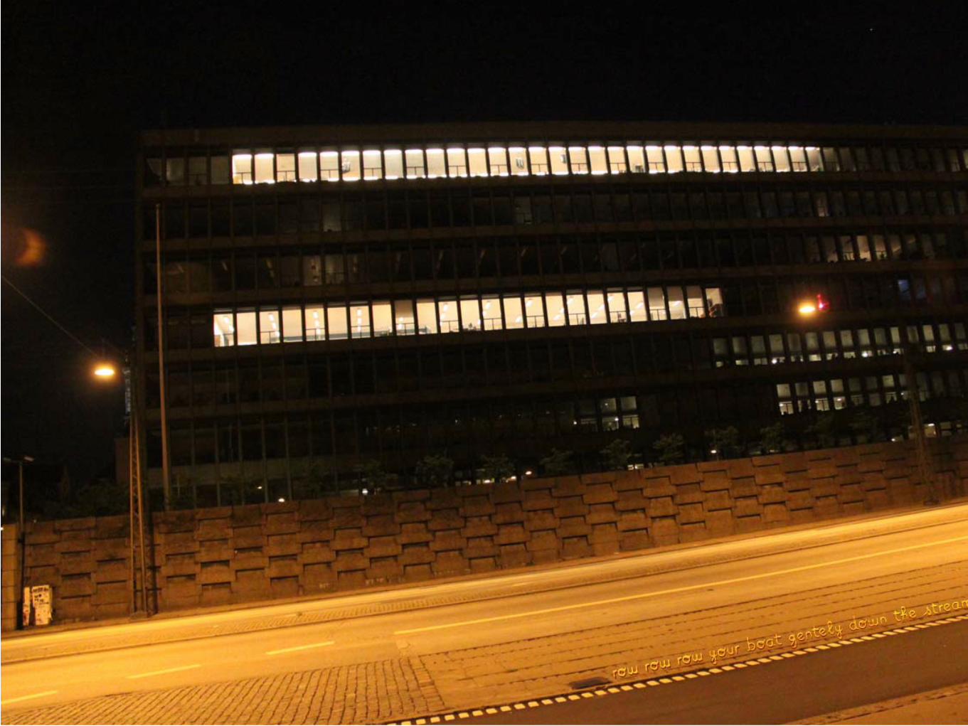
201020092008skills
DESIGNER - multi-tasker [email protected] +351 96 7873629
Portuguese23 anos
CENTRAL SAINT MARTINS, LONDRES,
UK
dittopress.co.uk
Do the Green Thing
Internship as a designer supporting on research, communication of wooloo productions and general administration. From August to October.
Internship for the printing studio retouching artwork, assisting with printing and general administration. From April to June.
Internship researching new business opportunities, brainstorming creative solutions with the team and creating print and digital communication supports for campaigns. From February to June.
Attended courses, exploring new techniques and concepts enriching my vision and method of Design. Experience Design, 100 Design Projects & Experimental Printmaking.
Wooloo.org
UNIVERSITY of SALFORD,
MANCHESTER, UK
UNIVERSIDADE de AVEIRO, PT
Exchange program, ERASMUS duration of 2 semesters.On the 1º semester: developed print and digital Graphic Design projects (analysis and creation of comunication supports, introdution to Dreamweaver).On the 2º semester: attended Visual Arts course, exploring diferent printing techniques. Production and montage of a video and sound instalation.
Graduated in DESIGNMain qualifi cations: Graphic, Editorial, Communication and Product Design, History and Theory of Design, Typography, creative and strategic thinking, Identities creation and Materials. 2005 - 2009
Leafl et production for the percussion show of an African woman group.September
Finka Pé, Moinho da Juventude, Cova da Moura
Helped planning and divulging the artistic event, “Roominations”; presented a video and sound Installation. April.
“Roominations”, University of Salford
Produced the restaurant’s business card and leafl et. Gave support in the development of its graphic and communication strategy.
Salpoente, Aveiro, PT
Creation of the presentation of Alma Lusa for a talk in Serralves. Support on the communication at the shop.
Alma Lusa, Rato, Lisboa
Since 2006, creation of communication devices for several social and cultural events; Worked on several part-time and holiday jobs (restaurants, bars, festivals, markets, events promoting).
Languages
Computer skills
Interests
Portuguese (mother tongue)Fluent in English: attended the International House, until level 11.IELTS 6,5 Spanish, excellent understanding of the written and spoken language, good oral expression.
Advanced use of Microsoft Office (Word, Excel e PowerPoint), Adobe Master Collection (Photoshop, Illustrator, After Effects, InDesign & Premiere) and Apple Final Cut Pro.
Travel through Europe and the Unites States. I like craft working for its authentic and manual manipulation.All the Arts but in particularly: Video, Image, Sound, Print and Performing.
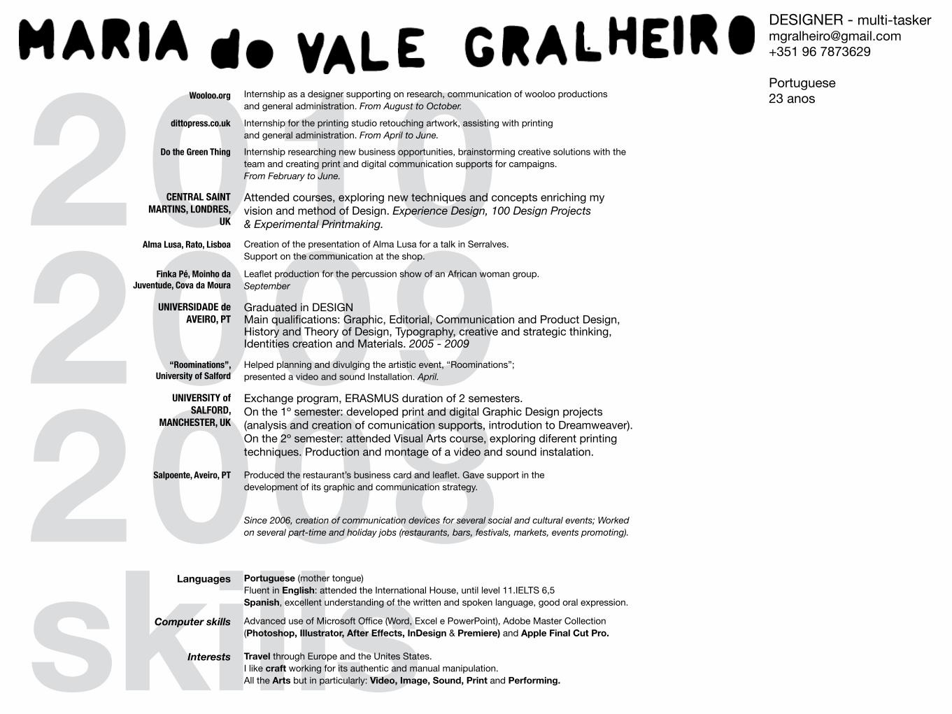
z The project proposal was to choose a theme and
redesign its promotional language in a leaflet. I chose
organic chocolate to draw the attention of to the benefits
of eating better-quality sweets. The folded shape looks
like a bitten chocolate bar; when open, it becomes a
poster with a typographic composition.
Choco | leaflet
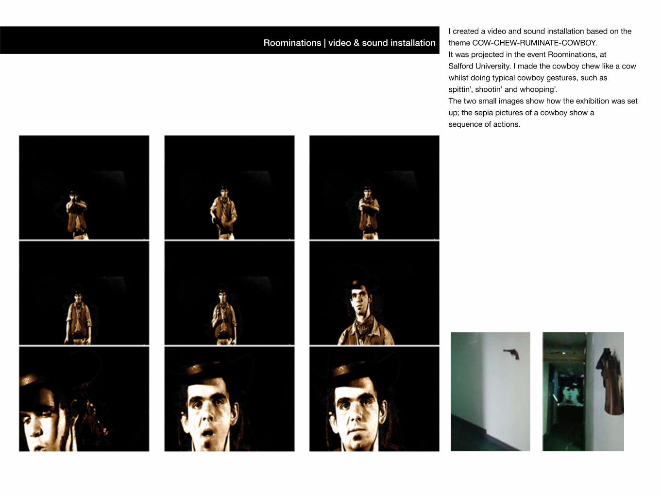
Roominations | video & sound installation I created a video and sound installation based on the
theme COW-CHEW-RUMINATE-COWBOY.
It was projected in the event Roominations, at
Salford University. I made the cowboy chew like a cow
whilst doing typical cowboy gestures, such as
spittin’, shootin’ and whooping’.
The two small images show how the exhibition was set
up; the sepia pictures of a cowboy show a
sequence of actions.
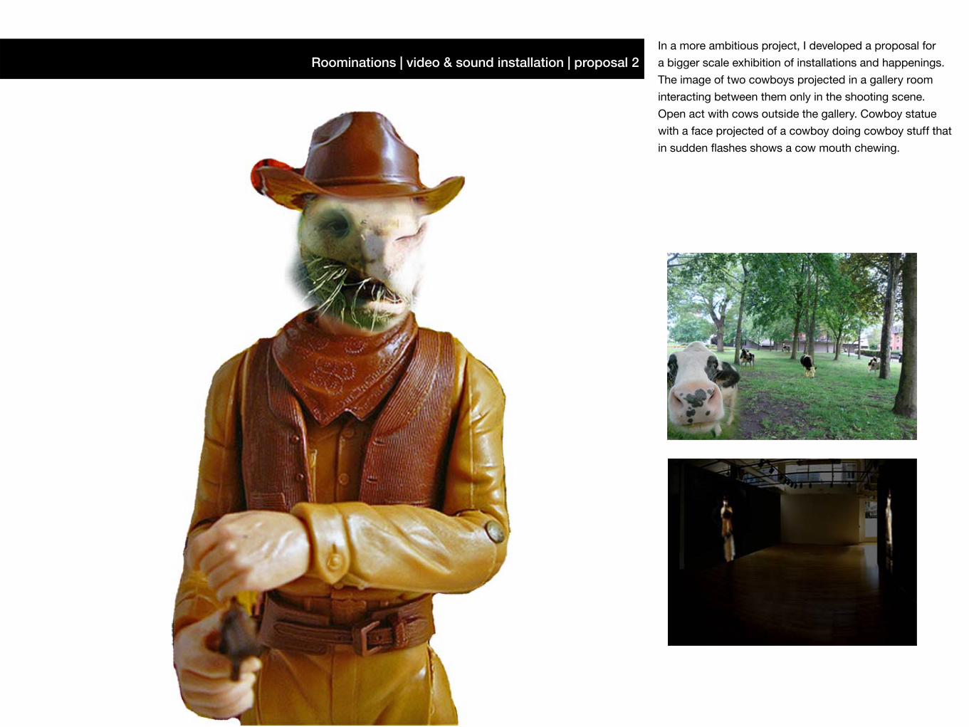
In a more ambitious project, I developed a proposal for
a bigger scale exhibition of installations and happenings.
The image of two cowboys projected in a gallery room
interacting between them only in the shooting scene.
Open act with cows outside the gallery. Cowboy statue
with a face projected of a cowboy doing cowboy stuff that
in sudden fl ashes shows a cow mouth chewing.
Roominations | video & sound installation | proposal 2
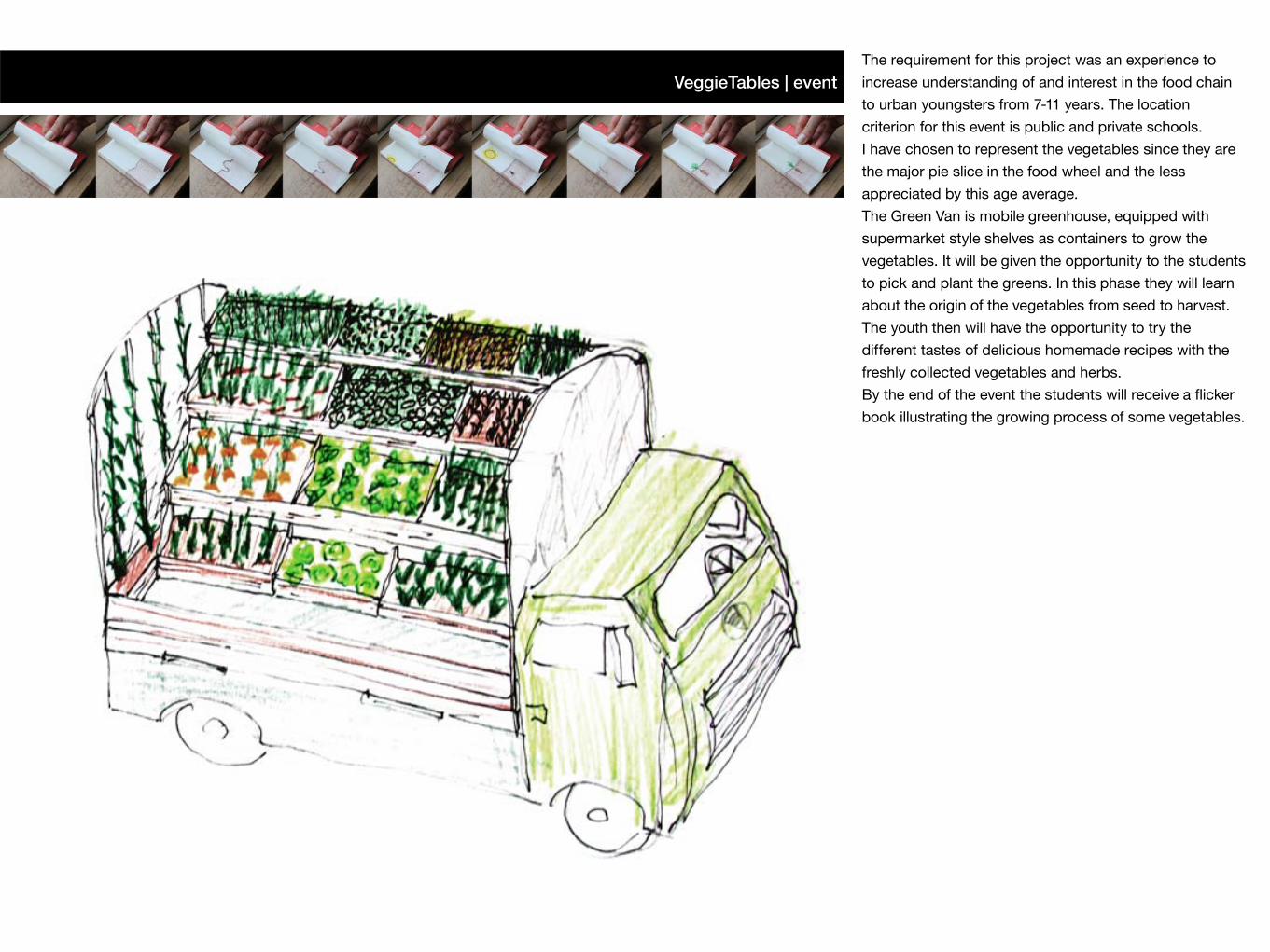
VeggieTables | eventThe requirement for this project was an experience to
increase understanding of and interest in the food chain
to urban youngsters from 7-11 years. The location
criterion for this event is public and private schools.
I have chosen to represent the vegetables since they are
the major pie slice in the food wheel and the less
appreciated by this age average.
The Green Van is mobile greenhouse, equipped with
supermarket style shelves as containers to grow the
vegetables. It will be given the opportunity to the students
to pick and plant the greens. In this phase they will learn
about the origin of the vegetables from seed to harvest.
The youth then will have the opportunity to try the
different tastes of delicious homemade recipes with the
freshly collected vegetables and herbs.
By the end of the event the students will receive a flicker
book illustrating the growing process of some vegetables.
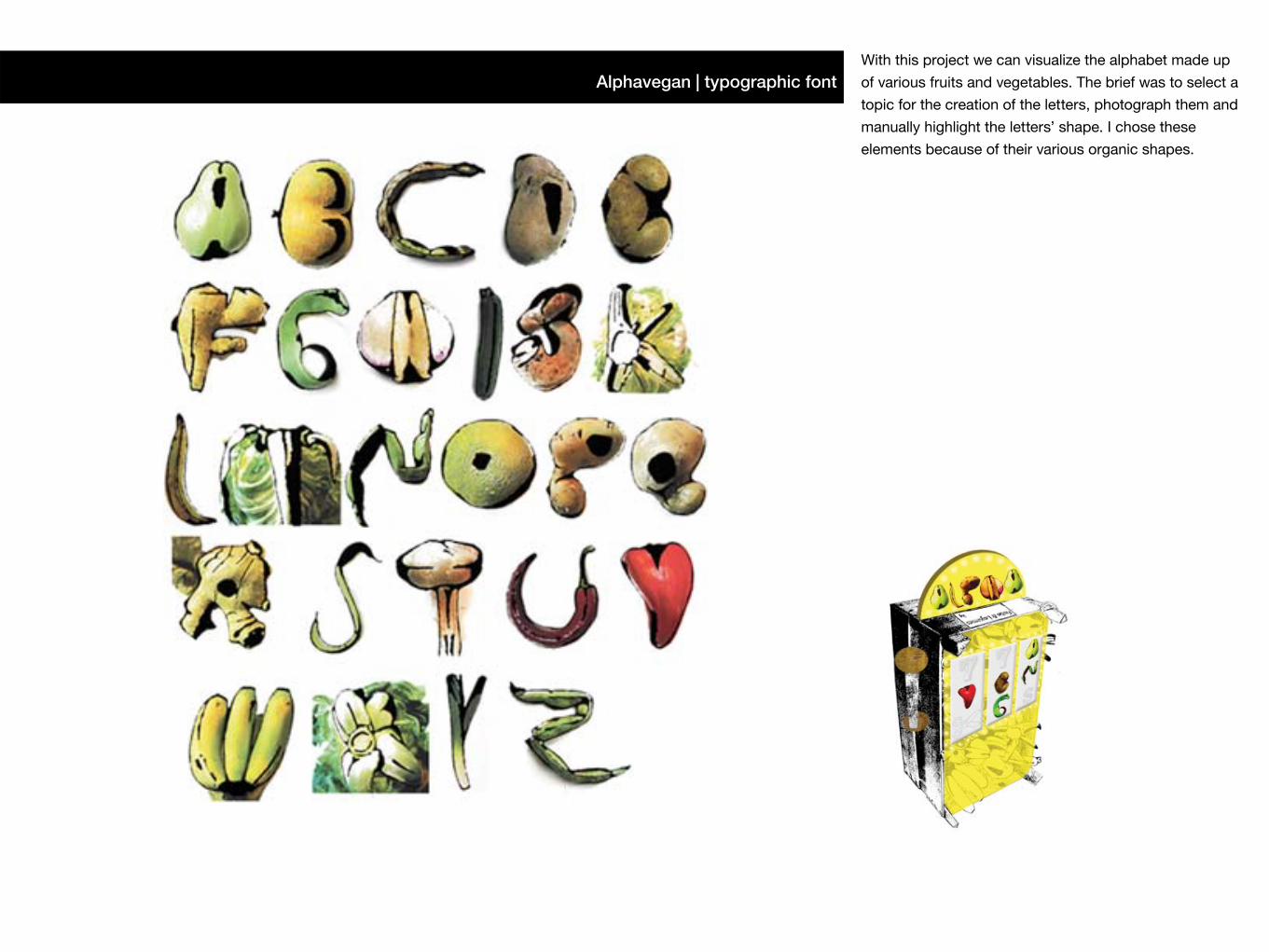
With this project we can visualize the alphabet made up
of various fruits and vegetables. The brief was to select a
topic for the creation of the letters, photograph them and
manually highlight the letters’ shape. I chose these
elements because of their various organic shapes.
Alphavegan | typographic font
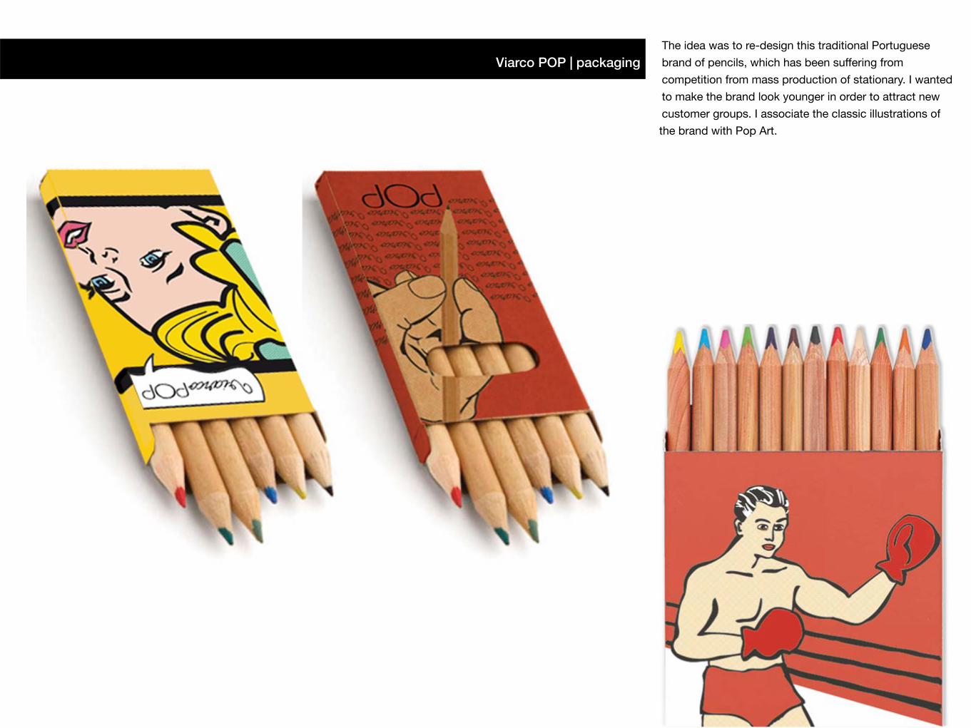
The idea was to re-design this traditional Portuguese
brand of pencils, which has been suffering from
competition from mass production of stationary. I wanted
to make the brand look younger in order to attract new
customer groups. I associate the classic illustrations of
the brand with Pop Art.
Viarco POP | packaging
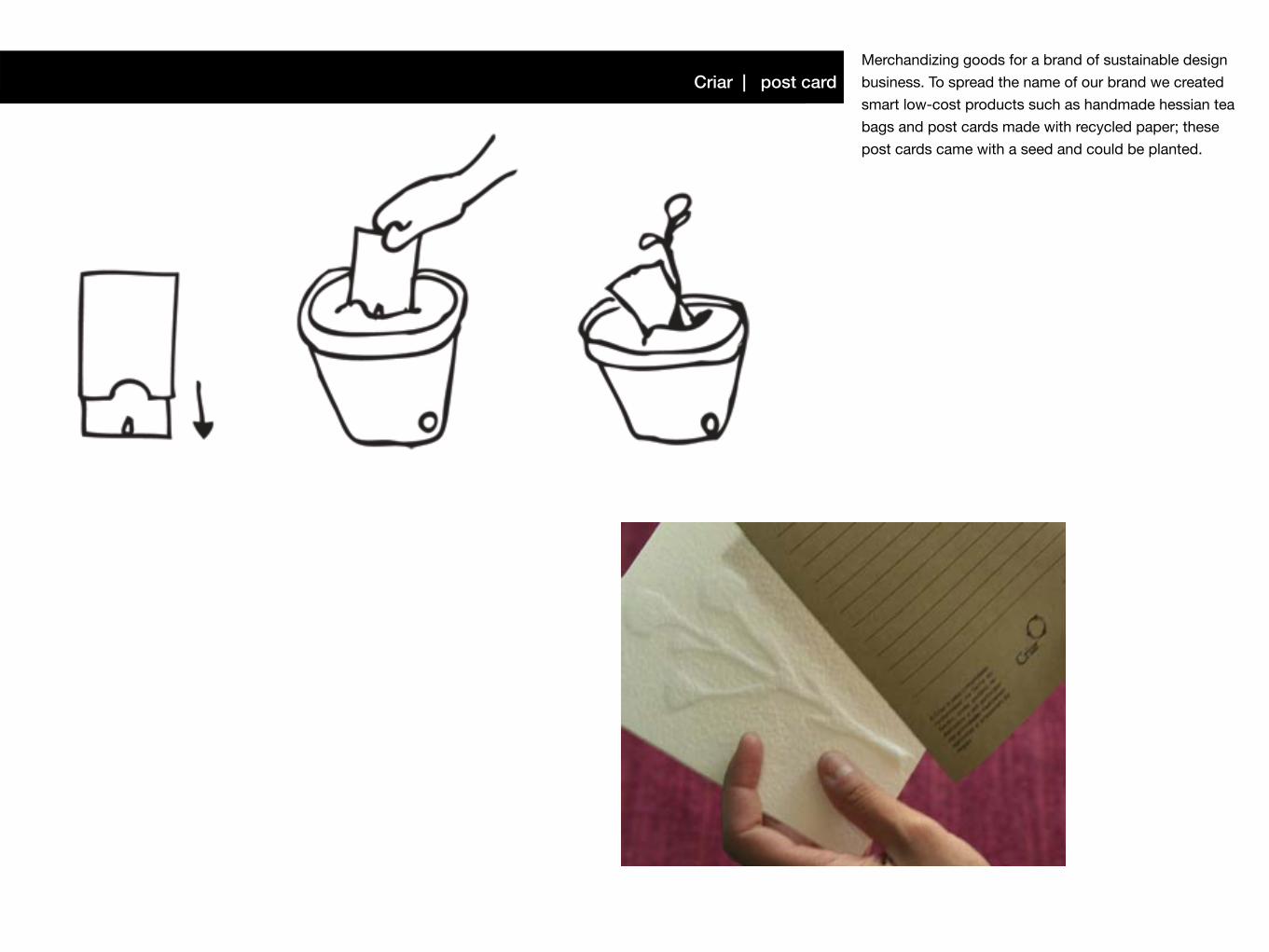
Merchandizing goods for a brand of sustainable design
business. To spread the name of our brand we created
smart low-cost products such as handmade hessian tea
bags and post cards made with recycled paper; these
post cards came with a seed and could be planted.
Criar | post card
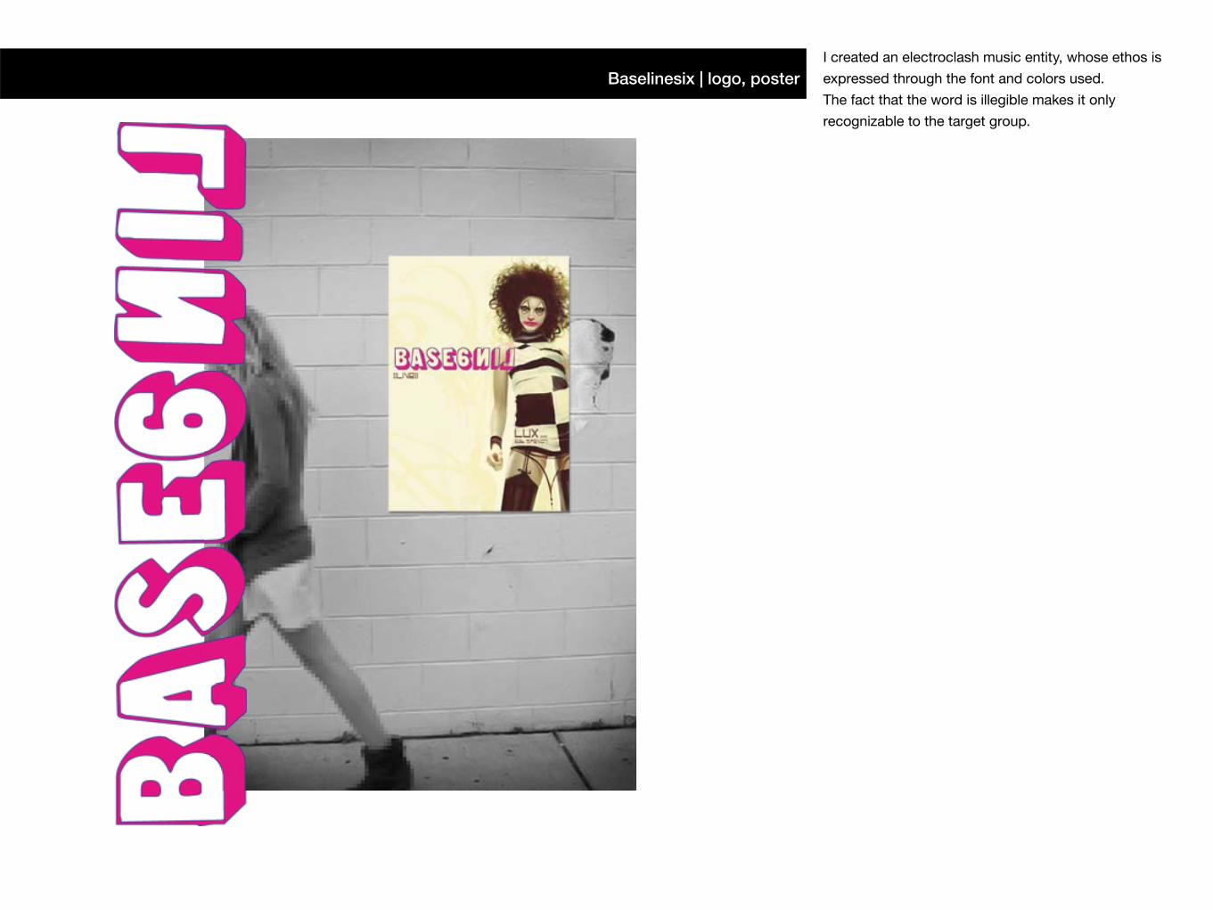
Baselinesix | logo, posterI created an electroclash music entity, whose ethos is
expressed through the font and colors used.
The fact that the word is illegible makes it only
recognizable to the target group.
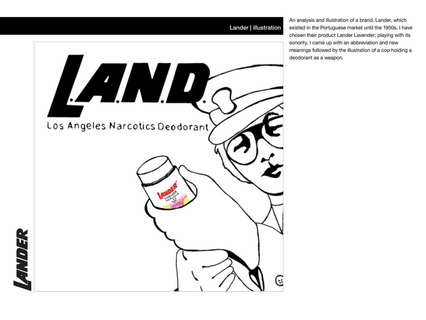
Lander | illustrationAn analysis and illustration of a brand, Lander, which
existed in the Portuguese market until the 1950s. I have
chosen their product Lander Lavender; playing with its
sonority, I came up with an abbreviation and new
meanings followed by the illustration of a cop holding a
deodorant as a weapon.
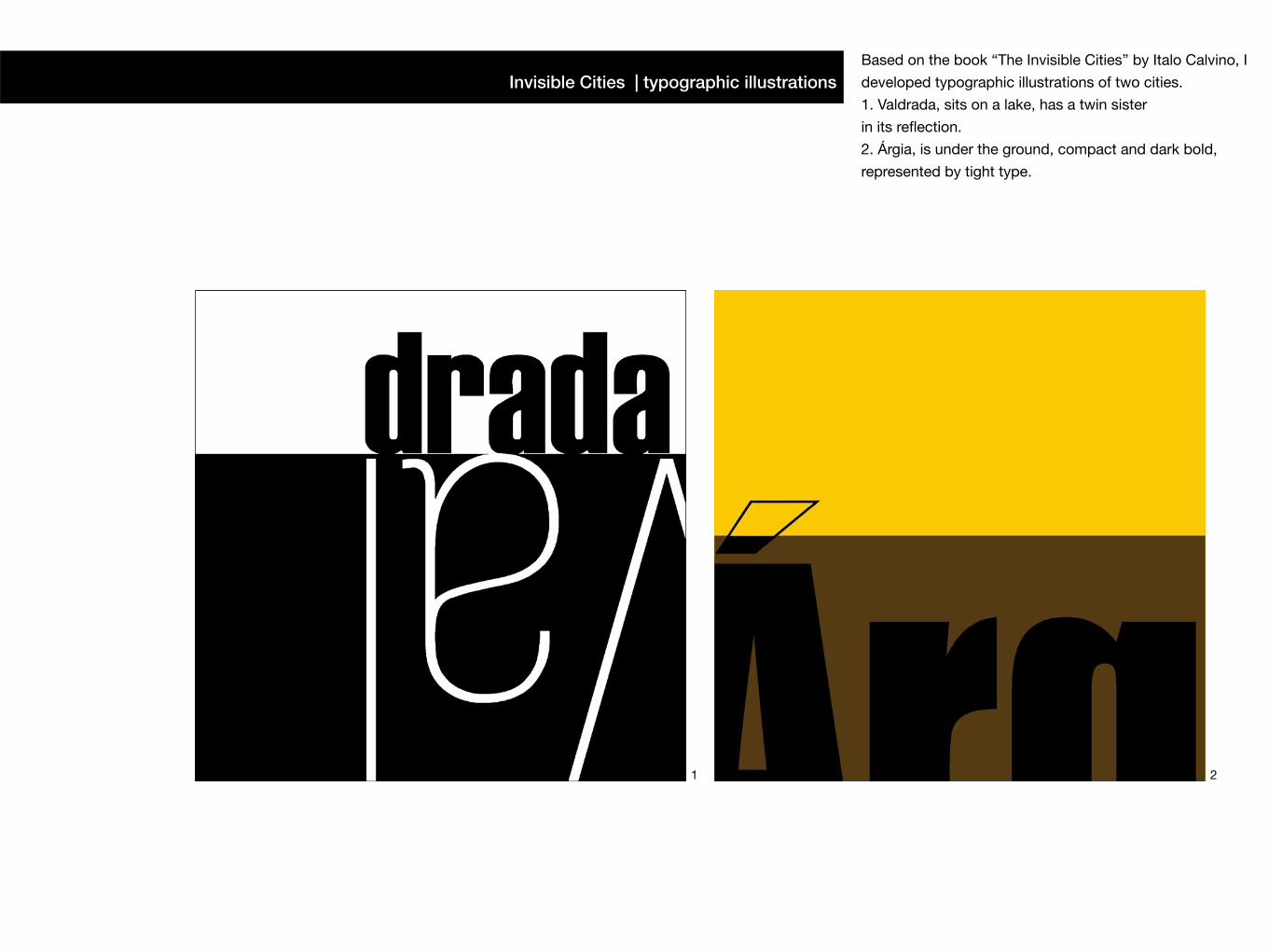
Invisible Cities | typographic illustrationsBased on the book “The Invisible Cities” by Italo Calvino, I
developed typographic illustrations of two cities.
1. Valdrada, sits on a lake, has a twin sister
in its reflection.
2. Árgia, is under the ground, compact and dark bold,
represented by tight type.
1 2
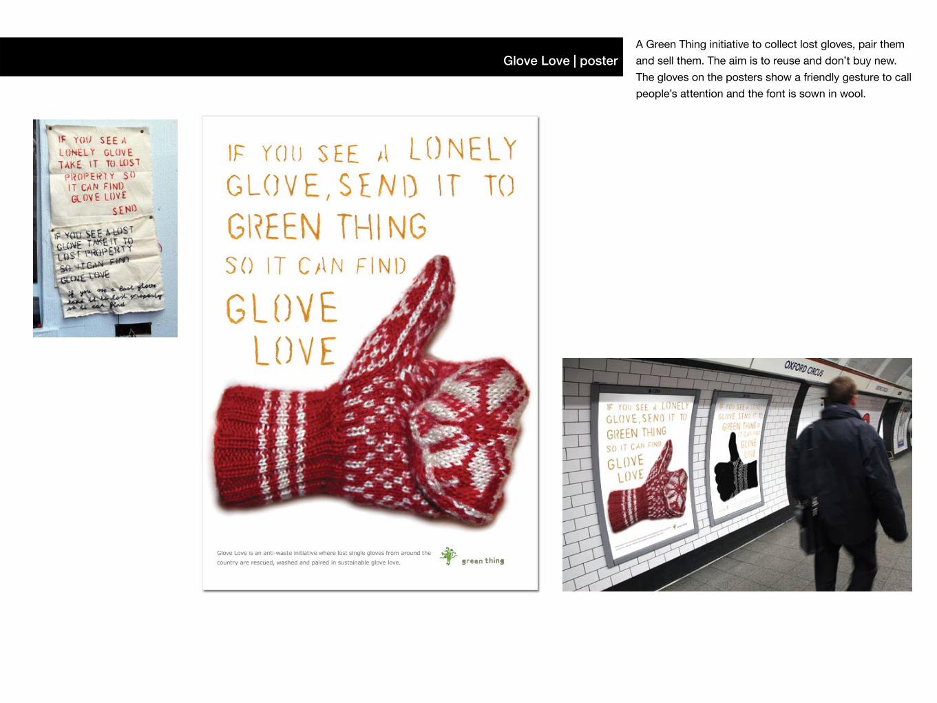
Glove Love | posterA Green Thing initiative to collect lost gloves, pair them
and sell them. The aim is to reuse and don’t buy new.
The gloves on the posters show a friendly gesture to call
people’s attention and the font is sown in wool.
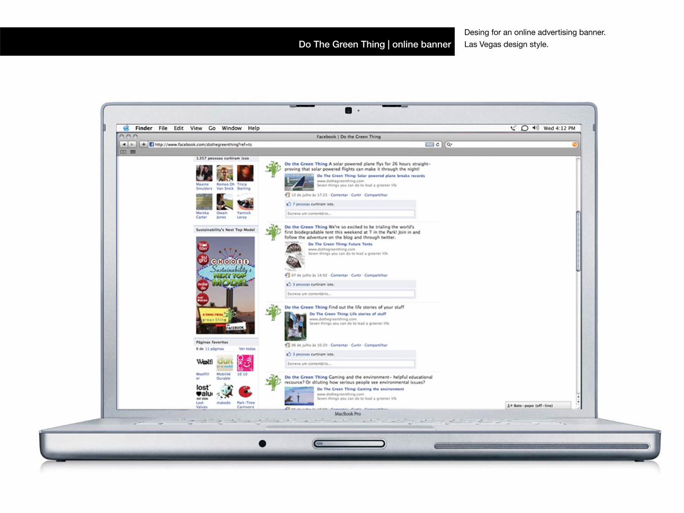
Do The Green Thing | online bannerDesing for an online advertising banner.
Las Vegas design style.
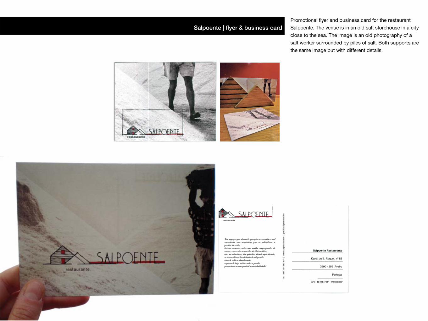
Salpoente | flyer & business cardPromotional flyer and business card for the restaurant
Salpoente. The venue is in an old salt storehouse in a city
close to the sea. The image is an old photography of a
salt worker surrounded by piles of salt. Both supports are
the same image but with different details.
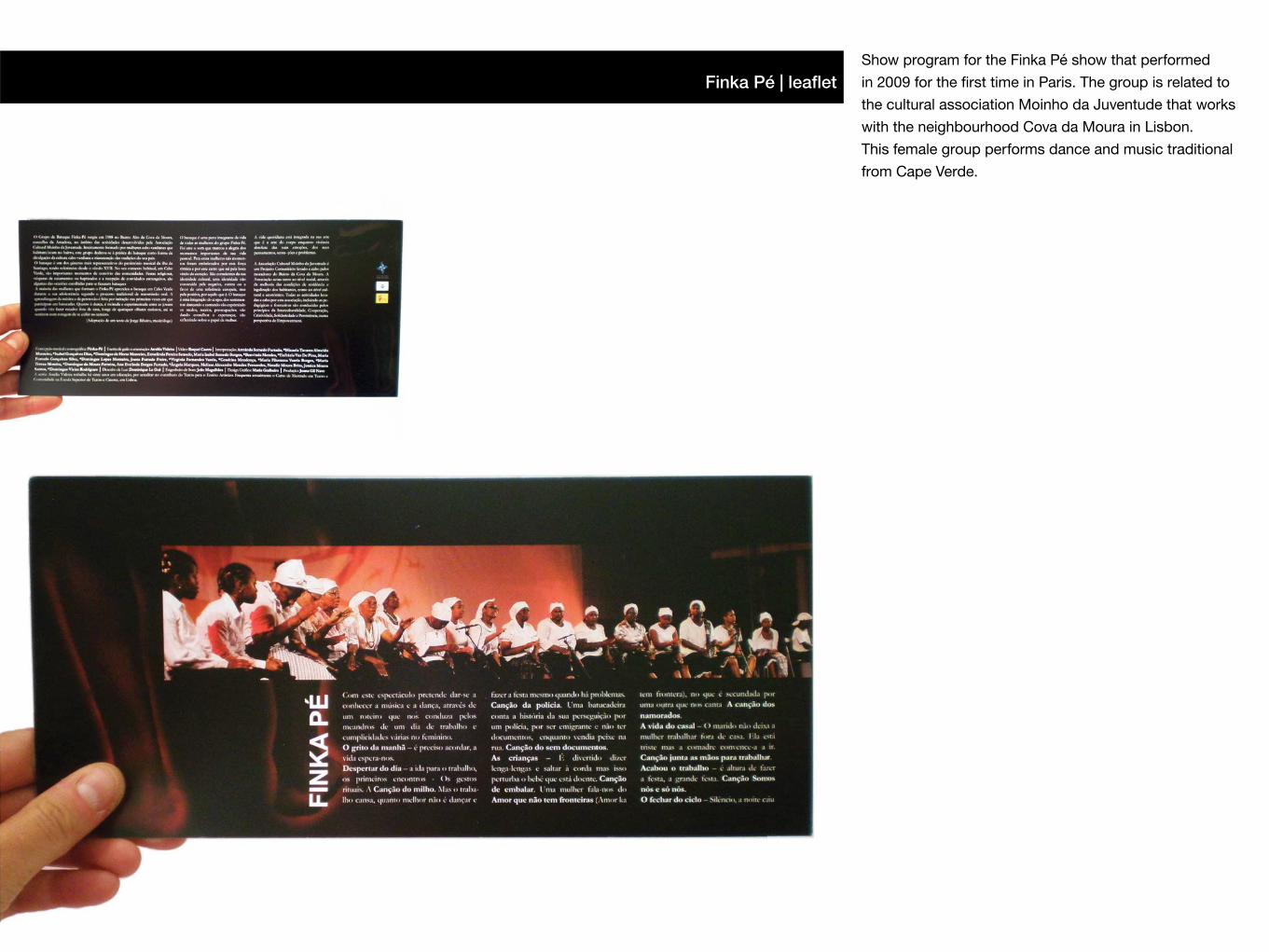
Finka Pé | leafletShow program for the Finka Pé show that performed
in 2009 for the first time in Paris. The group is related to
the cultural association Moinho da Juventude that works
with the neighbourhood Cova da Moura in Lisbon.
This female group performs dance and music traditional
from Cape Verde.
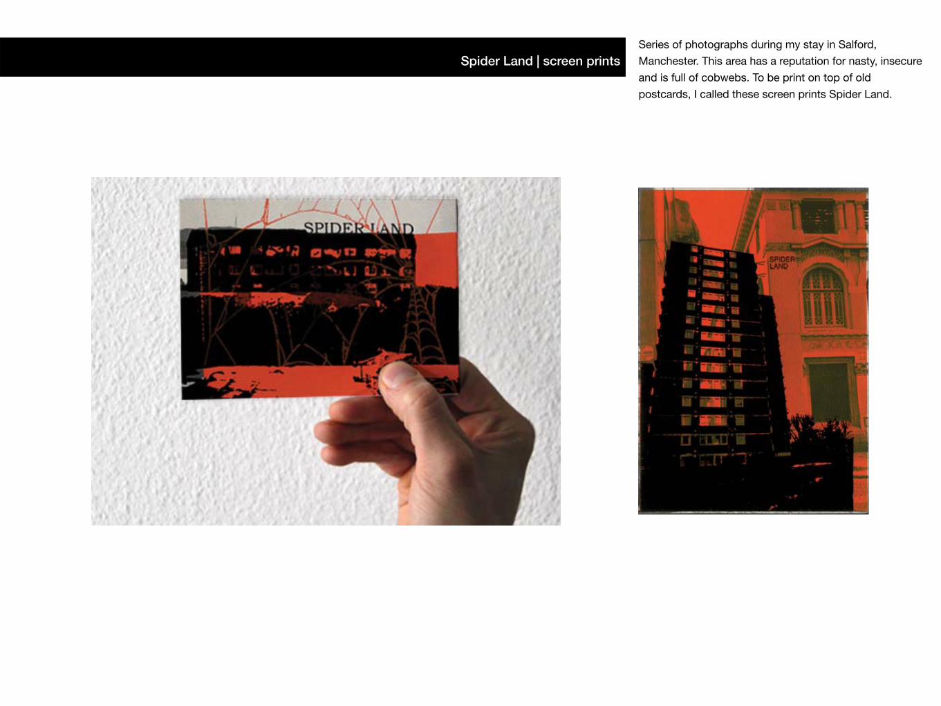
Spider Land | screen printsSeries of photographs during my stay in Salford,
Manchester. This area has a reputation for nasty, insecure
and is full of cobwebs. To be print on top of old
postcards, I called these screen prints Spider Land.
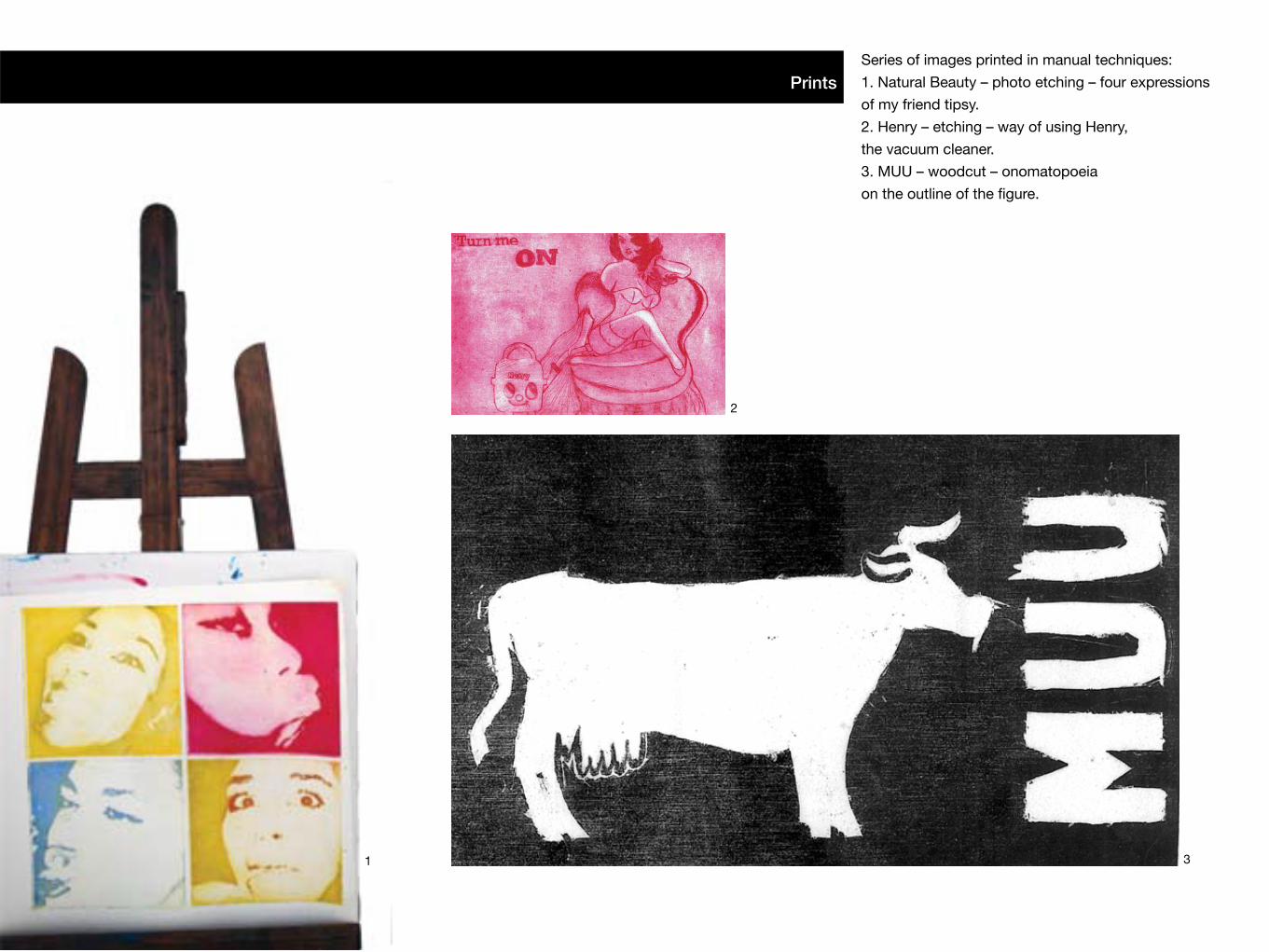
Series of images printed in manual techniques:
1. Natural Beauty – photo etching – four expressions
of my friend tipsy.
2. Henry – etching – way of using Henry,
the vacuum cleaner.
3. MUU – woodcut – onomatopoeia
on the outline of the figure.
Prints
1
2
3
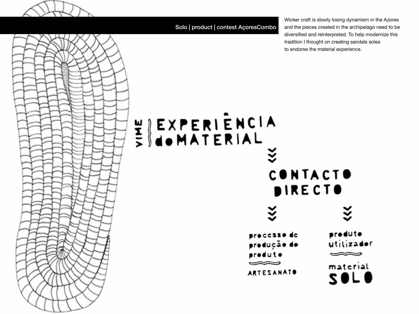
Solo | product | contest AçoresComboWicker craft is slowly losing dynamism in the Azores
and the pieces created in the archipelago need to be
diversified and reinterpreted. To help modernize this
tradition I thought on creating sandals soles
to endorse the material experience.
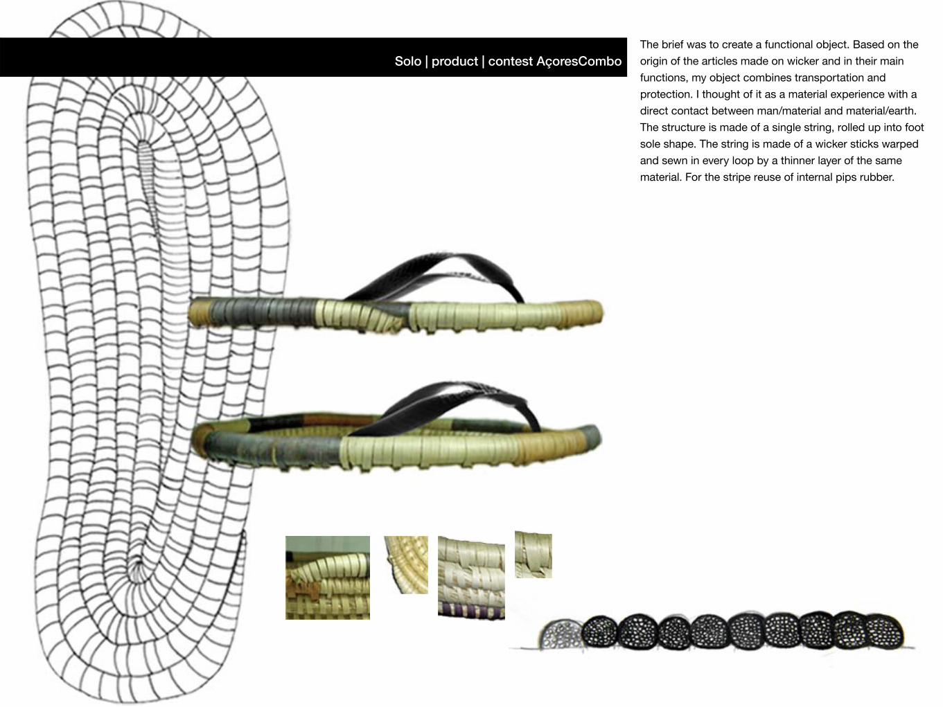
Solo | product | contest AçoresComboThe brief was to create a functional object. Based on the
origin of the articles made on wicker and in their main
functions, my object combines transportation and
protection. I thought of it as a material experience with a
direct contact between man/material and material/earth.
The structure is made of a single string, rolled up into foot
sole shape. The string is made of a wicker sticks warped
and sewn in every loop by a thinner layer of the same
material. For the stripe reuse of internal pips rubber.