Embed Size (px)
Citation preview
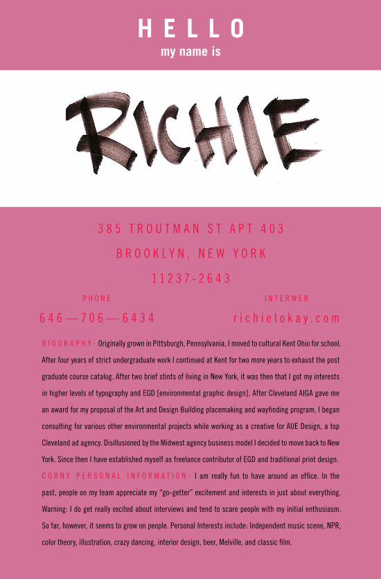
H E L L O my name is
B I O G R A P H Y : Originally grown in Pittsburgh, Pennsylvania, I moved to cultural Kent Ohio for school.
After four years of strict undergraduate work I continued at Kent for two more years to exhaust the post
graduate course catalog. After two brief stints of living in New York, it was then that I got my interests
in higher levels of typography and EGD [environmental graphic design]. After Cleveland AIGA gave me
an award for my proposal of the Art and Design Building placemaking and wayfinding program, I began
consulting for various other environmental projects while working as a creative for AUE Design, a top
Cleveland ad agency. Disillusioned by the Midwest agency business model I decided to move back to New
York. Since then I have established myself as freelance contributor of EGD and traditional print design.
C O R N Y P E R S O N A L I N F O R M A T I O N : I am really fun to have around an office. In the
past, people on my team appreciate my “go-getter” excitement and interests in just about everything.
Warning: I do get really excited about interviews and tend to scare people with my initial enthusiasm.
So far, however, it seems to grow on people. Personal Interests include: Independent music scene, NPR,
color theory, illustration, crazy dancing, interior design, beer, Melville, and classic film.
3 8 5 T R O U T M A N S T A P T 4 0 3
B R O O K L Y N , N E W Y O R K
1 1 2 3 7 - 2 6 4 3P H O N E
6 4 6 — 7 0 6 — 6 4 3 4
I N T E R W E B
r i c h i e l o k a y . c o m
RICHARD LOKAY 646.706.6434—385 TROUTMAN ST APT 403, BROOKLYN NY 11237-2643. [email protected]
N O TA B L E E X P E R IE N C E
Mo Lebowitz and the Antique Press: Designed and hosted gallery exhibition and bluegrass concert for
award winning designer and wood typographer Mo Lebowitz.
Ambrosia: The Food of the Gods: Brand identity for an ice cream shop. The project includes marketing
plan, brand naming, sign and uniform design.
Journalism Media Convergence: Attended two summer segd [society of environmental graphic design]
progressive environmental design workshop; Rethinking Sign Systems.
Wayfinding ADA Design Intent: Environmental improvement and signage of Kent State University buildings
in accordance of segd process and American Disabilities Act compliance.
Cranbrook Exhibition Design Conference and Charette: Invited to professional exhibition conference as
a student liaison. Also participated in the Celebrating Cranbrooke design charette.
USA Network hosts the Modern: Contracted to create a design plan of branding, lighting and multimedia
environment solutions for host, USA Networks, advertising Gala at the Museum of Modern Art’s restaurant.
Bronzeville Patina: Placemaking and Identity for a proposed senior housing environment in historic
Chicago. The project includes interdisciplinary development and design.
D E S IG N AWA R D S
AIGA 2004 Annual Design Competition: “Wayfinding ADA” project chosen as one of fifty-two of Cleveland’s
best in its annual design awards show.
UCDA Student Published Exhibition: “Mo Lebowitz and the Antique Press” Design Exhibit chosen in Annual
Design Competition in its category as a winner.
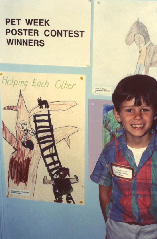
Carnegie Museum of Art 1984 Pet Week Poster Contest: “Helping Each Other” project chosen third
place Kindergarten group [see reverse].
U NI V E R S I T Y E D U C AT IO N
Kent State University Bachelor of Fine Arts School of Visual Communication Design, 3-D design
concentration in Environmental Graphic Design.
R E L E VA N T E M P L O Y M E N T
Freelance Designer: Blue Note Records, NFL, Blister, GQ Magazine, Marie Claire As a contracted
full-time freelance designer I created unique and thoughtful designed advertising and promotions with the
occasional environmental graphic design consultation. New York, NY 2006-2007.
Art Director: AUE Creative As the sole creative designer, I helped reposition the company as a full service
creative solution while retaining its roots as a high-end design boutique. Cleveland, OH 2005.
Art Director: Signum Design As a University student run design studio, I designed and oversaw printing
and fabrication of various ads campaigns, design projects, and university signage projects. Kent, OH 2004.
TRUST IN DIEBOLD TRUST IN DIEBOLD T
RUST
IN D
IEBOLD
U N D E R S T A N D T H E F I N E P R I N T
IN YOU THEY TRUSTIN YOU THEY TRUSTIN YOU THEY TRUST
HEL
PING GOOD RE
STA
UR
A
NTS BECOME GR
EA
T
HEL
PING GOOD RE
STA
UR
A
NTS BECOME GR
EA
T
R I C H I E @ R I C H I E L O K A Y . C O M 6 4 6 . 7 0 6 . 6 4 3 4 . 3 8 5 T R O U T M A N A P T 4 0 3 . B R O O K L Y N , N Y 1 1 2 3 7 .
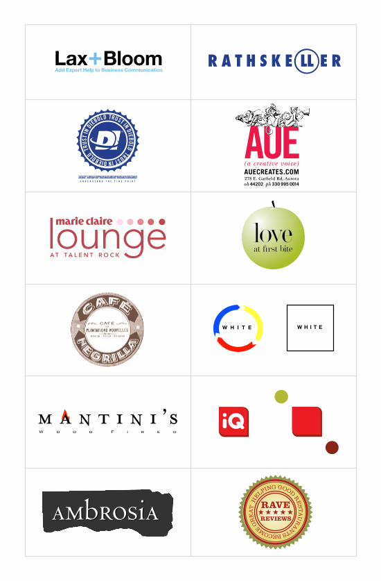
LOGOTYPES AND OTHER MARKSBranding and Identity: Here are a range of marks, each solving a unique problem.
L
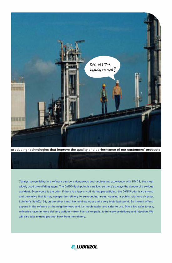
producing technologies that improve the quality and performance of our customers’ products
Catalyst presulfiding in a refinery can be a dangerous and unpleasant experience with DMDS, the most
widely used presulfiding agent. The DMDS flash point is very low, so there’s always the danger of a serious
accident. Even worse is the odor. If there is a leak or spill during presulfiding, the DMDS odor is so strong
and pervasive that it may escape the refinery to surrounding areas, causing a public relations disaster.
Lubrizol’s SulfrZol 54, on the other hand, has minimal odor and a very high flash point. So it won’t offend
anyone in the refinery or the neighborhood and it’s much easier and safer to use. Since it’s safer to use,
refineries have far more delivery options—from five-gallon pails, to full-service delivery and injection. We
will also take unused product back from the refinery.
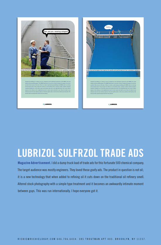
LUBRIZOL SULFRZOL TRADE ADS
Dan, are you wearing cologne?
producing technologies that improve the quality and performance of our customers’ products
Catalyst presulfiding in a refinery can be a dangerous and unpleasant experience with DMDS, the most
widely used presulfiding agent. The DMDS flash point is very low, so there’s always the danger of a serious
accident. Even worse is the odor. If there is a leak or spill during presulfiding, the DMDS odor is so strong
and pervasive that it may escape the refinery to surrounding areas, causing a public relations disaster.
Lubrizol’s SulfrZol 54, on the other hand, has minimal odor and a very high flash point. So it won’t offend
anyone in the refinery or the neighborhood and it’s much easier and safer to use. Since it’s safer to use,
refineries have far more delivery options—from five-gallon pails, to full-service delivery and injection. We
will also take unused product back from the refinery.
Magazine Advertisement. I did a dump truck load of trade ads for this fortunate 500 chemical company.
The target audience was mostly engineers. They loved these goofy ads. The product in question is not oil;
it is a new technology that when added to refining oil it cuts down on the traditional oil refinery smell.
Altered stock photography with a simple type treatment and it becomes an awkwardly intimate moment
between guys. This was run internationally. I hope everyone got it.
Dan, are you wearing cologne?
producing technologies that improve the quality and performance of our customers’ products
Catalyst presulfiding in a refinery can be a dangerous and unpleasant experience with DMDS, the most
widely used presulfiding agent. The DMDS flash point is very low, so there’s always the danger of a serious
accident. Even worse is the odor. If there is a leak or spill during presulfiding, the DMDS odor is so strong
and pervasive that it may escape the refinery to surrounding areas, causing a public relations disaster.
Lubrizol’s SulfrZol 54, on the other hand, has minimal odor and a very high flash point. So it won’t offend
anyone in the refinery or the neighborhood and it’s much easier and safer to use. Since it’s safer to use,
refineries have far more delivery options—from five-gallon pails, to full-service delivery and injection. We
will also take unused product back from the refinery.
R I C H I E @ R I C H I E L O K A Y . C O M 6 4 6 . 7 0 6 . 6 4 3 4 . 3 8 5 T R O U T M A N A P T 4 0 3 . B R O O K L Y N , N Y 1 1 2 3 7 .
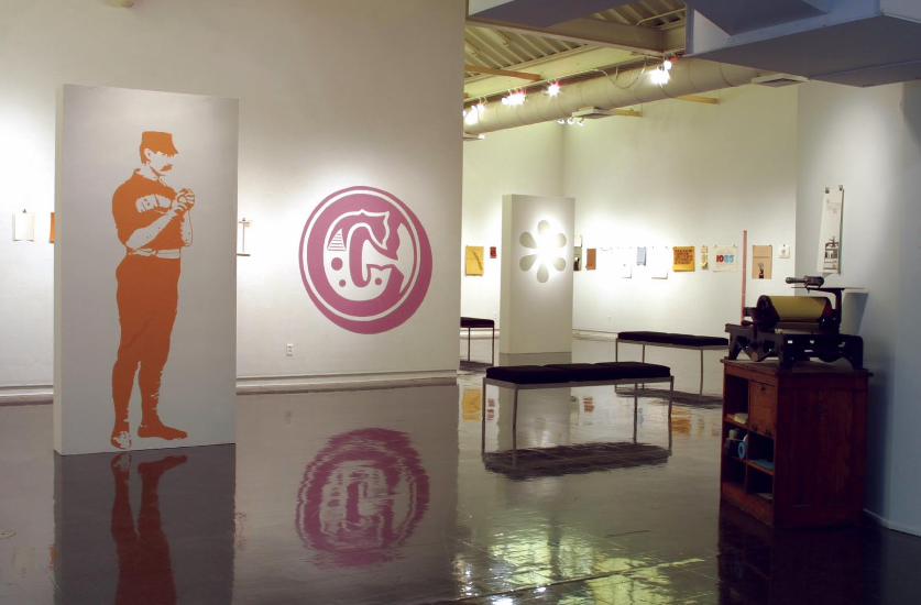
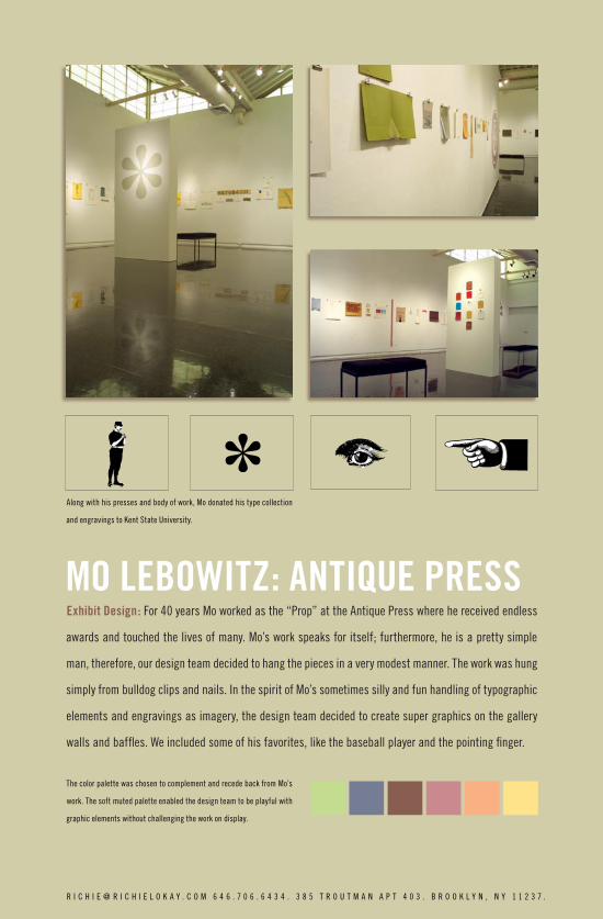
MO LEBOWITZ: ANTIQUE PRESSExhibit Design: For 40 years Mo worked as the “Prop” at the Antique Press where he received endless
awards and touched the lives of many. Mo’s work speaks for itself; furthermore, he is a pretty simple
man, therefore, our design team decided to hang the pieces in a very modest manner. The work was hung
simply from bulldog clips and nails. In the spirit of Mo’s sometimes silly and fun handling of typographic
elements and engravings as imagery, the design team decided to create super graphics on the gallery
walls and baffles. We included some of his favorites, like the baseball player and the pointing finger.
The color palette was chosen to complement and recede back from Mo’s
work. The soft muted palette enabled the design team to be playful with
graphic elements without challenging the work on display.
Along with his presses and body of work, Mo donated his type collection
and engravings to Kent State University.
R I C H I E @ R I C H I E L O K A Y . C O M 6 4 6 . 7 0 6 . 6 4 3 4 . 3 8 5 T R O U T M A N A P T 4 0 3 . B R O O K L Y N , N Y 1 1 2 3 7 .
¢
¢
¢
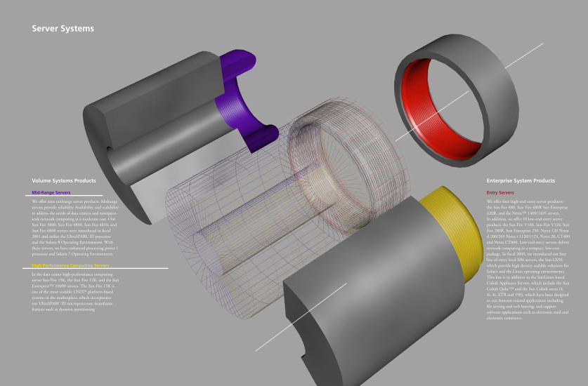
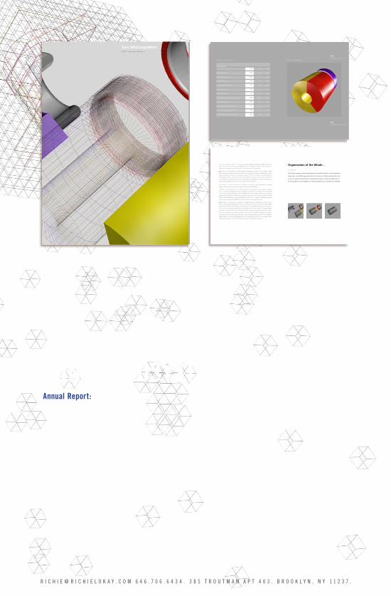
SUN MICROSYSTEMS ANNUALAnnual Report: The challenge of this annual was the copy. It had a very long formal narrative that
laid out the inter-workings of all sections of the company. What I did was to interweave a narrative
of visual metaphors that break up the long passages of text with interpretations of colorful, abstract
shapes. These abstract shapes connect and combine until the end when the viewer realizes they make
up the company logo. Formally the type work is easy to follow and well treated. I took great care in the
illustrations to use a unique look and feel for each spread. I think its successful in being compelling in
a industry that is so often not.
R I C H I E @ R I C H I E L O K A Y . C O M 6 4 6 . 7 0 6 . 6 4 3 4 . 3 8 5 T R O U T M A N A P T 4 0 3 . B R O O K L Y N , N Y 1 1 2 3 7 .
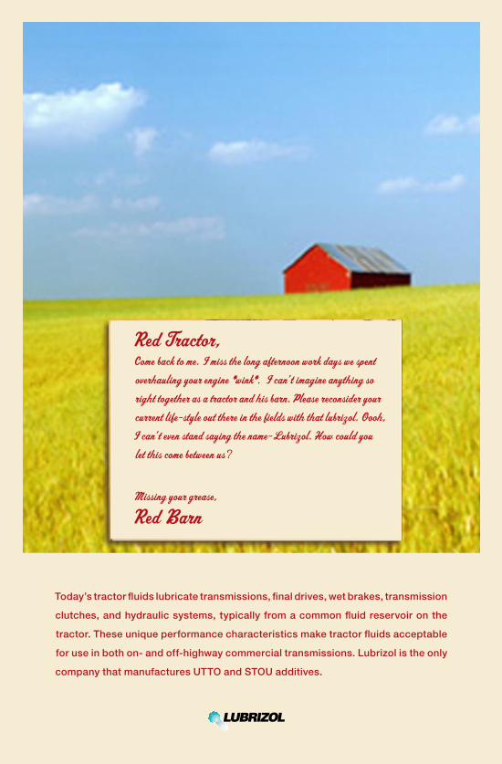
Red Tractor,Come back to me. I miss the long afternoon work days we spent overhauling your engine *wink*. I can’ t imagine anything so right together as a tractor and his barn. Please reconsider your current life-style out there in the fields with that lubrizol. Oooh,
I can’ t even stand saying the name-Lubrizol. How could you let this come between us?
Missing your grease,
Red Barn
Today’s tractor fluids lubricate transmissions, final drives, wet brakes, transmission
clutches, and hydraulic systems, typically from a common fluid reservoir on the
tractor. These unique performance characteristics make tractor fluids acceptable
for use in both on- and off-highway commercial transmissions. Lubrizol is the only
company that manufactures UTTO and STOU additives.
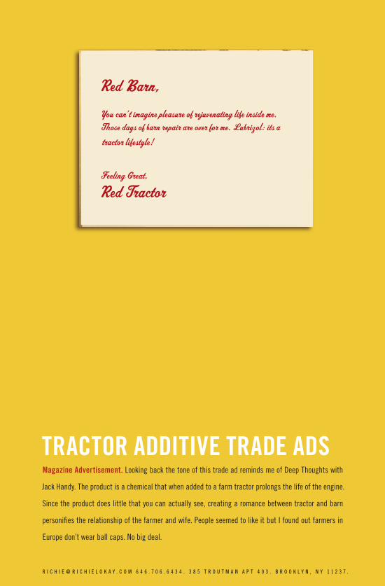
Red Barn,You can’ t imagine pleasure of rejuvenating life inside me. Those days of barn repair are over for me. Lubrizol: its a tractor lifestyle!
Feeling Great,
Red Tractor
TRACTOR ADDITIVE TRADE ADS
Red Barn,You can’ t imagine pleasure of rejuvenating life inside me. Those days of barn repair are over for me. Lubrizol: its a tractor lifestyle!
Feeling Great,
Red Tractor
Magazine Advertisement. Looking back the tone of this trade ad reminds me of Deep Thoughts with
Jack Handy. The product is a chemical that when added to a farm tractor prolongs the life of the engine.
Since the product does little that you can actually see, creating a romance between tractor and barn
personifies the relationship of the farmer and wife. People seemed to like it but I found out farmers in
Europe don’t wear ball caps. No big deal.
R I C H I E @ R I C H I E L O K A Y . C O M 6 4 6 . 7 0 6 . 6 4 3 4 . 3 8 5 T R O U T M A N A P T 4 0 3 . B R O O K L Y N , N Y 1 1 2 3 7 .
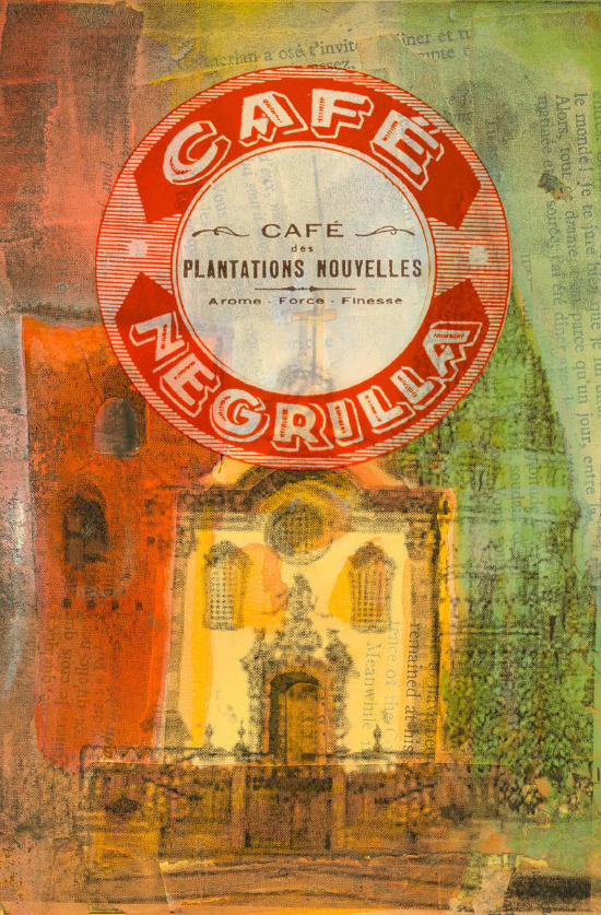
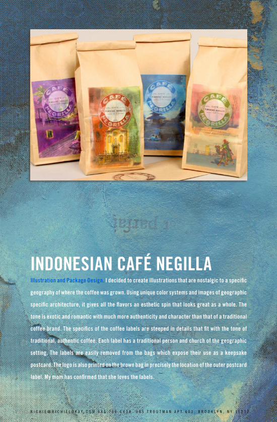
INDONESIAN CAFÉ NEGILLAIllustration and Package Design. I decided to create illustrations that are nostalgic to a specific
geography of where the coffee was grown. Using unique color systems and images of geographic
specific architecture, it gives all the flavors an esthetic spin that looks great as a whole. The
tone is exotic and romantic with much more authenticity and character than that of a traditional
coffee brand. The specifics of the coffee labels are steeped in details that fit with the tone of
traditional, authentic coffee. Each label has a traditional person and church of the geographic
setting. The labels are easily removed from the bags which expose their use as a keepsake
postcard. The logo is also printed on the brown bag in precisely the location of the outer postcard
label. My mom has confirmed that she loves the labels.
R I C H I E @ R I C H I E L O K A Y . C O M 6 4 6 . 7 0 6 . 6 4 3 4 . 3 8 5 T R O U T M A N A P T 4 0 3 . B R O O K L Y N , N Y 1 1 2 3 7 .
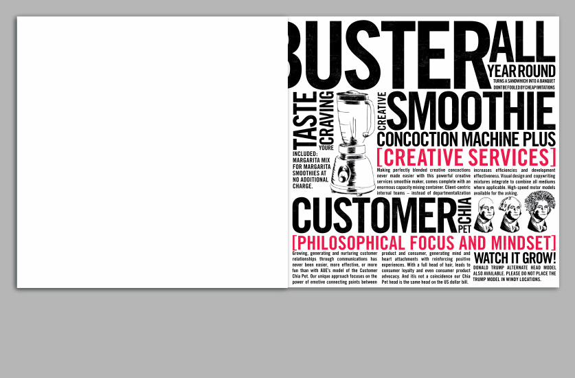
AUE
CAPA
BILI
TY
SQUI
B IN
SERT
Self Promotion. ”A thumb of the nose” to traditional advertising agencies, AUE’s self promotion
capabilities sheet was in the form of the most loathe some medium of advertising, the newspaper insert.
Printed on cheap newsprint, this cheeky in your face tabloid would be inserted into high-brow business
magazines. The tone is an AUE version of traditional American woodblock type. Fun and innovative, sadly,
I never got to see all my hard work come to fruition. It never went to print since internally the AUE work
picked up without any of its benefit.
I found this to be a very rewarding project since I expanded on the
identity system I devised for AUE and toke it where no one of the
mind of a traditional Cleveland ad agency had been. I used the
trademark red and goofy illustration style of the self promotion
work we did in the past. It felt more like a I was solving a puzzle
than setting type.
R I C H I E @ R I C H I E L O K A Y . C O M 6 4 6 . 7 0 6 . 6 4 3 4 . 3 8 5 T R O U T M A N A P T 4 0 3 . B R O O K L Y N , N Y 1 1 2 3 7 .

R I C H I E @ R I C H I E L O K A Y . C O M 6 4 6 . 7 0 6 . 6 4 3 4 . 3 8 5 T R O U T M A N A P T 4 0 3 . B R O O K L Y N , N Y 1 1 2 3 7 .R I C H I E @ R I C H I E L O K A Y . C O M 6 4 6 . 7 0 6 . 6 4 3 4 . 3 8 5 T R O U T M A N A P T 4 0 3 . B R O O K L Y N , N Y 1 1 2 3 7 .
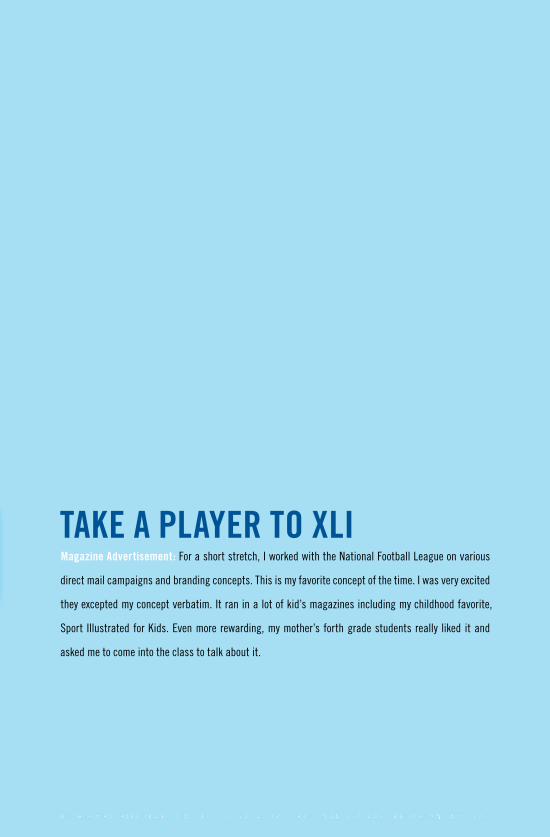
TAKE A PLAYER TO XLIMagazine Advertisement: For a short stretch, I worked with the National Football League on various
direct mail campaigns and branding concepts. This is my favorite concept of the time. I was very excited
they excepted my concept verbatim. It ran in a lot of kid’s magazines including my childhood favorite,
Sport Illustrated for Kids. Even more rewarding, my mother’s forth grade students really liked it and
asked me to come into the class to talk about it.
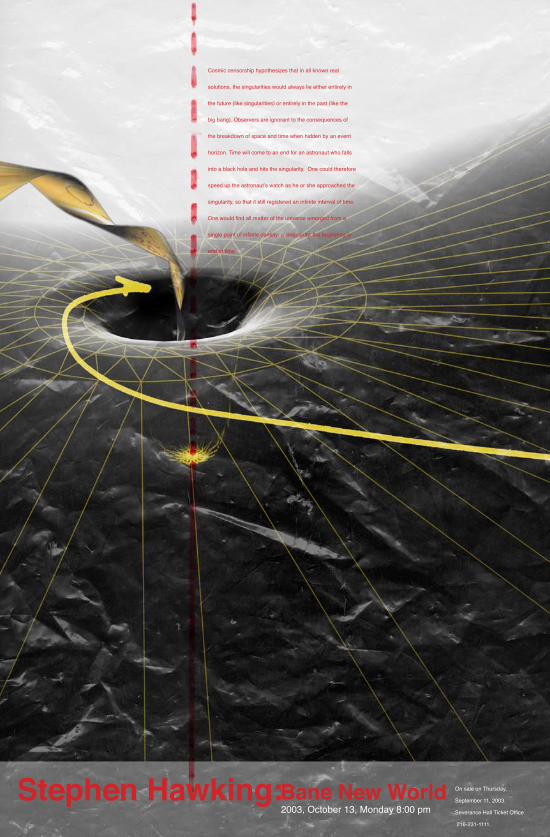
Cosmic censorship hypothesizes that in all known real
solutions, the singularities would always lie either entirely in
the future (like singularities) or entirely in the past (like the
big bang). Observers are ignorant to the consequences of
the breakdown of space and time when hidden by an event
horizon. Time will come to an end for an astronaut who falls
into a black hole and hits the singularity. One could therefore
speed up the astronaut’s watch as he or she approached the
singularity, so that it still registered an infinite interval of time.
One would find all matter of the universe emerged from a
single point of infinite density: a singularity, the beginning or
end of time.
Bane New WorldStephen Hawking:2003, October 13, Monday 8:00 pm
On sale on Thursday,
September 11, 2003.
Severance Hall Ticket Office
216-231-1111.
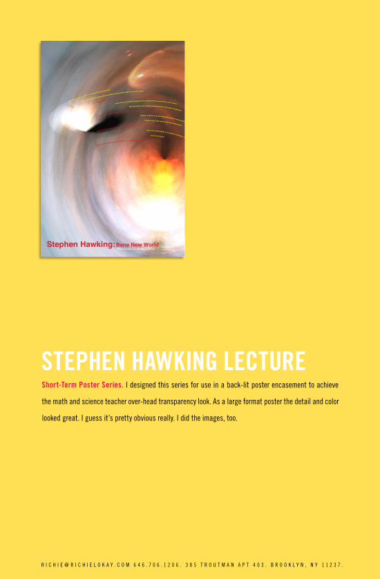
STEPHEN HAWKING LECTUREShort-Term Poster Series. I designed this series for use in a back-lit poster encasement to achieve
the math and science teacher over-head transparency look. As a large format poster the detail and color
looked great. I guess it’s pretty obvious really. I did the images, too.
R I C H I E @ R I C H I E L O K A Y . C O M 6 4 6 . 7 0 6 . 1 2 0 6 . 3 8 5 T R O U T M A N A P T 4 0 3 . B R O O K L Y N , N Y 1 1 2 3 7 .
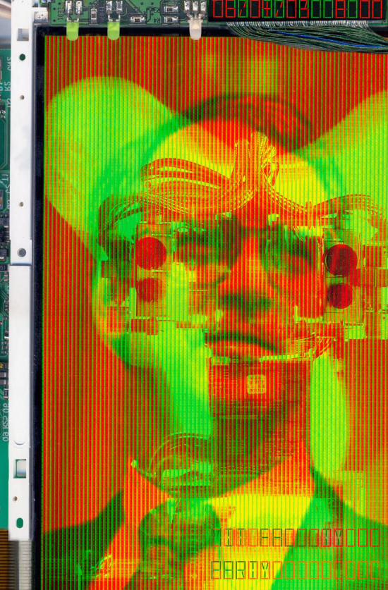
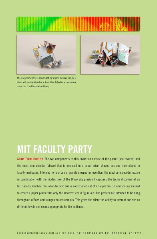
MIT FACULTY PARTY
This insanely small type is no oversight, nor a secret message from me to
others with a similar attraction to detail. Also, it also has no conceptional
connection. It just looks better this way.
Short-Term Identity. The two components to this invitation consist of the poster [see reverse] and
the robot arm decoder [above] that is enclosed in a small prism shaped box and then placed in
faculty mailboxes. Intended for a group of people steeped in invention, the robot arm decoder puzzle
in combination with the hidden joke of the University president captures the techie discovery of an
MIT faculty member. The robot decoder arm is constructed out of a simple die-cut and scoring method
to create a paper puzzle that only the smartest could figure out. The posters are intended to be hung
throughout offices and lounges across campus. This gives the client the ability to interact and see on
different levels and seems appropriate for the audience.
R I C H I E @ R I C H I E L O K A Y . C O M 6 4 6 . 7 0 6 . 6 4 3 4 . 3 8 5 T R O U T M A N A P T 4 0 3 . B R O O K L Y N , N Y 1 1 2 3 7 .
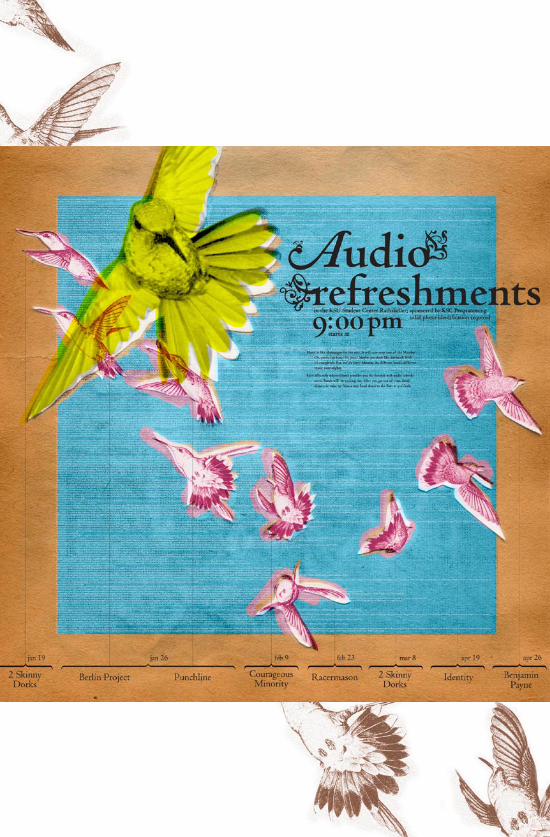
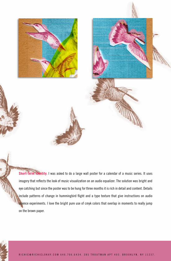
AUDIO REFRESHMENTSShort-Term Identity. I was asked to do a large wall poster for a calendar of a music series. It uses
imagery that reflects the look of music visualization on an audio equalizer. The solution was bright and
eye catching but since the poster was to be hung for three months it is rich in detail and content. Details
include patterns of change in hummingbird flight and a type texture that give instructions on audio
science experiments. I love the bright pure use of cmyk colors that overlap in moments to really jump
on the brown paper.
R I C H I E @ R I C H I E L O K A Y . C O M 6 4 6 . 7 0 6 . 6 4 3 4 . 3 8 5 T R O U T M A N A P T 4 0 3 . B R O O K L Y N , N Y 1 1 2 3 7 .
ART AND DESIGN WAYFINDING
Floor One
Grad Studio
Type High Press105
111
105 107 111
109
108 110
112
114 116
117
113C
113B113A
Floor Two
Art OfficeVCD OfficeApple StoreLecture HallArt GalleryGlyph[xYou Are Here
201A231217202201213 220 222 224 226 228
225 227
223
221
217
215B
215A
213
216218
218C 218B 218A
214
206
202
201A 201B
201
231
Floor Three
305B 305C 305D 305E 305F
305G
305H
305I
305J
305K305L
305A
305M305M306
306
305N
308
310
312
314
Directory
AppleStoreArt DepartmentVCD DepartmentElevator
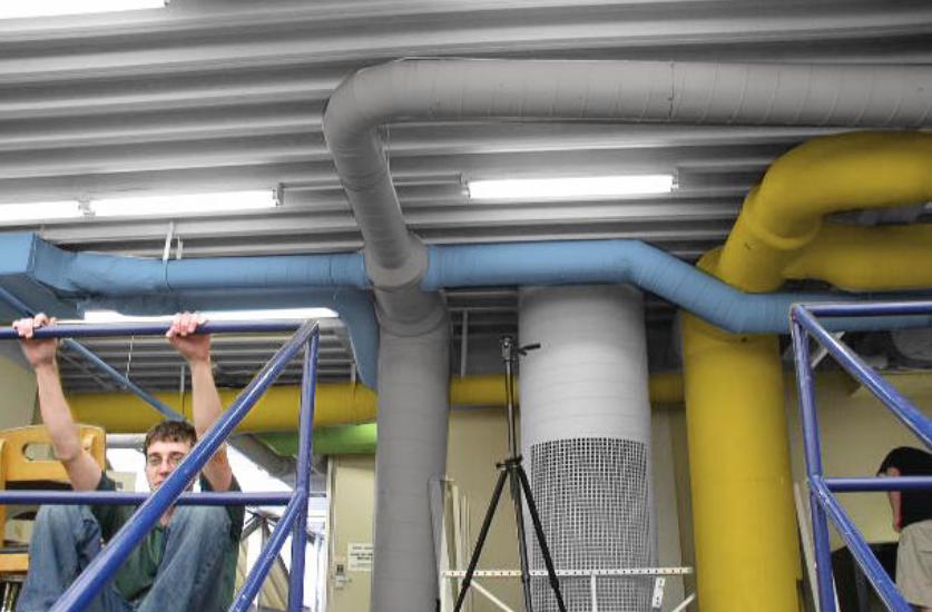
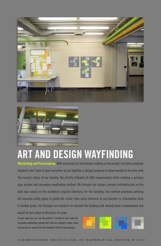
Wayfinding and Placemaking: With my former art and design building as the model, two other graduate
students and I took it upon ourselves to put together a design proposal of what needed to be done with
the current status of our facility. We strictly followed all ADA requirements while creating a primary
sign system and secondary wayfinding method. We focused our design concept architecturally so the
plan was based on the architects original intentions for the building. Our method proposed painting
the exposed utility pipes to guide the visitor from every entrance to any elevator or information desk.
It worked great, but through our research we learned the building had already been compromised and
would be torn down in the years to come.To your right you can see the palette I created to color code the
secondary wayfinding system and code the cognative maps. Heck,
we even got an award from the Cleveland AIGA for the proposal.
R I C H I E @ R I C H I E L O K A Y . C O M 6 4 6 . 7 0 6 . 6 4 3 4 . 3 8 5 T R O U T M A N A P T 4 0 3 . B R O O K L Y N , N Y 1 1 2 3 7 .
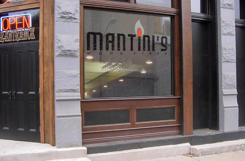
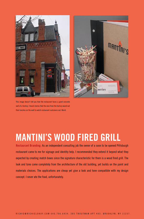
MANTINI’S WOOD FIRED GRILLRestaurant Branding: As an independent consulting job the owner of a soon to be opened Pittsburgh
restaurant came to me for signage and identity help. I recommended they extend it beyond what they
expected by creating match boxes since the signature characteristic for them is a wood fired grill. The
look and tone come completely from the architecture of the old building, yet builds on the paint and
materials choices. The applications are cheap yet give a look and tone compatible with my design
concept. I never ate the food, unfortunately.
This image doesn’t tell you that the restaurant faces a giant concrete
wall of a factory. I heard stories that the men from the factory would eat
their lunches on the wall to watch restaurant customers eat. Weird.
R I C H I E @ R I C H I E L O K A Y . C O M 6 4 6 . 7 0 6 . 6 4 3 4 . 3 8 5 T R O U T M A N A P T 4 0 3 . B R O O K L Y N , N Y 1 1 2 3 7 .
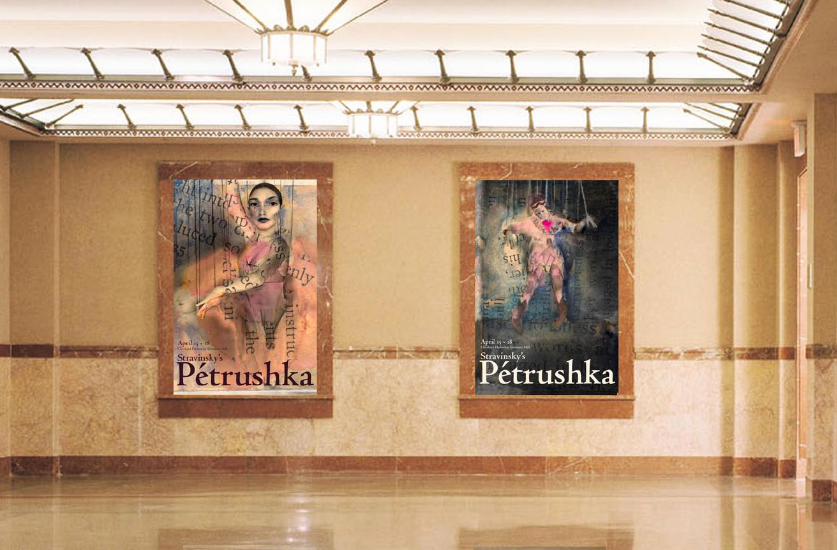
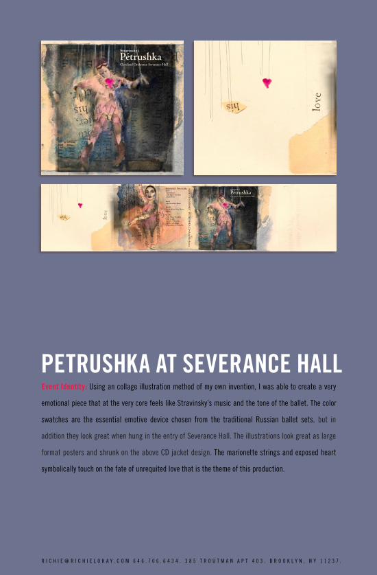
PETRUSHKA AT SEVERANCE HALLEvent Identity: Using an collage illustration method of my own invention, I was able to create a very
emotional piece that at the very core feels like Stravinsky’s music and the tone of the ballet. The color
swatches are the essential emotive device chosen from the traditional Russian ballet sets, but in
addition they look great when hung in the entry of Severance Hall. The illustrations look great as large
format posters and shrunk on the above CD jacket design. The marionette strings and exposed heart
symbolically touch on the fate of unrequited love that is the theme of this production.
R I C H I E @ R I C H I E L O K A Y . C O M 6 4 6 . 7 0 6 . 6 4 3 4 . 3 8 5 T R O U T M A N A P T 4 0 3 . B R O O K L Y N , N Y 1 1 2 3 7 .
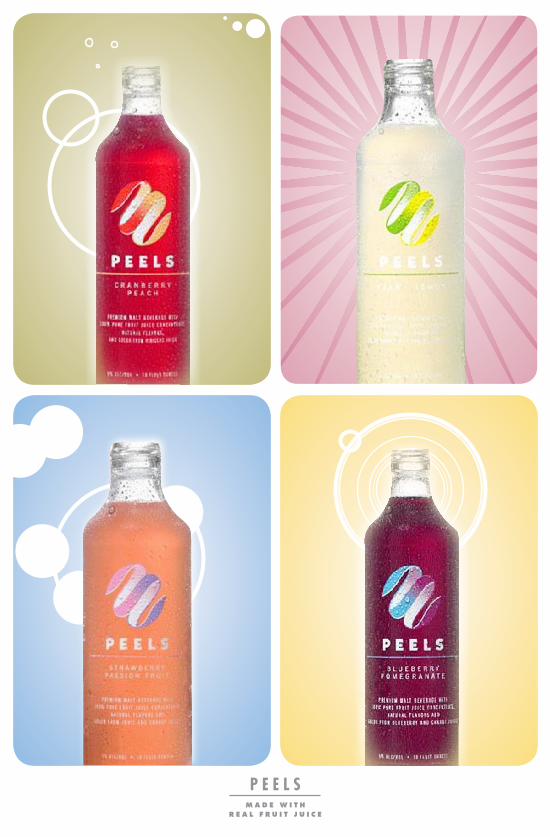
P E E L Sm a d e w i t h
r e a l f r u i t j u i c e
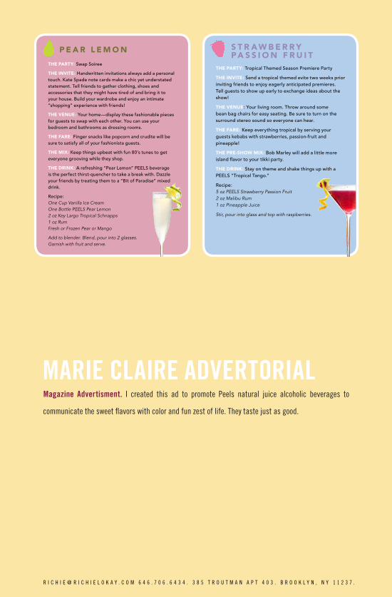
The ParTy: Swap Soiree
The InvITe: Handwritten invitations always add a personal touch. Kate Spade note cards make a chic yet understated statement. Tell friends to gather clothing, shoes and accessories that they might have tired of and bring it to your house. Build your wardrobe and enjoy an intimate “shopping” experience with friends!
The venue: Your home—display these fashionable pieces for guests to swap with each other. You can use your bedroom and bathrooms as dressing rooms.
The Fare: Finger snacks like popcorn and crudite will be sure to satisfy all of your fashionista guests.
The MIx: Keep things upbeat with fun 80’s tunes to get everyone grooving while they shop.
The DrInk: A refreshing “Pear Lemon” PEELS beverage is the perfect thirst-quencher to take a break with. Dazzle your friends by treating them to a “Bit of Paradise” mixed drink.
Recipe: One Cup Vanilla Ice Cream One Bottle PEELS Pear Lemon 2 oz Key Largo Tropical Schnapps 1 oz Rum Fresh or Frozen Pear or Mango
Add to blender. Blend, pour into 2 glasses. Garnish with fruit and serve.
P e a r L e M o n
MARIE CLAIRE ADVERTORIALMagazine Advertisment. I created this ad to promote Peels natural juice alcoholic beverages to
communicate the sweet flavors with color and fun zest of life. They taste just as good.
The ParTy: Tropical Themed Season Premiere Party
The InvITe: Send a tropical themed evite two weeks prior inviting friends to enjoy eagerly anticipated premieres. Tell guests to show up early to exchange ideas about the show!
The venue: Your living room. Throw around some bean bag chairs for easy seating. Be sure to turn on the surround stereo sound so everyone can hear.
The Fare: Keep everything tropical by serving your guests kebabs with strawberries, passion-fruit and pineapple!
The Pre-show MIx: Bob Marley will add a little more island flavor to your tikki party.
The DrInk: Stay on theme and shake things up with a PEELS “Tropical Tango.”
Recipe: 5 oz PEELS Strawberry Passion Fruit 2 oz Malibu Rum 1 oz Pineapple Juice
Stir, pour into glass and top with raspberries.
s T r a w b e r r y Pa s s I o n F r u I T
R I C H I E @ R I C H I E L O K A Y . C O M 6 4 6 . 7 0 6 . 6 4 3 4 . 3 8 5 T R O U T M A N A P T 4 0 3 . B R O O K L Y N , N Y 1 1 2 3 7 .
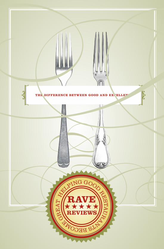
THE DIFFERENCE BETWEEN GOOD AND EXCELLENT
HEL
PING GOOD RE
STA
UR
A
NTS BECOME GR
EA
T
HEL
PING GOOD RE
STA
UR
A
NTS BECOME GR
EA
T
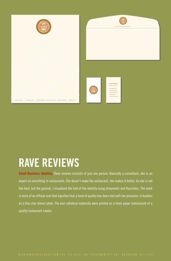
RAVE REVIEWSSmall Business Identity: Rave reviews consists of just one person. Basically a consultant, she is an
expert on everything in restaurants. She doesn’t make the restaurant, she makes it better. As she is not
the food, but the garnish. I visualized the look of the identity using ornaments and flourishes. The mark
is more of an official seal that signifies that a level of quality has been met with her presence, it doubles
as a five-star dinner plate. The end collateral materials were printed on a linen paper reminiscent of a
quality restaurant napkin.
Shelley Prueter 36214 Dellwood Dr. Grafton, OH 44044 www.ravereviews.info T 440 926 2608 3303 F 440 926 1240
1005 Abbe Road North Elyria, OH 44035
RAVE REVIEWS
Shelley Prueter
36214 Dellwood Dr.
Grafton, OH 44044
T 440 926 2608 3303
F 440 926 1240
www.ravereviews.info
R I C H I E @ R I C H I E L O K A Y . C O M 6 4 6 . 7 0 6 . 6 4 3 4 . 3 8 5 T R O U T M A N A P T 4 0 3 . B R O O K L Y N , N Y 1 1 2 3 7 .
THIS PAGE INTENTIONALLY LEFT YELLOW