Embed Size (px)
Citation preview
Production Networks and the Flattening of the Phillips Curve∗
Christian Hoynck †
Click here for latest version
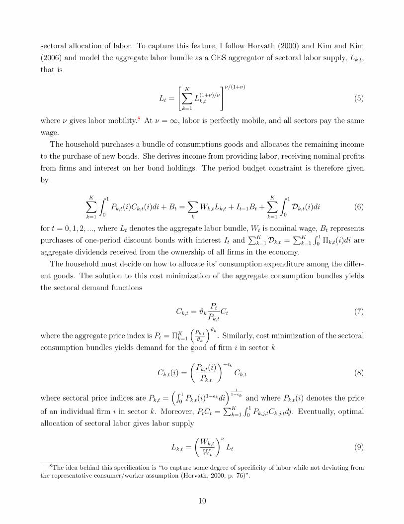
January 2, 2020
Abstract
This paper analyzes the role of changes in the structure of production networks on
the flattening of the Phillips curve over the last decades. I build a multi-sector model
with production networks, and heterogeneity in input-output linkages and in degree of
nominal rigidities. In the production network model, inflation sensitivity to the output
gap depends on the topology of the network of the economy. In particular, I show that
two characteristics of the network matter for inflation dynamics: (i) the network multiplier
and (ii) output shares. Analyzing the U.S. Input-Output structure from 1963 to 2017, I
document structural changes in the production network. Calibrating the model to these
sectoral changes can account for a decrease in the slope of up to 15 percent. Decomposing
the aggregate effect shows that the flattening is primarily due to an increase in the centrality
of sectors with more rigid prices that is incompletely reflected by compositional changes in
value-added.
JEL codes: C67, E23, E31, E32, E52, E58
Key words: Production Networks, Inflation Dynamics, Phillips Curve, Sectoral Hetero-
geneity, Nominal Rigidities, New-Keynesian Model
∗I am extremely grateful to my advisors Jordi Galı, and, Barbara Rossi for invaluable guidance and support, and
to Davide Debortoli and Edouard Schaal for comments that substantially improved this paper. I would also like
to thank Regis Barnichon, Isaac Baley, Saki Bigio, Roberto Billi, Manuel Garcıa-Santana, Geert Mesters, Michael
Weber, Lutz Weinke and seminar and conference participants at Vigo Workshop on Dynamic Macroeconomics,
and CREi macro lunch for helpful comments on this and earlier drafts of the paper. This paper was partly written
during visits to Sveriges Riksbank, and European Central Bank, I thank the institutions and their inspiring people
for their hospitality. Any errors are mine.†Universitat Pompeu Fabra, Department of Economics, and Barcelona GSE, Ramon Trias Fargas 25-27, 08005
Barcelona, Spain. E-mail: [email protected].
1
1 Introduction
The strength of the relationship between inflation and economic activity, represented by the
Phillips curve, has been at the centerstage of discussions between economic commentators and
policymakers in the past few years. Empirical studies have found a flattening of the slope of
the Phillips curve over time. This is of central importance to policymakers and central banks in
particular because the sensitivity of inflation to the output gap is important for many reasons.
It gives a sense of how real activity affects inflation. For instance, given a positive output gap,
a smaller sensitivity implies smaller inflationary pressures. In this situation, maintaining an
inflation target will become harder for a central bank. In order to reach the same target level,
larger movements in economic activity are needed, which in turn require larger shifts in the
interest rate. This is of particular concern, in times of the zero lower bound on the interest rate.
The evidence on the flattening documents that the sensitivity of inflation to output has de-
clined by more than 50 percent, with most of the change taking place in a period after the
1980’s.1 Understanding the sources of this shift is crucial and economists have suggested a num-
ber of possible explanations. Commonly proposed explanations include the success of monetary
policy in anchoring expectations (Bernanke, 2010), the credibility of the central bank (McLeay
and Tenreyro, 2019), or global forces (Jorda et al., 2019). Those explanations have different
implications for how optimal policy would need to change: from a larger role of fiscal policies or
combined money-fiscal policies (Gali, 2019) towards rethinking inflation targeting.
In this paper, I propose a novel explanation for the flattening of the Phillips curve. I investigate
the implications of changes to the production network structure of the economy for inflation
dynamics. These changes go beyond changes in the value-added composition of the economy.
Networks are important since firms use a variety of inputs to build their products. Thereby, they
form a complex web of input-output linkages. Analysis of the input-output tables of the U.S.
economy show large changes in those interlinkages that coincide with the changes in inflation in
the 1980’s. Changes in the input-output structure have implications for the sensivity of inflation
as they alter sectoral input-output linkages. I show how the slope of the Phillips curve depends
on the topology of the network. Moreover, using historical data on the input-output linkages,
I find that a network-augmented Phillips curve can account for a part of the flattening of the
Phillips curve since the mid 1980’s.
Inflation dynamics depend on the network structure of the economy. In this paper, I study a
multi-sector economy with monetary frictions in which industries are connected through input-
output linkages. Additionally, I consider heterogeneity across the network structure, the degree
of nominal rigidities and markups. The first main result of this paper is that two key network
1See for instance Kiley (2000), Ball and Mazumder (2011), Blanchard, Cerutti and Summers (2015) Coibinand Gorodnichenko (2015), or for a recent overview Stock and Watson (2019). Studies on the wage Phillips curveinclude Gali and Gambetti (2019) or Hooper, Mishkin and Sufi (2019).
2
statistics matter for inflation dynamics: (i) network multiplier and (ii) centrality captured by
sectoral gross output shares. These network statistics describe specific attributes of the input-
output linkages, based on fundamentals of the economy. They have direct empirical counterparts
that can be easily observed.
The network multiplier is a measure of the overall importance of the network in this economy.
Total production in an economy exceeds real value-added (GDP) by the intermediate good use.
The larger intermediate good use, the stronger fluctuations in GDP will impact total production
and therefore labor demand and prices.
The output share is a measure of network centrality. A sector’s output share captures the
importance of the sector’s output to all other sectors as an input as well as for the consumption
good. If the output of a sector is extensively used by other sectors in the economy, then its
equilibrium output share will be high. Whether a sector has a high or low output share depends
on the network structure. Sectors with larger output shares will contribute more to the input
prices of other sectors and therefore to aggregate inflation dynamics. If central sectors have
higher degrees of nominal rigidities, the aggregate sensitivity of inflation in this economy will be
smaller.
The importance of a sector in the economy will not only be given by its value added-share but
rather by its gross output share. A standard multi-sector model predicts that the importance
of sector and therefore the extent towards it affects aggregate inflation is related to the share of
that sectors in final consumption. In the production network model, instead, a sector can have
a positive influence on the aggregate inflation dynamics even if its consumption share is zero.
The network structure affects aggregate inflation dynamics through another channel that
dampens the sensitivity of inflation: strategic complementarities. When the optimal price cho-
sen by a firm depends positively (negatively) on the prices of other firms, we speak of strategic
complementarities (substitutes) (see Cooper and John, 1988). Here, strategic complementarities
arise because of sticky intermediate good prices. In my production network setting, however,
there are two key differences with strategic complementarities in standard formulations of in-
termediate goods as in Basu (1995). First, prices depend positively on the sector-specific input
price instead of the aggregate price level. The sectoral input price depends on the composition
of the sectoral input good, which in turn depends on the composition of those goods constituting
inputs. As an implication, the degree of strategic complementarity depends on the particular
network structure of the whole economy because of those indirect supply channels. Second, the
degree of strategic complementarity will be sector-specific and be larger for sectors that have a
larger share of intermediate goods used in production.
A second implication concerns the estimation of the Phillips curve. Inflation dynamics are
determined by endogenous variables in addition to the output gap. The presence of these variables
biases the estimated slope coefficient of the standard Phillips curve because they are correlated
3
with the output gap. As I demonstrate, the bias depends on the network structure. Therefore,
the evolution of the Phillips curve could either be caused by a decrease in the standard slope
coefficient or by a change in the bias through changes in the endogenous variables. I show
that additionally to the former effect, changes in the network structure influence the correlation
between these endogenous variables and the output gap, which leads to lower estimates of the
Phillips curve.
The network structure of the U.S. economy has changed over time. The Bureau of Economic
Analysis (BEA) provides Input-Output accounts for the U.S. economy from which a snapshot of
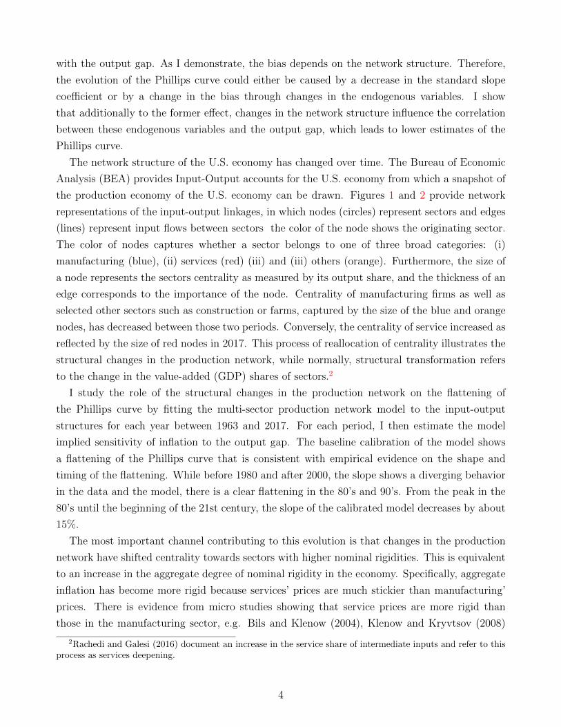
the production economy of the U.S. economy can be drawn. Figures 1 and 2 provide network
representations of the input-output linkages, in which nodes (circles) represent sectors and edges
(lines) represent input flows between sectors the color of the node shows the originating sector.
The color of nodes captures whether a sector belongs to one of three broad categories: (i)
manufacturing (blue), (ii) services (red) (iii) and (iii) others (orange). Furthermore, the size of
a node represents the sectors centrality as measured by its output share, and the thickness of an
edge corresponds to the importance of the node. Centrality of manufacturing firms as well as
selected other sectors such as construction or farms, captured by the size of the blue and orange
nodes, has decreased between those two periods. Conversely, the centrality of service increased as
reflected by the size of red nodes in 2017. This process of reallocation of centrality illustrates the
structural changes in the production network, while normally, structural transformation refers
to the change in the value-added (GDP) shares of sectors.2
I study the role of the structural changes in the production network on the flattening of
the Phillips curve by fitting the multi-sector production network model to the input-output
structures for each year between 1963 and 2017. For each period, I then estimate the model
implied sensitivity of inflation to the output gap. The baseline calibration of the model shows
a flattening of the Phillips curve that is consistent with empirical evidence on the shape and
timing of the flattening. While before 1980 and after 2000, the slope shows a diverging behavior
in the data and the model, there is a clear flattening in the 80’s and 90’s. From the peak in the
80’s until the beginning of the 21st century, the slope of the calibrated model decreases by about
15%.
The most important channel contributing to this evolution is that changes in the production
network have shifted centrality towards sectors with higher nominal rigidities. This is equivalent
to an increase in the aggregate degree of nominal rigidity in the economy. Specifically, aggregate
inflation has become more rigid because services’ prices are much stickier than manufacturing’
prices. There is evidence from micro studies showing that service prices are more rigid than
those in the manufacturing sector, e.g. Bils and Klenow (2004), Klenow and Kryvtsov (2008)
2Rachedi and Galesi (2016) document an increase in the service share of intermediate inputs and refer to thisprocess as services deepening.
4
or Nakamura and Steinsson (2008). Increases in the degree of nominal rigidity translate into a
smaller sensitivity of inflation to the output gap in the Phillips curve.
Taking into account the input-output structure of the economy is important to understand
the decline in the Phillips curve. Simple compositional changes in value-added fail to capture
all of the explained changes to the Phillips curve. The increase in aggregate rigidity due to
sectoral reallocation exceeds the one that would arise considering changes in value-added shares
only. Using the model I can decompose the aggregate change to the slope estimate into the
contribution of each of those two channels. I find that changes in the network structure and in
the value-added shares each contribute half to the explained decline in the slope of the Phillips
curve.
This paper relates to the literature on sectoral heterogeneity and production networks. It is
connected to studies on the implications of networks on the transmission of shocks (e.g. Horvath,
2000, Acemoglu et al. 2012, 2015 or Carvalho, 2014). In these studies, the size of the network
effects in the amplication of shocks is usually related to the Leontief-Inverse matrix (Acemoglu
et al., 2015, or Bigio and La’O, 2019). I contribute two new insights to this literature. First,
I show that the impact of the network on the transmission of shocks depends on two network
statistics that capture different components of the network effects: (i) the importance of the
overall network and (ii) the relative importance of sectors. Second, in the presence of nominal
frictions, the network statistics and hence the size of network effects become dependent on
countercyclical markups.
The paper is also related to New Keynesian models with production networks. It is connected
to studies that emphasize the role of networks and sectoral heterogeneity in price rigidity in
amplifying the degree of aggregate monetary non-neutraliy (e.g. Carvalho, 2006, Galesi and
Rachedi, 2019 , and Pasten, Schoenle and Weber, 2019a), on government spending multipliers
(Bouakez, Rachedi and Santoro, 2019), or the role of price dispersion on optimal policy (Cienfue-
gos, 2019). My paper also ties in closely with Pasten, Schoenle and Weber (2019b), who argue
that in the presence of heterogeneity in intermediate input consumption and nominal rigidities
the relevant measure of the size of a sector changes.3 In contrast to these studies, I focus on
the role of production networks (and changes to it) on inflation dynamics. Moreover, I depart
by allowing for a more general network structure via heterogeneity in sectoral intermediate good
shares and sectoral degrees of market power. I discuss the implications of this model for the
slope of the Phillips curve, and calibrate it for the U.S. economy at different points in time to
compare the estimated slopes of the Phillips curve.
Section 2 of this paper presents evidence of the evolution of the Phillips curve. Section 3
outlines the structure of the model and explains the importance of the two network statistics.
3In particular, the effective distribution of size and centrality (out-degree) argument resembles my distinctionbetween output shares and value-added shares.
5

Section 4 describes the calibration of the model and shows how the network structure as measured
by the two network statistics has changed over time. Section 5 investigates inflation dynamics
and predictions of the model for the sensitivity of inflation to the output gap by comparing
different network economies. Section 6 shows the solution of the model over time and reports
the implied slope of the Phillips curve. Finally, Section 7 concludes.
2 Evidence on the Flattening of the Phillips Curve
Before turning to networks as a potential explanation for changes in the Phillips curve, in this
section, I present evidence on the evolution of the Phillips curve over the past 50 years. I will
focus on three components: (i) size of the change, (ii) shape of the change and (iii) timing of the
change.
2.1 Coefficient over Time
At the center of macroeconomics is the theory that the real and nominal side of the economy are
linked through a Phillips curve relationship. Phillips (1958) provided the first formal statistical
evidence on this trade-off using data on wage inflation in the U.K. Samuelson and Solow (1960)
extended “Phillips’ curve” to U.S. data and to price inflation. In this paper, I focus on the most
widely used model of this kind, the New Keynesian Phillips curve (NKPC). It gained popularity
from its theoretical microfoundations that build on early work of Fischer (1997), Taylor (1980)
and Calvo (1983). It is centered around staggered price setting by forward looking individuals and
firms.4 The key property of the NKPC is that inflation dynamics reflect changes in economic
activity and inflationary expectations. The standard macroeconomic textbook version of the
NKPC as in Woodford (2003) or Galı (2015) is
πt = c+ βEtπt+1 + κxt + vt (1)
where c is a constant, x is a measure of economic activity, β the time discount factor, v cor-
responds to cost-push shocks and Etπt+1 denotes expectations of inflation. The measure of
economic activity in these models is usually marginal costs which in turn is related to the output
gap. The coefficient κ here describes the relationship between economic slack and inflationary
pressures, i.e. the slope of the Phillips curve.5
4Achieved by two standard ingredients: a microeconomic environment with (i) monopolistically competitivefirms (ii) facing constraints on price adjustment.
5In these models, the slope is usually given by κ = (1− θ)(1− θβ)/θ ∗ (σ+ϕ) where θ is the Calvo parameter- probability of not adjusting prices, β corresponds to the time discount factor, σ denotes the intertemporalelasticity of substitution and ϕ is the Frisch labor supply elasticity.
6
I continue by estimating this relationship for the U.S. economy between 1960 and 2007.6 To
characterize the strength of economic activity, I use estimates of the Congressional Budget Office
for the potential level of GDP. Concerning inflation expectations, I follow Ball and Mazumder
(2011) as well as Coibin and Gorodnichenko (2015), and assume as a simple baseline that inflation
expectations are backward-looking. Specifically, I assume that inflation expectations are a four-
quarter average of past inflation rates,
Et πt+1 =1
4(πt−1 + πt−2 + πt−3 + πt−4).
where I use the inflation rate from the personal consumption expenditure survey (PCE), πt.
First, I investigate how the sensitivity of inflationary dynamics to economic activity has
changed over time. Was there a particular point in time when the slope broke down or was
this rather a smooth process? Has the slope only flattened or was there a time when it was in-
creasing? To answer these questions, I estimate the relationship (1) by OLS over rolling windows
of 50 quarters.
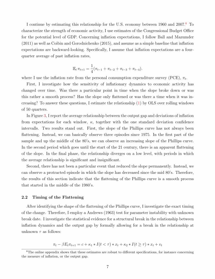
In Figure 3, I report the average relationship between the output gap and deviations of inflation
from expectations for each window, κ, together with the one standard deviation confidence
intervalls. Two results stand out. First, the slope of the Phillips curve has not always been
flattening. Instead, we can basically observe three episodes since 1975. In the first part of the
sample and up the middle of the 80’s, we can observe an increasing slope of the Phillips curve.
In the second period which goes until the start of the 21 century, there is an apparent flattening
of the slope. In the final phase, the relationship diverges on a low level, with periods in which
the average relationship is significant and insignificant.
Second, there has not been a particular event that reduced the slope permanently. Instead, we
can observe a protracted episode in which the slope has decreased since the mid 80’s. Therefore,
the results of this section indicate that the flattening of the Phillips curve is a smooth process
that started in the middle of the 1980’s.
2.2 Timing of the Flattening
After identifying the shape of the flattening of the Phillips curve, I investigate the exact timing
of the change. Therefore, I employ a Andrews (1963) test for parameter instability with unknown
break date. I investigate the statistical evidence for a structural break in the relationship between
inflation dynamics and the output gap by formally allowing for a break in the relationship at
unknown τ as follows:
πt − βEtπt+1 = c+ κ1 ∗ I(t < τ) ∗ xt + κ2 ∗ I(t ≥ τ) ∗ xt + vt
6The online appendix shows that these estimates are robust to different specifications, for instance concerningthe measure of inflation, or the output gap.
7

where I are time dummy variables equal to one if the respective condition is satisfied and zero
otherwise. The null hypothesis of the Andrews test is that the slope coefficients in both periods
are equal.
Table 7, reports results for the Andrews test for different specifications for the inflation mea-
sure, forcing variable and estimation methodology. Consistent with results of the previous section,
the test cannot reject the null that the slope is unchanged. The protracted flattening episode is
represented by a series of potential break dates in 1982 or 1983.
Next, I will use the previous result on the break date to calculate the size of the change
in the slope coefficient. In Figure 4, I present a scatter plot of quarterly output gaps for the
United States against the deviations of inflation that quarter from expected, discounted inflation.
Data from 1960Q1 until our estimated break date 1982Q3 is represented by circles, while data
from 1982Q4 is plotted by diamonds. The lines represent the slope of the average relationship
estimated by OLS over each sample period. The slope is positive, indicating that economic
slack, i.e. economic activity that is lower than potential, is associated with inflationary pressures
below expectations. The sensitivity has changed over time. We can observe a flattening in the
sensitivity of inflation to economic activity and estimates of the slope suggest that those are in
the magnitude of 40 to 80 percent.
The statistical evidence of this section provided insights into the size, timing and shape of the
flattening of the Phillips curve. The findings suggest that the flattening was a smooth process
that started in 1982Q2 and saw a decrease in the slope of 40-80%.
3 Model
I consider a multi-sector New Keynesian Model with nominal rigidities and linkages in produc-
tion via the use of sector-specific intermediate goods. In comparison to standard New Keynesian
(e.g. Gali, 2015) or multi-sector models, firms use as inputs to production not only labor but also
goods produced by firms from potentially all sectors of the economy. Additionally, heterogeneity
in the degree of nominal rigidities, elasticity of substitution, and intermediate good share are
modeled. The model represents an extension of the standard New Keynesian model (Gali, 2015),
with the sectoral models of Carvalho (2006), Carvalho and Lee (2011) and Pasten, Schoenle and
Weber (2019), as well as the intermediate good model of Basu (1995) as limiting cases.7 The
economy consists of firms, households, and a government.
The economy is composed of a continuum of firms i ∈ [0, 1] each of which belongs to a
sector k ∈ {1, 2, .., K}. Each firm produces a differentiated good that can be used either in
7Carvalho (2006) considers a multi-sector model with heterogeneity in nominal rigidities. Carvalho and Lee(2011) and Pasten, Schoenle and Weber (2019) add roundabout production structures. Cienfuegos (2018) studiesa model with trend inflation and without heterogeneity in the elasticity of substitution or and intermediate goodshares.
8
consumption or in the production of other goods. Within each sector firms face monopolistic
competition (Dixit-Stiglitz), and produce with the same Cobb-Douglas production function that
combines labor and intermediate inputs (with share γk). They set prices a la Calvo (1983), i.e.
they can reset prices with an exogenous, but sector-specific probability, θk.
On the consumption side, the economy is represented by a single representative household
that choses labor and aggregate consumption. The latter is composed of sectoral consumption
bundles, which themselves are CES aggregators of goods produced by individual firms within a
sectors. The labor aggregator is CES, too.
The government consists of a monetary authority, which sets the nominal interest rate follow-
ing a Taylor rule.
3.1 Households
The economy is populated by an infinitely-lived representative household that has preferences
over consumption, Ct and labor, Lt. She seeks to maximize expected lifetime utility given by
E0
∞∑t=0
βt[C1−σt
1− σ− L1+ϕ
t
1 + ϕ
](2)
where Ct is aggregate (final) consumption, Lt is labor input, β is the subjective time discount
factor, σ is intertemporal elasticity of substitution, ϕ inverse of the Frisch elasticity of labor
supply and E0 is the expections operator conditional on information up to time t = 0.
The aggregate consumption bundle is a CD aggregator of sectoral consumption bundles
Ct =K∏k=1
Cϑkk,t (3)
where ϑk is the expenditure share of sectoral consumption from sector k. Also∑
k ϑk = 1.
The sectoral consumption bundles Ck,t themselves are CES aggregators of the individual firms
indexed in [0, 1]
Ck,t =
[∫ 1
0
Ck,t(i)εk−1
εk
] εkεk−1
(4)
where Ck,t(i) is the quantity of good i of sector k consumed by the household, and εk is the
sector-specific elasticity of substitution between different goods of a sector. It is a measure of
competitiveness in sectors. Note also that one usually assumes εk > 1 which implies that it is
harder to substitute consumption goods from different sectors than substitute goods within the
same sector.
I assume that labor provided by the household to the firms cannot move perfectly across
sectors. Lee and Wolpin (2006) document that there are large mobility costs that impairs the
9
sectoral allocation of labor. To capture this feature, I follow Horvath (2000) and Kim and Kim
(2006) and model the aggregate labor bundle as a CES aggregator of sectoral labor supply, Lk,t,
that is
Lt =
[K∑k=1
L(1+ν)/νk,t
]ν/(1+ν)
(5)
where ν gives labor mobility.8 At ν =∞, labor is perfectly mobile, and all sectors pay the same
wage.
The household purchases a bundle of consumptions goods and allocates the remaining income
to the purchase of new bonds. She derives income from providing labor, receiving nominal profits
from firms and interest on her bond holdings. The period budget constraint is therefore given
by
K∑k=1
∫ 1
0
Pk,t(i)Ck,t(i)di+Bt =∑k
Wk,tLk,t + It−1Bt +K∑k=1
∫ 1
0
Dk,t(i)di (6)
for t = 0, 1, 2, ..., where Lt denotes the aggregate labor bundle, Wt is nominal wage, Bt represents
purchases of one-period discount bonds with interest It and∑K
k=1Dk,t =∑K
k=1
∫ 1
0Πk,t(i)di are
aggregate dividends received from the ownership of all firms in the economy.
The household must decide on how to allocate its’ consumption expenditure among the differ-
ent goods. The solution to this cost minimization of the aggregate consumption bundles yields
the sectoral demand functions
Ck,t = ϑkPtPk,t
Ct (7)
where the aggregate price index is Pt = ΠKk=1
(Pk,tϑk
)ϑk. Similarly, cost minimization of the sectoral
consumption bundles yields demand for the good of firm i in sector k
Ck,t(i) =
(Pk,t(i)
Pk,t
)−εkCk,t (8)
where sectoral price indices are Pk,t =(∫ 1
0Pk,t(i)
1−εkdi) 1
1−εk and where Pk,t(i) denotes the price
of an individual firm i in sector k. Moreover, PtCt =∑K
k=1
∫ 1
0Pk,j,tCk,j,tdj. Eventually, optimal
allocation of sectoral labor gives labor supply
Lk,t =
(Wk,t
Wt
)νLt (9)
8The idea behind this specification is “to capture some degree of specificity of labor while not deviating fromthe representative consumer/worker assumption (Horvath, 2000, p. 76)”.
10
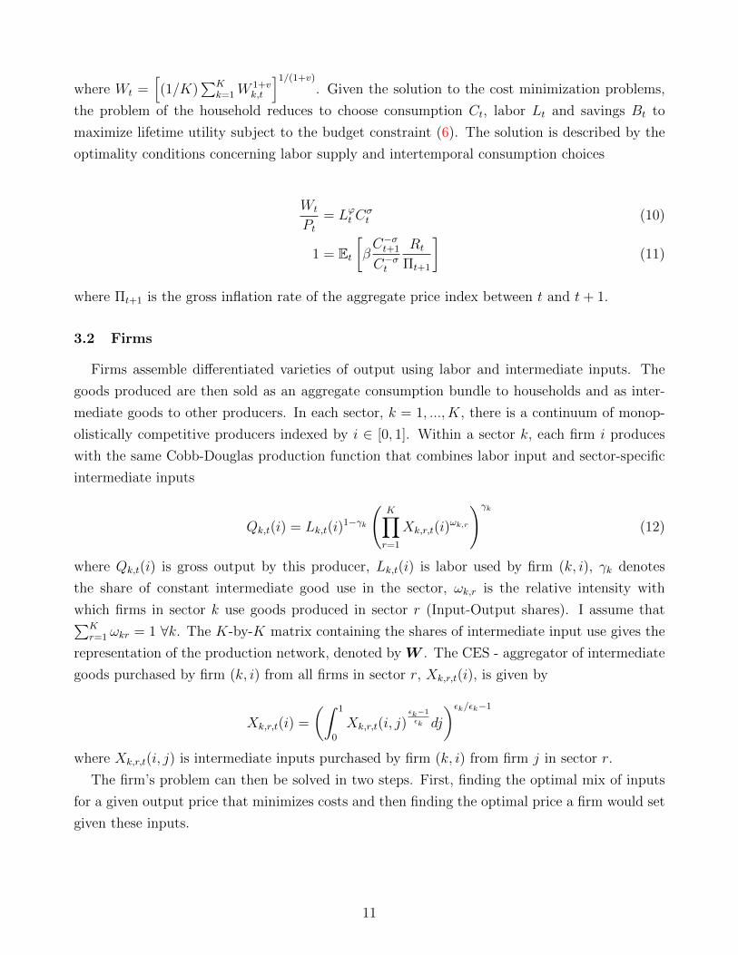
where Wt =[(1/K)
∑Kk=1W
1+vk,t
]1/(1+v)
. Given the solution to the cost minimization problems,
the problem of the household reduces to choose consumption Ct, labor Lt and savings Bt to
maximize lifetime utility subject to the budget constraint (6). The solution is described by the
optimality conditions concerning labor supply and intertemporal consumption choices
Wt
Pt= Lϕt C
σt (10)
1 = Et[βC−σt+1
C−σt
Rt
Πt+1
](11)
where Πt+1 is the gross inflation rate of the aggregate price index between t and t+ 1.
3.2 Firms
Firms assemble differentiated varieties of output using labor and intermediate inputs. The
goods produced are then sold as an aggregate consumption bundle to households and as inter-
mediate goods to other producers. In each sector, k = 1, ..., K, there is a continuum of monop-
olistically competitive producers indexed by i ∈ [0, 1]. Within a sector k, each firm i produces
with the same Cobb-Douglas production function that combines labor input and sector-specific
intermediate inputs
Qk,t(i) = Lk,t(i)1−γk
(K∏r=1
Xk,r,t(i)ωk,r
)γk
(12)
where Qk,t(i) is gross output by this producer, Lk,t(i) is labor used by firm (k, i), γk denotes
the share of constant intermediate good use in the sector, ωk,r is the relative intensity with
which firms in sector k use goods produced in sector r (Input-Output shares). I assume that∑Kr=1 ωkr = 1 ∀k. The K-by-K matrix containing the shares of intermediate input use gives the
representation of the production network, denoted by W . The CES - aggregator of intermediate
goods purchased by firm (k, i) from all firms in sector r, Xk,r,t(i), is given by
Xk,r,t(i) =
(∫ 1
0
Xk,r,t(i, j)εk−1
εk dj
)εk/εk−1
where Xk,r,t(i, j) is intermediate inputs purchased by firm (k, i) from firm j in sector r.
The firm’s problem can then be solved in two steps. First, finding the optimal mix of inputs
for a given output price that minimizes costs and then finding the optimal price a firm would set
given these inputs.
11
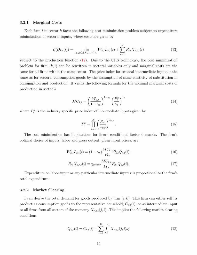
3.2.1 Marginal Costs
Each firm i in sector k faces the following cost minimization problem subject to expenditure
minimization of sectoral inputs, where costs are given by
C(Qk,t(i)) = minLk,t(i),{Xk,r,t(i)}r
Wk,tLk,t(i) +K∑r=1
Pr,tXk,r,t(i) (13)
subject to the production function (12). Due to the CRS technology, the cost minimization
problem for firm (k, i) can be rewritten in sectoral variables only and marginal costs are the
same for all firms within the same sector. The price index for sectoral intermediate inputs is the
same as for sectoral consumption goods by the assumption of same elasticity of substitution in
consumption and production. It yields the following formula for the nominal marginal costs of
production in sector k
MCk,t =
(Wk,t
1− γk
)1−γk (P kt
γk
)γk(14)
where P kt is the industry specific price index of intermediate inputs given by
P kt =
K∏r=1
(Pr,tωk,r
)ωk,r. (15)
The cost minimization has implications for firms’ conditional factor demands. The firm’s
optimal choice of inputs, labor and gross output, given input prices, are
Wk,tLk,t(i) = (1− γk)MCk,tPk,t
Pk,tQk,t(i), (16)
Pr,tXk,r,t(i) = γkωk,rMCk,tPk,t
Pk,tQk,t(i). (17)
Expenditure on labor input or any particular intermediate input r is proportional to the firm’s
total expenditure.
3.2.2 Market Clearing
I can derive the total demand for goods produced by firm (i, k). This firm can either sell its
product as consumption goods to the representative household, Ck,t(i), or as intermediate input
to all firms from all sectors of the economy Xr,k,t(j, i). This implies the following market clearing
conditions
Qk,t(i) = Ck,t(i) +K∑r=1
∫ 1
0
Xr,k,t(j, i)dj (18)
12
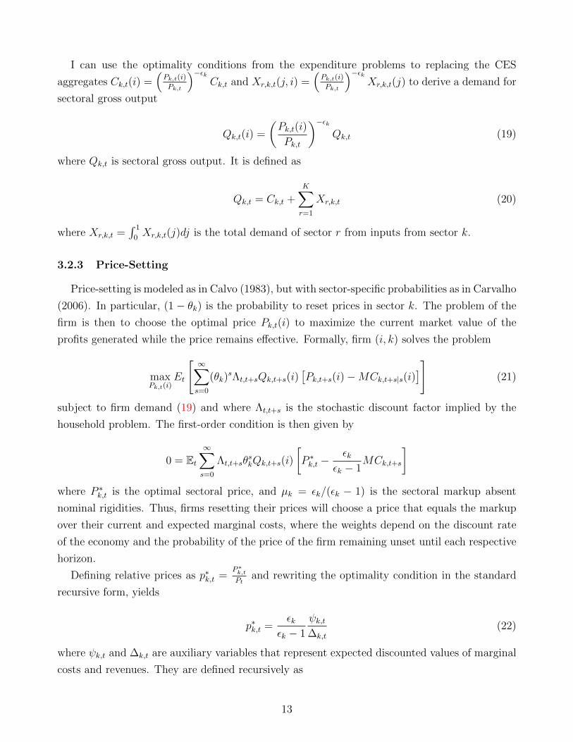
I can use the optimality conditions from the expenditure problems to replacing the CES
aggregates Ck,t(i) =(Pk,t(i)
Pk,t
)−εkCk,t and Xr,k,t(j, i) =
(Pk,t(i)
Pk,t
)−εkXr,k,t(j) to derive a demand for
sectoral gross output
Qk,t(i) =
(Pk,t(i)
Pk,t
)−εkQk,t (19)
where Qk,t is sectoral gross output. It is defined as
Qk,t = Ck,t +K∑r=1
Xr,k,t (20)
where Xr,k,t =∫ 1
0Xr,k,t(j)dj is the total demand of sector r from inputs from sector k.
3.2.3 Price-Setting
Price-setting is modeled as in Calvo (1983), but with sector-specific probabilities as in Carvalho
(2006). In particular, (1− θk) is the probability to reset prices in sector k. The problem of the
firm is then to choose the optimal price Pk,t(i) to maximize the current market value of the
profits generated while the price remains effective. Formally, firm (i, k) solves the problem
maxPk,t(i)
Et
[∞∑s=0
(θk)sΛt,t+sQk,t+s(i)
[Pk,t+s(i)−MCk,t+s|s(i)
]](21)
subject to firm demand (19) and where Λt,t+s is the stochastic discount factor implied by the
household problem. The first-order condition is then given by
0 = Et∞∑s=0
Λt,t+sθskQk,t+s(i)
[P ∗k,t −
εkεk − 1
MCk,t+s
]where P ∗k,t is the optimal sectoral price, and µk = εk/(εk − 1) is the sectoral markup absent
nominal rigidities. Thus, firms resetting their prices will choose a price that equals the markup
over their current and expected marginal costs, where the weights depend on the discount rate
of the economy and the probability of the price of the firm remaining unset until each respective
horizon.
Defining relative prices as p∗k,t =P ∗k,tPt
and rewriting the optimality condition in the standard
recursive form, yields
p∗k,t =εk
εk − 1
ψk,t∆k,t
(22)
where ψk,t and ∆k,t are auxiliary variables that represent expected discounted values of marginal
costs and revenues. They are defined recursively as
13
ψk,t = Qk,tC−σt mck,t + θkβ Et
[Πεkk,t+1ψk,t+1
](23)
∆k,t = Qk,tC−σt + θkβ Et
[Πεkk,t+1
Πt+1
∆k,t+1
](24)
where mck,t = MCk,t/Pt are real marginal costs and Πk,t−1,t+s = Pk,t+s/Pk,t−1 is the gross nominal
inflation rate.
The Calvo environment implies that sectoral price dynamics are described by
Pk,t =[(1− θk)
(P ∗k,t)1−εk + θk (Pk,t−1)1−εk
]1/1−εk. (25)
3.3 Monetary Policy
The monetary authority sets the short-term nominal interest rate, It, according to the following
Taylor rule in accordance with value-added output and aggregate inflation
ItI
=
(YtY
)φc (Πt
Π
)φπeυt (26)
where Πt = ΠKk=1Πϑk
k,t is the aggregate inflation rate, variables with a bar denote steady state
values, Yt is aggregate nominal value-added and υt is a monetary policy shock that follows an
AR(1) process. In this model, the respective real measure is the value-added output, Yt instead
of gross output, Qt and the inflation index that is relevant for consumption of households is,
Πt. The coefficients φc and φπ measure the degree to which the monetary authority adjusts
the nominal interest rate in response to changes in the consumption-based inflation rate and to
changes in the value-added output respectively.
3.4 Equilibrium
Before turning to the log-linearized solution of the model and the Phillips curve in particular,
in this section, I describe the model’s equilibrium system. In particular, I stress its properties
related to the determinants of marginal costs and the connection between gross output and
value-added output. The equilibrium is described by the optimality conditions of the firms, the
households along with market clearing conditions.
3.4.1 Aggregation and value-added Output
In this economy, real aggregate value-added (i.e. real GDP), Yt is equal to consumption, Ct.
Let Yk,t(i) denote the nominal value-added of producer i in sector k. It is defined as the value of
gross output produced by this firm abstracting the value of intermediate inputs it is using, i.e.
14
Yk,t(i) = Pk,t(i)Qk,t(i)−K∑r=1
Pr,tXk,r,t(i) (27)
Aggregating over all real value-added of all producers in sector k
Yk,t =
∫ 1
0
Yk,t(i)di = Pk,tQk,t −K∑r=1
Pr,tXk,r,t (28)
where Xk,r,t =∫ 1
0Xk,r,t(i)di by intermediate input clearing condition.
I can aggregate nominal dividends by using
Dk,t =
∫ 1
0
Dk,t(i)di = Pk,tQk,t −Wk,tLk,t −K∑r=1
Pr,tXk,r,t = Yk,t −Wk,tLk,t. (29)
where I use the labor market clearing condition Lk,t =∫ 1
0Lk,t(i)di.
Eventually, substituting into the households’ budget constraint (6), aggregate dividends and
the bond market clearing Bt = 0, I obtain
PtCt =K∑k=1
Wk,tLk,t +K∑k=1
Dk,t =K∑k=1
Yk,t. (30)
The aggregate nominal value-added equals the nominal value of total consumption. Real
aggregate value-added (i.e. real GDP), Yt, can then be derived by deflating the nominal aggregate
value-added by the aggregate consumption price index, Pt, that is
Yt =
∑Kk=1 Yk,tPt
= Ct. (31)
3.4.2 Wages and Total Expenditure
The role of total production in affecting marginal costs becomes clearer when deriving the
optimal wages in this economy. Combining the labor market clearing condition Lk,t =∫ 1
0Lk,t(i)di
with labor demand from firms (16) yields sectoral labor demand
Lk,t = (1− γk)mck,tpk,t
pk,tQk,tdk,tw−1k,t (32)
where mck,t =MCk,tPt
, pk,t =Pk,tPt
, and wk,t =Wk,t
Ptare real sectoral marginal costs, relative sectoral
prices and real sectoral wages respectively. Moreover, dk,t =∫ 1
0
(Pk,t(i)
Pk,t
)−εkdi is within sector
price dispersion. This corresponds to price dispersion in a one-sector model and as shown in
Gali (2015), around a zero inflation steady state, price dispersion is approximately zero. Thus,
for expositional purposes, I will not carry it along in the derivations that follow but have in
15
mind that it becomes negligable up to a first order approximation.9 The exposition shows that
sectoral labor demand depends on the total sectoral expenditure of the sector. This expenditure
is the share of total revenue from production that is not spent on markups. Labor demand is
increasing in the real value of sectoral production and decreasing in sectoral markups.
One can combine labor supply (10) and labor demand (16) with marginal costs (14) to solve
for real wages
wk,t =Wk,t
Pt=
((1− γkγk
)γk(pkt )
γkQk,t
) ϕ1+γkϕ
Cσ
1+γkϕ
t (33)
The wage rate depends on firms demand for labor input and households supply of labor via the
following mechanisms. Wages increase in firms demand for labor input if their total production
increases, Qk,t, and in the cost of intermediate goods, pkt , as they can substitute labor inputs
for intermediate inputs. On the other hand, wages increase in households labor supply if their
demand for the aggregate consumption good, Ct, increases or the disutility from working, ϕ,
falls.
3.4.3 Marginal costs
Replacing wages (33) in marginal costs (14), we can show that the average marginal cost in
sector k yields
mck,t = φkY(σ+ϕ)(1−γk)
1+γkϕ
t
(pk,tQk,t
Yt
)ϕ(1−γk)1+γkϕ
(pktγk
pk,t
) (1+ϕ)1+γkϕ
(34)
where φk = 11−γk
(1−γkγk
) γk(1+ϕ)1+γkϕ is a constant.
In this economy, marginal costs are affected by three components: (i) the aggregate demand
channel, Yt, (ii) the real value of sectoral output and (iii) the price of intermediate inputs. While
the first channel is standard, the other two are due to production networks.This is, however, only
a partial equilibrium analysis since sectoral output depends on fluctuations in markups.
3.4.4 Linking Sectoral Production to GDP
The next step in my derivation is to solve for the real value of sectoral production, pk,tQk,t,
in terms of real value-added, Yt. In particular, I will show that sectoral markups will affect
other industries through the production network channel. I use the definition of real value-
added, the market clearing condition (14) and the budget constraint (6) to obtain the following
9It will become relevant under the assumptions of positive trend inflation (Ascari and Sbordone, 2014). Thenthis will introduce the propagation of sectoral price dispersions as discussed in Cienfuegos (2018).
16
characterization for the real value of sectoral production in terms of real aggregate value-added,
i.e. GDP.
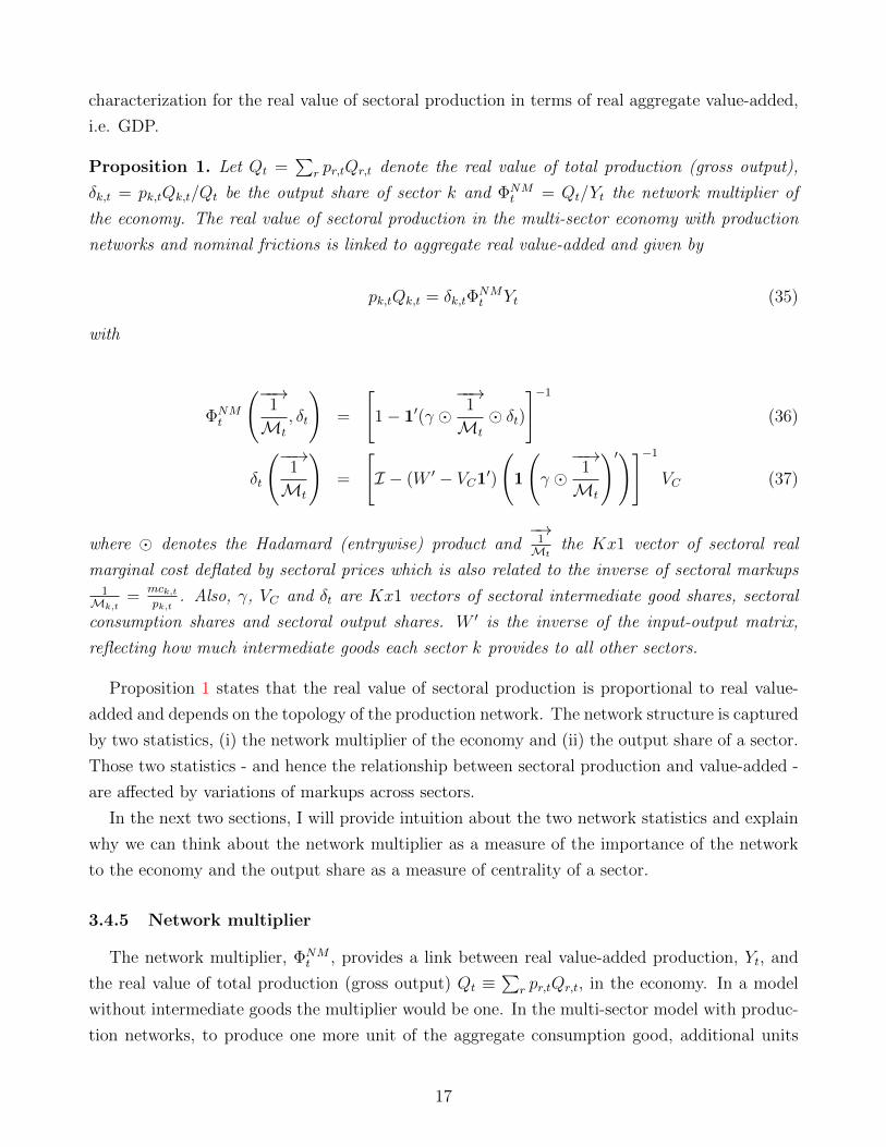
Proposition 1. Let Qt =∑
r pr,tQr,t denote the real value of total production (gross output),
δk,t = pk,tQk,t/Qt be the output share of sector k and ΦNMt = Qt/Yt the network multiplier of
the economy. The real value of sectoral production in the multi-sector economy with production
networks and nominal frictions is linked to aggregate real value-added and given by
pk,tQk,t = δk,tΦNMt Yt (35)
with
ΦNMt
(−−→1
Mt
, δt
)=
[1− 1′(γ �
−−→1
Mt
� δt)
]−1
(36)
δt
(−−→1
Mt
)=
[I − (W ′ − VC1′)
(1
(γ �−−→
1
Mt
)′)]−1
VC (37)
where � denotes the Hadamard (entrywise) product and−→
1Mt
the Kx1 vector of sectoral real
marginal cost deflated by sectoral prices which is also related to the inverse of sectoral markups1Mk,t
=mck,tpk,t
. Also, γ, VC and δt are Kx1 vectors of sectoral intermediate good shares, sectoral
consumption shares and sectoral output shares. W ′ is the inverse of the input-output matrix,
reflecting how much intermediate goods each sector k provides to all other sectors.
Proposition 1 states that the real value of sectoral production is proportional to real value-
added and depends on the topology of the production network. The network structure is captured
by two statistics, (i) the network multiplier of the economy and (ii) the output share of a sector.
Those two statistics - and hence the relationship between sectoral production and value-added -
are affected by variations of markups across sectors.
In the next two sections, I will provide intuition about the two network statistics and explain
why we can think about the network multiplier as a measure of the importance of the network
to the economy and the output share as a measure of centrality of a sector.
3.4.5 Network multiplier
The network multiplier, ΦNMt , provides a link between real value-added production, Yt, and
the real value of total production (gross output) Qt ≡∑
r pr,tQr,t, in the economy. In a model
without intermediate goods the multiplier would be one. In the multi-sector model with produc-
tion networks, to produce one more unit of the aggregate consumption good, additional units
17
of production are produced that will be used as intermediate goods. Therefore, the network
multiplier will be larger than one.
The larger the network multiplier, the more labor is needed in order to produce the same
consumption unit. One can think about this as a proxy for the length of the production chain
in this economy. The longer the production chain, the more intermediate goods and hence labor
input is needed for production.
To derive the network multiplier, I rewrite the budget constraint (6) in terms of real value-
added and the total value of production
Qt = Yt +K∑k=1
γkmck,tpk,t
δk,tQt. (38)
where I use the definition of the output shares pk,tQk,t = δk,tQt. The real value of total production
exceeds real aggregate value-added by the aggregate expenditure on intermediate goods.
This recursive expression of real total value of production can be iterated to obtain a repre-
sentation capturing all direct and indirect expenditure effects along the production network
Qt = Yt +K∑k=1
γkmck,tpk,t
δk,tYt +K∑k=1
γkmck,tpk,t
δk,t
K∑r=1
γrmck,tpk,t
δr,tYt + . . .︸ ︷︷ ︸network component
. (39)
The first term captures household’s expenditure on the consumption good. The second term
captures the indirect expenditure on intermediate goods as a proportion of total consumption.
The third and higher terms, reflect the expenditure on intermediate goods higher in the pro-
duction chain. All of those indirect effects decay at the rate given by the intermediate good
share, γk, and the markup, 1M(k,t)
.10 The size of the decay is weighted by the importance of
a particular sector, reflected by its output share, δk,t. The network component captures these
indirect effects. It increases if large (in terms of output shares) sectors have larger intermediate
good shares and smaller markups. Importingly, here we can see how distortions in markups can
propagate through the network and change total expenditure. In the New Keynesian model,
markups are countercyclical, which means that the network component and hence the network
multiplier increases in booms.
The decay of the network multiplier has another intriguing interpretation. The smaller the
decay, the longer will be the production chain. If the network structure is such that more central
10If we assume the intermediate share to be constant, γk = γ, we would find
Qt = Yt + γ
K∑k=1
mck,tpk,t
δk,tYt + γ2K∑
k=1
mck,tpk,t
δk,t
K∑r=1
mck,tpk,t
δr,tYt + . . . (40)
i.e. higher order terms are devaluated by the rate γ.
18
sectors have larger intermediate shares, then the total decay of the network will be smaller,
and the total multiplier larger. I will investigate this mechanism more when I look at different
examples of networks.
Rewriting the sums in vector form, I can rewrite the last expression as
Qt =
[1− 1′
(γ �−−→
1
Mt
� δt
)]−1
︸ ︷︷ ︸=ΦNMt
Yt (41)
where γ,−→
1Mt
and δt are Kx1 vectors of sectoral intermediate good shares, sectoral markups and
sectoral output shares, and Qt as well as Yt are scalars.
The network multiplier, ΦNMt , shows how much total production is needed in order for the
household to consume one unit of the consumption good. By capturing the size of the network
component relative to the direct expenditure on the consumption good, it is therefore a measure
of the relative importance of the network in this economy. As long as intermediate good shares
are positive, the network component will be non-zero and the network multiplier will be larger
than one. The network multiplier is not constant as it depends on markups and the output
shares. In the next section, I develop a closed-form expression for output shares.
3.4.6 Output Shares
The output share, δk,t, provides a link between the real value of sectoral production and the
real value of total production. In a model without intermediate goods, the output share will
be equal to the consumption share, VC . In the multi-sector model with production networks,
however, each sector also provides intermediate goods to other sectors. From the system of
market clearing conditions (20) in combination with sectoral intermediate good demands (17),
the demand for sectoral production yields
pk,tQk,t = ϑkCt +K∑r=1
ωr,kγrmcr,tpr,t
pr,tQr,t (42)
where the first part on the right hand side represents the household’s direct demand for goods
from sector k. This demand is fully described by the consumption share of goods from sector k
in the total demand of the household for the aggregate consumption good, ϑk, i.e. it reflects the
preferences of the household.11 The second component is the demand from other sectors r that
use sector k’s good as an intermediate input. It is given by the share sector r spends on goods
from sector k, ωr,k, relative to its total intermediate good expenditure.
11By the Cobb-Douglas assumption on the consumption aggregator, this is thus a constant fraction of totalconsumption.
19
Combining with the budget constraint (6) and dividing by the total real value of production
yields an iterated representation of the output shares
δk,t = ϑk +K∑r=1
ωr,kϑr +K∑r=1
K∑s=1
ωs,rωr,kϑs + . . .︸ ︷︷ ︸network component
(43)
where ωr,k,t = (ωr,k − ϑk)γr 1Mr,t
is a weighting matrix.
The first term represents again the direct demand for goods from sector k from the household.
The first term of the network component captures the importance of sector k to its immediate
customers, firms that are directly connected to k. The specific contribution of sector r to k’s
output share depends on sector r’s own share, δr,t, and on a weighting matrix, ωr,k. This weight-
ing matrix depends on the network weight connecting both sectors, ωr,k and the intermediate
good expenditure of sector r. The second term of the network component captures the indirect
importance of k through sectors that buy inputs from sector k’s customers. In other words, this
is the indirect demand from the customers of the customers of sector k. The third and higher
order terms capture the importance of k through customers that are one or more further steps
away from sector k.
Again, we can rewrite the last equation in vector form to represent the relationship between
the vector of sectoral real values of production,−→PQt, and the total real value of production, Qt,
in this economy
−→PQt = (I − Wt)
−1VC︸ ︷︷ ︸=δt
Qt (44)
where Wt = (W ′ − VC1′)(1(γ �−→
1Mt
)′).
The output share summarizes the network structure by specifying how much sectoral produc-
tion pk,tQk,t is needed in order to satisfy a given demand for gross output, Qt =∑
r pr,tQr,t. In
fact, output shares are equal to the network centrality of Katz (1953), i.e. they capture the rela-
tive importance of each node (sector) in a network (aggregate economy). A sector is important
if its outdegree is larger than its consumption share, i.e. (W ′k − VC,k > 0), and if its customers
have large intermediate good shares, γk, or small markups,Mk,t. In the absence of intermediate
goods or markups, the output share is equal to the consumption share, VC . Again, fluctuations
in markups in other sectors are transmitted through the network via intermediate good use, W .
3.5 Steady State and Network Examples
In this section, I highlight some key features of network statistics in steady state. Therefore,
I examine some examples of network structures in order to provide intuition about the network
20
statistics introduced before. Moreover, I discuss how both statistics can be directly calculated
from the data.
The main difference between a zero-inflation steady state and the equilibrium is that markups
are constant and given by M = εkεk−1
. Evaluating network statistics and marginal costs in steady
state yields
ΦNM =
[1− 1′(γ �
−→1
M� δ)
]−1
(45)
δ =
[I − (W ′ − VC1′)
(1
(γ �−→1
M
)′)]−1
VC (46)
This expression shows that the two networks statistics are depend on network characteristics
only and the sectoral markups. Independent of nominal rigidities. In the dynamic model (i.e.
outside the steady state), the markups will vary and thus the network multiplier.
Another interesting implication comes from these equations. Given observables for interme-
diate good shares, value-added shares, the input-output tables and markups, we can calculate
both network characteristics directly (without additional assumptions) from the data. Actually,
the output shares even shave a direct empirical counterpart in the data. They can be observed at
the yearly frequency from input output tables. Thus, they could potentially be used as sufficient
statistics for the slope of the PC.
Before I turn to the calibration part, where I show how the network statistics have changed
over time, I will outline how different features of hypothetical network economies affect the two
network statistics.
EXAMPLE 1 (Change in network multiplier): This economy has two sectors. I assume
that the household preference weights on each good are the same, VC = [0.5; 0.5]. Markups are
symmetric and equal to 20%, i.e. 1M = 5/6. Moreover, I consider two networks that differ in
their intermediate shares
W1 = W2 =
(0.5 0.5
0.5 0.5
)and γ1 =
(0.75
0.75
)and γ2 =
(0.5
0.5
)Both networks feature a symmetric roundabout production network: Sectors 1 and 2 equally
spend their input expenditure on inputs from sectors 1 and 2. The equivalence of consumption
shares and outdegrees implies that both sectors have the same output share in steady state
(δ = VC), with each sector having 50% of the market. However, Network 2 has a smaller network
multiplier of 1.71 because of its lower intermediate share than Network 1 of 2.67.
In this example, the network multiplier changes without changes in output shares. This will
21
become important later to decompose changes in the slope through the lens of a symmetric
network model.
EXAMPLE 2 (A (non-)“irrelevant” sector): Keeping the markup structure of Example
1, and adjusting the houshold preferences such that sector 1 becomes irrelevant for households
VC = [0; 1], Network 3 and is given by
W3 =
(1 0
1 0
)and γ3 =
(0.75
0.75
)This networks is a representation of a star network: Sectors 1 and 2 spend all of their input
expenditure on inputs from sectors 1. Therefore, sector 1 that is irrelevant from the houshold
perspective, is the central sector of this economy from the network perspective: Sector 1 has
non-zero output shares as δ = [0.63; 0.37] 6= VC . By the symmetry of the intermediate good
shares and markups, Network 3 has the same network multiplier as Network 1, 2.67.
Hence, consumption weights do no longer characterize the importance of a sector for the
economy. This is basically an illustration that Hulten’s law (1978) does not hold in this economy.
The impact of a sectoral TFP shock is not equal to the sector’s share in total value-added.
EXAMPLE 3 (Change in output share): In the next example, I want to show how the
change of the I/O structure can change the output shares. Keeping the consumption shares, and
intermediate good shares from Network 3 but increasing the markup from Sector 1 to 50%, i.e.1M = [3/6; 5/6], I will look at the transition from Network 4 to Network 3, where the former is
given by
W4 =
(1 0
0.5 0.5
)In Network 4, Sector 2 is equally spending its expenditure on inputs from both sectors instead
of solely using inputs from Sector 1 (Network 3). Therefore, Sector 1 will be relevant again
but with a lower output share δ4 = [1/3; 2/3]. Transitioning to Network 3, the outdegree of
Sector 1 increases and so does its output share to δ3 = [1/2; 1/2]. The increase in the centrality
has another interesting implication in this example. Since, Sector 1 has a higher markup, the
aggregate output share weighted markup increases. This decreases the network multiplier from
2.18 to 2.12
EXAMPLE 4 (Increasing the “length” of the production chain): In the last example,
I want to show how the change of the I/O structure can increase the network multiplier by in-
creasing the length of the network. Keeping the consumption shares, and markups from Network
12This is also smaller as the multiplier in the Network 3 in Example 2, of 2.67, because in Example 2 bothsectors had lower markups.
22
1, I will consider the following two networks
W5 =
(0.5 0.5
0.5 0.5
)vis-a-vis W6 =
(0.9 0.1
0.9 0.1
)and γ5 = γ6 =
(0.5
0.5
)While Network 5 is a symmetric network again as in example 1, Network 6 is a star network
with Sector 1 being the central sector. Increasing the centrality of the sector that uses more
intermediate goods can be seen as increasing the overall length of that network as discussed in
Section 3.4.6. Making Sector 1 the “star” in the star network increases its centrality from 0.5 to
0.73 as measured by its output share. This increases the network multiplier from 2.08 to 2.32.
3.6 Equilibrium conditions and Dynamics
The equilibrium is described by a system of 7N + 3 equations to pin down the 7N + 3
endogenous variables: sectoral variables {Πk,t, pk,t, Qk,t,mck,t, dk,t, ψk,t,∆k,t}Kk=1 and aggregate
{Yt, It,Πt} variables given the monetary shocks eυt . The three aggregate equations are the Euler
equation (11), the Taylor rule (26) and the aggregate labor supply (10). The sectoral equations
are output demand (20), labor demand and marginal costs (14) those that determine the optimal
pricing decision (22) , (23) and (24).
4 Calibration and Structural Transformation
This section describes the baseline calibration of the model and the data sources. One of
the objectives of the calibration is to compute the model’s implied slope of the New Keynesian
Phillips curve over time. I will allow for time-variation in the calibration of different parameters:
the production network, i.e. (i) the composition of sectoral intermediate goods, W , which will
be derived from the Input-Output tables, as well as (ii) sectoral intermediate good shares, γk,
and (iii) the size of each sector as measured by its’ value-added share, ϑk.
In the second part, I outline how the production network in the U.S. has structurally changed
in the past decades as represented by the two network statistics introduced in the last section:
(i) network multiplier and (ii) output shares. In this respect, I show that services have not only
become more central in value-added terms but also with respect to the network structure. It
follows a discussion of examples and characteristics that describe those sectors that have become
most central.
4.1 Calibration
Starting from the sectoral definitions of the “summary level” of the Input-Output tables from
the BEA, I excluded the government sector to be consistent with the model. Moreover, the
specification of sectors has changed in from 1996 to 1997. To account for these changes in the
23
classification, I merged 5 sectors to be consistent with the 1963 specification. Eventually, the
dataset covers 53 sectors at roughly the 3-digit NAICS level from 1963 to 2017.
4.1.1 Production network
I use data from the Bureau of Economic Analysis (BEA) on the flow of goods from each
industry in the U.S. economy to other industries. The aggregated industries defined by the BEA
sum to gross domestic product and therefore cover the entire economy. The Input-output tables
are available at an annual frequency and show the dollar value of goods produced, for example,
in industry i that industry j uses as inputs. For each sector, I use this information to derive the
composition of intermediate goods ωk,r, final demand ϑ,k as well as the intermediate goods share,
γk.
4.1.2 Frequency of Price Changes
The frequency of price changes is calibrated using data from Pasten, Schoenle and Weber
(2016). They calculate monthly frequencies using confidential microdata underlying the BLSs
Producer Price Index (PPI). Based on these frequencies of price adjustments at the goods level,
they aggregate these into the 350-sector industry level industry definitions of the Bureau of
Economic Analysis (BEA). In order to map them into the 53 sector specification, I compute the
median frequency within each 3-digit sector. The monthly frequencies are transformed to match
the quarterly calibration of the model.
4.1.3 Other Parameters
I calibrate the model at the quarterly frequency using standard parameter values in the liter-
ature. The discount factor is assumed to be β = 0.99 which implies a annual steady state return
on financial assets of about 4 percent. It is also assumed a unitary intertemporal elasticity of
substitution and inverse Frisch elasticity of labor supply as well as labor mobility σ = ν = ϕ = 1.
As to the interest rate rule coefficients, it is assumed φπ = 1.5 and φc = 0.5/4. The persistence
parameter of monetary shocks is ρm = 0.5. Finally the constant elasticity of substitution is set
equal to ε = 6 in order to match a steady state markup of 20%.13 Table 7 summarizes the
calibration of the other business cycle paramters.
4.2 Structural Change in the Production Network
This section documents how the input-output network structure of the U.S. economy has
changed over time. I use the input-output data from the BEA to analyze the U.S. economy over
13In the empirical part of the paper, I abstract from heterogeneity in the elasticity of substitution in thebenchmark case. However, an online appendix discusses an extension with heterogeneity.
24
a long time span (from 1963 to 2017) at an annual frequency. Importantly, I find that a sectoral
change from manufacturing to services did not not only take place for final demand, but also
in terms of the network structure. Consistent with a process of service deepening (Galesi and
Rachedi, 2016), I find that certain, usually services-based industries have become more important
in terms of centrality or intermediate good provision in the network over time. In the second
part of the section, I study how these changes are reflected in the two network statistics from
Section 3.
4.2.1 Changes in the Input-Output Structure over Time
First, I will look at changes to the network structure of the economy by comparing the input-
output tables from 1963 to 2017 and then compare measures of network centrality. The Figure
5 displays the Input-output matrix as created by the guidelines of BEA handbook in 1963 and
2017, respectively. They shows the contribution from all the other sectors to the intermediate
goods of sector k (vertical axis). There are three things to notice. First, sectors usually tend to
consume a lot of intermediate goods from their own sector as represented by the dark shade of
the diagonal line. Second, service sectors and manufacturing sectors prefer sectors of the same
category. The figure displays accumulations of shaded boxes in the top left and bottom right
quadrant of the heatmap. Over time, the pattern becomes weaker for the Manufacturing sector
and the opposite for services. Third, from 1963 to 2017, there is a strong increase in the use of
services across the board. This trend is particularly apparent when looking at Figure 5. However,
two sectors stand as illustrated by a vertical line: (i) Management of companies and enterprises
and Miscellaneous professional, scientific, and technical services (Man prof scie tech) and (55)
and Administrative and support services (Administration).
4.2.2 Which Industries have become more or less central?
In this section I analyse how the input-output relationships have changed over time by means
of our first network characteristic: output shares. The output shares, δk, are a measure of
centrality, as outlined in Section 3. Centrality is one way of measuring the relative importance of
each node (industry) in a graph (network). It is particularly important because centrality takes
into account not only an industry’s connections to other industries but also the strength of these
connections and how connected the other industries are. In this way, an industry will tend to
have a high measure of centrality if it is connected to other industries with high centrality.
Table 7 shows the most and least central industries in terms of output shares at the beginning
and end of the 1963-2017 sample. Of the top central firms in 1963 were three manufacturing
industries with “Food, beverage and tobacco products”, “Motor vehicles, and parts” and “Chem-
ical products”. Of those, only the first stayed in the Top 10. At the same time, among the least
25
central industries in 2017, we can find 4 Manufacturing firms, while in 1963, none was Man-
ufacturing. In 2017, half of the most central industries were Services. Important contributors
to this change is the increasing importance of the Health sector with “Hospitals and nursing
and residential care facilities” or “Ambulatory Health care services” as well as the FIRE sector
represented by “Real Estate” and “Insurance carriers and related activities”.
4.2.3 Which are the Characteristics of Sectors that increased a lot?
According to Table 7 the industries with the biggest rank declines were food and manufactur-
ing related, while those with the biggest rank increases were almost exclusively services based.
Looking at the characteristics of those sectors, we can observe that sectors with rank increases
tend to have higher price rigidities (higher probability of not changing prices) and higher in-
creases in their outdegree.14 While they have relatively lower intermediate good shares, they
display larger increases in those, too. Of those industries, “Management and Professional, scien-
tific and technical services” is a good example. The industry is on the lower end of the frequency
distribution (see Figure 9), and saw its’ outdegree double from 3.46 to 6.17.
Conversely, industries with rank decreases are almost exclusively manufacturing related (ex-
cept for “Construction”,“Farms” and “Retail trade”), and are characterized by higher interme-
diate good shares and decreasing outdegrees. “Food, beverage and tobacco products” have an
intermediate goods share of 0.71 and their outdegree fall by half from 1.63 to 0.85 in between
1963 and 2017. Among industries that became less central are industries with very small price
rigidities such as “Farms” 0.02 or “Primary metals” with 0.2.
4.2.4 Does this resemble the Structural Transformation in Value-Added Shares?
Industries with high centrality do not necessarily also have high value-added. Looking at
“Management, professional, scientific, and technical services” we see it is among the top rank
increases in terms of centrality, however, the industry’s GDP share has stayed almost unchanged.
The same can be observed for sectors that became less central. While “Primary metals”, “Ma-
chinery” and “Fabricated metal products” are among the industries that became less centrality,
their GDP share did not change. Centrality measures an industry’s importance as part of the
input-output network, not necessarily its importance within GDP. GDP counts only the amount
of goods and services that go into into final uses, e.g. consumption or investment (value-added).
GDP excludes input-output flows since intermediate goods are excluded from value-added out-
put. Therefore, industries that are large providers of intermediates goods but not final goods,
can have high centrality but low value-added, and vice versa. Another good example is “Oil and
14The outdegree is an alternative measure of centrality and is central for the network statistics. The outdegreeof sector j is defined as W ′j =
∑Ki=1 ωi,j .
26
gas extraction”. The industry does basically not provide goods for final demand, a value-added
share of zero, but has an output share of 0.08% by being a large provider of intermediate goods.
Therefore, industries that are important from a network perspective may not necessarily be
important from a GDP perspective. Conversely, just because an industry is important in terms
of value-added does not imply that it has a large role in the input-output network.
4.3 Changes in the Distribution over Time
Finally, in this section, I will display how the whole distribution of industries has changed
in terms of value-added shares, output shares and intermediate good shares. In general, we
can observe again structural changes in the network structure (process of service deepening)
additionally to structural transformation.
The Figure 10 shows the change in sectoral output shares as defined above. It is apparent
how services became the most central sector in the economy. To put those numbers in context,
the average centrality in 1963 was 1.9%. “Miscellaneous professional, scientific, and technical
services” saw a gain in output share by 2.5 percentage points, i.e. increased by more than the
average total size of a sector. The reason for this development is threefold. First, the outdegree
of services increased. This means services provide more intermediate inputs to other industries.
We can see this development from figure
Therefore, these results highlight the structural changes in the network structure from 1963 to
2017. There was not only a reallocation between sectors in terms of value-added shares (usually
referred to as structural transformation), but also in terms of the centrality of sectors (structural
change in production networks). In particular, Services became the most central sector in the
economy (service deepening) and this had important implictions on the sensitivity of inflation
to the output gap, as discussed in the next section.
5 Inflation Dynamics
In this section I discuss how the production network is reflected in the Phillips curve. I
will show how the multi-sector model with production networks compares to other models with
respect to the sensitivity of inflation to the output gap. Before analyzing the impact of the
structural changes in the network statistics identified in the previous section, I will derive the
sensitivity in different cases in order to study the contribution of each feature of the model on
inflation dynamics.
In order to derive the Phillips curve in this environment, I start by log-linearizing the models
equilibrium conditions around a zero inflation steady state and analyze the resulting system of
difference equations. Unless otherwise noted I use the ∧ symbol on top of a variable to indicate
the deviation from its steady state value.
27
5.1 The Sectoral Phillips Curves
As standard in New Keynesian models, inflation dynamics are described by a forward-looking
relationship between inflation and markups. From the expression of markups from equation (34),
these sectoral New Keynesian Phillips Curves (NKPC) from the model described in Section 3
are given by
πk,t = β E πk,t+1+κk(1− γk)1 + γkϕ
(σ+ϕ)yt+κkϕ(1− γk)1 + γkϕ
(pk,t+Qk,t−yt)−κk(1 + ϕ)
1 + γkϕ(γkp
kt−pk,t) (47)
where κk = (1− θk)(1− βθk)/θk.The expression shows that sectoral inflation dynamics in this economy depend on three vari-
ables additional to future expected inflation: (i) the output gap as in the standard NKPC, (ii)
sectoral real value of sectoral production gaps, (pk,t + Qk,t) and (iii) sectoral relative price gaps,
(pk,t − γkpkt ). The latter two variables are two channels that determine inflation but are ignored
in simpler models.
The production network enters in three ways. First, the coefficients in front of the three
variables depend on the sectoral intermediate share, γk. With more intensive intermediate good
use, the first two channels (via the wage channel) become less important and marginal costs
depend more on input price gaps, pkt . Second, these relative input price gaps depend on the
input-ouput network via W since they are defined by pkt =∑
r ωk,rpr,t. Three, as delineated
in Section 3, sectoral production gaps, (pk,t + Qk,t), depend on the network structure via two
statistics: (i) the network multiplier and (ii) output shares.
There are numerous implications from the sectoral Phillips curves in (47). First, the presence
of relative price gaps in the sectoral NKPCs adds persistence into the inflation dynamics. In
particular, relative prices are lagged endogenous variables, and, thus, they introduce a backward-
looking component in the determination of inflation. This occurs for two reasons. Due to the
multi-sector structure with heterogeneity in nominal frictions as in Woodford (2003), which is
reprensented by pk,t. Additionally, the presence of intermediate goods in production, introduces
relative price gaps via the input price gaps. Second, due the presence of relative price gaps
and sectoral production in the determination of aggregate inflation, there will not be a so-called
“divine coincidence” (Blanchard and Galı, 2007). Instead, the central bank will face a trade-off
between the stabilization of inflation and output gap.
5.2 Aggregate Inflation Dynamics and the Slope of the Phillips Curve
Using the definition of the aggregate price index, the aggregate NKPC is a weighted average
of the sectoral NKPC’s πt =∑
k ωckπk,t and given by
28
πt = β E πt+1 +∑k
ωckκk(1− γk)1 + γkϕ
(σ + ϕ)︸ ︷︷ ︸≡ΦStd
yt +∑k
ωckκkϕ(1− γk)1 + γkϕ
(pk,t + Qk,t − yt)︸ ︷︷ ︸≡ΦMulti
+∑k
ωckκk(1 + ϕ)
1 + γkϕ(γkp
kt )− pk,t︸ ︷︷ ︸
≡ΦStratComp
(48)
According to this expression, aggregate inflation in this economy is determined by the sum
of sectoral dynamics of the output gap, ΦStdyt, the weighted average of sectoral over production
gaps (total value of sectoral production relative to value-added) , ΦMulti, and aggregated relative
price gaps, ΦStratComp. Additionally, as is standard in New Keynesian Phillips curves, inflation
expectations matter, β E πt+1.
What is the slope of the Phillips curve, i.e. the sensitivity of aggregate inflation to the output
gap? Naturally, one would say the coefficient in front of the output gap. In the production
network model, however, this answer is incomplete, because both relative price gaps and sectoral
production gaps are correlated with the output gap. The slope of the Phillips curve will thus
depend on the sensitivity of all three terms ΦStd, ΦMulti and ΦStratComp with respect to the output
gap. In each case, this is a combination of the three coefficients together with the correlation of
the respective endogenous variable and the output gap. If this correlation is negative (coefficient
is positive), then the term has a dampening effect on the slope. In order to find the slope of the
Phillips curve, the correlations between the output gap and relative price gaps as well as sectoral
production gaps need to be calculated.
What would an econometrician, who would want to estimate the sensitivity of inflation to the
output gap, estimate? Estimating the model in Equation (1), he would estimate the sensitivity
of inflation to the output gap as the combined effect of channels 1)-3). Therefore, any change
in one of those channels can account for changes in the slope of the PC. If the econometrician
would want to estimate ΦStd he would get a biased estimate by running the estimation in (1).
Therefore, changes in the estimated slope over time (Section 2) can originate in any of the three
components and not just in ΦStd.
A few additional things are noteworthy about the last term. It shows the presence of strategic
complementarities in price-setting. When the optimal price chosen by a firm depends positivly
(negatively) on the prices of other firms, we speak of strategic complementarities (substitutes)
(see Cooper and John, 1988)15. There are different sources for strategic complementarities such
as kinked demand curves (Kimball, 1995) or factor attachments (see Basu, 2005). In the present
15In the simple setting of CJ, strategic complementarity arises if the profit of a firm V (pi, p−i) is such thatV12(pi, p−i) > 0.
29
case, strategic complementarities arise because of sticky intermediate good prices. In the produc-
tion network setting, however, there are two distinct differences to strategic complementarities
from general standard formulations of intermediate goods (Basu, 1995).
First, prices depend positively on the sector specific input price, pkt instead of the aggregate
price level, pt. As an implication, the degree of strategic complementarity will be sector specific
and depend on the share of intermediate goods used in production. Second, due to the network
structure also indirect effects will be present. The price-setting of a firm will depend on the
prices of their suppliers. Since those, however, themselves use intermediate goods in production,
their prices depend on the suppliers’ suppliers’ prices and so on. Consequently, the degree of
strategic complementarity depends on the particular network structure of the whole economy.
In particular, the interaction of suppliers’ stickiness, θk, and intermediate good share γk will
impact downstream sectors; e.g. if an important supplier is rigid then its’ downstream sectors
will exhibit large degrees of strategic complementarity, too. This feature reduces the sensitivity
of real marginal cost and hence aggregate inflation to changes in aggregate demand (real rigidity,
Ball and Romer, 1990).
Before deriving the slopes in different models, in the next section, I will look at one special
case of the economy from Section 3 and illustrate the implications for the Phillips curve and its
slope.
Multi-Sector Model without intermediate goods. Here, I will derive the Phillips curve that
arrives out of a multi-sector model without intermediate goods, γk = 0, but with heterogeneity in
nominal rigidities (Woodford Ch. 3, 2003 or Carvalho, 2006). The aggregate inflation dynamics
in this model are given by
πt = E πt+1 + κ(σ + ϕ)yt − (1 + ϕ)∑k
ωckκkpk,t (49)
where κ =∑
k ωckκk is the average slope coefficient.
The second term on the right-hand side of Equation (49) corresponds to the slope coefficient
with respect to the output gap, ΦStd. In the absence of intermediate goods, excess production is
zero, i.e. the sectoral real value of production is equivalent to sectoral consumption. It is apparent
from this expression that the econometrician will not recover κ(σ+ϕ) as the slope of the Phillips
curve but instead a biased estimate due to relative prices. The last term in Equation (49) is due
to heterogeneity in nominal rigidities.16 This induces an increase in monetary non-neutrality as
in Carvalho (2006) or Carvalho and Schwartzmann (2015) because relative price gaps and the
output gap are correlated. Only if the econometrician controls for changes in relative price gaps,
will he recover the standard slope, κ(σ + ϕ).
16In the absence of heterogeneity in nominal rigidities, prices are symmetric:∑
k ωckpk,t = 0.
30

5.3 Implications for the Slope in Different Economies
In this section I calibrate the economy to the input-output structure of 2007. I will compute
the implied slopes and compare the model’s predictions for the three components of the Phillips
curve. Moreover, I will provide a decomposition of the different components of the aggregate
sensitivity of inflation to the output gap introduced in the last section. In a second step, I will
estimate the sensitivity an econometrician would recover from simulated data in order to show
this coincides with the sum of the three components. Finally, I compare the predictions of the
model concerning the network statistics and dynamic multiplier.
Different economies. I use different versions of the full calibrated economy to compare the
contributions of different characteristics of the model. In particular, I will add step-wise (i)
heterogeneity in the frequency of price change (Case 2), (ii) in the intermediate share (Case 4),
and asymmetry in the network structure (Case 5) to the multi-sector model without networks
(Case 1). Eventually, Case 6 represents the fully calibrated U.S. economy in 2007.
Case 1: “Homogenous Multi-Sector Economy”: Multi-sector model, no production network,
homogenous frequency of price adjustment
Case 2: “Heterogenous Multi-Sector Economy”: Multi-sector model, no production network,
heterogenous frequency of price adjustment
Case 3: “Symmetric Input-Output Economy”: Symmetric production network, homogenous
intermediate share, homogenous frequency of price adjustment
Case 4: “Heterogeneous Intermediate Shares Economy”: Symmetric production network, het-
erogenous intermediate shares, homogenous frequency of price adjustment
Case 5: “Asymmetric Network Economy”: Asymmetric production network, homogenous in-
termediate shares, homogenous frequency of price adjustment
Case 6: “Full 2007 Economy”: Asymmetric production network, heterogenous intermediate
shares, heterogenous frequency of price adjustment
Monte Carlo Evidence. In this section I will simulate the model to calculate the implied
slope components. The model does not allow for an analytical solution of the slope because
of the endogenous components from relative prices. Instead the endogenous components that
generate the bias will depend on the Taylor rule or the series of shocks. The system formed by
the equilibrium described as in Section 3.6 and the calibration in Section 4.1 is simulated 2000
times for 200 periods, respectively. Aggregate inflation, output gap, sectoral over production and
relative price gaps are collected at each repetition. Each simulation gives rise to an aggregate
series for inflation and the components of marginal costs. These can then be used to estimate
31

an aggregate Phillips curve and the compononents of the slope as well as the bias. The mean
estimates of the Phillips curve are then reported, averaged over 2000 repetitions. Using medians
instead does not change the results.
Panel (a) of Table 7 shows the three implied slope components ΦStd, ΦMulti, ΦStratComp as well
as their sum Φπ.
The implied slope is derived from projecting the slope components on the output gap according
to
Φx = βx ∗ yt + εt
where x = {Std,Multi, StratComp, π} and βΦπ corresponds to the aggregate sensitivity of
inflation to the output gap in this economy.
The first column of Table 7 corresponds to the multi-sector economy without production
networks or intermediate goods and with homogenous frequency of price adjustment. In this
economy, the slope of the Phillips curve is equal to the standard slope coefficient, ΦStd, and the
econometrician is estimating exactly this coefficient without a bias.17
The multi-sector economy without intermediate goods but with heterogenous degrees of nom-
inal rigidities is illustrated in Column two. This introduces relative price gaps as in Carlstrom
et al. (2006) and aa bias in the estimation of the Phillips curve due to strategic complements,
ΦStratComp. This has a dampening effect on the standard slope18 and the estimated slope is
smaller than in case 1.
The production network is introduced step-wise in the next four columns. The network struc-
ture affects the different components of the aggregate Phillips curves in three ways. First, the
size of the standard slope coefficient is reduced. The effect is stronger for heterogenous interme-
diate shares, indicating that sectors with large intermediate shares tend to have larger degrees of
nominal rigidity. Second, the component in the Phillips curve related to the gaps in the relative
size of total over production is positive which biases the aggregate estimated slope. The size of
this components depends on the network multiplier and centrality of sticky sectors. Column 5
illustrates that in the asymmetric network, the centrality of sticky sectors has increased which
decreases the slope coefficient relative to the symmetric network in column 3. The third effect
is that the network structure affects the degree of strategic complementarity. Due to interaction
effects between strategic complementarities and the network structure the component is smaller
than in case 2.
In the calibrated economy in 2007, the standard slope component and the component due to
strategic complementarities offset each other almost completely. As a result, the estimated slope
17Specifically, the slope collapses to the textbook one-sector economy, κ = κ(θ), where θ is the average degreeof price rigidity in the economy.
18The standard slope coefficient corresponds now to the weighted average of sectoral coefficients.
32

coincides with the bias introduced from the network via the over-production gap, ΦMult.
The fourth row of Table 7 gives us the aggregate sensitivity of inflation to the output gap
an econometrician would recover in this economy. Panel (b) of Table 7 confirms the previous
result by presenting the slope an econometrician would estimate using simulated data on inflation
and the output gap from the model. The deviation arises because the econometrician has no
knowledge about expected inflation and attempts to control for this. In the presence of production
networks, the slope is cut approximately in half, 0.42 vs. 0.249.
Eventually, I will look at the implications of those models for the network characteristics
introduced in Section 3. First, Panel (c) of Table 7 displays the network multipliers. In the
two multi-sector economies, the multiplier is one. In the production economies, heterogeneity
in the intermediate shares increases the multiplier (column 4), while the actual input-output
structure of the U.S. economy decreases it (column 6). This indicates that more central sectors
have smaller intermediate shares.
6 The Slope of the Phillips curve over Time
In this section, I will calibrate the multi-sector production network model for an economy
in each of the years between 1963 and 2017. For each period, I calculate the model implied
sensitivity of inflation to the output gap. Then, I will decompose the aggregate into the three
different components introduced in the previous section. Eventually, I analyze how structural
transformation in value-added and in the production network has contributed to the flattening
of the Phillips curve.
6.1 The Production Network Model Implied Slope
The model implied sensitivity of inflation to the output gap is flattening over time. The
dashed line in Figure 12 depicts the model implied slope of the Phillips curve. This corresponds
to Φπ in Section 5. The line matches the shape and the timing of the identified changes to the
Phillips curve. The three episodes are visible, whith the first period extending until the middle
of the 80’s. Also we can see a slight rebound and a generally diverging behaviour of the slope
after 2000. From the peak in the 80’s until the beginning of the 21st century, the slope decreases
by about 15%. This corresponds to 25 to 50 percent of the total decrease in the sensitivity that
I have presented in Section 2. Compared to the evidence from the data in Section 1, the level of
the slope is larger than data would suggest. Therefore, I want to focus on the change over time
and discuss potential sources for the bias in the level, below.
33
6.2 Components
Changes to the production network are thus able to explain a significant part of the flattening
of the curve. To understand the sources of this flattening, Figure 13 illustrates the paths of the
different components of inflation sensitivity. The solid blue line, represents the slope coefficient
associated with the network multiplicator and the overproduction of the real value of production
compared to value-added. It constitutes the main source of the decrease in the slope decreasing
by about 50% over time. Figure 13 allows for a further comparison with changes in the standard
slope (black dashed) as well as strategic complementarities (solid red). The other two lines
are strongly negatively correlated, cancel each other out in most the periods, oscillating around
0.8 and -0.8, respectively. Thus, structural changes in the production network structure of the
economy is the most important source of the flattening of the Phillips curve. The next two
sections, analyze the roles of two important dimensions of the model and how they interacted
with the changes in the network structure: (i) the frequency of price adjustment and (ii) the
intermediate good share.
6.2.1 The Role of Reallocation of Centrality to Sticky Sectors
In Section 4, I described a the changing production structure of the U.S. economy. First, I
observed an increase in the centrality of services as measured by their output shares. Second, a
decrease in the network multplier. The degree of nominal rigidity plays an important role in New
Keynesian models. When the propability of being able to adjust prices decreases, the average
duration of firm’s prices increase and so it becomes more likely that those prices are away from
their optimal level. Sectors with larger nominal rigidities (larger calvo parameters, θk) therefore
have a smaller sensitivity of inflation to the output gap.
Changes to the network have decreased the aggregate degree of nominal rigidity by shifting
production towards stickier sectors - i.e. sectors with a larger calvo parameter.
To give a first impression of this reallocation, Figure 14 compares the sectoral heterogeneity in
nominal rigidities in 1963 and 2017. Each sector is represented by a bubble, where the size of the
bubble corresponds to the centrality of the sector measured by its output share, δk, in 1963 and
2017, respectively. The figure shows that service sectors (red bubbles) increase in centrality and
that they display a larger rigidity. In contrast a number of formerly important manufacturing
sectors (blue) become irrelevant in 2017.
To further build intuition, Figure 15 displays the average degree of nominal rigidity in the
economy where the weights are ever the value-added shares (solid) or output shares (dashed line,
right axis) of the respective sector. The average degree of nominal rigidity increases over time,
particularly, after 1980 irrespective of the weighting. Inspecting the scales, however, the change
is bigger if sectors are weighted by their output shares as in the production network model.
34

Finally, to give a direct estimate of the impact of this increase in the overall stickiness in this
economy, I perform a counterfactual exercise. Figure 18 shows the path of the model implied
inflation sensitivity assuming homogenous calvo rigidities across sectors. Figure 18 confirms the
importance of the sectoral reallocation in calvo rigidities mechanism. Preventing this channel,
the slope of the Phillips does not flatten over time.
6.2.2 Heterogeneity in Intermediate Shares and the Network Multiplier
The sensitivity of inflation to the output gap increases in the size of the network multiplier
because a larger total production requires more labor input. The most important determinant
for the network multiplier is the markup adjusted, output share weighted average intermediate
input share, γ. On the other hand, an decrease in the intermediate good share decreases the
importance for relative input price gaps for marginal costs, strategic complementarities.
In the calibrated model, I abstract from heterogeneity in markups. Hence, the network multi-
plier is proportional to the average output share weighted intermediate share. Panel A of Figure
17 shows the strong connection between the two. The network multiplier falls in the 1980’s
and then increase again the mid 2000’s.19 The underlying reason for this is twofold and can be
explained by observing the cross-section.
Figure 14 shows the sectoral change in the intermediate shares between 1963 and 2017. First,
manufacturing firms (blue) tend to have larger intermediate good shares than service sectors
(red). The change in the network in the 80’s therefore decreased the aggregate intermediate good
share and similarly the network multiplier. In this way, the decrease in the network multiplier
contributes to the flattening of the Phillips curve. Second, Figure 14 furthermore shows that the
intermediate good share of service sectors (red) has increased from 1963 to 2017. This increase
took place at the beginning of the 21st century and resulted in an increase in the aggregate
intermediate good share. The increase of services’ intermediate good share is the cause of the
increase in the implied slope of the model in the 2000’s in Figure 12 via the network multiplier.
Eventually, Figure 18 performs a similar counterfactual exercise as in the last section. In
particular, Figure 18 displays the implied inflation sensitivity of the model under an homogenous
intermediate goods share. The flattening appears to be stronger than in the baseline case.
This shows that the two opposing mechanisms of changes in the intermediate share offset each
other. In fact, it appears that the change in intermediate shares decreases the role of strategic
complementarities more than it dampends the slope of the Phillips curve by decreasing the
network multiplier.20
19Panel B of Figure 17 also provides an external validity exercise. Despite not being targeting, the model doesa good job at matching the observed network multiplier from the data.
20In the calibration exercise, the decrease in the network multiplier is only caused by a change in the intermediateshare since we abstract from changes in markups. A number of recent studies has shown, however, that marketpower may have risen in a number of sectors in the economy. Increases in markups would be an alternative
35
6.2.3 The Role of Structural Transformation
Finally, I want to look at the role played by structural transformation, i.e. changes in the
value-added shares of sectors. Therefore, we first compare the changes in centrality to those
changes in the sectoral GDP shares as measured by final demand from the BEA Use table. The
Figure 7 shows the change in final demand for each of the 53 sectors from 1963 to 2017. While the
construction, retail and most Manufacturing sectors (Codes 3) see a decline in the importance,
services (5-8) increase strongly in GDP senses. The increase is strongest for services related
to health care such as “Ambulatory health care services” (621) or “Hospitals and nursing and
residential care facilities” (622). In contrast, the food and textile productions have seen a large
decrease in their importance.
Next, I will investigate the impact of this transformation on the slope. Figure 18 shows the
result of a counterfactual exercise where the value-added shares, VC , are hold constant at their
levels from 1963. Any change in the solid line is due to structural changes in the network structure
as opposed to changes in the value-added shares. Figure 18 shows that structural transformation
in networks and in value-added shares each contribute half to the total decline in the slope.
The underlying reason is that structural transformation has also led to the reallocation towards
sectors that have larger rigidities. Figure 15 shows, however, that the effect is stronger when also
taking into account the network structure. In this sense, in order to understand the flattening
of the Phillips curve it is important to consider structural transformation in value-added shares
and the network structure together.
7 Conclusion
A growing literature documents that the Phillips curve has flattened over time. I contribute to
this discussion by providing evidence that changes to the network structure can be an important
explanation. Using a multi-sector model with production networks, I show that input-output
linkages in the production function of firms affect inflation dynamics. Moreover, I identify the
relationship between different network characteristics and the sensitivity of inflation to the output
gap. When calibrated to the U.S. economy from 1963-2017, changes to the network structure of
the economy are able to explain a significant part of the flattening of the Phillips curve. In this
project, I abstracted from two dimensions of change in the network that are promising avenues
for future research: (i) international linkages in production networks and (ii) the role of rising
market power for the network multiplier. Accounting for production networks and its changes
over time has important implications for inflation dynamics and contributes to better understand
the changes to the Phillips curve relationship in the past decades.
explanation in the observed decrease in the network multiplier with an unambigous dampening effect on theslope.
36

References
Acemoglu, D., U. Akcigit, and W. Kerr (2015). Networks and the macroeconomy: Anempirical exploration. NBER Macroeconomics Annual, 30.
Acemoglu, D., V.M. Carvalho, A. Ozdaglar, and A. Tahbaz-Salehi (2012). The networkorigins of aggregate fluctuations. Econometrica, 80(5), 1977-2016.
Andrews, Donald W.K. (1993). Tests for Parameter Instability and Structural Change WithUnknown Change Point. Econometrica, 61(4): 821-856.
Atalay, Enghin (2017). How important are sectoral shocks? American Economic Journal:Macroeconomics, 2017, 9 (4), 25480.
Ball, Laurence, and Sandeep Mazumder (2011). Inflation Dynamics and the Great Reces-sion (with Comments and Discussion by Karen Dynan and James H. Stock). Brookings Paperson Economic Activity, 337405
Barnichon, Regis, and Geert Mesters (2018). Direct Estimation of theInflation-UnemploymentTradeoff. Working Paper.
Basu, Susanto (1995). Intermediate goods and business cycles: Implications for productivityand welfare. The American Economic Review, 85(3), 512-531.
Bernanke, Ben (2010). The Economic Outlook and Monetary Policy. Speech, Federal ReserveBank of Kansas City Economic Symposium, Jackson Hole, Wyoming.
Bils, Mark, and Peter J. Klenow (2004). Some Evidence on the Importance of Sticky Prices.Journal of Political Economy, 112, 947985.
Blanchard, Olivier (2016). The Phillips Curve: Back to the 60s? American Economic Review,106(5): 3134.
Calvo, Guillermo A. (1983). Staggered Prices in a Utility-Maximizing Framework. Journalof Monetary Economics, 12 (3): 383398.
Carvalho, Carlos (2006). Heterogeneity in Price Stickiness and The Real Effects of MonetaryShocks. Frontiers in Macroeconomics, 6 (3).
Carvalho, Vasco (2014). From Micro to Macro via Production Networks. Journal of EconomicPerspectives, 28(4): 23-48.
Cienfuegos, Nicolas Castro (2019). The importance of Production Networks and SectoralHeterogeneity for Monetary Policy. Working Paper.
Coibin, Olivier and Yuriy Gorodnichenko (2015). Is the Phillips Curve Alive and Wellafter All? Inflation Expectations and the Missing Disinflation. American Economic Journal:Macroeconomics, 7(1): 197-232.
Galesi, Alessandro and Omar Rachedi 2019. Services Deepening and the Transmission ofMonetary Policy. Journal of the European Economic Association, 17(4): 12611293.
Gali, Jordi, and Mark Gertler (1999). Inflation dynamics: A structural econometric anal-ysis. Journal of Monetary Economics, 44: 195-222.
37

Galı, Jordi (2015). Monetary Policy, Inflation and the Business Cycle: An Introduction to theNew Keynesian Framework. Princeton: Princeton University Press.
Gordon, Robert J. (2011). The History of the Phillips Curve: Consensus and Bifurcation.Economica, 78: 1050.
Gordon, Robert (2013). The Phillips Curve is Alive and Well: Inflation and the NAIRUDuring the Slow Recovery. NBER Working Paper 19390.
Hooper, Peter, Frederic S. Mishkin, and Amir Sufi (2019). Prospects for Inflation in aHigh Pressure Economy: Is the Phillips Curve Dead or is It Just Hibernating? NBER WorkingPaper No. 25792.
Horvath, Michael (2000). Sectoral Shocks and Aggregate Fluctuations. Journal of MonetaryEconomics, 45(1): 69-106.
Imbs, J., Jondeau, E. and F. Pelgrin (2011). Sectoral Phillips Curves and the AAggregatePhillips Curve. Journal of Monetary Economics 58(4): 328-344.
Jorda, Oscar, Chitra Marti, Fernanda Nechio, and Eric Tallman (2019). Why Is Infla-tion Low Globally? FRBSF Economic Letter 2019-19.
Klenow, Peter J., and Oleksiy Kryvtsov (2008). State-Dependent or Time-DependentPricing: Does It Matter for Recent U.S. Inflation? Quarterly Journal of Economics, 123, 863904.
Lee, D., and K. Wolpin. (2006). Intersectoral Labor Mobility and the Growth of the ServiceSector. Econometrica, 74, 1-46.
Mavroeidis, S., Plagborg-Mller, M. and J. H. Stock. (2014). Empirical Evidence onInflation Expectations in the New Keynesian Phillips Curve. Journal of Economic Literature,52, 124-188.
McLeay, Michael, and Silvana Tenreyro (2019). Optimal inflation and the identification ofthe Phillips curve. forthcoming, NBER Macroeconomics Annual 2019.
Nakamura, E., and J. Steinsson (2010). Monetary non-neutrality in a multisector menu costmodel. Quarterly Journal of Economics, 125(3), 1415-1464.
Pasten, E., R. Schoenle, and M. Weber (2019a). The Propagation of Monetary PolicyShocks in a Heterogeneous Production Economy. Working paper.
Pasten, E., R. Schoenle, and M. Weber (2019b). Price Rigidities and the Granular Originsof Aggregate Fluctuations. Working paper.
Peach, R., Rich, R. and Lindner, H.M. (2013). The Parts are More than the Whole:Separating Goods and Services to Predict Core Inflation. Current Issues in Economics andFinance, 19(7), Federal Reserve Bank of New York.
Stock, J. and M. Watson. (2019). Slack and Cyclically Sensitive Inflation. NBER WorkingPaper 25987.
Woodford, Michael (2003). Interest and prices: Foundations of a Theory of Monetary Policy,Princeton University Press.
38
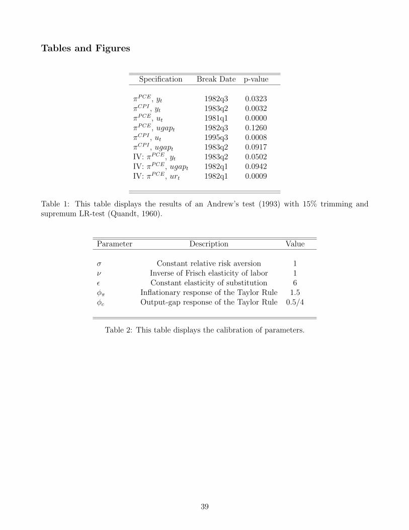
Tables and Figures
Specification Break Date p-value
πPCE, yt 1982q3 0.0323πCPI , yt 1983q2 0.0032πPCE, ut 1981q1 0.0000πPCE, ugapt 1982q3 0.1260πCPI , ut 1995q3 0.0008πCPI , ugapt 1983q2 0.0917IV: πPCE, yt 1983q2 0.0502IV: πPCE, ugapt 1982q1 0.0942IV: πPCE, urt 1982q1 0.0009
Table 1: This table displays the results of an Andrew’s test (1993) with 15% trimming andsupremum LR-test (Quandt, 1960).
Parameter Description Value
σ Constant relative risk aversion 1ν Inverse of Frisch elasticity of labor 1ε Constant elasticity of substitution 6φπ Inflationary response of the Taylor Rule 1.5φc Output-gap response of the Taylor Rule 0.5/4
Table 2: This table displays the calibration of parameters.
39
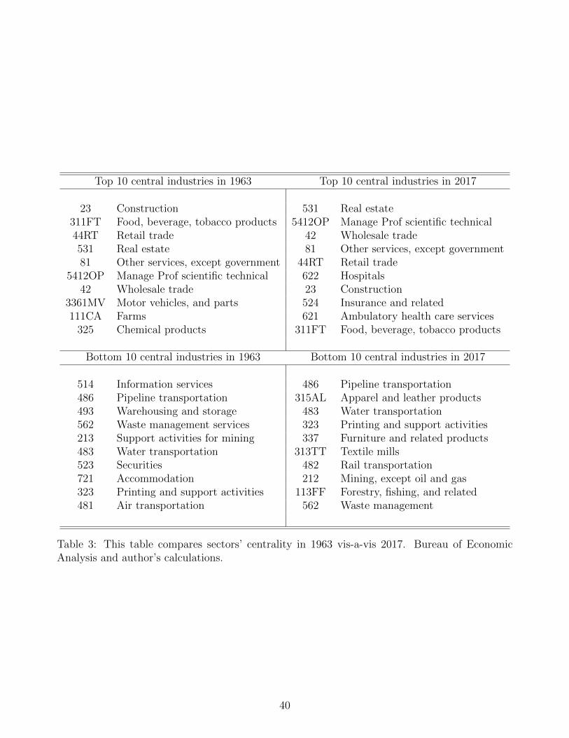
Top 10 central industries in 1963 Top 10 central industries in 2017
23 Construction 531 Real estate311FT Food, beverage, tobacco products 5412OP Manage Prof scientific technical44RT Retail trade 42 Wholesale trade531 Real estate 81 Other services, except government81 Other services, except government 44RT Retail trade
5412OP Manage Prof scientific technical 622 Hospitals42 Wholesale trade 23 Construction
3361MV Motor vehicles, and parts 524 Insurance and related111CA Farms 621 Ambulatory health care services
325 Chemical products 311FT Food, beverage, tobacco products
Bottom 10 central industries in 1963 Bottom 10 central industries in 2017
514 Information services 486 Pipeline transportation486 Pipeline transportation 315AL Apparel and leather products493 Warehousing and storage 483 Water transportation562 Waste management services 323 Printing and support activities213 Support activities for mining 337 Furniture and related products483 Water transportation 313TT Textile mills523 Securities 482 Rail transportation721 Accommodation 212 Mining, except oil and gas323 Printing and support activities 113FF Forestry, fishing, and related481 Air transportation 562 Waste management
Table 3: This table compares sectors’ centrality in 1963 vis-a-vis 2017. Bureau of EconomicAnalysis and author’s calculations.
40
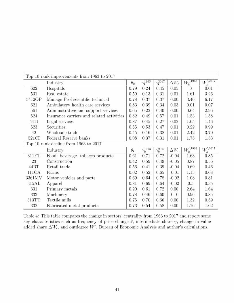
Top 10 rank improvements from 1963 to 2017
Industry θk γ1963k γ2017
k ∆Wc W′,1963k W
′,2017k
622 Hospitals 0.79 0.24 0.45 0.05 0 0.01531 Real estate 0.50 0.13 0.31 0.01 1.61 3.26
5412OP Manage Prof scientific technical 0.78 0.37 0.37 0.00 3.46 6.17621 Ambulatory health care services 0.83 0.39 0.34 0.03 0.01 0.07561 Administrative and support services 0.65 0.22 0.40 0.00 0.64 2.96524 Insurance carriers and related activities 0.82 0.49 0.57 0.01 1.53 1.585411 Legal services 0.87 0.45 0.27 0.02 1.05 1.46523 Securities 0.55 0.53 0.47 0.01 0.22 0.9942 Wholesale trade 0.45 0.16 0.38 0.01 2.42 3.70
521CI Federal Reserve banks 0.08 0.37 0.31 0.01 1.75 1.53Top 10 rank decline from 1963 to 2017
Industry θk γ1963k γ2017
k ∆Wc W′,1963k W
′,2017k
311FT Food. beverage. tobacco products 0.61 0.71 0.72 -0.04 1.63 0.8523 Construction 0.42 0.59 0.49 -0.05 0.87 0.56
44RT Retail trade 0.56 0.41 0.39 -0.04 0.69 0.46111CA Farms 0.02 0.52 0.65 -0.01 1.15 0.68
3361MV Motor vehicles and parts 0.69 0.64 0.78 -0.02 1.08 0.81315AL Apparel 0.81 0.69 0.64 -0.02 0.5 0.35
331 Primary metals 0.20 0.61 0.72 0.00 2.64 1.64333 Machinery 0.78 0.46 0.60 -0.01 0.96 0.85
313TT Textile mills 0.75 0.70 0.66 0.00 1.32 0.59332 Fabricated metal products 0.73 0.54 0.58 0.00 1.76 1.62
Table 4: This table compares the change in sectors’ centrality from 1963 to 2017 and report somekey characteristics such as frequency of price change θ, intermediate share γ, change in valueadded share ∆Wc, and outdegree W ′. Bureau of Economic Analysis and author’s calculations.
41
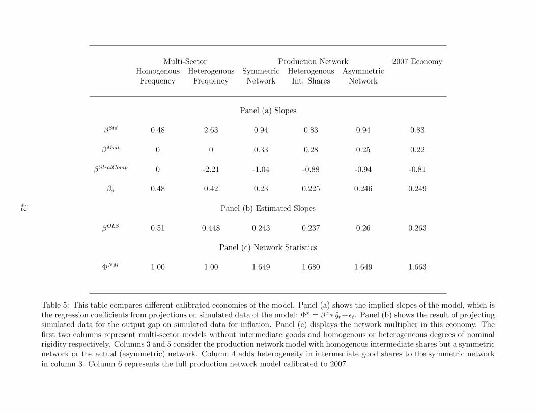
Multi-Sector Production Network 2007 EconomyHomogenous Heterogenous Symmetric Heterogenous AsymmetricFrequency Frequency Network Int. Shares Network
Panel (a) Slopes
βStd 0.48 2.63 0.94 0.83 0.94 0.83
βMult 0 0 0.33 0.28 0.25 0.22
βStratComp 0 -2.21 -1.04 -0.88 -0.94 -0.81
βπ 0.48 0.42 0.23 0.225 0.246 0.249
Panel (b) Estimated Slopes
βOLS 0.51 0.448 0.243 0.237 0.26 0.263
Panel (c) Network Statistics
ΦNM 1.00 1.00 1.649 1.680 1.649 1.663
Table 5: This table compares different calibrated economies of the model. Panel (a) shows the implied slopes of the model, which isthe regression coefficients from projections on simulated data of the model: Φx = βx∗ yt+εt. Panel (b) shows the result of projectingsimulated data for the output gap on simulated data for inflation. Panel (c) displays the network multiplier in this economy. Thefirst two columns represent multi-sector models without intermediate goods and homogenous or heterogeneous degrees of nominalrigidity respectively. Columns 3 and 5 consider the production network model with homogenous intermediate shares but a symmetricnetwork or the actual (asymmetric) network. Column 4 adds heterogeneity in intermediate good shares to the symmetric networkin column 3. Column 6 represents the full production network model calibrated to 2007.
42
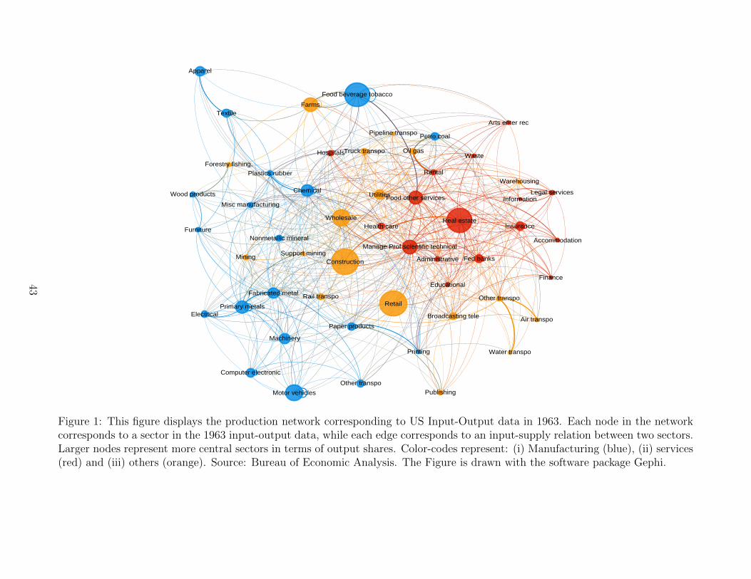
Farms
Forestry fishing,
Oil gas
Mining Support mining
Utilities
Construction
Wood products
Nonmetallic mineral
Primary metals
Fabricated metal
Machinery
Computer electronic
Electrical
Motor vehicles
Other transpo
Furniture
Misc manufacturing
Food beverage tobacco
Textile
Apparel
Paper products
Printing
Petro coal
Chemical
Plastics rubber
Wholesale
Retail
Air transpo
Rail transpo
Water transpo
Truck transpo
Pipeline transpo
Other transpo
Warehousing
Publishing
Broadcasting tele
Information
Fed banks
Finance
InsuranceReal estate
Rental
Legal services
Manage Prof scientific technical
Administrative
Waste
Educational
Health care
Hospitals
Arts enter rec
Accommodation
Food other services
Figure 1: This figure displays the production network corresponding to US Input-Output data in 1963. Each node in the networkcorresponds to a sector in the 1963 input-output data, while each edge corresponds to an input-supply relation between two sectors.Larger nodes represent more central sectors in terms of output shares. Color-codes represent: (i) Manufacturing (blue), (ii) services(red) and (iii) others (orange). Source: Bureau of Economic Analysis. The Figure is drawn with the software package Gephi.
43
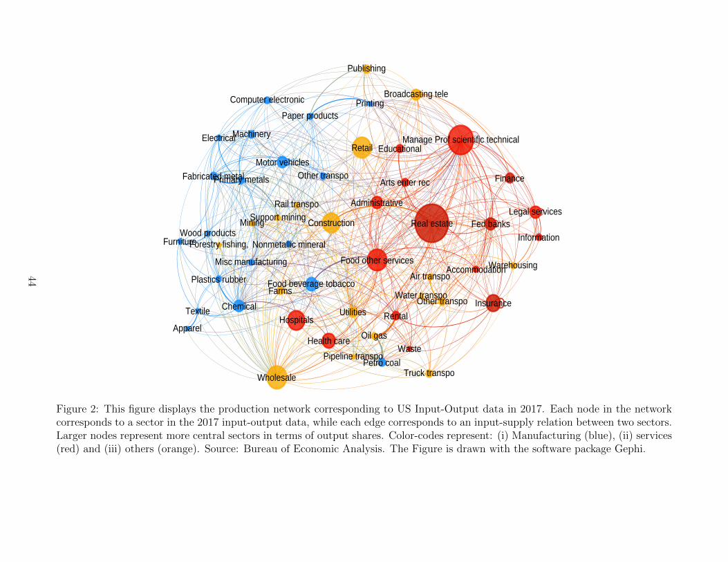
Farms
Forestry fishing,
Oil gas
MiningSupport mining
Utilities
ConstructionWood products
Nonmetallic mineral
Primary metalsFabricated metal
Machinery
Computer electronic
Electrical
Motor vehiclesOther transpo
Furniture
Misc manufacturing
Food beverage tobacco
Textile
Apparel
Paper productsPrinting
Petro coal
Chemical
Plastics rubber
Wholesale
Retail
Air transpo
Rail transpo
Water transpo
Truck transpo
Pipeline transpo
Other transpo
Warehousing
Publishing
Broadcasting tele
InformationFed banks
Finance
Insurance
Real estate
Rental
Legal services
Manage Prof scientific technical
Administrative
Waste
Educational
Health care
Hospitals
Arts enter rec
AccommodationFood other services
Figure 2: This figure displays the production network corresponding to US Input-Output data in 2017. Each node in the networkcorresponds to a sector in the 2017 input-output data, while each edge corresponds to an input-supply relation between two sectors.Larger nodes represent more central sectors in terms of output shares. Color-codes represent: (i) Manufacturing (blue), (ii) services(red) and (iii) others (orange). Source: Bureau of Economic Analysis. The Figure is drawn with the software package Gephi.
44
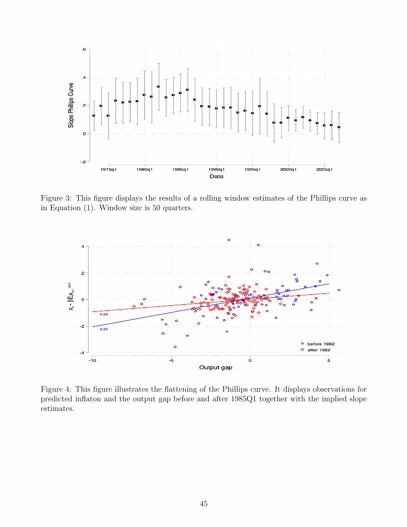
Figure 3: This figure displays the results of a rolling window estimates of the Phillips curve asin Equation (1). Window size is 50 quarters.
Figure 4: This figure illustrates the flattening of the Phillips curve. It displays observations forpredicted inflaton and the output gap before and after 1985Q1 together with the implied slopeestimates.
45
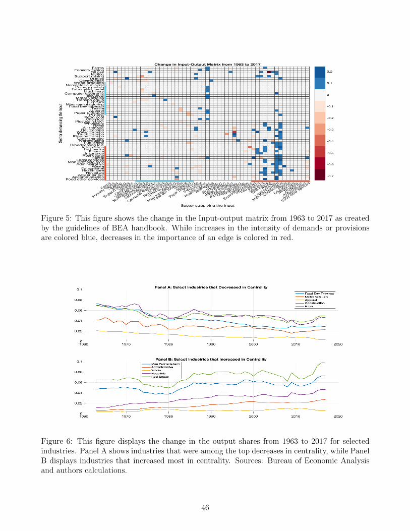
Figure 5: This figure shows the change in the Input-output matrix from 1963 to 2017 as createdby the guidelines of BEA handbook. While increases in the intensity of demands or provisionsare colored blue, decreases in the importance of an edge is colored in red.
Figure 6: This figure displays the change in the output shares from 1963 to 2017 for selectedindustries. Panel A shows industries that were among the top decreases in centrality, while PanelB displays industries that increased most in centrality. Sources: Bureau of Economic Analysisand authors calculations.
46
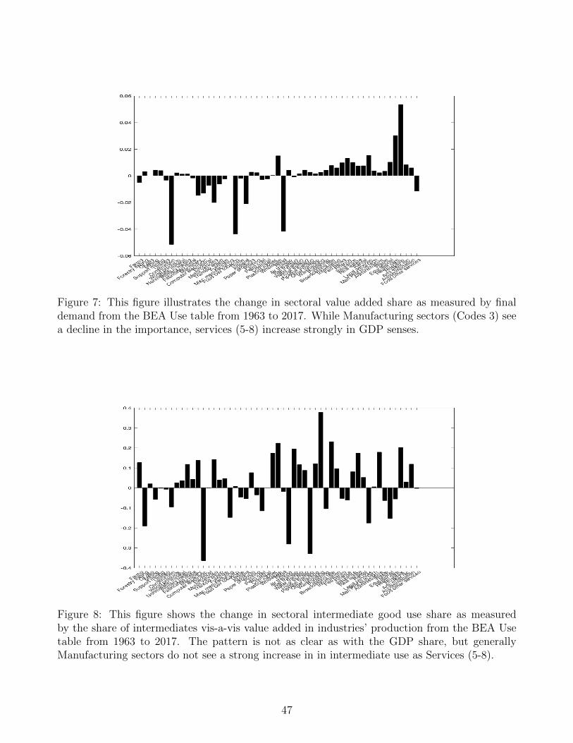
Figure 7: This figure illustrates the change in sectoral value added share as measured by finaldemand from the BEA Use table from 1963 to 2017. While Manufacturing sectors (Codes 3) seea decline in the importance, services (5-8) increase strongly in GDP senses.
Figure 8: This figure shows the change in sectoral intermediate good use share as measuredby the share of intermediates vis-a-vis value added in industries’ production from the BEA Usetable from 1963 to 2017. The pattern is not as clear as with the GDP share, but generallyManufacturing sectors do not see a strong increase in in intermediate use as Services (5-8).
47
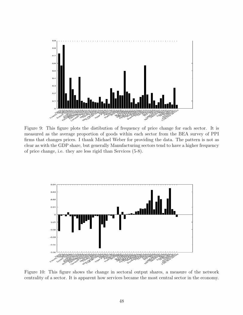
Figure 9: This figure plots the distibution of frequency of price change for each sector. It ismeasured as the average proportion of goods within each sector from the BEA survey of PPIfirms that changes prices. I thank Michael Weber for providing the data. The pattern is not asclear as with the GDP share, but generally Manufacturing sectors tend to have a higher frequencyof price change, i.e. they are less rigid than Services (5-8).
Figure 10: This figure shows the change in sectoral output shares, a measure of the networkcentrality of a sector. It is apparent how services became the most central sector in the economy.
48
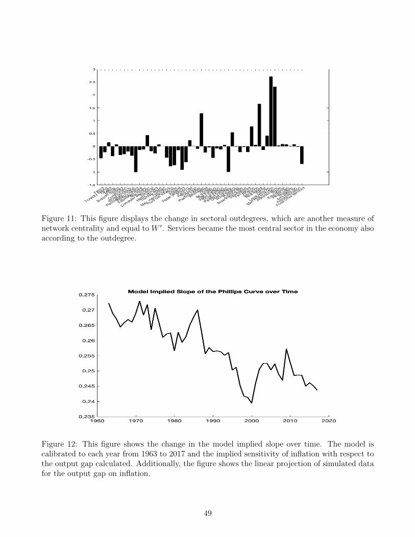
Figure 11: This figure displays the change in sectoral outdegrees, which are another measure ofnetwork centrality and equal to W ′. Services became the most central sector in the economy alsoaccording to the outdegree.
Figure 12: This figure shows the change in the model implied slope over time. The model iscalibrated to each year from 1963 to 2017 and the implied sensitivity of inflation with respect tothe output gap calculated. Additionally, the figure shows the linear projection of simulated datafor the output gap on inflation.
49
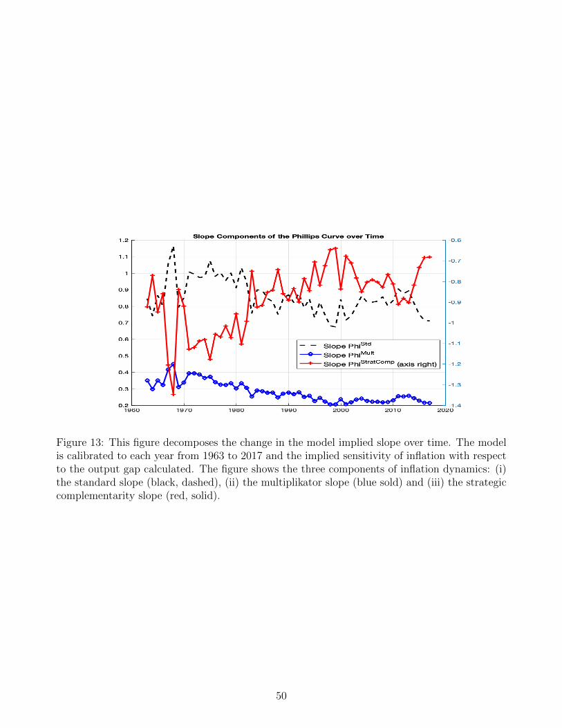
Figure 13: This figure decomposes the change in the model implied slope over time. The modelis calibrated to each year from 1963 to 2017 and the implied sensitivity of inflation with respectto the output gap calculated. The figure shows the three components of inflation dynamics: (i)the standard slope (black, dashed), (ii) the multiplikator slope (blue sold) and (iii) the strategiccomplementarity slope (red, solid).
50
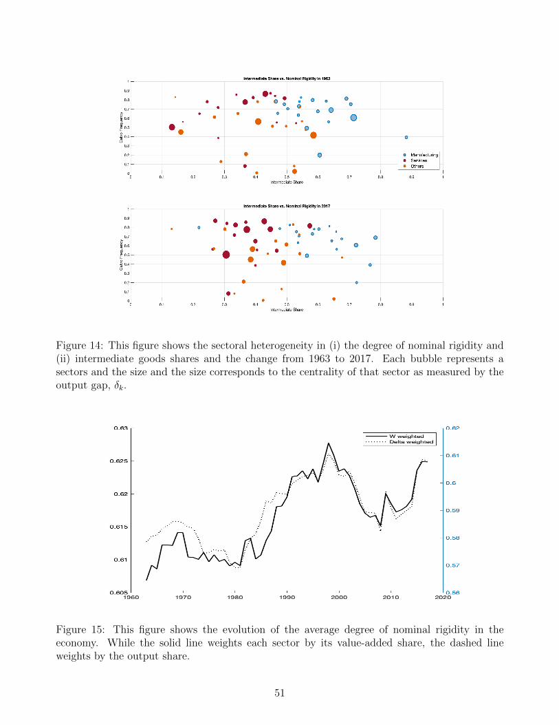
Figure 14: This figure shows the sectoral heterogeneity in (i) the degree of nominal rigidity and(ii) intermediate goods shares and the change from 1963 to 2017. Each bubble represents asectors and the size and the size corresponds to the centrality of that sector as measured by theoutput gap, δk.
Figure 15: This figure shows the evolution of the average degree of nominal rigidity in theeconomy. While the solid line weights each sector by its value-added share, the dashed lineweights by the output share.
51
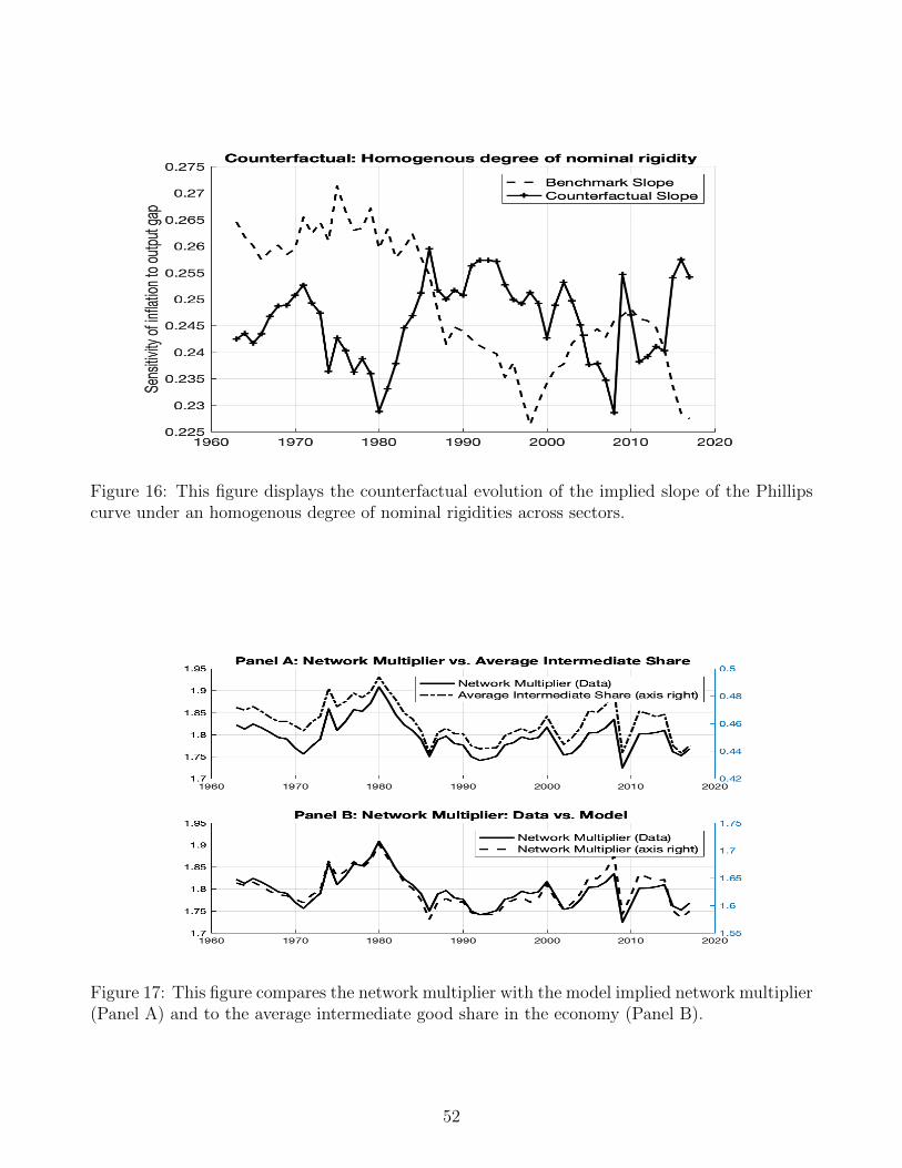
Figure 16: This figure displays the counterfactual evolution of the implied slope of the Phillipscurve under an homogenous degree of nominal rigidities across sectors.
Figure 17: This figure compares the network multiplier with the model implied network multiplier(Panel A) and to the average intermediate good share in the economy (Panel B).
52
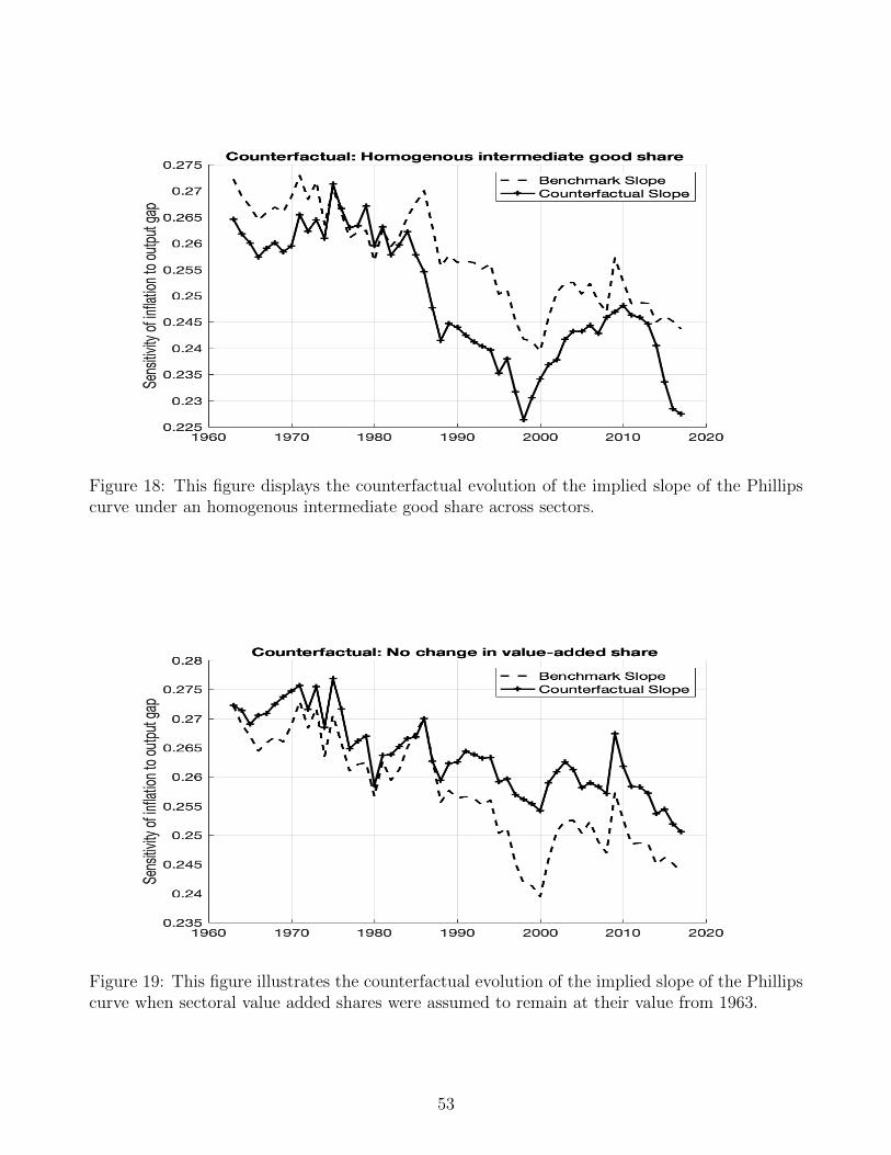
Figure 18: This figure displays the counterfactual evolution of the implied slope of the Phillipscurve under an homogenous intermediate good share across sectors.
Figure 19: This figure illustrates the counterfactual evolution of the implied slope of the Phillipscurve when sectoral value added shares were assumed to remain at their value from 1963.
53