Embed Size (px)
Citation preview

Volume IV
color expressions &Trends Inspirations
1211314_24pg.indd 1 12/3/12 3:23 PM

Photo courtesy of Traditional Home.
Product Recommendation: RedSeal®
Offers the perfect combination of beauty, durability and value.
1211314_24pg.indd 2 12/3/12 3:23 PM

The Year of the & Pratt & Lambert embraces the multidimensional … the diverse … the layers & nuances of style & design. We are proud to share our vision with you, and to introduce you to another multifaceted visionary, Stacy Garcia.
2013 Color Trends — Contrasts Let us introduce you to our 2013 color trends. These are the shades and hues of who we are. New palettes that reflect society’s comfort with conflict, our contentedness with contrast. These are the colors that we see in our future – and which you will want to see in your home.
4
6
Showing Off Pratt & Lambert color steals the show in several beautiful Show Homes around the country.
A New Site with Insight Our all-new website is a welcoming, inspiring place that can virtually change the way you see color in your home.
Design Buzz Some of your common paint and color questions, answered by our experts.
16 Project Planner Proper preparation and the right tools can help your painting project go smoothly.
18
20
22
color expressions volume IV
Color swatches shown depict colors as accurately as possible and may vary slightly from sample due to aging, lighting, surface texture and application. Please refer to actual color chip at the color rack.
20
4
Designer White 33-1
Photo courtesy of Traditional Home.
6
P&L Color Expressions 3
1211314_24pg.indd 3 12/3/12 3:23 PM
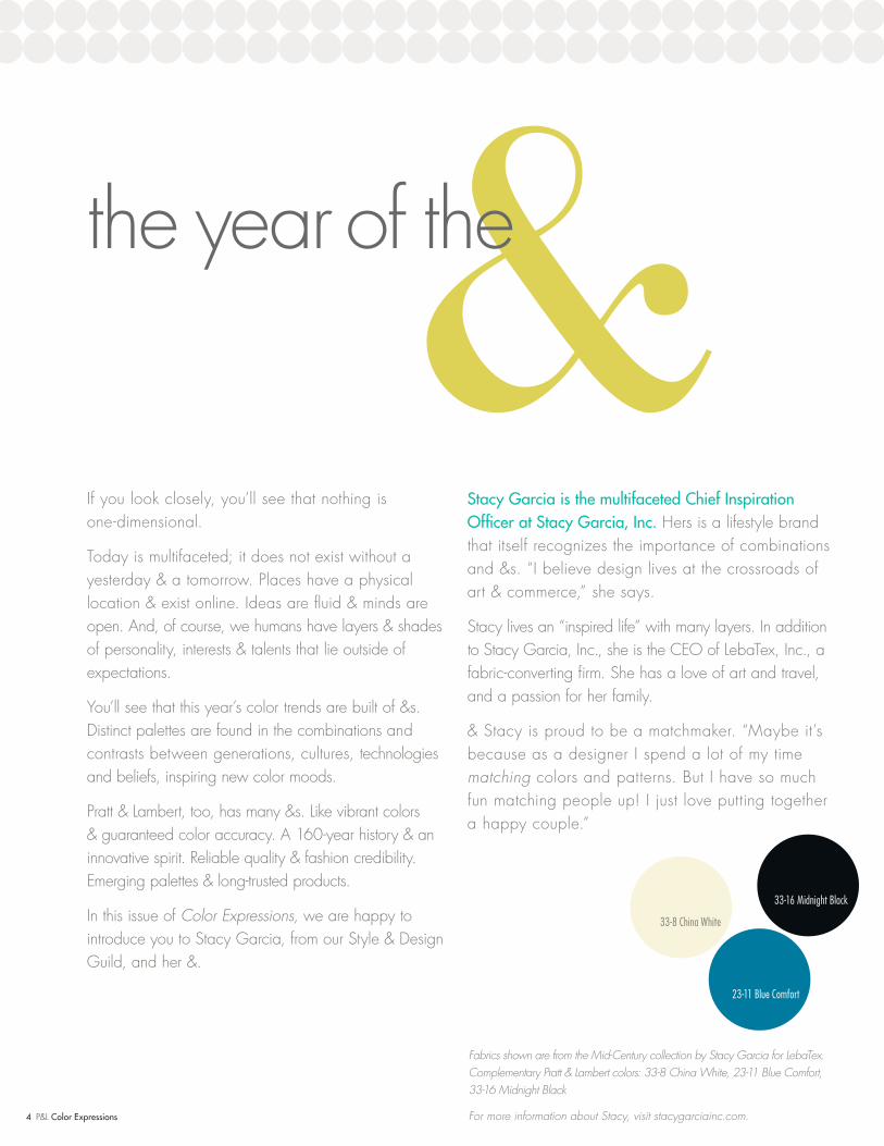
&the year of the
If you look closely, you’ll see that nothing is one-dimensional.
Today is multifaceted; it does not exist without a yesterday & a tomorrow. Places have a physical location & exist online. Ideas are fluid & minds are open. And, of course, we humans have layers & shades of personality, interests & talents that lie outside of expectations.
You’ll see that this year’s color trends are built of &s. Distinct palettes are found in the combinations and contrasts between generations, cultures, technologies and beliefs, inspiring new color moods.
Pratt & Lambert, too, has many &s. Like vibrant colors & guaranteed color accuracy. A 160-year history & an innovative spirit. Reliable quality & fashion credibility. Emerging palettes & long-trusted products.
In this issue of Color Expressions, we are happy to introduce you to Stacy Garcia, from our Style & Design Guild, and her &.
Stacy Garcia is the multifaceted Chief Inspiration Officer at Stacy Garcia, Inc. Hers is a lifestyle brand that itself recognizes the importance of combinations and &s. “I believe design lives at the crossroads of art & commerce,” she says.
Stacy lives an “inspired life” with many layers. In addition to Stacy Garcia, Inc., she is the CEO of LebaTex, Inc., a fabric-converting firm. She has a love of art and travel, and a passion for her family.
& Stacy is proud to be a matchmaker. “Maybe it’s because as a designer I spend a lot of my time matching colors and patterns. But I have so much fun matching people up! I just love putting together a happy couple.”
Fabrics shown are from the Mid-Century collection by Stacy Garcia for LebaTex.Complementary Pratt & Lambert colors: 33-8 China White, 23-11 Blue Comfort, 33-16 Midnight Black
For more information about Stacy, visit stacygarciainc.com.
33-8 China White
23-11 Blue Comfort
33-16 Midnight Black
4 P&L Color Expressions
1211314_24pg.indd 4 12/3/12 3:23 PM
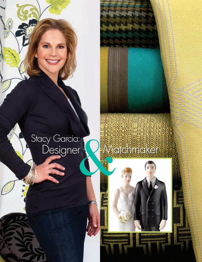
&Stacy Garcia:
Designer&
1211314_24pg.indd 5 12/3/12 3:23 PM
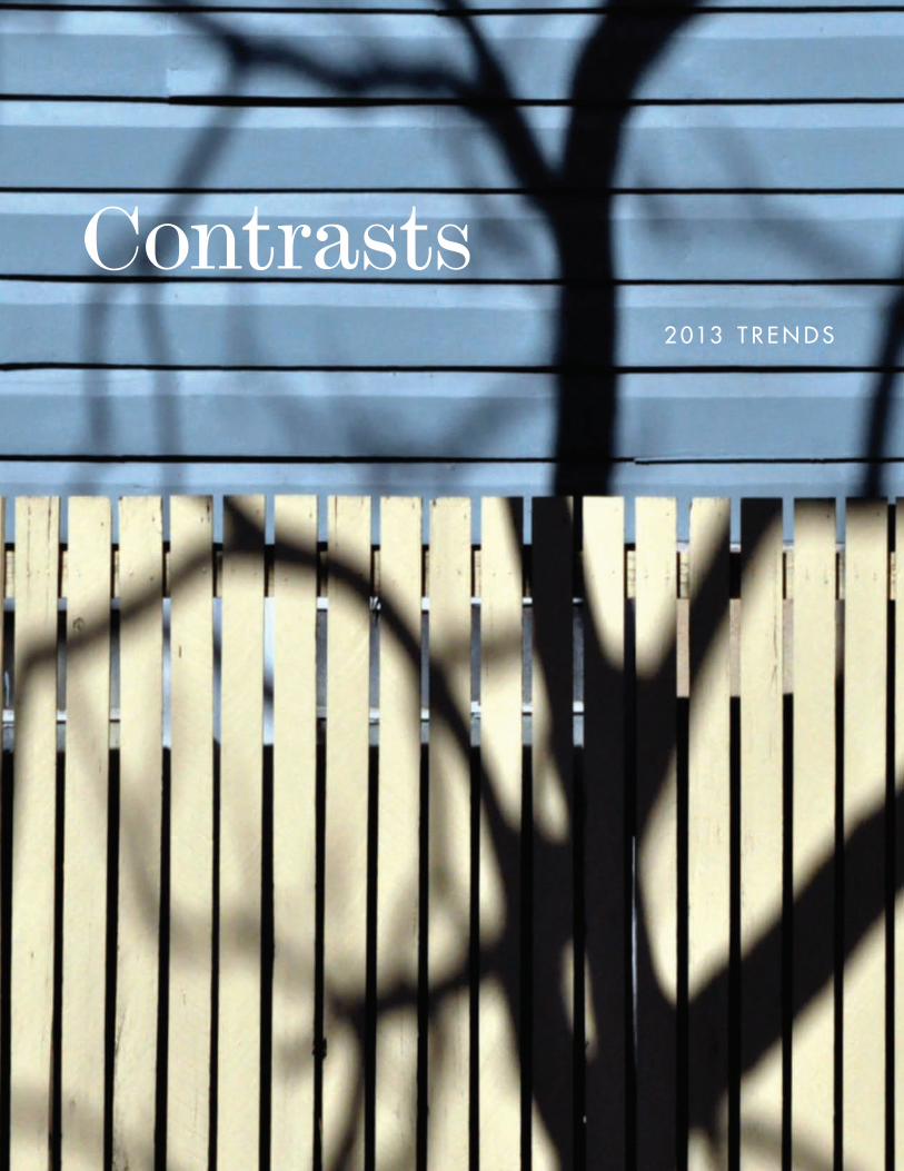
2 013 T R E N D S
Contrasts
1211314_24pg.indd 6 12/3/12 3:24 PM

The most enduring, memorable trends are a balance between reflecting and projecting, mirroring the current priorities of our culture while projecting forward to imagine the focus of the future.
It’s easy to see this duality in our 2013 color trends, which celebrate the concept of CONTRASTS. We live in a society that is comfortable on the edge, poised between what is real & imagined, definite & possible, practical & fantastical. Each of us is a balancing act, a shifting mosaic, a layered file of what is and “what if.” We are happily, steadfastly grounded in a today we know, while straining toward a tomorrow we can only imagine.
This contented tension between extremes creates new moods and color palettes that define our new trends. These are the color expressions of who we are and who we are becoming. Take a look and see yourself within.
2 013 T R E N D S
P&L Color Expressions 7
1211314_24pg.indd 7 12/3/12 3:24 PM

phenomena
Blending the intricacies and patterns of science and the physical world, with the fantasies of art and creativity to create a completely, magically new way to look at
design and color. This trend is an exciting experiment with hyperreality and
wild imaginings, science and surrealism. And the color palette finds balance in the discipline of neutral hues and the spirit of
high-energy brights.
1211314_24pg.indd 8 12/3/12 3:24 PM

21-10 Tide Pools
32-2 Chiffon
Dining Room Wall:15-8 SnapdragonKitchen Wall: 5-12 Azalea Ceiling: 32-2 Chiffon
32-2 Chiffon
5-12 Azalea
15-8 Snapdragon
16-10 Light Chartreuse
21-10 Tide Pools
23-11 Blue Comfort
33-5 Swiss Coffee
28-28 Violet Echo
P&L Color Expressions 9
1211314_24pg.indd 9 12/3/12 3:25 PM

This trend is about merging the fantastically modern and imaginative with what is timeworn and doggedly industrial. The resulting style and palette are mired in the past but moving inexorably forward. Ideas are accidentally anachronistic, distressed and finessed by the desire to innovate upon a foundation of romantic history. So, of course, the colors are rich and modern, but softened by a sense of the past.
30-16 Monsignor30-16 Monsignor
vestiges
1211314_24pg.indd 10 12/3/12 3:25 PM

11-5 Fresh Cream
33-14 Steel Wool
21-27 Leek
1-16 Botticelli
30-16 Monsignor
24-12 French Blue
11-32 Chalk Gray
18-24 Woodgate
Wall: 33-14 Steel WoolBack Pillows: 21-27 LeekFront Pillows: 24-12 French BlueAccent Pillow: 11-5 Fresh Cream and 1-16 Botticelli P&L Color Expressions 11
1211314_24pg.indd 11 12/3/12 3:26 PM

The global movement has sharpened our local focus. Culture is, in fact, multicultural. And there is a balance between what brings us together and what sets us apart that is both evolutionary and revolutionary. This trend is a celebration of the unapologetically dissonant voices that speak in a single language of design and color. The earthy, tribal shades of this palette are the colors of common ground.
2-13 Cranberry
dialects
12 P&L Color Expressions
1211314_24pg.indd 12 12/3/12 3:26 PM

11-8 Golden Laughter
15-20 Butternut Leaf
7-10 Sunblest Poppy
2-13 Cranberry
24-24 Oat Grass
28-11 Anchusa
2-21 Deep Taupe
29-23 Timeless Gray
2-13 Cranberry
15-20 Butternut Leaf
11-8 Golden Laughter
1211314_24pg.indd 13 12/3/12 3:26 PM

Yesterday, today and tomorrow meet in this trend. Journaling morphs into blogging while handcrafted scrapbooks become scrap-bytes. New ideas are old news in an instant. Old concepts seem new again. Even décor and design are chronicled in an ever-changing digital diary where everything is recycled, upcycled and unexpected. Just as these colors are new posts of recent favorites.
curated
1211314_24pg.indd 14 12/3/12 3:27 PM
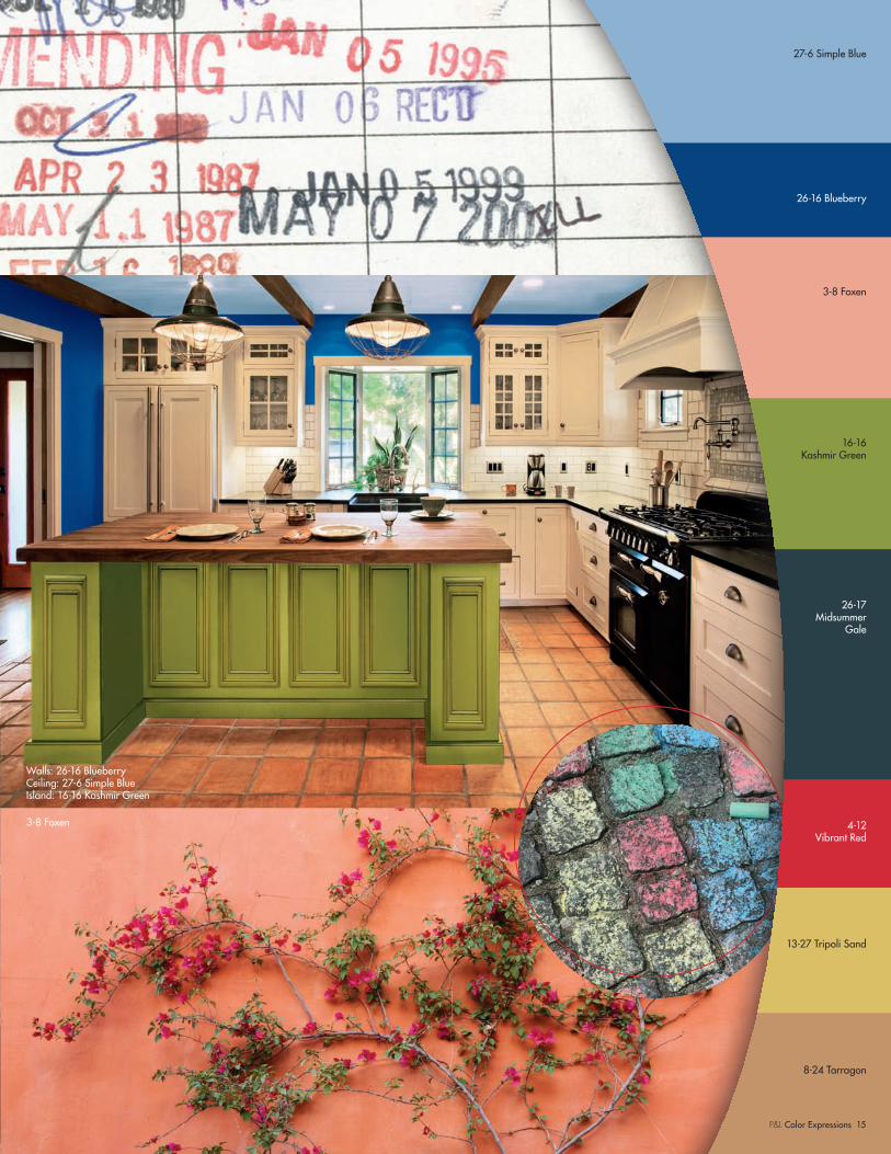
Walls: 26-16 BlueberryCeiling: 27-6 Simple BlueIsland: 16-16 Kashmir Green
3-8 Foxen
27-6 Simple Blue
26-16 Blueberry
3-8 Foxen
16-16 Kashmir Green
26-17 Midsummer
Gale
4-12 Vibrant Red
13-27 Tripoli Sand
8-24 Tarragon
P&L Color Expressions 15
1211314_24pg.indd 15 12/3/12 3:27 PM

Courtesy Coastal Living, a division of the Time Inc. Lifestyle Group, photograph by Tria Giovan. Coastal Living is a registered trademark of Time Inc. and is used with permission.
Wall19-30 Moss Lake
showing off
Product Recommendation: Skylight®
Our flat latex ceiling paint is formulated for easy, spatterless application, fast dry, low odor and excellent hiding.
Ceiling 27-32 Seed Pearl
16 P&L Color Expressions
1211314_24pg.indd 16 12/3/12 3:27 PM
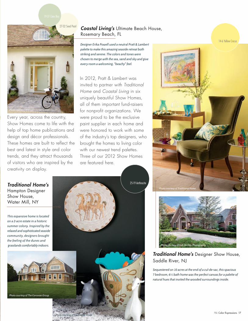
Every year, across the country, Show Homes come to life with the help of top home publications and design and décor professionals. These homes are built to reflect the best and latest in style and color trends, and they attract thousands of visitors who are inspired by the creativity on display.
In 2012, Pratt & Lambert was invited to partner with Traditional Home and Coastal Living in six uniquely beautiful Show Homes, all of them important fund-raisers for nonprofit organizations. We were proud to be the exclusive paint supplier in each home and were honored to work with some of the industry’s top designers, who brought the homes to living color with our newest trend palettes. Three of our 2012 Show Homes are featured here.
14-6 Yellow Crocus
25-19 Anthracite
Designer Erika Powell used a neutral Pratt & Lambert
palette to make this amazing seaside retreat both
striking and serene. The colors and tones were
chosen to merge with the sea, sand and sky and give
every room a welcoming, “beachy” feel.
Traditional Home’s Hampton Designer Show House, Water Mill, NY
This expansive home is located
on a 2-acre estate in a historic
summer colony. Inspired by the
relaxed and sophisticated seaside
community, designers brought
the feeling of the dunes and
grasslands comfortably indoors.
Traditional Home’s Designer Show House, Saddle River, NJ
Sequestered on 10 acres at the end of a cul-de-sac, this spacious
7 bedroom, 6½ bath home was the perfect canvas for a palette of
natural hues that invited the wooded surroundings inside.
Photo courtesy of Traditional Home
Photo courtesy of Traditional Home
Photo courtesy of Bob Skinner Photography
Photo courtesy of The Corcoran Group
Photo courtesy of The Corcoran Group
27-32 Seed Pearl
19-31 Coos Bay
Coastal Living’s Ultimate Beach House, Rosemary Beach, FL
P&L Color Expressions 17
1211314_24pg.indd 17 12/3/12 3:28 PM

a new site with insight
In 2012, we introduced an all-new Pratt & Lambert website. A beautiful site with the character, taste and panache of our brand, crafted to inform and inspire. Big, bold colors. Gorgeous and inspiring room photography. Inviting, engaging moods and styles balanced with expert guidance and tools, organized to create an easy-to-use, enjoyable-to-browse resource for our customers.
18 P&L Color Expressions
1211314_24pg.indd 18 12/3/12 3:28 PM
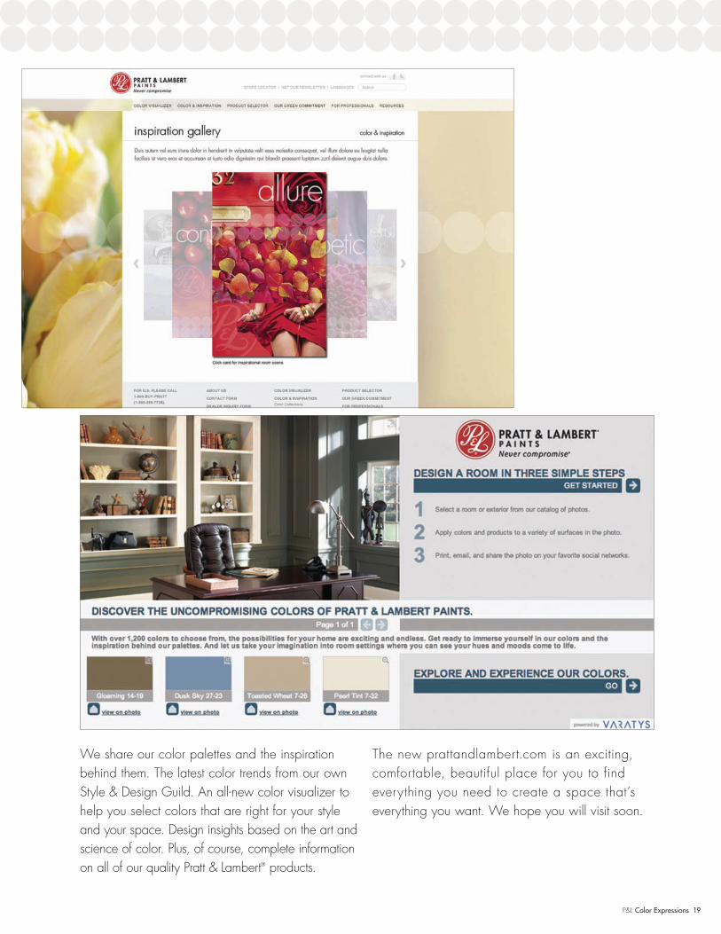
We share our color palettes and the inspiration behind them. The latest color trends from our own Style & Design Guild. An all-new color visualizer to help you select colors that are right for your style and your space. Design insights based on the art and science of color. Plus, of course, complete information on all of our quality Pratt & Lambert® products.
The new prattandlambert.com is an exciting, comfortable, beautiful place for you to find everything you need to create a space that’s everything you want. We hope you will visit soon.
FPO
P&L Color Expressions 19
1211314_24pg.indd 19 12/3/12 3:28 PM

Luis Caicedo
Laura Kirar
Maria Killam
Eldon Wong
Kate Smith
Michael Bagley
20 P&L Color Expressions
1211314_24pg.indd 20 12/3/12 3:28 PM

Q: I’m planning to paint my outdated kitchen cabinets white.
Should I use the same white on the trim in the room?
A: As long as your cabinets are anywhere from white to cream, then your trim should also be the same color.
However, if the color of your cabinets moves into a color you would call beige, or if you glaze the cabinets so they
are no longer actually white or cream, then your trim should be a coordinating color, instead of a match.
Q: I’ve noticed the trend of painted wood furniture lately. I have a house full
of beautiful furniture, but it’s all in dark wood tones. I’m thinking of painting a few pieces white,
but don’t know which pieces or how many.
A: If you look in any beautifully decorated home, it’s common to find a mixture of painted wood and natural wood in dark
and light tones. Most designers choose to mix the finishes instead of building matched sets in a room. So if you currently
have a matched bedroom, dining room or coffee table set, paint a few pieces, like the end tables or dining chairs. You
can choose white or a coordinating color. Interestingly, adding different colors and finishes injects a more
collected look and feel to a room.
The Style & Design Guild is our color think
tank, with a diverse membership tuned to current and emerging trends. We’ve
asked our experts to respond to some of today’s most common design and
color questions.
Q: I like the idea of
using paint with different finishes, or sheens. Are there any rules
to follow in selecting which one is right for the room I use it in?
A: Selecting the right finish can enhance the feeling and character of a space. FLAT and VELVET finishes give walls sensuality, softness and depth. These finishes are great in rooms where comfort is a part of the desired effect, like a bedroom or library. SATIN adds a soft sheen that picks up
light and adds a touch of reflection, so it’s perfect for places where you want a bit of subtle “glam,” like dining rooms,
hallways and powder rooms. As for the GLOSS finishes, they can make a space feel smaller, so
use these sheens in spaces where that won’t matter, like a kitchen or
playroom.
Q: I don’t care for white walls, but
I’m hesitant to use a lot of color (even though I love color!). What can you suggest?
A: Try a neutral, off-white color on the main walls of your home and add pops of the bright colors you like
in smaller areas. A small entryway or alcove off a main hallway is a perfect place to make a color statement. A powder room or accent wall can handle a lot of color. Even adding color to a kitchen backsplash can make
a big difference. Reinforce your colors with small matching accessories in the main rooms.
Q: There’s a lot going on in some of
my rooms, with office furniture, entertainment centers, storage pieces and more crowding the space. How can I keep full rooms from looking
cluttered and small?
A: Wouldn’t it be great to be able to get custom built-ins for a clean, tailored look? Short of that, there are certainly ways to
manage a busy room. Try to keep electronics behind doors and, of course, keep all cables hidden from view. Choose furnishings in matching woods and finishes, or paint furniture in neutral colors
that don’t stand out. Another very modern idea is to paint furniture and décor items the exact color of the walls so that
they virtually disappear. It’s an exciting way to avoid visual clutter and create a look that flows nicely
and multitasks effortlessly.
Q: Can I paint my bedroom a dark color without it feeling like a cave?
A: Used correctly, dark colors feel sophisticated and modern, and they can be very soothing and
calming in a bedroom. To keep the room from disappearing into total darkness, we recommend
painting the ceiling, trim and doors in a crisp, contrasting color. Keep décor, artwork and accessories to a
minimum and let the color take charge of the environment. It goes without saying that you
should be very sure of your color choice when being bold like this.
But go for it!
design buzz
Q: I spend a lot of time looking at paint chips,
but it always seems that the color I choose looks very different on my walls
than on the chip. Why is this?
A: The impact of color expands as the space it covers expands. So if you choose a dark color, it will feel darker; a
bright color will feel brighter, etc. There are two things you can do to make sure you get the color you expect. First, get a color sample so you can see it in your room. (Instead of painting
directly on the wall, we suggest painting a large piece of poster board that you can move around the room.)
Second, think about getting two samples to save time and frustration. Pick the color you think you want,
and also the next lighter shade on the paint chip. You may find that the “other” color
feels better in your space.
P&L Color Expressions 21
1211314_24pg.indd 21 12/3/12 3:28 PM

interior project planner
Paint Quantity
One gallon of paint covers approximately
400 square feet. To determine the size of
your room, measure the perimeter (length and
width) and add all four numbers together.
Then multiply the perimeter by the height. Be
sure to deduct doors (average of 21 sq. ft.)
and windows (average of 15 sq. ft.), and then
divide the remainder by 400.
Supply Checklist
Depending on what room you’re painting
and what type of paint and finish you want,
having all the supplies and tools you need before
you start can save a lot of time and frustration.
Sheen Selection
Every sheen has different attributes that make
it ideal for different rooms. Understanding
them is key to making walls look their best.
Flat Does not reflect light, giving it the ability
to hide imperfections, such as patched holes
and cracks.
Velvet/Eggshell A softer sheen that provides
excellent washability and exceptional stain
resistance.
Satin Very versatile paint with subtle shine;
can be used almost anywhere; durable
and scrubbable.
Semi-Gloss Very scrubbable and durable
paint with a higher level of shine; tight film
offers mildew resistance.
Proper Primer
Priming is critical to ensuring a good and
evenly porous surface. It also helps to make
your chosen color turn out exactly the way
you envisioned it.
Surface Prep
After you’ve collected all your supplies and
chosen your paint and primer, you’re ready
to get to work.
1. Clean — Remove any dirt, dust or
grease with a mild household detergent,
and let it dry thoroughly.
2. Repair — Scrape away peeling paint, and
fill any cracks, holes or seams with a
paintable acrylic caulk or patching
compound.
3. Tape — Mask off window trim, doorframes
or any other areas not being painted.
4. Protect — Cover the floor and furniture
with drop cloths.
Time to Prime...and Paint
Once the surface is ready, it’s time for the fun
part! Prime your walls first to promote strong
adhesion and hide, let it dry and then move
on to the paint.
1. Cut In — Using a flat brush, paint a 3"
border around the top, bottom and sides
of your walls.
2. Roll with It — Working in a 3' x 3' area,
roll a large “W” onto the surface and
fill in around it. Repeat by moving
horizontally across the wall.
3. Trim — Use a 1" or 2" angle brush to coat
sashes, moldings and woodwork.
Clean Up
When you’re all finished painting, make sure
to clean up properly. Use soap and warm
water to clean latex paint from your brushes
and rollers. A brush comb can make this
easier. Oil or alkyd paints can be cleaned
off using turpentine or paint thinner.
• Flat brush for walls, angle brush for trim
• Roller frame and covers
• Drop cloth
• Painter’s tape
• Paint trays
• Ladder
• Spackle and putty knife
• Sandpaper
• Nail hole filler
• Rags
• Screwdriver
• Paint can opener
• Gloves
19-30 Moss Lake
22 P&L Color Expressions
1211314_24pg.indd 22 12/3/12 3:28 PM

interior project planner
Courtesy Coastal Living, a division of the Time Inc. Lifestyle Group, photograph by Tria Giovan. Coastal Living is a registered trademark of Time Inc. and is used with permission.
Product Recommendation: Accolade®
Offers a flawless finish and beautiful, long-lasting results guaranteed for life.
1211314_24pg.indd 23 12/3/12 3:28 PM

Pratt & Lambert Paints 101 West Prospect Ave., Cleveland, Ohio 44115 prattandlambert.com1.800.BUY.PRAT (U.S.A.) 1.877.PRATT98 (CANADA)
970-0745-000 11/12
1211314_24pg.indd 24 12/3/12 3:28 PM