Embed Size (px)
Citation preview
Complete Solutions Manual to Accompany
Probability and Statistics
for Engineering and the Sciences
NINTH EDITION
Jay Devore California Polytechnic State University,
San Luis Obispo, CA
Prepared by
Matthew A. Carlton California Polytechnic State University, San Luis Obispo, CA
Australia • Brazil • Mexico • Singapore • United Kingdom • United States
© C
enga
ge L
earn
ing.
All
right
s res
erve
d. N
o di
strib
utio
n al
low
ed w
ithou
t exp
ress
aut
horiz
atio
n.
Printed in the United States of America 1 2 3 4 5 6 7 17 16 15 14 13
© 2016 Cengage Learning ALL RIGHTS RESERVED. No part of this work covered by the copyright herein may be reproduced, transmitted, stored, or used in any form or by any means graphic, electronic, or mechanical, including but not limited to photocopying, recording, scanning, digitizing, taping, Web distribution, information networks, or information storage and retrieval systems, except as permitted under Section 107 or 108 of the 1976 United States Copyright Act, without the prior written permission of the publisher except as may be permitted by the license terms below.
For product information and technology assistance, contact us at Cengage Learning Customer & Sales Support,
1-800-354-9706.
For permission to use material from this text or product, submit all requests online at www.cengage.com/permissions
Further permissions questions can be emailed to [email protected].
ISBN-13: 978-1-305-26061-0 ISBN-10: 1-305-26061-9 Cengage Learning 20 Channel Center Street Fourth Floor Boston, MA 02210 USA Cengage Learning is a leading provider of customized learning solutions with office locations around the globe, including Singapore, the United Kingdom, Australia, Mexico, Brazil, and Japan. Locate your local office at: www.cengage.com/global. Cengage Learning products are represented in Canada by Nelson Education, Ltd. To learn more about Cengage Learning Solutions, visit www.cengage.com. Purchase any of our products at your local college store or at our preferred online store www.cengagebrain.com.
NOTE: UNDER NO CIRCUMSTANCES MAY THIS MATERIAL OR ANY PORTION THEREOF BE SOLD, LICENSED, AUCTIONED,
OR OTHERWISE REDISTRIBUTED EXCEPT AS MAY BE PERMITTED BY THE LICENSE TERMS HEREIN.
READ IMPORTANT LICENSE INFORMATION
Dear Professor or Other Supplement Recipient: Cengage Learning has provided you with this product (the “Supplement”) for your review and, to the extent that you adopt the associated textbook for use in connection with your course (the “Course”), you and your students who purchase the textbook may use the Supplement as described below. Cengage Learning has established these use limitations in response to concerns raised by authors, professors, and other users regarding the pedagogical problems stemming from unlimited distribution of Supplements. Cengage Learning hereby grants you a nontransferable license to use the Supplement in connection with the Course, subject to the following conditions. The Supplement is for your personal, noncommercial use only and may not be reproduced, posted electronically or distributed, except that portions of the Supplement may be provided to your students IN PRINT FORM ONLY in connection with your instruction of the Course, so long as such students are advised that they
may not copy or distribute any portion of the Supplement to any third party. You may not sell, license, auction, or otherwise redistribute the Supplement in any form. We ask that you take reasonable steps to protect the Supplement from unauthorized use, reproduction, or distribution. Your use of the Supplement indicates your acceptance of the conditions set forth in this Agreement. If you do not accept these conditions, you must return the Supplement unused within 30 days of receipt. All rights (including without limitation, copyrights, patents, and trade secrets) in the Supplement are and will remain the sole and exclusive property of Cengage Learning and/or its licensors. The Supplement is furnished by Cengage Learning on an “as is” basis without any warranties, express or implied. This Agreement will be governed by and construed pursuant to the laws of the State of New York, without regard to such State’s conflict of law rules. Thank you for your assistance in helping to safeguard the integrity of the content contained in this Supplement. We trust you find the Supplement a useful teaching tool.
CONTENTS
Chapter 1 Overview and Descriptive Statistics 1
Chapter 2 Probability 48
Chapter 3 Discrete Random Variables and Probability Distributions
90
Chapter 4 Continuous Random Variables and Probability Distributions
126
Chapter 5 Joint Probability Distributions and Random Samples 177
Chapter 6 Point Estimation 206
Chapter 7 Statistical Intervals Based on a Single Sample 217
Chapter 8 Tests of Hypotheses Based on a Single Sample 234
Chapter 9 Inferences Based on Two Samples 255
Chapter 10 The Analysis of Variance 285
Chapter 11 Multifactor Analysis of Variance 299
Chapter 12 Simple Linear Regression and Correlation 330
Chapter 13 Nonlinear and Multiple Regression 368
Chapter 14 Goodness-of-Fit Tests and Categorical Data Analysis 406
Chapter 15 Distribution-Free Procedures 424
Chapter 16 Quality Control Methods 434

1
CHAPTER 1
Section 1.1 1.
a. Los Angeles Times, Oberlin Tribune, Gainesville Sun, Washington Post b. Duke Energy, Clorox, Seagate, Neiman Marcus
c. Vince Correa, Catherine Miller, Michael Cutler, Ken Lee
d. 2.97, 3.56, 2.20, 2.97
2.
a. 29.1 yd, 28.3 yd, 24.7 yd, 31.0 yd
b. 432 pp, 196 pp, 184 pp, 321 pp
c. 2.1, 4.0, 3.2, 6.3
d. 0.07 g, 1.58 g, 7.1 g, 27.2 g 3.
a. How likely is it that more than half of the sampled computers will need or have needed warranty service? What is the expected number among the 100 that need warranty service? How likely is it that the number needing warranty service will exceed the expected number by more than 10?
b. Suppose that 15 of the 100 sampled needed warranty service. How confident can we be
that the proportion of all such computers needing warranty service is between .08 and .22? Does the sample provide compelling evidence for concluding that more than 10% of all such computers need warranty service?

Chapter 1: Overview and Descriptive Statistics
2
4. a. Concrete populations: all living U.S. Citizens, all mutual funds marketed in the U.S., all
books published in 1980 Hypothetical populations: all grade point averages for University of California undergraduates during the next academic year, page lengths for all books published during the next calendar year, batting averages for all major league players during the next baseball season
b. (Concrete) Probability: In a sample of 5 mutual funds, what is the chance that all 5 have rates of return which exceeded 10% last year? Statistics: If previous year rates-of-return for 5 mutual funds were 9.6, 14.5, 8.3, 9.9 and 10.2, can we conclude that the average rate for all funds was below 10%? (Hypothetical) Probability: In a sample of 10 books to be published next year, how likely is it that the average number of pages for the 10 is between 200 and 250? Statistics: If the sample average number of pages for 10 books is 227, can we be highly confident that the average for all books is between 200 and 245?
5. a. No. All students taking a large statistics course who participate in an SI program of this
sort. b. The advantage to randomly allocating students to the two groups is that the two groups
should then be fairly comparable before the study. If the two groups perform differently in the class, we might attribute this to the treatments (SI and control). If it were left to students to choose, stronger or more dedicated students might gravitate toward SI, confounding the results.
c. If all students were put in the treatment group, there would be no firm basis for assessing
the effectiveness of SI (nothing to which the SI scores could reasonably be compared). 6. One could take a simple random sample of students from all students in the California State
University system and ask each student in the sample to report the distance form their hometown to campus. Alternatively, the sample could be generated by taking a stratified random sample by taking a simple random sample from each of the 23 campuses and again asking each student in the sample to report the distance from their hometown to campus. Certain problems might arise with self reporting of distances, such as recording error or poor recall. This study is enumerative because there exists a finite, identifiable population of objects from which to sample.
7. One could generate a simple random sample of all single-family homes in the city, or a
stratified random sample by taking a simple random sample from each of the 10 district neighborhoods. From each of the selected homes, values of all desired variables would be determined. This would be an enumerative study because there exists a finite, identifiable population of objects from which to sample.
Chapter 1: Overview and Descriptive Statistics
3
8. a. Number observations equal 2 x 2 x 2 = 8 b. This could be called an analytic study because the data would be collected on an existing
process. There is no sampling frame. 9.
a. There could be several explanations for the variability of the measurements. Among them could be measurement error (due to mechanical or technical changes across measurements), recording error, differences in weather conditions at time of measurements, etc.
b. No, because there is no sampling frame.
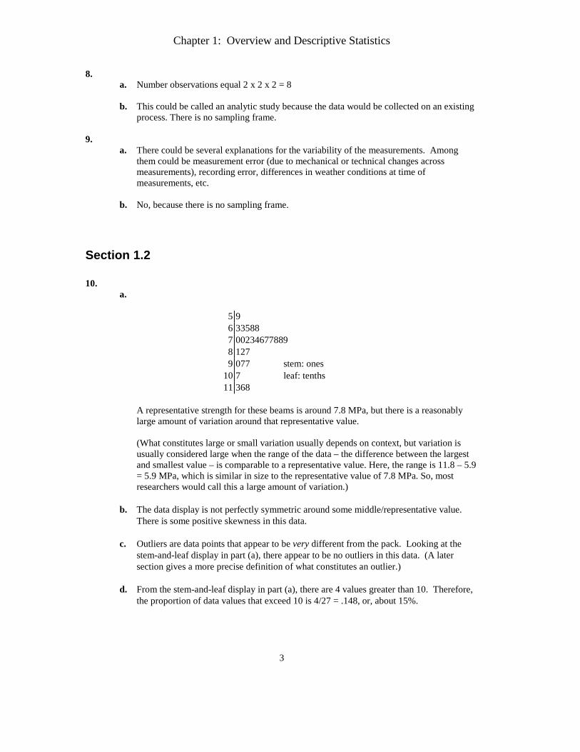
Section 1.2 10.
a.
5 9 6 33588 7 00234677889 8 127 9 077 stem: ones
10 7 leaf: tenths 11 368
A representative strength for these beams is around 7.8 MPa, but there is a reasonably large amount of variation around that representative value. (What constitutes large or small variation usually depends on context, but variation is usually considered large when the range of the data – the difference between the largest and smallest value – is comparable to a representative value. Here, the range is 11.8 – 5.9 = 5.9 MPa, which is similar in size to the representative value of 7.8 MPa. So, most researchers would call this a large amount of variation.)
b. The data display is not perfectly symmetric around some middle/representative value.
There is some positive skewness in this data. c. Outliers are data points that appear to be very different from the pack. Looking at the
stem-and-leaf display in part (a), there appear to be no outliers in this data. (A later section gives a more precise definition of what constitutes an outlier.)
d. From the stem-and-leaf display in part (a), there are 4 values greater than 10. Therefore,
the proportion of data values that exceed 10 is 4/27 = .148, or, about 15%.
Chapter 1: Overview and Descriptive Statistics
4
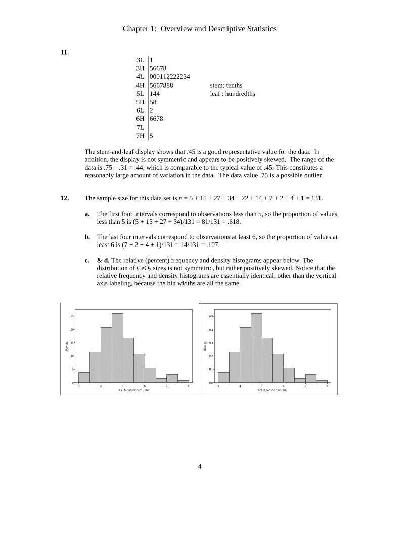
11. 3L 1 3H 56678 4L 000112222234 4H 5667888 stem: tenths 5L 144 leaf : hundredths 5H 58 6L 2 6H 6678 7L 7H 5
The stem-and-leaf display shows that .45 is a good representative value for the data. In addition, the display is not symmetric and appears to be positively skewed. The range of the data is .75 – .31 = .44, which is comparable to the typical value of .45. This constitutes a reasonably large amount of variation in the data. The data value .75 is a possible outlier.
12. The sample size for this data set is n = 5 + 15 + 27 + 34 + 22 + 14 + 7 + 2 + 4 + 1 = 131.
a. The first four intervals correspond to observations less than 5, so the proportion of values less than 5 is (5 + 15 + 27 + 34)/131 = 81/131 = .618.
b. The last four intervals correspond to observations at least 6, so the proportion of values at least 6 is (7 + 2 + 4 + 1)/131 = 14/131 = .107.
c. & d. The relative (percent) frequency and density histograms appear below. The distribution of CeO2 sizes is not symmetric, but rather positively skewed. Notice that the relative frequency and density histograms are essentially identical, other than the vertical axis labeling, because the bin widths are all the same.
876543
25
20
15
10
5
0
CeO2 particle size (nm)
Perc
ent
876543
0.5
0.4
0.3
0.2
0.1
0.0
CeO2 particle size (nm)
Den
sity
Chapter 1: Overview and Descriptive Statistics
5
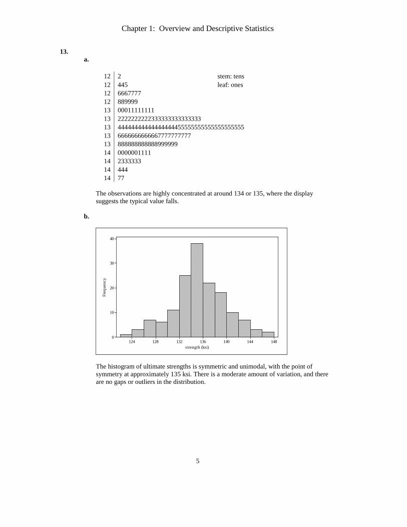
13. a.
12 2 stem: tens 12 445 leaf: ones 12 6667777 12 889999 13 00011111111 13 2222222222333333333333333 13 44444444444444444455555555555555555555 13 6666666666667777777777 13 888888888888999999 14 0000001111 14 2333333 14 444 14 77
The observations are highly concentrated at around 134 or 135, where the display suggests the typical value falls.
b.
148144140136132128124
40
30
20
10
0
strength (ksi)
Freq
uenc
y
The histogram of ultimate strengths is symmetric and unimodal, with the point of symmetry at approximately 135 ksi. There is a moderate amount of variation, and there are no gaps or outliers in the distribution.
Chapter 1: Overview and Descriptive Statistics
6
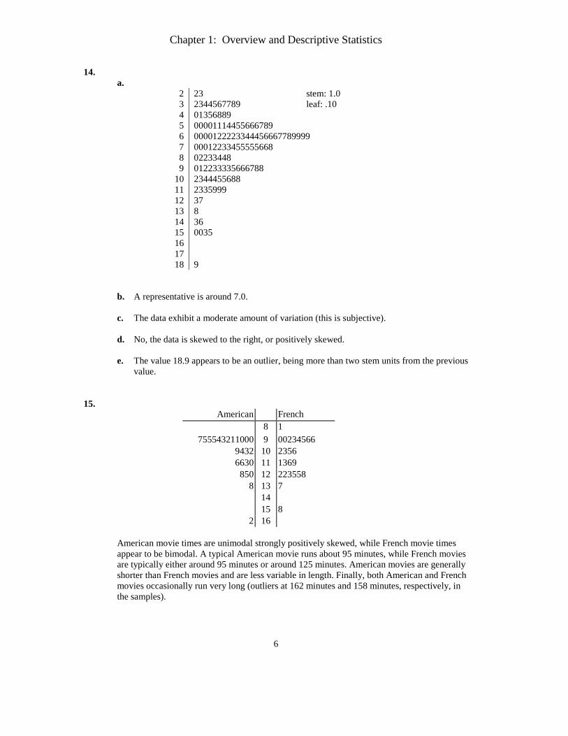
14. a.
2 23 stem: 1.0 3 2344567789 leaf: .10 4 01356889 5 00001114455666789 6 0000122223344456667789999 7 00012233455555668 8 02233448 9 012233335666788
10 2344455688 11 2335999 12 37 13 8 14 36 15 0035 16 17 18 9
b. A representative is around 7.0. c. The data exhibit a moderate amount of variation (this is subjective).
d. No, the data is skewed to the right, or positively skewed. e. The value 18.9 appears to be an outlier, being more than two stem units from the previous
value.
15.
American French 8 1
755543211000 9 00234566 9432 10 2356 6630 11 1369
850 12 223558 8 13 7
14 15 8
2 16 American movie times are unimodal strongly positively skewed, while French movie times appear to be bimodal. A typical American movie runs about 95 minutes, while French movies are typically either around 95 minutes or around 125 minutes. American movies are generally shorter than French movies and are less variable in length. Finally, both American and French movies occasionally run very long (outliers at 162 minutes and 158 minutes, respectively, in the samples).
Chapter 1: Overview and Descriptive Statistics
7
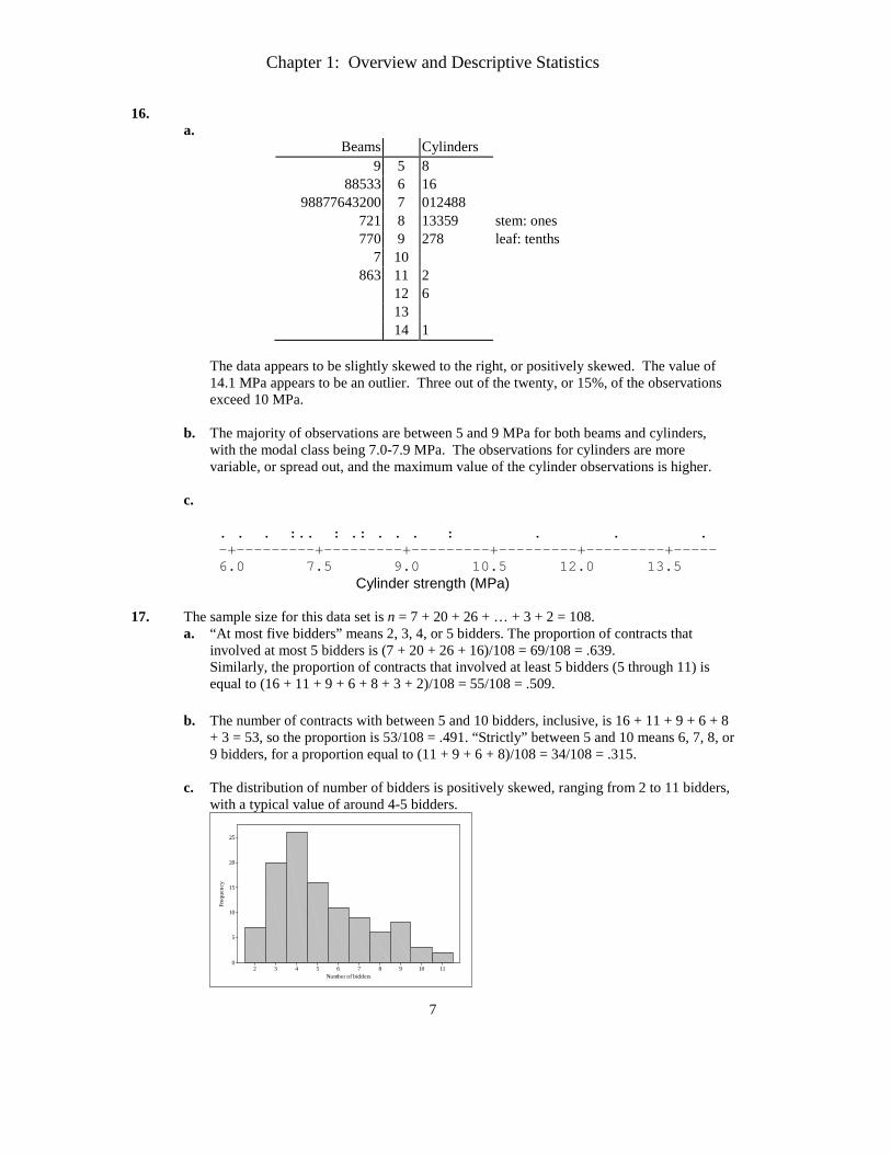
16. a.
Beams Cylinders 9 5 8
88533 6 16 98877643200 7 012488
721 8 13359 stem: ones 770 9 278 leaf: tenths
7 10 863 11 2
12 6 13 14 1
The data appears to be slightly skewed to the right, or positively skewed. The value of 14.1 MPa appears to be an outlier. Three out of the twenty, or 15%, of the observations exceed 10 MPa.
b. The majority of observations are between 5 and 9 MPa for both beams and cylinders, with the modal class being 7.0-7.9 MPa. The observations for cylinders are more variable, or spread out, and the maximum value of the cylinder observations is higher.
c.
. . . :.. : .: . . . : . . .
-+---------+---------+---------+---------+---------+----- 6.0 7.5 9.0 10.5 12.0 13.5
Cylinder strength (MPa) 17. The sample size for this data set is n = 7 + 20 + 26 + … + 3 + 2 = 108.
a. “At most five bidders” means 2, 3, 4, or 5 bidders. The proportion of contracts that involved at most 5 bidders is (7 + 20 + 26 + 16)/108 = 69/108 = .639. Similarly, the proportion of contracts that involved at least 5 bidders (5 through 11) is equal to (16 + 11 + 9 + 6 + 8 + 3 + 2)/108 = 55/108 = .509.
b. The number of contracts with between 5 and 10 bidders, inclusive, is 16 + 11 + 9 + 6 + 8
+ 3 = 53, so the proportion is 53/108 = .491. “Strictly” between 5 and 10 means 6, 7, 8, or 9 bidders, for a proportion equal to (11 + 9 + 6 + 8)/108 = 34/108 = .315.
c. The distribution of number of bidders is positively skewed, ranging from 2 to 11 bidders,
with a typical value of around 4-5 bidders.
111098765432
25
20
15
10
5
0
Number of bidders
Freq
uenc
y
Chapter 1: Overview and Descriptive Statistics
8
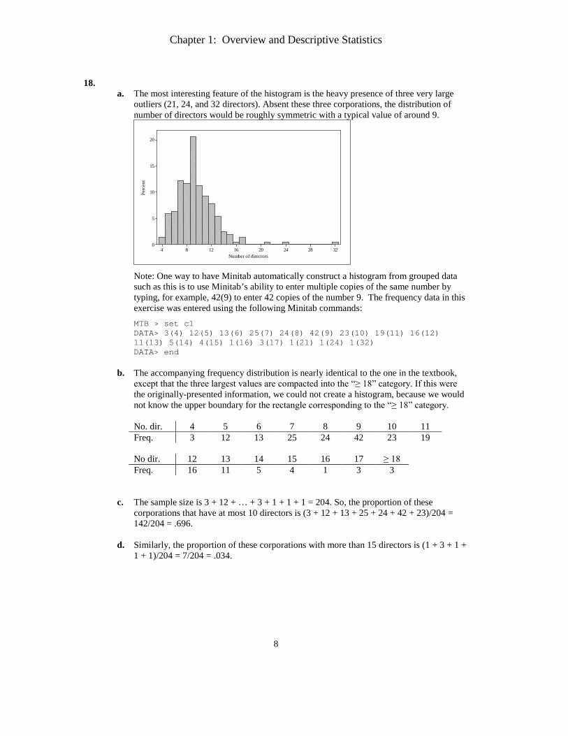
18.
a. The most interesting feature of the histogram is the heavy presence of three very large outliers (21, 24, and 32 directors). Absent these three corporations, the distribution of number of directors would be roughly symmetric with a typical value of around 9.
32282420161284
20
15
10
5
0
Number of directors
Perc
ent
Note: One way to have Minitab automatically construct a histogram from grouped data such as this is to use Minitab’s ability to enter multiple copies of the same number by typing, for example, 42(9) to enter 42 copies of the number 9. The frequency data in this exercise was entered using the following Minitab commands: MTB > set c1 DATA> 3(4) 12(5) 13(6) 25(7) 24(8) 42(9) 23(10) 19(11) 16(12) 11(13) 5(14) 4(15) 1(16) 3(17) 1(21) 1(24) 1(32) DATA> end
b. The accompanying frequency distribution is nearly identical to the one in the textbook,
except that the three largest values are compacted into the “≥ 18” category. If this were the originally-presented information, we could not create a histogram, because we would not know the upper boundary for the rectangle corresponding to the “≥ 18” category. No. dir. 4 5 6 7 8 9 10 11 Freq. 3 12 13 25 24 42 23 19 No dir. 12 13 14 15 16 17 ≥ 18 Freq. 16 11 5 4 1 3 3
c. The sample size is 3 + 12 + … + 3 + 1 + 1 + 1 = 204. So, the proportion of these
corporations that have at most 10 directors is (3 + 12 + 13 + 25 + 24 + 42 + 23)/204 = 142/204 = .696.
d. Similarly, the proportion of these corporations with more than 15 directors is (1 + 3 + 1 +
1 + 1)/204 = 7/204 = .034.
Chapter 1: Overview and Descriptive Statistics
9
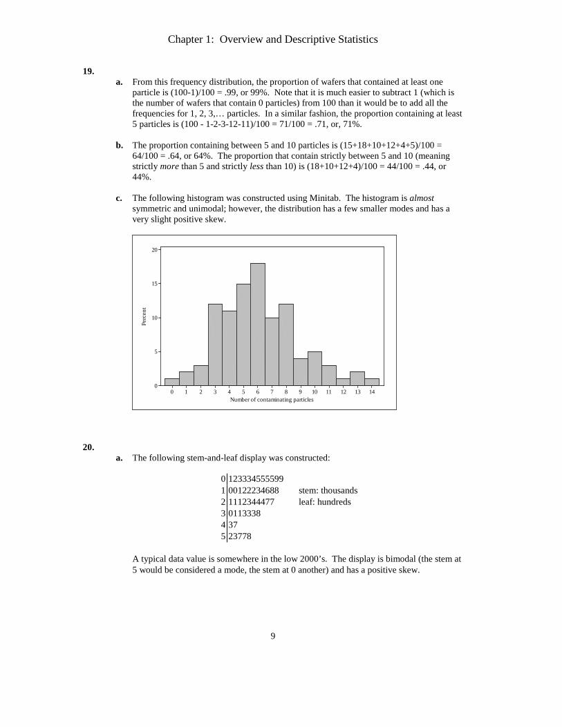
19. a. From this frequency distribution, the proportion of wafers that contained at least one
particle is (100-1)/100 = .99, or 99%. Note that it is much easier to subtract 1 (which is the number of wafers that contain 0 particles) from 100 than it would be to add all the frequencies for 1, 2, 3,… particles. In a similar fashion, the proportion containing at least 5 particles is (100 - 1-2-3-12-11)/100 = 71/100 = .71, or, 71%.
b. The proportion containing between 5 and 10 particles is (15+18+10+12+4+5)/100 =
64/100 = .64, or 64%. The proportion that contain strictly between 5 and 10 (meaning strictly more than 5 and strictly less than 10) is (18+10+12+4)/100 = 44/100 = .44, or 44%.
c. The following histogram was constructed using Minitab. The histogram is almost
symmetric and unimodal; however, the distribution has a few smaller modes and has a very slight positive skew.
14131211109876543210
20
15
10
5
0
Number of contaminating particles
Perc
ent
20.
a. The following stem-and-leaf display was constructed:
0 123334555599 1 00122234688 stem: thousands 2 1112344477 leaf: hundreds 3 0113338 4 37 5 23778
A typical data value is somewhere in the low 2000’s. The display is bimodal (the stem at 5 would be considered a mode, the stem at 0 another) and has a positive skew.
Chapter 1: Overview and Descriptive Statistics
10
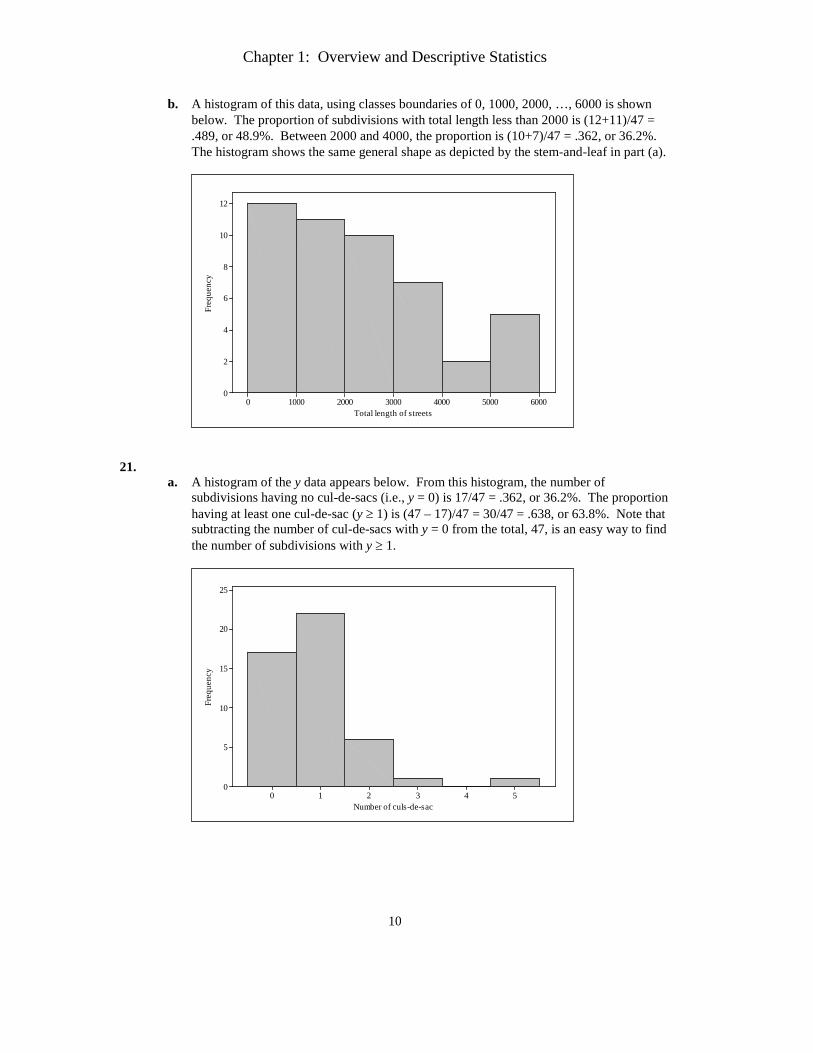
b. A histogram of this data, using classes boundaries of 0, 1000, 2000, …, 6000 is shown below. The proportion of subdivisions with total length less than 2000 is (12+11)/47 = .489, or 48.9%. Between 2000 and 4000, the proportion is (10+7)/47 = .362, or 36.2%. The histogram shows the same general shape as depicted by the stem-and-leaf in part (a).
6000500040003000200010000
12
10
8
6
4
2
0
Total length of streets
Freq
uenc
y
21.
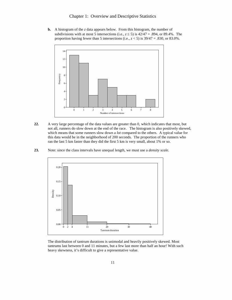
a. A histogram of the y data appears below. From this histogram, the number of subdivisions having no cul-de-sacs (i.e., y = 0) is 17/47 = .362, or 36.2%. The proportion having at least one cul-de-sac (y ≥ 1) is (47 – 17)/47 = 30/47 = .638, or 63.8%. Note that subtracting the number of cul-de-sacs with y = 0 from the total, 47, is an easy way to find the number of subdivisions with y ≥ 1.
543210
25
20
15
10
5
0
Number of culs-de-sac
Freq
uenc
y
Chapter 1: Overview and Descriptive Statistics
11
b. A histogram of the z data appears below. From this histogram, the number of subdivisions with at most 5 intersections (i.e., z ≤ 5) is 42/47 = .894, or 89.4%. The proportion having fewer than 5 intersections (i.e., z < 5) is 39/47 = .830, or 83.0%.
876543210
14
12
10
8
6
4
2
0
Number of intersections
Freq
uenc
y
22. A very large percentage of the data values are greater than 0, which indicates that most, but
not all, runners do slow down at the end of the race. The histogram is also positively skewed, which means that some runners slow down a lot compared to the others. A typical value for this data would be in the neighborhood of 200 seconds. The proportion of the runners who ran the last 5 km faster than they did the first 5 km is very small, about 1% or so.
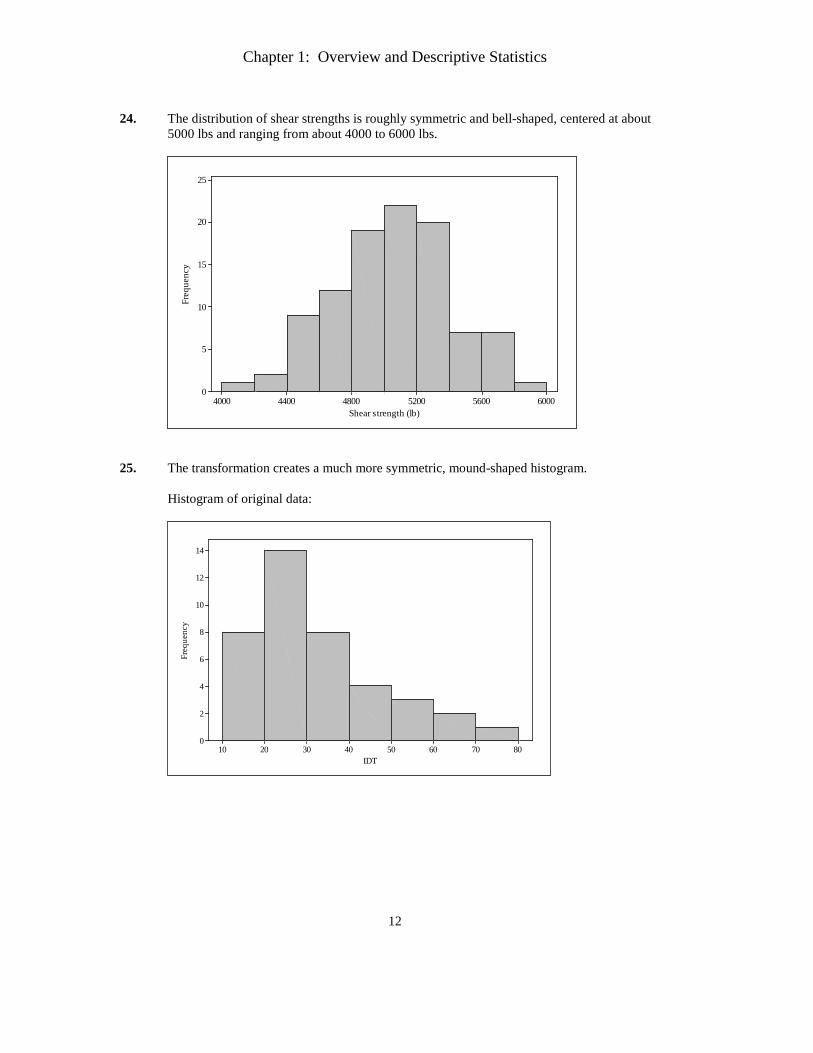
23. Note: since the class intervals have unequal length, we must use a density scale.
40302011420
0.20
0.15
0.10
0.05
0.00
Tantrum duration
Den
sity
The distribution of tantrum durations is unimodal and heavily positively skewed. Most tantrums last between 0 and 11 minutes, but a few last more than half an hour! With such heavy skewness, it’s difficult to give a representative value.
Chapter 1: Overview and Descriptive Statistics
12
24. The distribution of shear strengths is roughly symmetric and bell-shaped, centered at about
5000 lbs and ranging from about 4000 to 6000 lbs.
600056005200480044004000
25
20
15
10
5
0
Shear strength (lb)
Freq
uenc
y
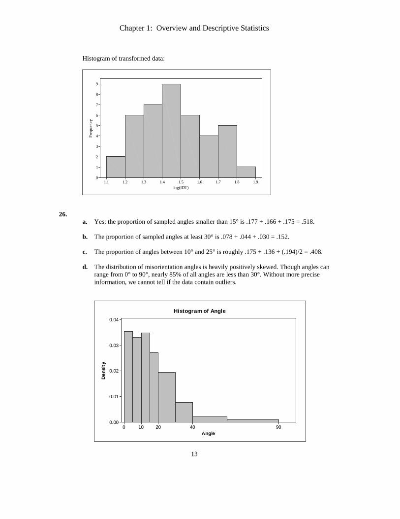
25. The transformation creates a much more symmetric, mound-shaped histogram.
Histogram of original data:
8070605040302010
14
12
10
8
6
4
2
0
IDT
Freq
uenc
y
Chapter 1: Overview and Descriptive Statistics
13
Histogram of transformed data:
1.91.81.71.61.51.41.31.21.1
9
8
7
6
5
4
3
2
1
0
log(IDT)
Freq
uenc
y
26.
a. Yes: the proportion of sampled angles smaller than 15° is .177 + .166 + .175 = .518.
b. The proportion of sampled angles at least 30° is .078 + .044 + .030 = .152. c. The proportion of angles between 10° and 25° is roughly .175 + .136 + (.194)/2 = .408.
d. The distribution of misorientation angles is heavily positively skewed. Though angles can
range from 0° to 90°, nearly 85% of all angles are less than 30°. Without more precise information, we cannot tell if the data contain outliers.
Angle
Den
sity
904020100
0.04
0.03
0.02
0.01
0.00
Histogram of Angle
Chapter 1: Overview and Descriptive Statistics
14
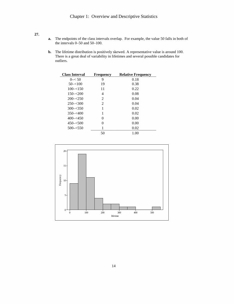
27.
a. The endpoints of the class intervals overlap. For example, the value 50 falls in both of the intervals 0–50 and 50–100.
b. The lifetime distribution is positively skewed. A representative value is around 100. There is a great deal of variability in lifetimes and several possible candidates for outliers.
Class Interval Frequency Relative Frequency 0–< 50 9 0.18
50–<100 19 0.38 100–<150 11 0.22 150–<200 4 0.08 200–<250 2 0.04 250–<300 2 0.04 300–<350 1 0.02 350–<400 1 0.02 400–<450 0 0.00 450–<500 0 0.00 500–<550 1 0.02
50 1.00
5004003002001000
20
15
10
5
0
lifetime
Freq
uenc
y
Chapter 1: Overview and Descriptive Statistics
15
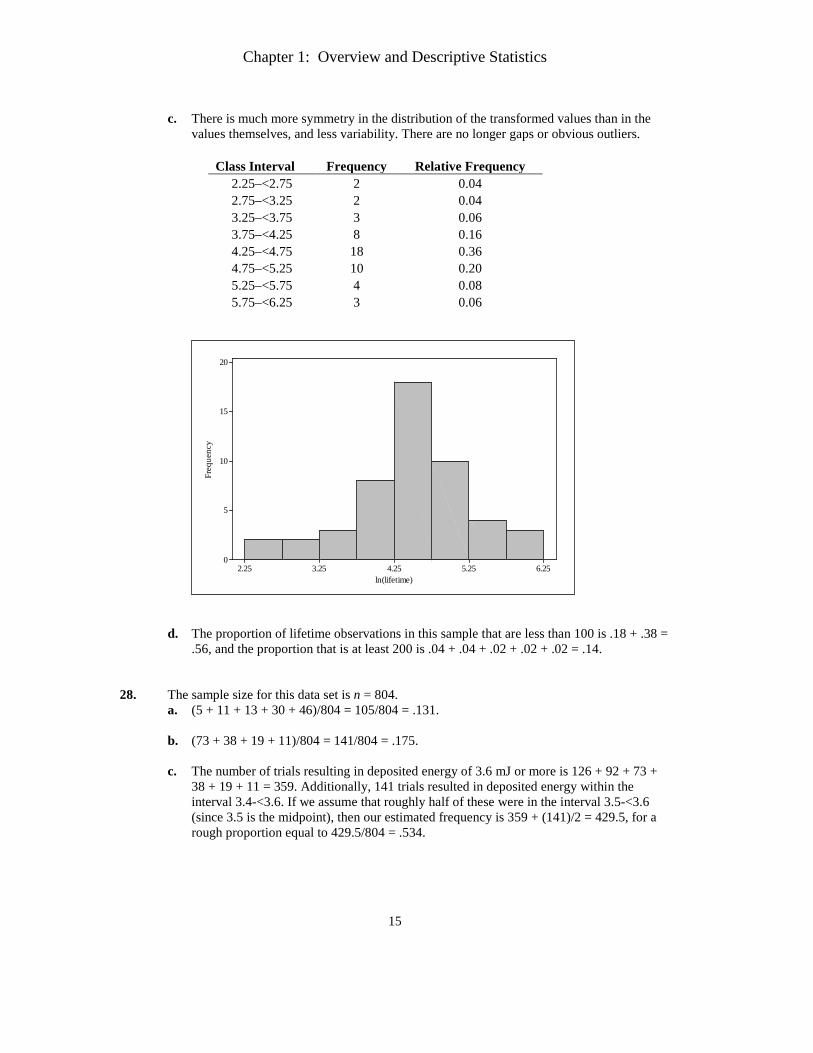
c. There is much more symmetry in the distribution of the transformed values than in the
values themselves, and less variability. There are no longer gaps or obvious outliers.
Class Interval Frequency Relative Frequency 2.25–<2.75 2 0.04 2.75–<3.25 2 0.04 3.25–<3.75 3 0.06 3.75–<4.25 8 0.16 4.25–<4.75 18 0.36 4.75–<5.25 10 0.20 5.25–<5.75 4 0.08 5.75–<6.25 3 0.06
6.255.254.253.252.25
20
15
10
5
0
ln(lifetime)
Freq
uenc
y
d. The proportion of lifetime observations in this sample that are less than 100 is .18 + .38 =
.56, and the proportion that is at least 200 is .04 + .04 + .02 + .02 + .02 = .14. 28. The sample size for this data set is n = 804.
a. (5 + 11 + 13 + 30 + 46)/804 = 105/804 = .131.
b. (73 + 38 + 19 + 11)/804 = 141/804 = .175.
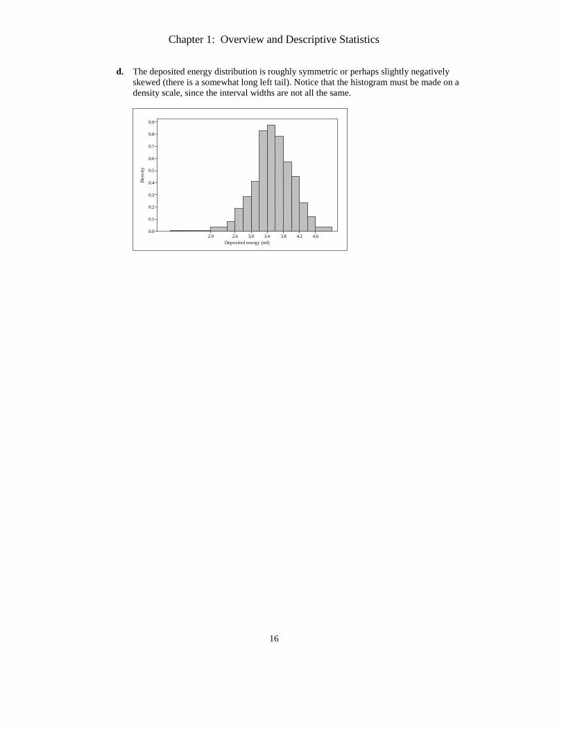
c. The number of trials resulting in deposited energy of 3.6 mJ or more is 126 + 92 + 73 + 38 + 19 + 11 = 359. Additionally, 141 trials resulted in deposited energy within the interval 3.4-<3.6. If we assume that roughly half of these were in the interval 3.5-<3.6 (since 3.5 is the midpoint), then our estimated frequency is 359 + (141)/2 = 429.5, for a rough proportion equal to 429.5/804 = .534.
Chapter 1: Overview and Descriptive Statistics
16
d. The deposited energy distribution is roughly symmetric or perhaps slightly negatively skewed (there is a somewhat long left tail). Notice that the histogram must be made on a density scale, since the interval widths are not all the same.
4.64.23.83.43.02.62.0
0.9
0.8
0.7
0.6
0.5
0.4
0.3
0.2
0.1
0.0
Deposited energy (mJ)
Den
sity
Chapter 1: Overview and Descriptive Statistics
17
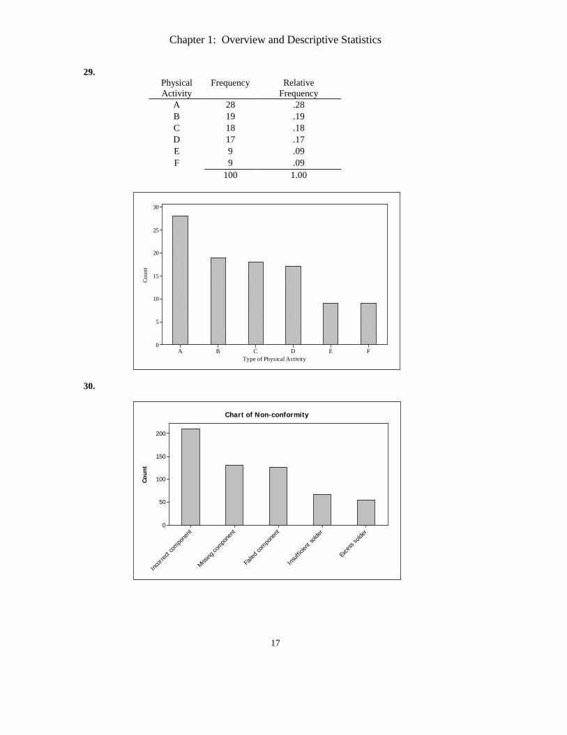
29. Physical Activity
Frequency Relative Frequency
A 28 .28 B 19 .19 C 18 .18 D 17 .17 E 9 .09 F 9 .09 100 1.00
FEDCBA
30
25
20
15
10
5
0
Type of Physical Activity
Coun
t
30.
Coun
t
Exce
ss so
lder
Insuff
icient
solde
r
Faile
d com
pone
nt
Missing
compo
nent
Incor
rect c
ompo
nent
200
150
100
50
0
Chart of Non-conformity
Chapter 1: Overview and Descriptive Statistics
18
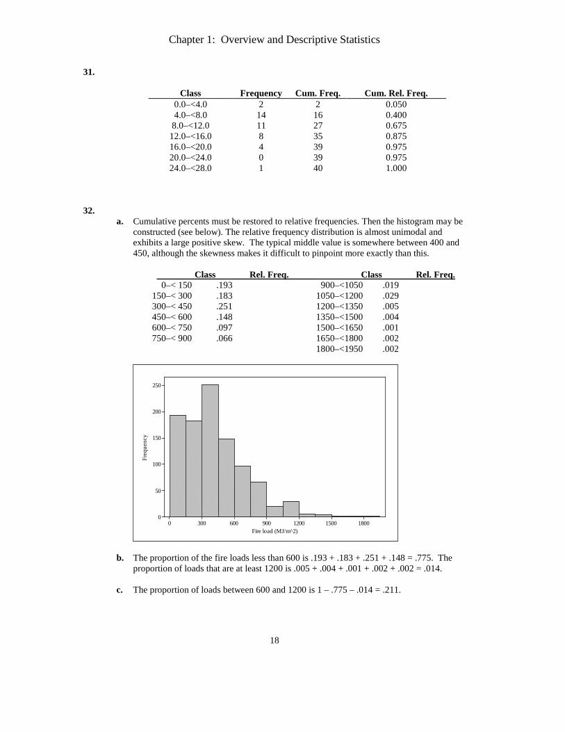
31.
Class Frequency Cum. Freq. Cum. Rel. Freq. 0.0–<4.0 2 2 0.050 4.0–<8.0 14 16 0.400
8.0–<12.0 11 27 0.675 12.0–<16.0 8 35 0.875 16.0–<20.0 4 39 0.975 20.0–<24.0 0 39 0.975 24.0–<28.0 1 40 1.000
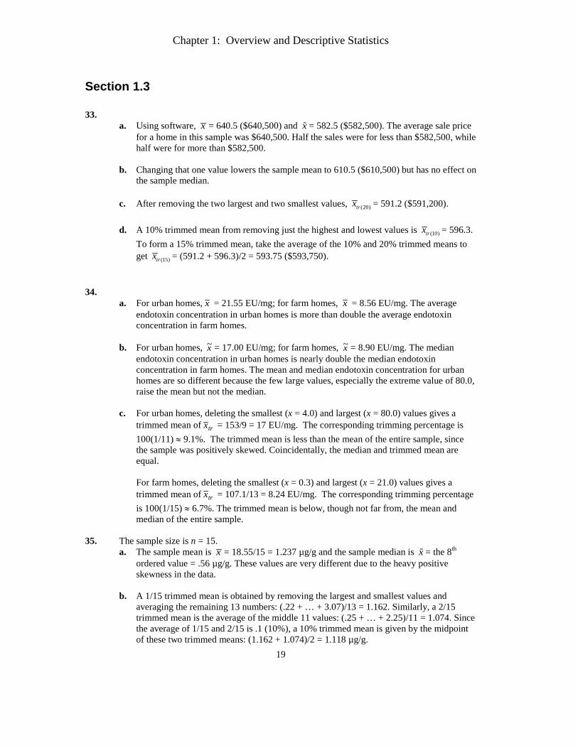
32.
a. Cumulative percents must be restored to relative frequencies. Then the histogram may be constructed (see below). The relative frequency distribution is almost unimodal and exhibits a large positive skew. The typical middle value is somewhere between 400 and 450, although the skewness makes it difficult to pinpoint more exactly than this.
Class Rel. Freq. Class Rel. Freq.
0–< 150 .193 900–<1050 .019 150–< 300 .183 1050–<1200 .029 300–< 450 .251 1200–<1350 .005 450–< 600 .148 1350–<1500 .004 600–< 750 .097 1500–<1650 .001 750–< 900 .066 1650–<1800 .002
1800–<1950 .002
1800150012009006003000
250
200
150
100
50
0
Fire load (MJ/m^2)
Freq
uenc
y
b. The proportion of the fire loads less than 600 is .193 + .183 + .251 + .148 = .775. The proportion of loads that are at least 1200 is .005 + .004 + .001 + .002 + .002 = .014.
c. The proportion of loads between 600 and 1200 is 1 – .775 – .014 = .211.
Chapter 1: Overview and Descriptive Statistics
19
Section 1.3 33.
a. Using software, x = 640.5 ($640,500) and x = 582.5 ($582,500). The average sale price for a home in this sample was $640,500. Half the sales were for less than $582,500, while half were for more than $582,500.
b. Changing that one value lowers the sample mean to 610.5 ($610,500) but has no effect on
the sample median.
c. After removing the two largest and two smallest values, (20)trx = 591.2 ($591,200).
d. A 10% trimmed mean from removing just the highest and lowest values is (10)trx = 596.3. To form a 15% trimmed mean, take the average of the 10% and 20% trimmed means to get (15)trx = (591.2 + 596.3)/2 = 593.75 ($593,750).
34.
a. For urban homes, x = 21.55 EU/mg; for farm homes, x = 8.56 EU/mg. The average endotoxin concentration in urban homes is more than double the average endotoxin concentration in farm homes.
b. For urban homes, x~ = 17.00 EU/mg; for farm homes, x~ = 8.90 EU/mg. The median
endotoxin concentration in urban homes is nearly double the median endotoxin concentration in farm homes. The mean and median endotoxin concentration for urban homes are so different because the few large values, especially the extreme value of 80.0, raise the mean but not the median.
c. For urban homes, deleting the smallest (x = 4.0) and largest (x = 80.0) values gives a
trimmed mean of trx = 153/9 = 17 EU/mg. The corresponding trimming percentage is 100(1/11) ≈ 9.1%. The trimmed mean is less than the mean of the entire sample, since the sample was positively skewed. Coincidentally, the median and trimmed mean are equal.
For farm homes, deleting the smallest (x = 0.3) and largest (x = 21.0) values gives a trimmed mean of trx = 107.1/13 = 8.24 EU/mg. The corresponding trimming percentage is 100(1/15) ≈ 6.7%. The trimmed mean is below, though not far from, the mean and median of the entire sample.
35. The sample size is n = 15.
a. The sample mean is x = 18.55/15 = 1.237 µg/g and the sample median is x = the 8th ordered value = .56 µg/g. These values are very different due to the heavy positive skewness in the data.
b. A 1/15 trimmed mean is obtained by removing the largest and smallest values and averaging the remaining 13 numbers: (.22 + … + 3.07)/13 = 1.162. Similarly, a 2/15 trimmed mean is the average of the middle 11 values: (.25 + … + 2.25)/11 = 1.074. Since the average of 1/15 and 2/15 is .1 (10%), a 10% trimmed mean is given by the midpoint of these two trimmed means: (1.162 + 1.074)/2 = 1.118 µg/g.
Chapter 1: Overview and Descriptive Statistics
20
c. The median of the data set will remain .56 so long as that’s the 8th ordered observation.
Hence, the value .20 could be increased to as high as .56 without changing the fact that the 8th ordered observation is .56. Equivalently, .20 could be increased by as much as .36 without affecting the value of the sample median.
36.
a. A stem-and leaf display of this data appears below:
32 55 stem: ones 33 49 leaf: tenths 34 35 6699 36 34469 37 03345 38 9 39 2347 40 23 41 42 4
The display is reasonably symmetric, so the mean and median will be close.
b. The sample mean is x = 9638/26 = 370.7 sec, while the sample median is x~ = (369+370)/2 = 369.50 sec.
c. The largest value (currently 424) could be increased by any amount. Doing so will not
change the fact that the middle two observations are 369 and 370, and hence, the median will not change. However, the value x = 424 cannot be changed to a number less than 370 (a change of 424 – 370 = 54) since that will change the middle two values.
d. Expressed in minutes, the mean is (370.7 sec)/(60 sec) = 6.18 min, while the median is
6.16 min. 37. 01.12=x , 35.11~ =x , 46.11)10( =trx . The median or the trimmed mean would be better
choices than the mean because of the outlier 21.9.
Chapter 1: Overview and Descriptive Statistics
21
38.
a. The reported values are (in increasing order) 110, 115, 120, 120, 125, 130, 130, 135, and 140. Thus the median of the reported values is 125.
b. 127.6 is reported as 130, so the median is now 130, a very substantial change. When there
is rounding or grouping, the median can be highly sensitive to small change. 39.
a. 475.16=Σ ix so 0297.116475.16
==x ; 009.12
)011.1007.1(~ =+
=x
b. 1.394 can be decreased until it reaches 1.011 (i.e. by 1.394 – 1.011 = 0.383), the largest
of the 2 middle values. If it is decreased by more than 0.383, the median will change. 40. 8.60~ =x , (25) 59.3083trx = , 3475.58)10( =trx , 54.58=x . All four measures of center have
about the same value. 41.
a. x/n = 7/10 = .7 b. 70.=x = the sample proportion of successes c. To have x/n equal .80 requires x/25 = .80 or x = (.80)(25) = 20. There are 7 successes (S)
already, so another 20 – 7 = 13 would be required. 42.
a. cxnnc
nx
ncx
ny
y iii +=+Σ
=+Σ
=Σ
=)(
=y~ the median of =+++ ),...,,( 21 cxcxcx n median of
cxcxxx n +=+ ~),...,,( 21
b. xcnxc
ncx
ny
y iii =Σ
=⋅Σ
=Σ
=)(
=y~ the median of ),...,,( 21 ncxcxcx 1 2the median of ( , ,..., )nc x x x cx= ⋅ = 43. The median and certain trimmed means can be calculated, while the mean cannot — the exact
values of the “100+” observations are required to calculate the mean. x = 0.682
)7957(=
+ ,
(20)trx = 66.2, (30)trx = 67.5.
Chapter 1: Overview and Descriptive Statistics
22
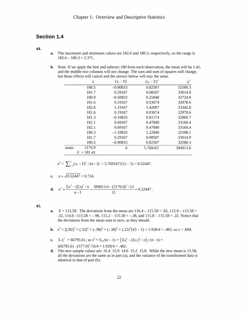
Section 1.4 44.
a. The maximum and minimum values are 182.6 and 180.3, respectively, so the range is 182.6 – 180.3 = 2.3°C.
b. Note: If we apply the hint and subtract 180 from each observation, the mean will be 1.41,
and the middle two columns will not change. The sum and sum of squares will change, but those effects will cancel and the answer below will stay the same.
ix ( )ix x− 2( )ix x− 2ix
180.5 –0.90833 0.82507 32580.3 181.7 0.29167 0.08507 33014.9 180.9 –0.50833 0.25840 32724.8 181.6 0.19167 0.03674 32978.6 182.6 1.19167 1.42007 33342.8 181.6 0.19167 0.03674 32978.6 181.3 –0.10833 0.01174 32869.7 182.1 0.69167 0.47840 33160.4 182.1 0.69167 0.47840 33160.4 180.3 –1.10833 1.22840 32508.1 181.7 0.29167 0.08507 33014.9 180.5 –0.90833 0.82507 32580.3
sums: 2176.9 x = 181.41
0
5.769167
394913.6
s2 =
12( / )) ( 1n
i i xx n=
− −∑ = 5.769167/(12 – 1) = 0.52447. c. 0.52447s = = 0.724.
d. 2 2 2
2 ( ) / 394913.6 (2176.9) /12 0.524471 11
x x nsn
Σ − Σ −= = =
−.
45.
a. x = 115.58. The deviations from the mean are 116.4 – 115.58 = .82, 115.9 – 115.58 = .32, 114.6 –115.58 = –.98, 115.2 – 115.58 = –.38, and 115.8 – 115.58 = .22. Notice that the deviations from the mean sum to zero, as they should.
b. s2 = [(.82)2 + (.32)2 + (-.98)2 + (-.38)2 + (.22)2]/(5 – 1) = 1.928/4 = .482, so s = .694.
c. 2
ixΣ = 66795.61, so s2 = Sxx/(n – 1) = ( )2 2)( / / ( 1)i i nx x n−Σ Σ − = (66795.61 –(577.9)2 /5)/4 = 1.928/4 = .482.
d. The new sample values are: 16.4 15.9 14.6 15.2 15.8. While the new mean is 15.58, all the deviations are the same as in part (a), and the variance of the transformed data is identical to that of part (b).
Chapter 1: Overview and Descriptive Statistics
23
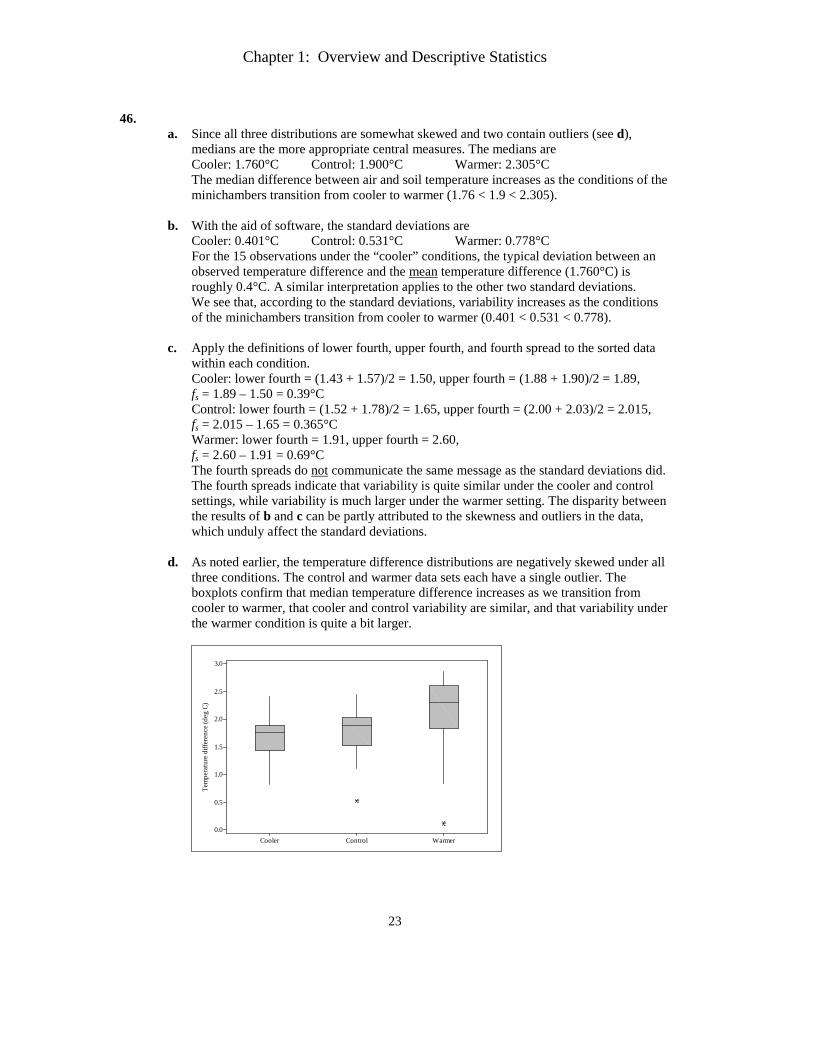
46.
a. Since all three distributions are somewhat skewed and two contain outliers (see d), medians are the more appropriate central measures. The medians are Cooler: 1.760°C Control: 1.900°C Warmer: 2.305°C The median difference between air and soil temperature increases as the conditions of the minichambers transition from cooler to warmer (1.76 < 1.9 < 2.305).
b. With the aid of software, the standard deviations are
Cooler: 0.401°C Control: 0.531°C Warmer: 0.778°C For the 15 observations under the “cooler” conditions, the typical deviation between an observed temperature difference and the mean temperature difference (1.760°C) is roughly 0.4°C. A similar interpretation applies to the other two standard deviations. We see that, according to the standard deviations, variability increases as the conditions of the minichambers transition from cooler to warmer (0.401 < 0.531 < 0.778).
c. Apply the definitions of lower fourth, upper fourth, and fourth spread to the sorted data within each condition. Cooler: lower fourth = (1.43 + 1.57)/2 = 1.50, upper fourth = (1.88 + 1.90)/2 = 1.89, fs = 1.89 – 1.50 = 0.39°C Control: lower fourth = (1.52 + 1.78)/2 = 1.65, upper fourth = (2.00 + 2.03)/2 = 2.015, fs = 2.015 – 1.65 = 0.365°C Warmer: lower fourth = 1.91, upper fourth = 2.60, fs = 2.60 – 1.91 = 0.69°C The fourth spreads do not communicate the same message as the standard deviations did. The fourth spreads indicate that variability is quite similar under the cooler and control settings, while variability is much larger under the warmer setting. The disparity between the results of b and c can be partly attributed to the skewness and outliers in the data, which unduly affect the standard deviations.
d. As noted earlier, the temperature difference distributions are negatively skewed under all three conditions. The control and warmer data sets each have a single outlier. The boxplots confirm that median temperature difference increases as we transition from cooler to warmer, that cooler and control variability are similar, and that variability under the warmer condition is quite a bit larger.
WarmerControlCooler
3.0
2.5
2.0
1.5
1.0
0.5
0.0
Tem
pera
ture
diff
eren
ce (d
eg C
)
Chapter 1: Overview and Descriptive Statistics
24
47.
a. From software, x = 14.7% and x = 14.88%. The sample average alcohol content of these 10 wines was 14.88%. Half the wines have alcohol content below 14.7% and half are above 14.7% alcohol.
b. Working long-hand, 2( )ix xΣ − = (14.8 – 14.88)2 + … + (15.0 – 14.88)2 = 7.536. The sample variance equals s2 = 2( )ix xΣ − = 7.536/(10 – 1) = 0.837.
c. Subtracting 13 from each value will not affect the variance. The 10 new observations are 1.8, 1.5, 3.1, 1.2, 2.9, 0.7, 3.2, 1.6, 0.8, and 2.0. The sum and sum of squares of these 10 new numbers are iyΣ = 18.8 and 2
iyΣ = 42.88. Using the sample variance shortcut, we obtain s2 = [42.88 – (18.8)2/10]/(10 – 1) = 7.536/9 = 0.837 again.
48.
a. Using the sums provided for urban homes, Sxx = 10,079 – (237.0)2/11 = 4972.73, so s =
11173.4972
−= 22.3 EU/mg. Similarly for farm homes, Sxx = 518.836 and s = 6.09 EU/mg.
The endotoxin concentration in an urban home “typically” deviates from the average of 21.55 by about 22.3 EU/mg. The endotoxin concentration in a farm home “typically” deviates from the average of 8.56 by about 6.09 EU/mg. (These interpretations are very loose, especially since the distributions are not symmetric.) In any case, the variability in endotoxin concentration is far greater in urban homes than in farm homes.
b. The upper and lower fourths of the urban data are 28.0 and 5.5, respectively, for a fourth
spread of 22.5 EU/mg. The upper and lower fourths of the farm data are 10.1 and 4, respectively, for a fourth spread of 6.1 EU/mg. Again, we see that the variability in endotoxin concentration is much greater for urban homes than for farm homes.
Chapter 1: Overview and Descriptive Statistics
25
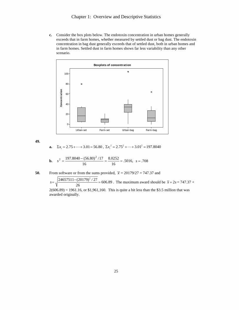
c. Consider the box plots below. The endotoxin concentration in urban homes generally
exceeds that in farm homes, whether measured by settled dust or bag dust. The endotoxin concentration in bag dust generally exceeds that of settled dust, both in urban homes and in farm homes. Settled dust in farm homes shows far less variability than any other scenario.
Co
ncen
trat
ion
Farm-bagUrban-bagFarm-setUrban-set
100
80
60
40
20
0
Boxplots of concentration
49.
a. 2.75 3.01 56.80ixΣ = + + = , 2 2 22.75 3.01 197.8040ixΣ = + + =
b. ,5016.160252.8
1617/)80.56(8040.197 2
2 ==−
=s 708.=s
50. From software or from the sums provided, x = 20179/27 = 747.37 and
224657511 (20179) 606.8926
/ 27s −= = . The maximum award should be 2x s+ = 747.37 +
2(606.89) = 1961.16, or $1,961,160. This is quite a bit less than the $3.5 million that was awarded originally.
Chapter 1: Overview and Descriptive Statistics
26
51.
a. From software, s2 = 1264.77 min2 and s = 35.56 min. Working by hand, 2563=Σx and 2 368501xΣ = , so
2
2 368501 (2563) /19 1264.76619 1
s −= =
− and 1264.766 35.564s ==
b. If y = time in hours, then y = cx where c = 1
60 . So, ( )22 260
2 1 1264.766 .351y xs c s= = = hr2 and
( )160 35.564 .593y xs cs= = = hr.
52. Let d denote the fifth deviation. Then 03.10.19.3. =++++ d or 05.3 =+ d , so 5.3−=d .
One sample for which these are the deviations is ,8.31 =x ,4.42 =x ,5.43 =x ,8.44 =x .05 =x (These were obtained by adding 3.5 to each deviation; adding any other number will
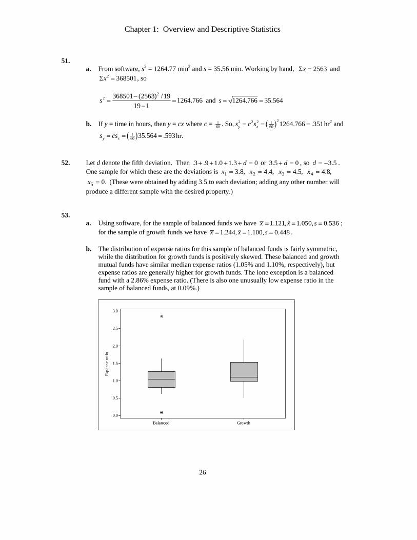
produce a different sample with the desired property.) 53.
a. Using software, for the sample of balanced funds we have 1.121, 1.050, 0.536x x s= = = ; for the sample of growth funds we have 1.244, 1.100, 0.448x x s= = = .
b. The distribution of expense ratios for this sample of balanced funds is fairly symmetric,
while the distribution for growth funds is positively skewed. These balanced and growth mutual funds have similar median expense ratios (1.05% and 1.10%, respectively), but expense ratios are generally higher for growth funds. The lone exception is a balanced fund with a 2.86% expense ratio. (There is also one unusually low expense ratio in the sample of balanced funds, at 0.09%.)
GrowthBalanced
3.0
2.5
2.0
1.5
1.0
0.5
0.0
Expe
nse
ratio
Chapter 1: Overview and Descriptive Statistics
27
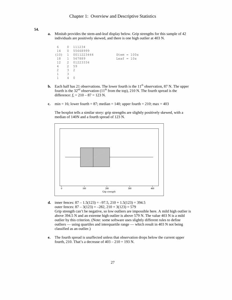
54. a. Minitab provides the stem-and-leaf display below. Grip strengths for this sample of 42
individuals are positively skewed, and there is one high outlier at 403 N.
6 0 111234 14 0 55668999 (10) 1 0011223444 Stem = 100s 18 1 567889 Leaf = 10s 12 2 01223334 4 2 59 2 3 2 1 3 1 4 0
b. Each half has 21 observations. The lower fourth is the 11th observation, 87 N. The upper fourth is the 32nd observation (11th from the top), 210 N. The fourth spread is the difference: fs = 210 – 87 = 123 N.
c. min = 16; lower fourth = 87; median = 140; upper fourth = 210; max = 403
The boxplot tells a similar story: grip strengths are slightly positively skewed, with a median of 140N and a fourth spread of 123 N.
4003002001000Grip strength
d. inner fences: 87 – 1.5(123) = –97.5, 210 + 1.5(123) = 394.5 outer fences: 87 – 3(123) = –282, 210 + 3(123) = 579 Grip strength can’t be negative, so low outliers are impossible here. A mild high outlier is above 394.5 N and an extreme high outlier is above 579 N. The value 403 N is a mild outlier by this criterion. (Note: some software uses slightly different rules to define outliers — using quartiles and interquartile range — which result in 403 N not being classified as an outlier.)
e. The fourth spread is unaffected unless that observation drops below the current upper fourth, 210. That’s a decrease of 403 – 210 = 193 N.
Chapter 1: Overview and Descriptive Statistics
28
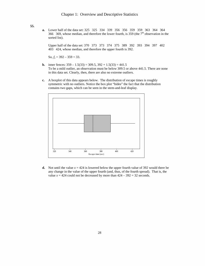
55. a. Lower half of the data set: 325 325 334 339 356 356 359 359 363 364 364
366 369, whose median, and therefore the lower fourth, is 359 (the 7th observation in the sorted list). Upper half of the data set: 370 373 373 374 375 389 392 393 394 397 402 403 424, whose median, and therefore the upper fourth is 392.
So, fs = 392 – 359 = 33.
b. inner fences: 359 – 1.5(33) = 309.5, 392 + 1.5(33) = 441.5
To be a mild outlier, an observation must be below 309.5 or above 441.5. There are none in this data set. Clearly, then, there are also no extreme outliers.
c. A boxplot of this data appears below. The distribution of escape times is roughly
symmetric with no outliers. Notice the box plot “hides” the fact that the distribution contains two gaps, which can be seen in the stem-and-leaf display.
420400380360340320Escape time (sec)
d. Not until the value x = 424 is lowered below the upper fourth value of 392 would there be
any change in the value of the upper fourth (and, thus, of the fourth spread). That is, the value x = 424 could not be decreased by more than 424 – 392 = 32 seconds.
Chapter 1: Overview and Descriptive Statistics
29
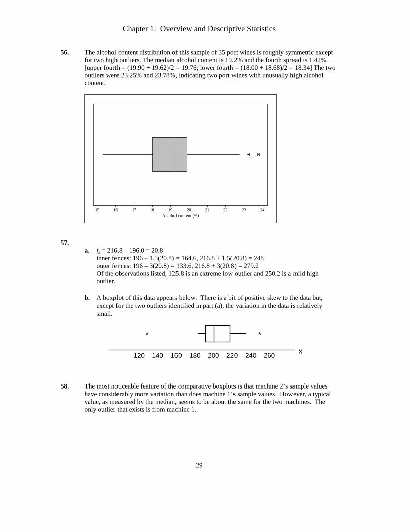
56. The alcohol content distribution of this sample of 35 port wines is roughly symmetric except for two high outliers. The median alcohol content is 19.2% and the fourth spread is 1.42%. [upper fourth = (19.90 + 19.62)/2 = 19.76; lower fourth = (18.00 + 18.68)/2 = 18.34] The two outliers were 23.25% and 23.78%, indicating two port wines with unusually high alcohol content.
24232221201918171615Alcohol content (%)
57.
a. fs = 216.8 – 196.0 = 20.8 inner fences: 196 – 1.5(20.8) = 164.6, 216.8 + 1.5(20.8) = 248 outer fences: 196 – 3(20.8) = 133.6, 216.8 + 3(20.8) = 279.2 Of the observations listed, 125.8 is an extreme low outlier and 250.2 is a mild high outlier.
b. A boxplot of this data appears below. There is a bit of positive skew to the data but,
except for the two outliers identified in part (a), the variation in the data is relatively small.
x120 140 160 180 200 220 240 260
* *
58. The most noticeable feature of the comparative boxplots is that machine 2’s sample values
have considerably more variation than does machine 1’s sample values. However, a typical value, as measured by the median, seems to be about the same for the two machines. The only outlier that exists is from machine 1.
Chapter 1: Overview and Descriptive Statistics
30
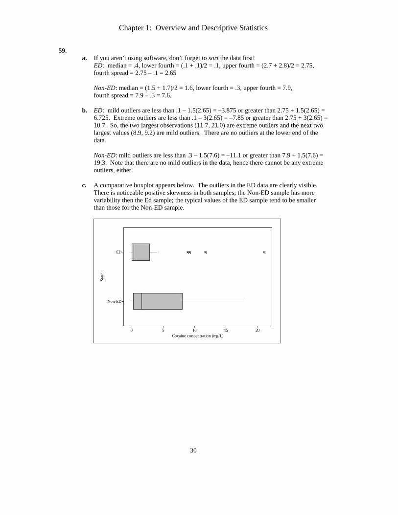
59. a. If you aren’t using software, don’t forget to sort the data first!
ED: median = .4, lower fourth = (.1 + .1)/2 = .1, upper fourth = (2.7 + 2.8)/2 = 2.75, fourth spread = 2.75 – .1 = 2.65
Non-ED: median = (1.5 + 1.7)/2 = 1.6, lower fourth = .3, upper fourth = 7.9, fourth spread = 7.9 – .3 = 7.6.
b. ED: mild outliers are less than .1 – 1.5(2.65) = –3.875 or greater than 2.75 + 1.5(2.65) =
6.725. Extreme outliers are less than .1 – 3(2.65) = –7.85 or greater than 2.75 + 3(2.65) = 10.7. So, the two largest observations (11.7, 21.0) are extreme outliers and the next two largest values (8.9, 9.2) are mild outliers. There are no outliers at the lower end of the data.
Non-ED: mild outliers are less than .3 – 1.5(7.6) = –11.1 or greater than 7.9 + 1.5(7.6) = 19.3. Note that there are no mild outliers in the data, hence there cannot be any extreme outliers, either.
c. A comparative boxplot appears below. The outliers in the ED data are clearly visible.
There is noticeable positive skewness in both samples; the Non-ED sample has more variability then the Ed sample; the typical values of the ED sample tend to be smaller than those for the Non-ED sample.
Non-ED
ED
20151050
Stat
e
Cocaine concentration (mg/L)
Chapter 1: Overview and Descriptive Statistics
31
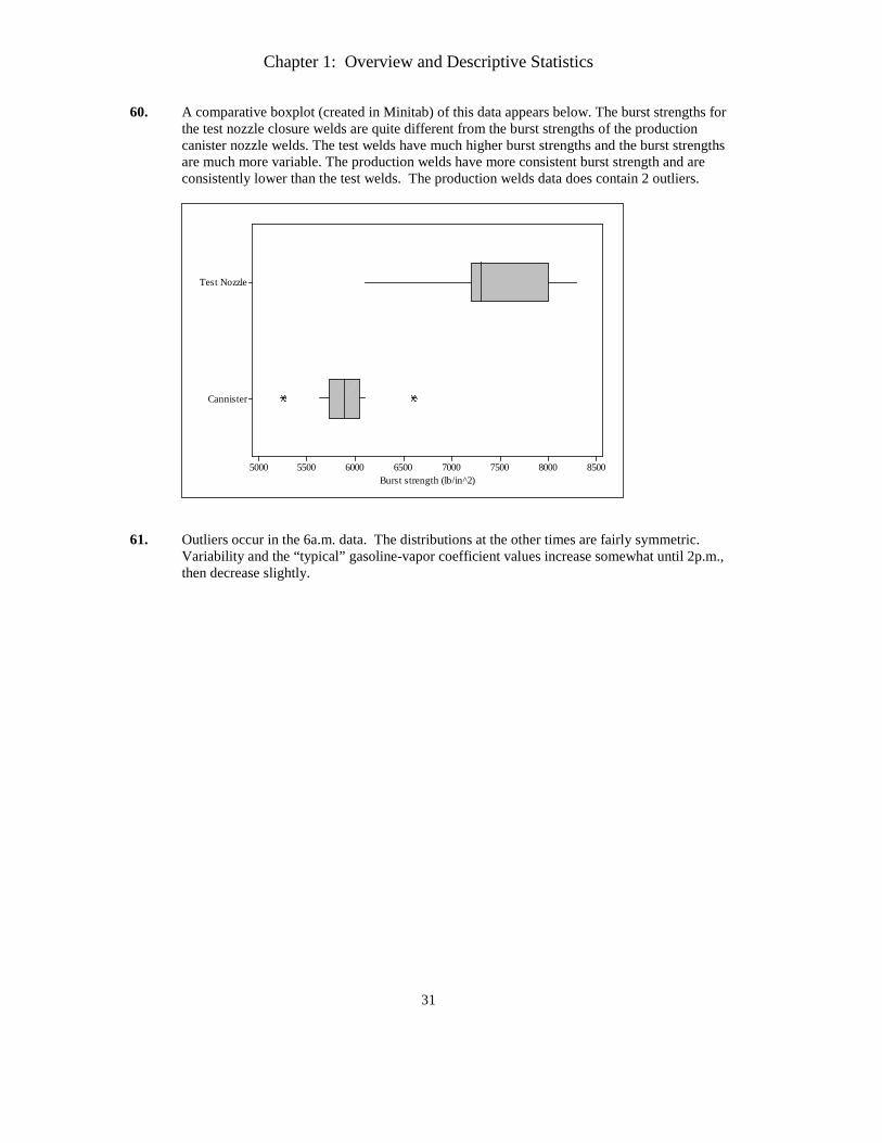
60. A comparative boxplot (created in Minitab) of this data appears below. The burst strengths for the test nozzle closure welds are quite different from the burst strengths of the production canister nozzle welds. The test welds have much higher burst strengths and the burst strengths are much more variable. The production welds have more consistent burst strength and are consistently lower than the test welds. The production welds data does contain 2 outliers.
Cannister
Test Nozzle
85008000750070006500600055005000Burst strength (lb/in^2)
61. Outliers occur in the 6a.m. data. The distributions at the other times are fairly symmetric.
Variability and the “typical” gasoline-vapor coefficient values increase somewhat until 2p.m., then decrease slightly.
Chapter 1: Overview and Descriptive Statistics
32
Supplementary Exercises 62. To simplify the math, subtract the mean from each observation; i.e., let i iy x x= − =
76831ix − . Then y1 = 76683 – 76831 = –148 and y4 = 77048 – 76831 = 217; by rescaling, 76831 0y x= − = , so y2 + y3 = –(y1 + y4) = –69. Also,
2 2
2 2( ) 972001 3
180 3(180)i ii
x x y yn
s Σ − Σ⇒ Σ ====
−=
so 2 2 2 2 2 22 3 1 497200 ( ) 97200 (( 148) (217) ) 28207yy y y+ = − + = − − + = .
To solve the equations y2 + y3 = –69 and 2 22 3 28207yy + = , substitute y3 = –69 – y2 into the
second equation and use the quadratic formula to solve. This gives y2 = 79.14 or –148.14 (one is y2 and one is y3). Finally, x2 and x3 are given by y2 + 76831 and y3 + 76831, or 79,610 and 76,683.
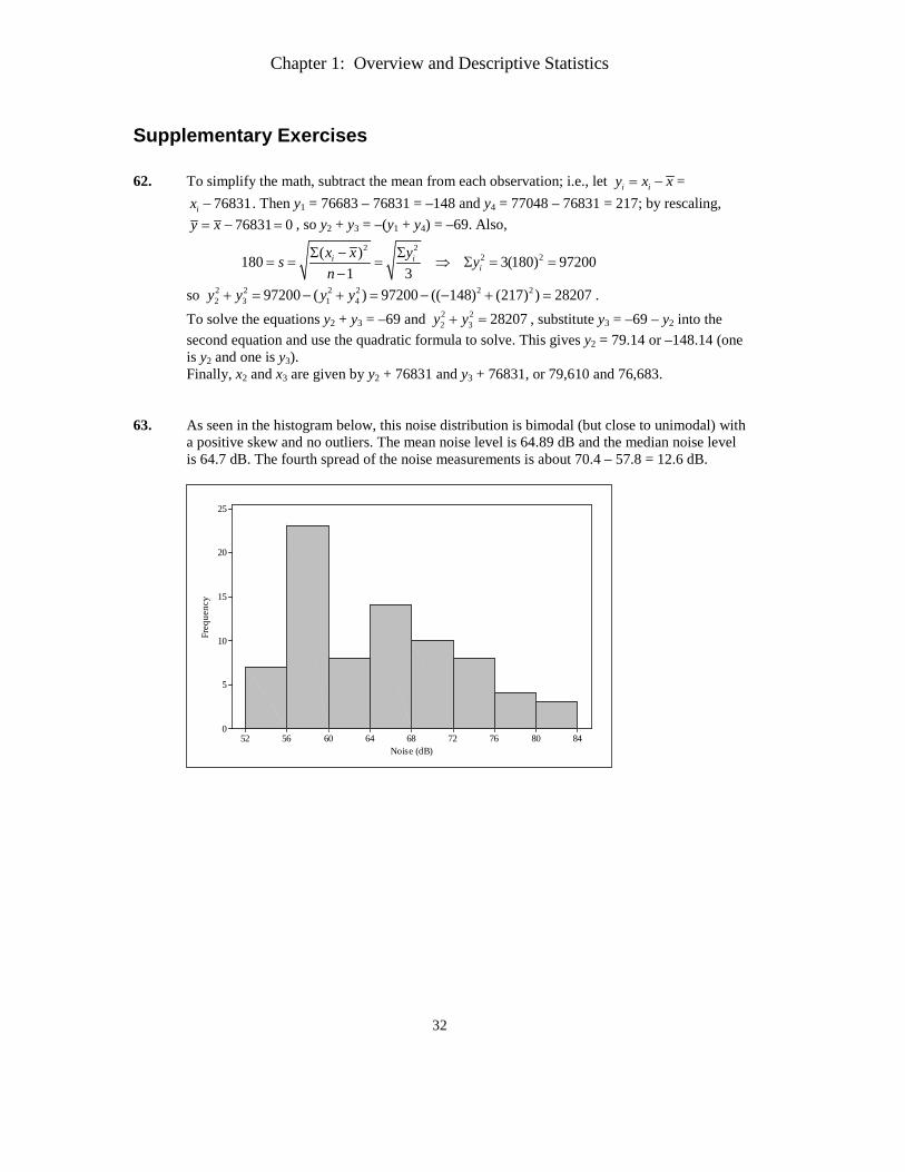
63. As seen in the histogram below, this noise distribution is bimodal (but close to unimodal) with
a positive skew and no outliers. The mean noise level is 64.89 dB and the median noise level is 64.7 dB. The fourth spread of the noise measurements is about 70.4 – 57.8 = 12.6 dB.
848076726864605652
25
20
15
10
5
0
Noise (dB)
Freq
uenc
y
Chapter 1: Overview and Descriptive Statistics
33
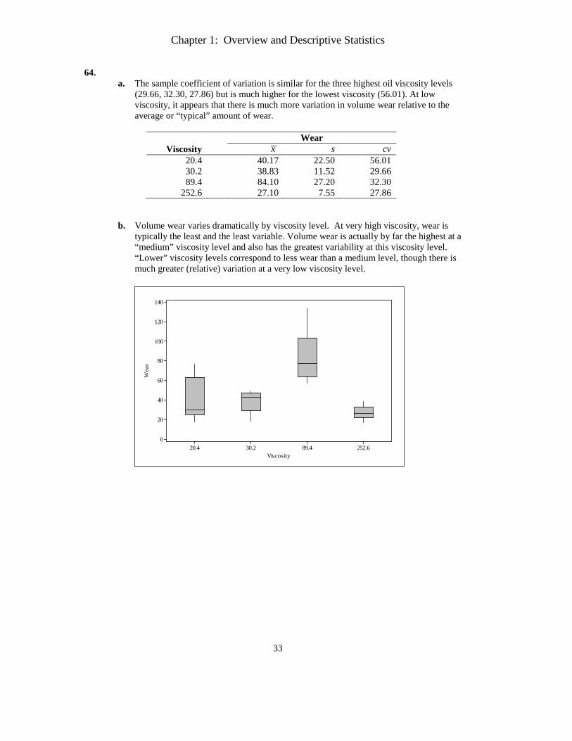
64. a. The sample coefficient of variation is similar for the three highest oil viscosity levels
(29.66, 32.30, 27.86) but is much higher for the lowest viscosity (56.01). At low viscosity, it appears that there is much more variation in volume wear relative to the average or “typical” amount of wear.
Wear
Viscosity x s cv 20.4 40.17 22.50 56.01 30.2 38.83 11.52 29.66 89.4 84.10 27.20 32.30
252.6 27.10 7.55 27.86
b. Volume wear varies dramatically by viscosity level. At very high viscosity, wear is typically the least and the least variable. Volume wear is actually by far the highest at a “medium” viscosity level and also has the greatest variability at this viscosity level. “Lower” viscosity levels correspond to less wear than a medium level, though there is much greater (relative) variation at a very low viscosity level.
252.689.430.220.4
140
120
100
80
60
40
20
0
Viscosity
Wea
r
Chapter 1: Overview and Descriptive Statistics
34
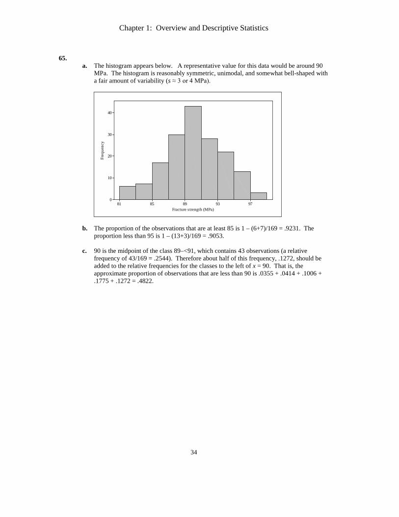
65.
a. The histogram appears below. A representative value for this data would be around 90 MPa. The histogram is reasonably symmetric, unimodal, and somewhat bell-shaped with a fair amount of variability (s ≈ 3 or 4 MPa).
9793898581
40
30
20
10
0
Fracture strength (MPa)
Freq
uenc
y
b. The proportion of the observations that are at least 85 is 1 – (6+7)/169 = .9231. The proportion less than 95 is 1 – (13+3)/169 = .9053.
c. 90 is the midpoint of the class 89–<91, which contains 43 observations (a relative
frequency of 43/169 = .2544). Therefore about half of this frequency, .1272, should be added to the relative frequencies for the classes to the left of x = 90. That is, the approximate proportion of observations that are less than 90 is .0355 + .0414 + .1006 + .1775 + .1272 = .4822.
Chapter 1: Overview and Descriptive Statistics
35
66.
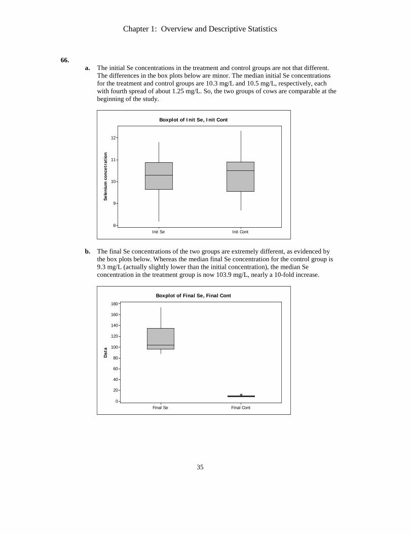
a. The initial Se concentrations in the treatment and control groups are not that different. The differences in the box plots below are minor. The median initial Se concentrations for the treatment and control groups are 10.3 mg/L and 10.5 mg/L, respectively, each with fourth spread of about 1.25 mg/L. So, the two groups of cows are comparable at the beginning of the study.
Se
leni
um c
once
trat
ion
Init ContInit Se
12
11
10
9
8
Boxplot of Init Se, Init Cont
b. The final Se concentrations of the two groups are extremely different, as evidenced by the box plots below. Whereas the median final Se concentration for the control group is 9.3 mg/L (actually slightly lower than the initial concentration), the median Se concentration in the treatment group is now 103.9 mg/L, nearly a 10-fold increase.
Dat
a
Final ContFinal Se
180
160
140
120
100
80
60
40
20
0
Boxplot of Final Se, Final Cont
Chapter 1: Overview and Descriptive Statistics
36
67.
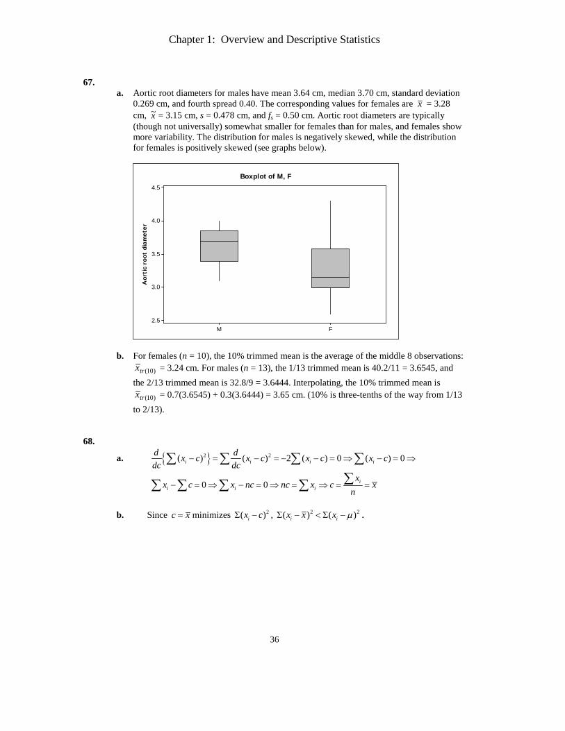
a. Aortic root diameters for males have mean 3.64 cm, median 3.70 cm, standard deviation 0.269 cm, and fourth spread 0.40. The corresponding values for females are x = 3.28 cm, x~ = 3.15 cm, s = 0.478 cm, and fs = 0.50 cm. Aortic root diameters are typically (though not universally) somewhat smaller for females than for males, and females show more variability. The distribution for males is negatively skewed, while the distribution for females is positively skewed (see graphs below).
Aor
tic
root
dia
met
er
FM
4.5
4.0
3.5
3.0
2.5
Boxplot of M, F
b. For females (n = 10), the 10% trimmed mean is the average of the middle 8 observations: )10(trx = 3.24 cm. For males (n = 13), the 1/13 trimmed mean is 40.2/11 = 3.6545, and
the 2/13 trimmed mean is 32.8/9 = 3.6444. Interpolating, the 10% trimmed mean is )10(trx = 0.7(3.6545) + 0.3(3.6444) = 3.65 cm. (10% is three-tenths of the way from 1/13
to 2/13). 68.
a. { }2 2( ) ( ) 2 ( ) 0 ( ) 0i i i id dx c x c x c x cdc dc
− = − = − − = ⇒ − = ⇒∑ ∑ ∑ ∑
0 0 ii i i
xx c x nc nc x c x
n− = ⇒ − = ⇒ = ⇒ = =∑∑ ∑ ∑ ∑
b. Since c x= minimizes 2( )ix cΣ − , 2 2( ) ( )i ix x x µΣ − < Σ − .
Chapter 1: Overview and Descriptive Statistics
37
69.
a. ( )
( ) ( ) ( )
( )
2 2 22
222 2
( )1 1 1
1
i i i i
i i iy
ix
y ax b a x b a x nby ax b
n n n ny y ax b ax b ax ax
sn n n
a x xa s
n
+ + += = = = = +
− + − + −= = =
− − −
−= =
−
∑ ∑ ∑ ∑ ∑
∑ ∑ ∑
∑
b.
( )
( )2
22
C, F9 87.3 32 189.14 F5
9 1.04 3.5044 1.872 F5y y
x y
y
s s
= =
= + =
= = = =
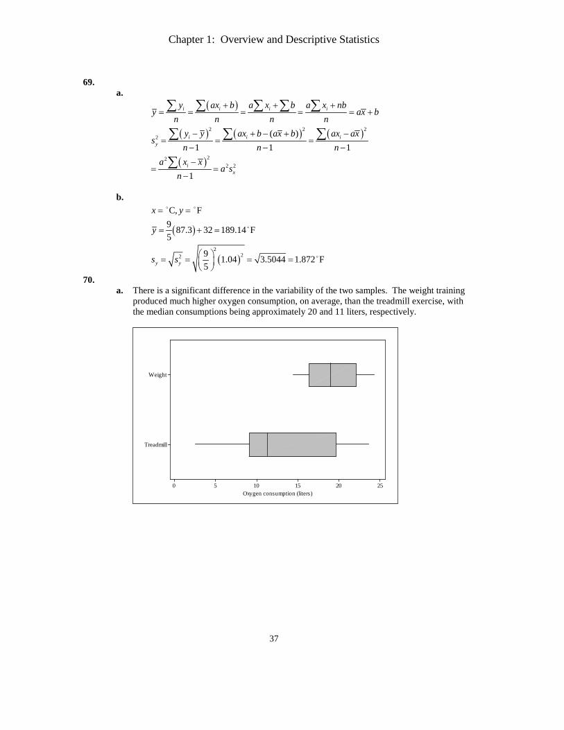
70. a. There is a significant difference in the variability of the two samples. The weight training
produced much higher oxygen consumption, on average, than the treadmill exercise, with the median consumptions being approximately 20 and 11 liters, respectively.
Treadmill
Weight
2520151050Oxygen consumption (liters)
Chapter 1: Overview and Descriptive Statistics
38
b. The differences in oxygen consumption (weight minus treadmill) for the 15 subjects are
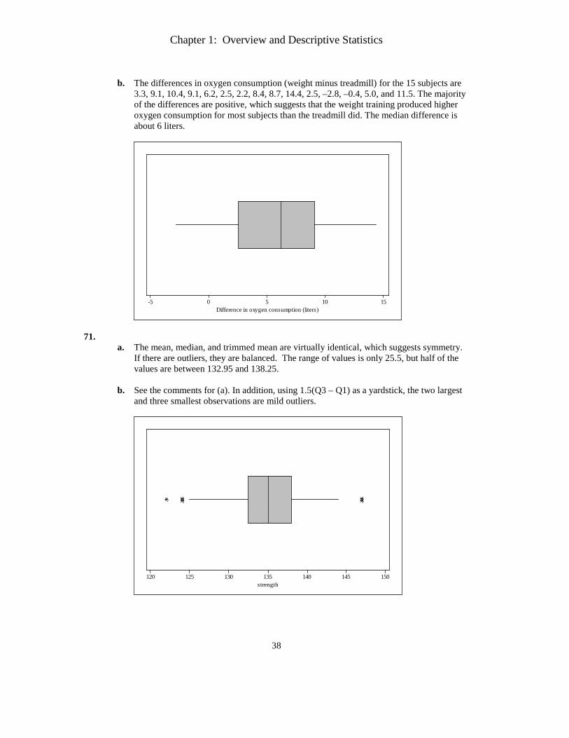
3.3, 9.1, 10.4, 9.1, 6.2, 2.5, 2.2, 8.4, 8.7, 14.4, 2.5, –2.8, –0.4, 5.0, and 11.5. The majority of the differences are positive, which suggests that the weight training produced higher oxygen consumption for most subjects than the treadmill did. The median difference is about 6 liters.
151050-5Difference in oxygen consumption (liters)
71. a. The mean, median, and trimmed mean are virtually identical, which suggests symmetry.
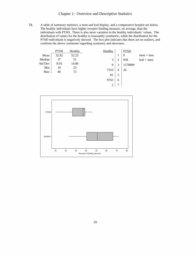
If there are outliers, they are balanced. The range of values is only 25.5, but half of the values are between 132.95 and 138.25.
b. See the comments for (a). In addition, using 1.5(Q3 – Q1) as a yardstick, the two largest
and three smallest observations are mild outliers.
150145140135130125120strength
Chapter 1: Overview and Descriptive Statistics
39
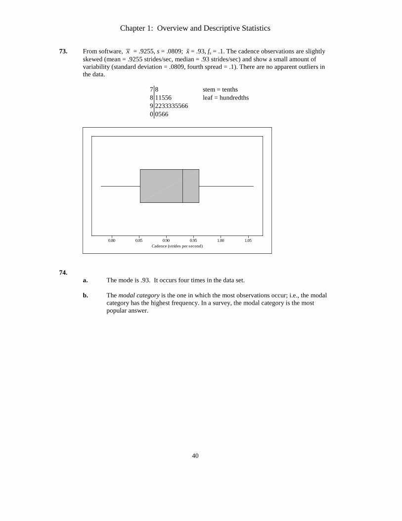
72. A table of summary statistics, a stem and leaf display, and a comparative boxplot are below. The healthy individuals have higher receptor binding measure, on average, than the individuals with PTSD. There is also more variation in the healthy individuals’ values. The distribution of values for the healthy is reasonably symmetric, while the distribution for the PTSD individuals is negatively skewed. The box plot indicates that there are no outliers, and confirms the above comments regarding symmetry and skewness.
PTSD Healthy
Mean 32.92 52.23 Median 37 51 Std Dev 9.93 14.86
Min 10 23 Max 46 72
Healthy PTSD 1 0 stem = tens
3 2 058 leaf = ones 9 3 1578899
7310 4 26 81 5
9763 6 2 7
Healthy
PTSD
8070605040302010Receptor binding measure
Chapter 1: Overview and Descriptive Statistics
40
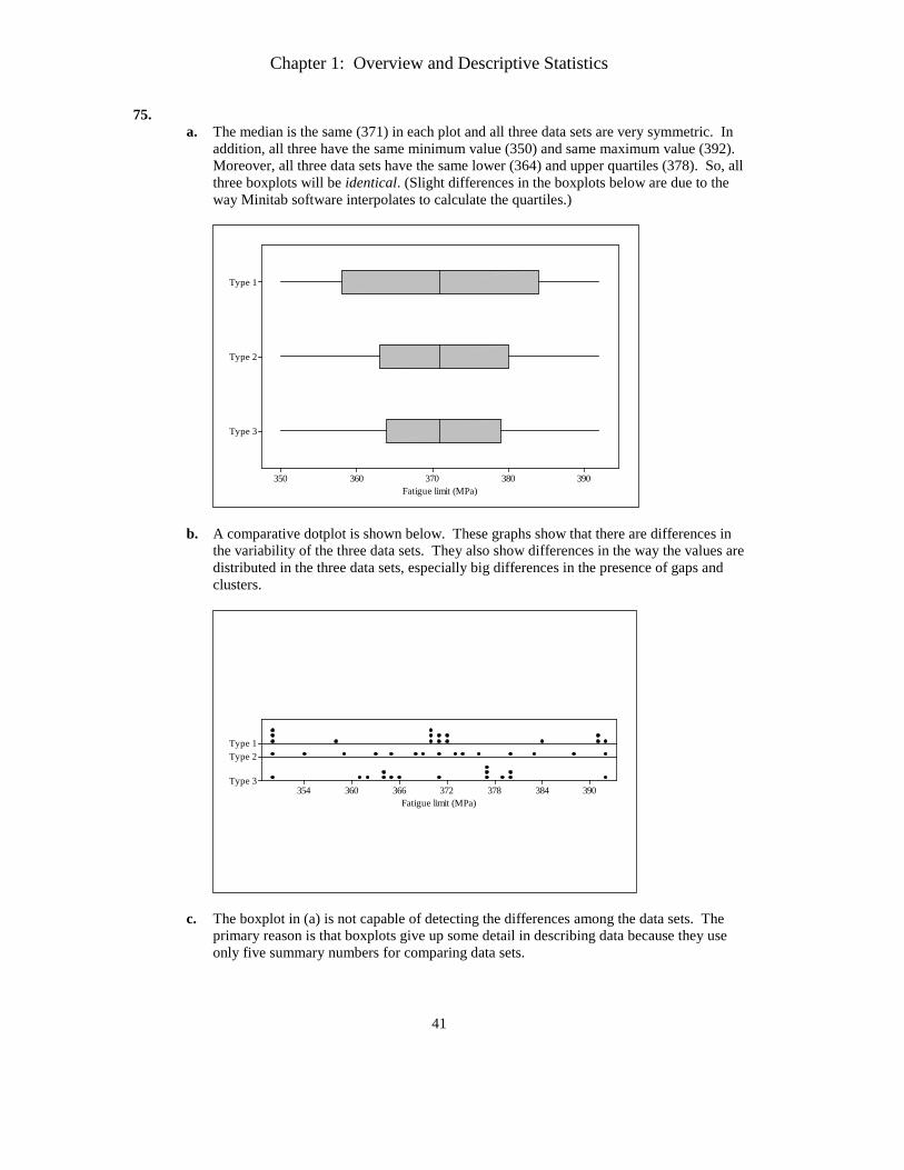
73. From software, x = .9255, s = .0809; x = .93, fs = .1. The cadence observations are slightly skewed (mean = .9255 strides/sec, median = .93 strides/sec) and show a small amount of variability (standard deviation = .0809, fourth spread = .1). There are no apparent outliers in the data.
7 8 stem = tenths 8 11556 leaf = hundredths 9 2233335566 0 0566
1.051.000.950.900.850.80Cadence (strides per second)
74. a. The mode is .93. It occurs four times in the data set. b. The modal category is the one in which the most observations occur; i.e., the modal
category has the highest frequency. In a survey, the modal category is the most popular answer.
Chapter 1: Overview and Descriptive Statistics
41
75. a. The median is the same (371) in each plot and all three data sets are very symmetric. In
addition, all three have the same minimum value (350) and same maximum value (392). Moreover, all three data sets have the same lower (364) and upper quartiles (378). So, all three boxplots will be identical. (Slight differences in the boxplots below are due to the way Minitab software interpolates to calculate the quartiles.)
Type 3
Type 2
Type 1
390380370360350Fatigue limit (MPa)
b. A comparative dotplot is shown below. These graphs show that there are differences in
the variability of the three data sets. They also show differences in the way the values are distributed in the three data sets, especially big differences in the presence of gaps and clusters.
390384378372366360354
Type 1Type 2
Type 3
Fatigue limit (MPa)
c. The boxplot in (a) is not capable of detecting the differences among the data sets. The primary reason is that boxplots give up some detail in describing data because they use only five summary numbers for comparing data sets.