Embed Size (px)
DESCRIPTION
Print Screens of My Music Magazine
Citation preview

HARRISON WHEELER
MUSIC MAGAZINE
FRONT PAGE
SCREEN SHOTS
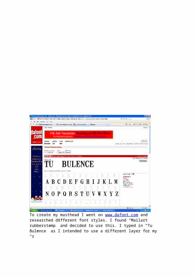
To create my masthead I went on www.dafont.com and researched different font styles. I found “Mailart rubberstamp” and decided to use this. I typed in “Tu Bulence” as I intended to use a different layer for my “r”

I then print screened my font and pasted it onto Photoshop.
I then used the box selection tool on this print screen to select the font.
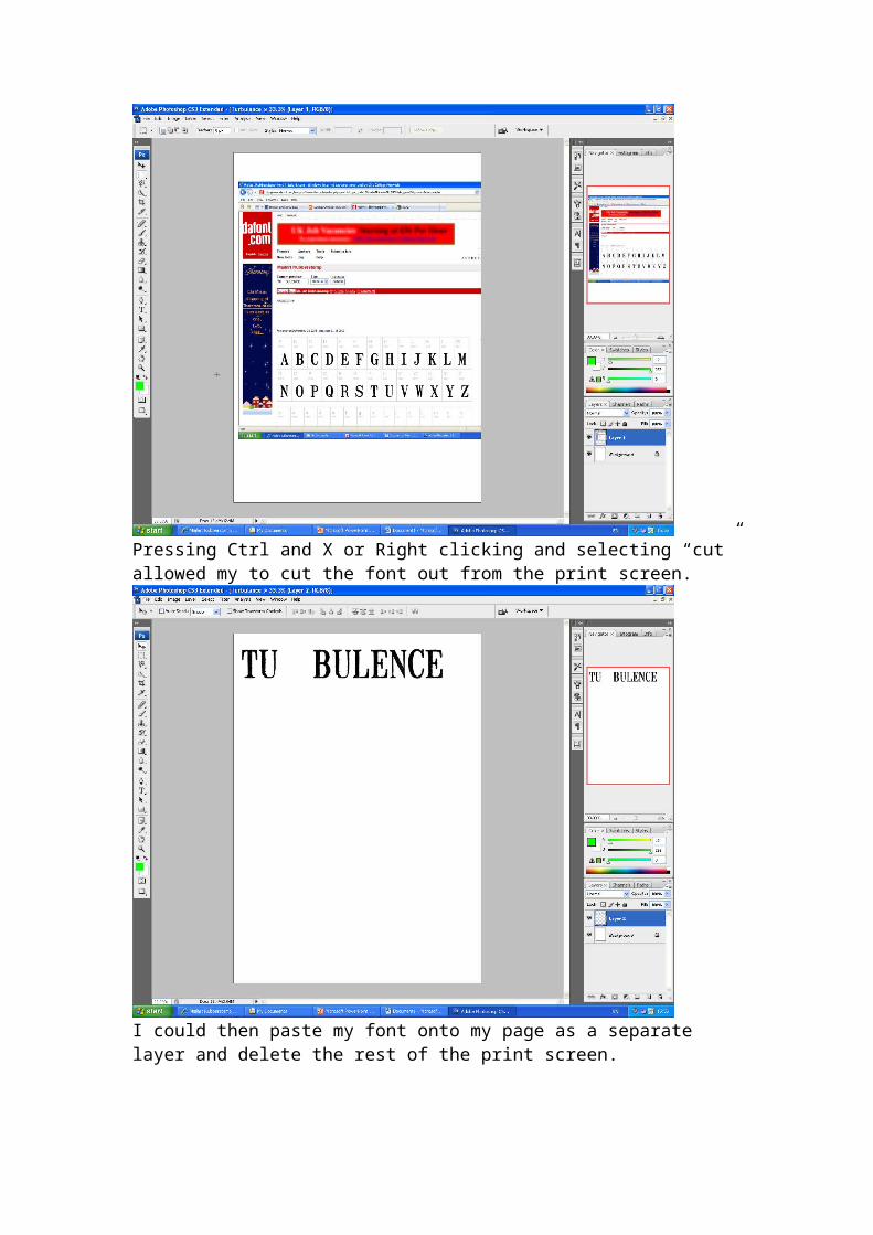
Pressing Ctrl and X or Right clicking and selecting “cut” allowed my to cut the font out from the print screen.
I could then paste my font onto my page as a separate layer and delete the rest of the print screen.

To get rid of the white box surrounding my text I selected layer blend options and selected multiply.
I then repeated this process with my “R”
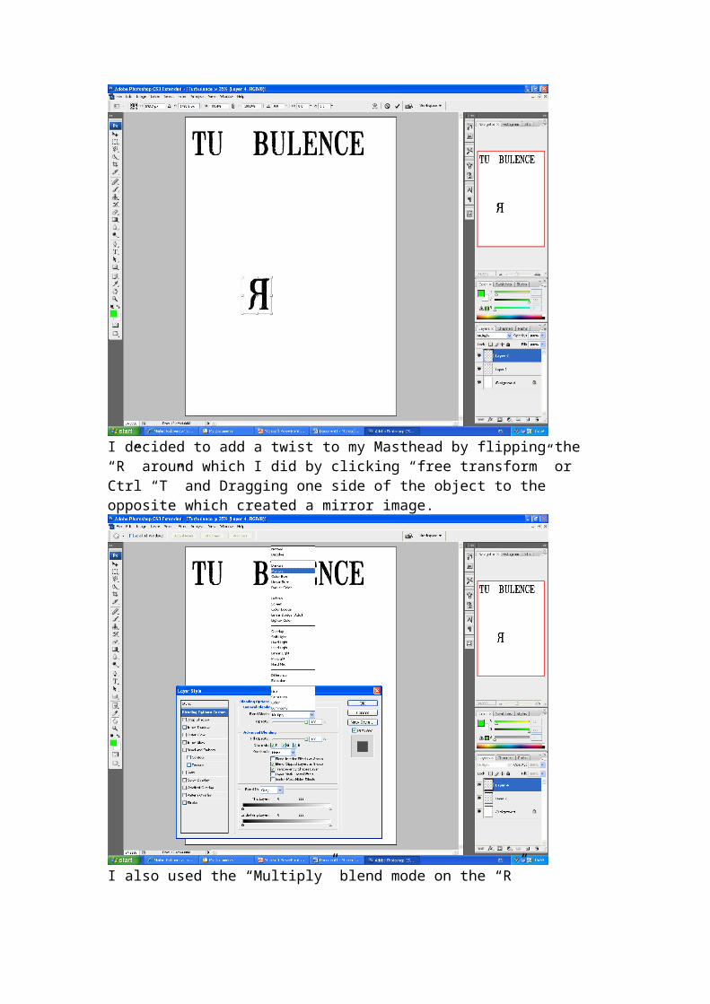
I decided to add a twist to my Masthead by flipping the “R” around which I did by clicking “free transform” or Ctrl “T” and Dragging one side of the object to the opposite which created a mirror image.
I also used the “Multiply” blend mode on the “R”

I used my chosen photo from the photo-shoot and uploaded it onto my documents. I then right clicked the thumbnail and selected “open in Adobe Photoshop”
My photo came up in a different window, to move it onto my project I selected it and dragged it across onto the page.

To get rid of the background of the photo I used the magnetic lasso tool which allowed me to select the area around my models and remove it.
To do this in more detailed areas I zoomed in using the toggle on my toolbar on the right hand side and did the same process with more specific results.

As a result my models appeared on the page without a background.
I decided to use the “Headline” font from the dafont website for the band name for the lead article.

As with the masthead I cut and pasted the font onto my page.
Again, I changed the blend mode to multiply for this text.
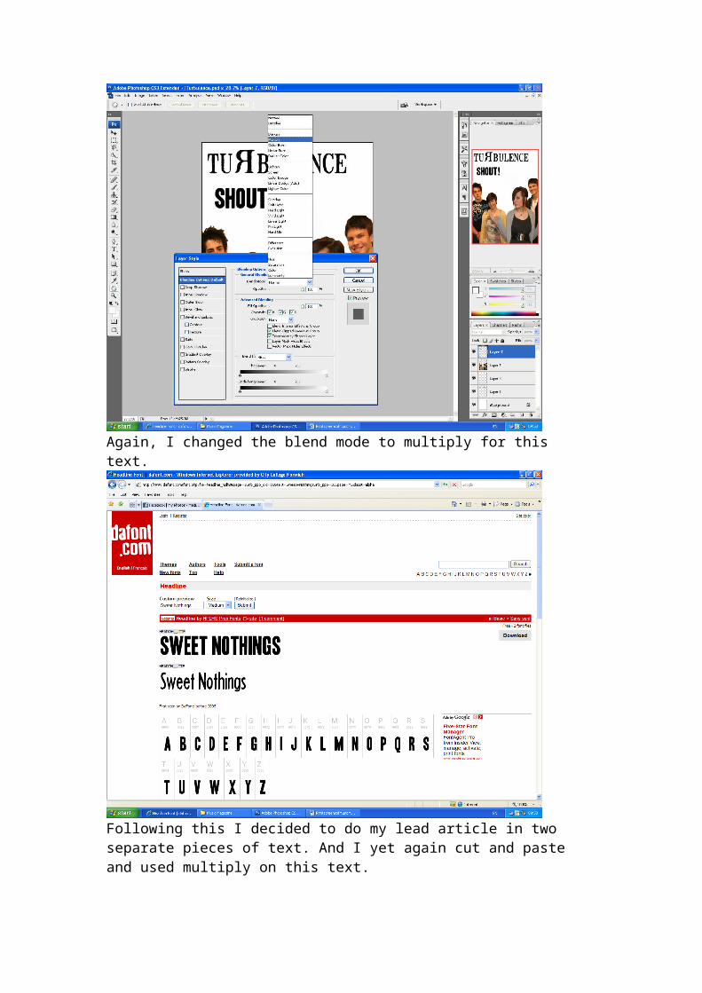
Following this I decided to do my lead article in two separate pieces of text. And I yet again cut and paste and used multiply on this text.
To change the colour of my font I used the quick select tool and then selected a colour and used the paint bucket tool to fill in the black areas of text.

For my strap line (which I used the same font as my lead article), as I had done with all of my dafont texts, I used the “free transform” option to change the size of the text.
I decided to change the colour of my models eyes. To do this, I used the eyedropper tool.

I used this tool to select my models eye colour to be replaced with a new colour.
I then selected the colour replacement brush and selected a green colour. As I brushed over the models eye it changed to green.

On this model, I decided to use the spot healing tool to make the face look smoother.
I gradually worked over the face selecting areas where I could make the face look clearer and smoother.

After this, I used a low opacity eraser to faintly erase the edges of the models photo to remove the sharp edges.
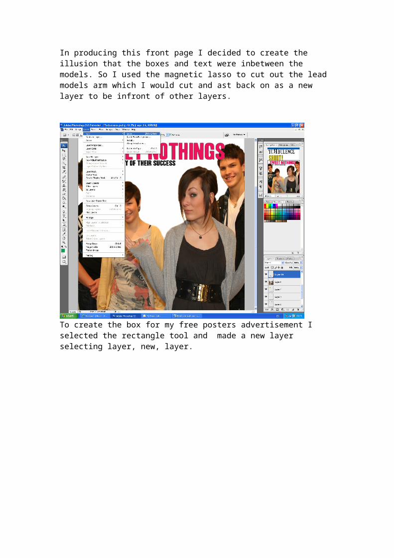
In producing this front page I decided to create the illusion that the boxes and text were inbetween the models. So I used the magnetic lasso to cut out the lead models arm which I would cut and ast back on as a new layer to be infront of other layers.

To create the box for my free posters advertisement I selected the rectangle tool and made a new layer selecting layer, new, layer.
Using this tool I could draw out a box and also demonstrate my cut out arm as it looks like the box is in-between one of the models and the lead models arm.
I then imported three of my other photographs as smaller images to advertise as posters.
As a continuation of the font I used for both my lead article and strap line I used the headline font from dafont to use as my font for my “Free” sign.

I then used the same method as I did on the lead article to change the colour of both the “Free” text and the white box surrounding it with the quick selection and paint bucket tool,

To make my pop up article I opened a separate image into Photoshop and used the circle selection tool to change the shape of the picture.
I then cut and pasted this circular image onto the main page.
I found a group of brushes on psbrushes.net which I wanted to use as it was similar to electricity which I thought reflected the energy of the music content of this magazine.

I used different layers to rotate and manipulate the brushes to fit around my masthead, pull quote and boxes.
I moved my circular image into an empty space on my cover and used the faint eraser to fade the edges.

I then used another box of the same colour as the other boxes and added a caption in “headline” font. To make the picture stand out I selected the layer style, outer glow.
I changed the colour, Distance, spread, size and jitter of this glow to match the green and blue colour scheme.

I used the drop shadow on my main image to make the band seem in a more 3D area than on a flat magazine page.
I added Cover lines at the bottom of my front cover which were in “headline” font.

Again I used the quick select tool and paint bucket to change the colour.
To create my bar code I made a new layer, and drew a white box using the rectangle tool.

I then used the “Free 3 to 9” Photoshop font to write a barcode
I then merged these two layers so I can easily transform them.

Using free transform I flipped the barcode onto the side of the page.
In a small font I wrote the issue number price and date on top of the barcode.

I then added numbers along the side of the barcode.