Embed Size (px)
Citation preview

PRINT LAYOUT DESIGN

Print Layout

All about the Canvas
• Whenever designing or writing for anything it it is important to design for the canvas. Analyze what content and information you can fit into it.

Page Construction
• The Canons of Page Construction are a set of principles in the field of book design used to describe the ways that page proportions, margins and type areas (print spaces) of books are constructed. Recto page from a rare
Blackletter Bible (1497)

“Typographical Divine Proportion."
• Tschichold's “Golden Canon of Page Construction" is based on simple integer ratios, equivalent to Rosarivo's “Typographical Divine Proportion."

“Typographical Divine Proportion."
• Medieval manuscript framework according to Tschichold, in which a text area proportioned near the golden ratio is constructed.
• "Page proportion is 2:3, text area proportioned in the Golden Section."
How did writers split the text?

Intro to “The GRID”
“The grid system is an aid, not a guarantee. It permits a number of possible uses and each designer can look for a solution appropriate to his/her personal style. But one must learn how to use the grid; it is an art that requires practice. ” -Josef Müller-Brockmann

“The Grid” • A grid is a network of lines.
The lines typically run horizontally and vertically.
• When you write notes on a pad of lined paper, or sketch out a floor plan on a graph paper, or practice handwriting on calligraphy on ruled pages, the lines serve to guide the hand and eyes as you work.


Grid Continued
• A well made grid encourages the designer to vary the scale and placement of elements. • The grid offers a rationale and starting
point for each composition, converting a blank area to a structured field.


Columns
• If you have ever used Microso# Excel then you have used Columns.
• Columns can work the same way, by giving your eye some structure and adding an idea of organization to your content.

Columns • The columns keep small
type (typically only 9 to 11 points) organized in a way that is easy to read and adds order to a page with lots of text elements that may not relate to one another.
• The Wall Street Journal has used the same six-column layout for decades with only slight tweaks to the layout, such as the addition of color and photos

Golden Ratio

Fibonacci Sequence
• Fibonacci numbers, like many elements found in nature, follow a 1:1.61 ratio
• This is what we refer to as the Golden Ratio, and as it forms such a common sight in nature, it feels pleasing to the eye when we use this same ratio in our design work.

Like a Shell…
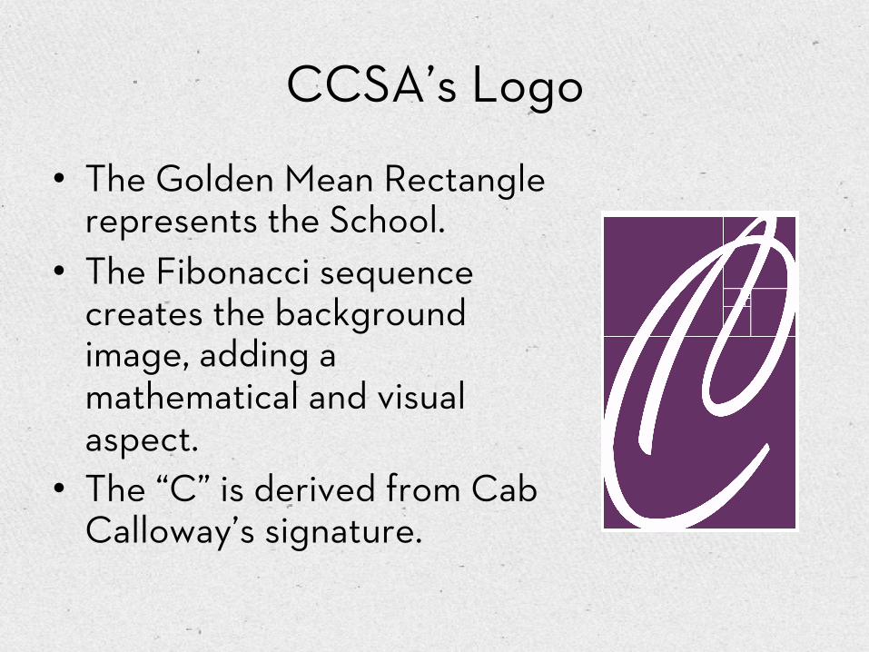
CCSA’s Logo
• The Golden Mean Rectangle represents the School.
• The Fibonacci sequence creates the background image, adding a mathematical and visual aspect.
• The “C” is derived from Cab Calloway’s signature.

IN NATURE
THROUGHOUT HISTORY

Golden Ratios in Print

White Space
• White space is o#en referred to as negative space.
• It is the portion of a page le# unmarked: the space between graphics, margins, gutters, space between columns, space between lines of type or figures and objects drawn or depicted.
• The term arises from graphic design practice, where printing processes generally use white paper

What is a PICA? • Adobe PostScript
promoted the pica unit of measure that is the standard in contemporary printing, as in home computers and printers
• It is exactly 1/6th of an inch.
• So you could say that it is 1/72nd of a foot

12 Point font?
• It just so happens that the pica contains 12 point units of measure.
• So there are 72 points in an inch.

Design Measurements
• Cheat Sheet – Abbreviating Picas and Points – 6 Picas = 6p – 6 Points = p6, or 6pts – 6 Picas, 4 points = 6p4 – 6-Point Helvetica with 9 points of line spacing =
6/9 Helvetica

Print Layout Design
• Terms – Margin – Gutter – Bleed – Column – Grid – Body Copy – Golden Ratios

Margin
• The white space around the page are the margins
• Definition: The margins — top, bottom, and either side — is that usually empty space between the trim (where the page is cut) and the live printing area (primary text and graphics) of the page. Sometimes headers or footers may be placed within the margins.

Margin Example
• It’s always important to follow Mr. Greider’s templates.
• If doing a page from scrap all margins are 6 Picas

Gutter
• The inside margins or blank space between two facing pages is the gutter.

Bleed
• Refers to objects that extend beyond the edge of the printed page.

Bleed • When a press
sheet is folded multiple times, the thickness of the paper caused the inner pages to gradually shi#. This is called creep or shingling.

Column
• Vertical arrangement on a page of horizontal lines of type. – Justify -to make (a line
of type) a desired length by spacing the words and letters
– Align to each ends or Align to the page Gutter.
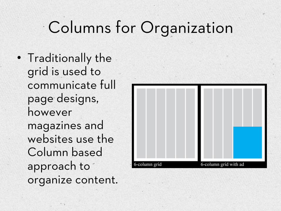
Columns for Organization
• Traditionally the grid is used to communicate full page designs, however magazines and websites use the Column based approach to organize content.

Body Copy • It is written text of an ad,
brochure, book, or Web page. It's all the words.
• The main text found in publications we read — body copy — is the text of the stories and articles.
• Body copy is not the headlines or subhead lines.

Tools of the Trade
• Adobe Design Suite; Photoshop, Illustrator, and InDesign
• All are equally important and have a specific task

Different types of Images
• Everything you have ever seen on a computer screen has been a raster graphic or a vector graphic.
• Although Vector graphics are cleaner, they are still limited to the resolution of the screen!