Embed Size (px)
Citation preview

Apteligent White Paper
Principles of Mobile App Design Joshua Kaufman,Apteligent UX Design

2
With millions of apps to choose from, a great design is often the differentiating factor compelling users to download, positively review, and continue using your app. Design shouldn’t just be taken at face value; it goes much deeper than making an app pretty. As Steve Jobs said, “It’s not just what it looks and feels like. Design is how it works.”To keep user experience consistent across apps, the major mobile platforms provide guidelines for app design. Both Google and Apple have documentation available, but they can be overwhelming for those new to app design. We’ll break down these guidelines here into a more digestible format so you can start incorporating them into your app development efforts immediately. We’ll begin by outlining your app’s mission, establish an understanding of how people really use mobile apps, and review the basic tenants of designing for simplicity. Next, we’ll discuss app organization and interface components to maintain a consistent user experience for your app. Finally, we’ll demonstrate how to interact with your app’s users and create your visual identity.
2

3
Understand How Users Interact with Mobile AppsOnce you define what your app does, it’s worth understanding how people are actually using mobile apps.
- Focus on speedAs you design and develop your app, you spend hours using each feature and testing every use case. This makes it easy to forget that people will not spend much time in your app. In fact, outside of games, most people try to spend as little time in an app as possible. They have a task and want to complete it as efficiently as possible so they can get back to their day.
As you build and test your app, it’s important to ensure that the interface is responsive. But how fast is fast enough? Usability guru Jakob Nielsen has summarized his research, showing that when applied to mobile interactions in which the user considers the app to be “working” on their behalf, the operation should take no longer than a second1. If you’re curious about how this might play out in the context of your app, some recommended reading: Greg Toto’s article on user-centric metrics measurement.
- Make your design invisibleAlmost no one will notice your amazing design, but they will absolutely notice when the app breaks or doesn’t work as expected. Every issue and glitch cumulatively translates to another lost user. As a designer/developer, you have to consider every single component on every screen to ensure the best user experience. Every interaction should be simple and easy — never jarring.
Create Your App’s MissionBefore you start sketching how your app will work, it’s important to clearly define what your app does and how it is unique.
- Fill a needThe first step to defining what your app does is to understand which user needs it is addressing. With the millions of apps already in existence, there’s a good chance that there’s already an app (or maybe even hundreds of apps) that does something similar to what you’re envisioning. You need to consider how your app is different and what will make it stand out from the crowd. Which specific scenarios are you targeting? Is there a specific audience that you’re looking to attract?
- Understand your app’s contextUnderstanding the mindset of the user is the next step in defining your app. Think of this as one step below your app’s genre. Define your user’s situation and what they are trying to accomplish. Are you a productivity app? “I need to complete a task.” Entertainment? “I’m bored and looking for something fun to do.” Travel? “I’m in San Francisco and looking for sushi.”
3

4
- Focus on the most important taskKnowing your app’s primary function and its audience can still leave you with a wide range of use cases. At this point, it is critical to understand the single-most important task of your app so you can optimize the design. Identify the best interface that will allow your audience to complete that task. Design for this single, core function and build out from there.
- Keep users coming backGetting downloads is one thing, but you’ll need users to continue using your app for it to be successful. A majority of apps are downloaded, used once, and never opened again. For certain genres of apps, offering a reason for users to return to the app is slightly easier; productivity tools and content apps have repeat use built in – and games offer new levels, achievements, and goals. What does your app offer after the user completes their initial, basic intent?
After completing the introductory “7 Days of Calm,” Calm offers many other meditation series that can only be accessed by subscribing.
Design for Simplicity
- Just say noAfter your app is released, you’ll probably receive feedback and feature suggestions from users. It is easy to feel the pressure to add each new feature requested. As an app maker, it’s important to stay true to your product’s mission and not give into every suggestion. Make additions only when necessary. When you do need to add something, use analytics and other user research to base your decisions on what users are actually doing, rather than making changes based on individual requests.
5
- Position elements appropriatelyThere is an optimal location and size for everything, which can be derived from the importance of the task or element. When setting a component’s position, first follow de facto standards (e.g., put the back button in the top-left corner in iOS). Beyond that, consider thumb ergonomics and position frequently used components within the thumb’s range.
- Do more with lessWhile designing your app, you’ll probably think of many buttons, gestures, and interactions that you would like to add. Before adding a component, ask yourself: Can the user still accomplish their goal without it? Be sure to trim your app as much as possible before its first release out of consideration for your soon-to-be advanced users, who might become unhappy when components disappear. It’s easier to add features than it is to take them away.
- Make tasks obviousBasic functions should be completely obvious, and important information should be prominent. Your users don’t want to think, so guide them through your app with subtle hints and a clever, dynamic onboarding. If scrolling reveals more information, show the ‘tip of the iceberg’ on the screen to indicate it. If the app has a gesture shortcut, animate the interface to show the user, rather than telling them explicitly.
App OrganizationAt a high level, there are four major types of navigation models in mobile apps. For simplicity’s sake, we’ll keep it focused on the big two platforms: iOS and Android. Understanding these models will help you determine which best suits your application.
- Scrolling Pages & CardsPages (iOS) and cards (Android) are ideal for apps that provide organized and focused sections of content because they are scrollable items displayed in a flat navigation structure.
In iOS, a page is an individual screen of content that can be accessed by swiping, usually from left to right). For example, the iOS weather app uses a page for each city displayed.

6
Be sure to use the page control to give the user orientation within the app.
Android uses cards, which show concise information and act as an entry point to more details. Unlike iOS, cards only scroll vertically.
Don’t overload pages or cards with extraneous information. Use a navigational hierarchy (see below) to direct users to more information.

7
- Bars & DrawersApps with multiple sections of content or functionality are good candidates for the bars and drawers model. Bottom navigation bars (Tab Bar on iOS, Bottom Navigation on Android) are anchored to the bottom of the screen and should be limited to no more than five items.
Facebook uses the bars and drawers model.
The Navigation Drawer is a scalable alternative when the section count is greater than five. The drawer slides in horizontally and displays a list of selectable items that represent various sections or functionality within the app.
This model is also fairly common in iOS, but is not explicitly named in the Human Interface Guidelines.

8
Sections within tab bars and navigation drawers should contain mutually exclusive types of content and functionality. It’s important to keep these menus concise, as too many options at the highest level of navigation can add unnecessary complexity to your app.
- Tree hierarchyIf your app contains a large number of features, categorized items, or content, it is a good candidate for a tree structure. iOS and Android both have clear notions of this model, which allows users to “drill down” to increasing levels of detail. Trees also cut down on interface design, since the operating systems provide standard elements for this navigational model.
Spotify uses tree hierarchy in a very clean and effective way.
- Content/experience-drivenAs the name implies, content/experience-driven navigation is defined by the content or app experience. Most common in games and other apps with specialized interfaces, this navigational model is more free form than others. Of course, you’ll want to emulate a common user experience and make user interactions obvious so the users feel at home navigating your app.
- Best of both worldsSometimes a single navigational model doesn’t suffice, in which case you can mix and match. For example, the Facebook Messenger app combines a navigation bar and a tree structure. The nature of your app should inform your approach to utilizing the standard models. Be careful not to confuse the users by switching models without purpose.

9
Facebook Messenger uses a combination of navigation bar and tree structure.
User Interface ComponentsAs an app maker, it’s tempting to create custom controls for your app. However, usability needs to be prioritized over aesthetics, so it’s best to stick with standard controls. Standard components are familiar to users, who need to understand and interact with your app without a second thought. Apple and Google have detailed guidelines for the most familiar components, but here’s the summary.
- You are here: Navigation Bars and App BarsNavigation Bars (iOS) and App Bars (Android) display the current location of the user within the context of the app. If it’s a tree structure, the left hand side may contain a back button, indicating that you are at least one level deep in the content. Navigation drawer buttons (aka hamburger buttons) may also be found on the left, and are usually only accessible from the ‘root’ view.
A title in the center indicates the name of the screen. Placing a logo here can clutter the interface, so avoid it when possible. If a logo is required, only display it within the home view.
One or more buttons can be stacked on the right hand side of the bar to provide access to additional functionality. This is the least accessible corner of the app, so avoid placing frequently needed buttons here.

10
The right hand side of the bar is the least accessible corner of the app, so avoid placing frequently needed buttons here.
- Taking Action: Buttons & ToolbarsThe primary method to perform an action in an app is by using a button. These can be anywhere on the screen and should have at least two states: default (before the button is pressed) and highlighted (when the button is being pressed). These states allow you to give visual feedback to the user. A third state, disabled, indicates to the user that the button is ‘turned off’ and won’t perform any action.
If you’re designing for iOS, there is also the toolbar (not to be mistaken with the tab bar). This is a row of small buttons anchored to the bottom of the screens, perfect for views with 3-5 actions available on the main content. Make sure you don’t go bar-crazy; it is not recommended to stack a toolbar on top of a tab bar.
The iOS toolbar is best for views with 3-5 actions available.
The Android guidelines include two button types worth mentioning: the floating action button and persistent footer buttons. The floating action button is a button that represents the primary action within an app; only one floating action button should be used per screen. Persistent footer buttons are similar to the iOS toolbar; they’re a row of buttons anchored to the bottom of the screen. A key difference is that persistent footer buttons have full text labels whereas toolbars are typically icons only.

11
Example of the floating action button on Android
- Organization: Table Views/ListsBoth iOS and Android provide the concept of lists (also named Table Views oniOS). These components display a collection of related items made up of texts,images, or a combination of simple subviews. Employ them when presenting alarge number of items, and make sure they are optimized for readability so thatusers can find what they’re looking for efficiently. As for item design, the majorityof the row should be dedicated to its primary action, with any additional actionspositioned on the right side of the item.
- Making Choices: Pickers and SheetsIt’s often easier to quickly tap a button instead of typing out a response.Fortunately, both iOS and Android provide simple and standard components formaking choices without a keyboard.
Pickers provide a simple way help the user save time from typing and to select a single value from a pre-determined set, such as dates or time. iOS handles these in a consistent way with dials that allow people to spin to the choice they’re looking for. Android pickers can use either dials, calendar, or clock face layouts.
iOS users will recognize the familiar picker for choosing a date.

12
Sheets (Action Sheets in iOS) are best when the user needs to choose between several possible actions. Sheets are also a great option for confirming a tap or gesture. For example, when tapping “Cancel” the app might confirm the user’s intention with a sheet.
In this scenario, the app will confirm the user’s intention with a sheet.
Lists (Table Views in iOS) are the best option if the choices are less familiar and/or there is a considerable number of choices. Additionally, unlike pickers or sheets, lists allow you to choose multiple items.
Working with GesturesThoughtful gestures can make the difference between an average app and an exceptional app, but it’s important that they are easy to discover and use.
Clear relies heavily on gestures, but makes them very easy to learn by including instructions on the preloaded tasks.

13
- Not all gestures are created equalSome gestures are obvious as the interface conforms to our real worldexpectations: tapping buttons, scrolling pickers, and swiping cards. Othergestures are less obvious. Most importantly, gestures should never hide criticalfunctionality. You should ensure that there’s another way to accomplish the task,as users may not discover these gestures naturally. (Here’s a great example ofa hidden yet very powerful gesture within Google Maps: try double tapping themap and slide up and down to zoom with one finger.) In general, if the gestureis something that easily translates from a physical object or desktop computerinterface, it’s more likely to be discoverable and understandable.
- Use standard gestures firstSimilar to controls, it’s good practice to utilize standard gestures before adding orextending the user’s natural behavior. For example, swipe to delete, double-tap tozoom, shake to undo, and tap and hold to copy are commonly used acrossoperating systems. Keep in mind that it can be very confusing to change thebehavior of standard gestures. They’re called “standard gestures” because mostusers will understand how they work. If you change their behavior, they can nolonger be classified as “standard.”
When standard gestures aren’t enough, consider extending standard gestures before inventing a new gesture. For example, consider the “pull down to refresh” gesture, which emerged from the standard gesture of scrolling to the top to see the latest information. It used to be non-standard and is now embedded within the iOS SDK.
- Provide visual feedback to gesturesIn the real world, every action creates a reaction. For example, pushing a key(action) moves it down (reaction). The reaction helps us understand our actionand make sense of the world. Similarly, every gesture should provide immediatefeedback, communicating to users the effect of the gesture. Just as every buttonshould have a default and highlighted state, every gesture should have a defaultand active state.
Communicating with Your UsersIn the real world, when you want to establish a rapport with someone else, etiquette matters. The same is true in the digital world when you want to create a well-designed app. This means giving careful thought to your messaging and how it is delivered to the user. Both iOS and Android have standard communication conventions, which you should understand when designing your app.
- Alerts and dialogsWhen the iPhone launched, it only had alerts, which are modal boxes that appear in the middle of the screen. These interrupt whatever the user is doing and require a response before he/she can continue. Android has a similar component called a dialog, and as a user, you can’t miss them.

14
Above is the original iOS alert.
As a general rule, alerts and dialogs should only be used for urgent information. If you abuse this rule, your users may become desensitized to these messages. If a user is conditioned to quickly tap through the message, your alert may go unnoticed when something actually important happens.
Here are a few examples of appropriate alert or dialog usage:
a) Something is preventing the app from functioning properly.
b) The app needs user assistance in order to complete a task.
c) The app requires user permission before accessing information suchas GPS location, calendar, or contacts.
Here are a few examples of when it is not appropriate to use an alert or dialog:
a) Communicating fleeting issues like poor GPS signal. This can bedisplayed more effectively, which we’ll discuss below.
b) Welcoming the user to the app. It’s a great idea to welcome the user,but it’s better accomplished through a welcome screen, not an alert.
- Banners and NotificationsThe other major type of notification is called a banner (iOS) or notification (Android). These can contain the same content as alerts and dialogs, but are subtler because they don’t interrupt the user’s flow.
These messages appear at the top of the screen, and on Android sometimes appear simply as an icon in the notification area. On both platforms, the user can see the details of the notifications by opening the notification drawer (called Notification Center on iOS).

15
iOS uses banners as a subtle alert.
In general, there are two main types of notifications. The first are local notifications, which are scheduled and delivered by an app on your device. The second are push notifications, which are sent by an app’s server to a notification service, which then delivers them to the user’s device(s).
Push and local notifications are less intrusive than alerts, so they can be used in more scenarios. However, careful thought should always be given to the content and frequency of notifications. Sending irrelevant notifications or sending notifications too often will quickly become frustrating to your users.
- Writing alerts and notificationsEach time you communicate with your users, your messaging should be craftedwith care. Describe the situation clearly and provide enough information so userscan understand how to proceed.
The text itself should focus on the message, not the available actions that can be taken. Avoid telling people which alert button to tap or how to open your app. The message should be concise and displayed on one or two lines. Of course, always be sure to use sentence-case capitalization and appropriate punctuation.
- Badges (iOS only)While alerts and notifications are best when there’s an important message to tellthe user, sometimes your message can be conveyed with a simple badge. Abadge is the numbered red circle attached to app icons on the iOS home screen.

16
Badges are unique to iOS.
Badges passively indicate unread messages, missed calls, remaining tasks, and other important content. It is important to make sure the badge accurately reports the current status; it can be annoying for users to investigate the badge only to realize that they’ve already seen the content.
- Spinners and activity indicatorsIn situations when your app cannot immediately respond to a user action — it might be waiting to receive a response from a server or executing a long-running algorithm — your interface needs to respond accordingly.
In these cases, it’s helpful to use a spinner or activity indicator to communicate that the app is waiting for something to complete before it can continue. These common elements across iOS and Android are best accompanied by a message that describes what the user is waiting for.
A spinner lets the user know that the app is waiting to complete its action.

17
Once the spinner disappears, the user knows that the task is complete and they can continue using the app.
Creating Your Visual IdentityNo matter what kind of app you’re creating, visual aesthetics are important to the user. Creating a unique visual identity will usually require the help of a talented UX designer. Here, we discuss the importance of visual identity and the key concepts that you should keep in mind.
- What is your app’s personality?Every design choice contributes to your app’s personality. Before you start thinking about color schemes and navigation, consider how you want people to perceive your app. Should it be business-like? Comforting? Edgy?
Choose your app’s personality before you start designing its visual identity so that you have a framework for making consistent decisions based on the personality you want to achieve.
- Creating custom interfacesEarly iPhone interfaces were full of custom graphics until iOS 7 established a flatter, more minimal design. Many apps followed suit to maintain consistency between the OS and app experiences.
If you decide to create a custom interface, there are two directions you can take:
a) Create a completely custom interface from top to bottom where you build every element from scratch.
b) Customize the standard Android or iOS elements with your own designs.
When creating custom interfaces, keep the following tips in mind:
a) Be consistent in your customization and style related components equally.
b) The custom interface shouldn’t distract from the main content. No matter how beautiful your interface is, make sure the content has priority.
c) Maintain realism by using a top-down light source.
d) Make sure your interface is readable; choose higher contrast colors for fonts and other important interface elements.
e) Minimize the number of fonts you choose and make sure you choose ones that are highly readable on screen.
- Using metaphors appropriatelyIn the earlier days of the iPhone, metaphors were much more popular as the iPhone promoted skeuomorphism, a design concept of making items represented resemble their real-world counterparts.

18
In the iPhone’s early days, skeuomorphism was a popular design concept.
This can be beneficial if you want a unique visual identity, but it’s important that the visuals are easily understandable and usable. Ideally, your visual metaphor should be intuitive to use, and based on real-world counterparts. UX designers refer to these intuitive metaphors as affordances.
Metaphors and skeuomorphic designs can make an app more playful and immersive. However, be sure to maintain balance within the app. If you go too far with sound effects or animations, your app can quickly become annoying and frustrating to use.
- Onboard users quickly and easilyA user has downloaded your app and arrived at the first screen. Ideally, your app is so easy and intuitive that it’s immediately obvious how it works. Unfortunately, this is extremely rare. In reality, each app is unique and most users will require some handholding until they know how to use it. The onboarding experience is usually the most important flow within your entire app. The longer and more complex this flow is, the more people will abandon your app. However, it’s important not to force users into a mandatory intro flow when they may just want to dive right in. Teach users within the natural flow of the app so they can start interacting with its components immediately.

19
Color was an app that launched to much fanfare, but its interface was frustratingly confusing and provided no guidance.
There are many different ways to onboard users. However, effective onboarding techniques share common patterns. Here are four onboarding methodologies you should consider when designing and building your app.
- Benefits-oriented onboardingBenefits-oriented onboard was the first type of onboarding to appear in apps, and there’s a very good chance you’ve seen it yourself.
This method explains the key benefits of the app along with a few images — no more than three are recommended — that illustrate those benefits. The images could be of app screens or they could be related imagery.
Benefits-oriented onboarding helps the user understand the app’s benefits.
20
In this introductory flow, your app should answer a few basic questions. What does the app do? How should it be used? What value will it provide?
Each screen should present one key idea, and while you’ll be tempted to include more detail, remember that most users have a single goal in mind. At this stage, they don’t want – or need – to read about the details of your app.
Finally, focus on the essentials of the idea, and make each screen as easy to scan as possible. Users want to use the app, not spend time learning how to use it, so the faster they can get through onboarding the better.
- Function-oriented onboardingFunction-oriented onboarding, as with benefits-oriented onboarding, usually includes three or more introductory screens. However, instead of focusing on benefits, function-oriented onboarding focuses on key functionality.
In this introductory flow, your app should answer a few basic questions. What is the key functionality? When should I use this functionality? How do I use the functionality?
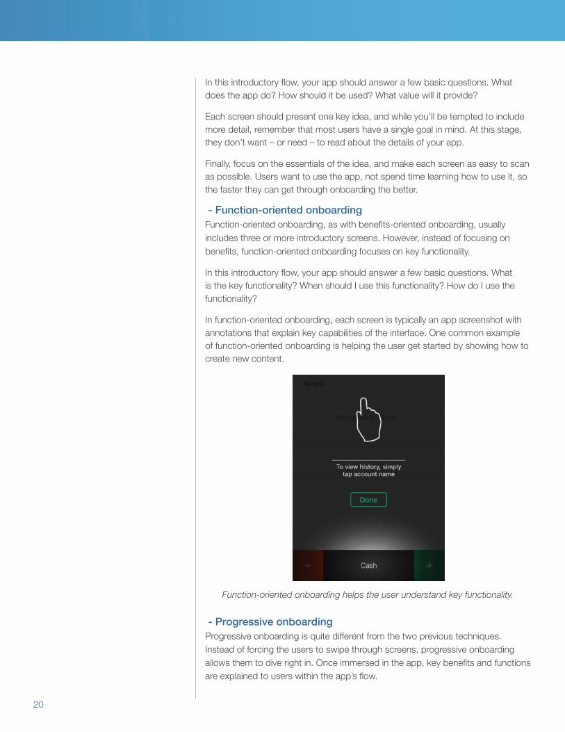
In function-oriented onboarding, each screen is typically an app screenshot with annotations that explain key capabilities of the interface. One common example of function-oriented onboarding is helping the user get started by showing how to create new content.
Function-oriented onboarding helps the user understand key functionality.
- Progressive onboardingProgressive onboarding is quite different from the two previous techniques. Instead of forcing the users to swipe through screens, progressive onboarding allows them to dive right in. Once immersed in the app, key benefits and functions are explained to users within the app’s flow.

21
Complex workflows are the best candidates for progressive onboarding, since there are likely more than three simple screens to explain how the app works. However, this type of onboarding is also useful when functionality is hidden or initiated by gestures.
Progressive onboarding demystifies complex workflows.
- Hybrid and alternative onboardingOf course, it’s possible that one type of onboarding might not be enough. In that case, you should consider combining benefits-oriented or function-oriented onboarding with progressive onboarding. This option gives the user a high-level overview upon the first app open, and then drills into more specific content as they continue to use the app.
Another alternative is to use a video or animation that explains how to use the app. If you choose this option, bear in mind that the user may not be somewhere that they can play sound, so using subtitles is a must.
SummaryFocusing on app design is extremely important to increase user acquisition and user retention in the face of stiff competition on the iOS App Store or the Google Play Store.
• Set a clear mission that spells out your app’s goals, and helps guide youractions and decision-making in order to differentiate your app from millions ofothers.

22
• Consider the users’ perspective and focus on speed and minimize freezes orcrashes to ensure the best user experience. Whatever onboarding methodyou choose, keep this process simple and intuitive to teach users your app’sfunctions within a natural flow.
• Less is more in most cases, so try to only use buttons, gestures, andinteractions that are necessary for the app’s functionality and obvious for theusers to understand.
• When it comes to app organization, there are four main types of navigationmodels that give the users better orientation within the app and each type issuitable for different characteristics of the apps’ sections of content.
• We recommend sticking with standard controls rather than creating customcontrols, because these are universally recognizable to users.
• Both iOS and Android have standard conventions for communicating with yourusers and should be considered when designing your app.
• Work with your UX designer to create a unique visual identity that reflects yourapp’s personality and be sure to maintain consistency between the OS andapp experience, or between your customization and other visual componentswithin your app.
Now that you’re prepared with important principles of mobile app design, we believe you’ll be ready to create your next app that attracts users to download, give 5-star ratings, and keep coming back for more. Best of luck! Now go make something amazing!
Footnotes1 Nielsen, Jakob. “Powers of 10: Time Scales in User Experience”. Oct 5, 2009. Nielsen Norman Group. https://www.nngroup.com/articles/powers-of-10-time-scales-in-ux/


About Apteligent Apteligent provides the world’s leading mobile application intelligence solution enabling enterprises to accelerate their mobile business. The company’s solution monitors every aspect of mobile app performance and provides a real-time global view of app and transaction metrics across iOS, Android, Windows Phone 10, Hybrid and HTML5 apps. Trusted by three of the top five credit card issuers, three of the top five media companies, three of the top five retailers, and two of the top three hotel chains with the success of their strategic mobile app initiatives. Apteligent is leading the drive to the App Economy. Learn more at www.apteligent.com.
www.apteligent.com | @apteligent | apteligent | apteligent
©2016 Apteligent. All rights reserved. 07.16