Embed Size (px)
Citation preview
3 October 2017
FNB HOME LOANS:
MARKET ANALYTICS AND
SCENARIO FORECASTING UNIT
JOHN LOOS:
HOUSEHOLD AND PROPERTY
SECTOR STRATEGIST
087-328 0151
THEO SWANEPOEL:
PROPERTY MARKET ANALYST
FNB HOME LOANS
087-328 0157
The information in this publication is
derived from sources which are regarded
as accurate and reliable, is of a general
nature only, does not constitute advice
and may not be applicable to all
circumstances. Detailed advice should be
obtained in individual cases. No
responsibility for any error, omission or
loss sustained by any person acting or
refraining from acting as a result of this
publication is accepted by Firstrand Group
Limited and / or the authors of the
material.
First National Bank – a division of FirstRand Bank
Limited. An Authorised Financial Services
provider. Reg No. 1929/001225/06
PROPERTY BAROMETER
Price Realism and Market Balance
National asking price realism deteriorates further, but
Gauteng remains the most price-realistic of the Major
Metro regions.
On a national average basis, a continuation of the gradual rise in average time
of homes on the market prior to sales points to a housing market moving
away from equilibrium, and into a space where supply exceeds demand.
However, a look at the major regional breakdown points to very different
regional housing markets. Gauteng appears the most price-realistic and
relatively well balanced, averaging 12 weeks and 4 days time on the market.
But certain Coastal Metro markets, notably Ethekwini and Nelson Mandela
Bay, have recently appeared significantly less price realistic.
KEY POINTS
• The 3rd quarter 2017 FNB Estate Agent Survey saw the average time of
homes on the market continue its gradual rise from 15 weeks and 4 days
previous to 15 weeks and 6 days.
• From a multi-year low of 78% in the 2nd quarter of 2014, the market
weakening since then has brought about a mild upward trend to 93% of all
sellers dropping their asking price in the 3rd quarter of 2017.
• The estimated magnitude of drop in asking price increased, from -6.8%
in the 2nd quarter of 2017 to -9.8% in the 3rd quarter survey. So more sellers are
believed to be dropping their price and by a greater magnitude.
• The once booming Namibian market is battling. Whereas South Africa’s
estimated average time on the market was 15 weeks and 6 days in the 3rd
quarter of 2017, Namibia’s had risen to as high as 24 weeks and 2 days.
• From a multi-year high average of 14.42 estimated serious viewers per
show house for the 4-quarters of 2013, we have seen a noticeable decline to
10.49 average for the 4 quarters up to and including the 3rd quarter of 2017.
• In the 3rd quarter of 2017 we saw 8% of agents citing “stock constraints”
as an issue in their areas, unchanged from the previous quarter. This percentage
is now far below the 24% high of early 2015.
• Within South Africa, the shift away from market equilibrium, or towards
less realistic pricing, has taken place more in the country’s Coastal Metros,
especially Ethekwini Metro and to a lesser extent Nelson Mandela Bay.
• The Gauteng region, by comparison, has been a relatively “balanced”
and “price realistic” region, with its average time on the market of 12 weeks and
4 days having risen only marginally.
ESTIMATED AVERAGE TIME OF HOMES ON THE MARKET INCREASES
INTRODUCTION
Due to significant resistance by home sellers to
downward pressure on house prices in times of housing
demand slowdown, house prices do not fully adjust in
the short term. Instead, the residential market often
moves away from market equilibrium price for lengthy
periods of time. Such a move away from equilibrium is
reflected in a rise in the average time that homes
remain on the market prior to sale.
Many sellers are prepared to “wait it out” for their
asking price. Eventually, many will get their asking price.
What they may not realise, however, is that a lengthy
waiting period in many instances means that their
asking price has been declining in real terms during the
waiting period on the market (“real” referring to house
price adjusted for CPI inflation). This means that in
actual fact they have been gradually dropping their
asking price in real terms without actually realizing it.
This is all part of the concept of “money illusion” where
people think about their money and wealth largely in
nominal terms and not in real terms. The existence of
such “money illusion” is often helpful in allowing the
housing market to correct albeit over lengthy periods of
time. If home sellers were to think about prices in real
terms, they may hypothetically even resort to gradually
lifting their asking price each week or month in line with
broader price inflation in the economy, making market
corrections even more difficult to achieve.
INDICATORS OF MARKET BALANCE AND PRICE
REALISM
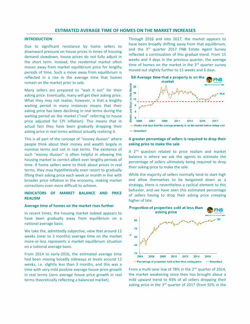
Average time of homes on the market rises further
In recent times, the housing market indeed appears to
have been gradually away from equilibrium on a
national average basis.
We take the, admittedly subjective, view that around 12
weeks (near to 3 months) average time on the market
more-or-less represents a market equilibrium situation
on a national average basis.
From 2014 to early-2016, the estimated average time
had been moving broadly sideways at levels around 12
weeks, i.e. slightly less than 3 months, and this was a
time with very mild positive average house price growth
in real terms (zero average house price growth in real
terms theoretically reflecting a balanced market).
Through 2016 and into 2017, the market appears to
have been broadly drifting away from that equilibrium,
and the 3rd quarter 2017 FNB Estate Agent Survey
reflected a continuation of this gradual trend. From 15
weeks and 4 days in the previous quarter, the average
time of homes on the market in the 3rd quarter survey
moved out slightly further to 15 weeks and 6 days.
A greater percentage of sellers is required to drop their
asking price to make the sale
A 2nd question related to price realism and market
balance is where we ask the agents to estimate the
percentage of sellers ultimately being required to drop
their asking price to make the sale.
While the majority of sellers normally tend to start high
and allow themselves to be bargained down as a
strategy, there is nevertheless a cyclical element to this
behavior, and we have seen this estimated percentage
of sellers having to drop their asking price creeping
higher of late.
From a multi-year low of 78% in the 2nd quarter of 2014,
the market weakening since then has brought about a
mild upward trend to 93% of all sellers dropping their
asking price in the 3rd quarter of 2017 (from 92% in the
2nd quarter survey), according to the respondents’
estimates.
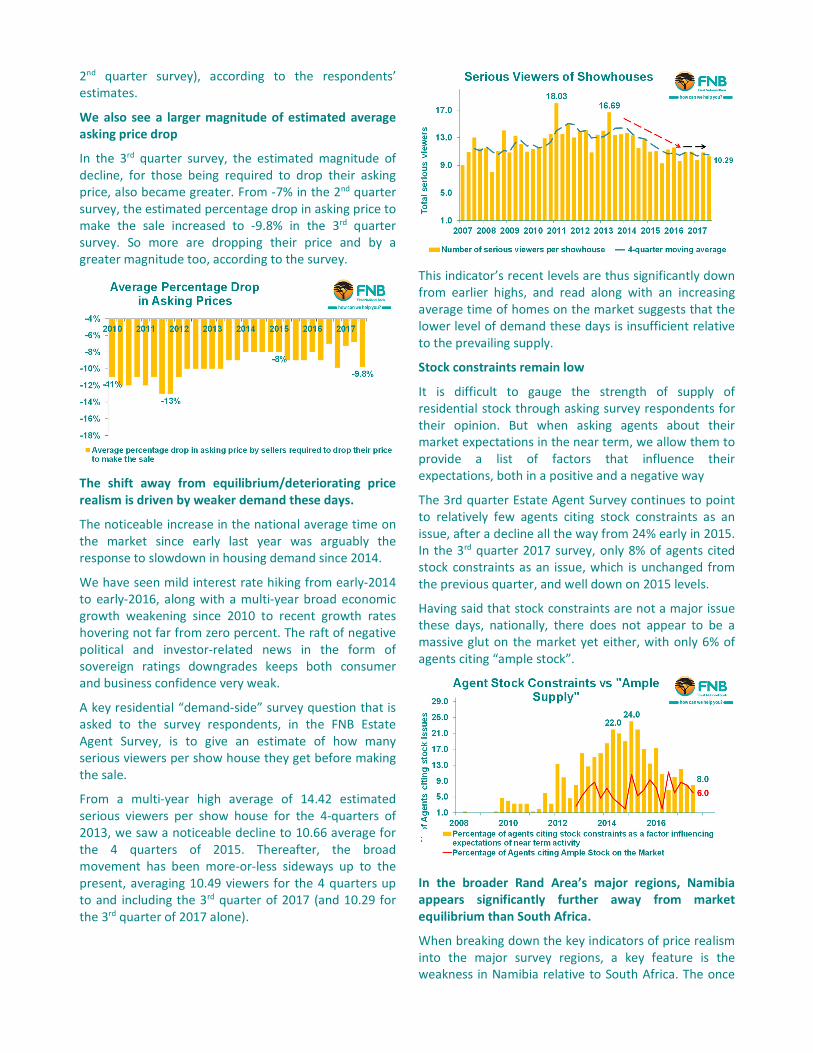
We also see a larger magnitude of estimated average
asking price drop
In the 3rd quarter survey, the estimated magnitude of
decline, for those being required to drop their asking
price, also became greater. From -7% in the 2nd quarter
survey, the estimated percentage drop in asking price to
make the sale increased to -9.8% in the 3rd quarter
survey. So more are dropping their price and by a
greater magnitude too, according to the survey.
The shift away from equilibrium/deteriorating price
realism is driven by weaker demand these days.
The noticeable increase in the national average time on
the market since early last year was arguably the
response to slowdown in housing demand since 2014.
We have seen mild interest rate hiking from early-2014
to early-2016, along with a multi-year broad economic
growth weakening since 2010 to recent growth rates
hovering not far from zero percent. The raft of negative
political and investor-related news in the form of
sovereign ratings downgrades keeps both consumer
and business confidence very weak.
A key residential “demand-side” survey question that is
asked to the survey respondents, in the FNB Estate
Agent Survey, is to give an estimate of how many
serious viewers per show house they get before making
the sale.
From a multi-year high average of 14.42 estimated
serious viewers per show house for the 4-quarters of
2013, we saw a noticeable decline to 10.66 average for
the 4 quarters of 2015. Thereafter, the broad
movement has been more-or-less sideways up to the
present, averaging 10.49 viewers for the 4 quarters up
to and including the 3rd quarter of 2017 (and 10.29 for
the 3rd quarter of 2017 alone).
This indicator’s recent levels are thus significantly down
from earlier highs, and read along with an increasing
average time of homes on the market suggests that the
lower level of demand these days is insufficient relative
to the prevailing supply.
Stock constraints remain low
It is difficult to gauge the strength of supply of
residential stock through asking survey respondents for
their opinion. But when asking agents about their
market expectations in the near term, we allow them to
provide a list of factors that influence their
expectations, both in a positive and a negative way
The 3rd quarter Estate Agent Survey continues to point
to relatively few agents citing stock constraints as an
issue, after a decline all the way from 24% early in 2015.
In the 3rd quarter 2017 survey, only 8% of agents cited
stock constraints as an issue, which is unchanged from
the previous quarter, and well down on 2015 levels.
Having said that stock constraints are not a major issue
these days, nationally, there does not appear to be a
massive glut on the market yet either, with only 6% of
agents citing “ample stock”.
In the broader Rand Area’s major regions, Namibia
appears significantly further away from market
equilibrium than South Africa.
When breaking down the key indicators of price realism
into the major survey regions, a key feature is the
weakness in Namibia relative to South Africa. The once
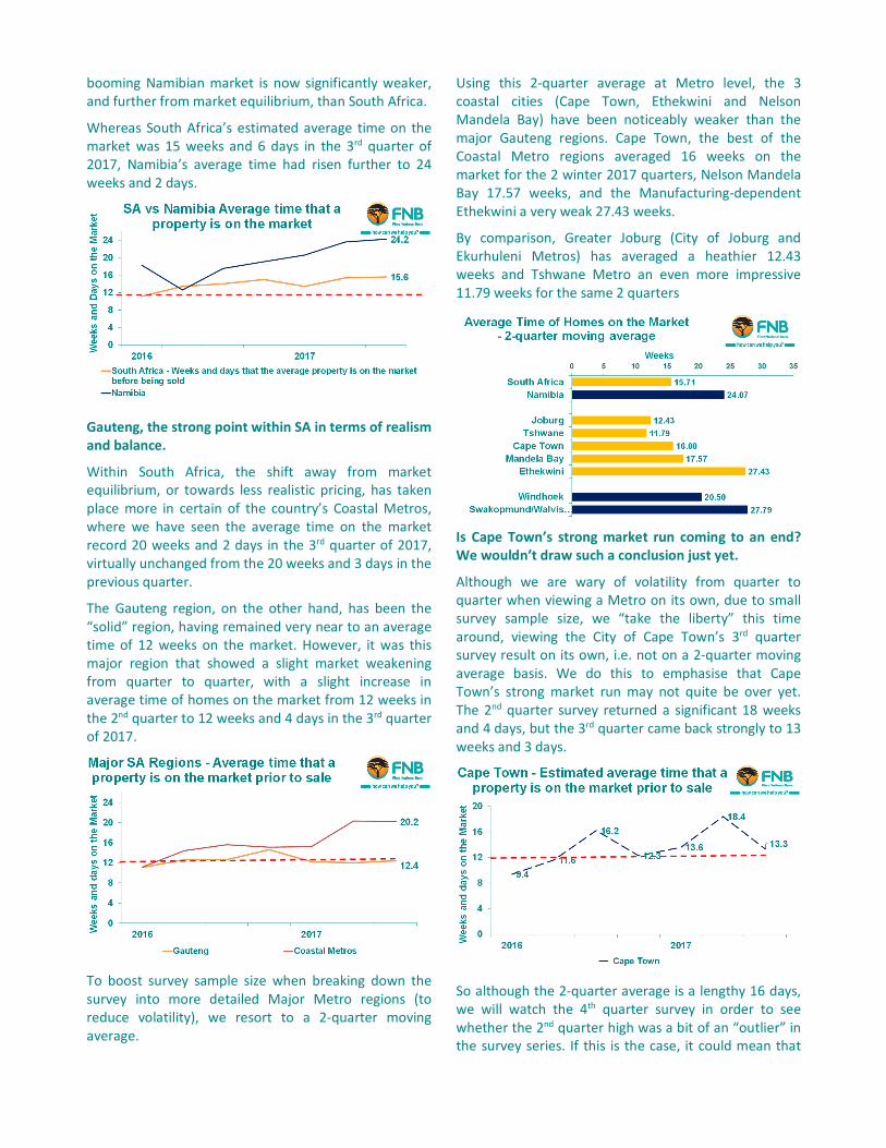
booming Namibian market is now significantly weaker,
and further from market equilibrium, than South Africa.
Whereas South Africa’s estimated average time on the
market was 15 weeks and 6 days in the 3rd quarter of
2017, Namibia’s average time had risen further to 24
weeks and 2 days.
Gauteng, the strong point within SA in terms of realism
and balance.
Within South Africa, the shift away from market
equilibrium, or towards less realistic pricing, has taken
place more in certain of the country’s Coastal Metros,
where we have seen the average time on the market
record 20 weeks and 2 days in the 3rd quarter of 2017,
virtually unchanged from the 20 weeks and 3 days in the
previous quarter.
The Gauteng region, on the other hand, has been the
“solid” region, having remained very near to an average
time of 12 weeks on the market. However, it was this
major region that showed a slight market weakening
from quarter to quarter, with a slight increase in
average time of homes on the market from 12 weeks in
the 2nd quarter to 12 weeks and 4 days in the 3rd quarter
of 2017.
To boost survey sample size when breaking down the
survey into more detailed Major Metro regions (to
reduce volatility), we resort to a 2-quarter moving
average.
Using this 2-quarter average at Metro level, the 3
coastal cities (Cape Town, Ethekwini and Nelson
Mandela Bay) have been noticeably weaker than the
major Gauteng regions. Cape Town, the best of the
Coastal Metro regions averaged 16 weeks on the
market for the 2 winter 2017 quarters, Nelson Mandela
Bay 17.57 weeks, and the Manufacturing-dependent
Ethekwini a very weak 27.43 weeks.
By comparison, Greater Joburg (City of Joburg and
Ekurhuleni Metros) has averaged a heathier 12.43
weeks and Tshwane Metro an even more impressive
11.79 weeks for the same 2 quarters
Is Cape Town’s strong market run coming to an end?
We wouldn’t draw such a conclusion just yet.
Although we are wary of volatility from quarter to
quarter when viewing a Metro on its own, due to small
survey sample size, we “take the liberty” this time
around, viewing the City of Cape Town’s 3rd quarter
survey result on its own, i.e. not on a 2-quarter moving
average basis. We do this to emphasise that Cape
Town’s strong market run may not quite be over yet.
The 2nd quarter survey returned a significant 18 weeks
and 4 days, but the 3rd quarter came back strongly to 13
weeks and 3 days.
So although the 2-quarter average is a lengthy 16 days,
we will watch the 4th quarter survey in order to see
whether the 2nd quarter high was a bit of an “outlier” in
the survey series. If this is the case, it could mean that
Cape Town’s period of market strength may not quite
be finished yet.
We have long expected Cape Town’s average time on
the market to rise noticeably as its steadily inflating
market runs into major affordability challenges, but
knowing exactly when to anticipate such market
weakening is always an inexact science.
In addition, why we are hesitant to conclude that Cape
Town’s 2-quarter average time on the market is a sign
of sustainable weakening just yet, is because over the
past 2 quarters a still-high percentage of agents, i.e.
21%, in that region cite housing stock constraints as an
issue.
This remains far higher than any other city, whereas
only 2% of agents in Joburg and zero in Tshwane
reported stock constraints.
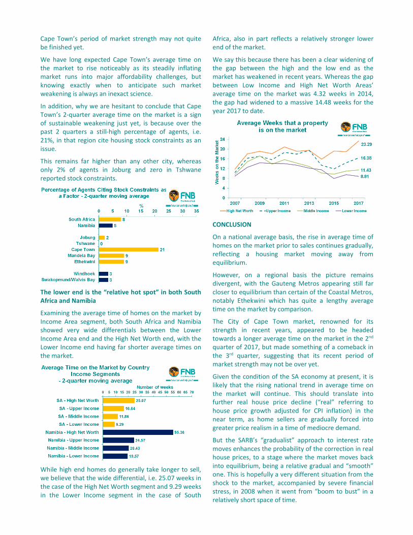
The lower end is the “relative hot spot” in both South
Africa and Namibia
Examining the average time of homes on the market by
Income Area segment, both South Africa and Namibia
showed very wide differentials between the Lower
Income Area end and the High Net Worth end, with the
Lower Income end having far shorter average times on
the market.
While high end homes do generally take longer to sell,
we believe that the wide differential, i.e. 25.07 weeks in
the case of the High Net Worth segment and 9.29 weeks
in the Lower Income segment in the case of South
Africa, also in part reflects a relatively stronger lower
end of the market.
We say this because there has been a clear widening of
the gap between the high and the low end as the
market has weakened in recent years. Whereas the gap
between Low Income and High Net Worth Areas’
average time on the market was 4.32 weeks in 2014,
the gap had widened to a massive 14.48 weeks for the
year 2017 to date.
CONCLUSION
On a national average basis, the rise in average time of
homes on the market prior to sales continues gradually,
reflecting a housing market moving away from
equilibrium.
However, on a regional basis the picture remains
divergent, with the Gauteng Metros appearing still far
closer to equilibrium than certain of the Coastal Metros,
notably Ethekwini which has quite a lengthy average
time on the market by comparison.
The City of Cape Town market, renowned for its
strength in recent years, appeared to be headed
towards a longer average time on the market in the 2nd
quarter of 2017, but made something of a comeback in
the 3rd quarter, suggesting that its recent period of
market strength may not be over yet.
Given the condition of the SA economy at present, it is
likely that the rising national trend in average time on
the market will continue. This should translate into
further real house price decline (“real” referring to
house price growth adjusted for CPI inflation) in the
near term, as home sellers are gradually forced into
greater price realism in a time of mediocre demand.
But the SARB’s “gradualist” approach to interest rate
moves enhances the probability of the correction in real
house prices, to a stage where the market moves back
into equilibrium, being a relative gradual and “smooth”
one. This is hopefully a very different situation from the
shock to the market, accompanied by severe financial
stress, in 2008 when it went from “boom to bust” in a
relatively short space of time.
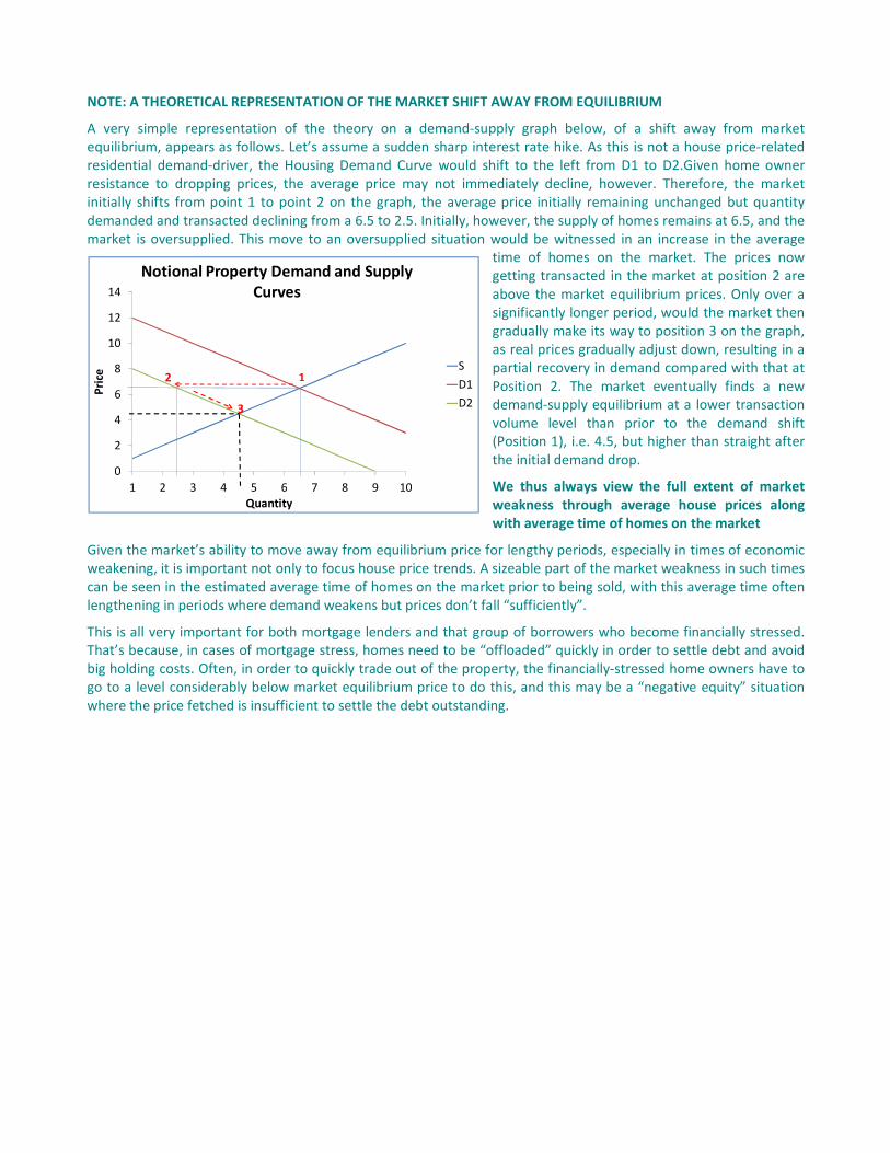
NOTE: A THEORETICAL REPRESENTATION OF THE MARKET SHIFT AWAY FROM EQUILIBRIUM
A very simple representation of the theory on a demand-supply graph below, of a shift away from market
equilibrium, appears as follows. Let’s assume a sudden sharp interest rate hike. As this is not a house price-related
residential demand-driver, the Housing Demand Curve would shift to the left from D1 to D2.Given home owner
resistance to dropping prices, the average price may not immediately decline, however. Therefore, the market
initially shifts from point 1 to point 2 on the graph, the average price initially remaining unchanged but quantity
demanded and transacted declining from a 6.5 to 2.5. Initially, however, the supply of homes remains at 6.5, and the
market is oversupplied. This move to an oversupplied situation would be witnessed in an increase in the average
time of homes on the market. The prices now
getting transacted in the market at position 2 are
above the market equilibrium prices. Only over a
significantly longer period, would the market then
gradually make its way to position 3 on the graph,
as real prices gradually adjust down, resulting in a
partial recovery in demand compared with that at
Position 2. The market eventually finds a new
demand-supply equilibrium at a lower transaction
volume level than prior to the demand shift
(Position 1), i.e. 4.5, but higher than straight after
the initial demand drop.
We thus always view the full extent of market
weakness through average house prices along
with average time of homes on the market
Given the market’s ability to move away from equilibrium price for lengthy periods, especially in times of economic
weakening, it is important not only to focus house price trends. A sizeable part of the market weakness in such times
can be seen in the estimated average time of homes on the market prior to being sold, with this average time often
lengthening in periods where demand weakens but prices don’t fall “sufficiently”.
This is all very important for both mortgage lenders and that group of borrowers who become financially stressed.
That’s because, in cases of mortgage stress, homes need to be “offloaded” quickly in order to settle debt and avoid
big holding costs. Often, in order to quickly trade out of the property, the financially-stressed home owners have to
go to a level considerably below market equilibrium price to do this, and this may be a “negative equity” situation
where the price fetched is insufficient to settle the debt outstanding.
0
2
4
6
8
10
12
14
1 2 3 4 5 6 7 8 9 10
Pri
ce
Quantity
Notional Property Demand and Supply
Curves
S
D1
D2
1
3
2