Embed Size (px)
DESCRIPTION
Every autumn the Talent issue of Foam Magazine is devoted to outstanding work by young, talented photographers. Out of 800 submissions, we selected 15 photographic projects to be presented in this extra thick issue. This is an excerpt please to use the link below to purchase the whole issue
Citation preview
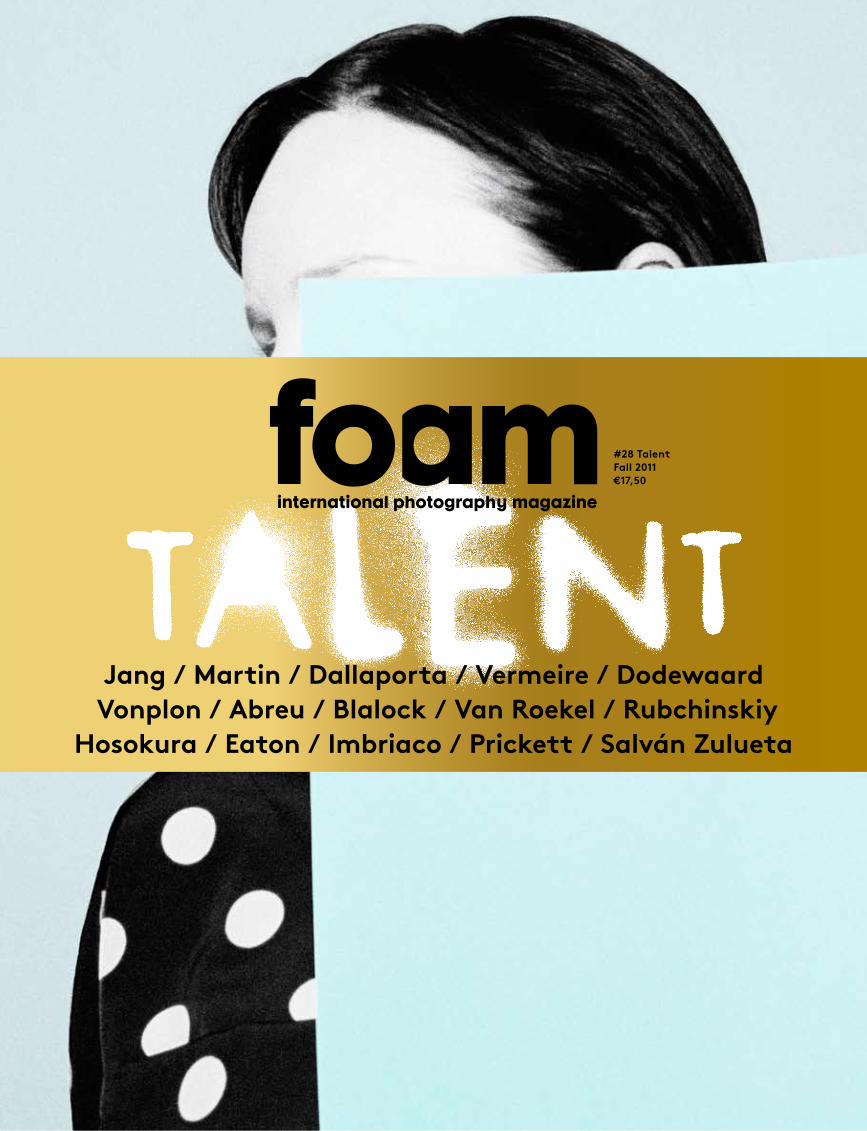
#28 TalentFall 2011€17,50
Jang / Martin / Dallaporta / Vermeire / Dodewaard Vonplon / Abreu / Blalock / Van Roekel / Rubchinskiy
Hosokura / Eaton / Imbriaco / Prickett / Salván Zulueta

Please enjoy this preview of our latest issue.We encourage you to visit our shop and purchase or subscribe to the magazine to get the full experience.
Jang / Martin / Dallaporta / Vermeire / Van Dodewaard Vonplon / Abreu / Blalock / Van Roekel / Rubchinskiy
Hosokura / Eaton / Imbriaco / Prickett / Salván Zulueta
foam
mag
azin
e #
28 t
alen
t
4
5Editorial
6Portfolio Overview
8On My Mind
Susan Meiselas, Urs Stahel, Nathalie Herschdorfer,
Marcelo Brodsky, Pieter Hugo, Charlotte Dumas
14Interview
James Reid:Commissioning the Unexpected
by Nick Compton
21Theme introduction
The difference between ‘being talented’ and
‘being a talent’by Marcel Feil
PortfoliosAll interviews by Anne-Celine Jaeger
31Ina Jang
In a World Without Words...
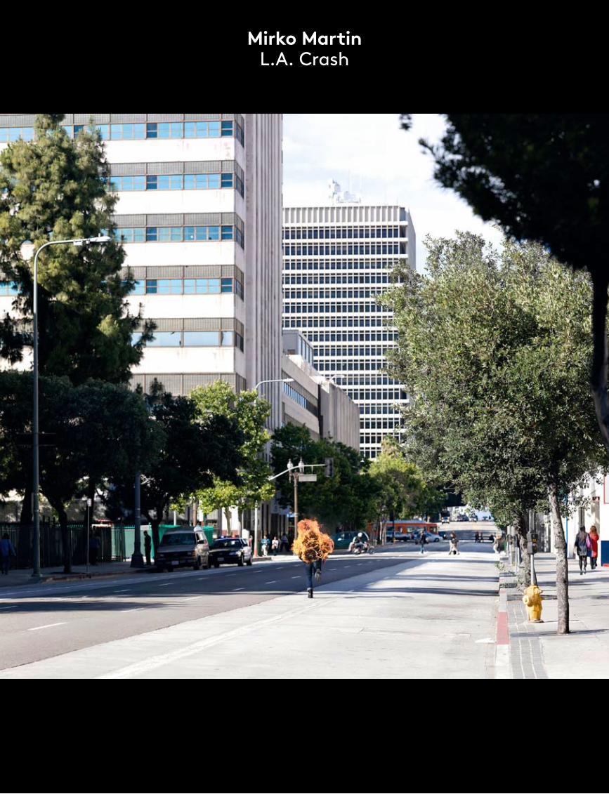
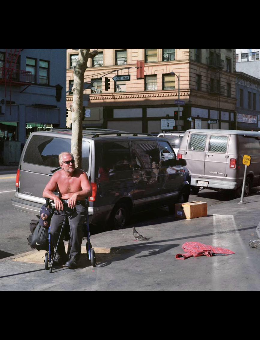
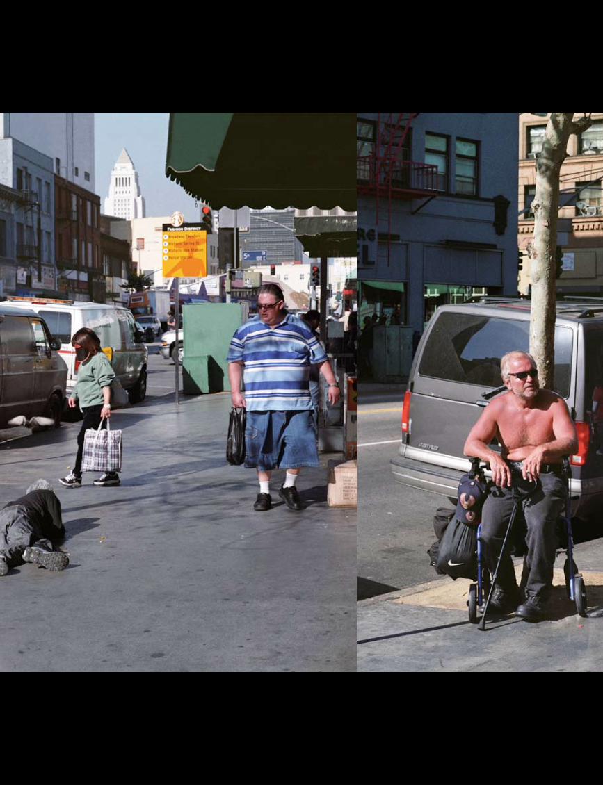
49Mirko Martin
L.A. Crash
67Raphaël Dallaporta
Ruins (Season 1)
77Katrien Vermeire
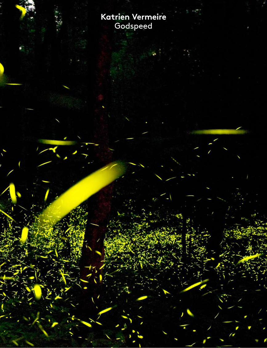
Godspeed
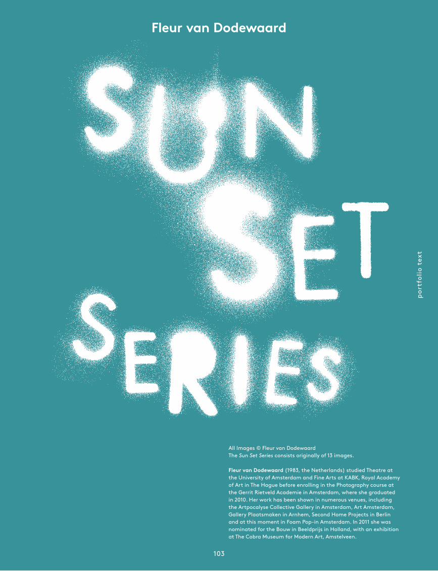
87Fleur van Dodewaard
Sun Set Series
105Ester Vonplon
The Stillness of Existence
115Renato Abreu
Revelations
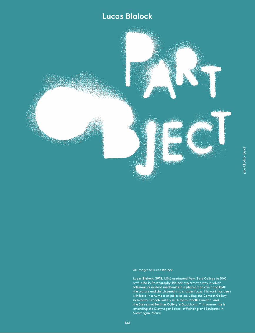
125Lucas Blalock
Part Object
143Florian van Roekel
How Terry Likes His Coffee
161Gosha Rubchinskiy
Untitled
171Mayumi Hosokura
Kazan
189Jessica Eaton
Cubes for Albert and LeWitt
199Alessandro Imbriaco
Angela’s Garden
209Ivor Prickett
Days of Anger
227Alberto Salván Zulueta
Views
238Photobooks
By Sebastian Hau
243Foam Amsterdam
Exhibition programme
264Colophon
edit
oria
l
5
Regular readers of Foam Magazine will know that the autumn issue is traditionally devoted to the work of young, talented photographers. That has been the case ever since our twelfth issue, making this the fifth time we have highlighted young talent.
Every year the process is both gripping and inspiring. The excitement is created to a large extent by the way we arrive at the final selection of portfolios to appear in the magazine. The process begins with an open and widely publicized Ta-lent Call. Each spring the editors of Foam Magazine and our website team put out a call to young photographers to send in their work. Then we wait. Have any responses come in yet and if so how many? What is our initial impression of the quality? Does it come up to the overall standard we are hoping to achieve? And are we receiving enough portfolios to allow us to make a legitimate selection? It is always a thrill, partly because experience has taught us that most people send in their portfolios at the very last moment.
Once the submission period is over we are faced with a job we can never take lightly: looking at and assessing all the work submitted. To make a proper judgement it is essential for us to have sufficient time and stamina, as well as strength of will and generosity of heart. Still, it is hardly an onerous task. Every year the editors are exceptionally pleased that so many people have taken the trouble to send in their work, allowing us to gain a reasonably accurate impression of what young photographers are up to worldwide. This annual up-date is extremely valuable to us. As a whole the portfolios we receive can be described as good, but of course it is the truly outstanding work that matters most.
In making our final decision as to which portfolios to publish, we need to bear in mind that the editors’ primary task is to put together the best magazine possible. Sometimes editorial concerns will resolve a difficult choice. Have we achieved a good balance between the portfolios? Have we avoided re-petition, is there sufficient variety, have we avoided placing too much emphasis on photographers from Europe and the United States?
Editorial by Marloes Krijnen Editor-in-chief
Even if your work has not been selected for this specific issue, it may yet prove important to have sent us your portfolio. We have seen it and may feel it merits inclusion in our lively and much drawn upon archive. In all issues of Foam Magazine we devote a good deal of space to the work of young photo-graphers, so it is more than possible that we will make use of material originally submitted for a Talent issue. If it is not something for the magazine, we may decide it can be shown and shared on one of our other platforms, because this year again, both the shortlist and the longlist contained a great deal of excellent work that it would be a pity to leave unseen. The message is clear: Foam Magazine always keeps an eye on real photographic talent, so real photographic talent should always keep an eye on Foam Magazine. •
foam
mag
azin
e #
28 t
alen
t
6
Portfolio Overview
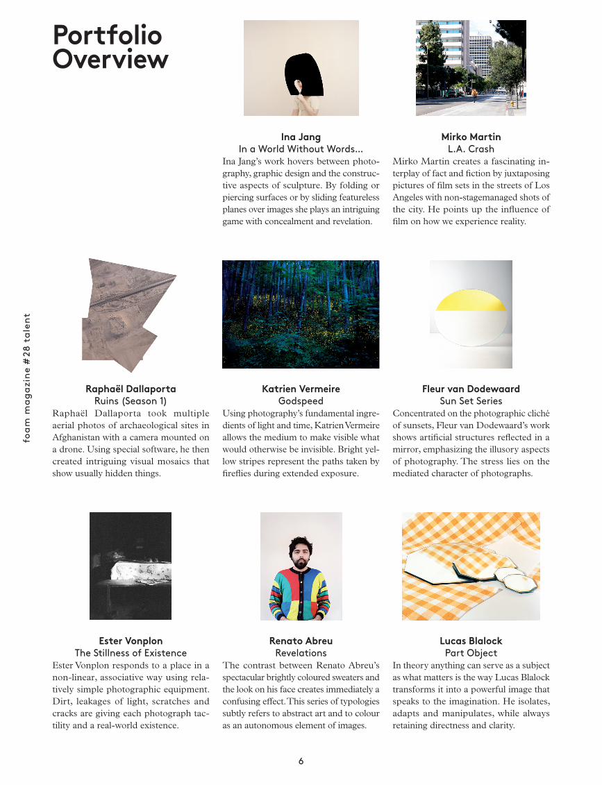
Mirko MartinL.A. Crash
Mirko Martin creates a fascinating in-terplay of fact and fiction by juxtaposing pictures of film sets in the streets of Los Angeles with non-stagemanaged shots of the city. He points up the influence of film on how we experience reality.
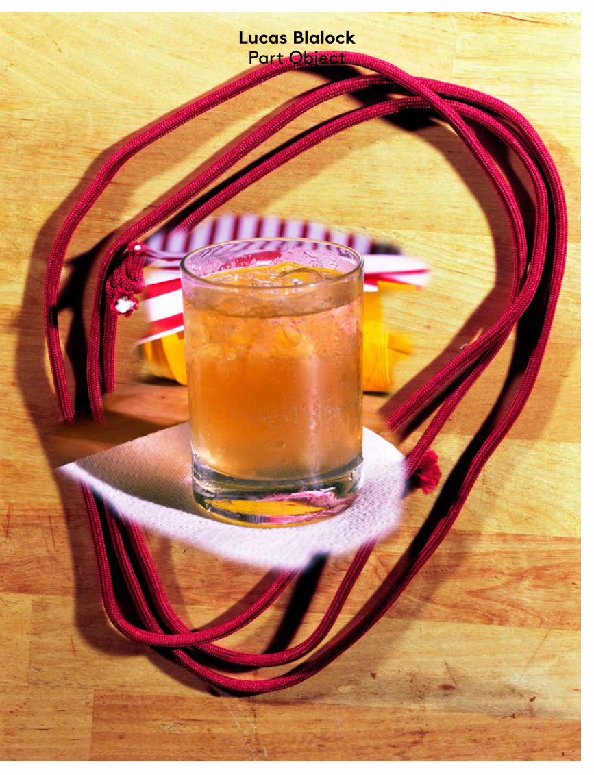
Lucas BlalockPart Object
In theory anything can serve as a subject as what matters is the way Lucas Blalock transforms it into a powerful image that speaks to the imagination. He isolates, adapts and manipulates, while always retaining directness and clarity.
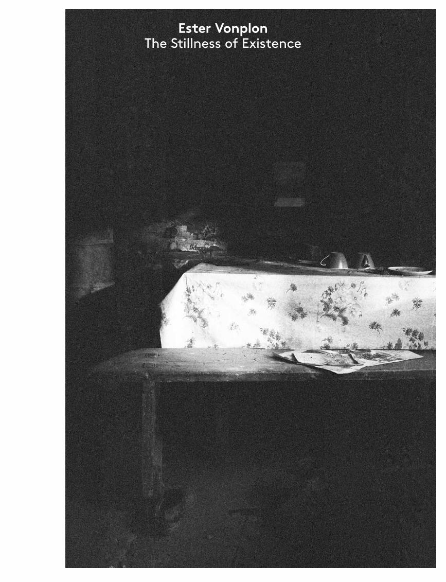
Ester VonplonThe Stillness of Existence
Ester Vonplon responds to a place in a non-linear, associative way using rela-tively simple photographic equipment. Dirt, leakages of light, scratches and cracks are giving each photograph tac-tility and a real-world existence.
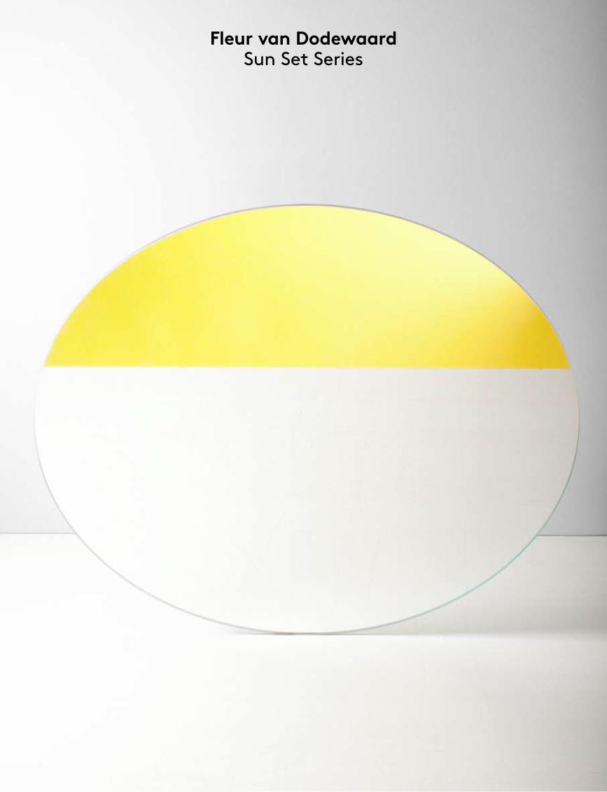
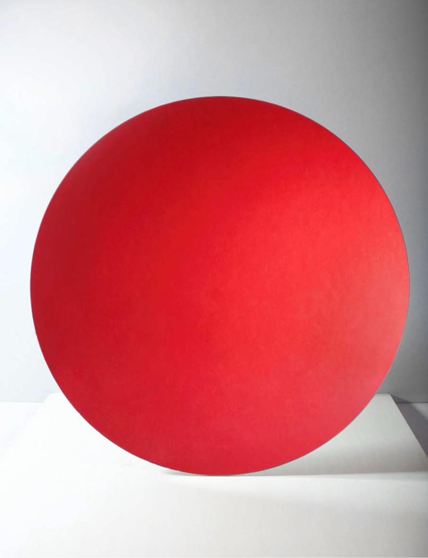
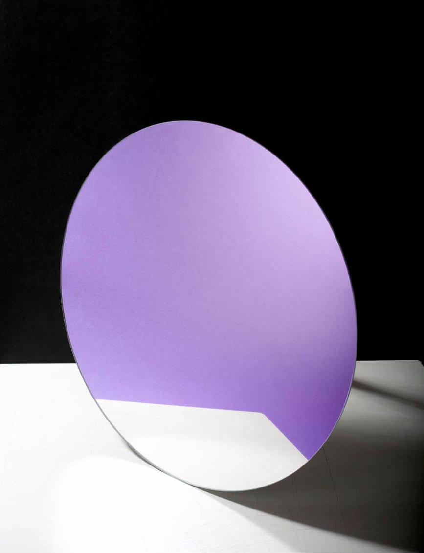
Fleur van DodewaardSun Set Series
Concentrated on the photographic cliché of sunsets, Fleur van Dodewaard’s work shows artificial structures reflected in a mirror, emphasizing the illusory aspects of photo graphy. The stress lies on the mediated character of photographs.
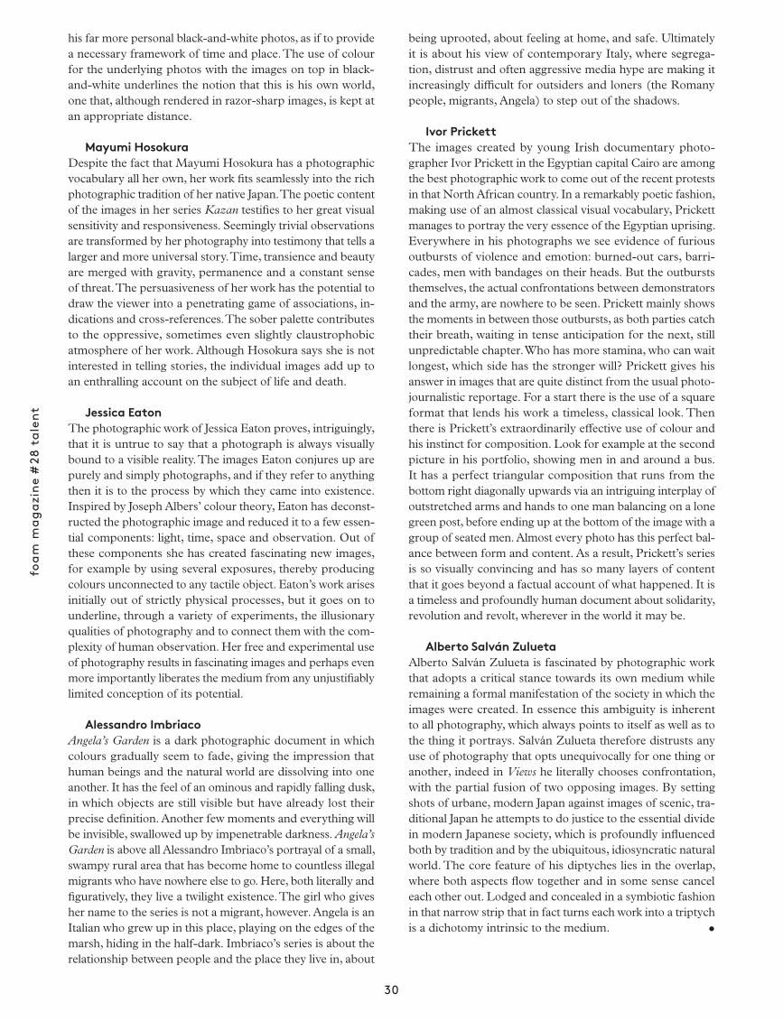
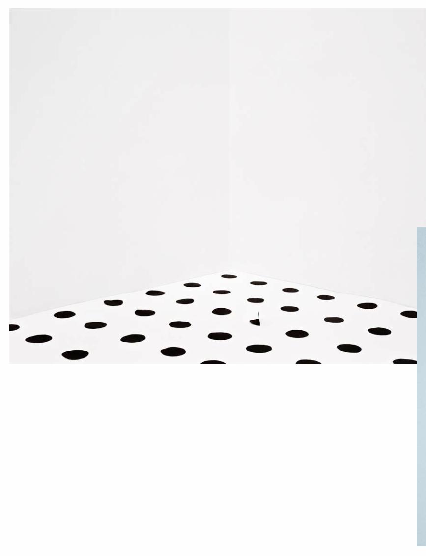
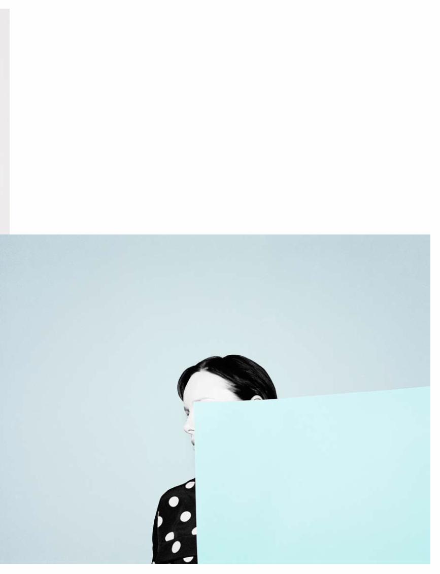
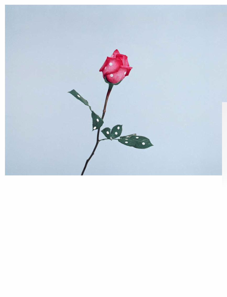
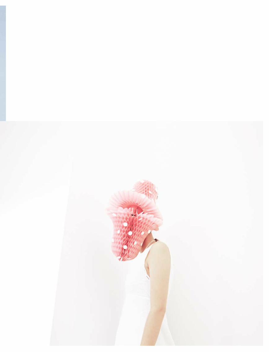
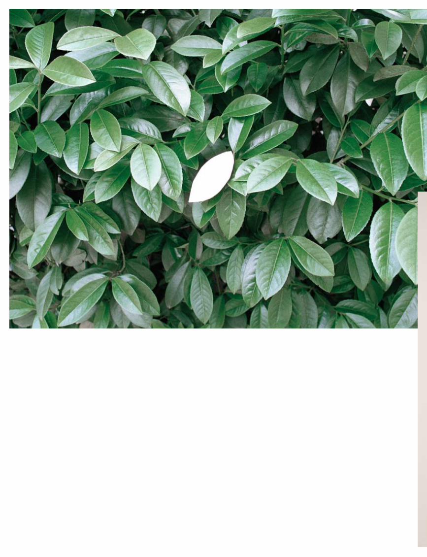
Ina JangIn a World Without Words...
Ina Jang’s work hovers between photo-graphy, graphic design and the construc-tive aspects of sculpture. By folding or piercing surfaces or by sliding featureless planes over images she plays an intriguing game with concealment and revelation.
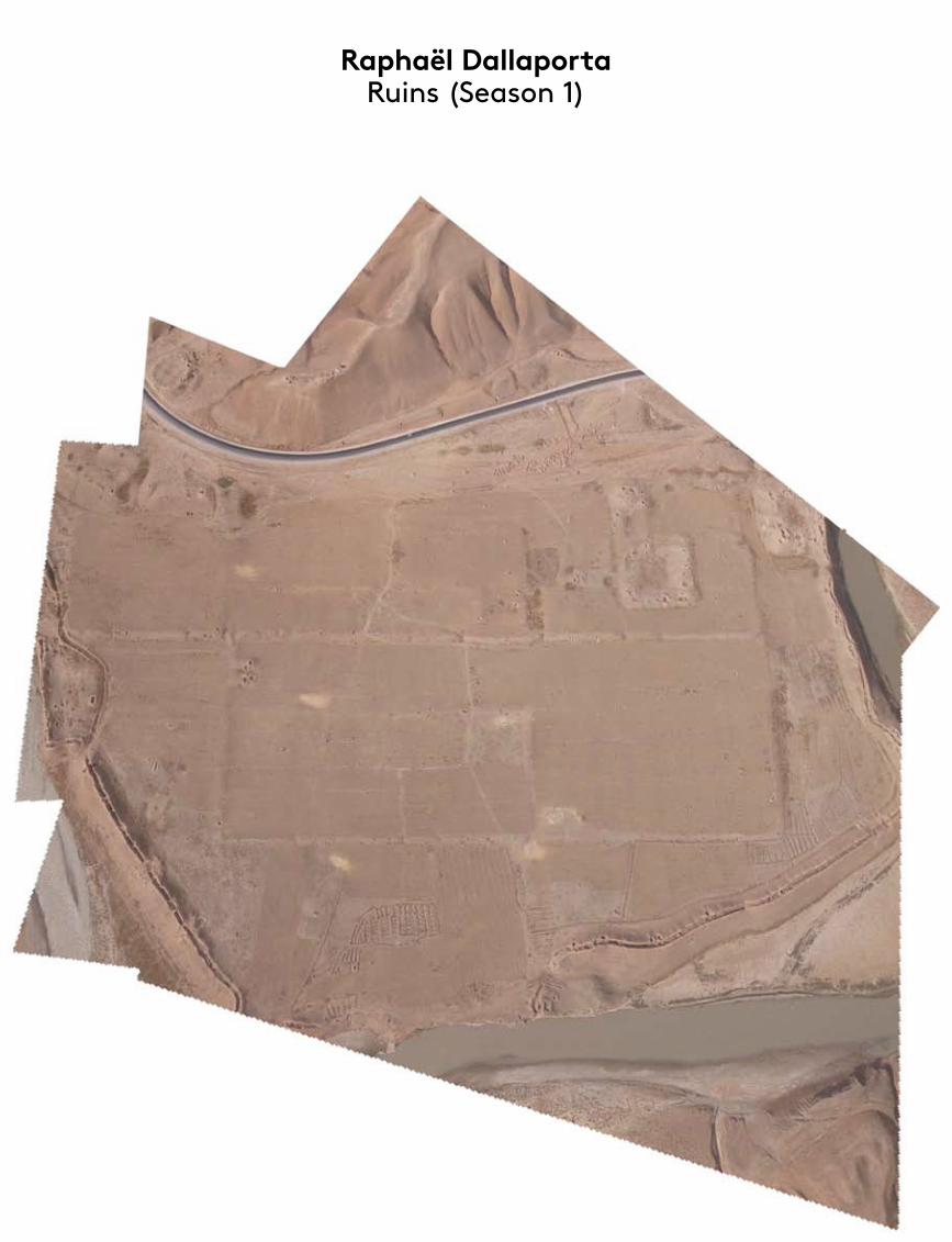
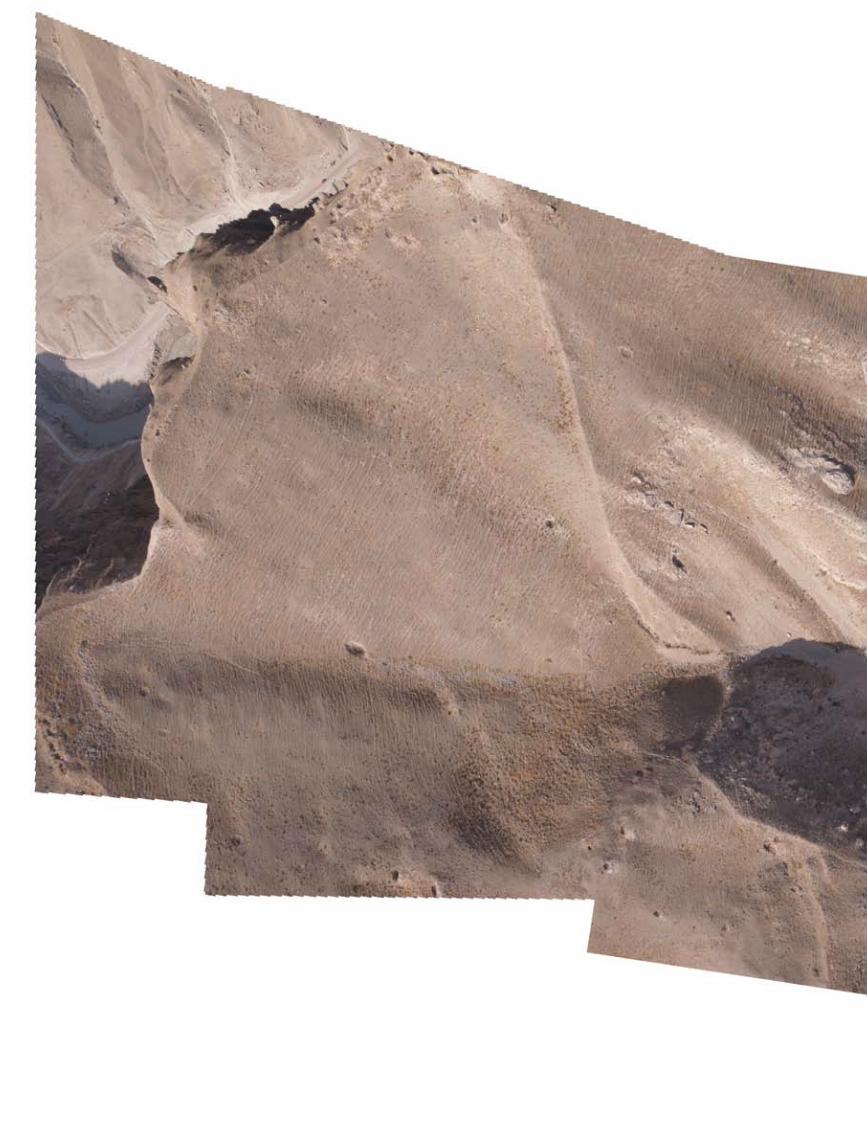
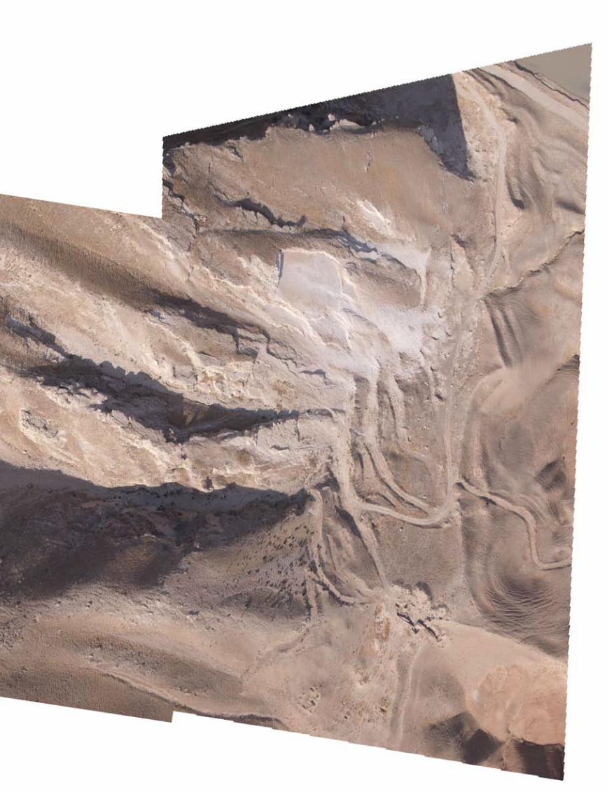
Raphaël DallaportaRuins (Season 1)
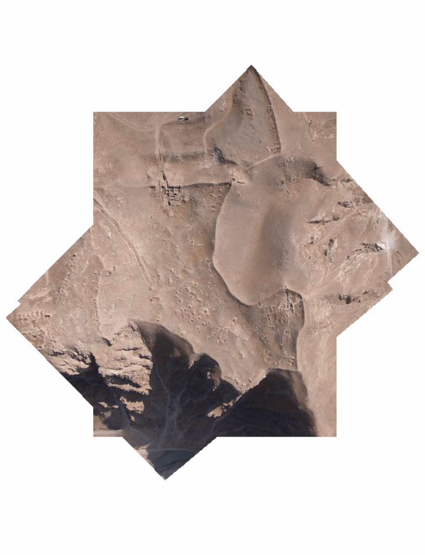
Raphaël Dallaporta took multiple aerial photos of archaeological sites in Afghanistan with a camera mounted on a drone. Using special software, he then created intriguing visual mosaics that show usually hidden things.
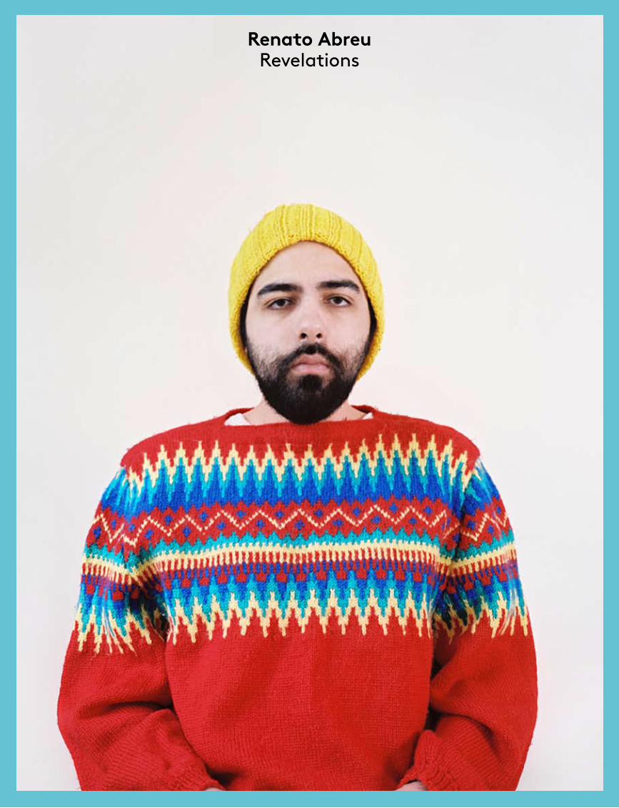
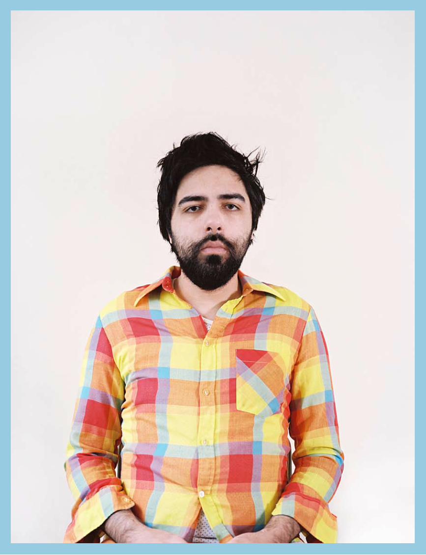
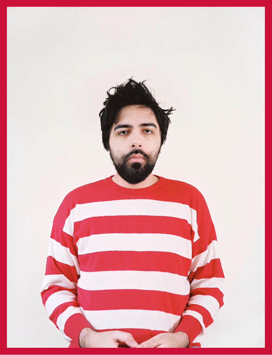
Renato AbreuRevelations
The contrast between Renato Abreu’s spectacular brightly coloured sweaters and the look on his face creates immediately a confusing effect. This series of typologies subtly refers to abstract art and to colour as an autonomous element of images.
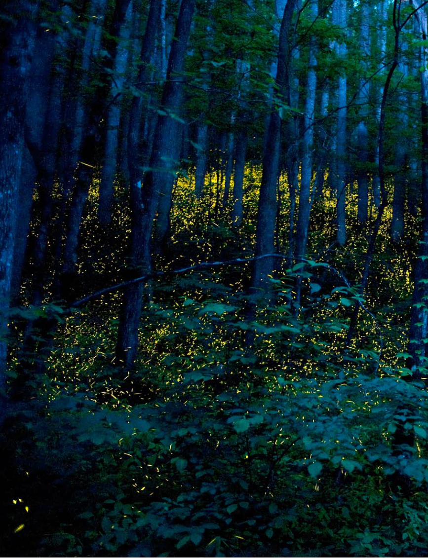
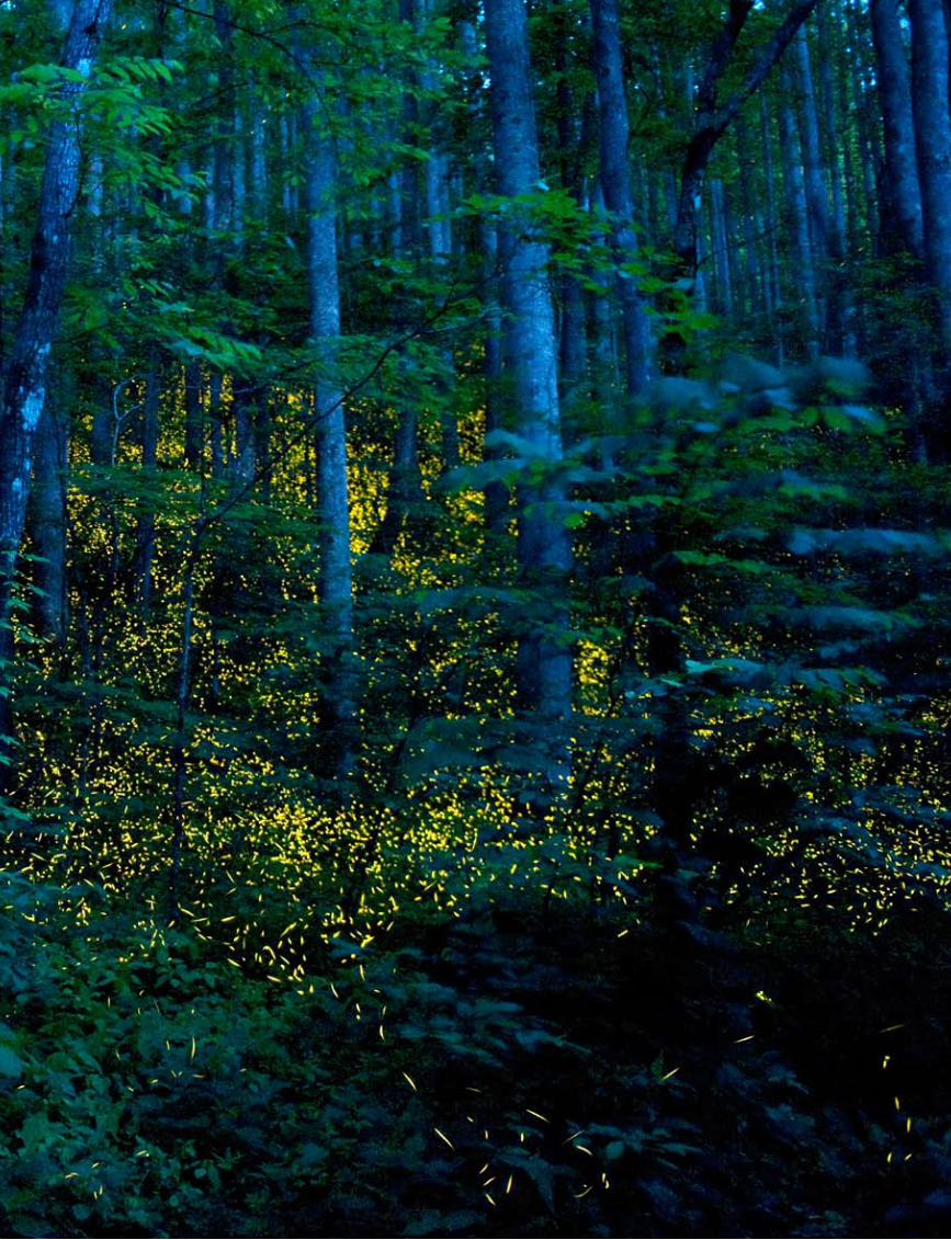
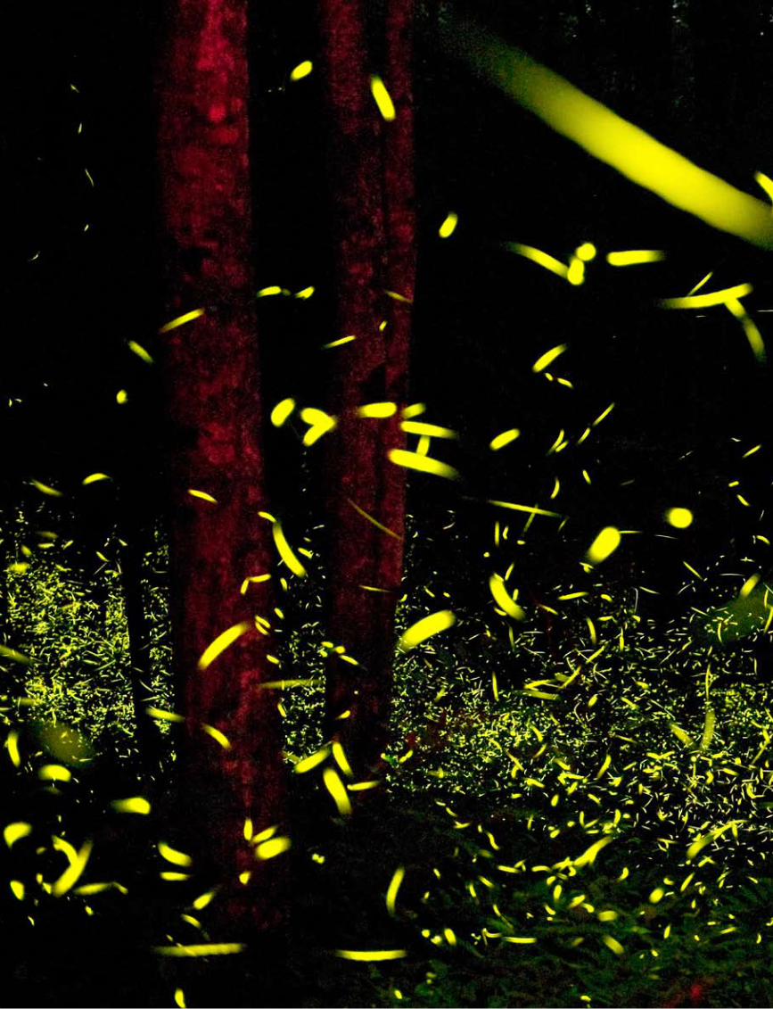
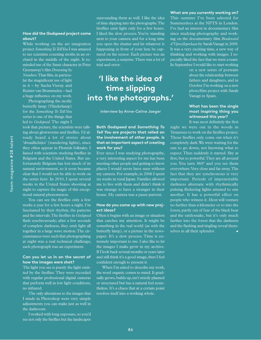
Katrien VermeireGodspeed
Using photography’s fundamental ingre-dients of light and time, Katrien Vermeire allows the medium to make visible what would otherwise be invisible. Bright yel-low stripes represent the paths taken by fireflies during extended exposure.
7
port
folio
ove
rvie
w
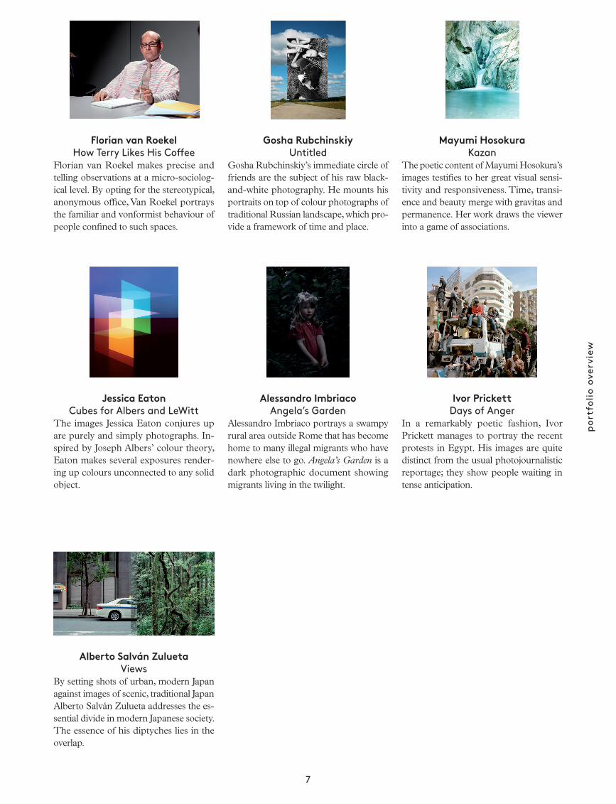
Mayumi HosokuraKazan
The poetic content of Mayumi Hosokura’s images testifies to her great visual sensi-tivity and responsiveness. Time, transi-ence and beauty merge with gravitas and permanence. Her work draws the viewer into a game of associations.
Ivor PrickettDays of Anger
In a remarkably poetic fashion, Ivor Prickett manages to portray the recent protests in Egypt. His images are quite distinct from the usual photo journalistic reportage; they show people waiting in tense anticipation.
Florian van RoekelHow Terry Likes His Coffee
Florian van Roekel makes precise and telling observations at a micro-sociolog-ical level. By opting for the stereotypical, anonymous office, Van Roekel portrays the familiar and vonformist behaviour of people confined to such spaces.
Jessica EatonCubes for Albers and LeWitt
The images Jessica Eaton conjures up are purely and simply photographs. In-spired by Joseph Albers’ colour theory, Eaton makes several exposures render-ing up colours unconnected to any solid object.
Alberto Salván ZuluetaViews
By setting shots of urban, modern Japan against images of scenic, traditional Japan Alberto Salván Zulueta addresses the es-sential divide in modern Japanese society. The essence of his diptyches lies in the overlap.
Gosha RubchinskiyUntitled
Gosha Rubchinskiy’s immediate circle of friends are the subject of his raw black-and-white photography. He mounts his portraits on top of colour photographs of traditional Russian landscape, which pro-vide a framework of time and place.
Alessandro ImbriacoAngela’s Garden
Alessandro Imbriaco portrays a swampy rural area outside Rome that has become home to many illegal migrants who have nowhere else to go. Angela’s Garden is a dark photographic document showing migrants living in the twilight.
foam
mag
azin
e #
28 t
alen
t
22
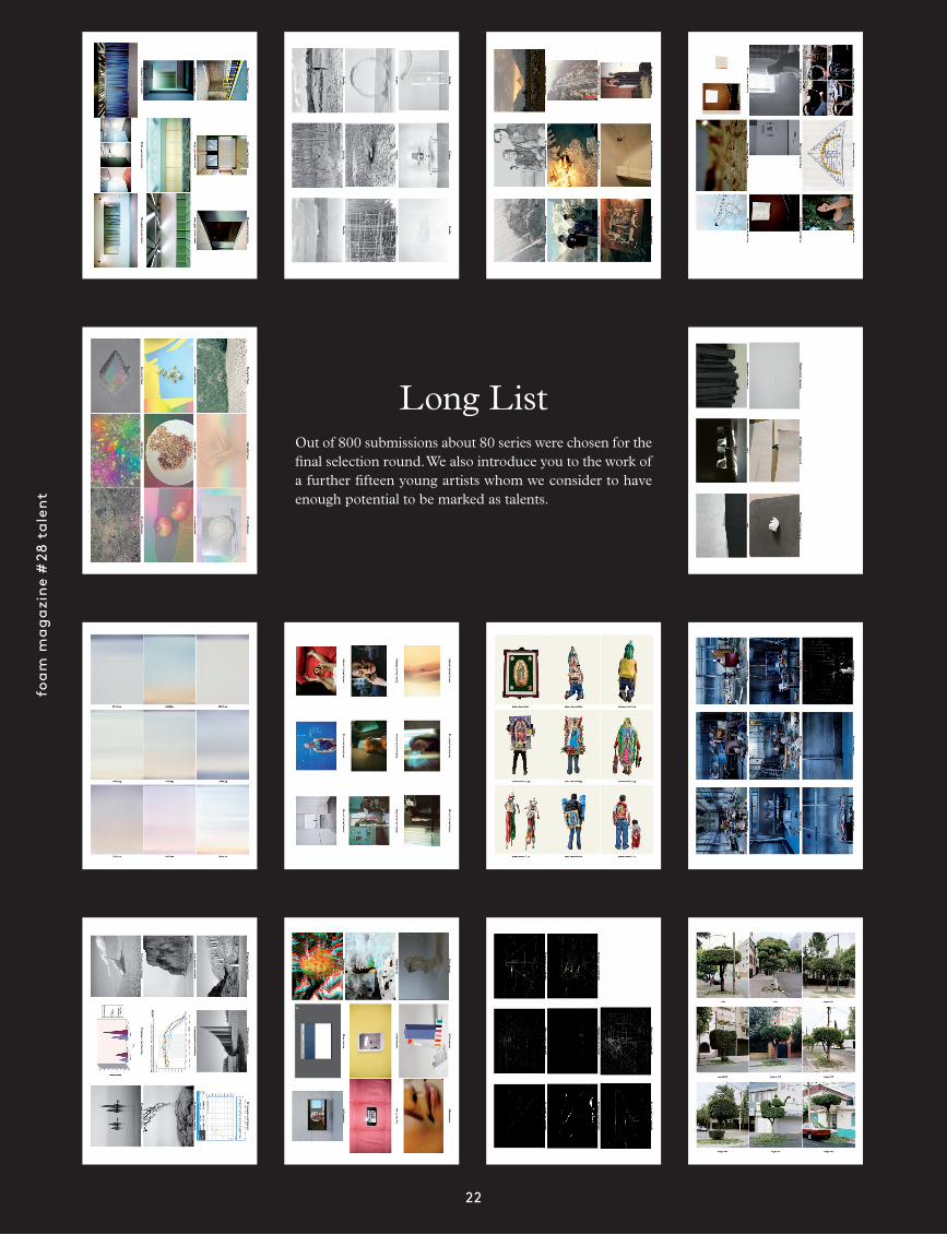
Long ListOut of 800 submissions about 80 series were chosen for the final selection round. We also introduce you to the work of a further fifteen young artists whom we consider to have enough potential to be marked as talents.
them
e in
trod
ucti
on
23
This is the fifth time we have put together a special Talent issue – clear proof of the value we place on the work of young photographers. The discovery and above all the presenta-tion and publicizing of work by exceptional talents is one of the key purposes of both the magazine and the museum in Amsterdam. Foam sees it as its task to offer a platform to photographers whose work deserves to be shown and holds promise for the future. Foam Magazine likes to discover new things for itself and believes it is important to initiate and maintain contact with photographers who may have the abil-ity to influence developments in the medium. To qualify to submit work for Foam Magazine’s Talent issue a photographer must be under the age of thirty-five. People often question this age limit, which the editorial team settled upon for a variety of reasons. Our main aim is to produce an annual overview of the work of young artists. It may point to developments, trends and themes that are of particular im-portance to a new generation of artists who are likely, in due course, to have an impact on developments within the photo-graphical field as a whole. We think an age limit of thirty-five
makes sense, since by then most of the artists have left the academy behind them and generated a visual language of their own, yet they are still young enough to develop further, to carve out a path for themselves in the photographic profession and remain influential for a significant time to come. Having said that, there is clearly a difference between ‘being talented’ and ‘being a talent’. Talent is unrelated to age, but anyone who is ‘a talent’ will generally be young, with outstanding skills or abilities in comparison to contemporaries. At Foam Magazine we are always on the lookout for truly talented photographers, but in our annual Talent issue we feature the work of artists we consider to be true talents. This year again, many hundreds of portfolios reached us and most were of a remarkably high quality. The editors of Foam Magazine would like to thank everyone who took the trouble to put together a portfolio and send it to us. Without your efforts and without your talent it would be impossible to justify publishing this issue. Even if your work has not been included, your efforts were not necessarily wasted. Several portfolios were candidates for inclusion until the very last
by Marcel Feil
The difference between
being talented
beinga talent
and
foam
mag
azin
e #
28 t
alen
t
24
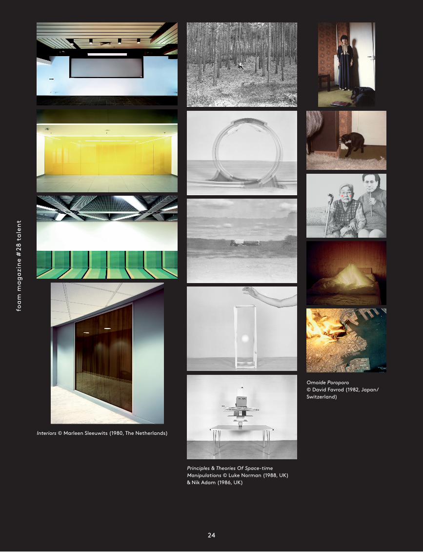
Interiors © Marleen Sleeuwits (1980, The Netherlands)
Principles & Theories Of Space-time Manipulations © Luke Norman (1988, UK) & Nik Adam (1986, UK)
Omoide Poroporo © David Favrod (1982, Japan/Switzerland)
them
e in
trod
ucti
on
25
moment; others have been put to one side because we believe a moment will arrive, or a different platform present itself, that will give us the opportunity to show the work they contain. Still, we are exceptionally proud of the fifteen finalists and would like to offer you a quick profile of each of them.
Ina JangAmbiguity is a word that seems particularly appropriate to the striking and deeply authentic work of South Korean photographer Ina Jang. As a result of the intriguing way she deals with the photographic surface, her work hovers between photography, graphic design and the constructive aspects of sculpture. Nothing about it is straightforward. By folding or piercing surfaces or by sliding featureless planes over images she plays an intriguing game with concealment and revela-tion. When people appear in her pictures (often her sister) the face is hardly ever visible; it is replaced by a monochrome flat plane or hidden behind a large coloured shape or surface. The characteristic pastel tints give the work an apparently gentle, accessible aura, but the hand of the artist is always in evidence, determining the degree of manipulation and the confusion it creates, and indicating the powerful desire of the artist to appropriate the image and constantly wrong-foot the viewer. Flat and three-dimensional, tender and severe, serious and playful, graphic and sculptural: Ina Jang’s work unites all these opposing elements in a com-pletely natural way, yet at the same time manages to create an enjoyable friction between them.
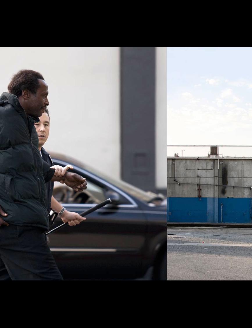
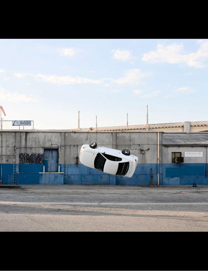
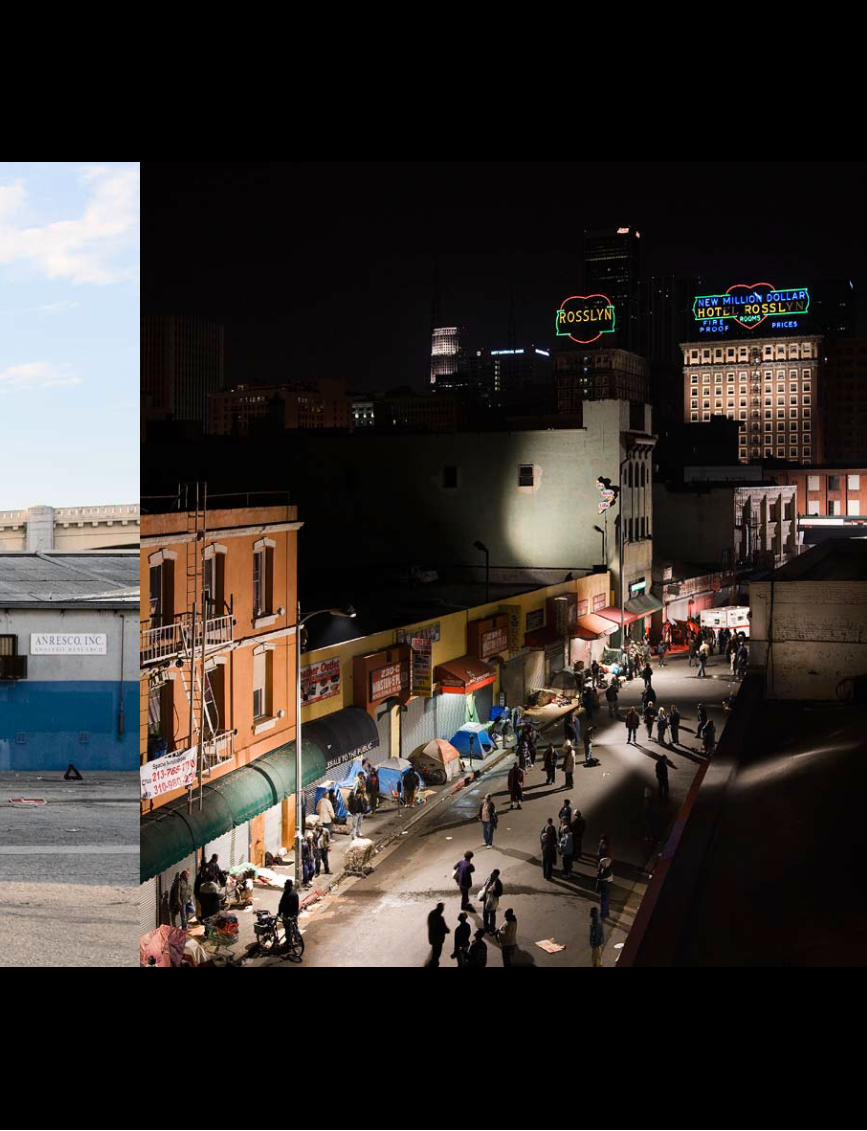
Mirko MartinAmong the many portfolios we looked at, Mirko Martin’s work stood out straight away. Its pronounced visual power, its references to cinemato-graphy, the clarity and monumentality of the images, along with a fascinating interplay of fact and fiction convinced us immediately of Martin’s talent. The intelligence he displays in combining pictures of film sets in the streets of Los Ange-les with non-stage-managed shots of the same city not only investigates the complex relationship between photography and the real world, it points to the influence of film and the news media on the way we experience reality. The intriguing way in which fiction and reality reflect each other, especially in a city like Los Angeles, makes it no simple matter for a viewer to relate to what he is seeing. Is real life imitating art? Does art hold up a mirror? Can we still distinguish between the two? These are questions of real importance, especially in a society in which the influence of the media is ubiquitous. Aside from these substantive themes, Mirko Martin’s work testifies to a visual audacity that distinguishes him from many of his contemporaries.
Raphaël DallaportaRaphaël Dallaporta is the winner of the 2011 Paul Huf Award, a photography prize organized by Foam for young photographic talents. He won the prize for several series he has produced in
recent years, cooperating in each case with experts from out-side the photographic field. For his project Fragile he worked with a forensic pathologist and anatomist, for Antipersonnel with military experts and for Domestic Slavery with human rights organizations. Uniting all these projects is the apparently neutral, objective, almost scientific way in which Dallaporta makes use of the typical photographic means of capturing reality. The accompanying texts are often an intrinsic part of his work, revealing the frequently unpleasant background to his images. The tension between text and image, between read-ing and looking, and the mental processes needed to digest the information, creates a multi-stage and often contradictory sensation. For his most recent project, Ruins (Season 1), Dalla-porta again worked with experts, in this case a team of French archaeologists. In northern Afghanistan he took multiple aerial photos of archaeological sites with a camera mounted on a drone that he had adapted himself. With the help of special software, he used the resulting images to create compound pictures, intriguing visual mosaics from which an extraordinary amount can be read, ranging from late Bronze Age settlements, through the re mains of Greek civilization and Zoroastrian architecture to Soviet tank tracks. Dallaporta deploys photo-graphy to capture the complexity and multilayered nature of
history, culture and geo logy, often in a single image.
Katrien VermeirePhotography is fundamentally about the reaction of light- sensitive material to exposure to light, and for her series God-speed Belgian photographer Katrien Vermeire has chosen a truly unique light source. Doz-ens of glow worms and fire-flies produce the light that is essential to her astonishing
images. They are taken with digi tal cameras that work well in conditions of low light and created using long exposure times. The results, which rely entirely on the light given off by these tiny insects, are enchanting. Blue-grey and ember-red tree trunks serve as a background to what can best be described as a snowstorm of light. Bright yellow stripes represent the paths taken by the fireflies during the time the shutter was open; the floor of a dark wood glows with the tiny creatures present on it. Using photography’s most fundamental ingredients (light, time), Katrien Vermeire allows the medium to do what it is best at: making visible things that would otherwise be invisible. Godspeed emphasizes just how magical the results can be.
Fleur van DodewaardFleur van Dodewaard is less interested in the photographic representation of reality as such than in the way in which photography relates to the other media it exploits in its efforts to achieve autonomy. She commonly uses a diversity of materials to create clear and powerful images that on closer inspection prove unexpectedly complex. The primary feature of her Sun Set Series is its simple and powerful graphic im-agery. By concentrating on the photographic cliché of sunset and depicting it as an artificial structure reflected in a mirror,
Developments, trends and themes
that are of particular importance to
a new generation of artists
foam
mag
azin
e #
28 t
alen
t
26
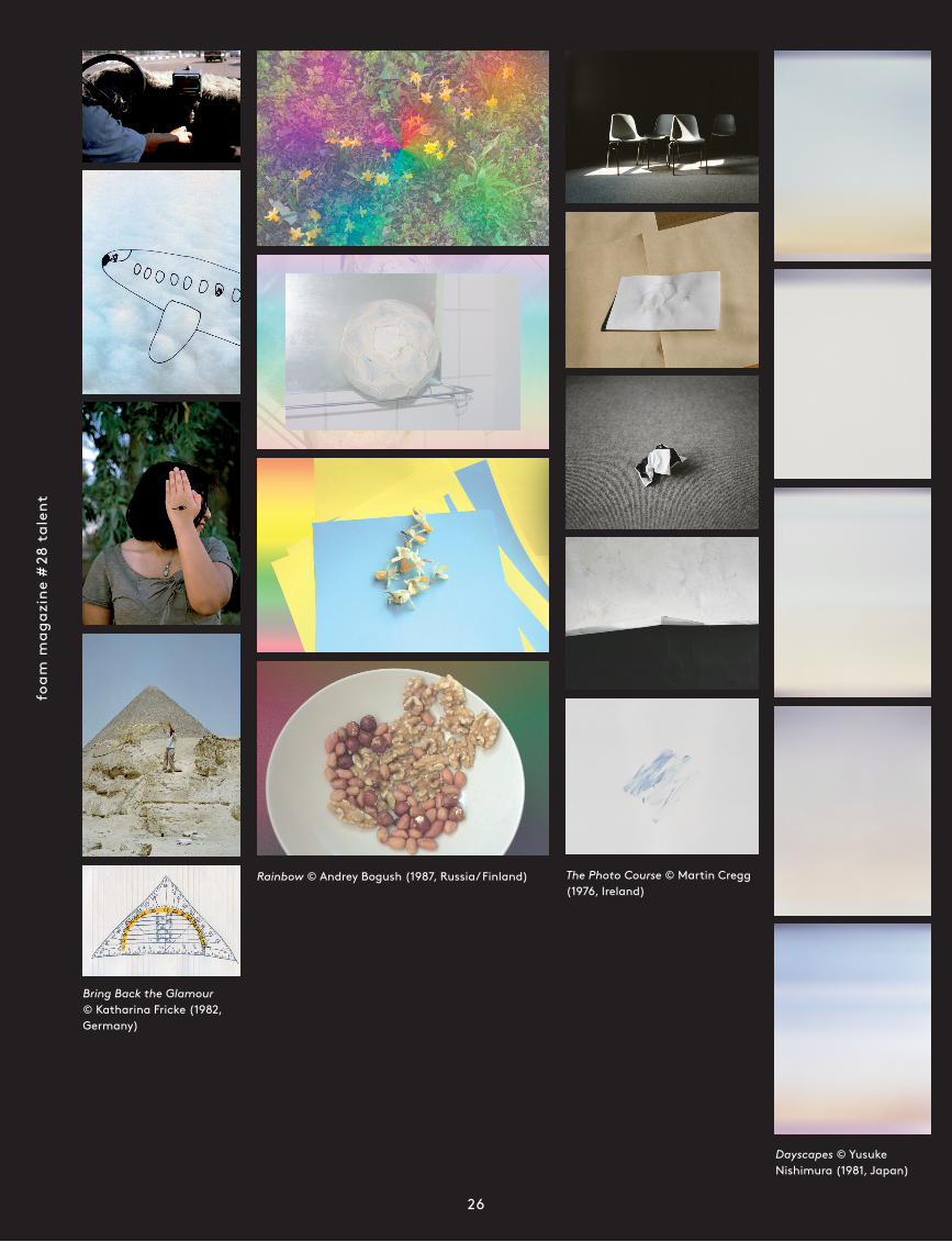
Bring Back the Glamour © Katharina Fricke (1982, Germany)
The Photo Course © Martin Cregg (1976, Ireland)
Dayscapes © Yusuke Nishimura (1981, Japan)
Rainbow © Andrey Bogush (1987, Russia/ Finland)
them
e in
trod
ucti
on
27
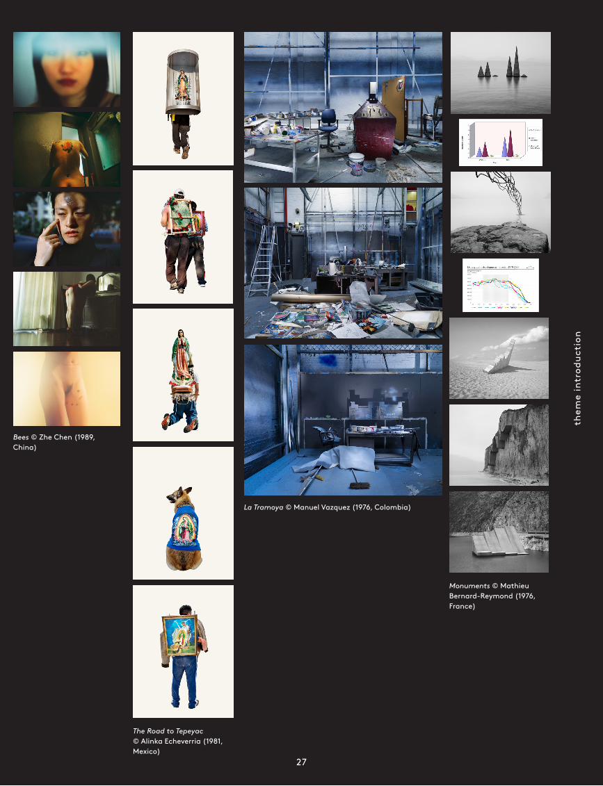
Monuments © Mathieu Bernard-Reymond (1976, France)
The Road to Tepeyac © Alinka Echeverria (1981, Mexico)
Bees © Zhe Chen (1989, China)
La Tramoya © Manuel Vazquez (1976, Colombia)
foam
mag
azin
e #
28 t
alen
t
28
she emphasizes the illusory aspects of photography. It is im-possible literally to capture the real world and photography is only ever connected to reality indirectly, by means of reflec-tion. Her constructions reinforce the mediated character of her photographs and at the same time point to her role as their creator. Van Dodewaard tries nevertheless to limit that role by keeping her imagery as detached and neutral as possible. This is reiterated by countless allusions to abstract and con-ceptual art. Her weaving together of art historical references contributes additional weight and significance to her critical reflection on the medium.
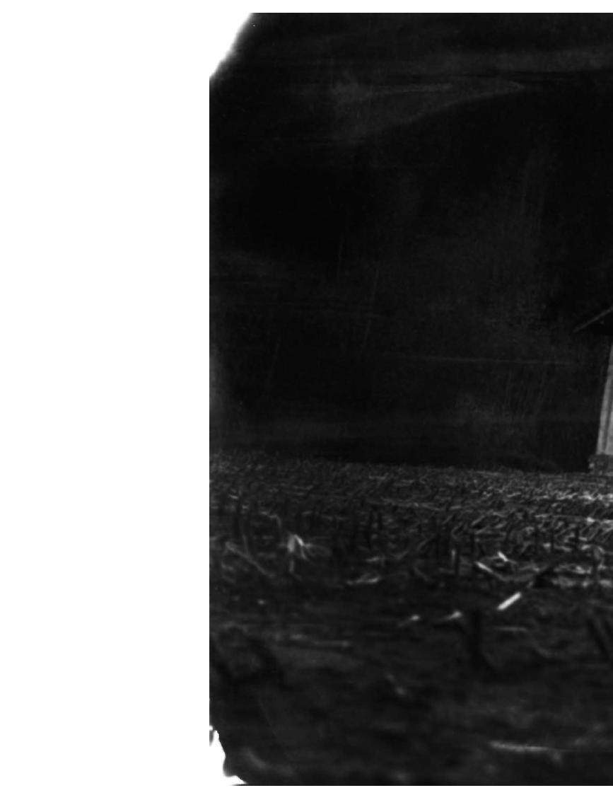
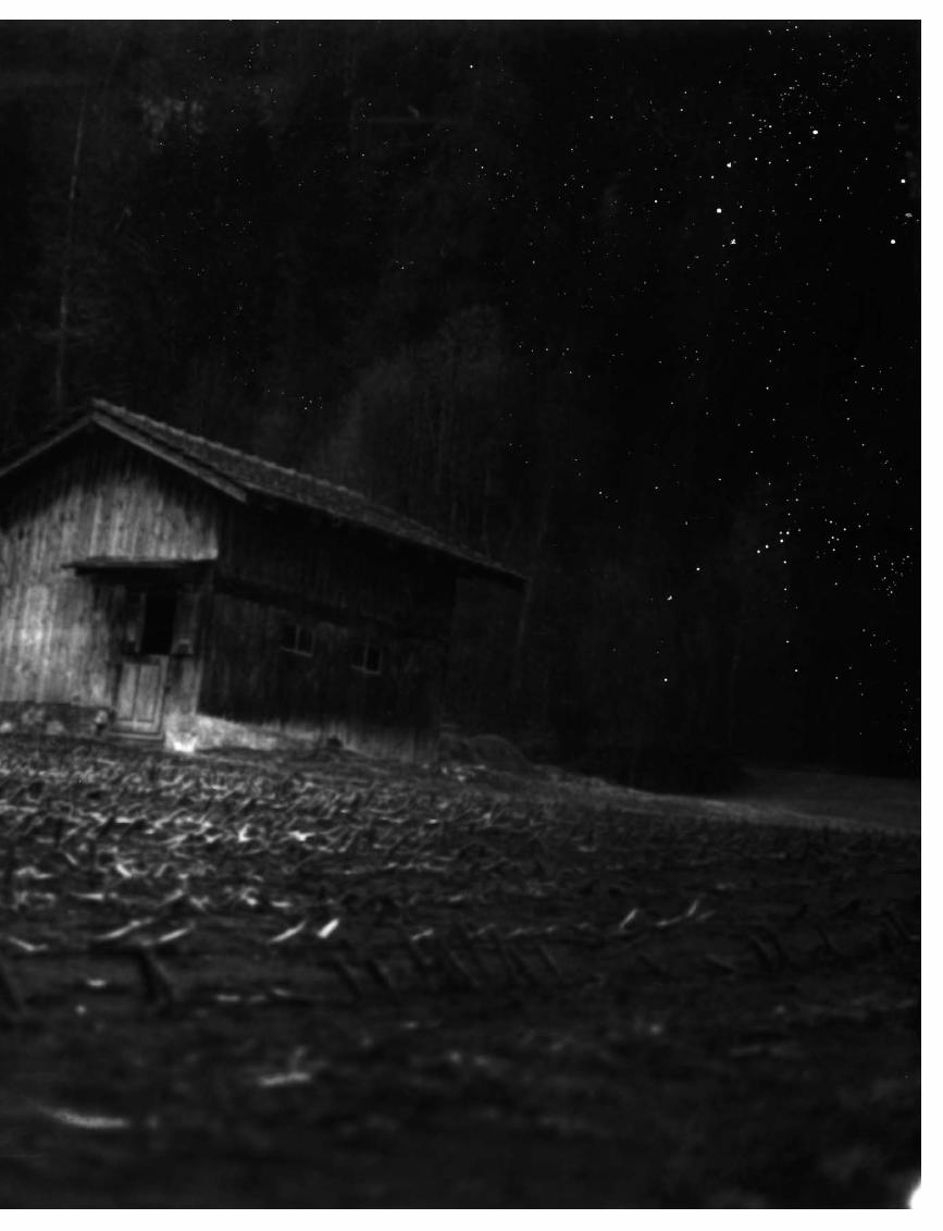
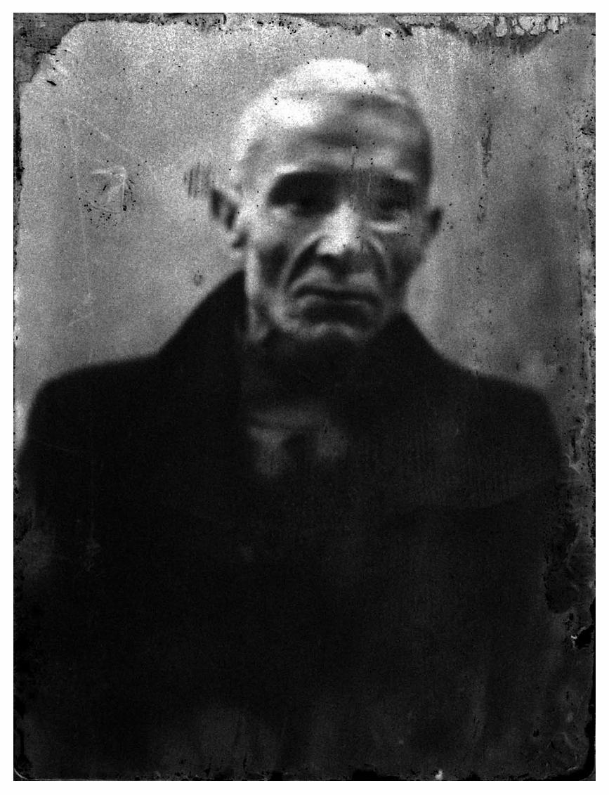
Ester VonplonEvery year the work submitted for Foam Magazine’s Talent issue includes portfolios full of raw, sombre, black-and-white photography, reminiscent of stream-of-consciousness work by, for example, the early Moriyama, William Klein, Anders Petersen or, more recently, Antoine d’Agata. In its own dis-tinctive way, Ester Vonplon’s work belongs in this rich tra-dition. She responds to a place in a non-linear, associative way using relatively simple photo-graphic equipment. That place, and the feeling it creates in her, is of prime importance. When-ever possible she develops her films there too, often with un-foreseen technical and there-fore aesthetic results. Dirt, leakages of light, scratches and cracks are essential elements of the image, contributing to the feelings that emanate from her work. This approach is of importance not only to the image but to physical aspects of photography. Each photograph has weight, proportions, tactility and a real-world existence. No wonder the self-made photo book is the format that best does justice to Ester Vonplon’s work and working methods.
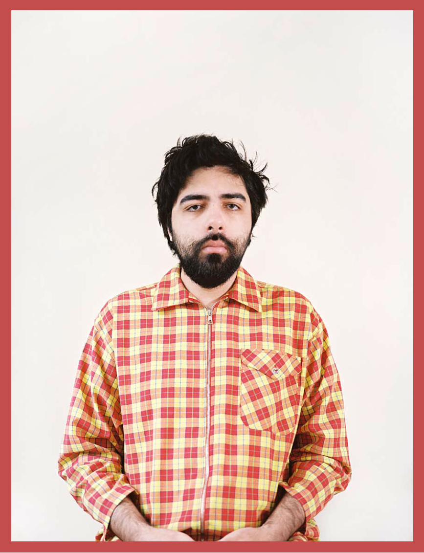
Renato AbreuFew of the series we received had such an immediate effect as Renato Abreu’s Revelations. Each of the self-portraits in his portfolio shows him with the same unhappy expression. The extraordinary multicoloured jumpers he wears are all that changes. The contrast between his spectacularly brightly col-oured clothing and the look on his face creates an immediate but confusing effect. Is this a joke, is he serious, or are we missing something crucial? However that may be, the visual power of the series is indisputable and infectious. Revelations can also be seen as a striking series of typologies, with the sweaters subtly pointing to abstract art and the role of colour as an autonomous element of an image. By placing such em-phasis on himself as part of the image, he both puts the series in perspective and underlines the personal importance of the work to its creator. Its very ambiguity is perhaps the essence of the work.
Lucas BlalockThe work of Lucas Blalock is marked by a delightful free-dom and contrariness. At first sight he seems to place no
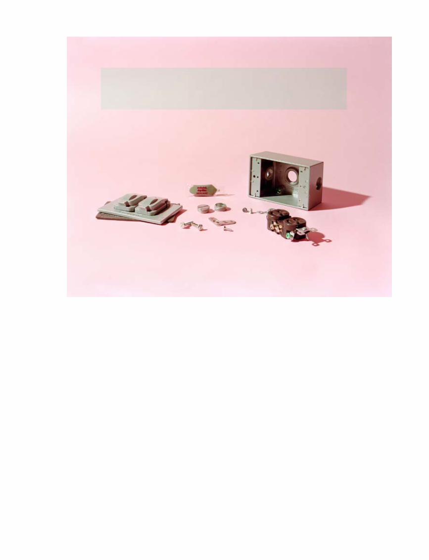
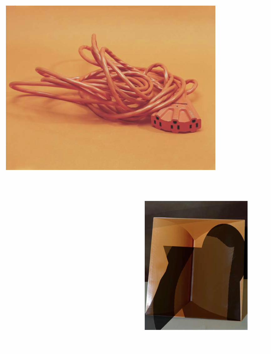
limits at all on his choice of subject-matter: various graters, an orange electricity cable, dishes in a dishwasher, the front of a house, an old rag. In theory anything can serve as a subject, since what matters is the way in which he transforms it into a powerful image that speaks to the imagination. Blalock’s work offers anything but a straightforward representation of a specific object. He isolates, adapts, manipulates, while always retaining an attractive directness and clarity. He also attaches great importance to a use of colour that refers to a specific time in the past, the 1970s particularly. His photographs are reminiscent of the anonymous utilitarian photography of dec-ades past, but there are subtle interventions that clearly point to contemporary photographic equipment and that ensures each image possesses a tension all its own. His free, associative and mildly anarchic way of working makes Blalock an out-standing representative of a new generation of image-makers who are breaking open the old framework within which photo-graphy still often operates and by doing so are stimulating the
entire medium in ways that we greatly appreciate.
Florian van RoekelFlorian van Roekel’s work demonstrates his ability to make precise and telling obser-vations at a micro-sociological level. Apparently insignificant, everyday behaviour can con-vey an extraordinary amount of information about who we are and how we relate to one another. By opting for a spe-
cific biotope – the stereotypical, anonymous office – Van Roekel sharpens his powers of observation. Like a consum-mate anthropologist, he looks at how the office workers hold their phones, the expressions on their faces as they do so, how they drink their coffee and what kind of mugs are popular. His subject is the familiar and to some degree uniform behaviour of people who spend their days together in a small space, obeying their own particular behavioural codes. Van Roekel is an outsider, recording their behaviour with a sharp eye and presenting it to us with a dash of irony. The series How Terry Likes his Coffee is a tragicomic document like no other.
Gosha RubchinskiyThe young Russian artist Gosha Rubchinskiy is not only a photographer but a film maker and the founder of the fashion label Aglec. In his work he focuses mainly on his own life and the people with whom he surrounds himself. To an important extent they are contemporaries, aware of being caught be-tween youthful insouciance and the prospect of increasingly having to bear adult responsibility. That tension tends to ex-press itself in the typical behaviour of big-city youth: unruly, wayward and often operating from the margins. Skateboard-ers and graffiti artists belong to Rubchinskiy’s immediate circle of friends and are therefore quite frequently the subject of his raw black-and-white photography. The most striking thing about the series shown here is the mounting of these images on top of slightly bigger colour photographs. The underlying pictures seem to function literally as a basis for
Artists who are likely, in due course,
to have an impact on developments within
the photographical field as a whole
them
e in
trod
ucti
on
29
them
e in
trod
ucti
on
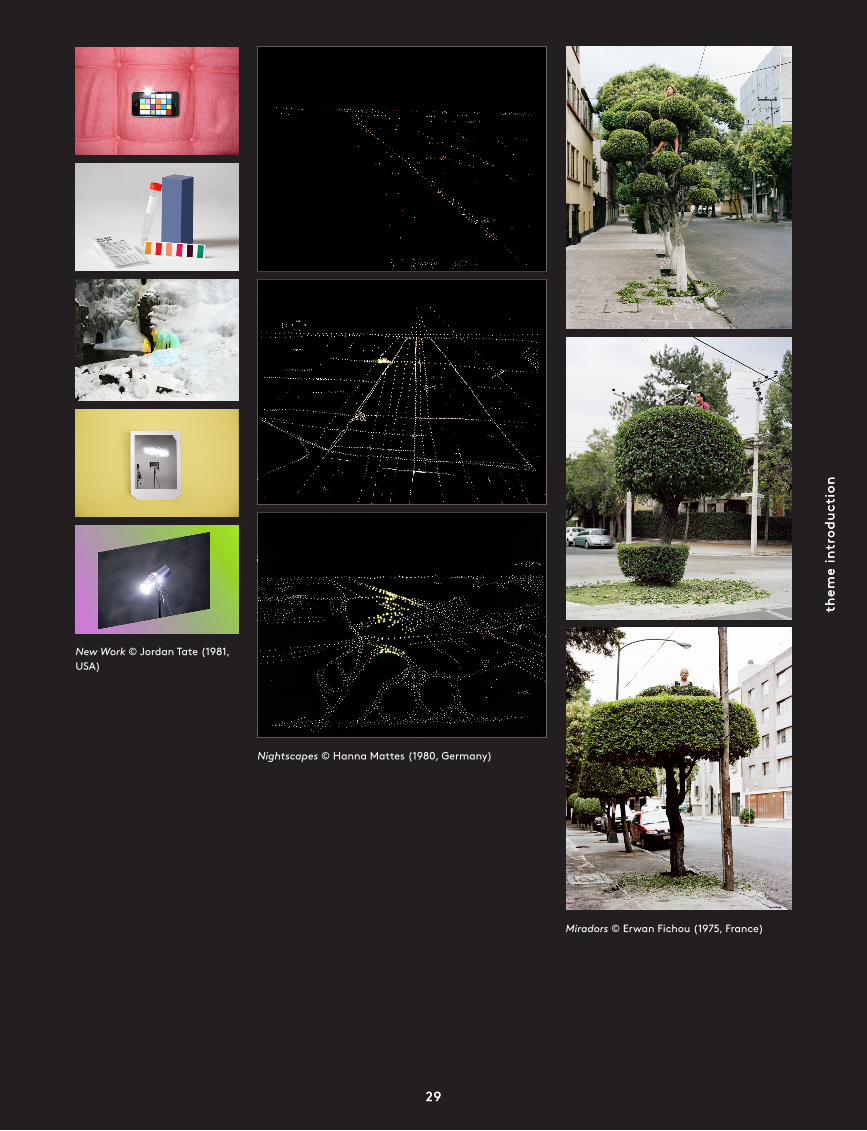
New Work © Jordan Tate (1981, USA)
Nightscapes © Hanna Mattes (1980, Germany)
Miradors © Erwan Fichou (1975, France)
29
foam
mag
azin
e #
28 t
alen
t
30
his far more personal black-and-white photos, as if to provide a necessary framework of time and place. The use of colour for the underlying photos with the images on top in black-and-white underlines the notion that this is his own world, one that, although rendered in razor-sharp images, is kept at an appropriate distance.
Mayumi HosokuraDespite the fact that Mayumi Hosokura has a photographic vocabulary all her own, her work fits seamlessly into the rich photographic tradition of her native Japan. The poetic content of the images in her series Kazan testifies to her great visual sensitivity and responsiveness. Seemingly trivial observations are transformed by her photography into testimony that tells a larger and more universal story. Time, transience and beauty are merged with gravity, permanence and a constant sense of threat. The persuasiveness of her work has the potential to draw the viewer into a penetrating game of associations, in-dications and cross-references. The sober palette con tributes to the oppressive, sometimes even slightly claustrophobic atmosphere of her work. Although Hosokura says she is not interested in telling stories, the individual images add up to an enthralling account on the subject of life and death.
Jessica EatonThe photographic work of Jessica Eaton proves, intriguingly, that it is untrue to say that a photograph is always visually bound to a visible reality. The images Eaton conjures up are purely and simply photographs, and if they refer to anything then it is to the process by which they came into existence. Inspired by Joseph Albers’ colour theory, Eaton has deconst-ructed the photographic image and reduced it to a few essen-tial components: light, time, space and observation. Out of these components she has created fascinating new images, for example by using several exposures, thereby producing colours unconnected to any tactile object. Eaton’s work arises initially out of strictly physical processes, but it goes on to underline, through a variety of experiments, the illusionary qualities of photography and to connect them with the com-plexity of human observation. Her free and experimental use of photography results in fascinating images and perhaps even more importantly liberates the medium from any unjustifiably limited conception of its potential.
Alessandro ImbriacoAngela’s Garden is a dark photographic document in which colours gradually seem to fade, giving the impression that human beings and the natural world are dissolving into one another. It has the feel of an ominous and rapidly falling dusk, in which objects are still visible but have already lost their precise definition. Another few moments and everything will be invisible, swallowed up by impenetrable darkness. Angela’s Garden is above all Alessandro Imbriaco’s portrayal of a small, swampy rural area that has become home to countless illegal migrants who have nowhere else to go. Here, both literally and figuratively, they live a twilight existence. The girl who gives her name to the series is not a migrant, however. Angela is an Italian who grew up in this place, playing on the edges of the marsh, hiding in the half-dark. Imbriaco’s series is about the relationship between people and the place they live in, about
being uprooted, about feeling at home, and safe. Ultimately it is about his view of contemporary Italy, where segrega-tion, distrust and often aggressive media hype are making it increasingly difficult for outsiders and loners (the Romany people, migrants, Angela) to step out of the shadows.
Ivor PrickettThe images created by young Irish documentary photo-grapher Ivor Prickett in the Egyptian capital Cairo are among the best photographic work to come out of the recent protests in that North African country. In a remarkably poetic fashion, making use of an almost classical visual vocabulary, Prickett manages to portray the very essence of the Egyptian uprising. Everywhere in his photographs we see evidence of furious outbursts of violence and emotion: burned-out cars, barri-cades, men with bandages on their heads. But the outbursts themselves, the actual confrontations between demonstrators and the army, are nowhere to be seen. Prickett mainly shows the moments in between those outbursts, as both parties catch their breath, waiting in tense anticipation for the next, still unpredictable chapter. Who has more stamina, who can wait longest, which side has the stronger will? Prickett gives his answer in images that are quite distinct from the usual photo-journalistic reportage. For a start there is the use of a square format that lends his work a timeless, classical look. Then there is Prickett’s extraordinarily effective use of colour and his instinct for composition. Look for example at the second picture in his portfolio, showing men in and around a bus. It has a perfect triangular composition that runs from the bottom right diagonally upwards via an intriguing interplay of outstretched arms and hands to one man balancing on a lone green post, before ending up at the bottom of the image with a group of seated men. Almost every photo has this perfect bal-ance between form and content. As a result, Prickett’s series is so visually convincing and has so many layers of content that it goes beyond a factual account of what happened. It is a timeless and profoundly human document about solidarity, revolution and revolt, wherever in the world it may be.
Alberto Salván ZuluetaAlberto Salván Zulueta is fascinated by photographic work that adopts a critical stance towards its own medium while remaining a formal manifestation of the society in which the images were created. In essence this ambiguity is inherent to all photography, which always points to itself as well as to the thing it portrays. Salván Zulueta therefore distrusts any use of photography that opts unequivocally for one thing or another, indeed in Views he literally chooses confrontation, with the partial fusion of two opposing images. By setting shots of urbane, modern Japan against images of scenic, tra-ditional Japan he attempts to do justice to the essential divide in modern Japanese society, which is profoundly influenced both by tradition and by the ubiquitous, idiosyncratic natural world. The core feature of his diptyches lies in the overlap, where both aspects flow together and in some sense cancel each other out. Lodged and concealed in a symbiotic fashion in that narrow strip that in fact turns each work into a triptych is a dichotomy intrinsic to the medium. •
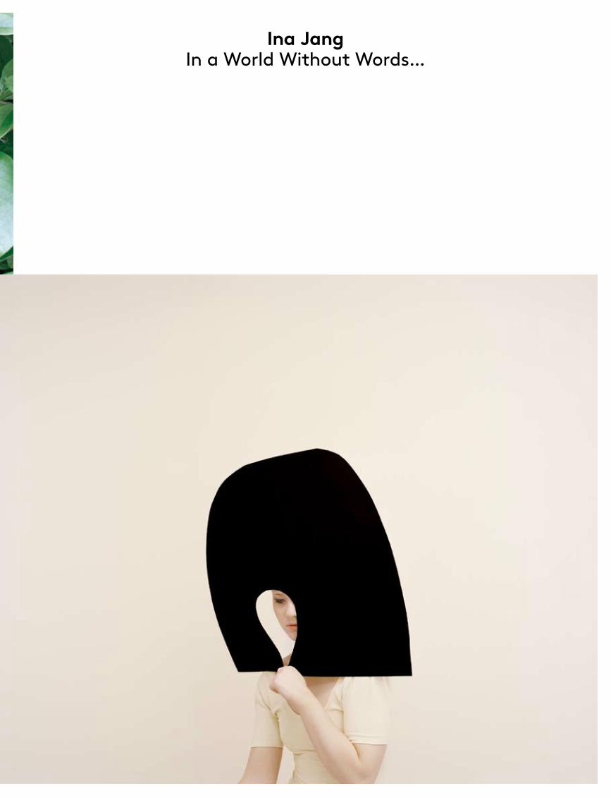
Ina Jang In a World Without Words...
port
folio
tex
t
47
Ina Jang
All Images © Ina Jang
Ina Jang (1982, South Korea) graduated from the School of Visual Arts in New York with a BA in Photography in 2010. Her work, which explores a collapse of dimensions in photography, has been shown in countless galleries, including the Empty Quarter in Dubai, KiptonART and the Humble Arts Foundation in New York. Over the past two years she has been nominated for seven different awards, including KiptonART Rising Award 2011 and Print Magazine’s 20 Under 30. She was a finalist at the Festival d’Hyères 2011.
foam
mag
azin
e #
28 t
alen
t
48
Tell me about your choice of colours for your set-ups. There are a lot of pastels like blushed pink, pistachio, nude tones. Is that because pastels work better in creating that two-dimensional look?I think of pastel colours as being neutral. That’s why I mainly use those colours whose precise name you can’t quite figure out. Was it steamed spinach green or a pistachio-gelato green? It’s those colours
you see in between other primary colours. I like the ambiguity and subtlety the pastel palette brings to my work.
You mention that your time with your sister away from family and friends inspired your recent projects? Where were you with your sister and how did that period inspire you? The playfulness in my projects comes from the time I spent in isolation with my sister. For most of my early adulthood I was with my sister in Japan, where we had no childhood friends or family. When I got my camera and it became such a huge activity, it filled the void or the time I would have spent with my friends back home. I guess that didn’t change much when I moved to New York. I appreciate the time I can spend alone. I wanted it to be the way it was in Tokyo. I wanted to constant-ly make images that stimulated my im-agination. I think I work best when I am all by myself, isolated from the world, and especially when I’m bored to death and the only thing left for me to do is to photo-graph and create something.
How did your interest in photo graphy develop?I got a camera as a gift about 10 years ago and soon became obsessed with making images. After discovering that I had pho-tographed just about everything around me, I started bringing stories and ideas in front of the camera. Mostly, I photo-graphed my younger sister in many dif-ferent roles.
How did you first come up with your project idea? What is your project called?I don’t actually think of the pictures as a body of work. I only recently began thinking about making a body of work. I think of the pictures as a stream of ideas. Even when I first started setting up the shoots, I always began with a quick sketch of the images. I had an idea and then I would find the perfect person and location for the image. I have treated my recent work more like drawings. I en-visage the image, as I am drawing on a white canvas, and simplify the elements in the photographs.
Your work explores the concepts of photography and its physicality. It’s almost as if you have crawled into a picture with your glue and scissors to create a new reality.I try to make it fun for myself. That’s why it involves a good deal of crafting. I believe it adds a personal touch to each image; one which is more human and clumsy and intimate. It makes me feel I am the owner of the images.
Whilst being conceptual, your work also has a touch of the playful. Can you tell me a little bit about why it was important for you to merge the two?The images are more successful when I enjoy the whole experience of making the image as well as its end result. Keeping it light-hearted means I don’t stress about the conceptual side of cre ating the images. If I don’t appreciate the entire process, there is no reason for me to create work. I’m very much involved in every grain of the image.
You’ve received many nominations for your work this year alone. Why do you think your work has hit the mark for the judges at this particu-lar moment?I was lucky enough to be seen in New York. Also, my work often raises questions. My pic tures are almost like graphic de-signs. They are con structed and thought
out as if they were drawings or paintings. But they also show a great amount of construc-tion, as if I were a sculptor in the form of photo graphy. It’s interesting to see all those ele-ments printed on a piece of photographic paper, or on a computer screen. The subject is very much questionable too. Usually I am not even quite
sure what it is. But the answers to those questions are focused and restrained.
What is the single most inspiring thing you witnessed last year?I was at my friend’s wedding in Japan last summer, and the ‘kaiseki’ they had for the reception keeps coming back in my mind; subtle colors, gentle shapes, and detailed placement of food made an ethe-real landscape on the plate as if it was a painting. It had everything I look for when I make images and the food also tasted great. •
‘I think of the pictures as
a stream of ideas.’interview by Anne-Celine Jaeger
Mirko Martin L.A. Crash
port
folio
tex
t
65
Mirko Martin
All Images by Mirko Martin © VG Bild-Kunst, Bonn 2011
Mirko Martin (1976, Germany) studied art from 2001 till 2008, graduating from the Braunschweig University of Art, years that included an exchange year (2005 – 2006) at the MFA program, California Institute of the Arts, Los Angeles, School of Film & Video. He currently lives and works in Berlin. He has already received countless grants and awards, including a Fulbright Scholarship at the California Institute of the Arts and the German DAAD grant. His work has been exhibited in European art institutions including the Kunstverein Hanover, the KW Institute for Contemporary Art in Berlin and the Kunsthaus Essen.
foam
mag
azin
e #
28 t
alen
t
66
I’d go to a place I’m attracted to, spend time there and find out what the attraction is about, get to know the place better, yet still maintain a certain distance, have an eye for the unusual, the absurd, the para-doxical and the edgy. It took me a while to take pictures there. I think I need some sort of semi-familiarity with a place. Look first, shoot later. If you’re too quick there’s always the tendency to focus on spectacular events
that you don’t really understand. At home in Berlin I can’t really photograph much. It’s too familiar. I lack the curiosity.
L.A. Crash evokes thoughts about fiction and reality, documentary and staged photography etc. What was your intention for the project?In my case, the starting point for a project is usually not a thought or an intention but an observation. So when I strolled around downtown L.A. during my first year in the city, I noticed the film sets there. As many movies are set in cities, Hollywood uses downtown L.A. as a back drop a lot. Eve-ry once in a while the sets looked awesome because they were about to perform some-thing spectacular there. I took pictures like a tourist in the beginning. Looking at the images back in my apartment, I thought that it might be interesting to take the photos in such a way that you can’t tell that it’s a movie set when you look at them. I thought it was a funny idea, so I played around with it for quite a while. It was only after spending more time downtown that I realized that some of the events enacted within the boundaries of the film sets were actually mirrored by real-life incidents there. Above all, I noticed that the behaviour of many people on the street was so ex pressive that real situations often re sembled a theatre play. So I took pic tures there, too, and that’s how the project grew. The line between reality and fiction seems very thin in L.A. at times.
You seem to be a master at getting funding and grants. What’s your trick? Thanks for the compliment – actually, most of the time it doesn’t work out for me either. And, by the way, I don't have a foothold in the art market, since I am not represented by any gallery. But as for the success ful cases: first of all, compared to other countries, there are many funding oppor tunities for artists living in Germany. Beyond that, there’s no trick as such, but I think many of my photos are visually very distinctive, which is probably beneficial when your portfolio is scanned alongside many others within a short period of time. I tend to include some photos in a portfolio that really stick out visually, but I usually mix them with quieter or more complex photos (as well as videos if allowed) to show a broader array of forms of expression. I suppose the clarity of my concepts might also help.
Los Angeles has provided you with lots of inspiration for a number of projects, including Ocean Front Walk, L.A. Crash, A Street Story. Can you tell me a little bit about your per-sonal relationship with the city and how you use it for your work?I first went to L.A. for a year during art school, in 2005, because I was curious how far fictions created by the movie in-dustry blend into the city’s everyday life. I had dealt with similar topics in my work before, so it was a deliberate choice to go there, and I fell in love with the city right away. I was impressed by the vastness of space and the diversity of the population, the different forms of expression, lan-guages, styles. On top of that, the streets seemed un-cannily familiar because I had seen their looks in many movies, it was like a strange déjà vu. There's extreme poverty, and on the other hand there's the very artificial world of the movie industry and weird places like Beverly Hills, which create staggering contrasts. American culture is so close and yet so far away from ours. I often thought I’d understood a certain behaviour or phrase only to realize later I hadn’t. So I like my position of being somewhat of an outsider and explore situations I’m irritated by.
Was it your sojourn in L.A. and your exchange year at the California Institute of the Arts, L.A., School of Film & Video that inspired you to start using video in your work?No, I was using video be fore then. I start-ed working with video in 2003, after two years of photography at the Braunschweig University of Art. Since my photo work involved people, video felt like a natural extension of photography, because it sim-
ply allows a more expanded view of a person or situation. I shot the footage for my first video in Benidorm; a very touristic city in Spain that has a quite artificial atmos phere to it, which I was attracted to. Interestingly, being at the film school in L.A. rather pushed me back towards pho-tography again. I felt the desire to break out of the academic context there, as studying in
the US was much more school-like than I was used to from art school in Germany.
What are you currently working on?I’d like to continue editing interviews that I conducted at a homeless shelter in L.A. last year, in which I asked homeless people to tell me what kind of movie they would make if they had all the means they want-ed. Plus, I want to edit video footage from a project with a paranoid man whom I met on the streets of L.A. I don’t know yet how this will turn out, though. It’ll probably be very experi mental.
What is the single most inspiring thing you witnessed last year?A screening of Apichatpong Weerasethakul’s film Uncle Boonmee Who Can Recall His Past Lives. It feels quite appropriate to use the verb witness here rather than watch since I experienced the film more like a phenomenon, the narrative almost coming to a standstill. It’s as if everything is in there; it made me feel very humble – a wonderful experience. •
‘The line between reality and fiction
seems very thin in L.A. at times.’interview by Anne-Celine Jaeger
Raphaël Dallaporta Ruins (Season 1)
port
folio
tex
t
75
Raphaël Dallaporta
When did you first get interested in photography?When I was fourteen a new supervisor came into my college enthusiastic about restoring the old photo lab. His energy was infectious. I did my first contact sheets then and was soon developing films and making prints in my bathroom. I was liv-ing in the suburbs and I used to take pictures on roller-skates on day trips to Paris. At the time, I was inspired by the French humanist photographers, such as Doisneau.
How does one develop one’s own vo-cabulary and visual language?For me it was about my curiosity and I was not only looking for the vernacular things at the side of the street, but rather seeking out the hidden stories. My language has emerged out of the special relationship between myself and the professionals and
experts I work with. I never photograph them but they really influence the way I look at the subject. It transforms my aes-thetic too. My language may also be linked to my technical background as my photo-graphic schooling was very technical and commercially oriented.
On your website you refer to your-self as a documentary photographer and yet your projects go beyond the merely documentary. Where do you see yourself on the reportage/art spectrum?My projects are based mostly on my documentary conviction. Primarily I trust photography for its ability to record a real-ity, but I try my best not to do straightfor-ward illustration, as that is the easiest and most dangerous thing in photography and art, especially when dealing with social is-sues. I like to offer a symbolic approach.
When I’m really involved with an issue, the photos have an aesthetic value. That’s the great pleasure you get from photo-graphy. It can be interpreted in so many ways. Think of Eugène Atget who docu-mented the architecture and street scenes of Paris, providing documents for artists to work from, and ended up being a huge influence on many artists.
The relationship between image and text and the tension between the two is important in your projects. How do you find words that enhance the viewing experience rather than detract from it?I appreciate that the viewer can also be a reader. The text allows the viewer/reader to find a position in relation to the issue. I don’t write the text myself, it’s always a collaboration. I try to find a balance, an equilibrium. And I enjoy playing with the
foam
mag
azin
e #
28 t
alen
t
76
the images using image-recognition software. I was moved by their shape. Examining them gave me the same sensation as flying the remote-controlled drone. I like the fact that the patterns extract themselves from the regular rectangular shapes, and that they are fragments similar to those we were al ready working on. They reflect the metonymy of the whole country and its history. There are layers upon layers. By taking an aerial
view I can play with the perspective of both the image and the country.
Your work, as in Domestic Slavery and Antipersonnel is largely about contradictions. They play on the tension between violent acts and straightforward representation. How did that interest develop?I’m interested in the human condition. I realize that many of my projects speak about violence, but I feel there is a moral behind the violence explored. It’s not gratuitous. I’m not a collector. I simply present generic examples. The projects deal with tragic things, with human contradiction. Our condition is based on paradox. I think the issues raised are important. I like it
contrast between the words and the image. In the image/text balance I try to achieve the same thing Michel-Eugène Chevreul discusses in his simultaneous colour contrast theory, where colours mutually influence one another when juxtaposed. In my work, the text is presented as part of the work. Captions are framed. I ap-preciate the manner in which the two different ob jects affect each other, and create a com plex sensation of attraction and repulsion.
For the project Ruins (Season 1), in which you show aerial photo graphs of archaeological sites in Afghanistan, you cus-tomized a drone for pho-tographic pur poses. How did this un usual project come about?I have an architect friend who has been working for the ar-chaeological mission in Bactria, a northern province of Afghani stan, for the past five years. He kindly introduced me to his boss and we dis cussed how I might help the mission by recording sites. Working with archaeo logists is another manifestation of my fascination with professions that look for hidden things. Archaeologists extract infor mation from silent objects. In the past it would have been much more complicated to take a picture from the air, but today gaining access to open source material has become easy, I am particularly grateful for the energetic work of all the people who make this information available online. My drone was quick to set up and discrete. It was only when pre-senting the images at a conference that some of the members of the mission real-ized it had been an artistic project for me. For them it was just a useful way of making a record of the sites for future reference. The drone discovered the remains of what must have been a 2km-long aqueduct, that was previously thought to be only a trace of wall.
Your starting point for Ruins was a documentary, yet your approach as a photographer is conceptual and highly aesthetic. What would you like the viewer to gain from these images?Like the archaeologists, I assembled im-ages that had a common point of refer-ence. It was a very simple way of com bining
when things develop a symbolism. Oxy-morons are my favorite figure of speech. Sharp-and-dull notions such as mili tary intelligenceor creative destruction are essential to me to touch upon the com-plexity of the world in which we live. As Emmanuel Castella my friend and assis-tant use to say ‘life is not a honey pot’.
To what degree is making a political statement important to you?
I’m political in the Ancient Greek understanding of the word. I am engaged as a citi-zen, but I’m not interested in politics as such. I’m not an ac-tivist, but I feel concern about the rights of my alter-ego. Most of the time I don’t ac-tually work with the victims, but with the people who fix or help them. I try to defend the victims and preserve their dignity.
What is the most inspiring thing you saw or heard last year?Reading the book, Le Droit au Vol by Felix Nadar, first published in 1860. The other thing that really amazed me was a YouTube video some teenagers did on how they sent an amateur camera into space with a gps, and recorded its journey until it crashed back to earth. They beat NASA with a £300 device. I’ve also been thinking a lot about fra-gility since the birth of my child this year. I really believe we have to develop the abil-ity to appreciate our fragility and that of others. In these capitalist times, we are always taught to go for the maximum. But fragility is not a weakness. It’s some thing so precious, we must cultivate it. •
‘By taking an aerial view I can play with
the perspective of both the image and the country.’
interview by Anne-Celine Jaeger
All Images © Raphaël DallaportaRaphaël Dallaporta is the winner of the Foam Paul Huf Award 2011.
Raphaël Dallaporta (1980, France) is a documentary photographer concerned with issues addressing human rights as well as less tangible subjects such as the fragility of life. For each project he works very closely with the professionals involved in his subject, a landmine clearer for Antipersonnel for example, a forensic pathologist for Fragile and most recently, archeologists for Ruins. Solo exhibitions include Protocole at Musée de l’Elysée, Lausanne, in 2010, Autopsy, curated by Kathy Ryan at the New York 2008 Photo Festival, and Antipersonnel, curated by Martin Parr at Les Rencontres d’Arles 2004. Raphaël Dallaporta is the winner of the 2010 Young Photographer ICP Infinity Award. Dallaporta’s work winning the Foam Paul Huf Award, is on show at Foam Amsterdam from 2nd September to 26th October 2011.
Katrien Vermeire Godspeed
port
folio
tex
t
85
Katrien Vermeire
All Images © Katrien Vermeire
Katrien Vermeire (1979, Belgium) graduated from the Royal Academy of Fine Arts (KASK) in Ghent in 2001. She has received a number of grants from the Flemish Agency for Arts and Heritage, to support her artistic endeavours. Her work has been exhibited in numerous galleries including the Alexandre Cadain Gallery in Paris, Museum M in Leuven and the Crown Gallery in Brussels. This autumn she will be working on the audio-visual project The Wave with Belgian director Sarah Vanagt, documenting the process of the exhumation of a mass grave of Franco victims in Spain.
foam
mag
azin
e #
28 t
alen
t
86
surrounding them as well. I like the idea of time slipping into the photo graphs. The fireflies emit light only for a few hours. I liked the slow process. You’re standing next to your camera and for a long time you open the shutter and let whatever is happening in front of your lens be cap-tured on the sen sor. Each picture was an experiment, a surprise. There was a lot of trial and error.
Both Godspeed and Something To Tell You are projects that relied on the involvement of other people. Is that an important aspect of creating work for you?Ever since I was studying photography, a very interesting aspect for me has been meeting other people and getting to know places I would never have seen without my camera. For example, in 2006 I spent six weeks in rural Japan. Families allowed me to live with them and didn’t think it was strange to have a stranger in their house. My camera was a passe-partout.
How do you come up with new proj-ect ideas?Often it begins with an image or situation that catches my attention. It might be something in the real world (as with the butterfly lamp), or a picture in the news-paper. It’s a slow process. Time is ex-tremely important to me. I also like to let the images I make grow in my archive. If I look back several months or years later and still think it’s a good image, then I feel confident enough to present it. When I’m asked to describe my work, the word organic comes to mind. It grad-ually grows, builds up, isn’t strictly planned or structured but has a natural feel none-theless. It’s a chaos that at a certain point resolves itself into a working whole.
How did the Godspeed project come about? While working on the art integration project Something To Tell You I was amazed to see scientists counting moths in an or-chard in the middle of the night. It re-minded me of the Smut character in Peter Greenaway’s film Drowning by Numbers. That film, in particu-lar the magnificent use of light in it – by Sacha Vierny and Reinier van Brummelen – had a huge influ ence on my work. Photographing the moth/butterfly lamp (Vlinderlamp) for the Something To Tell You series is one of the things that led to Godspeed. The night I took that picture, the scientists were talk-ing about glow worms and fireflies. I’d al-ready heard a lot of stories about ‘dwaallichtjes’ (wan dering lights), since they often ap pear in Flemish folktales. I liaised with scientists studying fireflies in Belgium and the United States. But un-fortunately Belgium has lost much of its natural environment, so it soon became clear that I would not be able to work on the series here. In 2010, I spent several weeks in the United States shooting at night to capture the magic of this excep-tional natural phenomenon. You can see the fireflies only a few weeks a year for a few hours a night. I’m fascinated by their rhythm, the patterns and the intervals. The fireflies in Godspeed flash synchronously; after a few seconds of complete darkness, they emit light all together in a large wave motion. The cir-cumstances were such that photographing at night was a real technical challenge; each photograph was an experiment.
Can you let us in on the secret of how the images were shot?The light you see is purely the light emit-ted by the fireflies. They were recorded with regular professional digital cameras that perform well in low light conditions, no infrared. The only alterations to the images that I made in Photoshop were very simple adjustments you can make just as well in the darkroom. I worked with long exposure, so you’d see not only the fireflies but the landscapes
What are you currently working on?This summer I’ve been selected for Summerdocs at the NFTS in London. I’ve had an interest in documentary film since studying photography and work- ing on the documentary film Boulevard d’Ypres/Ieperlaan by Sarah Vanagt in 2009. It was a very exciting time, a new way of thinking and working with images. I es-pecially liked the fact that we were a team. In September I would like to start working
on a new series of portraits about the relationship between fathers and daughters, and in October I’m working on a new photo/film project with Sarah Vanagt in Spain.
What has been the single most inspiring thing you witnessed this year?It was most definitely the first
night we were out in the woods in Tennessee to work on the fireflies project. Those fire flies only come out when it’s completely dark. We were waiting for the sun to go down, not knowing what to expect. Then suddenly it started. Shy at first, but so powerful. They are all around you. You turn 360° and you see them everywhere. Very close and far away. The fact that they are synchronous is very important. Periods of impenetrable darkness alternate with rhythmically pulsing flickering lights attuned to one another. It has a powerful effect on people who witness it. Most will venture no further than a kilometer or so into the forest, partly out of fear of the black bear and the rattlesnake, but it’s only much farther into the forest that the darkness and the flashing and tingling reveal them-selves in all their splendor. •
‘I like the idea of time slipping
into the photographs.’interview by Anne-Celine Jaeger
Fleur van Dodewaard Sun Set Series


port
folio
tex
t
103
Fleur van Dodewaard
All Images © Fleur van DodewaardThe Sun Set Series consists originally of 13 images.
Fleur van Dodewaard (1983, the Netherlands) studied Theatre at the University of Amsterdam and Fine Arts at KABK, Royal Academy of Art in The Hague before enrolling in the Photography course at the Gerrit Rietveld Academie in Amsterdam, where she graduated in 2010. Her work has been shown in numerous venues, including the Artpocalyse Collective Gallery in Amsterdam, Art Amsterdam, Gallery Plaatsmaken in Arnhem, Second Home Projects in Berlin and at this moment in Foam Pop-in Amsterdam. In 2011 she was nominated for the Bouw in Beeldprijs in Holland, with an exhibition at The Cobra Museum for Modern Art, Amstelveen.
foam
mag
azin
e #
28 t
alen
t
104
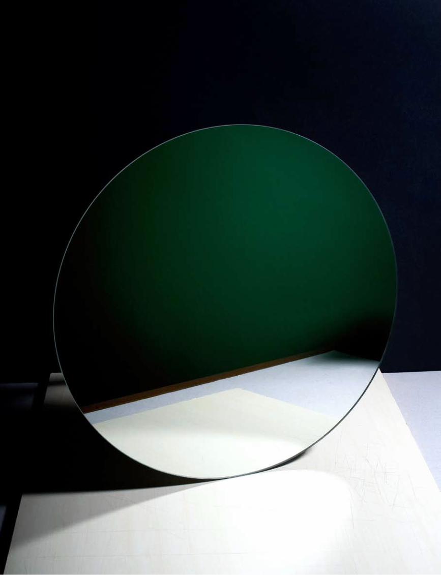
With the Sun Set Series I chose the most clichéd subject in photography. The series shows how I construct models for the im-ages with found materials, conceding as little visual information as possible. For these constructions I used a mirror. To me it’s an interesting photo graphical object because it always shows something other than itself. Therefore, it can not really be captured. In this work I emphasize the idea of photography as an imaginary medium,
in which it serves as an instrument to cap-ture a new truth. When exhibited on a wall, the work shows thirteen suns at the same time. This hints at Malevich’s stage design for the opera Victory over the Sun, from 1913.
Where and when did you develop an interest in examining and stretching the limits of photography?I see it as a natural thing to question the field that you’re working in, to think of new subjects to depict and to think of new manners to use the medium in an artistic way. Because I often deal with other forms of art I encounter photography’s many limitations. I enjoy working within those limitations, trying to stretch them a little.
You graduated from the Gerrit Rietveld Academie in 2010. In what way did the photography school environment influence or help you develop your working practice?The photography depart-ment, with its concentration on one medium and a focus on developing a firm and in-dividual point of view, offered me a framework within which to operate. I learned to distill my ideas, to sharpen my eyes, to define concepts and to ex-ecute the choices I make in extreme ways.
You also studied Fine Arts before that. How did that shape your thought processes?I still see my practice as being Fine Art. Within the process of creating a photo-graph I make drawings, sculptures, paint-ings, set-ups. Apart from that, these different forms of art are often the sub-jects of my work. At the Royal Academy of Art in The Hague, where I studied Fine Arts for a year, I started with a program of classical lessons in drawing, sculpture and paint-ing. I thought it was terribly old-fashioned and boring at the time to do that instead of developing new methods. Today I see it as a valuable experience in which I en-countered the fundamental elements in art. It created an awareness of colours, shapes, light, volume, materials and how to use them. It also made me aware of the long tradition my practice relates to. My work Nude Studies (2010) is connected to that experience.
How did the Sun Set Series come about? What was your starting point for the project? The desire to be original is very important to young artists. And I am no exception. In time the desire itself became a subject of my thoughts and therefore of my work.
The Sun Set Series and The Kelly Pages projects are both very graph-ic in their use of block colours. To what degree is that also part of your ex ploration?I like a simple form, line or colour to be a visual starting point of an idea, leaving room for interpretation.
How does a seed idea de- velop into a project for you?Things usually begin with en-countering an image, reading a text, or seeing a work of art. I let it resonate for a while, then start researching and soon start thinking about the material and execution side of things. Next comes a long pe-riod of trial and error in the
studio. Sometimes it happens that I’m working on one thing when another idea arises. In that case the development of the idea comes later.
What is the single most inspiring thing you saw or heard last year?A recent photograph of Robert Mangold’s studio. An American ab stract painter.
What do you think a dialogue inside a viewer’s head might sound like when she or he sees your work?I wouldn’t know. But apart from being conceptual, I want to create visually strong images. I like people to be able to relate to the image. Just to look at it. To wonder about what it is they’re actually looking at, about how it is constructed, about what other images or situations it reminds them of. And in this specific case I would be interested in whether they could compare the image to a drawing of a sun, if they think of sunsets they’ve experienced and if my work would affect their perception the next time they encounter one. •
‘In this work I emphasize the idea of photography as
an imaginary medium.’interview by Anne-Celine Jaeger
Ester Vonplon The Stillness of Existence
port
folio
tex
t
113
Ester Vonplon
All Images © Ester Vonplon
Ester Vonplon (1980, Switzerland) divides her time between Berlin and Castrisch in Switzerland. She graduated from the FAS, Fotografie am Schiffbauerdamm in Berlin in 2007 and has since worked on numerous personal projects including The Stillness of Existence. In 2008 Vonplon was awarded the Swiss Photographer of the Year Award and received a grant from the Aargauer Kuratorium in Switzerland. She has self-published four limited-edition books including Es gibt nicht mehr Sonne (a collection of Polaroids taken in Kosovo).
foam
mag
azin
e #
28 t
alen
t
114
What do you do in post-production to create this look? I usually develop my films wherever I am. So, for example, working in Kosovo was hard. The water from the tap was very dirty. At first I was shocked when I saw
what had happened to my rolls but back home, scanning my negatives, I com pared their imperfect look with what I’d wit-nessed while visiting a family with many problems. My memories are heavy and dark. So are the photos. Life in Kosovo is far from perfect, so a perfect digital shot would not fit what I was feeling. I play a lot with different tech niques and formats and use old equip ment. But I also love to work with the possibilities offered by dig-ital editing and printing. For me it’s like adding some thing more to the old way of photo graphy.
The statements accompanying your series are very refreshing. They are poetic and thought-provoking with-out throwing around too much pho-tographic terminology. What inspired you to take this approach?I guess I’m not that into the terminology of photography, or the technical aspects of the medium. I’m more interested in the picture. The end result. For me the tech-nique is a tool that you have to dominate but once you are in control of it, you can break all the rules and it won’t disturb you while you work. In a way, it’s a coincidence that I ended up taking photos. I am actually more in-fluenced by music, film and literature. I’d love to be able to express myself through music, but sadly I’m not any good at it.
When did you first develop an inter-est in photography and how did you feed that interest?In the beginning I was much more at-tracted to film than photography. I moved to Berlin in 2002 to work for a film pro-duction company. A man who worked there came up to me one day and asked me if I had ever tried photography. At the time I didn’t even own a camera. So I went to a flea market and bought one, took it to Bucha-rest and just walked around the streets and took pictures. I didn’t have a clue about pho-tography. When I got back to Berlin, I checked online how to develop the films and with those same prints I applied to a photo graphy school. That’s how it all started. It’s such a fantastic thing, working for and by yourself. Your images have a nostalgic, vernac-ular feel, almost as if the pictures had been discovered by someone. How did this aesthetic come to you?I guess there are different things that come together. First of all it’s linked to how I edit my work, and what I want the view-er to see. The other thing is, I’m attracted to taking pictures in certain circumstanc-es. I travel alone a lot by train or bus. So it’s easier for me not to carry too much equipment. Often, I find myself in places with low light, where I push my films and don’t use flash. It’s nothing special. It’s just the way I work. And what’s more, I love taking pictures on rainy or snowy days.
There is a sense of tristesse in your work, a hint of something that is broken but still contains a flicker of hope. What attracts you to the subject matter of a place and people with an unknown future?I’m interested in the miracle of the unspo-ken and the unseen. I’m always looking
for stories in my pictures, al-most like a short film taken in one picture. I want you to look at the photo and for it to gen-erate some thing in your mind that will continue. I want you to feel by looking at the places and people that there is a his-tory behind them, that there is a story that might soon disap-pear forever.
I see from your website that you have self-published a few projects. To what degree does the book format help your working prac-tice?I just love to play around with my photos. While working on a book I look at them over and over again. I carry a dummy around with me in my bag wherever I go and I look at it all the time. It has to work in each situation and place. I show it to different people. Pretty soon you find pic-tures that are okay when you are looking at them for the first time but become bor-ing after looking at them a few more times. And then there are the pictures that are little miracles. Also, I love the idea of finding a format, of creating order. Going to the copy shop, making a dummy, playing around with the pages, the edit, the print, the bookbinding. It’s the working process I love so much and the fact that it’s all handmade.
What is the most inspiring thing you witnessed this past year?Maybe giving birth to my little girl Otavia. I never saw anything so vulnerable and beautiful. Every morning is worth getting up for. •
‘I’m always looking for stories in my pictures,
almost like a short film taken in one picture.’
interview by Anne-Celine Jaeger
Renato Abreu Revelations
port
folio
tex
t
123
Renato Abreu
All Images © Renato Abreu
Renato Abreu (1983, Brazil) graduated with a BA in Fashion at the Faculdade Santa Marcelina in São Paulo, Brazil, in 2006. After working for two years as an assistant fashion stylist for magazines such as the Brazilian editions of Vogue and L’Officiel he launched into photography as an assistant to photographer André Passos. Inspired by the photography of fashion campaigns, he embarked on a BA in photography at the Royal Academy of Fine Arts in Antwerp, Belgium, in 2009. Abreu is currently living, working and studying in Antwerp.
foam
mag
azin
e #
28 t
alen
t
124
Your Revelations series is interesting. It made me giggle in a slightly hys-terical uncomfortable way, thinking ‘He looks funny. He looks sad, what’s going on?’ Where did you find the clothes and what was your intention for the series? Except for one jacket that I’m wearing in that series all the clothes were bought in second-hand stores. I collect clothes.
Whenever I see something that captivates me, I buy it. And most of those garments I don’t even wear myself, since they’re too small or simply because they’re wo men’s clothes. The series was born in a very sponta-neous way. I saw that heap of colourful clothes in my house and as that day I was feeling sad I had the idea of making self-portraits, to mix the happy colourful clothes with my sadness. I felt that such an interaction could create an ambiguity that could be interesting.
In your statement you mention a slightly out-of-focus aspect to the still life and also that your as-sistant, who helped on Revelations, wasn’t technically perfect. How important is technical proficiency to you in creating your art?The formal aspects of photography are a concern for me and I’m always striving for perfection. On the other hand, because the medium lends itself to be easily mas-tered technically, accidents can also be-come an interesting thing in an image.
You studied fashion before launch-ing into photography. When and how did you first become interested in photo graphy? My interest in fashion was born out of fashion campaign photographs. When doing my fashion studies I had photo-graphy classes, and that was the first time I got a camera. I bought a Pentax K-1000, and felt very com fortable with a camera in my hands and with the act of photo-graphing from the very begin-ning. I also found that I could express myself better through photography than through fashion. After that I got to know the work of photogra-phers. I remember seeing André Kertész’s photos for the first time. They made a huge impression on me.
To what degree has your background in fashion influenced your two sub-mitted projects? I’m thinking in par-ticular about the colour blocking in the still life series.Colour is my biggest passion. I feel deep-ly connected to colours in a very intrinsic way. I was very influenced by the colour theories of Johannes Itten, who was as-sociated with the Bauhaus movement. I particularly loved his book on colour, which is just beautiful, and I like his spir-itual approach.
How is it helping or hindering your work practice to be based in Belgium, away from Brazil?This was my first time out of Brazil, and here I found exoticism. It opens up my mind to see things in a dif erent light. The
academy is a very critical en-vironment; the teachers pro-mote a critical view of our production. Al though they expect us to be technically capable when we present our work, the conceptual aspect is still the most important.
What themes are you interested in ex ploring in your photographic practice?I think I work very conceptually and mostly I try to create a certain feeling in the spectator. I’m very much interested in still life and daily life. I’m inspired by the relationship that William Eggleston has with colour photography. I’m trying to understand what my relationship is to colour in my working practice.
How does a seed idea develop into a project for you?First I go through an intensive process of research, which involves finding imagery in books, magazines, the internet, and also actively taking snapshots, which I call snapshooting on the street. I see myself as a hunter-gatherer shoot ing images on the street and archiving in triguing pictures in my mind, rather than a farmer who plans his own production.
What is the single most inspiring thing you witnessed last year?Actually it was something that happened quite recently. While attending Jef Wall’s lecture at the Bozar in Brussels, I had a unique opportunity to understand a bit more about his work, his methods, and his ability to create and construct photos a bit better. At the Bozar he shows his own photos as well as works by artists who have influenced him. It was great because I was able to see prints by Atget, Arbus and Gursky, among others. I left the exhibition super-inspired and motivated. •
‘Colour is my biggest passion.’
interview by Anne-Celine Jaeger
Lucas Blalock Part Object

port
folio
tex
t
141
Lucas Blalock
All Images © Lucas Blalock
Lucas Blalock (1978, USA) graduated from Bard College in 2002 with a BA in Photography. Blalock explores the way in which falseness or evident mechanics in a photograph can bring both the picture and the pictured into sharper focus. His work has been exhibited in a number of galleries including the Contact Gallery in Toronto, Branch Gallery in Durham, North Carolina, and the Steinsland Berliner Gallery in Stockholm. This summer he is attending the Skowhegan School of Painting and Sculpture in Skowhegan, Maine.
foam
mag
azin
e #
28 t
alen
t
142
Paul Strand (among others) are evident in my choices here but nothing specific was on my mind at the time. I think I only made one frame. I shoot with a 4×5 and am usually pretty sparing.
The process I just described is a pre tty simple ‘making a picture’ but I feel the questions and problems that bring me to making the decisions at hand are really important to my practice. Those in tentions begin to act like the conditions of the pic-ture and later on in the process become the elements that guide my actions after the picture has been shot. So I get the film back and have been thinking about curved layers and mask ing, both of which are basic steps in getting a digital file ready for printing, and as I look at the picture I sort of see an opportunity to highlight the elements I first found in-teresting by telling a joke about smoky glasses, which are them selves a sort of trope for a certain kind of character. This in itself opens up another field of associa-tions. Leaving the selection unrefined opens up this kind of acting for the view-er I hope, as one of any number of deci-sions that could be made. At the same time it allows me a chance to make a set of shapes I find interesting. That said, I feel this kind of explication is not really very helpful in looking at the pictures. I’m really interested in the figur-ing out that someone goes through in ap-proaching the work. I believe photography is a shared space and really pretty legible to a lot of people. I feel that explaining these things takes that primary relation-ship and makes it textual, which I feel in the end might undermine the very things I’m trying to explore.
Your work explores, amongst other things, the question ‘What is a photo graph?’ How did your fascination with that particular aspect of photo graphy evolve?I feel the question of photography is something every photographer has to deal with one way or another. To believe that you can communicate any kind of experi-ence presupposes that you have a certain belief in the tool you are using to com-municate with. Beyond that I think that the digital era has really brought these relation-ships to the fore. I don’t really feel my work is a com mentary on ‘What is a photo graph?’ but rather a rethinking of the machine that I am picturing with. The work is quite liter-ally made with an apparatus that is some thing like a cam-era/computer/studio machine (as many pictures are) and I am specifically inter ested in the possibili-ties inherent in this, only some of which can be accounted for in the camera/dark-room apparatus of years past.
Your choice of materials, colours and patterns in your work evoke the 70s for me – predigital, prePhotoshop and yet they are clearly reworked, so there is a jarring effect.I have never really thought of them as relating to any specific time but I do feel I am interested in patterns that have a his-tory or come with a baggage of associa-tions. I am interested in the way that associative connection creates expecta-tions and how other choices in a picture can undermine them or bring them into tension. As for the objects, it’s pretty in-tuitive. I just get interested in these things and bring them back to the studio.
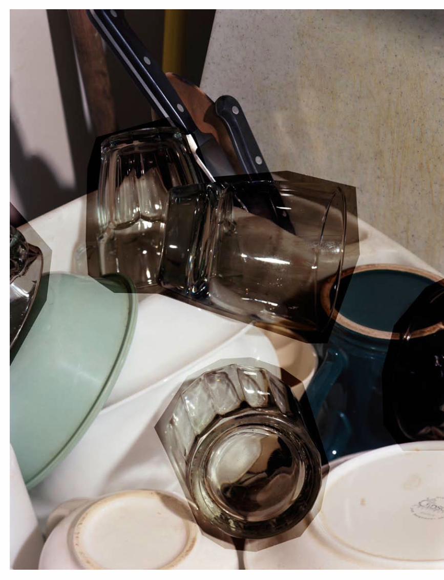
Let’s take one of your pictures, say Dark Glasses, 2010. Can you talk me through what’s going on in that picture, as if you were in a crit. Choice of subject, manipulation in postproduction, intent, how it fits into the series? The picture began with me seeing these glasses arranged like the four points of a compass in my dish-rack at home. I think that is what got me to start looking at them with the camera. From there I turned on a light and found a frame I was interested in. I think pictures by Jan Groover and
To what degree do you see yourself as part of a new school of photographers who have at the heart of their work an exploration of what a photograph means today? Have you formed a group? Do you discuss works together?I have some great friends in New York, as well as my part-ner Nina, with whom I often discuss these things, but there is no group. John Houck,
Chris Wiley, Barney Kulok and Kate Steciw are all photo graphers I spend a lot of time with who have helped to shape my practice but I don’t think there is total agreement on any side. All of our projects end up consti tuting photography in dif-ferent ways.
I see you are a candidate for the MFA at UCLA – what are your hopes and expectations for that course? I am looking forward to having the time and resources that school allows. I met with Jim Welling in the spring and am re-ally excited about working with him and the other faculty members there. I’m not sure there is anything concrete I am ex-pecting – just a next chapter and a chance to work out some new questions.
How do you come up with a seed idea and how does that develop into a project?I spend a lot of time looking at art and reading, so I feel like the work is really made on top of a patchwork of ideas. When I come to the editing process these ideas can act as a center of gravity for me to think through a project.
What was the single most inspiring thing you witnessed last year?A lecture I saw by the artist Daniel Bozhkov at the Skowhegan School of Painting and Sculpture in Maine, where I’m spending the summer. •
‘My work is rather a rethinking of
the machine that I am picturing with.’
interview by Anne-Celine Jaeger
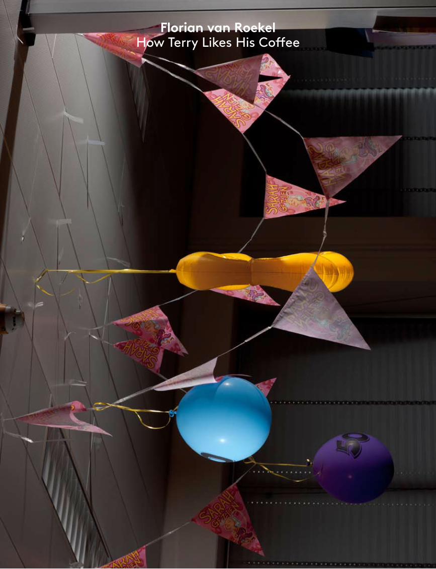
Florian van Roekel How Terry Likes His Coffee
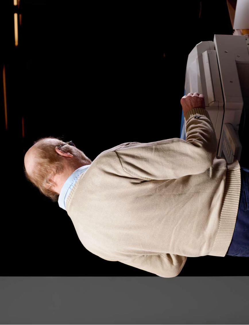
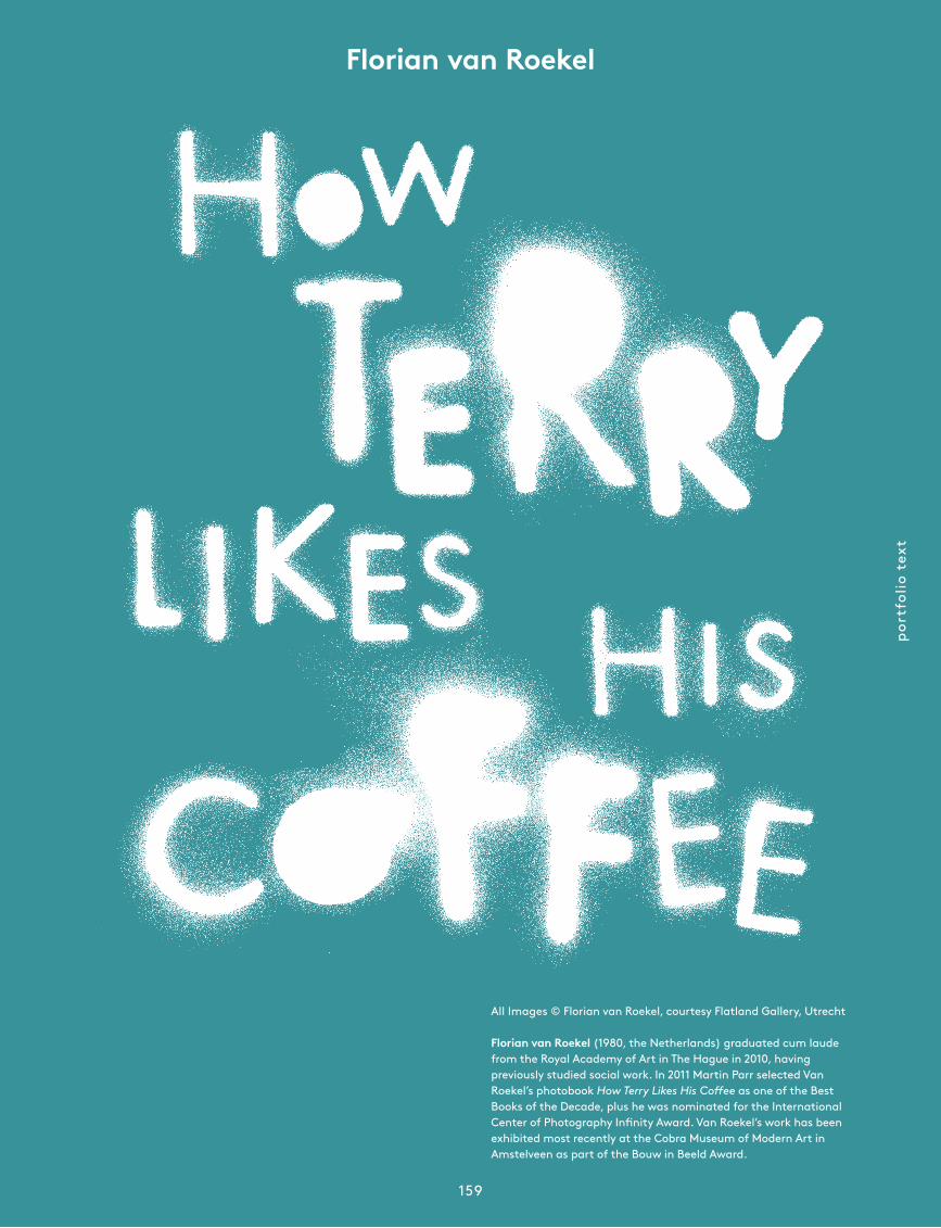
port
folio
tex
t
159
Florian van Roekel
All Images © Florian van Roekel, courtesy Flatland Gallery, Utrecht
Florian van Roekel (1980, the Netherlands) graduated cum laude from the Royal Academy of Art in The Hague in 2010, having previously studied social work. In 2011 Martin Parr selected Van Roekel’s photobook How Terry Likes His Coffee as one of the Best Books of the Decade, plus he was nominated for the International Center of Photography Infinity Award. Van Roekel’s work has been exhibited most recently at the Cobra Museum of Modern Art in Amstelveen as part of the Bouw in Beeld Award.
foam
mag
azin
e #
28 t
alen
t
160
How did the idea for the book come about?Think of an ice cube melting in a glass of water. Then play it backwards. The idea came floating to the surface and took shape over the total span of the project. I did not start out with an idea of what I was going to show. I let intuition guide me. So in order to put into words what I was doing, I had to analyse a part of myself that doesn’t manifest itself logically.
For instance, one of my fixations was fuzzy-haired women. The images I shot of them revealed little of their faces. Virtu-ally all the women in the book are photo-graphed this way. After putting some thought into it, I came to the conclusion that they symbolize emotional malnour-ishment. Although I now had an explana-tion, it didn’t feel satisfactory. It felt as if the conversion into words had degraded the images, the same way as rational think-ing degrades reality.
I feel that a lot of the emotions elicited in the viewer are achieved just through the subject, through the very specific lighting you use. How did you work out how to shoot it?Before I shot the office series, I briefly worked on a documentary set in a bread factory. The fluorescent lighting really bothered me. Too dim and too difficult to colour-balance, especially since I’m par-tially colour blind. As an experiment I took a battery-powered flash unit with me. I put my lights on maximum output to overpower the colour contamination from the strip lighting. Then a strange thing happened. Seemingly mundane situations turned into drama. People who sang performed musical scenes. This con-fused and fascinated me. At the end of the project I started questioning the docu-mentary value of images that seem to re-late more to fiction than to reality. That was when I started working on Terry.
What got you interested in photography?The first thing I noticed about photo-graphy was that I could use it to translate my everyday environment into something more exciting. It was a way of bringing colour into my situation, which was rap-idly desaturating at the time. A way out mentally and physically. Eventually it evolved from simply adding some vibrancy to my perception into adding more mean-ing as well.
How has your degree in social work affected the way you take pictures, and indeed look at the world?Becoming a social worker was about learning to reflect on the way I perceived myself and others, and then communicat-ing it. I was trained to look past the surface of an experience. It’s actu-ally quite similar to what I do now. I was confronted with the limitations of my ra-tional way of interpreting the world. I real-ized I was a social worker who observed keenly but was emotionally handicapped. A year or so later, as a photography student, my overly rational interpretation of images resulted in an inability to under-stand some key photographs in Robert Franks’ The Americans. After spending a few months analyzing those images in various ways, I realized they referred to much more than what they superficially showed; they spoke in complex metaphors. Such a way of seeing things made photo-graphy and my experience of the world far more interesting, and it stayed with me.
I love the fact that your book starts with doodles on really tedious officepad paper. For me a whole set of emotions arises that remind me of the limited time I’ve spent in corporate environments. What was your own experience of that?I spent ten months as a social worker intern in an office environment. The things that fascinated me most were the ways in which we were all trying to retain a sense of individuality while having to conform to all kinds of written and un-written rules. I wasn’t any good at it and became frustrated. My office had posters of tropical getaways on the walls, a chair to take breaks in and a creaking door to wake me up.
By presenting diptychs of characters that are very similar and yet slightly different, you create tension and lend your work a filmic quality. Were you inspired by specific films or artists?
I was influenced by many years of media input. The ease with which candid re ality be-comes interpreted as scripted fiction was some thing I found fascinatingly scary. The loss of realism reso nated with my ex-perience in an office. The first five months that I worked on the project I was an assistant to photographer Niels Stomps.
I learned a lot from his strong reliance on his gut feeling and his way of combining differently themed blocks of images to build large bodies of work. I look up to him like an older brother. He’s still a men-tor to me. Most of the other aspects of my book found their way into my project either by chance or necessity. For instance, the dark backgrounds were a welcome result of having only two lights. The diptychs came into being only during the editing process. Graphic designer Syb and I decided to humanize what would otherwise have re-mained ciphers.
What was the single most inspiring thing you witnessed this year?Reading Masanobu Fukuoka’s The One-Straw Revolution. It’s a book by a Japanese farmer who came to the realization that all his efforts to manipulate agricultural land were based on the wrongheaded idea that nature can be fully understood. Solutions for agriculture that avoided ploughing, weeding, trimming, fertilizers and pesti-cides were elegant and presented them-selves to him through basic observation. Amazingly, his yields were even higher than before and among the highest that had ever been recorded. •
‘Seemingly mundane situations turned into drama.’
interview by Anne-Celine Jaeger
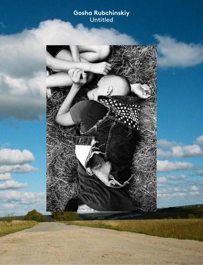
Gosha Rubchinskiy Untitled
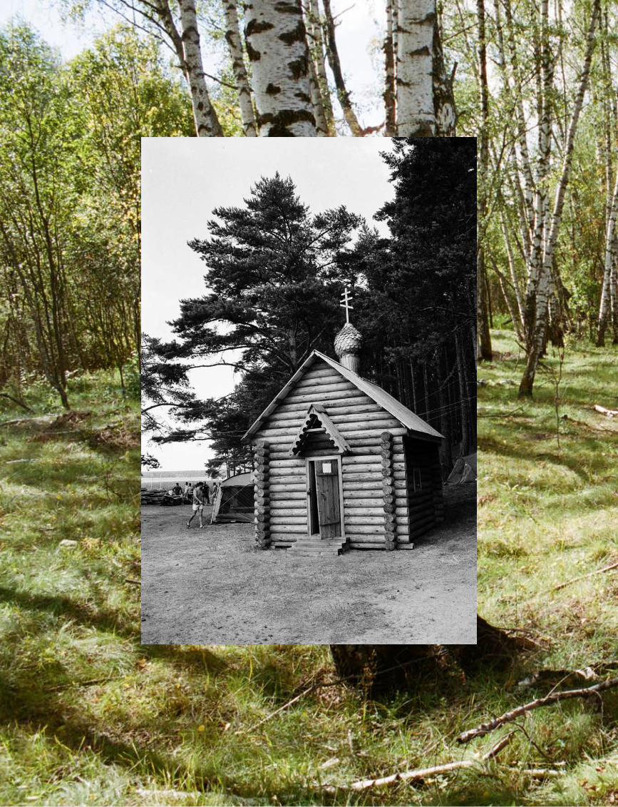
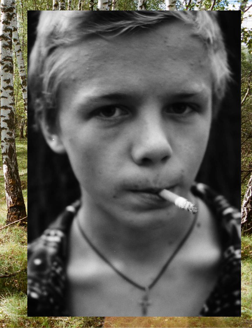
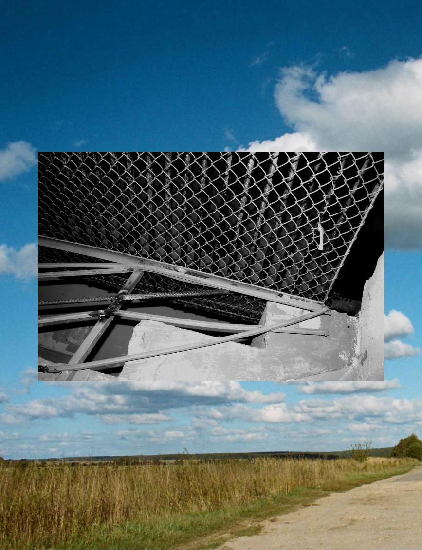
port
folio
tex
t
169
Gosha Rubchinskiy
All Images © Gosha Rubchinskiy
Gosha Rubchinskiy (1984, Russia) started a streetwear label in 2008 called Aglec, after being inspired by Muscovite youth and the intricacies of his country’s history. He is also a photographer and film-maker, whose work has a documentary aesthetic heavily influenced by his urban surroundings, and young skate and graffiti artist friends. Using his photography, film and fashion work almost like a Gesamtkunstwerk, he is bringing the post-Soviet generation to the foreground in an honest, new light.
foam
mag
azin
e #
28 t
alen
t
170
What attracts you in capturing the youth of your country?I really believe in my country, in its future. The current youth is a symbol. It’s the generation of hope. I can compare Russia, the country, to a teenager whose conscience is fresh, but genetic roots still show themselves. What attracts me is this combination of being open to everything new and at the same time being quite orthodox.
What does it mean to be young and Russian today?My country is located in this unique position between the West and the East. Also, Russia has always had a special role in history. The future of the country, and probably the whole world, will depend on what this generation grows up to be like. If you are young in Russia you find yourself in a state where you intuitively feel responsibility but at the same time you are afraid of it. It’s an attempt to cheat yourself, to run away from yourself.
How has your background in fashion and styling influenced the way you take pictures?Fashion tries to show beauty and desires to people at a particular time. The same idea is embedded in photography. If you have something to talk about or to show, it no longer matters which medium is chosen to present your ideas. It can be photography, video, music, or anything else. The main thing is to feel the moment.
What do you hope to elicit in the viewer with your pictures?I always try to be honest. If I show something to a viewer then it’s something that I like, something that amazes me: a person, a place, a situation, or an event. You have to feel yourself being me while watching the images.
What images do you surround your-self with? There is a lot of information around – the streets, people, the internet. So, one has to choose, to look for something that belongs to one, putting aside what is left over. I like travelling across Moscow on the underground. You can find a lot of things, see interesting characters, get inspiration. Anyway, in the outside world I always look for something that is a part of the inner me. Everything I create is a part of me: my past, present, future – as I imagine them. So every work reveals me to some extent.
To what degree has the political and economic landscape of your country influenced your visual culture?Politics and economics do not affect my work too much. I mainly shoot in Russia, the people and places here. Having said that, the general contemporary cultural context does influence me. However, I always try to find something personal in what surrounds me. I always want to create my own world. At the same time, I can’t imagine myself being anywhere else, being in a place that is not Russia.
How does a seed idea develop into a project for you?
The most important thing for me is to make wishes, aims and goals come true. To feel them, move towards them, make them come closer. When you know your goal and listen to yourself – everything happens of its own accord. I build everything on intuition and almost always see ‘my things’. When I make a choice I already know
that the subject or thing is mine or at least it will bring me to where I need to ’be’.
What is the single most inspiring thing you witnessed last year?My trip to Yalta, a place in the Crimea, Southern Ukraine. My graffiti artist friends live there. I will make a new project – a video about their life and about this unique area. In the summer it is a resort. In winter there is almost nobody there and my friends go into the abandoned and halfdestroyed sanatoriums to paint and photograph there. This story will be very interesting for me to show.
What are your plans for the rest of 2011?I am planning to spend the summer in St. Petersburg. I have an opportunity to finish my project about local skaters. I’ve been working on it for a couple of years already. It will result in a video and a book. We are building a pool in the centre of the city in a very interesting area called New Holland as well as a mini ramp at the beach on the Gulf of Finland. I think it will be fun. •
‘I always want to create
my own world.’interview by Anne-Celine Jaeger
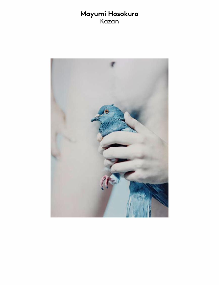
Mayumi Hosokura Kazan
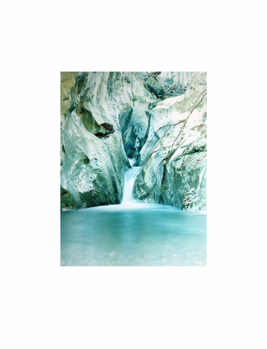
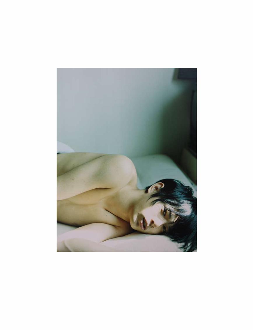
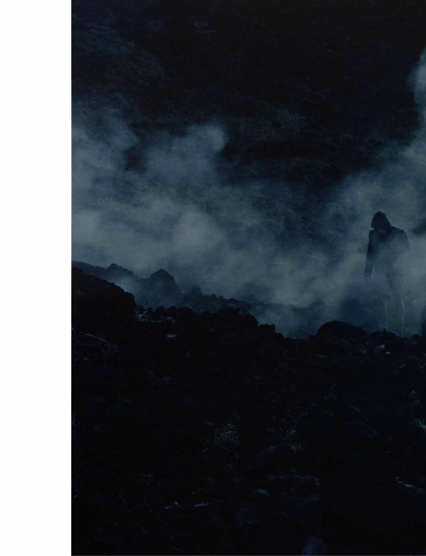
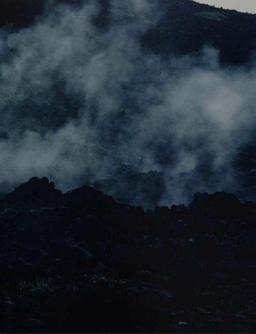
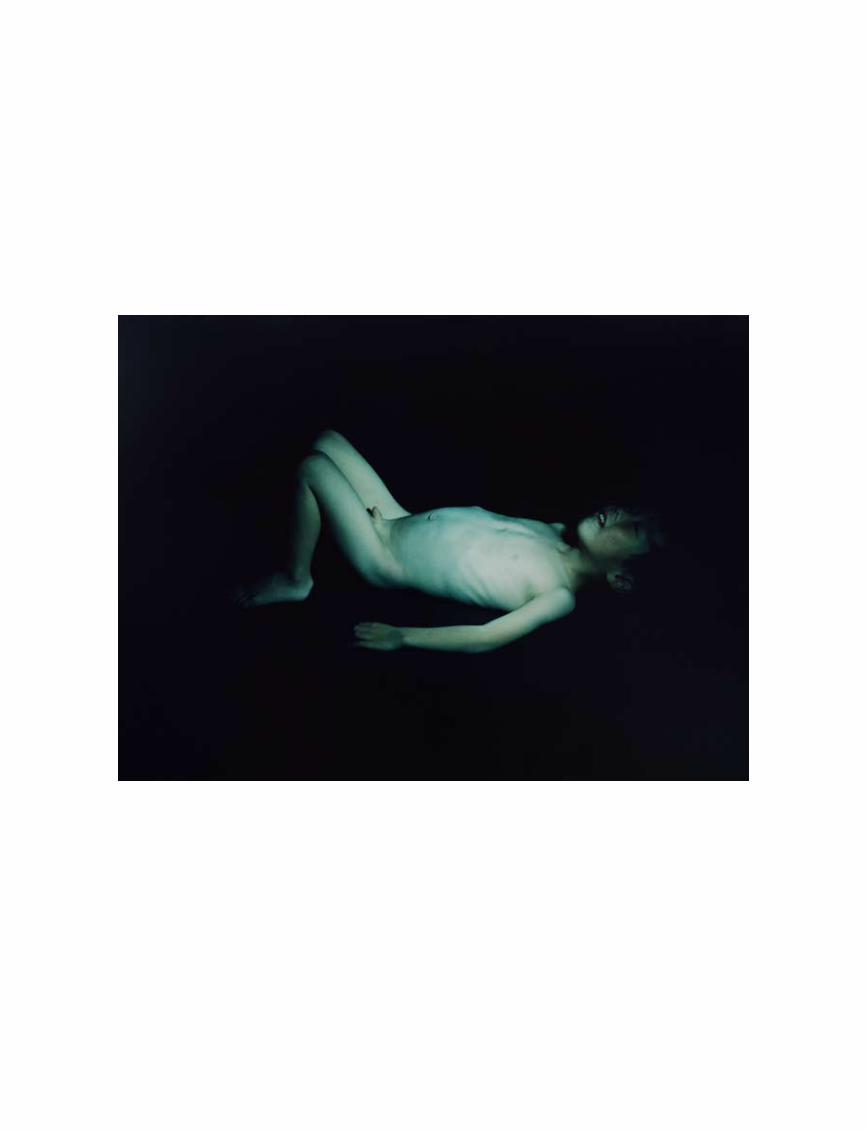
port
folio
tex
t
187
Mayumi Hosokura
All Images © Mayumi Hosokura
Mayumi Hosokura (1979, Japan) graduated from the faculty of literature at Ritsumeikan University in 2002 and in 2005 from the Photography department, Nihon University, College of Art (Tokyo). Hosokura was twice shortlisted for the Hitotsubo Award for young photographers in 2004 and 2005. Her recent exhibitions include Yokohama Photo Festival, 2010; New/Another Fashion of Photography, Tokyo, 2010; The Exposed #3.5, ART ZONE, Kyoto, 2009. Hosokura’s solo show is scheduled for winter 2011 in G/P Gallery, Tokyo. Her work is represented by G/P Gallery, Tokyo.
foam
mag
azin
e #
28 t
alen
t
188
What do you hope to evoke in the viewer with those images?Each photograph stands by itself but at the same time they have the possibility of sympathizing with each other. I call it the circulation of the imagination.
What was the process involved in altering the found images of your grandmother for your other project?
I re-photographed the images close up and also created photograms of the pho-tographs. I wanted to find out something new, to alter the found images of my grandmother. Creating the photograms, in particular, was a sentimental process for me, because it demonstrates that I have nothing to take from the photograph. I merely exposed a shadow of the photo-graph on photographic paper. Each proc-ess made me rethink what exactly a portrait is. And what does it mean to take a picture?
When did you first become interested in photography?I first became interested in photography when I was at high school. At that time, there was a photography movement in Japan that we referred to as the girly photo movement. I really admired Hiromix, who was part of that movement, and I was inspired to start tak-ing pictures myself. I think it was a brilliant moment for Japanese photography.
I see from your CV that you studied literature first. How does the path from litera ture to photography influence the images you create today? Are you still interested in storytelling?I am not that interested in storytelling now. But I am very interested in leaps of imagination. I think it’s an important thing for photography and literature.
How did the Kazan project come about?I love youth and capturing the beauty of youth with my photography. It’s lost in a super-short time, which makes me love it even more. Having said that, minerals are another motif in the series and they are opposite to youth. They don’t change at all over a very long period of time, and yet they also feel so beautiful. Something ephemeral and permanent... My intention was to attempt to create a pathway between two apparently quite opposite things.
How do you feel about your grand-mother now?This is an ongoing project. But my feelings towards my grandmother have shifted, along with my point of view. I started to feel a tension between a feeling that I felt while she was alive and a new feeling,
which occurred by looking at heaps of images of her after her death. It was a strange phenomenon; my feelings about my grandmother were updated by photographs taken in the past. But I still don’t know for sure who my real grandmother is.
Where do you get ideas for new personal projects?Usually, I get ideas about my
next project whilst working on an ongoing one. For example, I started a new project using a classical photo technique called Tintype. This came out of me taking pho-tographs of minerals for the Kazan project. I decided to use Tintype because I thought I wanted the photography itself to get closer to the minerals. But an idea is just an idea. I always lose my way en route to the goal.
What kind of magazines do you work for and how does that compare to doing a personal project?Personal projects and commercial work are completely different things for me. Aside from my own photos, I currently work for music, culture and lifestyle mag-azines, and I do some advertising work. I think doing commercial work is good training, as it teaches me that having an artistic ego is not always a good thing when you are trying to create good photography.
What was the single most inspiring thing you witnessed last year?I saw many inspiring things last year but they were sort of wiped out by the earth-quake, the tsunami and the problems with the nuclear plant that ensued. Even if I tried, I can’t remember much else. I could say that everything has changed for the Japanese after everything that came with the earthquake. It is so strange how one adapts to such a huge tragedy. •
‘I am very interested in
leaps of imagination.’
interview by Anne-Celine Jaeger
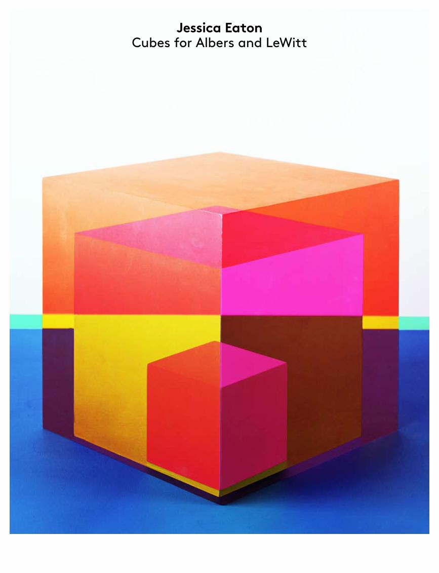
Jessica Eaton Cubes for Albers and LeWitt
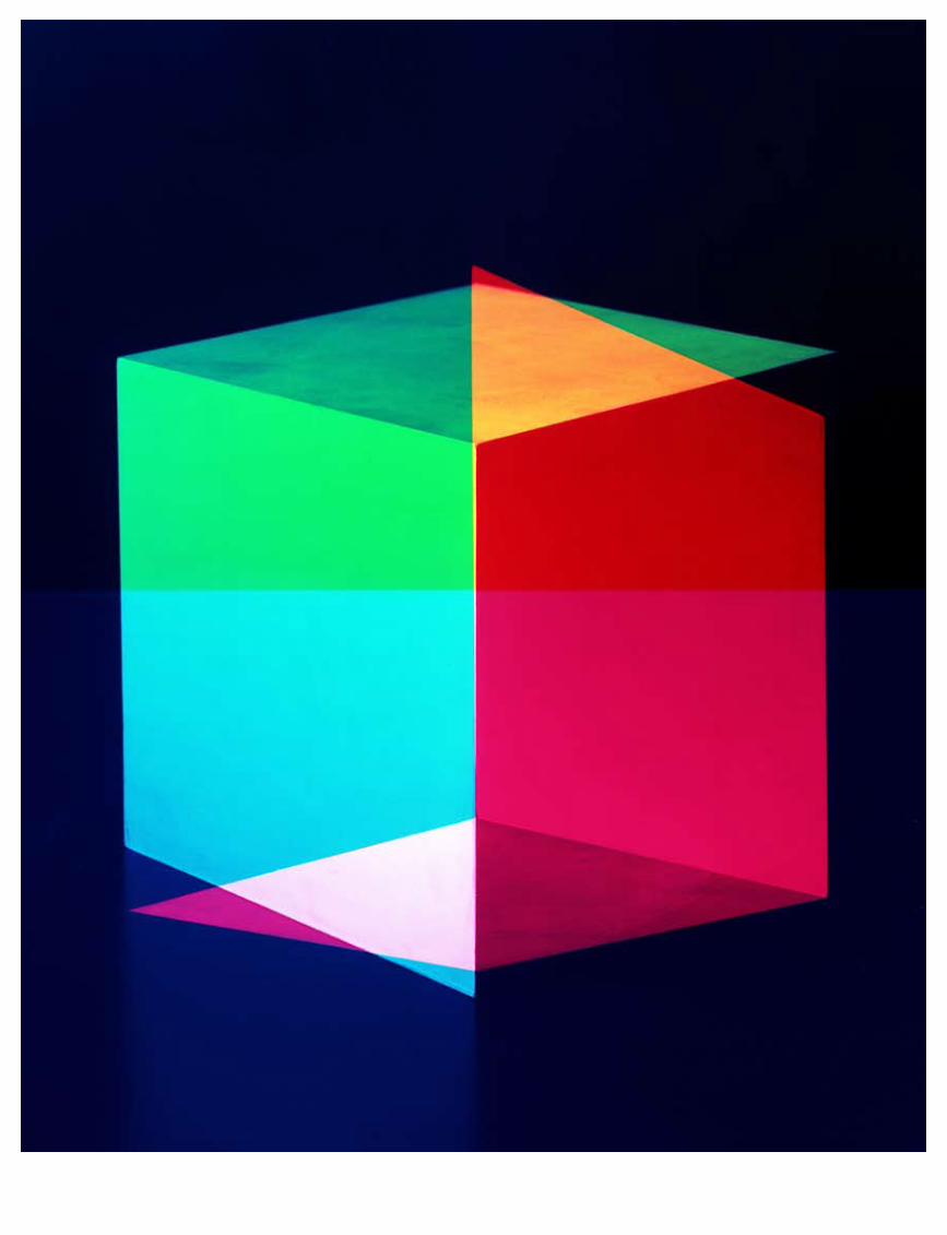
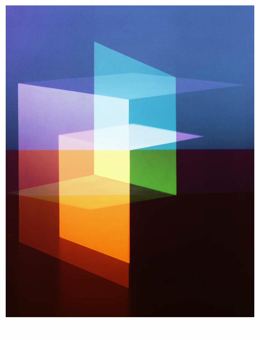
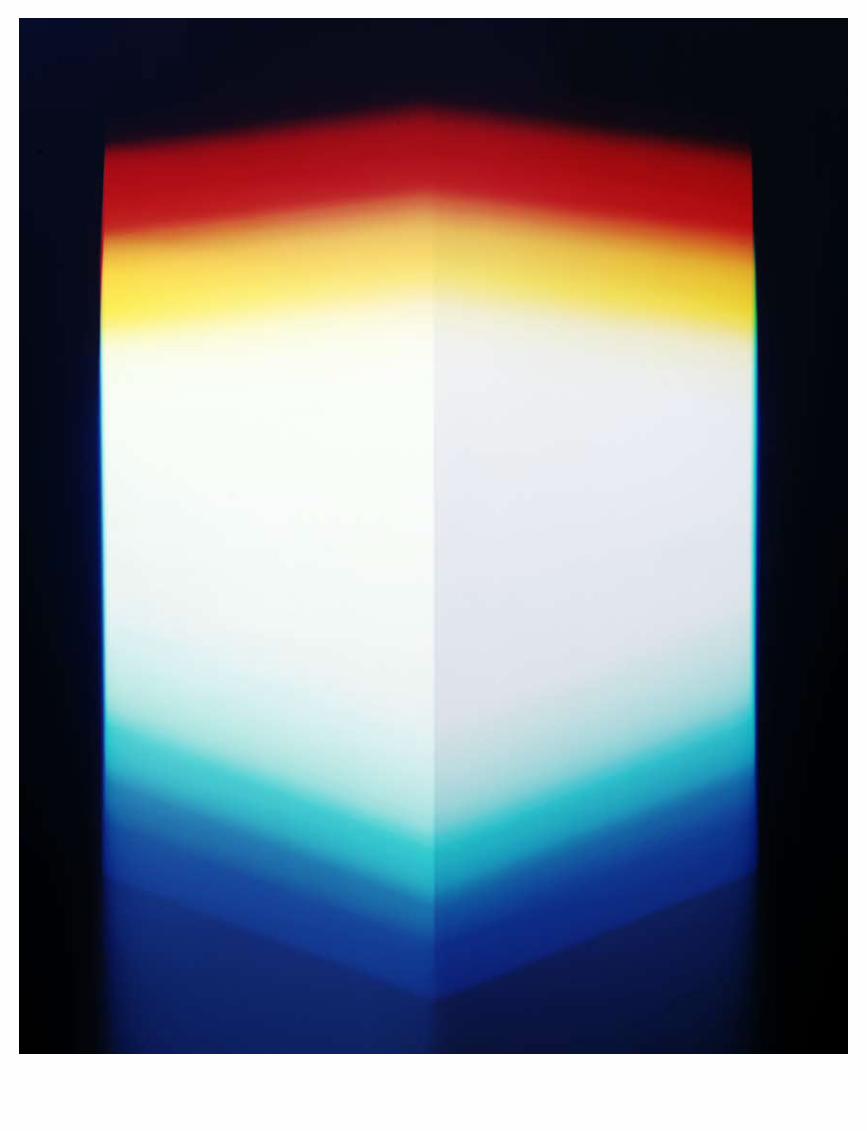
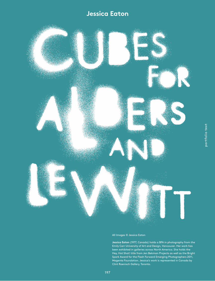
port
folio
tex
t
197
Jessica Eaton
All Images © Jessica Eaton
Jessica Eaton (1977, Canada) holds a BFA in photography from the Emily Carr University of Art and Design, Vancouver. Her work has been exhibited in galleries across North America. She holds the Hey, Hot Shot! title from Jen Bekman Projects as well as the Bright Spark Award for the Flash Forward Emerging Photographers 2011, Magenta Foundation. Jessica’s work is represented in Canada by Clint Roenisch Gallery, Toronto.
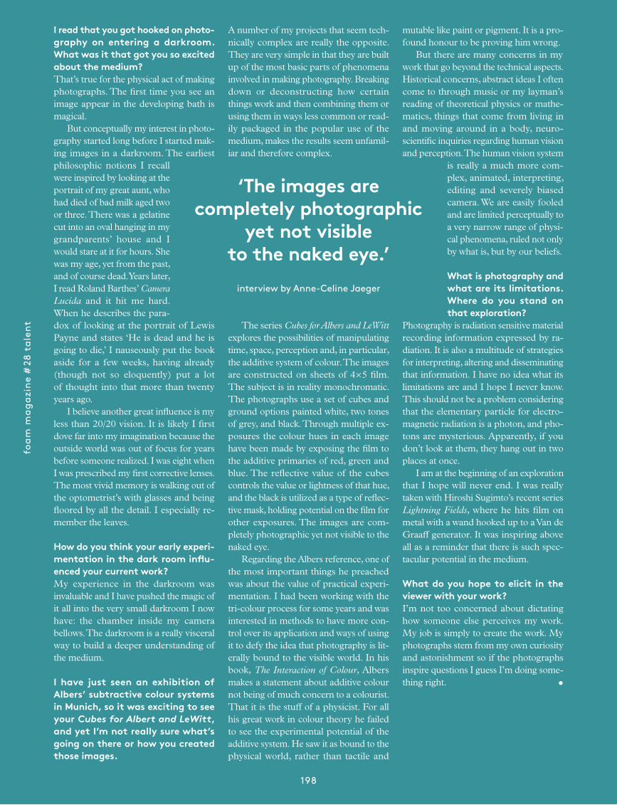
foam
mag
azin
e #
28 t
alen
t
198
A number of my projects that seem technically complex are really the opposite. They are very simple in that they are built up of the most basic parts of phenomena involved in making photography. Breaking down or deconstructing how certain things work and then combining them or using them in ways less common or readily packaged in the popular use of the medium, makes the results seem unfamiliar and therefore complex.
The series Cubes for Albers and LeWitt explores the possibilities of manipulating time, space, perception and, in particular, the additive system of colour. The images are constructed on sheets of 4×5 film. The subject is in reality monochromatic. The photographs use a set of cubes and ground options painted white, two tones of grey, and black. Through multiple exposures the colour hues in each image have been made by exposing the film to the additive primaries of red, green and blue. The reflective value of the cubes controls the value or lightness of that hue, and the black is utilized as a type of reflective mask, holding potential on the film for other exposures. The images are completely photographic yet not visible to the naked eye. Regarding the Albers reference, one of the most important things he preached was about the value of practical experimentation. I had been working with the tricolour process for some years and was interested in methods to have more control over its application and ways of using it to defy the idea that photography is literally bound to the visible world. In his book, The Interaction of Colour, Albers makes a statement about additive colour not being of much concern to a colourist. That it is the stuff of a physicist. For all his great work in colour theory he failed to see the experimental potential of the additive system. He saw it as bound to the physical world, rather than tactile and
I read that you got hooked on photography on entering a darkroom. What was it that got you so excited about the medium?That’s true for the physical act of making photographs. The first time you see an image appear in the developing bath is magical. But conceptually my interest in photography started long before I started making images in a darkroom. The earliest philosophic notions I recall were inspired by looking at the portrait of my great aunt, who had died of bad milk aged two or three. There was a gelatine cut into an oval hanging in my grand parents’ house and I would stare at it for hours. She was my age, yet from the past, and of course dead. Years later, I read Roland Barthes’ Camera Lucida and it hit me hard. When he describes the paradox of looking at the portrait of Lewis Payne and states ‘He is dead and he is going to die,’ I nauseously put the book aside for a few weeks, having already (though not so eloquently) put a lot of thought into that more than twenty years ago. I believe another great influence is my less than 20/20 vision. It is likely I first dove far into my imagination because the outside world was out of focus for years before someone realized. I was eight when I was prescribed my first corrective lenses. The most vivid memory is walking out of the op tometrist’s with glasses and being floored by all the detail. I especially remember the leaves.
How do you think your early experimentation in the dark room influenced your current work?My experience in the darkroom was invaluable and I have pushed the magic of it all into the very small darkroom I now have: the chamber inside my camera bellows. The darkroom is a really visceral way to build a deeper understanding of the medium.
I have just seen an exhibition of Albers’ subtractive colour systems in Munich, so it was exciting to see your Cubes for Albert and LeWitt, and yet I’m not really sure what’s going on there or how you created those images.
mutable like paint or pigment. It is a profound honour to be proving him wrong. But there are many concerns in my work that go beyond the technical aspects. Historical concerns, abstract ideas I often come to through music or my layman’s reading of theoretical physics or mathematics, things that come from living in and moving around in a body, neuroscientific inquiries re garding human vision and per cep tion. The human vision system
is really a much more complex, ani mated, inter preting, editing and severely biased camera. We are easily fooled and are limited perceptually to a very narrow range of physical phe nomena, ruled not only by what is, but by our beliefs.
What is photography and what are its limitations. Where do you stand on that exploration?
Photography is radiation sensitive material recording information expressed by radiation. It is also a multitude of strategies for interpreting, altering and disseminating that information. I have no idea what its limitations are and I hope I never know. This should not be a problem considering that the elementary particle for electromagnetic radiation is a photon, and photons are mysterious. Apparently, if you don’t look at them, they hang out in two places at once. I am at the beginning of an exploration that I hope will never end. I was really taken with Hiroshi Sugimto’s recent series Lightning Fields, where he hits film on metal with a wand hooked up to a Van de Graaff generator. It was inspiring above all as a reminder that there is such spectacular potential in the medium.
What do you hope to elicit in the viewer with your work?I’m not too concerned about dictating how someone else perceives my work. My job is simply to create the work. My photographs stem from my own curiosity and astonishment so if the photographs inspire questions I guess I’m doing something right. •
‘The images are completely photographic
yet not visible to the naked eye.’
interview by Anne-Celine Jaeger
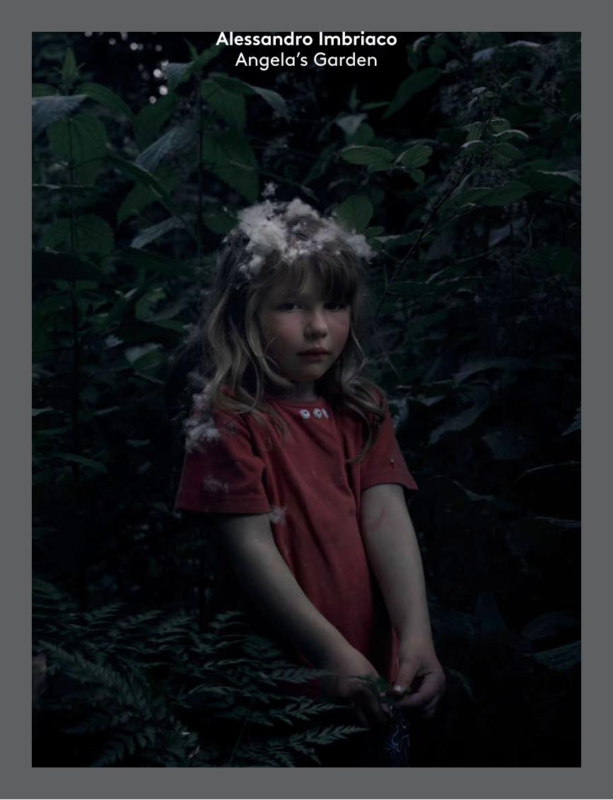
Alessandro Imbriaco Angela’s Garden
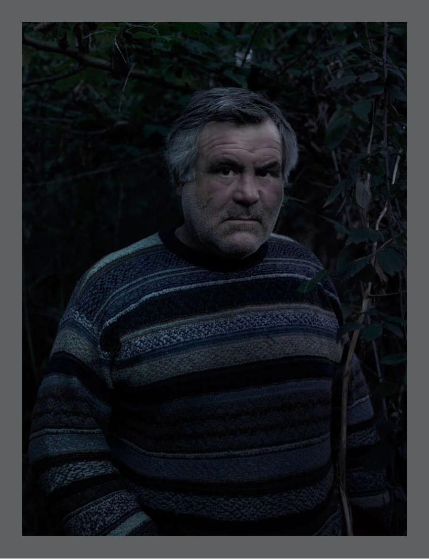

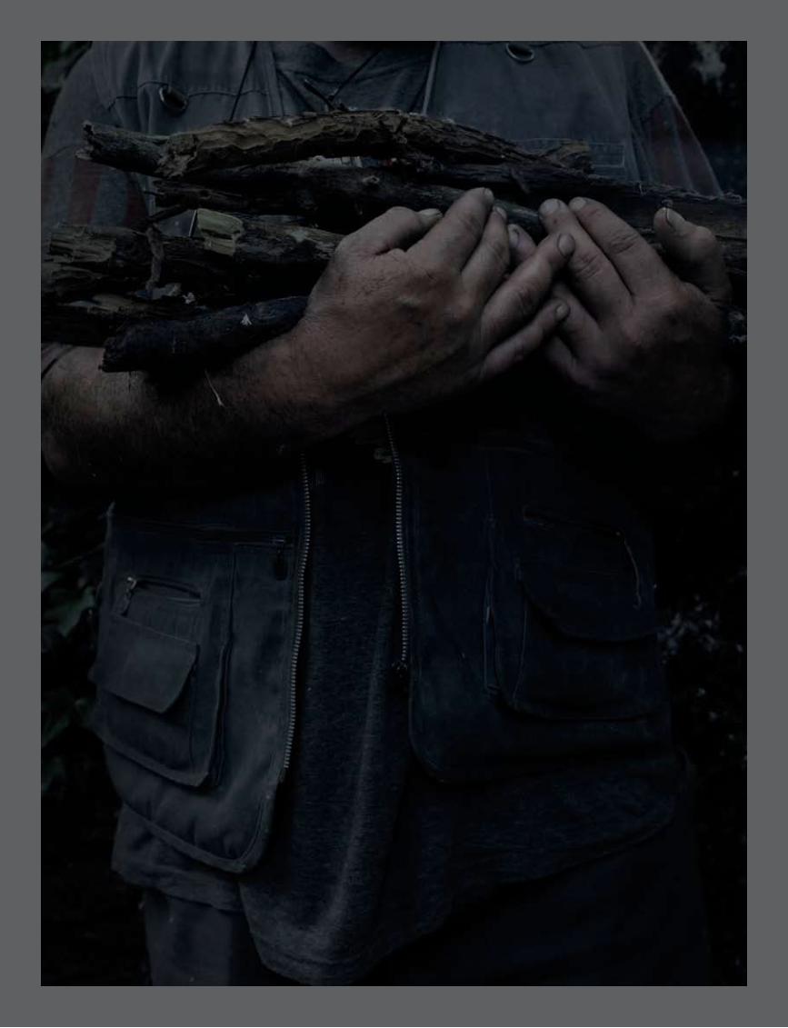
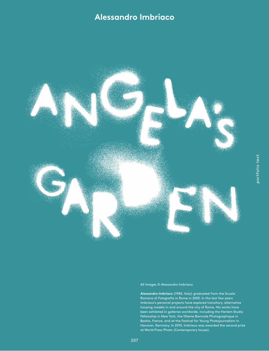
port
folio
tex
t
207
All Images © Alessandro Imbriaco
Alessandro Imbriaco (1980, Italy) graduated from the Scuola Romana di Fotografia in Rome in 2005. In the last few years Imbriaco’s personal projects have explored transitory, alternative housing models in and around the city of Rome. His works have been exhibited in galleries worldwide, including the Harlem Studio Fellowship in New York, the 10ieme Biennale Photographique in Bastia, France, and at the Festival for Young Photojournalism in Hanover, Germany. In 2010, Imbriaco was awarded the second prize at World Press Photo (Contemporary Issues).
Alessandro Imbriaco
foam
mag
azin
e #
28 t
alen
t
208
and how that settlement became a chance to preserve something of the wider area. Rome underwent a massive process of urban growth, and yet several green areas survived in the city centre and in the sub-urbs. The communities who settle down there often develop somewhat anarchistic and temporary ways of inhabiting a place. And in these exceptional conditions, for shorter or longer periods, a mutual pro-tection is established between the people
and the territory. When the Casilino 900 camp was cleared out, the land on which the camp had existed for half a century was made ready to be turned into another of the many suburbs of Rome.
Can you tell me a little bit about Angela’s Garden? The colours are interesting and muted, like a garden of Eden gone wrong.That is exactly the story of that place. It was meant to be a small nature reserve. You can find a wide variety of birds and foxes living around the swamp. A small initiative to protect the place eventually failed, and today the area is a shelter not only for the animals but for homeless peo-ple who managed to build a safe place for themselves among the trees of the swamp. Most of them are immigrants from Eastern Europe. The case of Angela and her family is different. They were just about the first to go and live there. Piero, her father, is Italian and says that if he had the money he would buy that land and live there forever. Angela grew up sleeping under a bridge, playing around the swamp, always under a roof of leaves or cement, hiding in the semidarkness. The overall visual effect is meant to show the dim light Angela is used to.
You studied engineering before turning to photography – when did you first develop an interest in photography?When I was at university my father gave me his camera and his dark room equip-ment. It was a moment where I was not enjoying my studies, and I quickly got into photo-graphy. At first I always shot in the same place, an abandoned factory where there was amaz-ing light. And I was shooting purely to have something to print in the darkroom. I made a series of prints from the fac-tory and started showing them around. A few com pli ments about those photographs, along with my growing dis-affection with engineer ing were all it took.
Casilino 900 is part of your ongoing Temporary Autonomous Zone project, a mapping of housing projects in and around Rome. What sparked off this personal project?I started this work four years ago. I was working on a project on the eastern sub-urban area of Rome and there I met some people who squatted an office building. I’ve been working on the housing and liv-ing conditions in Rome ever since. At first I focused on squatters transforming build-ings not originally intended for habitation. Now I’m more interested in the relationship between urban territory and the people who live there in an unconventional way.
After what happened with the camp in Rome at the beginning of 2010 it’s quite refreshing to see your images. The outside world has probably been persuaded that Romans, or at least Berlusconi, are fairly impatient with the gypsy community. What impact were you hoping these pictures would have?My idea was to go beyond the stereo-typical image of Casilino 900, which is seen as a difficult or even criminal place and a symbol of the segregation of the Roma community. I wanted to show how they found their own way of living there,
Have Casilino 900, Angela’s Garden or Temporary Houses been published in any Italian magazines and what was the local reaction to the situation?It’s hard to evaluate the average re action of Italians to this issue. Over all these years we have been taught to reject foreigners as people who should leave because they take jobs, houses, even seats on the bus from us. It’s a kind of rac ism that stems
from the way we have been governed in recent years. Now, without much uproar and with the government’s approval, the Roma people have been registered based on their race and religion. The fingerprints of adults and children were pre-emptively collected for se-curity reasons.
What makes an image worth shooting or captur ing?The preliminary stage is
merely emo tional, a fragment of reality standing out and becoming something worth being photographed. It’s an instinc-tive pro cess that evolves and becomes refined with experience, but that eludes any rational analysis at the moment it oc-curs. The next stage is about elaborating a vision, the choice of a certain distance from things to represent what you pre-visualized of a particular scene.
How do you come up with new project ideas?Most of my projects are made in the city where I live, even quite near my house, so they usually begin with seeing things while driving around, or walking.
What was the single most inspiring thing you witnessed last year?On 14 December tens of thousands of people marched in Rome to protest against Berlusconi. That day he snatched a confidence vote by pretty much buying votes from the opposition. I think that mo-ment gave me the hope that the Berlusconi era would soon come to an end. That gives you the strength to keep living and work-ing in Italy. •
‘I’m interested in the relationship between
urban territory and the people who live there
in an unconventional way.’interview by Anne-Celine Jaeger
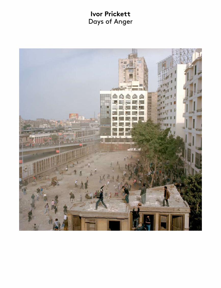
Ivor Prickett Days of Anger

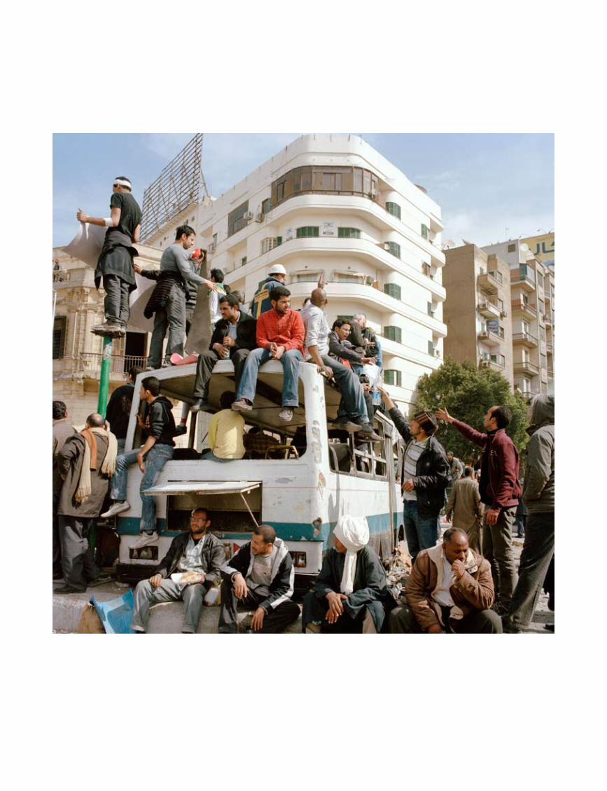
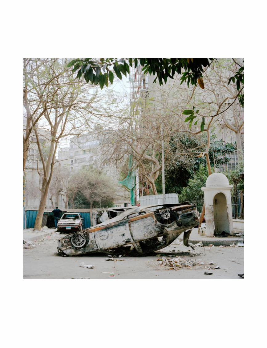
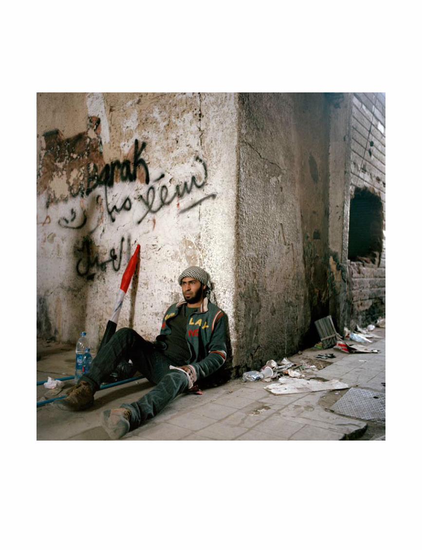
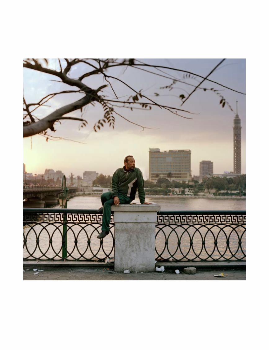
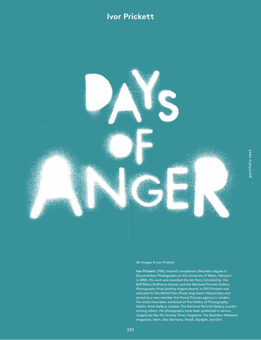
port
folio
tex
t
225
Ivor Prickett
All Images © Ivor Prickett
Ivor Prickett (1983, Ireland) completed a Bachelor degree in Documentary Photography at the University of Wales, Newport in 2006. His work was awarded the Ian Parry Scholarship, the BJP/Nikon Endframe Award, and the National Portrait Gallery Photography Prize Godfrey Argent Award. In 2011 Prickett was selected for the World Press Photo Joop Swart Masterclass and joined as a new member the Panos Pictures agency in London.His works have been exhibited at The Gallery of Photography, Dublin; Host Gallery, London; The National Portrait Gallery, London among others. His photographs have been published in various magazines like The Sunday Times magazine, The Guardian Weekend magazine, Stern, Geo Germany, Foto8, Daylight, and Exit.
foam
mag
azin
e #
28 t
alen
t
226
Looking at the pictures of Days of Anger made me think of the entire history of the uprising. To what de-gree were you highlighting modern aspects of the revolution, which gained momentum through Twitter and Facebook? I was definitely aware of them whilst shooting. They were hard to ignore. In fact I was aware of them before the revolution even started, as my girlfriend had
done a major story about the blogger movement for GEO magazine the year before. After Tunisia, everyone was aware of the power of social media. It wasn’t the first time either. The uprising in Iran had also been fueled and sustained through Twitter and Facebook although it wasn’t successful. I purposely tried to find some of the main people behind the movement, the activists etc. But having said that, once I was there it quickly became clear that all sections of Egyptian society were out on the streets. You would have these younger forwardlooking types alongside families who had come in from the countryside.
The stories you have covered, whether in Days of Anger, The Quiet After the Storm (Croatia’s displaced Serbs) or Kablare, are all political in na-ture. What do you think is needed today to create a picture or a series of images that resonates with the viewer?The stories I’m interested in are innately linked to politics but it’s not necessarily something I try to explore in the pictures. In terms of resonating, I think all I can do is be honest and work on stories I’m passionate about. If you don’t feel strongly about what you’re photographing, you will struggle to have empathy or com passion for the people involved, some thing that I think is integral to making good documentary photo graphy.
When did you first become interested in photography? During my last year at school in Ireland, when I was putting together a portfolio of work to apply for art college. At a loose end in the summer holidays I did a blackandwhite photography course. I fell in love with the process, the magic of shooting a roll of film and processing it. It opened up a whole new world to me. During that last school year, I abandoned the art dreams and put together a photography portfolio.
How did your passion evolve into a love of documentary?When I didn’t get into the two photography courses I had applied for, I was at a loss as to what to do. I had no guidance, but I found out about a course in Ireland, run by a documentary photographer called Joe Sterling. The course was very documentaryoriented and I quickly realized that this was what I wanted to do. It was a particularly intense and fastmoving year that gave me the opportunity to go and do my own thing, and to interpret what we’d learnt. It set me up brilliantly for going to Newport.
It appears from where you are based that you have quite a nose for a story. Were you in Beirut before Egypt happened?My girlfriend, the photographer Anastasia TaylorLind, and I moved to the Middle East to be closer to the stuff going on that we were interested in. When the uprising started, I was in Lebanon. I’m not a news photographer but when Egypt started to evolve, I think everyone realized that it was something momentous. I was sitting here in Beirut and thought, ‘I’ve got to go and do something if I’m going to call myself a photographer based in the Middle East’. So I booked a lastminute flight to Cairo.
The first thing that struck me looking at the different projects you have worked on is the beauty of the light and colours and the poetic quality of
your images. What are you attracted to and how do you work around that?Photography is a visual form of communication and it seems to me that to captivate people and garner their attention, you need to create something that’s unique and dynamic and, dare I say it, beautiful, regardless of the situation. But it’s also more personal than that. It’s not just
because that’s what people want to see, it’s how I want to represent the people I photograph. I purposely look for those situations. It often re quires a lot of patience and it doesn’t always happen. Having said that, even if the light isn’t very good, you still have to try to take the picture. Light and colour are the two most important components of an interesting image, so surely you’ve got to work with them. I do very little in postproduction and given that I shoot film I have to do a bit more thinking than if I was shooting digitally.
Whose work have you been inspired by in the past or present?I love Simon Norfolk’s early work, the beauty of his images and the serious issues he tackles. It really resonates with me. But I have found the most inspiration from more current, younger photographers, such as Ziyah Gafic and Mikhael Subotzky.
What would you like to work on next? I’ve been a bit distracted by what’s happening in the Middle East. Any thing else that I had going on has been put on hold for the time being. But I’ve become very interested in the Caucasus. That part of the world really fascinates me. I’m going to spend a lot of time there in the next couple of years. Some of my earliest projects were in the Balkans, so ex ploring that axis between East and West seems like a natural progression. •
‘It quickly became clear that all sections of
Egyptian society were out on the streets.’
interview by Anne-Celine Jaeger
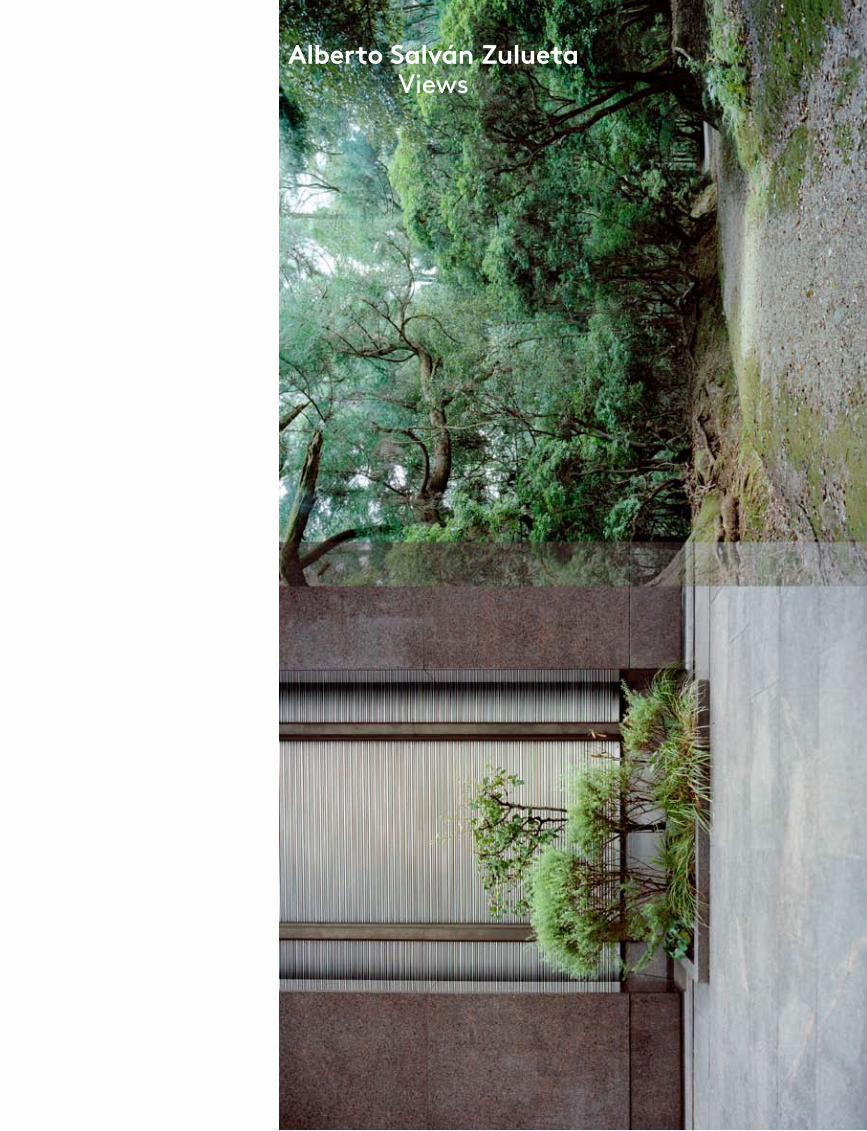
Alberto Salván Zulueta Views
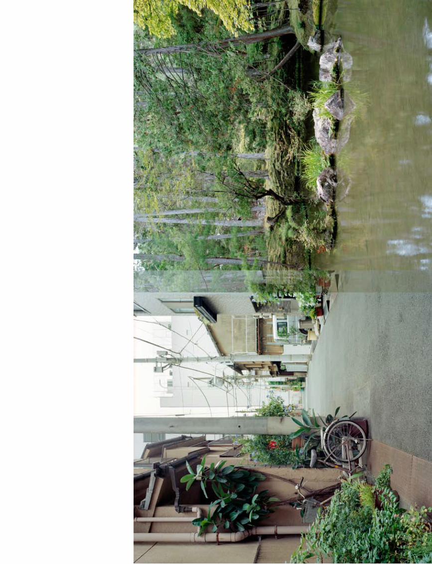
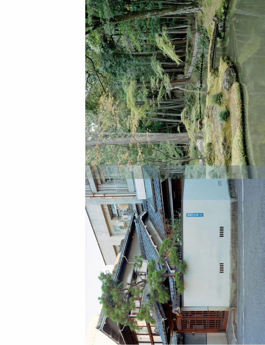
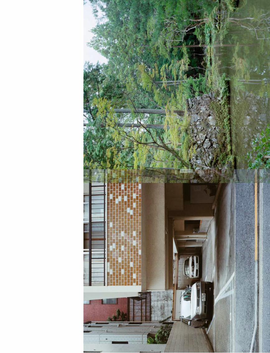
port
folio
tex
t
235
Alberto Salván Zulueta
All Images © Alberto Salván Zulueta
Alberto Salván Zulueta (1979, Spain) runs a graphic design company called Tres Tipos Gráficos in Madrid. His photographic work has been exhibited in numerous galleries including the Billirubin Gallery, Berlin; 3 Punts Galeria, Barcelona and the Círculo de Bellas Artes, Madrid. In 2010 he won the third prize at the 11 Mostra Internacional Gas Natural and several mentions in other contests as Purificación García 2010 or Descubrimientos PHE 06.
foam
mag
azin
e #
28 t
alen
t
236
What do you hope to evoke for the viewer?Japan is a very complex society. As I un-derstand it there seems to be a violent contrast between the urban and modern and the traditional and natural. The idiosyncrasy of nature is venerated in all aspects of Japan’s culture: religion, food, folklore, the arts and so on. Nature is closely linked to its traditions, yet at the same time this is offset by the cosmopolitan
city in a duality that generates a conflict for its inhabitants. And this conflict – not in the pejorative sense – affects activities, as well as internal behaviour and social re-lations. It is that conflict and duality I want to bring out in this project.
Can you tell me about overlapping images in your work. In Views na-ture bleeds into the cityscape and in Portraits you have layered por-traits on top of each other.Photography has been assigned an an-thropomorphic configuration that is not necessarily appropriate. Reality is more complex. That is why, in Portraits, I avoid simple or anecdotal posed portraits, using instead a variety of registers to configure the complex reality of the sitter. I am not afraid to break the ‘window onto the world’, a concept generally as-sociated with photography that I don’t really buy into. In Views, I am exercising a greater visual license. I believe that over-lapping generates a conflict in two senses: in the idea of contrasting two opposing images, and in the medium of photogra-phy itself, with its classic representation as a self-referential image. It even manifests the physicality of the photograph as its own reality, rather than as a mere repre-sentation or register of something.
Your website is called Abandoned Realities. What is your interest in iso lated spaces and the absence of people?I don’t believe in portraiture as it always involves a conscious pose. Even when we dress in street clothes we are aware of how we will be seen by others. I prefer to focus on places where traces of human activity have been left in an unpremeditated or unconscious way – traces that speak of the place and its inhabitants in a more sincere manner. Nevertheless, the overall title of my projects, Abandoned Realities, is not to be taken in a literal sense but rather in a broader way. Photography as a medium, and how society uses images generated by that medium, are to me the most important aspects implicit in the word ‘reality’.
How did the project Views/Places come about?I always try to begin with everyday spaces, approaching society through small details. That is why I assign the generic term ‘places’ to my images. In all my series I try to avoid direct references to the place. I am not interested in documentary as-pects, as they breed prejudices. I do not believe I am making documentaries about places. Nor do I believe that an image can summarize an entire place or the character of its inhabitants, although it can reflect some meaningful details. I delve into the formulas a society uses to represent itself – how communities see themselves. A society’s his torical artistic manifestations are a reference, but I do not assign any particular importance to photography as a medium. I am referring to artistic, popular or cultural man-ifestations as a whole, including literary self-references.
You have a day job as a graphic de-signer. Many artists struggle to find time for their art. How do you get that balance right?There are always conflicts, but also many positive aspects. Having a day job greatly limits the time I can dedicate to my pho-tographic projects, but it also imposes a certain distance, and longer periods in which to develop a project. The time span allows my view of a project to shift over
the course of weeks or months, and to become more reflective. Nonetheless, I’m slightly ob-sessive about my projects and they are always on my mind.
How does your graphic design background influ-ence your work? It helps me see a great variety of things and perhaps allows
me to be more open when formalizing a project. Or maybe it allows me to get out-side the project when editing it, approach-ing the edit from a less emotional point of view.
How does an idea evolve into a proj-ect for you?There are two main threads that I find fascinating: societies, with all their com-plexity, differences and characteristics and the medium of photography. I am looking to merge two elements: the exploration of human presence in society and the pho-tographic medium with all its complexi-ties. It usually takes me one or two years to get from the initial idea through proofs, photos and editing all the way to the end of a project. It means that I sometimes lose some spontaneity, but that doesn’t bother me.
What is your main source of inspira-tion?How a society relates to images in general, and the role, use or importance it assigns them. Current visual arts, of course, but most of all art history, because in the end, each period or style is a formal man-ifestation of the society of its time, a self-portrait in the broadest sense. I should also mention photographers who have dealt with photography’s on-tological questions and who have become direct references for me, particularly Stephen Shore, Wolfgang Tillmans, Thomas Ruff, Roland Fischer, Hiroshi Sugimoto and Paul Graham. •
‘I do not believe I am making documentaries
about places.’interview by Anne-Celine Jaeger
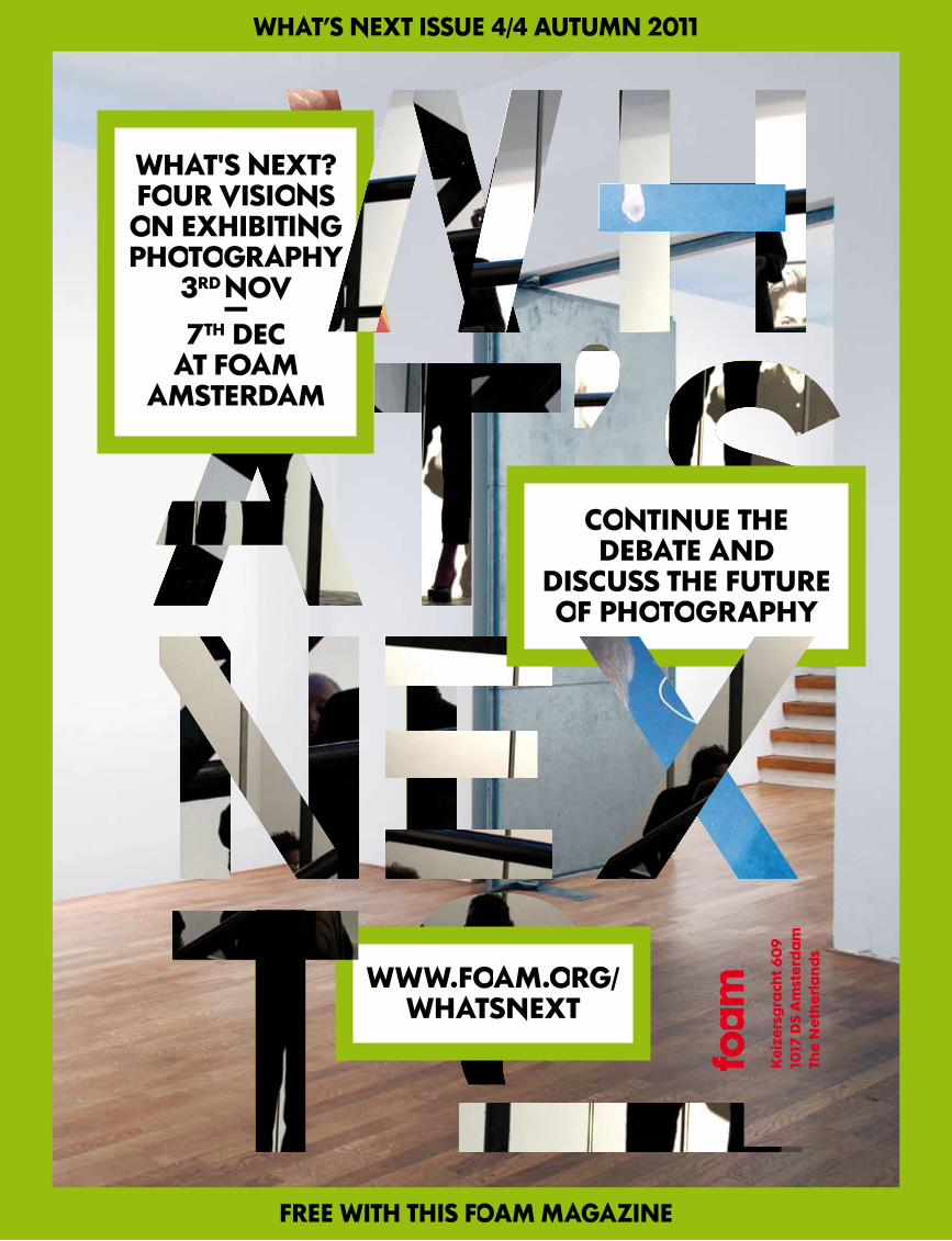
FREE WITH THIS FOAM MAGAZINE
WHAT’S NEXT ISSUE 4/4 AUTUMN 2011
WWW.FOAM.ORG/WHATSNEXT
WHAT'S NEXT?FOUR VISIONS ON EXHIBITING PHOTOGRAPHY
3RD NOV -
7TH DECAT FOAM
AMSTERDAM
CONTINUE THEDEBATE AND
DISCUSS THE FUTURE OF PHOTOGRAPHY
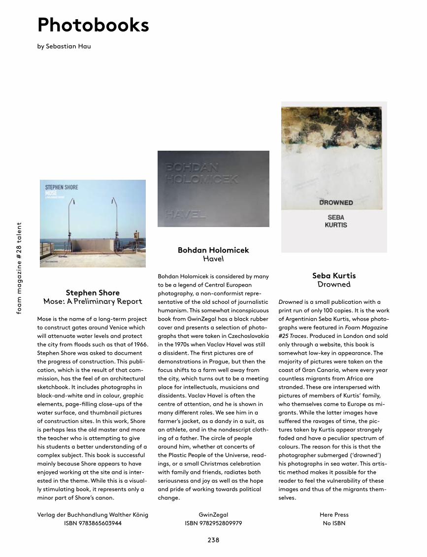
foam
mag
azin
e #
28 t
alen
t
238
Photobooksby Sebastian Hau
Bohdan HolomicekHavel
Bohdan Holomicek is considered by many to be a legend of Central European photo graphy, a non-conformist repre-sentative of the old school of journalistic humanism. This somewhat inconspicuous book from GwinZegal has a black rubber cover and presents a selection of photo-graphs that were taken in Czechoslovakia in the 1970s when Vaclav Havel was still a dissident. The first pictures are of demonstrations in Prague, but then the focus shifts to a farm well away from the city, which turns out to be a meeting place for intellectuals, musicians and dissidents. Vaclav Havel is often the centre of attention, and he is shown in many different roles. We see him in a farmer’s jacket, as a dandy in a suit, as an athlete, and in the nondescript cloth-ing of a father. The circle of people around him, whether at concerts of the Plastic People of the Universe, read-ings, or a small Christmas celebration with family and friends, radiates both seriousness and joy as well as the hope and pride of working towards political change.
GwinZegal ISBN 9782952809979
Stephen ShoreMose: A Preliminary Report
Mose is the name of a long-term project to construct gates around Venice which will attenuate water levels and protect the city from floods such as that of 1966. Stephen Shore was asked to document the progress of construction. This publi-cation, which is the result of that com-mission, has the feel of an architectural sketchbook. It includes photographs in black-and-white and in colour, graphic elements, page-filling close-ups of the water surface, and thumbnail pictures of construction sites. In this work, Shore is perhaps less the old master and more the teacher who is attempting to give his students a better understanding of a complex subject. This book is successful mainly because Shore appears to have enjoyed working at the site and is inter-ested in the theme. While this is a visual-ly stimulating book, it represents only a minor part of Shore’s canon.
Verlag der Buchhandlung Walther König ISBN 9783865603944
Seba KurtisDrowned
Drowned is a small publication with a print run of only 100 copies. It is the work of Argentinian Seba Kurtis, whose photo-graphs were featured in Foam Magazine #25 Traces. Produced in London and sold only through a website, this book is somewhat low-key in appearance. The majority of pictures were taken on the coast of Gran Canaria, where every year countless migrants from Africa are stranded. These are interspersed with pictures of members of Kurtis’ family, who themselves came to Europe as mi-grants. While the latter images have suffered the ravages of time, the pic-tures taken by Kurtis appear strangely faded and have a peculiar spectrum of colours. The reason for this is that the photographer submerged (‘drowned’) his photographs in sea water. This artis-tic method makes it possible for the reader to feel the vulnerability of these images and thus of the migrants them-selves.
Here PressNo ISBN
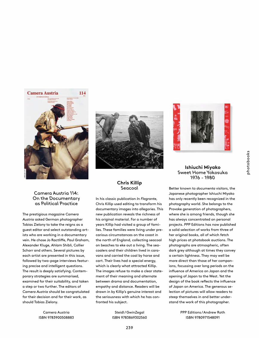
phot
oboo
ks
239
Camera Austria 114: On the Documentary as Political Practice
The prestigious magazine Camera Austria asked German photographer Tobias Zielony to take the reigns as a guest editor and select outstanding art-ists who are working in a documentary vein. He chose Jo Ractliffe, Paul Graham, Alexander Kluge, Ahlam Shibli, Collier Schorr and others. Several pictures by each artist are presented in this issue, followed by two-page interviews featur-ing precise and intelligent questions. The result is deeply satisfying. Contem-porary strategies are summarised, examined for their suitability, and taken a step or two further. The editors of Camera Austria should be congratulated for their decision and for their work, as should Tobias Zielony.
Camera AustriaISBN 9783900508883
Chris KillipSeacoal
In his classic publication In Flagrante, Chris Killip used editing to transform his documentary images into allegories. This new publication reveals the richness of his original material. For a number of years Killip had visited a group of fami-lies. These families were living under pre-carious circumstances on the coast in the north of England, collecting seacoal on beaches to eke out a living. The sea-coalers and their children lived in cara-vans and carried the coal by horse and cart. Their lives had a special energy, which is clearly what attracted Killip. The images refuse to make a clear state-ment of their meaning and alternate between drama and documentation, empathy and distance. Readers will be drawn in by Killip’s genuine interest and the seriousness with which he has con-fronted his subject.
Steidl / GwinZegal ISBN 9783869302560
Ishiuchi MiyakoSweet Home Yokosuka
1976 - 1980
Better known to documenta visitors, the Japanese photographer Ishiuchi Miyako has only recently been recognized in the photography world. She belongs to the Provoke generation of photographers, where she is among friends, though she has always concentrated on personal projects. PPP Editions has now published a solid selection of works from three of her original books, all of which fetch high prices at photobook auctions. The photographs are atmospheric, often dark grey although at times they convey a certain lightness. They may well be more direct than those of her compan-ions, focussing over long periods on the influence of America on Japan and the opening of Japan to the West. Yet the design of the book reflects the influence of Japan on America. The generous se-lection of pictures will allow readers to steep themselves in and better under-stand the work of this photographer.
PPP Editions / Andrew RothISBN 9780971548091
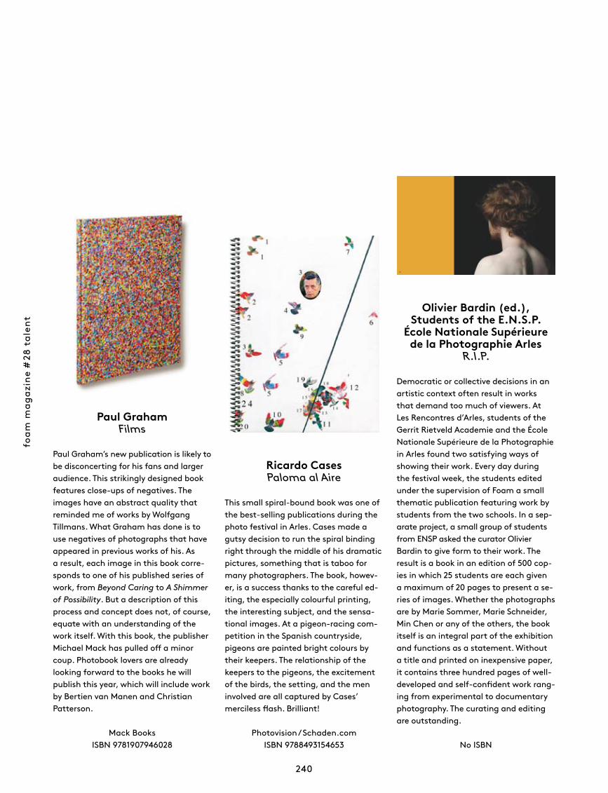
foam
mag
azin
e #
28 t
alen
t
240
Olivier Bardin (ed.), Students of the E.N.S.P.
École Nationale Supérieure de la Photographie Arles
R.I.P.
Democratic or collective decisions in an artistic context often result in works that demand too much of viewers. At Les Rencontres d’Arles, students of the Gerrit Rietveld Academie and the École Nationale Supérieure de la Photographie in Arles found two satisfying ways of showing their work. Every day during the festival week, the students edited under the supervision of Foam a small thematic publication featuring work by students from the two schools. In a sep-arate project, a small group of students from ENSP asked the curator Olivier Bardin to give form to their work. The result is a book in an edition of 500 cop-ies in which 25 students are each given a maximum of 20 pages to present a se-ries of images. Whether the photographs are by Marie Sommer, Marie Schneider, Min Chen or any of the others, the book itself is an integral part of the exhibition and functions as a statement. Without a title and printed on inexpensive paper, it contains three hundred pages of well-developed and self-confident work rang-ing from experimental to documentary photography. The curating and editing are outstanding.
No ISBN
Paul GrahamFilms
Paul Graham’s new publication is likely to be disconcerting for his fans and larger audience. This strikingly designed book features close-ups of negatives. The images have an abstract quality that reminded me of works by Wolfgang Tillmans. What Graham has done is to use negatives of photographs that have appeared in previous works of his. As a result, each image in this book corre-sponds to one of his published series of work, from Beyond Caring to A Shimmer of Possibility. But a description of this process and concept does not, of course, equate with an understanding of the work itself. With this book, the publisher Michael Mack has pulled off a minor coup. Photobook lovers are already looking forward to the books he will pub lish this year, which will include work by Bertien van Manen and Christian Patterson.
Mack BooksISBN 9781907946028
Ricardo CasesPaloma al Aire
This small spiral-bound book was one of the best-selling publications during the photo festival in Arles. Cases made a gutsy decision to run the spiral binding right through the middle of his dramatic pictures, something that is taboo for many photographers. The book, howev-er, is a success thanks to the careful ed-iting, the especially colour ful printing, the interesting subject, and the sensa-tional images. At a pigeon-racing com-petition in the Spanish countryside, pigeons are painted bright colours by their keepers. The relationship of the keepers to the pigeons, the excitement of the birds, the setting, and the men involved are all captured by Cases’ merciless flash. Brilliant!
Photovision / Schaden.com ISBN 9788493154653
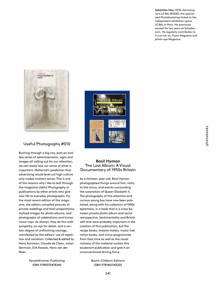
phot
oboo
ks
241
Sebastian Hau (1976, Germany) runs LE BAL BOOKS, the special-ized Photobookshop linked to the independent exhibition space LE BAL in Paris. He previously worked for ten years at Schaden.com. He regularly contributes to Fotokritik.de, Foam Magazine and photo-eye Magazine.
Useful Photography #010
Rushing through a big city, past an end-less series of advertisements, signs and images all calling out for our attention, we can easily lose our sense of what is important. Mallarmé’s prediction that advertising would level out high culture only makes matters worse. This is one of the reasons why I like to leaf through the magazine Useful Photography or publications by other artists who give new life to everyday photographs. For the most recent edition of the maga-zine, the editors compiled pictures of private weddings and their preparations, stylized images for photo albums, and photographs of celebrations and honey-moon trips. As always, they do this with sympathy, an eye for detail, and a cer-tain degree of unflinching courage, manifested by the editors’ use of repeti-tion and variation. Collected & edited by Hans Aarsman, Claudie de Cleen, Julian Germain, Erik Kessels, Hans van der Meer.
KesselsKramer Publishing ISBN 9789070478346
Basil Hyman The Lost Album: A Visual
Documentary of 1950s Britain
As a thirteen-year-old, Basil Hyman photographed things around him, visits to the circus, and events surrounding the coronation of Queen Elizabeth II. The photographs of this attentive and curious young boy have now been pub-lished, along with his collection of 1950s ephemera, in a book that is a cross be-tween private photo album and social retrospective. Sentimentality and British self-love were probably important in the creation of this publication, but the recipe books, theatre tickets, motor fuel ration books, and circus programmes from that time as well as the visual richness of the material sustain this ex uberant publication and give it an unconventional driving force.
Booth-Clibborn EditionsISBN 9781861543202
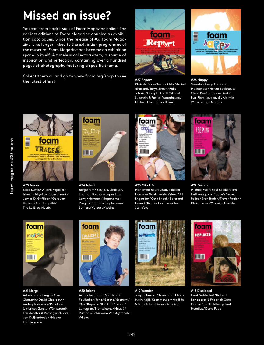
foam
mag
azin
e #
28 t
alen
t
242
Missed an issue? You can order back issues of Foam Magazine online. The earliest editions of Foam Magazine doubled as exhibi-tion catalogues. Since the release of #3, Foam Maga-zine is no longer linked to the exhibition programme of the museum. Foam Magazine has become an exhibition space in itself. A timeless collectors-item, a source of inspiration and reflection, containing over a hundred pages of photography featuring a specific theme.
Collect them all and go to www.foam.org/shop to see the latest offers!
foam
mag
azin
e #2
8 ta
lent
242
#18 DisplacedHenk Wildschut / Roland Bonaparte & Friedrich Carel Hisgen / Jim Goldberg / Juul Hondius / Dana Popa
#19 WonderJaap Scheeren / Jessica Backhaus Syoin Kajii / Koen Hauser / Madi Ju & Patrick Tsai / Sanna Kannisto
#21 MergeAdam Broomberg & Oliver Chanarin / David Claerbout / Andrey Tarkovsky / Penelope Umbrico / Gunnel Wåhlstrand / Freudenthal & Verhagen / Nickel van Duijvenboden / Naoya Hatakeyama
#22 PeepingMichael Wolf / Paul Kooiker / Tim Hetherington / Prague's Secret Police / Evan Baden / Trevor Paglen / Chris Jordan / Yasmine Chatila
#23 City LifeMohamed Bourouissa / Takashi Homma / Nontsikelelo Veleko / JH Engström / Otto Snoek / Bertrand Fleuret / Reinier Gerritsen / Joel Sternfeld
#20 TalentAsfar / Bergantini / Castilho / Faulhaber / Fritz / Gerats / Gronsky / Klos / Koyama / Kruithof / Leong / Lundgren / Monteleone / Naudé / Purchas / Schuman / Van Agtmael/ Wilcox
#24 TalentBergström / Boske / Dubuisson / Engman / Gibson / Lopez Luz/ Lowy / Herman / Nagahama /Prager / Rotatori / Stephenson / Somers / Volpatti / Weiner
#27 ReportChris de Bode / Aernout Mik / Amirali Ghasemi /Taryn Simon/ Rolls Tohoku / Doug Rickard / Mikhael Subotzky & Patrick Waterhouse / Michael Christopher Brown
#26 HappyYeondoo Jung / Thomas Mailaender / Henze Boekhout / Olivia Bee / Ruth van Beek / Eva-Fiore Kovacovsky / Jaimie Warren / Inge Morath
#25 TracesSeba Kurtis / Willem Popelier / Ishiuchi Miyako / Robert Frank / James D. Griffioen / Gert Jan Kocken / Anni Leppälä / The La Brea Matrix
foam
am
ster
dam
Foam enables people all over the world to experience and enjoy photography, whether it’s at our museum in Amsterdam, on the website, via our internationally distributed magazine or in our Editions department.
The heart of Foam is located in the centre of Amsterdam, in the museum on the Keizersgracht. Here we schedule a varied programme of exhibitions including world-famous photographers as well as young or undiscovered talent. Large-scale exhibitions alternate with small, quickly changing shows. We also organise a dynamic programme of lectures, discussions, guided tours, workshops and special events.
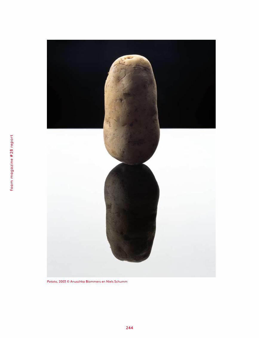
foam
mag
azin
e #
28 r
epor
t
244
Potato, 2003 © Anuschka Blommers en Niels Schumm
foam
am
ster
dam
245
In Still/Life – Contemporary Dutch Photography Foam presents work by Dutch photo-graphers that refers to a classic genre: still life. For a large group of contemporary (au-tonomous) photographers still life continues to inspire, although the concept has been modernized and brought up to date. Inspired by flowers, fruit and vanitas themes, the artists create new worlds in their studios, which only occasionally still show recognisable objects. Whether the end product is a picture, a video or an installation containing photo-graphy, the composition is always balanced in form, colour and light in a considered way. Still/Life does not only provide a specific overview of the work of often relatively young Dutch photographers, but also underlines the importance of emerging photographic talent to Foam during the last decade. The participating photographers are: Melanie Bonajo, Kim Boske, Blommers & Schumm, Elspeth Diederix, Fleur van Dodewaard, Uta Eisenreich, Peggy Franck, Marnix Goossens, Eva-Fiore Kovacovsky, Paul Kooiker, Anouk Kruithof, Yvonne Lacet, Lernert & Sander, Charlott Markus, Katja Mater, Krista van der Niet, Jaap Scheeren, Scheltens & Abbenes, Diana Scherer, Johannes Schwartz, Ingmar Swalue, Marianne Vierø, Anne de Vries and Qiu Yang. •
Still/Life Contemporary
Dutch photography9 September – 26 October 2011
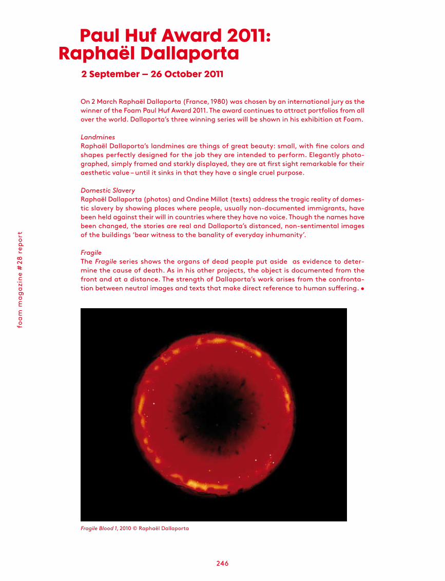
foam
mag
azin
e #
28 r
epor
t
246
On 2 March Raphaël Dallaporta (France, 1980) was chosen by an international jury as the winner of the Foam Paul Huf Award 2011. The award continues to attract portfolios from all over the world. Dallaporta’s three winning series will be shown in his exhibition at Foam.
LandminesRaphaël Dallaporta’s landmines are things of great beauty: small, with fine colors and shapes perfectly designed for the job they are intended to perform. Elegantly photo-graphed, simply framed and starkly displayed, they are at first sight remarkable for their aesthetic value – until it sinks in that they have a single cruel purpose.
Domestic SlaveryRaphaël Dallaporta (photos) and Ondine Millot (texts) address the tragic reality of domes-tic slavery by showing places where people, usually non-documented immigrants, have been held against their will in countries where they have no voice. Though the names have been changed, the stories are real and Dallaporta’s distanced, non-sentimental images of the buildings ‘bear witness to the banality of everyday inhumanity’.
FragileThe Fragile series shows the organs of dead people put aside as evidence to deter-mine the cause of death. As in his other projects, the object is documented from the front and at a distance. The strength of Dallaporta’s work arises from the confronta-tion between neutral images and texts that make direct reference to human suffering. •
Paul Huf Award 2011:Raphaël Dallaporta
2 September – 26 October 2011
Fragile Blood 1, 2010 © Raphaël Dallaporta
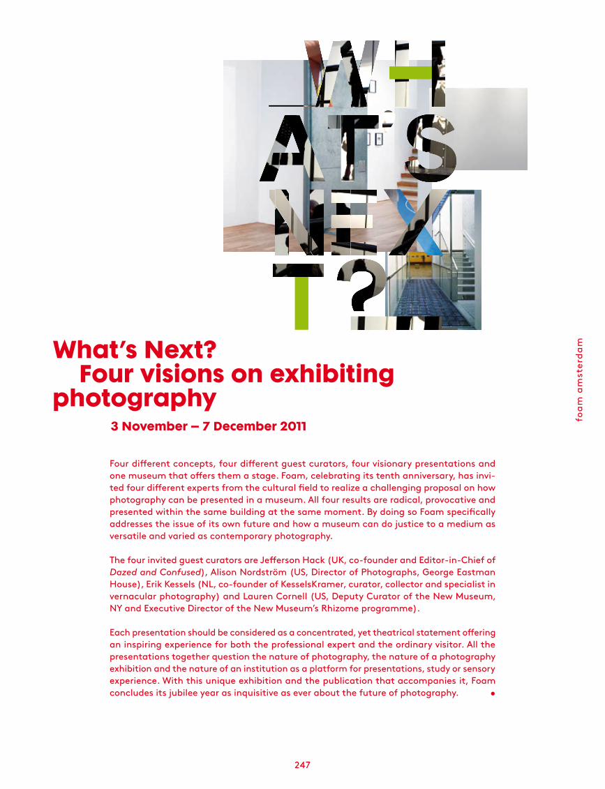
foam
am
ster
dam
247
Four different concepts, four different guest curators, four visionary presentations and one museum that offers them a stage. Foam, celebrating its tenth anniversary, has invi-ted four different experts from the cultural field to realize a challenging proposal on how photography can be presented in a museum. All four results are radical, provocative and presented within the same building at the same moment. By doing so Foam specifically addresses the issue of its own future and how a museum can do justice to a medium as versatile and varied as contemporary photography.
The four invited guest curators are Jefferson Hack (UK, co-founder and Editor-in-Chief of Dazed and Confused), Alison Nordström (US, Director of Photographs, George Eastman House), Erik Kessels (NL, co-founder of KesselsKramer, curator, collector and specialist in vernacular photography) and Lauren Cornell (US, Deputy Curator of the New Museum, NY and Executive Director of the New Museum’s Rhizome programme).
Each presentation should be considered as a concentrated, yet theatrical statement offering an inspiring experience for both the professional expert and the ordinary visitor. All the presentations together question the nature of photography, the nature of a photography exhibition and the nature of an institution as a platform for presentations, study or sensory experience. With this unique exhibition and the publication that accompanies it, Foam concludes its jubilee year as inquisitive as ever about the future of photography. •
What’s Next?Four visions on exhibiting
photography3 November – 7 December 2011
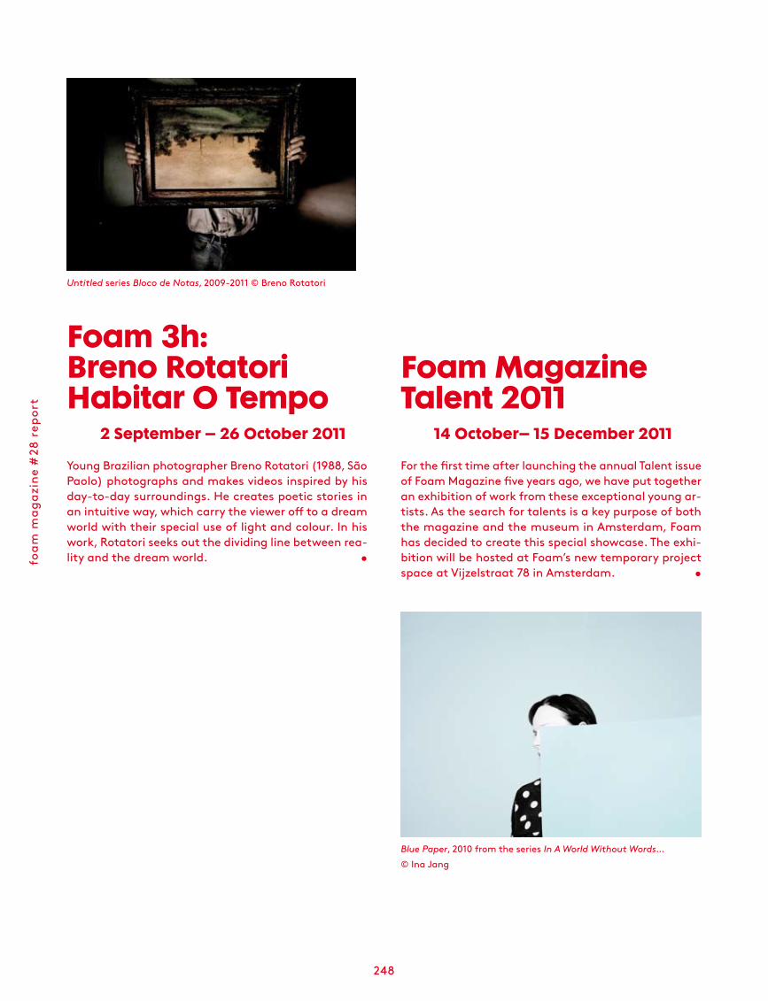
foam
mag
azin
e #
28 r
epor
t
248
For the first time after launching the annual Talent issue of Foam Magazine five years ago, we have put together an exhibition of work from these exceptional young ar-tists. As the search for talents is a key purpose of both the magazine and the museum in Amsterdam, Foam has decided to create this special showcase. The exhi-bition will be hosted at Foam’s new temporary project space at Vijzelstraat 78 in Amsterdam. •
Blue Paper, 2010 from the series In A World Without Words… © Ina Jang
Foam Magazine Talent 2011
14 October– 15 December 2011
Foam 3h:Breno Rotatori Habitar O Tempo
2 September – 26 October 2011
Young Brazilian photographer Breno Rotatori (1988, São Paolo) photographs and makes videos inspired by his day-to-day surroundings. He creates poetic stories in an intuitive way, which carry the viewer off to a dream world with their special use of light and colour. In his work, Rotatori seeks out the dividing line between rea-lity and the dream world. •
Untitled series Bloco de Notas, 2009-2011 © Breno Rotatori

Visit www.foam.org/shop
Menu Sign in Search
Home › Shop
Shop
Books
Editions Magazine
Posters
Anton Corbijn exhibition - Anthony Kiedis€30,-
Magazine
Foam #28 Talent fall 2011€17,50
Magazine
Foam #27 Report summer 2011€17,50
Magazine
Foam #26 Happy spring 2011€17,50
Magazine
Foam #25 Traces winter 2010€17,50
Magazine
Foam Magazine back issues€12,50 — €17,50
Lucian Freud, by Anton Corbijn36 × 36 cm - edition of 15€ 1.250,-
Search in shop
New
A Book of Beds€29,50
Special price for readers
New
A Book of Beds€29,50
Foam Magazine year subscription€70,-
1 year subscription
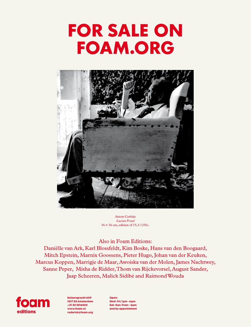
Also in Foam Editions:Daniëlle van Ark, Karl Blossfeldt, Kim Boske, Hans van den Boogaard,Mitch Epstein, Marnix Goossens, Pieter Hugo, Johan van der Keuken,
Marcus Koppen, Marrigje de Maar, Awoiska van der Molen, James Nachtwey, Sanne Peper, Misha de Ridder, Thom van Rijckevorsel, August Sander,
Jaap Scheeren, Malick Sidibé and Raimond Wouda
Anton CorbijnLucian Freud
36 × 36 cm, edition of 15, € 1250,-
FOR SALE ON FOAM.ORG
Keizersgracht 6091017 DS Amsterdam +31 20 5516500 www.foam.nl [email protected]
Open:Wed - Fri: 1 pm - 6 pmSat - Sun: 11 am - 6 pmand by appointment
editions
working
closely together
with
artists
and designers
www.lecturis.nl www.lecturisbooks.nl
Optimistic Branding Visit vandejong.com
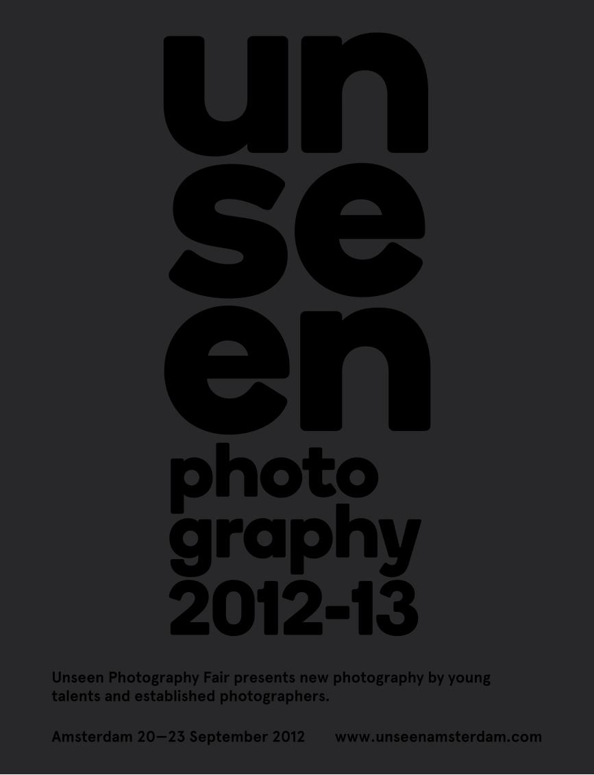
Unseen Photography Fair presents new photography by young talents and established photographers.
Amsterdam 20—23 September 2012 www.unseenamsterdam.com
t 0 2 0 4 2 7 1 0 1 0 i n f o @ b e a m s y s t e m s . n lf 0 2 0 3 3 0 9 9 5 6 w w w . b e a m s y s t e m s . n l
Audiovisue le presentat ies
BeamSystems adviseert en insta l leert
Misha de R idder - Foam Amsterdam
Matte l - Sydney
BS2011_AdvFoam.indd 1 28-07-2011 13:00:12
The fi rst and only visually-oriented art magazine featuring creative material from all over the world.
elephantmag.com
ElephantElephantElephant
The art & visual The art & visual culture magazine
The KitchenV - Homage to Saint Therese by Marina Abramović in Elephant #7.Photo courtesy of Sean Kelly Gallery, New York
FOAM_elephant_def.indd 1 7/21/11 4:18 PM
THE EYE IS A LONELY HUNTERKunsthalle Mannheim | ZEPHYR der Reiss-Engelhorn-Museen | Alter Messplatz Wilhelm-Hack Museum | Kunstverein Ludwigshafen | Heidelberger Kunstverein Sammlung Prinzhorn | halle02
WWW.FOTOFESTIVAL.INFO
Foto
: Fr
an
cesc
o G
iust
i, B
on
ga B
on
ga F
rom
th
e se
rie
s Sa
polo
gie
, Po
inte
no
ire,
co
nG
o, 2
009
Gest
aLt
un
G: r
au
m-m
an
nh
eim
.com
MANNHEIMLUDWIGSHAFENHEIDELBERG
10.9.-6.11.11
W i t h s P e c i a L s u P P o r t B Y
Seven d is t inguished inst i tu t ions in three d i f ferent c i t ies in Germany wi l l host the exhib i t ion of the 4 th edi t ion of the Fotofest iva l .
E X A M P L E S O F O U R
P R I N T I N G A R T U P C O M I N G
W W W. D R U K K E R I J S L I N G E R . N LI N F O @ D R U K K E R I J S L I N G E R . N L
T 0 0 . 3 1 . 7 2 5 4 0 2 2 7 4
D E A M S T E R D A M S E S C H O O L‘ V E R B E E L D E I D E A L E N ’
M U S E U M H E T S C H I P
F O T O L E X I C O N # 4 4 :T H E O BA A R T
H A R M B O T M A N
V I N C E N T M E N T Z E LVO E T N O O T- P U B L I S H E R S
W H AT W E W E A RP I E T E R VA N D E N B O O G E R T
WAT Z I E I K ? A M S T E R D A MS TA D VA N F O T O ’ S
T E X T: J E S S I C A VO E T E NVO E T N O O T P U B L I S H E R S
P L O N SH E R M A N KO C H
P H O T O Y E A R B O O K M A I S L I N G E R VO E T N O O T
K U N S T O P K A M E R SS T I C H T I N G K U N S T O P K A M E R S
H O M M A G E A BA U D E L A I R E2 5 J A A R VO E T N O O T
E E R B E T O O N A A N C H A R L E S BA U D E L A I R EVO E T N O O T- P U B L I S H E R S
B R I E V E N A A N E S T H E RA R N O N G R U N B E R GA L A U D A P U B L I C AT I O N S
C I T Y S C A P E S & B I R D M E NJ A C Q U I E M A R I A W E S S E L S
T E X T: M I C H I E L VA N K E M P E NVO E T N O O T P U B L I S H E R S
F R A G I L ER A P H A E L D A L L A P O R TA
W O R K I N G O N 9 9 B E D SM O S W I L L E N S
T H É O D O R E VA N L E LY V E L D
ADVERTENTIE 270711.pdf 28-07-2011 13:19:31
WELCOME TO OUR WORLDPARIS - NEW YORK 2011
WORKS BY
THE DEFINITIVE REFERENCE FOR FASHION, PHOTOGRAPHY, I MAG E MAKI NG, ADVE RTI S I NG, PRODUCTION AN D EVE NTS
WWW.LE BOOK.COM
All Basquiat Works ©
Estate of Jean-Michel Basquiat. Used by perm
ission. Licensed by Artestar, New York
CONNECTIONS : THE CUSTOM-MADE TRADESHOW FOR ALL THOSE WHO COMMISSION CREATIVE TALENT FOR CAMPAIGNS, EDITORIALS, CATALOGS AND OTHER VISUAL PRODUCTIONS
NEXT STOP : BERLIN20TH & 21ST OF OCTOBER 2011
BY INVITATION ONLY - REGISTER AT WWW.LEBOOK.COM/CONNECTIONS
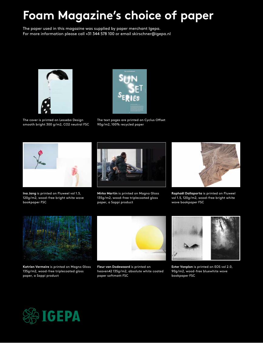
Fleur van Dodewaard is printed on heaven42 135g/m2, absolute white coated paper softmatt FSC
Raphaël Dallaporta is printed on Fluweel vol 1.5, 120g/m2, wood-free bright white wove bookpaper FSC
Katrien Vermeire is printed on Magno Gloss 135g/m2, wood-free triplecoated gloss paper, a Sappi product
Ina Jang is printed on Fluweel vol 1.5, 120g/m2, wood-free bright white wove bookpaper FSC
Ester Vonplon is printed on EOS vol 2.0, 90g/m2, wood-free bluewhite wove bookpaper FSC
The cover is printed on Lessebo Design smooth bright 300 g/m2, CO2 neutral FSC
The text pages are printed on Cyclus Offset 90g/m2, 100% recycled paper
Mirko Martin is printed on Magno Gloss 135g/m2, wood-free triplecoated gloss paper, a Sappi product
The paper used in this magazine was supplied by paper merchant Igepa. For more information please call +31 344 578 100 or email [email protected]
Foam Magazine’s choice of paper
Ivor Prickett is printed on Profibulk 1.1, 115g/m2, wood-free white bulky design paper FSC
Alberto Salván Zulueta is printed on heaven42 135g/m2, absolute white coated paper softmatt FSC
Jessica Eaton is printed on Fluweel vol 1.5, 120g/m2, wood-free bright white wove bookpaper FSC
Florian van Roekel is printed on heaven42 135g/m2, absolute white coated paper softgloss FSC
Alessandro Imbriaco is printed on heaven42 135g/m2, absolute white coated paper softmatt FSC
Gosha Rubchinskiy is printed on EOS vol 2.0, 90g/m2, wood-free bluewhite wove book-paper FSC
Renato Abreu is printed on Magno Gloss 135g/m2, wood-free triplecoated gloss paper, a Sappi product
Mayumi Hosokura is printed on Lessebo Smooth White vol 1.2, 115g/m2, CO2 neutral FSC
Lucas Blalock is printed on Magno Satin 135g/m2, wood-free tiplecoated demigloss paper, a Sappi product
Issue #28, Fall 2011
Editor-in-chiefMarloes Krijnen
Creative DirectorPjotr de Jong
EditorsCaroline von Courten, Marcel Feil, Pjotr de Jong, Marloes Krijnen
Managing EditorCaroline von Courten
Editorial InternDaria Tuminas
Magazine ManagerNiek van Lonkhuijzen
CommunicationMartine Holberton
Project ManagementFemke Papma, Nienke Sinnema
Art DirectorVandejong: Hamid Sallali
Design & LayoutVandejong: Esteban Berrios Vargas, Ayumi Higuchi, Hamid Sallali
TypographyVandejong: Esteban Berrios Vargas, Ayumi Higuchi
FontsLL Brown & Plantin MT Pro
Contributing Photographers and ArtistsRenato Abreu, Lucas Blalock, Raphaël Dallaporta, Fleur van Dodewaard, Jessica Eaton, Tim Gutt, Mayumi Hosokura, Alessandro Imbriaco, Ina Jang, Mirko Martin, Ivor Prickett, Florian van Roekel, Gosha Rubchinskiy, Alberto Salván Zulueta, Katrien Vermeire, Ester Vonplon
Cover PhotographBlue Paper, 2010 from the series In A World Without Words… © Ina Jang
Contributing WritersNick Compton, Marcel Feil, Anne- Celine Jaeger, Sebastian Hau
Copy EditorPittwater Literary Services,Amsterdam: Rowan Hewison
TranslationPaul Christensen, Iris Maher, Marion Schnelle, Liz Waters
Lithography & PrintingLecturis PrintingKalverstraat 72 5642 CJ Eindhoven -NL
BindingBinderij HexspoorLadonkseweg 75281 RN Boxtel – NL
PaperIgepa Nederland B.V.De Geer 104004 LT Tiel - NL
Editorial AddressFoam MagazineKeizersgracht 6091017 DS Amsterdam – NLT +31 20 551 65 00F +31 20 551 65 [email protected]
AdvertisingNiek van LonkhuijzenFoam MagazinePO Box 922921090 AG Amsterdam – NLT +31 20 462 20 62F +31 20 462 20 [email protected]
Subscriptions Hexspoor Support CenterLadonkseweg 95281 RN Boxtel – NLT +31 41 163 34 [email protected]
Subscriptions include 4 issues per year € 70,– excluding VAT and postageStudents and Club Foam members receive 20% discount
Single issue € 17,50Back issues (# 2 – 27) € 12,50Excluding VAT and postageFoam Magazine # 1 is out of printwww.foam.org / shop
PublisherFoam MagazinePO Box 922921090 AG Amsterdam – [email protected]
ISSN 1570-4874ISBN 978-90-70516-23-9
© photographers, authors, Foam Magazine BV, Amsterdam, 2011.All photographs and illustration material is the copyright property
of the photographers and /or their estates, and the publications in which they have been published. Every effort has been made to con-tact copyright holders. Any copy-right holders we have been unable to reach or to whom inaccurate acknowledgement has been made are invited to contact the publis-hers at [email protected]
All rights reserved. No part of this publication may be reproduced or transmitted in any form or by any means, electronic or mechanical, including photo-copy, recording or otherwise without prior written permission of the publishers. Alt-hough the highest care is taken to make the information contained in Foam Magazine as accurate as possible, neither the publishers nor the authors can accept any responsibility for damage, of any nature, resulting from the use of this information.
DistributionThe NetherlandsBetapress BVT + 31 16 145 78 00
Great BritainCentral [email protected]
Export Press supplies to the following [email protected]
AustraliaSpeedimpex [email protected]
AustriaMorawa [email protected]
BelgiumImapress [email protected]
DenmarkInterpress [email protected]
FinlandAketeeminen Kirjakauppa [email protected]
FranceImport [email protected]
GermanyW.E Saarbach [email protected]
Great BritainComag T +44 18 95433600
GreeceHellenic Distribution [email protected]
HongkongForeign Press Distributors [email protected]
ItalyIntercontinental [email protected]
LebanonLevant [email protected]
New ZealandMag [email protected]
NorwayInterpress [email protected]
PolandInternews [email protected]
PortugalInternational [email protected]
SpainComercial [email protected]
SwedenSvenska Interpress [email protected]
SwitzerlandMotto [email protected]
TaiwanMulti-Arts [email protected]
USASource [email protected]
MMR (USA)[email protected]
Speedimpex (USA)[email protected]
For distribution in other territories please contact Export Press.
Colophonfo
am m
agaz
ine
# 28
tal
ent
264
PH
OTO
VIV
IAN
E S
AS
SE
N. C
Ou
rT
ESy
ST
EV
EN
SO
N, C
AP
E T
Ow
N A
Nd
MO
TIV
E G
All
Er
y, A
MST
Er
dA
M —
Ar
T d
IrE
CT
ION
ClÉ
O C
HA
ru
ET
10 . 13 NOV 2011GRAND PALAIS
WWW.PARISPHOTO.FR
Avec le soutien de / With the support of
FOAM 230x300_Sassen.indd 2 25/07/11 14:30
#28 TalentFall 2011€17,50