Embed Size (px)
Citation preview

Presenting information
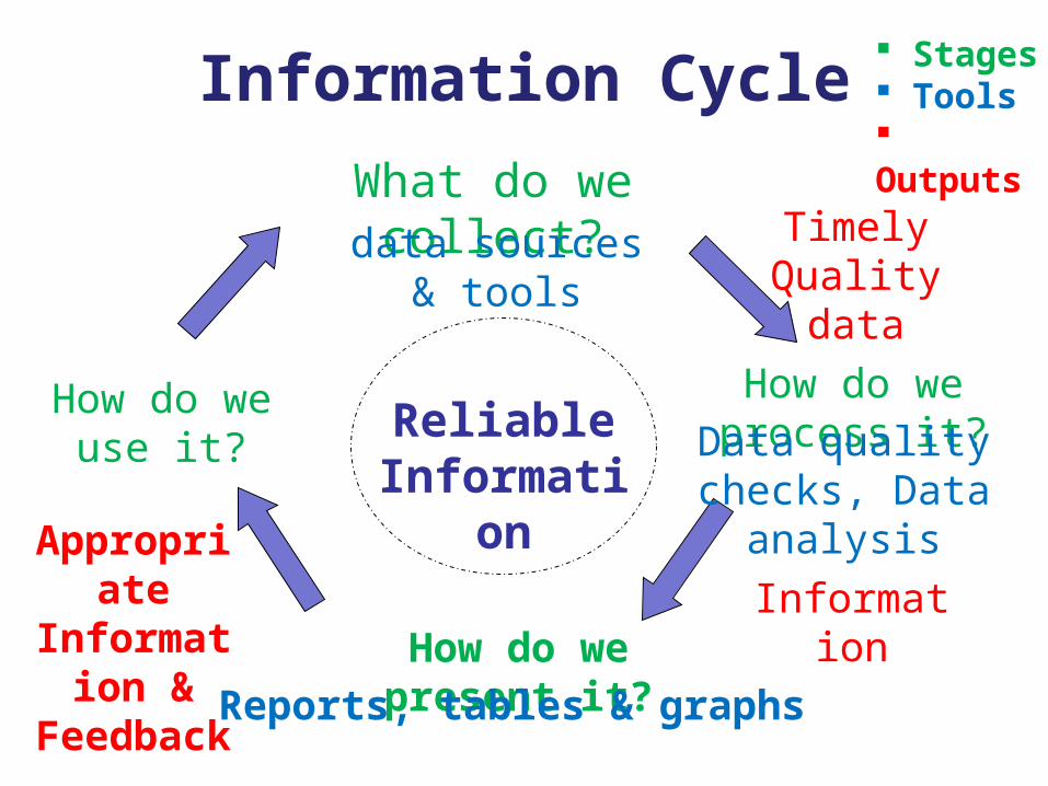
How do we process it?
How do we present it?
How do we use it? Reliable Information
Information Cycle
What do we collect?
Stages Tools Outputs
data sources & tools
Timely Quality data
Data quality checks, Data
analysis
Information
Reports, tables & graphs
Appropriate Information & Feedback
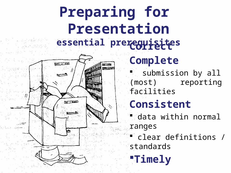
Preparing for Presentationessential prerequisites
CorrectComplete submission by all (most) reporting facilities
Consistent data within normal ranges clear definitions / standards
Timely
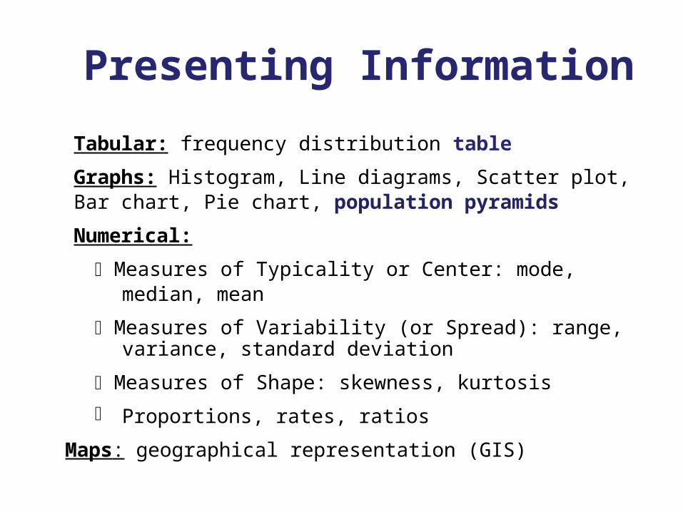
Presenting Information
Tabular: frequency distribution table
Graphs: Histogram, Line diagrams, Scatter plot, Bar chart, Pie chart, population pyramids
Numerical:
Measures of Typicality or Center: mode, median, mean
Measures of Variability (or Spread): range, variance, standard deviation
Measures of Shape: skewness, kurtosis
Proportions, rates, ratios
Maps: geographical representation (GIS)
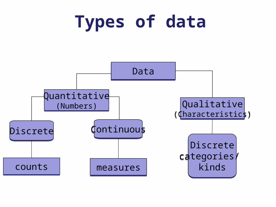
DataData
Quantitative(Numbers)
Quantitative(Numbers) Qualitative
(Characteristics)Qualitative
(Characteristics)
DiscreteDiscrete ContinuousContinuous
Types of data
Discretecategories/
kinds
Discretecategories/
kindscountscounts measuresmeasures
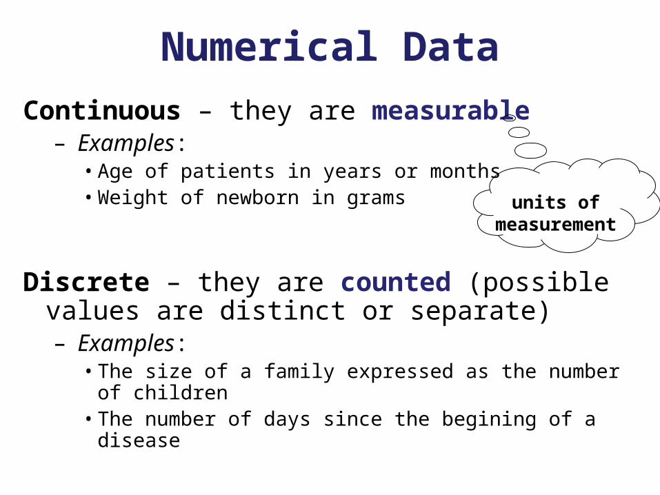
Numerical DataContinuous – they are measurable
– Examples:• Age of patients in years or months• Weight of newborn in grams
Discrete – they are counted (possible values are distinct or separate)– Examples:
• The size of a family expressed as the number of children
• The number of days since the begining of a disease
units of measurement
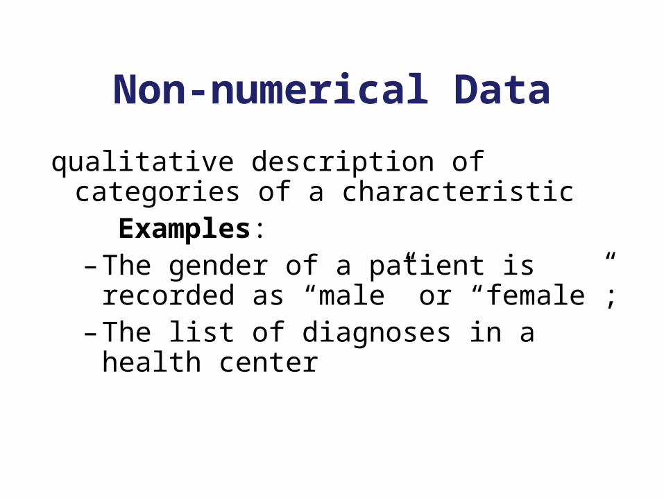
Non-numerical Data
qualitative description of categories of a characteristic
Examples:– The gender of a patient is recorded as
“male” or “female”;– The list of diagnoses in a health center
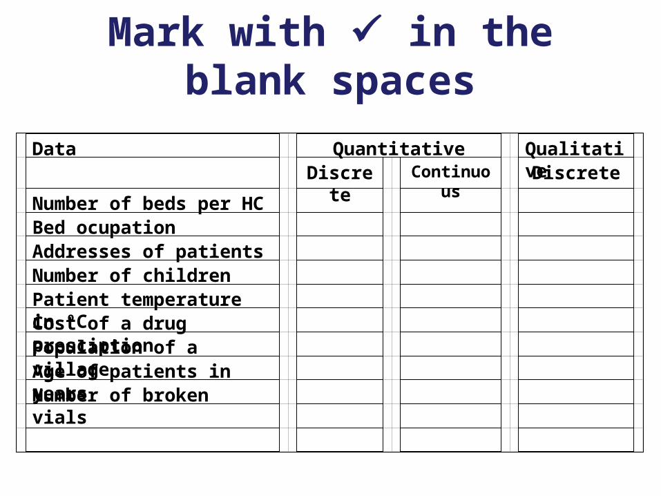
Mark with in the blank spaces
Data Quantitative Qualitative Discrete Continuous Discrete
Number of beds per HC Bed ocupation Addresses of patients Number of children Patient temperature in ºC Cost of a drug presciption Population of a village Age of patients in years Number of broken vials
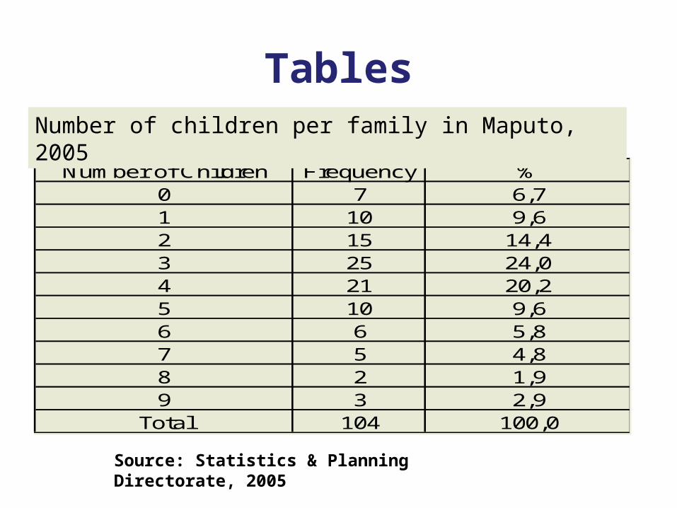
Tables
Number of Children Frequency %0 7 6,71 10 9,62 15 14,43 25 24,04 21 20,25 10 9,66 6 5,87 5 4,88 2 1,99 3 2,9
Total 104 100,0
Number of children per family in Maputo, 2005
Source: Statistics & Planning Directorate, 2005
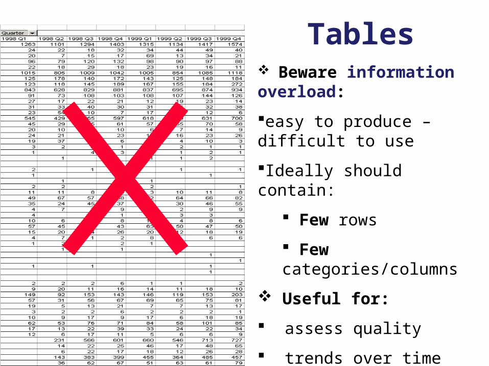
Tables Beware information overload:
easy to produce – difficult to use
Ideally should contain:
Few rows
Few categories/columns
Useful for:
assess quality
trends over time
make comparisons
identify outliers, gaps
GRAPHS(a visual representation of data)
Advantages:– Information is instantly conveyed
– Data are presented clearly and simply
– Can expose relationships and patterns
– Detect trends over time
– Can be used to emphasise information
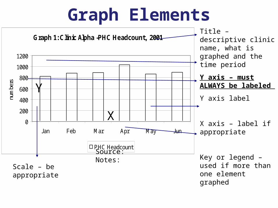
Graph ElementsGraph 1: Clinic Alpha -PHC Headcount, 2001
0
200
400
600
800
1000
1200
Jan Feb Mar Apr May Jun
num
bers
PHC Headcount
X
Y
Title – descriptive clinic name, what is graphed and the time period
Y axis – must ALWAYS be labeled
Y axis label
X axis – label if appropriate
Key or legend – used if more than one element graphed
Scale – be appropriate
Source: Notes:
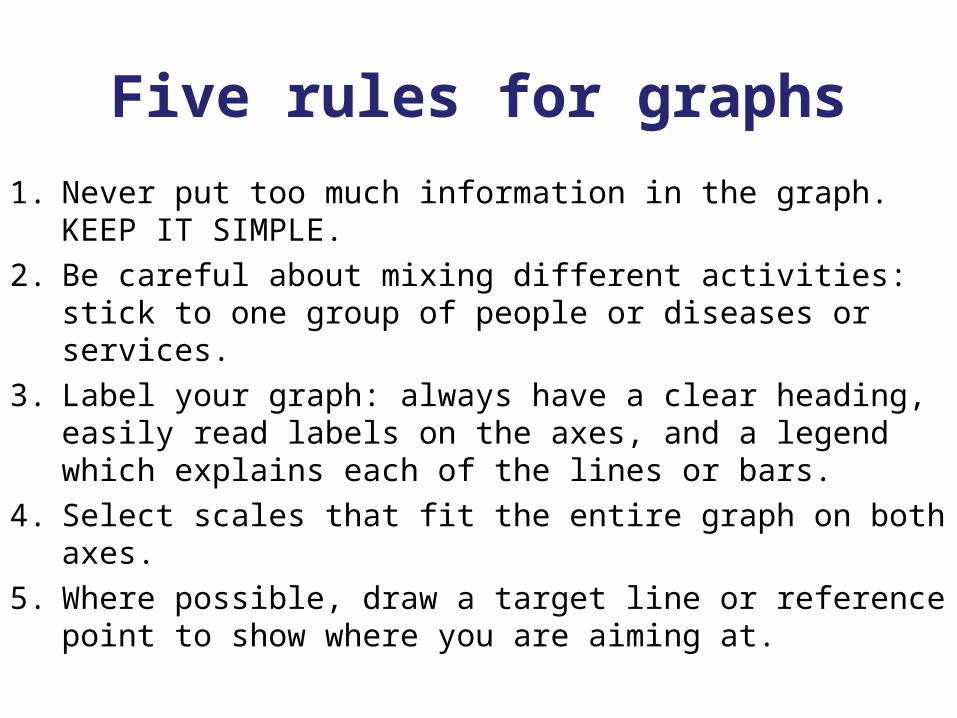
Five rules for graphs
1. Never put too much information in the graph. KEEP IT SIMPLE.2. Be careful about mixing different activities: stick to one group of
people or diseases or services.3. Label your graph: always have a clear heading, easily read
labels on the axes, and a legend which explains each of the lines or bars.
4. Select scales that fit the entire graph on both axes.5. Where possible, draw a target line or reference point to show
where you are aiming at.
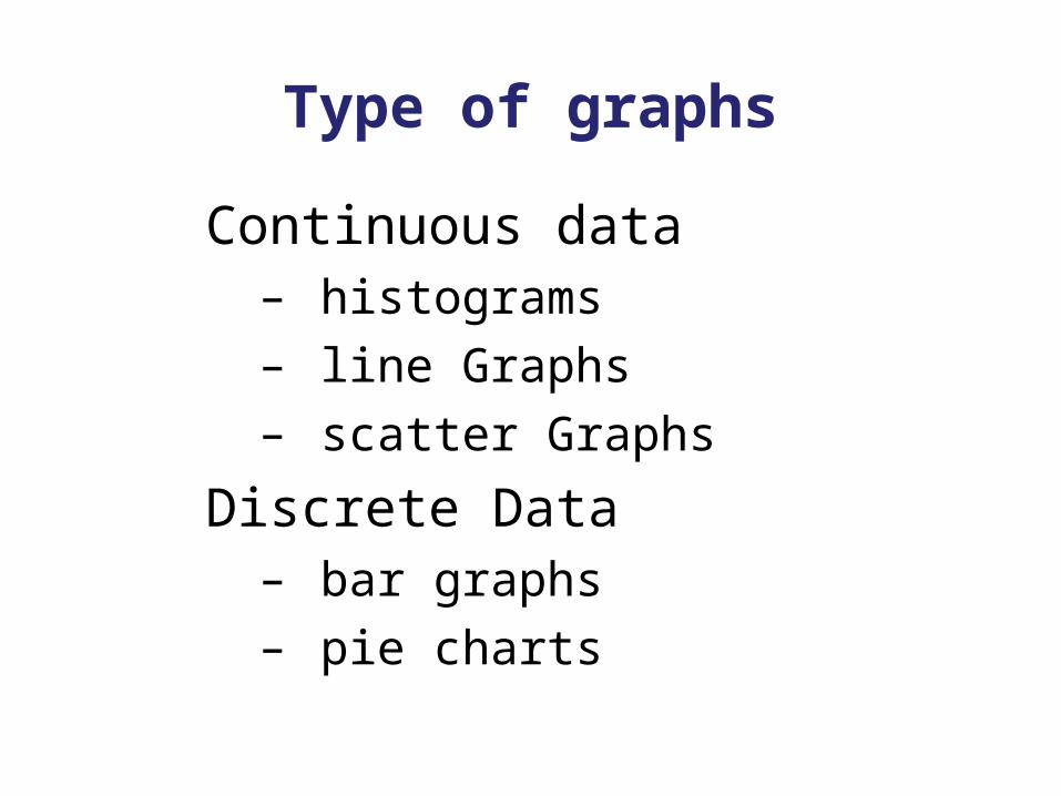
Type of graphs
Continuous data – histograms
– line Graphs
– scatter Graphs
Discrete Data– bar graphs
– pie charts
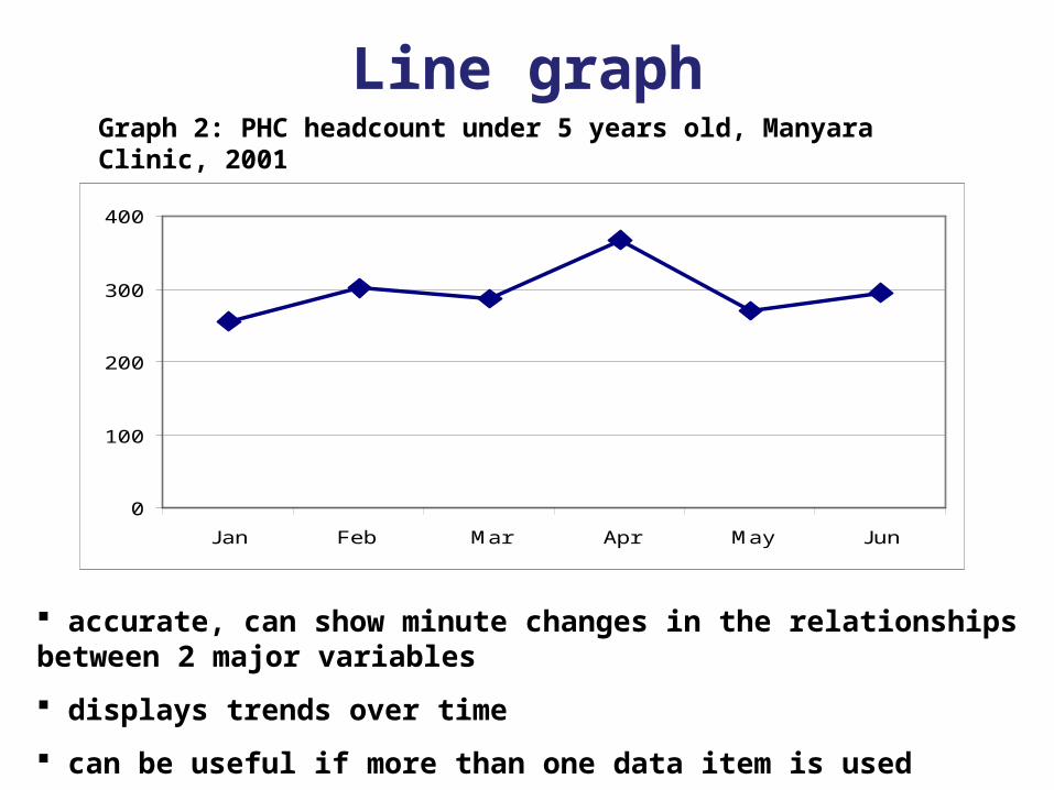
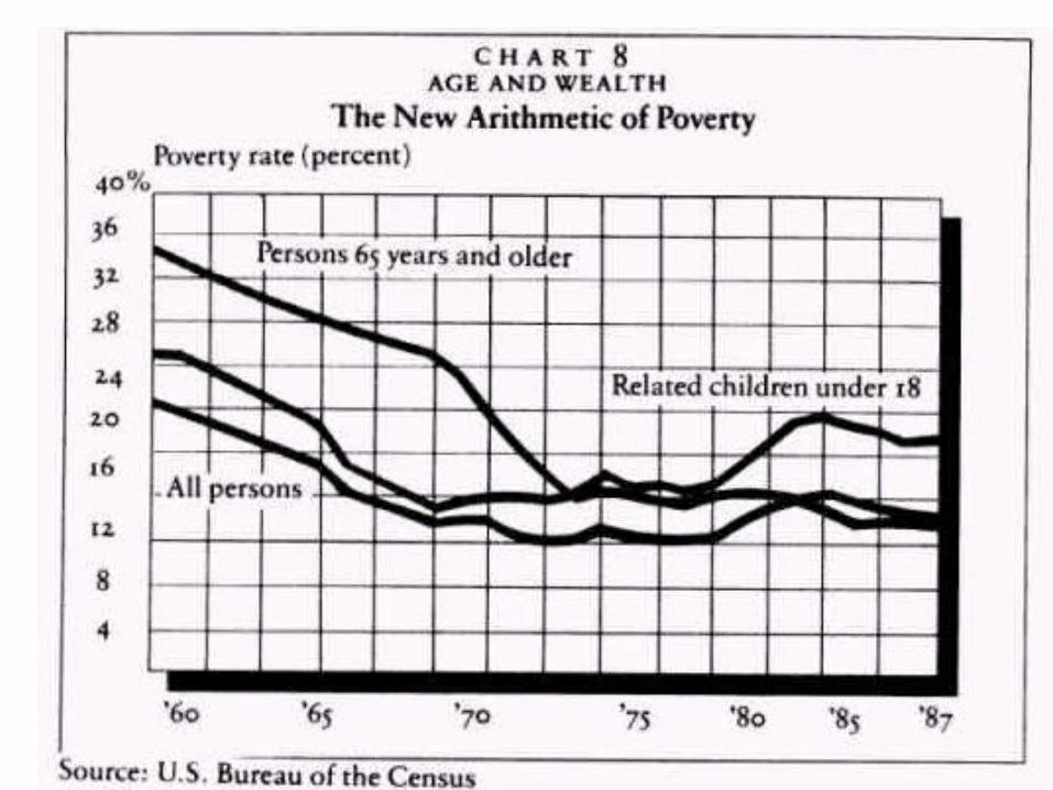
Line graph
0
100
200
300
400
Jan Feb Mar Apr May Jun
accurate, can show minute changes in the relationships between 2 major variables
displays trends over time
can be useful if more than one data item is used
Graph 2: PHC headcount under 5 years old, Manyara Clinic, 2001
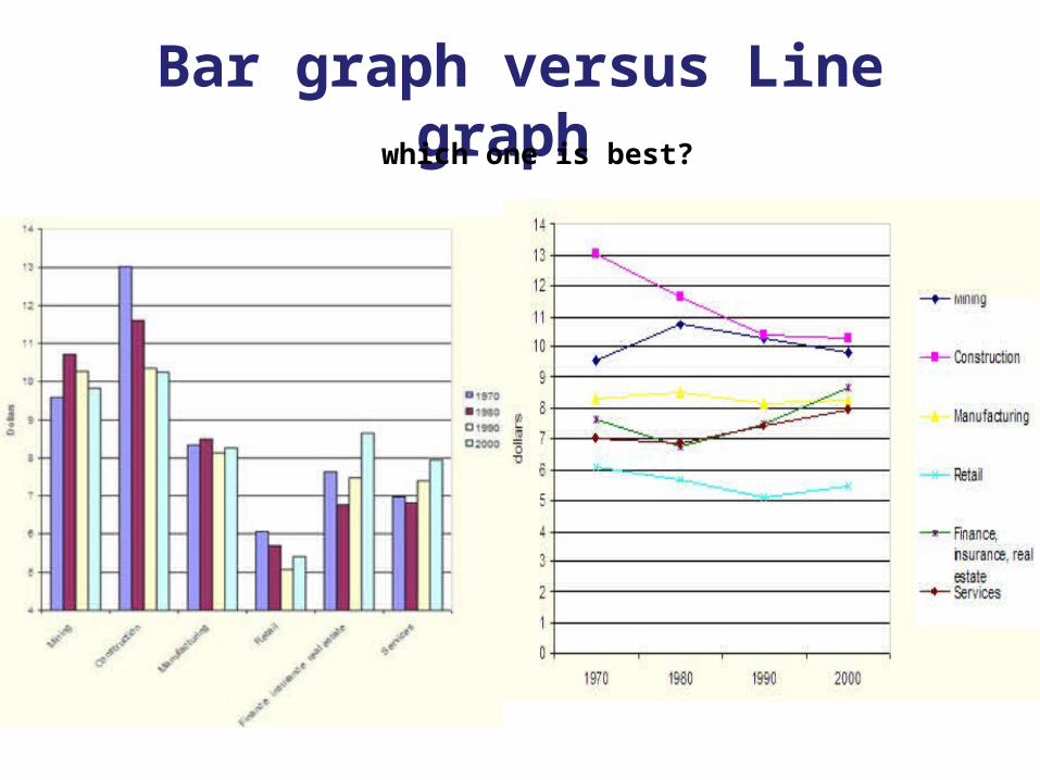
Bar graph versus Line graph which one is best?
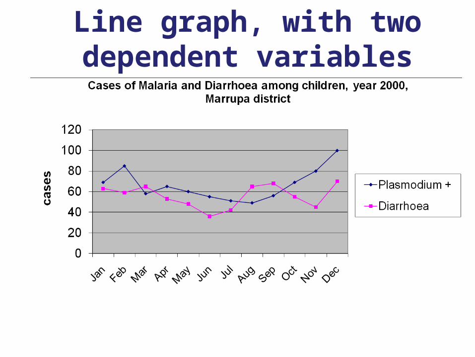
Line graph, with two dependent variables
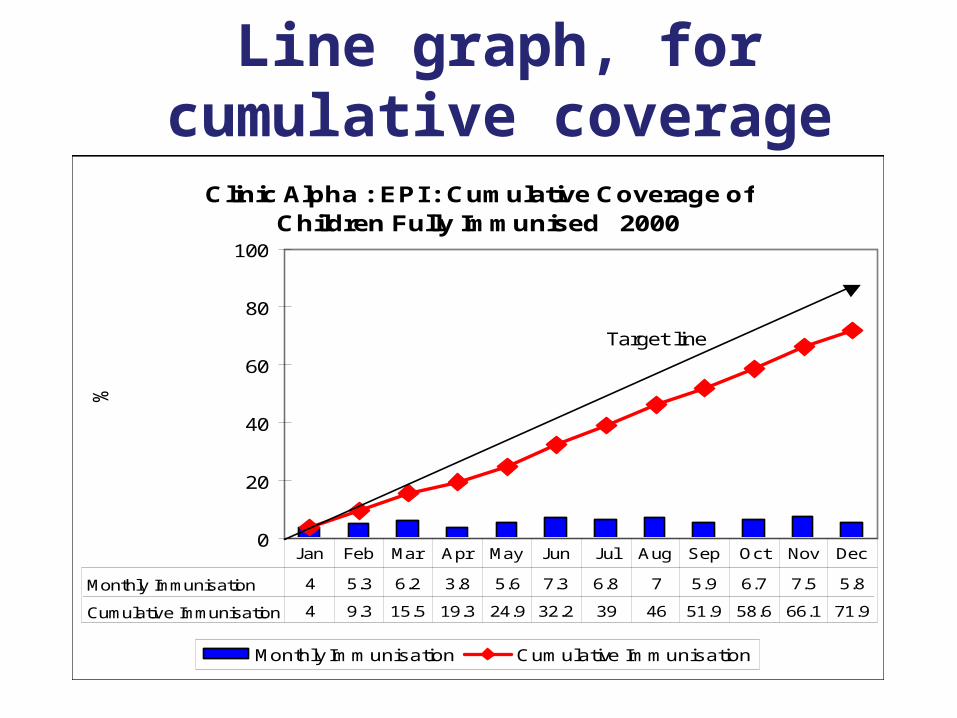
Line graph, for cumulative coverage
Clinic Alpha : EPI : Cumulative Coverage of Children Fully Immunised 2000
0
20
40
60
80
100
%
Monthly Immunisation Cumulative Immunisation
Monthly Immunisation 4 5.3 6.2 3.8 5.6 7.3 6.8 7 5.9 6.7 7.5 5.8
Cumulative Immunisation 4 9.3 15.5 19.3 24.9 32.2 39 46 51.9 58.6 66.1 71.9
Jan Feb Mar Apr May Jun Jul Aug Sep Oct Nov Dec
Target line
Line graph, for cumulative coverage Simple and effective monitoring tool
Used when targets are set for a year i.e. immunization, antenatal coverage, etc.
Each month, data is graphed individually and also added to the previous month
A target is set, a target line is drawn and progress is monitored with respect to the target line
Graphs for sets of discrete data
pie chartsbar graphs
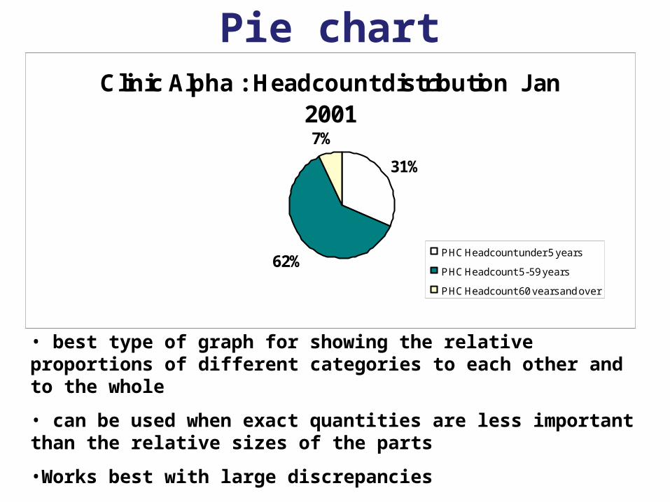
Pie chartClinic Alpha : Headcount distribution Jan
20017%
62%
31%
PHC Headcount under 5 years
PHC Headcount 5-59 years
PHC Headcount 60 years and over
• best type of graph for showing the relative proportions of different categories to each other and to the whole
• can be used when exact quantities are less important than the relative sizes of the parts
•Works best with large discrepancies
•Only for data that adds up to a total (100%)
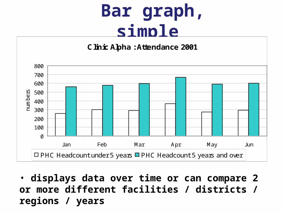
Bar graph, simple Clinic Alpha : Attendance 2001
0
100
200
300
400
500
600
700
800
Jan Feb Mar Apr May Jun
num
bers
PHC Headcount under 5 years PHC Headcount 5 years and over
• displays data over time or can compare 2 or more different facilities / districts / regions / years
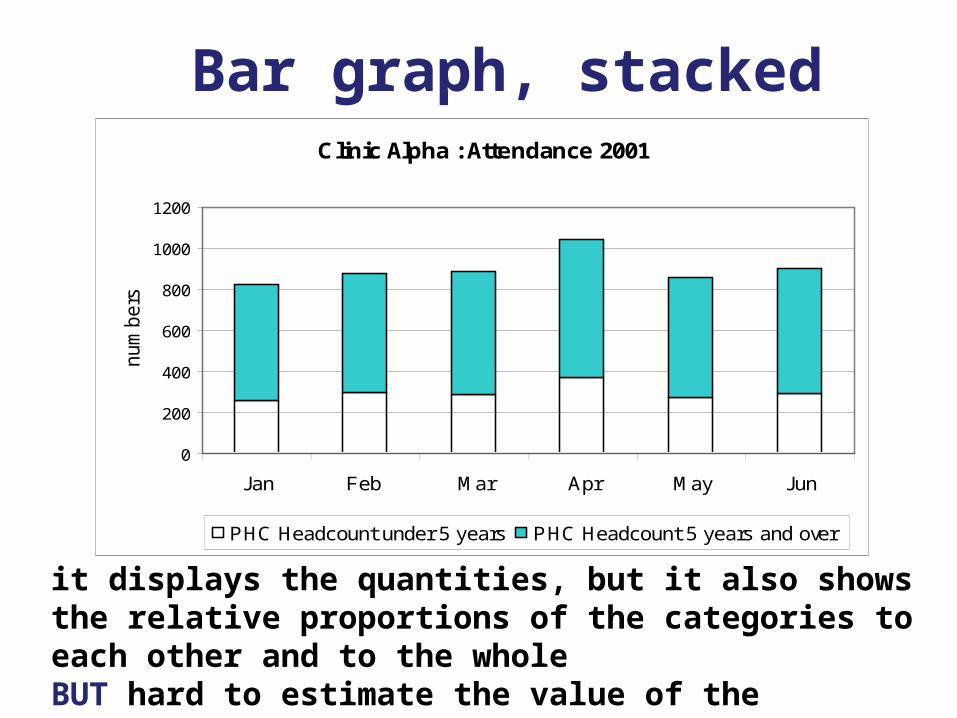
Bar graph, stacked Clinic Alpha : Attendance 2001
0
200
400
600
800
1000
1200
Jan Feb Mar Apr May Jun
num
bers
PHC Headcount under 5 years PHC Headcount 5 years and over
it displays the quantities, but it also shows the relative proportions of the categories to each other and to the wholeBUT hard to estimate the value of the variables at the top
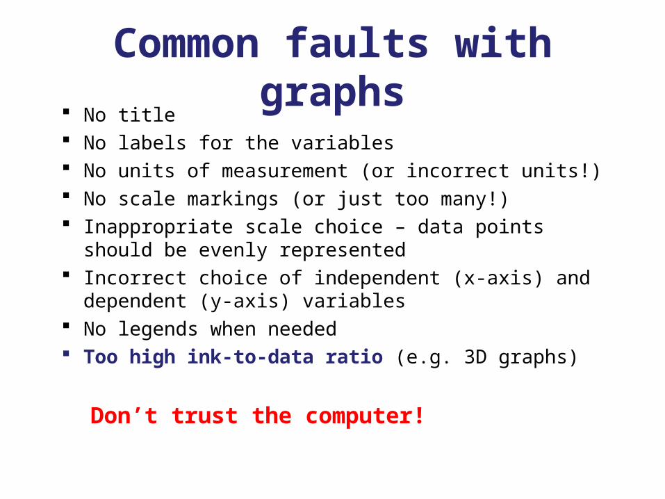
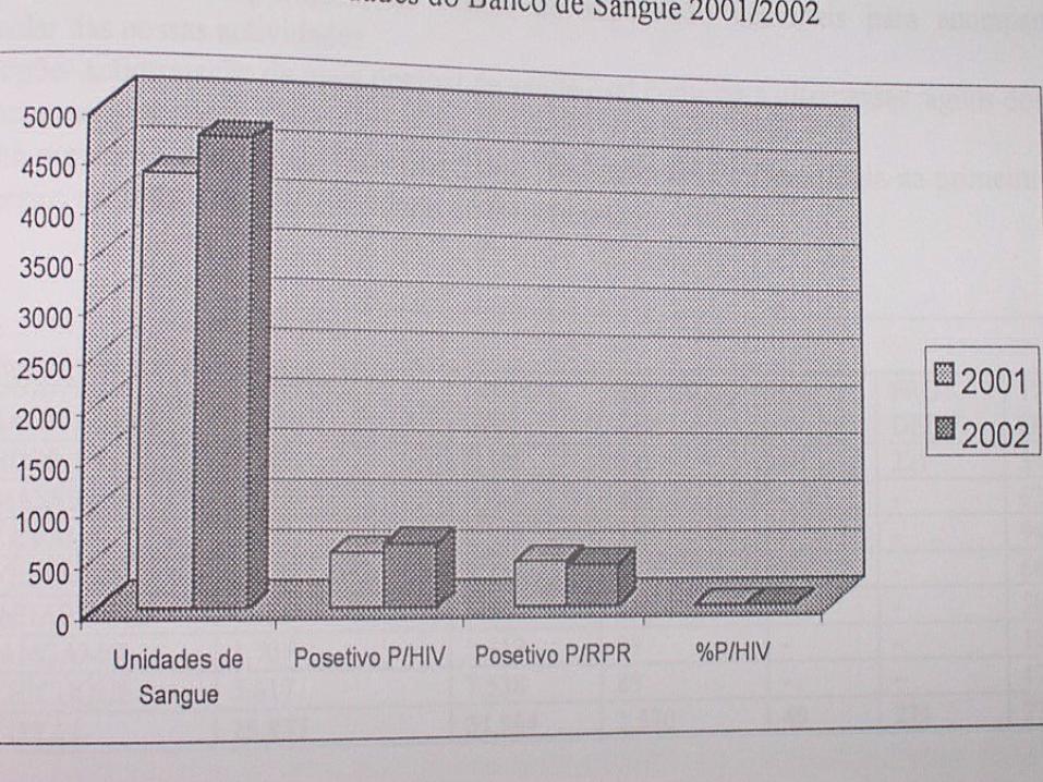
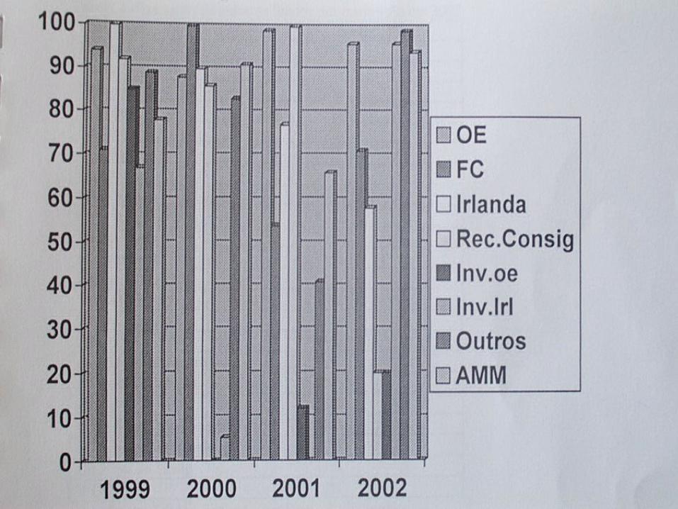
Common faults with graphs No title No labels for the variables No units of measurement (or incorrect units!) No scale markings (or just too many!) Inappropriate scale choice – data points should be
evenly represented Incorrect choice of independent (x-axis) and
dependent (y-axis) variables No legends when needed Too high ink-to-data ratio (e.g. 3D graphs)
Don’t trust the computer!
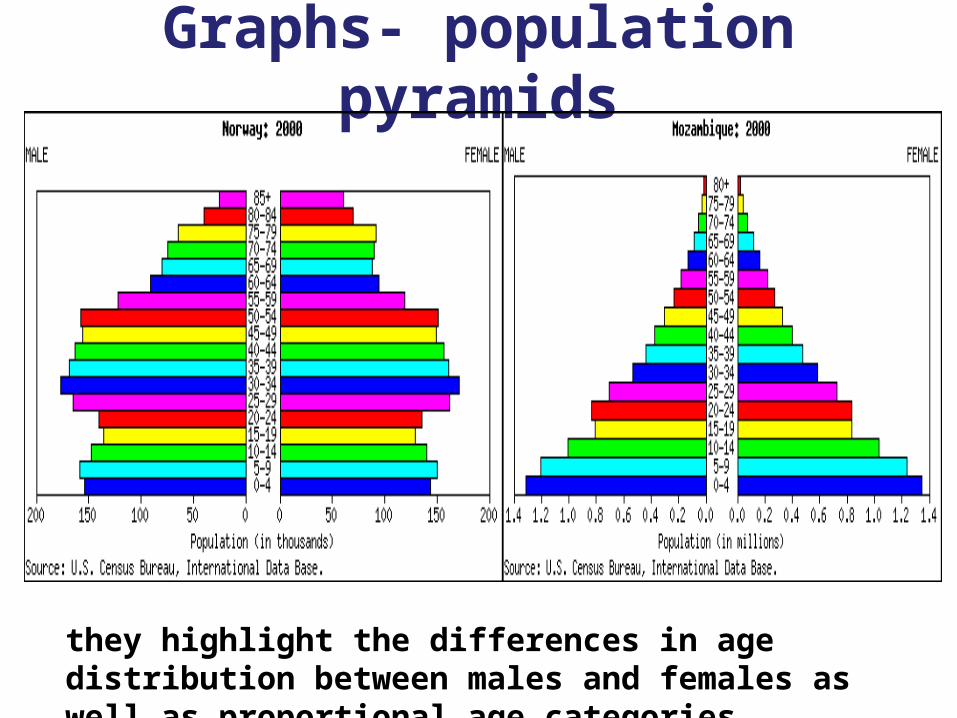
Graphs- population pyramids
they highlight the differences in age distribution between males and females as well as proportional age categories
BADGRAPHS YOU SHOULD NOT
BUILD!
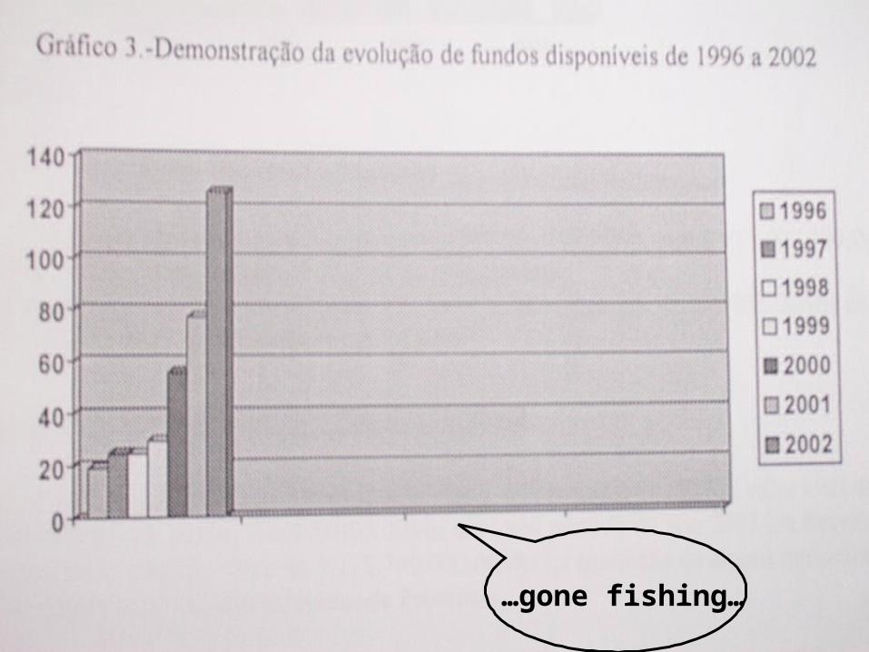
…gone fishing…