Embed Size (px)
DESCRIPTION
preliminary college magazine
Citation preview


• This is the magazine I have decided to look at as part of my magazine research. I chose this magazine because it is simple and easier to access.• It contains a main headline, subtitles, barcode and date, and one main image. • The contents of the cover is laid out spaciously on the page to give it simplicity.•I would consider using a similar style for my own magazine cover, but I think it may be a little risky for me to do as its so simple. If it looks too simple and not right, it may look too unfinished and boring.

I chose to write about this student magazine cover because I like the use of colour. Its bright and vibrant which I think really appeals to a student because they're more likely to opt for a more formal looking magazine to read as they might be tired of reading text books from lessons etc. I would like to use a similar colour palette on my own magazine cover, it would look exciting and interesting, and that’s how I want to my cover to come across to my target audience. On the other hand I’m not too keen on the silhouette style images. I like the composition of the images, but I would like to use actual photographs of people where you can see who they are. Lastly, I like the format, fonts and how the titles and cover lines have been placed. It’s a lot how I would imagine my own cover looking like, but obviously in my own styles and fonts etc.

• This font is a san serif font because it has no arms or feet. I like this font because its curved and cartoon like which I think would be good for my target audience. The bad thing is that it may come across too cartoon-like to some and might look immature and for a younger target audience.
This font is a serif type of font and this is just because it does have arms and feet. I like the block colour of the font and the curves, but overall I do not think I can use a font similar to this because it looks too formal and professional, and its not the look I want to get across to my target audience.
I really like this font because it is a san serif font, it has a mix of curvy and non-curvy letters which really makes it look personal to the audience. Because my audience are aimed at students whom are likely to be mostly teenagers, I think the graffiti in the background of this found would work well with all scenarios and would easily appeal to all students.

This is what I would call an original scale image. It is not too close up, nor is it showing any part of the body below the waist so I cannot be called a medium shot.The good things about using original images are so that it gives out a real impression to the audience of the person or subject matter. A negative thing is that it may look boring and uninteresting because nothing in particular has been done to the image.I think I might use an original image because it will allow me to experiment more with fonts and backgrounds. This is because a simple image cannot look OTT with the rest of the subtitles or backgrounds etc…

This is a medium close up. It is basically a zoomed in version of a original close up. The good points of using medium close ups are that it shows intimacy of detail. Magazine covers may use medium close ups to go with intimate headlines and stories.In this case this image can be used to express students disappointment in sandwiches!The bad points of a close up on a cover is that it prevents you being able to use other images because it may look like its too much together, and a close up is usually quite large meaning that it can take up lots of space on the actual cover.I don’t think I would use a close up image because of that reason. I want to broaden my possibilities with experimenting with the cover.

This is the design of how I want my cover to be like.I used the idea of having san serif font, in bubble writing. I want to use an original image so I


This is my completed magazine cover. I stuck to my idea of using a medium shot as my main cover image based on the fact of the subject matter of graffiti. It would have been much easier to use a medium shot than any other shot to get the graffiti on the page. I have only two sub titles because I did want to over power the cover as I have already got so much going on in the background image. I used the colours because they are funky and bright, and I know that they would appeal to my target audience.
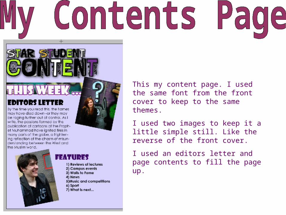
This my content page. I used the same font from the front cover to keep to the same themes.I used two images to keep it a little simple still. Like the reverse of the front cover.I used an editors letter and page contents to fill the page up.


![Preliminary task, school magazine compared to music[1]](https://img.pdfslide.us/doc/110x75/55a0f1561a28ab546a8b47d5/preliminary-task-school-magazine-compared-to-music1.jpg)

