Embed Size (px)
Citation preview

© C
opyr
ight
200
3 KO
NICA
MIN
OLTA
SEN
SING
, INC
. All
right
s re
serv
ed.
An infinite number of colors surround us in our everyday lives. We all take color pretty much for granted, but it has a wide range of roles in our daily lives: not only does it influence our tastes in food and other purchases, the color of a person‘s face can also tell us about that person‘s health. Even though colors affect us so much and their importance continues to grow, our knowledge of color and its control is often insufficient, leading to a variety of problems in deciding product color or in business transactions involving color. Since judgment is often performed according to a person‘s impression or experience, it is impossible for everyone to control color accurately using common, uniform standards. Is there a way in which we can express a given color* accurately, describe that color to another person, and have that person correctly reproduce the color we perceive? How can color communication between all fields of industry and study be performed smoothly? Clearly, we need more information and knowledge about color.
* In this booklet, color will be used as referring to the color of an object.
PRECISE COLOR COMMUNICATION
Knowing color.Knowing by color.In any environment,color attracts attention.
COLOR CONTROL FROM PERCEPTION TO INSTRUMENTION
The essentials of imaging
© C
opyr
ight
200
3 KO
NICA
MIN
OLTA
SEN
SING
, INC
. All
right
s re
serv
ed.
© C
opyr
ight
200
3 KO
NICA
MIN
OLTA
SEN
SING
, INC
. All
right
s re
serv
ed.
PRECISE COLOR COMMUNICATION
}} Part I Let‘s study color.
Even when we just look around, a wide variety of colors leap into our eyes. We are surrounded by an infinite variety of colors in our daily lives. However, unlike length or weight, there is no physical scale for measuring color, making it unlikely that everyone will answer in the same way when asked what a certain color is. For example, if we say “blue ocean” or “blue sky” to people, each individual will imagine different blue colors, because their color sensitivity and past experiences will be different. This is the problem with color. So let‘s study a little and determine what kind of color information would be useful.
© C
opyr
ight
200
3 KO
NICA
MIN
OLTA
SEN
SING
, INC
. All
right
s re
serv
ed.
}} Contents
}} What color is this apple?
}} A color expression often means ten different colors to ten different people.
}} Two red balls. How would you describe the differences between their colors to someone?
}} Hue. Lightness. Saturation. The world of color is a mixture of these three attributes.
}} Hue, lightness, saturation. Let‘s create a color solid.
}} By creating scales for hue, lightness, and saturation, we can measure color numerically.
}} Let‘s look at some color spaces.···I
}} Let‘s look at some color spaces.···II
}} Let‘s look at some color spaces.···III
}} Let‘s measure various colors with a colorimeter.
}} Colorimeters excel at reporting even minute color differences.
}} Even if colors look the same to the human eye, measurements with a colorimeter
can point out slight differences
}} Features of colorimeters
© C
opyr
ight
200
3 KO
NICA
MIN
OLTA
SEN
SING
, INC
. All
right
s re
serv
ed.
PRECISE COLOR COMMUNICATION
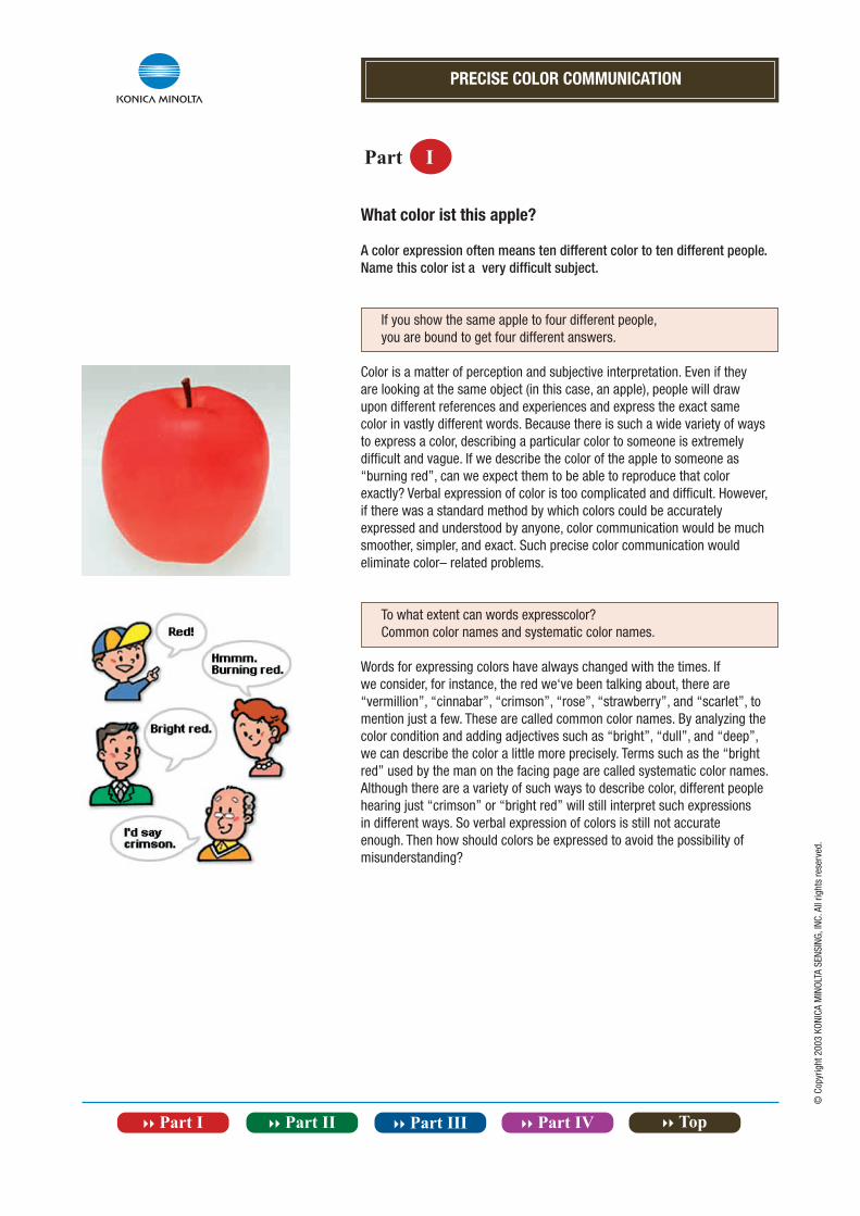
What color ist this apple?
A color expression often means ten different color to ten different people.Name this color ist a very difficult subject.
If you show the same apple to four different people,you are bound to get four different answers.
Color is a matter of perception and subjective interpretation. Even if they are looking at the same object (in this case, an apple), people will draw upon different references and experiences and express the exact same color in vastly different words. Because there is such a wide variety of ways to express a color, describing a particular color to someone is extremely difficult and vague. If we describe the color of the apple to someone as “burning red”, can we expect them to be able to reproduce that color exactly? Verbal expression of color is too complicated and difficult. However, if there was a standard method by which colors could be accurately expressed and understood by anyone, color communication would be much smoother, simpler, and exact. Such precise color communication would eliminate color– related problems.
To what extent can words expresscolor?Common color names and systematic color names.
Words for expressing colors have always changed with the times. If we consider, for instance, the red we‘ve been talking about, there are “vermillion”, “cinnabar”, “crimson”, “rose”, “strawberry”, and “scarlet”, to mention just a few. These are called common color names. By analyzing the color condition and adding adjectives such as “bright”, “dull”, and “deep”, we can describe the color a little more precisely. Terms such as the “bright red” used by the man on the facing page are called systematic color names. Although there are a variety of such ways to describe color, different people hearing just “crimson” or “bright red” will still interpret such expressions in different ways. So verbal expression of colors is still not accurate enough. Then how should colors be expressed to avoid the possibility of misunderstanding?
Part I
PRECISE COLOR COMMUNICATION
Part I
© C
opyr
ight
200
3 KO
NICA
MIN
OLTA
SEN
SING
, INC
. All
right
s re
serv
ed.
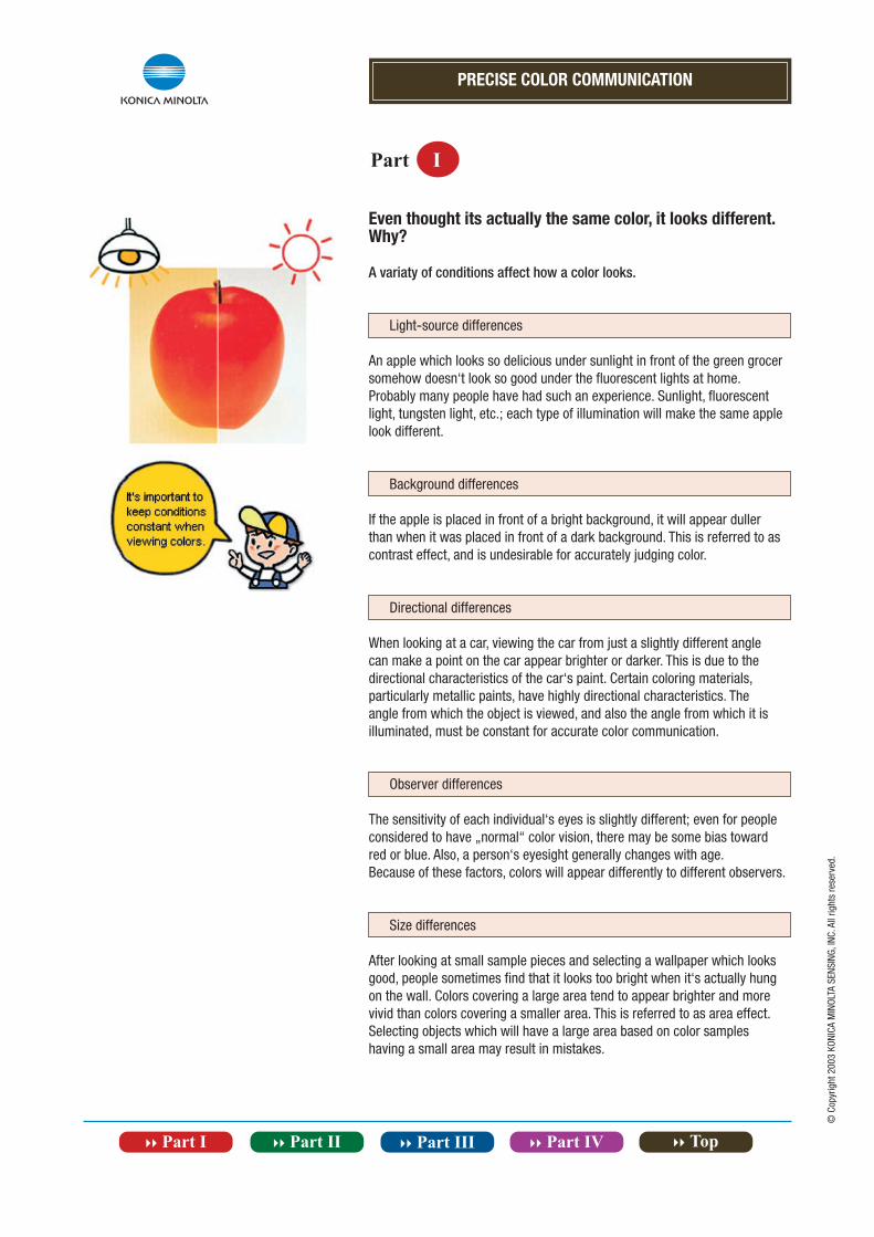
Even thought its actually the same color, it looks different. Why?
A variaty of conditions affect how a color looks.
Light-source differences
An apple which looks so delicious under sunlight in front of the green grocersomehow doesn‘t look so good under the fluorescent lights at home. Probably many people have had such an experience. Sunlight, fluorescent light, tungsten light, etc.; each type of illumination will make the same apple look different.
Background differences
If the apple is placed in front of a bright background, it will appear duller than when it was placed in front of a dark background. This is referred to as contrast effect, and is undesirable for accurately judging color.
Directional differences
When looking at a car, viewing the car from just a slightly different angle can make a point on the car appear brighter or darker. This is due to the directional characteristics of the car‘s paint. Certain coloring materials, particularly metallic paints, have highly directional characteristics. The angle from which the object is viewed, and also the angle from which it is illuminated, must be constant for accurate color communication.
Observer differences
The sensitivity of each individual‘s eyes is slightly different; even for peopleconsidered to have „normal“ color vision, there may be some bias toward red or blue. Also, a person‘s eyesight generally changes with age.Because of these factors, colors will appear differently to different observers.
Size differences
After looking at small sample pieces and selecting a wallpaper which looks good, people sometimes find that it looks too bright when it‘s actually hung on the wall. Colors covering a large area tend to appear brighter and more vivid than colors covering a smaller area. This is referred to as area effect. Selecting objects which will have a large area based on color samples having a small area may result in mistakes.
PRECISE COLOR COMMUNICATION
Part I
© C
opyr
ight
200
3 KO
NICA
MIN
OLTA
SEN
SING
, INC
. All
right
s re
serv
ed.
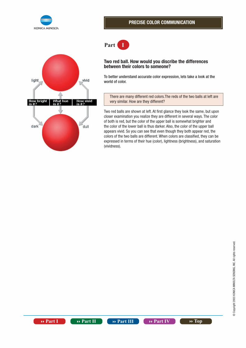
Two red ball. How would you discribe the differences between their colors to someone?
To better understand accurate color expression, lets take a look at the world of color.
There are many different red colors.The reds of the two balls at left are very similar. How are they different?
Two red balls are shown at left. At first glance they look the same, but upon closer examination you realize they are different in several ways. The color of both is red, but the color of the upper ball is somewhat brighter and the color of the lower ball is thus darker. Also, the color of the upper ball appears vivid. So you can see that even though they both appear red, the colors of the two balls are different. When colors are classified, they can be expressed in terms of their hue (color), lightness (brightness), and saturation (vividness).
PRECISE COLOR COMMUNICATION
Part I
© C
opyr
ight
200
3 KO
NICA
MIN
OLTA
SEN
SING
, INC
. All
right
s re
serv
ed.
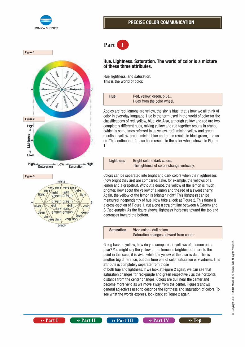
Hue. Lightness. Saturation. The world of color is a mixture of these three attributes.
Hue, lightness, and saturation:This is the world of color.
Hue Red, yellow, green, blue... Hues from the color wheel.
Apples are red, lemons are yellow, the sky is blue; that‘s how we all think of color in everyday language. Hue is the term used in the world of color for the classifications of red, yellow, blue, etc. Also, although yellow and red are two completely different hues, mixing yellow and red together results in orange (which is sometimes referred to as yellow-red), mixing yellow and green results in yellow-green, mixing blue and green results in blue-green, and so on. The continuum of these hues results in the color wheel shown in Figure 1.
Lightness Bright colors, dark colors. The lightness of colors change vertically.
Colors can be separated into bright and dark colors when their lightnesses (how bright they are) are compared. Take, for example, the yellows of a lemon and a grapefruit. Without a doubt, the yellow of the lemon is much brighter. How about the yellow of a lemon and the red of a sweet cherry. Again, the yellow of the lemon is brighter, right? This lightness can be measured independently of hue. Now take a look at Figure 2. This figure is a cross-section of Figure 1, cut along a straight line between A (Green) and B (Red-purple). As the figure shows, lightness increases toward the top and decreases toward the bottom.
Saturation Vivid colors, dull colors. Saturation changes outward from center.
Going back to yellow, how do you compare the yellows of a lemon and a pear? You might say the yellow of the lemon is brighter, but more to the point in this case, it is vivid, while the yellow of the pear is dull. This is another big difference, but this time one of color saturation or vividness. This attribute is completely separate from thoseof both hue and lightness. If we look at Figure 2 again, we can see that saturation changes for red-purple and green respectively as the horizontal distance from the center changes. Colors are dull near the center and become more vivid as we move away from the center. Figure 3 shows general adjectives used to describe the lightness and saturation of colors. To see what the words express, look back at Figure 2 again.
Figure 1
Figure 2
Figure 3
PRECISE COLOR COMMUNICATION
Part I
© C
opyr
ight
200
3 KO
NICA
MIN
OLTA
SEN
SING
, INC
. All
right
s re
serv
ed.
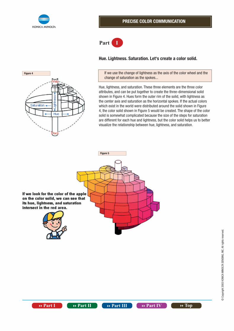
Hue. Lightness. Saturation. Let‘s create a color solid.
If we use the change of lightness as the axis of the color wheel and the change of saturation as the spokes...
Hue, lightness, and saturation. These three elements are the three color attributes, and can be put together to create the three-dimensional solid shown in Figure 4. Hues form the outer rim of the solid, with lightness as the center axis and saturation as the horizontal spokes. If the actual colors which exist in the world were distributed around the solid shown in Figure 4, the color solid shown in Figure 5 would be created. The shape of the color solid is somewhat complicated because the size of the steps for saturation are different for each hue and lightness, but the color solid helps us to better visualize the relationship between hue, lightness, and saturation.
Figure 4
Figure 5
PRECISE COLOR COMMUNICATION
Part I
© C
opyr
ight
200
3 KO
NICA
MIN
OLTA
SEN
SING
, INC
. All
right
s re
serv
ed.
By creating scales for hue, lightness, and saturation, we can measure color numerically.
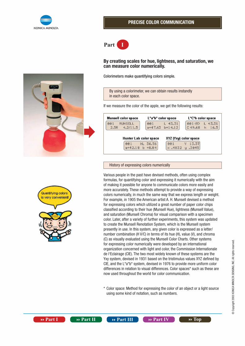
Colorimeters make quantifying colors simple.
By using a colorimeter, we can obtain results instandly in each color space.
If we measure the color of the apple, we get the following results:
History of expressing colors numerically
Various people in the past have devised methods, often using complex formulas, for quantifying color and expressing it numerically with the aim of making it possible for anyone to communicate colors more easily and more accurately. These methods attempt to provide a way of expressing colors numerically, in much the same way that we express length or weight. For example, in 1905 the American artist A. H. Munsell devised a method for expressing colors which utilized a great number of paper color chips classified according to their hue (Munsell Hue), lightness (Munsell Value), and saturation (Munsell Chroma) for visual comparison with a specimencolor. Later, after a variety of further experiments, this system was updated to create the Munsell Renotation System, which is the Munsell system presently in use. In this system, any given color is expressed as a letter/number combination (H V/C) in terms of its hue (H), value (V), and chroma (C) as visually evaluated using the Munsell Color Charts. Other systems for expressing color numerically were developed by an international organization concerned with light and color, the Commission Internationale de l‘Eclairage (CIE). The two most widely known of these systems are the Yxy system, devised in 1931 based on the tristimulus values XYZ defined by CIE, and the L*a*b* system, devised in 1976 to provide more uniform color differences in relation to visual differences. Color spaces* such as these are now used throughout the world for color communication.
* Color space: Method for expressing the color of an object or a light source using some kind of notation, such as numbers.
PRECISE COLOR COMMUNICATION
Part I
© C
opyr
ight
200
3 KO
NICA
MIN
OLTA
SEN
SING
, INC
. All
right
s re
serv
ed.
Let‘s look at some color spaces. · · · |
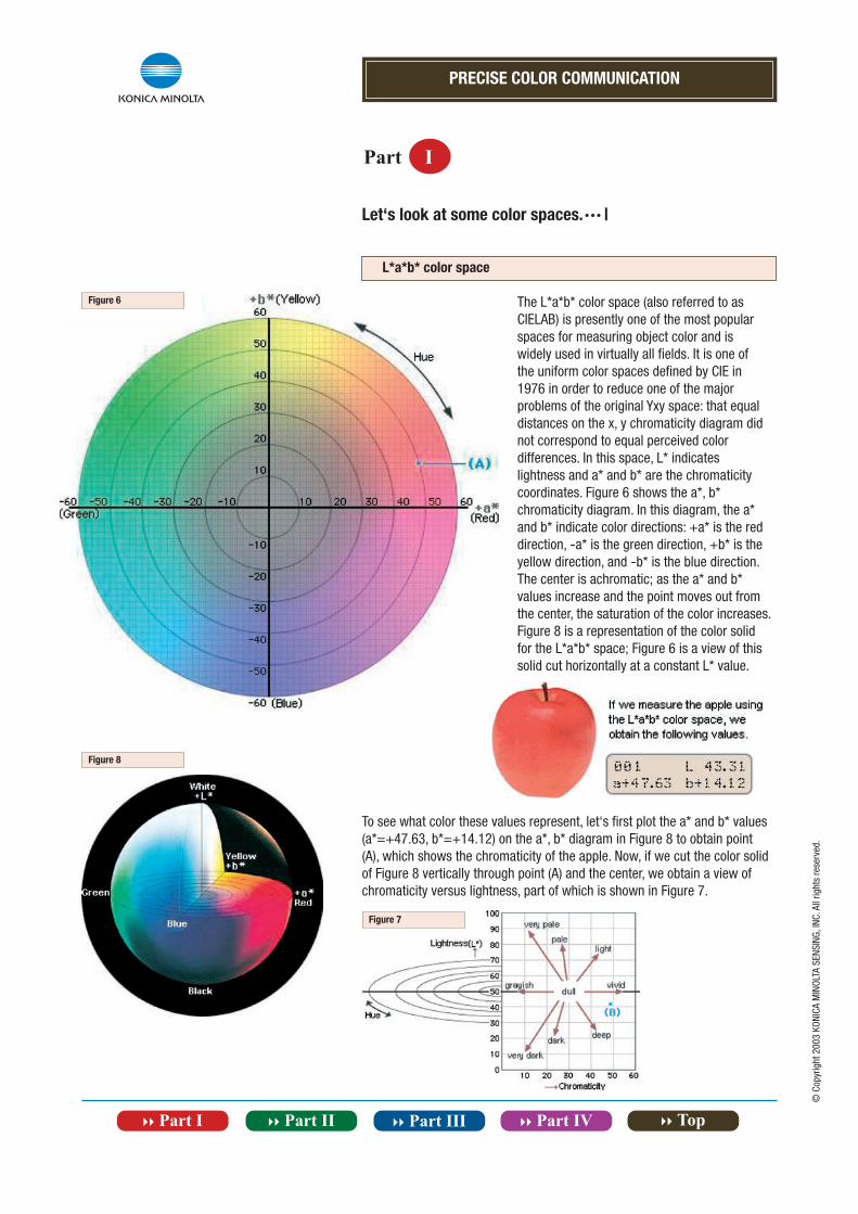
L*a*b* color space
The L*a*b* color space (also referred to asCIELAB) is presently one of the most popularspaces for measuring object color and iswidely used in virtually all fields. It is one ofthe uniform color spaces defined by CIE in1976 in order to reduce one of the majorproblems of the original Yxy space: that equaldistances on the x, y chromaticity diagram didnot correspond to equal perceived colordifferences. In this space, L* indicateslightness and a* and b* are the chromaticitycoordinates. Figure 6 shows the a*, b*chromaticity diagram. In this diagram, the a*and b* indicate color directions: +a* is the reddirection, -a* is the green direction, +b* is theyellow direction, and -b* is the blue direction.The center is achromatic; as the a* and b*values increase and the point moves out fromthe center, the saturation of the color increases.Figure 8 is a representation of the color solidfor the L*a*b* space; Figure 6 is a view of thissolid cut horizontally at a constant L* value.
To see what color these values represent, let‘s first plot the a* and b* values (a*=+47.63, b*=+14.12) on the a*, b* diagram in Figure 8 to obtain point (A), which shows the chromaticity of the apple. Now, if we cut the color solid of Figure 8 vertically through point (A) and the center, we obtain a view of chromaticity versus lightness, part of which is shown in Figure 7.
Figure 6
Figure 8
Figure 7
PRECISE COLOR COMMUNICATION
Part I
© C
opyr
ight
200
3 KO
NICA
MIN
OLTA
SEN
SING
, INC
. All
right
s re
serv
ed.
Let‘s look at some color spaces. · · · ||
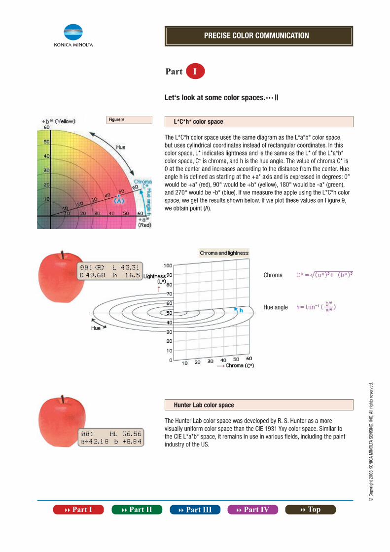
L*C*h* color space
The L*C*h color space uses the same diagram as the L*a*b* color space, but uses cylindrical coordinates instead of rectangular coordinates. In this color space, L* indicates lightness and is the same as the L* of the L*a*b* color space, C* is chroma, and h is the hue angle. The value of chroma C* is 0 at the center and increases according to the distance from the center. Hue angle h is defined as starting at the +a* axis and is expressed in degrees: 0° would be +a* (red), 90° would be +b* (yellow), 180° would be -a* (green), and 270° would be -b* (blue). If we measure the apple using the L*C*h color space, we get the results shown below. If we plot these values on Figure 9, we obtain point (A).
Hunter Lab color space
The Hunter Lab color space was developed by R. S. Hunter as a more visually uniform color space than the CIE 1931 Yxy color space. Similar to the CIE L*a*b* space, it remains in use in various fields, including the paint industry of the US.
Chroma
Hue angle
Figure 9
PRECISE COLOR COMMUNICATION
Part I
© C
opyr
ight
200
3 KO
NICA
MIN
OLTA
SEN
SING
, INC
. All
right
s re
serv
ed.
Let‘s look at some color spaces. · · · |||
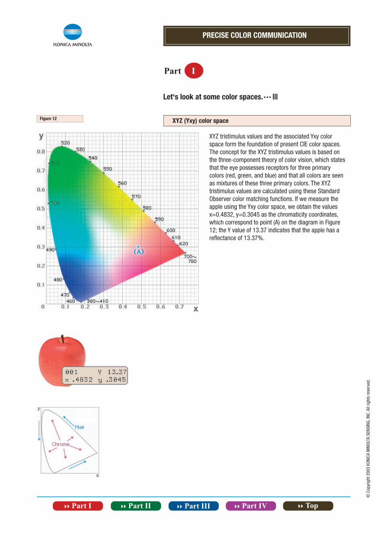
XYZ (Yxy) color space
XYZ tristimulus values and the associated Yxy color space form the foundation of present CIE color spaces. The concept for the XYZ tristimulus values is based on the three-component theory of color vision, which states that the eye possesses receptors for three primary colors (red, green, and blue) and that all colors are seen as mixtures of these three primary colors. The XYZ tristimulus values are calculated using these Standard Observer color matching functions. If we measure the apple using the Yxy color space, we obtain the values x=0.4832, y=0.3045 as the chromaticity coordinates,which correspond to point (A) on the diagram in Figure 12; the Y value of 13.37 indicates that the apple has a reflectance of 13.37%.
Figure 12
PRECISE COLOR COMMUNICATION
Part I
Tile
Rubber
Plastic
Printing
Textiles
Paint
indicates the measurement point
© C
opyr
ight
200
3 KO
NICA
MIN
OLTA
SEN
SING
, INC
. All
right
s re
serv
ed.
Let‘s measure various colors with a colorimeter.
Although the human eye cannot quantify colors accurately, with a colorimeter it‘s simple. As we have seen previously, unlike the subjective expressions commonly used by people to describe colors verbally, colorimeters express colors numerically according to international standards. By expressing colors in this way, it makes it possible for anyone to understand what color is being expressed. Further, a person‘s perception of a single color may change depending on the background or on the light source illuminating the color. Colorimeters have sensitivities corresponding to those of the human eye, but because they always take measurements using the same light source and illumination method, the measurement conditions will be the same, regardless of whether it‘s day or night, indoors or outdoors. This makes accurate measurements simple. Using the color spaces discussed previously, confirm the numerical values for your measurement object.
L*a*b* color space
L*a*b* color space
L*a*b* color space
XYZ (Yxy) color space
L*C*h* color space
Munsellcolor space
PRECISE COLOR COMMUNICATION
Part I
„ “ (delta) indicates difference.
© C
opyr
ight
200
3 KO
NICA
MIN
OLTA
SEN
SING
, INC
. All
right
s re
serv
ed.
Colorimeters excel at reporting even minute color differences
Numerical values show the differences.
Color difference
Minute color differences are the biggest headache anywhere that color is used. But with a colorimeter, even minute color differences can be expressed numerically and easily understood. Let‘s use the L*a*b* and L*C*h color spaces to look at the color difference between two apples. Using apple 1‘s color (L*=43.31, a*=+47.63, b*=+14.12) as the standard, if we measure the difference of apple 2‘s color (L*=47.34, a*=+44.58,b*=+15.16) from apple 1‘s color, we get the results shown in displays A and B below. The difference is also shown on the graph in Figure 13. The diagram of Figure 14 should make color difference in the L*a*b* color space easier to understand.
In the L*a*b* color space, color difference can be expressed as a single numerical value, E*ab, which indicates the size of the color difference but not in what way the colors are different. E*ab is defined by the following equation: E*ab=[( L*)2 + ( a*)2 + ( b*)2]1/2
If we put the values L*=+4.03, a*=-3.05, and b*=+1.04 from display A above into this equation, we get E*ab=5.16, which is the value shown in the upper left corner of display A. If we measure the color difference between the two apples using the L*C*h color space, we get the results shown in display B above. The value of L* is the same as the value measured in the L*a*b* color space. C*=-2.59, indicating that apple 2‘s color is less saturated. The hue difference between the two apples, H* (defined by the equation H*=[( E*ab)2 - ( L*)2 - ( C*)2]1/2), is +1.92, which if we look at Figure 13, means that the color of apple 2 is closer to the +b* axis, and so is more yellow. Although words are not as exact as numbers, we can use words to describe color differences. Figure 15 shows some of the terms used to describe differences in lightness and chroma; the terms shown in this figure indicate the direction of color difference, but unless an additional modifier (slightly, very, etc.) is used, they do not indicate the degree of color difference. If we look at the plotted values for the two apples, we see that we should say that the color of apple 2 is „paler“ than that of apple 1; since the chroma difference is not very great, we might also add a modifier, saying that apple 2 is „slightly paler“ to indicate the degree of difference.
Figure 15
Figure 14Figure 13
2
1
2
1
Apple 1
Apple 2
B
A
PRECISE COLOR COMMUNICATION
Part I
E*ab=0.15L*=-0.08a*=-0.02b*=0.13
Color control of printed material
Color control of textiles Color control of plastic products
E*ab=0.77L*=-0.32a*=-0.01b*=-0.70
E*ab=0.18L*=0.11a*=-0.06b*=0.13
© C
opyr
ight
200
3 KO
NICA
MIN
OLTA
SEN
SING
, INC
. All
right
s re
serv
ed.
Even if colors look the sameto the human eye, measurements with a colorimeter can point out slight differences
Even if two colors look the same to the human eye, as in the example of the two apples in Part I-11, slight differences may be found when the colors are measured with a colorimeter. In addition, the colorimeter expresses such differences exactly in numerical form. If for some reason the color of a product was wrong and the product was shipped without the problem beingnoticed, and the customer complained as a result.... The effect would not be limited to only the sales department or the production department, it would hurt the reputation of the entire company. Color control plays a very important role in preventing such problems from occurring.
An example of quality control using a colorimeter.
Let‘s look at how useful a colorimeter can be for color control. Company A manufactures exterior plastic parts ordered by company B. Company B also orders similar parts from companies other than company A. At company A, a full-time staff of inspectors is in charge of controlling color on the production line and visually evaluates products in comparison to color samples.
Visual inspection depends on the eyes of skilled inspectors to determine whether or not a product is within the acceptance range as defined by the color samples. This work cannot be performed by anyone; it requires years of experience to develop an ability for visual inspection. As a result, the number of people who can do this work is limited. Also, the process can be performed only for a limited period of time per day or week, and the evaluation will vary according to the inspector‘s age and physical condition. Sometimes, company B complained that the color of parts delivered by company A did not match those of other suppliers and so company B returned the parts to company A. Company A decided to utilize colorimeters for color control of its products on the production line. The colorimeters became very popular, because they were handheld and could be used even on the production line, they were easy enough for anyone to use, and measurements were quick so they could be used at any time. Further, the data measured by the colorimeter were submitted with the products at the time of delivery as proof of the company‘s quality control.
indicates the measurement point
PRECISE COLOR COMMUNICATION
Part I
Photo shows KONICA MINOLTA Chroma Meter CR-400 and CR-410.
© C
opyr
ight
200
3 KO
NICA
MIN
OLTA
SEN
SING
, INC
. All
right
s re
serv
ed.
Features of colorimeters
Colorimeters offers a variety of outstanding functions.
Built-in light source
The built-in light source and double-beam feedback system ensures uniform illumination of the object for all measurements, and data can be calculated based on CIE Standard Illuminant C or D65.
Data memory
Measurement data is automatically stored at the time of measurement and can also be printed out.
Data communication
RS-232C standard data communication can be performed to output data or control the colorimeter.
Data display
Measurement results are displayed not as subjective impressions but in precise numerical form in a variety of color spaces to allow easy, accurate communication with other people.
Constant illumination/viewing angles
The illumination/viewing geometry is fixed to ensure uniform conditions for measurements.
Constant „observer“
The „observer“ of the colorimeter is a set of three photocells filtered to closely match the CIE 1931 Standard Observer functions, so observer conditions are uniform for all measurements.
Elimination of area effect and constrast effect
Since the colorimeter measures only the specimen (provided specimen is at least the specified minimum size), the effects of different specimen sizes or backgrounds are eliminated.
Color differences measurement
Color difference from a target color can be measured and instantly displayed in numerical form.
© C
opyr
ight
200
3 KO
NICA
MIN
OLTA
SEN
SING
, INC
. All
right
s re
serv
ed.
PRECISE COLOR COMMUNICATION
}} Part II Let‘s study color in a little more detail.
In the preceding pages, we have talked about how color appears and how to express color. In the next section, we will discuss the basics of color, such as what makes an apple red and why the same color may appear different under different conditions. Most people take such things for granted, but it‘s surprising how little people actually know about them. For color control in the production area or in scientific laboratories, as greater strictness is demanded it becomes necessary to know more about the nature of color.Let‘s delve deeper into the world of color.
© C
opyr
ight
200
3 KO
NICA
MIN
OLTA
SEN
SING
, INC
. All
right
s re
serv
ed.
}} Contents
}} Why does an apple look red?
}} Human beings can perceive specific wavelengths as colors.
}} Let‘s look at the differences between the process in which light entering our eyes
gives us the sensation of color and the measurement process of a colorimeter.
}} What about the components of light (and color)? Let‘s take a look by using a spectrophotometer.
}} Let‘s measure various colors with a spectrophotometer.
}} Differences between tristimulus method and spectrophotometric method.
}} How will the apparent color change when the light source is changed?
}} A spectrophotometer can even handle metamerism, a complex problem.
}} Features of spectrophotometers.
PRECISE COLOR COMMUNICATION
Part II
© C
opyr
ight
200
3 KO
NICA
MIN
OLTA
SEN
SING
, INC
. All
right
s re
serv
ed.
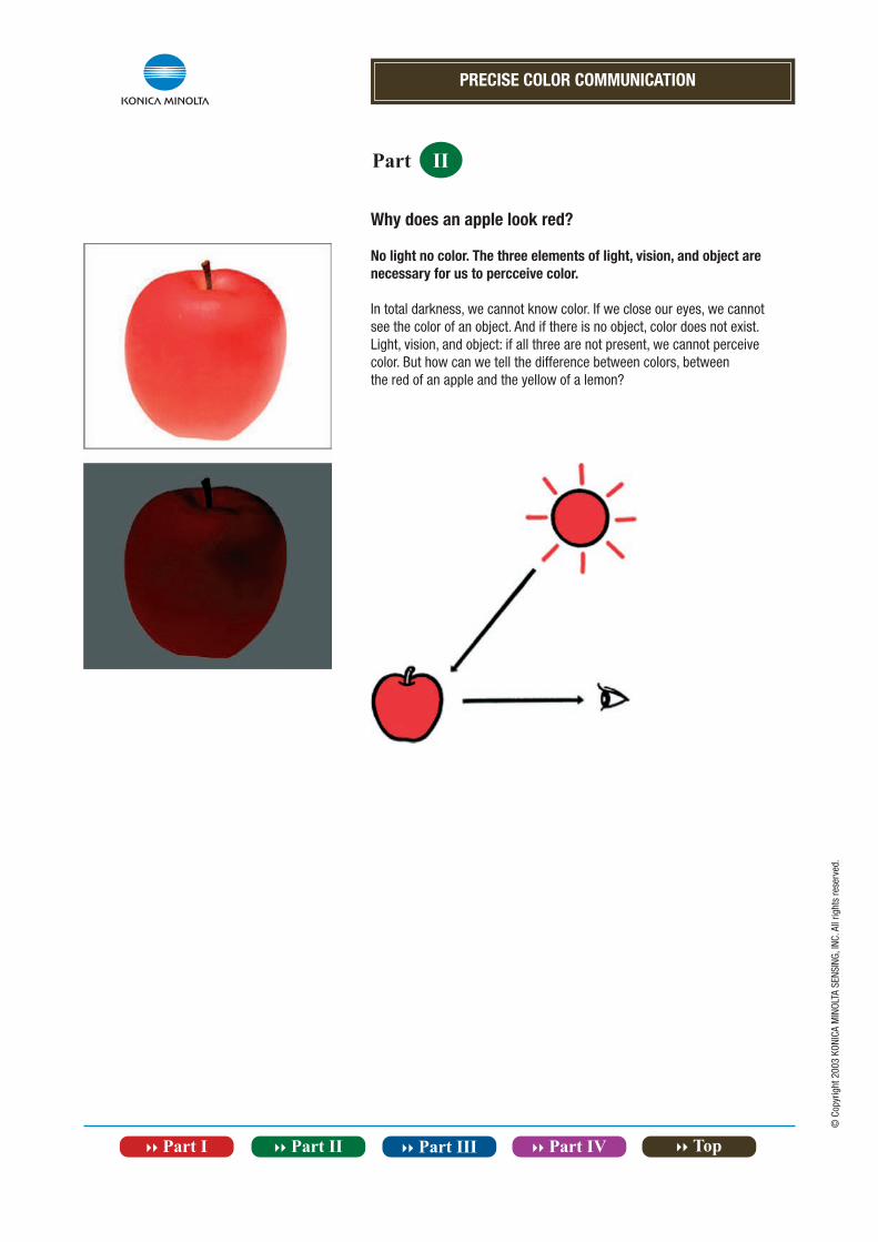
Why does an apple look red?
No light no color. The three elements of light, vision, and object are necessary for us to percceive color.
In total darkness, we cannot know color. If we close our eyes, we cannotsee the color of an object. And if there is no object, color does not exist.Light, vision, and object: if all three are not present, we cannot perceivecolor. But how can we tell the difference between colors, betweenthe red of an apple and the yellow of a lemon?
PRECISE COLOR COMMUNICATION
Part II
© C
opyr
ight
200
3 KO
NICA
MIN
OLTA
SEN
SING
, INC
. All
right
s re
serv
ed.
Human beings can perceive specific wavelengths as colors.
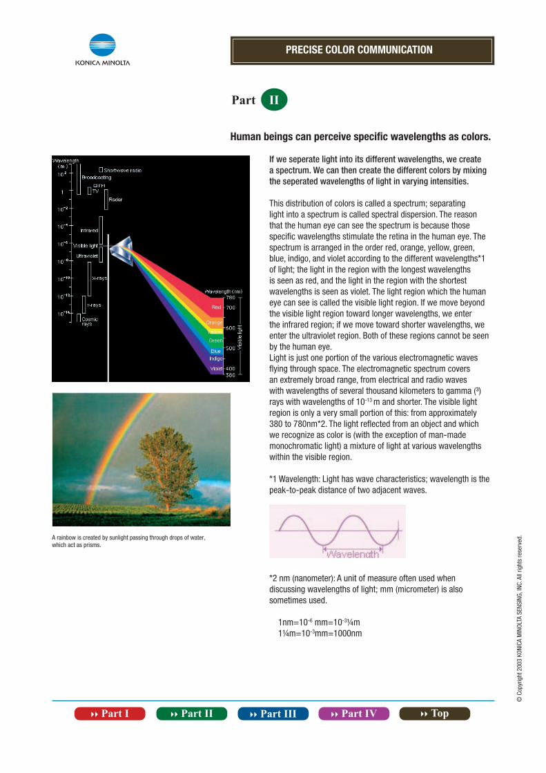
If we seperate light into its different wavelengths, we create a spectrum. We can then create the different colors by mixing the seperated wavelengths of light in varying intensities.
This distribution of colors is called a spectrum; separating light into a spectrum is called spectral dispersion. The reason that the human eye can see the spectrum is because those specific wavelengths stimulate the retina in the human eye. The spectrum is arranged in the order red, orange, yellow, green, blue, indigo, and violet according to the different wavelengths*1 of light; the light in the region with the longest wavelengths is seen as red, and the light in the region with the shortest wavelengths is seen as violet. The light region which the human eye can see is called the visible light region. If we move beyond the visible light region toward longer wavelengths, we enter the infrared region; if we move toward shorter wavelengths, we enter the ultraviolet region. Both of these regions cannot be seen by the human eye.Light is just one portion of the various electromagnetic waves flying through space. The electromagnetic spectrum covers an extremely broad range, from electrical and radio waves with wavelengths of several thousand kilometers to gamma (³) rays with wavelengths of 10-13 m and shorter. The visible light region is only a very small portion of this: from approximately 380 to 780nm*2. The light reflected from an object and which we recognize as color is (with the exception of man-made monochromatic light) a mixture of light at various wavelengths within the visible region.
*1 Wavelength: Light has wave characteristics; wavelength is the peak-to-peak distance of two adjacent waves.
*2 nm (nanometer): A unit of measure often used when discussing wavelengths of light; mm (micrometer) is also sometimes used.
1nm=10-6 mm=10-31⁄4m 11⁄4m=10-3mm=1000nm
A rainbow is created by sunlight passing through drops of water, which act as prisms.
PRECISE COLOR COMMUNICATION
Part II
RED
Spectral reflectance graph
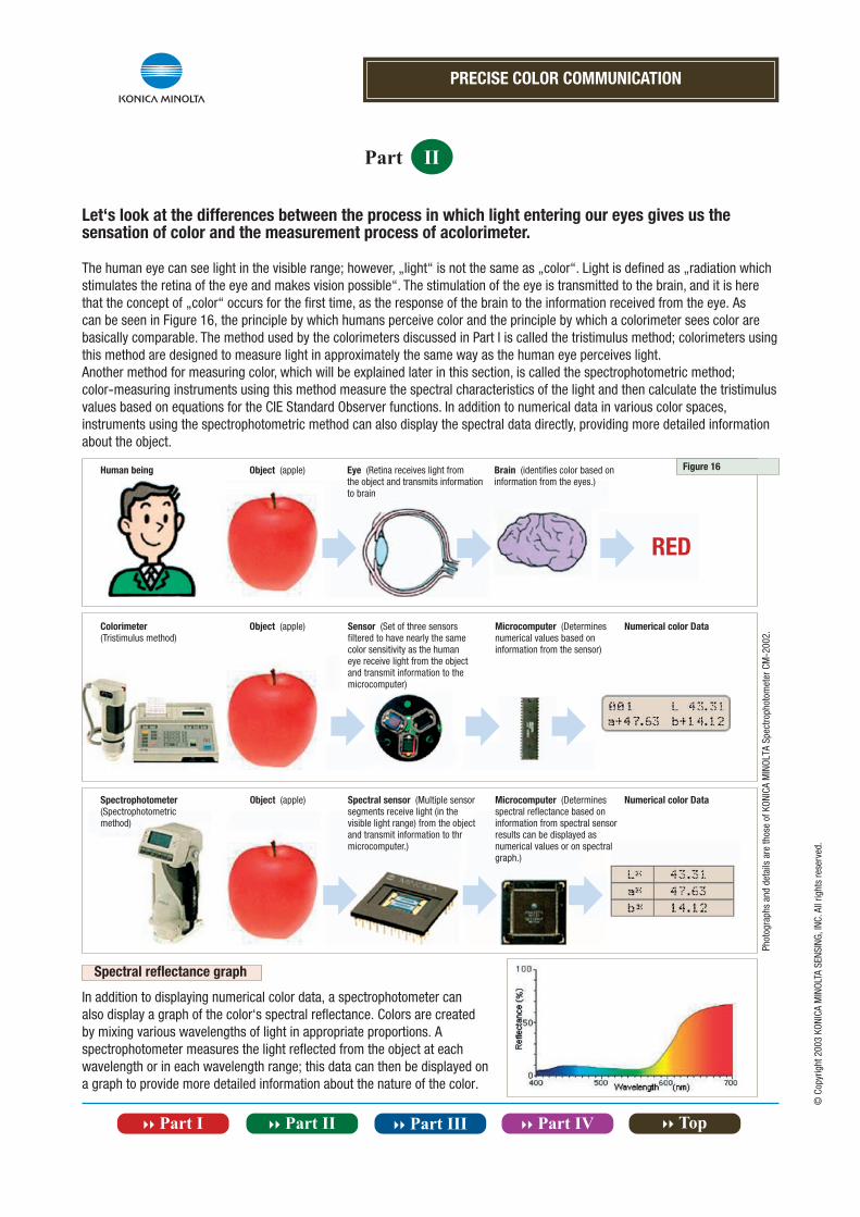
In addition to displaying numerical color data, a spectrophotometer can also display a graph of the color‘s spectral reflectance. Colors are created by mixing various wavelengths of light in appropriate proportions. A spectrophotometer measures the light reflected from the object at each wavelength or in each wavelength range; this data can then be displayed on a graph to provide more detailed information about the nature of the color.
Pho
togr
aphs
and
det
ails
are
thos
e of
KON
ICA
MIN
OLTA
Spe
ctro
phot
omet
er C
M-2
002.
© C
opyr
ight
200
3 KO
NICA
MIN
OLTA
SEN
SING
, INC
. All
right
s re
serv
ed.
Let‘s look at the differences between the process in which light entering our eyes gives us the sensation of color and the measurement process of acolorimeter.
The human eye can see light in the visible range; however, „light“ is not the same as „color“. Light is defined as „radiation whichstimulates the retina of the eye and makes vision possible“. The stimulation of the eye is transmitted to the brain, and it is here that the concept of „color“ occurs for the first time, as the response of the brain to the information received from the eye. As can be seen in Figure 16, the principle by which humans perceive color and the principle by which a colorimeter sees color are basically comparable. The method used by the colorimeters discussed in Part I is called the tristimulus method; colorimeters using this method are designed to measure light in approximately the same way as the human eye perceives light.Another method for measuring color, which will be explained later in this section, is called the spectrophotometric method;color-measuring instruments using this method measure the spectral characteristics of the light and then calculate the tristimulus values based on equations for the CIE Standard Observer functions. In addition to numerical data in various color spaces, instruments using the spectrophotometric method can also display the spectral data directly, providing more detailed information about the object.
Object (apple)
Eye (Retina receives light from the object and transmits information to brain
Brain (identifies color based on information from the eyes.)
Colorimeter (Tristimulus method)
Sensor (Set of three sensors filtered to have nearly the same color sensitivity as the human eye receive light from the object and transmit information to the microcomputer)
Microcomputer (Determines numerical values based on information from the sensor)
Object (apple)Human being
Numerical color Data
Spectrophotometer (Spectrophotometric method)
Object (apple) Spectral sensor (Multiple sensor segments receive light (in the visible light range) from the object and transmit information to thr microcomputer.)
Microcomputer (Determines spectral reflectance based on information from spectral sensor results can be displayed as numerical values or on spectral graph.)
Numerical color Data
Figure 16
PRECISE COLOR COMMUNICATION
Part II
© C
opyr
ight
200
3 KO
NICA
MIN
OLTA
SEN
SING
, INC
. All
right
s re
serv
ed.
What about the components of light (and color)? Let‘s take a look of using a spectrophotometer.
An object absorbs part of the light from the light source and reflects the remaining light. This reflected light enters the human eye, and the resulting stimulation of the retina is recognized as the object‘s „color“ by the brain. Each object absorbs and reflects light from different portions of the spectrum and in different amounts; these differences in absorptance and reflectance are what make the colors of different objects different.
Apple
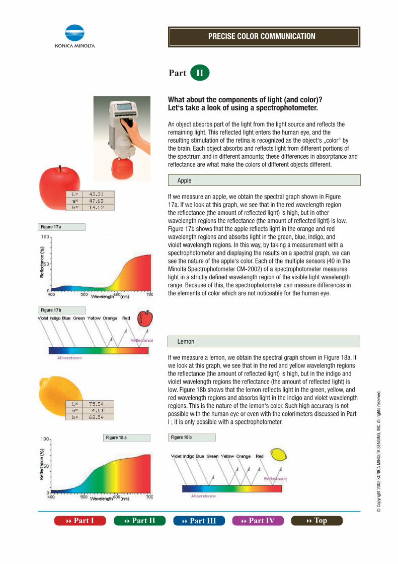
If we measure an apple, we obtain the spectral graph shown in Figure17a. If we look at this graph, we see that in the red wavelength regionthe reflectance (the amount of reflected light) is high, but in other wavelength regions the reflectance (the amount of reflected light) is low.Figure 17b shows that the apple reflects light in the orange and red wavelength regions and absorbs light in the green, blue, indigo, and violet wavelength regions. In this way, by taking a measurement with a spectrophotometer and displaying the results on a spectral graph, we cansee the nature of the apple‘s color. Each of the multiple sensors (40 in the Minolta Spectrophotometer CM-2002) of a spectrophotometer measures light in a strictly defined wavelength region of the visible light wavelength range. Because of this, the spectrophotometer can measure differences in the elements of color which are not noticeable for the human eye.
Lemon
If we measure a lemon, we obtain the spectral graph shown in Figure 18a. If we look at this graph, we see that in the red and yellow wavelength regions the reflectance (the amount of reflected light) is high, but in the indigo and violet wavelength regions the reflectance (the amount of reflected light) is low. Figure 18b shows that the lemon reflects light in the green, yellow, and red wavelength regions and absorbs light in the indigo and violet wavelength regions. This is the nature of the lemon‘s color. Such high accuracy is not possible with the human eye or even with the colorimeters discussed in Part I ; it is only possible with a spectrophotometer.
Figure 17a
Figure 17b
Figure 18 a Figure 18 b
PRECISE COLOR COMMUNICATION
Part II
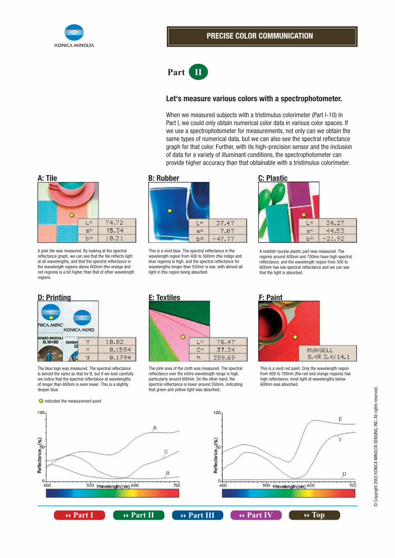
A: Tile B: Rubber C: Plastic
D: Printing F: PaintE: Textiles
A pink tile was measured. By looking at the spectral reflectance graph, we can see that the tile reflects light at all wavelengths, and that the spectral reflectance in the wavelength regions above 600nm (the orange and red regions) is a bit higher than that of other wavelength regions.
This is a vivid blue. The spectral reflectance in the wavelength region from 400 to 500nm (the indigo and blue regions) is high, and the spectral reflectance for wavelengths longer than 550nm is low, with almost all light in this region being absorbed.
A reddish-purple plastic part was measured. The regions around 400nm and 700nm have high spectralreflectance, and the wavelength region from 500 to 600nm has low spectral reflectance and we can see that the light is absorbed.
The blue logo was measured. The spectral reflectance is almost the same as that for B, but if we look carefully we notice that the spectral reflectance at wavelengths of longer than 600nm is even lower. This is a slightly deeper blue.
The pink area of the cloth was measured. The spectral reflectance over the entire wavelength range is high,particularly around 600nm. On the other hand, the spectral reflectance is lower around 550nm, indicating that green and yellow light was absorbed.
This is a vivid red paint. Only the wavelength region from 600 to 700nm (the red and orange regions) has high reflectance; most light at wavelengths below 600nm was absorbed.
indicates the measurement point
© C
opyr
ight
200
3 KO
NICA
MIN
OLTA
SEN
SING
, INC
. All
right
s re
serv
ed.
Let‘s measure various colors with a spectrophotometer.
When we measured subjects with a tristimulus colorimeter (Part I-10) in Part I, we could only obtain numerical color data in various color spaces. If we use a spectrophotometer for measurements, not only can we obtain the same types of numerical data, but we can also see the spectral reflectance graph for that color. Further, with its high-precision sensor and the inclusion of data for a variety of illuminant conditions, the spectrophotometer can provide higher accuracy than that obtainable with a tristimulus colorimeter.
PRECISE COLOR COMMUNICATION
Part II
© C
opyr
ight
200
3 KO
NICA
MIN
OLTA
SEN
SING
, INC
. All
right
s re
serv
ed.
Differences between tristimulus method and spectrophotometric method
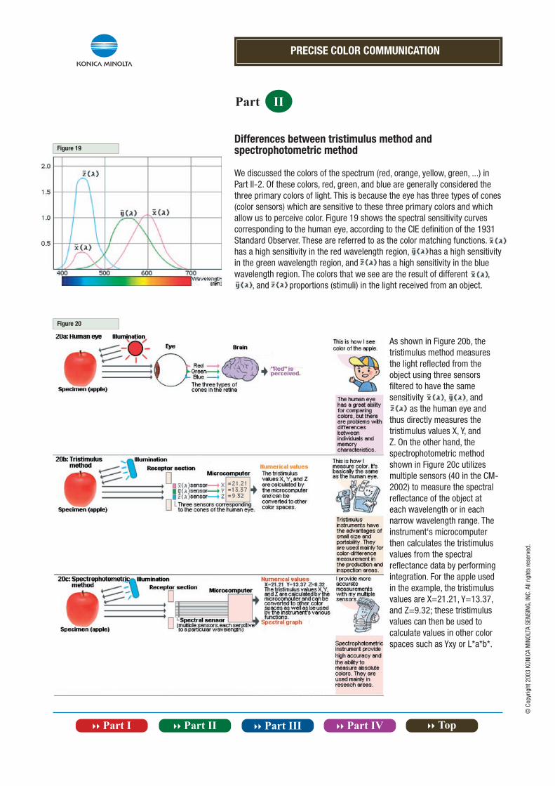
We discussed the colors of the spectrum (red, orange, yellow, green, ...) in Part II-2. Of these colors, red, green, and blue are generally considered the three primary colors of light. This is because the eye has three types of cones (color sensors) which are sensitive to these three primary colors and which allow us to perceive color. Figure 19 shows the spectral sensitivity curves corresponding to the human eye, according to the CIE definition of the 1931 Standard Observer. These are referred to as the color matching functions. has a high sensitivity in the red wavelength region, has a high sensitivity in the green wavelength region, and has a high sensitivity in the blue wavelength region. The colors that we see are the result of different , , and proportions (stimuli) in the light received from an object.
As shown in Figure 20b, the tristimulus method measures the light reflected from the object using three sensors filtered to have the same sensitivity , , and as the human eye and thus directly measures the tristimulus values X, Y, and Z. On the other hand, the spectrophotometric method shown in Figure 20c utilizes multiple sensors (40 in the CM-2002) to measure the spectral reflectance of the object at each wavelength or in each narrow wavelength range. The instrument‘s microcomputer then calculates the tristimulus values from the spectral reflectance data by performing integration. For the apple used in the example, the tristimulus values are X=21.21, Y=13.37, and Z=9.32; these tristimulus values can then be used to calculate values in other color spaces such as Yxy or L*a*b*.
Figure 19
Figure 20
PRECISE COLOR COMMUNICATION
Part II
© C
opyr
ight
200
3 KO
NICA
MIN
OLTA
SEN
SING
, INC
. All
right
s re
serv
ed.
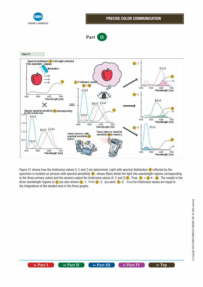
Figure 21 shows how the tristimulus values X, Y, and Z are determined. Light with spectral distribution reflected by thespecimen is incident on sensors with spectral sensitivity , whose filters divide the light into wavelength regions correspondingto the three primary colors and the sensors output the tristimulus values (X, Y, and Z) . Thus, = •~ . The results in thethree wavelength regions of are also shown: -1: , -2: , and -3: . The tristimulus values are equal tothe integrations of the shaded area in the three graphs.
Figure 21
A
A
A DDCC
B A
C
C
C
A
A
A
BB
A
B
C C A B
C C C C
PRECISE COLOR COMMUNICATION
Part II
© C
opyr
ight
200
3 KO
NICA
MIN
OLTA
SEN
SING
, INC
. All
right
s re
serv
ed.
How will the apparent color change when the light source is changed?
As we said in Part I-2, different light sources will make colors appeardifferent. For measuring color, the CIE defined the spectral characteristics of several different types of typical illuminants. Figure 22 shows the spectral power distributions of some of these illuminants. A light source is usually built into the color-measuring instrument. This light source may or may not match any of the CIE illuminants; instead, the instrument determines the data for measurements under the selected illuminant through calculations based on the data actually measured under the instrument‘s light source and the illuminant‘s spectral distribution data stored in the instrument‘s memory.
Figure 22a: Standard Illuminants1 Standard Illuminant Average daylight (including ultraviolet wavelength region) with a correlated color temperature of 6504K; should be used for measuring specimens which will be illuminated by daylight including ultraviolet radiation. 2 Standard Illuminant C Average daylight (not including ultraviolet wavelength region) with a correlated color temperature of 6774K;should be used for measuring specimens which will be illuminated bydaylight in the visible wavelength range but not including ultravioletradiation. 3 Standard Illuminant A Incandescent light with a correlated colortemperature of 2856K; should be used for measuring specimens whichwill be illuminated by incandescent lamps.
Figure 22b: Fluorescent Illuminants(recommended by JIS for measurements)4 F6: Cool white5 F8: Daylight6 F10: Three narrow band daylight white
Figure 22c: Fluorescent Illuminants(recommended by CIE for measurements)7 F2: Cool white8 F7: Daylight9 F11: Three narrow band cool white
Figure 22a
Figure 22b
Figure 22c
12
3
4
5
6
7
8
9
1 2 1 9
PRECISE COLOR COMMUNICATION
Part II
© C
opyr
ight
200
3 KO
NICA
MIN
OLTA
SEN
SING
, INC
. All
right
s re
serv
ed.
Let‘s look at examples of what happens if we measure our specimen (apple) using a spectrophotometer under Standard IlluminantD65 (example 1) and Standard Illuminant (example 2).In example 1, is the graph of the spectral power distribution of Standard Illuminant D65 and is a graph of the spectralreflectance of the apple. is the spectral power distribution of the light reflected from the specimen (apple) and is the product of and . In example 2, ‘ is the spectral power distribution of Standard Illuminant and is the spectral reflectance of the specimen (apple), which is the same as in Example 1. ‘ is the spectral power distribution of the light reflected from thespecimen (apple) and is the product of ‘and . If we compare and ‘, we notice that the light in the red region is muchstronger in ‘, meaning that the apple would appear much redder under Standard Illuminant . This shows that the color of asubject changes according to the light under which it is viewed. A spectrophotometer actually measures the spectral reflectance of the specimen; the instrument can then calculate numerical color values in various color spaces using the spectral powerdistribution data for the selected illuminant and data for the color matching functions of the Standard Observer. the specimen; the instrument can then calculate numerical color values in various color spaces using the spectral power distribution data for the selected illuminant and data for the color matching functions of the Standard Observer.
A B
C
A B A A B
C
A B C C
C A
A
A BCC
A B
CC
A BBA
PRECISE COLOR COMMUNICATION
Part II
© C
opyr
ight
200
3 KO
NICA
MIN
OLTA
SEN
SING
, INC
. All
right
s re
serv
ed.
A spectrophotometer can even handle metamerism, a complex problem
In the previous section, we discussed how the color of an object depends on the light source under which it is viewed. A related problem is if, for example, the colors of two objects appeared to be the same under daylight but appeared to be different under indoor room lighting. Such a phenomenon, in which two colors appear the same under one light source but different under another, is called metamerism. For metameric objects, the spectral reflectance characteristics of the colors of the two objects are different, but the resulting tristimulus values are the same under one light source and different from each other under another. This problem is often due to the use of different pigments or materials.
Look at Figure 23. If we look at the spectral reflectance curves for the two specimens, we can immediately see that they are different. However, the L*a*b* values for measurements under Standard Illuminant D65 are the same for both specimens, but the values for measurements under Standard Illuminant A are different from each other. This shows that even though the two specimens have different spectral reflectance characteristics, they would appear to be the same color under daylight (Standard Illuminant D65).
So how should metamerism be handled? To evaluate metamerism, it is necessary to measure the specimens under two or more illuminants with very different spectral power distributions, such as Standard Illuminant D65 and Standard Illuminant A. Although both tristimulus colorimeters and spectrophotometers use a single light source, they can calculate measurement results based on illuminant data in memory to provide data for measurements under various illuminants. Tristimulus colorimeters can generally take measurements under only Standard Illuminant C and Standard Illuminant D65, both of which represent daylight and which have very similar spectral power distributions; because of this, tristimulus colorimeters cannot be used to measure metamerism. Spectrophotometers, on the other hand, are equipped with the spectral power distributions of a wide range of illuminants and thus can determine metamerism. Moreover, with the spectrophotometer‘s capability to display spectral reflectance graphs, you can see exactly how the spectral reflectances of the two colors are different.
„ The colors may not be reproduced exactly in this page due to the limitations of the printing process.
Figure 23
PRECISE COLOR COMMUNICATION
Part II
Photo shows Konica MinoltaSpectrophotometer CM-2600d.
© C
opyr
ight
200
3 KO
NICA
MIN
OLTA
SEN
SING
, INC
. All
right
s re
serv
ed.
Features of spectrophotometers
Minolta‘s Spectrophotometer series offers a wide range of functions and superior accuracy.
Illuminant conditions
Data for a wide variety of CIE Illuminants are stored in memory to allow measurements under various illuminant conditions.
Data memory
Measurement data is automatically stored at the time of measurement.
Data communication
RS-232C standard data communication can be performed to output data or control the spectrophotometer.
Spectral reflectance graph display
Measurement results can be displayed on a spectral reflectance graph.
Fixed illumination/viewing angles
The illumination/viewing geometry is fixed to ensure uniform conditions for measurements.
Spectral sensor
The spectral sensor consists of numerous segments to measurethe light at each wavelength interval for high accuracy.
Color spaces
Measurement data can be displayed numerically in a wide variety of color spaces, including Yxy, L*a*b*, Hunter Lab, etc.
Color-differences measurement
Color difference from a target color can be measured and instantly displayed in numerical form or on a spectral reflectance graph.
© C
opyr
ight
200
3 KO
NICA
MIN
OLTA
SEN
SING
, INC
. All
right
s re
serv
ed.
PRECISE COLOR COMMUNICATION
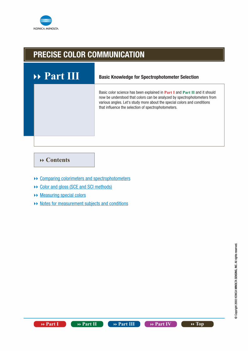
}} Part III Basic Knowledge for Spectrophotometer Selection
Basic color science has been explained in Part I and Part II and it should now be understood that colors can be analyzed by spectrophotometers from various angles. Let‘s study more about the special colors and conditions that influence the selection of spectrophotometers.
© C
opyr
ight
200
3 KO
NICA
MIN
OLTA
SEN
SING
, INC
. All
right
s re
serv
ed.
}} Contents
}} Comparing colorimeters and spectrophotometers
}} Color and gloss (SCE and SCI methods)
}} Measuring special colors
}} Notes for measurement subjects and conditions
PRECISE COLOR COMMUNICATION
Part III
© C
opyr
ight
200
3 KO
NICA
MIN
OLTA
SEN
SING
, INC
. All
right
s re
serv
ed.
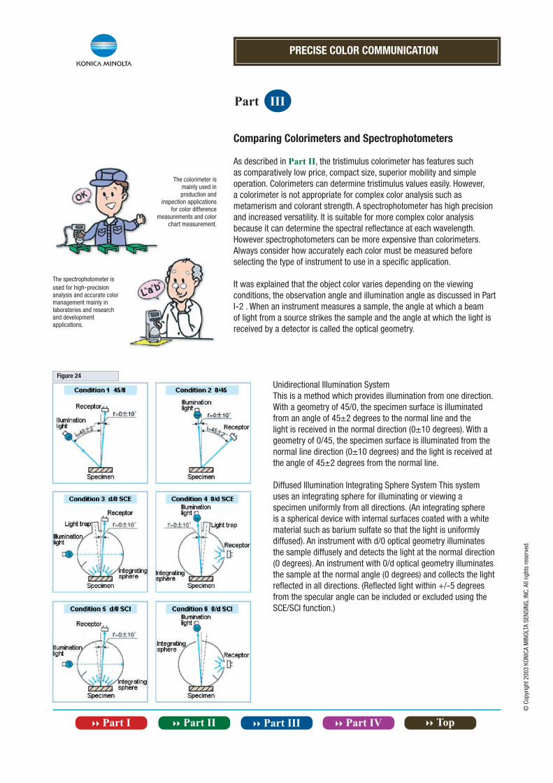
Comparing Colorimeters and Spectrophotometers
As described in Part II, the tristimulus colorimeter has features such as comparatively low price, compact size, superior mobility and simple operation. Colorimeters can determine tristimulus values easily. However, a colorimeter is not appropriate for complex color analysis such as metamerism and colorant strength. A spectrophotometer has high precision and increased versatility. It is suitable for more complex color analysis because it can determine the spectral reflectance at each wavelength. However spectrophotometers can be more expensive than colorimeters.Always consider how accurately each color must be measured before selecting the type of instrument to use in a specific application.
It was explained that the object color varies depending on the viewing conditions, the observation angle and illumination angle as discussed in Part I-2 . When an instrument measures a sample, the angle at which a beam of light from a source strikes the sample and the angle at which the light is received by a detector is called the optical geometry.
Unidirectional Illumination SystemThis is a method which provides illumination from one direction. With a geometry of 45/0, the specimen surface is illuminated from an angle of 45±2 degrees to the normal line and the light is received in the normal direction (0±10 degrees). With a geometry of 0/45, the specimen surface is illuminated from the normal line direction (0±10 degrees) and the light is received at the angle of 45±2 degrees from the normal line.
Diffused Illumination Integrating Sphere System This system uses an integrating sphere for illuminating or viewing a specimen uniformly from all directions. (An integrating sphere is a spherical device with internal surfaces coated with a white material such as barium sulfate so that the light is uniformly diffused). An instrument with d/0 optical geometry illuminates the sample diffusely and detects the light at the normal direction (0 degrees). An instrument with 0/d optical geometry illuminates the sample at the normal angle (0 degrees) and collects the light reflected in all directions. (Reflected light within +/-5 degrees from the specular angle can be included or excluded using the SCE/SCI function.)
The colorimeter ismainly used inproduction and
inspection applicationsfor color difference
measurements and colorchart measurement.
The spectrophotometer isused for high-precisionanalysis and accurate colormanagement mainly inlaboratories and researchand developmentapplications.
Figure 24
PRECISE COLOR COMMUNICATION
Part III
© C
opyr
ight
200
3 KO
NICA
MIN
OLTA
SEN
SING
, INC
. All
right
s re
serv
ed.
Color and Gloss (SCE and SCI Methods)
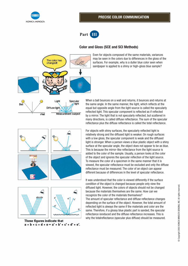
Even for objects composed of the same materials, variances may be seen in the colors due to differences in the gloss of the surfaces. For example, why is a duller blue color seen when sandpaper is applied to a shiny or high-gloss blue sample?
When a ball bounces on a wall and returns, it bounces and returns at the same angle. In the same manner, the light, which reflects at the equal but opposite angle from the light source is called the specularly reflected light. This specular component is reflected as if reflected by a mirror. The light that is not specularly reflected, but scattered in many directions, is called diffuse reflectance. The sum of the specular reflectance plus the diffuse reflectance is called the total reflectance.
For objects with shiny surfaces, the specularly reflected light is relatively strong and the diffused light is weaker. On rough surfaces with a low gloss, the specular component is weak and the diffused light is stronger. When a person views a blue plastic object with a shiny surface at the specular angle, the object does not appear to be as blue. This is because the mirror-like reflectance from the light source is added to the color of the sample. Usually, a person looks at the color of the object and ignores the specular reflection of the light source. To measure the color of a specimen in the same manner that it is viewed, the specular reflectance must be excluded and only the diffuse reflectance must be measured. The color of an object can appear different because of differences in the level of specular reflectance.
It was understood that the color is viewed differently if the surface condition of the object is changed because people only view the diffused light. However, the colors of objects should not be changed because the materials themselves are the same. How can we recognize the color of the materials themselves? The amount of specular reflectance and diffuse reflectance changes depending on the surface of the object. However, the total amount of reflected light is always the same if the materials and color are the same. Therefore, if a glossy blue plastic part is sanded, the specular reflectance isreduced and the diffuse reflectance increases. This is why the totalreflectance (specular plus diffuse) should be measured.
PRECISE COLOR COMMUNICATION
Part III
© C
opyr
ight
200
3 KO
NICA
MIN
OLTA
SEN
SING
, INC
. All
right
s re
serv
ed.
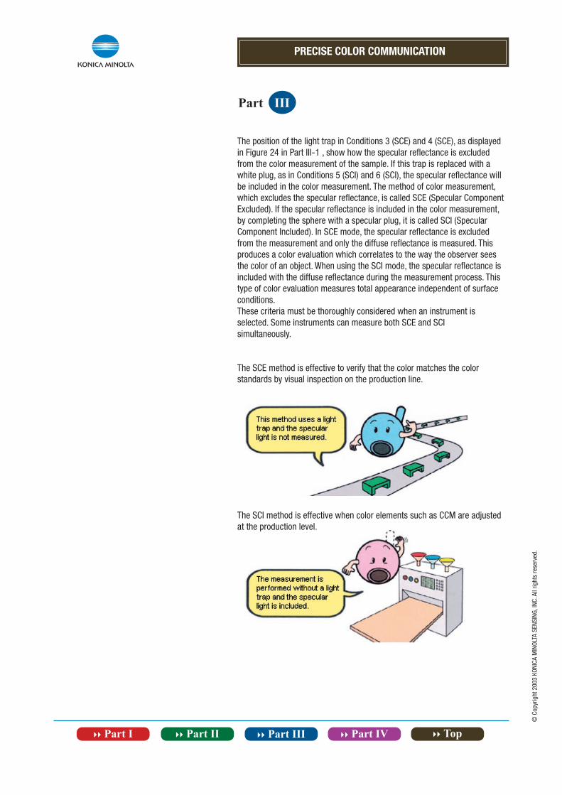
The position of the light trap in Conditions 3 (SCE) and 4 (SCE), as displayed in Figure 24 in Part III-1 , show how the specular reflectance is excluded from the color measurement of the sample. If this trap is replaced with a white plug, as in Conditions 5 (SCI) and 6 (SCI), the specular reflectance will be included in the color measurement. The method of color measurement, which excludes the specular reflectance, is called SCE (Specular Component Excluded). If the specular reflectance is included in the color measurement, by completing the sphere with a specular plug, it is called SCI (Specular Component Included). In SCE mode, the specular reflectance is excluded from the measurement and only the diffuse reflectance is measured. Thisproduces a color evaluation which correlates to the way the observer sees the color of an object. When using the SCI mode, the specular reflectance is included with the diffuse reflectance during the measurement process. Thistype of color evaluation measures total appearance independent of surface conditions.These criteria must be thoroughly considered when an instrument is selected. Some instruments can measure both SCE and SCIsimultaneously.
The SCE method is effective to verify that the color matches the color standards by visual inspection on the production line.
The SCI method is effective when color elements such as CCM are adjusted at the production level.
PRECISE COLOR COMMUNICATION
Part III
© C
opyr
ight
200
3 KO
NICA
MIN
OLTA
SEN
SING
, INC
. All
right
s re
serv
ed.
Measuring Special colors
Fluorescent colors
When you see a fluorescent color, it looks like it is glowing by itself although it is not actually a light source. When light is applied to a fluorescent material, the rays are absorbed and re-emitted as visible light in other regions of the spectrum, usually at longer wavelengths. As explained in Part II-2 , the visible light region is electromagnetic radiation between 380nm and 780nm. For example, when 360nm radiation is absorbed and emitted at 420nm, the measurement value at 420nm may exceed 100%. Since more than the expected amount of light is visible, it appears to the human eye as if the material glows by itself. For measurement of non-fluorescentsamples, the dispersive element can be placed either between the source and the sample or between the sample and the receiver. However for the measurement of fluorescent samples to agree with the color as it appears to people, the dispersive element must be placed between the sample and the detector so that the sample is illuminated by the entire spectrum of the source. When a fluorescent color is measured by the spectrophotometer, the spectral power distribution of the light source, including the ultraviolet regions, must be controlled.
Metalic colors
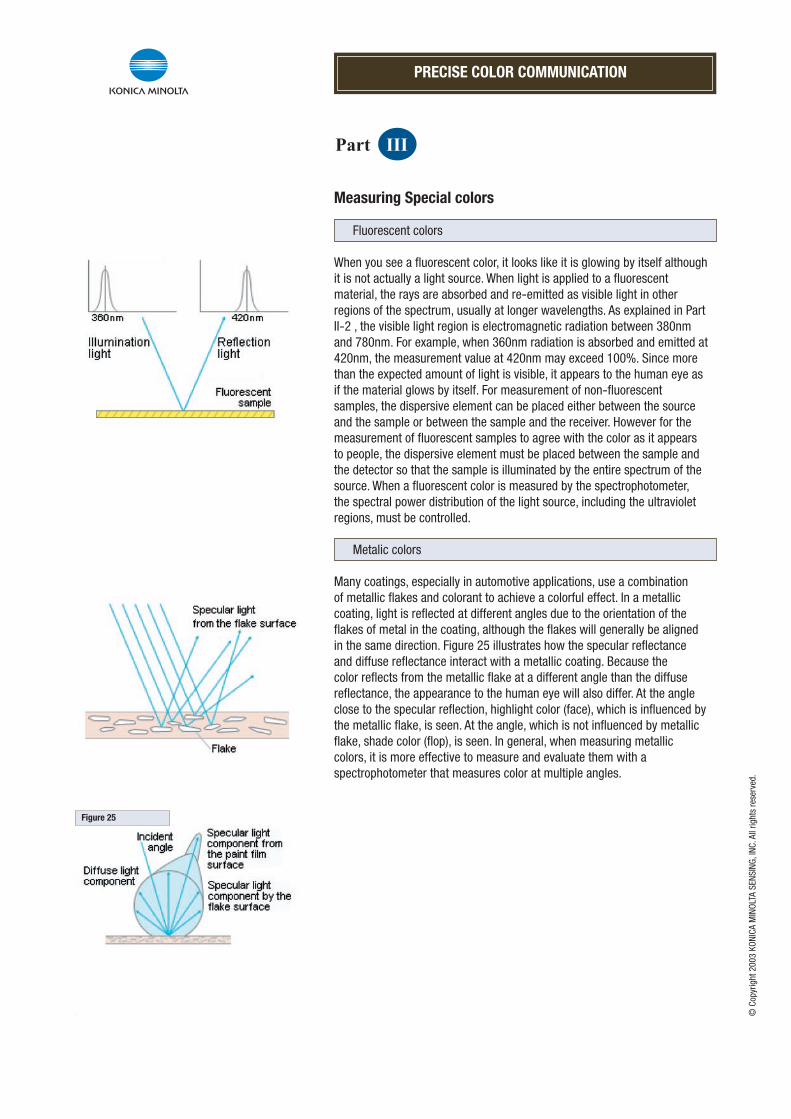
Many coatings, especially in automotive applications, use a combination of metallic flakes and colorant to achieve a colorful effect. In a metallic coating, light is reflected at different angles due to the orientation of the flakes of metal in the coating, although the flakes will generally be aligned in the same direction. Figure 25 illustrates how the specular reflectance and diffuse reflectance interact with a metallic coating. Because the color reflects from the metallic flake at a different angle than the diffuse reflectance, the appearance to the human eye will also differ. At the angle close to the specular reflection, highlight color (face), which is influenced by the metallic flake, is seen. At the angle, which is not influenced by metallic flake, shade color (flop), is seen. In general, when measuring metalliccolors, it is more effective to measure and evaluate them with a spectrophotometer that measures color at multiple angles.
Figure 25
PRECISE COLOR COMMUNICATION
Part III
© C
opyr
ight
200
3 KO
NICA
MIN
OLTA
SEN
SING
, INC
. All
right
s re
serv
ed.
Black Light and Fluorescent Material
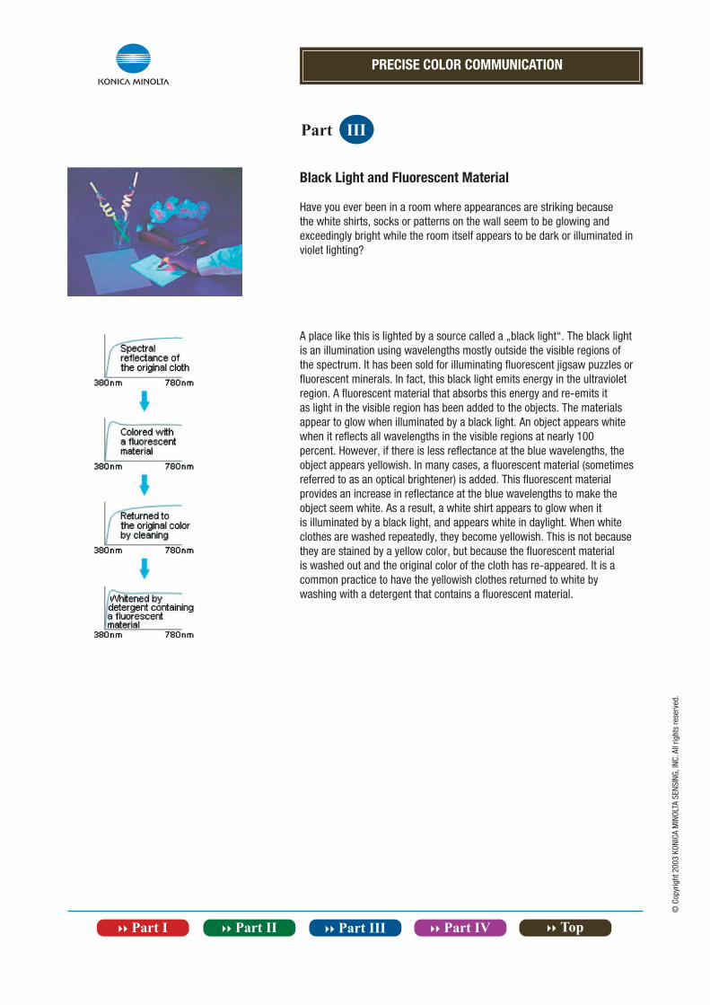
Have you ever been in a room where appearances are striking because the white shirts, socks or patterns on the wall seem to be glowing and exceedingly bright while the room itself appears to be dark or illuminated in violet lighting?
A place like this is lighted by a source called a „black light“. The black light is an illumination using wavelengths mostly outside the visible regions of the spectrum. It has been sold for illuminating fluorescent jigsaw puzzles or fluorescent minerals. In fact, this black light emits energy in the ultraviolet region. A fluorescent material that absorbs this energy and re-emits itas light in the visible region has been added to the objects. The materials appear to glow when illuminated by a black light. An object appears white when it reflects all wavelengths in the visible regions at nearly 100percent. However, if there is less reflectance at the blue wavelengths, the object appears yellowish. In many cases, a fluorescent material (sometimes referred to as an optical brightener) is added. This fluorescent material provides an increase in reflectance at the blue wavelengths to make the object seem white. As a result, a white shirt appears to glow when itis illuminated by a black light, and appears white in daylight. When white clothes are washed repeatedly, they become yellowish. This is not because they are stained by a yellow color, but because the fluorescent material is washed out and the original color of the cloth has re-appeared. It is a common practice to have the yellowish clothes returned to white bywashing with a detergent that contains a fluorescent material.
PRECISE COLOR COMMUNICATION
Part III
© C
opyr
ight
200
3 KO
NICA
MIN
OLTA
SEN
SING
, INC
. All
right
s re
serv
ed.
Notes for Measurement Subjects and Conditions
Measuring Powders
When measuring powder with a spectrophotometer, the measurement value varies depending on the density of the powder and the surface conditions. To avoid errors, special methods are required such as placing a fixed amount of powder into a container of a fixed shape and size and maintaining a fixed surface quality. If the size of the particles is large, use a spectrophotometer which has a large measurement area, so the measurement surface is averaged and repeatable measurement values can be obtained.
Measuring Semi-Transparent Objects
The measurement of semi-transparent objects requires special consideration because the light might pass through the material and the measurement may be influenced by what is behind the object. To solve this problem, increase the thickness of the object to prevent the light from being transmitted completely. Another solution is to put an opaque white surface behind the object.
Measuring Objects With Patterns
When measuring objects that have patterns or textures, the measurement value varies according to the location if a small area is measured. The largest possible measurement area should be used, or measurements should be taken several times in different locations and then the average measurement value should be calculated. Sometimes when the temperature of an object changes, the color of that object will also change.
Influence of Temperature Conditions
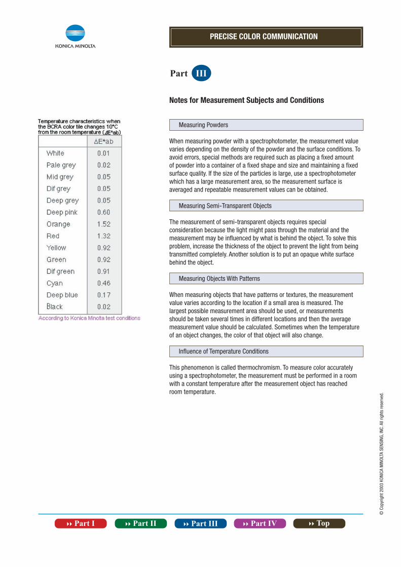
This phenomenon is called thermochromism. To measure color accurately using a spectrophotometer, the measurement must be performed in a room with a constant temperature after the measurement object has reached room temperature.
© C
opyr
ight
200
3 KO
NICA
MIN
OLTA
SEN
SING
, INC
. All
right
s re
serv
ed.
PRECISE COLOR COMMUNICATION
}} Part IV Color Terms
More details on terms, standards, and color spaces discussed inthis booklet.
© C
opyr
ight
200
3 KO
NICA
MIN
OLTA
SEN
SING
, INC
. All
right
s re
serv
ed.
}} Contents
}} 2° Standard Observer and 10° Supplementary Standard Observer / Color-Matching Functions
}} XYZ Tristimulus Value (CIE 1931) / Tristimulus Value (CIE 1964)
}} xyz Chromaticity Coodinates / xy and Chromaticity Diagram
}} L*a*b* Color Space / Uniform Color Space
}} L*C*h Color Space
}} Hunter Lab Color Space / Munsell Color Space
}} L*u*v* Color Space
}} CIE 1976 UCS Diagram / E*94 Color difference formula (CIE 1994)
}} Difference Between Object Color and Source Color ··· I
}} Difference Between Object Color and Source Color ··· II
X10, Y10, Z10
X10, Y10
PRECISE COLOR COMMUNICATION
Part IV
© C
opyr
ight
200
3 KO
NICA
MIN
OLTA
SEN
SING
, INC
. All
right
s re
serv
ed.
Color Terms
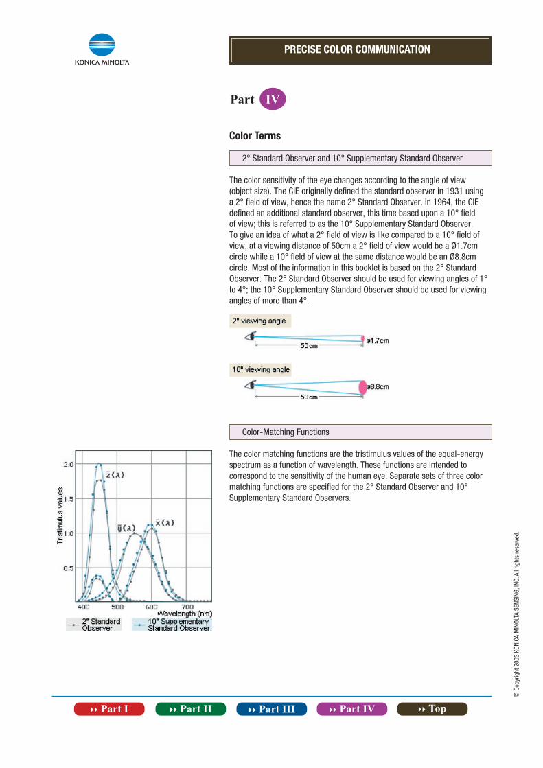
2° Standard Observer and 10° Supplementary Standard Observer
The color sensitivity of the eye changes according to the angle of view (object size). The CIE originally defined the standard observer in 1931 using a 2° field of view, hence the name 2° Standard Observer. In 1964, the CIE defined an additional standard observer, this time based upon a 10° field of view; this is referred to as the 10° Supplementary Standard Observer. To give an idea of what a 2° field of view is like compared to a 10° field of view, at a viewing distance of 50cm a 2° field of view would be a Ø1.7cm circle while a 10° field of view at the same distance would be an Ø8.8cm circle. Most of the information in this booklet is based on the 2° Standard Observer. The 2° Standard Observer should be used for viewing angles of 1° to 4°; the 10° Supplementary Standard Observer should be used for viewing angles of more than 4°.
Color-Matching Functions
The color matching functions are the tristimulus values of the equal-energyspectrum as a function of wavelength. These functions are intended to correspond to the sensitivity of the human eye. Separate sets of three color matching functions are specified for the 2° Standard Observer and 10° Supplementary Standard Observers.
PRECISE COLOR COMMUNICATION
Part IV
© C
opyr
ight
200
3 KO
NICA
MIN
OLTA
SEN
SING
, INC
. All
right
s re
serv
ed.
Color Terms
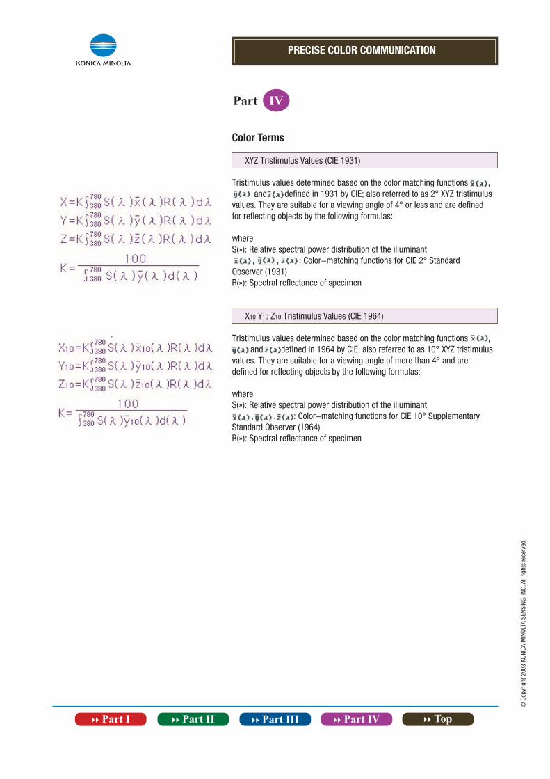
XYZ Tristimulus Values (CIE 1931)
Tristimulus values determined based on the color matching functions , and defined in 1931 by CIE; also referred to as 2° XYZ tristimulus values. They are suitable for a viewing angle of 4° or less and are defined for reflecting objects by the following formulas:
whereS(»): Relative spectral power distribution of the illuminant , , : Color-matching functions for CIE 2° Standard Observer (1931)R(»): Spectral reflectance of specimen
X10 Y10 Z10 Tristimulus Values (CIE 1964)
Tristimulus values determined based on the color matching functions , and defined in 1964 by CIE; also referred to as 10° XYZ tristimulus values. They are suitable for a viewing angle of more than 4° and are defined for reflecting objects by the following formulas:
whereS(»): Relative spectral power distribution of the illuminant , , : Color-matching functions for CIE 10° Supplementary Standard Observer (1964)R(»): Spectral reflectance of specimen
PRECISE COLOR COMMUNICATION
Part IV
© C
opyr
ight
200
3 KO
NICA
MIN
OLTA
SEN
SING
, INC
. All
right
s re
serv
ed.
Color Terms
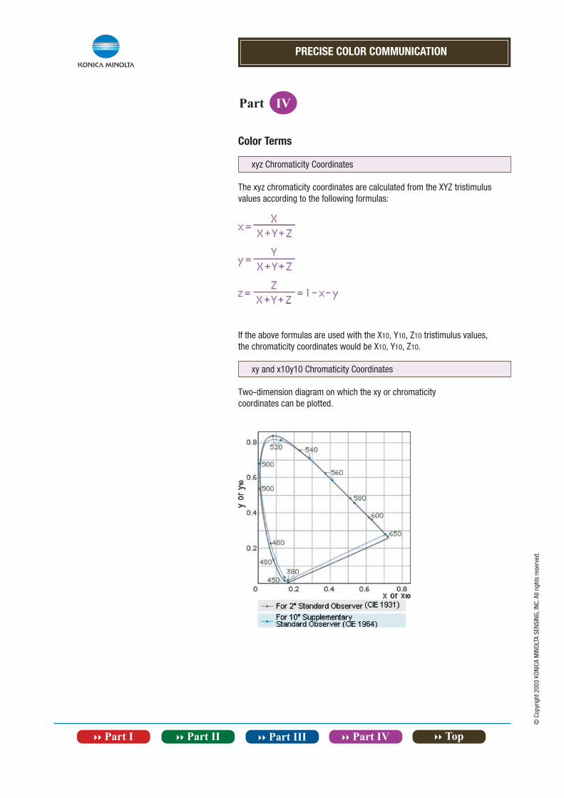
xyz Chromaticity Coordinates
The xyz chromaticity coordinates are calculated from the XYZ tristimulus values according to the following formulas:
If the above formulas are used with the X10, Y10, Z10 tristimulus values,the chromaticity coordinates would be X10, Y10, Z10.
xy and x10y10 Chromaticity Coordinates
Two-dimension diagram on which the xy or chromaticitycoordinates can be plotted.
PRECISE COLOR COMMUNICATION
Part IV
© C
opyr
ight
200
3 KO
NICA
MIN
OLTA
SEN
SING
, INC
. All
right
s re
serv
ed.
Color Terms
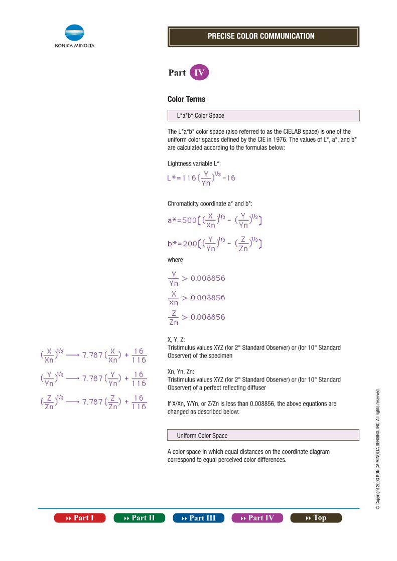
L*a*b* Color Space
The L*a*b* color space (also referred to as the CIELAB space) is one of the uniform color spaces defined by the CIE in 1976. The values of L*, a*, and b* are calculated according to the formulas below:
Lightness variable L*:
Chromaticity coordinate a* and b*:
where
X, Y, Z:Tristimulus values XYZ (for 2° Standard Observer) or (for 10° Standard Observer) of the specimen
Xn, Yn, Zn:Tristimulus values XYZ (for 2° Standard Observer) or (for 10° Standard Observer) of a perfect reflecting diffuser
If X/Xn, Y/Yn, or Z/Zn is less than 0.008856, the above equations arechanged as described below:
Uniform Color Space
A color space in which equal distances on the coordinate diagram correspond to equal perceived color differences.
PRECISE COLOR COMMUNICATION
Part IV
© C
opyr
ight
200
3 KO
NICA
MIN
OLTA
SEN
SING
, INC
. All
right
s re
serv
ed.
Color Terms
Color difference E*ab in the L*a*b* color space, which indicates the degree of color difference but not the direction, is defined by the following equation:
where L*, a*, b*: Difference in L*, a*, and b* values between the specimen color and the target color.
L*C*h* Color Space
The L*C*h color space uses the same diagram as the L*a*b* color space, but uses cylindrical coordinates. Lightness L* is the same as L* in the L*a*b* color space; Metric Chroma C* and Metric Hue Angle h are defined by the following formulas:
wherea*, b*: Chromaticity coordinates in the L*a*b* color space
For difference measurements, Metric Hue Angle difference is not calculated; instead, Metric Hue Difference H* is calculated according to the following formula:
The Metric Hue Difference is positive if the Metric Hue Angle h of the specimen is greater than that of the target and negative if the Metric Hue Angle of the specimen is less than that of the target.
PRECISE COLOR COMMUNICATION
Part IV
© C
opyr
ight
200
3 KO
NICA
MIN
OLTA
SEN
SING
, INC
. All
right
s re
serv
ed.
Color Terms
Hunter Lab Color Space
The Hunter Lab space was developed in 1948 by R. S. Hunter as a uniform color space which could be read directly from a photoelectric colorimeter (tristimulus method). Values in this space are defined by the following formulas:
whereX, Y, Z: Tristimulus values of the specimen (X10, Y10, Z10 tristimulus values can also be used.) X0, Y0, Z0: Tristimulus values of the perfect reflecting diffuser
For the 2Ú Standard Observer and Standard Illuminant C, the above equations would become:
Color difference EH in the Hunter Lab color space, which indicates the degree of color difference but not the direction, is defined by the following equation:
Munsell Color Space
The Munsell color system consists of a series of color charts which are intended to be used for visual comparison with the specimen. Colors are defined in terms of the Munsell Hue (H; indicates hue), Munsell Value (V; indicates lightness), and Munsell Chroma (C; indicates saturation) and are written as H V/C. For example, for the color with H=5.0R, V=4.0, and C=14.0, the Munsell notation would be: 5.0R 4.0/14.0
PRECISE COLOR COMMUNICATION
Part IV
© C
opyr
ight
200
3 KO
NICA
MIN
OLTA
SEN
SING
, INC
. All
right
s re
serv
ed.
Color Terms
L*u*v* Color Space
The L*u*v* color space (also referred to as the CIELUV space) is one of the uniform color spaces defined by the CIE in 1976. The values of L*, u*, and v* are calculated according to the formulas below:
whereY: Tristimulus value Y (tristimulus value Y10 can also be used.) u‘, v‘: Chromaticity coordinates from the CIE 1976 UCS diagram Yo, u‘o, v‘o: Tristimulus value Y (or Y10) and chromaticity coordinates u‘, v‘ of the perfect reflecting diffuser.
Color difference E*uv in the L*u*v* color space, which indicates the degree of color difference but not the direction, is defined by the following equation:
whereL*, u*, v*: Difference in L*, u*, and v* values between the specimen color and the target color
PRECISE COLOR COMMUNICATION
Part IV
© C
opyr
ight
200
3 KO
NICA
MIN
OLTA
SEN
SING
, INC
. All
right
s re
serv
ed.
Color Terms
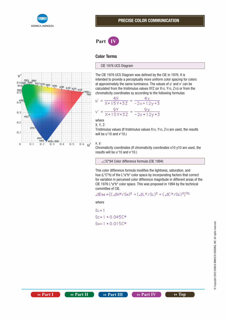
CIE 1976 UCS Diagram
The CIE 1976 UCS Diagram was defined by the CIE in 1976. It is intended to provide a perceptually more uniform color spacing for colors at approximately the same luminance. The values of u‘ and v‘ can be calculated from the tristimulus values XYZ (or X10, Y10, Z10) or from the chromaticity coordinates xy according to the following formulas:
whereX, Y, Z:Tristimulus values (If tristimulus values X10, Y10, Z10 are used, the results will be u‘10 and v‘10.)
x, y:Chromaticity coordinates (If chromaticity coordinates x10 y10 are used, the results will be u‘10 and v‘10.)
E*94 Color difference formula (CIE 1994)
This color difference formula modifies the lightness, saturation, andhue (L*C*h) of the L*a*b* color space by incorporating factors that correct for variation in perceived color difference magnitude in different areas of the CIE 1976 L*a*b* color space. This was proposed in 1994 by the technical committee of CIE.
where
PRECISE COLOR COMMUNICATION
Part IV
© C
opyr
ight
200
3 KO
NICA
MIN
OLTA
SEN
SING
, INC
. All
right
s re
serv
ed.
Differences Between Object Color and Source Color
Determining the color of an object was described previously. However, there is a difference when a color is created independently such as by a light bulb. This is called source color. The following is a simple explanation of the differences between object and source color.
Difinitions Differences
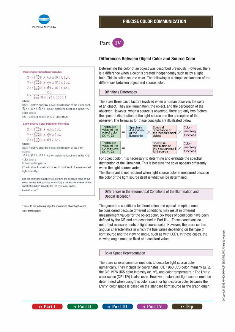
There are three basic factors involved when a human observes the color of an object. They are illumination, the object, and the perception of the observer. However, when a source is observed, there are only two factors: the spectral distribution of the light source and the perception of the observer. The formulas for these concepts are illustrated below.
For object color, it is necessary to determine and evaluate the spectral distribution of the illuminant. This is because the color appears differently when the light source varies.The illuminant is not required when light source color is measured because the color of the light source itself is what will be determined.
Differences in the Geometrical Conditions of the Illumination and Optical Reception
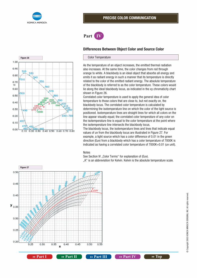
The geometric conditions for illumination and optical reception must be considered because different conditions may result in different measurement values for the object color. Six types of conditions have been defined by the CIE and are described in Part III-1. These conditions do not affect measurements of light source color. However, there are certain angular characteristics in which the hue varies depending on the type of light source and the viewing angle, such as with LCDs. In these cases, the viewing angle must be fixed at a constant value.
Color Space Representation
There are several common methods to describe light source color numerically. They include xy coordinates, CIE 1960 UCS color intensity (u, v), the CIE 1976 UCS color intensity (u*, v*), and color temperature.* The L*u*v* color space (CIE LUV) is also used. However, a standard light source must be determined when using this color space for light-source color because the L*u*v* color space is based on the standard light source as the graph origin.
* Refer to the following page for information about light source
color temperature.
PRECISE COLOR COMMUNICATION
Part IV
© C
opyr
ight
200
3 KO
NICA
MIN
OLTA
SEN
SING
, INC
. All
right
s re
serv
ed.
Differences Between Object Color and Source Color
Color Temperature
As the temperature of an object increases, the emitted thermal radiation also increases. At the same time, the color changes from red through orange to white. A blackbody is an ideal object that absorbs all energy and emits it as radiant energy in such a manner that its temperature is directly related to the color of the emitted radiant energy. The absolute temperatureof the blackbody is referred to as the color temperature. These colors would lie along the ideal blackbody locus, as indicated in the xy chromaticity chart shown in Figure 26.Correlated color temperature is used to apply the general idea of color temperature to those colors that are close to, but not exactly on, the blackbody locus. The correlated color temperature is calculated by determining the isotemperature line on which the color of the light source is positioned. Isotemperature lines are straight lines for which all colors on the line appear visually equal; the correlated color temperature of any color on the isotemperature line is equal to the color temperature at the point where the isotemperature line intersects the blackbody locus.The blackbody locus, the isotemperature lines and lines that indicate equal values of uv from the blackbody locus are illustrated in Figure 27. For example, a light source which has a color difference of 0.01 in the green direction (Euv) from a blackbody which has a color temperature of 7000K isindicated as having a correlated color temperature of 7000K+0.01 (uv unit).
NotesSee Section IV „Color Terms“ for explanation of (Euv).„K“ is an abbreviation for Kelvin. Kelvin is the absolute temperature scale.
Figure 26
Figure 27


European Headquarter/BENELUX Nieuwegein, Netherland Phone: +31(0)30 248-1193 Fax: +31(0)30 248-1280 [email protected] Office München, Germany Phone: +49(0)89 4357 156 0 Fax: +49(0)89 4357 156 99 [email protected] Office Roissy CDG, France Phone: +33(0)1 80-11 10 70 Fax: +33(0)1 80-11 10 82 [email protected] Office Warrington, United Kingdom Phone: +44 (0) 1925-467300 Fax: +44 (0) 1925-711143 [email protected] Office Milan, Italy Phone: +39 02 849 488.00 Fax: +39 02 849 488.30 [email protected] Office Zaventem, Belgium Phone: +32 (0)2 7170 933 Fax: +32(0)2 7170-977 [email protected] Office Dietikon, Switzerland Phone: +41(0)43 322-9800 Fax: +41(0)43 322-9809 [email protected] Office Västra Frölunda, Sweden Phone: +46(0)31 7099464 Fax: +46(0)31 474945 [email protected] Office Wroclaw, Poland Phone: +48(0)71 33050-01 Fax: +48(0)71 734 52 10 [email protected]
www.konicaminolta.eu
Certificate No: JQA-E-80027 Registration Date: March 12, 1997
Certificate No: YKA 0937 154Registration Date: March 3, 1995