Embed Size (px)
Citation preview

With support from
PPRC-BIGD Rapid Response Survey
Livelihoods, Coping and Recovery
During COVID-19 Crisis
October 2020
With support from

PPRC-BIGD 2nd Rapid Response Research
Livelihoods, Coping and Recovery
During COVID-19 Crisis
Report Team
Hossain Zillur Rahman
Atiya Rahman
Umama Zillur
Imran Matin
Sabrina Miti Gain
Fatema Mohammad
Shakil Ahmed
Research Team
BIGD PPRC Atiya Rahman, Senior Research Associate
Dr Imran Matin, Executive Director
Dr Narayan C Das, Senior Research Fellow
Shakil Ahmed, Senior Research Associate
Tanvir Ahmed Mozumdar, Research Associate
Hossain Zillur Rahman, Executive Chairman
Syed M. Hashemi, Trustee
Mohammad Abdul Wazed, Senior Fellow
Umama Zillur, Research Associate
Sabrina Miti Gain, Research Associate
Fatema Mohammad, Research Assistant
October 2020
Power and Participation Research Centre (PPRC)
House 15, Road 12, Dhanmondi R/A
Dhaka 1209, Bangladesh
BRAC Institute of Governance and Development (BIGD), BRAC University
SK Center (3rd - 7th & 9th Floor), GP, JA-4, TB Gate, Bir Uttam AK Khandakar Road,
Mohakhali
Dhaka 1212, Bangladesh
Cover design: Umama Zillur
First published: October 2020
Copyright © PPRC & BIGD
All rights are reserved

Contents 1 Introduction ..............................................................................................................................1
2 Methodology ............................................................................................................................2
2.1 Survey mode ................................................................................................................................. 2
2.2 Sampling and survey instrument .................................................................................................. 2
2.3 Analysis ......................................................................................................................................... 3
2.4 Limitations..................................................................................................................................... 4
3 Respondent profiles ..................................................................................................................5
3.1 Regional profile ............................................................................................................................. 5
3.2 Demographic profile ..................................................................................................................... 5
3.3 Economic profile ........................................................................................................................... 5
4 Impact of COVID-19 on income and poverty ...........................................................................9
4.1 Income shock, February to June 2020 .......................................................................................... 9
4.2 The ‘New Poor’ ............................................................................................................................ 10
4.3 Poverty dynamics February-April-June 2020 .............................................................................. 10
5 Labour market dynamics ........................................................................................................ 13
5.1 Impact on livelihoods, February-June 2020 ................................................................................ 13
5.2 Occupational transition ............................................................................................................... 14
5.3 Gender differences in employment impact ................................................................................ 15
6 Impact on food security .......................................................................................................... 17
6.1 Four indicators of food insecurity ............................................................................................... 17
6.2 State of food security, June 2020 ............................................................................................... 17
7 Coping realities ....................................................................................................................... 21
7.1 Personal coping ........................................................................................................................... 21
7.2 Social and institutional support .................................................................................................. 22
7.3 Changes in coping mechanisms, April-June 2020 ....................................................................... 22
7.4 Digital inclusion: Coping through leveraging technology ........................................................... 23
7.5 Non-food expenditure burdens .................................................................................................. 24
8 Social protection realities ....................................................................................................... 28
8.1 Social perceptions of support ..................................................................................................... 28
8.2 Listing realities ............................................................................................................................ 28
8.3 Outcome realities ........................................................................................................................ 30
9 Unpacking recovery April-June 2020 ...................................................................................... 33
9.1 Activity recovery ............................................................................................................................... 33
9.2 Income recovery ............................................................................................................................... 34
9.3 Food expenditure recovery ............................................................................................................... 35
9.4 Food intake recovery ........................................................................................................................ 36
10 Mobility dynamics ................................................................................................................... 38
10.1 Mobility trends ................................................................................................................................ 38
10.2 Post-migration livelihoods adjustment ........................................................................................... 39
11 Social perceptions of pandemic realities ................................................................................ 40
11.1 Health awareness ........................................................................................................................ 40
11.2 Perception about lifting ‘lockdown’/general holiday ..................................................................... 41
11.3 Optimism/pessimism on near-term prospects ............................................................................... 41
12 Analytical takeaways and policy lessons ................................................................................. 43
12.1 Resilience amidst governance and policy conundrum ............................................................... 43
12.2 Fragile recovery and emerging vulnerabilities ............................................................................ 44
12.3 Addressing the ‘New Poor’ ......................................................................................................... 45
12.4 Urban social protection............................................................................................................... 46
12.5 Health, nutrition and human capital reversal risks ..................................................................... 46
12.6 The ‘other’ crisis: Confidence and morale .................................................................................. 47

Table of Figures Figure 1: Sample distribution: Rural-Urban (% of HHs) ................................................................................ 5
Figure 2: Urban sample distribution by division (% of surveyed HHs) .......................................................... 5
Figure 3: Pre-COVID income status (% of HHs) ............................................................................................. 7
Figure 4: Main sources of Household Income (% of HHs)............................................................................. 7
Figure 5: Occupational profile (% of HHs) ..................................................................................................... 8
Figure 6: Per capita income in February and June by income categories .................................................... 9
Figure 7: Per capita income in BDT in February and June (rural vs urban) ................................................... 9
Figure 8: June poverty status of households who were vulnerable non-poor in February 2020 (% of HHs)
.................................................................................................................................................................... 10
Figure 9: Poverty dynamics, February-April-June 2020 (% of HHs) ............................................................ 11
Figure 10: Impact on livelihoods, February-June 2020 (% of respondents that were employed in February
2020) ........................................................................................................................................................... 13
Figure 11: Occupation-wise livelihood impact (% of respondents who were employed in February) ....... 13
Figure 12: Occupation-wise reduction in income, February-June 2020 (% of those who were continuing
the same occupation) ................................................................................................................................. 14
Figure 13: Consumption reduction used as a negative coping strategy (% of the HHs) ............................. 18
Figure 14: Per day per capita food expenditure in BDT (urban-rural and poverty categories) .................. 19
Figure 15: % of HHs that have not consumed vegetable (except potato), meat, egg, fish, lentil, milk or
fruit since ?? ................................................................................................................................................ 19
Figure 16: Coping mechanisms food expenditure burden (% of HHs) ........................................................ 21
Figure 17: Comparison of coping strategies between 1st and 2nd round surveys (% of rural HHs in the
panel sample) .............................................................................................................................................. 23
Figure 18: Comparison of coping strategies between 1st and 2nd round surveys (% of urban HHs in the
panel sample) .............................................................................................................................................. 23
Figure 19: Have a mobile financial account (% of HHs) .............................................................................. 24
Figure 20: Non-food expenditure burdens, June 2020 (average BDT per HH) ........................................... 25
Figure 21: Non-food expenditure for June 2020 across income categories (% of HHs) ............................. 26
Figure 22: Unpacking the rent burden during pandemic (% of HHs who live on rental property) ............ 26
Figure 23: Rent payment status across income groups (% of HHs living in rental house) ......................... 27
Figure 24: Observed relief activity—spatial disaggregation (% of respondents) ....................................... 28
Figure 25: Beneficiary listing—spatial targeting (% of HHs) ....................................................................... 29
Figure 26: Beneficiary listing—targeting across income categories (% of HHs) ......................................... 29
Figure 27: Beneficiary targeting in rural area across income categories (% of HHs) .................................. 30
Figure 28: Beneficiary targeting in urban slums across income categories (% of HHs) .............................. 30
Figure 29: % of HHs receiving support—spatial distribution ...................................................................... 30
Figure 30: Received Any Support—disaggregated by income categories (% of HHs) ................................ 31
Figure 31:Types of Support – Spatial Disaggregation (% of HHs) ............................................................... 31
Figure 32: Average value of the support received so far (% of HHs that received any support) ............... 32
Figure 33: Economic acitivity recovery (% of respondents) ........................................................................ 33
Figure 34: Income recovery (average BDT per day per capita)................................................................... 34
Figure 35: Income recovery of persons continuing in the same occupation from February to June 2020 35

Figure 36: Food expenditure (in per capita BDT) trend across (i) rural-urban (ii) poverty groups
(panel sample) ........................................................................................................................................... 36
Figure 37: Feb-April-June Trend Picture – Percentage of panel HHs who had 3 meals previous day across
rural-urban and income groups .................................................................................................................. 37
Figure 38: Migration Trend: April-June (% of respondents) ....................................................................... 38
Figure 39: Direction of migration ............................................................................................................... 38
Figure 40: Migrating Households Disaggregated by Poverty Status (% of HHs) ......................................... 39
Figure 41:Migrating HHs Disaggregated by Occupation ............................................................................. 39
Figure 42: Perception about lifting lockdown (% of respondents) ............................................................. 41
Figure 43: Belief that the HH income would contract or stop in next three months (% of HHs) ............... 42
Figure 44: Pessimism across February occupations.................................................................................... 42
Figure 45: Timeline of responses ............................................................................................................... 42
Figure 46: Causal pathway between fragile recovery and longer-term poverty ........................................ 45
Table of Tables Table 1: Sample size and success rate of the survey .................................................................................... 3
Table 2: Occupation in February vs June 2020 (% of respondents) ............................................................ 15
Table 3: Gender differences in employment impact in June (% of respondents who were employed in
February 2020) ............................................................................................................................................ 16
Table 4: % of HHs having less than 3 meals a day ...................................................................................... 17

Preface
COVID-19 began as a health crisis but in time has triggered a grave and unfolding economic
crisis, particularly for the poor and vulnerable. For effective policy response to the poverty crisis
created by the pandemic, the importance of real-time evidence cannot be over-emphasized.
Power and Participation Research Centre (PPRC) and BRAC Institute for Governance and
Development (BIGD) have teamed up to conduct rapid response research on the impact of
COVID-19 on household-level economic realities in urban and rural Bangladesh. The first survey
was conducted in April 2020 when lockdown-type measures had just been introduced. This
report is primarily on the second survey conducted in June 2020 after economic activities had
partially resumed. It looks at the continuing impact of COVID-19 on livelihoods, employment,
and food security as well as the coping mechanisms and the recovery realities of the
households.
Both PPRC and BIGD have an abiding and deep commitment to the social responsibility of the
research community and to the generation of independent knowledge capital. The two surveys
conducted so far at two points in the impact cycle of COVID-19 have provided invaluable
insights on how the impact of COVID-19 is evolving and how individuals and communities are
coping with the crisis. PPRC and BIGD intend to undertake a third survey towards the end of the
year to assess the medium-term impact of COVID-19.
We gratefully acknowledge the generous supplementary support of the World Food Program
(WFP), this year’s winner of the Nobel Peace Prize, for the latter surveys. Our deepest gratitude
goes to the respondents who agreed to spare the time to talk in their moments of crisis and
uncertainty and also the survey team who turned stay-at-home reality into a dedicated field
research endeavour.
The research is intended to support better policy responses and design of support programmes
for the vulnerable population. PPRC and BIGD are committed to continue providing real-time
research support towards achieving the goal of more effective policy responses to this
unprecedented crisis of our times.
Hossain Zillur Rahman Imran Matin
Executive Chairman Executive Director
PPRC BIGD


1
1 Introduction The initial panic of COVID-19 in early 2020 has given way to a broader realization that the
pandemic is here to stay, at least for the foreseeable future. Policy and social attitudes too have
had to adjust with a shift of perspective from ‘life versus livelihoods’—centred on lockdown—to
one of ‘life and livelihoods’—centred on the resumption with economic activities albeit with safety
measures. In April 2020 when lockdown measures had been put in place, Power and Participation
Research Centre (PPRC)1 and BRAC Institute for Governance and Development (BIGD)2 teamed up
to launch a rapid response telephonic survey on the immediate impact of COVID-19 on livelihoods
and household welfare.3 The survey (Phase I) utilized respondent telephone databases from earlier
surveys in urban slums and rural poor.
Our real-time research evidence on the economic impact of COVID-19 during the early phase of
the pandemic generated a great deal of attention. Realizing the value of this research, PPRC and
BIGD resolved to undertake additional rounds of survey as the pandemic situation evolves. The
World Food Program (WFP) came forward to provide supplementary support to this end.
After an interval of three months, by when economic activities had largely resumed, we launched
the second survey (Phase II) in June 2020 on livelihood and coping during the COVID-19 crisis,
with an additional focus on recovery dynamics.
1 Power and Participation Research Centre (PPRC) is a Dhaka-based policy research centre that emerged out of the BIDS 62-village Analysis of Poverty Trends Project of the 1990s with a strong track record on policy research on poverty, governance, social protection, inclusive growth, UHC and sustainable urbanization (pprc-bd.org). Some examples of PPRC rapid response research: Hossain Zillur Rahman, 1998, Early Warning on Post-Flood Coping: Findings on In-Migration to Dhaka after 1998 Floods, PPRC; PPRC, 2009, A SIDR-AILA Postscript: Coastal Vulnerability and Response Challenges, based on 4 rounds of PPRC Surveys 2007-2009; Hossain Zillur Rahman & Salehuddin Ahmed, 2010, Resilience Amidst Uncertainty: Growth and Poverty Perspectives after global financial crisis, PPRC; Hossain Zillur Rahman & Liaquat Ali Choudhury, 2009, Food Price Inflation: Impact and Response: Lessons from Recent Experiences, PPRC & Concern Worldwide.
2 BRAC Institute for Governance and Development (BIGD) is a research and academic institution of BRAC University in Bangladesh and is focused on both post-graduate academic courses and governance and development research. BIGD has undertaken a number of COVID-19 related rapid response research as cited here: Mahpara, P. (2020), Media Tracking of Domestic Violence in Bangladesh. Dhaka: BIGD, BRAC University; Antara, I. J. (2020), Impact of COVID-19 Crisis on the Wages and Employment in the RMG Sector and Role of Trade Unions. Dhaka: BIGD, BRAC University; Sultan, M., Hossain, M. S., Islam, S., Chowdhury, K., Naim, J., & Huq, F. (2020), COVID-19 Impact on RMG Sector and the Financial Stimulus Package: Trade Union Responses. Dhaka: BIGD, BRAC University; Hossain, N., Ali, T. O., Hassan, M. M., & Hoque, M. M. (2020). Trust, Institutions, and Collective Action: Rapid Study of Community Responses to COVID-19 in Bangladesh. Dhaka: BRAC Institute of Governance and Development (BIGD), BRAC University; Zaman, S., Rahman, S., Rabbani, M., & Matin, I. (2020). Crisis of Communication during COVID-19: A Rapid Research. Dhaka: BRAC Institute of Governance and Development (BIGD), BRAC University 3 PPRC-BIGD Rapid Response Research: Livelihood, Coping and Support During COVID-19 Crisis, April, 2020, PPRC and BIGD, Dhaka.

2
2 Methodology
2.1 Survey mode
We needed to adapt our survey mode in the context of restricted mobility and interaction
because of COVID-19. We identified the telephonic survey as the most practical way of reaching
a wide number of respondents efficiently.
2.2 Sampling and survey instrument
Both BIGD and PPRC have telephone contact databases from previous surveys. Two large urban
and rural contact databases of BIGD collected in 2017, and smaller contact databases of PPRC
collected in 2019, were particularly relevant to this survey. The sample was mainly drawn
from the following datasets (i.e. benchmark surveys):
1. BIGD’s census of 24,283 households (HHs) in 35 slums (randomly chosen from 150 slums
of BRAC’s Urban Development Program) across nine districts of five divisions including
Dhaka, Chattogram, Khulna, Barishal, and Rangpur, conducted from October 2016 to
January 2017.
2. BIGD’s nationally representative survey of 26,925 rural HHs across 64 districts of all eight
divisions, conducted from October 2017 to January 2018.
Phase I survey in April 2020 included a total sample of 12,000 HHs, of which 6,000 were
randomly selected from the urban database. In the rural database, HHs are classified into three
income categories based on per capita income—extreme poor, poor, and non-poor. From each
category, 2,000 samples were randomly selected, 6000 urban samples in total. Details on the
sampling for the Phase I survey and the benchmark surveys are available in Rahman and et al.
(2020). Out of 12,000 HHs, we could successfully interview 5,471 HHs over the phone.
Phase II survey was carried out in June 2020. In addition to the 5,471 HHs successfully
interviewed in Phase I, 6,200 new HHs were drawn from the same datasets—4,000 from the
urban dataset and 2,000 from the rural dataset. The larger urban sample was selected to
facilitate disaggregated analysis of the urban centres. In addition, 200 samples were drawn from
a third PPRC database on hard to reach areas, Chattogram Hill Tracts (CHT) region in Southeast
Bangladesh.
As mentioned earlier, the Phase I urban samples were randomly drawn. For Phase II, all
remaining samples from Khulna, Barishal, and Rangpur divisions, 2,089 in total, were taken from
the urban dataset because Phase I urban sample did not have enough sample from these
divisions. Additionally, 955 and 956 samples were randomly drawn from the remaining samples
of Dhaka and Chattogram divisions. From the rural dataset, an additional 2,000 HHs were
randomly drawn from the remaining samples of the benchmark survey.

3
Of the 11,671 households in the final sample, 7,638 were successfully interviewed, of which
4,424 (58%) are panel sample, those surveyed in Phase I. The rest are new, of which 3,121 HHs
(41%) are new sample and 93 HHs (1%) are from the CHT. The success rate of reaching the
respondents was highest for the panel sample (81%) while about half the new samples could be
interviewed. The household head was the default respondent in the survey. If the household
head was not available, the spouse or other income earner was interviewed.
Table 1: Sample size and success rate of the survey
Selected
Sample (HHs)
Successful
survey (HHs)
Success Rate
Panel Sample 5,471 4,424 81%
New Sample 6,000 3,121 54%
CHT Sample 200 93 47%
Total 11,671 7,638 65%
A quantitative and close-ended questionnaire was developed through intensive brainstorming
sessions and discussions. Pre-testing of the survey instrument examined the reliability and
validity of the survey questions and estimated the required timing to complete a survey. The
survey questionnaire mainly included segments on the impact of the COVID-19 crisis on their
livelihoods, coping mechanisms, food security, non-food expenditures, relief governance, and
their level of awareness and perceptions about the crisis. In Phase II, each contact number was
revisited three times via mobile phone to increase the success rate. Average time for conducting
the interview was 30 minutes. The survey was conducted from 20 June to 2 July 2020.
Deep involvement of BIGD and PPRC researchers in instrument development and strong pre-
testing of the instrument ensured that the survey questions were easily understood by
respondents and that the interviewers had sufficient time for interviewing.
2.3 Analysis
As earlier mentioned, we have panel households—who were surveyed in both April and June—
and we have new households—who were only surveyed in June. For panel households, we
analyse two-round data to understand the impact of COVID on income and food poverty, labour
market dynamics, coping mechanisms, and mobility dynamics. To understand other realities and
responses, i.e. non-food expenditure burden, social protection, and relief governance, we could
only utilize the post-lockdown data for both panel and new households.
Rahman et al. (2020) show that the majority of Phase I’s successfully interviewed households
were extreme poor, as of income before the pandemic (i.e. February 2020). To minimize this bias,
we assigned weights for analysis. For rural samples, the weights were the ratios of the number of
BIGD’s nationally representative sample to the number of our surveyed HHs for each income
group because the sample was equally drawn from each group of the nationally representative

4
survey. For urban samples, the weight was the ratio of BIGD’s representative sample of urban
slums to the number of our surveyed sample because we randomly drew the sample from the
urban slum’s representative samples. These are the weights for the panel households.
Moving to the assigned weights for the new samples, we randomly drew these samples from
both rural and urban slums’ representative surveys. Thus, the weights were the ratios of our
surveyed samples to the representative samples of each zone—rural and urban.
2.4 Limitations
Both Phase I and Phase II surveys had to be conducted within a short period because of the
urgency to address the COVID-19 induced economic fallout. As a result, we had to rely on the
proxy indicators of reported income and consumption rather than rigorous and detailed
calculation of income and consumption. This renders the measures approximate rather than
exact.
5
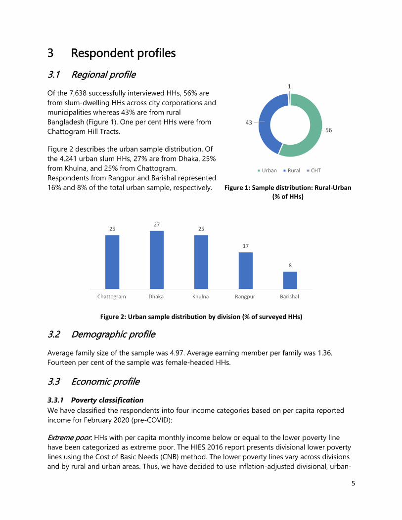
3 Respondent profiles
3.1 Regional profile
Of the 7,638 successfully interviewed HHs, 56% are
from slum-dwelling HHs across city corporations and
municipalities whereas 43% are from rural
Bangladesh (Figure 1). One per cent HHs were from
Chattogram Hill Tracts.
Figure 2 describes the urban sample distribution. Of
the 4,241 urban slum HHs, 27% are from Dhaka, 25%
from Khulna, and 25% from Chattogram.
Respondents from Rangpur and Barishal represented
16% and 8% of the total urban sample, respectively.
Figure 2: Urban sample distribution by division (% of surveyed HHs)
3.2 Demographic profile
Average family size of the sample was 4.97. Average earning member per family was 1.36.
Fourteen per cent of the sample was female-headed HHs.
3.3 Economic profile
3.3.1 Poverty classification
We have classified the respondents into four income categories based on per capita reported
income for February 2020 (pre-COVID):
Extreme poor: HHs with per capita monthly income below or equal to the lower poverty line
have been categorized as extreme poor. The HIES 2016 report presents divisional lower poverty
lines using the Cost of Basic Needs (CNB) method. The lower poverty lines vary across divisions
and by rural and urban areas. Thus, we have decided to use inflation-adjusted divisional, urban-
2527
25
17
8
Chattogram Dhaka Khulna Rangpur Barishal
5643
1
Urban Rural CHT
Figure 1: Sample distribution: Rural-Urban (% of HHs)

6
rural lower poverty lines. For example, a rural household in Barishal division has been
categorized as extreme poor if its per capita income was below BDT 2,264 in February 2020;
similarly, a rural household in Chattogram division has been categorized as extreme poor if its
per capita income was below BDT 2,58. Likewise, the HHs living in urban areas have been
classified as extreme poor based on per capita monthly income of urban areas of the division
they live in.
Moderate poor: HHs with per capita monthly income above the lower and below or equal to the
upper poverty lines have been categorized as poor. Similar to the lower poverty line, we have
used the inflation-adjusted divisional urban-rural upper poverty lines, presented in the HIES
2016 report.
Vulnerable non-poor: Though official classification does not include the category of vulnerable
non-poor, the need was already identified in earlier poverty studies4 to differentiate the group
that is at risk of falling back to poverty from the group that is not. The PPRC-BIGD survey
findings have validated the need for differentiating the vulnerable non-poor, HHs subsisting
within a vulnerable band above the poverty line. Through discussions with former Bangladesh
Bureau of Statistics (BBS) colleagues, the parameter for this vulnerability band was established as
the range between the upper poverty line and the inflation-adjusted median income. The then
Director of the Household Income and Expenditure Survey (HIES) informed us that per capita
median income in HIES 2016 was BDT 3,040 which stands at inflation-adjusted BDT 3,872 in
2020. So, the vulnerable non-poor in this survey are those whose reported income, in terms of
February 2020, was between the upper poverty line income and the median income.
Non-poor: We have categorized the HHs with per capita monthly income above the median
income (i.e. BDT 3,872 for 2020) as non-poor.
3.3.2 Pre-COVID (February) income status
The survey sample has a strong poverty bias. According to the reported pre-COVID (February
2020) income, 38% of sample HHs were extreme poor, 18% were moderate poor, 18% were
vulnerable non-poor, and 26% non-poor.
The disaggregated distribution in terms of urban, rural, and CHT is shown in Figure 3. The
proportion of extreme poor was highest (68%) in the CHT sub-sample followed by the rural sub-
sample (44%) and the urban sub-sample (33%). At the other end, the proportion of non-poor
was highest (31%) in urban sub-sample while the percentage in rural and CHT sub-samples were
19% and 17% respectively.
4 Hossain Zillur Rahman & Mahabub Hossain, 1994, Rethinking Rural Poverty: Bangladesh as a Case Study, SAGE Publications

7
Figure 3: Pre-COVID income status (% of HHs)
3.3.3 Main source of income
Figure 4 describes the HHs by their source of income. Overall, nearly 40% of the main income
earners were from informal occupational groups—rickshaw-pullers, housemaids, day labourers.
Salaried and wage labour in garments and other factories were 28% of the overall sample.
Another 20% of the sample had business as their main source of income. Additionally,
approximately eight per cent of the sample HHs had agriculture as their principal source of
income. A very small percentage, i.e. 1.21% of the HHs reported dependence on external
help/assistance from formal (government, NGO etc.) and informal (relative/friend/family)
sources as their main earning source. The occupational categories used have followed the
categorization by the Bangladesh Bureau of Statistics (BBS).
Figure 4: Main sources of Household Income (% of HHs)
44
13
2419
33
22
14
31
68
11
4
17
Extreme-poor Moderate poor Vulnerable non-poor Non-poor
% o
f H
Hs
in r
ura
l, u
rban
an
d C
HT
Rural Urban CHT
1
3
8
20
28
40
Help/Assistance
Others
Agriculture/Livestock rearing
Business
Salaried/wage labour
Casual labour

8
3.3.4 Occupational profile
Figure 5 describes in more detail the occupation profile of the sample. The top five reported
occupations included unskilled labour (26%), small business owners (19%), transport workers
(10%), skilled labour (10%), salaried job holders (9%), and agriculture (8%). On the other hand,
9% of the whole sample reported being unemployed during the survey.
Figure 5: Occupational profile (% of HHs)
0
1
2
5
8
9
9
10
10
19
26
Others
Housemaid
Factory Worker
Rickshaw puller
Agriculture
Unemployed
Salaried Job
Transport worker
Skilled Labour
Small Business
Unskilled labour

9
4 Impact of COVID-19 on income and poverty
4.1 Income shock, February to June 2020
The need for social distancing to contain COVID-19 is the main reason for the current global
economic distress. To curb the pandemic at an early stage, the Government of Bangladesh took
‘lockdown-type’ measures in mid-March, bringing the economy to a standstill and causing
widespread financial distress. By mid-May, the lockdown measures were withdrawn by fits and
starts. In Round I, the survey collected information on the per capita HH income in February
(pre-COVID) and during the lockdown. In Round II, the survey collected information on the per
capita income in June.
Figure 6 describes the extent of the income shock experienced by the surveyed HHs between
February and June 2020. The findings show a dramatic and steep decline in income across all
income categories, from extreme-poor to non-poor, indicating a system-wide income shock, not
limited to a specific group. Moderate poor, vulnerable non-poor, and non-poor HHs all
experienced an income drop of 41-45% while the extreme poor, with a very low income to start
with, suffered an income drop of 34%.
57
95114
200
3856
66
109
Extreme Poor Moderate Poor Vulnerable non-poor
Non-poor
Per
cap
ita
inco
me
in B
DT
February June
103120
61 67
Rural Urban
Per
cap
ita
inco
me
in B
DT
February June
Figure 6: Per capita income in February and June by income categories
Figure 7: Per capita income in BDT in February and June (rural vs urban)

10
The income shock was also experienced across all geographical locations (Figure 7). Rural HHs
experienced an average income drop of 41% and urban slum HHs a drop of 43% while the
already impoverished CHT HHs experienced an income drop of 25%.
4.2 The ‘New Poor’
An important finding from the two rounds of surveys in April and June is the emergence of the
‘new poor’, HHs that had per capita income above the poverty line in February—the month
immediately preceding the onset of the COVID-19 crisis—but had fallen below the poverty line
because of the crisis. Most of these ‘new poor’ were from the vulnerable non-poor HHs that had
per capita income above the upper poverty line and below the median income in February.
To estimate the size of the vulnerable non-poor at the national scale, the simple procedure is to
find the difference between the median (50%) and the current poverty rate (20.5% in 2019). This
yields an estimate of (50%-20.5%)=29.5% as the size of the vulnerable non-poor at the national
level.
Next, we calculated the proportion of the vulnerable non-poor that have fallen into poverty
because of the pandemic and multiply the proportion to the estimated proportion of the
vulnerable-non-poor population to find the share of ‘new poor’ in the population. It is worth
mentioning, even though many non-poor HHs were also made poor by the pandemic, we have
not included in our calculation of ‘new poor’. Figure 8 shows that 74% of HHs who were
vulnerable non-poor in February fell below the poverty line in June 2020. The national estimate
of ‘new poor’ in June 2020 then is (73.53% of 29.5%)=21.7%.
This implies that beyond the 20.5% of the
population officially recognized as poor, there
was a group of ‘new poor’ representing an
additional 21.7% of the population that needed
to be included in the discussion on poverty.
4.3 Poverty dynamics February-
April-June 2020
For the 4,424 panel HHs who were surveyed
in both April and June, availability of three
data points for reported income, i.e.
February, April, and June, allow us to have a
deeper examination of the short-term
poverty dynamics. Figure 9 categorizes the panel HHs in terms of their changing poverty
status over the February-April-June cycle.
Poor74
Vulnerable non-poor
20
Non-poor6
Figure 8: June poverty status of households who were vulnerable non-poor in February 2020 (% of HHs)

11
Figure 9: Poverty dynamics, February-April-June 2020 (% of HHs)
Based on their poverty status in February, April and June, the sample of panel HHs can
be grouped into five categories with a sixth residual one:
Chronic poor: These HHs were poor to begin with and remained poor over the two
rounds of the survey. Overall, they constituted 54% of the sample. It may be pertinent to
note that the sample was biased towards the poor.
New poor: These are the HHs who were vulnerable non-poor in February but had since
fallen into poverty and remained so in June. Overall, they represented 21.4% of the
panel sample with little variation between urban and rural sub-samples.
Late fallers: An additional segment of the ‘new poor’ are those who were non-poor to
start with and remained so in the early stages of the crisis (April) but has since (June) fell
below the poverty line. This sub-group was more prominent in the rural sample (8%)
than in the urban sample (3%).
On the positive side, there are two groups whose economic fortunes have fared better
during the crisis:
Revival: These were the HHs above the upper poverty line in February but had fallen into
poverty in the early phase of the crisis (April) but then recovered their income to the
level above the poverty line by June. They constituted 6.89% of HHs with a slightly
higher percentage in the urban sample (7.25%) compared to the rural sample (6.54%).
Sustainable non-poor: About 4.23% of the sample HHs were non-poor who withstood
the income shock of the COVID-19 crisis and remained non-poor all until June.
Comparatively, this percentage was lower in the urban sub-sample (2.95%).
51
21
7 58 8
58
22
73 3
7
54
21
74 6
8
Chronic Poor New PersistentPoor
Revival Sustainable Late Faller Churning
Rural Urban Total

12
Over and beyond the five groups described above, there was a residual group without
any common pattern:
Churning: HHs within this group include those who were poor in February and April but
were non-poor in June. It also includes HHs who were poor in February, non-poor in
April but were poor in June.

13
5 Labour market dynamics
5.1 Impact on livelihoods, February-June 2020
A key focus of the survey was the impact on livelihoods. Figure 10 describes this impact
for all those HHs who were gainfully employed immediately before the pandemic hit
(February). While 76% were able to continue in the same occupation in June, 17% lost
their livelihoods and became unemployed. About seven per cent retained livelihood by
shifting occupations.
Figure 10: Impact on livelihoods, February-June 2020 (% of respondents that were employed in
February 2020)
The scale of the livelihood impact varied across occupations. Informal occupations and
women-centric occupations suffered greater livelihood loss relative to formal sector
occupations (Figure 11). However, no occupation was immune from the livelihood
shock.
Figure 11: Occupation-wise livelihood impact (% of respondents who were employed in February)
17
7
76
Unemployed in June
Respondent shifted to another job
Respondent have same job
10
9
8
7
6
5
10
6
5
10
11
11
14
17
17
18
20
54
Factory Worker
Agriculture
Rickshaw puller
Salaried Job
Transport worker
Small Business
Skilled Labour
Unskilled labour
Housemaid
In Same job Job changed Unemployed

14
Housemaids suffered the worst impact, 54% respondents in this category were
unemployment in June. Unskilled labours suffered a 20% growth in unemployment.
Comparatively, the lesser-affected occupation groups were factory workers, farmers, and
rickshaw-pullers with an unemployment rate of 10%, 11% and 11%, respectively.
The livelihood impact can be seen not only in job loss but also in the loss of earnings
among those continuing the same occupation. Figure 12 describes the occupation-wise
reduction in income in June from February 2020.
Figure 12: Occupation-wise reduction in income, February-June 2020 (% of those who were continuing
the same occupation)
The two occupations in the formal sector —factory work and salaries job—suffered the
least contraction in income, between 16 and18 per cent. From figure 11, we see that
rickshaw-pullers had been relatively less affected by unemployment. But this masked a
reality that they had suffered the highest income drop of 54%. Unskilled labour,
transport worker and small businesses were also suffering a nearly 50% drop in
earnings. For housemaids, the earning drop was comparatively small (37%), but as seen
from the preceding table, this occupation category suffered the highest rate of
unemployment.
5.2 Occupational transition
The survey data also provides some insight into labour market dynamics. Overall, 76%
were continuing in the same job and about seven per cent had shifted to another job.
Table 2 further disaggregates these trends for each occupation.
-54
-50
-48
-48
-40
-39
-37
-18
-16
Rickshaw puller
Small Business
Transport worker
Unskilled Labour
Skilled Labour
Agriculture
Housemaid
Salaried Job
Factory worker

15
We find that majority of those who shifted occupation found work as unskilled labour,
generally less lucrative than the jobs they held before; so, the move is largely out of
desperation and not to pursue an opportunity. Even the three occupation groups
belonging to the formal sector—factory workers, salaried workers, and skilled workers—
found employment as unskilled labour as the main livelihood option to escape
unemployment. Most rickshaw-pullers and housemaids when faced with the need to
seek alternative employment could only find work as unskilled labour. The only other
opportunity of note was the small business occupation; 2% of farmers, 2.5% of skilled
labour, 2.4% of factory workers, 1.4% of salary workers, and 1.2% of rickshaw-pullers
started small businesses.
Table 2: Occupation in February vs June 2020 (% of respondents)
Occupation in February
Agriculture Transport worker
Skilled Labour
Unskilled labour
Factory Worker
Salaried Job
Small Business
Unemployed Rickshaw puller
Housemaid
Agriculture
80% 1% 1% 6% 0% 0% 2% 11% 0% 0%
Transport
worker
1% 77% 0% 3% 0% 0% 1% 17% 1% 0%
Skilled
Labour
0% 1% 72% 5% 0% 1% 3% 18% 1% 0%
Unskilled
labour
3% 1% 0% 74% 0% 0% 1% 20% 1% 0%
Factory Worker
0% 1% 0% 5% 80% 0% 2% 10% 1% 1%
Salaried Job
2% 0% 1% 2% 0% 79% 1% 14% 1% 0%
Small
Business
2% 0% 0% 2% 0% 0% 77% 17% 1% 0%
Unemployed
1% 0% 0% 1% 0% 1% 1% 97% 0% 0%
Rickshaw puller
0% 1% 0% 6% 0% 0% 1% 11% 80% 0%
Housemaid
0% 0% 0% 3% 0% 0% 0% 54% 0% 41%
5.3 Gender differences in employment impact
Table 3 describes the post-opening livelihood for men and women separately. Clearly,
female workers are considerably worse off compared to male workers. Housemaids are
the worst affected with 54% unemployment in June. Women with a small business and
in unskilled labour were also significantly worse off than men in the same occupations.
Around 35% female small business owners became unemployed compared to 16% male
business owners. In the case of unskilled labour, 31% of the female workers became
jobless in contrast to 20% unemployed men. The unemployment rate among women in
almost all the common occupations is higher than men.

16
In addition, in almost all occupational categories, more men who lost their job found an
alternate employment compared to women.
Table 3: Gender differences in employment impact in June (% of respondents who were employed in February 2020)
Occupation in February In same job Job changed Unemployed
Male Female Male Female Male Female
Factory worker 79% 81% 12% 3% 8% 16%
Agriculture 80% 74% 9% 7% 10% 19%
Salaried job 80% 66% 7% 13% 14% 20%
Small business 79% 61% 6% 4% 16% 35%
Transport worker 77% 100% 6% 0% 17% 0%
Skilled labour 71% 74% 10% 9% 18% 17%
Unskilled labour 79% 81% 12% 3% 8% 16%
Rickshaw-puller 80% 74% 9% 7% 10% 19%
Housemaid 80% 66% 7% 13% 14% 20%

17
6 Impact on food security
6.1 Four indicators of food insecurity
Phase I of the study conducted in April examined how the pandemic had affected food
insecurity in terms of the food expenditure and the nutritional impact in HHs across
urban and rural areas as well as income groups. Phase II of the study conducted in June
explored whether the food consumption of the food insecure household improved from
the initial reduction in March. To assess the impact on food security, four indices of food
insecurity were examined:
1. Hunger index: Number of meals taken the previous day as a proxy indicator of calorie
intake,
2. Negative coping: Reducing consumption to cope with reduced income,
3. Nutritional security: Extent of diet diversity in daily food intake, and
4. Food expenditure recovery post-opening: Trend in food expenditure over April-June.
6.2 State of food security, June 2020
6.2.1 Hunger Index
Information was collected on the number of meals taken the previous day as a proxy for
daily caloric consumption. If the number of meals taken is less than the norm of three
meals, this is taken to indicate the prevalence of hunger in the household. Table 4
describes the findings on this indicator, disaggregated by location and poverty status.
Table 4: % of HHs having less than 3 meals a day
Urban-Rural % of HHs having less than 3 meals a day
Urban 12
Rural 6
Location
Dhaka 15
Chattogram 12
Other divisions 10
Poverty status
Extreme poor 12
Moderate poor 3
Vulnerable non-poor 3
Non-poor 3

18
Predictably, the highest proportion of the HHS suffering from hunger is the extreme
poor group (12%). In terms of spatial location, Dhaka appears to be the worst-off with
15% of sample respondents reporting less than three meals a day. Similarly, urban sub-
sample is also worse-off vis-à-vis rural sub-sample with 12% of HHs suffering from
hunger compared to 6% for the rural sub-sample.
6.2.2 Food consumption reduction as a negative coping strategy
HHs utilize multiple coping strategies to address food security when confronted with
income shocks. One of the strategies which we have labelled as negative coping is to
curtail consumption. The data collected here is the frequency with which respondents
cited negative coping as one of the coping strategies. For the panel sample, this data is
available for two points in time during the crisis—April and June (Figure 13). This shows
some improvement in June vis-à-vis April but still nearly a third were still resorting to
income reduction as a negative coping strategy for managing the reduced income.
Figure 13: Consumption reduction used as a negative coping strategy (% of the HHs)
6.2.3 Food expenditure
Data was also collected on reported food expenditure by HHs. This provides a third
indicator of measuring food insecurity at the household level. Analyzing the data for the
panel sample (Figure 14), we observe a 25% reduction in per capita daily food
expenditure between February and June for the urban sample and a 29% reduction for
the rural sample. A caveat on the finding for the rural sample is that the survey period of
June coincided with the harvesting period during which rural HHs usually purchase less
food. Looking at the other disaggregation as per poverty status, we note that all the
groups experienced a reduction in food expenditure in the range of 26% to 29%.
38
30
Round 1 Round 2
Reduced Consumption

19
6.2.4 State of nutritional security, June 2020
The income reduction because of the pandemic has also affected the nutritional security
among the low-income HHs. To capture the nutritional security of the surveyed HHs,
dietary diversity was selected as the proxy indicator and the findings have been
presented in terms of urban-rural demographics, income groups and spatial variations
(Figure 15).
Figure 15: % of HHs that are not having vegetable (except potato), meat, egg, fish, lentil, milk or fruit
in a week prior to their daily diets at the Phase II time of survey
0 0 0 0 0 0 1 0 0
68 6977
61
4638
71 7167
1924 25
16 13 13
25 22 23
915 15
6 3 3
1512
17
5 3 4 4 4 3 4 2 2
69
8682 79
64 62
86 86 86
2834 35
22 2116
3442
30
Rural Urban Extremepoor
Moderatepoor
Vulnerablenon-poor
Non-poor Chattogram Dhaka Otherdivisions
Vegetable except potato Meat Egg Fish Lentil Milk Fruit
48
5560
74
3439
43
54
Extreme poor Moderate poor Vulnerable non-poor
Non-poor
February June
45
37
60
52
Urban Rural
Figure 14: Per day per capita food expenditure in BDT (urban-rural and poverty categories)

20
The four items on which dietary shortfall was most evident in June were meat, milk,
fruits, and eggs in that order. Reduction in dietary diversity appears to be a more
pronounced first-order response to the crisis compared to the reduction in caloric
consumption per se. Additionally, disruptions in supply chain and distribution, hike in
food prices and changes in purchasing habits also may have contributed to the
declining demand for highly perishable items like vegetables, fruits and animal-sourced
foods, which are the main sources of protein and micronutrients in diets. Therefore, the
poor have responded by purchasing cheap and durable food like rice and lentils.
As high as 86% to 69% of the urban slum HHs reported having never consumed milk
and meat in the week prior to the Phase II survey. Conversely, in rural HHs, though the
non-consumption of meat (68%) was similar to that in urban slum HHs, about 17% more
rural HHs consumed milk.
Across income groups, poor diets were found to be more common in the extreme poor
HHs with 77% and 82% of them reporting to have not consumed meat and milk
respectively the week prior to the survey. It was noted that HHs across all income
groups relied significantly on lentils and fish followed by eggs. Most surveyed
respondents across all income groups reported having consumed locally produced
seasonal fruits during the month of April-July that somewhat contributed to maintaining
their dietary diversity. Absence of milk and meat in the daily diets of HHs and reliance
on lentils and fish followed a similar consumption pattern across Dhaka, Chattogram Hill
Tracts and in other divisions.

21
7 Coping realities
The HHs that became economically vulnerable because of the pandemic resorted to
multiple personal, social, and institutional support mechanisms to cope with the
multifaceted crisis. The second round of the survey explored how the poor and
vulnerable HHs were coping with their food and non-food expenditure requirements.
The answers were provided in multiple responses, meaning percentages, when added,
exceed 100 per cent.
HHs rely on multiple strategies to cope and Figure 16 below illustrates the coping
realities on food expenditure needs for the HHs in terms of personal, social, and
institutional support mechanisms and captures the spatial variation in doing so.
Figure 16: Coping mechanisms food expenditure burden (% of HHs)
7.1 Personal coping
Personal coping strategies include relying on household income, savings, loans, shop
credit, consumption reduction, asset sale and remittance. In June, most HHs were using
their income to buy food as most had some income by then though the rate is
somewhat lower in urban slums. However, there was a striking difference between rural
and urban HHs on the reliance on savings—50% vs 30%. The lower incidence in the case
of the urban sample was likely to be explained by the exhaustion of savings through the
first three months of the crisis. Incurring debt was also a prominent coping strategy,
slightly higher for the urban sample at 36%. Shop credit had also emerged as an
important coping strategy with around a third of the respondents in both urban and
rural samples reporting this coping strategy.
81
50
35 35
22
52
13
40
3 1 3
79
3036
31
38
2 0
13
61
13
51
Ho
use
ho
ldin
com
e
Savi
ngs
Loan
Ow
ing
tosh
op
keep
er
Red
uce
dco
nsu
mp
tio
n
Selli
ng
asse
t
Rem
itta
nce
Hel
p f
rom
frie
nd
/rel
ativ
e
Hel
p f
rom
ne
igh
bo
r/lo
cal…
Hel
p f
rom
emp
loye
r
Hel
p f
rom
gove
rnm
ent
Hel
p f
rom
NG
O
Del
ayin
g M
FIin
stal
lme
nt
Rural Urban

22
The largest difference between rural and urban coping mechanisms in the reduction in
food consumption: 21% vs 38%. The two other negative personal coping strategies—asset
sale and reliance on remittance—were not used by many HHs, which is a good sign.
7.2 Social and institutional support
Similar to the findings in Phase I of the study, some degree of reliance on social and
institutional support for meeting food security needs was found in Phase II as well.
Social support included support from friends/relatives, neighbours, and the local
community as well as support from employers. Institutional support included support
from government relief and help from NGOs.
Social and institutional support to cope with food security was much less significant
than support from personal sources. Within social support, the most important source
was the support from friends and relatives (12% for urban and rural samples).
Community/neighbour support slightly more prominent for the urban sample (6%)
compared to rural sample (4%).
Within institutional support, the noteworthy finding is that 13% of the urban sample
cited support from the government, indicating a degree of government attention to the
needs of the urban poor. NGO support was cited by much fewer respondents in general,
though it was cited by more urban respondents.
A new type of institutional support was the option given for deferring of instalment
payment on microfinance loans. This, of course, applied only to those respondents who
were microfinance clients. Overall, this was cited by a small percentage—three per cent
for the rural sample and 1.5% for the urban sample.
7.3 Changes in coping mechanisms, April-June 2020
Have there been any changes in the crisis coping strategies of HHs between the early
phase of the crisis (April) and post-opening period (June)? Figure 17 compares the
coping strategies on food security between the first and second round surveys. Four
features stand out.
First, with an incremental resumption of economic activities, reliance on income to meet
food expenditure needs has become more prominent. Second, the reliance on savings
has gone down. This is unlikely only to be a consequence of greater reliance on income.
For urban HHs in particular, a possible reason is the depletion of savings. Third, social
support shows diverging trend—slightly less significant in urban HHs compared to the
April round but slightly more significant for rural HHs. Fourth, overall personal coping

23
continues to be much more significant than either social or institutional support even in
round 2.
Figure 17: Comparison of coping strategies between 1st and 2nd round surveys (% of rural HHs in the
panel sample)
Figure 18: Comparison of coping strategies between 1st and 2nd round surveys (% of urban HHs in the
panel sample)
7.4 Digital inclusion: Coping through leveraging technology
Has the COVID-19 crisis acted as a trigger to accelerating digital inclusion out of
necessity? The pandemic has indeed underscored how essential digital finance has
become for poor and vulnerable HHs which have been disproportionately affected by
the crisis. Sending and receiving remittances and cash assistance within the
formal/informal support network, vital lifelines for vulnerable people during the crisis,
can be done quickly in compliance with safe physical distance using digital finance.
47
82
34 31
4 2 6 2 0 3 0
81
4837 37
21
5 213
3 0 4 1 3
Ho
use
ho
ld in
com
e
Savi
ngs
Loan
Ow
ing
tosh
op
keep
er
Red
uce
dco
nsu
mp
tio
n
Selli
ng
asse
t
Rem
itta
nce
Hel
p f
rom
frie
nd
/rel
ativ
e
Hel
p f
rom
ne
igh
bo
r/lo
cal
pe
op
le
Hel
p f
rom
emp
loye
r
Hel
p f
rom
gove
rnm
ent
Hel
p f
rom
NG
O
Del
ayin
g M
FIin
stal
lme
nt
Round 1 Round 2
30
6653
46
1 013 9
211
3
79
3137 31
39
2 012
6 112
4 2
Ho
use
ho
ld in
com
e
Savi
ngs
Loan
Ow
ing
tosh
op
keep
er
Red
uce
dco
nsu
mp
tio
n
Selli
ng
asse
t
Rem
itta
nce
Hel
p f
rom
frie
nd
/rel
ativ
e
Hel
p f
rom
ne
igh
bo
r/lo
cal
pe
op
le
Hel
p f
rom
emp
loye
r
Hel
p f
rom
gove
rnm
ent
Hel
p f
rom
NG
O
Del
ayin
g M
FIin
stal
lme
nt
Round 1 Round 2

24
Information collected in the June survey provides a reality check on digital inclusion—
how far digital services, i.e. mobile money, had reached the poor and vulnerable
population.
Figure 18 describes the spatial distribution of respondents who reported having mobile
financial accounts. The proportion is highest for the urban sample (76.26%), followed
somewhat closely by rural (62.11%) and CHT HHs (58%). The incidences are broadly
similar across all income groups in the respective urban and rural samples.
Figure 19: Have a mobile financial account (% of HHs)
The study attempted to explore if there had been any surge in the usage of mobile
financial services among the low-income HHs during the pandemic. The respondents
who reported to have mobile financial accounts were asked to mention the time when
they had opened their accounts. A quarter of the urban slum respondents and 24% of
the CHT respondents who reported having a mobile financial account opened it after 26
March 2020, shortly after the nationwide lockdown was announced; the percentage was
slightly smaller for the rural poor HHs (18%). Such a quick increase in the last few
months indicates that the pandemic had an impact on motivating HHs to take up
mobile banking.
The study also looked at how the respondents were using mobile money. Majority of
the accountholders (75%) used it for multiple purposes. About a third (34%) of urban
respondents used MFS accounts for receiving relief/cash assistance. The corresponding
rate for rural respondents was 21%.
7.5 Non-food expenditure burdens
62
76
58
Rural Urban CHT
25
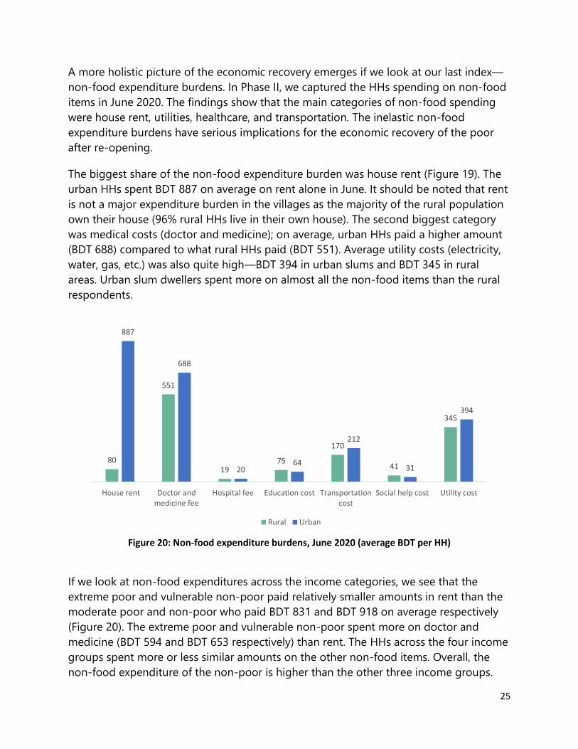
A more holistic picture of the economic recovery emerges if we look at our last index—
non-food expenditure burdens. In Phase II, we captured the HHs spending on non-food
items in June 2020. The findings show that the main categories of non-food spending
were house rent, utilities, healthcare, and transportation. The inelastic non-food
expenditure burdens have serious implications for the economic recovery of the poor
after re-opening.
The biggest share of the non-food expenditure burden was house rent (Figure 19). The
urban HHs spent BDT 887 on average on rent alone in June. It should be noted that rent
is not a major expenditure burden in the villages as the majority of the rural population
own their house (96% rural HHs live in their own house). The second biggest category
was medical costs (doctor and medicine); on average, urban HHs paid a higher amount
(BDT 688) compared to what rural HHs paid (BDT 551). Average utility costs (electricity,
water, gas, etc.) was also quite high—BDT 394 in urban slums and BDT 345 in rural
areas. Urban slum dwellers spent more on almost all the non-food items than the rural
respondents.
Figure 20: Non-food expenditure burdens, June 2020 (average BDT per HH)
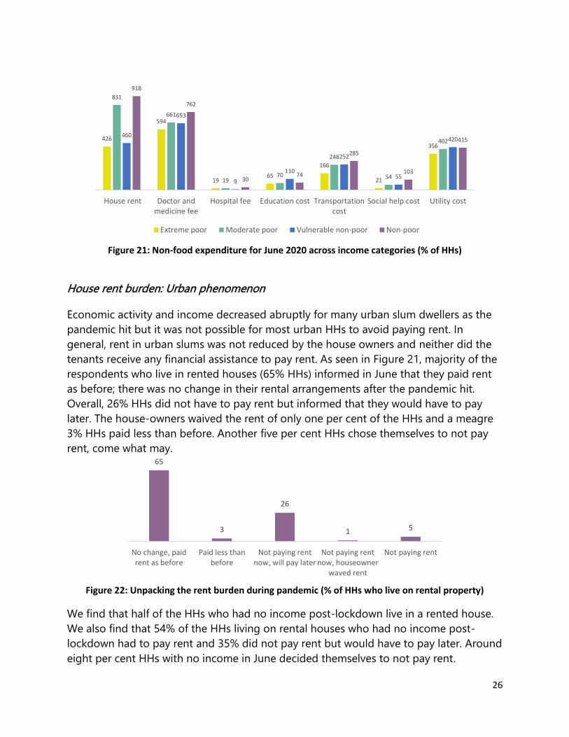
If we look at non-food expenditures across the income categories, we see that the
extreme poor and vulnerable non-poor paid relatively smaller amounts in rent than the
moderate poor and non-poor who paid BDT 831 and BDT 918 on average respectively
(Figure 20). The extreme poor and vulnerable non-poor spent more on doctor and
medicine (BDT 594 and BDT 653 respectively) than rent. The HHs across the four income
groups spent more or less similar amounts on the other non-food items. Overall, the
non-food expenditure of the non-poor is higher than the other three income groups.
80
551
1975
170
41
345
887
688
2064
212
31
394
House rent Doctor andmedicine fee
Hospital fee Education cost Transportationcost
Social help cost Utility cost
Rural Urban
26
Figure 21: Non-food expenditure for June 2020 across income categories (% of HHs)
House rent burden: Urban phenomenon
Economic activity and income decreased abruptly for many urban slum dwellers as the
pandemic hit but it was not possible for most urban HHs to avoid paying rent. In
general, rent in urban slums was not reduced by the house owners and neither did the
tenants receive any financial assistance to pay rent. As seen in Figure 21, majority of the
respondents who live in rented houses (65% HHs) informed in June that they paid rent
as before; there was no change in their rental arrangements after the pandemic hit.
Overall, 26% HHs did not have to pay rent but informed that they would have to pay
later. The house-owners waived the rent of only one per cent of the HHs and a meagre
3% HHs paid less than before. Another five per cent HHs chose themselves to not pay
rent, come what may.
Figure 22: Unpacking the rent burden during pandemic (% of HHs who live on rental property)
We find that half of the HHs who had no income post-lockdown live in a rented house.
We also find that 54% of the HHs living on rental houses who had no income post-
lockdown had to pay rent and 35% did not pay rent but would have to pay later. Around
eight per cent HHs with no income in June decided themselves to not pay rent.
426
594
1965
166
21
356
831
661
1970
248
54
402460
653
9
110
252
55
420
918
762
3074
285
103
415
House rent Doctor andmedicine fee
Hospital fee Education cost Transportationcost
Social help cost Utility cost
Extreme poor Moderate poor Vulnerable non-poor Non-poor
65
3
26
1 5
No change, paidrent as before
Paid less thanbefore
Not paying rentnow, will pay later
Not paying rentnow, houseowner
waved rent
Not paying rent

27
The situation is similar across the post-lockdown income groups (Figure 22). More than
three-quarters of the HHs above the lower poverty line according to June’s income i.e.
moderate poor, vulnerable non-poor and non-poor, living in rental house stated in June
that they paid rent same as before. Among the extreme poor HHs, the rate is 58%. On
the other hand, 33% extreme poor HHs living in rental house did not have to pay rent
temporarily but would have to pay the due rent later. Much fewer HHs above the lower
poverty line had this facility.
Figure 23: Rent payment status across income groups (% of HHs living in rental house)
58
3
33
16
76
3
17
1 2
76
2
18
2 2
84
2
11
1 3
No change, paid rentas before
Paid less than beforeNot paying rent now,will pay later
Not paying rent now,houseowner waved
rent
Not paying rent
Extreme-poor Moderate Poor Vulnerable Non-poor Non-poor
28
8 Social protection realities
8.1 Social perceptions of support
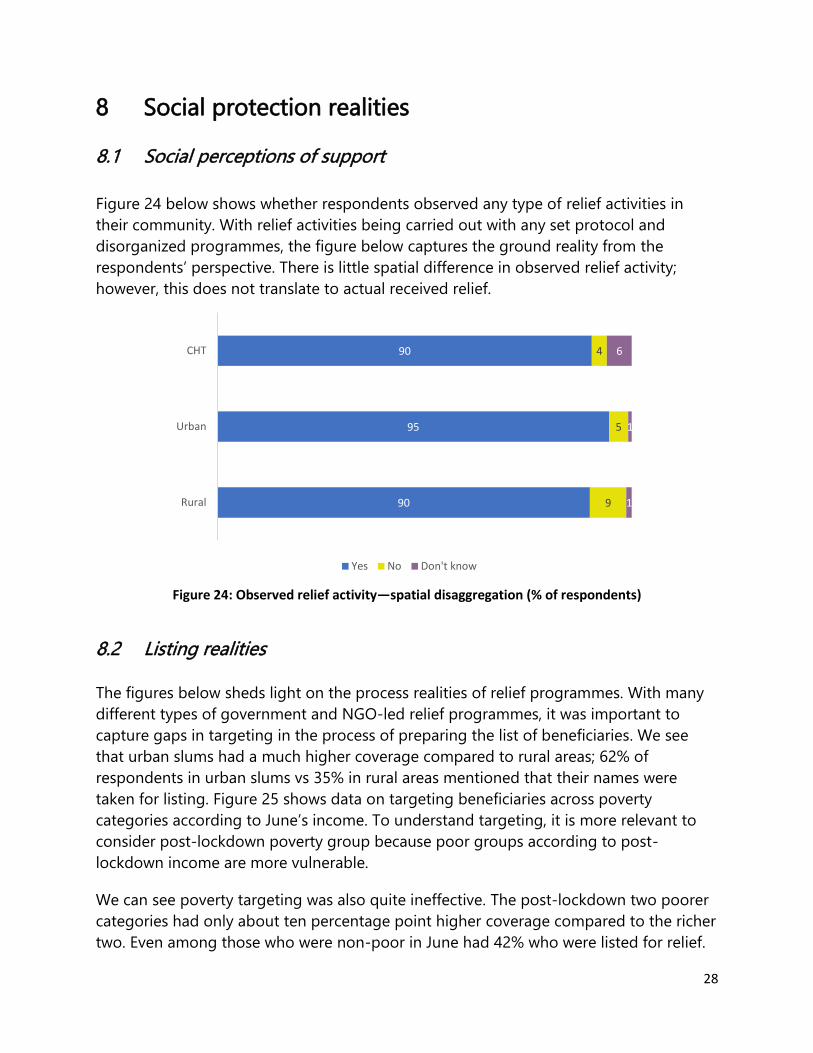
Figure 24 below shows whether respondents observed any type of relief activities in
their community. With relief activities being carried out with any set protocol and
disorganized programmes, the figure below captures the ground reality from the
respondents’ perspective. There is little spatial difference in observed relief activity;
however, this does not translate to actual received relief.
Figure 24: Observed relief activity—spatial disaggregation (% of respondents)
8.2 Listing realities
The figures below sheds light on the process realities of relief programmes. With many
different types of government and NGO-led relief programmes, it was important to
capture gaps in targeting in the process of preparing the list of beneficiaries. We see
that urban slums had a much higher coverage compared to rural areas; 62% of
respondents in urban slums vs 35% in rural areas mentioned that their names were
taken for listing. Figure 25 shows data on targeting beneficiaries across poverty
categories according to June’s income. To understand targeting, it is more relevant to
consider post-lockdown poverty group because poor groups according to post-
lockdown income are more vulnerable.
We can see poverty targeting was also quite ineffective. The post-lockdown two poorer
categories had only about ten percentage point higher coverage compared to the richer
two. Even among those who were non-poor in June had 42% who were listed for relief.
90
95
90
9
5
4
1
1
6
Rural
Urban
CHT
Yes No Don't know

29
These figures only represent the fact that the names were taken, not whether their
names were actually included in the list, neither that they received any assistance. Many
of the respondents who said their names were taken did not know about their status in
the beneficiary list.
Figure 25: Beneficiary listing—spatial targeting (% of HHs)
Figure 26: Beneficiary listing—targeting across post-lockdown income categories (% of HHs)
Further disaggregation of HH targeting shows that mistargeting was prominent in urban
slums. In rural areas, overall coverage was quite low; only 38% of the extreme poor HHs
were listed in rural areas. But the targeting was much better as much lower non-poor
HHs (14%) were listed compared to the moderate and extreme poor HHs. In
comparison, 55% of non-poor HHs from urban areas were listed for relief programmes.
It is important to note that only urban slums were included in this study which might be
a factor contributing to this stark difference in targeting.
35
62
95
33
14
3
7
2
22
20
2
3
2
Rural
Urban
CHT
Yes
No
Not Applicable for me
Took name for list but don't know about status now
Don't know
54
55
42
42
21
18
25
24
2
3
11
14
21
22
19
17
3
2
3
3
Extreme poor
Moderate poor
Vulnerable non-poor
Non-poor
Yes
No
Not Applicable for me
Took name for list but don't know about status now
Don't know
Pover
ty S
tatu
s in
June

30
Figure 27: Beneficiary targeting in rural area across income categories (% of HHs)
Figure 28: Beneficiary targeting in urban slums across income categories (% of HHs)
8.3 Outcome realities
As noticed previously, government
relief and help from NGOs were cited
as the dominant institutional support
for poor and vulnerable HHs in rural,
urban and CHT areas to meet the
non-food expenditure burdens. To
substantiate the findings, the
respondents of the second-round
survey were questioned if they had
received any support during the
period of nationwide lockdown and
till the time of the survey. Figure 29 shows the portion of respondents across study
38
38
25
14
32
31
36
41
4
8
17
31
22
19
19
12
3
3
3
3
Extreme poor
Moderate poor
Vulnerable non-poor
Non-poor
Yes No Not Applicable for me Took name for list but don't know about status now Don't know
64
59
60
55
13
14
14
16
1
1
6
8
20
23
18
20
2
2
3
2
Extreme poor
Moderate poor
Vulnerable non-poor
Non-poor
Yes No Not Applicable for me Took name for list but don't know about status now Don't know
22
61
70
44
Rural Urban CHT Total
Figure 29: % of HHs receiving support—spatial distribution

31
locations who had received some type of relief. We can see that relief support was
mostly concentrated in urban areas with more than half the respondents saying they
received some form of support. In rural areas, only 22% received support less than half
of the whole sample reported to have received any sort of relief from the government
and/or NGOs.
These figures indicate the priority placed on the urban slum by the government and
NGOs. This finding also explains the significantly lesser reliance of rural HHs on relief
assistance from institution sources as compared to the CHT and urban HHs.
Disaggregation by poverty status shows similar patterns to the data on the listing
process. There was some mistargeting in actual relief provided with overall 32% of non-
poor HHs in June receiving some type of relief. Across all poverty categories, coverage
was much higher in urban areas compared to rural areas.
Figure 30: Received Any Support—disaggregated by post-lockdown income categories (% of HHs)
We also find (Figure 31) that most of the support was in terms of food-rice, multiple
food packages, subsidy received through the open market sale (OMS). Very few received
direct monitory or cash support.
Figure 31:Types of Support–Spatial Disaggregation (% of HHs)
23 26
1710
6559 56
434650
34 32
Extreme poor Moderate poor Vulnerable non-poor Non-poor
Rural Urban Total
4
15
3
1116
29
10
43
Money Rice OMS Multiple food package
Rural Urban

32
The following figure shows the monetary value of the support received among those
who received any support. We see that cash support was the much higher in monetary
value, but we also need to remember that only a small fraction of the HHs received any
cash support.
Figure 32: Average value of the support received so far (% of HHs that received any support)
Even when the average value of the total amount of support—total monetary value of
cash, rice OMS, and multiple food packages—is calculated for those who received
support, it covers only a small portion of the lost income due to COVID-19.
1909
520
1050
535
1737
472
1681
718
Cash support Rice OMS Multiple food package
Rural Urban Total
67.6 80.58
27.3256.84
272.35
138.34 155.75
311.56
0
50
100
150
200
250
300
350
Cash Support Rice OMS Multiple FoodPackage
BD
T
Per household Support Amount
Rural Urban
BD
T f
or
tho
se w
ho
rec
eived
the
rele
van
t su
pp
ort

33
9 Unpacking recovery April-June 2020 The countrywide ‘general holiday’ or lockdown to contain the spread of COVID-19 in
Bangladesh was started in late March and lifted in May 2020, after which many people
gradually began to resume economic activities. However, their income remained lower
than pre-COVID yet their living costs remained high. The data on their livelihood and
expenditures gathered in Phase I (April) and Phase II (June) are compared to unpack the
economic recovery reality after the lockdown with the support of five indices:
Index 1: Activity Recovery Percentage of respondents rejoining economic activity post-
opening
Index 2: Income Recovery Extent to which HH income has recovered to pre-COVID level
Index 3: Food Expenditure
Recovery
Extent to which HH food expenditure has recovered to pre-
COVID level
Index 4: Food Intake
Recovery
Extent to which ‘3 Meals a Day’ norm has recovered to pre-
COVID
Index 5: Non-food
Expenditure Burdens
House rent, doctor and medicine fee, utility costs, etc. that
burden the poor from recovering to pre-COVID level
9.1 Activity recovery
The first index to unpack recovery is
economic activity. The drastic drop in
economic activity in April, especially in
urban areas, considerably improved in
June though did not fully reach pre-
COVID level of activity. Figure 33 shows
that only 32% of the urban HHs were
involved in economic activities in April,
which increased to 84% in June and in
the case of rural areas, economic
activity improved from 50% in April to
83% in June.
99
50
8398
32
84
February April June
Rural Urban
Figure 33: Economic acitivity recovery (% of respondents)

34
However, the increase in economic activity did not prompt income or food expenditure
recovery to the same extent, as we will see later.
9.2 Income recovery The second index, income recovery,
demonstrates the slow pace of economic
recovery after re-opening. Figure 34
describes the changes in reported per capita
income from Phase I and Phase II of the
study in comparison to the upper and lower
poverty lines for both rural and urban areas
The findings show a dramatic decline in per
capita daily income in April 2020, which
moderately improved in June. Reported
daily per capita incomes in June—BDT 67
(urban) and BDT 53 (rural), on average—are
considerably lower than the pre-COVID
income at BDT 108 and BDT 96 for urban
and rural areas respectively. Average June
incomes also remained below the lower poverty lines in both rural areas and urban
slums (index 2).
The following figure shows the extent of income recovery by occupation. In general,
there is a significant difference between the earning recovery of those in formal
occupations, i.e. salaried jobs, and factory work, and those in other occupations, mostly
the informal sector. Among those who were involved in the same occupation, income
recovery in June, with respect to February income, was much smaller for those in
informal occupations. For instance, the income of factory workers and salaried
jobholders recovered to 84% and 82% respectively in June whereas the income of
transport workers and unskilled labours recovered to around 52%. Income recovery for
agricultural labourers was also considerably smaller than those working in the formal
sector.
9…
37
53
108
27
67
February April June
Rural
Urban
Rural Lower Povery Line
Urban Lower Povery Line
Figure 34: Income recovery (average BDT per day per capita)

35
Figure 35: Income recovery of persons continuing in the same occupation from February to June 2020
9.3 Food expenditure recovery
The first phase of this study conducted at the beginning of the pandemic (April) found
that cutting back on food expenditure was a prevalent coping mechanism among low
income HHs in both rural and urban slum areas. In Phase II, information was collected to
sense if there was any recovery in the per capita food expenditure in the panel
respondent HHs as compared to April, after the lockdown was lifted and the economic
activities resumed, albeit in a much smaller scale.
As illustrated below, food expenditure in June did not recover up to the prior level in
February 2020 (Index 3). Daily expenditure on food in urban slum HHs barely improved
from BDT 44 per capita in April to BDT 45 in June whereas it was BDT 60 daily before the
pandemic. In the case of rural HHs, per capita daily food expenditure deceased from
BDT 41 in April to BDT 37 in June, which can be attributed to the harvesting season
around that time in rural areas that dampened the demand for food from the market
(Figure 36 i). Moreover, daily food expenditure of all the four pre-COVID income
groups—extreme poor, moderate poor, vulnerable non-poor and non-poor—in fact
decreased in June compared to their food expenditure in April and remained
considerably lower than pre-pandemic level (Figure 36 ii).
46
50
52
52
60
61
63
82
84
Rickshaw puller
Small Business
Transport worker
Unskilled Labour
Skilled Labour
Agriculture
Housemaid
Salaried job
Factory Worker
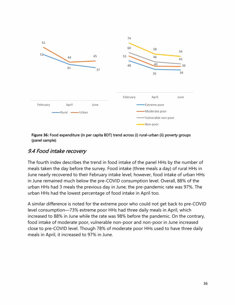
36
9.4 Food intake recovery
The fourth index describes the trend in food intake of the panel HHs by the number of
meals taken the day before the survey. Food intake (three meals a day) of rural HHs in
June nearly recovered to their February intake level; however, food intake of urban HHs
in June remained much below the pre-COVID consumption level. Overall, 88% of the
urban HHs had 3 meals the previous day in June; the pre-pandemic rate was 97%. The
urban HHs had the lowest percentage of food intake in April too.
A similar difference is noted for the extreme poor who could not get back to pre-COVID
level consumption—73% extreme poor HHs had three daily meals in April, which
increased to 88% in June while the rate was 98% before the pandemic. On the contrary,
food intake of moderate poor, vulnerable non-poor and non-poor in June increased
close to pre-COVID level. Though 78% of moderate poor HHs used to have three daily
meals in April, it increased to 97% in June.
52
4137
61
44 45
February April June
Rural Urban
Figure 36: Food expenditure (in per capita BDT) trend across (i) rural-urban (ii) poverty groups
(panel sample)
48
35 34
55
40 39
60
4643
74
5854
February April June
Extreme poor
Moderate poor
Vulnerable non-poor
Non-poor

37
Figure 37: Feb-April-June trend picture–Percentage of panel HHs who had 3 meals the previous day
across rural-urban and income groups
99 97 98 97 98 98
85
73 7378
87 8994
88 8897 97 97
Rural Urban Extreme Moderate Vulnerablenon-poor
Non-poor
Area Poverty status
February April June

38
10 Mobility dynamics
10.1 Mobility trends
Mobility patterns changed
drastically between Phase I, one
month into the lockdown, and
Phase II, shortly after the
lockdown measures were lifted.
In April, only six per cent of HHs
moved from urban to rural areas;
whereas in June, 13% of the
panel sample of 4,424 HHs
migrated. It is important to note
that for Phase II data, we are
considering any location change
to be a proxy variable for urban-
rural migration.
Spatial disaggregation of these 584 HHs who changed districts between April and June
shows that mobility mainly takes the form of reverse migration as the majority of the
migrants have moved from Dhaka and Chattogram, two largest cities in Bangladesh.
About 16% of Dhaka residents migrated to other districts, followed by Chattogram
respondents with 8% who moved to another district. This substantial increase in reverse
migration can be attributed to depleting savings due to extended lockdown as well as
rising expenditure in the cities, mainly rent and utilities.
Figure 39: Direction of migration (% of original district residents)
13
16
8
1
1
Respondent moved to another district
Respondent moved from Dhaka to anotherdistrict
Respondent moved from Chattogram toanother district
Respondent Moved from other districts toDhaka
Respondent Moved from other districts toChattogram
13
6
Respondent moved to anotherdistrict from April to June
Moved from urban to rural in April
Figure 38: Migration Trend: April-June (% of respondents)

39
Migration was the highest (17%)
amongst the non-poor category in June
followed by moderate poor (15%) and
vulnerable non-poor (14%) HHs. HHs
with slightly higher income typically have
assets, including land, in both urban and
rural areas. During a crisis, they are able
to return to their homes from cities to
avoid higher expenditures in cities. The
extreme poor HHs had the lowest rate of
migration (10%). Migration is expensive
and even during the lockdown, cities
have more opportunities for earning income which this category of people may have
wanted to take advantage of. Besides, many extreme poor HHs lack any fallback option
in villages.
10.2 Post-migration livelihoods adjustment
Only 36% of migrating HHs were employed in April which changed to 74% in June; this
implies that migration is mainly driven by unemployment (i.e. lack of income) and that
the migrants experienced significant employment recovery. Out of those who moved,
eight per cent were unskilled labour, the rate increased to 21% in June. Similarly, the
percentage of small or petty businesses among the migrants increased by threefold.
These figures corroborate the fact that the reverse migration in the last few months is
not driven by opportunities elsewhere but mainly by necessity (i.e. coping with income
reduction).
Figure 41:Migrating HHs Disaggregated by Occupation
3 2 38
210
50
64
2 15 8 7
21
310
15
0
26
51
April June
10
15 14
17
Extreme poor Moderatepoor
Vulnerablenon-poor
Non-poor
Figure 40: Migrating Households Disaggregated by Poverty Status (% of HHs)

40
11 Social perceptions of pandemic realities
11.1 Health awareness
Most of the respondents in mentioned using mask while going outside and regularly
washing hands with soap and water—two vital protective measures against the pandemic
in Bangladesh where social distancing is often not possible, especially in cities. In CHT,
comparatively fewer respondents mentioned these two measures, but they mentioned
keeping distance with anyone with cough/cold much more frequently than urban and
rural respondents; this is reasonable as the houses in CHT are more dispersed. Very few
mentioned other types of precautions such as avoid touching face and using
elbow/tissue/cloth while sneezing/coughing. It should be noted that there can be
discrepancies between reported practice and actual practice to prevent COVID-19
transmission.
A very similar pattern can be found across different income groups. Understandably,
slightly more respondents in two non-poor groups mentioned the measures compared
to the two poor groups.
1
5
15
19
25
31
93
93
0
5
8
16
20
28
91
95
1
3
2
6
37
55
78
77
Don't know
Others
using elbow fold/tissue/cloth for cold
avoid touching nose/eyes/mouth
Staying at home if feel sick
keeping distance with anyone with cough/cold
Regulary wash hands with soap and water
Using mask going outside
CHT Urban Rural

41
11.2 Perception about lifting ‘lockdown’/general holiday
The respondents were asked in June if it was a good decision to withdraw the
‘lockdown’ or general holiday at the end of May 2020. Analysis of the responses makes
it clear that for the respondents as a whole, livelihood concerns strongly outweighed
‘life’ concerns 75% of urban respondents and 65% of rural respondents either saw the
withdrawal as an unavoidable necessity or more positively as an opportunity to re-join
economic activities. A minority—18% rural and 13% urban respondents—stated that it
was not a good decision as it may increase COVID-19 transmission and another small
percentage of respondents believed that the lockdown or general holiday to prevent the
transmission of COVID-19 should have been withdrawn later than May. Responses were
very similar when desegregated by income groups.
Figure 42: Perception about lifting lockdown (% of respondents)
Again, very similar responses can be observed, with very little variation across different
income groups.
11.3 Optimism/pessimism on near-term prospects
The study found that there are broad-based pessimism and uncertainty about the
immediate future. The respondents were particularly concerned about earnings
recovery. About 86% of extreme poor in rural and 81% extreme poor in urban expressed
pessimism about their near-term livelihood and earnings prospects. The degree of
pessimism declines along the poverty scale but even among the non-poor, 64%
believed that their income would contract or stop in next three months.
28
18
37
14
4
27
13
48
10
3
116
73
5 5
Yes gooddecision-we can
work now
Not a gooddecision-fear of
infection
There is No otheroptions
It should bewithdrawn later
No opinion
Rural Urban CHT
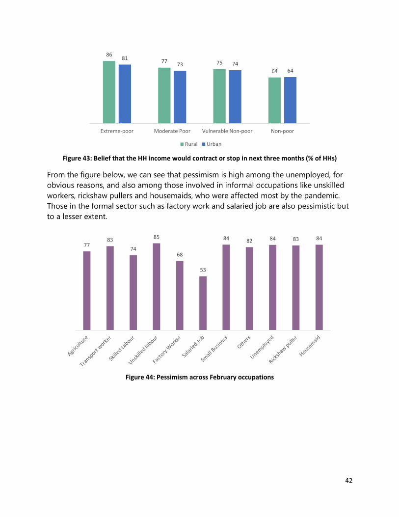
42
Figure 43: Belief that the HH income would contract or stop in next three months (% of HHs)
From the figure below, we can see that pessimism is high among the unemployed, for
obvious reasons, and also among those involved in informal occupations like unskilled
workers, rickshaw pullers and housemaids, who were affected most by the pandemic.
Those in the formal sector such as factory work and salaried job are also pessimistic but
to a lesser extent.
Figure 44: Pessimism across February occupations
8677 75
64
8173 74
64
Extreme-poor Moderate Poor Vulnerable Non-poor Non-poor
Rural Urban
7783
74
85
68
53
84 82 84 83 84

43
12 Analytical takeaways and policy lessons
12.1 Resilience amidst governance and policy conundrum
A remarkable feature of Bangladesh response to COVID-19 has been the fragmented
approach to pandemic containment and a very early resumption in ‘fits and starts’ of
economic activities.
The official response was marked by four factors: firstly, a poorly enforced semi-
lockdown of two months; secondly, strict enforcement of three critical mobility
restrictions, namely inter-district public transportation, school closure and closure of
places of worship, among which the second still continues six months since the
outbreak; thirdly, a feeling of being overwhelmed by the health service needs
necessitated by the pandemic and a corresponding inability to respond credibly to the
service challenge; and finally, a pragmatic decision to strongly tilt towards the
‘livelihood’ part of the ‘life versus livelihood’ debate and leave the ‘healthcare’ part to
largely sort itself out. The tilt towards livelihoods saw policy boosts in ‘fits and starts ‘,
first a stimulus package for the politically powerful and leading export sector, i.e. ready-
made garments, then stimulus packages for some other formal sectors also having a
political voice, then partial resumption of microfinance activities and finally, more as an
afterthought as seen through comparatively much lower implementation rate, stimulus
package for smaller market players.
Figure 45: Timeline of responses

44
For its part, society also had a nuanced response, one to a degree influenced by the
nature of the official response. After a brief initial phase of widespread panic, the
popular ‘mood’ coalesced around three positions. Firstly, there was a limited and quite
uneven acceptance of two health protocols–masks and hand-washing, more so in urban
centres than in the villages. Secondly, there was varied local-level enforcement of
mobility restrictions depending on the pro-activeness of community leadership. Thirdly,
after an initial rush for testing and hospital care, a popular psychology took hold that
testing was not necessary given the widespread reports of false testing and neither was
hospital care given the real-life experiences of poor service standards and exorbitant
costs. Widespread sharing of get-well-at-home advice on social media further
consolidated the popular psychology to ignore testing and hospitalization except in
specific circumstances. All these played into a qualitative shift in popular psychology
from a brief initial spell of panic of the unknown into dropping the fear and adopt a
comparatively early decision to ignore the pandemic and resume economic activities
wherever possible.
On hindsight, both the official and social response to the pandemic have at one end
served to underscore resilience but the governance and policy conundrum has also
exposed the system and the population to critical emerging vulnerabilities.
12.2 Fragile recovery and emerging vulnerabilities
After the stricter lockdown type measures had been withdrawn, it was natural to expect
a recovery of economic activities. It was found that the livelihoods of the vulnerable
urban and rural population had indeed recovered significantly in June, compared to
April, but it was mainly in terms of finding work. Yet, a significant percentage have
remained out of work and for those who managed to continue their occupation or find
something new, income has remained much lower than the pre-COVID level. Nor did
support play a major role. Despite the widespread income shock, only 39% received any
support and for those who received support, the amount covered, on average, only a
mere four per cent of their estimated income loss because of the pandemic.
Consequently, to cope with the months of low income, households have taken a variety
of strategies some of which may have long-term poverty consequences. Majority of the
surveyed households were using their savings to meet their food need from the
beginning of the pandemic, and use of loan was also quite high, though much lower
than the former. However, by June, the percentage of households using credit to meet
food need increased significantly and the percentage using savings almost halved. This
trend means savings depletion and indebtedness for many households.

45
The non-negotiable non-food expenditure has been are accumulating and creating
additional pressure on the finances of the vulnerable people, particularly in the cities. As
a result, we have also found increasing internal migration, more likely from more
productive cities to the less productive rural areas.
All the above factors are increasing the financial vulnerabilities of many people, if not for
most people, and creating a longer-term poverty trap. This process is illustrated in the
following diagram.
12.3 Addressing the ‘New Poor’
In our Phase I April survey, we found that a large majority of the HHs in the vulnerable
non-poor category in pre-COVID economy came down far below the poverty line,
causing a surge in the ‘new poor’ population—people who were made poor by the
pandemic. In Phase I June survey, we found that because of slow income recovery, most
of the new poor did not manage to bring back their income above the poverty line. As
a result, the proportion of ‘new poor’, about a fifth of the population, barely moved
from April. Though the ‘new poor’ were doing better than the chronic poor population
before the pandemic, months of low income combined with the pressure of non-food
Months of low Income
Inadequate support
Savings Depletion and Debt
dependence
Longer-term poverty
May cause
May cause
Accumulating non-food
expenditure
Food Consumption
Reduction
Reverse Migration
Figure 46: Causal pathway between fragile recovery and longer-term poverty

46
expenditure may push many ‘new poor’ HHs in a longer-term poverty trap, as explained
in the previous section.
Regression of the vulnerable non-poor to poverty will be a major setback in the recent
progress in Bangladesh on poverty reduction. Thus, the issues of the ‘new poor’ must be
taken seriously.
12.4 Urban social protection
Even though the pandemic has hit almost everyone economically, some groups have
been hit harder than the others. On one hand, this gives rise to increasing inequality and
marginalization, but on the other hand, if we can specify the vulnerable groups, we can
try to come up with targeted interventions for these groups and make more effective
use of limited resources.
First, occupational groups in the informal sector appear to be suffering more than those
who are working in the formal sectors. Female-headed HHs also appear to be affected
more severely. Disproportionately more female respondents were out of work. The
sectors they work in, e.g. domestic work and beauty parlours, have also been affected
severely. The urban slum-dwellers are also disproportionately affected for two reasons.
First, most of them work in the informal sector, which has been affected the most.
Second, the non-food expenditure burden, particularly rent and utilities, is much higher
in the cities. All the above groups are more vulnerable to falling in a poverty trap and
less likely to restore their pre-COVID economic status without assistance for
rehabilitation.
Bangladesh has made commendable progress on developing a social protection
portfolio but this has so far been focused primarily on the rural poor. The crisis wrought
by COVID-19 has put into sharp focus the urgency of extending social protection to the
urban poor too. Indeed, the Government of Bangladesh did take some initial steps
focused on extending traditional food support program to the cities and also
experimented with a cash support program focused on the ‘new poor’. However, these
have been early, experimental steps and the challenge is to develop a fuller portfolio
taking into account the specificities of the urban poor as distinct from the rural poor.
12.5 Health, nutrition and human capital reversal risks
We also find that months of low income combined with inadequate assistance and
pressure of non-food expenditure have resulted in continuous ‘food poverty’ for many
vulnerable HHs. The additional ‘food poverty’—reflected in the contraction in food
expenditure, reduction in food consumption and number of meals, and reduction in
dietary diversity from pre-COVID levels—may bring disastrous long term health and

47
nutritional status, particularly for the already food insecure families and demographic
groups like pregnant mothers, unborn babies and growing children. Bangladesh had
been making steady progress from starch-centric diets to more nutritional diets. Unless
countered by specific program initiatives, there are serious risks of reversals on the
nutritional front which is a key SDG priority.
The reversal risk also extends to the health of the people. As explained earlier, the key
concerns of the people at the moment have less to do with specific services related to
the pandemic and more to do with their routine healthcare needs. There were serious
disruptions in non-COVID healthcare needs including for family planning and child
health needs. Overall, COVID-19 crisis has dramatically exposed the weaknesses in the
healthcare system including the burden of healthcare costs. A particular policy agenda
which has gained further urgency is urban health and in particular publicly-funded
urban primary healthcare for the poor and vulnerable.
Beyond the risks of health and nutritional reversals, there is a looming third risk – that of
pandemic period learning loss and consequent reversal in human capital. School closure
has been one of the important pandemic containment policy and this is likely to
continue till the end of 2020. To compensate, there has been a surge in use of digital
technology but overall this has also shown a growing digital divide that further
disadvantages the poor and the marginalized groups and locations. Not only is this a
rising risk, an additional cause for concern is that this particular risk is yet to come into
priority policy focus.
12.6 The ‘other’ crisis: Confidence and morale
The people of Bangladesh have demonstrated commendable resilience in coping with
pandemic and its fall-outs. However, from their practical vantage points, they are
understandably pessimistic about the emerging vulnerabilities and the risks of reversals
on multiple fronts. Much has been discussed about monetary stimulus packages to
accelerate the recovery process. But a critical ‘stimulus’ is a supportive policy and
governance environment that encourages community engagement and a stronger
listening culture among policy-makers on the needs and expectations of groups who
lack ‘voice muscle’. Confidence and morale among frontline workers in critical sectors
such as health, local governments and municipal cleaners have repeatedly surfaced as
issues during the pandemic response.