Embed Size (px)
Citation preview
ICS 4Human Factors for the Web
David G. [email protected]://www.ics.uci.edu/~kay/courses/4/slides.pdf
Acknowledgements and caveatThese slides draw liberally from the Informatics 131 slides of Prof. Alfred Kobsa and the slides from our textbook, McCracken and Wolfe’s User-Centered Web Development.
Caveat (beware): At best, PowerPoint slides are only a pale imitation of the entirety of a class meeting. In ICS 4 in particular, the lectures will cover topics beyond what appears in these slides. Don’t rely on them as a substitute for attending class.
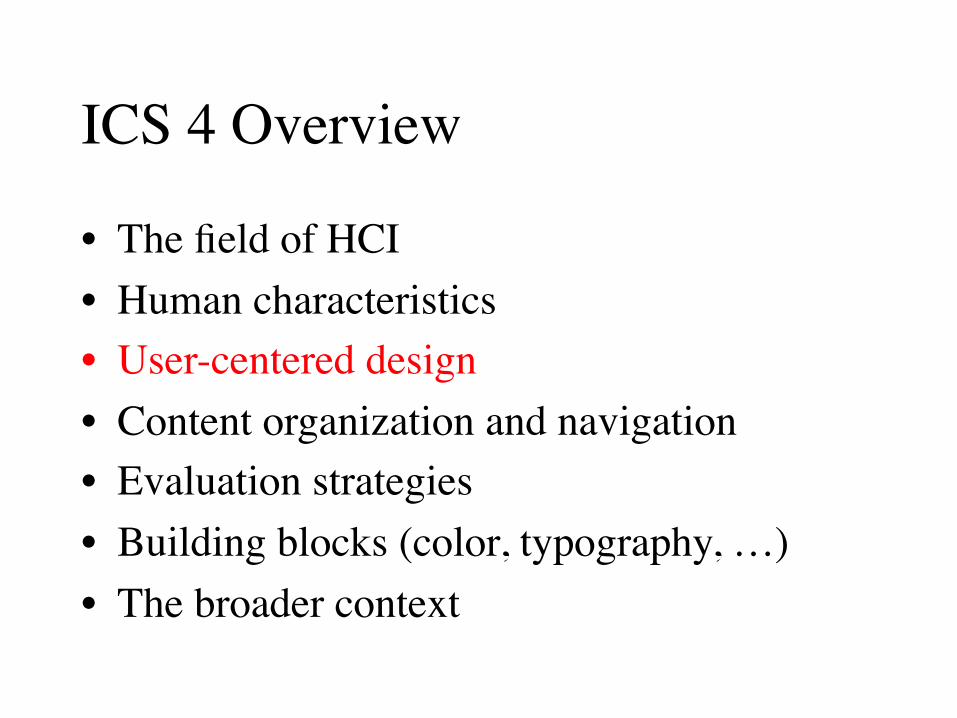
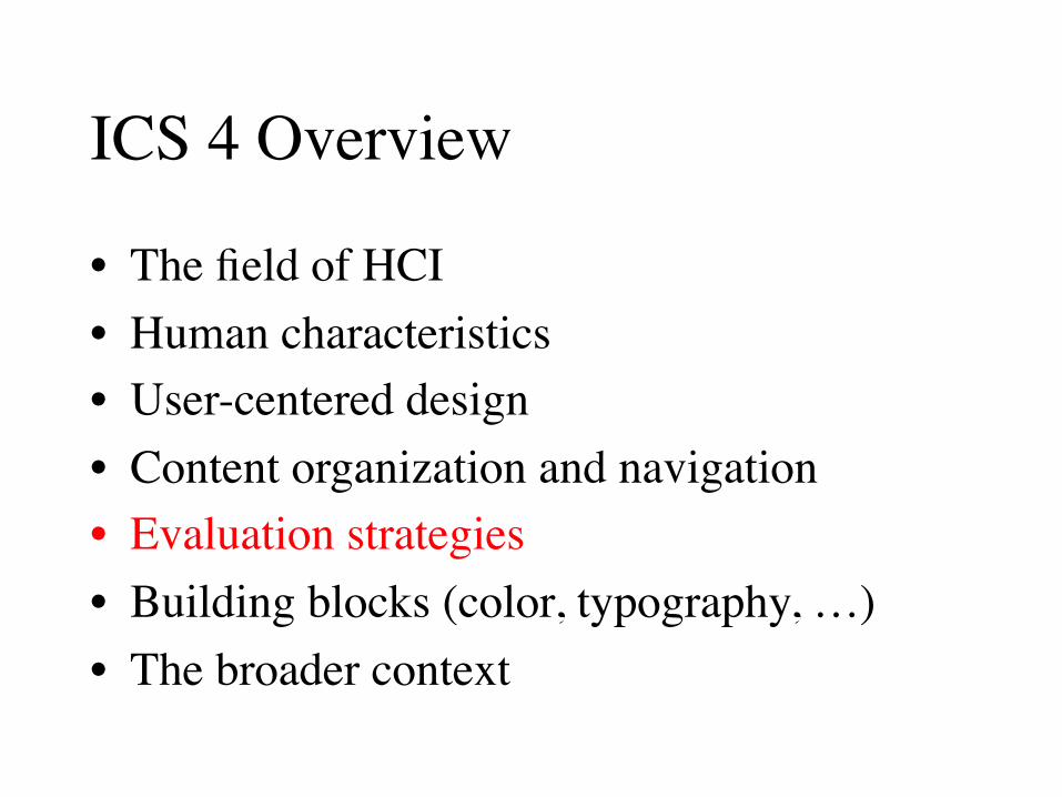
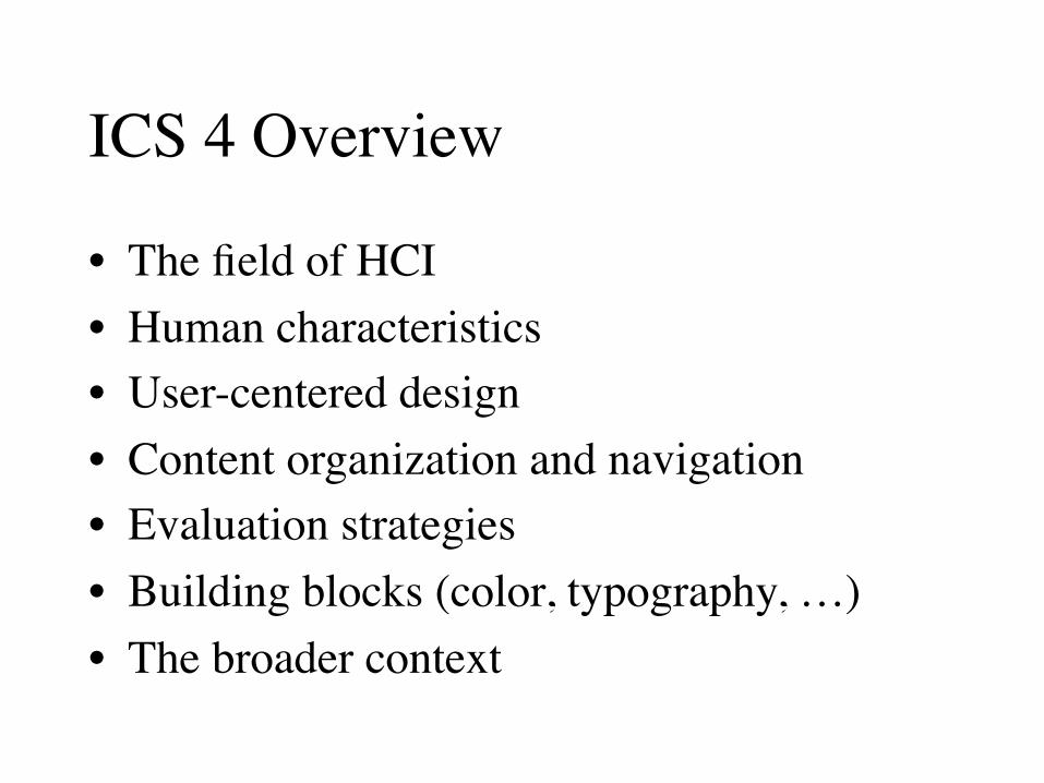
ICS 4 Overview
• The field of HCI• Human characteristics• User-centered design• Content organization and navigation• Evaluation strategies• Building blocks (color, typography, …)• The broader context
Why are we here?
• The web is everywhere• People time is more expensive than
computer time • Interfaces matter: for efficiency, for
convenience, for commercial success,even for life and death
• Everyone has stories of bad user interfaces
What is HCI?
• Narrowly: 1 user, 1 computer– Focus on software, layout and operation of UI
• Broadly: people and computers– Users’ mental processes, work practices– Training; collaboration; management– Social/organizational/health issues

Six aspects of HCI
• Human abilities (perception, memory, …)• Technologies (browsers, links, cellphones, …)• Design methods (prototyping, lifecycles, …)• Evaluation methods (experiments,
observation, …)• Guidelines and results (what has been proven to
work in particular situations, e.g., typography) • Implementation tools and techniques
ICS 4 Recurring Themes
• People are diverse, unpredictable, messy, and ill-understood
• You (the designer) may not be qualified to know what the user needs
• You have to evaluate constantly, at every stage of development
• The later you are in the development cycle, the more it costs to make changes
How did the field of HCI arise?
• Once, it was enough if software just worked (most of the time)
• Once, the burden was on the user• Today, you have to care: Success of a
product (and well-being of users) depends on good UI
Administrative Stuff
• Syllabus• Your “HCI Notebook”: Carry it with you
always!
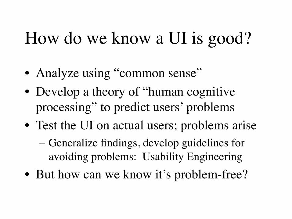
How do we know a UI is good?
• Analyze using “common sense”• Develop a theory of “human cognitive
processing” to predict users’ problems• Test the UI on actual users; problems arise
– Generalize findings, develop guidelines for avoiding problems: Usability Engineering
• But how can we know it’s problem-free?
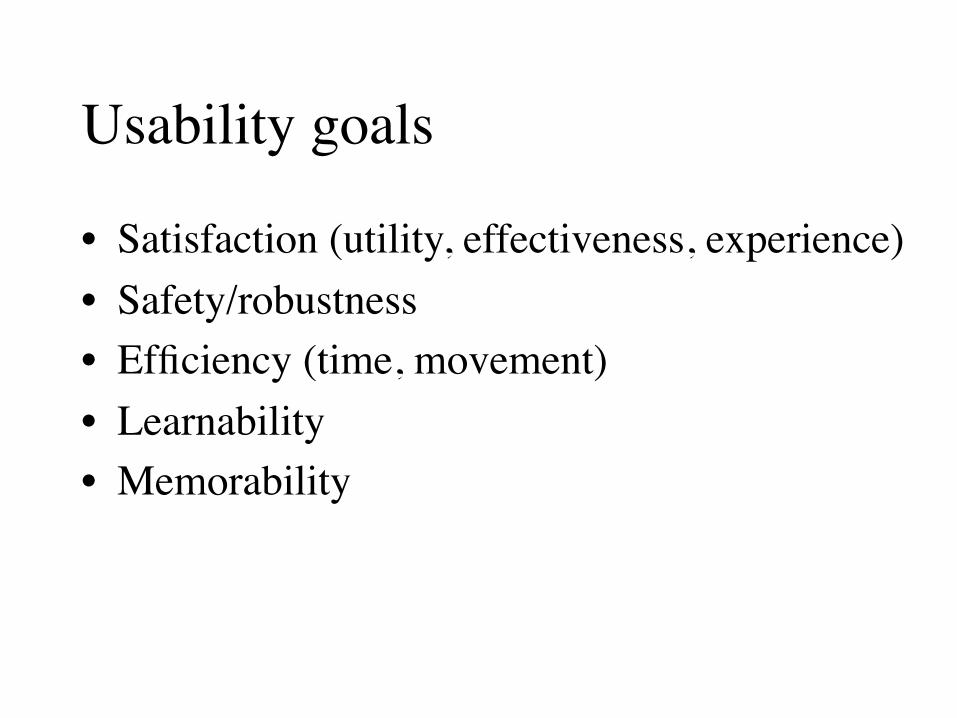
Usability goals
• Satisfaction (utility, effectiveness, experience)• Safety/robustness• Efficiency (time, movement)• Learnability• Memorability
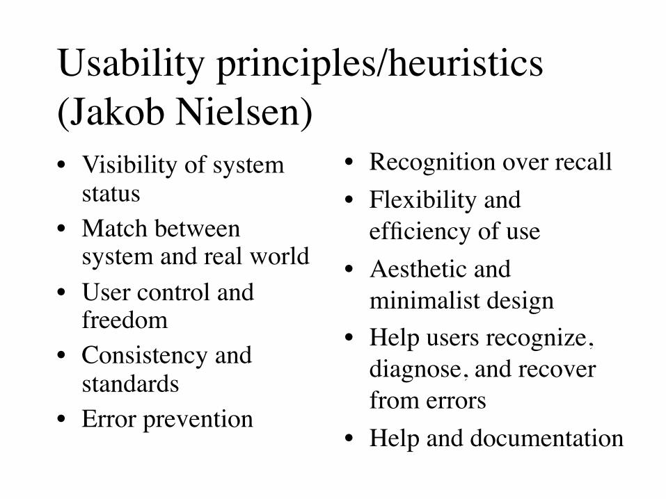
Usability principles/heuristics (Jakob Nielsen)• Visibility of system
status• Match between
system and real world• User control and
freedom• Consistency and
standards• Error prevention
• Recognition over recall• Flexibility and
efficiency of use• Aesthetic and
minimalist design• Help users recognize,
diagnose, and recover from errors
• Help and documentation
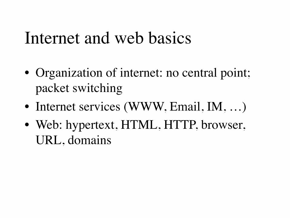
Internet and web basics
• Organization of internet: no central point; packet switching
• Internet services (WWW, Email, IM, …)• Web: hypertext, HTML, HTTP, browser,
URL, domains
ICS 4 Overview
• The field of HCI• Human characteristics• User-centered design• Content organization and navigation• Evaluation strategies• Building blocks (color, typography, …)• The broader context

Human perception and cognition
• If we’re designing web sites for human users, it only makes sense to know something about “how people work”
• Our brains don’t just “take pictures”: They process, select, categorize, model
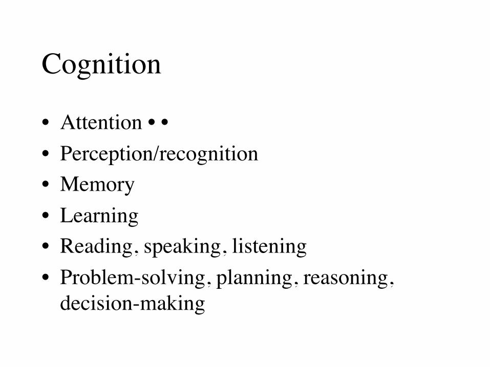
Cognition
• Attention • •• Perception/recognition• Memory• Learning• Reading, speaking, listening• Problem-solving, planning, reasoning,
decision-making
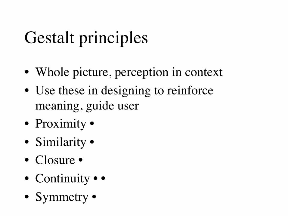
Gestalt principles
• Whole picture, perception in context• Use these in designing to reinforce
meaning, guide user• Proximity •• Similarity •• Closure •• Continuity • •• Symmetry •
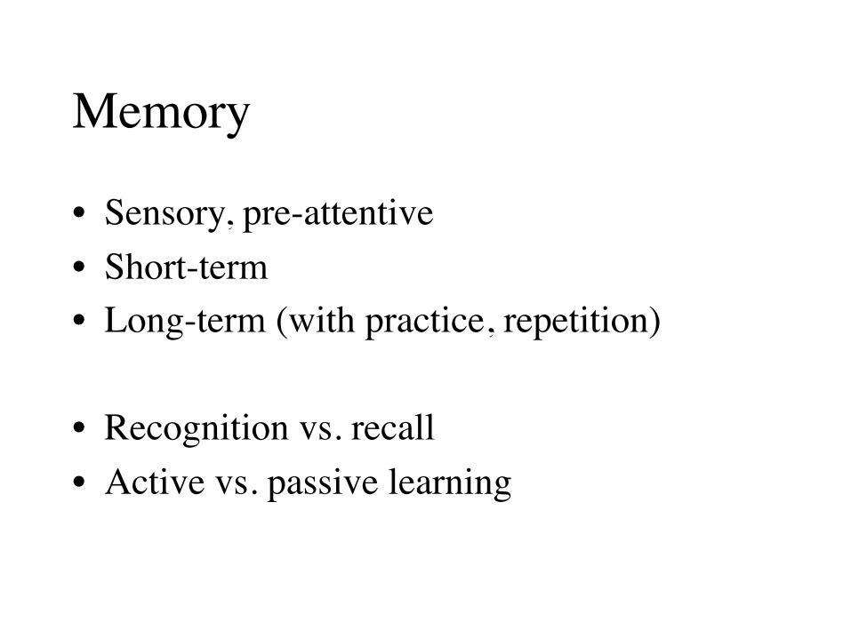
Memory
• Sensory, pre-attentive• Short-term• Long-term (with practice, repetition)
• Recognition vs. recall• Active vs. passive learning
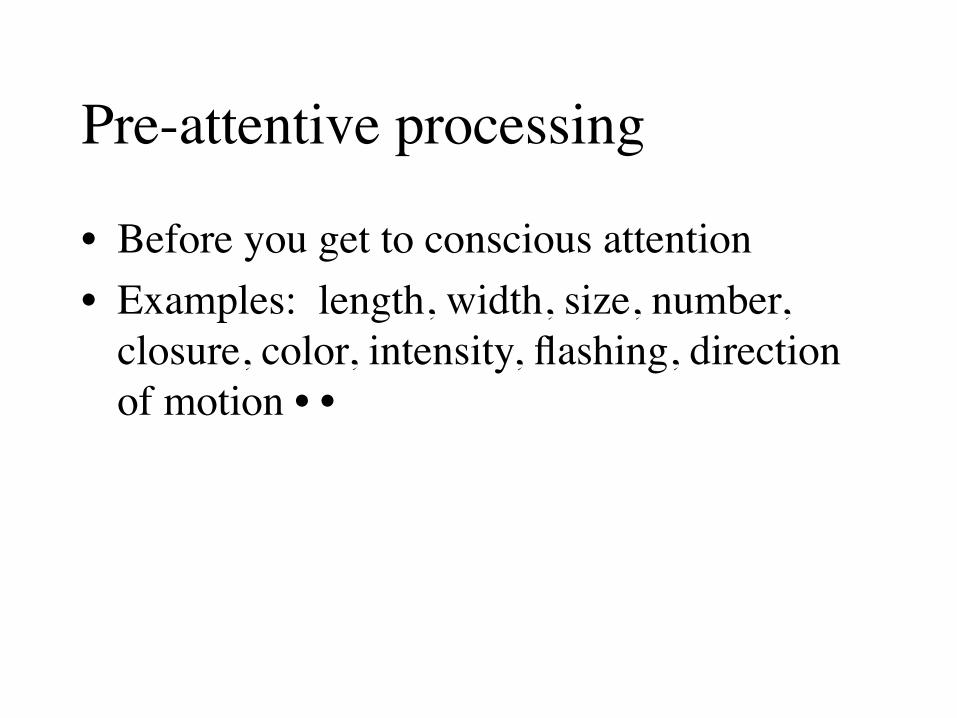
Pre-attentive processing
• Before you get to conscious attention• Examples: length, width, size, number,
closure, color, intensity, flashing, direction of motion • •

Conceptual/mental models• Model: abstraction, simplification• How user thinks of system/device/product• Functional (how it works, how to use)
– Should match the task• Structural (how it’s organized, built)
– Harder to acquire from experience– Useful for extension, integration
• May not match reality – Maybe that’s okay
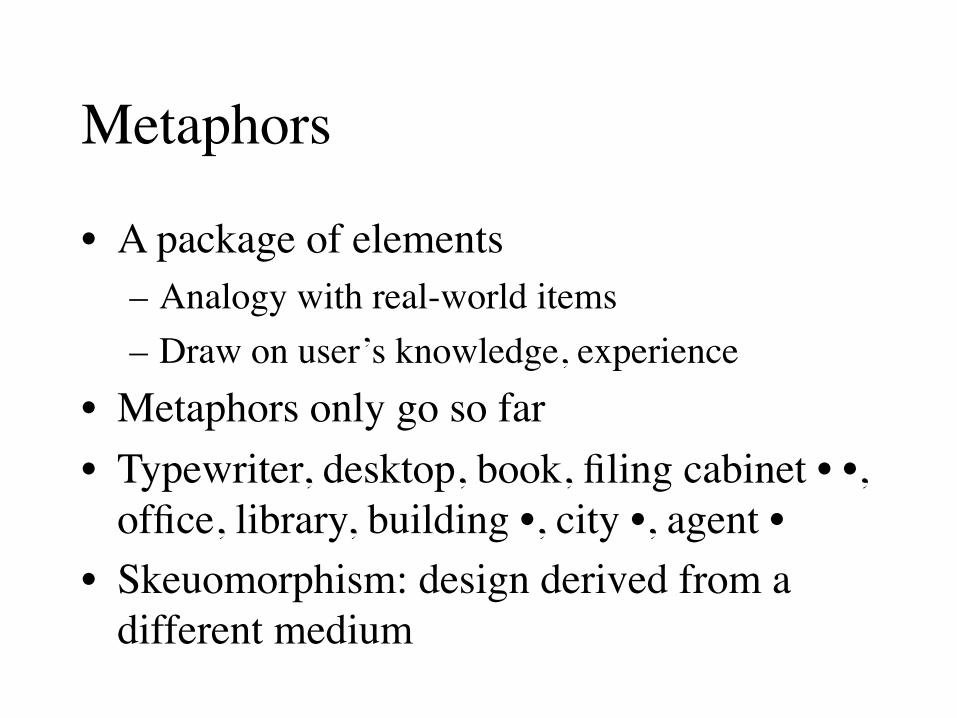
Metaphors
• A package of elements– Analogy with real-world items– Draw on user’s knowledge, experience
• Metaphors only go so far• Typewriter, desktop, book, filing cabinet • •,
office, library, building •, city •, agent •• Skeuomorphism: design derived from a
different medium
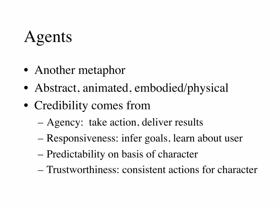
Agents
• Another metaphor• Abstract, animated, embodied/physical• Credibility comes from
– Agency: take action, deliver results– Responsiveness: infer goals, learn about user– Predictability on basis of character– Trustworthiness: consistent actions for character
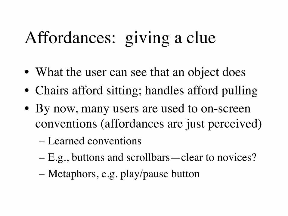
Affordances: giving a clue
• What the user can see that an object does• Chairs afford sitting; handles afford pulling• By now, many users are used to on-screen
conventions (affordances are just perceived)– Learned conventions– E.g., buttons and scrollbars—clear to novices?– Metaphors, e.g. play/pause button
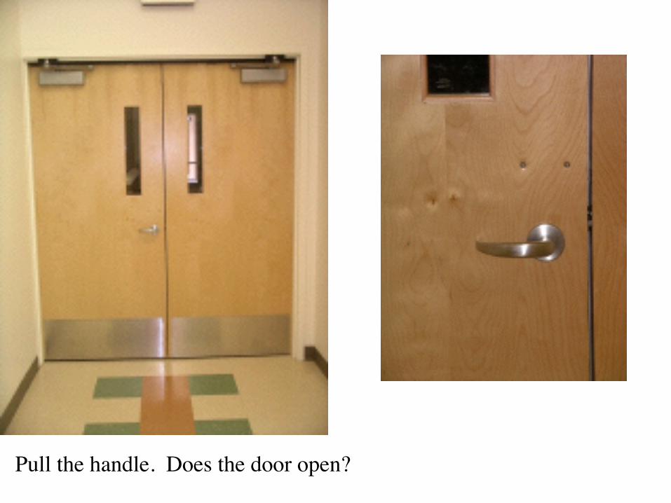
Pull the handle. Does the door open?
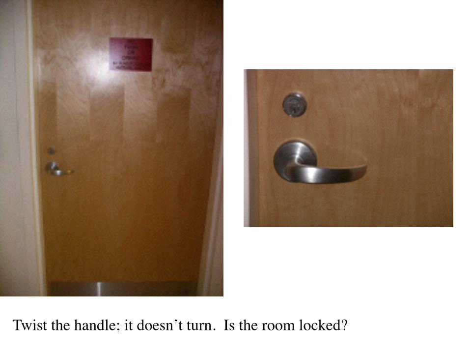
Twist the handle; it doesn’t turn. Is the room locked?

An affordance for pushing
Text
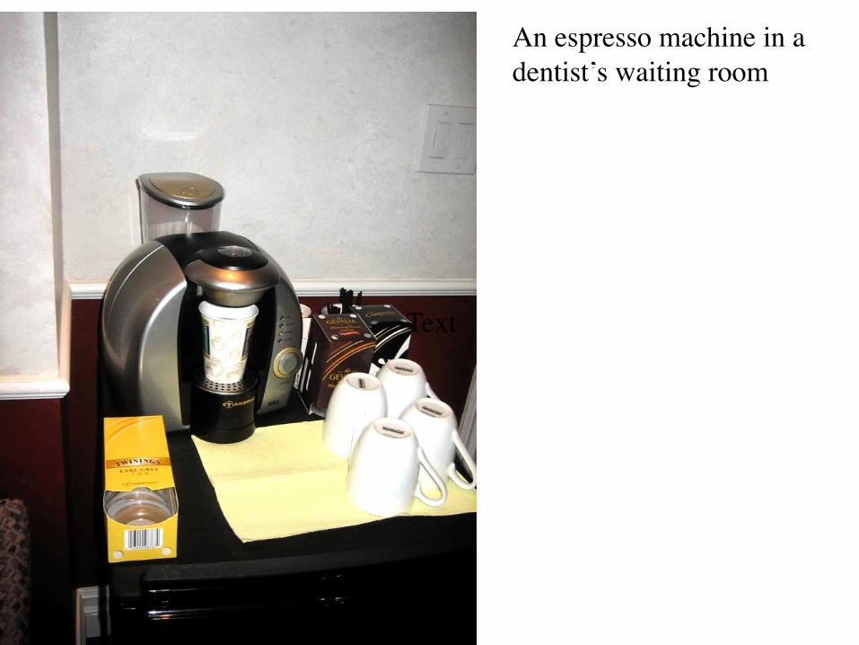
An espresso machine in a dentist’s waiting room
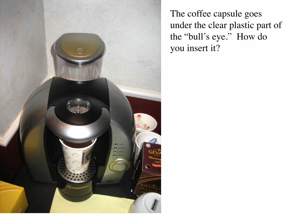
The coffee capsule goes under the clear plastic part of the “bull’s eye.” How do you insert it?
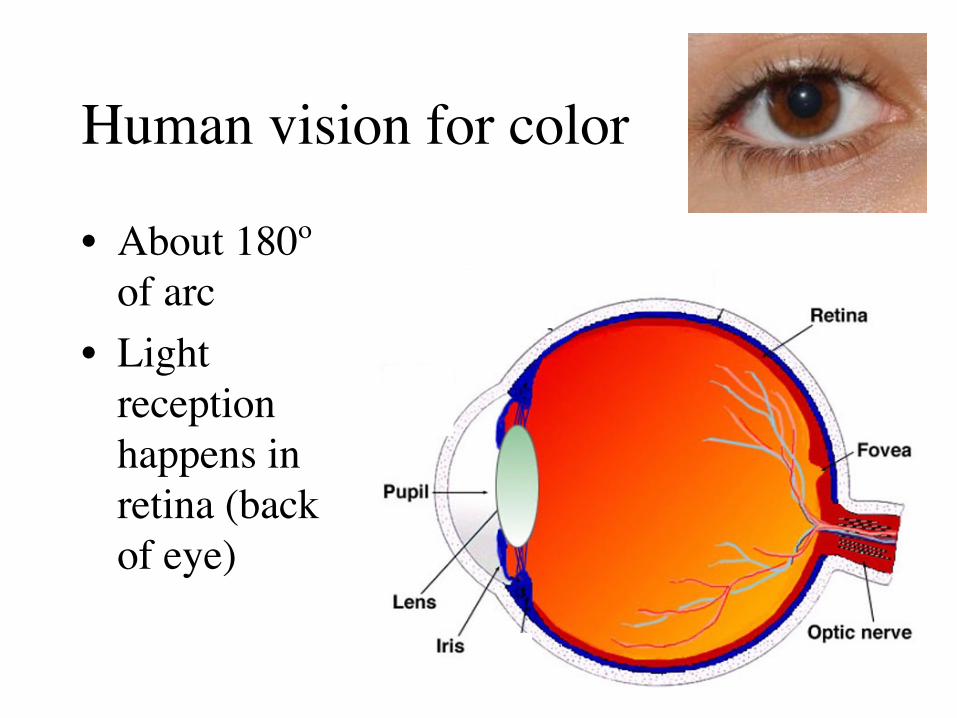
Human vision for color
• About 180ºof arc
• Lightreceptionhappens inretina (backof eye)
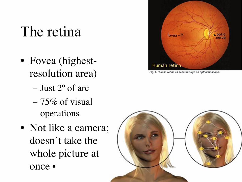
The retina
• Fovea (highest-resolution area)– Just 2º of arc– 75% of visual
operations• Not like a camera;
doesn’t take the whole picture at once •
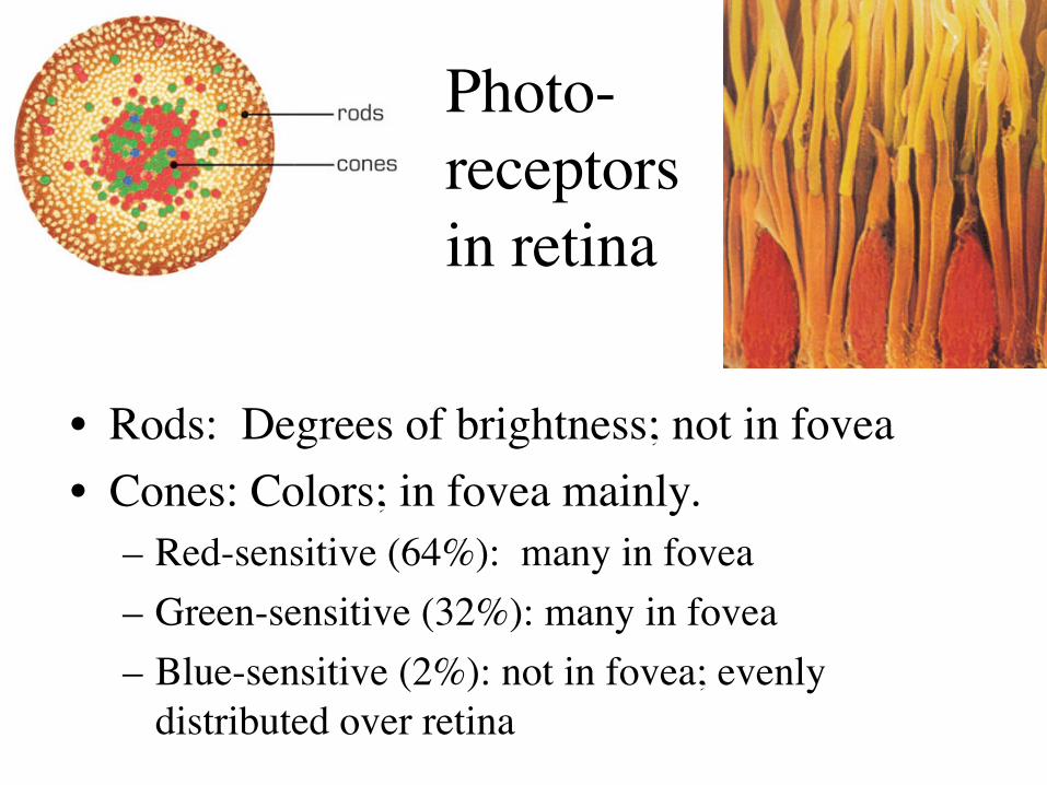
Photo-receptors in retina
• Rods: Degrees of brightness; not in fovea• Cones: Colors; in fovea mainly.
– Red-sensitive (64%): many in fovea– Green-sensitive (32%): many in fovea– Blue-sensitive (2%): not in fovea; evenly
distributed over retina
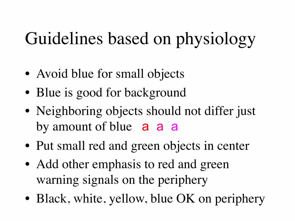
Guidelines based on physiology
• Avoid blue for small objects• Blue is good for background• Neighboring objects should not differ just
by amount of blue a a a• Put small red and green objects in center• Add other emphasis to red and green
warning signals on the periphery• Black, white, yellow, blue OK on periphery
Graphical coding
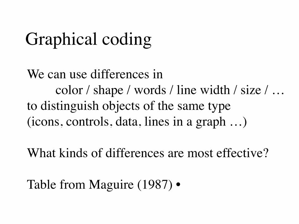
We can use differences in color / shape / words / line width / size / …to distinguish objects of the same type(icons, controls, data, lines in a graph …)
What kinds of differences are most effective?
Table from Maguire (1987) •
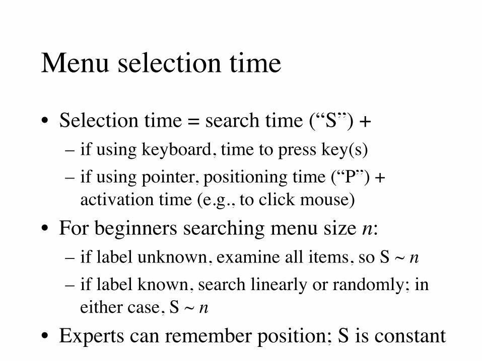
Menu selection time
• Selection time = search time (“S”) +– if using keyboard, time to press key(s)– if using pointer, positioning time (“P”) +
activation time (e.g., to click mouse)• For beginners searching menu size n:
– if label unknown, examine all items, so S ~ n– if label known, search linearly or randomly; in
either case, S ~ n• Experts can remember position; S is constant
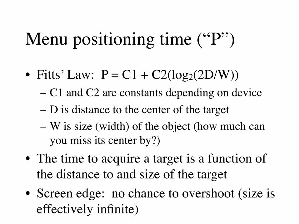
Menu positioning time (“P”)
• Fitts’ Law: P = C1 + C2(log2(2D/W))– C1 and C2 are constants depending on device– D is distance to the center of the target– W is size (width) of the object (how much can
you miss its center by?)• The time to acquire a target is a function of
the distance to and size of the target• Screen edge: no chance to overshoot (size is
effectively infinite)

Learning modes (sensory input)
• Visual• Auditory• Kinesthetic
• Exercise from Saundra Sparling
ICS 4 Overview
• The field of HCI• Human characteristics• User-centered design• Content organization and navigation• Evaluation strategies• Building blocks (color, typography, …)• The broader context
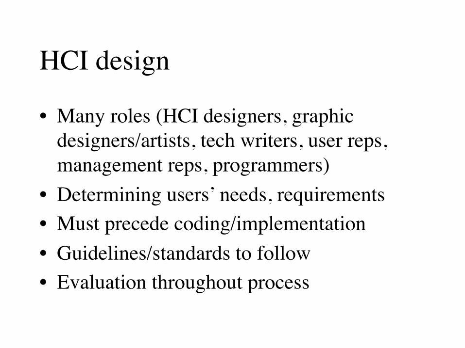
HCI design
• Many roles (HCI designers, graphic designers/artists, tech writers, user reps, management reps, programmers)
• Determining users’ needs, requirements• Must precede coding/implementation• Guidelines/standards to follow• Evaluation throughout process
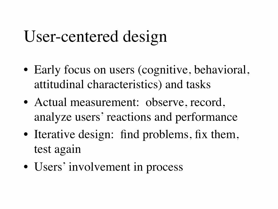
User-centered design
• Early focus on users (cognitive, behavioral, attitudinal characteristics) and tasks
• Actual measurement: observe, record, analyze users’ reactions and performance
• Iterative design: find problems, fix them, test again
• Users’ involvement in process
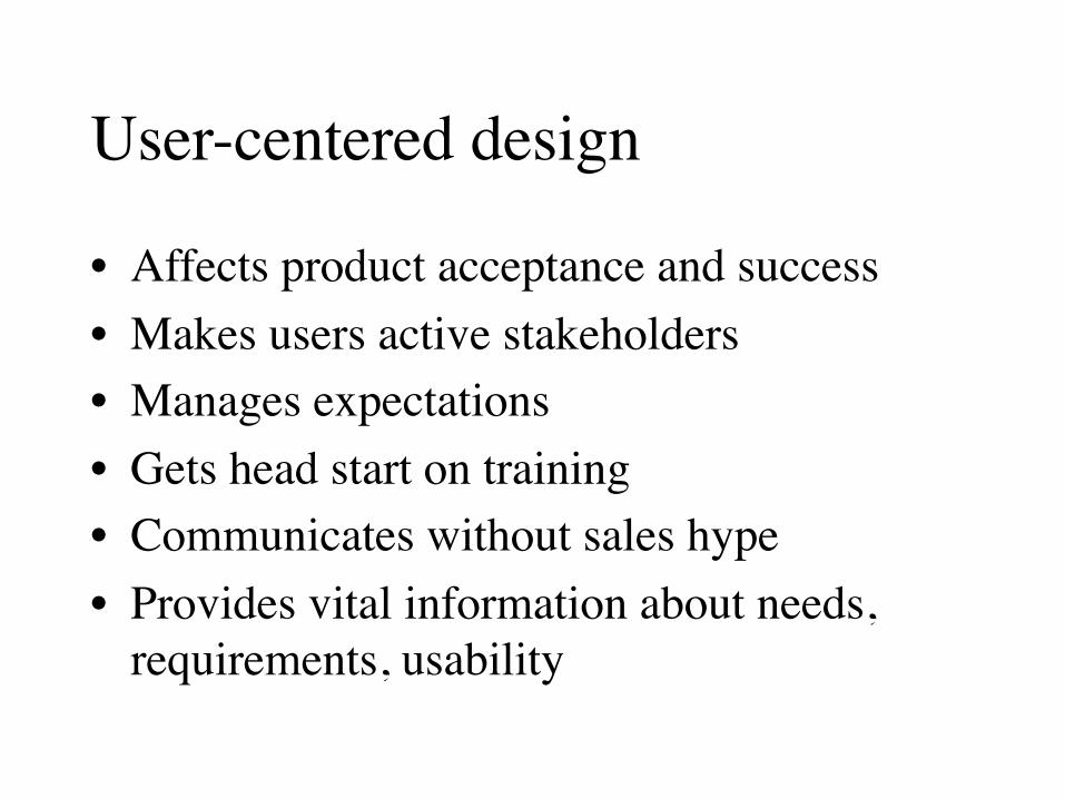
User-centered design
• Affects product acceptance and success• Makes users active stakeholders • Manages expectations• Gets head start on training• Communicates without sales hype• Provides vital information about needs,
requirements, usability
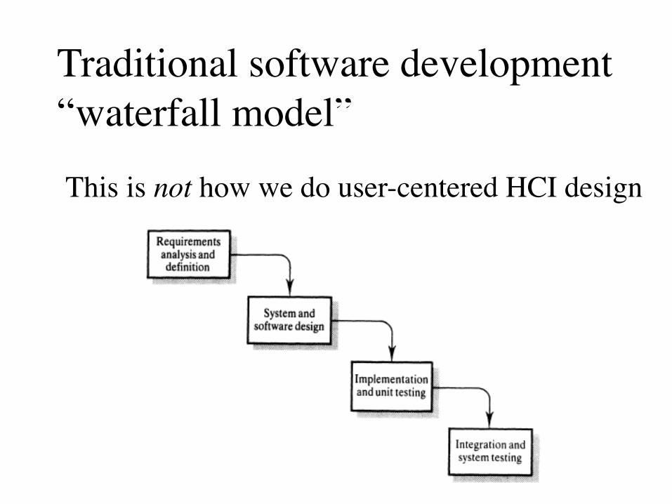
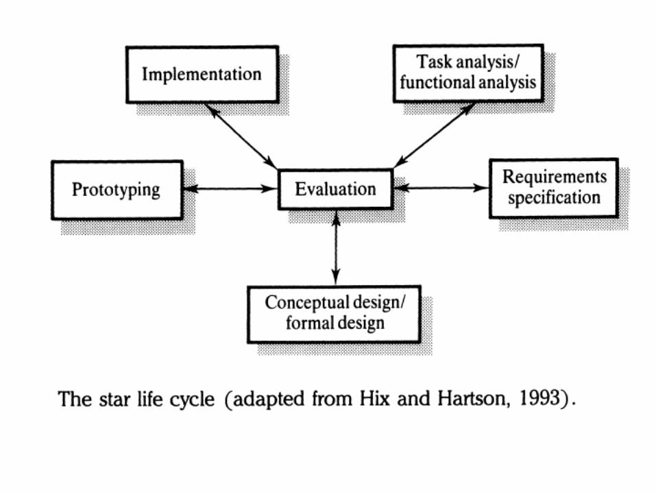
Traditional software development “waterfall model”
This is not how we do user-centered HCI design
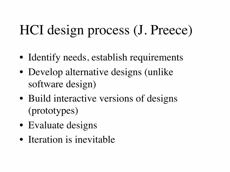
HCI design process (J. Preece)
• Identify needs, establish requirements• Develop alternative designs (unlike
software design)• Build interactive versions of designs
(prototypes)• Evaluate designs• Iteration is inevitable
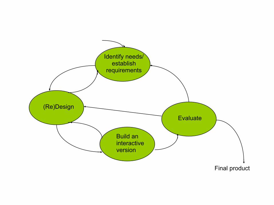
Evaluate
(Re)Design
Identify needs/ establish
requirements
Build an interactive version
Final product
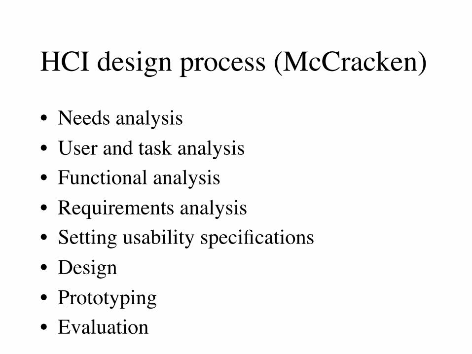
HCI design process (McCracken)
• Needs analysis• User and task analysis• Functional analysis• Requirements analysis• Setting usability specifications• Design• Prototyping• Evaluation
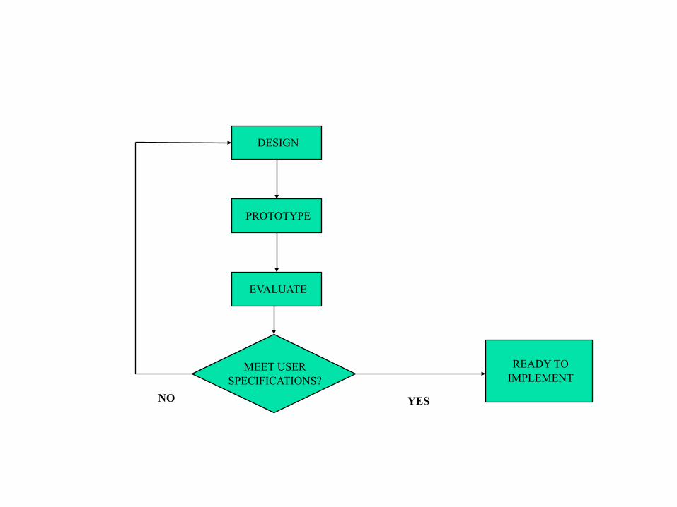
DESIGN
PROTOTYPE
EVALUATE
READY TO IMPLEMENT
MEET USER SPECIFICATIONS?
NO YES
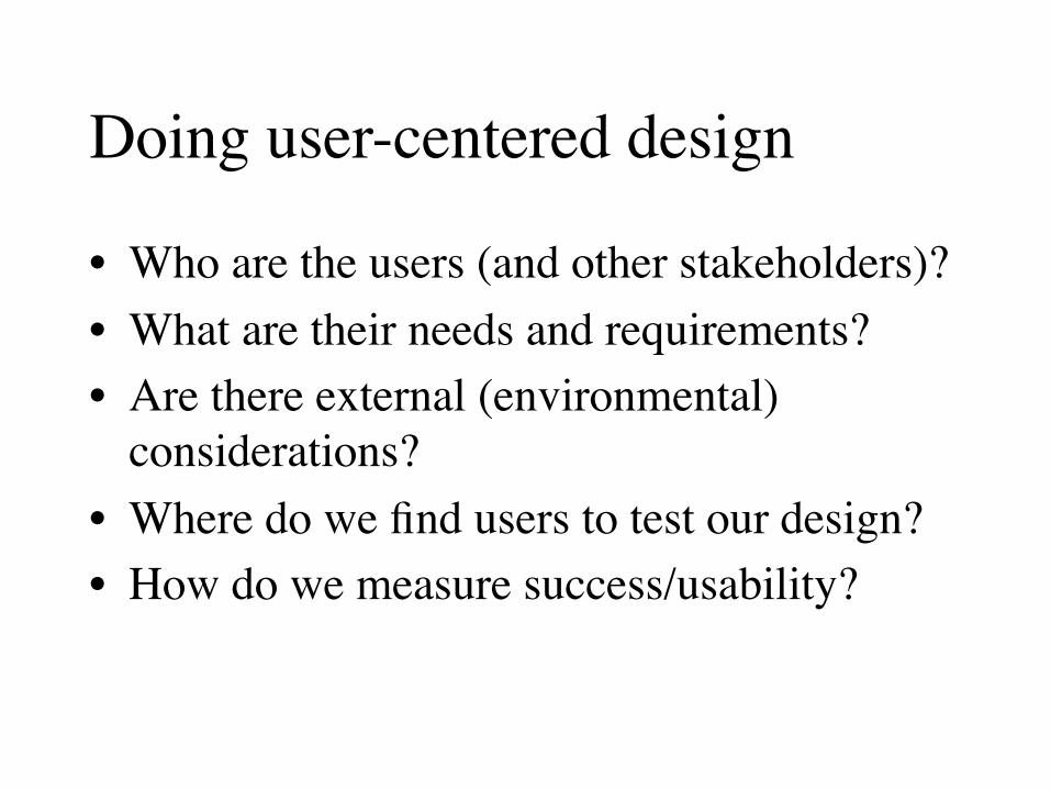
Doing user-centered design
• Who are the users (and other stakeholders)?• What are their needs and requirements?• Are there external (environmental)
considerations?• Where do we find users to test our design?• How do we measure success/usability?
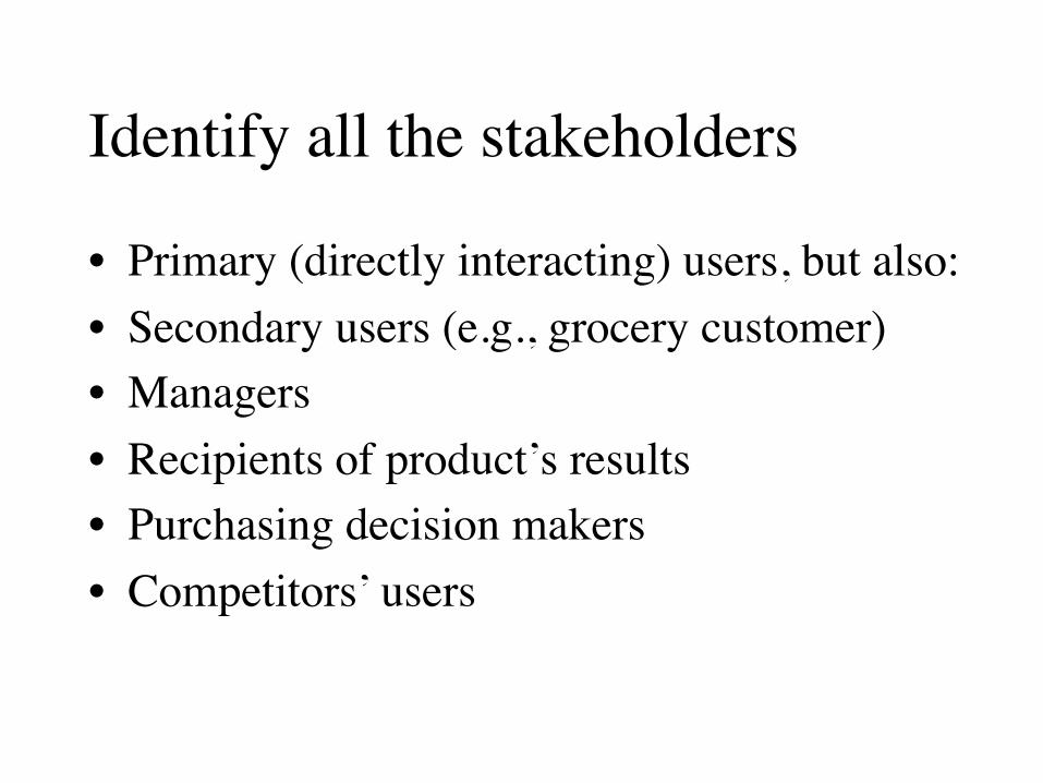
Identify all the stakeholders
• Primary (directly interacting) users, but also:• Secondary users (e.g., grocery customer)• Managers• Recipients of product’s results• Purchasing decision makers• Competitors’ users
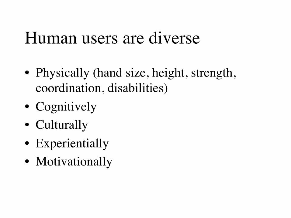
Human users are diverse
• Physically (hand size, height, strength, coordination, disabilities)
• Cognitively• Culturally• Experientially• Motivationally
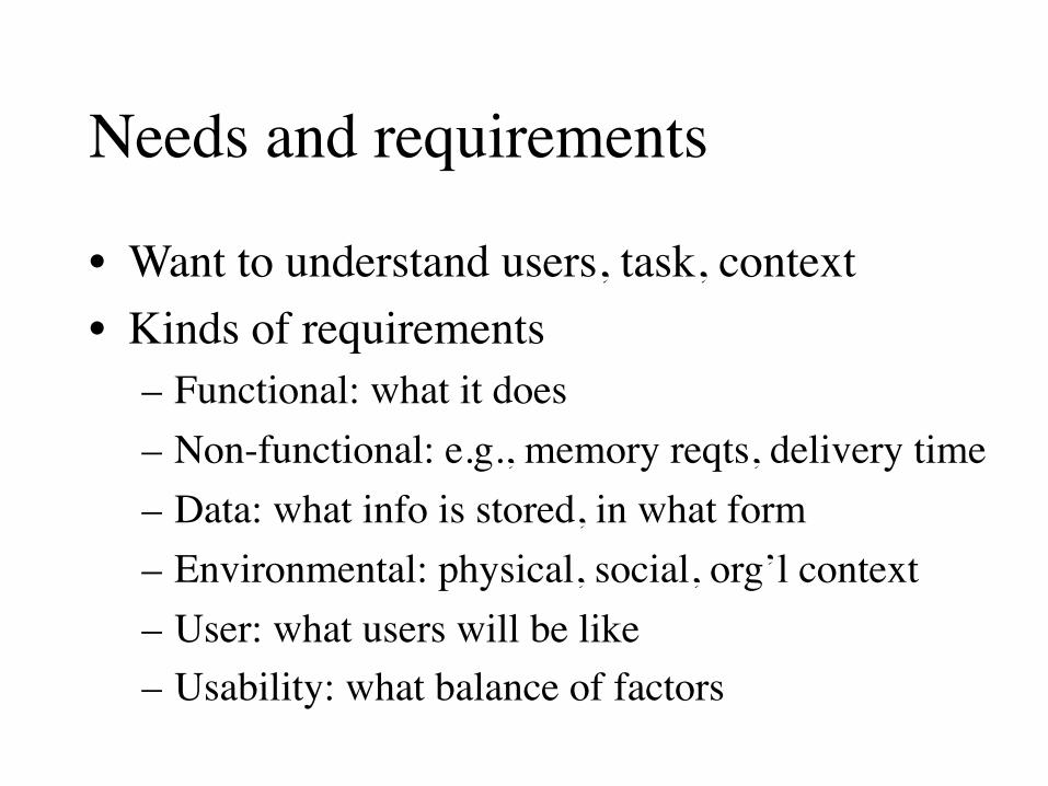
Needs and requirements
• Want to understand users, task, context• Kinds of requirements
– Functional: what it does– Non-functional: e.g., memory reqts, delivery time– Data: what info is stored, in what form– Environmental: physical, social, org’l context– User: what users will be like– Usability: what balance of factors
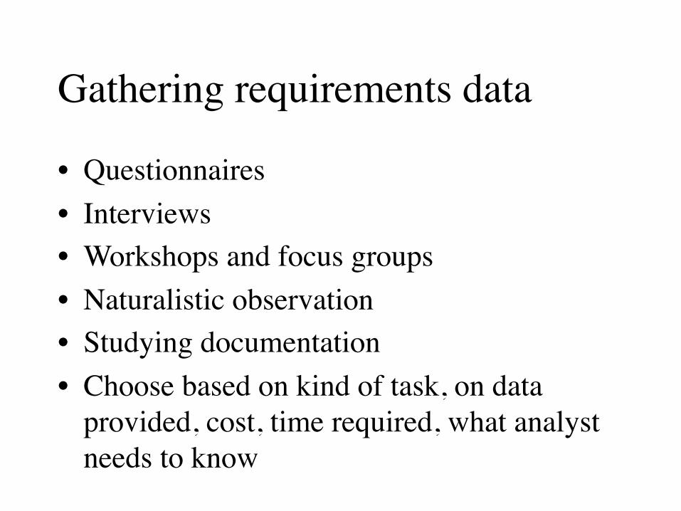
Gathering requirements data
• Questionnaires• Interviews• Workshops and focus groups• Naturalistic observation• Studying documentation• Choose based on kind of task, on data
provided, cost, time required, what analyst needs to know
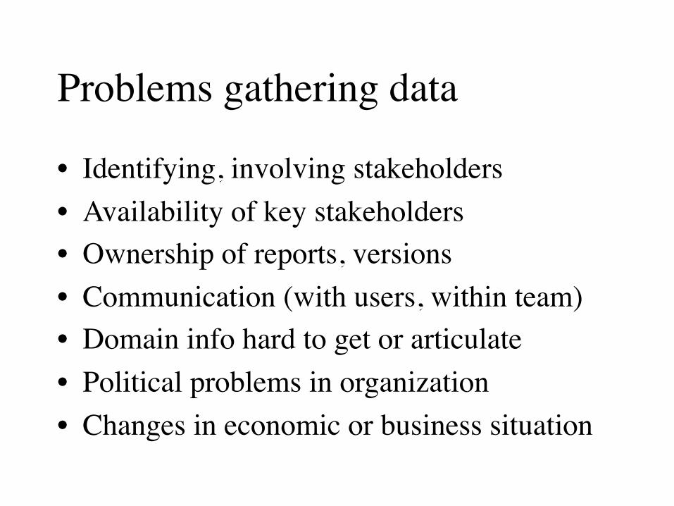
Problems gathering data
• Identifying, involving stakeholders• Availability of key stakeholders• Ownership of reports, versions• Communication (with users, within team)• Domain info hard to get or articulate• Political problems in organization• Changes in economic or business situation
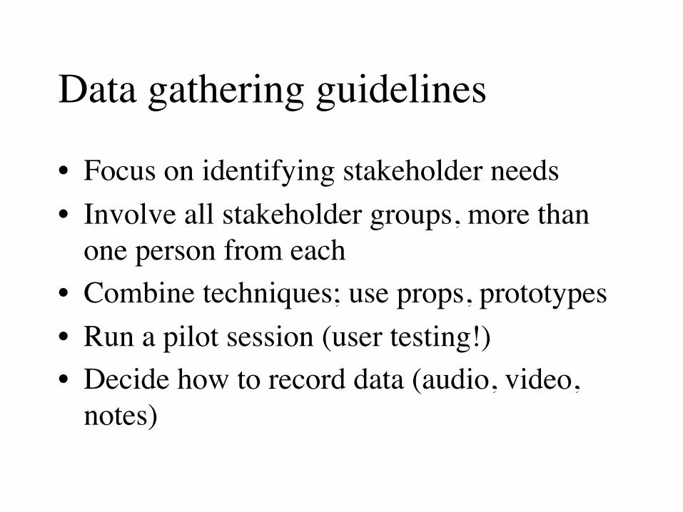
Data gathering guidelines
• Focus on identifying stakeholder needs• Involve all stakeholder groups, more than
one person from each• Combine techniques; use props, prototypes• Run a pilot session (user testing!)• Decide how to record data (audio, video,
notes)

Data analysis
• Don’t let data get stale• Do this iteratively, too• Decide which tools, how much formalism
– Quantitative vs. qualitative– Scenarios (narrative) and personas– Use cases (describe interaction with system,
alternative paths)– “Essential use cases,” “hierarchical task
analysis” (more formal methods)
Le mieux est l’ennemi du bien.(The best is the enemy of the good.)
—Voltaire [“Dramatic Art” in Philosophical Dictionary, 1764]
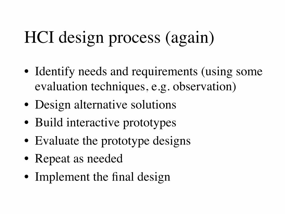
HCI design process (again)
• Identify needs and requirements (using some evaluation techniques, e.g. observation)
• Design alternative solutions• Build interactive prototypes• Evaluate the prototype designs• Repeat as needed• Implement the final design

Generating alternative designs
• No automatic way to come up with ideas• What kind of interaction (instructing,
conversing, manipulating, exploring)?• Look at similar systems, at very different
systems• Build up your repertoire, your toolbox;
expose yourself to a lot of things.• Techniques: brainstorming, attribute listing
and variation, …
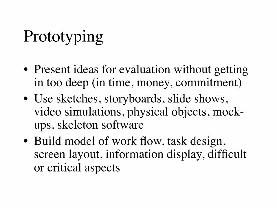
Prototyping
• Present ideas for evaluation without getting in too deep (in time, money, commitment)
• Use sketches, storyboards, slide shows, video simulations, physical objects, mock-ups, skeleton software
• Build model of work flow, task design, screen layout, information display, difficult or critical aspects
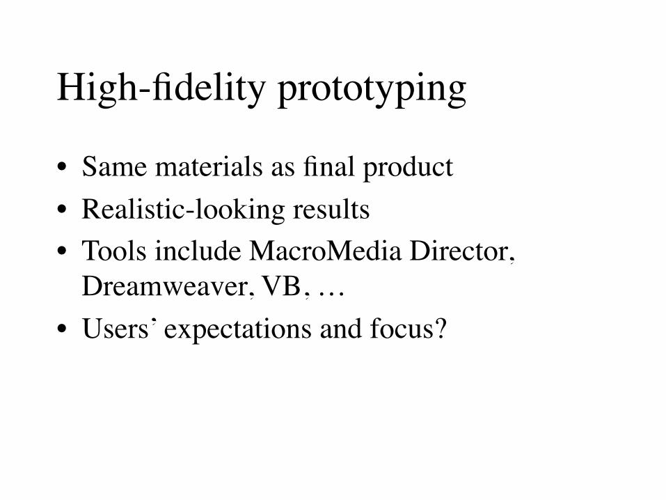
High-fidelity prototyping
• Same materials as final product• Realistic-looking results• Tools include MacroMedia Director,
Dreamweaver, VB, …• Users’ expectations and focus?

Low-fidelity prototyping
• Unlike the final form• Quick, cheap, easily changeable• Examples
– Sketches– Index cards– Storyboards– Sticky notes
• Paper prototyping • • •

Chapter 7: Prototyping Copyright © 2004 by Prentice Hall
Elements of a paper prototype Menu Bar
ScrollBar
Secondary Menu
Opening Contents
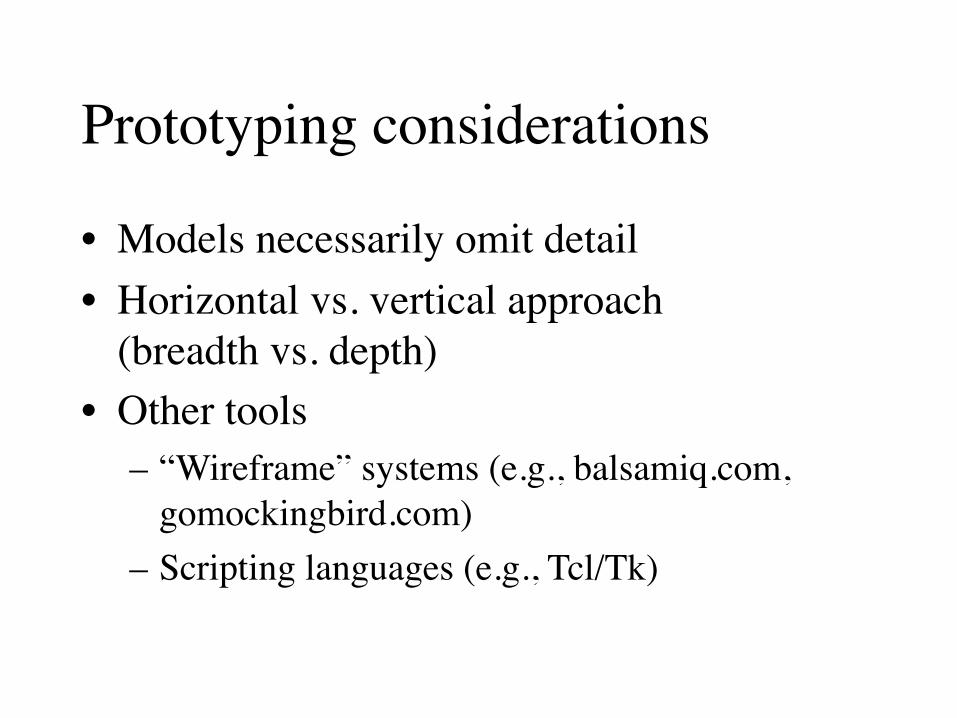
Prototyping considerations
• Models necessarily omit detail• Horizontal vs. vertical approach
(breadth vs. depth)• Other tools
– “Wireframe” systems (e.g., balsamiq.com, gomockingbird.com)
– Scripting languages (e.g., Tcl/Tk)
ICS 4 Overview
• The field of HCI• Human characteristics• User-centered design• Content organization and navigation• Evaluation strategies• Building blocks (color, typography, …)• The broader context

How do we organize information?• How do users group concepts together? • How do we name the groups? (McCracken:
organizational scheme)• How do the groups relate to each other?
(McCracken: organizational structure)

Organizational schemes
• Exact: alphabetical, chronological, geographical
• Inexact/ambiguous: topical, task-oriented, audience-specific
• Combinations

Organization structures• Shape can be hierarchical, linear/multipath,
network/web, matrix• Unrestricted
linking makesorientation hard
• Network/webstructures hardfor beginners
• Database •
Hypermedia and the WWW
• Nodes (info in many media)• Visible links to other nodes• HCI view: navigation between pages,
information presentation, multimedia layout• More than just HCI design • • • •
Visual organization principles
• Use proximity, alignment, consistency, contrast to good effect
• More closely related things should be closer, aligned, consistent
• Less closely related: further, contrasting• Every difference (in size, color, type,
placement) should have a reason or meaning
General screen guidelines
• Reflect structure of task, not of implementation• Group info for coherent subtask on one screen• With multiple, related screens
– Use same headlines– Present necessary info on each screen in same place– Allow navigation to previous screen, access to help,
ability to exit subtask or whole program
Special screen areas
• Title at top, distinguished• Can use bottom for status info, explanation,
warnings• Logos typically upper left or upper right• Clocks (no seconds, no ticking)• Special meanings: Home, Search, Contact,
About, Check Out
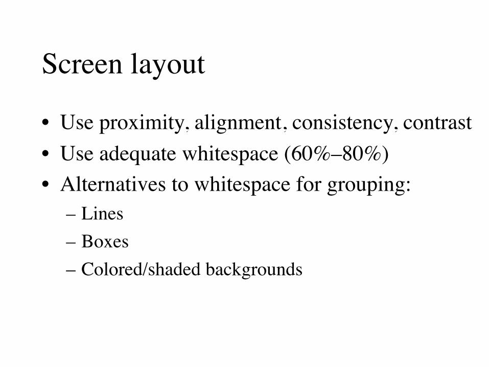
Screen layout
• Use proximity, alignment, consistency, contrast• Use adequate whitespace (60%–80%)• Alternatives to whitespace for grouping:
– Lines– Boxes– Colored/shaded backgrounds
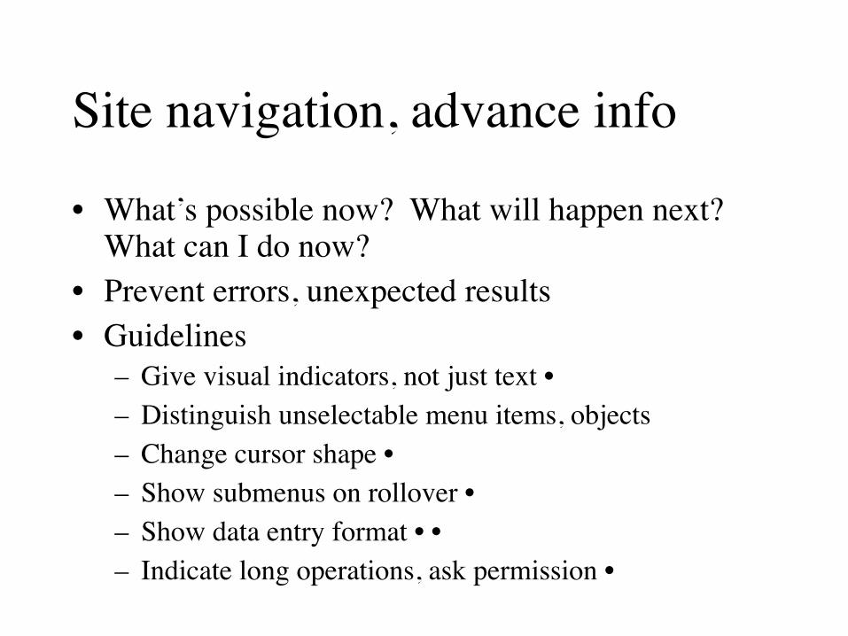
Site navigation, advance info
• What’s possible now? What will happen next? What can I do now?
• Prevent errors, unexpected results• Guidelines
– Give visual indicators, not just text •– Distinguish unselectable menu items, objects– Change cursor shape •– Show submenus on rollover •– Show data entry format • •– Indicate long operations, ask permission •
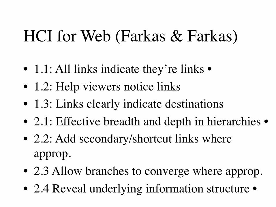
HCI for Web (Farkas & Farkas)
• 1.1: All links indicate they’re links •• 1.2: Help viewers notice links• 1.3: Links clearly indicate destinations• 2.1: Effective breadth and depth in hierarchies •• 2.2: Add secondary/shortcut links where
approp.• 2.3 Allow branches to converge where approp.• 2.4 Reveal underlying information structure •
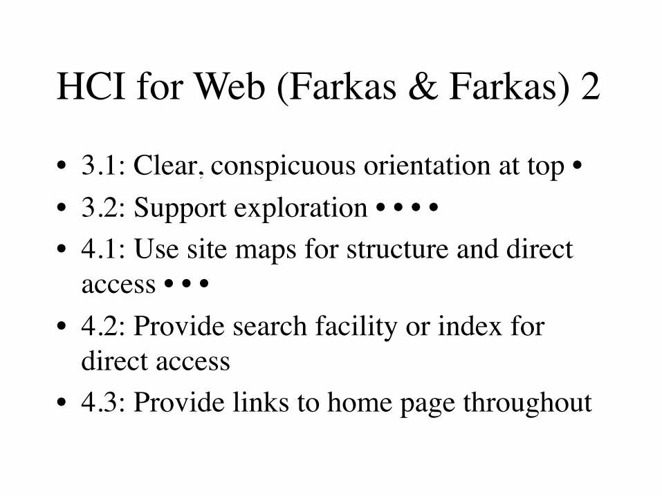
HCI for Web (Farkas & Farkas) 2
• 3.1: Clear, conspicuous orientation at top •• 3.2: Support exploration • • • •• 4.1: Use site maps for structure and direct
access • • •• 4.2: Provide search facility or index for
direct access• 4.3: Provide links to home page throughout
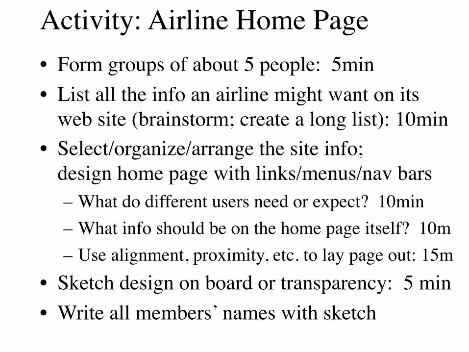
Activity: Airline Home Page• Form groups of about 5 people: 5min• List all the info an airline might want on its
web site (brainstorm; create a long list): 10min• Select/organize/arrange the site info;
design home page with links/menus/nav bars– What do different users need or expect? 10min– What info should be on the home page itself? 10m– Use alignment, proximity, etc. to lay page out: 15m
• Sketch design on board or transparency: 5 min• Write all members’ names with sketch
ICS 4 Overview
• The field of HCI• Human characteristics• User-centered design• Content organization and navigation• Evaluation strategies• Building blocks (color, typography, …)• The broader context

Evaluation
• Formative vs. summative• Four paradigms
– Informal feedback– Walkthroughs– Field studies– Predictive evaluation
• Goals: find problems or new opportunities, check conformity with guidelines, standards, requirements, …
Evaluation planning
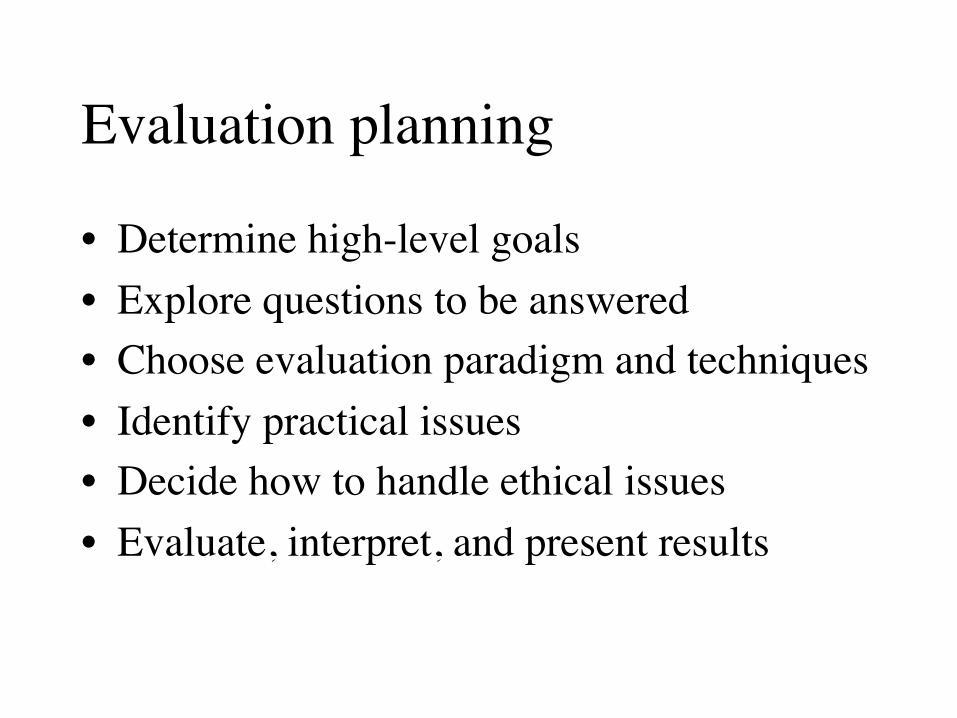
• Determine high-level goals• Explore questions to be answered• Choose evaluation paradigm and techniques• Identify practical issues• Decide how to handle ethical issues• Evaluate, interpret, and present results
Designing a study
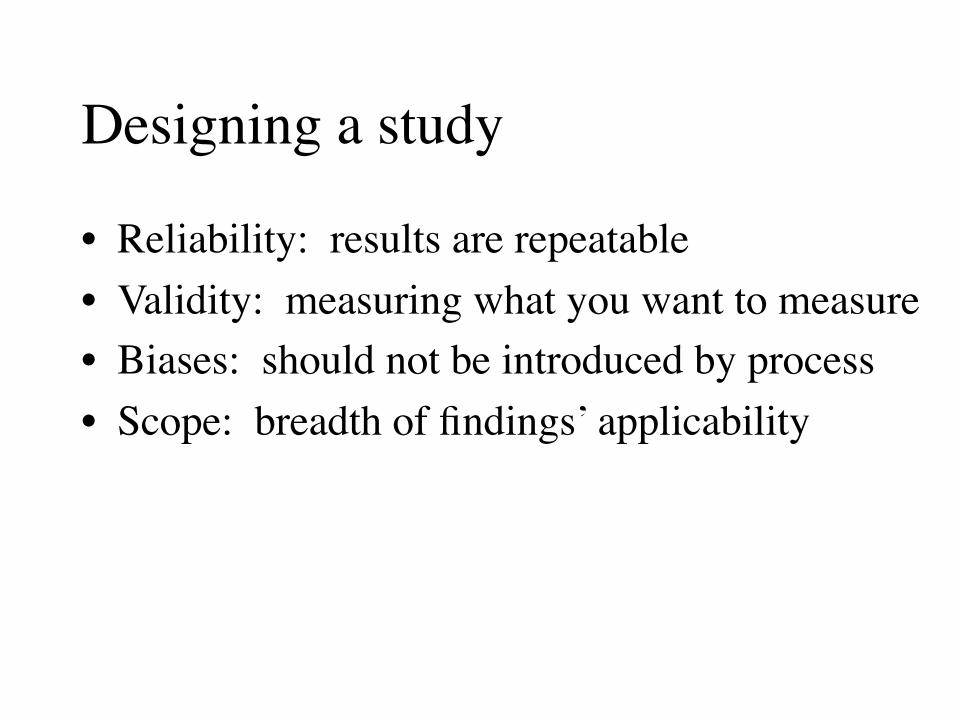
• Reliability: results are repeatable• Validity: measuring what you want to measure• Biases: should not be introduced by process• Scope: breadth of findings’ applicability
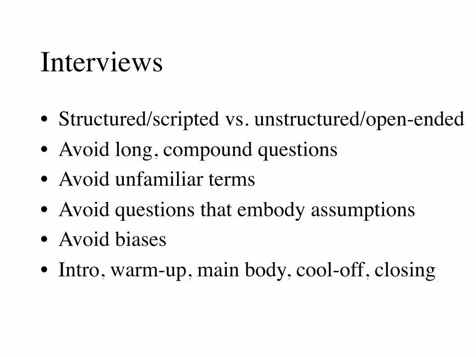
Interviews
• Structured/scripted vs. unstructured/open-ended• Avoid long, compound questions• Avoid unfamiliar terms• Avoid questions that embody assumptions• Avoid biases• Intro, warm-up, main body, cool-off, closing

Questionnaire development
• Paper vs. electronic, closed vs. open-ended• Checkboxes, rating scales, prose responses• Design
– Start off-line even if goal is electronic– Questions all positive, all negative, mixed– Pilot-test questions for clarity, sufficient space– Consider analysis
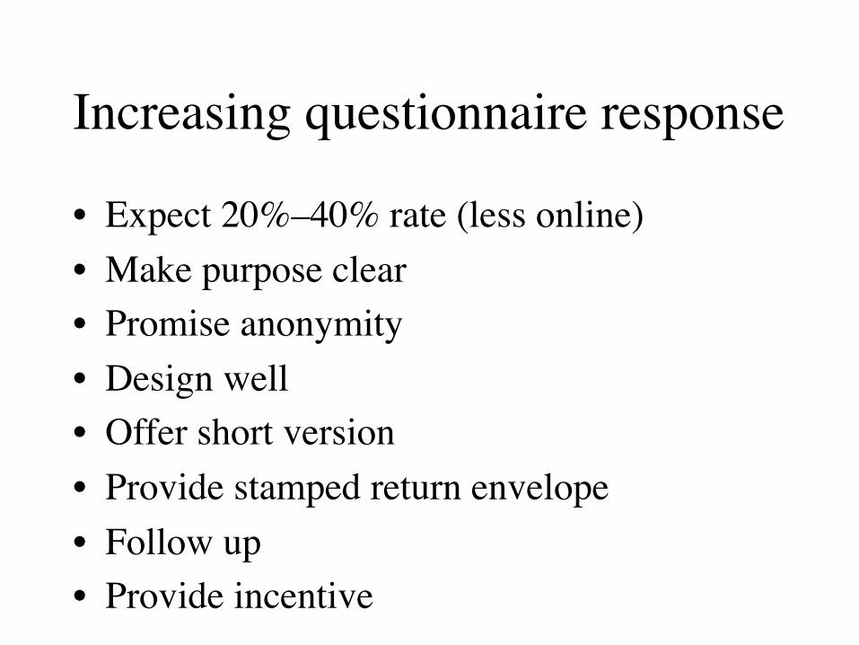
Increasing questionnaire response
• Expect 20%–40% rate (less online)• Make purpose clear• Promise anonymity• Design well• Offer short version• Provide stamped return envelope• Follow up• Provide incentive
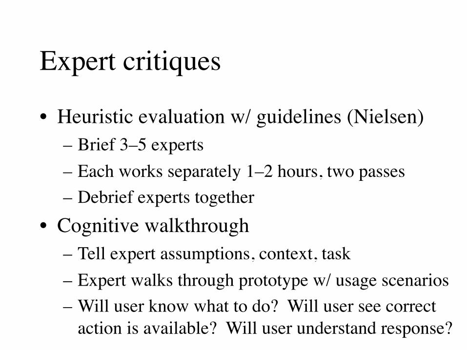
Expert critiques
• Heuristic evaluation w/ guidelines (Nielsen)– Brief 3–5 experts– Each works separately 1–2 hours, two passes– Debrief experts together
• Cognitive walkthrough– Tell expert assumptions, context, task– Expert walks through prototype w/ usage scenarios– Will user know what to do? Will user see correct
action is available? Will user understand response?

Observing users
• In the lab– Walkthroughs with low-fi prototypes– Instrumented sessions with higher-fi systems
• In the field• Consider, as always, who’s involved, their
goals, their actions, their feelings, the relevant objects and events
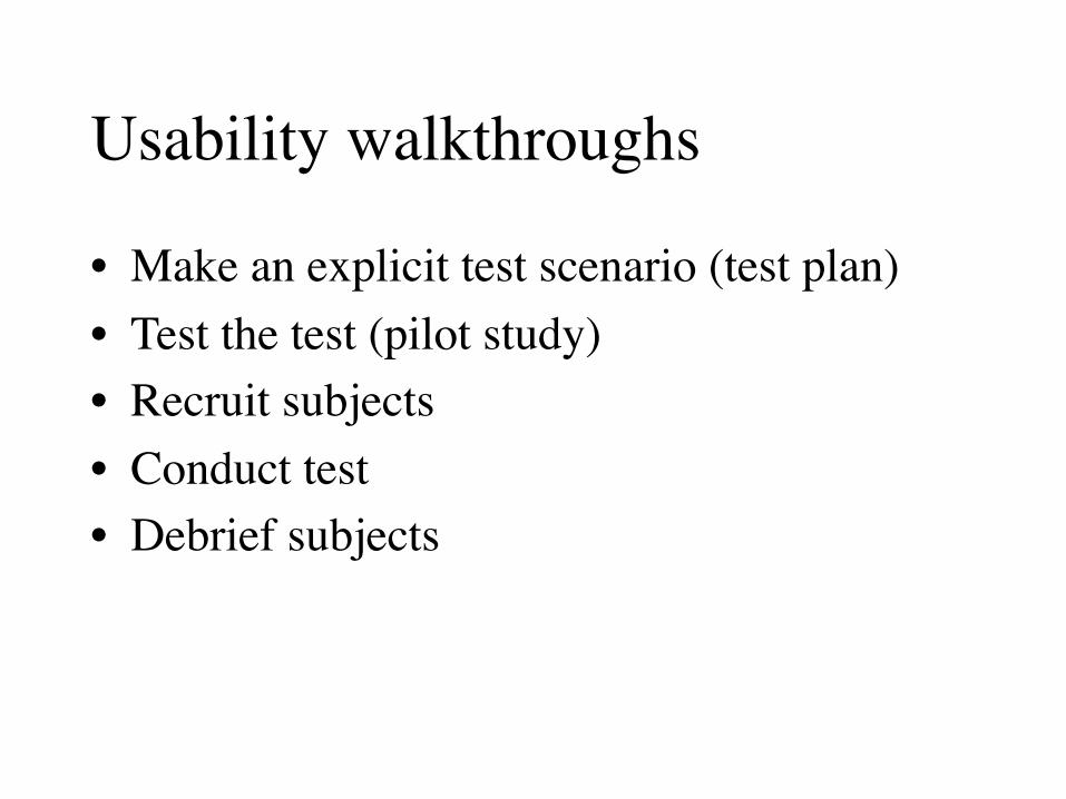
Usability walkthroughs
• Make an explicit test scenario (test plan)• Test the test (pilot study)• Recruit subjects• Conduct test• Debrief subjects
Roles in walkthroughs
• Greeter gets user settled• Facilitator talks to user during testing• Computer (a person) manipulates interface
elements• Observer(s) take notes
User testing
• A part of usability testing• Smaller-scale, less formal, more focused than
full-blown usability research• Can be quantitative: time to complete,
number of errors, number of help requests, number of users completing task successfully
• Can include keystroke-level monitoring• How many users?

ICS 4 Overview
• The field of HCI• Human characteristics• User-centered design• Content organization and navigation• Evaluation strategies• Building blocks (color, typography, …)• The broader context
Interaction styles (traditional)
• Command entry• Menus• Direct manipulation• Form fill-in• Natural language
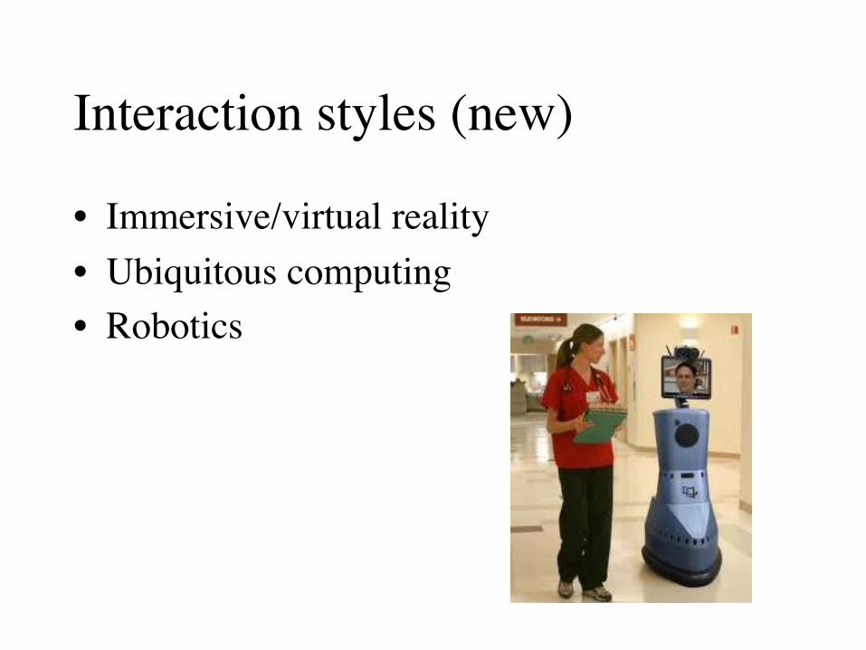
Interaction styles (new)
• Immersive/virtual reality• Ubiquitous computing• Robotics
Conceptual models for activities
• Giving instructions• Conversing• Manipulating, navigating• Exploring, browsing
Direct manipulation
• GUI objects representing task objects/funcs• Pointing device• Based on consistent metaphor• Congruent operations, always available• Immediate feedback• Form of icon, cursor on rollover indicates
possible operations
Feedback
• User action, system reaction (ideally < 0.1 sec)• Guidelines
– Highlight items on rollover– Mark selected items •– Show path in navigation hierarchy– Report errors immediately– Use status or progress indicators– Use visual, auditory, and tactile modes– Make reaction time uniform
Undo
• Encourages users to explore functionality• Guidelines
– Special-purpose undo (e.g., backspace) supplements general
– Try to make everything undoable (external effects clearer to users than internal)
– Multiple undo (undo/redo or linear sequence)
Error avoidance
• Provide advance information• Keep dangerous controls away from
frequently used ones• Warn users of irreversible effects; don’t
make them the default; request confirmation• Turn safety options on by default• Recognize errors and react ASAP

Error messages and actions
• Explain nature of problem, how user can solve it (at least with correct examples)
• Describe in terms of user’s task• Use polite language • • •• On crash, give opportunity to save• Support force quit and relaunch
Shneiderman’s error message guidelines
• Avoid “fatal,” “invalid,” “bad”• Avoid ALL CAPS, cryptic numbers• Give control over audio feedback• Give precise messages• Provide context-sensitive help
Quick activity: Silencing cellphones
• Form groups of 2, 3, or 4.• People forget to silence their cellphones in
class, meetings, movies. They forget to turn them back on when they’re done. Come up with an interface to help with this. (10 min.) Assume you have a smartphone with GPS, calendar, and other apps you can create.
• Write members’ names, very brief notes/sketch• Each group presents (60 seconds max)

Help: different types
• Tutorial or getting-started manuals• Guided tours• Reference manuals• Reminders (reference cards, keyboard
templates, rollovers)• Wizards (to walk through tasks)• Tips• On-line help (searchable)
Online help
• Available, consistent for all system functions• Including currently unavailable options• Situation-sensitive and concrete• Written in terms of user’s task• Not obscuring relevant items; movable• Initially short, with details on request• Good ID reduces need for explicit help
Tours, tutorials, manuals
• Tour should be short, hit highlights• Encourage active learning (e.g., user actions,
quizzes), address users directly, give examples• Manuals are last-resort, comprehensive
sources• Use tech writing specialists where possible
Form design guidelines
• Allow entry in tables or labeled data fields •• Left-align labels, fields, columns in tables •• Arrange sequences in columns •• Use meaningful, unambiguous labels• Mirror layout of paper source document• Use adequate white space • •• Tell user expected form of data; indicate if
required; allow “N/A” or “other”• Allow enough space for expected data
Data entry in forms
• Tab or return should move to next field• Fill fields with default/most recent/inference• Allow entry in arbitrary order• Allow abbreviation/expansion• Show alternatives if entry not unique •• Don’t supply dangerous values as auto entries• Detect, indicate, explain errors; allow multiple
corrections• Don’t require re-entry of correct data
Color
• Adds information, interest, emotion• Ways of thinking about color (color models)• Color harmony schemes• Text and background• Most illustrations from McCracken and
Wolfe, User-Centered Website Development

Spectrum of visible light
• Wavelengths ~350 – ~800 nanometers• Small part of whole electromagnetic
spectrum (radio, microwave, …, X-rays)
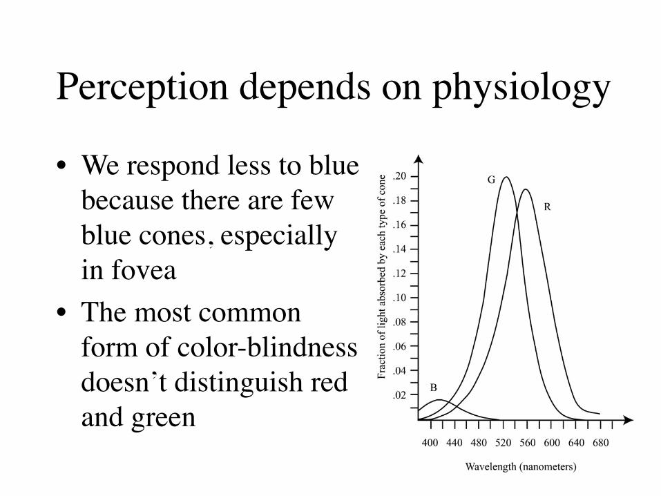
Perception depends on physiology
• We respond less to bluebecause there are few blue cones, especially in fovea
• The most common form of color-blindness doesn’t distinguish red and green
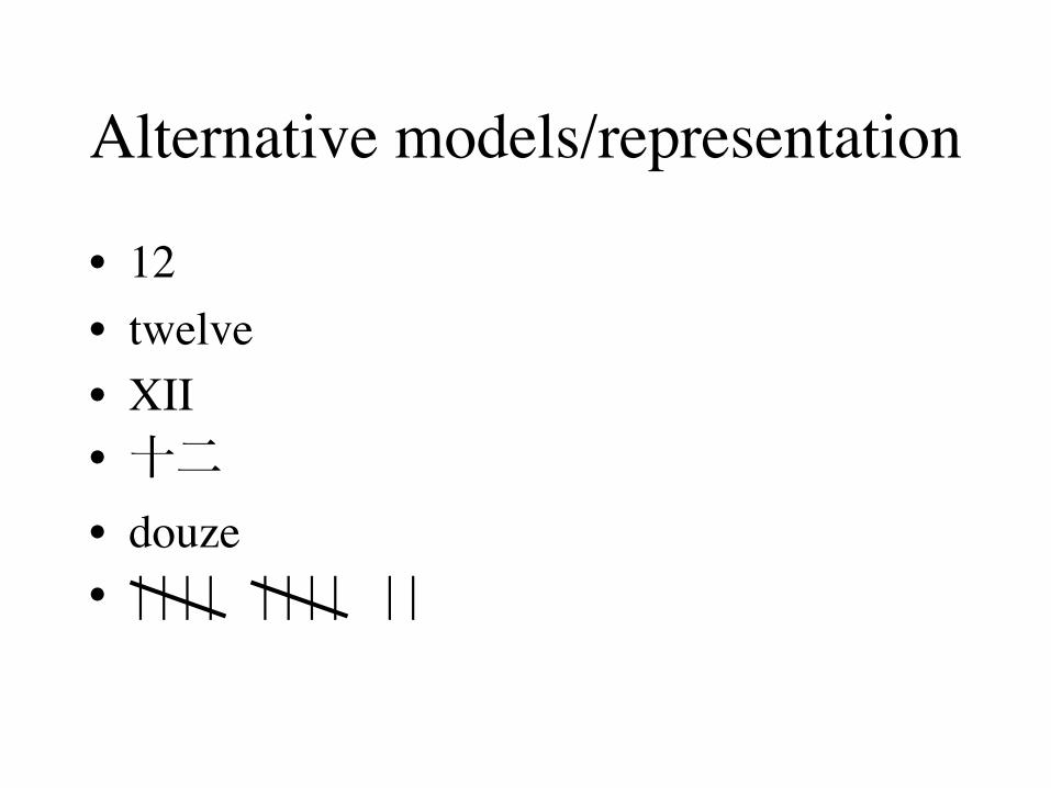
Alternative models/representation
• 12• twelve• XII• 十二• douze• |||| |||| ||

Color models
• RYB: red-yellow-blue (artist’s color wheel)• RGB: red-green-blue (additive color)• CMYK: cyan-magenta-yellow-black
(subtractive color)• HSB: hue-saturation-brightness• Lab: luminance - green/red - blue/yellow

RYB
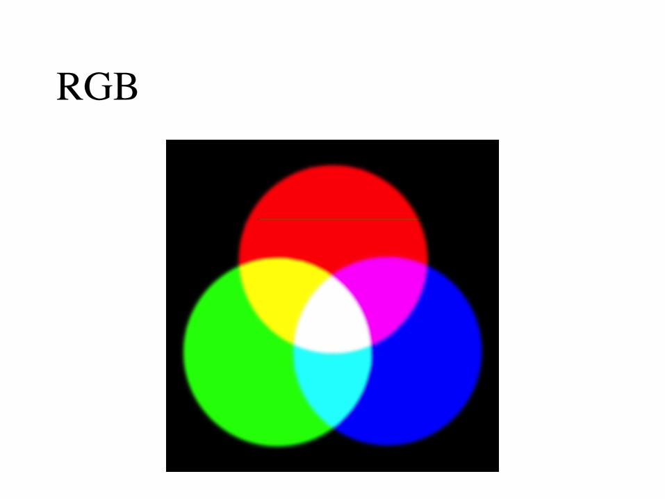
RGB
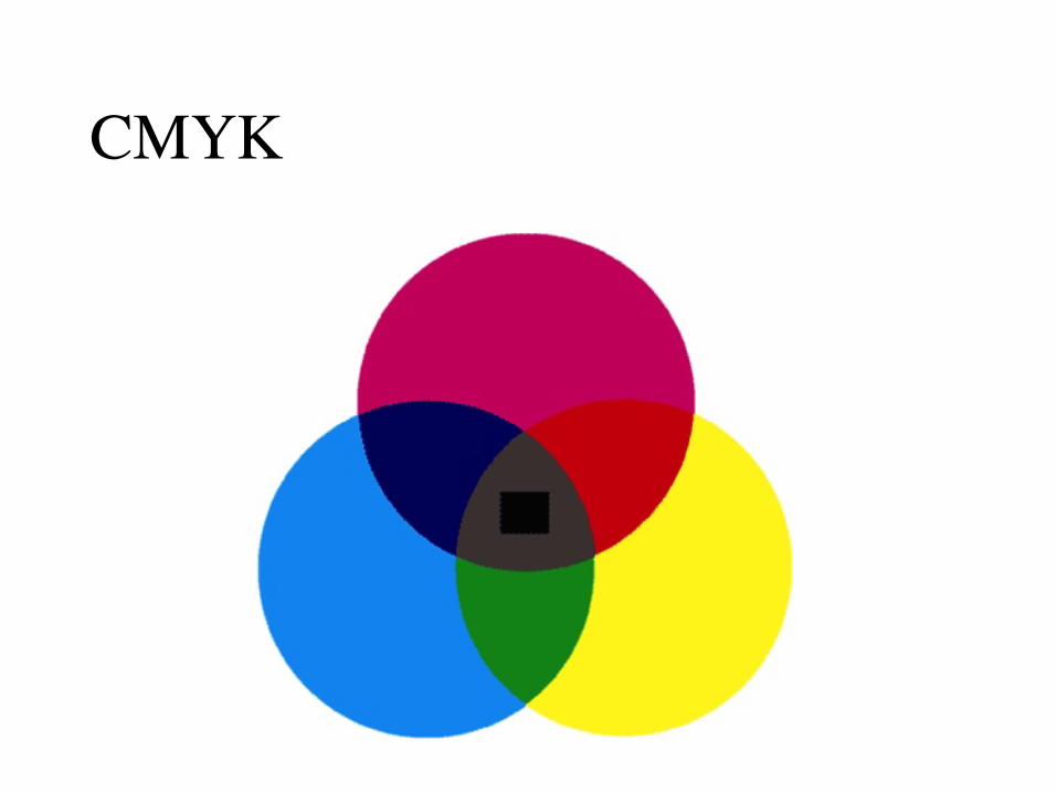
CMYK

HSB
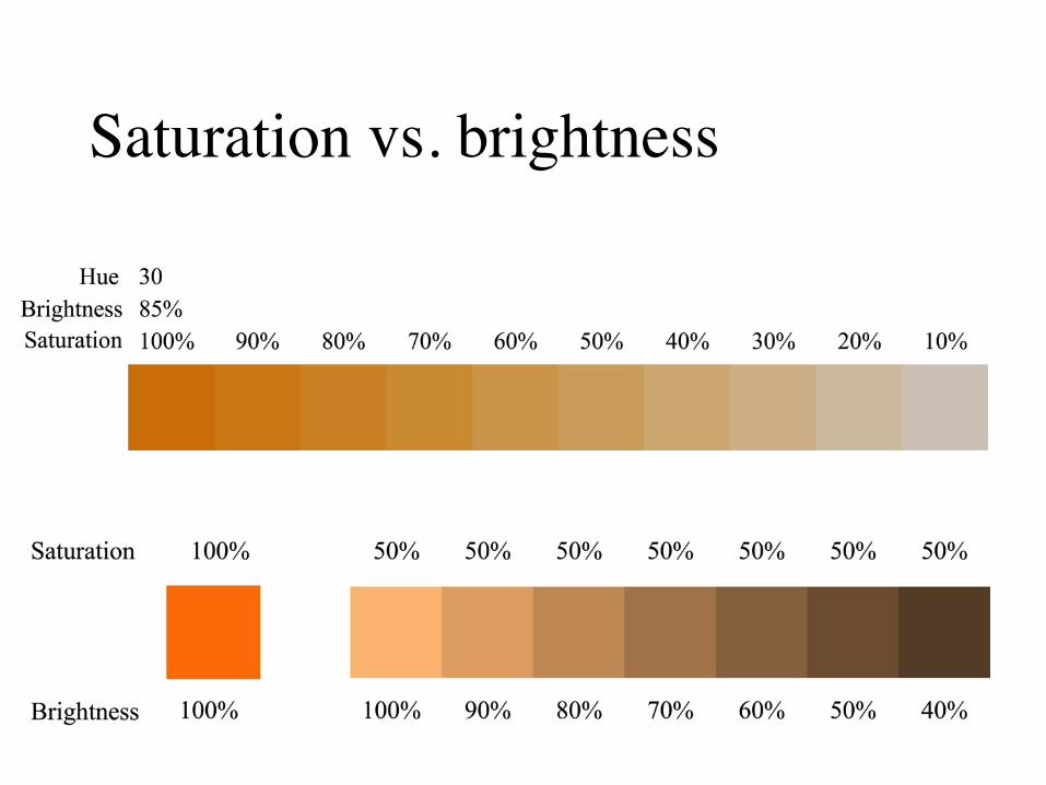
Saturation vs. brightness

Color harmony schemes
• Monochromatic (all same hue)• Complementary (opposite on color wheel)• Analogous (adjacent on color wheel)• Triadic (three colors evenly spaced on wheel)• Tetradic (four colors, two pairs)• See kuler.adobe.com, colorschemedesigner.com• These can be approximate, but ignore at your
peril
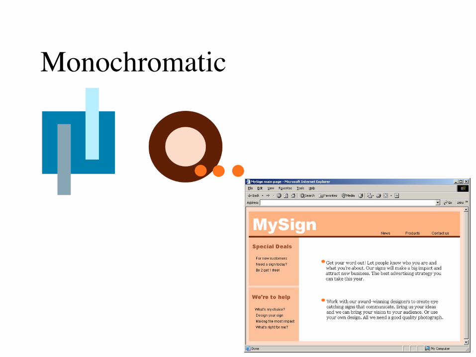
Monochromatic
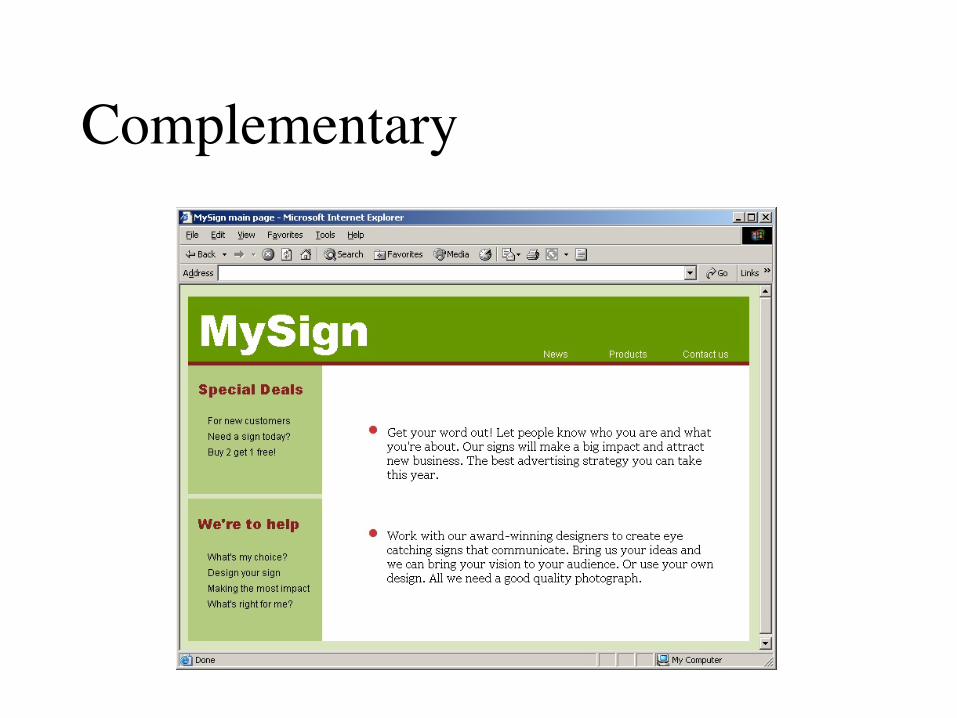
Complementary
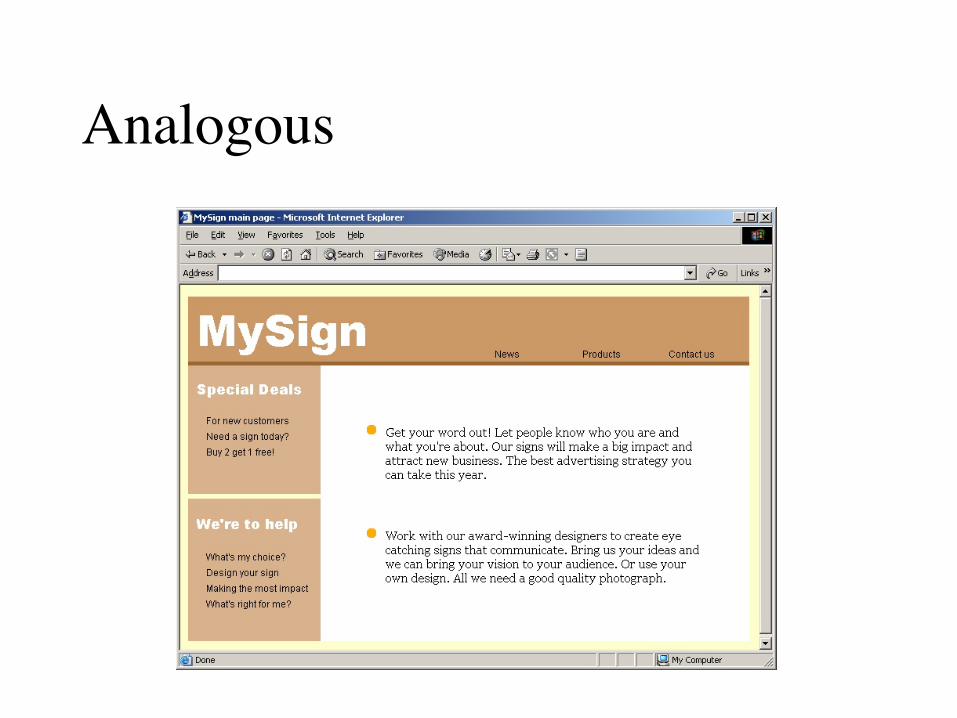
Analogous
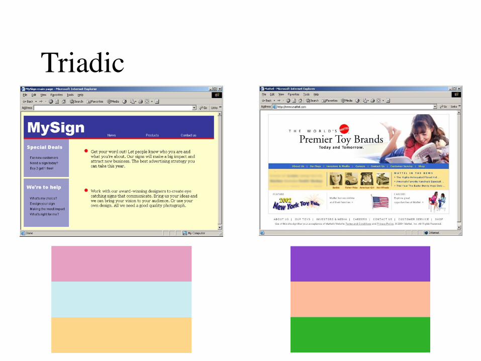
Triadic
Text and background colors
• Provide adequate contrast• Avoid clashes, especially for extended use• Dark on light is better than light on dark
Color depends on context
• Perception varies based on what other colors are nearby •
• Cultural connotations
Recommended uses of color
• Emphasis, grouping (especially as background)• Coding discrete or continuous data • •• Distinguishing window types• Visual separation of overlapping graphics• Depth in 3D graphics (red closer, blue farther)• Warnings, status reports• Increasing attractiveness, creating emotional
response (within guidelines)
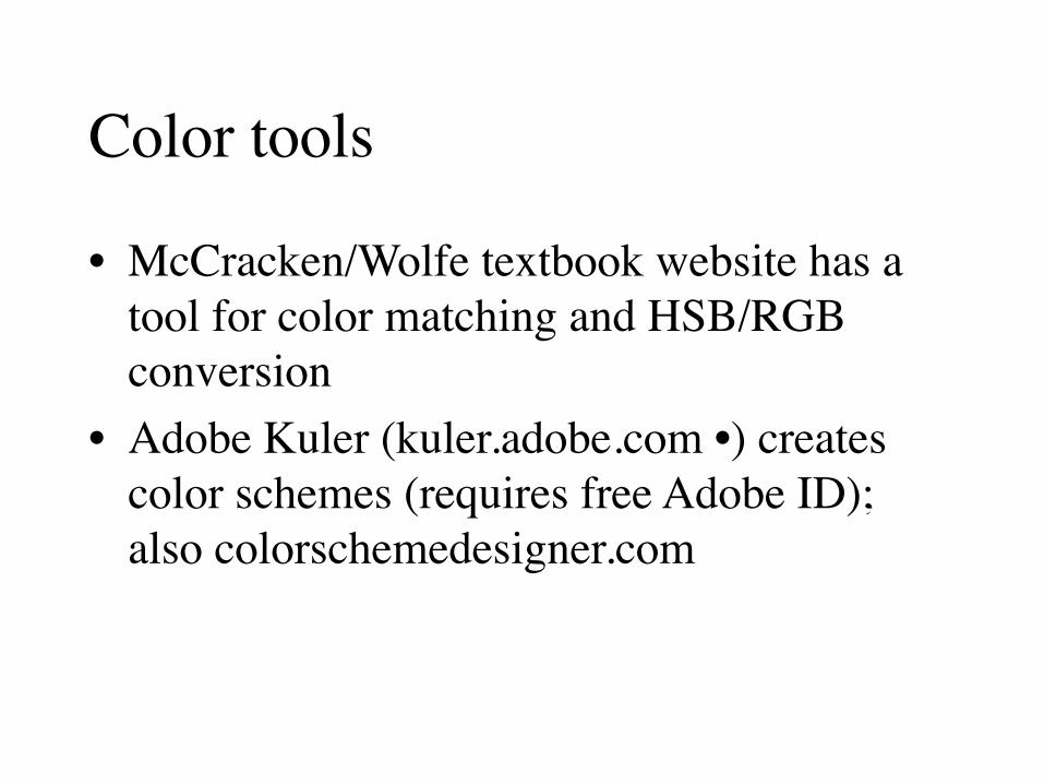
Color tools
• McCracken/Wolfe textbook website has a tool for color matching and HSB/RGB conversion
• Adobe Kuler (kuler.adobe.com •) creates color schemes (requires free Adobe ID); also colorschemedesigner.com

Typography
• HCI for documents, affects effectiveness• Display type vs. body type
– Quick recognition of letters, words, lines• Great control now in user’s hands
– “With more power comes the power to mess up in new and more spectacular ways.” —DGK
• Differences between displays and paper• Less designer control for text on the WWW
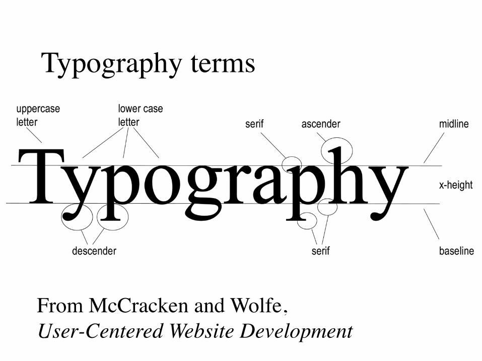
Typography terms
From McCracken and Wolfe, User-Centered Website Development
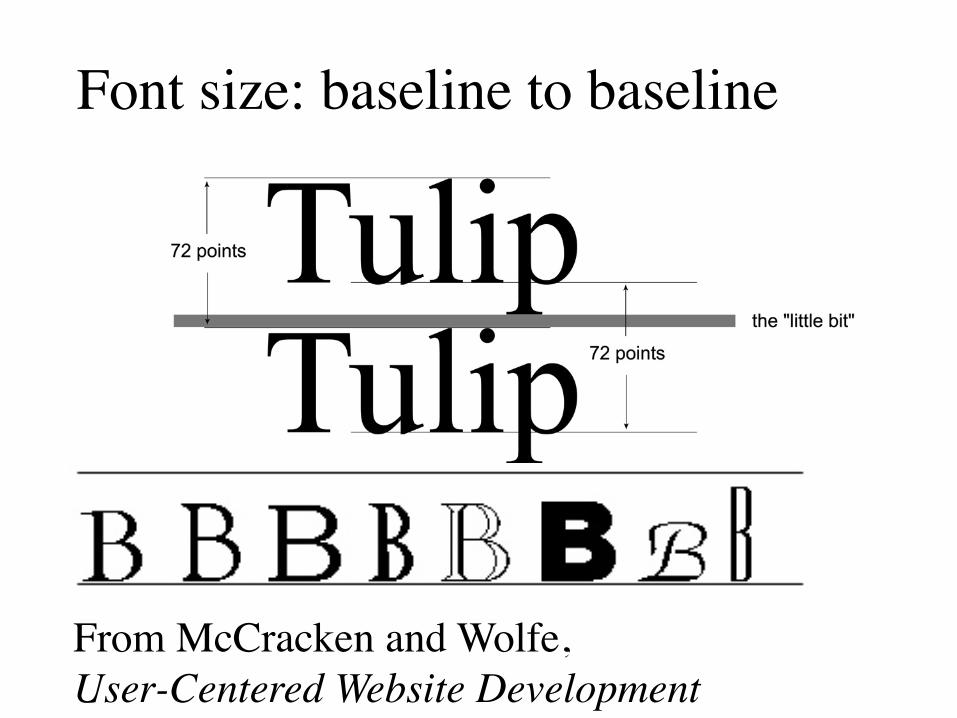
Font size: baseline to baseline
From McCracken and Wolfe, User-Centered Website Development

Line spacing (leading) matters
From McCracken and Wolfe, User-Centered Website Development
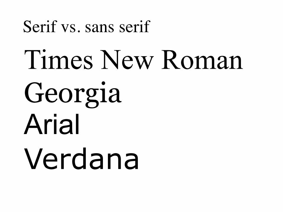
Serif vs. sans serif
Times New RomanGeorgiaArialVerdana
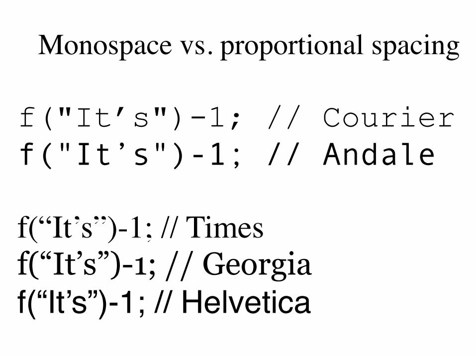
Monospace vs. proportional spacing
f("It’s")-1; // Courierf("It’s")-1; // Andale
f(“It’s”)-1; // Timesf(“It’s”)-1; // Georgiaf(“It’s”)-1; // Helvetica
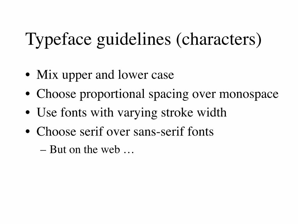
Typeface guidelines (characters)
• Mix upper and lower case• Choose proportional spacing over monospace• Use fonts with varying stroke width• Choose serif over sans-serif fonts
– But on the web …
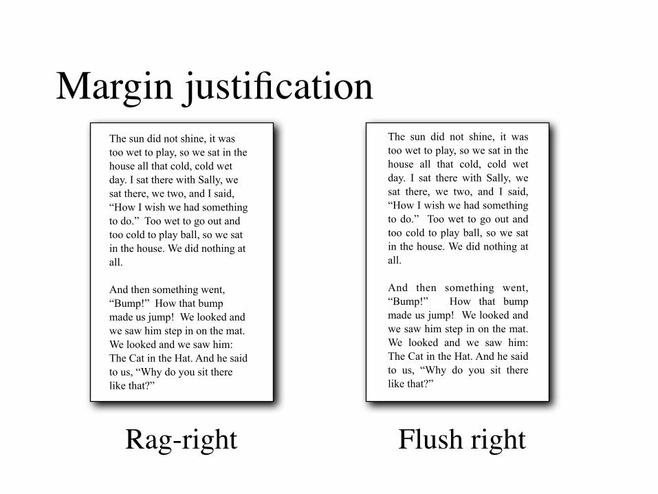
Margin justification
Rag-right Flush right
The sun did not shine, it was too wet to play, so we sat in the house all that cold, cold wet day. I sat there with Sally, we sat there, we two, and I said, “How I wish we had something to do.” Too wet to go out and too cold to play ball, so we sat in the house. We did nothing at all.
And then something went, “Bump!” How that bump made us jump! We looked and we saw him step in on the mat. We looked and we saw him: The Cat in the Hat. And he said to us, “Why do you sit there like that?”
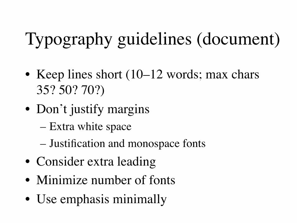
Typography guidelines (document)
• Keep lines short (10–12 words; max chars 35? 50? 70?)
• Don’t justify margins– Extra white space– Justification and monospace fonts
• Consider extra leading• Minimize number of fonts• Use emphasis minimally
Graphic design critique
www.ics.uci.edu/~kay/whatswrong.pdf •
Multimedia
• Text, images, audio, animation, video• Hyperlinks and multimedia pretty much
characterize the web
Audio
• Recall audio/visual/kinesthetic learning modes• Supports people with vision limitations• Conventional audio: Download whole file
before playback• Streaming audio: Start playing before
download has finished

Audio guidelines
• Have text alternative for audio language• When mood-setting, keep volume low• When getting attention, keep audio brief• Have a mute button
Video
• If a (still) picture is worth a thousand words …• But it requires high bandwidth (i.e., it’s
painfully slow on slow connections)• Download time depends on
– File size: pixels per frame (e.g., 320 x 240) and bits per pixel (e.g., monochrome v. color)
– Transmission rate (e.g., 56Kb/sec dialup)• People lose attention after 10 seconds (but
that’s not absolute)
Video recording guidelines
• Use a tripod• Use a neutral background• (These also improve compression)• Get in close to your subject
Animation
• Synthesized moving images• Can be more compact than video• Can enable more interactions than video
Information visualization
• Allows understanding of huge amounts of data• Allows perception of unanticipated properties• Reveals problems with data itself• Facilitates understanding of large- and small-
scale features of data• Facilitates hypothesis formation
Ware, Information Visualization
Edward Tufte (Yale)
• The Visual Display of Quantitative Information• Envisioning Information• Visual Explanations• Beautiful Evidence
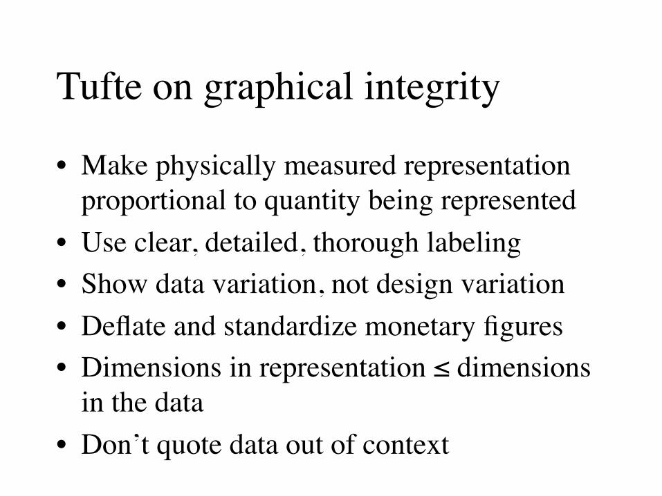
Tufte on graphical integrity
• Make physically measured representation proportional to quantity being represented
• Use clear, detailed, thorough labeling• Show data variation, not design variation• Deflate and standardize monetary figures• Dimensions in representation ≤ dimensions
in the data• Don’t quote data out of context
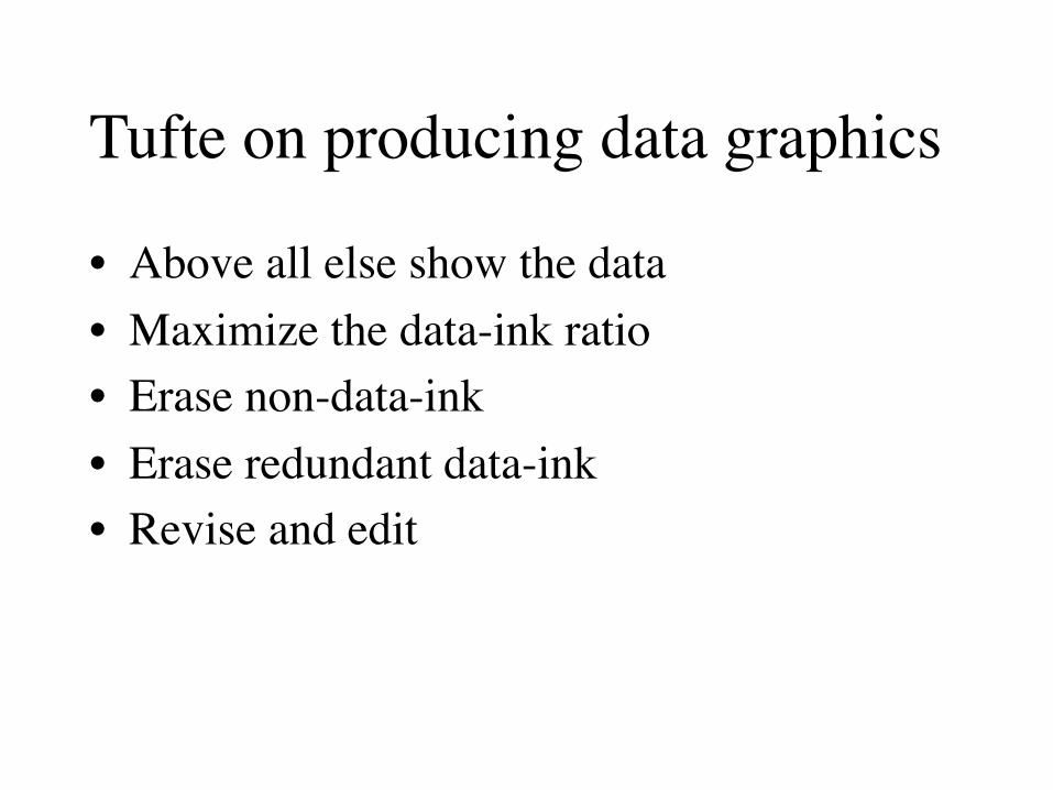
Tufte on producing data graphics
• Above all else show the data• Maximize the data-ink ratio• Erase non-data-ink• Erase redundant data-ink• Revise and edit
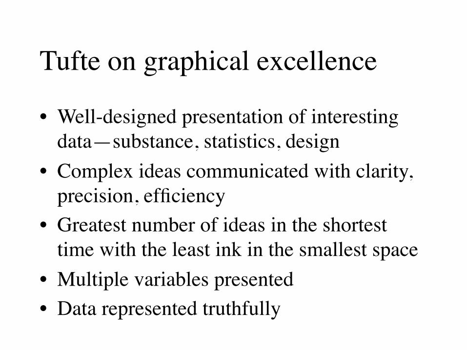
Tufte on graphical excellence
• Well-designed presentation of interesting data—substance, statistics, design
• Complex ideas communicated with clarity, precision, efficiency
• Greatest number of ideas in the shortest time with the least ink in the smallest space
• Multiple variables presented• Data represented truthfully

ICS 4 Overview
• The field of HCI• Human characteristics• User-centered design• Content organization and navigation• Evaluation strategies• Building blocks (color, typography, …)• The broader context
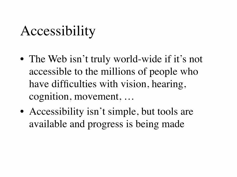
Accessibility
• The Web isn’t truly world-wide if it’s not accessible to the millions of people who have difficulties with vision, hearing, cognition, movement, …
• Accessibility isn’t simple, but tools are available and progress is being made

Vision
• Blindness, impaired vision, color blindness, photosensitive epilepsy
• Technologies– Screen-reading software– Braille “displays”– Descriptive audio– Screen magnifiers (software, hardware)– Vischeck.com • (software to simulate and
compensate for color blindness)
Hearing
• Technologies– Captioning– American Sign Language (automatically generated
by an animated avatar, asl.cs.depaul.edu •)

Mobility
• Trouble with keyboard and/or mouse• Caused by disease, injury, RSI, aging• Technologies
– One-finger sequential typing for, e.g., Ctl-X– Ignore brief or repeated keystrokes– Move pointer using keyboard– Predictive typing; cycle-until-stop– Head/foot/mouth/gaze/speech control devices
Guidelines and legal requirements
• Web Accessibility Initiative,(www.w3.org/WAI/ •)
• Americans with Disabilities Act (ADA) •• 1998 amendment to Rehabilitation Act of
1973 (www.section508.gov •)• Institutional directives (e.g., UCI’s Electronic
Communications Policy)
Evaluation of accessibility
• Try turning off images, sound, Java• Try larger-than-normal font sizes• Try smaller-than-normal screen or window• Try monochrome display• Try it without a mouse• Try it with a text-only or voice browser • Use Wave •, Bobby •, A-Prompt • tools• Do user testing
Globalization
• They don’t call it world-wide for nothing• Internationalization: Identify and isolate
culture-specific items– Text– Numbers (34.50 vs. 34,50, $ vs. £, units)– Dates/times (y/m/d, AM/PM, time zones)– Colors (different cultural connotations)
• Localization: Translate or create text appropriate to a given location
Don’t rely on automated translation
• For 60 years, a goal of computing (still unmet)• It’s far tougher than dog = perro = chien =• Idioms, nuances, cultural issues, non-
overlapping grammatical categories• Not just waiting for the next, faster machine:
We just don’t know enough about language• (You shouldn’t rely on the grammar checker in
Word, for the same reason)• Use professional human translators
犬
Other tricky cultural issues
• Icons: Symbols and gestures differ• Addresses• Reading direction —> page layout• Space for text (Exit, Salir, Quitter, Verlassen)• User testing: in target locale and language
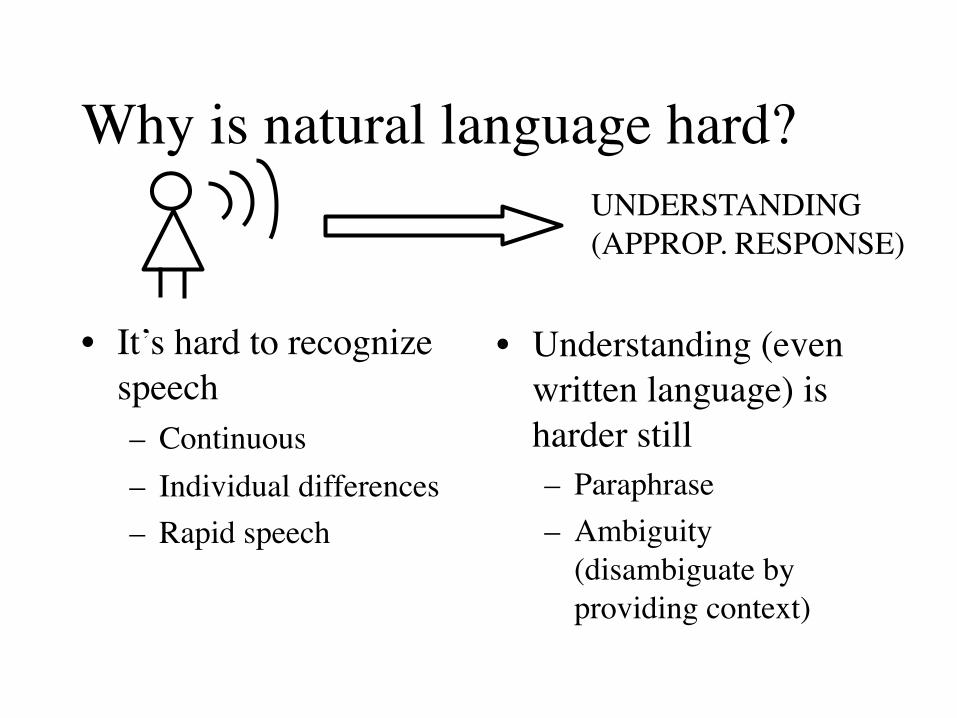
Why is natural language hard?
• It’s hard to recognize speech– Continuous– Individual differences– Rapid speech
• Understanding (even written language) is harder still– Paraphrase– Ambiguity
(disambiguate by providing context)
UNDERSTANDING(APPROP. RESPONSE)
Personalization
• “Welcome back, Joe.”• “Weather in Irvine, California”• “Here are some recommendations for you”• “View your order history”• “Save your ordering information?”• Web sites that know something about you
can be useful
Privacy
• But what if that information falls into the wrong hands?
• Security breaches: rogue or careless employees, system break-ins, laptop theft
• Theft, ID theft, embarrassment, unwanted ads• The laws regulating privacy are a patchwork• Practically, it’s about trust, not law: If users
don’t trust you, they won’t use your site
What affects trust?
• If less is at risk, less trust expected• Perceived similarity: Users trust sites they
think reflect concerns similar to their own• Status or standing: Social leader endorsement• Consistent behavior: Actions match words?• Certification: Doctors, e.g., are licensed• Referrals: Users are likely to trust someone
they know (or someone like them, as above)
How to foster trust
• List what security precautions the site takes• Observe good business practices (follow
through on delivery dates, return policy, ...)• Have a privacy statement: what info is
gathered, how it will be used, allow opt-in or opt-out of use
Privacy more broadly
• Why it’s a particular issue with IT• Computer matching and inferences• Privacy advocates’ principles
– Data used only for purposes it was collected for– No systems whose existence is secret– Subject’s right to see/correct/amend (exceptions)– Responsibility of record-keeper to safeguard
security and integrity
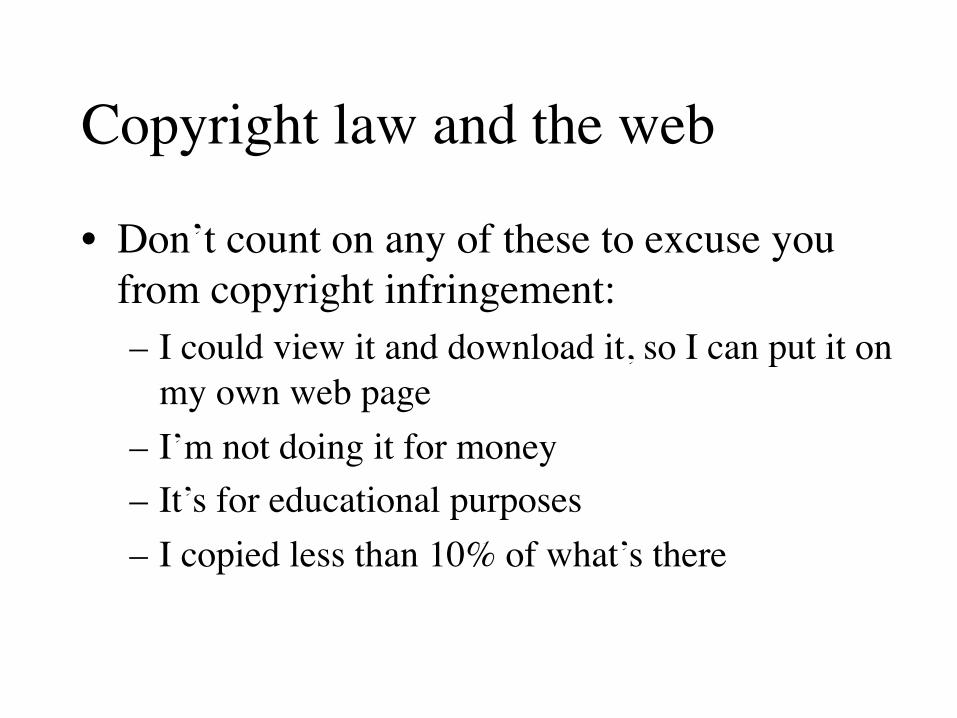
Copyright law and the web
• Don’t count on any of these to excuse you from copyright infringement:– I could view it and download it, so I can put it on
my own web page– I’m not doing it for money– It’s for educational purposes– I copied less than 10% of what’s there
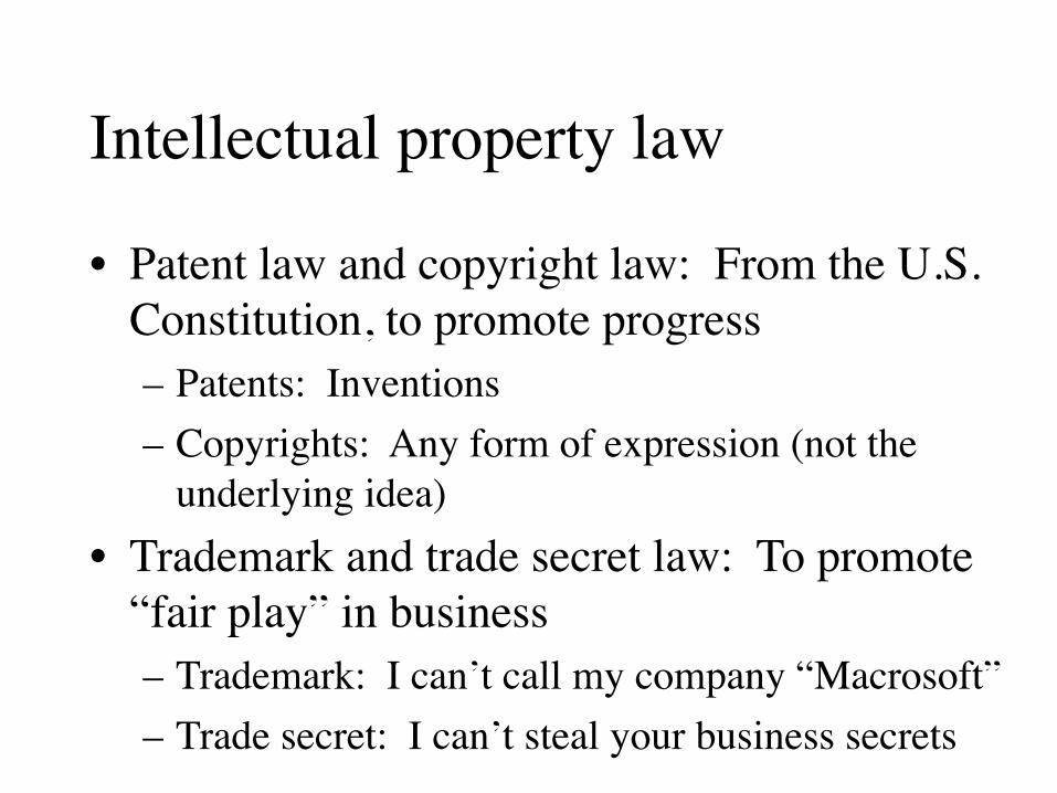
Intellectual property law
• Patent law and copyright law: From the U.S. Constitution, to promote progress– Patents: Inventions– Copyrights: Any form of expression (not the
underlying idea)• Trademark and trade secret law: To promote
“fair play” in business– Trademark: I can’t call my company “Macrosoft”– Trade secret: I can’t steal your business secrets
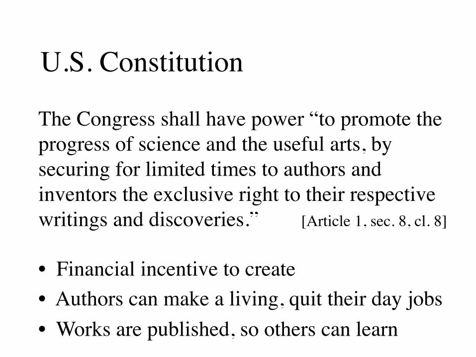
U.S. Constitution
The Congress shall have power “to promote the progress of science and the useful arts, by securing for limited times to authors and inventors the exclusive right to their respective writings and discoveries.” [Article 1, sec. 8, cl. 8]
• Financial incentive to create• Authors can make a living, quit their day jobs• Works are published, so others can learn
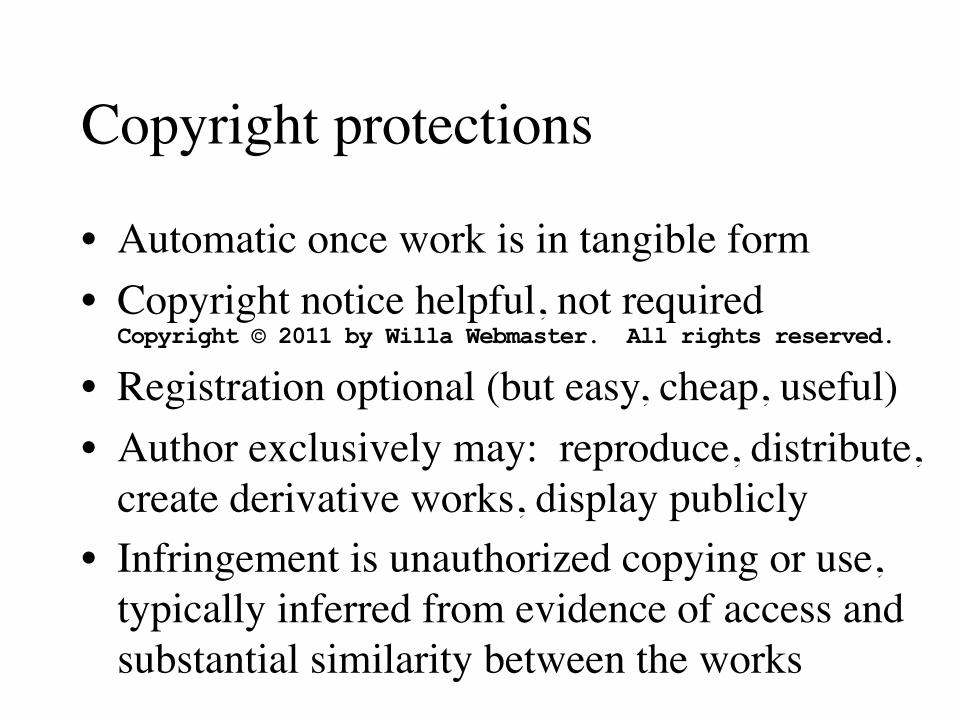
Copyright protections
• Automatic once work is in tangible form• Copyright notice helpful, not required
Copyright © 2011 by Willa Webmaster. All rights reserved.
• Registration optional (but easy, cheap, useful)• Author exclusively may: reproduce, distribute,
create derivative works, display publicly• Infringement is unauthorized copying or use,
typically inferred from evidence of access and substantial similarity between the works

Defenses to copyright infringement
• Copyright protects expressive form, not underlying ideas
• Independent creation• Public domain• Aspects dictated by external constraints• Copying by “implied license”• “Fair use” …
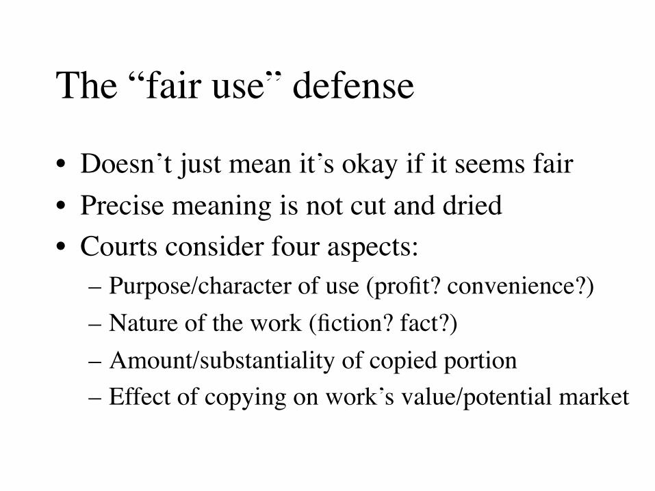
The “fair use” defense
• Doesn’t just mean it’s okay if it seems fair• Precise meaning is not cut and dried• Courts consider four aspects:
– Purpose/character of use (profit? convenience?)– Nature of the work (fiction? fact?)– Amount/substantiality of copied portion– Effect of copying on work’s value/potential market
Copyright issues
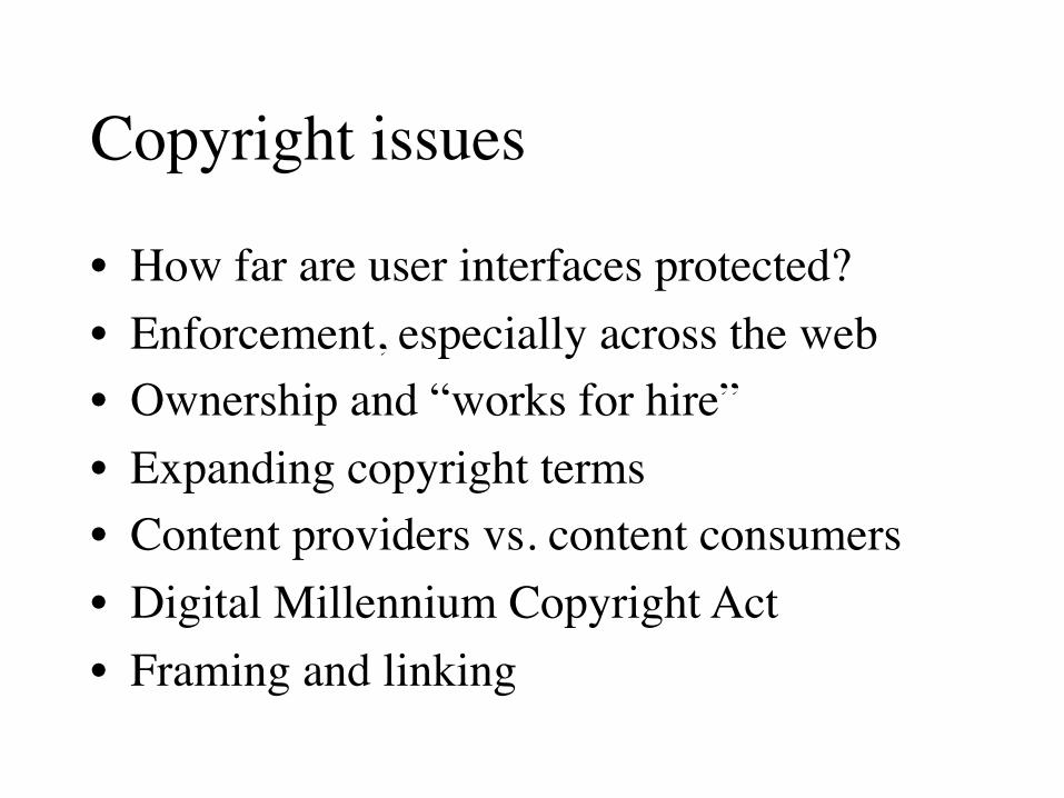
• How far are user interfaces protected?• Enforcement, especially across the web• Ownership and “works for hire”• Expanding copyright terms• Content providers vs. content consumers• Digital Millennium Copyright Act• Framing and linking
Copyright references [not required]
• Copyright office, www.copyright.gov• Electronic Frontier Foundation, eff.org• UC Copyright Education Web Site,
www.universityofcalifornia.edu/copyright• Lawrence Lessig, www.lessig.org
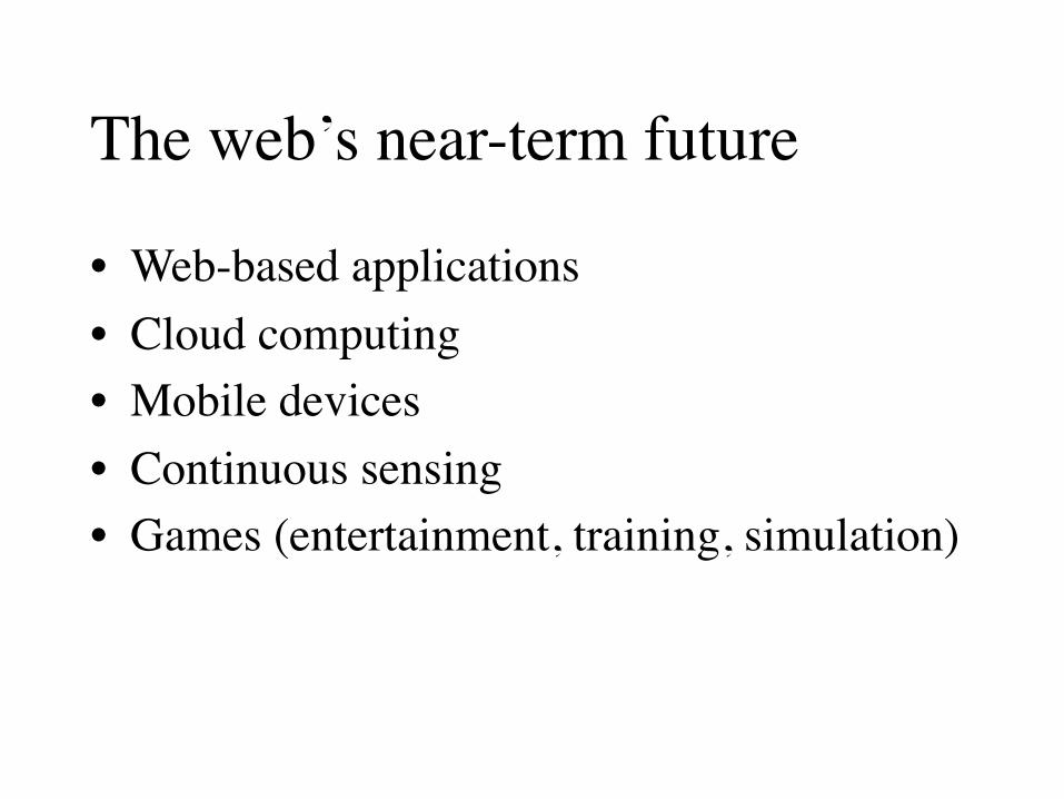
The web’s near-term future
• Web-based applications• Cloud computing• Mobile devices• Continuous sensing• Games (entertainment, training, simulation)
ICS 4 Overview
• The field of HCI• Human characteristics• User-centered design• Content organization and navigation• Evaluation strategies• Building blocks (color, typography, …)• The broader context

End-of-quarter logistics
• If you have review questions for the final– Use piazza.com or [email protected].– Review session, Monday 18 March, 1:00-2:50,
DBH 1500 (bring or Email written questions)• Final exam
– Tuesday 19 March, 10:30–12:30, DBH 1600 (here)– Covers the whole course, more or less evenly– Mostly similar to midterm in form– You may bring any paper materials, as before
• Please do the course evaluation on EEE
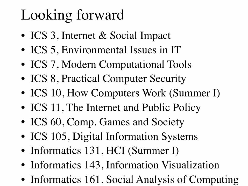
Looking forward• ICS 3, Internet & Social Impact • ICS 5, Environmental Issues in IT • ICS 7, Modern Computational Tools • ICS 8, Practical Computer Security • ICS 10, How Computers Work (Summer I)• ICS 11, The Internet and Public Policy• ICS 60, Comp. Games and Society• ICS 105, Digital Information Systems• Informatics 131, HCI (Summer I)• Informatics 143, Information Visualization• Informatics 161, Social Analysis of Computing

Questions?