Embed Size (px)
Citation preview
Life After Death by PowerPoint
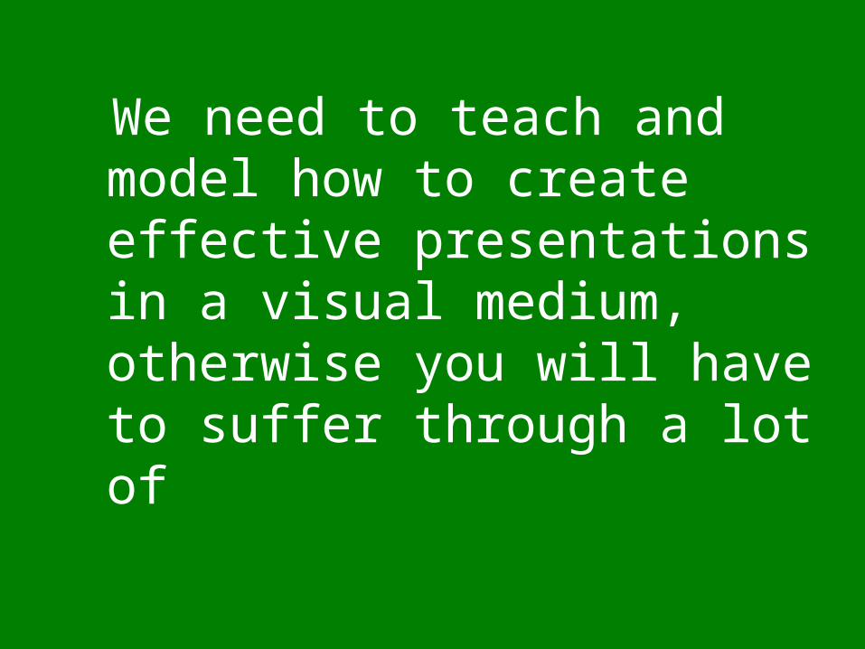
We need to teach and model how to create effective presentations in a visual medium, otherwise you will have to suffer through a lot of
Albert Einstein• Albert Einstein was born into a Jewish family in
Ulm, Württemberg, Germany on March 14, 1879. His father was Hermann Einstein, a salesman and engineer. His mother was Pauline Einstein (née Koch). In 1880, the family moved to Munich, where his father and his uncle founded a company, Elektrotechnische Fabrik J. Einstein & Cie, that manufactured electrical equipment.
• The Einsteins were not observant of Jewish religious practices, and Albert attended a Catholic elementary school. Although Einstein had early speech difficulties, he was a top student in elementary school.
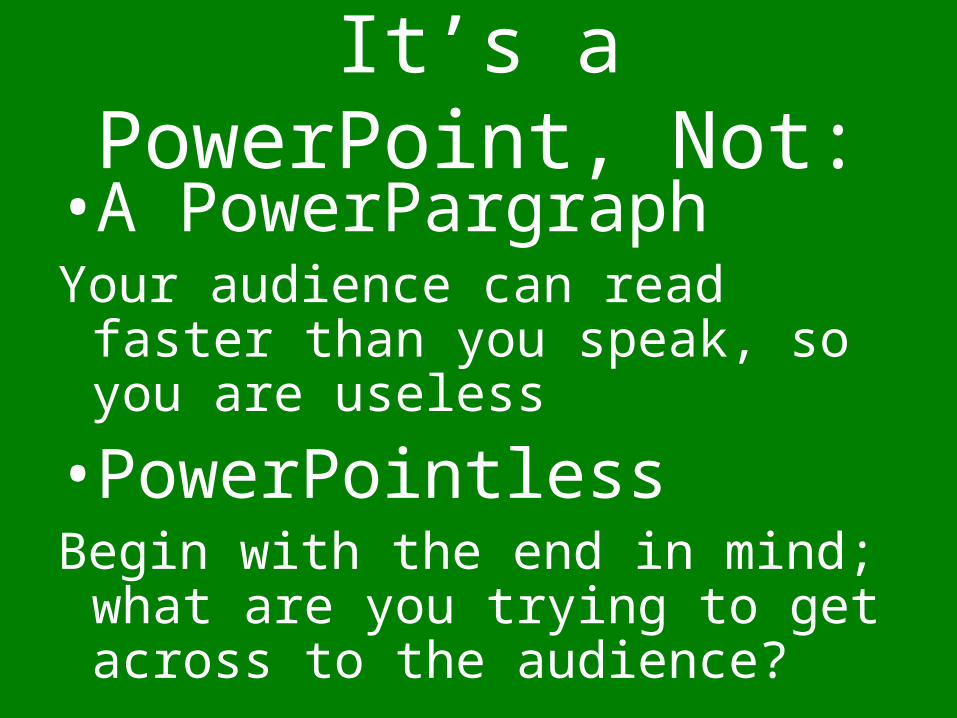
It’s a PowerPoint, Not:• A PowerPargraphYour audience can read faster than
you speak, so you are useless
• PowerPointlessBegin with the end in mind; what
are you trying to get across to the audience?
One Big Rule
Less
is more
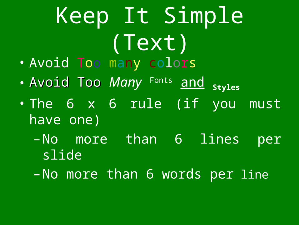
Keep It Simple (Text)• Avoid Too many colors
• Avoid TooAvoid Too Many Fonts and Styles• The 6 x 6 rule (if you must have one)
– No more than 6 lines per slide– No more than 6 words per line
Keep It Simple (Text)
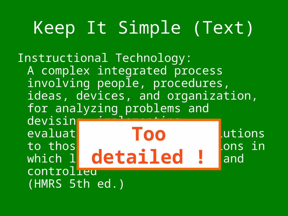
Instructional Technology:A complex integrated process involving people, procedures, ideas, devices, and organization, for analyzing problems and devising, implementing, evaluating, and managing solutions to those problems in situations in which learning is purposive and controlled(HMRS 5th ed.)
Too detailed !
Keep It Simple (Text)
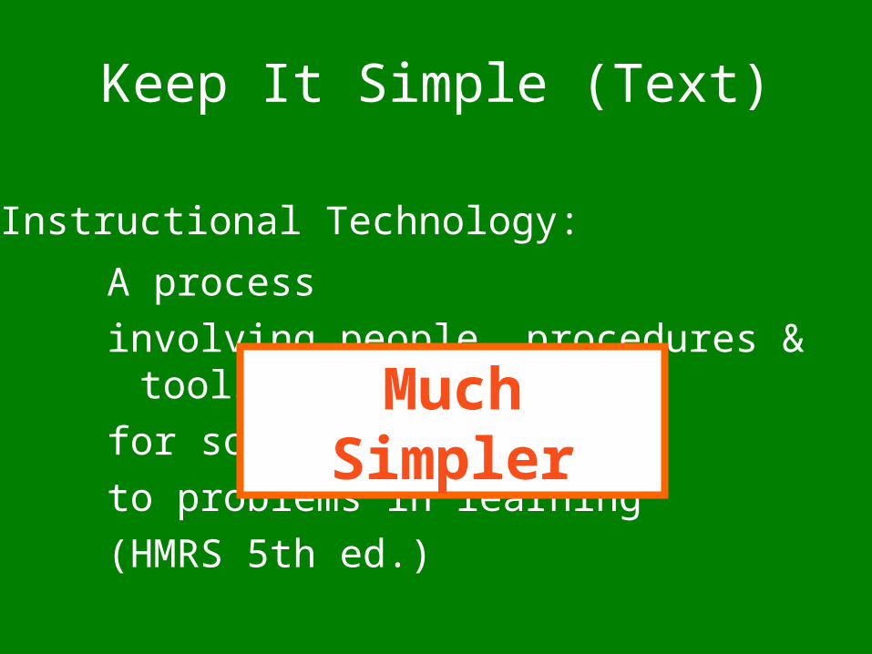
A process
involving people, procedures & tools
for solutions
to problems in learning
(HMRS 5th ed.)
Instructional Technology:
Much Simpler
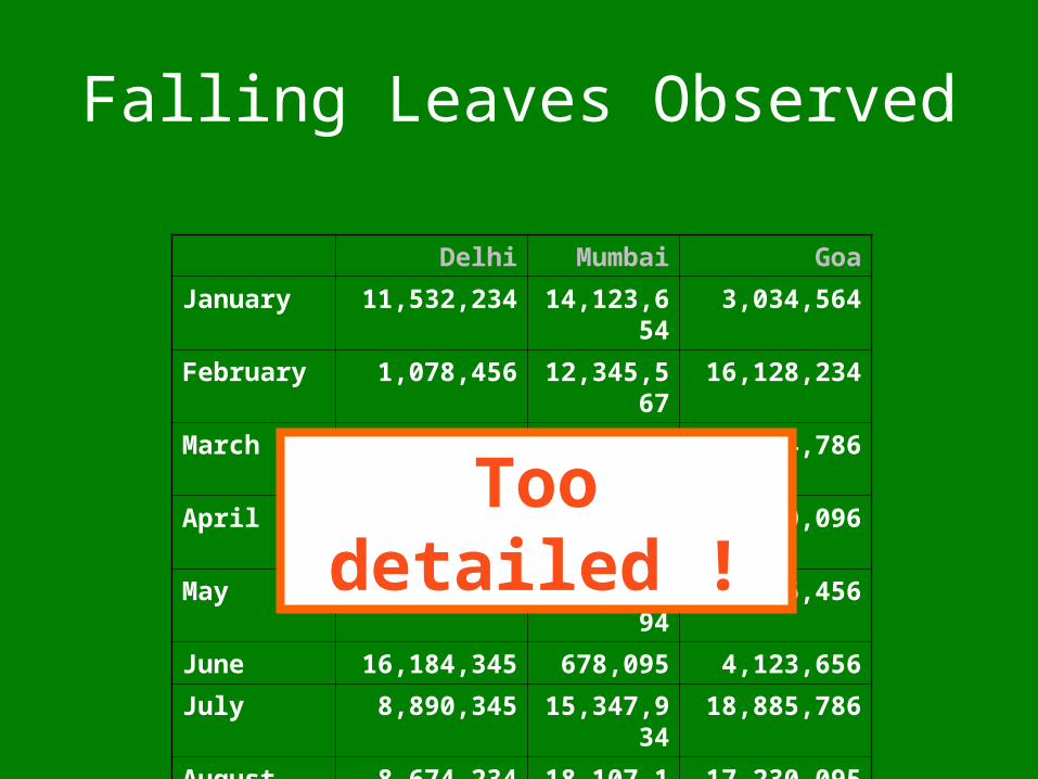
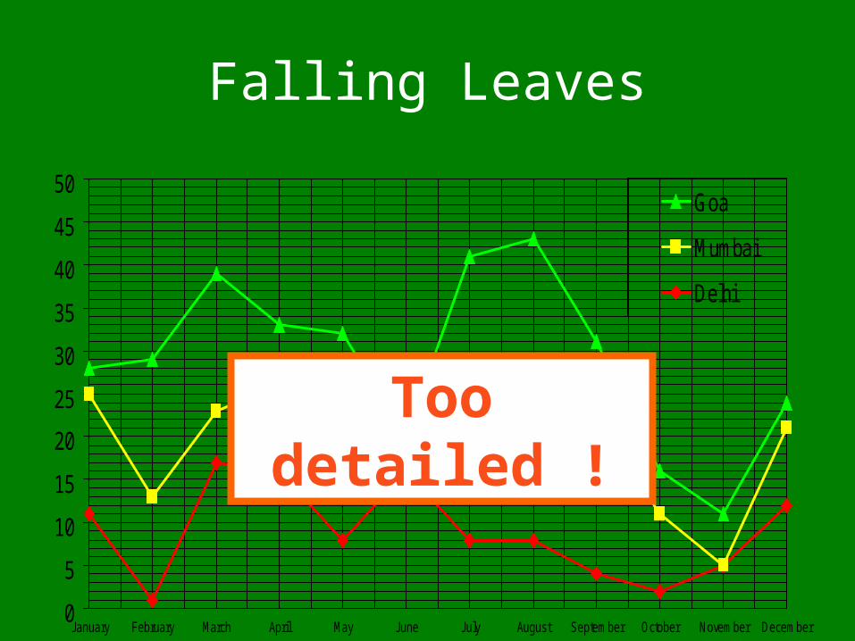
Falling Leaves Observed
Delhi Mumbai Goa
January 11,532,234 14,123,654 3,034,564
February 1,078,456 12,345,567 16,128,234
March 17,234,778 6,567,123 16,034,786
April 16,098,897 10,870,954 7,940,096
May 8,036,897 10,345,394 14,856,456
June 16,184,345 678,095 4,123,656
July 8,890,345 15,347,934 18,885,786
August 8,674,234 18,107,110 17,230,095
September 4,032,045 18,923,239 9,950,498
October 2,608,096 9,945,890 5,596,096
November 5,864,034 478,023 6,678,125
December 12,234,123 9,532,111 3,045,654
Too detailed !
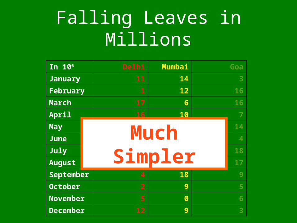
Falling Leaves in Millions
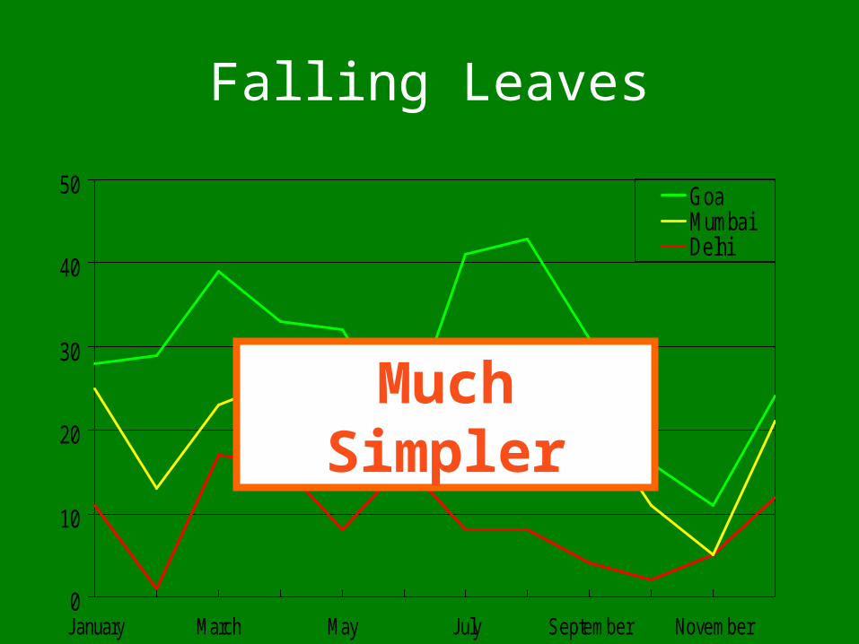
In 106 Delhi Mumbai Goa
January 11 14 3
February 1 12 16
March 17 6 16
April 16 10 7
May 8 10 14
June 16 0 4
July 8 15 18
August 8 18 17
September 4 18 9
October 2 9 5
November 5 0 6
December 12 9 3
Much Simpler
Falling Leaves
0
5
10
15
20
25
30
35
40
45
50
January February March April May June July August September October November December
Goa
Mumbai
Delhi
Too detailed !
Falling Leaves
0
10
20
30
40
50
January March May July September November
GoaMumbaiDelhi
Much Simpler
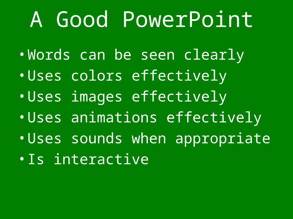
A Good PowerPoint
• Words can be seen clearly
• Uses colors effectively
• Uses images effectively
• Uses animations effectively
• Uses sounds when appropriate
• Is interactive
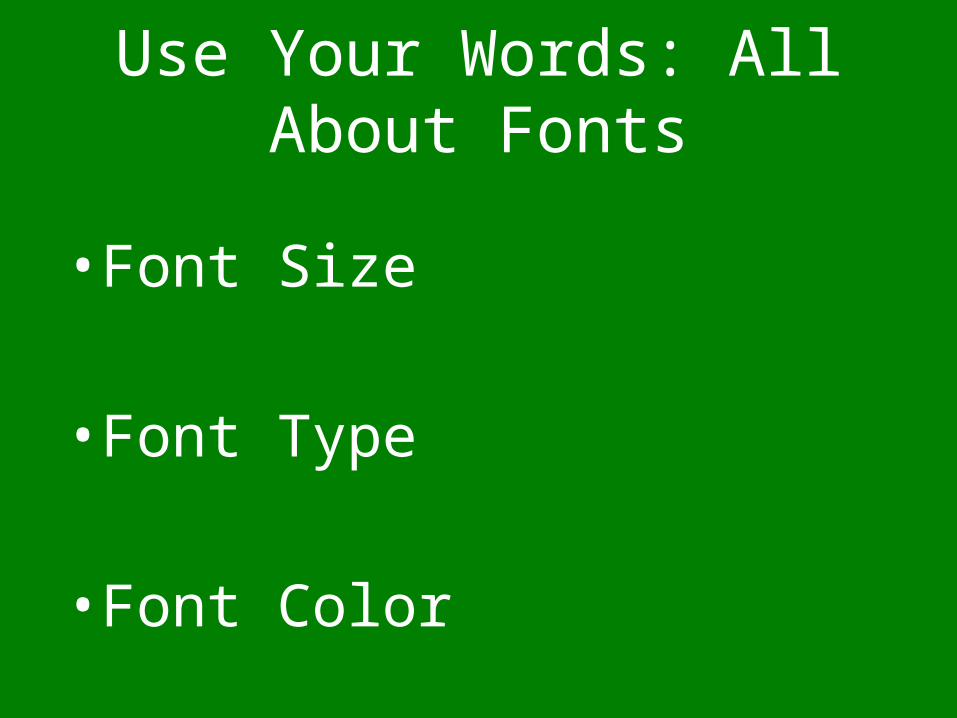
Use Your Words: All About Fonts
• Font Size
• Font Type
• Font Color
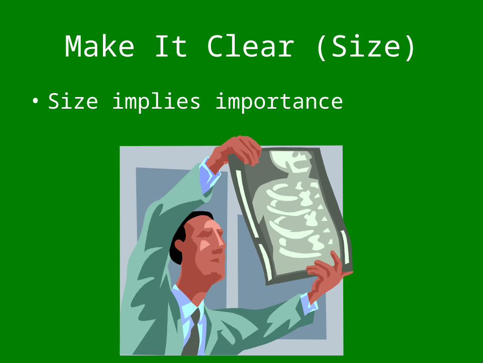
Make It Clear (Size)
• Size implies importance
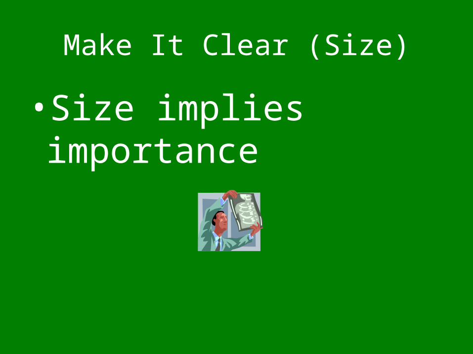
Make It Clear (Size)
• Size implies importance
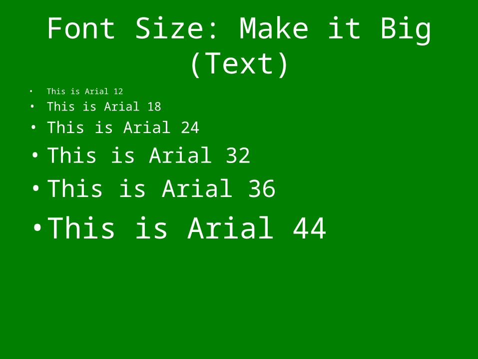
Font Size: Make it Big (Text)• This is Arial 12
• This is Arial 18
• This is Arial 24
• This is Arial 32
• This is Arial 36
• This is Arial 44
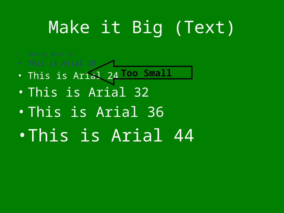
Make it Big (Text)• This is Arial 12
• This is Arial 18
• This is Arial 24
• This is Arial 32
• This is Arial 36
• This is Arial 44
Too Small
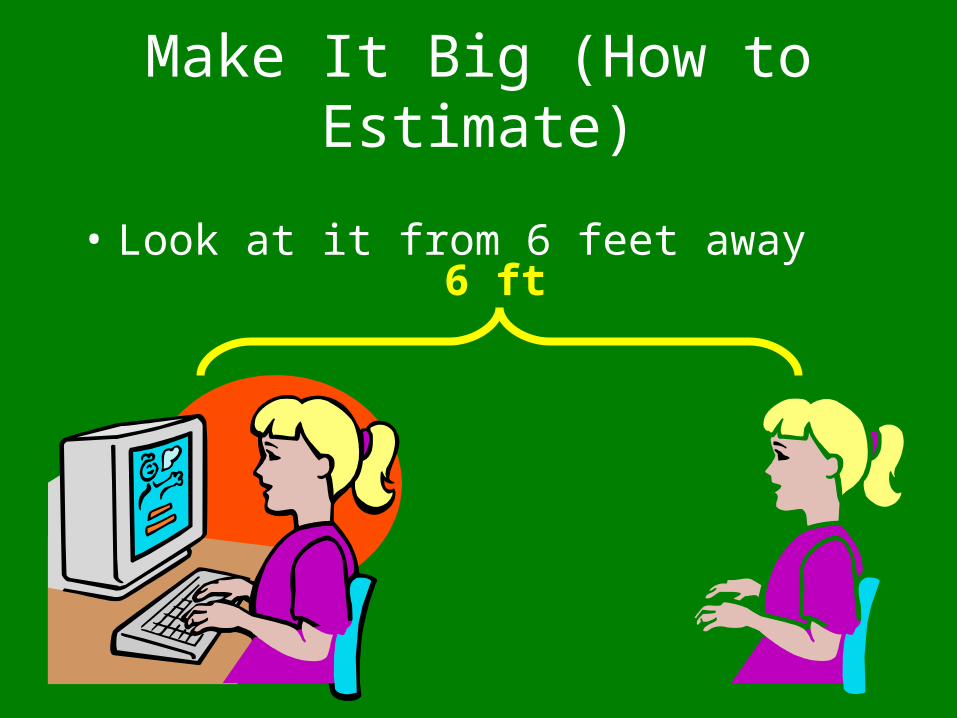
Make It Big (How to Estimate)
• Look at it from 6 feet away6 ft
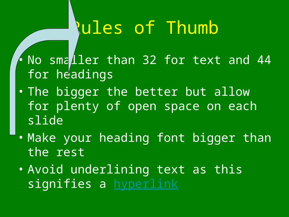
Rules of Thumb
• No smaller than 32 for text and 44 for headings
• The bigger the better but allow for plenty of open space on each slide
• Make your heading font bigger than the rest
• Avoid underlining text as this signifies a hyperlink
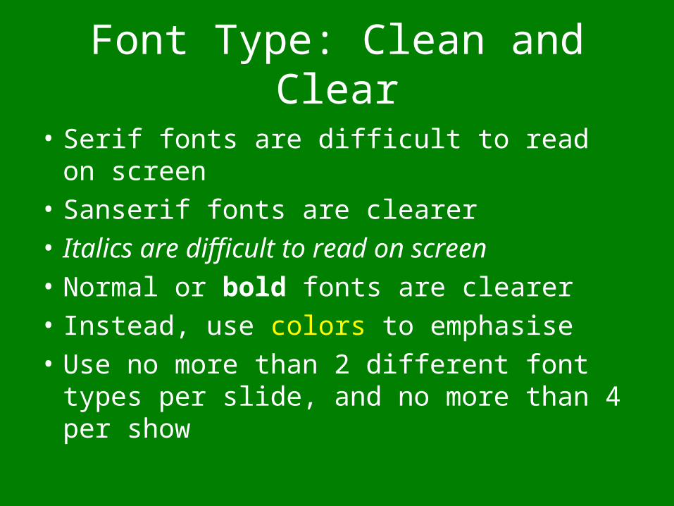
• Serif fonts are difficult to read on screen
• Sanserif fonts are clearer• Italics are difficult to read on screen
• Normal or bold fonts are clearer
• Instead, use colors to emphasise
• Use no more than 2 different font types per slide, and no more than 4 per show
Font Type: Clean and Clear
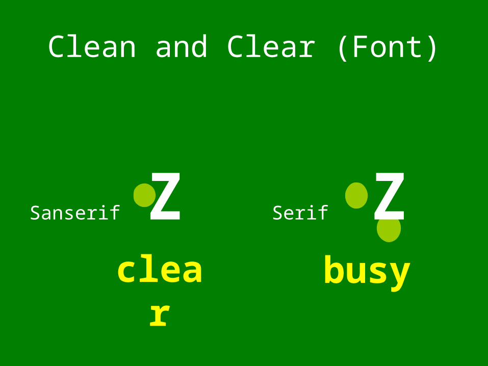
Sanserif Z SerifZ
Clean and Clear (Font)
busyclear
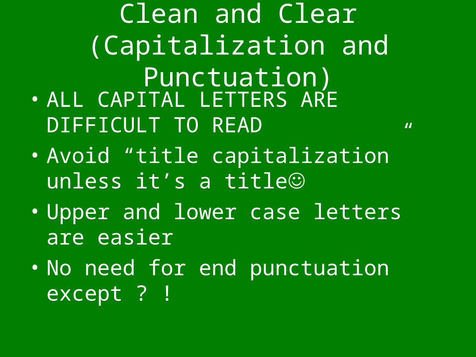
Clean and Clear (Capitalization and Punctuation)
• ALL CAPITAL LETTERS ARE DIFFICULT TO READ
• Avoid “title capitalization” unless it’s a title
• Upper and lower case letters are easier
• No need for end punctuation except ? !

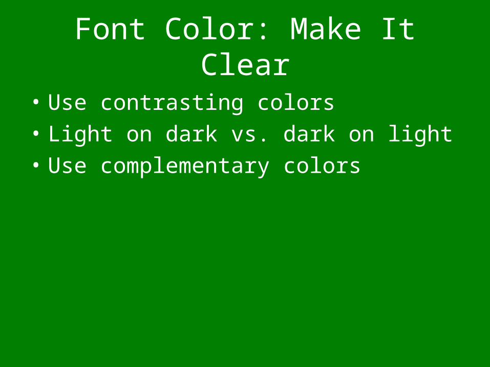
Font Color: Make It Clear
• Use contrasting colors
• Light on dark vs. dark on light
• Use complementary colors
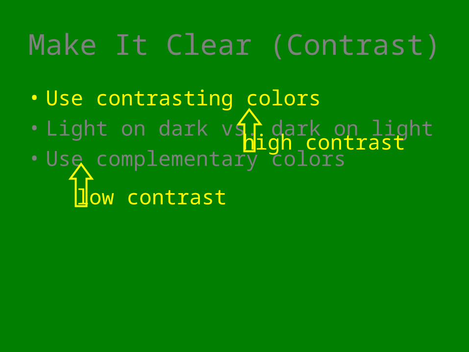
Make It Clear (Contrast)
• Use contrasting colors
• Light on dark vs. dark on light
• Use complementary colors
low contrast
high contrast
Make It Clear (Contrast)
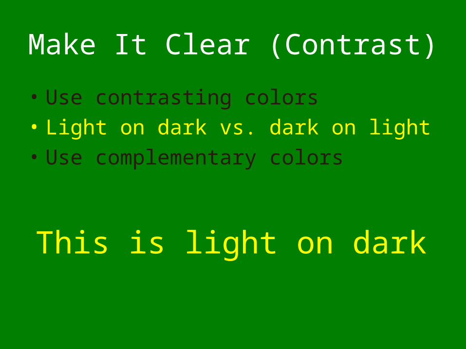
• Use contrasting colors
• Light on dark vs. dark on light
• Use complementary colors
This is light on dark
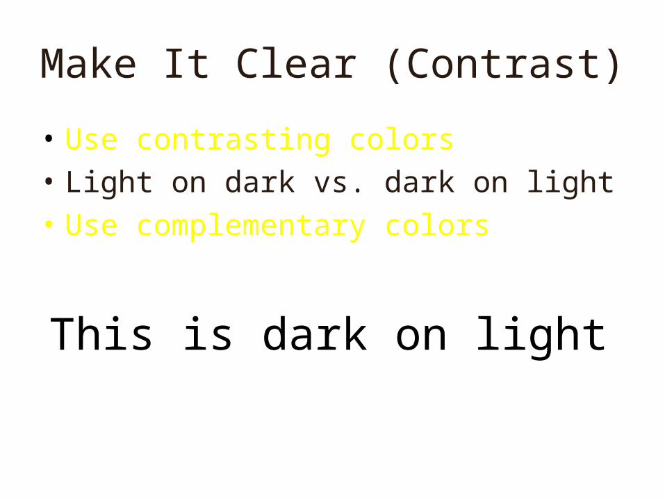
Make It Clear (Contrast)
• Use contrasting colors
• Light on dark vs. dark on light
• Use complementary colors
This is dark on light
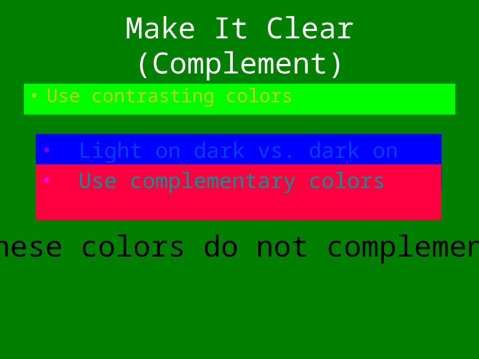
Make It Clear (Complement)
• Use contrasting colors
• Light on dark vs. dark on light • Use complementary colors
These colors do not complement
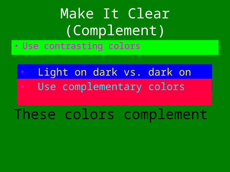
Make It Clear (Complement)
• Use contrasting colors
• Light on dark vs. dark on light • Use complementary colors
These colors complement
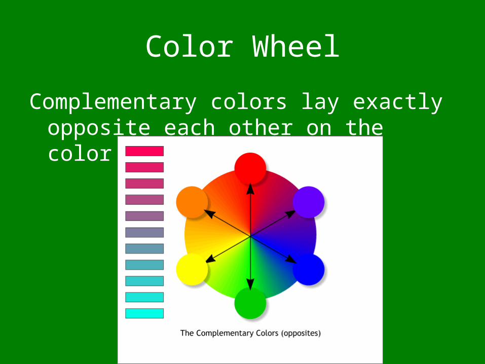
Color Wheel
Complementary colors lay exactly opposite each other on the color wheel
Color Blindness
Do not use red and green together
Are you color blind?
http://www.webexhibits.org/causesofcolor/2.html#vissamp

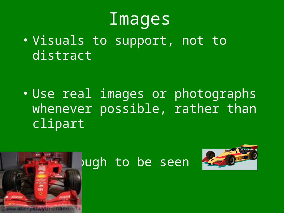
Images• Visuals to support, not to distract
• Use real images or photographs whenever possible, rather than clipart
• Big enough to be seen
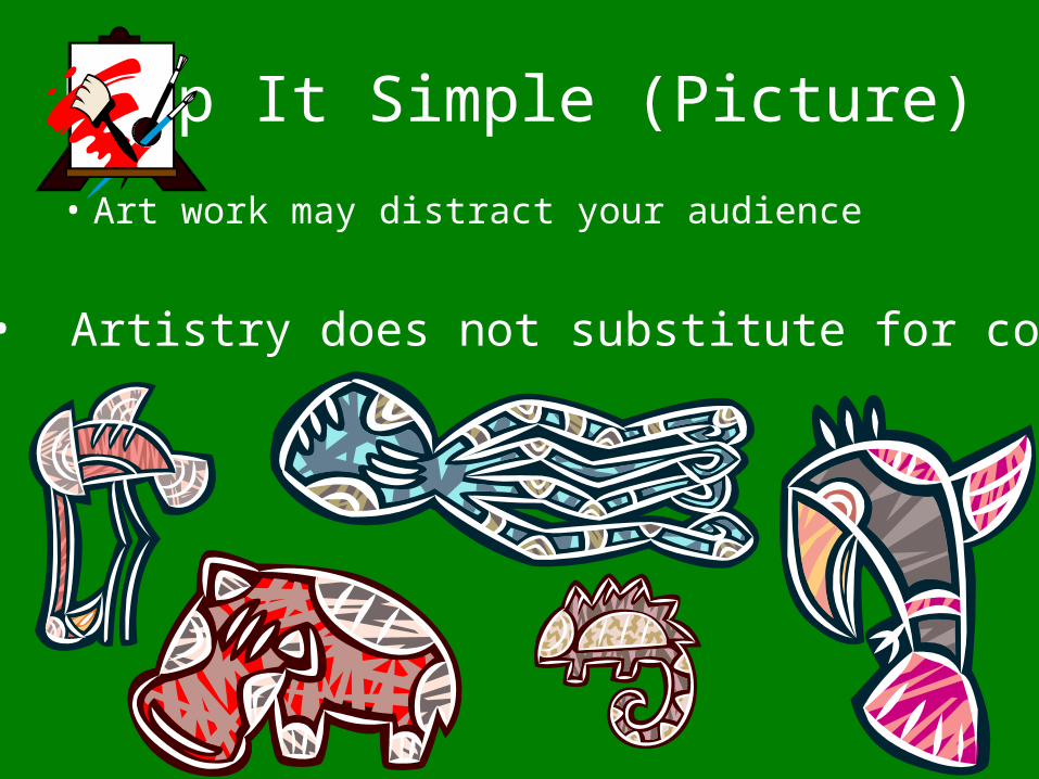
Keep It Simple (Picture)
• Art work may distract your audience
• Artistry does not substitute for content
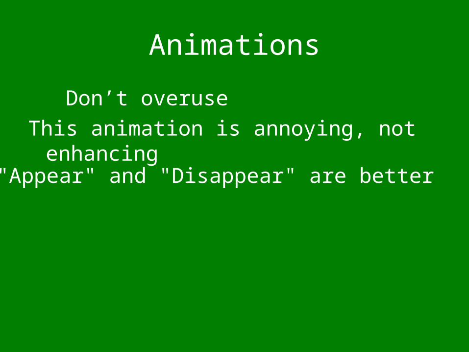
Animations
Don’t overuse
This animation is annoying, not enhancing
"Appear" and "Disappear" are better
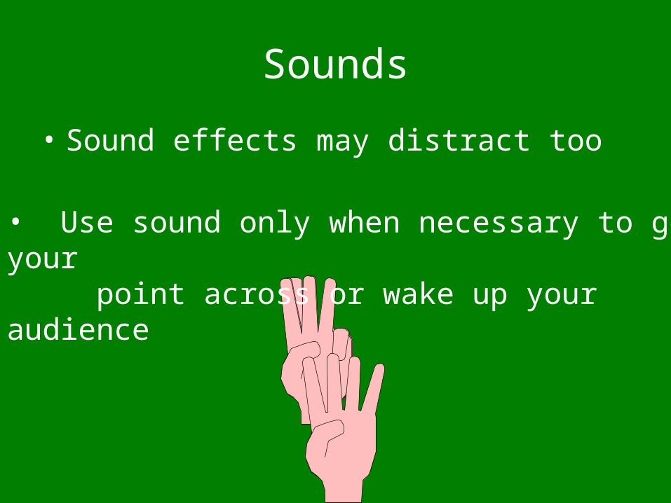
Sounds
• Sound effects may distract too
• Use sound only when necessary to get your point across or wake up your audience
Interactivity
• PowerPoint should be non-linear, so it doesn’t just go forward and backward
• Use action buttons
• Or hyperlinks
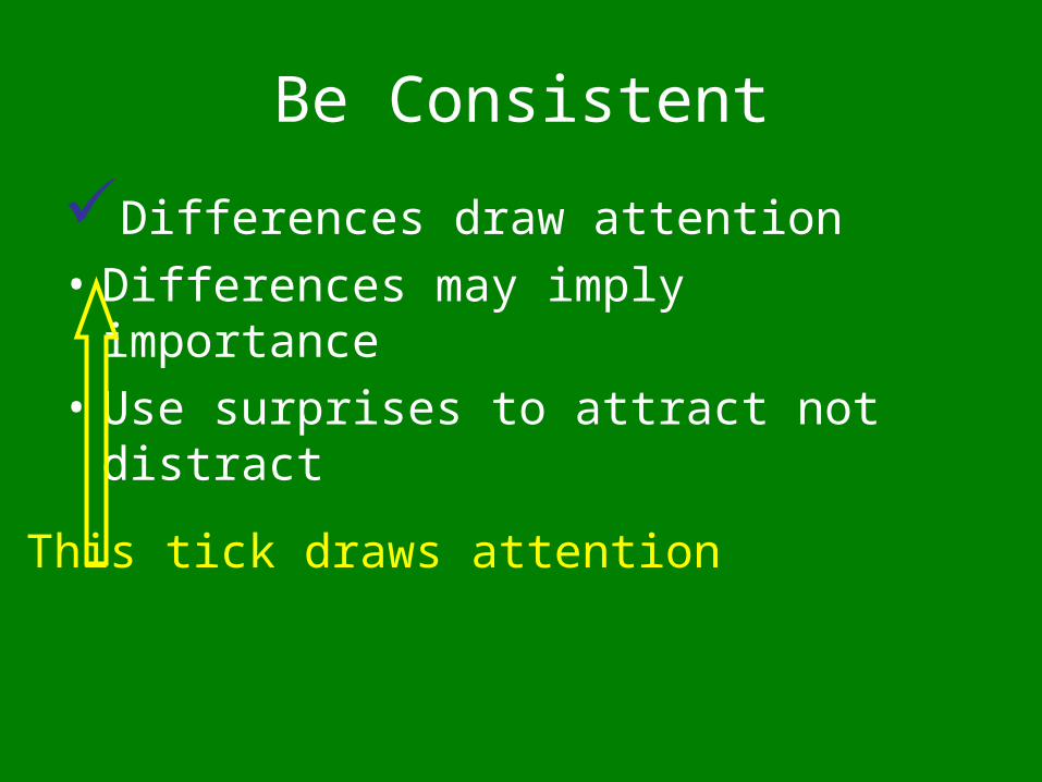
Be Consistent
• Be consistent with background design and color schemes
• Differences draw attention
• Differences may imply importance
• Use surprises to attract not distract
Be Consistent
Differences draw attention
• Differences may imply importance
• Use surprises to attract not distract
This tick draws attention
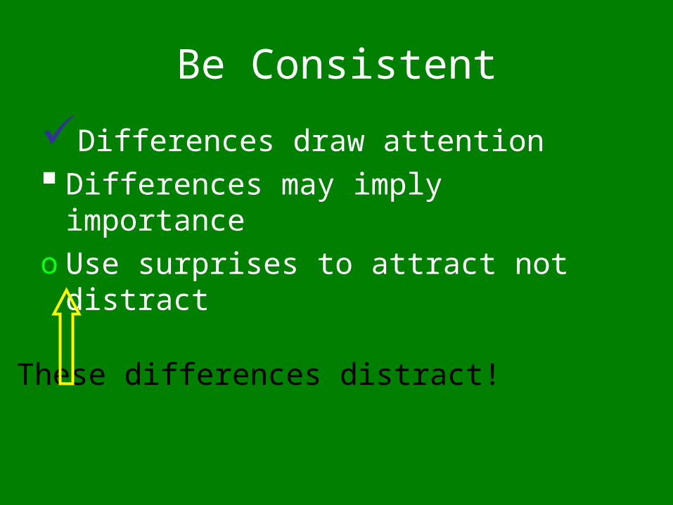
Be Consistent
Differences draw attention Differences may imply importance
o Use surprises to attract not distract
These differences distract!
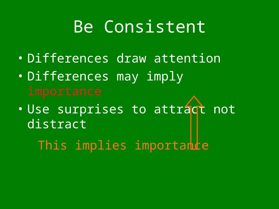
Be Consistent
• Differences draw attention• Differences may imply importance
• Use surprises to attract not distract
This implies importance
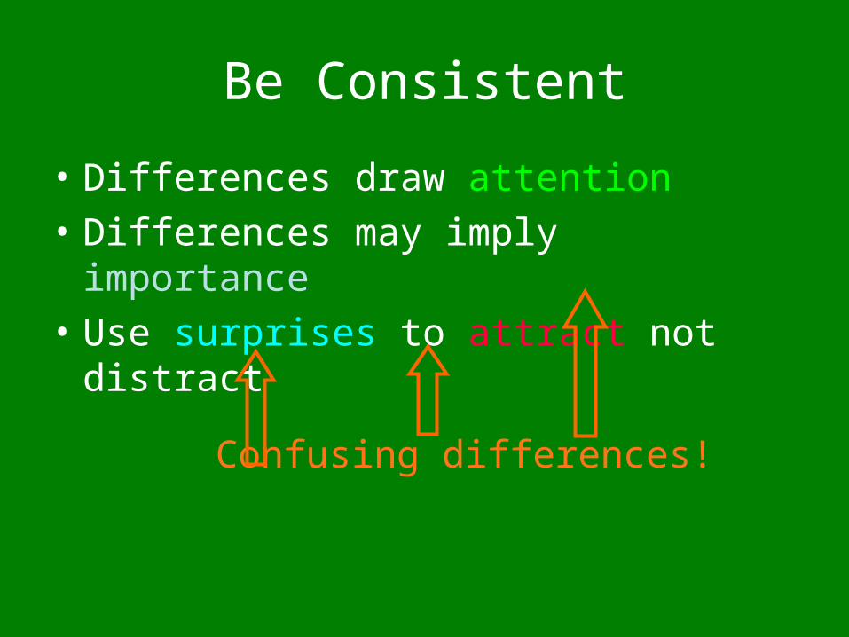
Be Consistent
• Differences draw attention• Differences may imply importance
• Use surprises to attract not distract
Confusing differences!
Be Consistent
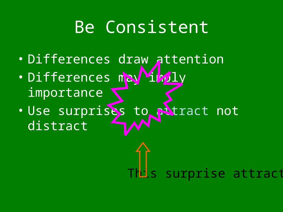
• Differences draw attention
• Differences may imply importance
• Use surprises to attract not distract
This surprise attracts
Be Consistent
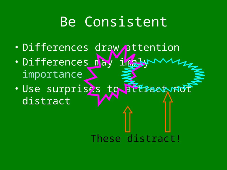
• Differences draw attention
• Differences may imply importance
• Use surprises to attract not distract
These distract!
Final Thoughts:
• Text to support the communication
• Pictures to simplify complex concepts
• Animations for complex relationships
• Visuals to support, not to distract
• Sounds only when absolutely necessary
• Think about the people in the back of the room when creating slides
Resources Used(require students do this)
• http://www.slideshare.net/thecroaker/death-by-powerpoint?src=related_normal&rel=9179
• http://www.slideshare.net/satyajeet_02/how-to-make-effective-presentation/
• http://owl.english.purdue.edu/owl/resource/686/01/• http://www.gst-d2l.com/TLC/TLCProj.html• http://www.michaelhyatt.com/workingsmart/2005/06/
five_rules_for_.html• http://www.cheney268.com/training/PowerPoint/PowerPointTips.htm• http://mason.gmu.edu/~montecin/powerpoint.html• http://kinesiology.boisestate.edu/kines442/
tips_for_making_effective_powerp.htm


![Yud Shvat, 5711 [1951] - SIEsie.org/media/pdf/1095/BOMm10954393.pdf · Sichos in English Classics 19 . Yud Shvat, 5711 [1951] Proceeding Together . Sichos In English . 788 Eastern](https://img.pdfslide.us/doc/110x75/5fcae1b439d54a60943f2e30/yud-shvat-5711-1951-sichos-in-english-classics-19-yud-shvat-5711-1951.jpg)