Embed Size (px)
Citation preview
Power BI: Getting Started GuideThis documentation is for preview only, and is subject to change in future releases.© 2013 Microsoft Corp. All rights reserved.
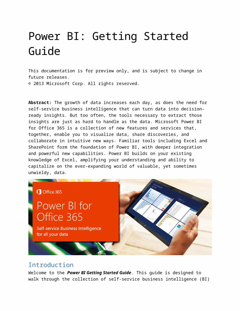
Abstract: The growth of data increases each day, as does the need for self-service business intelligence that can turn data into decision-ready insights. But too often, the tools necessary to extract those insights are just as hard to handle as the data. Microsoft Power BI for Office 365 is a collection of new features and services that, together, enable you to visualize data, share discoveries, and collaborate in intuitive new ways. Familiar tools including Excel and SharePoint form the foundation of Power BI, with deeper integration and powerful new capabilities. Power BI builds on your existing knowledge of Excel, amplifying your understanding and ability to capitalize on the ever-expanding world of valuable, yet sometimes unwieldy, data.
IntroductionWelcome to the Power BI Getting Started Guide. This guide is designed to walk through the collection of self-service business intelligence (BI) features included in Power BI. While each new feature is compelling in its own right, the value of Power BI is how its features and services work together, and how the insights are securely, yet interactively shared.
To facilitate getting you started with Power BI, this guide has two main sections, plus an Introduction and a Summary:
Introduction (the section you’re reading right now) Self-Service BI in Excel Power BI for Office 365 Summary – including additional links

Eager to get jump ahead? You can skip to the Self-Service BI in Excel section of this Getting Started Guide, and get started right away.
In the Summary section of this Guide you’ll find all sorts of links, including each of the links in the following bullets. But just in case you want them now, here are a few to get you going:
Register for the Power BI Preview Download each of the Power BI features for Excel (or learn how to activate them)
Lastly, we’re constantly updating features and adding capabilities to Power BI. To provide you with the latest information, the final section in this guide describes updates added since the initial Power BI Preview release. Check back often to make sure you’re in the know:
Updates to Power BI Preview o Power BI Q&A – ask your data questions, get answers
Okay, with those details out of the way, let’s discuss how people in different roles can use Power BI, then briefly look at each Power BI feature. We finish this section with a quick introduction to the characters we’ll follow through this guide, as they put its features and services to use.
Who will use Power BI?Any Excel user, who has a need for self-service BI capabilities, will find Power BI very useful. With its familiar Excel interface, Power BI is immediately accessible and intuitively connected to the software and services already used by report creators and Excel power users alike.
While the focus of this guide is the user, or report creator, other people in different roles also benefit from the features of Power BI. These roles tend to fall into three categories: report creator/user, data stewards and IT professionals, and report consumers. Let’s look at each in turn.
If you’re a report creator – such as a data analyst, data or BI consultant, or a mainstream Excel user – you’ll likely use Power BI’s self-service BI features in Excel often, and extensively. Online services that support collaboration, such as distributing interactive reports and sharing workbooks, are also an important central workspace and information hub.
If you’re a data steward – such as a data scientist, a data administrator, or an IT professional – the online service features of Power BI enable you to provide specific and secure access to data resources. Online service-related elements of certain self-service BI tools – such as enabling the identification, selection, and secure distribution of on-premise and public data feeds – are also significant. If you’re in this category, check out the Power BI Provisioning Guide, which shows how to get Power BI running in your organization.
And if you’re a report consumer – anyone from an aspiring students to a CEO – you can collaborate, share securely, and interact with reports using Power BI for smarter, insightful, and more nimble decisions. This includes using an online hub, built right into Office 365, specifically tailored for collaborative BI.

What Features are Included in Power BI?Let’s take a look at the features and services that are included in Power BI.
Self-Service BI in Excel
These features are part of the familiar Excel environment, and extend its functionality to all sorts of cool data-specific capabilities. Some of these features have been available before, some are new, but each is now integrated into Excel and into Power BI online services. These client tools are:
Power Query – easily discover and connect to data from public and corporate data sources. This includes new data search capabilities, as well as capabilities to easily transform and merge data from multiple data sources so that you can continue to analyze it in Excel.
Power Pivot – continue to create sophisticated data models with that data in Excel by creating relationships, custom measures, hierarchies, and KPI’s. Power Pivot models run in-memory so that users can analyze 100’s of millions of rows of data with lightning fast performance.
Power View – easily create reports and analytical views through interactive charts and graphs that help you explore and present your data visually in Excel.
Power Map – explore and navigate geospatial data on a 3D map experience in Excel.
Power BI for Office 365
Insights and visualizations are better when shared. Power BI excels at making insights available to everyone who should see them, securing those reports, and enabling them to be seen from anywhere in the world:
Power BI Sites – this is the heart of your collaborative Power BI experience. Quickly create collaborative Power BI sites for your team to share and view reports. Larger workbook viewing is also supported (up to 250MB) so that users can view and interact with larger workbooks through the browser.
Data Management – when you create a great query in Excel, you can share it with others, manage its availability, and see how much it gets used. With the data management features of Power BI, not only can you share your own query-creating genius, you can find other queries easily, too. You’re collaborating from within Excel, and sharing your efforts online. It’s powerful.
Power BI for Mobile – See the latest reports posted to your Power BI site from a rich, immersive app on your mobile device.
So… What’s the Story?When learning something new, a story often helps. It lets you project how you could use Power BI onto your own business challenges… and opportunities.
In this guide, we follow Anna (an analyst, or report creator) as she creates a report on stock performance for the Online Contoso Network. The structure of this guide follows how a self-service BI project often progresses – it starts with data discovery, mash-ups, and report creation, then continues to posting and highlighting, collaborating, and sharing.
During her adventure, Anna exercises the features of Power BI. She also learns something interesting – and unexpected – about a certain subset of stocks during the economic downturn of 2009, by visualizing the data in ways she hadn’t before. So let’s jump in, and see what Anna can do with Power BI.
Self-Service BI in Excel Power BI features in Excel 2013 make discovering and visualizing data easy. These four features – Power Query, Power Pivot, Power View, and Power Map – work seamlessly together.
With Power Query, you can search the entire cloud for data, both public and private. Using multiple data sources, you can filter, shape, merge, and append that data using Power Query… without bringing any of it into Excel. You get a view into the data, shape it how you want, and can then send it directly to the Data Model in Power Pivot. And even then, you can create new calculations and fields in Power Pivot to get just the dataset you want.
Power View uses the Data Model to bring that data to life. Create reports, then let others interact and drill into them, changing visualizations on the fly as they select report elements.
To show how all this comes together, from scratch, let’s follow Anna as she creates her report.
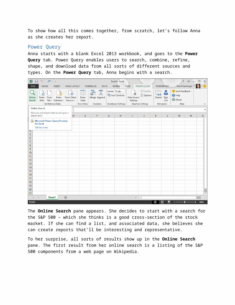
Power QueryAnna starts with a blank Excel 2013 workbook, and goes to the Power Query tab. Power Query enables users to search, combine, refine, shape, and download data from all sorts of different sources and types. On the Power Query tab, Anna begins with a search.
The Online Search pane appears. She decides to start with a search for the S&P 500 – which she thinks is a good cross-section of the stock market. If she can find a list, and associated data, she believes she can create reports that’ll be interesting and representative.
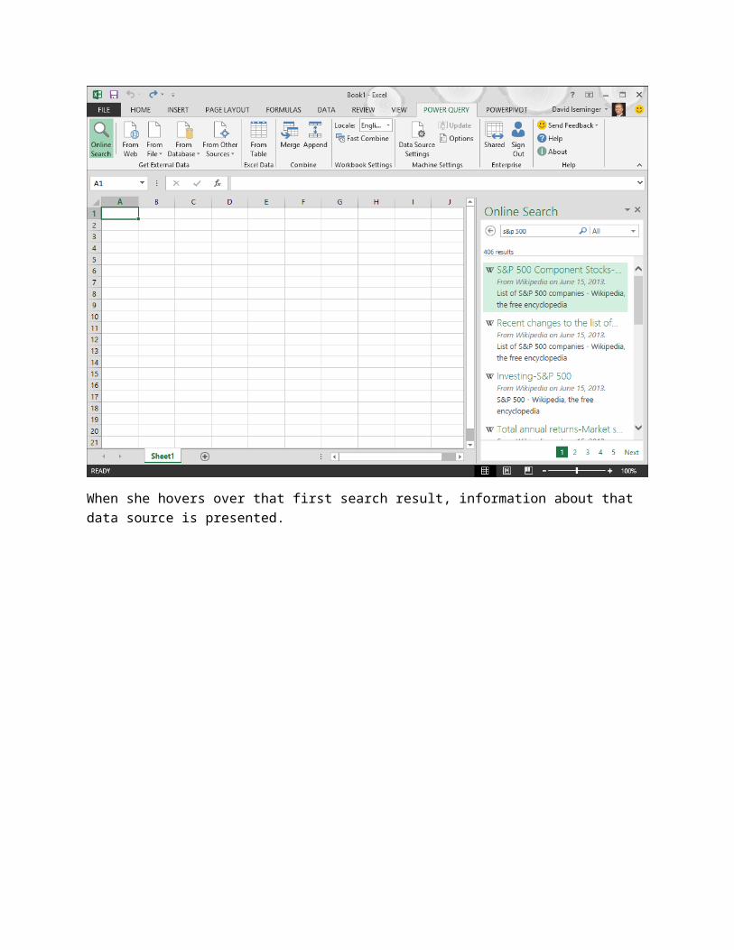
To her surprise, all sorts of results show up in the Online Search pane. The first result from her online search is a listing of the S&P 500 components from a web page on Wikipedia.
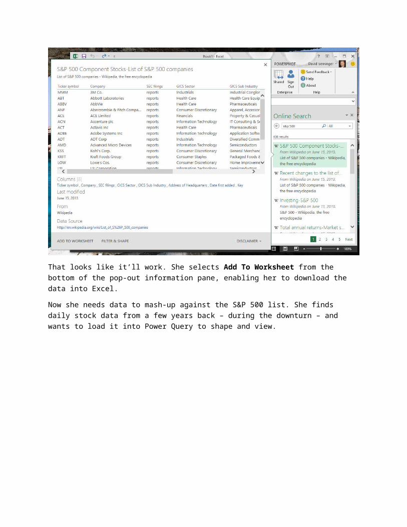
When she hovers over that first search result, information about that data source is presented.
That looks like it’ll work. She selects Add To Worksheet from the bottom of the pop-out information pane, enabling her to download the data into Excel.
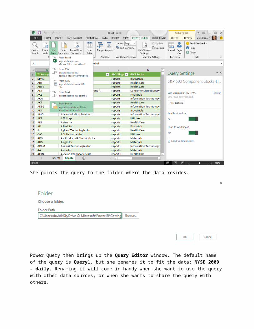
Now she needs data to mash-up against the S&P 500 list. She finds daily stock data from a few years back – during the downturn – and wants to load it into Power Query to shape and view.
She points the query to the folder where the data resides.
Power Query then brings up the Query Editor window. The default name of the query is Query1, but she renames it to fit the data: NYSE 2009 – daily. Renaming it will come in handy when she want to use the query with other data sources, or when she wants to share the query with others.
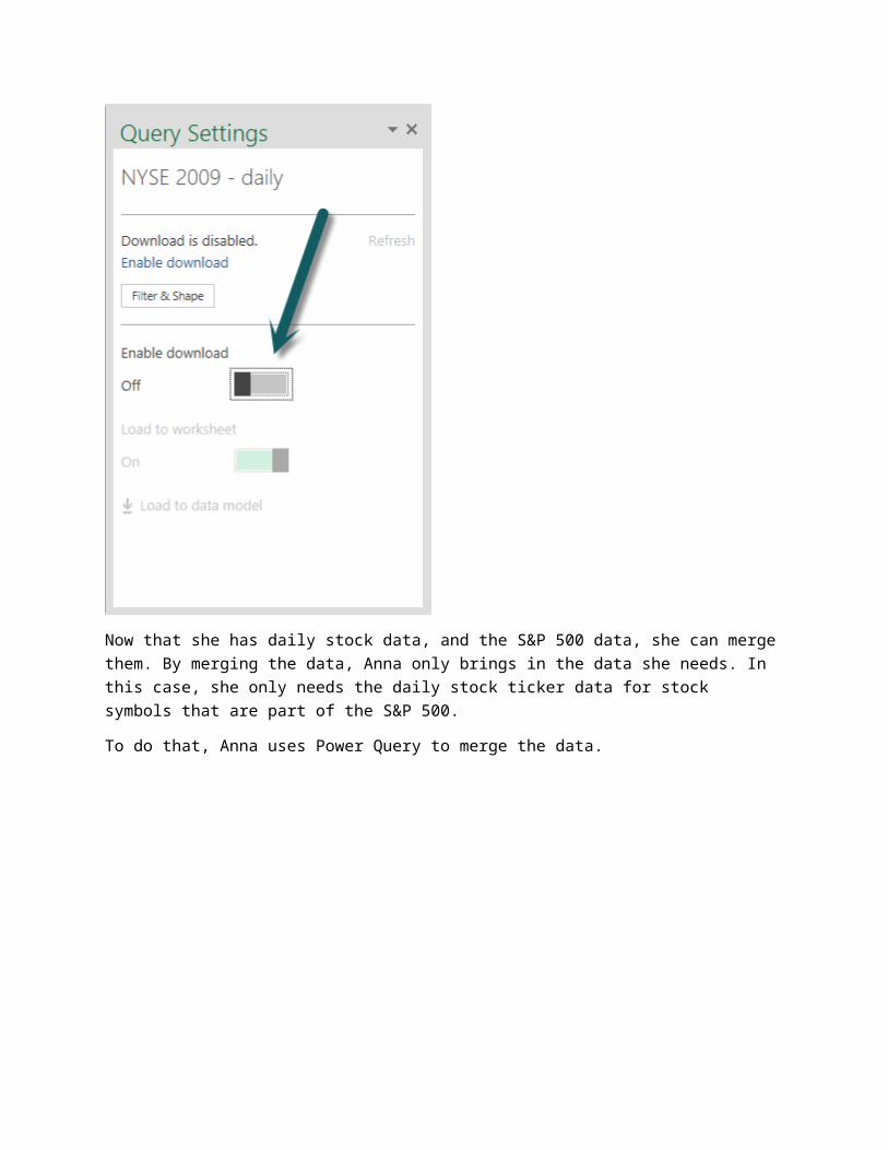
The data set from those two files is large – almost 75 megabytes – so she doesn’t want to download it all to her workbook. She just want to see the columns, decide how to filter and shape the data, and then will only bring down the subset she’s going to use.
She clicks Done in the bottom of the Query Editor window, and then slides Enable Download to Off.

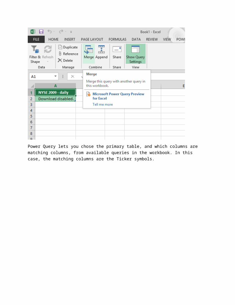
Now that she has daily stock data, and the S&P 500 data, she can merge them. By merging the data, Anna only brings in the data she needs. In this case, she only needs the daily stock ticker data for stock symbols that are part of the S&P 500.
To do that, Anna uses Power Query to merge the data.
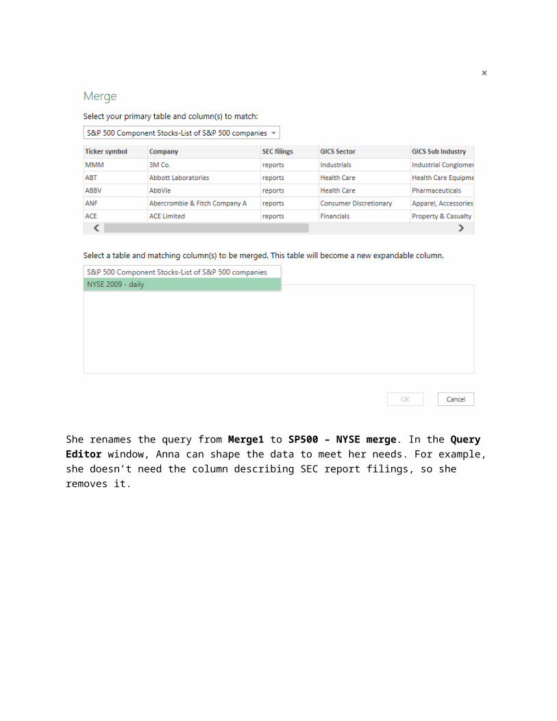
Power Query lets you chose the primary table, and which columns are matching columns, from available queries in the workbook. In this case, the matching columns are the Ticker symbols.
She renames the query from Merge1 to SP500 – NYSE merge. In the Query Editor window, Anna can shape the data to meet her needs. For example, she doesn’t need the column describing SEC report filings, so she removes it.
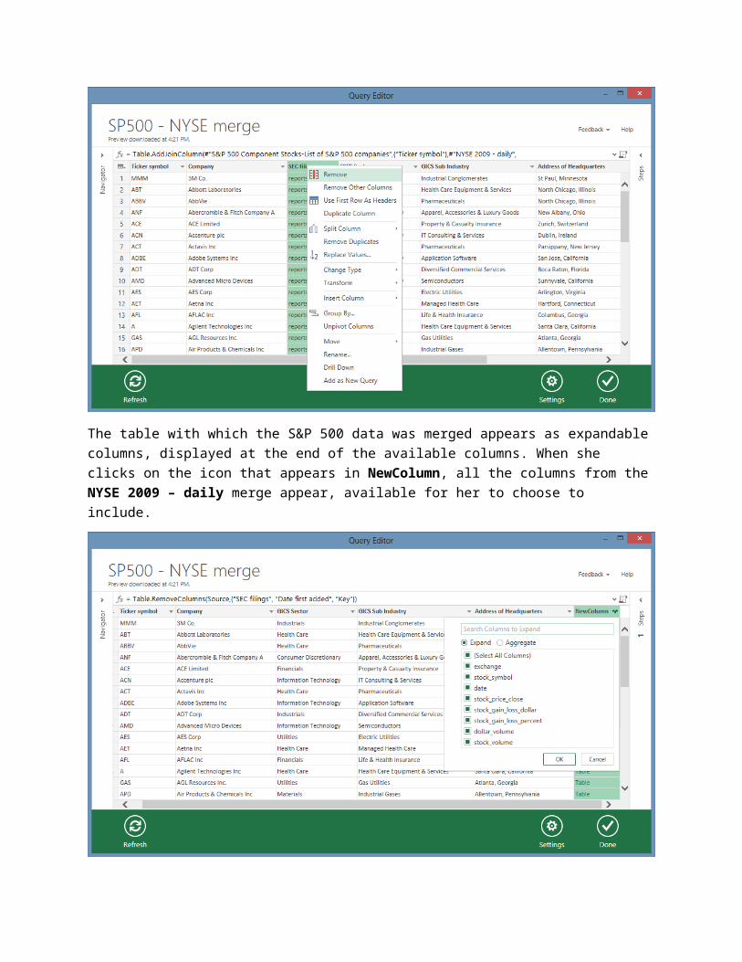
The table with which the S&P 500 data was merged appears as expandable columns, displayed at the end of the available columns. When she clicks on the icon that appears in NewColumn, all the columns from the NYSE 2009 – daily merge appear, available for her to choose to include.
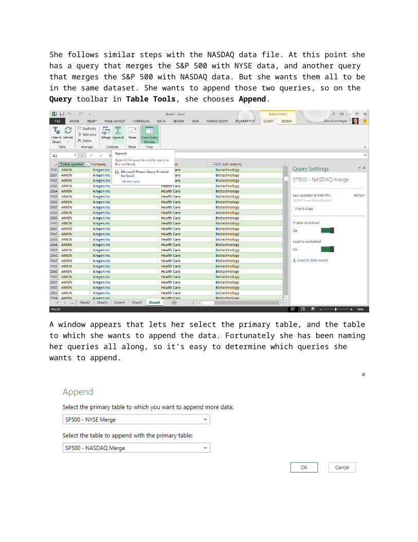
She follows similar steps with the NASDAQ data file. At this point she has a query that merges the S&P 500 with NYSE data, and another query that merges the S&P 500 with NASDAQ data. But she wants
them all to be in the same dataset. She wants to append those two queries, so on the Query toolbar in Table Tools, she chooses Append.
A window appears that lets her select the primary table, and the table to which she wants to append the data. Fortunately she has been naming her queries all along, so it’s easy to determine which queries she wants to append.
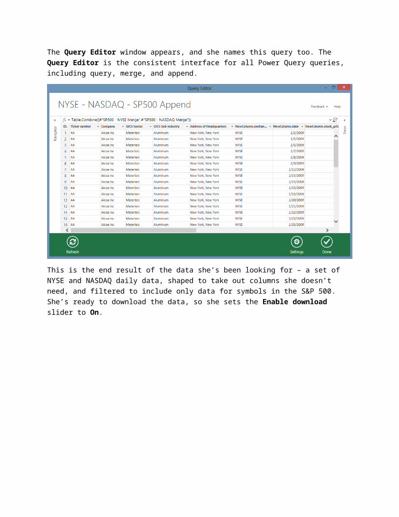
The Query Editor window appears, and she names this query too. The Query Editor is the consistent interface for all Power Query queries, including query, merge, and append.
This is the end result of the data she’s been looking for – a set of NYSE and NASDAQ daily data, shaped to take out columns she doesn’t need, and filtered to include only data for symbols in the S&P 500. She’s ready to download the data, so she sets the Enable download slider to On.
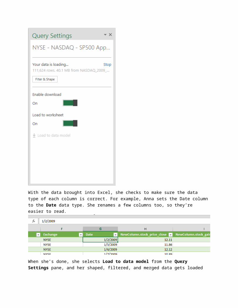
With the data brought into Excel, she checks to make sure the data type of each column is correct. For example, Anna sets the Date column to the Date data type. She renames a few columns too, so they’re easier to read.
When she’s done, she selects Load to data model from the Query Settings pane, and her shaped, filtered, and merged data gets loaded into the Data Model, which will bring her to next feature of Power BI: Power Pivot.
Power Query summary: with Power Query, you can search for data across your organization and across the Internet. Once you find the data you want, you can shape, filter, merge, and append different data sets from various sources, all without having to bring the data into Excel. Once your query is shaped and filtered how you want it, you can download it into a worksheet in Excel, into the Data Model, or both.
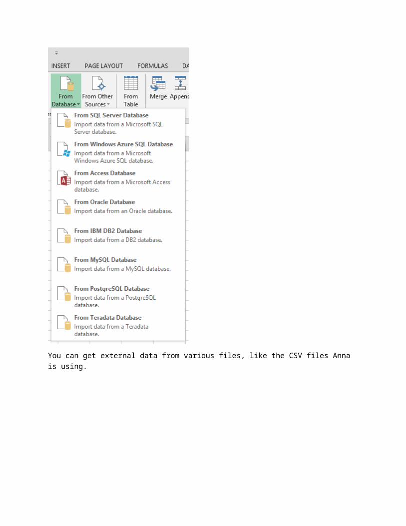
There are all sorts of compatible data sources, as the following images show. You can get external data from databases:
You can get external data from various files, like the CSV files Anna is using.

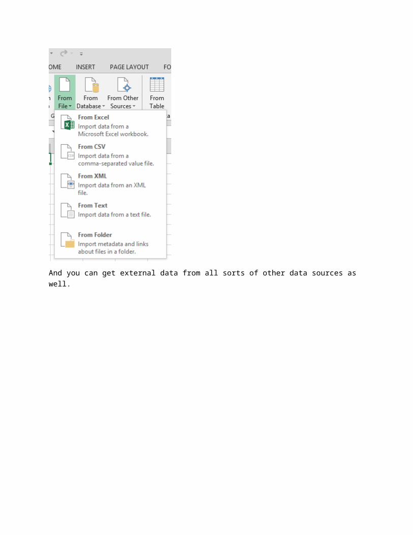
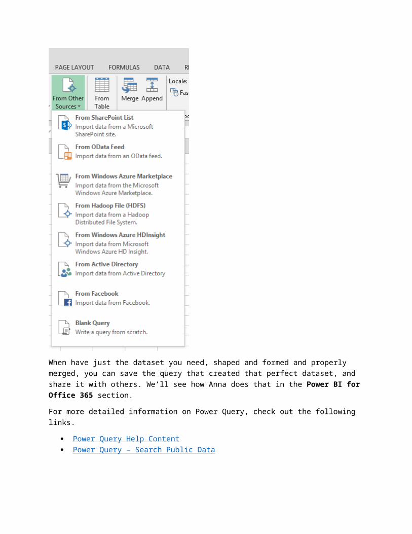
And you can get external data from all sorts of other data sources as well.
When have just the dataset you need, shaped and formed and properly merged, you can save the query that created that perfect dataset, and share it with others. We’ll see how Anna does that in the Power BI for Office 365 section.
For more detailed information on Power Query, check out the following links.
Power Query Help Content Power Query – Search Public Data
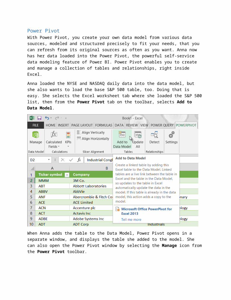
Power PivotWith Power Pivot, you create your own data model from various data sources, modeled and structured precisely to fit your needs, that you can refresh from its original sources as often as you want. Anna now
has her data loaded into the Power Pivot, the powerful self-service data modeling feature of Power BI. Power Pivot enables you to create and manage a collection of tables and relationships, right inside Excel.
Anna loaded the NYSE and NASDAQ daily data into the data model, but she also wants to load the base S&P 500 table, too. Doing that is easy. She selects the Excel worksheet tab where she loaded the S&P 500 list, then from the Power Pivot tab on the toolbar, selects Add to Data Model.
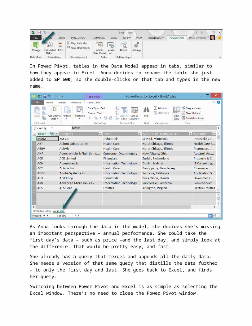
When Anna adds the table to the Data Model, Power Pivot opens in a separate window, and displays the table she added to the model. She can also open the Power Pivot window by selecting the Manage icon from the Power Pivot toolbar.
In Power Pivot, tables in the Data Model appear in tabs, similar to how they appear in Excel. Anna decides to rename the table she just added to SP 500, so she double-clicks on that tab and types in the new name.
As Anna looks through the data in the model, she decides she’s missing an important perspective – annual performance. She could take the first day’s data – such as price –and the last day, and simply look at the difference. That would be pretty easy, and fast.
She already has a query that merges and appends all the daily data. She needs a version of that same query that distills the data further – to only the first day and last. She goes back to Excel, and finds her query.
Switching between Power Pivot and Excel is as simple as selecting the Excel window. There’s no need to close the Power Pivot window.
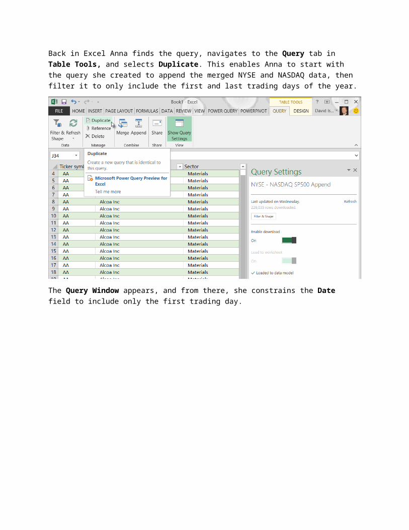
Back in Excel Anna finds the query, navigates to the Query tab in Table Tools, and selects Duplicate. This enables Anna to start with the query she created to append the merged NYSE and NASDAQ data, then filter it to only include the first and last trading days of the year.
The Query Window appears, and from there, she constrains the Date field to include only the first trading day.
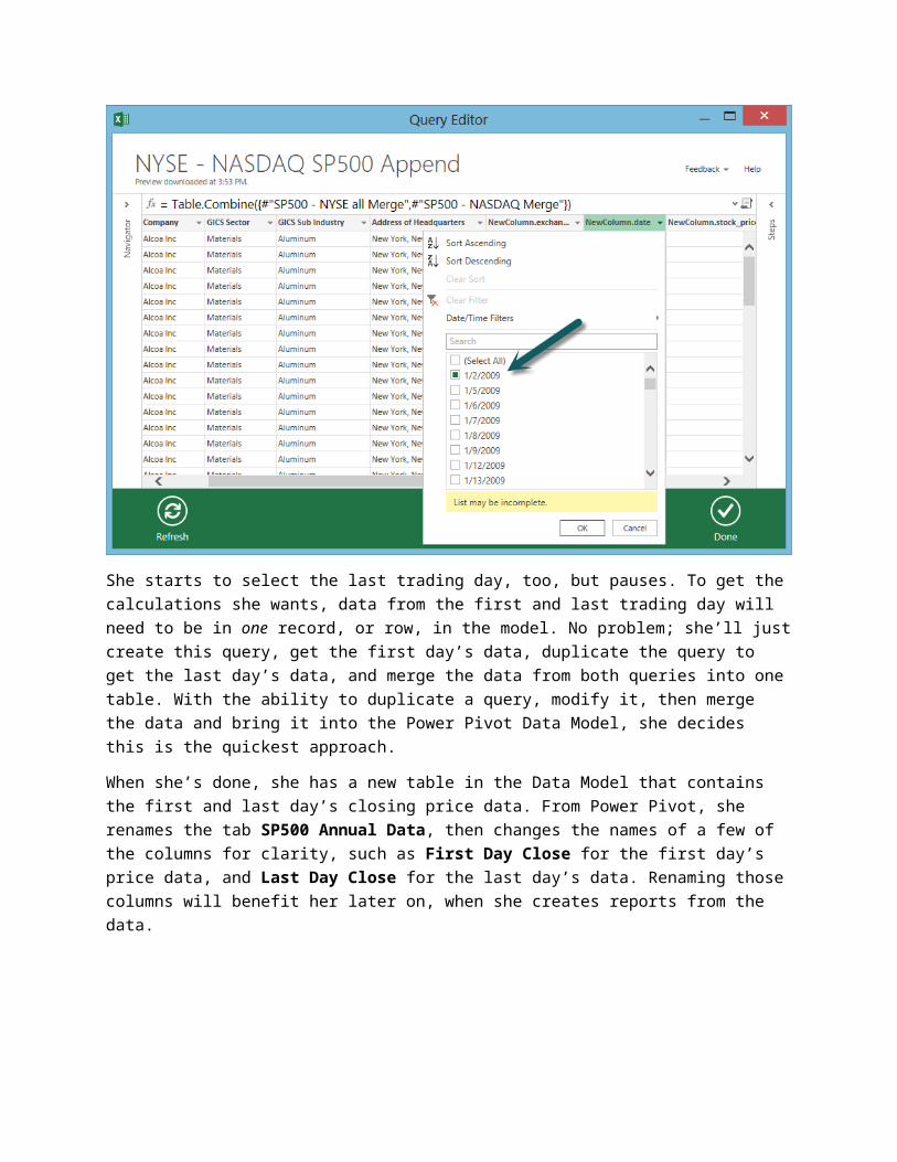
She starts to select the last trading day, too, but pauses. To get the calculations she wants, data from the first and last trading day will need to be in one record, or row, in the model. No problem; she’ll just create this query, get the first day’s data, duplicate the query to get the last day’s data, and merge the data from both queries into one table. With the ability to duplicate a query, modify it, then merge the data and bring it into the Power Pivot Data Model, she decides this is the quickest approach.
When she’s done, she has a new table in the Data Model that contains the first and last day’s closing price data. From Power Pivot, she renames the tab SP500 Annual Data, then changes the names of a few of the columns for clarity, such as First Day Close for the first day’s price data, and Last Day Close for the last day’s data. Renaming those columns will benefit her later on, when she creates reports from the data.
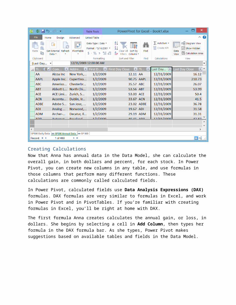
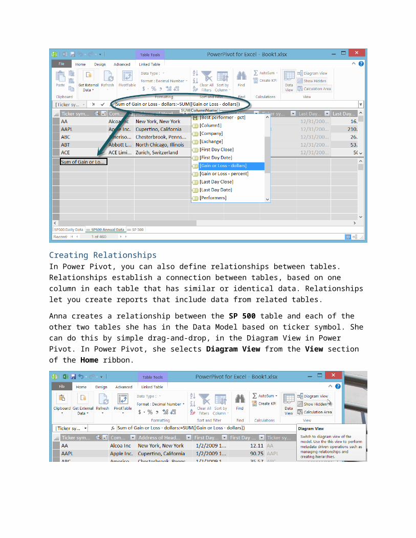
Creating CalculationsNow that Anna has annual data in the Data Model, she can calculate the overall gain, in both dollars and percent, for each stock. In Power Pivot, you can create new columns in any table, and use formulas in those columns that perform many different functions. These calculations are commonly called calculated fields.
In Power Pivot, calculated fields use Data Analysis Expressions (DAX) formulas. DAX formulas are very similar to formulas in Excel, and work in Power Pivot and in PivotTables. If you’re familiar with creating formulas in Excel, you’ll be right at home with DAX.
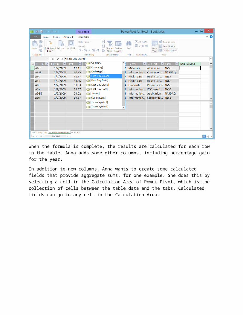
The first formula Anna creates calculates the annual gain, or loss, in dollars. She begins by selecting a cell in Add Column, then types her formula in the DAX formula bar. As she types, Power Pivot makes suggestions based on available tables and fields in the Data Model.
When the formula is complete, the results are calculated for each row in the table. Anna adds some other columns, including percentage gain for the year.
In addition to new columns, Anna wants to create some calculated fields that provide aggregate sums, for one example. She does this by selecting a cell in the Calculation Area of Power Pivot, which is the collection of cells between the table data and the tabs. Calculated fields can go in any cell in the Calculation Area.
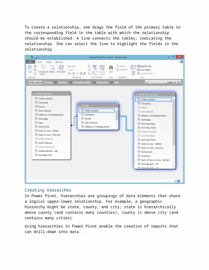
Creating RelationshipsIn Power Pivot, you can also define relationships between tables. Relationships establish a connection between tables, based on one column in each table that has similar or identical data. Relationships let you create reports that include data from related tables.
Anna creates a relationship between the SP 500 table and each of the other two tables she has in the Data Model based on ticker symbol. She can do this by simple drag-and-drop, in the Diagram View in Power Pivot. In Power Pivot, she selects Diagram View from the View section of the Home ribbon.
To create a relationship, she drags the field of the primary table to the corresponding field in the table with which the relationship should be established. A line connects the tables, indicating the relationship. She can select the line to highlight the fields in the relationship.
Creating HierarchesIn Power Pivot, hierarchies are groupings of data elements that share a logical upper-lower relationship. For example, a geographic hierarchy might be state, county, and city; state is hierarchically above county (and contains many counties), county is above city (and contains many cities).
Using hierarchies in Power Pivot enable the creation of reports that can drill-down into data.
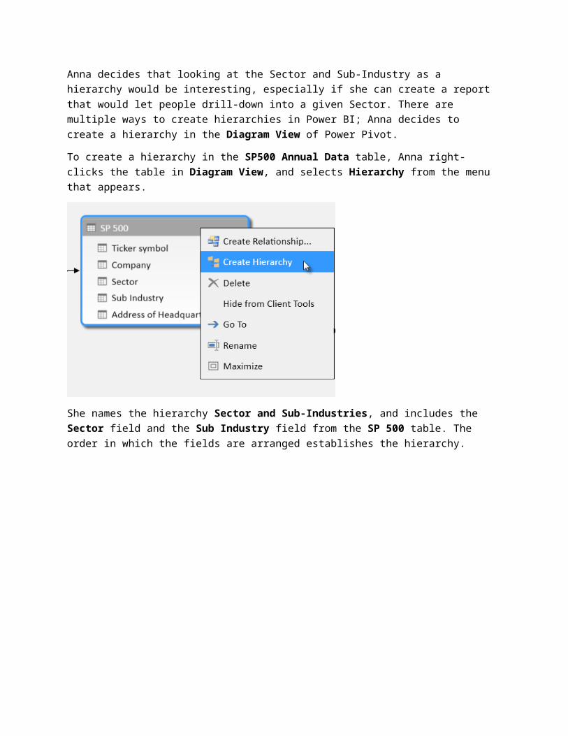
Anna decides that looking at the Sector and Sub-Industry as a hierarchy would be interesting, especially if she can create a report that would let people drill-down into a given Sector. There are multiple ways to create hierarchies in Power BI; Anna decides to create a hierarchy in the Diagram View of Power Pivot.
To create a hierarchy in the SP500 Annual Data table, Anna right-clicks the table in Diagram View, and selects Hierarchy from the menu that appears.
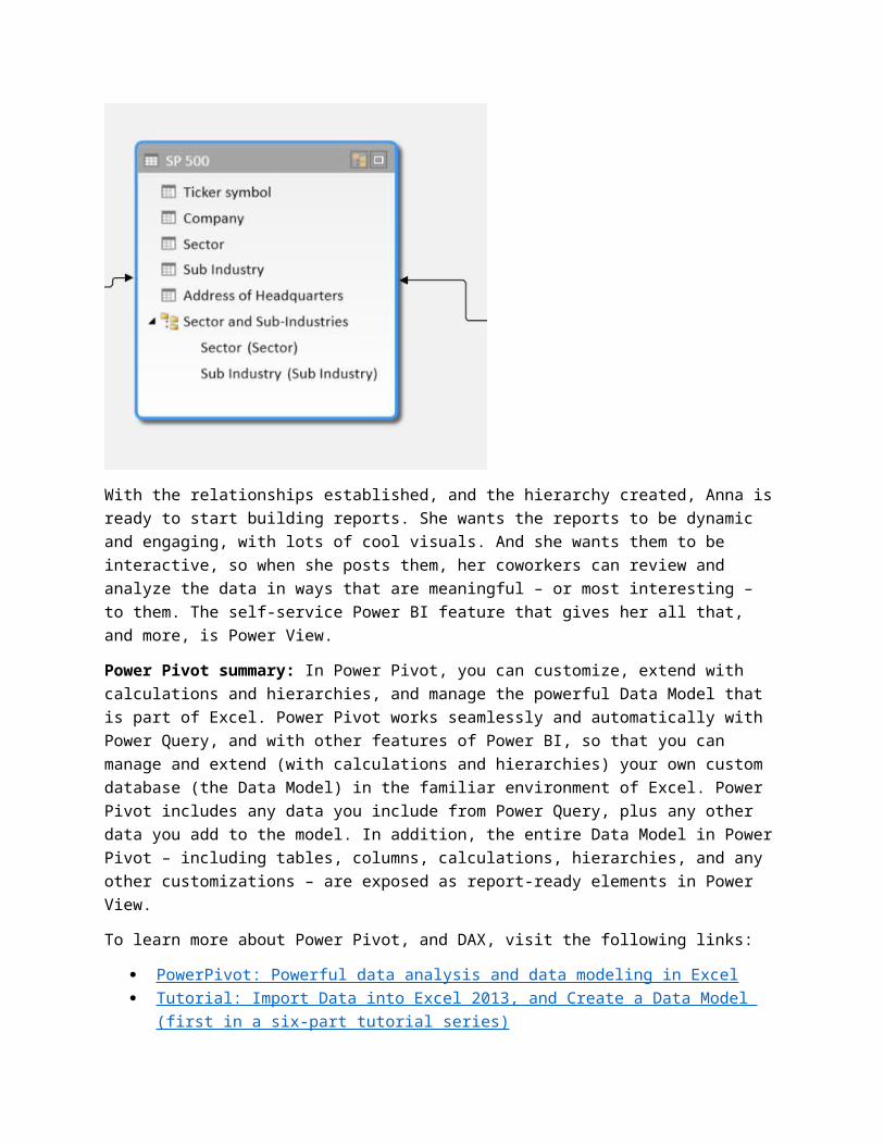
She names the hierarchy Sector and Sub-Industries, and includes the Sector field and the Sub Industry field from the SP 500 table. The order in which the fields are arranged establishes the hierarchy.
With the relationships established, and the hierarchy created, Anna is ready to start building reports. She wants the reports to be dynamic and engaging, with lots of cool visuals. And she wants them to be interactive, so when she posts them, her coworkers can review and analyze the data in ways that are meaningful – or most interesting – to them. The self-service Power BI feature that gives her all that, and more, is Power View.
Power Pivot summary: In Power Pivot, you can customize, extend with calculations and hierarchies, and manage the powerful Data Model that is part of Excel. Power Pivot works seamlessly and automatically with Power Query, and with other features of Power BI, so that you can manage and extend (with
calculations and hierarchies) your own custom database (the Data Model) in the familiar environment of Excel. Power Pivot includes any data you include from Power Query, plus any other data you add to the model. In addition, the entire Data Model in Power Pivot – including tables, columns, calculations, hierarchies, and any other customizations – are exposed as report-ready elements in Power View.
To learn more about Power Pivot, and DAX, visit the following links:
PowerPivot: Powerful data analysis and data modeling in Excel Tutorial: Import Data into Excel 2013, and Create a Data Model (first in a six-part tutorial series) Calculations in Power Pivot Data Analysis Expressions (DAX) Overview
Power ViewIn Power View, you can create engaging, interactive, and insightful visualizations with just a few clicks. All sorts of visualizations are capable in Power View, and the reports created in Power View are easily shared with others, and interactively analyzed by report consumers.
To create a new Power View report in Excel, Anna selects the Power View button, found in the Reports section of the Insert ribbon in Excel. A new worksheet tab is created.
Note that the Power View tab in the ribbon only appears when a Power View report is the active tab. With the new Power View report sheet created, the Power View tab appears in the ribbon and Anna is ready to create a report.
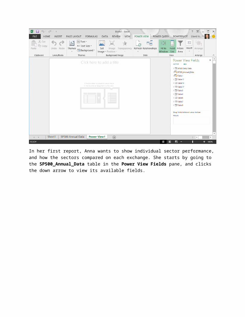
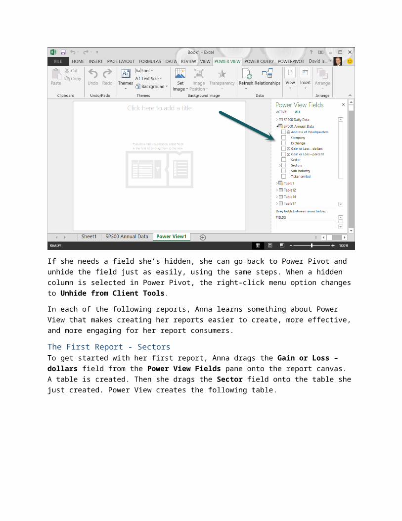
In her first report, Anna wants to show individual sector performance, and how the sectors compared on each exchange. She starts by going to the SP500_Annual_Data table in the Power View Fields pane, and clicks the down arrow to view its available fields.
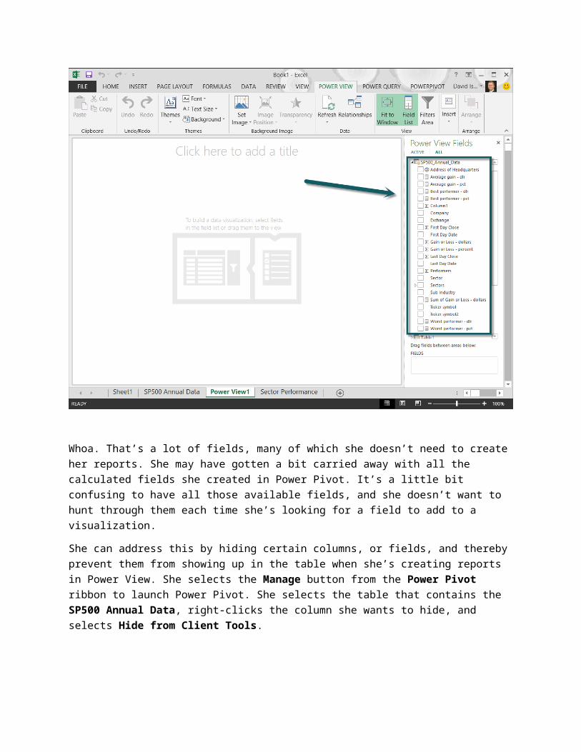
Whoa. That’s a lot of fields, many of which she doesn’t need to create her reports. She may have gotten a bit carried away with all the calculated fields she created in Power Pivot. It’s a little bit confusing to have all those available fields, and she doesn’t want to hunt through them each time she’s looking for a field to add to a visualization.
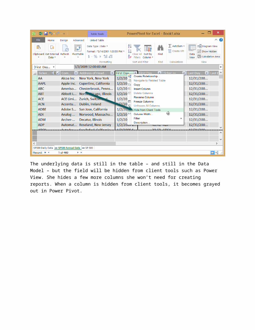
She can address this by hiding certain columns, or fields, and thereby prevent them from showing up in the table when she’s creating reports in Power View. She selects the Manage button from the Power Pivot ribbon to launch Power Pivot. She selects the table that contains the SP500 Annual Data, right-clicks the column she wants to hide, and selects Hide from Client Tools.
The underlying data is still in the table – and still in the Data Model – but the field will be hidden from client tools such as Power View. She hides a few more columns she won’t need for creating reports. When a column is hidden from client tools, it becomes grayed out in Power Pivot.

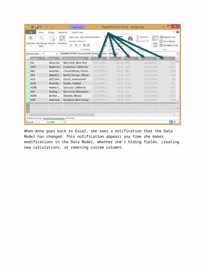
When Anna goes back to Excel, she sees a notification that the Data Model has changed. This notification appears any time she makes modifications to the Data Model, whether she’s hiding fields, creating new calculations, or removing custom columns.
Anna smiles at this – because it means she can continue to modify and customize her Data Model, even after she thinks she’s created the right set of data, and the best collection of calculated fields. She can customize all she wants, while creating her reports, and Excel makes sure the Data Model and all her reports are synchronized and current.
She selects OK, and reviews the list of available fields in the SP500_Annual_Data table. She decides the fewer number of available fields is much more manageable.
If she needs a field she’s hidden, she can go back to Power Pivot and unhide the field just as easily, using the same steps. When a hidden column is selected in Power Pivot, the right-click menu option changes to Unhide from Client Tools.
In each of the following reports, Anna learns something about Power View that makes creating her reports easier to create, more effective, and more engaging for her report consumers.
The First Report - SectorsTo get started with her first report, Anna drags the Gain or Loss – dollars field from the Power View Fields pane onto the report canvas. A table is created. Then she drags the Sector field onto the table she just created. Power View creates the following table.
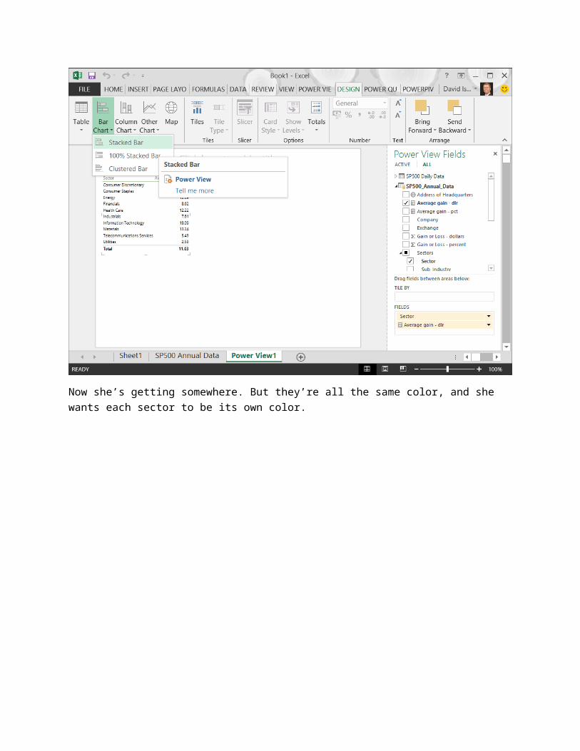
Power View automatically creates a sum of the gains. Anna decides it would be more interesting to see the average gain for each sector, at least in this report, so she adds that field instead. She wants to see this as a bar chart, so she selects the table, then selects Design > Switch Visualization > Bar Chart > Stacked Bar from the ribbon.
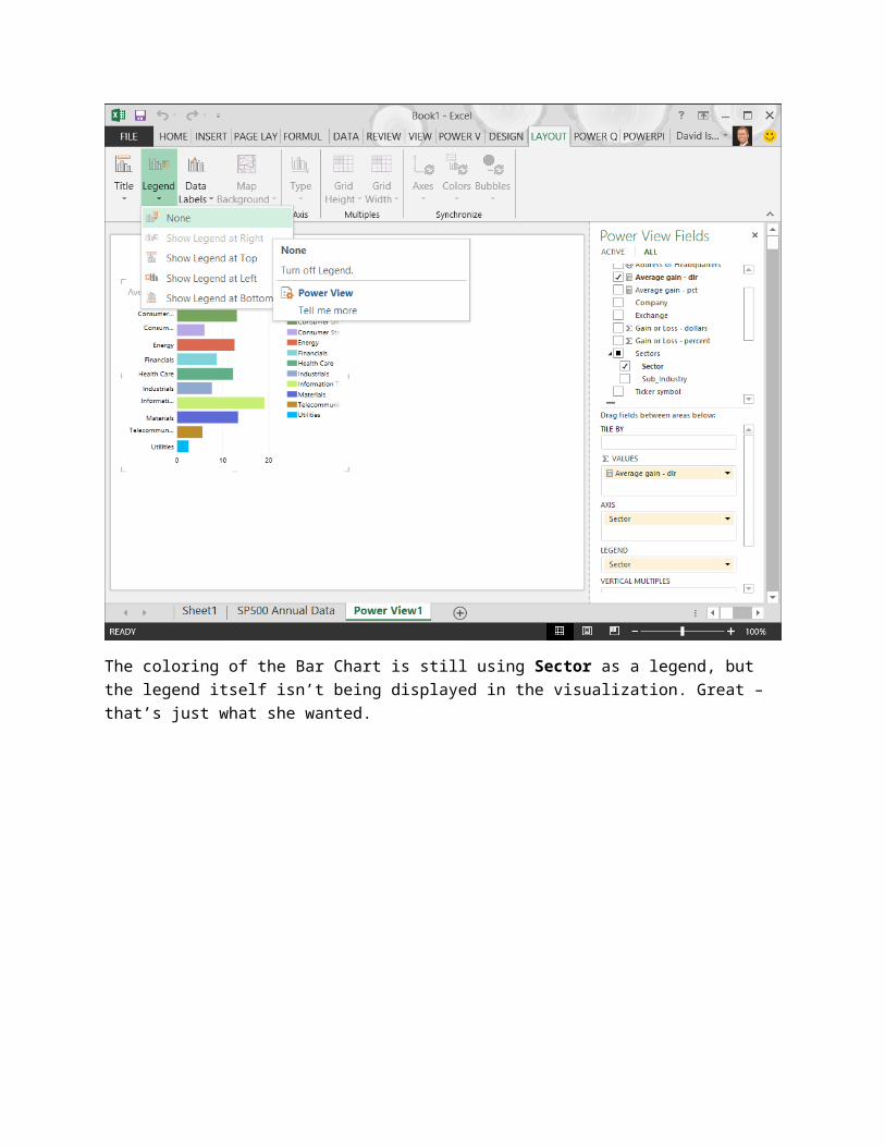
Now she’s getting somewhere. But they’re all the same color, and she wants each sector to be its own color.
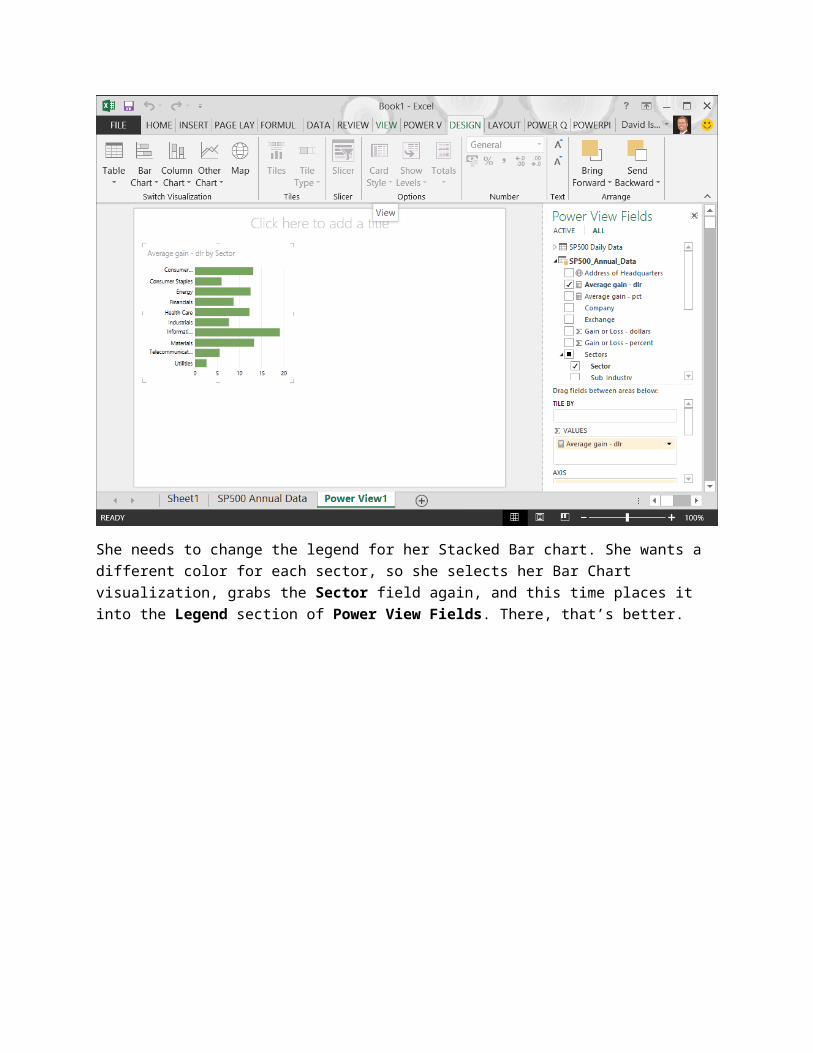
She needs to change the legend for her Stacked Bar chart. She wants a different color for each sector, so she selects her Bar Chart visualization, grabs the Sector field again, and this time places it into the Legend section of Power View Fields. There, that’s better.

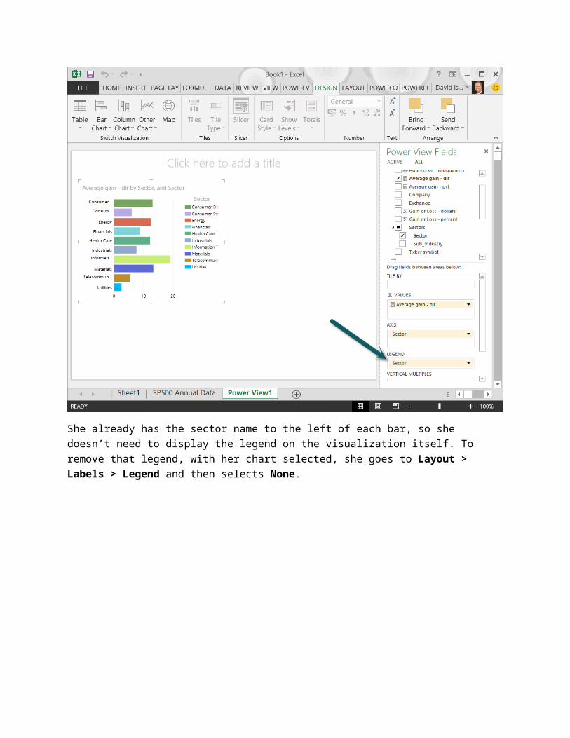
She already has the sector name to the left of each bar, so she doesn’t need to display the legend on the visualization itself. To remove that legend, with her chart selected, she goes to Layout > Labels > Legend and then selects None.
The coloring of the Bar Chart is still using Sector as a legend, but the legend itself isn’t being displayed in the visualization. Great – that’s just what she wanted.

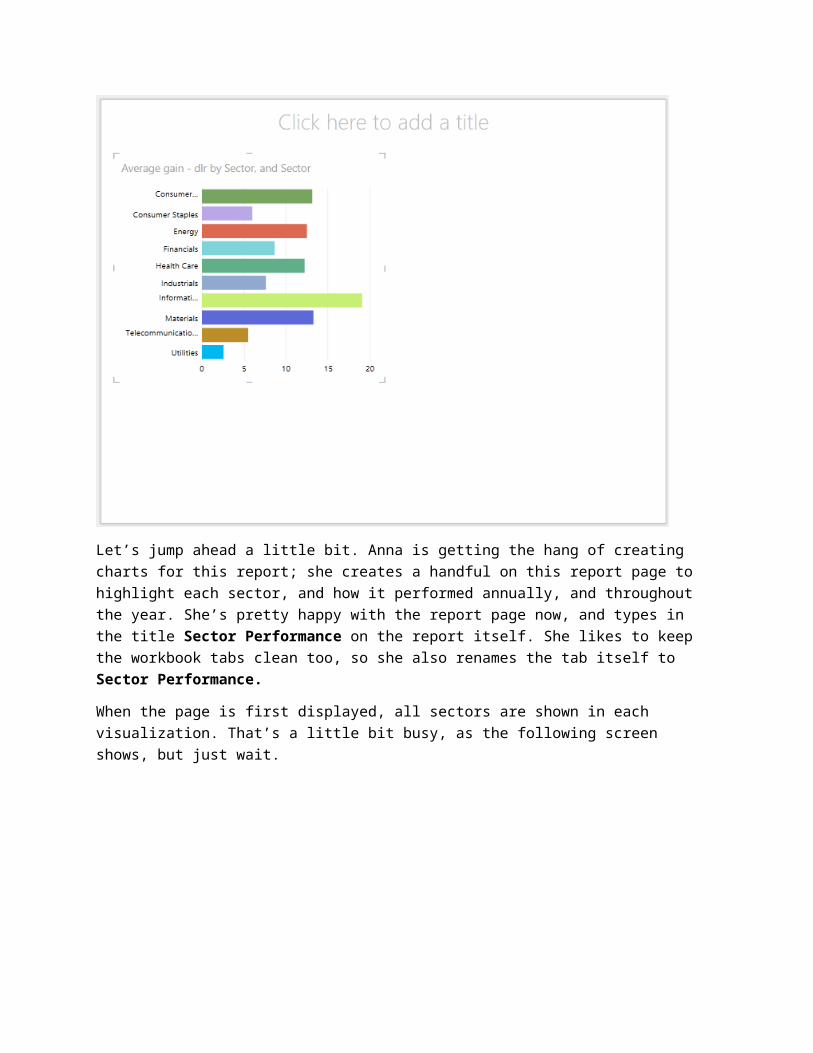
Let’s jump ahead a little bit. Anna is getting the hang of creating charts for this report; she creates a handful on this report page to highlight each sector, and how it performed annually, and throughout the year. She’s pretty happy with the report page now, and types in the title Sector Performance on the report itself. She likes to keep the workbook tabs clean too, so she also renames the tab itself to Sector Performance.
When the page is first displayed, all sectors are shown in each visualization. That’s a little bit busy, as the following screen shows, but just wait.
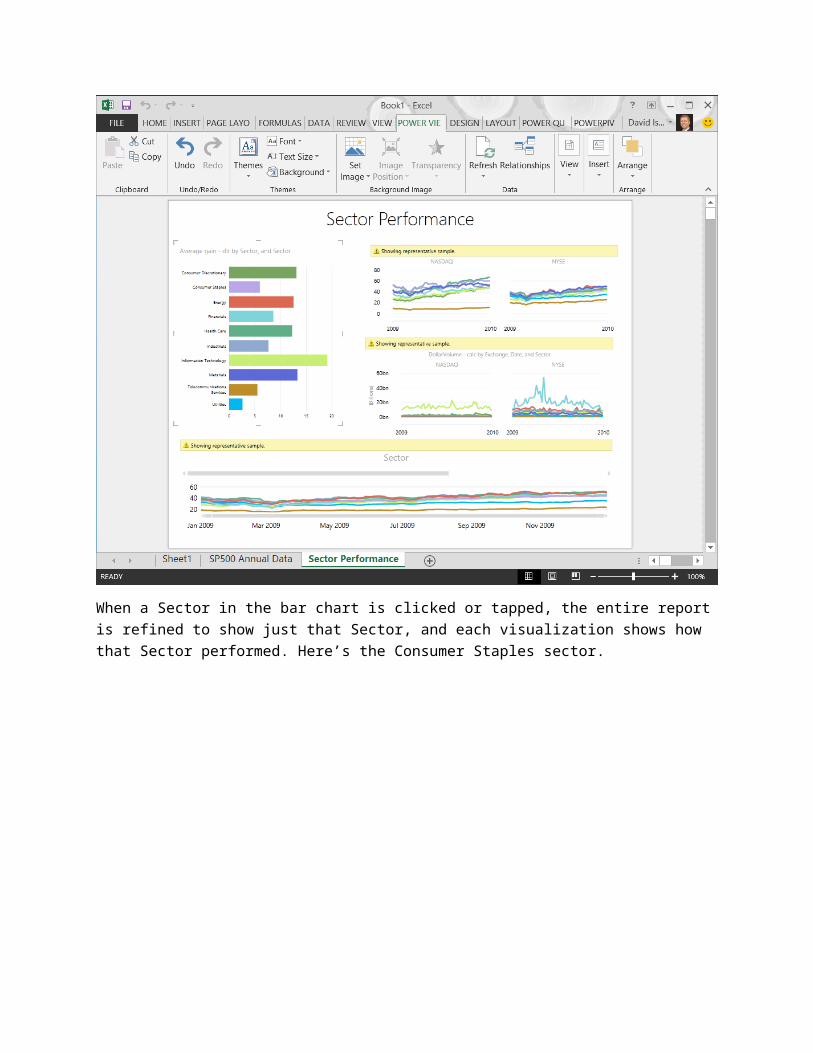
When a Sector in the bar chart is clicked or tapped, the entire report is refined to show just that Sector, and each visualization shows how that Sector performed. Here’s the Consumer Staples sector.
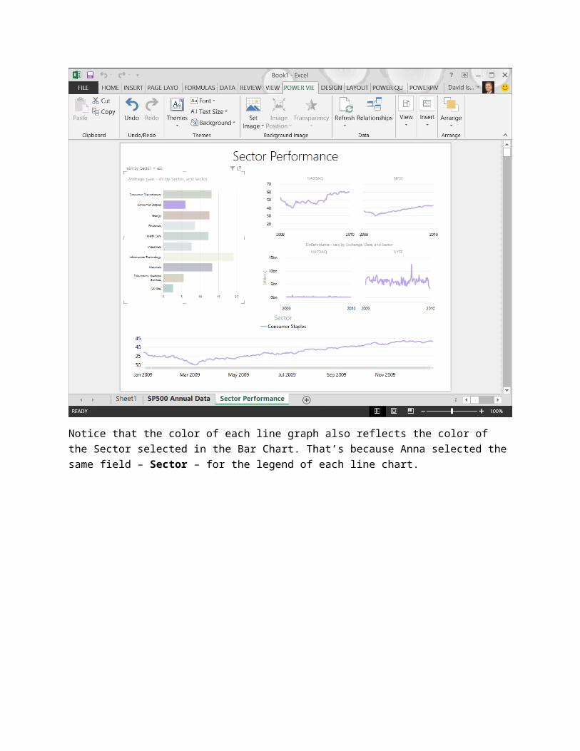
Notice that the color of each line graph also reflects the color of the Sector selected in the Bar Chart. That’s because Anna selected the same field – Sector – for the legend of each line chart.
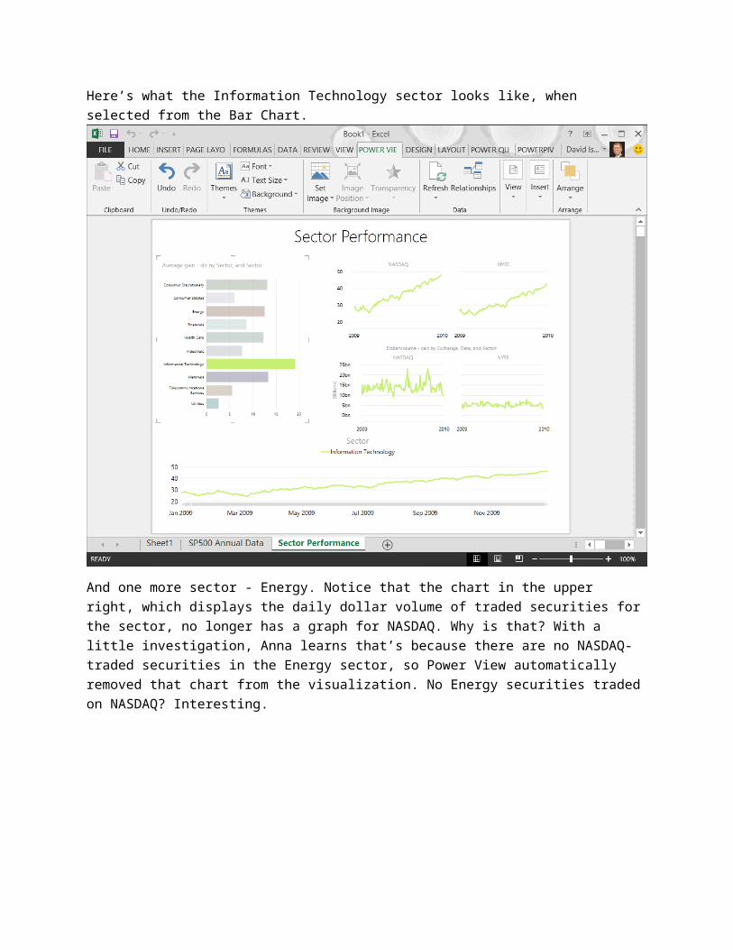
Here’s what the Information Technology sector looks like, when selected from the Bar Chart.
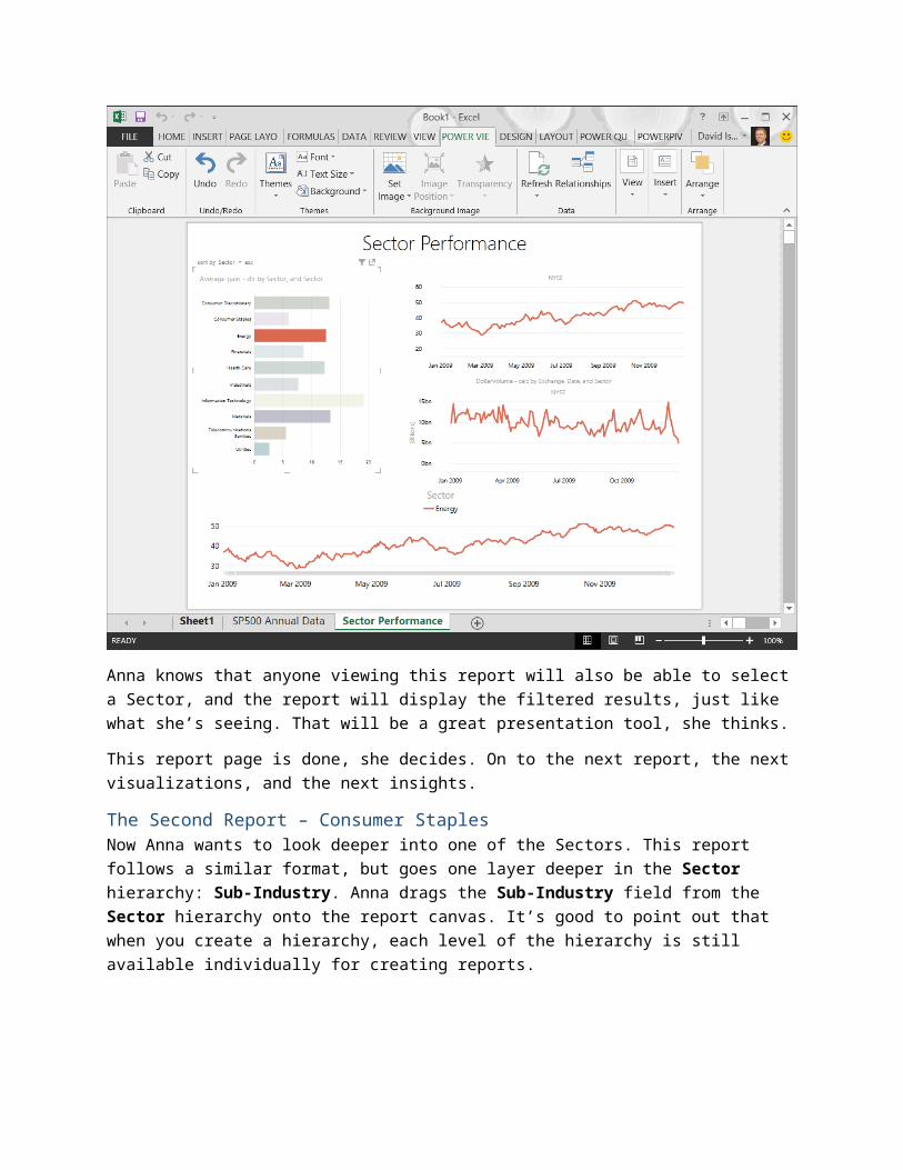
And one more sector - Energy. Notice that the chart in the upper right, which displays the daily dollar volume of traded securities for the sector, no longer has a graph for NASDAQ. Why is that? With a little investigation, Anna learns that’s because there are no NASDAQ-traded securities in the Energy sector, so Power View automatically removed that chart from the visualization. No Energy securities traded on NASDAQ? Interesting.
Anna knows that anyone viewing this report will also be able to select a Sector, and the report will display the filtered results, just like what she’s seeing. That will be a great presentation tool, she thinks.
This report page is done, she decides. On to the next report, the next visualizations, and the next insights.
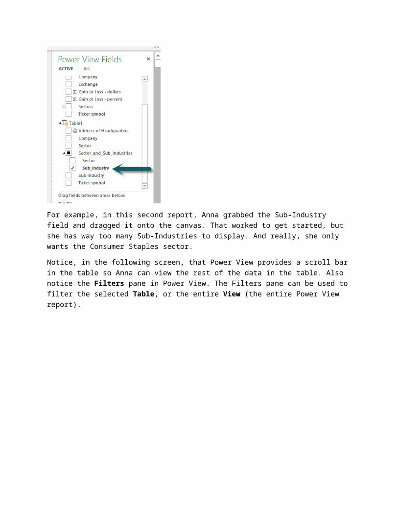
The Second Report – Consumer StaplesNow Anna wants to look deeper into one of the Sectors. This report follows a similar format, but goes one layer deeper in the Sector hierarchy: Sub-Industry. Anna drags the Sub-Industry field from the Sector hierarchy onto the report canvas. It’s good to point out that when you create a hierarchy, each level of the hierarchy is still available individually for creating reports.
For example, in this second report, Anna grabbed the Sub-Industry field and dragged it onto the canvas. That worked to get started, but she has way too many Sub-Industries to display. And really, she only wants the Consumer Staples sector.
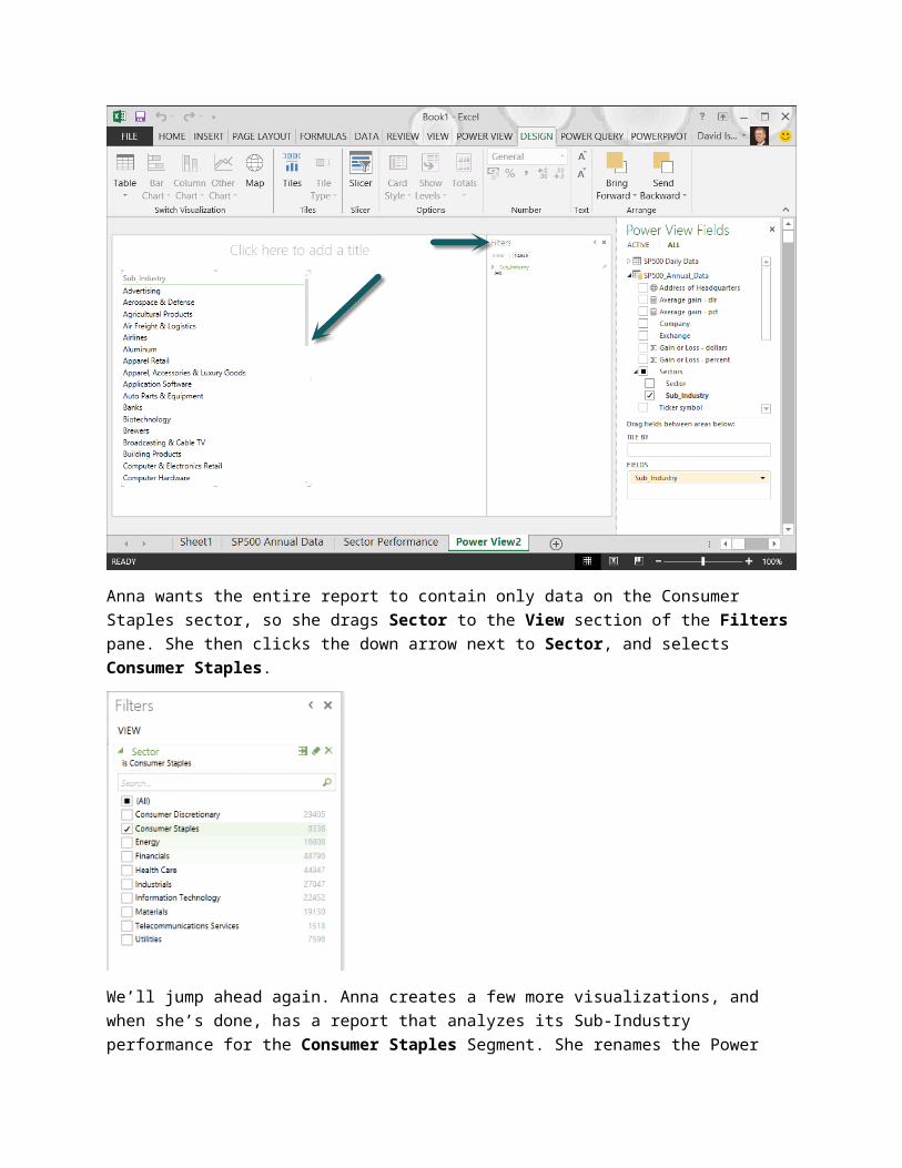
Notice, in the following screen, that Power View provides a scroll bar in the table so Anna can view the rest of the data in the table. Also notice the Filters pane in Power View. The Filters pane can be used to filter the selected Table, or the entire View (the entire Power View report).
Anna wants the entire report to contain only data on the Consumer Staples sector, so she drags Sector to the View section of the Filters pane. She then clicks the down arrow next to Sector, and selects Consumer Staples.
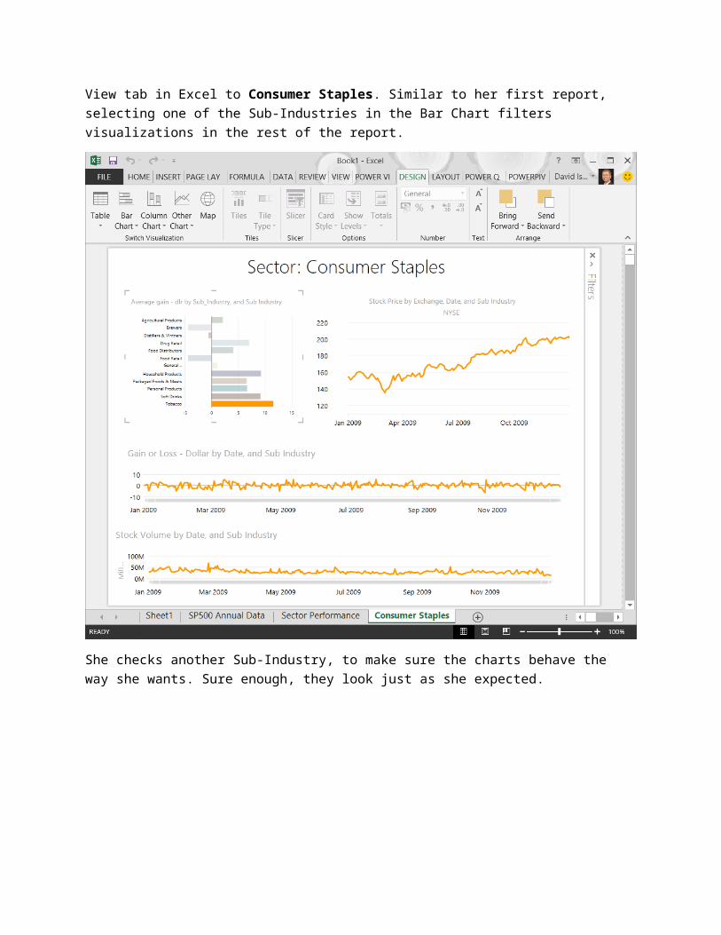
We’ll jump ahead again. Anna creates a few more visualizations, and when she’s done, has a report that analyzes its Sub-Industry performance for the Consumer Staples Segment. She renames the Power View tab in Excel to Consumer Staples. Similar to her first report, selecting one of the Sub-Industries in the Bar Chart filters visualizations in the rest of the report.
She checks another Sub-Industry, to make sure the charts behave the way she wants. Sure enough, they look just as she expected.
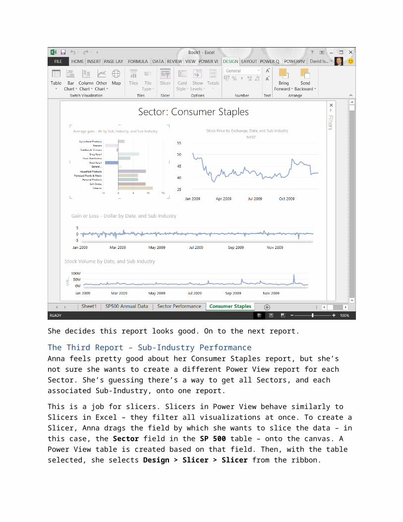
She decides this report looks good. On to the next report.
The Third Report – Sub-Industry PerformanceAnna feels pretty good about her Consumer Staples report, but she’s not sure she wants to create a different Power View report for each Sector. She’s guessing there’s a way to get all Sectors, and each associated Sub-Industry, onto one report.
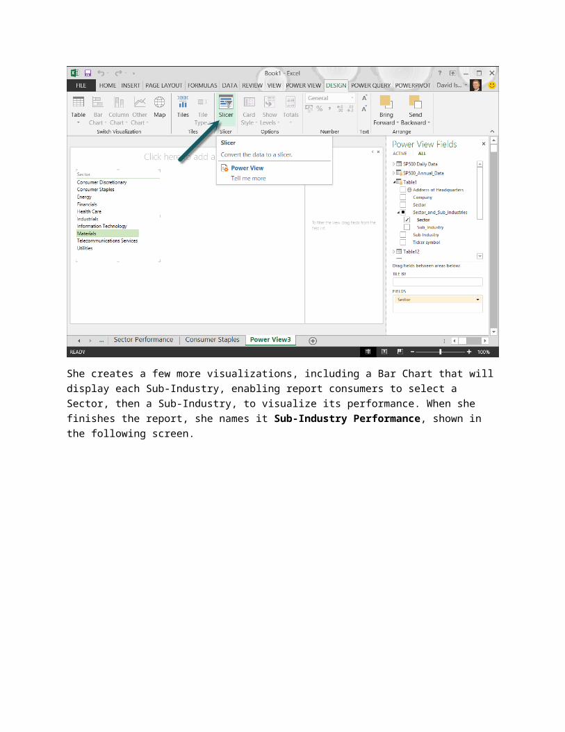
This is a job for slicers. Slicers in Power View behave similarly to Slicers in Excel – they filter all visualizations at once. To create a Slicer, Anna drags the field by which she wants to slice the data – in this case, the Sector field in the SP 500 table – onto the canvas. A Power View table is created based on that field. Then, with the table selected, she selects Design > Slicer > Slicer from the ribbon.
She creates a few more visualizations, including a Bar Chart that will display each Sub-Industry, enabling report consumers to select a Sector, then a Sub-Industry, to visualize its performance. When she finishes the report, she names it Sub-Industry Performance, shown in the following screen.
When report viewers interact with the report, they can select a Sector from the slicer (upper left), and then select a Sub-Industry from the Bar Chart (lower left), and the daily line charts will reflect the performance of that Sub-Industry. For example, the following screen shows the Health Care Sector, and its Health Care Distributors & Services Sub-Industry.
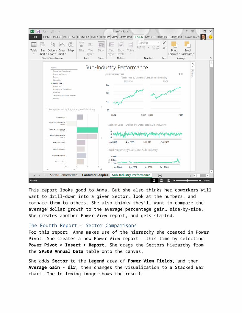
This report looks good to Anna. But she also thinks her coworkers will want to drill-down into a given Sector, look at the numbers, and compare them to others. She also thinks they’ll want to compare the average dollar growth to the average percentage gain… side-by-side. She creates another Power View report, and gets started.
The Fourth Report – Sector ComparisonsFor this report, Anna makes use of the hierarchy she created in Power Pivot. She creates a new Power View report – this time by selecting Power Pivot > Insert > Report. She drags the Sectors hierarchy from the SP500 Annual Data table onto the canvas.
She adds Sector to the Legend area of Power View Fields, and then Average Gain - dlr, then changes the visualization to a Stacked Bar chart. The following image shows the result.
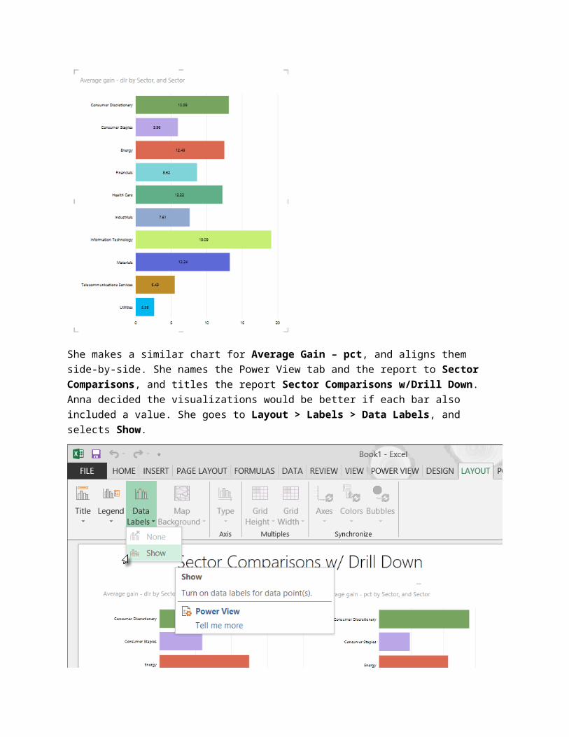
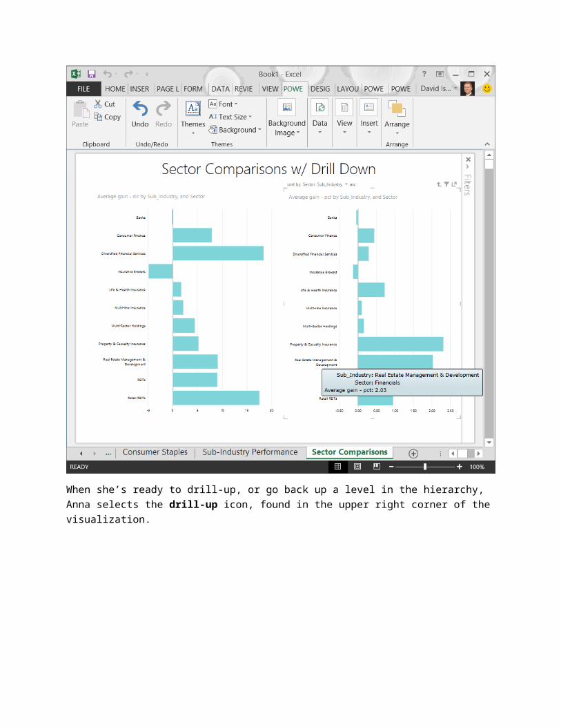
She makes a similar chart for Average Gain – pct, and aligns them side-by-side. She names the Power View tab and the report to Sector Comparisons, and titles the report Sector Comparisons w/Drill Down. Anna decided the visualizations would be better if each bar also included a value. She goes to Layout > Labels > Data Labels, and selects Show.
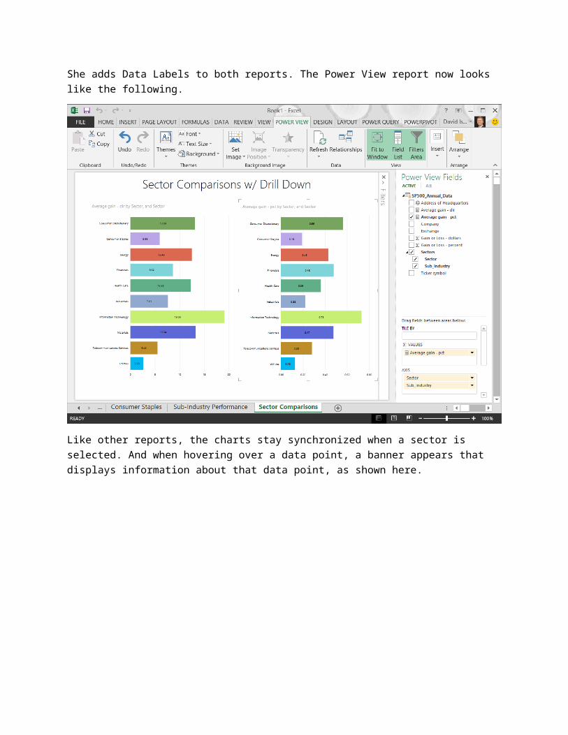
She adds Data Labels to both reports. The Power View report now looks like the following.
Like other reports, the charts stay synchronized when a sector is selected. And when hovering over a data point, a banner appears that displays information about that data point, as shown here.
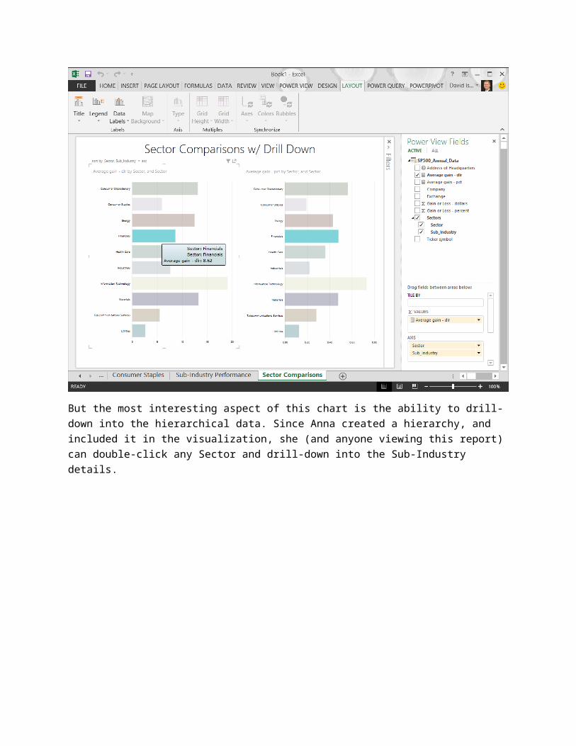
But the most interesting aspect of this chart is the ability to drill-down into the hierarchical data. Since Anna created a hierarchy, and included it in the visualization, she (and anyone viewing this report) can double-click any Sector and drill-down into the Sub-Industry details.

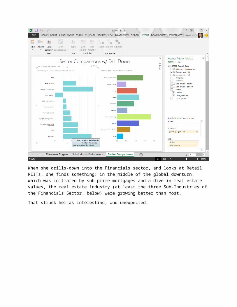
When she drills-down into the Financials sector, and looks at Retail REITs, she finds something: in the middle of the global downturn, which was initiated by sub-prime mortgages and a dive in real estate values, the real estate industry (at least the three Sub-Industries of the Financials Sector, below) were growing better than most.
That struck her as interesting, and unexpected.
When she’s ready to drill-up, or go back up a level in the hierarchy, Anna selects the drill-up icon, found in the upper right corner of the visualization.
She likes this pair of visualizations. She decides to leave it at that, and go on to her last report.
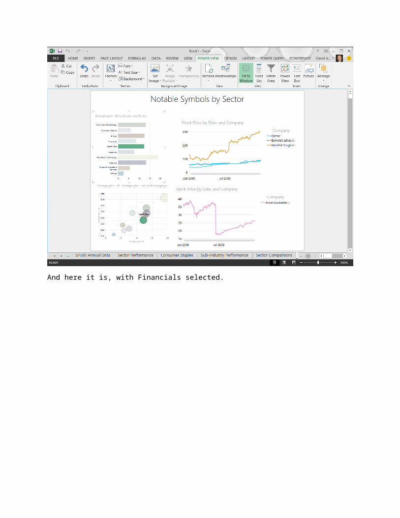
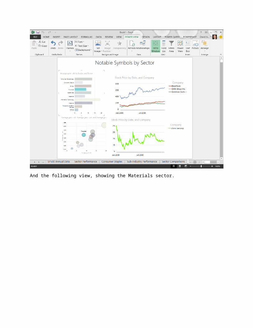
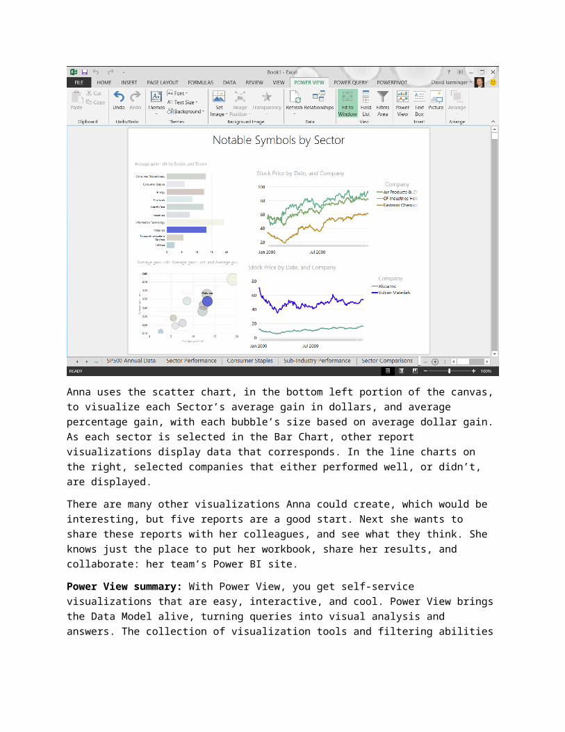
The Last Report - PerformersOne perspective missing from her reports is individual stock performance. She doesn’t want to show every stock in the S&P 500, but selected stocks – based on performance in their sector – would be interesting.
This time we’ll look at her finished report first, and review what she did. Here it is, with the Health Care sector selected.
And here it is, with Financials selected.
And the following view, showing the Materials sector.
Anna uses the scatter chart, in the bottom left portion of the canvas, to visualize each Sector’s average gain in dollars, and average percentage gain, with each bubble’s size based on average dollar gain. As each sector is selected in the Bar Chart, other report visualizations display data that corresponds. In the line charts on the right, selected companies that either performed well, or didn’t, are displayed.
There are many other visualizations Anna could create, which would be interesting, but five reports are a good start. Next she wants to share these reports with her colleagues, and see what they think. She knows just the place to put her workbook, share her results, and collaborate: her team’s Power BI site.
Power View summary: With Power View, you get self-service visualizations that are easy, interactive, and cool. Power View brings the Data Model alive, turning queries into visual analysis and answers. The collection of visualization tools and filtering abilities available in Power View make its possibilities limited only by imagination and experimentation.
For more information about Power View, check out the following links.
Power View Start Page Tutorial: Create Amazing Power View Reports - Part 1 Tutorial: Create a Power View report with Windows Azure Marketplace data Video: Getting Started with Power View
Power MapOne of the newest additions to Excel is Power Map – a geocentric and temporal mapping feature of Power BI that brings location data into powerful, engaging 3D map visualizations. With Power Map, you can create location-based reports, visualized over a time continuum, that visually tour the data and provide insights like no other.
Anna has some basic location information in her stock and sectors dataset, but she doesn’t think it’s enough – by itself – to build the compelling kind of Power Map visualizations that she knows she could create. She does a quick search on Bing, and sees what other people are doing with Power Map. She’s amazed, with four visualizations in particular.
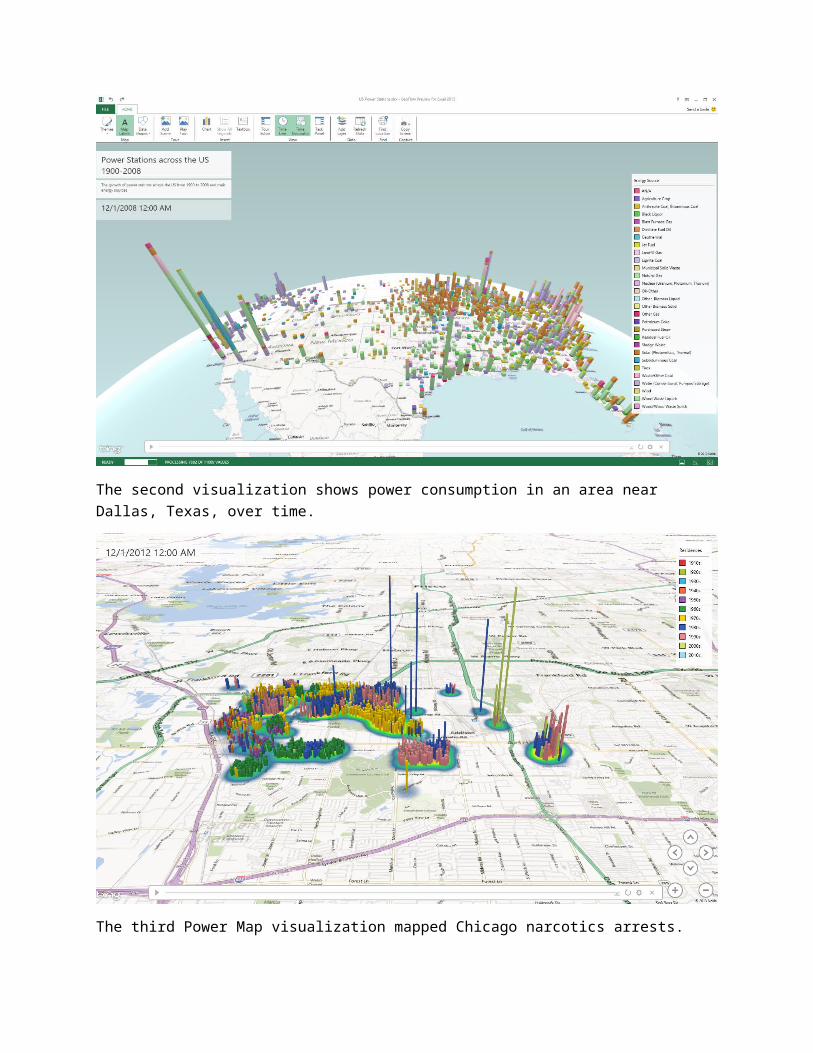
The first Power Map visualization she finds shows power stations across the United States, from 1900 to 2008.
The second visualization shows power consumption in an area near Dallas, Texas, over time.
The third Power Map visualization mapped Chicago narcotics arrests.
And the last visualization, well, Anna isn’t quite sure what it displays, but it’s so cool that she just stares at it for a good, long couple of minutes.

Looking at those Power Map visualizations gives Anna all sorts of ideas. What if she could mash-up demographics, or economic data, or employment data, with her stock data? She can think of a handful of interesting scenarios, but those will have to wait until next time.
For now, she needs to publish her workbook and get feedback on what she created.
Power Map summary: With the Power Map feature of Power BI, maps take on entirely new meaning. With its 3D modeling capability and the interactive tours, Power Map can take viewers on a flight across the data (it’s like a helicopter tour around the 3D data, with you at the controls), taking interactivity to an entirely new level.
With its zoom, pan, and altitude controls, Power Map is an amazing data experience outside the interactive tours, as well. Select data points, view the data from space or up-close, and select any data point to get information. You can also create notes that highlight information right on the map, and bring analysis and insights into a 3D visual world.
For more information about Power Map, see the following link.
Power Map Documentation
Summary: Excel 2013 Self-Service BI FeaturesWith the collection of self-service BI features in Excel, Power BI provides the tools you need to find data, shape and filter it how you want, model it, and visualize it. One of the greatest advantages of the Power BI features in Excel is how easily they integrate – once you have your base Data Model, you can go back to Power Query and find more data to mash-up, or go into Power Pivot and add new calculations to further your insight and analysis… or to get the exact Power View visualization you want.
Power BI for Office 365Reports are made to be shared – so are great queries, and new insights. With Power BI, your Excel workbooks have a home that keeps them safe, and enables you to share them with everyone who should see them – at the office, or on the go.
In this section, you learn how to use Power BI sites for sharing workbooks, how to share and manage queries created using Power Query, the Data Management capabilities for monitoring and managing query and data source usage and the Power BI app for accessing workbooks on the go.
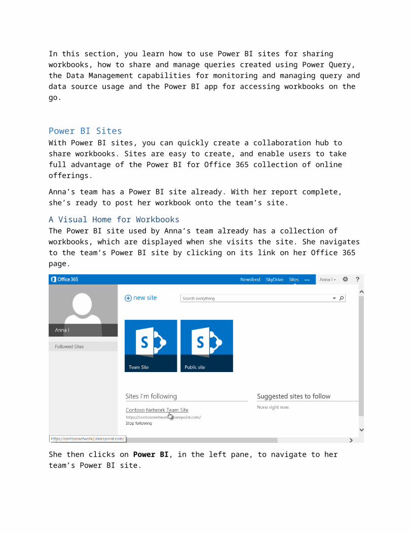
Power BI SitesWith Power BI sites, you can quickly create a collaboration hub to share workbooks. Sites are easy to create, and enable users to take full advantage of the Power BI for Office 365 collection of online offerings.
Anna’s team has a Power BI site already. With her report complete, she’s ready to post her workbook onto the team’s site.
A Visual Home for WorkbooksThe Power BI site used by Anna’s team already has a collection of workbooks, which are displayed when she visits the site. She navigates to the team’s Power BI site by clicking on its link on her Office 365 page.
She then clicks on Power BI, in the left pane, to navigate to her team’s Power BI site.
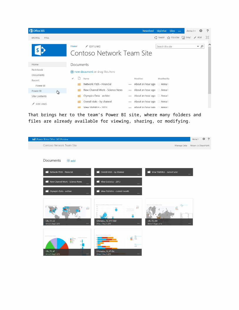
That brings her to the team’s Power BI site, where many folders and files are already available for viewing, sharing, or modifying.
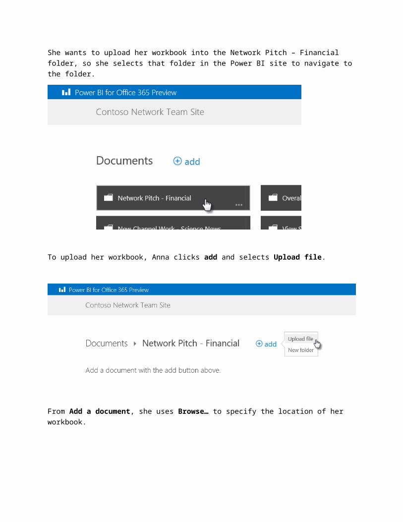
She wants to upload her workbook into the Network Pitch – Financial folder, so she selects that folder in the Power BI site to navigate to the folder.
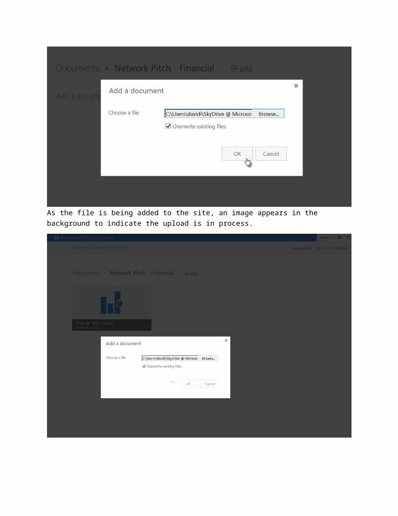
To upload her workbook, Anna clicks add and selects Upload file.
From Add a document, she uses Browse… to specify the location of her workbook.

As the file is being added to the site, an image appears in the background to indicate the upload is in process.
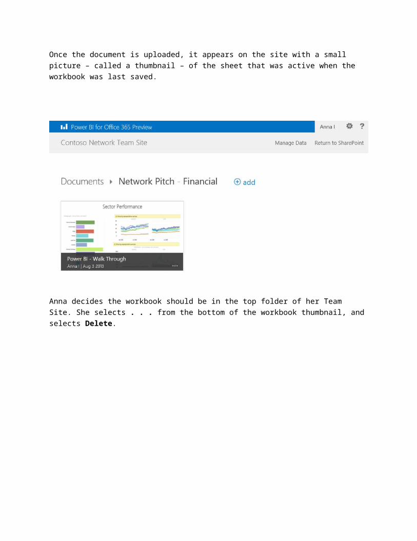
Once the document is uploaded, it appears on the site with a small picture – called a thumbnail – of the sheet that was active when the workbook was last saved.
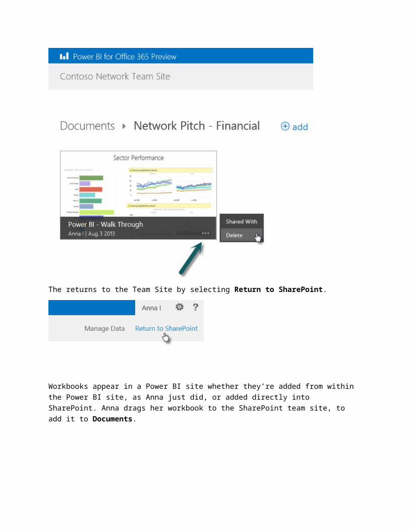
Anna decides the workbook should be in the top folder of her Team Site. She selects . . . from the bottom of the workbook thumbnail, and selects Delete.

The returns to the Team Site by selecting Return to SharePoint.
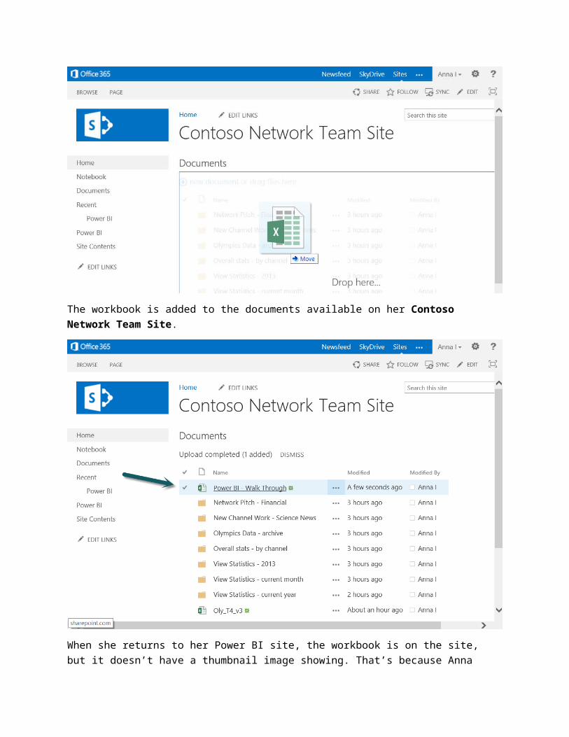
Workbooks appear in a Power BI site whether they’re added from within the Power BI site, as Anna just did, or added directly into SharePoint. Anna drags her workbook to the SharePoint team site, to add it to Documents.

The workbook is added to the documents available on her Contoso Network Team Site.
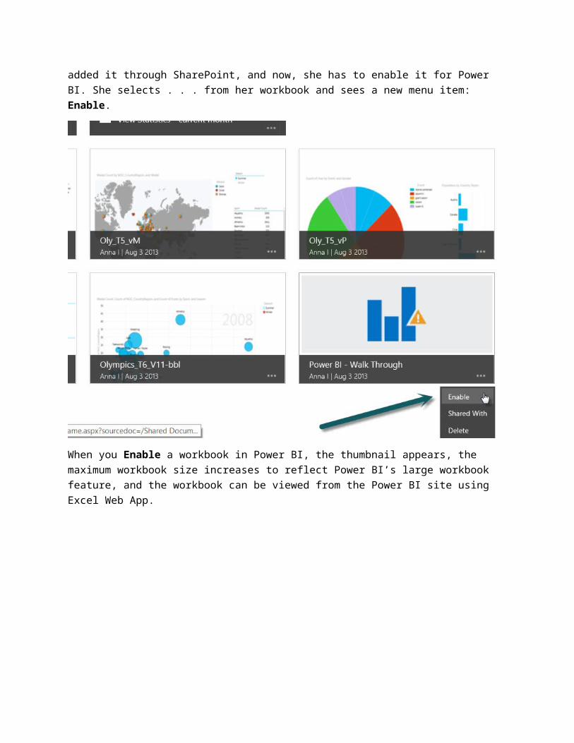
When she returns to her Power BI site, the workbook is on the site, but it doesn’t have a thumbnail image showing. That’s because Anna added it through SharePoint, and now, she has to enable it for Power BI. She selects . . . from her workbook and sees a new menu item: Enable.
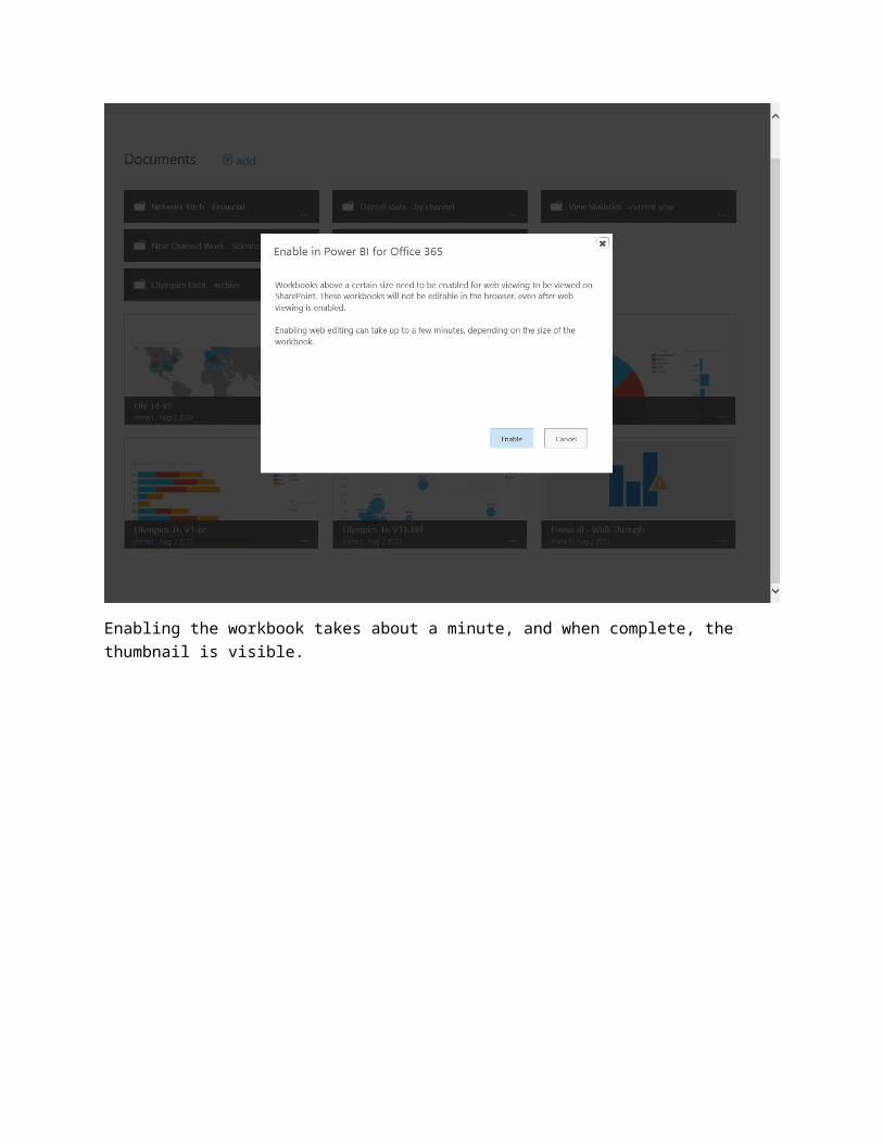
When you Enable a workbook in Power BI, the thumbnail appears, the maximum workbook size increases to reflect Power BI’s large workbook feature, and the workbook can be viewed from the Power BI site using Excel Web App.
Enabling the workbook takes about a minute, and when complete, the thumbnail is visible.
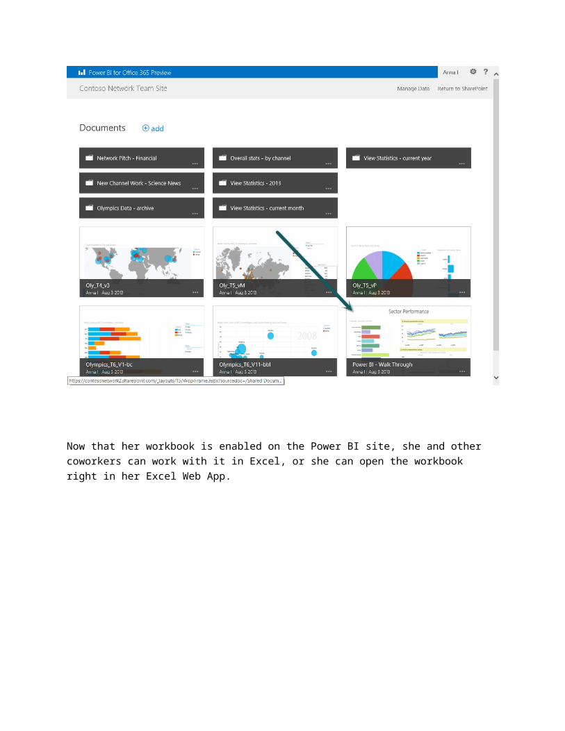
Now that her workbook is enabled on the Power BI site, she and other coworkers can work with it in Excel, or she can open the workbook right in her Excel Web App.
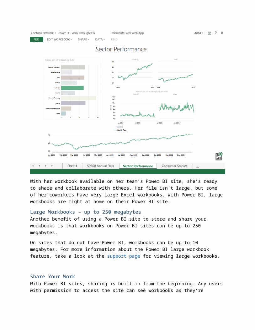
With her workbook available on her team’s Power BI site, she’s ready to share and collaborate with others. Her file isn’t large, but some of her coworkers have very large Excel workbooks. With Power BI, large workbooks are right at home on their Power BI site.
Large Workbooks – up to 250 megabytes Another benefit of using a Power BI site to store and share your workbooks is that workbooks on Power BI sites can be up to 250 megabytes.
On sites that do not have Power BI, workbooks can be up to 10 megabytes. For more information about the Power BI large workbook feature, take a look at the support page for viewing large workbooks.
Share Your WorkWith Power BI sites, sharing is built in from the beginning. Any users with permission to access the site can see workbooks as they’re displayed on the site, unless permissions are further restricted for a particular workbook or folder.
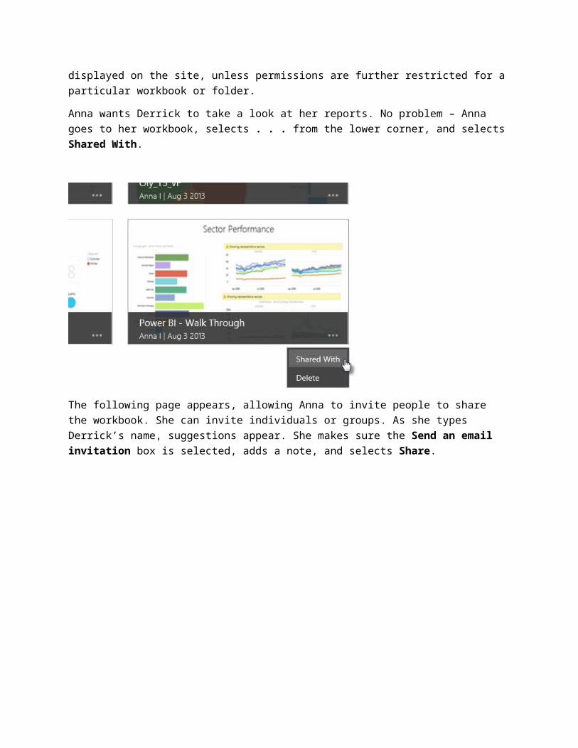
Anna wants Derrick to take a look at her reports. No problem – Anna goes to her workbook, selects . . . from the lower corner, and selects Shared With.
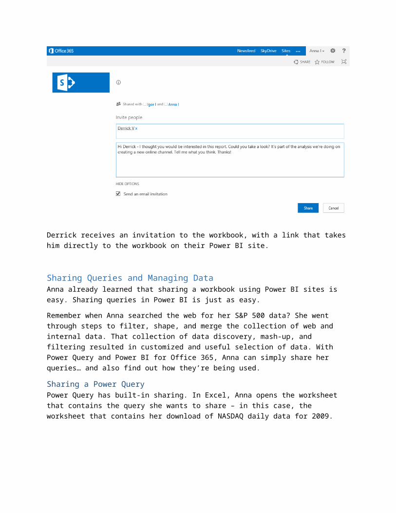
The following page appears, allowing Anna to invite people to share the workbook. She can invite individuals or groups. As she types Derrick’s name, suggestions appear. She makes sure the Send an email invitation box is selected, adds a note, and selects Share.
Derrick receives an invitation to the workbook, with a link that takes him directly to the workbook on their Power BI site.
Sharing Queries and Managing DataAnna already learned that sharing a workbook using Power BI sites is easy. Sharing queries in Power BI is just as easy.
Remember when Anna searched the web for her S&P 500 data? She went through steps to filter, shape, and merge the collection of web and internal data. That collection of data discovery, mash-up, and filtering resulted in customized and useful selection of data. With Power Query and Power BI for Office 365, Anna can simply share her queries… and also find out how they’re being used.
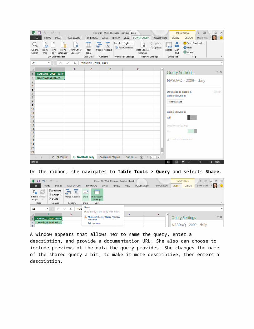
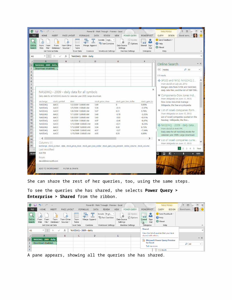
Sharing a Power QueryPower Query has built-in sharing. In Excel, Anna opens the worksheet that contains the query she wants to share – in this case, the worksheet that contains her download of NASDAQ daily data for 2009.
On the ribbon, she navigates to Table Tools > Query and selects Share.
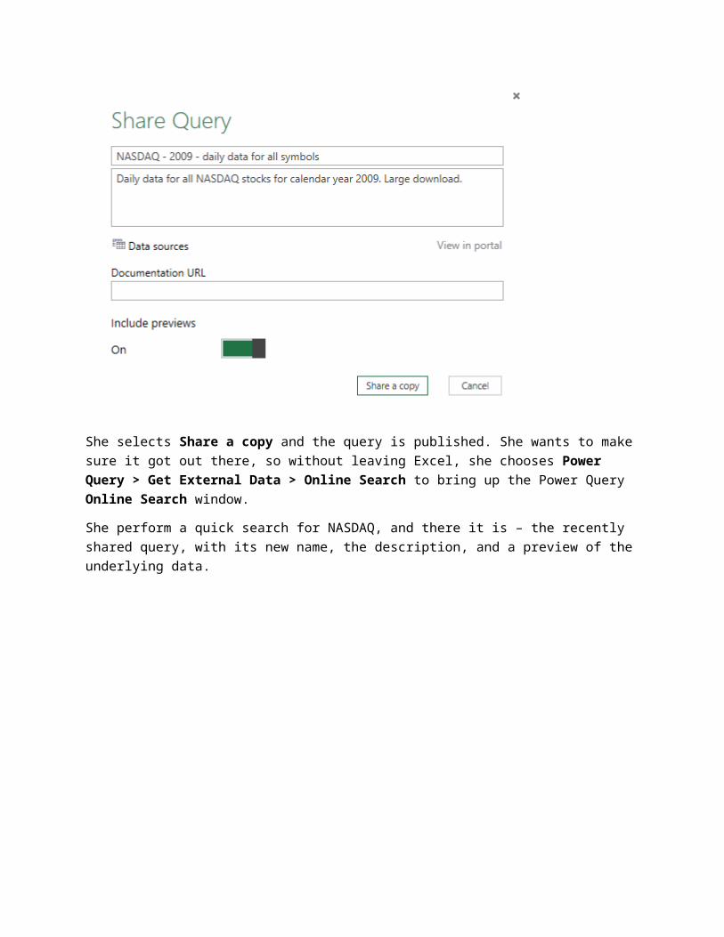
A window appears that allows her to name the query, enter a description, and provide a documentation URL. She also can choose to include previews of the data the query provides. She changes the name of the shared query a bit, to make it more descriptive, then enters a description.
She selects Share a copy and the query is published. She wants to make sure it got out there, so without leaving Excel, she chooses Power Query > Get External Data > Online Search to bring up the Power Query Online Search window.
She perform a quick search for NASDAQ, and there it is – the recently shared query, with its new name, the description, and a preview of the underlying data.
She can share the rest of her queries, too, using the same steps.
To see the queries she has shared, she selects Power Query > Enterprise > Shared from the ribbon.
A pane appears, showing all the queries she has shared.
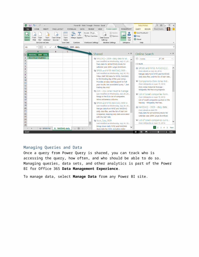
Managing Queries and DataOnce a query from Power Query is shared, you can track who is accessing the query, how often, and who should be able to do so. Managing queries, data sets, and other analytics is part of the Power BI for Office 365 Data Management Experience.
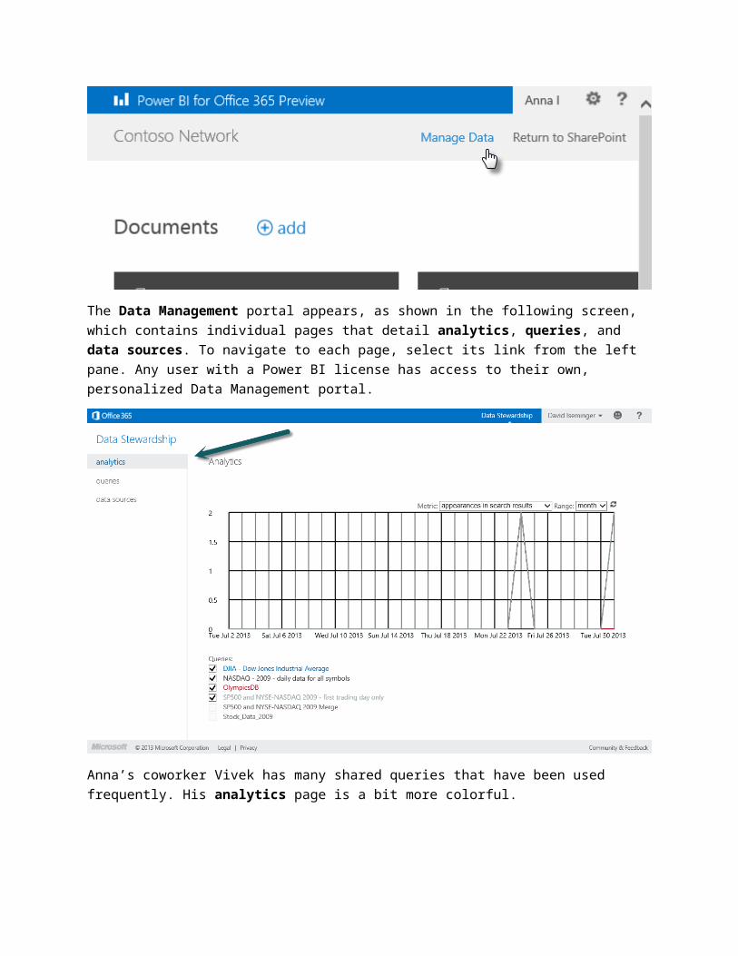
To manage data, select Manage Data from any Power BI site.
The Data Management portal appears, as shown in the following screen, which contains individual pages that detail analytics, queries, and data sources. To navigate to each page, select its link from the left pane. Any user with a Power BI license has access to their own, personalized Data Management portal.
Anna’s coworker Vivek has many shared queries that have been used frequently. His analytics page is a bit more colorful.
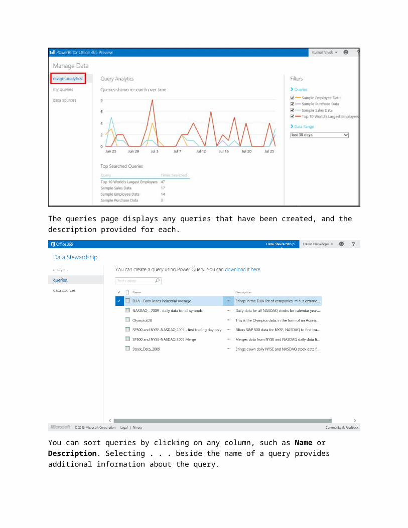
The queries page displays any queries that have been created, and the description provided for each.
You can sort queries by clicking on any column, such as Name or Description. Selecting . . . beside the name of a query provides additional information about the query.
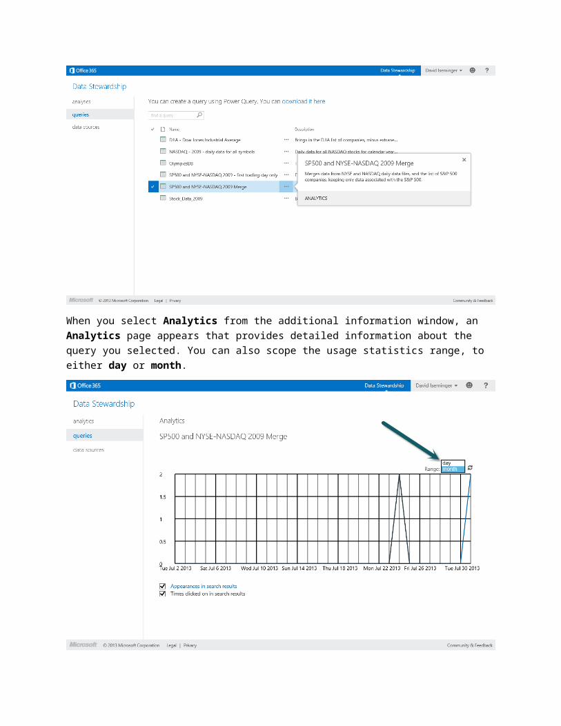
When you select Analytics from the additional information window, an Analytics page appears that provides detailed information about the query you selected. You can also scope the usage statistics range, to either day or month.
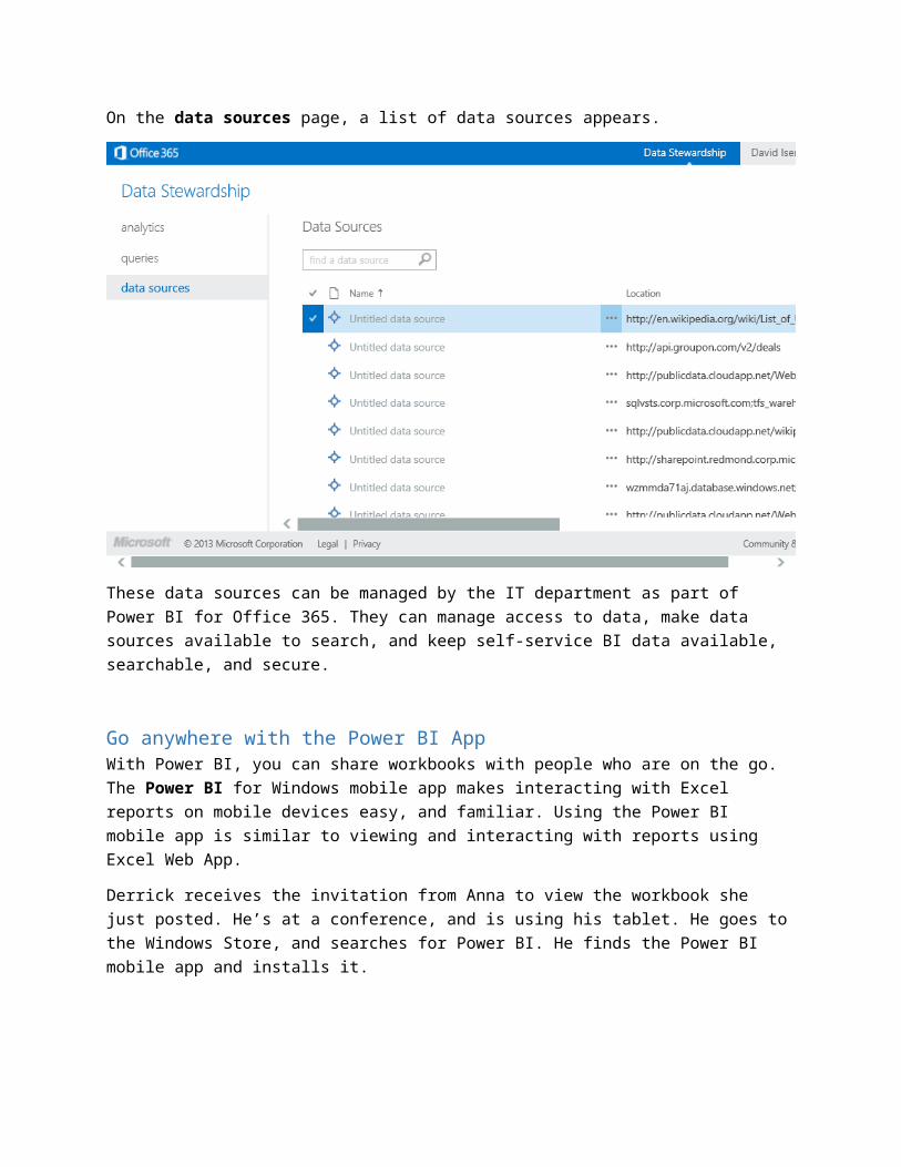
On the data sources page, a list of data sources appears.
These data sources can be managed by the IT department as part of Power BI for Office 365. They can manage access to data, make data sources available to search, and keep self-service BI data available, searchable, and secure.
Go anywhere with the Power BI AppWith Power BI, you can share workbooks with people who are on the go. The Power BI for Windows mobile app makes interacting with Excel reports on mobile devices easy, and familiar. Using the Power BI mobile app is similar to viewing and interacting with reports using Excel Web App.
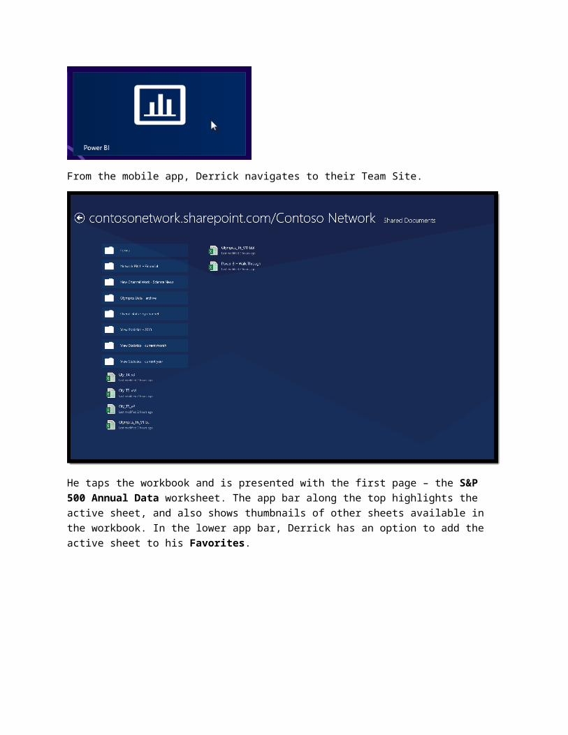
Derrick receives the invitation from Anna to view the workbook she just posted. He’s at a conference, and is using his tablet. He goes to the Windows Store, and searches for Power BI. He finds the Power BI mobile app and installs it.
From the mobile app, Derrick navigates to their Team Site.
He taps the workbook and is presented with the first page – the S&P 500 Annual Data worksheet. The app bar along the top highlights the active sheet, and also shows thumbnails of other sheets available in the workbook. In the lower app bar, Derrick has an option to add the active sheet to his Favorites.
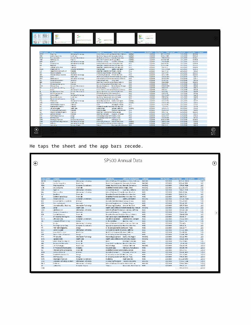
He taps the sheet and the app bars recede.
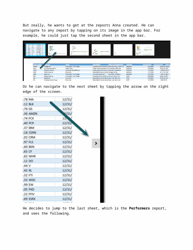
But really, he wants to get at the reports Anna created. He can navigate to any report by tapping on its image in the app bar. For example, he could just tap the second sheet in the app bar.
Or he can navigate to the next sheet by tapping the arrow on the right edge of the screen.
He decides to jump to the last sheet, which is the Performers report, and sees the following.
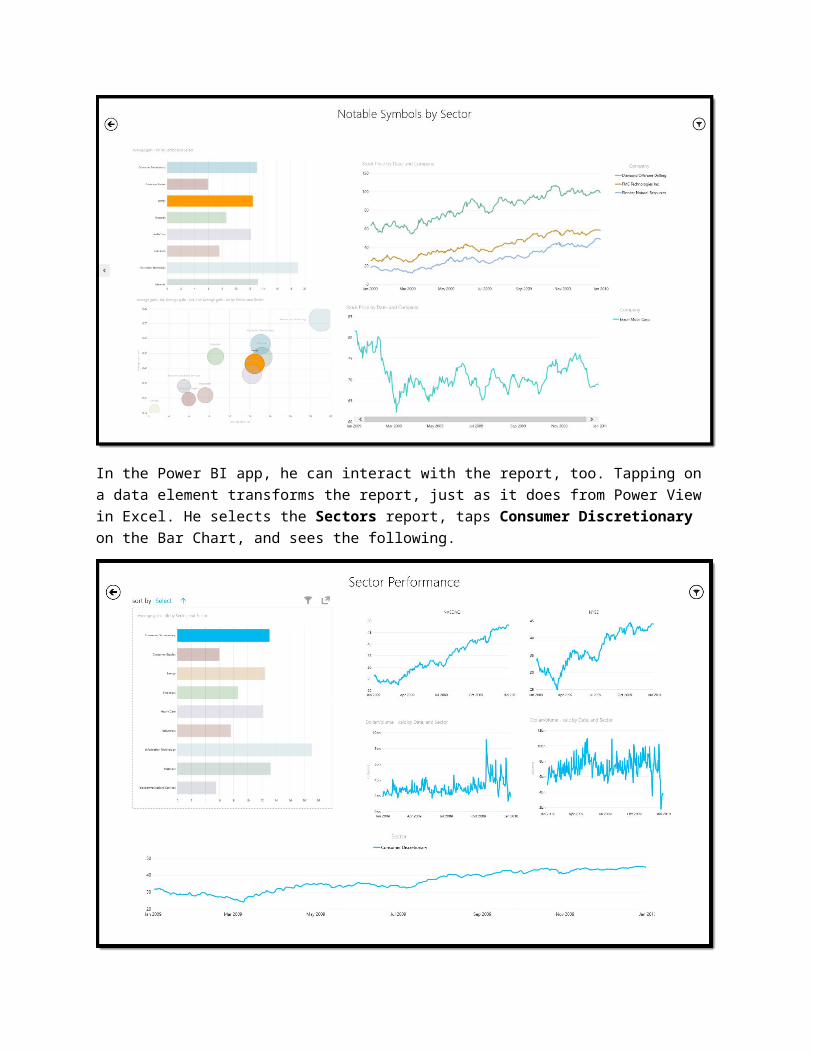
In the Power BI app, he can interact with the report, too. Tapping on a data element transforms the report, just as it does from Power View in Excel. He selects the Sectors report, taps Consumer Discretionary on the Bar Chart, and sees the following.
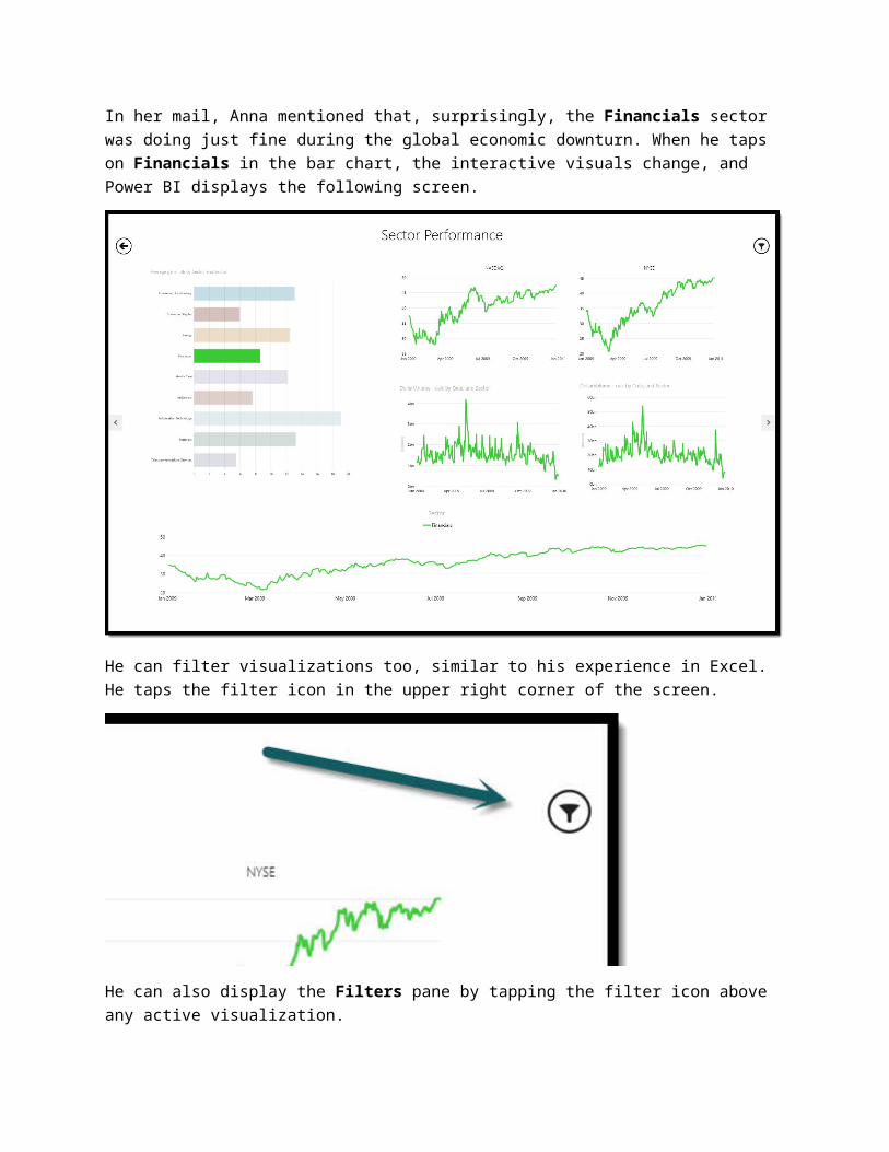
In her mail, Anna mentioned that, surprisingly, the Financials sector was doing just fine during the global economic downturn. When he taps on Financials in the bar chart, the interactive visuals change, and Power BI displays the following screen.
He can filter visualizations too, similar to his experience in Excel. He taps the filter icon in the upper right corner of the screen.
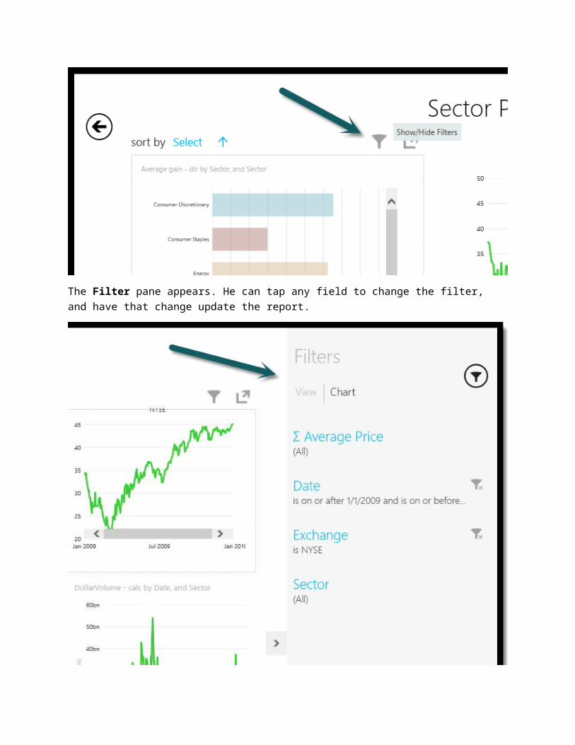
He can also display the Filters pane by tapping the filter icon above any active visualization.
The Filter pane appears. He can tap any field to change the filter, and have that change update the report.
Tapping on Average Price, for example, allows Derrick to adjust the upper limit and lower limit, and see the report data in ways that in most interesting, useful, or compelling to him.
With the Power BI app, workbooks on a Power BI site are accessible from anywhere in the world.
SummaryWith Power BI, you get a collection of features and services that make self-service BI intuitive, collaborative, and holistic. Combining the power and familiarity of Excel, with the collaboration and cloud-based infrastructure of Power BI for Office 365, extends your reach – and amplifies the impact of what you can find, analyze, and visualize. For you, and for your organization.
Summary of FeaturesWith Power BI, services and features are fully integrated, and fall into two broad categories – Self Service BI in Excel, and Power BI for Office 365.
Self-Service BI in Excel – find, shape, and filter the world’s data in Power Query; create your custom data model in Power Pivot; visualize and interact with the data in Power View; then show the world where it all originated, and what it all means, using Power Map.
Power BI for Office 365 – gather your reports, and your team, with Power BI sites; let others benefit from your perfectly formed data sets, and filters, by sharing queries created with Power Query; see how often they’re being used (and by whom) with Data Management, and get your reports to everyone, anywhere, while they’re on the go by using the Power BI for Windows mobile app.
There are other features of Power BI that benefit IT departments. For example, the provisioning experience (getting Power BI up and running on Office 365) is really easy. Your IT department can also connect your on-premise data to the cloud, thereby making your data discovery and mash-up experience seamless. They can also manage access to enterprise data sources (including granting you access to that great data source you found using search), and make sure it all runs smoothly. It’s self-service BI, with a supporting infrastructure, and a collaborative sharing and dissemination experience.
To get more information about Power BI for IT departments, point them to the Power BI Provisioning Guide.
Better TogetherEach feature and service in Power BI is interesting on its own. But by putting these features together, in an offering that incorporates and integrates them all, they become more than the sum of their parts.
The features of Self-Service BI in Excel 2013 work seamlessly together, amplifying your ability to find data, mash it up, and create visually stunning and interactive insights.
The features of Power BI for Office 365 bring those insights into a collaborative environment, where finding, sharing, and consuming reports is not only easy, it’s ubiquitous – any available data, found and shared anywhere in the world, on any device. It’s the cloud, and all of its data, on your terms.
What’s Next?What’s next for you? Give Power BI a try, and find out how it can work for you.
Register for Power BI – sign up for the Power BI Preview Enable Power BI features for Excel – learn how
Really, that’s it. Click one of the links above, and get started with Power BI.
Links to More Information, and More EngagementGet more Information – the following links take you to all sorts of information about Power BI.
Main Power BI Site – visit the Power BI web site Learn Technical Details – visit the learning and support web page for Power BI Visit Power BI forums – find out what others are doing, saying, discovering Get more involved – learn how to become a technology adoption partner Read our Power BI blog – the Power BI blog has great articles about Power BI
We’re moving fast toward our official public release of Power BI. When more information is available about general availability for Power BI, including any new features that may be included, we’ll post it here for all to see. Visit frequently, since we’ll update that site whenever new information becomes available.
Thank YouWe hope you’ve enjoyed this guide and found it useful. Want to give us feedback? Great – we’re listening. Our goal is to help you understand Power BI, how it works, how to get the most of its features, and to provide the knowledge that’ll make you more successful.
To send us a message, use this link.
To talk to us in the forums, go here (same link as above – we want to hear from you).
Good luck to you! May your self-service BI efforts reveal new insights, make data more accessible, and empower you and your organization like never before.
Sincerely,
The Power BI Team
Updates to Power BI PreviewWe’re constantly innovating. In this section, you learn about features and capabilities that have been added to Power BI Preview since its initial release.
Check back frequently, and learn what’s new with Power BI.
Power BI Q&AWith Q&A (Questions and Answers) you can type natural language questions about your data, and get answers. Think of it as a conversation between you and your data, with answers provided in the form of charts, graphs, maps, or other Power BI visualizations.
When you connect to Power BI for Office 365 online, and navigate to your Power BI site, you have an opportunity to install sample data. Once sample data is installed you see the following screen, with a link available for you to ask a question.
When you select ask, the following screen lets you type a question.
As soon as you start typing Q&A presents possible answers, and refine the selection of answers as you continue. For example, if you type who won the most gold medals for swimming, Q&A presents the following answer.
If you’re interested in fencing, you may want to know who won the most medals in fencing during the 2008 Olympics. No problem. Type which country won the most medals in fencing in 2008, and Q&A presents a chart with the answer. To see the answer as a bar chart, select SHOW MORE, then select bar chart, as shown in the following screen.
In addition to the Olympics sample, there’s also a retail sales sample included with Q&A.
Select Show other samples… in the upper right corner, select the RETAIL sample from the main screen, and Q&A is ready for your question.
Let’s find out which employee accounted for the most sales. When you type which employees has the highest liquor sales by type, Q&A creates the following visualization. Q&A provides suggestions as you type – you can simply click on any suggested question to select it.
Whew – Jerome Chau is quite the salesman. Wait… maybe he’s just there all the time. Let’s find out, by typing which employee works the most hours.
Okay – Jerome works quite a few hours, but not the most. Interesting.
Let’s ask which types of drinks sell best in this establishment. Type which drink category sells best, then select column chart, and Q&A comes up with the following visualization.
Notice that Q&A shows the query it performed to generate the visualization, in italics, below where you typed your question.
Looks like liquor sales are the winner.
There are all sorts of questions you can ask Q&A, and all sorts of visualizations you can create. To see what it’s like to have a conversation with your data – and get answers – give Q&A a try.


![Getting Started with SAP NetWeaver 7.4 with BI Java and · PDF fileGetting Started with SAP NetWeaver 7.4 with BI Java and AS ABAP on MaxDB [Trial] Deployed on Amazon Web Services](https://img.pdfslide.us/doc/110x75/5a702a9d7f8b9ab1538bb81e/getting-started-with-sap-netweaver-74-with-bi-java-and-nbsppdf.jpg)