Embed Size (px)
DESCRIPTION
Â
Citation preview

Shirley Fan

Content About DesignGreateaVolaruccelloIllustration design
IllustrationWatercolorComputer coloring
ProjectMaking

AboutHi, My name is Shirley Fan.
I do Graphic designs and illustations.
I’m a Chinese Australian. My major is Graphic Design but I’m also very interest in illustrating. I do many watercolour and computer coloured drawings. I can speak three languages fluently. These languages are Chinese, English and Japanese. I’m a friendly person who loves to hear feedback from others. It is always a good experience for me to challenge new things or new jobs. It is a pleasure to talk to people.
私の名前はShirley Fanです。国籍はオーストラリアで、生まれは中華人民共和国です。大学では主にGデザインを勉強し、(主要使用ソフト: Photoshop, Illustrator, Indesign, など)同時にWebデザインについても学びました。(主要使用Web言語種類:Html & Css & Javascript)。イラストを描く事には幼い頃から大変興味があり、様々なイラストを描いてきました。私は水彩やPhotoshopでイラストを描く事のが得意で、色やデザインへのこだわりは決して他の人には負けないと思います。必ず自分の視野を広げ、真面目に作業につき、一番明瞭かつ理解しやすい、そして皆様の興味をそそるようなデザインを作って行きたいと思います。それはグラフィックデザインだけではなく、Webデザインやイラストの作業にも、その熱情を込め、一生懸命頑張らせていただきたいと思います。
私は三国語(英語、日本語、中国語)を流暢に話せますので、その特長を利用して、自分の作品をもっといろんな人に広げていきたいと思っています。まだまだ学ぶ事が沢山ありますが、これからも視野を広げ、経験を増やして、新な事を学びながら頑張っていきたいと思います。 我的名字是Shirley Fan。是一个华裔澳洲人。我在大学专攻平面设计,并得到了很多经验和知识。对绘画也一直很感兴趣,一直都有在自己创作插图。我很喜欢用水彩和photoshop来进行上色。我能说三国语言,英文,中文和日文,并且喜欢和各种各样的人交流沟通,扩张自己的视野,从他人,环境里学到更多的东西。我很喜欢设计以及绘画,并且永远希望能够做的更好。

Education2008 ~ 2011Robina State High School Year 9 ~ 12 compelected
2012
Tafe Gold Coast Ealry Education Certificate IIIGriffith University Bachelor of Nursing
2013 ~ 2015Griffith University Bachelor of Digital MediaMajor on Graphic Design
SkillsToolsAdobe PhotoshopAdobe IllustratorAdobe IndesignAdobe DreamweaverAdobe Affter EffectCss & HtmlDrawingWatercolor painting
OtherSpeak three languages: Chinese, Japanese, EnglishGeneral knowledge on social mediaBasic Knowledge about Javascript
Australian citizen Good teamworkGood communication skillsGood time management skillsLove to hear feedbacksAlways smiling
Achievements2009Subject award -English as a second language2D Art
2010Subject award - 3D Art
FocusGraphic Design IllustrationConcept artLanguage developmentCommunication
Contact Me(+61) 425 220 [email protected]

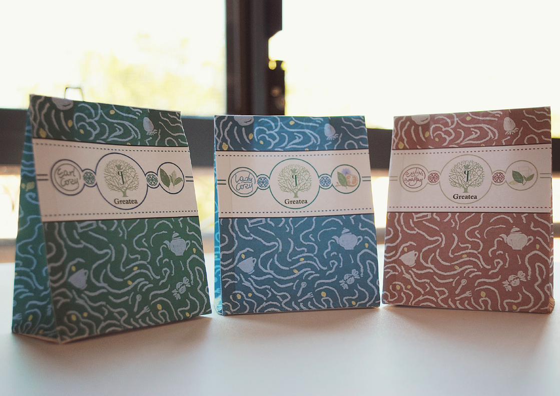
Design
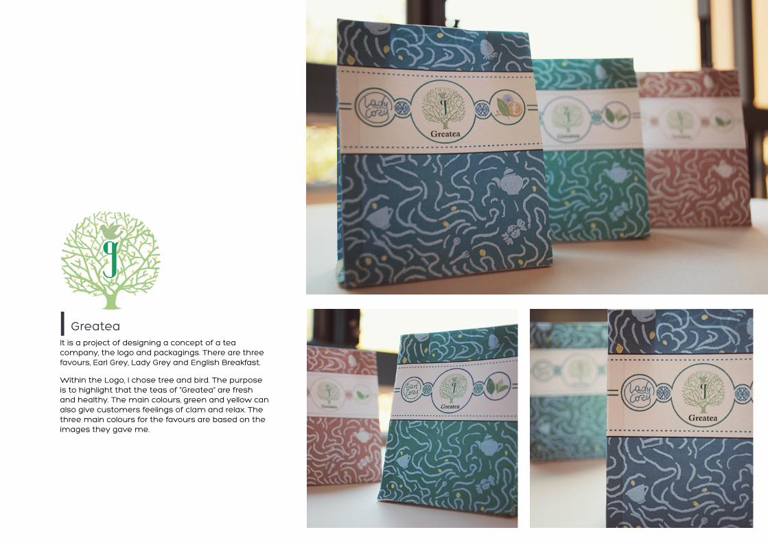
It is a project of designing a concept of a tea company, the logo and packagings. There are three favours, Earl Grey, Lady Grey and English Breakfast.
Within the Logo, I chose tree and bird. The purpose is to highlight that the teas of “Greatea” are fresh and healthy. The main colours, green and yellow can also give customers feelings of clam and relax. The three main colours for the favours are based on the images they gave me.
Greatea

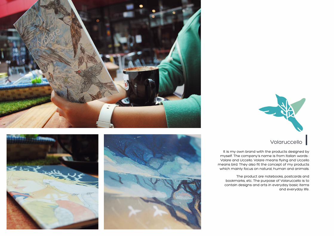
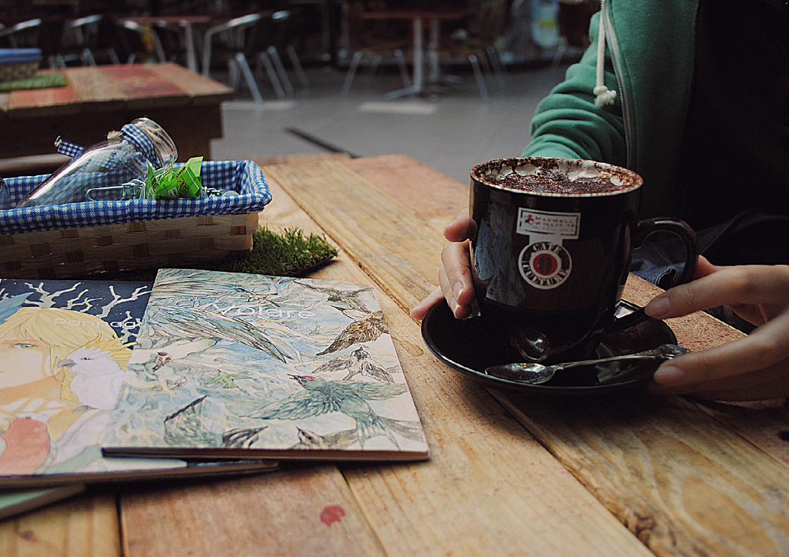
It is my own brand with the products designed by myself. The company’s name is from Italian words : Volare and Uccello. Volare means flying and Uccello
means bird. They also fit the concept of my products which mainly focus on natural, human and animals.
The product are notebooks, postcards and bookmarks, etc. The purpose of Volaruccello is to
contain designs and arts in everyday basic items and everyday life.
Volaruccello


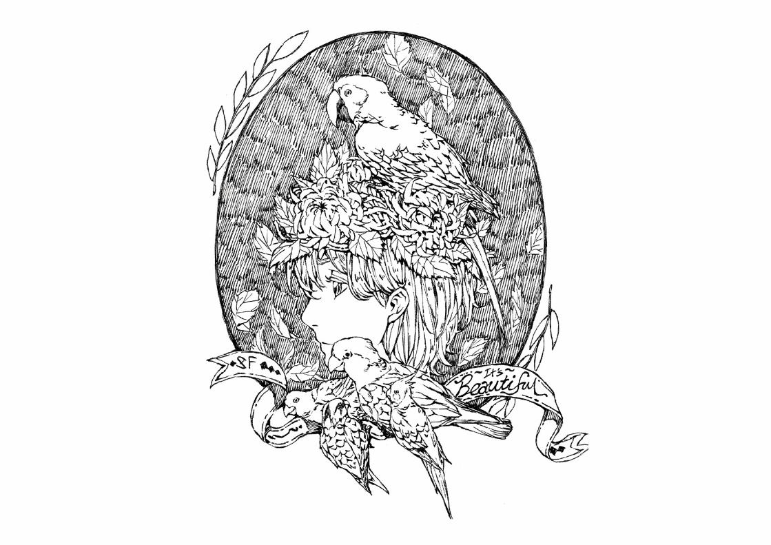
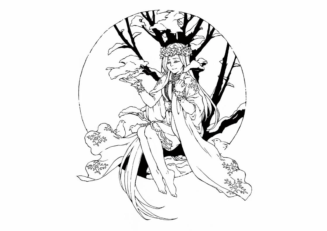
These are a series of illustration designs I have done in black pen. I love both drawing and design, so I try to join them together.
Illustration Design

Illustration
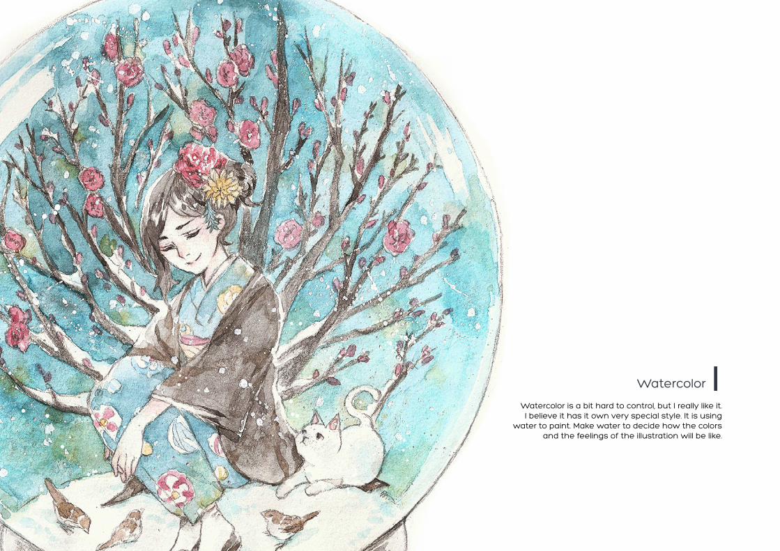
Watercolor is a bit hard to control, but I really like it. I believe it has it own very special style. It is using
water to paint. Make water to decide how the colors and the feelings of the illustration will be like.
Watercolor


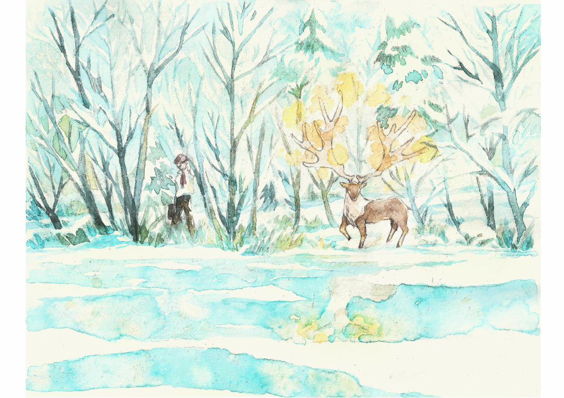


Comuputer coloring are more easier to control but hard to build own style and paint very well. I do most of my illustration coloring in Photoshop. It is my favourite tool.
Computer coloring


Project

Klaus Petrat is a German writer who wrote a book this few years and prepared to publish. For the book, he need some illustrations and a cover design. I feel
glad that I find this job and been able to work on it.
It is my first proper job for illustrating and it is also the first time I go out and meet the client. It is
always a little bite challenge to go out and meet strangers, people you never know before. However it
wasn’t that scary. This job gave me great experience on both illustration design and communication skill
area. It not only improved my illustration skill but also my communication skill.
Illustrations for Klaus Petrat


It is the first time I worked with a company and my first international job. This company is based on Japan. They sell beautiful flowers and oranges. The theme was Halloween. I had to design a 2 sided orange packaging for the company for Halloween season.
The client is located at Japan, so I need to communicate with him between Emails. The most challenge thing for me in this project is to talk to the client which is the business owner in Japanese and make sure my Japanese is right. This project gave me a great experience on packaging design and also on my language skill. I believe that in this project I improved myself on both design and Japanese language area.
田村みかんバラ園 ハロウィン用パッケージデザイン Yuramikan Halloween Orange Packaging Design

Making