Embed Size (px)
Citation preview
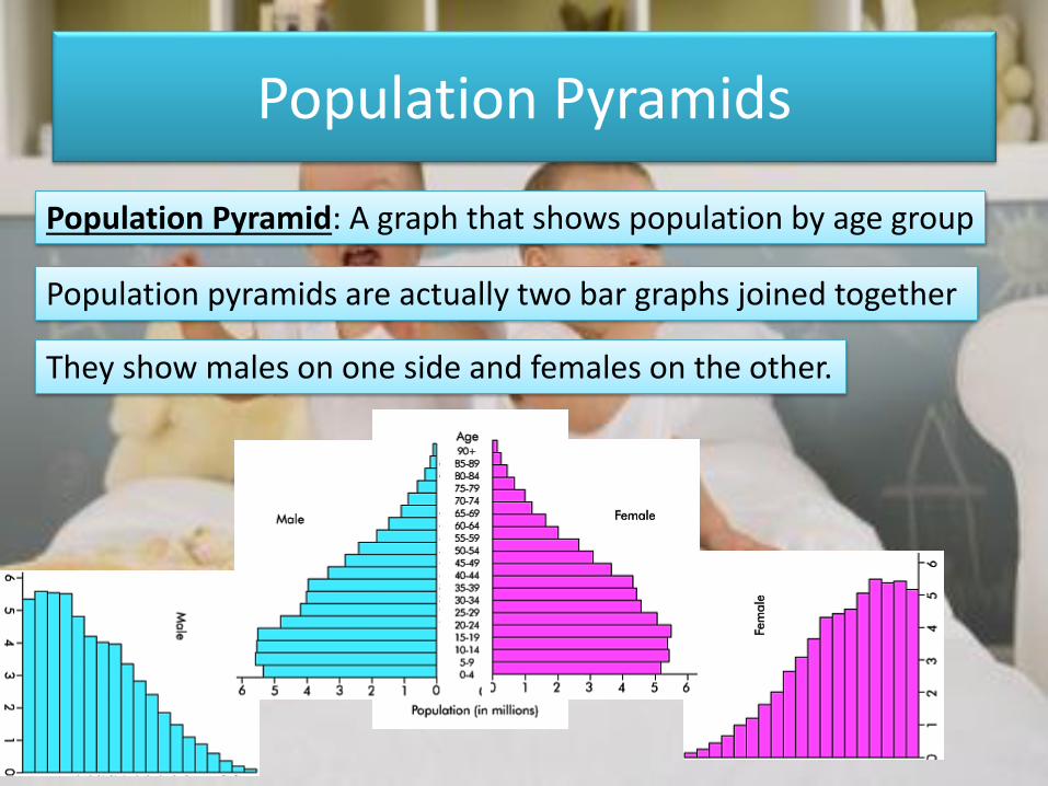
Population Pyramids
Population Pyramid: A graph that shows population by age group
Population pyramids are actually two bar graphs joined together
They show males on one side and females on the other.
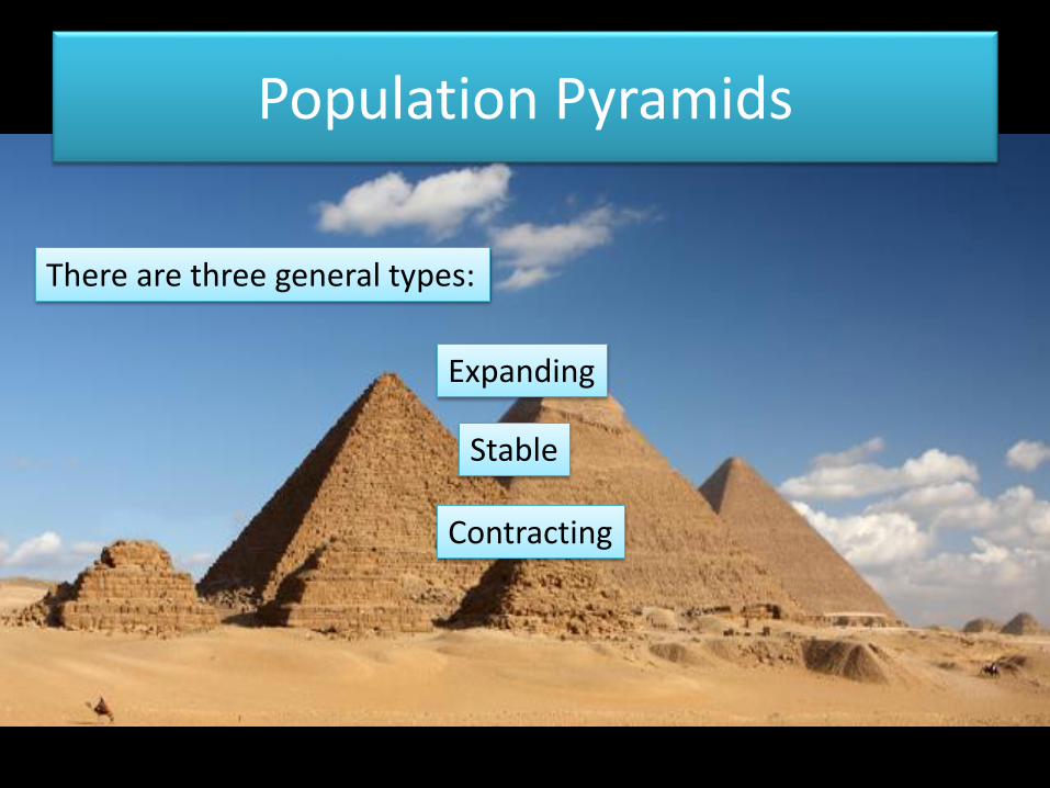
Population Pyramids
There are three general types:
Expanding
Stable
Contracting
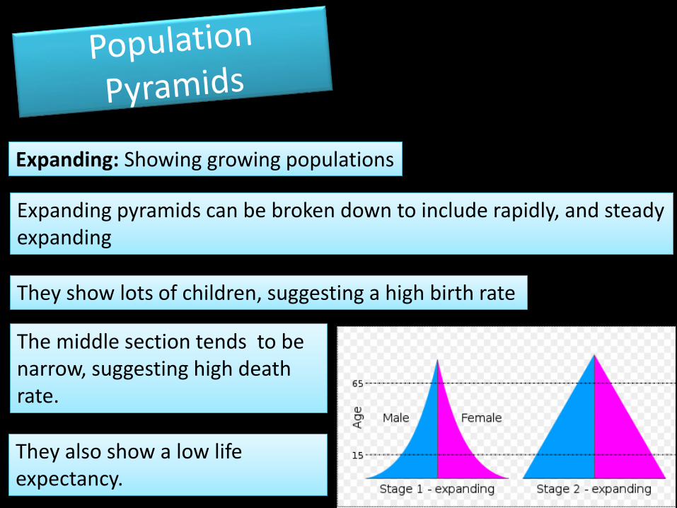
Expanding: Showing growing populations
Expanding pyramids can be broken down to include rapidly, and steady expanding
The middle section tends to be narrow, suggesting high death rate.
They show lots of children, suggesting a high birth rate
They also show a low life expectancy.
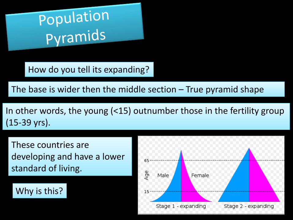
How do you tell its expanding?
In other words, the young (<15) outnumber those in the fertility group (15-39 yrs).
The base is wider then the middle section – True pyramid shape
These countries are developing and have a lower standard of living.
Why is this?
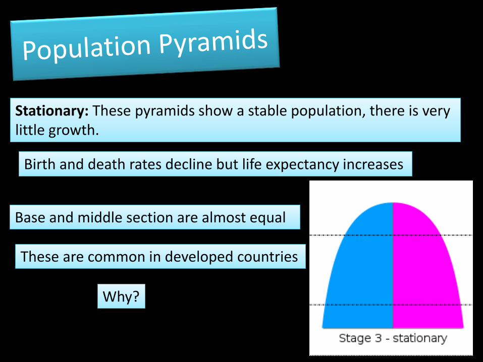
Stationary: These pyramids show a stable population, there is very little growth.
Birth and death rates decline but life expectancy increases
These are common in developed countries
Base and middle section are almost equal
Why?
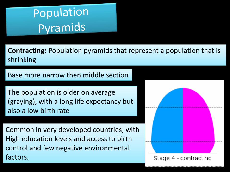
Contracting: Population pyramids that represent a population that is shrinking
Common in very developed countries, with High education levels and access to birth control and few negative environmental factors.
Base more narrow then middle section
The population is older on average (graying), with a long life expectancy but also a low birth rate
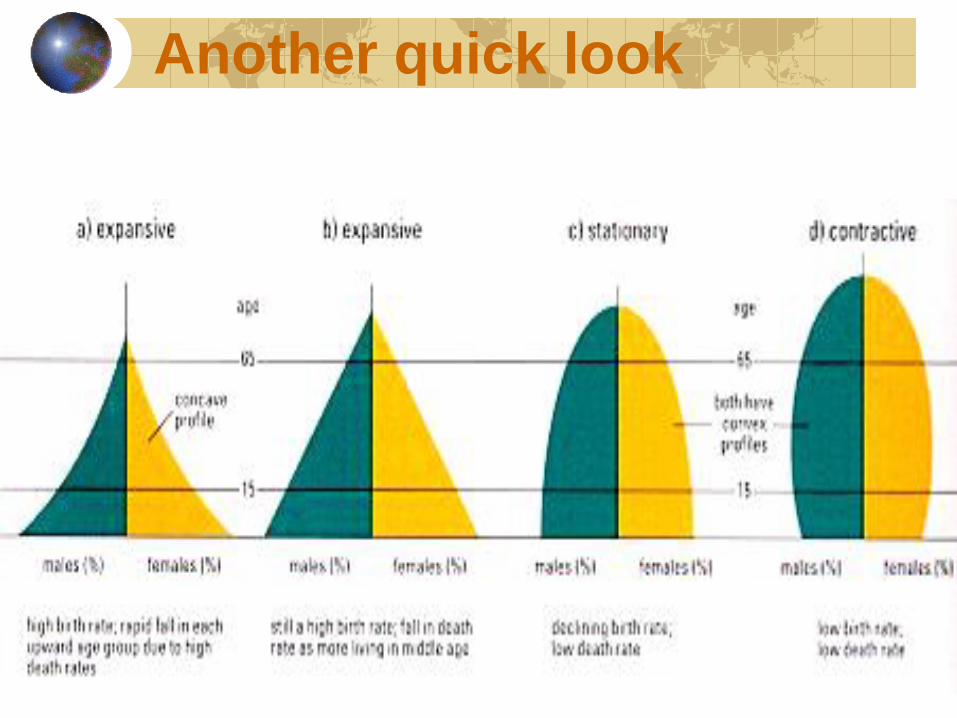
Another quick look
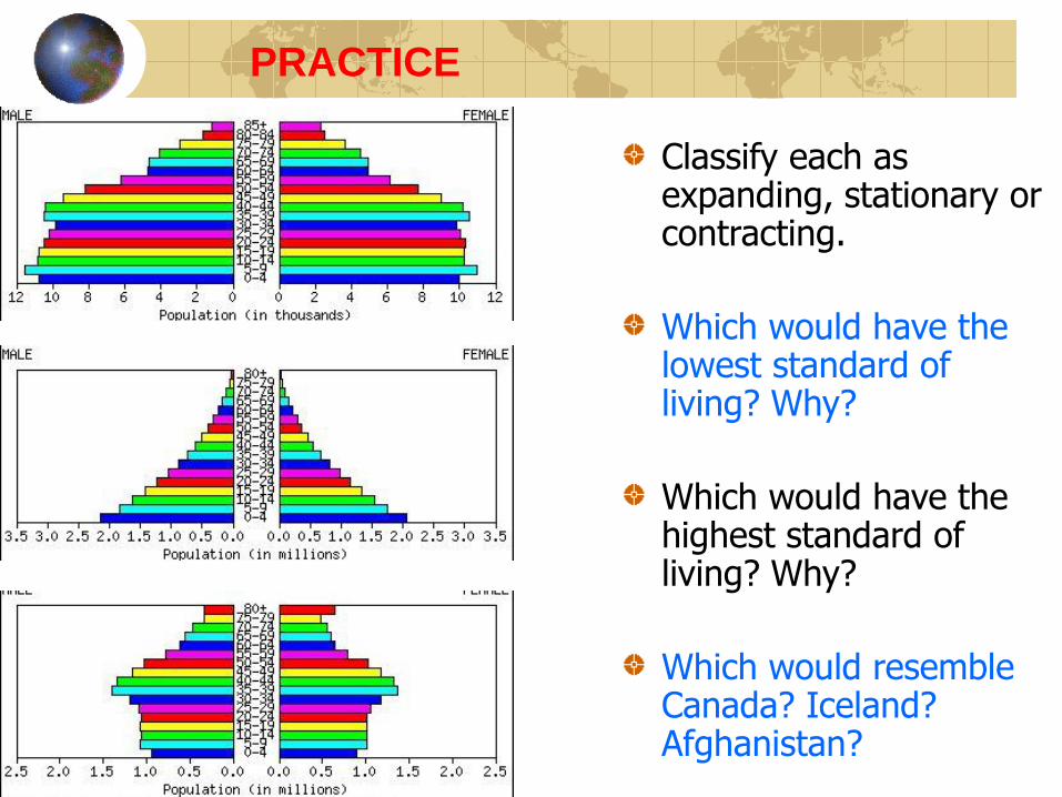
PRACTICE
Classify each as expanding, stationary or contracting.
Which would have the lowest standard of living? Why?
Which would have the highest standard of living? Why?
Which would resemble Canada? Iceland? Afghanistan?
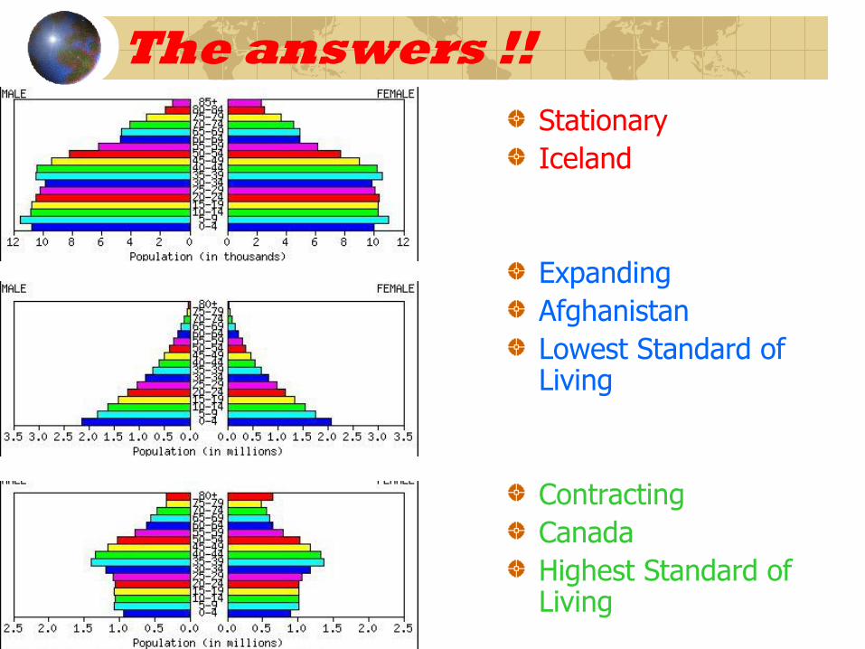
The answers !!
Stationary
Iceland
Expanding
Afghanistan
Lowest Standard of Living
Contracting
Canada
Highest Standard of Living
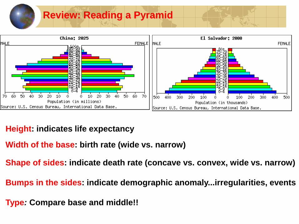
Review: Reading a Pyramid
Height: indicates life expectancy
Width of the base: birth rate (wide vs. narrow)
Shape of sides: indicate death rate (concave vs. convex, wide vs. narrow)
Bumps in the sides: indicate demographic anomaly...irregularities, events
Type: Compare base and middle!!
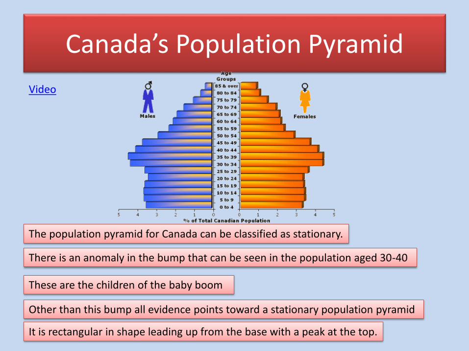
Canada’s Population Pyramid
Video
The population pyramid for Canada can be classified as stationary.
There is an anomaly in the bump that can be seen in the population aged 30-40
These are the children of the baby boom
Other than this bump all evidence points toward a stationary population pyramid
It is rectangular in shape leading up from the base with a peak at the top.
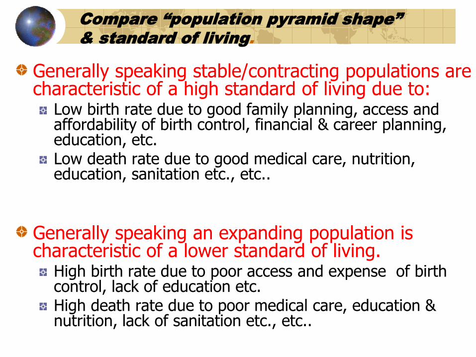
Compare “population pyramid shape”
& standard of living.
Generally speaking stable/contracting populations are characteristic of a high standard of living due to:
Low birth rate due to good family planning, access and affordability of birth control, financial & career planning, education, etc.Low death rate due to good medical care, nutrition, education, sanitation etc., etc..
Generally speaking an expanding population is characteristic of a lower standard of living.
High birth rate due to poor access and expense of birth control, lack of education etc.High death rate due to poor medical care, education & nutrition, lack of sanitation etc., etc..


![Geography Population Population Pyramids[Date] Today I will: -Know how to draw and begin to interpret a population pyramid](https://img.pdfslide.us/doc/110x75/56649ea95503460f94bada33/geography-population-population-pyramidsdate-today-i-will-know-how-to-draw.jpg)