Embed Size (px)
Citation preview
Pop music magazine cover annotations
By Matthew McMinn
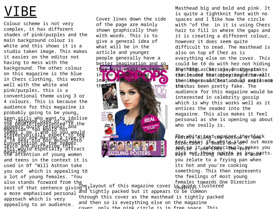
VIBEColour scheme is not very complex, it has different shades of pink/purples and the main background colour is white and this shows it is a studio taken image. This makes it easier on the editor not having to mess with the background. The other colour on this magazine is the blue in Chers clothing, this works well with the white and pink/purples, this is a conventional theme using 3 or 4 colours. This is because the audience for this magazine is probably going to be young teen girls who want to idolise the people represented in the magazine. You would not stereotypically expect to see a 14 year old boy going into Tesco and purchasing this magazine.
Masthead big and bold and pink. It is quite a tightknit font with no spaces and I like how the circle with “of the” in it is using Chers hair to fill in where the gaps and it is creating a different colour, however it does seem quite difficult to read. The masthead is also on top of Cher as is everything else on the cover. This could be to do with her not hiding anything as it says in the pink circle and her appearing from all the images and text could represent this.
The language used of “you” appears quite personal and seems 1 on 1 and so you would feel you are having a type of conversation as the reader. This would especially attract the attention of young women and teens in the context it is used in of “Will Ashton take you out” which is appealing to a lot of young females. “You” also stands forward from the rest of that sentence giving it a more emphasised personal approach which is very appealing to an audience.
The “REAL” Cher Lloyd suggests to the reader that they maybe haven’t seen the real Cher and up until now she has been pretty fake. The audience for this magazine would be interested in celebrity gossip which is why this works well as it entices the reader into the magazine. This also makes it feel personal as she is opening up about who she really is.
The white text against the black text makes the white stand out more and so it subconsciously makes you pick out those points as key parts.
Posters along the bottom of One Direction, a small one of Jessie J and Cher. The text says “sizzling” which is a word you relate to a frying pan when its hot and you’re cooking something. This then represents the feelings of most young females towards One Direction (mainly).
Cover lines down the side of the page are mainly shown graphically than with words. This is to give a general idea of what will be in the article and younger people generally have a better imagination and so this will print an image in the readers head, the image just catalyses that.
The layout of this magazine cover is quite clustered and tightly packed but it appears to be common through this cover as the masthead is tightly packed and then so is everything else on the magazine cover, only the pink circle is in free space. This suggests a lot of magazine content.
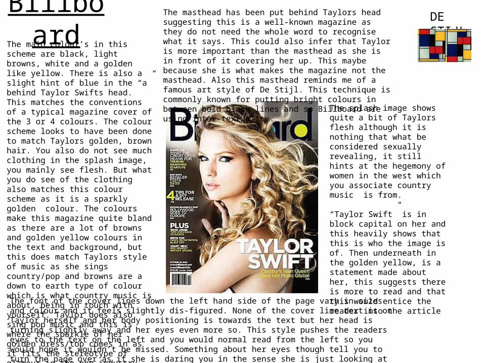
BillboardThe main colour’s in this scheme are black, light browns, white and a golden like yellow. There is also a slight hint of blue in the “a” behind Taylor Swifts head. This matches the conventions of a typical magazine cover of the 3 or 4 colours. The colour scheme looks to have been done to match Taylors golden, brown hair. You also do not see much clothing in the splash image, you mainly see flesh. But what you do see of the clothing also matches this colour scheme as it is a sparkly golden colour. The colours make this magazine quite bland as there are a lot of browns and golden yellow colours in the text and background, but this does match Taylors style of music as she sings country/pop and browns are a down to earth type of colour which is what country music is about, being in touch with yourself. Taylor does also sing pop music and this is where the sparkle of her golden dress/top comes in as it fits the stereotype of glamour in the pop industry.
DE STIJLThe masthead has been put behind Taylors head suggesting this is a well-known magazine as they do not need the whole word to recognise what it says. This could also infer that Taylor is more important than the masthead as she is in front of it covering her up. This maybe because she is what makes the magazine not the masthead. Also this masthead reminds me of a famous art style of De Stijl. This technique is commonly known for putting bright colours in between bold black lines and so Billboard are using inter-textuality.
The font of the cover lines down the left hand side of the page vary in sizes and colour and it feels slightly dis-figured. None of the cover line text is on Taylor herself and her body positioning is towards the text but her head is turning slightly away and her eyes even more so. This style pushes the readers eyes to the text on the left and you would normal read from the left so you would hope it wouldn’t be missed. Something about her eyes though tell you to turn the page over as if she is daring you in the sense she is just looking at the corner of her eye and this gives it a personal feel that she is convincing you.
The splash image shows quite a bit of Taylors flesh although it is nothing that what be considered sexually revealing, it still hints at the hegemony of women in the west which you associate country music is from.
“Taylor Swift” is in block capital on her and this heavily shows that this is who the image is of. Then underneath in the golden yellow, is a statement made about her, this suggests there is more to read and that this would entice the reader into the article
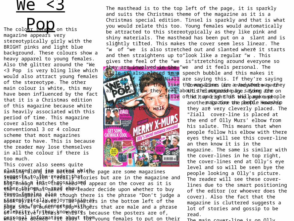
We <3 PopThe colour scheme on this magazine appears very stereotypically girly with the BRIGHT pinks and light blue background. These colours show a heavy apparel to young females. Also the glitter around the “We <3 Pop” is very bling like which would also attract young females of the stereotype. The other main colour is white, this may have been influenced by the fact that it is a Christmas edition of this magazine because white is heavily associated with this period of time. This magazine cover also matches the conventional 3 or 4 colour scheme that most magazines appear to have. This is because the reader may lose themselves in all the colour if there is too much.This cover also seems quite cluttered and jam packed which suggests to the reader that there is a lot of gossip and other things to read about. Young females also stereotypically enjoy gossip as they can feel connected with a celebrity if they know more personal information about them and this is a ploy used to get people to buy the magazine.
The masthead is to the top left of the page, it is sparkly and suits the Christmas theme of the magazine as it is a Christmas special edition. Tinsel is sparkly and that is what you would relate this too. Young females would automatically be attracted to this stereotypically as they like pink and shiny materials. The masthead has been put on a slant and is slightly tilted. This makes the cover seem less linear. The “w” of “we” is also stretched out and slanted where it starts and then straightens up to look like a regular “w”. This gives the feel of the “we” is stretching around everyone so they are involved in the “we” and it feels personal. The title is also placed in a speech bubble and this makes it seem as if Zane and Niall are saying this. If they’re saying the title as if they like the magazine (in a twisted way they are saying how they feel about the magazine by saying the
title of it) and so this will make people buy the magazine as people worship the ground they walk
on.Cover-lines are everywhere over this cluttered page. Some are on the top right of the page and another is too the left. However they are very cleverly placed. The “Ziall” cover-line is placed at the end of Olly Murs’ elbow from his salute. This means that when people follow his elbow with there eyes they will see this cover-line an then know it is in the magazine. The same is similar with the cover-lines in he top right, the cover-lines end at Olly’s eye level and so will be seen bye the people looking a Olly’s picture. The reader will see these cover-lines due to the smart positioning of the editor (or whoever does the cover). Also the fact that the magazine is cluttered suggests a lot of stories and gossip to be read.The main cover-line is on Olly himself under his head. This cover-line is bigger than the rest as it is an “EXCLUSIVE” and the magazine feel as if they need to emphasise this to the reader. This also tells the reader that this will most likely be a double page spread (or longer) in the magazine and so this is why it is larger.
Running along the bottom of the page are some magazines items that aren’t really stories but are in the magazine and big enough that they need to appear on the cover as it is the cover that makes the reader decide upon whether to buy this magazine even though there is the phrase “Don’t judge a book by it’s cover.” The posters in the bottom left of the page show a bunch of pop singers that are male and a phrase of “Festive Fitness” this is because the posters are of, what are deemed ‘fit lads’ for young females to put on their bedroom walls. This is an attraction to them and so would make them buy the magazine. The alliteration pun fits in with the theme and with what the posters are about/like.