Embed Size (px)
Citation preview

ÚSTAV INFORMATIKY PROVOZNĚ EKONOMICKÉ FAKULTY
Pivot Tables tutorial in Excel 2007
Karel Burda
2011
This tutorial shows basic and advanced features of Pivot Tables in Excel 2007. The tutorial includes series of tasks with enclosed example solution with pictures.
Pivot Tables tutorial
2
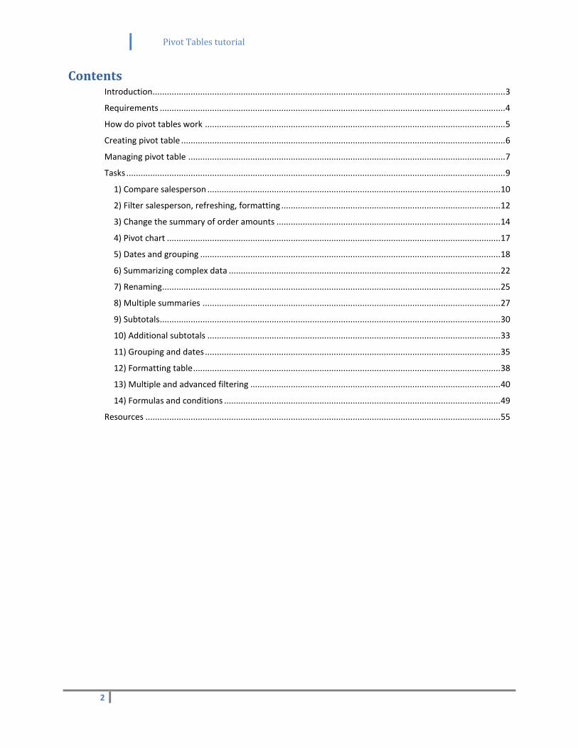
Contents Introduction .................................................................................................................................................... 3
Requirements ................................................................................................................................................. 4
How do pivot tables work .............................................................................................................................. 5
Creating pivot table ........................................................................................................................................ 6
Managing pivot table ..................................................................................................................................... 7
Tasks ............................................................................................................................................................... 9
1) Compare salesperson ........................................................................................................................... 10
2) Filter salesperson, refreshing, formatting ............................................................................................ 12
3) Change the summary of order amounts .............................................................................................. 14
4) Pivot chart ............................................................................................................................................ 17
5) Dates and grouping .............................................................................................................................. 18
6) Summarizing complex data .................................................................................................................. 22
7) Renaming.............................................................................................................................................. 25
8) Multiple summaries ............................................................................................................................. 27
9) Subtotals............................................................................................................................................... 30
10) Additional subtotals ........................................................................................................................... 33
11) Grouping and dates ............................................................................................................................ 35
12) Formatting table ................................................................................................................................. 38
13) Multiple and advanced filtering ......................................................................................................... 40
14) Formulas and conditions .................................................................................................................... 49
Resources ..................................................................................................................................................... 55
Pivot Tables tutorial
3
Introduction
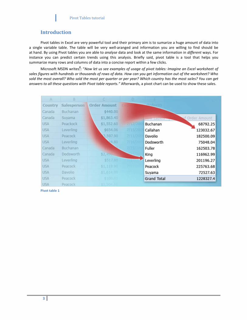
Pivot tables in Excel are very powerful tool and their primary aim is to sumarize a huge amount of data into a single variable table. The table will be very well-aranged and information you are willing to find should be at hand. By using Pivot tables you are able to analyse data and look at the same information in different ways. For instance you can predict certain trends using this analysis. Briefly said, pivot table is a tool that helps you summarize many rows and columns of data into a concise report within a few clicks.
Microsoft MSDN writes2: “Now let us see examples of usage of pivot tables: Imagine an Excel worksheet of
sales figures with hundreds or thousands of rows of data. How can you get information out of the worksheet? Who sold the most overall? Who sold the most per quarter or per year? Which country has the most sales? You can get answers to all these questions with Pivot table reports.” Afterwards, a pivot chart can be used to show these sales.
Pivot table 1
Pivot Tables tutorial
4
Requirements
However, pivot tables demand certain requirements to be met:
Consistency of all the data.
No empty rows nor columns.
No repetitive columns.
Separating data into multiple columns.
o Consider a situation that you have a column named Address. Instead of having one column for the full address, use 3 columns instead: street, city, state.
Removing repetitive columns.
o Imagine that we have 4 regions in our worksheet: East, West, North and South region. In order to create a pivot table, we must merge these columns into one columns called Region for instance.
Ideally, our source data should be completely isolated from the other data and be located on a separate worksheet
1.
Pivot Tables tutorial
5
How do pivot tables work
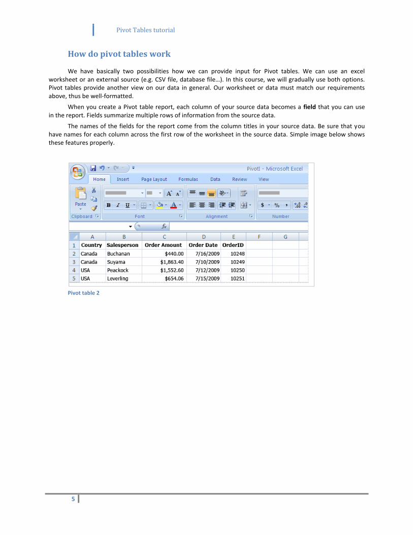
We have basically two possibilities how we can provide input for Pivot tables. We can use an excel worksheet or an external source (e.g. CSV file, database file…). In this course, we will gradually use both options. Pivot tables provide another view on our data in general. Our worksheet or data must match our requirements above, thus be well-formatted.
When you create a Pivot table report, each column of your source data becomes a field that you can use in the report. Fields summarize multiple rows of information from the source data.
The names of the fields for the report come from the column titles in your source data. Be sure that you have names for each column across the first row of the worksheet in the source data. Simple image below shows these features properly.
Pivot table 2
Pivot Tables tutorial
6
Creating pivot table
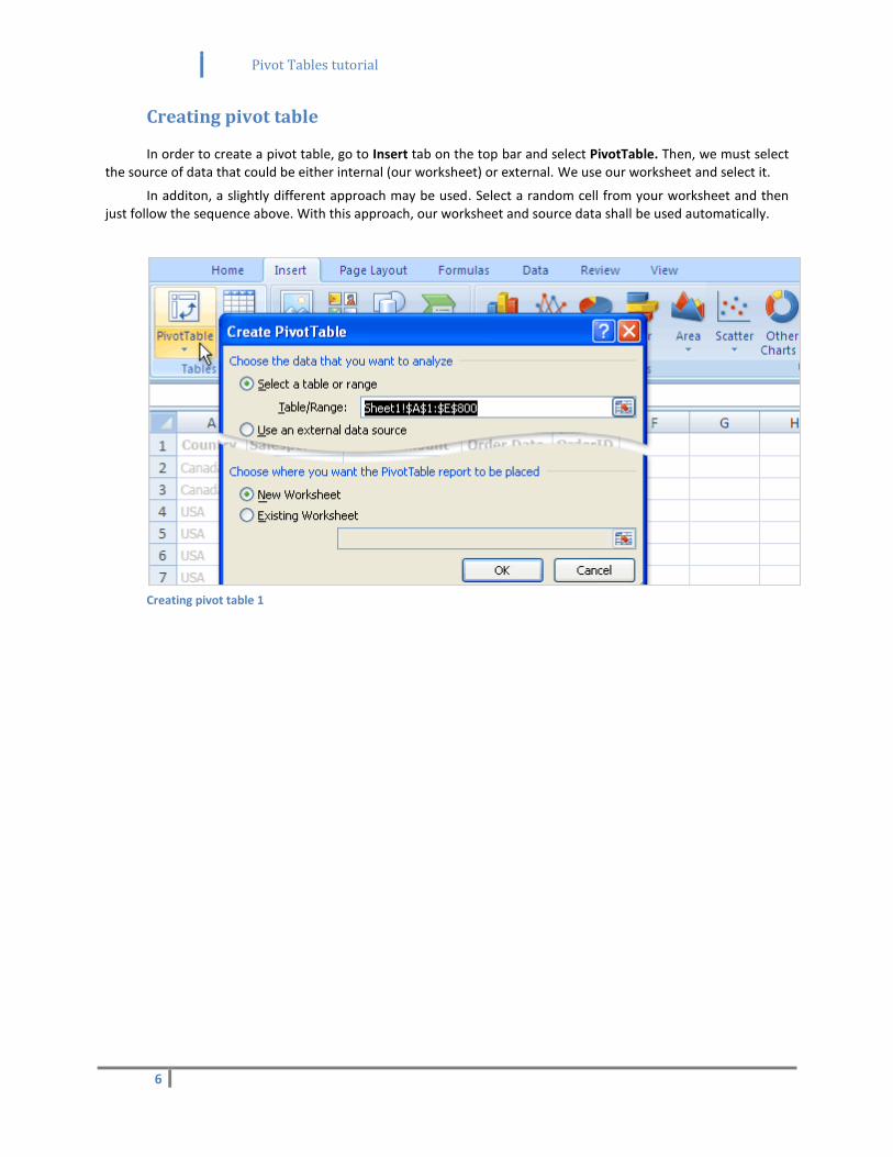
In order to create a pivot table, go to Insert tab on the top bar and select PivotTable. Then, we must select the source of data that could be either internal (our worksheet) or external. We use our worksheet and select it.
In additon, a slightly different approach may be used. Select a random cell from your worksheet and then just follow the sequence above. With this approach, our worksheet and source data shall be used automatically.
Creating pivot table 1
Pivot Tables tutorial
7
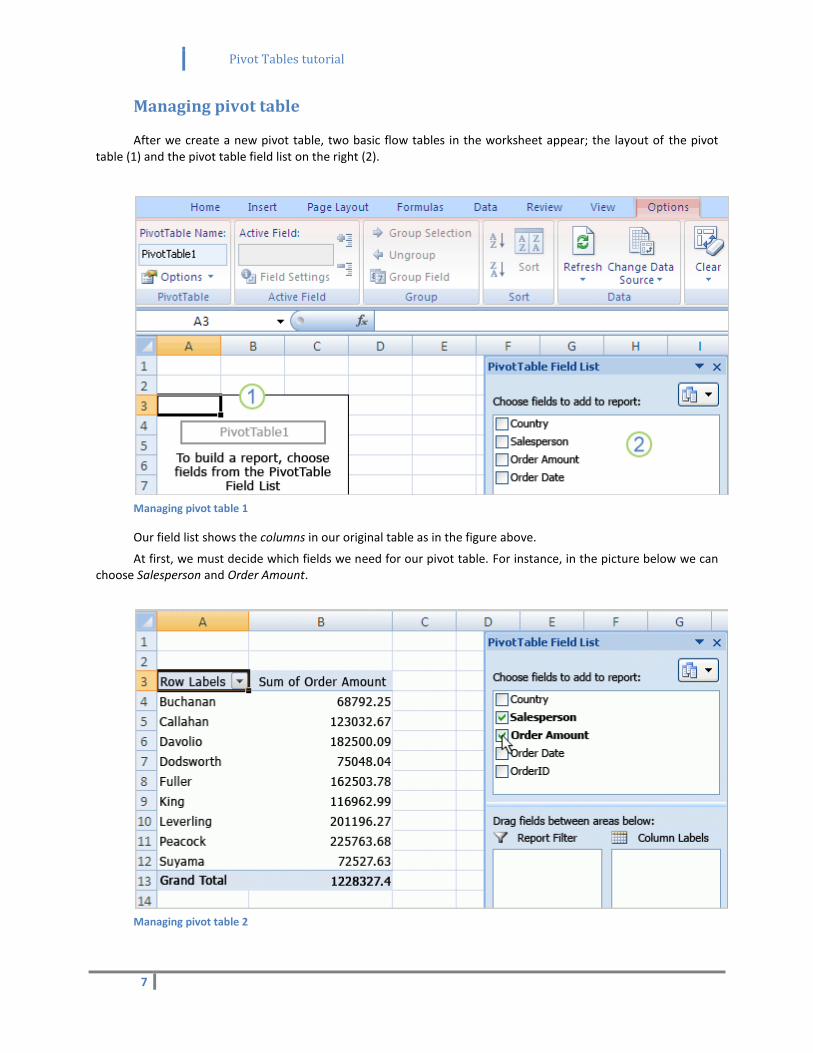
Managing pivot table
After we create a new pivot table, two basic flow tables in the worksheet appear; the layout of the pivot table (1) and the pivot table field list on the right (2).
Managing pivot table 1
Our field list shows the columns in our original table as in the figure above.
At first, we must decide which fields we need for our pivot table. For instance, in the picture below we can choose Salesperson and Order Amount.
Managing pivot table 2

Pivot Tables tutorial
8
Now we have row labels on the left and values on the right side.
One of the most important drawbacks of pivot tables is that whenever you make a change to the source data, the pivot table must be updated manually in addition. This issue can be fixed though, we will see it later.
When a field contains string data, it is automatically moved to the row labels. Secondly, if a field expresses number data, it is matched to the values area
1.
Pivot Tables tutorial
9
Tasks
In order to practise work with pivot tables, we are going to look at and work with certain examples.
In the following tasks we are going to use two worksheets: SalesPerson.xslx1 and WorkOrders
2. The first one
is a sample worksheet that contains salesperson and their orders. The second is slightly more complex. Both sheets also contain the final solution for each task.
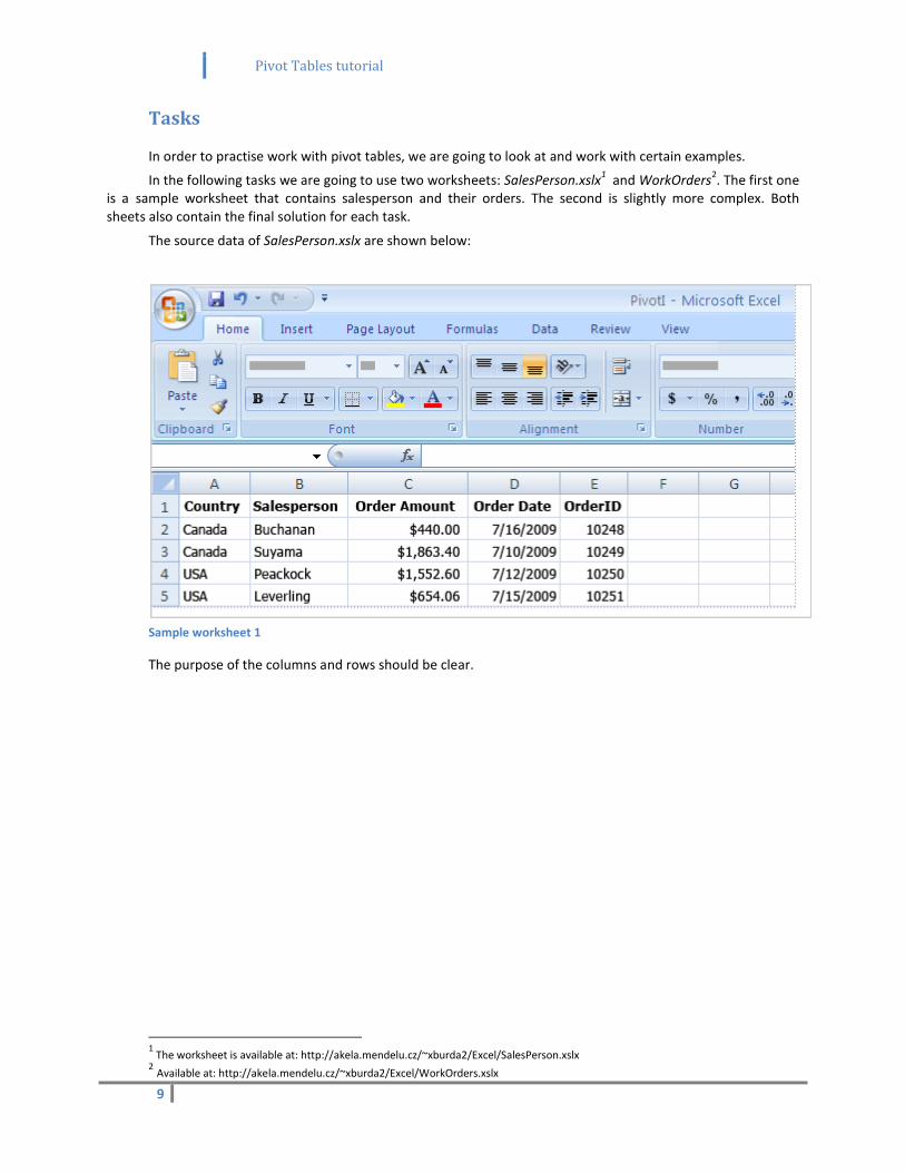
The source data of SalesPerson.xslx are shown below:
Sample worksheet 1
The purpose of the columns and rows should be clear.
1 The worksheet is available at: http://akela.mendelu.cz/~xburda2/Excel/SalesPerson.xslx
2 Available at: http://akela.mendelu.cz/~xburda2/Excel/WorkOrders.xslx
Pivot Tables tutorial
10
1) Compare salesperson
You manager says: “Show me how much of order amount each salesperson provided (the sum) and sort the data from the greatest amount to the lowest one.”
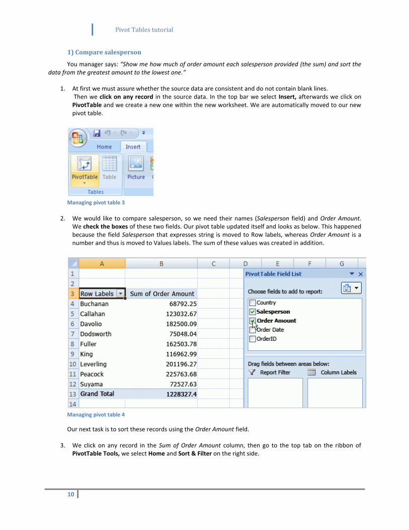
1. At first we must assure whether the source data are consistent and do not contain blank lines. Then we click on any record in the source data. In the top bar we select Insert, afterwards we click on PivotTable and we create a new one within the new worksheet. We are automatically moved to our new pivot table.
Managing pivot table 3
2. We would like to compare salesperson, so we need their names (Salesperson field) and Order Amount. We check the boxes of these two fields. Our pivot table updated itself and looks as below. This happened because the field Salesperson that expresses string is moved to Row labels, whereas Order Amount is a number and thus is moved to Values labels. The sum of these values was created in addition.
Managing pivot table 4
Our next task is to sort these records using the Order Amount field.
3. We click on any record in the Sum of Order Amount column, then go to the top tab on the ribbon of PivotTable Tools, we select Home and Sort & Filter on the right side.
Pivot Tables tutorial
11
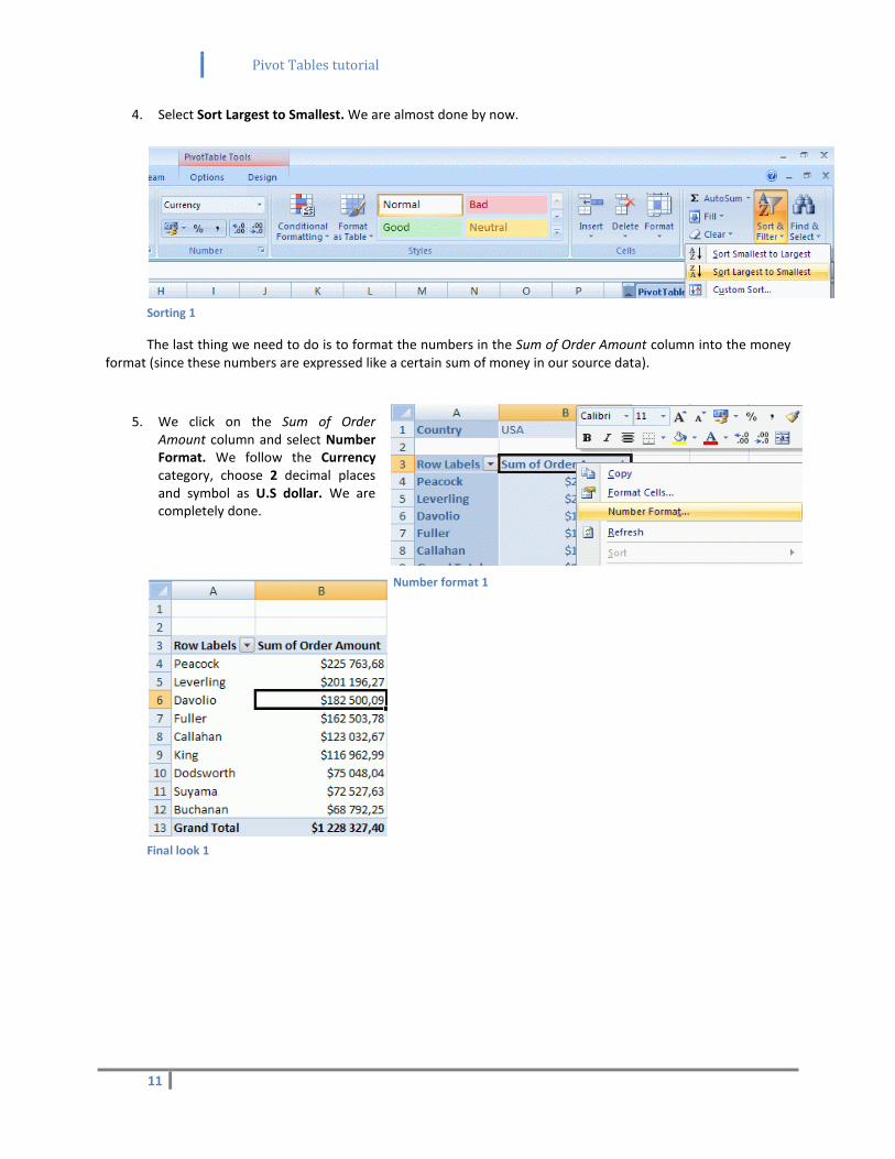
4. Select Sort Largest to Smallest. We are almost done by now.
Sorting 1
The last thing we need to do is to format the numbers in the Sum of Order Amount column into the money format (since these numbers are expressed like a certain sum of money in our source data).
5. We click on the Sum of Order Amount column and select Number Format. We follow the Currency category, choose 2 decimal places and symbol as U.S dollar. We are completely done.
Final look 1
Number format 1
Pivot Tables tutorial
12
2) Filter salesperson, refreshing, formatting
Manager claims that it would be nice, if one could easily choose the country where each salesperson operates. Then he gives you a new record that must be updated in our source data and also in the pivot table:
USA-Leverling-2.5.2005-11058-$50,00
In the end, he demands that the pivot summary should be formatted to be more colorful somehow.
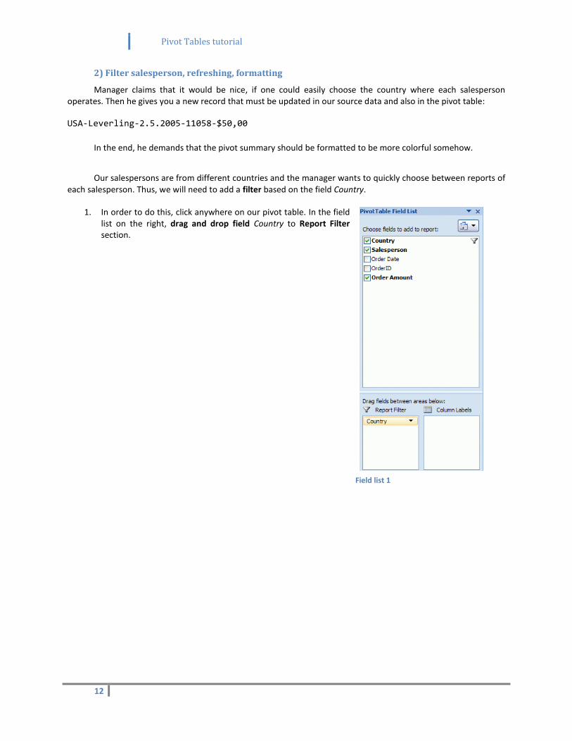
Our salespersons are from different countries and the manager wants to quickly choose between reports of each salesperson. Thus, we will need to add a filter based on the field Country.
1. In order to do this, click anywhere on our pivot table. In the field list on the right, drag and drop field Country to Report Filter section.
Field list 1
Pivot Tables tutorial
13
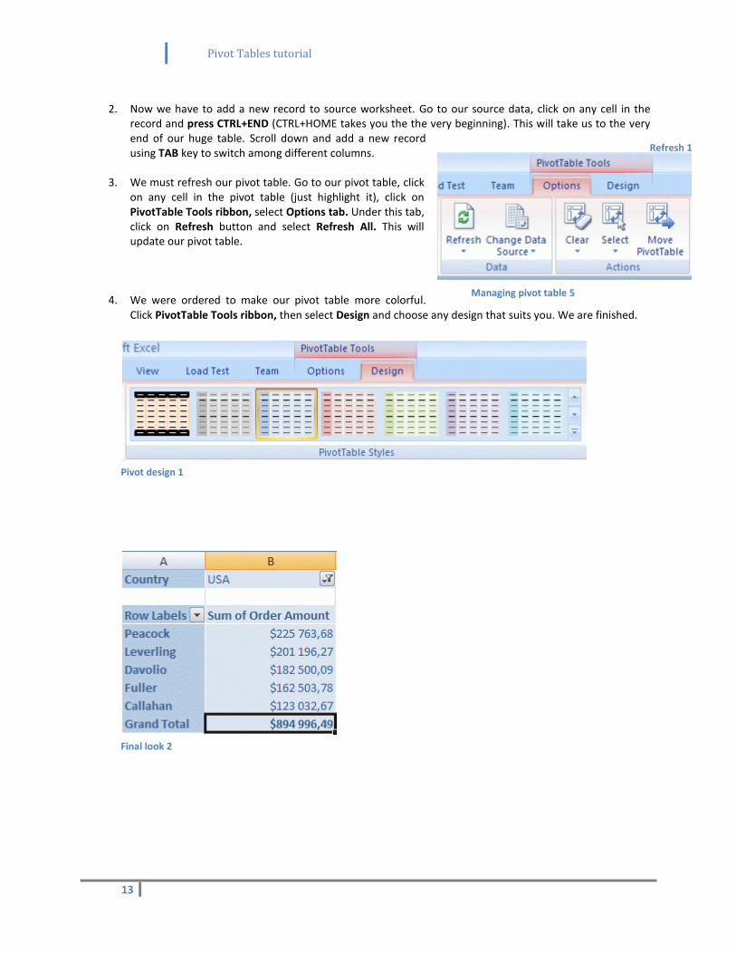
2. Now we have to add a new record to source worksheet. Go to our source data, click on any cell in the
record and press CTRL+END (CTRL+HOME takes you the the very beginning). This will take us to the very end of our huge table. Scroll down and add a new record using TAB key to switch among different columns.
3. We must refresh our pivot table. Go to our pivot table, click on any cell in the pivot table (just highlight it), click on PivotTable Tools ribbon, select Options tab. Under this tab, click on Refresh button and select Refresh All. This will update our pivot table.
4. We were ordered to make our pivot table more colorful. Click PivotTable Tools ribbon, then select Design and choose any design that suits you. We are finished.
Pivot design 1
Final look 2
Refresh 1
Managing pivot table 5
Pivot Tables tutorial
14
3) Change the summary of order amounts
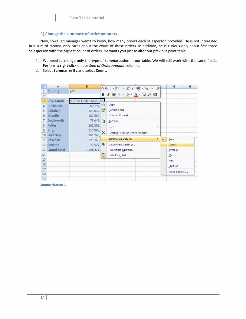
Now, so-called manager wants to know, how many orders each salesperson provided. He is not interested in a sum of money, only cares about the count of these orders. In addition, he is curious only about first three salesperson with the highest count of orders. He wants you just to alter our previous pivot table.
1. We need to change only the type of summarization in our table. We will still work with the same fields. Perform a right-click on our Sum of Order Amount columns.
2. Select Summarize By and select Count.
Summarization 1
Pivot Tables tutorial
15
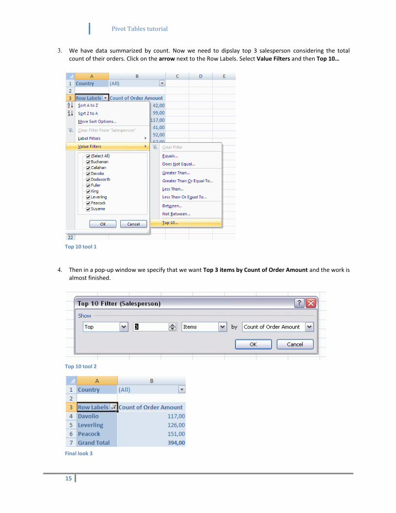
3. We have data summarized by count. Now we need to dipslay top 3 salesperson considering the total count of their orders. Click on the arrow next to the Row Labels. Select Value Filters and then Top 10…
Top 10 tool 1
4. Then in a pop-up window we specify that we want Top 3 items by Count of Order Amount and the work is
almost finished.
Top 10 tool 2
Final look 3

Pivot Tables tutorial
16
5. Ultimately, we right-click on Count of Order Amount, select Number Format, category Number and we set decimal places to 0, since there cannot exist any order that would represent a non-integer number.
Pivot Tables tutorial
17
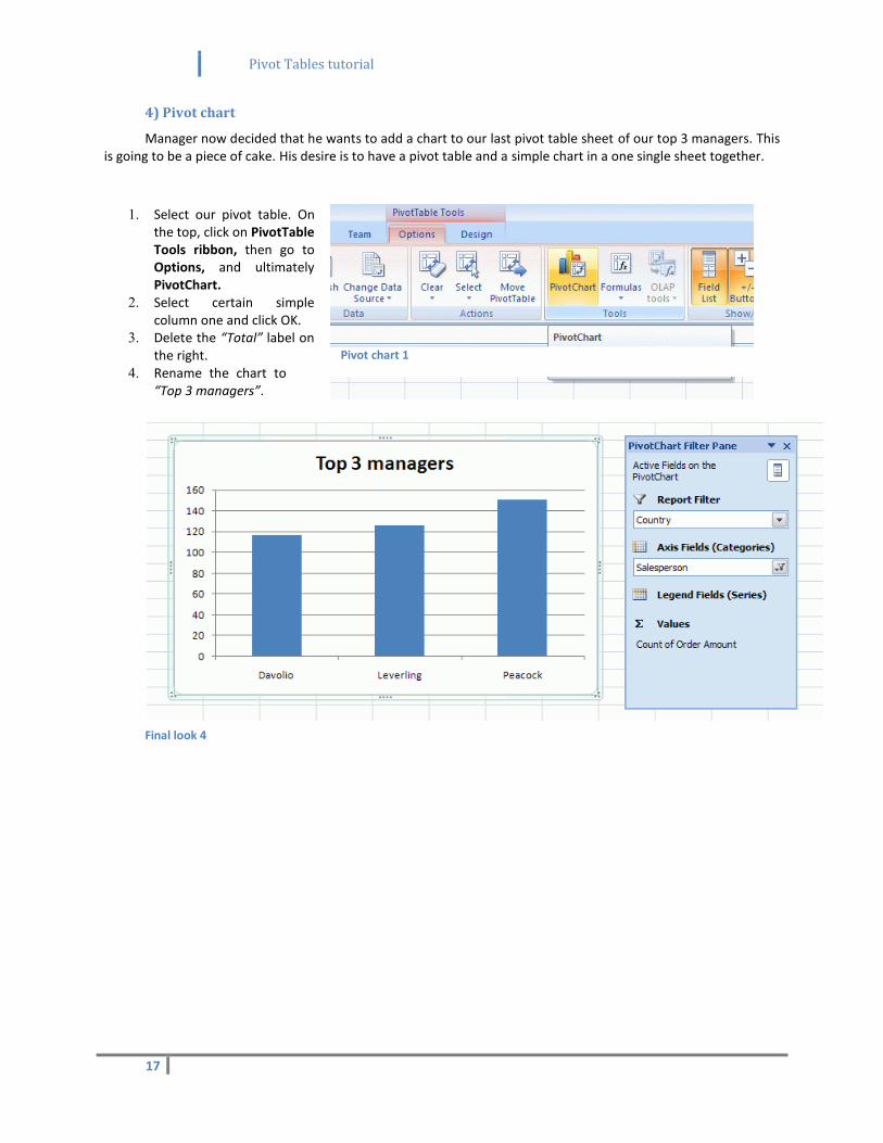
4) Pivot chart
Manager now decided that he wants to add a chart to our last pivot table sheet of our top 3 managers. This is going to be a piece of cake. His desire is to have a pivot table and a simple chart in a one single sheet together.
1. Select our pivot table. On the top, click on PivotTable Tools ribbon, then go to Options, and ultimately PivotChart.
2. Select certain simple column one and click OK.
3. Delete the “Total” label on the right.
4. Rename the chart to “Top 3 managers”.
Final look 4
Pivot chart 1
Pivot Tables tutorial
18
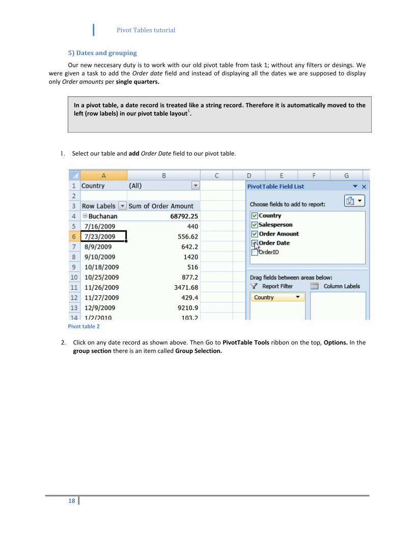
5) Dates and grouping
Our new neccesary duty is to work with our old pivot table from task 1; without any filters or desings. We were given a task to add the Order date field and instead of displaying all the dates we are supposed to display only Order amounts per single quarters.
1. Select our table and add Order Date field to our pivot table.
Pivot table 2
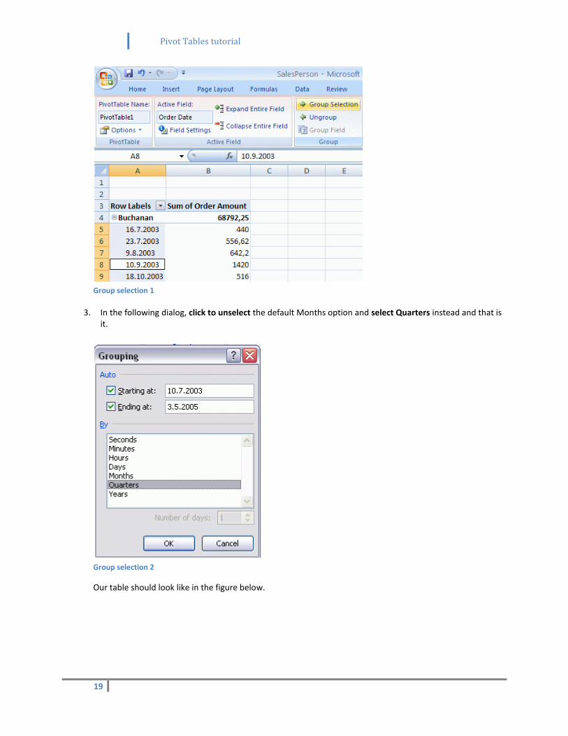
2. Click on any date record as shown above. Then Go to PivotTable Tools ribbon on the top, Options. In the group section there is an item called Group Selection.
In a pivot table, a date record is treated like a string record. Therefore it is automatically moved to the left (row labels) in our pivot table layout
1.
Pivot Tables tutorial
19
Group selection 1
3. In the following dialog, click to unselect the default Months option and select Quarters instead and that is it.
Group selection 2
Our table should look like in the figure below.
Pivot Tables tutorial
20
Final look 5
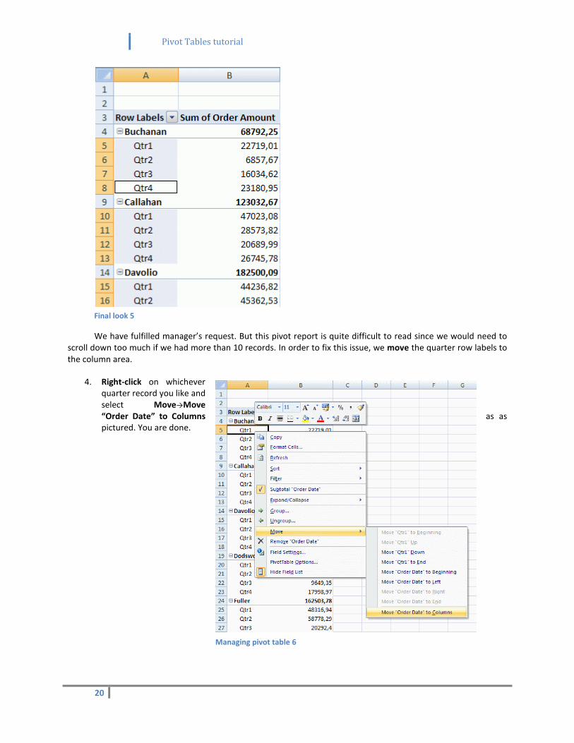
We have fulfilled manager’s request. But this pivot report is quite difficult to read since we would need to scroll down too much if we had more than 10 records. In order to fix this issue, we move the quarter row labels to the column area.
4. Right-click on whichever quarter record you like and select Move→Move “Order Date” to Columns as as pictured. You are done.
Managing pivot table 6
Pivot Tables tutorial
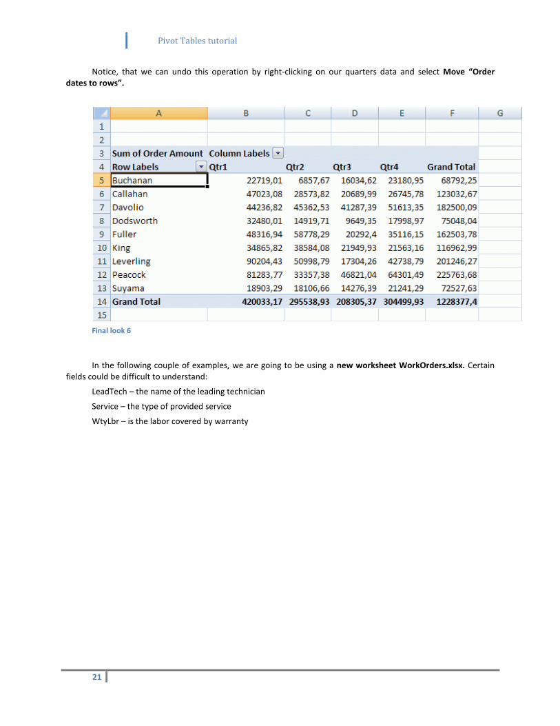
21
Notice, that we can undo this operation by right-clicking on our quarters data and select Move “Order dates to rows”.
Final look 6
In the following couple of examples, we are going to be using a new worksheet WorkOrders.xlsx. Certain fields could be difficult to understand:
LeadTech – the name of the leading technician
Service – the type of provided service
WtyLbr – is the labor covered by warranty
Pivot Tables tutorial
22
6) Summarizing complex data
Our new task is to show average labor hours per each service with each leading technician. That means to show average time that each technician spends on each type of service for each service call.
Then the manager wants us to cover the standard deviation for each service in order to be able to make a comparisson between these average hours.
Simple scheme would look like this example:
ASSESS DELIVER INSTALL REPAIR REPLACE TOTAL
Burton 0,2 1,3 2,7 0,2 1,5 0,9
Michner 1,1 0,6 0,8 0,9 1,9 1,1
...
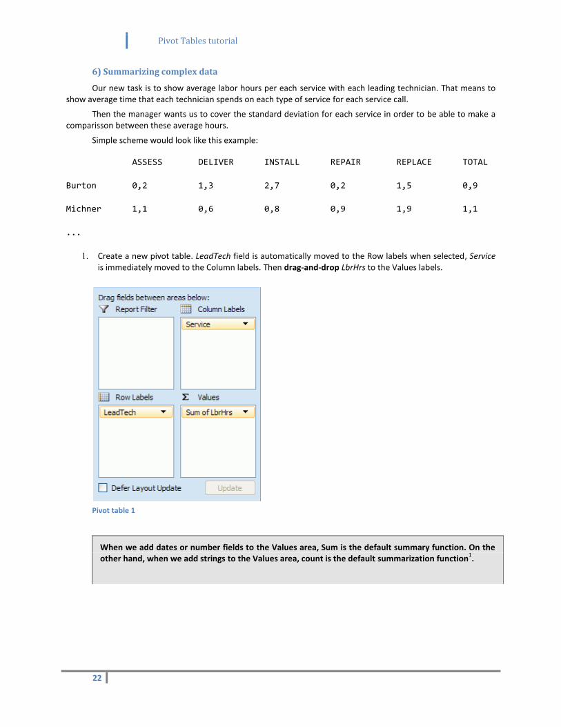
1. Create a new pivot table. LeadTech field is automatically moved to the Row labels when selected, Service is immediately moved to the Column labels. Then drag-and-drop LbrHrs to the Values labels.
Pivot table 1
When we add dates or number fields to the Values area, Sum is the default summary function. On the other hand, when we add strings to the Values area, count is the default summarization function
1.
Pivot Tables tutorial
23
2. Click on any cell and select Number format, then Number category and select 2 decimal places.
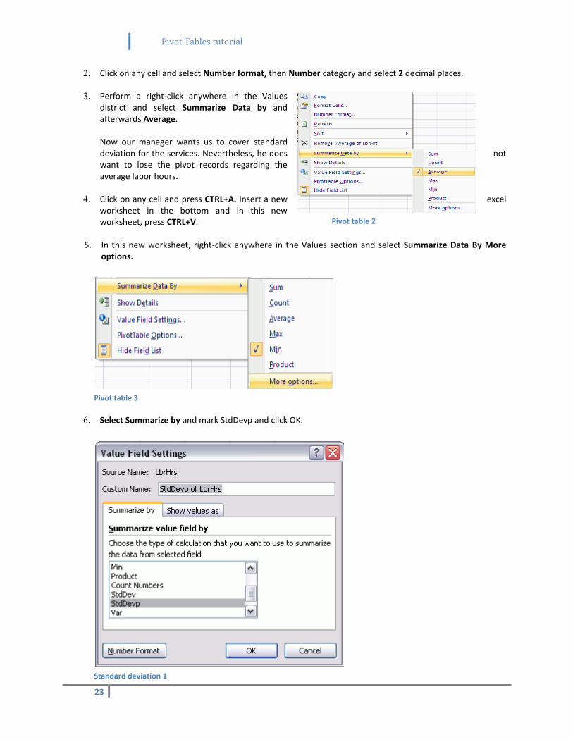
3. Perform a right-click anywhere in the Values district and select Summarize Data by and afterwards Average. Now our manager wants us to cover standard deviation for the services. Nevertheless, he does not want to lose the pivot records regarding the average labor hours.
4. Click on any cell and press CTRL+A. Insert a new excel worksheet in the bottom and in this new worksheet, press CTRL+V.
5. In this new worksheet, right-click anywhere in the Values section and select Summarize Data By More options.
Pivot table 3
6. Select Summarize by and mark StdDevp and click OK.
Standard deviation 1
Pivot table 2

Pivot Tables tutorial
24
And we are done!
StdDevp function is a standard deviation in the entire population1 and since our worksheet represents the
population (in a way), we may use this function.
Pivot Tables tutorial
25
7) Renaming
After we have calculated the average times, the service coordinator has asked us to show a count of jobs where the labor was done under warranty.
We are going to use a field WtyLbr, which is the boolean value containing “Yes” if the labor is covered by warranty and vice-versa regarding the second possible option.
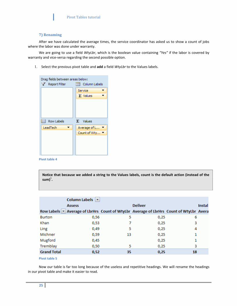
1. Select the previous pivot table and add a field WtyLbr to the Values labels.
Pivot table 4
Pivot table 5
Now our table is far too long because of the useless and repetitive headings. We will rename the headings in our pivot table and make it easier to read.
Notice that because we added a string to the Values labels, count is the default action (instead of the sum)
1.
Pivot Tables tutorial
26
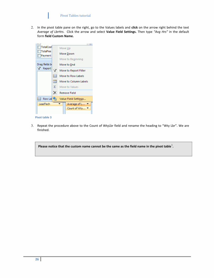
2. In the pivot table pane on the right, go to the Values labels and click on the arrow right behind the text Average of LbrHrs. Click the arrow and select Value Field Settings. Then type “Avg Hrs” in the default form field Custom Name.
Pivot table 3
3. Repeat the procedure above to the Count of WtyLbr field and rename the heading to “Wty Lbr”. We are finished.
Please notice that the custom name cannot be the same as the field name in the pivot table1.
Pivot Tables tutorial
27
8) Multiple summaries
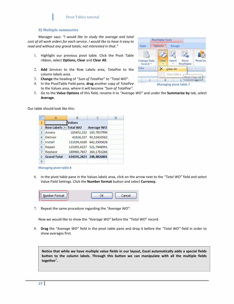
Manager says: “I would like to study the average and total cost of all work orders for each service. I would like to have it easy to read and without any grand totals; not interested in that.”
1. Highlight our previous pivot table. Click the Pivot Table ribbon, select Options, Clear and Clear All.
2. Add Services to the Row Labels area, TotalFee to the
column labels area. 3. Change the heading of “Sum of TotalFee” to “Total WO”. 4. In the PivotTable Field pane, drag another copy of TotalFee
to the Values area, where it will become “Sum of TotalFee”. 5. Go to the Value Options of this field, rename it to “Average WO” and under the Summarize by tab, select
Average.
Our table should look like this:
Managing pivot table 8
6. In the pivot table pane in the Values labels area, click on the arrow next to the “Total WO” field and select Value Field Settings. Click the Number format button and select Currency.
7. Repeat the same procedure regarding the “Average WO”.
Now we would like to show the “Average WO” before the “Total WO” record.
8. Drag the “Average WO” field in the pivot table pane and drop it before the “Total WO” field in order to show averages first.
Notice that while we have multiple value fields in our layout, Excel automatically adds a special fields button to the column labels. Through this button we can manipulate with all the multiple fields together
1.
Managing pivot table 7
Pivot Tables tutorial
28
Pivot table 6
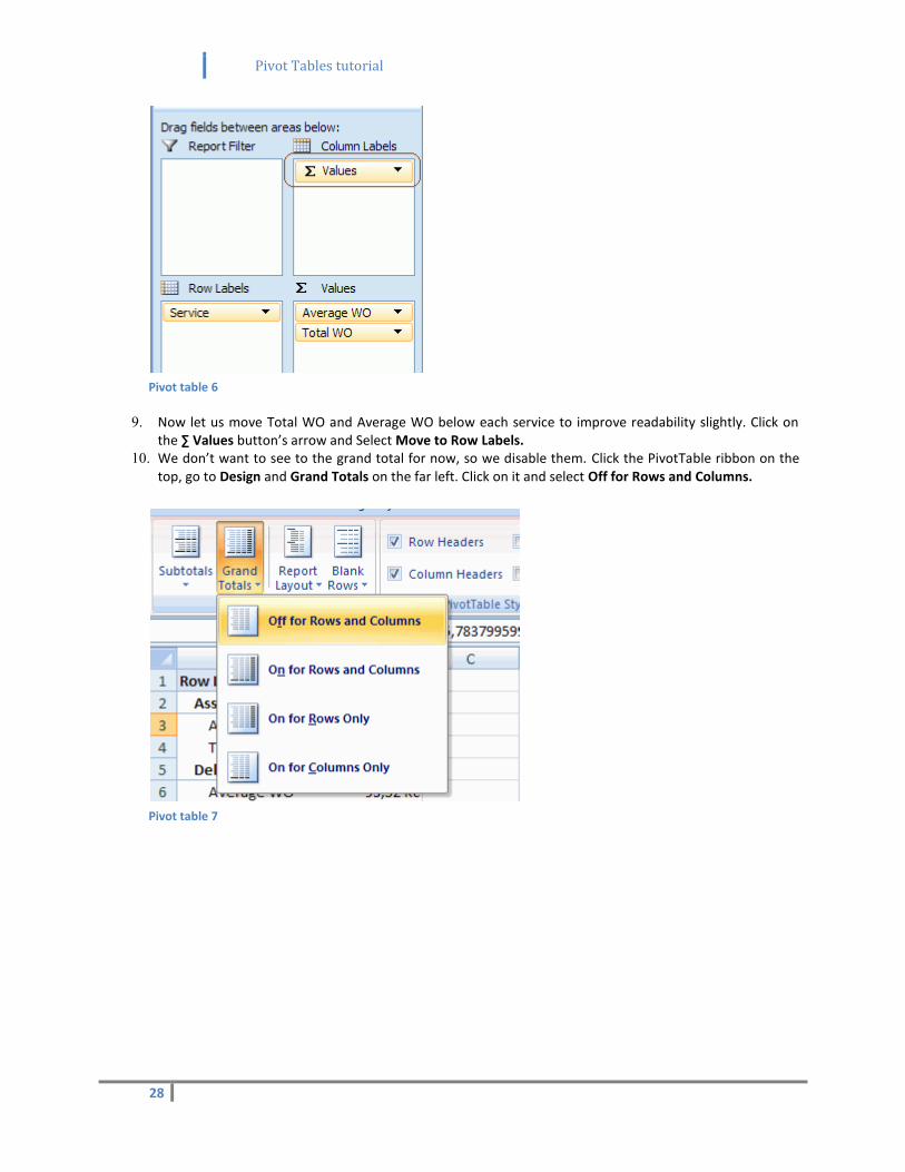
9. Now let us move Total WO and Average WO below each service to improve readability slightly. Click on the ∑ Values button’s arrow and Select Move to Row Labels.
10. We don’t want to see to the grand total for now, so we disable them. Click the PivotTable ribbon on the top, go to Design and Grand Totals on the far left. Click on it and select Off for Rows and Columns.
Pivot table 7
Pivot Tables tutorial
29
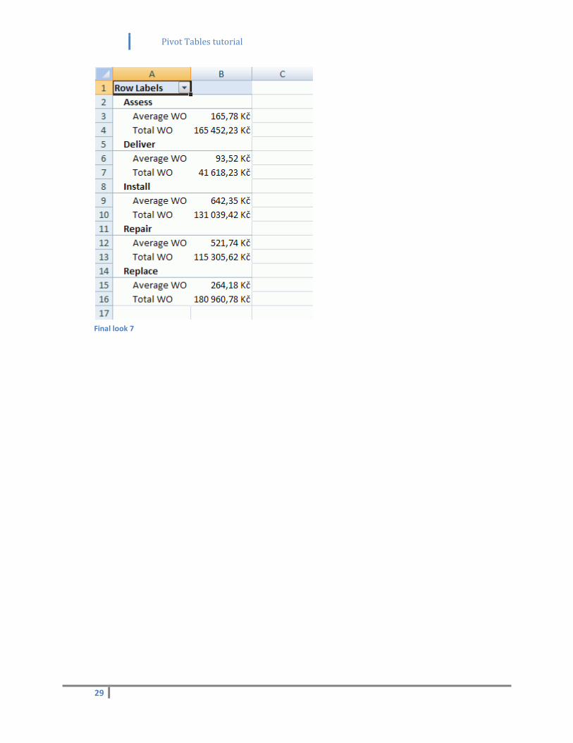
Final look 7
Pivot Tables tutorial
30
9) Subtotals
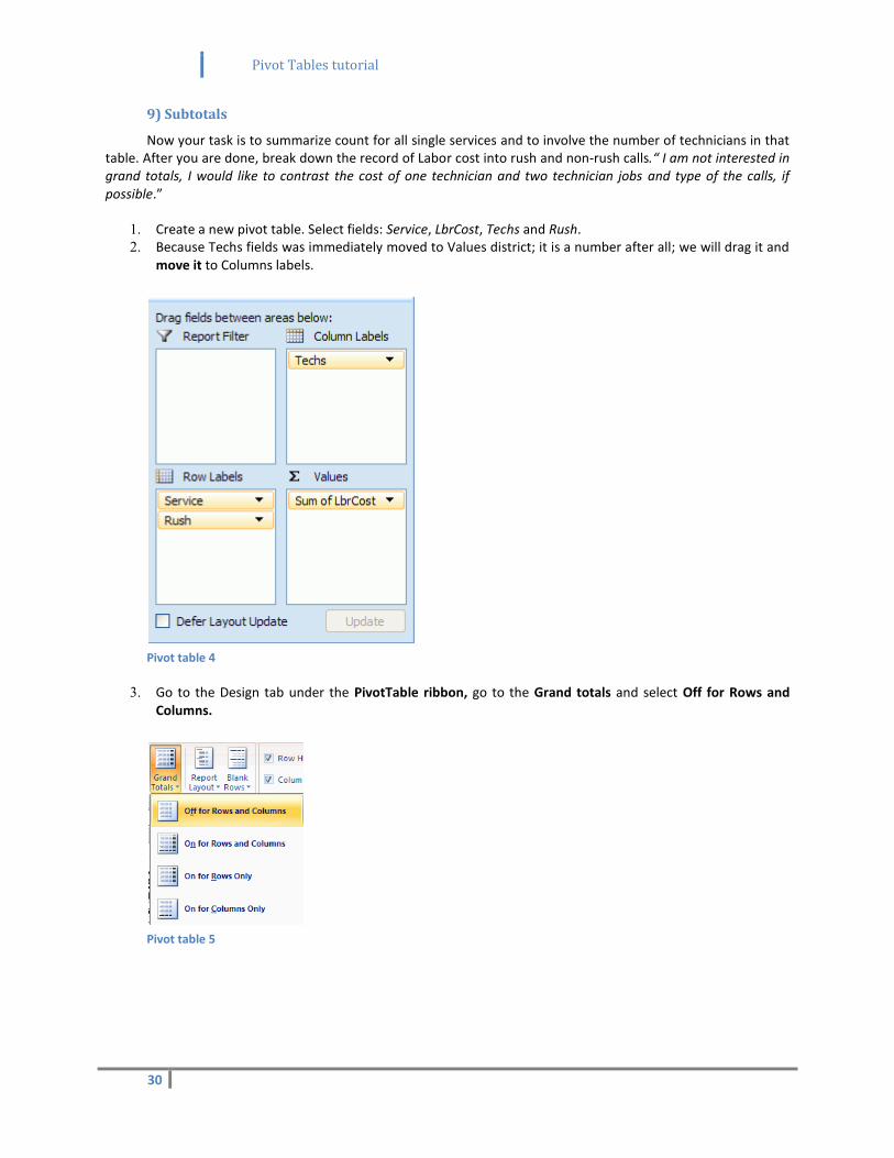
Now your task is to summarize count for all single services and to involve the number of technicians in that table. After you are done, break down the record of Labor cost into rush and non-rush calls.“ I am not interested in grand totals, I would like to contrast the cost of one technician and two technician jobs and type of the calls, if possible.”
1. Create a new pivot table. Select fields: Service, LbrCost, Techs and Rush. 2. Because Techs fields was immediately moved to Values district; it is a number after all; we will drag it and
move it to Columns labels.
Pivot table 4
3. Go to the Design tab under the PivotTable ribbon, go to the Grand totals and select Off for Rows and Columns.
Pivot table 5
Pivot Tables tutorial
31
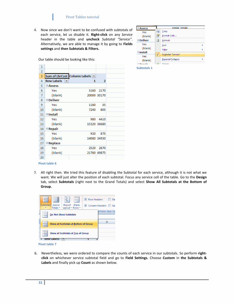
4. Now since we don’t want to be confused with subtotals of each service, let us disable it. Right-click on any Service header in the table and uncheck Subtotal “Service”. Alternatively, we are able to manage it by going to Fields settings and then Subtotals & Filters.
Our table should be looking like this:
Pivot table 6
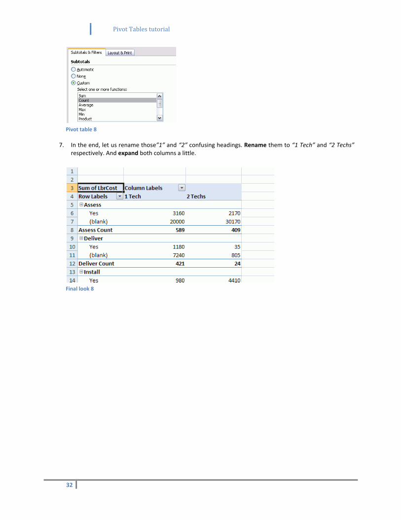
5. All right then. We tried this feature of disabling the Subtotal for each service, although it is not what we want. We will just alter the position of each subtotal. Focus any service cell of the table. Go to the Design tab, select Subtotals (right next to the Grand Totals) and select Show All Subtotals at the Bottom of Group.
Pivot table 7
6. Nevertheless, we were ordered to compare the counts of each service in our subtotals. So perform right-click on whichever service subtotal field and go to Field Settings. Choose Custom in the Subtotals & Labels and finally pick up Count as shown below.
Subtotals 1
Pivot Tables tutorial
32
Pivot table 8
7. In the end, let us rename those”1” and “2” confusing headings. Rename them to “1 Tech” and “2 Techs” respectively. And expand both columns a little.
Final look 8
Pivot Tables tutorial
33
10) Additional subtotals
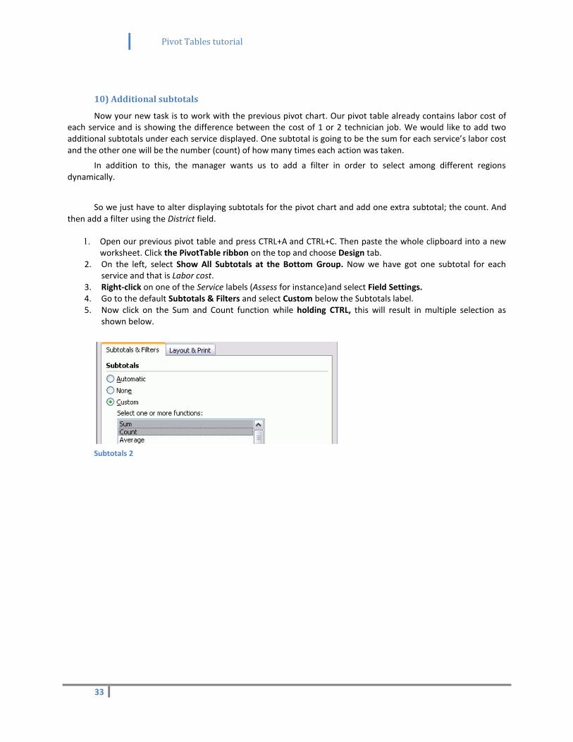
Now your new task is to work with the previous pivot chart. Our pivot table already contains labor cost of each service and is showing the difference between the cost of 1 or 2 technician job. We would like to add two additional subtotals under each service displayed. One subtotal is going to be the sum for each service’s labor cost and the other one will be the number (count) of how many times each action was taken.
In addition to this, the manager wants us to add a filter in order to select among different regions dynamically.
So we just have to alter displaying subtotals for the pivot chart and add one extra subtotal; the count. And then add a filter using the District field.
1. Open our previous pivot table and press CTRL+A and CTRL+C. Then paste the whole clipboard into a new worksheet. Click the PivotTable ribbon on the top and choose Design tab.
2. On the left, select Show All Subtotals at the Bottom Group. Now we have got one subtotal for each service and that is Labor cost.
3. Right-click on one of the Service labels (Assess for instance)and select Field Settings. 4. Go to the default Subtotals & Filters and select Custom below the Subtotals label. 5. Now click on the Sum and Count function while holding CTRL, this will result in multiple selection as
shown below.
Subtotals 2
Pivot Tables tutorial
34
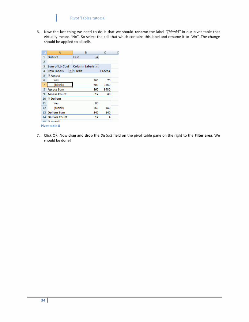
6. Now the last thing we need to do is that we should rename the label “(blank)” in our pivot table that virtually means “No”. So select the cell that which contains this label and rename it to “No”. The change should be applied to all cells.
Pivot table 8
7. Click OK. Now drag and drop the District field on the pivot table pane on the right to the Filter area. We should be done!
Pivot Tables tutorial
35
11) Grouping and dates
In this task you will be grouping the data. Our service manager demands a brand new pivot table. He would like to count how many work orders each single technician handled. But our internal company’s logic is such that we have our technicians divided into two groups:
Team A involves Burton, Linq and Tremblay. Team B on the other hand involves Khan, Michner and Mugford. Managers would like to project this logic into our pivot table. On top of that, we are to include the waiting days in our records and group them by the number of 50.
Since the whole task is a bit tricky, manager provided you with the following schema:
TEAM A
Burton
WAITING DAYS NUMBER OF ORDERS
1-50 120
51-100 84
... ...
Linq 1-50 75
51-100 26
...
....
Totalteam A: 5360
TEAM B
Khan
WAITING DAYS NUMBER OF ORDERS
1-50 254
... ...
Total team B: 4270
I hope that scheme clarified the whole task. So we have to include these fields: LeadTech, Wait and WO. Rows will be composed by Wait and LeadTech, values are WO. Then we will have to group the technicians and group the waiting days together and show relevant totals in the end. We have already done grouping dates and grouping numbers is about the same. So let’s stick to it.
Pivot Tables tutorial
36
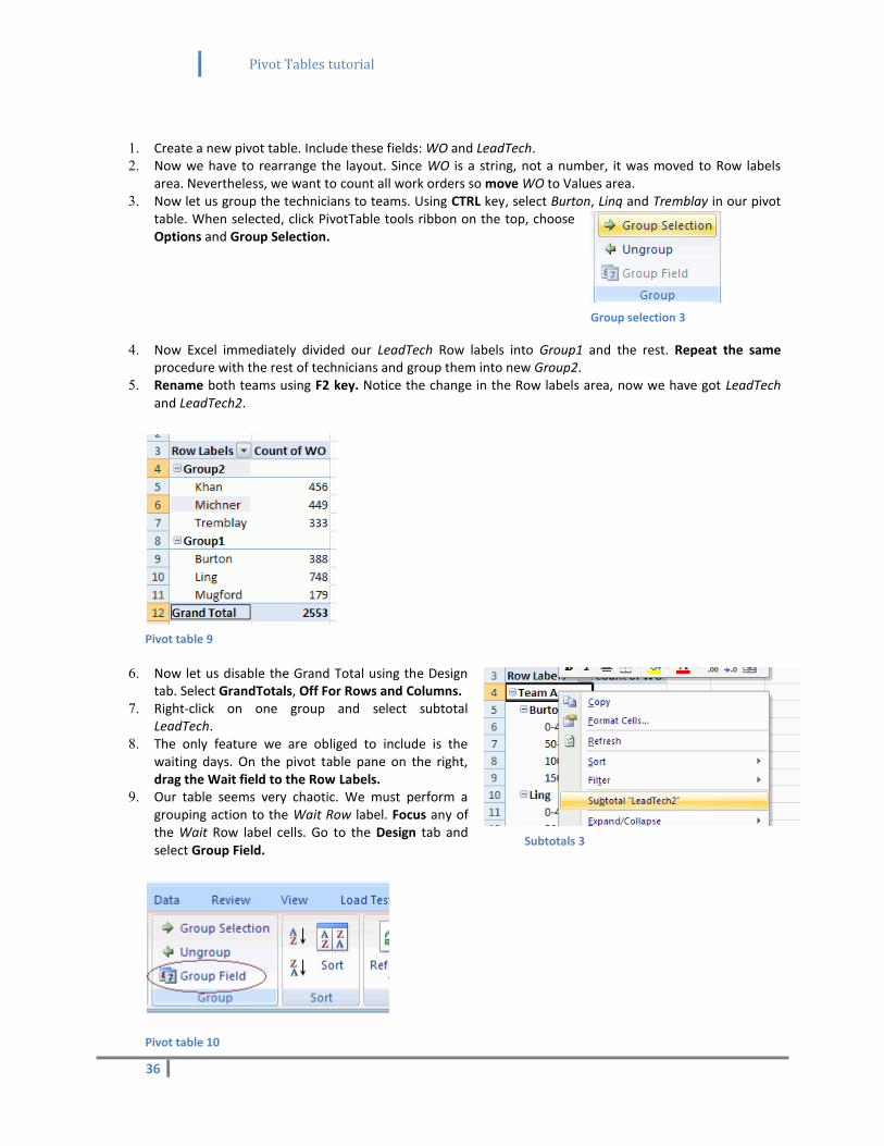
1. Create a new pivot table. Include these fields: WO and LeadTech. 2. Now we have to rearrange the layout. Since WO is a string, not a number, it was moved to Row labels
area. Nevertheless, we want to count all work orders so move WO to Values area. 3. Now let us group the technicians to teams. Using CTRL key, select Burton, Linq and Tremblay in our pivot
table. When selected, click PivotTable tools ribbon on the top, choose Options and Group Selection.
4. Now Excel immediately divided our LeadTech Row labels into Group1 and the rest. Repeat the same procedure with the rest of technicians and group them into new Group2.
5. Rename both teams using F2 key. Notice the change in the Row labels area, now we have got LeadTech and LeadTech2.
Pivot table 9
6. Now let us disable the Grand Total using the Design tab. Select GrandTotals, Off For Rows and Columns.
7. Right-click on one group and select subtotal LeadTech.
8. The only feature we are obliged to include is the waiting days. On the pivot table pane on the right, drag the Wait field to the Row Labels.
9. Our table seems very chaotic. We must perform a grouping action to the Wait Row label. Focus any of the Wait Row label cells. Go to the Design tab and select Group Field.
Pivot table 10
Group selection 3
Subtotals 3
Pivot Tables tutorial
37
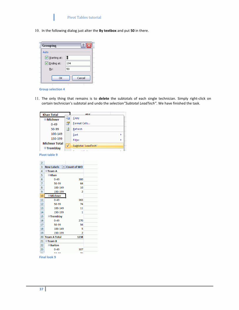
10. In the following dialog just alter the By textbox and put 50 in there.
Group selection 4
11. The only thing that remains is to delete the subtotals of each single technician. Simply right-click on certain technician’s subtotal and undo the selection”Subtotal LeadTech”. We have finished the task.
Pivot table 9
Final look 9
Pivot Tables tutorial
38
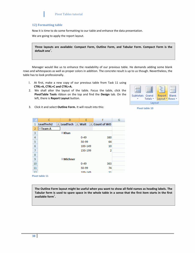
12) Formatting table
Now it is time to do some formatting to our table and enhance the data presentation.
We are going to apply the report layout.
Manager would like us to enhance the readability of our previous table. He demands adding some blank rows and whitespaces as well as proper colors in addition. The concrete result is up to us though. Nevertheless, the table has to look professionally.
1. At first, make a new copy of our previous table from Task 11 using CTRL+A, CTRL+C and CTRL+A.
2. We shall alter the layout of the table. Focus the table, click the PivotTable Tools ribbon on the top and find the Design tab. On the left, there is Report Layout button.
3. Click it and select Outline Form. It will result into this:
Pivot table 11
Three layouts are available: Compact Form, Outline Form, and Tabular Form. Compact Form is the default one
1.
The Outline Form layout might be useful when you want to show all field names as heading labels. The Tabular form is used to spare space in the whole table in a sense that the first item starts in the first available form
1.
Pivot table 10
Pivot Tables tutorial
39
4. Next we are going to add some blank rows into our table. In the Design tab, click the Blank Rows button and Insert Blank Line After Each Item. This will enhance readability.
Pivot table 12
5. Now what we are going to do is that we will make the rows banded in order to improve the look of the table. In the Design Tab check the mark Banded Rows.
Managing pivot table 9
You can make a brand new pivot table style. While in the PivotTable styles, click More arrow and select New PivotTable style. Moreover, you are able to duplicate and modify existing styles by right-clicking on a particular style
1.
Pivot Tables tutorial
40
13) Multiple and advanced filtering
In this task you shall be using multiple filtering and certain advanced features. What manager demands is that he wants to list certain piece of information only about one single technician: Michner. How many hours did he work all in all? He would like to involve labor hours, rush and non-rush jobs in the pivot report. For these work hours which payment was received?
The source data are located in the file WorkOrders_data.txt.
“In addition to this, add another dynamic filter which will provide the report according to date. Please, arrange these filters horizontally, not vertically.”
“Then, sort the records according to the count in the payment type (Account, warranty etc.) from top to down and from left to right.”
“I want you to list the service fields in the pivot table in the following order:”
o Replace o Repair o Assess o Deliver o Install
“Moreover, all districts apart from the “Central” are those I am interested in. So list only North, Northeast and Northwest districts.”
“For empty cells, use the “/” symbol; I don’t want to see any blank cells at all. After we will be done with this, make sure that the pivot table will be automatically refreshed when source data change.”
So, we have got quite a lot of work, don’t you think? At first, we are going to import external data from the text file into the source table.
Afterwards, we need to decide which fields we shall be using: LbrHrs, Service, Rush and Payment. Afterwards, we will supply the report with filters and arrange them as well. By using Custom Lists we are going to change the order of fields.
The next issue is how to assure that we want to list all districts except for the “Central” district. The answer is: using Label Filters. And we will make some formatting and minor changes in the end.
Clear button 1
The rest of the demands (e.g. automatic refresh etc.) we fulfill by PivotTable Options available by right-click. And we are going to arrange the layout table a bit to improve the readability.
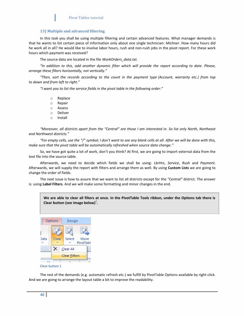
We are able to clear all filters at once. In the PivotTable Tools ribbon, under the Options tab there is Clear button (see image below)
1.
Pivot Tables tutorial
41
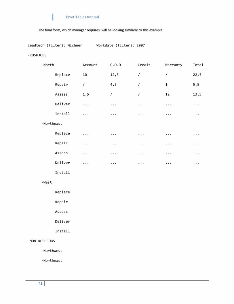
The final form, which manager requires, will be looking similarly to this example:
Leadtech (filter): Michner Workdate (filter): 2007
-RUSHJOBS
-North Account C.O.D Credit Warranty Total
Replace 10 12,5 / / 22,5
Repair / 4,5 / 1 5,5
Assess 1,5 / / 12 13,5
Deliver ... ... ... ... ...
Install ... ... ... ... ...
-Northeast
Replace ... ... ... ... ...
Repair ... ... ... ... ...
Assess ... ... ... ... ...
Deliver ... ... ... ... ...
Install
-West
Replace
Repair
Assess
Deliver
Install
-NON-RUSHJOBS
-Northwest
-Northeast
Pivot Tables tutorial
42
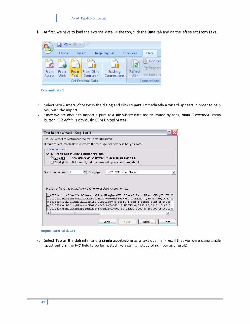
1. At first, we have to load the external data. In the top, click the Data tab and on the left select From Text.
External data 1
2. Select WorkOrders_data.txt in the dialog and click Import. Immediately a wizard appears in order to help
you with the import. 3. Since we are about to import a pure text file where data are delimited by tabs, mark “Delimited” radio
button. File origin is obviously OEM United States.
Import external data 1
4. Select Tab as the delimiter and a single apostrophe as a text qualifier (recall that we were using single apostrophe in the WO field to be formatted like a string instead of number as a result).
Pivot Tables tutorial
43
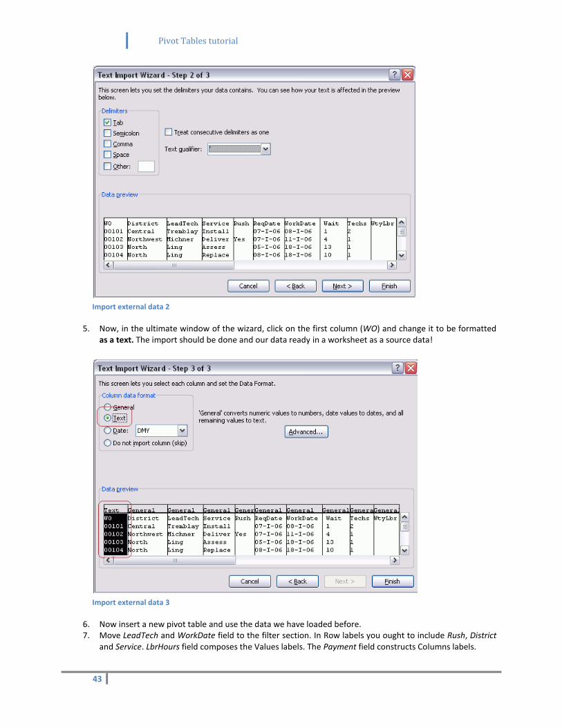
Import external data 2
5. Now, in the ultimate window of the wizard, click on the first column (WO) and change it to be formatted as a text. The import should be done and our data ready in a worksheet as a source data!
Import external data 3
6. Now insert a new pivot table and use the data we have loaded before. 7. Move LeadTech and WorkDate field to the filter section. In Row labels you ought to include Rush, District
and Service. LbrHours field composes the Values labels. The Payment field constructs Columns labels.

Pivot Tables tutorial
44
Pivot design 2
8. Using our filter, select Michner as a technician. 9. OK, now let us improve readability of the whole table. Rename the cells “Yes” and “(blank)” to “Rush” and
“Non-rush” respectively, because that is the correct form we would like to present. 10. Go to the Number Format available from Value Field Settings in the Sum of LbrHrs in the Values labels
and format the data as a number with 1 decimal place. 11. Go to the Design tab, select Report Layout and choose Outline Form, which will hopefully enhance
readability.
.
Managing pivot table 11
12. It would be nice if we could insert some blank lines so let us do it. In the Design tab, click Blank Rows and Insert Blank Line after Each Item.
Managing pivot table 10
Pivot Tables tutorial
45
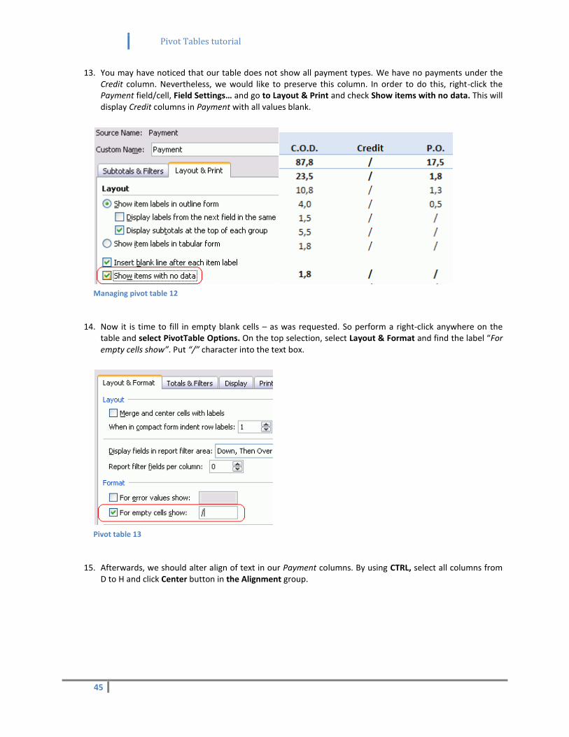
13. You may have noticed that our table does not show all payment types. We have no payments under the Credit column. Nevertheless, we would like to preserve this column. In order to do this, right-click the Payment field/cell, Field Settings… and go to Layout & Print and check Show items with no data. This will display Credit columns in Payment with all values blank.
Managing pivot table 12
14. Now it is time to fill in empty blank cells – as was requested. So perform a right-click anywhere on the
table and select PivotTable Options. On the top selection, select Layout & Format and find the label “For empty cells show”. Put “/” character into the text box.
Pivot table 13
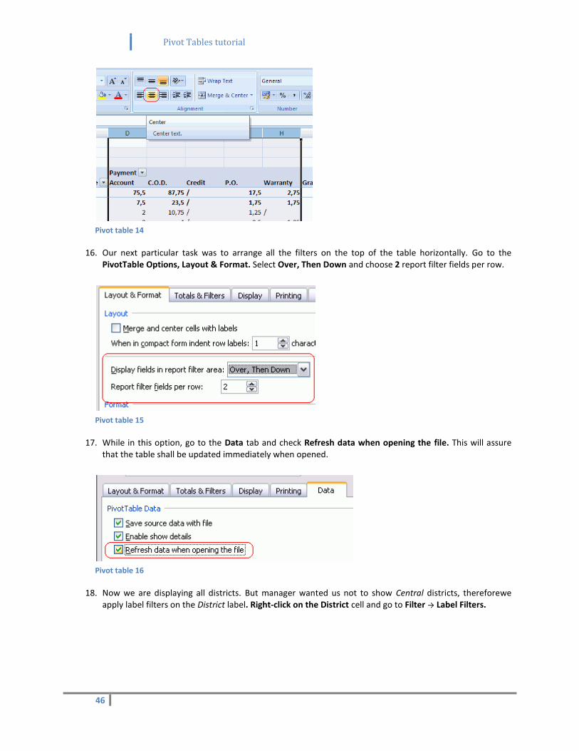
15. Afterwards, we should alter align of text in our Payment columns. By using CTRL, select all columns from
D to H and click Center button in the Alignment group.
Pivot Tables tutorial
46
Pivot table 14
16. Our next particular task was to arrange all the filters on the top of the table horizontally. Go to the PivotTable Options, Layout & Format. Select Over, Then Down and choose 2 report filter fields per row.
Pivot table 15
17. While in this option, go to the Data tab and check Refresh data when opening the file. This will assure that the table shall be updated immediately when opened.
Pivot table 16
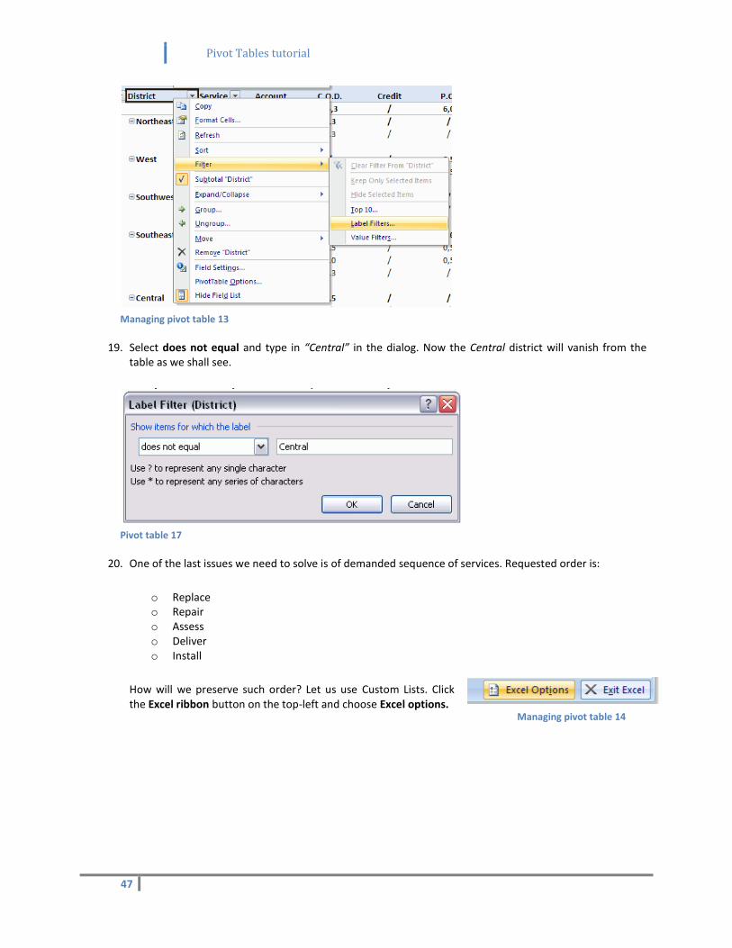
18. Now we are displaying all districts. But manager wanted us not to show Central districts, thereforewe apply label filters on the District label. Right-click on the District cell and go to Filter → Label Filters.
Pivot Tables tutorial
47
Managing pivot table 13
19. Select does not equal and type in “Central” in the dialog. Now the Central district will vanish from the table as we shall see.
Pivot table 17
20. One of the last issues we need to solve is of demanded sequence of services. Requested order is:
o Replace o Repair o Assess o Deliver o Install
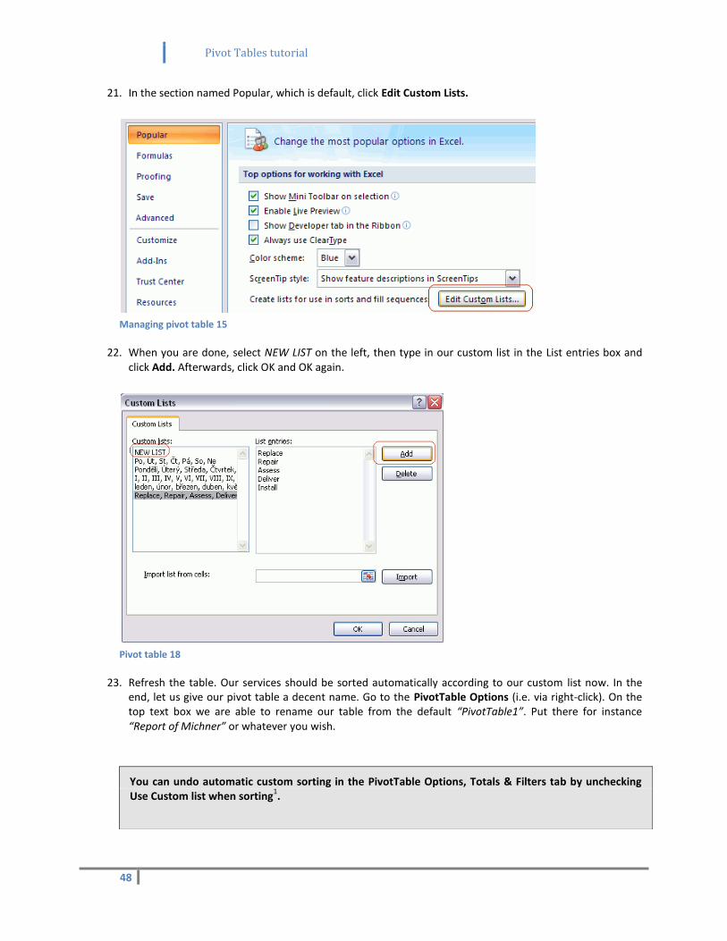
How will we preserve such order? Let us use Custom Lists. Click the Excel ribbon button on the top-left and choose Excel options.
Managing pivot table 14
Pivot Tables tutorial
48
21. In the section named Popular, which is default, click Edit Custom Lists.
Managing pivot table 15
22. When you are done, select NEW LIST on the left, then type in our custom list in the List entries box and click Add. Afterwards, click OK and OK again.
Pivot table 18
23. Refresh the table. Our services should be sorted automatically according to our custom list now. In the end, let us give our pivot table a decent name. Go to the PivotTable Options (i.e. via right-click). On the top text box we are able to rename our table from the default “PivotTable1”. Put there for instance “Report of Michner” or whatever you wish.
You can undo automatic custom sorting in the PivotTable Options, Totals & Filters tab by unchecking Use Custom list when sorting
1.
Pivot Tables tutorial
49
14) Formulas and conditions
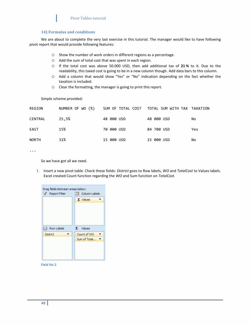
We are about to complete the very last exercise in this tutorial. The manager would like to have following pivot report that would provide following features:
o Show the number of work orders in different regions as a percentage. o Add the sum of total cost that was spent in each region. o If the total cost was above 50.000 USD, then add additional tax of 21 % to it. Due to the
readability, this taxed cost is going to be in a new column though. Add data bars to this column. o Add a column that would show ”Yes” or “No” indication depending on the fact whether the
taxation is included. o Clear the formatting, the manager is going to print this report.
Simple scheme provided:
REGION NUMBER OF WO (%) SUM OF TOTAL COST TOTAL SUM WITH TAX TAXATION
CENTRAL 25,5% 48 000 USD 48 000 USD No
EAST 15% 70 000 USD 84 700 USD Yes
NORTH 31% 15 000 USD 15 000 USD No
...
So we have got all we need.
1. Insert a new pivot table. Check these fields: District goes to Row labels, WO and TotalCost to Values labels. Excel created Count function regarding the WO and Sum function on TotalCost.
Field list 2
Pivot Tables tutorial
50
2. Select Pivot Style Light 1 design in the Design tab.
Pivot design 3
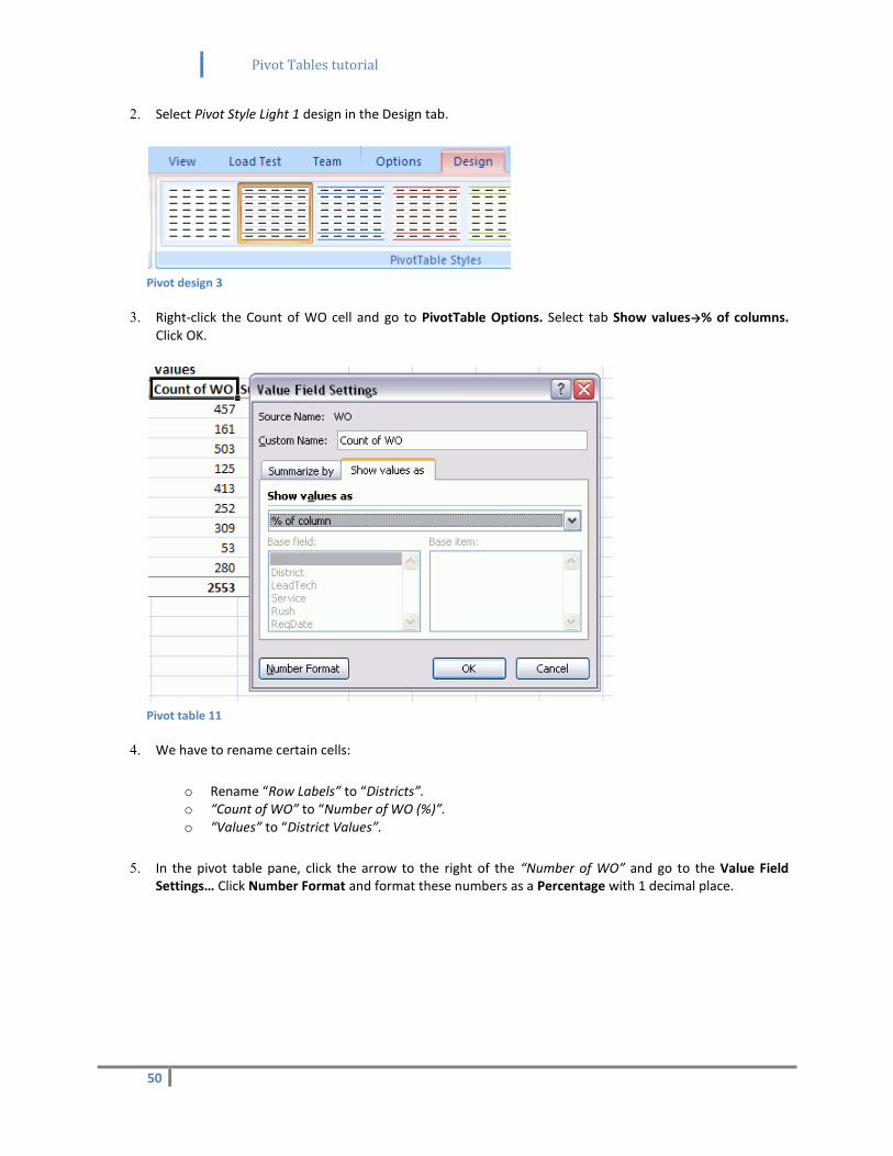
3. Right-click the Count of WO cell and go to PivotTable Options. Select tab Show values→% of columns. Click OK.
Pivot table 11
4. We have to rename certain cells:
o Rename “Row Labels” to “Districts”. o “Count of WO” to “Number of WO (%)”. o “Values” to “District Values”.
5. In the pivot table pane, click the arrow to the right of the “Number of WO” and go to the Value Field Settings… Click Number Format and format these numbers as a Percentage with 1 decimal place.
Pivot Tables tutorial
51
Pivot table 12
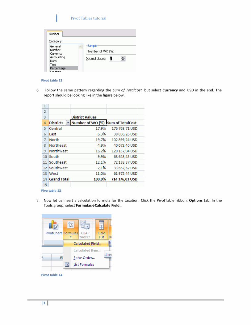
6. Follow the same pattern regarding the Sum of TotalCost, but select Currency and USD in the end. The report should be looking like in the figure below.
Pivo table 13
7. Now let us insert a calculation formula for the taxation. Click the PivotTable ribbon, Options tab. In the Tools group, select Formulas→Calculate Field…
Pivot table 14
Pivot Tables tutorial
52
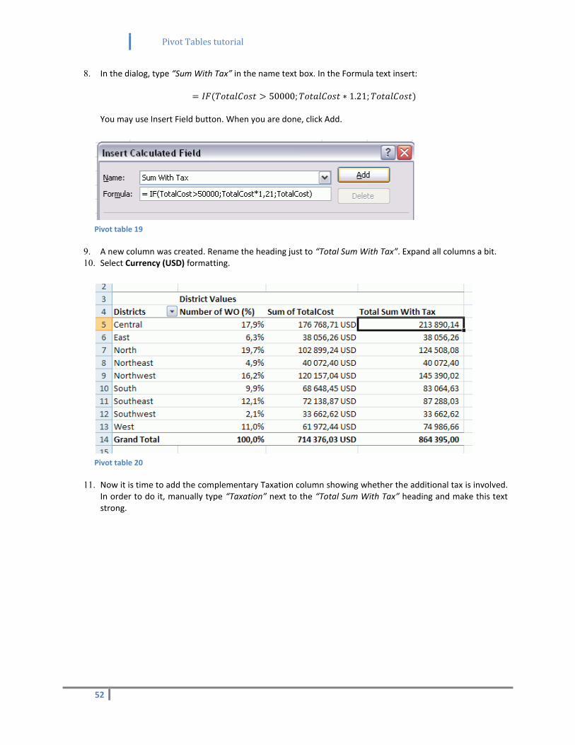
8. In the dialog, type “Sum With Tax” in the name text box. In the Formula text insert:
You may use Insert Field button. When you are done, click Add.
Pivot table 19
9. A new column was created. Rename the heading just to “Total Sum With Tax”. Expand all columns a bit. 10. Select Currency (USD) formatting.
Pivot table 20
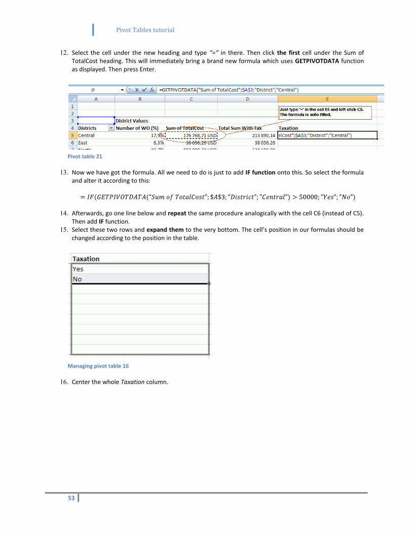
11. Now it is time to add the complementary Taxation column showing whether the additional tax is involved. In order to do it, manually type “Taxation” next to the “Total Sum With Tax” heading and make this text strong.
Pivot Tables tutorial
53
12. Select the cell under the new heading and type “=“ in there. Then click the first cell under the Sum of TotalCost heading. This will immediately bring a brand new formula which uses GETPIVOTDATA function as displayed. Then press Enter.
Pivot table 21
13. Now we have got the formula. All we need to do is just to add IF function onto this. So select the formula and alter it according to this:
14. Afterwards, go one line below and repeat the same procedure analogically with the cell C6 (instead of C5). Then add IF function.
15. Select these two rows and expand them to the very bottom. The cell’s position in our formulas should be changed according to the position in the table.
Managing pivot table 16
16. Center the whole Taxation column.
Pivot Tables tutorial
54
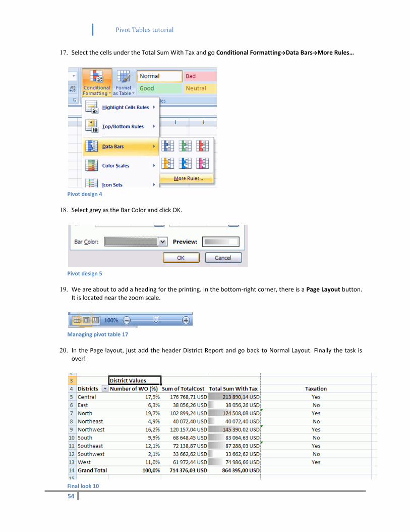
17. Select the cells under the Total Sum With Tax and go Conditional Formatting→Data Bars→More Rules…
Pivot design 4
18. Select grey as the Bar Color and click OK.
Pivot design 5
19. We are about to add a heading for the printing. In the bottom-right corner, there is a Page Layout button. It is located near the zoom scale.
Managing pivot table 17
20. In the Page layout, just add the header District Report and go back to Normal Layout. Finally the task is over!
Final look 10

Pivot Tables tutorial
55
Resources
1. DALGLEISH, Debra. Beginning Pivot Tables in Excel 2007. United States of America : Apress, 2007. 294 p. ISBN 973-1-59059-890-0.
2. Microsoft Office Support : Get started with PivotTable reports in Excel 2007 [online]. 2008 [quoted 2011-06-28]. PivotTable I. Available at WWW: <http://office.microsoft.com/en-us/excel-help/overview-RZ010205886.aspx?section=1>.