Embed Size (px)
Citation preview

Picture Perfect Graphing with Statistical Graphics Procedures
Julie VanBuskirk, MPH Baylor Health Care System
Abstract:
Do you have reports based on SAS/GRAPH procedures, customized with multiple GOPTIONS? Do
you dream of those same graphs existing in a GOPTIONS and Annotate free world? Recreating complex
graphs using Statistical Graphics (SG) procedures is not only possible, but much easier than you think!
Using before and after examples, I will discuss how the graphs were created using the combination of
Proc Template, Graph Template Language (GTL), and the SG procedures. This method produces graphs
that are nearly indistinguishable from the original, with code that has been proven to be reusable across
projects, and is based on one central style template which allows style changes to cascade effortlessly.
I will describe how we were able to mimic the customization of SAS/GRAPH using the
combination of Proc Template, Graph Template Language (GTL), and the SG procedures. The end result
is nearly indistinguishable from the original and the code behind it has proven to be reusable and easier
to update and maintain.
Introduction:
Conversion of existing and working code into newer procedures is generally not high on the
priority list. We found ourselves in a unique position with the time and support to work on updating the
code, however there was a catch. This particular report had also recently gone through a major style
overhaul and was commonly used in corporate presentations or published within hospitals, therefore
there was a need to redesign only the inside. We needed as few changes to the output appearance as
possible for this to work. This was quite a feat!
Luckily we did not have to start from scratch, previously a style sheet that controlled tabular
output had been created. This meant that it only needed to be updated to include style related to graph
elements. These graph styles in the original template will then be called using GTL so that each element
only needs to be defined once, instead of being repeated within each particular graph template. Finally
SG render was used to call the graph template and create the final output. In this paper, I will focus on
the style template elements and graph template that were necessary to recreate horizontal bar charts
and trend charts.
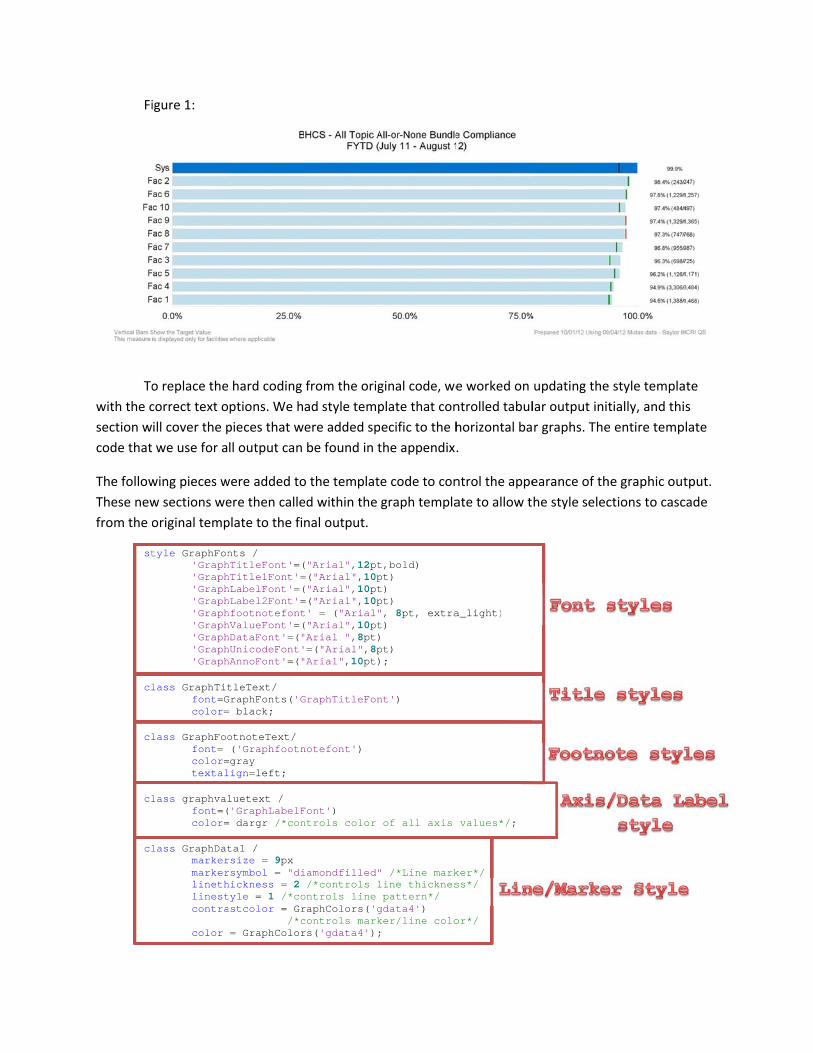
Horizontal Bar Chart:
Since this process is a code redesign only, we already know what we need the final output to
look like. Both the original (figure 1) and the final (figure 2) graphs are shown to allow for comparison
and visualize the similarities between the results. The image in figure 1 is a jpeg image created with Proc
GCHART and GOPTIONS to control the colors, font type, and sizing. Annotate was used to add the red
and green target lines and the data labels on the horizontal bars. The titles, footer, x‐axis, and y‐axis
were all styled by using in‐line style options hard coded into the statements.
Fi
To
with the c
section w
code that
The follow
These new
from the o
st
cl
cl
cl
cl
igure 1:
o replace the
correct text o
ill cover the p
we use for a
wing pieces w
w sections we
original temp
tyle GraphFon'Graph'Graph'Graph'Graph'Graph'Graph'Graph'Graph'Graph
lass GraphTitfont=Gcolor=
lass GraphFoofont= color=textal
lass graphvalfont=(color=
lass GraphDatmarkermarkerlinethlinestcontra
color
hard coding
ptions. We h
pieces that w
ll output can
were added to
ere then calle
plate to the fi
nts / hTitleFont'=(hTitle1Font'=hLabelFont'=(hLabel2Font'=hfootnotefonthValueFont'=(hDataFont'=("hUnicodeFont'hAnnoFont'=("
tleText/ GraphFonts('G= black;
otnoteText/ ('Graphfootn
=gray lign=left;
luetext / ('GraphLabelF= dargr /*con
ta1 / rsize = 9px rsymbol = "dihickness = 2 tyle = 1 /*coastcolor = Gr
/*c= GraphColor
from the orig
ad style temp
ere added sp
be found in t
o the templat
ed within the
nal output.
("Arial",12pt=("Arial",10p("Arial",10pt=("Arial",10pt' = ("Arial"("Arial",10pt"Arial ",8pt)=("Arial",8p
"Arial",10pt)
GraphTitleFon
notefont')
Font') ntrols color
iamondfilled"/*controls l
ontrols line raphColors('gcontrols markrs('gdata4');
ginal code, we
plate that con
ecific to the h
the appendix.
e code to con
graph templa
t,bold) pt) t) pt) ", 8pt, extrat)
pt) ;
nt')
of all axis
" /*Line markline thicknespattern*/
gdata4') ker/line colo;
e worked on
ntrolled tabul
horizontal ba
.
ntrol the appe
ate to allow t
a_light)
values*/;
ker*/ ss*/
or*/
updating the
lar output init
r graphs. The
earance of th
he style selec
e style templa
tially, and thi
e entire temp
he graphic out
ctions to casc
ate
s
late
tput.
cade

Begin by defining the headers and footers.
entrytitle title1/textattrs= Graphtitletext ; entrytitle title2/textattrs= Graphtitletext (weight=normal size=8.5pt) ; entryfootnote halign = right foot1 /textattrs=GraphFootnoteText ; entryfootnote halign=left foot2 foot3 foot4 /textattrs=GraphFootnoteText;
The color changes in the bars were originally handled using GOPTIONS. Using GTL we were able
to take advantage of the attribute map. The attribute maps allows you to map the data values to a specific visual style options. This allowed me to specify all of the facilities and define the color scheme associated with that facility from within the GTL. Shown below is only a subset of the code used to define the map. Adding the option IGNORECASE = True allows the map to match regardless of the case of the text, which is very handy if you work with inconsistent data. The DISCRETEATTRVAR statement is required for the attribute map to be used, ATTVAR will be used as the group option on the horizontal bar to call the map, VAR is the name of the variable where the data resides, and ATTRMAP is the name that you assigned the map. /* define the attribute map and assign the name "symbols" */ discreteattrmap name="FAC_colors" / ignorecase=true ; value "Sys" / fillattrs=(color=CX0073CF) lineattrs=(color=CX0073CF); value "Fac 1" / fillattrs=(color=cxc2deea)
lineattrs=(color=cxc2deea); value "Fac 2" / fillattrs=(color=cxc2deea) lineattrs=(color=cxc2deea); enddiscreteattrmap ; discreteattrvar attrvar=unitcolor var=_location_code2 attrmap="FAC_colors" ;
We will start by drawing in the bar chart. The BARCHARTPARM was chosen in this case because our data was pre‐summarized. First the axis and barcharts were defined. layout overlay / xaxisopts=
(linearopts=(tickvalueformat=_display) display=(TICKVALUES LINE ) tickvalueattrs = Graphvaluetext(size =8pt)
offsetmin = 0 offsetmax = _axis2)
yaxisopts= ( display=(LINE TICKVALUES ) tickvalueattrs = Graphvaluetext(size =8pt))
barchartparm x=_LOCATION_CODE y=_METRIC_VALUE /
group=unitcolor name='bar(h)' orient=horizontal;
Now the targets and data labels need to be added to the graph. In the original graph, both the target lines and data labels were defined using annotate. This functionality could have been replicated using DRAW in GTL, however I used a different approach. Creating variables that contain the data points and using a scatterplot overlay on the horizontal bar chart allows for these images to be added without
Define the format for the tick values
Define the style for the
tick values
Handle alignment options for text
Modify original style from template
Call the attribute map
Change bar orientation

Defi
th
having to an x2 axis
scat
scat
The last st
This has a
statemen
to preven
traditiona
template
dynamic
Now, we
to diamon
ine the x2 axi
hese labels on
specifically ds was defined
x2a
tterplot x=x
tterplot x=s
tep to creatin
already been d
t to the GTL.
nt the use of m
al macro calls,
with data val
c _LOCATI_dat
_axis
can see what
nds the result
is for
nly.
define the loca to create en
axisopts= ( display=offsetmin=
xlabel y=_LOxaxis=x2 markercharmarkerattrmarkerchar
scatter_ref markerattrmarkercolocolormodel
ng a reusable
done through
These variab
macros within
, however in
lues. When th
ION_CODE ta_label s2;
t the final pro
t is very close
ation. The daough space fo
= NONE tick= _axis1 of
OCATION_COD
racter= _dars= Graphvaracterattrs
y=_LOCATIOrs=GraphDatorgradient=l= ThreeCol
template is r
hout the prev
les and value
n the templat
a multi‐user e
his occurs it c
_METRIC_Vtitle1 ti
oduct looks lik
e to the origin
ta labels weror them to pr
kvalueattrsffsetmax = 0
DE /
ata_label aluetext (sis= Graphvalu
ON_CODE / ta1 = traffic lorRamp;
replacing any
vious stateme
es can be defi
te. With single
environment
an cause unp
VALUE _disitle2 foot
ke. Aside from
nal.
re created as rint properly.
= Graphval0 ) ;
ize=8pt) uetext(size
macro variab
ents, and only
ned using the
e user GTL th
these macro
predictable re
splay _LOt1 foot2
m a style choi
Th
us
Con
a variable in
luetext(size
e=8pt) ;
bles with a dy
y requires add
e same statem
here are seldo
os can be over
esults.
OCATION_COfoot3 foo
ce to change
he offset min
ed to define t
The d
a
ntrol the colo
target mark
the dataset a
e =8pt)
ynamic statem
ding the dyna
ment in SGRE
om issues usin
rwritten in th
ODE2 ot4 _axis1
targets from
and max opti
the area for d
data label var
as the scatter
or of the
kers
and
ment.
amic
ENDER
ng
he
1
lines
ions were
data labels.
riable is defin
plot marker
ned

Def
u
Multiple S
The graph
layout sec
plot with
la
Sets the axi
as the d
fines the axis
use in creating
Series Run Ch
h presented a
ction of this G
two y axis.
ayout overyaxis
xaxis
y2axi
serie
serie
is for this line
efault axis
definition to
g the graph
hart:
above is the o
GTL for this pi
rlay / sopts =
(la di
lawe
sopts= (di
isopts = (la
di la wei
esplot x= xpricondisyaxlinmar
esplot x= xpricondisyaxlinmar
e
original versio
ece. To recre
abel = y1_isplay=(tiabelattrseight= bol
isplay =(
abel = y2_isplay=(tiabelattrsight=bold)
x2value y=imary=truennectordersplay=all xis=y2 neattrs= Grkerattrs=
xvalue y=yimary=falsnnectordersplay=all xis=y neattrs= Grkerattrs=
on of a multip
eate this grap
_axis icks tickva= graphfoold))
ticks tick
_axis icks tickva= graphfoo);
= y2value /e r=xvalues
GraphDataDe= GraphData
yvalue / se r=xvalues
GraphDataDe=GraphDataD
ple series tren
h using GTL, w
alues labeotnotetext
kvalues li
alues lineotnotetext
/
efault (paaDefault;
efault (coDefault(co
Define th
axi
nd chart. I will
we will need
el line) t(color= bl
ine))
e label) t(color = c
attern=shor
olor=black)olor=black)
he text for the
is label
l focus on the
to use a serie
lack
cx0073cf
rtdash)
) );
e
Update th
color to m
R
e
es
he axis label
match the line
Reset the linee

This imag
final grap
from the G
image is v
identical t
original o
Refer
M
SA
SA
SA
W
D
e shows the
h output
GTL. The
very close to
to the
utput.
rences:
Mantage, Sanj
AS. Cary, NC.
AS Institute In
AS Institute In
Watts, Perry. D
ata When Th
ay. Heath, Da
SAS Institute
nc. 2009. SAS
nc.
Derby, Nate. S
ere is Too Mu
an. Statistical
e Inc.
S® 9.2 Graph T
Stakana Analy
uch of it to Vi
l Graphics Pro
Template Lan
ytics, Elkins P
isualize; SAS G
ocedures by E
nguage Refere
Park, PA; Usin
Global Forum
Example: Effec
ence, Second
ng SAS GTL to
m 2012 (Paper
ctive Graphs
Edition. Cary
Visualize You
r 262‐2012).
Using
y, NC:
ur

Appendix 1: Proc Template Code
libname b_style "path"; ods path(prepend) b_style.bhcs_styles(update); proc template; define style styles.Baylor_core; parent= styles.Journal; class fonts/ 'TitleFont' = ("Arial", 12pt, Bold)
/*Titles from Title Statements*/ 'TitleFont2' = ("Arial", 10pt) /*Procedure Titles*/ 'StrongFont' = ("Arial", 12pt, Bold) /*page numbers*/ 'EmphasisFont' = ("Arial", 10pt, Italic)
/*Titles for table of contents/table of pages, emphasized header/footer*/
'headingfont' = ("Arial", 10pt, bold) /*table column and row headings and footers, by group headings*/
'headingemphasisfont' = ("Arial", 12pt, bold) 'docfont' = ("Arial", 8pt) /*data in table cells*/ 'footnotefont' = ("Arial", 10pt)
/*footnotes generated with footnote statement*/ 'FixedFont'=("<monospace>, Courier",2)
/*Fonts for processes that require a fixed space font*/ 'BatchFixedFont'=("SAS Monospace,
<monospace>, Courier, monospace",2) 'FixedHeadingFont'=("<monospace>, Courier, monospace",2) 'FixedStrongFont'=(
"<monospace>, Courier, monospace",2,bold) 'FixedEmphasisFont'=(
"<monospace>, Courier, monospace",2,italic) ; style systemfooter from TitlesandFooters / font = Fonts('footnotefont') textalign=left /*Left Justify all footnotes*/ color= grey /*Footnote color*/ ; style GraphFonts / 'GraphTitleFont'=("Arial",12pt,bold) 'GraphTitle1Font'=("Arial",10pt) 'GraphLabelFont'=("Arial",12pt) 'GraphLabel2Font'=("Arial",12pt) 'Graphfootnotefont' = ("Arial", 8pt, extra_light) 'GraphValueFont'=("Arial",10pt) 'GraphDataFont'=("Arial ",8pt) 'GraphUnicodeFont'=("Arial",8pt) 'GraphAnnoFont'=("Arial",10pt); style colors/ 'fg' = black 'fg2' = blue 'fgA1' = cx000000

'bgA1' = cxF0F0F0 'bg2' = black 'fg3' = black 'bg3' = white 'fg4' = black 'bg4' = black 'bg5' = black 'link1' = black 'link2' = blue 'titlefg' = _undef_ 'contentfg' = white 'contentbg' = white 'docbg' = white ; style GraphColors / 'gablock' = cxE0E0E0 'gblock' = cxF2F2F2 'gcclipping' = cx000000 'gclipping' = cxD2D2D2 'gcstars' = cx000000 'gstars' = cxD2D2D2 'gcruntest' = cxA3A3A3 'gruntest' = cxDDDDDD 'gccontrollim' = CXc2deea
/*shewhart control limits background*/ 'gcontrollim' = CXc2deea
/*shewhart control limits background*/ 'gcerror' = cx000000 'gerror' = cxA0A0A0 'gcpredictlim' = cx000000 'gpredictlim' = cxC8C8C8 'gcpredict' = cx000000 'gpredict' = cx000000 'gcconfidence2' = cx000000 'gcconfidence' = cx000000 'gconfidence2' = cxA8A8A8 'gconfidence' = cxC8C8C8 'gcfit2' = cx000000 'gcfit' = cx000000 'gfit2' = cx000000 'gfit' = cx000000 'gcmiss' = cx000000 'gcoutlier' = cx000000 'goutlier' = cxA0A0A0 'gcdata' = cx000000 'gdata' = cxD2D2D2 'ginsetheader' = colors('docbg') 'ginset' = cxFFFFFF 'greferencelines' = gray 'gheader' = colors('docbg') 'gramp3cend' = red /*used by ThreeColorRamp*/ 'gramp3cneutral' = big /*used by ThreeColorRamp*/ 'gramp3cstart' = big /*used by ThreeColorRamp*/ 'gramp2cend' = cxF0F0F0 /*used by TwoColorRamp*/ 'gramp2cstart' = cx5F5F5F /*used by TwoColorRamp*/ 'gconramp3cend' = red /*used by ThreeColorAltRamp*/ 'gconramp3cneutral' = lightskyblue

/*used by ThreeColorAltRamp*/ 'gconramp3cstart' = lightskyblue
/*used by ThreeColorAltRamp*/ 'gconramp2cend' = cx5F5F5F /*used by TwoColorAltRamp*/ 'gconramp2cstart' = cxF0F0F0 /*Used by TwoColorAltRamp*/ 'gtext' = cx000000 'glabel' = cx000000 'gborderlines' = black 'goutlines' = black 'gmiss' = black 'ggrid' = cxECECEC 'gaxis' = gray /*control x,y axis color*/ 'gshadow' = cx000000 'glegend' = cxFFFFFF 'gfloor' = white 'gwalls' = white
/*top and bottom lines surrounding the control chart limits in shewhart*/
'gcdata12' = cx000000 'gcdata11' = cx000000 'gcdata10' = cx000000 'gcdata9' = cx000000 'gcdata8' = cx000000 'gcdata7' = cx000000 'gcdata6' = cx000000 'gcdata5' = cx000000 'gcdata4' = cx000000 'gcdata3' = cx000000 'gcdata2' = cx000000 'gcdata1' = cx000000 'gdata1' = cxc2deea /* Facility Data*/ 'gdata2' = CX0073CF /* System Data*/ 'gdata3' = CXA9DC92 /* Green*/ 'gdata4' = Black /*Black Line color*/ 'gdata5' = CXffb652 /*Orange support color*/ 'gdata6' = cx9cdcd9 /*Teal support color*/ 'gdata7' = cx00a9e0 /*Bright blue support color*/ 'gdata8' = purple /*playing with extra colors*/ 'gdata9' = maroon /*playing with extra colors*/ 'gdata10' = white /*playing with extra colors*/ 'gdata11' = CXe1e1e1 'gdata12' = CX080808 ; Class output/ /*for BCFY12 Production*/ rules=all /*All border lines for table*/ FRAme=box /*Table Border*/ bordercolor=gainsboro /*Border Color - light grey*/ cellspacing= 2 /*No spacing between cells*/ ; class header/ /*Table headers*/ backgroundcolor=CX0073CF /*Baylor Blue heading*/ foreground=white /*Heading text color*/ bordercolor=CX0073CF /*Baylor Blue outline*/ font= ('Arial', 12pt, bold) ; class rowheader/ backgroundcolor = CX0073CF;

replace GraphReference / /*Graph reference line*/ linethickness = 1px linestyle = 1 contrastcolor = GraphColors('greferencelines') ; class GraphTitleText /
/*changes the size and color of the graph title*/ font=GraphFonts('GraphTitleFont') color= black ; class GraphFootnoteText /
/*changes the size and color of the graph footnote*/ font= ('Arial', 8pt) color=gray textalign=left ; class graphlabeltext / /*changes the font and size of the axis labels*/ font=('Arial', 10pt) ; class graphvaluetext /
/*changes the color and font of data values on the axis*/ font=('Arial', 10pt) color= dargr /*changes the color of all axis values*/;
class graphbackground / backgroundcolor= colors ('docbg') color=colors('docbg')/*outside of graph area (behind x&y values)background color*/;
class GraphWalls / linethickness = 1px linestyle = 1
frameborder = off contrastcolor = GraphColors('gaxis') backgroundcolor = GraphColors('gwalls') color = GraphColors('gwalls');
class GraphDataDefault //*controls the marker appearance, must be
within the template (markerattrs)*/ markersize = 9px markersymbol = "circlefilled" /*Line marker style*/ linethickness = 2 /*controls line thickness*/ linestyle = 1 /*controls pattern of line*/ contrastcolor = GraphColors('gdata2')
/*control marker&line color*/; class GraphData1 / markersize = 9px markersymbol = "diamondfilled" /*Line marker style*/ linethickness = 2 /*controls line thickness*/ linestyle = 1 /*controls pattern of line*/ contrastcolor = GraphColors('gdata4')
/*control marker&line color*/ color = GraphColors('gdata4'); class GraphAxisLines / tickdisplay = "outside" /*tickmarks outside of graph area*/

linethickness = 1px contrastcolor = GraphColors('gaxis'); /*controls axis colors - x&y only*/;
class Graphborderlines/ contrastcolor=graphcolors('gdata10'); end; run;
Appendix 2: Horizontal Bar Chart Code
libname b_style "path"; ods path(prepend) b_style.bhcs_styles(update); proc template; define statgraph b_style.baylor_hbar; dynamic _LOCATION_CODE _METRIC_VALUE _display _data_label title1 title2 foot1 foot2 foot3 foot4 _axis1 _axis2; begingraph / backgroundcolor=CXFFFFFF border=false; entrytitle title1/textattrs= Graphtitletext (size=9pt); entrytitle title2/textattrs= Graphtitletext (weight=normal size=8.5pt); entryfootnote halign = right foot1 /textattrs=GraphFootnoteText ; entryfootnote halign=left foot2 foot3 foot4/textattrs=GraphFootnoteText; /* define the attribute map and assign the name "symbols" */ discreteattrmap name="FAC_colors" / ignorecase=true ; value "Sys" / fillattrs=(color=CX0073CF) lineattrs=(color=CX0073CF); value "Fac 1" / fillattrs=(color=cxc2deea)
lineattrs=(color=cxc2deea); value "Fac 2" / fillattrs=(color=cxc2deea) lineattrs=(color=cxc2deea); enddiscreteattrmap ; discreteattrvar attrvar=unitcolor var=_location_code
attrmap= "FAC_colors" ; layout lattice / rowgutter=10 columngutter=10; layout overlay /
xaxisopts=(linearopts=(tickvalueformat=_display) display=(TICKVALUES LINE )
tickvalueattrs = Graphvaluetext(size =8pt) offsetmin = 0 offsetmax = _axis2
) yaxisopts=( display=(LINE TICKVALUES )
tickvalueattrs = Graphvaluetext(size =8pt))x2axisopts= ( display= NONE tickvalueattrs Graphvaluetext(size =8pt) offsetmin= _axis1 offsetmax = 0 );
barchartparm x=_LOCATION_CODE y=_METRIC_VALUE /
yaxis=y group=unitcolor

name='bar(h)' orient=horizontal ; scatterplot x=xlabel y=_LOCATION_CODE /
markercharacter= _data_label markerattrs= Graphvaluetext (size=8pt) markercharacterattrs= Graphvaluetext(size=8pt) xaxis=x2 ;
scatterplot x=scatter_ref y=_LOCATION_CODE /
markerattrs=GraphData1 markercolorgradient= traffic
colormodel= ThreeColorRamp; endlayout; endlayout; endgraph; end; run;
proc sgrender data=dataset_name template= b_style.baylor_hbar ; dynamic title1 = "title1_txt."
title2 = "title2_txt." foot1 = %sysfunc(compbl("footer1_txt.")) foot2 = %sysfunc(compbl("footer2_txt.")) foot3 = %sysfunc(compbl("footer3_txt.")) foot4 = %sysfunc(compbl("footer4_txt.")) _LOCATION_CODE="'location_variable'n" _METRIC_VALUE="'Numeric_value_to_be_graphed'n" _data_label ="'created_data_label_variable'n" _display = "display_format." _axis1 = axis_1_measure _axis2 = axis_2_measure ; run;
Appendix 3: Trend Chart Code
libname b_style "path"; ods path(prepend) b_style.bhcs_styles(update); proc template; define statgraph b_style.baylor_RUNCHART ; dynamic title1 title2 foot1 foot2 foot3 _YAXIS _yaxis2 xvalue yvalue x2value y2value y_label x_label; begingraph /border=false; entrytitle title1 /textattrs= Graphtitletext(weight = bold); entrytitle title2 /textattrs= Graphtitletext(weight=normal); entryfootnote halign= right foot1 halign=left foot2 / textattrs=graphfootnotetext; entryfootnote halign= left foot3 / textattrs=graphfootnotetext; layout overlay /

yaxisopts = (label = _YAXIS display=(ticks tickvalues label line) labelattrs = graphfootnotetext(color= black weight= bold))
xaxisopts= (display =( ticks tickvalues line)) y2axisopts = (label = _yaxis2
display=(ticks tickvalues line label) labelattrs = graphfootnotetext(color = cx0073cf weight=bold));
seriesplot x= x2value y= y2value / primary=true connectorder=xvalues display=all yaxis=y2 lineattrs= GraphDataDefault (pattern=shortdash) markerattrs= GraphDataDefault ;
seriesplot x= xvalue y=yvalue /
primary=false connectorder=xvalues display=all yaxis=y lineattrs= GraphDataDefault (color=black ) markerattrs=GraphDataDefault(color=black);
endlayout; endgraph; end; run; proc sgrender data=data_set_name template= b_style.baylor_RUNCHART; dynamic title1 = "title1_txt" title2 = "title2_txt" foot1 = "footer1_txt" foot2 = "footer2_txt" foot3 = "footer3_txt" _yaxis = "y axis 1 label" _y2axis = "y axis 2 label" xvalue = 'x1 line value var'
yvalue = 'y2 line value var' X2value = 'x2 line value var'
y2value = 'y2 line value var'; run;