Embed Size (px)
DESCRIPTION
Learn how to master photoshop a few steps
Citation preview
ptg6970545
ptg6970545
Education and Curriculum Developer for the National Association of Photoshop Professionals
Corey Barker

ptg6970545
The Photoshop Down & Dirty Tricks for Designers Book Team
CREATIVE DIRECTOR Felix Nelson
ASSOCIATE ART DIRECTOR Jessica Maldonado
TECHNICAL EDITORSKim Doty Cindy Snyder
TRAFFIC DIRECTORKim Gabriel
PRODUCTION MANAGERDave Damstra
STOCK IMAGES COURTESY OFiStockphoto.com fotolia.com
Published By New Riders
Copyright ©2012 by Kelby Corporate Management, Inc.
All rights reserved. No part of this book may be reproduced or transmitted in any form, by any means, electronic or mechanical, including photocopying, recording, or by any information storage and retrieval system, without written permission from the publisher, except for the inclusion of brief quotations in a review.
Composed in Frutiger, Museo, and ITC Script by Kelby Media Group, Inc.
TrademarksAll terms mentioned in this book that are known to be trademarks or service marks have been appropriately capitalized. New Riders cannot attest to the accuracy of this infor mation. Use of a term in the book should not be regarded as affecting the validity of any trademark or service mark.
Photoshop is a registered trademark of Adobe Systems Incorporated.
Warning and DisclaimerThis book is designed to provide information about designing in Adobe Photoshop. Every effort has been made to make this book as complete and as accurate as pos-sible, but no warranty of fitness is implied.
The information is provided on an as-is basis. The author and New Riders shall have neither the liability nor responsibility to any person or entity with respect to any loss or damages arising from the information contained in this book or from the use of the discs or programs that may accompany it.
THIS PRODUCT IS NOT ENDORSED OR SPONSORED BY ADOBE SYSTEMS INCORPORATED, PUBLISHER OF ADOBE PHOTOSHOP.
ISBN 10: 0-321-82049-5 ISBN 13: 978-0-321-82049-5
9 8 7 6 5 4 3 2 1
Printed and bound in the United States of America
www.newriders.com http://kelbytraining.com

ptg6970545
For Blue
ptg6970545
iv
Scott Kelby—�There just aren’t enough good things I can say about Scott Kelby. It was his first Photoshop Down & Dirty Tricks book that lit up my creativity way back when, and now I am honored that he has the confidence in me to carry on the name to a new generation of Photoshop creatives. It is unfair that so few of us can experience the joy of working for such an awesome guy, who has the passion to share the knowl-edge that has made him an inspiration to so many! Thank you Scott!
Mom and Mark—�You guys have always supported everything I ever did with great enthusiasm, and I’ve always enjoyed our movie banter. We’ve all certainly seen life’s ups and downs, but we’ve always known how to make the best of it and look ahead. Thank you for all you’ve done!
Dad and Sue—�You two were there when this all started nearly 20 years ago, when you dropped me off at art school in Sarasota, Florida. It has since been one awesome journey, and I want to thank you for all your help and encouragement along the way.
Shelley Giard—�You inspire me with your determination. You, Zane, Baleigh, and Brie were my cheering section during this whole process and I can’t thank you enough.
Dave Moser—�I can always count on you to have a good military metaphor to fit any situation, and yet as silly as they sound sometimes, you always get the point. Thanks for being a strong leader and great mentor. I, like many others in the company, am quite comfortable knowing you are at the helm.
Felix Nelson—�This man is definitely one of the best digital artists on the planet, and I have always been a fan of his work. Now, we talk movies and Photoshop, and that alone inspires ideas. Thanks for just being awesome!
The Photoshop Guys—�I most definitely have to give a shout out to my fellow Photoshop Guys: Matt Kloskowski, Rafael “RC” Concepcion, Dave Cross, and Pete Collins. You guys are the reason it is fun to come to work every day. Thank you Matt for being a great leader and being the glue of the team. RC, remember the old Layers TV days? Ah, good times! Glad we are able to work together. You are wealth of knowledge. I can always count on Dave Cross to be the rational one of the bunch. Thanks to you for being a good friend and great mentor. Pete, since you just started recently, you get mentioned merely by association, but I’m glad you’re here!
Bert Monroy—�Having been a huge fan of Bert’s work, I never thought I would meet him, and we have since become good friends. You are truly an inspiration and I would not be where I am today without your teachings. Oh, and I am actually in Bert’s Times Square painting, as well. How cool is that?
Cindy Snyder & Kim Doty—�You guys are the real deal. This being my first book, I have only heard about what it is like doing a book with you guys. Now I can see that I cannot think of anyone else I would want to do a book with. You guys are solid pros!
Jessica Maldonado—�Your talents and expertise have made this book look as cool as it could possibly be, from cover to cover. Thanks for all your hard work and design genius!
Adobe Systems, Inc.—�To my good friends at Adobe: Zorana Gee, Russell Brown, and Pete Falco, to name a few. So glad that I have gotten to know all of you, and glad for all the work we have done together over the years.
iStockphoto—�A big thanks to all the folks over at iStockphoto for all their help, especially Brenda Bazylewski for providing me with everything I needed to create the dazzling images you see throughout the book.
New Riders & Peachpit Press—�A big thanks to the entire gang over at Peachpit Press: Ted Waitt, Sara Jane Todd, Gary-Paul Prince, and Scott Cowlin. You guys are the ones that make learning accessible and fun! Keep up all the good work and thank you for this opportunity.
Alicen Rehnert—�You have become a treasured friend, and I knew I could always count on you when I needed a favor. You were always helpful when I was on the seminar tour, and always had a solution for any problem, even when 1,000 miles away.
Tomasz Opasinski—�I have always admired your body of work, both commercial and personal. I thank you for letting me share some of your magic within the pages of this book.
Lastly, a big thanks to the late Steve Jobs. The impact he has made on my career is profound, and I feel fortunate that I was able to experience the impact he had on our world. You were truly a renaissance man.
Acknowledgments
ptg6970545
v
About the AuthorCorey is an Education and Curriculum Developer at the National Association of Photoshop Professionals (NAPP). An award-winning designer and illustrator, Corey is the Executive Producer of the Planet Photoshop website (www.planetphotoshop.com), and has regular columns in Photoshop User magazine. He is also a featured instructor at the Photoshop World Conference & Expo, and is an Adobe MAX Master Instructor. He has taught thou-sands on the Photoshop Down & Dirty Tricks seminar tour, traveling to cities across the country. Corey has produced numerous online training courses and DVDs on Photoshop and design for Kelby Training, and was a contributing author of Photoshop CS4 Down & Dirty Tricks with Scott Kelby. He was also a contributing author of 3D in Photoshop: The Ultimate Guide for Creative Professionals. Corey holds a BFA in Illustration from the Ringling College of Art & Design in Sarasota, Florida.
COREY BARKER
ptg6970545
vi
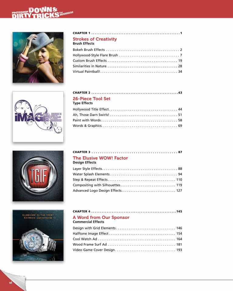
CHAPTER 1 . . . . . . . . . . . . . . . . . . . . . . . . . . . . . . . . . . . . . . . . . . . . . . . . . . . . 1
Strokes of CreativityBrush Effects
Bokeh Brush Effects . . . . . . . . . . . . . . . . . . . . . . . . . . . . . . . . . . . . . . . . 2
Hollywood-Style Flare Brush . . . . . . . . . . . . . . . . . . . . . . . . . . . . . . . . . 7
Custom Brush Effects . . . . . . . . . . . . . . . . . . . . . . . . . . . . . . . . . . . . . . 19
Similarities in Nature . . . . . . . . . . . . . . . . . . . . . . . . . . . . . . . . . . . . . . 28
Virtual Paintball! . . . . . . . . . . . . . . . . . . . . . . . . . . . . . . . . . . . . . . . . . . 34
CHAPTER 2 . . . . . . . . . . . . . . . . . . . . . . . . . . . . . . . . . . . . . . . . . . . . . . . . . . . 43
26-Piece Tool SetType Effects
Hollywood Title Effect . . . . . . . . . . . . . . . . . . . . . . . . . . . . . . . . . . . . 44
Ah, Those Darn Swirls! . . . . . . . . . . . . . . . . . . . . . . . . . . . . . . . . . . . . 51
Paint with Words . . . . . . . . . . . . . . . . . . . . . . . . . . . . . . . . . . . . . . . . 58
Words & Graphics. . . . . . . . . . . . . . . . . . . . . . . . . . . . . . . . . . . . . . . . 69
CHAPTER 3 . . . . . . . . . . . . . . . . . . . . . . . . . . . . . . . . . . . . . . . . . 87
The Elusive WOW! FactorDesign Effects
Layer Style Effects . . . . . . . . . . . . . . . . . . . . . . . . . . . . . . . . . . . . . . . . . 88
Water Splash Elements . . . . . . . . . . . . . . . . . . . . . . . . . . . . . . . . . . . . . 94
Step & Repeat Effects . . . . . . . . . . . . . . . . . . . . . . . . . . . . . . . . . . . . . 110
Compositing with Silhouettes . . . . . . . . . . . . . . . . . . . . . . . . . . . . . . 119
Advanced Logo Design Effects . . . . . . . . . . . . . . . . . . . . . . . . . . . . . . 127
CHAPTER 4 . . . . . . . . . . . . . . . . . . . . . . . . . . . . . . . . . . . . . . . . . . . . . . . . . .145
A Word from Our SponsorCommercial Effects
Design with Grid Elements . . . . . . . . . . . . . . . . . . . . . . . . . . . . . . . . . 146
Halftone Image Effect . . . . . . . . . . . . . . . . . . . . . . . . . . . . . . . . . . . . . 154
Cool Watch Ad . . . . . . . . . . . . . . . . . . . . . . . . . . . . . . . . . . . . . . . . . . . 164
Wood Frame Surf Ad . . . . . . . . . . . . . . . . . . . . . . . . . . . . . . . . . . . . . 181
Video Game Cover Design . . . . . . . . . . . . . . . . . . . . . . . . . . . . . . . . . 193
ptg6970545
vii
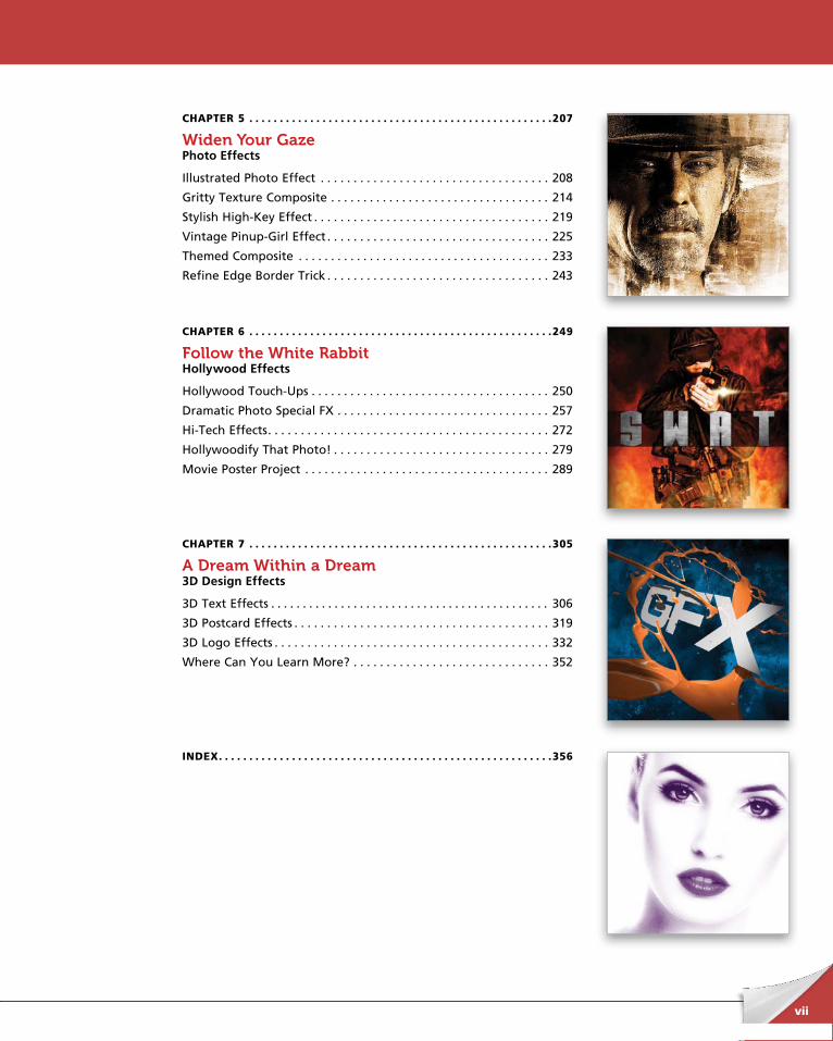
CHAPTER 5 . . . . . . . . . . . . . . . . . . . . . . . . . . . . . . . . . . . . . . . . . . . . . . . . . .207
Widen Your GazePhoto Effects
Illustrated Photo Effect . . . . . . . . . . . . . . . . . . . . . . . . . . . . . . . . . . . 208
Gritty Texture Composite . . . . . . . . . . . . . . . . . . . . . . . . . . . . . . . . . . 214
Stylish High-Key Effect . . . . . . . . . . . . . . . . . . . . . . . . . . . . . . . . . . . . 219
Vintage Pinup-Girl Effect . . . . . . . . . . . . . . . . . . . . . . . . . . . . . . . . . . 225
Themed Composite . . . . . . . . . . . . . . . . . . . . . . . . . . . . . . . . . . . . . . . 233
Refine Edge Border Trick . . . . . . . . . . . . . . . . . . . . . . . . . . . . . . . . . . 243
CHAPTER 6 . . . . . . . . . . . . . . . . . . . . . . . . . . . . . . . . . . . . . . . . . . . . . . . . . .249
Follow the White RabbitHollywood Effects
Hollywood Touch-Ups . . . . . . . . . . . . . . . . . . . . . . . . . . . . . . . . . . . . . 250
Dramatic Photo Special FX . . . . . . . . . . . . . . . . . . . . . . . . . . . . . . . . . 257
Hi-Tech Effects . . . . . . . . . . . . . . . . . . . . . . . . . . . . . . . . . . . . . . . . . . . 272
Hollywoodify That Photo! . . . . . . . . . . . . . . . . . . . . . . . . . . . . . . . . . 279
Movie Poster Project . . . . . . . . . . . . . . . . . . . . . . . . . . . . . . . . . . . . . . 289
CHAPTER 7 . . . . . . . . . . . . . . . . . . . . . . . . . . . . . . . . . . . . . . . . . . . . . . . . . .305
A Dream Within a Dream3D Design Effects
3D Text Effects . . . . . . . . . . . . . . . . . . . . . . . . . . . . . . . . . . . . . . . . . . . . 306
3D Postcard Effects . . . . . . . . . . . . . . . . . . . . . . . . . . . . . . . . . . . . . . . 319
3D Logo Effects . . . . . . . . . . . . . . . . . . . . . . . . . . . . . . . . . . . . . . . . . . 332
Where Can You Learn More? . . . . . . . . . . . . . . . . . . . . . . . . . . . . . . 352
INDEX . . . . . . . . . . . . . . . . . . . . . . . . . . . . . . . . . . . . . . . . . . . . . . . . . . . . . . .356
ptg6970545
viii
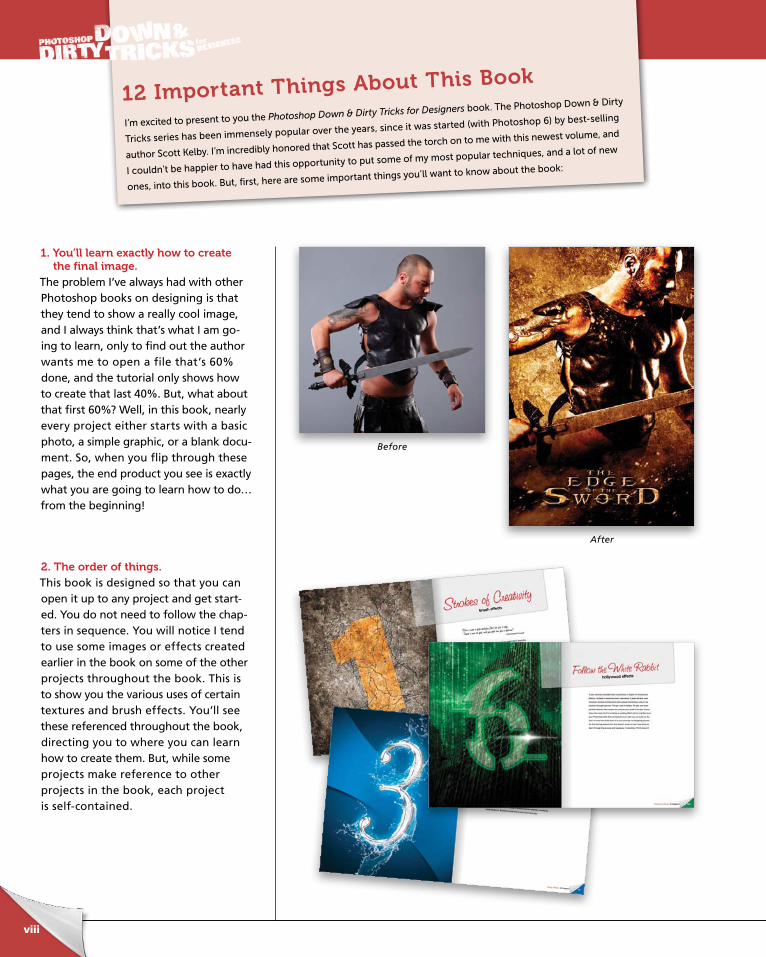
1. You’ll learn exactly how to create the final image.
The problem I’ve always had with other Photoshop books on designing is that they tend to show a really cool image, and I always think that’s what I am go-ing to learn, only to find out the author wants me to open a file that’s 60% done, and the tutorial only shows how to create that last 40%. But, what about that first 60%? Well, in this book, nearly every project either starts with a basic photo, a simple graphic, or a blank docu-ment. So, when you flip through these pages, the end product you see is exactly what you are going to learn how to do…from the beginning!
2. The order of things.This book is designed so that you can open it up to any project and get start-ed. You do not need to follow the chap-ters in sequence. You will notice I tend to use some images or effects created earlier in the book on some of the other projects throughout the book. This is to show you the various uses of certain textures and brush effects. You’ll see these referenced throughout the book, directing you to where you can learn how to create them. But, while some projects make reference to other projects in the book, each project is self-contained.
I’m excited to present to you the Photoshop Down & Dirty Tricks for Designers book. The Photoshop Down & Dirty
Tricks series has been immensely popular over the years, since it was started (with Photoshop 6) by best-selling
author Scott Kelby. I’m incredibly honored that Scott has passed the torch on to me with this newest volume, and
I couldn’t be happier to have had this opportunity to put some of my most popular techniques, and a lot of new
ones, into this book. But, first, here are some important things you’ll want to know about the book:
12 Important Things About This Book
Before
After

ptg6970545
ix
3. The D&D Designer’s Kit.As a supplement to the book, I’ve created a Down & Dirty Designer’s Kit (http://kelbytraining.com/books /cs5dd/), featuring the start-up files for all of the projects throughout the book. I also added a few video tutori-als that expand on certain concepts, especially for the 3D chapter. They will help you get a better idea of how the effects were created and modified. Also, make sure you check the website every so often for updates. If a new feature is released or added, I may up-date a project or chapter and place a new video or PDF file on the website.
4. What about the fonts?Like in previous editions of this book series, I tried to use common fonts available on most systems. But, in some designs, I used specialized fonts just to finish the effect. I have provided some fonts as part of the D&D Designer’s Kit downloads, but would also encourage you to go beyond what’s used in the projects and try other typefaces. One great resource for free fonts to experi-ment with is www.dafont.com.
ptg6970545
x
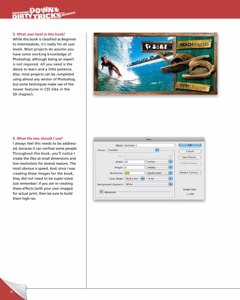
5. What user level is this book?While this book is classified as Beginner to Intermediate, it’s really for all user levels. Most projects do assume you have some working knowledge of Photo shop, although being an expert is not required. All you need is the desire to learn and a little patience. Also, most projects can be completed using almost any version of Photoshop, but some techniques make use of the newer features in CS5 (like in the 3D chapter).
6. What file size should I use?I always feel this needs to be address-ed, because it can confuse some people. Throughout this book, you’ll notice I create the files at small dimensions and low resolutions for several reasons. The most obvious is speed. And, since I was creating these images for the book, they did not need to be super-sized. Just remember: if you are re-creating these effects (with your own images) for actual print, then be sure to build them high-res.
ptg6970545
xi
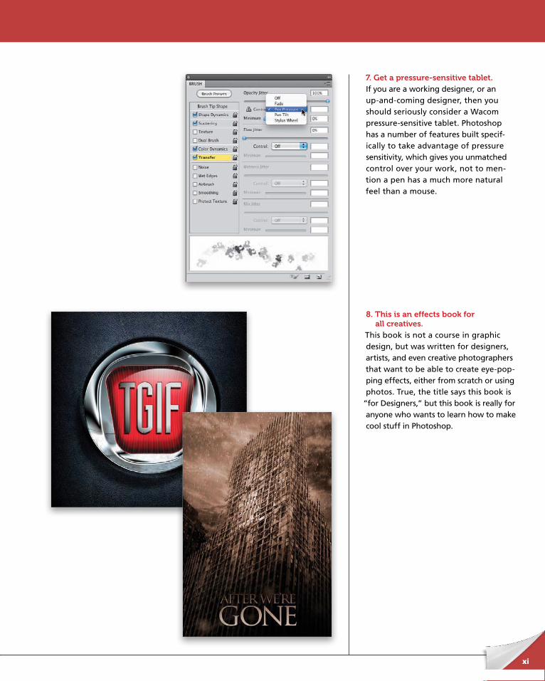
7. Get a pressure-sensitive tablet.If you are a working designer, or an up-and-coming designer, then you should seriously consider a Wacom pressure-sensitive tablet. Photoshop has a number of features built specif-ically to take advantage of pressure sensitivity, which gives you unmatched control over your work, not to men-tion a pen has a much more natural feel than a mouse.
8. This is an effects book for all creatives.
This book is not a course in graphic design, but was written for designers, artists, and even creative photogra phers that want to be able to create eye-pop-ping effects, either from scratch or using photos. True, the title says this book is
“for Designers,” but this book is really for anyone who wants to learn how to make cool stuff in Photoshop.
ptg6970545
xii
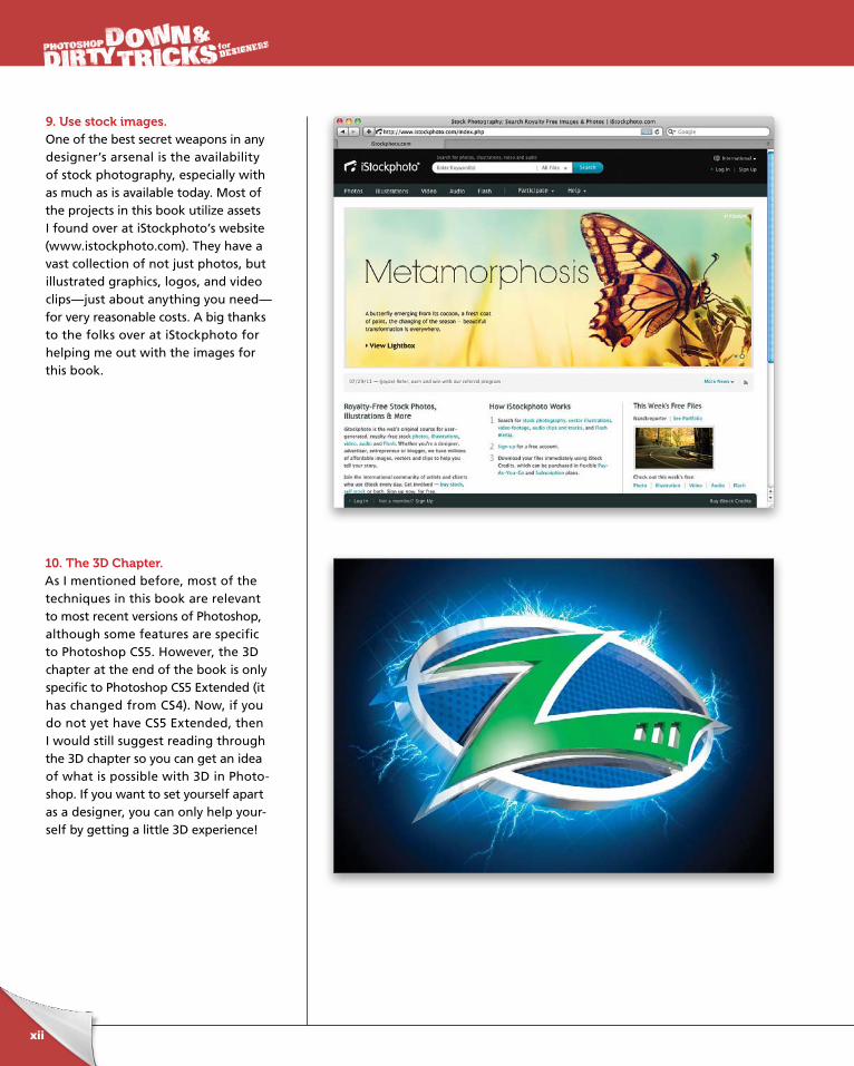
9. Use stock images.One of the best secret weapons in any designer’s arsenal is the availability of stock photography, especially with as much as is available today. Most of the projects in this book utilize assets I found over at iStockphoto’s website (www.istockphoto.com). They have a vast collection of not just photos, but illustrated graphics, logos, and video clips—just about anything you need—for very reasonable costs. A big thanks to the folks over at iStockphoto for helping me out with the images for this book.
10. The 3D Chapter.As I mentioned before, most of the techniques in this book are relevant to most recent versions of Photoshop, although some features are specific to Photoshop CS5. However, the 3D chapter at the end of the book is only specific to Photoshop CS5 Extended (it has changed from CS4). Now, if you do not yet have CS5 Extended, then I would still suggest reading through the 3D chapter so you can get an idea of what is possible with 3D in Photo-shop. If you want to set yourself apart as a designer, you can only help your-self by getting a little 3D experience!
ptg6970545
xiii
11. Experiment, experiment, experiment!While I do encourage you to follow the projects in the book step by step, be sure to experiment with your newfound knowledge. Think of these projects as a vehicle for a real project you’re working on. Chances are most of you won’t actu-ally be creating a movie poster or title effect, but that doesn’t mean that the concepts can’t be applied to your own projects. Master the technique, and then add your own flavor to it. Most of the ef-fects in this book were created through my own experimentation, both from things I’ve seen or things I just thought would look cool.
12. Be creative and have fun!Finally, I just want to thank you for taking the leap forward and making this small investment in your creativity. Sometimes, just seeing what is possible is enough to light up your creative brain to new ideas. That is one of the reasons I had the final images in this book made as large as possible, so you can really take in what the final result is and get inspired. I hope you enjoy the fun times to be had within these pages and remember to be creative and have fun!
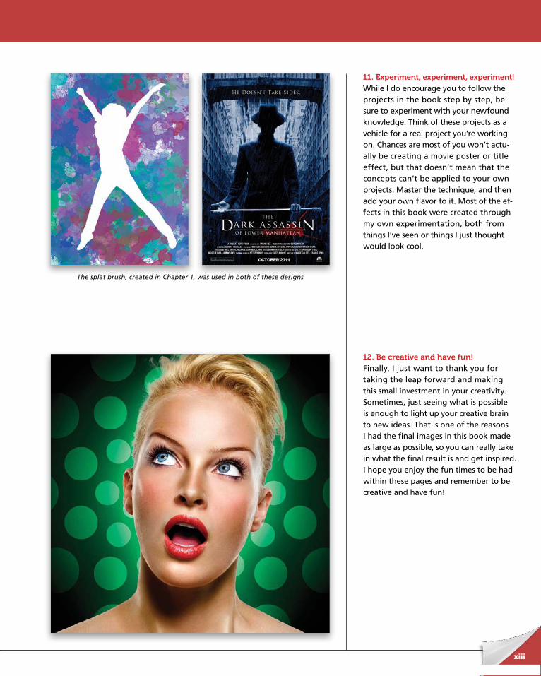
The splat brush, created in Chapter 1, was used in both of these designs
ptg6970545
ptg6970545
“Give a man a fish and you feed him for a day. Teach a man to fish and you feed him for a lifetime.”
—Old Chinese Proverb
I like the quote above, because it sums up nicely what I think about the
brush engine in Photoshop. You can indeed follow a tutorial step by step
and end up with what someone intended, and that would be it. You can
also follow a tutorial and then take what you learned and go further by
experimenting with other features and settings. Thus, you will feed your
creativity for a lifetime. As you go through this chapter, and through the
rest of this book, for that matter, try to keep in mind to go out of your mind.
What I mean is that you should think beyond the obvious use for the
things you see here, and contemplate other directions by experimenting.
Have fun fishing!
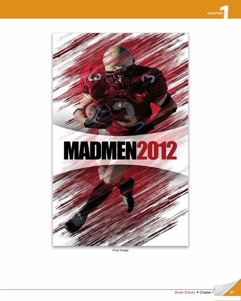
Strokes of Creativitybrush effects
1Chapter 1Brush Effects
ptg6970545
2 Chapter 1 Brush Effects
chapter 1
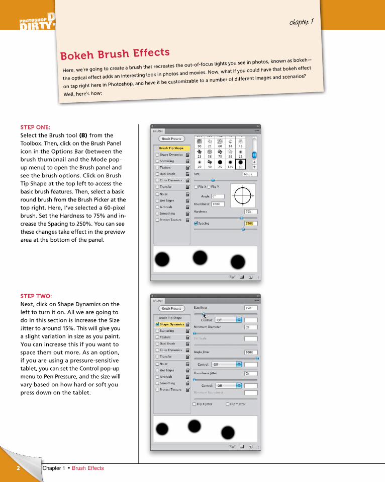
Bokeh Brush Effects
Here, we’re going to create a brush that recreates the out-of-focus lights you see in photos, known as bokeh—
the optical effect adds an interesting look in photos and movies. Now, what if you could have that bokeh effect
on tap right here in Photoshop, and have it be customizable to a number of different images and scenarios?
Well, here’s how:
STEP ONE:Select the Brush tool (B) from the Toolbox. Then, click on the Brush Panel icon in the Options Bar (between the brush thumbnail and the Mode pop-up menu) to open the Brush panel and see the brush options. Click on Brush Tip Shape at the top left to access the basic brush features. Then, select a basic round brush from the Brush Picker at the top right. Here, I’ve selected a 60-pixel brush. Set the Hardness to 75% and in-crease the Spacing to 250%. You can see these changes take effect in the preview area at the bottom of the panel.
STEP TWO:Next, click on Shape Dynamics on the left to turn it on. All we are going to do in this section is increase the Size Jitter to around 15%. This will give you a slight variation in size as you paint. You can increase this if you want to space them out more. As an option, if you are using a pressure-sensitive tablet, you can set the Control pop-up menu to Pen Pressure, and the size will vary based on how hard or soft you press down on the tablet.
ptg6970545
3Chapter 1Brush Effects
Continued
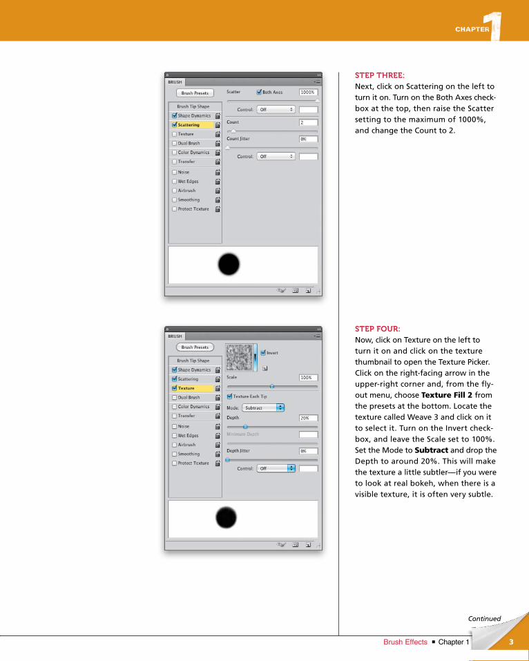
STEP THREE:Next, click on Scattering on the left to turn it on. Turn on the Both Axes check-box at the top, then raise the Scatter setting to the maximum of 1000%, and change the Count to 2.
STEP FOUR:Now, click on Texture on the left to turn it on and click on the texture thumbnail to open the Texture Picker. Click on the right-facing arrow in the upper-right corner and, from the fly-out menu, choose Texture Fill 2 from the presets at the bottom. Locate the texture called Weave 3 and click on it to select it. Turn on the Invert check-box, and leave the Scale set to 100%. Set the Mode to Subtract and drop the Depth to around 20%. This will make the texture a little subtler—if you were to look at real bokeh, when there is a visible texture, it is often very subtle.
ptg6970545
4 Chapter 1 Brush Effects
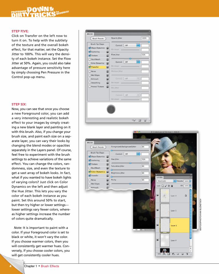
STEP FIVE:Click on Transfer on the left now to turn it on. To help with the subtlety of the texture and the overall bokeh effect, for that matter, set the Opacity Jitter to 100%. This will vary the densi-ty of each bokeh instance. Set the Flow Jitter at 50%. Again, you could also take advantage of pressure sensitivity here by simply choosing Pen Pressure in the Control pop-up menu.
STEP SIX:Now, you can see that once you choose a new Foreground color, you can add a very interesting and realistic bokeh effect to your images by simply creat-ing a new blank layer and painting on it with this brush. Also, if you change your brush size, and paint each size on a sep-arate layer, you can vary their looks by changing the blend modes or opacities separately in the Layers panel. Of course, feel free to experiment with the brush settings to achieve variations of the same effect. You can change the colors, ran-domness, size, and even the texture to get a vast array of bokeh looks. In fact, what if you wanted to have bokeh lights of varying colors? Just click on Color Dynamics on the left and then adjust the Hue Jitter. This lets you vary the color of each bokeh instance as you paint. Set this around 50% to start, but then try higher or lower settings—lower settings vary fewer colors, where-as higher settings increase the number of colors quite dramatically.
Note: It is important to paint with a color. If your Foreground color is set to black or white, it won’t vary the color. If you choose warmer colors, then you will consistently get warmer hues. Con-versely, if you choose cooler colors, you will get consistently cooler hues.
©IS
TO
CK
PH
OT
O/IV
AN
BLI
ZN
ET
SO
V
ptg6970545
5Chapter 1Brush Effects
Continued
STEP SEVEN:Now that you’ve created the brush, you may want to save it for future use, so you don’t have to go through this process every time. I tend to use this brush a lot, and not always for a bokeh effect. I’ll vary the settings and use it on a layer mask to create a stylish mask-ing effect, or paint with straight, solid colors for a more graphic effect. It was experimenting with these settings that helped me develop this bokeh effect in the first place!
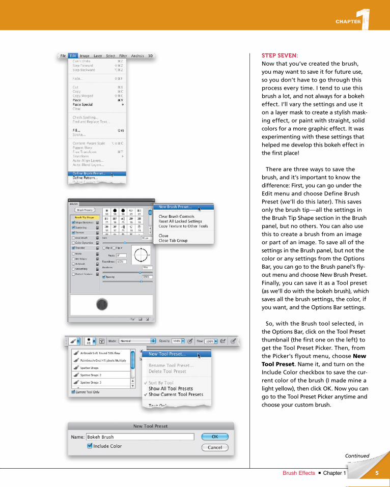
There are three ways to save the brush, and it’s important to know the difference: First, you can go under the Edit menu and choose Define Brush Preset (we’ll do this later). This saves only the brush tip—all the settings in the Brush Tip Shape section in the Brush panel, but no others. You can also use this to create a brush from an image or part of an image. To save all of the settings in the Brush panel, but not the color or any settings from the Options Bar, you can go to the Brush panel’s fly-out menu and choose New Brush Preset. Finally, you can save it as a Tool preset (as we’ll do with the bokeh brush), which saves all the brush settings, the color, if you want, and the Options Bar settings.
So, with the Brush tool selected, in the Options Bar, click on the Tool Preset thumbnail (the first one on the left) to get the Tool Preset Picker. Then, from the Picker’s flyout menu, choose New Tool Preset. Name it, and turn on the Include Color checkbox to save the cur-rent color of the brush (I made mine a light yellow), then click OK. Now you can go to the Tool Preset Picker anytime and choose your custom brush.
ptg6970545
6
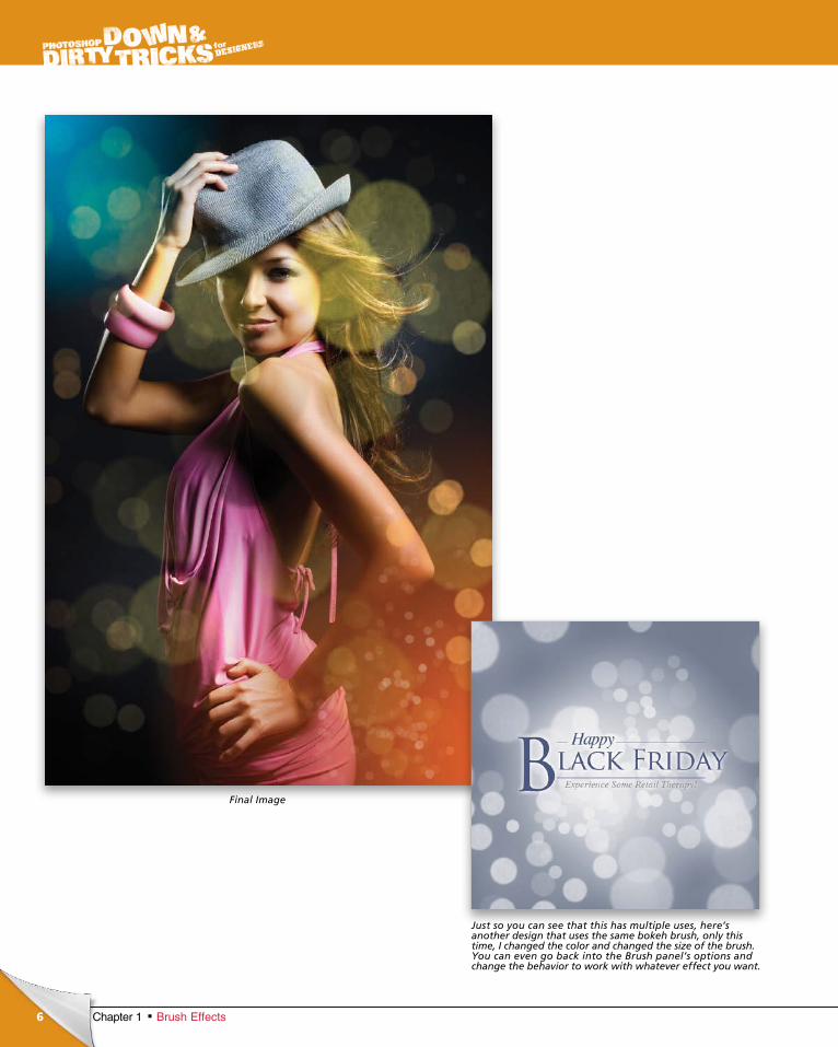
Final Image
Chapter 1 Brush Effects
Just so you can see that this has multiple uses, here’s another design that uses the same bokeh brush, only this time, I changed the color and changed the size of the brush. You can even go back into the Brush panel’s options and change the behavior to work with whatever effect you want.
ptg6970545
7Chapter 1Brush Effects
Continued
chapter 1
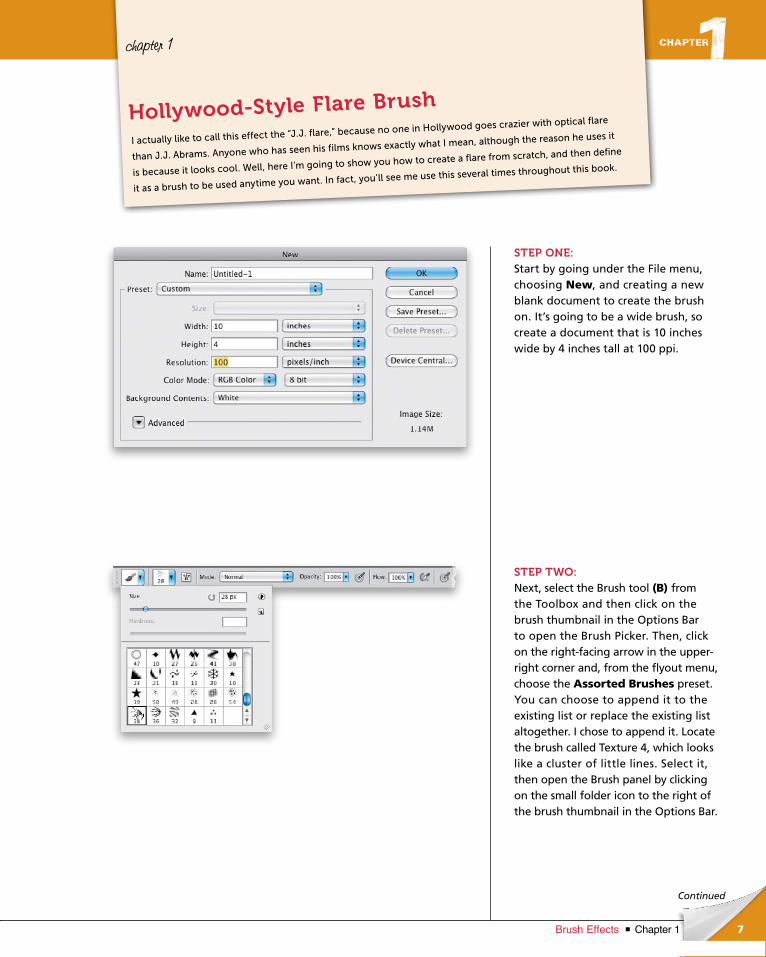
STEP ONE:Start by going under the File menu, choosing New, and creating a new blank document to create the brush on. It’s going to be a wide brush, so create a document that is 10 inches wide by 4 inches tall at 100 ppi.
STEP TWO:Next, select the Brush tool (B) from the Toolbox and then click on the brush thumbnail in the Options Bar to open the Brush Picker. Then, click on the right-facing arrow in the upper-right corner and, from the fly out menu, choose the Assorted Brushes preset. You can choose to append it to the existing list or replace the existing list altogether. I chose to append it. Locate the brush called Tex ture 4, which looks like a cluster of little lines. Select it, then open the Brush panel by clicking on the small folder icon to the right of the brush thumb nail in the Options Bar.
I actually like to call this effect the “J.J. flare,” because no one in Hollywood goes crazier with optical flare
than J.J. Abrams. Anyone who has seen his films knows exactly what I mean, although the reason he uses it
is because it looks cool. Well, here I’m going to show you how to create a flare from scratch, and then define
it as a brush to be used anytime you want. In fact, you’ll see me use this several times throughout this book.
Hollywood-Style Flare Brush
ptg6970545
8 Chapter 1 Brush Effects
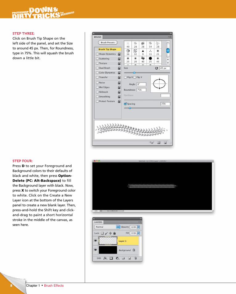
STEP THREE:Click on Brush Tip Shape on the left side of the panel, and set the Size to around 45 px. Then, for Roundness, type in 75%. This will squash the brush down a little bit.
STEP FOUR:Press D to set your Foreground and Back ground colors to their defaults of black and white, then press Option-Delete (PC: Alt-Backspace) to fill the Background layer with black. Now, press X to switch your Foreground color to white. Click on the Create a New Layer icon at the bottom of the Layers panel to create a new blank layer. Then, press-and-hold the Shift key and click-and-drag to paint a short horizontal stroke in the middle of the canvas, as seen here.
ptg6970545
9Chapter 1Brush Effects
Continued
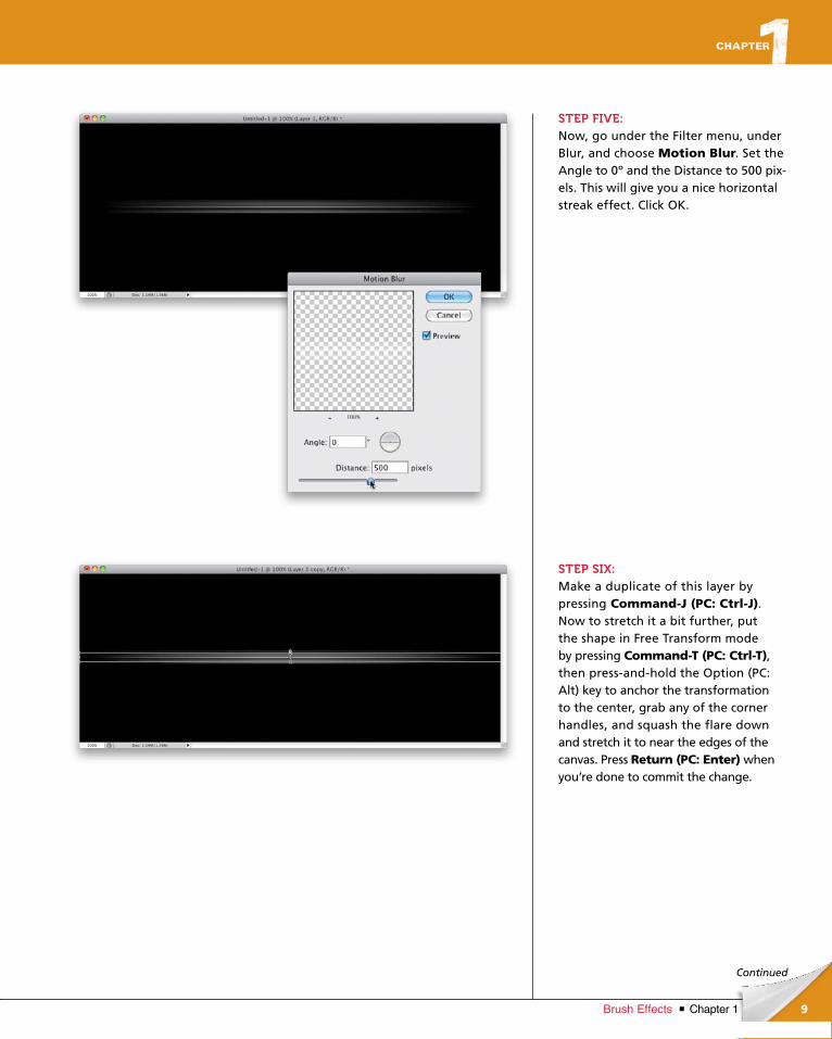
STEP FIVE:Now, go under the Filter menu, under Blur, and choose Motion Blur. Set the Angle to 0º and the Distance to 500 pix-els. This will give you a nice horizontal streak effect. Click OK.
STEP SIX:Make a duplicate of this layer by pressing Command-J (PC: Ctrl-J). Now to stretch it a bit further, put the shape in Free Transform mode by pressing Command-T (PC: Ctrl-T), then press-and-hold the Option (PC: Alt) key to anchor the transformation to the center, grab any of the corner handles, and squash the flare down and stretch it to near the edges of the canvas. Press Return (PC: Enter) when you’re done to commit the change.
ptg6970545
10 Chapter 1 Brush Effects
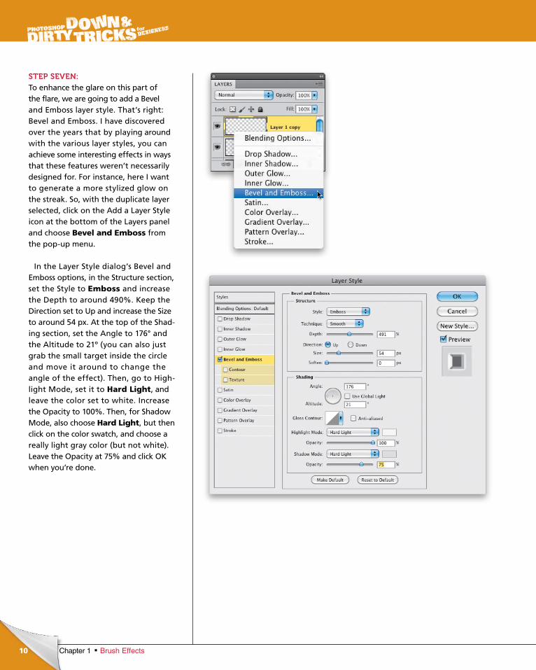
STEP SEVEN:To enhance the glare on this part of the flare, we are going to add a Bevel and Emboss layer style. That’s right: Bevel and Emboss. I have discovered over the years that by playing around with the various layer styles, you can achieve some interesting effects in ways that these features weren’t necessarily designed for. For instance, here I want to generate a more stylized glow on the streak. So, with the duplicate layer selected, click on the Add a Layer Style icon at the bottom of the Layers panel and choose Bevel and Emboss from the pop-up menu.
In the Layer Style dialog’s Bevel and Emboss options, in the Structure section, set the Style to Emboss and increase the Depth to around 490%. Keep the Direction set to Up and increase the Size to around 54 px. At the top of the Shad-ing section, set the Angle to 176° and the Altitude to 21º (you can also just grab the small target inside the circle and move it around to change the angle of the effect). Then, go to High-light Mode, set it to Hard Light, and leave the color set to white. Increase the Opacity to 100%. Then, for Shadow Mode, also choose Hard Light, but then click on the color swatch, and choose a really light gray color (but not white). Leave the Opacity at 75% and click OK when you’re done.
ptg6970545
11Chapter 1Brush Effects
Continued
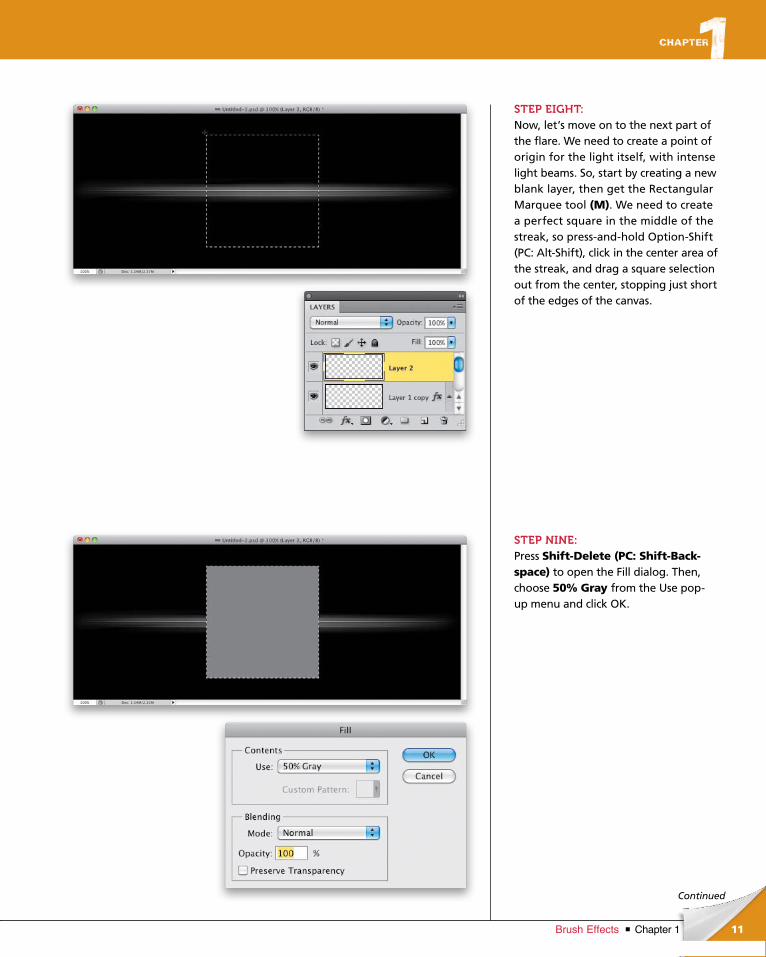
STEP EIGHT:Now, let’s move on to the next part of the flare. We need to create a point of origin for the light itself, with intense light beams. So, start by creating a new blank layer, then get the Rectangular Marquee tool (M). We need to create a perfect square in the middle of the streak, so press-and-hold Option-Shift (PC: Alt-Shift), click in the center area of the streak, and drag a square selection out from the center, stopping just short of the edges of the canvas.
STEP NINE:Press Shift-Delete (PC: Shift-Back-space) to open the Fill dialog. Then, choose 50% Gray from the Use pop- up menu and click OK.
ptg6970545
12 Chapter 1 Brush Effects
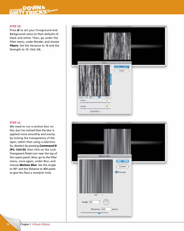
STEP 10:Press D to set your Foreground and Background colors to their defaults of black and white. Then, go under the Filter menu, under Render, and choose Fibers. Set the Variance to 16 and the Strength to 10. Click OK.
STEP 11:We need to run a motion blur on this, but I’ve noticed that the blur is applied more smoothly and evenly by locking the transparency of the layer, rather than using a selection. So, deselect by pressing Command-D (PC: Ctrl-D), then click on the Lock Transparent Pixels icon near the top of the Layers panel. Now, go to the Filter menu, once again, under Blur, and choose Motion Blur. Set the Angle to 90º and the Distance to 400 pixels to give the flare a streakier look.
ptg6970545
13Chapter 1Brush Effects
Continued
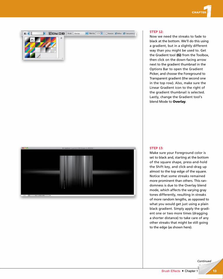
STEP 12:Now we need the streaks to fade to black at the bottom. We’ll do this using a gradient, but in a slightly different way than you might be used to. Get the Gradient tool (G) from the Toolbox, then click on the down-facing arrow next to the gradient thumbnail in the Options Bar to open the Gradient Pick er, and choose the Foreground to Trans parent gradient (the second one in the top row). Also, make sure the Linear Gradient icon to the right of the gradient thumbnail is selected. Lastly, change the Gradient tool’s blend Mode to Overlay.
STEP 13:Make sure your Foreground color is set to black and, starting at the bottom of the square shape, press-and-hold the Shift key, and click-and-drag up almost to the top edge of the square. Notice that some streaks remained more prominent than others. This ran-domness is due to the Overlay blend mode, which affects the varying gray tones differently, resulting in streaks of more random lengths, as opposed to what you would get just using a plain black gradient. Simply apply the gradi-ent one or two more times (dragging a shorter distance) to take care of any other streaks that might be still going to the edge (as shown here).
ptg6970545
14 Chapter 1 Brush Effects
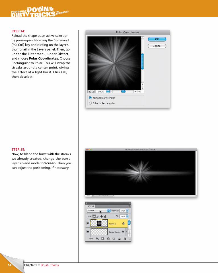
STEP 14:Reload the shape as an active selection by pressing-and-holding the Command (PC: Ctrl) key and clicking on the layer’s thumbnail in the Layers panel. Then, go under the Filter menu, under Distort, and choose Polar Coordinates. Choose Rectangular to Polar. This will wrap the streaks around a center point, giving the effect of a light burst. Click OK, then deselect.
STEP 15:Now, to blend the burst with the streaks we already created, change the burst layer’s blend mode to Screen. Then you can adjust the positioning, if necessary.
ptg6970545
15Chapter 1Brush Effects
Continued
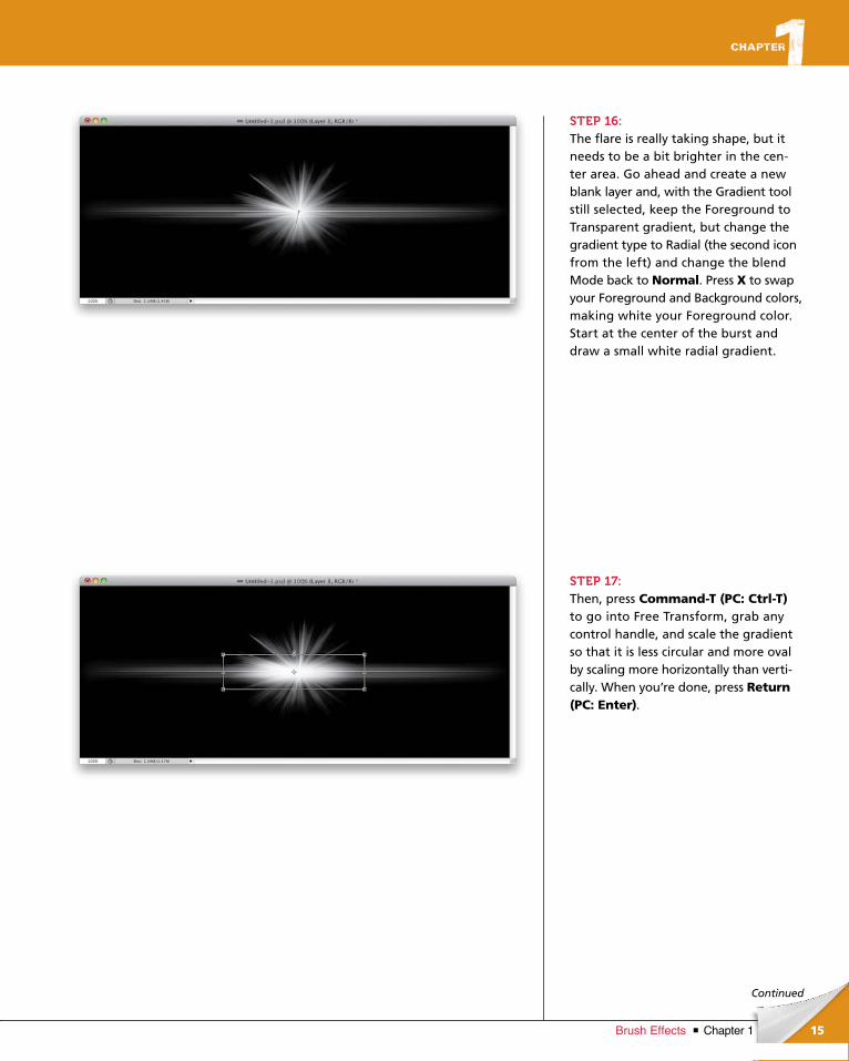
STEP 16:The flare is really taking shape, but it needs to be a bit brighter in the cen-ter area. Go ahead and create a new blank layer and, with the Gradi ent tool still selected, keep the Foreground to Transparent gradient, but change the gradient type to Radial (the second icon from the left) and change the blend Mode back to Normal. Press X to swap your Foreground and Background colors, making white your Foreground color. Start at the center of the burst and draw a small white radial gradient.
STEP 17:Then, press Command-T (PC: Ctrl-T) to go into Free Transform, grab any control handle, and scale the gradient so that it is less circular and more oval by scaling more horizontally than verti-cally. When you’re done, press Return (PC: Enter).
ptg6970545
16 Chapter 1 Brush Effects
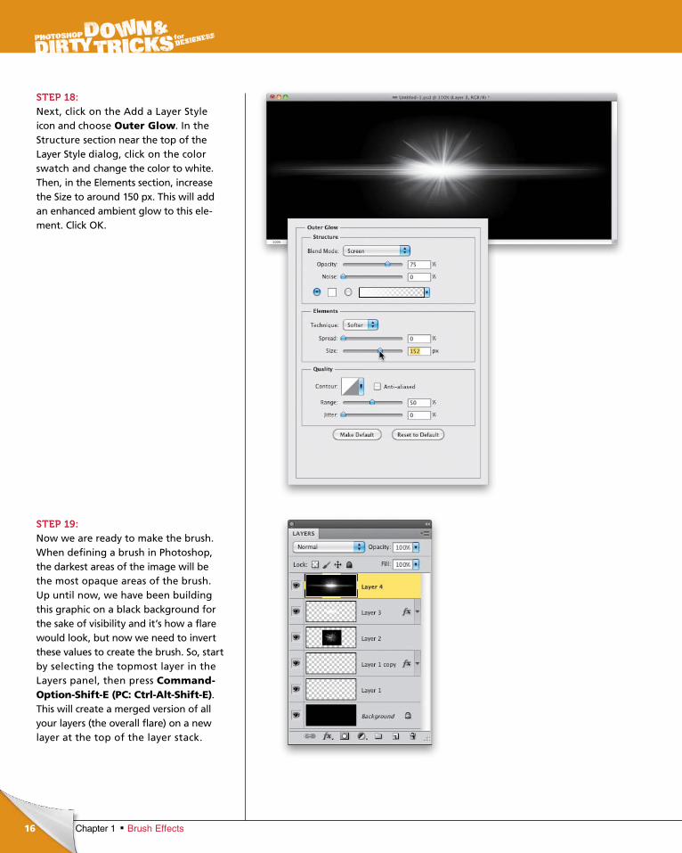
STEP 18:Next, click on the Add a Layer Style icon and choose Outer Glow. In the Structure section near the top of the Layer Style dialog, click on the color swatch and change the color to white. Then, in the Elements section, increase the Size to around 150 px. This will add an enhanced ambient glow to this ele-ment. Click OK.
STEP 19:Now we are ready to make the brush. When defining a brush in Photoshop, the darkest areas of the image will be the most opaque areas of the brush. Up until now, we have been building this graphic on a black background for the sake of visibility and it’s how a flare would look, but now we need to invert these values to create the brush. So, start by selecting the topmost layer in the Layers panel, then press Command-Option-Shift-E (PC: Ctrl-Alt-Shift-E). This will create a merged version of all your layers (the overall flare) on a new layer at the top of the layer stack.
ptg6970545
17Chapter 1Brush Effects
Continued
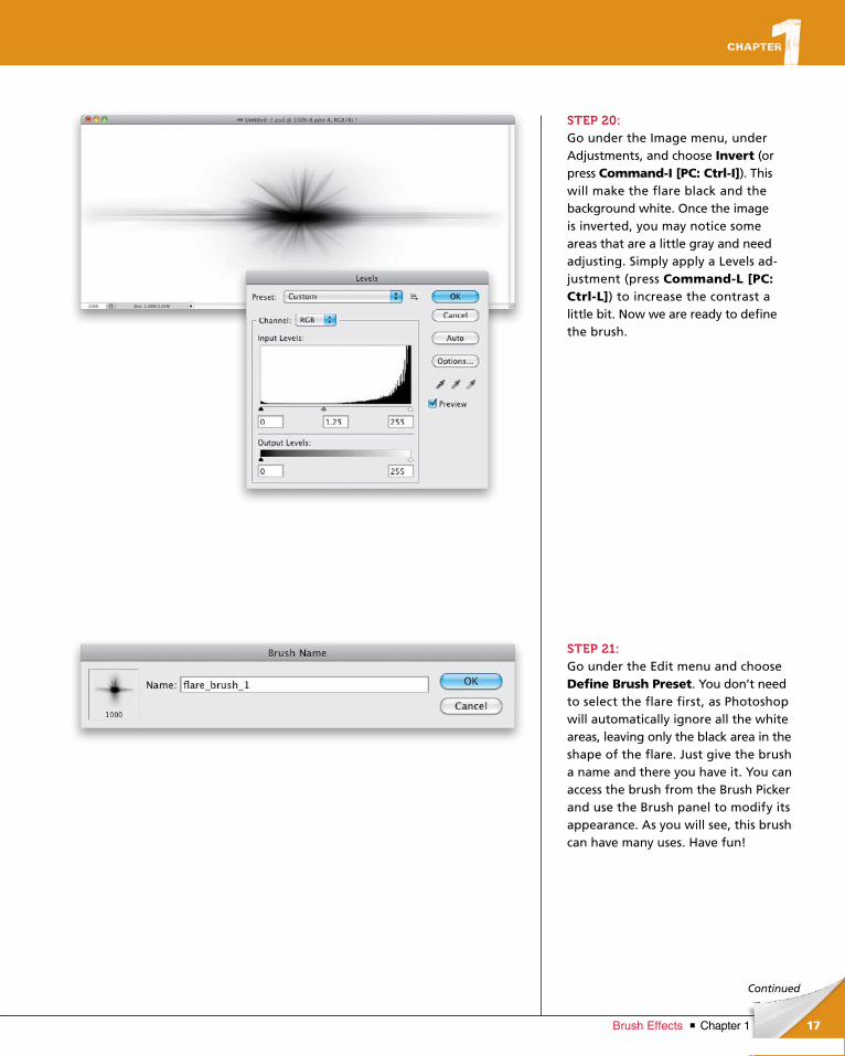
STEP 20:Go under the Image menu, under Adjustments, and choose Invert (or press Command-I [PC: Ctrl-I]). This will make the flare black and the background white. Once the image is inverted, you may notice some areas that are a little gray and need adjusting. Simply apply a Levels ad-justment (press Command-L [PC: Ctrl-L]) to increase the contrast a little bit. Now we are ready to define the brush.
STEP 21:Go under the Edit menu and choose Define Brush Preset. You don’t need to select the flare first, as Photoshop will automatically ignore all the white areas, leaving only the black area in the shape of the flare. Just give the brush a name and there you have it. You can access the brush from the Brush Picker and use the Brush panel to modify its appearance. As you will see, this brush can have many uses. Have fun!
ptg6970545
18
©F
OT
OLI
A/Y
UG
AN
OV
KO
NS
TAN
TIN
©IS
TO
CK
PH
OT
O/IC
ON
OG
EN
IC
Chapter 1 Brush Effects
Final Image
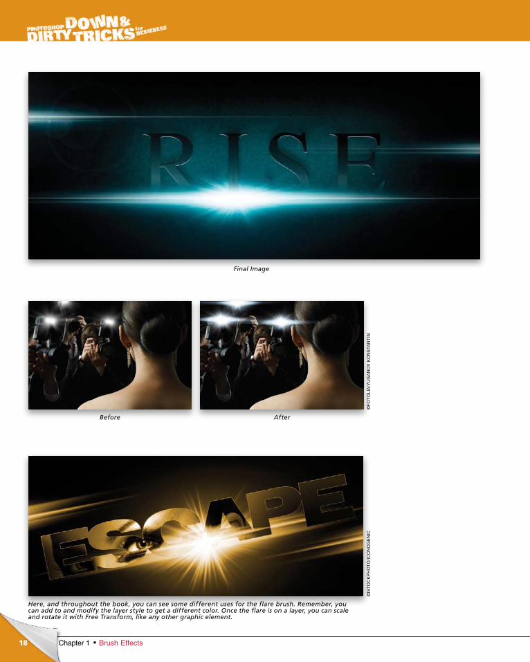
Here, and throughout the book, you can see some different uses for the flare brush. Remember, you can add to and modify the layer style to get a different color. Once the flare is on a layer, you can scale and rotate it with Free Transform, like any other graphic element.
AfterBefore
ptg6970545
19Chapter 1Brush Effects
Continued
chapter 1
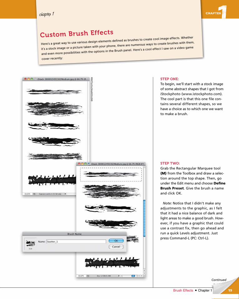
STEP ONE:To begin, we’ll start with a stock image of some abstract shapes that I got from iStockphoto (www.istockphoto.com). The cool part is that this one file con-tains several different shapes, so we have a choice as to which one we want to make a brush.
STEP TWO:Grab the Rectangular Marquee tool (M) from the Toolbox and draw a selec-tion around the top shape. Then, go under the Edit menu and choose Define Brush Preset. Give the brush a name and click OK.
Note: Notice that I didn’t make any adjustments to the graphic, as I felt that it had a nice balance of dark and light areas to make a good brush. How-ever, if you have a graphic that could use a contrast fix, then go ahead and run a quick Levels adjustment. Just press Command-L (PC: Ctrl-L).
Here’s a great way to use various design elements defined as brushes to create cool image effects. Whether
it’s a stock image or a picture taken with your phone, there are numerous ways to create brushes with them,
and even more possibilities with the options in the Brush panel. Here’s a cool effect I saw on a video game
cover recently:
Custom Brush Effects
©IS
TO
CK
PH
OT
O/T
UJA
66
ptg6970545
20
©IS
TO
CK
PH
OT
O/J
AS
ON
LU
GO
Chapter 1 Brush Effects
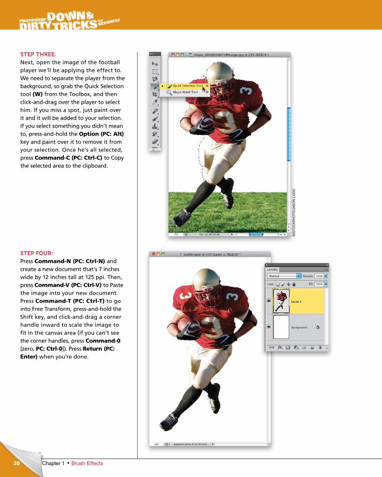
STEP THREE:Next, open the image of the football player we’ll be applying the effect to. We need to separate the player from the background, so grab the Quick Selection tool (W) from the Toolbox, and then click-and-drag over the player to select him. If you miss a spot, just paint over it and it will be added to your selection. If you select something you didn’t mean to, press-and-hold the Option (PC: Alt)key and paint over it to remove it from your selection. Once he’s all selected, press Command-C (PC: Ctrl-C) to Copy the selected area to the clipboard.
STEP FOUR:Press Command-N (PC: Ctrl-N) and create a new document that’s 7 inches wide by 12 inches tall at 125 ppi. Then, press Command-V (PC: Ctrl-V) to Paste the image into your new document. Press Command-T (PC: Ctrl-T) to go into Free Transform, press-and-hold the Shift key, and click-and-drag a corner handle inward to scale the image to fit in the canvas area (if you can’t see the corner handles, press Command-0 [zero, PC: Ctrl-0]). Press Return (PC: Enter) when you’re done.
ptg6970545
21Chapter 1Brush Effects
Continued
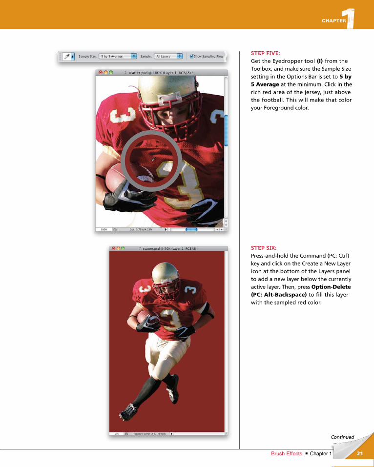
STEP FIVE:Get the Eyedropper tool (I) from the Toolbox, and make sure the Sample Size setting in the Options Bar is set to 5 by 5 Average at the minimum. Click in the rich red area of the jersey, just above the football. This will make that color your Foreground color.
STEP SIX:Press-and-hold the Command (PC: Ctrl) key and click on the Create a New Layer icon at the bottom of the Layers panel to add a new layer below the currently active layer. Then, press Option-Delete (PC: Alt-Backspace) to fill this layer with the sampled red color.
ptg6970545
22 Chapter 1 Brush Effects
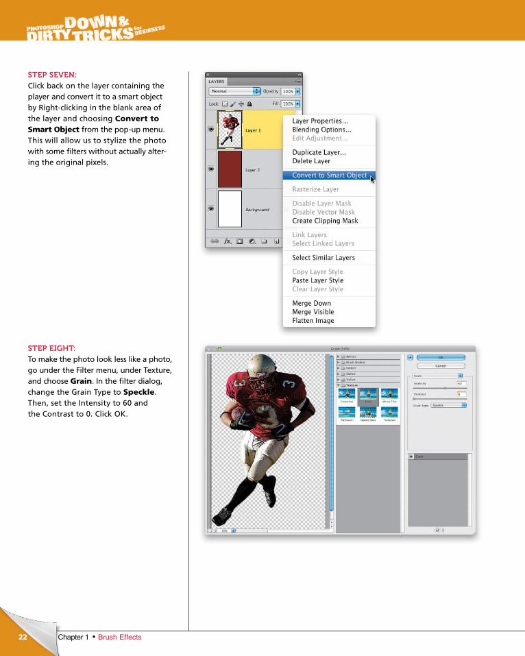
STEP SEVEN:Click back on the layer containing the player and convert it to a smart object by Right-clicking in the blank area of the layer and choosing Convert to Smart Object from the pop-up menu. This will allow us to stylize the photo with some filters without actually alter-ing the original pixels.
STEP EIGHT:To make the photo look less like a photo, go under the Filter menu, under Texture, and choose Grain. In the filter dialog, change the Grain Type to Speckle. Then, set the Intensity to 60 and the Contrast to 0. Click OK.
ptg6970545
23Chapter 1Brush Effects
Continued
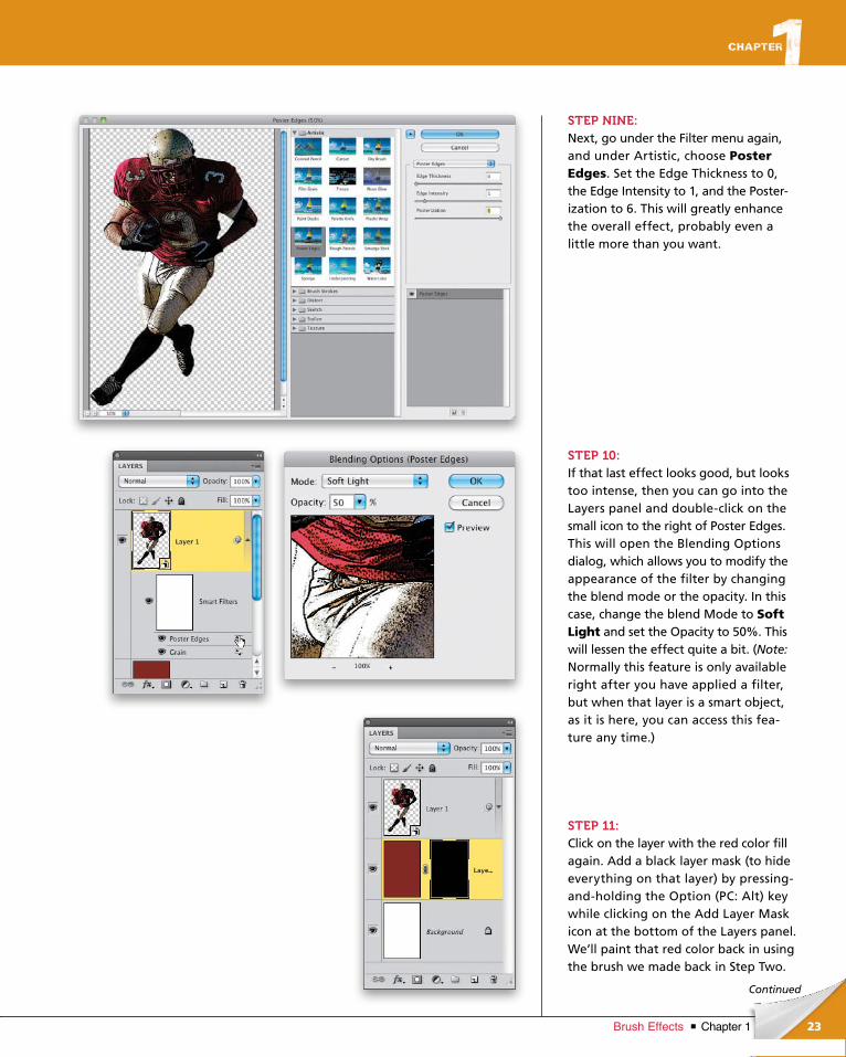
STEP NINE:Next, go under the Filter menu again, and under Artistic, choose Poster Edges. Set the Edge Thickness to 0, the Edge Intensity to 1, and the Poster-ization to 6. This will greatly enhance the overall effect, probably even a little more than you want.
STEP 10:If that last effect looks good, but looks too intense, then you can go into the Layers panel and double-click on the small icon to the right of Poster Edges. This will open the Blending Options dialog, which allows you to modify the appearance of the filter by changing the blend mode or the opacity. In this case, change the blend Mode to Soft Light and set the Opacity to 50%. This will lessen the effect quite a bit. (Note: Normally this feature is only available right after you have applied a filter, but when that layer is a smart object, as it is here, you can access this fea-ture any time.)
STEP 11:Click on the layer with the red color fill again. Add a black layer mask (to hide everything on that layer) by pressing-and-holding the Option (PC: Alt) key while clicking on the Add Layer Mask icon at the bottom of the Layers panel. We’ll paint that red color back in using the brush we made back in Step Two.
ptg6970545
24 Chapter 1 Brush Effects
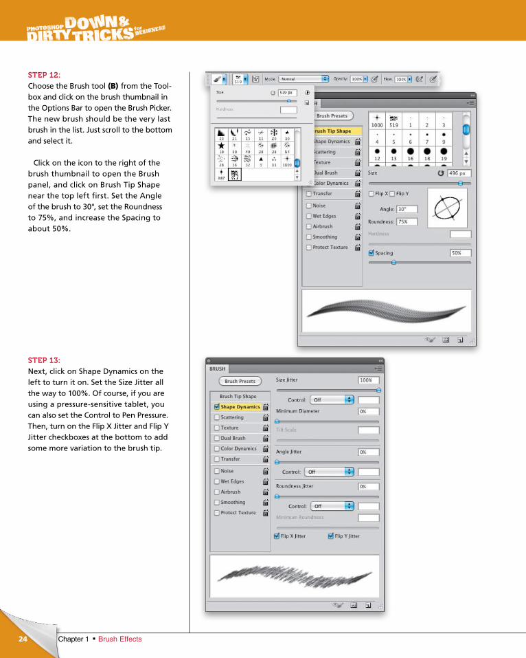
STEP 12:Choose the Brush tool (B) from the Tool-box and click on the brush thumbnail in the Options Bar to open the Brush Picker. The new brush should be the very last brush in the list. Just scroll to the bottom and select it.
Click on the icon to the right of the brush thumbnail to open the Brush panel, and click on Brush Tip Shape near the top left first. Set the Angle of the brush to 30°, set the Roundness to 75%, and increase the Spacing to about 50%.
STEP 13:Next, click on Shape Dynamics on the left to turn it on. Set the Size Jitter all the way to 100%. Of course, if you are using a pressure-sensitive tablet, you can also set the Control to Pen Pressure. Then, turn on the Flip X Jitter and Flip Y Jitter checkboxes at the bottom to add some more variation to the brush tip.
ptg6970545
25Chapter 1Brush Effects
Continued
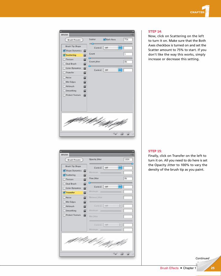
STEP 14:Now, click on Scattering on the left to turn it on. Make sure that the Both Axes checkbox is turned on and set the Scatter amount to 75% to start. If you don’t like the way this works, simply increase or decrease this setting.
STEP 15:Finally, click on Transfer on the left to turn it on. All you need to do here is set the Opacity Jitter to 100% to vary the density of the brush tip as you paint.
ptg6970545
26 Chapter 1 Brush Effects
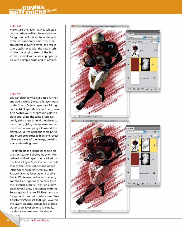
STEP 16:Make sure the layer mask is selected on the red-color-filled layer and your Foreground color is set to white, and then just randomly paint the area around the player to reveal the red in a very stylish way with the new brush. Notice the varying sizes of the brush strokes, as well as the varying opacity. All with a simple brush and its options.
STEP 17:You can definitely take it a step further and add a white (reveal all) layer mask to the Smart Object layer, by clicking on the Add Layer Mask icon. Then, press X to switch your Foreground color to black and, using the same brush, ran-domly paint areas around the player to mask them, giving the appearance that the effect is wrapping all around the player. So, you’re using the same brush and brush properties to hide and reveal different parts of the image, creating a very interesting result.
To finish off the image (as shown on the next page), I clicked back on the red-color-filled layer, then clicked on the Add a Layer Style icon at the bot-tom of the Layers panel and added Inner Glow, Gradient Overlay, and Pattern Over lay layer styles. I used a Black, White revers ed radial gradient, and the Herringbone 2 pattern from the Patterns presets. Then, on a new blank layer, I drew a rectangle with the Rectangle tool set to Fill Pixels and my Foreground color set to white, used Free Transform’s Warp set to Bulge, lowered the layer’s opacity, and added a black Outer Glow layer style to it. Finally, I added some text over the shape.
ptg6970545
27Chapter 1Brush Effects
Final Image

ptg6970545
28
©IS
TO
CK
PH
OT
O/C
HE
E M
ING
WO
NG
Chapter 1 Brush Effects
chapter 1
STEP ONE:Here, we’ll start with this simple stock image of a lightning strike. It’s always good to have a folder of images that contain generic elements like this. You just never know what you might be able to use them for.
STEP TWO:To create the brush, we are going to start with the image’s channels. Open the Channels panel by going to Window>Channels. Toggle through the individual channels and locate the chan-nel that defines the lightning pretty well, while the background is as dark as pos-sible. In this case, it looks like it will be the Red channel. So, make a duplicate of the Red channel by dragging it down onto the Create New Channel icon.
Here’s something that I actually stumbled upon by accident: I was attempting to take a photo of lightning and create
a brush from it, so I could have lightning when I needed it. However, in my pursuit of this, I had a “Eureka!” moment.
When you look at the lightning image below, what does the shape of the lightning resemble? Read on to find out.
Similarities in Nature
ptg6970545
29Chapter 1Brush Effects
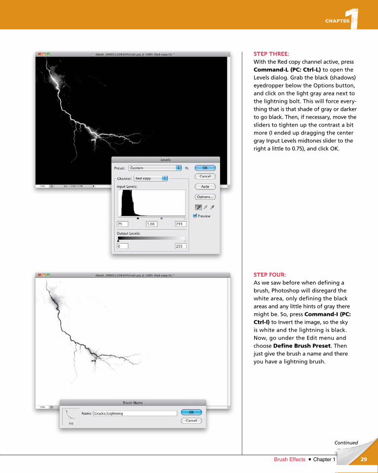
Continued
STEP THREE:With the Red copy channel active, press Command-L (PC: Ctrl-L) to open the Levels dialog. Grab the black (shadows) eyedropper below the Options button, and click on the light gray area next to the lightning bolt. This will force every-thing that is that shade of gray or darker to go black. Then, if necessary, move the sliders to tighten up the contrast a bit more (I ended up dragging the center gray Input Levels midtones slider to the right a little to 0.75), and click OK.
STEP FOUR:As we saw before when defining a brush, Photoshop will disregard the white area, only defining the black areas and any little hints of gray there might be. So, press Command-I (PC: Ctrl-I) to Invert the image, so the sky is white and the lightning is black. Now, go under the Edit menu and choose Define Brush Preset. Then just give the brush a name and there you have a lightning brush.

ptg6970545
30 Chapter 1 Brush Effects
STEP FIVE:At this point, we have achieved what we first set out to do, which was to create a lightning brush. But, if we think a little outside the box, we can use it for more than just lightning. Click on the brush thumbnail in the Options Bar to open the Brush Picker, and select your new lightning brush. Then, click on the icon to the right of the brush thumbnail to open up the Brush panel. Click on Brush Tip Shape on the left and set the Spacing to 60%. Notice, also, that the brush size is set to what it was defined as. But, we’ll use a handy keyboard shortcut to change the size later while painting.
STEP SIX:Next, click on Shape Dynamics on the left to turn it on. Set the Size Jitter to 100% and make sure the Control pop-up menu is set to Off. Then set the Angle Jitter to 100%, as well, and again leave the Control menu set to Off. Finally turn on the Flip X Jitter and Flip Y Jitter check-boxes at the bottom to add variation to the brush effect.
ptg6970545
31Chapter 1Brush Effects
Continued
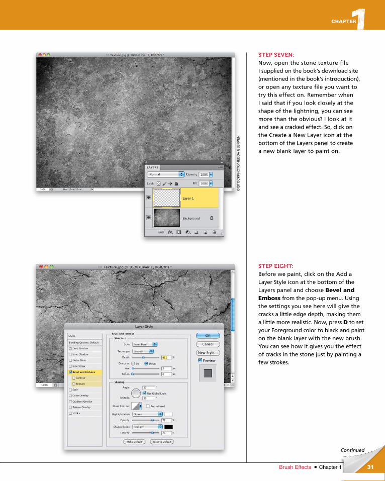
STEP SEVEN:Now, open the stone texture file I supplied on the book’s download site (mentioned in the book’s introduction), or open any texture file you want to try this effect on. Remember when I said that if you look closely at the shape of the lightning, you can see more than the obvious? I look at it and see a cracked effect. So, click on the Create a New Layer icon at the bottom of the Layers panel to create a new blank layer to paint on.
STEP EIGHT:Before we paint, click on the Add a Layer Style icon at the bottom of the Layers panel and choose Bevel and Emboss from the pop-up menu. Using the settings you see here will give the cracks a little edge depth, making them a little more realistic. Now, press D to set your Foreground color to black and paint on the blank layer with the new brush. You can see how it gives you the effect of cracks in the stone just by painting a few strokes.
©IS
TO
CK
PH
OT
O/H
ED
DA
GJE
RP
EN
ptg6970545
32 Chapter 1 Brush Effects
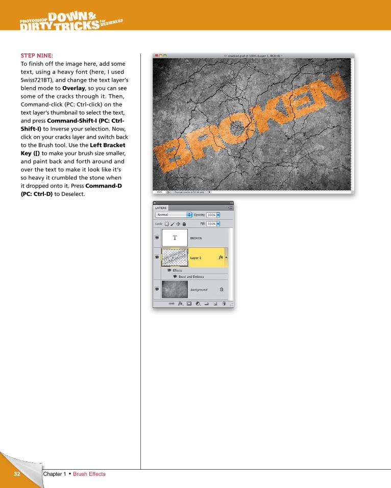
STEP NINE:To finish off the image here, add some text, using a heavy font (here, I used Swiss721BT), and change the text layer’s blend mode to Overlay, so you can see some of the cracks through it. Then, Command-click (PC: Ctrl-click) on the text layer’s thumbnail to select the text, and press Command-Shift-I (PC: Ctrl-Shift-I) to Inverse your selection. Now, click on your cracks layer and switch back to the Brush tool. Use the Left Bracket Key ([) to make your brush size smaller, and paint back and forth around and over the text to make it look like it’s so heavy it crumbled the stone when it dropped onto it. Press Command-D (PC: Ctrl-D) to Deselect.
ptg6970545
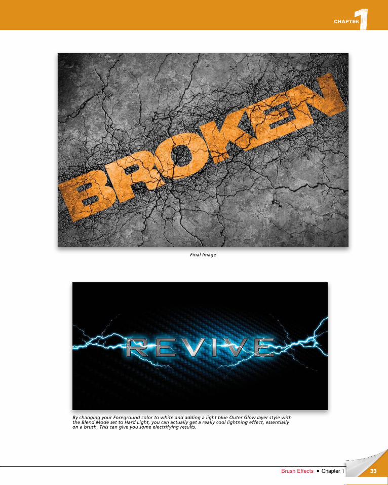
33Chapter 1Brush Effects
Final Image
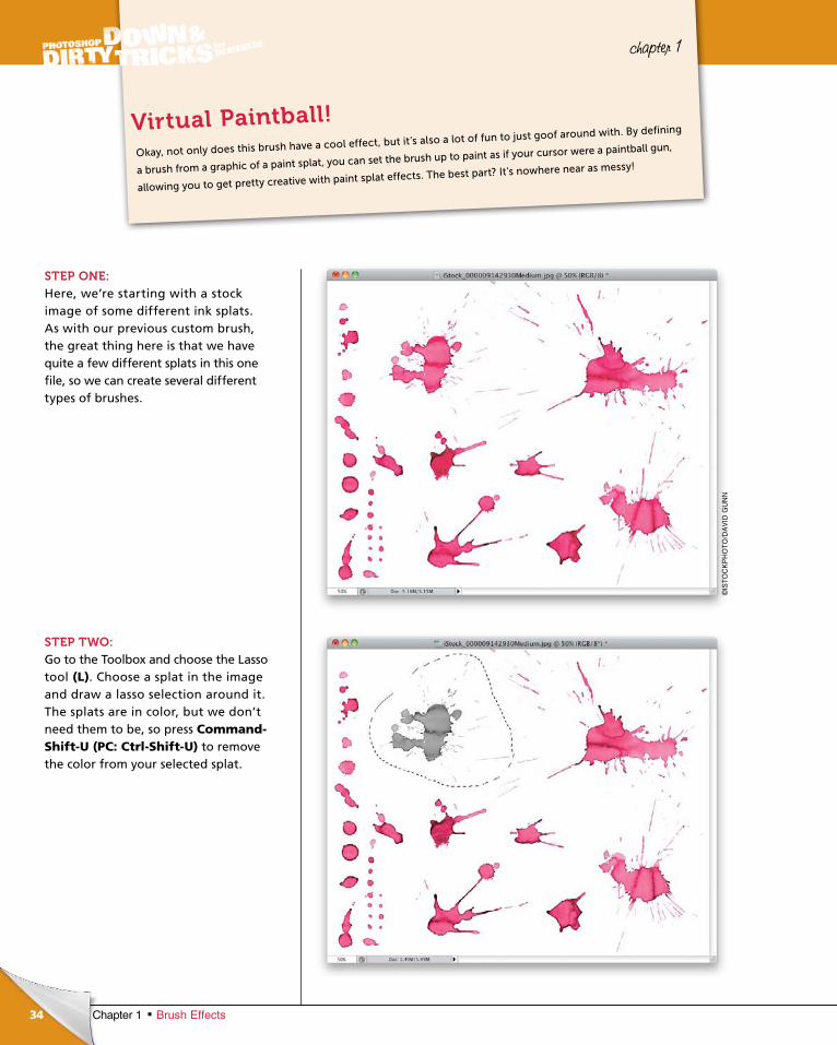
By changing your Foreground color to white and adding a light blue Outer Glow layer style with the Blend Mode set to Hard Light, you can actually get a really cool lightning effect, essentially on a brush. This can give you some electrifying results.
ptg6970545
34
©IS
TO
CK
PH
OT
O/D
AV
ID G
UN
N
Chapter 1 Brush Effects
chapter 1
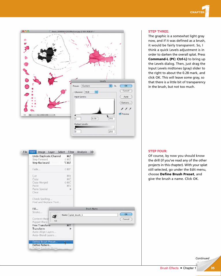
STEP ONE:Here, we’re starting with a stock image of some different ink splats. As with our previous custom brush, the great thing here is that we have quite a few different splats in this one file, so we can create several different types of brushes.
STEP TWO:Go to the Toolbox and choose the Lasso tool (L). Choose a splat in the image and draw a lasso selection around it. The splats are in color, but we don’t need them to be, so press Command-Shift-U (PC: Ctrl-Shift-U) to remove the color from your selected splat.
Okay, not only does this brush have a cool effect, but it’s also a lot of fun to just goof around with. By defining
a brush from a graphic of a paint splat, you can set the brush up to paint as if your cursor were a paintball gun,
allowing you to get pretty creative with paint splat effects. The best part? It’s nowhere near as messy!
Virtual Paintball!
ptg6970545
35Chapter 1Brush Effects
Continued
STEP THREE:The graphic is a somewhat light gray now, and if it was defined as a brush, it would be fairly transparent. So, I think a quick Levels adjustment is in order to darken the overall splat. Press Command-L (PC: Ctrl-L) to bring up the Levels dialog. Then, just drag the Input Levels midtones (gray) slider to the right to about the 0.28 mark, and click OK. This will leave some gray, so that there is a little bit of transparency in the brush, but not too much.
STEP FOUR:Of course, by now you should know the drill (if you’ve read any of the other projects in this chapter). With your splat still selected, go under the Edit menu, choose Define Brush Preset, and give the brush a name. Click OK.
ptg6970545
36 Chapter 1 Brush Effects
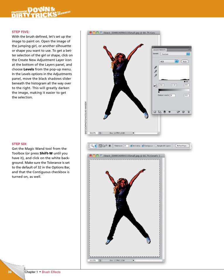
STEP FIVE:With the brush defined, let’s set up the image to paint on. Open the image of the jumping girl, or another silhouette or shape you want to use. To get a bet-ter selection of the girl or shape, click on the Create New Adjustment Layer icon at the bottom of the Layers panel, and choose Levels from the pop-up menu. In the Levels options in the Adjustments panel, move the black shadows slider beneath the histogram all the way over to the right. This will greatly darken the image, making it easier to get the selection.
STEP SIX:Get the Magic Wand tool from the Tool box (or press Shift-W until you have it), and click on the white back-ground. Make sure the Tolerance is set to the default of 32 in the Options Bar, and that the Contiguous checkbox is turned on, as well.
©IS
TO
CK
PH
OT
O/N
ICO
LAS
HA
NS
EN
ptg6970545
37Chapter 1Brush Effects
Continued
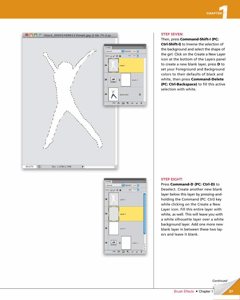
STEP SEVEN:Then, press Command-Shift-I (PC: Ctrl-Shift-I) to Inverse the selection of the background and select the shape of the girl. Click on the Create a New Layer icon at the bottom of the Layers panel to create a new blank layer, press D to set your Foreground and Background colors to their defaults of black and white, then press Command-Delete (PC: Ctrl-Backspace) to fill this active selection with white.
STEP EIGHT:Press Command-D (PC: Ctrl-D) to Deselect. Create another new blank layer below this layer by pressing-and-holding the Command (PC: Ctrl) key while clicking on the Create a New Layer icon. Fill this entire layer with white, as well. This will leave you with a white silhouette layer over a white background layer. Add one more new blank layer in between these two lay-ers and leave it blank.
ptg6970545
38 Chapter 1 Brush Effects
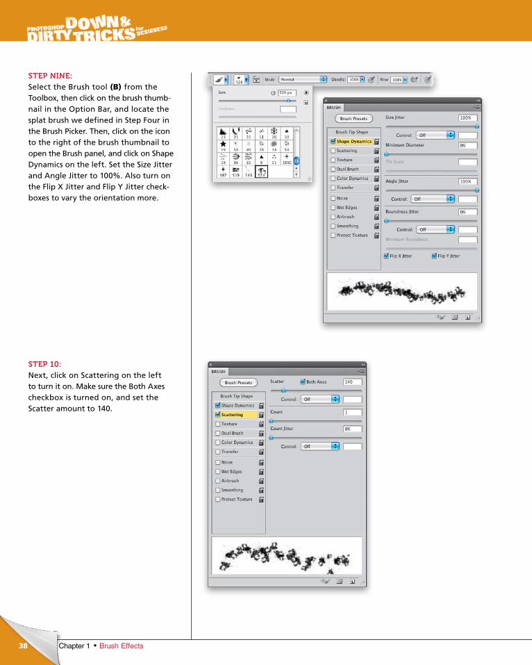
STEP NINE:Select the Brush tool (B) from the Tool box, then click on the brush thumb-nail in the Option Bar, and locate the splat brush we defined in Step Four in the Brush Picker. Then, click on the icon to the right of the brush thumbnail to open the Brush panel, and click on Shape Dynamics on the left. Set the Size Jitter and Angle Jitter to 100%. Also turn on the Flip X Jitter and Flip Y Jitter check-boxes to vary the orientation more.
STEP 10:Next, click on Scattering on the left to turn it on. Make sure the Both Axes checkbox is turned on, and set the Scatter amount to 140.
ptg6970545
39Chapter 1Brush Effects
Continued
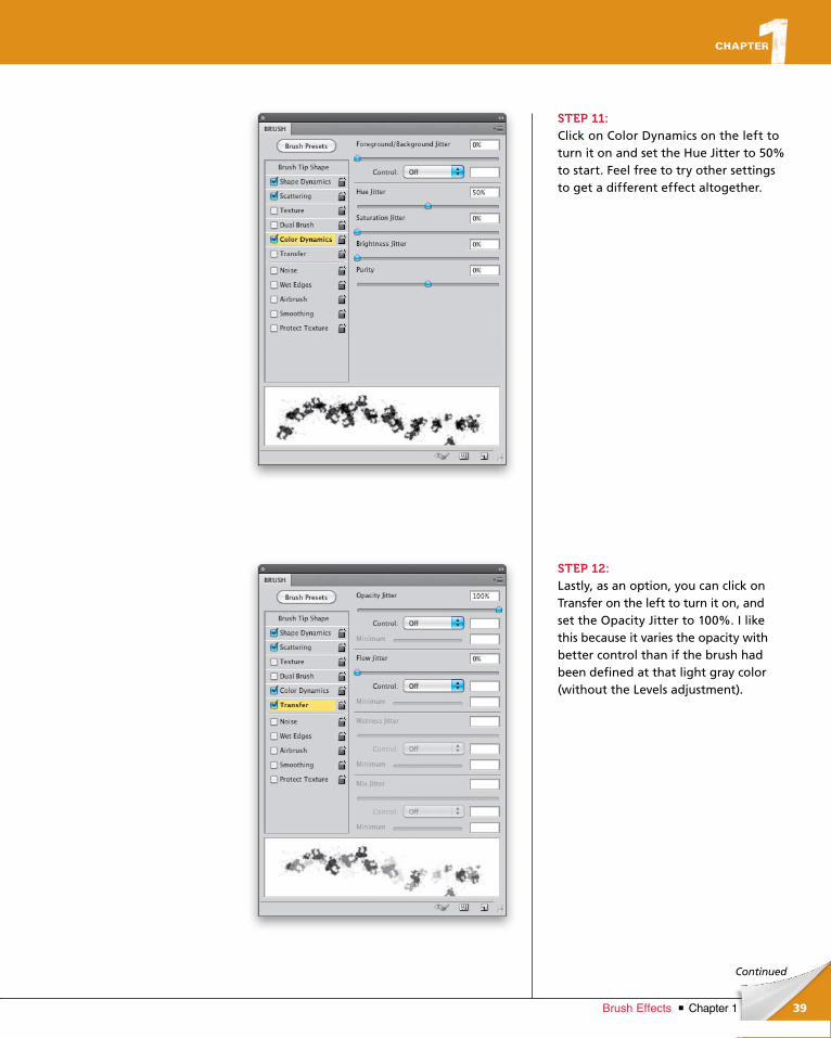
STEP 11:Click on Color Dynamics on the left to turn it on and set the Hue Jitter to 50% to start. Feel free to try other settings to get a different effect altogether.
STEP 12:Lastly, as an option, you can click on Transfer on the left to turn it on, and set the Opacity Jitter to 100%. I like this because it varies the opacity with better control than if the brush had been defined at that light gray color (without the Levels adjustment).
ptg6970545
40 Chapter 1 Brush Effects
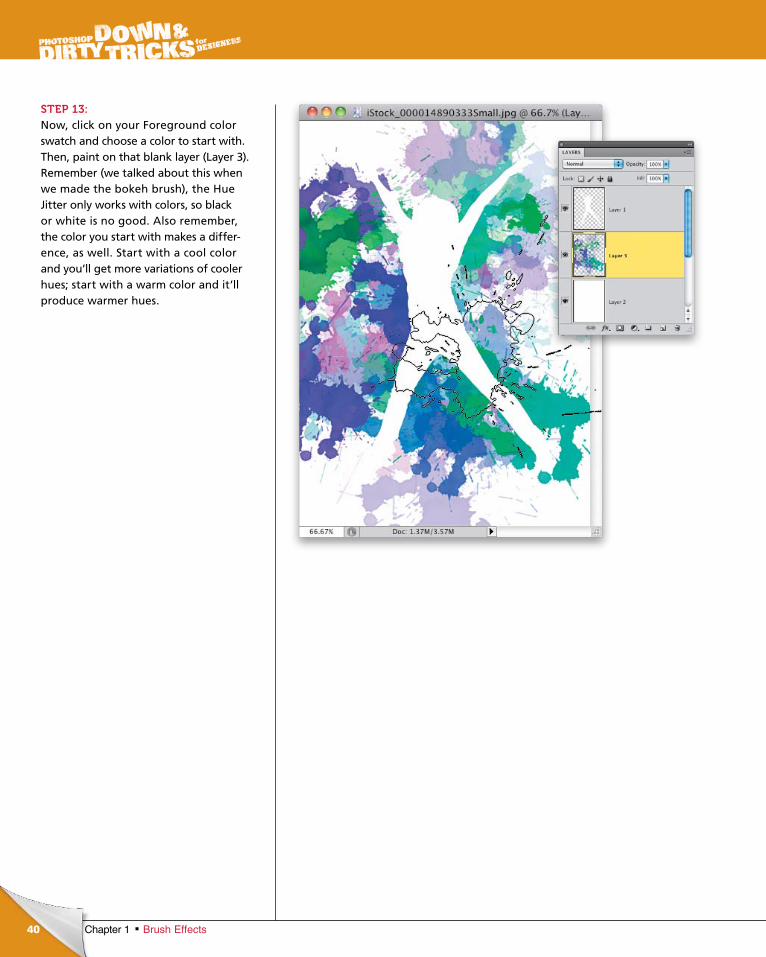
STEP 13:Now, click on your Foreground color swatch and choose a color to start with. Then, paint on that blank layer (Layer 3). Remember (we talked about this when we made the bokeh brush), the Hue Jitter only works with colors, so black or white is no good. Also remember, the color you start with makes a differ-ence, as well. Start with a cool color and you’ll get more variations of cooler hues; start with a warm color and it’ll produce warmer hues.
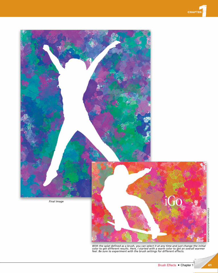
ptg6970545
41Chapter 1Brush Effects
©IS
TO
CK
PH
OT
O/S
TE
PH
AN
HO
ER
OLD
Final Image
With the splat defined as a brush, you can select it at any time and just change the initial color to get different results. Here, I started with a warm color to get an overall warmer feel. Be sure to experiment with the brush settings for different effects.
ptg6970545
ptg6970545
Of all the tool sets available to the modern designer today, one of them
remains the most important: those 26 characters we call the alphabet.
Every designer will use text at some level in their design work, whether it
is a simple paragraph of formatted text or a full logo effect with graphics
and images. Using text effectively is, in and of itself, an art form. In this
chapter, we will explore ways to use the strengths of Photoshop to create
effects that will help you see text more as a design element. Pay close
attention to more than what the text represents, to each letter’s physical
appearance and shape. Even observe the negative space inside and
around the text, and see what emerges. With 26 letters and the
numbers 0 through 9, you have an infinite number of possibilities.
So, what do you say?
26-Piece Tool Set type effects
43Chapter 2Type Effects
ptg6970545
44 Chapter 2 Type Effects
chapter 2
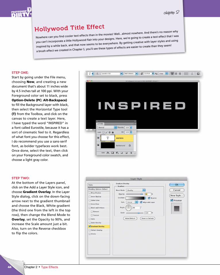
STEP ONE:Start by going under the File menu, choosing New, and creating a new document that’s about 11 inches wide by 4.5 inches tall at 100 ppi. With your Foreground color set to black, press Option-Delete (PC: Alt-Backspace)to fill the Background layer with black, then select the Hori zon tal Type tool (T) from the Toolbox, and click on the canvas to create a text layer. Here, I have typed the word “INSPIRED” in a font called Eurostile, because it has a sort of cinematic feel to it. Regardless of what font you choose for this effect, I do recommend you use a sans-serif font, as bolder typefaces work best. Once done, select the text, then click on your Foreground color swatch, and choose a light gray color.
STEP TWO:At the bottom of the Layers panel, click on the Add a Layer Style icon, and choose Gradient Overlay. In the Layer Style dialog, click on the down-facing arrow next to the gradient thumbnail and choose the Black, White gradient (the third one from the left in the top row), then change the Blend Mode to Overlay, set the Opacity to 90%, and increase the Scale amount just a bit. Also, turn on the Reverse checkbox to flip the colors.
Nowhere can you find cooler text effects than in the movies! Well...almost nowhere. And there’s no reason why
you can’t incorporate a little Hollywood flair into your designs. Here, we’re going to create a text effect that I was
inspired by a while back, and that now seems to be everywhere. By getting creative with layer styles and using
a brush effect we created in Chapter 1, you’ll see these types of effects are easier to create than they seem!
Hollywood Title Effect
ptg6970545
45Chapter 2Type Effects
Continued
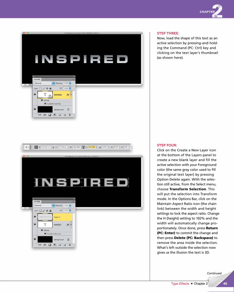
STEP THREE:Now, load the shape of this text as an active selection by pressing-and-hold-ing the Command (PC: Ctrl) key and clicking on the text layer’s thumbnail (as shown here).
STEP FOUR:Click on the Create a New Layer icon at the bottom of the Layers panel to create a new blank layer and fill the active selection with your Foreground color (the same gray color used to fill the original text layer) by pressing Option-Delete again. With the selec-tion still active, from the Select menu, choose Transform Selection. This will put the selection into Transform mode. In the Options Bar, click on the Maintain Aspect Ratio icon (the chain link) between the width and height settings to lock the aspect ratio. Change the H (height) setting to 102% and the width will automatically change pro-portionately. Once done, press Return (PC: Enter) to commit the change and then press Delete (PC: Back space) to remove the area inside the selection. What’s left outside the selection now gives us the illusion the text is 3D.
ptg6970545
46 Chapter 2 Type Effects
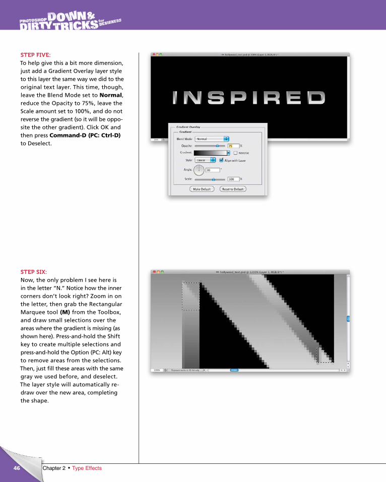
STEP FIVE:To help give this a bit more dimension, just add a Gradient Overlay layer style to this layer the same way we did to the original text layer. This time, though, leave the Blend Mode set to Normal, reduce the Opacity to 75%, leave the Scale amount set to 100%, and do not reverse the gradient (so it will be oppo-site the other gradient). Click OK and then press Command-D (PC: Ctrl-D)to Deselect.
STEP SIX:Now, the only problem I see here is in the letter “N.” Notice how the inner corners don’t look right? Zoom in on the letter, then grab the Rectangular Marquee tool (M) from the Toolbox, and draw small selections over the areas where the gradient is missing (as shown here). Press-and-hold the Shift key to create multiple selections and press-and-hold the Option (PC: Alt) key to remove areas from the selections. Then, just fill these areas with the same gray we used before, and deselect. The layer style will automatically re-draw over the new area, completing the shape.
ptg6970545
47Chapter 2Type Effects
Continued
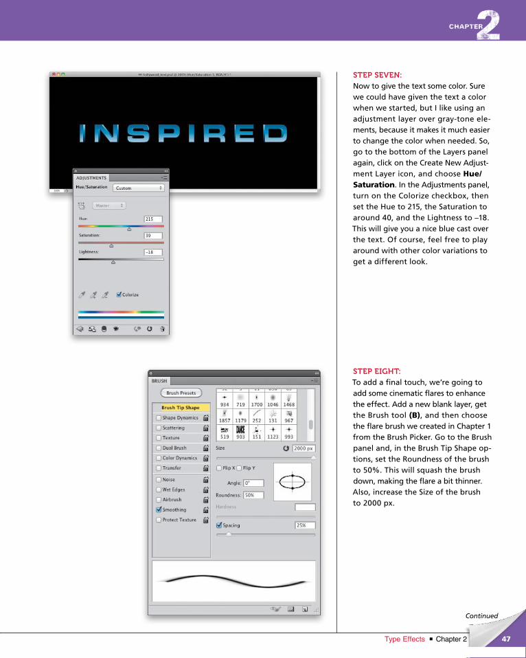
STEP SEVEN:Now to give the text some color. Sure we could have given the text a color when we started, but I like using an adjustment layer over gray-tone ele-ments, because it makes it much easier to change the color when needed. So, go to the bottom of the Layers panel again, click on the Create New Adjust-ment Layer icon, and choose Hue/Saturation. In the Adjustments panel, turn on the Colorize checkbox, then set the Hue to 215, the Saturation to around 40, and the Lightness to –18. This will give you a nice blue cast over the text. Of course, feel free to play around with other color variations to get a different look.
STEP EIGHT:To add a final touch, we’re going to add some cinematic flares to enhance the effect. Add a new blank layer, get the Brush tool (B), and then choose the flare brush we created in Chapter 1 from the Brush Picker. Go to the Brush panel and, in the Brush Tip Shape op-tions, set the Roundness of the brush to 50%. This will squash the brush down, making the flare a bit thinner. Also, increase the Size of the brush to 2000 px.
ptg6970545
48 Chapter 2 Type Effects
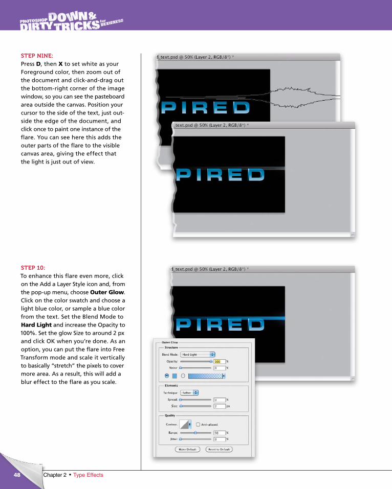
STEP NINE:Press D, then X to set white as your Foreground color, then zoom out of the document and click-and-drag out the bottom-right corner of the image window, so you can see the pasteboard area outside the canvas. Position your cursor to the side of the text, just out-side the edge of the document, and click once to paint one instance of the flare. You can see here this adds the outer parts of the flare to the visible canvas area, giving the effect that the light is just out of view.
STEP 10:To enhance this flare even more, click on the Add a Layer Style icon and, from the pop-up menu, choose Outer Glow. Click on the color swatch and choose a light blue color, or sample a blue color from the text. Set the Blend Mode to Hard Light and increase the Opacity to 100%. Set the glow Size to around 2 px and click OK when you’re done. As an option, you can put the flare into Free Transform mode and scale it vertically to basically “stretch” the pixels to cover more area. As a result, this will add a blur effect to the flare as you scale.
ptg6970545
49Chapter 2Type Effects
Continued
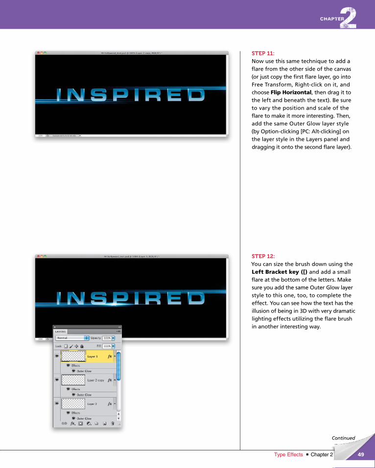
STEP 11:Now use this same technique to add a flare from the other side of the canvas (or just copy the first flare layer, go into Free Transform, Right-click on it, and choose Flip Horizontal, then drag it to the left and beneath the text). Be sure to vary the position and scale of the flare to make it more interesting. Then, add the same Outer Glow layer style (by Option-clicking [PC: Alt-clicking] on the layer style in the Layers panel and dragging it onto the second flare layer).
STEP 12:You can size the brush down using the Left Bracket key ([) and add a small flare at the bottom of the letters. Make sure you add the same Outer Glow layer style to this one, too, to complete the effect. You can see how the text has the illusion of being in 3D with very dramatic lighting effects utilizing the flare brush in another interesting way.
ptg6970545
50
Final Image
Chapter 2 Type Effects
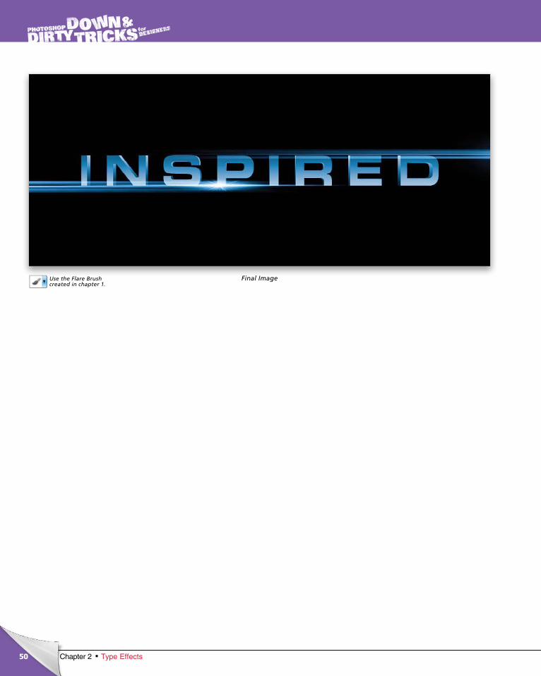
Use the Flare Brush created in chapter 1.
ptg6970545
51Chapter 2Type Effects
©IS
TO
CK
PH
OT
O/C
AJO
ER
Continued
chapter 2
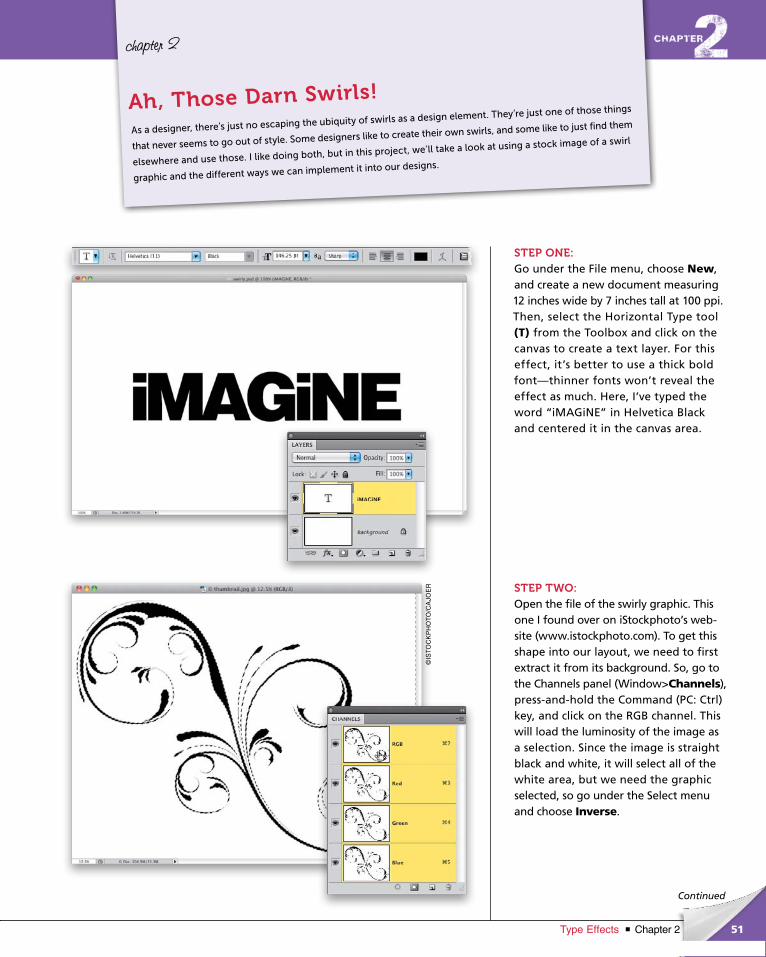
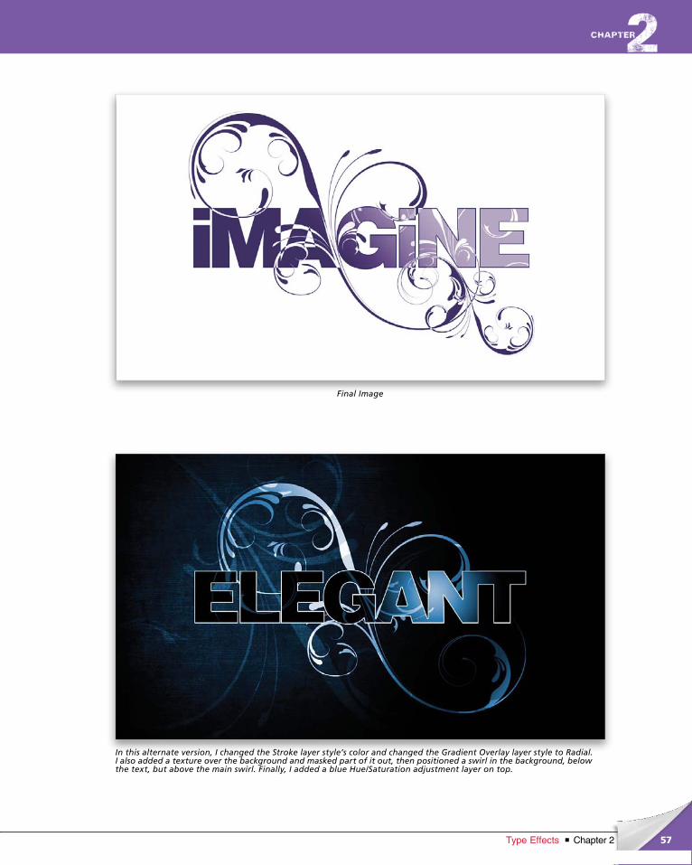
STEP ONE:Go under the File menu, choose New, and create a new document measuring 12 inches wide by 7 inches tall at 100 ppi. Then, select the Horizontal Type tool (T) from the Toolbox and click on the canvas to create a text layer. For this effect, it’s better to use a thick bold font—thinner fonts won’t reveal the effect as much. Here, I’ve typed the word “iMAGiNE” in Helvetica Black and centered it in the canvas area.
STEP TWO:Open the file of the swirly graphic. This one I found over on iStockphoto’s web-site (www.istockphoto.com). To get this shape into our layout, we need to first extract it from its background. So, go to the Channels panel (Window>Channels), press-and-hold the Command (PC: Ctrl) key, and click on the RGB channel. This will load the luminosity of the image as a selection. Since the image is straight black and white, it will select all of the white area, but we need the graphic selected, so go under the Select menu and choose Inverse.
As a designer, there’s just no escaping the ubiquity of swirls as a design element. They’re just one of those things
that never seems to go out of style. Some designers like to create their own swirls, and some like to just find them
elsewhere and use those. I like doing both, but in this project, we’ll take a look at using a stock image of a swirl
graphic and the different ways we can implement it into our designs.
Ah, Those Darn Swirls!
ptg6970545
52 Chapter 2 Type Effects
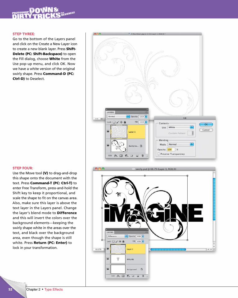
STEP THREE:Go to the bottom of the Layers panel and click on the Create a New Layer icon to create a new blank layer. Press Shift-Delete (PC: Shift-Backspace) to open the Fill dialog, choose White from the Use pop-up menu, and click OK. Now we have a white version of the original swirly shape. Press Command-D (PC: Ctrl-D) to Deselect.
STEP FOUR:Use the Move tool (V) to drag-and-drop this shape onto the document with the text. Press Command-T (PC: Ctrl-T) to enter Free Transform, press-and-hold the Shift key to keep it proportional, and scale the shape to fit on the canvas area. Also, make sure this layer is above the text layer in the Layers panel. Change the layer’s blend mode to Differenceand this will invert the colors over the background elements—keeping the swirly shape white in the areas over the text, and black over the background area, even though the shape is still white. Press Return (PC: Enter) to lock in your transformation.
ptg6970545
53Chapter 2Type Effects
Continued
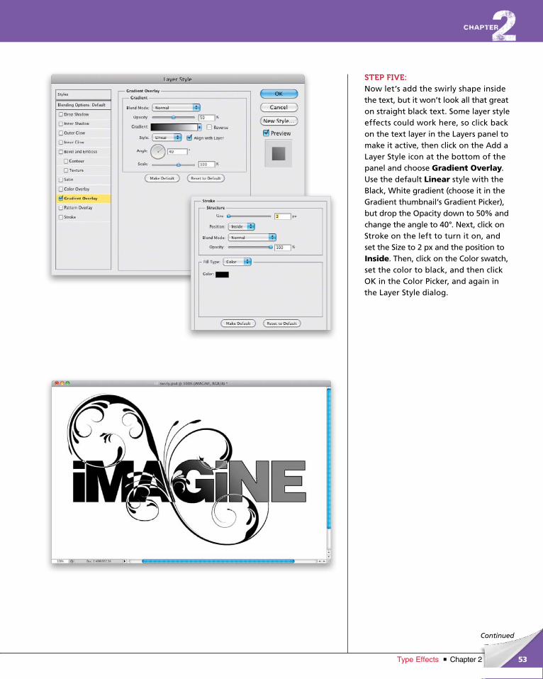
STEP FIVE:Now let’s add the swirly shape inside the text, but it won’t look all that great on straight black text. Some layer style effects could work here, so click back on the text layer in the Layers panel to make it active, then click on the Add a Layer Style icon at the bottom of the panel and choose Gradient Overlay. Use the default Linear style with the Black, White gradient (choose it in the Gradient thumbnail’s Gradient Picker), but drop the Opacity down to 50% and change the angle to 40°. Next, click on Stroke on the left to turn it on, and set the Size to 2 px and the position to Inside. Then, click on the Color swatch, set the color to black, and then click OK in the Color Picker, and again in the Layer Style dialog.
ptg6970545
54 Chapter 2 Type Effects
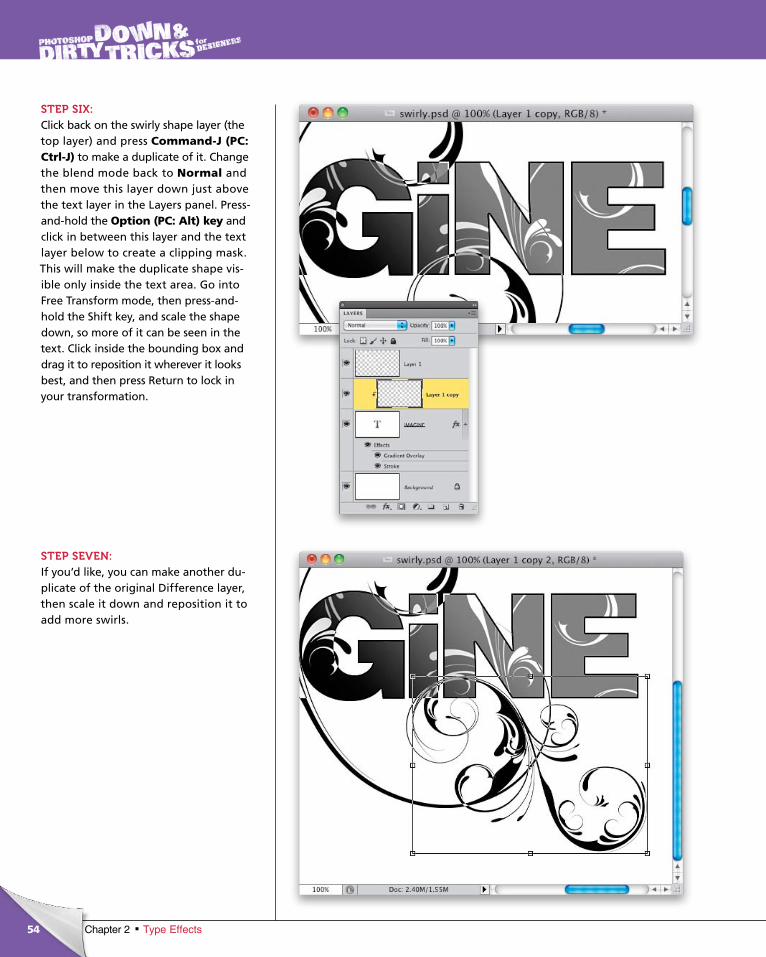
STEP SIX:Click back on the swirly shape layer (the top layer) and press Command-J (PC: Ctrl-J) to make a duplicate of it. Change the blend mode back to Normal and then move this layer down just above the text layer in the Layers panel. Press-and-hold the Option (PC: Alt) key and click in between this layer and the text layer below to create a clipping mask. This will make the duplicate shape vis-ible only inside the text area. Go into Free Transform mode, then press-and-hold the Shift key, and scale the shape down, so more of it can be seen in the text. Click inside the bounding box and drag it to reposition it wherever it looks best, and then press Return to lock in your transformation.
STEP SEVEN:If you’d like, you can make another du-plicate of the original Difference layer, then scale it down and reposition it to add more swirls.
ptg6970545
55Chapter 2Type Effects
Continued
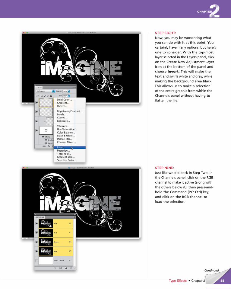
STEP EIGHT:Now, you may be wondering what you can do with it at this point. You certainly have many options, but here’s one to consider: With the top-most layer select ed in the Layers panel, click on the Create New Adjustment Layer icon at the bottom of the panel and choose Invert. This will make the text and swirls white and gray, while making the background area black. This allows us to make a selection of the entire graphic from within the Channels panel without having to flatten the file.
STEP NINE:Just like we did back in Step Two, in the Channels panel, click on the RGB channel to make it active (along with the others below it), then press-and-hold the Command (PC: Ctrl) key, and click on the RGB channel to load the selection.
ptg6970545
56 Chapter 2 Type Effects
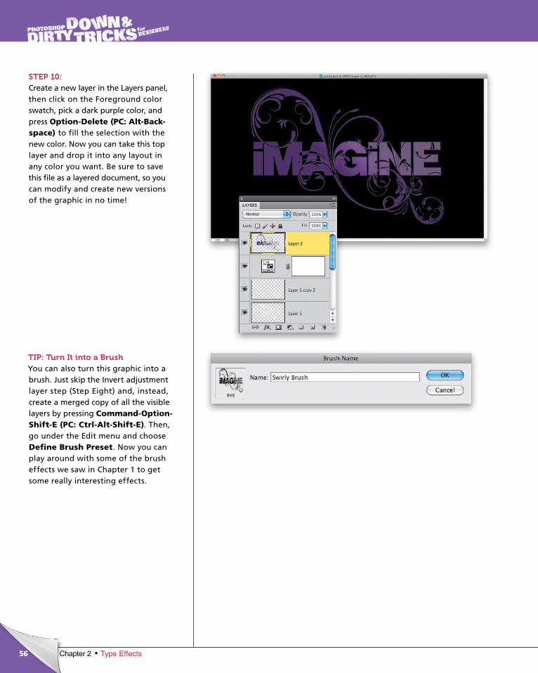
STEP 10:Create a new layer in the Layers panel, then click on the Foreground color swatch, pick a dark purple color, and press Option-Delete (PC: Alt-Back-space) to fill the selection with the new color. Now you can take this top layer and drop it into any layout in any color you want. Be sure to save this file as a layered document, so you can modify and create new versions of the graphic in no time!
TIP: Turn It into a BrushYou can also turn this graphic into a brush. Just skip the Invert adjust ment layer step (Step Eight) and, instead, create a merged copy of all the visible layers by pressing Command-Option-Shift-E (PC: Ctrl-Alt-Shift-E). Then, go under the Edit menu and choose Define Brush Preset. Now you can play around with some of the brush effects we saw in Chapter 1 to get some really interesting effects.
ptg6970545
57Chapter 2Type Effects
Final Image
In this alternate version, I changed the Stroke layer style’s color and changed the Gradient Overlay layer style to Radial. I also added a texture over the background and masked part of it out, then positioned a swirl in the background, below the text, but above the main swirl. Finally, I added a blue Hue/Saturation adjustment layer on top.
ptg6970545
58 Chapter 2 Type Effects
chapter 2
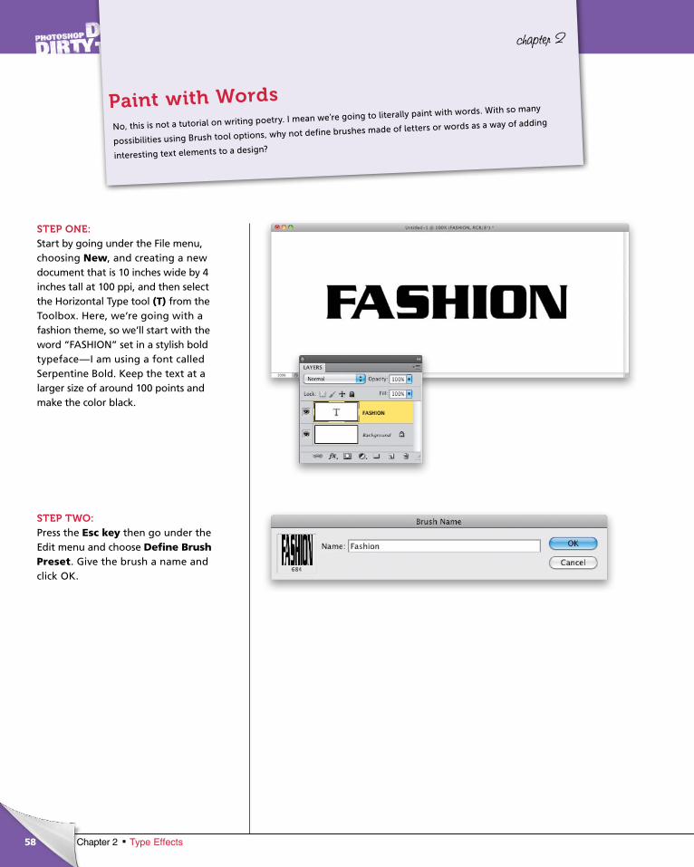
STEP ONE:Start by going under the File menu, choosing New, and creating a new document that is 10 inches wide by 4 inches tall at 100 ppi, and then select the Horizon tal Type tool (T) from the Toolbox. Here, we’re going with a fashion theme, so we’ll start with the word “FASHION” set in a stylish bold typeface—I am using a font called Serpentine Bold. Keep the text at a larger size of around 100 points and make the color black.
STEP TWO:Press the Esc key then go under the Edit menu and choose Define Brush Preset. Give the brush a name and click OK.
No, this is not a tutorial on writing poetry. I mean we’re going to literally paint with words. With so many
possibilities using Brush tool options, why not define brushes made of letters or words as a way of adding
interesting text elements to a design?
Paint with Words
ptg6970545
59Chapter 2Type Effects
Continued
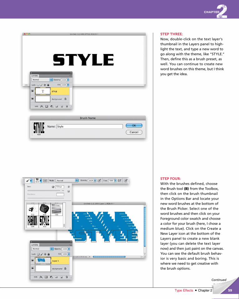
STEP THREE:Now, double-click on the text layer’s thumbnail in the Layers panel to high-light the text, and type a new word to go along with the theme, like “STYLE.” Then, define this as a brush preset, as well. You can continue to create new word brushes on this theme, but I think you get the idea.
STEP FOUR:With the brushes defined, choose the Brush tool (B) from the Toolbox, then click on the brush thumbnail in the Options Bar and locate your new word brushes at the bottom of the Brush Picker. Select one of the word brushes and then click on your Foreground color swatch and choose a color for your brush (here, I chose a medium blue). Click on the Create a New Layer icon at the bottom of the Layers panel to create a new blank layer (you can delete the text layer now) and then just paint on the canvas. You can see the default brush behav-ior is very basic and boring. This is where we need to get creative with the brush options.
ptg6970545
60 Chapter 2 Type Effects
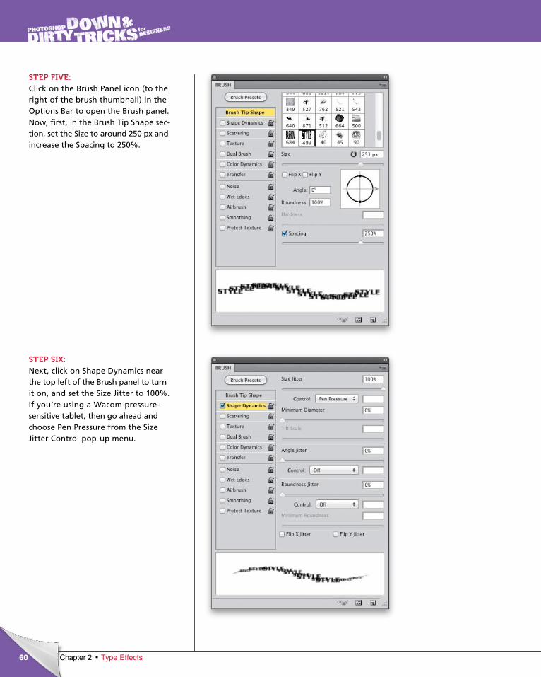
STEP FIVE:Click on the Brush Panel icon (to the right of the brush thumbnail) in the Options Bar to open the Brush panel. Now, first, in the Brush Tip Shape sec-tion, set the Size to around 250 px and increase the Spacing to 250%.
STEP SIX:Next, click on Shape Dynamics near the top left of the Brush panel to turn it on, and set the Size Jitter to 100%. If you’re using a Wacom pressure-sensitive tablet, then go ahead and choose Pen Pressure from the Size Jitter Control pop-up menu.
ptg6970545
61Chapter 2Type Effects
Continued
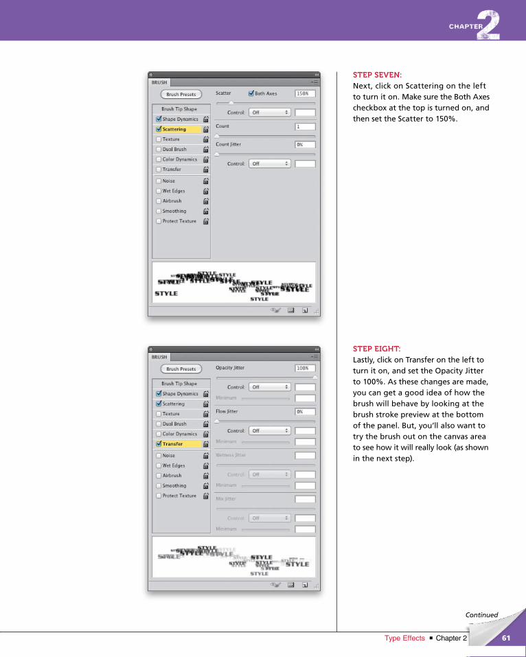
STEP SEVEN:Next, click on Scattering on the left to turn it on. Make sure the Both Axes checkbox at the top is turned on, and then set the Scatter to 150%.
STEP EIGHT:Lastly, click on Transfer on the left to turn it on, and set the Opacity Jitter to 100%. As these changes are made, you can get a good idea of how the brush will behave by looking at the brush stroke preview at the bottom of the panel. But, you’ll also want to try the brush out on the canvas area to see how it will really look (as shown in the next step).
ptg6970545
62 Chapter 2 Type Effects
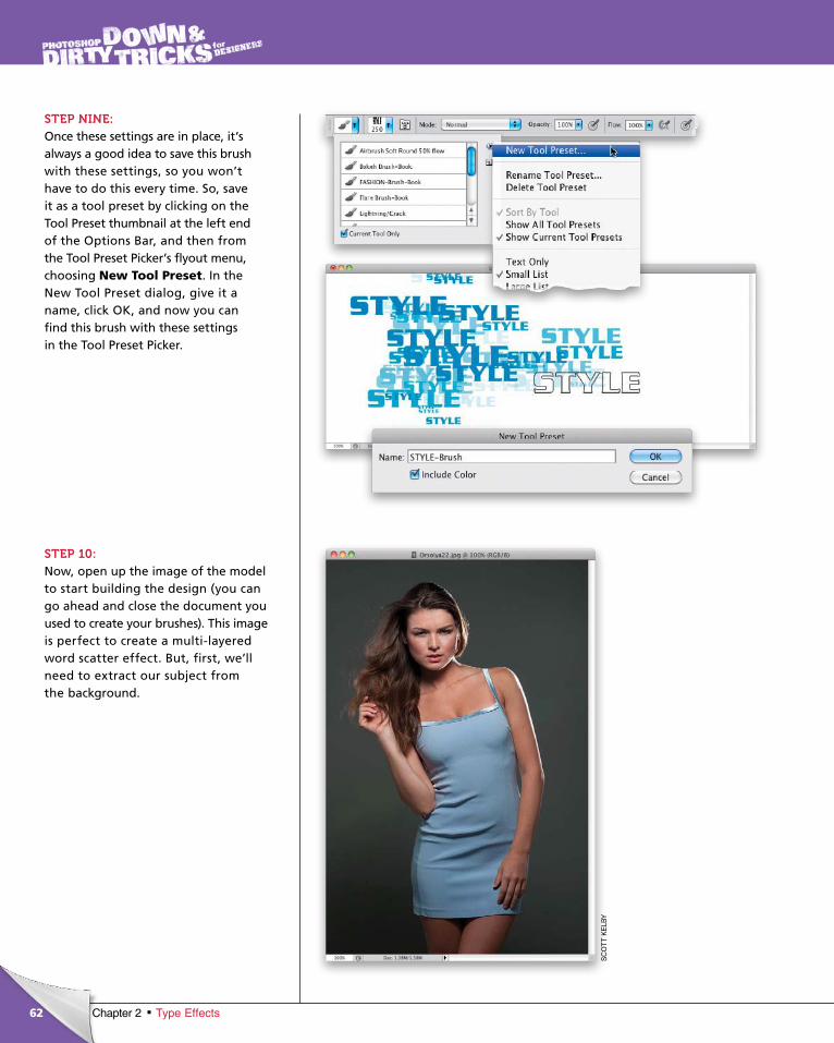
STEP NINE:Once these settings are in place, it’s always a good idea to save this brush with these settings, so you won’t have to do this every time. So, save it as a tool preset by clicking on the Tool Preset thumbnail at the left end of the Options Bar, and then from the Tool Preset Picker’s flyout menu, choosing New Tool Preset. In the New Tool Preset dialog, give it a name, click OK, and now you can find this brush with these settings in the Tool Preset Picker.
STEP 10:Now, open up the image of the model to start building the design (you can go ahead and close the document you used to create your brushes). This image is perfect to create a multi-layered word scatter effect. But, first, we’ll need to extract our subject from the background.
SC
OT
T K
ELB
Y
ptg6970545
63Chapter 2Type Effects
Continued
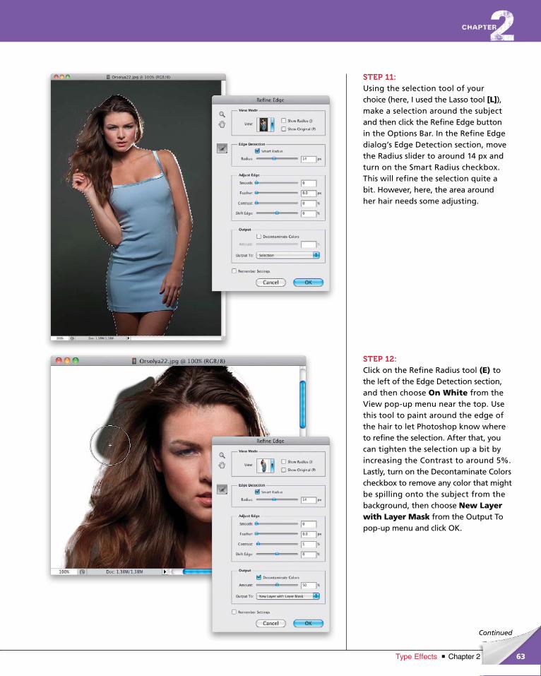
STEP 11:Using the selection tool of your choice (here, I used the Lasso tool [L]), make a selection around the subject and then click the Refine Edge button in the Options Bar. In the Refine Edge dialog’s Edge Detec tion section, move the Radius slider to around 14 px and turn on the Smart Radius checkbox. This will refine the selection quite a bit. However, here, the area around her hair needs some adjusting.
STEP 12:Click on the Refine Radius tool (E) to the left of the Edge Detection section, and then choose On White from the View pop-up menu near the top. Use this tool to paint around the edge of the hair to let Photoshop know where to refine the selection. After that, you can tighten the selection up a bit by increasing the Contrast to around 5%. Lastly, turn on the Decontaminate Colors checkbox to remove any color that might be spilling onto the subject from the background, then choose New Layer with Layer Mask from the Out put To pop-up menu and click OK.
ptg6970545
64 Chapter 2 Type Effects
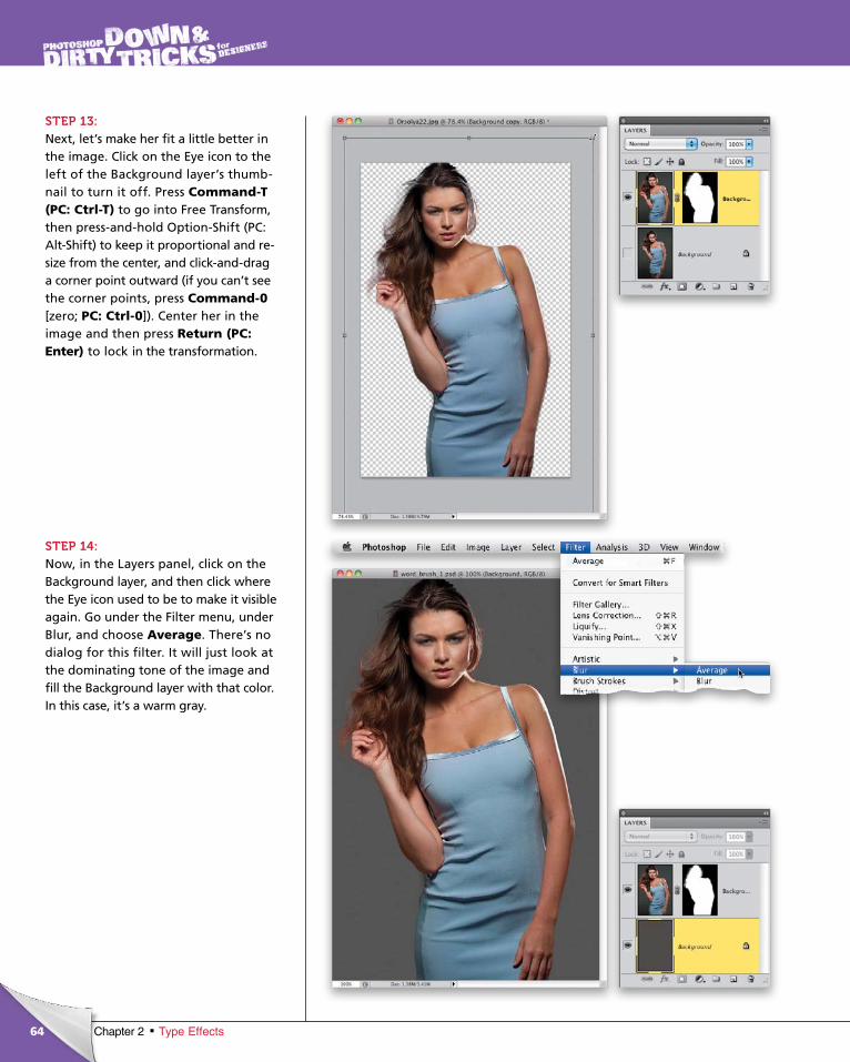
STEP 13:Next, let’s make her fit a little better in the image. Click on the Eye icon to the left of the Background layer’s thumb-nail to turn it off. Press Com mand-T (PC: Ctrl-T) to go into Free Transform, then press-and-hold Option-Shift (PC: Alt-Shift) to keep it proportional and re-size from the center, and click-and-drag a corner point outward (if you can’t see the corner points, press Com mand-0 [zero; PC: Ctrl-0]). Center her in the image and then press Return (PC: Enter) to lock in the transformation.
STEP 14:Now, in the Layers panel, click on the Background layer, and then click where the Eye icon used to be to make it visible again. Go under the Filter menu, under Blur, and choose Average. There’s no dialog for this filter. It will just look at the dominating tone of the image and fill the Background layer with that color. In this case, it’s a warm gray.
ptg6970545
65Chapter 2Type Effects
Continued
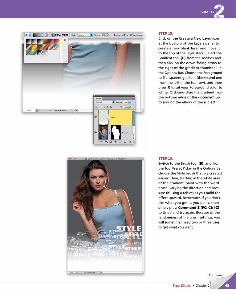
STEP 15:Click on the Create a New Layer icon at the bottom of the Layers panel to create a new blank layer and move it to the top of the layer stack. Select the Gradient tool (G) from the Toolbox and then click on the down-facing arrow to the right of the gradient thumbnail in the Options Bar. Choose the Foreground to Transparent gradient (the second one from the left in the top row), and then press X to set your Foreground color to white. Click-and-drag the gradient from the bottom edge of the document up to around the elbow of the subject.
STEP 16:Switch to the Brush tool (B), and from the Tool Preset Picker in the Options Bar, choose the Style brush that we created earlier. Then, starting in the white area of the gradient, paint with the word brush, varying the direction and pres-sure (if using a tablet) as you build the effect upward. Remember, if you don’t like what you get as you paint, then simply press Command-Z (PC: Ctrl-Z)to Undo and try again. Because of the randomness of the brush settings, you will sometimes need two or three tries to get what you want.
ptg6970545
66 Chapter 2 Type Effects
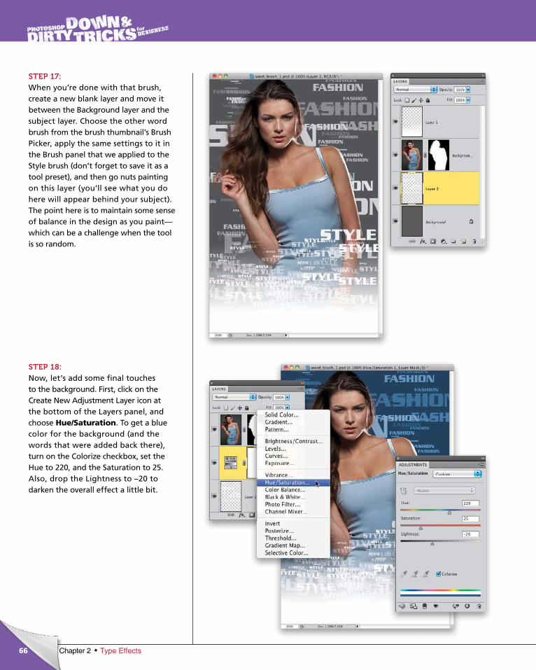
STEP 17:When you’re done with that brush, create a new blank layer and move it between the Background layer and the subject layer. Choose the other word brush from the brush thumbnail’s Brush Picker, apply the same settings to it in the Brush panel that we applied to the Style brush (don’t forget to save it as a tool preset), and then go nuts painting on this layer (you’ll see what you do here will appear behind your subject). The point here is to maintain some sense of balance in the design as you paint—which can be a challenge when the tool is so random.
STEP 18:Now, let’s add some final touches to the background. First, click on the Create New Adjustment Layer icon at the bottom of the Layers panel, and choose Hue/Saturation. To get a blue color for the background (and the words that were added back there), turn on the Colorize checkbox, set the Hue to 220, and the Saturation to 25. Also, drop the Lightness to –20 to darken the overall effect a little bit.
ptg6970545
67Chapter 2Type Effects
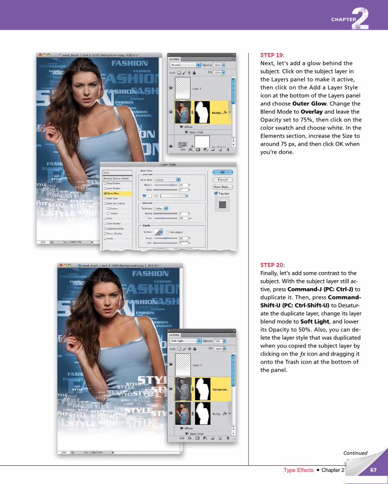
Continued
STEP 19:Next, let’s add a glow behind the subject. Click on the subject layer in the Layers panel to make it active, then click on the Add a Layer Style icon at the bottom of the Layers panel and choose Outer Glow. Change the Blend Mode to Overlay and leave the Opacity set to 75%, then click on the color swatch and choose white. In the Elements section, increase the Size to around 75 px, and then click OK when you’re done.
STEP 20:Finally, let’s add some contrast to the subject. With the subject layer still ac-tive, press Command-J (PC: Ctrl-J) to duplicate it. Then, press Command-Shift-U (PC: Ctrl-Shift-U) to Desatur-ate the duplicate layer, change its layer blend mode to Soft Light, and lower its Opacity to 50%. Also, you can de-lete the layer style that was duplicated when you copied the subject layer by clicking on the ƒx icon and dragging it onto the Trash icon at the bottom of the panel.
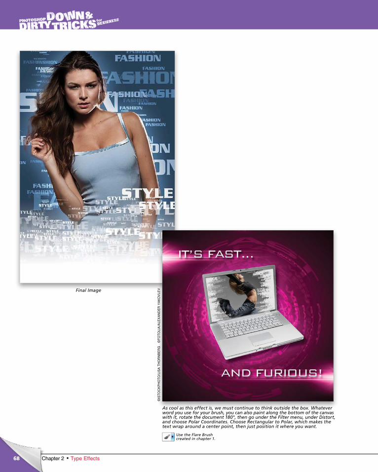
ptg6970545
68 Chapter 2 Type Effects
©IS
TO
CK
PH
OT
O/L
ISA
TH
OR
NB
ER
G©
FO
TO
LIA
/ALE
XA
ND
ER
YA
KO
VLE
VFinal Image
As cool as this effect is, we must continue to think outside the box. What ever word you use for your brush, you can also paint along the bottom of the canvas with it, rotate the document 180°, then go under the Filter menu, under Distort, and choose Polar Coordinates. Choose Rectangular to Polar, which makes the text wrap around a center point, then just position it where you want.
Use the Flare Brush created in chapter 1.
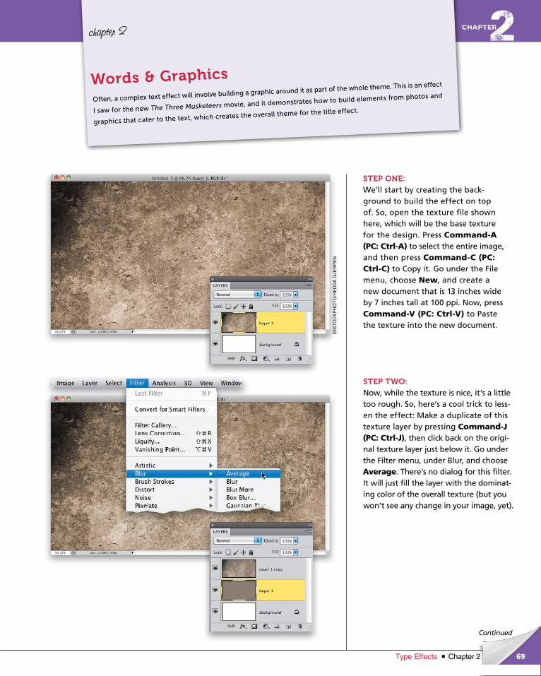
ptg6970545
69Chapter 2Type Effects
©IS
TO
CK
PH
OT
O/H
ED
DA
GJE
RP
EN
Continued
chapter 2
STEP ONE:We’ll start by creating the back -ground to build the effect on top of. So, open the texture file shown here, which will be the base texture for the design. Press Command-A (PC: Ctrl-A) to select the entire image, and then press Command-C (PC: Ctrl-C) to Copy it. Go under the File menu, choose New, and create a new docu ment that is 13 inches wide by 7 inches tall at 100 ppi. Now, pressCommand-V (PC: Ctrl-V) to Paste the texture into the new document.
STEP TWO:Now, while the texture is nice, it’s a little too rough. So, here’s a cool trick to less-en the effect: Make a duplicate of this texture layer by pressing Command-J (PC: Ctrl-J), then click back on the origi-nal texture layer just below it. Go under the Filter menu, under Blur, and choose Average. There’s no dialog for this filter. It will just fill the layer with the dominat-ing color of the overall texture (but you won’t see any change in your image, yet).
Often, a complex text effect will involve building a graphic around it as part of the whole theme. This is an effect
I saw for the new The Three Musketeers movie, and it demonstrates how to build elements from photos and
graphics that cater to the text, which creates the overall theme for the title effect.
Words & Graphics
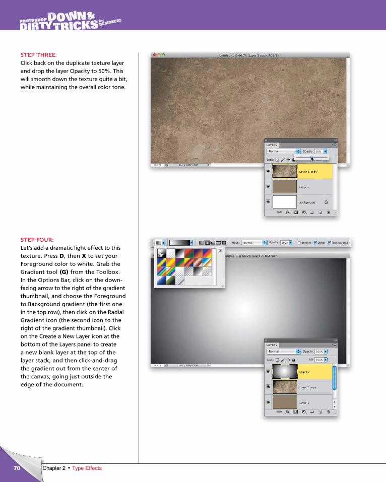
ptg6970545
70 Chapter 2 Type Effects
STEP THREE:Click back on the duplicate texture layer and drop the layer Opacity to 50%. This will smooth down the texture quite a bit, while maintaining the overall color tone.
STEP FOUR:Let’s add a dramatic light effect to this texture. Press D, then X to set your Fore ground color to white. Grab the Gradient tool (G) from the Tool box. In the Options Bar, click on the down-facing arrow to the right of the gradient thumbnail, and choose the Foreground to Background gradient (the first one in the top row), then click on the Radial Gradient icon (the second icon to the right of the gradient thumbnail). Click on the Create a New Layer icon at the bottom of the Layers panel to create a new blank layer at the top of the layer stack, and then click-and-drag the gradient out from the center of the canvas, going just outside the edge of the document.
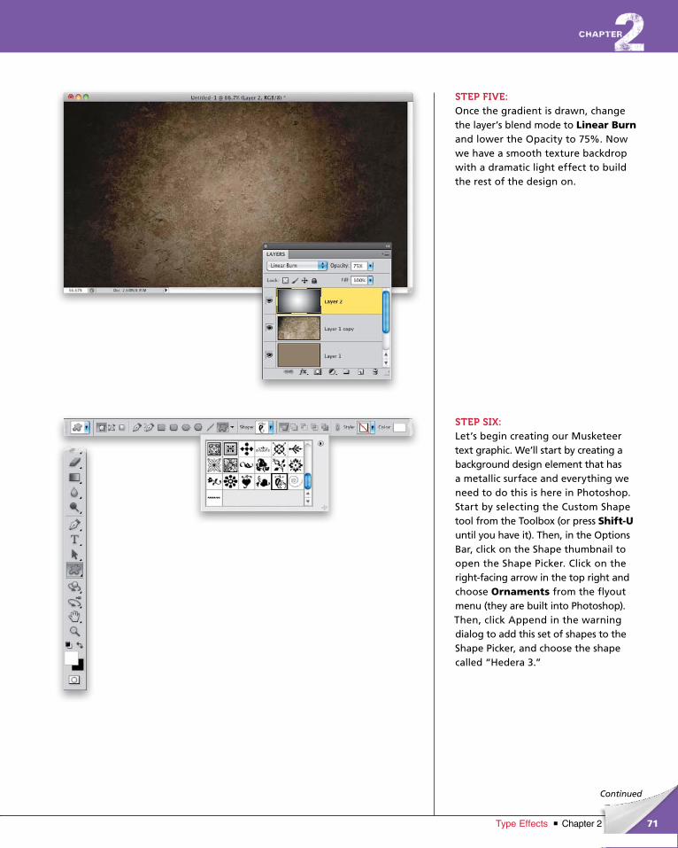
ptg6970545
71Chapter 2Type Effects
Continued
STEP FIVE:Once the gradient is drawn, change the layer’s blend mode to Linear Burnand lower the Opacity to 75%. Now we have a smooth texture backdrop with a dramatic light effect to build the rest of the design on.
STEP SIX:Let’s begin creating our Musketeer text graphic. We’ll start by creating a background design element that has a metallic surface and everything we need to do this is here in Photoshop. Start by selecting the Custom Shape tool from the Toolbox (or press Shift-Uuntil you have it). Then, in the Options Bar, click on the Shape thumbnail to open the Shape Picker. Click on the right-facing arrow in the top right and choose Orna ments from the flyout menu (they are built into Photo shop). Then, click Append in the warning dialog to add this set of shapes to the Shape Picker, and choose the shape called “Hedera 3.”
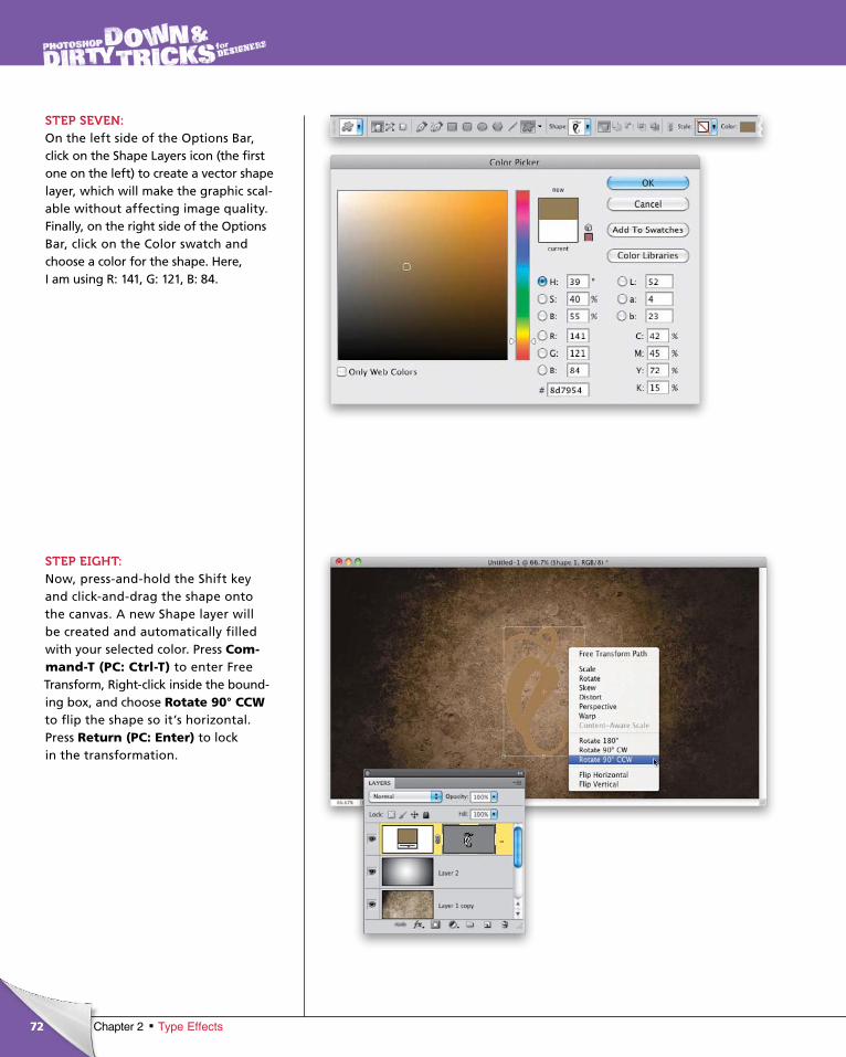
ptg6970545
72 Chapter 2 Type Effects
STEP SEVEN:On the left side of the Options Bar, click on the Shape Layers icon (the first one on the left) to create a vector shape layer, which will make the graphic scal-able without affecting image quality. Finally, on the right side of the Options Bar, click on the Color swatch and choose a color for the shape. Here, I am using R: 141, G: 121, B: 84.
STEP EIGHT:Now, press-and-hold the Shift key and click-and-drag the shape onto the canvas. A new Shape layer will be created and automatically filled with your selected color. Press Com-mand-T (PC: Ctrl-T) to enter Free Trans form, Right-click inside the bound-ing box, and choose Rotate 90° CCWto flip the shape so it’s horizontal. Press Return (PC: Enter) to lock in the transformation.
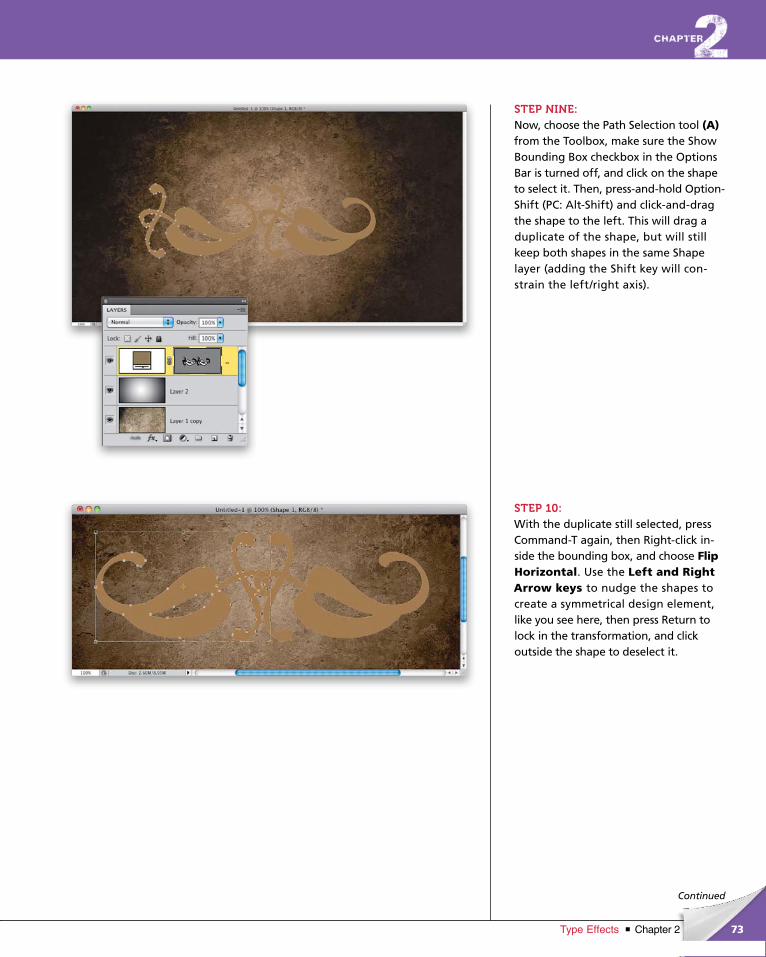
ptg6970545
73Chapter 2Type Effects
Continued
STEP NINE:Now, choose the Path Selection tool (A) from the Toolbox, make sure the Show Bounding Box checkbox in the Options Bar is turned off, and click on the shape to select it. Then, press-and-hold Option-Shift (PC: Alt-Shift) and click-and-drag the shape to the left. This will drag a duplicate of the shape, but will still keep both shapes in the same Shape layer (adding the Shift key will con-strain the left/right axis).
STEP 10:With the duplicate still selected, press Command-T again, then Right-click in-side the bounding box, and choose Flip Horizon tal. Use the Left and Right Arrow keys to nudge the shapes to create a symmetrical design element, like you see here, then press Return to lock in the transformation, and click outside the shape to deselect it.
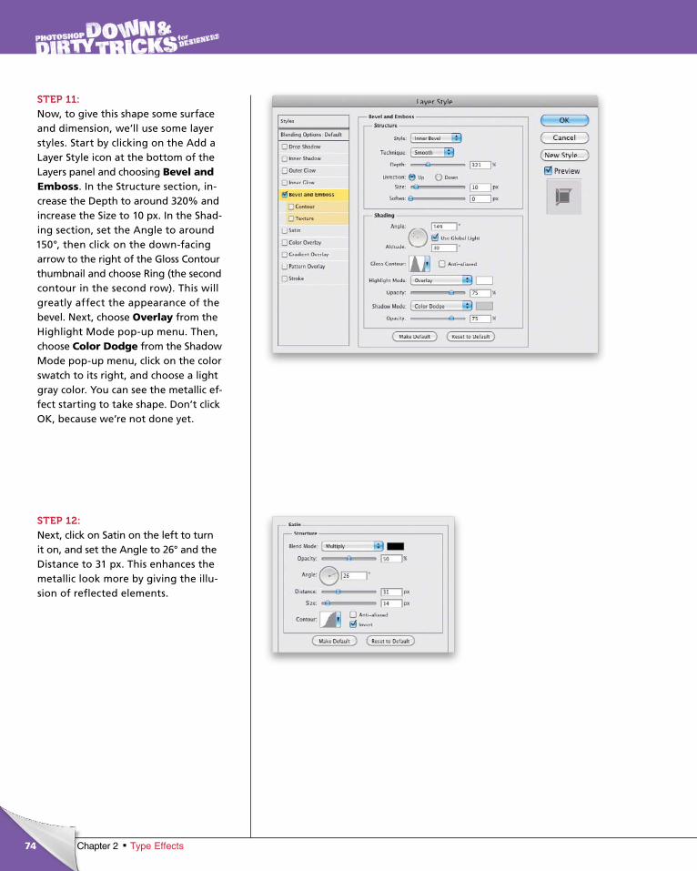
ptg6970545
74 Chapter 2 Type Effects
STEP 11:Now, to give this shape some surface and dimension, we’ll use some layer styles. Start by clicking on the Add a Layer Style icon at the bottom of the Layers panel and choosing Bevel and Emboss. In the Structure section, in-crease the Depth to around 320% and increase the Size to 10 px. In the Shad-ing section, set the Angle to around 150°, then click on the down-facing arrow to the right of the Gloss Contour thumb nail and choose Ring (the second contour in the second row). This will greatly affect the appearance of the bevel. Next, choose Overlay from the Highlight Mode pop-up menu. Then, choose Color Dodge from the Shadow Mode pop-up menu, click on the color swatch to its right, and choose a light gray color. You can see the metallic ef-fect starting to take shape. Don’t click OK, because we’re not done yet.
STEP 12:Next, click on Satin on the left to turn it on, and set the Angle to 26° and the Distance to 31 px. This enhances the metallic look more by giving the illu-sion of reflected elements.
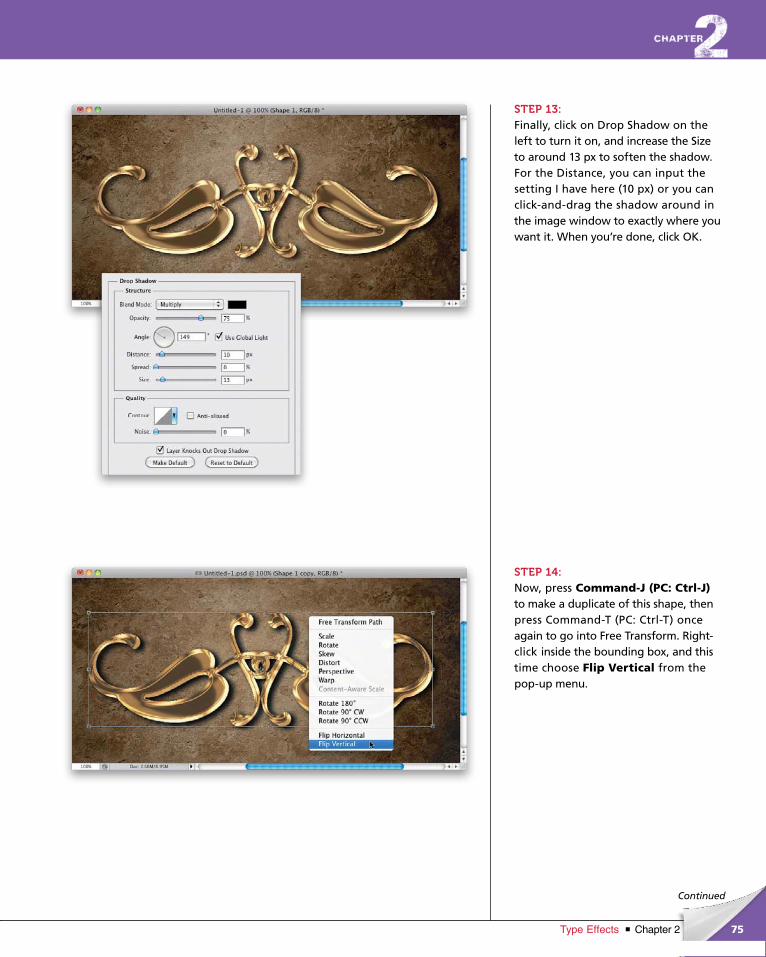
ptg6970545
75Chapter 2Type Effects
Continued
STEP 13: Finally, click on Drop Shadow on the left to turn it on, and increase the Size to around 13 px to soften the shadow. For the Distance, you can input the setting I have here (10 px) or you can click-and-drag the shadow around in the image window to exactly where you want it. When you’re done, click OK.
STEP 14:Now, press Command-J (PC: Ctrl-J) to make a duplicate of this shape, then press Command-T (PC: Ctrl-T) once again to go into Free Transform. Right- click inside the bounding box, and this time choose Flip Vertical from the pop-up menu.
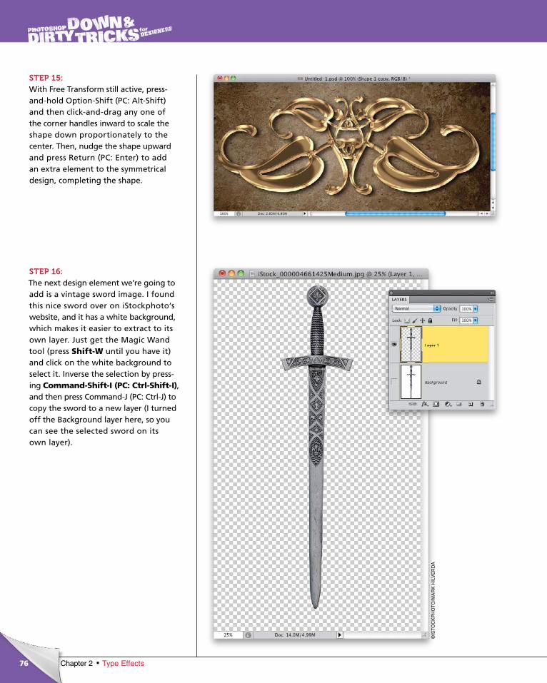
ptg6970545
76
©IS
TO
CK
PH
OT
O/M
AR
K H
ILV
ER
DA
Chapter 2 Type Effects
STEP 15:With Free Transform still active, press-and-hold Option-Shift (PC: Alt-Shift) and then click-and-drag any one of the corner handles inward to scale the shape down proportionately to the center. Then, nudge the shape upward and press Return (PC: Enter) to add an extra element to the symmetrical design, completing the shape.
STEP 16:The next design element we’re going to add is a vintage sword image. I found this nice sword over on iStockphoto’s web site, and it has a white background, which makes it easier to extract to its own layer. Just get the Magic Wand tool (press Shift-W until you have it) and click on the white back ground to select it. Inverse the selection by press-ing Command-Shift-I (PC: Ctrl-Shift-I), and then press Command-J (PC: Ctrl-J) to copy the sword to a new layer (I turned off the Background layer here, so you can see the selected sword on its own layer).

ptg6970545
77Chapter 2Type Effects
Continued
STEP 17:Now, use the Move tool (V) to drag-and-drop the sword layer into the working design document. Move the sword into the middle of the design and use Free Transform to scale it to fit in the area, like you see here. Also, when I moved the sword into my document, I thought the shape graphic looked too big. So, I Command-clicked (PC: Ctrl-clicked) on both Shape layers in the Layers panel and used Free Transform to decrease their size a bit.
STEP 18:To finish off the sword, add a Drop Shadow layer style to it, using the settings shown here.
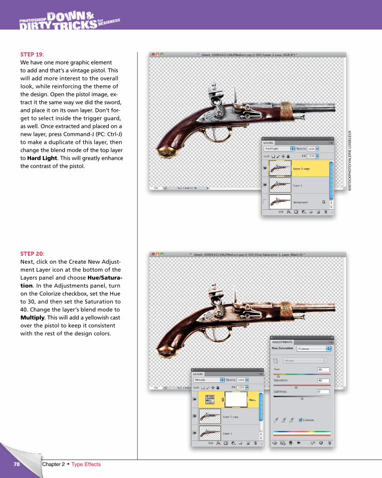
ptg6970545
78
©IS
TO
CK
PH
OT
O/V
ALE
RIE
LO
ISE
LEU
X
Chapter 2 Type Effects
STEP 19:We have one more graphic element to add and that’s a vintage pistol. This will add more interest to the overall look, while reinforcing the theme of the design. Open the pistol image, ex-tract it the same way we did the sword, and place it on its own layer. Don’t for-get to select inside the trigger guard, as well. Once extracted and placed on a new layer, press Command-J (PC: Ctrl-J) to make a duplicate of this layer, then change the blend mode of the top layer to Hard Light. This will great ly enhance the contrast of the pistol.
STEP 20:Next, click on the Create New Adjust-ment Layer icon at the bottom of the Layers panel and choose Hue/Satura-tion. In the Adjustments panel, turn on the Colorize checkbox, set the Hue to 30, and then set the Saturation to 40. Change the layer’s blend mode to Multiply. This will add a yellowish cast over the pistol to keep it consistent with the rest of the design colors.
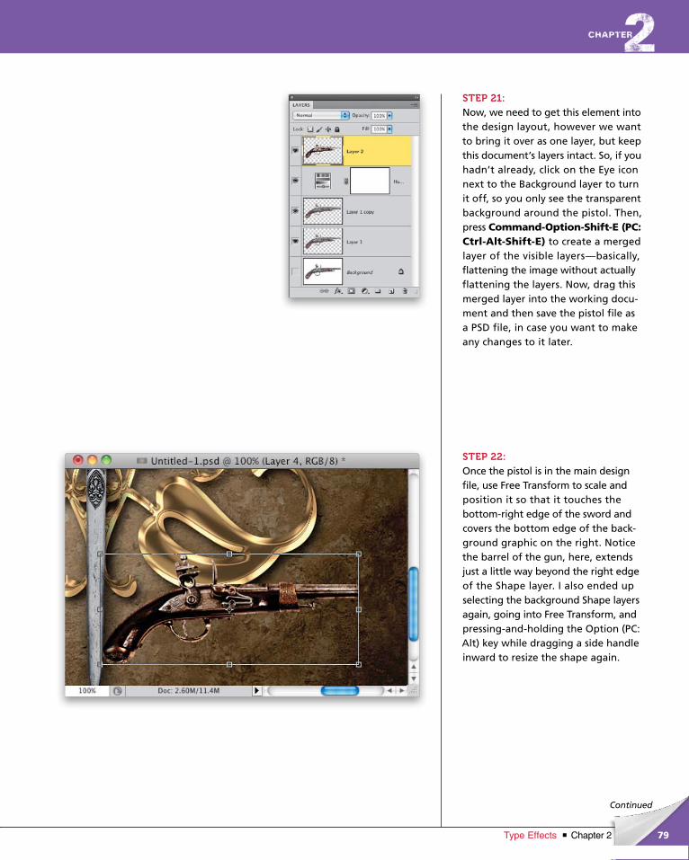
ptg6970545
79Chapter 2Type Effects
Continued
STEP 21:Now, we need to get this element into the design layout, however we want to bring it over as one layer, but keep this document’s layers intact. So, if you hadn’t already, click on the Eye icon next to the Background layer to turn it off, so you only see the transparent background around the pistol. Then, press Command-Option-Shift-E (PC: Ctrl-Alt-Shift-E) to create a merged layer of the visible layers—basically, flattening the image without actually flattening the layers. Now, drag this merged layer into the working docu-ment and then save the pistol file as a PSD file, in case you want to make any changes to it later.
STEP 22:Once the pistol is in the main design file, use Free Transform to scale and position it so that it touches the bottom-right edge of the sword and covers the bottom edge of the back-ground graphic on the right. Notice the barrel of the gun, here, extends just a little way beyond the right edge of the Shape layer. I also ended up selecting the background Shape layers again, going into Free Trans form, and pressing-and-holding the Option (PC: Alt) key while dragging a side handle inward to resize the shape again.
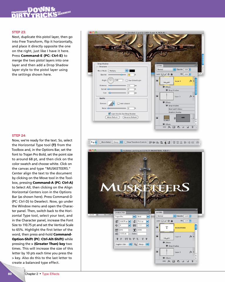
ptg6970545
80 Chapter 2 Type Effects
STEP 23:Next, duplicate this pistol layer, then go into Free Transform, flip it horizontally, and place it directly opposite the one on the right, just like I have it here. Press Command-E (PC: Ctrl-E) to merge the two pistol layers into one layer and then add a Drop Shadow layer style to the pistol layer using the settings shown here.
STEP 24:Now, we’re ready for the text. So, select the Horizontal Type tool (T) from the Toolbox and, in the Options Bar, set the font to Trajan Pro Bold, set the point size to around 68 pt, and then click on the color swatch and choose white. Click on the canvas and type “MUSKETEERS.” Center align the text to the document by clicking on the Move tool in the Tool-box, pressing Command-A (PC: Ctrl-A)to Select All, then clicking on the Align Hor izontal Centers icon in the Options Bar (as shown here). Press Command-D (PC: Ctrl-D) to Deselect. Now, go under the Win dow menu and open the Charac-ter panel. Then, switch back to the Hori-zon tal Type tool, select your text, and in the Character panel, increase the Font Size to 110.75 pt and set the Vertical Scale to 65%. Highlight the first letter of the word, then press-and-hold Command-Option-Shift (PC: Ctrl-Alt-Shift) while pressing the > (Greater Than) key two times. This will increase the size of this letter by 10 pts each time you press the > key. Also do this to the last letter to create a balanced type effect.
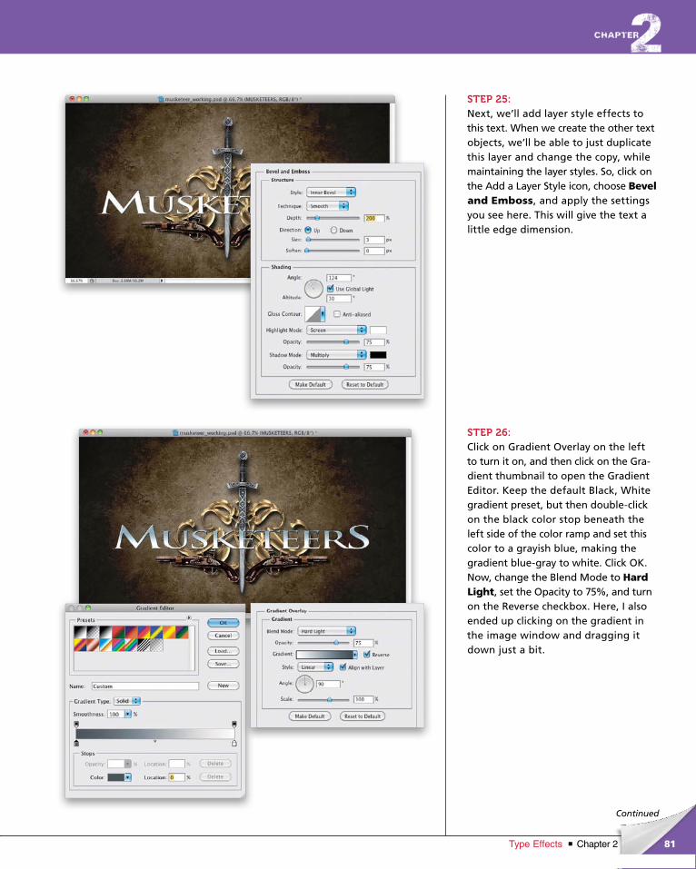
ptg6970545
81Chapter 2Type Effects
Continued
STEP 25:Next, we’ll add layer style effects to this text. When we create the other text objects, we’ll be able to just duplicate this layer and change the copy, while maintaining the layer styles. So, click on the Add a Layer Style icon, choose Bevel and Emboss, and apply the settings you see here. This will give the text a little edge dimension.
STEP 26:Click on Gradient Overlay on the left to turn it on, and then click on the Gra-dient thumbnail to open the Gradient Editor. Keep the default Black, White gradient preset, but then double-click on the black color stop beneath the left side of the color ramp and set this color to a grayish blue, making the gradient blue-gray to white. Click OK. Now, change the Blend Mode to Hard Light, set the Opacity to 75%, and turn on the Reverse checkbox. Here, I also ended up clicking on the gradient in the image window and dragging it down just a bit.
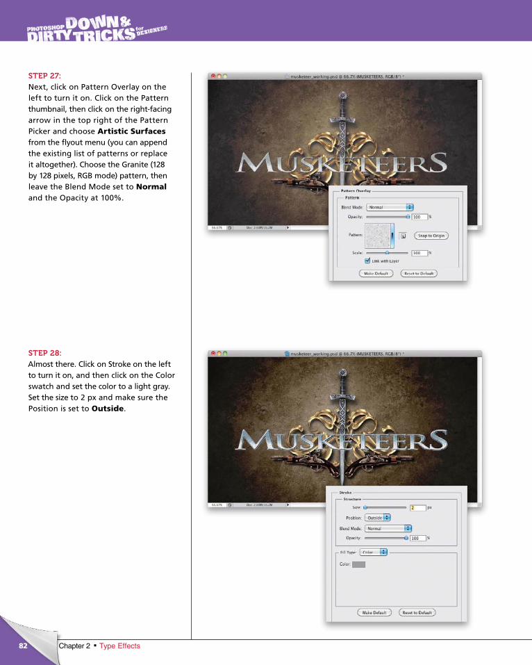
ptg6970545
82 Chapter 2 Type Effects
STEP 27:Next, click on Pattern Overlay on the left to turn it on. Click on the Pattern thumbnail, then click on the right-facing arrow in the top right of the Pattern Picker and choose Artistic Surfacesfrom the fly out menu (you can append the existing list of patterns or replace it altogether). Choose the Granite (128 by 128 pixels, RGB mode) pattern, then leave the Blend Mode set to Normaland the Opacity at 100%.
STEP 28:Almost there. Click on Stroke on the left to turn it on, and then click on the Color swatch and set the color to a light gray. Set the size to 2 px and make sure the Position is set to Outside.
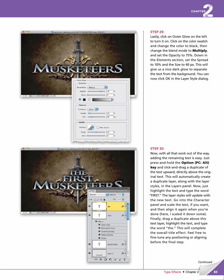
ptg6970545
83Chapter 2Type Effects
Continued
STEP 29:Lastly, click on Outer Glow on the left to turn it on. Click on the color swatch and change the color to black, then change the blend mode to Multiply, and set the Opacity to 75%. Down in the Elements section, set the Spread to 10% and the Size to 40 px. This will give us a nice dark glow to separate the text from the background. You can now click OK in the Layer Style dialog.
STEP 30:Now, with all that work out of the way, adding the remaining text is easy. Just press-and-hold the Option (PC: Alt) key and click-and-drag a duplicate of the text upward, directly above the orig-inal text. This will automatically create a duplicate layer, along with the layer styles, in the Layers panel. Now, just highlight the text and type the word
“FIRST.” The layer styles will update with the new text. Go into the Character panel and scale the text, if you want, and then align it again when you’re done (here, I scaled it down some). Fi nally, drag a duplicate above this text layer, highlight the text, and type the word “the.” This will complete the overall title effect. Feel free to fine-tune any positioning or aligning before the final step.
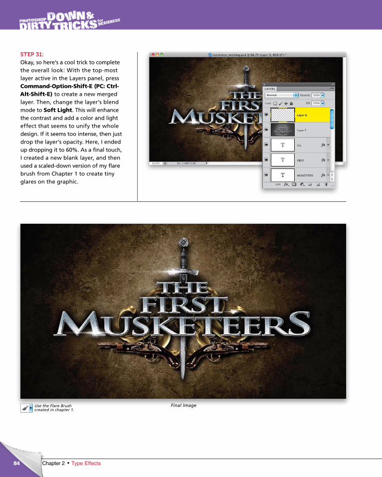
ptg6970545
84 Chapter 2 Type Effects
STEP 31:Okay, so here’s a cool trick to complete the overall look: With the top-most layer active in the Layers panel, press Command-Option-Shift-E (PC: Ctrl-Alt-Shift-E) to create a new merged layer. Then, change the layer’s blend mode to Soft Light. This will enhance the contrast and add a color and light effect that seems to unify the whole design. If it seems too intense, then just drop the layer’s opacity. Here, I ended up dropping it to 60%. As a final touch, I created a new blank layer, and then used a scaled-down version of my flare brush from Chapter 1 to create tiny glares on the graphic.
Final ImageUse the Flare Brush created in chapter 1.

ptg6970545
This page intentionally left blank
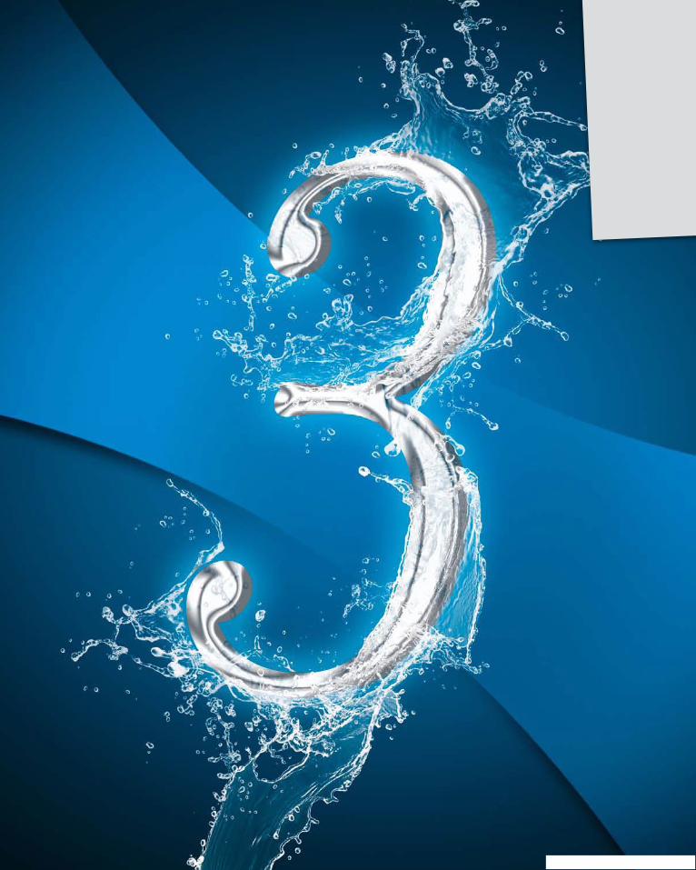
ptg6970545
ptg6970545
As a designer, you’re always seeking that “Eureka!” moment that grabs
you in an instant and shoots a feeling through your spine that lets you
know that: a) you need to see a chiropractor soon, or b) you’ve discovered
that elusive WOW! factor. It’s that moment when you see a spark of an idea
that tells you you’re on the right track. Unfortunately, there’s no formula for
getting that WOW! factor every time. It really depends on the designer and
how much you choose to see. The best I can do here is present you with
some strategies that will kick-start your creative mind in the hopes that,
along the way, you’ll see that spark that sets you off on your own creative
journey into the unknown. Lately, it seems to be the road less traveled by
many designers. Be bold and see where your mind takes you.
The Elusive WOW! Factordesign effects
87Chapter 3Design Effects
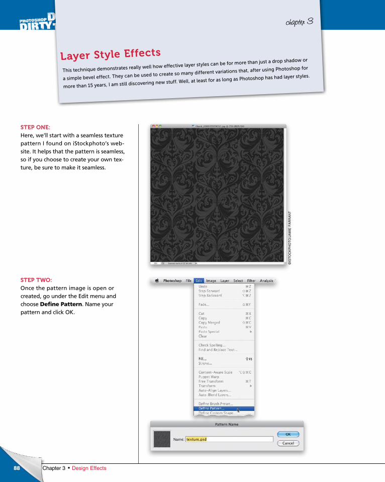
ptg6970545
88 Chapter 3 Design Effects
chapter 3
STEP ONE:Here, we’ll start with a seamless texture pattern I found on iStockphoto’s website. It helps that the pattern is seamless, so if you choose to create your own texture, be sure to make it seamless.
STEP TWO:Once the pattern image is open or created, go under the Edit menu and choose Define Pattern. Name your pattern and click OK.
This technique demonstrates really well how effective layer styles can be for more than just a drop shadow or
a simple bevel effect. They can be used to create so many different variations that, after using Photoshop for
more than 15 years, I am still discovering new stuff. Well, at least for as long as Photoshop has had layer styles.
Layer Style Effects
©IS
TO
CK
PH
OT
O/J
AM
IE F
AR
RA
NT
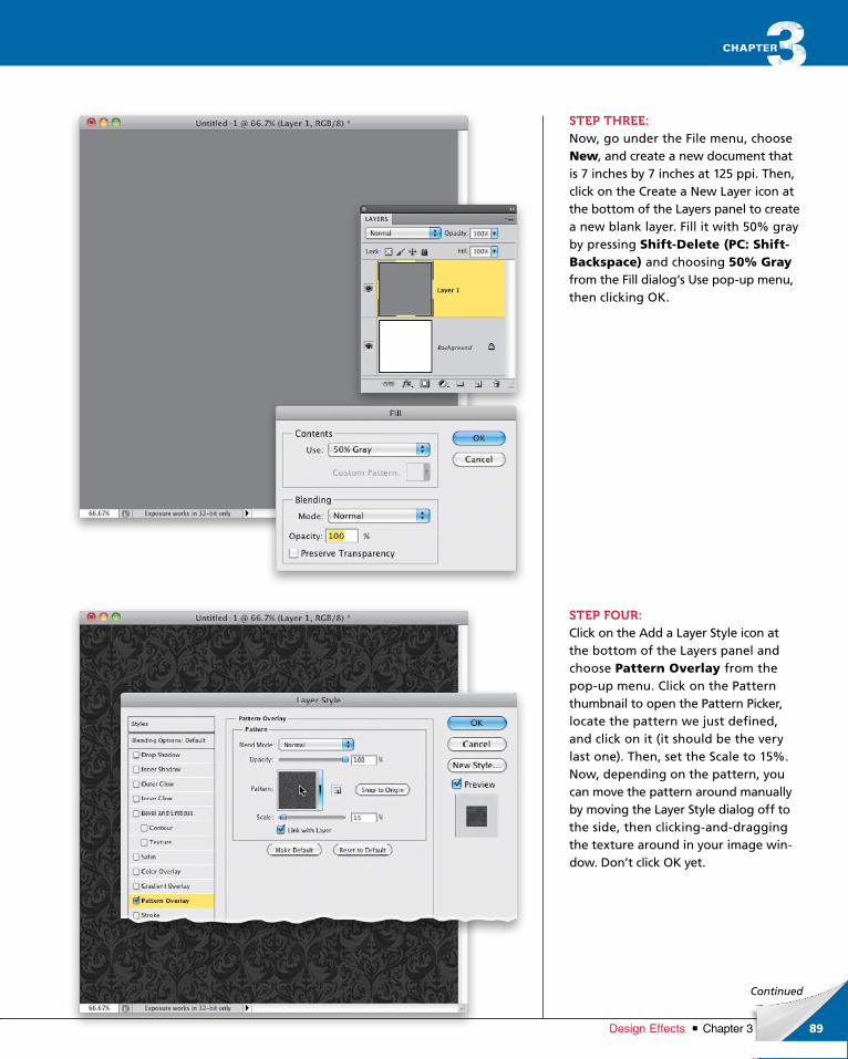
ptg6970545
89Chapter 3Design Effects
Continued
STEP THREE:Now, go under the File menu, choose New, and create a new document that is 7 inches by 7 inches at 125 ppi. Then, click on the Create a New Layer icon at the bottom of the Layers panel to create a new blank layer. Fill it with 50% gray by pressing Shift-Delete (PC: Shift-Backspace) and choosing 50% Grayfrom the Fill dialog‘s Use popup menu, then clicking OK.
STEP FOUR:Click on the Add a Layer Style icon at the bottom of the Layers panel and choose Pattern Overlay from the popup menu. Click on the Pattern thumbnail to open the Pattern Picker, locate the pattern we just defined, and click on it (it should be the very last one). Then, set the Scale to 15%. Now, depending on the pattern, you can move the pattern around manually by moving the Layer Style dialog off to the side, then clickinganddragging the texture around in your image window. Don’t click OK yet.
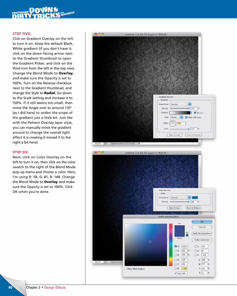
ptg6970545
90 Chapter 3 Design Effects
STEP FIVE:Click on Gradient Overlay on the left to turn it on. Keep the default Black, White gradient (if you don’t have it, click on the downfacing arrow next to the Gradient thumbnail to open the Gradient Picker, and click on the third icon from the left in the top row). Change the Blend Mode to Overlay, and make sure the Opacity is set to 100%. Turn on the Reverse checkbox next to the Gradient thumbnail, and change the Style to Radial. Go down to the Scale setting and increase it to 150%. If it still seems too small, then move the Angle over to around 110º (as I did here) to widen the scope of the gradient just a little bit. Just like with the Pattern Overlay layer style, you can manually move the gradient around to change the overall light effect it is creating (I moved it to the right a bit here).
STEP SIX:Next, click on Color Overlay on the left to turn it on, then click on the color swatch to the right of the Blend Mode popup menu and choose a color. Here, I’m using R: 58, G: 81, B: 148. Change the Blend Mode to Overlay and make sure the Opacity is set to 100%. Click OK when you’re done.
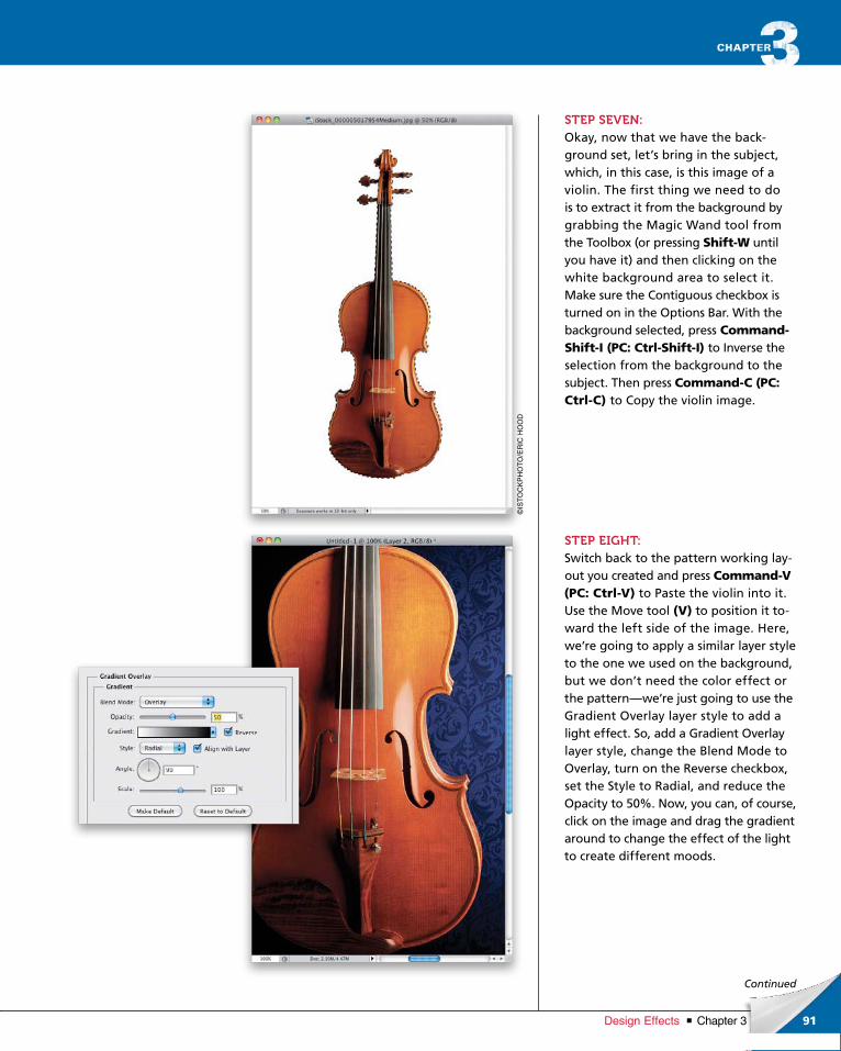
ptg6970545
91Chapter 3Design Effects
©IS
TO
CK
PH
OT
O/E
RIC
HO
OD
Continued
STEP SEVEN:Okay, now that we have the background set, let’s bring in the subject, which, in this case, is this image of a violin. The first thing we need to do is to extract it from the background by grabbing the Magic Wand tool from the Toolbox (or pressing Shift-W until you have it) and then clicking on the white background area to select it. Make sure the Contiguous checkbox is turned on in the Options Bar. With the background selected, press Command-Shift-I (PC: Ctrl-Shift-I) to Inverse the selection from the background to the subject. Then press Command-C (PC: Ctrl-C) to Copy the violin image.
STEP EIGHT:Switch back to the pattern working layout you created and press Command-V (PC: Ctrl-V) to Paste the violin into it. Use the Move tool (V) to position it toward the left side of the image. Here, we’re going to apply a similar layer style to the one we used on the background, but we don’t need the color effect or the pattern—we’re just going to use the Gradient Overlay layer style to add a light effect. So, add a Gradient Overlay layer style, change the Blend Mode to Overlay, turn on the Reverse checkbox, set the Style to Radial, and reduce the Opacity to 50%. Now, you can, of course, click on the image and drag the gradient around to change the effect of the light to create different moods.
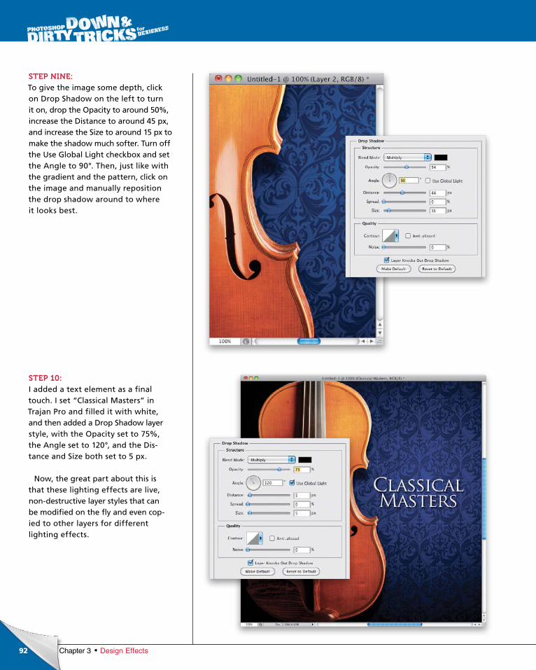
ptg6970545
92 Chapter 3 Design Effects
STEP NINE:To give the image some depth, click on Drop Shadow on the left to turn it on, drop the Opacity to around 50%, increase the Distance to around 45 px, and increase the Size to around 15 px to make the shadow much softer. Turn off the Use Global Light checkbox and set the Angle to 90°. Then, just like with the gradient and the pattern, click on the image and manually reposition the drop shadow around to where it looks best.
STEP 10:I added a text element as a final touch. I set “Classical Masters” in Trajan Pro and filled it with white, and then added a Drop Shadow layer style, with the Opacity set to 75%, the Angle set to 120°, and the Distance and Size both set to 5 px.
Now, the great part about this is that these lighting effects are live, nondestructive layer styles that can be modified on the fly and even copied to other layers for different lighting effects.
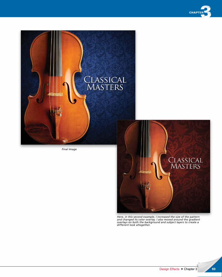
ptg6970545
93Chapter 3Design Effects
Final Image
Here, in this second example, I increased the size of the pattern and changed its color overlay. I also moved around the gradient overlays on both the background and subject layers to create a different look altogether.
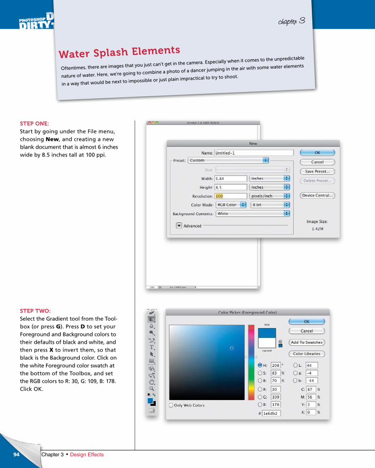
ptg6970545
94 Chapter 3 Design Effects
chapter 3
STEP ONE:Start by going under the File menu, choosing New, and creating a new blank document that is almost 6 inches wide by 8.5 inches tall at 100 ppi.
STEP TWO:Select the Gradient tool from the Toolbox (or press G). Press D to set your Foreground and Background colors to their defaults of black and white, and then press X to invert them, so that black is the Background color. Click on the white Foreground color swatch at the bottom of the Toolbox, and set the RGB colors to R: 30, G: 109, B: 178. Click OK.
Oftentimes, there are images that you just can’t get in the camera. Especially when it comes to the unpredictable
nature of water. Here, we’re going to combine a photo of a dancer jumping in the air with some water elements
in a way that would be next to impossible or just plain impractical to try to shoot.
Water Splash Elements
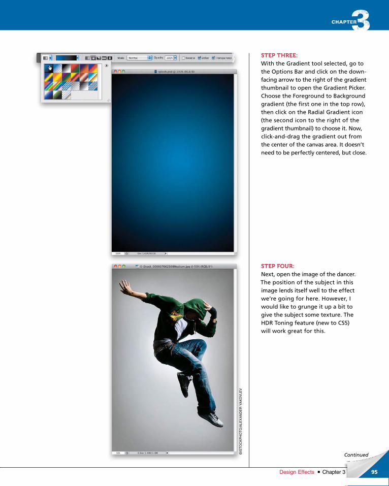
ptg6970545
95Chapter 3Design Effects
Continued
STEP THREE:With the Gradient tool selected, go to the Options Bar and click on the downfacing arrow to the right of the gradient thumbnail to open the Gradient Picker. Choose the Foreground to Background gradient (the first one in the top row), then click on the Radial Gradient icon (the second icon to the right of the gradient thumbnail) to choose it. Now, clickanddrag the gradient out from the center of the canvas area. It doesn’t need to be perfectly centered, but close.
STEP FOUR:Next, open the image of the dancer. The position of the subject in this image lends itself well to the effect we’re going for here. However, I would like to grunge it up a bit to give the subject some texture. The HDR Toning feature (new to CS5) will work great for this.
©IS
TO
CK
PH
OT
O/A
LEX
AN
DE
R Y
AK
OV
LEV
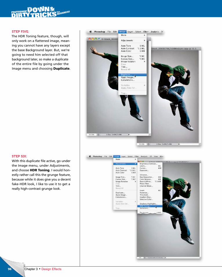
ptg6970545
96 Chapter 3 Design Effects
STEP FIVE:The HDR Toning feature, though, will only work on a flattened image, meaning you cannot have any layers except the base Background layer. But, we’re going to need him selected off that background later, so make a duplicate of the entire file by going under the Image menu and choosing Duplicate.
STEP SIX:With this duplicate file active, go under the Image menu, under Adjustments, and choose HDR Toning. I would honestly rather call this the grunge feature, because while it does give you a decent fakeHDR look, I like to use it to get a really highcontrast grunge look.
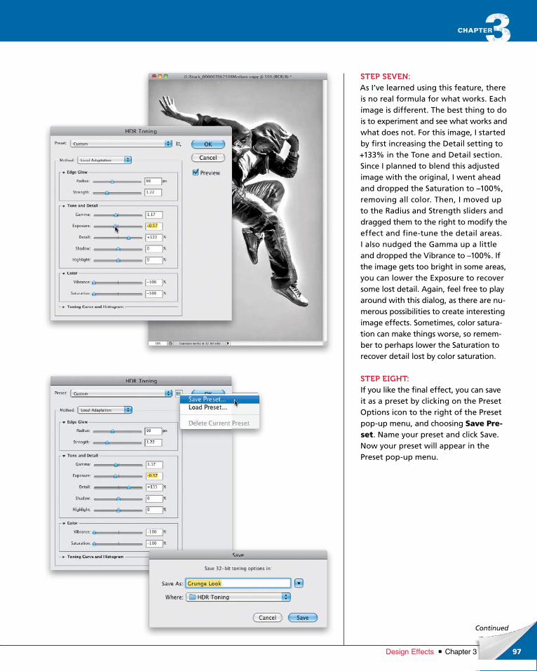
ptg6970545
97Chapter 3Design Effects
Continued
STEP SEVEN:As I’ve learned using this feature, there is no real formula for what works. Each image is different. The best thing to do is to experiment and see what works and what does not. For this image, I start ed by first increas ing the Detail setting to +133% in the Tone and Detail section. Since I planned to blend this adjusted image with the original, I went ahead and dropped the Saturation to –100%, removing all color. Then, I moved up to the Radius and Strength sliders and dragged them to the right to modify the effect and finetune the detail areas. I also nudged the Gamma up a little and dropped the Vibrance to –100%. If the image gets too bright in some areas, you can lower the Exposure to recover some lost detail. Again, feel free to play around with this dialog, as there are numerous possibilities to create interesting image effects. Sometimes, color saturation can make things worse, so remember to perhaps lower the Saturation to recover detail lost by color saturation.
STEP EIGHT:If you like the final effect, you can save it as a preset by clicking on the Preset Options icon to the right of the Preset popup menu, and choosing Save Pre-set. Name your preset and click Save. Now your preset will appear in the Preset popup menu.
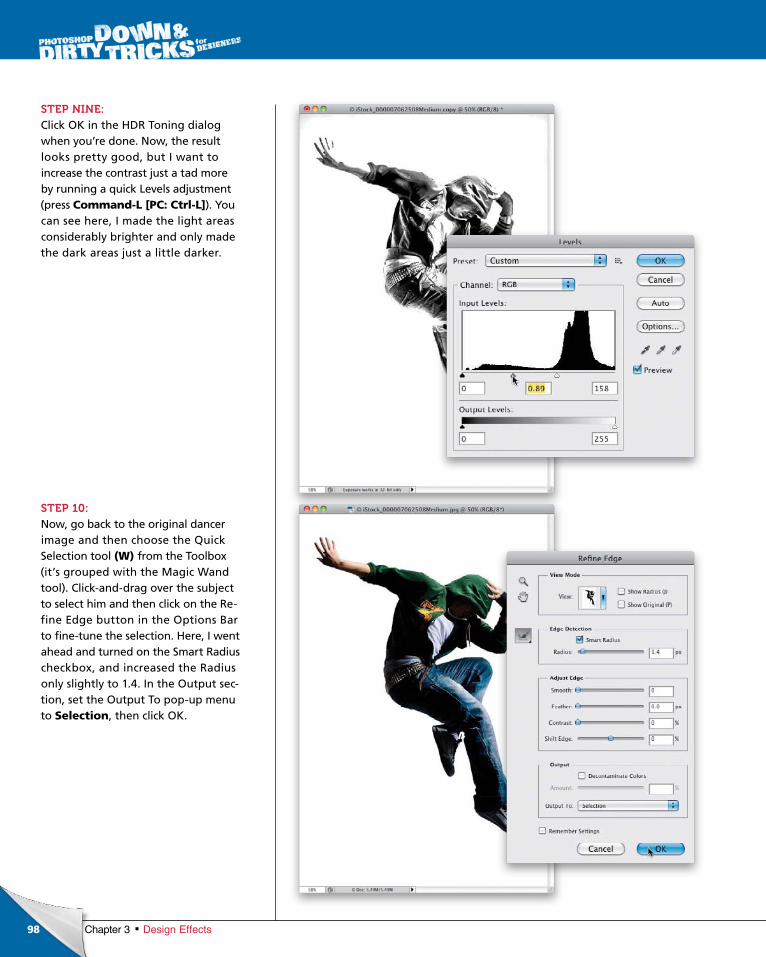
ptg6970545
98 Chapter 3 Design Effects
STEP NINE:Click OK in the HDR Toning dialog when you’re done. Now, the result looks pretty good, but I want to increase the contrast just a tad more by running a quick Levels adjustment (press Command-L [PC: Ctrl-L]). You can see here, I made the light areas considerably brighter and only made the dark areas just a little darker.
STEP 10:Now, go back to the original dancer image and then choose the Quick Selection tool (W) from the Toolbox (it’s grouped with the Magic Wand tool). Clickanddrag over the subject to select him and then click on the Refine Edge button in the Options Bar to finetune the selection. Here, I went ahead and turned on the Smart Radius checkbox, and increased the Radius only slightly to 1.4. In the Output section, set the Output To popup menu to Selection, then click OK.
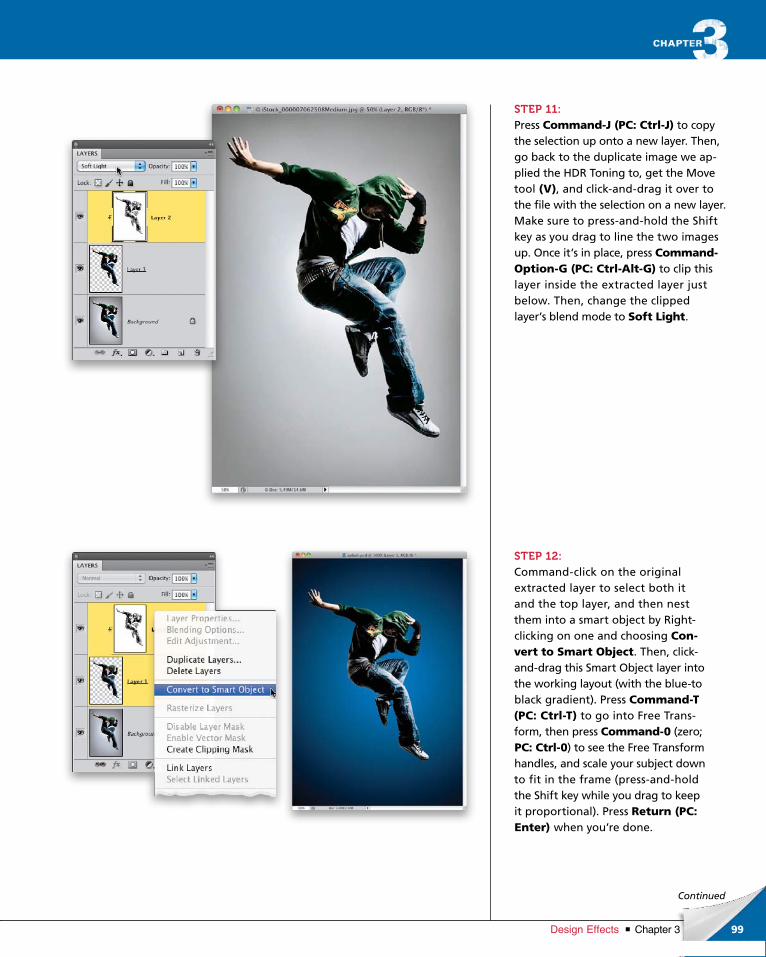
ptg6970545
99Chapter 3Design Effects
Continued
STEP 11:Press Command-J (PC: Ctrl-J) to copy the selection up onto a new layer. Then, go back to the duplicate image we applied the HDR Toning to, get the Move tool (V), and clickanddrag it over to the file with the selection on a new layer. Make sure to pressandhold the Shift key as you drag to line the two images up. Once it’s in place, press Command-Option-G (PC: Ctrl-Alt-G) to clip this layer inside the extracted layer just below. Then, change the clipped layer’s blend mode to Soft Light.
STEP 12:Commandclick on the original extracted layer to select both it and the top layer, and then nest them into a smart object by Rightclicking on one and choosing Con-vert to Smart Object. Then, clickanddrag this Smart Object layer into the working layout (with the blueto black gradient). Press Com mand-T (PC: Ctrl-T) to go into Free Transform, then press Command-0 (zero; PC: Ctrl-0) to see the Free Trans form handles, and scale your subject down to fit in the frame (pressandhold the Shift key while you drag to keep it proportional). Press Return (PC: Enter) when you’re done.
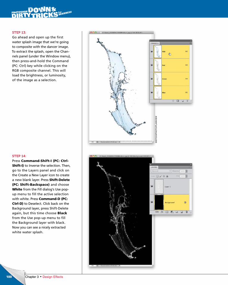
ptg6970545
100
©IS
TO
CK
PH
OT
O/P
LA
INV
IEW
Chapter 3 Design Effects
STEP 13:Go ahead and open up the first water splash image that we’re going to com posite with the dancer image. To extract the splash, open the Channels panel (under the Window menu), then pressandhold the Command (PC: Ctrl) key while clicking on the RGB composite channel. This will load the brightness, or luminosity, of the image as a selection.
STEP 14:Press Command-Shift-I (PC: Ctrl-Shift-I) to Inverse the selection. Then, go to the Layers panel and click on the Create a New Layer icon to create a new blank layer. Press Shift-Delete (PC: Shift-Backspace) and choose White from the Fill dialog’s Use popup menu to fill the active selection with white. Press Command-D (PC: Ctrl-D) to Deselect. Click back on the Background layer, press ShiftDelete again, but this time choose Black from the Use popup menu to fill the Back ground layer with black. Now you can see a nicely extracted white water splash.
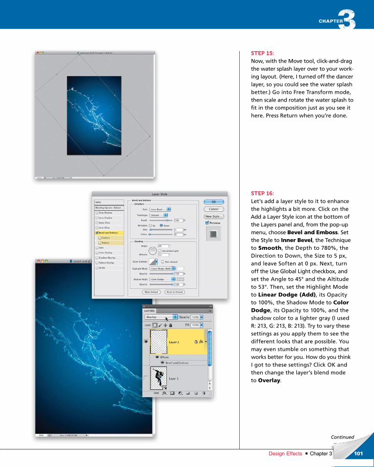
ptg6970545
101Chapter 3Design Effects
Continued
STEP 15:Now, with the Move tool, clickanddrag the water splash layer over to your working layout. (Here, I turned off the dancer layer, so you could see the water splash better.) Go into Free Transform mode, then scale and rotate the water splash to fit in the composition just as you see it here. Press Return when you’re done.
STEP 16:Let’s add a layer style to it to enhance the highlights a bit more. Click on the Add a Layer Style icon at the bottom of the Layers panel and, from the popup menu, choose Bevel and Emboss. Set the Style to Inner Bevel, the Technique to Smooth, the Depth to 780%, the Direction to Down, the Size to 5 px, and leave Soften at 0 px. Next, turn off the Use Global Light checkbox, and set the Angle to 45° and the Altitude to 53°. Then, set the Highlight Mode to Linear Dodge (Add), its Opacity to 100%, the Shadow Mode to Color Dodge, its Opa city to 100%, and the shadow color to a lighter gray (I used R: 213, G: 213, B: 213). Try to vary these settings as you apply them to see the different looks that are possible. You may even stumble on something that works better for you. How do you think I got to these settings? Click OK and then change the layer’s blend mode to Overlay.
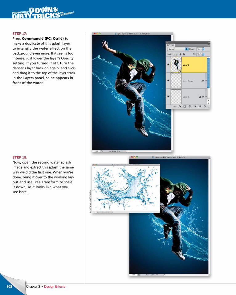
ptg6970545
102 Chapter 3 Design Effects
STEP 17:Press Command-J (PC: Ctrl-J) to make a duplicate of this splash layer to intensify the water effect on the background even more. If it seems too intense, just lower the layer’s Opacity setting. If you turned if off, turn the dancer’s layer back on again, and clickanddrag it to the top of the layer stack in the Layers panel, so he appears in front of the water.
STEP 18:Now, open the second water splash image and extract this splash the same way we did the first one. When you’re done, bring it over to the working layout and use Free Transform to scale it down, so it looks like what you see here.
©IS
TO
CK
PH
OT
O/O
KE
A
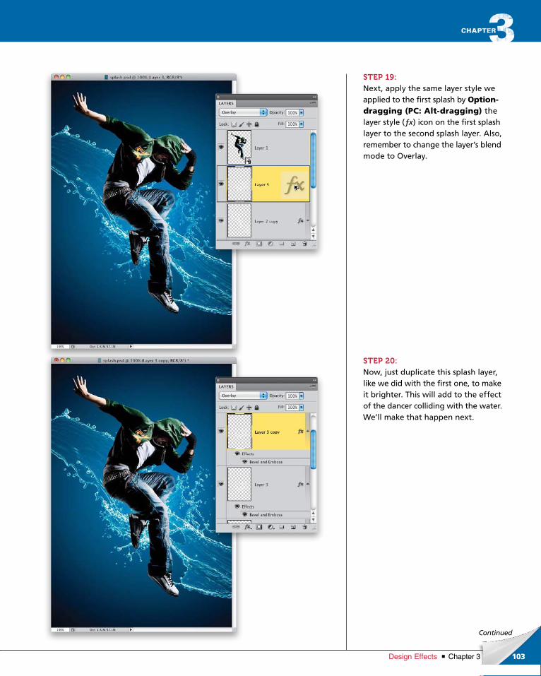
ptg6970545
103Chapter 3Design Effects
Continued
STEP 19:Next, apply the same layer style we applied to the first splash by Option-dragging (PC: Alt-dragging) the layer style (ƒx) icon on the first splash layer to the second splash layer. Also, remember to change the layer’s blend mode to Overlay.
STEP 20:Now, just duplicate this splash layer, like we did with the first one, to make it brighter. This will add to the effect of the dancer colliding with the water. We’ll make that happen next.
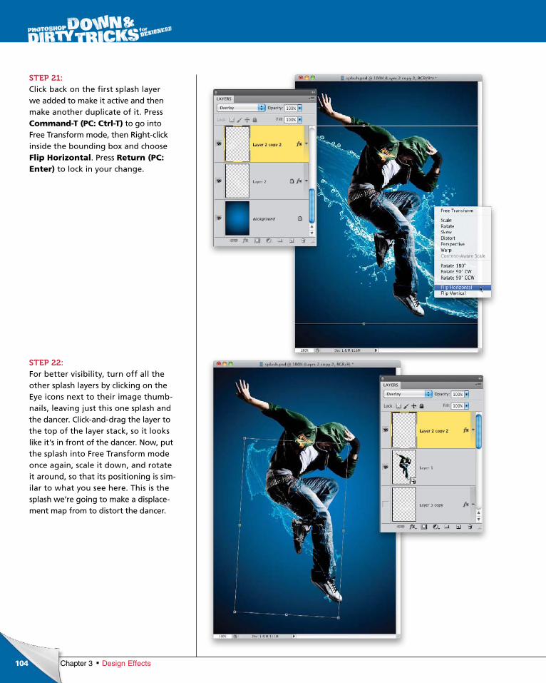
ptg6970545
104 Chapter 3 Design Effects
STEP 21:Click back on the first splash layer we added to make it active and then make another duplicate of it. Press Command-T (PC: Ctrl-T) to go into Free Transform mode, then Rightclick inside the bounding box and choose Flip Horizontal. Press Return (PC: Enter) to lock in your change.
STEP 22:For better visibility, turn off all the other splash layers by clicking on the Eye icons next to their image thumbnails, leaving just this one splash and the dancer. Clickanddrag the layer to the top of the layer stack, so it looks like it’s in front of the dancer. Now, put the splash into Free Transform mode once again, scale it down, and rotate it around, so that its positioning is similar to what you see here. This is the splash we’re going to make a displacement map from to distort the dancer.
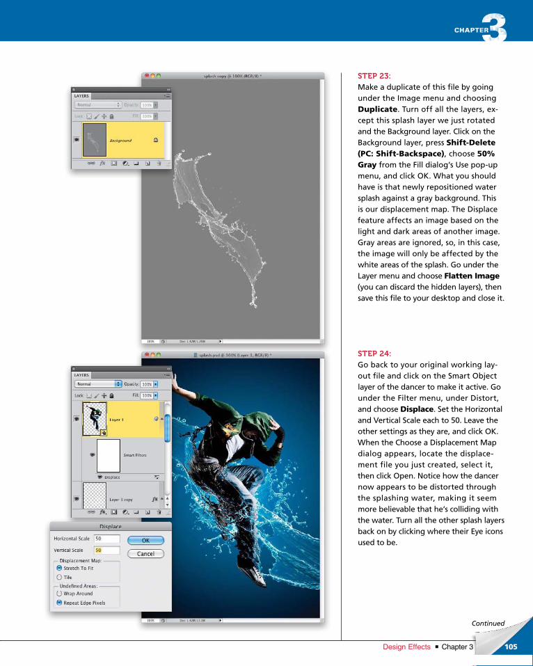
ptg6970545
105Chapter 3Design Effects
Continued
STEP 23:Make a duplicate of this file by going under the Image menu and choosing Duplicate. Turn off all the layers, except this splash layer we just rotated and the Background layer. Click on the Back ground layer, press Shift-Delete (PC: Shift-Backspace), choose 50% Gray from the Fill dialog’s Use popup menu, and click OK. What you should have is that newly repositioned water splash against a gray background. This is our displacement map. The Displace feature affects an image based on the light and dark areas of another image. Gray areas are ignored, so, in this case, the image will only be affected by the white areas of the splash. Go under the Layer menu and choose Flatten Image(you can discard the hidden layers), then save this file to your desktop and close it.
STEP 24:Go back to your original working layout file and click on the Smart Object layer of the dancer to make it active. Go under the Filter menu, under Distort, and choose Displace. Set the Horizontal and Vertical Scale each to 50. Leave the other settings as they are, and click OK. When the Choose a Displacement Map dialog appears, locate the displacement file you just created, select it, then click Open. Notice how the dancer now appears to be distorted through the splashing water, making it seem more believable that he’s colliding with the water. Turn all the other splash layers back on by clicking where their Eye icons used to be.

ptg6970545
106 Chapter 3 Design Effects
STEP 25:Pressandhold the Command (PC: Ctrl) key and click on the image thumbnail for the splash layer that we used to create the displacement map (Layer 2 copy 2) to load it as a selection. Then, click on the dancer layer and Optionclick (PC: Altclick) on the Add Layer Mask icon at the bottom of the Layers panel. This will hide the subject in the area where the distortion is, adding to the effect.
STEP 26:To make it look more like his foot is plunging through the water, duplicate the first water splash layer we used one more time, drag it to the top of the layer stack, then use Free Transform to scale and rotate it to cover his foot, so it looks like what you see here.
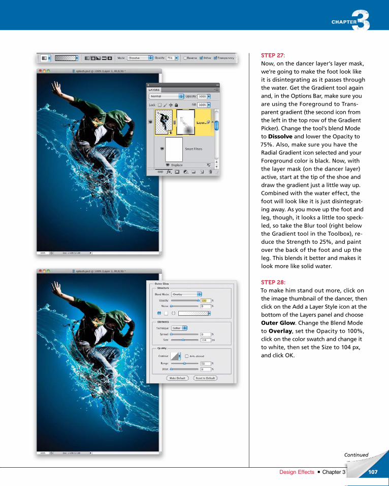
ptg6970545
107Chapter 3Design Effects
Continued
STEP 27:Now, on the dancer layer’s layer mask, we’re going to make the foot look like it is disintegrating as it passes through the water. Get the Gradient tool again and, in the Options Bar, make sure you are using the Foreground to Transparent gradient (the second icon from the left in the top row of the Gradient Picker). Change the tool’s blend Mode to Dissolve and lower the Opacity to 75%. Also, make sure you have the Radial Gradient icon selected and your Foreground color is black. Now, with the layer mask (on the dancer layer) active, start at the tip of the shoe and draw the gradient just a little way up. Combined with the water effect, the foot will look like it is just disintegrating away. As you move up the foot and leg, though, it looks a little too speckled, so take the Blur tool (right below the Gradient tool in the Toolbox), reduce the Strength to 25%, and paint over the back of the foot and up the leg. This blends it better and makes it look more like solid water.
STEP 28:To make him stand out more, click on the image thumbnail of the dancer, then click on the Add a Layer Style icon at the bottom of the Layers panel and choose Outer Glow. Change the Blend Mode to Overlay, set the Opacity to 100%, click on the color swatch and change it to white, then set the Size to 104 px, and click OK.

ptg6970545
108 Chapter 3 Design Effects
STEP 29:After adding the glow, I think the colors in the dancer’s clothing need to be more saturated. So, click on the Create New Adjustment Layer icon at the bottom of the Layers panel, and choose Hue/Saturation. In the Adjustments panel, drag the Saturation slider to +25. To make the adjustment only apply to him, press Command-Option-G (PC: Ctrl-Alt-G) to clip the adjustment layer to the dancer layer.
STEP 30:As a final element, I added a distorted white shape in the background (just above the Background layer) to help bring the elements together (I turned off all the other layers, so you could see it better). To do this, I drew a rectangle with the Rec tangle tool set to Fill Pixels, and my Fore ground color set to white. Then, I went into Free Transform, Rightclicked and chose Warp, chose Bulge from the Warp popup menu in the Options Bar, grabbed the topcenter control handle, and dragged down a bit. Then, I Rightclicked again and chose Skew, and angled it so it was higher on the left. I added a Drop Shadow layer style to it (using the settings shown here), and hid part of it behind the dancer by adding a layer mask and drawing a black radial gradient on it. Was it really needed? Not necessarily, but I like it.
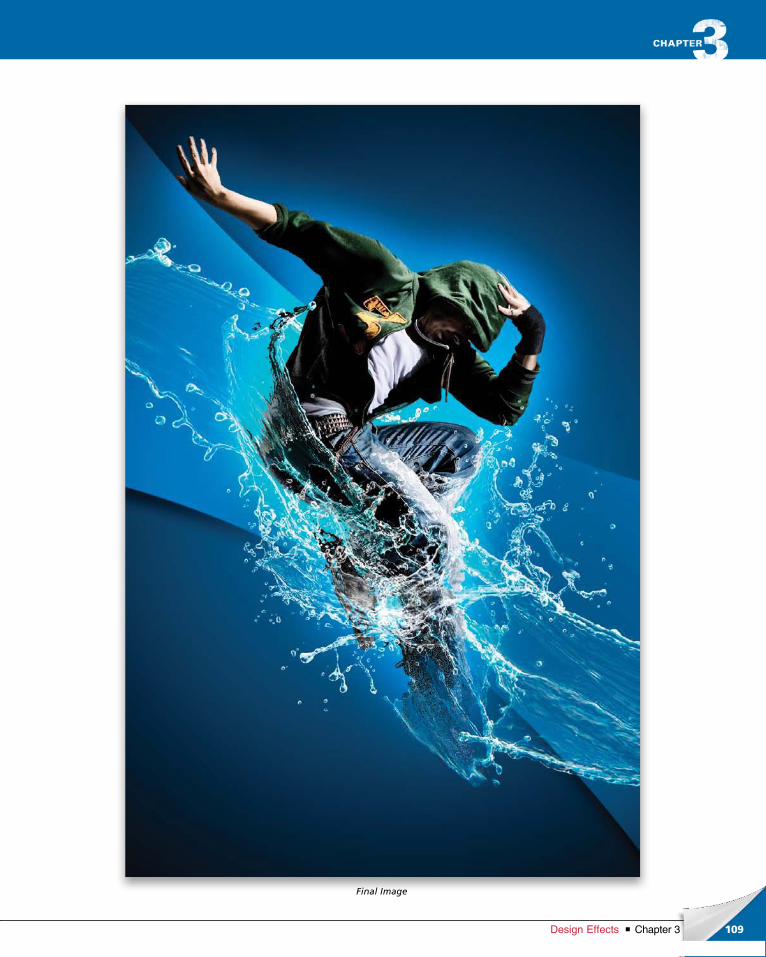
ptg6970545
109Chapter 3Design Effects
Final Image
ptg6970545
110 Chapter 3 Design Effects
chapter 3
STEP ONE:Go under the File menu, choose New, and create a new document measuring 7 inches by 7 inches at 200 ppi. Then, press D to set your Foreground color to black, and press Option-Delete (PC: Alt-Backspace) to fill the Background layer with black.
STEP TWO:Make the rulers visible by pressing Command-R (PC: Ctrl-R), then click inside the vertical ruler and drag out a guide to the center of the canvas (3.5"). Click inside the horizontal ruler and create a horizontal guide, as well. These will help us in creating the pattern.
One of the coolest hidden features in Photoshop is the step-and-repeat command. It’s a very clever way to get
some really interesting repeating effects and patterns. While we’ll be concentrating on one use here, you’ll defi-
nitely want to play with this feature with different graphics and images to get some crazy graphic effects.
Step & Repeat Effects
ptg6970545
111Chapter 3Design Effects
Continued
STEP THREE:Clickandhold on the Rectangle tool in the Toolbox and choose the Ellipse tool from the menu. Then, up in the Options Bar, make sure the Shape Layers icon is selected (the first one on the left next to the tool thumbnail), and make sure the Color is set to white.
STEP FOUR:Pressandhold the Shift key and draw a small circle shape at the top of the canvas area, making sure it’s centered to the guide. It should snap to the guide (if it doesn’t, go under the View menu, under Snap To, and choose Guides).
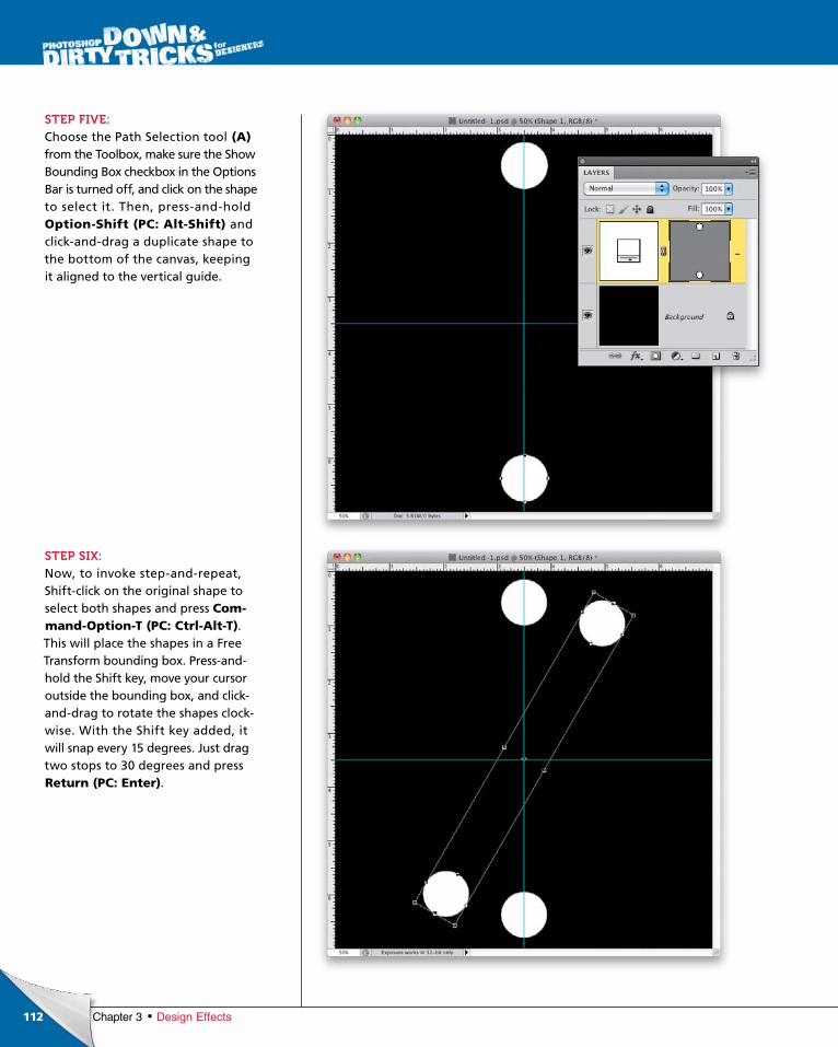
ptg6970545
112 Chapter 3 Design Effects
STEP FIVE:Choose the Path Selection tool (A) from the Toolbox, make sure the Show Bounding Box checkbox in the Options Bar is turned off, and click on the shape to select it. Then, pressandhold Option-Shift (PC: Alt-Shift) and clickanddrag a duplicate shape to the bottom of the canvas, keeping it aligned to the vertical guide.
STEP SIX:Now, to invoke stepandrepeat, Shiftclick on the original shape to select both shapes and press Com-mand-Option-T (PC: Ctrl-Alt-T). This will place the shapes in a Free Transform bounding box. Pressandhold the Shift key, move your cursor outside the bounding box, and clickanddrag to rotate the shapes clockwise. With the Shift key added, it will snap every 15 degrees. Just drag two stops to 30 degrees and press Return (PC: Enter).
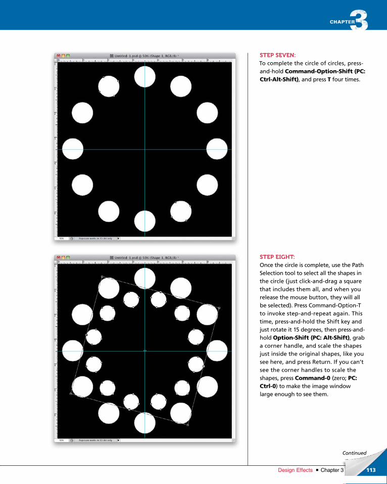
ptg6970545
113Chapter 3Design Effects
Continued
STEP SEVEN:To complete the circle of circles, pressandhold Command-Option-Shift (PC: Ctrl-Alt-Shift), and press T four times.
STEP EIGHT:Once the circle is complete, use the Path Selection tool to select all the shapes in the circle (just clickanddrag a square that includes them all, and when you release the mouse button, they will all be selected). Press CommandOptionT to invoke stepandrepeat again. This time, pressandhold the Shift key and just rotate it 15 degrees, then pressandhold Option-Shift (PC: Alt-Shift), grab a corner handle, and scale the shapes just inside the original shapes, like you see here, and press Return. If you can’t see the corner handles to scale the shapes, press Command-0 (zero; PC: Ctrl-0) to make the image window large enough to see them.
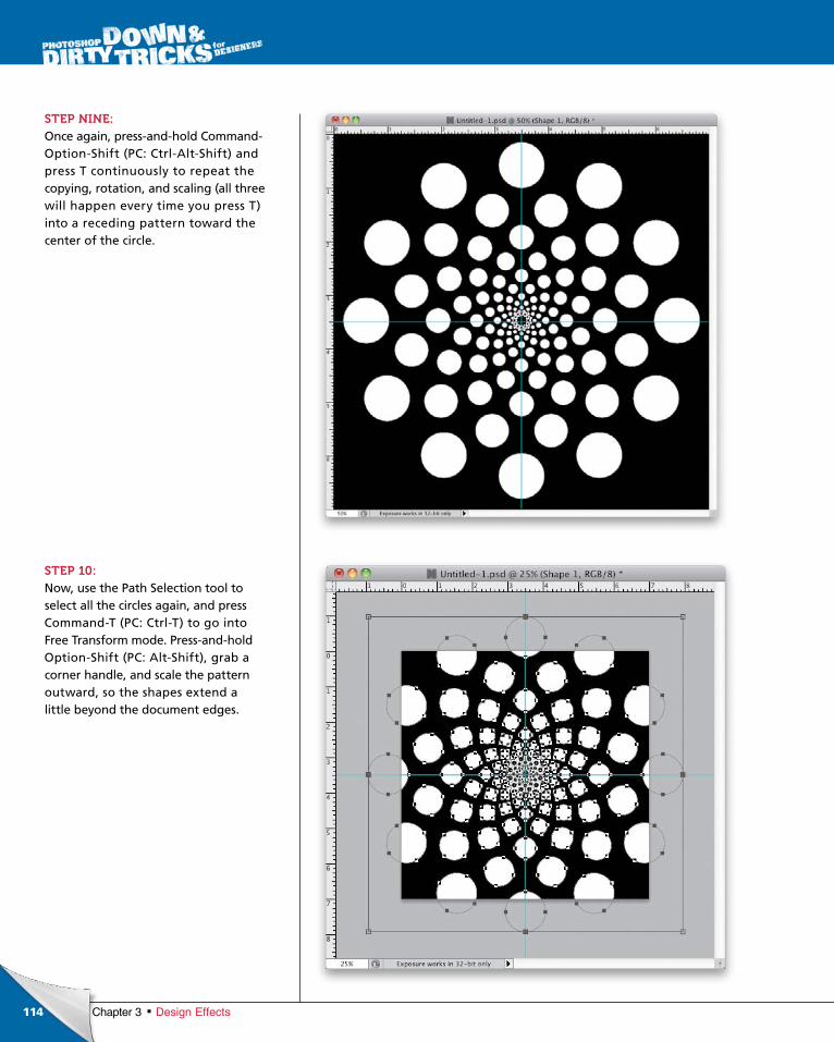
ptg6970545
114 Chapter 3 Design Effects
STEP NINE:Once again, pressandhold CommandOptionShift (PC: CtrlAltShift) and press T continuously to repeat the copying, rotation, and scaling (all three will happen every time you press T) into a receding pattern toward the center of the circle.
STEP 10:Now, use the Path Selection tool to select all the circles again, and press CommandT (PC: CtrlT) to go into Free Transform mode. Pressandhold OptionShift (PC: AltShift), grab a corner handle, and scale the pattern outward, so the shapes extend a little beyond the document edges.
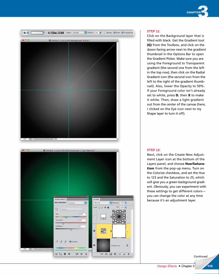
ptg6970545
115Chapter 3Design Effects
Continued
STEP 11:Click on the Background layer that is filled with black. Get the Gradient tool (G) from the Toolbox, and click on the downfacing arrow next to the gradient thumbnail in the Options Bar to open the Gradient Picker. Make sure you are using the Foreground to Transparent gradient (the second one from the left in the top row), then click on the Radial Gradient icon (the second icon from the left to the right of the gradient thumbnail). Also, lower the Opacity to 50%. If your Foreground color isn’t already set to white, press D, then X to make it white. Then, draw a light gradient out from the center of the canvas (here, I clicked on the Eye icon next to my Shape layer to turn it off).
STEP 12:Next, click on the Create New Adjustment Layer icon at the bottom of the Layers panel, and choose Hue/Satura-tion from the popup menu. Turn on the Colorize checkbox, and set the Hue to 123 and the Saturation to 25, which will give you a green background gradient. Obviously, you can experiment with these settings to get different colors—you can change the color at any time because it’s an adjustment layer.
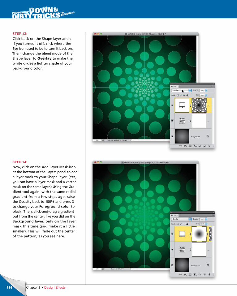
ptg6970545
116 Chapter 3 Design Effects
STEP 13:Click back on the Shape layer and,z if you turned it off, click where the Eye icon used to be to turn it back on. Then, change the blend mode of the Shape layer to Overlay to make the white circles a lighter shade of your background color.
STEP 14:Now, click on the Add Layer Mask icon at the bottom of the Layers panel to add a layer mask to your Shape layer. (Yes, you can have a layer mask and a vector mask on the same layer.) Using the Gradient tool again, with the same radial gradient from a few steps ago, raise the Opacity back to 100% and press D to change your Foreground color to black. Then, clickanddrag a gradient out from the center, like you did on the Background layer, only on the layer mask this time (and make it a little smaller). This will fade out the center of the pattern, as you see here.
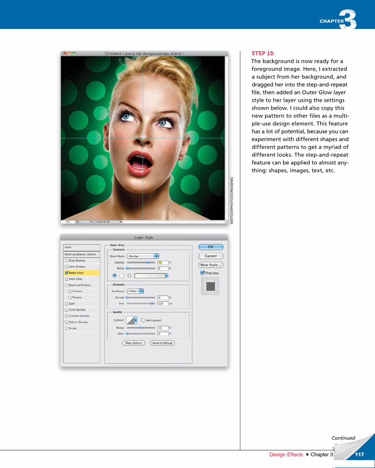
ptg6970545
117Chapter 3Design Effects
©IS
TO
CK
PH
OT
O/IC
ON
OG
EN
IC
Continued
STEP 15:The background is now ready for a foreground image. Here, I extracted a subject from her background, and dragged her into the stepandrepeat file, then added an Outer Glow layer style to her layer using the settings shown below. I could also copy this new pattern to other files as a multipleuse design element. This feature has a lot of potential, because you can experiment with different shapes and different patterns to get a myriad of different looks. The stepandrepeat feature can be applied to almost anything: shapes, images, text, etc.
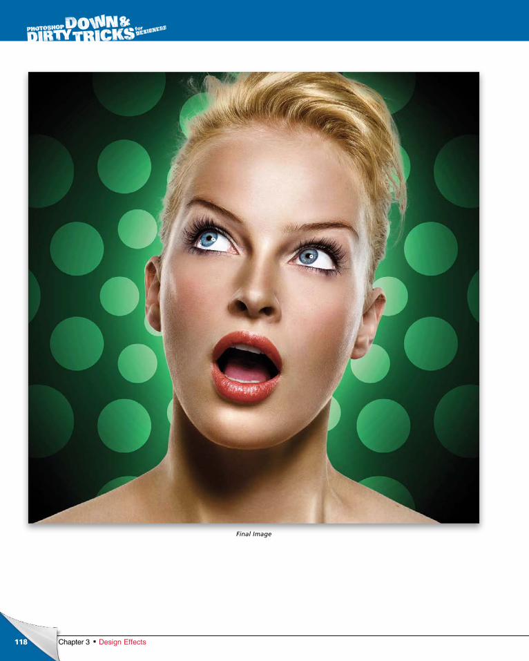
ptg6970545
118 Chapter 3 Design Effects
Final Image
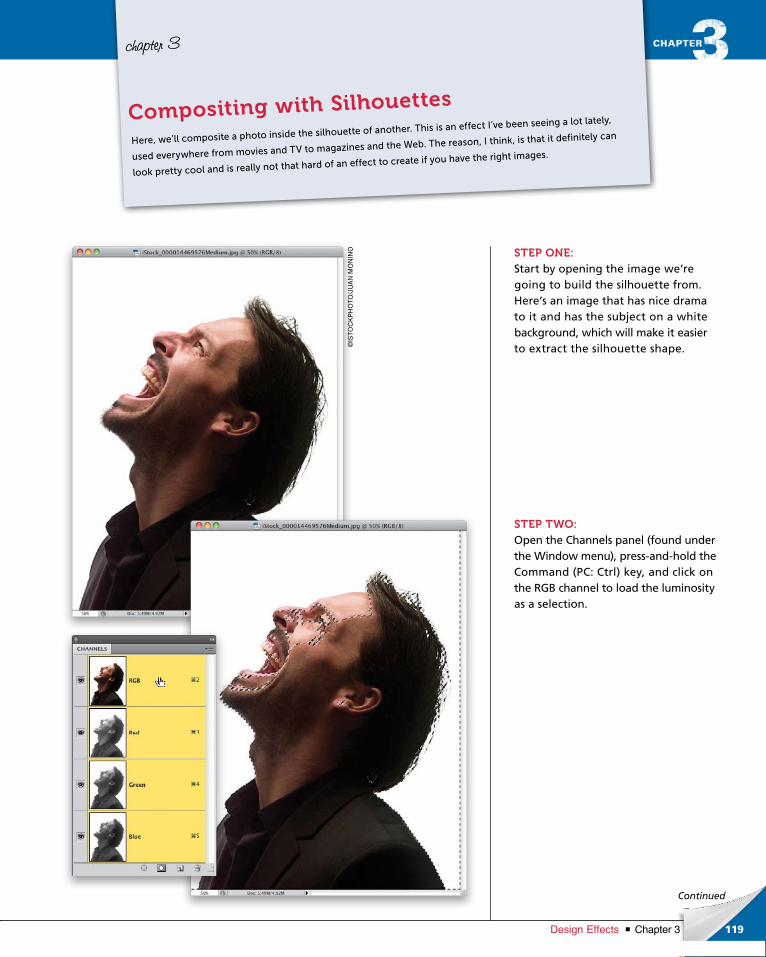
ptg6970545
119Chapter 3Design Effects
Continued
chapter 3
STEP ONE:Start by opening the image we’re going to build the silhouette from. Here’s an image that has nice drama to it and has the subject on a white background, which will make it easier to extract the silhouette shape.
STEP TWO:Open the Channels panel (found under the Window menu), pressandhold the Command (PC: Ctrl) key, and click on the RGB channel to load the luminosity as a selection.
Here, we’ll composite a photo inside the silhouette of another. This is an effect I’ve been seeing a lot lately,
used everywhere from movies and TV to magazines and the Web. The reason, I think, is that it definitely can
look pretty cool and is really not that hard of an effect to create if you have the right images.
Compositing with Silhouettes
©IS
TO
CK
PH
OT
O/J
UA
N M
ON
INO
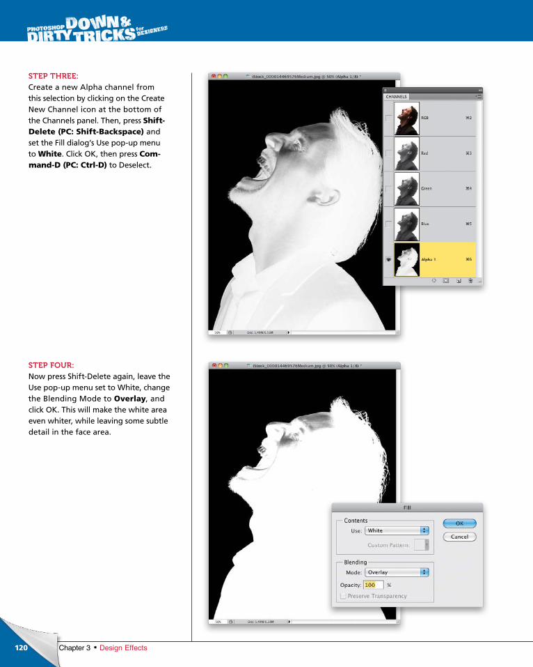
ptg6970545
120 Chapter 3 Design Effects
STEP THREE:Create a new Alpha channel from this selection by clicking on the Create New Channel icon at the bottom of the Channels panel. Then, press Shift- Delete (PC: Shift-Backspace) and set the Fill dialog’s Use popup menu to White. Click OK, then press Com-mand-D (PC: Ctrl-D) to Deselect.
STEP FOUR:Now press ShiftDelete again, leave the Use popup menu set to White, change the Blending Mode to Overlay, and click OK. This will make the white area even whiter, while leaving some subtle detail in the face area.
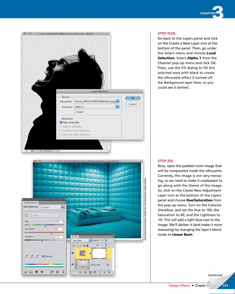
ptg6970545
121Chapter 3Design Effects
©IS
TO
CK
PH
OT
O/P
Ab
LO D
EM
ET
RIO
SC
AP
INA
CH
IS A
RM
ST
RO
NG
Continued
STEP FIVE:Go back to the Layers panel and click on the Create a New Layer icon at the bottom of the panel. Then, go under the Select menu and choose Load Selection. Select Alpha 1 from the Channel popup menu and click OK. Then, use the Fill dialog to fill this selected area with black to create the silhouette effect (I turned off the Background layer here, so you could see it better).
STEP SIX:Now, open the padded room image that will be composited inside the silhouette. Currently, this image is not very menacing, so we need to make it unpleasant to go along with the theme of the image. So, click on the Create New Adjustment Layer icon at the bottom of the Layers panel and choose Hue/Saturation from the popup menu. Turn on the Colorize checkbox, and set the Hue to 190, the Saturation to 69, and the Lightness to –10. This will add a light blue cast to the image. We’ll darken it (and make it more menacing) by changing the layer’s blend mode to Linear Burn.

ptg6970545
122
©IS
TO
CK
PH
OT
O/H
ED
DA
GJE
RP
EN
Chapter 3 Design Effects
STEP SEVEN:Let’s apply a texture to grunge it up a little and make it even less pleasant (or as pleasant as a padded room can be). Open a rough texture file, like the one I have here, and use the Move tool (V) to drag it over to the padded room image.
STEP EIGHT:Desaturate the color by pressing Com-mand-Shift-U (PC: Ctrl-Shift-U), as we’re only interested in the texture and not the color. Change the layer’s blend mode to Overlay to finish the effect. Then, create a merged copy of this image by pressing Command-Option-Shift-E (PC: Ctrl-Alt-Shift-E).
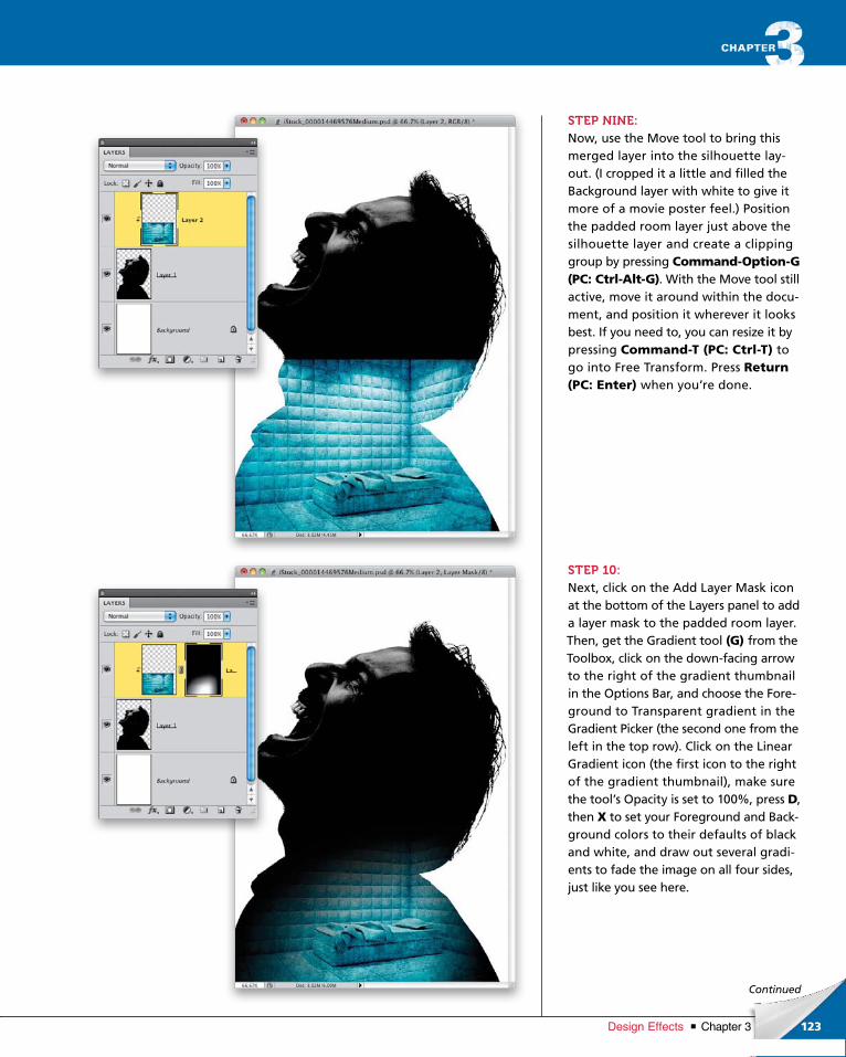
ptg6970545
123Chapter 3Design Effects
Continued
STEP NINE:Now, use the Move tool to bring this merged layer into the silhouette layout. (I cropped it a little and filled the Background layer with white to give it more of a movie poster feel.) Position the padded room layer just above the silhouette layer and create a clipping group by pressing Command-Option-G (PC: Ctrl-Alt-G). With the Move tool still active, move it around within the document, and position it wherever it looks best. If you need to, you can resize it by pressing Command-T (PC: Ctrl-T) to go into Free Transform. Press Return (PC: Enter) when you’re done.
STEP 10:Next, click on the Add Layer Mask icon at the bottom of the Layers panel to add a layer mask to the padded room layer. Then, get the Gradient tool (G) from the Toolbox, click on the downfacing arrow to the right of the gradient thumbnail in the Options Bar, and choose the Foreground to Transparent gradient in the Gradient Picker (the second one from the left in the top row). Click on the Linear Gradi ent icon (the first icon to the right of the gradient thumbnail), make sure the tool’s Opacity is set to 100%, press D, then X to set your Fore ground and Background colors to their defaults of black and white, and draw out several gradients to fade the image on all four sides, just like you see here.
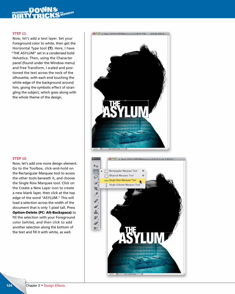
ptg6970545
124 Chapter 3 Design Effects
STEP 11:Now, let’s add a text layer. Set your Fore ground color to white, then get the Horizontal Type tool (T). Here, I have
“THE ASYLUM” set in a condensed bold Helvetica. Then, using the Character panel (found under the Window menu) and Free Transform, I scaled and positioned the text across the neck of the silhouette, with each end touching the white edge of the background around him, giving the symbolic effect of strangling the subject, which goes along with the whole theme of the design.
STEP 12:Now, let’s add one more design element. Go to the Toolbox, clickandhold on the Rectangular Marquee tool to access the other tools beneath it, and choose the Single Row Marquee tool. Click on the Create a New Layer icon to create a new blank layer, then click at the top edge of the word “ASYLUM.” This will load a se lec tion across the width of the doc ument that is only 1 pixel tall. Press Option-Delete (PC: Alt-Backspace) to fill the selection with your Fore ground color (white), and then click to add another selection along the bottom of the text and fill it with white, as well.
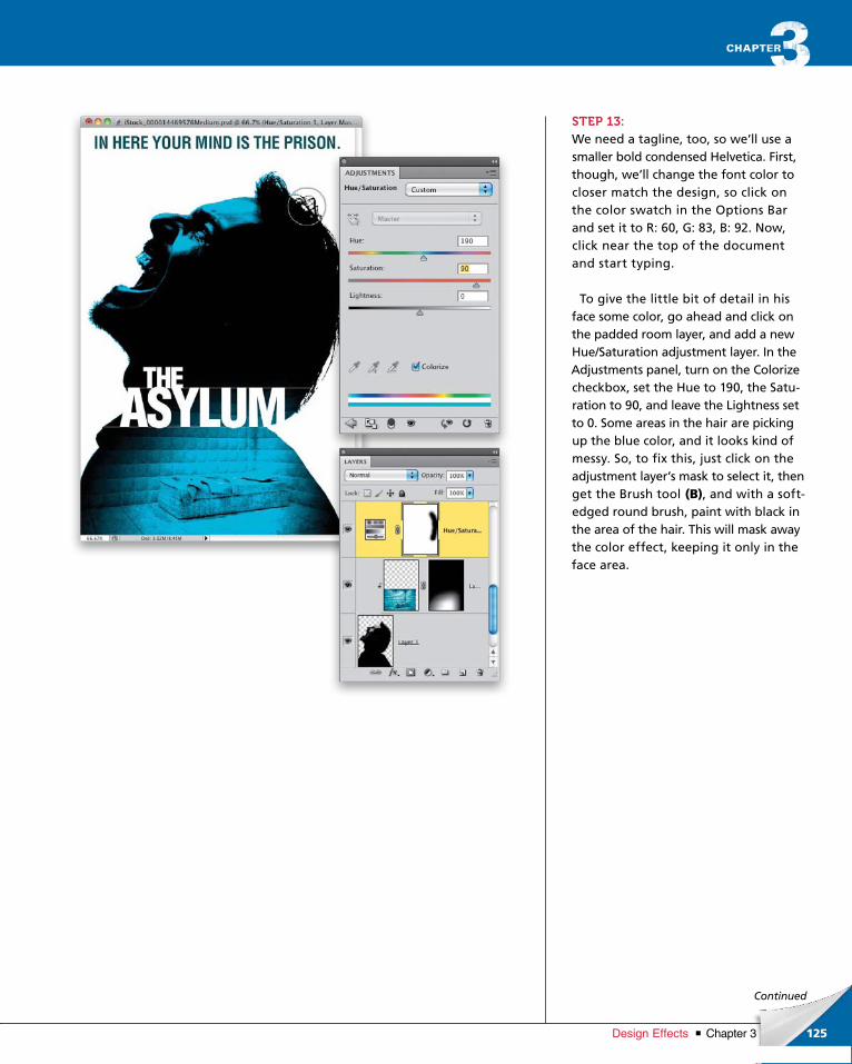
ptg6970545
125Chapter 3Design Effects
Continued
STEP 13:We need a tagline, too, so we’ll use a smaller bold condensed Helvetica. First, though, we’ll change the font color to closer match the design, so click on the color swatch in the Options Bar and set it to R: 60, G: 83, B: 92. Now, click near the top of the document and start typing.
To give the little bit of detail in his face some color, go ahead and click on the padded room layer, and add a new Hue/Saturation adjustment layer. In the Adjustments panel, turn on the Colorize checkbox, set the Hue to 190, the Saturation to 90, and leave the Lightness set to 0. Some areas in the hair are picking up the blue color, and it looks kind of messy. So, to fix this, just click on the adjustment layer’s mask to select it, then get the Brush tool (B), and with a softedged round brush, paint with black in the area of the hair. This will mask away the color effect, keeping it only in the face area.
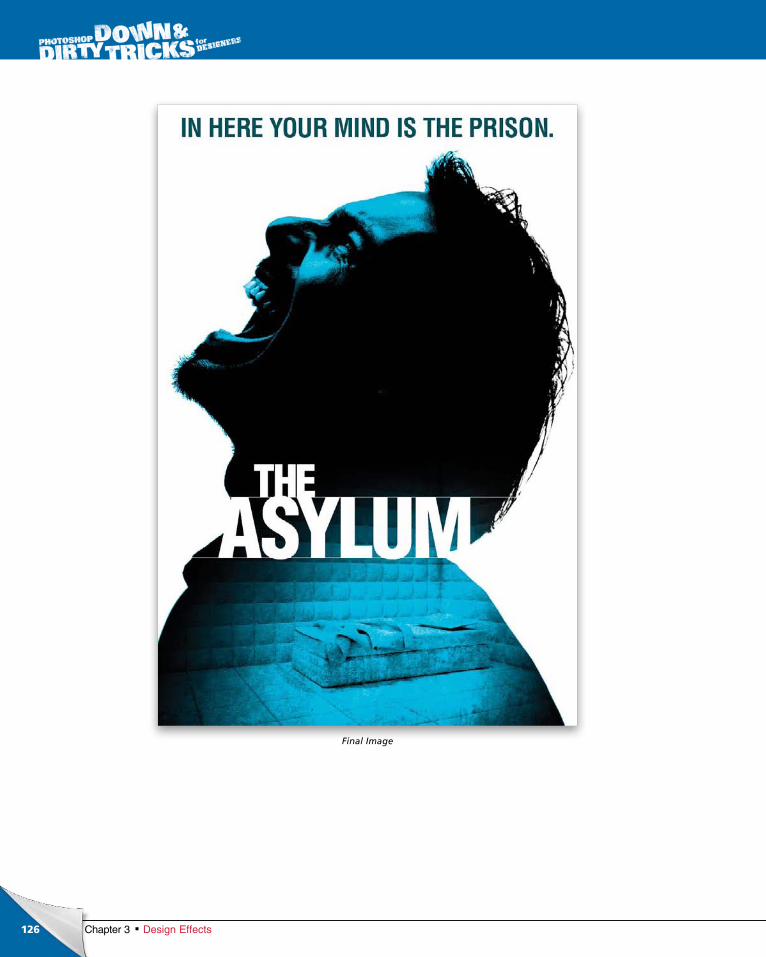
ptg6970545
126 Chapter 3 Design Effects
Final Image
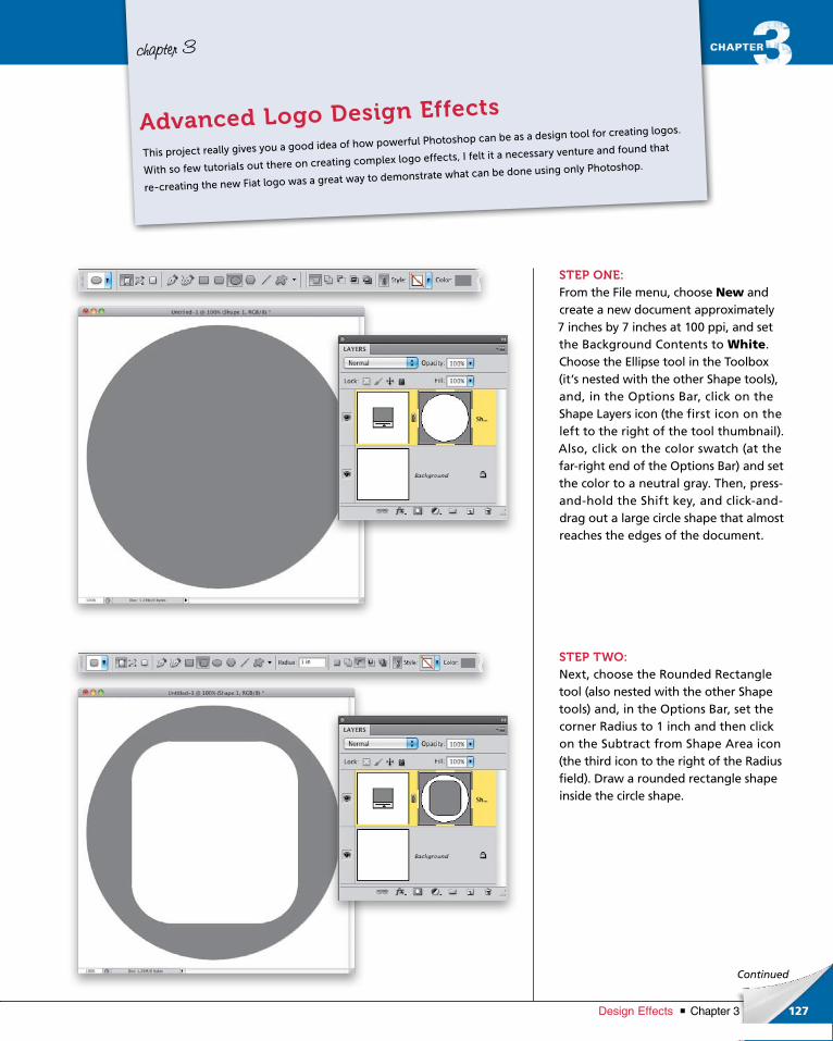
ptg6970545
127Chapter 3Design Effects
Continued
chapter 3
STEP ONE:From the File menu, choose New and create a new document approximately 7 inches by 7 inches at 100 ppi, and set the Background Contents to White. Choose the Ellipse tool in the Toolbox (it’s nested with the other Shape tools), and, in the Options Bar, click on the Shape Layers icon (the first icon on the left to the right of the tool thumbnail). Also, click on the color swatch (at the farright end of the Options Bar) and set the color to a neutral gray. Then, pressandhold the Shift key, and clickanddrag out a large circle shape that almost reaches the edges of the document.
STEP TWO:Next, choose the Rounded Rectangle tool (also nested with the other Shape tools) and, in the Options Bar, set the corner Radius to 1 inch and then click on the Subtract from Shape Area icon (the third icon to the right of the Radius field). Draw a rounded rectangle shape inside the circle shape.
This project really gives you a good idea of how powerful Photoshop can be as a design tool for creating logos.
With so few tutorials out there on creating complex logo effects, I felt it a necessary venture and found that
re-creating the new Fiat logo was a great way to demonstrate what can be done using only Photoshop.
Advanced Logo Design Effects
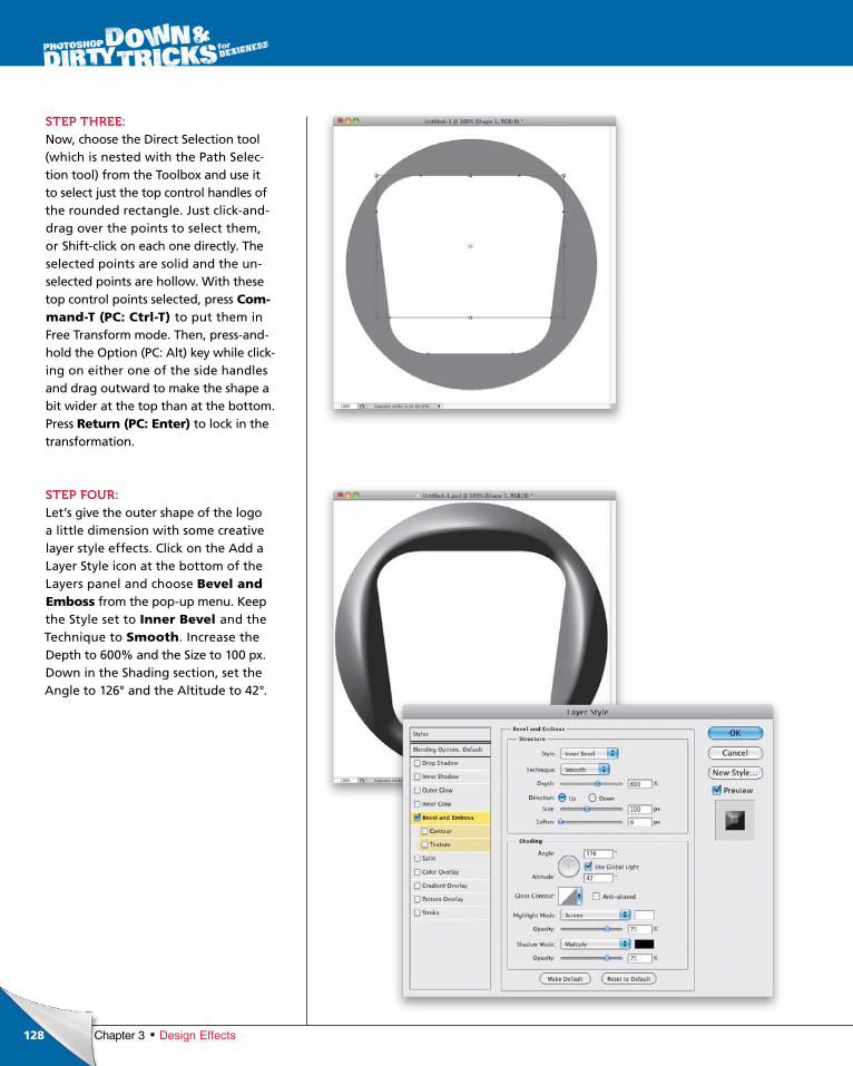
ptg6970545
128 Chapter 3 Design Effects
STEP THREE:Now, choose the Direct Selection tool (which is nested with the Path Selection tool) from the Toolbox and use it to select just the top control handles of the rounded rectangle. Just clickanddrag over the points to select them, or Shiftclick on each one directly. The selected points are solid and the unselected points are hollow. With these top con trol points selected, press Com-mand-T (PC: Ctrl-T) to put them in Free Trans form mode. Then, pressandhold the Option (PC: Alt) key while clicking on either one of the side handles and drag outward to make the shape a bit wider at the top than at the bottom. Press Return (PC: Enter) to lock in the transformation.
STEP FOUR:Let’s give the outer shape of the logo a little dimension with some creative layer style effects. Click on the Add a Layer Style icon at the bottom of the Layers panel and choose Bevel and Emboss from the popup menu. Keep the Style set to Inner Bevel and the Technique to Smooth. Increase the Depth to 600% and the Size to 100 px. Down in the Shading section, set the Angle to 126° and the Altitude to 42°.
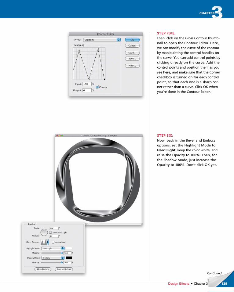
ptg6970545
129Chapter 3Design Effects
Continued
STEP FIVE:Then, click on the Gloss Contour thumbnail to open the Contour Editor. Here, we can modify the curve of the contour by manipulating the control handles on the curve. You can add control points by clicking directly on the curve. Add the control points and position them as you see here, and make sure that the Corner checkbox is turned on for each control point, so that each one is a sharp corner rather than a curve. Click OK when you’re done in the Contour Editor.
STEP SIX:Now, back in the Bevel and Emboss options, set the Highlight Mode to Hard Light, keep the color white, and raise the Opacity to 100%. Then, for the Shadow Mode, just increase the Opacity to 100%. Don’t click OK yet.
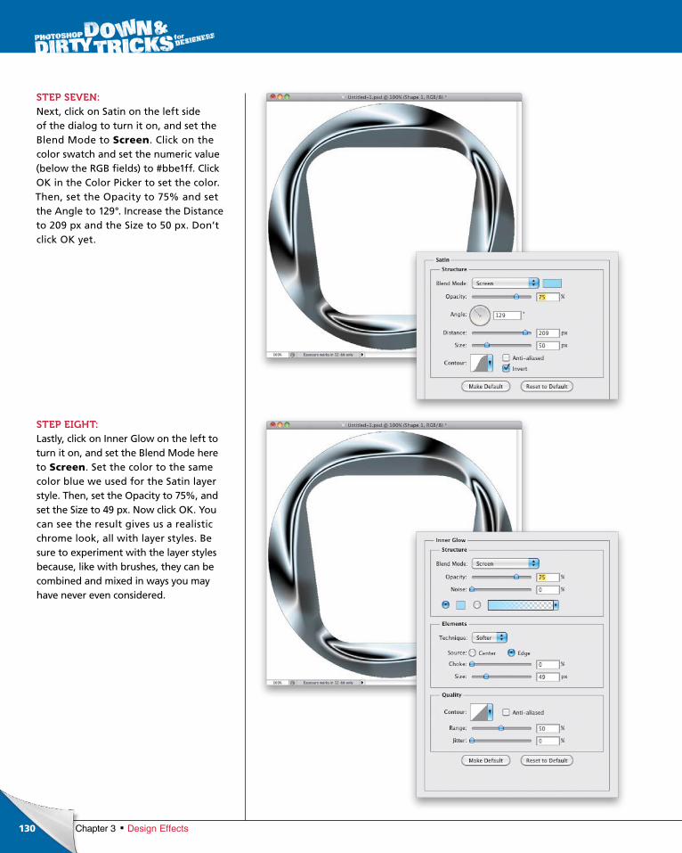
ptg6970545
130 Chapter 3 Design Effects
STEP SEVEN:Next, click on Satin on the left side of the dialog to turn it on, and set the Blend Mode to Screen. Click on the color swatch and set the numeric value (below the RGB fields) to #bbe1ff. Click OK in the Color Picker to set the color. Then, set the Opacity to 75% and set the Angle to 129°. Increase the Distance to 209 px and the Size to 50 px. Don’t click OK yet.
STEP EIGHT:Lastly, click on Inner Glow on the left to turn it on, and set the Blend Mode here to Screen. Set the color to the same color blue we used for the Satin layer style. Then, set the Opacity to 75%, and set the Size to 49 px. Now click OK. You can see the result gives us a realistic chrome look, all with layer styles. Be sure to experiment with the layer styles because, like with brushes, they can be combined and mixed in ways you may have never even considered.
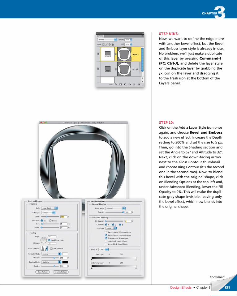
ptg6970545
131Chapter 3Design Effects
Continued
STEP NINE:Now, we want to define the edge more with another bevel effect, but the Bevel and Emboss layer style is already in use. No problem, we’ll just make a duplicate of this layer by pressing Command-J (PC: Ctrl-J), and delete the layer style on the duplicate layer by grabbing the ƒx icon on the layer and dragging it to the Trash icon at the bottom of the Layers panel.
STEP 10:Click on the Add a Layer Style icon once again, and choose Bevel and Embossto add a new effect. Increase the Depth setting to 300% and set the size to 5 px. Then, go into the Shading section and set the Angle to 62° and Altitude to 32°. Next, click on the downfacing arrow next to the Gloss Contour thumbnail and choose Ring Contour (it’s the second one in the second row). Now, to blend this bevel with the original shape, click on Blending Options at the top left and, under Advanced Blending, lower the Fill Opacity to 0%. This will make the duplicate gray shape invisible, leaving only the bevel effect, which now blends into the original shape.

ptg6970545
132
©IS
TO
CK
PH
OT
O/I
AK
OV
KA
LIN
IN
Chapter 3 Design Effects
STEP 11:This would be a good time to save if you have not already! After that, create a duplicate of this file by choosing Image> Duplicate, because we’ll need to create a displacement file out of the graphic up to this point. In the duplicate file, click on the Background layer to make it active, then press Shift-Delete (PC: Shift-Backspace), and choose 50% Gray from the Fill dialog’s Use popup menu. Go to Layer>Flatten Imageand flatten the image. Save this file to your desktop as a PSD file, so we can load it as a displacement map.
STEP 12:Now, here, we have a simple beach image that we’ll use as the reflected image on the chrome surface. Press Command-Shift-U (PC: Ctrl-Shift-U)to remove the color, then use the Move tool (V) to bring it into your working logo file and place it at the top of the layer stack. Once there, use Free Transform (press CommandT [PC: CtrlT]) to scale it to cover the entire canvas area, press Return (PC: Enter), then press Command-A (PC: Ctrl-A) to select everything. Once the entire canvas is selected, go under the Image menu and choose Crop to get rid of any parts that extend beyond the edge, as this will affect the positioning of the displacement.

ptg6970545
133Chapter 3Design Effects
Continued
STEP 13:You might think we’re going to apply the displacement map using the Dis place filter. Nope! We’re actually going to use the Glass filter. This will give a much smoother distortion. So, go under the Filter menu, under Distort, and choose Glass. In the Glass filter dialog, click on the small icon to the right of the Tex ture popup menu, and from the flyout menu, choose Load Texture. When the Load Texture dialog opens, locate the displacement map file, then click Load (PC: Open). Set the Distortion to 17 and the Smoothness to 3, then click OK.
STEP 14:Now, Optionclickanddrag (PC: Altclickanddrag) the vector mask from the Shape layer just below the beach image layer up to the beach image layer, as seen here. This will copy the vector mask to the beach image, masking it just like the Shape layers. Finally, change the top layer’s blend mode to Overlay to blend the image to the chrome effect.
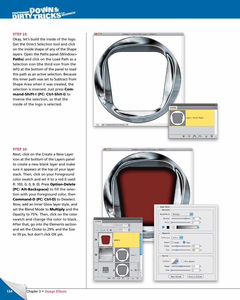
ptg6970545
134 Chapter 3 Design Effects
STEP 15:Okay, let’s build the inside of the logo. Get the Direct Selection tool and click on the inside shape of any of the Shape layers. Open the Paths panel (Window> Paths) and click on the Load Path as a Selection icon (the third icon from the left) at the bottom of the panel to load this path as an active selection. Because this inner path was set to Subtract from Shape Area when it was created, the selection is inversed. Just press Com-mand-Shift-I (PC: Ctrl-Shit-I) to Inverse the selection, so that the inside of the logo is selected.
STEP 16:Next, click on the Create a New Layer icon at the bottom of the Layers panel to create a new blank layer and make sure it appears at the top of your layer stack. Then, click on your Foreground color swatch and set it to a red (I used R: 103, G: 0, B: 0). Press Option-Delete (PC: Alt-Backspace) to fill the selection with your Fore ground color, then Command-D (PC: Ctrl-D) to Deselect. Now, add an Inner Glow layer style, and set the Blend Mode to Multiply and the Opacity to 75%. Then, click on the color swatch and change the color to black. After that, go into the Elements section and set the Choke to 29% and the Size to 59 px, but don’t click OK yet.
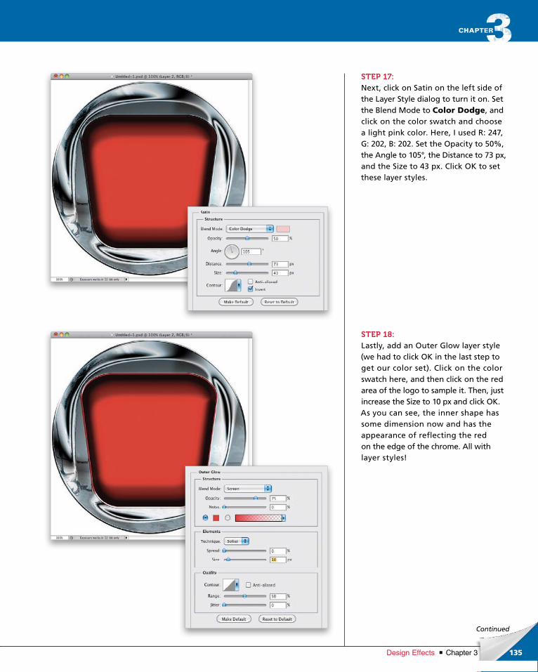
ptg6970545
135Chapter 3Design Effects
Continued
STEP 17:Next, click on Satin on the left side of the Layer Style dialog to turn it on. Set the Blend Mode to Color Dodge, and click on the color swatch and choose a light pink color. Here, I used R: 247, G: 202, B: 202. Set the Opacity to 50%, the Angle to 105°, the Distance to 73 px, and the Size to 43 px. Click OK to set these layer styles.
STEP 18:Lastly, add an Outer Glow layer style (we had to click OK in the last step to get our color set). Click on the color swatch here, and then click on the red area of the logo to sample it. Then, just increase the Size to 10 px and click OK. As you can see, the inner shape has some dimension now and has the appearance of reflecting the red on the edge of the chrome. All with layer styles!
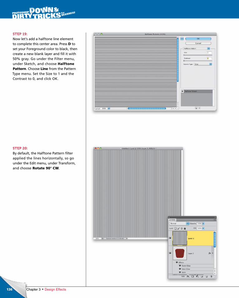
ptg6970545
136 Chapter 3 Design Effects
STEP 19:Now let’s add a halftone line element to complete this center area. Press D to set your Foreground color to black, then create a new blank layer and fill it with 50% gray. Go under the Filter menu, under Sketch, and choose Halftone Pattern. Choose Line from the Pattern Type menu. Set the Size to 1 and the Contrast to 0, and click OK.
STEP 20:By default, the Halftone Pattern filter applied the lines horizontally, so go under the Edit menu, under Transform, and choose Rotate 90° CW.
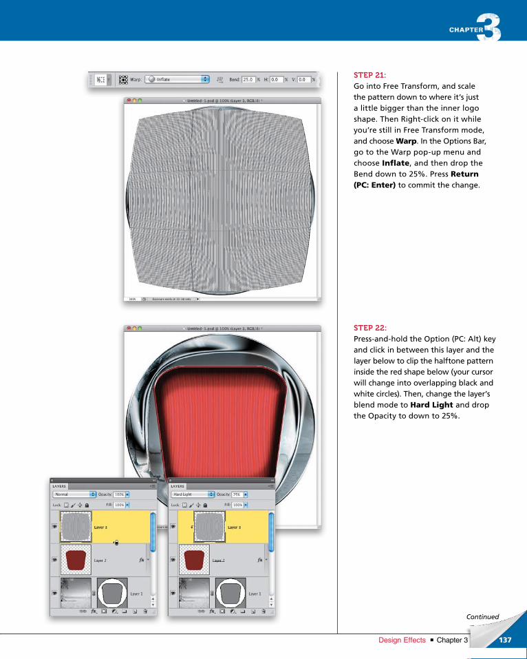
ptg6970545
137Chapter 3Design Effects
Continued
STEP 21:Go into Free Transform, and scale the pattern down to where it’s just a little bigger than the inner logo shape. Then Rightclick on it while you’re still in Free Transform mode, and choose Warp. In the Options Bar, go to the Warp popup menu and choose Inflate, and then drop the Bend down to 25%. Press Return (PC: Enter) to commit the change.
STEP 22:Pressandhold the Option (PC: Alt) key and click in between this layer and the layer below to clip the halftone pattern inside the red shape below (your cursor will change into overlapping black and white circles). Then, change the layer’s blend mode to Hard Light and drop the Opacity to down to 25%.
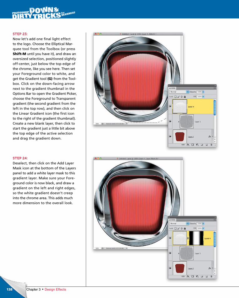
ptg6970545
138 Chapter 3 Design Effects
STEP 23:Now let’s add one final light effect to the logo. Choose the Elliptical Marquee tool from the Toolbox (or pressShift-M until you have it), and draw an oversized selection, positioned slightly offcenter, just below the top edge of the chrome, like you see here. Then set your Fore ground color to white, and get the Gra dient tool (G) from the Toolbox. Click on the downfacing arrow next to the gradient thumb nail in the Options Bar to open the Gradient Picker, cho ose the Fore ground to Transparent gradient (the second gradient from the left in the top row), and then click on the Linear Gradient icon (the first icon to the right of the gradient thumbnail). Create a new blank layer, then click to start the gradient just a little bit above the top edge of the active selection and drag the gradient down.
STEP 24:Deselect, then click on the Add Layer Mask icon at the bottom of the Layers panel to add a white layer mask to this gradient layer. Make sure your Foreground color is now black, and draw a gradient on the left and right edges, so the white gradient doesn’t creep into the chrome area. This adds much more dimension to the overall look.
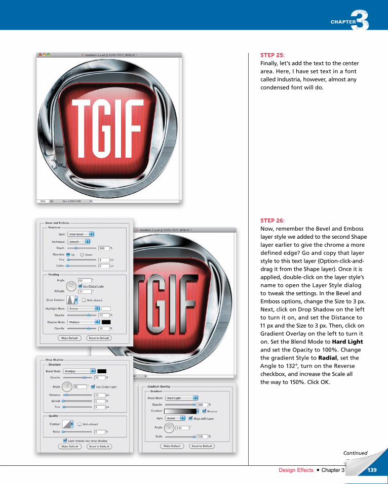
ptg6970545
139Chapter 3Design Effects
Continued
STEP 25:Finally, let’s add the text to the center area. Here, I have set text in a font called Industria, however, almost any condensed font will do.
STEP 26:Now, remember the Bevel and Emboss layer style we added to the second Shape layer earlier to give the chrome a more defined edge? Go and copy that layer style to this text layer (Optionclickanddrag it from the Shape layer). Once it is applied, doubleclick on the layer style’s name to open the Layer Style dialog to tweak the settings. In the Bevel and Emboss options, change the Size to 3 px. Next, click on Drop Shadow on the left to turn it on, and set the Distance to 11 px and the Size to 3 px. Then, click on Gradient Overlay on the left to turn it on. Set the Blend Mode to Hard Light and set the Opacity to 100%. Change the gradient Style to Radial, set the Angle to 132°, turn on the Reverse check box, and increase the Scale all the way to 150%. Click OK.
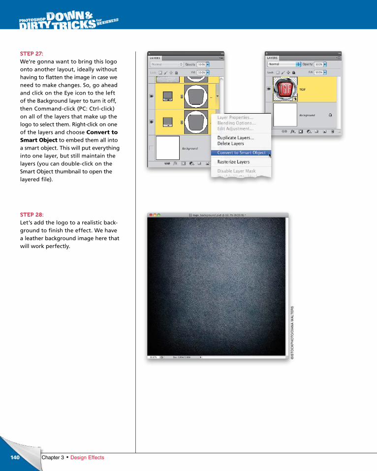
ptg6970545
140
©IS
TO
CK
PH
OT
O/D
IAN
A W
ALT
ER
S
Chapter 3 Design Effects
STEP 27:We’re gonna want to bring this logo onto another layout, ideally without having to flatten the image in case we need to make changes. So, go ahead and click on the Eye icon to the left of the Background layer to turn it off, then Commandclick (PC: Ctrlclick) on all of the layers that make up the logo to select them. Rightclick on one of the layers and choose Convert to Smart Object to embed them all into a smart object. This will put everything into one layer, but still maintain the layers (you can doubleclick on the Smart Object thumbnail to open the layered file).
STEP 28:Let’s add the logo to a realistic background to finish the effect. We have a leather background image here that will work perfectly.
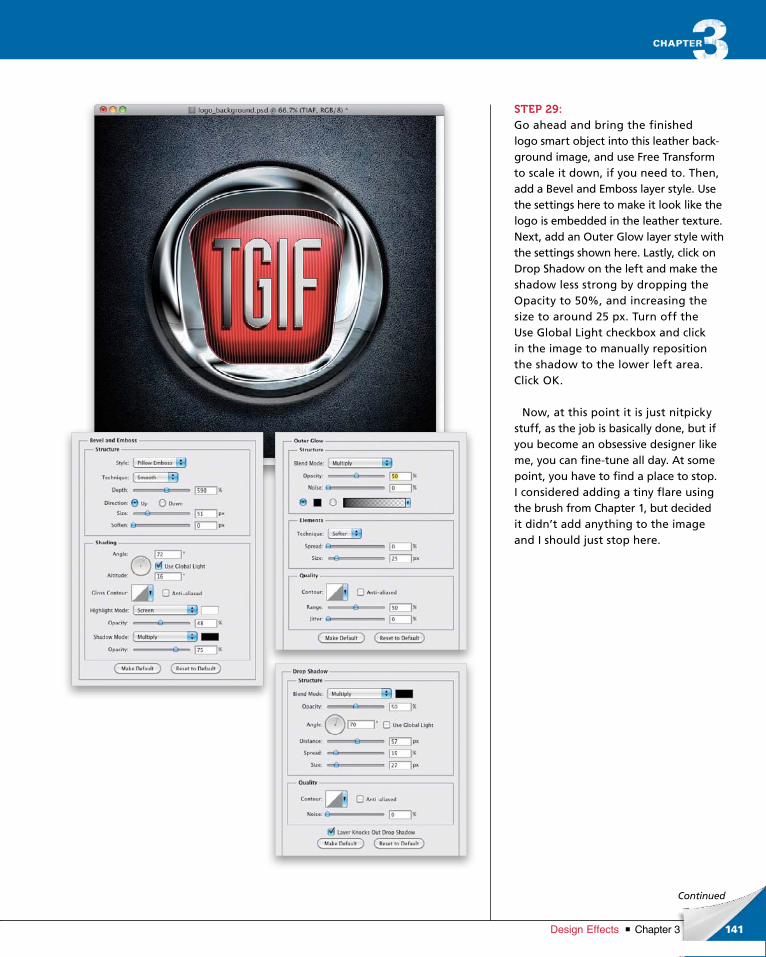
ptg6970545
141Chapter 3Design Effects
Continued
STEP 29:Go ahead and bring the finished logo smart object into this leather background image, and use Free Transform to scale it down, if you need to. Then, add a Bevel and Emboss layer style. Use the settings here to make it look like the logo is embedded in the leather texture. Next, add an Outer Glow layer style with the settings shown here. Lastly, click on Drop Shadow on the left and make the shadow less strong by dropping the Opacity to 50%, and increasing the size to around 25 px. Turn off the Use Global Light checkbox and click in the image to manually reposition the shadow to the lower left area. Click OK.
Now, at this point it is just nitpicky stuff, as the job is basically done, but if you become an obsessive designer like me, you can finetune all day. At some point, you have to find a place to stop. I considered adding a tiny flare using the brush from Chapter 1, but decided it didn’t add anything to the image and I should just stop here.
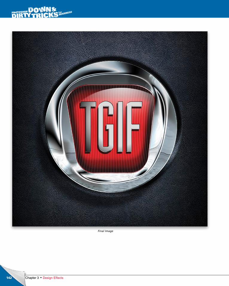
ptg6970545
142 Chapter 3 Design Effects
Final Image

ptg6970545
This page intentionally left blank
ptg6970545

ptg6970545
Many designers refer to commercial design work as the type that pays
the bills, meaning it’s the work you do for commercial clients that doesn’t
always lend itself to creative work. You are often limited by assets, time,
and sometimes input from the client. They always seem to know what they
don’t want, but never what they actually do want. However, it is under these
conditions that you can really test your creativity. My first job out of design
school was as an ad creator for a newspaper. Notice the title: Ad Creator,
not Graphic Designer. The title alone limited my creativity, but I had to
start somewhere. I pressed on to do the best I could and learned a lot.
For one thing, I learned the value of speed. Because of daily deadlines,
I was constantly in a pinch. As stressful as this sounds, I received more
assignments beyond the scope of an ad creator because I showed higher
proficiency. As a result, today I am able to infuse my own design style
and still turn around projects, like commercial work, really quickly. So,
don’t look at commercial work as a burden on your creativity. Use it to
challenge your imagination to come up with creative solutions.
A Word from Our Sponsorcommercial effects
145Chapter 4Commercial Effects
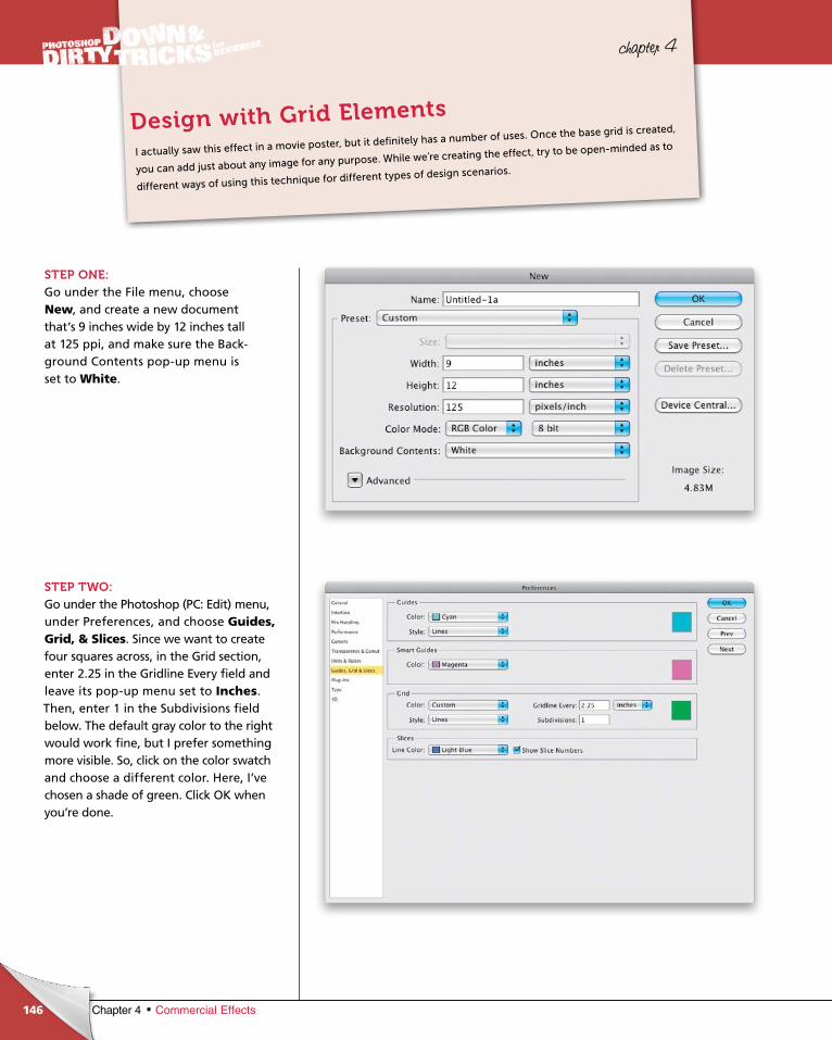
ptg6970545
146 Chapter 4 Commercial Effects
chapter 4
STEP ONE:Go under the File menu, choose New, and create a new document that’s 9 inches wide by 12 inches tall at 125 ppi, and make sure the Background Contents popup menu is set to White.
STEP TWO:Go under the Photoshop (PC: Edit) menu, under Preferences, and choose Guides, Grid, & Slices. Since we want to create four squares across, in the Grid section, enter 2.25 in the Gridline Every field and leave its popup menu set to Inches. Then, enter 1 in the Subdivisions field below. The default gray color to the right would work fine, but I prefer some thing more visible. So, click on the color swatch and choose a different color. Here, I’ve chosen a shade of green. Click OK when you’re done.
I actually saw this effect in a movie poster, but it definitely has a number of uses. Once the base grid is created,
you can add just about any image for any purpose. While we’re creating the effect, try to be open-minded as to
different ways of using this technique for different types of design scenarios.
Design with Grid Elements
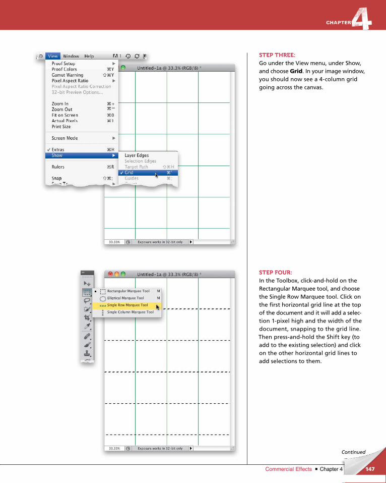
ptg6970545
147Chapter 4Commercial Effects
Continued
STEP THREE:Go under the View menu, under Show, and choose Grid. In your image window, you should now see a 4column grid going across the canvas.
STEP FOUR:In the Toolbox, clickandhold on the Rectangular Marquee tool, and choose the Single Row Marquee tool. Click on the first horizontal grid line at the top of the document and it will add a selection 1pixel high and the width of the document, snapping to the grid line. Then pressandhold the Shift key (to add to the existing selection) and click on the other horizontal grid lines to add selections to them.
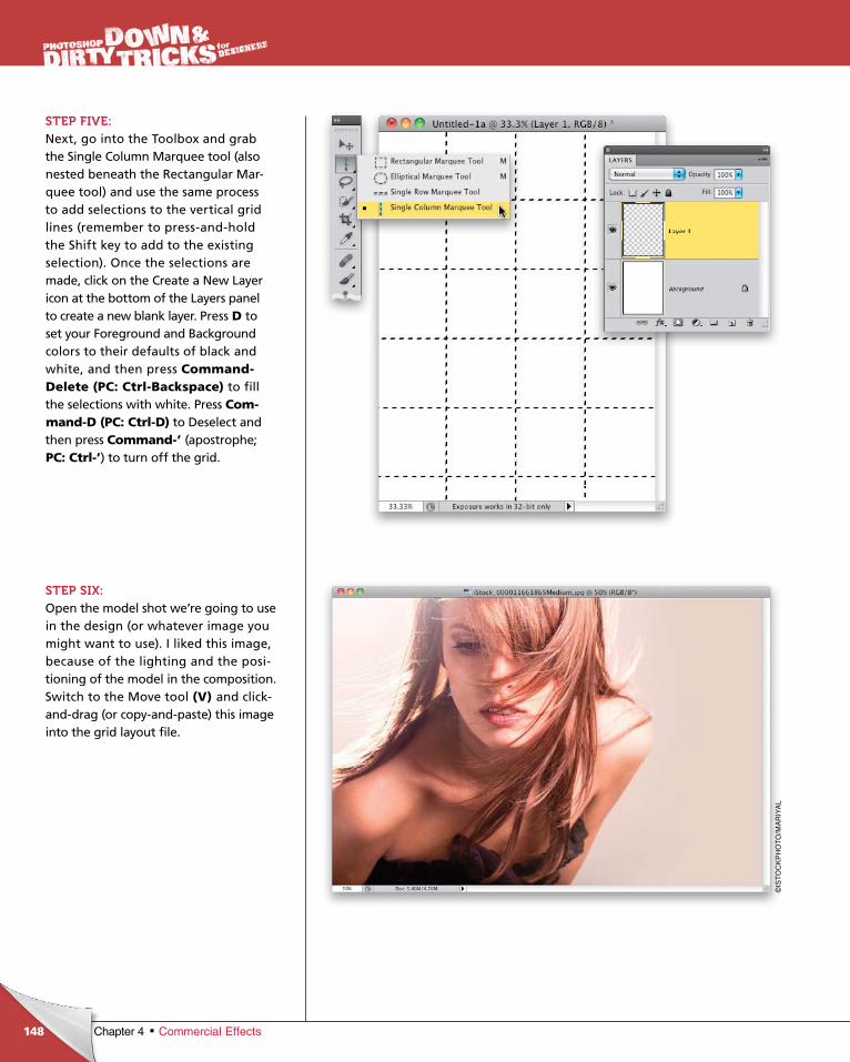
ptg6970545
148
©IS
TO
CK
PH
OT
O/M
AR
IYA
L
Chapter 4 Commercial Effects
STEP FIVE:Next, go into the Toolbox and grab the Single Column Marquee tool (also nested beneath the Rectangular Marquee tool) and use the same process to add selections to the vertical grid lines (remember to pressandhold the Shift key to add to the existing selection). Once the selections are made, click on the Create a New Layer icon at the bottom of the Layers panel to create a new blank layer. Press D to set your Foreground and Background colors to their defaults of black and white, and then press Command-Delete (PC: Ctrl-Backspace) to fill the selections with white. Press Com-mand-D (PC: Ctrl-D) to Deselect and then press Command-’ (apostrophe; PC: Ctrl-’) to turn off the grid.
STEP SIX:Open the model shot we’re going to use in the design (or whatever image you might want to use). I liked this image, because of the lighting and the positioning of the model in the composition. Switch to the Move tool (V) and clickanddrag (or copyandpaste) this image into the grid layout file.

ptg6970545
149Chapter 4Commercial Effects
Continued
STEP SEVEN:Clickanddrag this image layer beneath the grid layer in the Layers panel. Then, position the image at the top edge of the canvas, like you see here.
STEP EIGHT:Click on the Add Layer Mask icon at the bottom of the Layers panel to add a layer mask to the model layer and then select the Gradient tool (G) from the Toolbox. In the Options Bar, click on the downfacing arrow to the right of the gradient thumbnail and choose the Foreground to Transparent gradient (the second gradient from the left in the top row), and then click on the Linear Gradient icon to the right of the gradient thumbnail. Press X to set your Foreground color to black, and then clickanddrag the gradient up just a little bit, starting at the bottom edge of the photo, to fade the image into the white background.
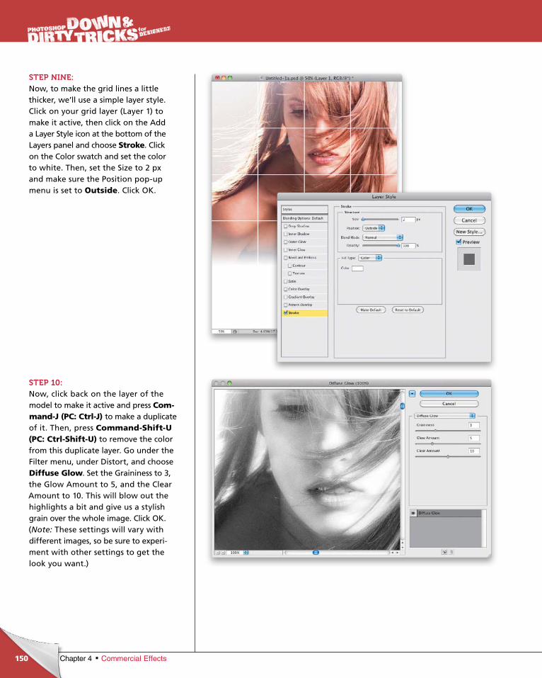
ptg6970545
150 Chapter 4 Commercial Effects
STEP NINE: Now, to make the grid lines a little thicker, we’ll use a simple layer style. Click on your grid layer (Layer 1) to make it active, then click on the Add a Layer Style icon at the bottom of the Layers panel and choose Stroke. Click on the Color swatch and set the color to white. Then, set the Size to 2 px and make sure the Position popup menu is set to Outside. Click OK.
STEP 10:Now, click back on the layer of the model to make it active and press Com-mand-J (PC: Ctrl-J) to make a duplicate of it. Then, press Command-Shift-U (PC: Ctrl-Shift-U) to remove the color from this duplicate layer. Go under the Filter menu, under Distort, and choose Diffuse Glow. Set the Grain iness to 3, the Glow Amount to 5, and the Clear Amount to 10. This will blow out the highlights a bit and give us a stylish grain over the whole image. Click OK. (Note: These settings will vary with different images, so be sure to experiment with other settings to get the look you want.)
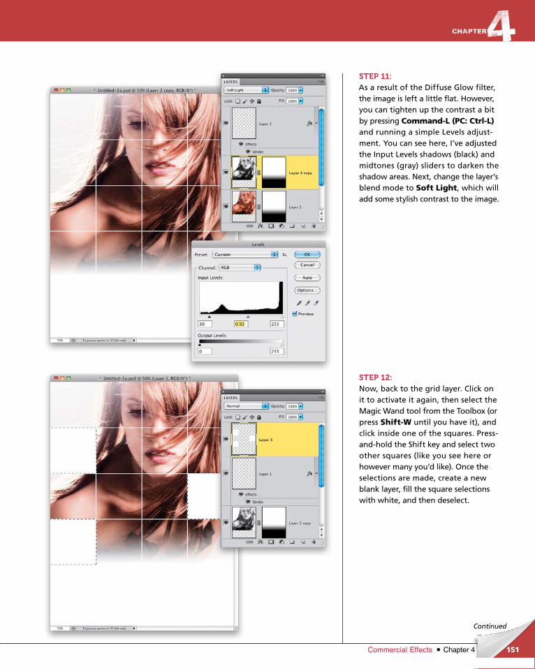
ptg6970545
151Chapter 4Commercial Effects
Continued
STEP 11:As a result of the Diffuse Glow filter, the image is left a little flat. However, you can tighten up the contrast a bit by pressing Command-L (PC: Ctrl-L) and running a simple Levels adjustment. You can see here, I’ve adjusted the Input Levels shadows (black) and midtones (gray) sliders to darken the shadow areas. Next, change the layer’s blend mode to Soft Light, which will add some stylish contrast to the image.
STEP 12:Now, back to the grid layer. Click on it to activate it again, then select the Magic Wand tool from the Toolbox (or press Shift-W until you have it), and click inside one of the squares. Pressandhold the Shift key and select two other squares (like you see here or how ever many you’d like). Once the selections are made, create a new blank layer, fill the square selections with white, and then deselect.
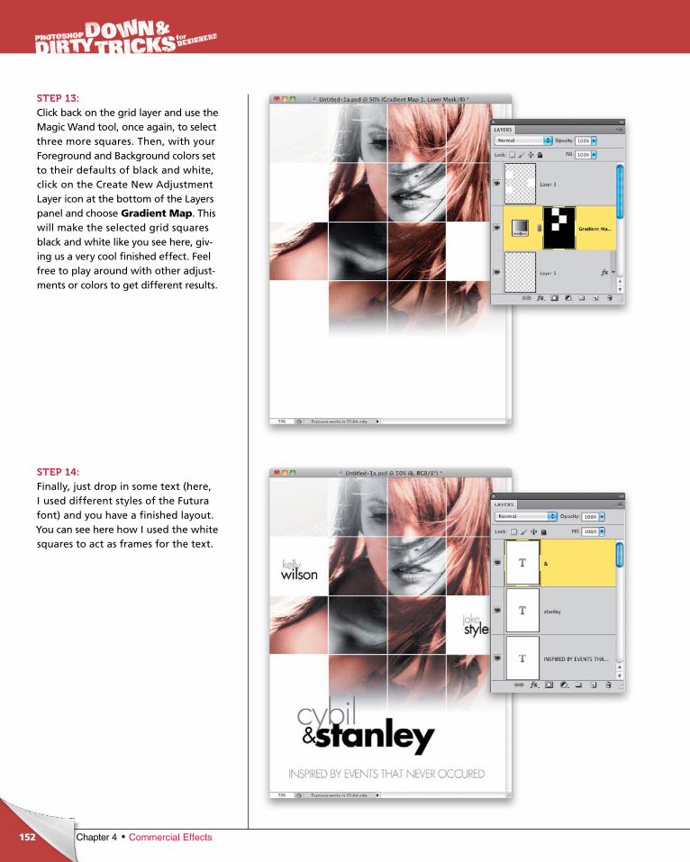
ptg6970545
152 Chapter 4 Commercial Effects
STEP 13: Click back on the grid layer and use the Magic Wand tool, once again, to select three more squares. Then, with your Foreground and Back ground colors set to their defaults of black and white, click on the Create New Adjustment Layer icon at the bottom of the Layers panel and choose Gradient Map. This will make the selected grid squares black and white like you see here, giving us a very cool finished effect. Feel free to play around with other adjustments or colors to get different results.
STEP 14:Finally, just drop in some text (here, I used different styles of the Futura font) and you have a finished layout. You can see here how I used the white squares to act as frames for the text.
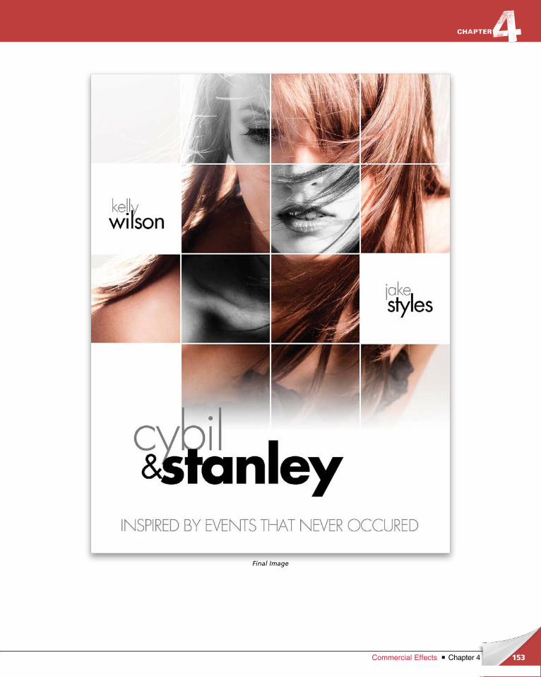
ptg6970545
153Chapter 4Commercial Effects
Final Image
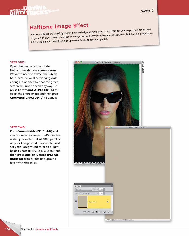
ptg6970545
154
CO
RE
Y B
AR
KE
R
Chapter 4 Commercial Effects
chapter 4
STEP ONE:Open the image of the model. Notice it was shot on a green screen. We won’t need to extract the subject here, because we’ll be working close enough in on the face that the green screen will not be seen anyway. So, press Com mand-A (PC: Ctrl-A) to select the entire image and then press Command-C (PC: Ctrl-C) to Copy it.
STEP TWO:Press Command-N (PC: Ctrl-N) and create a new document that’s 9 inches wide by 12 inches tall at 100 ppi. Click on your Foreground color swatch and set your Foreground color to a light beige (I chose R: 186, G: 179, B: 160) and then press Option-Delete (PC: Alt-Back space) to fill the Background layer with this color.
Halftone effects are certainly nothing new—designers have been using them for years—yet they never seem
to go out of style. I saw this effect in a magazine and thought it had a cool look to it. Building on a technique
I did a while back, I’ve added a couple new things to spice it up a bit.
Halftone Image Effect
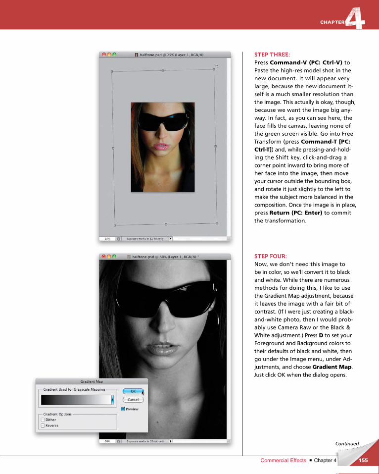
ptg6970545
155Chapter 4Commercial Effects
Continued
STEP THREE:Press Command-V (PC: Ctrl-V) to Paste the highres model shot in the new doc u ment. It will appear very large, because the new document itself is a much smaller resolution than the image. This actually is okay, though, because we want the image big anyway. In fact, as you can see here, the face fills the canvas, leaving none of the green screen visible. Go into Free Transform (press Com mand-T [PC: Ctrl-T]) and, while pressingandholding the Shift key, clickanddrag a corner point inward to bring more of her face into the image, then move your cursor outside the bounding box, and rotate it just slightly to the left to make the subject more balanced in the compo sition. Once the image is in place, press Return (PC: Enter) to commit the transformation.
STEP FOUR:Now, we don’t need this image to be in color, so we’ll convert it to black and white. While there are numerous methods for doing this, I like to use the Gradient Map adjustment, because it leaves the image with a fair bit of contrast. (If I were just creating a blackandwhite photo, then I would probably use Camera Raw or the Black & White adjustment.) Press D to set your Foreground and Back ground colors to their defaults of black and white, then go under the Image menu, under Adjustments, and choose Gradient Map. Just click OK when the dialog opens.
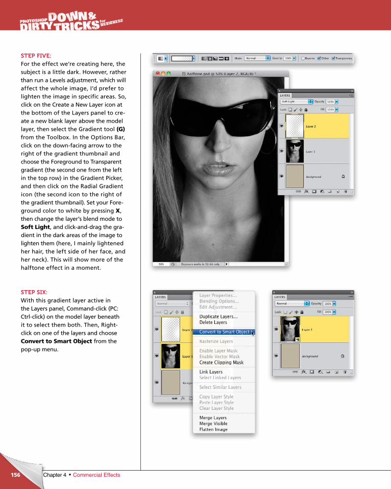
ptg6970545
156 Chapter 4 Commercial Effects
STEP FIVE:For the effect we’re creating here, the subject is a little dark. However, rather than run a Levels adjustment, which will affect the whole image, I’d prefer to lighten the image in specific areas. So, click on the Create a New Layer icon at the bottom of the Layers panel to create a new blank layer above the model layer, then select the Gradient tool (G)from the Toolbox. In the Options Bar, click on the downfacing arrow to the right of the gradient thumbnail and choose the Foreground to Transparent gradient (the second one from the left in the top row) in the Gradient Picker, and then click on the Radial Gradient icon (the second icon to the right of the gradient thumbnail). Set your Foreground color to white by pressing X, then change the layer’s blend mode to Soft Light, and clickanddrag the gradient in the dark areas of the image to lighten them (here, I mainly lightened her hair, the left side of her face, and her neck). This will show more of the halftone effect in a moment.
STEP SIX:With this gradient layer active in the Layers panel, Commandclick (PC: Ctrlclick) on the model layer beneath it to select them both. Then, Rightclick on one of the layers and choose Convert to Smart Object from the popup menu.
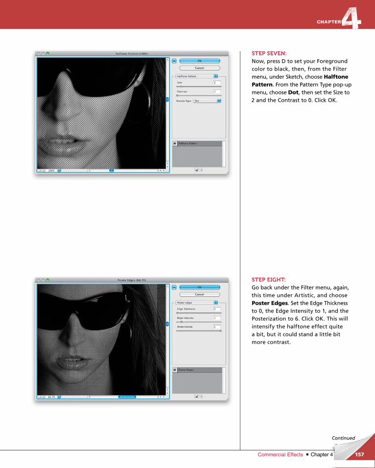
ptg6970545
157Chapter 4Commercial Effects
Continued
STEP SEVEN:Now, press D to set your Foreground color to black, then, from the Filter menu, under Sketch, choose Halftone Pattern. From the Pattern Type popup menu, choose Dot, then set the Size to 2 and the Contrast to 0. Click OK.
STEP EIGHT:Go back under the Filter menu, again, this time under Artistic, and choose Poster Edges. Set the Edge Thickness to 0, the Edge Intensity to 1, and the Posterization to 6. Click OK. This will intensify the halftone effect quite a bit, but it could stand a little bit more contrast.
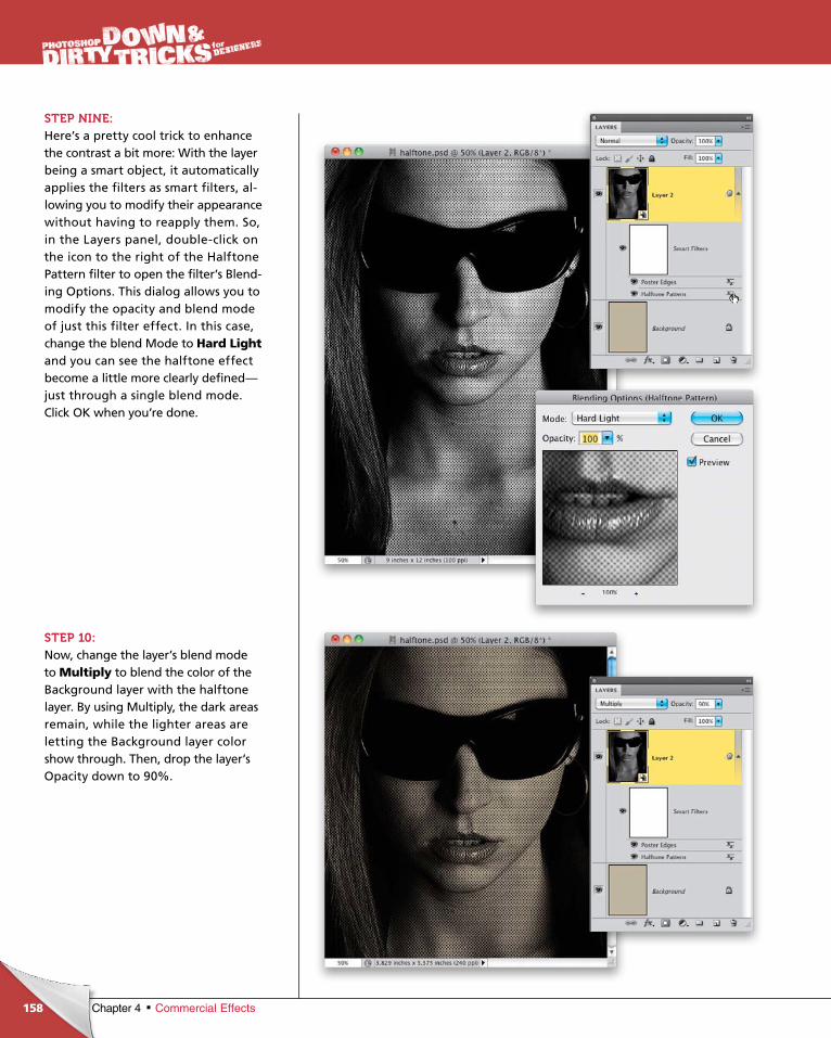
ptg6970545
158 Chapter 4 Commercial Effects
STEP NINE:Here’s a pretty cool trick to enhance the contrast a bit more: With the layer being a smart object, it automatically applies the filters as smart filters, allowing you to modify their appearance without having to reapply them. So, in the Layers panel, doubleclick on the icon to the right of the Halftone Pattern filter to open the filter’s Blending Options. This dialog allows you to modify the opacity and blend mode of just this filter effect. In this case, change the blend Mode to Hard Lightand you can see the halftone effect become a little more clearly defined—just through a single blend mode. Click OK when you’re done.
STEP 10:Now, change the layer’s blend mode to Multiply to blend the color of the Background layer with the halftone layer. By using Multiply, the dark areas remain, while the lighter areas are letting the Background layer color show through. Then, drop the layer’s Opacity down to 90%.
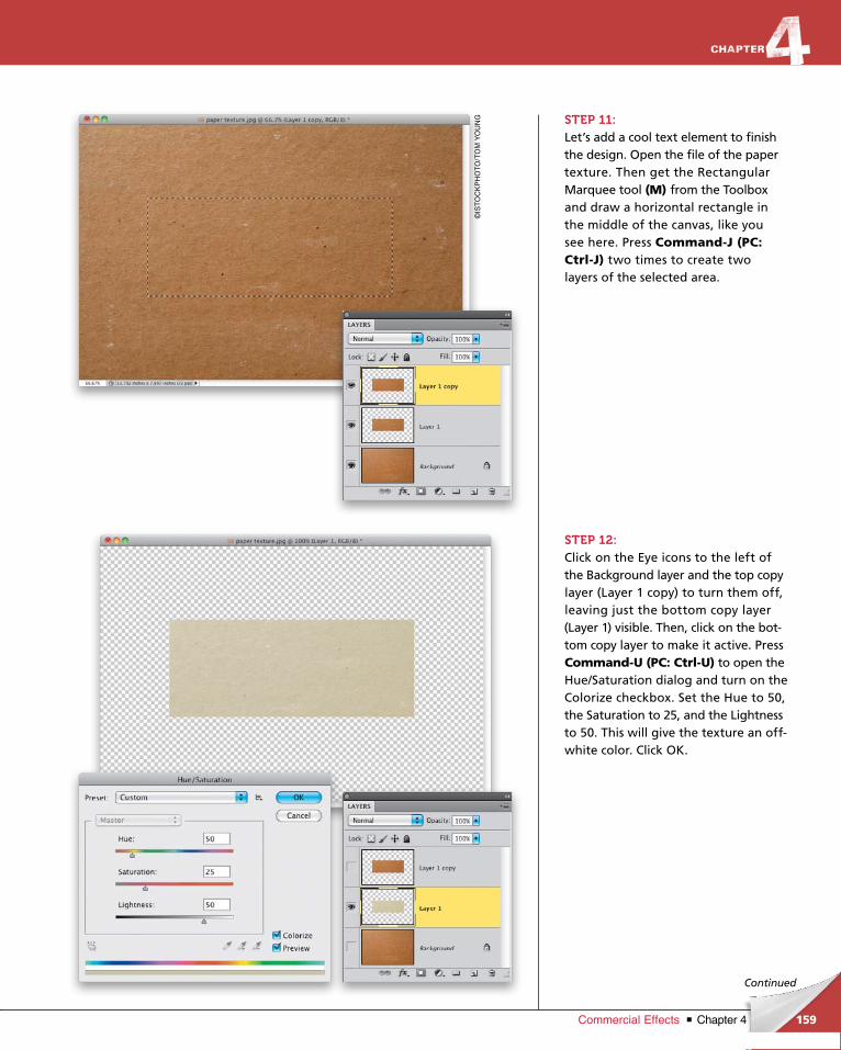
ptg6970545
159Chapter 4Commercial Effects
©IS
TO
CK
PH
OT
O/T
OM
YO
UN
G
Continued
STEP 11:Let’s add a cool text element to finish the design. Open the file of the paper texture. Then get the Rectangular Mar quee tool (M) from the Toolbox and draw a horizontal rectangle in the middle of the canvas, like you see here. Press Command-J (PC: Ctrl-J) two times to create two layers of the selected area.
STEP 12:Click on the Eye icons to the left of the Background layer and the top copy layer (Layer 1 copy) to turn them off, leaving just the bottom copy layer (Layer 1) visible. Then, click on the bottom copy layer to make it active. Press Command-U (PC: Ctrl-U) to open the Hue/Saturation dialog and turn on the Colorize checkbox. Set the Hue to 50, the Saturation to 25, and the Lightness to 50. This will give the texture an offwhite color. Click OK.
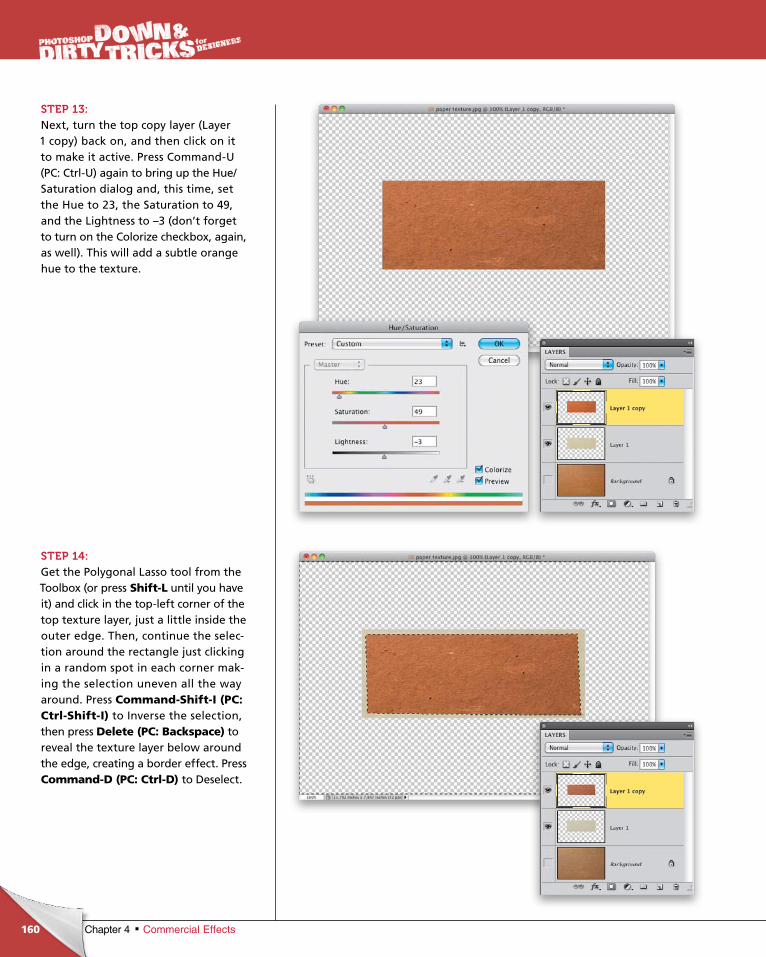
ptg6970545
160 Chapter 4 Commercial Effects
STEP 13:Next, turn the top copy layer (Layer 1 copy) back on, and then click on it to make it active. Press CommandU (PC: CtrlU) again to bring up the Hue/Saturation dialog and, this time, set the Hue to 23, the Saturation to 49, and the Lightness to –3 (don’t forget to turn on the Colorize checkbox, again, as well). This will add a subtle orange hue to the texture.
STEP 14:Get the Polygonal Lasso tool from the Toolbox (or press Shift-L until you have it) and click in the topleft corner of the top texture layer, just a little inside the outer edge. Then, continue the selection around the rectangle just clicking in a random spot in each corner making the selection uneven all the way around. Press Command-Shift-I (PC: Ctrl-Shift-I) to Inverse the selection, then press Delete (PC: Backspace) to reveal the texture layer below around the edge, creating a border effect. Press Command-D (PC: Ctrl-D) to Deselect.
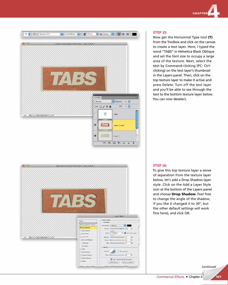
ptg6970545
161Chapter 4Commercial Effects
Continued
STEP 15:Now get the Horizontal Type tool (T)from the Toolbox and click on the canvas to create a text layer. Here, I typed the word “TABS” in Helvetica Black Oblique and set the font size to occupy a large area of the texture. Next, select the text by Commandclicking (PC: Ctrlclick ing) on the text layer’s thumbnail in the Layers panel. Then, click on the top texture layer to make it active and press Delete. Turn off the text layer and you’ll be able to see through the text to the bottom texture layer below. You can now deselect.
STEP 16:To give this top texture layer a sense of separation from the texture layer below, let’s add a Drop Shadow layer style. Click on the Add a Layer Style icon at the bottom of the Layers panel and choose Drop Shadow. Feel free to change the angle of the shadow, if you like (I changed it to 30°, but the other default settings will work fine here), and click OK.
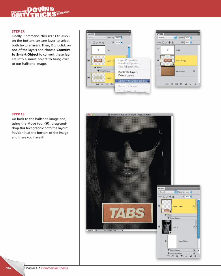
ptg6970545
162 Chapter 4 Commercial Effects
STEP 17: Finally, Commandclick (PC: Ctrlclick) on the bottom texture layer to select both texture layers. Then, Rightclick on one of the layers and choose Convert to Smart Object to convert these layers into a smart object to bring over to our halftone image.
STEP 18:Go back to the halftone image and, using the Move tool (V), draganddrop this text graphic onto the layout. Position it at the bottom of the image and there you have it!

ptg6970545
163Chapter 4Commercial Effects
Final Image
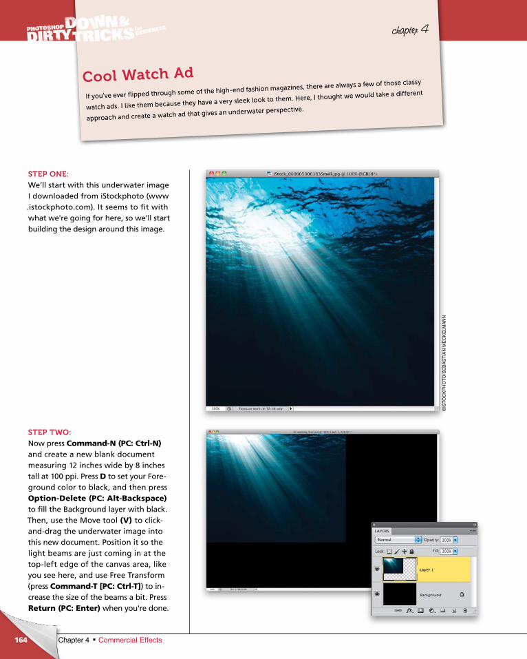
ptg6970545
164 Chapter 4 Commercial Effects
chapter 4
STEP ONE:We’ll start with this underwater image I downloaded from iStockphoto (www .istockphoto.com). It seems to fit with what we're going for here, so we’ll start building the design around this image.
STEP TWO:Now press Command-N (PC: Ctrl-N)and create a new blank document measuring 12 inches wide by 8 inches tall at 100 ppi. Press D to set your Foreground color to black, and then press Option-Delete (PC: Alt-Backspace)to fill the Background layer with black. Then, use the Move tool (V) to clickanddrag the underwater image into this new document. Position it so the light beams are just coming in at the topleft edge of the canvas area, like you see here, and use Free Transform (press Command-T [PC: Ctrl-T]) to increase the size of the beams a bit. Press Return (PC: Enter) when you're done.
If you’ve ever flipped through some of the high-end fashion magazines, there are always a few of those classy
watch ads. I like them because they have a very sleek look to them. Here, I thought we would take a different
approach and create a watch ad that gives an underwater perspective.
Cool Watch Ad
©IS
TO
CK
PH
OT
O/S
EB
AS
TIA
N M
EC
KE
LMA
NN
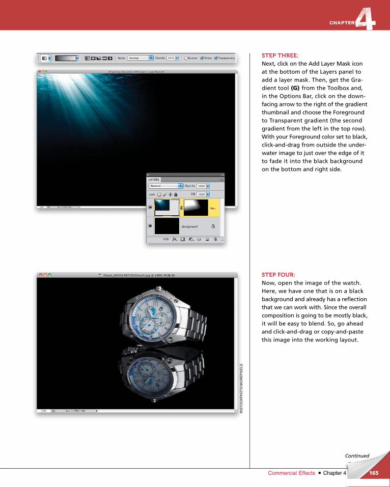
ptg6970545
165Chapter 4Commercial Effects
Continued
STEP THREE:Next, click on the Add Layer Mask icon at the bottom of the Layers panel to add a layer mask. Then, get the Gradient tool (G) from the Toolbox and, in the Options Bar, click on the downfacing arrow to the right of the gradient thumb nail and choose the Fore ground to Transparent gradient (the second gradient from the left in the top row). With your Foreground color set to black, clickanddrag from outside the underwater image to just over the edge of it to fade it into the black background on the bottom and right side.
STEP FOUR:Now, open the image of the watch. Here, we have one that is on a black background and already has a reflection that we can work with. Since the overall composition is going to be mostly black, it will be easy to blend. So, go ahead and clickanddrag or copyandpaste this image into the working layout.
©IS
TO
CK
PH
OT
O/M
OR
EP
IXE
LS
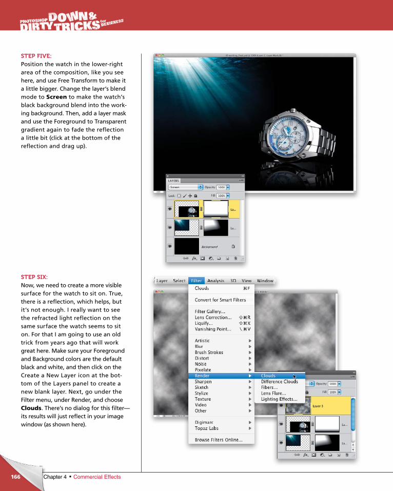
ptg6970545
166 Chapter 4 Commercial Effects
STEP FIVE:Position the watch in the lowerright area of the composition, like you see here, and use Free Transform to make it a little bigger. Change the layer’s blend mode to Screen to make the watch’s black background blend into the working background. Then, add a layer mask and use the Foreground to Transparent gradient again to fade the reflection a little bit (click at the bottom of the reflec tion and drag up).
STEP SIX:Now, we need to create a more visible surface for the watch to sit on. True, there is a reflection, which helps, but it’s not enough. I really want to see the refracted light reflection on the same surface the watch seems to sit on. For that I am going to use an old trick from years ago that will work great here. Make sure your Foreground and Background colors are the default black and white, and then click on the Create a New Layer icon at the bottom of the Layers panel to create a new blank layer. Next, go under the Filter menu, under Render, and choose Clouds. There’s no dialog for this filter—its results will just reflect in your image window (as shown here).
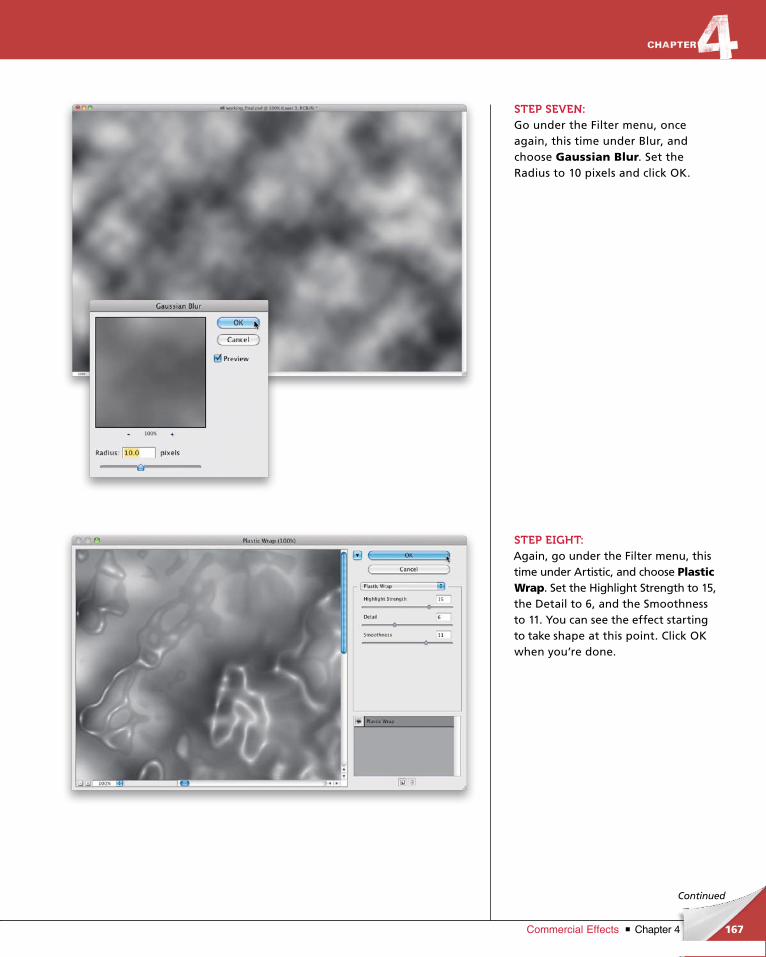
ptg6970545
167Chapter 4Commercial Effects
Continued
STEP SEVEN:Go under the Filter menu, once again, this time under Blur, and choose Gaussian Blur. Set the Radius to 10 pixels and click OK.
STEP EIGHT: Again, go under the Filter menu, this time under Artistic, and choose Plastic Wrap. Set the Highlight Strength to 15, the Detail to 6, and the Smoothness to 11. You can see the effect starting to take shape at this point. Click OK when you’re done.
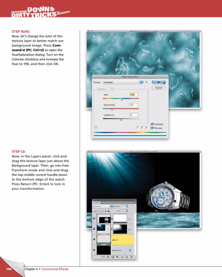
ptg6970545
168 Chapter 4 Commercial Effects
STEP NINE:Now, let’s change the color of this texture layer to better match our background image. Press Com-mand-U (PC: Ctrl-U) to open the Hue/Saturation dialog. Turn on the Colorize checkbox and increase the Hue to 190, and then click OK.
STEP 10: Now, in the Layers panel, clickanddrag this texture layer just above the Background layer. Then, go into Free Transform mode and clickanddrag the topmiddle control handle down to the bottom edge of the watch. Press Return (PC: Enter) to lock in your transformation.
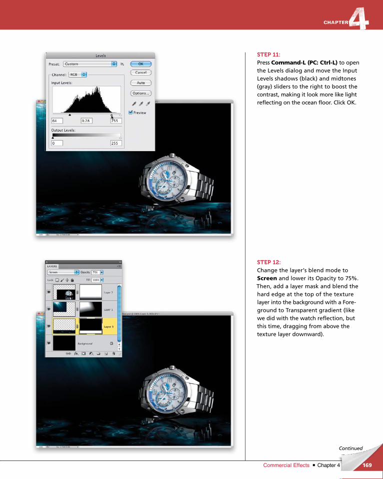
ptg6970545
169Chapter 4Commercial Effects
Continued
STEP 11:Press Command-L (PC: Ctrl-L) to open the Levels dialog and move the Input Levels shadows (black) and midtones (gray) sliders to the right to boost the contrast, making it look more like light reflecting on the ocean floor. Click OK.
STEP 12:Change the layer’s blend mode to Screen and lower its Opacity to 75%. Then, add a layer mask and blend the hard edge at the top of the texture layer into the background with a Foreground to Transparent gradient (like we did with the watch reflection, but this time, dragging from above the texture layer downward).
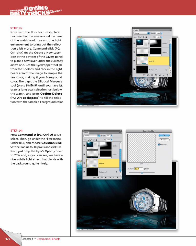
ptg6970545
170 Chapter 4 Commercial Effects
STEP 13:Now, with the floor texture in place, I can see that the area around the base of the watch could use a subtle light enhancement to bring out the reflection a bit more. Commandclick (PC: Ctrlclick) on the Create a New Layer icon at the bottom of the Layers panel to place a new layer under the currently active one. Get the Eyedropper tool (I) from the Toolbox and click in the light beam area of the image to sample the teal color, making it your Foreground color. Then, get the Elliptical Marquee tool (press Shift-M until you have it), draw a long oval selection just below the watch, and press Option-Delete (PC: Alt-Backspace) to fill the selection with the sampled Fore ground color.
STEP 14:Press Command-D (PC: Ctrl-D) to Deselect. Then, go under the Filter menu, under Blur, and choose Gaussian Blur. Set the Radius to 30 pixels and click OK. Next, just drop the layer’s Opacity down to 75% and, as you can see, we have a nice, subtle light effect that blends with the background quite nicely.
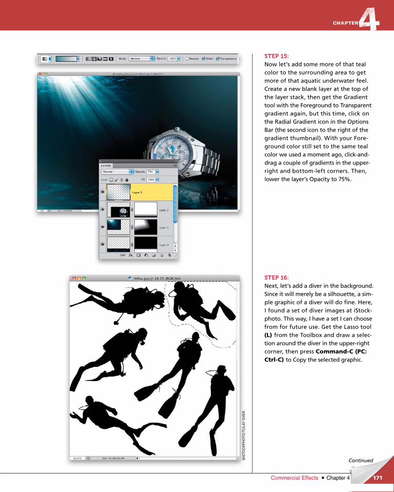
ptg6970545
171Chapter 4Commercial Effects
Continued
STEP 15:Now let’s add some more of that teal color to the surrounding area to get more of that aquatic underwater feel. Create a new blank layer at the top of the layer stack, then get the Gradient tool with the Foreground to Transparent gradient again, but this time, click on the Radial Gradient icon in the Options Bar (the second icon to the right of the gradient thumbnail). With your Foreground color still set to the same teal color we used a moment ago, clickanddrag a couple of gradients in the upperright and bottomleft corners. Then, lower the layer’s Opacity to 75%.
STEP 16:Next, let’s add a diver in the background. Since it will merely be a silhouette, a simple graphic of a diver will do fine. Here, I found a set of diver images at iStockphoto. This way, I have a set I can choose from for future use. Get the Lasso tool (L) from the Toolbox and draw a selection around the diver in the upperright corner, then press Command-C (PC: Ctrl-C) to Copy the selected graphic.
©IS
TO
CK
PH
OT
O/T
UL
AY
OV
ER
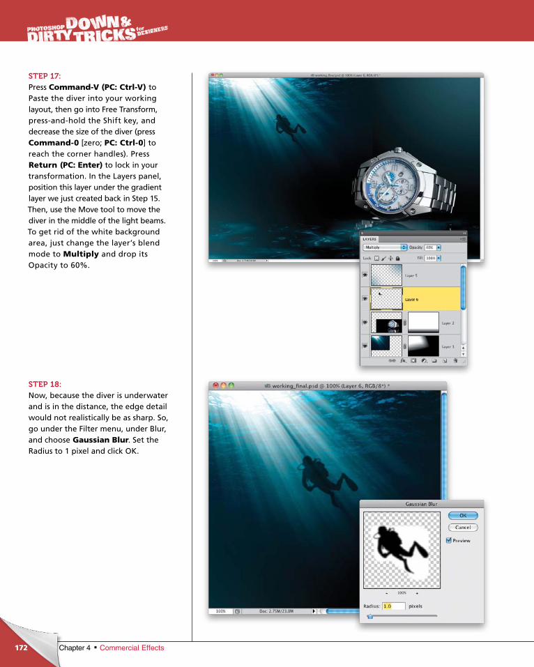
ptg6970545
172 Chapter 4 Commercial Effects
STEP 17:Press Command-V (PC: Ctrl-V) to Paste the diver into your working lay out, then go into Free Transform, pressandhold the Shift key, and decrease the size of the diver (press Command-0 [zero; PC: Ctrl-0] to reach the corner handles). Press Return (PC: Enter) to lock in your transformation. In the Layers panel, position this layer under the gradient layer we just created back in Step 15. Then, use the Move tool to move the diver in the middle of the light beams. To get rid of the white background area, just change the layer’s blend mode to Multiply and drop its Opacity to 60%.
STEP 18:Now, because the diver is underwater and is in the distance, the edge detail would not realistically be as sharp. So, go under the Filter menu, under Blur, and choose Gaussian Blur. Set the Radius to 1 pixel and click OK.
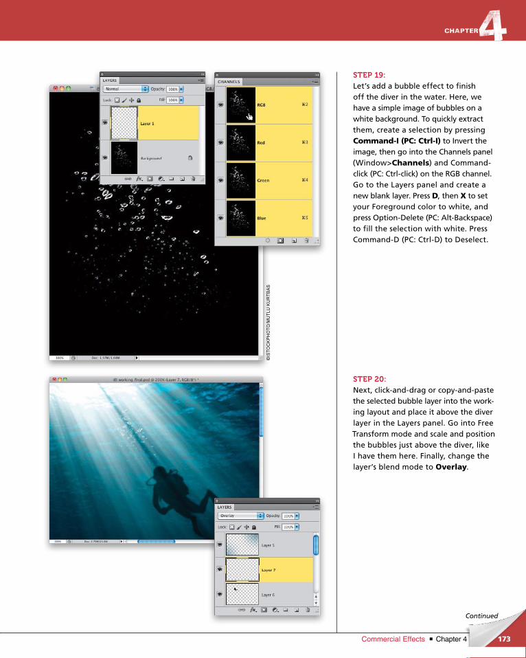
ptg6970545
173Chapter 4Commercial Effects
Continued
STEP 19:Let’s add a bubble effect to finish off the diver in the water. Here, we have a simple image of bubbles on a white background. To quickly extract them, create a selection by pressing Command-I (PC: Ctrl-I) to Invert the image, then go into the Channels panel (Window>Channels) and Com mandclick (PC: Ctrlclick) on the RGB channel. Go to the Layers panel and create a new blank layer. Press D, then X to set your Foreground color to white, and press OptionDelete (PC: AltBack space) to fill the selection with white. Press CommandD (PC: CtrlD) to Deselect.
STEP 20:Next, clickanddrag or copyandpaste the selected bubble layer into the working layout and place it above the diver layer in the Layers panel. Go into Free Transform mode and scale and position the bubbles just above the diver, like I have them here. Finally, change the layer’s blend mode to Overlay.
©IS
TO
CK
PH
OT
O/M
UT
LU K
UR
TB
AS
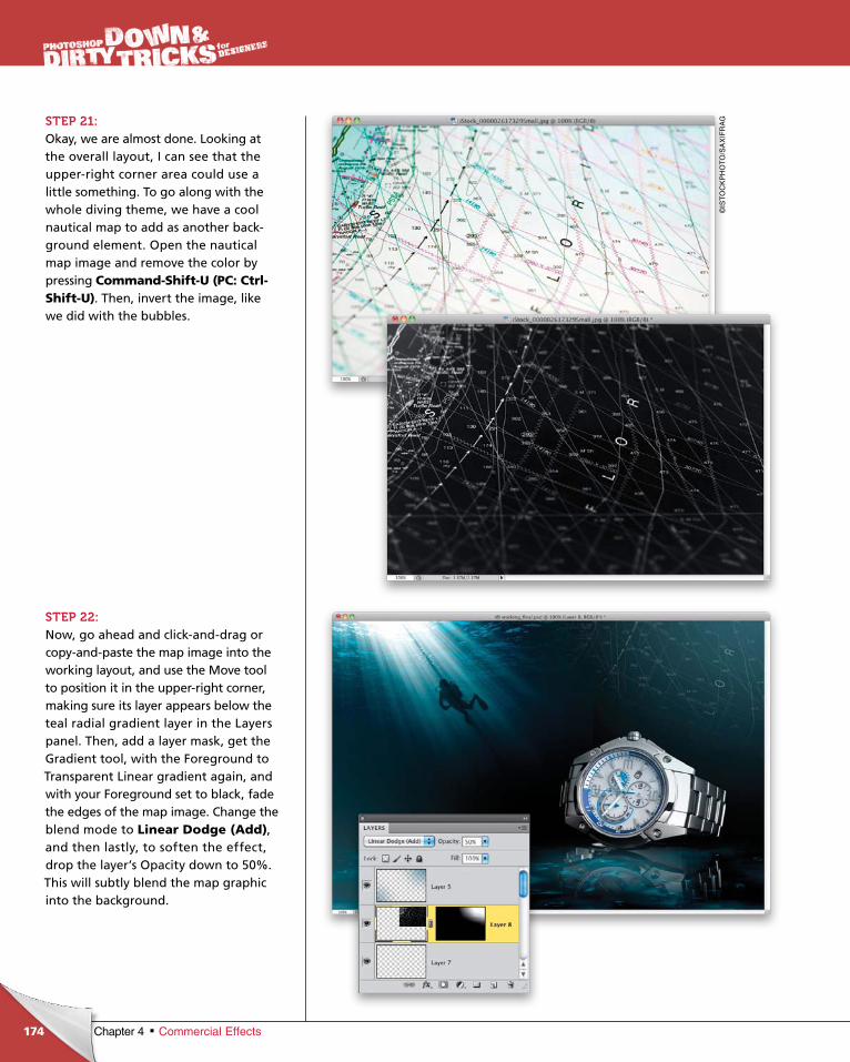
ptg6970545
174 Chapter 4 Commercial Effects
STEP 21:Okay, we are almost done. Looking at the overall layout, I can see that the upperright corner area could use a little something. To go along with the whole diving theme, we have a cool nautical map to add as another background element. Open the nautical map image and remove the color by pressing Command-Shift-U (PC: Ctrl-Shift-U). Then, invert the image, like we did with the bubbles.
STEP 22:Now, go ahead and clickanddrag or copyandpaste the map image into the working layout, and use the Move tool to position it in the upperright corner, making sure its layer appears below the teal radial gradient layer in the Layers panel. Then, add a layer mask, get the Gradient tool, with the Foreground to Transparent Linear gradient again, and with your Foreground set to black, fade the edges of the map image. Change the blend mode to Linear Dodge (Add), and then lastly, to soften the effect, drop the layer’s Opacity down to 50%. This will subtly blend the map graphic into the background.
©IS
TO
CK
PH
OT
O/S
AX
IFR
AG

ptg6970545
175Chapter 4Commercial Effects
Continued
STEP 23:Let’s finish the whole design off with some text. Start by selecting the Horizontal Type tool (T) from the Toolbox and creating a text layer. Click on the color swatch in the Options Bar and enter R: 224, G: 146, B: 47 in the Color Picker. Here, I stacked the words “AQUA TIME” in Eurostile (T1) Extended 2 at almost 73 points for AQUA and at almost 53 points for TIME.
STEP 24:Create a new blank layer below the text layer. Get the Rectangular Marquee tool (M), and draw a thinline selection across the document, in between the lines of text. Set your Foreground color to the same color used for the text and then press OptionDelete (PC: AltBackspace) to fill the line with that color, then deselect. (Note: To get both words to line up with the line you just created, use the Move tool to move the bottom of AQUA onto the line and then select TIME with the Horizontal Type tool, and press Option-Up Arrow key (PC: Alt-Up Arrow key) to bring the top of it up to the line.) Now, Commandclick (PC: Ctrlclick) on both the line and text layers so both are selected, and then from the Layers panel’s flyout menu, choose Convert to Smart Object to convert them into a single Smart Object layer.

ptg6970545
176 Chapter 4 Commercial Effects
STEP 25:Now, let’s dress up the text with layer styles. With the Smart Object layer active in the Layers panel, click on the Add a Layer Style icon at the bottom of the panel and choose Inner Shadow. Use the settings shown here to add some depth to the text.
STEP 26:Next, click on Gradient Overlay on the left side of the dialog to turn it on, and just change the Blend Mode to Soft Light.

ptg6970545
177Chapter 4Commercial Effects
Continued
STEP 27:Lastly, click on Outer Glow on the left to turn it on, and set this Blend Mode to Overlay and the Opacity to 100%. Click on the color swatch and change the color to white. Then, down in the Elements section, increase the Spread to 25% and set the Size to around 105 px. This will give the glow a subtle halo effect. Click OK.
STEP 28:Now we need to mask the line where it goes over the watch. So, get the Elliptical Marquee tool (press Shift-M until you have it) and draw a long oval selection over the line where it goes over the watch.
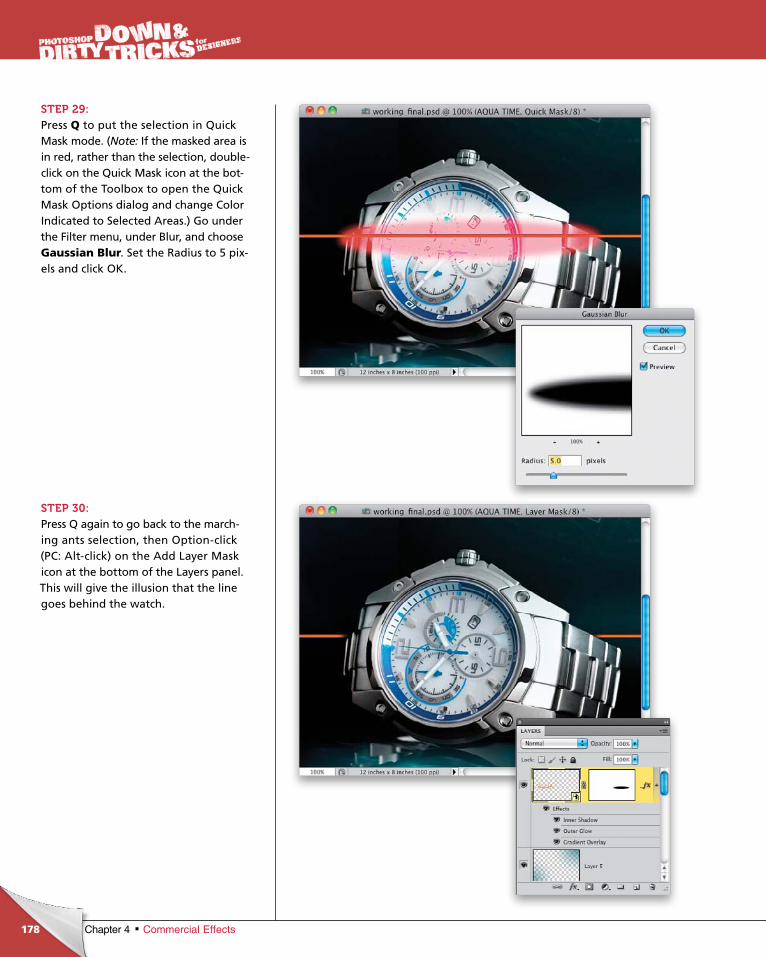
ptg6970545
178 Chapter 4 Commercial Effects
STEP 29:Press Q to put the selection in Quick Mask mode. (Note: If the masked area is in red, rather than the selection, doubleclick on the Quick Mask icon at the bottom of the Toolbox to open the Quick Mask Options dialog and change Color Indicated to Selected Areas.) Go under the Filter menu, under Blur, and choose Gaussian Blur. Set the Radius to 5 pixels and click OK.
STEP 30:Press Q again to go back to the marching ants selection, then Optionclick (PC: Altclick) on the Add Layer Mask icon at the bottom of the Layers panel. This will give the illusion that the line goes behind the watch.
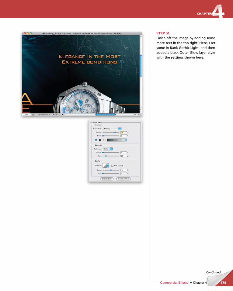
ptg6970545
179Chapter 4Commercial Effects
Continued
STEP 31:Finish off the image by adding some more text in the top right. Here, I set some in Bank Gothic Light, and then added a black Outer Glow layer style with the settings shown here.
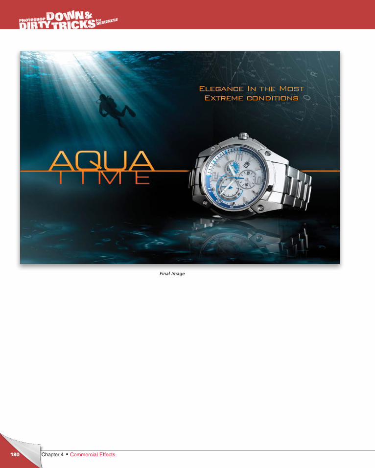
ptg6970545
180 Chapter 4 Commercial Effects
Final Image
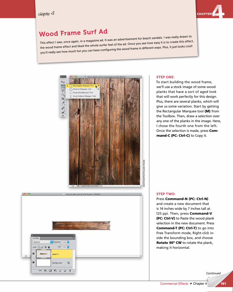
ptg6970545
181Chapter 4Commercial Effects
chapter 4
Continued
STEP ONE:To start building the wood frame, we’ll use a stock image of some wood planks that have a sort of aged look that will work perfectly for this design. Plus, there are several planks, which will give us some variation. Start by getting the Rectangular Marquee tool (M) from the Toolbox. Then, draw a selection over any one of the planks in the image. Here, I chose the fourth one from the left. Once the selection is made, press Com-mand-C (PC: Ctrl-C) to Copy it.
STEP TWO:Press Command-N (PC: Ctrl-N) and create a new document that is 14 inches wide by 7 inches tall at 125 ppi. Then, press Command-V (PC: Ctrl-V) to Paste the wood plank selection in the new doc ument. Press Command-T (PC: Ctrl-T) to go into Free Transform mode, Rightclick inside the bounding box, and choose Rotate 90º CW to rotate the plank, making it horizontal.
This effect I saw, once again, in a magazine ad. It was an advertisement for beach sandals. I was really drawn to
the wood frame effect and liked the whole surfer feel of the ad. Once you see how easy it is to create this effect,
you’ll really see how much fun you can have configuring the wood frame in different ways. Plus, it just looks cool!
Wood Frame Surf Ad
©IS
TO
CK
PH
OT
O/J
AN
RIH
AK
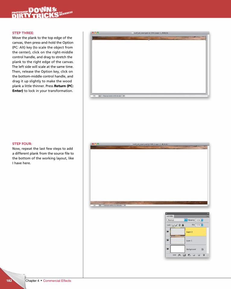
ptg6970545
182 Chapter 4 Commercial Effects
STEP THREE:Move the plank to the top edge of the canvas, then pressandhold the Option (PC: Alt) key (to scale the object from the center), click on the rightmiddle control handle, and drag to stretch the plank to the right edge of the canvas. The left side will scale at the same time. Then, release the Option key, click on the bottommiddle control handle, and drag it up slightly to make the wood plank a little thinner. Press Return (PC: Enter) to lock in your transformation.
STEP FOUR:Now, repeat the last few steps to add a different plank from the source file to the bottom of the working layout, like I have here.
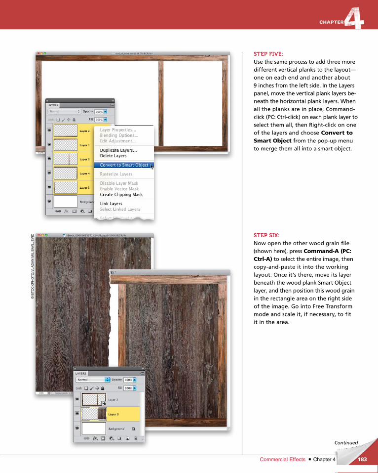
ptg6970545
183Chapter 4Commercial Effects
Continued
STEP FIVE:Use the same process to add three more different vertical planks to the layout—one on each end and another about 9 inches from the left side. In the Layers panel, move the vertical plank layers beneath the horizontal plank layers. When all the planks are in place, Commandclick (PC: Ctrlclick) on each plank layer to select them all, then Rightclick on one of the layers and choose Convert to Smart Object from the popup menu to merge them all into a smart object.
STEP SIX:Now open the other wood grain file (shown here), press Command-A (PC: Ctrl-A) to select the entire image, then copyandpaste it into the working lay out. Once it’s there, move its layer beneath the wood plank Smart Object layer, and then position this wood grain in the rectangle area on the right side of the image. Go into Free Transform mode and scale it, if necessary, to fit it in the area.
©IS
TO
CK
PH
OT
O/V
LA
DA
N M
ILIS
AV
LJE
VIC
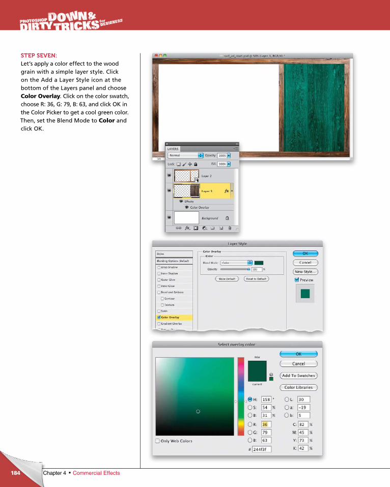
ptg6970545
184 Chapter 4 Commercial Effects
STEP SEVEN:Let’s apply a color effect to the wood grain with a simple layer style. Click on the Add a Layer Style icon at the bottom of the Layers panel and choose Color Overlay. Click on the color swatch, choose R: 36, G: 79, B: 63, and click OK in the Color Picker to get a cool green color. Then, set the Blend Mode to Color and click OK.
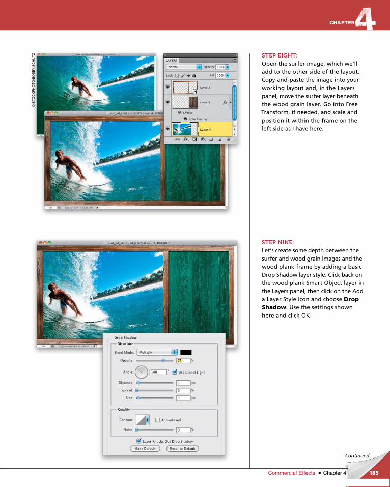
ptg6970545
185Chapter 4Commercial Effects
Continued
STEP EIGHT:Open the surfer image, which we’ll add to the other side of the layout. Copyandpaste the image into your working layout and, in the Layers panel, move the surfer layer beneath the wood grain layer. Go into Free Transform, if needed, and scale and position it within the frame on the left side as I have here.
STEP NINE:Let’s create some depth between the surfer and wood grain images and the wood plank frame by adding a basic Drop Shadow layer style. Click back on the wood plank Smart Object layer in the Layers panel, then click on the Add a Layer Style icon and choose Drop Shadow. Use the settings shown here and click OK.
©IS
TO
CK
PH
OT
O/B
OB
BY
SC
HU
TZ
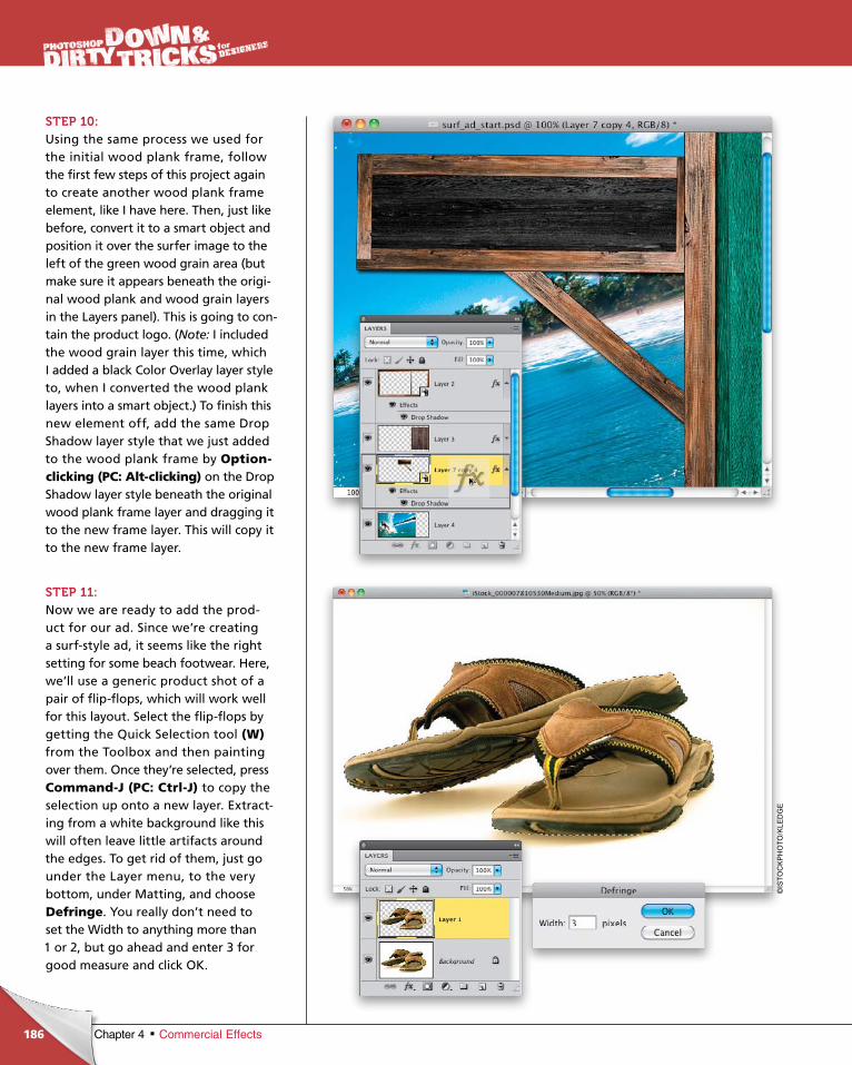
ptg6970545
186 Chapter 4 Commercial Effects
STEP 10:Using the same process we used for the initial wood plank frame, follow the first few steps of this project again to create another wood plank frame element, like I have here. Then, just like before, convert it to a smart object and position it over the surfer image to the left of the green wood grain area (but make sure it appears beneath the original wood plank and wood grain layers in the Layers panel). This is going to contain the product logo. (Note: I included the wood grain layer this time, which I added a black Color Overlay layer style to, when I converted the wood plank layers into a smart object.) To finish this new element off, add the same Drop Shadow layer style that we just added to the wood plank frame by Option-clicking (PC: Alt-clicking) on the Drop Shadow layer style beneath the original wood plank frame layer and dragging it to the new frame layer. This will copy it to the new frame layer.
STEP 11:Now we are ready to add the product for our ad. Since we’re creating a surfstyle ad, it seems like the right setting for some beach footwear. Here, we’ll use a generic product shot of a pair of flipflops, which will work well for this layout. Select the flipflops by getting the Quick Selection tool (W)from the Toolbox and then painting over them. Once they’re selected, press Command-J (PC: Ctrl-J) to copy the selection up onto a new layer. Extracting from a white background like this will often leave little artifacts around the edges. To get rid of them, just go under the Layer menu, to the very bottom, under Matting, and choose Defringe. You really don’t need to set the Width to anything more than 1 or 2, but go ahead and enter 3 for good measure and click OK.
©IS
TO
CK
PH
OT
O/K
LED
GE
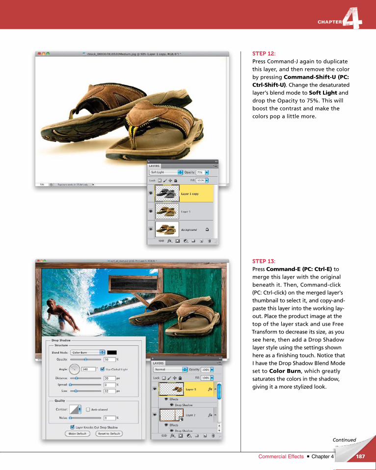
ptg6970545
187Chapter 4Commercial Effects
Continued
STEP 12:Press CommandJ again to duplicate this layer, and then remove the color by pressing Command-Shift-U (PC: Ctrl-Shift-U). Change the desaturated layer’s blend mode to Soft Light and drop the Opacity to 75%. This will boost the contrast and make the colors pop a little more.
STEP 13:Press Command-E (PC: Ctrl-E) to merge this layer with the original beneath it. Then, Commandclick (PC: Ctrlclick) on the merged layer’s thumbnail to select it, and copyandpaste this layer into the working layout. Place the product image at the top of the layer stack and use Free Transform to decrease its size, as you see here, then add a Drop Shadow layer style using the settings shown here as a finishing touch. Notice that I have the Drop Shadow Blend Mode set to Color Burn, which greatly saturates the colors in the shadow, giving it a more stylized look.
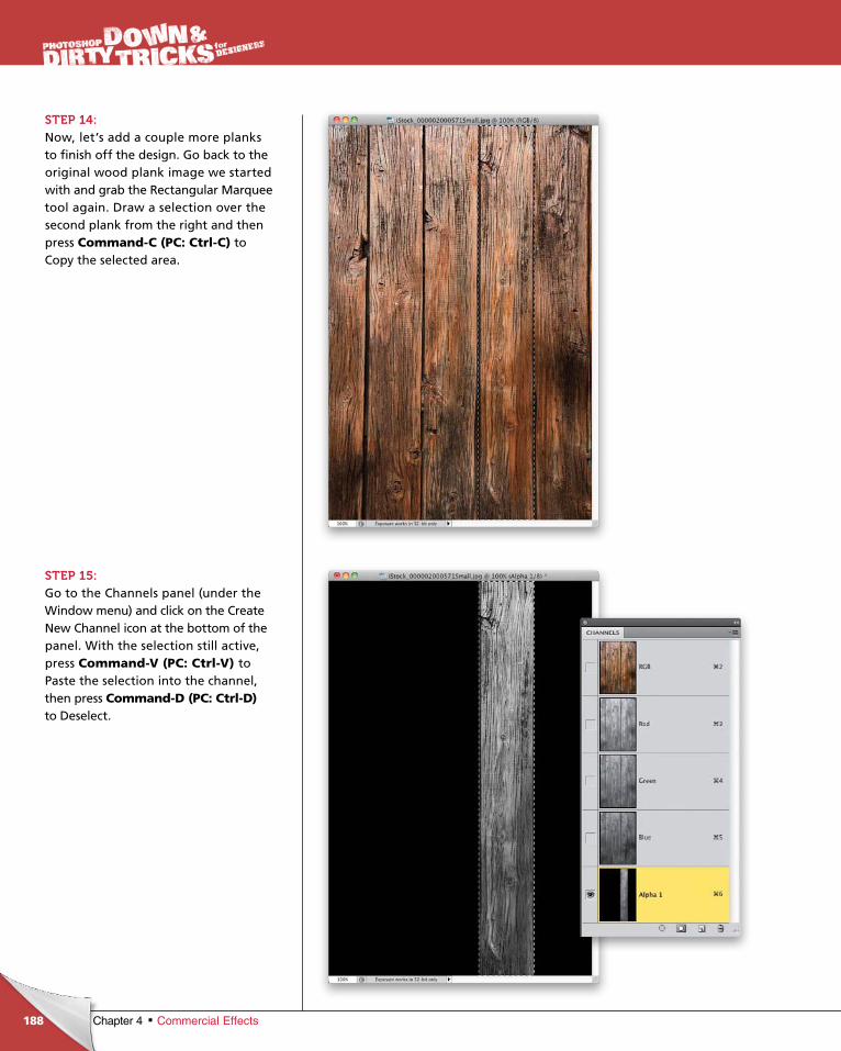
ptg6970545
188 Chapter 4 Commercial Effects
STEP 14:Now, let’s add a couple more planks to finish off the design. Go back to the original wood plank image we started with and grab the Rectangular Marquee tool again. Draw a selection over the second plank from the right and then press Command-C (PC: Ctrl-C) to Copy the selected area.
STEP 15:Go to the Channels panel (under the Window menu) and click on the Create New Channel icon at the bottom of the panel. With the selection still active, press Command-V (PC: Ctrl-V) to Paste the selection into the channel, then press Command-D (PC: Ctrl-D) to Deselect.
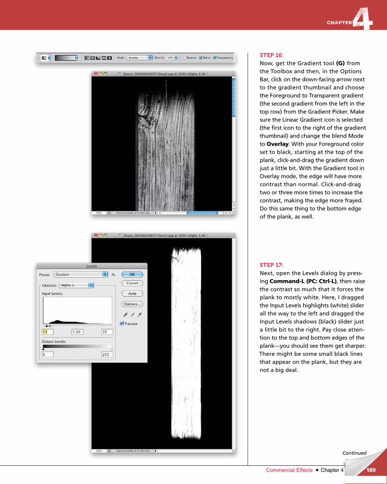
ptg6970545
189Chapter 4Commercial Effects
Continued
STEP 16:Now, get the Gradient tool (G) from the Toolbox and then, in the Options Bar, click on the downfacing arrow next to the gradient thumbnail and choose the Foreground to Transparent gradient (the second gradient from the left in the top row) from the Gradient Picker. Make sure the Linear Gradient icon is selected (the first icon to the right of the gradient thumbnail) and change the blend Mode to Overlay. With your Foreground color set to black, starting at the top of the plank, clickanddrag the gradient down just a little bit. With the Gradient tool in Overlay mode, the edge will have more contrast than normal. Clickanddrag two or three more times to increase the contrast, making the edge more frayed. Do this same thing to the bottom edge of the plank, as well.
STEP 17:Next, open the Levels dialog by pressing Command-L (PC: Ctrl-L), then raise the contrast so much that it forces the plank to mostly white. Here, I dragged the Input Levels highlights (white) slider all the way to the left and dragged the Input Levels shadows (black) slider just a little bit to the right. Pay close attention to the top and bottom edges of the plank—you should see them get sharper. There might be some small black lines that appear on the plank, but they are not a big deal.
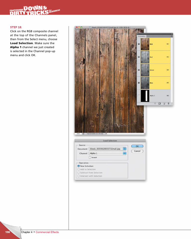
ptg6970545
190 Chapter 4 Commercial Effects
STEP 18:Click on the RGB composite channel at the top of the Channels panel, then from the Select menu, choose Load Selection. Make sure the Alpha 1 channel we just created is selected in the Channel popup menu and click OK.
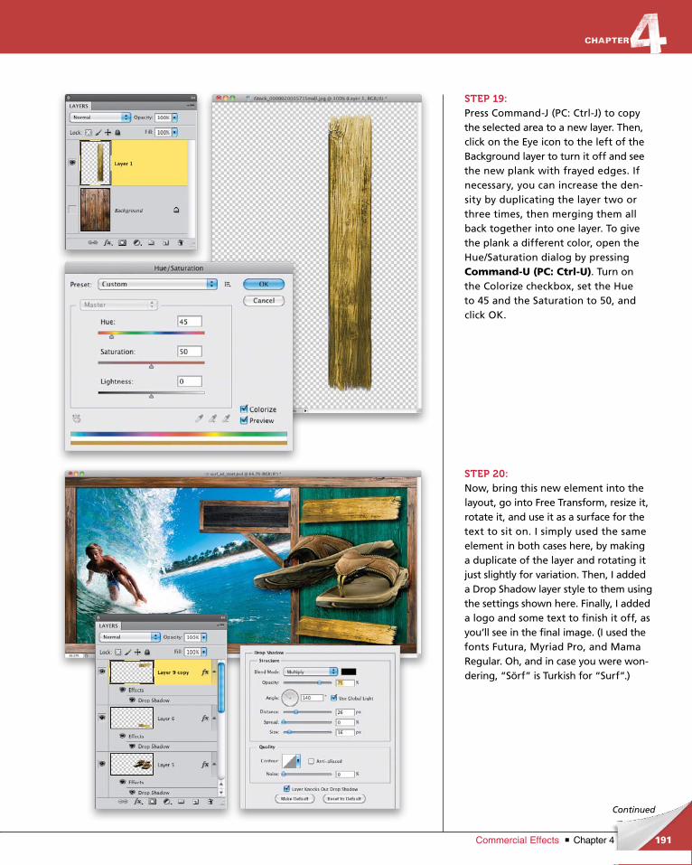
ptg6970545
191Chapter 4Commercial Effects
Continued
STEP 19:Press CommandJ (PC: CtrlJ) to copy the selected area to a new layer. Then, click on the Eye icon to the left of the Background layer to turn it off and see the new plank with frayed edges. If necessary, you can increase the density by duplicating the layer two or three times, then merging them all back together into one layer. To give the plank a different color, open the Hue/Saturation dialog by pressing Command-U (PC: Ctrl-U). Turn on the Colorize checkbox, set the Hue to 45 and the Saturation to 50, and click OK.
STEP 20:Now, bring this new element into the layout, go into Free Transform, resize it, rotate it, and use it as a surface for the text to sit on. I simply used the same element in both cases here, by making a duplicate of the layer and rotating it just slightly for variation. Then, I added a Drop Shadow layer style to them using the settings shown here. Finally, I added a logo and some text to finish it off, as you’ll see in the final image. (I used the fonts Futura, Myriad Pro, and Mama Regular. Oh, and in case you were wondering, “Sörf” is Turkish for “Surf”.)
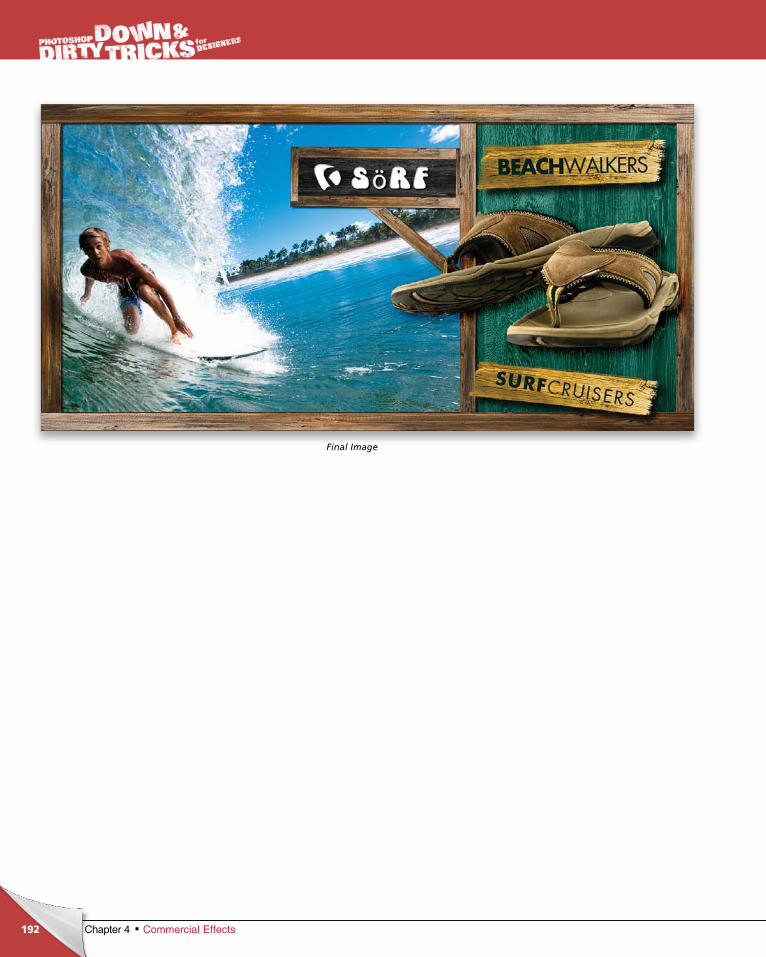
ptg6970545
192 Chapter 4 Commercial Effects
Final Image
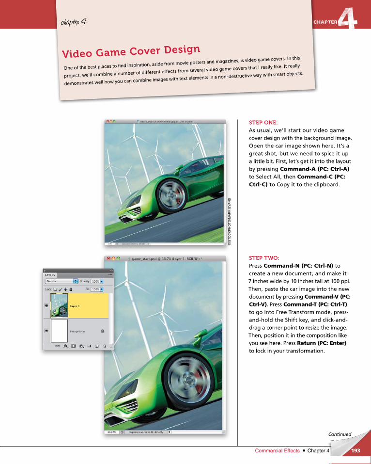
ptg6970545
193Chapter 4Commercial Effects
chapter 4
Continued
STEP ONE:As usual, we’ll start our video game cover design with the background image. Open the car image shown here. It’s a great shot, but we need to spice it up a little bit. First, let’s get it into the lay out by pressing Command-A (PC: Ctrl-A) to Select All, then Command-C (PC: Ctrl-C) to Copy it to the clipboard.
STEP TWO:Press Command-N (PC: Ctrl-N) to create a new document, and make it 7 inches wide by 10 inches tall at 100 ppi. Then, paste the car image into the new document by pressing Command-V (PC: Ctrl-V). Press Command-T (PC: Ctrl-T)to go into Free Transform mode, pressandhold the Shift key, and clickanddrag a corner point to resize the image. Then, position it in the composition like you see here. Press Return (PC: Enter)to lock in your transformation.
One of the best places to find inspiration, aside from movie posters and magazines, is video game covers. In this
project, we’ll combine a number of different effects from several video game covers that I really like. It really
demonstrates well how you can combine images with text elements in a non-destructive way with smart objects.
Video Game Cover Design
©IS
TO
CK
PH
OT
O/M
AR
K E
VA
NS
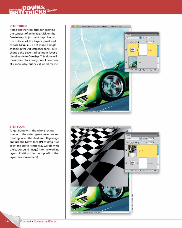
ptg6970545
194 Chapter 4 Commercial Effects
STEP THREE:Here’s another cool trick for boosting the contrast of an image: click on the Create New Adjustment Layer icon at the bottom of the Layers panel and choose Levels. Do not make a single change in the Adjustments panel. Just change the Levels adjustment layer’s blend mode to Overlay. This alone will make the colors really pop. I don’t really know why, but hey, it works for me.
STEP FOUR:To go along with the whole racing theme of the video game cover we’re creating, open the checkered flag image and use the Move tool (V) to drag it or copyandpaste it (the way we did with the background image) into the working layout. Position it in the top left of the layout (as shown here).
©IS
TO
CK
PH
OT
O/K
YU
OH
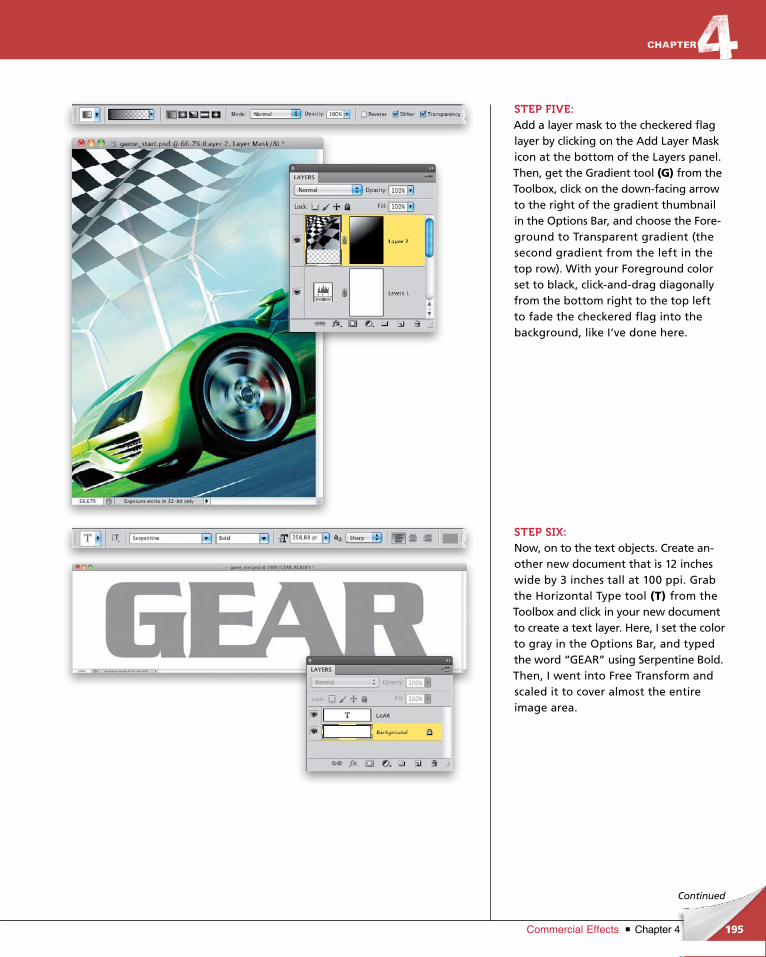
ptg6970545
195Chapter 4Commercial Effects
Continued
STEP FIVE:Add a layer mask to the checkered flag layer by clicking on the Add Layer Mask icon at the bottom of the Layers panel. Then, get the Gradient tool (G) from the Toolbox, click on the downfacing arrow to the right of the gradient thumbnail in the Options Bar, and choose the Foreground to Transparent gradient (the second gradient from the left in the top row). With your Foreground color set to black, clickanddrag diagonally from the bottom right to the top left to fade the checkered flag into the back ground, like I’ve done here.
STEP SIX:Now, on to the text objects. Create another new document that is 12 inches wide by 3 inches tall at 100 ppi. Grab the Horizontal Type tool (T) from the Toolbox and click in your new document to create a text layer. Here, I set the color to gray in the Options Bar, and typed the word “GEAR” using Serpentine Bold. Then, I went into Free Transform and scaled it to cover almost the entire image area.
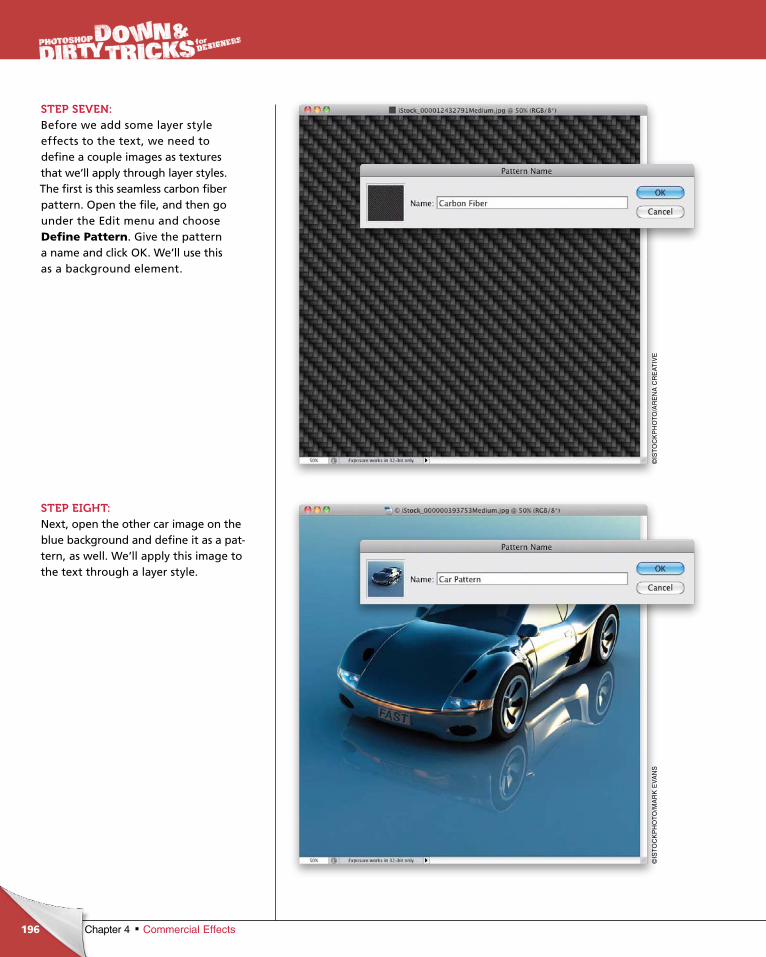
ptg6970545
196 Chapter 4 Commercial Effects
STEP SEVEN:Before we add some layer style effects to the text, we need to define a couple images as textures that we’ll apply through layer styles. The first is this seamless carbon fiber pattern. Open the file, and then go under the Edit menu and choose Define Pattern. Give the pattern a name and click OK. We’ll use this as a background element.
STEP EIGHT:Next, open the other car image on the blue background and define it as a pattern, as well. We’ll apply this image to the text through a layer style.
©IS
TO
CK
PH
OT
O/A
RE
NA
CR
EA
TIV
E©
IST
OC
KP
HO
TO
/MA
RK
EV
AN
S
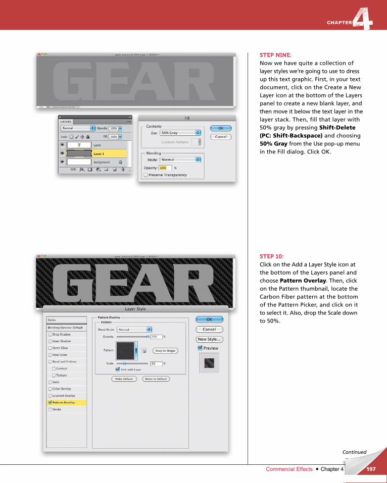
ptg6970545
197Chapter 4Commercial Effects
Continued
STEP NINE:Now we have quite a collection of layer styles we’re going to use to dress up this text graphic. First, in your text document, click on the Create a New Layer icon at the bottom of the Layers panel to create a new blank layer, and then move it below the text layer in the layer stack. Then, fill that layer with 50% gray by pressing Shift-Delete (PC: Shift-Backspace) and choosing 50% Gray from the Use popup menu in the Fill dialog. Click OK.
STEP 10:Click on the Add a Layer Style icon at the bottom of the Layers panel and choose Pattern Overlay. Then, click on the Pattern thumbnail, locate the Carbon Fiber pattern at the bottom of the Pattern Picker, and click on it to select it. Also, drop the Scale down to 50%.
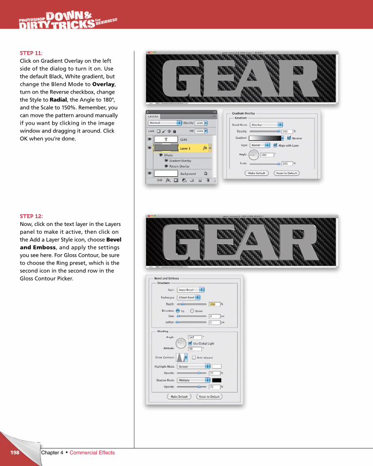
ptg6970545
198 Chapter 4 Commercial Effects
STEP 11:Click on Gradient Overlay on the left side of the dialog to turn it on. Use the default Black, White gradient, but change the Blend Mode to Overlay, turn on the Reverse checkbox, change the Style to Radial, the Angle to 180°, and the Scale to 150%. Remember, you can move the pattern around manually if you want by clicking in the image window and dragging it around. Click OK when you’re done.
STEP 12:Now, click on the text layer in the Layers panel to make it active, then click on the Add a Layer Style icon, choose Bevel and Emboss, and apply the settings you see here. For Gloss Contour, be sure to choose the Ring preset, which is the second icon in the second row in the Gloss Contour Picker.
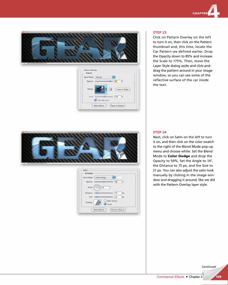
ptg6970545
199Chapter 4Commercial Effects
Continued
STEP 13:Click on Pattern Overlay on the left to turn it on, then click on the Pattern thumb nail and, this time, locate the Car Pattern we defined earlier. Drop the Opacity down to 85% and increase the Scale to 175%. Then, move the Layer Style dialog aside and clickanddrag the pattern around in your image window, so you can see some of the reflective surface of the car inside the text.
STEP 14:Next, click on Satin on the left to turn it on, and then click on the color swatch to the right of the Blend Mode popup menu and choose white. Set the Blend Mode to Color Dodge and drop the Opacity to 50%. Set the Angle to 14°, the Distance to 15 px, and the Size to 21 px. You can also adjust the satin look manually by clicking in the image window and dragging it around, like we did with the Pattern Overlay layer style.
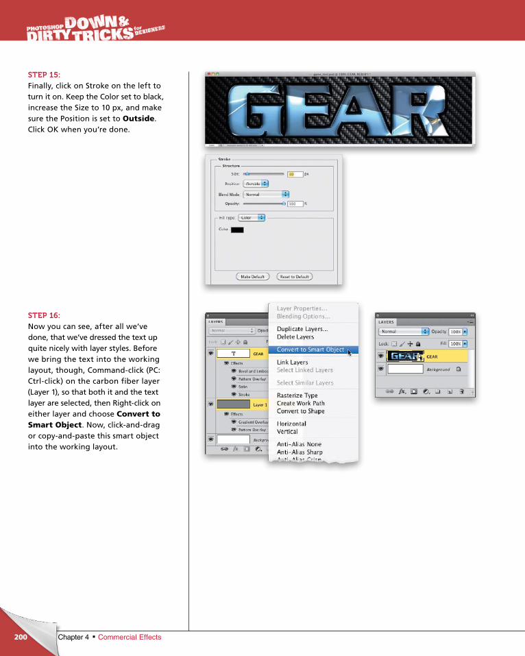
ptg6970545
200 Chapter 4 Commercial Effects
STEP 15:Finally, click on Stroke on the left to turn it on. Keep the Color set to black, increase the Size to 10 px, and make sure the Position is set to Outside. Click OK when you’re done.
STEP 16:Now you can see, after all we’ve done, that we’ve dressed the text up quite nicely with layer styles. Before we bring the text into the work ing layout, though, Commandclick (PC: Ctrlclick) on the carbon fiber layer (Layer 1), so that both it and the text layer are selected, then Rightclick on either layer and choose Convert to Smart Object. Now, clickanddrag or copyandpaste this smart object into the working layout.
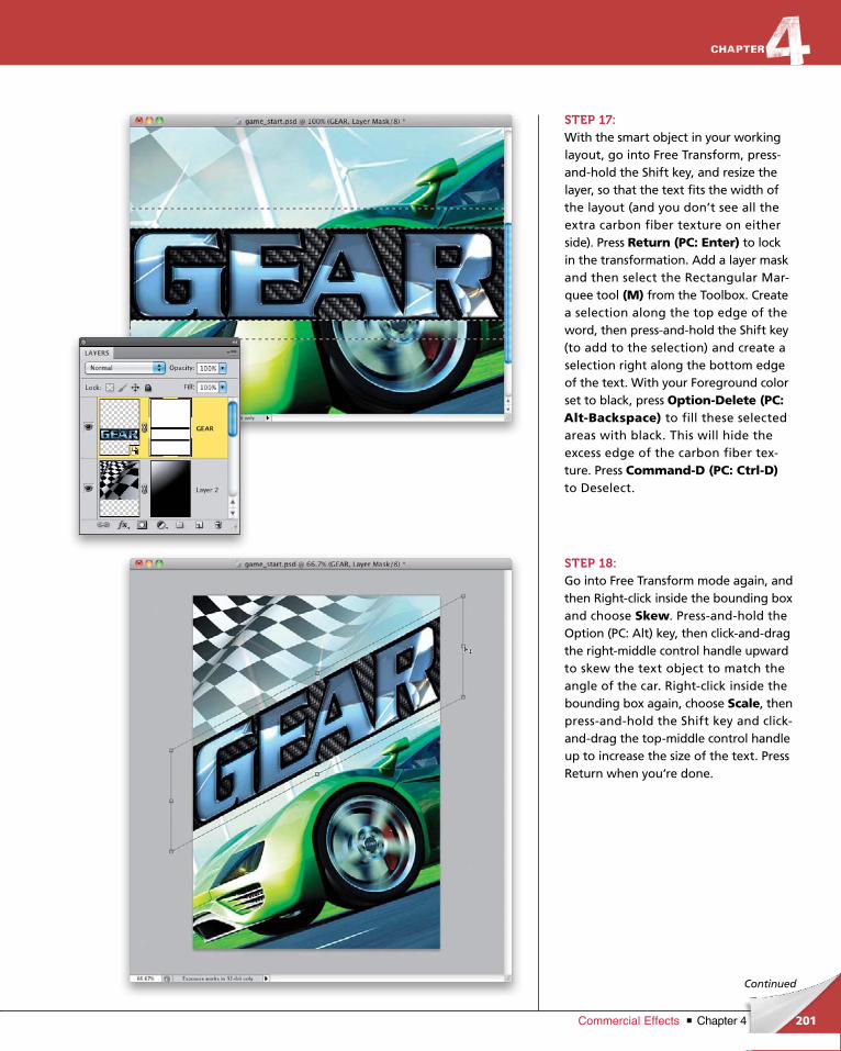
ptg6970545
201Chapter 4Commercial Effects
Continued
STEP 17:With the smart object in your working layout, go into Free Transform, pressandhold the Shift key, and resize the layer, so that the text fits the width of the layout (and you don’t see all the extra carbon fiber texture on either side). Press Return (PC: Enter) to lock in the transformation. Add a layer mask and then select the Rectangular Marquee tool (M) from the Toolbox. Create a selection along the top edge of the word, then pressandhold the Shift key (to add to the selection) and create a selection right along the bottom edge of the text. With your Foreground color set to black, press Option-Delete (PC: Alt-Backspace) to fill these selected areas with black. This will hide the ex cess edge of the carbon fiber texture. Press Command-D (PC: Ctrl-D)to Deselect.
STEP 18:Go into Free Transform mode again, and then Rightclick inside the bounding box and choose Skew. Pressandhold the Option (PC: Alt) key, then clickanddrag the rightmiddle control handle upward to skew the text object to match the angle of the car. Rightclick inside the bounding box again, choose Scale, then pressandhold the Shift key and clickanddrag the topmiddle control handle up to increase the size of the text. Press Return when you’re done.
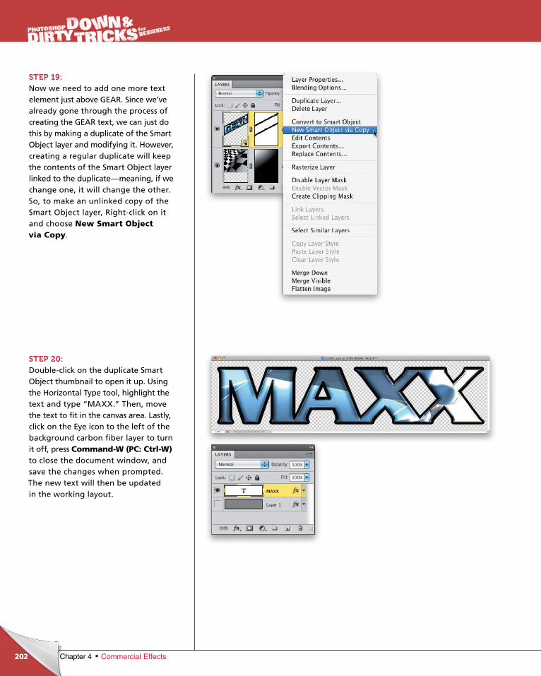
ptg6970545
202 Chapter 4 Commercial Effects
STEP 19:Now we need to add one more text element just above GEAR. Since we’ve already gone through the process of creating the GEAR text, we can just do this by making a duplicate of the Smart Object layer and modifying it. However, creating a regular duplicate will keep the contents of the Smart Object layer linked to the duplicate—meaning, if we change one, it will change the other. So, to make an unlinked copy of the Smart Object layer, Rightclick on it and choose New Smart Object via Copy.
STEP 20:Doubleclick on the duplicate Smart Object thumbnail to open it up. Using the Horizontal Type tool, high light the text and type “MAXX.” Then, move the text to fit in the canvas area. Lastly, click on the Eye icon to the left of the background carbon fiber layer to turn it off, press Command-W (PC: Ctrl-W)to close the document window, and save the changes when prompted. The new text will then be updated in the working layout.
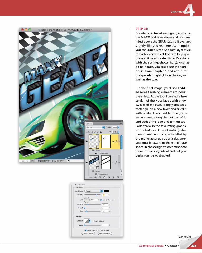
ptg6970545
203Chapter 4Commercial Effects
Continued
STEP 21:Go into Free Transform again, and scale the MAXX text layer down and position it just above the GEAR text, so it overlaps slightly, like you see here. As an option, you can add a Drop Shadow layer style to both Smart Object layers to help give them a little more depth (as I’ve done with the settings shown here). And, as a final touch, you could use the flare brush from Chapter 1 and add it to the specular highlight on the car, as well as the text.
In the final image, you’ll see I added some finishing elements to polish the effect. At the top, I created a fake version of the Xbox label, with a few tweaks of my own. I simply created a rectangle on a new layer and filled it with white. Then, I added the gradient element along the bottom of it and added the logo and text on top. I also threw in the fake rating graphic at the bottom. These finishing elements would normally be handled by the manufacturer, but as a designer, you must be aware of them and leave space in the design to accommodate them. Otherwise, critical parts of your design can be obstructed.
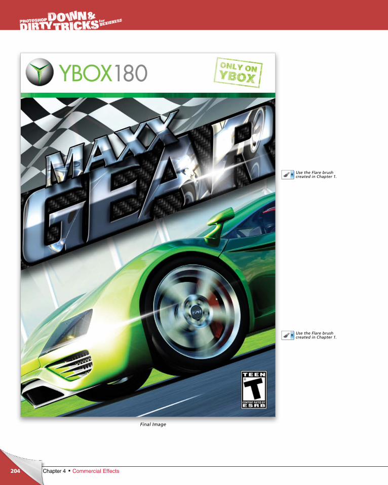
ptg6970545
204
Use the Flare brush created in Chapter 1.
Use the Flare brush created in Chapter 1.
Chapter 4 Commercial Effects
Final Image

ptg6970545
This page intentionally left blank
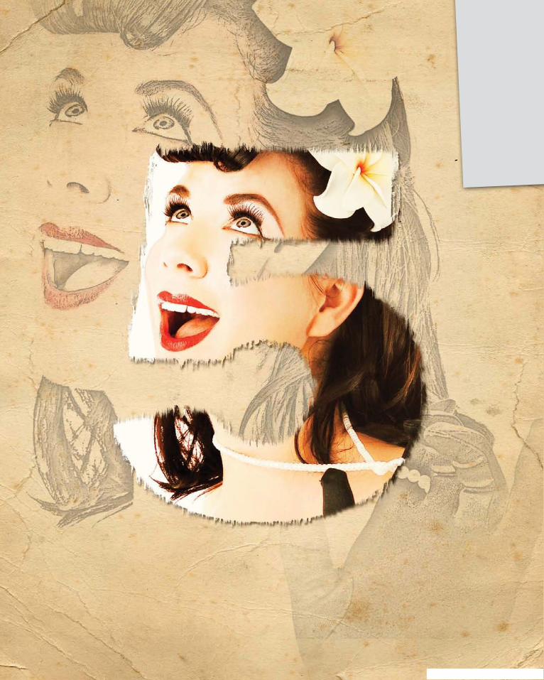
ptg6970545
ptg6970545
Look beyond the obvious. How many of us have a digital camera and
find ourselves with a whole bunch of images that just take up space on
the memory card? I think we all have at some point. So, one day, I decided
that I would force my creative mind to make something out of nothing.
As a designer, I use photography as a big part of my work. However, unlike
a normal photographer, I look at things differently, as I encourage you to do.
Change your perspective on the world and look at things differently. Notice
textures, shapes, patterns, and even negative space, and grab them with
whatever you have—your phone, a DSLR camera, or even a point-and-shoot.
Whatever you have, you can make something extraordinary from it. Even
looking through stock images, you can shift your thinking and look at differ-
ent ways to use images as design elements. As you widen your gaze, you
will start to see a world of ideas right before your very eyes!
photo effectsWiden Your Gaze
207Chapter 5Photo Effects
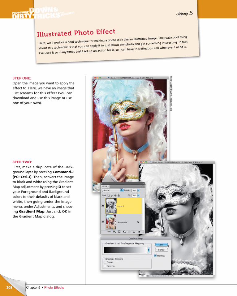
ptg6970545
208
©IS
TOC
KP
HO
TO/J
AN
IS L
ITA
VN
IEK
S
Chapter 5 Photo Effects
chapter 5
STEP ONE:Open the image you want to apply the effect to. Here, we have an image that just screams for this effect (you can download and use this image or use one of your own).
STEP TWO:First, make a duplicate of the Background layer by pressing Command-J (PC: Ctrl-J). Then, convert the image to black and white using the Gradient Map adjustment by pressing D to set your Foreground and Background colors to their defaults of black and white, then going under the Image menu, under Adjustments, and choosing Gradient Map. Just click OK in the Gradient Map dialog.
Here, we’ll explore a cool technique for making a photo look like an illustrated image. The really cool thing
about this technique is that you can apply it to just about any photo and get something interesting. In fact,
I’ve used it so many times that I set up an action for it, so I can have this effect on call whenever I need it.
Illustrated Photo Effect
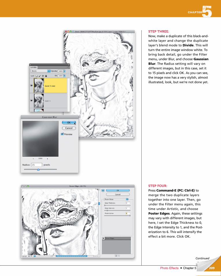
ptg6970545
209Chapter 5Photo Effects
Continued
STEP THREE:Now, make a duplicate of this blackandwhite layer and change the duplicate layer’s blend mode to Divide. This will turn the entire image window white. To bring back detail, go under the Filter menu, under Blur, and choose Gaussian Blur. The Radius setting will vary on different images, but in this case, set it to 15 pixels and click OK. As you can see, the image now has a very stylish, almost illustrated, look, but we’re not done yet.
STEP FOUR:Press Command-E (PC: Ctrl-E) to merge the two duplicate layers together into one layer. Then, go under the Filter menu again, this time under Artistic, and choose Poster Edges. Again, these settings may vary with different images, but here, I set the Edge Thickness to 0, the Edge Intensity to 1, and the Posterization to 6. This will intensify the effect a bit more. Click OK.
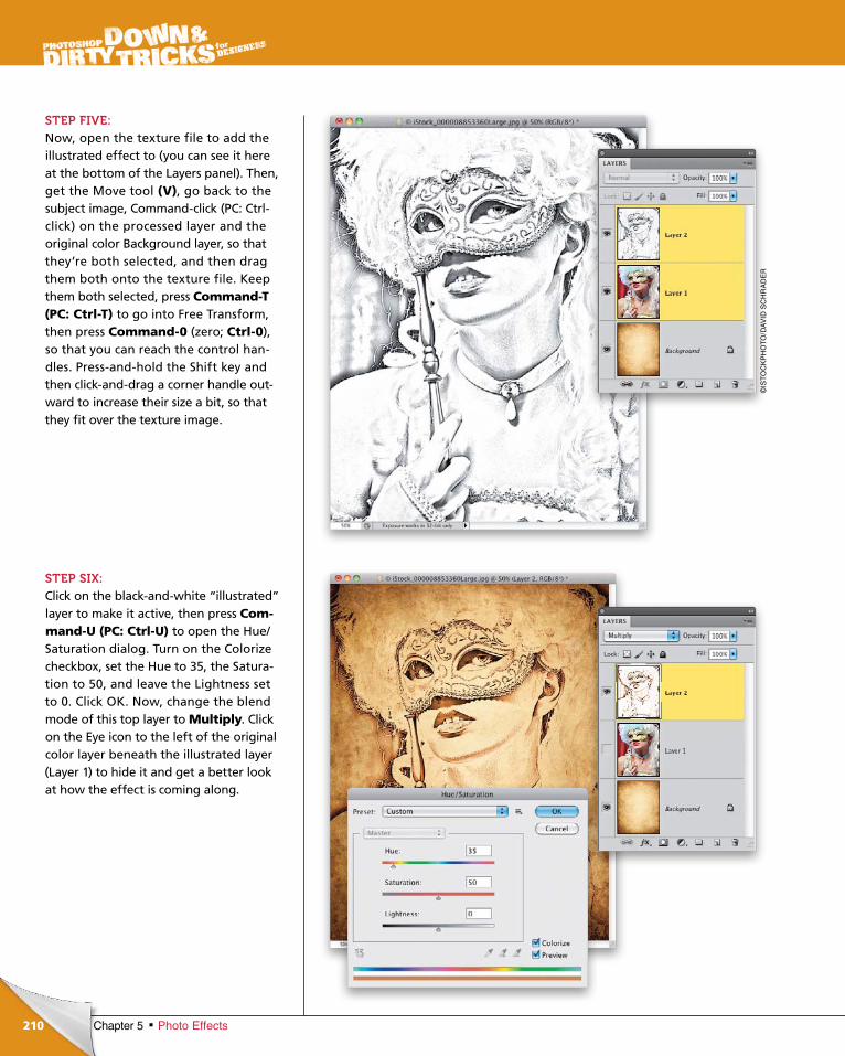
ptg6970545
210
©IS
TO
CK
PH
OT
O/D
AV
ID S
CH
RA
DE
R
Chapter 5 Photo Effects
STEP FIVE:Now, open the texture file to add the illustrated effect to (you can see it here at the bottom of the Layers panel). Then, get the Move tool (V), go back to the subject image, Commandclick (PC: Ctrlclick) on the processed layer and the original color Background layer, so that they’re both selected, and then drag them both onto the texture file. Keep them both selected, press Command-T (PC: Ctrl-T) to go into Free Transform, then press Command-0 (zero; Ctrl-0), so that you can reach the control handles. Pressandhold the Shift key and then clickanddrag a corner handle outward to increase their size a bit, so that they fit over the texture image.
STEP SIX:Click on the blackandwhite “illustrated” layer to make it active, then press Com-mand-U (PC: Ctrl-U) to open the Hue/ Saturation dialog. Turn on the Colorize checkbox, set the Hue to 35, the Saturation to 50, and leave the Lightness set to 0. Click OK. Now, change the blend mode of this top layer to Multiply. Click on the Eye icon to the left of the original color layer beneath the illustrated layer (Layer 1) to hide it and get a better look at how the effect is coming along.
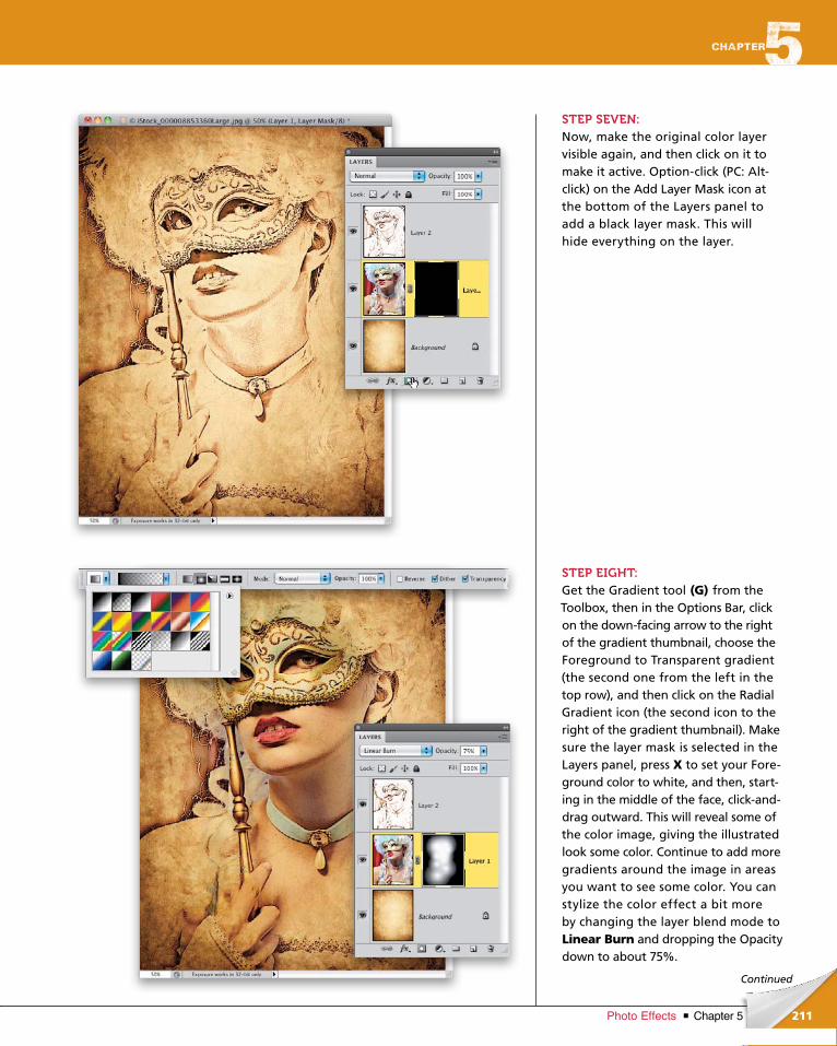
ptg6970545
211Chapter 5Photo Effects
Continued
STEP SEVEN:Now, make the original color layer visible again, and then click on it to make it active. Optionclick (PC: Altclick) on the Add Layer Mask icon at the bottom of the Layers panel to add a black layer mask. This will hide everything on the layer.
STEP EIGHT:Get the Gradient tool (G) from the Tool box, then in the Options Bar, click on the downfacing arrow to the right of the gradient thumbnail, choose the Fore ground to Transparent gradient (the second one from the left in the top row), and then click on the Radial Gradient icon (the second icon to the right of the gradient thumbnail). Make sure the layer mask is selected in the Layers panel, press X to set your Fore ground color to white, and then, starting in the middle of the face, clickanddrag outward. This will reveal some of the color image, giving the illustrated look some color. Continue to add more gradients around the image in areas you want to see some color. You can stylize the color effect a bit more by changing the layer blend mode to Linear Burn and dropping the Opacity down to about 75%.
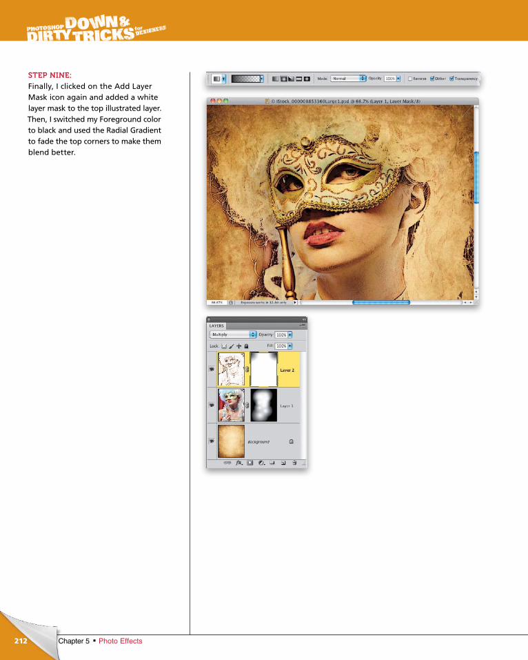
ptg6970545
212 Chapter 5 Photo Effects
STEP NINE:Finally, I clicked on the Add Layer Mask icon again and added a white layer mask to the top illustrated layer. Then, I switched my Foreground color to black and used the Radial Gradient to fade the top corners to make them blend better.
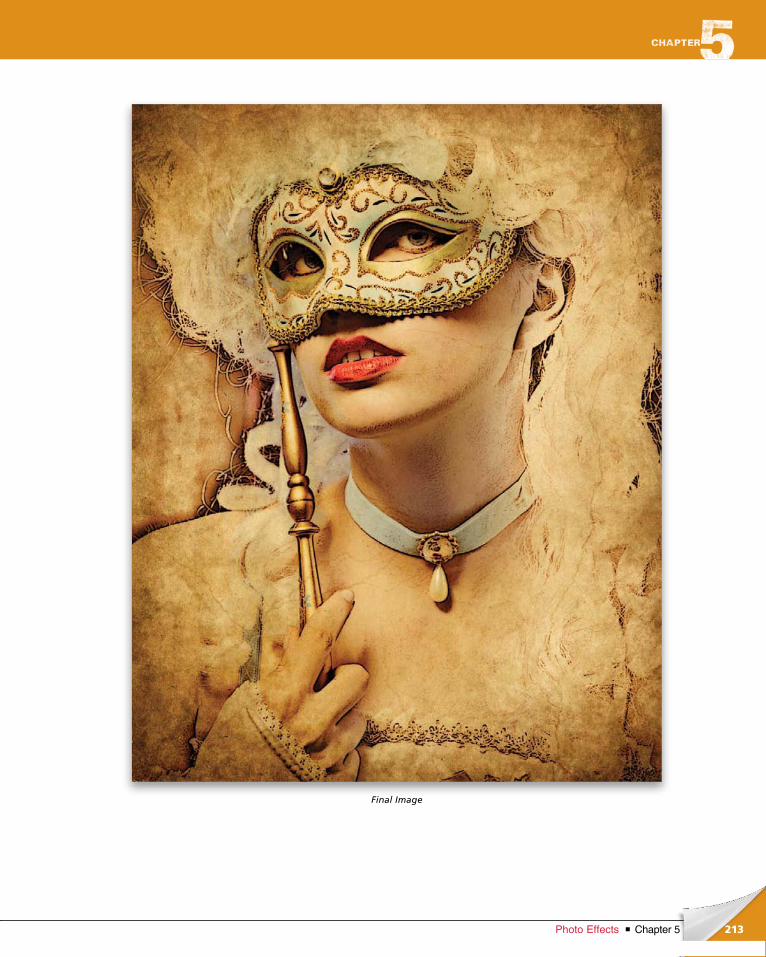
ptg6970545
213Chapter 5Photo Effects
Final Image
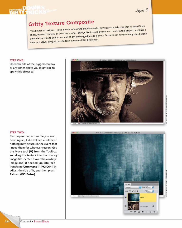
ptg6970545
214 Chapter 5 Photo Effects
chapter 5
STEP ONE:Open the file of the rugged cowboy or any other photo you might like to apply this effect to.
STEP TWO:Next, open the texture file you see here. Again, I like to keep a folder of nothing but textures in the event that I need them for whatever reason. Get the Move tool (V) from the Toolbox and drag this texture into the cowboy image file. Center it over the cowboy image and, if needed, go into Free Transform (Command-T [PC: Ctrl-T]), adjust the size of it, and then press Return (PC: Enter).
I’m a big fan of textures. I keep a folder of nothing but textures for any occasion. Whether they’re from iStock-
photo, my own camera, or even my phone, I always like to have a variety on hand. In this project, we’ll use a
simple texture file to add an element of grit and ruggedness to a photo. Textures can have so many uses beyond
their face value; you just have to look at them a little differently.
Gritty Texture Composite
©IS
TO
CK
PH
OT
O/C
AM
ER
ON
WH
ITM
AN
©IS
TO
CK
PH
OT
O/E
VA
SE
RR
AB
AS
SA
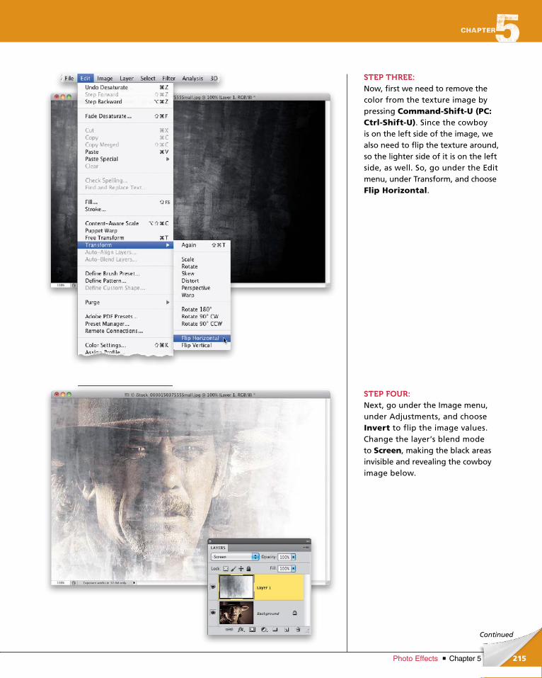
ptg6970545
215Chapter 5Photo Effects
Continued
STEP THREE:Now, first we need to remove the color from the texture image by pressing Command-Shift-U (PC: Ctrl-Shift-U). Since the cowboy is on the left side of the image, we also need to flip the texture around, so the lighter side of it is on the left side, as well. So, go under the Edit menu, under Transform, and choose Flip Horizontal.
STEP FOUR:Next, go under the Image menu, under Adjustments, and choose Invert to flip the image values. Change the layer’s blend mode to Screen, making the black areas invisible and revealing the cowboy image below.
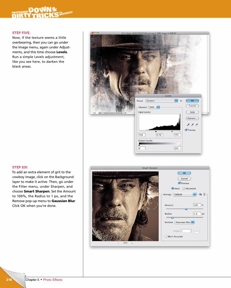
ptg6970545
216 Chapter 5 Photo Effects
STEP FIVE:Now, if the texture seems a little overbearing, then you can go under the Image menu, again under Adjustments, and this time choose Levels. Run a simple Levels adjustment, like you see here, to darken the black areas.
STEP SIX:To add an extra element of grit to the cowboy image, click on the Back ground layer to make it active. Then, go under the Filter menu, under Sharp en, and choose Smart Sharpen. Set the Amount to 100%, the Radius to 1 px, and the Remove popup menu to Gaussian Blur. Click OK when you’re done.

ptg6970545
217Chapter 5Photo Effects
Continued
STEP SEVEN: To finish this effect, click back on the texture layer in the Layers panel to make it active, then click on the Create New Adjustment Layer icon at the bottom of the panel and choose Hue/Saturation. In the Adjustments panel, turn on the Colorize checkbox, then set the Hue to 32, the Saturation to 40, and the Lightness to –10. This will give the image a vintage sepia look. Finally, change the adjustment layer’s blend mode to Hard Light and, if needed, get the Crop tool (C) and crop the image slightly to remove some of the white background on the right (as you’ll see I did in the Final Image).
That’s pretty much it. As you play with this technique, be sure to try different textures and colors to get a variety of different looks.
TIP: Photograph TexturesSince textures are often very abstract images, you can use things like the camera on your phone to take pictures of textures when you’re out and about. These days, camera phones take pretty decent pictures that you can work with.
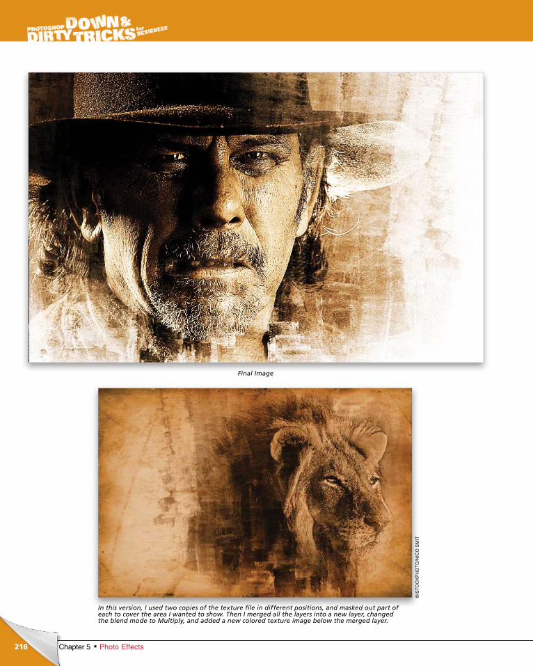
ptg6970545
218 Chapter 5 Photo Effects
Final Image
In this version, I used two copies of the texture file in different positions, and masked out part of each to cover the area I wanted to show. Then I merged all the layers into a new layer, changed the blend mode to Multiply, and added a new colored texture image below the merged layer.
©IS
TO
CK
PH
OT
O/N
ICO
SM
IT
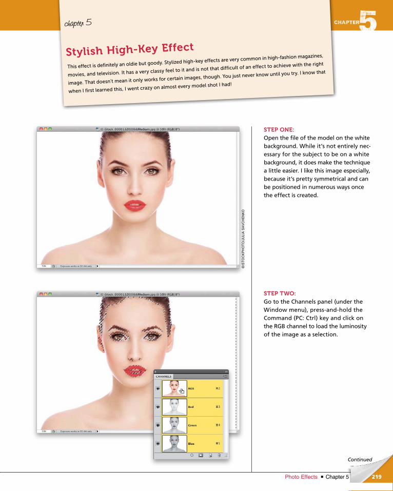
ptg6970545
219Chapter 5Photo Effects
Continued
chapter 5
STEP ONE:Open the file of the model on the white background. While it’s not entirely necessary for the subject to be on a white background, it does make the technique a little easier. I like this image especially, because it’s pretty symmetrical and can be positioned in numerous ways once the effect is created.
STEP TWO:Go to the Channels panel (under the Window menu), pressandhold the Command (PC: Ctrl) key and click on the RGB channel to load the luminosity of the image as a selection.
This effect is definitely an oldie but goody. Stylized high-key effects are very common in high-fashion magazines,
movies, and television. It has a very classy feel to it and is not that difficult of an effect to achieve with the right
image. That doesn’t mean it only works for certain images, though. You just never know until you try. I know that
when I first learned this, I went crazy on almost every model shot I had!
Stylish High-Key Effect
©IS
TO
CK
PH
OT
O/J
ULI
A S
AV
CH
EN
KO
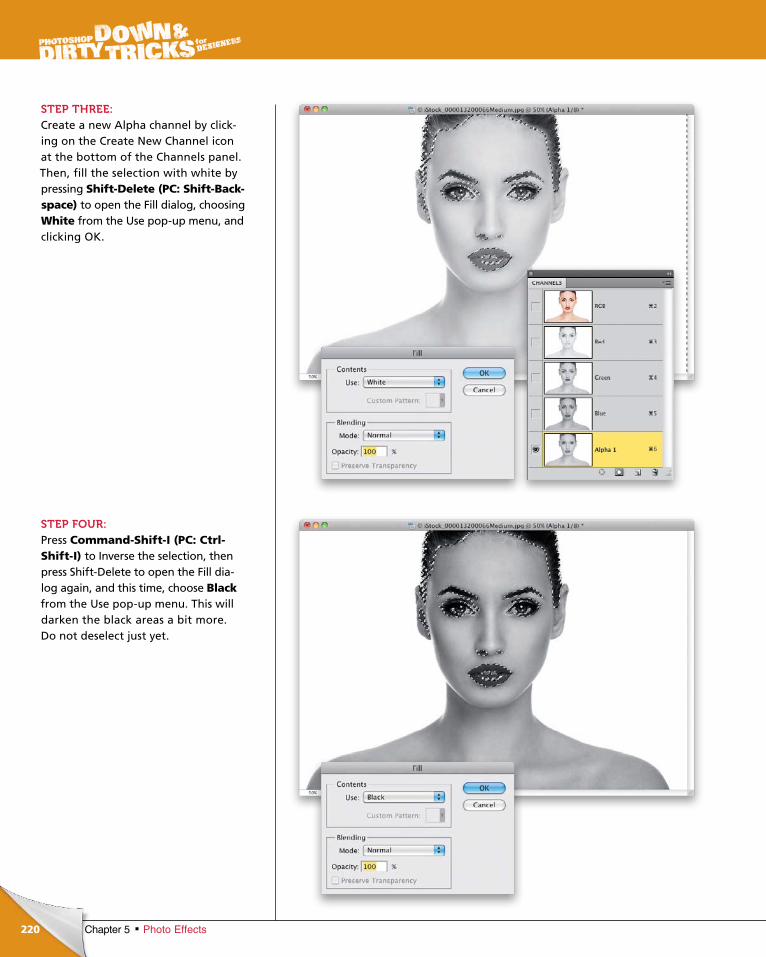
ptg6970545
220 Chapter 5 Photo Effects
STEP THREE:Create a new Alpha channel by clicking on the Create New Channel icon at the bottom of the Channels panel. Then, fill the selection with white by pressing Shift-Delete (PC: Shift-Back-space) to open the Fill dialog, choosing White from the Use popup menu, and clicking OK.
STEP FOUR:Press Command-Shift-I (PC: Ctrl-Shift-I) to Inverse the selection, then press ShiftDelete to open the Fill dialog again, and this time, choose Blackfrom the Use popup menu. This will darken the black areas a bit more. Do not deselect just yet.
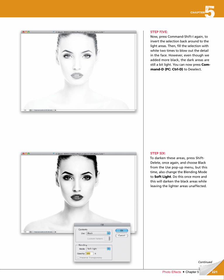
ptg6970545
221Chapter 5Photo Effects
Continued
STEP FIVE: Now, press CommandShiftI again, to invert the selection back around to the light areas. Then, fill the selection with white two times to blow out the detail in the face. However, even though we added more black, the dark areas are still a bit light. You can now press Com-mand-D (PC: Ctrl-D) to Deselect.
STEP SIX:To darken these areas, press ShiftDelete, once again, and choose Black from the Use popup menu, but this time, also change the Blending Mode to Soft Light. Do this once more and this will darken the black areas while leaving the lighter areas unaffected.
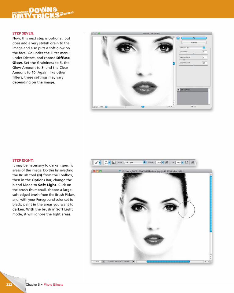
ptg6970545
222 Chapter 5 Photo Effects
STEP SEVEN:Now, this next step is optional, but does add a very stylish grain to the image and also puts a soft glow on the face. Go under the Filter menu, under Distort, and choose Diffuse Glow. Set the Graininess to 5, the Glow Amount to 3, and the Clear Amount to 10. Again, like other filters, these settings may vary depending on the image.
STEP EIGHT:It may be necessary to darken specific areas of the image. Do this by selecting the Brush tool (B) from the Toolbox, then in the Options Bar, change the blend Mode to Soft Light. Click on the brush thumbnail, choose a large, softedged brush from the Brush Picker, and, with your Foreground color set to black, paint in the areas you want to darken. With the brush in Soft Light mode, it will ignore the light areas.
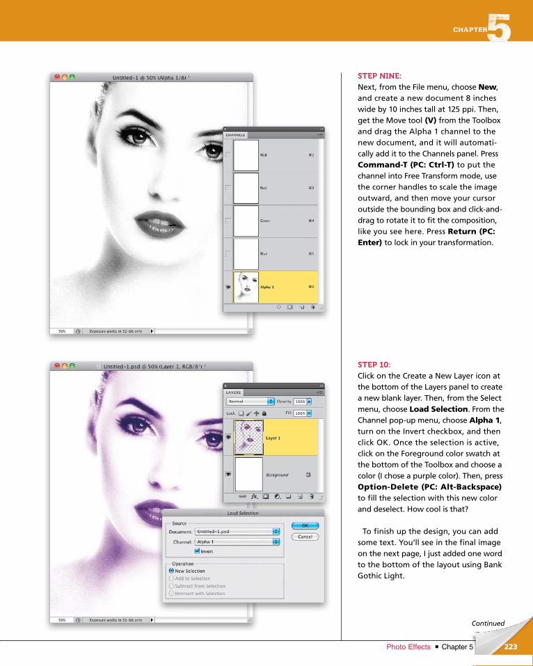
ptg6970545
223Chapter 5Photo Effects
Continued
STEP NINE:Next, from the File menu, choose New, and create a new document 8 inches wide by 10 inches tall at 125 ppi. Then, get the Move tool (V) from the Toolbox and drag the Alpha 1 channel to the new doc ument, and it will automatically add it to the Channels panel. Press Command-T (PC: Ctrl-T) to put the channel into Free Transform mode, use the corner handles to scale the image outward, and then move your cursor outside the bounding box and clickanddrag to rotate it to fit the composition, like you see here. Press Return (PC: Enter) to lock in your transformation.
STEP 10:Click on the Create a New Layer icon at the bottom of the Layers panel to create a new blank layer. Then, from the Select menu, choose Load Selection. From the Channel popup menu, choose Alpha 1, turn on the Invert checkbox, and then click OK. Once the selection is active, click on the Foreground color swatch at the bottom of the Toolbox and choose a color (I chose a purple color). Then, press Option-Delete (PC: Alt-Back space)to fill the selection with this new color and deselect. How cool is that?
To finish up the design, you can add some text. You’ll see in the final image on the next page, I just added one word to the bottom of the layout using Bank Gothic Light.
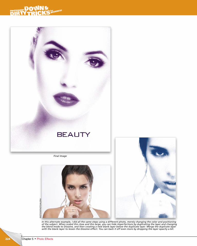
ptg6970545
224 Chapter 5 Photo Effects
Final Image
In this alternate example, I did all the same steps using a different photo, merely changing the color and positioning of the subject. When scaled this close and this large, you can hide imperfections by duplicating the layer and changing the blend mode to Dissolve, and then creating a new blank layer below the duplicate layer. Merge the duplicate layer with the blank layer to lessen the Dissolve effect. You can back it off even more by dropping the layer opacity a bit.
©IS
TO
CK
PH
OT
O/A
LDR
A
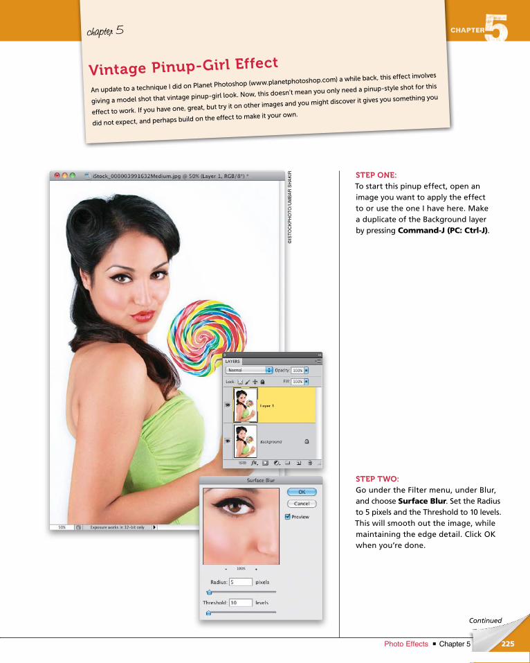
ptg6970545
225Chapter 5Photo Effects
Continued
chapter 5
STEP ONE:To start this pinup effect, open an image you want to apply the effect to or use the one I have here. Make a duplicate of the Background layer by pressing Command-J (PC: Ctrl-J).
STEP TWO:Go under the Filter menu, under Blur, and choose Surface Blur. Set the Radius to 5 pixels and the Threshold to 10 levels. This will smooth out the image, while maintaining the edge detail. Click OK when you’re done.
An update to a technique I did on Planet Photoshop (www.planetphotoshop.com) a while back, this effect involves
giving a model shot that vintage pinup-girl look. Now, this doesn’t mean you only need a pinup-style shot for this
effect to work. If you have one, great, but try it on other images and you might discover it gives you something you
did not expect, and perhaps build on the effect to make it your own.
Vintage Pinup-Girl Effect
©IS
TO
CK
PH
OT
O/U
MB
AR
SH
AK
IR
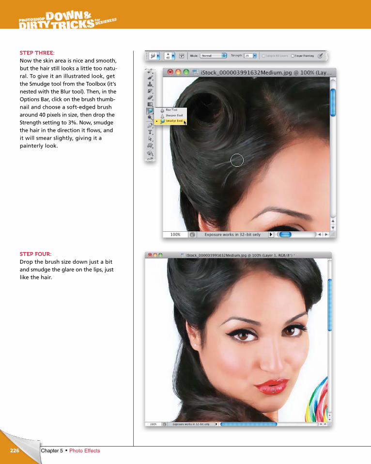
ptg6970545
226 Chapter 5 Photo Effects
STEP THREE:Now the skin area is nice and smooth, but the hair still looks a little too natural. To give it an illustrated look, get the Smudge tool from the Toolbox (it’s nested with the Blur tool). Then, in the Options Bar, click on the brush thumbnail and choose a softedged brush around 40 pixels in size, then drop the Strength setting to 3%. Now, smudge the hair in the direction it flows, and it will smear slightly, giving it a painterly look.
STEP FOUR:Drop the brush size down just a bit and smudge the glare on the lips, just like the hair.
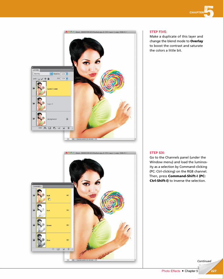
ptg6970545
227Chapter 5Photo Effects
Continued
STEP FIVE:Make a duplicate of this layer and change the blend mode to Overlay to boost the contrast and saturate the colors a little bit.
STEP SIX:Go to the Channels panel (under the Window menu) and load the luminosity as a selection by Commandclicking (PC: Ctrlclicking) on the RGB channel. Then, press Command-Shift-I (PC: Ctrl-Shift-I) to Inverse the selection.
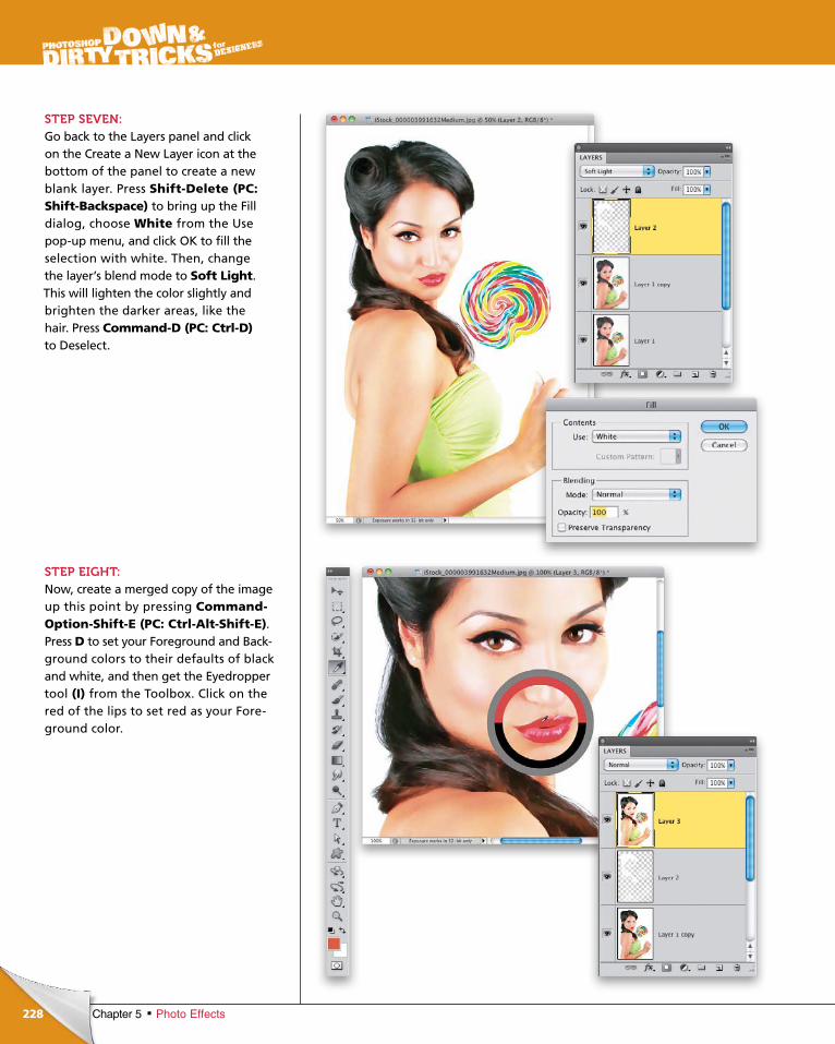
ptg6970545
228 Chapter 5 Photo Effects
STEP SEVEN:Go back to the Layers panel and click on the Create a New Layer icon at the bottom of the panel to create a new blank layer. Press Shift-Delete (PC: Shift-Backspace) to bring up the Fill dialog, choose White from the Use popup menu, and click OK to fill the selection with white. Then, change the layer’s blend mode to Soft Light. This will lighten the color slightly and brighten the darker areas, like the hair. Press Command-D (PC: Ctrl-D)to Deselect.
STEP EIGHT:Now, create a merged copy of the image up this point by pressing Command-Option-Shift-E (PC: Ctrl-Alt-Shift-E). Press D to set your Foreground and Background colors to their defaults of black and white, and then get the Eyedropper tool (I) from the Toolbox. Click on the red of the lips to set red as your Foreground color.
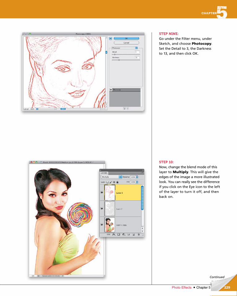
ptg6970545
229Chapter 5Photo Effects
Continued
STEP NINE:Go under the Filter menu, under Sketch, and choose Photocopy. Set the Detail to 3, the Darkness to 13, and then click OK.
STEP 10:Now, change the blend mode of this layer to Multiply. This will give the edges of the image a more illustrated look. You can really see the difference if you click on the Eye icon to the left of the layer to turn it off, and then back on.
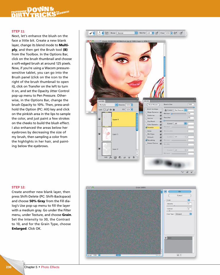
ptg6970545
230 Chapter 5 Photo Effects
STEP 11:Next, let’s enhance the blush on the face a little bit. Create a new blank layer, change its blend mode to Multi-ply, and then get the Brush tool (B) from the Toolbox. In the Options Bar, click on the brush thumbnail and choose a softedged brush at around 125 pixels. Now, if you’re using a Wacom pressuresensitive tablet, you can go into the Brush panel (click on the icon to the right of the brush thumbnail to open it), click on Transfer on the left to turn it on, and set the Opacity Jitter Control popup menu to Pen Pressure. Otherwise, in the Options Bar, change the brush Opacity to 10%. Then, pressandhold the Option (PC: Alt) key and click on the pinkish area in the lips to sample the color, and just paint a few strokes on the cheeks to build the blush effect. I also enhanced the areas below her eye brows by decreasing the size of my brush, then sampling a color from the highlights in her hair, and painting below the eyebrows.
STEP 12:Create another new blank layer, then press ShiftDelete (PC: ShiftBackspace) and choose 50% Gray from the Fill dialog’s Use popup menu to fill the layer with a medium gray. Go under the Filter menu, under Texture, and choose Grain. Set the Inten sity to 30, the Contrast to 10, and for the Grain Type, choose Enlarged. Click OK.
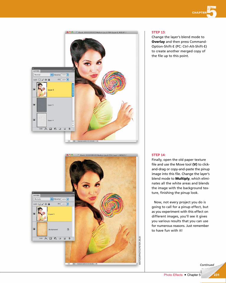
ptg6970545
231Chapter 5Photo Effects
©IS
TO
CK
PH
OT
O/P
ET
ER
ZE
LEI
Continued
STEP 13:Change the layer’s blend mode to Overlay and then press CommandOptionShiftE (PC: CtrlAltShiftE) to create another merged copy of the file up to this point.
STEP 14:Finally, open the old paper texture file and use the Move tool (V) to clickanddrag or copyandpaste the pinup image into this file. Change the layer’s blend mode to Multiply, which eliminates all the white areas and blends the image with the background texture, finishing the pinup look.
Now, not every project you do is going to call for a pinup effect, but as you experiment with this effect on different images, you’ll see it gives you various results that you can use for numerous reasons. Just remember to have fun with it!
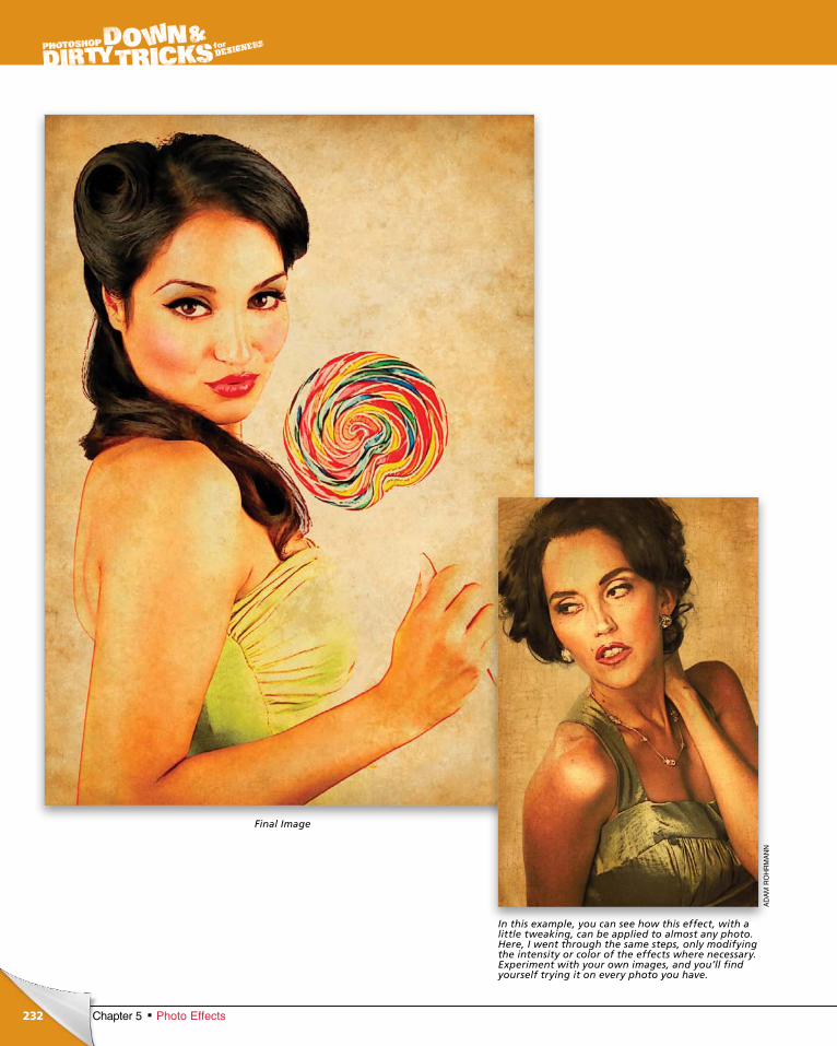
ptg6970545
232 Chapter 5 Photo Effects
Final Image
In this example, you can see how this effect, with a little tweaking, can be applied to almost any photo. Here, I went through the same steps, only modifying the intensity or color of the effects where necessary. Experiment with your own images, and you’ll find yourself trying it on every photo you have.
AD
AM
RO
HR
MA
NN
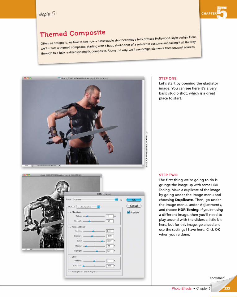
ptg6970545
233Chapter 5Photo Effects
©IS
TO
CK
PH
OT
O/B
AH
AD
IR K
UY
UC
U
Continued
chapter 5
STEP ONE:Let’s start by opening the gladiator image. You can see here it’s a very basic studio shot, which is a great place to start.
STEP TWO:The first thing we’re going to do is grunge the image up with some HDR Toning. Make a duplicate of the image by going under the Image menu and choosing Duplicate. Then, go under the Image menu, under Adjustments, and choose HDR Toning. If you’re using a different image, then you’ll need to play around with the sliders a little bit here, but for this image, go ahead and use the settings I have here. Click OK when you’re done.
Often, as designers, we love to see how a basic studio shot becomes a fully dressed Hollywood-style design. Here,
we’ll create a themed composite, starting with a basic studio shot of a subject in costume and taking it all the way
through to a fully realized cinematic composite. Along the way, we’ll use design elements from unusual sources.
Themed Composite
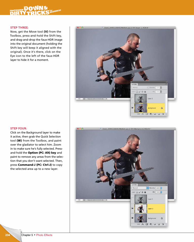
ptg6970545
234 Chapter 5 Photo Effects
STEP THREE:Now, get the Move tool (V) from the Toolbox, pressandhold the Shift key, and draganddrop the fauxHDR image into the original document (holding the Shift key will keep it aligned with the original). Once it’s there, click on the Eye icon to the left of the fauxHDR layer to hide it for a moment.
STEP FOUR:Click on the Background layer to make it active, then grab the Quick Selection tool (W) from the Toolbox, and paint over the gladiator to select him. Zoom in to make sure he’s fully selected. Pressandhold the Option (PC: Alt) key and paint to remove any areas from the selection that you don’t want selected. Then, press Command-J (PC: Ctrl-J) to copy the selected area up to a new layer.
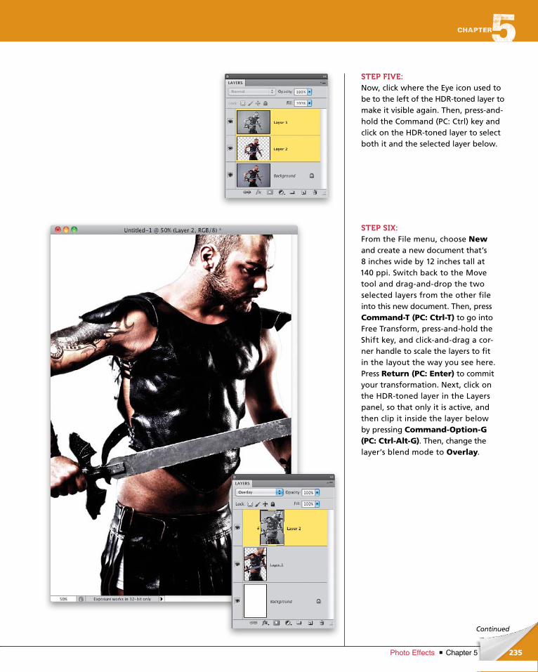
ptg6970545
235Chapter 5Photo Effects
Continued
STEP FIVE:Now, click where the Eye icon used to be to the left of the HDRtoned layer to make it visible again. Then, pressandhold the Command (PC: Ctrl) key and click on the HDRtoned layer to select both it and the selected layer below.
STEP SIX:From the File menu, choose Newand create a new document that’s 8 inches wide by 12 inches tall at 140 ppi. Switch back to the Move tool and draganddrop the two selected layers from the other file into this new document. Then, press Command-T (PC: Ctrl-T) to go into Free Transform, pressandhold the Shift key, and clickanddrag a corner handle to scale the layers to fit in the layout the way you see here. Press Return (PC: Enter) to commit your transformation. Next, click on the HDRtoned layer in the Layers panel, so that only it is active, and then clip it inside the layer below by pressing Command-Option-G (PC: Ctrl-Alt-G). Then, change the layer’s blend mode to Overlay.
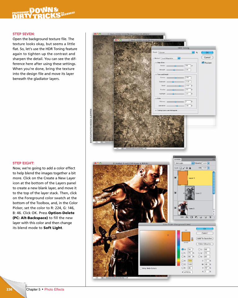
ptg6970545
236 Chapter 5 Photo Effects
STEP SEVEN:Open the background texture file. The texture looks okay, but seems a little flat. So, let’s use the HDR Toning feature again to tighten up the contrast and sharpen the detail. You can see the difference here after using these settings. When you’re done, bring the texture into the design file and move its layer beneath the gladiator layers.
STEP EIGHT:Now, we’re going to add a color effect to help blend the images together a bit more. Click on the Create a New Layer icon at the bottom of the Layers panel to create a new blank layer, and move it to the top of the layer stack. Then, click on the Foreground color swatch at the bottom of the Toolbox, and, in the Color Picker, set the color to R: 224, G: 146, B: 46. Click OK. Press Option-Delete (PC: Alt-Backspace) to fill the new layer with this color and then change its blend mode to Soft Light.
©IS
TO
CK
PH
OT
O/H
ED
DA
GJE
RP
EN
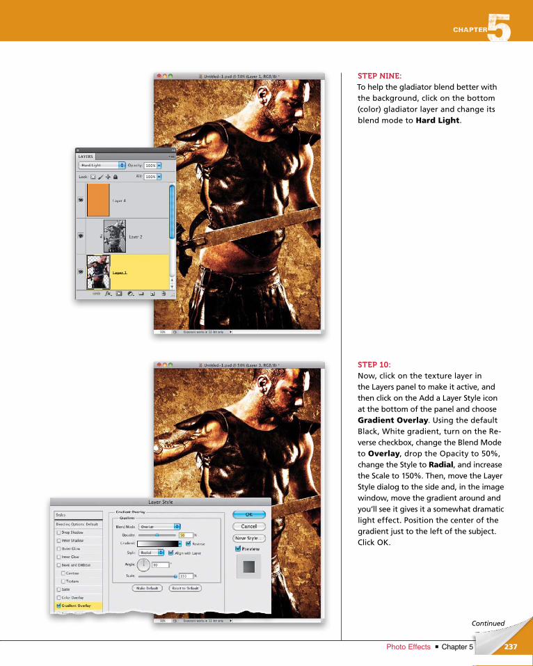
ptg6970545
237Chapter 5Photo Effects
Continued
STEP NINE:To help the gladiator blend better with the background, click on the bottom (color) gladiator layer and change its blend mode to Hard Light.
STEP 10:Now, click on the texture layer in the Layers panel to make it active, and then click on the Add a Layer Style icon at the bottom of the panel and choose Gradient Overlay. Using the default Black, White gradient, turn on the Reverse checkbox, change the Blend Mode to Overlay, drop the Opacity to 50%, change the Style to Radial, and increase the Scale to 150%. Then, move the Layer Style dialog to the side and, in the image window, move the gradient around and you’ll see it gives it a somewhat dramatic light effect. Position the center of the gradient just to the left of the subject. Click OK.
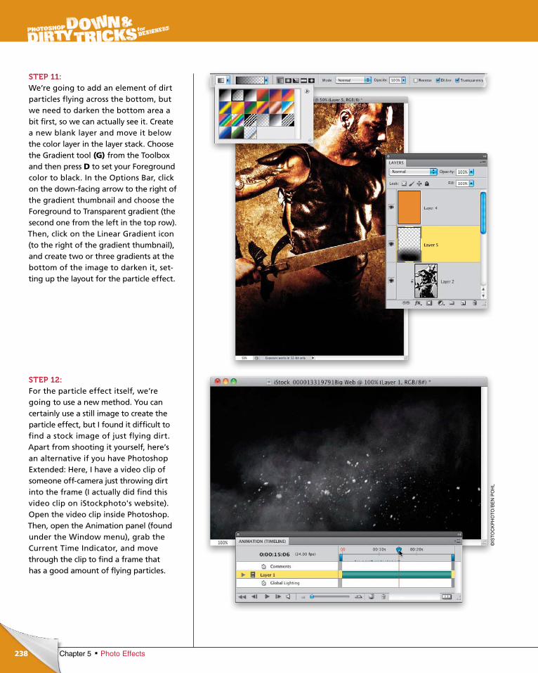
ptg6970545
238 Chapter 5 Photo Effects
STEP 11:We’re going to add an element of dirt particles flying across the bottom, but we need to darken the bottom area a bit first, so we can actually see it. Create a new blank layer and move it below the color layer in the layer stack. Choose the Gradient tool (G) from the Toolbox and then press D to set your Foreground color to black. In the Options Bar, click on the downfacing arrow to the right of the gradient thumbnail and choose the Foreground to Transparent gradient (the second one from the left in the top row). Then, click on the Linear Gradient icon (to the right of the gradient thumbnail), and create two or three gradients at the bottom of the image to darken it, setting up the layout for the particle effect.
STEP 12:For the particle effect itself, we’re going to use a new method. You can certainly use a still image to create the particle effect, but I found it difficult to find a stock image of just flying dirt. Apart from shooting it yourself, here’s an alternative if you have Photoshop Extended: Here, I have a video clip of someone offcamera just throwing dirt into the frame (I actually did find this video clip on iStockphoto's website). Open the video clip inside Photo shop. Then, open the Animation panel (found under the Window menu), grab the Current Time Indicator, and move through the clip to find a frame that has a good amount of flying particles.
©IS
TO
CK
PH
OT
O/B
EN
PO
HL
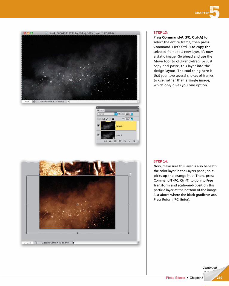
ptg6970545
239Chapter 5Photo Effects
Continued
STEP 13:Press Command-A (PC: Ctrl-A) to select the entire frame, then press CommandJ (PC: CtrlJ) to copy the selected frame to a new layer. It’s now a static image. Go ahead and use the Move tool to clickanddrag, or just copyandpaste, this layer into the design layout. The cool thing here is that you have several choices of frames to use, rather than a single im age, which only gives you one option.
STEP 14:Now, make sure this layer is also beneath the color layer in the Layers panel, so it picks up the orange hue. Then, press CommandT (PC: CtrlT) to go into Free Transform and scaleandposition this particle layer at the bottom of the image, just above where the black gradients are.Press Return (PC: Enter).
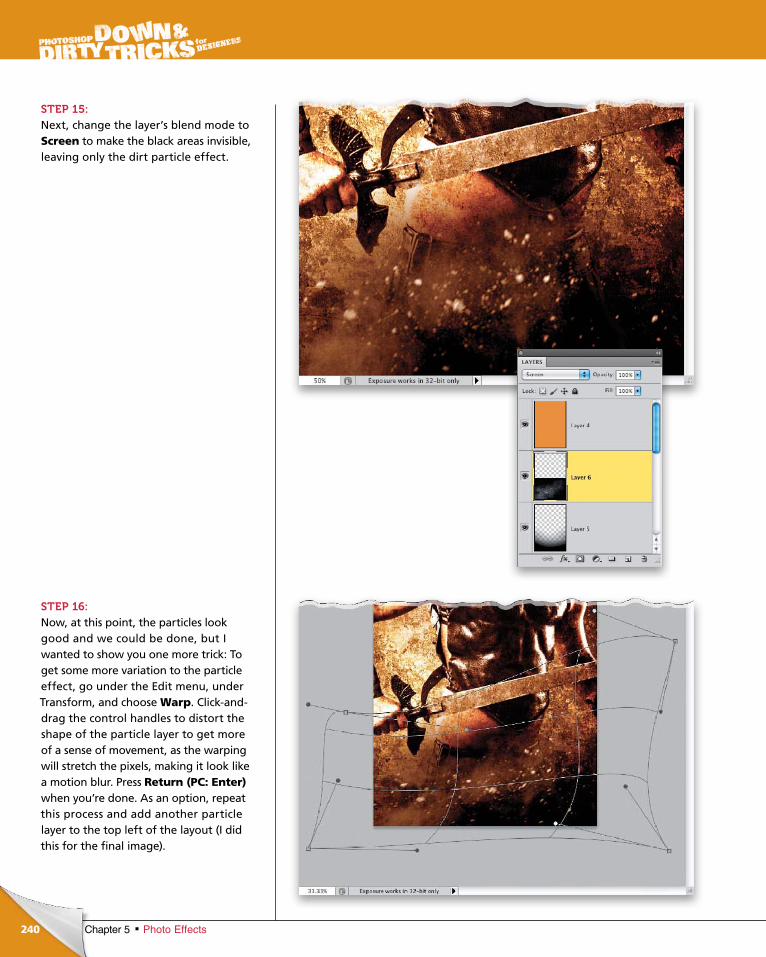
ptg6970545
240 Chapter 5 Photo Effects
STEP 15:Next, change the layer’s blend mode to Screen to make the black areas invisible, leaving only the dirt particle effect.
STEP 16: Now, at this point, the particles look good and we could be done, but I wanted to show you one more trick: To get some more variation to the particle effect, go under the Edit menu, under Transform, and choose Warp. Clickanddrag the control handles to distort the shape of the particle layer to get more of a sense of movement, as the warping will stretch the pixels, making it look like a motion blur. Press Return (PC: Enter) when you’re done. As an option, repeat this process and add another particle layer to the top left of the layout (I did this for the final image).
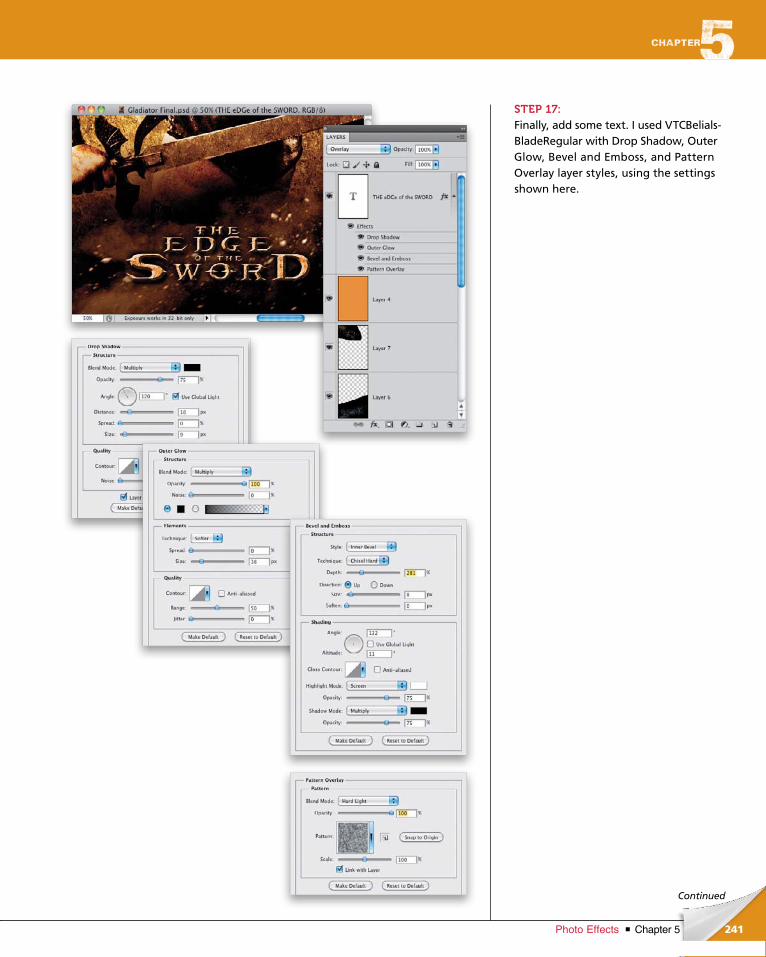
ptg6970545
241Chapter 5Photo Effects
Continued
STEP 17:Finally, add some text. I used VTCBelialsBladeRegular with Drop Shadow, Outer Glow, Bevel and Emboss, and Pattern Overlay layer styles, using the settings shown here.
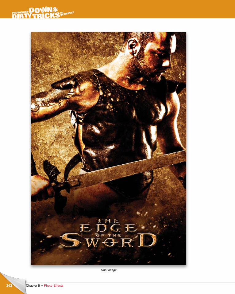
ptg6970545
242 Chapter 5 Photo Effects
Final Image
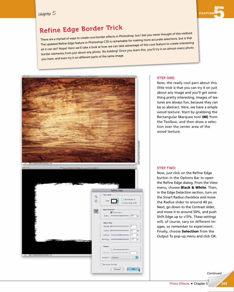
ptg6970545
243Chapter 5Photo Effects
Continued
chapter 5
STEP ONE:Now, the really cool part about this little trick is that you can try it on just about any image and you’ll get something pretty interesting. Images of textures are always fun, because they can be so abstract. Here, we have a simple wood texture. Start by grabbing the Rectangular Marquee tool (M) from the Toolbox, and then draw a selection over the center area of the wood texture.
STEP TWO:Now, just click on the Refine Edge button in the Options Bar to open the Refine Edge dialog. From the View menu, choose Black & White. Then, in the Edge Detection section, turn on the Smart Radius checkbox and move the Radius slider to around 40 px. Next, go down to the Contrast slider, and move it to around 50%, and push Shift Edge up to +13%. These settings will, of course, vary on different images, so remember to experiment. Finally, choose Selection from the Output To popup menu and click OK.
There are a myriad of ways to create cool border effects in Photoshop, but I bet you never thought of this method.
The updated Refine Edge feature in Photoshop CS5 is remarkable for making more accurate selections, but is that
all it can do? Nope! Here we’ll take a look at how we can take advantage of this cool feature to create interesting
border elements from just about any photo. No kidding! Once you learn this, you’ll try it on almost every photo
you have, and even try it on different parts of the same image.
Refine Edge Border Trick
©IS
TO
CK
PH
OT
O/IS
GA
BY
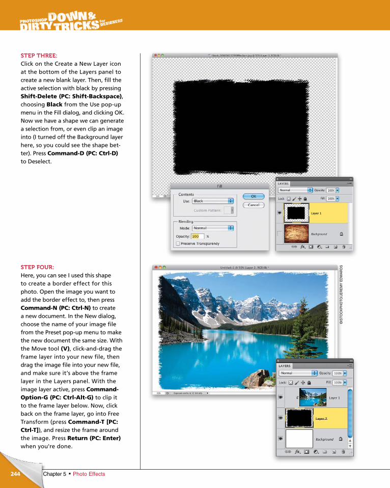
ptg6970545
244
©IS
TO
CK
PH
OT
O/J
ER
EM
Y E
DW
AR
DS
Chapter 5 Photo Effects
STEP THREE:Click on the Create a New Layer icon at the bottom of the Layers panel to create a new blank layer. Then, fill the active selection with black by pressing Shift-Delete (PC: Shift-Backspace), choosing Black from the Use popup menu in the Fill dialog, and clicking OK. Now we have a shape we can generate a selection from, or even clip an image into (I turned off the Background layer here, so you could see the shape better). Press Command-D (PC: Ctrl-D) to Deselect.
STEP FOUR:Here, you can see I used this shape to create a border effect for this photo. Open the image you want to add the border effect to, then press Command-N (PC: Ctrl-N) to create a new document. In the New dialog, choose the name of your image file from the Preset popup menu to make the new document the same size. With the Move tool (V), clickanddrag the frame layer into your new file, then drag the image file into your new file, and make sure it’s above the frame layer in the Layers panel. With the image layer active, press Command-Option-G (PC: Ctrl-Alt-G) to clip it to the frame layer below. Now, click back on the frame layer, go into Free Transform (press Command-T [PC: Ctrl-T]), and resize the frame around the image. Press Return (PC: Enter) when you're done.
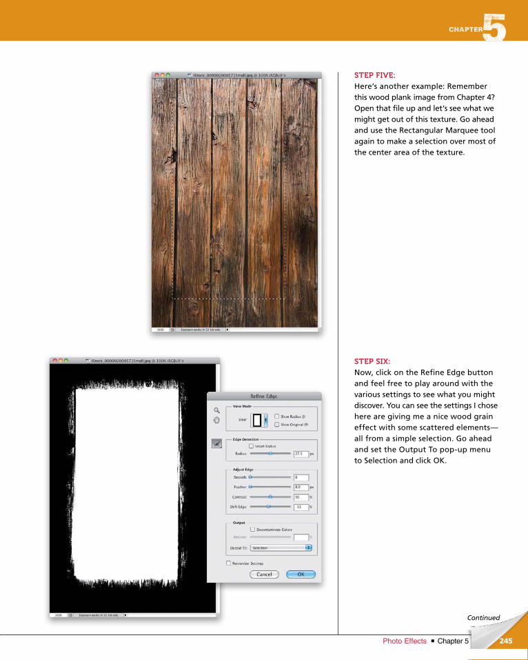
ptg6970545
245Chapter 5Photo Effects
Continued
STEP FIVE:Here’s another example: Remember this wood plank image from Chapter 4? Open that file up and let’s see what we might get out of this texture. Go ahead and use the Rectangular Marquee tool again to make a selection over most of the center area of the texture.
STEP SIX:Now, click on the Refine Edge button and feel free to play around with the various settings to see what you might discover. You can see the settings I chose here are giving me a nice wood grain effect with some scattered elements— all from a simple selection. Go ahead and set the Output To popup menu to Selection and click OK.
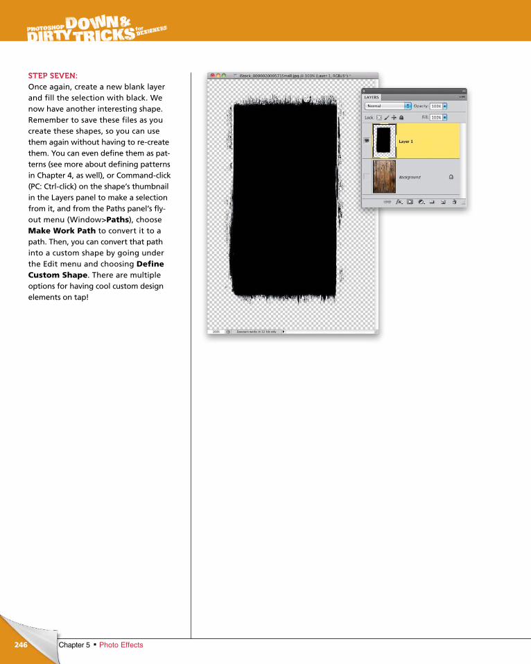
ptg6970545
246 Chapter 5 Photo Effects
STEP SEVEN:Once again, create a new blank layer and fill the selection with black. We now have another interesting shape. Remem ber to save these files as you create these shapes, so you can use them again without having to recreate them. You can even define them as patterns (see more about defining patterns in Chapter 4, as well), or Com mandclick (PC: Ctrlclick) on the shape’s thumbnail in the Layers panel to make a selection from it, and from the Paths panel’s flyout menu (Window>Paths), choose Make Work Path to convert it to a path. Then, you can convert that path into a custom shape by going under the Edit menu and choosing Define Custom Shape. There are mul tiple options for having cool custom design elements on tap!
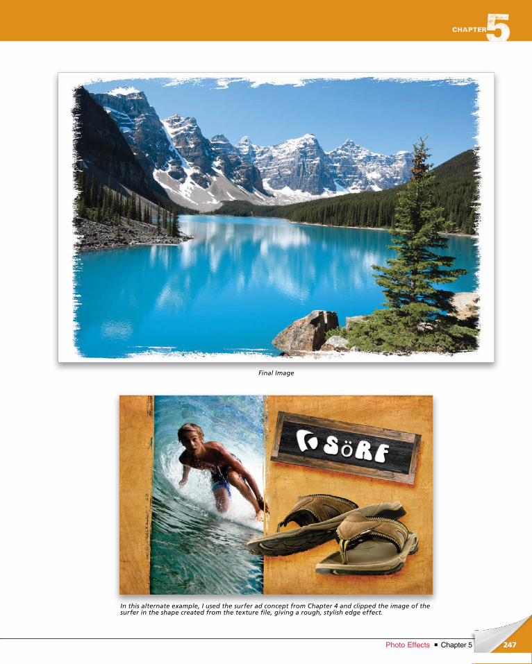
ptg6970545
247Chapter 5Photo Effects
Final Image
In this alternate example, I used the surfer ad concept from Chapter 4 and clipped the image of the surfer in the shape created from the texture file, giving a rough, stylish edge effect.

ptg6970545
ptg6970545
It was certainly inevitable that I would have a chapter on Hollywood
effects. I’ve been a movie fan since I was about 3 years old and, over
the years, movies and television have played tremendous roles in my
creative thought process. Things I see in trailers, TV ads, and even
printed material, often inspire me and give me a spark of an idea. Some
times, the mere act of recreating an existing effect will not only finetune
your Photoshop skills, but can lead you to an idea you can build on. So,
bear in mind that while most of us are certainly not designing posters
for the next big feature film, that doesn’t mean we can’t use what we
learn through the process and repurpose it elsewhere. Think about it!
hollywood effects
249Chapter 6Hollywood Effects
Follow the White Rabbit
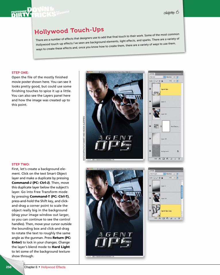
ptg6970545
250 Chapter 6 Hollywood Effects
chapter 6
STEP ONE:Open the file of the mostly finished movie poster shown here. You can see it looks pretty good, but could use some finishing touches to spice it up a little. You can also see the Layers panel here and how the image was created up to this point.
STEP TWO:First, let’s create a background ele-ment. Click on the text Smart Object layer and make a duplicate by pressing Command-J (PC: Ctrl-J). Then, move this duplicate layer below the subject’s layer. Go into Free Transform mode by pressing Command-T (PC: Ctrl-T), press-and-hold the Shift key, and click-and-drag a corner point to scale the object really big in the background (drag your image window out larger, so you can continue to see the control handles). Then, move your cursor out side the bounding box and click-and-drag to rotate the text to roughly the same angle as the gunman. Press Return (PC: Enter) to lock in your changes. Change the layer’s blend mode to Hard Lightto let some of the background texture show through.
There are a number of effects that designers use to add that final touch to their work. Some of the most common
Hollywood touchup effects I’ve seen are background elements, light effects, and sparks. There are a variety of
ways to create these effects and, once you know how to create them, there are a variety of ways to use them.
Hollywood Touch-Ups
©IS
TO
CK
PH
OT
O/T
UN
AR
T A
ND
HE
DD
A G
JER
PE
N
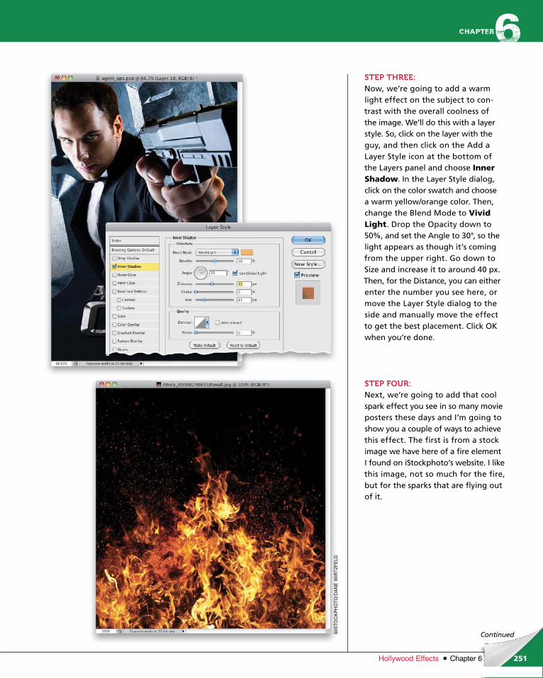
ptg6970545
251Chapter 6Hollywood Effects
©IS
TO
CK
PH
OT
O/D
AN
E W
IRT
ZF
ELD
Continued
STEP THREE:Now, we’re going to add a warm light effect on the subject to con-trast with the overall coolness of the image. We’ll do this with a layer style. So, click on the layer with the guy, and then click on the Add a Layer Style icon at the bottom of the Layers panel and choose Inner Shadow. In the Layer Style dia log, click on the color swatch and choose a warm yellow/orange color. Then, change the Blend Mode to Vivid Light. Drop the Opacity down to 50%, and set the Angle to 30°, so the light appears as though it’s coming from the upper right. Go down to Size and increase it to around 40 px. Then, for the Distance, you can either enter the number you see here, or move the Layer Style dialog to the side and manually move the effect to get the best placement. Click OK when you’re done.
STEP FOUR:Next, we’re going to add that cool spark effect you see in so many movie posters these days and I’m going to show you a couple of ways to achieve this effect. The first is from a stock image we have here of a fire element I found on iStockphoto’s website. I like this image, not so much for the fire, but for the sparks that are flying out of it.
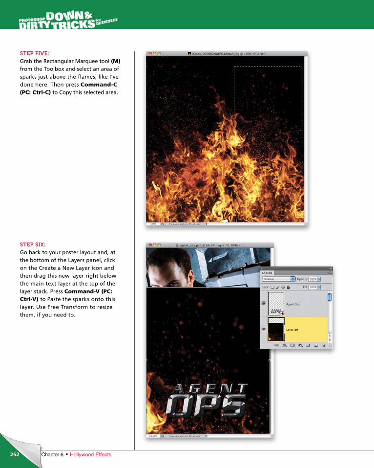
ptg6970545
252 Chapter 6 Hollywood Effects
STEP FIVE:Grab the Rectangular Marquee tool (M) from the Toolbox and select an area of sparks just above the flames, like I’ve done here. Then press Command-C (PC: Ctrl-C) to Copy this selected area.
STEP SIX:Go back to your poster layout and, at the bottom of the Layers panel, click on the Create a New Layer icon and then drag this new layer right below the main text layer at the top of the layer stack. Press Command-V (PC: Ctrl-V) to Paste the sparks onto this layer. Use Free Trans form to resize them, if you need to.
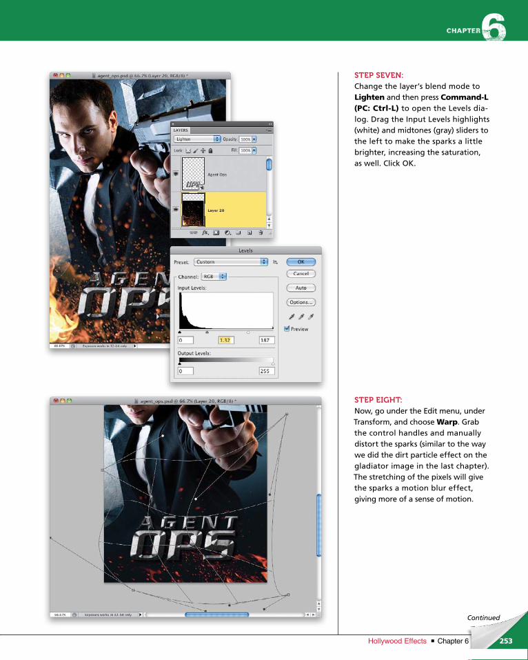
ptg6970545
253Chapter 6Hollywood Effects
Continued
STEP SEVEN:Change the layer’s blend mode to Lighten and then press Command-L (PC: Ctrl-L) to open the Levels dia-log. Drag the Input Levels highlights (white) and midtones (gray) sliders to the left to make the sparks a little brighter, increasing the saturation, as well. Click OK.
STEP EIGHT:Now, go under the Edit menu, under Trans form, and choose Warp. Grab the control handles and manually distort the sparks (similar to the way we did the dirt particle effect on the gladiator image in the last chapter). The stretching of the pixels will give the sparks a motion blur effect, giving more of a sense of motion.
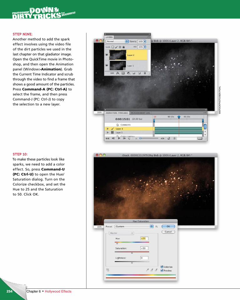
ptg6970545
254 Chapter 6 Hollywood Effects
STEP NINE:Another method to add the spark effect involves using the video file of the dirt particles we used in the last chapter on that gladiator image. Open the QuickTime movie in Photo-shop, and then open the Animation panel (Window>Animation). Grab the Current Time Indicator and scrub through the video to find a frame that shows a good amount of the particles. Press Command-A (PC: Ctrl-A) to select the frame, and then press Com mand-J (PC: Ctrl-J) to copy the selection to a new layer.
STEP 10:To make these particles look like sparks, we need to add a color effect. So, press Command-U (PC: Ctrl-U) to open the Hue/Saturation dialog. Turn on the Color ize checkbox, and set the Hue to 25 and the Saturation to 50. Click OK.
©IS
TO
CK
PH
OT
O/B
EN
PO
HL
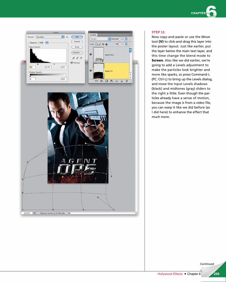
ptg6970545
255Chapter 6Hollywood Effects
Continued
STEP 11:Now copy-and-paste or use the Move tool (V) to click-and-drag this layer into the poster layout. Just like earlier, put the layer below the main text layer, and this time change the blend mode to Screen. Also like we did earlier, we’re going to add a Levels adjustment to make the particles look brighter and more like sparks, so press Command-L (PC: Ctrl-L) to bring up the Levels dialog, and move the Input Levels shadows (black) and midtones (gray) sliders to the right a little. Even though the par-ticles already have a sense of motion, because the image is from a video file, you can warp it like we did before (as I did here) to enhance the effect that much more.
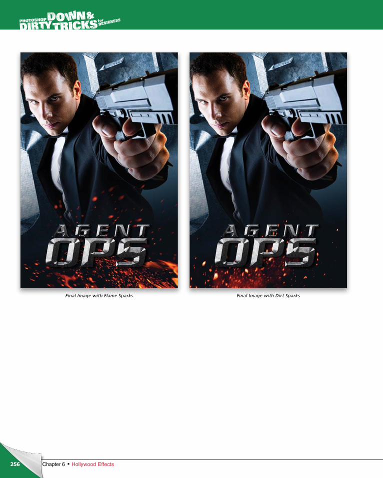
ptg6970545
256 Chapter 6 Hollywood Effects
Final Image with Flame Sparks Final Image with Dirt Sparks
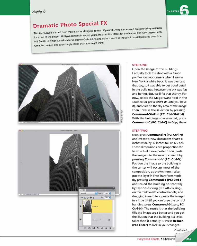
ptg6970545
257Chapter 6Hollywood Effects
CO
RE
Y B
AR
KE
R
Continued
chapter 6
STEP ONE:Open the image of the buildings. I actually took this shot with a Canon point-and-shoot camera when I was in New York a while back. It was overcast that day, so I was able to get good detail in the buildings, however the sky was flat and boring. But, we’ll fix that shortly. For now, select the Magic Wand tool in the Toolbox (or press Shift-W until you have it), and click on the sky area of the image. Then, Inverse the selection by pressing Command-Shift-I (PC: Ctrl-Shift-I). With the buildings now selected, press Command-C (PC: Ctrl-C) to Copy them.
STEP TWO:Now, press Command-N (PC: Ctrl-N) and create a new document that’s 8 inches wide by 12 inches tall at 125 ppi. These dimensions are proportionate to an actual movie poster. Then, paste the image into the new document by pressing Command-V (PC: Ctrl-V). Position the image so the building in the center will occupy most of the composition, as shown here. I also put the layer in Free Transform mode (by press ing Command-T [PC: Ctrl-T]) and scaled the building horizontally by Option-clicking (PC: Alt-clicking) on the middle-left control handle, and dragging inward to squeeze the image in a little bit (if you can’t see the control handles, press Comamnd-0 [zero; PC: Ctrl-0]). The result is that the building fills the image area better and you get the illusion that the building is a little taller than it actually is. Press Return (PC: Enter) to lock in your changes.
This technique I learned from movie poster designer Tomasz Opasinski, who has worked on advertising materials
for some of the biggest Hollywood films in recent years. He used this effect for the feature film I Am Legend with
Will Smith, in which we take a basic photo of a building and make it seem as though it has deteriorated over time.
Great technique, and surprisingly easier than you might think!
Dramatic Photo Special FX
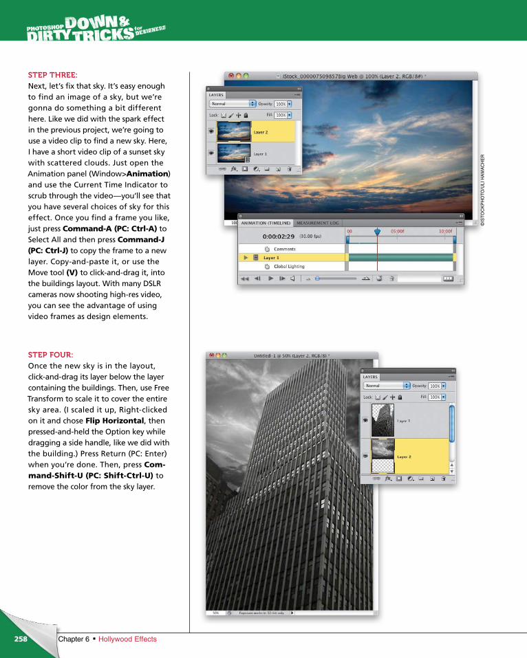
ptg6970545
258 Chapter 6 Hollywood Effects
STEP THREE:Next, let’s fix that sky. It’s easy enough to find an image of a sky, but we’re gonna do something a bit different here. Like we did with the spark effect in the previous project, we’re going to use a video clip to find a new sky. Here, I have a short video clip of a sunset sky with scattered clouds. Just open the Animation panel (Window>Animation) and use the Current Time Indicator to scrub through the video—you’ll see that you have several choices of sky for this effect. Once you find a frame you like, just press Com mand-A (PC: Ctrl-A) to Select All and then press Command-J (PC: Ctrl-J) to copy the frame to a new layer. Copy-and-paste it, or use the Move tool (V) to click-and-drag it, into the buildings layout. With many DSLR cameras now shooting high-res video, you can see the advantage of using video frames as design elements.
STEP FOUR:Once the new sky is in the layout, click-and-drag its layer below the layer containing the buildings. Then, use Free Transform to scale it to cover the entire sky area. (I scaled it up, Right-clicked on it and chose Flip Horizontal, then pressed-and-held the Option key while dragging a side handle, like we did with the building.) Press Return (PC: Enter) when you’re done. Then, press Com-mand-Shift-U (PC: Shift-Ctrl-U) to remove the color from the sky layer.
©IS
TO
CK
PH
OT
O/U
LI H
AM
AC
HE
R
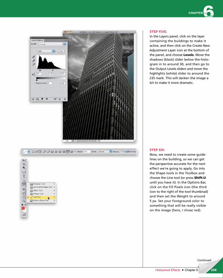
ptg6970545
259Chapter 6Hollywood Effects
Continued
STEP FIVE:In the Layers panel, click on the layer containing the buildings to make it active, and then click on the Create New Adjustment Layer icon at the bottom of the panel, and choose Levels. Move the shadows (black) slider below the histo-gram in to around 30, and then go to the Output Levels sliders and move the highlights (white) slider to around the 235 mark. This will darken the image a bit to make it more dramatic.
STEP SIX:Now, we need to create some guide-lines on the building, so we can get the perspective accurate for the next effect we’re going to apply. Go into the Shape tools in the Toolbox and choose the Line tool (or press Shift-Uuntil you have it). In the Options Bar, click on the Fill Pixels icon (the third icon to the right of the tool thumbnail) and then set the Weight to around 5 px. Set your Foreground color to something that will be really visible on the image (here, I chose red).
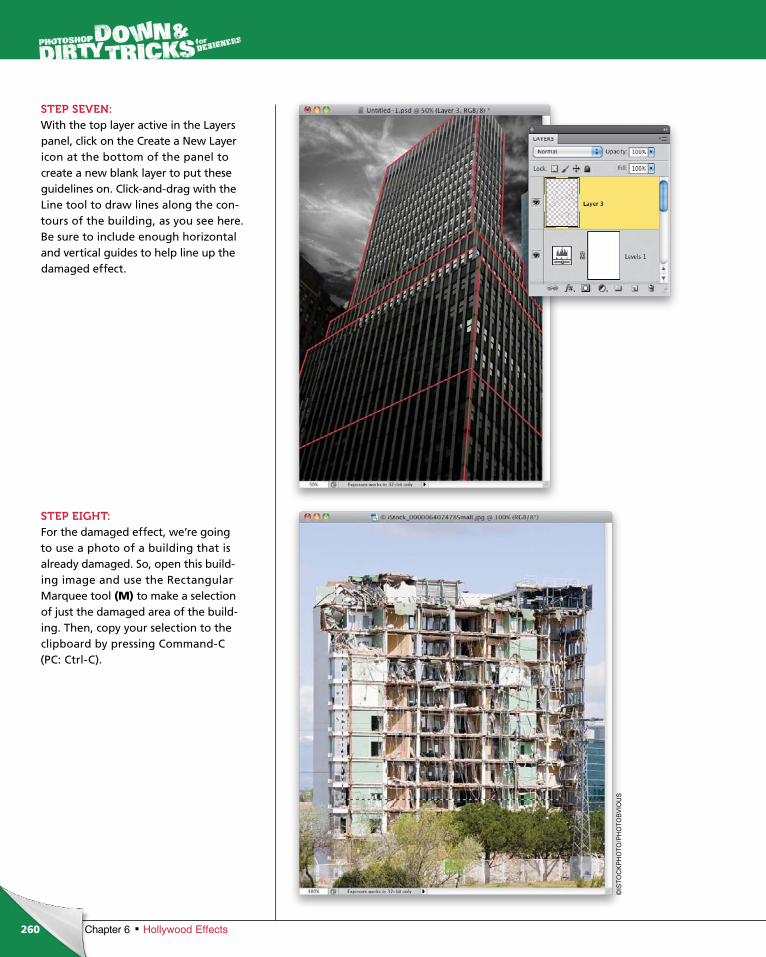
ptg6970545
260 Chapter 6 Hollywood Effects
STEP SEVEN:With the top layer active in the Layers panel, click on the Create a New Layer icon at the bottom of the panel to create a new blank layer to put these guidelines on. Click-and-drag with the Line tool to draw lines along the con-tours of the building, as you see here. Be sure to include enough hori zontal and vertical guides to help line up the damaged effect.
STEP EIGHT:For the damaged effect, we’re going to use a photo of a building that is already damaged. So, open this build-ing image and use the Rectangular Marquee tool (M) to make a selection of just the damaged area of the build-ing. Then, copy your selection to the clipboard by pressing Command-C (PC: Ctrl-C).
©IS
TO
CK
PH
OT
O/P
HO
TO
BV
IOU
S
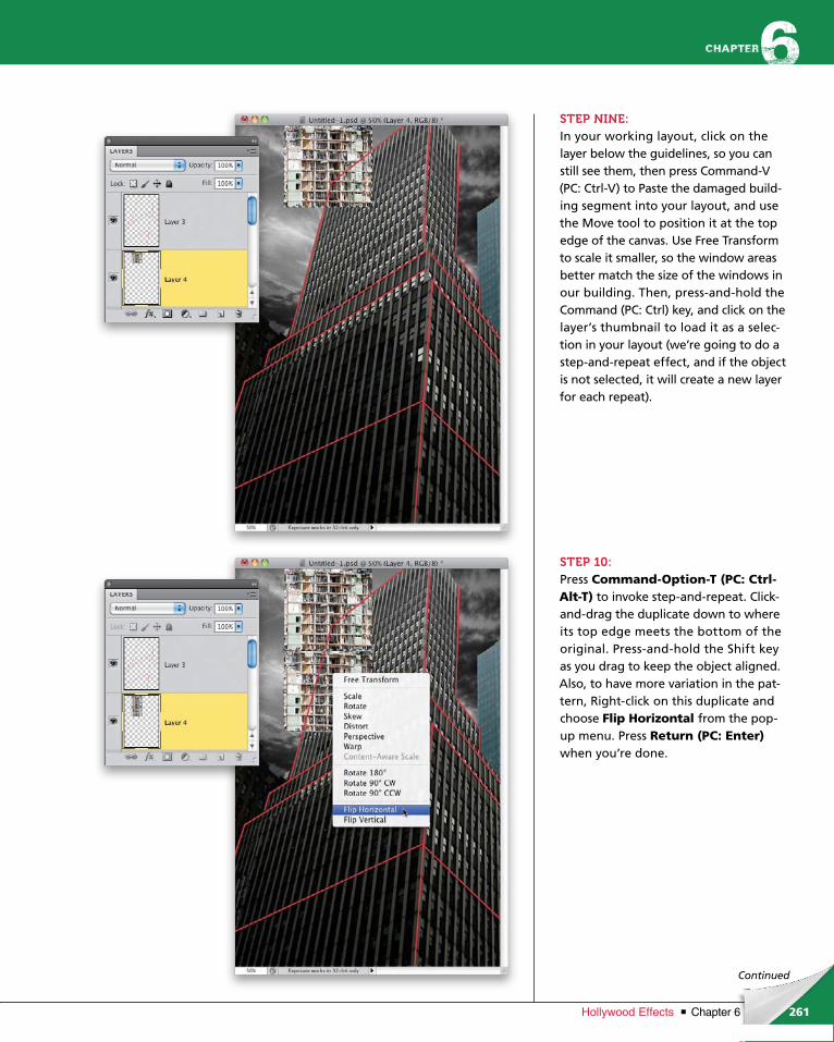
ptg6970545
261Chapter 6Hollywood Effects
Continued
STEP NINE:In your working layout, click on the layer below the guidelines, so you can still see them, then press Command-V (PC: Ctrl-V) to Paste the damaged build-ing segment into your layout, and use the Move tool to position it at the top edge of the canvas. Use Free Transform to scale it smaller, so the window areas better match the size of the windows in our building. Then, press-and-hold the Command (PC: Ctrl) key, and click on the layer’s thumbnail to load it as a selec-tion in your layout (we’re going to do a step-and-repeat effect, and if the object is not selected, it will create a new layer for each repeat).
STEP 10:Press Command-Option-T (PC: Ctrl-Alt-T) to invoke step-and-repeat. Click-and-drag the duplicate down to where its top edge meets the bottom of the original. Press-and-hold the Shift key as you drag to keep the object aligned. Also, to have more variation in the pat-tern, Right-click on this duplicate and choose Flip Horizontal from the pop-up menu. Press Return (PC: Enter)when you’re done.
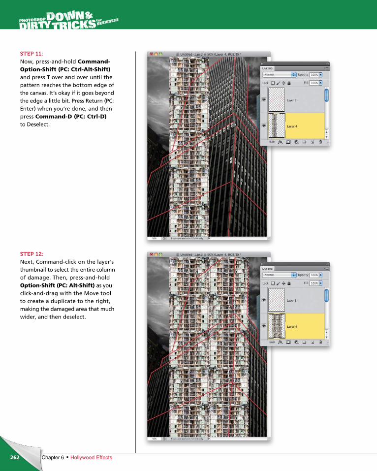
ptg6970545
262 Chapter 6 Hollywood Effects
STEP 11:Now, press-and-hold Command-Option-Shift (PC: Ctrl-Alt-Shift)and press T over and over until the pattern reaches the bottom edge of the canvas. It’s okay if it goes beyond the edge a little bit. Press Return (PC: Enter) when you’re done, and then press Com mand-D (PC: Ctrl-D) to Deselect.
STEP 12:Next, Command-click on the layer’s thumb nail to select the entire column of damage. Then, press-and-hold Option-Shift (PC: Alt-Shift) as you click-and-drag with the Move tool to create a duplicate to the right, making the damaged area that much wider, and then deselect.

ptg6970545
263Chapter 6Hollywood Effects
Continued
STEP 13:This is where the red guidelines come in handy. We need to distort the damaged building layer to fit the area on the face of the building. First, press Command-J (PC: Ctrl-J) to make a dupli cate of the damaged building layer, so we have one to apply to the side of the building, as well. Click on the Eye icon to the left of the dupli-cate layer’s thumbnail to turn that layer off for the moment. Then, click back on the original damaged build-ing layer, go under the Edit menu, under Transform, and choose Distort. Grab the corner handles and distort the image to conform to the guides. Use the vertical and horizontal lines to match the perspective of the dam-aged layer to the building. Press Return when you’re done.
STEP 14:Turn the duplicate layer back on by clicking where the Eye icon used to be, and then click on the layer to make it active. Now, distort it to the side of the building, like you see here. Then, merge these two layers into one by making sure the top one of the two is active, and pressing Command-E (PC: Ctrl-E).
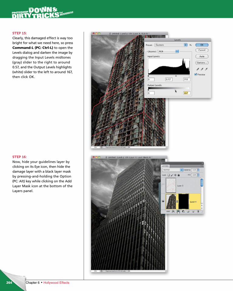
ptg6970545
264 Chapter 6 Hollywood Effects
STEP 15:Clearly, this damaged effect is way too bright for what we need here, so press Command-L (PC: Ctrl-L) to open the Levels dialog and darken the image by dragging the Input Levels midtones (gray) slider to the right to around 0.57, and the Out put Levels highlights (white) slider to the left to around 167, then click OK.
STEP 16:Now, hide your guidelines layer by clicking on its Eye icon, then hide the damage layer with a black layer mask by pressing-and-holding the Option (PC: Alt) key while clicking on the Add Layer Mask icon at the bottom of the Layers panel.

ptg6970545
265Chapter 6Hollywood Effects
Continued
STEP 17:Press D to set your Foreground and Background colors to their defaults of black and white, then go into the Toolbox and choose the Brush tool (B). Click on the brush thumbnail in the Options Bar to open the Brush Picker, then click on the right-facing arrow in the top-right corner and choose Dry Media Brushes. In the dialog that appears, click Append, then scroll down in your Brush Picker and click on the Soft Oil Pastel brush tip to select it. Open the Brush panel (Window>Brush), and set the Size to around 50 px.
STEP 18:Now, let’s start modifying the behavior of the brush by first clicking on Shape Dynamics in the list on the left to turn it on. Set the Size Jitter to 100% and the Angle Jitter to 100%, as well.
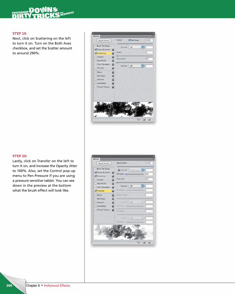
ptg6970545
266 Chapter 6 Hollywood Effects
STEP 19:Next, click on Scattering on the left to turn it on. Turn on the Both Axes checkbox, and set the Scatter amount to around 290%.
STEP 20:Lastly, click on Transfer on the left to turn it on, and increase the Opacity Jitter to 100%. Also, set the Control pop-up menu to Pen Pressure if you are using a pressure-sensitive tablet. You can see down in the preview at the bottom what the brush effect will look like.

ptg6970545
267Chapter 6Hollywood Effects
Continued
STEP 21:Before we go and start brushing in the damaged effect, let’s first apply a color effect to the image. Click on the Create New Adjustment Layer icon and choose Hue/Saturation. In the Adjustments panel, turn on the Colorize checkbox, and set the Hue to 28 and the Satura-tion to 19.
STEP 22:Click on the layer mask we added to the damaged building layer. Then, make sure your Foreground color is set to white, and start painting in random areas of the building to reveal the damaged areas. As it blends with the original building, it will start to look like the building is really falling apart. Don’t go too crazy, though. It’s easy to get carried away with this effect.
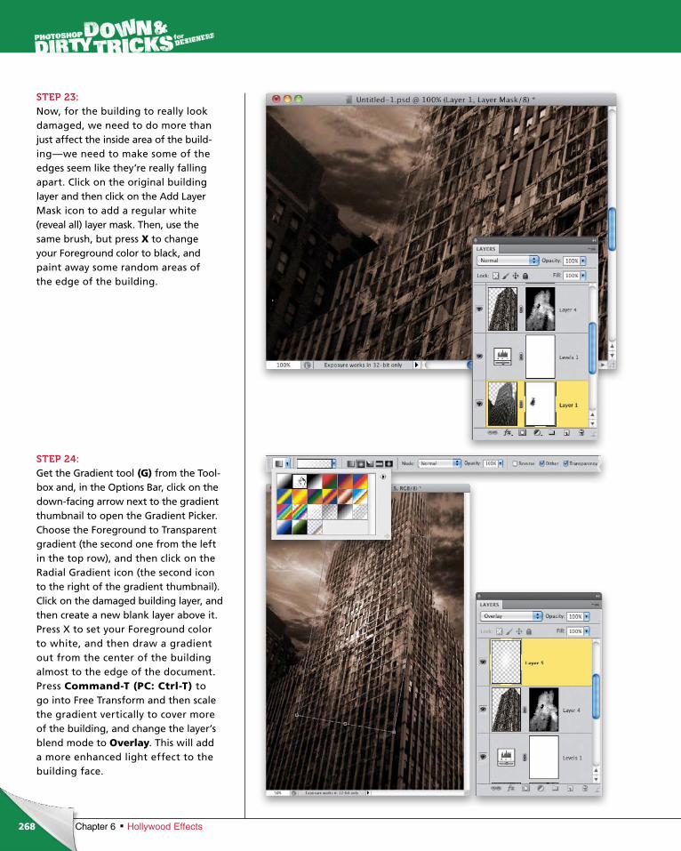
ptg6970545
268 Chapter 6 Hollywood Effects
STEP 23:Now, for the building to really look damaged, we need to do more than just affect the inside area of the build-ing—we need to make some of the edges seem like they’re really falling apart. Click on the original building layer and then click on the Add Layer Mask icon to add a regular white (reveal all) layer mask. Then, use the same brush, but press X to change your Foreground color to black, and paint away some random areas of the edge of the building.
STEP 24:Get the Gradient tool (G) from the Tool-box and, in the Options Bar, click on the down-facing arrow next to the gradient thumbnail to open the Gradient Picker. Choose the Foreground to Transparent gradient (the second one from the left in the top row), and then click on the Radial Gradient icon (the second icon to the right of the gradient thumbnail). Click on the damaged building layer, and then create a new blank layer above it. Press X to set your Fore ground color to white, and then draw a gradient out from the center of the building almost to the edge of the document. Press Com mand-T (PC: Ctrl-T) to go into Free Trans form and then scale the gradient vertically to cover more of the building, and change the layer’s blend mode to Over lay. This will add a more enhanced light effect to the building face.
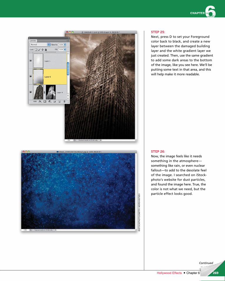
ptg6970545
269Chapter 6Hollywood Effects
©IS
TO
CK
PH
OT
O/D
MIT
RY
MO
RD
VIN
TS
EV
Continued
STEP 25:Next, press D to set your Foreground color back to black, and create a new layer between the damaged building layer and the white gradient layer we just created. Then, use the same gradient to add some dark areas to the bottom of the image, like you see here. We’ll be putting some text in that area, and this will help make it more readable.
STEP 26:Now, the image feels like it needs something in the atmosphere— something like rain, or even nuclear fallout—to add to the desolate feel of the image. I searched on iStock-photo’s website for dust particles, and found the image here. True, the color is not what we need, but the particle effect looks good.
ptg6970545
270 Chapter 6 Hollywood Effects
STEP 27:Go ahead and remove the color by pressing Command-Shift-U (PC: Ctrl-Shift-U), then copy-and-paste or use the Move tool to click-and-drag this particle effect into the design layout. Use Free Transform to make it larger, so it covers the entire image.
STEP 28:In the Layers panel, drag this layer just above the original building layer and change its blend mode to Screen. The particle effect may still seem a little too much, so go ahead and run a quick Levels adjustment to make the image darker, making the particle effect that much less intense. You can also lower the layer’s Opacity (here, I lowered it to 75%). Aside from some subtle tweaking of the image here and there, that pretty much completes the effect.
As you can see in the final image on the next page, all I did to finish it up was to add some text in Trajan Pro, with Drop Shadow and Gradient Over-lay layer styles, at the bottom and there you have it!
ptg6970545
271Chapter 6Hollywood Effects
Final Image
ptg6970545
272 Chapter 6 Hollywood Effects
chapter 6
STEP ONE:Start by opening the binary code file shown here, which is merely a bunch of random 1s and 0s. I created them as white text, and have them on a black Background layer just for the sake of visibility.
STEP TWO:Turn off the Background layer by clicking on the Eye icon to the left of the layer’s thumbnail, and make sure the text layer is active. Then, go under the Edit menu and choose Define Pattern. Give the new pattern a name, and click OK.
tech effects, like grids
If you look at most scifi or action film posters these days, you’ll see some common high
or random fields of code, combined with images and subtle light effects to add more interest and wow factor to a
design. Here, I’m going to show you how you can set up these effects to use on the fly whenever you need them.
Hi-Tech Effects
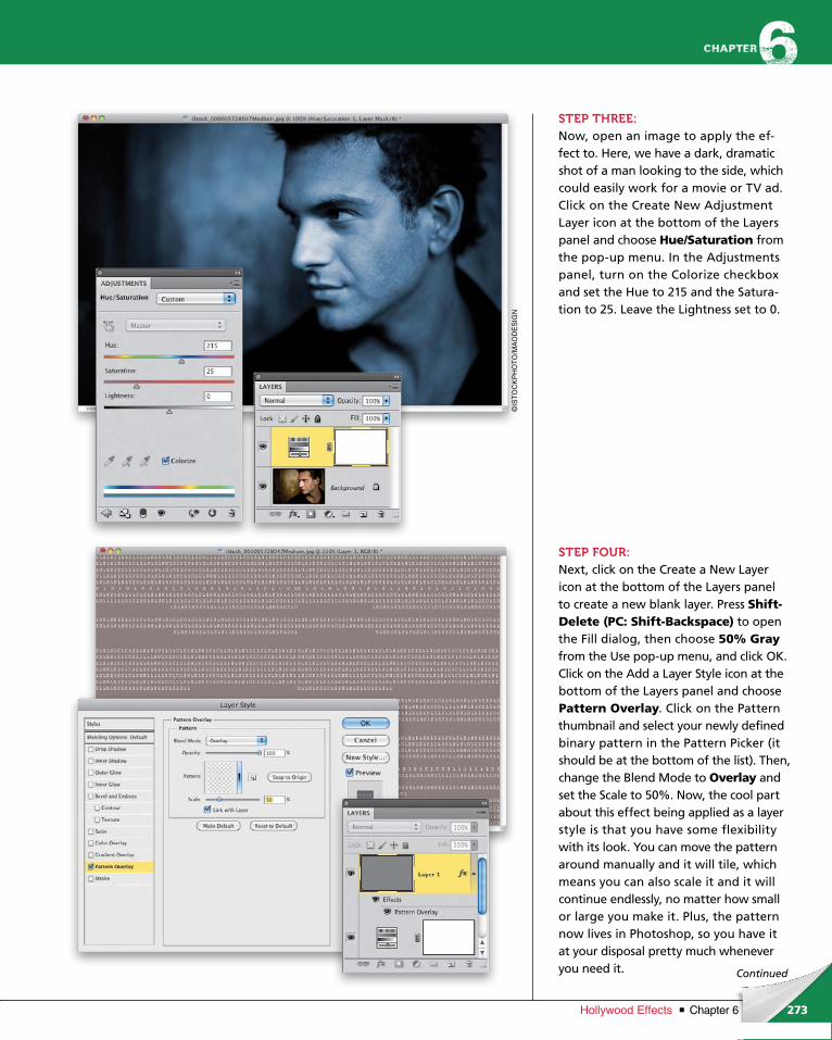
ptg6970545
273Chapter 6Hollywood Effects
Continued
STEP THREE:Now, open an image to apply the ef-fect to. Here, we have a dark, dramatic shot of a man looking to the side, which could easily work for a movie or TV ad. Click on the Create New Adjustment Layer icon at the bottom of the Layers panel and choose Hue/Saturation from the pop-up menu. In the Adjustments panel, turn on the Colorize checkbox and set the Hue to 215 and the Satura-tion to 25. Leave the Lightness set to 0.
STEP FOUR:Next, click on the Create a New Layer icon at the bottom of the Layers panel to create a new blank layer. Press Shift-Delete (PC: Shift-Backspace) to open the Fill dialog, then choose 50% Grayfrom the Use pop-up menu, and click OK. Click on the Add a Layer Style icon at the bottom of the Layers panel and choose Pattern Overlay. Click on the Pattern thumbnail and select your newly defined binary pattern in the Pattern Picker (it should be at the bottom of the list). Then, change the Blend Mode to Overlay and set the Scale to 50%. Now, the cool part about this effect being applied as a layer style is that you have some flexibility with its look. You can move the pattern around manually and it will tile, which means you can also scale it and it will continue endlessly, no matter how small or large you make it. Plus, the pattern now lives in Photoshop, so you have it at your disposal pretty much whenever you need it.
©IS
TO
CK
PH
OT
O/M
AO
DE
SIG
N

ptg6970545
274 Chapter 6 Hollywood Effects
STEP FIVE:Now, you probably noticed that even with the Overlay blend mode, the gray background is still there. So, just click on Blending Options: Default at the top left of the Layer Style dialog, drop the Fill Opacity down to 0%, and click OK. This will leave the pattern, while making the gray layer pixels invisible. Isn’t that cool?
STEP SIX:There may be some areas of the image where the code is a little overbearing, or perhaps you just want to vary the opacity. So, click on the Add Layer Mask icon at the bottom of the Layers panel to add a white mask to the layer. Then, get the Gradient tool (G) from the Tool-box and, up in the Options Bar, click on the down-facing arrow to the right of the gradient thumbnail to open the Gradient Picker, and choose the Fore-ground to Transparent gradient (the sec-ond one from the left in the top row). Click on the Radial Gradient icon (the second icon to the right of the gradient thumbnail), and then press D to set your Foreground color to black. Click-and-drag a couple of gradients around the face area to fade the binary pattern, like you see here.
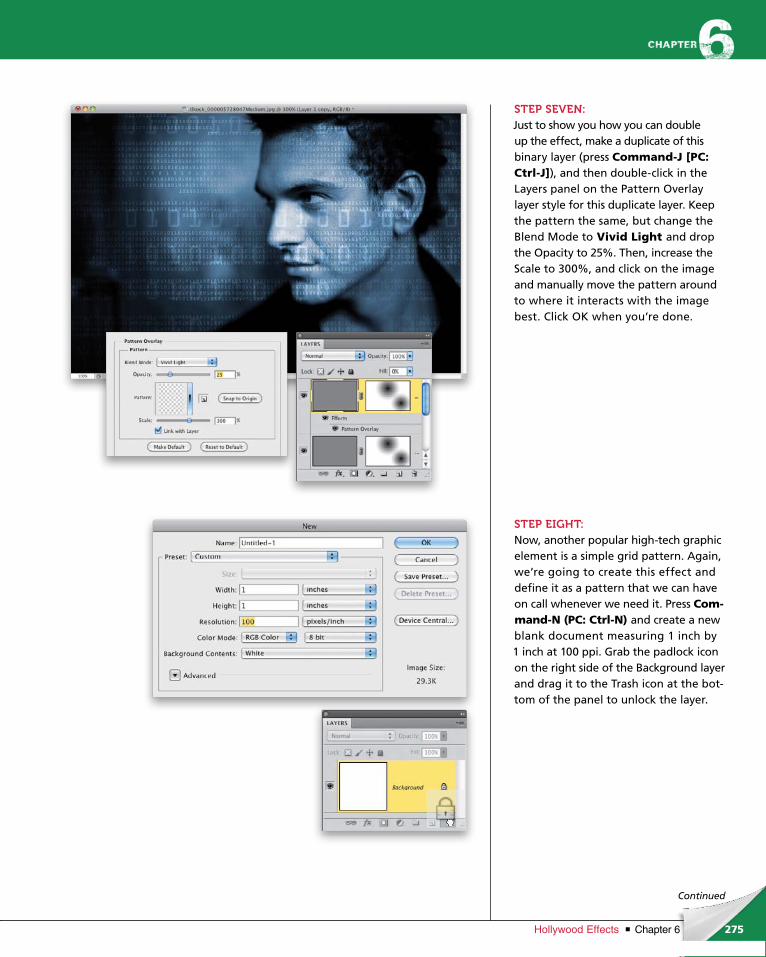
ptg6970545
275Chapter 6Hollywood Effects
Continued
STEP SEVEN:Just to show you how you can double up the effect, make a duplicate of this binary layer (press Command-J [PC: Ctrl-J]), and then double-click in the Layers panel on the Pattern Overlay layer style for this duplicate layer. Keep the pattern the same, but change the Blend Mode to Vivid Light and drop the Opacity to 25%. Then, increase the Scale to 300%, and click on the image and manually move the pattern around to where it interacts with the image best. Click OK when you’re done.
STEP EIGHT:Now, another popular high-tech graphic element is a simple grid pattern. Again, we’re going to create this effect and define it as a pattern that we can have on call whenever we need it. Press Com-mand-N (PC: Ctrl-N) and create a new blank document measuring 1 inch by 1 inch at 100 ppi. Grab the padlock icon on the right side of the Background layer and drag it to the Trash icon at the bot-tom of the panel to unlock the layer.
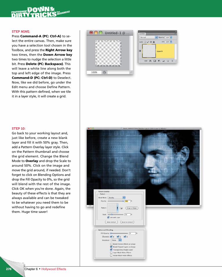
ptg6970545
276 Chapter 6 Hollywood Effects
STEP NINE:Press Command-A (PC: Ctrl-A) to se-lect the entire canvas. Then, make sure you have a selection tool chosen in the Toolbox, and press the Right Arrow key two times, then the Down Arrow keytwo times to nudge the selection a little bit. Press Delete (PC: Backspace). This will leave a white line along both the top and left edge of the image. PressCommand-D (PC: Ctrl-D) to De select. Now, like we did before, go under the Edit menu and choose Define Pattern. With this pattern defined, when we tile it in a layer style, it will create a grid.
STEP 10:Go back to your working layout and, just like before, create a new blank layer and fill it with 50% gray. Then, add a Pattern Overlay layer style. Click on the Pattern thumbnail and choose the grid element. Change the Blend Mode to Overlay and drop the Scale to around 50%. Click on the image and move the grid around, if needed. Don’t forget to click on Blending Options and drop the Fill Opacity to 0%, so the grid will blend with the rest of the image. Click OK when you’re done. Again, the beauty of these effects is that they are always available and can be tweaked to be whatever you need them to be without having to go and redefine them. Huge time saver!

ptg6970545
277Chapter 6Hollywood Effects
Continued
STEP 11:Just like we did with the binary pattern layer, add a white layer mask and, with your Foreground color set to black, use the Foreground to Transparent radial gradient to hide parts of the grid pat-tern, like you see here. To finish it off, I added some text in white, using Bank Gothic Light and Bank Gothic Medium. Then, I created a flare below the text by adding a Drop Shadow layer style to it, using the settings seen here.
In the final image on the next page, I decided his neck area was too bright, so I added a blank layer above the Back-ground layer and dragged out a small, black, Foreground to Transparent radial gradient in the bottom-right corner of the image.
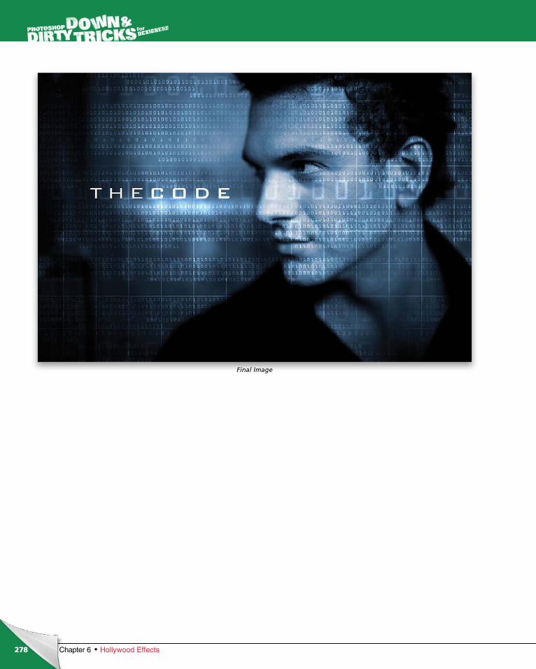
ptg6970545
278 Chapter 6 Hollywood Effects
Final Image
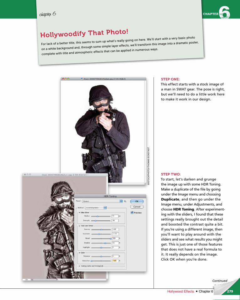
ptg6970545
279Chapter 6Hollywood Effects
Continued
chapter 6
STEP ONE:This effect starts with a stock image of a man in SWAT gear. The pose is right, but we’ll need to do a little work here to make it work in our design.
STEP TWO:To start, let’s darken and grunge the image up with some HDR Toning. Make a duplicate of the file by going under the Image menu and choosing Duplicate, and then go under the Image menu, under Adjustments, and choose HDR Toning. After experiment-ing with the sliders, I found that these settings really brought out the detail and boost ed the contrast quite a bit. If you’re using a different image, then you’ll want to play around with the sliders and see what results you might get. This is just one of those features that does not have a real formula to it. It really depends on the image. Click OK when you’re done.
For lack of a better title, this seems to sum up what’s really going on here. We’ll start with a very basic photo
on a white background and, through some simple layer effects, we’ll transform this image into a dramatic poster,
complete with title and atmospheric effects that can be applied in numerous ways.
Hollywoodify That Photo!
©IS
TO
CK
PH
OT
O//T
HO
MA
S E
CK
ST
AD
T
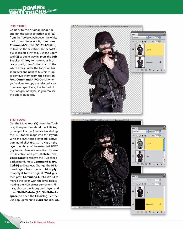
ptg6970545
280 Chapter 6 Hollywood Effects
STEP THREE:Go back to the original image file and get the Quick Selection tool (W)from the Toolbox. Paint over the white back ground to select it, then press Com mand-Shift-I (PC: Ctrl-Shift-I) to Inverse the selection, so the SWAT guy is selected instead. Use the Zoom tool (Z) to zoom way in, press the Left Bracket ([) key to make your brush really small, then Option-click in the white areas under the loops on his shoulders and next to his chin strap to remove them from the selection. Press Command-J (PC: Ctrl-J) when you’re done to copy the selected area to a new layer. Here, I’ve turned off the Background layer, so you can see the selection better.
STEP FOUR:Get the Move tool (V) from the Tool-box, then press-and-hold the Shift key (to keep it lined up) and click-and-drag the HDR-toned image into this layout. With the HDR-toned layer still active, Command-click (PC: Ctrl-click) on the layer thumbnail of the extracted SWAT guy to load him as a selection. Inverse the selection and press Delete (PC: Backspace) to remove the HDR-toned background. Press Command-D (PC: Ctrl-D) to Deselect. Change the HDR-toned layer’s blend mode to Multiply to apply it to the original SWAT guy, then press Com mand-E (PC: Ctrl-E) to merge this layer with the layer below, making the HDR effect permanent. Fi-nal ly, click on the Background layer, and press Shift-Delete (PC: Shift-Back-space) to open the Fill dialog. Set the Use pop-up menu to Black and click OK.
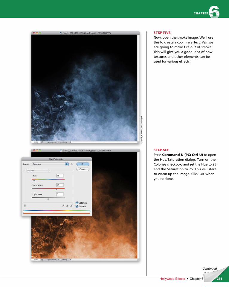
ptg6970545
281Chapter 6Hollywood Effects
Continued
STEP FIVE:Now, open the smoke image. We’ll use this to create a cool fire effect. Yes, we are going to make fire out of smoke. This will give you a good idea of how textures and other elements can be used for various effects.
STEP SIX:Press Command-U (PC: Ctrl-U) to open the Hue/Saturation dialog. Turn on the Colorize checkbox, and set the Hue to 25 and the Saturation to 75. This will start to warm up the image. Click OK when you’re done.
©IS
TO
CK
PH
OT
O/P
LAIN
VIE
W
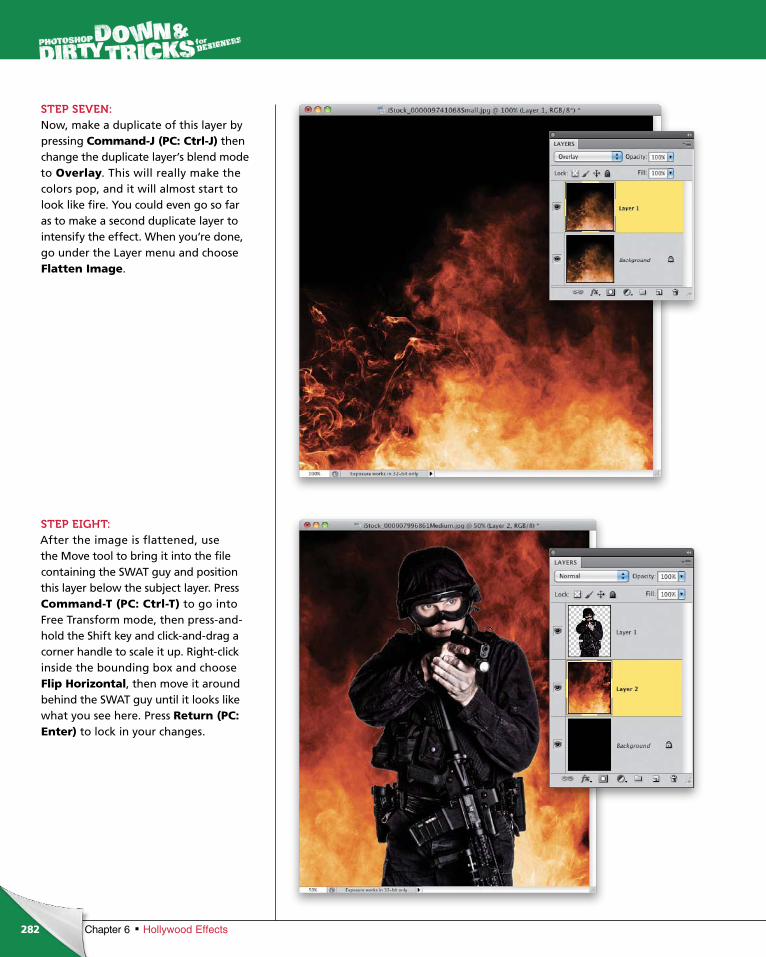
ptg6970545
282 Chapter 6 Hollywood Effects
STEP SEVEN:Now, make a duplicate of this layer by pressing Command-J (PC: Ctrl-J) then change the duplicate layer’s blend mode to Overlay. This will really make the colors pop, and it will almost start to look like fire. You could even go so far as to make a second duplicate layer to intensify the effect. When you’re done, go under the Layer menu and choose Flatten Image.
STEP EIGHT:After the image is flattened, use the Move tool to bring it into the file containing the SWAT guy and position this layer below the subject layer. Press Com mand-T (PC: Ctrl-T) to go into Free Transform mode, then press-and-hold the Shift key and click-and-drag a corner handle to scale it up. Right-click inside the bounding box and choose Flip Hori zontal, then move it around behind the SWAT guy until it looks like what you see here. Press Return (PC: Enter) to lock in your changes.
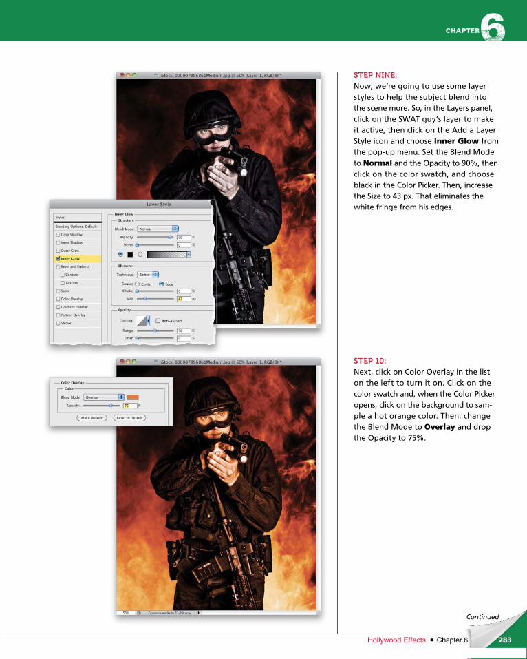
ptg6970545
283Chapter 6Hollywood Effects
Continued
STEP NINE:Now, we’re going to use some layer styles to help the subject blend into the scene more. So, in the Layers panel, click on the SWAT guy’s layer to make it active, then click on the Add a Layer Style icon and choose Inner Glow from the pop-up menu. Set the Blend Mode to Normal and the Opacity to 90%, then click on the color swatch, and choose black in the Color Picker. Then, increase the Size to 43 px. That eliminates the white fringe from his edges.
STEP 10:Next, click on Color Overlay in the list on the left to turn it on. Click on the color swatch and, when the Color Picker opens, click on the background to sam-ple a hot orange color. Then, change the Blend Mode to Overlay and drop the Opacity to 75%.
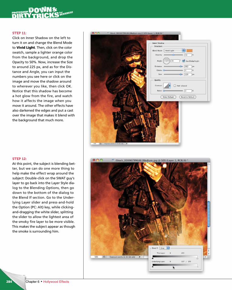
ptg6970545
284 Chapter 6 Hollywood Effects
STEP 11:Click on Inner Shadow on the left to turn it on and change the Blend Mode to Vivid Light. Then, click on the color swatch, sample a lighter orange color from the background, and drop the Opacity to 50%. Now, increase the Size to around 225 px, and as for the Dis-tance and Angle, you can input the numbers you see here or click on the image and move the shadow around to wherever you like, then click OK. Notice that this shadow has become a hot glow from the fire, and watch how it affects the image when you move it around. The other effects have also darkened the edges and put a cast over the image that makes it blend with the background that much more.
STEP 12:At this point, the subject is blending bet-ter, but we can do one more thing to help make the effect wrap around the subject: Double-click on the SWAT guy’s layer to go back into the Layer Style dia-log to the Blending Options, then go down to the bottom of the dialog to the Blend If section. Go to the Under-lying Layer slider and press-and-hold the Option (PC: Alt) key, while clicking-and-dragging the white slider, splitting the slider to allow the lightest area of the smoky fire layer to be more visible. This makes the subject appear as though the smoke is surrounding him.
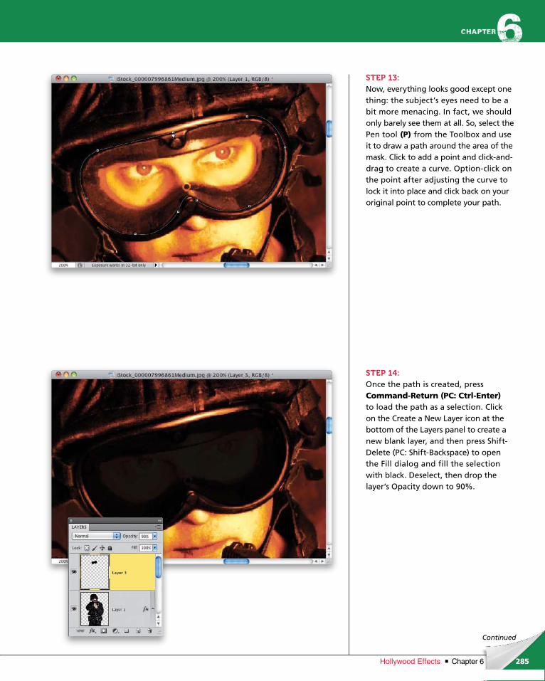
ptg6970545
285Chapter 6Hollywood Effects
Continued
STEP 13:Now, everything looks good except one thing: the subject’s eyes need to be a bit more menacing. In fact, we should only barely see them at all. So, select the Pen tool (P) from the Toolbox and use it to draw a path around the area of the mask. Click to add a point and click-and-drag to create a curve. Option-click on the point after adjusting the curve to lock it into place and click back on your original point to complete your path.
STEP 14:Once the path is created, press Command-Return (PC: Ctrl-Enter)to load the path as a selection. Click on the Create a New Layer icon at the bottom of the Layers panel to create a new blank layer, and then press Shift-Delete (PC: Shift-Backspace) to open the Fill dialog and fill the selection with black. Deselect, then drop the layer’s Opacity down to 90%.
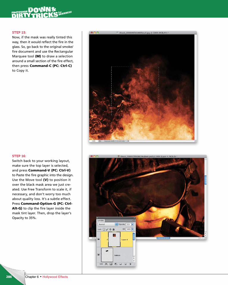
ptg6970545
286 Chapter 6 Hollywood Effects
STEP 15:Now, if the mask was really tinted this way, then it would reflect the fire in the glass. So, go back to the original smoke/fire document and use the Rectangular Marquee tool (M) to draw a selection around a small section of the fire effect, then press Command-C (PC: Ctrl-C)to Copy it.
STEP 16:Switch back to your working layout, make sure the top layer is selected, and press Command-V (PC: Ctrl-V) to Paste the fire graphic into the design. Use the Move tool (V) to position it over the black mask area we just cre-ated. Use Free Trans form to scale it, if necessary, and don’t worry too much about quality loss. It’s a subtle effect. Press Command-Option-G (PC: Ctrl-Alt-G) to clip the fire layer inside the mask tint layer. Then, drop the layer’s Opacity to 35%.
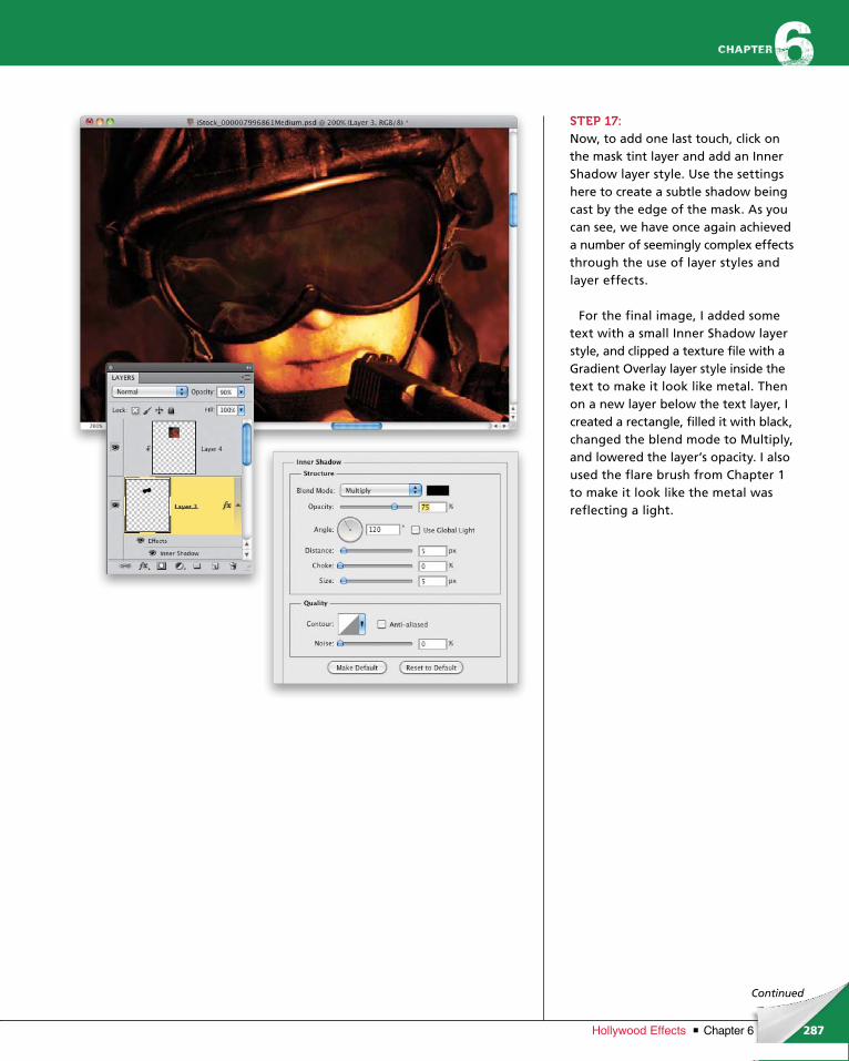
ptg6970545
287Chapter 6Hollywood Effects
Continued
STEP 17:Now, to add one last touch, click on the mask tint layer and add an Inner Shadow layer style. Use the settings here to create a subtle shadow being cast by the edge of the mask. As you can see, we have once again achieved a number of seemingly complex effects through the use of layer styles and layer effects.
For the final image, I added some text with a small Inner Shadow layer style, and clipped a texture file with a Gradient Overlay layer style inside the text to make it look like metal. Then on a new layer below the text layer, I created a rectangle, filled it with black, changed the blend mode to Multiply, and lowered the layer’s opacity. I also used the flare brush from Chapter 1 to make it look like the metal was reflecting a light.
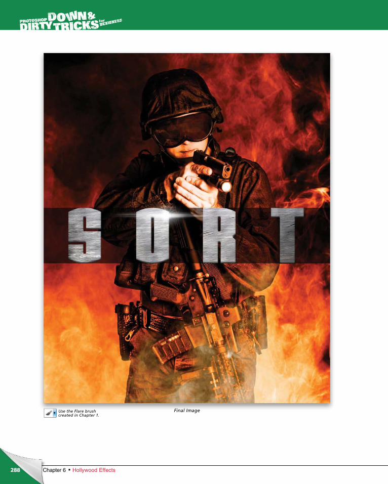
ptg6970545
288 Chapter 6 Hollywood Effects
Final ImageUse the Flare brush created in Chapter 1.
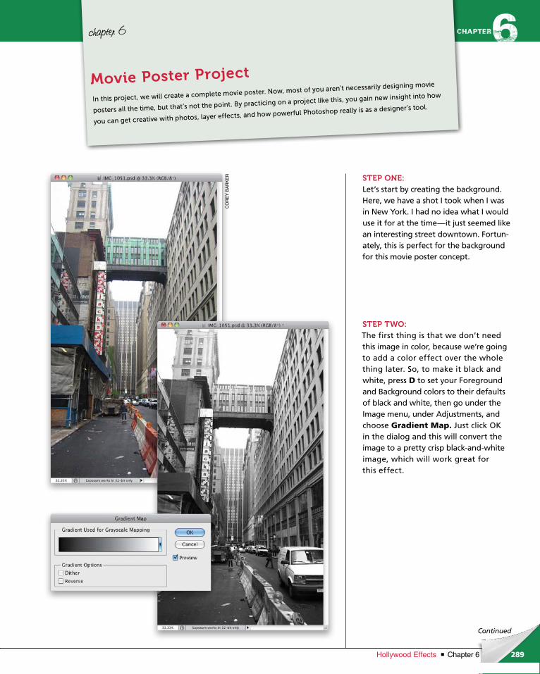
ptg6970545
289Chapter 6Hollywood Effects
CO
RE
Y B
AR
KE
R
Continued
chapter 6
STEP ONE:Let’s start by creating the background. Here, we have a shot I took when I was in New York. I had no idea what I would use it for at the time—it just seemed like an interesting street downtown. Fortun-ately, this is perfect for the background for this movie poster concept.
STEP TWO:The first thing is that we don’t need this image in color, because we’re going to add a color effect over the whole thing later. So, to make it black and white, press D to set your Foreground and Background colors to their defaults of black and white, then go under the Image menu, under Adjustments, and choose Gradient Map. Just click OK in the dialog and this will convert the image to a pretty crisp black-and-white image, which will work great for this effect.
In this project, we will create a complete movie poster. Now, most of you aren’t necessarily designing movie
posters all the time, but that’s not the point. By practicing on a project like this, you gain new insight into how
you can get creative with photos, layer effects, and how powerful Photoshop really is as a designer’s tool.
Movie Poster Project
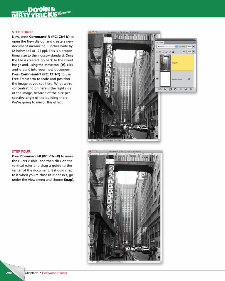
ptg6970545
290 Chapter 6 Hollywood Effects
STEP THREE:Now, press Command-N (PC: Ctrl-N) to open the New dialog, and create a new document measuring 8 inches wide by 12 inches tall at 125 ppi. This is a propor-tional size to the industry standard. Once the file is created, go back to the street image and, using the Move tool (V), click- and-drag it into your new document. Press Command-T (PC: Ctrl-T) to use Free Transform to scale and position the image as you see here. What we’re concentrating on here is the right side of the image, because of the nice per-spective angle of the building there. We’re going to mirror this effect.
STEP FOUR:Press Command-R (PC: Ctrl-R) to make the rulers visible, and then click on the vertical ruler and drag a guide to the center of the document. It should snap to it when you’re close (if it doesn’t, go under the View menu and choose Snap).
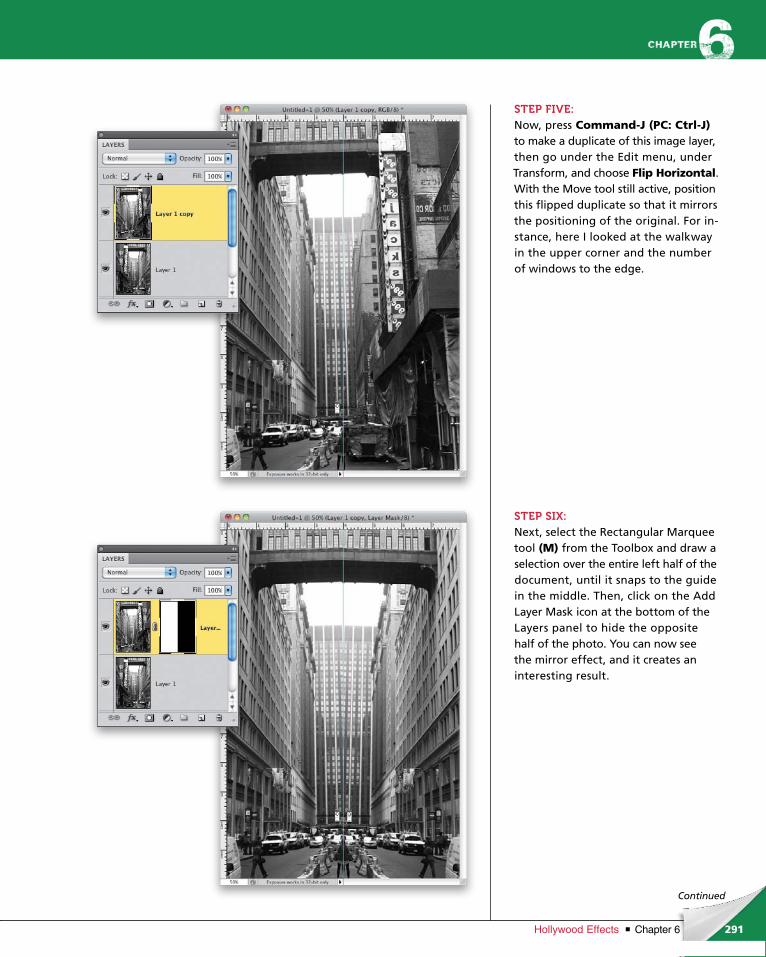
ptg6970545
291Chapter 6Hollywood Effects
Continued
STEP FIVE:Now, press Command-J (PC: Ctrl-J)to make a duplicate of this image layer, then go under the Edit menu, under Transform, and choose Flip Horizontal. With the Move tool still active, position this flipped duplicate so that it mirrors the positioning of the original. For in-stance, here I looked at the walkway in the upper corner and the number of windows to the edge.
STEP SIX:Next, select the Rectangular Marquee tool (M) from the Toolbox and draw a selection over the entire left half of the document, until it snaps to the guide in the middle. Then, click on the Add Layer Mask icon at the bottom of the Layers panel to hide the opposite half of the photo. You can now see the mirror effect, and it creates an interesting result.
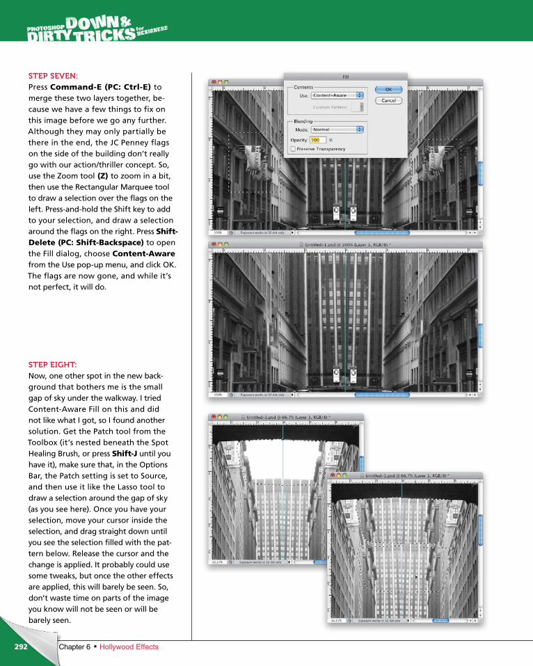
ptg6970545
292 Chapter 6 Hollywood Effects
STEP SEVEN:Press Command-E (PC: Ctrl-E) to merge these two layers together, be-cause we have a few things to fix on this image before we go any further. Although they may only partially be there in the end, the JC Penney flags on the side of the building don’t really go with our action/thriller concept. So, use the Zoom tool (Z) to zoom in a bit, then use the Rectangular Marquee tool to draw a selection over the flags on the left. Press-and-hold the Shift key to add to your selection, and draw a selection around the flags on the right. Press Shift- Delete (PC: Shift-Backspace) to open the Fill dialog, choose Content-Aware from the Use pop-up menu, and click OK. The flags are now gone, and while it’s not perfect, it will do.
STEP EIGHT:Now, one other spot in the new back-ground that bothers me is the small gap of sky under the walkway. I tried Content-Aware Fill on this and did not like what I got, so I found another solution. Get the Patch tool from the Toolbox (it’s nested beneath the Spot Healing Brush, or press Shift-J until you have it), make sure that, in the Options Bar, the Patch setting is set to Source, and then use it like the Lasso tool to draw a selection around the gap of sky (as you see here). Once you have your selection, move your cursor inside the selection, and drag straight down until you see the selection filled with the pat-tern below. Release the cursor and the change is applied. It probably could use some tweaks, but once the other effects are applied, this will barely be seen. So, don’t waste time on parts of the image you know will not be seen or will be barely seen.
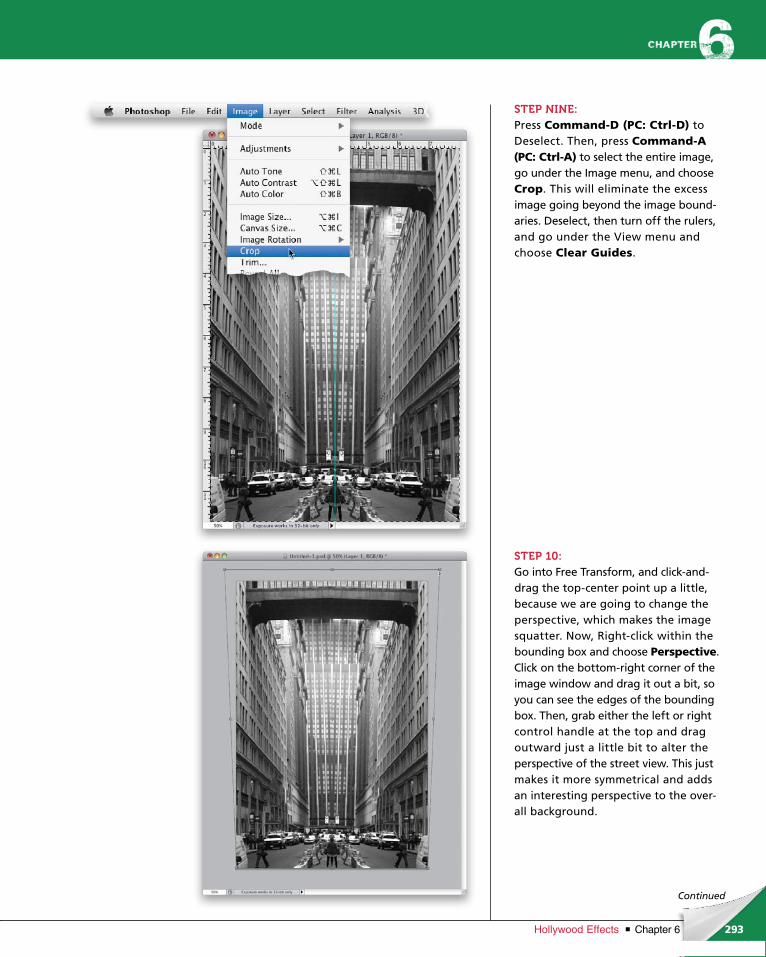
ptg6970545
293Chapter 6Hollywood Effects
Continued
STEP NINE:Press Command-D (PC: Ctrl-D) to Deselect. Then, press Command-A (PC: Ctrl-A) to select the entire image, go under the Image menu, and choose Crop. This will eliminate the excess image going beyond the image bound-aries. Deselect, then turn off the rulers, and go under the View menu and choose Clear Guides.
STEP 10:Go into Free Transform, and click-and-drag the top-center point up a little, because we are going to change the perspective, which makes the image squatter. Now, Right-click within the bounding box and choose Perspective. Click on the bottom-right corner of the image window and drag it out a bit, so you can see the edges of the bounding box. Then, grab either the left or right control handle at the top and drag out ward just a little bit to alter the perspective of the street view. This just makes it more symmetrical and adds an interesting perspective to the over-all background.
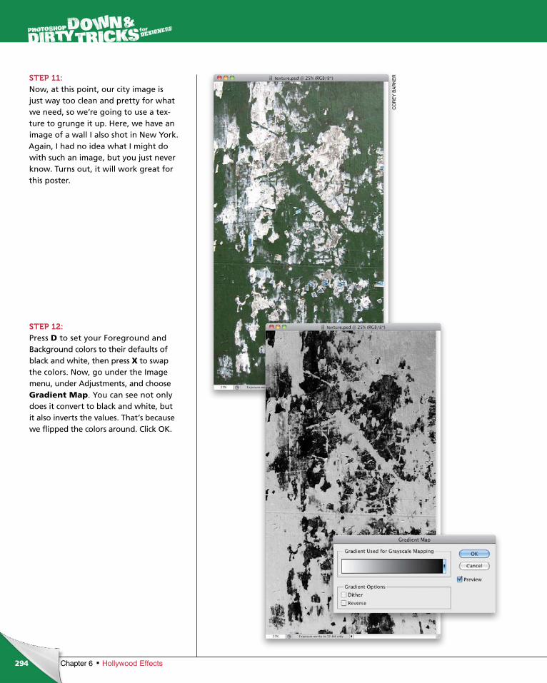
ptg6970545
294
CO
RE
Y B
AR
KE
R
Chapter 6 Hollywood Effects
STEP 11:Now, at this point, our city image is just way too clean and pretty for what we need, so we’re going to use a tex-ture to grunge it up. Here, we have an image of a wall I also shot in New York. Again, I had no idea what I might do with such an image, but you just never know. Turns out, it will work great for this poster.
STEP 12:Press D to set your Foreground and Background colors to their defaults of black and white, then press X to swap the colors. Now, go under the Image menu, under Adjustments, and choose Gradient Map. You can see not only does it convert to black and white, but it also inverts the values. That’s because we flipped the colors around. Click OK.
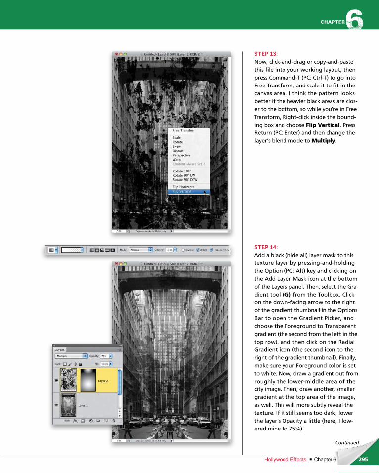
ptg6970545
295Chapter 6Hollywood Effects
Continued
STEP 13:Now, click-and-drag or copy-and-paste this file into your working layout, then press Command-T (PC: Ctrl-T) to go into Free Transform, and scale it to fit in the canvas area. I think the pattern looks better if the heavier black areas are clos-er to the bottom, so while you’re in Free Transform, Right-click inside the bound-ing box and choose Flip Vertical. Press Return (PC: Enter) and then change the layer’s blend mode to Multiply.
STEP 14:Add a black (hide all) layer mask to this texture layer by pressing-and-holding the Option (PC: Alt) key and clicking on the Add Layer Mask icon at the bottom of the Layers panel. Then, select the Gra-dient tool (G) from the Toolbox. Click on the down-facing arrow to the right of the gradient thumbnail in the Options Bar to open the Gradient Picker, and choose the Foreground to Transparent gradient (the second from the left in the top row), and then click on the Radial Gradient icon (the second icon to the right of the gradient thumbnail). Finally, make sure your Foreground color is set to white. Now, draw a gradient out from roughly the lower-middle area of the city image. Then, draw another, smaller gradient at the top area of the image, as well. This will more subtly reveal the texture. If it still seems too dark, lower the layer’s Opacity a little (here, I low-ered mine to 75%).
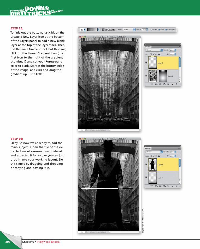
ptg6970545
296 Chapter 6 Hollywood Effects
STEP 15:To fade out the bottom, just click on the Create a New Layer icon at the bottom of the Layers panel to add a new blank layer at the top of the layer stack. Then, use the same Gradient tool, but this time, click on the Linear Gradient icon (the first icon to the right of the gradient thumbnail) and set your Foreground color to black. Start at the bottom edge of the image, and click-and-drag the gradient up just a little.
STEP 16:Okay, so now we’re ready to add the main subject. Open the file of the ex-tracted sword assassin. I went ahead and extracted it for you, so you can just drop it into your working layout. Do this simply by dragging-and-dropping or copying-and-pasting it in.
©IS
TO
CK
PH
OT
O/D
AN
WIL
TON
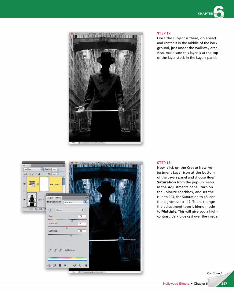
ptg6970545
297Chapter 6Hollywood Effects
Continued
STEP 17:Once the subject is there, go ahead and center it in the middle of the back-ground, just under the walkway area. Also, make sure this layer is at the top of the layer stack in the Layers panel.
STEP 18:Now, click on the Create New Ad-just ment Layer icon at the bottom of the Layers panel and choose Hue/ Saturation from the pop-up menu. In the Adjustments panel, turn on the Colorize checkbox, and set the Hue to 224, the Saturation to 48, and the Lightness to +17. Then, change the adjustment lay er’s blend mode to Multiply. This will give you a high- contrast, dark blue cast over the image.
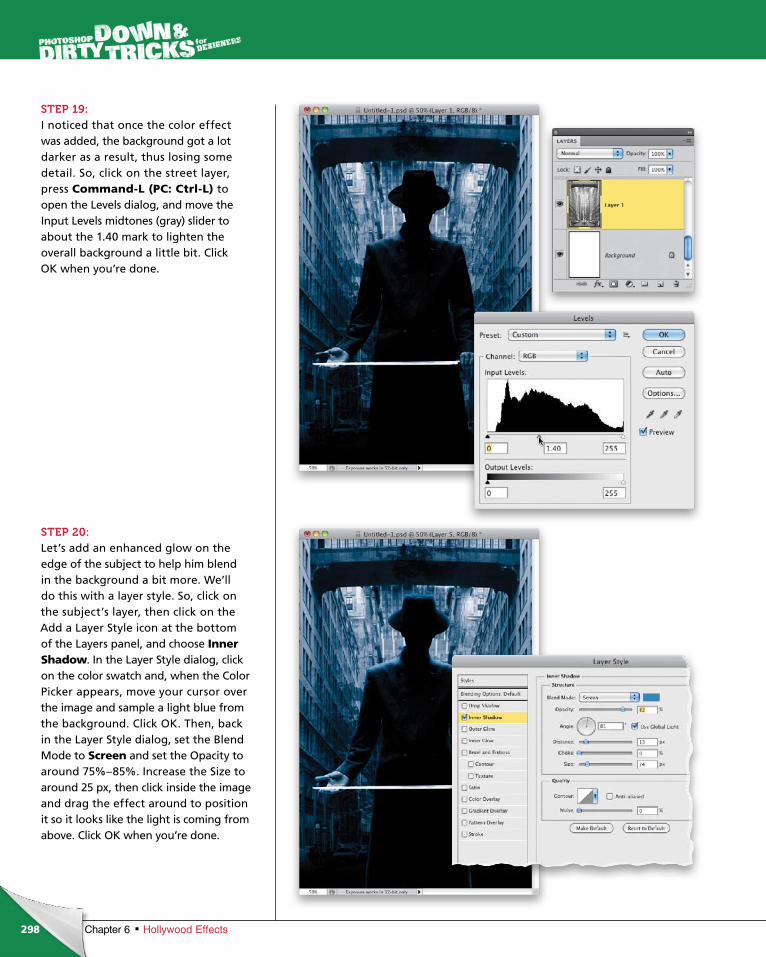
ptg6970545
298 Chapter 6 Hollywood Effects
STEP 19:I noticed that once the color effect was added, the background got a lot darker as a result, thus losing some detail. So, click on the street layer, press Command-L (PC: Ctrl-L) to open the Levels dialog, and move the Input Levels midtones (gray) slider to about the 1.40 mark to lighten the overall background a little bit. Click OK when you’re done.
STEP 20:Let’s add an enhanced glow on the edge of the subject to help him blend in the background a bit more. We’ll do this with a layer style. So, click on the subject’s layer, then click on the Add a Layer Style icon at the bottom of the Layers panel, and choose Inner Shadow. In the Layer Style dialog, click on the color swatch and, when the Color Picker appears, move your cursor over the image and sample a light blue from the background. Click OK. Then, back in the Layer Style dialog, set the Blend Mode to Screen and set the Opacity to around 75%–85%. Increase the Size to around 25 px, then click inside the image and drag the effect around to position it so it looks like the light is coming from above. Click OK when you’re done.
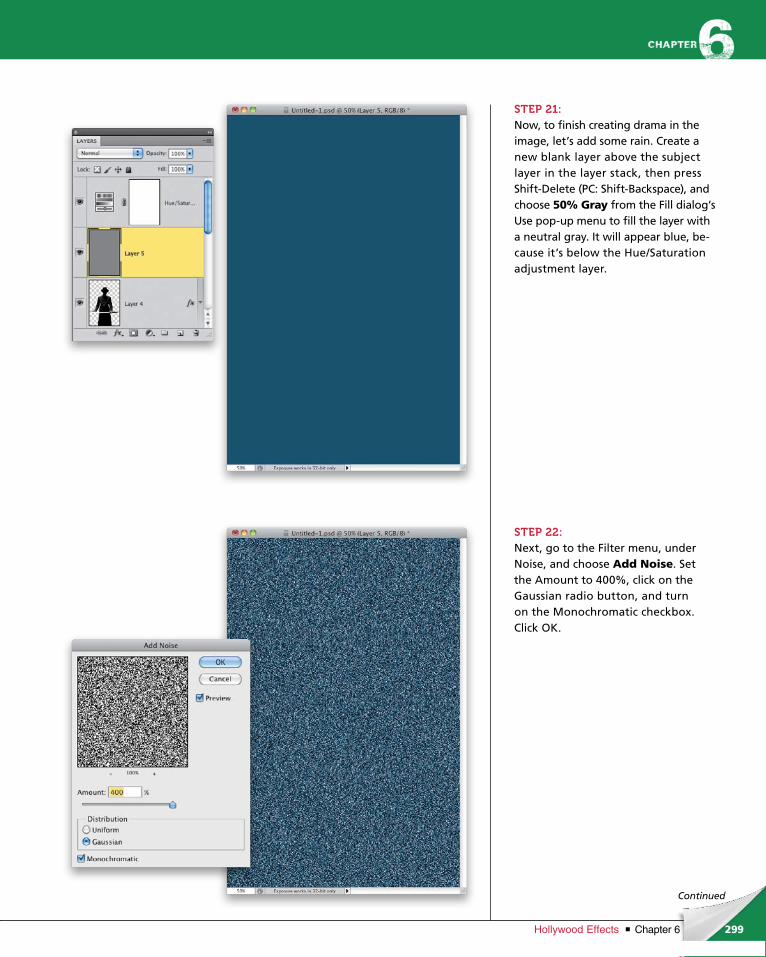
ptg6970545
299Chapter 6Hollywood Effects
Continued
STEP 21:Now, to finish creating drama in the image, let’s add some rain. Create a new blank layer above the subject layer in the layer stack, then press Shift-Delete (PC: Shift-Backspace), and choose 50% Gray from the Fill dialog’s Use pop-up menu to fill the layer with a neutral gray. It will appear blue, be-cause it’s below the Hue/Saturation adjustment layer.
STEP 22:Next, go to the Filter menu, under Noise, and choose Add Noise. Set the Amount to 400%, click on the Gaussian radio button, and turn on the Monochromatic checkbox. Click OK.
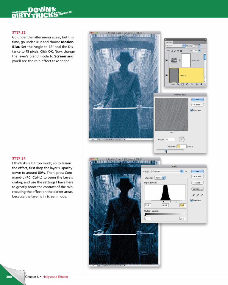
ptg6970545
300 Chapter 6 Hollywood Effects
STEP 23:Go under the Filter menu again, but this time, go under Blur and choose Motion Blur. Set the Angle to 72° and the Dis-tance to 75 pixels. Click OK. Now, change the layer’s blend mode to Screen and you’ll see the rain effect take shape.
STEP 24:I think it’s a bit too much, so to lessen the effect, first drop the layer’s Opacity down to around 80%. Then, press Com-mand-L (PC: Ctrl-L) to open the Levels dialog, and use the settings I have here to greatly boost the contrast of the rain, reducing the effect on the darker areas, because the layer is in Screen mode.
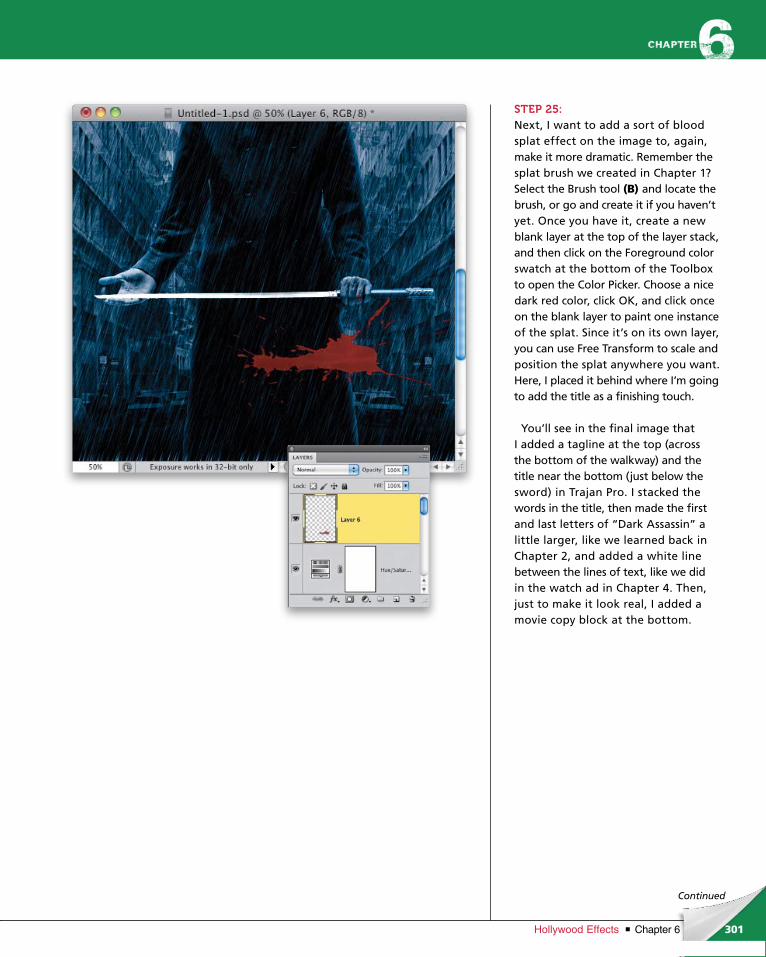
ptg6970545
301Chapter 6Hollywood Effects
Continued
STEP 25:Next, I want to add a sort of blood splat effect on the image to, again, make it more dramatic. Remember the splat brush we created in Chapter 1? Select the Brush tool (B) and locate the brush, or go and create it if you haven’t yet. Once you have it, create a new blank layer at the top of the layer stack, and then click on the Foreground color swatch at the bottom of the Toolbox to open the Color Picker. Choose a nice dark red color, click OK, and click once on the blank layer to paint one instance of the splat. Since it’s on its own layer, you can use Free Transform to scale and position the splat anywhere you want. Here, I placed it behind where I’m going to add the title as a finish ing touch.
You’ll see in the final image that I add ed a tagline at the top (across the bottom of the walkway) and the title near the bottom (just below the sword) in Trajan Pro. I stacked the words in the title, then made the first and last letters of “Dark Assassin” a little larger, like we learned back in Chapter 2, and added a white line between the lines of text, like we did in the watch ad in Chapter 4. Then, just to make it look real, I added a movie copy block at the bottom.
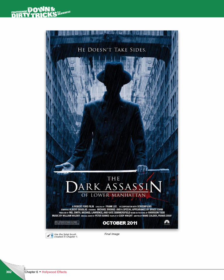
ptg6970545
302
Use the Splat brush created in Chapter 1.
Chapter 6 Hollywood Effects
Final Image

ptg6970545
This page intentionally left blank

ptg6970545
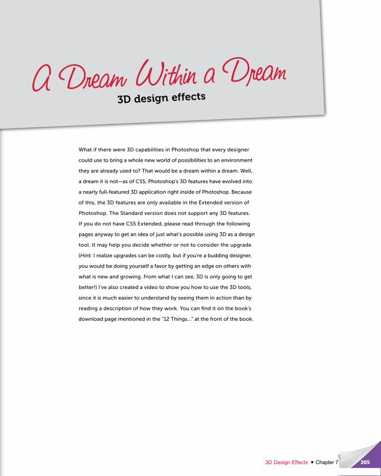
ptg6970545
What if there were 3D capabilities in Photoshop that every de signer
could use to bring a whole new world of possibilities to an environ ment
they are already used to? That would be a dream within a dream. Well,
a dream it is not—as of CS5, Photoshop’s 3D features have evolved into
a nearly full-featured 3D application right inside of Photoshop. Because
of this, the 3D features are only available in the Extended version of
Photo shop. The Standard version does not support any 3D features.
If you do not have CS5 Extended, please read through the following
pages anyway to get an idea of just what’s possible using 3D as a design
tool. It may help you decide whether or not to consider the upgrade.
(Hint: I realize upgrades can be costly, but if you’re a budding designer,
you would be doing yourself a favor by getting an edge on others with
what is new and growing. From what I can see, 3D is only going to get
better!) I’ve also created a video to show you how to use the 3D tools,
since it is much easier to understand by seeing them in action than by
reading a description of how they work. You can find it on the book’s
download page mentioned in the “12 Things…” at the front of the book.
305Chapter 73D Design Effects
A Dream Within a Dream3D design effects
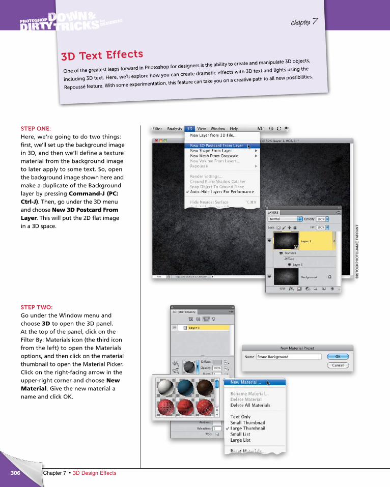
ptg6970545
306 Chapter 7 3D Design Effects
chapter 7
STEP ONE:Here, we’re going to do two things: first, we’ll set up the background image in 3D, and then we’ll define a texture material from the background image to later apply to some text. So, open the background image shown here and make a duplicate of the Background layer by pressing Com mand-J (PC: Ctrl-J). Then, go under the 3D menu and choose New 3D Postcard From Layer. This will put the 2D flat image in a 3D space.
STEP TWO:Go under the Window menu and choose 3D to open the 3D panel. At the top of the panel, click on the Filter By: Materials icon (the third icon from the left) to open the Materials options, and then click on the material thumbnail to open the Material Picker. Click on the right-facing arrow in the upper-right corner and choose New Material. Give the new material a name and click OK.
One of the greatest leaps forward in Photoshop for designers is the ability to create and manipulate 3D objects,
including 3D text. Here, we’ll explore how you can create dramatic effects with 3D text and lights using the
Repoussé feature. With some experimentation, this feature can take you on a creative path to all new possibilities.
3D Text Effects
©IS
TO
CK
PH
OT
O/J
AM
IE F
AR
RA
NT
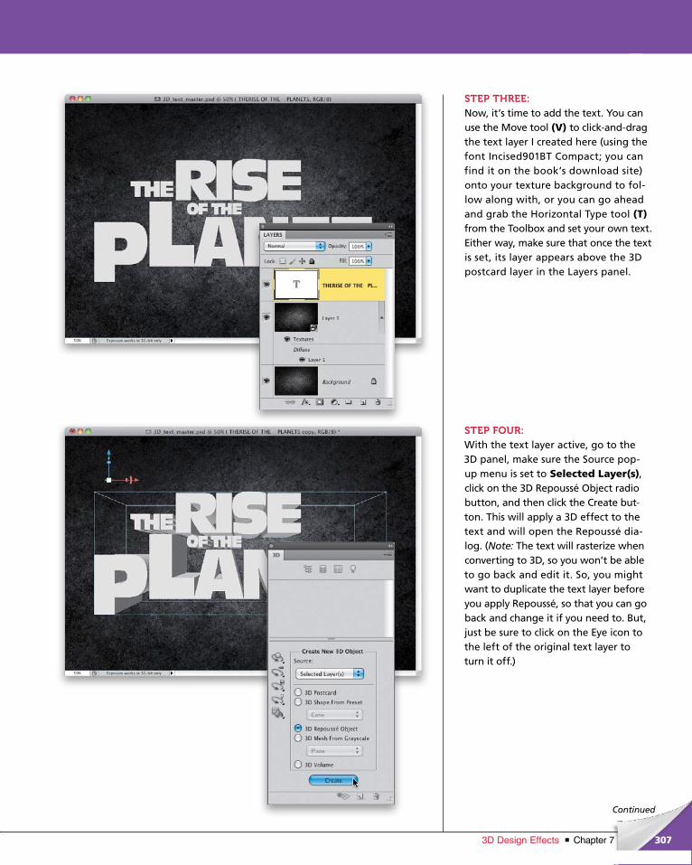
ptg6970545
307Chapter 73D Design Effects
Continued
STEP THREE:Now, it’s time to add the text. You can use the Move tool (V) to click-and-drag the text layer I created here (using the font Incised901BT Compact; you can find it on the book’s download site) onto your texture background to fol-low along with, or you can go ahead and grab the Horizon tal Type tool (T)from the Toolbox and set your own text. Either way, make sure that once the text is set, its layer appears above the 3D post card layer in the Layers panel.
STEP FOUR:With the text layer active, go to the 3D panel, make sure the Source pop- up menu is set to Selected Layer(s), click on the 3D Repoussé Object radio button, and then click the Create but-ton. This will apply a 3D effect to the text and will open the Repoussé dia-log. (Note: The text will rasterize when converting to 3D, so you won’t be able to go back and edit it. So, you might want to duplicate the text layer before you apply Repoussé, so that you can go back and change it if you need to. But, just be sure to click on the Eye icon to the left of the original text layer to turn it off.)
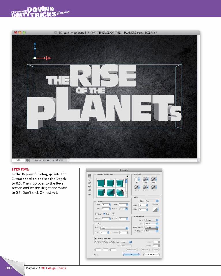
ptg6970545
308 Chapter 7 3D Design Effects
STEP FIVE:In the Repoussé dialog, go into the Extrude section and set the Depth to 0.3. Then, go over to the Bevel section and set the Height and Width to 0.5. Don’t click OK just yet.
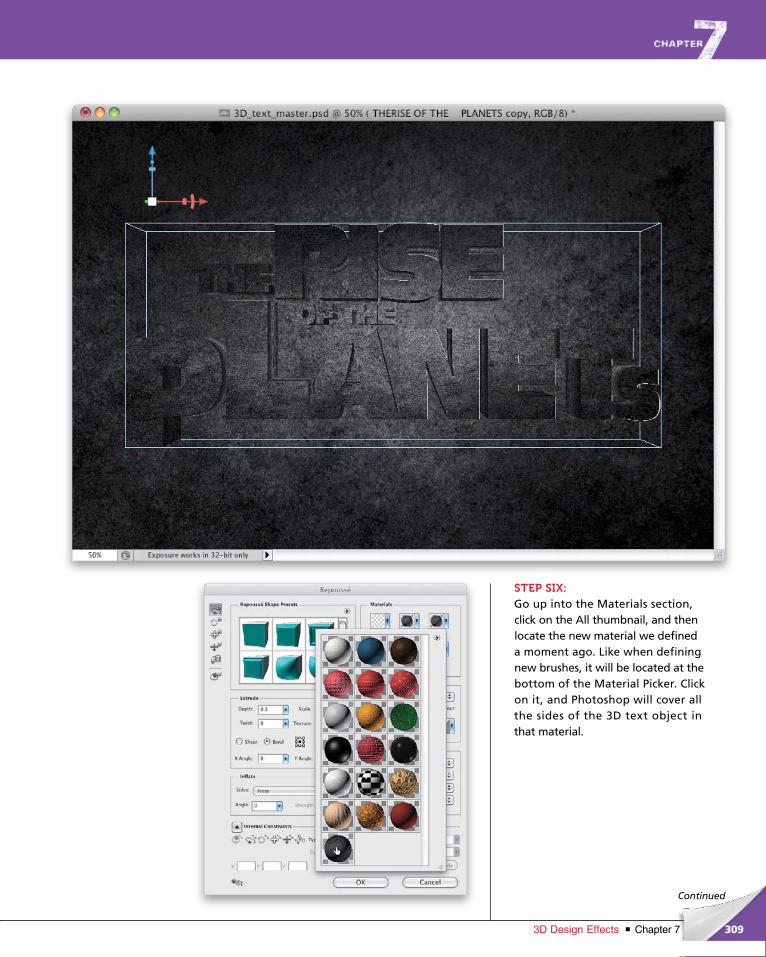
ptg6970545
309Chapter 73D Design Effects
Continued
STEP SIX:Go up into the Materials section, click on the All thumbnail, and then locate the new material we defined a moment ago. Like when defining new brushes, it will be located at the bottom of the Material Picker. Click on it, and Photoshop will cover all the sides of the 3D text object in that material.
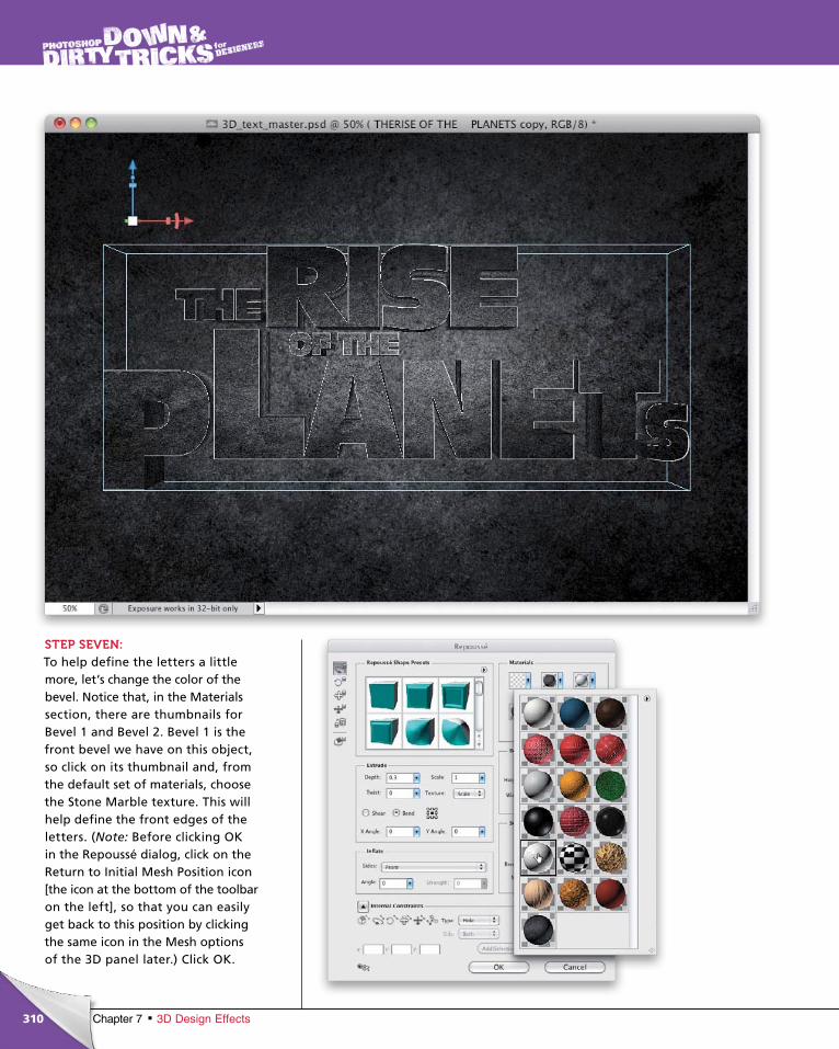
ptg6970545
310 Chapter 7 3D Design Effects
STEP SEVEN:To help define the letters a little more, let’s change the color of the bevel. Notice that, in the Materials section, there are thumbnails for Bevel 1 and Bevel 2. Bevel 1 is the front bevel we have on this object, so click on its thumbnail and, from the default set of materials, choose the Stone Marble texture. This will help define the front edges of the letters. (Note: Before clicking OK in the Repoussé dialog, click on the Return to Initial Mesh Position icon [the icon at the bottom of the toolbar on the left], so that you can easily get back to this position by clicking the same icon in the Mesh options of the 3D panel later.) Click OK.
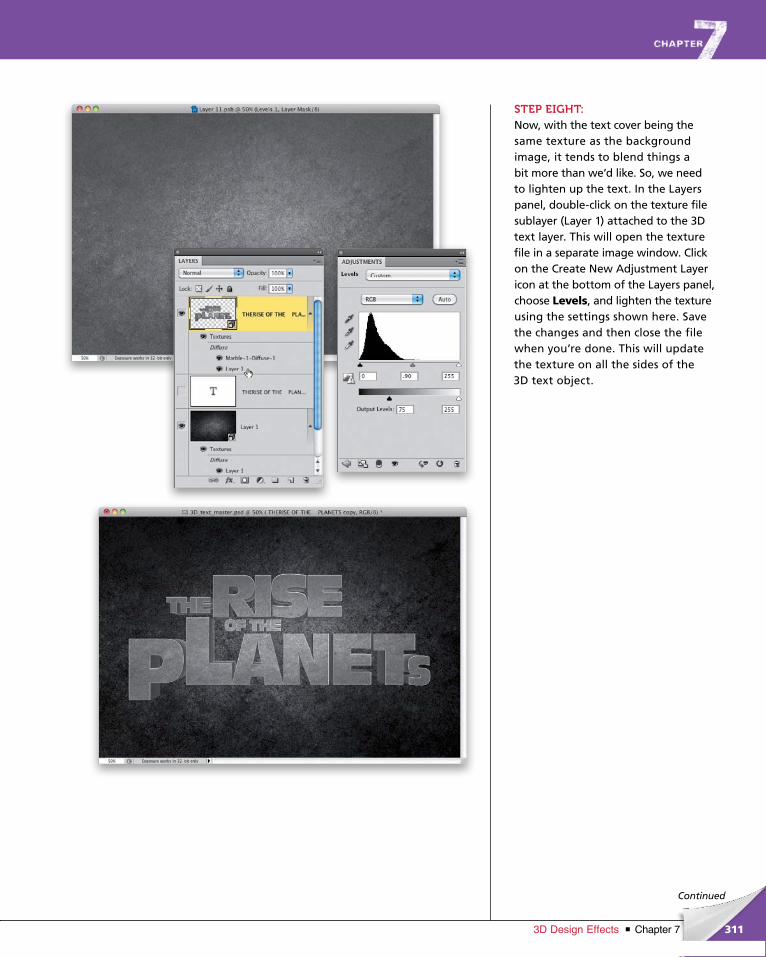
ptg6970545
311Chapter 73D Design Effects
Continued
STEP EIGHT:Now, with the text cover being the same texture as the background image, it tends to blend things a bit more than we’d like. So, we need to lighten up the text. In the Layers panel, double-click on the texture file sub layer (Layer 1) attached to the 3D text layer. This will open the texture file in a separate image window. Click on the Create New Ad justment Layer icon at the bottom of the Layers panel, choose Levels, and lighten the texture using the settings shown here. Save the changes and then close the file when you’re done. This will update the texture on all the sides of the 3D text object.
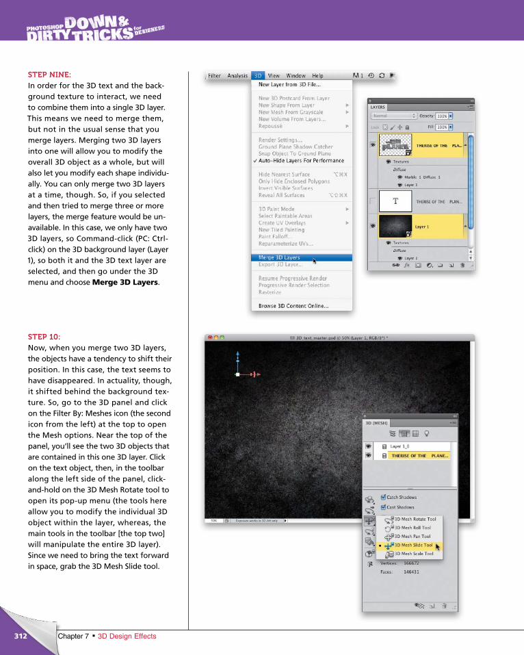
ptg6970545
312 Chapter 7 3D Design Effects
STEP NINE:In order for the 3D text and the back-ground texture to interact, we need to combine them into a single 3D layer. This means we need to merge them, but not in the usual sense that you merge layers. Merging two 3D layers into one will allow you to modify the overall 3D object as a whole, but will also let you modify each shape individu-ally. You can only merge two 3D layers at a time, though. So, if you selected and then tried to merge three or more layers, the merge feature would be un-available. In this case, we only have two 3D layers, so Command-click (PC: Ctrl-click) on the 3D background layer (Layer 1), so both it and the 3D text layer are selected, and then go under the 3D menu and choose Merge 3D Layers.
STEP 10:Now, when you merge two 3D layers, the objects have a tendency to shift their position. In this case, the text seems to have disappeared. In actuality, though, it shifted behind the background tex-ture. So, go to the 3D panel and click on the Filter By: Meshes icon (the second icon from the left) at the top to open the Mesh options. Near the top of the panel, you’ll see the two 3D objects that are contained in this one 3D layer. Click on the text object, then, in the toolbar along the left side of the panel, click-and-hold on the 3D Mesh Rotate tool to open its pop-up menu (the tools here allow you to modify the individual 3D object within the layer, whereas, the main tools in the toolbar [the top two] will manipulate the entire 3D layer). Since we need to bring the text forward in space, grab the 3D Mesh Slide tool.
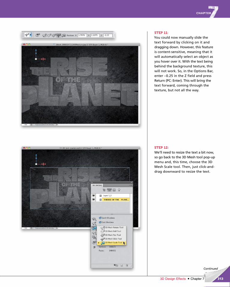
ptg6970545
313Chapter 73D Design Effects
Continued
STEP 11:You could now manually slide the text forward by clicking on it and dragging down. However, this feature is content-sensitive, meaning that it will automat ically select an object as you hover over it. With the text being behind the background texture, this will not work. So, in the Options Bar, enter –0.25 in the Z field and press Return (PC: Enter). This will bring the text forward, coming through the texture, but not all the way.
STEP 12:We’ll need to resize the text a bit now, so go back to the 3D Mesh tool pop-up menu and, this time, choose the 3D Mesh Scale tool. Then, just click-and-drag downward to resize the text.
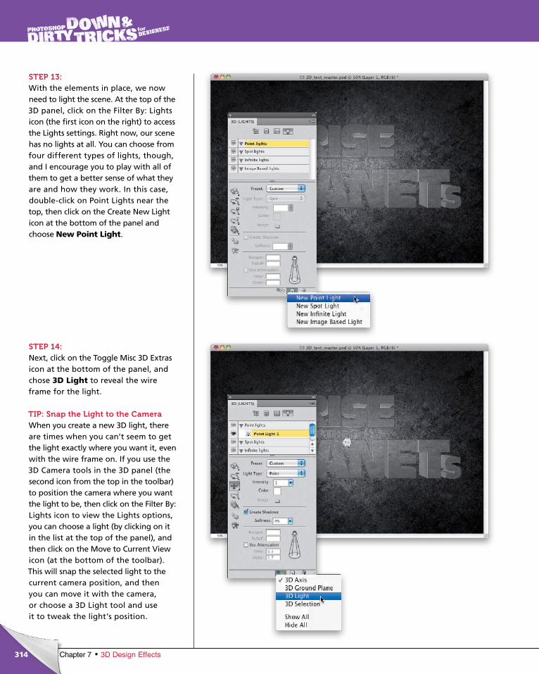
ptg6970545
314 Chapter 7 3D Design Effects
STEP 13:With the elements in place, we now need to light the scene. At the top of the 3D panel, click on the Filter By: Lights icon (the first icon on the right) to access the Lights settings. Right now, our scene has no lights at all. You can choose from four different types of lights, though, and I encourage you to play with all of them to get a better sense of what they are and how they work. In this case, double-click on Point Lights near the top, then click on the Create New Light icon at the bottom of the panel and choose New Point Light.
STEP 14:Next, click on the Toggle Misc 3D Extras icon at the bottom of the panel, and chose 3D Light to reveal the wire frame for the light.
TIP: Snap the Light to the CameraWhen you create a new 3D light, there are times when you can’t seem to get the light exactly where you want it, even with the wire frame on. If you use the 3D Camera tools in the 3D panel (the second icon from the top in the toolbar) to position the camera where you want the light to be, then click on the Filter By: Lights icon to view the Lights options, you can choose a light (by clicking on it in the list at the top of the panel), and then click on the Move to Current View icon (at the bottom of the toolbar). This will snap the selected light to the current camera position, and then you can move it with the camera, or choose a 3D Light tool and use it to tweak the light’s position.
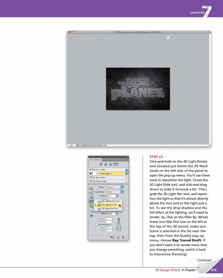
ptg6970545
315Chapter 73D Design Effects
Continued
STEP 15:Click-and-hold on the 3D Light Rotate tool (located just below the 3D Mesh tools) on the left side of the panel to open the pop-up menu. You’ll use these tools to reposition the light. Chose the 3D Light Slide tool, and click-and-drag down to slide it forward a bit. Then, grab the 3D Light Pan tool, and reposi-tion the light so that it’s almost directly above the text and to the right just a bit. To see the drop shadow and the full effect of the lighting, we’ll need to render. So, click on the Filter By: Whole Scene icon (the first icon on the left at the top of the 3D panel), make sure Scene is selected in the list near the top, then from the Quality pop-up menu, choose Ray Traced Draft. If you don’t want it to render every time you change something, switch it back to Interactive (Painting).
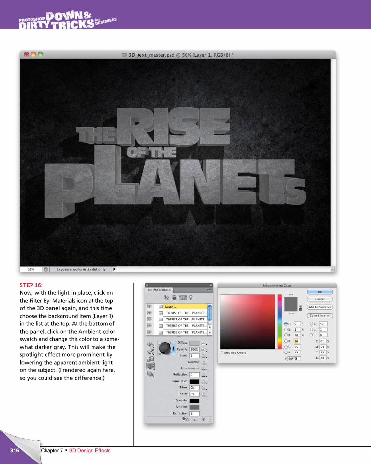
ptg6970545
316 Chapter 7 3D Design Effects
STEP 16:Now, with the light in place, click on the Filter By: Materials icon at the top of the 3D panel again, and this time choose the background item (Layer 1) in the list at the top. At the bottom of the panel, click on the Ambient color swatch and change this color to a some-what darker gray. This will make the spotlight effect more prominent by lowering the apparent ambient light on the subject. (I rendered again here, so you could see the difference.)
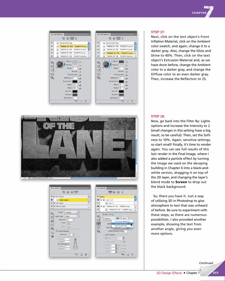
ptg6970545
317Chapter 73D Design Effects
Continued
STEP 17:Next, click on the text object’s Front Inflation Material, click on the Ambient color swatch, and again, change it to a darker gray. Also, change the Gloss and Shine to 40%. Then, click on the text object’s Extrusion Material and, as we have done before, change the Ambient color to a darker gray, and change the Diffuse color to an even darker gray. Then, increase the Reflection to 25.
STEP 18:Now, go back into the Filter By: Lights options and increase the Intensity to 2 (small changes in this setting have a big result, so be careful). Then, set the Soft-ness to 10%. Again, sensitive settings, so start small! Finally, it’s time to render again. You can see full results of this last render in the Final Image, where I also added a particle effect by turning the image we used on the decaying building in Chapter 6 into a black-and-white version, dragging it on top of the 3D layer, and changing the layer’s blend mode to Screen to drop out the black background.
So, there you have it. Just a way of utilizing 3D in Photoshop to give atmos phere to text that was unheard of before. Be sure to experiment with these steps, as there are numerous possibilities. I also provided another example, showing the text from another angle, giving you even more options.
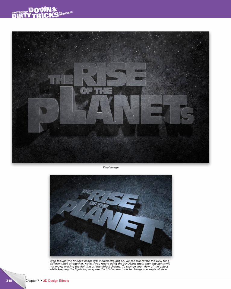
ptg6970545
318 Chapter 7 3D Design Effects
Final Image
Even though the finished image was viewed straight on, we can still rotate the view for a different look altogether. Note: If you rotate using the 3D Object tools, then the lights will not move, making the lighting on the object change. To change your view of the object while keeping the lights in place, use the 3D Camera tools to change the angle of view.

ptg6970545
319Chapter 73D Design Effects
Continued
chapter 7
STEP ONE:To begin, we need a nice abstract splash image. I went to iStockphoto’s website and searched “paint splash,” and it returned quite a few images. I think this one has a lot of interesting things happening and can be used in multiple ways. But, first, we’ll need to extract it.
STEP TWO:Since the splash was shot on a black background, we can use a simple chan-nels trick to select it. Open the Channels panel (Window>Channels), click on the Red channel, and drag it onto the Create New Channel icon at the bottom of the panel to make a copy.
3D postcards (2D images placed in 3D space that have shadows and reflections from other objects) are a lot more
powerful than you might think. With a little experimentation and some outside-the-box thinking, you can use these
features to create interesting effects. In this project, we’ll take a generic paint splash and use 3D postcards to create
an interesting 3D environment. This effect will also work in CS4 Extended, as 3D postcards were first introduced in
that version.
3D Postcard Effects
©IS
TO
CK
PH
OT
O/T
HE
O_S
TO
CK
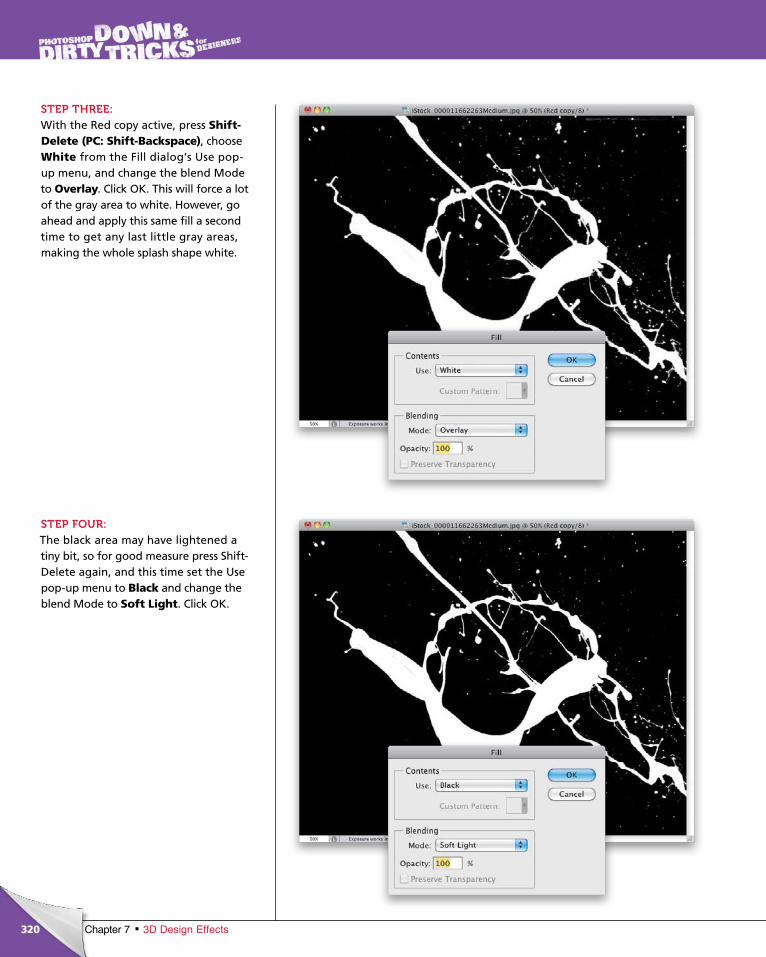
ptg6970545
320 Chapter 7 3D Design Effects
STEP THREE:With the Red copy active, press Shift-Delete (PC: Shift-Backspace), choose White from the Fill dialog’s Use pop-up menu, and change the blend Mode to Overlay. Click OK. This will force a lot of the gray area to white. However, go ahead and apply this same fill a second time to get any last little gray areas, making the whole splash shape white.
STEP FOUR:The black area may have lightened a tiny bit, so for good measure press Shift-Delete again, and this time set the Use pop-up menu to Black and change the blend Mode to Soft Light. Click OK.
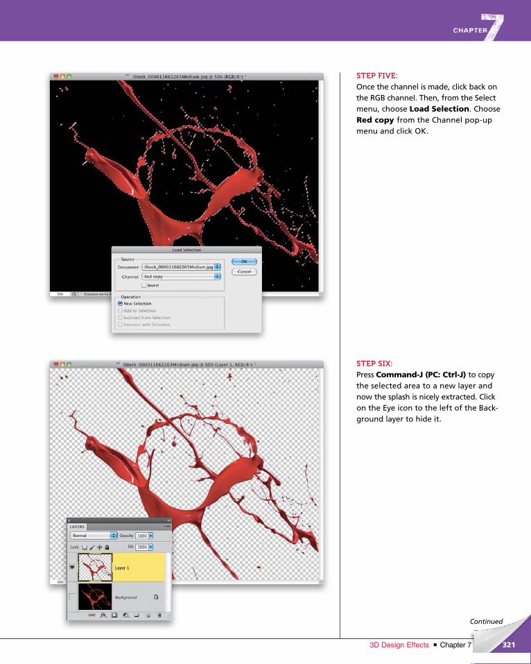
ptg6970545
321Chapter 73D Design Effects
Continued
STEP FIVE:Once the channel is made, click back on the RGB channel. Then, from the Select menu, choose Load Selection. Choose Red copy from the Channel pop-up menu and click OK.
STEP SIX:Press Command-J (PC: Ctrl-J) to copy the selected area to a new layer and now the splash is nicely extracted. Click on the Eye icon to the left of the Back-ground layer to hide it.

ptg6970545
322 Chapter 7 3D Design Effects
STEP SEVEN:To polish up the edges, go to the bottom of the Layer menu, under Matting, and choose Defringe. Set the Width to 2 pixels and click OK. This will clean up any anti-aliasing noise picked up from the background.
STEP EIGHT:Now, the splash is a nice bright red, but that’s not what we need. So, let’s change the color by clicking on the Create New Adjustment Layer icon at the bottom of the Layers panel and choosing Hue/Saturation. In the Ad-justments panel, turn on the Colorize checkbox, and set the Hue to 25, the Saturation to 60, and the Lightness to 20. This will make the paint splash orange.
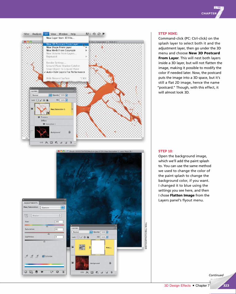
ptg6970545
323Chapter 73D Design Effects
©IS
TO
CK
PH
OT
O/B
ILL
NO
LL
Continued
STEP NINE:Command-click (PC: Ctrl-click) on the splash layer to select both it and the adjustment layer, then go under the 3D menu and choose New 3D Postcard From Layer. This will nest both layers inside a 3D layer, but will not flatten the image, making it possible to modify the color if needed later. Now, the postcard puts the image into a 3D space, but it’s still a flat 2D image, hence the name
“postcard.” Though, with this effect, it will almost look 3D.
STEP 10:Open the background image, which we’ll add the paint splash to. You can use the same method we used to change the color of the paint splash to change the background color, if you want. I changed it to blue using the settings you see here, and then I chose Flatten Image from the Layers panel’s flyout menu.
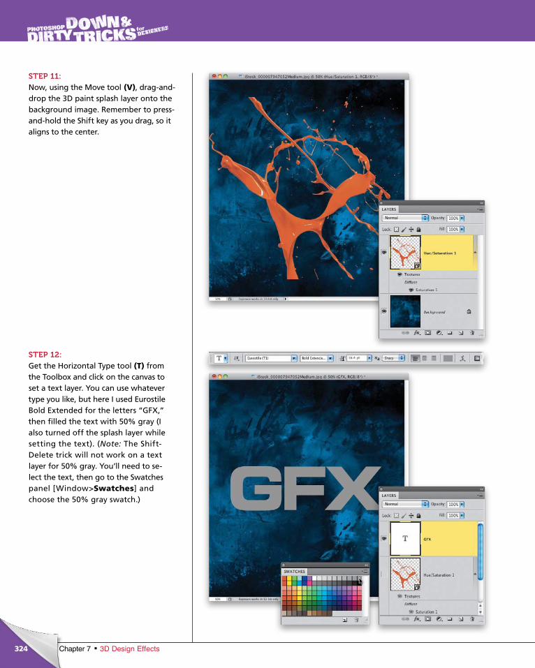
ptg6970545
324 Chapter 7 3D Design Effects
STEP 11:Now, using the Move tool (V), drag-and-drop the 3D paint splash layer onto the background image. Remember to press-and-hold the Shift key as you drag, so it aligns to the center.
STEP 12: Get the Horizontal Type tool (T) from the Toolbox and click on the canvas to set a text layer. You can use whatever type you like, but here I used Eurostile Bold Extended for the letters “GFX,” then filled the text with 50% gray (I also turned off the splash layer while setting the text). (Note: The Shift-Delete trick will not work on a text layer for 50% gray. You’ll need to se-lect the text, then go to the Swatches panel [Window>Swatches] and choose the 50% gray swatch.)
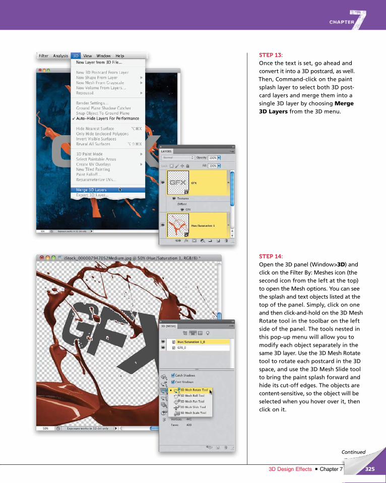
ptg6970545
325Chapter 73D Design Effects
Continued
STEP 13:Once the text is set, go ahead and convert it into a 3D postcard, as well. Then, Command-click on the paint splash layer to select both 3D post-card layers and merge them into a single 3D layer by choosing Merge 3D Layers from the 3D menu.
STEP 14:Open the 3D panel (Window>3D) and click on the Filter By: Meshes icon (the second icon from the left at the top) to open the Mesh options. You can see the splash and text objects listed at the top of the panel. Simply, click on one and then click-and-hold on the 3D Mesh Rotate tool in the toolbar on the left side of the panel. The tools nested in this pop-up menu will allow you to modify each object separately in the same 3D layer. Use the 3D Mesh Rotate tool to rotate each postcard in the 3D space, and use the 3D Mesh Slide tool to bring the paint splash forward and hide its cut-off edges. The objects are content-sensitive, so the object will be selected when you hover over it, then click on it.
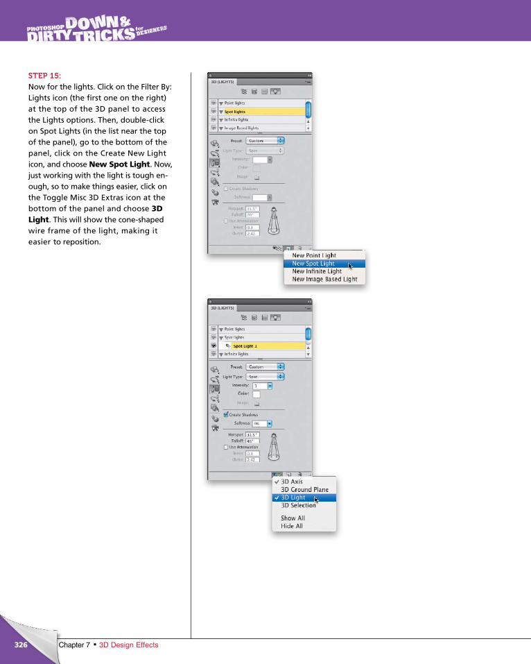
ptg6970545
326 Chapter 7 3D Design Effects
STEP 15:Now for the lights. Click on the Filter By: Lights icon (the first one on the right) at the top of the 3D panel to access the Lights options. Then, double-click on Spot Lights (in the list near the top of the panel), go to the bottom of the panel, click on the Create New Light icon, and choose New Spot Light. Now, just work ing with the light is tough en-ough, so to make things easier, click on the Toggle Misc 3D Extras icon at the bot tom of the panel and choose 3D Light. This will show the cone-shaped wire frame of the light, making it easier to reposition.
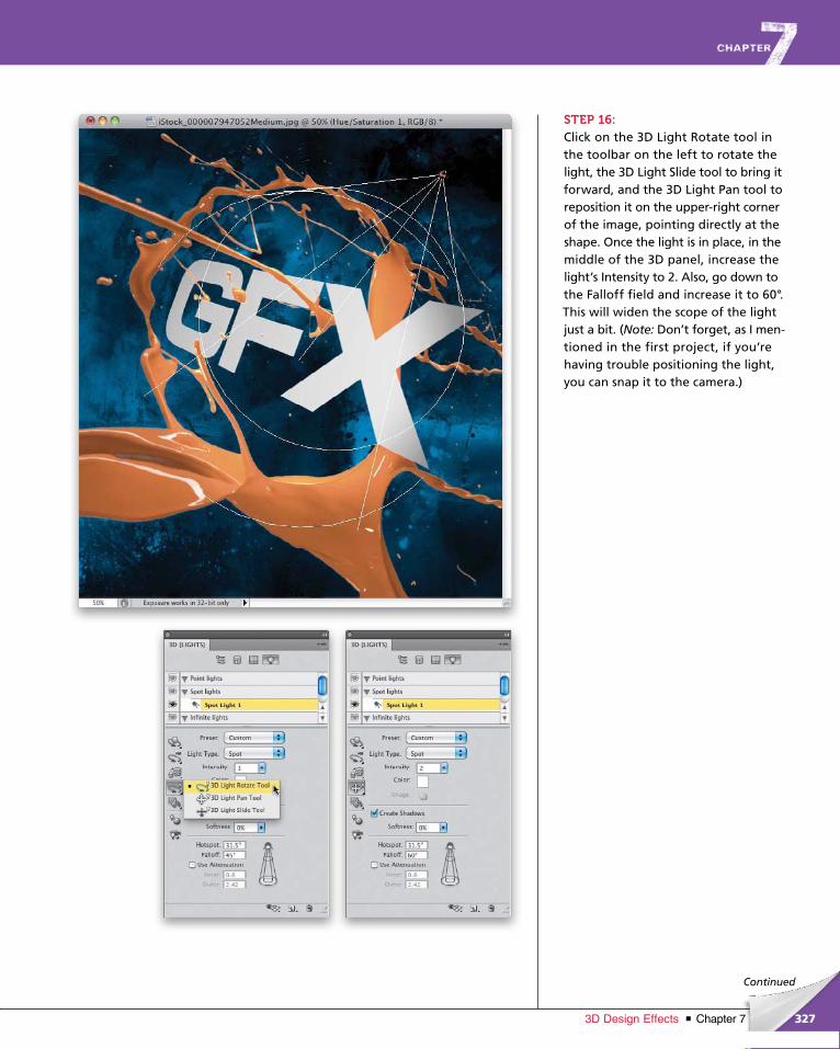
ptg6970545
327Chapter 73D Design Effects
Continued
STEP 16:Click on the 3D Light Rotate tool in the toolbar on the left to rotate the light, the 3D Light Slide tool to bring it forward, and the 3D Light Pan tool to reposition it on the upper-right corner of the image, pointing directly at the shape. Once the light is in place, in the middle of the 3D panel, increase the light’s Intensity to 2. Also, go down to the Falloff field and increase it to 60°. This will widen the scope of the light just a bit. (Note: Don’t forget, as I men-tioned in the first project, if you’re having trouble positioning the light, you can snap it to the camera.)
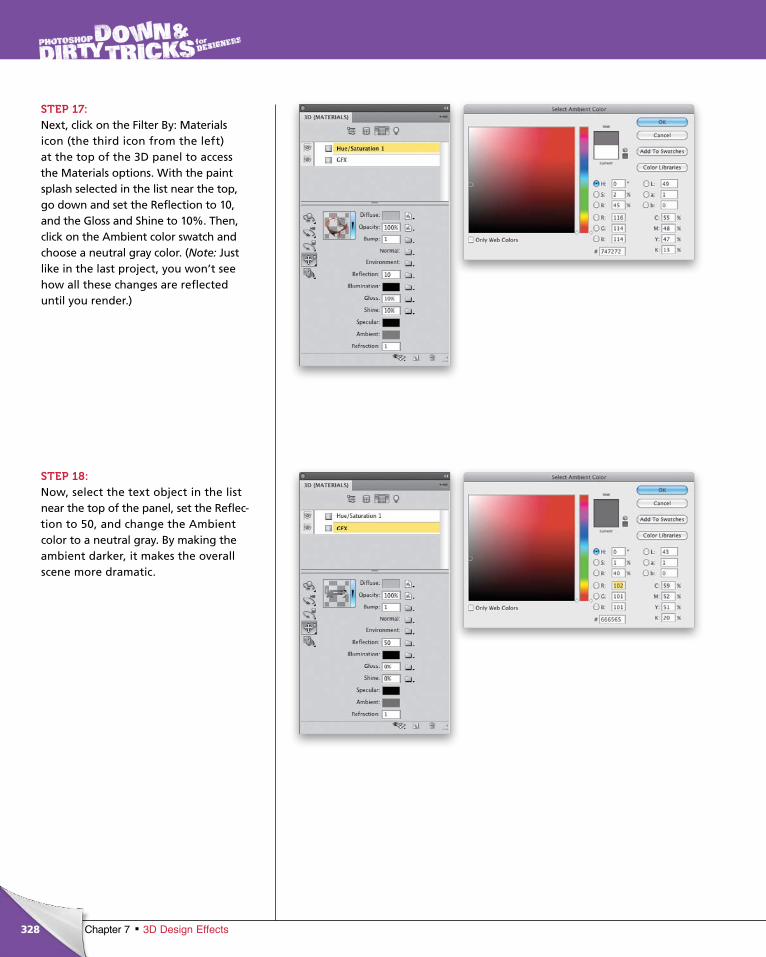
ptg6970545
328 Chapter 7 3D Design Effects
STEP 17:Next, click on the Filter By: Materials icon (the third icon from the left) at the top of the 3D panel to access the Materials options. With the paint splash selected in the list near the top, go down and set the Reflection to 10, and the Gloss and Shine to 10%. Then, click on the Ambient color swatch and choose a neutral gray color. (Note: Just like in the last project, you won’t see how all these changes are reflected until you render.)
STEP 18:Now, select the text object in the list near the top of the panel, set the Reflec-tion to 50, and change the Ambient color to a neutral gray. By making the ambient darker, it makes the overall scene more dramatic.
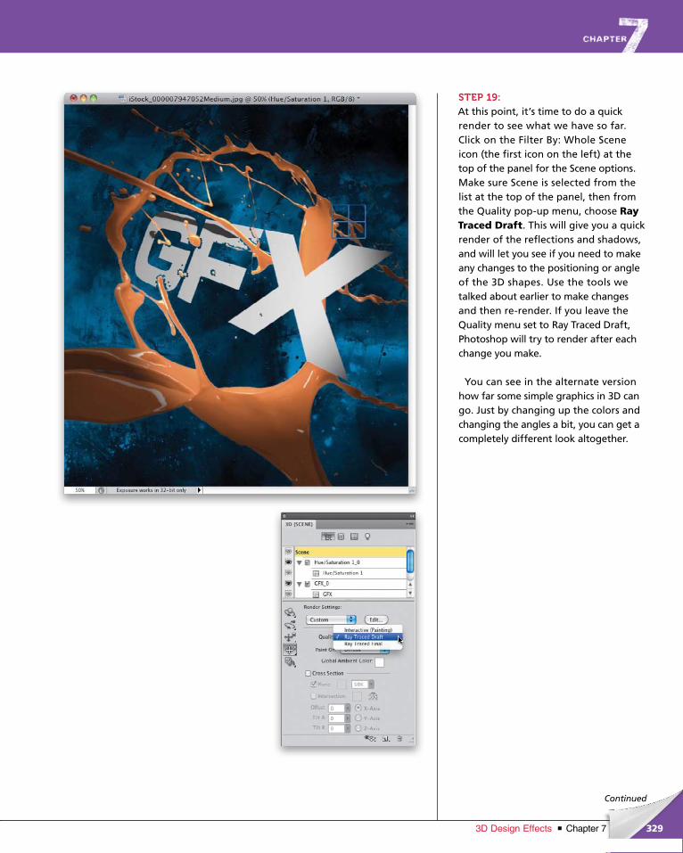
ptg6970545
329Chapter 73D Design Effects
Continued
STEP 19:At this point, it’s time to do a quick render to see what we have so far. Click on the Filter By: Whole Scene icon (the first icon on the left) at the top of the panel for the Scene options. Make sure Scene is selected from the list at the top of the panel, then from the Quality pop-up menu, choose Ray Traced Draft. This will give you a quick render of the reflections and shadows, and will let you see if you need to make any changes to the positioning or angle of the 3D shapes. Use the tools we talked about earlier to make changes and then re-render. If you leave the Quality menu set to Ray Traced Draft, Photoshop will try to render after each change you make.
You can see in the alternate version how far some simple graphics in 3D can go. Just by changing up the colors and changing the angles a bit, you can get a completely different look altogether.
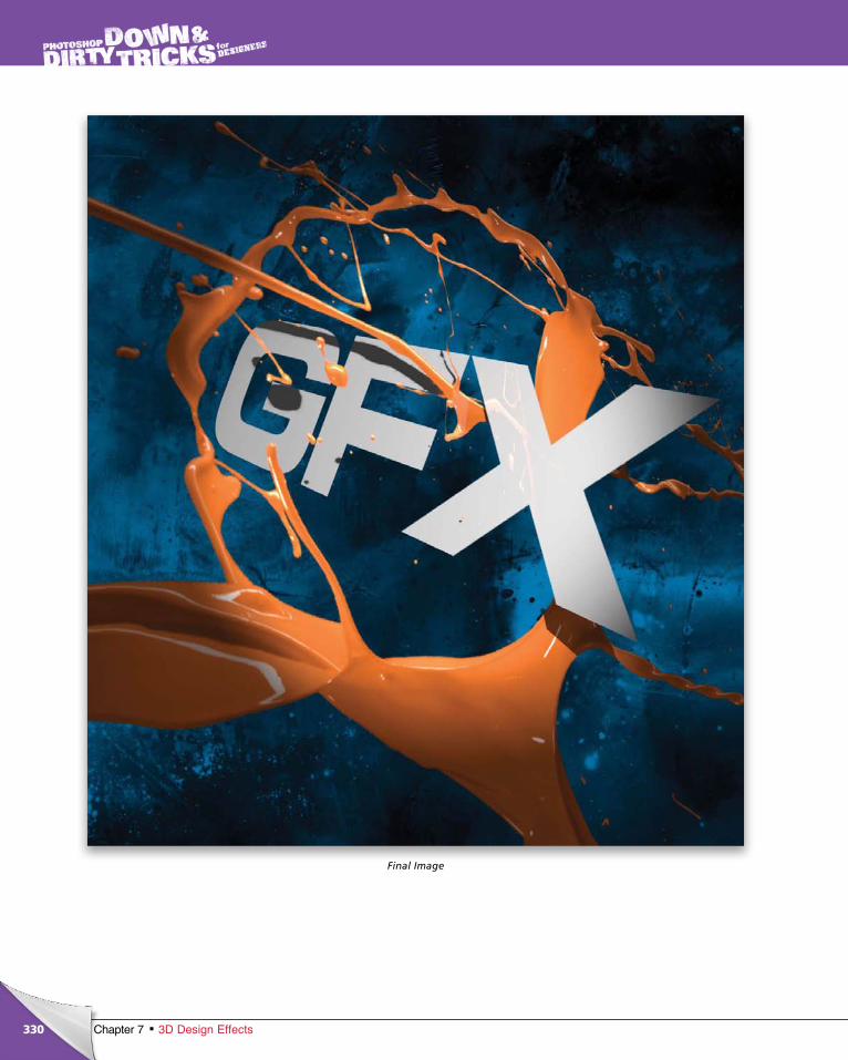
ptg6970545
330 Chapter 7 3D Design Effects
Final Image
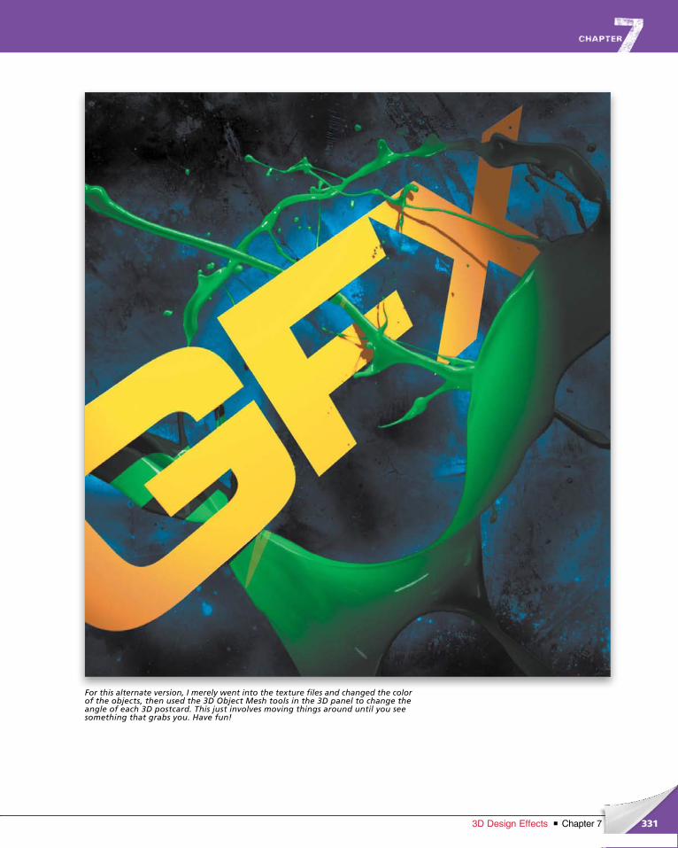
ptg6970545
331Chapter 73D Design Effects
For this alternate version, I merely went into the texture files and changed the color of the objects, then used the 3D Object Mesh tools in the 3D panel to change the angle of each 3D postcard. This just involves moving things around until you see something that grabs you. Have fun!
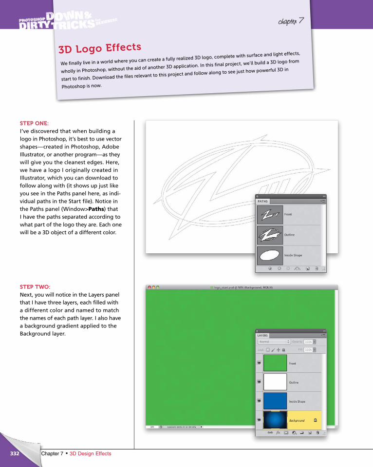
ptg6970545
332 Chapter 7 3D Design Effects
chapter 7
STEP ONE:I’ve discovered that when building a logo in Photoshop, it’s best to use vector shapes—created in Photoshop, Adobe Illustrator, or another program—as they will give you the cleanest edges. Here, we have a logo I originally created in Illustrator, which you can download to follow along with (it shows up just like you see in the Paths panel here, as indi-vidual paths in the Start file). Notice in the Paths panel (Window>Paths) that I have the paths separated according to what part of the logo they are. Each one will be a 3D object of a different color.
STEP TWO:Next, you will notice in the Layers panel that I have three layers, each filled with a different color and named to match the names of each path layer. I also have a background gradient applied to the Background layer.
We finally live in a world where you can create a fully realized 3D logo, complete with surface and light effects,
wholly in Photoshop, without the aid of another 3D application. In this final project, we’ll build a 3D logo from
start to finish. Download the files relevant to this project and follow along to see just how powerful 3D in
Photoshop is now.
3D Logo Effects
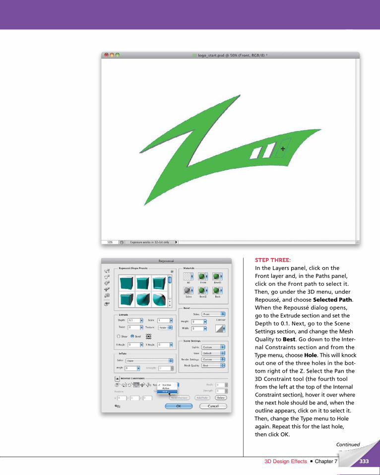
ptg6970545
333Chapter 73D Design Effects
Continued
STEP THREE:In the Layers panel, click on the Front layer and, in the Paths panel, click on the Front path to select it. Then, go under the 3D menu, under Repoussé, and choose Selected Path. When the Repoussé dialog opens, go to the Extrude section and set the Depth to 0.1. Next, go to the Scene Settings section, and change the Mesh Quality to Best. Go down to the Inter-nal Con straints section and from the Type menu, choose Hole. This will knock out one of the three holes in the bot-tom right of the Z. Select the Pan the 3D Constraint tool (the fourth tool from the left at the top of the Internal Constraint section), hover it over where the next hole should be and, when the outline appears, click on it to select it. Then, change the Type menu to Hole again. Repeat this for the last hole, then click OK.
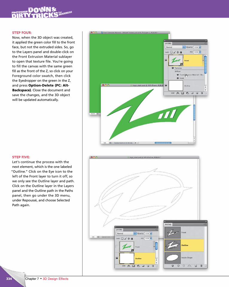
ptg6970545
334 Chapter 7 3D Design Effects
STEP FOUR:Now, when the 3D object was created, it applied the green color fill to the front face, but not the extruded sides. So, go to the Layers panel and double-click on the Front Extrusion Material sublayer to open that texture file. You’re going to fill the canvas with the same green fill as the front of the Z, so click on your Foreground color swatch, then click the Eyedropper on the green in the Z, and press Option-Delete (PC: Alt-Backspace). Close the document and save the changes, and the 3D object will be updated automatically.
STEP FIVE:Let’s continue the process with the next element, which is the one labeled
“Outline.” Click on the Eye icon to the left of the Front layer to turn it off, so we only see the Outline layer and path. Click on the Outline layer in the Layers panel and the Outline path in the Paths panel, then go under the 3D menu, under Repoussé, and choose Selected Path again.

ptg6970545
335Chapter 73D Design Effects
Continued
STEP SIX:This time, in the Extrude section, set the Depth to 0.07. Then, go to the Bevel section and set the Height and Width to 0.5, and again change the Mesh Quality setting to Best in the Scene Settings sec-tion. Just like we did before, go to the Internal Constraint section and change the Type pop-up menu to Hole. Then, click on each of the other four areas that need to be knocked out, and change the pop-up menu to Hole. Click OK. Now, here the extrusion material has a de-fault gray fill, which will be fine for the reflected effects we will add shortly. So, no need to go in and change it.
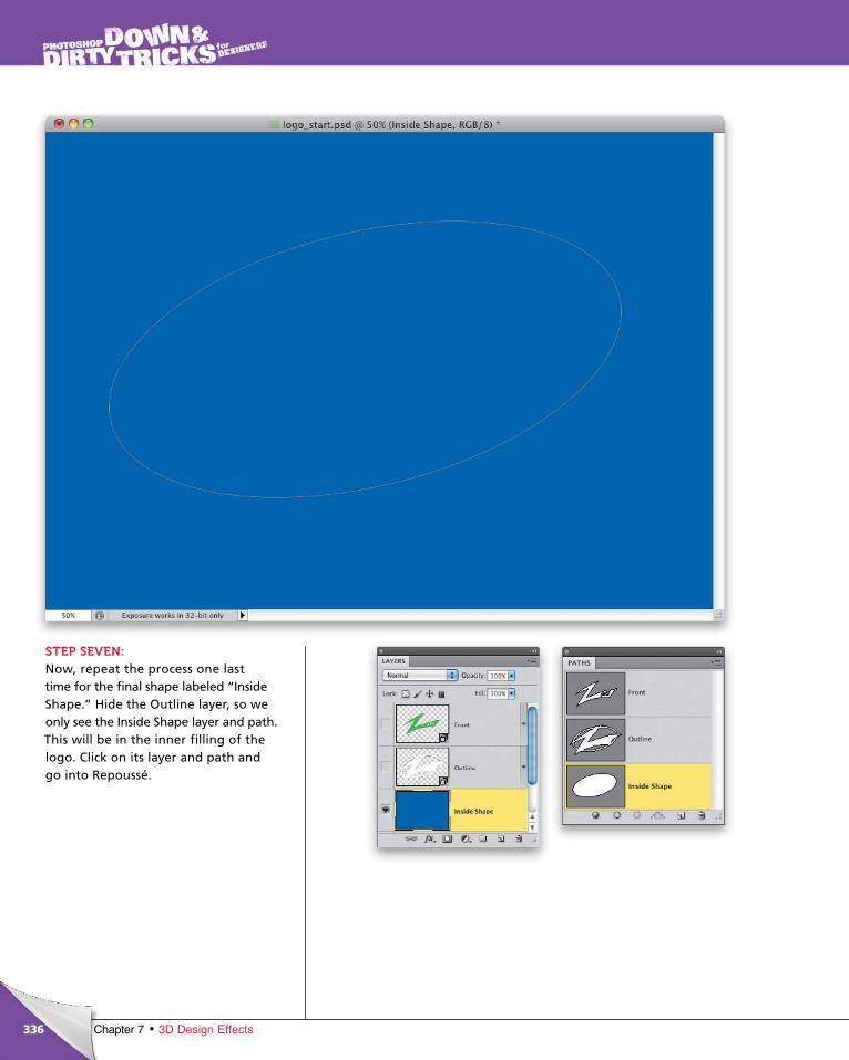
ptg6970545
336 Chapter 7 3D Design Effects
STEP SEVEN:Now, repeat the process one last time for the final shape labeled “Inside Shape.” Hide the Outline layer, so we only see the Inside Shape layer and path. This will be in the inner filling of the logo. Click on its layer and path and go into Repoussé.
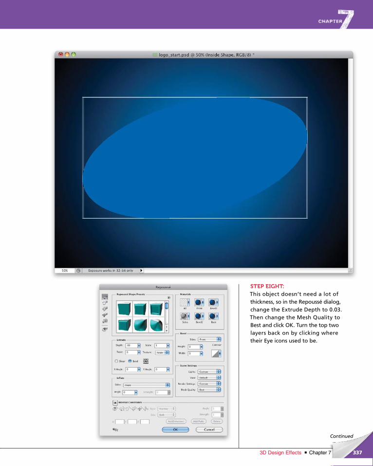
ptg6970545
337Chapter 73D Design Effects
Continued
STEP EIGHT:This object doesn’t need a lot of thickness, so in the Repoussé dialog, change the Extrude Depth to 0.03. Then change the Mesh Quality to Best and click OK. Turn the top two layers back on by clicking where their Eye icons used to be.
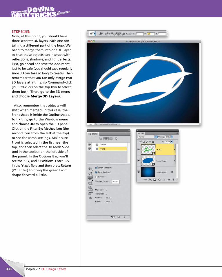
ptg6970545
338 Chapter 7 3D Design Effects
STEP NINE:Now, at this point, you should have three separate 3D layers, each one con-taining a different part of the logo. We need to merge them into one 3D layer so that these objects can interact with reflections, shadows, and light effects. First, go ahead and save the document, just to be safe (you should save regularly since 3D can take so long to create). Then, remember that you can only merge two 3D layers at a time, so Command-click (PC: Ctrl-click) on the top two to select them both. Then, go to the 3D menu and choose Merge 3D Layers.
Also, remember that objects will shift when merged. In this case, the Front shape is inside the Outline shape. To fix this, go to the Window menu and choose 3D to open the 3D panel. Click on the Filter By: Meshes icon (the second icon from the left at the top) to see the Mesh settings. Make sure Front is selected in the list near the top, and then select the 3D Mesh Slide tool in the toolbar on the left side of the panel. In the Options Bar, you’ll see the X, Y, and Z Positions. Enter –25 in the Y-axis field and then press Return (PC: Enter) to bring the green Front shape forward a little.
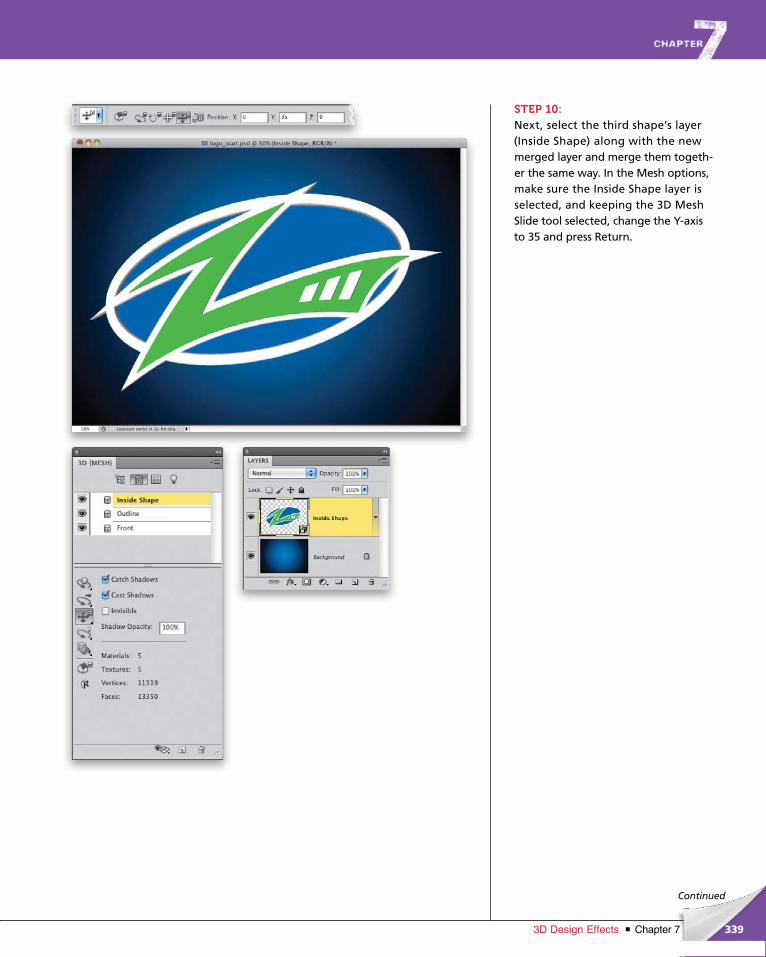
ptg6970545
339Chapter 73D Design Effects
Continued
STEP 10:Next, select the third shape’s layer (Inside Shape) along with the new merged layer and merge them togeth-er the same way. In the Mesh options, make sure the Inside Shape layer is selected, and keeping the 3D Mesh Slide tool selected, change the Y-axis to 35 and press Return.
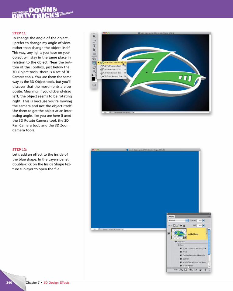
ptg6970545
340 Chapter 7 3D Design Effects
STEP 11:To change the angle of the object, I prefer to change my angle of view, rather than change the object itself. This way, any lights you have on your object will stay in the same place in relation to the object. Near the bot-tom of the Toolbox, just below the 3D Object tools, there is a set of 3D Camera tools. You use them the same way as the 3D Object tools, but you’ll discover that the movements are op-posite. Meaning, if you click-and-drag left, the object seems to be rotating right. This is because you’re moving the camera and not the object itself. Use them to get the object at an inter-esting angle, like you see here (I used the 3D Rotate Camera tool, the 3D Pan Camera tool, and the 3D Zoom Camera tool).
STEP 12:Let’s add an effect to the inside of the blue shape. In the Layers panel, double-click on the Inside Shape tex-ture sublayer to open the file.
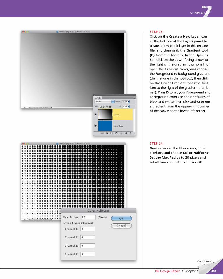
ptg6970545
341Chapter 73D Design Effects
Continued
STEP 13:Click on the Create a New Layer icon at the bottom of the Layers panel to create a new blank layer in this texture file, and then grab the Gradient tool (G) from the Toolbox. In the Options Bar, click on the down-facing arrow to the right of the gradient thumbnail to open the Gradient Picker, and choose the Foreground to Background gradient (the first one in the top row), then click on the Linear Gradient icon (the first icon to the right of the gradient thumb-nail). Press D to set your Fore ground and Background colors to their defaults of black and white, then click-and-drag out a gradient from the upper-right corner of the canvas to the lower-left corner.
STEP 14:Now, go under the Filter menu, under Pixelate, and choose Color Halftone. Set the Max Radius to 20 pixels and set all four channels to 0. Click OK.
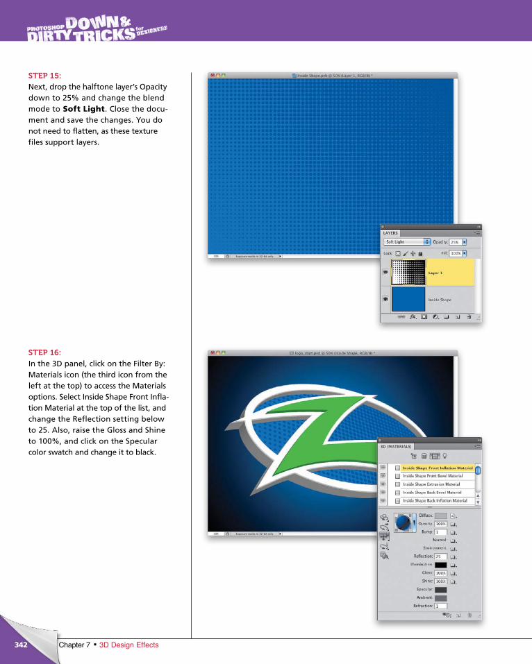
ptg6970545
342 Chapter 7 3D Design Effects
STEP 15:Next, drop the halftone layer’s Opacity down to 25% and change the blend mode to Soft Light. Close the docu-ment and save the changes. You do not need to flatten, as these texture files support layers.
STEP 16:In the 3D panel, click on the Filter By: Materials icon (the third icon from the left at the top) to access the Materials options. Select Inside Shape Front Infla-tion Material at the top of the list, and change the Reflection setting below to 25. Also, raise the Gloss and Shine to 100%, and click on the Specular color swatch and change it to black.
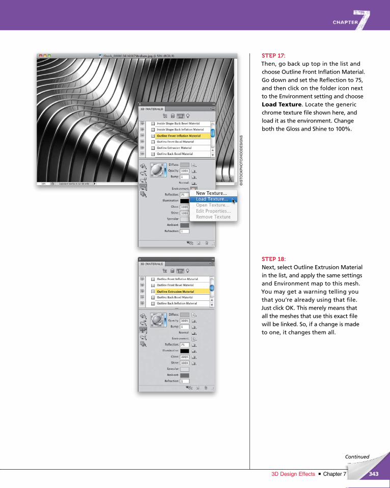
ptg6970545
343Chapter 73D Design Effects
Continued
STEP 17:Then, go back up top in the list and choose Outline Front Inflation Material. Go down and set the Reflection to 75, and then click on the folder icon next to the Environment setting and choose Load Texture. Locate the generic chrome texture file shown here, and load it as the environment. Change both the Gloss and Shine to 100%.
STEP 18:Next, select Outline Extrusion Material in the list, and apply the same settings and Environment map to this mesh. You may get a warning telling you that you’re already using that file. Just click OK. This merely means that all the meshes that use this exact file will be linked. So, if a change is made to one, it changes them all.
©IS
TO
CK
PH
OT
O/H
OO
DE
SIG
NS
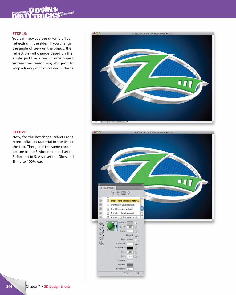
ptg6970545
344 Chapter 7 3D Design Effects
STEP 19:You can now see the chrome effect reflecting in the sides. If you change the angle of view on the object, the reflection will change based on the angle, just like a real chrome object. Yet another reason why it’s good to keep a library of textures and surfaces.
STEP 20:Now, for the last shape: select Front Front Inflation Material in the list at the top. Then, add the same chrome texture to the Environment and set the Reflection to 5. Also, set the Gloss and Shine to 100% each.
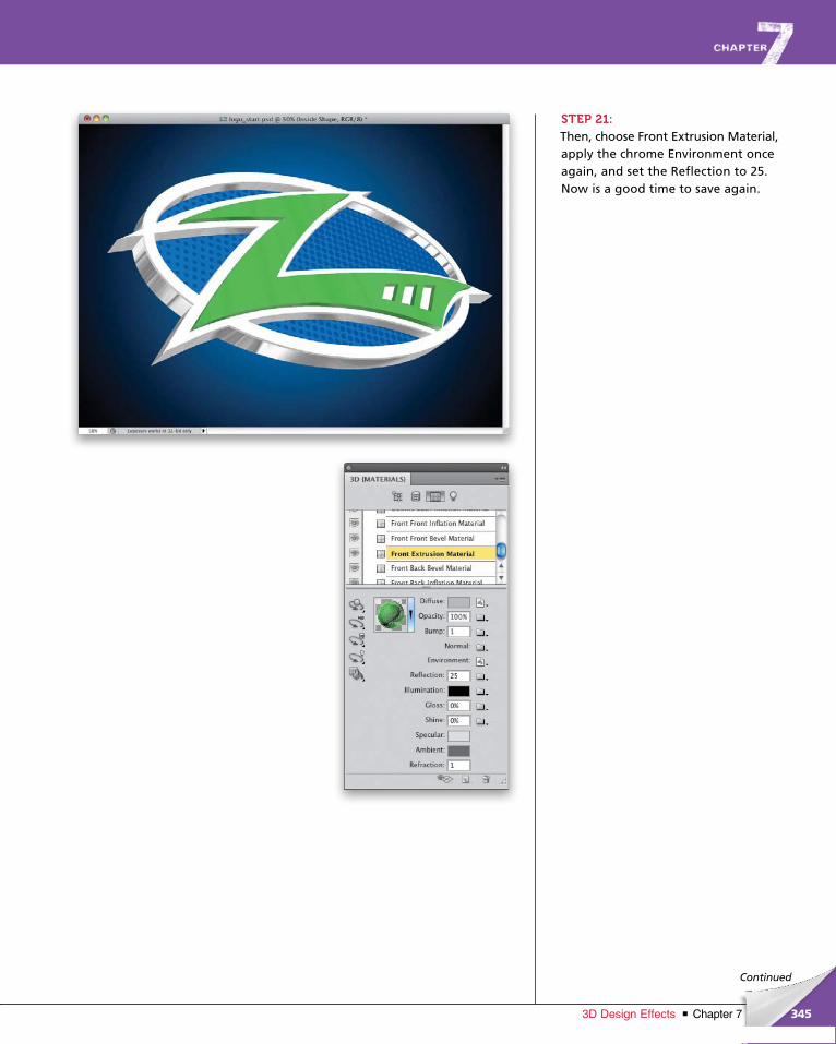
ptg6970545
345Chapter 73D Design Effects
Continued
STEP 21:Then, choose Front Extrusion Material, apply the chrome Environment once again, and set the Reflection to 25. Now is a good time to save again.
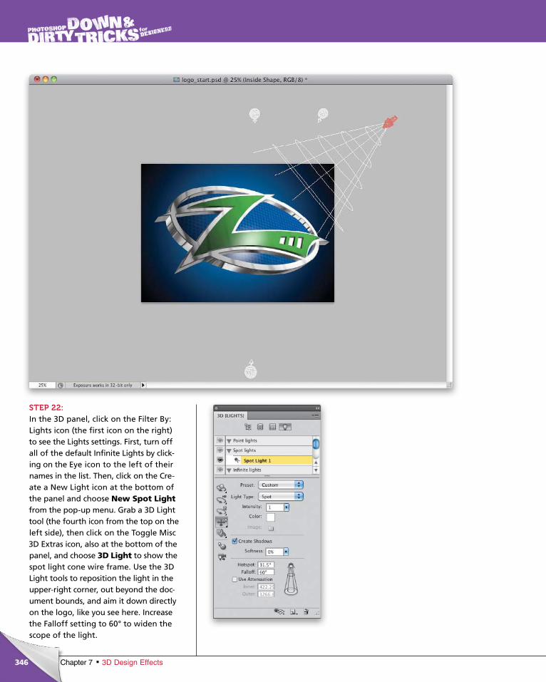
ptg6970545
346 Chapter 7 3D Design Effects
STEP 22:In the 3D panel, click on the Filter By: Lights icon (the first icon on the right) to see the Lights settings. First, turn off all of the default Infinite Lights by click-ing on the Eye icon to the left of their names in the list. Then, click on the Cre-ate a New Light icon at the bottom of the panel and choose New Spot Light from the pop-up menu. Grab a 3D Light tool (the fourth icon from the top on the left side), then click on the Toggle Misc 3D Extras icon, also at the bottom of the panel, and choose 3D Light to show the spot light cone wire frame. Use the 3D Light tools to reposition the light in the upper-right corner, out beyond the doc-ument bounds, and aim it down directly on the logo, like you see here. Increase the Fall off setting to 60° to widen the scope of the light.
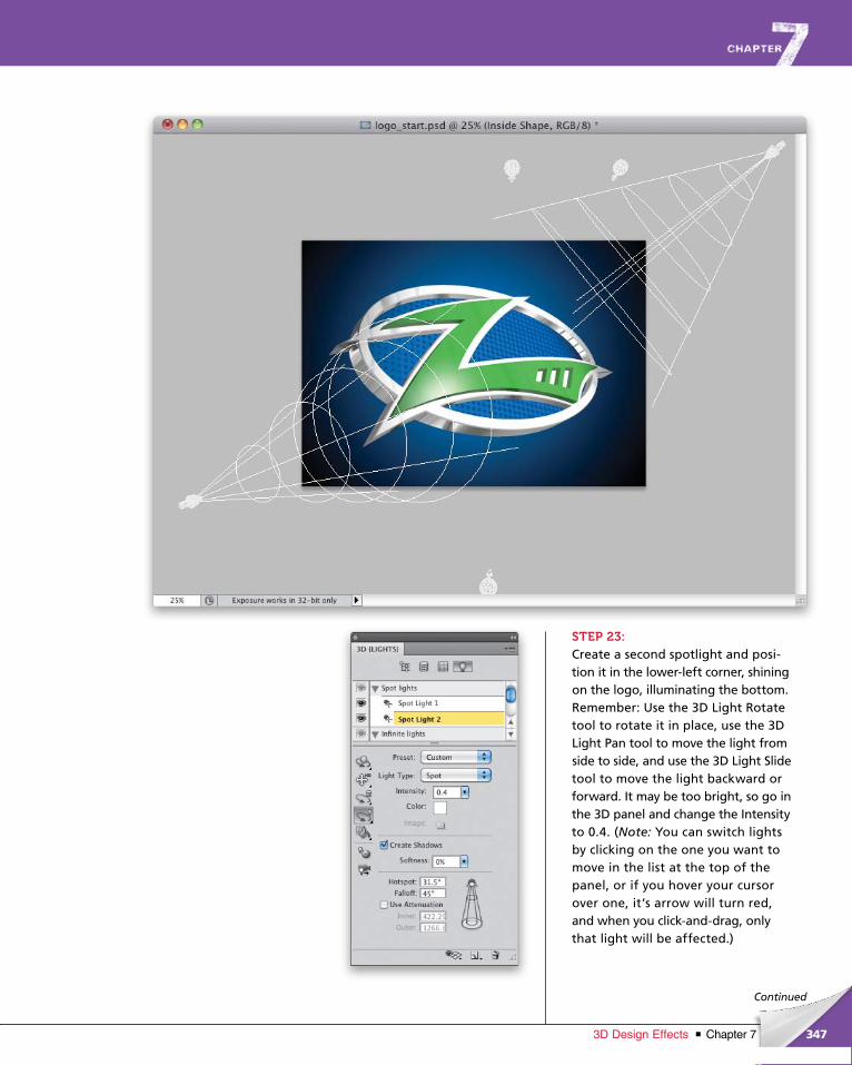
ptg6970545
347Chapter 73D Design Effects
Continued
STEP 23:Create a second spotlight and posi-tion it in the lower-left corner, shining on the logo, illuminating the bottom. Remember: Use the 3D Light Rotate tool to rotate it in place, use the 3D Light Pan tool to move the light from side to side, and use the 3D Light Slide tool to move the light backward or forward. It may be too bright, so go in the 3D panel and change the Inten sity to 0.4. (Note: You can switch lights by clicking on the one you want to move in the list at the top of the panel, or if you hover your cursor over one, it’s arrow will turn red, and when you click-and-drag, only that light will be affected.)
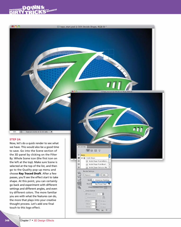
ptg6970545
348 Chapter 7 3D Design Effects
STEP 24:Now, let’s do a quick render to see what we have. This would also be a good time to save. Go into the Scene section of the 3D panel by clicking on the Filter By: Whole Scene icon (the first icon on the left at the top). Make sure Scene is selected at the top of the list, and then go to the Quality pop-up menu and choose Ray Traced Draft. After a few passes, you’ll see the effect start to take shape. At this point, you can certainly go back and experiment with different settings and different angles, and even try different colors. The more familiar you are with what the features can do, the more that plays into your creative thought process. Let’s add one final touch to this logo effect.
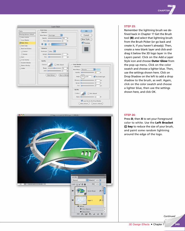
ptg6970545
349Chapter 73D Design Effects
Continued
STEP 25:Remember the lightning brush we de-fined back in Chapter 1? Get the Brush tool (B) and select that lightning brush from the Brush Picker (or go back and create it, if you haven’t already). Then, create a new blank layer and click-and-drag it below the 3D logo layer in the Layers panel. Click on the Add a Layer Style icon and choose Outer Glow from the pop-up menu. Click on the color swatch and choose a lighter blue. Then, use the settings shown here. Click on Drop Shadow on the left to add a drop shadow to the brush, as well. Again, click on the color swatch and choose a lighter blue, then use the settings shown here, and click OK.
STEP 26:Press D, then X to set your Foreground color to white. Use the Left Bracket ([) key to reduce the size of your brush, and paint some random lightning around the edge of the logo.
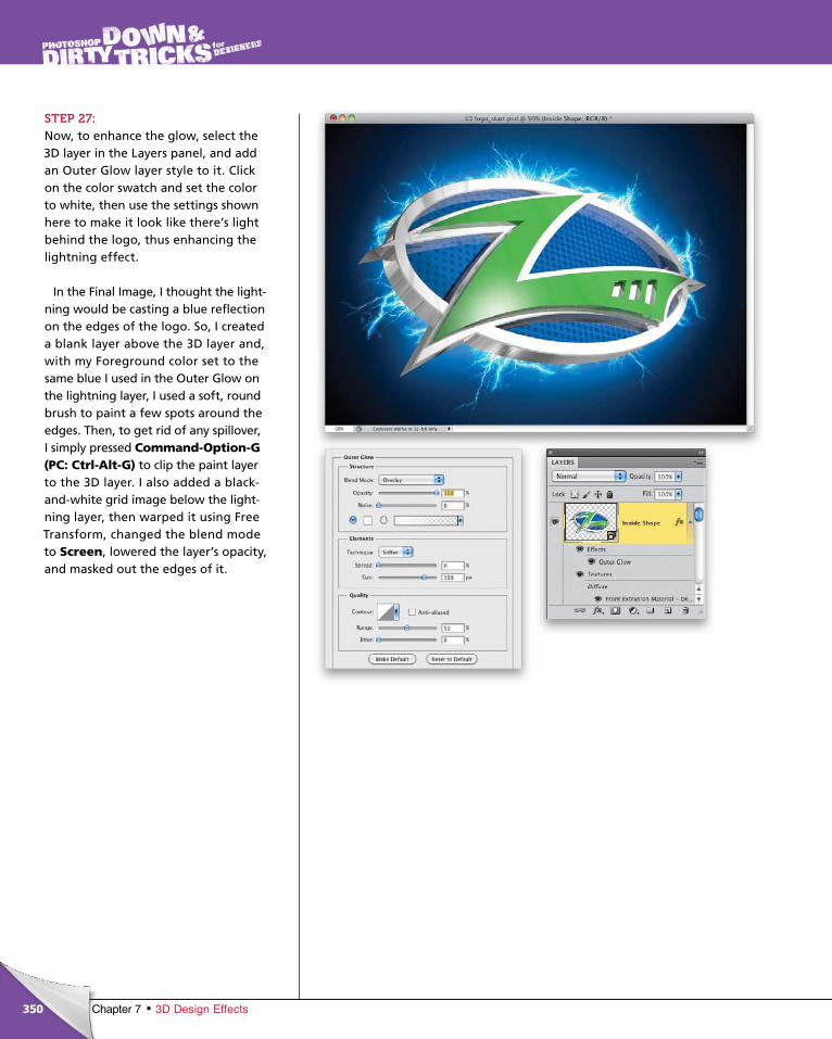
ptg6970545
350 Chapter 7 3D Design Effects
STEP 27:Now, to enhance the glow, select the 3D layer in the Layers panel, and add an Outer Glow layer style to it. Click on the color swatch and set the color to white, then use the settings shown here to make it look like there’s light behind the logo, thus enhancing the lightning effect.
In the Final Image, I thought the light-ning would be casting a blue reflection on the edges of the logo. So, I created a blank layer above the 3D layer and, with my Foreground color set to the same blue I used in the Outer Glow on the lightning layer, I used a soft, round brush to paint a few spots around the edges. Then, to get rid of any spillover, I simply pressed Com mand-Option-G (PC: Ctrl-Alt-G) to clip the paint layer to the 3D layer. I also added a black-and-white grid image below the light-ning layer, then warped it using Free Transform, changed the blend mode to Screen, lowered the layer’s opacity, and masked out the edges of it.
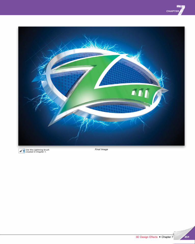
ptg6970545
351Chapter 73D Design Effects
Use the Lightning brush created in Chapter 1.
Final Image
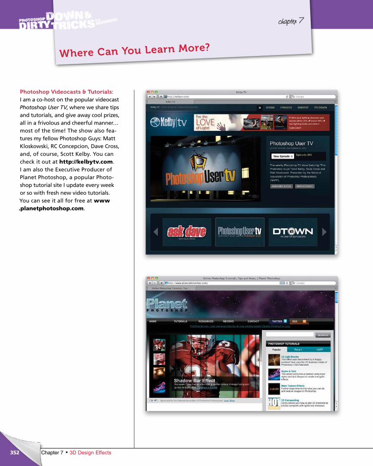
ptg6970545
352 Chapter 7 3D Design Effects
chapter 7
Where Can You Learn More?
Photoshop Videocasts & Tutorials:I am a co-host on the popular video cast Photoshop User TV, where we share tips and tutorials, and give away cool prizes, all in a frivolous and cheer ful manner…most of the time! The show also fea-tures my fellow Photo shop Guys: Matt Kloskowski, RC Concepcion, Dave Cross, and, of course, Scott Kelby. You can check it out at http://kelbytv.com. I am also the Executive Producer of Planet Photoshop, a popular Photo-shop tutorial site I update every week or so with fresh new video tutorials. You can see it all for free at www .planetphotoshop.com.
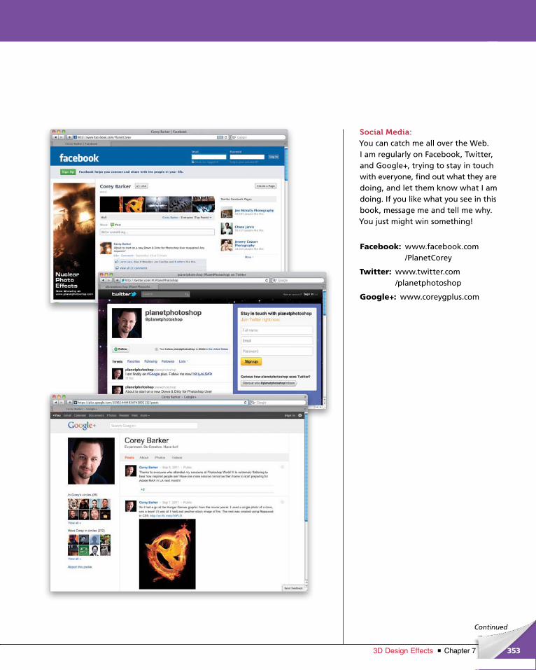
ptg6970545
353Chapter 73D Design Effects
Social Media:You can catch me all over the Web. I am regularly on Facebook, Twitter, and Google+, trying to stay in touch with everyone, find out what they are doing, and let them know what I am doing. If you like what you see in this book, message me and tell me why. You just might win something!
Facebook: www.facebook.com /PlanetCorey
Twitter: www.twitter.com /planetphotoshop
Google+: www.coreygplus.com
Continued
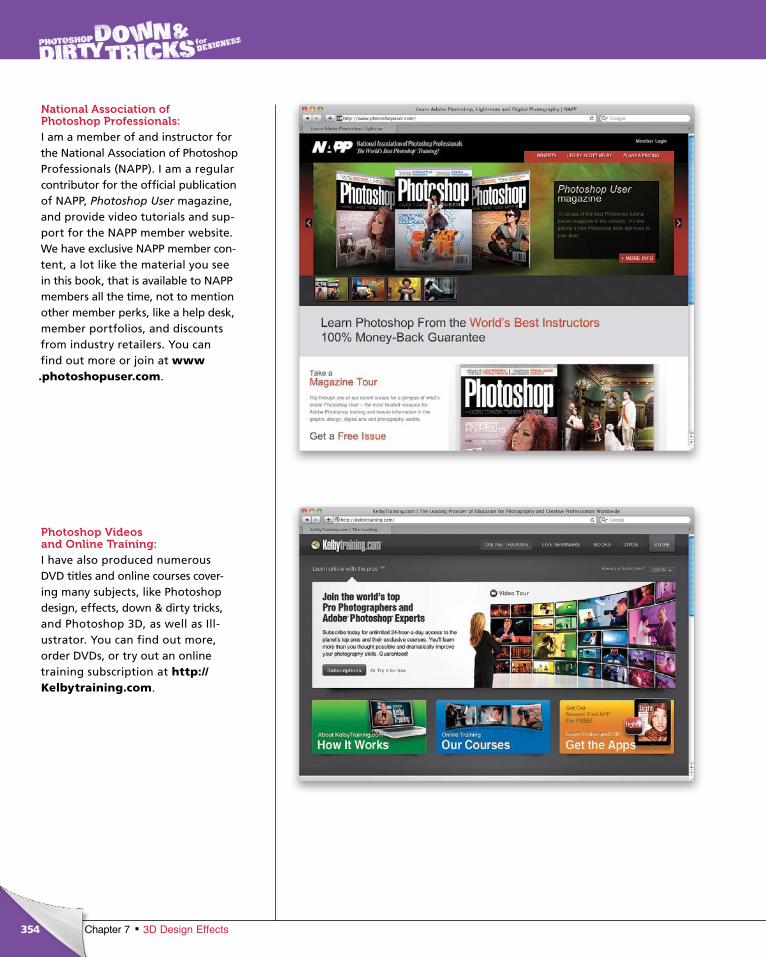
ptg6970545
354 Chapter 7 3D Design Effects
National Association of Photoshop Professionals: I am a member of and instructor for the National Association of Photoshop Professionals (NAPP). I am a regular contributor for the official publication of NAPP, Photoshop User magazine, and provide video tutorials and sup-port for the NAPP member website. We have exclusive NAPP member con-tent, a lot like the material you see in this book, that is available to NAPP members all the time, not to mention other member perks, like a help desk, member portfolios, and discounts from industry retailers. You can find out more or join at www .photoshopuser.com.
Photoshop Videos and Online Training: I have also produced numerous DVD titles and online courses cover-ing many subjects, like Photoshop design, effects, down & dirty tricks, and Photoshop 3D, as well as Ill-ustra tor. You can find out more, order DVDs, or try out an online training subscription at http://Kelby training.com.

ptg6970545
355Chapter 73D Design Effects
Photoshop World: This has become what I have dubbed the Super Bowl of Photoshop events. I have been a fan of the Photoshop World Conference & Expo for years. It is truly a designer’s and photog-rapher’s dream event. I get to teach alongside some of the biggest names in photography and Photoshop design for three days of geeking out! You’ve just got to love your Photoshop job, when there is a full conference dedi-cated to it. It is held twice a year, with new instructors and events happening every year. It is not to be missed! Find out about the next one, and read blog entries about the last one, at http://photoshopworld.com.
ptg6970545
356 Index
Index
3D design effects, 305–3513D logo effects, 332–3513D postcard effects, 319–3313D text effects, 306–318
3D layerscreating, 341merging, 312, 325, 338
3D menu, 306, 333, 3343D panel, 306
Camera tools, 314, 318Lights options, 314–315, 317, 326–327, 346–347Materials options, 306, 309, 316–317, 328, 342Mesh options, 312–313, 325, 338, 339Object tools, 318Repoussé feature, 307Scene options, 315, 329, 348
3D rendering, 315, 317, 329, 3483D tools
3D Camera tools, 314, 318, 3403D Light Pan tool, 315, 327, 3473D Light Rotate tool, 315, 327, 3473D Light Slide tool, 315, 327, 3473D Mesh Rotate tool, 312, 3253D Mesh Scale tool, 3133D Mesh Slide tool, 312, 338, 3393D Object tools, 318video tutorial, 305
50% Gray fill, 11, 89, 197, 230, 273, 324
AAbrams, J. J., 7active selections, 45Add a Layer Style icon, 10, 16, 31Add Layer Mask icon, 23, 116Add Noise filter, 299adjustment layers
Gradient Map, 152, 155, 208Hue/Saturation, 47, 66, 78, 108, 115, 217, 267, 322Levels, 36, 259, 311
Adjustments panelColorize checkbox, 47, 115, 159, 210, 254, 322Hue/Saturation adjustments, 47, 66, 78, 108, 115, 217,
267, 322Levels adjustments, 36, 216, 259, 311
advertisementscool watch ad, 164–180wood frame surf ad, 181–192See also commercial effects
Alpha channel, 120, 121, 190, 220, 223Ambient color swatch, 316, 317, 328Angle Jitter setting, 30, 38, 265Angle settings
3D object, 340Bevel and Emboss, 10, 74, 128Brush tool, 24Drop Shadow, 92Gradient Overlay, 53, 90, 198Inner Shadow, 251Motion Blur, 9, 12, 300
Animation panel, 238, 254, 258anti-aliasing noise, 322aspect ratio, 45Assorted Brushes preset, 7Average Blur filter, 64, 69
BBackground color
default setting for, 8, 12, 37swapping with Foreground color, 15, 94
Background Contents pop-up menu, 146Background layers
3D layers and, 312duplicating, 208, 225filling, 8, 44, 154, 280turning off, 79, 140, 272
backgroundsblack, 16, 165, 166, 272, 319changing color of, 66gradients applied to, 95, 115white, 76, 119, 172, 186, 219
Bevel and Emboss layer stylebrush effects and, 10, 31commercial effects and, 198design effects and, 101, 128, 131, 139type effects and, 74, 81
Bevel settings, Repoussé dialog, 308, 335binary code effect, 272–278Black, White gradient, 53, 81, 90, 198black backgrounds, 16, 165, 166, 272, 319Black Fill option, 220, 244, 280, 320black layer masks, 23, 211, 295
ptg6970545
357Index 357
black-and-white conversions, 289, 294Blend If options, 284blend modes
Color, 184Color Burn, 187Color Dodge, 135, 199Difference, 52Dissolve, 107, 224Divide, 209Hard Light, 48, 78, 137, 158, 217, 250Lighten, 253Linear Burn, 71, 121, 211Linear Dodge, 174Multiply, 78, 83, 134, 158, 172, 210, 280Normal, 15, 46, 54, 283Overlay, 13, 32, 44, 67, 90, 173, 194, 227, 268, 320Screen, 14, 130, 166, 169, 215, 255, 317Soft Light, 23, 67, 84, 99, 151, 176, 221, 320Vivid Light, 251, 275, 284
Blending Options dialog, 23blood splat effect, 301blur effects
Average Blur, 64, 69Gaussian Blur, 167, 170, 172, 178, 209Motion Blur, 9, 12, 300Surface Blur, 225
bokeh brush, 2–6border effects, 243–247Both Axes checkbox, 3, 25, 38, 266brush effects, 1–41
bokeh brush, 2–6custom brush, 19–27Hollywood-style flare brush, 7–18similarities in nature, 28–33virtual paintball, 34–41
Brush panel, 2–5, 24–25, 30, 38, 230Brush picker, 2, 24, 30Brush tool
darkening image areas with, 222saving brush presets for, 5, 17, 19, 29, 35setting options for, 2–4, 24–25, 30, 38
brushesbokeh, 2–6custom, 19–27flare, 7–18, 47–49, 203, 287lightning, 28–29, 349resizing, 32, 49, 280, 349saving, 5, 17, 19, 29, 35
setting options for, 2–3, 24–25, 38–39, 265–266splat, 34–41, 301swirly graphic, 56text, 58–62
bubble effect, 173Bulge option, 108
CCamera tools, 314, 318, 340channels
Alpha channel, 120, 121, 190, 220, 223creating new, 188duplicating, 28, 319Free Transform mode, 223Load Selection option, 121, 190, 223, 321Red channel, 28, 319RGB channel, 51, 100, 173, 219, 321
Channels panel, 28, 51, 100, 173, 188, 219, 227, 319Character panel, 80, 124chrome texture, 343–344Clear Guides option, 293clipping masks, 54, 99, 108Close document command, 202Clouds filter, 166color
3D bevel, 310background, 8, 12, 37converting to B&W, 289, 294desaturating, 67, 122, 187foreground, 8, 12, 37grid line, 146painting with, 4removing from images, 34, 150, 174, 215, 258sampling, 21, 170, 334shape, 72text, 47texture, 160, 168
Color blend mode, 184Color Burn blend mode, 187Color Dodge blend mode, 135, 199Color Dynamics setting, 39Color Halftone filter, 341Color Overlay layer style
commercial effects and, 184, 186design effects and, 90Hollywood effects and, 283
Color Picker, 53, 130, 175, 184, 236, 298
ptg6970545
358 Index
Colorize checkbox3D effects and, 322commercial effects and, 159, 160, 168, 191design effects and, 115, 121, 125Hollywood effects and, 254, 267, 273, 281, 297photo effects and, 210, 217type effects and, 47, 66, 78
commercial effects, 145–204cool watch ad, 164–180design with grid elements, 146–153halftone image effect, 154–163video game cover design, 193–204wood frame surf ad, 181–192
composite imagesgritty texture composite, 214–218silhouettes in, 119–126text added to, 124, 125themed composite, 233–242
Concepcion, RC, 352Content-Aware Fill option, 292Contour Editor, 129contrast adjustments, 67, 151, 158, 189, 194Contrast slider, Refine Edge dialog, 243conversions
color to B&W, 289, 294layer to Smart Object, 22, 99, 140, 156path to shape, 246
copyingimages, 69, 91, 154, 193selections, 20, 234, 252video frames, 239, 254, 258See also duplicating
cracked effect, 31Create a New Layer icon, 8, 21, 31, 37Create a New Light icon, 346Create New Adjustment Layer icon, 36, 55, 108Create New Channel icon, 28, 120Crop tool, 132, 217, 293Cross, Dave, 352custom brush effects, 19–27Custom Shape tool, 71
Ddafont.com website, ixdamaged building effect, 260–271dancer image, 95, 98, 102–108
darkeningcolor cast, 121image areas, 216, 220–222, 238shadows, 151
Decontaminate Colors checkbox, 63Define Brush Preset command, 17, 19, 29, 35, 58Define Custom Shape command, 246Define Pattern command, 88, 196, 272Defringe command, 186, 322deleting
image areas, 45, 280layer styles, 67, 131See also removing
Desaturate command, 34, 122, 132, 150, 258Deselect command, 12, 32, 37design effects, 87–142
advanced logo effects, 127–142compositing with silhouettes, 119–126layer style effects, 88–93step-and-repeat effects, 110–118water splash elements, 94–109
Difference blend mode, 52Diffuse Glow filter, 150, 222Direct Selection tool, 128, 134Displace filter, 105displacement map, 105, 133Dissolve blend mode, 107, 224Distort command, 263Divide blend mode, 209documents
closing, 202creating new, 7
Dot halftone pattern, 157Down & Dirty Designer’s Kit, ixDown Arrow key, 276dramatic light effect, 70–71dramatic photo special FX, 257–271drawing
lines, 260paths, 285
Drop Shadow layer style3D effects and, 349commercial effects and, 161, 185, 186, 191, 203design effects and, 92, 139Hollywood effects and, 277type effects and, 75, 77
Dry Media Brushes option, 265
ptg6970545
359Index
duplicatingBackground layer, 208, 225channels, 28images, 96, 105, 132, 233, 263layers, 9, 54, 67shapes, 75Smart Objects, 250See also copying
dust particles, 269–270DVD tutorials, 354
Eedges
refining for borders, 243–247removing fringe from, 186, 322
educational resources. See resourceseffects
3D design, 305–351brush, 1–41commercial, 145–204design, 87–142Hollywood, 249–302photo, 207–247type, 43–84
Ellipse tool, 111, 127Elliptical Marquee tool, 138, 170, 177experimentation, importance of, xiiiExtrude settings, 308, 333, 335, 337Eye icon, 64, 79, 116Eyedropper tool, 21, 170, 334
FFacebook resource, 353Falloff setting, 327, 346Fibers filter, 12file size for projects, xFill dialog
50% Gray option, 11, 89, 105, 197, 230, 273Black option, 220, 244, 280, 320Content-Aware option, 292White option, 52, 100, 220, 320
Fill Pixels icon, 259filling
layers, 8, 21, 89selections, 37, 45, 56, 100, 121text, 324
filtersAdd Noise, 299Average Blur, 64, 69Clouds, 166Color Halftone, 341Diffuse Glow, 150, 222Displace, 105Fibers, 12Gaussian Blur, 167, 170, 172, 178, 209Glass, 133Grain, 22, 230Halftone Pattern, 136, 157Motion Blur, 9, 12, 300Photocopy, 229Plastic Wrap, 167Polar Coordinates, 14, 68Poster Edges, 23, 157, 209Smart Sharpen, 216Surface Blur, 225
flare brush, 7–18, 47–49, 203, 287flattening layers, 105, 132, 282, 323Flip Horizontal command, 49, 73, 215, 258Flip Vertical command, 75, 295Flip X/Y Jitter checkboxes, 24, 30, 38flipping
images, 49, 73, 104, 258layers, 49shapes, 73, 75textures, 215
Flow Jitter setting, 4fonts
resource for free, ixswirly graphics and, 51See also text; type effects
Foreground colordefault setting for, 8, 12, 37swapping with Background color, 15, 94
Foreground to Background gradient, 70, 95, 341Foreground to Transparent gradient
brush effects and, 13, 15commercial effects and, 149, 165, 166, 189, 195design effects and, 107, 115, 123Hollywood effects and, 268, 274, 277, 295photo effects and, 211, 238type effects and, 65
frame borders, 243–244
ptg6970545
360 Index
Free Transformflipping images with, 49, 73, 75, 104, 295perspective adjustments with, 293positioning images with, 155, 173resizing images with, 64, 193rotating images with, 72, 181scaling images with, 15, 20, 54, 76, 128, 137, 257showing the handles in, 20, 64, 99, 172skewing text objects with, 201step-and-repeat feature, 112–114, 261–262stretching images with, 9, 48, 182warping images with, 108, 137
fx icon, 67, 103
GGaussian Blur filter, 167, 170, 172, 178, 209glare, enhancing, 10Glass filter, 133Gloss Contour
Contour Editor, 129Ring preset, 74, 131, 198
glow effectsDiffuse Glow, 150, 222Inner Glow, 134, 283Outer Glow, 16, 48, 67, 83, 107, 135, 177, 349, 350
Google+ resource, 353Gradient Editor, 81Gradient Map adjustment layer, 152, 155, 208Gradient Map dialog adjustments, 289, 294Gradient Overlay layer style
commercial effects and, 198design effects and, 90, 139Hollywood effects and, 287photo effects and, 237type effects and, 44, 46, 53, 81
Gradient Picker, 13, 95, 115, 341Gradient tool, 13, 65, 94, 149, 341gradients
Black, White, 53, 81, 90, 198Foreground to Background, 70, 95, 341Foreground to Transparent, 13, 65, 107, 149, 211, 268Linear, 13, 53, 123, 138Radial, 15, 57, 90, 139
Grain filter, 22, 230graphics
copying, 171flipping, 49, 73, 75, 104rotating, 72scaling, 15, 20, 52, 54, 64, 76
stretching, 9, 48, 182swirly, 51–57text with, 69–84See also images; shapes
gray fill option, 11, 89, 105, 197, 230, 273, 324grid elements in designs, 146–153, 350grid lines
adding selections to, 147–148creating/showing, 146–147sizing/resizing, 150turning off, 148See also guides
grid pattern effect, 275–277gritty texture composite, 214–218grunge effect, 96, 122, 294guides
clearing, 293setting, 110, 290snapping to, 111, 290See also grid lines
Guides, Grid, & Slices preferences, 146
Hhair retouching, 226halftone image effect, 154–163Halftone Pattern filter, 136, 157Hard Light blend mode
commercial effects and, 158design effects and, 137, 139Hollywood effects and, 250photo effects and, 217, 237type effects and, 48, 78, 81
Hardness setting, Brush tool, 2HDR Toning feature
design effects and, 95–98Hollywood effects and, 279photo effects and, 233, 236
high-key effect, 219–224Highlight Mode, Bevel and Emboss, 10, 74, 101, 129high-tech effects, 272–278Hollywood effects, 249–302
dramatic photo effects, 257–271flare brush effects, 7–18high-tech effects, 272–278Hollywoodify effects, 279–288movie poster project, 289–302title effect, 44–50touch-up effects, 250–256
Hollywood title effect, 44–50
ptg6970545
361Index
Hollywood-style flare brush, 7–18horizontal flip, 49, 73, 215, 258horizontal ruler, 110horizontal streak effect, 9Horizontal Type tool
3D effects and, 307, 324commercial effects and, 161, 175, 195design effects and, 124type effects and, 44, 58, 80
Hue Jitter setting, 4, 39, 40Hue/Saturation adjustment layer
3D effects and, 322design effects and, 108, 115, 121, 125Hollywood effects and, 267, 273, 297photo effects and, 217type effects and, 47, 66, 78
Hue/Saturation dialogcommercial effects and, 159, 160, 168, 191Hollywood effects and, 254, 281photo effects and, 210
Iillustrated photo effect, 208–213images
B&W conversion of, 208compositing, 119–126, 214–218, 233–242copying, 69, 91, 154, 193distorting, 263duplicating, 96, 105, 132, 233, 263flattening, 105, 132, 282, 323flipping, 49, 73, 75, 104, 258inverting, 17, 29, 55, 215noise added to, 299positioning, 91, 99, 123, 149, 162, 172resizing, 64, 193rotating, 181scaling, 64stock, xii, 19, 51stylizing, 22–27texture, 217See also graphics
Inflate option, 137ink splats, 34Inner Bevel layer style, 101, 128Inner Glow layer style, 134, 283Inner Shadow layer style, 176, 251, 284, 287, 298Intensity setting for lights, 347inversing selections, 32, 37, 51, 76, 91
inverting images, 17, 29, 55, 215iStockphoto website, xii, 19, 51
KKelby, Scott, viii, 352kelbytraining.com website, ix, 354kelbytv.com website, 352Kloskowski, Matt, 352
LLasso tool, 34, 63, 171layer masks, 23, 116, 138, 149, 211, 291Layer Style dialog, 10, 284layer style effects, 88–93layer styles
Bevel and Emboss, 10, 31, 74, 81, 101, 128, 198Color Overlay, 90, 184, 186, 283Drop Shadow, 75, 92, 139, 161, 185, 277, 349Gradient Overlay, 44, 46, 53, 81, 90, 139, 237Inner Glow, 134, 283Inner Shadow, 176, 251, 284, 287, 298Outer Glow, 16, 48, 67, 83, 107, 135, 177, 349, 350Pattern Overlay, 82, 89, 197, 199, 273, 276Satin, 74, 130, 135, 199Stroke, 53, 82, 150, 200
layers3D, 312, 323, 325clipping, 99, 108converting to Smart Objects, 22, 99, 140, 156creating new, 8, 21duplicating, 9, 54, 67filling, 8, 21, 89flattening, 105, 132, 282, 323flipping, 49merging, 16, 56, 79opacity of, 70, 158, 169, 270path, 332resizing, 201, 203, 235shape, 72, 116text, 44, 51unlocking, 275
Layers panelcreating layers in, 8, 21layer masks added in, 23, 116layer styles added in, 10merging layers in, 16, 56, 79
ptg6970545
362 Index
Left Bracket Key ([), 32, 49, 280, 349Levels adjustment layer, 36, 216, 259, 311Levels dialog adjustments
brush effects and, 17, 29, 35commercial effects and, 169, 189design effects and, 98Hollywood effects and, 253, 255, 264, 298, 300
Lighten blend mode, 253lighting effects
3D object, 314–315, 317, 326–327, 346–347dramatic light effect, 70–71warm light effect, 251
lightning brush, 28–29, 348Line halftone pattern, 136Line tool, 259Linear Burn blend mode, 71, 121, 211Linear Dodge blend mode, 174Linear gradients, 13, 53, 123, 138Load Selection command, 121, 190, 223, 321Load Texture command, 133, 343logos
3D effects for, 332–351advanced design effects for, 127–142
MMagic Wand tool, 36, 76, 91, 151, 257Make Work Path option, 246masks
clipping, 54, 99, 108layer, 23, 116, 138, 149, 211, 291quick, 178
Material Picker, 306, 309Materials options, 3D panel, 306, 309, 316–317, 328, 342merging
3D layers, 312, 325, 338layers, 16, 56, 79
Mesh options3D panel, 312–313, 325, 338, 339Repoussé dialog, 333, 335, 337
mirror effect, 291Motion Blur filter, 9, 12, 300Move tool
center aligning text with, 80dragging-and-dropping graphics with, 52, 77, 324positioning images with, 91, 123, 149, 162, 172, 194
movie poster project, 289–302
Multiply blend modecommercial effects and, 158, 172design effects and, 134Hollywood effects and, 280, 287, 295, 297photo effects and, 210, 229, 230, 231type effects and, 78, 83
Nnaming patterns, 88, 196, 272National Association of Photoshop Professionals (NAPP),
354nature, similarities in, 28–33neutral gray fill option, 11, 89, 105, 197, 230, 273New document dialog, 7New Layer with Layer Mask option, 63New Material option, 306New Smart Object Via Copy command, 202New Tool Preset command, 5, 62noise
adding to images, 299cleaning up, 322
Normal blend mode, 15, 46
OObject tools, 318, 340online training, 354opacity
drop shadow, 141layer, 70, 158, 169, 270text, 48
Opacity Jitter setting, 4, 25, 39, 230Opasinski, Tomasz, 257Ornament shapes, 71Outer Glow layer style
3D effects and, 349, 350brush effects and, 16commercial effects and, 177design effects and, 107, 135, 141type effects and, 48, 67, 83
Output To pop-up menu, 63, 98, 243, 245Overlay blend mode
3D effects and, 320brush effects and, 13, 32commercial effects and, 173, 189, 194, 198design effects and, 90, 107, 116, 133Hollywood effects and, 268, 273, 276, 282, 283photo effects and, 227, 231, 235type effects and, 44, 67
ptg6970545
363Index
Ppadlock icon, 275paint splash image, 319paint splat brush, 34–41, 301painting
with color, 4with words, 58–68
Pan the 3D Constraint tool, 333paper texture, 159, 231particle effect, 238–240, 269–270, 317Paste command, 20, 69, 91, 155, 172Patch tool, 292Path Selection tool, 73, 112, 113, 114paths
3D logo design, 332–333converting to shapes, 246drawing around image areas, 285loading as selections, 134, 285
Paths panel, 134, 246, 332, 333Pattern Overlay layer style
commercial effects and, 197, 199design effects and, 89Hollywood effects and, 273, 276type effects and, 82
Pattern Picker, 82, 89, 197, 273patterns
choosing, 82grid, 275–277naming, 88, 196, 272rotating, 136scaling, 137, 197seamless, 88step-and-repeat, 112–114See also textures
Pen Pressure setting, 230, 266Pen tool, 285Perspective adjustment, 293photo effects, 207–247
gritty texture composite, 214–218illustrated photo effect, 208–213refine edge border trick, 243–247stylish high-key effect, 219–224themed composite, 233–242vintage pinup-girl effect, 225–232
Photocopy filter, 229
photoscomposite, 119–126, 214–218, 233–242stock, xii, 19, 51stylized, 22–27texture, 217See also images
Photoshop CS5 Extended, xii, 305Photoshop resources, 352–355
NAPP membership, 354Photoshop World, 355social media, 353tutorials, 352, 354videocasts, 352See also Web resources
Photoshop User magazine, 354Photoshop User TV videocast, 352Photoshop World Conference & Expo, 355pinup-girl effect, 225–232Planet Photoshop website, 225, 352Plastic Wrap filter, 167Point Light option, 314Polar Coordinates filter, 14, 68Polygonal Lasso tool, 160positioning images
Free Transform for, 155, 173Move tool for, 91, 99, 123, 149, 162, 172, 195
postcard 3D design effects, 319–331Poster Edges filter, 23, 157, 209posters
Hollywood effects for, 279–288movie poster project, 289–302
presetsbrush, 5, 17, 19, 29, 35effect, 97tool, 5, 62, 66
pressure-sensitive tablets, xi, 230projects
file sizes for, xfonts used in, ix
QQuick Mask mode, 178Quick Selection tool, 20, 98, 186, 234, 280
ptg6970545
364 Index
RRadial gradients, 15, 57, 70, 90, 139Radius slider, Refine Edge dialog, 63, 243rain effect, 299–300Ray Traced Draft quality option, 315, 329, 348Rectangular Marquee tool
brush effects and, 11, 19commercial effects and, 147, 159, 175, 181, 188, 201design effects and, 124Hollywood effects and, 252, 260, 286, 291, 292photo effects and, 243, 245
Red channel, 28, 319refine edge border trick, 243–247Refine Edge dialog, 63, 243, 245Refine Radius tool, 63reflections
3D object, 317, 328, 342–345creating, 286fading, 166
removingcolor from images, 34, 150, 174, 215, 258, 270fringe from edges, 186, 322See also deleting
rendering 3D scenes, 315, 317, 329, 348Repoussé dialog, 307–310, 333, 335, 337resizing. See sizing/resizingresources, 352–355
NAPP membership, 354Photoshop World, 355social media, 353tutorials, 352videocasts, 352
RGB channel, 51, 55, 119, 173, 190, 219, 227Right Arrow key, 276rotating
3D objects, 312, 318, 325, 327, 347images, 72, 181, 223patterns, 136shapes, 72
Rounded Rectangle tool, 127Roundness setting, Brush tool, 8, 24, 47rulers, 110, 290
See also guides
Ssampling colors, 21, 170, 334Satin layer style, 74, 130, 135, 199Saturation adjustments, 97, 159, 160
savingbrush presets, 5, 17, 19effect presets, 97tool presets, 62, 66
scaling3D text, 313gradients, 15images, 20, 64, 223, 257layers, 201, 203, 235patterns, 137, 197shapes, 52, 54, 76See also sizing/resizing
Scatter setting, 3, 25, 38, 266Scene options, 3D panel, 315, 329, 348Screen blend mode
3D effects and, 317, 350brush effects and, 14commercial effects and, 166, 169design effects and, 130Hollywood effects and, 255, 270, 298, 300photo effects and, 215, 240
Select All command, 80, 193selections
active, 45copying, 20, 234, 252deselecting, 12filling, 37, 45, 56, 100, 121grid line, 147–148inversing, 32, 37, 51, 76, 91loading paths as, 134, 285outputting to, 98, 243, 245positioning, 276quick, 20, 98, 186, 234, 280square, 11transforming, 45
Shadow Mode, Bevel and Emboss, 10, 74, 101, 129shadows
bevel, 74drop, 75, 77, 92, 139, 161inner, 176, 251
Shape Dynamics settings, 2, 24, 30, 38, 265Shape Layers icon, 127Shape Picker, 71Shape tools, 259shapes
border, 244choosing, 71colors for, 72converting paths to, 246
ptg6970545
365Index
duplicating, 75flipping, 73, 75gradients in, 13layer styles for, 74rotating, 72scaling, 52, 54, 76, 128step-and-repeat for, 112–114stretching, 9, 48swirly, 51–57See also graphics
silhouettesadding to images, 171compositing with, 119–126creating from images, 119–121
similarities in nature, 28–33Single Column Marquee tool, 148Single Row Marquee tool, 124, 147Size Jitter setting, 2, 24, 30, 38, 265sizing/resizing
3D text, 313brushes, 32, 49, 280, 349frames, 244grid lines, 150images, 64, 193layers, 201, 203, 235text, 80, 201See also scaling
Skew option, 108, 201sky effects, 258smart filters, 158Smart Objects
converting layers to, 22, 99, 140, 156creating unlinked copies of, 202duplicating, 250
Smart Radius checkbox, 63, 243Smart Sharpen filter, 216smoke/fire effect, 281–282Smudge tool, 226Snap To option, 111, 290, 314social media resources, 353Soft Light blend mode
3D effects and, 320, 342brush effects and, 23commercial effects and, 151, 176design effects and, 99photo effects and, 221, 222, 228, 236type effects and, 67, 84
Spacing setting, Brush tool, 2, 24, 30, 60spark effect, 251–254Speckle Grain filter, 22Specular color swatch, 342splash effect, 94–109splat brush, 34–41, 301Spot Light option, 326, 346, 347spotlight effect, 316square selections, 11step-and-repeat effects, 110–118, 261–262stock images, xii, 19, 51stone textures, 31, 310Stroke layer style, 53, 82, 150, 200stylish high-key effect, 219–224Subtract from Shape Area icon, 127surf ad design, 181–192Surface Blur filter, 225Swatches panel, 324swirly graphics, 51–57
Ttext
3D effect, 306–318adding, 44, 51, 83brush presets, 58–62center aligning, 80colorizing, 47commercial design, 152, 161, 175–176, 179, 195,
197–203composite image, 124, 125design effect, 124, 139filling, 324flares added to, 47–49gradients in, 44graphics with, 69–84Hollywood title, 44–50layer styles added to, 81–83, 197–200movie poster, 301, 302Overlay blend mode, 32painting with, 58–68photo effect, 241sizing/resizing, 80, 201skewing, 201swirls added to, 51–57See also type effects
Texture Picker, 3
ptg6970545
366 Index
textures3D design, 310–311, 343–344brush, 3chrome, 343–344colorizing, 160, 168desaturating, 215flipping, 215frame border, 243–244grunge, 122loading, 133, 343naming, 88, 196paper, 159photos of, 217seamless, 88smoothing, 69–70stone, 31wood, 243, 245See also patterns
themed composite design, 233–242titles, Hollywood-style, 44–50Toggle Misc 3D Extras icon, 314, 326, 346touch-ups, Hollywood, 250–256Transfer setting, 4, 25, 39, 230, 266Transform Selection command, 45tutorials
3D tools video, 305Kelbytraining.com, 354Planet Photoshop, 352
Twitter resource, 353type effects, 43–84
Hollywood title effect, 44–50painting with words, 58–68swirly graphics, 51–57words & graphics, 69–84See also text
UUnderlying Layer slider, 284underwater image, 164–180Undo command, 65unlocking layers, 275
Vvector shapes, 332vertical flip, 75, 295vertical ruler, 110
video frame capturesof particles, 238–239of skies, 258of sparks, 254
video game cover design, 193–204video tutorials, ix
3D tools video, 305Planet Photoshop, 352
vintage pinup-girl effect, 225–232virtual paintball effect, 34–41Vivid Light blend mode, 251, 275, 284
WWacom pressure-sensitive tablets, xi, 230warm light effect, 251Warp command, 240, 253warping images
Bulge option for, 108Inflate option for, 137
watch ad design, 164–180water splash effect, 94–109Web resources
dafont.com, ixiStockphoto, com, xii, 19, 51kelbytraining.com, ix, 354kelbytv.com, 352Photoshop World, 355Planet Photoshop, 225, 352See also Photoshop resources
white backgrounds, 76, 119, 172, 186, 219White Fill option, 52, 100, 220, 320white layer masks, 138, 212, 277Whole Scene render option, 315, 348wood frame surf ad, 181–192wood texture effects, 243, 245words
painting with, 58–68See also text
ZZoom tool, 280, 292

ptg6970545
This page intentionally left blank

ptg6970545
$2495UNLIMITED 24/7 ACCESS
OR$199
PER YEAR A MONTH
Visit www.KelbyTraining.com to subscribe or for more info.
100% Money Back GuaranteeVisit KelbyTraining.com for details.100%
Learn Online with the ProsWorld Class Online Training forPhotographers & Photoshop Experts
At Kelbytraining.com you’re always on-location and in-studio! Become part of the action as we take you behind the
scenes of live photo shoots and show you exactly how the pros do it, step-by-step, from start to finish.
Join the world’s top pro photographers and Photoshop experts as they teach
you today’s most advanced techniques.
Adobe & Photoshop are registered trademarks of Adobe Systems Incorporated.
KT_BK_D&Ddes_OTWall_0911ƒ.indd 1 9/26/11 10:55 AM
ptg6970545
Yeah, It’s Kinda Like That!With over 40,000 photographers & Photoshop users attending our
events each year, it’s easy to see why Kelby Training LIVE produces the most popular seminar tours in the world. Coming soon to a city near you!
You’ll be amazed at how much you can learn in just one day. Guaranteed!
Adobe & Photoshop are registered trademarks of Adobe Systems Inc.
KT_BK_DDT4Design_SEMbrand_0911ƒ.indd 1 9/26/11 10:53 AM

ptg6970545
You love our books and you love to share them with your colleagues and friends...why not earn some $$ doing it!
If you have a website, blog or even a Facebook page, you can start earning money by putting a Peachpit link on your page.
If a visitor clicks on that link and purchases something on peachpit.com, you earn commissions* on all sales!
Every sale you bring to our site will earn you a commission. All you have to do is post an ad and we’ll take care of the rest.
ApplY And get stArted!It’s quick and easy to apply. To learn more go to: http://www.peachpit.com/affiliates/*Valid for all books, eBooks and video sales at www.Peachpit.com
Join the PeachPit AffiliAte teAm!