Embed Size (px)
Citation preview

FireArrow Photo Viewer
Installation and User Guide
Version 1.0.1

1
Notice
This document is a proprietary product of FireArrow and is protected by copyright laws and
international treaty. Information in this manual is subject to change without notice and does
not represent a commitment on the part of FireArrow. While reasonable efforts have been
made to ensure the accuracy of the information contained herein, FireArrow assumes no
liability for errors or omissions. No liability is assumed for direct, incidental, or consequential
damages resulting from the use of the information contained in this document.
The copyrighted software that accompanies this document is licensed to the End User for use
only in strict accordance with the End User License Agreement, which the Licensee should
read carefully before commencing use of the software. No part of this publication may be
reproduced, transmitted, stored in a retrieval system, nor translated into any human or
computer language, in any form or by any means, electronic, mechanical, magnetic, optical,
chemical, manual or otherwise, without the prior written permission of the copyright owner.
This document may use fictitious names for purposes of demonstration; references to be
actual persons, companies, or organizations are strictly coincidental.

2
Table of Contents
Chapter 1: Introduction .............................................................................................. 3
Chapter 2: Installation Guide ..................................................................................... 4
1. Installation Prerequisites ................................................................................................4
2. Installation Procedure .....................................................................................................4
3. Post-Installation Tasks ..................................................................................................18
4. Un-installation ..............................................................................................................19
5. License Management ....................................................................................................20
Chapter 3: User & Administrative Guide ................................................................ 24
1. Interface Introduction ...................................................................................................24
2. Web Part Setting Overview ..........................................................................................25
3. Photo Viewer Display Styles ........................................................................................31
4. Transition Effects Guide ...............................................................................................40
Chapter 4: Technical Support ................................................................................... 51

3
Chapter 1: Introduction
FireArrow Photo Viewer Web Part allows users to browse or auto-display images from
SharePoint library easily. It provides elegant display styles, rich transition effects and
advanced features to display additional image information and add a relative link.
Key Feature List:
Eight different photo viewer styles
Configurable navigation
Adjustable display size and alignment
Cool image transition effects
Set transition effect interval time
Auto-play mode to display images automatically
Set auto-play speed
Set your own photo viewer title
Display image properties/meta-data information
Configurable associated hyperlink.
Release Notes:
The latest product release is version 1.0.1.5
About This Guide:
This guide covers the information you need to install and use the Photo Viewer web part. It
walks you through the process of installing and activating the web part in your SharePoint
environment. In addition, it describes the configuration options and features provided by the
web part in detail.

4
Chapter 2: Installation Guide
1. Installation Prerequisites
System Requirements:
Microsoft Windows SharePoint Service 3.0
Microsoft Office SharePoint Server 2007
Supported Browser:
Internet Explorer 6, 7, 8
FireFox 2.0+
Safari 2.0+
Language Support:
1. English
2. Installation Procedure
The Photo Viewer installation package contains the installation files for the following two
components: License Manager Installation, Photo Viewer web part installation and Product
Activation Tool Installation.
License Manager Installation
The License Manager is only required to install once on a server. If you have already installed
it with other FireArrow products before, you can skip the installation steps but need to ensure
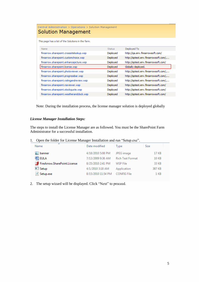
it is deployed globally. To verify the installation and deployment, follow below steps:
1. Log into the SharePoint Central Administration. Go to the Operations page and select
“Solution management” under the Global Configuration.
2. Check if “firearrow.sharepoint.license.wsp” is in the solution list or not. If it is, it means
License Manager has been already installed. If not, please skip to the next section to
install the License Manager.
5
Note: During the installation process, the license manager solution is deployed globally
License Manager Installation Steps:
The steps to install the License Manager are as followed. You must be the SharePoint Farm
Administrator for a successful installation.
1. Open the folder for License Manager Installation and run “Setup.exe”.
2. The setup wizard will be displayed. Click “Next” to proceed.

6
3. Wait for system check to complete and then click “Next”.
4. After you have read and accepted the License Agreement, click “Next” to continue.

7
5. Select one or more target web applications and then click "Next".
6. The wizard starts installing and display the installation progress.

8
7. Installation is completed successfully and clicks “Close” to exit the wizard.

9
Product Activation Tool Installation
The Product Activation Tool will be used to active FireArrow products. Just like the License
Manager, it is also only required to install once on a server.
Open the folder for Product Activation installation and run “Setup.exe”.
The setup wizard will be displayed and click “Next” to proceed.
Select the installation folder, and click ‘Next’.

10
Click ‘Next’ to confirm the installation.
The wizard starts the installation and display the installation progress.

11
Installation is completed successfully and clicks “Close” to exit the wizard.

12
Photo Viewer Web Part Installation
We provide two installation approaches for Photo Viewer web part installation. One is to use
the installation wizard for automatic installation. The other way is to use STSADM command
tool for manual installation. This section describes both approaches in detail.
Automatic Installation Approach
The Photo Viewer installation package contains the installer file, solution package file, image,
and etc. You must be the SharePoint Farm Administrator for a successful installation. Please
follow the following steps for installation.
1. Open the folder for PhotoViewer installation and double click the “Setup.exe” to start the
installation.
2. The setup wizard will be displayed. Click “Next” to proceed.
3. Wait for system check to complete and then click “Next”.

13
4. After you have read and accepted the License Agreement, click “Next” to continue.

14
5. Select one or more target web applications and then click "Next".
6. The wizard starts installing and display the installation progress.

15
7. Installation is completed successfully and clicks “Close” to exit the wizard.
Manual Installation Approach
The folder for PhotoViewer installation contains the solution package which you need for
manual installation.
The steps for manual installation are as followed:
1. Copy the solution package to the server farm and run following commands to add
solutions to the server farm:
stsadm.exe -o addsolution -filename "FireArrow.SharePoint.PhotoViewer.wsp"
stsadm -o execadmsvcjobs
2. Then you need to deploy the solution package. You can deploy the solution package
either by running STSADM commands or using the SharePoint 3.0 Central
Administration web interface.
8. Option 1: running STSADM commands

16
You need to run the following two commands for solution deployment:
1) stsadm -o deploysolution -name "FireArrow.SharePoint.PhotoViewer.wsp" -
immediate -url http://qa.test.FireArrowsoft.com -force -allowCasPolicies
Note: replace the url (http://qa.test.firearrowsoft.com) with your target web
application's url.
2) stsadm -o execadmsvcjobs
9. Option 2: using SharePoint 3.0 Central Administration Interface 1) Open Central Administration, select Operations, and select Solution management
under the Global Configuration.
2) Select the solution "FireArrow.SharePoint.PhotoViewer.wsp", and then select
Deploy Solution from the Solution Properties.

17
3) Set the deployment job schedule and choose the target web application where the
solution will be deployed.
After the solution is deployed to target web application, run the command “iisreset /noforce” to
restart IIS

18
3. Post-Installation Tasks
Feature Activation After installation, you need to perform the following steps to active the feature before the web
part is ready to use.
1. Go to the Site Settings page: click “Site Actions”→ “Site Settings”→ “Modify All Site
Settings” under MOSS screen.
2. Select “Site collection features”.

19
3. Click “Active” Button to active FireArrow Photo Viewer Web Part.
4. Un-installation

20
You can use FireArrow Photo Viewer Web Part Installer to uninstall Photo Viewer Web Part.
To uninstall the web part:
1) Run the setup.exe on your system.
2) Select the radio button for “Remove” and click “Next”, the web part will be
uninstalled.
5. License Management
The FireArrow Photo Viewer is allowed to use for 30-days after the installation without
license activation. It is always recommended to provision your valid license activation key
immediately after the installation is completed. Please go to the FireArrow web site
(http://www.firearrowsoft.com) to purchase the software in order to obtain the license
activation key.
After the software purchase, please email us ([email protected]) the following
information in order to generate the product activation code:
1. Product key
2. Order confirmation #
We will email you the product activation key.
You can obtain the product key information through the Product Activation Tool. Please
follow the steps in below section to obtain the product key and complete the license activation.
License Activation
After the Product Activation Manager is successfully installed, follow below steps to obtain
the product key information and activate the FireArrow product license in your server.

21
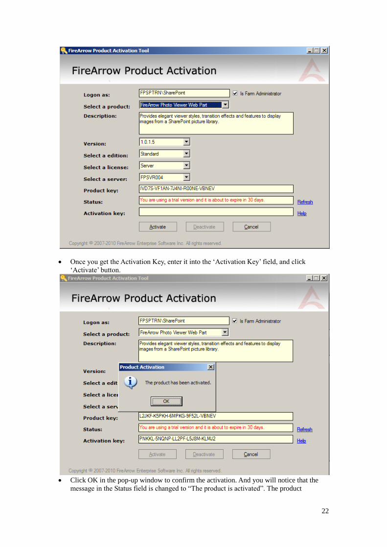
Go to “Start” menuAll ProgramsFireArrow SoftwareProduct Activation Tool and
click “FireArrow Product Activation Tool”.
Select the ‘FireArrow Photo Viewer” from the product dropdown list and the
corresponding product information will be displayed in the form, including the “Product
Key” information. You can also see the license status from the “Status” field. Before
activation, the status will indicate you are using a trial version.
22
Once you get the Activation Key, enter it into the ‘Activation Key’ field, and click
‘Activate’ button.
Click OK in the pop-up window to confirm the activation. And you will notice that the
message in the Status field is changed to “The product is activated”. The product

23
activation is completed.
.
.

24
Chapter 3: User & Administrative Guide
1. Interface Introduction
Below the image is the standard configuration interface when the Photo Viewer web part is
placed into a SharePoint page.
Key to areas on the interface:
1. Web Part Zone: a container where Photo Viewer web part is located.
2. Photo Viewer Web Part Tool Pane: to configure Photo Viewer web part properties
and settings.
1
2

25
2. Web Part Setting Overview
2.1 Selecting Image Source The FireArrow Photo Viewer Web Part allows you to select images at the views level and
folder level from a SharePoint library.
1
Key to areas on interface:
1. Select image source
2. Choose Photo Viewer style
3. Set Viewer display size
4. Set display alignment
5. Set auto-play mode and speed
6. Set the maximum navigable
icons
7. Set image transition effects
8. Set transition interval time
9. Image property mapping
10. Set hyperlinks
2
3
4
5
6
7
8
9
10

26
Site Url: Enter the site url where the source image library is located and click “Get” button.
Available Libraries: This dropdown list displays all the available libraries from the source
site. You can select the target library from the list.
Available Views: This dropdown list displays available views from the selected target library.
You can use views to organize the images and select the view for display.
Available Folders: This dropdown list display the folders contained by the selected view in
the target library. You can select a folder to display the images only from the selected folder.
If no folder is selected, all images from the selected view will be displayed.
Include Sub Folders: This checkbox is checked by default to include images from the sub
folders. Photo Viewer web part will display all images from current directory and sub-folders.
If it is not checked, only images in the current path will be displayed.

27
2.2 Setting Photo Viewer Style Photo Viewer Web Part provides eight different styles to choose and each style has its own
configuration options. When you select a style from the list, the setting page will be refreshed
to load the configuration options for the selected style. The next section "Photo Viewer
Display Styles" explains in detail about every display style provided by the web part.
2.3 Setting Size You can select the pre-defined size for the selected photo viewer style or set its own size.
Each style has different default predefined sizes.
.
2.4 Setting Display Alignment You can adjust the display alignment of the Photo Viewer in the web part zone by selecting
the alignment options below.

28
2.5 Enabling Auto-Play Feature You can enable the auto-play feature by checking the “Auto Play” checkbox and setting the
time interval between images.
If the Auto-play feature is disabled by un-checking the checkbox, the Play/Pause button will
not appear in the Photo Viewer interface. After you enable the Auto-Play feature, the
Play/Pause button will be displayed in the interface.
2.6 Configuring Navigation You can control the maximum number of thumbnail navigation displayed in the photo viewer
user interface by setting a number in the input box below.
“Left” alignment
“Center” alignment
“Right” alignment
Auto-play feature
is disabled
Auto-play feature
is disabled

29
2.7 Setting Image Transition Effect You can choose the transition effect from the dropdown list and also set transition lasting time.
The photo viewer web part provides twenty-one different transition effects (see image below).
Transition effect with * is for IE browser only.(see transition effect in Appendix 1)
2.8 Mapping Image Properties FireArrow Photo Viewer provides the feature to display image property information by
Maximum number of navigable icons = 4 Maximum number of navigable icons = 6

30
mapping the property columns from the library to the pre-defined section in the user interface
of the photo viewer.
"Section": pre-defined area in the user interface of selected photo viewer style.
"From": column dropdown list from the image source. Available columns in the dropdown list
are subject to the selected view settings.
The mapping options vary slightly for different display styles. Please refer to the next section
which describes the display styles and the associated configuration options in detail.
Below is an example to show the available columns for mapping from the selected image
source view, the "All Documents" view.
Below image shows the available columns in the down list is corresponding to the “All
Documents” view setting.

31
2.9 Applying Settings Click the "Apply" button at the bottom of setting panel to apply the settings. Click “OK” to
apply and exit edit mode.
3. Photo Viewer Display Styles
FireArrow Photo Viewer provides eight display styles for you to choose. Each style has
distinct look and feel and some unique settings. This section explains the distinct user
interface and configuration options for each style.
3.1 Black Pearl
Below the image shows the appearance of the “Black Pearl” style.
The designated area is designed to display additional image information. It is divided into
small sections. Below the image shows the layout of the various small sections in the
designated area.
Thumbnail Navigation
Image display window
Designated area to
display additional
image information
Play/Pause Button

32
Each section can be mapped to an image property/column through below setting options.
3.2. Broad View
Below the image shows the appearance of the “Broad View” style.
“Title” section
“Author” section
“Date” section
“Size” section
“Details” section
“Hyperlink” section
Thumbnail Navigation
Image display window
Designated area to
display additional
image information

33
The designated area is designed to display additional image information. It is divided into
small sections. Below the image shows the layout of the various small sections in the
designated area.
Each section can be mapped to an image property/column through below setting options.
3.3 Contemporary
Below the image shows the appearance of the “Contemporary” style.
“Description” section
“Nav Desc” section
“Title” section
Thumbnail Navigation
Image display
window
Designated area to display
additional image information

34
The designated area is designed to display additional image information. It is divided into
small sections. Below the image shows the layout of the various small sections.
Each section can be mapped to an image property/column through below setting options.
“Title” section
“Author” section
“Date” section
“Size” section
“Details” section
“Hyperlink” section
“Header” section

35
3.4 Gray Scale
Below the image shows the appearance of the “Gray Scale” style.
The navigation section provides a designated area to display additional image information. It
is divided into small sections. Below the image shows the layout of the various small sections.
Each section can be mapped to an image property/column through below setting options.
“Title” section “Line1” section
“Size” section “Line2” section
Thumbnail Navigation
Image display window
Designated area to display additional image
information

36
3.5 Post-card
Below the image shows the appearance of the “Post-card” style.
The designated area is designed to display additional image information. It is divided into
small sections. Below the image shows the layout of the various small sections.
Each section can be mapped to an image property/column through below setting options.
“Title” section
“Author” section
“Date” section
“Size” section
“Details” section
Thumbnail
Navigation
Image display window
Designated area to display
additional image information
Play/Pause Button

37
3.6 Ridge
Below the image shows the appearance of the “Ridge” style.
The navigation section provides a designated area to display additional image information. It
is divided into small sections. Below the image shows the layout of the various small sections.
Thumbnail
Navigation
Image display window
Designated area to display additional image
information

38
Each section can be mapped to an image property/column through below setting options.
3.7 Rock Solid
Below the image shows the appearance of the “Rock Solid” style.
“Title” section
“Line1” section
“Size” section
“Line2” section
Thumbnail
Navigation
Image display window

39
You can set the hover color to highlight the selected image on the navigation bar by below
setting.
The navigation section provides a designated area to display additional image information. It
is divided into small sections. Below the image shows the layout of the various small sections.
Each section can be mapped to an image property/column through below setting options.
“Title” section
“Line1” section
“Size” section

40
3.8 Thumbnail
Below the image shows the appearance of the "Thumbnail" style.
The "Thumbnail" style provides a simple way to display and navigate images. There is no
additional option available to display image information.
4. Transition Effects Guide
FireArrow Photo Viewer image providing the following transition effects (Transition effect
with * is for IE browser only)
4.1 Default
Image display window
Thumbnail Navigation

41
4.2 Dropdown
4.3 WipeRight

42
4.4 BlindZ
4.5 Barn*

43
4.6 Blinds*
4.7 CheckerBoard*

44
4.8 Fade*
4.9 GradientWipe*

45
4.10 Insert*
4.11 Iris*

46
4.12 Pixelate*
4.13 RadialWipe*

47
4.14 RandomBars*
4.15 RandomDissolve*

48
4.16 Slide*
4.17 Spiral*

49
4.18 Stretch*
4.19 Wtrips*

50
4.20 Wheel*
4.21 Zigzag*

51
Chapter 4: Technical Support
Please feel free to contact our technical support team if you have any question or encounter
any technical difficulty.
Technical Support: [email protected]
Please visit our web site (http://www.firearrowsoft.com) for any product update and answers
to frequently asked questions.