Embed Size (px)
Citation preview
Photo For Advert
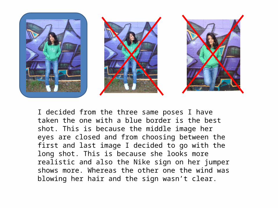
I decided from the three same poses I have taken the one with a blue border is the best shot. This is because the middle image her eyes are closed and from choosing between the first and last image I decided to go with the long shot. This is because she looks more realistic and also the Nike sign on her jumper shows more. Whereas the other one the wind was blowing her hair and the sign wasn’t clear.
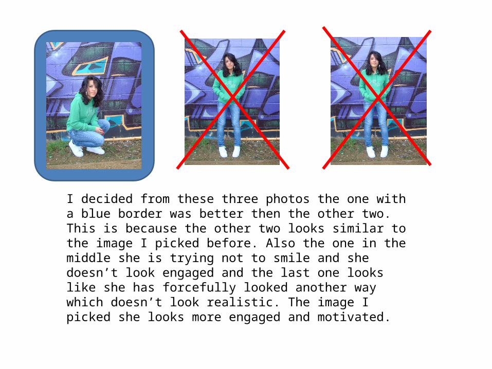
I decided from these three photos the one with a blue border was better then the other two. This is because the other two looks similar to the image I picked before. Also the one in the middle she is trying not to smile and she doesn’t look engaged and the last one looks like she has forcefully looked another way which doesn’t look realistic. The image I picked she looks more engaged and motivated.
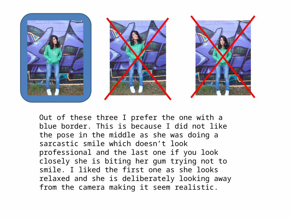
Out of these three I prefer the one with a blue border. This is because I did not like the pose in the middle as she was doing a sarcastic smile which doesn’t look professional and the last one if you look closely she is biting her gum trying not to smile. I liked the first one as she looks relaxed and she is deliberately looking away from the camera making it seem realistic.
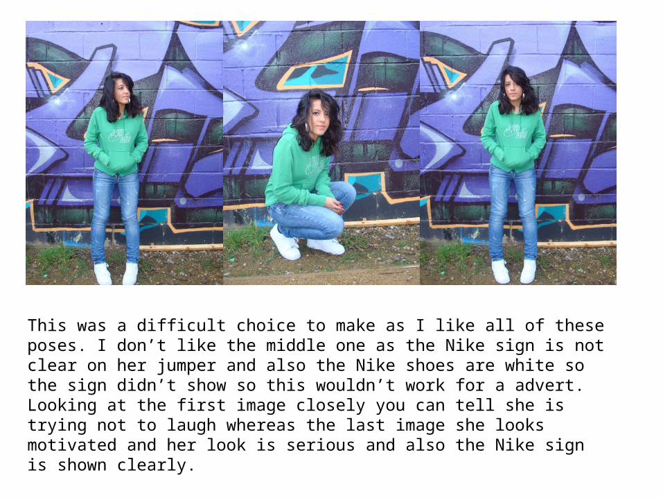
This was a difficult choice to make as I like all of these poses. I don’t like the middle one as the Nike sign is not clear on her jumper and also the Nike shoes are white so the sign didn’t show so this wouldn’t work for a advert. Looking at the first image closely you can tell she is trying not to laugh whereas the last image she looks motivated and her look is serious and also the Nike sign is shown clearly.