Embed Size (px)
Citation preview

Editing my pictures. After looking through all my pictures I have been able to select the best ones
to edit and use in my magazine.

Photo 1: My magazine will contain images of album covers on my contents page that I have made on photoshop and pages.
To edit this photo I changed the colors to ensure the brightness and contrast looked more enhanced because the original photo appeared too dark. I then
copied the photo and flipped it, layering it over the original image. I also enlarged it and changed the transparency on the top image too create this
effect. I added a boarder to make the image look crisp with a professional finish. I downloaded a font from ‘dafont.com’ and added this onto the image, changing the spacing so it looked the way the I wanted. I left the text black because parts of the image are also black so I thought this looked the most professional and
effective.

Photo 2: My magazine will contain images of album covers on my contents page that I have made on photoshop and pages.
With this album cover, I picked the original image from my photo shoot and changed the
colouring to a lighter more pink tone. This matches the calm music I imagine this band
to create. I then put this image into the frames on the background image and added a title. The title is coloured to match the tones in the photo to ensure the whole image links
together and looks professional.

Photo 3: My magazine will contain an image of another artist on my contents page.
This image will be used on the contents page to show a variety of artists that will be included in the rest of the magazine. The composition of this image
doesn't need an extra editing however I did want to change the colour so that it stood out more and looked sharper. I did this buy changing the contrast,
brightness and tone on Keynote.
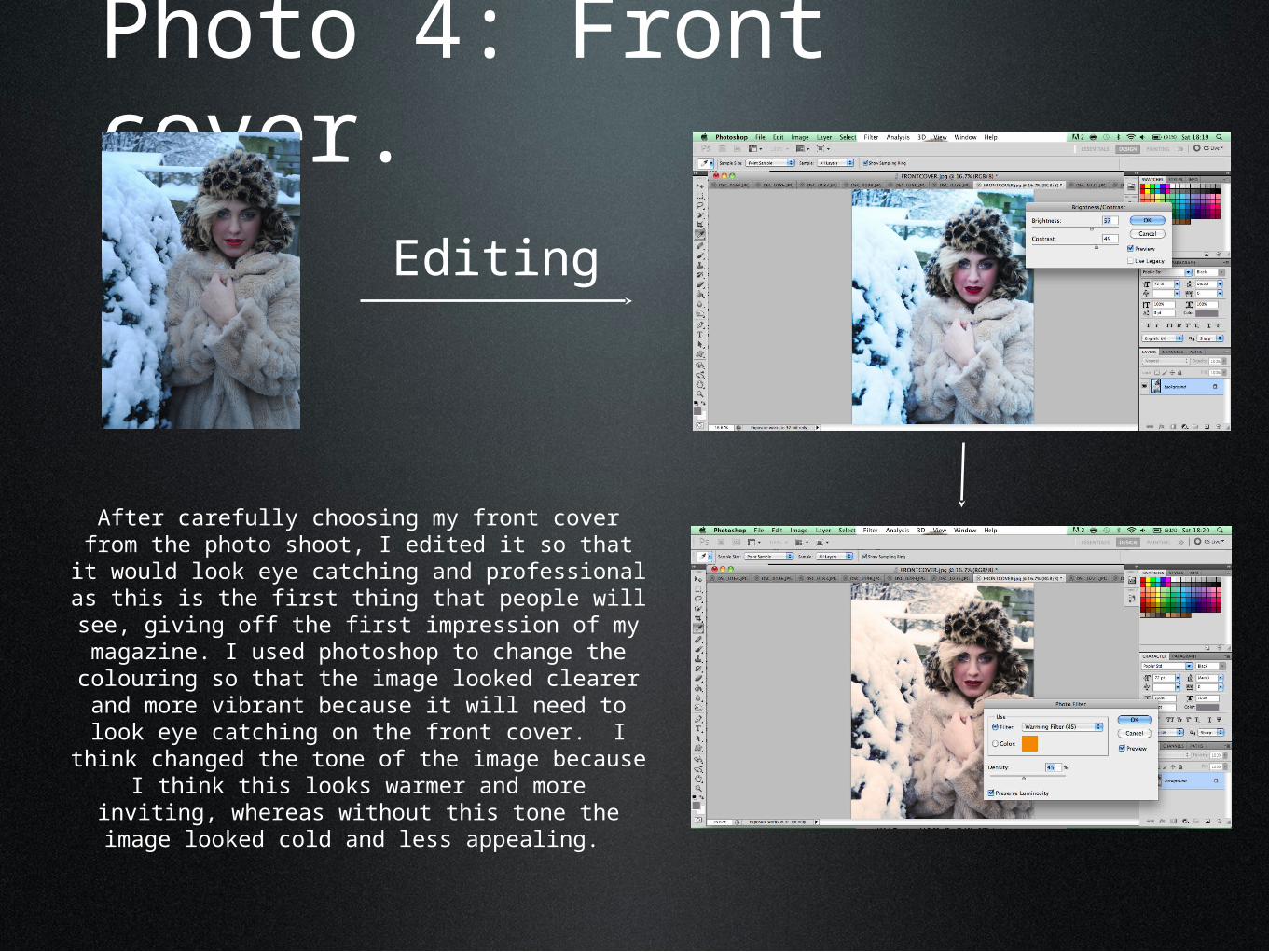
Photo 4: Front cover.
Editing
After carefully choosing my front cover from the photo shoot, I edited it so that it would look eye
catching and professional as this is the first thing that people will see, giving off the first impression of my magazine. I used photoshop to change the colouring so that the image looked clearer and more vibrant because it will need to look eye
catching on the front cover. I think changed the tone of the image because I think this looks
warmer and more inviting, whereas without this tone the image looked cold and less appealing.
Photo 4: Final front cover image.

Photo 5: Photos for double page spread.
With the images for the double page spread, I needed to cut out the image from the background. This is so that I can put the image onto the background of the double page spread. Using one background for the whole page means
that I can layer different images of the artist onto it without the images looking like blocks and making the overall page more professional.