Embed Size (px)
Citation preview
PHANTASTIC: DESIGN JOURNALISM VIA AN ANIMATED WEB SERIES
by
Colton Branscum, B.F.A.
A thesis submitted to the Graduate College ofTexas State University in partial fulfillment
of the requirements for the degree ofMaster of Fine Arts
with a Major in Communication DesignDecember 2016
Committee Members:
Maia Wright, Chair
Claudia Roeschmann
Grayson Lawrence
COPYRIGHT
by
Colton Branscum
2016

FAIR USE AND AUTHOR’S PERMISSION STATEMENT
Fair Use
This work is protected by the Copyright Laws of the United States (Public Law 94-553, section 107). Consistent with fair use as defined in the Copyright Laws, brief quotations from this material are allowed with proper acknowledgement. Use of this material for financialgain without the author’s express written permission is not allowed.
Duplication Permission
As the copyright holder of this work I, Colton Branscum, authorize duplication of this
work, in whole or in part, for educational or scholarly purposes only.
DEDICATION
For Jypsy Jonas, my mom. The strongest, most hard working person I know.
ACKNOWLEDGEMENTS
I would like to express my sincere thanks to my thesis chair, M. Wright, for her
help through this process. Thank you for all of the support, encouragement, and guidance.
In developing this thesis, the boundaries of my understanding of communication design
have been stretched beyond anything I could have expected, and with your prompting,
I had the opportunity to experience an adventure the like of which I would have never
dreamed, at this point in my life. Without M, this project would not have been possible.
I would also like to thank the other members of my thesis committee, Claudia
Röschmann and Grayson Lawrence. Thank you to Claudia for being such a great sorce of
inspiration during my time at Texas State. Your dedication to design, and your work with
the school is incredibly admirable, and something I aspire to emulate in my own career.
Thank you to Grayson for teaching me to be acute and astute in problem solving; and not
just in coding or design. Your keen, but lighthearted nature helped my time at Texas State
be most enjoyable, and interesting. The summers just won’t be the same.
A special thanks goes to Christine Haney for being a central and essential part of
the MFA program. Thank you for making me feel so welcome; and for helping to shep-
herd the horde of wild cats that make up the program.
Thank you to all of the friends I have made during my time at Texas State. Having
the opportunity to work alongside each of you has been an education in itself. I feel un-
v
commonly lucky to have gained the new perspectives and approaches to design, I learned
while getting to know you, and hope we get to work together again soon.
Thank you to Armin Vit, Eric Benson, Peter Hall, Mariana Amatullo, Rosten Woo,
and Charles S. Anderson for making the time to meet with me, to be interviewed for the
first season of the Phantastic web show. The work produced by each of these design
professionals is helping to shape the Zeitgeist around graphic design as we know it. I am
incredibly honored to have had the chance to interview all of you.
And finally, thank you to Barry Underhill, who helped to usher me into the design
world, and inspire my great love for design history. Learning about those who came be-
fore us has provided me with limitless inspiration and motivation in my design practices,
and will be a driving force for me in the years to come.
vi
TABLE OF CONTENTS
Page
ACKNOWLEDGEMENTS.................................................................................................v
LIST OF TABLES............................................................................................................. ix
LIST OF FIGURES........................................................................................................... .x
CHAPTER
I. INTRODUCTION.................................................................................................1
The Current State of Graphic Design Journalism.........................................2
II. STATEMENT OF THE PROBLEM...................................................................5
Framing the Problem....................................................................................5 Thesis Description/Objective.......................................................................8 Hypothesis....................................................................................................9
III. EXPLORATORY RESEARCH........................................................................11
Information Retention via New Media.......................................................11 Visual Stimuli.................................................................................11 Storytelling......................................................................................12 Compartmentalized Structure.........................................................13 Competitive Audit .....................................................................................15 SWOT Analysis: Comparing strengths, weaknesses, opportunities, and threats................................................................17 Identifying Desirable Attributes for Communication and Retention.................................................19 Evaluating Analogous Modes of Design Journalism in Relation to Desirable Attributes.................................................23
IV. METHODOLOGY...........................................................................................25
Methods of Evaluation...............................................................................25
vii
V. GENERATIVE RESEARCH............................................................................27
Logo...........................................................................................................27 Characters/Framing Devices......................................................................28 Set..............................................................................................................30 Color Palette..............................................................................................32 Pilot Episode..............................................................................................34 Website...................................................................................................... 37
VI. EVALUATIVE RESEARCH............................................................................41
Criticism....................................................................................................41 Focus Group Results...................................................................................41 Competitive Comparison............................................................................43
VII. CONCLUSION..............................................................................................46
Future Research.........................................................................................47
APPENDIX SECTION......................................................................................................49
REFERENCES...................................................................................................................52
viii
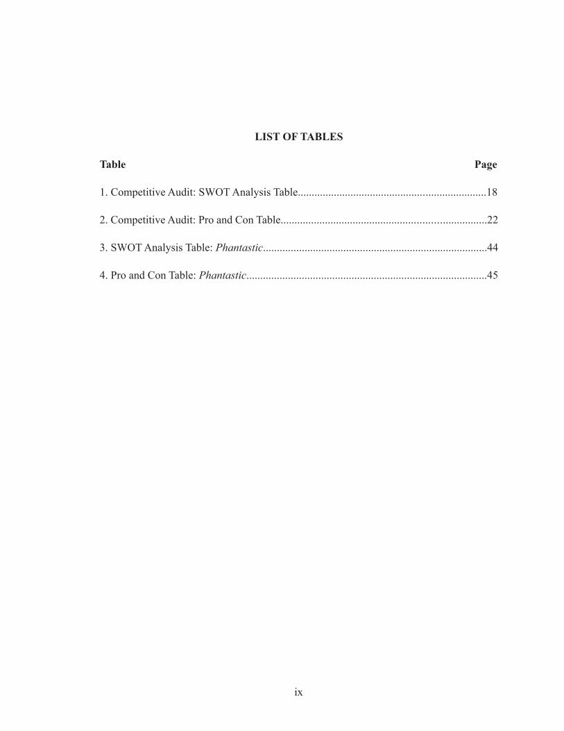
LIST OF TABLES
Table Page
1. Competitive Audit: SWOT Analysis Table....................................................................18
2. Competitive Audit: Pro and Con Table..........................................................................22
3. SWOT Analysis Table: Phantastic.................................................................................44
4. Pro and Con Table: Phantastic.......................................................................................45
ix
LIST OF FIGURES
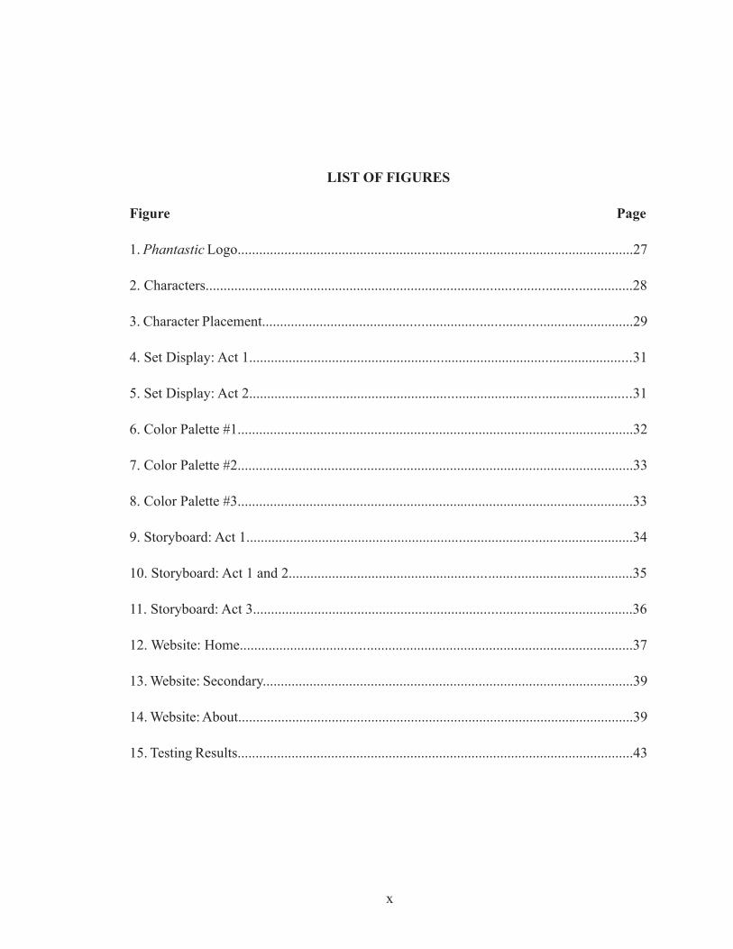
Figure Page
1. Phantastic Logo..............................................................................................................27
2. Characters......................................................................................................................28
3. Character Placement......................................................................................................29
4. Set Display: Act 1..........................................................................................................31
5. Set Display: Act 2..........................................................................................................31
6. Color Palette #1..............................................................................................................32
7. Color Palette #2..............................................................................................................33
8. Color Palette #3..............................................................................................................33
9. Storyboard: Act 1...........................................................................................................34
10. Storyboard: Act 1 and 2...............................................................................................35
11. Storyboard: Act 3.........................................................................................................36
12. Website: Home.............................................................................................................37
13. Website: Secondary.......................................................................................................39
14. Website: About..............................................................................................................39
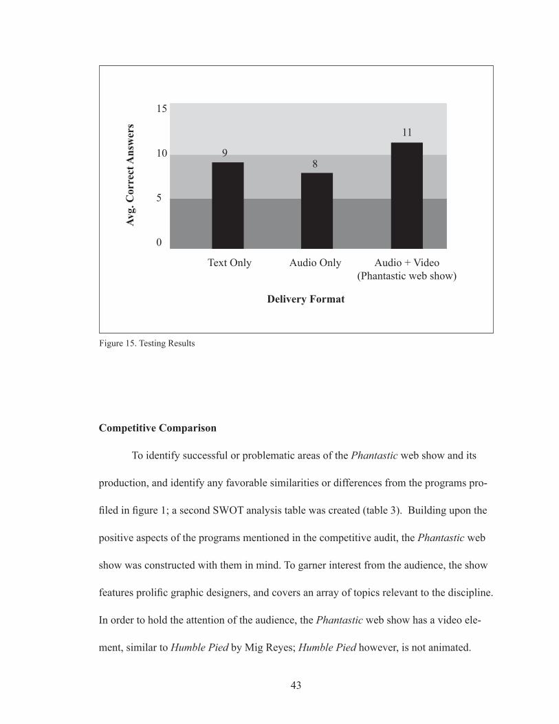
15. Testing Results..............................................................................................................43
x
I. INTRODUCTION
Graphic design comes in many forms, though regardless of its media or venue, its
primary purpose is to communicate the subtleties of a time and place, to tell cultural and
visual stories, and to clarify an item’s purpose or echo an idea’s message (Poulin, 9). The
legacy of design has evolved over time. Meggs’ History of Graphic Design begins with
the advent of writing 40,000 years ago and covers design milestones leading up to the
“digital revolution and beyond” (Meggs, 4), which is the time we live in currently. Nearly
everything a person will encounter in everyday life includes at least some form of design
in one way or another; this can include printed advertisements, television commercials,
street signs, websites, books, magazines, and much more, created to convey a message.
Some notable designers who have contributed to the advancement of the practice in the
United States are Paul Rand who designed many well known identities for companies
such as IBM, UPS, and ABC (Rand); Milton Glaser, recipient of the National Medal
of the Arts in Design and co-founder of New York Magazine and Pushpin Studios; and
Muriel Cooper, a recipient of the National Medal of the Arts in Design. Cooper is also the
founder of MIT’s Visible Language Workshop -— a class created to introduce students to
graphic design — and co-founder of the MIT Media Lab — an interdisciplinary research
laboratory spanning several different mediums (qtd. in AIGA, “Muriel Cooper”). Work
by talented designers like these has been involved in the cultural progression of human-
1
“The immediacy and ephemeral nature of graphic design, combined with its link with the social, political, and economic life of its culture, enable it to more closely express the Zeitgeist of an epoch than many other forms of human expression”. —Meggs’ History of Graphic Design, 4
2
kind since it became necessary to convey information to an audience. Success or failure
of that conveyance was contingent upon how the message being conveyed resonated
with its audience, or how palatably it fit with the taste of its epoch. This determined what
elements would continue to be used in further communications, helping to form visual
languages and styles that have changed over time. As time goes on, these visual sym-
bols and languages change and take on new meanings (Champagne); all the while being
simultaneously formed based on the success or failure from the day before and followed
by the evolution of graphic design, constantly in pursuit of the days to come after. The
following research is an attempt to add to the continuance of this evolution of communi-
cation design.
The Current State of Graphic Design Journalism
In any profession, one of the best ways to hone a craft is to step back and evaluate
what already exists within the discipline. In graphic design, one way to gain perspective
on the state of the discipline is to subscribe to several of the different journalistic and
scholarly mediums available, such as newspaper and magazine articles, books, blogs,
and podcasts. Examples of these include Print and I.D. magazine, The New York Times,
and The Guardian, as well as books about popular designers such as Milton Glaser, Irma
Boom, Tibor Kalman, Stefan Sagmeister, and many more. Other resources include De-
signInquiry.net, a non-profit educational organization dedicated to researching design is-
sues (Hall) and Debbie Millman’s Design Matters, which describes itself as “the world’s
first podcast about design and an inquiry into the broader world of creative culture
3
through wide-ranging conversations with designers, writers, artists, curators, musicians,
and other luminaries of contemporary thought” (Millman). It takes the form of a podcast,
in which she interviews designers about subjects having to do with their work, as well as
past, present, or future design events.
While Design Matters is strictly an audio-based program, there are other forms of
new media that are used to inform designers about new thinkers and developments in the
discipline. Usually found on a personal website or hosted by a website featuring articles
by many writers, a written blog is one medium available for design journalists and critics.
Design Observer is one example of a resource where many design journalists can pres-
ent their thoughts and opinions (Design Observer). In this form of design reporting, the
audience can take in a combination of text and images which express an idea or relay a
message. Another format that is used in the realm of public design discourse is the video
blog. Similar to a podcast, a video blog can be used to feature both audio and video, al-
lowing the viewer to observe visual stimuli and receive audible and visual information
simultaneously.
With such a variety of methods in which to deliver information, the question
arises: “Which is the most efficient means to relay information to the audience?” In the
course of preliminary research regarding information retention and learning with new
media, a study by Popova, Kirschner, Joiner (2014) indicated that information presented
to test subjects audibly rather than in text allowed them to “better understand the topics,”
“think more deeply,” and consider “the possible applications of the subject” (Popova,
Kirschner, Joiner, 335-336). Another study found that learning by observing pictures with
4
accompanying audio resulted in more successful retention of the information provided,
than when subjects were asked to learn without a supporting audible element (Glaser,
Schwan, 1006). Further investigation into learning with supporting imagery showed that
an average person’s sequence of cognition recognizes images faster than text, and that
images are more likely to remain in long-term memory (Baker, 2). With this information
in mind it was surmised that the most effective method of relaying information to the au-
dience would be the option that will more fully engage viewer attention: a form of design
journalism incorporating an audio transmission of the information to be broadcast as well
as a visual element to reinforce the information being provided.
II. STATEMENT OF THE PROBLEM
Framing the Problem
One method available for delivering design journalism is the written blog. In this
time of readily available social media outlets, and platforms that allow the user to create
and style their own websites, any person wishing to project their thoughts into the pub-
lic realm need only to create an online account and begin dispatching their thoughts and
ideas to anyone who is interested. The problem for some amateur journalists is, with this
democracy of communication and the integration of technology in everyday life, their
voice can become lost in the cacophonous din that makes up the countless voices already
speaking through this media. Also, there are what might be considered more efficient
and enjoyable ways to take in information through new media; leaving them with the
choice to either adapt or continue, and risk being considered outdated or contemporarily
irrelevant. With this in mind, this thesis project will not be limited to a single, sustained
structure; but based on presentation methods and principles that research has found to be
the most effective for the time — such as how it will be shaped in the course of this thesis
project, in relation to the research conducted.
With the strengths and weaknesses of the written format in mind, the next step
in the echelon of design journalism would be that of the audio-based podcast. One study
found that its test subjects preferred an audible conveyance of information as opposed
to written because it added a “human element.” Senior lecturer at the School of Infor-
mation Technology, Dr. Esyin Chew found that audibly relaying information made it
“unique and interesting to listen to” (Chew, 127). Popova, et al. showed that information
5
presented to test subjects audibly rather than in written format allowed them to “better
understand the topics”, “think more deeply”, and consider “the possible applications of
the subject” (Popova, Kirschner, Joiner, 335-336). Also, Caroline Crawford and Marion
Smith’s findings assert that applying the use of storytelling as a method of information
delivery makes that information more memorable because it allows the audience to better
understand a subject’s nature and intentions. This allows the audience to further fathom
the deeper meaning of the story presented (Crawford, Smith, 26). While these findings
indicate that a podcast is more successful in effectively and efficiently delivering infor-
mation than a written blog or article, the resources required to publish a written piece are
more easily accessible, requiring only a computer or word processor to record the writer’s
thoughts and opinions, and an internet connection or printer to distribute them.
Even with the success of an audible conveyance, there is still room for improve-
ment in relaying information. Babette Park and her team conducted an experiment to
examine “the influence of emotions on learning with multimedia” by presenting subjects
with information both with and without anthropomorphisms — objects or illustrations
that have had human characteristics imposed upon them — “to induce positive emotions
and facilitate learning.” The results of the study found that when subjects were presented
with anthropomorphisms while in a positive emotional state, it resulted in “the highest
learning outcome and longest fixation on the relevant information” (Park, 30). Another
experiment, conducted by Manuela Glaser and Stephan Schwan in Explaining Pictures:
How Verbal Cues Influence Processing Of Pictorial Learning Material “examined
whether learning is better with a multimedia presentation in which pictorial information
6
is verbally referenced than without such referencing.” They also explored the effective-
ness of learning with “pictorial information” in scenarios where an image is verbally
referenced as opposed to one where it is not referenced. Their findings concluded that the
pictures with accompanying audio in which elements of the picture were identified, were
better learned (“free recall, multiple choice, visual recognition”) rather than the pictures
with elements that were not named through an audible element. Also that, “within a
single presentation, named elements were better learned than unnamed elements” (Glaser,
Schwan, 1006). Another experiment by Glaser and Schwan tested “whether the multime-
dia effect is due to a shift of attention toward the elements presented multimodally and
away from those presented unimodally.” Results showed longer fixation times for ele-
ments that had been identified in the accompanying audio and shorter fixations times for
elements that were not identified in the imagery presented. Also, “gaze synchrony of the
learners” was found to be greater in regard to “time points of naming pictorial elements
than for time points of no naming” (Glaser, Schwan, 1006). With these findings regard-
ing visual stimuli combined with the results of the research on an audible conveyance of
information, it could be argued that the most effective means of relaying information to
an audience is one that combines both audible stimuli as well as anthropomorphisms to
reinforce the ideas conveyed. And with the implementation of a compartmentalized show
structure with clearly defined audible and visible cues between segments, it will support
the organization of the information being taken in (Vinh, 13) and allow the user to engage
in “deep-learning” (Wang).
7
Thesis Description/Objective
The creative outcome of this project will be an animated web series featuring
stories about historical and contemporary design. It will also include interviews with top
designers such as Charles S. Anderson of CSA Design Co, a recipient of the American
Institute of Graphic Arts Centennial Year Medal; Dr. Mariana Amatullo of Art Center
College of Design and co-founder of Design Matters, a design initiative for global, social
impact; and Peter Hall, who is a well respected design journalist and critic, as well as
other groundbreaking design professionals. The proposed series will be presented in the
format of a talk show. Every episode will have an overarching theme that is conveyed
through three segments: a section on historical design, an interview, and finally a seg-
ment on a work of contemporary design. The primary platform for distribution will be
a website where viewers will have access to each episode, citations for the information
provided, and links to further information about the episodes, featured guests, and topics.
With an ever-growing and diverse population entering the graphic design profession in
the United States, it is important to be able to appeal to a wide range of potential audience
members. To insure that this web series will be readily equipped to suit the needs of its
audience, it will be crafted by taking cues from existing design-journalistic productions,
based on their perceived strengths and shortcomings. To complement the desirable as-
pects found in each, this web series will incorporate the use of visual stimuli (Park, 30),
an audible delivery of information (Chew, 127) implementing storytelling as a device for
transmission (Crawford, Smith, 26), and a compartmentalized show structure (Vinh, 13)
to more efficiently and effectively deliver information to its audience.
8
While this series can be considered a video blog, labeling it a “web show” or
“web series” may allow for some departure from already existing productions, so the
audience might leave behind any preconceived notions or expectations established by
other programs. Also, the animated element — aside from being unique as an approach
to a graphic design centered source for design journalism — allows for a fully curated
experience, unencumbered by the limitations of a budget for props and set construction,
much less the restrictions of physics when portraying elements of the show or making
transitions. This enhanced flexibility also permits a more free interpretation of the content
depicted through anthropomorphisms, or even adding alternative context in cases where
an interviewee is in a different location; that person could be depicted as “live via satel-
lite” due to the difference in each speaker’s background noise. Adding these elements
will distinguish from existing modes of design journalism.
Hypothesis
By creating an animated web series for the graphic design community, this project
will help to expand design journalism into a new and innovative format; which is unique-
ly suited to efficiently and effectively engage and inform its audience through the use of
visual stimuli to more successfully hold the audience’s attention (Park, 30); storytelling
so the audience might make personal connections to the information being presented,
facilitating a more successful recollection of the information later (Ribeiro, Moreira, da
Silva, 180); and a compartmentalized show structure to allow for easier mental organiza-
tion of information (Vinh, 13). Focusing on these aspects in the production of this web
9
10
series will make the information more palatable, allowing the show and its content to
deliver a more effective transmission of valuable information, and hence promote infor-
mation retention as well as contribute to the discourse surrounding contemporary graphic
design practice.
III. EXPLORATORY RESEARCH
Information Retention via New Media
Visual Stimuli
In Multiple Intelligences, Gardener discusses the misconception that every per-
son’s intelligence is something that can be measured on the same scale, and how an
individual’s level of intelligence can vary and be specialized to specific areas of exper-
tise, based on genetics and life experience. He goes on to describe the methods in which
young children learn to interact with a “ spectrum classroom,” a classroom in which
students are “surrounded each day by rich and engaging materials that evoke the use of a
range of intelligences” (Gardner, 92). When discussing how the students learn to interact
with different sections of the classroom, Gardener stated “It is highly desirable for chil-
dren to observe adults or older peers at work or play” so that they will “come to appreci-
ate the reasons for the materials as well as the nature of the skills that enable a master
to interact with the materials in a meaningful way” (Gardener, 92). Learning through
interpreting visual cues and using visual stimuli to make connections is something that
humans can implement throughout their entire lives, across numerous forms of media. A
study of college students in Saarbrücken, Germany, tested to see the effect of anthropo-
morphisms in multimedia learning, by tracking the eye movements of its subjects. Each
participant was presented with information that either included or excluded anthropomor-
phisms, and then were tested to see how much information each student had retained. The
results of the study concluded that those who were presented with anthropomorphisms
while learning “showed the highest learning outcome and longest fixation on the relevant
11
information of the multimedia instruction” (Park, 30). In providing visual stimuli to ac-
company the information being delivered audibly in the presentation of the proposed web
series, the audience is expected to gain further focus and enjoy a deeper level of recall
and understanding.
Storytelling
One of humanity’s greatest and most enduring traditions is that of storytelling.
Whether relayed verbally, graphically, or legibly, storytelling is an effective means used
by societies all over the world and throughout time to inform and educate an audience.
Some of the earliest evidence of storytelling can be found in the Lascaux caves in France,
dating back to approximately 35,000 years ago and takes the form of paintings which
were created by primitive people; likely “made for survival, and for utilitarian and ritual-
istic purposes” and even “magical rites” (Meggs, 4). Thanks to the evolution of the tech-
nology allowing humans to relay messages, today, there are countless resources in which
humans can receive information through one form of storytelling or another. Books,
television, magazines, social media and all other forms of broad-spectrum communica-
tion people use every day have accelerated the process of transmitting thoughts and ideas
by being able to reach more people, more quickly and sometimes combine elements of
transmission by simultaneously relaying both audio and video, audio and legible text,
or any combination of the three. In Digital Storytelling As An Instrument Of Learning:
Storytelling As A Primary Form Of Communicative Learning Through Mobile App Books,
Caroline Crawford and Marion Smith state that “Stories are effective as educational tools
12
because they are believable, rememberable, and entertaining.” They maintain believ-
ability’s value “stems from the fact that stories deal with human or human-like experi-
ence that we tend to perceive as an authentic and credible source of knowledge,” and that
“stories make information more rememberable because they involve us in the actions and
intentions of the characters,” and as the audience “we are engaged with the story on both
levels, and it is through this dual involvement that we enter into the minds of the char-
acters and into the deeper meaning of the story” (Crawford, Smith, 26). The storytelling
format allows the audience to make intimate connections with the narrative, by “person-
alizing” the information being presented. This allows the audience to relate key points
in the story to their own experiences, making the information easier to take in and recall
later (Ribeiro, Moreira, da Silva, 180). By relaying information through storytelling on
the proposed web series, it is likely that the knowledge being transferred to the audience
will be more palatable, and thus, more likely to be absorbed.
Compartmentalized Structure
In Koi Vinh’s Ordering Disorder, he talks about grids in relation to usability and
how they not only help to make design more successful and orderly, but also how humans
interact with grids and organized information. In chapter two, he states: “They [grids]
lay a foundation through which a designer can create solutions to problems large and
small, and in doing so help readers, users, and audiences find that which all humans seek:
a sense of order within the disorder.” He goes on to say that in general, the layman will
“tend to look for order less critically, at least in the visual realm.” Looking for a “sense of
13

order, and not necessarily for the fact of order” (Vinh, 2011). Because this project takes
the form of a web show rather than that of a website or a printed page, the audience will
need to rely on audible and visual cues to differentiate each segment. In applying this
idea of an organized delivery of information to an audience, the proposed web series
will contain three separate sections — a segment on graphic design history, an interview
with a prolific designer, and then a segment on contemporary graphic design — in which
information from each will be presented with defined parameters exhibited by transition-
ing between scenes with a “fade-in, fade-out” effect with occasional audio cues following
the conclusion of a story or interview. The goal being that this structured approach will
provide a clear and organized transmission of the information being provided, enabling
the audience to learn more deeply, as in the experiment conducted by Jui-Sheng Wang
(Wang).
14
Competitive Audit
There are many different resources for design journalism available to the public.
The following examples were chosen based on the criteria found to be effective in the
preliminary research outlined in the previous sections regarding information retention and
learning with new media. Design Matters by Debbie Millman is an example of a widely
distributed design podcast. Being an audio-based podcast with no visual component can
leave some gaps in terms of audience focus and retention of the information provided
(Park, 30). In this fast moving world, an audience member might be likely to attempt
listening to an audio-only podcast while carrying out distracting tasks such as working,
driving, or doing other activities that generally accompany ambient audible entertainment,
rather than sit quietly, undistracted, and listen to the complete interview, giving it their
full attention (Ross, par, 9). With this in mind, the proposed web series will incorporate
visual stimuli along with audio so that the audience will be more likely to have their full
attention engaged by the program (Park, 30), and consider the information, and how they
might apply it in their own life (Popova, Kirschner, Joiner, 335-336).
99% Invisible by Roman Mars is an audio-based design podcast, but differs from
Design Matters in that it is centered around storytelling rather than focusing on one-on-
one interviews. Ribeiro et al. assert that storytelling allows an audience to make intimate
connections with the narrative, by “personalizing” the information being presented, mak-
ing it easier to recall and apply later (Ribeiro, Moreira, da Silva, 180). The 99% Invisible
website usually features photographs or supporting static imagery. These images help to
add some visual interest and context while listening to the program, but they and their
15
accompanying text only help to support the overall theme of the story, and do not help to
communicate the contents as they are presented through the progression of an episode’s
transmission. To reinforce the progression of an episode, the proposed web series will
feature 2D stop-motion animation throughout, helping the viewer stay focused on and en-
gaged with the subjects presented through the use of audible (Popova, Kirschner, Joiner,
335-336) and visual stimuli (Park, 30). The implementation of storytelling to make the
information more “real” and “personal”, appealing to “a natural and organic” form of
education for the audience (Lawrence, Paige, 66).
An example of a video blog with a large viewership is Humble Pied by Mig
Reyes. While the show provides valuable advice for beginning designers, an episode is
generally between 2-4 minutes long and the interviewee only answers a single question
about what advice he or she would give to other designers, then the show is abruptly con-
cluded. This does not allow time for the audience to get to know the designer or under-
stand the influences that support their thoughts and opinions, and provides little oppor-
tunity for the compartmentalization of the information being presented. In an interview
for the proposed web series, a variety of questions will be covered so the audience may
get a better understanding of the designer, their reasoning behind certain advice or opin-
ions, and the context that influenced their responses. Each episode will be organized into
three separate segments featuring storytelling or a formal interview; each contributing
to an overarching theme, which will allow the audience to make mental separations —
compartmentalize the information — through audible and visible cues (Vihn, 13), while
following the progression of the episode.
16
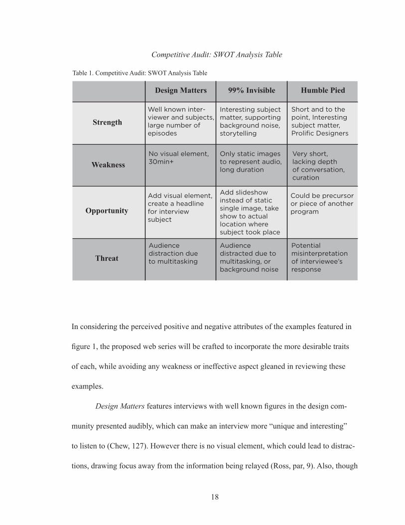
SWOT Analysis: Comparing strengths, weaknesses, opportunities, and threats.
SWOT analysis is a tool often used in graphic design to identify an idea or proj-
ect’s strengths, weaknesses, opportunities for growth or improvement, and threats to its
development or progression into the marketplace (Baycheva-Merger, 1192). By imple-
menting this process of identifying the strong and weak points of a given problem, the de-
signer may anticipate and correct any elements that might stand in the way of developing
a successful idea or product. The following is a SWOT analysis (table. 1) which studies
the design related podcasts and video blog covered in the competitive audit. This SWOT
analysis confirms that current vehicles for design journalism do not replicate the proposed
format for this project, and identifies areas for improvement in terms of audience engage-
ment and information retention.
17
Humble PiedDesign Matters 99% Invisible
Strength
Weakness
Opportunity
Threat
Short and to the point, Interesting subject matter, Prolific Designers
Very short, lacking depth of conversation, curation
Could be precursor or piece of another program
Potential misinterpretation of interviewee’s response
Well known inter-viewer and subjects, large number of episodes
No visual element, 30min+
Add visual element, create a headline for interview subject
Audience distraction due to multitasking
Interesting subject matter, supporting background noise, storytelling
Only static images to represent audio, long duration
Add slideshow instead of static single image, take show to actual location where subject took place
Audience distracted due to multitasking, or background noise
Competitive Audit: SWOT Analysis Table
Table 1. Competitive Audit: SWOT Analysis Table
18
In considering the perceived positive and negative attributes of the examples featured in
figure 1, the proposed web series will be crafted to incorporate the more desirable traits
of each, while avoiding any weakness or ineffective aspect gleaned in reviewing these
examples.
Design Matters features interviews with well known figures in the design com-
munity presented audibly, which can make an interview more “unique and interesting”
to listen to (Chew, 127). However there is no visual element, which could lead to distrac-
tions, drawing focus away from the information being relayed (Ross, par, 9). Also, though
19
the duration may vary, each episode is over thirty minutes long, which might be a larger
commitment of time than some viewers are ready to make.
99% Invisible covers a variety of subjects in its audio based transmissions through
the use of storytelling; which can make information more palatable and easy to relate to,
thus making it easier to retain (Ribeiro, Moreira, da Silva, 180). Though, as with Design
Matters, there is no visual element to guide the audience through the progression of the
podcast, disallowing the potential for maximum engagement and fixation on the informa-
tion being relayed (Park, 30).
Humble Pied is a video blog consisting of both audio and video elements, featur-
ing short interviews with a variety of designers. Though this video blog contains visual
stimuli, the imagery depicted is that of real life: the setting of the host, and then of the
interviewee. This allows for limited curation on the host’s part, only being able to con-
trol the look and feel of where he is, and not that of the interview subject. Also, because
each episode only features a single question and is between 2-4 minutes, it does not leave
much opportunity for the audience to organize and compartmentalize the information be-
ing presented, preventing the audience from engaging in deeper learning (Chew).
Identifying Desirable Attributes for Communication and Retention
After reviewing the SWOT Analysis Table in figure 1, it was decided that in order
to create a web series — a collection of episodes featuring audio and animated video,
set in a talk-show style format — that will inform and entertain members of the graphic
design community, this project will implement visual stimuli, storytelling, and a com-
20
partmentalized show structure. Each of these elements were decided to be fundamental
in developing the series based on their individual strengths. In How Many Words Is A
Picture Worth? Integrating Visual Literacy In Language Learning With Photographs,
Lottie Baker states that cognitive research has shown that the human brain processes
images more quickly than it processes words, and images are more likely than text to
remain in our long-term memory (Baker, 2). She goes on to say that incorporating imag-
ery to complement instruction “will appeal to digital native learners, those students who
grew up in a world where using smartphones, laptops, and social media is part of every-
day life” (Baker, 2). To capitalize on this assertion, visual stimuli will be incorporated as
part of the presentation of this web series. Further research has shown that visual stimuli
increased the likelihood of focus and recollection by the viewer. Analysis of data found
in an eye-tracking study that tested to see the effect of learning with anthropomorphisms
indicated a higher learning outcome and longer fixation on subjects depicted (Park, 30).
This is beneficial because by using illustrated anthropomorphisms to help convey the
ideas being expressed, the audience will be more likely to focus on what is being pre-
sented, and retain the information there-in. In What Our Ancestors Knew: Teaching And
Learning Through Storytelling, Randee Lipson Lawrence and Dennis Swiftdeer Paige
describe storytelling as “a natural and organic aspect of adult education as it taps into the
experience of the learners”. They go on to say “the eliciting of personal stories makes the
curriculum content more, real, more immediate, and more personal” and that “storytelling
is a collaborative nonhierarchical process that involves the learners as active agents in the
learning process rather than as passive receivers” (Lawrence, Paige, 66). By allowing for
21
this interactivity, storytelling is a useful tool in recalling previously obtained information
because it allows the audience to relate key points of the story to their own life and expe-
riences; making them easier to recall later (Ribeiro, Moreira, da Silva, 180). A compart-
mentalized show structure will allow the audience to feel “that which all humans seek,” a
sense of order (Vinh, 13). By exhibiting the separation of each segment in an episode, it
grants the audience the opportunity to more easily absorb the information within. A study
by Jui-Sheng Wang, and their team analyzed data from “a longitudinal, 17-institution
sample to determine the total, direct, and indirect impacts of perceived overall exposure
to clear and organized classroom instruction and the use of deep approaches to learn-
ing on four-year growth in critical thinking skills and need for cognition.” Through their
research, it was found that “clear and organized classroom instruction had individually
significant and positive indirect effects on fourth-year need for cognition through all three
deep approaches to learning: higher-order learning, reflective learning, and integrative
learning”, meaning “exposure to clear and organized classroom instruction was uniquely
linked to increased student use of deep-learning approaches which, in turn, positively
influenced four-year growth in need for cognition” (Wang).
22
Comp. Show Str.Visual Stimuli Storytelling
Design Matters
99% Invisible
Humble Pied
Pro: able to multi-task, valuable info
Con: take in less, easily distracted
Pro: some imagery provided
Con: does not sup-port details of story
Pro: full video, engaging
Con: no eyecatch-ing imagery
Pro: interviews w/ interesting guests
Con: less storytell-ing, less engaging
Pro: conveys story well, authentic
Con: no supportive imagery
Pro: valuable info for audience
Con: short inter-view, no context
Pro: able to elabo-rate on subjects
Con: one large piece, no separation
Pro: full scope of story, ads at end
Con: Intro and outro end take too long
Pro: short and to the point, simple
Con: one singlesegment, short
Competitive Audit: Pro and Con Table
Table 2. Competitive Audit: Pro and Con Table
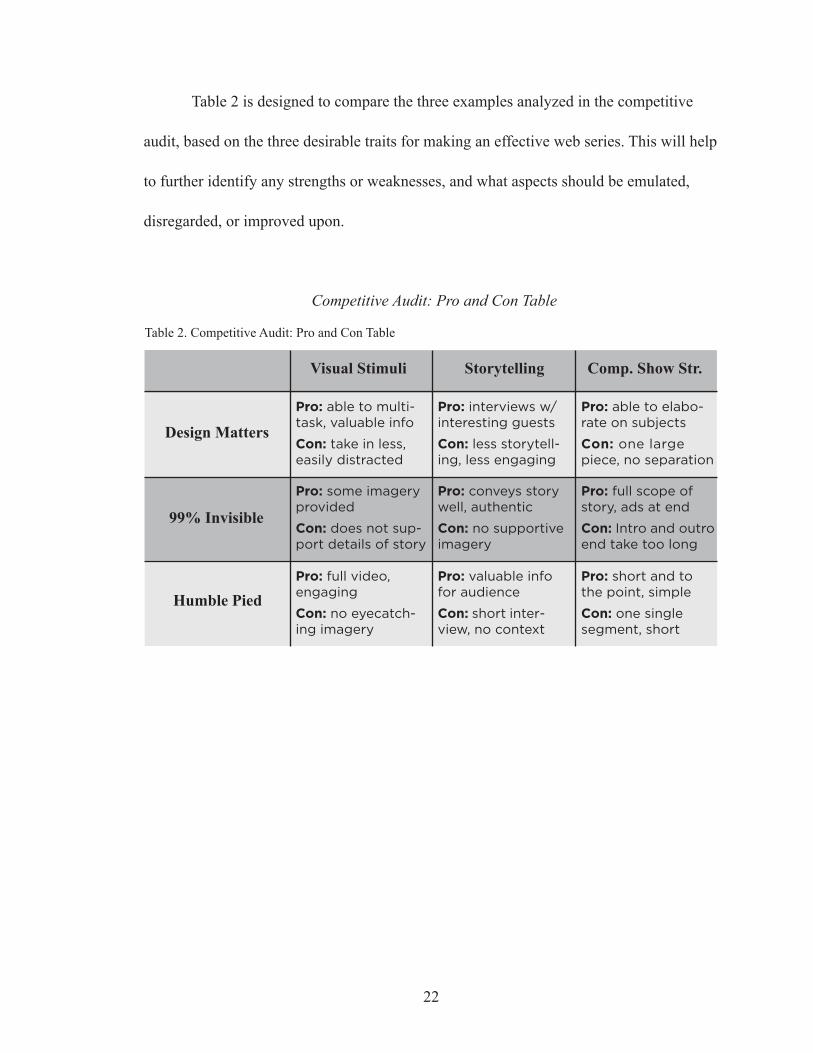
Table 2 is designed to compare the three examples analyzed in the competitive
audit, based on the three desirable traits for making an effective web series. This will help
to further identify any strengths or weaknesses, and what aspects should be emulated,
disregarded, or improved upon.
Evaluating Analogous Modes of Design Journalism in Relation to Desirable Attributes
In the Pro and Con Table in figure 2, each example of current design journalism
profiled in the competitive audit was evaluated in relation to the three desirable traits on
which the web series will be built.
An episode of Design Matters features interviews with well known designers
containing information that can be received while an audience member completes other
tasks; that same audience member could increase their likelihood of retaining that infor-
mation were they also presented with visual stimuli to focus on while the information is
delivered (Glaser, Schwan, 1006). And though an audible conveyance has shown to be
more effective and enjoyable than a version delivered through text (Chew, 127), Design
Matters’ interview format doesn’t necessarily include storytelling; which would allow
the audience to become an “active agent” in the learning process, rather than a “passive
receiver” (Lawrence, Paige, 66). This would allow the audience member to make con-
nections to their own experiences, making the information easier to recall later (Ribeiro,
Moreira, da Silva, 180). Also, while the podcast’s duration allows for elaboration on in-
terview topics and a broader context for the information to be framed, it might be difficult
for an audience member to compartmentalize the information being taken in and organize
it — an interview being one long piece — making it difficult to incorporate “deep levels
of learning” (Wang).
While 99% Invisible includes a representative image for each episode, that image
only helps to give an idea or “tease” of the subject matter each episode might contain.
As with Design Matters, were the audience to be presented with visual stimuli to sup-
23
port information as it is being presented, the likelihood of retaining the information given
could be increased. 99% Invisible uses storytelling as the main vehicle for the delivery of
information in each episode. This allows the information to be “more, real, more immedi-
ate, and more personal” (Lawrence, Paige, 66), making it easier for an audience member
to digest and retain. And while each episode consists of three separate segments— which
could promote the compartmentalization of the information presented (Wang) — the first
and last sections do not necessarily always pertain to the central theme of the episode,
having more to do with the show as an entity.
Humble Pied features both audio and video in each episode; the audio adds a hu-
man element (Chew, 127) while the video allows for increased focus on, and retention of,
the information being relayed and the imagery that is there to support it (Park, 30). Each
episode consists of a single question answered by a member of the design community,
and then the episode is abruptly ended. The information being presented is minimal in
comparison to that given in the other two examples featured in the competitive audit. This
leaves little opportunity for the compartmentalization of the information provided; due
to the fact so little is given. Also, because of the simple “question and answer” format,
storytelling isn’t always implemented which might be more likely to allow the audience
to apply the themes or ideas featured to their own knowledge base (Ribeiro, Moreira, da
Silva, 180).
24
IV. METHODOLOGY
To facilitate information retention, and ensure that the web show is being deliv-
ered in the most effective and enjoyable way possible, this web series will be designed
according to Hugh Dubberly’s Model of the Creative Process (Dubberly). The first step
involves reflecting on what the basic needs of the project are. The second step is to make
a prototype version of an episode and show it to a focus group style audience. The third
step is to receive feedback from that audience about their feelings in regard to how the
show was presented and how it might be improved. This process works in a continuous
fashion where the thoughts and criticism from the focus group are considered and then
applied to a revised version of that episode. Individuals involved in focus group testing,
along with a select group of industry professionals will be asked to share their feelings
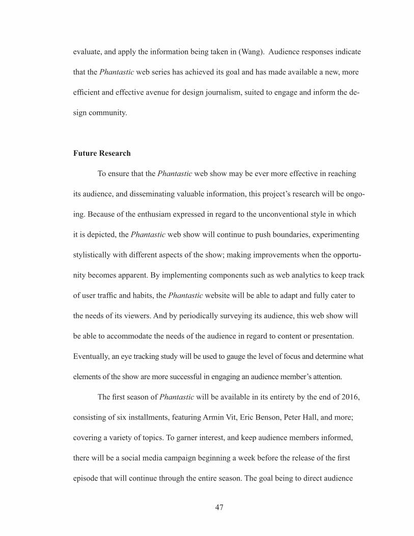
with a short survey (Appendix A) about the show’s presentation. Once all criticism has
been received and considered, adjustments to the show will be made accordingly, and the
process repeated until the show has reached an acceptable and engaging format.
Methods of Evaluation
One aspect of the creative process is receiving criticism so that a piece or proj-
ect might reach an optimal level of execution in its final form. In Lost in Translation:
The Emergence and Erasure of ‘New Thinking’ within Graphic Design Criticism in the
1990’s, Julia Moszkowicz talks about McCoy’s description of postmodern art criticism as
being part of the “Cranbrook mix” and how “new influences” built upon existing interest
and became a part of “a larger re-evaluation of graphic expression” (Moszkowicz, 249).
25
To craft the most successful rendition of the show possible, it will be honed by creating
and revising the presentation of the program based on criticism from members of the de-
sign community. The individuals supplying this criticism will be members of the design
community at varying stages in their career who are asked to share their feelings on the
presentation of the first episode by filling out a survey (appendix A).
Afterward, the focus group will be divided into three groups where they will
review either an episode of the proposed web show consisting of audio and video fea-
turing anthropomorphisms, an audio only version of that episode, or a typed transcript
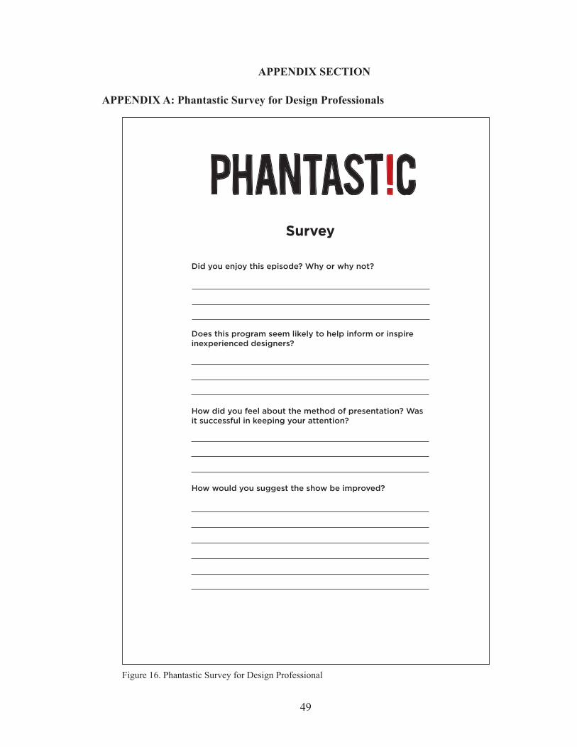
of the same episode. To test the level of information retention after receiving the same
information in these three ways, the focus groups will be asked to answer questions from
a quiz (Appendix B) containing the same questions regardless of the method in which the
information was delivered.
26
V. GENERATIVE RESEARCH
Logo
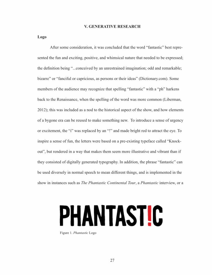
After some consideration, it was concluded that the word “fantastic” best repre-
sented the fun and exciting, positive, and whimsical nature that needed to be expressed;
the definition being “...conceived by an unrestrained imagination; odd and remarkable;
bizarre” or “fanciful or capricious, as persons or their ideas” (Dictionary.com). Some
members of the audience may recognize that spelling “fantastic” with a “ph” harkens
back to the Renaissance, when the spelling of the word was more common (Liberman,
2012); this was included as a nod to the historical aspect of the show, and how elements
of a bygone era can be reused to make something new. To introduce a sense of urgency
or excitement, the “i” was replaced by an “!” and made bright red to attract the eye. To
inspire a sense of fun, the letters were based on a pre-existing typeface called “Knock-
out”, but rendered in a way that makes them seem more illustrative and vibrant than if
they consisted of digitally generated typography. In addition, the phrase “fantastic” can
be used diversely in normal speech to mean different things, and is implemented in the
show in instances such as The Phantastic Continental Tour, a Phantastic interview, or a
27
Figure 1. Phantastic Logo
Phantastic Prize Giveaway. Or the host can use it as a device to indicate the end of an
interview “...well this has been Phantastic, thank you for joining me....”
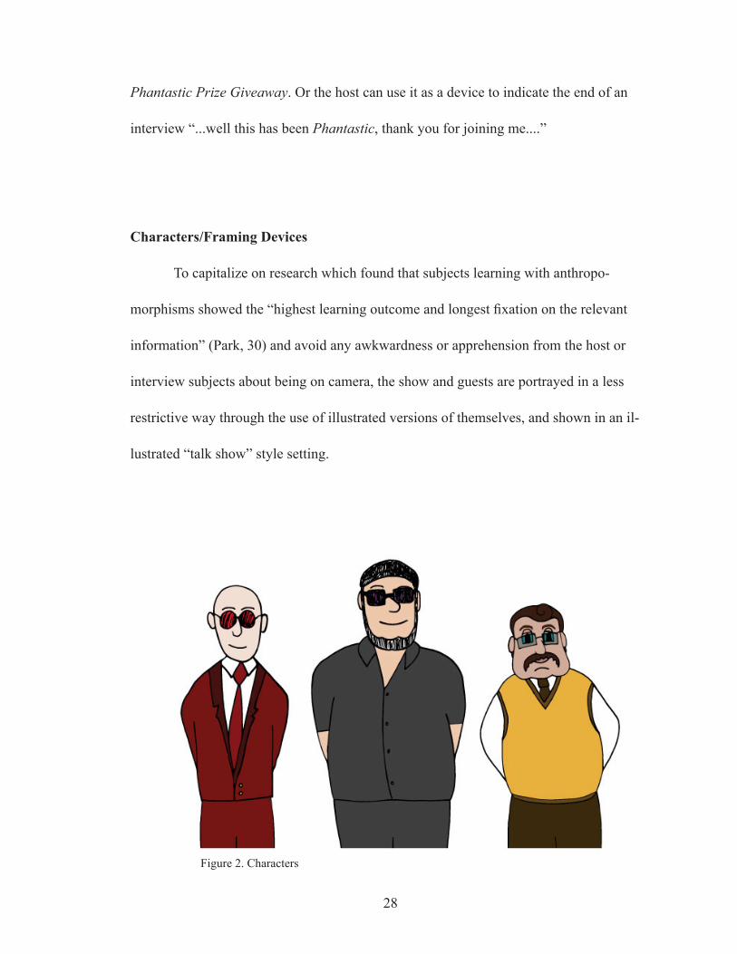
Characters/Framing Devices
To capitalize on research which found that subjects learning with anthropo-
morphisms showed the “highest learning outcome and longest fixation on the relevant
information” (Park, 30) and avoid any awkwardness or apprehension from the host or
interview subjects about being on camera, the show and guests are portrayed in a less
restrictive way through the use of illustrated versions of themselves, and shown in an il-
lustrated “talk show” style setting.
28
Figure 2. Characters
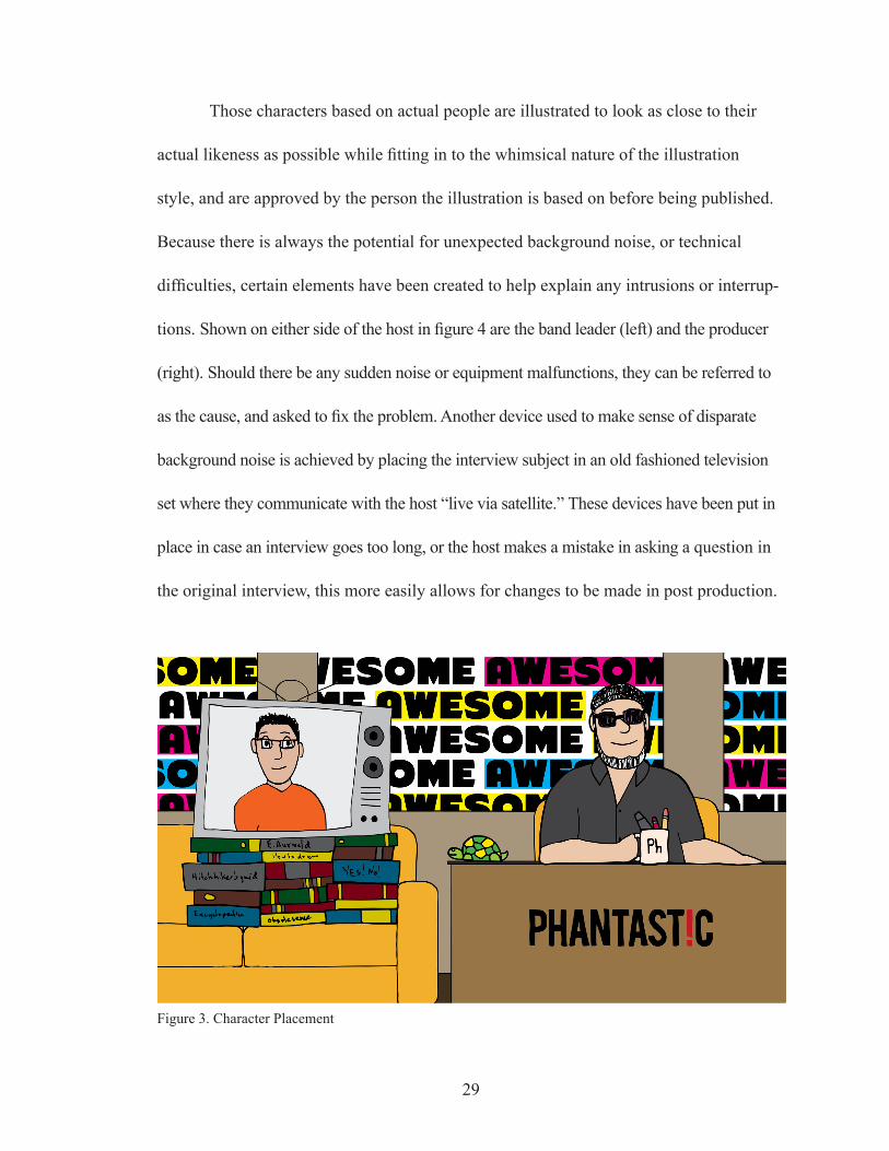
Those characters based on actual people are illustrated to look as close to their
actual likeness as possible while fitting in to the whimsical nature of the illustration
style, and are approved by the person the illustration is based on before being published.
Because there is always the potential for unexpected background noise, or technical
difficulties, certain elements have been created to help explain any intrusions or interrup-
tions. Shown on either side of the host in figure 4 are the band leader (left) and the producer
(right). Should there be any sudden noise or equipment malfunctions, they can be referred to
as the cause, and asked to fix the problem. Another device used to make sense of disparate
background noise is achieved by placing the interview subject in an old fashioned television
set where they communicate with the host “live via satellite.” These devices have been put in
place in case an interview goes too long, or the host makes a mistake in asking a question in
the original interview, this more easily allows for changes to be made in post production.
29
Figure 3. Character Placement

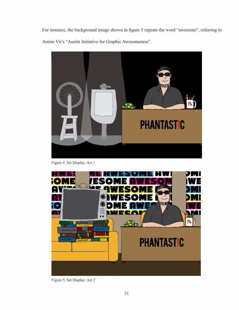
Set
The main setting for this web show will always display the host sitting behind
a desk with a small turtle sitting on it; the turtle always facing the speaker or subject
of speech if there is only one human depicted at the time — this is so the audience will
always know who is speaking, or what is being referred to in conversation. Then to add
depth to the frame, there is a couch and background image which can be seen through
windows in the backdrop. In the first segment of the show, the historical segment, every-
thing but the host, desk, and the items on the desk turns to black making a flat plain so
images pertaining to that segment can be shown with little distraction from non-related
background imagery, while including a few, constant, elements to maintain the context.
Supporting images can be shown while the host shares a monologue about an event or
figure in graphic design history.
Once it is time for the interview portion of the show, the regular set returns and
there is either an empty couch next to the host or a television with a blank screen sitting
on the couch (fig. 5) — the television being a device that can be used when the back-
ground noise for the interviewee and host does not match up due to location or editing
issues; allowing for some visual sense to be made in conjuction with the disparate audio.
If the television is present, the set will turn on revealing the guest as the introduction for
that guest begins. Otherwise, the guest would just be shown sitting on the couch next to
the host until the introduction is complete. The image shown through the windows of the
back drop would be unique to each episode, referring in some way to the body of work
done by the interviewee, to give the audience a sense of their design personality or style.
30
31
Figure 4. Set Display: Act 1
For instance, the background image shown in figure 5 repeats the word “awesome”, referring to
Armin Vit’s “Austin Initiative for Graphic Awesomeness”.
Figure 5. Set Display: Act 2
Color Palette
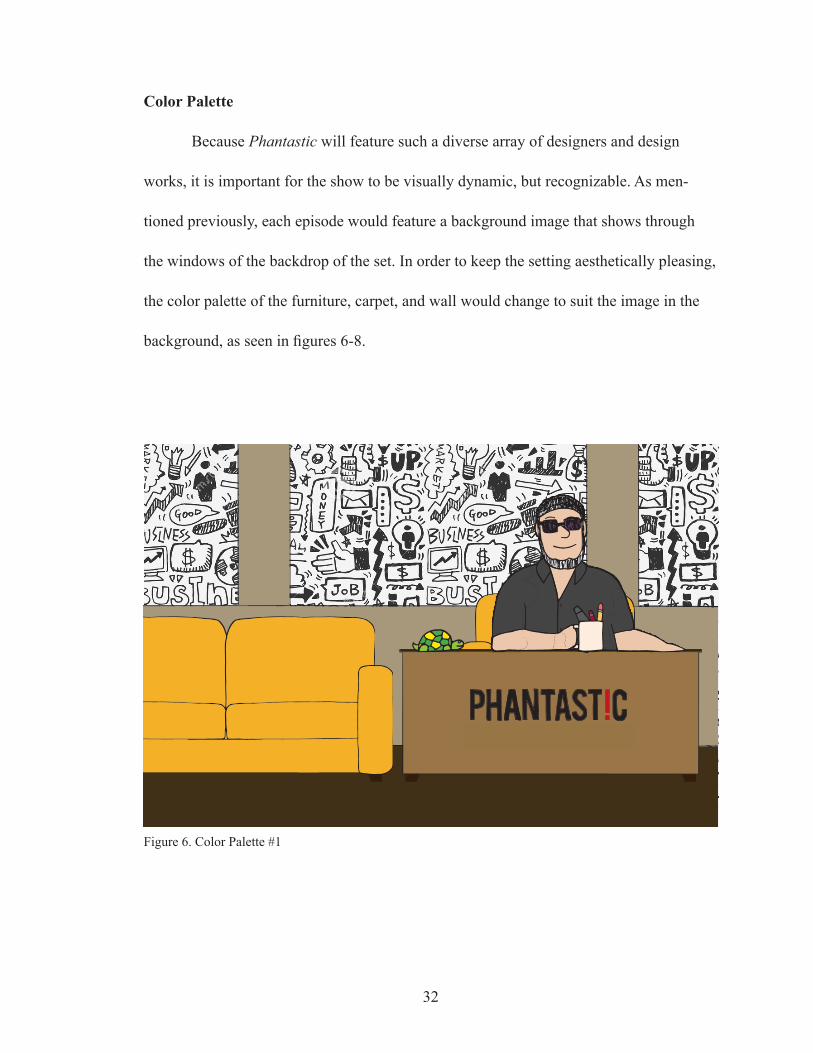
Because Phantastic will feature such a diverse array of designers and design
works, it is important for the show to be visually dynamic, but recognizable. As men-
tioned previously, each episode would feature a background image that shows through
the windows of the backdrop of the set. In order to keep the setting aesthetically pleasing,
the color palette of the furniture, carpet, and wall would change to suit the image in the
background, as seen in figures 6-8.
32
Figure 6. Color Palette #1

33
Figure 7. Color Palette #2
Figure 8. Color Palette #3
Pilot Episode
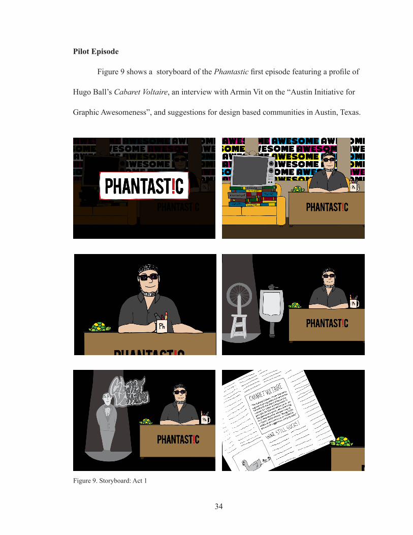
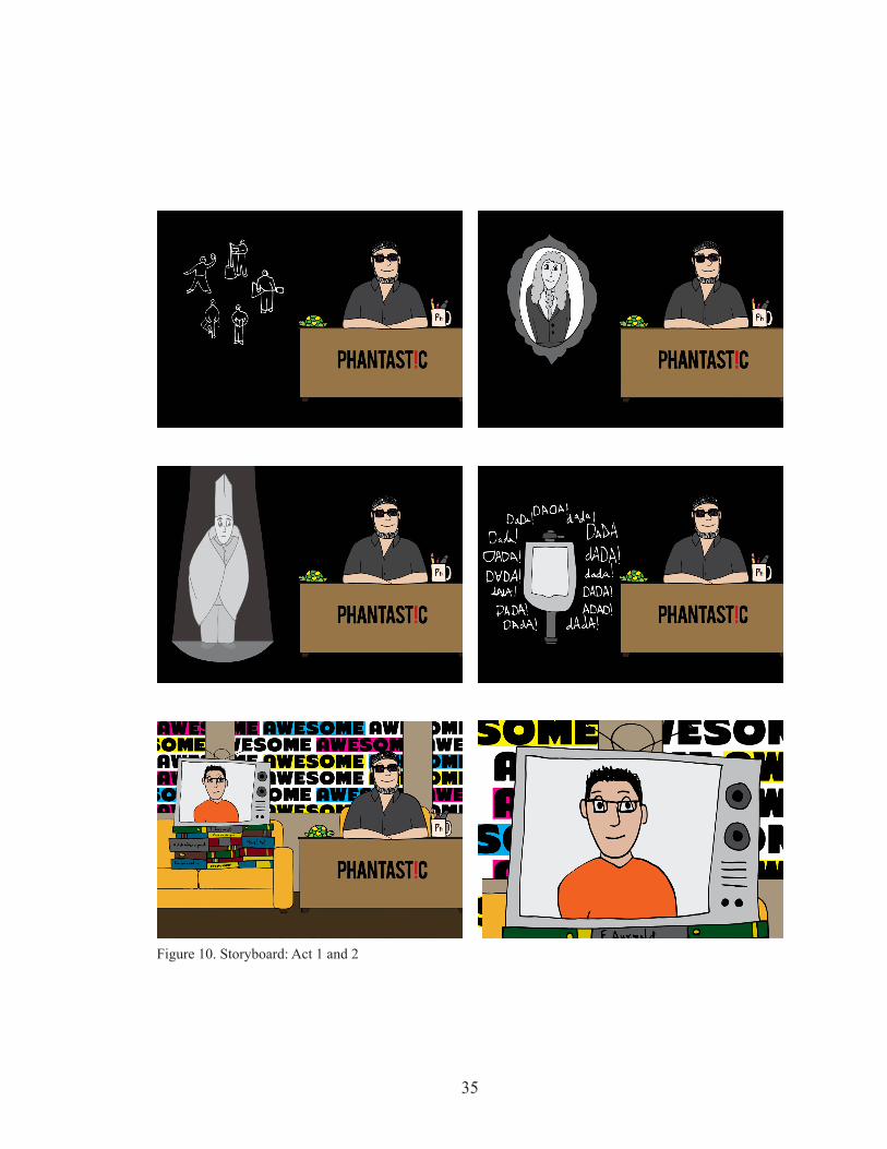
Figure 9 shows a storyboard of the Phantastic first episode featuring a profile of
Hugo Ball’s Cabaret Voltaire, an interview with Armin Vit on the “Austin Initiative for
Graphic Awesomeness”, and suggestions for design based communities in Austin, Texas.
34
Figure 9. Storyboard: Act 1
35
Figure 10. Storyboard: Act 1 and 2

36
Figure 11. Storyboard: Act 3
Website
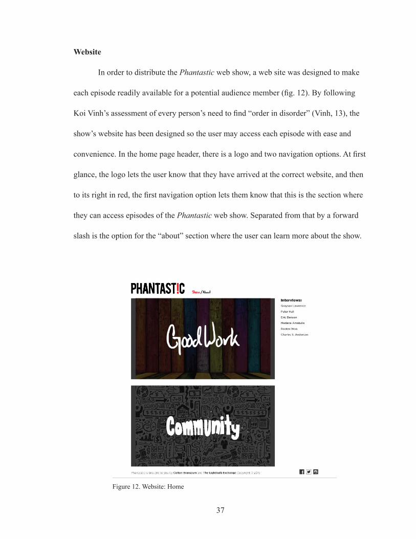
In order to distribute the Phantastic web show, a web site was designed to make
each episode readily available for a potential audience member (fig. 12). By following
Koi Vinh’s assessment of every person’s need to find “order in disorder” (Vinh, 13), the
show’s website has been designed so the user may access each episode with ease and
convenience. In the home page header, there is a logo and two navigation options. At first
glance, the logo lets the user know that they have arrived at the correct website, and then
to its right in red, the first navigation option lets them know that this is the section where
they can access episodes of the Phantastic web show. Separated from that by a forward
slash is the option for the “about” section where the user can learn more about the show.
37
Figure 12. Website: Home
In the body of this page on the left are representative images for each episode with
a word or phrase that describes the overarching theme of that episode, allowing the user
to quickly identify the subject covered within. Each image’s background would be used
in the backdrop of the corresponding episode. To the right of those images is a column
where a list of designers who have been previously featured on the show is arranged so
the user can select one of the names and will be taken to the episode in which they ap-
peared. Shown in the footer section of the page are credits and links to websites for the
host and design initiative that the web show is associated with, as well as a notice of
copyright and links to social media related to the Phantastic web show.
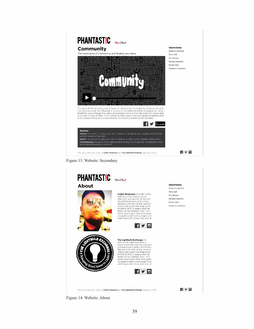
After finding the desired episode, the user can click the image (left) or name
(right) and will be taken to a secondary page (fig. 13) where the actual episode is found.
On this secondary page is the selected episode as well as a short description of its con-
tents. Below that are options to share the featured episode on social media, and a button
labeled “Sources” which activates a drop-down area where the user can view sources for
the information provided in that episode.
38
39
Figure 13. Website: Secondary
Figure 14. Website: About
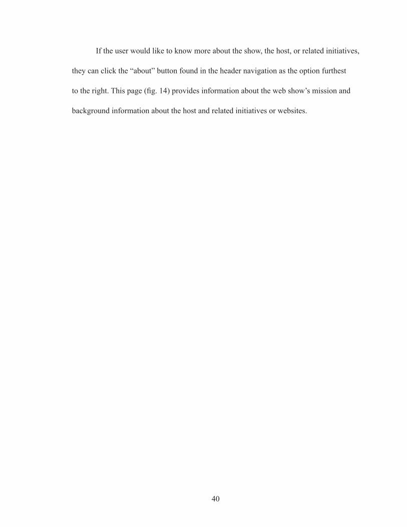
If the user would like to know more about the show, the host, or related initiatives,
they can click the “about” button found in the header navigation as the option furthest
to the right. This page (fig. 14) provides information about the web show’s mission and
background information about the host and related initiatives or websites.
40
VI. EVALUATIVE RESEARCH
Criticism
So that the Phantastic web show might more thoroughly entertain the audience
and successfully relay information through the use of visual stimuli, storytelling, and a
compartmentalized show structure, several professional designers were asked to view the
first episode of Phantastic and give a critique of the show and how it might be improved
for future episodes.
After watching the first episode and considering its various aspects, the overall
concensus was positive. The animation style was referred to as unique, and entertaining;
though it was suggested that more illustrated elements could be added to increase visual
interest. The show’s content was well recieved, being described as interesting, inspiring,
and informative. And the overall format was said to have a nice and thoughtful progres-
sion, and was well structured.
Focus Group Results
After being shown the first installment of the web show, a focus group of 10 audi-
ence members from the design community were asked to share their feelings about the
episode (appendix A). 80% responded positively, indicating that they enjoyed the method
of presentation, and that the show contained valuable information. The other 20% of the
audience surveyed expressed that the animation style was the leading factor in their dis-
satisfaction with the episode. Similar to the criticism from the previously mentioned de-
sign professionals, it was suggested that in order to remedy this aversion to the animation,
41
42
more movement might be implemented, and illustrative elements added which would
enable the show to be more visually interesting.
In order to test the effectiveness of the delivery of information to the target audi-
ence, 10 individuals were divided into three groups, each group being asked to take in
the information provided either by reading a transcript of the Phantastic first episode,
listening to the episode’s audio only, or viewing the episode with accompanying audio.
After being quizzed (appendix B) about the information they just received, the results
showed that while those who either read or listened to the information presented in the
episode without visual stimuli exhibited a similar amount of recollection and enjoyment;
those who received the information via visual stimuli and audio showed the highest rate
of information recall, and 100% responded positively when asked to rate the experience.
These focus group responses confirm that the animated web show format promotes en-
hanced information retention; being more effectively engaging and efficiently informative
compared to the existing text-only or audio-only formats.
43
Competitive Comparison
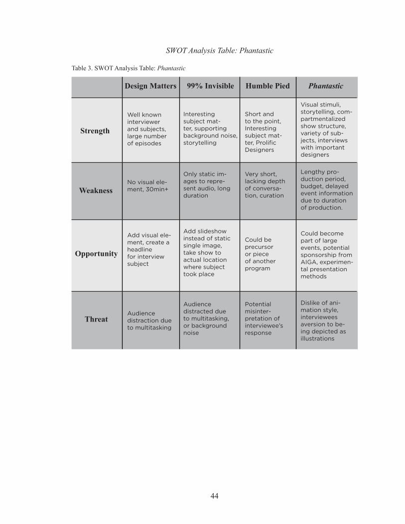
To identify successful or problematic areas of the Phantastic web show and its
production, and identify any favorable similarities or differences from the programs pro-
filed in figure 1; a second SWOT analysis table was created (table 3). Building upon the
positive aspects of the programs mentioned in the competitive audit, the Phantastic web
show was constructed with them in mind. To garner interest from the audience, the show
features prolific graphic designers, and covers an array of topics relevant to the discipline.
In order to hold the attention of the audience, the Phantastic web show has a video ele-
ment, similar to Humble Pied by Mig Reyes; Humble Pied however, is not animated.
Text Only
0
5
10
15
Audio Only Audio + Video(Phantastic web show)
Delivery Format
Avg.
Cor
rect
Ans
wer
s
98
11
Figure 15. Testing Results
44
Humble Pied PhantasticDesign Matters 99% Invisible
Strength
Weakness
Opportunity
Threat
Short and to the point, Interesting subject mat-ter, Prolific Designers
Very short, lacking depth of conversa-tion, curation
Could be precursor or piece of another program
Potential misinter-pretation of interviewee’s response
Visual stimuli, storytelling, com-partmentalized show structure, variety of sub-jects, interviews with important designers
Lengthy pro-duction period, budget, delayed event information due to duration of production.
Could become part of large events, potential sponsorship from AIGA, experimen-tal presentation methods
Dislike of ani-mation style, interviewees aversion to be-ing depicted as illustrations
Well known interviewer and subjects, large number of episodes
No visual ele-ment, 30min+
Add visual ele-ment, create a headline for interview subject
Audience distraction due to multitasking
Interesting subject mat-ter, supporting background noise, storytelling
Only static im-ages to repre-sent audio, long duration
Add slideshow instead of static single image, take show to actual location where subject took place
Audience distracted due to multitasking, or background noise
SWOT Analysis Table: Phantastic
Table 3. SWOT Analysis Table: Phantastic
Table 4. Pro and Con Table: Phantastic
PhantasticPro: engaging, illustrates ideas
Con: animation unconventional
Pro: gives contexts, elaborates on story
Con: a lot of info
Pro: organized, easy to navigate
Con: could use better transitions
Comp. Show Str.Visual Stimuli Storytelling
Design Matters
99% Invisible
Humble Pied
Pro: able to multi-task, valuable info
Con: take in less, easily distracted
Pro: some imagery provided
Con: does not sup-port details of story
Pro: full video, engaging
Con: no eyecatch-ing imagery
Pro: interviews w/ interesting guests
Con: less storytell-ing, less engaging
Pro: conveys story well, authentic
Con: no supportive imagery
Pro: valuable info for audience
Con: short inter-view, no context
Pro: able to elabo-rate on subjects
Con: one large piece, no separation
Pro: full scope of story, ads at end
Con: Intro and outro end take too long
Pro: short and to the point, simple
Con: one singlesegment, short
Pro and Con Table: Phantastic
45
VII. CONCLUSION
In creating this animated web series, the objective was to expand design jour-
nalism into a new and innovative format, which was uniquely suited to efficiently and
effectively engage and inform its audience. Doing so allowed for information to be more
palatable, permiting the show and its content to deliver a more effective transmission of
valuable information; promoting information retention. By achieving this, the Phantastic
web show will be able to effectively contribute to the discourse surrounding contempo-
rary graphic design practice.
The number of correct answers from audience members who received informa-
tion via combined audio and video as opposed to those who received the same informa-
tion through audio or text-only, indicates that with the implementation of visual stimuli,
or animation featuring anthropomorphisms to attract and hold their attention, audience
members showed a level of enhanced information retention (Park, 30) (Glaser, Schwan,
1006). And may reaffirm Baker’s assertion that this approach of incorporating imagery
while learning “will appeal to digital native learners” (Baker, 2). The use of storytelling
afforded audience members the opportunity to make connections between the information
presented and their own knowledge and experiences, adding increased context to the in-
formation being received (Ribeiro, Moreira, da Silva, 2014) making it believable, memo-
rable, and entertaining (Crawford, Smith, 26). These testing results also indicate that the
compartmentalized show structure presented the viewer with a palatable organization
of the information being presented by separating each segment using audible or visible
cues (Vinh, 13). This allowed the viewer to apply deeper methods of thinking to receive,
46
evaluate, and apply the information being taken in (Wang). Audience responses indicate
that the Phantastic web series has achieved its goal and has made available a new, more
efficient and effective avenue for design journalism, suited to engage and inform the de-
sign community.
Future Research
To ensure that the Phantastic web show may be ever more effective in reaching
its audience, and disseminating valuable information, this project’s research will be ongo-
ing. Because of the enthusiam expressed in regard to the unconventional style in which
it is depicted, the Phantastic web show will continue to push boundaries, experimenting
stylistically with different aspects of the show; making improvements when the opportu-
nity becomes apparent. By implementing components such as web analytics to keep track
of user traffic and habits, the Phantastic website will be able to adapt and fully cater to
the needs of its viewers. And by periodically surveying its audience, this web show will
be able to accommodate the needs of the audience in regard to content or presentation.
Eventually, an eye tracking study will be used to gauge the level of focus and determine what
elements of the show are more successful in engaging an audience member’s attention.
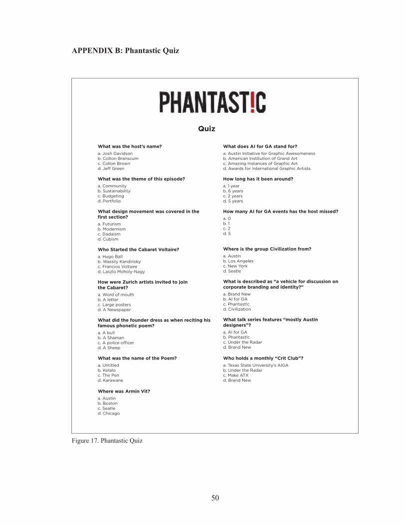
The first season of Phantastic will be available in its entirety by the end of 2016,
consisting of six installments, featuring Armin Vit, Eric Benson, Peter Hall, and more;
covering a variety of topics. To garner interest, and keep audience members informed,
there will be a social media campaign beginning a week before the release of the first
episode that will continue through the entire season. The goal being to direct audience
47

members to visit the Phantastic website for information about the show and what to
expect; and mark their calendars for upcoming episodes and events. The last three epi-
sodes will feature interviews from the Phantastic Continental Tour with Rosten Woo, Dr.
Mariana Amatullo, and Charles S. Anderson. To gain notoriety, and establish its place
in the design community, Phantastic will be presented to design conferences and events
in the form of a“pop-up” style booth where interviews can be held between events, and
information about the web show can be disseminated.
Though the Phantastic web series was created with the graphic design commu-
nity in mind, the research and method of delivering information in this thesis could be
applied to other disciplines or subjects beyond the realm of design. Also, the Phantastic
web show could be featured on resource and tutorial websites like Lynda.com, or Learn-
able.com. Whatever the application, the model applied to the Phantastic web show is an
engine that will engage and inform its audience efficiently and effectively.
48
APPENDIX SECTION
APPENDIX A: Phantastic Survey for Design Professionals
Did you enjoy this episode? Why or why not?
Does this program seem likely to help inform or inspire inexperienced designers?
How did you feel about the method of presentation? Was it successful in keeping your attention?
How would you suggest the show be improved?
Did you enjoy this episode? Why or why not?
Does this program seem likely to help inform or inspire inexperienced designers?
How did you feel about the method of presentation? Was it successful in keeping your attention?
How would you suggest the show be improved?
Survey Survey
49
Figure 16. Phantastic Survey for Design Professional
APPENDIX B: Phantastic Quiz
Quiz
What was the host’s name?
a. Josh Davidsonb. Colton Branscumc. Collon Brownd. Jeff Green
What was the theme of this episode?
a. Communityb. Sustainabilityc. Budgetingd. Portfolio
What design movement was covered in the first section?
a. Futurismb. Modernismc. Dadaismd. Cubism
Who Started the Cabaret Voltaire?
a. Hugo Ballb. Wassily Kandinskyc. Francios Voltaired. Laszlo Moholy-Nagy
How were Zurich artists invited to join the Cabaret?
a. Word of mouthb. A letterc. Large postersd. A Newspaper
What did the founder dress as when reciting his famous phonetic poem?
a. A bullb. A Shamanc. A police officerd. A Sheep
What was the name of the Poem?
a. Untitledb. Kolaloc. The Pend. Karawane
Where was Armin Vit?
a. Austinb. Bostonc. Seatled. Chicago
What does AI for GA stand for?
a. Austin Initiative for Graphic Awesomenessb. American Institution of Grand Artc. Amazing Instances of Graphic Artd. Awards for International Graphic Artists
How long has it been around?
a. 1 yearb. 6 yearsc. 2 yearsd. 5 years
How many AI for GA events has the host missed?
a. 0b. 1c. 2d. 5
Where is the group Civilization from?
a. Austinb. Los Angelesc. New Yorkd. Seatle
What is described as “a vehicle for discussion on corporate branding and identity?”
a. Brand Newb. AI for GAc. Phantast!cd. Civilization
What talk series features “mostly Austin designers”?
a. AI for GAb. Phantast!cc. Under the Radard. Brand New
Who holds a monthly “Crit Club”?
a. Texas State University’s AIGAb. Under the Radarc. Make ATXd. Brand New
50
Figure 17. Phantastic Quiz
APPENDIX C: Phantastic Season 1
Episodes in the Phantastic first season:
Ep.1 - “Community” - Armin Vit
Ep.2 -”Sustainability” - Eric Benson [in production]
Ep.3 -”Make/Do” - Peter Hall [in production]
Ep.4 - “Design for Social Impact - Global” - Mariana Amatullo [in production]
Ep.5 - “Design for Social Impact - Local” - Rosten Woo [in production]
Ep.6 - “Make/Do and History” - Charles Anderson [in production]
51
APPENDIX D: Phantastic Episode 1
To view episode, please visit http://www.PhantasticShow.com
52
REFERENCES
AIGA, Abrams, Janet. “Muriel Cooper.” AIGA. I.D. Magazine, 1994. Web. 26 Mar. 2016.
Baker, Lottie. “How Many Words Is A Picture Worth? Integrating Visual Literacy In
Language Learning With Photographs.” English Teaching Forum 53.4 (2015):
2-13. ERIC. Web. 5 Sept. 2016.
Baycheva-Merger, Tanya, and Bernhard Wolfslehner. “Evaluating The Implementation
Of The Pan-European Criteria And Indicators For Sustainable Forest Management
– A SWOT Analysis.” Ecological Indicators 60.(2016): 1192-1199. ScienceDi-
rect. Web. 1 Apr. 2016.
Champagne, Marc. Semiotics. n.p.: [New York] : Oxford University Press, [2014-], 2014.
Texas State - Alkek Library’s Catalog. Web. 14 Mar. 2016.
Chew, E. “To Listen Or To Read?” Audio Or Written Assessment Feedback For Interna-
tional Students In The UK.” On The Horizon 22.2 (2014): 127-135. Scopus®.
Web. 16 Feb. 2016.
Crawford, Caroline M.1, and Marion2 Smith. “Digital Storytelling As An Instrument Of
Learning: Storytelling As A Primary Form Of Communicative Learning Through
Mobile App Books.” International Journal Of The Book 11.2 (2014): 23-33.
Humanities Source. Web. 5 Sept. 2016.
Dictionary.com: “Fantastic | Define Fantastic at Dictionary.com.” Dictionary.com. N.p.,
n.d. Web. 21 Oct. 2016.
Design Observer. 2016. Web. 14 Mar. 2016.
Dubberly, Hugh. “A Model of The Creative Process.” Dubberly Design Office RSS. 20
53
Mar. 2009. Web. 07 Apr. 2016.
Glaser, Manuela, and Stephan Schwan. “Explaining Pictures: How Verbal Cues Influence
Processing Of Pictorial Learning Material.” Journal Of Educational Psychology
107.4 (2015): 1006-1018. PsycARTICLES. Web. 5 Sept. 2016.
Gardner, Howard. Multiple Intelligences [Electronic Resource] : New Horizons /
Howard Gardner. n.p.: New York : Basic Books, ©2006., 2006. Texas State -
Alkek Library’s Catalog. Web. 23 Feb. 2016.
Hall, Peter. “Design Writing.” Peter Hall (design Writer). Peter Hall. Web. 3 Feb. 2016.
Lawrence, Randee Lipson1, and Dennis Swiftdeer Paige. “What Our Ancestors Knew:
Teaching And Learning Through Storytelling.” New Directions For Adult &
Continuing Education 2016.149 (2016): 63-72. Education Source. Web. 5 Sept.
2016.
Liberman, Anatoly. “The Oddest English Spellings, Part 21: Phony from Top to Bottom |
OUPblog.” OUP Blog The Oddest English Spellings Part 21. 2012. Web. 27
Mar. 2016.
Meggs, Philip B., Alston W. Purvis, and Philip B. Meggs. Meggs’ History of Graphic
Design. Hoboken, NJ: J. Wiley & Sons, 2006. Print.
Millman, Debbie. “DebbieMillman.” Debbie Millman. Web. 02 Feb. 2016.
Moszkowicz, Julia. “Lost In Translation: The Emergence And Erasure Of ‘New Thinking’
Within Graphic Design Criticism In The 1990S.” Journal Of Design History 24.3
(2011): 241-254. Art Source. Web. 7 Apr. 2016
Park, Babette, et al. “Emotional Design And Positive Emotions In Multimedia Learning:
54
An Eyetracking Study On The Use Of Anthropomorphisms.” Computers &
Education 86. (2015): 30-42. ScienceDirect. Web. 15 Apr. 2015.
Popova, Anguelina, Paul A. Kirschner, and Richard Joiner. “Effects Of Primer Podcasts
On Stimulating Learning From Lectures: How Do Students Engage?.” British
Journal Of Educational Technology 45.2 (2014): 330-339. Science & Technology
Collection. Web. 6 Oct. 2015.
Poulin, Richard. Graphic Design Architecture, a 20th Century History: A Guide to Type,
Image, Symbol, and Visual Storytelling in the Modern World. Beverly, MA:
Rockport, 2012. Albert B. Alkek Library. Texas State University, 2012. Web. 2
Feb. 2016.
Rand, Paul. “Paul-Rand.com.” Biography. Paul-Rand.com, 11 Apr. 2007. Web. 24
Mar. 2016.
Ribeiro, Sandra, António Moreira, and Cristina Pinto da Silva. “Digital Storytelling:
Emotions In Higher Education.” International Association For Development Of
The Information Society (2014): ERIC. Web. 16 Feb. 2016.
Ross, Martha. “Listen up! Podcast boom fills in commutes and other down time.” San
Jose Mercury News (CA) 05 Feb. 2015: Points of View Reference Center. Web. 1
Apr. 2016.
Wang, Jui-Sheng1, et al. “How Clear And Organized Classroom Instruction And Deep
Approaches To Learning Affect Growth In Critical Thinking And Need For
Cognition.” Studies In Higher Education 40.10 (2015): 1786-1807. Education
Source. Web. 5 Sept. 2016.
55
Vinh, Khoi. Ordering Disorder : Grid Principles For Web Design / Khoi Vinh. n.p.:
Berkeley, Calif. : New Riders, 2011., 2011. Texas State - Alkek Library’s
Catalog. Web. 23 Feb. 2016.