Embed Size (px)
Citation preview
Perceptually-Based Brush Strokes for Nonphotorealistic Visualization
CHRISTOPHER G. HEALEY and LAURA TATEOSIAN
North Carolina State University
and
JAMES T. ENNS and MARK REMPLE
The University of British Columbia
An important problem in the area of computer graphics is the visualization of large, complex information spaces. Datasetsof this type have grown rapidly in recent years, both in number and in size. Images of the data stored in these collectionsmust support rapid and accurate exploration and analysis. This article presents a method for constructing visualizations thatare both effective and aesthetic. Our approach uses techniques from master paintings and human perception to visualize amultidimensional dataset. Individual data elements are drawn with one or more brush strokes that vary their appearance torepresent the element’s attribute values. The result is a nonphotorealistic visualization of information stored in the dataset. Ourresearch extends existing glyph-based and nonphotorealistic techniques by applying perceptual guidelines to build an effectiverepresentation of the underlying data. The nonphotorealistic properties the strokes employ are selected from studies of thehistory and theory of Impressionist art. We show that these properties are similar to visual features that are detected by the low-level human visual system. This correspondence allows us to manage the strokes to produce perceptually salient visualizations.Psychophysical experiments confirm a strong relationship between the expressive power of our nonphotorealistic properties andprevious findings on the use of perceptual color and texture patterns for data display. Results from these studies are used toproduce effective nonphotorealistic visualizations. We conclude by applying our techniques to a large, multidimensional weatherdataset to demonstrate their viability in a practical, real-world setting.
Categories and Subject Descriptors: H.1.2 [Models and Principles]: User/Machine Systems—human factors, human infor-mation processing; I.3.3 [Computer Graphics]: Picture/Image Generation—display algorithms; I.3.6 [Computer Graphics]:Methodology and Techniques—interaction techniques; J.5 [Arts and Humanities]—fine arts
General Terms: Experimentation, Human Factors, Performance
Additional Key Words and Phrases: Abstractionism, color, computer graphics, human vision, Impressionism, nonphotorealisticrendering, perception, psychophysics, scientific visualization, texture
1. INTRODUCTION
Visualization is the conversion of collections of strings and numbers (datasets) into images that are usedto explore, discover, validate, and analyze. The term “scientific visualization” originated during an NSFpanel on graphics and image processing [McCormick et al. 1987], although the field had a long and richhistory prior to this meeting (e.g., cartography, or charts and graphs [MacEachren 1995; Slocum 1998; Tufte1983; 1990; 1997]). A number of important research problems were identified during these initial discussions.
This work was supported in part by the National Science Foundation (NSF) grant CISE-ACI-0083421, and by the National
Sciences and Engineering Research Council of Canada.Authors’ addresses: C. G. Healey and L. Tateosian, Department of Computer Science, 173 Venture III Suite 165A, 900Main Campus Drive #8207, North Carolina State University, Raleigh, NC, 27695-8207; email: [email protected]; [email protected]; J. T. Enns and M. Remple, Department of Psychology, 2136 Main Mall, University of British Columbia,Vancouver, B. C., Canada, V6T 1Z4; email: [email protected]; [email protected] to make digital/hard copy of all or part of this material without fee for personal or classroom use provided thatthe copies are not made or distributed for profit or commercial advantage, the ACM copyright/server notice, the title of thepublication, and its date appear, and notice is given that copying is by permission of the ACM, Inc. To copy otherwise, torepublish, to post on servers, or to redistribute to lists requires prior specific permission and/or a fee.c© 2004 ACM 0730-0301/2004/0100-0001 $5.00
ACM Transactions on Graphics, Vol. 23, No. 1, January 2004.
2 · Christopher G. Healey et al.
In particular, panelists emphasized the need for ways to manage the overwhelming amount of data beinggenerated. This is not only an issue of the total number of sample points or data elements stored in adataset (i.e., its size). Each element may also encode multiple values representing multiple independentdata attributes (i.e., its dimensionality). The challenge is to design methods to represent even some of thisinformation together in a common display, without overwhelming a viewer’s ability to make sense of theresulting images.
A follow-up report on advances in scientific visualization discussed new techniques in important applicationareas such as volume and flow visualization [Rosenblum 1994]. At the same time, the report noted that muchless progress had been made towards application-independent methods for managing and displaying large,multidimensional datasets. Increasing information quality and quantity remains an open problem; this needwas again emphasized during a recent DOE/NSF meeting on research directions in visualization [Smith andVan Rosendale 1998].
Work in our laboratories has studied various issues in scientific visualization for much of the last ten years.A large part of this effort has focused on multidimensional visualization, the need to visualize multiple layersof overlapping information simultaneously in a common display. We often divide this problem into two steps:
(1) The design of a data-feature mapping M , a function that defines visual features (e.g., color, texture, ormotion) to represent the data.
(2) An analysis of a viewer’s ability to use the images produced by M to explore and analyze the data.
A multidimensional dataset D represents m attributes A = (A1, . . . , Am) recorded at n sample points ei,that is, D = {e1, . . . , en} and ei = (ai,1, . . . , ai,m), ai,j ∈ Aj . A data-feature mapping M(V, Φ) defines mvisual features Vj ∈ V to use to display values for each Aj; it also defines a corresponding Φj : Aj → Vj
to map the domain of Aj to the range of displayable values in Vj . An effective M must generate imagesthat allow viewers to “see” effortlessly within their data. The need to build fundamental techniques that areappropriate for a wide range of visualization environments further complicates this problem.
The guidelines used to design our M are based on the perceptual abilities of the low-level human visualsystem. Previous work has documented different methods for harnessing perception during visualization[Bergman et al. 1995; Grinstein et al. 1989; Healey 1996; Healey et al. 1996; Healey and Enns 1999; Rheingansand Tebbs 1990; Rogowitz and Treinish 1993; Ware 1988; 2000; Ware and Knight 1995; Weigle et al.2000]. Certain visual features are detected very quickly by the visual system [Egeth and Yantis 1997; Mackand Rock 1998; Pomerantz and Pristach 1989; Rensink 2000; Simons 2000; Triesman 1985; Triesman andGormican 1988; Wolfe 1994; Wolfe et al. 2000]; when combined properly, these same features can be usedto construct multidimensional displays that support rapid, accurate, and effortless exploration and analysis.For example, properties of color and texture (e.g., luminance, hue, contrast, or regularity) are often used torepresent different attributes in a dataset. The way that color and texture are mapped to the data attributesis controlled using results from psychophysical studies of our ability to distinguish between different colorand texture patterns. The application of perception in aid of visualization has shown great promise, and hasbeen explicitly cited as an important area of current and future research [Smith and Van Rosendale 1998].
More recently, we have initiated a new set of investigations that focus on the question: “Can we make ourvisualizations aesthetically pleasing?” The way an image initially attracts a viewer’s attention is differentfrom how it holds a viewer’s interest over time. Cognitive scientists use the terms “orienting” and “engaging”to describe the distinct psychophysical processes involved in these two aspects of attention [Coren et al. 2003].Display techniques that invoke these responses could be used to direct attention to important propertiesin a visualization, and to then encourage the visual system to perform a more detailed analysis withinthese areas. The idea of building artistically-motivated visualizations was also based on nonphotorealisticrendering algorithms in computer graphics [Curtis et al. 1997; Haberli 1990; Hertzmann 1998; Hsu and Lee1994; Litwinowicz 1997; Meier 1996; Strassmann 1986], and by the efforts of researchers such as InterranteACM Transactions on Graphics, Vol. 23, No. 1, January 2004.
Perceptually-Based Brush Strokes for Nonphotorealistic Visualization · 3
[Interrante 2000], Laidlaw [Kirby et al. 1999; Laidlaw 2001; Laidlaw et al. 1998], and Ebert and Rheingans[Ebert and Rheingans 2000; Rheingans and Ebert 2001] to extend this work to a visualization environment.Nonphotorealistic techniques represent a promising method to both orient and engage a viewer’s attentionwithin an image.
Certain movements in painting (e.g., Impressionism, Abstractionism, or watercolor) are characterized bya set of fundamental styles [Brown 1978; Schapiro 1997; Venturi 1978]. If the basic brush stroke propertiesembodied in these styles can be identified and simulated on a computer, we believe they can then be usedto represent individual data attributes in a multidimensional dataset. Our goal is an image that looks likea painting, not of a real-world scene, but rather of the information contained in the dataset.
Such a technique might initially seem difficult to control and test. An important insight is that many brushstroke properties correspond closely to perceptual features that are detected by our visual system. In somesense this is not surprising. Artistic masters understood intuitively which properties of a painting wouldorient a viewer’s gaze and engage their thoughts. We believe this overlap can act as a bridge between artisticstyles and low-level vision, allowing us to apply our knowledge of perception to predict how nonphotorealistictechniques will perform in a visualization environment. In addition, psychophysical experiments offer acontrolled method for studying the fundamental strengths and limitations of a given stroke property, both inisolation and in combination with other properties shown together in the same display. In order to use thecorrespondence between painting and perception during multidimensional visualization, we need to show thatour perceptual guidelines extend to a nonphotorealistic domain. Perceptually salient displays will guaranteean effective presentation of information.
We begin this article with a brief overview of nonphotorealistic rendering, followed by a description ofpainting styles in Impressionism and their correspondence to perceptual features in vision. We continuewith an explanation of the guidelines that are used to construct perceptually salient brush strokes. We nextdiscuss a set of experiments that test the expressiveness of our nonphotorealistic properties to confirm thattheir abilities match the perceptual rules on which they are based. Finally, we describe a visualization systembuilt from our experimental findings, and demonstrate its use for exploring a collection of multidimensionalweather datasets.
2. NONPHOTOREALISTIC RENDERING
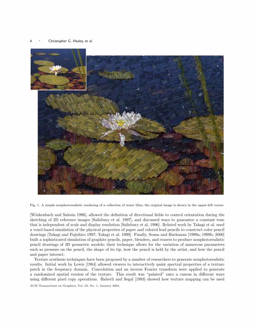
For many years researchers in the areas of modeling and rendering in computer graphics have studied theproblem of producing photorealistic images, images of graphical models that are indistinguishable fromphotographs of an equivalent real-world scene. Advances in areas such as the simulation of global lighttransport, modeling of natural phenomena, and image-based rendering have made dramatic strides towardsachieving this goal. At the same time, researchers have approached the issue of image generation from acompletely different direction. Although photographs are common, there are many other compelling methodsof visual discourse, for example, oil and watercolor paintings, pen and ink sketches, cel animation, andline art. In certain situations, these nonphotorealistic renderings are often considered more effective, moreappropriate, or even more expressive than an equivalent photograph [Gooch and Gooch 2001; Strothotteand Schlechtweg 2002] (see Figure 1).
Different methods have been suggested to simulate different artistic styles. For example, researchers fromthe University of Washington presented a collection of techniques for generating pen-and-ink sketches. Theirinitial work focused on using multiresolution curves [Finkelstein and Salesin 1994] to build a stroke texture,a prioritized collection of simulated pen strokes that are drawn to create stroke patches with a specifictexture and tone. The stroke textures are used to construct nonphotorealistic renderings of 3D polygonalmodels [Winkenbach and Salesin 1994], and to interactively convert greyscale reference images into pen-and-ink sketches [Salisbury et al. 1994]. Follow-on work extended the stroke textures to parametric surfaces
ACM Transactions on Graphics, Vol. 23, No. 1, January 2004.
4 · Christopher G. Healey et al.
Fig. 1. A simple nonphotorealistic rendering of a collection of water lilies; the original image is shown in the upper-left corner
[Winkenbach and Salesin 1996], allowed the definition of directional fields to control orientation during thesketching of 2D reference images [Salisbury et al. 1997], and discussed ways to guarantee a constant tonethat is independent of scale and display resolution [Salisbury et al. 1996]. Related work by Takagi et al. useda voxel-based simulation of the physical properties of paper and colored lead pencils to construct color pencildrawings [Takagi and Fujishiro 1997; Takagi et al. 1999]. Finally, Sousa and Buchanan [1999a; 1999b; 2000]built a sophisticated simulation of graphite pencils, paper, blenders, and erasers to produce nonphotorealisticpencil drawings of 3D geometric models; their technique allows for the variation of numerous parameterssuch as pressure on the pencil, the shape of its tip, how the pencil is held by the artist, and how the penciland paper interact.
Texture synthesis techniques have been proposed by a number of researchers to generate nonphotorealisticresults. Initial work by Lewis [1984] allowed viewers to interactively paint spectral properties of a texturepatch in the frequency domain. Convolution and an inverse Fourier transform were applied to generatea randomized spatial version of the texture. This result was “painted” onto a canvas in different waysusing different pixel copy operations. Haberli and Segal [1993] showed how texture mapping can be usedACM Transactions on Graphics, Vol. 23, No. 1, January 2004.
Perceptually-Based Brush Strokes for Nonphotorealistic Visualization · 5
to produce a number of fundamental drawing primitives, including air brush and painted effects. Morerecently, Hertzmann et al. [2001] constructed feature analogies to automatically generate nonphotorealisticresults. Texture synthesis techniques were applied to two images I and I ′ to learn how features in I map tocorresponding features in I ′ (e.g., I could be a photograph and I ′ a painterly rendition of the photograph).Hertzmann used the resulting image analogy to automatically generate a nonphotorealistic image J ′ from anew source image J . The image analogy embodies J ′ with style properties similar to those seen in I ′.
Our interests lie mainly in nonphotorealistic techniques that use simulated brush strokes to produce imagesthat look like paintings. An early example of this idea was proposed by Strassmann [1986]; he constructeda “hairy brush”, a collection of bristles placed along a line segment. Japanese-style sumi brush strokes wereproduced by applying ink to the brush, then moving it along a path over a simulated paper surface. Laterwork by Haberli [1990] allowed users to paint by stroking a brush over an underlying target image. Thesize, shape, color, location, and direction of brush strokes were varied to produce different representationsof the target. Hsu and Lee [1994] defined a reference backbone and reference thickness for a base texture,then warped these properties parametrically to produce line art images. This generated expressive strokeswith complex paths of varying thickness. Litwinowicz [1997] clipped simple strokes to object boundariesin a reference image, then rendered the strokes as lines and texture maps with variable length, thickness,direction, and color. A stroke’s properties were selected based on the image properties of the object itrepresented. Curtis et al. [1997] built a fluid-flow simulation to model the interactions of brush, pigment,and paper during the painting of watercolor images. Their system produced subtle watercolor effects suchas dry-brush, backruns, and color glazing. Shiraishi and Yamaguchi [1999] computed image moments on atarget image; these values controlled the color, location, orientation, and size of texture-mapped brush strokesin a painterly rendering of the target. Hertzmann [1998] decomposed a reference image into a level-of-detailhierarchy by applying Gaussian kernels with increasing support. This generated a collection of referenceimages, each with different amounts of blurring. The images were painted using strokes with a radiusproportional to the kernel size. Each stroke was modeled as a spline that varied in its length, size, opacity,placement, and color jitter. The individual paintings were composited to produce a nonphotorealistic result.Meier [1996] addressed the goal of animating nonphotorealistic renderings by attaching particles to surfacesin a 3D geometric scene, then drawing a brush stroke with scene-controlled color, size, and direction at eachparticle position. Information stored within a particle ensured a consistent stroke appearance. This produceda smooth animation free of the visual artifacts that result from inconsistent variations in the appearance ofa stroke across multiple frames. Gooch et al. [2002] segmented an image into closed regions representingimage features; the medial axis of a region defined the locations and directions of brush strokes that wereused to paint the region. Finally, Hertzmann [2002] proposed a method for simulating the appearance oflighting on the brush strokes in a painting. A height field was associated with each brush stroke, producinga global height map as the strokes were painted; the height map was then used to bump-map the paintingwith a Phong shading model.
More recently, researchers in scientific visualization have started to investigate how techniques from non-photorealistic rendering might be used to improve the expressiveness of a data display. Laidlaw extendedthe layered approach of Meier to visualize multidimensional data in a painterly fashion [Kirby et al. 1999;Laidlaw 2001; Laidlaw et al. 1998]. He varied style properties such as underpainting lightness and strokesize, transparency, direction, saturation, and frequency to display multiple layers of information in a singlenonphotorealistic image. Interrante [2000] discussed constructing natural textures to visualize multidimen-sional data. Finally, Ebert and Rheingans used nonphotorealistic techniques such as silhouettes, sketch lines,and halos to highlight important features in a volumetric dataset [Ebert and Rheingans 2000; Rheingansand Ebert 2001]. More recent work applied stipple drawing techniques to interactively preview scientific andmedical volumes [Lu et al. 2002].
ACM Transactions on Graphics, Vol. 23, No. 1, January 2004.
6 · Christopher G. Healey et al.
Nonphotorealistic rendering produces images that are expressive by making use of a wide range of paintingstyles. Promising results from scientific visualization show that these ideas can be extended to the problemof representing information. This suggests that it may be possible to construct flexible brush stroke glyphsto visualize multidimensional data elements. To do this properly, however, we must ensure our brush strokeswill form nonphotorealistic visualizations that are effective in their ability to represent multidimensionaldata. The use of nonphotorealistic techniques also holds promise for constructing visualizations that areseen as aesthetic or beautiful by our viewers.
Our investigations focus on understanding and controlling the expressive abilities of different nonpho-torealistic brush stroke properties during visualization. These properties can then be used to producenonphotorealistic images that are both effective and engaging.
3. PAINTING STYLES
The fundamental properties of a nonphotorealistic image can be identified in part by studying the stylesused by artists to construct their paintings. Our investigation of nonphotorealistic properties is directedby two separate criteria. First, we are restricting our search to a particular movement in art known asImpressionism. Second, we attempt to match brush stroke characteristics from the Impressionist paintingstyle with corresponding visual features that have been shown to be effective in a perceptual visualizationenvironment. There are no technical reasons for our choice of Impressionism over any other movement. Infact, we expect the basic theories behind our technique will extend to other types of artistic presentation.For our initial work, however, we felt it was important to narrow our focus to a set of fundamental goals inthe context of a single type of painting style.
The term “Impressionism” was attached to a small group of French artists (initially including Monet,Degas, Manet, Renoir, and Pissaro, and later Cezanne, Sisley, and van Gogh, among others) who broke fromthe traditional schools of the time to approach painting from a new perspective. The Impressionist techniquewas based on a number of underlying principles [Brown 1978; Schapiro 1997; Venturi 1978], for example:
(1) Object and environment interpenetrate. Outlines of objects are softened or obscured (e.g., Monet’s waterlilies); objects are bathed and interact with light; shadows are colored and movement is represented asunfinished outlines.
(2) Color acquires independence. There is no constant hue for an object, atmospheric conditions and lightmoderate color across its surface; objects may reduce to swatches of color.
(3) Solicit a viewer’s optics. Study the retinal system; divide tones as separate brush strokes to vitalizecolor rather than greying with overlapping strokes; harness simultaneous contrast; use models from colorscientists such as Chevreul [1967] or Rood [1879].
(4) Minimize perspective. Perspective is shortened and distance reduced to turn 3D space into a 2D image.
(5) Show a small section of nature. The artist is not placed in a privileged position relative to nature; theworld is shown as a series of close-up details.
Although these general characteristics are perhaps less precise than we might prefer, we can still draw anumber of important conclusions. Properties of hue, luminance, and lighting were explicitly controlled andeven studied in a scientific fashion by some of the Impressionists (e.g., Seurat’s use of scientific models ofcolor [Chevreul 1967; Hering 1964; Rood 1879]). Rather than building an “object-based” representation, theartists appear to be more concerned with subdividing a painting based on the interactions of light with colorand other surface features. Additional properties can be identified by studying the paintings themselves.These properties often varied dramatically between individual artists, acting to define their unique paintingtechniques. Examples include:ACM Transactions on Graphics, Vol. 23, No. 1, January 2004.
Perceptually-Based Brush Strokes for Nonphotorealistic Visualization · 7
—Path. The direction a brush stroke follows; van Gogh made extensive use of curved paths to defineboundaries and shape in his paintings; other artists favored simpler, straighter strokes,
—Length. The length of individual strokes on the canvas, often used to differentiate between contextuallydifferent parts of a painting,
—Density. The number and size of strokes laid down in a fixed area of canvas,—Coverage. The amount of canvas or underpainting that shows through the foreground strokes,—Coarseness. The coarseness of the brush used to apply a stroke; a coarser brush causes visible bristle lines
and surface roughness, and—Weight. The amount of paint applied during each stroke; heavy strokes highlight coarseness and stroke
boundaries, and produce ridges of paint that cause underhanging shadows when lit from the properdirection.
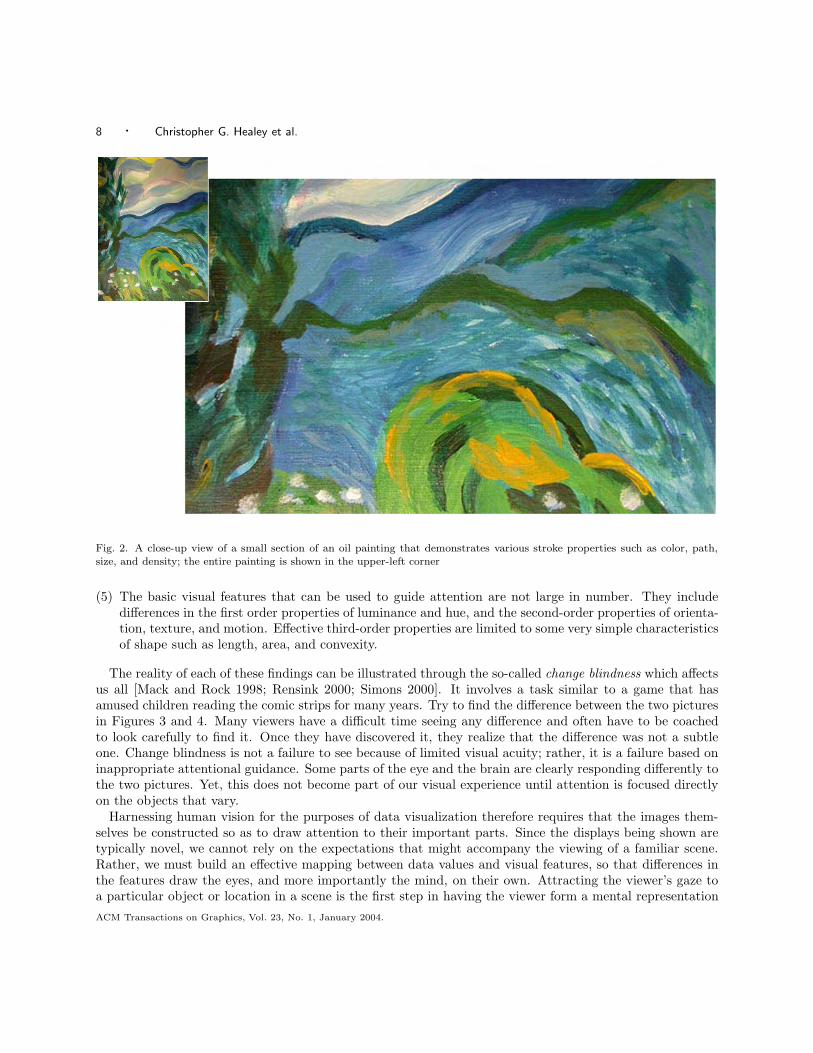
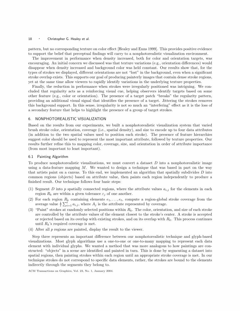
Figure 2 shows a close-up view of an oil painting that demonstrates different brush stroke properties suchas color, path, size, and density. Although by no means exhaustive, this collection of features provides a goodstarting point for our work. All of the stroke properties we use are evaluated for effectiveness by identifyingtheir perceptual characteristics, and by validating their ability to support visualization, discovery, analysis,and presentation in a real-world application environment.
4. PERCEPTUAL PROPERTIES
Recent research in visualization has explored ways to apply rules of perception to produce images that arevisually salient [Ware 2000]. This work is based in large part on psychophysical studies of the low-levelhuman visual system. One of the most important lessons of the past twenty-five years is that human visiondoes not resemble the relatively faithful and largely passive process of modern photography [Pomerantz andPristach 1989; Triesman 1985; Triesman and Gormican 1988; Wolfe 1994; Wolfe et al. 2000]. The goal ofhuman vision is not to create a replica or image of the seen world in our heads. A much better metaphor forvision is that of a dynamic and ongoing construction project, where the products being built are short-livedmodels of the external world that are specifically designed for the current visually guided tasks of the viewer[Egeth and Yantis 1997; Mack and Rock 1998; Rensink 2000; Simons 2000]. There does not appear to be anygeneral purpose vision. What we “see” when confronted with a new scene depends as much on our goals andexpectations as it does on the array of light that enters our eyes. Among the research findings responsiblefor this altered view of “seeing” is a greater appreciation of:
(1) Detailed form and color vision is only possible for a tiny window of several degrees of arc surroundingthe current gaze location. “Seeing” beyond the single glance therefore requires a time-consuming seriesof eye movements.
(2) The eye movements that are needed to process a “whole scene,” such as the 180◦ view we often assumewe have, are discrete. Many of them must be made in order to see the detail in a large scene, and almostno visual information is gained during an eye movement itself.
(3) Memory for information from one glance to the next is extremely limited. At most, the details from onlythree or four objects can be monitored between glances; perception is often limited to only one objectat a time. What we see therefore depends critically on which objects in a scene we are looking for andattending to.
(4) Human vision is designed to capitalize on the assumption that the world is generally a quiet place. Onlydifferences need to be registered. Objects that are very different from their surroundings, or that changeor move, draw attention to themselves because of the difference signals that emanate from these visualfield locations.
ACM Transactions on Graphics, Vol. 23, No. 1, January 2004.
8 · Christopher G. Healey et al.
Fig. 2. A close-up view of a small section of an oil painting that demonstrates various stroke properties such as color, path,size, and density; the entire painting is shown in the upper-left corner
(5) The basic visual features that can be used to guide attention are not large in number. They includedifferences in the first order properties of luminance and hue, and the second-order properties of orienta-tion, texture, and motion. Effective third-order properties are limited to some very simple characteristicsof shape such as length, area, and convexity.
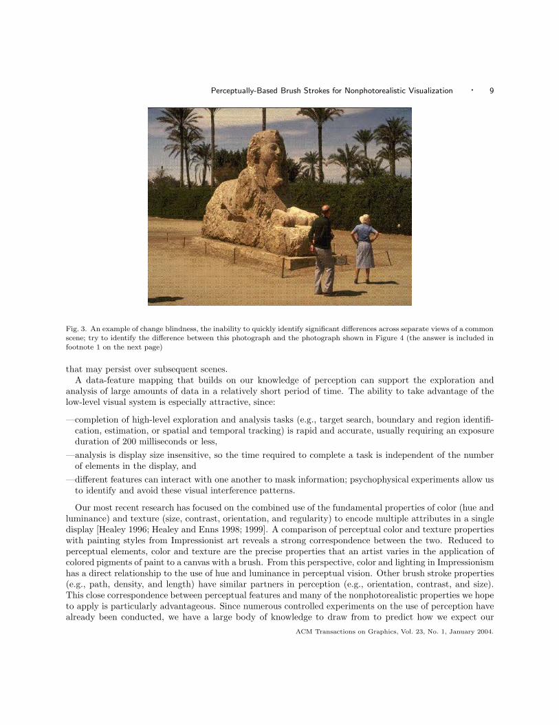
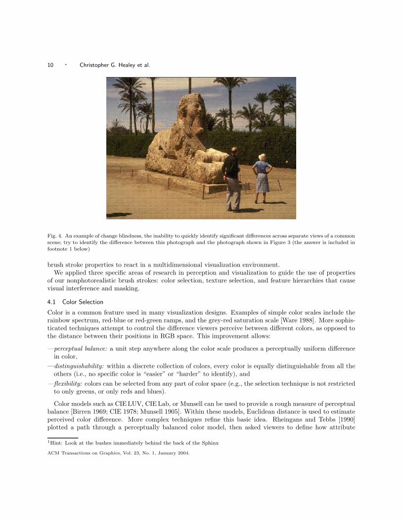
The reality of each of these findings can be illustrated through the so-called change blindness which affectsus all [Mack and Rock 1998; Rensink 2000; Simons 2000]. It involves a task similar to a game that hasamused children reading the comic strips for many years. Try to find the difference between the two picturesin Figures 3 and 4. Many viewers have a difficult time seeing any difference and often have to be coachedto look carefully to find it. Once they have discovered it, they realize that the difference was not a subtleone. Change blindness is not a failure to see because of limited visual acuity; rather, it is a failure based oninappropriate attentional guidance. Some parts of the eye and the brain are clearly responding differently tothe two pictures. Yet, this does not become part of our visual experience until attention is focused directlyon the objects that vary.
Harnessing human vision for the purposes of data visualization therefore requires that the images them-selves be constructed so as to draw attention to their important parts. Since the displays being shown aretypically novel, we cannot rely on the expectations that might accompany the viewing of a familiar scene.Rather, we must build an effective mapping between data values and visual features, so that differences inthe features draw the eyes, and more importantly the mind, on their own. Attracting the viewer’s gaze toa particular object or location in a scene is the first step in having the viewer form a mental representationACM Transactions on Graphics, Vol. 23, No. 1, January 2004.
Perceptually-Based Brush Strokes for Nonphotorealistic Visualization · 9
Fig. 3. An example of change blindness, the inability to quickly identify significant differences across separate views of a commonscene; try to identify the difference between this photograph and the photograph shown in Figure 4 (the answer is included infootnote 1 on the next page)
that may persist over subsequent scenes.A data-feature mapping that builds on our knowledge of perception can support the exploration and
analysis of large amounts of data in a relatively short period of time. The ability to take advantage of thelow-level visual system is especially attractive, since:
—completion of high-level exploration and analysis tasks (e.g., target search, boundary and region identifi-cation, estimation, or spatial and temporal tracking) is rapid and accurate, usually requiring an exposureduration of 200 milliseconds or less,
—analysis is display size insensitive, so the time required to complete a task is independent of the numberof elements in the display, and
—different features can interact with one another to mask information; psychophysical experiments allow usto identify and avoid these visual interference patterns.
Our most recent research has focused on the combined use of the fundamental properties of color (hue andluminance) and texture (size, contrast, orientation, and regularity) to encode multiple attributes in a singledisplay [Healey 1996; Healey and Enns 1998; 1999]. A comparison of perceptual color and texture propertieswith painting styles from Impressionist art reveals a strong correspondence between the two. Reduced toperceptual elements, color and texture are the precise properties that an artist varies in the application ofcolored pigments of paint to a canvas with a brush. From this perspective, color and lighting in Impressionismhas a direct relationship to the use of hue and luminance in perceptual vision. Other brush stroke properties(e.g., path, density, and length) have similar partners in perception (e.g., orientation, contrast, and size).This close correspondence between perceptual features and many of the nonphotorealistic properties we hopeto apply is particularly advantageous. Since numerous controlled experiments on the use of perception havealready been conducted, we have a large body of knowledge to draw from to predict how we expect our
ACM Transactions on Graphics, Vol. 23, No. 1, January 2004.
10 · Christopher G. Healey et al.
Fig. 4. An example of change blindness, the inability to quickly identify significant differences across separate views of a commonscene; try to identify the difference between this photograph and the photograph shown in Figure 3 (the answer is included infootnote 1 below)
brush stroke properties to react in a multidimensional visualization environment.We applied three specific areas of research in perception and visualization to guide the use of properties
of our nonphotorealistic brush strokes: color selection, texture selection, and feature hierarchies that causevisual interference and masking.
4.1 Color Selection
Color is a common feature used in many visualization designs. Examples of simple color scales include therainbow spectrum, red-blue or red-green ramps, and the grey-red saturation scale [Ware 1988]. More sophis-ticated techniques attempt to control the difference viewers perceive between different colors, as opposed tothe distance between their positions in RGB space. This improvement allows:
—perceptual balance: a unit step anywhere along the color scale produces a perceptually uniform differencein color,
—distinguishability: within a discrete collection of colors, every color is equally distinguishable from all theothers (i.e., no specific color is “easier” or “harder” to identify), and
—flexibility: colors can be selected from any part of color space (e.g., the selection technique is not restrictedto only greens, or only reds and blues).
Color models such as CIE LUV, CIE Lab, or Munsell can be used to provide a rough measure of perceptualbalance [Birren 1969; CIE 1978; Munsell 1905]. Within these models, Euclidean distance is used to estimateperceived color difference. More complex techniques refine this basic idea. Rheingans and Tebbs [1990]plotted a path through a perceptually balanced color model, then asked viewers to define how attribute
1Hint: Look at the bushes immediately behind the back of the Sphinx
ACM Transactions on Graphics, Vol. 23, No. 1, January 2004.
Perceptually-Based Brush Strokes for Nonphotorealistic Visualization · 11
values map to positions along the path. Non-linear mappings emphasize differences in specific parts ofan attribute’s domain (e.g., in the lower end with a logarithmic mapping, or in the higher end with anexponential mapping). Other researchers have constructed rules to automatically select a colormap for atarget data attribute [Bergman et al. 1995; Rogowitz and Treinish 1993]. Properties of the attribute suchas its spatial frequency, its continuous or discrete nature, and the type of analysis to be performed are usedto choose an appropriate color representation. Ware [1988] constructed a color scale that spirals up aroundthe luminance axis to maintain a uniform simultaneous contrast error along its length. His solution matchedor outperformed traditional color scales for metric and form identification tasks. Healey and Enns showedthat color distance, linear separation, and color category must all be controlled to select discrete collectionsof equally distinguishable colors [Healey 1996; Healey and Enns 1999].
Our color selection technique combines different aspects of each of these methods. A single loop spiralingup around the L-axis (the luminance pole) is plotted near the boundary of our monitor’s gamut of displayablecolors in CIE LUV space. The path is subdivided into r named color regions (i.e., a blue region, a greenregion, and so on). n colors can then be selected by choosing n
r colors uniformly spaced along each of ther color regions. The result is a set of colors selected from a perceptually balanced color model, each with aroughly constant simultaneous contrast error, and chosen such that color distance and linear separation areconstant within each named color region.
4.2 Texture Selection
Texture is often viewed as a single visual feature. Like color, however, it can be decomposed into a collection offundamental perceptual dimensions. Researchers in computer vision have used properties such as regularity,directionality, contrast, size, and coarseness to perform automatic texture segmentation and classification[Haralick et al. 1973; Rao and Lohse 1993a; 1993b; Tamura et al. 1978]. These texture features were derivedboth from statistical analysis, and through experimental study. Results from psychophysics have shown thatmany of these properties are also detected by the low-level visual system, although not always in ways thatare identical to computer-based algorithms [Aks and Enns 1996; Cutting and Millard 1984; Julesz 1975;1984; Julesz et al. 1973; 1978; Snowden 1998; Triesman 1991; Wolfe 1994].
One promising approach in visualization has been to use perceptual texture dimensions to representmultiple data attributes. Individual values of an attribute control its corresponding texture dimension. Theresult is a texture pattern that changes its visual appearance based on data in the underlying dataset.Grinstein et al. [1989] visualized multidimensional data with “stick-man” icons whose limbs encode attributevalues stored in a data element; when the stick-men are arrayed across a display, they form texture patternswhose spatial groupings and boundaries identify attribute correspondence. Ware and Knight [1995] designedGabor filters that modified their orientation, size, and contrast based on the values of three independent dataattributes. Healey and Enns [1998; 1999] constructed perceptual texture elements (or pexels) that varied insize, density, and regularity; results showed that size and density are perceptually salient, but variations inregularity are much more difficult to identify. More recent work found that orientation can also be used toencode information [Weigle et al. 2000]; a difference of 15◦ is sufficient to rapidly distinguish elements fromone another.
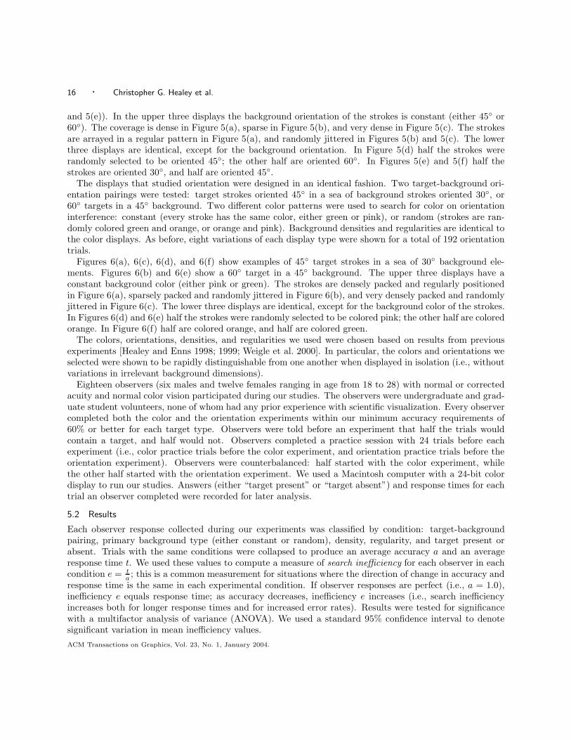
We designed brush strokes that can vary in their area, orientation, spatial density, and regularity (inaddition to color). These texture dimensions correspond closely to the nonphotorealistic properties size,direction, coverage, and placement. The displays in Figures 5 and 6, used to measure target detectionperformance, show examples of each of these properties.
4.3 Feature Hierarchy
A third issue that must be considered is visual interference. This occurs when the presence of one featuremasks another. Although the need to measure a brush stroke’s perceptual strength is not necessary in a
ACM Transactions on Graphics, Vol. 23, No. 1, January 2004.
12 · Christopher G. Healey et al.
(a) (b) (c)
(d) (e) (f)
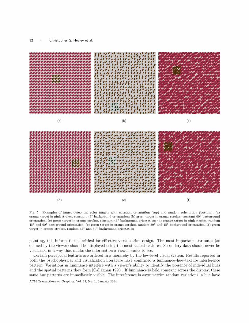
Fig. 5. Examples of target detection, color targets with constant orientation (top) and random orientation (bottom); (a)orange target in pink strokes, constant 45◦ background orientation; (b) green target in orange strokes, constant 60◦ backgroundorientation; (c) green target in orange strokes, constant 45◦ background orientation; (d) orange target in pink strokes, random45◦ and 60◦ background orientation; (e) green target in orange strokes, random 30◦ and 45◦ background orientation; (f) greentarget in orange strokes, random 45◦ and 60◦ background orientation
painting, this information is critical for effective visualization design. The most important attributes (asdefined by the viewer) should be displayed using the most salient features. Secondary data should never bevisualized in a way that masks the information a viewer wants to see.
Certain perceptual features are ordered in a hierarchy by the low-level visual system. Results reported inboth the psychophysical and visualization literature have confirmed a luminance–hue–texture interferencepattern. Variations in luminance interfere with a viewer’s ability to identify the presence of individual huesand the spatial patterns they form [Callaghan 1990]. If luminance is held constant across the display, thesesame hue patterns are immediately visible. The interference is asymmetric: random variations in hue haveACM Transactions on Graphics, Vol. 23, No. 1, January 2004.
Perceptually-Based Brush Strokes for Nonphotorealistic Visualization · 13
(a) (b) (c)
(d) (e) (f)
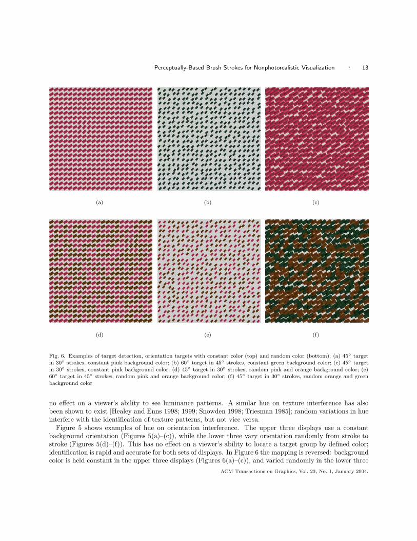
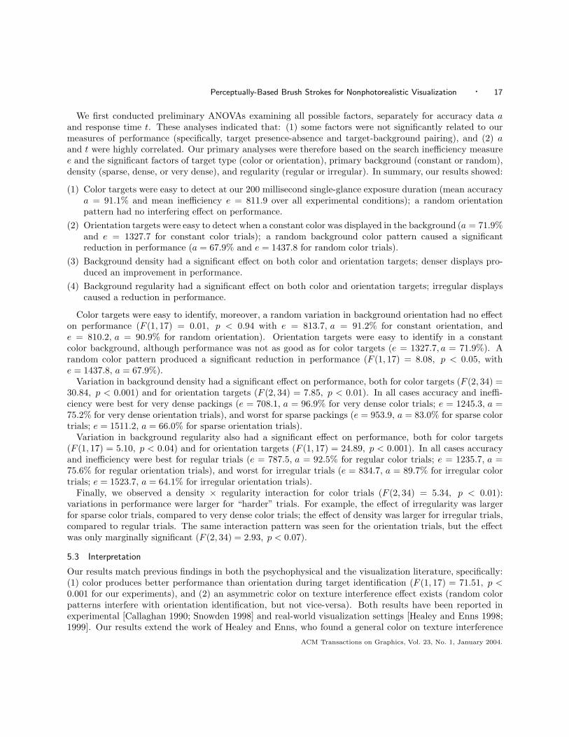
Fig. 6. Examples of target detection, orientation targets with constant color (top) and random color (bottom); (a) 45◦ targetin 30◦ strokes, constant pink background color; (b) 60◦ target in 45◦ strokes, constant green background color; (c) 45◦ targetin 30◦ strokes, constant pink background color; (d) 45◦ target in 30◦ strokes, random pink and orange background color; (e)60◦ target in 45◦ strokes, random pink and orange background color; (f) 45◦ target in 30◦ strokes, random orange and greenbackground color
no effect on a viewer’s ability to see luminance patterns. A similar hue on texture interference has alsobeen shown to exist [Healey and Enns 1998; 1999; Snowden 1998; Triesman 1985]; random variations in hueinterfere with the identification of texture patterns, but not vice-versa.
Figure 5 shows examples of hue on orientation interference. The upper three displays use a constantbackground orientation (Figures 5(a)–(c)), while the lower three vary orientation randomly from stroke tostroke (Figures 5(d)–(f)). This has no effect on a viewer’s ability to locate a target group by defined color;identification is rapid and accurate for both sets of displays. In Figure 6 the mapping is reversed: backgroundcolor is held constant in the upper three displays (Figures 6(a)–(c)), and varied randomly in the lower three
ACM Transactions on Graphics, Vol. 23, No. 1, January 2004.
14 · Christopher G. Healey et al.
(Figures 6(d)–(f)). Locating a target group of strokes rotated counterclockwise from their neighbors is muchharder when color varies randomly, compared to the displays where color is held constant. What the visualsystem “sees” initially is a random color pattern. Only with additional exposure time will differences inorientation be reported. Feature interference results suggest that luminance, then hue, then various textureproperties should be used to display attributes in order of importance. Real-world evidence has confirmedthat this technique works well in practice.
4.4 Orienting Versus Engaging Attention
We are interested in two properties of a nonphotorealistic visualization: its effectiveness and its aestheticmerit. These properties correspond to two basic aspects of human attention: orienting and engaging [Corenet al. 2003]. Orienting attention to a specific location in an image occurs when the location contains an abrupttransition in a visual feature that is processed by the low-level visual system (e.g., a high-contrast luminanceedge, a brief flicker, or a motion discontinuity). This may include redirecting a viewer’s gaze so that thefoveal center of the eye is aimed at the region of interest, although this is not required. Visual processes canoperate selectively on areas of high visual salience through a process called “covert orienting” [Posner andRaichle 1994]. Rapidly orienting a viewer’s attention to novel or important areas in a visualization is thefirst step towards allowing the viewer to efficiently discover, explore, and analyze within their data.
The process of orienting is different from engaging attention in two important ways. First, while orientingis often a momentary event based largely on the nature of an image, engaging reflects the conscious intentionof the viewer to search for specific information. For example, engaging is the process that allows the search fora difficult-to-find target to continue, even when no low-level visual evidence exists to orient the visual systemto the target’s location. Second, different neurological foundations are believed to control the two aspectsof attention. Orienting is governed by the older, sub-cortical visual pathways. Engaging is determined bya network of cortical regions that are in close communication with the frontal lobes, the so-called “centralexecutive” of the human brain [Posner and Raichle 1994].
Skilled visual artists are adept at exploiting these complimentary aspects of visual attention, even thoughthey may do so intuitively, without understanding the underlying neural processes [Zeki 1999]. For example,masters of the human portrait such as Vermeer, Titian, and Rembrandt painted the faces of people such thatthe region of greatest detail and finest spatial resolution was the face itself. Properties of the background andthe model’s clothing are often presented in shadow or rendered with much less resolution and contrast. Thishas the effect of drawing the viewer’s eye towards the face, which is the center of interest in the portrait. Atthe same time, these artists reserved another small region away from the face for the most extreme contrast.This was often the collar of the model, a piece of jewelry, or a background surface detail. This localized regionof high contrast “pulls” at the viewer’s orienting system, even as the viewer tries to engage their attentionon the portrait’s face. It has recently been proposed that this interaction between orienting and engagingunderlies our fascination with and artistic appreciation of these works [Ramachandran and Hirstein 1999;Zeki 1999]. Psychologists believe they may soon understand the neural substrate of this aspect of creativetension, an idea that is usually thought to be highly abstract.
We believe that orienting and engaging are both important to a successful visualization. Orienting al-lows us to highlight important regions in an image by capturing the viewer’s focus of attention. Engagingencourages the visual system to continue to study the details of an image after orienting occurs. We are pur-suing nonphotorealistic visualizations as a promising way to build images with exactly these characteristics.Orienting occurs through the careful use of visual features that are rapidly detected by the low-level visualsystem. Engaging is achieved by constructing visualizations that are perceived to be beautiful or artistic bythe viewer. The studies described in this article represent our initial steps towards investigating differentaspects of attention in the context of our nonphotorealistic visualization techniques.ACM Transactions on Graphics, Vol. 23, No. 1, January 2004.
Perceptually-Based Brush Strokes for Nonphotorealistic Visualization · 15
5. EFFECTIVENESS STUDIES
The first question we wanted to answer is whether guidelines on the use of perception in glyph-based visual-izations will extend to our nonphotorealistic domain. We conducted a set of psychophysical experiments totest this hypothesis. Our experiments were designed to investigate an observer’s ability to rapidly and accu-rately identify target brush strokes defined by a particular color or orientation [Liu et al. 2003]. Observerswere asked to determine whether a small, 3× 3 group of strokes with a particular visual feature was presentor absent in a display (e.g., a group of orange strokes, as in Figures 5(a), 5(c), 5(d), and 5(f), or a groupstrokes tilted 60◦ in Figures 6(b) and 6(e)). Background orientation, color, regularity, and density variedbetween displays. This allowed us to test for single-glance task performance, and for visual interferenceeffects. Since observers need at least 200 milliseconds to initiate an eye movement, any task performed in200 milliseconds or less is completed based on “a single glance” at the image. In all cases, observer accuracyand response times were recorded to measure performance. The experimental results were then used toidentify similarities and differences between nonphotorealistic images and existing perceptual visualizationtechniques.
5.1 Design
Each experimental display contained a 22 × 22 array of simulated brush strokes (Figures 5 and 6). Thecolor of the displays was calibrated to the monitor to ensure accurate reproduction. Observers were askedto determine whether a group of strokes with a particular target type was present or absent in each display.Displays were shown for 200 milliseconds, after which the screen was cleared; the system then waited forobservers to enter their answer: “target present” or “target absent.” Observers were told to respond asquickly as possible, while still maintaining a high rate of accuracy. Feedback was provided after each display:a “+” sign if an observer’s answer was correct, or a “-” sign if it was not.
The displays were equally divided into two groups: one studied an observer’s ability to identify targetstrokes based on color, the other studied identification based on orientation. The appearance of the strokesin each display was varied to test for single-glance performance and visual interference. For example, thefollowing experimental conditions were used to investigate an observer’s ability to identify colored strokes:
—Two target-background color pairings. An orange target in a pink background, or a green target in anorange background; this allowed us to test for generality in observer performance for different target-background color pairings,
—Two background orientations. Constant (every stroke is oriented in the same direction, either 30◦ or 60◦),or random (strokes are randomly oriented 30◦ and 45◦, or 45◦ and 60◦); any decrease in performance froma constant to a random background would indicate visual interference from orientation during the searchfor color targets,
—Three background densities. The size of the strokes in the display were varied to produce sparse, dense, orvery dense patterns; this allowed us to see how changes in density affected target identification, and
—Two background regularities. Strokes were arrayed in a regular grid pattern, or jittered randomly across thedisplay; this allowed us to test for visual interference caused by spatial irregularity in the global texture.
Our experimental conditions produced 24 different color display types (two target-background color pair-ings by two background orientations by three background densities by two background regularities). Ob-servers were asked to view eight variations of each display type, for a total of 192 color trials. For eachdisplay type, half the trials were randomly chosen to contain a group of target strokes; the other half didnot.
Examples of six color displays are shown in Figure 5. Each display contains either an orange target in asea of pink strokes (Figures 5(a), 5c, 5(d), and 5(f)), or a green target in a sea of orange strokes (Figures 5(b)
ACM Transactions on Graphics, Vol. 23, No. 1, January 2004.
16 · Christopher G. Healey et al.
and 5(e)). In the upper three displays the background orientation of the strokes is constant (either 45◦ or60◦). The coverage is dense in Figure 5(a), sparse in Figure 5(b), and very dense in Figure 5(c). The strokesare arrayed in a regular pattern in Figure 5(a), and randomly jittered in Figures 5(b) and 5(c). The lowerthree displays are identical, except for the background orientation. In Figure 5(d) half the strokes wererandomly selected to be oriented 45◦; the other half are oriented 60◦. In Figures 5(e) and 5(f) half thestrokes are oriented 30◦, and half are oriented 45◦.
The displays that studied orientation were designed in an identical fashion. Two target-background ori-entation pairings were tested: target strokes oriented 45◦ in a sea of background strokes oriented 30◦, or60◦ targets in a 45◦ background. Two different color patterns were used to search for color on orientationinterference: constant (every stroke has the same color, either green or pink), or random (strokes are ran-domly colored green and orange, or orange and pink). Background densities and regularities are identical tothe color displays. As before, eight variations of each display type were shown for a total of 192 orientationtrials.
Figures 6(a), 6(c), 6(d), and 6(f) show examples of 45◦ target strokes in a sea of 30◦ background ele-ments. Figures 6(b) and 6(e) show a 60◦ target in a 45◦ background. The upper three displays have aconstant background color (either pink or green). The strokes are densely packed and regularly positionedin Figure 6(a), sparsely packed and randomly jittered in Figure 6(b), and very densely packed and randomlyjittered in Figure 6(c). The lower three displays are identical, except for the background color of the strokes.In Figures 6(d) and 6(e) half the strokes were randomly selected to be colored pink; the other half are coloredorange. In Figure 6(f) half are colored orange, and half are colored green.
The colors, orientations, densities, and regularities we used were chosen based on results from previousexperiments [Healey and Enns 1998; 1999; Weigle et al. 2000]. In particular, the colors and orientations weselected were shown to be rapidly distinguishable from one another when displayed in isolation (i.e., withoutvariations in irrelevant background dimensions).
Eighteen observers (six males and twelve females ranging in age from 18 to 28) with normal or correctedacuity and normal color vision participated during our studies. The observers were undergraduate and grad-uate student volunteers, none of whom had any prior experience with scientific visualization. Every observercompleted both the color and the orientation experiments within our minimum accuracy requirements of60% or better for each target type. Observers were told before an experiment that half the trials wouldcontain a target, and half would not. Observers completed a practice session with 24 trials before eachexperiment (i.e., color practice trials before the color experiment, and orientation practice trials before theorientation experiment). Observers were counterbalanced: half started with the color experiment, whilethe other half started with the orientation experiment. We used a Macintosh computer with a 24-bit colordisplay to run our studies. Answers (either “target present” or “target absent”) and response times for eachtrial an observer completed were recorded for later analysis.
5.2 Results
Each observer response collected during our experiments was classified by condition: target-backgroundpairing, primary background type (either constant or random), density, regularity, and target present orabsent. Trials with the same conditions were collapsed to produce an average accuracy a and an averageresponse time t. We used these values to compute a measure of search inefficiency for each observer in eachcondition e = t
a ; this is a common measurement for situations where the direction of change in accuracy andresponse time is the same in each experimental condition. If observer responses are perfect (i.e., a = 1.0),inefficiency e equals response time; as accuracy decreases, inefficiency e increases (i.e., search inefficiencyincreases both for longer response times and for increased error rates). Results were tested for significancewith a multifactor analysis of variance (ANOVA). We used a standard 95% confidence interval to denotesignificant variation in mean inefficiency values.ACM Transactions on Graphics, Vol. 23, No. 1, January 2004.
Perceptually-Based Brush Strokes for Nonphotorealistic Visualization · 17
We first conducted preliminary ANOVAs examining all possible factors, separately for accuracy data aand response time t. These analyses indicated that: (1) some factors were not significantly related to ourmeasures of performance (specifically, target presence-absence and target-background pairing), and (2) aand t were highly correlated. Our primary analyses were therefore based on the search inefficiency measuree and the significant factors of target type (color or orientation), primary background (constant or random),density (sparse, dense, or very dense), and regularity (regular or irregular). In summary, our results showed:
(1) Color targets were easy to detect at our 200 millisecond single-glance exposure duration (mean accuracya = 91.1% and mean inefficiency e = 811.9 over all experimental conditions); a random orientationpattern had no interfering effect on performance.
(2) Orientation targets were easy to detect when a constant color was displayed in the background (a = 71.9%and e = 1327.7 for constant color trials); a random background color pattern caused a significantreduction in performance (a = 67.9% and e = 1437.8 for random color trials).
(3) Background density had a significant effect on both color and orientation targets; denser displays pro-duced an improvement in performance.
(4) Background regularity had a significant effect on both color and orientation targets; irregular displayscaused a reduction in performance.
Color targets were easy to identify, moreover, a random variation in background orientation had no effecton performance (F (1, 17) = 0.01, p < 0.94 with e = 813.7, a = 91.2% for constant orientation, ande = 810.2, a = 90.9% for random orientation). Orientation targets were easy to identify in a constantcolor background, although performance was not as good as for color targets (e = 1327.7, a = 71.9%). Arandom color pattern produced a significant reduction in performance (F (1, 17) = 8.08, p < 0.05, withe = 1437.8, a = 67.9%).
Variation in background density had a significant effect on performance, both for color targets (F (2, 34) =30.84, p < 0.001) and for orientation targets (F (2, 34) = 7.85, p < 0.01). In all cases accuracy and ineffi-ciency were best for very dense packings (e = 708.1, a = 96.9% for very dense color trials; e = 1245.3, a =75.2% for very dense orientation trials), and worst for sparse packings (e = 953.9, a = 83.0% for sparse colortrials; e = 1511.2, a = 66.0% for sparse orientation trials).
Variation in background regularity also had a significant effect on performance, both for color targets(F (1, 17) = 5.10, p < 0.04) and for orientation targets (F (1, 17) = 24.89, p < 0.001). In all cases accuracyand inefficiency were best for regular trials (e = 787.5, a = 92.5% for regular color trials; e = 1235.7, a =75.6% for regular orientation trials), and worst for irregular trials (e = 834.7, a = 89.7% for irregular colortrials; e = 1523.7, a = 64.1% for irregular orientation trials).
Finally, we observed a density × regularity interaction for color trials (F (2, 34) = 5.34, p < 0.01):variations in performance were larger for “harder” trials. For example, the effect of irregularity was largerfor sparse color trials, compared to very dense color trials; the effect of density was larger for irregular trials,compared to regular trials. The same interaction pattern was seen for the orientation trials, but the effectwas only marginally significant (F (2, 34) = 2.93, p < 0.07).
5.3 Interpretation
Our results match previous findings in both the psychophysical and the visualization literature, specifically:(1) color produces better performance than orientation during target identification (F (1, 17) = 71.51, p <0.001 for our experiments), and (2) an asymmetric color on texture interference effect exists (random colorpatterns interfere with orientation identification, but not vice-versa). Both results have been reported inexperimental [Callaghan 1990; Snowden 1998] and real-world visualization settings [Healey and Enns 1998;1999]. Our results extend the work of Healey and Enns, who found a general color on texture interference
ACM Transactions on Graphics, Vol. 23, No. 1, January 2004.
18 · Christopher G. Healey et al.
pattern, but no corresponding texture on color effect [Healey and Enns 1999]. This provides positive evidenceto support the belief that perceptual findings will carry to a nonphotorealistic visualization environment.
The improvement in performance when density increased, both for color and orientation targets, wasencouraging. An initial concern we discussed was that texture variations (e.g., orientation differences) woulddisappear when density increased and background color was held constant. Our results show that, for thetypes of strokes we displayed, different orientations are not “lost” in the background, even when a significantstroke overlap exists. This supports our goal of producing painterly images that contain dense stroke regions,yet at the same time allow viewers to rapidly identify variations in the underlying texture properties.
Finally, the reduction in performance when strokes were irregularly positioned was intriguing. We con-cluded that regularity acts as a reinforcing visual cue, helping observers identify targets based on someother feature (e.g., color or orientation). The presence of a target patch “breaks” the regularity pattern,providing an additional visual signal that identifies the presence of a target. Jittering the strokes removesthis background support. In this sense, irregularity is not so much an “interfering” effect as it is the loss ofa secondary feature that helps to highlight the presence of a group of target strokes.
6. NONPHOTOREALISTIC VISUALIZATION
Based on the results from our experiments, we built a nonphotorealistic visualization system that variedbrush stroke color, orientation, coverage (i.e., spatial density), and size to encode up to four data attributes(in addition to the two spatial values used to position each stroke). The presence of feature hierarchiessuggest color should be used to represent the most important attribute, followed by texture properties. Ourresults further refine this to mapping color, coverage, size, and orientation in order of attribute importance(from most important to least important).
6.1 Painting Algorithm
To produce nonphotorealistic visualizations, we must convert a dataset D into a nonphotorealistic imageusing a data-feature mapping M . We wanted to design a technique that was based in part on the waythat artists paint on a canvas. To this end, we implemented an algorithm that spatially subdivides D intocommon regions (objects) based on attribute value, then paints each region independently to produce afinished result. Our technique follows four basic steps:
(1) Segment D into p spatially connected regions, where the attribute values ai,j for the elements in eachregion Rk are within a given tolerance εj of one another.
(2) For each region Rk containing elements e1, . . . , et, compute a region-global stroke coverage from theaverage value 1
t
∑ti=1 ai,j , where Aj is the attribute represented by coverage.
(3) “Paint” strokes at randomly selected positions within Rk. The color, orientation, and size of each strokeare controlled by the attribute values of the element closest to the stroke’s center. A stroke is acceptedor rejected based on its overlap with existing strokes, and on its overlap with Rk. This process continuesuntil Rk’s required coverage is met.
(4) After all p regions are painted, display the result to the viewer.
Step three represents an important difference between our nonphotorealistic technique and glyph-basedvisualizations. Most glyph algorithms use a one-to-one or one-to-many mapping to represent each dataelement with individual glyphs. We wanted a method that was more analogous to how paintings are con-structed: “objects” in a scene are identified and painted in turn. This is done by segmenting a dataset intospatial regions, then painting strokes within each region until an appropriate stroke coverage is met. In ourtechnique strokes do not correspond to specific data elements, rather, the strokes are bound to the elementsindirectly through the segments they belong to.ACM Transactions on Graphics, Vol. 23, No. 1, January 2004.
Perceptually-Based Brush Strokes for Nonphotorealistic Visualization · 19
(a) (b) (c) (d)
(e) (f) (g) (h)
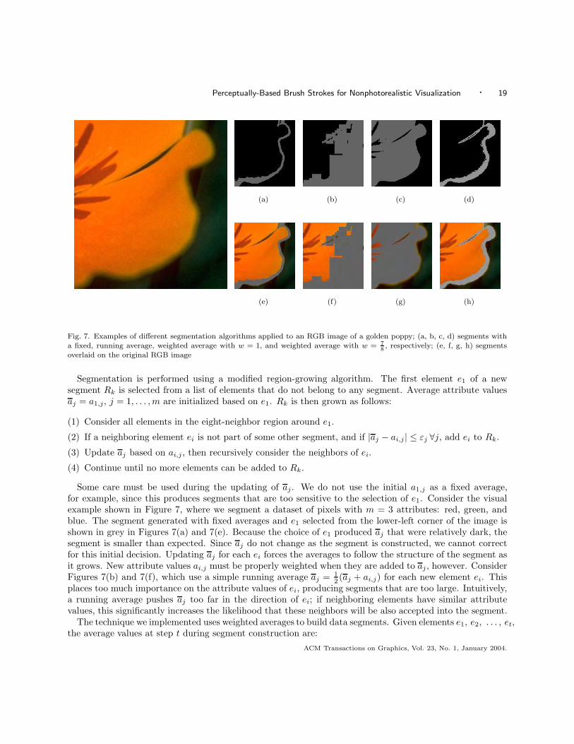
Fig. 7. Examples of different segmentation algorithms applied to an RGB image of a golden poppy; (a, b, c, d) segments witha fixed, running average, weighted average with w = 1, and weighted average with w = 7
8, respectively; (e, f, g, h) segments
overlaid on the original RGB image
Segmentation is performed using a modified region-growing algorithm. The first element e1 of a newsegment Rk is selected from a list of elements that do not belong to any segment. Average attribute valuesaj = a1,j, j = 1, . . . , m are initialized based on e1. Rk is then grown as follows:
(1) Consider all elements in the eight-neighbor region around e1.
(2) If a neighboring element ei is not part of some other segment, and if |aj − ai,j | ≤ εj ∀j, add ei to Rk.
(3) Update aj based on ai,j , then recursively consider the neighbors of ei.
(4) Continue until no more elements can be added to Rk.
Some care must be used during the updating of aj . We do not use the initial a1,j as a fixed average,for example, since this produces segments that are too sensitive to the selection of e1. Consider the visualexample shown in Figure 7, where we segment a dataset of pixels with m = 3 attributes: red, green, andblue. The segment generated with fixed averages and e1 selected from the lower-left corner of the image isshown in grey in Figures 7(a) and 7(e). Because the choice of e1 produced aj that were relatively dark, thesegment is smaller than expected. Since aj do not change as the segment is constructed, we cannot correctfor this initial decision. Updating aj for each ei forces the averages to follow the structure of the segment asit grows. New attribute values ai,j must be properly weighted when they are added to aj , however. ConsiderFigures 7(b) and 7(f), which use a simple running average aj = 1
2 (aj + ai,j) for each new element ei. Thisplaces too much importance on the attribute values of ei, producing segments that are too large. Intuitively,a running average pushes aj too far in the direction of ei; if neighboring elements have similar attributevalues, this significantly increases the likelihood that these neighbors will be also accepted into the segment.
The technique we implemented uses weighted averages to build data segments. Given elements e1, e2, . . . , et,the average values at step t during segment construction are:
ACM Transactions on Graphics, Vol. 23, No. 1, January 2004.
20 · Christopher G. Healey et al.
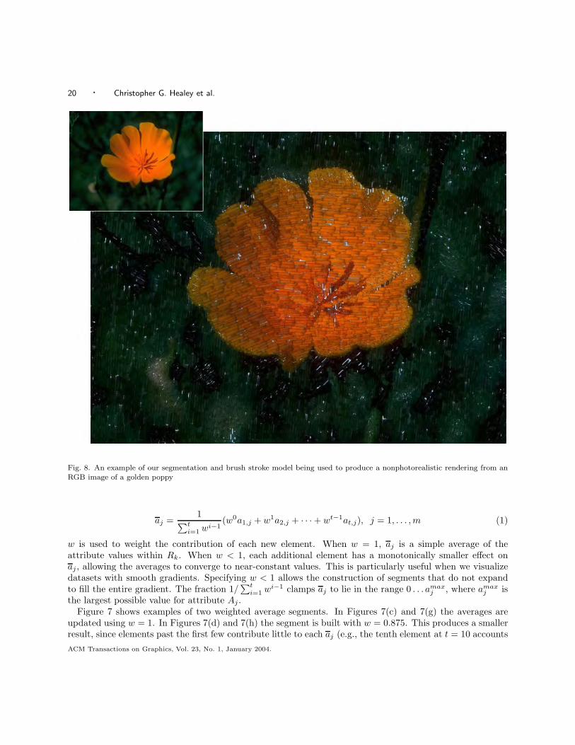
Fig. 8. An example of our segmentation and brush stroke model being used to produce a nonphotorealistic rendering from anRGB image of a golden poppy
aj =1
∑ti=1 wi−1
(w0a1,j + w1a2,j + · · · + wt−1at,j), j = 1, . . . , m (1)
w is used to weight the contribution of each new element. When w = 1, aj is a simple average of theattribute values within Rk. When w < 1, each additional element has a monotonically smaller effect onaj , allowing the averages to converge to near-constant values. This is particularly useful when we visualizedatasets with smooth gradients. Specifying w < 1 allows the construction of segments that do not expandto fill the entire gradient. The fraction 1/
∑ti=1 wi−1 clamps aj to lie in the range 0 . . . amax
j , where amaxj is
the largest possible value for attribute Aj .Figure 7 shows examples of two weighted average segments. In Figures 7(c) and 7(g) the averages are
updated using w = 1. In Figures 7(d) and 7(h) the segment is built with w = 0.875. This produces a smallerresult, since elements past the first few contribute little to each aj (e.g., the tenth element at t = 10 accountsACM Transactions on Graphics, Vol. 23, No. 1, January 2004.
Perceptually-Based Brush Strokes for Nonphotorealistic Visualization · 21
for 0.8759/∑10
i=1 0.875i−1 = 0.051, or approximately 5.1% of the segment average). By varying w, we cancontrol the relative size of the segments we generate.
Each segment Rk is painted by randomly placing brush strokes inside it. The percentage of Rk to be coveredby its strokes (coverage) is defined based on 1
t
∑ti=1 ai,j , where Aj is the attribute that represents coverage.
Because the elements ei within Rk must have similar attribute values, a region-global coverage producesan acceptable representation of Aj within Rk. As each new stroke is placed, two values are computed: theoverlap with existing strokes, and the overlap with Rk’s extent. If the stroke overlap is too high, or if thesegment overlap is too low, the stroke is rejected. The allowable stroke overlap is slowly increased to ensurethat Rk’s coverage can be met. The color, orientation, and size of each stroke are chosen using the attributevalues of the element closest to the stroke’s center.
The brush strokes used in our current prototype are identical to the ones shown during our experiments.They are constructed with a simple texture mapping scheme. This technique is common in nonphotorealisticrendering (e.g., in Haberli [1990], Hertzmann [1998], Litwinowicz [1997], and Meier [1996]). Real paintedstrokes are digitally captured and converted into texture maps. The textures are applied to an underlyingpolygon to produce a collection of generic brush strokes. We use a small library of representative stroketextures. One of the textures is randomly selected and bound to a stroke when it is placed. This produces amore random, hand-generated feel to the resulting images. The nonphotorealistic rendering of the completegolden poppy image is shown in Figure 8. Additional examples of renderings and visualizations are shownin Figures 1, 9, and 10.
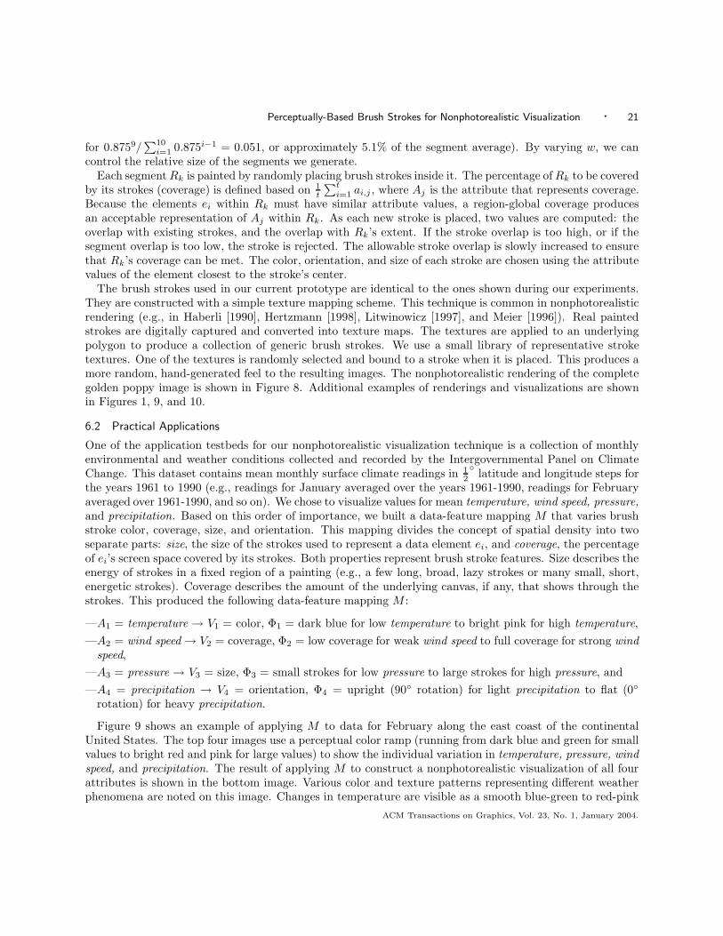
6.2 Practical Applications
One of the application testbeds for our nonphotorealistic visualization technique is a collection of monthlyenvironmental and weather conditions collected and recorded by the Intergovernmental Panel on ClimateChange. This dataset contains mean monthly surface climate readings in 1
2
◦ latitude and longitude steps forthe years 1961 to 1990 (e.g., readings for January averaged over the years 1961-1990, readings for Februaryaveraged over 1961-1990, and so on). We chose to visualize values for mean temperature, wind speed, pressure,and precipitation. Based on this order of importance, we built a data-feature mapping M that varies brushstroke color, coverage, size, and orientation. This mapping divides the concept of spatial density into twoseparate parts: size, the size of the strokes used to represent a data element ei, and coverage, the percentageof ei’s screen space covered by its strokes. Both properties represent brush stroke features. Size describes theenergy of strokes in a fixed region of a painting (e.g., a few long, broad, lazy strokes or many small, short,energetic strokes). Coverage describes the amount of the underlying canvas, if any, that shows through thestrokes. This produced the following data-feature mapping M :
—A1 = temperature → V1 = color, Φ1 = dark blue for low temperature to bright pink for high temperature,—A2 = wind speed → V2 = coverage, Φ2 = low coverage for weak wind speed to full coverage for strong wind
speed,—A3 = pressure → V3 = size, Φ3 = small strokes for low pressure to large strokes for high pressure, and—A4 = precipitation → V4 = orientation, Φ4 = upright (90◦ rotation) for light precipitation to flat (0◦
rotation) for heavy precipitation.
Figure 9 shows an example of applying M to data for February along the east coast of the continentalUnited States. The top four images use a perceptual color ramp (running from dark blue and green for smallvalues to bright red and pink for large values) to show the individual variation in temperature, pressure, windspeed, and precipitation. The result of applying M to construct a nonphotorealistic visualization of all fourattributes is shown in the bottom image. Various color and texture patterns representing different weatherphenomena are noted on this image. Changes in temperature are visible as a smooth blue-green to red-pink
ACM Transactions on Graphics, Vol. 23, No. 1, January 2004.
22 · Christopher G. Healey et al.
temperature pressure wind speed precipitation
cold (blue and green)
calm winds (low coverage)
light rain (upright)
strong wind (full coverage)
heavy rain (tilted)
pressure gradient (size gradient)
hot (pink and red)
Fig. 9. Nonphotorealistic visualization of weather conditions for February over the eastern United States: (top row) perceptualcolor ramps (dark blue for low to bright pink for high) of mean temperature, pressure, wind speed, and precipitation in isolation;(bottom row) combined visualization of temperature (dark blue to bright pink for cold to hot), wind speed (low to high coveragefor weak to strong), pressure (small to large for low to high), and precipitation (upright to flat for light to heavy)
ACM Transactions on Graphics, Vol. 23, No. 1, January 2004.
Perceptually-Based Brush Strokes for Nonphotorealistic Visualization · 23
(a)
(b)
Fig. 10. Weather conditions over the continental United States: (a) mean temperature, pressure, wind speed and precipitation(represented by color, size, coverage, and orientation) for January; (b) mean conditions for August
ACM Transactions on Graphics, Vol. 23, No. 1, January 2004.
24 · Christopher G. Healey et al.
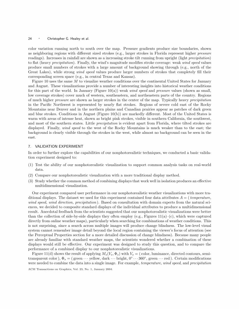
color variation running north to south over the map. Pressure gradients produce size boundaries, shownas neighboring regions with different sized strokes (e.g., larger strokes in Florida represent higher pressurereadings). Increases in rainfall are shown as a increasing stroke tilt running from upright (light precipitation)to flat (heavy precipitation). Finally, the wind’s magnitude modifies stroke coverage: weak wind speed valuesproduce small numbers of strokes with a large amount of background showing through (e.g., north of theGreat Lakes), while strong wind speed values produce larger numbers of strokes that completely fill theircorresponding screen space (e.g., in central Texas and Kansas).
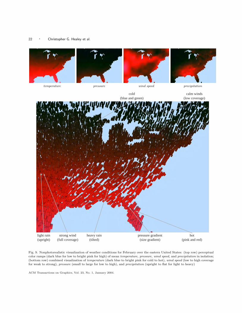
Figure 10 uses the same M to visualize weather conditions over the continental United States for Januaryand August. These visualizations provide a number of interesting insights into historical weather conditionsfor this part of the world. In January (Figure 10(a)) weak wind speed and pressure values (shown as small,low coverage strokes) cover much of western, southeastern, and northeastern parts of the country. Regionsof much higher pressure are shown as larger strokes in the center of the map. Typically heavy precipitationin the Pacific Northwest is represented by nearly flat strokes. Regions of severe cold east of the RockyMountains near Denver and in the northern plains and Canadian prairies appear as patches of dark greenand blue strokes. Conditions in August (Figure 10(b)) are markedly different. Most of the United States iswarm with areas of intense heat, shown as bright pink strokes, visible in southern California, the southwest,and most of the southern states. Little precipitation is evident apart from Florida, where tilted strokes aredisplayed. Finally, wind speed to the west of the Rocky Mountains is much weaker than to the east; thebackground is clearly visible through the strokes in the west, while almost no background can be seen in theeast.
7. VALIDATION EXPERIMENT
In order to further explore the capabilities of our nonphotorealistic techniques, we conducted a basic valida-tion experiment designed to:
(1) Test the ability of our nonphotorealistic visualization to support common analysis tasks on real-worlddata.
(2) Compare our nonphotorealistic visualization with a more traditional display method.(3) Study whether the common method of combining displays that work well in isolation produces an effective
multidimensional visualization.
Our experiment compared user performance in our nonphotorealistic weather visualizations with more tra-ditional displays. The dataset we used for this experiment contained four data attributes A = ( temperature,wind speed, wind direction, precipitation ). Based on consultation with domain experts from the natural sci-ences, we decided to composite standard displays of the individual attributes to produce a multidimensionalresult. Anecdotal feedback from the scientists suggested that our nonphotorealistic visualizations were betterthan the collection of side-by-side displays they often employ (e.g., Figures 11(a)–(c), which were captureddirectly from online weather maps), particularly when searching for combinations of weather conditions. Thisis not surprising, since a search across multiple images will produce change blindness. The low-level visualsystem cannot remember image detail beyond the local region containing the viewer’s focus of attention (seethe Perceptual Properties section for a more detailed discussion of change blindness). Because many peopleare already familiar with standard weather maps, the scientists wondered whether a combination of thesedisplays would still be effective. Our experiment was designed to study this question, and to compare theperformance of a combined display to our nonphotorealistic visualizations.
Figure 11(d) shows the result of applying Ms(Vs, Φs) with Vs = ( color, luminance, directed contours, semi-transparent color ), Φs = ( green · · · yellow, dark · · · bright, 0◦ · · · 360◦, green · · · red ). Certain modificationswere needed to combine the data into a single image. For example, temperature, wind speed, and precipitationACM Transactions on Graphics, Vol. 23, No. 1, January 2004.
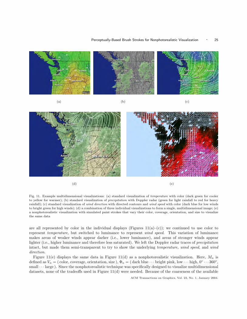
Perceptually-Based Brush Strokes for Nonphotorealistic Visualization · 25
(a) (b) (c)
(d) (e)
Fig. 11. Example multidimensional visualizations: (a) standard visualization of temperature with color (dark green for coolerto yellow for warmer); (b) standard visualization of precipitation with Doppler radar (green for light rainfall to red for heavyrainfall); (c) standard visualization of wind direction with directed contours and wind speed with color (dark blue for low windsto bright green for high winds); (d) a combination of three individual visualizations to form a single, multidimensional image; (e)a nonphotorealistic visualization with simulated paint strokes that vary their color, coverage, orientation, and size to visualizethe same data
are all represented by color in the individual displays (Figures 11(a)–(c)); we continued to use color torepresent temperature, but switched to luminance to represent wind speed. This variation of luminancemakes areas of weaker winds appear darker (i.e., lower luminance), and areas of stronger winds appearlighter (i.e., higher luminance and therefore less saturated). We left the Doppler radar traces of precipitationintact, but made them semi-transparent to try to show the underlying temperature, wind speed, and winddirection.
Figure 11(e) displays the same data in Figure 11(d) as a nonphotorealistic visualization. Here, Mn isdefined as Vn = ( color, coverage, orientation, size ), Φn = (dark blue · · · bright pink, low · · · high, 0◦ · · · 360◦,small · · · large ). Since the nonphotorealistic technique was specifically designed to visualize multidimensionaldatasets, none of the tradeoffs used in Figure 11(d) were needed. Because of the coarseness of the available
ACM Transactions on Graphics, Vol. 23, No. 1, January 2004.
26 · Christopher G. Healey et al.
data, we imposed a more regular structure on the positions of our brush strokes. Apart from this modification,the painting algorithm used for Figure 11(e) was identical to the one used for the previous datasets.
Fifteen observers (computer science graduate students and staff ranging in age from 18 to 41) with normalor corrected acuity and normal color vision participated during this experiment. The data-feature mappingsMs and Mn were explained in detail to the observers using a pair of visualizations different from the onesshown during the experiment. Observers were encouraged to ask questions to ensure they understood howeach attribute was being represented. Observers were then instructed to answer the following questions ona new pair of visualization images (Figures 11(d) and 11(e)):
(1) In which visualization is it easiest to distinguish: temperature; precipitation; wind speed; wind direction?(2) Identify an area in each visualization that has: high temperature; high precipitation; low wind speed.(3) Identify an area in each visualization that has: high precipitation and low temperature; high precipitation
and high wind speed.(4) Identify an area in each visualization where temperature changes rapidly.
The first question queried an observer’s preferences about the representation techniques used for eachattribute. The second question tested an observer’s ability to identify values for three different attributes.The third question tested an observer’s ability to identify combinations of attribute values. The final questiontested an observer’s ability to identify high spatial frequency changes in one attribute (temperature) in thepresence of a second (precipitation). As with the construction of the standard visualization image, thesequestions were selected in part through suggestions from our natural science colleagues.
7.1 Results
Responses were recorded and tabulated for all fifteen observers. Chi-squared tests with a standard 95%confidence interval were used to denote significance. In summary, we found:
(1) Observers preferred the nonphotorealistic visualization’s method of representing temperature and windspeed.
(2) Observers preferred the standard visualization’s method of representing precipitation.(3) Observers were better at identifying high temperature in the nonphotorealistic visualization.(4) Observers were better at identifying a combination of high precipitation and high wind speed in the
nonphotorealistic visualization.(5) Observers were better at identifying areas of rapid temperature change in the nonphotorealistic visu-
alization.
Table 7.1 details observer preferences for the visualization that they felt made each data attribute easiestto distinguish. A chi-squared test showed significant variation within the table as a whole (χ2
3 = 28.8,p < 0.001). Chi-squared tests on each attribute identified a significant preference for the nonphotorealisticvisualization for temperature and wind speed (χ2
1 = 11.267, p < 0.001 in both cases), and a significantpreference for the standard visualization for precipitation (χ2
1 = 8.067, p < 0.01). Observers indicated thatit was easier to see precipitation in the standard visualization, since it sat “on top” of the other attributes.However, this made it difficult to distinguish temperature and wind speed in areas of high precipitation (andthus the preference for the nonphotorealistic visualization’s method of displaying these attributes). Althoughwind direction was also obscured by precipitation in the standard visualization, some observers felt they couldinfer its pattern from what they could see entering and exiting areas of high rainfall.
Table 7.1 details observer performance for the task of identifying the location of high or low attributevalues in the visualization. For this task, “high” was considered to be any value in the top 10% of therange shown in the visualization, and “low” was any value in the bottom 10%. “Correct” means an observerACM Transactions on Graphics, Vol. 23, No. 1, January 2004.
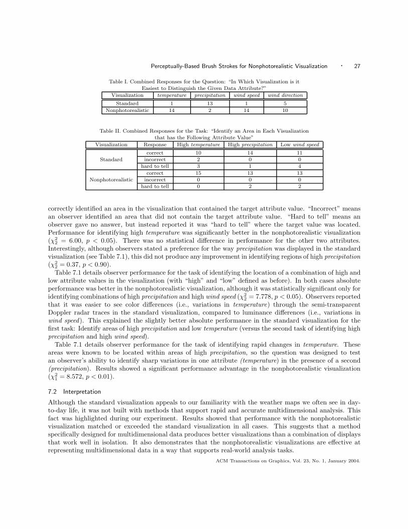
Perceptually-Based Brush Strokes for Nonphotorealistic Visualization · 27
Table I. Combined Responses for the Question: “In Which Visualization is itEasiest to Distinguish the Given Data Attribute?”
Visualization temperature precipitation wind speed wind direction
Standard 1 13 1 5
Nonphotorealistic 14 2 14 10
Table II. Combined Responses for the Task: “Identify an Area in Each Visualizationthat has the Following Attribute Value”
Visualization Response High temperature High precipitation Low wind speed
correct 10 14 11Standard incorrect 2 0 0
hard to tell 3 1 4
correct 15 13 13Nonphotorealistic incorrect 0 0 0
hard to tell 0 2 2
correctly identified an area in the visualization that contained the target attribute value. “Incorrect” meansan observer identified an area that did not contain the target attribute value. “Hard to tell” means anobserver gave no answer, but instead reported it was “hard to tell” where the target value was located.Performance for identifying high temperature was significantly better in the nonphotorealistic visualization(χ2
2 = 6.00, p < 0.05). There was no statistical difference in performance for the other two attributes.Interestingly, although observers stated a preference for the way precipitation was displayed in the standardvisualization (see Table 7.1), this did not produce any improvement in identifying regions of high precipitation(χ2
2 = 0.37, p < 0.90).Table 7.1 details observer performance for the task of identifying the location of a combination of high and
low attribute values in the visualization (with “high” and “low” defined as before). In both cases absoluteperformance was better in the nonphotorealistic visualization, although it was statistically significant only foridentifying combinations of high precipitation and high wind speed (χ2
2 = 7.778, p < 0.05). Observers reportedthat it was easier to see color differences (i.e., variations in temperature) through the semi-transparentDoppler radar traces in the standard visualization, compared to luminance differences (i.e., variations inwind speed). This explained the slightly better absolute performance in the standard visualization for thefirst task: Identify areas of high precipitation and low temperature (versus the second task of identifying highprecipitation and high wind speed).
Table 7.1 details observer performance for the task of identifying rapid changes in temperature. Theseareas were known to be located within areas of high precipitation, so the question was designed to testan observer’s ability to identify sharp variations in one attribute (temperature) in the presence of a second(precipitation). Results showed a significant performance advantage in the nonphotorealistic visualization(χ2
1 = 8.572, p < 0.01).
7.2 Interpretation
Although the standard visualization appeals to our familiarity with the weather maps we often see in day-to-day life, it was not built with methods that support rapid and accurate multidimensional analysis. Thisfact was highlighted during our experiment. Results showed that performance with the nonphotorealisticvisualization matched or exceeded the standard visualization in all cases. This suggests that a methodspecifically designed for multidimensional data produces better visualizations than a combination of displaysthat work well in isolation. It also demonstrates that the nonphotorealistic visualizations are effective atrepresenting multidimensional data in a way that supports real-world analysis tasks.
ACM Transactions on Graphics, Vol. 23, No. 1, January 2004.
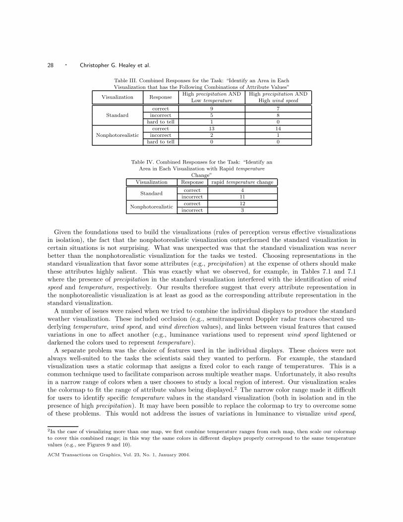
28 · Christopher G. Healey et al.
Table III. Combined Responses for the Task: “Identify an Area in EachVisualization that has the Following Combinations of Attribute Values”
High precipitation AND High precipitation ANDVisualization Response
Low temperature High wind speed
correct 9 7Standard incorrect 5 8
hard to tell 1 0
correct 13 14Nonphotorealistic incorrect 2 1
hard to tell 0 0
Table IV. Combined Responses for the Task: “Identify anArea in Each Visualization with Rapid temperature
Change”
Visualization Response rapid temperature change
correct 4Standard
incorrect 11
correct 12Nonphotorealistic
incorrect 3
Given the foundations used to build the visualizations (rules of perception versus effective visualizationsin isolation), the fact that the nonphotorealistic visualization outperformed the standard visualization incertain situations is not surprising. What was unexpected was that the standard visualization was neverbetter than the nonphotorealistic visualization for the tasks we tested. Choosing representations in thestandard visualization that favor some attributes (e.g., precipitation) at the expense of others should makethese attributes highly salient. This was exactly what we observed, for example, in Tables 7.1 and 7.1where the presence of precipitation in the standard visualization interfered with the identification of windspeed and temperature, respectively. Our results therefore suggest that every attribute representation inthe nonphotorealistic visualization is at least as good as the corresponding attribute representation in thestandard visualization.
A number of issues were raised when we tried to combine the individual displays to produce the standardweather visualization. These included occlusion (e.g., semitransparent Doppler radar traces obscured un-derlying temperature, wind speed, and wind direction values), and links between visual features that causedvariations in one to affect another (e.g., luminance variations used to represent wind speed lightened ordarkened the colors used to represent temperature).
A separate problem was the choice of features used in the individual displays. These choices were notalways well-suited to the tasks the scientists said they wanted to perform. For example, the standardvisualization uses a static colormap that assigns a fixed color to each range of temperatures. This is acommon technique used to facilitate comparison across multiple weather maps. Unfortunately, it also resultsin a narrow range of colors when a user chooses to study a local region of interest. Our visualization scalesthe colormap to fit the range of attribute values being displayed.2 The narrow color range made it difficultfor users to identify specific temperature values in the standard visualization (both in isolation and in thepresence of high precipitation). It may have been possible to replace the colormap to try to overcome someof these problems. This would not address the issues of variations in luminance to visualize wind speed,
2In the case of visualizing more than one map, we first combine temperature ranges from each map, then scale our colormapto cover this combined range; in this way the same colors in different displays properly correspond to the same temperaturevalues (e.g., see Figures 9 and 10).
ACM Transactions on Graphics, Vol. 23, No. 1, January 2004.
Perceptually-Based Brush Strokes for Nonphotorealistic Visualization · 29
or the occlusion that occurs in areas of high precipitation, however. Our intuition is that the standardvisualization would continue to produce poor representations for certain tasks, and would not outperformthe nonphotorealistic visualization, even with a more expressive colormap.
Although these experiments visualized weather data, we are not restricted to this domain. We are cur-rently applying our nonphotorealistic techniques to scientific simulation results in oceanography, and to theproblem of tracking intelligent agents interacting in a simulated e-commerce auction environment. Buildingon the strengths of the low-level human visual system provides the flexibility needed to construct effectivemultidimensional visualizations for a wide range of problem environments.
8. CONCLUSIONS AND FUTURE WORK
This paper describes a method of visualization that uses painted brush strokes to represent multidimensionaldata elements. Our goal was to produce effective nonphotorealistic visualizations. We were motivated in partby nonphotorealistic rendering in computer graphics, and by the work of Laidlaw, Interrante, and Ebert andRheingans to extend these techniques to a visualization environment. Our contributions to this work are theapplication of human perception during the selection of a data-feature mapping, and the use of controlledexperiments to study the effectiveness of a nonphotorealistic visualization, both in a laboratory setting, andin a more practical, real-world context.
The brush strokes we used support the variation of visual features that were selected based on styles fromthe Impressionist school of painting. Each attribute in a dataset is mapped to a specific nonphotorealisticproperty; attribute values stored in a data element can then be used to vary the visual appearance ofthe brush strokes. The properties we chose correspond closely to perceptual features detected by the low-level human visual system. Experimental results show that existing guidelines on the use of perceptionduring visualization extend to a nonphotorealistic environment. This allows us to optimize the selectionand application of our brush stroke properties. The result is a “painted image” whose color and texturepatterns can be used to explore, analyze, verify, and discover information stored in a multidimensionaldataset. We are optimistic that future results from studies of perception in visualization will also apply toour nonphotorealistic domain.
In addition to being effective, our techniques try to produce visualizations that viewers perceive as engagingor aesthetic. Nonphotorealistic techniques that highlight important or unexpected properties can be used toorient a viewer’s attention to specific areas in the image. An engaging visualization will encourage a morein-depth examination of these details.
A number of areas for future work are now being considered. Experiments are currently underway to tryto measure the level of artistic merit viewers attach to our visualizations, and to identify the basic emotionaland visual composition properties of the images (e.g., pleasure, arousal, meaning, and complexity) thataffect these judgments. One question of interest asks: “Can we use these results to vary a visualization’scomposition in ways that improve its artistic merit?” For example, we could try to increase the meaningof a visualization image by explaining what it represents and how it is used. If meaning is a predictor ofartistic beauty, we would expect to see an increase in observers’ artistic merit rankings of the visualizationimages. Another area for investigation asks: “How do knowledge and experience affect the rating scales?”Our observers are, for the most part, artistic novices. Conducting an experiment with participants whohave some type of formal training in art theory and art history could offer important insights on how thisknowledge affects appreciation of our different image types. Results from these two questions may showthat our current emotional and visual composition properties need to be refined or extended to furtherdifferentiate the artistic merit attached to different images. We are evaluating new candidate properties totest during future studies.
Another interesting suggestion is to compare the artistic merit of our nonphotorealistic visualizations withACM Transactions on Graphics, Vol. 23, No. 1, January 2004.
30 · Christopher G. Healey et al.
traditional visualization techniques (e.g., multidimensional glyphs). We are now studying this possibility asa follow-on to our current experiments.
Our brush strokes support the variation of color, orientation, coverage, and size. We are working toidentify new nonphotorealistic properties that could be integrated into our stroke model. Two promisingcandidates we have already discussed are coarseness and weight. Other properties are being sought using twocomplementary approaches. First, we are reviewing literature on technique and style in Impressionist art.Second, we are looking at perceptually salient visual features that may correspond to new nonphotorealisticproperties. Increasing the number of features we can encode effectively in each brush stroke may allow usto represent datasets with higher dimensionality.
The need to display additional nonphotorealistic properties may exceed the abilities of our simple texturemapped stroke model. We are studying three techniques to overcome this limitation: (1) the creation ofa larger library of texture mapped brush strokes that explicitly vary the properties that are not easy tomodify within an individual texture map; (2) a model that uses spline surfaces to construct continuousrepresentations of the multiple properties in a brush stroke, and (3) a model that uses a physical simulationto vary nonphotorealistic properties and construct visually realistic strokes.
Finally, we note one other important advantage we can derive from the correspondence between perceptualfeatures and nonphotorealistic properties. We measure the perceptual salience of a visual feature usingcontrolled psychophysical experiments. Exactly the same technique is used to investigate the strengths andlimitations of new nonphotorealistic features, both in isolation and when displayed together with other strokeproperties. Just as research in perception helps us to identify and control nonphotorealistic features duringvisualization, work on new features may offer insight into how the low-level visual system “sees” certaincombinations of visual properties. These results could have an important impact on models of low-levelhuman vision that are being constructed by researchers in the psychophysical community.
ACKNOWLEDGMENTS
The authors would like to thank Victoria Interrante, David Laidlaw, Penny Rheingans, and Theresa-MarieRhyne for their suggestions and insights during discussions of this work. The authors would also like tothank Peter Rand for his suggestions for a standard visualization image and analysis tasks to test duringour validation experiments.
REFERENCES
Aks, D. J. and Enns, J. T. 1996. Visual search for size is influenced by a background texture gradient. J. Experiment. Psych.:Human Percept. Perf. 22, 6, 1467–1481.
Bergman, L. D., Rogowitz, B. E., and Treinish, L. A. 1995. A rule-based tool for assisting colormap selection. In Proceedingsof Visualization ’95 (Atlanta, Ga.). 118–125.
Birren, F. 1969. Munsell: A Grammar of Color. Van Nostrand Reinhold Company, New York, New York.
Brown, R. 1978. Impressionist technique: Pissarro’s optical mixture. In Impressionism in Perspective, B. E. White, Ed.Prentice-Hall, Inc., Englewood Cliffs, N. J., 114–121.
Callaghan, T. C. 1990. Interference and dominance in texture segregation. In Visual Search, D. Brogan, Ed. Taylor & Francis,New York, 81–87.
Chevreul, M. E. 1967. The Principles of Harmony and Contrast of Colors and Their Applications to the Arts. ReinholdPublishing Corporation, New York.
CIE. 1978. CIE Publication No. 15, Supplement Number 2 (E-1.3.1, 1971): Official Recommendations on Uniform ColorSpaces, Color-Difference Equations, and Metric Color Terms. Commission Internationale de L’Eclairge.
Coren, S., Ward, L. M., and Enns, J. T. 2003. Sensation and Perception (6th Edition). Wiley, New York, New York.
Curtis, C. J., Anderson, S. E., Seims, J. E., Fleischer, K. W., and Salesin, D. H. 1997. Computer-generated watercolor.In SIGGRAPH 97 Conference Proceedings (Los Angeles, Calif.). T. Whitted, Ed. ACM, New York, 421–430.
Cutting, J. E. and Millard, R. T. 1984. Three gradients and the perception of flat and curved surfaces. J. Experiment.Psych.: General 113, 2, 198–216.
ACM Transactions on Graphics, Vol. 23, No. 1, January 2004.
Perceptually-Based Brush Strokes for Nonphotorealistic Visualization · 31
Ebert, D. and Rheingans, P. 2000. Volume illustration: Non-photorealistic rendering of volume models. In Proceedings of
Visualization 2000 (San Francisco, Calif.). 195–202.
Egeth, H. E. and Yantis, S. 1997. Visual attention: Control, representation, and time course. Ann. Rev. Psychol. 48, 269–297.
Finkelstein, A. and Salesin, D. H. 1994. Multiresolution curves. In SIGGRAPH 94 Conference Proceedings (Orlando, Fla.).A. S. Glassner, Ed. ACM, New York, 261–268.
Gooch, B., Coombe, G., and Shirley, P. 2002. Artistic vision: Painterly rendering using computer vision techniques. InProceedings of the NPAR 2002 Symposium on Non-Photorealistic Animation and Rendering (Annecy, France). 83–90.
Gooch, B. and Gooch, A. 2001. Non-Photorealistic Rendering. A K Peters, Ltd., Natick, Mass.
Grinstein, G., Pickett, R., and Williams, M. 1989. EXVIS: An exploratory data visualization environment. In Proceedingsof Graphics Interface ’89 (London, Ont., Canada). 254–261.
Haberli, P. 1990. Paint by numbers: Abstract image representations. Comput. Graph. (SIGGRAPH 90 Conference Proceed-ings) 24, 4, 207–214.
Haberli, P. and Segal, M. 1993. Texture mapping as a fundamental drawing primative. In Proceedings of the 4th EurographicsWorkshop on Rendering (Paris, France). M. Cohen, C. Puech, and F. Sillion, Eds. 259–266.
Haralick, R. M., Shanmugam, K., and Dinstein, I. 1973. Textural features for image classification. IEEE Trans. Syst.,Man, and Cybernet. SMC-3, 6, 610–621.
Healey, C. G. 1996. Choosing effective colours for data visualization. In Proceedings of Visualization ’96 (San Francisco,Calif.). 263–270.
Healey, C. G., Booth, K. S., and Enns, J. T. 1996. High-speed visual estimation using preattentive processing. ACM Trans.Computer-Hum. Interact. 3, 2, 107–135.
Healey, C. G. and Enns, J. T. 1998. Building perceptual textures to visualize multidimensional datasets. In Proceedings ofVisualization ’98 (Research Triangle Park, N. C.). 111–118.
Healey, C. G. and Enns, J. T. 1999. Large datasets at a glance: Combining textures and colors in scientific visualization.IEEE Trans. Visual. Comput. Graph. 5, 2, 145–167.
Hering, E. 1964. Outlines of a Theory of Light Sense. Harvard University Press, Cambridge, Mass.
Hertzmann, A. 1998. Painterly rendering with curved brush strokes of multiple sizes. In SIGGRAPH 98 Conference Proceedings(Orlando, Fla.). M. Cohen, Ed. ACM, New York, 453–460.
Hertzmann, A. 2002. Fast texture maps. In Proceedings of the NPAR 2002 Symposium on Non-Photorealistic Animation andRendering (Annecy, France). 91–96.
Hertzmann, A., Jacobs, C. E., Oliver, N., Curless, B., and Salesin, D. H. 2001. Image analogies. In SIGGRAPH 2001Conference Proceedings (Los Angeles, Calif.). E. Fiume, Ed. ACM, New York, 327–340.
Hsu, S. C. and Lee, I. H. H. 1994. Drawing and animation using skeletal strokes. In SIGGRAPH 94 Conference Proceedings(Orlando, Fla.). A. Glassner, Ed. ACM, New York, 109–118.
Interrante, V. 2000. Harnessing natural textures for multivariate visualization. IEEE Comput. Graph. Applic. 20, 6, 6–11.
Julesz, B. 1975. Experiments in the visual perception of texture. Scient. Amer. 232, 34–43.
Julesz, B. 1984. A brief outline of the texton theory of human vision. Trends Neurosci. 7, 2, 41–45.
Julesz, B., Gilbert, E. N., and Shepp, L. A. 1973. Inability of humans to discriminate between visual textures that agree insecond-order statistics—revisited. Perception 2, 391–405.
Julesz, B., Gilbert, E. N., and Victor, J. D. 1978. Visual discrimination of textures with identical third-order statistics.
Biologic. Cybernet. 31, 137–140.
Kirby, R. M., Marmanis, H., and Laidlaw, D. H. 1999. Visualizing multivalued data from 2D incompressible flows usingconcepts from painting. In Proceedings of Visualization ’99 (San Francisco, Calif.). 333–340.
Laidlaw, D. H. 2001. Loose, artistic “textures” for visualization. IEEE Comput. Graph. Applic. 21, 2, 6–9.
Laidlaw, D. H., Ahrens, E. T., Kremers, D., Avalos, M. J., Jacobs, R. E., and Readhead, C. 1998. Visualizing diffusiontensor images of the mouse spinal cord. In Proceedings of Visualization ’98 (Research Triangle Park, N. C.). 127–134.
Lewis, J.-P. 1984. Texture synthesis for digital painting. Comput. Graph. (SIGGRAPH 84 Proceedings) 18, 3, 245–252.
Litwinowicz, P. 1997. Processing images and video for an impressionist effect. In SIGGRAPH 97 Conference Proceedings(Los Angeles, Calif.). T. Whitted, Ed. ACM, New York, 407–414.
Liu, G., Healey, C. G., and Enns, J. T. 2003. Target detection and localization in visual search: A dual systems perspective.Percept. Psychophys. 65, 5, 678–694.
Lu, A., Morris, C. J., Ebert, D. S., Rheingans, P., and Hansen, C. 2002. Non-photorealistic volume rendering usingstippling techniques. In Proceedings of Visualization 2002 (Boston, Mass.). 211–218.
MacEachren, A. M. 1995. How Maps Work. Guilford Publications, Inc., New York.
ACM Transactions on Graphics, Vol. 23, No. 1, January 2004.
32 · Christopher G. Healey et al.
Mack, A. and Rock, I. 1998. Inattentional Blindness. MIT Press, Menlo Park, Calif.
McCormick, B. H., DeFanti, T. A., and Brown, M. D. 1987. Visualization in scientific computing. Comput. Graph. 21, 6,1–14.
Meier, B. J. 1996. Painterly rendering for animation. In SIGGRAPH 96 Conference Proceedings, (New Orleans, La.) H. Rush-meier, Ed. ACM, New York, 477–484.
Munsell, A. H. 1905. A Color Notation. Geo. H. Ellis Co., Boston, Mass.
Pomerantz, J. and Pristach, E. A. 1989. Emergent features, attention, and perceptual glue in visual form perception. J.Experiment. Psych.: Human Percept. Perf. 15, 4, 635–649.
Posner, M. I. and Raichle, M. E. 1994. Images of mind. Scientific American Library.
Ramachandran, V. S. and Hirstein, W. 1999. The science of art: A neurological theory of aesthetic experience. J. ofConscious. Stud. 6, 6-7, 15–51.
Rao, A. R. and Lohse, G. L. 1993a. Identifying high level features of texture perception. CVGIP: Graph. Models ImageProcess. 55, 3, 218–233.
Rao, A. R. and Lohse, G. L. 1993b. Towards a texture naming system: Identifying relevant dimensions of texture. InProceedings of Visualization ’93 (San Jose, Calif.). 220–227.
Rensink, R. A. 2000. Seeing, sensing, and scrutinizing. Vision Res. 40, 10-12, 1469–1487.
Rheingans, P. and Ebert, D. 2001. Volume illustration: Nonphotorealistic rendering of volume models. IEEE Trans. Vis.Comput. Graph. 7, 3, 253–264.
Rheingans, P. and Tebbs, B. 1990. A tool for dynamic explorations of color mappings. Comput. Graph. 24, 2, 145–146.
Rogowitz, B. E. and Treinish, L. A. 1993. An architecture for rule-based visualization. In Proceedings of Visualization ’93(San Jose, Calif.). 236–243.
Rood, O. N. 1879. Modern Chromatics, with Applications to Art and Industry. Appleton, New York.
Rosenblum, L. J. 1994. Research issues in scientific visualization. IEEE Comput. Graph. Applic. 14, 2, 61–85.
Salisbury, M., Anderson, C., Lischinski, D., and Salesin, D. H. 1996. Scale-dependent reproduction of pen-and-ink illus-trations. In SIGGRAPH 96 Conference Proceedings (New Orleans, La.). H. Rushmeier, Ed. ACM, New York, 461–468.
Salisbury, M., Anderson, S. E., Barzel, R., and Salesin, D. H. 1994. Interactive pen-and-ink illustrations. In SIGGRAPH94 Conference Proceedings (Orlando, Fla.). A. S. Glassner, Ed. ACM, New York, 101–108.
Salisbury, M., Wong, M. T., Hughes, J. F., and Salesin, D. H. 1997. Orientable textures for image-based pen-and-inkillustration. In SIGGRAPH 97 Conference Proceedings (Los Angeles, Calif.). T. Whitted, Ed. ACM, New York, 401–406.
Schapiro, M. 1997. Impressionism: Reflections and Perceptions. George Brazillier, Inc., New York.
Shiraishi, M. and Yamaguchi, Y. 1999. Image moment-based stroke placement. In SIGGRAPH 99 Sketches & Applications(Los Angeles, Calif.). R. Kidd, Ed. ACM, New York, 247.
Simons, D. J. 2000. Current approaches to change blindness. Vis. Cognit. 7, 1/2/3, 1–15.
Slocum, T. A. 1998. Thematic Cartography and Visualization. Prentice-Hall, Inc., Upper Saddle River, N. J.
Smith, P. H. and Van Rosendale, J. 1998. Data and visualization corridors report on the 1998 CVD workshop series(sponsored by DOE and NSF). Tech. Rep. CACR-164, Center for Advanced Computing Research, California Institute ofTechnology.
Snowden, R. J. 1998. Texture segregation and visual search: A comparison of the effects of random variations along irrelevantdimensions. J. Experiment. Psych.: Human Percept. Perf. 24, 5, 1354–1367.
Sousa, M. C. and Buchanan, J. W. 1999a. Computer-generated graphite pencil rendering of 3d polygon models. Comput.Graph. Forum (Proceedings Eurographics ’99) 18, 3, 195–208.
Sousa, M. C. and Buchanan, J. W. 1999b. Computer-generated pencil drawings. In Proceedings SKIGRAPH ’99 (Banff,Canada).
Sousa, M. C. and Buchanan, J. W. 2000. Observational models of graphite pencil materials. Comput. Graph. Forum 19, 1,27–49.
Strassmann, S. 1986. Hairy brushes. Comput. Graph. (SIGGRAPH 86 Proceedings) 20, 4, 185–194.
Strothotte, T. and Schlechtweg, S. 2002. Non-Photorealistic Computer Graphics: Modeling, Rendering and Animation.Morgan Kaufmann, Inc., San Francisco, Calif.
Takagi, S. and Fujishiro, I. 1997. Microscopic structural modeling of colored pencil drawings. In SIGGRAPH 97 Sketches& Applications (Los Angeles, Calif.). D. S. Ebert, Ed. ACM, New York, 187.
Takagi, S., Fujishiro, I., and Nakajima, M. 1999. Volumetric modeling of artistic techniques in colored pencil drawing. InSIGGRAPH 99 Sketches & Applications (Los Angeles, Calif.). R. Kidd, Ed. ACM, New York, 283.
ACM Transactions on Graphics, Vol. 23, No. 1, January 2004.
Perceptually-Based Brush Strokes for Nonphotorealistic Visualization · 33
Tamura, H., Mori, S., and Yamawaki, T. 1978. Textural features corresponding to visual perception. IEEE Trans. Sys.,
Man, and Cybernet. SMC-8, 6, 460–473.
Triesman, A. 1985. Preattentive processing in vision. Comput. Vis. Graph. Image Process. 31, 156–177.
Triesman, A. 1991. Search, similarity, and integration of features between and within dimensions. J. Experiment. Psych.:Human Percept. Perf. 17, 3, 652–676.
Triesman, A. and Gormican, S. 1988. Feature analysis in early vision: Evidence from search asymmetries. Psychol. Rev. 95, 1,15–48.
Tufte, E. R. 1983. The Visual Display of Quantitative Information. Graphics Press, Cheshire, Conn.
Tufte, E. R. 1990. Envisioning Information. Graphics Press, Cheshire, Conn.
Tufte, E. R. 1997. Visual Explanations: Images and Quantities, Evidence and Narrative. Graphics Press, Cheshire, Conn.
Venturi, L. 1978. Impressionist style. In Impressionism in Perspective, B. E. White, Ed. Prentice-Hall, Inc., Englewood Cliffs,N. J., 105–113.
Ware, C. 1988. Color sequences for univariate maps: Theory, experiments, and principles. IEEE Comput Graph. Applic. 8, 5,41–49.
Ware, C. 2000. Information Visualization: Perception for Design. Morgan-Kaufmann, San Francisco, Calif.
Ware, C. and Knight, W. 1995. Using visual texture for information display. ACM Trans. Graph. 14, 1, 3–20.
Weigle, C., Emigh, W. G., Liu, G., Taylor, R. M., Enns, J. T., and Healey, C. G. 2000. Oriented texture slivers: Atechnique for local value estimation of multiple scalar fields. In Proceedings of Graphics Interface 2000 (Montreal, Quebec,Canada). 163–170.
Winkenbach, G. and Salesin, D. H. 1994. Computer-generated pen-and-ink illustration. In SIGGRAPH 94 ConferenceProceedings (Orlando, Fla.). A. Glassner, Ed. ACM, New York, 91–100.
Winkenbach, G. and Salesin, D. H. 1996. Rendering free-form surfaces in pen-and-ink. In SIGGRAPH 96 ConferenceProceedings (New Orleans, La.). H. Rushmeier, Ed. ACM, New York, 469–476.
Wolfe, J. M. 1994. Guided Search 2.0: A revised model of visual search. Psycho. Bull. Rev. 1, 2, 202–238.
Wolfe, J. M., Klempen, N., and Dahlen, K. 2000. Post attentive vision. J. Experiment. Psych.: Human Percept. Perf. 26, 2,693–716.
Zeki, S. 1999. Inner Vision. Oxford University Press, Oxford, U. K.
Received January 2003; revised May 2003; accepted August 2003
ACM Transactions on Graphics, Vol. 23, No. 1, January 2004.


![Fluid Brush - University of Texas at Austintheshark/fluidbrush.pdf · mastery of brush strokes to achieve variation in form and style [Hi-rayama 1979]. Holding the brush upright creates](https://img.pdfslide.us/doc/110x75/5fed82a58988fc6cde05700b/fluid-brush-university-of-texas-at-austin-thesharkfluidbrushpdf-mastery-of.jpg)