Embed Size (px)
Citation preview
Shaping the book and thebuilding: text and image inDietterlin’s Architectura
KIMBERLEY SKELTON
In the sixteenth-century printed architectural book, text and image together
evoked a wide variety of interpretations from readers. Authors of these books
explicitly invited highly individual readings by assigning separate information
to text and image as well as by instructing their readers to analyze the book
with their own knowledge. Yet in suggesting how readers might critique a
book, both historians of the book and architectural historians have considered
text and image separately from each other and have often stressed single
rather than various readers. Studies in the history of the book consider how
readers can generate multiple interpretations from the text, its annotations
and indices.1 Scholars in architectural history, on the other hand, have
considered the illustration but have assumed that it outlines prescriptive rules.2
Among architectural books, Wendel Dietterlin’s Architectura of 1598 in
particular suggests that authors even assumed multiple interpretations from
different readers; together, his fantastic engravings and limited text create
space for the questions of audiences ranging from elite readers to master
builders.3 By exploring how these readers of Architectura created their own
interpretations, I will argue that the text–image relationship in Architectura
expands sixteenth-century ideas about the Orders as well as designing
buildings and, in turn, suggests the rich array of interpretations available to
early modern readers of printed books.
A variable text–image relationship and its audience: Architectura incontext
From even a cursory survey of Architectura, it is clear that Dietterlin presents
his readers with a paradox that they can unravel only through close analysis
of his engravings. On the one hand, he situates Architectura alongside other
contemporaneous architectural books; he claims patrons as well as master
builders for his audience, explicitly sets out to clarify previous architectural
writings, and imitates the structure of other books. Yet, on the other, he
includes engravings that contrast strikingly with those of other books in their
profusion of ornament and in the absence of explanatory text.
Despite this apparent contradiction, however, Dietterlin and his publisher
assumed an unusually wide readership for Architectura; three folio editions
were printed in 1598. Most sixteenth-century architectural books were
published in a single edition and then subsequently translated into other
languages.4 Architectura, in contrast, appeared at the same time in an
expensive German edition with red and black type, a less costly version also
in German but with only black ink, and a combined Latin and French
1 – Roger Chartier, ‘Communities of
Readers’, in The Order of Books, by Roger
Chartier (Stanford: Stanford University
Press, 1992), pp. 1–23; Anthony Grafton,
‘Geniture Collections, Origins and Uses of a
Genre’, in Books and the Sciences in History, eds
Marina Frasca-Spada and Nick Jardine
(New York: Cambridge University Press,
2000), pp. 49–68; Ann Blair, ‘Annotating and
Indexing Natural Philosophy’, in Books and the
Sciences in History, eds Marina Frasca-Spada
and Nick Jardine (New York: Cambridge
University Press, 2000), pp. 69–89. For
studies of individual readers, see Lisa Jardine
and Anthony Grafton, ‘‘‘Studied for
Action’’: How Gabriel Harvey Read his
Livy’, Past & Present, no. 129 (November
1990), pp. 30–78; William H. Sherman, John
Dee: The Politics of Reading and Writing in the
English Renaissance (Amherst: University of
Massachusetts Press, 1995), pp. 29–112. For a
summary of the ‘Reader-Response Criticism’
theory underlying this approach, see
Elizabeth Freund, The Return of the Reader:
Reader-Response Criticism (New York:
Methuen, 1987), passim.
2 – See, for instance, Myra Nan Rosenfeld,
‘Sebastiano Serlio’s Contributions to the
Creation of the Modern Illustrated
Architectural Manual’, in Sebastiano Serlio
(Sesto seminario internazionale di storia dell’archi-
tettura), ed. Christof Thoenes (Milan: Electa,
1989), pp. 102–110; Vaughan Hart, ‘Serlio
and the Representation of Architecture’, in
Paper Palaces: The Rise of the Renaissance
Architectural Treatise, eds Vaughan Hart and
Peter Hicks (New Haven: Yale University
Press, 1998), passim; Mario Carpo,
Architecture in the Age of Printing: Orality, Writing,
Typography, and Printed Images in the History of
Architectural Theory, trans. Sarah Benson
(Cambridge: MIT Press, 2001), passim. For
studies of single architects as readers, see
Christy Anderson, ‘Inigo Jones’s Library and
the Language of Architectural Classicism in
England, 1580–1640’, PhD dissertation,
Massachusetts Institute of Technology, 1993,
passim; Christy Anderson, ‘La lettura dei
testi come strategia di progrettazione: Inigo
Jones e la facciata occidentale della chiesa di
Saint Paul’, Annali di architettura: Rivista del
Centro Internazionale di Studi di Architettura Andrea
Palladio, 9 (1997), pp. 245–64; John Newman,
‘Criticizing Palazzi di Genova: The Evidence
of John Webb and Roger Pratt’, in The
Reception of P. P. Rubens’s Palazzi di Genova
During the Seventeenth Century in Europe: Questions
and Problems (Turnhout, Belgium: Brepols,
2002), pp. 121–30.
WORD & IMAGE, VOL. 23, NO. 1, JANUARY–MARCH 2007 25
Word & Image ISSN 0266-6286 # 2007 Taylor & Francis
http://www.tandf.co.uk/journals/tf/02666286.html
DOI: 10.1080/02666280500239289
version.5 As their different cost and languages suggest, these editions were
directed to a range of audiences — from wealthy readers to master builders.
By publishing an edition in Latin, the language of academic texts, Dietterlin
specifically addressed elite readers seeking an education in a range of
intellectual disciplines, from history and philosophy to architecture.6 Printed
in the vernacular German and at a lower cost, the edition only in black ink
would have been available to less wealthy readers who could have been
either patrons or craftsmen.
The expensive German edition, on the other hand, simultaneously
addresses both patrons and master builders. Not only is it at once more
costly and printed in the vernacular but it is dedicated to Daniel Soriau, an
art dealer turned master builder.7 Since Soriau became a master builder
only after migrating to the German area of Hanauer Neustadt, he would
have had a patron’s knowledge of architecture primarily from books but
simultaneously would have assumed a builder’s responsibility for overseeing
construction. Moreover, by including a dedicatory letter only in this edition,
Dietterlin implies that these patrons and master builders are his primary
audience. Thus, he situates Architectura both within an elite reader’s library
and within building practice, yet simultaneously stresses the relationship to
designing buildings.
Across these audiences, Dietterlin clearly assumed a constant interest in
the information that he provides yet one that would vary in the detail desired
by the reader. Throughout these three editions, Dietterlin changes only the
text to exclude references to Vitruvius in the Latin and French edition.8
Consequently, he implies that the readers of his German editions would
pursue comparative reading of architectural books, while those of his Latin
and French version would consider Architectura by itself. Since the references
to Vitruvius cite specific passages, it would be easy to move between
Architectura and Vitruvius. Without such references, however, readers would
need to accomplish the lengthier and more difficult task of reading Vitruvius
in order to locate the appropriate passage. According to Dietterlin, then,
patrons and master builders or craftsmen would seek highly detailed
information from Architectura, while wealthy readers of the Latin and French
version would desire a more summary knowledge of architecture.
By retaining the same structure and illustrations in all three editions at the
same time, Dietterlin suggests that any of his readers would seek knowledge
of the five Classical Orders and the designs which they could spark. His
preface to each edition predicts that Architectura will clarify the confusion of
previous architectural writings on the Orders. Moreover, Architectura
consistently includes a chapter of designs for each Order. By organizing
his book in this way, Dietterlin locates it alongside the growing number of
books about the Orders and, consequently, encourages comparison with
these other published writings.9 Like these books, he begins each chapter
with a description of the Order’s origins and proportions. Then, as do other
authors, such as Hans Vredeman de Vries and Sebastiano Serlio, he moves
to designs that incorporate the Order, such as doors and chimneypieces.
Thus, all of Dietterlin’s readers would both be able to compare his
illustrations with those of other contemporaneous books and have the same
engravings with which to accomplish those comparisons.
3 – Precisely because of these highly unusual
fantastic engravings, Dietterlin’s Architectura
has largely been considered as a collection of
prints by a facade painter rather than a book
engaging with other contemporaneous
printed architectural books. Karl Ohnesorge,
‘Wendel Dietterlin: Maler von Strassburg’,
PhD dissertation, Kaiser-Wilhelms
Universitat, Strasbourg, 1893, passim;
Margot Pirr, ‘Die Architectura des Wendel
Dietterlin’, PhD dissertation, Friedrich-
Wilhelms Universitat, Berlin, 1940, passim;
Erik Forssman, Saule und Ornament
(Stockholm and Cologne: Almqvist & Wiksell
and E. A. Seeman, 1956), pp. 166–7; Hans
Gerhard Evers, ‘Einfuhrung’, in Architectura
von Außtheilung/Symmetria und Proportion der
Funff Seulen/Und aller darauß volgender Kunst
Arbeit/von Fenstern/Caminem/Thurgerichten/
Portalen/Bronnen und Epitaphien, by Wendel
Dietterlin, 1598 (Reprint, Darmstadt:
Wissenschaftliche Buchgesellschaft, 1965),
p. 7; Susanne Vieten-Kreuels, ‘Wendel
Dietterlin’, in Deutsche Architekturtheorie zwischen
Gotik und Renaissance, ed. Hubertus Gunther
(Darmstadt: Wissenschaftliche
Buchgesellschaft, 1988), passim; Hanno-
Walter Kruft, A History of Architectural Theory
From Vitruvius to the Present, trans. Ronald
Taylor, Elsie Callander, and Antony Wood
(New York and London: Princeton
Architectural Press and Zwemmer, 1994),
p. 171.
4 – For instance, Sebastiano Serlio’s Regole
generali dell’architettura of 1537 was translated
into Dutch and German between 1539 and
1550 by Pieter Coecke van Aelst. John
Bernard Bury, ‘Serlio: Some Bibliographical
Notes’, in Sebastiano Serlio (Sesto seminario
internazionale di storia dell’architettura), ed.
Christof Thoenes (Milan: Electa, 1989), p. 95;
Rosenfeld, p. 103.
5 – Wendel Dietterlin, Architectura de constitu-
tione Symmetria ac Proportione quinque
Columnarum: Ac Omnis, inde Promanantis struc-
turae artificiosae: utpote Fenestrarum, Caminorum,
Postium seu Portalium, Pontium, atque
Epitaphiorum (Nuremberg: Hubrecht and
Balthasar Caymox, 1598), passim [hereafter
cited as Dietterlin, Architectura de constitutione].
The more expensive German version is
Dietterlin, Architectura von Außtheilung, passim,
and the less expensive version is Wendel
Dietterlin, Architectura von Außtheilung/
Symmetria und Proportion der Funff Seulen/Und
aller darauß volgender Kunst Arbeit/von Fenstern/
Caminem/Thurgerichten/Portalen/Bronnen und
Epitaphien (Nuremberg: Balthasar Caymox,
1598), passim. The edition published jointly
by Hubrecht and Balthasar Caymox appears
to be the more expensive. Not only is it
clearly funded by both of the Caymox but it
has red as well as black ink on the book’s title
page as well as those for each chapter. In
26 KIMBERLEY SKELTON
At the same time, however, Dietterlin also presents his readers with the
problem of how Architectura, in fact, relates to these other books since he
expanded both the content and format of a book on the Orders. Alongside the
usual designs for doors, windows, and chimneypieces are also incorporated
fountains and tombs. Likewise, he shows the greater complexity of designs for
the Ionic, Corinthian, and Composite differently than do most authors.
Customarily, for instance, a Corinthian window might have more intricate
curves or carved detailing than its Tuscan counterpart. Dietterlin’s window
designs, on the other hand, move from entire windows in the Tuscan and
Doric chapters to single elements of a window surround, such as Caryatid
figures, in the Ionic, Corinthian, and Composite. Consequently, a reader
could compare Architectura with other books on the Orders but would also
realize that Dietterlin was expanding both the designs of an Order and the
role of the illustration in conveying those designs.
However, readers’ interpretation of Architectura would depend largely on
their own individual questions. Unlike most sixteenth-century printed
architectural books, Architectura does not contain a passage of text for each
illustration.10 Instead, Dietterlin included only two pages of text at the
beginning of each chapter; the first page describes the Order’s origins
according to Vitruvius and the second sets out the Order’s proportions.
Consequently, his readers needed to construct their own texts for the
subsequent designs of doors, windows, chimneypieces, fountains, and tombs.
Even within his engravings, Dietterlin suggests multiple interpretations to
his readers; potentially, the engravings could simultaneously be architectural
designs, theatrical backdrops, or ways of organizing types of ornament for an
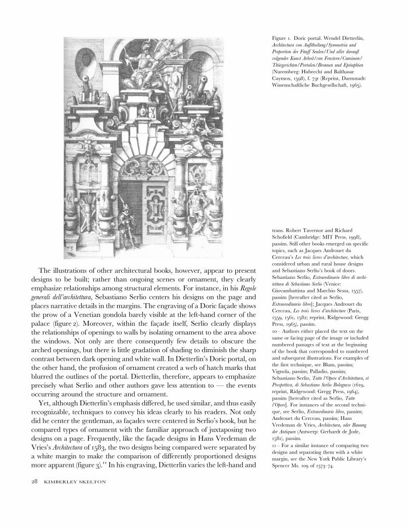
Order. In his design of a Doric portal, for instance, he suggests that the
portal is, in fact, not the primary focus of his engraving (figure 1). The reader
cannot see the entire design since the cornice extends beyond the edge of the
engraving and, even in the elements shown, would have difficulty
understanding the portal’s structure. A pile of armor covers the two niches
in the right-hand bay, while military implements together with a barrel of
cannonballs fill the shadows to the right of the central arched niche. In
contrast, the reader can easily see the gentleman poised on the threshold
since he has been centered in the engraving. This gentleman appears to be
the key to understanding the engraving. Just as Dietterlin has arrested the
movement of the gentleman entering or leaving the portal, the ornament
itself suggests a particular moment; the military statue over the door leans
precariously out from his niche, and the armor in the right-hand bay
appears balanced only tenuously. As a result, Dietterlin presents a engraving
in which the portal seems the backdrop of an ongoing scene.
At the same time, the portal also serves to organize Dietterlin’s various
interpretations in ornament of the Doric Order’s origins. According to
Vitruvius, and as stated in Dietterlin’s text, the Greeks created the Doric
Order from the proportions of a male warrior. Correspondingly, Dietterlin
includes a range of military implements in his engraving — from the armor
in the side bays to the barrels of cannonballs — and even literally transforms
the column shafts into cannons. In this light, Dietterlin’s portal is not a
structure itself to be built but rather the framework on paper for displaying
diverse types of Doric ornament.
6 – Miriam Usher Chrisman, Lay Culture,
Learned Culture: Books and Social Change in
Strasbourg, 1480–1599 (New Haven: Yale
University Press, 1982), pp. xx, xxix–xxx.
7 – Neues allgemeines Kunstler-Lexicon, s.v.
‘Soriau, Daniel’; Ohnesorge, p. 25; Pirr,
p. 23.
contrast, the book published by Balthasar
Caymox uses only black ink. Moreover, the
typeface on the pages describing each
Order’s origins also differs. For Latin words,
the Doric and Ionic pages of the more
expensive edition have Roman type, while
the less expensive version uses italic type.
Dietterlin, Architectura von Außtheilung (black
edition), ff. 5r, 45r, 94r, 135r, 175r. For the
Tuscan, Corinthian and Composite title
pages of the black and red edition, see
Dietterlin, Architectura von Außtheilung (black
and red edition), ff. 5r, 135r, 176r. For the
Doric and Ionic title pages of the black and
red editions, see Dietterlin, Architectura von
Außtheilung (black edition), ff. 45r, 94r. On the
different editions of Architectura, see G. Ulrich
Großmann, ‘Die verschiedenen Ausgaben
der ‘‘Architectura’’ des Wendel Dietterlin’,
Anzeiger des Germanischen Nationalmuseums
(1997), pp. 157–73.
8 – Describing the Doric Order in the
German editions, Dietterlin cites the specific
reference for the passage from Vitruvius, but
he merely mentions Vitruvius’s name in the
Latin and French edition. In his discussion of
the Composite Order, he changes his
discussion from explaining, in the German
editions, how it was not included in
Vitruvius, to explaining, in the Latin and
French edition, how it resulted from master
masons combining elements from the
Orders. Dietterlin, Architectura von Außtheilung,
ff. 45r, 176r; Dietterlin, Architectura de constitu-
tione, ff. 45r, 175r.
9 – These books include Giacomo Barozzi da
Vignola’s Regola delli cinque ordini d’architettura,
Hans Vredeman de Vries’s Architectura, Hans
Blum’s Quinque Columnarum, and John Shute’s
The First and Chief Groundes of Architecture.
Giacomo Barozzi da Vignola, Regola delli
cinque ordini d’architettura (Venice: Hieronymus
Porus, 1577), passim; Hans Blum, Quinque
Columnarum: Exacta descriptio atque deliniatio, cum
symmetrica earum distributione (Zurich: Christof
Froshover, 1550), passim; John Shute, The
First and Chief Groundes of Architecture (1563,
reprint, Ridgewood: Gregg Press, 1968),
passim. A more limited number of books
continued the fifteenth-century practice of
organizing a book into chapters on general
architectural principles, such as materials or
building types. In particular, see Philibert de
l’Orme, Le premier tome de l’architecture (Paris,
1567; reprint, Paris: L. Laget, 1988), passim;
Andrea Palladio, The Four Books on Architecture,
27
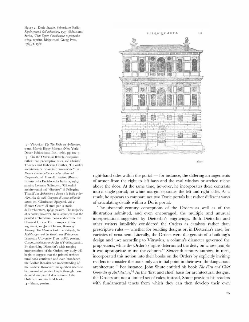
The illustrations of other architectural books, however, appear to present
designs to be built; rather than ongoing scenes or ornament, they clearly
emphasize relationships among structural elements. For instance, in his Regole
generali dell’architettura, Sebastiano Serlio centers his designs on the page and
places narrative details in the margins. The engraving of a Doric facade shows
the prow of a Venetian gondola barely visible at the left-hand corner of the
palace (figure 2). Moreover, within the facade itself, Serlio clearly displays
the relationships of openings to walls by isolating ornament to the area above
the windows. Not only are there consequently few details to obscure the
arched openings, but there is little gradation of shading to diminish the sharp
contrast between dark opening and white wall. In Dietterlin’s Doric portal, on
the other hand, the profusion of ornament created a web of hatch marks that
blurred the outlines of the portal. Dietterlin, therefore, appears to emphasize
precisely what Serlio and other authors gave less attention to — the events
occurring around the structure and ornament.
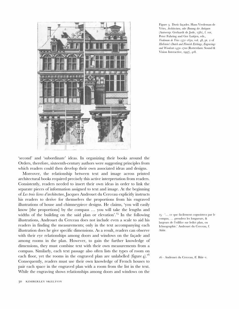
Yet, although Dietterlin’s emphasis differed, he used similar, and thus easily
recognizable, techniques to convey his ideas clearly to his readers. Not only
did he center the gentleman, as facades were centered in Serlio’s book, but he
compared types of ornament with the familiar approach of juxtaposing two
designs on a page. Frequently, like the facade designs in Hans Vredeman de
Vries’s Architectura of 1583, the two designs being compared were separated by
a white margin to make the comparison of differently proportioned designs
more apparent (figure 3).11 In his engraving, Dietterlin varies the left-hand and
10 – Authors either placed the text on the
same or facing page of the image or included
numbered passages of text at the beginning
of the book that corresponded to numbered
and subsequent illustrations. For examples of
the first technique, see Blum, passim;
Vignola, passim; Palladio, passim;
Sebastiano Serlio, Tutte l’Opere d’Architettura, et
Prospettiva, di Sebastiano Serlio Bolognese (1619,
reprint, Ridgewood: Gregg Press, 1964),
passim [hereafter cited as Serlio, Tutte
l’Opere]. For instances of the second techni-
que, see Serlio, Extraordinario libro, passim;
Androuet du Cerceau, passim; Hans
Vredeman de Vries, Architectura, oder Bauung
der Antiquen (Antwerp: Gerhardt de Jode,
1581), passim.
trans. Robert Tavernor and Richard
Schofield (Cambridge: MIT Press, 1998),
passim. Still other books emerged on specific
topics, such as Jacques Androuet du
Cerceau’s Les trois livres d’architecture, which
considered urban and rural house designs
and Sebastiano Serlio’s book of doors.
Sebastiano Serlio, Extraordinario libro di archi-
tettura di Sebastiano Serlio (Venice:
Giovambattista and Marchio Sessa, 1557),
passim [hereafter cited as Serlio,
Extraorodinario libro]; Jacques Androuet du
Cerceau, Les trois livres d’architecture (Paris,
1559, 1561, 1582; reprint, Ridgewood: Gregg
Press, 1965), passim.
Figure 1. Doric portal. Wendel Dietterlin,
Architectura von Außtheilung/Symmetria und
Proportion der Funff Seulen/Und aller darauß
volgender Kunst Arbeit/von Fenstern/Caminem/
Thurgerichten/Portalen/Bronnen und Epitaphien
(Nuremberg: Hubrecht and Balthasar
Caymox, 1598), f. 73r (Reprint, Darmstadt:
Wissenschaftliche Buchgesellschaft, 1965).
11 – For a similar instance of comparing two
designs and separating them with a white
margin, see the New York Public Library’s
Spencer Ms. 109 of 1573–74.
28 KIMBERLEY SKELTON
right-hand sides within the portal — for instance, the differing arrangements
of armor from the right to left bays and the oval window or arched niche
above the door. At the same time, however, he incorporates these contrasts
into a single portal; no white margin separates the left and right sides. As a
result, he appears to compare not two Doric portals but rather different ways
of articulating details within a Doric portal.
The sixteenth-century conceptions of the Orders as well as of the
illustration admitted, and even encouraged, the multiple and unusual
interpretations suggested by Dietterlin’s engravings. Both Dietterlin and
other writers implicitly considered the Orders as catalysts rather than
prescriptive rules — whether for building designs or, in Dietterlin’s case, for
varieties of ornament. Literally, the Orders were the genesis of a building’s
design and use; according to Vitruvius, a column’s diameter governed the
proportions, while the Order’s origins determined the deity on whose temple
it was appropriate to use the column.12 Sixteenth-century authors, in turn,
incorporated this notion into their books on the Orders by explicitly inviting
readers to consider the book only an initial point in their own thinking about
architecture.13 For instance, John Shute entitled his book The First and Chief
Groundes of Architecture.14 As the ‘first and chief’ basis for architectural designs,
the Orders are not a limited set of rules; instead, Shute provides his readers
with fundamental tenets from which they can then develop their own
Figure 2. Doric facade. Sebastiano Serlio,
Regole generali dell’architettura, 1537. (Sebastiano
Serlio, ‘Tutte l’opere d’architettura et prospettiva
(1619, reprint, Ridgewood: Gregg Press,
1964), f. 156r.
12 – Vitruvius, The Ten Books on Architecture,
trans. Morris Hicky Morgan (New York:
Dover Publications, Inc., 1960), pp. 102–3.
14 – Shute, passim.
13 – On the Orders as flexible categories
rather than prescriptive rules, see Christof
Thoenes and Hubertus Gunther, ‘Gli ordini
architettonici: rinascita o invenzione?’, in
Roma e l’antico nell’arte e nella cultura del
Cinquecento, ed. Marcello Fagiolo (Rome:
Istituto della Enciclopedia Italiana, 1985),
passim; Lorenzo Salimbeni, ‘Gli ordini
architettonici nel ‘‘discorso’’ di Pellegrino
Tibaldi’, in Architettura a Roma e in Italia 1580–
1621. Atti del xxiii Congresso di storia dell’archi-
tettura, ed. Gianfranco Spagnesi, vol. 2
(Rome: Centro di studi per la storia
dell’architettura, 1989), passim. The majority
of scholars, however, have assumed that the
printed architectural book codified the five
Classical Orders. For examples of this
argument, see John Onians, Bearers of
Meaning: The Classical Orders in Antiquity, the
Middle Ages, and the Renaissance (Princeton:
Princeton University Press, 1988), passim;
Carpo, Architecture in the Age of Printing, passim.
By describing Dietterlin’s wide-ranging
interpretations of the Orders, my study will
begin to suggest that the printed architec-
tural book continued and even broadened
the flexible Renaissance understanding of
the Orders. However, this question needs to
be pursued at greater length through more
detailed analyses of descriptions of the
Orders in architectural books.
29
‘second’ and ‘subordinate’ ideas. In organizing their books around the
Orders, therefore, sixteenth-century authors were suggesting principles from
which readers could then develop their own associated ideas and designs.
Moreover, the relationship between text and image across printed
architectural books required precisely this active interpretation from readers.
Consistently, readers needed to insert their own ideas in order to link the
separate pieces of information assigned to text and image. At the beginning
of Les trois livres d’architecture, Jacques Androuet du Cerceau explicitly instructs
his readers to derive for themselves the proportions from his engraved
illustrations of house and chimneypiece designs. He claims, ‘you will easily
know [the proportions] by the compass … you will take the lengths and
widths of the building on the said plan or elevation’.15 In the following
illustrations, Androuet du Cerceau does not include even a scale to aid his
readers in finding the measurements; only in the text accompanying each
illustration does he give specific dimensions. As a result, readers can observe
with their eye relationships among doors and windows on the facade and
among rooms in the plan. However, to gain the further knowledge of
dimensions, they must combine text with their own measurements from a
compass. Similarly, each text passage also often lists the types of room on
each floor, yet the rooms in the engraved plan are unlabelled (figure 4).16
Consequently, readers must use their own knowledge of French houses to
pair each space in the engraved plan with a room from the list in the text.
While the engraving shows relationships among doors and windows on the
15 – ‘… ce que facilement cognoistrez par le
compas, … prendrez les longueurs, &
largeurs de l’edifice sur ledict plan, ou
Ichnographie.’ Androuet du Cerceau, f.
Aiiiir.
16 – Androuet du Cerceau, ff. Biiir–v.
Figure 3. Doric facades. Hans Vredeman de
Vries, Architectura, oder Bauung der Antiquen
(Antwerp: Gerhardt de Jode, 1581), f. 10r,
Peter Fuhring and Ger Luitjen, eds.,
Vredeman de Vries 1572–1630, vol. 48, pt. 2 of
Hollstein’s Dutch and Flemish Etchings, Engravings
and Woodcuts 1450–1700 (Rotterdam: Sound &
Vision Interactive, 1997), 418.
30 KIMBERLEY SKELTON
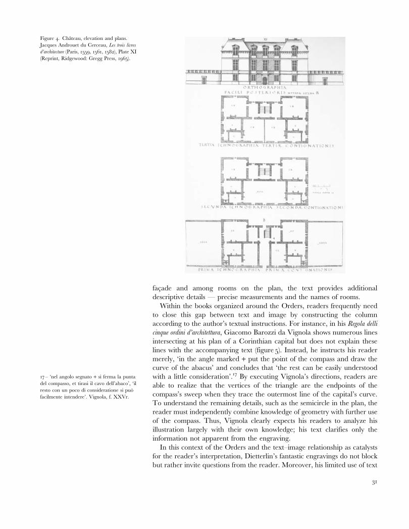
facade and among rooms on the plan, the text provides additional
descriptive details — precise measurements and the names of rooms.
Within the books organized around the Orders, readers frequently need
to close this gap between text and image by constructing the column
according to the author’s textual instructions. For instance, in his Regola delli
cinque ordini d’architettura, Giacomo Barozzi da Vignola shows numerous lines
intersecting at his plan of a Corinthian capital but does not explain these
lines with the accompanying text (figure 5). Instead, he instructs his reader
merely, ‘in the angle marked + put the point of the compass and draw the
curve of the abacus’ and concludes that ‘the rest can be easily understood
with a little consideration’.17 By executing Vignola’s directions, readers are
able to realize that the vertices of the triangle are the endpoints of the
compass’s sweep when they trace the outermost line of the capital’s curve.
To understand the remaining details, such as the semicircle in the plan, the
reader must independently combine knowledge of geometry with further use
of the compass. Thus, Vignola clearly expects his readers to analyze his
illustration largely with their own knowledge; his text clarifies only the
information not apparent from the engraving.
In this context of the Orders and the text–image relationship as catalysts
for the reader’s interpretation, Dietterlin’s fantastic engravings do not block
but rather invite questions from the reader. Moreover, his limited use of text
Figure 4. Chateau, elevation and plans.
Jacques Androuet du Cerceau, Les trois livres
d’architecture (Paris, 1559, 1561, 1582), Plate XI
(Reprint, Ridgewood: Gregg Press, 1965).
17 – ‘nel angolo segnato + si ferma la punta
del compasso, et tirasi il cavo dell’abaco’, ‘il
resto con un poco di consideratione si puo
facilmente intendere’. Vignola, f. XXVr.
31
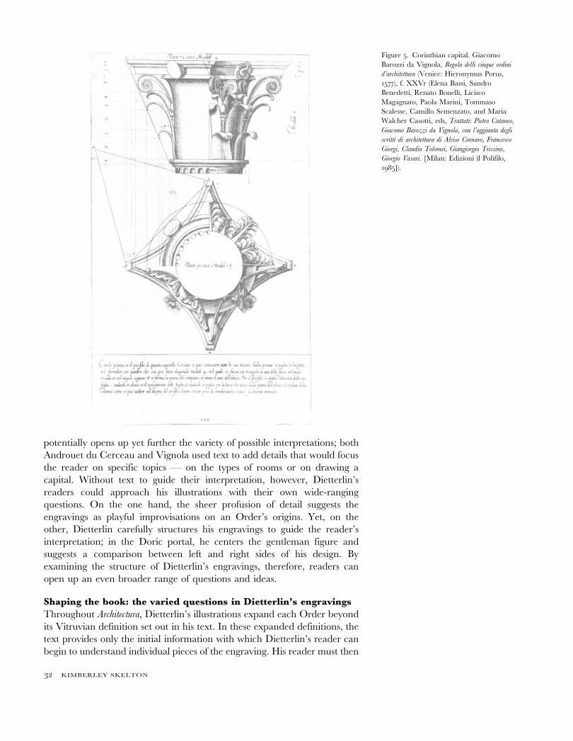
potentially opens up yet further the variety of possible interpretations; both
Androuet du Cerceau and Vignola used text to add details that would focus
the reader on specific topics — on the types of rooms or on drawing a
capital. Without text to guide their interpretation, however, Dietterlin’s
readers could approach his illustrations with their own wide-ranging
questions. On the one hand, the sheer profusion of detail suggests the
engravings as playful improvisations on an Order’s origins. Yet, on the
other, Dietterlin carefully structures his engravings to guide the reader’s
interpretation; in the Doric portal, he centers the gentleman figure and
suggests a comparison between left and right sides of his design. By
examining the structure of Dietterlin’s engravings, therefore, readers can
open up an even broader range of questions and ideas.
Shaping the book: the varied questions in Dietterlin’s engravings
Throughout Architectura, Dietterlin’s illustrations expand each Order beyond
its Vitruvian definition set out in his text. In these expanded definitions, the
text provides only the initial information with which Dietterlin’s reader can
begin to understand individual pieces of the engraving. His reader must then
Figure 5. Corinthian capital. Giacomo
Barozzi da Vignola, Regola delli cinque ordini
d’architettura (Venice: Hieronymus Porus,
1577), f. XXVr (Elena Bassi, Sandro
Benedetti, Renato Bonelli, Licisco
Magagnato, Paola Marini, Tommaso
Scalesse, Camillo Semenzato, and Maria
Walcher Casotti, eds, Trattati: Pietro Cataneo,
Giacomo Barozzi da Vignola, con l’aggiunta degli
scritti di architettura di Alvise Cornaro, Francesco
Giorgi, Claudio Tolomei, Giangiorgio Trissino,
Giorgio Vasari. [Milan: Edizioni il Polifilo,
1985]).
32 KIMBERLEY SKELTON
turn to the format of the engraving itself in order to understand the broader
questions encouraged by Dietterlin.
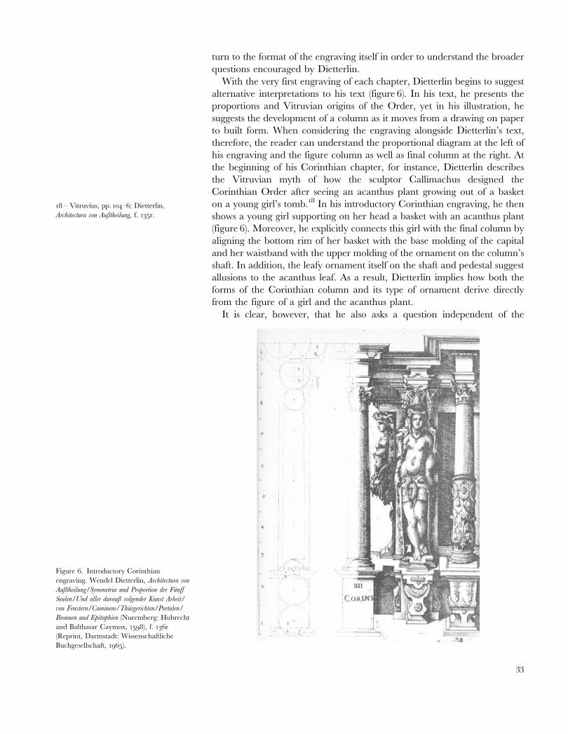
With the very first engraving of each chapter, Dietterlin begins to suggest
alternative interpretations to his text (figure 6). In his text, he presents the
proportions and Vitruvian origins of the Order, yet in his illustration, he
suggests the development of a column as it moves from a drawing on paper
to built form. When considering the engraving alongside Dietterlin’s text,
therefore, the reader can understand the proportional diagram at the left of
his engraving and the figure column as well as final column at the right. At
the beginning of his Corinthian chapter, for instance, Dietterlin describes
the Vitruvian myth of how the sculptor Callimachus designed the
Corinthian Order after seeing an acanthus plant growing out of a basket
on a young girl’s tomb.18 In his introductory Corinthian engraving, he then
shows a young girl supporting on her head a basket with an acanthus plant
(figure 6). Moreover, he explicitly connects this girl with the final column by
aligning the bottom rim of her basket with the base molding of the capital
and her waistband with the upper molding of the ornament on the column’s
shaft. In addition, the leafy ornament itself on the shaft and pedestal suggest
allusions to the acanthus leaf. As a result, Dietterlin implies how both the
forms of the Corinthian column and its type of ornament derive directly
from the figure of a girl and the acanthus plant.
It is clear, however, that he also asks a question independent of the
18 – Vitruvius, pp. 104–6; Dietterlin,
Architectura von Außtheilung, f. 135r.
Figure 6. Introductory Corinthian
engraving. Wendel Dietterlin, Architectura von
Außtheilung/Symmetria und Proportion der Funff
Seulen/Und aller darauß volgender Kunst Arbeit/
von Fenstern/Caminem/Thurgerichten/Portalen/
Bronnen und Epitaphien (Nuremberg: Hubrecht
and Balthasar Caymox, 1598), f. 136r
(Reprint, Darmstadt: Wissenschaftliche
Buchgesellschaft, 1965).
33
Corinthian Order’s Vitruvian origins, for the sequence of columns in the
engraving directly contradicts his text and he blatantly ignores the central
column. According to Vitruvius, and as set out by Dietterlin, the Greeks
selected the appropriate human figure and then derived the Order’s
proportions. However, Dietterlin’s engraving places the diagram of propor-
tions before the figure of the girl. Even more problematically, his text does not
address the half-dotted and half-perspectival column between the diagram
and the statue column of the girl. Since Dietterlin centers this column in his
illustration, moreover, he suggests that it represents the key to understanding
his engraving. Half in the dots of the diagram and half in the shading of the
perspectivally rendered columns to the right, this column appears to be in a
moment of transition from a two-dimensional diagram to a free-standing
building element. Its cornice explicitly suggests this development since the
upper line of the proportional diagram continues unbroken as first a dotted
cornice outline and then the hatched, three-dimensional cornice. By centering
the half-dotted and half-perspectival column, therefore, Dietterlin raises the
question of how a column moves from drawing to building.
With the group of columns at the right, he then traces out in detail the
steps by which the column emerges finally into its built form. Immediately
following the transitional central column, the girl in the Vitruvian origin
myth appears as a Caryatid figure and signals the shift to three dimensions;
like the following columns, she has clearly delineated areas of light and
shade. Yet the girl provides only a parenthetical explanation in Dietterlin’s
narrative, for Dietterlin recesses both Caryatids behind the planes of the
diagram as well as the central and final columns. Not only are the cornice
and podium of the second Caryatid stepped back but the skirt of the first
Caryatid extends behind the half-dotted, half-perspectival column. As a
result, these two statues do not appear as a specific stage in the transition
from drawing to building; the human figure explains the shift to three
dimensions but an architect would not draw it in designing a building.
Dietterlin makes this shift to a three-dimensional building explicit by
tracing out how the Caryatid figure gradually emerges from the plane of the
wall into the final column. With the first Caryatid, he explicitly draws a
parallel between the wall and the girl’s body. Like the wall, this Caryatid
supports the cornice. More literally, however, she appears to grow out of the
wall since she faces in the direction of the wall’s plane and occupies a space
cut from the wall. The second Caryatid continues to support the cornice but
resembles more the final free-standing column. She faces perpendicularly to
the wall’s plane and even has legs which she uses to step forward from the
wall; her step then stretches the base into a cruciform shape. The final
column becomes yet more independent from the wall since the cornice
above it projects forward and its white shaft contrasts sharply with the dark
hatching on the wall behind. Thus, through his introductory engraving,
Dietterlin not only uses specific columns to illustrate his text but explores a
question outside his text — the development from drawing to building —
through relationships among the columns.
The reader’s analysis of this engraving, however, does not halt with the
illustration and its accompanying text alone; instead, Dietterlin suggests
further interpretations from comparisons with other engravings within and
34 KIMBERLEY SKELTON
beyond the Corinthian chapter. In these comparisons, the reader must assume
a yet more active role of interpretation; text is used only when the possible
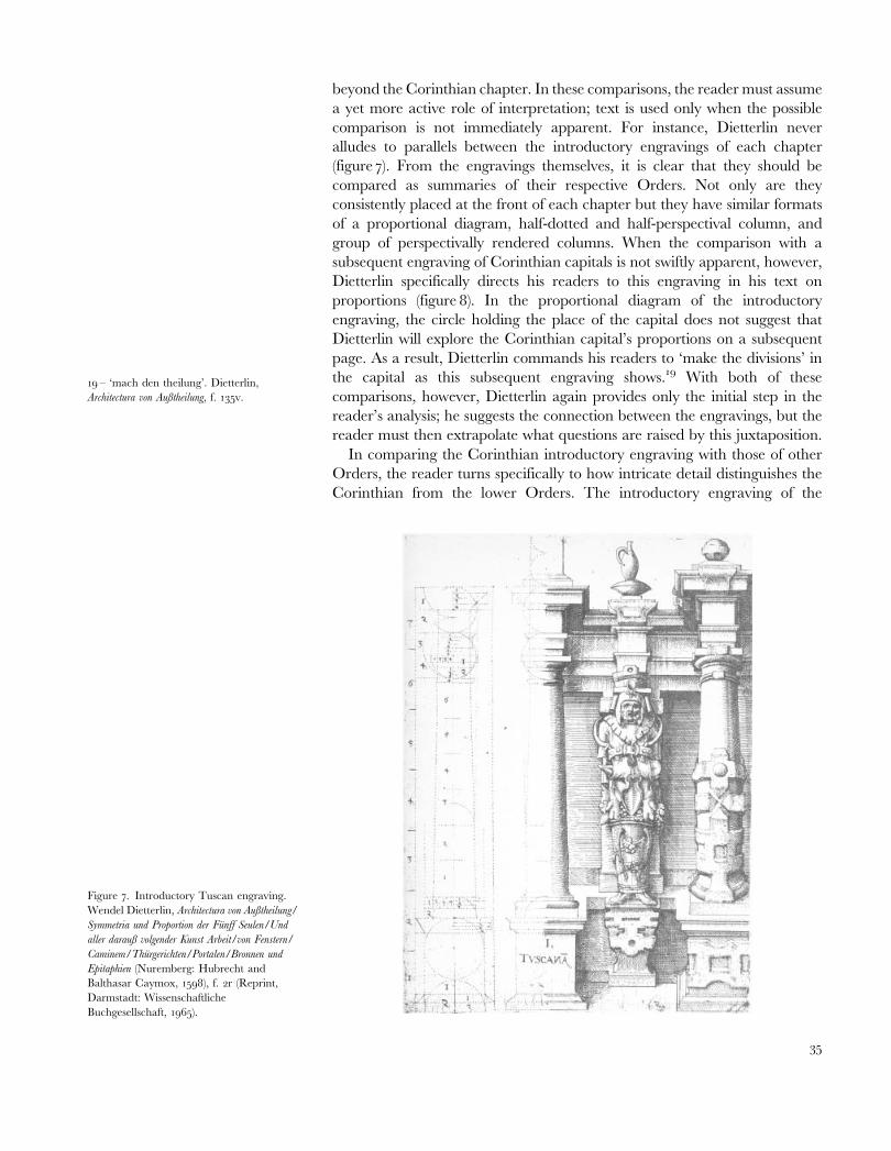
comparison is not immediately apparent. For instance, Dietterlin never
alludes to parallels between the introductory engravings of each chapter
(figure 7). From the engravings themselves, it is clear that they should be
compared as summaries of their respective Orders. Not only are they
consistently placed at the front of each chapter but they have similar formats
of a proportional diagram, half-dotted and half-perspectival column, and
group of perspectivally rendered columns. When the comparison with a
subsequent engraving of Corinthian capitals is not swiftly apparent, however,
Dietterlin specifically directs his readers to this engraving in his text on
proportions (figure 8). In the proportional diagram of the introductory
engraving, the circle holding the place of the capital does not suggest that
Dietterlin will explore the Corinthian capital’s proportions on a subsequent
page. As a result, Dietterlin commands his readers to ‘make the divisions’ in
the capital as this subsequent engraving shows.19 With both of these
comparisons, however, Dietterlin again provides only the initial step in the
reader’s analysis; he suggests the connection between the engravings, but the
reader must then extrapolate what questions are raised by this juxtaposition.
In comparing the Corinthian introductory engraving with those of other
Orders, the reader turns specifically to how intricate detail distinguishes the
Corinthian from the lower Orders. The introductory engraving of the
Figure 7. Introductory Tuscan engraving.
Wendel Dietterlin, Architectura von Außtheilung/
Symmetria und Proportion der Funff Seulen/Und
aller darauß volgender Kunst Arbeit/von Fenstern/
Caminem/Thurgerichten/Portalen/Bronnen und
Epitaphien (Nuremberg: Hubrecht and
Balthasar Caymox, 1598), f. 2r (Reprint,
Darmstadt: Wissenschaftliche
Buchgesellschaft, 1965).
19 – ‘mach den theilung’. Dietterlin,
Architectura von Außtheilung, f. 135v.
35
Tuscan, as the lowest Order in the hierarchy, presents the sharpest contrast
to the Corinthian. Here, Dietterlin includes roughly finished stone on the
pedestal as well as shaft and places large-scale ornament above the cornice
line (see figure 7). The Corinthian engraving, on the other hand, is finely
carved to reveal the tiny foliage details and has smaller-scale ornament that
is only between the pedestal and cornice. Moreover, the engraving itself has
become more complicated: the Corinthian engraving has an additional
Caryatid figure, while its Tuscan counterpart has only a single statue
column. Thus, through these two illustrations, Dietterlin’s reader can infer
how fine, detailed carving and greater complexity of design set the
Corinthian off from the lower Orders.
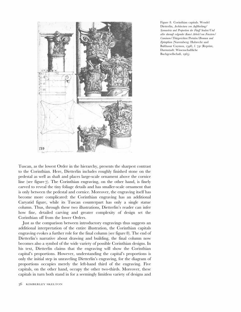
Just as the comparison between introductory engravings thus suggests an
additional interpretation of the entire illustration, the Corinthian capitals
engraving evokes a further role for the final column (see figure 8). The end of
Dietterlin’s narrative about drawing and building, the final column now
becomes also a symbol of the wide variety of possible Corinthian designs. In
his text, Dietterlin claims that the engraving will show the Corinthian
capital’s proportions. However, understanding the capital’s proportions is
only the initial step in unraveling Dietterlin’s engraving, for the diagram of
proportions occupies merely the left-hand third of the engraving. Five
capitals, on the other hand, occupy the other two-thirds. Moreover, these
capitals in turn both stand in for a seemingly limitless variety of designs and
Figure 8. Corinthian capitals. Wendel
Dietterlin, Architectura von Außtheilung/
Symmetria und Proportion der Funff Seulen/Und
aller darauß volgender Kunst Arbeit/von Fenstern/
Caminem/Thurgerichten/Portalen/Bronnen und
Epitaphien (Nuremberg: Hubrecht and
Balthasar Caymox, 1598), f. 73r (Reprint,
Darmstadt: Wissenschaftliche
Buchgesellschaft, 1965).
36 KIMBERLEY SKELTON
suggest the Corinthian capital’s origins. Since the two right-hand capitals
extend off the edge of the illustration, readers need to complete them with
their own ideas. Consequently, the capitals could vary widely among readers
as well as among times when a single reader analyzed the engraving. At the
same time, Dietterlin transforms these capitals into steps outlining the
eventual profusion of designs. With the horizontal sill, he divides the capitals
into two groups — one containing the capital of intertwined vines and its
carved counterpart and the other of the three highly carved capitals. The
capital of intertwined vines clearly appears a precursor to its stone
counterparts; not only is it set back behind a step but it alone is of vines
rather than stone. In this light, the capital immediately to the right suggests
the transformation to stone. Then, those capitals above the sill display the
variety of possible designs; both their carved foliage and volutes differ
markedly from each other. The Corinthian capital on the final column of
the introductory engraving thus no longer represents a definitive design but
instead calls to mind both its origins and possible variations.
By sparking multiple interpretations through his illustrations, Dietterlin
not only raises a range of questions about each engraving but,
simultaneously, broadens the Vitruvian and sixteenth-century definitions
of the Orders. The Composite Order, for instance, he defines according to
Vitruvius in his text — as a blend of the Doric, Ionic, and Corinthian
Orders.20 With his engravings, however, he suggests that ‘Composite’ can
also describe how his readers would combine two illustrations and how
materials as well as Gothic and Classic forms can be intertwined.21 Other
sixteenth-century authors also expanded the Composite Order to include
combinations other than the Doric, Ionic, and Corinthian Orders. However,
these combinations consistently remained within Classical architecture; for
instance, Serlio considered both the superposition of the Orders and then
the technique for bonding a stone Classical facing onto a brick building.22
Dietterlin is unusual, therefore, in defining ‘Composite’ as a way of reading
his book and of extending the five Orders beyond Classicism.
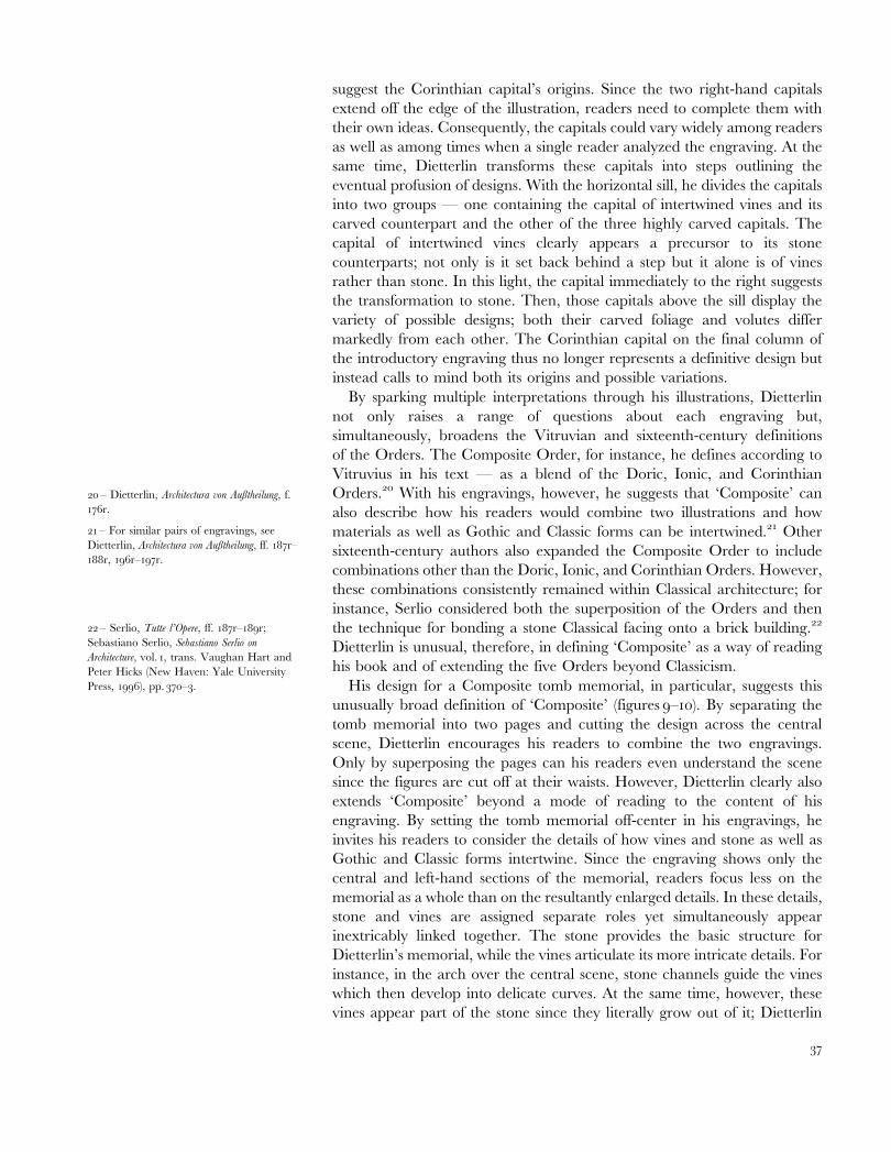
His design for a Composite tomb memorial, in particular, suggests this
unusually broad definition of ‘Composite’ (figures 9–10). By separating the
tomb memorial into two pages and cutting the design across the central
scene, Dietterlin encourages his readers to combine the two engravings.
Only by superposing the pages can his readers even understand the scene
since the figures are cut off at their waists. However, Dietterlin clearly also
extends ‘Composite’ beyond a mode of reading to the content of his
engraving. By setting the tomb memorial off-center in his engravings, he
invites his readers to consider the details of how vines and stone as well as
Gothic and Classic forms intertwine. Since the engraving shows only the
central and left-hand sections of the memorial, readers focus less on the
memorial as a whole than on the resultantly enlarged details. In these details,
stone and vines are assigned separate roles yet simultaneously appear
inextricably linked together. The stone provides the basic structure for
Dietterlin’s memorial, while the vines articulate its more intricate details. For
instance, in the arch over the central scene, stone channels guide the vines
which then develop into delicate curves. At the same time, however, these
vines appear part of the stone since they literally grow out of it; Dietterlin
20 – Dietterlin, Architectura von Außtheilung, f.
176r.
21 – For similar pairs of engravings, see
Dietterlin, Architectura von Außtheilung, ff. 187r–
188r, 196r–197r.
22 – Serlio, Tutte l’Opere, ff. 187r–189r;
Sebastiano Serlio, Sebastiano Serlio on
Architecture, vol. 1, trans. Vaughan Hart and
Peter Hicks (New Haven: Yale University
Press, 1996), pp. 370–3.
37
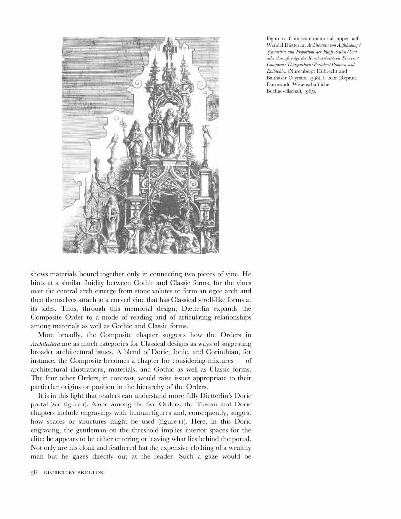
shows materials bound together only in connecting two pieces of vine. He
hints at a similar fluidity between Gothic and Classic forms, for the vines
over the central arch emerge from stone volutes to form an ogee arch and
then themselves attach to a curved vine that has Classical scroll-like forms at
its sides. Thus, through this memorial design, Dietterlin expands the
Composite Order to a mode of reading and of articulating relationships
among materials as well as Gothic and Classic forms.
More broadly, the Composite chapter suggests how the Orders in
Architectura are as much categories for Classical designs as ways of suggesting
broader architectural issues. A blend of Doric, Ionic, and Corinthian, for
instance, the Composite becomes a chapter for considering mixtures — of
architectural illustrations, materials, and Gothic as well as Classic forms.
The four other Orders, in contrast, would raise issues appropriate to their
particular origins or position in the hierarchy of the Orders.
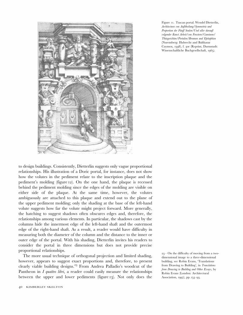
It is in this light that readers can understand more fully Dietterlin’s Doric
portal (see figure 1). Alone among the five Orders, the Tuscan and Doric
chapters include engravings with human figures and, consequently, suggest
how spaces or structures might be used (figure 11). Here, in this Doric
engraving, the gentleman on the threshold implies interior spaces for the
elite; he appears to be either entering or leaving what lies behind the portal.
Not only are his cloak and feathered hat the expensive clothing of a wealthy
man but he gazes directly out at the reader. Such a gaze would be
Figure 9. Composite memorial, upper half.
Wendel Dietterlin, Architectura von Außtheilung/
Symmetria und Proportion der Funff Seulen/Und
aller darauß volgender Kunst Arbeit/von Fenstern/
Caminem/Thurgerichten/Portalen/Bronnen und
Epitaphien (Nuremberg: Hubrecht and
Balthasar Caymox, 1598), f. 202r (Reprint,
Darmstadt: Wissenschaftliche
Buchgesellschaft, 1965).
38 KIMBERLEY SKELTON
appropriate to a member of the elite since the reader would either be the
man’s equal, another wealthy individual, or his inferior, a master builder. In
contrast, the man before a portal in the Tuscan Order is clearly a servant
figure; he is clothed simply in shirt and trousers, turns his back to the reader,
and carries a bucket as if he is completing a task. As the two lowest Orders in
the hierarchy, the Tuscan and Doric would be the most appropriate
chapters for discussing the use of space. Like the larger scale of the ornament
in their designs, the arrangement and use of spaces involve broader
questions about a building because they would affect the configuration of the
entire structure; in contrast, the intertwined materials and forms of the
Composite Order would then provide the details to articulate the building.
At the same time, since the Tuscan is below the Doric, it could be used to
consider the less ornate and often literally lower service spaces — in the
basement beneath the ground floor. In this way, through his highly detailed
engravings and limited text, Dietterlin’s readers can evoke multiple
interpretations which, in turn, expand the Orders into catalysts for designs
as well as discussions of broader architectural questions.
Shaping the building: Architectura, the patron, and the masterbuilder
While Architectura would thus easily ignite conversations in a patron’s library,
it is at first unclear how patrons and master builders could use its engravings
Figure 10. Composite memorial, lower half.
Wendel Dietterlin, Architectura von Außtheilung/
Symmetria und Proportion der Funff Seulen/Und
aller darauß volgender Kunst Arbeit/von Fenstern/
Caminem/Thurgerichten/Portalen/Bronnen und
Epitaphien (Nuremberg: Hubrecht and
Balthasar Caymox, 1598), f. 203r (Reprint,
Darmstadt: Wissenschaftliche
Buchgesellschaft, 1965).
39
to design buildings. Consistently, Dietterlin suggests only vague proportional
relationships. His illustration of a Doric portal, for instance, does not show
how the volutes in the pediment relate to the inscription plaque and the
pediment’s molding (figure 12). On the one hand, the plaque is recessed
behind the pediment molding since the edges of the molding are visible on
either side of the plaque. At the same time, however, the volutes
ambiguously are attached to this plaque and extend out to the plane of
the upper pediment molding; only the shading at the base of the left-hand
volute suggests how far the volute might project forward. More generally,
the hatching to suggest shadows often obscures edges and, therefore, the
relationships among various elements. In particular, the shadows cast by the
columns hide the innermost edge of the left-hand shaft and the outermost
edge of the right-hand shaft. As a result, a reader would have difficulty in
measuring both the diameter of the column and the distance to the inner or
outer edge of the portal. With his shading, Dietterlin invites his readers to
consider the portal in three dimensions but does not provide precise
proportional relationships.
The more usual technique of orthogonal projection and limited shading,
however, appears to suggest exact proportions and, therefore, to present
clearly viable building designs.23 From Andrea Palladio’s woodcut of the
Pantheon in I quattro libri, a reader could easily measure the relationships
between the upper and lower pediments (figure 13). Not only does the
Figure 11. Tuscan portal. Wendel Dietterlin,
Architectura von Außtheilung/Symmetria und
Proportion der Funff Seulen/Und aller darauß
volgender Kunst Arbeit/von Fenstern/Caminem/
Thurgerichten/Portalen/Bronnen und Epitaphien
(Nuremberg: Hubrecht and Balthasar
Caymox, 1598), f. 30r (Reprint, Darmstadt:
Wissenschaftliche Buchgesellschaft, 1965).
23 – On the difficulty of moving from a two-
dimensional image to a three-dimensional
building, see Robin Evans, ‘Translations
from Drawing to Building’, in Translations
from Drawing to Building and Other Essays, by
Robin Evans (London: Architectural
Association, 1997), pp. 153–93.
40 KIMBERLEY SKELTON
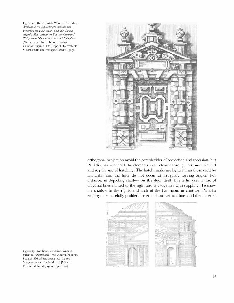
orthogonal projection avoid the complexities of projection and recession, but
Palladio has rendered the elements even clearer through his more limited
and regular use of hatching. The hatch marks are lighter than those used by
Dietterlin and the lines do not occur at irregular, varying angles. For
instance, in depicting shadow on the door itself, Dietterlin uses a mix of
diagonal lines slanted to the right and left together with stippling. To show
the shadow in the right-hand arch of the Pantheon, in contrast, Palladio
employs first carefully gridded horizontal and vertical lines and then a series
Figure 12. Doric portal. Wendel Dietterlin,
Architectura von Außtheilung/Symmetria und
Proportion der Funff Seulen/Und aller darauß
volgender Kunst Arbeit/von Fenstern/Caminem/
Thurgerichten/Portalen/Bronnen und Epitaphien
(Nuremberg: Hubrecht and Balthasar
Caymox, 1598), f. 67r (Reprint, Darmstadt:
Wissenschaftliche Buchgesellschaft, 1965).
Figure 13. Pantheon, elevation. Andrea
Palladio, I quattro libri, 1570 (Andrea Palladio,
I quattro libri dell’architettura, eds Licisco
Magagnato and Paola Marini [Milan:
Edizioni il Polifilo, 1980], pp. 340–1).
41
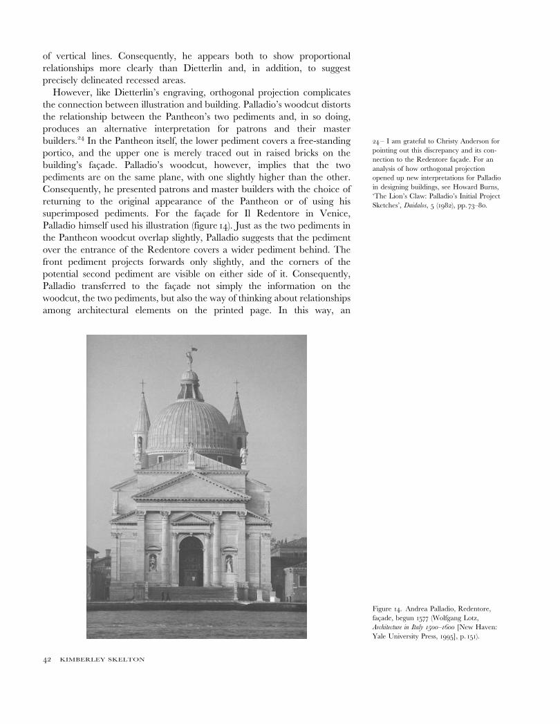
of vertical lines. Consequently, he appears both to show proportional
relationships more clearly than Dietterlin and, in addition, to suggest
precisely delineated recessed areas.
However, like Dietterlin’s engraving, orthogonal projection complicates
the connection between illustration and building. Palladio’s woodcut distorts
the relationship between the Pantheon’s two pediments and, in so doing,
produces an alternative interpretation for patrons and their master
builders.24 In the Pantheon itself, the lower pediment covers a free-standing
portico, and the upper one is merely traced out in raised bricks on the
building’s facade. Palladio’s woodcut, however, implies that the two
pediments are on the same plane, with one slightly higher than the other.
Consequently, he presented patrons and master builders with the choice of
returning to the original appearance of the Pantheon or of using his
superimposed pediments. For the facade for Il Redentore in Venice,
Palladio himself used his illustration (figure 14). Just as the two pediments in
the Pantheon woodcut overlap slightly, Palladio suggests that the pediment
over the entrance of the Redentore covers a wider pediment behind. The
front pediment projects forwards only slightly, and the corners of the
potential second pediment are visible on either side of it. Consequently,
Palladio transferred to the facade not simply the information on the
woodcut, the two pediments, but also the way of thinking about relationships
among architectural elements on the printed page. In this way, an
Figure 14. Andrea Palladio, Redentore,
facade, begun 1577 (Wolfgang Lotz,
Architecture in Italy 1500–1600 [New Haven:
Yale University Press, 1995], p. 151).
24 – I am grateful to Christy Anderson for
pointing out this discrepancy and its con-
nection to the Redentore facade. For an
analysis of how orthogonal projection
opened up new interpretations for Palladio
in designing buildings, see Howard Burns,
‘The Lion’s Claw: Palladio’s Initial Project
Sketches’, Daidalos, 5 (1982), pp. 73–80.
42 KIMBERLEY SKELTON
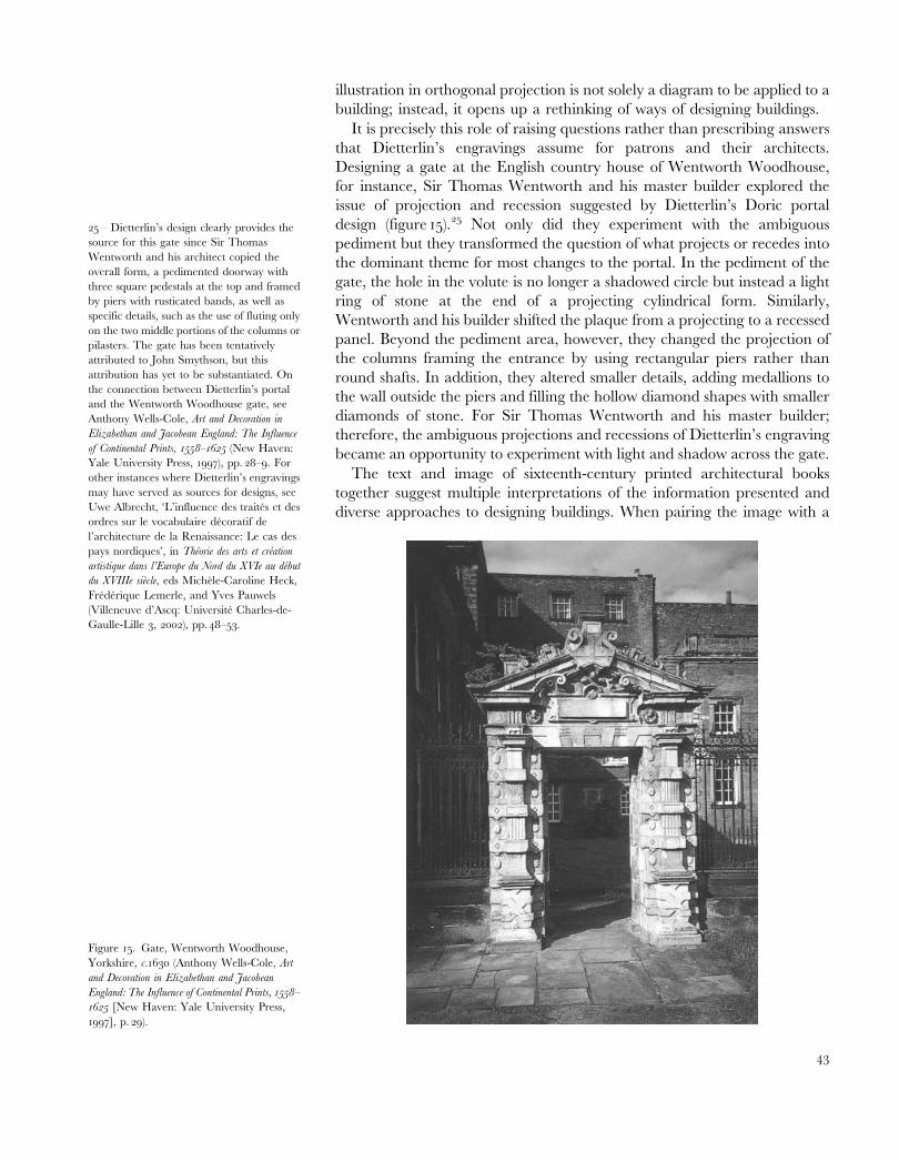
illustration in orthogonal projection is not solely a diagram to be applied to a
building; instead, it opens up a rethinking of ways of designing buildings.
It is precisely this role of raising questions rather than prescribing answers
that Dietterlin’s engravings assume for patrons and their architects.
Designing a gate at the English country house of Wentworth Woodhouse,
for instance, Sir Thomas Wentworth and his master builder explored the
issue of projection and recession suggested by Dietterlin’s Doric portal
design (figure 15).25 Not only did they experiment with the ambiguous
pediment but they transformed the question of what projects or recedes into
the dominant theme for most changes to the portal. In the pediment of the
gate, the hole in the volute is no longer a shadowed circle but instead a light
ring of stone at the end of a projecting cylindrical form. Similarly,
Wentworth and his builder shifted the plaque from a projecting to a recessed
panel. Beyond the pediment area, however, they changed the projection of
the columns framing the entrance by using rectangular piers rather than
round shafts. In addition, they altered smaller details, adding medallions to
the wall outside the piers and filling the hollow diamond shapes with smaller
diamonds of stone. For Sir Thomas Wentworth and his master builder;
therefore, the ambiguous projections and recessions of Dietterlin’s engraving
became an opportunity to experiment with light and shadow across the gate.
The text and image of sixteenth-century printed architectural books
together suggest multiple interpretations of the information presented and
diverse approaches to designing buildings. When pairing the image with a
25 – Dietterlin’s design clearly provides the
source for this gate since Sir Thomas
Wentworth and his architect copied the
overall form, a pedimented doorway with
three square pedestals at the top and framed
by piers with rusticated bands, as well as
specific details, such as the use of fluting only
on the two middle portions of the columns or
pilasters. The gate has been tentatively
attributed to John Smythson, but this
attribution has yet to be substantiated. On
the connection between Dietterlin’s portal
and the Wentworth Woodhouse gate, see
Anthony Wells-Cole, Art and Decoration in
Elizabethan and Jacobean England: The Influence
of Continental Prints, 1558–1625 (New Haven:
Yale University Press, 1997), pp. 28–9. For
other instances where Dietterlin’s engravings
may have served as sources for designs, see
Uwe Albrecht, ‘L’influence des traites et des
ordres sur le vocabulaire decoratif de
l’architecture de la Renaissance: Le cas des
pays nordiques’, in Theorie des arts et creation
artistique dans l’Europe du Nord du XVIe au debut
du XVIIIe siecle, eds Michele-Caroline Heck,
Frederique Lemerle, and Yves Pauwels
(Villeneuve d’Ascq: Universite Charles-de-
Gaulle-Lille 3, 2002), pp. 48–53.
Figure 15. Gate, Wentworth Woodhouse,
Yorkshire, c.1630 (Anthony Wells-Cole, Art
and Decoration in Elizabethan and Jacobean
England: The Influence of Continental Prints, 1558–
1625 [New Haven: Yale University Press,
1997], p. 29).
43
passage of text, authors direct the readers’ attention to specific details but
then, in their illustration, hint at further information which readers must
extrapolate. For instance, Vignola’s readers can use his text to focus on
particular proportions and steps for drawing each Order; from his
illustration, they then calculate further measurements or derive additional
stages in constructing a capital. Readers of Dietterlin’s Architectura also
needed to execute additional analysis yet did so by exploring a variety of
topics, from the Order’s origins to the use of interior spaces. Patrons and
master builders in their turn explored the possibilities raised by the image
and its disjunction with the three-dimensional building, whether in the
implicit contradictions of orthogonal projection or in Dietterlin’s more
overtly ambiguous engravings. Thus, by inviting the reader’s own
interpretations, text and image opened up a highly fluid understanding of
both the printed architectural book and its role in building practice.
44 KIMBERLEY SKELTON