Embed Size (px)
Citation preview
Module B7 – Probability and statistics
Module B7
Probability and statistics B3
Table of Contents Introduction .................................................................................................................... 7.1
7.1 Collecting data ....................................................................................................... 7.2 7.1.1 How data are displayed .................................................................................... 7.4 7.1.2 Exploring single variable data sets ................................................................... 7.6
7.2 Take your chances – probability ............................................................................ 7.14 7.2.1 Experimental probabilities ............................................................................... 7.18 7.2.2 Theoretical probabilities ................................................................................... 7.21
NOT ......................................................................................................................... 7.22 OR ............................................................................................................................ 7.23 AND ......................................................................................................................... 7.26 THEN ....................................................................................................................... 7.26
7.2.3 Probability in practice ...................................................................................... 7.31
7.3 Describing single data sets .................................................................................... 7.35 7.3.1 The centre of a data set ..................................................................................... 7.35
Mean ........................................................................................................................ 7.35 The mode ................................................................................................................. 7.36 The median .............................................................................................................. 7.36 Comparing the mean, median and mode ................................................................. 7.37
7.3.2 The spread of a data set .................................................................................... 7.37 Spread associated with median ................................................................................ 7.38 Spread associated with the mean ............................................................................. 7.45
7.4 Describing bivariate data sets ................................................................................ 7.53
7.5 A taste of things to come ....................................................................................... 7.66
7.6 Post-test ................................................................................................................. 7.67
7.7 Solutions ................................................................................................................ 7.70
Module B7 – Probability and statistics 7.1
Introduction
As our society speeds along the information superhighway we are surrounded by information in all its forms. Expressions such as:
‘the odds are’‘the average person on the street..’‘the employment rate is 5% above the norm…’‘the trends indicate….’
are common, and we might have even used them ourselves.
Statistics is the science of gaining and analysing information from numerical facts called data. You will undoubtedly come across it in one of its forms in your tertiary study. This module is designed to help you cope with the varying types of data you will encounter in the future and hopefully help you understand what those expressions above really mean.
This module builds on the concepts of summarizing and presenting data you will have encountered previously (possibly in Mathematics tertiary preparation level A).
More formally, when you have successfully completed this module you should be able to:
• demonstrate an understanding of the terms outcome, sample space, trial and experiment
• construct tree diagrams to represent sample spaces
• use tree diagrams and simple probability rules to solve real world problems
• demonstrate an understanding of the meaning of measures of central tendency (mean, median and mode) in single variable data sets
• demonstrate an understanding of the meaning of and calculate measures of spread (range, interquartile range, and standard deviation) in single variable data sets
• use measures of central tendency and spread to describe a sample of data using five number summaries and box and whisker plots
• explore two variable data sets using scatterplots and lines of best fit
• demonstrate an understanding of and use correlation coefficients.
7.2 TPP7182 – Mathematics tertiary preparation level B
7.1 Collecting data
Data are numbers collected from real world situations. We call groups of data, ‘data sets’. But data sets by themselves can be misleading. Look at this typical conversation.
“Did you read the newspaper today it said that every third family in Brisbane had their own swimming pool … that can’t be right!”
“No, you didn’t read the bit on the next page….they only asked families in one or two suburbs…”
Of course the first statement is not true for Brisbane, but it does go to show that data sets are only useful if we have some details about how the data are collected.
To help us do this statisticians define two types of data sets.
A statistical population would be all the possible values that could be collected and about which we are trying to draw conclusions. The values in a population are called individuals, but that doesn’t mean that they refer to people. Populations can be any set of counts or measurements. Variables are the attributes of those individuals that we have counted or measured. Let’s have a look at an example.
In an aquarium at Sea Universe are a number of different fish. We could have measured a number of different variables on the fish…length, weight, number of scales, colour or species (say). If we measured the lengths of all the fish we would have a population of different lengths. On the other hand, we might not have the time or money to measure all the fish so we decide to measure only some of them. This time the group of lengths would be a sample (a subset of the population). If each of the fish being measured had a equal chance of being selected for the sample then we would call the sample a random sample. If we had only selected the fish we liked the look of (say) then the sample would not be random and could be called unrepresentative or biased. Methods of collecting data so that samples are representative is an important area of study in statistics. You will investigate it further in your future tertiary studies.
Length is one variable we could have measured. If we had measured length and weight then we have a data set made up of two variables. Data sets made up of one variable are called univariate. Those made up of two variables are called bivariate, and those made up of many variables are called multivariate. In this module we will deal only with univariate and bivariate data.
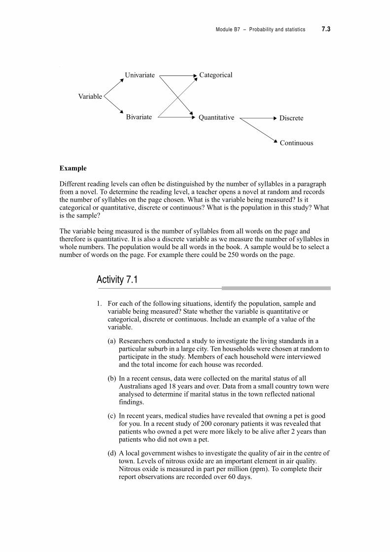
You might recall, or notice in the data set above, that variables can be of different types. Length and weight are quantitative variables which have an infinite number of possibilities (continuous variable). Number of scales on the fish is still quantitative but it is a discrete variable because it can only take whole number values (counts are always discrete variables). Species and colour are not quantitative but categorical variables because they are not measurements or counts and involve only particular groupings. We can summarize variables in the following way:
Module B7 – Probability and statistics 7.3
‘
Example
Different reading levels can often be distinguished by the number of syllables in a paragraph from a novel. To determine the reading level, a teacher opens a novel at random and records the number of syllables on the page chosen. What is the variable being measured? Is it categorical or quantitative, discrete or continuous? What is the population in this study? What is the sample?
The variable being measured is the number of syllables from all words on the page and therefore is quantitative. It is also a discrete variable as we measure the number of syllables in whole numbers. The population would be all words in the book. A sample would be to select a number of words on the page. For example there could be 250 words on the page.
Activity 7.1
1. For each of the following situations, identify the population, sample and variable being measured? State whether the variable is quantitative or categorical, discrete or continuous. Include an example of a value of the variable.
(a) Researchers conducted a study to investigate the living standards in a particular suburb in a large city. Ten households were chosen at random to participate in the study. Members of each household were interviewed and the total income for each house was recorded.
(b) In a recent census, data were collected on the marital status of all Australians aged 18 years and over. Data from a small country town were analysed to determine if marital status in the town reflected national findings.
(c) In recent years, medical studies have revealed that owning a pet is good for you. In a recent study of 200 coronary patients it was revealed that patients who owned a pet were more likely to be alive after 2 years than patients who did not own a pet.
(d) A local government wishes to investigate the quality of air in the centre of town. Levels of nitrous oxide are an important element in air quality. Nitrous oxide is measured in part per million (ppm). To complete their report observations are recorded over 60 days.
Variable
Univariate
Bivariate
Categorical
Quantitative Discrete
Continuous
7.4 TPP7182 – Mathematics tertiary preparation level B
7.1.1 How data are displayed
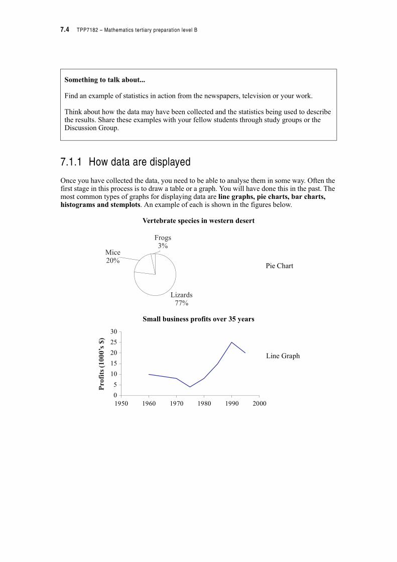
Once you have collected the data, you need to be able to analyse them in some way. Often the first stage in this process is to draw a table or a graph. You will have done this in the past. The most common types of graphs for displaying data are line graphs, pie charts, bar charts, histograms and stemplots. An example of each is shown in the figures below.
Vertebrate species in western desert
Small business profits over 35 years
Something to talk about...
Find an example of statistics in action from the newspapers, television or your work.
Think about how the data may have been collected and the statistics being used to describe the results. Share these examples with your fellow students through study groups or the Discussion Group.
Pie Chart
Mice20%
Frogs3%
Lizards77%
Line Graph
0
5
10
15
20
25
30
1950 1960 1970 1980 1990 2000
Pro
fits
(1000’s
$)

Module B7 – Probability and statistics 7.5
Histogram of scores in attitude to study of 18 students
Stem-and-leaf plot of scores in attitude to study of 18 students
Something to talk about...
The way that different types of graphs can be presented is only limited by our creativity. However, beware, many graphs that we see daily are designed to deceive the unwary. It is up to us to be cautious in our interpretation of statistics. Look in the newspapers to see if you can find any graphs or tables that may display misleading information. Share your discovery with a friend or the discussion group.
Histogram
5
100
1
0
2
3
4
5
110 120 130 140 150 160 170 180 190 200 210 220
Scores
Fre
quen
cy
11 6 represents 116
Stem-and-leaf plots are a cross between a table and a graph and display the same data as a histogram but preserve the detail of the original readings. Compare with the histogram above.
10 4
11 5, 6
12 1
13 4, 6, 7, 9
14 0 1
15 2 3
16 7 7
17 4, 7, 7
18
19
20 0

7.6 TPP7182 – Mathematics tertiary preparation level B
7.1.2 Exploring single variable data sets
To draw some of the graphs above we need to have the data in a tabular form. Most commonly this if a frequency distribution table. Recall that this is a table in which the first column shows the variable being measured or observed, with the second column being the frequency of that measurement/observation.
If we return to the example of the fish in the breeding tank at Sea Universe then the following measurements of length (cm) were made.
The frequency distribution table from these data would look like this.
Frequency distribution table for lengths of fish in breeding tank
95 23 67 78 87 59 61 40 12 88 87 56
45 40 61 95 77 78 63 66 75 76 66 67
71 73 59 77 76 69 81 87 56 61 35 78
72 85 69 71 73 67 25 93 88 83 76 68
68 56
Length of fish (cm)
Frequency (f)
12 1
23 1
25 1
35 1
40 2
45 1
56 3
59 2
61 3
63 1
66 2
67 3
68 2
69 2
71 2
72 1
73 2
75 1
76 3
77 2
78 3
81 1
83 1
85 1
87 3
88 2
93 1
95 2
! 50f
Module B7 – Probability and statistics 7.7
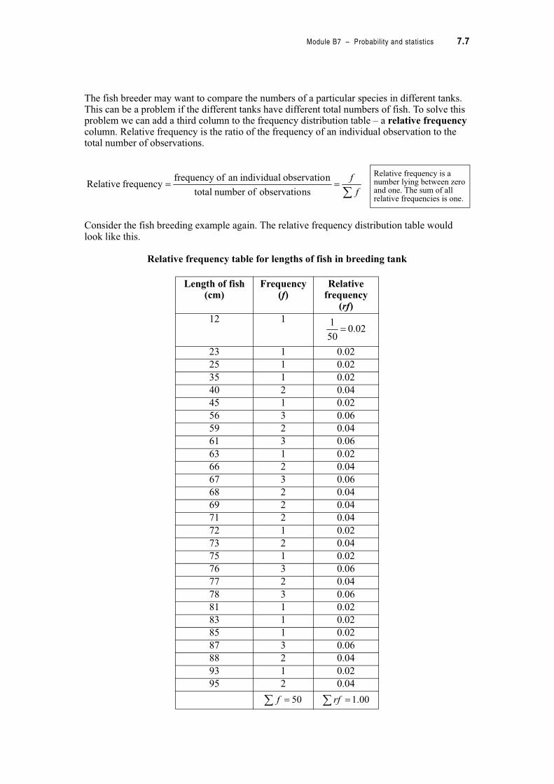
The fish breeder may want to compare the numbers of a particular species in different tanks. This can be a problem if the different tanks have different total numbers of fish. To solve this problem we can add a third column to the frequency distribution table – a relative frequency column. Relative frequency is the ratio of the frequency of an individual observation to the total number of observations.
Consider the fish breeding example again. The relative frequency distribution table would look like this.
Relative frequency table for lengths of fish in breeding tank
Length of fish (cm)
Frequency (f)
Relative frequency
(rf)
12 1
23 1 0.02
25 1 0.02
35 1 0.02
40 2 0.04
45 1 0.02
56 3 0.06
59 2 0.04
61 3 0.06
63 1 0.02
66 2 0.04
67 3 0.06
68 2 0.04
69 2 0.04
71 2 0.04
72 1 0.02
73 2 0.04
75 1 0.02
76 3 0.06
77 2 0.04
78 3 0.06
81 1 0.02
83 1 0.02
85 1 0.02
87 3 0.06
88 2 0.04
93 1 0.02
95 2 0.04
Relative frequency is a number lying between zero and one. The sum of all relative frequencies is one.
!!
f
f
nsobservatio ofnumber total
nobservatio individualan offrequency frequency Relative
02.050
1!
! 50f ! 00.1rf

7.8 TPP7182 – Mathematics tertiary preparation level B
Using this table we can answer a range of questions that, although possible from the frequency distribution table, are quicker if we have a relative frequency distribution table.
What proportion of fish are 76 cm in length?
We can answer this question by reading directly from the relative frequency distribution table. The relative frequency of 76 cm is 0.06. It is often easier to think of a relative frequency as a percentage rather than a proportion. In this case we multiply 0.06 by 100 to get 6%. So we could say that 6% of fish in the breeding tank are 76 cm in length.
What proportion of fish are less than 50 cm in length?
We could answer this question directly from the table but if we wanted the relative frequencies of the fish lengths less than 50 cm, we would have to add all the relative frequencies from 12 cm to 45 cm (including 12 but not including 56).
So sum the relative frequencies up to 50 .
We would say that 14% of the fish are less than 50 cm in length.
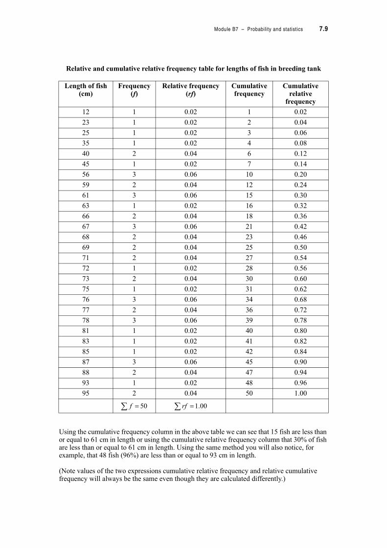
The accumulation process described in this example allows us to extend our original table another two steps to include cumulative frequency and cumulative relative frequency columns.
Cumulative frequency is created by adding together each frequency in turn until the last term is equal to the total frequency.
Cumulative relative frequency is created by adding together each relative frequency in turn until the last term is equal to 1.
14.002.004.002.002.002.002.0 !"""""!
Module B7 – Probability and statistics 7.9
Relative and cumulative relative frequency table for lengths of fish in breeding tank
Using the cumulative frequency column in the above table we can see that 15 fish are less than or equal to 61 cm in length or using the cumulative relative frequency column that 30% of fish are less than or equal to 61 cm in length. Using the same method you will also notice, for example, that 48 fish (96%) are less than or equal to 93 cm in length.
(Note values of the two expressions cumulative relative frequency and relative cumulative frequency will always be the same even though they are calculated differently.)
Length of fish (cm)
Frequency (f)
Relative frequency (rf)
Cumulative frequency
Cumulative relative
frequency
12 1 0.02 1 0.02
23 1 0.02 2 0.04
25 1 0.02 3 0.06
35 1 0.02 4 0.08
40 2 0.04 6 0.12
45 1 0.02 7 0.14
56 3 0.06 10 0.20
59 2 0.04 12 0.24
61 3 0.06 15 0.30
63 1 0.02 16 0.32
66 2 0.04 18 0.36
67 3 0.06 21 0.42
68 2 0.04 23 0.46
69 2 0.04 25 0.50
71 2 0.04 27 0.54
72 1 0.02 28 0.56
73 2 0.04 30 0.60
75 1 0.02 31 0.62
76 3 0.06 34 0.68
77 2 0.04 36 0.72
78 3 0.06 39 0.78
81 1 0.02 40 0.80
83 1 0.02 41 0.82
85 1 0.02 42 0.84
87 3 0.06 45 0.90
88 2 0.04 47 0.94
93 1 0.02 48 0.96
95 2 0.04 50 1.00
! 50f ! 00.1rf
7.10 TPP7182 – Mathematics tertiary preparation level B
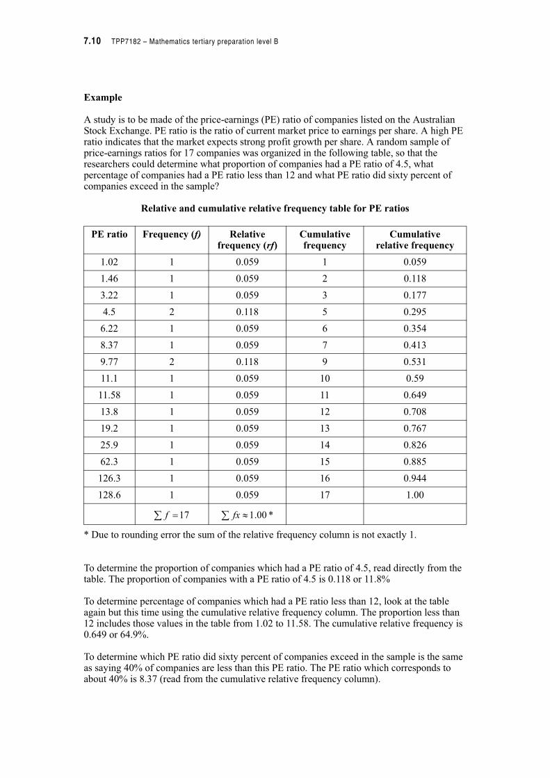
Example
A study is to be made of the price-earnings (PE) ratio of companies listed on the Australian Stock Exchange. PE ratio is the ratio of current market price to earnings per share. A high PE ratio indicates that the market expects strong profit growth per share. A random sample of price-earnings ratios for 17 companies was organized in the following table, so that the researchers could determine what proportion of companies had a PE ratio of 4.5, what percentage of companies had a PE ratio less than 12 and what PE ratio did sixty percent of companies exceed in the sample?
Relative and cumulative relative frequency table for PE ratios
* Due to rounding error the sum of the relative frequency column is not exactly 1.
To determine the proportion of companies which had a PE ratio of 4.5, read directly from the table. The proportion of companies with a PE ratio of 4.5 is 0.118 or 11.8%
To determine percentage of companies which had a PE ratio less than 12, look at the table again but this time using the cumulative relative frequency column. The proportion less than 12 includes those values in the table from 1.02 to 11.58. The cumulative relative frequency is 0.649 or 64.9%.
To determine which PE ratio did sixty percent of companies exceed in the sample is the same as saying 40% of companies are less than this PE ratio. The PE ratio which corresponds to about 40% is 8.37 (read from the cumulative relative frequency column).
PE ratio Frequency (f) Relative frequency (rf)
Cumulativefrequency
Cumulative relative frequency
1.02 1 0.059 1 0.059
1.46 1 0.059 2 0.118
3.22 1 0.059 3 0.177
4.5 2 0.118 5 0.295
6.22 1 0.059 6 0.354
8.37 1 0.059 7 0.413
9.77 2 0.118 9 0.531
11.1 1 0.059 10 0.59
11.58 1 0.059 11 0.649
13.8 1 0.059 12 0.708
19.2 1 0.059 13 0.767
25.9 1 0.059 14 0.826
62.3 1 0.059 15 0.885
126.3 1 0.059 16 0.944
128.6 1 0.059 17 1.00
!17f *00.1 #fx
Module B7 – Probability and statistics 7.11
Example
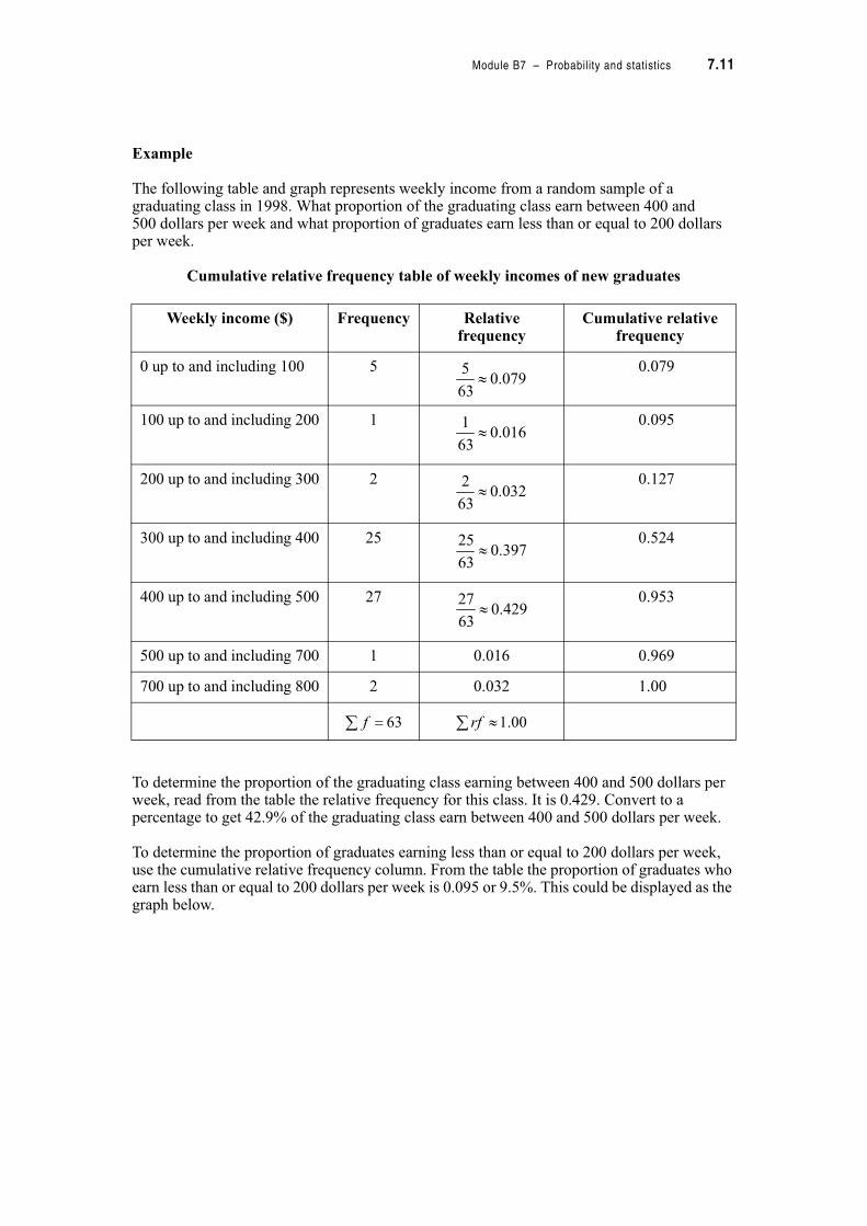
The following table and graph represents weekly income from a random sample of a graduating class in 1998. What proportion of the graduating class earn between 400 and 500 dollars per week and what proportion of graduates earn less than or equal to 200 dollars per week.
Cumulative relative frequency table of weekly incomes of new graduates
To determine the proportion of the graduating class earning between 400 and 500 dollars per week, read from the table the relative frequency for this class. It is 0.429. Convert to a percentage to get 42.9% of the graduating class earn between 400 and 500 dollars per week.
To determine the proportion of graduates earning less than or equal to 200 dollars per week, use the cumulative relative frequency column. From the table the proportion of graduates who earn less than or equal to 200 dollars per week is 0.095 or 9.5%. This could be displayed as the graph below.
Weekly income ($) Frequency Relative frequency
Cumulative relative frequency
0 up to and including 100 5 0.079
100 up to and including 200 1 0.095
200 up to and including 300 2 0.127
300 up to and including 400 25 0.524
400 up to and including 500 27 0.953
500 up to and including 700 1 0.016 0.969
700 up to and including 800 2 0.032 1.00
079.063
5#
016.063
1#
032.063
2#
397.063
25#
429.063
27#
! 63f # 00.1rf

7.12 TPP7182 – Mathematics tertiary preparation level B
Cumulative relative frequency curve forweekly income of a graduating class
Activity 7.2
1. In an optics experiment measurements were taken to measure the distance between a mirror and its image. The measurements were taken and the distance recorded in mm.
(a) Complete the table of relative and cumulative relative frequencies.
(b) What proportion of images are 162 mm from the mirror?
(c) What proportion of measurements are greater than 161 mm?
(d) What percentage of measurements are greater than 153 but less than 170 mm?
Image Distance (mm) Frequency Relative frequency Cumulative relative frequency
146 2
148 3
151 2
153 4
154 5
161 6
162 7
166 5
170 4
171 1
176 2
180 3
Weekly income ($)
Cum
ula
tive
rela
tive
freq
uen
cy
0.000 200 400 600 800
0.10
0.20
0.30
0.40
0.50
0.60
0.70
0.80
0.90
1.00
Module B7 – Probability and statistics 7.13
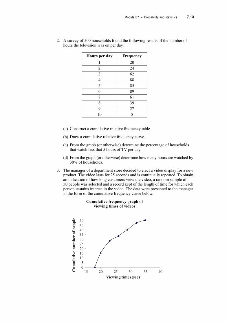
2. A survey of 500 households found the following results of the number of hours the television was on per day.
(a) Construct a cumulative relative frequency table.
(b) Draw a cumulative relative frequency curve.
(c) From the graph (or otherwise) determine the percentage of households that watch less that 5 hours of TV per day.
(d) From the graph (or otherwise) determine how many hours are watched by 30% of households.
3. The manager of a department store decided to erect a video display for a new product. The video lasts for 25 seconds and is continually repeated. To obtain an indication of how long customers view the video, a random sample of 50 people was selected and a record kept of the length of time for which each person sustains interest in the video. The data were presented to the manager in the form of the cumulative frequency curve below.
Cumulative frequency graph of viewing times of videos
Hours per day Frequency
1 20
2 24
3 62
4 88
5 85
6 89
7 61
8 39
9 27
10 5
0
5
10
15
20
25
30
35
40
45
50
15 20 25 30 35 40
Viewing times (sec)
Cum
ula
tive
num
ber
ofpeo
ple
7.14 TPP7182 – Mathematics tertiary preparation level B
(a) How many people viewed the video for less than 25 seconds?
(b) How many people stayed for a second viewing of the video (i.e. longer than 25 seconds)?
(c) The manager wanted to compare the viewing times over different days but different numbers of people were sampled on those days. What type of graph could you use to make a comparison between different days?
7.2 Take your chances – probability
If you have ever played cards, bought a ticket in lotto or said anything like
“…..you’re one in a million…”
“…you’ve got Buckleys of getting that…”
then chances are you have been delving into the world of probability. In fact, you have had a more recent experience than that because relative frequencies are one way of approaching the study of probability.
But before we continue, if you don’t already own a six sided throwing die or a pack of playing cards, now might be a good time to get them. The concept of probability was originally formalized by gamblers in the 1600s and today we still use the results of tossing coins, throwing dice and playing cards to demonstrate some of the principles of probability.
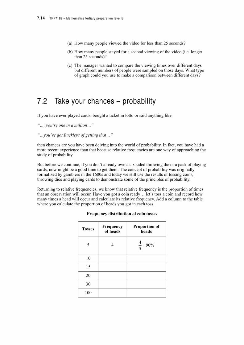
Returning to relative frequencies, we know that relative frequency is the proportion of times that an observation will occur. Have you got a coin ready… let’s toss a coin and record how many times a head will occur and calculate its relative frequency. Add a column to the table where you calculate the proportion of heads you got in each toss.
Frequency distribution of coin tosses
TossesFrequency
of headsProportion of
heads
5 4
10
15
20
30
100
%905
4!
Module B7 – Probability and statistics 7.15
What did you notice about the proportion of heads as you tossed more coins?
__________________________________________________________________________
__________________________________________________________________________
You might notice the more times you tossed the coin the closer you got to having half of them heads. In 1900 the English statistician Karl Pearson tossed a coin 24 000 times resulting in 12 012 heads and a relative frequency of 0.5005 (or 50.05%)! We won’t ask you to do this.
You might have expected to get 50% heads because we know intuitively that because there are only two alternatives when we toss a coin (if that coin is not one from the magic shop), that we have a 1 in 2 chance of getting a head. Repeating the procedure a number of times confirms our belief.
Before we go any further we need to define some terms. Let’s think of them in terms of tossing a coin.
• An experiment is the process of tossing the coin.
• If you toss a coin twice you have two trials.
• A single outcome is the result of an experiment and would be either a head or a tail.
• The sample space is the collection of all possible outcomes. If you tossed the coin once the sample space is a head and a tail.
• A group of outcomes of interest is called an event and is a subset of the sample space. In this case the event would the tossing of a coin.
Example
A new pocket video game has been developed. A company wishes to investigate its market potential amongst teenage children. A random sample of 100 teenage children test the game and record their views by replying whether they liked or disliked the game. What is the experiment, sample space, one possible event and one possible outcome?
The experiment is asking the teenage children their view on the new video game.
The sample space covers all possible responses on the new video game. It includes those who liked the game and those who did not. The sample space could be huge because of all the possible different combinations of people answering the question in different ways.
There are many possible events and answers will vary. We might be interested in the possibility that all children disliked the game.
Again, outcomes will also vary. A possible outcome may be that 24 players did not like the game.
7.16 TPP7182 – Mathematics tertiary preparation level B
Activity 7.3
1. The number of traffic violations were recorded from a large number of automobile drivers over a two week period.
(a) What is the experiment?
(b) What is the sample space?
(c) List one possible event. Describe a possible outcome from this event?
2. A stockbroker wishes to give her client advice on her current share portfolio of 4 stocks. To do this she makes a list of her clients stocks. For each stock she determines if she thinks it will rise or fall in the next six months.
(a) What is the sample space?
(b) Describe one possible event and list one possible outcome.
3. A study of opinions from interior designers was conducted to determine their choice of the colour most suitable for a new set of office desks. The results were as follows:
(a) What is the experiment?
(b) Describe an outcome from the event in part (b).
(c) How many trials were conducted for this experiment?
Number of violations Number of drivers
0 1589
1 68
2 25
3 14
4 8
5 4
6 or more 3
Colour Number of opinions
Red 25
Orange 12
Yellow 78
Blue 45
Green 85
Violet 115
Module B7 – Probability and statistics 7.17
4. A normal pack of playing cards is shuffled and a card is drawn at random. Match the word in the column on the left to the sentence in the right hand column which it best describes.
Probability is closely related to relative frequency. We can define it as follows.
Notice that probability is always calculated as a ratio with the numerator smaller than the denominator because we are always calculating the number of events of interest over the total number of events. The probability will always be between 0 and 1. A certain event will have probability of 1. An event which is not possible will have a probability of zero.
Yet we must still exhibit some caution in interpreting probabilities.
In many fields of endeavour experts will give opinions as to the likelihood of an event occurring. Sportswriters suggest that a certain swimmer has a 90% chance of winning at the Olympics. A stockbroker says that there is only a 1 in 4 chance of shares dropping in value. Bookmakers guess on the likelihood of a horse winning a race. This type of probability is called subjective probability and is only as reliable as the experts giving the advice. In general, assigning subjective probabilities to events is quite difficult and, although valid in some instances, is not a method explored further in this module.
In this module we will concentrate on experimental (or empirical) probabilities and a more theoretical approach to probabilities.
Experiment Card drawn is the ace of spades.
Trial Choosing a king.
Outcome Shuffling the cards and drawing one at random.
Event Each occurrence of shuffling and drawing cards.
Probability, P(A), is the proportion of times an event (A) will occur after a large number of trials.
7.18 TPP7182 – Mathematics tertiary preparation level B
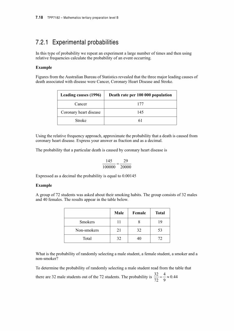
7.2.1 Experimental probabilities
In this type of probability we repeat an experiment a large number of times and then using relative frequencies calculate the probability of an event occurring.
Example
Figures from the Australian Bureau of Statistics revealed that the three major leading causes of death associated with disease were Cancer, Coronary Heart Disease and Stroke.
Using the relative frequency approach, approximate the probability that a death is caused from coronary heart disease. Express your answer as fraction and as a decimal.
The probability that a particular death is caused by coronary heart disease is
Expressed as a decimal the probability is equal to 0.00145
Example
A group of 72 students was asked about their smoking habits. The group consists of 32 males and 40 females. The results appear in the table below.
What is the probability of randomly selecting a male student, a female student, a smoker and a non-smoker?
To determine the probability of randomly selecting a male student read from the table that
there are 32 male students out of the 72 students. The probability is
Leading causes (1996) Death rate per 100 000 population
Cancer 177
Coronary heart disease 145
Stroke 61
Male Female Total
Smokers 11 8 19
Non-smokers 21 32 53
Total 32 40 72
20000
29
100000
145
44.09
4
72
32!
Module B7 – Probability and statistics 7.19
To determine the probability of randomly selecting a female student read from the table that
there are 40 female students out of a total of 72 students. The probability is
To determine the probability of randomly selecting a smoker read from the table that there are 19 students in the sample who are smokers out of a total of 72. These include both male and
female students. The probability is
To determine the probability of randomly selecting a non-smoker read from the table that there are 53 students in the sample who are non-smokers out of a total of 72. The probability of
being a non-smoker is
Activity 7.4
1. A consumer research group is commissioned to study the performance of TV repairers in a large city. Their results were as follows.
(a) What was the total number of repairers surveyed?
(b) If all the repairers were represented in the sample what is the probability that your repairer will give good service?
(c) What is the probability that the repairer will be factory trained?
(d) What is the probability the repairer will be factory trained and give good service?
2. A sample of 300 teenagers were observed in relation to their gender and hair colour producing the following results.
Gender Black Brown Blond Red Total
Male 32 43 16 9 100
Female 55 65 64 16 200
Total 87 108 80 25 300
56.09
5
72
40!
26.072
19!
74.072
53!
Good service Poor service
Factory trained 48 16
Not factory trained 24 62
7.20 TPP7182 – Mathematics tertiary preparation level B
If a teenager was selected at random from this sample
(a) What is the probability he/she would have red hair?
(b) What is the probability she would be female?
(c) If the person selected was female, what is the probability that this person would also have black hair?
(d) What is the probability that the person selected would have not be blonde?
3. In two national parks in the United States a large sample of skunks were collected and the presence or absence of rabies was determined as follows.
(a) What is the probability of catching a skunk in these samples with rabies?
(b) If you caught a skunk in Park 1, what is the probability that it would have rabies?
(c) Compare the probability of catching a skunk with rabies in Park 1 with Park 2.
4. The owners of a pet shop survey all their customers who entered the shop over a period of time. To analyse these data they presented the customers who only owned one type of pet in the following table.
(a) What is the probability that one of the customers owned a cat?
(b) What is the probability that a customer would be female and own a hermit crab?
(c) What is the probability that the customer would own either a cat or a dog?
With rabies Without rabies
Park 1 43 90
Park 2 39 123
Hermit crabs Fish Cats Dogs Birds Total
Female 3 10 47 30 45 135
Male 13 43 40 23 15 134
Total 16 53 87 53 60 269
Module B7 – Probability and statistics 7.21
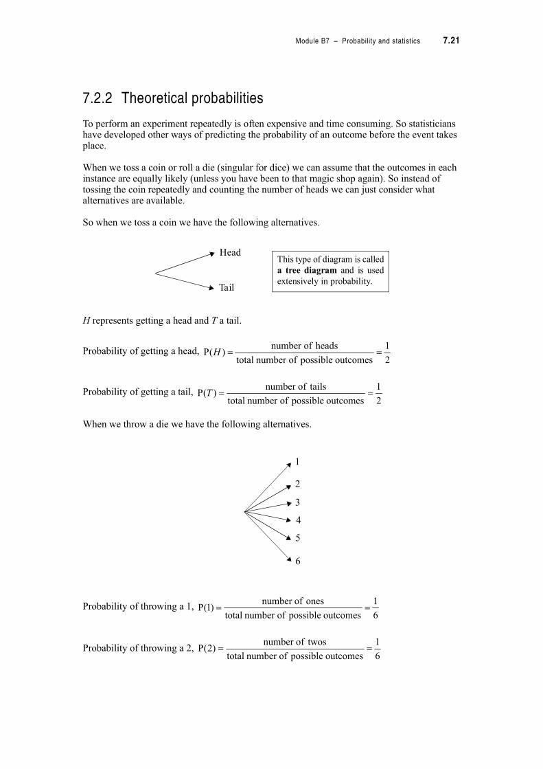
7.2.2 Theoretical probabilities
To perform an experiment repeatedly is often expensive and time consuming. So statisticians have developed other ways of predicting the probability of an outcome before the event takes place.
When we toss a coin or roll a die (singular for dice) we can assume that the outcomes in each instance are equally likely (unless you have been to that magic shop again). So instead of tossing the coin repeatedly and counting the number of heads we can just consider what alternatives are available.
So when we toss a coin we have the following alternatives.
H represents getting a head and T a tail.
Probability of getting a head,
Probability of getting a tail,
When we throw a die we have the following alternatives.
Probability of throwing a 1,
Probability of throwing a 2,
Head
Tail
This type of diagram is called
a tree diagram and is used
extensively in probability.
2
1
outcomes possible ofnumber total
heads ofnumber )(P H
2
1
outcomes possible ofnumber total
tailsofnumber )(P T
1
2
3
4
5
6
6
1
outcomes possible ofnumber total
ones ofnumber )1(P
6
1
outcomes possible ofnumber total
twosofnumber )2(P
7.22 TPP7182 – Mathematics tertiary preparation level B
Probability of throwing a 3,
Probability of throwing a 4,
Probability of throwing a 5,
Probability of throwing a 6,
Notice that in both cases the probabilities of each event are the same and that the sum of the probabilities is 1. Compare this with what you know about relative frequencies. Recall they also sum to 1.
The above approach works well when we have simple outcomes like getting one head but what can we do when we are required to determine more complicated events like the probability of getting a head and a tail when two coins are tossed. Here are some key words to help you to start.
NOT Not is a word in probability that is used to describe the complement of an event. When an experiment is conducted the event either happens or it does not. For example, suppose the probability of a patient surviving a particular disease is 0.8. We are asked ‘what is the probability that they will not survive?’ The total probability must be one so the complement of
the event will be the difference between 1 and 0.8 ( ). So the probability that they will not survive is 0.2.
Example
Some psychologists believe there is a relationship between aggression and birth order. In a study of 52 randomly selected first born children 20 were determined to be aggressive. What is the probability that a first born child will not be aggressive?
The probability that the first born child will be aggressive is . The
complement of this event will be that the first born child is not aggressive. The probability is
6
1
outcomes possible ofnumber total
threesofnumber )3(P
6
1
outcomes possible ofnumber total
fours ofnumber )4(P
6
1
outcomes possible ofnumber total
fives ofnumber )5(P
6
1
outcomes possible ofnumber total
sixes ofnumber )6(P
2.08.01 "
3846.013
5
52
20!
6154.013
8
13
51 ! "
Module B7 – Probability and statistics 7.23
Example
If we toss a dice, what is the probability of not getting a six.
(See tree diagram previously)
If we do not get a six we must get a 1, 2, 3, 4 or a 5. We could add the probabilities of the individual outcomes from the tree diagram or we could use the idea of a complement. The
probability of getting a six is . The probability of not getting a six is the same as 1 minus the
probability of throwing a six.
ORIn some activities we often wish to know the probability of two or more events occurring. The word or describes the union of two events in which outcomes can belong to one or the other or to both events. This means that the union of two groups will involve combining the information from both groups.
The following table shows sex and age characteristics of employees of a large hardware store.
What is the probability that an employee will be male or under 30 years? A possible solution would be to add the number of males to the number of employees under 30 years. If we do this, it will create a problem.
When the word ‘or’ is used be careful adding probabilities. We have to ensure that outcomes are only counted once.
The probability of being male is . The probability of being under 30 is . The probability
is then . We know that the probability must be between 0 and 1. If we simply add the
probability of being male to being under 30, some of the employees will be counted twice. There will be 97 employees which fall into the two categories. We therefore need to subtract
the 25 employees who are counted twice. The probability is then . This
ensures that a male under 30 is only counted once.
(Note: There are a number of different ways of solving this type of problem – we have only shown one alternative here.)
6
1
6
5
6
11six) aP(not
P(6)16) aP(not
six a getting ofy probabilit 1 six a gettingnot ofy Probabilit
"
"
"
Male Female Total
Employees under 30 25 15 40
Employees 30 or over 32 11 43
Total 57 26 83
83
57
83
40
83
97
83
72
83
25
83
40
83
57 "#
7.24 TPP7182 – Mathematics tertiary preparation level B
For the addition of some probabilities we do not have to consider events which occur together as they are mutually exclusive. Mutually exclusive events are those that do not occur together.
Are you a man or a mouse? are two mutually exclusive events
Are you fat or thin? are two mutually exclusive events
From a theoretical example, if asked the probability of drawing a 10 or a court card (a card with an ace, king, queen, or jack) from a pack of playing cards we need only consider the two
events. The probability of drawing a ten would be , because there are 4 tens in a pack of
52 cards (not counting the jokers). The probability of drawing a court card is , because
there are 4 court cards in 4 suits making 16 court cards in a pack of 52 cards. Because a ten is not a court card by definition, the probability of them both occurring together is zero. We therefore say the two events are mutually exclusive and we can just simply add the probability of drawing a ten and a court card to get:
Probability of a ten or a court card,
If events are not mutually exclusive like these ones below then we have to take that into account.
Are you rich or Italian? are not mutually exclusive
Are you short or fat? are not mutually exclusive.
If we chose a card from a well shuffled pack what is the probability that it is either a king or a spade? The two events are not mutually exclusive because a king could also be a spade. Now
because there are 4 kings in the pack the chances of getting a king are and because there
are 13 spades in a pack the chances of getting a spade are . But we know that one of the
kings is also a spade so that the probability of this is . If we put this all together we get:
Probability of a spade or king = prob (spade) + prob (king) – prob (king of spades)
52
4
52
16
13
5
52
20
52
16
52
4
cardcourt a ofy probabilit10 a ofy probabilit)cardcourt or 10(P
#
#
52
4
52
13
52
1
3077.0
52
16
52
1
52
4
52
13
!
"#
Module B7 – Probability and statistics 7.25
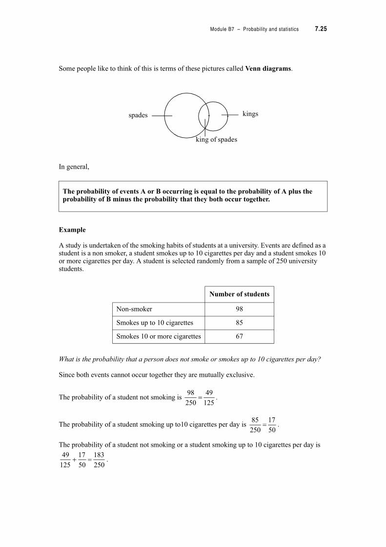
Some people like to think of this is terms of these pictures called Venn diagrams.
In general,
Example
A study is undertaken of the smoking habits of students at a university. Events are defined as a student is a non smoker, a student smokes up to 10 cigarettes per day and a student smokes 10 or more cigarettes per day. A student is selected randomly from a sample of 250 university students.
What is the probability that a person does not smoke or smokes up to 10 cigarettes per day?
Since both events cannot occur together they are mutually exclusive.
The probability of a student not smoking is .
The probability of a student smoking up to10 cigarettes per day is .
The probability of a student not smoking or a student smoking up to 10 cigarettes per day is
.
The probability of events A or B occurring is equal to the probability of A plus the probability of B minus the probability that they both occur together.
spades
king of spades
kings
Number of students
Non-smoker 98
Smokes up to 10 cigarettes 85
Smokes 10 or more cigarettes 67
125
49
250
98
50
17
250
85
250
183
50
17
125
49 #

7.26 TPP7182 – Mathematics tertiary preparation level B
AND‘And’ represents the overlap or intersection of two events. For example, given a deck of playing cards we could calculate the probability of drawing a card at random that is red and a court card.
We can see that although we have 26 red cards in a deck of cards only 8 of these will be court cards. So that means that we have 8 out of a total of 52 cards.
Probability of a red court card,
Example
Consider one spin of a roulette wheel. A roulette wheel is a game of chance that has 37 equal segments. The segments are numbered 0, 1, 2, 3, 4, 5…….36. What is the probability of winning for a gambler who places a bet on the two digit odd numbers that are divisible by three?
The total number of outcomes in the sample is 37. Of these outcomes first we would find the number that would be odd.
1, 3, 5, 7, 9, 11, 13, 15, 17, 19, 21, 23, 25, 27, 29, 31, 33, 35
Then we would see how many are odd and two digits.
11, 13, 15, 17, 19, 21, 23, 25, 27, 29, 31, 33, 35
Then we would see how many of them are divisible by 3.
15, 21, 27, 33
So there are 4 two digit odd numbers that are divisible by three out of 37 possible numbers.
Probability of ‘two digit/odd/divisible by 3’,
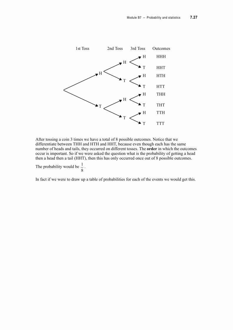
THENIn the situations above we have really only been discussing one event, but what about the situation where you have one event then repeat it. These are often called compound events. Let’s toss a coin three times instead of just once. What are the possibilities we might get.
13
2
52
8)cardcourt d(ReP
37
4)3/2digit/odd(P $
Module B7 – Probability and statistics 7.27
After tossing a coin 3 times we have a total of 8 possible outcomes. Notice that we differentiate between THH and HTH and HHT, because even though each has the same number of heads and tails, they occurred on different tosses. The order in which the outcomes occur is important. So if we were asked the question what is the probability of getting a head then a head then a tail (HHT), then this has only occurred once out of 8 possible outcomes.
The probability would be .
In fact if we were to draw up a table of probabilities for each of the events we would get this.
H
T
HHH
HHT
HTH
HTT
THH
THT
TTH
TTT
H
T
H
T
H
T
H
T
H
T
H
T
1st Toss 2nd Toss 3rd Toss Outcomes
8
1

7.28 TPP7182 – Mathematics tertiary preparation level B
Can you notice anything about the relationship between the probability of getting a single head
( ) or single tail ( ) and the probability of a compound event such as HHT with its
probability of ?
Recall that , so
Probability of HHT = Probability of H %&Probability of H % Probability of T.
We can actually multiply the probabilities along the branches of the tree diagram.
Outcome after tossing a coin 3 times
Probability of outcome
T T T
T H T
T H H
H T H
H T T
H T H
H H T
H H H
8
1
8
1
8
1
8
1
8
1
8
1
8
1
8
1
2
1
2
1
8
1
8
1
2
1
2
1
2
1 %%

Module B7 – Probability and statistics 7.29
This, in fact, will occur in most cases as long as one very important condition is met. The chance of getting a head on the first toss will not effect the chance of getting a head on the 2nd or 3rd toss. In this situation we say that the events are independent, they do not effect each other. The opposite situation occurs with dependent events. For example if we have a bag containing 6 red and 4 blue marbles. On our first choice the probability of getting a red would be 6 out of 10 (0.6), but if we went to choose again without replacing the red marble, then the probability of choosing another red marble would now be 5 out of 9. The first choice effected the second choice and the events would be dependent.
So in general we can say that:
Example
A woman has a bag that contains 12 purple marbles and 8 green marbles. Without looking she draws a marble from the bag. She then replaces the marble and takes out another marble. Find the probability that she:
(a) draws two purple marbles
(b) gets a purple marble then a green marble
We can find these probabilities by drawing a tree diagram.
If two or more events are independent, then the probabilities associated with multiple stages can be calculated by constructing a tree diagram and multiplying along the relevant branches.
H
T
HHH
HHT
HTH
HTT
THH
THT
TTH
TTT
H
T
H
T
H
T
H
T
H
T
H
T
1
2
1
2
1
21
2
1
21
2
1
21
2
1
2
1
2
1
2
1
2
1
2
1
2
1
8
1
8
1
21
8
1
81
8
1
8
1
2
1
2
1
2
1
8× × =
7.30 TPP7182 – Mathematics tertiary preparation level B
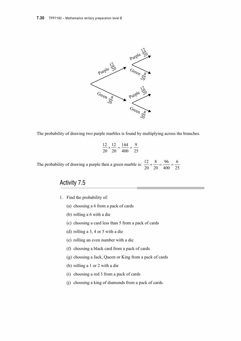
The probability of drawing two purple marbles is found by multiplying across the branches.
The probability of drawing a purple then a green marble is:
Activity 7.5
1. Find the probability of:
(a) choosing a 6 from a pack of cards
(b) rolling a 6 with a die
(c) choosing a card less than 5 from a pack of cards
(d) rolling a 3, 4 or 5 with a die
(e) rolling an even number with a die
(f) choosing a black card from a pack of cards
(g) choosing a Jack, Queen or King from a pack of cards
(h) rolling a 1 or 2 with a die
(i) choosing a red 3 from a pack of cards
(j) choosing a king of diamonds from a pack of cards.
820
Green
12
20Purple
12
20Purple
12
20Purple
820
Green
820
Green
25
9
400
144
20
12
20
12 %
25
6
400
96
20
8
20
12 %
Module B7 – Probability and statistics 7.31
2. A couple plan on having four children. Draw a tree diagram to show the possible outcomes. What is the probability that they will have:
(a) all girls
(b) all boys
(c) 3 girls and 1 boy
(d) 1 girl and 3 boys
(e) 2 girls and 2 boys
3. Ten drinks are on a shelf. There are 3 lime drinks, 2 orange drinks and 5 raspberry drinks.
(a) What is the probability that a child will choose a lime drink?
(b) What is the probability that a child will choose a lime or an orange drink?
(c) What is the probability that two children will choose an orange drink each?
4. It is known that 40% of the adult population of a certain city favours Australia becoming a republic. If two adults are selected at random, what is the probability that both will vote in favour of a republic?
7.2.3 Probability in practice
We have now had a look at a range of different situations involving both experimental and theoretical approaches. We have also looked at some of the language associated with probability. Let’s put our knowledge into practice with some real world problems that will call on your language skills as well as your probability skills.
Example
A bank manager classifies customers into various categories
A ' customers easy to deal with
B ' customers of longer than 10 years
C ' customers with over $10 000 in the bank.
The categories are not mutually exclusive and to represent the numbers in each group he shows it in the Venn diagram below. The total number of customers categorized was 55.

7.32 TPP7182 – Mathematics tertiary preparation level B
If you are a teller at the bank, what is the probability that a customer is:
• easy to deal with?
• a longstanding customer and easy to deal with?
• a long standing customer and easy to deal with and have more than $10 000 in the bank?
The number of easy to deal with customers is 8 + 12 + 11 + 5 = 36. The probability of this
occurring is .
The number of customers who are easy to deal with and long standing (customer for greater
than 10 years) is 12 + 11 = 23. The probability of this occurring is .
The number of customers who fit into all three categories is 11, the probability of this
occurring is .
Example
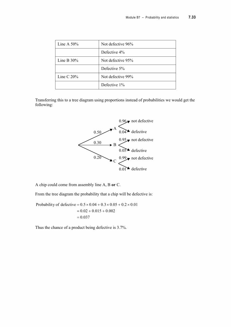
A plant has three assembly lines that produce memory chips. Line A produces 50% of the chips and has a defective rate of 4%; line B produces 30% of the chips and has a defective rate of 5%; line C produces 20% of the chips and has a defective rate of 1%. A chip is chosen at random from the plant.
Draw a tree diagram to represent the situation and use it to determine the probability that the chip is defective.
To clarify the alternatives it sometimes helps to summarize the probabilities in a table. Recall that the probabilities of being defective or not defective must sum to 100% (or 1 if using proportions), so we can use this to calculate the missing probabilities.
A B
C
8
12
11
5
65.055
36!
42.055
23!
2.05
1
55
11
Module B7 – Probability and statistics 7.33
Transferring this to a tree diagram using proportions instead of probabilities we would get the following:
A chip could come from assembly line A, B or C.
From the tree diagram the probability that a chip will be defective is:
Thus the chance of a product being defective is 3.7%.
Line A 50% Not defective 96%
Defective 4%
Line B 30% Not defective 95%
Defective 5%
Line C 20% Not defective 99%
Defective 1%
not defective
defective
not defective
defective
not defective
defective
A
C
0.96
0.04
0.95
0.05
0.99
0.01
B
0.50
0.30
0.20
037.0
002.0015.002.0
01.02.005.03.004.05.0defective ofy Probabilit
##
%#%#%
7.34 TPP7182 – Mathematics tertiary preparation level B
Activity 7.6
1. PALS is a peer assisted learning strategy used at USQ to help students in predominantly first year units which are historically difficult. The following table indicates grades of attendees and non-attendees for a first year unit.
Grade comparison of PALS attendees and non-attendees in S1 1998
If a researcher was to interview a student at random, use the table of frequencies to answer the following probability questions.
(a) What is the probability that a student gained a HD in S1, 1998?
(b) What is the probability that a student was an attendee and gained an A?
(c) What is the probability that a student was a non-attendee or failed?
2. A tourist company gathered data on tourists visiting various theme parks.
In a particular week 10 000 tourists were surveyed. The following table gives the number of tourists who visited two theme parks.
What is the probability that a tourist visited Ocean World or Cowboy Land?
3. One evening at a youth centre it was noticed that 8 boys and 12 girls played basketball, 6 boys and 4 girls played table tennis, and 2 boys and 4 girls played cards. If one was chosen at random, calculate the probability that the chosen person:
(a) played basketball
(b) was a boy
(c) was a girl who played table tennis.
Attendance/Grade
HD A B C F Incomplete Total
Attendees 6 6 6 10 4 1 33
Non-Attendees 2 0 5 14 47 8 76
Total 8 6 11 24 51 9 109
Theme park Number of visitors
Ocean World 1525
Cowboy World 1843
Both theme parks 728
Module B7 – Probability and statistics 7.35
4. If a soccer team’s top scorer plays, the probability of the team winning is 0.63 and the probability of the team losing is 0.19. If the top scorer does not play, the probability of the team winning is 0.48 and the probability of the team losing is 0.37.
(a) What is the probability of drawing a game in each case?
(b) What is the probability of not losing the game if the top scorer is not included?
5. You buy two lottery tickets for two different lotteries. One gives you a one-in-a-million chance at $100 000. The other gives you a one-in-two-million chance at $500 000. What is the probability that you will end up with $600 000?
6. In a city doctor’s practice the probability that a patient will get the flu this
winter is and the probability that they will get food poisoning this winter is
. What is the probability that they will both get the flu and food poisoning
this winter?
7.3 Describing single data sets
Previously we have looked generally at data, at summarizing it with tables and graphs, at the chances of a data event occurring, but we often need more than this to answer questions that occur.
In economics we might want to include just two figures in a brief report indicating the centre and variability of the consumer price index, while in science we might want to include similar figures indicating the centre and error associated with a set of measurements.
7.3.1 The centre of a data set
Recall that we use three measures of the centre of a set of data (measures of central tendency). The colloquial expression, average, can refer to any of these terms.
Mean
The mean is the most commonly used measure of the centre of a group of data. You may have heard it referred to as the arithmetic average.
6
1
50
1
nsobservatio ofnumber total
nsobservatio all of sumMean
7.36 TPP7182 – Mathematics tertiary preparation level B
This is sometimes abbreviated to the formula
where n is the total sample size and is the sum of all the observations.
The mode
The mode is the most common observation made in a set of observations and is derived from the French word for fashionable. For example in a sample of fish of lengths (cm) 77, 64, 128, 65, 85, 79, 57, 64, 95, and 115, then 64 would be the mode of these scores as it is the most common score.
In this case there was only one mode, but in other examples there may be more than one, or the mode may not exist if all the data had the same frequency. If the sample has more than one mode it is called multi-modal.
The median
The median is the middle value in a set of observations, after they have been ranked in order (usually from smallest to largest). The median observation should therefore have the same number of observations on either side of it. If there are an odd number of observations the median is the middle observation, but if there are an even number of observations the median will be the average of the two middle scores. The location of the middle score can be found by adding one to the total number of observations and dividing by two.
th value
Example
The ages of members of a health and fitness club were surveyed attending an aerobics class.
16 16 17 17 18 18 18 19 19 19 20 20 21 22 24 32 34 35 45 51
Find the median age of a person who attends this aerobics class.
Using the formula above locate the position of the middle score.
There are 20 people attending.
The median is the
The median lies between the 10th and 11th values.
Arranging the ages in order from lowest to highest the median lies between 19 years and 20 years. The middle of these two scores is 19.5 years.
n
n
iix
x
( 1
(
n
iix
1
2
1Median
#
n
20 1+
2---------------
21
2------ 10.5 th value.= =
Module B7 – Probability and statistics 7.37
Comparing the mean, median and mode
The mean, median and mode are each useful in their own ways. In particular,
The mode is most useful when:
• categorical variables are being considered
• qualities like sizes of products are being considered e.g. a manager of a supermarket will always be interested in the most frequently bought size rather than the mean size.
The median is most useful when:
• the distribution has some values which are either very small or very large (outliers) e.g. reports about incomes, house prices or other very skewed distributions usually use the median rather than the mean.
The mean is most useful because:
• it uses all the numbers in the calculation and is sensitive to small changes
• many people intuitively understand the meaning of this measure
• many rigorous statistical theories have been developed around this measure.
In conclusion, all three measures of central tendency have their advantages and disadvantages. Decisions about using the median and mean are often the most difficult and confusing. The best way to decide is to first draw a graph of the data. A stem-and-leaf plot is quick and easy. When you have this image use it to see how skewed the data are. The median is most useful for extremely skewed data.
7.3.2 The spread of a data set
The centre of a data set is one way to describe a data set but it is often not enough. If we look at these two examples below we strike difficulties when we only use one number to describe each set.
The selling price of houses in two streets, one in an old suburb and the other in a new suburb of town, are displayed in stem-and-leaf plots below.
New suburb (1000’s $) Old suburb (1000’s $)
5 1
6 5
7 9 7 1 3
8 4 5 7 8 2 3
9 0 1 1 8 9 1 1 2
10 0 0 1 2 2 10 0 0 1 2
Median is $91 000 Median is $91 000

7.38 TPP7182 – Mathematics tertiary preparation level B
The distribution of house prices for each street is quite skewed so the median was chosen as the measure of central tendency. The median house price for each street is the same, yet we can see from the stem-and-leaf plots that the shapes look very different, one is more spread out than the other. What other way can we describe the shape of these data sets.
The hours worked each week by a group of casual staff and a group of permanent staff are displayed in stem-and-leaf plots below.
The distribution of hours worked for each group of staff are not too skewed so the mean was chosen as the measure of central tendency. The mean number of hours for each group are the same, yet we can see from the stem-and-leaf plots that the shapes look very different, one is more spread out than the other. What other way can we describe the shape of these data sets?
Measures of spread will solve this difficulty in both situations. We have a number different measures of spread to choose from linked with our choice of measure of central tendency. Let’s explore some of these now.
Spread associated with median
Let’s have a look in detail at how we could describe these data sets in more detail.
The selling price of houses in two streets, one in an old suburb and the other in a new suburb of town, are displayed in stem-and-leaf plots below.
Casual staff (hours) Permanent staff (hours)
0 5
2 4 8
3 5 3 0 0 1 6 7 8 8
4 0 5 7 4 0
5 6
Mean is 35 hours
Mean is 35 hours
New suburb (1000’s $) Old suburb (1000’s $)
5 1
6 5
7 9 7 1 3
8 4 5 7 8 2 3
9 0 1 1 8 9 1 1 2
10 0 0 1 2 2 10 0 0 1 2
Median is $91 000 Median is $91 000
Module B7 – Probability and statistics 7.39
The range is the most easily calculated measure of spread. It is defined numerically as the difference between the maximum and minimum values of the variable.
Range = maximum value – minimum value
In our example the range of house prices in the new suburb would be $23 000, while for the old suburb it is $51 000. This gives us some idea of the spread.
Example
Many statistics have been generated over the years about the cricketing feats of Sir Donald Bradman. The following data are the number of runs made in his first eleven test matches from 1928 to 1933. If his median score was 145.5 what is the range of these data?
19 191 98 160* 139 255 334 14 232 4 25 223
152 43 226 112 169 299 103* 74 100 219
(* indicates not out innings)
The minimum and maximum values are quite extreme and the range is large at 330 runs.
However, the range as a measure of spread can be misleading as it can be affected by one or two values which are extreme. These extreme values are often referred to as outliers. Outliers can be important sources of information or they can show some inconsistency with data collection.
We can fine tune our understanding of spread around the median by looking at quartiles. The median divides a data set into two parts half lying above the median and half lying below. Quartiles divide a data set into four parts with one quarter of the data points lying below the first quartile half lying below the second quartile and three quarters lying below the third quartile. The second quartile is of course the median.
The positions of the quartiles are referred to as Q1, Q2 and Q3.Note that we could divide the distribution up into as many groups as we like.Percentiles result from the division of the data into 100 groups.Deciles result from the division of the data into 10 groups.
Maximum Minimum Range
334 runs 4 runs 334 runs – 4 runs = 330 runs
Q1 Q2 Q3
7.40 TPP7182 – Mathematics tertiary preparation level B
Example
Find the positions of the 1st and 3rd quartiles in Don Bradman’s cricket scores.
Step 1. Rank the data in order from lowest to highest.
4 14 19 25 43 74 98 100 103 112 139 152 160 169
191 219 223 226 232 255 299 334
Step 2. Find the median, Q2
As there are 22 observations the median position will be
This means that the median lies between the 11th and the 12th observation.
The exact median for this data set would be runs.
Step 3. Find Q1
The first quartile is the middle of the observations which lie to the left of the median (Q2).
There are 11 observations to the left of the median so the middle of these numbers is the 6th observation. Counting from the left the 6th score is 74 runs.
4 14 19 25 43 74 98 100 103 112 139 | 152 160
169 191 219 223 226 232 255 299 334
Step 4. To find Q3
The third quartile is the middle of the observations which lie to the right of the median (Q2). There are 11 observations to the right of the median, so the middle of these will be 6 scores along from the median. Counting six scores to the right of the median Q3 is 223, the 17th score.
4 14 19 25 43 74 98 100 103 112 139 | 152 160
169 191 219 223 226 232 255 299 334
For Don Bradman’s cricket scores theFirst quartile is at 74The median is at 145.5The third quartile is at 223.
4 4 19 25 43 74 98 100 103 112 139 | 152 160 169 191 219 223 226 232 255 299 334
The difference between the Q3 and Q1 gives us a measure called the interquartile range. This reduced form of the range is one way of describing spread without the influence of extreme values.
If we combine Q1, the median, and Q3 with the maximum and minimum values of the distribution we have five numbers which we can use to clearly describe the spread of the data in one line. Not surprisingly these five numbers are called a Five Number Summary.
5.112
122
#
5.1452
152139
#
Module B7 – Probability and statistics 7.41
The five number summary of Don Bradman’s cricket scores is
4 74 145.5 223 334
Example
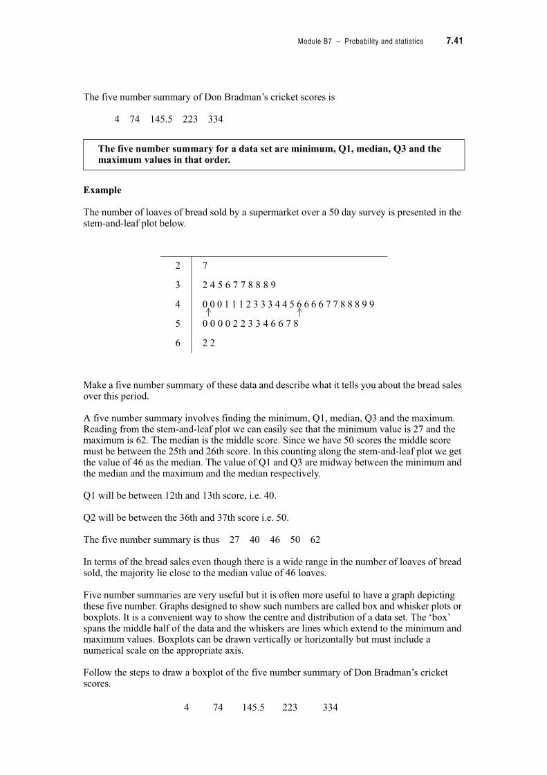
The number of loaves of bread sold by a supermarket over a 50 day survey is presented in the stem-and-leaf plot below.
Make a five number summary of these data and describe what it tells you about the bread sales over this period.
A five number summary involves finding the minimum, Q1, median, Q3 and the maximum. Reading from the stem-and-leaf plot we can easily see that the minimum value is 27 and the maximum is 62. The median is the middle score. Since we have 50 scores the middle score must be between the 25th and 26th score. In this counting along the stem-and-leaf plot we get the value of 46 as the median. The value of Q1 and Q3 are midway between the minimum and the median and the maximum and the median respectively.
Q1 will be between 12th and 13th score, i.e. 40.
Q2 will be between the 36th and 37th score i.e. 50.
The five number summary is thus 27 40 46 50 62
In terms of the bread sales even though there is a wide range in the number of loaves of bread sold, the majority lie close to the median value of 46 loaves.
Five number summaries are very useful but it is often more useful to have a graph depicting these five number. Graphs designed to show such numbers are called box and whisker plots or boxplots. It is a convenient way to show the centre and distribution of a data set. The ‘box’ spans the middle half of the data and the whiskers are lines which extend to the minimum and maximum values. Boxplots can be drawn vertically or horizontally but must include a numerical scale on the appropriate axis.
Follow the steps to draw a boxplot of the five number summary of Don Bradman’s cricket scores.
The five number summary for a data set are minimum, Q1, median, Q3 and the maximum values in that order.
4 74 145.5 223 334
2 7
3 2 4 5 6 7 7 8 8 8 9
4 0 0 0 1 1 1 2 3 3 3 4 4 5 6 6 6 6 7 7 8 8 8 9 9
5 0 0 0 0 2 2 3 3 4 6 6 7 8
6 2 2

7.42 TPP7182 – Mathematics tertiary preparation level B
Step 1. Choose a suitable numerical scale for the axis. The data ranged from 4 to 334 runs. A scale starting at 0 and using intervals of 50 would be appropriate.
Step 2. Give your boxplot a title and remember to label the axes, including units where appropriate.
Box plot of Don Bradman’s cricket scores
When you look at this boxplot there are three main features to consider:
• the position of the median which represents the centre of the distribution
• the spacing of the quartiles which gives an indication of skewness or symmetry• placement of the extreme values.
If the data set is symmetric, the median will lie midway between Q1 and Q3 and the whiskers extending to the minimum and maximum values will be of equal length. A skewed distribution will have a long whisker extending to the extreme value at either end. For example a positively skewed distribution will have a long whisker extending to the maximum value and a negatively skewed distribution will have a long whisker extending to the minimum value. In our example the distribution is almost symmetric. The median is approximately in the middle of the box and the whiskers are nearly of equal length.
Boxplots are an excellent way to compare two data sets.
Example
Previously we looked at the following situation. The selling price of houses in two streets, one in an old suburb and the other in a new suburb of town, are displayed in stem-and-leaf plots below.
0500 100 150 200 300250 350
Cricket scores
New suburb (1000’s $) Old suburb (1000’s $)
5 1
6 5
7 9 7 1 3
8 4 5 7 8 2 3
9 0 1 1 8 9 1 1 2
10 0 0 1 2 2 10 0 0 1 2
Median is $91 000 Median is $91 000

Module B7 – Probability and statistics 7.43
Construct five number summaries for these data and compare using a boxplot.
By counting off the values from the stem-and-leaf plots we can determine the five number summary.
Boxplots for these data are drawn as follows.
Box plots comparing house prices in an old and new suburb
From these it is apparent that the distributions of house prices are very different. The centre of each distribution is the same at $91 000 but the spread is wider in the prices in the old suburb, which range from $51 000 to $102 000. In this suburb two values, $65 000 or less, mark the only difference in the distributions.
New suburb Old suburb
Minimum 79 000 51 000
Q1 86 000 72 000
Median 91 000 91 000
Q3 100 500 100 000
Maximum 102 000 102 000
0 20000 40000 60000 80000 100000 120000
Old suburb
New suburb
House prices ($)
7.44 TPP7182 – Mathematics tertiary preparation level B
Activity 7.7
1. A bank manager is interested in the time it takes the inquiries staff to service customers and records the service time (to the nearest minute) for 20 customers as follows.
5 8 3 4 15 10 8 5 3 8 2 10
9 7 5 8 4 10 7 5
(a) Arrange the data in a cumulative frequency table.
(b) Use the cumulative frequency table to determine a 5 number summary for the data.
(c) Display the data as a boxplot.
2. The life expectancy of two species of birds in captivity is recorded below.
(a) What is the median length of life for the two species?
(b) What are the values of the 1st quartile and 3rd quartiles?
(c) Draw box-and-whisker plots displaying the five number summary for both sets of data.
(d) In your own words compare the life expectancy of both species of birds.
3. The consumer price index (CPI) has varied over the years. Below are presented a number of CPI between 1979 and 1991.
10.1 9.4 10.4 11.5 6.8 4.3 8.4 9.3 7.3 7.3 8.0 5.3
(a) Arrange these measures in order from smallest to largest and determine which values will be below 1st quartile, the 2nd quartile and the 3rd quartile.
(b) to help determine the five number summary for these data.
Species A (months) Species B (months)
34 34
36 36
37 37
39 39
40 40
41 41
42 42
43 43
79 44
80 45
Module B7 – Probability and statistics 7.45
4. The rental costs for two bedroom flats are as follows:
160 140 175 182 170 150 165 120 220 185 175 225165 130 135 170 160 190 180 160
(a) Determine the five number summary for these data.
(b) You have just bought a 2 bedroom flat as an investment property, use the five number summary to determine what would be a good rental to charge.
Spread associated with the mean
The work hours of some workers were originally presented as stem-and-leaf plots. What other measures could we use to describe these distributions without using diagrams? Have another look at the data set.
The hours worked each week by a group of casual staff and a group of permanent staff are displayed below in a stem-and-leaf plots.
In these data sets we are most interested in variation about the mean rather than the median. We could happily use the range or the interquartile range as a first estimate of the spread of the data but statisticians have developed other measures that are strictly related to the measurement of deviations from the mean.
The most widely used measure of spread associated with the mean is called the standard deviation. Let’s have a look at what standard deviation really means.
Deviations mean the difference between two points, so if we are talking about deviation from the mean we are usually talking about the difference between a data point and the mean. In the example above we have casual staff work hours of varying values:
5 24 28 35 40 45 47 56
Casual staff (hours) Permanent staff (hours)
0 5
2 4 8
3 5 3 0 0 1 6 7 8 8
4 0 5 7 4 0
5 6
Mean is 35 hours
Mean is 35 hours

7.46 TPP7182 – Mathematics tertiary preparation level B
If we find the deviations of these values from the mean we get:
If we try to find the arithmetic average or mean of these deviations then we have a problem. Adding them together they total zero….because the positive and negative deviations cancel each other out. To overcome this problem statistician have found ways to remove the negative values from the deviations. Can you think of two ways that you could do this?
If you said taking the absolute value or squaring then you would be right. Try it for yourself with some negative value.
If we take the absolute value of the deviations we can develop a measure of spread called mean absolute deviation from the mean. This measure has not been too popular with statisticians in the past because of its computational difficulties, but with the advent of modern computers it is becoming more popular. However, in this module we will not concentrate on this measure.
More commonly statisticians have taken the approach of squaring the deviations to remove the negative signs.
In our example this is what we might get.
Casual hours worked
Deviation from the mean
Squareddeviation
5 –30 900
24 –11 121
28 –7 49
35 0 0
40 5 25
45 10 100
47 12 144
56 21 441
Sum is 0 Sum is 1780
213556
123547
103545
53540
03535
73528
113524
30355
"
"
"
"
"
" "
" "
" "

Module B7 – Probability and statistics 7.47
However, having the sum of 1780 does not tell us what the average deviation from the mean is. To get this we have to divide by a number close to the total number of measurements, in this case 7 (we will explain why it was not 8 soon) and then take the square root to undo the previous squaring process. Now for our example we have a number that is 15.95. This is called the standard deviation. It also keeps the standard deviation in the same scale.
In the example we have just completed we were calculating the standard deviation of a sample rather than a population. For a sample we divide by n–1 for a population we divide just by n. The reason for the difference is that in a population, because we have every individual, we know the mean exactly whereas in a sample we only have an estimate of the mean. Such an estimation places a constraint on the data, to counter this for a sample we divide by n–1 while for a population we divide by n. Such values of n and n–1 are called degrees of freedom.
For information only the standard deviation of a population is, . The term
variance applies to the squared values of s and .
But what does standard deviation really mean. Let’s have a look at our two data sets on working hours at the beginning of this section. We find that:
The standard deviation for the permanent working hours is much smaller than that calculated for the casual working hours. The stem plot confirms that the spread of the data is much greater for the casual hours than the permanent hours so in this question the smaller the standard deviation then the smaller the spread. This is in fact a general result that will follow for any set of data and is a useful way to compare two data sets.
So far we have investigated how standard deviations are developed but what is the easiest way to calculate such a complicated formula?
Well the easiest way is to use your calculator. All scientific calculators will have a mode for statistics. Place the calculator in this mode and check your instruction book as to how to calculate standard deviation on your calculator. If you are still uncertain contact your tutor and they will be able to help you with the steps for your calculator.
Another way is to use what we call the computational formula.
Standard deviation,
Standard deviation for a sample is
Casual working hours Permanent working hours
Mean is 35 Mean is 35
Standard deviation is 15.95 Standard deviation is 4.04
1
)( 2
"
"
(n
xxs i
n
xxi( "
2)()
)
1
)( 22
"
"
((
n
n
xx
s
ii
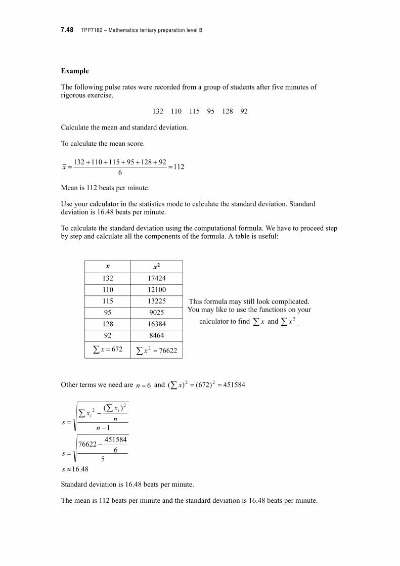
7.48 TPP7182 – Mathematics tertiary preparation level B
Example
The following pulse rates were recorded from a group of students after five minutes of rigorous exercise.
132 110 115 95 128 92
Calculate the mean and standard deviation.
To calculate the mean score.
Mean is 112 beats per minute.
Use your calculator in the statistics mode to calculate the standard deviation. Standard deviation is 16.48 beats per minute.
To calculate the standard deviation using the computational formula. We have to proceed step by step and calculate all the components of the formula. A table is useful:
Other terms we need are and
Standard deviation is 16.48 beats per minute.
The mean is 112 beats per minute and the standard deviation is 16.48 beats per minute.
1126
9212895115110132
##### x
x x2
This formula may still look complicated.You may like to use the functions on your
calculator to find and .
132 17424
110 12100
115 13225
95 9025
128 16384
92 8464
x 2x
! 672x 766222! x
6!n 451584)672()( 22!! x
48.16
5
6
45158476622
1
)( 22
"
#
!
#
#
!
s
s
n
n
xx
s
ii
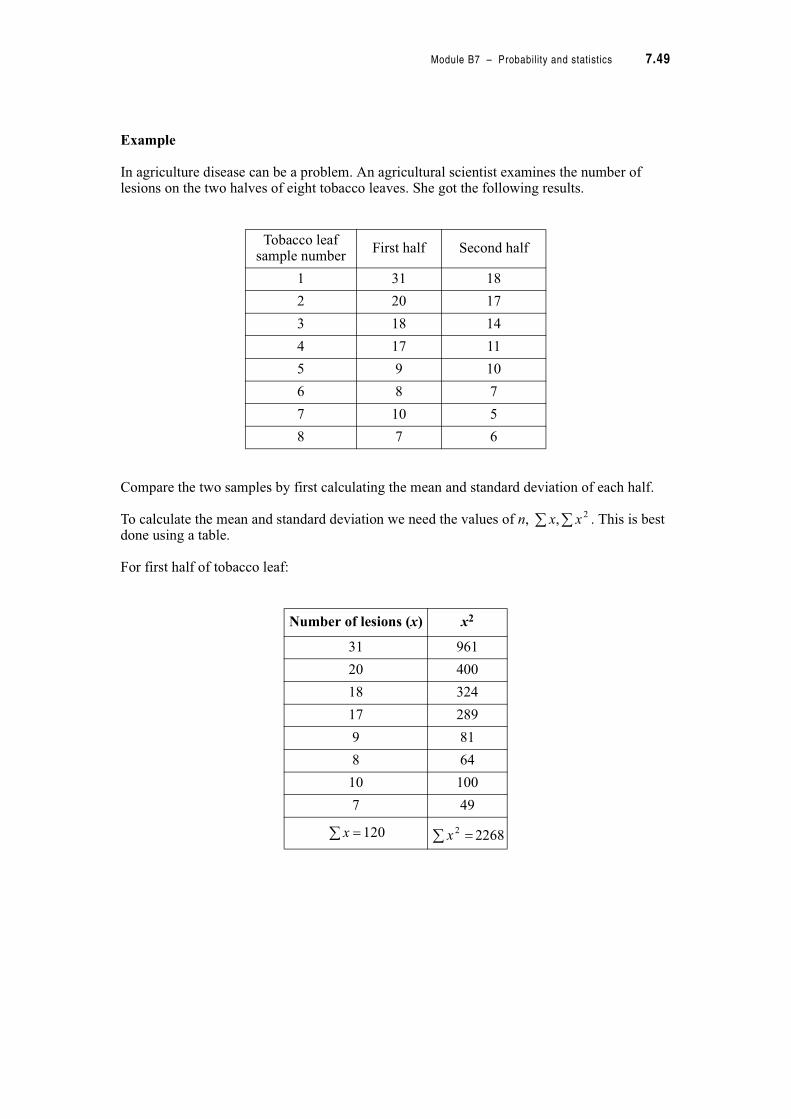
Module B7 – Probability and statistics 7.49
Example
In agriculture disease can be a problem. An agricultural scientist examines the number of lesions on the two halves of eight tobacco leaves. She got the following results.
Compare the two samples by first calculating the mean and standard deviation of each half.
To calculate the mean and standard deviation we need the values of n, . This is best done using a table.
For first half of tobacco leaf:
Tobacco leaf sample number
First half Second half
1 31 18
2 20 17
3 18 14
4 17 11
5 9 10
6 8 7
7 10 5
8 7 6
Number of lesions (x) x2
31 961
20 400
18 324
17 289
9 81
8 64
10 100
7 49
120 2268
2, xx
!x !2x

7.50 TPP7182 – Mathematics tertiary preparation level B
Using the formulas,
For the second half of the tobacco leaf
Using the formulas,
Check both answers on your calculator.
The mean is: The standard deviation is:
Number of lesions (x) x2
18 324
17 289
14 196
11 121
10 100
7 49
5 25
6 36
88 1140
The mean is: The standard deviation is:
158
120!!
n
x
18.8
7
8
144002268
1
)( 22
"
#
!
#
#
!
s
s
n
n
xx
s
ii
!x !2x
118
88!!
n
x
96.4
7
8
77441140
1
)( 22
"
#
!
#
#
!
s
s
n
n
xx
s
ii
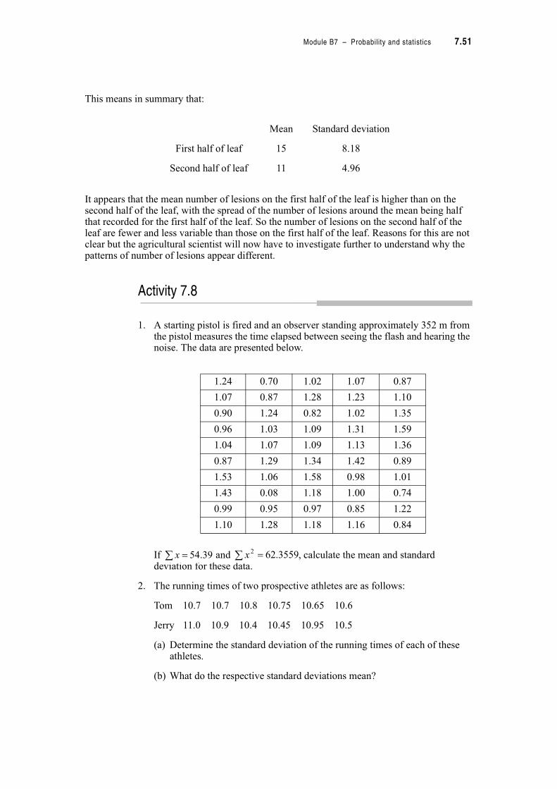
Module B7 – Probability and statistics 7.51
This means in summary that:
It appears that the mean number of lesions on the first half of the leaf is higher than on the second half of the leaf, with the spread of the number of lesions around the mean being half that recorded for the first half of the leaf. So the number of lesions on the second half of the leaf are fewer and less variable than those on the first half of the leaf. Reasons for this are not clear but the agricultural scientist will now have to investigate further to understand why the patterns of number of lesions appear different.
Activity 7.8
1. A starting pistol is fired and an observer standing approximately 352 m from the pistol measures the time elapsed between seeing the flash and hearing the noise. The data are presented below.
If and , calculate the mean and standard deviation for these data.
2. The running times of two prospective athletes are as follows:
Tom 10.7 10.7 10.8 10.75 10.65 10.6
Jerry 11.0 10.9 10.4 10.45 10.95 10.5
(a) Determine the standard deviation of the running times of each of these athletes.
(b) What do the respective standard deviations mean?
Mean Standard deviation
First half of leaf 15 8.18
Second half of leaf 11 4.96
1.24 0.70 1.02 1.07 0.87
1.07 0.87 1.28 1.23 1.10
0.90 1.24 0.82 1.02 1.35
0.96 1.03 1.09 1.31 1.59
1.04 1.07 1.09 1.13 1.36
0.87 1.29 1.34 1.42 0.89
1.53 1.06 1.58 0.98 1.01
1.43 0.08 1.18 1.00 0.74
0.99 0.95 0.97 0.85 1.22
1.10 1.28 1.18 1.16 0.84
39.54! x 3559.622! x

7.52 TPP7182 – Mathematics tertiary preparation level B
3. The following are the number of working days lost for 11 workers at two companies through one year.
Compare the absenteeism of the two companies using mean and standard deviations.
4. The weights of a sample of 100 sacks of potatoes (in kg) from an exporter were recorded. The exporter claimed the average sack was supposed to be 2.2 kg. Calculate the mean and standard deviation of the sample and comment on the claim. (Note these data are represented in a frequency
distribution where and .)
Company 1 8 2 3 17 15 11 6 20 11 42
Company 2 4 12 18 22 1 28 10 7 16 13
Sack weight (kg) Frequency
1.9 4
2.0 20
2.1 21
2.2 25
2.3 20
2.4 9
2.5 1
8.216! x 94.4712! x

Module B7 – Probability and statistics 7.53
7.4 Describing bivariate data sets
We have discussed in detail ways in which we can summarize univariate data sets, but what can we do when there are two variables involved. In most instances we are interested to discover if there is a relationship between the variables.
In science or business we might be faced with questions like these:
A local council is worried about the rat problem in their community and believes there is a relationship between number of rats and the distance from the local dump.
With the economic slowdown upsetting profitability, your firm is considering whether it should cut back on advertising expenditure and has asked you to determine whether a strong relationship exists between the advertising dollar and sales returns.
Usually, when we want to investigate the relationship between two variables we would plot a graph. This type of graph is called a scatterplot or scattergram. In a scatterplot the convention for plotting graphs we used in module 4 applies. The independent variable would be placed on the horizontal axis while the dependent is on the vertical axis. Scatterplots are covered in detail in Mathematics Tertiary Preparation Level A module 6.
Let’s have a look at this example. A push bike manufacturer has a number of production sites throughout Australia. In an effort to improve efficiency the quality management team analysed the production output of inexperienced workers and experienced workers. They started their analysis by examining the relationship between number of employees and number of bikes produced. The following table displays their results.
Experienced workers Inexperienced workers
Number of employees (E)
Number of bikes (B)
Number of employees
Number of bikes
1 1 1 1
2 7 3 15
4 14 5 5
10 25 7 40
12 40 10 15
15 36 11 40
25 70 23 40
30 85 29 95
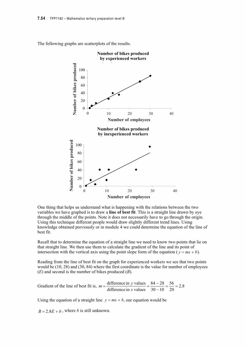
7.54 TPP7182 – Mathematics tertiary preparation level B
The following graphs are scatterplots of the results.
Number of bikes producedby experienced workers
Number of bikes producedby inexperienced workers
One thing that helps us understand what is happening with the relations between the two variables we have graphed is to draw a line of best fit. This is a straight line drawn by eye through the middle of the points. Note it does not necessarily have to go through the origin. Using this technique different people would draw slightly different trend lines. Using knowledge obtained previously or in module 4 we could determine the equation of the line of best fit.
Recall that to determine the equation of a straight line we need to know two points that lie on that straight line. We then use them to calculate the gradient of the line and its point of intersection with the vertical axis using the point slope form of the equation ( ).
Reading from the line of best fit on the graph for experienced workers we see that two points would be (10, 28) and (30, 84) where the first coordinate is the value for number of employees (E) and second is the number of bikes produced (B).
Gradient of the line of best fit is,
Using the equation of a straight line , our equation would be
, where b is still unknown.
0
20
40
60
80
100
0
y p
10 20 30 40
Number of employees
Number
ofbikes
produced
0
20
40
60
80
100
0 10 20 30 40
Number of employees
Number
ofbikes
produced
bmxy $!
8.220
56
1030
2884
valuesin difference
valuesin difference!!
#
#!!
x
ym
bmxy $!
bEB $! 8.2
Module B7 – Probability and statistics 7.55
To find b substitute one of the points, say (10, 28) into the equation to get
Final equation is
We could follow exactly the same procedure to determine the equation of our line of best fit for the data from inexperienced workers. If we did this we would get an identical equation,
. They look the same so this result appears reasonable. Yet the data look so different….what can we do?
When we examined univariate data we would have calculated some measure of spread to quantify the variability in the data set, and we can do a similar thing here by calculating a quantity that will tell us something about the strength of the linear relationship between two variables. The quantity is called the correlation coefficient (r). It is often a good idea to calculate this coefficient before you estimate the line of best fit.
Let’s have a look at the correlation coefficients for our two data sets. As stated before we can see from the scatterplots that the two data sets are very different. In the one from experienced workers all the points are clustered closely together and seem to follow a straight line trend. We would have had a limited number of alternative lines of best fit that would have suited these data. The data set from the inexperienced workers is very different, the points are scattered all over the quadrant and we could have estimated a very large number of lines to best fit these data.
To calculate the correlation coefficient you would use the following formula.
Do not learn this formula.
0
2828
108.228
!
$!
$%!
b
b
b
EB 8.2!
EB 8.2!
#%#
#!
2222 )()()()(
))(()(
yynxxn
yxxynr
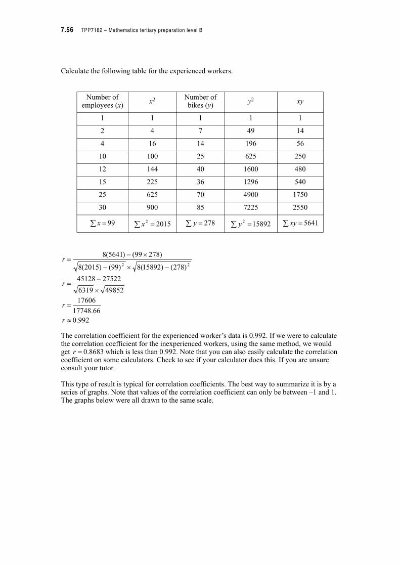
7.56 TPP7182 – Mathematics tertiary preparation level B
Calculate the following table for the experienced workers.
The correlation coefficient for the experienced worker’s data is 0.992. If we were to calculate the correlation coefficient for the inexperienced workers, using the same method, we would get which is less than 0.992. Note that you can also easily calculate the correlation coefficient on some calculators. Check to see if your calculator does this. If you are unsure consult your tutor.
This type of result is typical for correlation coefficients. The best way to summarize it is by a series of graphs. Note that values of the correlation coefficient can only be between –1 and 1. The graphs below were all drawn to the same scale.
Number of employees (x)
x2 Number of bikes (y)
y2 xy
1 1 1 1 1
2 4 7 49 14
4 16 14 196 56
10 100 25 625 250
12 144 40 1600 480
15 225 36 1296 540
25 625 70 4900 1750
30 900 85 7225 2550
! 99x 20152! x ! 278y 158922
! y ! 5641xy
992.0
66.17748
17606
498526319
2752245128
)278()15892(8)99()2015(8
)27899()5641(8
22
"
!
%
#!
#%#
%#!
r
r
r
r
8683.0!r
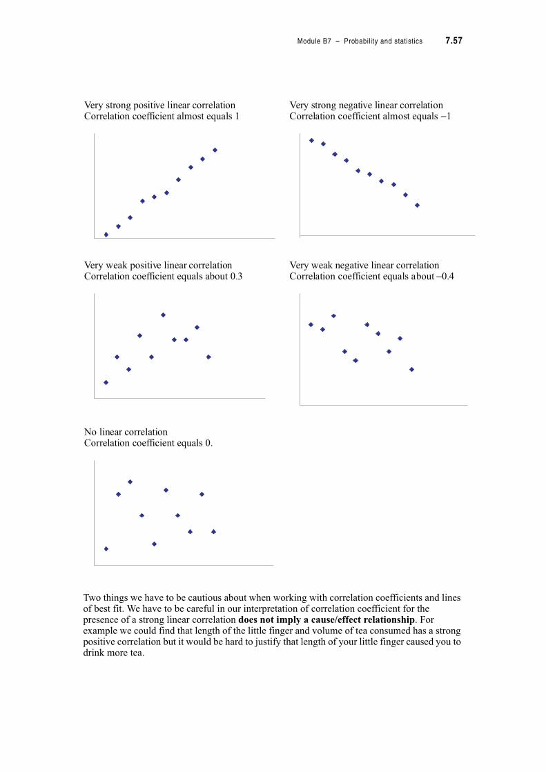
Module B7 – Probability and statistics 7.57
Two things we have to be cautious about when working with correlation coefficients and lines of best fit. We have to be careful in our interpretation of correlation coefficient for the presence of a strong linear correlation does not imply a cause/effect relationship. For example we could find that length of the little finger and volume of tea consumed has a strong positive correlation but it would be hard to justify that length of your little finger caused you to drink more tea.
Very strong positive linear correlationCorrelation coefficient almost equals 1
Very strong negative linear correlationCorrelation coefficient almost equals −1
Very weak positive linear correlationCorrelation coefficient equals about 0.3
Very weak negative linear correlationCorrelation coefficient equals about −0.4
No linear correlationCorrelation coefficient equals 0.
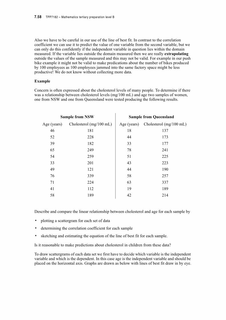
7.58 TPP7182 – Mathematics tertiary preparation level B
Also we have to be careful in our use of the line of best fit. In contrast to the correlation coefficient we can use it to predict the value of one variable from the second variable, but we can only do this confidently if the independent variable in question lies within the domain measured. If the variable lies outside the domain measured then we are really extrapolating outside the values of the sample measured and this may not be valid. For example in our push bike example it might not be valid to make predications about the number of bikes produced by 100 employees as 100 employees jammed into the same factory space might be less productive! We do not know without collecting more data.
Example
Concern is often expressed about the cholesterol levels of many people. To determine if there was a relationship between cholesterol levels (mg/100 mL) and age two samples of women, one from NSW and one from Queensland were tested producing the following results.
Describe and compare the linear relationship between cholesterol and age for each sample by
• plotting a scattergram for each set of data
• determining the correlation coefficient for each sample
• sketching and estimating the equation of the line of best fit for each sample.
Is it reasonable to make predictions about cholesterol in children from these data?
To draw scattergrams of each data set we first have to decide which variable is the independent variable and which is the dependent. In this case age is the independent variable and should be placed on the horizontal axis. Graphs are drawn as below with lines of best fit draw in by eye.
Sample from NSW Sample from Queensland
Age (years) Cholesterol (mg/100 mL) Age (years) Cholesterol (mg/100 mL)
46 181 18 137
52 228 44 173
39 182 33 177
65 249 78 241
54 259 51 225
33 201 43 223
49 121 44 190
76 339 58 257
71 224 63 337
41 112 19 189
58 189 42 214
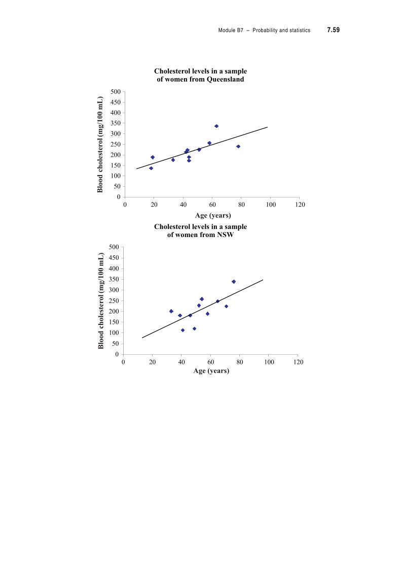
Module B7 – Probability and statistics 7.59
Cholesterol levels in a sampleof women from Queensland
Cholesterol levels in a sampleof women from NSW
0
50
100
150
200
250
300
350
400
450
500
0 20 40 60 80 100 120
Age (years)
Bloodch
olesterol(mg/100mL)
0
50
100
150
200
250
300
350
400
450
500
0 20 40 60 80 100 120
Age (years)
Bloodch
olesterol(m
g/100mL)
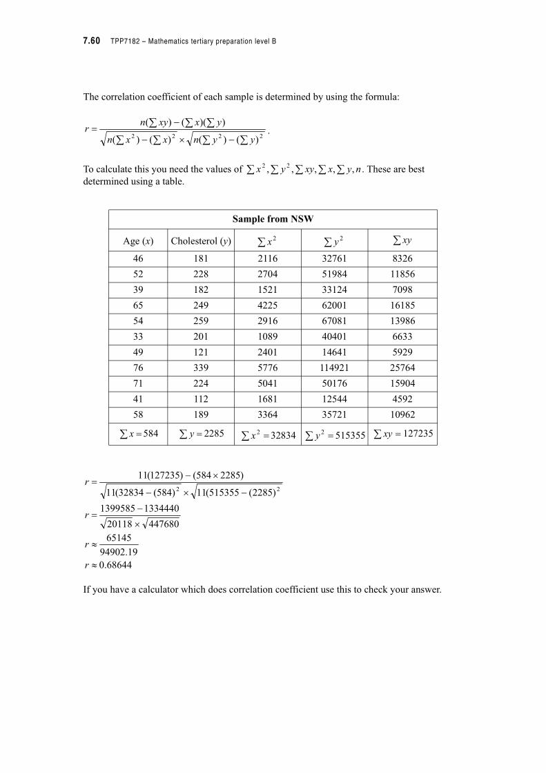
7.60 TPP7182 – Mathematics tertiary preparation level B
The correlation coefficient of each sample is determined by using the formula:
.
To calculate this you need the values of . These are best
determined using a table.
If you have a calculator which does correlation coefficient use this to check your answer.
Sample from NSW
Age (x) Cholesterol (y)
46 181 2116 32761 8326
52 228 2704 51984 11856
39 182 1521 33124 7098
65 249 4225 62001 16185
54 259 2916 67081 13986
33 201 1089 40401 6633
49 121 2401 14641 5929
76 339 5776 114921 25764
71 224 5041 50176 15904
41 112 1681 12544 4592
58 189 3364 35721 10962
584 2285 32834 515355 127235
#%#
#!
2222 )()()()(
))(()(
yynxxn
yxxynr
nyxxyyx ,,,,, 22
2x
2y xy
!x !y ! 2x !
2y ! xy
68644.0
19.94902
65145
44768020118
13344401399585
)2285(515355(11)584(32834(11
)2285584()127235(11
22
"
"
%
#!
#%#
%#!
r
r
r
r
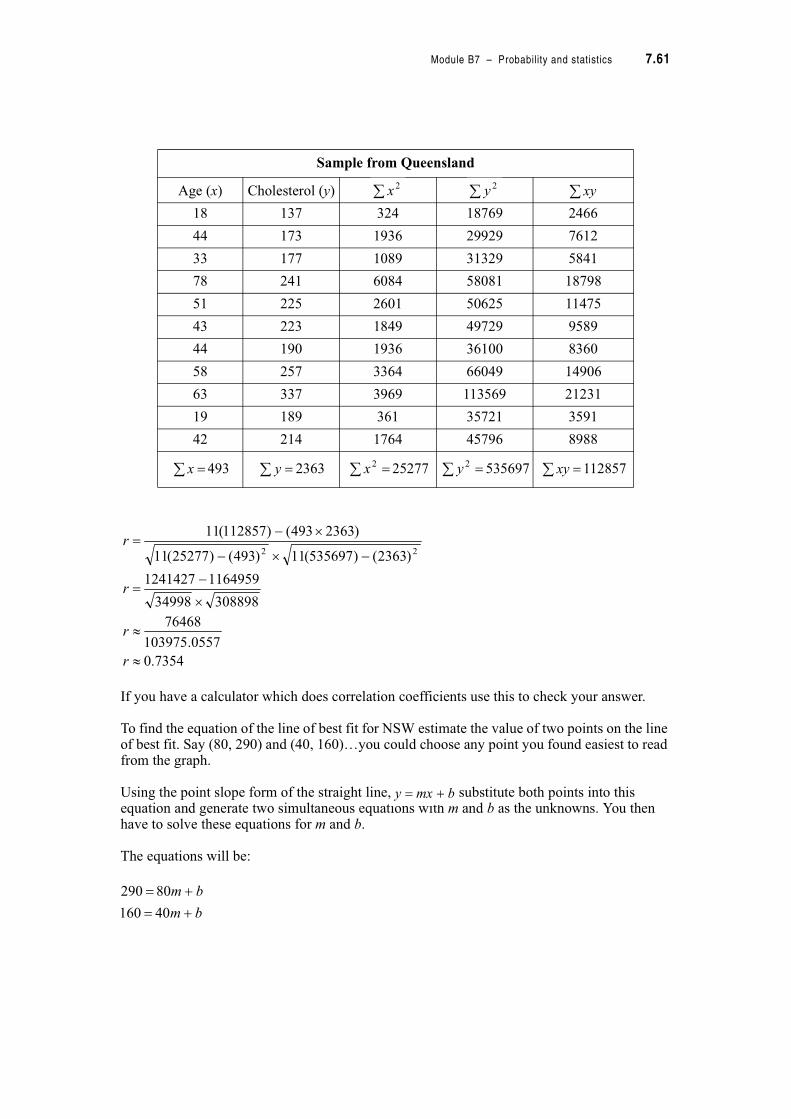
Module B7 – Probability and statistics 7.61
If you have a calculator which does correlation coefficients use this to check your answer.
To find the equation of the line of best fit for NSW estimate the value of two points on the line of best fit. Say (80, 290) and (40, 160)…you could choose any point you found easiest to read from the graph.
Using the point slope form of the straight line, substitute both points into this equation and generate two simultaneous equations with m and b as the unknowns. You then have to solve these equations for m and b.
The equations will be:
Sample from Queensland
Age (x) Cholesterol (y)
18 137 324 18769 2466
44 173 1936 29929 7612
33 177 1089 31329 5841
78 241 6084 58081 18798
51 225 2601 50625 11475
43 223 1849 49729 9589
44 190 1936 36100 8360
58 257 3364 66049 14906
63 337 3969 113569 21231
19 189 361 35721 3591
42 214 1764 45796 8988
493 2363 25277 535697 112857
2x
2y xy
!x !y ! 2x !
2y ! xy
7354.0
0557.103975
76468
30889834998
11649591241427
)2363()535697(11)493()25277(11
)2363493()112857(11
22
"
"
%
#!
#%#
%#!
r
r
r
r
bmxy $!
bm
bm
$!
$!
40160
80290
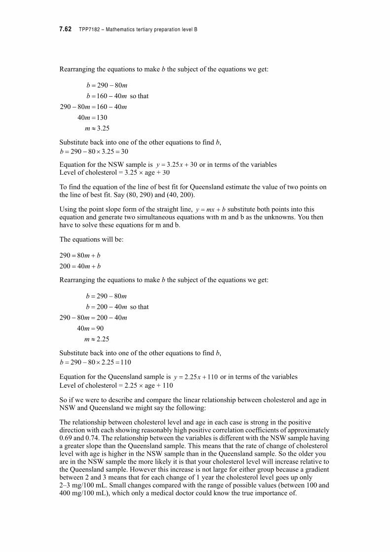
7.62 TPP7182 – Mathematics tertiary preparation level B
Rearranging the equations to make b the subject of the equations we get:
Substitute back into one of the other equations to find b,
Equation for the NSW sample is or in terms of the variablesLevel of cholesterol = 3.25 % age + 30
To find the equation of the line of best fit for Queensland estimate the value of two points on the line of best fit. Say (80, 290) and (40, 200).
Using the point slope form of the straight line, substitute both points into this equation and generate two simultaneous equations with m and b as the unknowns. You then have to solve these equations for m and b.
The equations will be:
Rearranging the equations to make b the subject of the equations we get:
Substitute back into one of the other equations to find b,
Equation for the Queensland sample is or in terms of the variables
Level of cholesterol = 2.25 % age + 110
So if we were to describe and compare the linear relationship between cholesterol and age in NSW and Queensland we might say the following:
The relationship between cholesterol level and age in each case is strong in the positive direction with each showing reasonably high positive correlation coefficients of approximately 0.69 and 0.74. The relationship between the variables is different with the NSW sample having a greater slope than the Queensland sample. This means that the rate of change of cholesterol level with age is higher in the NSW sample than in the Queensland sample. So the older you are in the NSW sample the more likely it is that your cholesterol level will increase relative to the Queensland sample. However this increase is not large for either group because a gradient between 2 and 3 means that for each change of 1 year the cholesterol level goes up only2–3 mg/100 mL. Small changes compared with the range of possible values (between 100 and 400 mg/100 mL), which only a medical doctor could know the true importance of.
25.3
13040
4016080290
thatso 40160
80290
"
!
#!#
#!
#!
m
m
mm
mb
mb
3025.380290 !%#!b
3025.3 $! xy
bmxy $!
bm
bm
$!
$!
40200
80290
25.2
9040
4020080290
thatso 40200
80290
"
!
#!#
#!
#!
m
m
mm
mb
mb
11025.280290 !%#!b
11025.2 $! xy
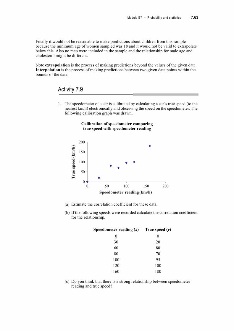
Module B7 – Probability and statistics 7.63
Finally it would not be reasonable to make predictions about children from this sample because the minimum age of women sampled was 18 and it would not be valid to extrapolate below this. Also no men were included in the sample and the relationship for male age and cholesterol might be different.
Note extrapolation is the process of making predictions beyond the values of the given data. Interpolation is the process of making predictions between two given data points within the bounds of the data.
Activity 7.9
1. The speedometer of a car is calibrated by calculating a car’s true speed (to the nearest km/h) electronically and observing the speed on the speedometer. The following calibration graph was drawn.
Calibration of speedometer comparingtrue speed with speedometer reading
(a) Estimate the correlation coefficient for these data.
(b) If the following speeds were recorded calculate the correlation coefficient for the relationship.
(c) Do you think that there is a strong relationship between speedometer reading and true speed?
Speedometer reading (x) True speed (y)
0 0
30 20
60 80
80 70
100 95
120 100
160 180
0
50
100
150
200
0 50 100 150 200
Speedometer reading(km/h)
Tru
espeed(km/h)
7.64 TPP7182 – Mathematics tertiary preparation level B
(d) Draw a line of best fit on the scatterplot and determine the equation that would be used to predict true speed from speedometer reading.
2. It is believed that the patterns of attendance at race meetings are determined by the temperature on the day. The following data were collected.
(a) Draw a scatterplot displaying the relationship between temperature and race attendance.
(b) What is the correlation coefficient of these data. Is the relationship a strong or weak relationship?
(c) If you need to order catering supplies for the race what attendance would you think reasonable if the temperature was 18&C.
(d) Can you use the relationship to predict the attendance if the temperature was 18&C and 25&C? Explain your answer.
3. The number of household utensils sold and their price are thought to be related. Consider the following sample of results.
(a) Calculate the correlation coefficient and determine if the statement that ‘quantity sold is dependent on the selling price’ is a reasonable statement.
(b) Sketch a scatterplot of the relationship.
(c) Draw a line of best fit on the scatterplot and determine its equation.
(d) Use this equation to predict what the selling price would be if the number sold was 100. Is this reasonable? Explain your answer.
Temperature (&C) Attendance (’000)
15 64
13 64
17 73
19 79
16 70
Price ($) Number sold
5 1 500
10 1 200
20 800
30 250
40 50
50 10
Module B7 – Probability and statistics 7.65
4. Four groups of apprentice laboratory technicians measured the length of a metal rod at different temperatures and calculated the correlation coefficients for the relationship between temperature and length. Their supervisor conducted a similar experiment and found that as temperature increased the length of the metal rod increased. The apprentices’ results are presented below.
Which results are the most reasonable? Explain your answer.
That’s the end of this module. You will have experienced a number of different ways to consider data sets to account for variation in data, as well as begin your study of probability.
But before you are really finished you should do a number of things
1. This is your last module so you should be getting close to your final revision. Have a close look at your action plan to prepare for your final assessment. Are you on schedule? Or do you need to restructure you action plan or contact your tutor to discuss any delays or concerns?
2. Make a summary of the important points in this module noting your strengths and weaknesses. Add any new words to your personal glossary. This will help with future revision.
3. Practice some real world problems by having a go at ‘A taste of things to come’.
4. Check your skill level by attempting the post-test.
5. When you are ready, complete and submit your assignment.
Group Correlation coefficient
1 0.99
2 1.20
3 0.87
4 #0.99
Something to talk about…
By now you will have finished all of the modules and be preparing for your final assessments. Think about the best way to do this. Talk with your fellow students through the discussion group or learning circle to get their ideas or discuss it with your tutor.
7.66 TPP7182 – Mathematics tertiary preparation level B
7.5 A taste of things to come
1. A sales manager of a large company commissioned a sales consultant to market a new product to their 90 sales outlets. After an extensive marketing campaign the consultant presents the following figures to the manager stating that each sales district performed well. You are sceptical of their conclusion and want to examine the data for yourself. What would you do with the following figures?
2. The vertebrate life by Pough, Cade and Heisner (1979) tells the story of a group of overzealous museum preparators who used the largest teeth of the giant fossil shark, Carcharodon megalodon to reconstruct the jaw of this animal estimating that the size of the giant shark would have been anywhere between 18.2 to 30.6 m. Modern paleontologists, however, prefer to make predictions about size of fossil animals using the evidence from living forms.
Below are the data collected from the living shark, Carcharodon carcharias.
Sales district number Number of new product sold
1 1
2 2
3 4
4 6
5 20
6 1
7 38
8 10
9 2
10 6
Enamel height of largest upper tooth (mm) Total body length (m)
17 1.8
20 1.8
20 2.1
21 2.3
22 2.5
26 2.6
24 2.7
23 2.8
25 2.8
26 3.2
30 3.4
30 3.8
35 4.3
43 4.6
45 4.7
45 5.3
49 5.5

Module B7 – Probability and statistics 7.67
(a) What is the mean and standard deviation of the enamel height of the sample of living sharks?
(b) Sketch a scatterplot of the relationship used to predict the total body length of a shark from the height of its tooth enamel. (Hint: use a domain of 0 to 150 and a range of 0 to 15.)
(c) What is the equation of that relationship?
(d) Calculate the correlation coefficient of the relationship and determine if it is a strong linear relationship.
(e) If you extrapolated the data from living sharks to fossil sharks with teeth of enamel height 112 mm what would be your predictions of the total body length of the fossil sharks?
7.6 Post-test
1. The number of days absent from work over one year by a group of employees is detailed below.
(a) How many employees were absent less than four days annually?
(b) Use the frequency distribution table to create a cumulative relative frequency distribution column.
(c) Use the table to determine the percentage of employees who had 12 or more days off annually.
(d) If one of the employees was selected at random, what is the probability that they would have had 4 up to 8 days off?
Number of days absent Frequency
0 up to 4 5
4 up to 8 12
8 up to 12 23
12 up to 16 8
16 up to 20 2
Total 50
7.68 TPP7182 – Mathematics tertiary preparation level B
2. Loyalty of managers and length of service was monitored by a company with the following results.
(a) Draw a tree diagram to represent the situation.
(b) What is the probability that a manager selected at random would be loyal and have more than 10 years of service?
3. A small pizza parlor offers free delivery within 15 km of the shop. The owner wants some information on the time it takes for delivery. From a sample of 20 deliveries he developed the following data:
(a) Draw a boxplot to represent the data.
(b) How long does a typical delivery take?
(c) Within what range of values will it take for most deliveries?
4. The prices of flats in a suburb of Brisbane are represented in the following stem-and-leaf plot in thousands of dollars.
Stem plot of flat prices in Brisbane
Develop a five number summary for these data.
Minimum ' 13 minute0s
Q1 ' 15 minutes
Median ' 18 minutes
Q3 ' 22 minutes
Maximum ' 30 minutes
Length of service
Less than 1 year 1–5 years 6–10 years More than 10 years
Loyal 10 30 5 75
Not Loyal 25 15 10 30
stem leaf
8 8 9
9 3 4 4 5 6 6 7
10 3 3 4 6 7 8
11 1 2 2 3 3 7 7 8 9
12 0 0 4 5 5 5 7 7
13 2 4 5 6 8 9 9
14 2 3 8
15 5 5 6
Module B7 – Probability and statistics 7.69
5. An automobile manufacturer tested three types of petrol on a number of cars measuring the kilometres per litre in each case.
Calculate the mean and standard deviation for each type of petrol.
6. The quality control department of a large manufacturer of stoves monitored the temperatures of three brands of stoves set to heat to 240 degrees. The following are the results of the data collected on the temperatures of the stoves.
Which oven would you prefer to have and why? Indicate in your answer which statistical measure(s) helped you make your decision.
7. Advertising is said to have an effect on the sales of toothpaste. The annual advertising expenditure ($ millions) is detailed below with the sales returns ($ millions) for 4 brands of toothpaste.
(a) Draw a scatterplot from which we can predict sales returns from advertising expenditure.
(b) Draw a line of best fit.
(c) What is the equation of your line of best fit?
(d) Determine the correlation coefficient for these data and comment on the linearity of the data.
Leaded petrol Unleaded petrol Premium unleaded petrol
39.31 36.69 40.04
39.87 40.00 39.89
39.87 41.01 39.93
37.93
Temperature &C
Brand 1 Brand 2 Brand 3
Mean 238.1 240.0 242.9
Median 240.0 240.0 240.0
Mode 241.5 240.0 239.1
Standard deviation 3.0 0.4 0.5
Advertising expenditure ($ mill)
Sales returns($ mill)
Pearly White 2 5
Cleany White 4 7
Bright and Shine 3 6
Shiny White 1 2
7.70 TPP7182 – Mathematics Tertiary Preparation Level B
Module B7 – Probability and Statistics
7.7 Solutions
Solutions to activities
Activity 7.1
1.
Activity 7.2
1. (a)
* Relative frequency will not sum exactly to one due to round off error.
Question part
Population Sample VariableType of variable
Value of variable
a Incomes of all house-holds in suburb
Ten households Total income for a household
Quantitative, continuous
$25 000
b Marital status of all Australians over 18
Marital status of all country town over 18
Marital status Categorical married
c All Living status of all coronary patients
200 coronary patients
Alive/dead and pet/no pets
Quantitative discrete
Alive with pet
d Measurements of nitrous oxide levels over the whole year
Measurements over 60 days
Levels of nitrous oxide
Quantitative continuous
5 ppm
Image distance (mm)
Frequency Relative frequencyCumulative relative
frequency
146 2 0.05 0.05
148 3 0.07 0.11
151 2 0.05 0.16
153 4 0.09 0.25
154 5 0.11 0.36
161 6 0.14 0.50
162 7 0.16 0.66
166 5 0.11 0.77
170 4 0.09 0.86
171 1 0.02 0.89
176 2 0.05 0.93
180 3 0.07 1.00
Module B7 – Probability and Statistics 7.71
(a) From the relative frequency column 0.16
(b) From the cumulative relative frequency column 0.50
(c) To find the value subtract 25% from 77% to get 52% between 153 and 170 mm
2. (a)
(b)Cumulative relative frequency curve
(c) 55% of people watch less than 5 hours.
(d) 30% of people watch less than 3.5 hours.
Hours per day FrequencyCumulative frequency
Relative cumulative frequency
1 20 20 0.04
2 24 44 0.088
3 62 106 0.212
4 88 194 0.388
5 85 279 0.558
6 89 368 0.736
7 61 429 0.858
8 39 468 0.936
9 27 495 0.99
10 5 500 1.00
0.00
0.20
0.40
0.60
0.80
1.00
0 1 3 4 5 6 7 8 9 102
Hours per day
Cumulativerelativefrequency
7.72 TPP7182 – Mathematics Tertiary Preparation Level B
3. (a) Approximately 30 people stayed at least 25 seconds.
(b) That means that 20 people stayed for the second viewing as there were 50 people in total.
(c) To compare between different days the manager could have asked for a relative cumulative frequency curve instead of a cumulative frequency curve.
Activity 7.3
1. (a) Experiment is counting the number of traffic violation.
(b) The sample space is all possible observations of 0, 1, 2, 3, 4, 5 or 6 or more traffic violations.
(c) An event is one traffic violation. An outcome of this experiment would be 68 drivers had one traffic violation.
2. (a) Sample space is possibility of stock rising or falling in a range of combinations e.g. RF, RR, FF, FR …(Note there is no need in this question to determine all possible combination.)
(b) An event would be the stocks rising, an outcome could be that all stock rise in that period.
3. (a) The experiment is to ask the colour preferences of 360 interior designers.
(b) An outcome is that 78 designers prefer yellow.
(c) Total number of trials is 360.
Activity 7.4
1.
(a) 150 repairers were surveyed.
(b) 72 out of 150 repairers gave good service the probability of getting one of these is
4. Experiment Shuffling the cards and drawing one at random.Trial Each occurrence of shuffling and drawing cards.Outcome Card drawn is the ace of spades.Event Choosing a king.
Good service Poor service Total
Factory trained 48 16 64
Not factory trained 24 62 86
Total 72 78 150
48.025
12
150
72

Module B7 – Probability and Statistics 7.73
(c) 64 out of 150 are factory trained so the probability of getting one of these is
(d) 48 repairers are factory trained and provide good service, the probability of getting one
of these is
2. (a) Probability would be
(b) Probability would be
(c) Only 200 females were in the sample. The probability of the selected one having black
hair would be
(d) 80 teenagers have blond hair. That means that 220 will not have blond hair, the
probability of selecting one of these is
3. (a) Total number of skunks sampled is 295, the probability of catching a skunk with rabies
is
(b) The total number of skunks in Park 1 is 133 the probability of it having rabies is
(c) Probability of catching a skunk with rabies in Park 2 is , this is much lower
than in Park 1. Probability in Park 1 is about 1.3 times greater than in Park 2.
4. (a) Probability is
(b) Probability is
(c) Probability is
43.075
32
150
64!
32.025
8
150
48
08.0300
25!
67.0300
200!
275.0200
55
73.0300
220!
28.0295
82!
32.0133
43!
24.0162
39!
32.0269
87!
01.0269
3!
52.0269
5387!
"
7.74 TPP7182 – Mathematics Tertiary Preparation Level B
Activity 7.5
1. (a)
(b)
(c) A card less than 5 could be a 2, 3 or 4 and there are 4 suits which makes 12 cards in all,
(d)
(e)
(f) There are 26 black cards and 26 red cards in a pack of cards.
(g) Each of four suits has a Jack, Queen and King totalling 12 altogether.
(h)
(i) There are two red 3’s in a pack of cards (a red heart and a red diamond).
(j) There is only one King of diamonds in a pack of cards.
13
1
52
4)6( P
6
1)6( P
13
3
52
12)5( #P
2
1
6
3)5or 4,3( P
2
1
6
3)even( P
2
1
52
26)black( P
13
3
52
12)King andQueen Jack,( P
3
1
6
2)2or 1( P
26
1
52
2)3 red( P
52
1)diamonds of king( P
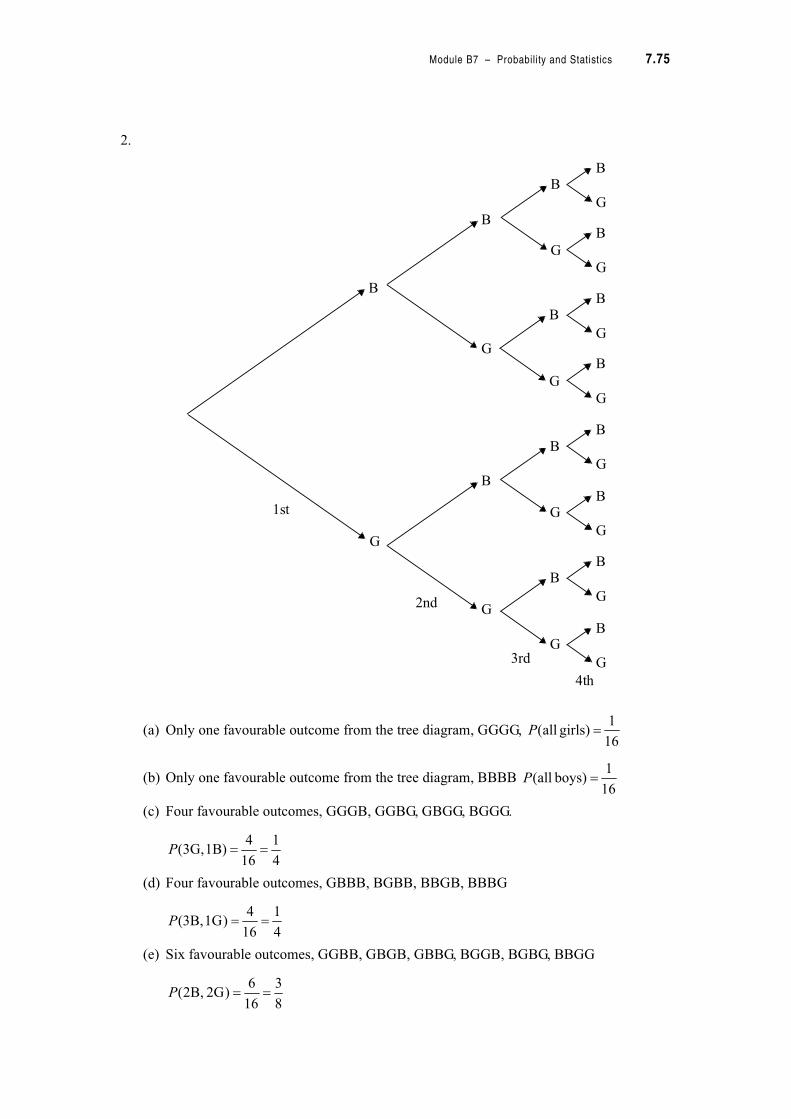
Module B7 – Probability and Statistics 7.75
2.
(a) Only one favourable outcome from the tree diagram, GGGG,
(b) Only one favourable outcome from the tree diagram, BBBB
(c) Four favourable outcomes, GGGB, GGBG, GBGG, BGGG.
(d) Four favourable outcomes, GBBB, BGBB, BBGB, BBBG
(e) Six favourable outcomes, GGBB, GBGB, GBBG, BGGB, BGBG, BBGG
B
G
B
G
B
G
B
G
B
G
B
G
B
G
B
G
B
G
B
G
B
G
B
G
B
G
B
G
B
G
1st
2nd
3rd
4th
16
1)girls all( P
16
1)boys all( P
4
1
16
4)1B 3G,( P
4
1
16
4)1G 3B,( P
8
3
16
6)2G 2B,( P
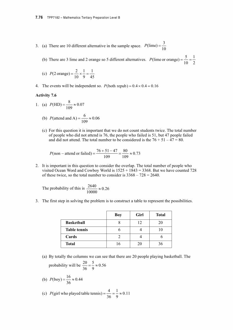
7.76 TPP7182 – Mathematics Tertiary Preparation Level B
3. (a) There are 10 different alternative in the sample space.
(b) There are 3 lime and 2 orange so 5 different alternatives.
(c)
4. The events will be independent so.
Activity 7.6
1. (a)
(b)
(c) For this question it is important that we do not count students twice. The total number of people who did not attend is 76, the people who failed is 51, but 47 people failed and did not attend. The total number to be considered is the 76 + 51 – 47 = 80.
2. It is important in this question to consider the overlap. The total number of people who visited Ocean Word and Cowboy World is 1525 + 1843 = 3368. But we have counted 728 of these twice, so the total number to consider is 3368 – 728 = 2640.
The probability of this is
3. The first step in solving the problem is to construct a table to represent the possibilities.
(a) By totally the columns we can see that there are 20 people playing basketball. The
probability will be
(b)
(c)
10
3)lime( P
2
1
10
5)orangeor lime( P
45
1
9
1
10
2)orange 2( $ P
16.04.04.0)repubboth ( $ P
07.0109
8)HD( ! P
06.0109
6)A and attend( ! P
73.0109
80
109
475176)failedor attendnon( !
%" %P
26.010000
2640!
Boy Girl Total
Basketball 8 12 20
Table tennis 6 4 10
Cards 2 4 6
Total 16 20 36
56.09
5
36
20!
44.036
16)boy( ! P
11.09
1
36
4) tennis tableplayed whogirl( ! P
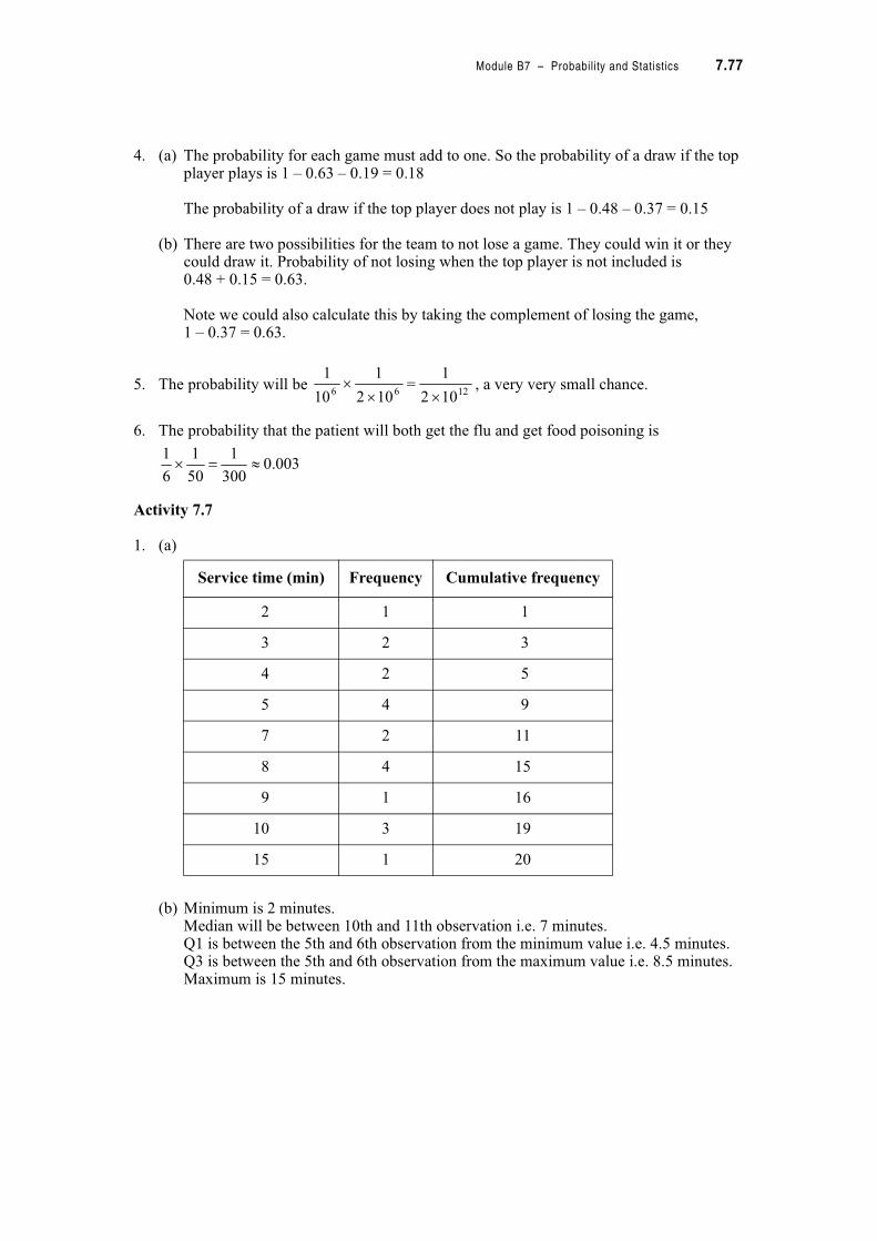
Module B7 – Probability and Statistics 7.77
4. (a) The probability for each game must add to one. So the probability of a draw if the top player plays is 1 – 0.63 – 0.19 = 0.18
The probability of a draw if the top player does not play is 1 – 0.48 – 0.37 = 0.15
(b) There are two possibilities for the team to not lose a game. They could win it or they could draw it. Probability of not losing when the top player is not included is0.48 + 0.15 = 0.63.
Note we could also calculate this by taking the complement of losing the game,1 – 0.37 = 0.63.
5. The probability will be , a very very small chance.
6. The probability that the patient will both get the flu and get food poisoning is
Activity 7.7
1. (a)
(b) Minimum is 2 minutes.Median will be between 10th and 11th observation i.e. 7 minutes.Q1 is between the 5th and 6th observation from the minimum value i.e. 4.5 minutes.Q3 is between the 5th and 6th observation from the maximum value i.e. 8.5 minutes.Maximum is 15 minutes.
Service time (min) Frequency Cumulative frequency
2 1 1
3 2 3
4 2 5
5 4 9
7 2 11
8 4 15
9 1 16
10 3 19
15 1 20
1266 102
1
102
1
10
1
$
$$
003.0300
1
50
1
6
1! $
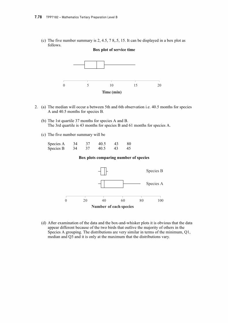
7.78 TPP7182 – Mathematics Tertiary Preparation Level B
(c) The five number summary is 2, 4.5, 7 8,.5, 15. It can be displayed in a box plot as follows.
Box plot of service time
2. (a) The median will occur a between 5th and 6th observation i.e. 40.5 months for species A and 40.5 months for species B.
(b) The 1st quartile 37 months for species A and B.The 3rd quartile is 43 months for species B and 61 months for species A.
(c) The five number summary will be
Species A 34 37 40.5 43 80Species B 34 37 40.5 43 45
Box plots comparing number of species
(d) After examination of the data and the box-and-whisker plots it is obvious that the data appear different because of the two birds that outlive the majority of others in the Species A grouping. The distributions are very similar in terms of the minimum, Q1, median and Q3 and it is only at the maximum that the distributions vary.
0
Time (min)
0 5 10 15 20
Number of each species
0 20 40 60 80 100
Species A
Species B
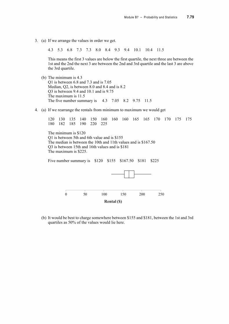
Module B7 – Probability and Statistics 7.79
3. (a) If we arrange the values in order we get.
4.3 5.3 6.8 7.3 7.3 8.0 8.4 9.3 9.4 10.1 10.4 11.5
This means the first 3 values are below the first quartile, the next three are between the 1st and the 2nd the next 3 are between the 2nd and 3rd quartile and the last 3 are above the 3rd quartile.
(b) The minimum is 4.3Q1 is between 6.8 and 7.3 and is 7.05Median, Q2, is between 8.0 and 8.4 and is 8.2Q3 is between 9.4 and 10.1 and is 9.75The maximum is 11.5The five number summary is 4.3 7.05 8.2 9.75 11.5
4. (a) If we rearrange the rentals from minimum to maximum we would get
120 130 135 140 150 160 160 160 165 165 170 170 175 175180 182 185 190 220 225
The minimum is $120Q1 is between 5th and 6th value and is $155The median is between the 10th and 11th values and is $167.50Q3 is between 15th and 16th values and is $181The maximum is $225.
Five number summary is $120 $155 $167.50 $181 $225
(b) It would be best to charge somewhere between $155 and $181, between the 1st and 3rd quartiles as 50% of the values would lie here.
0 50 100 150 200 250
Rental ($)

7.80 TPP7182 – Mathematics Tertiary Preparation Level B
Activity 7.8
1. If and ,
The mean is
seconds
The standard deviation is
2. (a) Standard deviation for Tom is
Standard deviation for Jerry is
You could check these values on a calculator.
(b) We can see from the standard deviations that Tom is a much more consistent runner than Jerry. This is because Tom’s standard deviations is much lower than Jerry’s.
39.54 & x 3559.622 & x
09.150
39.54!
&
n
xx
2552.0
49
50
27.29583559.62
1
)( 22
!
%
%
%
&&
s
s
n
n
xx
s
ii
0707.0
5
6
64.4121965.686
1
)( 22
!
%
%
%
&&
s
s
n
n
xx
s
ii
2775.0
5
6
64.4121325.687
1
)( 22
!
%
%
%
&&
s
s
n
n
xx
s
ii
Module B7 – Probability and Statistics 7.81
3. First calculate the mean and standard deviation for each company.
The mean level of absenteeism at the two companies is similar but company 1 has a much larger standard deviation than company 2. This mean that the variation about the mean is large and the company may have one or two workers who have high absenteeism rates.
4. Using the value given in the question the mean is,
.
The standard deviation is
Overall the mean is approximately 2.17 with a standard deviation of 0.14. Not only is the mean different from that claimed but the variation as indicated by the standard deviation would mean that the weight would vary around the mean. The purchasers may not be very satisfied.
Company 1
Mean Standard deviation
Company 2
Mean Standard deviation
13612.36
11
x
n !
& 22 ( )
1
184963034
11
10
11.6299
ii
xx
nsn
s
s
%
%
%
!
&&
13312.09
11
x
n !
& 22 ( )
1
176892331
11
10
8.5024
ii
xx
nsn
s
s
%
%
%
!
&&
168.2100
8.216
&
n
x
139.0
99
100
24.4700294.471
1
)( 22
!
%
%
%
&&
s
s
n
n
xx
s
ii
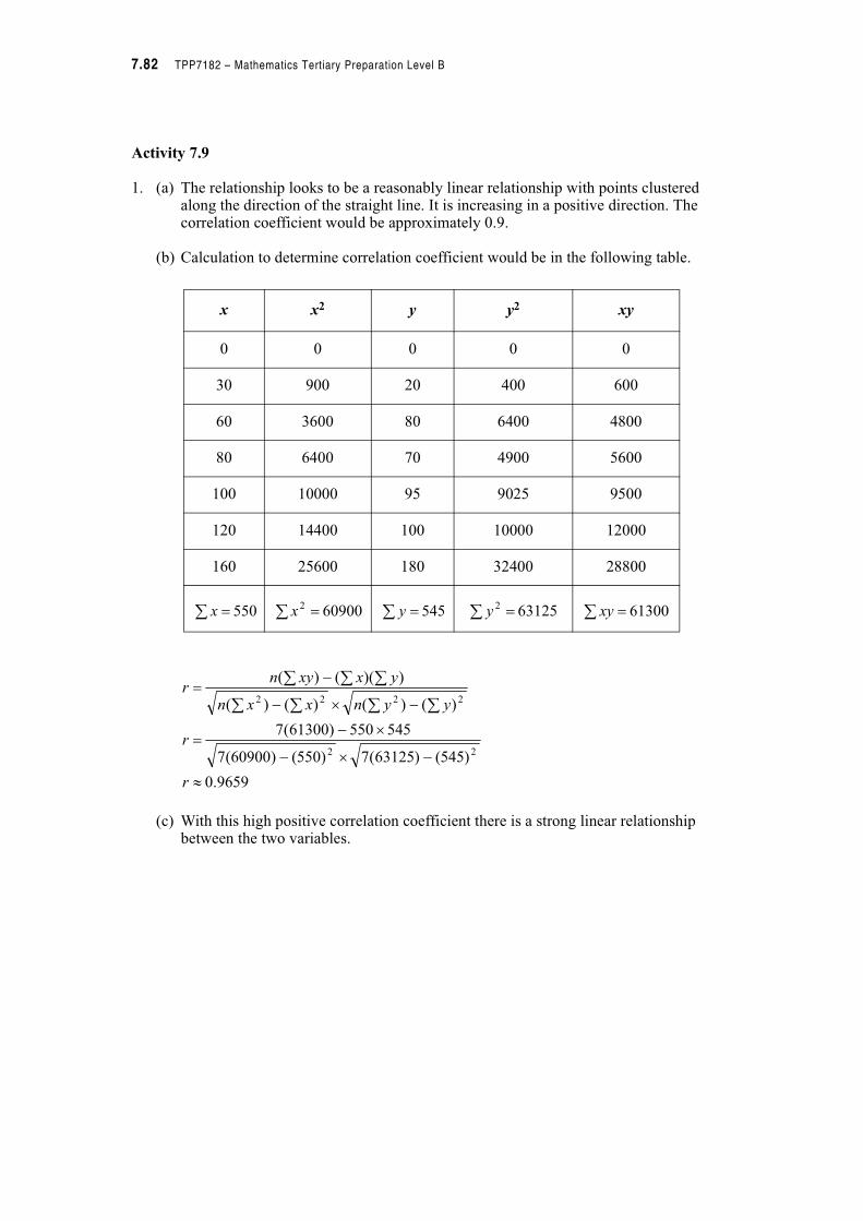
7.82 TPP7182 – Mathematics Tertiary Preparation Level B
Activity 7.9
1. (a) The relationship looks to be a reasonably linear relationship with points clustered along the direction of the straight line. It is increasing in a positive direction. The correlation coefficient would be approximately 0.9.
(b) Calculation to determine correlation coefficient would be in the following table.
(c) With this high positive correlation coefficient there is a strong linear relationship between the two variables.
x x2 y y2 xy
0 0 0 0 0
30 900 20 400 600
60 3600 80 6400 4800
80 6400 70 4900 5600
100 10000 95 9025 9500
120 14400 100 10000 12000
160 25600 180 32400 28800
& 550x 609002 & x & 545y & 631252y & 61300xy
9659.0
)545()63125(7)550()60900(7
545550)61300(7
)()()()(
))(()(
22
2222
!
%$%
$%
%$%
%
&&&&
& & &
r
r
yynxxn
yxxynr

Module B7 – Probability and Statistics 7.83
(d)Calibration of speedometer comparing true
speed with speedometer reading
The equation written on the graph is a very exact version of the equation of the line of best fit. If we use points from the graph we will get an approximation of the equation of the line. Your answer will differ from this one depending on the line you have drawn and the points you have chosen.
If we choose the points (50, 45) and (100, 95), then the gradient of the line will be
Using the point slope form of the line and the point (100, 95), the equation will be
The equation will be
−50
0
50
100
150
200
0 50 100 150 200
Truespeed(km/h)
Speedometer reading(km/h)
y = 1.0448x 4.2367−
1
50100
4595
12
12
%
%
%
%
m
m
xx
yym
y mx b+=
95 100 1 b+$=
b 5–=
y x 5–=

7.84 TPP7182 – Mathematics Tertiary Preparation Level B
2. (a) It is believed that the patterns of attendance at race meetings are determined by the temperature on the day. The following data were collected.
Patterns of attendance at race meetings and temperature
(b) Correlation coefficient is 0.9487 indicating a strong linear relationship between temperature and number of people.
(c) 75 000 people
(d) Data are only provided up to 20 degrees so caution should be shown when predicting past this point. 25 degrees might be reasonable by predictions about 125 degrees would be unrealistic.
Temperature ('C) Attendance (’000)
15 64
13 64
17 73
19 79
16 70
0
10
20
30
40
50
60
70
80
90
0 5 10 15 20 25
Numberofpeople
Temperature (degreesC)
y
r
= 2.7x + 26.8
= 0.9487
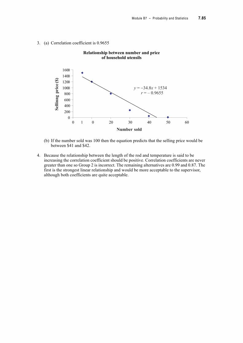
Module B7 – Probability and Statistics 7.85
3. (a) Correlation coefficient is 0.9655
Relationship between number and priceof household utensils
(b) If the number sold was 100 then the equation predicts that the selling price would be between $41 and $42.
4. Because the relationship between the length of the rod and temperature is said to be increasing the correlation coefficient should be positive. Correlation coefficients are never greater than one so Group 2 is incorrect. The remaining alternatives are 0.99 and 0.87. The first is the strongest linear relationship and would be more acceptable to the supervisor, although both coefficients are quite acceptable.
0
200
400
600
800
1000
1200
1400
1600
Sellinngprice($)
Number sold
0 1 0 20 30 40 50 60
y
r
= 34.8x + 1534
= – 0.9655
−
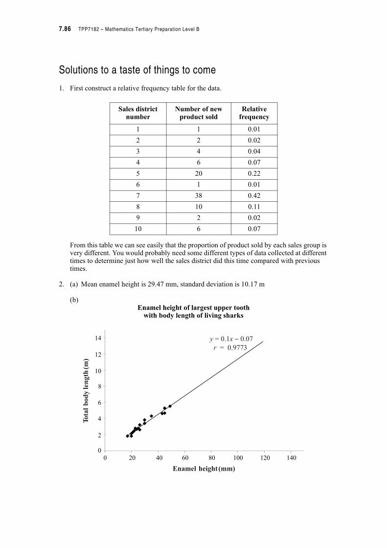
7.86 TPP7182 – Mathematics Tertiary Preparation Level B
Solutions to a taste of things to come
1. First construct a relative frequency table for the data.
From this table we can see easily that the proportion of product sold by each sales group is very different. You would probably need some different types of data collected at different times to determine just how well the sales district did this time compared with previous times.
2. (a) Mean enamel height is 29.47 mm, standard deviation is 10.17 m
(b)Enamel height of largest upper tooth
with body length of living sharks
Sales district number
Number of new product sold
Relative frequency
1 1 0.01
2 2 0.02
3 4 0.04
4 6 0.07
5 20 0.22
6 1 0.01
7 38 0.42
8 10 0.11
9 2 0.02
10 6 0.07
07
9773
Totalbodylength(m)
Enamel height(mm)
0
0
2
4
6
8
10
12
14
20 40 60 80 100 120 140
y
r
= 0.1x 0.07
= 0.9773
−
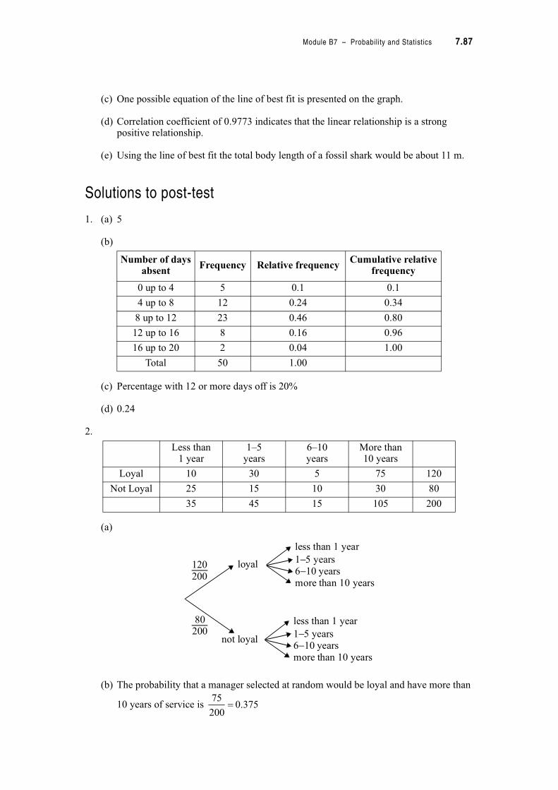
Module B7 – Probability and Statistics 7.87
(c) One possible equation of the line of best fit is presented on the graph.
(d) Correlation coefficient of 0.9773 indicates that the linear relationship is a strong positive relationship.
(e) Using the line of best fit the total body length of a fossil shark would be about 11 m.
Solutions to post-test
1. (a) 5
(b)
(c) Percentage with 12 or more days off is 20%
(d) 0.24
2.
(a)
(b) The probability that a manager selected at random would be loyal and have more than
10 years of service is
Number of days absent
Frequency Relative frequencyCumulative relative
frequency
0 up to 4 5 0.1 0.1
4 up to 8 12 0.24 0.34
8 up to 12 23 0.46 0.80
12 up to 16 8 0.16 0.96
16 up to 20 2 0.04 1.00
Total 50 1.00
Less than 1 year
1–5years
6–10years
More than 10 years
Loyal 10 30 5 75 120
Not Loyal 25 15 10 30 80
35 45 15 105 200
less than 1 year
6 10− yearsloyal
not loyal
1−5 years
more than 10 years
less than 1 year
6 10− years1−5 years
more than 10 years
120200
80200
375.0200
75
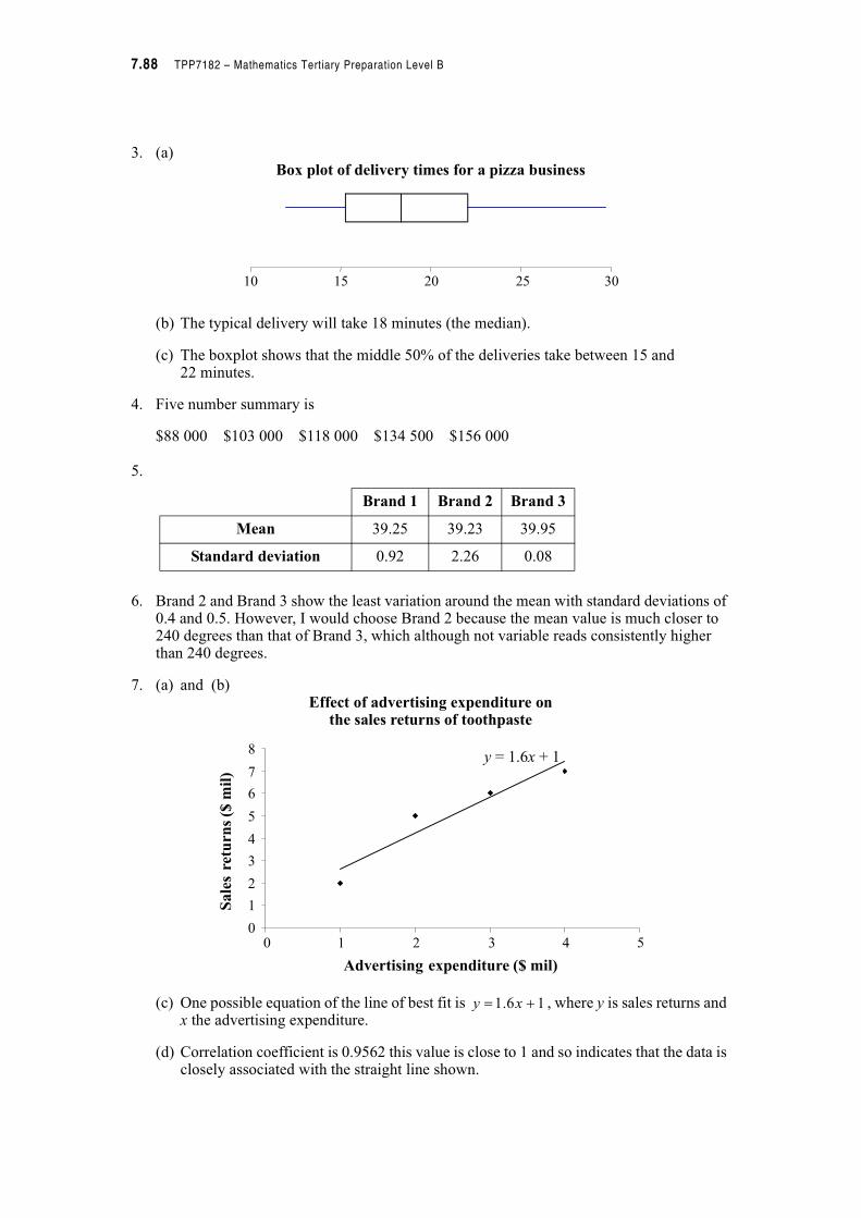
7.88 TPP7182 – Mathematics Tertiary Preparation Level B
3. (a)Box plot of delivery times for a pizza business
(b) The typical delivery will take 18 minutes (the median).
(c) The boxplot shows that the middle 50% of the deliveries take between 15 and 22 minutes.
4. Five number summary is
$88 000 $103 000 $118 000 $134 500 $156 000
5.
6. Brand 2 and Brand 3 show the least variation around the mean with standard deviations of 0.4 and 0.5. However, I would choose Brand 2 because the mean value is much closer to 240 degrees than that of Brand 3, which although not variable reads consistently higher than 240 degrees.
7. (a) and (b)Effect of advertising expenditure on
the sales returns of toothpaste
(c) One possible equation of the line of best fit is , where y is sales returns and x the advertising expenditure.
(d) Correlation coefficient is 0.9562 this value is close to 1 and so indicates that the data is closely associated with the straight line shown.
10 20 25 3015
Brand 1 Brand 2 Brand 3
Mean 39.25 39.23 39.95
Standard deviation 0.92 2.26 0.08
0
0 1 2 3 4 5
Advertising expenditure ($ mil)
y = 1.6x + 1
Salesreturns($mil)
1
2
3
4
5
6
7
8
16.1 " xy