Embed Size (px)
Citation preview
PagePlus 10.0 Companion
© 2004 Serif (Europe) Ltd. All rights reserved. No part of this publication may be reproduced in
any form without the express written permission of Serif (Europe) Ltd.
All Serif product names are trademarks of Serif (Europe) Ltd. Microsoft, Windows and the
Windows logo are registered trademarks of Microsoft Corporation. All other trademarks
acknowledged.
Serif PagePlus 10.0 © 2004 Serif (Europe) Ltd.
Companies and names used in samples are fictitious.
Clipart samples from Serif ArtPacks © Serif (Europe) Ltd. & Paul Harris
Portions images © 1997-2002 Nova Development Corporation; © 1995 Expressions Computer
Software; © 1996-98 CreatiCom, In.; 1996 Cliptoart; © 1996-99 Hemera; © 1997 Multimedia
Agency Corporation; © 1997-98 Seattle Support Group. Rights of all parties reserved.
Digital image content © 1997-2003 Hemera Technologies Inc. All rights reserved.
Portions TrueType Font content © 2002 Arts & Letters Corporation. All Rights Reserved.
Portions graphics import/export technology © AccuSoft Corp. & Eastman Kodak Company &
LEAD Technologies, Inc.
THE PROXIMITY HYPHENATION SYSTEM © 1989 Proximity Technology Inc. All rights
reserved.
THE PROXIMITY/COLLINS DATABASE® © 1990 William Collins Sons & Co. Ltd.; © 1990
Proximity Technology Inc. All rights reserved.
THE PROXIMITY/MERRIAM-WEBSTER DATABASE® © 1990 Merriam-Webster Inc.; © 1990
Proximity Technology Inc. All rights reserved.
The Sentry Spelling-Checker Engine © 2000 Wintertree Software Inc.
The ThesDB Thesaurus Engine © 1993-97 Wintertree Software Inc.
WGrammar Grammar-Checker Engine © 1998 Wintertree Software Inc.
PANTONE® Colours displayed in the software application or in the user documentation may not
match PANTONE-identified standards. Consult current PANTONE Colour Publications for accurate
colour. PANTONE® and other Pantone, Inc. trademarks are the property of Pantone, Inc. © Pantone
Inc., 2001.
Pantone, Inc. is the copyright owner of colour data and/or software which are licensed to Serif
(Europe) Ltd. to distribute for use only in combination with PagePlus. PANTONE Colour Data
and/or Software shall not be copied onto another disk or into memory unless as part of the execution
of PagePlus.
Software License Agreement This Software License Agreement (“License Agreement”) is a legal agreement between you (either an individual or a single entity)
and Serif (Europe) Ltd. (“Serif”) for the accompanying software product, which includes computer software and may include
associated media, printed materials, and “online” or electronic documentation (the “Software Product”). By installing, copying, or
otherwise using the Software Product, you agree to be bound by the terms of this License Agreement. If you do not agree to the terms
and conditions of this License Agreement, do not install or use the Software Product; you may, however, return it to your place of
purchase for a full refund.
THANK YOU FOR LICENSING THE USE OF THE SOFTWARE PRODUCT. IT IS IMPORTANT THAT YOU (THE
"LICENSEE") READ THIS NOTICE CAREFULLY. THESE ARE THE ONLY TERMS AND CONDITIONS APPLICABLE TO
YOUR RIGHTS WITH RESPECT TO THE SOFTWARE PRODUCT. THE SOFTWARE PRODUCT IS PROTECTED BY
COPYRIGHT LAWS AND INTERNATIONAL COPYRIGHT TREATIES, AS WELL AS OTHER INTELLECTUAL PROPERTY
LAWS AND TREATIES. THE SOFTWARE PRODUCT IS LICENSED, NOT SOLD.
1. GRANT OF LICENSE
Serif hereby grants to Licensee a personal, non-exclusive, non-
transferable license (a "License") to use one (1) copy of the
Software Product, including any updates thereto, and
accompanying documentation, if any, provided by Serif,
according to the terms set forth below. If the Software Product
is being provided to Licensee as an update or upgrade to
software which Licensee has previously licensed (such software
referred to as the "Prior Software"), then Licensee agrees to
destroy all copies of the Prior Software within thirty (30) days
after opening this package except for one backup copy of the
Prior Software.
2. SCOPE OF USE
You may install and use one copy of the Software Product, on a
single computer. The primary user of the computer on which
the Software Product is installed may make a second copy for
his or her exclusive use on a portable computer. Licensee may
also store or install a copy of the Software Product on a storage
device, such as a network server, used only to install or run the
Software Product on other computers over an internal network;
however, you must acquire and dedicate a license for each
separate computer on which the Software Product is installed or
run from the storage device. A license for the Software Product
may not be shared or used concurrently on different computers.
3. LICENSE PAK
If you have acquired this LICENSE AGREEMENT in a Serif
License Pak, you may make the number of additional copies of
the computer software portion of the Software Product as
authorized in the Serif License Pak, and you may use each copy
in the manner specified above. You are also entitled to make a
corresponding number of secondary copies for portable
computer use as specified above.
4. PROHIBITIONS
You may not: modify, prepare derivative works from, translate,
reverse engineer, decompile, disassemble or otherwise derive
source code from the Software Product (except to the extent that
such acts are expressly permitted by applicable law
notwithstanding this limitation); copy the Software Product
(except as provided above) or the accompanying
documentation; rent, transfer, disclose, make available or grant
any rights in the Software Product (including any
accompanying documentation) in any form to any person
without the prior written consent of Serif; remove any
proprietary notices, labels, or marks on the Software Product
(including any accompanying documentation); use the Software
Product in any manner that infringes the intellectual property or
other rights of another party; or use the Software Product to
provide on-line or other database services to any other person.
5. RETENTION OF RIGHTS; TERMINATION
This License Agreement does not constitute a sale. All title,
trade secrets, copyrights, patents and other intellectual rights to
the Software Product, its accompanying documentation and any
copy made by Licensee remain with Serif, and Licensee hereby
agrees to preserve and acknowledges the foregoing. Licensee
further agrees and acknowledges that the Software Product and
all copies thereof are Serif's exclusive property and constitute a
valuable trade secret of Serif. Licensee further agrees and
acknowledges that unauthorized copying of the Software
Product or the accompanying documentation, or failure to
comply with any of the provisions hereof (each, a "Terminable
Event"), will result in automatic termination of this License. In
the event of a violation of this License by Licensee, Serif
reserves and shall have available all legal remedies.
6. TERM OF LICENSE FOR TRIAL VERSION
SOFTWARE
The License pertaining to a trial version of the Software Product
(a "Trial Version") shall expire in accordance with the terms as
set forth in the installation process for the Trial Version along
with the designated trial period as set forth in the trial program.
7. LIMITED WARRANTY AND DISCLAIMER
Serif warrants that, for a period of ninety (90) days after
delivery, the diskettes or CD-ROMs on which the software
included in the Software Product is furnished will, under normal
use, be free from defects that prevent Licensee from loading the
Software Product on a computer. Serif's entire liability and
Licensee's exclusive remedy under this warranty will be, at
Serif's option, to (a) use reasonable commercial efforts to
attempt to correct or work around errors, or (b) to replace the
Software Product with functionally equivalent Software
Product, on diskettes or CD-ROM, as applicable or (c) return
the price paid for the Software Product, in each case upon return
of the Software Product to Serif together with a copy of your
receipt for the purchase thereof. This Limited Warranty is void
if failure of the Software Product or hardware has resulted from
accident, abuse, or misapplication. Any replacement Software
Product will be warranted for the remainder of the original
warranty period or thirty (30) days, whichever is longer.
Outside the United States, neither these remedies nor any
product support services offered by Serif are available without
proof of purchase from an authorized non-U.S. source. The
Software Product is licensed to you on an "as is" basis without
any warranty of any nature.
8. NO OTHER WARRANTIES
Except for the above express limited warranties, Serif and its
suppliers make and licensee receives no warranties or
conditions, or terms, express, implied, statutory, or in any
communication with licensee. To the maximum extent
permitted by applicable law, Serif and its suppliers disclaim all
other warranties and conditions, either express or implied,
including, but not limited to, implied warranties of
merchantability, fitness for a particular purpose, title and non-
infringement, with regard to the software product and the
provision of or failure to provide support services. Licensee
shall be solely responsible for the selection, use, efficiency and
suitability of the software product and serif shall have no
liability therefor. Serif shall have no liability for, nor obligation
to indemnify licensee regarding actions alleging the
infringement of proprietary rights by the software product. Serif
does not warrant that the operation of the software product will
be uninterrupted or error free or that the software product will
meet licensee’s specific requirements. The Limited Warranty
gives you specific legal rights. You may have others, which
vary from state/jurisdiction to state/jurisdiction.
9. LIMITATION OF LIABILITY
In no event will Serif or its suppliers be liable for loss of data,
corruption, lost profits, cost of cover, or other special,
incidental, punitive, consequential, or indirect damages arising
from the use of the software product (including any
accompanying documentation), however caused and on any
theory of liability. This limitation will apply even if Serif or an
authorized distributor has been advised of the possibility of
such damage. In no event will Serif’s liability exceed the
amount paid for the software product. Licensee acknowledges
that the amounts paid by licensee for the software product
reflect this allocation of risk. Some states or other jurisdictions
do not allow the exclusion or limitation of liability for
incidental or consequential damages, so the above limitations
and exclusions may not be applicable in certain instances. None
of the above affects the statutory rights of licensees residing in
the United Kingdom.
10. NOT FOR RESALE SOFTWARE
If the Software Product is labelled “Not for Resale” or “NFR,”
then, notwithstanding section 1 of this License, your use of the
Software Product is limited to use for demonstration, test, or
evaluation purposes.
11. NO RENTAL; OTHER TRANSFERS
You may transfer this License to another computer or
workstation only on a permanent basis (that is, with no intent to
transfer again) provided the computer, workstation, or other
digital electronic device from which you have transferred this
License no longer accesses or otherwise utilizes the Software
Product, and the Software Product is used in accordance with
the terms of this License Agreement.
12. TERMINATION
You may terminate this License Agreement at any time. Serif
may terminate this License Agreement if you fail to comply
with the terms and conditions of this License Agreement. In
either event, you must destroy all copies of the Software
Product.
13. UPGRADE
If this License is an “Upgrade,” you must have a valid license
for the Prior Software for this License Agreement to be valid,
and this License Agreement must be used to replace such
license for the Prior Software. The total number of license
“Upgrades” you may acquire may not exceed the total number
of computers, workstations, or other digital electronic devices
that were licensed to access or otherwise utilize the Software
Product at the time you upgraded the Software Product.
14. GUIDELINES FOR THE USE OF DIGITAL
CONTENT
This product contains numerous clipart and photo images and/or
video and audio media files (collectively referred to as the
“Digital Content”) which are either owned by Serif or licensed
from a third party. As a user of this product you are free to use,
modify, and publish the Digital Content as you wish subject to
the restrictions set out below. If you are uncertain as to whether
your intended use complies with the guidelines set out below,
we recommend that you seek the advice of your own attorney or
legal counsel.
A. YOU MAY, subject to any restrictions set out below:
1. Incorporate any Digital Content into your own original work
and publish, display, and distribute your work in any media.
You may not, however, resell, sublicense, or otherwise make
available the Digital Content for use or distribution separately
or detached from a product or Web page. For example, the
Digital Content may be used as part of a Web page design, but
may not be made available for downloading separately or in a
format designed or intended for permanent storage or reuse by
others. Similarly, clients may be provided with copies of the
Digital Content (including digital files) as an integral part of a
work product, but may not be provided with the Digital Content
or permitted to use the Digital Content separately or as part of
any other product;
2. Make one (1) copy of the Digital Content for backup or
archival purposes.
B. YOU MAY NOT:
1. Create scandalous, obscene, defamatory, or immoral works
using the Digital Content nor use the Digital Content for any
other purpose prohibited by law;
2. Use or permit the use of the Digital Content or any part
thereof as a trademark or service mark, or claim any proprietary
rights of any sort in the Digital Content or any part thereof;
3. Use the Digital Content in electronic format, on-line, or in
multimedia applications unless (a) the Digital Content is
incorporated for viewing purposes only and (b) no permission is
given to download and/or save the Digital Content for any
reason;
4. Rent, lease, sublicense, or lend the Digital Content, or a copy
thereof, to another person or legal entity. You may, however,
transfer all your license to use the Digital Content to another
person or legal entity, provided that (a) you transfer the Digital
Content and this License, including all copies (except copies
incorporated into your work product as permitted under this
License), to such person or entity, (b) that you retain no copies,
including copies stored on a computer or other storage device,
and (c) the receiving party agrees to be bound by the terms and
conditions of this License;
5. Use any Digital Content except as expressly permitted by this
License.
15. MISCELLANEOUS
This Agreement shall not be governed by the 1980 U. N.
Convention on Contracts for the International Sale of Goods;
rather, this Agreement shall be governed by English law. This
Agreement constitutes the entire agreement between Serif and
Licensee and supersedes all prior agreements, understandings,
communications, advertising, proposals or representations, oral
or written, by either party. If any provision of this Agreement is
held invalid or unenforceable, such provision shall be revised to
the extent necessary to cure the invalidity or non-enforceability,
and the remainder of this Agreement shall continue in full force
and effect. This Agreement shall be amended only by an
executed writing by authorized representatives of both parties.
How to contact us
Our main office (UK, Europe):
The Software Centre
PO Box 2000, Nottingham, NG11 7GW, UK
Main (0115) 914 2000
Registration (UK only) (0800) 376 1989
Sales (UK only) (0800) 376 7070
Technical Support (UK only) (0845) 345 6770
Customer Service (UK only) (0845) 345 6770
Customer Service/
Technical Support (International) +44 115 914 9090
General Fax (0115) 914 2020
Technical Support E-mail [email protected]
American office (USA, Canada):
The Software Center
13 Columbia Drive, Suite 5, Amherst, NH 03031
Main (603) 889-8650
Registration (800) 794-6876
Sales (800) 55-SERIF or 557-3743
Technical Support (603) 886-6642
Customer Service (800) 489-6720
General Fax (603) 889-1127
Technical Support E-mail [email protected]
Online
Visit us on the Web at http://www.serif.com
Serif newsgroups news://news.serif.com/SerifPagePlus
International
Please contact your local distributor/dealer. For further details please
contact us at one of our phone numbers above.
Comments or other feedback
We want to hear from you! E-mail [email protected] with your
ideas and comments!
Contents
1 ♦ Welcome 1
Introduction .............................................................................................. 3
About the Companion .............................................................................. 3
About Serif ............................................................................................... 4
Serif’s aims....................................................................................... 4
The future......................................................................................... 5
The History of PagePlus .......................................................................... 5
What’s New in PagePlus 10.0.................................................................. 8
...A Legacy of Powerful Features ........................................................... 10
Registration, Upgrades and Support...................................................... 14
Installation.............................................................................................. 15
What you need to run PagePlus 10.0............................................. 15
What you need to know.................................................................. 15
First-time install .............................................................................. 15
Manual install/re-install................................................................... 16
PagePlus 10 Resource CD-ROM................................................... 16
PagePlus 10 Resource Guide ........................................................ 16
2 ♦ Getting Started 17
PagePlus Startup Wizard....................................................................... 19
Using a Page Wizard….......................................................................... 20
Instant publications… It’s easy!...................................................... 20
Instant business card ..................................................................... 21
Getting your bearings..................................................................... 22
Moving Right Along... ............................................................................. 25
3 ♦ Creating a Publication 27
Introduction ............................................................................................ 29
One Step at a Time… ............................................................................ 29
Planning/Design..................................................................................... 29
Cheat!............................................................................................. 30
Design constraints.......................................................................... 30
Designing with text ......................................................................... 31
Designing with styles...................................................................... 32
Designing with effects .................................................................... 33
Preparing Content.................................................................................. 34
Text ................................................................................................ 35
Graphics......................................................................................... 35
Pictures .......................................................................................... 36
Page Make-up ....................................................................................... 38
Basic setup .................................................................................... 38
Layers and the stacking order........................................................ 40
Background.................................................................................... 41
The layout grid ............................................................................... 41
Placing content .............................................................................. 43
Fine-tuning............................................................................................. 46
Producing a book................................................................................... 47
Printing or publishing ............................................................................. 48
4 ♦ Designing for the World Wide Web 51
Designing for a New Medium................................................................. 53
You’d Better Shop Around ..................................................................... 53
Designing the Site.................................................................................. 54
Who’s it for? ................................................................................... 54
What have you got? ....................................................................... 55
Site structure.................................................................................. 56
Designing Pages.................................................................................... 58
Old principles... .............................................................................. 59
...New practices ............................................................................. 59
Page layout .................................................................................... 60
Your Home page............................................................................ 61
Navigation ...................................................................................... 62
Designing Elements............................................................................... 64
Links............................................................................................... 64
Text ................................................................................................ 69
Graphics......................................................................................... 70
Multimedia ............................................................................................. 76
Maintaining Your Site............................................................................. 77
A Few Suggested Resources ................................................................ 79
Print................................................................................................ 79
Links............................................................................................... 80
5 ♦ Production Issues 81
Introduction ............................................................................................ 83
Which way to go?........................................................................... 83
Desktop Printing .................................................................................... 87
Printer types................................................................................... 87
Adding a touch of colour ................................................................ 89
Optimizing photographs ................................................................. 89
Printing special formats.................................................................. 89
Tips for desktop printing................................................................. 91
Photocopying and Quick Printing........................................................... 92
Professional Printing .............................................................................. 93
Choosing print partners .................................................................. 95
Colour and artwork considerations................................................. 97
Calibrating your monitor ................................................................. 99
Output: PDF or PostScript?.......................................................... 103
Prepress settings ......................................................................... 109
Colour separations ....................................................................... 111
Standalone PDF................................................................................... 116
Summary.............................................................................................. 118
6 ♦ QuickRef Project 119
A Hands-on Project............................................................................. 121
What it is ...................................................................................... 121
What it isn’t................................................................................... 121
Before You Begin... .............................................................................. 122
Setting Up the Publication.................................................................... 123
Starting from scratch .................................................................... 123
Initial settings ............................................................................... 123
Footer and header........................................................................ 123
Page One – “Anatomy of a Page” ........................................................ 125
The Glossary Story .............................................................................. 126
Frame setup ................................................................................. 126
Importing the Glossary ................................................................. 126
Room to grow............................................................................... 127
Page Two – “accent” to “cap line” ........................................................ 128
alignment...................................................................................... 128
Bézier ........................................................................................... 130
blurb ............................................................................................. 131
boldface........................................................................................ 132
bounce ......................................................................................... 133
cap height..................................................................................... 133
Page Three – “caption” to “crop marks” ............................................... 134
caption.......................................................................................... 134
character ...................................................................................... 134
copyright....................................................................................... 135
Page Four – “cursive” to “folio”............................................................. 135
deck.............................................................................................. 135
dingbats........................................................................................ 136
display type .................................................................................. 136
dropped (drop) cap....................................................................... 136
drop shadow................................................................................. 136
Egyptian ....................................................................................... 137
family............................................................................................ 137
Page Five – PagePlus Font Sampler ................................................... 138
font ............................................................................................... 138
Page Six – “footer” to “justified” ........................................................... 140
frame text ..................................................................................... 140
gutter............................................................................................ 140
half-fill text.................................................................................... 141
initial cap ...................................................................................... 142
italic.............................................................................................. 142
Page Seven – “kerning” to “OPI”.......................................................... 143
kerning ......................................................................................... 143
leading ......................................................................................... 143
letterspacing................................................................................. 144
logo .............................................................................................. 144
Page Eight – “ornamental cap” to "resolution” ..................................... 145
outline .......................................................................................... 145
paragraph spacing ....................................................................... 145
picture cap ................................................................................... 145
point size...................................................................................... 146
raised cap .................................................................................... 146
Page Nine – “reverse” to “set-width” .................................................... 147
reverse ......................................................................................... 147
rule ............................................................................................... 148
sans serif...................................................................................... 148
script ............................................................................................ 149
serif .............................................................................................. 149
Page Ten – “shading” to “weight”......................................................... 149
shading ........................................................................................ 149
small caps .................................................................................... 150
soft return..................................................................................... 150
strikethrough ................................................................................ 151
text wrap ...................................................................................... 151
weight........................................................................................... 151
Page Eleven – “white space” to “x-height” ........................................... 152
white space .................................................................................. 152
width............................................................................................. 152
word spacing................................................................................ 152
Anatomy of a Page — reprise ...................................................... 153
Welcome
Welcome 3
Introduction
Welcome to PagePlus 10.0—still the best value in a complete desktop
publishing package for your home, school, church, or growing
business. PagePlus 10.0 “does it all” more easily than ever! If you’re
just starting out as a desktop publisher, we’ve got automated Wizards
for just about every job. If you require professional-level features and
total control, we can offer those as well!
From glossy corporate marketing materials and elegant Web sites to
fun stuff like party invitations, PagePlus 10.0 can handle it... Ads,
brochures, business stationery, cards, letterheads, compliment slips,
invoices, flyers, forms, newsletters, notices, handouts, event programs,
posters, banners, price lists, reports, announcements, invitations,
greeting cards—not to mention Web sites and so much more. With just
your PC, printer, and PagePlus, you can save time and money. No
experience necessary!
About the Companion
This Companion is your guide to getting started and getting results with
PagePlus 10.0—from the basics to advanced professional printing.
1 Welcome. Introduces you to key PagePlus features and gets you
up and running in no time.
2 Getting Started. Steps through a Page Wizard and introduces the
Studio, using a mini-tutorial approach.
3 Creating a Publication. An overview of the planning, design, and
creation of a publication, and a look at PagePlus options.
4 Designing for the World Wide Web. Beyond the basics—tips
and techniques for optimizing your Web site’s design and impact.
5 Production Issues. How to get the best results using desktop
printing, professional output, PostScript, colour options, and more.
6 QuickRef Project. Follow the instructions to build your own
illustrated Desktop Publishing reference, and grow your own skills
at the same time.
4 Welcome
About Serif
Serif is the leading independent developer and publisher of desktop
publishing, design and graphics software for the PC.
British owned and with operations in Europe and North America, Serif
has an award-winning software range for desktop publishing, digital
imaging, drawing and graphics, movie editing, 3D effects and
animations, media management, and Web publishing.
Founded in 1987 with the aim to develop low-cost alternatives to high-
end publishing and graphics packages, Serif has consistently been
praised for its powerful yet easy-to-use software which has put
professional effects and demanding publishing tasks within the reach of
ordinary PC users around the world.
Providing its own best-selling titles and other specially selected
products direct to customers through its contact centres in the UK and
US, and through traditional retail channels and the Web, Serif has its
head office, development and European sales centre in Nottingham,
UK, and its Internet development and North American sales operation
in New Hampshire, US.
Serif’s aims
Serif is proud of its reputation as a leading international publisher of
desktop publishing, design and graphics software and aims to continue
its success by pursuing the following aims:
♦ To develop and distribute highly functional, technologically
advanced software
♦ To ensure that new users can create professional results easily,
while professional users can work quickly and efficiently
♦ To provide customers with the best value-for-money
♦ To provide the best in service and support
♦ To create a working environment that will continue to attract, grow
and retain the brightest and most committed individuals in the
business
Welcome 5
The future
It would be foolish for anyone to claim that they can accurately predict
the future, particularly in the software industry, but one thing is certain:
by staying closely in touch with its customers, Serif will ensure that its
resources are focused on creating and selling the products that people
need and want.
Serif will continue to apply its winning formula of ease-of-use and
affordability to its best-selling publishing, digital imaging and graphics
range to make professional results accessible—and affordable—to all
PC users.
With loyal customers, award-winning products and great employees,
the future looks good. Keep the feedback and ideas coming, and thank
you for your support!
The History of PagePlus
Back in the early days, when Serif was battling to enter a market that
was dominated by huge US corporations with expensive, high-end
products, reaching version 10 of PagePlus was a far-off dream.
With Microsoft Windows in its infancy, the small team of software
engineers who had founded Serif wisely predicted that Windows PCs
would become widespread among general computer users and used this
as the platform to develop the first low-cost, easy-to-use DTP package.
This new package, PagePlus 1, was unique in providing most of the
functionality of the expensive high-end software that dominated the
market at that time, at a price that ordinary computer users could
afford.
Now, after years of dedicated development and with support from loyal
customers around the world, PagePlus has established itself as an
industry leader in its own right—with the awards and accolades to
prove it.
Here’s a brief timeline of the history of Serif’s flagship product:
1990: Serif PagePlus 1 is launched as the first sub-£100 DTP
package for Windows 3.0 and a head-on challenge to more
expensive high-end products such as Aldus PageMaker and
Ventura Publisher.
Tim Berners-Lee writes the prototype of the World Wide Web,
introducing a select audience of academics to HTML, URLs and
HTTP.
6 Welcome
1993: PagePlus 2 sees the light of day in Spring, following two
years of dedicated effort creating the first low-cost DTP to provide
full colour printing support. Enthusiastic press reviews quickly
confirm PagePlus as one of the best value programs in any
software category.
Intel Corp. releases the Pentium processor, bringing powerful
home computing within the reach of many more users.
1994: PagePlus 3 is launched and acclaimed by Windows
Magazine as providing “80% of PageMaker for 20% of the price.”
Many of the features that PagePlus users now take for granted are
added, including WritePlus, spell-checking, proof-reading,
automatic hyphenation and page numbering.
The first version of Netscape Navigator is released and the
Internet begins to gather momentum.
1995: PagePlus Home/Office Edition becomes Serif’s first 32-bit
application, introducing the first Design Wizards and LogoPlus.
In probably the biggest single computing launch to date, Windows
95 is unleashed with a blaze of publicity.
1996: PagePlus 4 brings a revamped ChangeBar and improved
text reflowing, along with enhanced professional printing support.
PagePlus continues its tradition of staying ahead of the competition
by fully supporting the new features of Windows 95 before many
of its more expensive rivals.
Microsoft jumps on the Internet bandwagon and releases its first 3
versions of Internet Explorer in the space of just 12 months.
1997: PagePlus 5 adds a whole new dimension to PagePlus’
capabilities by adding Web page creation to its list of features.
Removing the need to learn HTML in order to create Web pages,
PagePlus 5 is an instant hit with Serif’s customers and independent
reviewers alike. Computer Buyer gives it 6 stars out of 6 and sums
up PagePlus perfectly: “Beginners find it easy to use and yet it still
offers enough power for more experienced users.”
Internet fever gathers pace as domain name “business.com” is
sold for $150,000.
1999: PagePlus 6, the final version to be developed from Serif’s
original code base, is launched—introducing the popular Studio
Bar, QuickShapes and Colour Schemes, plus much-requested
ability to work on multiple documents simultaneously. PagePlus 6
is again given 6 stars by Computer Buyer magazine who comment:
“As an affordable design tool for beginners, home users or small
businesses, PagePlus 6 is an excellent choice.”
Napster, a Web site and application allowing users to swap music
Welcome 7
files online is the year’s big Internet craze. The number of Internet
users worldwide reaches 150 million.
2000: PagePlus 7 hits the streets, completely re-engineered from
the ground up and adding anti-aliasing, graduated fills and
transparency effects to PagePlus’ already impressive arsenal.
PagePlus 7 is described by PC Guide as “a great program, made
even better.”
The Internet stock market bubble bursts, causing many Internet
and software companies to fold and causing a worldwide stock
market crash.
2001: PagePlus 8 extends the lead over its rivals by adding the
Studio Page Manager, Multipage view, Replicate tool and Table
tool to its feature list. PC Plus gives PagePlus possibly its most
glowing tribute to date, commenting: “Whatever Serif is on, we
want some. At a time when most mainstream applications are
offering ever diminishing incremental improvements, PagePlus 8
slams home a whole slew of new & improved features over the
already impressive version 7.”
Windows XP is launched and the Internet continues to become
ever more integral to both home and business communications.
2002: PagePlus 8 PDF Edition adds a third dimension to
PagePlus’ output capabilities. In addition to printing documents
and creating Web sites, PagePlus 8 PDF Edition allows users to
create electronic PDF documents which can be transferred to
anyone, anywhere in the world, whilst still retaining their fonts,
graphics and formatting. Computer Buyer again gives PagePlus 6
stars out of 6 and a “Best Buy” award, commenting: “None of
PagePlus’s competitors can cope with the nitty-gritty of desktop
publishing as effectively as this package does. And at this price,
it’s unbeatable.”
There are now over 500 million Internet users, but that’s not
enough to save Napster, which shuts down after losing a long
court battle.
2003: PagePlus 9 takes PagePlus’ power to unprecedented levels,
adding new features such as support for the PDF/X-1 standard that
even some of its most expensive rivals lack. PagePlus’ graphic
creation tools also get a significant boost, with the addition of
Instant 3D and Object Styles, prompting PC Pro to comment:
“Even now, version 9 still finds scope for valuable enhancements
and—all too rare in today’s climate of bland software upgrades—
some new killer features.”
Online music downloads hit new heights with over 2.6 billion
music files being downloaded each month.
8 Welcome
2004: PagePlus 10 arrives, further distancing PagePlus from the
competition, adding BookPlus for longer documents and Unicode
for international publications amongst a host of other new features.
PagePlus 10’s beta testers comment “Just when you think you
know something about PagePlus, Serif comes up with another
ground-breaking version.”
Email use continues to sky-rocket, with over 8 billion messages
being sent every day.
What’s New in PagePlus 10.0...
If you’re a returning user, welcome back! You’ll find links to details on
all these new features in the Welcome topic of online help.
♦ Books Have Arrived on Your Desktop!
Treat separate PagePlus publication files as chapters and use the
new BookPlus utility to link them into a book! Reorder, add,
delete chapters with automatic page renumbering... synchronize
styles and other elements between chapters... even create a table of
contents and/or index for your whole book.
♦ Mail Merge—No Longer Just for Form Letters
With expanded Mail and Photo Merge, read data from just about
any source: tables from HTML Web pages, database files, even
live ODBC servers! Include or exclude fields, apply advanced
filtering/sorting. Merge images, too... quickly convert a folder of
photos to a data source. And use repeating areas to produce an
image-based publication like a catalog or photo album!
♦ Use Layers to Make the Most of Your Content
Now each page can have multiple layers—so you can assign
elements to different layers for modular design. Since each layer
can use its own master page, the flexibility extends to background
elements as well!
♦ Superior Text Entry and Unicode Support
Import, paste, export in Unicode format... design with foreign-
language or special fonts and characters... insert symbols with a
much-expanded dialog featuring character memory. Add
footnotes, endnotes, sub-and superscripts with ease.
Welcome 9
♦ Augmented Text Editing Capabilities, Convenience
Instantly fill new frames with “dummy” text for pre-final layout
design, or click the AutoFlow button anytime to generate new
frames and pages for longer stories. Use drag-and-drop editing in
WritePlus. Clear formatting (revert to plain style) with a single
keystroke. Apply marker-style highlighting in any colour.
Enhanced Find and Replace features “wild card” capability using
regular expressions.... and the Spell-checker now floats onscreen
while you work for easy access.
♦ Improved Clipboard and Object Controls
Select Similar and Paste in Place commands let you manipulate
objects more efficiently. Between objects, align and snap to object
centres... use Paste Format to transfer any or all attributes. On
single objects, apply a border to selected edges... include or
exclude specific filter effects.
♦ Picture Import and Editing Enhancements
Import images at 96dpi screen resolution. Adjust brightness and
contrast, size and resolution, apply colouration or transparency,
view properties with the new Picture toolbar. Copy/paste inline
images in text, adjust alignment and text wrap. Employ picture
frames as reusable containers for any image object.
♦ Enhanced Web Page and PDF Output
Now you can design separate backgrounds for individual Web
pages... and for graphic links, explore the range of the new
QuickButton shape. In your PDFs, add Web-style hyperlinks
directly... automatically generate a bookmark list (table of
contents) using styled text markup. Export with optional PDF
streaming for faster Web-based downloads!
If this is your first time using PagePlus, what’s new is only part of the
story. We’ve built our reputation on...
10 Welcome
...A Legacy of Powerful Features
DTP revolutionized the graphic arts industry, and PagePlus
revolutionized the DTP market, making high-impact design available to
everyone—with features like these:
♦ Integrated Page Wizard Technology for “Smart Documents”
Just pick the type of publication you want to produce and answer a
few simple questions. PagePlus does the rest! Revisit your colour
scheme and text selections at any time as you continue to work
with a publication. Basic user details are stored for automatic
reuse.
♦ Versatile Setup with Auto-Imposition
Just click to specify layouts for greeting cards, business cards,
folded brochures, and more. You see your publications the right
way up on-screen—and let PagePlus take care of orienting and
ordering the printed output for correctly assembled masters!
♦ Intelligent Colour Schemes
Choose from dozens of preset colour schemes to change the
overall appearance of your Page Wizard publications with a single
click. You can customize the scheme colours, create brand new
schemes, and apply any scheme to a “from-scratch” publication.
♦ Object Styles Transform with a Single Click
Select any object (including text) and choose from a gallery of
ready-made styles that combine a host of attributes such as 3D
filter effects, fills, transparency, line styles, border—even font
variations. Customize the preset styles or create your own!
♦ Web Publishing Mode
Create your own Web site with professionally-designed Web Page
Wizards (using the Resource CD). Or convert an existing PagePlus
publication to a Web site! The Layout Checker helps you fine-tune
your design. Add animated GIFs, marquee effects, sound, video,
Rollover graphics—even Java and HTML code—to spice up your
pages! Preview your site in a Web browser and publish it to a local
folder or a remote server. Use FTP-based maintenance mode with
familiar Explorer-style controls that let you view, rename, move,
or delete your uploaded files and folders.
Welcome 11
♦ PDF Output for Pro Printing or Electronic Distribution...
PDF (Portable Document Format) export is easier, more reliable
than PostScript for delivering a publication to your print partner.
One composite, press-ready PDF/X file includes all fonts and
colour information for spot or process colour... and PDF ensures a
secure, cross-platform electronic alternative to paper-based
publishing, with Bookmarks, PageHints, and file protection!
♦ Frame Text and Artistic Text
Of course, you can compose traditional text in frames, rotate or
reshape text frames and still edit their text. Enhanced text wrap
options and separate crop and wrap outlines mean you have greater
control over where text flows and how it appears. And artistic text
lets you click and type anywhere on the page, format with the
customary tools, then apply colourful lines and fills directly at the
character level. Scale it, rotate it, flip it... flow it along a path!
♦ On-screen Studio Combining Convenience with Functionality
The Studio’s tabs provide rapid drag-and-drop access to
commonly-used controls such as fonts, line settings, and the colour
table. The Pages tab provides a graphical overview, lets you drag
and drop to add or subtract pages, assign master pages. Use the
Portfolio to store your favourite designs for use in any
publication... and tap the Gallery, with built-in mastheads, logos,
picture-based effects, lots of other page elements you can
customize to suit your needs! Float, redock, show/hide tabs
individually as needed.
♦ Professional Layout Tools
Multipage view lets you see an array of pages, not just one at a
time. Intelligent text fitting. Movable rulers and guides. Precision
placement, rotation, and text wrap. Flip, crop, watermark, and
recolour graphics. Text formatting with bullets, lists, kerning,
hyphenation, drop caps, smart quotes, and named styles. Multiple
master pages with as many separate background templates as you
need. Facing pages display, and much more!
♦ Text Composition Tools
PagePlus includes word count, search and replace, spell-checking,
thesaurus, and proof reader. Vertical alignment options for frame,
table, and artistic text. Break out of the boring box with shaped
text frames—variable moulds to add impact to your text. And you
get over 400 TrueType fonts that let you express yourself with
flair!
12 Welcome
♦ QuickShapes
Long an exclusive feature of other Serif solutions, QuickShapes
work like intelligent clipart... or the most powerful set of drawing
tools you can imagine. Just choose a template shape, drag on the
page... then adjust handles to customize each angle and dimension.
♦ Powerful Drawing Options
An arsenal of drawing tools are at your command... Sketch
freehand lines and curves, extend existing lines with ease... simply
“connect the dots” to trace around curved objects and pictures. Use
the Curve Toolbar to fine-tune contours or edit Bézier nodes.
Sketch using calligraphic lines, add rounded corners (caps), vary
the join style of connected lines. Connect end points to create any
shape you like! Apply line styles to all kinds of shapes—even add
line endings like arrowheads and diamonds. Customize line and
fill, apply transparency, even freely edit the outline. Automatic
anti-aliasing of lines, text, and polygons results in superb visuals,
both on-screen and on the printed page.
♦ Powerful Shape Conversion Options
The Convert to Curves command gives you node-and-segment
control over all objects, including QuickShapes. Convert to Frame
lets you create a text container out of any shape you can draw! And
with Crop to Shape you can use any top shape’s outline to trim
another below.
♦ A New Slant with Enveloping
Apply a customizable mesh warp envelope to any object to add
perspective, slant, bulge, and more. You can deform just the
outline or include the object’s fill, with an optional grid revealing
the geometry of your warp.
♦ Gradient Fills
For sophisticated illustrations and impressive typographic effects,
select from a wide variety of Linear, Radial, and Conical fills. Use
the interactive fill tool for drag-and-drop updating of fill nodes and
colours.
♦ Transparency Effects
Both solid and variable transparency let you add new depth to your
print and Web creations. Apply transparency directly from the
Studio, then edit nodes and opacity with the interactive tool.
Welcome 13
♦ Astounding Lighting, Surface, 3D Effects
Beyond our previous shadow, glow, bevel, and emboss effects,
advanced algorithms bring flat shapes to life! Choose one or more
effects, then vary surface and source light properties. Start with a
pattern or a function, adjust parameters for incredible surface
contours, textures, fills— realistic-looking wood, water, skin,
marble and much more. The Feathering filter effect adds a soft or
blurry edge to any object... Instant 3D adds realistic depth to
ordinary objects and text. Use one master control panel to vary
extrusion, rotation, bevel, lighting, texture, and more.
♦ Impressive Graphics Handling
Import images inline as part of frame text flow, and create your
own 32-bit anti-aliased TIFFs and PNGs. Convert to Picture allows
instant, in-place format changes! Control imported metafiles and
OLE options. TIFFs retain CMYK colour data for full colour
separation. Linked images are easy to maintain... and each export
filter remembers its own settings.
♦ Photo Optimizer
If your publication includes colour or greyscale photographs, use
the Photo Optimizer to get the best results for each photo on your
particular printer. Pick the best result from the thumbnail sheet—
and PagePlus remembers the optimum settings for that image!
♦ Table Tool with Editable Calendars
Create and edit tables right in your publication, with no need for a
separate utility. Choose from a range of preset formats or design
your own by customizing lines, cells, rows, and columns. Use the
convenient Table Toolbar to enter text, apply preset or custom
number formatting, and choose from a wide range of functions for
spreadsheet calculations. Powerful text manipulation features
include AutoClear, AutoFill, and cell merge. And calendars are
table-based for enhanced functionality!
♦ Index, Table of Contents, Border and Calendar Wizards
Compile a professional index complete with headings, subheadings
and page references... especially useful for longer publications.
Automatically collect newsletter headlines (or any styled text you
specify) into a table of contents list. Add instant picture frames to
your imported pictures and shape art. Choose from a wide variety
of sizes and design options, then just click and drag to fit your
calendar to a column or a whole page.
14 Welcome
♦ Versatile Desktop Printing and Mail Merge
Impressive results on your dot-matrix, ink-jet, or laser printer in
black and white or full colour. Print your current publication
multiple times, merging data from any character-delimited address
list file.
♦ Professional Output
Use the high-end features of PagePlus to achieve the highest
possible quality. For a better match between printed or PDF output
and on-screen colours, register device profiles for internal RGB
and CMYK, monitor, and printer. Features the PANTONE®
colour library, colour mapping of vector images, and full spot and
process colour separation with saveable printer schemes. Efficient
transparency output with a bitmap stripping option. Colour bars
and registration marks for professional job requirements.
♦ Total Ease-of-use
PagePlus features MDI (Multiple Document Interface). Mouse
wheel support. Hideable toolbars for extra workspace area. Right-
click menus. Handy ChangeBar with context sensitivity and popup
sliders. AutoCorrect and AutoSpell proofing options. And there’s
more: The Replicate Tool instantly multiplies any object into a line
or grid arrangement. You can drag and drop objects from other
applications, select multiple Undo and Redo actions from a handy
list. Tool Hints, HintLine, Wizards, and context-sensitive cursors
make PagePlus as friendly as a puppy!
Registration, Upgrades and Support
If you see the Registration Wizard when you launch PagePlus, please
take a moment to complete the registration process. Just call Serif toll-
free and provide the installation number and code shown. We’ll give
you a personalized registration number in return. Remember, if you
need technical support please contact us. We aim to provide fast,
friendly service and knowledgeable help.
Welcome 15
Installation
What you need to run PagePlus 10.0
If you need help installing Windows, or setting up peripherals, see
Windows documentation and help.
Minimum:
♦ IBM-compatible Pentium PC with CD-ROM drive and mouse (or
other Microsoft-compatible pointing device)
♦ Microsoft Windows® 98, 98 SE, Me, 2000, or XP operating
system
♦ 64MB RAM minimum
♦ 240MB (recommended install) free hard disk space
♦ SVGA (800x600 resolution, 16-bit colour) display or higher.
Additional disk resources and memory are required when editing large
or complex documents.
Optional:
♦ Windows-compatible printer
♦ TWAIN-compatible scanner and/or digital camera
♦ Stylus or other input device
♦ Internet account and connection required for Web Publishing
features and accessing online resources
What you need to know
PagePlus is the easiest desktop publisher around. You don’t need any
printing or design experience, as the PagePlus Page Wizards can do
virtually all the work for you!
However, if you’re new to Windows computing, you will find it much
easier if, before installing and using PagePlus, you spend a little time
becoming familiar with the Windows operating environment.
� From the Windows desktop, click the Start button at the lower left
and choose Help.
First-time install
To install PagePlus 10.0, simply insert the Program CD-ROM into your
CD-ROM drive. The AutoRun feature automatically starts the Setup
process and all you need to do is answer the on-screen questions. If the
AutoRun does not start the install, use the manual install instructions
below.
16 Welcome
If you’ve also obtained the PagePlus 10.0 Resource CD-ROM (see
below), install it now following the same procedure you used for the
Program CD.
Manual install/re-install
To re-install the software or to change any part of the installation at a
later date, select Control Panel from the Windows Start menu (via the
Settings item for pre-XP systems) and then double-click the
Add/Remove Programs icon. Make sure the correct CD-ROM is
inserted into your CD-ROM drive, choose Serif PagePlus 10.0, and
click the Install… button. You’ll have the choice of removing or adding
components, re-installing components, or removing all components.
PagePlus 10 Resource CD-ROM
The Resource CD includes hundreds of professionally designed Wizard
documents for instantly creating brochures, business forms, calendars,
stationery, notices, newsletters, Web sites, and much more. In addition,
you’ll find a set of illustrated tutorials for a hands-on introduction to
the full range of PagePlus features. To find out more, see “How to
Contact Serif” at the front of this book.
PagePlus 10 Resource Guide
The Resource Guide provides a compendium of reference material to
help any user get the most out of PagePlus. At-a-glance, full colour
previews of PagePlus Wizards, Schemes, Object Styles and more...
convenient access to a range of tutorials at all levels... the Guide is
something to keep handy and return to time and time again. To learn
more, see “How to Contact Serif”.
Getting Started
Getting Started 19
Once PagePlus has been installed, you’ll be ready to start. Setup adds a
Serif PagePlus 10.0 item to the (All) Programs submenu of the
Windows Start menu.
� Use the Windows Start button to start PagePlus (or if PagePlus is
already running, choose New>New from Startup Wizard... from
the File menu) to display the Startup Wizard (menu screen).
PagePlus launches, and you’ll see the Startup Wizard.
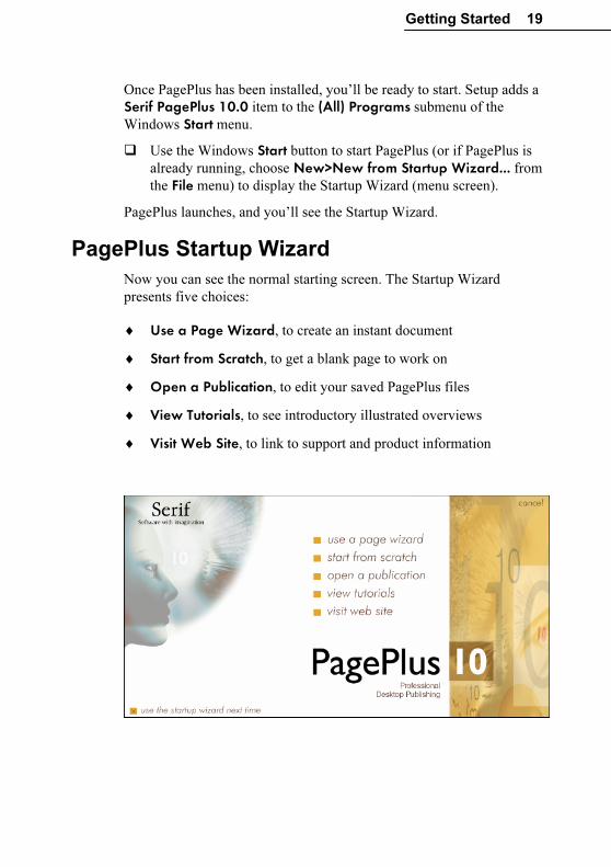
PagePlus Startup Wizard
Now you can see the normal starting screen. The Startup Wizard
presents five choices:
♦ Use a Page Wizard, to create an instant document
♦ Start from Scratch, to get a blank page to work on
♦ Open a Publication, to edit your saved PagePlus files
♦ View Tutorials, to see introductory illustrated overviews
♦ Visit Web Site, to link to support and product information
20 Getting Started
Whether you’re a new or returning PagePlus user, View a Tutorial is a
great place to begin learning about new features in PagePlus 10, and
review basic concepts. If you’re just getting started with PagePlus, here
are some suggestions:
� Click Use a Page Wizard or Start From Scratch. (For details on
using a Page Wizard, see the next section.)
� At any time from the main PagePlus screen, you can press F1 or
choose PagePlus Help from the Help menu to access online help.
The help window initially displays its Contents pane on the left,
and the Visual Reference menu on the right. Click the book icons
in the Contents list to expand topics, and click a document icon to
display a particular topic. Click directly on Visual Reference
graphics to browse interface features like menus and toolbars.
� Beginners should click the Help on Help topic in the Contents list
for some tips on how to proceed, tailored to individual levels of
expertise and experience.
� Click the Index tab to peruse the list of key terms, or the Search
tab to look up specific terms using full-text search.
When you’re done, you may want to branch out on your own—or you
can tag along as the rest of us continue this tour...
Using a Page Wizard…
Instant publications… It’s easy!
Creating a finished publication that you can be proud of is simple with
PagePlus. Most of the work is done by the automated Page Wizards,
and this brief tutorial shows you how they work so that you can start
publishing right now!
The steps that follow will assist you the very first time you run a Page
Wizard. After that, you’ll have no difficulty putting other Page Wizards
to work for you. And when you’re ready for a hands-on introduction to
PagePlus tools and special effects, turn to the “QuickRef Project”
chapter.
Here’s a popular starting point: a ready-made business card design. Try
it!
Getting Started 21
Instant business card
Here’s how to use a Page Wizard to create a basic business card you
can customize and experiment with.
� Run the Startup Wizard (File/New), and choose Use a Desktop Page Wizard.
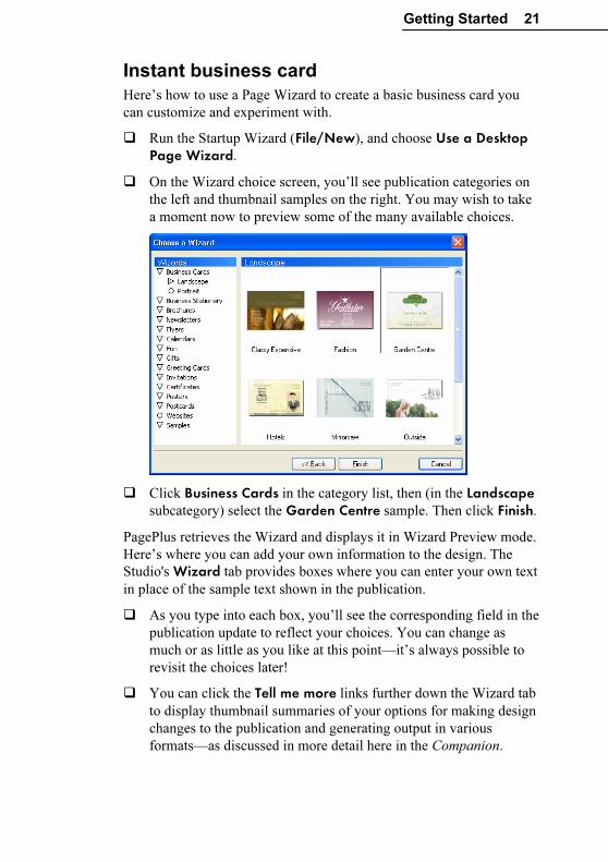
� On the Wizard choice screen, you’ll see publication categories on
the left and thumbnail samples on the right. You may wish to take
a moment now to preview some of the many available choices.
� Click Business Cards in the category list, then (in the Landscape
subcategory) select the Garden Centre sample. Then click Finish.
PagePlus retrieves the Wizard and displays it in Wizard Preview mode.
Here’s where you can add your own information to the design. The
Studio's Wizard tab provides boxes where you can enter your own text
in place of the sample text shown in the publication.
� As you type into each box, you’ll see the corresponding field in the
publication update to reflect your choices. You can change as
much or as little as you like at this point—it’s always possible to
revisit the choices later!
� You can click the Tell me more links further down the Wizard tab
to display thumbnail summaries of your options for making design
changes to the publication and generating output in various
formats—as discussed in more detail here in the Companion.
22 Getting Started
� When you’re done entering text, click the Wizard’s Schemes tab,
which displays a gallery of named colour schemes that let you
instantly revise the colours in a publication. You can extend a
colour scheme to new elements, customize scheme colours, or
create entirely new schemes!
Colour schemes work like a paint-by-numbers system, using five
numbers. Instead of assigning a specific colour to an element, you mark
it with a scheme colour number. For example, if an object is marked
with “Scheme Colour 1,” that means it will take on whichever colour
has been defined as Scheme Colour 1 in the current scheme. This
Wizard happens to employ the “Garden” scheme, but you can change
that in an instant.
� Click the “Floral” gallery sample and notice that colours change,
with specific elements taking on specific scheme colours. The
“Name” text, for example, is dark red—the second of the five
scheme colours shown in the gallery sample. Now click the
“Flesh” sample and you’ll see the text change to brown; again, it’s
Scheme Colour 2 that’s being applied to the text.
� Keep clicking different colour schemes. Which element(s) have
been marked with Scheme Colour 4?
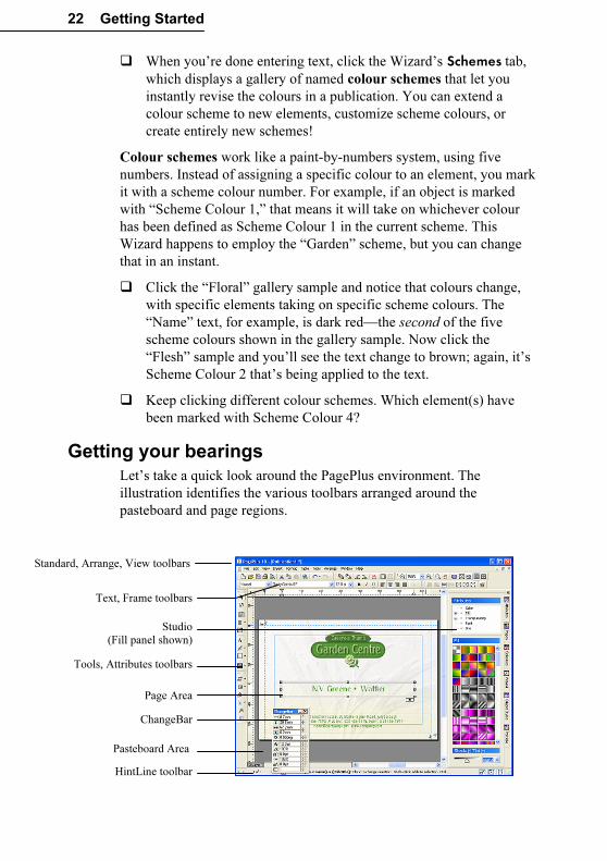
Getting your bearings
Let’s take a quick look around the PagePlus environment. The
illustration identifies the various toolbars arranged around the
pasteboard and page regions.
Standard, Arrange, View toolbars
HintLine toolbar
Page Area
Studio
(Fill panel shown)
Pasteboard Area
Tools, Attributes toolbars
Text, Frame toolbars
ChangeBar
Getting Started 23
� To begin learning about PagePlus tools and menus, just move the
mouse pointer around the screen. Watch the HintLine window at
the lower right for capsule descriptions of each feature.
� To access online help and resources, choose PagePlus Help from
the Help menu. The Visual Reference lets you browse interface
elements—simply click an item for details.
� Right-clicking any toolbar, object, or page region brings up a
context menu of functions.
Let’s continue exploring the other tabs in the Studio on the right side
of the PagePlus window. Click the tabs in sequence...
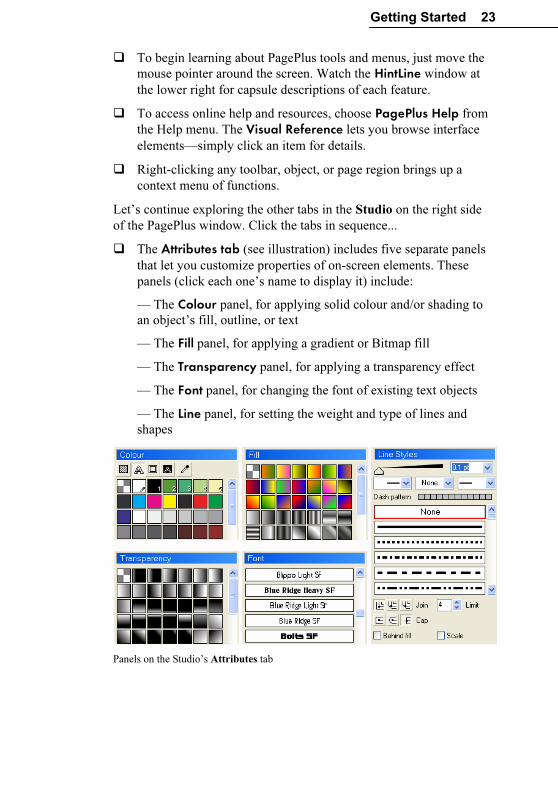
� The Attributes tab (see illustration) includes five separate panels
that let you customize properties of on-screen elements. These
panels (click each one’s name to display it) include:
— The Colour panel, for applying solid colour and/or shading to
an object’s fill, outline, or text
— The Fill panel, for applying a gradient or Bitmap fill
— The Transparency panel, for applying a transparency effect
— The Font panel, for changing the font of existing text objects
— The Line panel, for setting the weight and type of lines and
shapes
Panels on the Studio’s Attributes tab
24 Getting Started
� The Pages tab helps you navigate within the publication and
manipulate pages and master (background) pages.
� The Object Styles tab provides a wide assortment of predesigned
styles—each one a cluster of up to seven attributes like line colour,
fill, and border—that you can apply to any object and then
customize as you wish.
� The Portfolio includes a wide variety of predesigned elements—
graphics that you can drag and drop, then customize or use as a
starting point for your own designs. It also serves as a container for
storing your own design objects (pictures, text blocks, and even
unlinked text frames) for reuse in different publications.
Toolbars and Studio tabs are initially arranged in a convenient layout
around the perimeter of the work area. However, you have full control
over this arrangement, and can customize the display any way you
want—by showing or hiding toolbars and tabs, or repositioning them
onscreen in a way that suits your style. You can even undock individual
Studio tabs as floating “tab windows” and/or group them into different
cluster arrangements which can either float or dock as toolbars at the
left or right side of the workspace.
PagePlus makes it easy to see exactly what you’re working on—from a
wide view of multiple pages to a close-up view of a small region. For
example, you can use the scrollbars at the right and bottom of the main
window to move the page and pasteboard with respect to the main
window. The AutoScroll feature means that the view re-centres itself as
you drag objects to the edge of the screen. The View toolbar at the top
of the screen provides buttons that let you pan or zoom in and out so
you can inspect and/or edit the page at different levels of detail. In
addition, you can switch between two viewing modes: Normal view,
which displays one page at a time, and Multipage view, which displays
a number of pages at a time in the workspace.
Getting Started 25
Moving Right Along...
We’ve seen how a Page Wizard creates a nearly instant publication.
Wizards can provide design inspiration or essentially complete
frameworks for your own creative vehicles. For the more complex
publication formats, however, what will still be missing is content that
only you can provide.
Supplying content means substituting your own text and graphics for
the sample stories and pictures that the Page Wizard has used. PagePlus
makes these other tasks as painless as possible, too. For example, to
substitute your own text into a frame, simply right-click the frame and
choose Text File....
If you’re new to PagePlus, the basic tutorials (with more on the
Resource CD-ROM) are the best place to start. They’ll provide a
carefully sequenced introduction to the Desktop Publishing
environment. First, you’ll produce a basic publication using a variety of
PagePlus objects, and then you’ll develop the publication cumulatively,
while exploring each object’s possibilities.
Whether you continue using Wizards exclusively, or decide to start
from scratch creating your own publications—or a bit of both—the
information in the following chapters will be useful to you.
♦ Creating a Publication provides some general pointers on
publication design and project management.
♦ Designing for the World Wide Web focuses on Web Publishing
mode and its particular challenges.
♦ Production Issues looks at the finer points of producing a print-
based publication, whether you’re using your own desktop printer,
working with a commercial printer or service bureau, or generating
a standalone PDF file for electronic distribution.
♦ QuickRef Project presents a hands-on learning sequence you can
follow at your own pace, to create a useful reference document—
and learn Desktop Publishing terms and techniques at the same
time!
Creating a Publication
Creating a Publication 29
Introduction
Using the Page Wizards in PagePlus, you can quickly and easily
produce a wide range of documents with the minimum of effort and
experience. It’s so easy that, especially if you only use PagePlus
occasionally, you may not want to do anything else!
However, you may decide that you want to start designing your own
documents. In that case, this chapter will help you. It outlines the
planning, design, and creation of a publication and also provides an
overview of key Desktop Publishing concepts, as implemented in
PagePlus 10.0.
Follow the links to online help for step-by-step procedural details.
One Step at a Time…
The principal steps in the process of creating a publication are detailed
below. These are offered as a guideline, and in practice you’ll find that
the steps are not clear-cut and tend to overlap. The real message is to
adopt a consistent approach to producing your publications. As you
gain experience, you’ll develop your own style.
♦ Planning/Design
♦ Preparing Content
♦ Page Make-Up
♦ Fine Tuning
♦ Printing
Planning/Design
Developing design skills is an ongoing process rather than an event,
and you’ll find that experience is the best teacher. Starting with simpler
projects, and progressing to more complex work as you gain in
confidence, is the way to go.
PagePlus is a simple and flexible desktop publishing (DTP) program.
You’ll find it easy to create a design on-screen, and quickly adjust it by
dragging elements around the page. Because PagePlus uses a
“pasteboard” (a scratch area around the page) you can leave objects
there until you’re ready to put them in position.
30 Creating a Publication
The most important aspect of design, of course, is its suitability to the
job at hand. Whether you’re working in Paper Publishing mode or Web
Publishing mode, answering the following questions will help you.
♦ For whom is the publication intended? Customers, potential
clients, students, friends, yourself... You need to tailor your design
and content to appeal to your audience.
♦ What is your main message? It’s always better if you focus on the
“big picture” rather than the detail, as most successful designs
utilize a single dominant element (a photo, illustration or headline)
that’s consistent with the main message.
♦ Where will it be seen? Again, this affects the style you should
adopt. While you certainly don’t want to be indistinguishable from
other designs, you don’t want your design to look completely out
of place.
Cheat!
Design is one of those areas where it’s actually OK to cut corners a bit!
There’s no harm in deriving inspiration from other people’s successful
efforts, and picking up on new ideas and styles is part of looking
contemporary. Obviously, copyrights exist to protect creators, and you
cannot copy another’s creative work literally, outright, or in its entirety.
Still, the world of print and electronic publications is full of stylistic
devices that can be adapted and repurposed.
One great thing about existing artwork (especially if you’re looking to
save time, like most of us) is that it acts as a reminder of what to
include, without figuring it out for yourself. This means that when you
want to produce a fancy business card, you can take a look at other
cards to see exactly what should get included. For example, it’s now
customary to list lots of contact points, including e-mail, Web site, etc.
If you’re truly dedicated, you’ll start a folder or scrapbook (a “swipe
file,” as its called) of different publications—ads, flyers, cards, Web
pages, and so on—to use as a resource for content and design ideas.
Design constraints
Review the selection of Page Wizards for a glimpse of the range of
formats PagePlus can handle. Using custom page setup, you can
achieve many more... not to mention mail-merged output, which can
include both text and picture data. You can even auto-create a repeating
layout suitable for catalogs or photo albums!
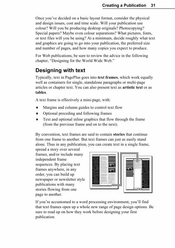
Creating a Publication 31
Once you’ve decided on a basic layout format, consider the physical
and design issues, cost and time scale. Will your publication use
colour? Will you be producing desktop originals? Photocopying?
Special papers? Maybe even colour separations? What pictures, fonts,
or text files will you be using? At a minimum, decide roughly what text
and graphics are going to go into your publication, the preferred size
and number of pages, and how many copies you expect to produce.
For Web publications, be sure to review the advice in the following
chapter, “Designing for the World Wide Web.”
Designing with text
Typically, text in PagePlus goes into text frames, which work equally
well as containers for single, standalone paragraphs or multi-page
articles or chapter text. You can also present text as artistic text or as
tables.
A text frame is effectively a mini-page, with:
♦ Margins and column guides to control text flow
♦ Optional preceding and following frames
♦ Text and optional inline graphics that flow through the frame
(from the previous frame and on to the next).
By convention, text frames are said to contain stories that continue
from one frame to another. But text frames can just as easily stand
alone. Thus in any publication, you can create text in a single frame,
spread a story over several
frames, and/or include many
independent frame
sequences. By placing text
frames anywhere, in any
order, you can build up
newspaper or newsletter style
publications with many
stories flowing from one
page to another.
If you’re accustomed to a word processing environment, you’ll find
that text frames open up a whole new range of page design options. Be
sure to read up on how they work before designing your first
publication.
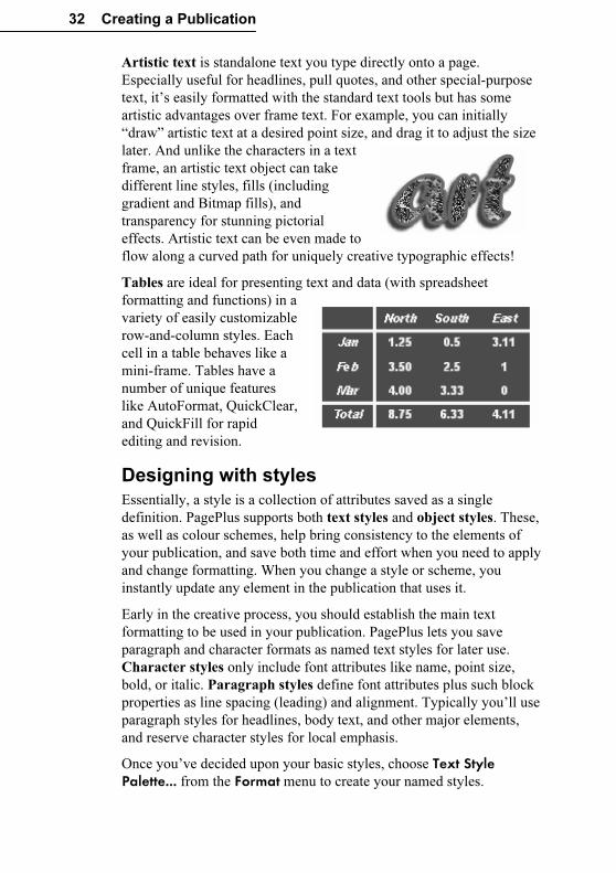
32 Creating a Publication
Artistic text is standalone text you type directly onto a page.
Especially useful for headlines, pull quotes, and other special-purpose
text, it’s easily formatted with the standard text tools but has some
artistic advantages over frame text. For example, you can initially
“draw” artistic text at a desired point size, and drag it to adjust the size
later. And unlike the characters in a text
frame, an artistic text object can take
different line styles, fills (including
gradient and Bitmap fills), and
transparency for stunning pictorial
effects. Artistic text can be even made to
flow along a curved path for uniquely creative typographic effects!
Tables are ideal for presenting text and data (with spreadsheet
formatting and functions) in a
variety of easily customizable
row-and-column styles. Each
cell in a table behaves like a
mini-frame. Tables have a
number of unique features
like AutoFormat, QuickClear,
and QuickFill for rapid
editing and revision.
Designing with styles
Essentially, a style is a collection of attributes saved as a single
definition. PagePlus supports both text styles and object styles. These,
as well as colour schemes, help bring consistency to the elements of
your publication, and save both time and effort when you need to apply
and change formatting. When you change a style or scheme, you
instantly update any element in the publication that uses it.
Early in the creative process, you should establish the main text
formatting to be used in your publication. PagePlus lets you save
paragraph and character formats as named text styles for later use.
Character styles only include font attributes like name, point size,
bold, or italic. Paragraph styles define font attributes plus such block
properties as line spacing (leading) and alignment. Typically you’ll use
paragraph styles for headlines, body text, and other major elements,
and reserve character styles for local emphasis.
Once you’ve decided upon your basic styles, choose Text Style Palette... from the Format menu to create your named styles.
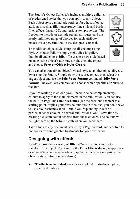
Creating a Publication 33
The Studio’s Object Styles tab includes multiple galleries
of predesigned styles that you can apply to any object.
Each object style can include settings for a host of object
attributes, such as fill, transparency, line style and border,
filter effects, Instant 3D, and various text properties. The
freedom to include or exclude certain attributes, and the
nearly unlimited range of choices for each attribute,
makes this a powerful tool in the designer’s arsenal.
To modify an object style using the all-encompassing
Style Attributes Editor, simply right-click its gallery
thumbnail and choose Edit.... To create a new style based
on an existing object’s attributes, right-click the object
and choose Format>Object Style>Create.
You can also transfer an object’s visual style to another object directly,
bypassing the Studio. Simply copy the source object, then select the
target object and use the Edit/Paste Format command. Edit/Paste Format Plus even lets you pick and choose which specific attributes to
transfer!
If you’re working in colour, you’ll need to select complementary
colours to apply to the main elements in the publication. You can use
the built-in PagePlus colour schemes (see the previous chapter) as a
starting point, or pick your own colours first. Of course, you don’t have
to use colour schemes at all—but if you’re planning to reuse a
particular set of colours in several publications, you’ll save time by
creating a custom colour scheme from those colours. The colours will
be right there on the Schemes tab when you need them.
Take a look at any document created by a Page Wizard, and feel free to
borrow its text and graphic treatments for your own work.
Designing with effects
PagePlus provides a variety of filter effects that you can use to
transform any object. You can use the Filter Effects dialog to apply one
or more effects to the same object; applied effects become part of the
object’s style definition (see above).
♦ 2D effects include shadows (for example, drop shadows), glow,
bevel, and emboss.
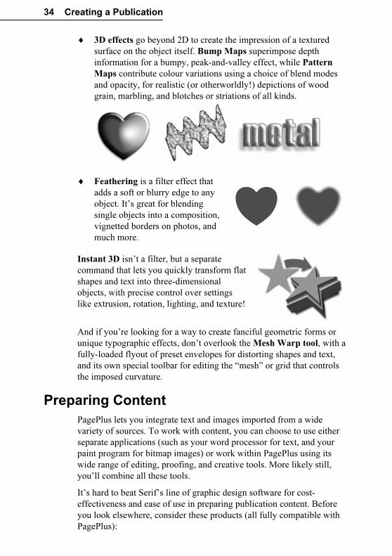
34 Creating a Publication
♦ 3D effects go beyond 2D to create the impression of a textured
surface on the object itself. Bump Maps superimpose depth
information for a bumpy, peak-and-valley effect, while Pattern
Maps contribute colour variations using a choice of blend modes
and opacity, for realistic (or otherworldly!) depictions of wood
grain, marbling, and blotches or striations of all kinds.
♦ Feathering is a filter effect that
adds a soft or blurry edge to any
object. It’s great for blending
single objects into a composition,
vignetted borders on photos, and
much more.
Instant 3D isn’t a filter, but a separate
command that lets you quickly transform flat
shapes and text into three-dimensional
objects, with precise control over settings
like extrusion, rotation, lighting, and texture!
And if you’re looking for a way to create fanciful geometric forms or
unique typographic effects, don’t overlook the Mesh Warp tool, with a
fully-loaded flyout of preset envelopes for distorting shapes and text,
and its own special toolbar for editing the “mesh” or grid that controls
the imposed curvature.
Preparing Content
PagePlus lets you integrate text and images imported from a wide
variety of sources. To work with content, you can choose to use either
separate applications (such as your word processor for text, and your
paint program for bitmap images) or work within PagePlus using its
wide range of editing, proofing, and creative tools. More likely still,
you’ll combine all these tools.
It’s hard to beat Serif’s line of graphic design software for cost-
effectiveness and ease of use in preparing publication content. Before
you look elsewhere, consider these products (all fully compatible with
PagePlus):
Creating a Publication 35
♦ Serif DrawPlus, the companion drawing module for PagePlus,
provides a powerful combination of paint-like effects in a vector-
based illustration and animation package.
♦ Serif ImpactPlus outputs cool, eye-catching designs ranging from
automated, Wizard-based text effects to fully rendered 3D scenes
and movies.
♦ Serif PhotoPlus handles bitmap creation and editing, with
powerful built-in filters, layering, and animation capabilities.
♦ Serif MoviePlus lets you create your own multimedia content
right on the desktop, for more lively and informative Web pages.
Text
There are a number of ways to prepare your publication’s text content:
♦ Create text using your existing word processor (such as Microsoft
Word or Corel WordPerfect), save it as a separate file, then import
it into a PagePlus text frame using Insert/Text File...
♦ Type text directly into a frame, table, or artistic text object on the
page. Simply drag with the appropriate tool to create a container
(or just click for artistic text), then start typing to create headlines,
captions, pull-quotes, and other text elements.
♦ Use WritePlus to edit continuous stories that may span many
linked text frames. To launch WritePlus, right-click the text frame
you want to edit and choose Edit Story.
If you prefer, you can create text frames first and insert “dummy” filler
text until you’re ready to insert your own. This lets you concentrate on
the visual arrangement of text frames without having to worry about
their content. To insert filler text, right-click a frame and choose Fill with Placeholder Text. PagePlus adds filler text to the frame as if
importing text, filling the available frame area.
Graphics
Without leaving the PagePlus environment, you can incorporate a
variety of graphic elements in your publications for emphasis and
decorative effect:
♦ Portfolio sample objects such as mastheads, logos, and other page
elements that you simply drag from the Studio’s Portfolio tab.
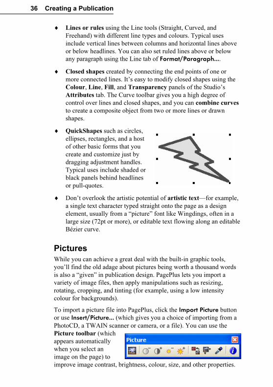
36 Creating a Publication
♦ Lines or rules using the Line tools (Straight, Curved, and
Freehand) with different line types and colours. Typical uses
include vertical lines between columns and horizontal lines above
or below headlines. You can also set ruled lines above or below
any paragraph using the Line tab of Format/Paragraph....
♦ Closed shapes created by connecting the end points of one or
more connected lines. It’s easy to modify closed shapes using the
Colour, Line, Fill, and Transparency panels of the Studio’s
Attributes tab. The Curve toolbar gives you a high degree of
control over lines and closed shapes, and you can combine curves
to create a composite object from two or more lines or drawn
shapes.
♦ QuickShapes such as circles,
ellipses, rectangles, and a host
of other basic forms that you
create and customize just by
dragging adjustment handles.
Typical uses include shaded or
black panels behind headlines
or pull-quotes.
♦ Don’t overlook the artistic potential of artistic text—for example,
a single text character typed straight onto the page as a design
element, usually from a “picture” font like Wingdings, often in a
large size (72pt or more), or editable text flowing along an editable
Bézier curve.
Pictures
While you can achieve a great deal with the built-in graphic tools,
you’ll find the old adage about pictures being worth a thousand words
is also a “given” in publication design. PagePlus lets you import a
variety of image files, then apply manipulations such as resizing,
rotating, cropping, and tinting (for example, using a low intensity
colour for backgrounds).
To import a picture file into PagePlus, click the Import Picture button
or use Insert/Picture... (which gives you a choice of importing from a
PhotoCD, a TWAIN scanner or camera, or a file). You can use the
Picture toolbar (which
appears automatically
when you select an
image on the page) to
improve image contrast, brightness, colour, size, and other properties.
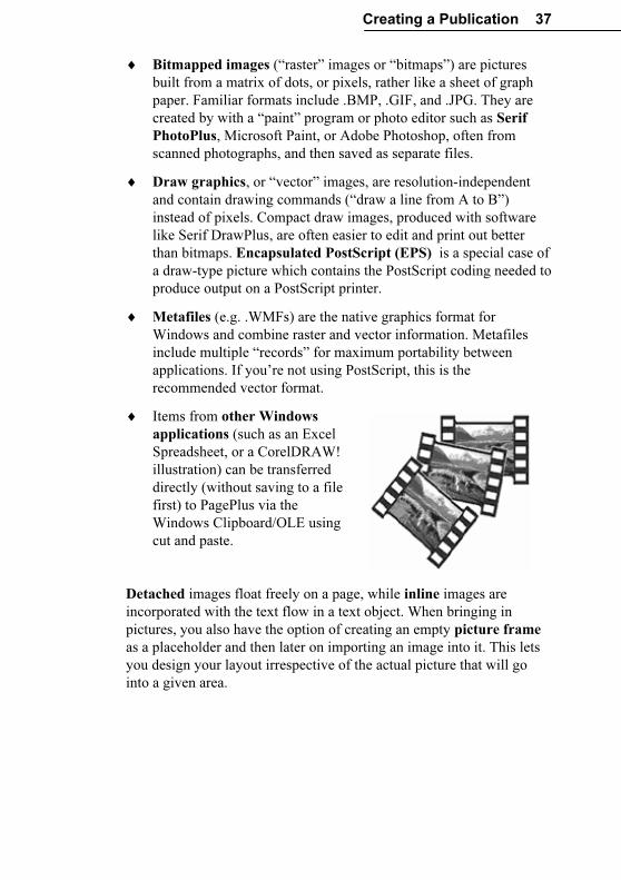
Creating a Publication 37
♦ Bitmapped images (“raster” images or “bitmaps”) are pictures
built from a matrix of dots, or pixels, rather like a sheet of graph
paper. Familiar formats include .BMP, .GIF, and .JPG. They are
created by with a “paint” program or photo editor such as Serif
PhotoPlus, Microsoft Paint, or Adobe Photoshop, often from
scanned photographs, and then saved as separate files.
♦ Draw graphics, or “vector” images, are resolution-independent
and contain drawing commands (“draw a line from A to B”)
instead of pixels. Compact draw images, produced with software
like Serif DrawPlus, are often easier to edit and print out better
than bitmaps. Encapsulated PostScript (EPS) is a special case of
a draw-type picture which contains the PostScript coding needed to
produce output on a PostScript printer.
♦ Metafiles (e.g. .WMFs) are the native graphics format for
Windows and combine raster and vector information. Metafiles
include multiple “records” for maximum portability between
applications. If you’re not using PostScript, this is the
recommended vector format.
♦ Items from other Windows
applications (such as an Excel
Spreadsheet, or a CorelDRAW!
illustration) can be transferred
directly (without saving to a file
first) to PagePlus via the
Windows Clipboard/OLE using
cut and paste.
Detached images float freely on a page, while inline images are
incorporated with the text flow in a text object. When bringing in
pictures, you also have the option of creating an empty picture frame
as a placeholder and then later on importing an image into it. This lets
you design your layout irrespective of the actual picture that will go
into a given area.
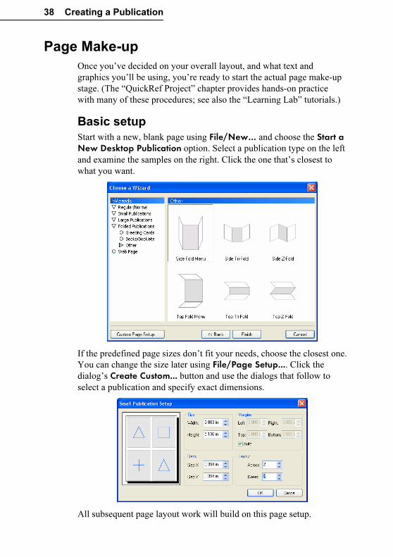
38 Creating a Publication
Page Make-up
Once you’ve decided on your overall layout, and what text and
graphics you’ll be using, you’re ready to start the actual page make-up
stage. (The “QuickRef Project” chapter provides hands-on practice
with many of these procedures; see also the “Learning Lab” tutorials.)
Basic setup
Start with a new, blank page using File/New… and choose the Start a New Desktop Publication option. Select a publication type on the left
and examine the samples on the right. Click the one that’s closest to
what you want.
If the predefined page sizes don’t fit your needs, choose the closest one.
You can change the size later using File/Page Setup.... Click the
dialog’s Create Custom... button and use the dialogs that follow to
select a publication and specify exact dimensions.
All subsequent page layout work will build on this page setup.
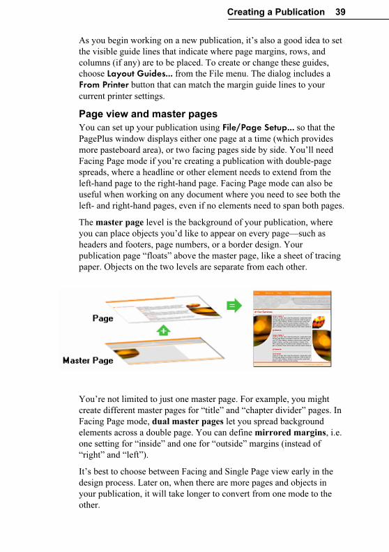
Creating a Publication 39
As you begin working on a new publication, it’s also a good idea to set
the visible guide lines that indicate where page margins, rows, and
columns (if any) are to be placed. To create or change these guides,
choose Layout Guides... from the File menu. The dialog includes a
From Printer button that can match the margin guide lines to your
current printer settings.
Page view and master pages
You can set up your publication using File/Page Setup... so that the
PagePlus window displays either one page at a time (which provides
more pasteboard area), or two facing pages side by side. You’ll need
Facing Page mode if you’re creating a publication with double-page
spreads, where a headline or other element needs to extend from the
left-hand page to the right-hand page. Facing Page mode can also be
useful when working on any document where you need to see both the
left- and right-hand pages, even if no elements need to span both pages.
The master page level is the background of your publication, where
you can place objects you’d like to appear on every page—such as
headers and footers, page numbers, or a border design. Your
publication page “floats” above the master page, like a sheet of tracing
paper. Objects on the two levels are separate from each other.
You’re not limited to just one master page. For example, you might
create different master pages for “title” and “chapter divider” pages. In
Facing Page mode, dual master pages let you spread background
elements across a double page. You can define mirrored margins, i.e.
one setting for “inside” and one for “outside” margins (instead of
“right” and “left”).
It’s best to choose between Facing and Single Page view early in the
design process. Later on, when there are more pages and objects in
your publication, it will take longer to convert from one mode to the
other.
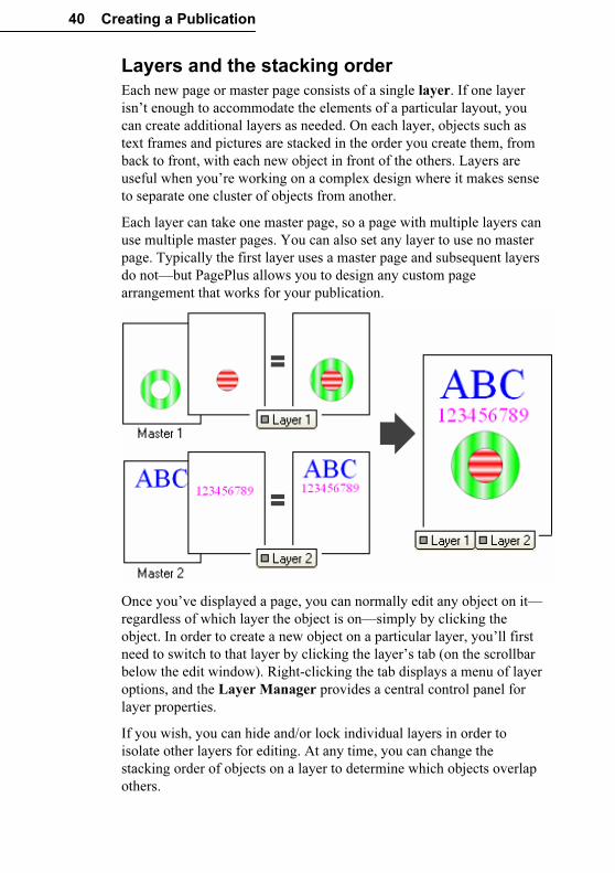
40 Creating a Publication
Layers and the stacking order
Each new page or master page consists of a single layer. If one layer
isn’t enough to accommodate the elements of a particular layout, you
can create additional layers as needed. On each layer, objects such as
text frames and pictures are stacked in the order you create them, from
back to front, with each new object in front of the others. Layers are
useful when you’re working on a complex design where it makes sense
to separate one cluster of objects from another.
Each layer can take one master page, so a page with multiple layers can
use multiple master pages. You can also set any layer to use no master
page. Typically the first layer uses a master page and subsequent layers
do not—but PagePlus allows you to design any custom page
arrangement that works for your publication.
Once you’ve displayed a page, you can normally edit any object on it—
regardless of which layer the object is on—simply by clicking the
object. In order to create a new object on a particular layer, you’ll first
need to switch to that layer by clicking the layer’s tab (on the scrollbar
below the edit window). Right-clicking the tab displays a menu of layer
options, and the Layer Manager provides a central control panel for
layer properties.
If you wish, you can hide and/or lock individual layers in order to
isolate other layers for editing. At any time, you can change the
stacking order of objects on a layer to determine which objects overlap
others.
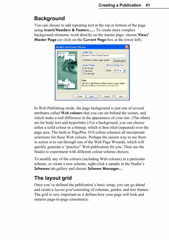
Creating a Publication 41
Background
You can choose to add repeating text at the top or bottom of the page
using Insert/Headers & Footers...... To create more complex
background elements, work directly on the master page: choose View/ Master Page (or click on the Current Page box at the lower left).
In Web Publishing mode, the page background is just one of several
attributes called Web colours that you can set behind the scenes, and
which make a real difference in the appearance of your site. (The others
are for body text and hyperlinks.) For a background, you can choose
either a solid colour or a bitmap, which is then tiled (repeated) over the
page area. The built-in PagePlus 10.0 colour schemes all incorporate
selections for these Web colours. Perhaps the easiest way to see them
in action is to run through one of the Web Page Wizards, which will
quickly generate a “practice” Web publication for you. Then use the
Studio to experiment with different colour scheme choices.
To modify any of the colours (including Web colours) in a particular
scheme, or create a new scheme, right-click a sample in the Studio’s
Schemes tab gallery and choose Scheme Manager....
The layout grid
Once you’ve defined the publication’s basic setup, you can go ahead
and create a layout grid consisting of columns, guides, and text frames.
The grid is very important as it defines how your page will look and
ensures page-to-page consistency.
42 Creating a Publication
♦ Columns. The main aspects of the grid are the number of columns
and the column gap (“gutter”). As noted earlier, page margin and
row/column guides are useful as visual background aids. For
example, layouts may be referred to as a “three-column grid” or
“five-column grid.” Set these values using File/Layout Guides....
♦ Text frames. Decide where you want to place the main blocks of
text (or stories) on the page and create text frames to mark these
areas. Create the frames using one of the Frame tools. For each
frame, set the margins, number of columns, and column gutter
(right-click a frame and choose Frame Setup...). You can start
importing or entering text now (see the discussion of options
above), or leave the frames empty until later. For text that will run
longer than a single frame, you will want to link additional frames
into a story sequence—but again, this decision can be postponed
until later.
♦ Ruler guides. These are straight, red lines on the page (not the
master page) that aid in placing elements such as a headline,
picture, or coupon. To add a guide, just click any point on a ruler.
To remove a guide, drag it off the page. Guides aren’t necessarily
part of the initial setup; you can add them whenever they’re
needed.
Snapping and the Dot Grid
This layout grid of page margin and row/column guides, frame margins
and columns, and horizontal and vertical ruler guides helps to ensure
that objects will be correctly aligned. When the Snapping feature is
turned on, objects you create, move, or resize will jump to align with
the nearest visible guide line. There are times when you’ll want
Snapping on, and other times when (for precise positioning) it may be a
hindrance. To turn Snapping on and off, click the Snapping button on
the HintLine toolbar.
PagePlus also features a Dot Grid—a matrix of dots or lines spaced a
certain distance apart, covering the page and pasteboard areas. To set
the grid spacing, choose Options... from the Tools menu and use the
Layout page.
To determine which guide elements are snapped-to, use the View menu
or the right-click View> flyout to show or hide (check or uncheck)
specific elements.
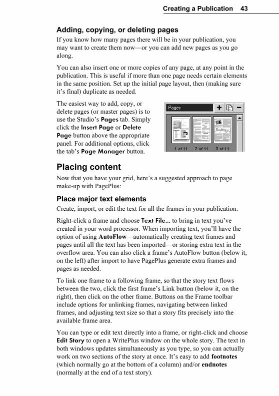
Creating a Publication 43
Adding, copying, or deleting pages
If you know how many pages there will be in your publication, you
may want to create them now—or you can add new pages as you go
along.
You can also insert one or more copies of any page, at any point in the
publication. This is useful if more than one page needs certain elements
in the same position. Set up the initial page layout, then (making sure
it’s final) duplicate as needed.
The easiest way to add, copy, or
delete pages (or master pages) is to
use the Studio’s Pages tab. Simply
click the Insert Page or Delete Page button above the appropriate
panel. For additional options, click
the tab’s Page Manager button.
Placing content
Now that you have your grid, here’s a suggested approach to page
make-up with PagePlus:
Place major text elements
Create, import, or edit the text for all the frames in your publication.
Right-click a frame and choose Text File... to bring in text you’ve
created in your word processor. When importing text, you’ll have the
option of using AutoFlow—automatically creating text frames and
pages until all the text has been imported—or storing extra text in the
overflow area. You can also click a frame’s AutoFlow button (below it,
on the left) after import to have PagePlus generate extra frames and
pages as needed.
To link one frame to a following frame, so that the story text flows
between the two, click the first frame’s Link button (below it, on the
right), then click on the other frame. Buttons on the Frame toolbar
include options for unlinking frames, navigating between linked
frames, and adjusting text size so that a story fits precisely into the
available frame area.
You can type or edit text directly into a frame, or right-click and choose
Edit Story to open a WritePlus window on the whole story. The text in
both windows updates simultaneously as you type, so you can actually
work on two sections of the story at once. It’s easy to add footnotes
(which normally go at the bottom of a column) and/or endnotes
(normally at the end of a text story).
44 Creating a Publication
If you plan to incorporate table text, first create the table objects and set
row/column properties. Then either type your text or paste from the
Clipboard. For a table that’s already set up as a calendar, click the
Insert Calendar button to choose from a variety of colourful styles.
At this point, you may want to adjust the graphic properties of the
frames and/or tables. You can manipulate these text objects just like
shapes and apply line styles, fills, colours, and transparency. To
simplify matters, tables come with a range of built-in AutoFormat
choices—take a look at those first!
Add headlines
Now add secondary text elements like headlines, captions, and banners.
For decorative text elements, consider using artistic text, which lets you
format individual characters with line properties, gradient or Bitmap
fills, and transparency.
With either kind of text object, you can apply text formatting
commands (using the Font panel of the Studio’s Attributes tab, the
Format menu (and right-click) commands, or the ChangeBar) to get the
text looking the way you want it. Adjust the font, size, width, and
colour. Rotate the text for greater impact.
Import and place pictures and objects
Once the principal text elements are in place, add your image files
using the Import Picture button. To replace an existing image—for
example, a placeholder picture included by a Page Wizard—just
double-click it to bring up the file selection dialog. You can also drag
and drop an image file icon into PagePlus, and of course paste objects
from other applications via the Windows Clipboard.
One advantage of importing over pasting (or drag and drop) is that it
lets you choose whether to link or embed the image. Each method has
pros and cons. A linked image is basically a reference to the original
file, so the actual picture stays separate from the publication file and its
representation updates automatically in PagePlus if you revise the
original image. An embedded picture is wedged into the PagePlus
publication when you import it; if you subsequently revise the image
you’ll need to re-embed it.
Lots of embedded files can swell the size of the publication file, but at
least all the images are in one place. (If you use linked images you’ll
need to keep track of them.) If file size isn’t an issue, consider using
linking just for images that are still “in flux,” and embedding them all
once they’re final.
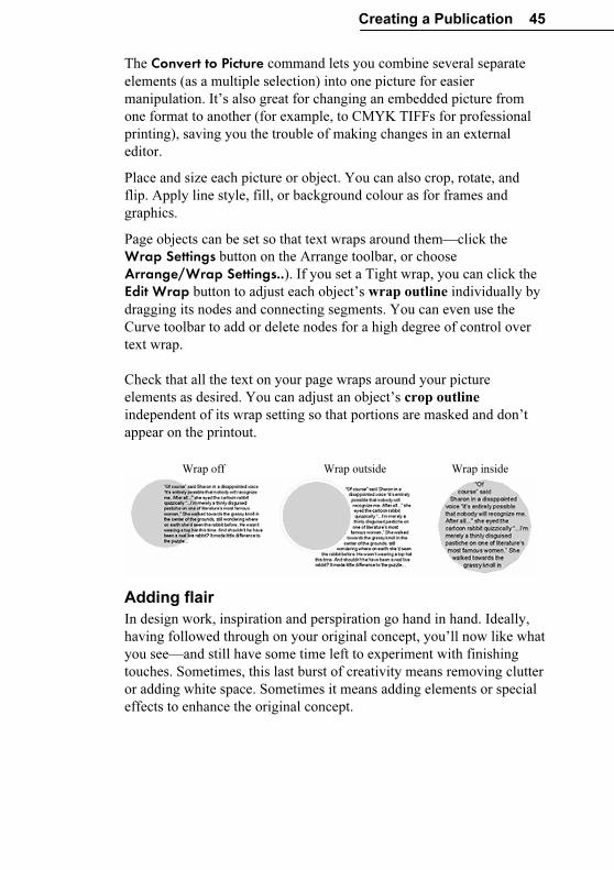
Creating a Publication 45
The Convert to Picture command lets you combine several separate
elements (as a multiple selection) into one picture for easier
manipulation. It’s also great for changing an embedded picture from
one format to another (for example, to CMYK TIFFs for professional
printing), saving you the trouble of making changes in an external
editor.
Place and size each picture or object. You can also crop, rotate, and
flip. Apply line style, fill, or background colour as for frames and
graphics.
Page objects can be set so that text wraps around them—click the
Wrap Settings button on the Arrange toolbar, or choose
Arrange/Wrap Settings..). If you set a Tight wrap, you can click the
Edit Wrap button to adjust each object’s wrap outline individually by
dragging its nodes and connecting segments. You can even use the
Curve toolbar to add or delete nodes for a high degree of control over
text wrap.
Check that all the text on your page wraps around your picture
elements as desired. You can adjust an object’s crop outline
independent of its wrap setting so that portions are masked and don’t
appear on the printout.
Wrap off Wrap outside Wrap inside
Adding flair
In design work, inspiration and perspiration go hand in hand. Ideally,
having followed through on your original concept, you’ll now like what
you see—and still have some time left to experiment with finishing
touches. Sometimes, this last burst of creativity means removing clutter
or adding white space. Sometimes it means adding elements or special
effects to enhance the original concept.
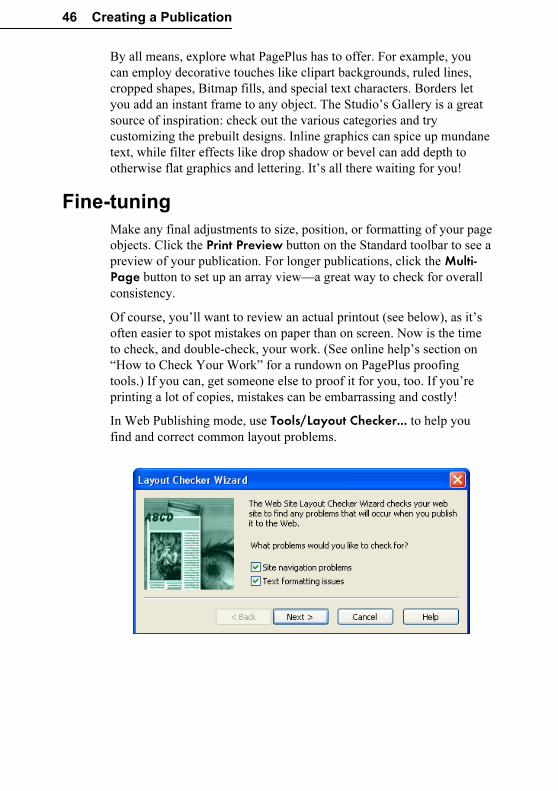
46 Creating a Publication
By all means, explore what PagePlus has to offer. For example, you
can employ decorative touches like clipart backgrounds, ruled lines,
cropped shapes, Bitmap fills, and special text characters. Borders let
you add an instant frame to any object. The Studio’s Gallery is a great
source of inspiration: check out the various categories and try
customizing the prebuilt designs. Inline graphics can spice up mundane
text, while filter effects like drop shadow or bevel can add depth to
otherwise flat graphics and lettering. It’s all there waiting for you!
Fine-tuning
Make any final adjustments to size, position, or formatting of your page
objects. Click the Print Preview button on the Standard toolbar to see a
preview of your publication. For longer publications, click the Multi-Page button to set up an array view—a great way to check for overall
consistency.
Of course, you’ll want to review an actual printout (see below), as it’s
often easier to spot mistakes on paper than on screen. Now is the time
to check, and double-check, your work. (See online help’s section on
“How to Check Your Work” for a rundown on PagePlus proofing
tools.) If you can, get someone else to proof it for you, too. If you’re
printing a lot of copies, mistakes can be embarrassing and costly!
In Web Publishing mode, use Tools/Layout Checker... to help you
find and correct common layout problems.
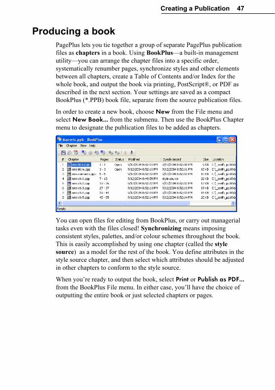
Creating a Publication 47
Producing a book
PagePlus lets you tie together a group of separate PagePlus publication
files as chapters in a book. Using BookPlus—a built-in management
utility—you can arrange the chapter files into a specific order,
systematically renumber pages, synchronize styles and other elements
between all chapters, create a Table of Contents and/or Index for the
whole book, and output the book via printing, PostScript®, or PDF as
described in the next section. Your settings are saved as a compact
BookPlus (*.PPB) book file, separate from the source publication files.
In order to create a new book, choose New from the File menu and
select New Book... from the submenu. Then use the BookPlus Chapter
menu to designate the publication files to be added as chapters.
You can open files for editing from BookPlus, or carry out managerial
tasks even with the files closed! Synchronizing means imposing
consistent styles, palettes, and/or colour schemes throughout the book.
This is easily accomplished by using one chapter (called the style
source) as a model for the rest of the book. You define attributes in the
style source chapter, and then select which attributes should be adjusted
in other chapters to conform to the style source.
When you’re ready to output the book, select Print or Publish as PDF... from the BookPlus File menu. In either case, you’ll have the choice of
outputting the entire book or just selected chapters or pages.
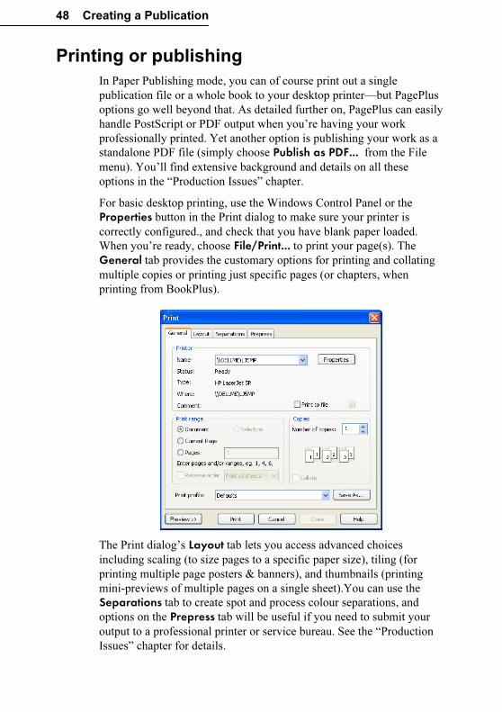
48 Creating a Publication
Printing or publishing
In Paper Publishing mode, you can of course print out a single
publication file or a whole book to your desktop printer—but PagePlus
options go well beyond that. As detailed further on, PagePlus can easily
handle PostScript or PDF output when you’re having your work
professionally printed. Yet another option is publishing your work as a
standalone PDF file (simply choose Publish as PDF... from the File
menu). You’ll find extensive background and details on all these
options in the “Production Issues” chapter.
For basic desktop printing, use the Windows Control Panel or the
Properties button in the Print dialog to make sure your printer is
correctly configured., and check that you have blank paper loaded.
When you’re ready, choose File/Print... to print your page(s). The
General tab provides the customary options for printing and collating
multiple copies or printing just specific pages (or chapters, when
printing from BookPlus).
The Print dialog’s Layout tab lets you access advanced choices
including scaling (to size pages to a specific paper size), tiling (for
printing multiple page posters & banners), and thumbnails (printing
mini-previews of multiple pages on a single sheet).You can use the
Separations tab to create spot and process colour separations, and
options on the Prepress tab will be useful if you need to submit your
output to a professional printer or service bureau. See the “Production
Issues” chapter for details.
Creating a Publication 49
In Web Publishing mode, you may want to print your pages for
reference, but the final stage here is of course “publishing” or
converting the PagePlus publication to a Web site. You can choose to
publish to a local disk folder or directly to the World Wide Web. See
online help for complete coverage of the basic steps involved. The next
chapter, “Designing for the World Wide Web,” picks up the discussion
on a slightly higher level, with tips and insights especially for those
transitioning from traditional DTP to Web publishing.
Designing for the World Wide Web
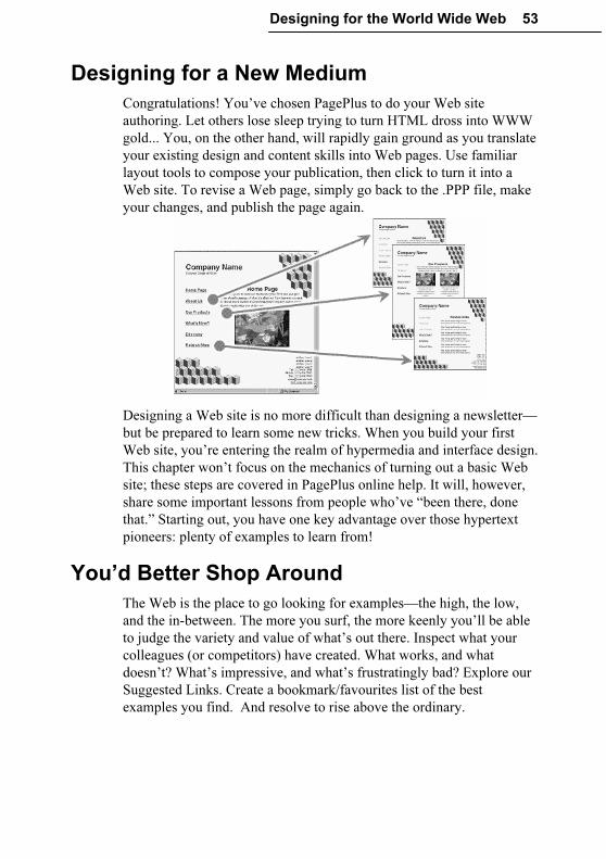
Designing for the World Wide Web 53
Designing for a New Medium
Congratulations! You’ve chosen PagePlus to do your Web site
authoring. Let others lose sleep trying to turn HTML dross into WWW
gold... You, on the other hand, will rapidly gain ground as you translate
your existing design and content skills into Web pages. Use familiar
layout tools to compose your publication, then click to turn it into a
Web site. To revise a Web page, simply go back to the .PPP file, make
your changes, and publish the page again.
Designing a Web site is no more difficult than designing a newsletter—
but be prepared to learn some new tricks. When you build your first
Web site, you’re entering the realm of hypermedia and interface design.
This chapter won’t focus on the mechanics of turning out a basic Web
site; these steps are covered in PagePlus online help. It will, however,
share some important lessons from people who’ve “been there, done
that.” Starting out, you have one key advantage over those hypertext
pioneers: plenty of examples to learn from!
You’d Better Shop Around
The Web is the place to go looking for examples—the high, the low,
and the in-between. The more you surf, the more keenly you’ll be able
to judge the variety and value of what’s out there. Inspect what your
colleagues (or competitors) have created. What works, and what
doesn’t? What’s impressive, and what’s frustratingly bad? Explore our
Suggested Links. Create a bookmark/favourites list of the best
examples you find. And resolve to rise above the ordinary.
54 Designing for the World Wide Web
Designing the Site
The advice in this chapter comes from some of the gurus who have set
up Web sites to disseminate their particular design credos, as well as
from first-hand experience developing user-friendly online
environments. Almost all agree that good design begins not with the
designer but with the user. Know the user; put yourself in his or her
place. Learn from your own experience as a consumer of online
information.
Notice immediately that we’re not speaking of “readers” here. In the
online realm, the people who point their Web browsers to your site are
“visitors” or even “users,” not merely readers. Even if the material
you’re presenting there comes from a print publication, when displayed
online it won’t be perceived in quite the same way.
Still, it’s worthwhile trying to conceptualize your site as if it were a
more traditional form. Is it a “billboard in the sky”? Is it basically a
greeting card, a photo album? An Open Letter or editorial? People’s
past experience with print and pictures shapes their expectations for
new forms, and a familiar concept or metaphor can help to draw users
into your web, as it were.
To begin with, don’t set out to overwhelm or overdesign. The simplest
site may work best. What will succeed is the result of understanding
who’s in your audience, and what they bring to what you have to offer.
Who’s it for?
Family, friends, neighbours, colleagues, co-workers, kids, adults,
clients, prospective clients, prospective employers, fellow worm-
farming enthusiasts—or “the world at large”? Chances are you already
know at least a few of the folks you’d like to reach. Perhaps you’re
already publishing print pieces that connect you to that audience. Part
of the excitement in creating a Web site is knowing you’ll likely be
reaching a great many folks you couldn’t reach before.
Use yourself, and your own experience on the Web, as a starting point.
But be prepared to be surprised that many users don’t share your
assumptions. Ideally, a Web site should constitute a dialog between
creator and audience, more like a (very slow) theatre event than a TV
broadcast. If the dialog begins while the site is in its formative stage, so
much the better. Do a bit of research among people (even just one
person) representative of those you’ll be trying to reach. Poll your
clients or newsletter subscribers.
Designing for the World Wide Web 55
♦ Ask them what they like and dislike about Web sites.
♦ What’s their level of expertise?
♦ What kind of hardware, software, and Internet connection are they
using?
♦ Use the Web itself to tap into surveys on Internet usage.
♦ What characteristics make your audience unique—different from
the so-called average user?
Each point you can clarify will serve as a reality check on your initial
concepts. And as time goes on (see “Maintaining Your Site”), user
feedback will help you develop your site in a way that keeps the
visitors coming back for more.
What have you got?
That is, not just what do you want to say, but why should anyone
listen? What have you got that users actually want? What are you
starting out with as content, and what kinds of transformations will it
need to go through to succeed on the Web? These are complex
questions, but essential to address at the start of this kind of project.
The answers will help you tailor your content to your intended
audience in this new medium.
Don’t assume that your existing content is going to satisfy Web visitors
before it’s been enhanced in various ways. Quite often, traditional
content needs to be “massaged” in order to translate successfully to the
computer screen. It’s a lot like adding motivational bells and whistles
to an instructional program for reluctant learners. In the early days of
the Internet, text and hypertext links were sufficient to keep scientist-
users entertained and enlightened. While one can certainly still design
elegant screens to display text-only material, one can’t turn back the
clock. Today, users expect to see pictures (or at least graphic elements),
colours, buttons, and other interface attributes. They certainly don’t
want to become bored or get lost. Your goal should be to minimize any
negative first reactions to your site, while maximizing the rewards for
each user.
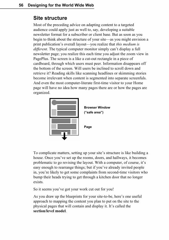
56 Designing for the World Wide Web
Site structure
Most of the preceding advice on adapting content to a targeted
audience could apply just as well to, say, developing a suitable
newsletter format for a subscriber or client base. But as soon as you
begin to think about the structure of your site—as you might envision a
print publication’s overall layout—you realize that this medium is
different. The typical computer monitor simply can’t display a full
newsletter page; you realize this each time you adjust the zoom view in
PagePlus. The screen is a like a cut-out rectangle in a piece of
cardboard, through which users must peer. Information disappears off
the bottom of the screen. Will users be inclined to scroll down and
retrieve it? Reading skills like scanning headlines or skimming stories
become irrelevant when content is segmented into separate screenfuls.
And even the most computer-literate first-time visitor to your Home
page will have no idea how many pages there are or how the pages are
organized.
Browser Window
(“safe area”)
Page
To complicate matters, setting up your site’s structure is like building a
house. Once you’ve set up the rooms, doors, and hallways, it becomes
problematic to go revising the layout. With a computer, of course, it’s
easy enough to rearrange things; but if you’ve already invited people
in, you’re likely to get some complaints from second-time visitors who
bump their heads trying to get through a kitchen door that no longer
exists.
So it seems you’ve got your work cut out for you!
As you draw up the blueprints for your site-to-be, here’s one useful
approach to mapping the content you plan to put on the site to the
physical pages that will contain and display it. It’s called the
section/level model.
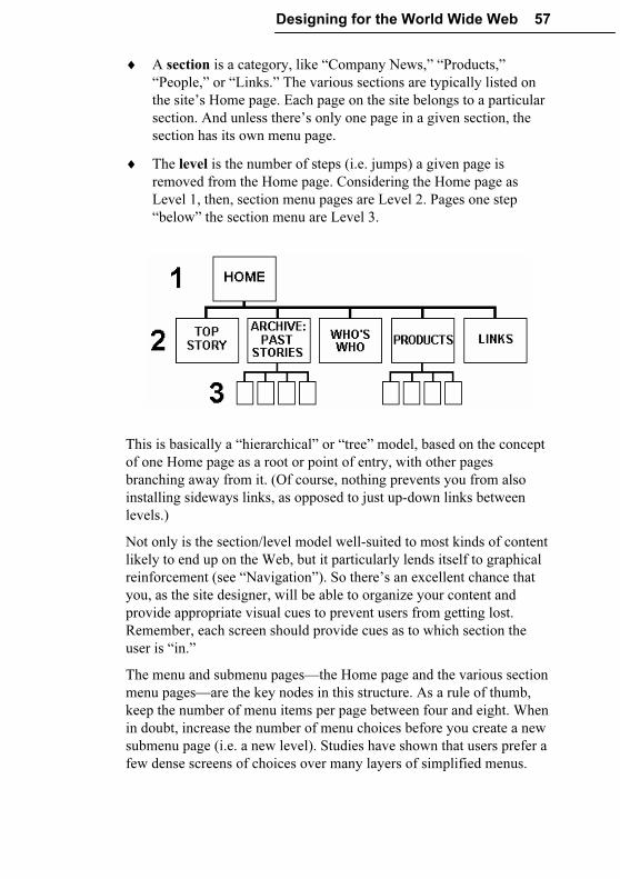
Designing for the World Wide Web 57
♦ A section is a category, like “Company News,” “Products,”
“People,” or “Links.” The various sections are typically listed on
the site’s Home page. Each page on the site belongs to a particular
section. And unless there’s only one page in a given section, the
section has its own menu page.
♦ The level is the number of steps (i.e. jumps) a given page is
removed from the Home page. Considering the Home page as
Level 1, then, section menu pages are Level 2. Pages one step
“below” the section menu are Level 3.
This is basically a “hierarchical” or “tree” model, based on the concept
of one Home page as a root or point of entry, with other pages
branching away from it. (Of course, nothing prevents you from also
installing sideways links, as opposed to just up-down links between
levels.)
Not only is the section/level model well-suited to most kinds of content
likely to end up on the Web, but it particularly lends itself to graphical
reinforcement (see “Navigation”). So there’s an excellent chance that
you, as the site designer, will be able to organize your content and
provide appropriate visual cues to prevent users from getting lost.
Remember, each screen should provide cues as to which section the
user is “in.”
The menu and submenu pages—the Home page and the various section
menu pages—are the key nodes in this structure. As a rule of thumb,
keep the number of menu items per page between four and eight. When
in doubt, increase the number of menu choices before you create a new
submenu page (i.e. a new level). Studies have shown that users prefer a
few dense screens of choices over many layers of simplified menus.
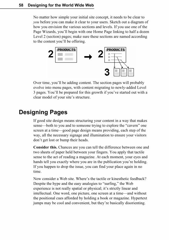
58 Designing for the World Wide Web
No matter how simple your initial site concept, it needs to be clear to
you before you can make it clear to your users. Sketch out a diagram of
how you envision the various sections and levels. If you use one of the
Page Wizards, you’ll begin with one Home Page linking to half a dozen
Level 2 (section) pages; make sure these sections are named according
to the content you’ll be offering.
Over time, you’ll be adding content. The section pages will probably
evolve into menu pages, with content migrating to newly-added Level
3 pages. You’ll be prepared for this growth if you’ve started out with a
clear model of your site’s structure.
Designing Pages
If good site design means structuring your content in a way that makes
sense—both to you and to someone trying to explore the “cavern” one
screen at a time—good page design means providing, each step of the
way, all the necessary signage and illumination to ensure your visitors
don’t get lost or bump their heads.
Consider this. Chances are you can tell the difference between one and
two sheets of paper held between your fingers. You apply that tactile
sense to the act of reading a magazine. At each moment, your eyes and
hands tell you exactly where you are in the publication you’re holding.
If you happen to drop the issue, you can find your place again in no
time.
Now consider a Web site. Where’s the tactile or kinesthetic feedback?
Despite the hype and the easy analogies to “surfing,” the Web
experience is not really spatial or physical; it’s strictly linear and
intellectual. One word, one picture, one screen at a time—and without
the positional cues afforded by holding a book or magazine. Hypertext
jumps may be cool and convenient, but they’re basically disorienting.
Designing for the World Wide Web 59
Unless you’re intentionally trying to attract people who like to lose
themselves inside Web sites (and yes, there are probably a few of
those), we suggest you discard any fanciful notion of turning your site
into a “museum” or a “landscape,” or even a “zone.” Focus instead on
what you can do to avoid losing or alienating your first-time visitors.
Old principles...
While many Web sites aspire to become multimedia experiences, the
reality is that it will be some time before most home users’ Internet
connections and hardware can deliver a full-screen, streaming media
experience on par with, say, a television. Furthermore, it’s expensive to
produce audiovisual content. Web pages will continue to be a showcase
for electronic text and typography, drawing upon the kind of design
principles that have prevailed in traditional print publishing.
In effect, what’s old is new. As long as people are reading Web pages,
as opposed to watching them or listening to them, everything you’ve
been taught about editorial style and text organization has relevance.
(Don’t throw away that Style Manual!) Readers respond to writing
that’s presented clearly and concisely. They’ll respect the fact that you
understand the proper way to present a story: the relation of headlines
to body text, the use of subheads, and so on. And they’ll appreciate
visual design that complements the message without detracting from
legibility.
...New practices
At the same time, respecting the unique challenges of navigating
through a Web site, as opposed to reading a book or a magazine, needs
to become part of your design approach. For example, suppose a visitor
is particularly interested in one page within your site (perhaps it’s your
Links page, a feature story, or a cool picture). They may bookmark that
one page and return to it later—or tell a friend. In effect, since every
page on your site has its own unique URL (address), the site has as
many “side doors” as it has pages. Each page needs to provide cues that
a visitor can use to become oriented to the new “space” they’ve
entered.
One basic aspect of looking at a Web page is that the viewer initially
sees only what’s displayed in the browser window (the safe area, after
the television concept of a “safe title” area), leaving unseen an
indeterminate portion of the page below that. At VGA resolution of
640x480, the safe area may be around 300 vertical pixels high; at
800x600, around 400. Content in this region may be all the visitor sees
for several seconds as various graphics load onto the page. Studies
60 Designing for the World Wide Web
show that many Web users are not in the habit of scrolling pages before
deciding to move on, so that leaves a fairly narrow strip and a short
interval in which to grab their attention!
♦ Content. The safe area should convey essential information about
the site and entice the visitor to scroll for more.
♦ Composition. Think of the safe area as a mini-page, and make
sure that the elements within it work as a group.
In general, Web page headers and footers need to contain more
information than those in a conventional publication. The Web site
title, which appears immediately in the browser’s title bar as the first
page loads, should convey your site’s identity accurately, and even with
a touch of wit. The top matter should include a logo or other
identifying motif, as well as a page title (so users know they’ve come to
the right place). Visual cues as to section and level can also be part of
the top matter.
The bottom of the page is a good place to include elements that help the
page stand on its own as a self-contained unit. For example, it’s good
practice to include a date stamp so users know how current the
contents are (use Insert/Information/Date or Time... and uncheck
Update Automatically). If you don’t have a separate “Reply” or
“Feedback” page, consider placing a return hyperlink with your own
e-mail address at the bottom of each page. It’s not a bad idea to spell
out the page’s URL as well. That way, if a visitor saves a page as a text
file, or prints it out, they’ll have a record of where the page originated.
A copyright notice isn’t out of the question, either.
Page layout
The above advice on top and bottom matter applies equally to your
Home page, section menu pages, or any other pages. It will help you
build in a page-to-page consistency that respects the way people view
Web sites.
In general, consistency is good: if you choose a graphic theme, by all
means use it throughout your site. But too much of this good thing can
lead to blandness, and you should also work on differentiating the
various levels of your site from each other. In other words, the Home
page should appear unique, and section menu pages should resemble
each other, while looking distinct from pages at other levels. Besides
adding interest, these variations also serve as navigational cues.
Designing for the World Wide Web 61
In using PagePlus to design the publication, take advantage of the
master page/page distinction. Think of the background as a sheet of
pre-printed stationery with its own elements. For example, you can
design a colourful background header—perhaps incorporating a main
logo—on the master page, which will then repeat on each Web page.
Individual pages can add “local” information such as a section name or
page title, which will be visually merged with the background when the
page is published. (See the tips in the “Graphics” section on combining
foreground and background elements.)
PagePlus includes two default Web page sizes: Standard for VGA
monitors, Wide for SVGA. You should have no problem if you choose
SVGA, or set an even wider Custom page width. The bottom of the
PagePlus page is fixed, too, but a Web browser will only display as far
as the bottom object on each page. If there’s a chance you’ll be
including pages with a lot of text, requiring users to scroll down, you
can increase the height value for the page to give yourself some extra
room. You don’t have to fill all the space, and it’s much easier to
change the value at the outset than after you’ve developed the site.
One of the simplest things you can do to improve your site’s
appearance is to set rather wide left and right margins. Extra space on
both left and right helps to set off your content from the edge of the
browser window, and gives an uncluttered appearance just as it would
on a printed page. It’s also easier to view: studies show that at normal
reading distances, the eye’s span of movement is only about 8 cm (3
inches) wide; longer lines of text require extra effort. So spend some
time experimenting with different placements of the main frame on
your very first page, previewing in your browser until you find your
own preferences. Then duplicate the first page to create the other pages,
so the layout will be consistent on the other pages in the site.
Your Home page
On the Home page, you can break a few rules. For example, although
you’re generally trying to reduce the time it takes each page to load, it’s
OK to include larger or more numerous graphics on the Home page.
Most visitors’ attention span will stretch a bit in anticipation of seeing
what your site has to offer, and they’ll make allowances. In addition,
they’ll only have to wait the first time they visit the page, as the
graphics will be cached and instantly available next time.
62 Designing for the World Wide Web
On the other hand, all the guidelines mentioned above work to your
advantage. The Home page, and particularly its safe area, are your only
chance to make a first impression (unless someone enters through one
of the “side doors” we alluded to). Decide what kind of impression you
want to make—“cool,” “hot,” “intriguing,” “professional,” or all of the
above—and go for it.
Make the safe area interesting enough to hold the visitor’s attention
while the rest of the page loads. Text loads first, then graphics. A
composition of free text blocks will load quickly and, with the right
choice of text and background colours, can be stunningly effective. A
pithy quotation or unusual symbol will serve to engage the mind’s eye
and arrest the web-surfer’s impulse to “click and get on with it.”
The Home page can be a cross between a greeting card, a magazine
cover, an advertisement, and a main menu for the rest of your site.
There’s no question that well-rendered graphics add interest, but don’t
feel obligated to illustrate every single section link with its own GIF.
Remember that some users still turn off graphic loading when browsing
Web sites, in order to speed up access to textual info and skip
advertising. These users will never see your pictures; make sure your
text hooks them.
For these as well as other visitors, make sure you provide alternate
text captions for each graphic, using the Web Picture Manager on the
Tools menu. You can select individual graphics and then run the
Wizard to set individual captions. The captions will hold attention as
the graphics load, and convey the essence of the image for the text-only
user. Blind users with special software can hear the alternate text (via
synthesized speech), and so will not completely miss the pictorial
content.
Navigation
Earlier (see “Site structure”) we introduced some of the differences
between Web sites and paper publications that make navigation tricky.
(When was the last time you even thought of “navigating” through a
book?) The section/level model we’ve been using provides a suitable
framework—assuming it works with your content—because the basic
form of a “tree” is about as intuitive as any path system is likely to get.
But with users coming in through side doors, or traversing hyperlinks
that leapfrog from one part of the site to another, it’s up to you to
ensure the tree doesn’t turn into a maze.
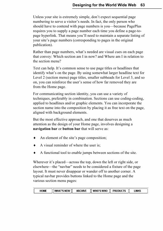
Designing for the World Wide Web 63
Unless your site is extremely simple, don’t expect sequential page
numbering to serve a visitor’s needs. In fact, the only person who
should have to contend with page numbers is you—because PagePlus
requires you to supply a page number each time you define a page-to-
page hyperlink. That means you’ll need to maintain a separate listing of
your site’s page numbers (corresponding to pages in the original
publication).
Rather than page numbers, what’s needed are visual cues on each page
that convey: Which section am I in now? and Where am I in relation to
the section menu?
Text can help. It’s common sense to use page titles or headlines that
identify what’s on the page. By using somewhat larger headline text for
Level 2 (section menu) page titles, smaller subheads for Level 3, and so
on, you can reinforce the user’s sense of how far removed they are
from the Home page.
For communicating section identity, you can use a variety of
techniques, preferably in combination. Sections can use coding-coding,
applied to headlines and/or graphic elements. You can incorporate the
section name into the composition by placing it as free text on the page,
aligned with background elements.
But the most effective approach, and one that deserves as much
attention as the design of your Home page, involves designing a
navigation bar or button bar that will serve as:
♦ An element of the site’s page composition;
♦ A visual reminder of where the user is;
♦ A functional tool to enable jumps between sections of the site.
Wherever it’s placed—across the top, down the left or right side, or
elsewhere—the “navbar” needs to be considered a fixture of the page
layout. It must never disappear or wander off to another corner. A
typical navbar provides buttons linked to the Home page and the
various section menu pages:
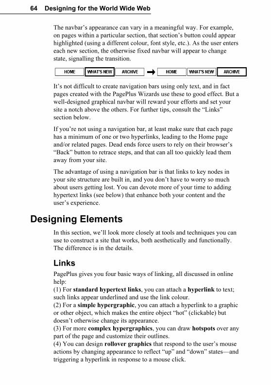
64 Designing for the World Wide Web
The navbar’s appearance can vary in a meaningful way. For example,
on pages within a particular section, that section’s button could appear
highlighted (using a different colour, font style, etc.). As the user enters
each new section, the otherwise fixed navbar will appear to change
state, signalling the transition.
It’s not difficult to create navigation bars using only text, and in fact
pages created with the PagePlus Wizards use these to good effect. But a
well-designed graphical navbar will reward your efforts and set your
site a notch above the others. For further tips, consult the “Links”
section below.
If you’re not using a navigation bar, at least make sure that each page
has a minimum of one or two hyperlinks, leading to the Home page
and/or related pages. Dead ends force users to rely on their browser’s
“Back” button to retrace steps, and that can all too quickly lead them
away from your site.
The advantage of using a navigation bar is that links to key nodes in
your site structure are built in, and you don’t have to worry so much
about users getting lost. You can devote more of your time to adding
hypertext links (see below) that enhance both your content and the
user’s experience.
Designing Elements
In this section, we’ll look more closely at tools and techniques you can
use to construct a site that works, both aesthetically and functionally.
The difference is in the details.
Links
PagePlus gives you four basic ways of linking, all discussed in online
help:
(1) For standard hypertext links, you can attach a hyperlink to text;
such links appear underlined and use the link colour.
(2) For a simple hypergraphic, you can attach a hyperlink to a graphic
or other object, which makes the entire object “hot” (clickable) but
doesn’t otherwise change its appearance.
(3) For more complex hypergraphics, you can draw hotspots over any
part of the page and customize their outlines.
(4) You can design rollover graphics that respond to the user’s mouse
actions by changing appearance to reflect “up” and “down” states—and
triggering a hyperlink in response to a mouse click.
Designing for the World Wide Web 65
The World Wide Web has finally popularized the concept of hypertext,
which has been around for at least a decade. We’re now accustomed to
clicking ’round the world in a matter of seconds! Yet the skill of
authoring effective hypertext documents is still in its infancy. Here are
several style tips for linking:
♦ Use links in text sparingly: quality, not quantity, matters. If you
want readers to finish reading your paragraph, don’t fill it full of
invitations to jump elsewhere.
♦ Don’t let links in text disrupt the flow of your writing. Avoid
sentences like: “Click here to learn more about placing links in
text.” An improvement would be: “Web links are powerful, but
may cause problems if overused.”
♦ If you have more than a couple of links to related material,
consider listing them separately (like a See Also list), perhaps with
a bit of graphic embellishment.
♦ If your site has a group of interrelated topics, it may be more
efficient to cluster them into a section or sub-section, with its own
menu page, rather than creating lots of sideways links between the
topics themselves.
♦ For sequential material, you can create a browse sequence (see
below).
Navigation buttons
We’ve already noted the value of a “navbar” as a basic layout element.
Generally, buttons are hypergraphics: graphics with hyperlinks or
hotspots applied. What should the graphics consist of, and how best to
construct them?
If your site adheres to the basic section/level model, then you’ll want to
provide links to the Home page as well as to the various section menu
pages. If you’re just starting to develop your site, make sure the overall
structure is clear before you design a navigation bar. Decide what your
sections will be, then choose a concise button label for each section.
Sketch some designs on paper. If there’s a chance you may add more
sections in the future, allow room for the navbar to accommodate a new
button or two.
Resist the temptation to design individual icons for the various buttons.
You might purloin some decent clip art, but developing a set of
original, decipherable icons is a fine art in itself, and a supreme time-
waster.
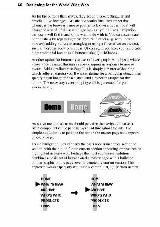
66 Designing for the World Wide Web
As for the buttons themselves, they needn’t look rectangular and
bevelled, like lozenges. Artistic text works fine. Remember that
whenever the browser’s mouse pointer rolls over a hyperlink, it will
change to a hand. If the assemblage looks anything like a navigation
bar, users will find it and know what to do with it. You can accentuate
button labels by separating them from each other (e.g. with lines or
borders); adding bullets or triangles; or using a filter effect on the text,
such as a drop shadow or emboss. Of course, if you like, you can create
more traditional box or oval buttons using QuickShapes.
Another option for buttons is to use rollover graphics—objects whose
appearance changes through image-swapping in response to mouse
events. Adding rollovers in PagePlus is simply a matter of deciding
which rollover state(s) you’ll want to define for a particular object, then
specifying an image for each state, and a hyperlink target for the
button. The necessary event-trapping code is generated for you
automatically.
As we’ve mentioned, users should perceive the navigation bar as a
fixed component of the page background throughout the site. The
simplest solution is to position the bar on the master page so it appears
on every page.
To aid navigation, you can vary the bar’s appearance from section to
section, with the button for the current section appearing emphasized or
highlighted in some way. Perhaps the most economical solution
combines a basic set of buttons on the master page with a bullet or
pointer graphic on the page level to denote the current section. This
approach works especially well with a vertical list, e.g. section names:
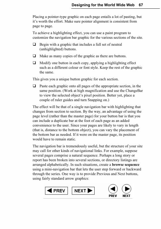
Designing for the World Wide Web 67
Placing a pointer-type graphic on each page entails a lot of pasting, but
it’s worth the effort. Make sure pointer alignment is consistent from
page to page.
To achieve a highlighting effect, you can use a paint program to
customize the navigation bar graphic for the various sections of the site.
� Begin with a graphic that includes a full set of neutral
(unhighlighted) buttons.
� Make as many copies of the graphic as there are buttons.
� Modify one button in each copy, applying a highlighting effect
such as a different colour or font style. Keep the rest of the graphic
the same.
This gives you a unique button graphic for each section.
� Paste each graphic onto all pages of the appropriate section, in the
same position. (Work at high magnification and use the ChangeBar
to view the selected object’s pixel position. Better yet, place a
couple of ruler guides and turn Snapping on.)
The effect will be that of a single navigation bar with highlighting that
changes from section to section. By the way, an advantage of using the
page level (rather than the master page) for your button bar is that you
can include a duplicate bar at the foot of each page as an added
convenience to the user. Since your pages are likely to vary in length
(that is, distance to the bottom object), you can vary the placement of
the bottom bar as needed. If it were on the master page, its position
would have to remain static.
The navigation bar is tremendously useful, but the structure of your site
may call for other kinds of navigational links. For example, suppose
several pages comprise a natural sequence. Perhaps a long story or
report has been broken into several sections, or directory listings are
arranged alphabetically. In such situations, create a browse sequence
using a mini-navigation bar that lets the user step forward or backward
through the series. One way is to provide Previous and Next buttons,
using fairly standard arrow graphics:
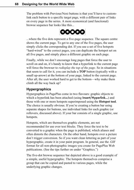
68 Designing for the World Wide Web
The problem with Previous/Next buttons is that you’ll have to custom-
link each button to a specific target page, with a different pair of links
on every page in the series. A more economical (and functional)
browse sequence bar looks like this...
...where the five dots represent a five-page sequence. The square centre
shows the current page. To get to any one of the five pages, the user
simply clicks the corresponding dot. If you use a set of five hotspots
“hard-wired” to the correct pages, you can duplicate the hotspot set on
all five pages, and simply place a different graphic on each page.
Finally, while we don’t encourage long pages that force the user to
scroll on and on, it’s handy to know that a hyperlink to the current page
will force the browser to redisplay the top of the page. So in situations
that seem to call for it, you can include a TOP button (typically with a
small up-arrow) at the bottom of your page, linked to the current page.
After all, the user worked hard to get to the bottom—why make them
climb all the way back up?
Hypergraphics
Hypergraphics in PagePlus come in two flavours: graphic objects to
which a hyperlink has been attached (using Insert/Hyperlink...) and
those with one or more hotspots superimposed using the Hotspot tool.
The choice is usually obvious. If you’re creating a button bar using
separate shapes for buttons, use individual links for each graphic (or
rollovers, discussed above). If your bar consists of a single graphic, use
hotspots.
Hotspots, which are themselves graphic elements, are not
recommended for use over text blocks. They force the text to be
converted to a graphic when the page is published, which aliases and
often distorts the characters. On the other hand, hotspots over a picture
don’t trigger conversion. So if you want clean lettering as part of your
hypergraphic, create it in your paint program. In general, use the .GIF
format for all non-photographic images you create for PagePlus Web
publications. (See the tips further on under “Graphics.”)
The five-dot browse sequence bar depicted above is a good example of
a simple, useful hypergraphic. The hotspots themselves comprise a
group that can be copied and pasted to various pages, while the
underlying graphic changes.
Designing for the World Wide Web 69
Hypergraphics give you an alternative to using hyperlinked text, which
is best reserved for use within body text. For example, if you had a set
of pages arranged alphabetically, you might like to create an alphabet
users could click on to jump to a particular page. This could be done
with a string of 26 hyperlinked text characters, but a creative alphabet
graphic with hotspots over each letter would undoubtedly end up
looking better.
You can use hypergraphics to create fanciful pictorial menus, visual
indexes, maps, diagrams, and other clickable previews of the content
on your site. In short, they’re fun. Use them!
Text
Tips about text usage abound in this chapter: writing style, varying text
size as a navigational cue, when to use or not use links in text, etc.
Rather than recap what’s been said, we’ll just make a few new points.
♦ Hardly anyone actually prefers reading computer text over
traditional print. Try to make your text inviting, at least. As a rule,
users should be able to view each text block in the browser
window without scrolling. Use short, newspaper-style paragraphs,
not flowing, book-length ones. The “inverted pyramid” style of
writing found in journalism works well on Web pages, too: use a
strong lead-in and place essential information up front.
♦ Headlines and subheadlines are useful devices to facilitate
scanning (scrolling) and to break up the monotony of longer
stories. Use left aligned rather than centred heads. Avoid headline
text larger than 24pt, which looks amateurish, and all-uppercase
headlines, which can be hard to read. For variety, you can colour
the heads and subheads differently from body text—just don’t
overdo it!
♦ In general, it’s not a good idea to use more than one column for
story text, as you might in a newsletter. No one wants to scroll to
the bottom of one column and then back to the top of the next. You
may see sophisticated Web pages that use tables and frames to
demarcate different kinds of content, and you may be able to
emulate these effects, but they work best with short text blocks and
menu pages, rarely for the presentation of longer material.
70 Designing for the World Wide Web
Graphics
You can obtain pictorial content in lots of ways: scanning, grabbing
screen images, using clip art, creating from scratch. No matter where
you get an image, you’ll need to modify it in some way: cropping or
enhancing it, adding text, applying a special effect, combining it with
another image. For these tasks, you don’t have to be a great artist, but
you do need to know your way around a paint program like Serif
PhotoPlus. Whichever program you’re using, the information and
advice in this section will help you use it effectively with PagePlus.
Appearance
Before moving on to some more technical aspects of enhancing Web
graphics, let’s review a few visual design precepts with special
relevance for Web pages in general. As in other sections of this chapter,
we’re interested in respecting the way people actually experience Web
pages.
♦ If you’re using graphics as page elements, not just as background,
then use small, significant elements throughout the page, not just at
the top and bottom. As users scroll, the page should preserve a
balance of text, graphics, and white (background) space.
♦ At the same time, avoid insignificant adornments like rules,
bullets, and icons unless they’re part of an overall scheme.
♦ Don’t use too many colours on the page or background. Half a
dozen per page, including background, body text, links, and
graphics, is about right to lend your site a professional appearance.
(Plain white or light backgrounds are favoured.) Pick no more than
two dominant colours per page; the further any other colour is
from these “dominants,” the less space it should occupy.
♦ Elements with similar form or function (for example, all section
heads or horizontal rules) should share the same colour.
♦ Try varying the artistic forms you use. Throw in a photograph or
two—even if they have no special relevance to your site, they’ll
enhance its visual appeal on a decorative level as long as they
blend into a compositional scheme. Think about using a clip art
photo as a background for a logo, text head, or navigation map.
Don’t get stuck on using just one type of graphic.
♦ Avoid blocky, rectangular shapes, which tend to make the page
look closed, static, and amateurish. Rounder and softer-edged
images tend to open up the page.
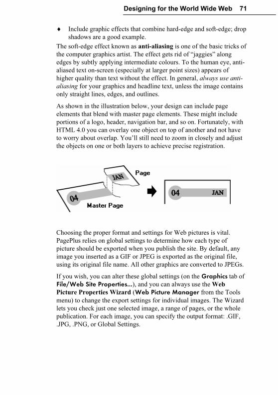
Designing for the World Wide Web 71
♦ Include graphic effects that combine hard-edge and soft-edge; drop
shadows are a good example.
The soft-edge effect known as anti-aliasing is one of the basic tricks of
the computer graphics artist. The effect gets rid of “jaggies” along
edges by subtly applying intermediate colours. To the human eye, anti-
aliased text on-screen (especially at larger point sizes) appears of
higher quality than text without the effect. In general, always use anti-
aliasing for your graphics and headline text, unless the image contains
only straight lines, edges, and outlines.
As shown in the illustration below, your design can include page
elements that blend with master page elements. These might include
portions of a logo, header, navigation bar, and so on. Fortunately, with
HTML 4.0 you can overlay one object on top of another and not have
to worry about overlap. You’ll still need to zoom in closely and adjust
the objects on one or both layers to achieve precise registration.
Choosing the proper format and settings for Web pictures is vital.
PagePlus relies on global settings to determine how each type of
picture should be exported when you publish the site. By default, any
image you inserted as a GIF or JPEG is exported as the original file,
using its original file name. All other graphics are converted to JPEGs.
If you wish, you can alter these global settings (on the Graphics tab of
File/Web Site Properties...), and you can always use the Web
Picture Properties Wizard (Web Picture Manager from the Tools
menu) to change the export settings for individual images. The Wizard
lets you check just one selected image, a range of pages, or the whole
publication. For each image, you can specify the output format: .GIF,
.JPG, .PNG, or Global Settings.
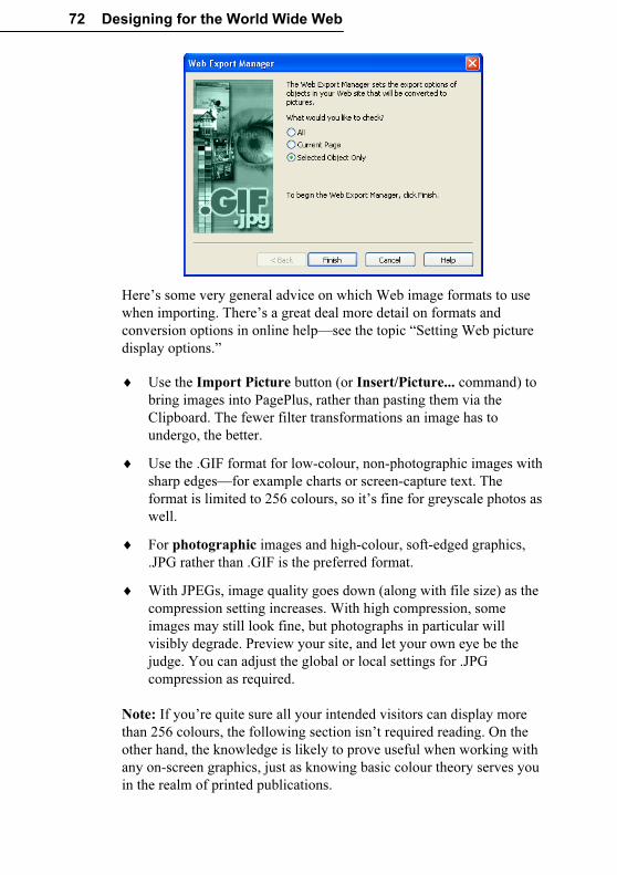
72 Designing for the World Wide Web
Here’s some very general advice on which Web image formats to use
when importing. There’s a great deal more detail on formats and
conversion options in online help—see the topic “Setting Web picture
display options.”
♦ Use the Import Picture button (or Insert/Picture... command) to
bring images into PagePlus, rather than pasting them via the
Clipboard. The fewer filter transformations an image has to
undergo, the better.
♦ Use the .GIF format for low-colour, non-photographic images with
sharp edges—for example charts or screen-capture text. The
format is limited to 256 colours, so it’s fine for greyscale photos as
well.
♦ For photographic images and high-colour, soft-edged graphics,
.JPG rather than .GIF is the preferred format.
♦ With JPEGs, image quality goes down (along with file size) as the
compression setting increases. With high compression, some
images may still look fine, but photographs in particular will
visibly degrade. Preview your site, and let your own eye be the
judge. You can adjust the global or local settings for .JPG
compression as required.
Note: If you’re quite sure all your intended visitors can display more
than 256 colours, the following section isn’t required reading. On the
other hand, the knowledge is likely to prove useful when working with
any on-screen graphics, just as knowing basic colour theory serves you
in the realm of printed publications.
Designing for the World Wide Web 73
Bear in mind that not all your visitors’ computers will match your own
for speed or graphic display. Like the .GIF format, some monitors are
still limited to 256 colours. It’s generally a good idea to switch your
display to 256 colours and test the page in a browser before finally
publishing it. This will ensure you’re using colours in a way that won’t
present problems when displayed on average systems. The more you
know about colour palettes and image formats, the fewer display
problems are likely to creep in.
A major constraint imposed by 256-colour systems is that not all
systems use the same 256 colours. The operating system reserves a
certain number of palette slots for “system colours,” and system
palettes differ, for example, between Windows and Macintosh
computers. Applications, including Web browsers, declare their own
palettes and use dithering to approximate colours outside that palette.
This means, for example, alternating pixels of red and blue (from
within the palette) to approximate a purple colour outside the palette.
If you’re not careful, dithering can ruin your best efforts. Let’s say
you’ve created a graphic with some solid colour areas, but the user’s
browser can’t display one of those colours. So the browser dithers the
colour, resulting in a mottled and degraded image. If the solid colour
happened to include text, the text becomes less legible.
To prevent display of this kind, Web designers often use a Web-safe
palette of 216 colours that don’t dither in Web browsers operating in
256-colour environments. The safe palette is actually a 6x6x6 RGB
“colour cube” using evenly-spaced red, green, and blue values from 0
to 255 along its axes. 51 happens to be the interval in the series of
values (0, 51, 102, 153, 204, 255). So, for example, the RGB definition
“0,102,51” would be a safe colour, while “0,102,52” would not. To
create Web-safe colours in a paint program, define new colours using
RGB values that are either 0 or divisible by 51.
For your convenience, PagePlus includes two swatch panels
incorporating the Web-safe colours. (Look for WEBSAFE1.GIF and
WEBSAFE2.GIF in the /PP10.0/SAMPLES folder.) You can paste either
one into your paint program’s “canvas” area and pick colours from it
using the program’s eye dropper tool. Or you can load the supplied
WEBSAFE.PAL palette so it’s used in the colour selection table. It’s
especially important when anti-aliasing graphics to ensure that the edge
colours the program applies come from the safe palette.
74 Designing for the World Wide Web
As a rule, if you’re concerned with 256-colour display, save low-colour
bitmap images created in your paint program in the .GIF format using
the safe palette. Avoid using a unique palette per image; if you have
multiple GIFs per Web page, different palettes may clash and all
images will suffer.
Performance
“Performance” may seem like an odd aspect of graphic design, but it’s
actually one of the key factors in how users will judge your Web site.
Technically, performance means load time: how long it takes for your
whole page, including text and graphics, to display completely in a
Web browser. In practice, it’s hard to measure, and subjective factors
intrude. Connection bandwidth, server speed, and modem rating all
play a part. As discussed earlier, it’s always wise to design the safe area
of each page to give visitors something to look at, read, and/or think
about, and thus offset the perception of delay while the rest of the page
loads.
Load time is a function of the total size of all the page objects that need
to load; and graphics usually take up the lion’s share. That’s why we
can talk about the “performance” of your page as a function of the total
file size of its graphics.
If you’re being considerate of users with dial-up modem connections
you can work out your own rule of thumb. Assuming these users are
willing to wait up to 20 seconds (because they’re probably accustomed
to waiting) you can multiply that by 4K bytes per second, the
throughput of a 1995-vintage modem. By that logic, if your pages
exceed about 80KB in size you will start to alienate some fraction of
your intended visitors. For comparison, a high-speed connection is
about ten times as fast.
� You can determine the actual size of your files by publishing one
page at a time to a local folder (using File/Publish Site/to Disk Folder...), then using Windows Explorer to examine the contents
of the folder. View the files by date and Shift-select the most
recent batch, then right-click and choose Properties to see the
aggregate byte count. Obviously, the lower the better.
Designing for the World Wide Web 75
Is there anything you can do to reduce the total size of your graphics,
aside from using fewer graphics? An obvious suggestion is to make
them no larger than they need to be to get your point across. Since file
size increases as the square of each dimension, shrinking both height
and width by 50% reduces the file size by 75%. Try to use the correct
dpi setting for images before importing, rather than scaling large
images down on the page. You can use the Size and Resolution dialog
(accessible from the Picture toolbar) after importing to scale pictures
and/or resample them so excessive dpi doesn’t waste bytes. Avoid large
regions of transparency if possible.
If you save graphics as GIFs (see above), you can take advantage of the
fact that GIFs, unlike most other 256-colour (8-bits-per-pixel “bit
depth”) formats, don’t insist on using 8-bit pixels. If the number of
colours in the image is 128, GIFs will encode using 7 bits; with 64
colours, 6 bits, and so on. As an experiment, we tried starting with a
small image (some anti-aliased text) that only used 14 colours. With the
paint program set for 256 colours, we saved as a .GIF, yielding a file
size of 1204 bytes. After reducing the number of colours displayed in
the paint program to 16—still sufficient to display all those in the
image—we saved again, and the file size went down to 420. If you’ve
got a dozen or more small GIFs per page, those little savings can really
add up!
Paint programs handle colour reduction in various ways. Some let you
set the image to either 16 or 256 colours, but not to 64 or 128; that’s
still a help if your images require 16 or fewer. Ideally, you can save
with an arbitrary number of colours, and the program will attempt to
optimize the image using that value. So you can pick any intermediate
bit depth, and find the one that works best for the specific image. To
sum up:
� To reduce file size, reduce the number of colours in each image,
and save as a .GIF file using the lowest acceptable bit depth your
paint program will allow.
If all this talk about image formats and bit depth has landed somewhere
slightly over your head, we have two suggestions:
(1) Spend some time with a good paint program like Serif PhotoPlus
and experiment with the techniques introduced here.
(2) Point your Web browser to the Suggested Links listed at the end of
this chapter. You’ll find a wealth of advice and examples to draw upon.
76 Designing for the World Wide Web
Multimedia
Considering all the cautionary advice here about reducing file sizes to
achieve acceptable load time on home-based Web browsers, a foray
into multimedia is clearly not for the faint of heart! Although PagePlus
10.0 allows you to insert both audio and video files—and will even
embed the files in the original publication to facilitate your efforts—
from a design standpoint this feature should be regarded as rather
experimental.
PagePlus can incorporate a wide variety of audio and video files such
as QuickTime, MPEG, RealAudio, and RealVideo, besides the
“generic” Windows media types (.WAV for audio and .AVI for video).
There are actually two sound playback options—background sound,
where a sound loads and plays automatically when a specific page is
first displayed in the visitor’s Web browser, and linked sound, triggered
by a mouse click (for example on an icon or hyperlinked object).
Linked video works like linked sound.
These days, chances are your target visitors will be able to play media
in any of the supported formats. But unless you’re sure they’ll have
high-speed connections, file size is still a significant barrier. For
example, a .WAV file for speech content consumes about 10K per
second, and a compressed .AVI file for a postage-stamp-sized, 10
frame-per-second movie video without sound uses at least 35K per
second. If you want an audio track along with your movie, add the two
numbers together. MPEG compression can reduce file size
significantly, but many Web visitors will still have to wait before that
ten-second video clip knocks their socks off. If you (and/or your Web
visitors) are on a local network or have high speed Internet access,
however, the fact that audio and video are basically file downloads
should not pose a problem.
PagePlus, of course, doesn’t handle either audio or video natively—it
cannot edit or play them back—so unless you rely on borrowed or clip
media, be prepared to master a media editing application or know
someone who can. (Any teenagers in the family?) The good news is
that just because multimedia is a bit of a creative leap you can still have
a lot of fun experimenting! For example, with Serif MoviePlus (and a
digital video capture card or camcorder), you can produce your own
digital movies and integrate them with your Web site.
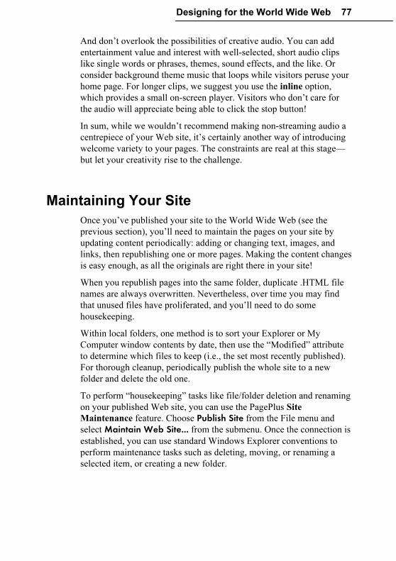
Designing for the World Wide Web 77
And don’t overlook the possibilities of creative audio. You can add
entertainment value and interest with well-selected, short audio clips
like single words or phrases, themes, sound effects, and the like. Or
consider background theme music that loops while visitors peruse your
home page. For longer clips, we suggest you use the inline option,
which provides a small on-screen player. Visitors who don’t care for
the audio will appreciate being able to click the stop button!
In sum, while we wouldn’t recommend making non-streaming audio a
centrepiece of your Web site, it’s certainly another way of introducing
welcome variety to your pages. The constraints are real at this stage—
but let your creativity rise to the challenge.
Maintaining Your Site
Once you’ve published your site to the World Wide Web (see the
previous section), you’ll need to maintain the pages on your site by
updating content periodically: adding or changing text, images, and
links, then republishing one or more pages. Making the content changes
is easy enough, as all the originals are right there in your site!
When you republish pages into the same folder, duplicate .HTML file
names are always overwritten. Nevertheless, over time you may find
that unused files have proliferated, and you’ll need to do some
housekeeping.
Within local folders, one method is to sort your Explorer or My
Computer window contents by date, then use the “Modified” attribute
to determine which files to keep (i.e., the set most recently published).
For thorough cleanup, periodically publish the whole site to a new
folder and delete the old one.
To perform “housekeeping” tasks like file/folder deletion and renaming
on your published Web site, you can use the PagePlus Site
Maintenance feature. Choose Publish Site from the File menu and
select Maintain Web Site... from the submenu. Once the connection is
established, you can use standard Windows Explorer conventions to
perform maintenance tasks such as deleting, moving, or renaming a
selected item, or creating a new folder.
78 Designing for the World Wide Web
The question of how frequently to update gets to the heart of “site
maintenance.” Having spent days or weeks designing and then
publishing an attractive site with intuitive navigation and palatable
content, you’ve only just begun. The cycle is completed when visitors
start arriving, and their feedback is critical. Be direct about asking for
comments, and make sure you’ve included an e-mail return link.
Challenge your users to respond! Give them some specific choices to
make (“Would you rather see A, B, or C on this page?”). Let them feel
they’re contributing. For you, there will be an enormous difference
between operating in a void and receiving even one or two responses.
Think of your site as more than an electronic business card—think of it
as a newsletter with publication deadlines. As a rule of thumb, don’t let
more than two weeks go by without making visible changes. The
changes don’t have to be dramatic; the main thing is to reinforce the
perception that your site is dynamic, not static. The Home page should
change most often: add new links, or replace old graphics with new
ones. Add a new page or two, expanding the original sections. (Be sure
to post notice of the NEW! features on the Home page.) Revise the
design of any pages that aren’t working the way you expected.
As a rule, keep the background and section organization intact so as not
to confuse repeat visitors. Sections that began as a single page will
require a section menu as soon as a few new pages have been added. If
you’ve got a navigation bar with a button already linked to the original
page, turn that target page into the menu page to keep the link intact.
It’s usually easier to migrate content to a new page than to rewire
existing links. (You can see the content, but you can’t easily see the
links.)
Designing for the World Wide Web 79
Finally, feel free to break the above rules and overhaul your site if it
becomes clear your users are getting lost or frustrated, or if you’ve
discovered a better way to organize your content. In this fledgling
medium, it’s not at all uncommon for sites to undergo metamorphosis.
On the World Wide Web, change is a constant—and now, you’re part
of it.
A Few Suggested Resources
� Nielsen, J., and M. Tahir. 2001. Homepage usability: 50 Websites
deconstructed. Indianapolis, IN: New Riders Publishing. Showcase
of popular Web home pages with solid qualitative analyses.
� Siegel, D. 2002. Creating killer web sites, 2nd ed. Indianapolis, IN:
Hayden. Rich technical and graphic resource, but dated; the author
has since renounced its mid-90s design philosophy.
� Strunk, W., and E. B. White. 1999. The elements of style, 4th ed.
Boston: Allyn & Bacon. Classic writer’s handbook.
� Rosenfeld, Louis, and Morville, Peter. Information architecture for
the World Wide Web. 1998. Cambridge, MA: O’Reilly &
Associates. Highly regarded overview of information design
concepts.
� Tufte, E.R. 1990. Envisioning information. Cheshire, CT: Graphics
Press. Classic, well-illustrated textbook on visual literacy.
� University of Chicago Press. 2003. The Chicago manual of style.
15th ed. Chicago: University of Chicago Press. Definitive
reference source, newly revised and updated.
� Weinman, L. 2002. Designing Web Graphics.4, 4th ed.
Indianapolis, IN: New Riders Publishing. Excellent introduction to
Web graphic issues.
� Zinsser, W. K. 2001. On writing well., 25th anniversary edition.
New York: Quill/HarperResource. Tips for nonfiction writers.
80 Designing for the World Wide Web
Links
� desktoppub.about.com Rich site features articles, resources,
buyer’s guide, discussion forums.
� www.webstyleguide.com Web Style Guide, 2nd ed. by Patrick
Lynch and Sarah Horton of Yale’s Centre for Advanced
Instructional Media. Illustrated, annotated dissertation on all facets
of Web interface design. Also available in book form.
� www.efuse.com Attractively presented sequence of informational
pages on planning, design, building, publishing.
� www.serif.com Forums, updates, and tips for users of all Serif
products. Online Glossary lets you browse the full version of our
Desktop Publishing QuickReference (see Chapter 6).
� www.sun.com/980713/webwriting/ Writing for the Web. Authored
by Jakob Nielsen et al. (see Print resources), research-based
guidelines to improve usability.
� www.wdvl.com Web Developer’s Virtual Library (WDVL).
Supersite contains dozens of sections for both novices and experts,
including /graphics/, /multimedia/, and /authoring/design/.
� webdesign.about.com Collection of links and features, including
Web Design A-Z.
� www.webpagesthatsuck.com Vincent Flanders’ guided tour
through examples of, ah, poor design. The site became one book,
then a second, and (unfortunately) never seems to run out of fresh
material.
� www.webreference.com Comprehensive developer’s site, includes
Developer’s Corner with how-to articles, sections on Graphics and
Design. Part of internet.com’s WebDev network.
Production Issues
Production Issues 83
Introduction
In Chapter 3 we covered the rudiments of printing—only as far as the
Print dialog’s General tab. Now it’s time to explore the other tabs
(Layout, Separations, and Prepress) as well as other PagePlus options
for producing and distributing your print publication. The main choices
include simply using your desktop printer; taking your job to a quick
copy shop; tapping a range of professional printing services for longer
runs, higher quality, and/or colour; or creating a standalone PDF file
that your audience can print out on their own. We’ll provide a brief
overview of the various approaches, followed by more in-depth
coverage of each one.
For high-volume, full-colour printed pieces—such as ads, mailings,
sophisticated marketing materials, and product packaging—you’ll need
to use a professional printer. But don’t overlook asking your local copy
shop to give you 100 photocopies of your laser-printed document, or
doing a short-run colour job at a service bureau.
If you are thinking of getting involved in outside printing for the first
time, browse this chapter to get an idea of the principles and jargon.
Try a simple job first; don’t make your first project a complex, full-
colour catalog!
Which way to go?
What are you looking to produce? Will desktop printing suffice, or do
you need professional reproduction? That is the question. The answer
depends on considerations such as these:
♦ Quantity. For small quantities (100 copies or so), you usually will
use your desktop printer to produce every copy. For somewhat
larger runs, it’s advisable to produce just one original (known as
camera-ready copy) and then use that for reproduction by
photocopying. For medium to long runs (500 or so and up), it’s
best to use professional printing.
♦ Quality. For producing your own copies or for creating camera-
ready copy for photocopying, the quality produced by your
desktop printer may be entirely adequate (especially the latest
600+ dpi laser printers). For higher quality, you’ll need to consider
using a professional printer. If your publication includes high
quality photographs or fine artwork, you may need to find a
service bureau to output a high-resolution version of your PagePlus
publication as master artwork for a printer.
84 Production Issues
♦ Colour. Colour ink-jets, and other desktop colour printers, produce
vibrant colour copy direct from your PC, which is fine for very
short runs but can be expensive for full-colour pieces. For slightly
longer runs, you can use colour photocopying of your desktop
printer output although this is still relatively expensive per copy.
For longer runs of high quality colour work you’ll end up using the
PagePlus options for producing either composite (single file) PDF
or separated-separated PostScript output. These are the realms of
professional printing and high-resolution service bureau output.
♦ Format. What size, colour, quality, thickness, and/or finish of
paper/card stock do you want? Perhaps you are producing
something of a non-standard size or shape, that will need cutting. If
your publication has special folding or binding requirements or
you are looking to print your designs onto other more adventurous
media, such as a mug or a T-shirt, then you will need to turn to a
professional printer.
♦ Speed. Finally, desktop printers can produce some very fine output
but when you are printing large or detailed designs they can be
desperately slow and therefore expensive. For high volume
production of high-colour or detailed designs you should seek the
services of a professional printer.
Desktop printing
This is the easiest and most familiar method for low-volume output of
your publication. It can produce good quality output—especially with a
newer printer on high-quality paper—but tends to be rather slow and
quite expensive in ink.
Once you have designed your publication simply open the Print dialog,
fill in the details on the General and Layout tabs and click the Print button.
Photocopying and quick printing
For quick and economic runs of up to 500 copies you can print off a
single copy using your desktop printer and take it to your local copy
shop for replication.
With the advent of direct-to-plate printing, for example using an Indigo
system, short-run colour (in runs of 500 or less) has become an
affordable option offered by both printers and service bureaus. The
results are superior to photocopying.
Production Issues 85
Professional printing
Traditional printing presses are used for longer print runs of several
thousand or more (which is when using a large press is almost certainly
cheaper than any of the forms of quick-printing), and for short-run,
high-quality colour work (e.g. a brochure).
Once you need more than about 500 copies, the economic advantages
of photocopying or quick printing begin to dwindle. The fixed cost for
stepping up to professional (offset) printing is the same whether you
require 200 or 20,000 copies, so the cost per sheet drops rapidly with
increased volume.
Besides economics, there may be other reasons why you need
professional printing. For example:
♦ If you need full colour (also known as process colour)
♦ If you need a precisely identifiable colour, such as a PANTONE®
reference colour
♦ If you need to use a special paper or heavy card
♦ If you need a special finish on the paper (e.g. a spray coating)
♦ Very large print runs
When choosing a professional printer, make sure you’ve first
established a working relationship and discussed your job’s
requirements. Whichever printing partner you choose, you’ll find that
PagePlus measures up to the task. You can easily output a PDF or
PostScript file and hand it off to the shop.
The costs of your print run will be based on a variety of factors. These
include:
♦ How the artwork is delivered
Desktop-printed output is camera-ready and film needs to be made
from it. Service bureau output is already final film.
♦ Use of colour
Single colour (black, or another colour).
Spot colour (how many colours, which colours).
Full (process) colour.
♦ Quantity
86 Production Issues
♦ Stock
Type (paper, card, art paper, etc.), coated/uncoated, gloss/matte,
weight, colour.
♦ Finish
None, varnish, lamination.
Standalone PDF
PDF is a cross-platform file format developed by Adobe. In a relatively
short time, PDF has evolved into a worldwide standard for document
distribution which works equally well for electronic or paper
publishing. PDF documents are uniformly supported in the Windows,
Macintosh, and UNIX® environments. Anyone with the free Adobe
Acrobat® Reader (the latest version is supplied with PagePlus) can
view or print out PDF files, either from within a Web browser window
or directly—for example, when delivered over a network or on CD-
ROM. PDF documents are compact—one-fifth the size of comparable
HTML files—for faster transmission.
As noted in the previous section, you can easily export your PagePlus
publication as a PDF file—for example, when handing it off to a
professional printer. But you may decide that PDFs advantages eclipse
the need for printing entirely! Via e-mail and/or the Web, you can
distribute PDFs to your audience or simply make PDF files available
for download as needed. Because it’s universally readable and contains
all of the original publication’s content in WYSIWYG format, PDF
represents a viable alternative to print publishing for utilitarian
documents like business reports, white papers, and newsletters.
Standalone PDFs even have some advantages over printed documents.
For example, readers can resize the document, and navigate through it
using not only built-in viewer page buttons but bookmarks the author
has added, with links to section headings and key elements. As author,
you can also include annotations in the form of pop-up “sticky notes”
for comments and sidebars. And of course, readers can always print out
the document if they wish—without you having to incur the paper cost!
Production Issues 87
Desktop Printing
Do-it-yourself output comes down to two basic choices: printing
multiple copies on a printer linked to the PC or printing a single master
for photocopying. For small numbers of finished items, say up to 500
items, photocopying may well be the most cost-effective method of
production. Masters for photocopying can be printed on either an inkjet
or laser printer.
Printer types
Small business or home PagePlus users probably have one or more of
the following types of printer available:
♦ Dot Matrix printer
♦ Inkjet printer
♦ Laser printer
Dot matrix printers should not be used for anything but drafting if at
all possible. They are much slower, not to mention noisier, than the
other types of printer, and do not really produce good enough output to
make acceptable photocopy masters. Their “impact printing” method
inevitably damages the paper slightly, and as more copies are made
they get greyer because the ink is literally squeezed out of the ribbon. If
you have absolutely no alternative, make sure that you use a new
ribbon and set the Windows printer driver to make the printer print at
its highest resolution.
Inkjet printers represent an intermediate stage. Inkjet technology has
come a long way in recent years. They give good resolution output (and
at the very highest resolution settings on the manufacturer’s own high-
gloss paper, photographic images are virtually indistinguishable from
original photographs) for a low to mid-level purchase price. Colour
inkjets are the cheapest way of getting standard-page-sized, full-colour
output. They can also print overhead projector transparencies and
photocopy masters.
Models from different manufacturers work in slightly different ways,
but basically they all spray liquid ink at the paper from a special print
head. Because of this, large areas of solid black or colour may emerge
wet from the printer and be prone to smudging. The ink can also bleed
into the fibres of cheaper papers (such as copier paper) resulting in the
edges of letters and shapes looking ragged.
88 Production Issues
On the down side, because the print head and ink reservoir are usually a
single throwaway unit, the running cost per page can be higher than
that for a laser printer. At the top end of the market, however, the
colour reproduction may be good enough to earn PANTONE
certification. Because inkjet printers build up the image on the paper
one row of dots at a time, it can take a long time to print a full page—
up to 20 minutes for a page with complex colour bitmaps!
Laser printers are the highest specification output devices available to
most small business or home users. In a process related to
photocopying, laser printers use a laser beam reflected off a spinning
mirror to electrostatically charge a light-sensitive photoconductor drum
or belt with an image of the page. The charge is transferred from the
drum to the surface of the paper, and as the paper passes above the
toner cartridge, particles of toner (powdered ink) are attracted to the
charged areas of the paper. The powder is then sealed to the paper by a
heating process just before it leaves the printer.
Most laser printers print at a resolution of 300 or 600 dpi (dots per
inch). Some laser printers reach 1200 dpi, but these are very expensive.
Laser printer output is perfectly adequate for photocopying masters, but
it may in fact be cheaper to laser print 100 originals than to make 100
photocopies.
There are two main standards for laser printer control: PCL and
PostScript. PCL (Printer Control Language) was developed by Hewlett
Packard. Printers which use PCL are often referred to as LaserJet
compatible. PostScript® was developed by Adobe Systems. It is a
page description language—if you wanted to, you could write a
PostScript program to draw a circle. PostScript printers are more
expensive, but as PostScript is also used to control imagesetters, a
PostScript laser can be a very good proofing device.
The speed at which the finished pages are delivered depends on the
exact model of printer—the page per minute (ppm) rating is a nominal
figure and is not wholly reliable. GDI (Graphical Display Interface)
printers use Windows system resources to build up the virtual page on
the PC, not the printer, and so their speed is much more dependent on
the power of your PC.
Production Issues 89
Adding a touch of colour
You can jazz up the output from your desktop printer simply by using
coloured paper or card. You can use plain paper in a wide variety of
colours for minimal extra cost, or you can use specially pre-printed
papers (for example, from PaperDirect) in a wide variety of colours and
designs. You can even get pre-printed cards, certificates, brochures,
and letterheads!
Optimizing photographs
Until now, it’s been difficult (if not impossible) to obtain predictable,
satisfactory results when using a desktop printer to reproduce
photographs. Because each photo is different, each requires individual
adjustments to contrast, gamma, colour values, and so on. Not only
that; each desktop printer has different characteristics!
The Photo Optimizer in PagePlus gets round these difficulties by
printing out a single image 24 ways on a single test sheet. Each
“thumbnail” uses a different internal setting; all you need to do is tell
PagePlus which one you think looks best. PagePlus remembers the
settings. Repeat the process to fine-tune the settings, if you like. If
you’re using photos in a desktop-printed publication, you’ll definitely
want to take the time to print a few test pages using the Photo
Optimizer.
Printing special formats
Using the PagePlus scaling and tiling options, you can use your desktop
printer to produce poster-sized output for event notices, calendars, and
so on. These print options allow you to increase the size of your on-
screen page, and print it out using several sheets of paper. You can then
assemble the sheets to make one large poster.
PagePlus features auto-imposition of publication formats like
newsletters, brochures, greeting cards, and booklets. This means that
you don’t have to reorder your pages, as PagePlus will put the correct
pairs together (for an eight-page booklet, page 1 is automatically
printed next to page 8, page 2 next to page 7, and so on).
To set special print options, choose File/Print... or click the Print button to display the Print dialog, then select the Layout tab.
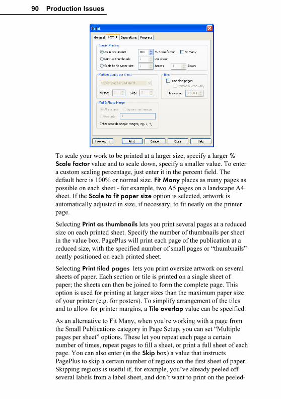
90 Production Issues
To scale your work to be printed at a larger size, specify a larger % Scale factor value and to scale down, specify a smaller value. To enter
a custom scaling percentage, just enter it in the percent field. The
default here is 100% or normal size. Fit Many places as many pages as
possible on each sheet - for example, two A5 pages on a landscape A4
sheet. If the Scale to fit paper size option is selected, artwork is
automatically adjusted in size, if necessary, to fit neatly on the printer
page.
Selecting Print as thumbnails lets you print several pages at a reduced
size on each printed sheet. Specify the number of thumbnails per sheet
in the value box. PagePlus will print each page of the publication at a
reduced size, with the specified number of small pages or “thumbnails”
neatly positioned on each printed sheet.
Selecting Print tiled pages lets you print oversize artwork on several
sheets of paper. Each section or tile is printed on a single sheet of
paper; the sheets can then be joined to form the complete page. This
option is used for printing at larger sizes than the maximum paper size
of your printer (e.g. for posters). To simplify arrangement of the tiles
and to allow for printer margins, a Tile overlap value can be specified.
As an alternative to Fit Many, when you’re working with a page from
the Small Publications category in Page Setup, you can set “Multiple
pages per sheet” options. These let you repeat each page a certain
number of times, repeat pages to fill a sheet, or print a full sheet of each
page. You can also enter (in the Skip box) a value that instructs
PagePlus to skip a certain number of regions on the first sheet of paper.
Skipping regions is useful if, for example, you’ve already peeled off
several labels from a label sheet, and don’t want to print on the peeled-
Production Issues 91
off sections. The dialog’s Preview window shows how each output will
look.
Tips for desktop printing
♦ Carefully proof your publication on-screen (using the Spell
Checker option) until you’re confident everything is OK.
♦ Use the correct driver for your printer. Some printers will work
with more than one driver, but will only have the best capabilities
with the driver optimized for them. If there is a driver specifically
for your printer, use it. New and updated printer drivers may be
available on-line from the manufacturer’s Web site.
♦ Set the printer driver which you will use for final output as your
Windows default printer. Set the printer driver to use the highest
possible resolution. Higher resolution = more dots per inch =
sharper image.
♦ If using a colour thermal wax or colour inkjet printer, use the
manufacturer’s recommended special paper. It will be more
expensive, but you will get better results.
♦ Use a good quality white paper to get maximum contrast when
preparing photocopying masters. If preparing photocopying
masters using an inkjet printer, consider using one of the special
coated papers which minimize ink bleed.
♦ If you can, print outsize master copies and then use a reducing
photocopier to reduce the size slightly, thus increasing apparent
print density and sharpness. For example, with business cards, you
can use the scaling options to print at 200% and then photo-reduce
back to original size.
♦ Photocopiers do not cope well with grey scales. Set the picture
colour of scanned photographs or shaded clipart to be a medium
grey, rather than Black or Original. If you are using a PostScript
laser printer, then set the Line Screen to a coarse value like 55
rather than leaving it set to the printer’s default.
♦ Carefully check your output, and handle the artwork with care.
Don’t fold it or get fingerprints on it, and make sure that anyone
else handling the artwork is equally careful.
♦ After you’ve printed your pages, you may want to consider various
DTP accessories for laminating or binding your publication for
presentation purposes.
92 Production Issues
Photocopying and Quick Printing
In recent years, home inkjet printers have made great strides in quality.
At the same time, with the continued expansion of office supply stores,
it’s gotten easier to find shops that offer photocopying and quick
printing services. You can use your desktop printer to produce artwork
originals for reproduction. Quick print shops normally accept such
copies as artwork and take it from there. Some can offer direct PC-to-
colour laser service. Choosing between photocopying and printing is
mainly a matter of cost.
Of course, if you have your own photocopier, you can produce your
own copies in-house, but an outside shop may offer a price advantage
for longer runs. Photocopying (especially in black-and-white) can be
quick and inexpensive for short runs. Colour photocopies cost more but
may still be more cost-effective than professional printing, depending
on the job size.
Photocopying may not reproduce your entire page exactly as you
expect. For example, tint areas (a shade of black, rather than a solid
colour) may become muddy. Very fine lines (in text or graphics) may
disappear. For colour work, the photocopy may differ slightly from
your printout, which may in turn differ from your on-screen colours. If
this is important to you, discuss it with your copy shop staff and they
can make test photocopies and tune the colour reproduction to your
satisfaction.
Quick printing is done using heavy-duty desktop printers, black-and-
white and colour photocopiers, and small printing presses that can print
medium-quality, short runs, direct from a desktop-printed original.
Quick printing is typically low-cost, convenient, and provides fast
turnaround of short, medium-quality print runs of, say, 300 to 3,000
copies.
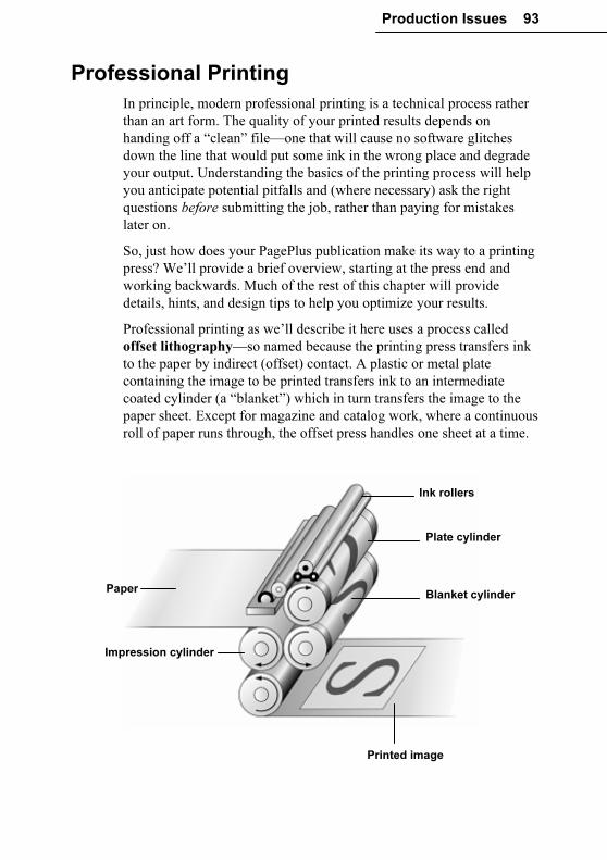
Production Issues 93
Professional Printing
In principle, modern professional printing is a technical process rather
than an art form. The quality of your printed results depends on
handing off a “clean” file—one that will cause no software glitches
down the line that would put some ink in the wrong place and degrade
your output. Understanding the basics of the printing process will help
you anticipate potential pitfalls and (where necessary) ask the right
questions before submitting the job, rather than paying for mistakes
later on.
So, just how does your PagePlus publication make its way to a printing
press? We’ll provide a brief overview, starting at the press end and
working backwards. Much of the rest of this chapter will provide
details, hints, and design tips to help you optimize your results.
Professional printing as we’ll describe it here uses a process called
offset lithography—so named because the printing press transfers ink
to the paper by indirect (offset) contact. A plastic or metal plate
containing the image to be printed transfers ink to an intermediate
coated cylinder (a “blanket”) which in turn transfers the image to the
paper sheet. Except for magazine and catalog work, where a continuous
roll of paper runs through, the offset press handles one sheet at a time.
Paper Blanket cylinder
Impression cylinder
Plate cylinder
Printed image
Ink rollers
94 Production Issues
Producing the printing plates for offset reproduction is a highly
specialized and sophisticated process which only professionals are
equipped to carry out. In earlier times, you would have supplied page
layouts as camera-ready copy that your printer would have turned into
film negatives using a large camera. These days, you usually hand off
either a PDF or PostScript file which then goes to an imagesetter or
platesetter—in effect, a very high-resolution laser printer that can
output images to film, paper, or directly to printing plates.
In brief, PostScript is a language and PDF is a document format; each
describe the exact position of every element of every page of your
publication, including text, fonts, shapes, bitmaps, etc. PagePlus can
output your publication using either method, as required by your print
partner. Whichever you choose, it’s important to understand the various
settings as detailed later in this chapter.
The image/platesetter decodes your file’s information using an
interpreter and sends the result on to a raster image processor (RIP)
which generates an image of the page composed of dots. “Ripped”
output quality is usually between 1200 dpi and 3600 dpi (compared to a
typical laser printer resolution of 300 or 600 dpi). Your print partner
may provide you the option of paying to review film output from the
imagesetter at this stage. Ripping directly from disk to paper or plastic
plates is cheaper, but you’ll forego the luxury of making last-minute
corrections.
For the offset process, one printing plate must be made for each
separate ink colour being applied to the paper—which means that prior
to plate-making the colours in your publication will need to be
separated. PagePlus fully supports the two standard colour separation
techniques: process colour, which usually combines just four inks
(cyan, magenta, yellow, and black) to reproduce the full colour range;
and spot colour, which applies specific inks at varying densities to
achieve more limited results. The method you choose depends entirely
on the results you want; we’ll have more to say about colour in later
sections.
Other modern printing methods include digital laser printing, similar
to colour photocopying and suited for short runs, and inkjet dye
sublimation, which uses pressure and heat to transfer dye to fabric or
other absorbent surfaces. Special coatings are used on non-porous items
like mugs to achieve comparable results.
Production Issues 95
Besides printing your job, professional printers are equipped to offer
(or can easily outsource) collating and binding services, where
signatures (multiple pages printed on single sheets) are folded,
trimmed, and gathered, then secured in some way to create a booklet or
longer publication.
Choosing print partners
If you are getting involved in professional printing for the first time,
shop around. Try to find reputable and friendly companies. Naturally,
you should also compare their prices! You can output your publication
to PDF or PostScript and hand it off to any commercial printer you
trust.
In some cases you may wish to consider using a prepress service
provider (the modern equivalent of the typesetting firm) to handle
tasks involved in preparing your desktop publishing files for a
professional press run. Traditionally, service bureaus are separate
companies that can deal with the print shop on your behalf, but large
shops will often have their own in-house prepress facilities. Either way,
they’ll put their expensive equipment and experienced personnel at
your disposal and offer production advice.
You can obtain prepress services such as:
♦ High-resolution scanning of artwork
♦ Production of colour separations
♦ Film separations, with a colour proof (such as a Cromalin or
Matchprint) to let you check for errors, and colour matching,
before you go ahead with a print run
♦ Extra copies of your film from the one set of separations (if you
need to send ad film to different magazines, for example)
♦ Traditional stripping-in of photographs, with photos (from film,
print, or disk) separated and stripped into your separated films
When shopping around, scan each firm’s literature and/or Web site for
technical terms you don’t understand. (This chapter will give you a
solid basis for knowing which processes are relevant to your particular
needs.) As a potential client, you’re in an excellent position to ask
questions at this stage—and to assess potential partners according to
how helpful their answers are! Take this opportunity to:
96 Production Issues
♦ Establish that the provider can meet your requirements, especially
if your job is unusual in any way
♦ Discuss the services and systems each provider offers:
imagesetting, colour matching, artwork scanning, colour trapping,
colour proofing, OPI, etc.
♦ Tap their technical knowledge of the processes involved
♦ Determine what they’ll require from you. For example, are they
equipped to handle composite PDF/X-1a output or would they
prefer PostScript files?
♦ Confirm and compare prices
You may feel more comfortable with a local company, but many
excellent organizations accept files by mail (on disk) and via modem. A
key question is how accessible the firm’s representatives will be,
whether by e-mail, phone, or walk-in visit.
When it’s time to hand off your publication, make sure you’ve
provided all necessary details on the company’s job submission form.
Obvious points include the name and subject of submitted file(s);
number of separations (for colour work); page size, orientation, and
count; number of copies required; and whether you’ll need to inspect
proofs. If you’re concerned that the form doesn’t spell out every detail,
be sure to discuss the finer points with your representative.
Even if you’re submitting the job electronically, it’s an excellent idea to
supply your own hardcopy proofs in the form of desktop printouts, to
help make clear what you want to see in the finished product. Make
sure that everything you send to the bureau is clearly identifiable. Label
physical disks with the filename, your name/company, phone and fax
numbers, and job number if you have it. Also label paper copies and
other instructions so they don’t become separated from the job to which
they relate.
Production Issues 97
Colour and artwork considerations
Quite early on, you’ll need to think about what level of colour
reproduction you need. Just black-and-white for a textual document?
One or two spot colours for a letterhead or company logo (perhaps
using a precisely referenced colour such as PANTONE)? Or does your
publication include colour photographs or full colour artwork that
would call for full (process) colour? We’ll have more to say about these
options later in the “Colour separations” section. Meanwhile, here’s
some general advice that applies broadly to almost all types of
publications.
Colour matching
When it comes to colour reproduction, printing devices and computer
screens are on totally different “wavelengths.”
Printing creates colours by mixing inks which absorb light. Mix the
four CMYK process inks (Cyan, Magenta, Yellow, and blacK), and
you get black. No ink gives you white (i.e., the colour of the paper)—
so if you want white, you must use no ink! CMYK is a subtractive
model: the more ink applied, the less light reflected, hence the darker
the colour.
A monitor produces an image by mixing light using the three primary
colours—Red, Green and Blue—hence, RGB. RGB is an additive
model. Mix all three colours together and you get white light. Turn all
the elements off and you get black. Different brightnesses of each
element give the typical computer monitor a range or gamut of colours
much greater than can be printed with CMYK inks.
The fundamental difference between the CMYK and RGB colour
models, and the limited gamut of the printed page compared to the
computer screen, create the colour matching problem: the challenge of
getting your printed output to match what you see in your on-screen
publication layout. By calibrating your equipment and using great care,
you can achieve a close approximation—but the cardinal rule is “Trust,
but verify!” Never simply assume the colours on your screen will turn
out exactly the same when printed. It’s just very difficult to convert
accurately between the two models!
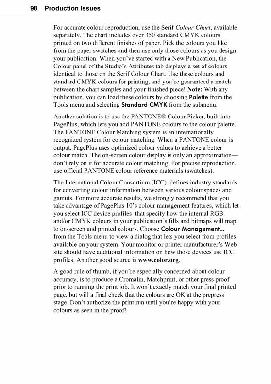
98 Production Issues
For accurate colour reproduction, use the Serif Colour Chart, available
separately. The chart includes over 350 standard CMYK colours
printed on two different finishes of paper. Pick the colours you like
from the paper swatches and then use only those colours as you design
your publication. When you’ve started with a New Publication, the
Colour panel of the Studio’s Attributes tab displays a set of colours
identical to those on the Serif Colour Chart. Use these colours and
standard CMYK colours for printing, and you’re guaranteed a match
between the chart samples and your finished piece! Note: With any
publication, you can load these colours by choosing Palette from the
Tools menu and selecting Standard CMYK from the submenu.
Another solution is to use the PANTONE® Colour Picker, built into
PagePlus, which lets you add PANTONE colours to the colour palette.
The PANTONE Colour Matching system is an internationally
recognized system for colour matching. When a PANTONE colour is
output, PagePlus uses optimized colour values to achieve a better
colour match. The on-screen colour display is only an approximation—
don’t rely on it for accurate colour matching. For precise reproduction,
use official PANTONE colour reference materials (swatches).
The International Colour Consortium (ICC) defines industry standards
for converting colour information between various colour spaces and
gamuts. For more accurate results, we strongly recommend that you
take advantage of PagePlus 10’s colour management features, which let
you select ICC device profiles that specify how the internal RGB
and/or CMYK colours in your publication’s fills and bitmaps will map
to on-screen and printed colours. Choose Colour Management... from the Tools menu to view a dialog that lets you select from profiles
available on your system. Your monitor or printer manufacturer’s Web
site should have additional information on how those devices use ICC
profiles. Another good source is www.color.org.
A good rule of thumb, if you’re especially concerned about colour
accuracy, is to produce a Cromalin, Matchprint, or other press proof
prior to running the print job. It won’t exactly match your final printed
page, but will a final check that the colours are OK at the prepress
stage. Don’t authorize the print run until you’re happy with your
colours as seen in the proof!
Production Issues 99
Calibrating your monitor
Regardless of the level of colour management you implement, accurate
colour calibration of your monitor is important. And if you’re trying
to visually match onscreen colours to a printed page, it’s critical. Note
that after successful calibration, monitor colours will appear less
vibrant as they will be restricted to the gamut of colours that printed
inks can achieve.
All computer monitors needs RGB data to display onscreen. However,
one monitor’s interpretation of RGB green might be different from
another’s. Colour profiles exist to iron out the differences. PagePlus
supports a colour profile called sRGB. If you set your monitor to its
sRGB mode (check the manufacturer’s instructions), you can be
assured that PagePlus is displaying colours as realistically as possible.
Some monitors have their own colour profile instead. PagePlus 9 lets
you load a specific monitor’s profile (see online help), again ensuring
accurate colour display. Be sure to choose a colour palette (CMYK or
RGB) as described above to match the type of output you’re aiming
for.
Another approach favoured by professionals is to employ specialized
hardware or software to verify that screen colours match established
standards. Check the Web for products and advice.
For many non-professionals, a common-sense approach and a few
adjustments will help to prevent disastrous mismatches between
onscreen and printed work. Here are a few things to keep in mind:
♦ Ambient lighting
The type and quality of background lighting at your workspace can
seriously affect your perception of colours displayed on the
monitor. The same monitor display can appear very different under
fluorescent lighting, which has a bluish tinge, than under warmer,
redder incandescent lighting. Daylight itself is quite variable over
the course of a day or even a few moments. Ideally you should
work where the light source is consistent (e.g. not a mix of natural
and artificial), evenly distributed (no dimmers) and directed
downwards to minimize screen reflections. Walls should be a
neutral colour. Obviously this is not practical for the average home
user but it is something that the small business user should be
aware of.
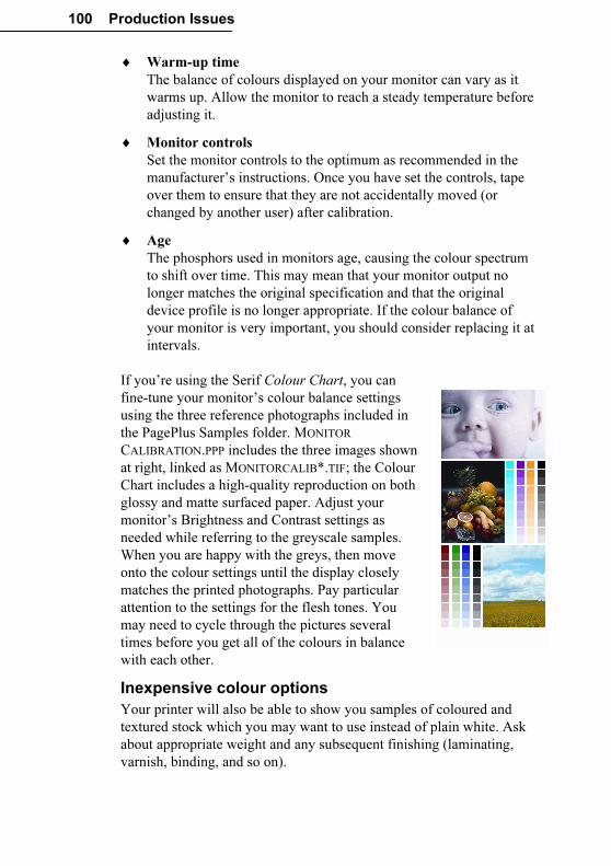
100 Production Issues
♦ Warm-up time
The balance of colours displayed on your monitor can vary as it
warms up. Allow the monitor to reach a steady temperature before
adjusting it.
♦ Monitor controls
Set the monitor controls to the optimum as recommended in the
manufacturer’s instructions. Once you have set the controls, tape
over them to ensure that they are not accidentally moved (or
changed by another user) after calibration.
♦ Age
The phosphors used in monitors age, causing the colour spectrum
to shift over time. This may mean that your monitor output no
longer matches the original specification and that the original
device profile is no longer appropriate. If the colour balance of
your monitor is very important, you should consider replacing it at
intervals.
If you’re using the Serif Colour Chart, you can
fine-tune your monitor’s colour balance settings
using the three reference photographs included in
the PagePlus Samples folder. MONITOR
CALIBRATION.PPP includes the three images shown
at right, linked as MONITORCALIB*.TIF; the Colour
Chart includes a high-quality reproduction on both
glossy and matte surfaced paper. Adjust your
monitor’s Brightness and Contrast settings as
needed while referring to the greyscale samples.
When you are happy with the greys, then move
onto the colour settings until the display closely
matches the printed photographs. Pay particular
attention to the settings for the flesh tones. You
may need to cycle through the pictures several
times before you get all of the colours in balance
with each other.
Inexpensive colour options
Your printer will also be able to show you samples of coloured and
textured stock which you may want to use instead of plain white. Ask
about appropriate weight and any subsequent finishing (laminating,
varnish, binding, and so on).
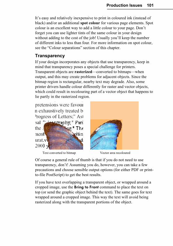
Production Issues 101
It’s easy and relatively inexpensive to print in coloured ink (instead of
black) and/or an additional spot colour for various page elements. Spot
colour is an excellent way to add a little colour to your page. Don’t
forget you can use lighter tints of the same colour in your design
without adding to the cost of the job! Usually you’ll keep the number
of different inks to less than four. For more information on spot colour,
see the “Colour separations” section of this chapter.
Transparency
If your design incorporates any objects that use transparency, keep in
mind that transparency poses a special challenge for printers.
Transparent objects are rasterized—converted to bitmaps—when
output, and this may create problems for adjacent objects. Since the
bitmap region is rectangular, nearby text may degrade. Also, some
printer drivers handle colour differently for raster and vector objects,
which could result in recolouring part of a vector object that happens to
lie partly in the rasterized region.
Text converted to bitmap Vector area recoloured
Of course a general rule of thumb is that if you do not need to use
transparency, don’t! Assuming you do, however, you can take a few
precautions and choose sensible output options (for either PDF or print-
to-file PostScript) to get the best results.
If you have text overlapping a transparent object, or wrapped around a
cropped image, use the Bring to Front command to place the text on
top (or send the graphic object behind the text). The same goes for text
wrapped around a cropped image. This way the text will avoid being
rasterized along with the transparent portions of the object.
102 Production Issues
When aiming for a “watermarking” design effect, try putting the
element at the back of the stack and using a +10% or +20% tint instead
of a solid 80% or 90% transparency. You’ll achieve the same faint
image in the background, but (since you’re technically not using
transparency), the effect won’t interfere with adjacent objects at output
time.
When it’s time to output your publication, PagePlus includes several
options (detailed in online help) that can circumvent rasterization issues
with transparent graphics—if your printer driver and/or print partner
can handle them. Stripping outputs irregular transparent regions by
producing thin strips of bitmaps placed one above the other; the
additional load of bitmaps to output can slow things down
considerably. Another method for printing known as clipping generates
a path or outline to reduce the rasterized output image to the smallest
possible area. Some printer drivers can handle these methods and some
cannot. For PDF output, masking can create a separate monochrome
bitmap defining the transparent region. Unfortunately, versions of
Acrobat before 6.0, as well as some RIPs (raster image processors),
don’t fully support masking.
Paper size
In professional printing you typically print onto paper that’s larger than
the finished “trim size”—the excess is removed after printing. (Some
printers use automated trimmers and will ask you to add a narrow black
page frame around your pages.) The larger area allows for bleeds
where certain objects run right out to the page edge after trimming. For
successful bleeds, let the object(s) overlap the edge slightly (say,
5mm—but check with your print partner) to allow for trimming errors.
PagePlus makes it convenient to design bleeds without having to alter
your Page Setup dimensions; these can stay the same as the intended
trim size. Once you’ve decided how much bleeds should overlap the
page edge (say, 5mm), choose File/Layout Guides... and enter that
value as your Bleed area guide setting. This will provide a visible
guide line at that distance outside the page edge, to which bleed objects
will snap (when Snapping is turned on). Later, when outputting your
pages, be sure to check the Bleed (limit) Prepress setting and enter the
identical overlap value as your Bleed Limit. PagePlus automatically
expands the dimensions of the output pages by the specified amount!
When you’re not using bleeds, leave a margin of at least 4 mm from the
trimmed edge for a professional look.
Production Issues 103
Note: To allow for bleeds when outputting a PostScript file, you’ll also
need to ensure that the printer driver page size (set via
File/Print.../General/Properties), is large enough to accommodate
the printed page plus the bleed.
Proof and proof again
If you are going to the expense of professional printing then the
proofing process becomes vital. Once the publication has gone to the
printer then any remaining errors can be very costly and time
consuming.
Before you deliver a PostScript or PDF file (see the next section),
always make sure that you extensively proof your publication using
your desktop printer. Preferably have a colleague check it over, too!
Select any appropriate print options (scaling, booklet, crop marks, and
so on) before outputting the publication. Make sure that the paper size
is large enough for the artwork and crop marks (they add an inch to
both dimensions). With PDF output, you can inspect the file on-screen
and print it out prior to submitting it.
If you’re doing full-colour (process-colour seps) work and colour
accuracy is critical, you should generally get a full-colour proof (such
as a Cromalin or Matchprint) produced. It won’t reproduce your final
printed page exactly, but it’s as close as you can get before going on
the press. It is your responsibility to ensure that you’re happy with the
colours in the colour proof before you authorize the print run. The
colours produced by the printing process will rarely match those
displayed on your screen.
Give a hardcopy printout to your print partner, so they can check the
imagesetter output. If your desktop printer isn’t quite up to the task, ask
the firm to run a proof on their laser printer so you can review it before
the imagesetter stage. If you receive final paper or film from a service
bureau, always examine it before you passing it on to your professional
printer. Compare it with your desktop printer output for consistency: it
is your responsibility to ensure that it is correct!
Output: PDF or PostScript?
Unless you’re handing off camera-ready artwork, your print provider
will specify the format in which you should submit the publication:
either PDF or PostScript. PostScript is a language which exactly
describes publication elements, while PDF is a format developed to
handle documents in a device- and platform-independent manner.
104 Production Issues
In recent years, print shops are moving away from PostScript and
toward the newer, more reliable PDF/X formats expressly targeted for
graphic arts and high quality reproduction. Several different “flavours”
of PDF/X exist; PagePlus supports PDF/X-1 and PDF/X-1a. Your print
partner may prefer one over the other, but from the PagePlus end of
things you won’t see a difference. In either mode, all your publication’s
colours will be output in the CMYK colour space, and fonts you’ve
used will be embedded.
If you choose PDF output, PagePlus produces a composite PDF file
that includes all of the fonts, images, graphics, and text required to
view and print the publication. A single PDF/X file will contain all the
necessary information your print partner requires to produce either spot
or process colour separations (as described elsewhere in the chapter).
When using PostScript output for separations, on the other hand, you’ll
need to tell PagePlus to generate a set of black-and-white “seps,” each
of the files representing one colour component.
Once you’ve decided whether to output as PDF or PostScript, choose
the appropriate export command in PagePlus. In either case, you’ll
need to set Prepress options (see “Prepress settings” below). Read the
following sections to be clear on any special requirements for each
format.
Whichever method you use, it’s always a good idea to print out a
hardcopy desktop proof and supply it to your print partner for them to
“eyeball.” It’s visual confirmation of what you’re expecting the
finished job to look like.
PDF output
To output your publication as a PDF/X file, choose Publish as PDF…
from the File menu. In the dialog, review settings on the General and
Advanced tabs as described below, then proceed to Prepress settings
(covered in the next section). Note: When handing off your publication
to a print partner, you don’t need to worry about the Compression or
Security tabs; these only apply to standalone PDFs.
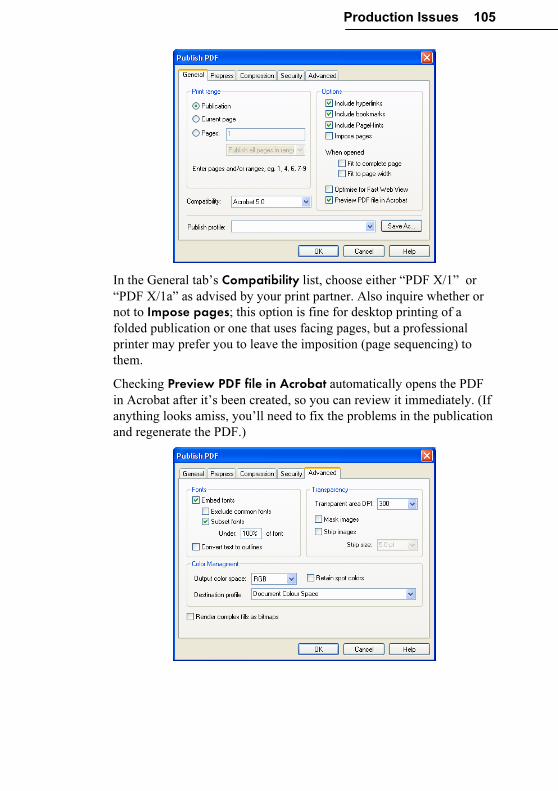
Production Issues 105
In the General tab’s Compatibility list, choose either “PDF X/1” or
“PDF X/1a” as advised by your print partner. Also inquire whether or
not to Impose pages; this option is fine for desktop printing of a
folded publication or one that uses facing pages, but a professional
printer may prefer you to leave the imposition (page sequencing) to
them.
Checking Preview PDF file in Acrobat automatically opens the PDF
in Acrobat after it’s been created, so you can review it immediately. (If
anything looks amiss, you’ll need to fix the problems in the publication
and regenerate the PDF.)
106 Production Issues
The Advanced tab includes settings you may only need to change if
you experience less than stellar results on a test run, or as specifically
directed by your print partner. As a rule, make sure that both Embed fonts and Subset fonts are checked, and uncheck Exclude common fonts. This will ensure that font information for any character that
appears in the publication gets included in the output; font subsetting
reduces file size by excluding specific characters you haven’t actually
used. If necessary (but it shouldn’t be) you can check Convert text to outlines and uncheck Embed fonts which will cause all text to be
treated as graphics.
If you have any completely or partially transparent regions in your
publication, make sure these come through properly in your output.
Technically, revealing transparent regions on-screen is quite different
from ensuring they look good on the printed page. Set the Transparent Area DPI as high as your print partner recommends (check first
whether they’ll accept 600 dpi). Masking and stripping are two options
that will add to the output time but may result in more satisfactory
transparency. Check Mask Images or Strip images only after
consulting with your print partner. Masking creates a separate
monochrome bitmap defining the transparent region, while stripping
outputs transparent graphics in thin “slices.” Both methods have pros
and cons, with masking generally preferable. When stripping, you may
need to experiment with the Strip size value to achieve the best results.
Smaller values mean smoother lines, but more complex PDF files. See
online help for details.
In the Colour Management section, the Output colour space setting
should always be “CMYK” for professional printing. Select the
Destination profile recommended by your print partner; “Document
working space” is the default setting. Check Retain spot colours to
enable your print partner to produce a separation for each spot colour;
otherwise spot colours will be redefined using the output colour space
you’ve selected.
Check Render complex fills as bitmaps to convert such objects to
bitmapped graphics. Uncheck the box to leave the objects as vector
graphics.
Production Issues 107
PostScript output
Producing a PostScript file is very much like printing, but instead of
printing to paper, you’re printing to disk. In the regular Print dialog,
you specify a PostScript printer (or PostScript printer driver) as the
target and check the Print to File option. The driver works like a
“virtual printer” and the end result is one or more PostScript files. In
other words, you might use the “Agfa SelectSet 7000SF v52.3” driver
without having that printer physically installed!
The key to success here is using an acceptable PostScript printer driver.
Your print partner can and should advise you specifically which driver
to use for your particular operating system; be prepared to locate and
download one on the Internet. Use the Windows Add Printer command
and choose an appropriate printer option, for example an AdobePS
driver. Right-click the printer’s icon in the Printers folder to access the
driver properties, and set up the driver exactly as directed by your
service bureau or printer.
Besides having the correct driver, you’ll need to know:
♦ What type of output you require: a single composite containing all
colours, process (CMYK) colour separations, or spot colour
separations
♦ What type of paper your document will be printed on
♦ The publication’s page size.
♦ Whether you want to print each page to a separate file and/or print
each separation to a separate file. (Smaller output files are more
easily transferable to a service bureau.)
Choose Print from the File menu to display the Print dialog. On the
General tab, click the Properties... button to select the PostScript
printer, page size and orientation, and other printer settings. Next,
review Prepress tab settings (covered in the next section). If preparing
colour separations, see the “Colour separations” section for background
information and details on Separations tab settings.
108 Production Issues
Your settings are “remembered” throughout the session, but each time
PagePlus restarts, the print options are reset to standard defaults. You
can save the current combination of settings made in the Print dialog as
a print profile with a unique name by clicking the Save As... button
next to the Print Profile list on the General tab. Once you’ve provided a
name and clicked OK, you can restore the profile later on simply by
choosing its name in the list. Note that the profile includes settings
from all tabs except the Separations tab.
When you’re ready to print, check the Print to File option on the
General tab to create output files on disk.
Here are some tips when generating PostScript output:
♦ In general, use only the TrueType fonts installed on your system.
TrueType fonts (marked TT) are fully scalable and can be
extensively manipulated by PagePlus (and other Windows
applications). Most importantly, all TrueType font information is
included in your PostScript output file so you won’t need to worry
about which fonts are available on the target printer.
♦ When naming output files, you can use any name you like; the
extensions .PRN and .PS are common. You should create the file
on your hard disk and then save a backup elsewhere. Copy the
PostScript file(s) to a disk which can be sent to your bureau, or
modem the files directly.
♦ PostScript print files can become very large, especially for
complex pages for colour separations. Consider using removable
media or recordable CD to transfer the files. Compress large files,
using an appropriate compression utility (such as WinZip) that can
split them across multiple disks if needed. Your print partner will
need the same hardware and software to decompress your files.
♦ When sending files via e-mail, bear in mind that e-mail programs
re-encode attachments, which means that the file size of an
attachment may exceed that of the original file by 75% or so. To
minimize download problems, don’t e-mail files larger than 1MB
or so. But if you must, make sure the recipient doesn’t mind
receiving large attachments! Using FTP (File Transfer Protocol) is
a time-saving option, if your print partner supports it.
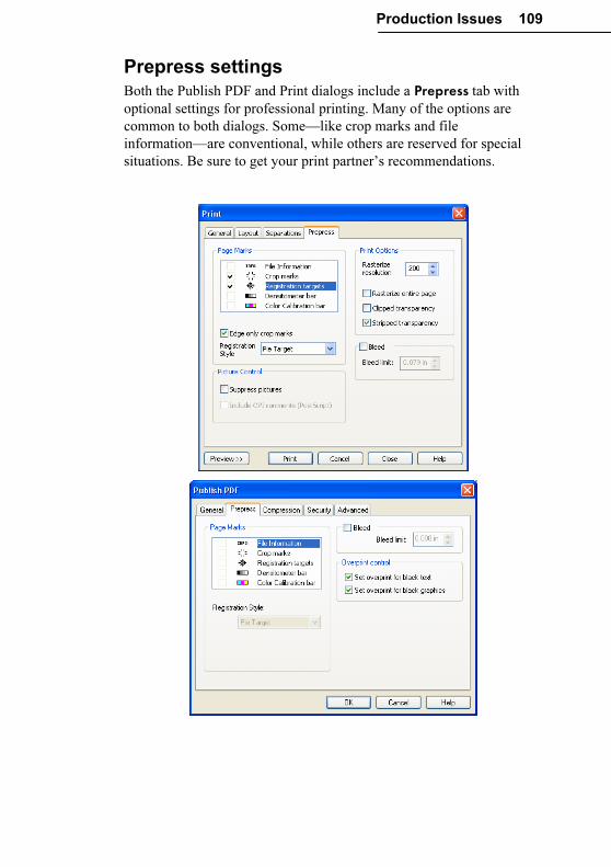
Production Issues 109
Prepress settings
Both the Publish PDF and Print dialogs include a Prepress tab with
optional settings for professional printing. Many of the options are
common to both dialogs. Some—like crop marks and file
information—are conventional, while others are reserved for special
situations. Be sure to get your print partner’s recommendations.
110 Production Issues
Choices in the “Page Marks” section include crop marks that show the
artwork (PagePlus page) dimensions; registration targets that help the
printer align subsequent press runs with the first one; densitometer
(greyscale) and colour calibration bars for gauging output accuracy;
and file information to print the time, date, and publication name. For
page marks to appear, the actual paper size must be at least 1 inch (25.4
mm) larger all around than the artwork. For PostScript printing, the
Windows printer driver normally has some “Extra” type page sizes that
can be used when using standard artwork paper sizes. If the paper is not
actually big enough, a warning message appears.
If your design incorporates bleeds—elements that run to the page
edges—check Bleed and to extend the printable area by the specified
Bleed limit beyond the page edges where printing would otherwise
stop. You can then print to an oversized sheet which is later trimmed to
the correct publication dimensions.
For PDF output, the Set overprint for black text and black graphics
boxes should be checked. Overprinting (available on the Separations
tab for PostScript output) in this case prevents black text on top from
“knocking out” (eliminating) any underlying colours and ensures there
won’t be any registration problems. As a general guideline, leave
overprinting on—and use a light-coloured background behind black
text so that the overprinted black text will be easily legible. The effect
may not be visible in an on-screen preview; you’ll need to print out the
relevant pages of the PDF to see it.
Several options are only available on the Prepress tab of the regular
Print dialog, and apply only to desktop printer or PostScript output:
In printed (or Web page) output, PagePlus uses the “rasterize on
output” method of maintaining transparency. This means that for many
objects with fancy fills and effects, the rectangular region bounding the
object is converted to an image when the document is published. The
main drawback of this method is that areas behind the transparent
region are converted to pictures, which can affect the quality and colour
of the background artwork.
Production Issues 111
When preparing transparent material for printing, follow the advice
given earlier in the “Colour and artwork considerations” section. When
printing, you can check the Stripped transparency option to have
PagePlus handle irregular transparent regions by producing thin strips
of bitmaps placed one above the other. You can combine this with
Clipped transparency, where PagePlus applies a clipping path or
outline to reduce the rasterized output image to the smallest possible
area. While both options offer efficient and accurate ways to produce
transparency in a printed or published document, some printer drivers
can handle these methods and some cannot. For example, clipping
sometimes causes problems with rotated graphics. If you find the print
job has grown to a large size in the print queue or is taking much longer
than you expect, try disabling the options in turn. See online help for
more details.
When the various methods of outputting your document have been
tried, but there’s still something annoyingly incorrect, there is one cure-
all solution—convert the whole page to a giant picture for faithful
reproduction. To achieve this, use the Rasterize Entire Page option.
Set a suitable Rasterize Resolution: 300dpi is the most common
setting for professional printing.
Checking Suppress pictures means that pictures won’t be printed, but
their position will be shown by place holder boxes. This speeds up
printing when doing quick proofs, and the key lines are useful when
pictures are added by hand (“stripped in”) later in production.
The Include OPI comments (PostScript) option only applies to the
production of Postscript print files for use with an OPI (Open Prepress
Interface) server. OPI comments describe the placement, size, rotation
and cropping of imported bitmap pictures so that the OPI server can
insert high-quality pictures before printing the page(s). The option is
greyed out unless printing to an OPI output device.
Colour separations
Because offset printing uses a different plate for each applied ink
colour, at some point in converting your publication for printing the
colour information needs to be separated into ink component colours.
As we’ve noted, PDF and PostScript handle this conversion differently.
A single composite PDF X/1-a file conveniently contains all the
necessary information to enable your print partner to prepare plates.
PostScript requires that you generate and hand off a set of black-and-
white “seps,” one for each colour component.
112 Production Issues
Whichever output method you’re using, colour information is being
separated, and it’s important that you understand the two basic ways of
separating colours in offset printing:
♦ Spot-colour separation means separation into the individual
colours visible on a page (“red,” PANTONE Reflex Blue and so
on). The printed piece typically uses black ink plus one or more
spot colours added using various tints of each colour.
♦ Process-colour separation means separation of everything into
percentages of the four so-called “process” colours (cyan,
magenta, yellow, and black). All printable colours can be
expressed, approximately, in terms of process colours.
Spot colour
Once on the press, the colour of the printed piece has nothing to do
with the colour of the original image or computer file. It depends on the
colour of the ink that the operator puts in the inkwell. Put in red ink
instead of black, and your piece is printed in red.
Suppose you want a flyer printed in black and red ink (for example, the
business name and a logo in red, everything else in black.) To do this,
two plates are needed: one with the part printing in black, and another
plate with the part printing in red. Each plate is “inked” from a
reservoir with either red or black ink, the image is transferred in turn to
each sheet of paper, either by running the paper through the press twice
(first to print the black part and again to print the red part) or by using a
two-colour press with two ink reservoirs and plate mountings.
In this example, two pieces of film are needed for plate making: one for
the black plate, and one for the red plate. The colours that are printed
depend only on the colours of ink put into the reservoir. If you changed
your mind, you could use the same plates and just tell the printer to fill
the reservoir with blue ink instead of red, and your job would now be
printed in black and blue. If you were to decide that you wanted the red
logo to be in black, then you would need new plates.
Production Issues 113
You can create an illusion of more colours by using tints of a colour,
with the same colour ink applied through a screen of tiny dots (that’s
how a newspaper photo is printed). For example, you could make one
headline a 70% tint of black, and print a logo in a 10% tint of blue
behind the type. You don’t get more colours, just different shades of
the colours you are using. You don’t need extra plates to print these
tints as they go on the same blue and black plates which you already
have. The tints can be created by a photographic process (for camera-
ready copy) or specified in the software before output from the
image/platesetter.
Note: If your publication uses any spot colours that have been
darkened from their base (100%) value, rather than lightened, be sure
to add their definitions to the palette before creating separations.
Otherwise darkened spot colours will appear using the base value.
Full or process colour (CMYK)
What about printing a colour photo or picture with hundreds or
thousands of colours? It’s not practical to run a job thorough a press
hundreds of times to print a picture. This is where process colour
comes in.
Process colour is a printing process which uses four different colour
inks: cyan (a light blue), magenta (purple-red), yellow, and black. They
are not solid, but semi-transparent, and when printed using four
different colour plates on the press, the inks laid down on each pass
will overlay the inks laid down earlier and mix on the page to create a
wide range of colours. Tints of each ink are used, with each
combination creating a different colour. 100% magenta on top of 100%
yellow ink gives a warm red; use less magenta (say 70% or 50%) and
you’ll get shades of orange. Add a small amount of black for a darker
shade.
The inks are not physically mixed together—this would just result in a
muddy dark brown colour—but they are mixed optically when you
look at the paper. Cyan, yellow, magenta, and black inks are used
because they can be mixed to produce almost every colour you might
want. However, they cannot produce every colour available as a spot
ink, and can produce far fewer colours than you can see on a computer
monitor.
♦ Try to avoid using tints that use less than 10% of C, M, Y, or K as
they usually print much lighter than they appear on-screen. If
possible, use colours from the standard CMYK palette.
114 Production Issues
♦ In the other direction, avoid using colours where the sum of the
CMYK ink percentages exceeds 250% or so. Too much ink may
cause set-off—markings on the underside of paper sheets before
the ink has dried—or other over-saturation problems.
♦ If you are using black in any areas where underlying objects might
show through, use a rich black instead—a mixture of 100% black
with some level of cyan or another process colour. In PagePlus,
rich black contains a mixture of 100% black and 30% each of
cyan, magenta, and yellow inks. The deeper tone helps disguise
any inconsistencies. However, don’t use rich black with small text
(below 12pt)—it can lead to registration problems and blurring.
Colour seps with PostScript output
You can create full-colour pages in PagePlus, and you can output them
using its built-in separation capabilities. If your print provider can
handle PDF/X1-a, there’s no need to weigh other options. If you must
submit PostScript, however, you’re faced with several choices:
♦ Print separations from PagePlus
Using the Print options described earlier, you can print spot- or
process-colour separations directly from PagePlus for all items on
your page. This is the most inexpensive way to create PostScript-
based separations, and if you do a lot of colour work you may
prefer to do this. You also have to take responsibility for scanning
any images and dealing with the technical issues of colour work.
Using photographs requires good-quality scanning, and these files
can become very large (and in turn, produce very large PostScript
files).
♦ Print seps from PagePlus combined with traditional separation
This approach uses the separation capabilities of PagePlus for all
elements except photographs. You create your layout using low-
resolution FPOs (For Position Only) of your photos and establish
size, position, rotation, and runaround. Then (after deleting your
images or using the Suppress Pictures option) you produce the
colour separations. Your commercial printer and/or service bureau
will scan high-resolution versions of your photos, and strip these in
to create final film. If you want the highest possible quality, or you
want to avoid the learning curve of desktop colour, take this
option.
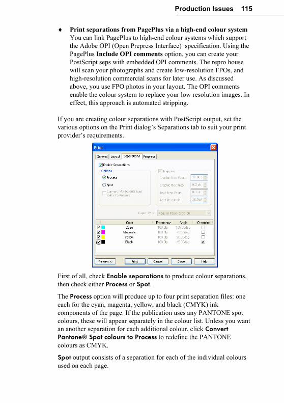
Production Issues 115
♦ Print separations from PagePlus via a high-end colour system
You can link PagePlus to high-end colour systems which support
the Adobe OPI (Open Prepress Interface) specification. Using the
PagePlus Include OPI comments option, you can create your
PostScript seps with embedded OPI comments. The repro house
will scan your photographs and create low-resolution FPOs, and
high-resolution commercial scans for later use. As discussed
above, you use FPO photos in your layout. The OPI comments
enable the colour system to replace your low resolution images. In
effect, this approach is automated stripping.
If you are creating colour separations with PostScript output, set the
various options on the Print dialog’s Separations tab to suit your print
provider’s requirements.
First of all, check Enable separations to produce colour separations,
then check either Process or Spot.
The Process option will produce up to four print separation files: one
each for the cyan, magenta, yellow, and black (CMYK) ink
components of the page. If the publication uses any PANTONE spot
colours, these will appear separately in the colour list. Unless you want
an another separation for each additional colour, click Convert Pantone® Spot colours to Process to redefine the PANTONE
colours as CMYK.
Spot output consists of a separation for each of the individual colours
used on each page.
116 Production Issues
Select the appropriate Paper Type on which to print your work. If you
are a printing expert and require nonstandard settings, select the
“Custom” paper type and adjust the values in the printer’s Properties
dialog (from the General tab).
The list at the bottom of the tab shows each separation along with
associated details. To suppress a given separation (for example, if
you’re just regenerating one in particular), uncheck its box.
Despite the use of registration marks (see “Prepress settings”), gaps
may occur between two printed elements from slight misalignment of
separate colour impressions. Various trapping methods are used to
overcome this problem. The Overprint box for black is checked by
default so that black prints on top of the other colours. (Because black
ink is very dark, it can be printed on top of other colours without
affecting its own colour.) Overprinting is especially useful when
printing fine black text on coloured tint (shaded) backgrounds. If you
wish, you can check a different colour to overprint.
Select the Trapping option to automatically “knock out” underlying
object regions where graphics overlap, leaving only a slight overprint
(trap) region at the edge. The auto-trapping values can be changed but
typically the default values will suffice.
If so directed by your print partner, you can specify custom screen
angles and frequencies for individual components in the colour list.
Alternatively, you can simply use the default PagePlus values, which
have been preset for a range of standard papers.
Standalone PDF
We’ve already said a lot (see the previous section) about PDFs
usefulness as an output format when handing off publication files to a
professional printer. Print shops can reliably extract spot or process
colour data from a single composite file you’ve output using the PDF/X
subset of the main Adobe specification. For standalone PDFs—those
you’ll distribute via e-mail and/or the Web, for your readers to read on-
screen or print out themselves (using Acrobat Reader)—PagePlus also
supports several versions of the standard PDF format. You’ll get best
results by using the latest version, but if your intended audience is
unlikely to have the latest Reader software, you may opt for an earlier
version.
Production Issues 117
There are several optional steps you can take to enhance a standalone
PDF publication; online help has details on all of them. For example,
you can insert hyperlinks to enable readers to click on text or a graphic
object to open a Web page, a page in your publication, a new e-mail
message, or an external file (such as a sound or movie). Hyperlinks are
a great way to link table of contents entries to pages in the same
document, or branch between documents.
Another optional step is to prepare a bookmark list of major headings.
This will appear as a separate list in a special pane when the PDF file is
viewed (bookmarks don’t appear when the document is printed).
Bookmarks are analogous to hyperlinks: they can link to a specific
page or to an anchor (for example, a piece of text or a graphic object) in
your publication. Finally, you can create pop-up annotations by
inserting PageHints as needed.
When you’re ready to export, choose Publish as PDF... from the File
menu and check your export settings. Choose the desired output format
in the General tab’s Compatibility list. See the “PDF output” section
above for other basic options. For standalone PDFs, you can skip the
Prepress tab, but it’s worth knowing about the compression and
security options PagePlus provides.
If your publication is picture-intensive, and you’re prepared to trade off
a bit of graphic quality for smaller file size, the Compression tab
provides separate options for shrinking colour, greyscale, and
monochrome images. You can select whether or not to downsample
each category of image, and specify a particular target resolution and
compression method. If you apply compression, be sure to inspect the
result to make sure the quality meets your standards before passing the
PDF to your readers!
The Security tab lets you add password protection to keep the contents
of your document away from unintended eyes. You can also lock
certain capabilities to prevent unauthorized dissemination or changes.
For example, you can specify No document printing to prevent paper
reproduction of the publication’s contents, or No content copying to
help ensure your text can’t be easily duplicated somewhere else. You
can even enter a master password to give you—and only you—the right
to alter these security settings. (Just be sure to remember your
password!)
118 Production Issues
Summary
This chapter has tried to give you an overview of the production issues
involved in professional printing. As with everything else, the best way
to find out the details is through experience.
With PagePlus and its sophisticated print options, professional printing
is now definitely an option for everyone. It’s worth considering for
colourful greeting cards, handouts, brochures, and so on. You’ll be
surprised by how inexpensive short-run colour printing can be...
However, don’t ignore the issues of colour matching and inclusion of
photographs. Make sure your first few professional printing projects are
simple, and allow plenty of time for the production process. Only when
you’ve successfully completed a few simpler professional printing
projects should you attempt a project of real consequence, or one with a
tight deadline.

QuickRef Project
QuickRef Project 121
A Hands-on Project
This chapter presents a learning sequence developed in the spirit of a
construction kit. We’ve provided the raw materials and instructions;
you provide several hours of your time, moving at your own pace.
There are no prerequisites. You’ll get results quickly, and feel a sense
of accomplishment each step of the way. When you’ve completed the
project, you’ll have not only a useful visual reference but a first-hand
knowledge of basic Desktop Publishing techniques—both of which you
can apply to your personal design projects.
What it is
You’ll be assembling an 11-page publication called a Quick Reference,
or QuickRef for short. The process transforms a text-only glossary of
DTP terms into a visual glossary with inline illustrations of typographic
terms and techniques. Just a browse through the pages of this chapter
will give you an idea of what’s in store and the DTP terminology you’ll
be introduced to.
Of course, we could have simply printed the QuickRef as a Companion
chapter—but then you would have missed a great opportunity to learn
about PagePlus and DTP at the same time!
What it isn’t
The QuickRef project is not a feature-by-feature tutorial—for a more
systematic, beginner-level introduction, you should start with the
Tutorials included with PagePlus, and those on the Design CD. There’s
a bit less hand-holding here. The QuickRef takes you through a
straightforward production sequence: just begin at the beginning and
follow the instructions. Along the way, we’ll introduce you to the tools
you need to get the job done—without long digressions on design
principles or technical details.
You’ll find the emphasis here is on black-and-white fundamentals
rather than specific-specific techniques. But don’t let that limit your
imagination!
122 QuickRef Project
Before You Begin...
Here are a few tips before you undertake the project:
Follow all instructions to the letter. (And how else, for a typography
primer?) To-do steps are noted with an open check box. (�) So as not
to skip a step inadvertently, it might be wise to make check marks on
the page as you proceed.
When called for, source files for the QuickRef project can normally be
found in the \PROGRAM FILES\SERIF\PAGEPLUS\10.0\SAMPLES folder
on your hard drive.
The QuickRef uses a variety of TrueType fonts, which are included
with the standard PagePlus installation. If the instructions call for a font
and it’s not installed on your system, you can substitute any suitable
font.
Save your work often. You can give the QuickRef file any name you
choose. It’s sound practice to Save As frequently, to a different file
name so if something happens to your current file you can fall back on
the previous version. For example, you could begin with QREF1.PPP,
then save as QREF2.PPP, and so on. Or alternate between the two names.
The currently selected object displays a bounding box and eight small
“handles.” When selecting an object that overlaps another, click
repeatedly until the object you want is selected. Clicking over text
objects will place the text editing cursor and allow you to select areas
of text as if you were using a word processor. To manipulate the text
frame itself, select its bounding box. To select objects behind text, hold
Alt on your keyboard while you click.
If you’re not already familiar with the various Zoom buttons on the
View toolbar above the PagePlus window, take a moment to glance at
their “tool tip” messages and try each of them out. It’s important to feel
in control of these options.
Take heart! If you make a mistake, most actions can be undone by
choosing Edit/Undo or pressing Ctrl+Z. You can set the number of
levels of undo using Tools/Options/General.
QuickRef Project 123
Setting Up the Publication
Starting from scratch
At the Startup screen, click the Start from Scratch option. From the
Regular/Portrait category, choose the standard Letter format (A4 for
users outside the US and Canada), click Finish, and the new publication
will open with one blank page.
Initial settings
Whether you’ve used PagePlus many times before, or not at all, you’ll
need to set various preferences and defaults a certain way so that the
instructions here will produce predictable results.
� Choose Layout Guides... from the File menu. We’ll only need the
Margins tab for this project. The number of Rows and Columns
should be 1. For a Letter-size page, set the margin guides to: Left
.75 inches, Right .75, Top .75, Bottom 1.00. For an A4-size page,
set the margins to: Left .63 (1.6cm), Right .64 (1.62cm), Top 1.00
(2.54cm), Bottom 1.44 (3.66cm). All check boxes should be
unchecked. Click OK.
� Choose Options... from the Tools menu, and on the Layout page
turn on (check) Display guide lines and Display frames. Turn
off (uncheck) Dot Grid. Click OK.
� On the top View toolbar, click the Full Page button. On the
HintLine toolbar along the bottom of the window, start with the
Snapping button down and the ChangeBar button up.
This means we’ll begin with a view of the whole page with the Studio
to the right; the Snapping feature turned on (for aligning the first
elements we create); and the ChangeBar hidden (we’ll get to that later).
If you’re using PagePlus for other publication work and need to change
these settings before you’ve completed the QuickRef, be sure to return
to this step and restore this setup before resuming the sequence.
Footer and header
To get started, you’ll install a pre-built footer into your QuickRef
publication and create a simple header.
� Before retrieving the footer, save your Untitled publication under
any name you choose (for example, QREF1.PPP).
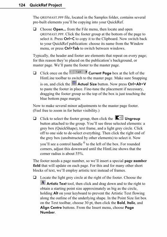
124 QuickRef Project
The QREFMAST.PPP file, located in the Samples folder, contains several
pre-built elements you’ll be copying into your QuickRef.
� Choose Open... from the File menu, then locate and open
QREFMAST.PPP. Click the footer group at the bottom of the page to
select it. Press Ctrl+C to copy it to the Clipboard. Now switch back
to your QuickRef publication: choose its name from the Window
menu, or press Ctrl+Tab to switch between windows.
Typically, the header and footer are elements that repeat on every page;
for this reason they’re placed on the publication’s background, or
master page. We’ll paste the footer to the master page.
� Click once on the Current Page box at the left of the
HintLine toolbar to switch to the master page. Make sure Snapping
is on, and click the Actual Size button. Now press Ctrl+Alt+V
to paste the footer in place. Fine-tune the placement if necessary,
dragging the footer group so the top of the box is just touching the
blue bottom page margin.
Now to make several minor adjustments to the master page footer.
(Feel free to zoom in for better visibility.)
� Click to select the footer group, then click the Ungroup
button attached to the group. You’ll see three selected elements: a
grey box (QuickShape), text frame, and a light grey circle. Click
off to one side to de-select everything. Then click the right end of
the grey box (unobstructed by other elements) to select it. Now
you’ll see a control handle to the left of the box. For rounded
corners, adjust this downward until the HintLine shows that the
corner radius is about 55%.
The footer needs a page number, so we’ll insert a special page number
field that will update on each page. For this and for many other short
blocks of text, we’ll employ artistic text instead of frames.
� Locate the light grey circle at the right of the footer. Choose the
Artistic Text tool, then click and drag down and to the right to
obtain a starting point size approximately as big as the circle,
holding Alt on your keyboard to prevent the Artistic Text flowing
along the outline of the underlying shape. In the Point Size list box
on the Text toolbar, choose 30 pt, then click the Bold, Italic, and
Align Centre buttons. From the Insert menu, choose Page Number.
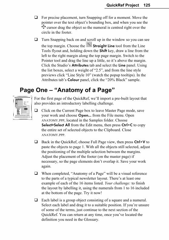
QuickRef Project 125
� For precise placement, turn Snapping off for a moment. Move the
pointer over the text object’s bounding box, and when you see the
cursor drag the object so the numeral is centred right over the
circle in the footer.
� Turn Snapping back on and scroll up in the window so you can see
the top margin. Choose the Straight Line tool from the Line
Tools flyout and, holding down the Shift key, draw a line from the
left to the right margin along the top page margin. Switch to the
Pointer tool and drag the line up a little, so it’s above the margin.
Click the Studio’s Attributes tab and select the Line panel. Using
the list boxes, select a weight of “2.5”, and from the line style
previews click “Line Style 10” (watch the popup tooltips). In the
Attributes tab’s Colour panel, click the “20% Black” sample.
Page One – “Anatomy of a Page”
For the first page of the QuickRef, we’ll import a pre-built layout that
also provides an introductory labelling challenge.
� Click on the Current Page box to leave Master Page mode, save
your work and choose Open... from the File menu. Open
ANATOMY.PPP, located in the Samples folder. Choose
Select>Select All from the Edit menu, then press Ctrl+C to copy
the entire set of selected objects to the Clipboard. Close
ANATOMY.PPP.
� Back in the QuickRef, choose Full Page view, then press Ctrl+V to
paste the objects to page 1. With all the objects still selected, adjust
the positioning of the multiple selection between the margins.
Adjust the placement of the footer (on the master page) if
necessary, so the page elements don’t overlap it. Save your work
again.
� When completed, “Anatomy of a Page” will be a visual reference
to the parts of a typical newsletter layout. There’s at least one
example of each of the 16 items listed. Your challenge: to finish
the layout by labelling it, using the numerals from 1 to 16 included
at the bottom of the page. Try it now!
� Each label is a group object consisting of a square and a numeral.
Select each label and drag it to a suitable position. If you’re unsure
of some of the terms, just continue to the next section of the
QuickRef. You can return at any time, once you’ve located the
definition you need in the Glossary.
126 QuickRef Project
The Glossary Story
Frame setup
The Glossary itself will begin on page 2. Before importing the text,
which will fill about six pages, we need to set up a template page with a
two-column frame.
� Click the Studio’s Pages tab and in the lower (Pages) panel, click
the Insert Page button. The new blank page appears.
� To create the frame, first click the Standard Frame Tool button on the left-hand Tools toolbar, which will give you the
standard square-shaped frame tool. Click at the upper left page
margin corner and, holding down the mouse button, drag out a
rectangle as far as the lower right page margin corner (but don’t
overlap the footer). Release the mouse button.
Since Snapping is turned on, the new frame sensibly aligns to the
nearest guide lines—those for the page margins.
� Right-click the new frame and choose Frame Setup.... Type “2”
as the number of Columns, and enter “.1” inches (0.25cm) in each
of the Margin boxes (top and bottom margins are set in the middle
of the window). The column gap should be 0.2 inches (0.5cm).
Click OK.
� With the new frame selected, choose Update Object Default from the Format menu so these settings will be in effect for frames
you create later.
Importing the Glossary
We’ll begin importing from page 2.
� Right-click the frame and choose Text File.... In the file selection
dialog, specify Files of Type: “Rich Text (.rtf).” Locate the file
GLOSSARY.RTF in the Samples folder and double-click its name. As
importing proceeds, answer Yes to the option to Autoflow; this
means PagePlus automatically creates new pages, with linked
frames holding all the text of the “story” being imported. (If you
get a prompt to AutoFit, answer No—we want to leave the text
size the same.)
When importing is done, you’ll be looking at page 7, with that page’s
main frame partially filled.
QuickRef Project 127
The next step is to carry out a simple Find/Replace operation to insert
spaces between each glossary term and its definition. We’ll be using
WritePlus, the built-in story editor.
� Right-click the frame and choose Edit Story to open WritePlus.
The full text of the Glossary story appears.
� Press Ctrl+F to open the Find and Replace window. In the Find
box, type “#” (without the quotation marks) and in the Replace
With box, type “ ” (two spaces). Click Replace All. Shortly the
“Replaced <n> occurrences” message will appear. Click OK, then
click Close to dismiss the Find and Replace dialog. Finally, click
the Close button in the top right of WritePlus to return to your
document view.
The Glossary text as it stands is essentially complete, minus the
illustrations we’ll be adding later. You may wish to print out pages 2 to
7 now for your own reference. This might also be a good point to save
your work as a new version, for example incrementing from QREF1.PPP
to QREF2.PPP.
Room to grow
At present, the Glossary story text is contained in six linked frames on
as many pages (2 to 7). As we proceed to add illustrations throughout
the text, the story will overflow beyond page 7. Sooner or later, we’ll
need to create some additional pages to contain the overflow. Doing
this now will help to clarify how all this content is going to be
distributed over the pages.
� Jump to page 2 and click Actual Size, then locate the entry for the
term “caption”. Click for an insertion point at the start of this line,
and press Ctrl+Shift+Enter, the shortcut for a Page Break. This
forces the “caption” entry to the top of page 3.
� Proceed through the document and repeat the page break procedure
in front of each of these entries: “cursive,” “font,” “kerning,”
“ornamental cap,” and “reverse.”
At this point you’ll be on page 7, with “reverse” and the following text
having disappeared into the story’s overflow region. Fortunately, we
can use AutoFlow to clone the current page, extending the frame
sequence.
� Scroll to the bottom of the page and notice the two “+” buttons at
the lower right of the frame: one green, the other red. Click the
green AutoFlow button.
128 QuickRef Project
� You’ll land on page 9, so backtrack to page 8 and continue
inserting page breaks before the terms “shading” and “white
space.”
� Again the overflow text runs past the last page (9), so click the
AutoFlow button again.
The Glossary story now runs through page 10, with all frames linked
together. Using AutoFlow has saved us the labour of creating new
frames on each page and linking them by hand!
Page Two – “accent” to “cap line”
Now for the main business of the QuickRef project: producing a series
of inline illustrations for key Glossary terms. We’ll proceed
alphabetically, so as soon as you’re done with a page it will be ready to
be printed out as a reference.
alignment
For the first illustration, we’ll apply four different kinds of paragraph
alignment to some sample text.
� Switch back to QREFMAST.PPP, or (if it’s closed) open it from the
Samples folder. On the left, you’ll see a text frame containing four
paragraphs. Click on the frame’s bounding box to select it, press
Ctrl+C to copy it to the Clipboard, then switch back to your
QuickRef window.
� Navigate to page 2 of the QuickRef publication.
For a suitable working view, you want the page edge centred in the
window, with pasteboard area on one side and a column of text on the
other. Usually, you’ll want to be zoomed-in enough to read the text in
the column, but not so close that you sacrifice workspace.
� To set the view, click the Zoom Tool button and drag out a
“marquee” selection rectangle around the top left quarter of the
page area, including some pasteboard area as well. Can you read
the text of the “alignment” Glossary entry? You may need to use
the Zoom Out or Zoom In buttons for a better view. About 70%
should be right. Is the page edge in the middle of the screen? Use
the lower scrollbar or the Pan Tool to adjust the view.
QuickRef Project 129
Before continuing, you may wish to experiment with the various zoom
and pan controls on the HintLine toolbar. You can also right-click on
an object and choose Zoom In or Zoom Out.
� Press Ctrl+V to paste the text frame, and drag it over to the
pasteboard on the left of the page. Starting with the top paragraph,
click each one in turn and apply the appropriate paragraph
alignment using the alignment buttons on the Text toolbar: Align Left, Justify, Align Centre, and Align Right.
Setting the text wrap properties of our illustrations will be an important
part of preparing them for inline insertion into the layout. Wrap settings
control how the text in a frame flows around an object. Usually we’ll
set the properties before inserting the object, then fine-tune the object’s
“wrap outline” values as part of final positioning.
� Right-click the newly pasted frame and choose Wrap Settings. In
the dialog, click Square and Both Sides, and change all four
default Distance From Text values to “.2 in” (0.5cm). Click OK.
� Drag the frame over the left column of page 2 text, just below the
“alignment” entry. Use the Pointer tool to adjust the frame’s
placement and width so it’s inset slightly from the existing column
margins. Drag the frame’s bottom, middle handle down several
inches so the frame is about six inches high; we’ll close it up later.
Now for finishing touches: standoff rules and white space.
� Click once in the first paragraph of the inset frame.
This will give you a text edit cursor. Remember, should you need to
cycle through overlapping objects, just Alt-click several times in the
same place.
� Select Paragraph from the Format menu. Select the Line tab and
click in the top half of the Line Selection box.
Type the value “12” for the Gap (top). Click the
Line Style button, specify 2.0pt as the Weight,
and make sure you’re using the first line style
from the list. Click OK twice to apply the
change.
� Repeat the process for the bottom paragraph of the new frame, but
this time give it a Line Below. Click in the lower half of the Line
Selector, uncheck Lock gap sizes, and specify a 12pt setting for
Gap (bottom). Apply the same line style as above.
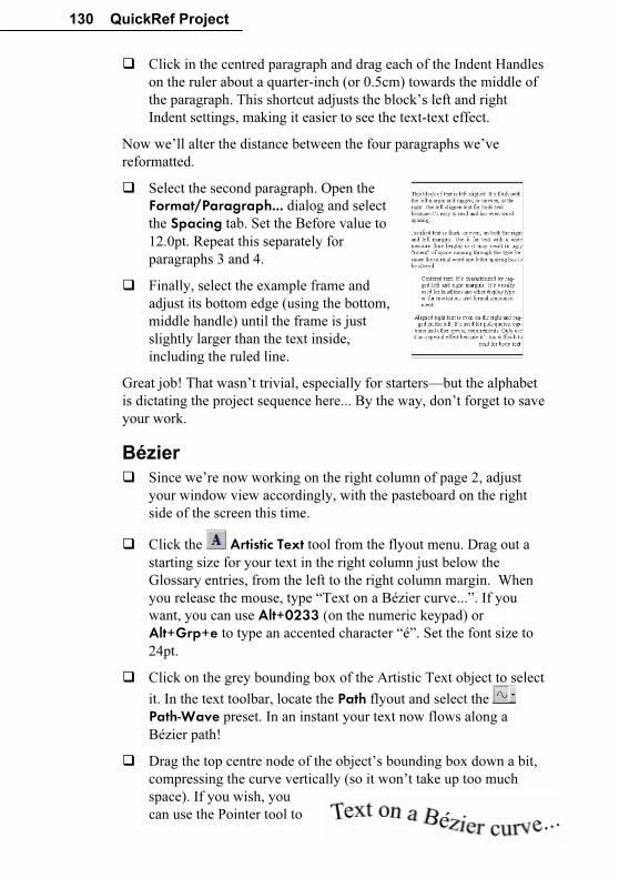
130 QuickRef Project
� Click in the centred paragraph and drag each of the Indent Handles
on the ruler about a quarter-inch (or 0.5cm) towards the middle of
the paragraph. This shortcut adjusts the block’s left and right
Indent settings, making it easier to see the text-text effect.
Now we’ll alter the distance between the four paragraphs we’ve
reformatted.
� Select the second paragraph. Open the
Format/Paragraph... dialog and select
the Spacing tab. Set the Before value to
12.0pt. Repeat this separately for
paragraphs 3 and 4.
� Finally, select the example frame and
adjust its bottom edge (using the bottom,
middle handle) until the frame is just
slightly larger than the text inside,
including the ruled line.
Great job! That wasn’t trivial, especially for starters—but the alphabet
is dictating the project sequence here... By the way, don’t forget to save
your work.
Bézier
� Since we’re now working on the right column of page 2, adjust
your window view accordingly, with the pasteboard on the right
side of the screen this time.
� Click the Artistic Text tool from the flyout menu. Drag out a
starting size for your text in the right column just below the
Glossary entries, from the left to the right column margin. When
you release the mouse, type “Text on a Bézier curve...”. If you
want, you can use Alt+0233 (on the numeric keypad) or
Alt+Grp+e to type an accented character “é”. Set the font size to
24pt.
� Click on the grey bounding box of the Artistic Text object to select
it. In the text toolbar, locate the Path flyout and select the
Path-Wave preset. In an instant your text now flows along a
Bézier path!
� Drag the top centre node of the object’s bounding box down a bit,
compressing the curve vertically (so it won’t take up too much
space). If you wish, you
can use the Pointer tool to
QuickRef Project 131
edit the shape of the line!
� Right-click the object’s box and choose Wrap Settings.... Set a
Square Wrap with Top and Bottom spacings of 0 and click OK.
� Drag the curved text just below the “Bézier” entry in the Glossary,
before the following entry for “blackletter.” You can drag its edge
or corner nodes as needed so it fits neatly into the column. Or,
instead of adjusting the object size, you might try fine-tuning its
wrap as follows: Select the Edit Wrap button on the toolbar to
view the wrap outline and nodes. Drag the nodes (corners, in this
case) of the object’s wrap outline so there’s a small amount of
white space above and below the example. Keep the left and right
edges of the wrap all the way out to the column margins, so there
are no gaps for text to flow into (it’s slippery stuff!).
blurb
This exercise introduces another standard publishing technique we’ll be
using. Adjust the window view so you’re fairly close in on the entry for
“blurb.”
� Click at the end of the “blurb” entry and create a new line by
pressing Enter on your keyboard. Just start typing, exactly these
words: “Don’t just sit down in front of the PC and dive in...” Press
Shift+Enter to insert a soft return (line break). Continue typing:
“Take some time to plan your design!”
� Triple-click over any of the words you’ve just typed and the whole
paragraph should select. Aim for the word “Don’t” if you’re
unsure where to click—you’ll soon get the hang of triple-clicking
(three clicks of the left mouse button in quick succession) On the
Text toolbar, set the text to “Arial” and “14.0p”. Then choose
Update Text Default from the Format menu so these settings will
be in effect for new text objects you create later.
� Make the text Bold and Italic using the buttons on the Text toolbar.
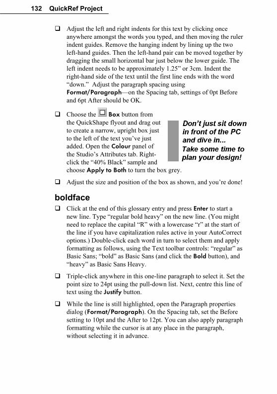
132 QuickRef Project
� Adjust the left and right indents for this text by clicking once
anywhere amongst the words you typed, and then moving the ruler
indent guides. Remove the hanging indent by lining up the two
left-hand guides. Then the left-hand pair can be moved together by
dragging the small horizontal bar just below the lower guide. The
left indent needs to be approximately 1.25” or 3cm. Indent the
right-hand side of the text until the first line ends with the word
“down.” Adjust the paragraph spacing using
Format/Paragraph—on the Spacing tab, settings of 0pt Before
and 6pt After should be OK.
� Choose the Box button from
the QuickShape flyout and drag out
to create a narrow, upright box just
to the left of the text you’ve just
added. Open the Colour panel of
the Studio’s Attributes tab. Right-
click the “40% Black” sample and
choose Apply to Both to turn the box grey.
� Adjust the size and position of the box as shown, and you’re done!
boldface
� Click at the end of this glossary entry and press Enter to start a
new line. Type “regular bold heavy” on the new line. (You might
need to replace the capital “R” with a lowercase “r” at the start of
the line if you have capitalization rules active in your AutoCorrect
options.) Double-click each word in turn to select them and apply
formatting as follows, using the Text toolbar controls: “regular” as
Basic Sans; “bold” as Basic Sans (and click the Bold button), and
“heavy” as Basic Sans Heavy.
� Triple-click anywhere in this one-line paragraph to select it. Set the
point size to 24pt using the pull-down list. Next, centre this line of
text using the Justify button.
� While the line is still highlighted, open the Paragraph properties
dialog (Format/Paragraph). On the Spacing tab, set the Before
setting to 10pt and the After to 12pt. You can also apply paragraph
formatting while the cursor is at any place in the paragraph,
without selecting it in advance.
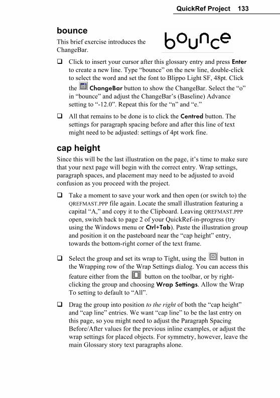
QuickRef Project 133
bounce
This brief exercise introduces the
ChangeBar.
� Click to insert your cursor after this glossary entry and press Enter to create a new line. Type “bounce” on the new line, double-click
to select the word and set the font to Blippo Light SF, 48pt. Click
the ChangeBar button to show the ChangeBar. Select the “o”
in “bounce” and adjust the ChangeBar’s (Baseline) Advance
setting to “-12.0”. Repeat this for the “n” and “e.”
� All that remains to be done is to click the Centred button. The
settings for paragraph spacing before and after this line of text
might need to be adjusted: settings of 4pt work fine.
cap height
Since this will be the last illustration on the page, it’s time to make sure
that your next page will begin with the correct entry. Wrap settings,
paragraph spaces, and placement may need to be adjusted to avoid
confusion as you proceed with the project.
� Take a moment to save your work and then open (or switch to) the
QREFMAST.PPP file again. Locate the small illustration featuring a
capital “A,” and copy it to the Clipboard. Leaving QREFMAST.PPP
open, switch back to page 2 of your QuickRef-in-progress (try
using the Windows menu or Ctrl+Tab). Paste the illustration group
and position it on the pasteboard near the “cap height” entry,
towards the bottom-right corner of the text frame.
� Select the group and set its wrap to Tight, using the button in
the Wrapping row of the Wrap Settings dialog. You can access this
feature either from the button on the toolbar, or by right-
clicking the group and choosing Wrap Settings. Allow the Wrap
To setting to default to “All”.
� Drag the group into position to the right of both the “cap height”
and “cap line” entries. We want “cap line” to be the last entry on
this page, so you might need to adjust the Paragraph Spacing
Before/After values for the previous inline examples, or adjust the
wrap settings for placed objects. For symmetry, however, leave the
main Glossary story text paragraphs alone.
134 QuickRef Project
Page Three – “caption” to “crop marks”
Since the first couple of examples on this page begin with designs pre-
stored in the master file, we’ll take this opportunity to introduce the
Portfolio—a repository that’s convenient both for storing objects you
want to reuse, and for transferring multiple objects between documents.
caption
� Switch to the QREFMAST.PPP file, and click the Studio’s Portfolio
tab. Make sure the “My Designs” category is selected at the top.
Holding the Ctrl key down, drag a copy of the lion picture and
drop it into the Portfolio’s lower panel. (Not holding down Ctrl would result in a Move operation.) You need not provide a name
for the design at this time; it will simply appear as “Unnamed
Design.” Likewise, Ctrl-drag a copy of the group featuring the
word “Everything” into the Portfolio.
� Switch to your QuickRef file and go to page 3. Click and drag the
lion picture from the Portfolio out onto the pasteboard.
Note that a copy of the design remains in the Portfolio. (For future
reference, to delete an item from the Portfolio, you can right-click on it
and choose Delete Design.)
� Set the zoom view and scroll settings to allow a legible glossary
entry for “caption” on the right, and pasteboard on the left. Drag
the lion over to the pasteboard to the left of your text.
� Select the picture, then show the ChangeBar. Using the Object
Rotation control, set the rotation to 10.0 degrees.
� Drag the picture into position below the “caption” entry. Set its
wrap to Square using the Wrap Settings button. Now zoom
in for a better view (use Zoom to Selection, then back off a bit).
� Choose the Artistic Text tool and click on a blank part of the page
for an insertion point. Type “It’s a jungle out there!” and set the
object’s font to Arial, 11pt. Use the ChangeBar to rotate this
caption block to 10.0 degrees, and drag it into position below and
to the right of the picture.
character
The “Everything” diagram in the Portfolio is the illustration to
accompany the “character” entry. (If it’s not there, retrieve it from
QREFMAST.PPP.)
QuickRef Project 135
� Drag a copy of the diagram out of the Portfolio and drop it over the
frame text so the “character” entry ends just above it in the left
column. The object’s left and right edges should align with the
page margins, spanning two columns. Set the wrap to Square, with
the distance from text set to .15 (0.4cm) top and .10 (0.25cm)
bottom.
copyright
� Choose the Artistic Text tool and drag out a letter approximately
1” (2.5cm) high at the edge of the page. Choose Symbol from the
Insert menu and select Copyright from the submenu. Select with a
double-click, then format the symbol as 60pt by typing “60”
directly into the Text Size box and pressing Enter. Set its wrap to
Tight this time. Make sure that the “Crop object to wrap outline”
box is unchecked in your wrap settings so no portion of the symbol
disappears in the next step.
� Drag the character into position to the right of
the “copyright” entry. To edit the wrap outline,
click the Edit Wrap button. You can then
drag the dashed outline or nodes. Bring the
outline quite close to the character, as shown.
To create a curved wrap on the left edge, drag
the edge from its centre; then you can adjust
the corner node handles. Make sure the right-hand outline extends
to the right margin, to keep text from sneaking in there.
� Before proceeding, make sure the two-line entry for “crop marks”
is the last entry on the page. Again, you can adjust the wrap
settings and spacing for inline illustrations to change the amount of
space available for the remaining frame text.
Page Four – “cursive” to “folio”
deck
� Click to insert your text cursor at the end of this entry. Press Enter to start a new line. Type “Introducing PagePlus 10”. Set the line to
Chanson Heavy 18pt, centred. Make the spacing before this
paragraph 12pt and leave the spacing after at 1pt.
� Press Enter once at the end of the line to start a new paragraph.
Type “It’s what you’ve been waiting for!” Make this Arial 14pt
and centre it. Leave the spacing before this paragraph at 0pt and set
the spacing after to 12pt.
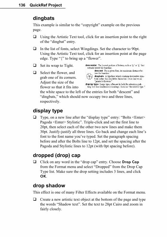
136 QuickRef Project
dingbats
This example is similar to the “copyright” example on the previous
page.
� Using the Artistic Text tool, click for an insertion point to the right
of the “dingbat” entry.
� In the list of fonts, select Wingdings. Set the character to 90pt.
Using the Artistic Text tool, click for an insertion point at the page
edge. Type “{” to bring up a “flower”.
� Set its wrap to Tight.
� Select the flower, and
grab one of its corners.
Adjust the size of the
flower so that it fits into
the white space to the left of the entries for both “descent” and
“dingbats,” which should now occupy two and three lines,
respectively.
display type
� Type, on a new line after the “display type” entry: “Bolts <Enter>
Pagoda <Enter> Stylistic”. Triple-click and set the first line to
20pt, then select each of the other two new lines and make them
30pt. Justify-justify all three lines. Go back and change each line’s
font to the font name you’ve typed. Set the paragraph spacing
before and after the Bolts line to 12pt, and set the spacing after the
Pagoda and Stylistic lines to 12pt (with 0pt spacing before).
dropped (drop) cap
� Click on any word in the “drop cap” entry. Choose Drop Cap
from the Format menu and select “Dropped” from the Drop Cap
Type list. Make sure the drop setting includes 3 lines, and click
OK.
drop shadow
This effect is one of many Filter Effects available on the Format menu.
� Create a new artistic text object at the bottom of the page and type
the words “Shadow text”. Set the text to 28pt Cairo and zoom in
fairly closely.
QuickRef Project 137
� Choose Filter Effects... from the Format menu. In the dialog,
check the Drop Shadow box and then play with the sliders on the
right side until you find a preview effect you like (or just use the
default settings). Click OK when you’re done. If you want to try
again, you can also find filter effects on the object’s right-click
menu.
� For added effect, use the ChangeBar to rotate the object +10
degrees. Drag it into position below the “drop shadow” entry, so
the illustration becomes the last element in the left column; it can
extend outward into the left margin. You can easily drag one of the
object’s corners to scale it, if necessary. Set a Square wrap with
standoff values so that the entry for “ear” now begins the right
column.
Egyptian
� Create a new line after this entry and type “Commerce”. Set the
font to Commerce, 36pt Centred. Set the paragraph spacing to 6pt
before and after.
family
This example introduces the special effect of “ghosting” light-shaded
text behind solid black text.
� Create a text frame 3” (7.5cm) wide by 2” (5cm) high with a single
column. Type “Times Regular <Enter> Times Italic <Enter>
Times Bold”. Press Ctrl+A to select all the text in this frame, then
set the font to 30pt Times New Roman. Tighten the frame to best
fit the text.
� Click the Align Right button. Then drag the Shade/Tint slider on
the Attributes tab’s Colour panel to a setting of +20% for light
grey “ghosted” text. Use the Pointer tool to triple-click the second
and third lines and set the font style to Italic and Bold,
respectively.
� Select the frame and click the Send to Back button. Now drag
the frame into position, behind the entry for “family,” so the font
names extend partway into the right margin. Adjust vertically for
best visibility.
Note: Some printer drivers have trouble with pages like this one
that include shaded text. For best results, before you print, click the
Properties button in the Print dialog and select the Fonts tab.
Check the option to “Download TrueType fonts as bitmap soft
fonts.”
138 QuickRef Project
Before proceeding, check that the entry for “folio” ends the right
column. (Adjust the paragraph spacing before and after on the font
examples, or the bottom frame margin if necessary.)
Page Five – PagePlus Font Sampler
This special page provides—in addition to a definition for the term
“font”—a visual reference showing a selection of some fonts included
in the PagePlus installation.
font
The Font Sampler page will use text that’s not part of the glossary
story, so we’ll insert a new page at this point, along with a new frame.
� Assuming you’re on page 4 now, then click the Page Manager button on the HintLine toolbar (or the Pages tab). Select
the dialog’s Insert tab and leave the settings as they are (1 page
after page 4). Just click OK.
� Zoom out to Fit Page view and make sure Snapping is on. Choose
the Standard Frame tool and drag out a text frame fit to the page
margins. Drag the top edge down leaving about two inches
between the frame and the top of the page.
In this space above the frame, we’ll create two elements: a headline or
title and (in a sidebar) the definition of “font.”
� Create an artistic text object at the top of the page, type “PagePlus
Font Sampler” and set the text as Centred, Chanson Heavy 20pt.
From the Format menu, choose Paragraph, and select the Line
tab. Click in the Line Selection box to create lines above and
below. Shift-click to select both lines (each should have a pair of
arrows). Click the Line Style button and set a 3pt line width. Then
unlock gap sizes and set the top and bottom gap to .10” (0.25cm).
Click OK.
� Drag the header block into position above the frame’s left column,
touching the top page margin.
� Create a new standard frame on the same page (or over on the
pasteboard, about one inch (2.5cm) high and three inches (7.5cm)
wide. Set it to have one column rather than two (you can use the
Columns control on the ChangeBar) and drag the margins to 0.
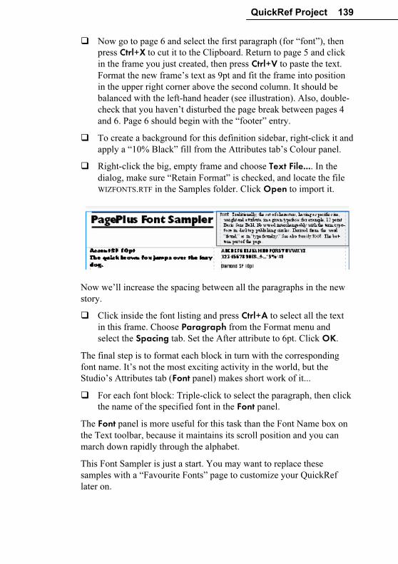
QuickRef Project 139
� Now go to page 6 and select the first paragraph (for “font”), then
press Ctrl+X to cut it to the Clipboard. Return to page 5 and click
in the frame you just created, then press Ctrl+V to paste the text.
Format the new frame’s text as 9pt and fit the frame into position
in the upper right corner above the second column. It should be
balanced with the left-hand header (see illustration). Also, double-
check that you haven’t disturbed the page break between pages 4
and 6. Page 6 should begin with the “footer” entry.
� To create a background for this definition sidebar, right-click it and
apply a “10% Black” fill from the Attributes tab’s Colour panel.
� Right-click the big, empty frame and choose Text File.... In the
dialog, make sure “Retain Format” is checked, and locate the file
WIZFONTS.RTF in the Samples folder. Click Open to import it.
Now we’ll increase the spacing between all the paragraphs in the new
story.
� Click inside the font listing and press Ctrl+A to select all the text
in this frame. Choose Paragraph from the Format menu and
select the Spacing tab. Set the After attribute to 6pt. Click OK.
The final step is to format each block in turn with the corresponding
font name. It’s not the most exciting activity in the world, but the
Studio’s Attributes tab (Font panel) makes short work of it...
� For each font block: Triple-click to select the paragraph, then click
the name of the specified font in the Font panel.
The Font panel is more useful for this task than the Font Name box on
the Text toolbar, because it maintains its scroll position and you can
march down rapidly through the alphabet.
This Font Sampler is just a start. You may want to replace these
samples with a “Favourite Fonts” page to customize your QuickRef
later on.
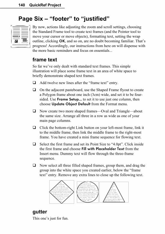
140 QuickRef Project
Page Six – “footer” to “justified”
By now, actions like adjusting the zoom and scroll settings, choosing
the Standard Frame tool to create text frames (and the Pointer tool to
move your cursor or move objects), formatting text, setting the wrap
outline, clicking OK, and so on, are no doubt becoming familiar. That’s
progress! Accordingly, our instructions from here on will dispense with
the more basic reminders and focus on essentials...
frame text
So far we’ve only dealt with standard text frames. This simple
illustration will place some frame text in an area of white space to
briefly demonstrate shaped text frames.
� Add twelve new lines after the “frame text” entry.
� On the adjacent pasteboard, use the Shaped Frame flyout to create
a Polygon frame about one inch (3cm) wide, and set it to be four-
sided. Use Frame Setup... to set it to use just one column, then
choose Update Object Default from the Format menu.
� Now create two more shaped frames—Oval and Triangle—about
the same size. Arrange all three in a row as wide as one of your
main page columns.
� Click the bottom-right Link button on your left-most frame, link it
to the middle frame, then link the middle frame to the right-most
frame. You have created a mini frame sequence for flowing text.
� Select the first frame and set its Point Size to “4.0pt”. Click inside
the first frame and choose Fill with Placeholder Text from the
Insert menu. Dummy text will flow through the three-frame
sequence.
� Now select all three filled shaped frames, group them, and drag the
group into the white space you created earlier, below the “frame
text” entry. Remove any extra lines to close up the following text.
gutter
This one’s just for fun.
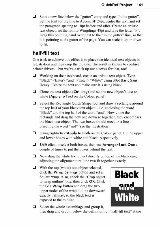
QuickRef Project 141
� Start a new line below the “gutter” entry and type “In the gutter”.
Set the font for the line to Accent SF 24pt, centre the text, and set
the paragraph spacing to 10pt before and after. Create an artistic
text object, set the font to Wingdings 48pt and type the letter “F”.
Drag this pointing hand over next to the “In the gutter” line, so that
it is pointing at the gutter of the page. You can scale it up or down
to fit.
half-fill text
One trick to achieve this effect is to place two identical text objects in
registration and then crop the top one. The result is known to confuse
printer drivers... but we’ve a trick up our sleeves for that, too!
� Working on the pasteboard, create an artistic text object. Type
“Black” <Enter> “and” <Enter> “White” using 30pt Basic Sans
Heavy. Centre the text and make sure it’s using black.
� Clone the text object (Ctrl-drag) and set the new object’s text to
white (Apply to Text on the Colour panel).
� Select the Rectangle Quick Shape tool and draw a rectangle around
the top half of your black text object—i.e. enclosing the word
“Black” and the top half of the word “and”. Now clone the
rectangle and drag the new one down so together, they encompass
the black text object. The two boxes should meet on a line
bisecting the word “and” (see the illustration).
� Using right-click/Apply to Both on the Colour panel, fill the upper
and lower boxes with white and black, respectively.
� Shift-click to select both boxes, then use Arrange/Back One a
couple of times to put the boxes behind the text.
� Now drag the white text object directly on top of the black one,
adjusting the alignment until the two fit together exactly.
� With the top (white) text object selected,
click the Wrap Settings button and set a
Square wrap. Also, check the “Crop object
to wrap outline” box, then click OK. Click
the Edit Wrap button and drag the two
upper nodes of the wrap outline downward
exactly halfway, so the black text is
exposed to the midline.
� Select the whole assemblage and group it,
then drag and drop it below the definition for “half-fill text” at the
142 QuickRef Project
bottom of the column. Give it a top/bottom wrap.
By the way, if you find that certain effects like this one pose problems
for your printer, you can choose Convert to Picture... from the Tools
menu. In this case we’d recommend the Bitmap Format option and
either the GIF or JPG format.
initial cap
A simple illustration…
� Select the “i” at the start of this entry. Set the point size to 24pt.
� In the Format/Paragraph... dialog, set the spacing before this
paragraph to 6pt, and the spacing after to 18pt.
italic
� Place your cursor at the end of this entry in the right-hand column
and create a new line. Type “Try using italics for pull-quotes and
captions.” Set the text to Grenoble 24pt, Italic (of course!); leave it
left-aligned.
� Set the left indent to .5” (1.5cm) and the right indent to .85”
(2.1cm), using either the ruler margin guides or the Paragraph
dialog. Set the paragraph spacing before and after to 14pt, and
remove the hanging indent.
� Create an artistic text object and type a “smart” open-quote
character (ANSI value 147). To do this, hold down the Alt key and
press “0147” on the numeric keypad. Set this block to 72pt
Grenoble (this time regular, not italic). Duplicate the object and
replace its text with a close-quote (ANSI 148, or Alt+0148).
� Now move these two quote characters around your indented
italicised text to form a big pull-quote. Adjust your indents if
necessary so it’s four lines and the third line reads “pull-quotes.”
Position the open quote to the top left, and the close quote to the
bottom right of the blurb. The artistic text should have no wrap.
� Before moving on, adjust the paragraph space settings, the size of
the half-fill text illustration, and/or the overall frame size so the
definition of “justified” ends the column.
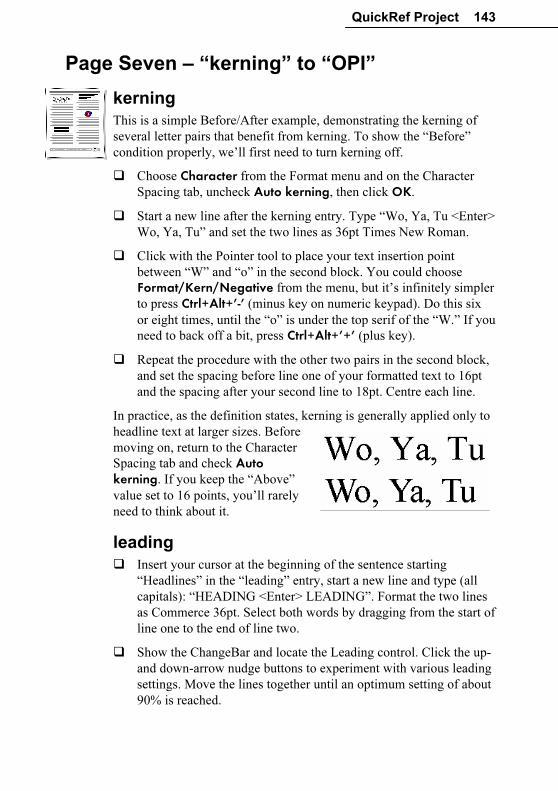
QuickRef Project 143
Page Seven – “kerning” to “OPI”
kerning
This is a simple Before/After example, demonstrating the kerning of
several letter pairs that benefit from kerning. To show the “Before”
condition properly, we’ll first need to turn kerning off.
� Choose Character from the Format menu and on the Character
Spacing tab, uncheck Auto kerning, then click OK.
� Start a new line after the kerning entry. Type “Wo, Ya, Tu <Enter>
Wo, Ya, Tu” and set the two lines as 36pt Times New Roman.
� Click with the Pointer tool to place your text insertion point
between “W” and “o” in the second block. You could choose
Format/Kern/Negative from the menu, but it’s infinitely simpler
to press Ctrl+Alt+’-’ (minus key on numeric keypad). Do this six
or eight times, until the “o” is under the top serif of the “W.” If you
need to back off a bit, press Ctrl+Alt+’+’ (plus key).
� Repeat the procedure with the other two pairs in the second block,
and set the spacing before line one of your formatted text to 16pt
and the spacing after your second line to 18pt. Centre each line.
In practice, as the definition states, kerning is generally applied only to
headline text at larger sizes. Before
moving on, return to the Character
Spacing tab and check Auto kerning. If you keep the “Above”
value set to 16 points, you’ll rarely
need to think about it.
leading
� Insert your cursor at the beginning of the sentence starting
“Headlines” in the “leading” entry, start a new line and type (all
capitals): “HEADING <Enter> LEADING”. Format the two lines
as Commerce 36pt. Select both words by dragging from the start of
line one to the end of line two.
� Show the ChangeBar and locate the Leading control. Click the up-
and down-arrow nudge buttons to experiment with various leading
settings. Move the lines together until an optimum setting of about
90% is reached.
144 QuickRef Project
� Set the paragraph spacing before HEADING and the spacing after
LEADING to 14pt. You may need to adjust the indent settings for
the paragraph starting “Headlines” by setting the special indent to
None, and the left indent to .1” (0.25cm). Centre the two lines.
letterspacing
The illustration will go at the top of the right column.
� Place your cursor at the start of the right hand column. Type “Line
has letterspacing” in Arial 14pt. Select and copy the line to the
Clipboard, then insert a return and paste the same line below the
first. Repeat this until you have five identical lines. Set the spacing
after the last line to 12pt. Type +1.4pt at the end of line 1, +0.7pt at
the end of line 2, 0pt on line 3, -0.7pt on line 4, and –1.4pt on line
5.
� Show the ChangeBar and locate the Letterspacing control.
We’re going to show how variations in letterspacing affect a typical
line. The middle line will remain as is, with no adjustment.
� Using either the nudge buttons or typing a value into the
ChangeBar, adjust the letterspacing on each line to match the
values you’ve typed. Select all five lines and set a .2” (0.5cm) left
hand indent.
logo
We’ve seen how the Portfolio can serve as a repository for your own
designs... and if you install the PagePlus Resource CD-ROM you’ll
discover you’ve stocked your Portfolio with scores of useful elements,
ready to use in your publications. Here’s a preview:
� Display the Portfolio tab and select the Samples category. Click
the thumbnail for “Free” and drag it onto the pasteboard. Zoom in
closely on the object and click its Ungroup button. Now you can
get to the placeholder text.
� Click the text frames and type to replace
the placeholder text with some of your
own. Reposition frames as needed.
� Regroup the collection of objects, then
adjust position and wrap: try choosing a
top and bottom wrap from the Wrap
Settings box, setting the distance from text to be .2” (0.5cm) at the
bottom.
QuickRef Project 145
By the way, the logo we’ve just added, like all Portfolio samples,
employs scheme colours—so if you’ve never experimented with the
Studio’s Schemes tab, there’s no time like the present!
� Before continuing, the last entry in the right column should be for
“OPI.” Make sure it’s complete. (To make some more room, you
might enlarge the main frame slightly by dragging down its lower
edge.)
Page Eight – “ornamental cap” to "resolution”
outline
� Start a new paragraph after this entry. Type “Jagger Outline”. Set
the text to Jagger, 20pt, centred. With both words selected, click
the Format/Character menu item to access the Character dialog.
Check the Outline box and set the paragraph spacing before and
after this line to 10pt.
paragraph spacing
� Right-click on the “paragraph spacing” entry, select Text Format/Paragraph..., and select the Spacing tab. Type 5 as
Before and 18 as After, and click OK. Now with the Pointer tool,
add the following to the entry: “This paragraph’s spacing is set at
5pt Before, 18pt After.” Select that new sentence and format it
Bold.
picture cap
For this effect, we’ll combine a clipart border with a capital letter from
the script font Ancestory.
� First, create an artistic text object and type a capital “P” into it,
then set the “P” to 18pt Ancestory. Zoom in so that you can easily
see the object.
� Next we’ll get a clipart border from the Samples folder. Deselect
all objects, then click the Import Picture button and you’ll see a
standard open file dialog. Locate BORD_4.WMF in the Samples
folder and select it, then click OK. (If your cursor is still in the
text, you’ll be asked if you want to insert the picture inline; click
No.)
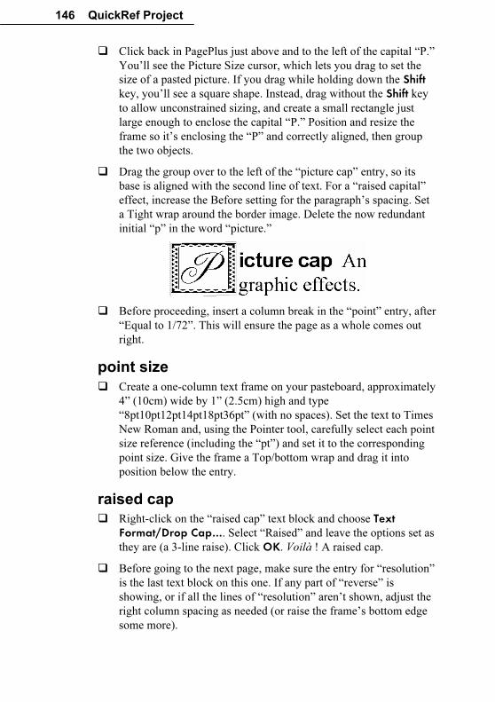
146 QuickRef Project
� Click back in PagePlus just above and to the left of the capital “P.”
You’ll see the Picture Size cursor, which lets you drag to set the
size of a pasted picture. If you drag while holding down the Shift key, you’ll see a square shape. Instead, drag without the Shift key
to allow unconstrained sizing, and create a small rectangle just
large enough to enclose the capital “P.” Position and resize the
frame so it’s enclosing the “P” and correctly aligned, then group
the two objects.
� Drag the group over to the left of the “picture cap” entry, so its
base is aligned with the second line of text. For a “raised capital”
effect, increase the Before setting for the paragraph’s spacing. Set
a Tight wrap around the border image. Delete the now redundant
initial “p” in the word “picture.”
� Before proceeding, insert a column break in the “point” entry, after
“Equal to 1/72”. This will ensure the page as a whole comes out
right.
point size
� Create a one-column text frame on your pasteboard, approximately
4” (10cm) wide by 1” (2.5cm) high and type
“8pt10pt12pt14pt18pt36pt” (with no spaces). Set the text to Times
New Roman and, using the Pointer tool, carefully select each point
size reference (including the “pt”) and set it to the corresponding
point size. Give the frame a Top/bottom wrap and drag it into
position below the entry.
raised cap
� Right-click on the “raised cap” text block and choose Text Format/Drop Cap…. Select “Raised” and leave the options set as
they are (a 3-line raise). Click OK. Voilà ! A raised cap.
� Before going to the next page, make sure the entry for “resolution”
is the last text block on this one. If any part of “reverse” is
showing, or if all the lines of “resolution” aren’t shown, adjust the
right column spacing as needed (or raise the frame’s bottom edge
some more).
QuickRef Project 147
Page Nine – “reverse” to “set-width”
reverse
The reverse effect for text uses two elements: background and
foreground. In this publication, we’ll specify black and white, but you
can create a wide variety of effects using greyscale shading or colours.
� Create a new frame (one column) about 3 inches (7.5cm) wide, and
type in all caps: “REVERSE”. Set it to Cairo 30pt. If the text
wraps, widen the frame.
� Now open the Studio’s Attributes tab and select the Colour panel.
With the new frame selected, click the white colour sample. The
text will disappear temporarily, but now click the Fill button
above the gallery and then the black colour sample. This time it’s
the frame background that changes colour, and we see the text
reversed out of black. (This is one effect you can’t achieve with
artistic text objects, which don’t have a “background fill”
property.)
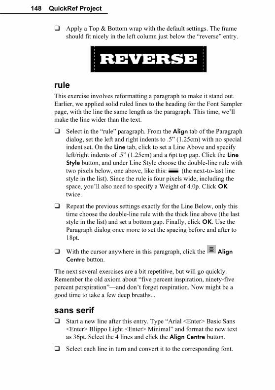
148 QuickRef Project
� Apply a Top & Bottom wrap with the default settings. The frame
should fit nicely in the left column just below the “reverse” entry.
rule
This exercise involves reformatting a paragraph to make it stand out.
Earlier, we applied solid ruled lines to the heading for the Font Sampler
page, with the line the same length as the paragraph. This time, we’ll
make the line wider than the text.
� Select in the “rule” paragraph. From the Align tab of the Paragraph
dialog, set the left and right indents to .5” (1.25cm) with no special
indent set. On the Line tab, click to set a Line Above and specify
left/right indents of .5” (1.25cm) and a 6pt top gap. Click the Line Style button, and under Line Style choose the double-line rule with
two pixels below, one above, like this: (the next-to-last line
style in the list). Since the rule is four pixels wide, including the
space, you’ll also need to specify a Weight of 4.0p. Click OK
twice.
� Repeat the previous settings exactly for the Line Below, only this
time choose the double-line rule with the thick line above (the last
style in the list) and set a bottom gap. Finally, click OK. Use the
Paragraph dialog once more to set the spacing before and after to
18pt.
� With the cursor anywhere in this paragraph, click the Align Centre button.
The next several exercises are a bit repetitive, but will go quickly.
Remember the old axiom about “five percent inspiration, ninety-five
percent perspiration”—and don’t forget respiration. Now might be a
good time to take a few deep breaths...
sans serif
� Start a new line after this entry. Type “Arial <Enter> Basic Sans
<Enter> Blippo Light <Enter> Minimal” and format the new text
as 36pt. Select the 4 lines and click the Align Centre button.
� Select each line in turn and convert it to the corresponding font.
QuickRef Project 149
� Adjust the paragraph spacing before the Arial line and after the
Minimal line so the first line of the “scanner” entry is at the bottom
of the left column. The second line should flow to the top of the
right column. As with the preceding page, you can raise the lower
edge of the main frame slightly if necessary. You may also need to
set off Widow/Orphan control in the Scanner paragraph, using the
Format/Paragraph/Breaks tab.
script
� Create a new frame and type “Handscript” and format the word as
Handscript, 40pt (type in the value). Tighten the frame size, centre
the text, and give it a top & bottom wrap with standoffs of 0. Plunk
it in place.
serif
� Start a new line after the serif entry and type “Casper <Enter>
Goudita <Enter> Times New Roman” and this time use 30pt;
again, centre the text. Convert each font name to its particular font,
and set the spacing before and after to 14pt.
� Before continuing, adjust spacing as needed so the entry for “set-
width” ends the page.
Page Ten – “shading” to “weight”
Coming down the home stretch now...
shading
We’ve used shading and tinting before but this exercise introduces a
couple of handy techniques that will help you in situations where
precise alignment is a necessity. In short, we’ll replicate a simple box a
number of times and align the boxes in an evenly spaced row.
� Since we’re illustrating an entry at the top of the column, a good
place to work would be in the top margin region. Zoom in to
100%. To create the initial box, select the Rectangle (QuickBox)
and draw a Shift-constrained square of .3” (0.75cm). Watch the
HintLine to get the size right.
� Using the Attributes tab’s Colour panel, give the box a mid-grey
“50% Black” fill from the gallery.
Now to make six copies (for seven boxes in all).
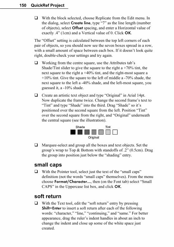
150 QuickRef Project
� With the block selected, choose Replicate from the Edit menu. In
the dialog, select Create line, type “7” as the line length (number
of objects), select Offset spacing, and enter a Horizontal value of
exactly .4” (1cm) and a Vertical value of 0. Click OK.
The “Offset” setting is calculated between the top left corners of each
pair of objects, so you should now see the seven boxes spread in a row,
with a small amount of space between each box. If it doesn’t look quite
right, double-check your settings and try again.
� Working from the centre square, use the Attributes tab’s
Shade/Tint slider to give the square to the right a +70% tint, the
next square to the right a +40% tint, and the right-most square a
+10% tint. Give the square to the left of middle a -70% shade, the
next square to the left a -40% shade, and the left-most square, you
guessed it, a -10% shade.
� Create an artistic text object and type “Original” in Arial 14pt.
Now duplicate the frame twice. Change the second frame’s text to
“Tint” and type “Shade” into the third. Drag “Shade” so it’s
positioned over the second square from the left. Position “Tint”
over the second square from the right, and “Original” underneath
the central square (see the illustration).
� Marquee-select and group all the boxes and text objects. Set the
group’s wrap to Top & Bottom with standoffs of .2” (0.5cm). Drag
the group into position just below the “shading” entry.
small caps
� With the Pointer tool, select just the text of the “small caps”
definition (not the words “small caps” themselves). From the menu
choose Format/Character…, then (on the Font tab) select “Small
CAPS” in the Uppercase list box, and click OK.
soft return
� With the Text tool, edit the “soft return” entry by pressing
Shift+Enter to insert a soft return after each of the following
words: “character,” “line,” “continuing,” and “same.” For better
appearance, drag the ruler’s indent handles in about an inch to
change the indent and close up some of the white space just
created.
QuickRef Project 151
� Set the before and after paragraph spacing to 8pt.
Note that the spacing between the new lines is identical and they are all
indented, per the paragraph’s defined hanging indent. Pressing Enter for a hard return, on the other hand, would start a new paragraph,
having its own hanging indent, and with a 1.0p Spacing After setting
(although subtle) separating the old paragraph from the new one. Try
experimenting with these values in a separate document. And check
online help for some differences in the way PagePlus handles hard and
soft returns.
strikethrough
� Just as with the previous “small caps” example, use the Character
dialog to apply the “Single Strikethru” style only to the definition
text, not to the term “strikethrough” itself.
text wrap
Shaped text frames in PagePlus let you achieve a wide variety of
internal text wrap effects without having to draw freehand container
shapes.
� Zoom/scroll until half your window shows the right column and
the other half shows pasteboard. Triple-click to select the “text
wrap” paragraph and cut the paragraph to your Clipboard. Click
the Shaped Frame flyout and create a 1.75” (4.5cm) high
Hourglass text frame, using Shift while dragging to maintain the
heart’s aspect ratio. Give the frame a top margin of .25 (0.63cm),
then paste the text into your now readied frame.
� Set a top and bottom wrap with the distance from text set to .1
(0.25cm) and drop the heart-shaped frame into the top middle of
the right column. Adjust the frame so all the text fits neatly.
weight
� Place your cursor at the end of this entry and start a new line. Type
“Grenoble Light <Enter> Grenoble Heavy”. Set both to 24pt, then
set each line to its corresponding font. Set 12pt spacing before the
first line you typed, and add spacing after the second if “Grenoble
Heavy” isn’t the last text on the page. Indent both lines by .5”
(1.25cm)
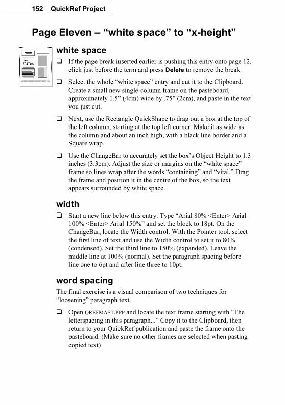
152 QuickRef Project
Page Eleven – “white space” to “x-height”
white space
� If the page break inserted earlier is pushing this entry onto page 12,
click just before the term and press Delete to remove the break.
� Select the whole “white space” entry and cut it to the Clipboard.
Create a small new single-column frame on the pasteboard,
approximately 1.5” (4cm) wide by .75” (2cm), and paste in the text
you just cut.
� Next, use the Rectangle QuickShape to drag out a box at the top of
the left column, starting at the top left corner. Make it as wide as
the column and about an inch high, with a black line border and a
Square wrap.
� Use the ChangeBar to accurately set the box’s Object Height to 1.3
inches (3.3cm). Adjust the size or margins on the “white space”
frame so lines wrap after the words “containing” and “vital.” Drag
the frame and position it in the centre of the box, so the text
appears surrounded by white space.
width
� Start a new line below this entry. Type “Arial 80% <Enter> Arial
100% <Enter> Arial 150%” and set the block to 18pt. On the
ChangeBar, locate the Width control. With the Pointer tool, select
the first line of text and use the Width control to set it to 80%
(condensed). Set the third line to 150% (expanded). Leave the
middle line at 100% (normal). Set the paragraph spacing before
line one to 6pt and after line three to 10pt.
word spacing
The final exercise is a visual comparison of two techniques for
“loosening” paragraph text.
� Open QREFMAST.PPP and locate the text frame starting with “The
letterspacing in this paragraph...” Copy it to the Clipboard, then
return to your QuickRef publication and paste the frame onto the
pasteboard. (Make sure no other frames are selected when pasting
copied text)
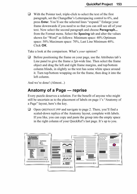
QuickRef Project 153
� With the Pointer tool, triple-click to select the text of the first
paragraph, set the ChangeBar’s Letterspacing control to 6%, and
press Enter. You’ll see the selected lines “expand.” Enlarge your
frame downwards if you need to so that you can still see all of your
text. Now select the second paragraph and choose Paragraph... from the Format menu. Select the Spacing tab and alter the values
shown for “Word” as follows: Minimum space: 40% Optimum
space: 50% Maximum space: 70%, Last Line Minimum 40%.
Click OK.
Take a look at the comparison. What’s your opinion?
� Before positioning the frame on your page, use the Attributes tab’s
Line panel to give the frame a 2pt-wide line. Then select the frame
object and drag the left and right frame margins, and top/bottom
column blinds, in slightly so the text has some white space around
it. Turn top/bottom wrapping on for the frame, then drag it into the
left column.
And we’re done! (Almost...)
Anatomy of a Page — reprise
Every puzzle deserves a solution. For the benefit of anyone who might
still be uncertain as to the placement of labels on page 1’s “Anatomy of
a Page” layout, here’s the key.
� Open QREFMAST.PPP and navigate to page 2. There, you’ll find a
scaled-down replica of the Anatomy layout, complete with labels.
If you like, you can copy and paste the group into the empty space
in the right column of your QuickRef’s last page. It’s up to you.
Index 2D and 3D effects, 33
A
Actual Size, 124
anti-aliasing, 71
artistic text, 32, 44
audio, 76
Autoflow, 126
auto-imposition, 89
AutoRun, 15
B
baseline shift, 133
binding, 95
bitmaps, 37
bleeds, 102
Bold, 124
bookmarks, 117
books, producing, 47
button bar, 63
C
Calendar Wizard, 13
calendars, 44
ChangeBar, 44, 67, 123, 133, 134, 137,
144, 152
chapters (in books), 47
clipart, 146
Clipboard, 72, 124, 128
clipping, 102, 111
CMYK, 97, 113
collating, 95
colour
calibration bars, 110
CMYK, 97, 113
matching, 97
monitor calibration, 99
PANTONE, 98, 115
proofs, 103
RGB, 97
schemes, 22, 33
separations, 94, 104, 111
Web palettes, 73
Colour Management, 98, 106
columns, 42
combining curves, 36
compression options (PDF), 117
Convert to Picture, 45
Copy, 124, 125
copyright notice, 60
creating
certificates, 21
posters, 89
Cromalin, 95, 103
crop marks, 103, 110
cropping, 45
Curve toolbar, 36, 45
customizing a Page Wizard publication,
21
D
densitometer bar, 110
desktop printing, 48, 84, 87
device profiles, 98
digital laser printing, 94
dithering, 73
dot grid, 42, 123
dot matrix printers, 87
double-page spreads, 39
draw-type graphics, 37
drivers (printer), 107
drop shadow effect, 33, 136
dropped caps, 136
dye sublimation, 94
E-F
effects, 33
embedding images, 44
endnotes, 44
EPS, 37
Facing Page mode, 39
feathering, 33, 34
file information, 110
filler text, 35
filter effects, 33, 137
Find & Replace, 127
Fit Page, 123
Flip, 45
fonts
embedding, 106
TrueType, 11, 108, 122
footers, 41, 123
footnotes, 44
frame tools, 42
frames, 31, 42, 123
graphic properties, 44
linking frames, 43
setup, 126
Standard Frame tool, 126
G-H
General tab (printing), 48
GIF, 68, 72, 75
graphics, 70
guides, 42, 123
handles, 122
Headers & Footers, 41, 123
Help on Help, 20
HintLine, 123, 129
Home page, 61
hotspots, 64, 68
HTML, 53
hypergraphics, 64, 68
hyperlinks, 60, 64, 68, 117
hypertext, 53, 55, 58, 64
I
ICC, 98
images
anti-aliasing, 71
bitmaps, 37
colour palettes, 73
Convert to Picture, 45
dithering, 73
draw graphics, 37
GIF format, 68, 72, 75
graphics, 35
hotspots, 64
hypergraphics, 64, 68
importing, 36, 44, 72
JPG format, 72
lines, 36
linking vs. embedding, 44
picture frames, 37
pictures, 36
rollover graphics, 64, 66
safe palette, 73
shapes, 36
text wrap around, 45
Web Picture Manager, 62, 71
imagesetter, 94
import
from other Windows applications,
37
images, 72
pictures, 36, 44
text, 35, 43, 126, 139
imposition, 105
Index Wizard, 13
inkjet dye sublimation, 94
inkjet printers, 87
Insert Symbol, 135
installation, 15
AutoRun, 15
first-time install, 15
manual install, 16
Instant 3D, 33
Italic, 124
J-L
JPEG, 72
kerning, 143
laser printers, 88
layers, 40
layout aids, displaying, 102, 123
Layout Checker Wizard, 46
layout grid, 41
leading, 144
letterspacing, 144
Line tools, 125
lines, 36
linking images, 44
lithography (offset), 93
M-O
mail merge, 30
margins, 61
masking, 102, 106
master pages, 39, 61
mesh warping, 33
monitor calibration, 99
Multipage view, 24
navigation bar, 63
Normal view, 24
object styles, 32
offset lithography, 93
Open Press Interface (OPI), 111, 115
outline, 145
overprinting, 110, 116
P
page make-up, 38
page marks, 110
page numbers, 124
Page Setup, 38
Page Wizard, 20
customizing, 44
using, 20
PageHints, 117
PagePlus, product history, 5
pages
adding, 43
copying, 43
deleting, 43
facing page view, 39
margin and row/column guides, 39,
42
master page, 61
page numbers, 124
Page Setup, 38, 39, 102, 123
size, 61
palettes (colour), 47, 73, 98
Pan tool, 128
PANTONE, 98, 115
paper type, 116
PaperDirect, 89
paragraph spacing, 145
Paste, 124, 125
Paste Format command, 33
Paste Format Plus command, 33
path text, 32
PDF, 86, 104, 116
PDF publishing, 48
photo merge, 30
Photo Optimizer Wizard, 13, 89
photocopying, 84, 92
picture frames, 37
Picture toolbar, 36, 75
pictures, 36
planning a publication, 29
platesetter, 94
point size, 124, 147
Pointer tool, 129
Portfolio, 11, 35, 134, 135, 144
PostScript, 37, 88, 94, 103, 107, 111,
114
Prepress tab, 109
Prepress tab (printing/PDF), 109
Print to File, 107
printer drivers, 107
printer types, 87
printing
auto-imposition, 89
choices and criteria, 83
colour proof, 103
colour separations, 94, 104, 111
crop marks, 103
desktop, 48
desktop printing, 84, 87
folded publications, 89
imposition, 105
overprinting, 110, 116
PDF, 86, 103, 104, 116
photocopying, 84, 92
posters, 89
PostScript, 88, 94, 103, 107, 111,
114
print options, 109
Print Preview, 46
printer setup, 48
printer types, 87
process colour, 113
professional, 85, 93
scaling output, 90
service bureau, 95
spot colour, 101, 112
thumbnails, 90
tiling, 90
transparency, 101, 106
transparency, 111
trapping, 116
process colour, 113
profiles (device), 98
Publish as PDF, 48, 104, 117
Q-R
QuickShapes, 36, 66
raised caps, 147
raster image processor (RIP), 94
registration targets, 110
Registration Wizard, 14
repeating area (mail merge), 30
RGB, 97
rich black, 114
rollover graphics, 64, 66
Rotate, 45
ruler guides, 42
S
saving, 122
Scheme Manager, 41
security options (PDF), 117
selecting, 122
separations, colour, 94, 104, 111
Serif Colour Chart, 98, 100
Serif, overview, 4
service bureau, 95
shadow effect, 33
shapes, 36
Size and Resolution, 75
small caps, 150
snapping, 42, 102, 123, 126
Spelling Checker, 91
spot colour, 101, 112
spreadsheets, 32
stacking order, 40
starting from scratch, 38, 123
starting PagePlus, 19
Startup Wizard, 19
strikethrough, 151
stripping, 102, 106, 111
Studio
Attributes tab, 36
customizing tabs, 24
Object Styles tab, 33
Pages tab, 43
Schemes tab, 22, 33, 41
style source (books), 47
styles, 32
synchronizing (chapter styles), 47
system requirements, 15
T
Table of Contents Wizard, 13
tables, 32, 44
text, 35, 69
artistic text, 32, 44
Autoflow, 126
bold, 124
dropped caps, 136
filler text, 35
footnotes and endnotes, 44
from a word processor, 35
importing, 43, 126
Insert Date or Time, 60
italic, 124
kerning, 143
letterspacing, 144
on a path, 32
outline, 145
paragraph spacing, 145
point size, 124, 147
raised caps, 147
ruled lines, 36
small caps, 150
strikethrough, 151
styles, 32
tables, 32, 44
text flow, 43
text frames, 31, 42
typing directly onto the page, 35
width, 152
word spacing, 152
thumbnails, printing, 90
tiling, 90
toolbars
customizing, 24
transparency, 101, 106, 111
trapping, 116
TrueType, 11, 108, 122
tutorials, 16, 20, 25, 121
U-V
Undo, 122
URL, 59
vector images, 37
video, 76
view options, 24
W
warping, 33
Web pages
alternate text, 62
colour palettes, 73
designing pages, 58
graphics, 70
height, 61
hotspots, 64
layout, 60
page size, 61
rollover graphics, 64, 66
safe area, 59
safe palette, 73
text, 69
URL, 59
Web colours, 41
Web Picture Manager, 62, 71
Web sites
audience, 54
browse sequence, 65, 67
button bar, 63
designing, 54
Home Page, 61
HTML, 53
hyperlinks, 60
hypertext, 53
links, 64
maintaining, 77
multimedia, 76
navigation bar, 63
Publish Site to Disk Folder, 74
sections, 57
site structure, 56
suggested resources, 79
title, 60
using existing content, 55
Web Publishing mode, 10
width, 152
word spacing, 152
wrap
crop to wrap outline, 45
Wrap Settings, 129
wrapping text, 45
WritePlus, 35, 127
starting, 35
Z
Zoom, 128
Actual Size, 124
Fit Page, 123
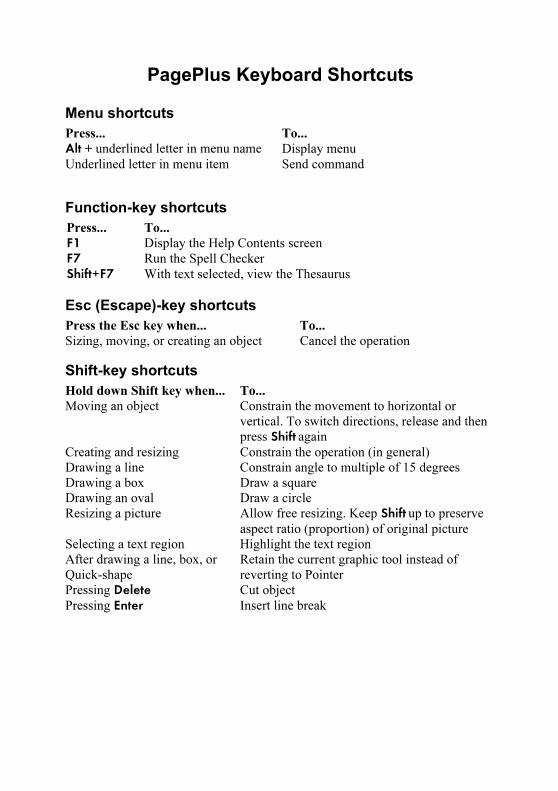
PagePlus Keyboard Shortcuts
Menu shortcuts
Press... To...
Alt + underlined letter in menu name Display menu
Underlined letter in menu item Send command
Function-key shortcuts
Press... To...
F1 Display the Help Contents screen
F7 Run the Spell Checker
Shift+F7 With text selected, view the Thesaurus
Esc (Escape)-key shortcuts
Press the Esc key when... To...
Sizing, moving, or creating an object Cancel the operation
Shift-key shortcuts
Hold down Shift key when... To...
Moving an object Constrain the movement to horizontal or
vertical. To switch directions, release and then
press Shift again
Creating and resizing Constrain the operation (in general)
Drawing a line Constrain angle to multiple of 15 degrees
Drawing a box Draw a square
Drawing an oval Draw a circle
Resizing a picture Allow free resizing. Keep Shift up to preserve
aspect ratio (proportion) of original picture
Selecting a text region Highlight the text region
After drawing a line, box, or
Quick-shape
Retain the current graphic tool instead of
reverting to Pointer
Pressing Delete Cut object
Pressing Enter Insert line break
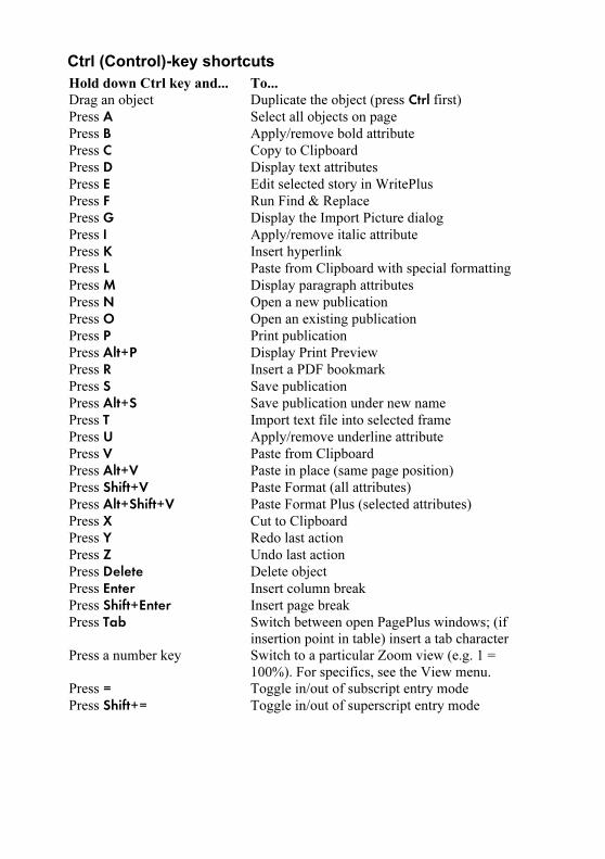
Ctrl (Control)-key shortcuts
Hold down Ctrl key and... To...
Drag an object Duplicate the object (press Ctrl first)
Press A Select all objects on page
Press B Apply/remove bold attribute
Press C Copy to Clipboard
Press D Display text attributes
Press E Edit selected story in WritePlus
Press F Run Find & Replace
Press G Display the Import Picture dialog
Press I Apply/remove italic attribute
Press K Insert hyperlink
Press L Paste from Clipboard with special formatting
Press M Display paragraph attributes
Press N Open a new publication
Press O Open an existing publication
Press P Print publication
Press Alt+P Display Print Preview
Press R Insert a PDF bookmark
Press S Save publication
Press Alt+S Save publication under new name
Press T Import text file into selected frame
Press U Apply/remove underline attribute
Press V Paste from Clipboard
Press Alt+V Paste in place (same page position)
Press Shift+V Paste Format (all attributes)
Press Alt+Shift+V Paste Format Plus (selected attributes)
Press X Cut to Clipboard
Press Y Redo last action
Press Z Undo last action
Press Delete Delete object
Press Enter Insert column break
Press Shift+Enter Insert page break
Press Tab Switch between open PagePlus windows; (if
insertion point in table) insert a tab character
Press a number key Switch to a particular Zoom view (e.g. 1 =
100%). For specifics, see the View menu.
Press = Toggle in/out of subscript entry mode
Press Shift+= Toggle in/out of superscript entry mode
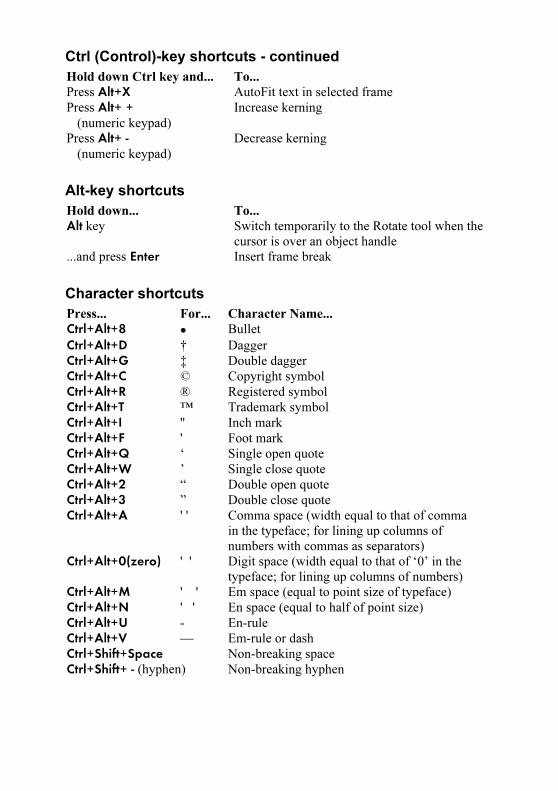
Ctrl (Control)-key shortcuts - continued
Hold down Ctrl key and... To...
Press Alt+X AutoFit text in selected frame
Press Alt+ + (numeric keypad)
Increase kerning
Press Alt+ - (numeric keypad)
Decrease kerning
Alt-key shortcuts
Hold down... To...
Alt key Switch temporarily to the Rotate tool when the
cursor is over an object handle
...and press Enter Insert frame break
Character shortcuts
Press... For... Character Name...
Ctrl+Alt+8 • Bullet
Ctrl+Alt+D † Dagger
Ctrl+Alt+G ‡ Double dagger
Ctrl+Alt+C © Copyright symbol
Ctrl+Alt+R ® Registered symbol
Ctrl+Alt+T ™ Trademark symbol
Ctrl+Alt+I '' Inch mark
Ctrl+Alt+F ' Foot mark
Ctrl+Alt+Q ‘ Single open quote
Ctrl+Alt+W ’ Single close quote
Ctrl+Alt+2 “ Double open quote
Ctrl+Alt+3 ” Double close quote
Ctrl+Alt+A ' ' Comma space (width equal to that of comma
in the typeface; for lining up columns of
numbers with commas as separators)
Ctrl+Alt+0(zero) ' ' Digit space (width equal to that of ‘0’ in the
typeface; for lining up columns of numbers)
Ctrl+Alt+M ' ' Em space (equal to point size of typeface)
Ctrl+Alt+N ' ' En space (equal to half of point size)
Ctrl+Alt+U - En-rule
Ctrl+Alt+V — Em-rule or dash
Ctrl+Shift+Space Non-breaking space
Ctrl+Shift+ - (hyphen) Non-breaking hyphen