Embed Size (px)
Citation preview
Page Layout Page Layout & Mobile & Mobile WebWeb
Using columns, grid systems, etc… to Using columns, grid systems, etc… to layout sites for desktops and mobilelayout sites for desktops and mobile
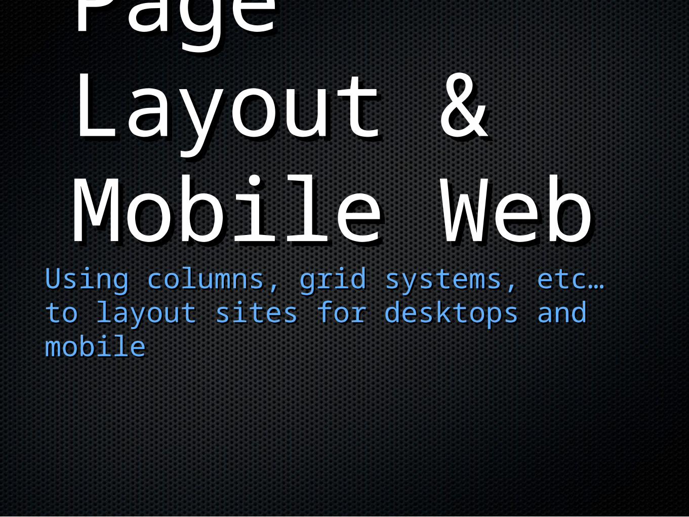
The Box ModelThe Box Model
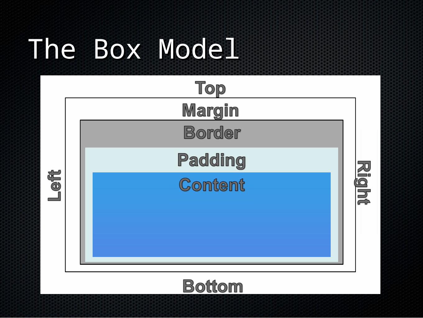
Margin PropertyMargin Property
margin: (top, right, bottom, left)margin: (top, right, bottom, left)margin: 10px 30px 20px 5px;margin: 10px 30px 20px 5px;
margin-topmargin-top
margin-rightmargin-right
margin-bottommargin-bottom
margin-leftmargin-left
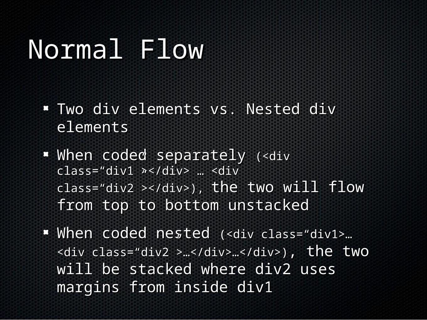
Normal FlowNormal Flow
Two div elements vs. Nested div elementsTwo div elements vs. Nested div elements
When coded separately When coded separately (<div (<div class=“div1”></div> … <div class=“div2”></div>), class=“div1”></div> … <div class=“div2”></div>),
the two will flow from top to bottom the two will flow from top to bottom unstackedunstacked
When coded nested When coded nested (<div class=“div1>…(<div class=“div1>…
<div class=“div2”>…</div>…</div>)<div class=“div2”>…</div>…</div>), the two will , the two will be stacked where div2 uses margins from be stacked where div2 uses margins from inside div1inside div1
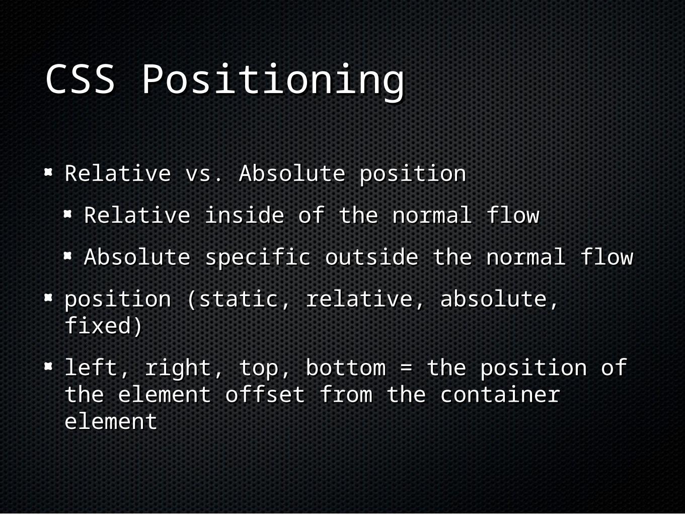
CSS PositioningCSS Positioning
Relative vs. Absolute positionRelative vs. Absolute position
Relative inside of the normal flowRelative inside of the normal flow
Absolute specific outside the normal flowAbsolute specific outside the normal flow
position (static, relative, absolute, fixed)position (static, relative, absolute, fixed)
left, right, top, bottom = the position of the left, right, top, bottom = the position of the element offset from the container elementelement offset from the container element
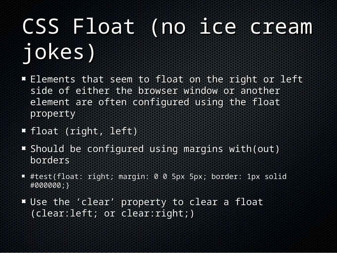
CSS Float (no ice cream CSS Float (no ice cream jokes)jokes)
Elements that seem to float on the right or left side Elements that seem to float on the right or left side of either the browser window or another element are of either the browser window or another element are often configured using the float propertyoften configured using the float property
float (right, left)float (right, left)
Should be configured using margins with(out) Should be configured using margins with(out) bordersborders
#test{float: right; margin: 0 0 5px 5px; border: 1px solid #000000;}#test{float: right; margin: 0 0 5px 5px; border: 1px solid #000000;}
Use the ‘clear’ property to clear a float (clear:left; or Use the ‘clear’ property to clear a float (clear:left; or clear:right;)clear:right;)
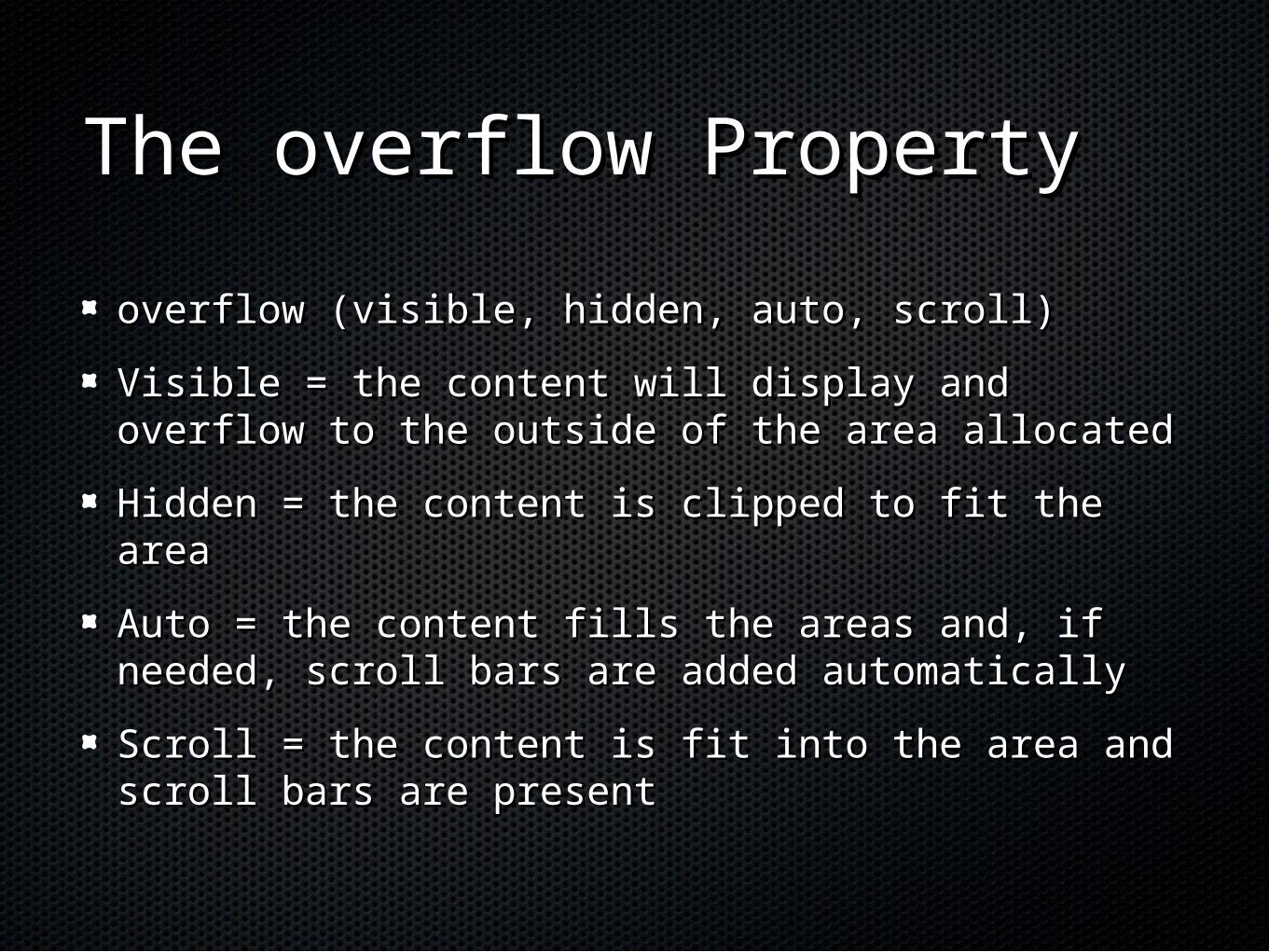
The overflow PropertyThe overflow Property
overflow (visible, hidden, auto, scroll)overflow (visible, hidden, auto, scroll)
Visible = the content will display and overflow Visible = the content will display and overflow to the outside of the area allocatedto the outside of the area allocated
Hidden = the content is clipped to fit the areaHidden = the content is clipped to fit the area
Auto = the content fills the areas and, if Auto = the content fills the areas and, if needed, scroll bars are added automaticallyneeded, scroll bars are added automatically
Scroll = the content is fit into the area and Scroll = the content is fit into the area and scroll bars are presentscroll bars are present
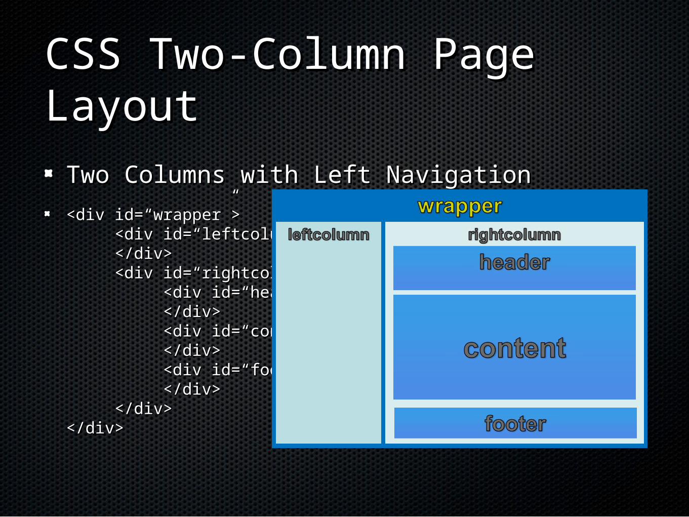
CSS Two-Column Page CSS Two-Column Page LayoutLayout
Two Columns with Left NavigationTwo Columns with Left Navigation
<div id=“wrapper”><div id=“wrapper”><div id=“leftcolumn”><div id=“leftcolumn”></div></div><div id=“rightcolumn”><div id=“rightcolumn”>
<div id=“header”><div id=“header”></div></div><div id=“content”><div id=“content”></div></div><div id=“footer”><div id=“footer”></div></div>
</div></div></div></div>
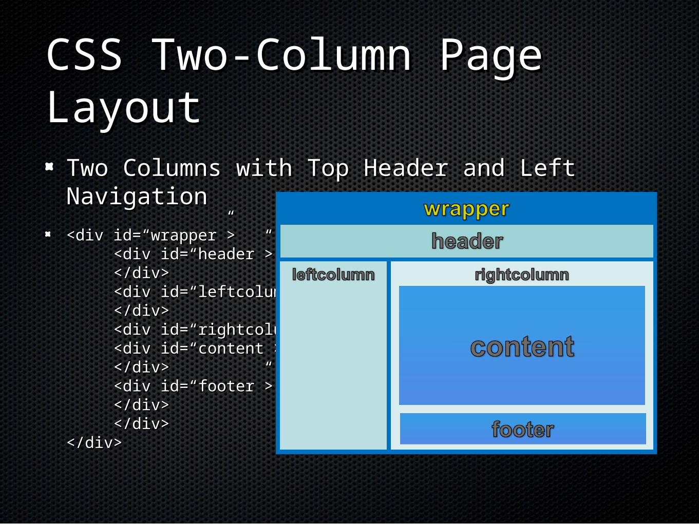
CSS Two-Column Page CSS Two-Column Page LayoutLayout
Two Columns with Top Header and Left Two Columns with Top Header and Left NavigationNavigation
<div id=“wrapper”><div id=“wrapper”><div id=“header”><div id=“header”></div></div><div id=“leftcolumn”><div id=“leftcolumn”></div></div><div id=“rightcolumn”><div id=“rightcolumn”>
<div id=“content”><div id=“content”></div></div><div id=“footer”><div id=“footer”></div></div>
</div></div></div></div>
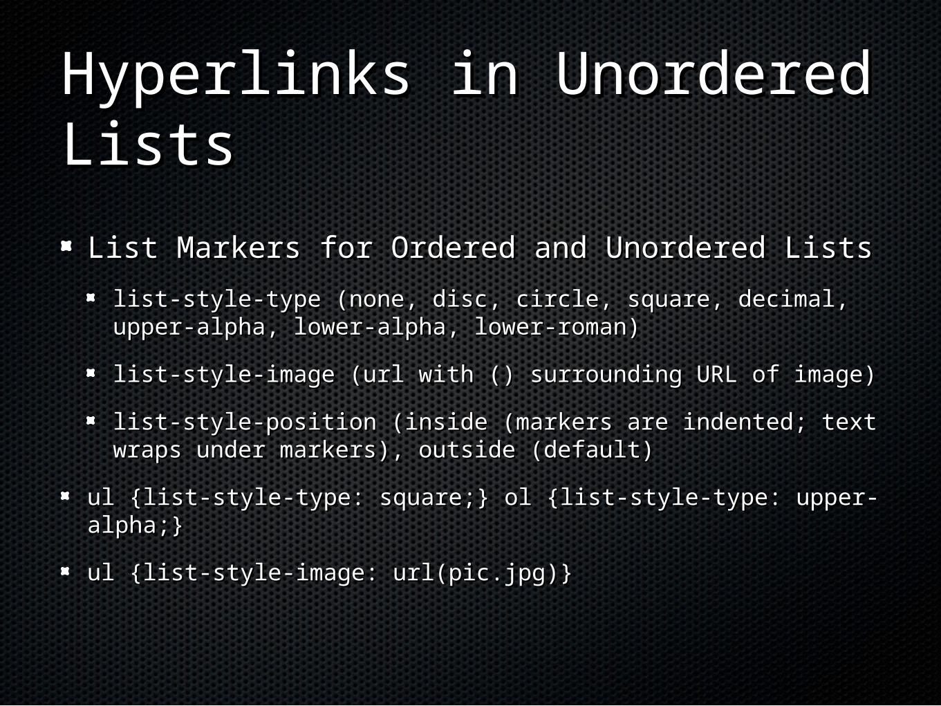
Hyperlinks in Unordered Hyperlinks in Unordered ListsLists
List Markers for Ordered and Unordered ListsList Markers for Ordered and Unordered Lists
list-style-type (none, disc, circle, square, decimal, upper-list-style-type (none, disc, circle, square, decimal, upper-alpha, lower-alpha, lower-roman)alpha, lower-alpha, lower-roman)
list-style-image (url with () surrounding URL of image)list-style-image (url with () surrounding URL of image)
list-style-position (inside (markers are indented; text list-style-position (inside (markers are indented; text wraps under markers), outside (default)wraps under markers), outside (default)
ul {list-style-type: square;}ul {list-style-type: square;} ol {list-style-type: ol {list-style-type: upper-alpha;}upper-alpha;}
ul {list-style-image: url(pic.jpg)}ul {list-style-image: url(pic.jpg)}
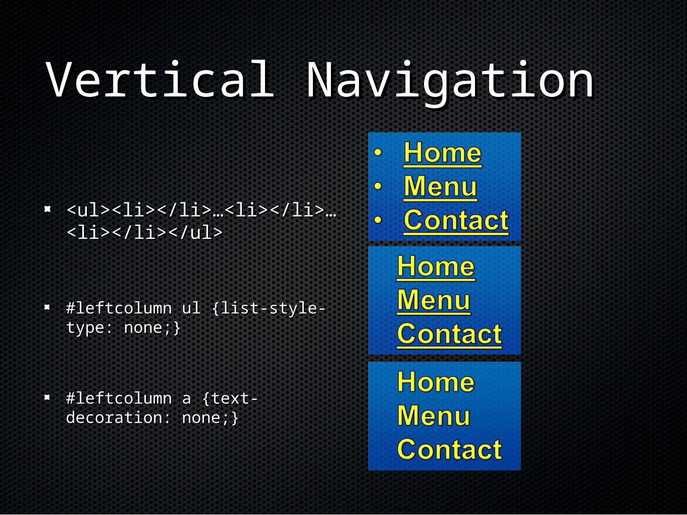
Vertical NavigationVertical Navigation
<ul><li></li>…<li></li>…<ul><li></li>…<li></li>…<li></li></ul><li></li></ul>
#leftcolumn ul {list-style-type: #leftcolumn ul {list-style-type: none;}none;}
#leftcolumn a {text-decoration: #leftcolumn a {text-decoration: none;}none;}
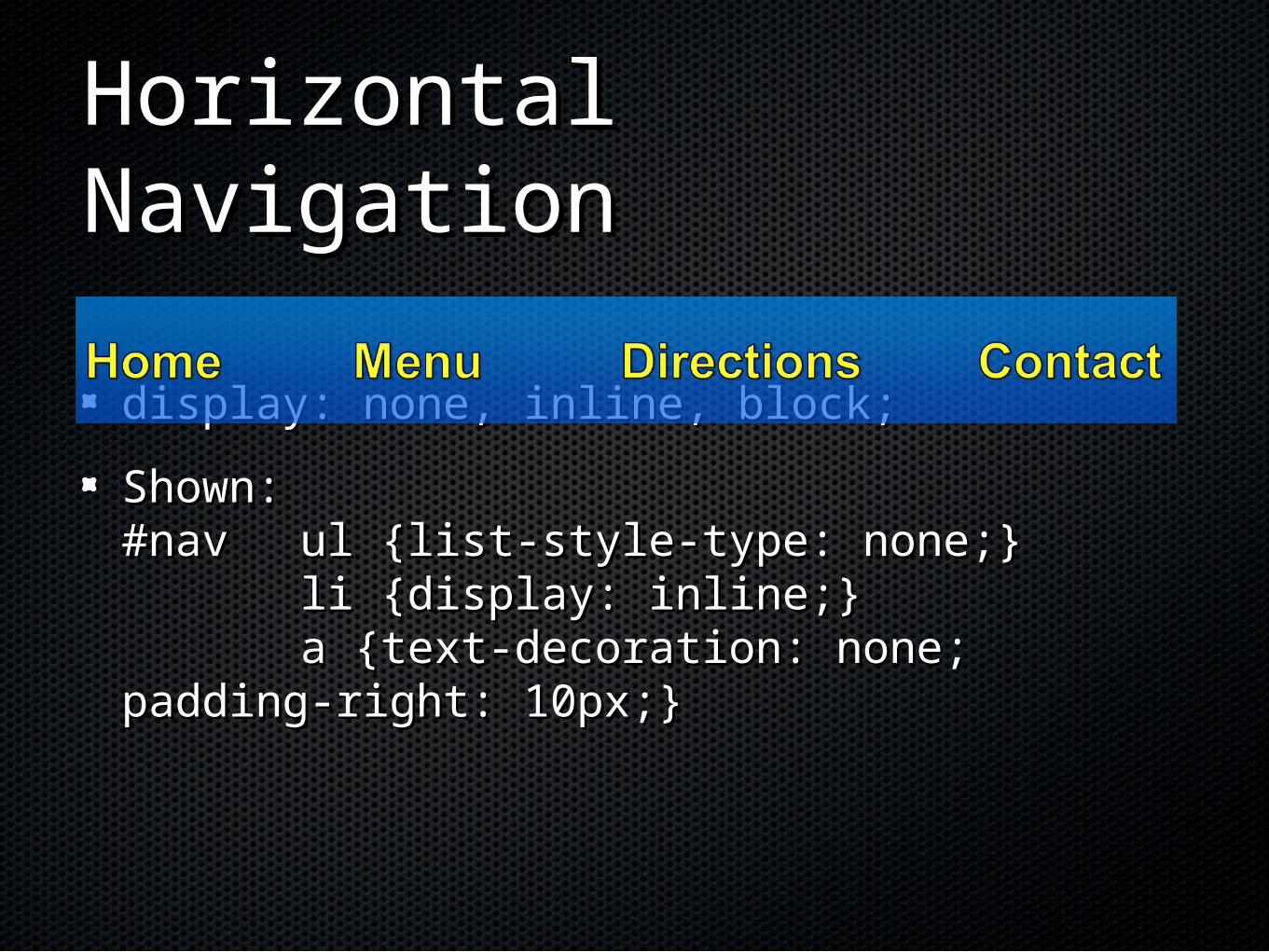
Horizontal NavigationHorizontal Navigation
display: none, inline, block;display: none, inline, block;
Shown:Shown:#nav #nav ul {list-style-type: none;}ul {list-style-type: none;}
li {display: inline;}li {display: inline;}a {text-decoration: none; padding-a {text-decoration: none; padding-
right: 10px;}right: 10px;}
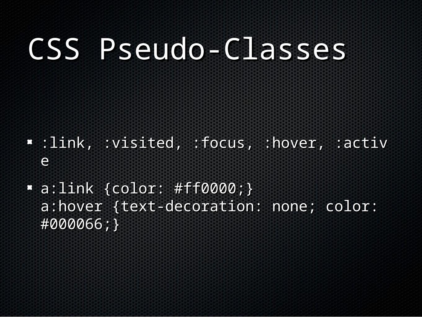
CSS Pseudo-ClassesCSS Pseudo-Classes
:link, :visited, :focus, :hover, :active:link, :visited, :focus, :hover, :active
a:link {color: #ff0000;}a:link {color: #ff0000;}a:hover {text-decoration: none; color: a:hover {text-decoration: none; color: #000066;}#000066;}
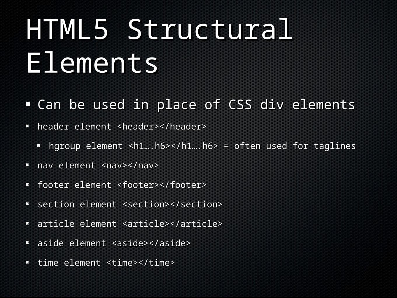
HTML5 Structural HTML5 Structural ElementsElements
Can be used in place of CSS div elementsCan be used in place of CSS div elements
header element <header></header>header element <header></header>
hgroup element <h1….h6></h1….h6> = often used for taglineshgroup element <h1….h6></h1….h6> = often used for taglines
nav element <nav></nav>nav element <nav></nav>
footer element <footer></footer>footer element <footer></footer>
section element <section></section>section element <section></section>
article element <article></article>article element <article></article>
aside element <aside></aside>aside element <aside></aside>
time element <time></time>time element <time></time>
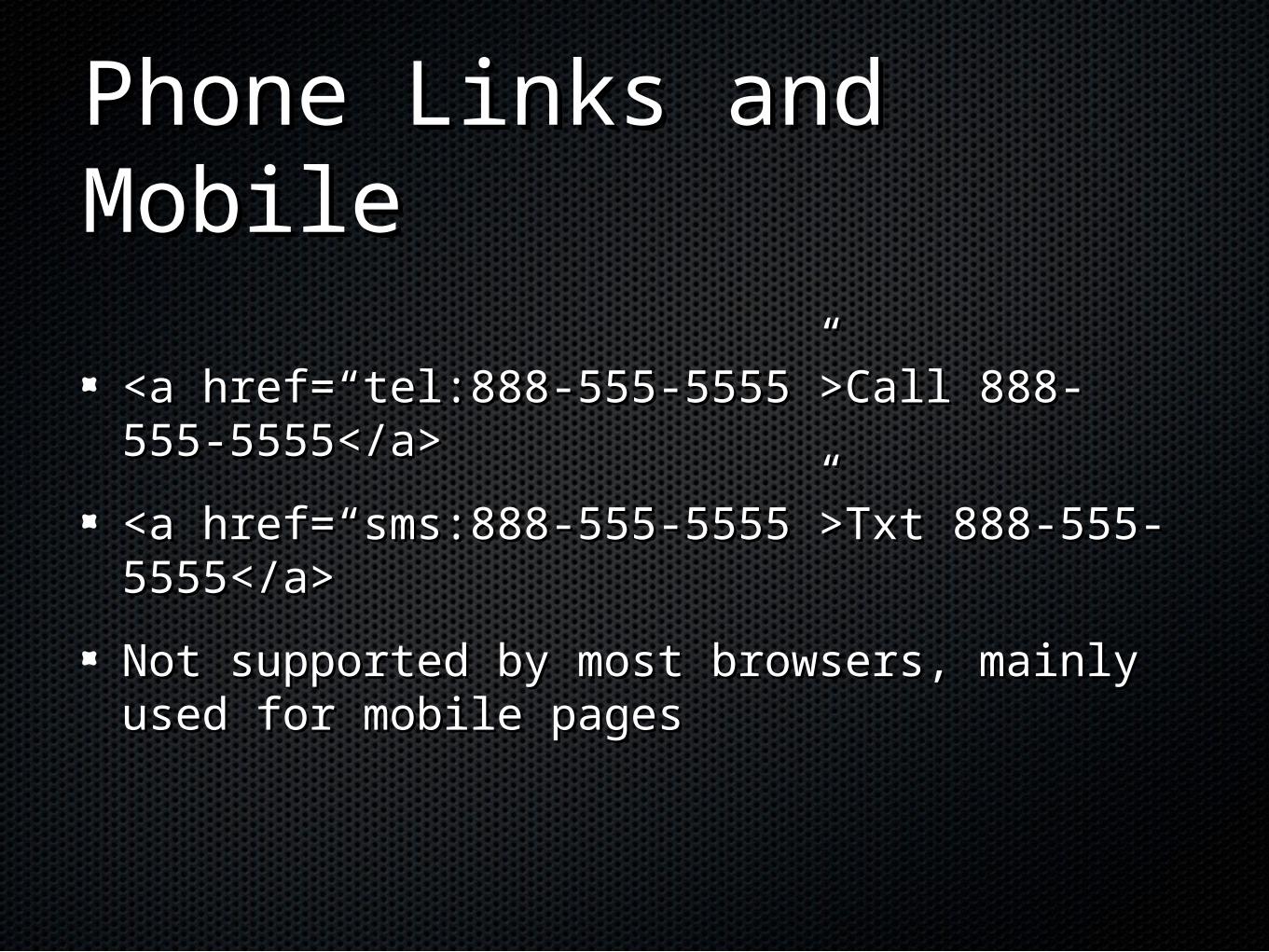
Phone Links and MobilePhone Links and Mobile
<a href=“tel:888-555-5555”>Call 888-555-<a href=“tel:888-555-5555”>Call 888-555-5555</a>5555</a>
<a href=“sms:888-555-5555”>Txt 888-555-<a href=“sms:888-555-5555”>Txt 888-555-5555</a>5555</a>
Not supported by most browsers, mainly used Not supported by most browsers, mainly used for mobile pagesfor mobile pages
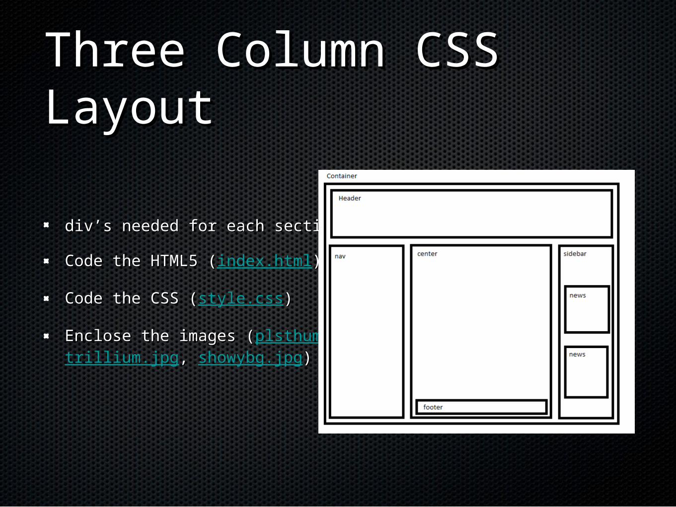
Three Column CSS Three Column CSS LayoutLayout
div’s needed for each sectiondiv’s needed for each section
Code the HTML5 (Code the HTML5 (index.html))
Code the CSS (Code the CSS (style.css))
Enclose the images (Enclose the images (plsthumb.jpg,,trillium.jpg, , showybg.jpg))
CSS Styling for Mobile CSS Styling for Mobile WebWeb
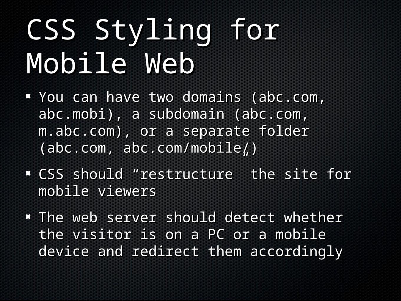
You can have two domains (abc.com, You can have two domains (abc.com, abc.mobi), a subdomain (abc.com, abc.mobi), a subdomain (abc.com, m.abc.com), or a separate folder (abc.com, m.abc.com), or a separate folder (abc.com, abc.com/mobile/)abc.com/mobile/)
CSS should “restructure” the site for mobile CSS should “restructure” the site for mobile viewersviewers
The web server should detect whether the The web server should detect whether the visitor is on a PC or a mobile device and visitor is on a PC or a mobile device and redirect them accordinglyredirect them accordingly
Mobile Web DesignMobile Web Design
Best Practices:Best Practices:
Small screen sizeSmall screen size
Low bandwidthLow bandwidth
Font, color, media issuesFont, color, media issues
Awkward controls, limited powerAwkward controls, limited power
Functionality Functionality
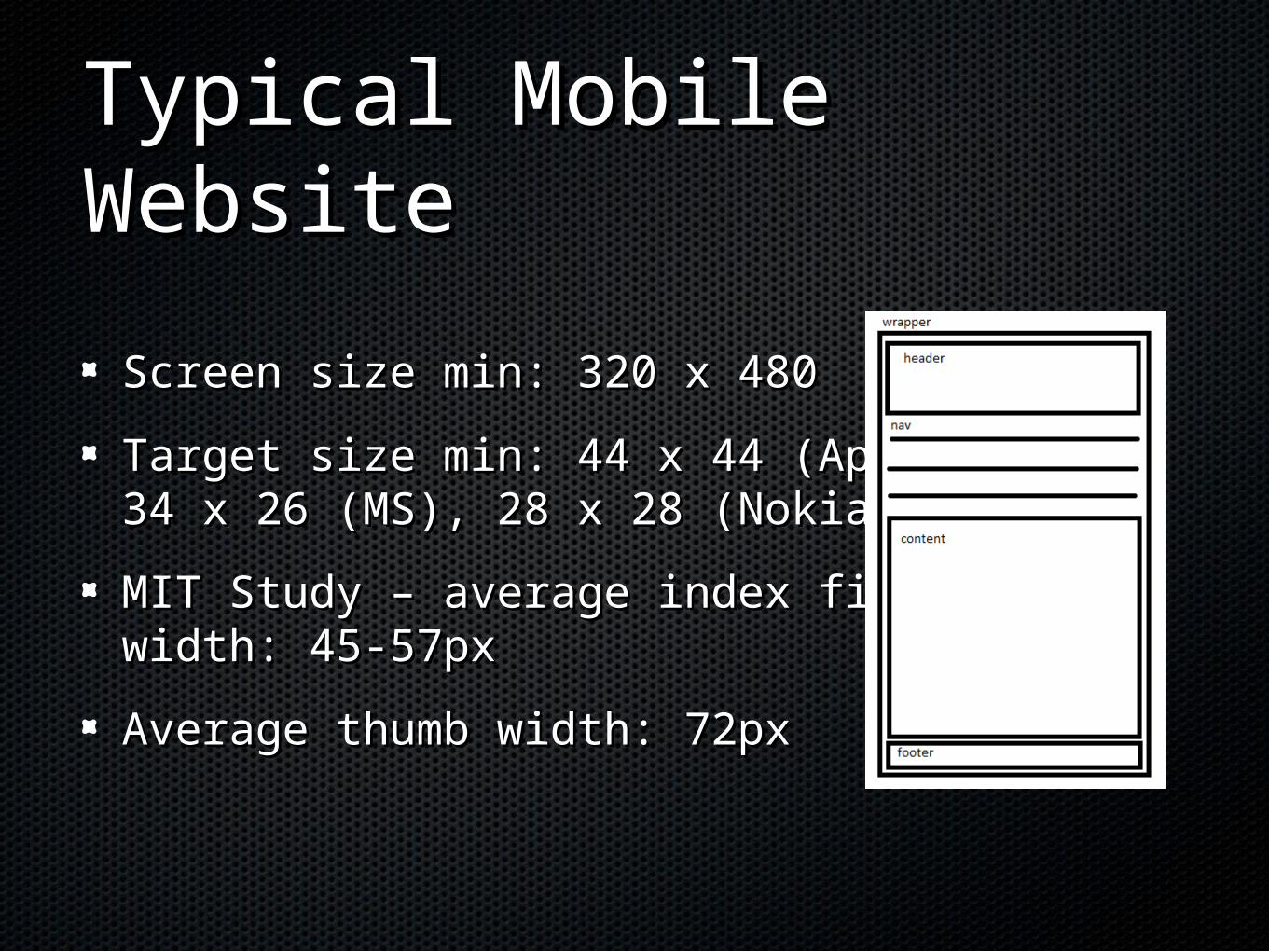
Typical Mobile WebsiteTypical Mobile Website
Screen size min: 320 x 480Screen size min: 320 x 480
Target size min: 44 x 44 (Apple),Target size min: 44 x 44 (Apple),34 x 26 (MS), 28 x 28 (Nokia)34 x 26 (MS), 28 x 28 (Nokia)
MIT Study – average index finger MIT Study – average index finger width: 45-57pxwidth: 45-57px
Average thumb width: 72pxAverage thumb width: 72px
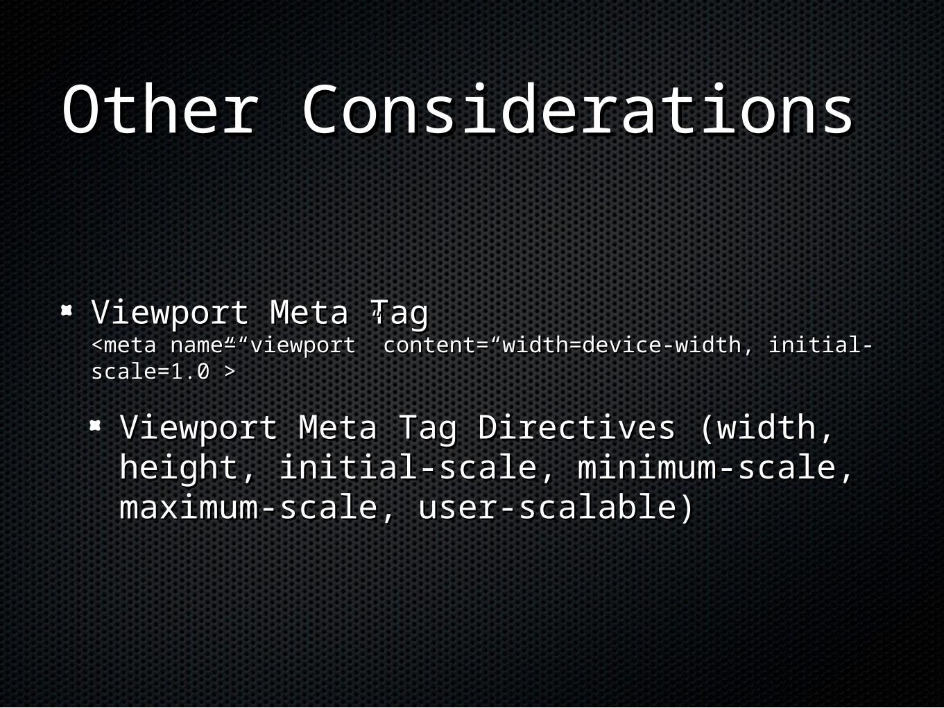
Other ConsiderationsOther Considerations
Viewport Meta TagViewport Meta Tag<meta name=“viewport” content=“width=device-width, initial-<meta name=“viewport” content=“width=device-width, initial-scale=1.0”>scale=1.0”>
Viewport Meta Tag Directives (width, height, Viewport Meta Tag Directives (width, height, initial-scale, minimum-scale, maximum-scale, initial-scale, minimum-scale, maximum-scale, user-scalable)user-scalable)
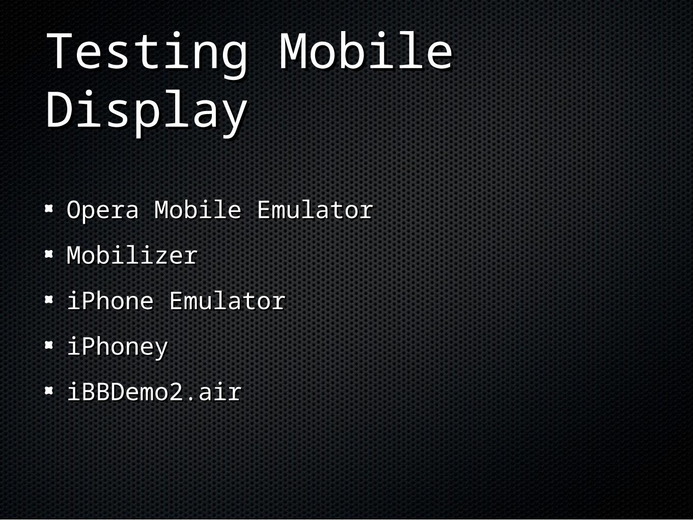
Testing Mobile DisplayTesting Mobile Display
Opera Mobile EmulatorOpera Mobile Emulator
MobilizerMobilizer
iPhone EmulatoriPhone Emulator
iPhoneyiPhoney
iBBDemo2.airiBBDemo2.air
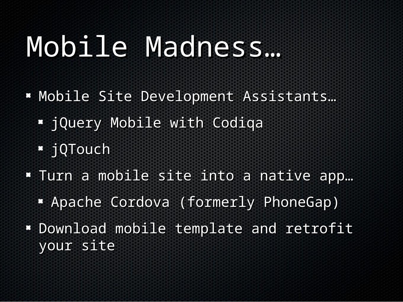
Mobile Madness…Mobile Madness…
Mobile Site Development Assistants…Mobile Site Development Assistants…
jQuery Mobile with CodiqajQuery Mobile with Codiqa
jQTouchjQTouch
Turn a mobile site into a native app…Turn a mobile site into a native app…
Apache Cordova (formerly PhoneGap)Apache Cordova (formerly PhoneGap)
Download mobile template and retrofit your Download mobile template and retrofit your sitesite