Embed Size (px)
Citation preview

P1: FXS/ABE P2: FXS
9780521740494c22.xml CUAU033-EVANS September 12, 2008 9:40
C H A P T E R
22Describing the
distribution of asingle variable
ObjectivesTo introduce the two main types of data—categorical and numerical
To use bar charts to display frequency distributions of categorical data
To use histograms and frequency polygons to display frequency distributions of
numerical data
To use cumulative frequency polygons and cumulative relative frequency
polygons to display cumulative frequency distributions
To use the stem-and-leaf plot to display numerical data
To use the histogram to display numerical data
To use these plots to describe the distribution of a numerical variable in terms of
symmetry, centre, spread and outliers
To define and calculate the summary statistics mean, median, range, interquartile
range, variance and standard deviation
To understand the properties of these summary statistics and when each is
appropriate
To construct and interpret boxplots, and use them to compare data sets
22.1 Types of variablesA characteristic about which information is recorded is called a variable, because its value is
not always the same. Several types of variable can be identified. Consider the following
situations.
500Cambridge University Press • Uncorrected Sample Pages • 978-0-521-61252-4 2008 © Evans, Lipson, Jones, Avery, TI-Nspire & Casio ClassPad material prepared in collaboration with Jan Honnens & David Hibbard
SAMPLE

P1: FXS/ABE P2: FXS
9780521740494c22.xml CUAU033-EVANS September 12, 2008 9:40
Chapter 22 — Describing the distribution of a single variable 501
Students answer a question by selecting ‘yes’, ‘no’ or ‘don’t know’.
Students say how they feel about a particular statement by ticking one of ‘strongly agree’,
‘agree’, ‘no opinion’, ‘disagree’ or ‘strongly disagree’.
Students write down the size shoe that they take.
Students write down their height.
These situations give rise to two different types of data. The data arising from the first two
situations are called categorical data, because the data can only be classified by the name of
the category from which they come; there is no quantity associated with each category. The
data arising from the third and fourth examples is called numerical data. These examples
differ slightly from each other in the type of numerical data they each generate. Shoe sizes are
of the form . . . , 6, 6.5, 7, 7.5, . . . . These are called discrete data, because the data can only
take particular values. Discrete data often arise in situations where counting is involved. The
other type of numerical data is continuous data where the variable may take any value
(sometimes within a specified interval). Such data arise when students measure height. In fact,
continuous data often arise when measuring is involved.
Exercise 22A
1 Classify the data which arise from the following situations into categorical, or numerical.
a Kindergarten pupils bring along their favourite toy, and they are grouped together under
the headings: ‘dolls’, ‘soft toys’, ‘games’, ‘cars’, and ‘other’.
b The number of students on each of twenty school buses are counted.
c A group of people each write down their favourite colour.
d Each student in a class is weighed in kilograms.
e Each student in a class is weighed and then classified as ‘light’, ‘average’ or ‘heavy’.
f People rate their enthusiasm for a certain rock group as ‘low’, ‘medium’, or ‘high’.
2 Classify the data which arise from the following situations as categorical or numerical.
a The intelligence quotient (IQ) of a group of students is measured using a test.
b A group of people are asked to indicate their attitude to capital punishment by selecting
a number from 1 to 5 where 1 = strongly disagree, 2 = disagree, 3 = undecided,
4 = agree, and 5 = strongly agree.
3 Classify the following numerical data as either discrete or continuous.
a The number of pages in a book.
b The price paid to fill the tank of a car with petrol.
c The volume of petrol used to fill the tank of a car.
d The time between the arrival of successive customers at an autobank teller.
e The number of tosses of a die required before a six is thrown.
Cambridge University Press • Uncorrected Sample Pages • 978-0-521-61252-4 2008 © Evans, Lipson, Jones, Avery, TI-Nspire & Casio ClassPad material prepared in collaboration with Jan Honnens & David Hibbard
SAMPLE

P1: FXS/ABE P2: FXS
9780521740494c22.xml CUAU033-EVANS September 12, 2008 9:40
502 Essential Advanced General Mathematics
22.2 Displaying categorical data—the bar chartSuppose a group of 130 students were asked to nominate their favourite kind of music under
the categories ‘hard rock’, ‘oldies’, ‘classical’, ‘rap’, ‘country’ or ‘other’. The table shows the
data for the first few students.
Student’s name Favourite music
Daniel hard rock
Karina classical
John country
Jodie hard rock
The table gives data for individual students. To consider the group as a whole the data
should be collected into a table called a frequency distribution by counting how many of each
of the different values of the variable have been observed.
Counting the number of students who responded to the question on favourite kinds of music
gave the following results in each category.
Hard rock Other Oldies Classical Rap Country
62 27 20 15 3 3
While a clear indication of the group’s preferences can be seen from the table, a visual
display may be constructed to illustrate this. When the data are categorical, the appropriate
display is a bar chart. The categories are indicated on the horizontal axis and the
corresponding numbers in each category shown on the vertical axis.
20
30
60
70
50
40
10
0
Num
ber
of s
tude
nts
Hard rock Other Oldies Classical Rap CountryType of music
The order in which the categories are listed on the horizontal axis is not important, as no
order is inherent in the category labels. In this particular bar chart, the categories are listed in
decreasing order by number.
From the bar chart the music preferences for the group of students may be easily compared.
The value which occurs most frequently is called the mode of the variable. Here it can be seen
that the mode is hard rock.
Cambridge University Press • Uncorrected Sample Pages • 978-0-521-61252-4 2008 © Evans, Lipson, Jones, Avery, TI-Nspire & Casio ClassPad material prepared in collaboration with Jan Honnens & David Hibbard
SAMPLE

P1: FXS/ABE P2: FXS
9780521740494c22.xml CUAU033-EVANS September 12, 2008 9:40
Chapter 22 — Describing the distribution of a single variable 503
Exercise 22B
1 A group of students were asked to select their favourite type of fast food, with the
following results.
a Draw a bar chart for these data.
b Which is the most popular food type?Food type Number of students
hamburgers 23
chicken 7
fish and chips 6
Chinese 7
pizza 18
other 8
2 The following responses were received to a
question regarding the return of capital punishment.
strongly agree 21
agree 11
don’t know 42
disagree 53
strongly disagree 129
a Draw a bar chart for these data.
b How many respondents either agree or strongly
agree?
3 A video shop proprietor took note of the
type of films borrowed during a particular day
with the following results.
a Construct a bar chart to illustrate these data.
b Which is the least popular film type?
comedy 53
drama 89
horror 42
music 15
other 33
4 A survey of secondary school students’ preferred
ways of spending their leisure time at home gave the
following results.
a Construct a bar chart to illustrate these data.
b What is the most common leisure activity?
watch TV 42%
read 13%
listen to music 23%
watch a video 12%
phone friends 4%
other 6%
22.3 Displaying numerical data—the histogramIn previous studies you have been introduced to various ways of summarising and displaying
numerical data, including dotplots, stem-and-leaf plots, histograms and boxplots. Constructing
a histogram for discrete numerical data is demonstrated in Example 1.
Cambridge University Press • Uncorrected Sample Pages • 978-0-521-61252-4 2008 © Evans, Lipson, Jones, Avery, TI-Nspire & Casio ClassPad material prepared in collaboration with Jan Honnens & David Hibbard
SAMPLE
P1: FXS/ABE P2: FXS
9780521740494c22.xml CUAU033-EVANS September 12, 2008 9:40
504 Essential Advanced General Mathematics
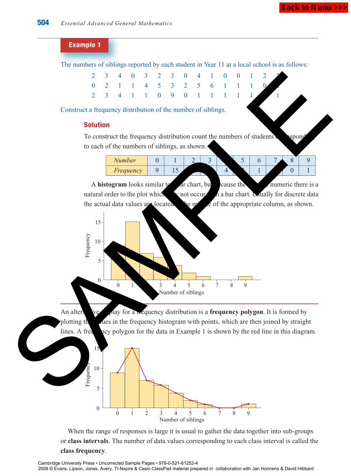
Example 1
The numbers of siblings reported by each student in Year 11 at a local school is as follows:
2 3 4 0 3 2 3 0 4 1 0 0 1 2 3
0 2 1 1 4 5 3 2 5 6 1 1 1 0 2
2 3 4 1 1 0 9 0 1 1 1 1 1 0 1
Construct a frequency distribution of the number of siblings.
Solution
To construct the frequency distribution count the numbers of students corresponding
to each of the numbers of siblings, as shown.
Number 0 1 2 3 4 5 6 7 8 9
Frequency 9 15 7 6 4 2 1 0 0 1
A histogram looks similar to a bar chart, but because the data are numeric there is a
natural order to the plot which may not occur with a bar chart. Usually for discrete data
the actual data values are located at the middle of the appropriate column, as shown.
00
5
15
10
1 2 3 4 5 6 7 8 9
Freq
uenc
y
Number of siblings
An alternative display for a frequency distribution is a frequency polygon. It is formed by
plotting the values in the frequency histogram with points, which are then joined by straight
lines. A frequency polygon for the data in Example 1 is shown by the red line in this diagram.
00
5
15
10
1 2 3 4 5 6 7 8 9
Freq
uenc
y
Number of siblings
When the range of responses is large it is usual to gather the data together into sub-groups
or class intervals. The number of data values corresponding to each class interval is called the
class frequency.
Cambridge University Press • Uncorrected Sample Pages • 978-0-521-61252-4 2008 © Evans, Lipson, Jones, Avery, TI-Nspire & Casio ClassPad material prepared in collaboration with Jan Honnens & David Hibbard
SAMPLE

P1: FXS/ABE P2: FXS
9780521740494c22.xml CUAU033-EVANS September 12, 2008 9:40
Chapter 22 — Describing the distribution of a single variable 505
Class intervals should be chosen according to the following principles:
Every data value should be in an interval
The intervals should not overlap
There should be no gaps between the intervals.
The choice of intervals can vary, but generally a division which results in about 5 to
15 groups is preferred. It is also usual to choose an interval width which is easy for the reader
to interpret, such as 10 units, 100 units, 1000 units etc (depending on the data). By convention,
the beginning of the interval is given the appropriate exact value, rather than the end. For
example, intervals of 0–49, 50–99, 100–149 would be preferred over the intervals 1–50,
51–100, 101–150 etc.
Example 2
A researcher asked a group of people to record how many cups of coffee they drank in a
particular week. Here are her results.
0 0 9 10 23 25 0 0 34 32 0 0 30 0 4
5 0 17 14 3 6 0 33 23 0 32 13 21 22 6
8 19 25 25 0 0 0 2 28 25 14 20 12 17 16
Construct a frequency distribution and hence a histogram of these data.
Solution
Because there are so many different results and they are spread over a wide range, the
data are summarised into class intervals.
As the minimum value is 0 and the
maximum is 34, intervals of width 5
would be appropriate, giving the
frequency distribution shown in the table.
Number of Frequency
cups of coffee
0–4 16
5–9 5
10–14 5
15–19 4
20–24 5
25–29 5
30–34 5
The corresponding histogram
may then be drawn.
Freq
uenc
y
20
15
10
5
50
10 252015 30 35Number of cups of coffee
Example 2 was concerned with a discrete numerical variable. When constructing a frequency
distribution of continuous data, the data are again grouped, as shown in Example 3.
Cambridge University Press • Uncorrected Sample Pages • 978-0-521-61252-4 2008 © Evans, Lipson, Jones, Avery, TI-Nspire & Casio ClassPad material prepared in collaboration with Jan Honnens & David Hibbard
SAMPLE

P1: FXS/ABE P2: FXS
9780521740494c22.xml CUAU033-EVANS September 12, 2008 9:40
506 Essential Advanced General Mathematics
Example 3
The following are the heights of the players in a basketball club, measured to the nearest
millimetre.
178.1 185.6 173.3 193.4 183.1 193.0 188.3 189.5 184.6 202.4 170.9
183.3 180.3 182.0 183.6 184.5 185.8 189.1 178.6 194.7 185.3 188.7
192.4 203.7 191.1 189.7 191.1 180.4 180.0 180.1 170.5 179.3 193.8
196.3 189.6 183.9 177.7 184.1 183.8 174.7 178.9
Construct a frequency distribution and hence a histogram of these data.
Solution
From the data it seems that intervals of width
5 will be suitable. All values of the variable
which are 170 or more, but less than 175,
have been included in the first interval.
The second interval includes values from
175 to less than 180, and so on for the rest
of the table.
Player heights Frequency
170 – 4
175 – 5
180 – 13
185 – 9
190 – 7
195 – 1
200 – 2
The histogram of these
data is shown here.
Freq
uenc
y
Player heights
15
5
170 175 180 185 190 195 200 2050
10
The interval in a frequency distribution which has the highest class frequency is
called the modal class. Here the modal class is 180.0–184.9.
Using the TI-NspireThe calculator can be used to construct a histogram for numerical data. This will be
illustrated using the basketball player height data from Example 3.
Cambridge University Press • Uncorrected Sample Pages • 978-0-521-61252-4 2008 © Evans, Lipson, Jones, Avery, TI-Nspire & Casio ClassPad material prepared in collaboration with Jan Honnens & David Hibbard
SAMPLE

P1: FXS/ABE P2: FXS
9780521740494c22.xml CUAU033-EVANS September 12, 2008 9:40
Chapter 22 — Describing the distribution of a single variable 507
The data is easiest entered in a Lists &Spreadsheet application ( 3).
Firstly, use the up/down arrows ( ) to
name the first column height.
Then enter each of the 41 numbers as
shown.
Open a Data & Statistics application (
5) to graph the data. At first the data
displays as shown.
Specify the x variable by selecting Add XVariable from the Plot Properties (b 2
4) and selecting height. The data now
displays as shown.
(Note: It is also possible to use the NavPad
to move down below the x-axis and click to
add the x variable.)
Select Histogram from the Plot Type menu
(b 13). The data now displays as
shown.
Select Bin Settings from the HistogramProperties submenu of Plot Propertiesmenu (b 222).
Let width = 5 and Alignment = 170.
Finally, select Zoom, Data from the
Window/Zoom menu (b 5 2) to
display the data as shown.
Cambridge University Press • Uncorrected Sample Pages • 978-0-521-61252-4 2008 © Evans, Lipson, Jones, Avery, TI-Nspire & Casio ClassPad material prepared in collaboration with Jan Honnens & David Hibbard
SAMPLE

P1: FXS/ABE P2: FXS
9780521740494c22.xml CUAU033-EVANS September 12, 2008 9:40
508 Essential Advanced General Mathematics
Using the Casio ClassPadThe calculator can be used to construct a histogram for numerical data. This will be
illustrated using the basketball player height data from Example 3.
In enter the data into list1, tapping EXE to enter and move down the column.
Tap SetGraph, Setting . . . and the tab for Graph 1, enter the settings shown and tap
SET.
Tap SetGraph, StatGraph1 and then tap the box
to tick and select the graph.
Tap to produce the graph selecting HStart
= 4 (the left bound of the histogram) and HStep =4 (the desired interval width) when prompted. The
histogram is produced as shown.
With the graph window selected (bold border)
tap 6 to adjust the viewing window for the
graph.
Tap Analysis, Trace and use the navigator key to
move from column to column and display the
count for that column.
Cambridge University Press • Uncorrected Sample Pages • 978-0-521-61252-4 2008 © Evans, Lipson, Jones, Avery, TI-Nspire & Casio ClassPad material prepared in collaboration with Jan Honnens & David Hibbard
SAMPLE

P1: FXS/ABE P2: FXS
9780521740494c22.xml CUAU033-EVANS September 12, 2008 9:40
Chapter 22 — Describing the distribution of a single variable 509
Relative and percentage frequenciesWhen frequencies are expressed as a proportion of the total number they are called relative
frequencies. By expressing the frequencies as relative frequencies more information is
obtained about the data set. Multiplying the relative frequencies by 100 readily converts them
to percentage frequencies, which are easier to interpret.
An example of the calculation of relative and percentage frequencies is shown in
Example 4.
Example 4
Construct a relative frequency distribution and a percentage frequency distribution for the
player height data.
SolutionPlayer Relative Percentage
heights (cm) Frequency frequency frequency
170 – 44
41= 0.10 10%
175 – 55
41= 0.12 12%
180 – 1313
41= 0.32 32%
185 – 99
41= 0.22 22%
190 – 77
41= 0.17 17%
195 – 11
41= 0.02 2%
200 – 22
41= 0.05 5%
From this table it can be
seen, for example, that nine
out of forty-one, or 22% of
players, have heights from
185 cm to less than 190 cm.
Both the relative frequency histogram and the percentage frequency histogram are identical to
the frequency histogram—only the vertical scale is changed. To construct either of these
histograms from a list of data use a graphics calculator to construct the frequency histogram,
and then convert the individual frequencies to either relative frequencies or percentage
frequencies one by one as required.
Cumulative frequency distributionTo answer questions concerning the number or proportion of the data values which are less
than a given value a cumulative frequency distribution, or a cumulative relative frequency
distribution can be constructed. In both a cumulative frequency distribution and a cumulative
relative frequency distribution, the number of observations in each class are accumulated from
low to high values of the variable.
Cambridge University Press • Uncorrected Sample Pages • 978-0-521-61252-4 2008 © Evans, Lipson, Jones, Avery, TI-Nspire & Casio ClassPad material prepared in collaboration with Jan Honnens & David Hibbard
SAMPLE

P1: FXS/ABE P2: FXS
9780521740494c22.xml CUAU033-EVANS September 12, 2008 9:40
510 Essential Advanced General Mathematics
Example 5
Construct a cumulative frequency distribution and a cumulative relative frequency distribution
for the data in Example 4.
Solution
Player heights Cumulative Cumulative relative
(cm) Frequency frequency frequency
<170 0 0 0
<175 4 4 0.10
<180 5 9 0.22
<185 13 22 0.54
<190 9 31 0.76
<195 7 38 0.93
<200 1 39 0.95
<205 2 41 1.00
Each cumulative frequency was obtained by adding preceding values of the frequency.
In the same way the cumulative relative frequencies were obtained by adding
preceding relative frequencies. Thus it can be said that a proportion of 0.54, or 54%,
of players are less than 185 cm tall.
A graphical representation of a cumulative frequency
distribution is called a cumulative frequency
polygon and has a distinctive appearance, as it
always starts at zero and is non-decreasing.
Cum
ulat
ive
freq
uenc
y
Player heights
20
30
40
170 175 180 185 190 195 200 205
0
10
This graph shows, on the vertical axis, the
number of players shorter than any height
given on the horizontal axis. The cumulative
relative frequency distribution could also be
plotted as a cumulative relative frequency
polygon, which would differ from the cumulative
frequency polygon only in the scale on the vertical axis, which would run from 0 to 1.
Exercise 22C
1 The number of pets reported by each student in a class is given in the following table:Example 1
2 3 4 0 3 2 3 0 4 1 0
0 2 1 1 4 5 3 2 5 6 1
Construct a frequency distribution of the numbers of pets reported by each student.
Cambridge University Press • Uncorrected Sample Pages • 978-0-521-61252-4 2008 © Evans, Lipson, Jones, Avery, TI-Nspire & Casio ClassPad material prepared in collaboration with Jan Honnens & David Hibbard
SAMPLE

P1: FXS/ABE P2: FXS
9780521740494c22.xml CUAU033-EVANS September 12, 2008 9:40
Chapter 22 — Describing the distribution of a single variable 511
2 The number of children in the family for each student in a class is shown in this histogram.
10
021 3 4 5 6 7 8 9 10
5
Size of family
Num
ber
of s
tude
nts
a How many students are the only child in a family?
b What is the most common number of children in the family?
c How many students come from families with six or more children?
d How many students are there in the class?
3 The following histogram gives the scores on a general knowledge quiz for a class of Year
11 students.
10
020 30 40 50 60 70 80 9010 100
5
Marks
Num
ber
of s
tude
nts
a How many students scored from 10–19 marks?
b How many students attempted the quiz? c What is the modal class?
d If a mark of 50 or more is designated as a pass, how many students passed the quiz?
4 The maximum temperatures for several capital cities around the world on a particular day,
in degrees Celsius, were:
17 26 36 32 17 12 32 2
16 15 18 25 30 23 33 33
17 23 28 36 45 17 19 37
31 19 25 22 24 29 32 38
a Use a class interval of 5 to construct a frequency distribution for these data.Example 2
b Construct the corresponding relative frequency distribution.Example 4
c Draw a histogram from the frequency distribution.
d What percentage of cities had a maximum temperature of less than 25◦C?
Cambridge University Press • Uncorrected Sample Pages • 978-0-521-61252-4 2008 © Evans, Lipson, Jones, Avery, TI-Nspire & Casio ClassPad material prepared in collaboration with Jan Honnens & David Hibbard
SAMPLE

P1: FXS/ABE P2: FXS
9780521740494c22.xml CUAU033-EVANS September 12, 2008 9:40
512 Essential Advanced General Mathematics
5 A student purchases 21 new text books from a school book supplier with the following
prices (in dollars).
21.65 14.95 12.80 7.95 32.50 23.99 23.99
7.80 3.50 7.99 42.98 18.50 19.95 3.20
8.90 17.15 4.55 21.95 7.60 5.99 14.50
a Draw a histogram of these data using appropriate class intervals.Example 3
b What is the modal class?
c Construct a cumulative frequency distribution for these data and draw the cumulativeExample 5
frequency polygon.
6 A group of students were asked to draw a line which they estimated to be the same length
as a 30 cm ruler. The lines were then measured (in cm) with the following results.
30.3 30.9 31.2 32.3 31.3 30.7 32.8 31.0 33.3 30.7
32.2 30.1 31.6 32.1 31.4 31.8 32.9 31.9 29.4 31.6
32.1 31.2 30.7 32.1 30.8 29.7 30.1 28.9
a Construct a histogram of the frequency distribution.
b Construct a cumulative frequency distribution for these data and draw the cumulative
frequency polygon.
c Write a sentence to describe the students’ performance on this task.
7 The following are the marks obtained by a group of Year 11 Chemistry students on the end
of year exam.
21 49 58 68 72 31 49 59 68 72
33 52 59 68 82 47 52 59 70 91
47 52 63 71 92 48 53 65 71 99
a Using a graphics calculator, or otherwise, construct a histogram of the frequency
distribution.
b Construct a cumulative frequency distribution for these data and draw the cumulative
frequency polygon.
c Write a sentence to describe the students’ performance on this exam.
8 The following 50 values are the lengths (in metres) of some par 4 golf holes from
Melbourne golf courses.
302 272 311 351 338 325 314 307 336 310
371 334 369 334 320 374 364 353 366 260
376 332 338 320 321 364 317 362 310 280
366 361 299 321 361 312 305 408 245 279
398 407 337 371 266 354 331 409 385 260
a Construct a histogram of the frequency distribution.
b Construct a cumulative frequency distribution for these data and draw the cumulative
frequency polygon.
Cambridge University Press • Uncorrected Sample Pages • 978-0-521-61252-4 2008 © Evans, Lipson, Jones, Avery, TI-Nspire & Casio ClassPad material prepared in collaboration with Jan Honnens & David Hibbard
SAMPLE

P1: FXS/ABE P2: FXS
9780521740494c22.xml CUAU033-EVANS September 12, 2008 9:40
Chapter 22 — Describing the distribution of a single variable 513
c Use the cumulative frequency polygon to estimate:
i the proportion of par 4 holes below 300 m in length
ii the proportion of par 4 holes 360 m or more in length
iii the length which is exceeded by 90% of the par 4 holes.
22.4 Characteristics of distributionsof numerical variablesDistributions of numerical variables are characterised by their shapes and special features such
as centre and spread.
Two distributions are said to differ in centre if the values of the variable in one distribution
are generally larger than the values of the variable in the other distribution. Consider, for
example, the following histograms shown on the same scale.
a
0 5 10 15
b
0 5 10 15
It can be seen that plot b is identical to plot a but moved horizontally several units to the
right, indicating that these distributions differ in the location of their centres.
The next pair of histograms also differ, but not in the same way. While both histograms are
centred at about the same place, histogram d is more spread out. Two distributions are said to
differ in spread if the values of the variable in one distribution tend to be more spread out than
the values of the variable in the other distribution.
c
0 5 10 15
d
0 5 10 15
A distribution is said to be symmetric if it forms a mirror image of itself when folded in the
‘middle’ along a vertical axis; otherwise it is said to be skewed. Histogram e is perfectly
symmetrical, while f shows a distribution which is approximately symmetric.
e
0 5 10 15
f
0 5 10 15
Cambridge University Press • Uncorrected Sample Pages • 978-0-521-61252-4 2008 © Evans, Lipson, Jones, Avery, TI-Nspire & Casio ClassPad material prepared in collaboration with Jan Honnens & David Hibbard
SAMPLE

P1: FXS/ABE P2: FXS
9780521740494c22.xml CUAU033-EVANS September 12, 2008 9:40
514 Essential Advanced General Mathematics
If a histogram has a short tail to the left and a long tail pointing to the right it is said to be
positively skewed (because of the many values towards the positive end of the distribution) as
shown in the histogram g.
If a histogram has a short tail to the right and a long tail pointing to the left it is said to be
negatively skewed (because of the many values towards the negative end of the distribution),
as shown in histogram h.
g
0 5 10 15
positively skewed
h
0 5 10 15
negatively skewed
Knowing whether a distribution is skewed or symmetric is important as this gives
considerable information concerning the choice of appropriate summary statistics, as will be
seen in the next section.
Exercise 22D
1 Do the following pairs of distributions differ in centre, spread, both or neither?
a
b
0 0
c
0 0
Cambridge University Press • Uncorrected Sample Pages • 978-0-521-61252-4 2008 © Evans, Lipson, Jones, Avery, TI-Nspire & Casio ClassPad material prepared in collaboration with Jan Honnens & David Hibbard
SAMPLE

P1: FXS/ABE P2: FXS
9780521740494c22.xml CUAU033-EVANS September 12, 2008 9:40
Chapter 22 — Describing the distribution of a single variable 515
2 Describe the shape of each of the following histograms.
a
0
b
0
c
0
3 What is the shape of the histogram drawn in 6, Exercise 22C?
4 What is the shape of the histogram drawn in 7, Exercise 22C?
5 What is the shape of the histogram drawn in 8, Exercise 22C?
22.5 Stem-and-leaf plotsAn informative data display for a small (less than 50 values) numerical data set is the
stem-and-leaf plot. The construction of the stem-and-leaf plot is illustrated in Example 6.
Example 6
By the end of 2004 the number of test matches played, as captain, by each of the Australian
cricket captains was:
3 16 2 1 8 3 6 4 8 21 2 15 10 6
10 11 2 5 25 5 24 1 24 2 17 1 5 28
1 39 2 25 1 30 48 7 28 93 50 57 9 6
Construct a stem-and-leaf plot of these data.
Cambridge University Press • Uncorrected Sample Pages • 978-0-521-61252-4 2008 © Evans, Lipson, Jones, Avery, TI-Nspire & Casio ClassPad material prepared in collaboration with Jan Honnens & David Hibbard
SAMPLE

P1: FXS/ABE P2: FXS
9780521740494c22.xml CUAU033-EVANS September 12, 2008 9:40
516 Essential Advanced General Mathematics
Solution
To make a stem-and-leaf plot find the smallest and
the largest data values. From the table above, the
smallest value is 1, which is given a 0 in the ten’s
column, and the largest is 93, which has a 9 in the
ten’s column. This means that the stems are chosen
to be from 0–9. These are written in a column with
a vertical line to their right, as shown.
0
1
2
3
4
5
6
7
8
9
The units for each data point are then entered to the right of the dividing line. They are
entered initially in the order in which they appear in the data. When all data points are
entered in the table, the stem-and-leaf plot looks like this.
0 3 2 1 8 3 6 4 8 2 6 2 5 5 1 2 1 5 1 2 1 7 9 6
1 6 5 0 0 1 7
2 1 5 4 4 8 5 8
3 9 0
4 8
5 0 7
6
7
8
9 3
To complete the plot the leaves are ordered, and a key added to specify the place
value of the stem and the leaves.
0 1 1 1 1 1 2 2 2 2 2 3 3 4 5 5 5 6 6 6 7 8 8 9
1 0 0 1 5 6 7
2 1 4 4 5 5 8 8
3 0 9
4 8
5 0 7
6 3 | 9 indicates 39 matches
7
8
9 3
It can be seen from this plot that one captain has led Australia in many more test matches than
any other (Allan Border, who captained Australia in 93 test matches). When a value sits away
from the main body of the data it is called an outlier.
Cambridge University Press • Uncorrected Sample Pages • 978-0-521-61252-4 2008 © Evans, Lipson, Jones, Avery, TI-Nspire & Casio ClassPad material prepared in collaboration with Jan Honnens & David Hibbard
SAMPLE

P1: FXS/ABE P2: FXS
9780521740494c22.xml CUAU033-EVANS September 12, 2008 9:40
Chapter 22 — Describing the distribution of a single variable 517
Stem-and-leaf plots have the advantage of retaining all the information in the data set while
achieving a display not unlike that of a histogram (turned on its side). In addition, a
stem-and-leaf plot clearly shows:
the range of values
where the values are concentrated
the shape of the data set
whether there are any gaps in which no values are observed
any unusual values (outliers).
Grouping the leaves in tens is simplest—other convenient groupings are in fives or twos, as
shown in Example 7.
Example 7
The birth weights, in kilograms, of the first 30 babies born at a hospital in a selected month are
as follows.
2.9 2.7 3.5 3.6 2.8 3.6 3.7 3.6 3.6 2.9
3.7 3.6 3.2 2.9 3.2 2.5 2.6 3.8 3.0 4.2
2.8 3.5 3.3 3.1 3.0 4.2 3.2 2.4 4.3 3.2
Construct a stem-and-leaf plot of these data.
Solution
A stem-and-leaf plot of the birth weights, with the stem representing units and the
leaves representing one-tenth of a unit, may be constructed.
2 4 5 6 7 8 8 9 9 9
3 0 0 1 2 2 2 2 3 5 5 6 6 6 6 6 7 7 8
4 2 2 3 3 | 0 indicates 3.0 kilograms
The plot, which allows one row for each different stem, appears to be too compact.
These data may be better displayed by constructing a stem-and-leaf plot with two rows
for each stem. These rows correspond to the digits {0, 1, 2, 3, 4} in the first row and
{5, 6, 7, 8, 9} in the second row.
2 4
2 5 6 7 8 8 9 9 9
3 0 0 1 2 2 2 2 3
3 5 5 6 6 6 6 6 7 7 8
4 2 2 3 3 | 0 indicates 3.0 kilograms
The only other possibility for a stem-and-leaf plot is one which has five rows per
stem. These rows correspond to the digits {0, 1}, {2, 3}, {4, 5}, {6, 7} and {8, 9}.
Cambridge University Press • Uncorrected Sample Pages • 978-0-521-61252-4 2008 © Evans, Lipson, Jones, Avery, TI-Nspire & Casio ClassPad material prepared in collaboration with Jan Honnens & David Hibbard
SAMPLE

P1: FXS/ABE P2: FXS
9780521740494c22.xml CUAU033-EVANS September 12, 2008 9:40
518 Essential Advanced General Mathematics
2 4 5
2 6 7
2 8 8 9 9 9
3 0 0 1
3 2 2 2 2 3
3 5 5
3 6 6 6 6 6 7 7
3 8
4 3 | 0 indicates 3.0 kilograms
4 2 2 3
None of the stem-and-leaf displays shown are correct or incorrect. A stem-and-leaf plot is
used to explore data and more than one may need to be constructed before the most
informative one is obtained. Again, from 5 to 15 rows is generally the most helpful, but this
may vary in individual cases.
When the data have too many digits for a convenient stem-and-leaf plot they should be
rounded or truncated. Truncating a number means simply dropping off the unwanted digits.
So, for example, a value of 149.99 would become 149 if truncated to three digits, but 150 if
rounded to three digits. Since the object of a stem-and-leaf display is to give a feeling for the
shape and patterns in the data set, the decision on whether to round or truncate is not very
important; however, generally when constructing a stem-and-leaf display the data is truncated,
as this is what commonly used data analysis computer packages will do.
Some of the most interesting investigations in statistics involve comparing two or more data
sets. Stem-and-leaf plots are useful displays for the comparison of two data sets, as shown in
the following example.
Example 8
The following table gives the number disposals by members of the Port Adelaide and Brisbane
football teams, in the 2004 AFL Grand Final.
Port Adelaide
25 20 19 18 18 17 16 15 14 13 12
12 11 11 11 11 10 10 9 9 7 7
Brisbane
25 19 19 18 17 16 15 15 13 13 13
10 10 9 9 8 8 7 6 5 4 0
Construct back to back stem-and-leaf plots of these data.
Cambridge University Press • Uncorrected Sample Pages • 978-0-521-61252-4 2008 © Evans, Lipson, Jones, Avery, TI-Nspire & Casio ClassPad material prepared in collaboration with Jan Honnens & David Hibbard
SAMPLE

P1: FXS/ABE P2: FXS
9780521740494c22.xml CUAU033-EVANS September 12, 2008 9:40
Chapter 22 — Describing the distribution of a single variable 519
Solution
To compare the two groups, the stem-and-leaf plots are drawn back to back, using two
rows per stem.
Port Adelaide Brisbane
0 0 4
9 9 7 7 0 5 6 7 8 8 9 9
4 3 2 2 1 1 1 1 0 0 1 0 0 3 3 3
9 8 8 7 6 5 1 5 5 6 7 8 9 9
0 2
5 2 5
0 | 2 represents 20 disposals 2 | 0 represents 20 disposals
The leaves on the left of the stem are centred slightly higher than the leaves on the
right, which suggests that, overall, Port Adelaide recorded more disposals. The spread
of disposals for Port Adelaide appears narrower than that of the Brisbane players.
Exercise 22E
1 The monthly rainfall for Melbourne, in a particular year, is given in the following tableExample 6
(in millimetres).
Month J F M A M J J A S O N D
Rainfall (mm) 48 57 52 57 58 49 49 50 59 67 60 59
a Construct a stem-and-leaf plot of the rainfall, using the following stems.
4
5
6
b In how many months is the rainfall 60 mm or more?
2 An investigator recorded the amount of time 24 similar batteries lasted in a toy. Her resultsExample 7
in hours were:
25.5 39.7 29.9 23.6 26.9 31.3 21.4 27.4 19.5 29.8 33.4 21.8
4.2 25.6 16.9 18.9 46.0 33.8 36.8 27.5 25.1 31.3 41.2 32.9
a Make a stem-and-leaf plot of these times with two rows per stem.
b How many of the batteries lasted for more than 30 hours?
3 The amount of time (in minutes) that a class of students spent on homework on one
particular night was:
10 27 46 63 20 33 15 21 16 14 15
39 70 19 37 67 20 28 23 0 29 10
Cambridge University Press • Uncorrected Sample Pages • 978-0-521-61252-4 2008 © Evans, Lipson, Jones, Avery, TI-Nspire & Casio ClassPad material prepared in collaboration with Jan Honnens & David Hibbard
SAMPLE

P1: FXS/ABE P2: FXS
9780521740494c22.xml CUAU033-EVANS September 12, 2008 9:40
520 Essential Advanced General Mathematics
a Make a stem-and-leaf plot of these times.
b How many students spent more than 60 minutes on homework?
c What is the shape of the distribution?
4 The cost of various brands of track shoes at a retail outlet are as follows.
$49.99 $75.49 $68.99 $164.99 $75.99 $39.99 $35.99 52.99
$210.00 $84.99 $36.98 $95.49 $28.99 $25.49 $78.99 $45.99
$46.99 $76.99 $82.99 $79.99 $149.99
a Construct a stem-and-leaf plot of these data.
b What is the shape of the distribution?
5 The students in a class were asked to write down the ages of their mothers and fathers.Example 8
Mother’s age
49 50 43 50 47 50 40 46 49 49 42 44 38
43 44 40 39 40 41 43 45 48 38 43 37 43Father’s age
50 51 41 55 51 48 47 47 52 54 41 44 40
43 46 44 44 48 43 48 43 46 48 49 45 46
a Construct a back to back stem-and-leaf plot of these data sets.
b How do the ages of the students’ mothers and fathers compare in terms of shape, centre
and spread?
6 The results of a mathematics test for two different classes of students are given in the table.
Class A
22 19 48 39 68 47 58 77 76 89 85 82
85 79 45 82 81 80 91 99 55 65 79 71
Class B
12 13 80 81 83 98 70 70 71 72 72 73
74 76 80 81 82 84 84 88 69 73 88 91
a Construct a back to back stem-and-leaf plot to compare the data sets.
b How many students in each class scored less than 50%?
c Which class do you think performed better overall on the test? Give reasons for your
answer.
22.6 Summarising dataA statistic is a number that can be computed from data. Certain special statistics are called
summary statistics, because they numerically summarise special features of the data set under
consideration. Of course, whenever any set of numbers is summarised into just one or two
figures much information is lost, but if the summary statistics are well chosen they will also
help to reveal the message which may be hidden in the data set.
Summary statistics are generally either measures of centre or measures of spread. There
are many different examples for each of these measures and there are situations when one of
the measures is more appropriate than another.
Cambridge University Press • Uncorrected Sample Pages • 978-0-521-61252-4 2008 © Evans, Lipson, Jones, Avery, TI-Nspire & Casio ClassPad material prepared in collaboration with Jan Honnens & David Hibbard
SAMPLE

P1: FXS/ABE P2: FXS
9780521740494c22.xml CUAU033-EVANS September 12, 2008 9:40
Chapter 22 — Describing the distribution of a single variable 521
Measures of centreMeanThe most commonly used measure of centre of a distribution of a numerical variable is the
mean. This is calculated by summing all the data values and dividing by the number of values
in the data set.
Example 9
The following data set shows the number of premierships won by each of the current AFL
teams, up until the end of 2004. Find the mean of the number of premiership wins.
Team Premierships
Carlton 16
Essendon 16
Collingwood 14
Melbourne 12
Fitzroy/Lions 11
Richmond 10
Hawthorn 9
Geelong 6
Kangaroos 4
Sydney 3
West Coast 2
Adelaide 2
Port Adelaide 1
W Bulldogs 1
St Kilda 1
Fremantle 0
Solution
mean = 16 + 16 + 14 + 12 + 11 + 10 + 9 + 6 + 4 + 3 + 2 + 2 + 1 + 1 + 1 + 0
16= 6.8
The mean of a sample is always denoted by the symbol x̄ , which is called ‘x bar’.
In general, if n observations are denoted by x1, x2, . . . ., xn the mean is
x̄ = x1 + x2 + · · · · · · + xn
n
or, in a more compact version
x̄ = 1
n
n∑i=1
xi
where the symbol∑
is the upper case Greek sigma, which in mathematics means ‘the sum
of the terms’.Cambridge University Press • Uncorrected Sample Pages • 978-0-521-61252-4 2008 © Evans, Lipson, Jones, Avery, TI-Nspire & Casio ClassPad material prepared in collaboration with Jan Honnens & David Hibbard
SAMPLE

P1: FXS/ABE P2: FXS
9780521740494c22.xml CUAU033-EVANS September 12, 2008 9:40
522 Essential Advanced General Mathematics
Note: The subscripts on the x’s are used to identify all of the n different values of x. They do not
mean that the x’s have to be written in any special order. The values of x in the example are in
order only because they were listed in that way in the table.
MedianAnother useful measure of the centre of a distribution of a numerical variable is the middle
value, or median. To find the value of the median, all the observations are listed in order and
the middle one is the median.
The median of
median
2 3 4 5 5 6 7 7 8 8 11
is 6, as there are five observations on either side of this value when the data are listed in order.
Example 10
Find the median number of premierships in the AFL ladder using the data in Example 9.
Solution
As the data are already given in order, it only remains to decide which is the middle
observation.
0 1 1 1 2 2 3 4 6 9 10 11 12 14 16 16
Since there are 16 entries in the table there is no actual middle observation, so the
median is chosen as the value half way between the two middle observations, in this
case the eighth and ninth (6 and 4). Thus the median is equal to1
2(6 + 4) = 5. The
interpretation here is that of the teams currently playing in the AFL, half (or 50%)
have won the premiership 5 or more times and half (or 50%) have have won the
premiership 5 or less times.
In general, to compute the median of a distribution:
Arrange all the observations in ascending order according to size.
If n, the number of observations, is odd, then the median is the
(n + 1
2
)th
observation from the end of the list.
If n, the number of observations, is even, then the median is found by averaging the
two middle observations in the list. That is, to find the median thenth
2and the(n
2+ 1
)thobservations are added together, and divided by 2.
The median value is easily determined from a stem-and-leaf plot by counting to the required
observation or observations from either end.
Cambridge University Press • Uncorrected Sample Pages • 978-0-521-61252-4 2008 © Evans, Lipson, Jones, Avery, TI-Nspire & Casio ClassPad material prepared in collaboration with Jan Honnens & David Hibbard
SAMPLE

P1: FXS/ABE P2: FXS
9780521740494c22.xml CUAU033-EVANS September 12, 2008 9:40
Chapter 22 — Describing the distribution of a single variable 523
From Examples 10 and 11, the mean number of times premierships won (6.8) and the
median number of premierships won (5) have already been determined. These values are
different and the interesting question is: why are they different, and which is the better measure
of centre for this example? To help answer this question consider a stem-and-leaf plot of these
data.
0 0 1 1 1 2 2 3 4
0 6 9
1 0 1 2 4
1 6 6
From the stem-and-leaf plot it can be seen that the distribution is positively skewed. This
example illustrates a property of the mean. When the distribution is skewed or if there are one
or two very extreme values, then the value of the mean may be quite significantly affected. The
median is not so affected by unusual observations, however, and is thus often a preferable
measure of centre. When this is the case, the median is generally preferred as a measure of
centre as it will give a better ‘typical’ value of the variable under consideration.
ModeThe mode is the observation which occurs most often. It is a useful summary statistic,
particularly for categorical data which do not lend themselves to some of the other numerical
summary methods. Many texts state that the mode is a third option for a measure of centre but
this is generally not true. Sometimes data sets do not have a mode, or they have several modes,
or they have a mode which is at one or other end of the range of values.
Measures of spreadRangeA measure of spread is calculated in order to judge the variability of a data set. That is, are
most of the values clustered together, or are they rather spread out? The simplest measure of
spread can be determined by considering the difference between the smallest and the largest
observations. This is called the range.
Example 11
Consider the marks, for two different tasks, awarded to a group of students.
Task A
2 6 9 10 11 12 13 22 23 24 26 26 27 33 34
35 38 38 39 42 46 47 47 52 52 56 56 59 91 94
Task B
11 16 19 21 23 28 31 31 33 38 41 49 52 53 54
56 59 63 65 68 71 72 73 75 78 78 78 86 88 91
Find the range of each of these data sets.
Cambridge University Press • Uncorrected Sample Pages • 978-0-521-61252-4 2008 © Evans, Lipson, Jones, Avery, TI-Nspire & Casio ClassPad material prepared in collaboration with Jan Honnens & David Hibbard
SAMPLE

P1: FXS/ABE P2: FXS
9780521740494c22.xml CUAU033-EVANS September 12, 2008 9:40
524 Essential Advanced General Mathematics
Solution
For Task A, the minimum mark is 2 and the maximum mark is 94.
Range for Task A = 94 − 2 = 92
For Task B, the minimum mark is 11 and the maximum mark is 91.
Range for Task B = 91 − 11 = 80
The range for Task A is greater than the range for Task B. Is the range a useful summary
statistic for comparing the spread of the two distributions? To help make this decision,
consider the stem-and-leaf plots of the data sets:
Task A Task B
9 6 2 0
3 2 1 0 1 1 6 9
7 6 6 4 3 2 2 1 3 8
9 8 8 5 4 3 3 1 1 3 8
7 7 6 2 4 1 9
9 6 6 2 2 5 2 3 4 6 9
6 3 5 8
7 1 2 3 5 8 8 8
8 6 8
4 1 9 1
From the stem-and-leaf plots of the data it appears that the spread of marks for the two tasks is
not well described by the range. The marks for Task A are more concentrated than the marks for
Task B, except for the two unusual values for Task A. Another measure of spread is needed, one
which is not so influenced by these extreme values. For this the interquartile range is used.
Interquartile range
To find the interquartile range of a distribution:
Arrange all observations in order according to size.
Divide the observations into two equal-sized groups. If n, the number of
observations, is odd, then the median is omitted from both groups.
Locate Q1, the first quartile, which is the median of the lower half of the
observations, and Q3, the third quartile, which is the median of the upper half
of the observations.
The interquartile range IQR is defined as the difference between the quartiles.
That is
IQR = Q3 − Q1
Cambridge University Press • Uncorrected Sample Pages • 978-0-521-61252-4 2008 © Evans, Lipson, Jones, Avery, TI-Nspire & Casio ClassPad material prepared in collaboration with Jan Honnens & David Hibbard
SAMPLE

P1: FXS/ABE P2: FXS
9780521740494c22.xml CUAU033-EVANS September 12, 2008 9:40
Chapter 22 — Describing the distribution of a single variable 525
Definitions of the quartiles of a distribution sometimes differ slightly from the one given here.
Using different definitions may result in slight differences in the values obtained, but these will
be minimal and should not be considered a difficulty.
Example 12
Find the interquartile ranges for Task A and Task B data given in Example 11.
Solution
For Task A the marks listed in order are:
2 6 9 10 11 12 13 22 23 24 26 26 27 33 34
35 38 38 39 42 46 47 47 52 52 56 56 59 91 94
Since there is an even number of observations, then the lower ‘half’ is:
2 6 9 10 11 12 13 22 23 24 26 26 27 33 34
The median of this lower group is the eighth observation, 22, so Q1 = 22.
The upper half is:
35 38 38 39 42 46 47 47 52 52 56 56 59 91 94
The median of this upper group is 47, so Q3 = 47
Thus, the interquartile range, IQR = 47 − 22
= 25
Similarly, for Task B data,
the lower quartile = 31 and
the upper quartile = 73,
giving an interquartile range for this data set of 42.
Comparing the two values of interquartile range shows the spread of Task A marks to
be much smaller than the spread of Task B marks, which seems consistent with the
display.
The interquartile range is a measure of spread of a distribution which describes the range of
the middle 50% of the observations. Since the upper 25% and the lower 25% of the
observations are discarded, the interquartile range is generally not affected by the presence of
outliers in the data set, which makes it a reliable measure of spread.
The median and quartiles of a distribution may also be determined from a cumulative
relative frequency polygon. Since the median is the observation which divides the data set in
half, this is the data value which corresponds to a cumulative relative frequency of 0.5 or 50%.
Similarly, the first quartile corresponds to a cumulative relative frequency of 0.25 or 25%, and
the third quartile corresponds to a cumulative relative frequency of 0.75 or 75%.
Cambridge University Press • Uncorrected Sample Pages • 978-0-521-61252-4 2008 © Evans, Lipson, Jones, Avery, TI-Nspire & Casio ClassPad material prepared in collaboration with Jan Honnens & David Hibbard
SAMPLE
P1: FXS/ABE P2: FXS
9780521740494c22.xml CUAU033-EVANS September 12, 2008 9:40
526 Essential Advanced General Mathematics
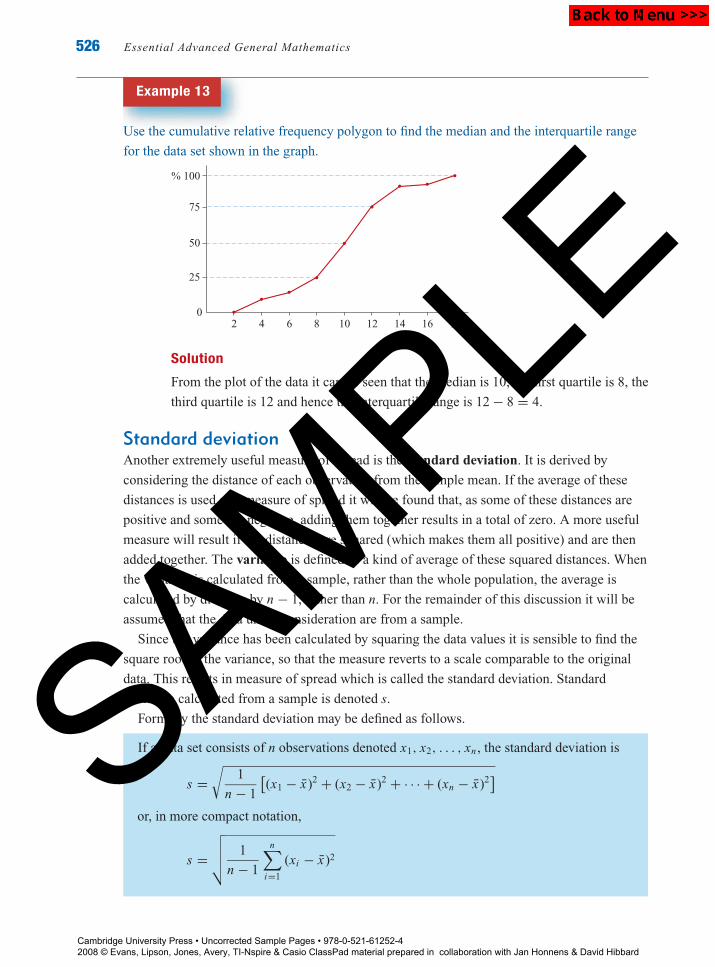
Example 13
Use the cumulative relative frequency polygon to find the median and the interquartile range
for the data set shown in the graph.
0
25
50
75
% 100
2 4 6 8 10 12 14 16 18
Solution
From the plot of the data it can be seen that the median is 10, the first quartile is 8, the
third quartile is 12 and hence the interquartile range is 12 − 8 = 4.
Standard deviationAnother extremely useful measure of spread is the standard deviation. It is derived by
considering the distance of each observation from the sample mean. If the average of these
distances is used as a measure of spread it will be found that, as some of these distances are
positive and some are negative, adding them together results in a total of zero. A more useful
measure will result if the distances are squared (which makes them all positive) and are then
added together. The variance is defined as a kind of average of these squared distances. When
the variance is calculated from a sample, rather than the whole population, the average is
calculated by dividing by n − 1, rather than n. For the remainder of this discussion it will be
assumed that the data under consideration are from a sample.
Since the variance has been calculated by squaring the data values it is sensible to find the
square root of the variance, so that the measure reverts to a scale comparable to the original
data. This results in measure of spread which is called the standard deviation. Standard
deviation calculated from a sample is denoted s.
Formally the standard deviation may be defined as follows.
If a data set consists of n observations denoted x1, x2, . . . , xn , the standard deviation is
s =√
1
n − 1
[(x1 − x̄)2 + (x2 − x̄)2 + · · · + (xn − x̄)2
]
or, in more compact notation,
s =√√√√ 1
n − 1
n∑i=1
(xi − x̄)2
Cambridge University Press • Uncorrected Sample Pages • 978-0-521-61252-4 2008 © Evans, Lipson, Jones, Avery, TI-Nspire & Casio ClassPad material prepared in collaboration with Jan Honnens & David Hibbard
SAMPLE

P1: FXS/ABE P2: FXS
9780521740494c22.xml CUAU033-EVANS September 12, 2008 9:40
Chapter 22 — Describing the distribution of a single variable 527
Example 14
Calculate the standard deviation of the following data set.
13 12 14 6 15 12 7 6 7 8
Solution
Construct a table as shown.
xi xi − x̄ (xi − x̄)2
13 3 912 2 414 4 166 −4 16
15 5 2512 2 47 −3 96 −4 167 −3 98 −2 4
�xi = 1̄00 �(xi − x̄)2 = 1̄12
From the table, the standard deviation s is: s =√
112
9= √
12.44 = 3.53
Interpreting the standard deviationThe standard deviation can be made more meaningful by interpreting it in relation to the data
set. The interquartile range gives the spread of the middle 50% of the data. Can similar
statements be made about the standard deviation? It can be shown that, for most data sets,
about 95% of the observations lie within two standard deviations of the mean.
Example 15
The cost of a lettuce at a number of different shops on a particular day is given in the table:
$3.85 $2.65 $1.90 $2.95 $2.40 $2.42 $2.63 $3.20 $4.20 $2.33 $0.85
$3.81 $1.69 $3.66 $2.60 $2.70 $3.10 $2.80 $1.80 $2.88 $1.40
Calculate the mean cost, the standard deviation and the interval equivalent to two standard
deviations above and below the mean.
Cambridge University Press • Uncorrected Sample Pages • 978-0-521-61252-4 2008 © Evans, Lipson, Jones, Avery, TI-Nspire & Casio ClassPad material prepared in collaboration with Jan Honnens & David Hibbard
SAMPLE

P1: FXS/ABE P2: FXS
9780521740494c22.xml CUAU033-EVANS September 12, 2008 9:40
528 Essential Advanced General Mathematics
Solution
The mean cost is $2.66 and the standard deviation is $0.84.
The interval equivalent to two standard deviations above and below the mean is:
[2.66 − 2 × 0.84, 2.66 + 2 × 0.84] = [0.98, 4.34].
In this case, 20 of the 21 observations, or 95% of observations, have values within the
interval calculated.
Example 16
The prices of forty secondhand motorbikes listed in a newspaper are as follows:
$5442 $5439 $2523 $2358 $2363 $2244 $1963 $2142
$2220 $1356 $738 $656 $715 $1000 $1214 $1788
$3457 $4689 $8218 $11 091 $11 778 $11 637 $8770 $8450
$6469 $7148 $10 884 $14 450 $15 731 $13 153 $10 067 $9878
$5294 $3847 $4219 $4786 $2280 $3019 $7645 $8079
Determine the interval equivalent to two standard deviations above and below the mean.
Solution
The mean price is $5729 and the standard deviation is $4233 (to the nearest whole
dollar).
The interval equivalent to two standard deviations above and below the mean is:
[5729 − 2 × 4233, 5729 + 2 × 4233] = [−2737, 14 195].
The negative value does not give a sensible solution and should be replaced by 0.
38 of the 40 observations, or 95% of observations, have values within the interval.
The exact percentage of observations which lie within two standard deviations of the mean
varies from data set to data set, but in general it will be around 95%, particularly for symmetric
data sets.
It was noted earlier that even a single outlier can have a very marked effect on the value of
the mean of a data set, while leaving the median unchanged. The same is true when the effect
of an outlier on the standard deviation is considered, in comparison to the interquartile range.
The median and interquartile range are called resistant measures, while the mean and standard
deviation are not resistant measures. When considering a data set it is necessary to do more
than just compute the mean and standard variation. First it is necessary to examine the data,
using a histogram or stem-and-leaf plot to determine which set of summary statistics is more
suitable.
Cambridge University Press • Uncorrected Sample Pages • 978-0-521-61252-4 2008 © Evans, Lipson, Jones, Avery, TI-Nspire & Casio ClassPad material prepared in collaboration with Jan Honnens & David Hibbard
SAMPLE

P1: FXS/ABE P2: FXS
9780521740494c22.xml CUAU033-EVANS September 12, 2008 9:40
Chapter 22 — Describing the distribution of a single variable 529
Using the TI-NspireThe calculator can be used to calculate the values of all of the summary statistics in this
section. Consider the data from Example 16.
The data is easiest entered in a Lists &Spreadsheet application ( 3).
Firstly, use the up/down arrows ( ) to
name the first column bike.
Then enter each of the 40 numbers as
shown.
Open a Calculator application ( 1) to
calculate the summary statistics.
Select the One-Variable Statisticscommand from the Stat Calculationssubmenu of the Statistics menu (b 6
11), specify in the dialog box that
there is only one list, and then complete the
final dialog box as shown.
Press enter to calculate the values of the
summary statistics.
Use the up arrow ( ) to view the rest of the
summary statistics.
Cambridge University Press • Uncorrected Sample Pages • 978-0-521-61252-4 2008 © Evans, Lipson, Jones, Avery, TI-Nspire & Casio ClassPad material prepared in collaboration with Jan Honnens & David Hibbard
SAMPLE

P1: FXS/ABE P2: FXS
9780521740494c22.xml CUAU033-EVANS September 12, 2008 9:40
530 Essential Advanced General Mathematics
The calculator can also be used to determine the summary statistics when the data is given
in a frequency table such as:
x 1 2 3 4
Frequency 5 8 7 2
The data is easiest entered in a Lists &Spreadsheet application ( 3).
Firstly, use the up/down arrows ( ) to
name the first column x and the second
column freq.
Then enter the data as shown.
Open a Calculator application ( 1) to
calculate the summary statistics.
Select the One-Variable Statisticscommand from the Stat Calculationssubmenu of the Statistics menu (b 6
11), specify in the dialog box that
there is only one list, and then complete the
final dialog box as shown. Press enter to
calculate the values of the summary
statistics.
Using the Casio ClassPadConsider the following heights in cm of a group of eight women.
176, 160, 163, 157, 168, 172, 173, 169
Enter the data into list1 in the module. Tap Calc, One-Variable and when prompted
ensure that the XList is set to list1 and the Freq = 1 (since each score is entered
individually).
The calculator returns the results as shown and all univariate statistics can be viewed
by using the scroll bar. Note that the standard deviation is given by x�n−1.
Where data is grouped, the scores are entered in list1 and the frequencies in list2. In
this case, in Set Calculation use the drop-down arrow to select list2 as the location for
the frequencies.
Cambridge University Press • Uncorrected Sample Pages • 978-0-521-61252-4 2008 © Evans, Lipson, Jones, Avery, TI-Nspire & Casio ClassPad material prepared in collaboration with Jan Honnens & David Hibbard
SAMPLE

P1: FXS/ABE P2: FXS
9780521740494c22.xml CUAU033-EVANS September 12, 2008 9:40
Chapter 22 — Describing the distribution of a single variable 531
Exercise 22F
1 Find the mean and the median of the following data sets.
Examples 9, 10 a 29 14 11 24 14 14 28 14 18 22 14
b 5 9 11 3 12 13 12 6 13 7 3 15 12 15 5 6
c 8.3 5.6 8.2 6.5 8.2 7.0 7.9 7.1 7.8 7.5
d 1.5 0.2 0.7 0.7 0.2 0.2 0.1 1.7 0.5 1.2 2.0 1.7
1.0 3.4 1.3 0.9 1.1 5.8 2.7 3.2 0.6 4.6 0.5 3.1
2 Find the mean and the median of the following data sets.
a x 1 2 3 4 5
Frequency 6 3 10 7 8
b x −2 −1 0 1 2
Frequency 5 8 11 3 2
3 The price, in dollars, of houses sold in a particular suburb during a one-week period are
given in the following list.
$187 500 $129 500 $93 400 $400 000 $118 000 $168 000 $550 000
$133 500 $135 500 $140 000 $186 000 $140 000 $204 000 $122 000
Find the mean and the median of the prices. Which do you think is a better measure of
centre of the data set? Explain your answer.
4 Concerned with the level of absence from his classes a teacher decided to investigate the
number of days each student had been absent from the classes for the year to date. These
are his results.
No. of days missed 0 1 2 3 4 5 6 9 21
No. of students 4 2 14 10 16 18 10 2 1
Find the mean and the median number of days each student had been absent so far that
year. Which is the better measure of centre in this case?
5 Find the range and the interquartile range for each of the following data sets.Examples 11, 12
a 718 630 1002 560 715 1085 750 510 1112 1093
b 0.7 −1.6 0.2 −1.2 −1.0 3.4 3.7 0.8
c 8.56 8.51 8.96 8.39 8.62 8.51 8.58 8.82 8.54
d 20 19 18 16 16 18 21 20 17 15 22 19
Cambridge University Press • Uncorrected Sample Pages • 978-0-521-61252-4 2008 © Evans, Lipson, Jones, Avery, TI-Nspire & Casio ClassPad material prepared in collaboration with Jan Honnens & David Hibbard
SAMPLE

P1: FXS/ABE P2: FXS
9780521740494c22.xml CUAU033-EVANS September 12, 2008 9:40
532 Essential Advanced General Mathematics
6 The serum cholesterol levels for a sample of twenty people are:
231 159 203 304 248 238 209 193 225 244
190 192 209 161 206 224 276 196 189 199
a Find the range of the serum cholesterol levels.
b Find the interquartile range of the serum cholesterol levels.
7 Twenty babies were born at a local hospital on one weekend. Their birth weights, in kg,
are given in the stem-and-leaf plot below.
2 1
2 5 7 9 9
3 1 3 3 4 4
3 5 6 7 7 9
4 1 2 2 3
4 5 3|6 represent 3.6 kg
a Find the range of the birth weights.
b Find the interquartile range of the birth weights.
8 Find the standard deviation for the following data sets.Example 14
a 30 16 22 23 18 18 14 56 13 26 9 31
b $2.52 $4.38 $3.60 $2.30 $3.45 $5.40 $4.43 $2.27 $4.50
$4.32 $5.65 $6.89 $1.98 $4.60 $5.12 $3.79 $4.99 $3.02
c 200 300 950 200 200 300 840 350 200 200
d 86 74 75 77 79 82 81 75 78 79 80 75 78 78 81 80 76 77 82
9 For each of the following data sets
a calculate the mean and the standard deviation
b determine the percentage of observations falling within two standard deviations of theExample 15
mean.
i 41 16 6 21 1 21 5 31 20 27 17 10 3 32 2 48 8 12
21 44 1 56 5 12 3 1 13 11 15 14 10 12 18 64 3 10
ii 141 260 164 235 167 266 150 255 168 245 258 239
152 141 239 145 134 150 237 254 150 265 140 132
10 A group of university students was asked to write down their ages with the followingExample 13
results.
17 17 17 17 17 17 17 18 18 18 18 18 18 18 18 18 18 18
18 18 18 18 18 19 19 19 20 20 20 21 24 25 31 41 44 45
a Construct a cumulative relative frequency polygon and use it to find the median and
the interquartile range of this data set.
b Find the mean and standard deviation of the ages.
c Find the percentage of students whose ages fall within two standard deviations of the
mean.Cambridge University Press • Uncorrected Sample Pages • 978-0-521-61252-4 2008 © Evans, Lipson, Jones, Avery, TI-Nspire & Casio ClassPad material prepared in collaboration with Jan Honnens & David Hibbard
SAMPLE

P1: FXS/ABE P2: FXS
9780521740494c22.xml CUAU033-EVANS September 12, 2008 9:40
Chapter 22 — Describing the distribution of a single variable 533
11 The results of a student’s chemistry experiment are as follows.
7.3 8.3 5.9 7.4 6.2 7.4 5.8 6.0
a i Find the mean and the median of the results.
ii Find the interquartile range and the standard deviation of the results.
b Unfortunately when the student was transcribing his results into his chemistry book he
made a small error, and wrote:
7.3 8.3 5.9 7.4 6.2 7.4 5.8 60
i Find the mean and the median of these results.
ii Find the interquartile range and the standard deviation of these results.
c Describe the effect the error had on the summary statistics calculated in parts a
and b.
12 A selection of shares traded on the stock exchange had a mean price of $50 with aExample 17
standard deviation of $3. Determine an interval which would include approximately 95%
of the share prices.
13 A store manager determined the store’s mean daily receipts as $550, with a standard
deviation of $200. On what proportion of days were the daily receipts between $150 and
$950?
22.7 The boxplotKnowing the median and quartiles of a distribution means that quite a lot is known about the
central region of the data set. If something is known about the tails of the distribution then a
good picture of the whole data set can be obtained. This can be achieved by knowing the
maximum and minimum values of the data. These five important statistics can be derived from
a data set: the median, the two quartiles and the two extremes.
These values are called the five-figure summary and can be used to provide a succinct
pictorial representation of a data set called the box and whisker plot, or boxplot.
For this visual display, a box is drawn with the ends at the first and third quartiles. Lines are
drawn which join the ends of the box to the minimum and maximum observations. The median
is indicated by a vertical line in the box.
Example 17
Draw a boxplot to show the number of hours spent on a project by individual students in a
particular school.
24 4 166 147 97 90 36 92 226 37 111
59 102 13 108 2 71 102 147 56 181 35
9 3 48 27 264 86 9 40 146 19 76
Cambridge University Press • Uncorrected Sample Pages • 978-0-521-61252-4 2008 © Evans, Lipson, Jones, Avery, TI-Nspire & Casio ClassPad material prepared in collaboration with Jan Honnens & David Hibbard
SAMPLE

P1: FXS/ABE P2: FXS
9780521740494c22.xml CUAU033-EVANS September 12, 2008 9:40
534 Essential Advanced General Mathematics
Solution
First arrange the data in order.
2 3 4 9 9 13 19 24 27 35 36
37 40 48 56 59 71 76 86 90 92 97
102 102 108 111 146 147 147 166 181 226 264
From this ordered list prepare the five-figure summary.
median, m = 71
first quartile, Q1 = 24 + 27
2= 25.5
third quartile, Q3 = 108 + 111
2= 109.5
minimum = 2
maximum = 264
The boxplot can then be drawn.
3002001000
min = 2max = 264Q1 = 25.5 Q3 = 109.5
m = 71
In general, to draw a boxplot:
Arrange all the observations in order, according to size.
Determine the minimum value, the first quartile, the median, the third quartile, and
the maximum value for the data set.
Draw a horizontal box with the ends at the first and third quartiles. The height of the
box is not important.
Join the minimum value to the lower end of the box with a horizontal line.
Join the maximum value to the upper end of the box with a horizontal line.
Indicate the location of the median with a vertical line.
Using a graphics calculatorA graphics calculator can be used to construct a boxplot.
Consider the data from Example 17.
Enter the data into a list named HOURS. To draw the boxplot
press 2ND STAT PLOT and select and turn on Plot1, as
previously described.
Cambridge University Press • Uncorrected Sample Pages • 978-0-521-61252-4 2008 © Evans, Lipson, Jones, Avery, TI-Nspire & Casio ClassPad material prepared in collaboration with Jan Honnens & David Hibbard
SAMPLE

P1: FXS/ABE P2: FXS
9780521740494c22.xml CUAU033-EVANS September 12, 2008 9:40
Chapter 22 — Describing the distribution of a single variable 535
Press the down arrow key and select from the Type menu
the boxplot icon as shown, then press ENTER .
Use the LIST menu to paste HOURS as the Xlist. Your
calculator screen should appear like this.
To bring up the boxplot, press ZOOM and then
9:ZoomStat. Your calculator screen should now look
like this. To find out values for the five-figure summary,
select TRACE .
The symmetry of a data set can be determined from a boxplot. If a data set is symmetric, then
the median will be located approximately in the centre of the box, and the tails will be of
similar length. This is illustrated in the following diagram, which shows the same data set
displayed as a histogram and a boxplot.
A median placed towards the left of the box, and/or a long tail to the right indicates a
positively skewed distribution, as shown in this plot.
Cambridge University Press • Uncorrected Sample Pages • 978-0-521-61252-4 2008 © Evans, Lipson, Jones, Avery, TI-Nspire & Casio ClassPad material prepared in collaboration with Jan Honnens & David Hibbard
SAMPLE

P1: FXS/ABE P2: FXS
9780521740494c22.xml CUAU033-EVANS September 12, 2008 9:40
536 Essential Advanced General Mathematics
A median placed towards the right of the box, and/or a long tail to the left indicates a
negatively skewed distribution, as illustrated here.
A more sophisticated version of a boxplot can be drawn with the outliers in the data set
identified. This is very informative, as one cannot tell from the previous boxplot if an
extremely long tail is caused by many observations in that region or just one.
Before drawing this boxplot the outliers in the data set must be identified. The term outlier
is used to indicate an observation which is rather different from other observations. Sometimes
it is difficult to decide whether or not an observation should be designated as an outlier. The
interquartile range can be used to give a very useful definition of an outlier.
An outlier is any number which is more than 1.5 interquartile ranges above the upper
quartile, or more than 1.5 interquartile ranges below the lower quartile.
When drawing a boxplot, any observation identified as an outlier is indicated by an asterisk,
and the whiskers are joined to the smallest and largest values which are not outliers.
Example 18
Use the data from Example 17 to draw a boxplot with outliers.
Solution
median = 71
interquartile range = Q3 − Q1
= 109.5 − 25.5
= 84
An outlier will be any observation which is less than 25.5 − 1.5 × 84 = −100.5,
which is impossible, or greater than 109.5 + 1.5 × 84 = 235.5. From the data it can
be seen that there is only one observation greater than this, 264, which would be
denoted with an asterisk.
The upper whisker is now drawn from the edge of the box to the largest observation
less than 235.5, which is 226.
3002001000
*
Cambridge University Press • Uncorrected Sample Pages • 978-0-521-61252-4 2008 © Evans, Lipson, Jones, Avery, TI-Nspire & Casio ClassPad material prepared in collaboration with Jan Honnens & David Hibbard
SAMPLE

P1: FXS/ABE P2: FXS
9780521740494c22.xml CUAU033-EVANS September 12, 2008 9:40
Chapter 22 — Describing the distribution of a single variable 537
Using the TI-NspireThe calculator can be used to construct a boxplot. Consider the data from Example 17.
The data is easiest entered in a Lists &Spreadsheet application ( 3).
Firstly, use the up/down arrows ( ) to
name the first column hours.
Then enter each of the 33 numbers as
shown.
Open a Data & Statistics application (
5) to graph the data. At first the data
displays as shown.
Specify the x variable by selecting Add XVariable from the Plot Properties (b 2
4) and selecting hours. The data now
displays as shown.
(Note: It is also possible to use the NavPad
to move down below the x-axis and click to
add the x variable.)
Select Box Plot from the Plot Type menu
(b 12). The data now displays as
shown.
Notice how the calculator, by default,
shows any outlier(s).
Cambridge University Press • Uncorrected Sample Pages • 978-0-521-61252-4 2008 © Evans, Lipson, Jones, Avery, TI-Nspire & Casio ClassPad material prepared in collaboration with Jan Honnens & David Hibbard
SAMPLE
P1: FXS/ABE P2: FXS
9780521740494c22.xml CUAU033-EVANS September 12, 2008 9:40
538 Essential Advanced General Mathematics
To not show the outlier(s), select ExtendBox Plot Whiskers from the Plot Propertiesmenu (b 23). The data now
displays as shown.
Note: It is possible to show the values of the
five-point summary by moving the cursor
over the boxplot.
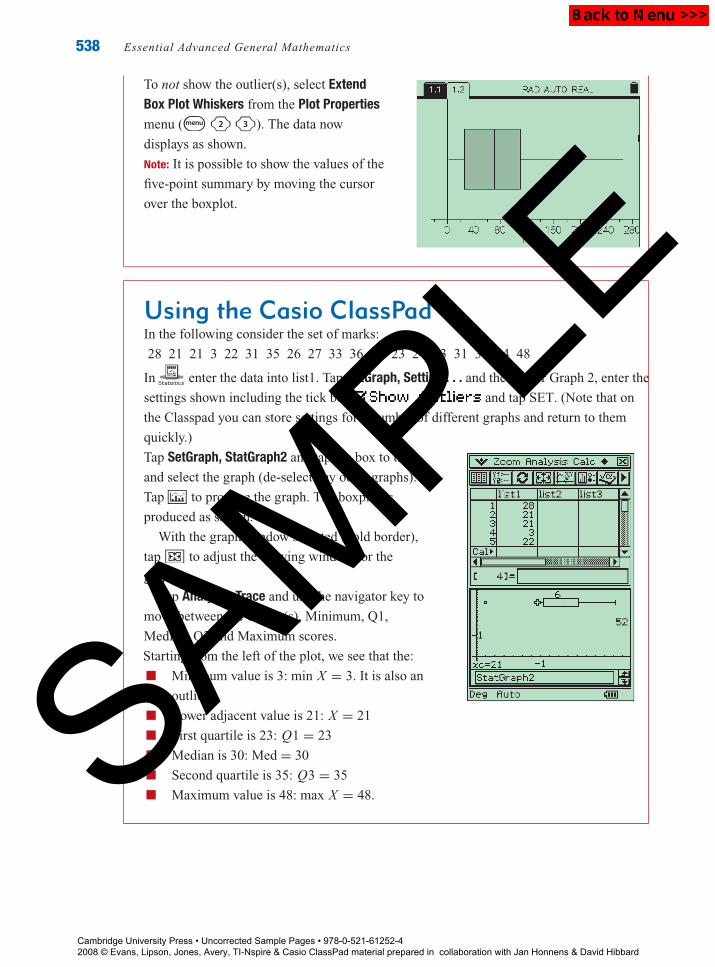
Using the Casio ClassPadIn the following consider the set of marks:
28 21 21 3 22 31 35 26 27 33 36 35 23 24 43 31 30 34 48
In enter the data into list1. Tap SetGraph, Setting . . . and the tab for Graph 2, enter the
settings shown including the tick box and tap SET. (Note that on
the Classpad you can store settings for a number of different graphs and return to them
quickly.)
Tap SetGraph, StatGraph2 and tap the box to tick
and select the graph (de-select any other graphs).
Tap to produce the graph. The boxplot is
produced as shown.
With the graph window selected (bold border),
tap 6 to adjust the viewing window for the
graph.
Tap Analysis, Trace and use the navigator key to
move between the outlier(s), Minimum, Q1,
Median, Q3 and Maximum scores.
Starting from the left of the plot, we see that the:
Minimum value is 3: min X = 3. It is also an
outlier
Lower adjacent value is 21: X = 21
First quartile is 23: Q1 = 23
Median is 30: Med = 30
Second quartile is 35: Q3 = 35
Maximum value is 48: max X = 48.
Cambridge University Press • Uncorrected Sample Pages • 978-0-521-61252-4 2008 © Evans, Lipson, Jones, Avery, TI-Nspire & Casio ClassPad material prepared in collaboration with Jan Honnens & David Hibbard
SAMPLE

P1: FXS/ABE P2: FXS
9780521740494c22.xml CUAU033-EVANS September 12, 2008 9:40
Chapter 22 — Describing the distribution of a single variable 539
Exercise 22G
1 The heights (in centimetres) of a class of girls areExample 17
160 165 123 143 154 180 133 123 157 157 135 140 140 150
154 159 149 167 176 163 154 167 168 132 145 143 157 156
a Determine the five-figure summary for this data set.
b Draw a boxplot of the data.
c Describe the pattern of heights in the class in terms of shape, centre and spread.
2 A researcher is interested in the number of books people borrow from a library. SheExample 18
decided to select a sample of 38 cards and record the number of books each person has
borrowed in the previous year. Here are her results.
7 28 0 2 38 18 0 0 4 0 0 2 13
1 1 14 1 8 27 0 52 4 0 12 28 15
10 1 0 2 0 1 11 5 11 0 13 0
a Determine the five-figure summary for this data set.
b Determine if there are any outliers.
c Draw a boxplot of the data, showing any outliers.
d Describe the number of books borrowed in terms of shape, centre and spread.
3 The winnings of the top 25 male tennis players in 2004 are given in the following table.
Player Winnings
Roger Federer 6 357 547
Lleyton Hewitt 2 766 051
Andy Roddick 2 604 590
Marat Safin 2 273 283
Guillermo Coria 1 697 155
Gaston Gaudio 1 639 171
Tim Henman 1 508 177
Carlos Moya 1 448 209
Andre Agassi 1 177 254
David Nalbandian 1 045 985
Jonas Bjorkman 927 344
Tommy Robredo 861 357
Nicolas Massu 854 533
Player Winnings
Joachim Johansson 828 744
Jiri Novak 813 792
Dominik Hrbaty 808 944
Guillermo Canas 780 701
Fernando Gonzalez 766 416
Sebastian Grosjean 755 795
Feliciano Lopez 748 662
Max Mirnyi 742 196
Juan Ignacio Chela 727 736
Mikhail Youzhny 725 948
Radek Stepanek 706 387
Vincent Spadea 704 105
a Draw a boxplot of the data, indicating any outliers.
b Describe the data in terms of shape, centre, spread and outliers.
4 The hourly rate of pay for a group of students engaged in part-time work was found to be:
$4.75 $8.50 $17.23 $9.00 $12.00 $11.69 $6.25
$7.50 $8.89 $6.75 $7.90 $12.46 $10.80 $8.40
$12.34 $10.90 $11.65 $10.00 $10.00 $13.00
Cambridge University Press • Uncorrected Sample Pages • 978-0-521-61252-4 2008 © Evans, Lipson, Jones, Avery, TI-Nspire & Casio ClassPad material prepared in collaboration with Jan Honnens & David Hibbard
SAMPLE

P1: FXS/ABE P2: FXS
9780521740494c22.xml CUAU033-EVANS September 12, 2008 9:40
540 Essential Advanced General Mathematics
a Draw a boxplot of the data, indicating any outliers.
b Describe the hourly pay rate for the students in terms of shape, centre, spread and
outliers.
5 The daily circulation of several newspapers in Australia is:
570 000 327 654 299 797 273 248 258 700 230 487
217 284 214 000 212 770 171 568 170 000 125 778
98 158 77 500 56 000 43 330 17 398
a Draw a boxplot of the data, indicating any outliers.
b Describe the daily newspaper circulation in terms of shape, centre, spread and outliers.
22.8 Using boxplots to compare distributionsBoxplots are extremely useful for comparing two or more sets of data collected on the same
variable, such as marks on the same assignment for two different groups of students. By
drawing boxplots on the same axis, both the centre and spread for the distributions are readily
identified and can be compared visually.
Example 19
The number of hours spent by individual students on the project referred to in Example 17 at
another school were:
53 152 82 30 16 136 21 11 1 55 128
57 106 14 18 173 102 86 227 48 12 45
136 226 17 9 156 19 107 24 42 21 176
24 80 54 16 106 6 38 3
Use boxplots to compare the time spent on the project by students at this school with those in
Example 17.
Solution
The five-figure summary for this data set is:
median, m = 48; first quartile, Q1 = 17.5; third quartile, Q3 = 106.5; minimum = 1;
maximum = 227
In order to compare the time spent on the project by the students at each school,
boxplots for both data sets are drawn on the same axis.
3002001000
*School 1
School 2
Cambridge University Press • Uncorrected Sample Pages • 978-0-521-61252-4 2008 © Evans, Lipson, Jones, Avery, TI-Nspire & Casio ClassPad material prepared in collaboration with Jan Honnens & David Hibbard
SAMPLE

P1: FXS/ABE P2: FXS
9780521740494c22.xml CUAU033-EVANS September 12, 2008 9:40
Chapter 22 — Describing the distribution of a single variable 541
From the boxplots the distributions of time for the two schools can be compared in
terms of shape; centre, spread and outliers. Clearly the two distributions for both
schools are positively skewed, indicating a larger range of values in the upper half of
the distributions. The centre for School 1 is higher than the centre for School 2
(71 hours compared to 48 hours). As can be seen by comparing the box widths, which
indicate the IQR, the spread of the data is comparable for both distributions. There is
one outlier, a student who attended School 1 and spent 264 hours on the project.
The boxplot is useful for summarising large data sets and for comparing several sets of data. It
focuses attention on important features of the data and gives a picture of the data which is easy
to interpret. When a single data set is being investigated a stem-and-leaf plot is sometimes
better, as a boxplot may hide the local detail of the data set.
Exercise 22H
1 To test the effect of a physical fitness course the number of sit-ups that a person could do
in 1 minute, both before and after the course, were recorded. Twenty randomly selected
participants scored as follows.
Example 19
Before 29 22 25 29 26 24 31 46 34 28
23 22 26 26 30 12 17 21 20 30
After 28 26 25 35 33 36 32 54 50 43
25 24 30 34 30 15 29 21 19 34
a Construct boxplots of these two sets of data on the same axis.
b Describe the effect of the physical fitness course on the number of sit-ups achieved in
terms of shape, centre, spread and outliers.
2 The number of hours spent on homework per week by a group of students in Year 8 and a
group of students in Year 12 are shown in the tables.
Year 8 1 2 4 2 4 4 5 3 7 7 2 4 3 3
1 3 4 3 3 1 7 2 1 3 1 4 1 0
Year 12 1 2 3 5 6 7 7 6 7 8 7 5 4 1
2 3 1 1 4 7 8 9 6 7 8 7 2 3
Draw boxplots of these two sets of data on the same axis and use them to answer the
following questions.
a Which group does the most homework?
b Which group varies more in the number of hours homework they do?
Cambridge University Press • Uncorrected Sample Pages • 978-0-521-61252-4 2008 © Evans, Lipson, Jones, Avery, TI-Nspire & Casio ClassPad material prepared in collaboration with Jan Honnens & David Hibbard
SAMPLE
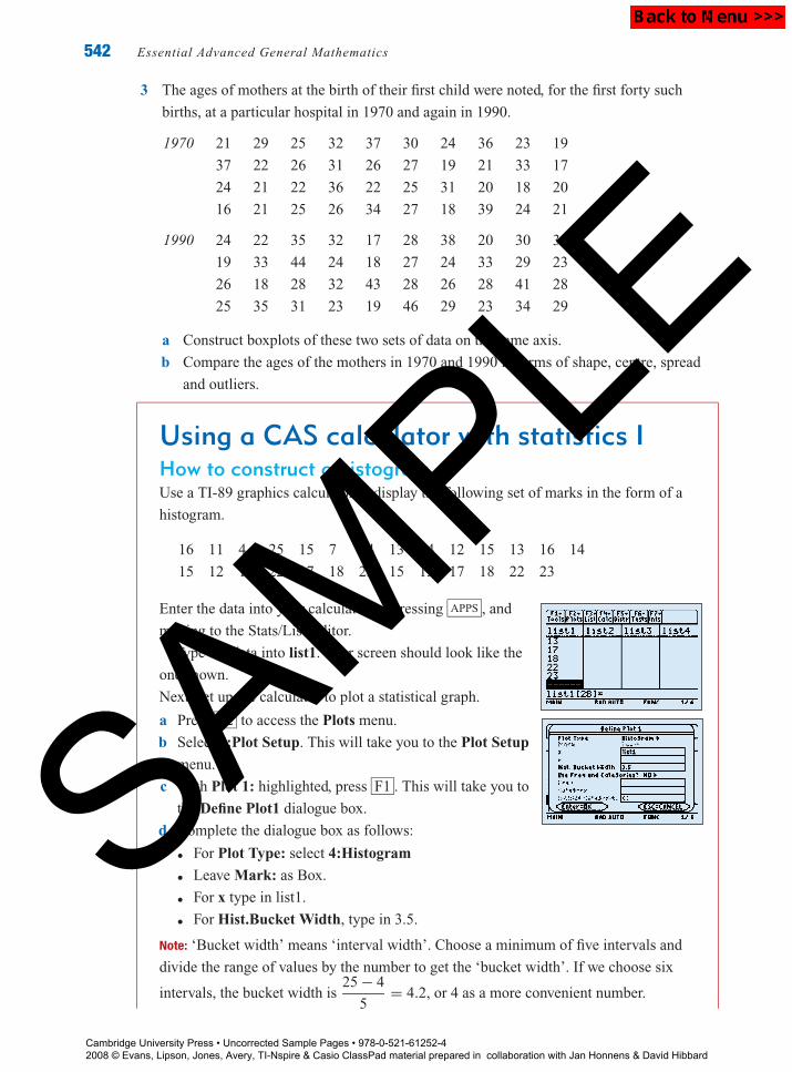
P1: FXS/ABE P2: FXS
9780521740494c22.xml CUAU033-EVANS September 12, 2008 9:40
542 Essential Advanced General Mathematics
3 The ages of mothers at the birth of their first child were noted, for the first forty such
births, at a particular hospital in 1970 and again in 1990.
1970 21 29 25 32 37 30 24 36 23 19
37 22 26 31 26 27 19 21 33 17
24 21 22 36 22 25 31 20 18 20
16 21 25 26 34 27 18 39 24 21
1990 24 22 35 32 17 28 38 20 30 39
19 33 44 24 18 27 24 33 29 23
26 18 28 32 43 28 26 28 41 28
25 35 31 23 19 46 29 23 34 29
a Construct boxplots of these two sets of data on the same axis.
b Compare the ages of the mothers in 1970 and 1990 in terms of shape, centre, spread
and outliers.
Using a CAS calculator with statistics IHow to construct a histogramUse a TI-89 graphics calculator to display the following set of marks in the form of a
histogram.
16 11 4 25 15 7 14 13 14 12 15 13 16 14
15 12 18 22 17 18 23 15 13 17 18 22 23
Enter the data into your calculator by pressing APPS , and
moving to the Stats/List Editor.
Type the data into list1. Your screen should look like the
one shown.
Next, set up the calculator to plot a statistical graph.
a Press F2 to access the Plots menu.
b Select 1:Plot Setup. This will take you to the Plot Setup
menu.
c With Plot 1: highlighted, press F1 . This will take you to
the Define Plot1 dialogue box.
d Complete the dialogue box as follows:� For Plot Type: select 4:Histogram� Leave Mark: as Box.� For x type in list1.� For Hist.Bucket Width, type in 3.5.
Note: ‘Bucket width’ means ‘interval width’. Choose a minimum of five intervals and
divide the range of values by the number to get the ‘bucket width’. If we choose six
intervals, the bucket width is25 − 4
5= 4.2, or 4 as a more convenient number.
Cambridge University Press • Uncorrected Sample Pages • 978-0-521-61252-4 2008 © Evans, Lipson, Jones, Avery, TI-Nspire & Casio ClassPad material prepared in collaboration with Jan Honnens & David Hibbard
SAMPLE
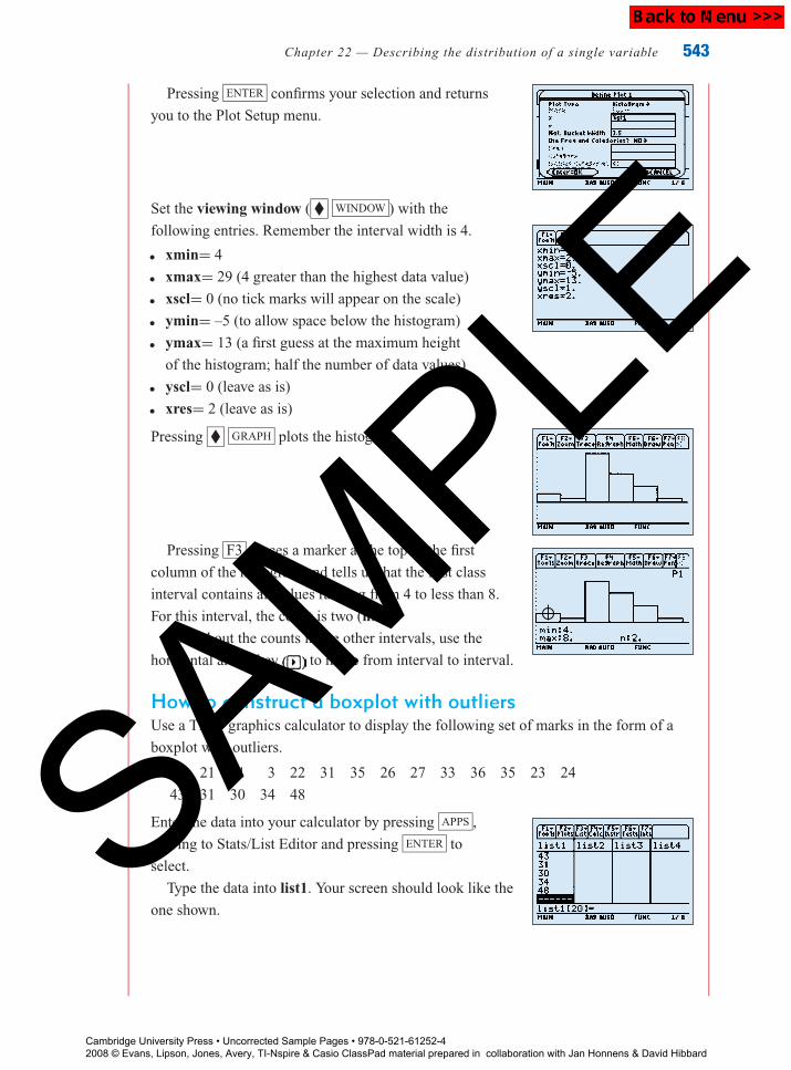
P1: FXS/ABE P2: FXS
9780521740494c22.xml CUAU033-EVANS September 12, 2008 9:40
Chapter 22 — Describing the distribution of a single variable 543
Pressing ENTER confirms your selection and returns
you to the Plot Setup menu.
Set the viewing window ( � WINDOW ) with the
following entries. Remember the interval width is 4.
� xmin= 4� xmax= 29 (4 greater than the highest data value)� xscl= 0 (no tick marks will appear on the scale)� ymin= –5 (to allow space below the histogram)� ymax= 13 (a first guess at the maximum height
of the histogram; half the number of data values)� yscl= 0 (leave as is)� xres= 2 (leave as is)
Pressing � GRAPH plots the histogram.
Pressing F3 places a marker at the top of the first
column of the histogram and tells us that the first class
interval contains all values ranging from 4 to less than 8.
For this interval, the count is two (n:2).
To find out the counts in the other intervals, use the
horizontal arrow key to move from interval to interval.
How to construct a boxplot with outliersUse a TI-89 graphics calculator to display the following set of marks in the form of a
boxplot with outliers.
28 21 21 3 22 31 35 26 27 33 36 35 23 24
43 31 30 34 48
Enter the data into your calculator by pressing APPS ,
moving to Stats/List Editor and pressing ENTER to
select.
Type the data into list1. Your screen should look like the
one shown.
Cambridge University Press • Uncorrected Sample Pages • 978-0-521-61252-4 2008 © Evans, Lipson, Jones, Avery, TI-Nspire & Casio ClassPad material prepared in collaboration with Jan Honnens & David Hibbard
SAMPLE
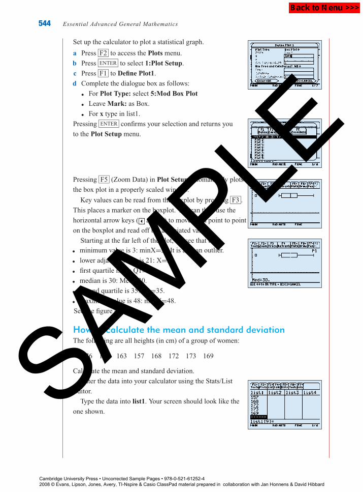
P1: FXS/ABE P2: FXS
9780521740494c22.xml CUAU033-EVANS September 12, 2008 9:40
544 Essential Advanced General Mathematics
Set up the calculator to plot a statistical graph.
a Press F2 to access the Plots menu.
b Press ENTER to select 1:Plot Setup.
c Press F1 to Define Plot1.
d Complete the dialogue box as follows:� For Plot Type: select 5:Mod Box Plot� Leave Mark: as Box.� For x type in list1.
Pressing ENTER confirms your selection and returns you
to the Plot Setup menu.
Pressing F5 (Zoom Data) in Plot Setup automatically plots
the box plot in a properly scaled window.
Key values can be read from the boxplot by pressing F3 .
This places a marker on the boxplot. You can then use the
horizontal arrow keys ( and ) to move from point to point
on the boxplot and read off the associated values.
Starting at the far left of the plot, we see that the� minimum value is 3: minX=3. It is also an outlier.� lower adjacent value is 21: X=21� first quartile is 23: Q1=23.� median is 30: Med=30.� second quartile is 35: Q1=35.� maximum value is 48: maxX=48.
See the figure opposite.
How to calculate the mean and standard deviationThe following are all heights (in cm) of a group of women:
176 160 163 157 168 172 173 169
Calculate the mean and standard deviation.
Enter the data into your calculator using the Stats/List
Editor.
Type the data into list1. Your screen should look like the
one shown.
Cambridge University Press • Uncorrected Sample Pages • 978-0-521-61252-4 2008 © Evans, Lipson, Jones, Avery, TI-Nspire & Casio ClassPad material prepared in collaboration with Jan Honnens & David Hibbard
SAMPLE

P1: FXS/ABE P2: FXS
9780521740494c22.xml CUAU033-EVANS September 12, 2008 9:40
Chapter 22 — Describing the distribution of a single variable 545
Press F4 to access the Calculate menu.
With 1:1-Var Stats highlighted, press ENTER to select.
This will take you to the 1-Var Stats dialogue box.
Complete the dialogue box:� For List:, type in list1. This is not necessary if list1 is
already shown. Press ENTER to obtain the results.
Write down your answers to the required degree of
accuracy (two decimal places).
Note: The value of the standard deviation is given by Sx.
Cambridge University Press • Uncorrected Sample Pages • 978-0-521-61252-4 2008 © Evans, Lipson, Jones, Avery, TI-Nspire & Casio ClassPad material prepared in collaboration with Jan Honnens & David Hibbard
SAMPLE

P1: FXS/ABE P2: FXS
9780521740494c22-1.xml CUAU033-EVANS September 12, 2008 10:56
Rev
iew
546 Essential Advanced General Mathematics
Chapter summary
Variables may be classified as categorical or numerical. Numerical data may be discrete
or continuous.
Examination of a data set should always begin with a visual display.
A bar chart is the appropriate visual display for categorical data.
When a data set is small, a stem-and-leaf plot is the most appropriate visual display for
numerical data.
When a data set is larger, a histogram, frequency polygon or boxplot is a more
appropriate visual display for numerical data.
Cumulative frequency distributions and cumulative relative frequency distributions are
useful for answering questions about the number or proportion of data values greater than
or less than a particular value. These are graphically represented in cumulative frequency
polygons or cumulative relative frequency polygons.
From a stem-and-leaf plot, histogram or boxplot, insight can be gained into the shape,
centre and spread of the distribution, and whether or not there are any outliers.
An outlier is a value which sits away from the main body of the data in a plot. It is formally
defined as a value more than 1.5IQR below Q1, or more than 1.5IQR above Q3.
For numerical data it is also very useful to calculate some summary statistics.
The mean is defined as x̄ = 1
n
n∑i=1
xi .
If n, the number of observations, is odd, then the median is the
(n + 1
2
)th
observation
from the end of the ordered list. If n is even, then the median is found by averaging the two
middle observations in the list, i.e., the(n
2
)thand the
(n
2+ 1
)thobservations are added
together and divided by 2.
The mode is the most common observation in a group of data.
The most useful measures of centre are the median and the mean.
To find the interquartile range of a distribution:� Arrange all observations in order according to size.� Divide the observations into two equal sized groups. If n, the number of
observations, is odd, then the median is omitted from both groups.� Locate Q1, the first quartile, which is the median of the lower half of the
observations, and Q3, the third quartile, which is the median of the upper half of the
observations.� The interquartile range IQR is defined as the difference between the quartiles. That is
IQR = Q3 − Q1
The standard deviation is defined as s =√
1
n − 1
n∑i=1
(xi − x̄)2.
The most useful measures of spread are the interquartile range and the standard
deviation.
Cambridge University Press • Uncorrected Sample Pages • 978-0-521-61252-4 2008 © Evans, Lipson, Jones, Avery, TI-Nspire & Casio ClassPad material prepared in collaboration with Jan Honnens & David Hibbard
SAMPLE

P1: FXS/ABE P2: FXS
9780521740494c22-1.xml CUAU033-EVANS September 12, 2008 10:56
Review
Chapter 22 — Describing the distribution of a single variable 547
The five-figure summary of a set of data consists of the minimum, Q1, median, Q3, and
the maximum. A boxplot is a diagrammatic representation of this, e.g.
minmaxQ1 Q3
median
When the data set is symmetric any of the summary statistics are appropriate.
When the data set is not symmetric or when there are outliers the median and the
interquartile range are the preferred summary statistics.
In general, 95% of the values of the data set will fall within two standard deviations of the
mean.
When comparing the distribution of two or more data sets the comparison should be made
in terms of the shape, centre, spread and outliers for each distribution.
Multiple-choice questions
1 In a survey a number of subjects were asked to indicate how much they exercise by
selecting one of the following options.
1 Never 2 Seldom 3 Occasionally 4 Regularly
The resulting variable was named Level of Exercise, and the level of measurement of this
variable is
A variable B numerical C constant D categorical E metric
Questions 2, 3 and 4 relate to the following information.
The numbers of hours worked per week by employees in a large company are shown in this
percentage frequency histogram.
Hours worked weekly
Per
cent
age
Fre
quen
cy
0
10
20
30
40
20 40 60 80
Cambridge University Press • Uncorrected Sample Pages • 978-0-521-61252-4 2008 © Evans, Lipson, Jones, Avery, TI-Nspire & Casio ClassPad material prepared in collaboration with Jan Honnens & David Hibbard
SAMPLE

P1: FXS/ABE P2: FXS
9780521740494c22-1.xml CUAU033-EVANS September 12, 2008 10:56
Rev
iew
548 Essential Advanced General Mathematics
2 The percentage of employees who work from 20 to less than 30 hours per week is closest to
A 1% B 2% C 6% D 10% E 33%
3 The median number of hours worked is in the interval
A 10 to less than 20 B 20 to less than 30
C 30 to less than 40 D 40 to less than 50
E 50 to less than 60
Questions 4 and 5 relate to the following information.
A group of 19 employees of a company was asked to record the number of meetings that they
attended in the last month. Their responses are summarised in the following stem-and-leaf plot.
0 1 1 2 3 4 5 5 6 6 7 9
1 0 2 4 4 6
2 2 3
3
4 4
4 The median number of meetings is
A 6 B 6.5 C 7 D 7.5 E 9
5 The interquartile range (IQR) of number of meetings is
A 0 B 4 C 9.5 D 10 E 14
6 The cumulative frequency polygon shown gives the
examination scores in Mathematics for a group of
200 students.
0
40 50 60 70 80 90
100
200
Exam Score
Num
ber
of s
tude
nts
The number of students who scored less than 70 on the
examination is closest to
A 30 B 100 C 150 D 175 E 200
Questions 7 and 8 relate to the following information.
The number of years that a sample of people has lived that their current address is summarised
in this boxplot.
Years lived this address
0 10 20 30 40 50
7 The shape of the distribution of years lived at this address is:
A positively skewed B negatively skewed C bimodal
D symmetric E symmetric with outliers
8 The interquartile range years lived at this address is approximately equal to:
A 5 B 8 C 17 D 12 E 50
Cambridge University Press • Uncorrected Sample Pages • 978-0-521-61252-4 2008 © Evans, Lipson, Jones, Avery, TI-Nspire & Casio ClassPad material prepared in collaboration with Jan Honnens & David Hibbard
SAMPLE

P1: FXS/ABE P2: FXS
9780521740494c22-1.xml CUAU033-EVANS September 12, 2008 10:56
Review
Chapter 22 — Describing the distribution of a single variable 549
Questions 9 and 10 relate to the following data.
The amount paid per week to the employees of each of five large companies are shown in the
boxplots:
0
Company 1
Company 2
Company 3
20000 60000 80000 12000010000040000
Yearly income
9 The company with the lowest typical wage is
A Company 1 B Company 2
C Company 3 D Company 1 and Company 2
E Company 2 and Company 3
10 The company with the largest variation in wage is
A Company 1 B Company 2
C Company 3 D Company 1 and Company 2
E Company 2 and Company 3
Short-answer questions (technology-free)
1 Classify the data which arise from the following situations as categorical or numerical.
a The number of phones calls a hotel receptionist receives each day.
b Interest in politics on a scale from 1 to 5 where 1 = very interested, 2 = quite interested,
3 = somewhat interested, 4 = not very interested, and 5 = uninterested.
2 This bar chart shows the
percentage of people working who are
employed in private companies, work
for the Government or are self-employed
in a certain town.
Private Government Self-employedType of company worked for
Perc
ent
0
10
30
40
50
20a What kind of measurement is the
‘Type of company worked for’?
b Approximately what percentage of
the people are self-employed?
Cambridge University Press • Uncorrected Sample Pages • 978-0-521-61252-4 2008 © Evans, Lipson, Jones, Avery, TI-Nspire & Casio ClassPad material prepared in collaboration with Jan Honnens & David Hibbard
SAMPLE
P1: FXS/ABE P2: FXS
9780521740494c22-1.xml CUAU033-EVANS September 12, 2008 10:56
Rev
iew
550 Essential Advanced General Mathematics
3 A researcher asked a group of people to record how many
cigarettes they had smoked on a particular day. Here are her results:
0 0 9 10 23 25 0 0 34 32 0 0 30 0 4
5 0 17 14 3 6 0 33 23 0 32 13 21 22 6
Using an appropriate class interval, construct a histogram of these data.
4 A teacher recorded the time taken (in minutes) by each of a class of students to complete a
test.
56 57 47 68 52 51 43 22 59 51 39
54 52 69 72 65 45 44 55 56 49 50
a Make a stem-and-leaf plot of these times, using one row per stem.
b Use this stem-and-leaf-plot to find the median and quartiles for the time taken.
5 The weekly rentals, in dollars, for apartments in a particular suburb are given in the
following table.
285 185 210 215 320 680 280
265 300 210 270 190 245 315
Find the mean and the median of the weekly rental.
6 Geoff decided to record the time it takes him to complete his mail delivery round each
working day for four weeks. His data are recorded in the following table.
170 189 201 183 168 182 161 166 167 173
164 176 161 187 180 201 147 188 186 176
182 167 188 211 174 193 185 183
The mean of the time taken, x̄ , is 179 and the standard deviation, s, is 14.
a Determine the percentage of observations falling within two standard deviations of the
mean.
b Is this what you would expect to find?
7 A group of students were asked to record the number of SMS messages that they sent in
one 24-hour period, and the following five-figure summary was obtained from the data set.
Use it to construct a simple boxplot of these data.
Min = 0, Q1 = 3, Median = 5, Q3 = 12, Max = 24
8 The following table gives the number of students absent each day from a large secondary
college on each of 36 randomly chosen school days.
7 22 12 15 21 16 23 23 17 23 8 16
7 3 21 30 13 2 7 12 18 14 14 0
15 16 13 21 10 16 11 4 3 0 31 44
Construct a boxplot of these data, with outliers.
Cambridge University Press • Uncorrected Sample Pages • 978-0-521-61252-4 2008 © Evans, Lipson, Jones, Avery, TI-Nspire & Casio ClassPad material prepared in collaboration with Jan Honnens & David Hibbard
SAMPLE

P1: FXS/ABE P2: FXS
9780521740494c22-1.xml CUAU033-EVANS September 12, 2008 10:56
Review
Chapter 22 — Describing the distribution of a single variable 551
Extended-response questions
1 The divorce rates (in percentages) of 19 countries are
27 18 14 25 28 6 32 44 53 0
26 8 14 5 15 32 6 19 9
a What is the level of measurement of the variable, ‘divorce rate’?
b Construct an ordered stem-and-leaf plot of divorce rates, with one row per stem.
c What shape is the divorce rates?
d What percentage of countries have divorce rates greater than 30?
e Calculate the mean and median of the divorce rates for the 19 countries.
f Construct a histogram of the data with class intervals of width 10.
i What is the shape of the histogram?
ii How many countries had divorce rates from 10% to less than 20%?
g Construct a cumulative percentage frequency polygon of divorce rates.
i What percentage of countries has divorce rates less than 20%?
ii Use the cumulative frequency distribution to estimate the median percentage
divorce rate.
2 Hillside Trains have decided to improve their service on the Lilydale line. Trains were timed
on the run from Lilydale to Flinders Street, and their times recorded over a period of six
weeks at the same time each day. The time taken for each journey is shown below.
60 61 70 72 68 80 76 65 69 79 82
90 59 86 70 77 64 57 65 60 68 60
63 67 74 78 65 68 82 89 75 62 64
58 64 69 59 62 63 89 74 60
a Construct a histogram of the times taken for the journey from Lilydale to Flinders
Street, using class intervals 55–59, 60–64, 65–69 etc.
i On how many days did the trip take from 65–69 minutes?
ii What shape is the histogram?
iii What percentage of trains took less than 65 minutes to reach Flinders Street?
b Calculate the following summary statistics for the time taken (correct to two decimal
places).
x s Min Q1 M Q3 Max
c Use the summary statistics to complete the following report.
i The mean time taken from Lilydale to Flinders Street (in minutes) was . . .
ii 50% of the trains took more than . . . minutes to travel from Lilydale to Flinders
Street.
iii The range of travelling times was . . . minutes while the interquartile range was . . ...
minutes.(cont’d)
Cambridge University Press • Uncorrected Sample Pages • 978-0-521-61252-4 2008 © Evans, Lipson, Jones, Avery, TI-Nspire & Casio ClassPad material prepared in collaboration with Jan Honnens & David Hibbard
SAMPLE

P1: FXS/ABE P2: FXS
9780521740494c22-1.xml CUAU033-EVANS September 12, 2008 10:56
Rev
iew
552 Essential Advanced General Mathematics
iv 25% of trains took more than . . . minutes to travel to Flinders Street.
v The standard deviation of travelling times was . . .
vi Approximately 95% of trains took between . . . and . . . minutes to travel to Flinders
St.
d Summary statistics for the year before Hillside Trains took over the Lilydale line from
the Met are indicated below:
Min = 55 Q1 = 65 Median = 70 Q3 = 89 Max = 99
Draw simple boxplots for the last year the Met ran the line and the data from Hillside
trains on the same axis.
e Use the information from the boxplots to compare travelling times for the two transport
corporations in terms of shape, centre and spread.
3 In a small company, upper management wants to know if there is a difference in the three
methods used to train its machine operators. One method uses a hands-on approach. A
second method uses a combination of classroom instruction and on-the-job training. The
third method is based completely on classroom training. Fifteen trainees are assigned
to each training technique. The following data are the results of a test undertaken by the
machine operators after completion of one of the different training methods.
Method 1 Method 2 Method 3
98 79 70
100 62 74
89 61 60
90 89 72
81 69 65
85 99 49
97 87 71
95 62 75
87 65 55
70 88 65
69 98 70
75 79 59
91 73 77
92 96 67
93 83 80
a Draw boxplots of the data sets, on the same axis.
b Write a paragraph comparing the three training methods in terms of shape, centre,
spread and outliers.
c Which training method would you recommend?
Cambridge University Press • Uncorrected Sample Pages • 978-0-521-61252-4 2008 © Evans, Lipson, Jones, Avery, TI-Nspire & Casio ClassPad material prepared in collaboration with Jan Honnens & David Hibbard
SAMPLE

P1: FXS/ABE P2: FXS
9780521740494c22-1.xml CUAU033-EVANS September 12, 2008 10:56
Review
Chapter 22 — Describing the distribution of a single variable 553
4 It has been argued that there is a relationship between a child’s level of independence and
the order in which they were born in the family. Suppose that the children in thirteen
three-children families are rated on a 50-point scale of independence. This is done when all
children are adults, thus eliminating age effects. The results are as follows.
Family 1 2 3 4 5 6 7 8 9 10 11 12 13
First-born 38 45 30 29 34 19 35 40 25 50 44 36 26
Second-born 9 40 24 16 16 21 34 29 22 29 20 19 18
Third-born 12 12 12 25 9 11 20 12 10 20 16 13 10
a Draw boxplots of the data sets on the same axis.
b Write a paragraph comparing the independence scores of first-, second-
and third-born children.
Cambridge University Press • Uncorrected Sample Pages • 978-0-521-61252-4 2008 © Evans, Lipson, Jones, Avery, TI-Nspire & Casio ClassPad material prepared in collaboration with Jan Honnens & David Hibbard
SAMPLE