Embed Size (px)
Citation preview

Our brand journey starts right here
Brand Book 2016 v2
EarthLink Brand Book v2 - External
2
EarthLink | Brand book 2014 | Section
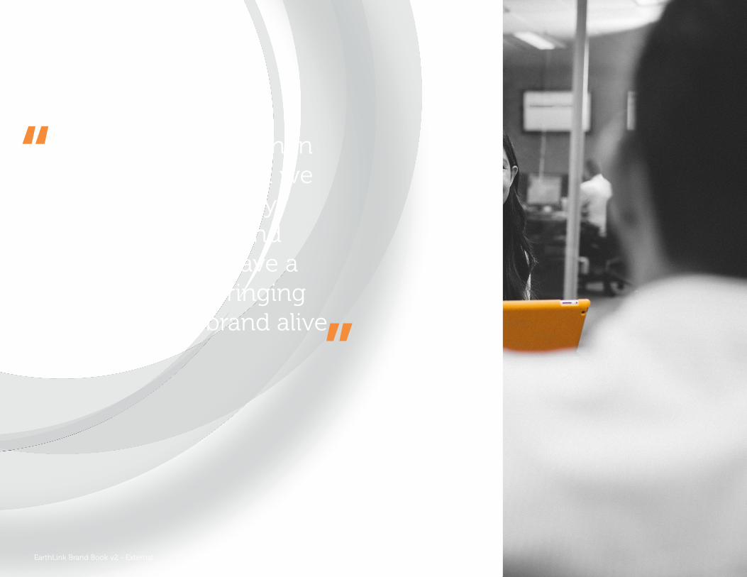
Our brand is more than just a logo. It’s what we say and how we say it, both in words and pictures. We all have a part to play in bringing the EarthLink brand alive.
“
”
EarthLink Brand Book v2 - External
3
EarthLink | Brand book 2016 | Welcome
Welcome
Every big brand has clear brand guidelines that are enforced rigorously. It’s how they achieve their consistency and clarity.
The EarthLink brand guidelines have been produced for the same reason: to introduce clarity and consistency in our communications to customers, to our business partners, and to our own people.
Before any communication leaves your desk, please consider the following:
Does the piece comply with brand guidelines?
Has the piece been approved by marketing?
Has the piece been cleared by legal?
Our brand guidelines
Think of the most recognizable brands in the world. Whether you’re thinking of Coke or Pepsi, Apple or Microsoft, Ford or Mercedes — the chances are the first thing you’ll think about is their logo and the way the brand presents itself to you, the customer.
Great brands have one thing in common: a clear proposition that is applied consistently across their entire business.
Oftentimes brand identity is THE differentiator between a company and its competitors (or is gas bought at one filling station really better than gas bought at another?)
Our brand identity touches everything we do, everything we say. It’s how we look, it’s how we sound and it’s how our customers engagewith us.
EarthLink Brand Book v2 - External
4
EarthLink | Brand book 2016 | Contents
2.0 Photography 2.1 Style guide 3.0 Marketing team contacts, briefing, brand
sign-off & brand checklist
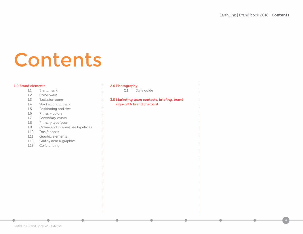
1.0 Brand elements 1.1 Brand mark 1.2 Color-ways 1.3 Exclusion zone 1.4 Stacked brand mark 1.5 Positioning and size 1.6 Primary colors 1.7 Secondary colors 1.8 Primary typefaces 1.9 Online and internal use typefaces 1.10 Dos & don’ts 1.11 Graphic elements 1.12 Grid system & graphics 1.13 Co-branding
Contents
EarthLink Brand Book v2 - External
5
EarthLink | Brand book 2016 | Brand elements
1.0 Brand elements1.1 Brand mark1.2 Color-ways1.3 Exclusion zone1.4 Stack brand mark1.5 Positioning and size1.6 Primary colors1.7 Secondary & Tertiary colors1.8 Primary typefaces1.9 Online and internal use typefaces1.10 Dos & don’ts1.11 Graphic elements1.12 Grid system & graphics1.13 Co-branding
EarthLink Brand Book v2 - External
6
EarthLink | Brand book 2016 | Brand mark
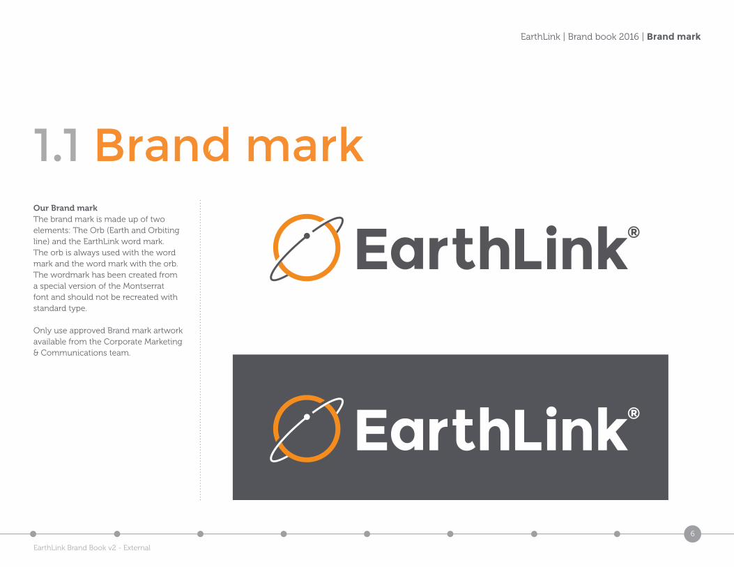
1.1 Brand markOur Brand markThe brand mark is made up of two elements: The Orb (Earth and Orbiting line) and the EarthLink word mark. The orb is always used with the word mark and the word mark with the orb. The wordmark has been created from a special version of the Montserrat font and should not be recreated with standard type.
Only use approved Brand mark artwork available from the Corporate Marketing & Communications team.
EarthLink Brand Book v2 - External
7
EarthLink | Brand book 2016 | Colorways
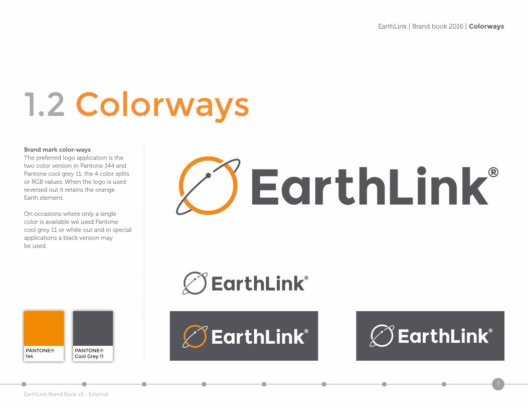
1.2 ColorwaysBrand mark color-waysThe preferred logo application is the two color version in Pantone 144 and Pantone cool grey 11, the 4 color splits or RGB values. When the logo is used reversed out it retains the orange Earth element.
On occasions where only a single color is available we used Pantone cool grey 11 or white out and in special applications a black version may be used.
PANTONE®144
PANTONE®Cool Grey 11
EarthLink Brand Book v2 - External
8
EarthLink | Brand book 2016 | Exclusion zone
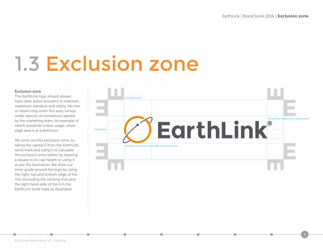
1.3 Exclusion zone
Exclusion zone from circle edge, not orbiting line
® mark sits within the exclusion zone
Centre line
Exclusion zone
Exclusion zoneThe EarthLink logo should always have clear space around it to maintain maximum standout and clarity. No text or object may enter this area, except under special circumstances agreed by the marketing team. An example of which would be online usage, when page area is at a premium.
We work out this exclusion zone, by taking the capital E from the EarthLink word mark and using it to calculate the exclusion zone (either by drawing a square to its cap height or using it as per the illustration. We draw our inner guide around the logo by using the right, top and bottom edge of the Orb (excluding the orbiting line) and the right hand-side of the k in the EarthLink word mark as illustrated.
EarthLink Brand Book v2 - External
9
EarthLink | Brand book 2016 | Stacked brand mark
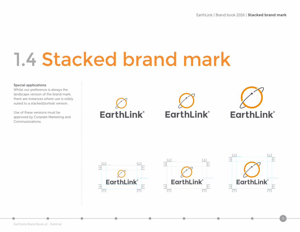
1.4 Stacked brand markSpecial applicationsWhilst our preference is always the landscape version of the brand mark, there are instances where use is solely suited to a stacked/portrait version.
Use of these versions must be approved by Corprate Marketing and Communications.
® mark sits within the exclusion zone
Exclusion zone
® mark sits within the exclusion zone
Exclusion zone
® mark sits within the exclusion zone
Exclusion zone
EarthLink Brand Book v2 - External
10
EarthLink | Brand book 2016 | Positioning and size
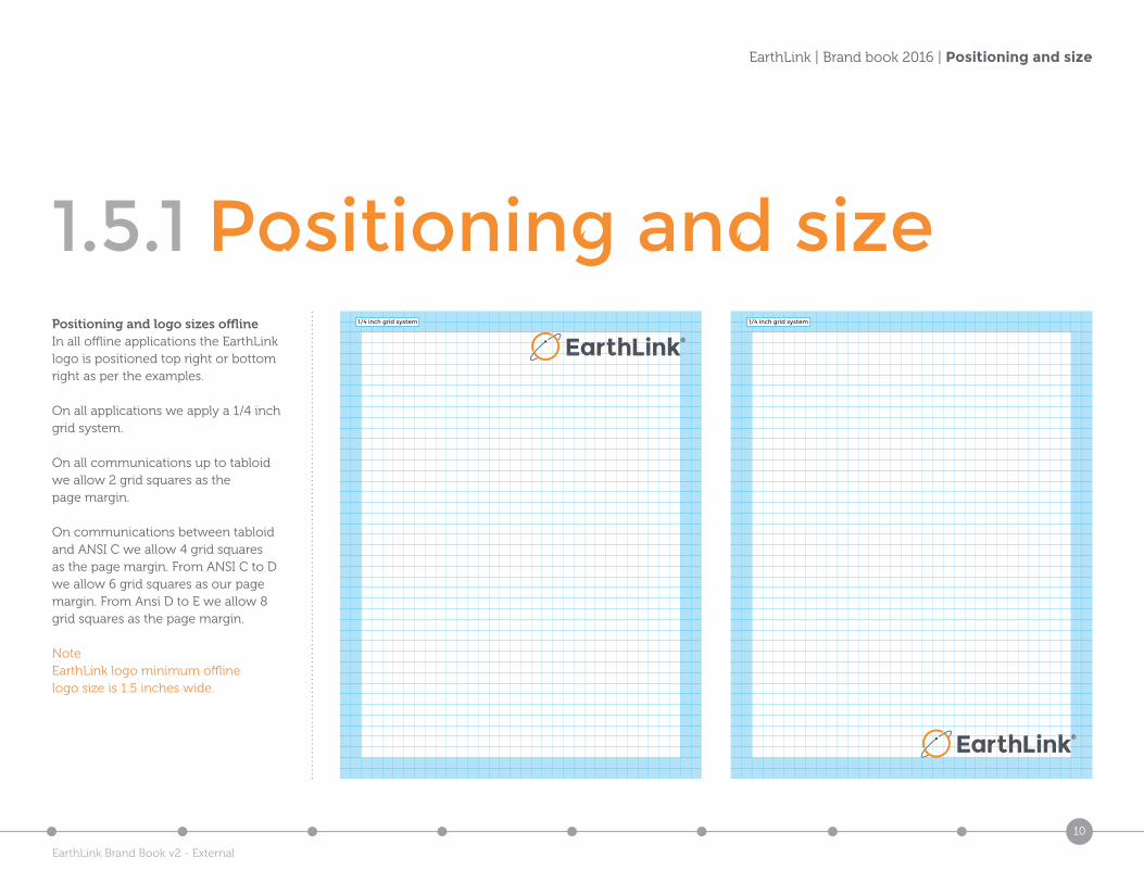
1.5.1 Positioning and sizePositioning and logo sizes offlineIn all offline applications the EarthLink logo is positioned top right or bottom right as per the examples.
On all applications we apply a 1/4 inch grid system.
On all communications up to tabloid we allow 2 grid squares as the page margin.
On communications between tabloid and ANSI C we allow 4 grid squares as the page margin. From ANSI C to D we allow 6 grid squares as our page margin. From Ansi D to E we allow 8 grid squares as the page margin.
NoteEarthLink logo minimum offline logo size is 1.5 inches wide.
1/4 inch grid system 1/4 inch grid system
EarthLink Brand Book v2 - External
11
EarthLink | Brand book 2016 | Positioning and size
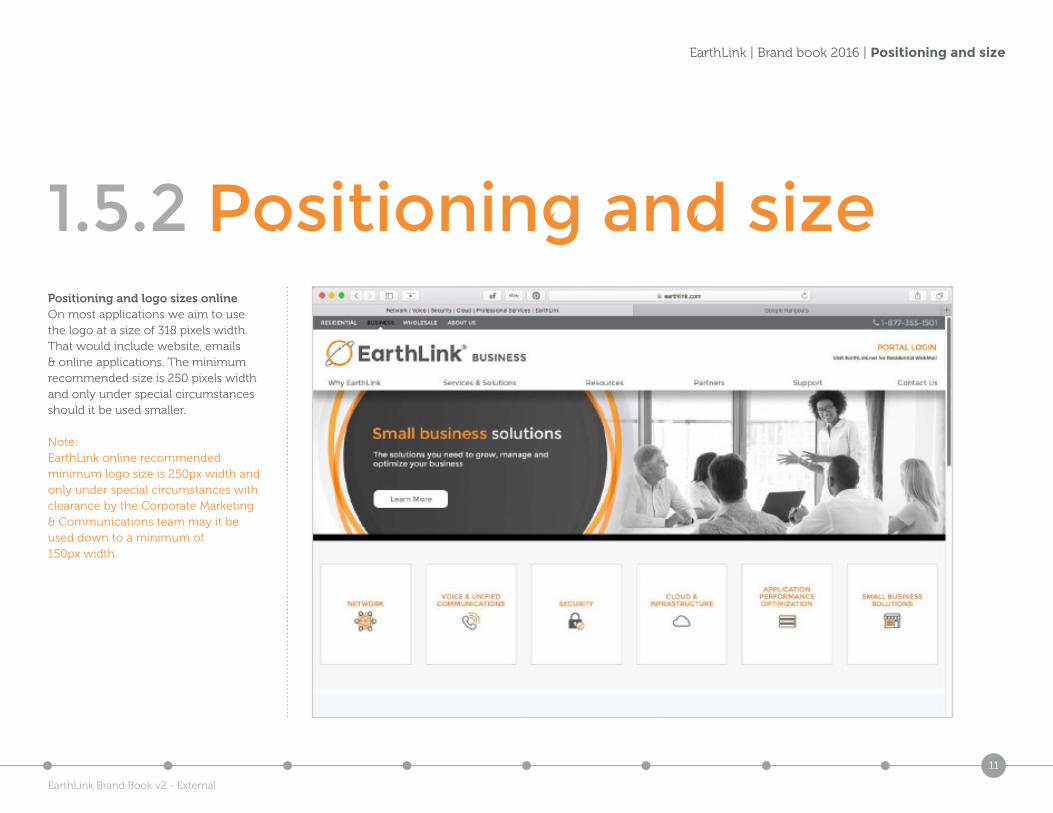
1.5.2 Positioning and sizePositioning and logo sizes onlineOn most applications we aim to use the logo at a size of 318 pixels width. That would include website, emails & online applications. The minimum recommended size is 250 pixels width and only under special circumstances should it be used smaller.
Note:EarthLink online recommended minimum logo size is 250px width and only under special circumstances with clearance by the Corporate Marketing & Communications team may it be used down to a minimum of 150px width.
EarthLink Brand Book v2 - External
12
EarthLink | Brand book 2016 | Positioning and size
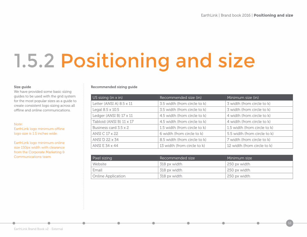
1.5.2 Positioning and sizeSize guideWe have provided some basic sizing guides to be used with the grid system for the most popular sizes as a guide to create consistent logo sizing across all offline and online communications.
Note:EarthLink logo minimum offline logo size is 1.5 inches wide.
EarthLink logo minimum online size 150px width with clearance from the Corporate Marketing & Communications team.
Recommended sizing guide
US sizing (in x in) Recommended size (in) Minimum size (in)
Letter (ANSI A) 8.5 x 11 3.5 width (from circle to k) 3 width (from circle to k)
Legal 8.5 x 10.5 3.5 width (from circle to k) 3 width (from circle to k)
Ledger (ANSI B) 17 x 11 4.5 width (from circle to k) 4 width (from circle to k)
Tabloid (ANSI B) 11 x 17 4.5 width (from circle to k) 4 width (from circle to k)
Business card 3.5 x 2 1.5 width (from circle to k) 1.5 width (from circle to k)
ANSI C 17 x 22 6 width (from circle to k) 5.5 width (from circle to k)
ANSI D 22 x 34 8.5 width (from circle to k) 7 width (from circle to k)
ANSI E 34 x 44 13 width (from circle to k) 12 width (from circle to k)
Pixel sizing Recommended size Minimum size
Website 318 px width 250 px width
Email 318 px width 250 px width
Online Application 318 px width 250 px width
EarthLink Brand Book v2 - External
13
EarthLink | Brand book 2016 | Primary colors
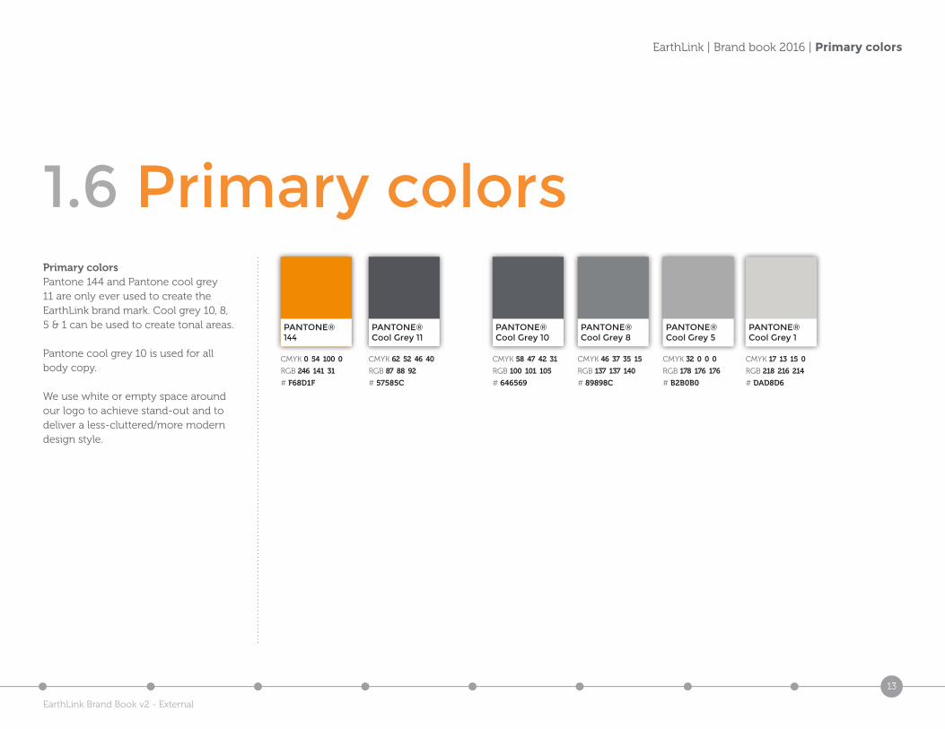
1.6 Primary colorsPrimary colorsPantone 144 and Pantone cool grey 11 are only ever used to create the EarthLink brand mark. Cool grey 10, 8, 5 & 1 can be used to create tonal areas.
Pantone cool grey 10 is used for all body copy.
We use white or empty space around our logo to achieve stand-out and to deliver a less-cluttered/more modern design style.
PANTONE®144
PANTONE®Cool Grey 11
PANTONE®Cool Grey 10
PANTONE®Cool Grey 8
PANTONE®Cool Grey 5
PANTONE®Cool Grey 1
CMYK 62 52 46 40
RGB 87 88 92
# 57585C
CMYK 58 47 42 31
RGB 100 101 105
# 646569
CMYK 46 37 35 15
RGB 137 137 140
# 89898C
CMYK 32 0 0 0
RGB 178 176 176
# B2B0B0
CMYK 17 13 15 0
RGB 218 216 214
# DAD8D6
CMYK 0 54 100 0
RGB 246 141 31
# F68D1F
EarthLink Brand Book v2 - External
14
EarthLink | Brand book 2016 | Secondary colors
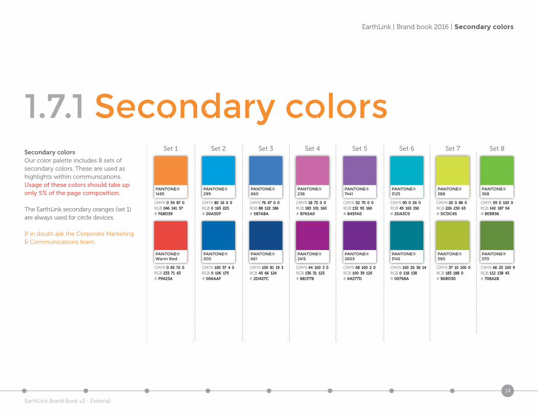
1.7.1 Secondary colorsSecondary colorsOur color palette includes 8 sets of secondary colors. These are used as highlights within communications. Usage of these colors should take up only 5% of the page composition.
The EarthLink secondary oranges (set 1) are always used for circle devices.
If in doubt ask the Corporate Marketing & Communications team.
PANTONE®299
PANTONE®300
CMYK 80 16 0 0RGB 0 163 223# 00A3DF
CMYK 100 57 4 0RGB 0 106 175# 006AAF
Set 2
PANTONE®1495
PANTONE®Warm Red
CMYK 0 54 87 0RGB 246 141 57# F68D39
CMYK 0 83 72 0RGB 233 71 63# F9423A
Set 1
PANTONE®3125
PANTONE®3145
CMYK 90 0 24 0RGB 45 163 192# 2DA3C0
CMYK 100 25 36 14RGB 0 118 138# 00768A
Set 6
PANTONE®238
PANTONE®7441
PANTONE®2415
PANTONE®2603
CMYK 18 72 0 0RGB 183 101 160# B765A0
CMYK 52 70 0 0RGB 132 95 160# 845FA0
CMYK 44 100 3 0RGB 136 31 123# 881F7B
CMYK 68 100 2 0RGB 100 39 125# 64277D
Set 4 Set 5
PANTONE®660
PANTONE®661
CMYK 76 47 0 0RGB 88 122 186# 587ABA
CMYK 100 81 19 3RGB 45 66 124# 2D427C
Set 3
PANTONE®388
PANTONE®368
PANTONE®390
PANTONE®370
CMYK 20 0 88 0RGB 226 230 63# DCDC45
CMYK 59 0 100 0RGB 142 187 54# 8EBB36
CMYK 37 10 100 0RGB 183 188 0# B6BD30
CMYK 66 25 100 9RGB 112 138 43# 708A28
Set 7 Set 8
EarthLink Brand Book v2 - External
15
EarthLink | Brand book 2016 | Primary typefaces
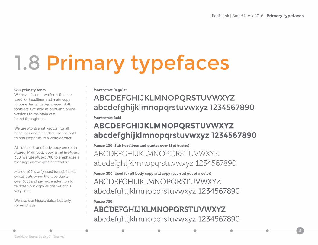
1.8 Primary typefacesOur primary fontsWe have chosen two fonts that are used for headlines and main copy in our external design pieces. Both fonts are available as print and online versions to maintain our brand throughout.
We use Montserrat Regular for all headlines and if needed, use the bold to add emphasis to a word or offer.
All subheads and body copy are set in Museo. Main body copy is set in Museo 300. We use Museo 700 to emphasise a message or give greater standout.
Museo 100 is only used for sub heads or call outs when the type size is over 16pt and pay extra attention to reversed out copy as this weight is very light.
We also use Museo italics but only for emphasis.
Montserrat Regular
ABCDEFGHIJKLMNOPQRSTUVWXYZabcdefghijklmnopqrstuvwxyz 1234567890Montserrat Bold
ABCDEFGHIJKLMNOPQRSTUVWXYZabcdefghijklmnopqrstuvwxyz 1234567890Museo 100 (Sub headlines and quotes over 16pt in size)
ABCDEFGHIJKLMNOPQRSTUVWXYZabcdefghijklmnopqrstuvwxyz 1234567890Museo 300 (Used for all body copy and copy reversed out of a color)
ABCDEFGHIJKLMNOPQRSTUVWXYZabcdefghijklmnopqrstuvwxyz 1234567890Museo 700
ABCDEFGHIJKLMNOPQRSTUVWXYZabcdefghijklmnopqrstuvwxyz 1234567890
EarthLink Brand Book v2 - External
16
EarthLink | Brand book 2016 | Internal use fonts
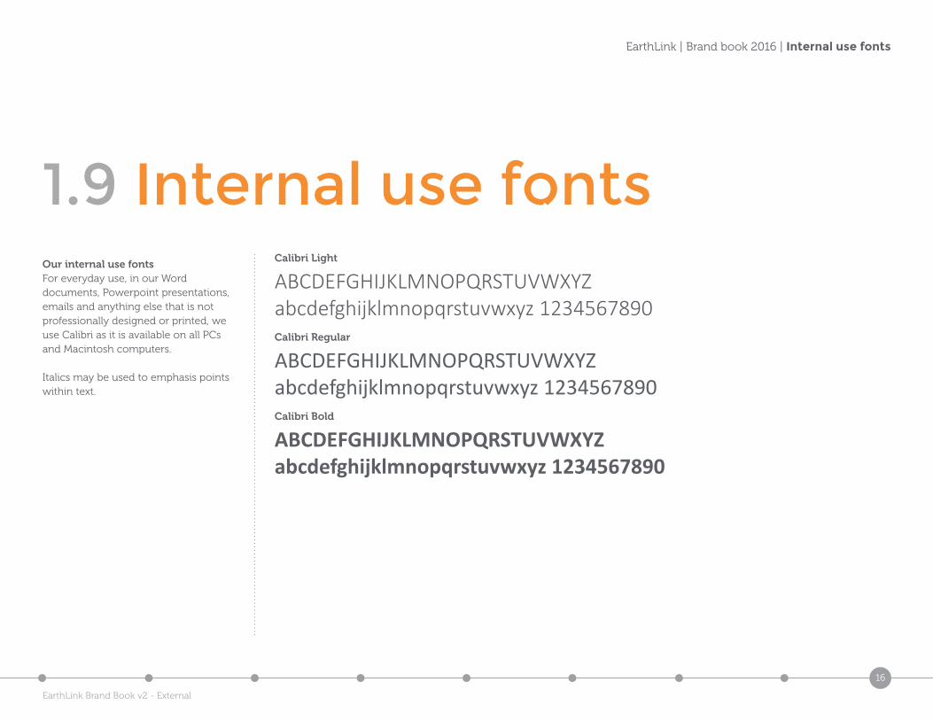
1.9 Internal use fontsCalibri Light
ABCDEFGHIJKLMNOPQRSTUVWXYZabcdefghijklmnopqrstuvwxyz 1234567890 Calibri Regular
ABCDEFGHIJKLMNOPQRSTUVWXYZabcdefghijklmnopqrstuvwxyz 1234567890Calibri Bold
ABCDEFGHIJKLMNOPQRSTUVWXYZabcdefghijklmnopqrstuvwxyz 1234567890
Our internal use fontsFor everyday use, in our Word documents, Powerpoint presentations, emails and anything else that is not professionally designed or printed, we use Calibri as it is available on all PCs and Macintosh computers.
Italics may be used to emphasis points within text.
EarthLink Brand Book v2 - External
17
EarthLink | Brand book 2016 | Do’s & Don’ts
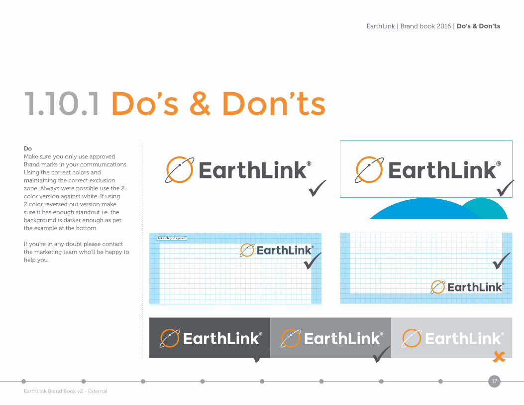
1.10.1 Do’s & Don’tsDoMake sure you only use approved Brand marks in your communications. Using the correct colors and maintaining the correct exclusion zone. Always were possible use the 2 color version against white. If using 2 color reversed out version make sure it has enough standout i.e. the background is darker enough as per the example at the bottom.
If you’re in any doubt please contact the marketing team who’ll be happy to help you.
1/4 inch grid system
1/4 inch grid system
EarthLink Brand Book v2 - External
18
EarthLink | Brand book 2016 | Do’s & Don’ts
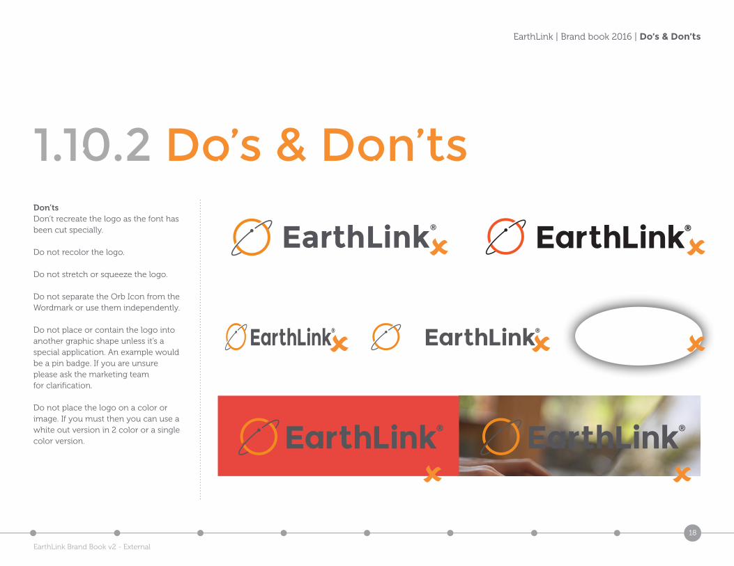
1.10.2 Do’s & Don’tsDon’tsDon’t recreate the logo as the font has been cut specially.
Do not recolor the logo.
Do not stretch or squeeze the logo.
Do not separate the Orb Icon from the Wordmark or use them independently.
Do not place or contain the logo into another graphic shape unless it’s a special application. An example would be a pin badge. If you are unsure please ask the marketing team for clarification.
Do not place the logo on a color or image. If you must then you can use a white out version in 2 color or a single color version.
EarthLink®
EarthLink Brand Book v2 - External
19
EarthLink | Brand book 2016 | Graphic elements
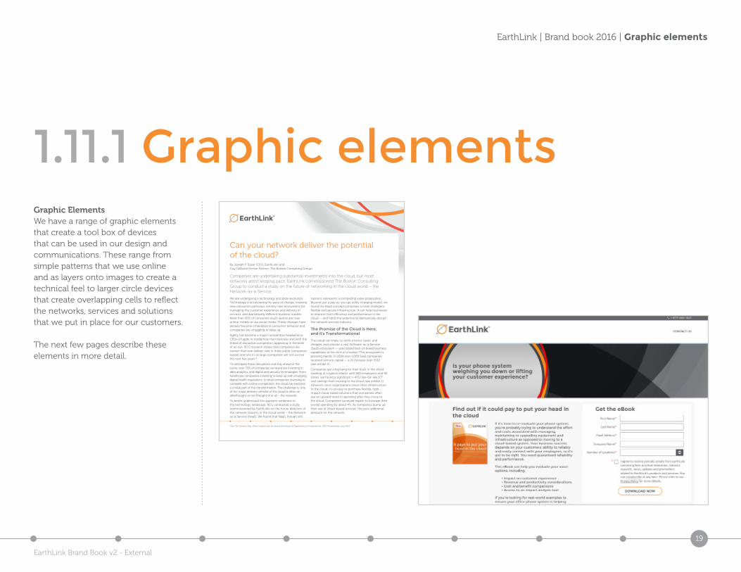
1.11.1 Graphic elementsGraphic ElementsWe have a range of graphic elements that create a tool box of devices that can be used in our design and communications. These range from simple patterns that we use online and as layers onto images to create a technical feel to larger circle devices that create overlapping cells to reflect the networks, services and solutions that we put in place for our customers.
The next few pages describe these elements in more detail.
Can your network deliver the potential of the cloud? By Joseph F. Eazor (CEO, EarthLink) and Guy Gilliland (Senior Partner, The Boston Consulting Group)
Companies are undertaking substantial investments into the cloud, but most networks aren’t keeping pace. EarthLink commissioned The Boston Consulting Group to conduct a study on the future of networking in the cloud world – the Network-as-a-Service.
We are undergoing a technology and data revolution. Technology is accelerating the pace of change, creating new consumer pathways, entirely new ecosystems for managing the customer experience and delivery of services, and dramatically different business models. More than 50% of consumer touch-points are now online, mobile or via social media. These changes have already become embedded in consumer behavior and companies are struggling to keep up.
Agility has become a major competitive headache as CEOs struggle to modernize their business and with the threat of disruptive competitors appearing in the blink of an eye. BCG research shows that companies die sooner than ever before: one in three public companies overall and one in six large companies will not survive the next five years.*
To anticipate these disruptions and stay ahead of the curve, over 70% of companies surveyed are investing in data analytics, and digital and security technologies. From healthcare companies investing to keep up with changing digital health regulations, to retail companies investing to compete with online competitors, the cloud has become a critical part of this transformation. The challenge is, one of the major delivery vehicles of the cloud is often an afterthought or not thought of at all – the network.
To better understand this apparent weakness in the technology landscape, BCG conducted a study (commissioned by EarthLink) on the future direction of the network industry in the cloud world – the Network-as-a-Service (NaaS). We found that NaaS, though still
nascent, represents a compelling value proposition. Beyond just a pay-as-you-go utility charging model, we found the NaaS concept comprises a more intelligent, flexible and secure infrastructure. It can help businesses to improve their efficiency and performance in the cloud — and holds the potential to dramatically disrupt the network services industry.
The Promise of the Cloud is Here, and it’s Transformational
The cloud can make us work smarter, faster, and cheaper, and unlocks a vast Software-as-a-Service (SaaS) ecosystem — specialized best-of-breed business capabilities at the click of a button. This ecosystem is growing rapidly. In 2014 over 1,000 SaaS companies received venture capital — a 2x increase over 2012 (see exhibit 2).
Companies get a big bang for their buck in the cloud. Looking at a typical retailer with 500 employees and 40 stores, we found a significant (~47%) like-for-like ICT cost savings from moving to the cloud (see exhibit 1). However, once organizations move their infrastructure to the cloud, it’s so easy to purchase flexible, high-impact cloud-based solutions that companies often see an upward trend in spending after they move to the cloud. Companies surveyed expect to increase their overall spending by about 4%. As companies bump up their use of cloud-based services, this puts additional pressure on the network.
*See “Die Another Day: What Leaders Can Do About Shrinking Life Expectancy of Corporations,” BCG Perspectives, July 2015.
EarthLink Brand Book v2 - External
20
EarthLink | Brand book 2016 | Graphic Elements
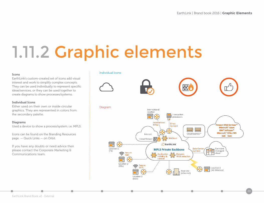
1.11.2 Graphic elementsIconsEarthLink’s custom-created set of icons add visual interest and work to simplify complex concepts. They can be used individually to represent specific ideas/services, or they can be used together to create diagrams to show processes/systems.
Individual IconsEither used on their own or inside circular graphics. They are represented in colors from the secondary palette.
DiagramsUsed a device to show a process/system. i.e. MPLS.
Icons can be found on the Branding Resources page — Quick Links — on Orbit.
If you have any doubts or need advice then please contact the Corporate Marketing & Communications team.
Individual Icons
Diagram
EarthLink Brand Book v2 - External
21
EarthLink | Brand book 2016 | Graphic elements
1.11.3 Graphic elements
Client: EarthLink Title: EarthLink graphic devices
Job No: 3500 Description: From simple circle devices on a line through to grid patterns, taken from currentelements used online and o�.
Revision: v1_0
Client: EarthLink Title: EarthLink graphic devices
Job No: 3500 Description: From simple circle devices on a line through to grid patterns, taken from currentelements used online and o�.
Revision: v1_0
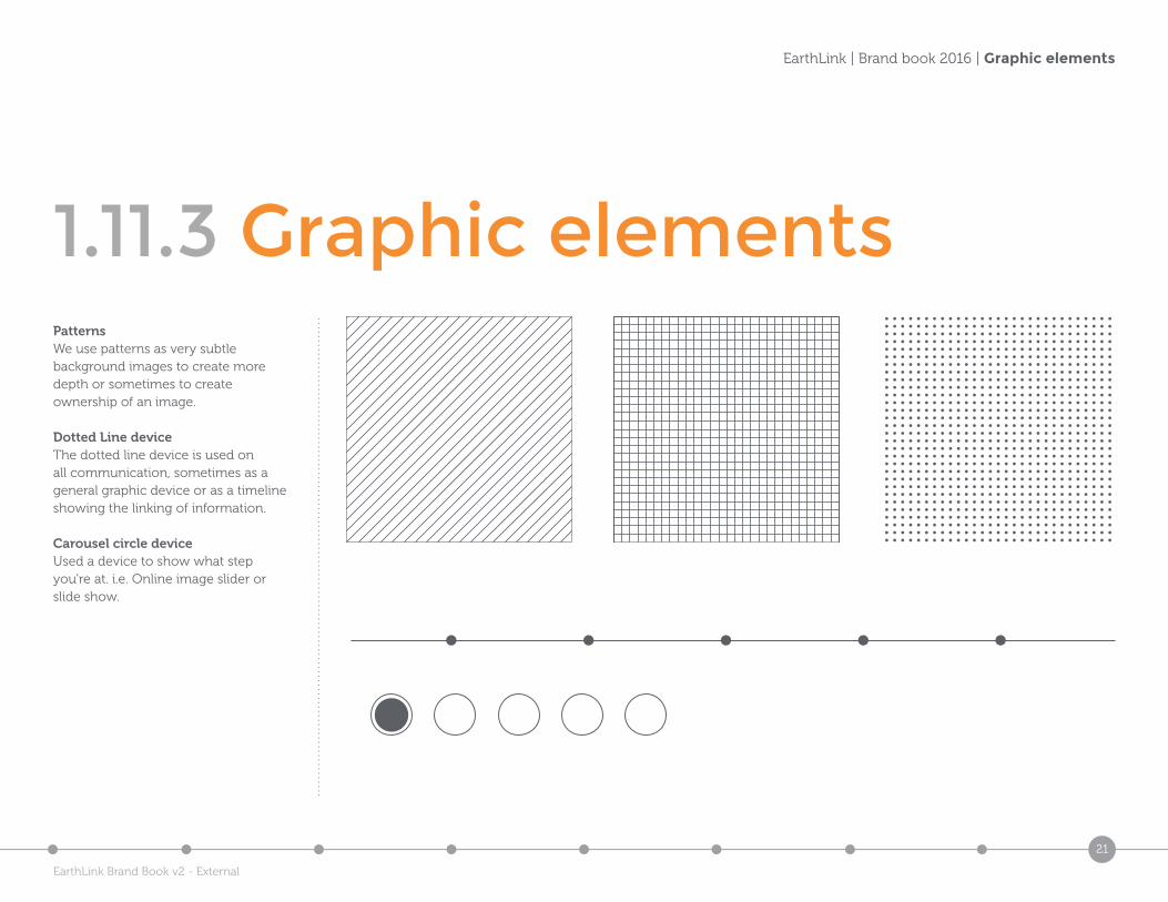
PatternsWe use patterns as very subtle background images to create more depth or sometimes to create ownership of an image.
Dotted Line deviceThe dotted line device is used on all communication, sometimes as a general graphic device or as a timeline showing the linking of information.
Carousel circle deviceUsed a device to show what step you’re at. i.e. Online image slider or slide show.
EarthLink Brand Book v2 - External
22
EarthLink | Brand book 2016 | Graphic elements
1.11.4 Graphic elements
Client: EarthLink Title: EarthLink graphic devices
Job No: 3500 Description: Circle device used to create overlapping cells to give a new dimension
Revision: v1_0
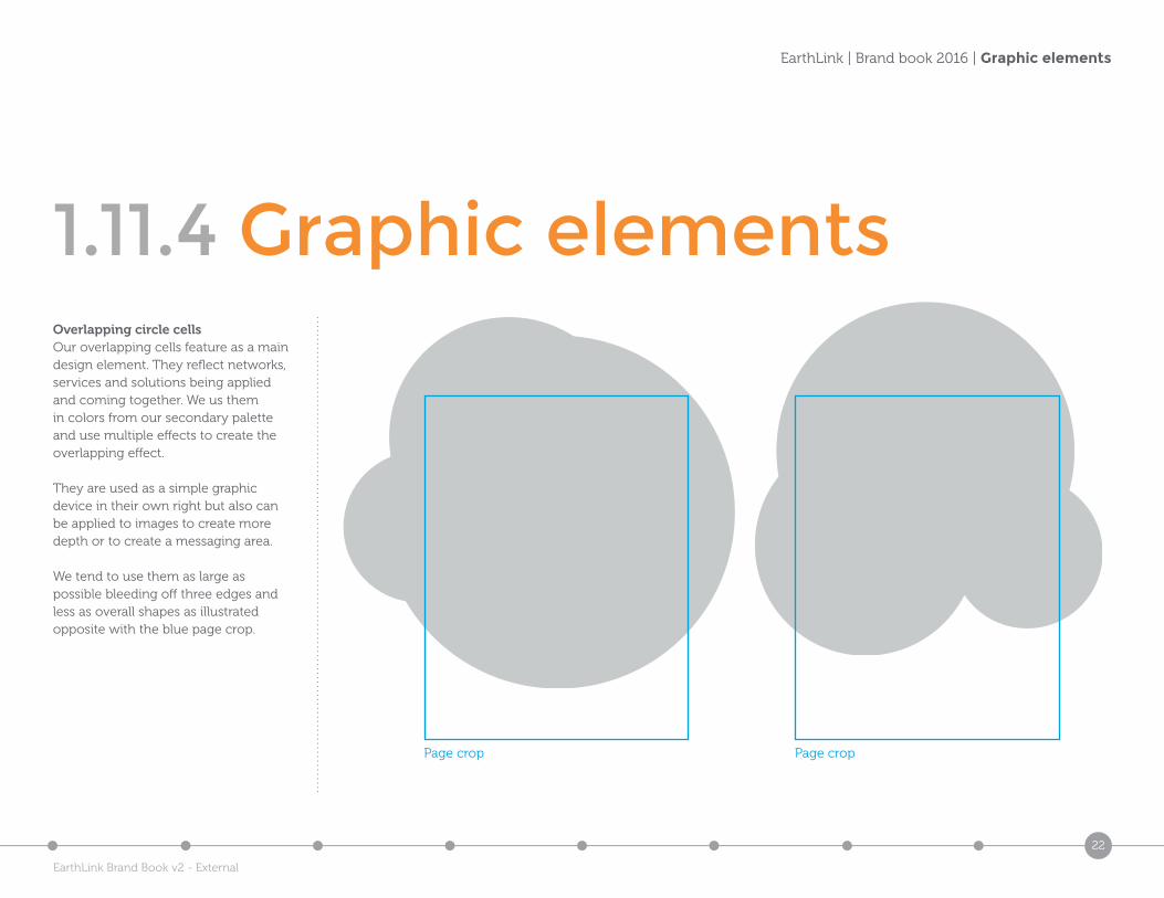
Overlapping circle cellsOur overlapping cells feature as a main design element. They reflect networks, services and solutions being applied and coming together. We us them in colors from our secondary palette and use multiple effects to create the overlapping effect.
They are used as a simple graphic device in their own right but also can be applied to images to create more depth or to create a messaging area.
We tend to use them as large as possible bleeding off three edges and less as overall shapes as illustrated opposite with the blue page crop.
Client: EarthLink Title: EarthLink graphic devices
Job No: 3500 Description: Circle device used to create overlapping cells to give a new dimension
Revision: v1_0
Page crop Page crop
EarthLink Brand Book v2 - External
23
EarthLink | Brand book 2016 | Graphic elements
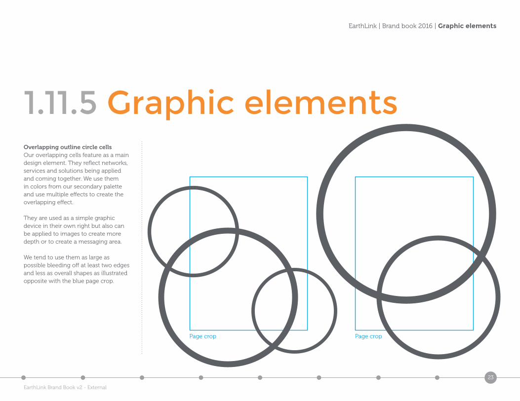
1.11.5 Graphic elementsOverlapping outline circle cellsOur overlapping cells feature as a main design element. They reflect networks, services and solutions being applied and coming together. We use them in colors from our secondary palette and use multiple effects to create the overlapping effect.
They are used as a simple graphic device in their own right but also can be applied to images to create more depth or to create a messaging area.
We tend to use them as large as possible bleeding off at least two edges and less as overall shapes as illustrated opposite with the blue page crop.
Page crop Page crop
EarthLink Brand Book v2 - External
24
EarthLink | Brand book 2016 | Graphic elements
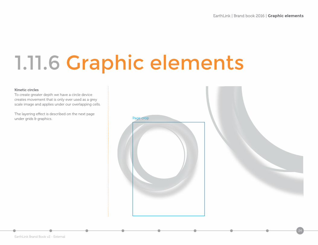
1.11.6 Graphic elements
Client: EarthLink Title: EarthLink graphic devices
Job No: 3500 Description: Key-lined circle devices used to create overlapping cells to give a new dimension
Revision: v1_0
Kinetic circlesTo create greater depth we have a circle device creates movement that is only ever used as a grey scale image and applies under our overlapping cells.
The layering effect is described on the next page under grids & graphics. Page crop
EarthLink Brand Book v2 - External
25
EarthLink | Brand book 2016 | Grid system & graphics
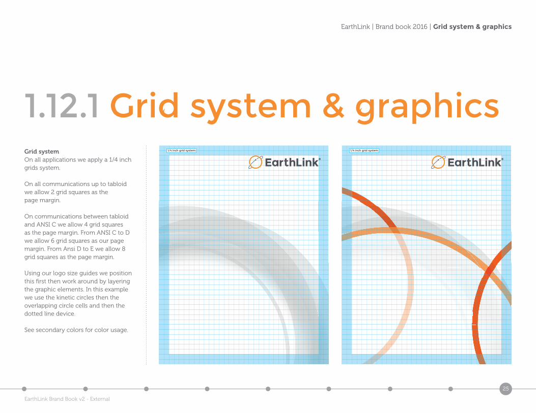
1.12.1 Grid system & graphicsGrid systemOn all applications we apply a 1/4 inch grids system.
On all communications up to tabloid we allow 2 grid squares as the page margin.
On communications between tabloid and ANSI C we allow 4 grid squares as the page margin. From ANSI C to D we allow 6 grid squares as our page margin. From Ansi D to E we allow 8 grid squares as the page margin.
Using our logo size guides we position this first then work around by layering the graphic elements. In this example we use the kinetic circles then the overlapping circle cells and then the dotted line device.
See secondary colors for color usage.
1/4 inch grid system 1/4 inch grid system
EarthLink Brand Book v2 - External
26
EarthLink | Brand book 2016 | Co-branding
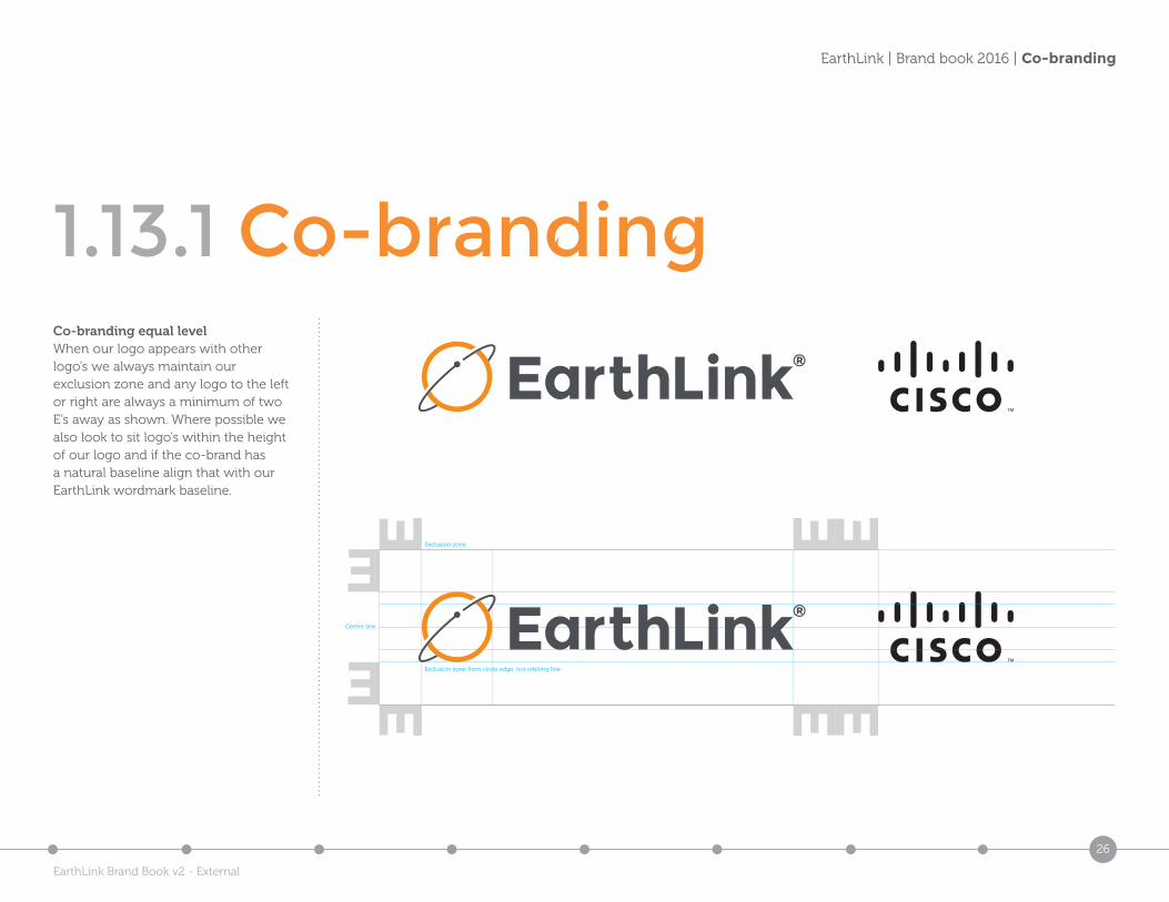
1.13.1 Co-brandingCo-branding equal levelWhen our logo appears with other logo’s we always maintain our exclusion zone and any logo to the left or right are always a minimum of two E’s away as shown. Where possible we also look to sit logo’s within the height of our logo and if the co-brand has a natural baseline align that with our EarthLink wordmark baseline.
Exclusion zone from circle edge, not orbiting line
Centre line
Exclusion zone
EarthLink Brand Book v2 - External
27
EarthLink | Brand book 2016 | Co-branding
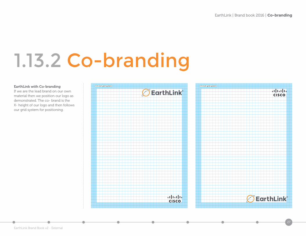
1.13.2 Co-brandingEarthLink with Co-brandingIf we are the lead brand on our own material then we position our logo as demonstrated. The co- brand is the X- height of our logo and then follows our grid system for positioning.
1/4 inch grid system 1/4 inch grid system
EarthLink Brand Book v2 - External
28
EarthLink | Brand book 2016 | Photography
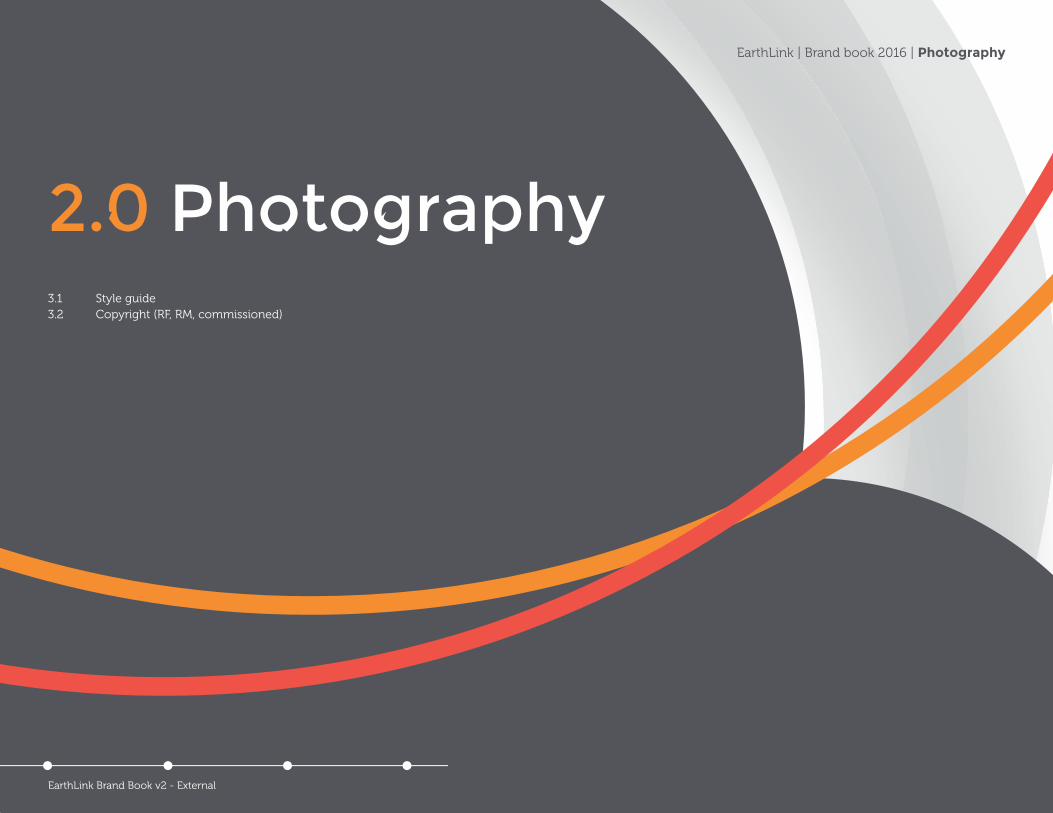
2.0 Photography3.1 Style guide3.2 Copyright (RF, RM, commissioned)
EarthLink Brand Book v2 - External
29
EarthLink | Brand book 2016 | Style guide - General
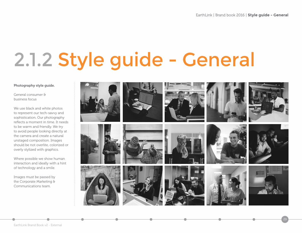
2.1.2 Style guide - GeneralPhotography style guide.
General consumer & business focus
We use black and white photos to represent our tech-savvy and sophistication. Our photography reflects a moment in time. It needs to be warm and friendly. We try to avoid people looking directly at the camera and create a natural unstaged composition. Images should be not overlite, colorized or overly stylized with graphics.
Where possible we show human interaction and ideally with a hint of technology and a smile.
Images must be passed by the Corporate Marketing & Communications team.
EarthLink Brand Book v2 - External
30
EarthLink | Brand book 2016 | Marketing team contacts
3.0 Marketing team contacts, briefing, brand sign-off & brand checklist
EarthLink Brand Book v2 - External
31
EarthLink | Brand book 2016 | Marketing team contacts
8.1 Marketing team contactsSadhana Joliet Sr. Director Corporate Marketing & Communications
[email protected]: 203-241-7053
Millisa Jackson Sr. Graphic Designer
[email protected]: 678-931-4670
EarthLink Brand Book v2 - External