Embed Size (px)
Citation preview

ANTHONY WHITE - PROJECT REPORT
OUGD503 - RESPONSIVE
Codex Books - Branding and Website
Secret 7 - 7” Sleeve Design
D&AD: npower - App Proposal
Yoke - Dialogue Exhibition
YCN: Champneys - Campaign (collaborative)
No. 7 Antiques - Branding
OAC Photography - Branding
Module Evaluation

3
4 5
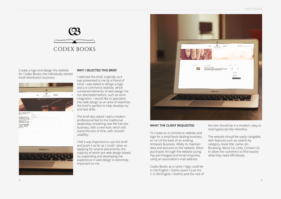
I selected this brief, originally as it was presented to me by a friend of mine. I was asked to design a logo and a e-commerce website, which contained elements of web design I’ve not attempted before, such as store integration. I would like to specialise into web design as an area of expertise, the brief is perfect to help develop my and test skills.
The brief also asked I add a modern professional feel to the traditional dealership, breathing new life into the business, with a new look, which will stand the test of time, with smooth usability.
I felt it was important to use this brief and push it as far as I could. I plan on applying for several placements, the majority of which are web design based. So, expanding and developing me experience in web design is extremely important to me.
CODEX BOOKS
WHAT THE CLIENT REQUESTED
To create an e-commerce website and logo for a small book dealing business, to run of the back of an existing Antiques Business. Ability to maintain data and pictures on the website. Allow purchases through the website (using Pay-pal linkages) and email enquiries, using an associated e-mail address.
Codex Books as a name / logo could be in Old English / Gothic (even if just the C is Old English / Gothic) and the rest of
WHY I SELECTED THIS BRIEFCreate a logo and design the website for Codex Books, the individually owned book distribution business
the text should be in a modern, easy to read typescript like Helvetica.
The website should be easily navigable, with features such as; search by category, book title, name, etc., Browsing, About Us, Links, Contact Us, to allow the customers to find exactly what they need effortlessly.
CODEX BOOKS

6 7
CODEX BOOKS
The design of the website was created using the specifications of the client, a modern professional feel was important, so I used a slightly off black and a slightly off white to achieve this. The limited colour palette does not distract of confuse the user, it’s clean. The black and white colour scheme is also reminiscent of the inners of a novel.
The target audience of the website is very broad, typically adults who have an interest in purchasing collectable publications. The simple design which is not intended for a specific target audience, but for a broad spectrum of users, multiple ages, genders and interests. I’ve done this by keeping the aesthetics of the site rather minimal. No gender segregated colours, no styles which reflect any social culture.
The structure of the website uses a four column grid, within the main content area. Which can then be divided down into an eight column grid, or even into a twelve column grid, to allow greater diversity where needed in the website.
I wanted to add some large banner like images to the website, to break up the white and black, and on pages such as the landing page, I wanted to fill the page with an image, which would have a impact the site’s visitors, captivating them. Making them want to browse
further into the website, hopefully purchasing some of the products.
The website has been designed to work dynamically, meaning that the main images and the supporting content on the page with resize themselves to fit the page until they reach their full resolution. Where as the body content, such as the text and the product images stay the same. I’ve designed it like this because the goal of the images are to captivate and engage the customers.
THE DESIGN CHOICES
I kept the range of pages quite limited, there are seven in total. (Although the further product page, which displays each individual product in more detail has an unlimited amount of variations, however, they will all look the same, and will be created using the same design and code. The host e-commerce features of the hosting service Codex Books will use allows this). I kept the number of pages at a low amount as the scale of the business at this date is rather small, and there is no need to go and produce a enormous website
like for that of a large business, such as Amazon. The majority of information which the customer might need can be obtained from contacting the owner of the business, via the contact page.

8 9
SECRET 7
The annual Secret 7” brief, to design a seven inch vinyl sleeve, for one or more of the seven proposed artists. To do this, you must not writing the name of the song or the artist anywhere on the sleeve, you must keep them secret.
WHY I CHOSE THIS BRIEF
I chose this brief because it’s quite a quick project, which I’m able to get done in under two days. I entered the competition the previous year, with success. I really enjoyed designing and entering Secret 7” last year, So, I thought I should enter again this year, with a new set of artists, some of which I’m huge fans of, and would love to design for. To see how I would do again this year.
SLEEVE DESIGN
The design of the sleeve is based around some of the lyrics within the song ‘Get it On’, by T-Rex. Scanning through the lyrics, I wanted to find a line which I could illustrate fairly easily, and for it to look good.
I knew I wanted to use an illustration for the main body of my submission to Secret 7”. My illustration skills have greatly improved over the last two years, so I thought it would be beneficial
for me to play to my skills, rather than experimenting. After all, this is a competition.
For the content of the illustrations I wanted to pick a phrase or line from the songs lyrics and create a visualisation from the phrase. I eventually settled on ‘you’re built like a car, you got a hubcap, diamond star halo, you’re built like a car, oh yeah”. I took the middle section from the lyric as my subject for the illustration. I wanted to illustrate a hub cap, with a diamond star on it.

10 11
SECRET 7
Following research into the subject, I decided that a line illustration might work well. I’ve also developed quite a minimalist style of design within the last year, so to keep the sleeve design quite personal to me, I thought the line illustration fits.
SECRET 7” 2014 RESULTS
Unfortunately, unlike the previous year, I was unsuccessful for selection. Secret 7” was much larger this year, with more entries than ever, making the
competition tougher than ever before. Although I was unsuccessful, and I didn’t get through, I still enjoyed creating the sleeve, I’ll probably enter again next year, if given the chance.
REFLECTION
To create this illustration, I had to adopt some new skills, and develop my precision with the tool available. The grill like pattern around the entirety of the illustration was extremely difficult and time consuming to create, a
few pixels off per spoke ruined the appearance of the spokes, as they could look unbalanced. It became quite tedious after a while, but I’m happy with the end result.
I feel I could improve the design as a whole by experimenting with colour. Perhaps some sort of colour scheme applied could life the whole design to another level completely. Rather than playing it same with a monotone, black and grey image. A more visually stimulating piece, using colour.

12 13

14 15
D&AD NPOWER
WHY I CHOSE THIS BRIEF
I’ve selected this brief because I’m interested in user interface and user experience design and development, as part of my practice. I thought designing an application to be used in the home, for a large company, such as npower, would be a good way to do so.
I’ve also wanted to enter D&AD for a long time, they’re internationally famous for their design awards, winning them would be a huge step on the ladder.
The brief itself was also a good challenge, to design an interface and a concept which would improve the lives of users of the app.
THE APPLICATION
I approached the solution with two ideas, to allow the user to control their gas and electricity expenditure away from the home, remotely, and to monitor the usage of electricity by room. So the user can see and control their exact expenditures, so
there are no surprising bills at the end of the month. It works with your npower account, which the majority of members will have.
The design of the app is made to work with the iOS7 theme, which runs throughout the phone and iOS devices. Everything is very clean, de-cluttered and flat. Sporting a limited colour palette throughout, all of which has been sampled from the npower logo, to allow some brand consistency, throughout the application. The npower red and the npower blue have been used to signify the gas and the electricity. Red for gas and blue for electricity. Gas is read, as it ties in with the flame, leaving blue to electricity.
A large amount of iconography has been used throughout the application, a flame has been used throughout the entire gas half of the application, and an energy saver bulb has been used for the electricity side of the application. The iconography has a very modern flat feel to it, working extremely well with iOS7.
The application also features a hamburger, which is a compressed menu, only visible when required, by clicking the hamburger looking icon, the three horizontal lines in the top left hand corner of the app page. It can be accessed on any page, and it can
transfer you to any page, allowing for quick navigation, rather than having to go back to the start of the application, and then work your way through the menus once again.
REFLECTION
I’ve learned a great deal from this project. During my research process, I dove deep into the world of user interface and user experience design. I’ve learned what is needed within an application to make it function properly,

16 17
things such as the hamburger, which allows for ease of access through the application. I’ve also learned that applications are incredibly difficult to design, as they usually have such a vast amount of pages. Something I certainly didn’t expect was the sheer amount of pages I had to create to demonstrate the application’s functionality.
I’m happy with how the application turned out overall. It looks fine and it’s usability works well. However, with more time and planning, I could’ve gone
into more depth with the design and the concept. I felt the idea was rather weak, and could’ve been pushed much further. Into a more developed final product. I also thought I could’ve really tightened the design of the app overall, there are some elements, upon review, which don’t fit with the rest of the app, I think.

18 19PANGAEA 200 MILLION YEARS AGO
To create a A3 black and white image, under the theme of dialogue, for an exhibition in Leeds Corn Exchange.
WHY I CHOSE THIS BRIEF
I selected this brief following a talk from Nathan Bolton and Eve Warren, third years on our course. They explained they were putting together an exhibition based on language, dialogue.. It was a quick brief, and we could make absolutely anything for it, based on the theme dialogue. Freedom to do whatever I fancied. Their concept was also very interesting, and something I wanted to be a part of. The pieces are screen printed on top of, or underneath, another designers work. A chance to be paired with a famous design is just to big to miss.
THE DESIGN
I wanted to do something that meant ‘connect’, so I thought of things which meant connection. I came to the hashatag, the symbol popularised on twitter for trending topics internationally, bringing the world together. I wanted to create a negative illustration. I thought of another way of how the world could be together, a more literal way. I thought of Pangea. Pangea, two-hundred million years ago, when all the continents were connected as one, similar to like how the hashtag
connects us now. Overlaying the two represents the connection they have, and how the connect the world, in a form of dialogue.
REFLECTION
I’ve learned a few new interesting techniques in Illustrator, using grouping and shape effects, which I didn’t know before. This will be useful in application to future designs.
I’m not very happy with the design of this piece as a whole, I like the concept, it reflects the idea I was after. However, I don’t like the execution. I feel I could have pushed the idea further, perhaps done something more intricate, more personal.
20 21
COLLECTION
Classic rosesensual
bath creamPampers, nourishes and
moisturises the skin
ORIENTAL OPULENCESHOWER CREAM
With silk proteins& ylang ylang
ENERGISING LIMEHYDRATING
BODY GELwith line & pepermint oil
& orange fruit extract

22 23
Raise the awareness of Champneys and our offering among 16-25 year olds. Attracting a younger age to the brand.
COLLABORATIVE PROJECT
I selected this brief to work in my collaborative project, I decided to work with Ewan North. Ewan and I have contrasting skills, he works in print mainly, whereas I work with digital mediums such as web, together, we cover the full range of design. We were able to split the workload down the
middle once we established a concept and the imagery we needed. I’m quite quick on software, so I created the majority of the main imagery which spreads across the re-brand. Whereas Ewan worked on the content.
We worked well as a team, we managed to get everything completed on time. No real issues, and we were able to make a consistent product, which we think works well at fore-filling the brief, and hitting the target market. As requested by Champneys.
WHY I SELECTED THIS BRIEF
We selected this brief as we thought it had great potential, room to create a large scope of interesting collateral. The brief has a target audience of 16-25 year olds, which are typically students, similar to us, so we’re able to relate to the needs of the audience, helping us aim the brief in the right direction.
The brief allowed both a print and web approach to the brief, which fitted us both well. I’m very comfortable working
with web and user interface/experience, as it’s where my strengths lie. Whereas Ewan’s strenghts lie with printed media. Which gives us a strong overall cover of the brief.
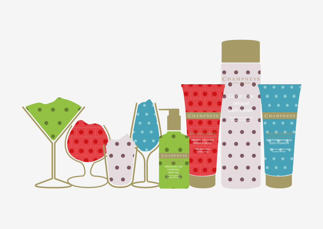
THE CAMPAIGN
For the campaign, we decided to use cocktail glasses to feature the Champneys products. Using illustrations of alcohol glasses filled with Champneys products, we hope to show the comparison as an alternative

24 25
to a night out. Corresponding patterns have been used on the glasses and the products.
I created the application for the campaign. The Champneys app works from a generated QR code. This will be implemented into other areas of the campaign, on posters, flyers and digital billboards. The App is a mobile way of viewing and purchasing products, as well as learning about the brand this will encourage The younger, 16 to 25 year old target audience, who spend
the vast majority of their time on theirmobile devices, to buy into the Champneys experience.
There is also a website, which I created, which offers similar things as the application. Whilst also giving information about the campaign and the benefits of using Champneys spa products.
Along with the digital branding, there is a large range of printed medium to accompany. Posters, leaflets and flyers
have been created to distribute on the street as well as promote the products around cities and towns. All of which feature QR codes, which when scanned open up a link to the download menu for the Champneys Application.
These then translated to digital billboards. Which work with the environment, in four dimensions. Whenever someone walks past the billboard, the image rotates to show the alternative from the cocktail glass.
REFLECTION
I think we worked really well together on this project. I’m happy with the outcome. I think I’ve learned a great deal about collaboration and working with others. In the past, I’ve really disliked working with others, however in this project we both pulled our weight, and it seems to get sorted fairly easily. I’ve learned how to split workloads, and the fact another creative is relying on me to produce work for a certain date, has really pushed my time management skills, being able to produce what is needed on time; so I’m not letting my collaborative partner down.
I think the project worked well as a whole, it could be pushed further if given the time, perhaps a full website, rather than an extension of Champneys current website. I also think we could
have extended the printed mediums. Perhaps a larger publication further explaining the benefits of the products. How they can improve studies and boost activity through a relaxing spa treatment.

26 27
To create a business card and a small range stationary, such as price tags and bags. To help promote the business and add the professionalism.
WHY I SELECTED THIS BRIEF
I selected this brief as it was proposed to me by a friend who’s recently celebrated one year as an Antiques dealer, and would like a re-brand. I do enjoy branding as part of my practice, and it is an area I would like to move my practice towards.
WHAT THE CLIENT WANTED
No. 7’s owner, Jacques, wanted a clean business card with similar branding proposals, to which he could take to manufacture, as he has printing connections. So they can be produced at a later date.
He wanted the design to be clean, simple without any brash designs or colours, with a traditional serif font, something similar to times new roman, easily readable.

28 29
THE DESIGN
I began by addressing one of the points the clients brought up, which was using a Roman font, with traditional serifs. To avoid any issues with copyright, and to break the mould, I searched the font libraries for something different to use. On font squirrel, I was able to find a fond called ‘source code pro’, which was a nice serif roman font, which look similar to times new roman, and best of all, it is completely free for commercial usage.
I experimented with the layout of he logo. I tried horizontal and vertical layouts, to see if either had any visual quality to them. The horizontal logo flowed better, and the hierarchy with the shop description worked better with the horizontal layout. I’ve used a line breaker to separate the type, allowing the hierarchy to be amplified, so your eyes are drawn to the logo, before moving down.
The price tag and the bag are extremely simple and clean, using only the logo in the lower areas of the bag and the tag. Nothing fancy was required or asked for.
THE CLIENT’S RESPONSE
The clients response we very positive, he liked what I presented. It was clean and minimalist, as he requested, just doing the job. He was also happy with the font choice, traditional, as requested. It will be produced in the near future. The design was just what he was after, and it fits the theme and audience of the business.
REFLECTION
I enjoyed this brief, as there was no real production involved, it made the process easier and less stressful for myself, as I don’t need to make time for printing or printing errors.
I’ve learned about designing of bags and tags. The client said he would like these screen printing, so I’ve had to provide a negative for them, one the size of the entire bag, so the alignment is current on every bag. Also with the price tag, the client requested to have the price tags tiled across an A3 page, to get the maximum number of tags in one print.
I’m fairly happy with how the brief has turned out. The brief was fairly quick, but because there wasn’t too much content, so I wanted to make it perfect, get everything right. In reflection, I’m sure if I devoted more time I could’ve improved this.
To create a logo and business card for a York based family photographer, who also can work in other settings, such as landscape photography. As to not be tied down to one area.
WHY I SELECTED THIS BRIEF
The brief was pitched to me by a friend of mine, to design a logo create a business card to promote a small photography business. I selected it as I’ve not designed a logo for a photography business before, and I had
lots of great ideas of where I can take this in terms of a logo. Plenty of themes I wanted to add. The idea of a business card also made this a fairly quick turn around brief. Something which I could just get done in a few days, without much stress.
WHAT THE CLIENT WANTED
The client, Olivia, wanted something which reflected her practice in a professional manner as a logo, something clean and modern, perhaps

30 31
using iconography to symbolise her practices. The business card must be appropriate to her target audience families, something not too empty, something friendly and welcoming.
In terms of the information which should be required, links to the relevant social media pages, and contact telephone and e-mail address as standard. Whilst also mentioning the location to which she operated. So she’s not contact from anywhere outside of reason, such as in the south.
THE DESIGN
The design for the logo was fairly straight forward. I sketched out around 10 logos, and the client selected two she really liked, both of which are displayed about on their respective business card variants. The first logo, on the left, uses her business name and tag line across the centre of the logo, with three icons above, a face, for family/portrait photography, an illustration of a canon 600D, her tool of the trade, and a mountain, to show
that she also specialises in other areas of photography, such as landscape. Around the edge of the logo is a frame, which mirrors the frame you see in the lens of a view finder. I’m quite happy with this logo, and it’s the one I personally prefer. On the right is the alternative logo. It has the same frame around the edge, and uses the typography as a tripod, a fun play with the type, which I really like, but I don’t think it fits the required brief. I feel it works better as a icon, for social media, perhaps, rather than a logo for the
business. As a logo needs to stand on it’s own, the first logo does that, it explains the specialisation The client and I decided to use the first logo for the business card.
For something different, I decided to triple the width of the business cards by putting black card in-between the front and back pieces. It adds some depth and dynamic to the business card, something I’ve not seen before, it really sets them aside from other business cards I’ve made in the past.
THE CLIENT’S RESPONSE
The client was very pleased to see the final business card, she really liked how the logo worked with the background image, which she chose from her range of self shoots. She liked the triple thickness, it was a nice touch, and something very different.
REFLECTION
I’m really happy with this brief and the turnout. I think the logo really fits well with what the client wanted, and I’m pleased she’s happy with it, and distributing them to her potential customers.
It was a fun quick project for me, I don’t often use iconography in my designs, it seems to work, so I may use it in future.

32 33
I’ve reallyed enjoyed this module, I feel like i’ve grown a tremendous amount as a designer and as a professional. I’m extremely surprised how much I enjoyed working on all the briefs I’ve participated in. I fond it was really interesting to work with clients, although we disagreed at points in the project, we were still able to complete the project and get a good result, as we both had the same aim, in the end.
I think I’ve really developed my skills in terms of communication and time management in the project. I was able to communicate with the client and my collaborators well, which is something I’m not typically able to do, but it needed to be done, so I’m glad I pushed my lack of social skills aside, and were able to get my point of view across, and work more efficiently with others.
My time management has also massively improved. When working for clients, I knew there was money involved, that really motivated me not let the client down. At the risk of being dropped as a designer, or not being paid, I treated all the projects, even the projects who were just for friends, with a high level of professionalism, and completed everything on the deadline we agreed on. The same applied in my collaborative project with Ewan, the brief for YCN was very important, and I would hate to be the reason we didn’t
win, because of my lack of effort, so it was very important to be to complete my work punctually and to the best of my ability, to hold up my end of the deal. Which I believe I did. I certainly hope this new established motivation and ability to manage my time sticks with all my projects and briefs in the future. I’m happy I’ve developed this skill before I enter level six, next year.
My planning process has been quite solid this entire module. I’ve been able to build a solid foundation of work through layouts and planning, of which I’m able to communicate to the client before I start producing any of the work digitally. Which made the process so much faster and easier.
I’ve discovered that my work is very digital. Even if the brief is for a physical product, such as business cards I prefer to design the product, and then out source the printing to a professional printers, as my printing and craft skills are something I need to develop, if I need to create anything else in the future. I really enjoyed working with the web and digital briefs, such as D&AD npower, YCN Champneys and Codex Books. I know for certain that digital and web design are something I really want to specialise into in the next year.
My weakness has certainly been my craft skills this module. I’ve shied away
from them whenever possible, only actually producing on physical product, with very minimal craft skills required. In an ongoing module I’m currently working on, I’m pushing myself produce a large range of physical products, to home my craft skills.
I think my skills have been my digital design and my time management. I’ve produced a high amount of digital and web resolutions. I really enjoy them, and I feel it’s something I want to specialise into. My process when designing for web is one of my strengths, I’m able to come to a solution quickly, once I’ve got all my variables such as audience sorted.
My time management, has been one of my strenghts in this project, I’ve been very motivated to work, and stuck to a schedule, able to produce a project in full, on time, to the deadline the client and I agreed on.
MODULE EVALUATION