Embed Size (px)
Citation preview

OSSI TAMMICASE STUDY ON MOBILE OPTIMIZATION OF A WEBAPPLICATION
Master of Science thesis
Examiner: Professor Kari SystaExaminer and topic approved by theFaculty Council of the Faculty ofComputing and Electrical Engineeringon 2nd May 2018

I
ABSTRACT
OSSI TAMMI: Case study on mobile optimization of a web applicationTampere University of TechnologyMaster of Science thesis, 69 pages, 13 Appendix pagesJuly 2018Master’s Degree Programme in Information TechnologyMajor: Software EngineeringExaminer: Professor Kari SystaKeywords: Progressive, mobile, optimization, responsive
It has become a norm in the modern society to own at least one mobile device
per person. This has had a major impact on the software engineering industry
trying to answer the consumer needs. In this thesis an information rich desktop
web application needs to become easily available in various use environments. The
research question is: what is the most suitable solution for turning an existing web
application into a mobile compatible application. In this context suitable means
cost efficient, easy to implement and easy to validate. To put it simply: we need to
make the existing web application more mobile. This thesis can be used as a guide
for anyone coming across similar needs.
Sometimes a native mobile application isn’t enough or an unoptimized web appli-
cation can’t provide the accessibility of a mobile application. A solution needs to
be found, that provides the best from both worlds: information rich web applica-
tion combined with easily accessible mobile application. Solutions involving native
mobile applications are also researched. This is done to further validate the best
solution. Operating environments for the application are industrial facilities, facto-
ries, metal scrap yards etc. The research question will be answered in a case study
manner; the most suitable solution will be implemented after which the success of
the solution is measured via performance metrics and user interviews.
It was found that turning the web application into a progressive web application, a
PWA, answers the thesis’ research question. Progressive web applications provide
vast amounts of benefits with little effort, for example the page loading times can be
easily reduced and the user experience on mobile is enhanced. Through performance
metrics it was found that the application’s performance improved considerably. User
interviews revealed that the application’s user experience was good with both mobile
and desktop devices. According to the results, PWAs can be highly recommended
for mobile optimization of a web application.
II
PREFACE
This thesis along with the software implementations was done during the first half
of 2018. The thesis is about finding the best solution for an application that serves
both mobile and desktop computer users.
I would like to thank my client for providing me with the possibility to write my
thesis about an interesting topic. I would also like to thank my supervisor Pette
for supporting me during the making of this thesis. Thank you to professor Kari
Systa for providing valuable knowledge about the thesis topic and for all the instruc-
tions regarding the thesis. Warm thanks to my family for all the support received
in life so far. A special thanks to my dearest fiance Emmi. It would have been hard
to write this thesis without all the help, trust and faith you gave me.
This thesis is dedicated to my beloved son Elias. You make life more beautiful.
Helsinki, 28.7.2018
Ossi Tammi

III
CONTENTS
1. Introduction . . . . . . . . . . . . . . . . . . . . . . . . . . . . . . . . . . . 1
2. Current state analysis . . . . . . . . . . . . . . . . . . . . . . . . . . . . . 4
2.1 Device introduction . . . . . . . . . . . . . . . . . . . . . . . . . . . . 4
2.2 User requirements . . . . . . . . . . . . . . . . . . . . . . . . . . . . . 6
2.3 Future needs . . . . . . . . . . . . . . . . . . . . . . . . . . . . . . . . 7
3. Current Architecture . . . . . . . . . . . . . . . . . . . . . . . . . . . . . . 8
3.1 Web application . . . . . . . . . . . . . . . . . . . . . . . . . . . . . . 8
3.2 Web components and Polymer Project . . . . . . . . . . . . . . . . . 10
3.3 Native applications . . . . . . . . . . . . . . . . . . . . . . . . . . . . 14
4. Options for the solution . . . . . . . . . . . . . . . . . . . . . . . . . . . . 16
4.1 Continue with the current solution . . . . . . . . . . . . . . . . . . . 16
4.2 Mobile optimization solutions . . . . . . . . . . . . . . . . . . . . . . 17
4.2.1 Progressive Web Application . . . . . . . . . . . . . . . . . . . . 17
4.2.2 Accelerated Mobile Pages . . . . . . . . . . . . . . . . . . . . . . 18
4.3 Other mobile solutions . . . . . . . . . . . . . . . . . . . . . . . . . . 19
4.3.1 Hybrid applications . . . . . . . . . . . . . . . . . . . . . . . . . 19
4.3.2 React Native . . . . . . . . . . . . . . . . . . . . . . . . . . . . . 20
4.4 Cost estimation . . . . . . . . . . . . . . . . . . . . . . . . . . . . . . 20
4.5 Resolution . . . . . . . . . . . . . . . . . . . . . . . . . . . . . . . . . 23
5. Progressive Web Application . . . . . . . . . . . . . . . . . . . . . . . . . . 26
5.1 Responsive, interactive . . . . . . . . . . . . . . . . . . . . . . . . . . 26
5.2 Connectivity-independent, always up-to-date, safe . . . . . . . . . . . 28
5.3 Discoverable, installable, linkable, re-engageable . . . . . . . . . . . . 31
5.4 Browser Support . . . . . . . . . . . . . . . . . . . . . . . . . . . . . 34
6. Implementation . . . . . . . . . . . . . . . . . . . . . . . . . . . . . . . . . 36
6.1 Service Worker . . . . . . . . . . . . . . . . . . . . . . . . . . . . . . 36
6.2 Responsive web design . . . . . . . . . . . . . . . . . . . . . . . . . . 39

IV
6.3 Manifest . . . . . . . . . . . . . . . . . . . . . . . . . . . . . . . . . . 45
6.4 Application shell architecture . . . . . . . . . . . . . . . . . . . . . . 46
6.5 Additional performance improvements . . . . . . . . . . . . . . . . . 47
6.6 Implementation tools . . . . . . . . . . . . . . . . . . . . . . . . . . . 49
7. Evaluation . . . . . . . . . . . . . . . . . . . . . . . . . . . . . . . . . . . . 50
7.1 Metrics . . . . . . . . . . . . . . . . . . . . . . . . . . . . . . . . . . . 50
7.1.1 Google Lighthouse metrics . . . . . . . . . . . . . . . . . . . . . . 51
7.1.2 Additional tests . . . . . . . . . . . . . . . . . . . . . . . . . . . 57
7.2 User interviews . . . . . . . . . . . . . . . . . . . . . . . . . . . . . . 61
8. Conclusions . . . . . . . . . . . . . . . . . . . . . . . . . . . . . . . . . . . 65
Bibliography . . . . . . . . . . . . . . . . . . . . . . . . . . . . . . . . . . . . 67
APPENDIX A. Initial results for Lighthouse audits . . . . . . . . . . . . . . . 70
APPENDIX B. Final results for Lighthouse audits . . . . . . . . . . . . . . . 75
APPENDIX C. Full summary of user interview answers . . . . . . . . . . . . . 79

V
LIST OF FIGURES
2.1 An example of the use environment for device types X and Y . . . . . 5
2.2 An example of the use environment for device type Z . . . . . . . . . 6
3.1 Communication flow between the devices and the cloud service . . . . 9
4.1 Polymer library popularity . . . . . . . . . . . . . . . . . . . . . . . . 22
4.2 Polymer library popularity compared to ReactJS . . . . . . . . . . . 22
5.1 Service worker information flow . . . . . . . . . . . . . . . . . . . . . 29
6.1 SPA navigation structure; closed version . . . . . . . . . . . . . . . . 42
6.2 SPA navigation structure; opened version . . . . . . . . . . . . . . . . 43
6.3 Responsive layout on tablet . . . . . . . . . . . . . . . . . . . . . . . 44
6.4 Responsive layout on desktop device . . . . . . . . . . . . . . . . . . 45
6.5 View of the application shell . . . . . . . . . . . . . . . . . . . . . . . 47
7.1 Lighthouse test tool found on Chrome browser . . . . . . . . . . . . . 51
7.2 Initial Lighthouse audit test summary . . . . . . . . . . . . . . . . . . 51
7.3 Initial Lighthouse performance test results . . . . . . . . . . . . . . . 52
7.4 Lighthouse performance improvement suggestions . . . . . . . . . . . 53
7.5 Initial Lighthouse audit result for PWA features . . . . . . . . . . . . 54
7.6 Lighthouse audits summary after the implementation work . . . . . . 54
7.7 Lighthouse performance audits after the implementation work . . . . 55
7.8 Lighthouse PWA audits after the implementation work . . . . . . . . 56

VI
7.9 Initial tests run via sitespeed.io . . . . . . . . . . . . . . . . . . . . . 58
7.10 Sitespeed.io tests run after the implementation work . . . . . . . . . . 60
8.1 A possible future architecture . . . . . . . . . . . . . . . . . . . . . . 66

VII
LIST OF TABLES
3.1 Browser support for Polymer / Webcomponents . . . . . . . . . . . . 13
4.1 Summary of different options for solution . . . . . . . . . . . . . . . . 24
5.1 Browser support for PWA web technologies . . . . . . . . . . . . . . . 35

VIII
LIST OF ABBREVIATIONS AND SYMBOLS
AMP Accelerated Mobile Pages
API Application Programming Interface
CDN Content Delivery Network
CRP Critical Rendering Path
CSS Cascading Style Sheets
DOM Document Object Model
ES EcmaScript
GPS Global Positioning System
HTTP Hypertext Transfer Protocol
HTTPS Hypertext Transfer Protocol Secure
HTML Hypertext Markup Language
IT Information Technology
JSON JavaScript Object Notation
NPM Node Package Manager
PWA Progressive Web Application
RWD Responsive Web Design
SEO Search Engine Optimization
SPA Single Page Application
TUT Tampere University of Technology
UI User Interface
URL Uniform Resource Locator
XML Extensible Markup Language
1
1. INTRODUCTION
The trend in using mobile devices in favor of desktop computers is steadily growing.
Applications running on mobile devices have two superior elements over desktops:
they are reached by far more users and the users can use the applications practically
everywhere. Nevertheless, a desktop environment can provide content and informa-
tion rich applications which are harder to achieve on mobile devices. They both
have their best use cases that are difficult to match with the other. The goal of this
thesis is to find out how to combine the best features of these two.
This thesis is done as a part of IT (Information Technology) consultant work for a
client. The client develops and manufactures industrial measurement devices. Some
of these measurement devices can connect to the cloud service that consists of an
API backend and a web client. API stands for application programming interface.
The web application that is in the center of the research serves as a platform where
the end customers can view measurements they have measured with the industrial
devices. The result of the measurement can be, e.g. industrial grade of a metal,
i.e. the metal’s composition. The goal is to solve the problem of how to provide
the end users with an application solution that fits their use environments. Mobile
optimization is a main topic of this thesis. It describes the process of turning a
website or a web application into a version where the user experience is optimized for
mobile. Responsive web design is also required for mobile compatible applications.
The web application needs to be mobile optimized for several reasons. For one, the
development costs for one mobile optimized web application are far smaller than
what it would be for one web application and one or two native mobile applica-
tions. Another reason is the consistency of experience for different users and use
environments. The value provided for the users should be maximized by providing
a consistent user experience for them. Finally, it is easier to maintain one appli-
cation instead of several ones. A scenario without the web application wouldn’t
answer the current and the future customer needs. The application includes plenty
of measurement data to present, e.g. in the form of charts and tables. Some of the
end users browse the data on a desktop machine. Thus, a desktop web application
is valuable for them. A natural way would be to enhance the web application to

1. Introduction 2
perform well also on mobile devices. The end users could then choose the device
according to their situation. The two existing native mobile applications have their
own usefulness in many use cases. One mobile optimized web application might not
be suitable to replace them altogether. Because of this, solutions are also researched
that would enhance the native applications.
Application solutions already exist to answer the presented problem. When software
developers make a certain architectural choice, they have to rationalize the decision
somehow. At least the cost, difficulty of implementation and difficulty of maintaining
should be evaluated. Nowadays as, e.g. new web application frameworks form every
once in a while, the ability to estimate if a framework is still officially maintained
after a couple of years has become a demanding task. Developing high function web
applications isn’t cheap. A miscalculation on the software framework choice can
be as expensive as the original application due to the need for a reimplementation.
A valid reasoning is needed for the solution to be proposed. To achieve this, the
available web and mobile application solutions are researched. Through research it
will be found what are the trends and where is the software industry going. Each
suitable solution is analyzed and pointed out how it would fit for a solution. What
are the issues with some solutions now and in the future? How would the solution
correlate with the software developing trends? These questions are answered before
the choice for the solution is made.
A current state analysis is made in chapter 2. The most common use cases, use
environments and end user requirements for the application are clarified. Future
needs for the application are presented.
In chapter 3 a description of the client’s current IT infrastructure is provided: how
it answers the current requirements and how it supports the mobile optimization
needs. The most common problems are brought to the open along with explanations
how they occur.
A literature review is made in chapter 4 to find the most suitable solution for the
research problem. The solution candidates are chosen by what are the current best
practices on creating mobile compatible applications. In the end of chapter 4 the
choice will be made between the solutions. It is based on how well the solution fits
the application’s most common use cases, how easy it is to implement, what are the
direct and indirect costs and how well it can perform reflecting to future needs.
A comprehensive review is made in chapter 5 about the chosen solution. A further
analysis is made about which parts of the chosen solution fit well for this case, and
which parts could be used later on.

1. Introduction 3
In chapter 6 it is shown how the chosen solution was implemented. This chapter
can provide insight for those who are facing similar problems. As this case study is
done for the client as a part of everyday IT consultant work, an evaluation is made
based on how much each part of the implementation took time.
In chapter 7 the enhanced user experience is evaluated through metrics and user
interviews. These will answer how well we succeeded in our task of mobile optimiza-
tion. The performance tests have high value as the application’s performance has a
major impact on the user experience. The tests are done with two different perfor-
mance metrics to minimize possible faulty outcomes. User interviews are conducted
to validate that the solution provides a good user experience on both mobile and
desktop environments.
A conclusion is made in chapter 8 about how the chosen solution worked and how
much work it required. A summary of the chosen solution is provided. Finally, a
conclusion is made about how the chosen solution will stand against future needs.

4
2. CURRENT STATE ANALYSIS
The purpose of this thesis is to evaluate how an existing web application can be
turned into an application that provides good user experience both in a mobile en-
vironment and in a stationary desktop environment. Currently the web application
is optimized for desktop usage, so it requires mobile optimization to function on a
mobile device. The optimization of the web application would seem to be a good
solution for the problem, but other solutions will also be taken into consideration.
Different solutions are presented in chapter 4. For example, as the case involves two
native applications, a solution might come into question where something could be
done to enhance them instead.
In this chapter, a closer look will be taken at the client, the industrial needs, the
business sector and how they are currently accounted for. As there are business
secrets involved, the name of the client is obfuscated, and it will be referred to
only as the client. The references to product names and topics will also be kept at
minimum.
2.1 Device introduction
The client designs and manufactures industrial oriented measurement devices, e.g.
for measuring the grade of a metal sample in a scrap yard for recycling and reselling
purposes. Currently there are two types of devices the web application supports:
devices that are movable and easy to carry along, and devices that are mostly
stationary. There are all in all three devices the web application supports: device
types X, Y and Z. Types X and Y are movable and type Z devices are stationary.
The devices that are easy to carry are mostly used on mobile environments. This
means the users can carry the device with them, perform the measurements and
analyze the results on the spot. These devices are referred to as type X and type
Y devices. The type X and Y devices are both movable and they are designed to
function in various environments. Figure 2.1 illustrates an example environment
where the device types X and Y can be used: a scrap metal storage or a scrap
yard. A common use case is to measure the metal composition of the scrap metal.
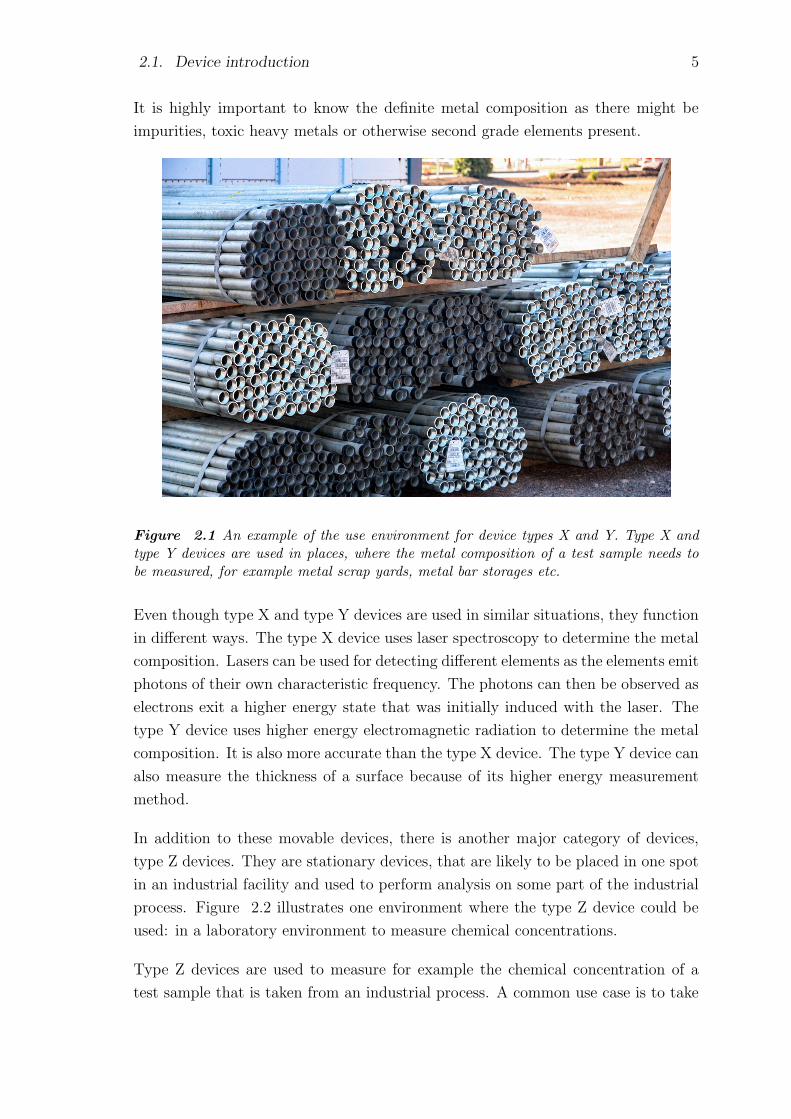
2.1. Device introduction 5
It is highly important to know the definite metal composition as there might be
impurities, toxic heavy metals or otherwise second grade elements present.
Figure 2.1 An example of the use environment for device types X and Y. Type X andtype Y devices are used in places, where the metal composition of a test sample needs tobe measured, for example metal scrap yards, metal bar storages etc.
Even though type X and type Y devices are used in similar situations, they function
in different ways. The type X device uses laser spectroscopy to determine the metal
composition. Lasers can be used for detecting different elements as the elements emit
photons of their own characteristic frequency. The photons can then be observed as
electrons exit a higher energy state that was initially induced with the laser. The
type Y device uses higher energy electromagnetic radiation to determine the metal
composition. It is also more accurate than the type X device. The type Y device can
also measure the thickness of a surface because of its higher energy measurement
method.
In addition to these movable devices, there is another major category of devices,
type Z devices. They are stationary devices, that are likely to be placed in one spot
in an industrial facility and used to perform analysis on some part of the industrial
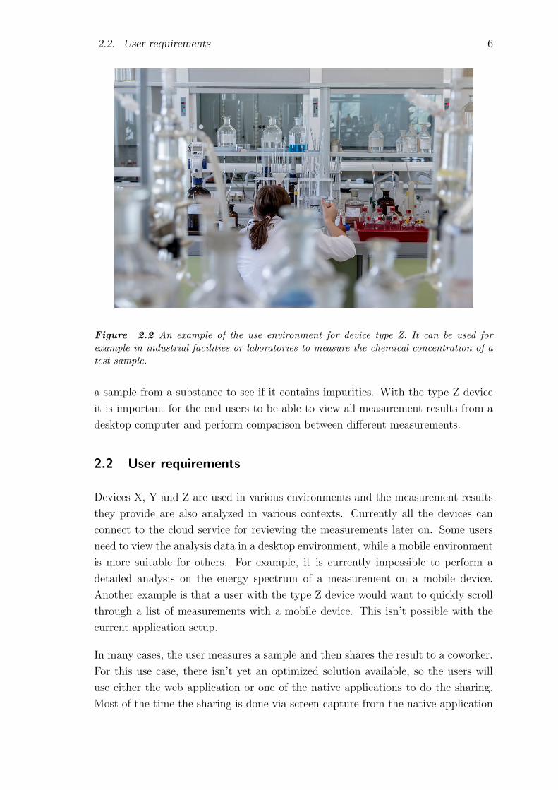
process. Figure 2.2 illustrates one environment where the type Z device could be
used: in a laboratory environment to measure chemical concentrations.
Type Z devices are used to measure for example the chemical concentration of a
test sample that is taken from an industrial process. A common use case is to take
2.2. User requirements 6
Figure 2.2 An example of the use environment for device type Z. It can be used forexample in industrial facilities or laboratories to measure the chemical concentration of atest sample.
a sample from a substance to see if it contains impurities. With the type Z device
it is important for the end users to be able to view all measurement results from a
desktop computer and perform comparison between different measurements.
2.2 User requirements
Devices X, Y and Z are used in various environments and the measurement results
they provide are also analyzed in various contexts. Currently all the devices can
connect to the cloud service for reviewing the measurements later on. Some users
need to view the analysis data in a desktop environment, while a mobile environment
is more suitable for others. For example, it is currently impossible to perform a
detailed analysis on the energy spectrum of a measurement on a mobile device.
Another example is that a user with the type Z device would want to quickly scroll
through a list of measurements with a mobile device. This isn’t possible with the
current application setup.
In many cases, the user measures a sample and then shares the result to a coworker.
For this use case, there isn’t yet an optimized solution available, so the users will
use either the web application or one of the native applications to do the sharing.
Most of the time the sharing is done via screen capture from the native application
2.3. Future needs 7
and an instant messaging application. This is a common use case that also needs
to be solved. If the application would be optimized for mobile use, the users could
easily create shareable content that would be accessible both in desktop and mobile
environments. Currently it is possible to create some kind of a report both with
the web application and with the native applications. Regardless of this, a uniform
reporting tool across different use devices would be beneficial.
There is also another user group who would benefit from a mobile compatible web
application: administrators and user support personnel. All new users and devices
that are connected to the cloud service are added through the web application. Also,
an administrator working in the field might need to, for example, reset the user’s
password, add a device to the service, analyze a faulty measurement etc. This is not
possible, since it is impractical to carry a desktop computer in the field and these
kind of changes can not be made on mobile. The administrator is a good example
of a user who would need to use the same application in both mobile and desktop
environments. The user support personnel have similar use for the web application
as the administrators.
2.3 Future needs
In the future additional devices will be connected to the service. As new devices
come, they provide some measurement data the old ones didn’t support. New types
of measurement data would increase the variety of different UI (User Interface) views
and UI elements. This has to be taken into account when designing the application
infrastructure. There would also be new kinds of use cases the application isn’t
initially designed for. Because the future requirements are often hard to predict,
the application infrastructure should be designed to be adaptive for changes. It
should be possible to connect a new type of device on the service with minimal
effort. One requirement for the new use cases is to have the application always
accessible on mobile. Some of the web application’s future features might require
a more comprehensive hardware support from the device than what is currently
needed. For example the device’s camera and GPS (Global Positioning System)
sensors are planned to be used. The goal is to find a solution that works well in
all different use cases. Optimizing the web application for mobile use seems like a
good option, but it is important to evaluate all possible solutions before making a
decision on this case.

8
3. CURRENT ARCHITECTURE
Currently there are three different client applications: the web application and two
native applications. The two native applications are identical in their intended use.
Only major difference is that the other one is for iOS platform and the other one for
Android. From now on they will be referred to as the native applications in singular
or plural. The web application and the native applications account for some similar
use cases, but also many different ones. In the following section we will go through
each of the applications for further review and to see how their usage aligns with
long term user needs.
3.1 Web application
The previously mentioned three devices of type X, Y and Z connect to an API
backend service that stores the measurements’ data into a database. The type X and
type Z devices connect to the API directly via WiFi network, but the older type Y
device needs either the iOS or the Android application as a proxy. The data from the
API is fetched to the web application’s client, which offers all the functionalities for
displaying the measurements and other generic information. Figure 3.1 illustrates
the communication flow between the devices and the cloud service.
The web application, also referred to as the cloud service, provides other user sup-
porting features, e.g. a dashboard where the user can see different stats about her
devices’ usage history. The service has also basic authentication and user manage-
ment systems as the measurement data is considered to be sensitive business data.
How the API is implemented or what are its internal functionalities are left out
from further review. It is enough to understand that some of the measurement
devices communicate with the API directly, and some of them need a native mobile
application in between.
The web application’s UI is written with Polymer. Polymer Project is an open-
source project mainly worked by the Google developers in the Chrome organization
[11]. In short, Polymer is a frontend framework built on top of web components

3.1. Web application 9
Figure 3.1 Current communication flow between the measurement devices and the cloudservice
abstraction. Web components themselves are a set of different web APIs to cre-
ate custom, reusable and encapsulated HTML (Hypertext Markup Language) tags
[39]. The definition of the web components is based on four specifications: cus-
tom elements, shadow DOM, HTML imports and HTML template. DOM stands
for Document Object Model. Polymer based custom components follow these same
specifications. In the following section a more detailed description is provided on
what these four web component specifications state, and how Polymer is based on
them.
It is important to know how the underlying frontend framework behaves before
performing mobile optimization for a web application. Some frameworks might be
too large in size to perform well on cellular networks or the framework might be
otherwise unusable with mobile devices. The choice of the frontend framework has
a big part on how much effort the modifications will require. Polymer framework
is built to be responsive and mobile friendly. From Polymer’s side there are no
constraints for continuing with the optimization work. The following section will

3.2. Web components and Polymer Project 10
clarify the reasoning behind why the Polymer framework suits well for creating
mobile compatible web applications.
3.2 Web components and Polymer Project
Web components provide the functionalities for creating custom HTML elements.
The custom elements can be used like any other HTML element:
<html >
<body >
<h1 > Custom element example </h1 >
<my-custom-element id="myElement">
<!-- Element ’s Inner HTML -->
</my-custom-element>
</body >
</html >
All modern browsers support creating custom elements. They can be used with any
JavaScript framework that works with traditional HTML. One restriction in custom
elements is that their name definition must always start with a lower-case letter and
it must include a dash character [36].
When creating a custom element, it might come into question to hide the element’s
inner structure, e.g. to prevent reverse-engineering of the custom element. This
can be done by encapsulating the markup, style and behavior of the element. This
is achieved with the shadow DOM. The shadow DOM is a DOM tree of its own,
separate from the page’s main markup tree [22]. The shadow DOM is attached to
a shadow host, which is a regular DOM node. After attaching the shadow DOM,
it becomes part of the host tree, but its content is hidden from the outside world.
This makes the HTML source code more readable.
Program 3.1 shows an example of how to define a custom element using ES6 (Ec-
maScript) class syntax:
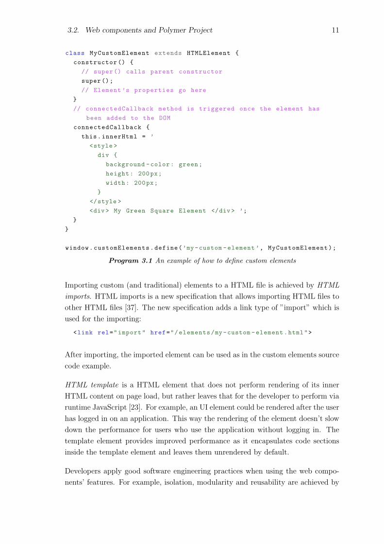
3.2. Web components and Polymer Project 11
class MyCustomElement extends HTMLElement {
constructor () {
// super () calls parent constructor
super ();
// Element ’s properties go here
}
// connectedCallback method is triggered once the element has
been added to the DOM
connectedCallback {
this.innerHtml = ’
<style >
div {
background -color: green;
height: 200px;
width: 200px;
}
</style >
<div > My Green Square Element </div > ’;
}
}
window.customElements.define(’my -custom -element ’, MyCustomElement);
Program 3.1 An example of how to define custom elements
Importing custom (and traditional) elements to a HTML file is achieved by HTML
imports. HTML imports is a new specification that allows importing HTML files to
other HTML files [37]. The new specification adds a link type of ”import” which is
used for the importing:
<link rel="import" href="/elements/my -custom -element.html">
After importing, the imported element can be used as in the custom elements source
code example.
HTML template is a HTML element that does not perform rendering of its inner
HTML content on page load, but rather leaves that for the developer to perform via
runtime JavaScript [23]. For example, an UI element could be rendered after the user
has logged in on an application. This way the rendering of the element doesn’t slow
down the performance for users who use the application without logging in. The
template element provides improved performance as it encapsulates code sections
inside the template element and leaves them unrendered by default.
Developers apply good software engineering practices when using the web compo-
nents’ features. For example, isolation, modularity and reusability are achieved by

3.2. Web components and Polymer Project 12
doing so. The custom elements can be published for others to use via the webcom-
ponents website [39].
Polymer is one of the libraries providing interfaces for creating web components
more easily than with the original web components API interfaces. With Polymer,
custom elements can be created the same way as with traditional web components.
Program 3.2 is an example of creating a custom element with Polymer:
<link rel="import" href=".../ polymer -element.html">
<dom-module id="my-custom -element">
<template >
<div >
<h1> My Blue Header Element </h1 >
</div >
<style >
h1: {color: blue}
</style >
</template >
<script >
class MyCustomElement extends Polymer.Element {
static get is() {return ’my -custom -element ’}
}
customElements.define(MyCustomElement.is , MyCustomElement);
</script >
</dom-module>
Program 3.2 Defining custom elements with Polymer
In addition to the basic custom element’s features, Polymer adds a set of features
to the elements: creates a shadow DOM tree for element instances, automation
for handling element’s properties and attributes, a data system for data binding,
property change observers and computed properties, as well as instance methods for
handling tasks [13]. In the source code example the template tag can be seen in use.
Source code inside those tags will be hidden from users, as it wraps its content with
the shadow DOM. The four web components’ main elements are seen here: HTML
import, HTML template, custom element and shadow DOM.
The web components and the Polymer library are suitable starting points for making
web applications mobile compatible. First of all, the HTML template boosts per-
formance when creating, e.g. Single Page Applications, SPAs, as different views can
be bundled inside the template tag. This helps by improving the page loading time
as the whole application content doesn’t have to be loaded at once. While modern
mobile networks offer high speed Internet access, it is still a great fault in the user
3.2. Web components and Polymer Project 13
experience if the application has long loading times. The custom elements approach
works for both desktop and mobile browsers as the element behaves depending on
the user agent’s screen size. Even different elements could be used for different de-
vices as there are already many custom elements published on the webcomponents
website [39].
Polymer has a good browser support. For those browsers, that don’t yet support
web components, Polymer uses polyfills to provide the support. Polyfill is a piece
of code that implements the unsupported feature in a supported way for a given
browser. Polymer’s browser support listed on the official Polymer website can be
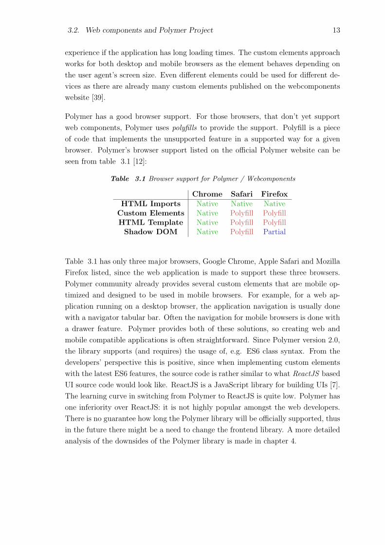
seen from table 3.1 [12]:
Table 3.1 Browser support for Polymer / Webcomponents
Chrome Safari FirefoxHTML Imports Native Native Native
Custom Elements Native Polyfill PolyfillHTML Template Native Polyfill Polyfill
Shadow DOM Native Polyfill Partial
Table 3.1 has only three major browsers, Google Chrome, Apple Safari and Mozilla
Firefox listed, since the web application is made to support these three browsers.
Polymer community already provides several custom elements that are mobile op-
timized and designed to be used in mobile browsers. For example, for a web ap-
plication running on a desktop browser, the application navigation is usually done
with a navigator tabular bar. Often the navigation for mobile browsers is done with
a drawer feature. Polymer provides both of these solutions, so creating web and
mobile compatible applications is often straightforward. Since Polymer version 2.0,
the library supports (and requires) the usage of, e.g. ES6 class syntax. From the
developers’ perspective this is positive, since when implementing custom elements
with the latest ES6 features, the source code is rather similar to what ReactJS based
UI source code would look like. ReactJS is a JavaScript library for building UIs [7].
The learning curve in switching from Polymer to ReactJS is quite low. Polymer has
one inferiority over ReactJS: it is not highly popular amongst the web developers.
There is no guarantee how long the Polymer library will be officially supported, thus
in the future there might be a need to change the frontend library. A more detailed
analysis of the downsides of the Polymer library is made in chapter 4.
3.3. Native applications 14
3.3 Native applications
The native iOS and Android mobile applications were originally designed to provide
a way to display, share and analyze the measurements measured with the type
Y movable device. Later on as the web application was introduced, the native
applications became sort of a proxy service between the type Y device and the
backend API, since the type Y didn’t support direct upload via WiFi network.
From the three devices, the type Y needs to have the native application if data is to
be sent to the web application. Type X can use the native application but it isn’t
mandatory as it supports direct connection via WiFi network. The type Z device
doesn’t use the native applications at all. This was illustrated already in figure 3.1.
The movable devices pair up with the native applications via local pairing. When
the local connection has been made between the device and the application, the
application will list all the measurements the device has measured. Multiple devices
can be paired with the application, but there can be only one device connected at a
time. If the user would have two different movable devices, it wouldn’t be possible
to compare the measurements of the two devices with the native applications. This
comparison of measurements can be done with the web application. The native
applications provide a functionality to add images to measurements, which can be
also done with the type X and Y devices themselves. The native applications also
synchronize images with the backend API. All images shown in the native application
will also be shown in the web application. The native applications work both on
iOS / Android smartphones and tablets.
The type Y device will start to support direct upload to the backend API via WiFi
network in the coming software releases. It will also start to send the measurement
data in the same file format as the type X and Z devices, which further unifies the
architecture. There will be a transition period, when support is required for both
the old and the new measurement file formats send from the type Y devices. During
that time the native applications are obligatory. This transition period will take as
long as there are type Y devices with the old software version on the field. Some
of the devices might have specific calibration settings that prevent updating the
software version. The number of devices with the old software can be monitored,
and when it reaches a certain low threshold, the support for cloud upload via the
native applications can be ended. The threshold can be determined by calculating
how much is the maintenance costs of the native applications’ versus how many
old devices there are on the field, and how much resources it takes to update those
devices to new ones. Then one possibility would be to rely on a mobile optimized web
application instead of the native applications. At this point it is hard to speculate
3.3. Native applications 15
what would be the optimal solution for this case. Resource vice it seems that
’web application only’ solution would be the cheapest option. There are also other
aspects that have to be kept in mind, for example that many of the end users don’t
necessarily have access for reliable Internet connection, which is the cornerstone for
the web application usage.

16
4. OPTIONS FOR THE SOLUTION
In this chapter the possible solutions for developing the applications are researched.
The solution should fit for the user needs explained in chapter 2. The original goal
of this thesis is to optimize the existing web application for mobile use, but it is
important to analyze different possible solutions for developing the applications.
This will ensure that the best solution is implemented and other solutions are left
out intentionally and after consideration. A thorough analysis of different solutions
at this point will strengthen and justify the position of the chosen solution. This
analysis will also be helpful in the future, when questions and new needs for the
application arise.
Continuing with the current solution is one option and it is evaluated first in this
chapter. Next are web application mobile optimization solutions and then other
mobile solutions. In the end of this chapter will be a cost estimation of the solutions
and finally a resolution is made between the solutions presented here.
4.1 Continue with the current solution
Currently there is the existing web application and two native applications that
integrate with the measurement devices and provide analysis of the measurement
results. The native applications are needed as long as there are type Y devices on the
field with the old software version. Furthermore, there are many users that currently
don’t have access to the cloud service. Reasons for this are, for example, that the
users work only on remote locations or that their work doesn’t include computers.
For these users, the native applications are of great value. One big advantage of
the native applications is that the user doesn’t need to have an Internet connection
when connecting the device to the application as it uses local connectivity. In many
developing countries and distant locations away from cities the Internet networks
might not be fast or reliable enough to provide continuous connectivity with a web
application. This is a valid reason for using the native applications over the web
application. However, the Internet networks develop continuously and there are
even global movements for providing Internet connection for everyone on the planet,

4.2. Mobile optimization solutions 17
so this reasoning might soon become outdated. The guideline is that all future
devices will connect to the API backend directly. The sought solution will not
take into account that the older devices need the native application support while
communicating with the API. As the two native applications already communicate
with the hand-held devices, they could also be further developed to support the new
type Z device, and possible future devices.
It is important to include the web application in the overall solution as it provides
access to the measurement data for all the measurement devices. Currently, and
likely also in the future, there are use cases where a detailed view of the measurement
data is needed. One such case is when the user needs to analyze the measurement’s
energy spectrum. This is both hard to accomplish and unpractical to use with mobile
devices. One possibility for future features could be to provide more data analytical
tools for the users and add machine learning properties to help with the analytics.
More sophisticated analytical tools often require larger displays for a pleasant UX.
4.2 Mobile optimization solutions
Mobile optimization describes the process of turning a website or a web application
into a version where the user experience is optimized for mobile. In the follow-
ing subsections two approaches, that provide mobile optimization, are described:
Progressive Web Application, PWA, and Accelerated Mobile Pages, AMP.
4.2.1 Progressive Web Application
Progressive Web Application is a web application that is progressive, i.e. it pro-
gressively enhances the user experience starting from when the user enters the web
application for the first time. The term progressive web application was first intro-
duced by Google Chrome engineer Alex Russell on his article, in which he described
web applications that take advantage of the latest browser features, e.g. Service
Workers, that make applications progressive and make them feel like native (mobile)
applications [33]. Progressive enhancement aims to provide the best possible expe-
rience for the user regardless of the device. This progressive property is achieved via
helper JavaScript scripts and specification files. A more thorough review of PWAs
and their features is made in chapter 5. A PWA aims to have a great user experience
with every possible device. For example, the UX has to be pleasant with mobile,
tablet and desktop devices. In addition to this, the UX progressively changes based
on the browser and operating system the application is run on. This means having
4.2. Mobile optimization solutions 18
responsive UIs that adapt to different screen sizes and resolutions, accompanied by
easily utilized UI elements, e.g. large buttons and navigation solutions. The respon-
sive UI of a PWA is achieved via responsive web design. PWAs aim to seize the
features provided by the modern web browsers accompanied by a mobile experience.
PWAs are required to perform well even on 3G mobile networks. This is achieved
via caching application assets with a service worker and by making sure the assets
themselves are minified and compressed. The UI of a PWA is often built based on an
application shell architecture. This provides an enhanced UX as the application shell
can be cached and presented to the user in offline mode. PWAs also provide app-
likeness by allowing the user to install them on the mobile device’s home screen. The
PWA can then be opened from the mobile device like any other mobile application.
The PWA is run on the device’s browser, although the browser’s navigation elements
are often hidden for a cleaner UI.
4.2.2 Accelerated Mobile Pages
Accelerated Mobile Pages, AMP, is a performance optimized HTML and JavaScript
framework for delivering web page content quickly [30]. AMP technology was first
introduced by Google and it is currently open-sourced. AMP is similar to Facebook’s
Instant Articles -framework [2]. The ’Instant Articles’ -format works so that when
the users click a Facebook link, instead of loading the whole website, e.g. a news
article, the Facebook app loads the stripped Instant Article instead, and does it
essentially faster. AMP works in a similar fashion. AMP was originally designed
for the purpose of quickly loading static pages. It is used for example on Google
search to show short previews of the search results or for displaying page ads. As
the name suggests, AMP thrives to provide lightning fast web content. AMP was
originally created mainly for static content, but it is moving towards serving rich
and interactive web applications. AMP consists of three main components: AMP-
HTML, AMP-JS and AMP Cache.
AMP-HTML is a HTML5 based markup language that extends and restricts the
usage of HTML tags, so that high performance tags are favored and low performance
tags restricted. It also includes additional custom elements that make loading a
page faster. Since AMP-HTML is a HTML5 based framework, it doesn’t need any
additional libraries to work, which means it can be used in any browser supporting
HTML5.
AMP-JS is a JavaScript library providing a runtime environment for AMP content.
AMP-JS converts the custom AMP-HTML elements to native HTML and calculates

4.3. Other mobile solutions 19
the page size based on a known HTML element.
AMP-Cache, or AMP-CDN, is a content delivery network that caches files for fast
delivery. It does various optimization tasks including inlining CSS sources, resizing
images to fit the device viewport, minimizing HTML and CSS sources and pre-
rendering the page on background for quicker page loading.
4.3 Other mobile solutions
Even though the original plan is to optimize the web application for mobile use, it
is important to research solutions that are aimed for creating mobile applications.
If the web application is left unoptimized, then one possible solution would be to
replace the two native applications with a solution, that would be cheaper and
easier to maintain. There might also be mobile solutions available that would create
synergy with the current web application.
4.3.1 Hybrid applications
Hybrid applications are native mobile applications that host a web application ar-
chitecture on top of the platform’s WebView [35]. The WebView is like a fullscreen
browser window. Hybrid applications combine features from both native applica-
tions and web applications. They can, e.g. be published in application stores as
they look and appear like native applications for the users. Hybrid applications can
be developed using modern web technologies, e.g. HTML5, CSS3 (Cascading Style
Sheets) and modern JavaScript frameworks, thus making it easier to find developers
than for genuine native applications. Hybrid applications are by default heavier to
run compared to native applications, because of the implementation on top of the
WebView. With hybrid applications, many hardware features can be accessed the
same as with native applications, but there might be some restrictions depending
on the used framework. For example, using HTML input tag with the new HTML5
media capture property, the devices camera and microphone can be accessed [38].
The same features can naturally be used in a regular web application.
With hybrid applications, the source code can be shared between applications of dif-
ferent platforms’. Some native implementation is always needed, including the work
of publishing the application to application stores. Because all the UI functionalities
are developed using modern web technologies, the common code base can consist
of a major part of the application. The same code base could also be shared with
4.4. Cost estimation 20
the web application. This would help in creating a more consistent user experience
between different devices.
4.3.2 React Native
React Native can be used to write actual native mobile applications with JavaScript
and ReactJS [8]. With React Native the end result is not a mobile web application,
like with PWA, nor a HTML5 mobile compatible application nor a hybrid appli-
cation. It is a genuine native application that is built using the same elements as
regular native applications [8]. React Native and similar libraries differ essentially
from hybrid applications as their end result is a native mobile application with all
the same hardware support that a genuine native application would have. As hybrid
applications are basically web applications run on WebView, they are in that sense
closer to PWAs than React Native applications.
Currently React Native supports creating mobile applications both for iOS and
Android operating systems [9]. With React Native, the application is written only
once: the same application source compiles both to an iOS native application and
to an Android application. This is similar to the cross platform feature of hybrid
applications. Because of this cross platform feature, a React Native application is
also far cheaper to develop than creating individual applications for both operating
systems. There might be some platform specific implementation that needs to be
done with React Native, but the combined effort is still less than with individual
applications.
The source code between a ReactJS web application and a React Native mobile
application can be shared to a large extend. For example, they would both use the
same API backend for resource fetching; those functionalities could be reused almost
in entirety. The UI elements would still be different because the mobile UI would
need more specific elements as they are converted to their native counterparts. If
the web application were to be reimplemented using ReactJS, then creating a React
Native application would offer synergy benefits due to shareable code written with
the same UI library.
4.4 Cost estimation
In this section a cost estimation between the possible solutions is made. As monetary
reasons always have a major impact on software projects, they have to be taken into
consideration. Not only is it important to think about what are the present costs,

4.4. Cost estimation 21
but also what kind of costs the software will build up in the future. It is also
important to evaluate the indirect costs of different solutions.
Continuing with the current applications without any optimization work would be
the cheapest solution for the time being. However, this solution might be the most
expensive one to maintain in the long run. Three different applications with unique
code bases accumulate large maintenance costs. Especially further developing and
maintaining the two native applications would create large costs, as native applica-
tions are expensive to develop compared to web applications. There are also indirect
costs that can occur if no action is taken towards a new solution. The costs could
rise from lost business opportunities if a rival company invests resources for a similar
contributory software and due to it, would achieve a larger sector of the business.
Valid reasons for continuing with the current applications would be monetary or
schedule reasons.
The PWA features would take approximately two months to implement and test
altogether. The optimization work would be done using the existing web application
lowering the costs from that part. AMP features would take roughly the same
amount of time to implement as the PWA features. PWA might be cheaper than
AMP in the long run as it would offer a more comprehensive mobile solution that
could replace the native applications.
One argument against the PWA and AMP solutions would be that the Polymer
frontend might need a large refactoring at some point and this will be costly. Refac-
toring can come into question if the code base becomes too hard to maintain due
to features added along the way. Another possible reason for refactoring the whole
code base is if the Polymer library isn’t officially supported and maintained anymore.
This can happen if the library becomes too unpopular. The initial release of Polymer
version 1.0 was on May 2015 [14]. After a while, Polymer’s popularity started to
drop and it never rose to a higher level. The peak on Polymers (worldwide) interest
right after the initial release can been seen in figure 4.1.

4.4. Cost estimation 22
Figure 4.1 Polymer library popularity indicated by the Google search trends
Since Polymer’s road to success has been this tough, it might stay a marginal fron-
tend library. In the current market situation, there is a continuous demand for
software developers and this market situation favors the developers. The developers
can in many cases determine their working conditions and look for the most inter-
esting projects. The current trend in frontend web development is that a couple
of frontend libraries or frameworks rule the scene. For example ReactJS, Vue.js
and AngularJS are currently widely used and a big part of new applications are
developed with one of these. As an example, many frontend developers might know
ReactJS, thus they might also prefer using it over other libraries or frameworks
because of its familiarity.
In figure 4.2 we can see an illustration of the massive popularity of ReactJS com-
pared to Polymer. The graph also shows how the trend of a successful (ReactJS)
frontend library grows steadily over time.
Figure 4.2 Polymer library popularity compared to ReactJS by Google Trends

4.5. Resolution 23
For a software developer it is important to understand where the trends are going.
It is a lot easier and cheaper to hire a frontend developer to develop a ReactJS
application than to find a developer for a Polymer based application. In the long run
it’s cheaper to maintain and develop an application that is written with a popular
library. This is one aspect that adds to the costs of creating web applications
compared to native applications: with native applications, the libraries are not that
likely to evolve so quickly to a point, where an overall technology stack change is
needed. This has to be taken into consideration when deciding whether to choose
the web application and enhance its mobile compatibility or further develop the
native applications. At some point of their life cycle web applications typically need
a full or partial refactoring. This situation can be a good time for evaluating the
used frameworks and libraries, and possibly update to a more modern technology
stack.
A hybrid application could use the existing web application’s UI code base to some
extend making it cheaper than creating an application from scratch. If it could also
replace the two native applications, then it would be a reasonable choice cost vice.
A React Native application would have to be developed from scratch. This would be
expensive and difficult, since the existing application code base can not be reused.
On the other hand, a React Native application would be cheaper in the long run
compared to two native applications. If the web application’s UI framework were
to be changed to ReactJS at some point, then the React Native solution would also
provide synergy between the web and mobile applications.
Taking into account the projects current state and schedule, it wouldn’t be bene-
ficial to completely rewrite any of the applications at this point. Current solution
is the cheapest in the present situation, but it might be expensive in the long run.
PWA and AMP would be the cheapest solutions when thinking about the additional
implementation costs. Hybrid and React Native solutions would have large imme-
diate costs, but they could bring savings in the future. The PWA solution could be
cheapest in the long run, assuming it would lower the resources put into the two
native applications.
4.5 Resolution
Table 4.1 presents a summary of the cost, difficulty and suitability of each solution
presented in this chapter. Cost refers to costs of the solution, both now and in the
long run. Difficulty refers to how difficult the implementation work is, e.g. the inte-
gration to the current architecture. Suitability describes how the solution matches
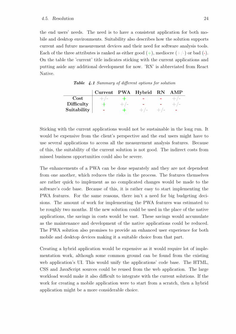
4.5. Resolution 24
the end users’ needs. The need is to have a consistent application for both mo-
bile and desktop environments. Suitability also describes how the solution supports
current and future measurement devices and their need for software analysis tools.
Each of the three attributes is ranked as either good (+), mediocre (+/-) or bad (-).
On the table the ’current’ title indicates sticking with the current applications and
putting aside any additional development for now. ’RN’ is abbreviated from React
Native.
Table 4.1 Summary of different options for solution
Current PWA Hybrid RN AMPCost +/- + - - +/-
Difficulty + +/- - - +/-Suitability - + +/- +/- -
Sticking with the current applications would not be sustainable in the long run. It
would be expensive from the client’s perspective and the end users might have to
use several applications to access all the measurement analysis features. Because
of this, the suitability of the current solution is not good. The indirect costs from
missed business opportunities could also be severe.
The enhancements of a PWA can be done separately and they are not dependent
from one another, which reduces the risks in the process. The features themselves
are rather quick to implement as no complicated changes would be made to the
software’s code base. Because of this, it is rather easy to start implementing the
PWA features. For the same reasons, there isn’t a need for big budgeting deci-
sions. The amount of work for implementing the PWA features was estimated to
be roughly two months. If the new solution could be used in the place of the native
applications, the savings in costs would be vast. These savings would accumulate
as the maintenance and development of the native applications could be reduced.
The PWA solution also promises to provide an enhanced user experience for both
mobile and desktop devices making it a suitable choice from that part.
Creating a hybrid application would be expensive as it would require lot of imple-
mentation work, although some common ground can be found from the existing
web application’s UI. This would unify the applications’ code base. The HTML,
CSS and JavaScript sources could be reused from the web application. The large
workload would make it also difficult to integrate with the current solutions. If the
work for creating a mobile application were to start from a scratch, then a hybrid
application might be a more considerable choice.
4.5. Resolution 25
Creating a mobile application with React Native would also be expensive at this
point as it would have to be implemented from scratch. It would also have a big
workload making it difficult from that part. If at some point the web application’s
UI library is changed to ReactJS, it might come into question to replace the current
native applications with a React Native cross platform application.
The AMP solution is similar to the PWA regarding cost and ease of implementa-
tion. The AMP-HTML feature can be used to improve the loading times of the
web application. The application has a large DOM structure, thus optimizing the
HTML tags would bring performance benefits. AMP-Cache would further boost the
performance due to its file caching and source file compressions. AMP architecture
is also beneficial, because its features can be implemented one by one. However, at
the moment the PWA approach gets vastly more support and attention from the
software developing field. This needs to be taken into consideration as going after a
dying technology is one common mistake developers have to avoid these days. The
PWA approach seems to provide a more comprehensive mobile experience compared
to the AMP. The AMP solution might not be able to reduce the amount of devel-
opment and maintenance work done for the native applications, thus the possible
savings in costs and its overall suitability are questionable. The benefits of AMP
listed on the official site make its purpose seem like making user engagement as
addictive as possible for monetary reasons [15]. For a content heavy dynamic web
application, AMP could provide performance enhancements, but it wouldn’t solve
the problem of creating a comprehensive mobile experience.
According to this resolution, the PWA solution stands out as the best solution for
this case. Changing the current web application into a progressive web applica-
tion would require making the application’s UI responsive, implementing a service
worker and a few additional architectural changes, like creating an application shell
structure. A major benefit in creating a PWA from an existing application is that
the process itself is progressive. For example by first implementing a new responsive
UI, the user experience will improve immediately on mobile devices. After that a
service worker can be implemented for offline support and for faster loading times.
This would improve the UX on all different devices that support the service worker.
The application is progressively enhanced to work better for different devices.
PWA features are implemented and their suitability for this case is evaluated. After
a few years, a new review of the software architecture should take place, in which
all the softwares are again put under research. Then it should be validated which
of the applications are still supported, and which are to be deprecated.
26
5. PROGRESSIVE WEB APPLICATION
A progressive web application, a PWA, is a web application, that progressively
enhances the user experience. The purpose of a PWA is to bring value to the
end users by making the web application more engaging, resilient and faster in
performance. A PWA is at least, but not limited to the following things [18]:
• Responsive
• Interactive with a feel like a native app’s
• Connectivity-independent
• Always up-to-date
• Safe
• Discoverable
• Installable
• Linkable
• Re-engageable
The term ’progressive web application’ itself is new so there isn’t an exact definition
for it. Nevertheless, the topics listed above can be used as a guideline and checklist
for creating a PWA. In the following sections different PWA features are introduced
that correspond to these topics.
5.1 Responsive, interactive
When a traditional website created for desktop use is opened with a mobile device,
the device will try to fit the page’s content on the smaller mobile screen. This will
result in all the images, text and other elements to be scaled down as much as

5.1. Responsive, interactive 27
needed to be fit on the small screen. The page is essentially zoomed out leading
to unreadable text and unusable UI elements. The solution for this problem is to
create a responsive design for the website or web application. Nowadays there are
a number of technologies that help developers achieve responsive design. The trend
for creating responsive design has thrived since owning a smartphone has become
the new norm in the developed countries. There is a term for this kind of design
method: Responsive Web Design, RWD. Responsive web design is a way to design
websites or web applications so that the design responds to the user’s device, to the
device’s viewport size and to the platform the device operates on. The purpose is to
provide attractive UX for any screen resolution. The responsive design is achieved
mainly via three primary concepts: Grid layout, Responsive media, Media queries.
Grid layout means, that the layout is arranged based on a grid, that is responsive
and breaks down in a predictable way for different screen sizes. The content of the
grids can then be adjusted by size and position to fit the device’s screen. The end
result is a responsive UI layout. With responsive media for example images are
scaled so that they fit the on device’s screen and they don’t overflow out of the
screen. Usually this is achieved by determining the image size as a percentage of
the device’s viewport size. Media queries is a CSS3 feature which allows developers
to define how styles are applied for a given media query. Next we will go through
how the media queries work and how the fluid grids can be achieved.
With the CSS media queries it’s possible to apply different CSS styles for different
browser viewport sizes [24]. When creating custom styles for different devices, it
is important to base those styles on the device’s viewport size rather than on the
physical size of the device’s screen. The viewport is the rectangular area that is being
viewed with the user agent [19]. When using the device’s screen size, all physical
screen sizes available on the market should more or less be taken into account.
With the viewport size, it is possible to create CSS styles that match a certain sized
viewport. All devices that fit under that specification will use the custom size. With
the media queries, it is possible to target a specific media type, e.g. a screen or a
printer. For example in this case the media type ’all’ could be used, which targets
all possible devices. There are also media features that can be used, for example a
definition for device ranges like the ’min-width’ feature. Another commonly used
feature is the ’orientation’ which is often used to specify styles for mobile landscape
and portrait use. Media queries and features can be combined into a combined rule:
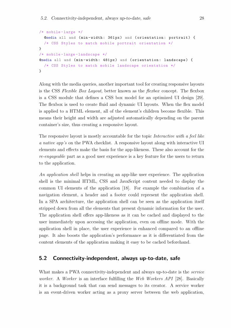
5.2. Connectivity-independent, always up-to-date, safe 28
/* mobile -large */
@media all and (min -width: 361px) and (orientation: portrait) {
/* CSS Styles to match mobile portrait orientation */
}
/* mobile -large -landscape */
@media all and (min -width: 481px) and (orientation: landscape) {
/* CSS Styles to match mobile landscape orientation */
}
Along with the media queries, another important tool for creating responsive layouts
is the CSS Flexible Box Layout, better known as the flexbox concept. The flexbox
is a CSS module that defines a CSS box model for an optimized UI design [29].
The flexbox is used to create fluid and dynamic UI layouts. When the flex model
is applied to a HTML element, all of the element’s children become flexible. This
means their height and width are adjusted automatically depending on the parent
container’s size, thus creating a responsive layout.
The responsive layout is mostly accountable for the topic Interactive with a feel like
a native app’s on the PWA checklist. A responsive layout along with interactive UI
elements and effects make the basis for the app-likeness. These also account for the
re-engageable part as a good user experience is a key feature for the users to return
to the application.
An application shell helps in creating an app-like user experience. The application
shell is the minimal HTML, CSS and JavaScript content needed to display the
common UI elements of the application [18]. For example the combination of a
navigation element, a header and a footer could represent the application shell.
In a SPA architecture, the application shell can be seen as the application itself
stripped down from all the elements that present dynamic information for the user.
The application shell offers app-likeness as it can be cached and displayed to the
user immediately upon accessing the application, even on offline mode. With the
application shell in place, the user experience is enhanced compared to an offline
page. It also boosts the application’s performance as it is differentiated from the
content elements of the application making it easy to be cached beforehand.
5.2 Connectivity-independent, always up-to-date, safe
What makes a PWA connectivity-independent and always up-to-date is the service
worker. A Worker is an interface fulfilling the Web Workers API [28]. Basically
it is a background task that can send messages to its creator. A service worker
is an event-driven worker acting as a proxy server between the web application,

5.2. Connectivity-independent, always up-to-date, safe 29
browser and the network [25]. One of its main tasks is to create offline support for
a web application. The service worker is accountable for the PWA checklist part
connectivity-independent. The developer creating a PWA can choose to selectively
cache relevant parts of the web application for offline support. For example in a news
article application it is possible to load recent news to cache when the device has
Internet access. This guarantees that the application is also always up-to-date. The
service worker accepts network requests and performs tasks based on the network
availability. It is required for push notifications to work and for background sync
APIs, which take care of sending user actions across the network. If the browser
doesn’t support service workers, the website or web application will fall back to
function as if there wasn’t a service worker present. This is another good example
of where the term progressive enhancement derives from.
Service workers run on their own global script context. They are not tied to a
certain web application so they are reusable for another application if they use
the same assets. The assets are stored in and served by the worker based on the
HTTP (Hypertext Transfer Protocol) request URLs (Uniform Resource Locator).
The service workers don’t have access to modify the elements of the web page as
they don’t have DOM access. Instead, they are event-driven so the developer has
to pick and choose which events are served by the worker [18].
A service worker can be seen as a proxy between the browser’s execution thread and
the server serving the web application through the network. In figure 5.1 the role
of the service worker is illustrated on a large scale.
Figure 5.1 Role of the service worker as a proxy passing information with the browser,cache and network
The service worker runs on its own global script context called the ServiceWorker-

5.2. Connectivity-independent, always up-to-date, safe 30
GlobalScope [26]. It will not block the browser’s thread execution, but instead it
runs the scripts asynchronously in a separate thread. This has a side effect that syn-
chronous resources can not be accessed, like XMLHttpRequest or the browser’s lo-
calStorage [18] with the service worker. XML is abbreviated from Extensible Markup
Language. When the user first enters an URL to a browser, the browser downloads,
parses and executes the service worker. If the service worker installation succeeds,
it is ready to run tasks on its own scope and it starts to serve the cached assets.
After the installation phase the service worker listens for predefined events and acts
accordingly. One common event to listen for is the fetch event, to which the service
worker can reply by serving a precached asset or forward the fetch request to the
server. The location of the worker file in the project tree also has an effect on the
service worker: if the source file is in the root of the project, the worker’s scope will
be the whole origin. The service worker will not execute anything on the initial page
load but only after the installation process. Thus the user has to refresh the page
or navigate to another page for the service worker to perform tasks [18].
Before the service worker can be used, it has to be registered. Program 5.1 shows
an example of how to insert a service worker to the HTML source with script tags.
After registration, the service worker scripts are executed from the source file. This
is in Program 5.1 referred to as ’service-worker.js’.
<html >
<head >
...
</head >
<body >
<script >
// Register SW
if(’serviceWorker ’ in navigator) {
navigator.serviceWorker.register(’/service -worker.js’)
.then(registration => {
// Registration successful; SW scripts can be run
}).catch(err => {
// Registration failed; ignore SW scripts
})
}
</script >
</body >
</html >
Program 5.1 Adding a service worker to a web application
One feature of PWAs is that they are always served via a secure HTTPS, Hypertext
Transfer Protocol Secure, protocol. This requirement comes into practice with the
5.3. Discoverable, installable, linkable, re-engageable 31
service workers as they are required to run under HTTPS. It is for example possible
to hijack a user session with the service worker. This guarantees that PWAs are safe
from that part. Nowadays it is more of an exception to use plain HTTP protocol
instead of HTTPS in enterprise web applications.
The service worker is not the first solution to provide offline support and faster
web application loading times. The Application Cache, or AppCache, interface is
the predecessor of service workers. AppCache interface is used in a similar fashion
as service workers. AppCache caches resources for offline use. Service workers are
favored in the future as the AppCache will be deprecated from use.
5.3 Discoverable, installable, linkable, re-engageable
An application manifest is what makes a PWA installable and discoverable. The
application manifest is a file that provides the possibility for adding a website or web
application on the device’s home screen ergo providing both for the installable and
also for the re-engageable parts of the PWA checklist. Its main function is to provide
generic information, a set of icons and color themes for the application when it is
installed on the device. The file is a JSON, JavaScript Object Notation, text file that
provides declarative information about the application [27]. This information can be
for example the name, author and description of the application, or information on
what kind of an icon to use when added to the device’s home screen. The manifest
aims to provide the same kind of information as provided for a native application
when publishing it to an application store.
Program 5.2 represents the basic structure of a manifest source file:
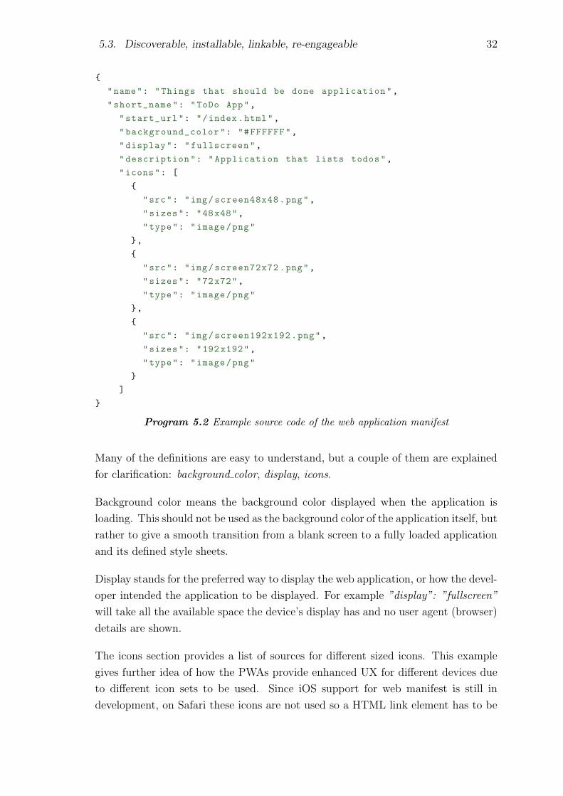
5.3. Discoverable, installable, linkable, re-engageable 32
{
"name": "Things that should be done application",
"short_name": "ToDo App",
"start_url": "/index.html",
"background_color": "#FFFFFF",
"display": "fullscreen",
"description": "Application that lists todos",
"icons": [
{
"src": "img/screen48x48.png",
"sizes": "48x48",
"type": "image/png"
},
{
"src": "img/screen72x72.png",
"sizes": "72x72",
"type": "image/png"
},
{
"src": "img/screen192x192.png",
"sizes": "192 x192",
"type": "image/png"
}
]
}
Program 5.2 Example source code of the web application manifest
Many of the definitions are easy to understand, but a couple of them are explained
for clarification: background color, display, icons.
Background color means the background color displayed when the application is
loading. This should not be used as the background color of the application itself, but
rather to give a smooth transition from a blank screen to a fully loaded application
and its defined style sheets.
Display stands for the preferred way to display the web application, or how the devel-
oper intended the application to be displayed. For example ”display”: ”fullscreen”
will take all the available space the device’s display has and no user agent (browser)
details are shown.
The icons section provides a list of sources for different sized icons. This example
gives further idea of how the PWAs provide enhanced UX for different devices due
to different icon sets to be used. Since iOS support for web manifest is still in
development, on Safari these icons are not used so a HTML link element has to be

5.3. Discoverable, installable, linkable, re-engageable 33
provided with relation apple-touch-icon and a source for an icon to use with the
application.
For the PWA to be able to prompt the user to add the application to the device’s
home screen, the following conditions have to be met [18]:
• Manifest.json is available
• Manifest file has a start URL defined for the application
• An icon of size 144x144 pixels is available and referenced on the manifest
• Site must use a service worker running over HTTPS
• The user has visited the web site at least twice before, and the interval of those
visits has to be more than 5 minutes
The first four are more self-evident, but the last one might need an explanation: if the
application would on the first visit prompt the user to add itself on the home screen,
it would give an intrusive expression. The five minutes interval is to guarantee that
the second visit for the page is intentional. The prompting for adding the app
to home screen can be altogether disabled by a simple JavaScript code snipped.
For some applications it might not make sense to install it on the home screen.
Sometimes it is hard to determine whether the users find the prompting useful or
irritating. The user behavior can be analyzed by adding a code snipped that listens
for the install prompt -event and sends analytics data based on the action.
Another PWA feature that adds for the re-engageable part of the checklist is the
application splash screen. The splash screen is a temporary screen that is displayed
when the user opens up the application from the home screen icon. The splash
screen is shown while the browser renders the first frame of the document [18]. The
idea of a splash screen is to improve the perceived loading time of the application.
The application loads already while the splash screen is shown. It also creates an
app-like feeling and can provide important design elements for the application.
Currently only Chrome fully supports application manifest. For the iOS and Win-
dows mobile devices the manifest properties have to be declared in the old way.
For example, to allow Safari to add an application on the device’s home screen,
individual meta tags would be declared to define the application’s properties [1]:
<meta name="apple -mobile -web -app -capable" content="yes">
<meta name="apple -mobile -web -app -title" content="ToDo App">
<link rel="apple -touch -icon" href="img/apple -icon.png">

5.4. Browser Support 34
For Windows platform similar kinds of tags are needed:
<meta name="msapplication -TileImage" content="img/win -icon.png"/>
<meta name="msapplication -TileColor" content="#FF8855"/>
As the support for manifest file is growing, hopefully only one universal file that
defines the application information for all different platforms is needed. The manifest
file can be added to an application via HTML link element:
<link rel="manifest" href="/manifest.json">
One powerful feature that has emerged to make web applications even more engaging
is the Push API. The Push API provides functionalities to send push notifications
to a web application via a push service [31]. The application server can send a
push notification at any time regardless of whether the application or the user agent
(device) is on an active state. Push notifications are commonplace for native ap-
plications; the Push API makes the same feature available for web applications.
Receiving push notifications is something that the user has to opt-in. This means
the web application isn’t permitted to send notifications before the user has agreed
to receive the notifications. Without the opt-in, the feature would make of a great
tool for showing malicious content for users.
What makes a PWA discoverable is that PWAs are traditional websites under all the
features. Because of this, users can search for PWAs with Internet search engines as
they would search for any other website. For the same reason it is self-explanatory
how a PWA is linkable.
When compared a PWA to a native mobile application, in the best case scenario
the user would not perceive whether the application they are using is a PWA or a
native application. Native applications are by nature a superior solution for mobile
platforms. Nevertheless, with the above mentioned features, PWAs will definitely
be able to compete with them.
5.4 Browser Support
The browser support for different PWA features evolve rapidly. In this section we
will have a closer look on which parts of the PWA features are supported by the
major browsers: Google Chrome, Mozilla Firefox, Apple iOS Safari and Microsoft
Edge. Support for Chrome includes both support for Chrome running on iOS or
Android. Firefox support is for Android platform only. A closer look will be taken
at three important PWA features and what is their current browser support: web
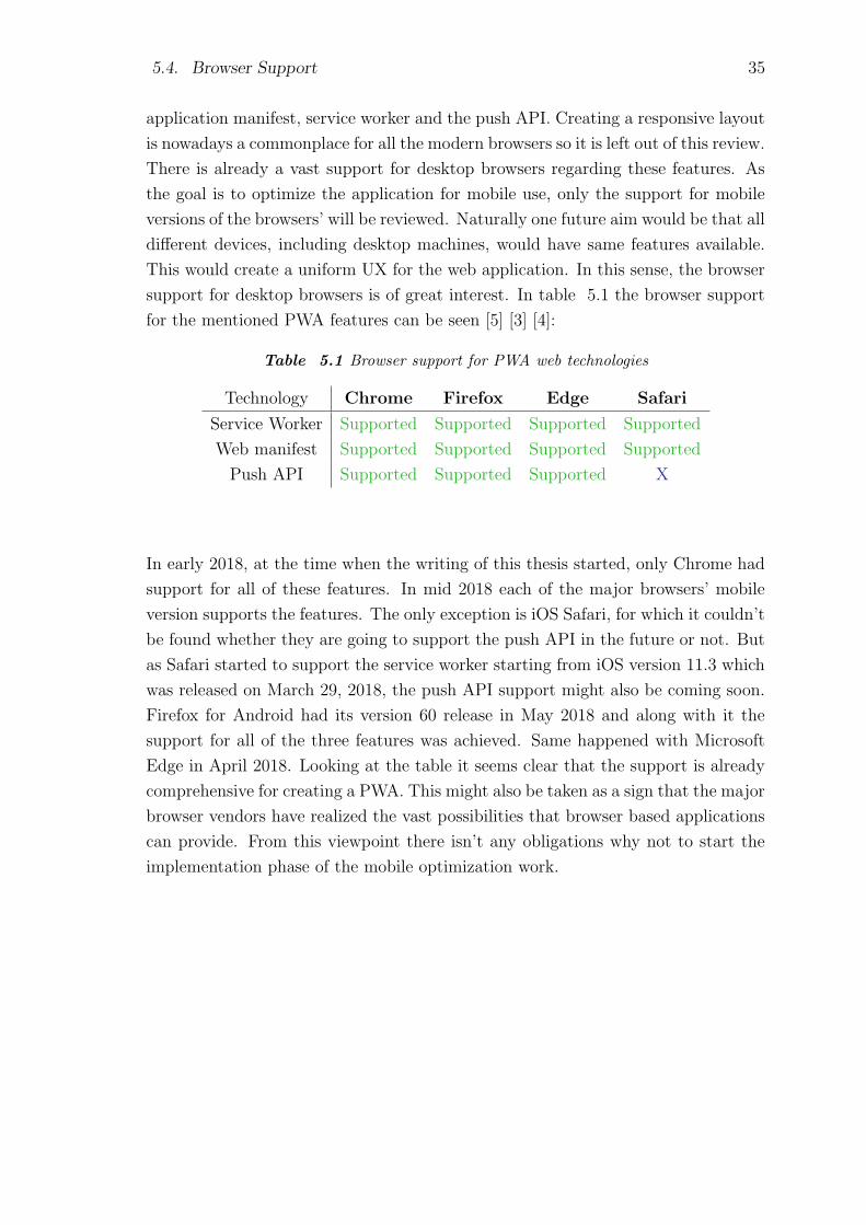
5.4. Browser Support 35
application manifest, service worker and the push API. Creating a responsive layout
is nowadays a commonplace for all the modern browsers so it is left out of this review.
There is already a vast support for desktop browsers regarding these features. As
the goal is to optimize the application for mobile use, only the support for mobile
versions of the browsers’ will be reviewed. Naturally one future aim would be that all
different devices, including desktop machines, would have same features available.
This would create a uniform UX for the web application. In this sense, the browser
support for desktop browsers is of great interest. In table 5.1 the browser support
for the mentioned PWA features can be seen [5] [3] [4]:
Table 5.1 Browser support for PWA web technologies
Technology Chrome Firefox Edge Safari
Service Worker Supported Supported Supported Supported
Web manifest Supported Supported Supported Supported
Push API Supported Supported Supported X
In early 2018, at the time when the writing of this thesis started, only Chrome had
support for all of these features. In mid 2018 each of the major browsers’ mobile
version supports the features. The only exception is iOS Safari, for which it couldn’t
be found whether they are going to support the push API in the future or not. But
as Safari started to support the service worker starting from iOS version 11.3 which
was released on March 29, 2018, the push API support might also be coming soon.
Firefox for Android had its version 60 release in May 2018 and along with it the
support for all of the three features was achieved. Same happened with Microsoft
Edge in April 2018. Looking at the table it seems clear that the support is already
comprehensive for creating a PWA. This might also be taken as a sign that the major
browser vendors have realized the vast possibilities that browser based applications
can provide. From this viewpoint there isn’t any obligations why not to start the
implementation phase of the mobile optimization work.
36
6. IMPLEMENTATION
In this chapter source code examples of the PWA features will be provided along
with explanations of how they were implemented. Ideas and examples can be freely
taken from the source code listings when others are implementing something similar.
Common pitfalls developers might encounter while implementing the PWA features
are mentioned. There are already tools available that can help developers to create
a PWA from an existing web application. Some of them will be introduced along
with examples. These tools evolve rapidly as PWAs become more common. Yet it is
important to know the basics behind the PWAs and how the different technologies
are used. Eventhough it was decided to implement PWA features to optimize the
mobile performance of the existing web application, the goal is not to create a fully
qualified PWA. Those PWA features that are most relevant were chosen and they
are implemented. This way insight will also be obtained whether to implement
additional PWA features later on. In addition, as the PWA implementation is done
in a case study manner, it wouldn’t be beneficial to go full ahead with the PWA
solution since the current goal is to get user validation with quick and cheap changes.
Along with the implementation explanations, insight is provided to validate why the
feature was implemented and how it helps in the validation whether PWA is the right
solution. In the end, the success of this thesis is measured by how well the end users
will perceive the enhanced web application and how much value they will get from
it, but not whether the application scores as a 100% validated PWA in the metrics.
6.1 Service Worker
The service worker was implemented to provide dynamic, customizable and effective
browser caching. Our application should perform well even on low-speed mobile
networks. The service worker adds enormous value for this as it fetches the chosen
assets only once from the server. After the initial load, the service worker will
handle all the future requests when the corresponding cached assets are required by
the browser. The service worker was implemented following the examples of Dean
Alan Hume in his book Progressive Web Apps [18]. Program 6.1 shows examples of
how the service worker was implemented:
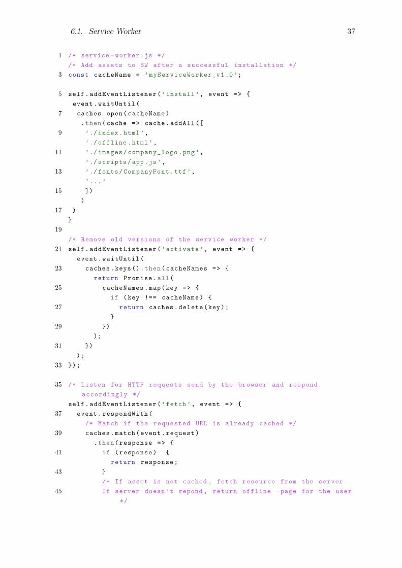
6.1. Service Worker 37
1 /* service -worker.js */
/* Add assets to SW after a successful installation */
3 const cacheName = ’myServiceWorker_v1 .0’;
5 self.addEventListener(’install ’, event => {
event.waitUntil(
7 caches.open(cacheName)
.then(cache => cache.addAll ([
9 ’./index.html’,
’./ offline.html’,
11 ’./ images/company_logo.png’,
’./ scripts/app.js’,
13 ’./fonts/CompanyFont.ttf’,
’...’
15 ])
)
17 )
}
19
/* Remove old versions of the service worker */
21 self.addEventListener(’activate ’, event => {
event.waitUntil(
23 caches.keys().then(cacheNames => {
return Promise.all(
25 cacheNames.map(key => {
if (key !== cacheName) {
27 return caches.delete(key);
}
29 })
);
31 })
);
33 });
35 /* Listen for HTTP requests send by the browser and respond
accordingly */
self.addEventListener(’fetch’, event => {
37 event.respondWith(
/* Match if the requested URL is already cached */
39 caches.match(event.request)
.then(response => {
41 if (response) {
return response;
43 }
/* If asset is not cached , fetch resource from the server
45 If server doesn’t repond , return offline -page for the user
*/

6.1. Service Worker 38
var fetchRequest = event.request.clone();
47 return fetch(fetchRequest).then(res => {
return res;
49 }).catch(err => {
return caches.match(’./ offline.html’);
51 });
})
53 )
});
55
...
Program 6.1 Source code example of the service worker
This code snippet listens for the ’install’ event to be completed before if caches the
specified application assets. Defining what assets to cache is straight forward, but it
has a downside that the service worker is quite easy to be misused, for example by
caching files that shouldn’t be cached. Generally it is a bad practice to cache files
whose content change on runtime. During the service worker installation phase if
any of the specified files fails to download and cache, the service worker will not be
installed. The installation phase is rerun on page refresh if there isn’t a successfully
installed service worker present. For this reason developers have to be careful of
what to include on the worker. Another thing to notice when implementing a service
worker is that it doesn’t reload itself intuitively. The service worker source file has
to be modified after which the web page has to be refreshed for the service worker to
reload and to update the cached assets. There are also developer tools in browsers
that can force installing a new version of the service worker on a page refresh. A
good solution is to debug the service worker on browser’s Incognito mode as it clears
all registrations and caches when the tab or window is closed. Also a good solution
for managing different versions of the service worker is to dynamically provide a new
name for the service worker when its content has changed.
The ’activate’ event seen on line 21 on program 6.1 is important when there is a
need to remove old versions of the service worker. The event handler goes through
all the installed caches and removes those whose name doesn’t match the name
of the current service worker. In the source code listing the file has the name
’myServiceWorker v1.0’. If that name is changed, a new service worker is installed
and all the old ones are stopped, unregistered and removed from use. In the case
where the old service workers are not removed, they will continue to serve assets as
long as something goes wrong with them. It is also possible to add an expiration
time for the worker. Sometimes it might make sense to have multiple different service
workers running for one application, but in this case one worker was sufficient enough
6.2. Responsive web design 39
and easier to maintain.
The ’fetch’ event handler seen on line 36 specifies what kind of strategy is used to
serve the requested assets. Different strategies are, e.g. to serve everything from
the server; to first try to serve assets from service worker, then from the server; to
first try to serve assets from the service worker, then from the server but after that
add the missing asset dynamically to the service worker, and so on. The chosen
approach was to cache the preconfigured assets, always trying to first serve them
from the service worker. If an asset isn’t cached, then fetch it from the server. Also
if the server itself doesn’t respond at all due to network errors etc., then serve an
offline page for the user. As the application shows dynamic content based on the
user’s data, it doesn’t make sense to cache that data. In this kind of situation it is
better to serve static assets that don’t change during runtime.
6.2 Responsive web design
Responsive web design was put into practice to make the UI mobile compatible. Due
to time constraints, one view of the application was chosen and responsive design
was implemented for that. The rest of the application will be made responsive as
the schedules allow and if this case study ends up to be a success. Turning one
view to be mobile compatible was found sufficient as that view consists of the user’s
measurement data and it includes all the main functionalities of the application.
RWD is the cornerstone of a PWA as it is impossible to have a good user experience
with an application that doesn’t show its content properly on the device.
With the use of media queries, specific CSS styles were created for three different
viewport sizes in mind: styles for mobile (smartphones), styles for tablet and styles
for desktop usage. Depending on the size of the device screen, it will fall under
the specification of one of these; under which one, it doesn’t really matter since the
user experience should be optimized in each of them. The implementation was done
with the common rule to use the flexbox concept where ever it seemed to fit well. A
dynamic grid layout was created with the flexbox by creating two-directional flexible
column and row layout.
Program 6.2 illustrates how the list containing different measurements was done
using flexbox:
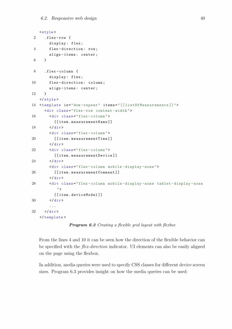
6.2. Responsive web design 40
<style >
2 .flex -row {
display: flex;
4 flex -direction: row;
align -items: center;
6 }
8 .flex -column {
display: flex;
10 flex -direction: column;
align -items: center;
12 }
</style >
14 <template is="dom -repeat" items="[[ listOfMeasurements ]]">
<div class="flex -row content -width">
16 <div class="flex -column">
[[item.measurementName ]]
18 </div >
<div class="flex -column">
20 [[item.measurementTime ]]
</div >
22 <div class="flex -column">
[[item.measurementDevice ]]
24 </div >
<div class="flex -column mobile -display -none">
26 [[item.measurementComment ]]
</div >
28 <div class="flex -column mobile -display -none tablet -display -none
">
[[item.deviceModel ]]
30 </div >
...
32 </div >
</template >
Program 6.2 Creating a flexible grid layout with flexbox
From the lines 4 and 10 it can be seen how the direction of the flexible behavior can
be specified with the flex-direction indicator. UI elements can also be easily aligned
on the page using the flexbox.
In addition, media queries were used to specify CSS classes for different device screen
sizes. Program 6.3 provides insight on how the media queries can be used:

6.2. Responsive web design 41
<style >
@media all and (max -width: 700px) {
.mobile -display -none {
display: none;
}
.content - w i d t h {
width: 95%;
}
}
@media all and (min -width: 700px) and (max -width: 960px) {
.tablet -display -none {
display: none;
}
.content -width {
width: 90%;
}
}
@media all and (min -width: 960px) {
.content -width {
width: 80%;
}
}
</style >
Program 6.3 Adding CSS media queries to specify styles for different viewport sizes
The source code examples seen on program 6.3 are simplified for better readability.
The basic idea was to create media queries to specify styles for the three different
device types: mobile, tablet and desktop. The break points of the media queries
(max-width etc.) were chosen based on how much space the content will typically
take, rather than on actual device screen dimensions. This way the content should
be pleasant to browse with different device sizes. As a summary, the mobile view
has the largest relative content width and smallest amount of actual content, while
desktop view has the smallest relative content width but largest amount of content.
On mobile devices the content is displayed closer to the edges of the screen while on
desktop devices there is additional room for margins.
Along with the media queries and the flexbox, premade Polymer custom elements
were used to enhance the user experience with different devices. The app-drawer
element is a good example of this. The drawer -functionality is widely used on
mobile oriented websites and web applications [32]. The drawer can be opened from
the hamburger icon on the top leftmost corner of the application. The drawer itself

6.2. Responsive web design 42
is used to navigate inside the SPA. In figure 6.1 the header bar with the hamburger
icon can be seen along with the responsive list view:
Figure 6.1 Single page application navigation done via app-drawer -element. The drawerelement can be opened from the hamburger icon located on the navigation bar
Figure 6.2 shows the same view with the drawer element opened up for navigation:

6.2. Responsive web design 43
Figure 6.2 Single page application navigation done via app-drawer -element. The drawerelement is currently opened and the user can navigate to different views from it
The drawer element can be used with all different devices, although it is traditionally
seen to fit better for mobile use. Figure 6.3 shows the same application view on a
tablet device:
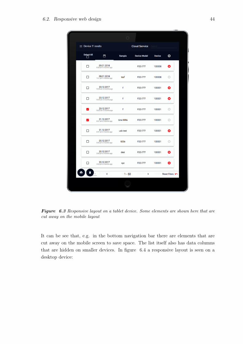
6.2. Responsive web design 44
Figure 6.3 Responsive layout on a tablet device. Some elements are shown here that arecut away on the mobile layout
It can be see that, e.g. in the bottom navigation bar there are elements that are
cut away on the mobile screen to save space. The list itself also has data columns
that are hidden on smaller devices. In figure 6.4 a responsive layout is seen on a
desktop device:
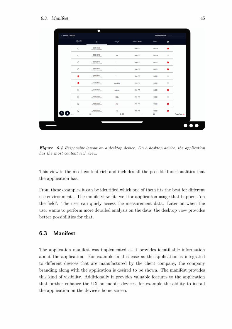
6.3. Manifest 45
Figure 6.4 Responsive layout on a desktop device. On a desktop device, the applicationhas the most content rich view.
This view is the most content rich and includes all the possible functionalities that
the application has.
From these examples it can be identified which one of them fits the best for different
use environments. The mobile view fits well for application usage that happens ’on
the field’. The user can quicly access the measurement data. Later on when the
user wants to perform more detailed analysis on the data, the desktop view provides
better possibilities for that.
6.3 Manifest
The application manifest was implemented as it provides identifiable information
about the application. For example in this case as the application is integrated
to different devices that are manufactured by the client company, the company
branding along with the application is desired to be shown. The manifest provides
this kind of visibility. Additionally it provides valuable features to the application
that further enhance the UX on mobile devices, for example the ability to install
the application on the device’s home screen.

6.4. Application shell architecture 46
The implementation for the application manifest was straightforward. Difficult
scenarios were not encountered during the implementation. The source file man-
ifest.json was written in the format explained in chapter 5 after which it was added
to the application’s entry point index.html via HTML link tag. The presence of a
manifest file can be tested for example by opening the application and trying to
install it on the device’s home screen. The predefined icon should appear on the
home screen and the application should launch properly when opened from the icon.
From this it can be concluded that the manifest file was correctly implemented.
6.4 Application shell architecture
The implementation of the application shell architecture took the longest because
of the large project structure. Even though the responsive layout was made only for
one of the application’s view, the application shell is shown in the background of
every view of the application. As the application is built using the SPA architecture,
the application entry point which includes all the views and elements is rather large.
There is also one large common JavaScript execution file attached to the entry point
document. Both of these take a long time to load and execute. Together they handle
all events and requests passing through the application. Because of this, the initial
loading time of the application was initially long and the implementation of the
application shell was not always straightforward.
The SPA architecture is built using custom made Polymer elements, each of which
is loaded when the user navigates to the appropriate application view. The issue
with the large application entry page was confronted by adding different views of the
SPA dynamically when the user logs in. This way a more lightweight landing page
was achieved thus decreasing the time of the page’s first paint. Since the application
requires user authentication on startup, the application shell isn’t visible when the
application is first entered, but rather a login window is shown for the user. After a
successful login, the user is forwarded to one of the application’s views based on the
user’s profile. At this point, if there is a network error or similar so that the user’s
data can’t be fetched, the user will see the plain application shell shown in figure
6.5:

6.5. Additional performance improvements 47
Figure 6.5 View of the application shell structure that is displayed always on the appli-cation’s background
As can be seen from figure 6.5, the application shell is rather light in the appli-
cation. It consists only of the application’s header along with the drawer element
shown on figure 6.2. A good rule for creating the application shell is to make it
as lightweight as possible and to have minimum amount of dependencies relating to
other application assets. This way the application shell can be easily cached by the
service worker so it can be showed to the user on offline mode.
6.5 Additional performance improvements
Aside from the service worker implementation and possible performance improve-
ments achieved by it, other improvements were also made to guarantee fast loading
times even on slow speed mobile networks. The performance tests showed that ini-
tially the web application took over 30 seconds to load visual content on a 3G mobile
connection. This was reduced by enabling text compression for the HTTP requests’
payloads. The compression was made on the web client’s Node.js server serving the

6.5. Additional performance improvements 48
application’s assets. Another common problem that slows web applications’ per-
formance is unused assets that increase the total size of the application. When a
project has multiple different developers working on it over a long period, it is likely
that a library, a CSS rule or a similar asset that was previously used, goes unused
at some point without anyone noticing it. In this case there were couple of third
party JavaScript libraries, CSS style declarations and image assets that weren’t used
anymore. By removing these extra assets, the application’s performance was further
increased. The performance improvements achieved by the text compression and by
removing the unused assets is further explained in the chapter 7.
Some of the third party libraries were previously fetched from a Content Delivery
Network, CDN. CDN is a distributed server serving content over the network. A
method that was used to further improve performance was to download couple of
the largest third party libraries to the server serving the application, so that the
same HTTP text compression could be applied for those source files. Also when
the libraries are served from the application’s server itself, they became safe to add
to the service worker cache. One should never cache assets on the service worker
that can’t be reliably fetched during the service worker’s installation phase. One
type of asset like this is a third party library fetched from a CDN. If the CDN is
unavailable, the service worker installation would fail.
A common web development practice is to minify and uglify the source files. Mini-
fying is a process where all the white spaces, line breaks and sometimes the source
code comments are removed from the source files. Uglifying is a process where,
e.g. function and variable names are changed to shorter counterparts. For example
function naming conversion from calculateSquareRoot(...) to c(...). Both minifying
and uglifying were already used in the project to some extend, but the rules were
tightened to further compress the application size. Additional room to boost the
performance was still found that couldn’t be addressed as part of this thesis’ im-
plementation. For example source files that had mixed HTML, CSS and JavaScript
content weren’t always fully compressed due to problems with the source code com-
pression tools. This is something that can be addressed in the future, for example
in the scenario where the project build tool is switched to another one.
The performance was further boosted by loading some of the JavasScript, HTML and
CSS source files asynchronously if possible. It doesn’t make sense to asynchronously
load the application landing page index.html or the main JavaScript execution file
app.js since they are immediately needed for the page to load. On the other hand
there were lots of assets that were used only after a user of a particular user type had
successfully logged in. In these cases the asynchronous asset loading worked well.
6.6. Implementation tools 49
The way how the performance is improved in asynchronous loading is by allowing the
browser’s main execution thread to load critical assets immediately, while secondary
assets are loaded in parallel when there is a thread available.
6.6 Implementation tools
Google has a well documented website listing different tools to help in the process
of creating a PWA [10]. They provide information how to, e.g. interact with the
service worker on the fly, or where in different browsers the application manifest can
be inspected.
PWA Builder is one of the many tools that can be used to automate the process
of creating a manifest file, a service worker and to create appropriate icons for all
different platforms and screen sizes [21]. The PWA builder asks for the URL of the
website and tries to find an existing manifest.json file from the resources it fetches.
If the manifest file is found, it is displayed along with all the key-value -pairs found,
and with all the different icons specified in the manifest. It also provides an input
form to add missing information on the manifest file and a possibility to download
the updated file. The App Image Generator found under the PWA builder website
can be used to submit an image to it to generate different sized icons out of it.
The PWA builder has multiple options to create a pre-configured service worker
from. The most lightweight solution creates a service worker that only hosts an
offline page that is served when the service is unavailable. A heavier solution stores
a copy of each page of the application the user has visited to the cache.
As the PWA builder was first created by Microsoft, it has support for creating
an AppX file that is used to distribute and install applications to the Universal
Windows Platfrom, UWP. The UWP is a platform for creating homogeneous appli-
cations for different Windows based environments, for example computers running
on Windows 10, on Windows 10 Mobile operating system or on Xbox One device
[20]. Homogeneous means that one version of the software can run on any of the
environments without having to port the software.
Finally the PWA builder makes it possible to publish the application to various
application stores by providing bundles consisting of relevant files for each individual
application store.
50
7. EVALUATION
In this chapter the changes made to the application are evaluated. The goal of
the evaluation is to validate that the changes have helped in creating a better user
experience. The user experience should be enhanced for both the mobile and the
desktop environments. As the application has already been used with desktop de-
vices, emphasis will be on evaluating the mobile experience. This evaluation is used
later on in the conclusion chapter to discuss how much the PWA features and their
implementation has added value for the application. The changes are first evaluated
through performance metrics. Enhancing the performance is essential for a good
user experience, especially for mobile devices, which often have access to lower net-
work speeds than desktop devices. After the performance metrics user interviews
are conducted to validate that the general usage of the modified application is good.
This is done to guarantee a good user experience both on mobile and desktop devices
to answer the end users’ needs explained in chapter 2.
7.1 Metrics
Different metrics of the web application were measured before and after the PWA
features were implemented. The measured metrics were performance and PWA
features compatibility. Google Lighthouse provides a summary of both of these
metrics, so it was the most influential tool to determine the success of this thesis.
In addition, another metric tool Sitespeed.io was used to avoid the bias of a single
metric provider.
Our goal of inspecting different metrics is to validate that the web application per-
forms better with the PWA implementations compared to the situation before them.
Improving the page loading time is of significant importance as mobile users have
commonly slower Internet connections than desktop users. The goal is not to get a
100% PWA validation from the Lighthouse metrics but rather to see that with the
small changes that have been made, the application would perform well in mobile
use.
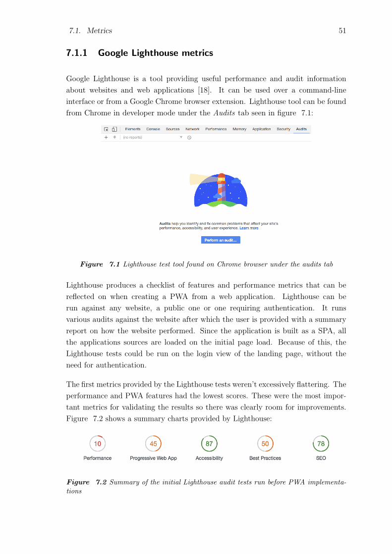
7.1. Metrics 51
7.1.1 Google Lighthouse metrics
Google Lighthouse is a tool providing useful performance and audit information
about websites and web applications [18]. It can be used over a command-line
interface or from a Google Chrome browser extension. Lighthouse tool can be found
from Chrome in developer mode under the Audits tab seen in figure 7.1:
Figure 7.1 Lighthouse test tool found on Chrome browser under the audits tab
Lighthouse produces a checklist of features and performance metrics that can be
reflected on when creating a PWA from a web application. Lighthouse can be
run against any website, a public one or one requiring authentication. It runs
various audits against the website after which the user is provided with a summary
report on how the website performed. Since the application is built as a SPA, all
the applications sources are loaded on the initial page load. Because of this, the
Lighthouse tests could be run on the login view of the landing page, without the
need for authentication.
The first metrics provided by the Lighthouse tests weren’t excessively flattering. The
performance and PWA features had the lowest scores. These were the most impor-
tant metrics for validating the results so there was clearly room for improvements.
Figure 7.2 shows a summary charts provided by Lighthouse:
Figure 7.2 Summary of the initial Lighthouse audit tests run before PWA implementa-tions
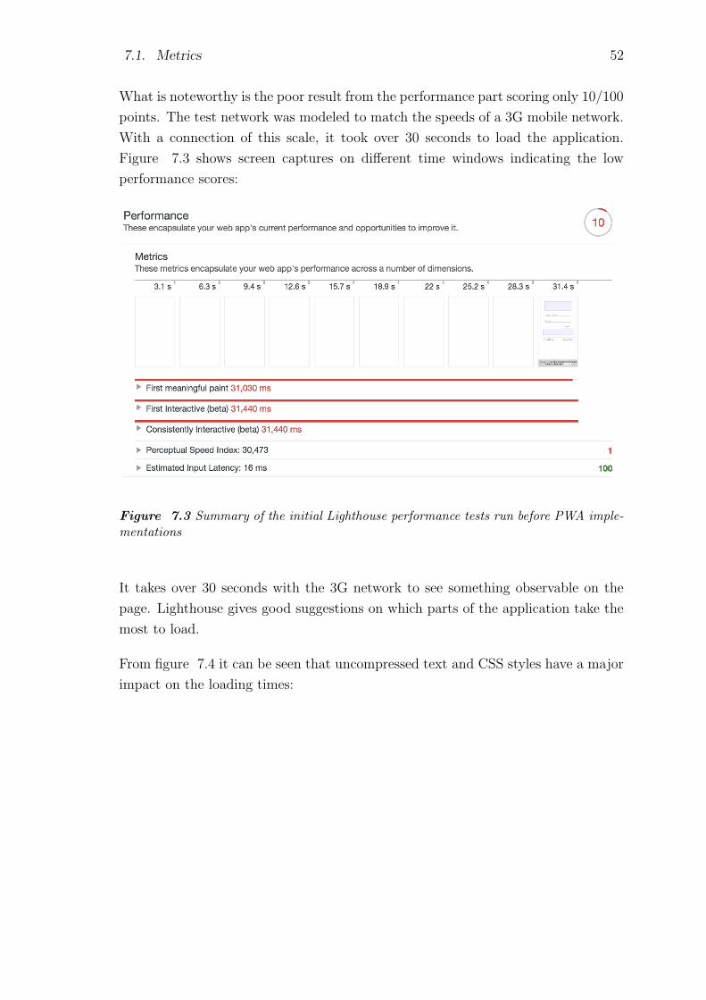
7.1. Metrics 52
What is noteworthy is the poor result from the performance part scoring only 10/100
points. The test network was modeled to match the speeds of a 3G mobile network.
With a connection of this scale, it took over 30 seconds to load the application.
Figure 7.3 shows screen captures on different time windows indicating the low
performance scores:
Figure 7.3 Summary of the initial Lighthouse performance tests run before PWA imple-mentations
It takes over 30 seconds with the 3G network to see something observable on the
page. Lighthouse gives good suggestions on which parts of the application take the
most to load.
From figure 7.4 it can be seen that uncompressed text and CSS styles have a major
impact on the loading times:

7.1. Metrics 53
Figure 7.4 Suggestions provided by Lighthouse to improve the application’s performance
Text compression is a method where the texts byte size is minimized on network
requests that include text contents. What is interesting about the results is that the
PWA score is already 45/100 points as seen in figure 7.5:

7.1. Metrics 54
Figure 7.5 Lighthouse audit results for PWA features measured before the actual imple-mentation work
Many of the features seen in figure 7.5 that already pass are part of common web
development best practices. For example using HTTPS is nowadays more of a rule
than an exception. Full summary of the initial audits provided by Lighthouse can
be found in APPENDIX A.
After the performance improvements, the same audit tests with the same boundary
conditions were run again on Lighthouse. The summary of the audits can be seen
in figure 7.6:
Figure 7.6 Lighthouse audit results for PWA features measured after the actual imple-mentation work
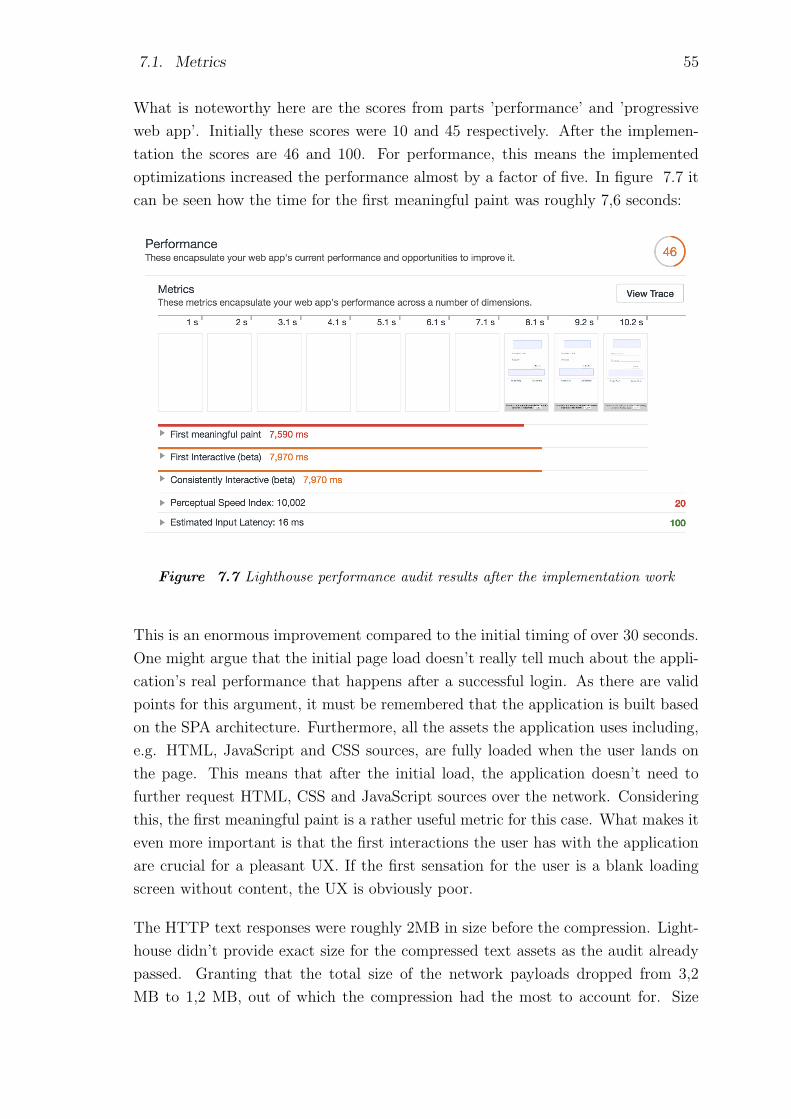
7.1. Metrics 55
What is noteworthy here are the scores from parts ’performance’ and ’progressive
web app’. Initially these scores were 10 and 45 respectively. After the implemen-
tation the scores are 46 and 100. For performance, this means the implemented
optimizations increased the performance almost by a factor of five. In figure 7.7 it
can be seen how the time for the first meaningful paint was roughly 7,6 seconds:
Figure 7.7 Lighthouse performance audit results after the implementation work
This is an enormous improvement compared to the initial timing of over 30 seconds.
One might argue that the initial page load doesn’t really tell much about the appli-
cation’s real performance that happens after a successful login. As there are valid
points for this argument, it must be remembered that the application is built based
on the SPA architecture. Furthermore, all the assets the application uses including,
e.g. HTML, JavaScript and CSS sources, are fully loaded when the user lands on
the page. This means that after the initial load, the application doesn’t need to
further request HTML, CSS and JavaScript sources over the network. Considering
this, the first meaningful paint is a rather useful metric for this case. What makes it
even more important is that the first interactions the user has with the application
are crucial for a pleasant UX. If the first sensation for the user is a blank loading
screen without content, the UX is obviously poor.
The HTTP text responses were roughly 2MB in size before the compression. Light-
house didn’t provide exact size for the compressed text assets as the audit already
passed. Granting that the total size of the network payloads dropped from 3,2
MB to 1,2 MB, out of which the compression had the most to account for. Size

7.1. Metrics 56
of the unused CSS style rules also dropped from 177KB to 47KB. The Lighthouse
performance metric already advocates that our optimization implementation was a
success.
The maximum scores from the PWA audit doesn’t guarantee the application would
be efficiently optimized for mobile usage. It does imply that the basis for a mobile
compatible web application exists. In figure 7.8 can be seen the Lighthouse PWA
test results:
Figure 7.8 Lighthouse PWA audit results after the implementation work
Many of the audit items seen in figure 7.8 are important regardless of the nature
of the website at question. For example using encrypted HTTPS over traditional
HTTP is crucial for network security. What is especially important when thinking
about web application user experience on mobile devices is that the audits concern-
ing content scaling depending on the device’s viewport pass. Defining the viewport
size and scaling with the meta tag is a way to tell the device’s browser that it has
to adjust the content based on the user agent’s viewport size. Fundamentally this
can also be seen as responsive scaling based on the device’s screen size. Audits
that tell more about the PWA features and especially about the app-like feeling of
the application are the audits regarding the service worker, the splash screen and
possibility to install the application on the device’s home screen. Even though the
aim of the implementation work was not to achieve full scores on the PWA audits,
7.1. Metrics 57
it was nevertheless a pleasant result. Full summary of the final audits provided by
Lighthouse can be found in APPENDIX B.
In the light of the Lighthouse audits it can be said that the application passes as a
progressive web application.
7.1.2 Additional tests
Sitespeed is a set of open source tools for measuring website performance [34]. One
easy way to use the sitespeed test tools is to install the sitespeed.io command line
application via npm, node package manager. Npm is used to manage packages used
with Node.js. Along with the sitespeed.io command line application the throttle
application can be used that allows users to run performance tests under differ-
ent artificial network connections. As Lighthouse runs the tests modeling a 3G
mobile network, the same approach was used here to achieve comparable results be-
tween the test tools. In the same manner the sitespeed.io was configured to run the
tests in a simulated mobile environment. Additional tests were run both before the
performance improvements took place and after they were done. The sitespeed.io
application provides an easily approachable summary table for the test results as
can be seen from figure 7.9.
The sitespeed.io results differ from the Lighthouse tests to some extend. For ex-
ample, the performance score is 65/100 points thus significantly better than what
Lighthouse tests indicated. The result table has color indicators to distinguish good,
mediocre, bad and other general results from each other. The color codes are green,
yellow, red and blue respectively. For the test cases, it took approximately 20 sec-
onds to show content on the web page. Even though this is over 30% faster than
what the Lighthouse tests indicate, they are both still of the same order of magni-
tude. What is noteworthy is that the tests regarding styling have much better scores
here compared to Lighthouse; although speedtest.io version lacks a review on how
much there is unused CSS rules present, thus making the results slightly biased.
What both test tools agree on is that the total transfer size of the assets, 3.1 MB
listed here, would be too big for providing fast page loading. SpeedCurve, a company
providing web performance testing tools, has a well written article about how large
in size websites are on average [6]. To sum up the article: first of all, currently
the average size of a website is 3 MB. Secondly the size of the website is not that
big of a factor affecting the end user’s UX as one might think. Instead, developers
should pay attention that the website serves optimized images and make sure the
CSS and JavaScript sources don’t block the page loading. A similar aspect can also

7.1. Metrics 58
Figure 7.9 Initial performance tests run via sitespeed.io command line application with3G connectivity and mobile environment
be found from the page loading times. The Speedcurve article describes the behavior
of Amazon’s website (www.amazon.com) and how it takes on average 18,8 seconds
to fully load. Yet, it takes only roughly 2,5 seconds to display a well-populated
viewport with actual content. When a user enters a website, the browser starts to
load resources required to render the page step by step. There is always a certain
step after which the browser renders some meaningful content on the display. These
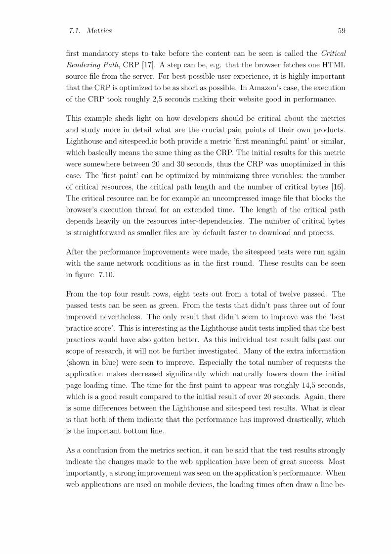
7.1. Metrics 59
first mandatory steps to take before the content can be seen is called the Critical
Rendering Path, CRP [17]. A step can be, e.g. that the browser fetches one HTML
source file from the server. For best possible user experience, it is highly important
that the CRP is optimized to be as short as possible. In Amazon’s case, the execution
of the CRP took roughly 2,5 seconds making their website good in performance.
This example sheds light on how developers should be critical about the metrics
and study more in detail what are the crucial pain points of their own products.
Lighthouse and sitespeed.io both provide a metric ’first meaningful paint’ or similar,
which basically means the same thing as the CRP. The initial results for this metric
were somewhere between 20 and 30 seconds, thus the CRP was unoptimized in this
case. The ’first paint’ can be optimized by minimizing three variables: the number
of critical resources, the critical path length and the number of critical bytes [16].
The critical resource can be for example an uncompressed image file that blocks the
browser’s execution thread for an extended time. The length of the critical path
depends heavily on the resources inter-dependencies. The number of critical bytes
is straightforward as smaller files are by default faster to download and process.
After the performance improvements were made, the sitespeed tests were run again
with the same network conditions as in the first round. These results can be seen
in figure 7.10.
From the top four result rows, eight tests out from a total of twelve passed. The
passed tests can be seen as green. From the tests that didn’t pass three out of four
improved nevertheless. The only result that didn’t seem to improve was the ’best
practice score’. This is interesting as the Lighthouse audit tests implied that the best
practices would have also gotten better. As this individual test result falls past our
scope of research, it will not be further investigated. Many of the extra information
(shown in blue) were seen to improve. Especially the total number of requests the
application makes decreased significantly which naturally lowers down the initial
page loading time. The time for the first paint to appear was roughly 14,5 seconds,
which is a good result compared to the initial result of over 20 seconds. Again, there
is some differences between the Lighthouse and sitespeed test results. What is clear
is that both of them indicate that the performance has improved drastically, which
is the important bottom line.
As a conclusion from the metrics section, it can be said that the test results strongly
indicate the changes made to the web application have been of great success. Most
importantly, a strong improvement was seen on the application’s performance. When
web applications are used on mobile devices, the loading times often draw a line be-
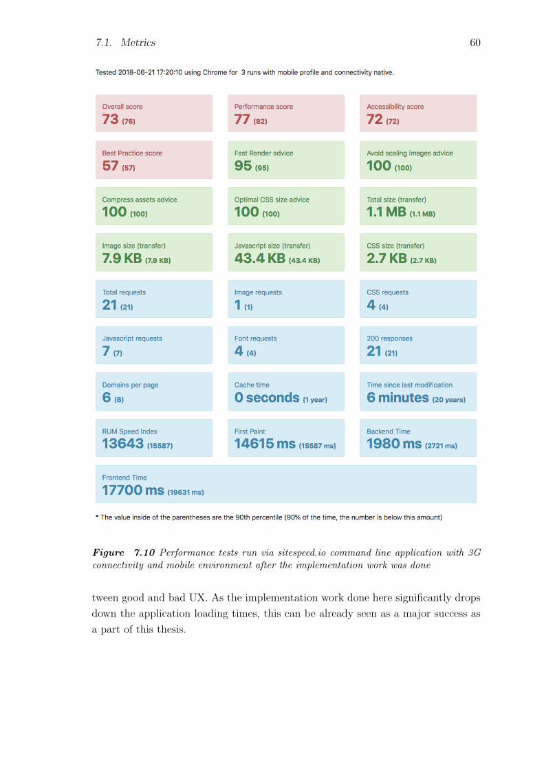
7.1. Metrics 60
Figure 7.10 Performance tests run via sitespeed.io command line application with 3Gconnectivity and mobile environment after the implementation work was done
tween good and bad UX. As the implementation work done here significantly drops
down the application loading times, this can be already seen as a major success as
a part of this thesis.

7.2. User interviews 61
7.2 User interviews
User interviews were conducted to give a final validation about the application’s
compatibility for both mobile and desktop use. The interviews were conducted
for two different user types: users who have already used the web application, and
users who have not used it before. This division provides valuable information about
how much the web application improved from the previous state now that it was
turned into a PWA. Secondly it will shed light on how easy it is for new users to
adapt to the PWA, and how do each of the test users feel the PWA compares to
traditional native mobile applications. Since the old version of the web application
was unusable on mobile devices, it would have been meaningless to perform the
same user interviews before the implementation part. Also because of this, the
comparison between the UX of the PWA implementation and the old application
version was kept to a minimum as they don’t offer much common ground to perform
the comparison on. As the whole PWA implementation was made in a case study
manner, the number of interviewees was kept low to not put too much resources
into it. The method for the interviews was qualitative analysis as the goal was the
shed light on the user experience of the PWA. Full scale quantitative user interviews
can be performed later on with actual end users, rather than with test persons who
might not be using the application outside the tests. The interviews were conducted
for four different interviewees.
A use case scenario was made up for the basis of the interview. The test persons
were asked to perform the following steps with the application to model a real use
case:
1. On your mobile device, open up the browser (Chrome, Firefox or Safari) and
navigate to the application by typing the URL on the navigation bar.
2. When the application has loaded, find a way to add the application on the
device’s home screen. When done, close the browser.
3. Open the application from the home screen icon created on the previous step.
Login to the application using the test credentials.
4. Navigate to the application view containing the measurement results
5. From the result list, find a measurement result that has only the word ’Test’
in its title
6. Validate if the concentration of iron (Fe) is within appropriate safety limits on
that result
7.2. User interviews 62
7. Logout from the application
This test case was first walked through with a smartphone and then with a desktop
device. On the desktop device the use case was gone through without installing the
application on the device’s home screen, even though this would have been possible
with some of the test devices and their operating system. The use case was picked
to be one of the most common one to occur amongst the real end users. The first
impression is also very important here, so the test case is aimed to provide insight on
that as well. After this use case the interviewees were asked the following questions
which were documented during the interview. The answers were given as free form
thoughts.
• How good was the general user experience of the PWA? Did you confront any
pain points or pleasant experiences?
• How did the application work performance vice (fast/slow loading times etc.)?
• How easy it was to install the application on the device’s home screen compared
to, e.g. installing a mobile application from an application store?
• How did the application perform and feel when opened from the home screen
compared to navigating to the site via browser?
• What differences where there between going through the test case with mobile
and desktop device?
Full summary of the user interviews can be found in APPENDIX C. The general
feedback from the application was good. Each four interviewee completed the test
task in a matter of minutes and no major problems were encountered. All of them
found the asked result’s details quickly and without trouble, even the two intervie-
wees who had no previous experience with the application. The performance of the
application was perceived to be excellent. Only one interviewee commented that the
performance could have been better during the login process. Others didn’t pay too
much attention on the performance or they though it was rather good. Those who
didn’t pay attention to it later on commented that it must have been so because the
performance was good, otherwise they would have noted it.
Each interviewee had a positive feeling about the PWA concept. For those who
weren’t familiar whit it, it was explained before the test task. Each of them liked
how the application looked when opened from the device’s home screen on a smart-
phone. The design was felt to be good and compact with all the information easily

7.2. User interviews 63
available. General feedback was that installing and using a PWA compared to a
native application was either more pleasant or they were alike each other. One in-
terviewee especially liked how the PWA instantly showed up on the home screen,
compared to a native mobile application which might take some time to install.
Compared to merely opening the application with the mobile device’s browser, it
was perceived to be pleasant that opening the application from the home screen
opens up a new application instance on the device, rather than just a new browser
tab.
All of them had a comment about installing a web application on the device’s home
screen, that if a person hasn’t done it before, it probably takes some time to find out
how it is done. At this point it was explained to the interviewees that PWAs will
normally prompt the user if they want to install the application on the device. This
was generally found to be a good approach. All of them liked the idea of a PWA and
wished that they would become more common. One interviewee raised a concern
about how the design for native applications is quite similar between applications of
a certain platform, and how the PWA concept might disrupt this in a bad way. This
was a valid point which hopefully can be answered later on in the future if PWAs
become more common.
Some concerns were raised about data integrity and user sessions when the appli-
cation is opened from the home screen. It was felt to be a little confusing whether
the application stores the login credentials and other session data, as one would
assume a native mobile application would do. The confusion was felt to rise from
the fact that the application was very similar to that of a native mobile application
when it was opened from the home screen icon. It was explained that generally the
application performs as it would perform when opened with the device’s browser. If
the application itself is made to store session data etc., then it will also do it when
opened from the home screen icon.
All of the interviewees had a pleasant experience also on the desktop device. Some
of them preferred using a desktop machine, some preferred smartphone. It was felt
pleasant that the application had a similar look and feel on both devices. Because
of this, the interviewees already knew where to find all the information after using
the first device. One interviewee had a good point about the responsive design:
the design has to be carefully though for mobile devices, so that it is not merely a
stripped down version of the desktop design, but rather a design of its own. The
main point was that at some point the application felt like it was squeezed down
when used on the mobile device. This is already taken into account as the application
will have a new design in the coming future.
7.2. User interviews 64
As a conclusion, the user interviews gave good insight about the application’s per-
formance and design. What was an especially important finding was that the test
case was easy to go through with both mobile and desktop devices. This advo-
cates the argument that the responsive design has worked as intended. The PWA
approach was felt to be pleasant and it seemed to build up interest amongst the
interviewees. Based on the interviews, it can be concluded that the application can
now be fluently used both in mobile and desktop environments.
65
8. CONCLUSIONS
The research question of this thesis was: what is the most suitable solution for
turning an existing web application into a mobile compatible application. This
question was answered in a case study manner, where different alternatives were
compared and the best solution implemented. Through research the Progressive
Web Application, the PWA, was selected for the case. Performance metrics and
user interviews done after the implementation proved that the research question
was answered. The PWA solution worked well for this case and it can be highly
recommended for similar cases.
The amount of work for the implementation was rather small. All in all, it took a
couple of weeks to perform the changes explained in the implementation chapter.
Based on the evaluation chapter, the case study was a success. With little work, the
web application was modified from a ’desktop only’ application to a PWA that is
pleasant to use with various devices. The old application architecture was converted
to a more dynamic one, and the performance metrics indicated that the performance
had improved significantly. Additional performance improvements were found which
will be examined in the future. The user interviews proved that the user experience
of the responsively designed application was good. General feedback about the
application was positive and no major problems were confronted during the test
cases. The interviewees were intrigued by the concept of the PWA.
Final validation of the success will be received only if the end users will adapt to the
PWA. This validation will take time from months to years. If the end users adapt
to the PWA, it might become relevant to evaluate, if there is a need for separate
native mobile applications. Immediate cost savings would be achieved by relying
solely on the PWA. One benefit would be that the communication between the
measurement devices and the cloud service would become rather simple. Illustration
of the possible future architecture can be seen in figure 8.1. Figure 8.1 shows that
all current and future devices could communicate directly with the cloud service.
This uniformity would offer great benefits. For example, adding new devices to the
cloud service would become easier. Also testing, debugging and maintaining the old
devices would become more clear.

8. Conclusions 66
Figure 8.1 One possible future architecture that could be achieved with the mobile opti-mization changes
The web application shows extensive potential as an application platform, providing
assistance for analyzing, sharing and storing valuable industrial measurement data.
If the service can be unified both in the UI and the API side to allow any future
device to be integrated on it, it would bring a great amount of value for both
the end users and the client running the business. This case study has provided
proof that the key for a uniform user experience is the progressive web application
solution. It brings value for the users through its engaging modern web application
features. In the light of these results, there is no doubt that other PWA features
will be implemented as a part of the web application. Future will show if PWAs will
reshape the way applications are developed.

67
BIBLIOGRAPHY
[1] “Configuring web applications,” Apple Inc., 2016, Available: https:
//developer.apple.com/library/content/documentation/AppleApplications/
Reference/SafariWebContent/ConfiguringWebApplications/
ConfiguringWebApplications.html.
[2] D. Bohn, “Google’s instant articles competitor is about
to take over mobile search,” The Verge, August 2016,
Available: https://www.theverge.com/2016/8/2/12349524/
google-amp-instant-articles-search-results-mobile-web-fragmentation.
[3] “Push api browser support,” Caniuse, Alexis Deveria, June 2018, Available:
https://caniuse.com/#search=push%20api.
[4] “Service worker browser support,” Caniuse, Alexis Deveria, June 2018, Avail-
able: https://caniuse.com/#search=service%20worker.
[5] “Wep application manifest browser support,” Caniuse, Alexis Deveria, June
2018, Available: https://caniuse.com/#feat=web-app-manifest.
[6] T. Everts, “The average web page is 3mb. how much should we
care?” Speedcurve, August 2017, Available: https://speedcurve.com/blog/
web-performance-page-bloat/.
[7] “React javascript library,” Facebook Inc., 2018, Available: https://reactjs.org/.
[8] “React native: build native mobile apps using javascript and react,” Facebook
Inc., 2018, Available: https://facebook.github.io/react-native/.
[9] “React native github page,” Facebook Inc., 2018, Available: https://github.
com/facebook/react-native#react-native-----.
[10] “Tools for pwa developers,” Google Inc., 2018, Available: https://developers.
google.com/web/ilt/pwa/tools-for-pwa-developers.
[11] “Polymer project,” Google Inc. and contributors, Available: https://www.
polymer-project.org/.
[12] “Polymer project browser support,” Google Inc. and contributors, Available:
https://www.polymer-project.org/2.0/docs/browsers.

BIBLIOGRAPHY 68
[13] “Polymer project custom elements documentation,” Google Inc. and con-
tributors, Available: https://www.polymer-project.org/2.0/docs/devguide/
custom-elements.
[14] “Polymer project version 1.0 release,” Google Inc. and contributors, Available:
https://www.polymer-project.org/blog/2015-05-29-one-dot-oh.html.
[15] “Amp official website,” Google Inc. and open source community, 2018, Avail-
able: https://www.ampproject.org/about/benefits/.
[16] “Optimizing the critical rendering path,” Google Web Fundamentals, 2018,
Available: https://developers.google.com/web/fundamentals/performance/
critical-rendering-path/optimizing-critical-rendering-path.
[17] I. Grigorik, “Critical rendering path,” Google Web Fundamentals, 2018,
Available: https://developers.google.com/web/fundamentals/performance/
critical-rendering-path/.
[18] D. A. Hume, Progressive Web Apps, 1st ed. Manning Publications Co., 2018.
[19] “Viewport,” MDN, 2018, Available: https://developer.mozilla.org/en-US/
docs/Glossary/viewport.
[20] “What’s a universal windows platform?” Microsoft, 2018, Avail-
able: https://docs.microsoft.com/en-us/windows/uwp/get-started/
universal-application-platform-guide.
[21] “Pwa builder,” Microsoft, Open Source, 2018, Available: https://www.
pwabuilder.com/.
[22] “Using shadow dom,” Mozilla and individual contributors, 2018, Avail-
able: https://developer.mozilla.org/en-US/docs/Web/Web Components/
Using shadow DOM.
[23] “Mdn html template element,” Mozilla Foundation, 2017, Available: https:
//developer.mozilla.org/en-US/docs/Web/HTML/Element/template.
[24] “Css media queries,” Mozilla Foundation, 2018, Available: https://developer.
mozilla.org/en-US/docs/Web/CSS/Media Queries/Using media queries.
[25] “Service worker api,” Mozilla Foundation, March 2018, Available: https://
developer.mozilla.org/en-US/docs/Web/API/Service Worker API.
[26] “Using service workers,” Mozilla Foundation, March 2018, Available:
https://developer.mozilla.org/en-US/docs/Web/API/Service Worker API/
Using Service Workers.

Bibliography 69
[27] “Web app manifest,” Mozilla Foundation, 2018, Available: https://developer.
mozilla.org/en-US/docs/Web/Manifest.
[28] “Web worker,” Mozilla Foundation, 2018, Available: https://developer.mozilla.
org/en-US/docs/Web/API/Worker.
[29] “Mdn css flexible box layout,” Mozilla Foundation and individual contrib-
utors, 2018, Available: https://developer.mozilla.org/en-US/docs/Web/CSS/
CSS Flexible Box Layout.
[30] R. O’Donoghue, AMP: Building Accelerated Mobile Pages, 1st ed. Packt Pub-
lishing, 2017.
[31] M. T. e. a. Peter Beverloo, “W3c push api specification,” W3C, December 2017,
Available: https://www.w3.org/TR/push-api/.
[32] “App-drawer custom web component,” PolymerElements, Available:
https://www.webcomponents.org/element/PolymerElements/app-layout/
elements/app-drawer.
[33] A. Russell, “Progressive web apps: Escaping tabs without losing
our soul,” June 2015, Available: https://infrequently.org/2015/06/
progressive-apps-escaping-tabs-without-losing-our-soul/.
[34] “Sitespeed web performance,” Sitespeed and OSS developers, 2018, Available:
https://www.sitespeed.io/.
[35] “What is a hybrid mobile application?” Telerik Developer Net-
work, 2017, Available: https://developer.telerik.com/featured/
what-is-a-hybrid-mobile-app/.
[36] “W3c custom element specification,” W3C, 2018, Available: https://w3c.
github.io/webcomponents/spec/custom/.
[37] “W3c html imports specification,” W3C, 2018, Available: http://w3c.github.
io/webcomponents/spec/imports/.
[38] “W3c html media capture,” W3C, 2018, Available: https://www.w3.org/TR/
html-media-capture/.
[39] “Web components community website,” 2018, Available: https://www.
webcomponents.org/introduction.
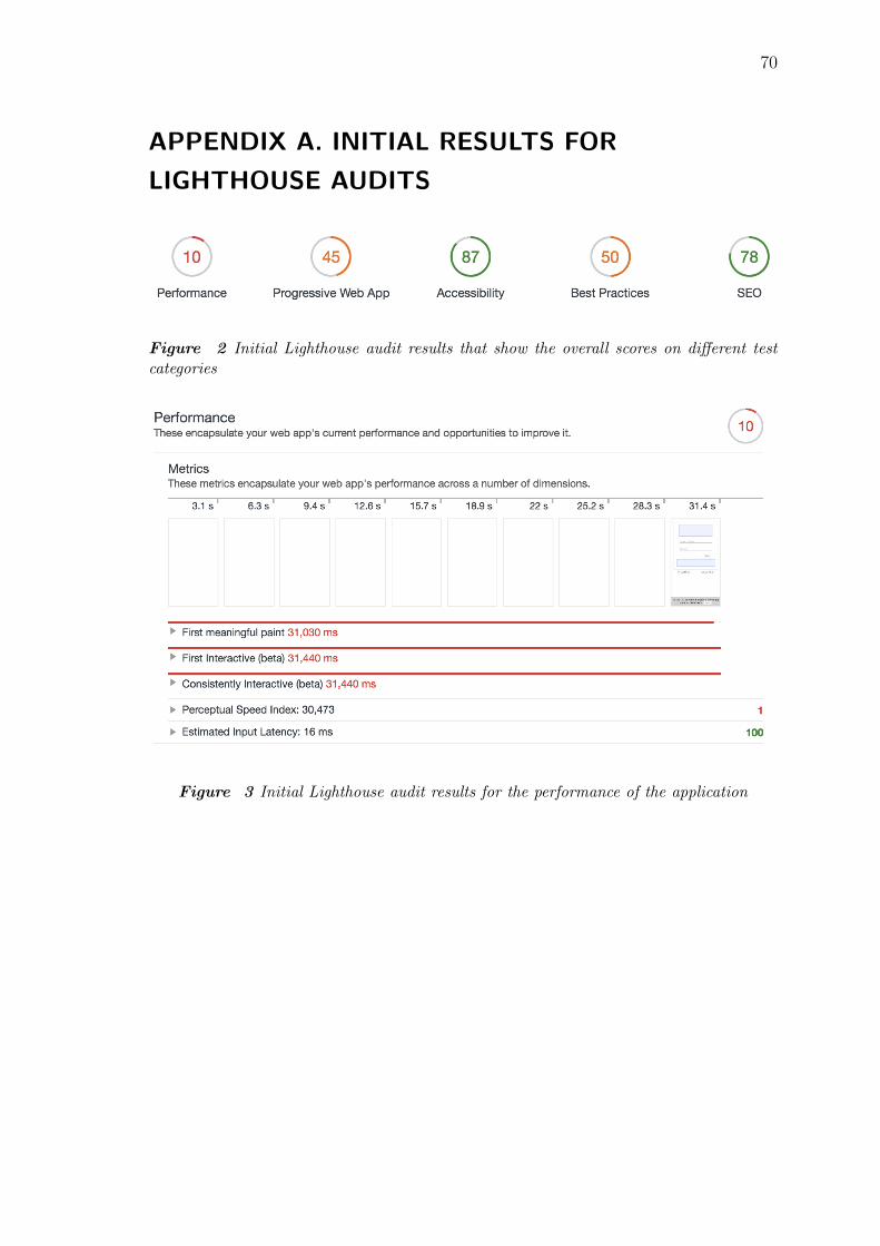
70
APPENDIX A. INITIAL RESULTS FOR
LIGHTHOUSE AUDITS
Figure 2 Initial Lighthouse audit results that show the overall scores on different testcategories
Figure 3 Initial Lighthouse audit results for the performance of the application

APPENDIX A. Initial results for Lighthouse audits 71
Figure 4 Initial Lighthouse audit results for the performance opportunities of the appli-cation
Figure 5 Initial Lighthouse audit results for the more detailed performance diagnostics
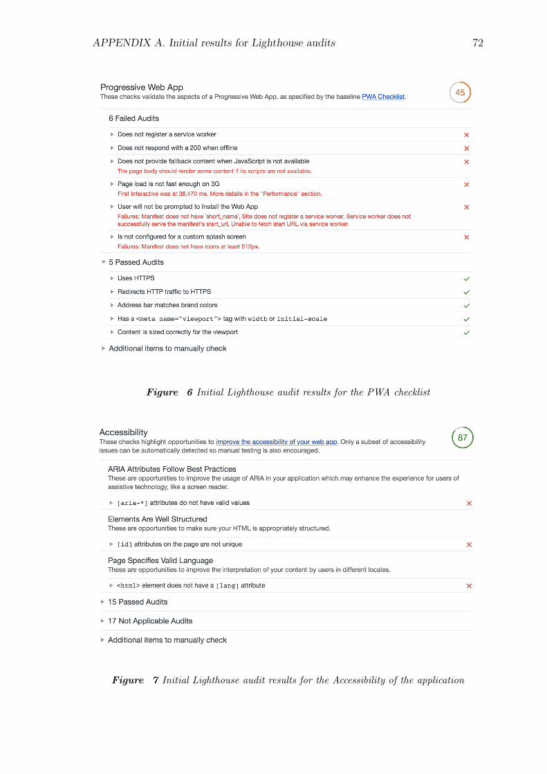
APPENDIX A. Initial results for Lighthouse audits 72
Figure 6 Initial Lighthouse audit results for the PWA checklist
Figure 7 Initial Lighthouse audit results for the Accessibility of the application
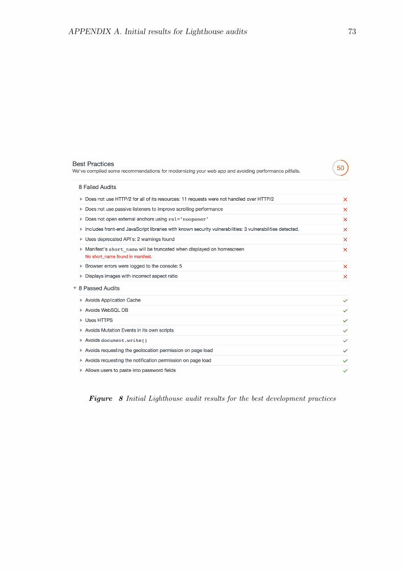
APPENDIX A. Initial results for Lighthouse audits 73
Figure 8 Initial Lighthouse audit results for the best development practices

APPENDIX A. Initial results for Lighthouse audits 74
Figure 9 Initial Lighthouse audit results for the SEO attributes
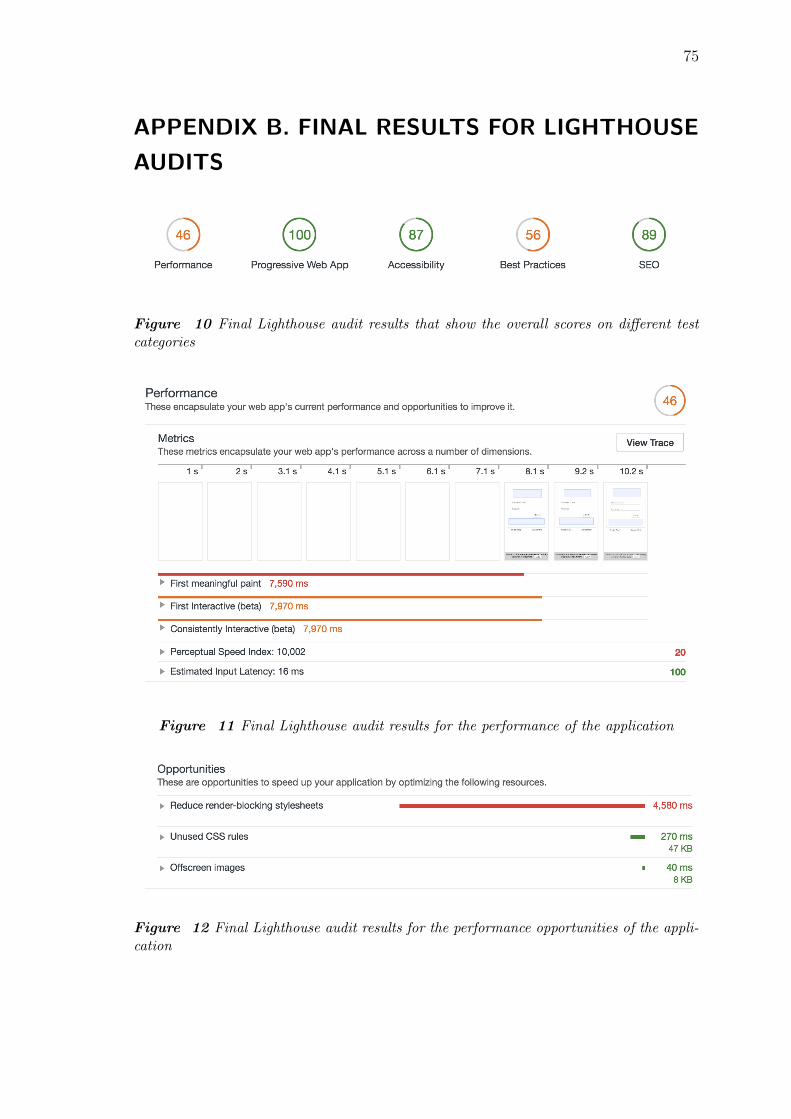
75
APPENDIX B. FINAL RESULTS FOR LIGHTHOUSE
AUDITS
Figure 10 Final Lighthouse audit results that show the overall scores on different testcategories
Figure 11 Final Lighthouse audit results for the performance of the application
Figure 12 Final Lighthouse audit results for the performance opportunities of the appli-cation

APPENDIX B. Final results for Lighthouse audits 76
Figure 13 Final Lighthouse audit results for the more detailed performance diagnostics
Figure 14 Final Lighthouse audit results for the PWA checklist

APPENDIX B. Final results for Lighthouse audits 77
Figure 15 Final Lighthouse audit results for the Accessibility of the application
Figure 16 Final Lighthouse audit results for the best development practices
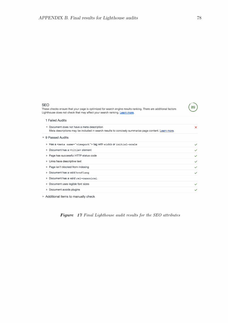
APPENDIX B. Final results for Lighthouse audits 78
Figure 17 Final Lighthouse audit results for the SEO attributes

79
APPENDIX C. FULL SUMMARY OF USER
INTERVIEW ANSWERS
INTERVIEWEE NO. 1.: BACKGROUND UNRELATED, HASN’T USED
THE APPLICATION BEFORE
- Interviewee generally prefers mobile device over laptop, so she felt better using the
mobile device rather than the desktop device for the use case. In general, the PWA
worked well on both mobile and desktop devices, and it was really easy to find the
same information on both UIs as the underlying application stayed the same.
- Performance vice the application felt good for the user and the experience was
positive. The interviewee explained that she didn’t at any point get the feeling
that the application would be lagging, which was good. Quoting the interviewee:
”I didn’t observe the application loading times, which means they must be in a good
shape”.
- Installing the PWA on the mobile device’s home screen felt a lot easier than what it
takes to install a native application from an application store. From the application
store one has to first search the right application, and then possibly wait for a
significant amount of time for the application to install. It was found really pleasant
that the PWA immediately showed on the home screen and could be launched on
the same second as it was installed.
- Interviewee preferred launching the application from the home screen compared to
opening the application traditionally with the browser. It was felt that the design
was better on the version launched from the home screen as it had cleaner looks
and more space to display content. One inferior feature found from opening the
application from browser compared to opening from the home screen was that if the
application was left on the device’s background to run, it was faster to bring back
the application running on browser.
- Additional comment was that it was found pleasant to open the application from
the home screen as it opens up as an own application instance on the mobile de-
vice. The interviewee explained that she always has multiple browser tabs open on
the mobile device, so important browser tabs often tend to disappear amongst oth-
ers. This was not the case when the application was opened from the home screen
(Interviewer’s comment: test device was iOS iPhone 6s).
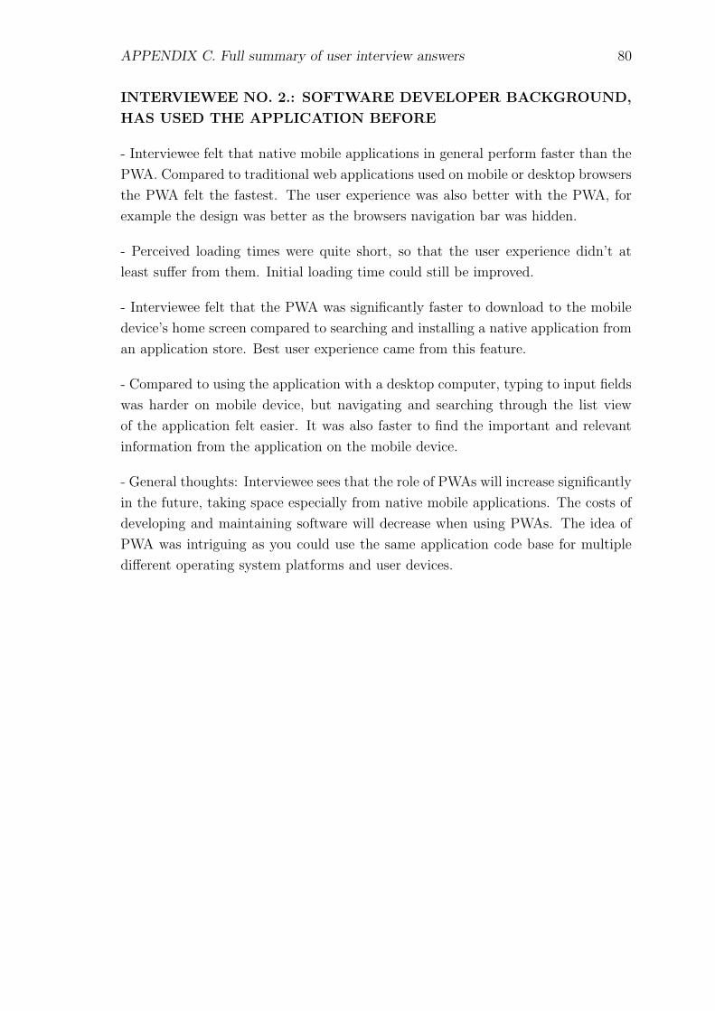
APPENDIX C. Full summary of user interview answers 80
INTERVIEWEE NO. 2.: SOFTWARE DEVELOPER BACKGROUND,
HAS USED THE APPLICATION BEFORE
- Interviewee felt that native mobile applications in general perform faster than the
PWA. Compared to traditional web applications used on mobile or desktop browsers
the PWA felt the fastest. The user experience was also better with the PWA, for
example the design was better as the browsers navigation bar was hidden.
- Perceived loading times were quite short, so that the user experience didn’t at
least suffer from them. Initial loading time could still be improved.
- Interviewee felt that the PWA was significantly faster to download to the mobile
device’s home screen compared to searching and installing a native application from
an application store. Best user experience came from this feature.
- Compared to using the application with a desktop computer, typing to input fields
was harder on mobile device, but navigating and searching through the list view
of the application felt easier. It was also faster to find the important and relevant
information from the application on the mobile device.
- General thoughts: Interviewee sees that the role of PWAs will increase significantly
in the future, taking space especially from native mobile applications. The costs of
developing and maintaining software will decrease when using PWAs. The idea of
PWA was intriguing as you could use the same application code base for multiple
different operating system platforms and user devices.

APPENDIX C. Full summary of user interview answers 81
INTERVIEWEE NO. 3.: SOFTWARE DESIGNER BACKGROUND,
HAS USED THE APPLICATION BEFORE
- Interviewee felt that installing the application on the device’s home screen worked
well, but only when the user knows about this feature. Installing on the home
screen could be made somehow easier, so that the user would be hinted about
this possibility. There wasn’t seen any real difference in the workload comparing
installing the PWA on the device’s home screen and installing a native application
through application store. The interviewee prefers to install native applications
through links that she finds while navigating with the browser.
- Initial loading time and time for logging in took slightly longer than expected
according to the interviewee. After the logging, everything worked and loaded really
fast.
- Interviewee prefers desktop over mobile, so she would also use the application on
desktop rather than on mobile device. The interviewee has been using computers
a lot and can quickly navigate through websites and the operating system through
keyboard shortcuts etc. On mobile these things aren’t present. Additional comment
was that it was really fast to perform the test task on mobile, and if desktop computer
wasn’t available, the interviewee could easily work with the application on mobile
device.
- Compared to native applications, the interviewee raised questions about data in-
tegrity and user sessions. For example, does the user have to login to the application
every time it is opened from the home screen? What happens to the user session’s
data if the mobile device’s browser settings are restored (e.g. the browser history is
deleted)?
- Interviewee generally likes the idea of PWAs and would like to see more of them.
Some thoughts were given about the responsive design: on mobile devices the design
shouldn’t be a ”narrow” version of the desktop design; rather it should be a stripped
down design where only the most important information is shown by default. Also
the interviewee raised concern about PWA design in general. For example, Apple
has a very strict policy when it comes to application design and software developers
have to comply to those rules. Because of this, the iOS applications’ UI design has
been uniform between applications. This makes it is easy for the users to start using
a new application as they already have insight about e.g., how the navigation works.
What happens to this uniformity if PWAs will get more popular?
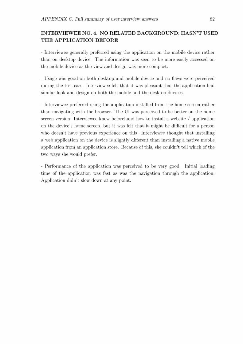
APPENDIX C. Full summary of user interview answers 82
INTERVIEWEE NO. 4. NO RELATED BACKGROUND: HASN’T USED
THE APPLICATION BEFORE
- Interviewee generally preferred using the application on the mobile device rather
than on desktop device. The information was seen to be more easily accessed on
the mobile device as the view and design was more compact.
- Usage was good on both desktop and mobile device and no flaws were perceived
during the test case. Interviewee felt that it was pleasant that the application had
similar look and design on both the mobile and the desktop devices.
- Interviewee preferred using the application installed from the home screen rather
than navigating with the browser. The UI was perceived to be better on the home
screen version. Interviewee knew beforehand how to install a website / application
on the device’s home screen, but it was felt that it might be difficult for a person
who doesn’t have previous experience on this. Interviewee thought that installing
a web application on the device is slightly different than installing a native mobile
application from an application store. Because of this, she couldn’t tell which of the
two ways she would prefer.
- Performance of the application was perceived to be very good. Initial loading
time of the application was fast as was the navigation through the application.
Application didn’t slow down at any point.