Embed Size (px)
Citation preview
Evaluation of original images
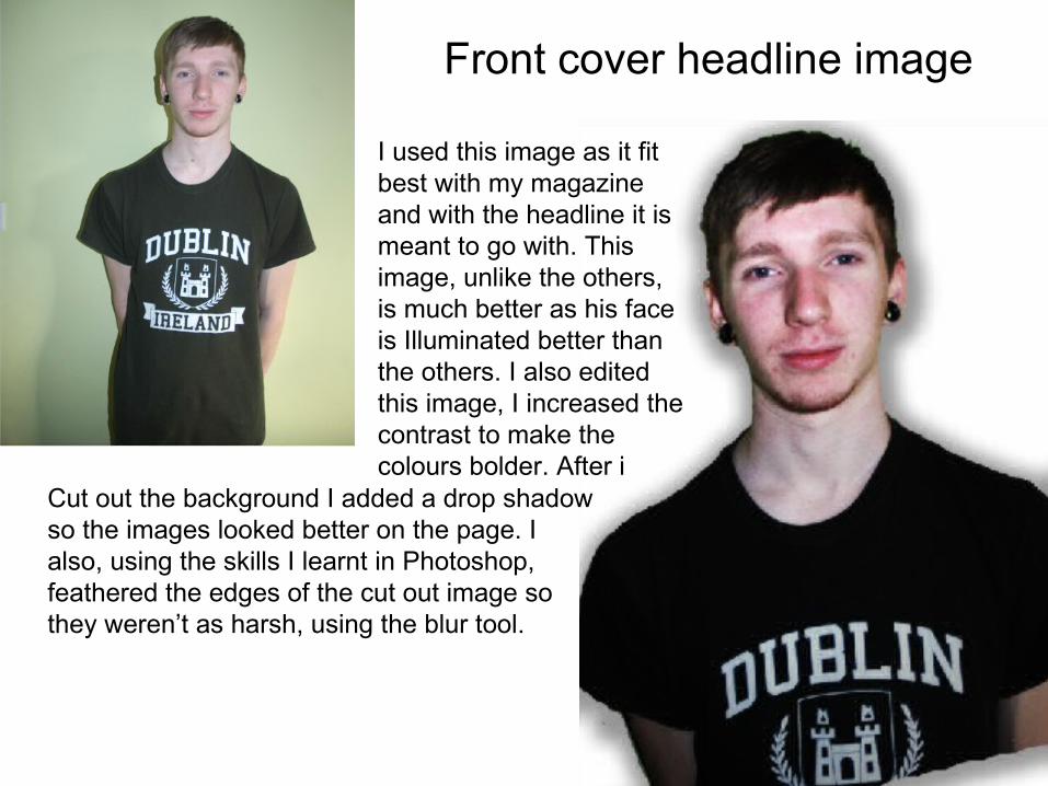
Front cover headline image
I used this image as it fit best with my magazine and with the headline it is meant to go with. This image, unlike the others, is much better as his face is Illuminated better than the others. I also edited this image, I increased the contrast to make the colours bolder. After i
Cut out the background I added a drop shadow so the images looked better on the page. I also, using the skills I learnt in Photoshop, feathered the edges of the cut out image so they weren’t as harsh, using the blur tool.
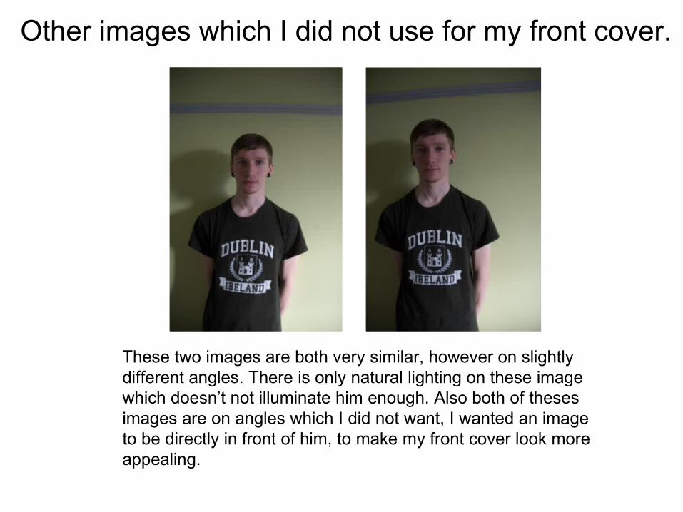
Other images which I did not use for my front cover.
These two images are both very similar, however on slightly different angles. There is only natural lighting on these image which doesn’t not illuminate him enough. Also both of theses images are on angles which I did not want, I wanted an image to be directly in front of him, to make my front cover look more appealing.
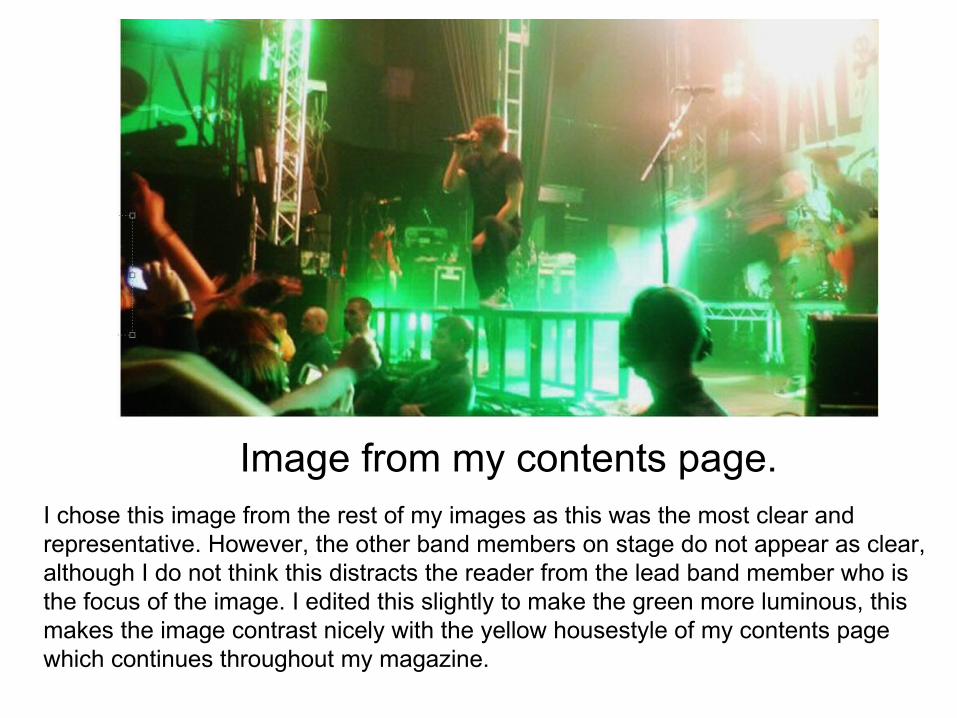
Image from my contents page.I chose this image from the rest of my images as this was the most clear and representative. However, the other band members on stage do not appear as clear, although I do not think this distracts the reader from the lead band member who is the focus of the image. I edited this slightly to make the green more luminous, this makes the image contrast nicely with the yellow housestyle of my contents page which continues throughout my magazine.
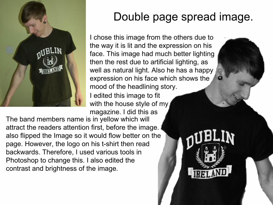
Double page spread image.
I chose this image from the others due to the way it is lit and the expression on his face. This image had much better lighting then the rest due to artificial lighting, as well as natural light. Also he has a happy expression on his face which shows the mood of the headlining story.
The band members name is in yellow which will attract the readers attention first, before the image. I also flipped the Image so it would flow better on the page. However, the logo on his t-shirt then read backwards. Therefore, I used various tools in Photoshop to change this. I also edited the contrast and brightness of the image.
I edited this image to fit with the house style of my magazine. I did this as
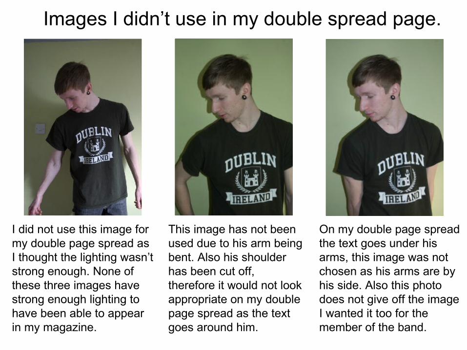
Images I didn’t use in my double spread page.
I did not use this image for my double page spread as I thought the lighting wasn’t strong enough. None of these three images have strong enough lighting to have been able to appear in my magazine.
This image has not been used due to his arm being bent. Also his shoulder has been cut off, therefore it would not look appropriate on my double page spread as the text goes around him.
On my double page spread the text goes under his arms, this image was not chosen as his arms are by his side. Also this photo does not give off the image I wanted it too for the member of the band.