Embed Size (px)
Citation preview
On The Mathematics of Income Inequality
Klaus Volpert Villanova University
Sep. 19, 2013
Published in American Mathematical Monthly, Dec 2012
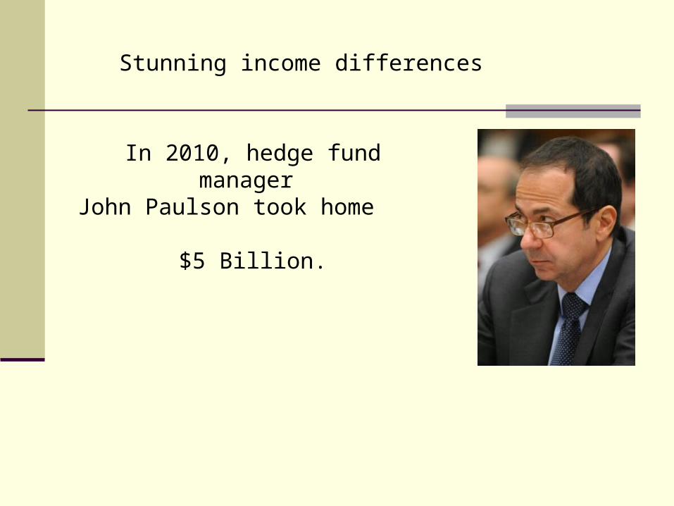
In 2010, hedge fund manager John Paulson took home
$5 Billion.
Stunning income differences
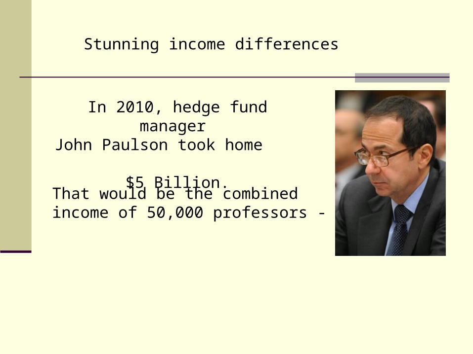
In 2010, hedge fund manager John Paulson took home
$5 Billion.
That would be the combined income of 50,000 professors -
Stunning income differences
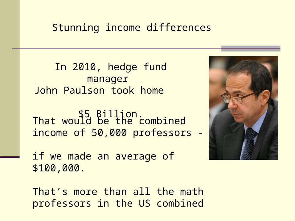
In 2010, hedge fund manager John Paulson took home
$5 Billion.
That would be the combined income of 50,000 professors - if we made an average of $100,000.
That’s more than all the math professors in the US combined
Stunning income differences
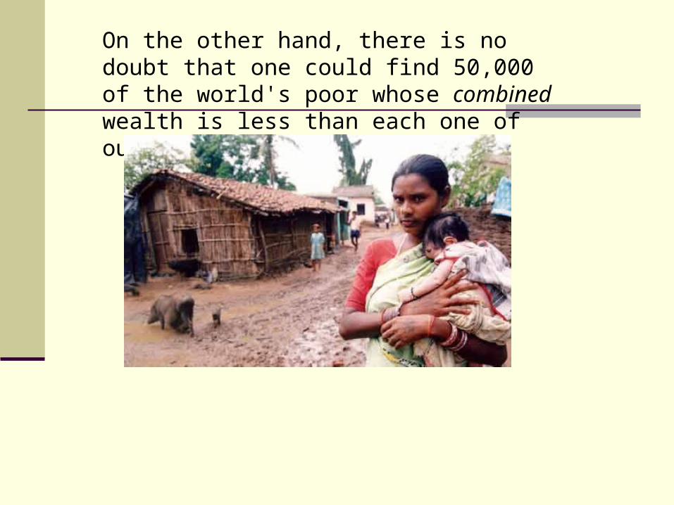
On the other hand, there is no doubt that one could find 50,000 of the world's poor whose combined wealth is less than each one of ours.
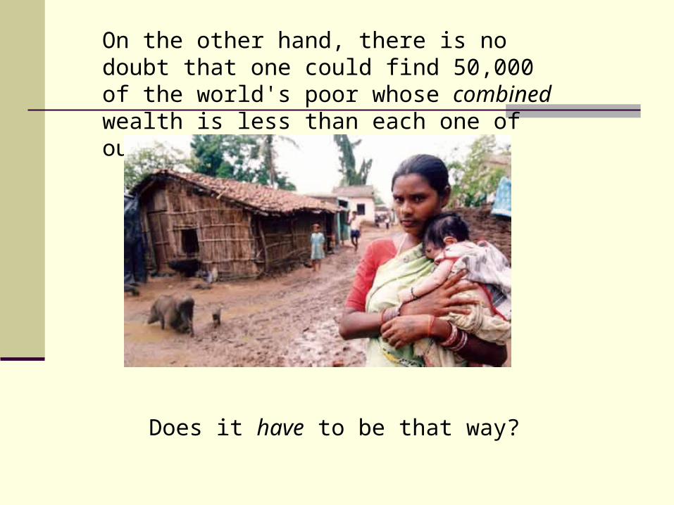
On the other hand, there is no doubt that one could find 50,000 of the world's poor whose combined wealth is less than each one of ours.
Does it have to be that way?
Total Equality is not possible
Even if we could distribute all wealth equally, inequality would return in an instant.
Total Equality is not possible
Even if we could distribute all wealth equally, inequality would return in an instant.
For one man would take his money to the bank, and one man would take it to the bar.
Herr Procher (my 10th grade English teacher)
Total Equality is not possible
Inequality might be inevitable,it might be stunning, But it is not static!
Inequality varies a great deal from country to country. Even within the same country it can change dramatically over time!
Q: What do you think: over the last 100 years, has inequality in the US increased or decreased?
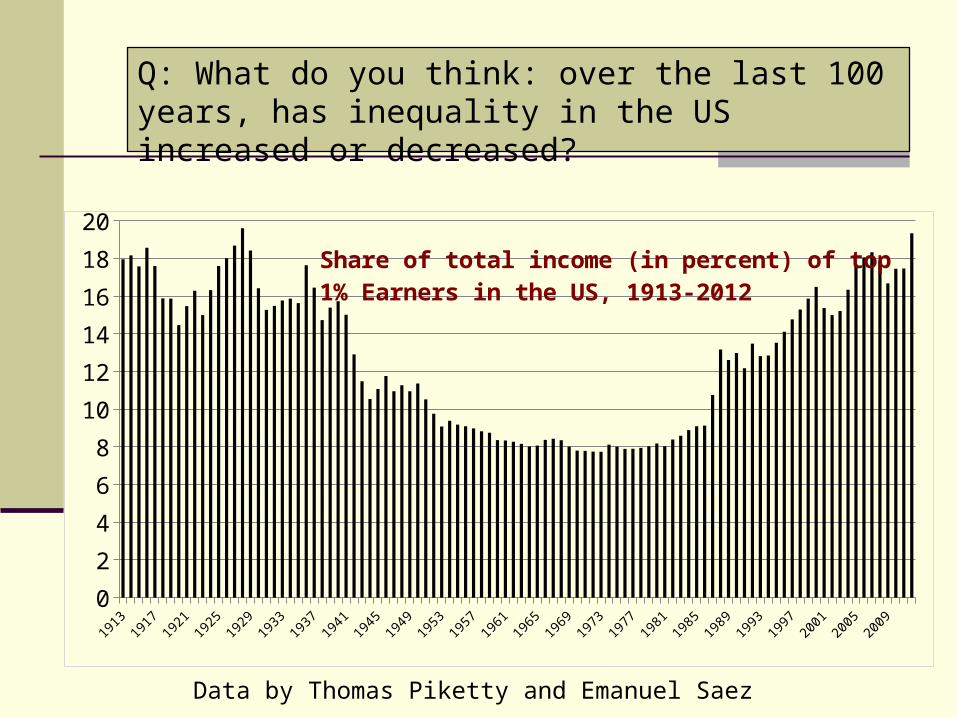
Q: What do you think: over the last 100 years, has inequality in the US increased or decreased?
Data by Thomas Piketty and Emanuel Saez
1913
1916
1919
1922
1925
1928
1931
1934
1937
1940
1943
1946
1949
1952
1955
1958
1961
1964
1967
1970
1973
1976
1979
1982
1985
1988
1991
1994
1997
2000
2003
2006
2009
2012
0
2
4
6
8
10
12
14
16
18
20Share of total income (in percent) of top 1% Earners in the US, 1913-2012
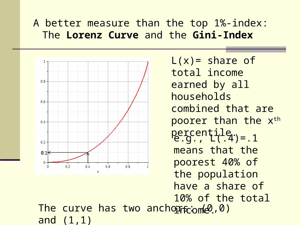
A better measure than the top 1%-index:The Lorenz Curve and the Gini-Index
L(x)= share of total income earned by all households combined that are poorer than the xth percentile.
e.g., L(.4)=.1 means that the poorest 40% of the population have a share of 10% of the total income.
The curve has two anchors: (0,0) and (1,1)
0.1
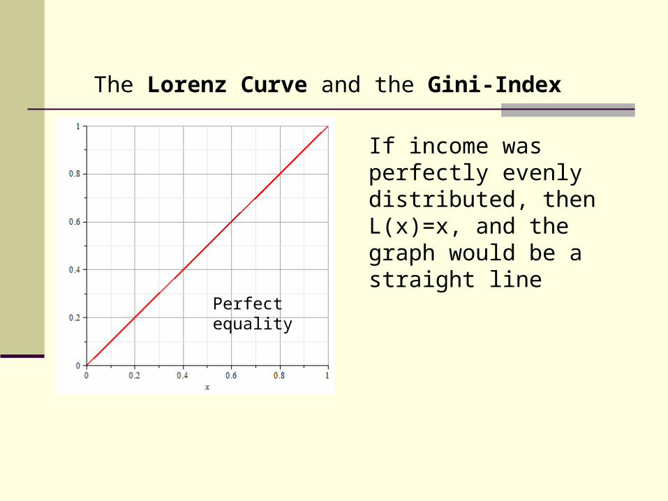
If income was perfectly evenly distributed, then L(x)=x, and the graph would be a straight line
Perfect equality
The Lorenz Curve and the Gini-Index
The Lorenz Curve and the Gini-Index
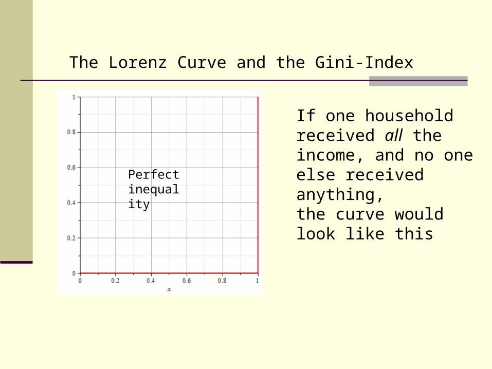
If one household received all the income, and no one else received anything, the curve would look like this
Perfect inequality
The Lorenz Curve and the Gini-Index
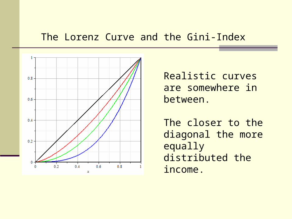
Realistic curves are somewhere in between.
The closer to the diagonal the more equally distributed the income.
The Lorenz Curve and the Gini-Index
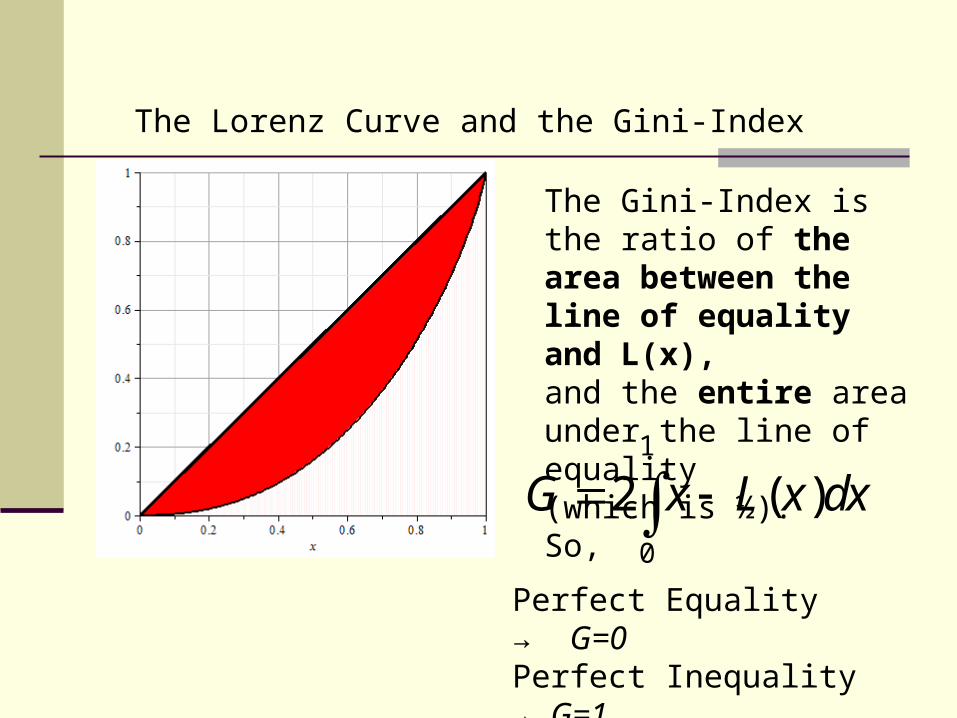
The Gini-Index is the ratio of the area between the line of equality and L(x),and the entire area under the line of equality(which is ½).So, 1
0
2 ( )G x L x dx Perfect Equality → G=0Perfect Inequality → G=1
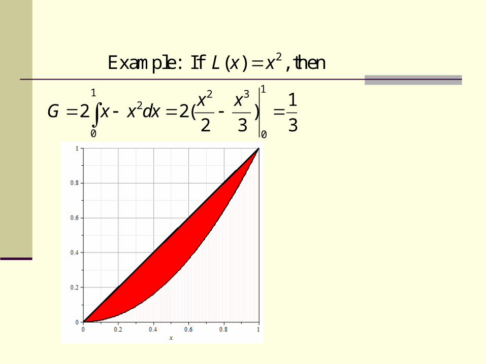
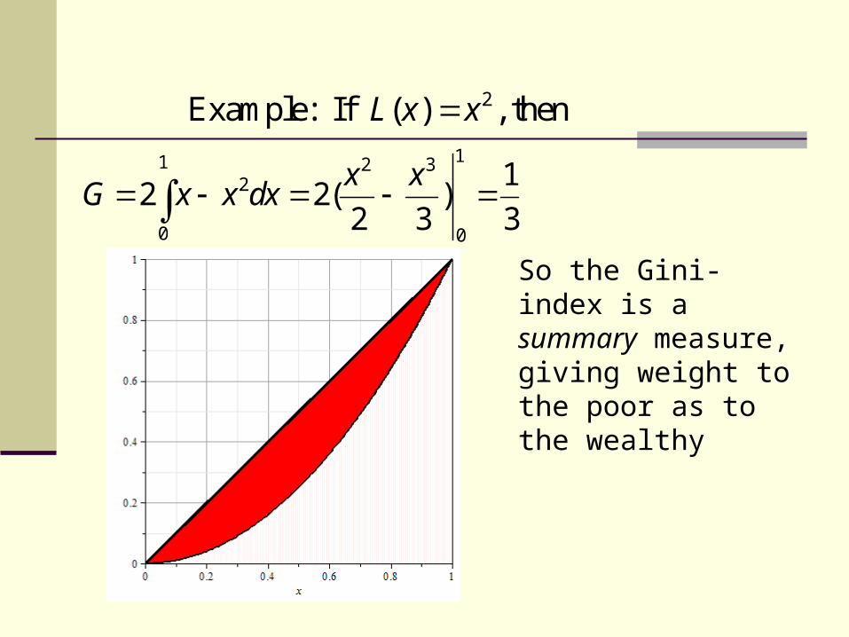
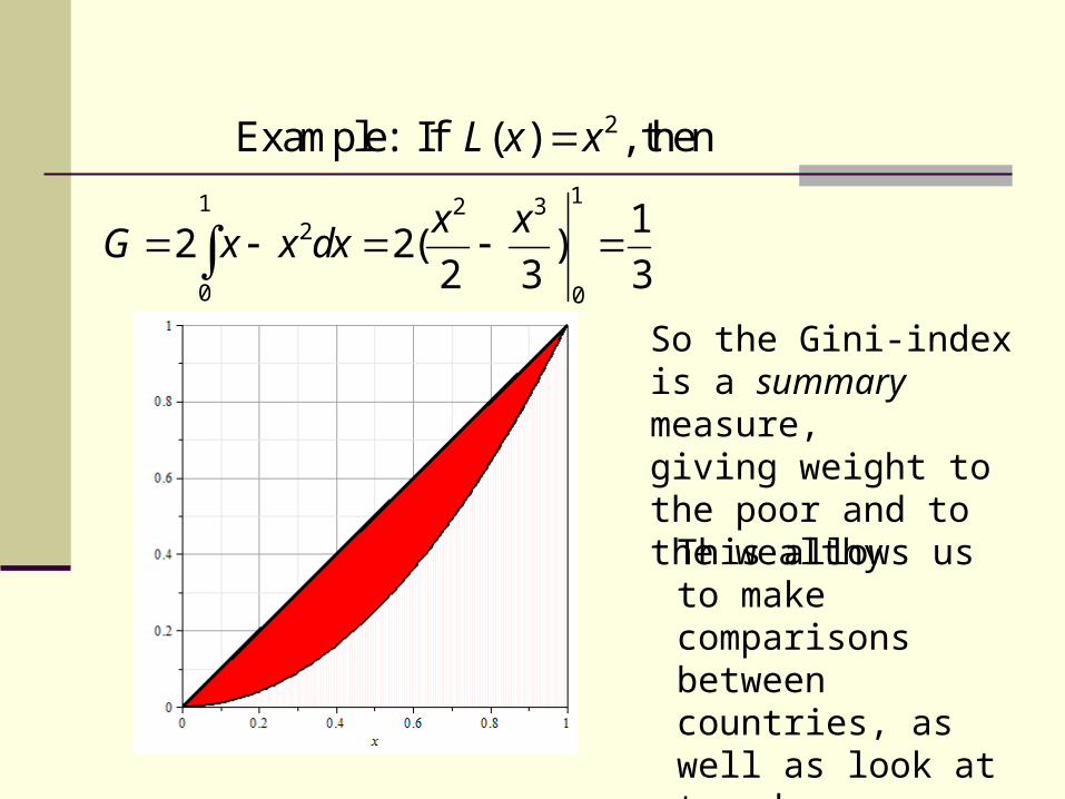
11 2 32
0 0
12 2( )
2 3 3
x xG x x dx
2Example: If ( ) , thenL x x
11 2 32
0 0
12 2( )
2 3 3
x xG x x dx
2Example: If ( ) , thenL x x
So the Gini-index is a summary measure,giving weight to the poor as to the wealthy
11 2 32
0 0
12 2( )
2 3 3
x xG x x dx
2Example: If ( ) , thenL x x
So the Gini-index is a summary measure,giving weight to the poor and to the wealthy
This allows us to make comparisons between countries, as well as look at trends over time.
The Gini-Index for various Countries:(according to data from the World Bank and CIA)
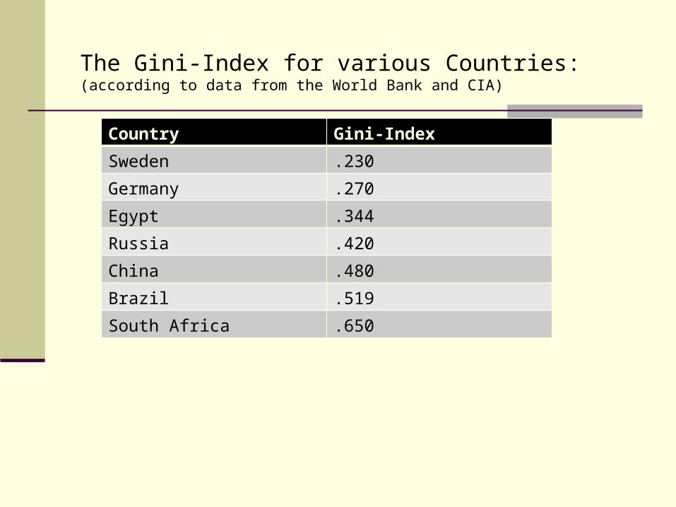
The Gini-Index for various Countries:(according to data from the World Bank and CIA)
Country Gini-Index
Sweden .230
Germany .270
Egypt .344
Russia .420
China .480
Brazil .519
South Africa .650
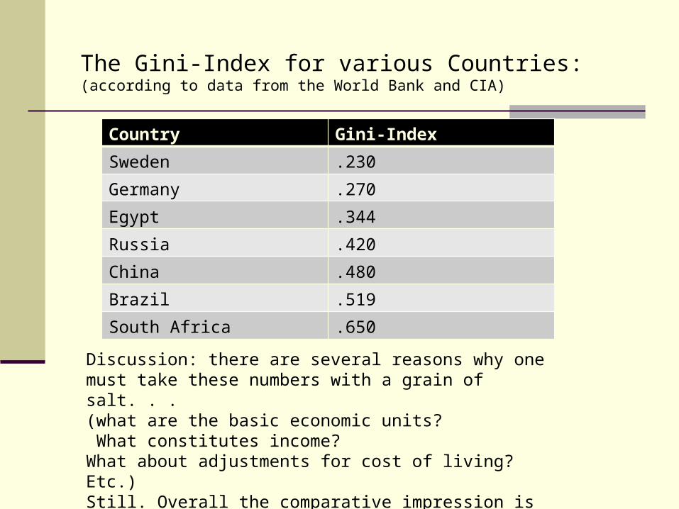
The Gini-Index for various Countries:(according to data from the World Bank and CIA)
Country Gini-Index
Sweden .230
Germany .270
Egypt .344
Russia .420
China .480
Brazil .519
South Africa .650
Discussion: there are several reasons why one must take these numbers with a grain of salt. . . (what are the basic economic units? What constitutes income? What about adjustments for cost of living? Etc.)Still. Overall the comparative impression is correct.
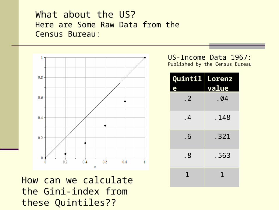
What about the US?Here are Some Raw Data from the Census Bureau:
Quintile Lorenz value
.2 .04
.4 .148
.6 .321
.8 .563
1 1
US-Income Data 1967:Published by the Census Bureau
How can we calculate the Gini-index from these Quintiles??
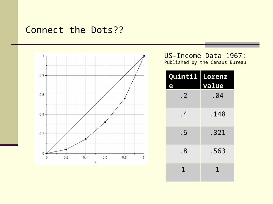
Connect the Dots??
Quintile Lorenz value
.2 .04
.4 .148
.6 .321
.8 .563
1 1
US-Income Data 1967:Published by the Census Bureau
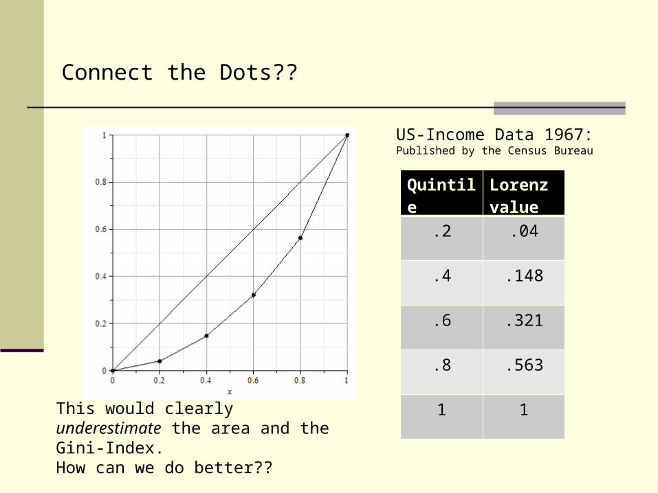
Connect the Dots??
Quintile Lorenz value
.2 .04
.4 .148
.6 .321
.8 .563
1 1
US-Income Data 1967:Published by the Census Bureau
This would clearly underestimate the area and the Gini-Index.How can we do better??
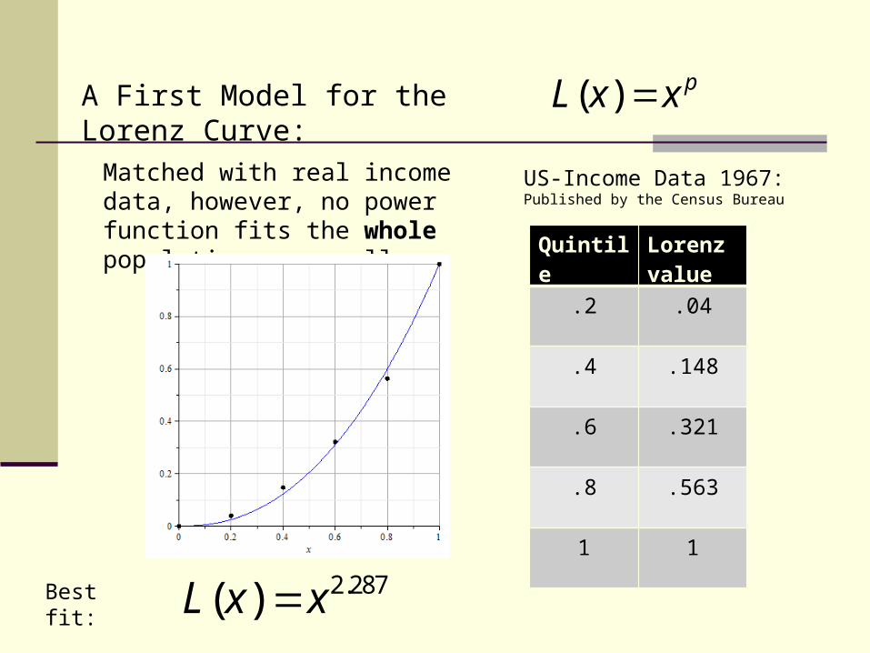
A First Model for the Lorenz Curve: ( ) pL x x
Matched with real income data, however, no power function fits the whole population very well: Quintile Lorenz
value
.2 .04
.4 .148
.6 .321
.8 .563
1 1
US-Income Data 1967:Published by the Census Bureau
2.287( )L x xBest fit:
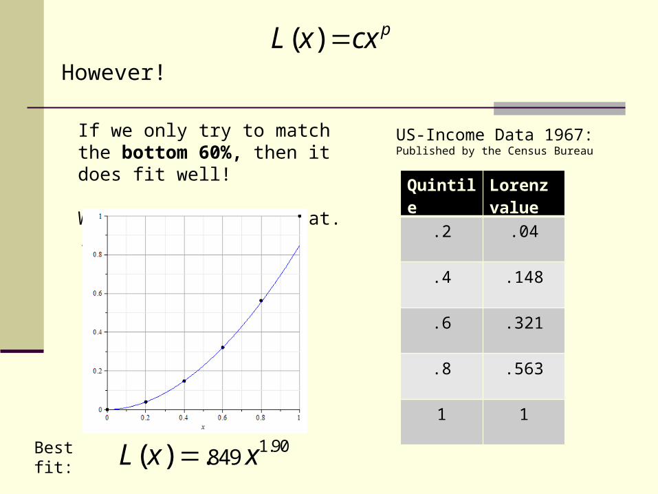
However!
( ) pL x cx
If we only try to match the bottom 60%, then it does fit well!
We’ll come back to that. . . . Quintile Lorenz
value
.2 .04
.4 .148
.6 .321
.8 .563
1 1
US-Income Data 1967:Published by the Census Bureau
1.90849 ( ) .L x xBest fit:
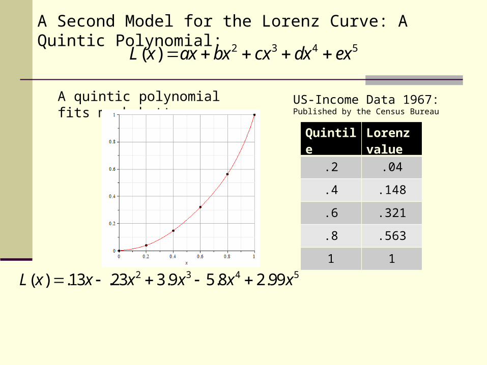
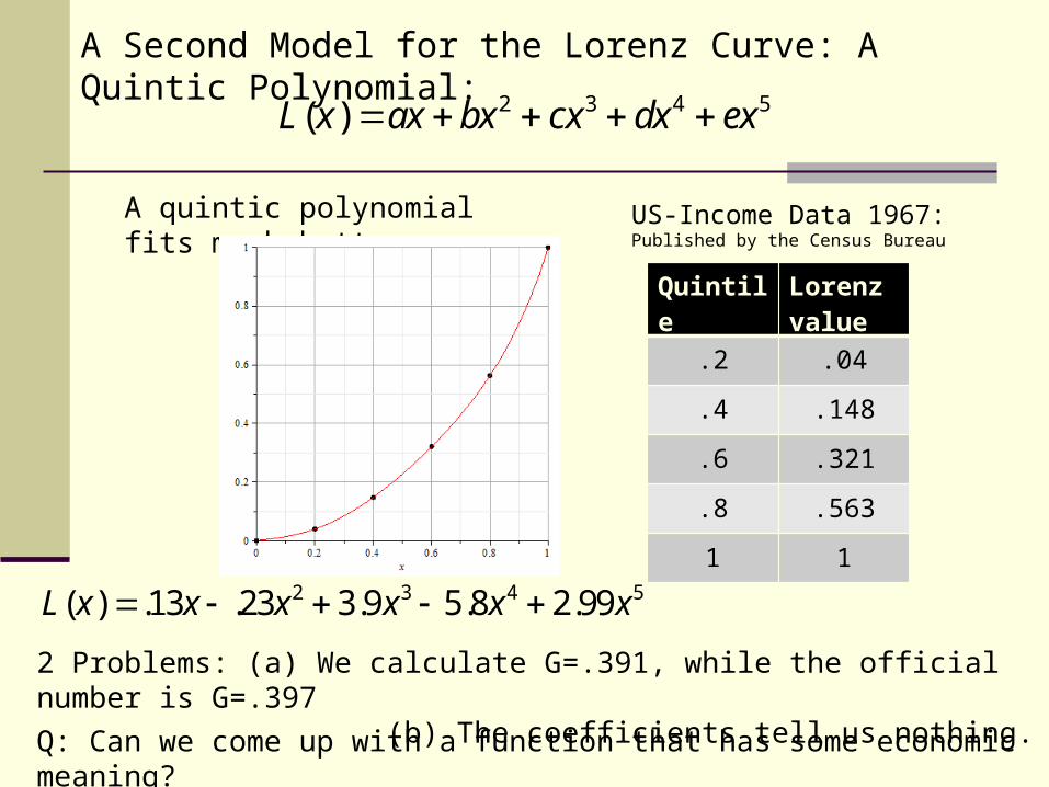
A Second Model for the Lorenz Curve: A Quintic Polynomial:
2 3 4 5( )L x ax bx cx dx ex
A quintic polynomial fits much better:
Quintile Lorenz value
.2 .04
.4 .148
.6 .321
.8 .563
1 1
US-Income Data 1967:Published by the Census Bureau
2 3 4 5( ) .13 .23 3.9 5.8 2.99L x x x x x x
A Second Model for the Lorenz Curve: A Quintic Polynomial:
2 3 4 5( )L x ax bx cx dx ex
A quintic polynomial fits much better:
Quintile Lorenz value
.2 .04
.4 .148
.6 .321
.8 .563
1 1
US-Income Data 1967:Published by the Census Bureau
2 3 4 5( ) .13 .23 3.9 5.8 2.99L x x x x x x
2 Problems: (a) We calculate G=.391, while the official number is G=.397 (b) The coefficients tell us nothing.
Q: Can we come up with a function that has some economic meaning?
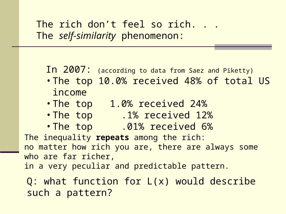
The rich don’t feel so rich. . .The self-similarity phenomenon:
In 2007: (according to data from Saez and Piketty)
• The top 10.0% received 48% of total US income• The top 1.0% received 24%• The top .1% received 12%• The top .01% received 6%
The inequality repeats among the rich: no matter how rich you are, there are always some who are far richer,in a very peculiar and predictable pattern.
Q: what function for L(x) would describe such a pattern?
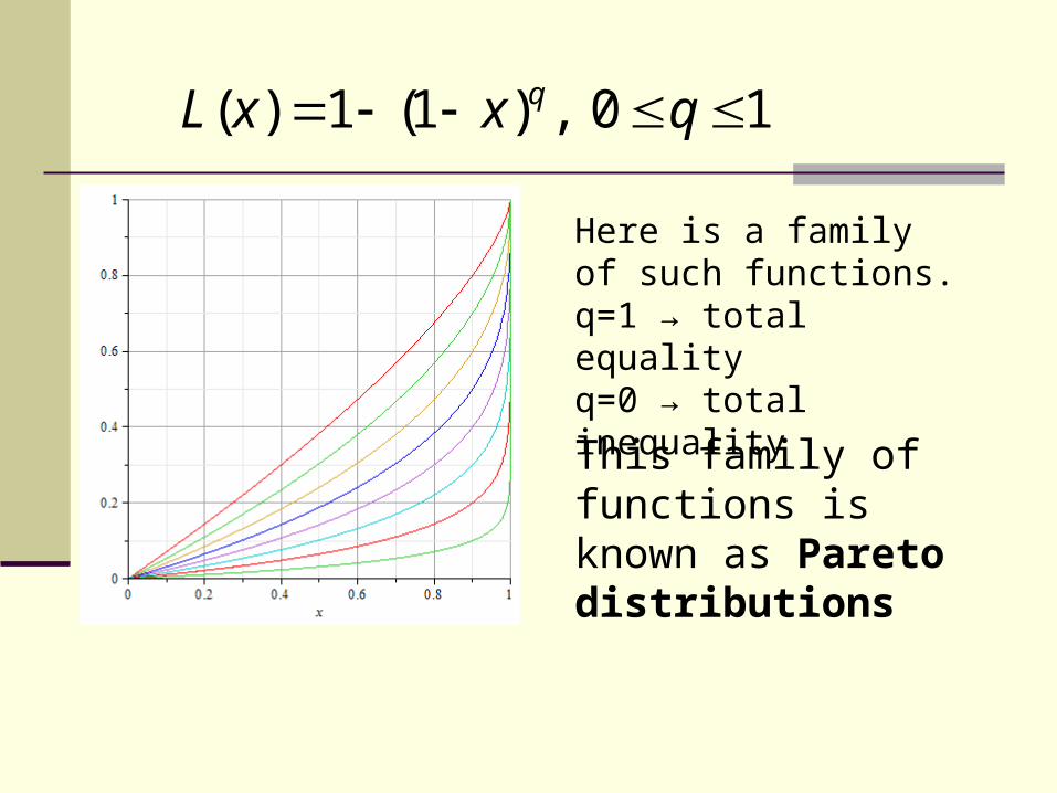
( ) 1 (1 ) , 0 1qL x x q
Here is a family of such functions.q=1 → total equalityq=0 → total inequality
This family of functions is known as Pareto distributions
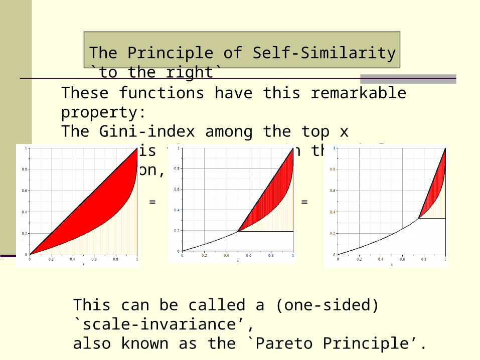
These functions have this remarkable property:The Gini-index among the top x percent is the same as in the whole population, for any x.
= =
The Principle of Self-Similarity `to the right`
This can be called a (one-sided) `scale-invariance’,also known as the `Pareto Principle’.
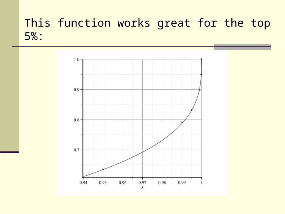
This function works great for the top 5%:
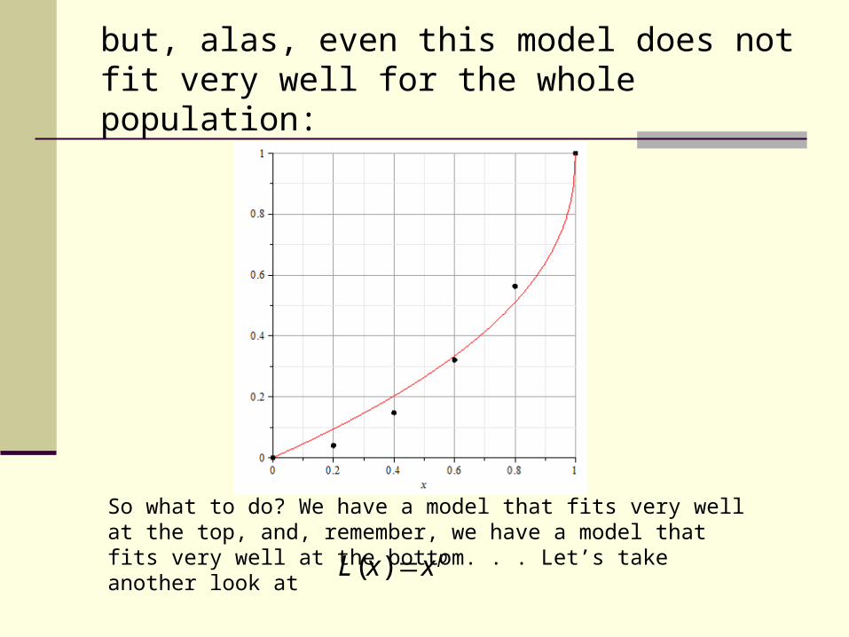
but, alas, even this model does not fit very well for the whole population:
So what to do? We have a model that fits very well at the top, and, remember, we have a model that fits very well at the bottom. . . Let’s take another look at ( ) pL x x
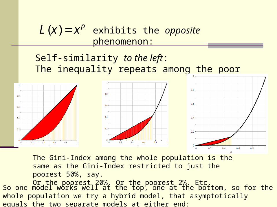
exhibits the opposite phenomenon:
Self-similarity to the left:The inequality repeats among the poor
( ) pL x x
The Gini-Index among the whole population is the same as the Gini-Index restricted to just the poorest 50%, say. Or the poorest 20%. Or the poorest 2%. Etc.
So one model works well at the top, one at the bottom, so for the whole population we try a hybrid model, that asymptotically equals the two separate models at either end:
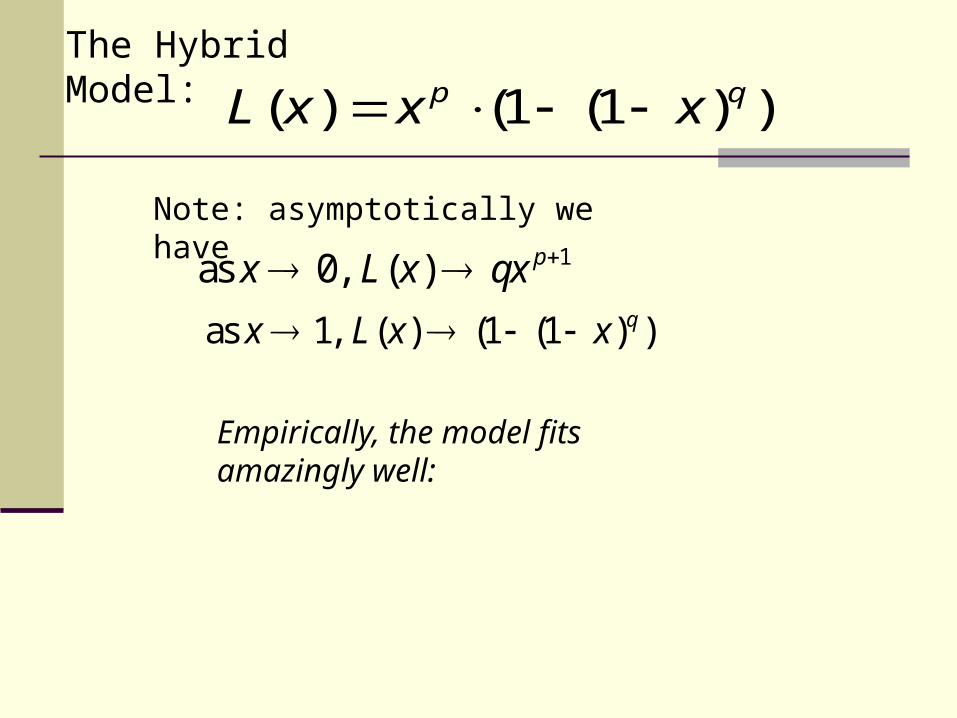
The Hybrid Model:
( ) (1 (1 ) )p qL x x x
Note: asymptotically we have
1as 0, ( ) px L x qx as 1, ( ) (1 (1 ) )qx L x x
Empirically, the model fits amazingly well:
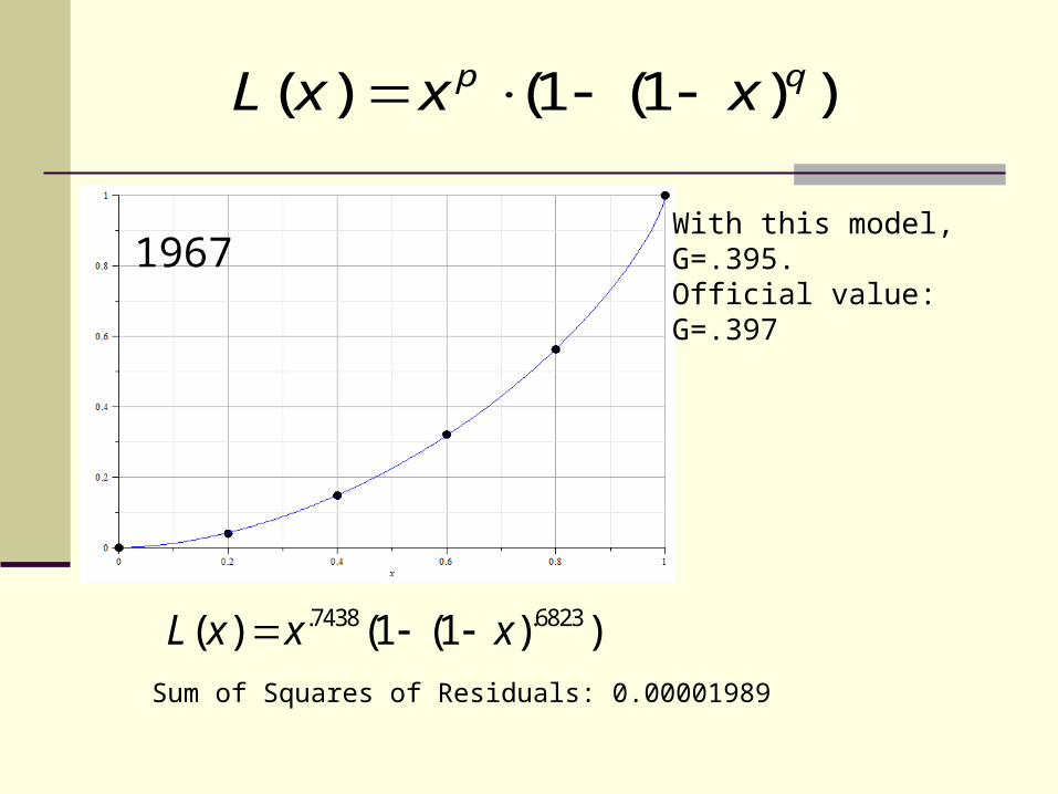
.7438 .6823( ) (1 (1 ) )L x x x
With this model, G=.395.Official value: G=.3971967
Sum of Squares of Residuals: 0.00001989
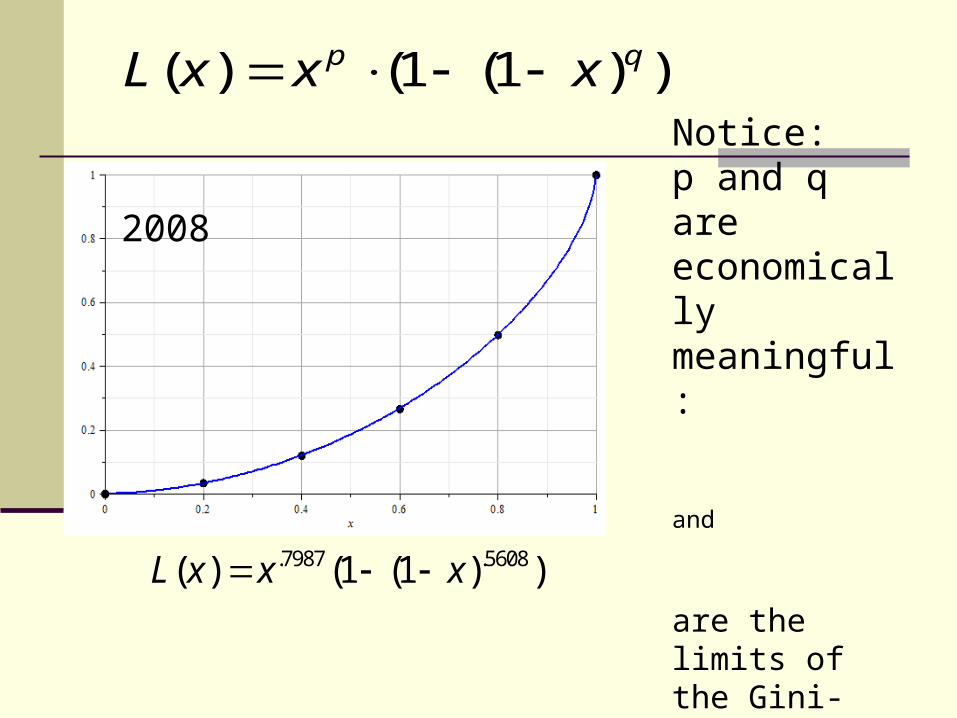
( ) (1 (1 ) )p qL x x x
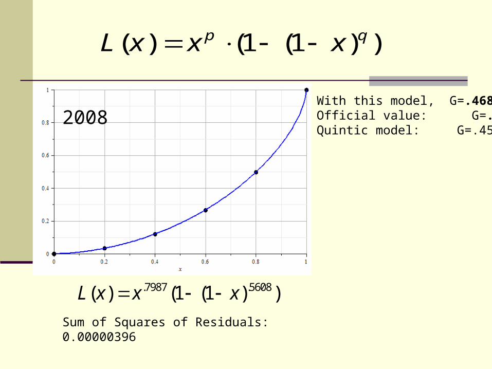
.7987 .5608( ) (1 (1 ) )L x x x
With this model, G=.468Official value: G=.466Quintic model: G=.45720082008
Sum of Squares of Residuals: 0.00000396
( ) (1 (1 ) )p qL x x x
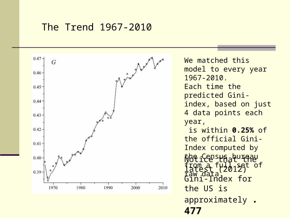
We matched this model to every year 1967-2010.Each time the predicted Gini-index, based on just 4 data points each year, is within 0.25% of the official Gini-Index computed by the Census bureau from a full set of raw data.
The Trend 1967-2010
Notice that the latest (2012) Gini-Index for the US is
approximately .477
.7987 .5608( ) (1 (1 ) )L x x x
20082008
Notice:p and q are economically meaningful:
and
are the limits of the Gini-Index at the low and high end respectively
( ) (1 (1 ) )p qL x x x
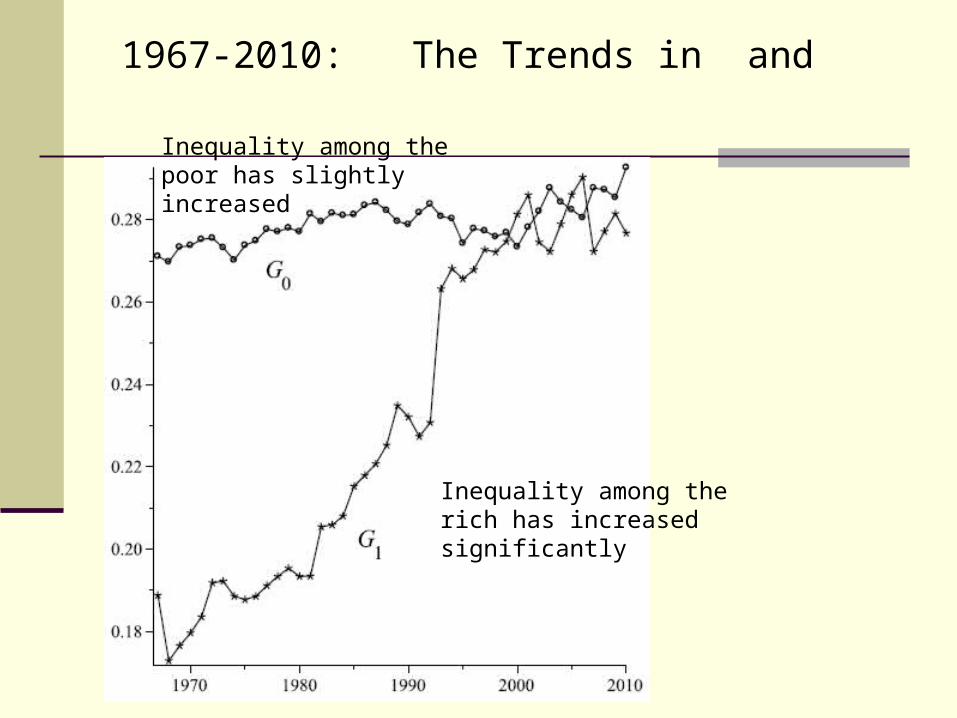
1967-2010: The Trends in and
Inequality among the poor has slightly increased
Inequality among the rich has increased significantly
It is easy to forget among all the models and data, that there are real people affected by poverty and inequality.
Concluding Thought
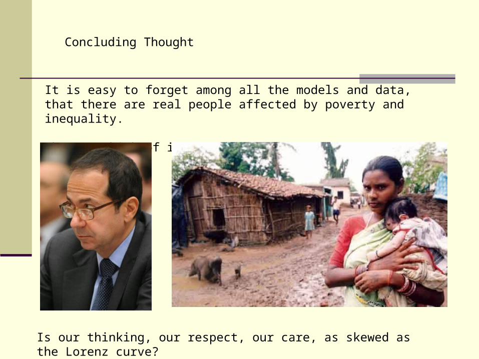
It is easy to forget among all the models and data, that there are real people affected by poverty and inequality.
When we think of inequality, do we think of him or her?
Concluding Thought
Is our thinking, our respect, our care, as skewed as the Lorenz curve?

So I would like to finish with a quote from a girl at a school in South Africa that is under the care of the Augustinian Mission, which in turn is connected to Villanova University
Concluding Thought

AndileStudent, St. Leo’s School, Durban, South Africa
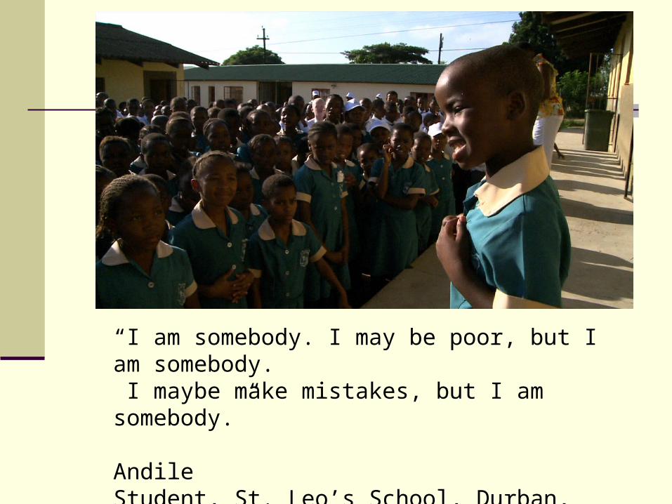
“I am somebody. I may be poor, but I am somebody. I maybe make mistakes, but I am somebody.”
AndileStudent, St. Leo’s School, Durban, South Africa