Embed Size (px)
Citation preview
THE STATE OF THE CLIMATE IN 2016
Ole Humlum
The Global Warming Policy Foundation
GWPF Report 23
GWPF REPORTSViews expressed in the publications ofthe Global Warming Policy Foundationare those of the authors, not those ofthe GWPF, its Academic Advisory Coun-cil members or its directors
THE GLOBALWARMING POLICY FOUNDATIONDirectorBenny Peiser
BOARDOF TRUSTEESLord Lawson (Chairman) Peter Lilley MPLord Donoughue Charles MooreLord Fellowes Baroness NicholsonRt RevdDrPeter Forster, BishopofChester Graham Stringer MPSir Martin Jacomb Lord Turnbull
ACADEMIC ADVISORY COUNCILProfessor Christopher Essex (Chairman) Professor Ross McKitrickSir Samuel Brittan Professor Garth PaltridgeSir Ian Byatt Professor Ian PlimerDr John Constable Professor Paul ReiterProfessor Vincent Courtillot Dr Matt RidleyProfessor Freeman Dyson Sir Alan RudgeChristian Gerondeau Professor Nir ShavivDr Indur Goklany Professor Philip StottProfessor William Happer Professor Henrik SvensmarkProfessor David Henderson Professor Richard TolProfessor Terence Kealey Professor Anastasios TsonisProfessor Deepak Lal Professor Fritz VahrenholtProfessor Richard Lindzen Dr David WhitehouseProfessor Robert Mendelsohn
CREDITSCover image NASA
Public domain
THE STATE OF THE CLIMATE IN 2016
Ole Humlum
ISBN 978-0-9931189-4-4© Copyright 2017 The Global Warming Policy Foundation

Contents
About the author vii
Executive summary ix
1 General overview 2016 1
2 The spatial pattern of global surface air temperatures in 2016 3
3 Global monthly lower troposphere air temperatures since 1979 5
4 Global mean annual lower troposphere air temperatures since 1979 7
5 Global monthly surface air temperatures since 1979 8
6 Global mean annual surface air temperature since 1850 10
7 Comparing surface air temperatures with temperatures recordedby satellites 11
8 Globalmonthly lower troposphereair temperatures since1979; oceansversus land 12
9 Atmospheric temperatures from the surface to 17 km altitude 13
10 Atmospheric greenhouse gases: water vapour and carbon dioxide 14
11 Zonal surface air temperatures 16
12 Polar air temperatures 17
13 Sea surface temperature anomaly at the end of 2015 and 2016 18
14 Global ocean average temperatures to 1900m depth 20
15 Global ocean temperatures at different depths 21
16 Regional ocean temperature changes at 0–1900m 23
17 Ocean temperature net change 2004–2016 in twonorth–south sec-tors 24
18 Pacific Decadal Oscillation 27
v
19 Atlantic Multidecadal Oscillation 28
20 Sea level from satellite altimetry 29
21 Sea level from tide gauges 30
22 Annual accumulated cyclone energy for the Atlantic Basin 32
23 Global, Arctic and Antarctic sea-ice extent 33
24 Northern hemisphere snow-cover extent 34
25 Links to data sources 37

About the author
Ole Humlum is Professor of Physical Geography at the University Centre in Svalbard,Norway.
vii

Executive summary
1. It is likely that 2016 was one of the warmest years in the temperature recordsfrom the instrumental period (since about 1850). However, by the end of 2016,global air temperatures were essentially back to the level of the years beforethe recent 2015–16 oceanographic El Niño episode, although there are smalldifferences between the individual temperature records. This fact reveals thatthe global 2015–16 surface temperature peak was caused mainly by El Niño. Italso suggests thatwhat has been termed the ‘hiatus’, ‘pause’ or ‘periodof gentlewarming’ may endure after the recent El Niño episode.
2. There appears tobea systematic differencedevelopingbetweenglobal air tem-peratures as estimated by surface stations and by satellites. Especially since2003, the global temperature estimate based on surface stationmeasurementshas consistently drifted away from the satellite-based estimate in awarmdirec-tion, and is now about 0.1◦C higher.
3. The temperature variations recorded in the lower troposphere are generally re-flected at higher altitudes too, and the overall temperature ‘pause’ since aboutyear 2002 is recorded at all altitudes, including the tropopause and into thestratosphere. In the stratosphere, however, the temperature ‘pause’ began asearly as around 1995; that is, 5–7 years before a similar temperature ‘pause’ be-gan in the lower troposphere near the Earth’s surface. The stratospheric tem-perature ‘pause’ has now endured without interruption for about 22 years.
4. The recent 2015–16 oceanographic El Niño is among the strongest since thebeginning of the record in 1950. Considering the entire record, however, recentvariations of El Niño and La Niña episodes do not appear to deviate from theprevious pattern.
5. Much of the heat given off during the 2015–16 El Niño appears to have beentransported to thepolar regions, especially to theArctic, causing severeweatherphenomena and unseasonably high air temperatures. Subsequently, the heatmayhavebeen radiatedout to space, as latitudes north of 70°Nhavebeen char-acterised by above-normal outgoing longwave radiation during the northernhemisphere autumn and early winter of 2016.
6. Since 2004, when theArgobuoys came into operation, the global oceans above1900m depth have, on average, warmed somewhat. The maximum warming(from the surface to about 120m) affects the oceans near the Equator, and sur-face warming is absent or small at higher latitudes in both hemispheres. Themaximum ocean surface warming has taken place at latitudes where the in-coming solar radiation is at its annual maximum. Net cooling since 2004 is pro-nounced for the North Atlantic.
ix
7. Data from tide gauges all over the world suggest an average global sea-levelrise of 1–1.5mm/year, while the satellite-derived record suggests a rise ofmorethan 3mm/yr. The noticeable difference between the two data sets still has nobroadly accepted explanation.
8. Arctic and Antarctic sea-ice extents since 1979 have developed in opposite di-rections, decreasing and increasing, respectively. Superimposed on these over-all trends, shorter variations are also important to understand year-to-year vari-ations. In the Arctic, a 5.3-year periodic variation is important, while for theAntarctic a cycle of about 4.5 years duration is important. Both these variationsreached their minima simultaneously in 2016, which explains the recent mini-mum in global sea-ice extent.
9. The northern hemisphere snow-cover extent has important local and regionalvariations from year to year. The overall tendency (since 1972), however, is astable overall snow extent.
x
1 General overview 2016
The year 2016 was affected by the oceanographic phenomenon El Niño in the PacificOcean. It is likely that 2016 was one of the warmest years in the longest global airtemperature record (HadCRUT), which extends back to 1850. However, by the endof 2016, global air temperatures were again back to the level of the years before therecent El Niño episode, suggesting that the global 2015–16 surface temperature peakwas caused mainly by this oceanographic phenomenon.
Many diagrams in this report focus on the period from 1979 onwards. This rep-resents the start of the satellite era, from when access to a wide range of observa-tions with nearly global coverage, including temperature, became available. Thesedata provide a detailed view of temperature changes over time at different altitudesin the atmosphere. Among other phenomena, these observations reveal that whilethe well-known lower-troposphere temperature pause began around 2002, a similarstratospheric temperature plateau had already started already by 1995, several yearsbefore the similar temperature plateau near the Earth’s surface. Until now, little at-tention has been paid to this aspect of global climate change.
Surface air temperatures are understandably at the core of the climate debate,but the significance of any short-termwarming or cooling in surface air temperaturesshould not be overstated. Whenever the Earth experiences a warm El Niño or a coldLa Niña episode, major heat exchanges take place between the Pacific Ocean and theatmosphere above, eventually showing up as a signal in estimates of the global airtemperature. However, this does not reflect a similar change in the total heat contentof the atmosphere–ocean system. In fact, global net changesmay be small, and suchheat exchangesmaymainly reflect a redistribution of energy between the ocean andatmosphere. Evaluating the dynamics of ocean temperatures is therefore just as im-portant as evaluating changes of surface air temperatures.
Since 2004 the 3800 Argo floats have provided a unique ocean temperature dataset for depths down to 1900m. Although the oceans are much deeper than 1900m,and the Argo data series is still relatively short, several interesting features are nowemerging from these empirical observations.
Globally since 2004, the upper 1900m of the oceans have beenwarming on aver-age change. The maximumwarming affects the top 100m, especially near the Equa-tor. At about 200m depth, cooling has on average taken place. At greater depths,some net warming has occurred since 2004.
This global average oceanic change since 2004 is reflected in Equatorial oceansbetween 30°N and 30°S, representing a huge surface area. At the same time, thenorthern oceans (55–65°N) have on average experienced a marked cooling down to1300m depth, and some warming at greater depths. The southern oceans (55–65°S)have on average seen slight warming at all depths since 2004. However, as is wellknown, averages may be misleading, and quite often a better insight is obtained by
1
studying the details.Air-temperature data suggests that a part of the heat released from the Pacific
Ocean during the recent El Niño episode may have been transported towards thepolar regions, especially in the northern hemisphere, mainly via the Atlantic sector.ManyArctic regions experiencedhigh temperatures in 2016, especially in the autumnand early winter, along with associated weather-related phenomena. At the sametime, north of 70°N, the outgoing longwave radiation from the top of the atmospherehas been above normal. Through this mechanism, much of the additional heat re-leased to the atmosphere from the Pacific Ocean may have been lost to space fromthe Arctic region.
A fascinating difference is developing betweenglobal air temperatures estimatedby surface stations (HadCRUT, NCDC and GISS)† and by satellites (UAH and RSS),‡ re-spectively. In the early part of the temperature record after 1979, the satellite-basedtemperatures were often – but not always – somewhat higher than the temperaturesestimated from surface observations. Since 2003, however, the temperature estimatefrom the surface stations has consistently drifted away from the satellite-based esti-mates in a warm direction, and is now on average about 0.1◦C higher.
At the endof 2016, theglobal sea-ice extent reachedamarkedminimum. Thiswasat least partly caused by the operation of two different natural cycles of the sea ice inthe northern and the southern hemispheres. In 2016, both cycles had simultaneousminima, with inevitable consequences for global sea-ice extent. It is therefore likelythat coming years will be characterised by somewhat different changes in global sea-ice extent.
Variations in global snow-cover extent aremainly causedby changes in the north-ern hemisphere, where most of the major land masses are located. The southernhemisphere snow-cover extent is essentially controlledby theAntarctic ice sheet, andis therefore relatively stable. The northern hemisphere average snow cover extenthas also been stable since the onset of satellite observations, although local and re-gional interannual variationsmay be large. Considering seasonal changes, the north-ern hemisphere autumn snow-cover extent is increasing a little, the mid-winter ex-tent is largely stable, and the spring extent is declining a little.
Global sea levels aremonitored by satellite altimetry and by directmeasurementsfrom tide gauges. While the satellite-derived record suggests a global sea-level rise ofmore than 3mm per year, data from tide gauges all over the world suggest a stable,average global sea-level rise of less than 1.5mm per year. The marked difference be-tween the two datasets still has no broadly accepted explanation. What remains sig-
† HadCRUT is a cooperative effort between the Hadley Centre for Climate Prediction and Researchand theUniversity of East Anglia’s Climatic ResearchUnit (CRU), UK. NCDC is theNational ClimaticData Center, USA. GISS is the Goddard Institute for Space Studies, USA.
‡ UAH is the University of Alabama at Huntsville. RSS is Remote Sensing Systems Inc.
2
nificant, however, is that for local coastal planning the tide-gauge data are the moreimportant, as is explained later.
2 The spatial pattern of global surface airtemperatures in 2016
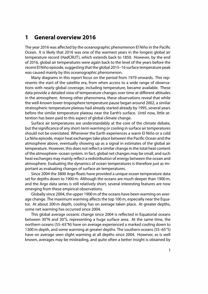
On average, the global surface air temperature for 2016 was above the average ofthe past ten years, as was the case in 2015. Both 2015 and 2016 were affected by therecent El Niño episode in the Pacific Ocean, which peaked in early 2016.
Figure 1: 2016 surface air temperatures compared to the average for the previous tenyears.
Green-yellow-red colours indicate areas with higher temperatures than the average,while blue colours indicate lower-than-average temperatures. Data source: GISS.
The northern hemisphere was characterised by regional temperature contrasts,but was generally warm north of 60°N. Alaska and the Arctic Ocean in particular werewarm. Relatively cold regions were only found in parts of the North Atlantic and inthe Pacific Ocean. Most of North America had above-average temperatures, Europewas close to the average, andmost of Russia, Siberia, and Asia were somewhat aboveaverage.
Near the Equator, temperatures were generally near the average of the previousten years. In the Pacific, however, temperatures were relatively high, reflecting the ElNiño, which was still playing out during the first part of 2016.
3
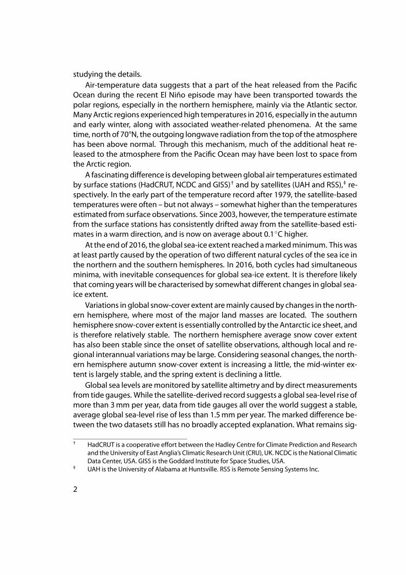
Figure 2: 2016 polar surface air temperatures compared to the average for the previ-ous ten years.
Green-yellow-red colours indicate areas with higher temperature than the average,while blue colours indicate lower-than-average temperatures. Data source: GISS.
In the southern hemisphere, surface air temperatures were near or below the av-erage for the previous ten years. In particular, western Australia and central SouthAmerica had average temperatures somewhat below the average.
In the Arctic, most regions in 2016 had above-average temperatures, especiallywithin the Alaska and Greenland sectors of the Arctic. The temperature pattern for2016 is, however, influenced bywhat is probably an interpolation error at GISS, whichresults in an implausible circular temperature plateau north of 80°N.
The Antarctic continent was divided into regions with above- and below-averagetemperatures in 2016, in contrast to 2015, where the entire continent was charac-terised by below-average temperatures. Another probable interpolation error ap-pears to influence the pattern south of 80°S as well.
Globally speaking, at the end of 2016, air temperatures were essentially back tothe level normal in the years leadingup to the recent 2015–16 ElNiño. Thus theglobalsurface air temperature peak of 2015–16 appears to bemainly caused by this oceano-graphic phenomenon.
4
3 Global monthly lower troposphere airtemperatures since 1979
(a) UAH
(b) RSS
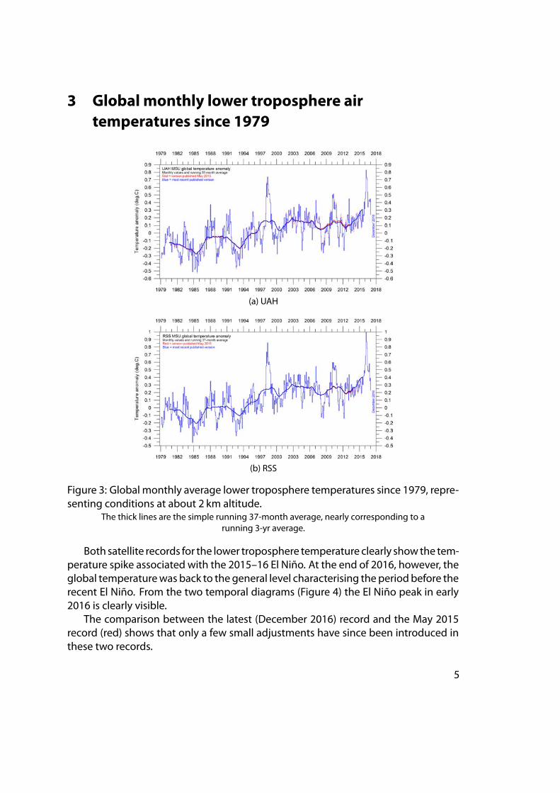
Figure 3: Global monthly average lower troposphere temperatures since 1979, repre-senting conditions at about 2 km altitude.
The thick lines are the simple running 37-month average, nearly corresponding to arunning 3-yr average.
Both satellite records for the lower troposphere temperature clearly showthe tem-perature spike associated with the 2015–16 El Niño. At the end of 2016, however, theglobal temperaturewas back to the general level characterising the periodbefore therecent El Niño. From the two temporal diagrams (Figure 4) the El Niño peak in early2016 is clearly visible.
The comparison between the latest (December 2016) record and the May 2015record (red) shows that only a few small adjustments have since been introduced inthese two records.
5
(a) UAH
(b) RSS
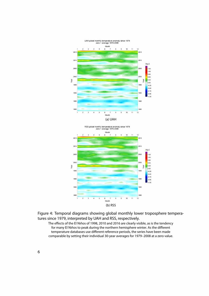
Figure 4: Temporal diagrams showing global monthly lower troposphere tempera-tures since 1979, interpreted by UAH and RSS, respectively.
The effects of the El Niños of 1998, 2010 and 2016 are clearly visible, as is the tendencyfor many El Niños to peak during the northern hemisphere winter. As the differenttemperature databases use different reference periods, the series have been made
comparable by setting their individual 30-year averages for 1979–2008 at a zero value.
6
4 Global mean annual lower troposphere airtemperatures since 1979
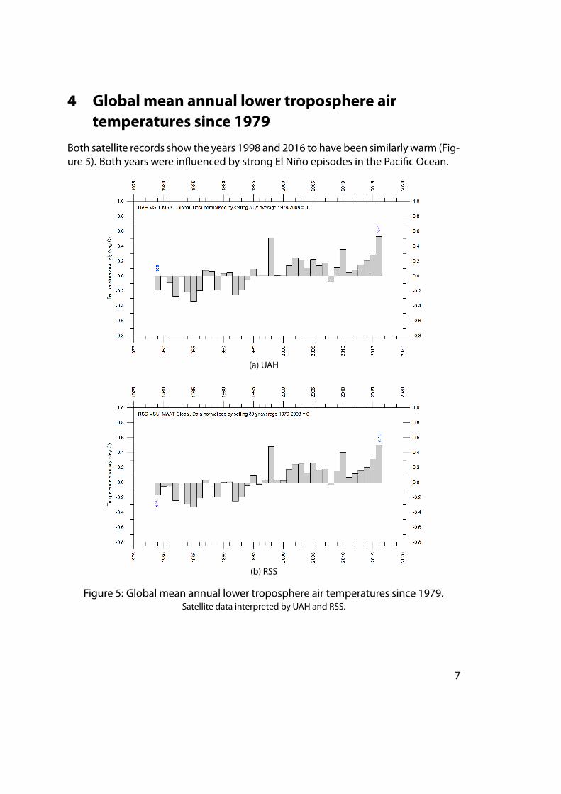
Both satellite records show the years 1998 and 2016 to have been similarly warm (Fig-ure 5). Both years were influenced by strong El Niño episodes in the Pacific Ocean.
(a) UAH
(b) RSS
Figure 5: Global mean annual lower troposphere air temperatures since 1979.Satellite data interpreted by UAH and RSS.
7
5 Global monthly surface air temperatures since1979
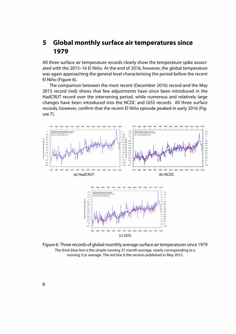
All three surface air temperature records clearly show the temperature spike associ-ated with the 2015–16 El Niño. At the end of 2016, however, the global temperaturewas again approaching the general level characterising the period before the recentEl Niño (Figure 6).
The comparison between the most recent (December 2016) record and the May2015 record (red) shows that few adjustments have since been introduced in theHadCRUT record over the intervening period, while numerous and relatively largechanges have been introduced into the NCDC and GISS records. All three surfacerecords, however, confirm that the recent El Niño episode peaked in early 2016 (Fig-ure 7).
(a) HadCRUT (b) NCDC
(c) GISS
Figure 6: Three records of globalmonthly average surface air temperatures since 1979The thick blue line is the simple running 37-month average, nearly corresponding to a
running 3-yr average. The red line is the version published in May 2015.
8
(a) HadCRUT
(b) NCDC
(c) GISS
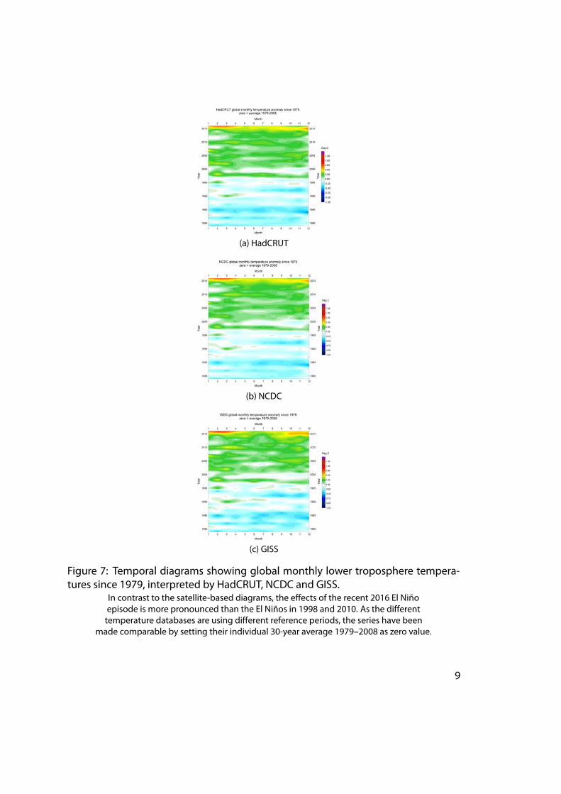
Figure 7: Temporal diagrams showing global monthly lower troposphere tempera-tures since 1979, interpreted by HadCRUT, NCDC and GISS.
In contrast to the satellite-based diagrams, the effects of the recent 2016 El Niñoepisode is more pronounced than the El Niños in 1998 and 2010. As the differenttemperature databases are using different reference periods, the series have been
made comparable by setting their individual 30-year average 1979–2008 as zero value.
9
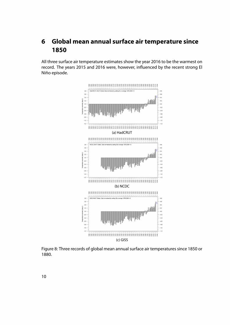
6 Global mean annual surface air temperature since1850
All three surface air temperature estimates show the year 2016 to be the warmest onrecord. The years 2015 and 2016 were, however, influenced by the recent strong ElNiño episode.
(a) HadCRUT
(b) NCDC
(c) GISS
Figure 8: Three records of global mean annual surface air temperatures since 1850 or1880.
10
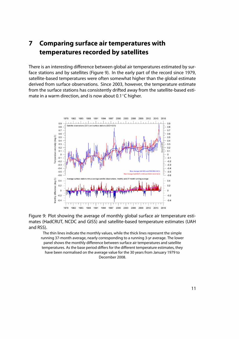
7 Comparing surface air temperatures withtemperatures recorded by satellites
There is an interesting difference between global air temperatures estimated by sur-face stations and by satellites (Figure 9). In the early part of the record since 1979,satellite-based temperatures were often somewhat higher than the global estimatederived from surface observations. Since 2003, however, the temperature estimatefrom the surface stations has consistently drifted away from the satellite-based esti-mate in a warm direction, and is now about 0.1◦C higher.
Figure 9: Plot showing the average of monthly global surface air temperature esti-mates (HadCRUT, NCDC and GISS) and satellite-based temperature estimates (UAHand RSS).
The thin lines indicate the monthly values, while the thick lines represent the simplerunning 37-month average, nearly corresponding to a running 3-yr average. The lowerpanel shows the monthly difference between surface air temperatures and satellitetemperatures. As the base period differs for the different temperature estimates, theyhave been normalised on the average value for the 30 years from January 1979 to
December 2008.
11
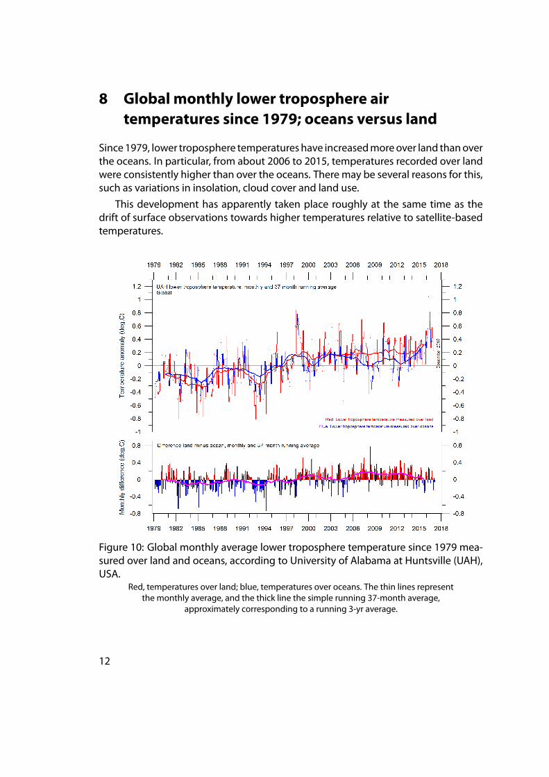
8 Global monthly lower troposphere airtemperatures since 1979; oceans versus land
Since1979, lower troposphere temperatureshave increasedmoreover land thanoverthe oceans. In particular, from about 2006 to 2015, temperatures recorded over landwere consistently higher than over the oceans. There may be several reasons for this,such as variations in insolation, cloud cover and land use.
This development has apparently taken place roughly at the same time as thedrift of surface observations towards higher temperatures relative to satellite-basedtemperatures.
Figure 10: Global monthly average lower troposphere temperature since 1979 mea-sured over land and oceans, according to University of Alabama at Huntsville (UAH),USA.
Red, temperatures over land; blue, temperatures over oceans. The thin lines representthe monthly average, and the thick line the simple running 37-month average,
approximately corresponding to a running 3-yr average.
12
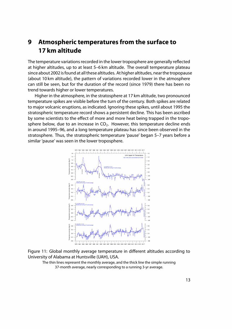
9 Atmospheric temperatures from the surface to17 km altitude
The temperature variations recorded in the lower troposphere are generally reflectedat higher altitudes, up to at least 5–6 km altitude. The overall temperature plateausinceabout2002 is foundat all thesealtitudes. Athigher altitudes, near the tropopause(about 10 km altitude), the pattern of variations recorded lower in the atmospherecan still be seen, but for the duration of the record (since 1979) there has been notrend towards higher or lower temperatures.
Higher in the atmosphere, in the stratosphere at 17 km altitude, two pronouncedtemperature spikes are visible before the turn of the century. Both spikes are relatedto major volcanic eruptions, as indicated. Ignoring these spikes, until about 1995 thestratospheric temperature record shows a persistent decline. This has been ascribedby some scientists to the effect of more and more heat being trapped in the tropo-sphere below, due to an increase in CO2. However, this temperature decline endsin around 1995–96, and a long temperature plateau has since been observed in thestratosphere. Thus, the stratospheric temperature ‘pause’ began 5–7 years before asimilar ‘pause’ was seen in the lower troposphere.
Figure 11: Global monthly average temperature in different altitudes according toUniversity of Alabama at Huntsville (UAH), USA.
The thin lines represent the monthly average, and the thick line the simple running37-month average, nearly corresponding to a running 3-yr average.
13
10 Atmospheric greenhouse gases: water vapourand carbon dioxide
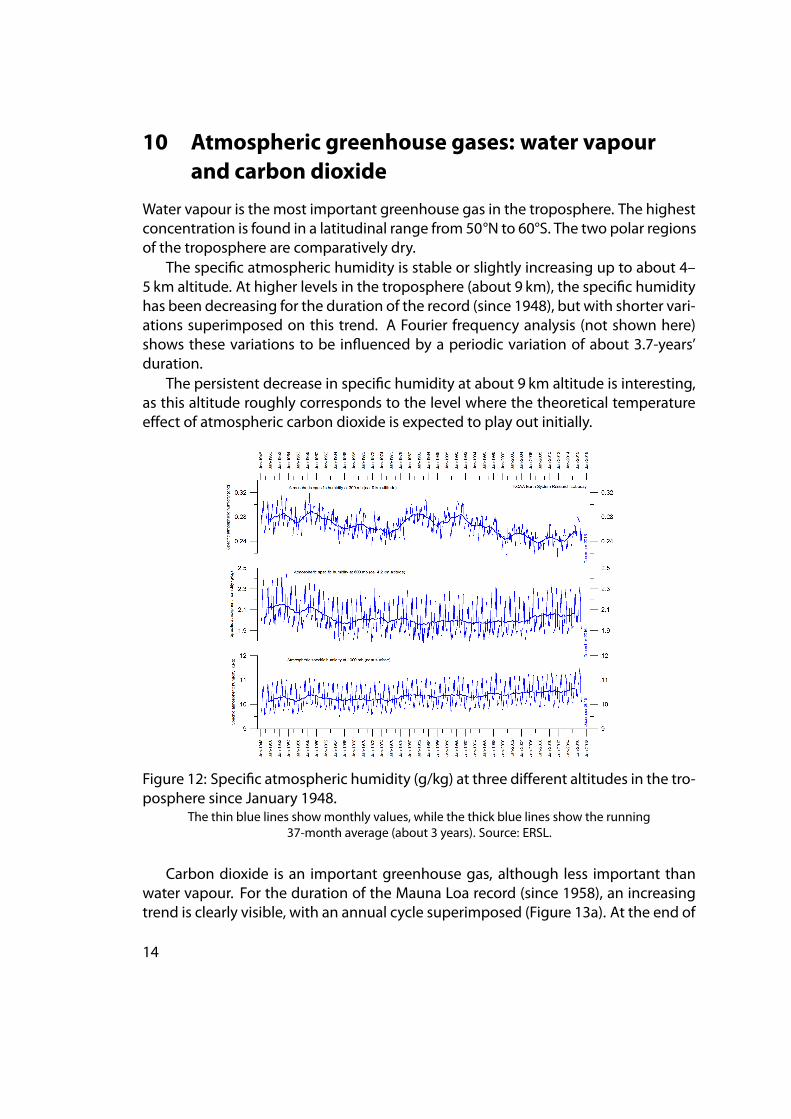
Water vapour is the most important greenhouse gas in the troposphere. The highestconcentration is found in a latitudinal range from 50°N to 60°S. The two polar regionsof the troposphere are comparatively dry.
The specific atmospheric humidity is stable or slightly increasing up to about 4–5 km altitude. At higher levels in the troposphere (about 9 km), the specific humidityhas been decreasing for the duration of the record (since 1948), but with shorter vari-ations superimposed on this trend. A Fourier frequency analysis (not shown here)shows these variations to be influenced by a periodic variation of about 3.7-years’duration.
The persistent decrease in specific humidity at about 9 km altitude is interesting,as this altitude roughly corresponds to the level where the theoretical temperatureeffect of atmospheric carbon dioxide is expected to play out initially.
Figure 12: Specific atmospheric humidity (g/kg) at three different altitudes in the tro-posphere since January 1948.
The thin blue lines showmonthly values, while the thick blue lines show the running37-month average (about 3 years). Source: ERSL.
Carbon dioxide is an important greenhouse gas, although less important thanwater vapour. For the duration of the Mauna Loa record (since 1958), an increasingtrend is clearly visible, with an annual cycle superimposed (Figure 13a). At the end of
14
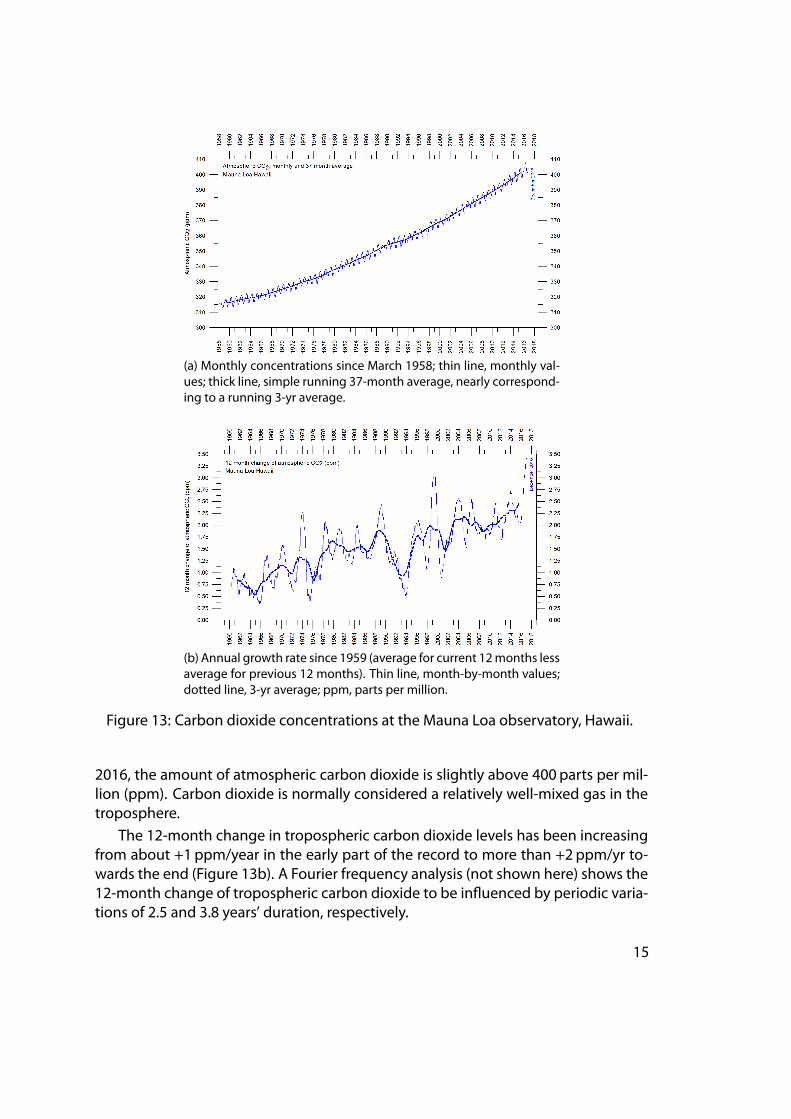
(a) Monthly concentrations since March 1958; thin line, monthly val-ues; thick line, simple running 37-month average, nearly correspond-ing to a running 3-yr average.
(b) Annual growth rate since 1959 (average for current 12months lessaverage for previous 12 months). Thin line, month-by-month values;dotted line, 3-yr average; ppm, parts per million.
Figure 13: Carbon dioxide concentrations at the Mauna Loa observatory, Hawaii.
2016, the amount of atmospheric carbon dioxide is slightly above 400 parts per mil-lion (ppm). Carbon dioxide is normally considered a relatively well-mixed gas in thetroposphere.
The 12-month change in tropospheric carbon dioxide levels has been increasingfrom about +1 ppm/year in the early part of the record to more than +2 ppm/yr to-wards the end (Figure 13b). A Fourier frequency analysis (not shown here) shows the12-month change of tropospheric carbon dioxide to be influenced by periodic varia-tions of 2.5 and 3.8 years’ duration, respectively.
15
11 Zonal surface air temperatures
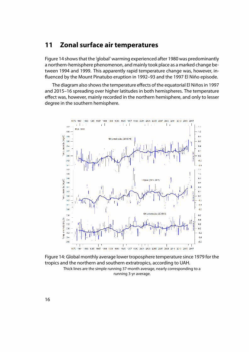
Figure 14 shows that the ‘global’ warming experienced after 1980was predominantlya northern-hemisphere phenomenon, andmainly took place as amarked change be-tween 1994 and 1999. This apparently rapid temperature change was, however, in-fluenced by the Mount Pinatubo eruption in 1992–93 and the 1997 El Niño episode.
The diagram also shows the temperature effects of the equatorial El Niños in 1997and 2015–16 spreading over higher latitudes in both hemispheres. The temperatureeffect was, however, mainly recorded in the northern hemisphere, and only to lesserdegree in the southern hemisphere.
Figure 14: Globalmonthly average lower troposphere temperature since 1979 for thetropics and the northern and southern extratropics, according to UAH.
Thick lines are the simple running 37-month average, nearly corresponding to arunning 3-yr average.
16
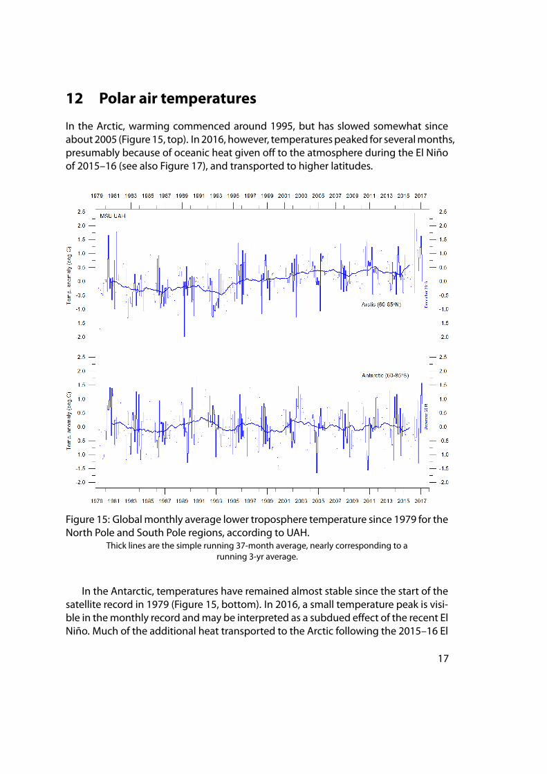
12 Polar air temperatures
In the Arctic, warming commenced around 1995, but has slowed somewhat sinceabout2005 (Figure15, top). In 2016, however, temperaturespeaked for severalmonths,presumably because of oceanic heat given off to the atmosphere during the El Niñoof 2015–16 (see also Figure 17), and transported to higher latitudes.
Figure 15: Globalmonthly average lower troposphere temperature since 1979 for theNorth Pole and South Pole regions, according to UAH.
Thick lines are the simple running 37-month average, nearly corresponding to arunning 3-yr average.
In the Antarctic, temperatures have remained almost stable since the start of thesatellite record in 1979 (Figure 15, bottom). In 2016, a small temperature peak is visi-ble in themonthly record andmay be interpreted as a subdued effect of the recent ElNiño. Much of the additional heat transported to the Arctic following the 2015–16 El
17
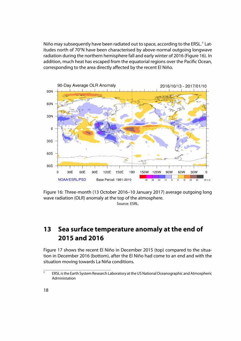
Niñomay subsequently have been radiated out to space, according to the ERSL.† Lat-itudes north of 70°N have been characterised by above-normal outgoing longwaveradiation during the northern hemisphere fall and early winter of 2016 (Figure 16). Inaddition, much heat has escaped from the equatorial regions over the Pacific Ocean,corresponding to the area directly affected by the recent El Niño.
Figure 16: Three-month (13 October 2016–10 January 2017) average outgoing longwave radiation (OLR) anomaly at the top of the atmosphere.
Source: ESRL.
13 Sea surface temperature anomaly at the end of2015 and 2016
Figure 17 shows the recent El Niño in December 2015 (top) compared to the situa-tion in December 2016 (bottom), after the El Niño had come to an end and with thesituation moving towards La Niña conditions.
† ERSL is the Earth SystemResearch Laboratory at theUSNationalOceanographic andAtmosphericAdministation
18
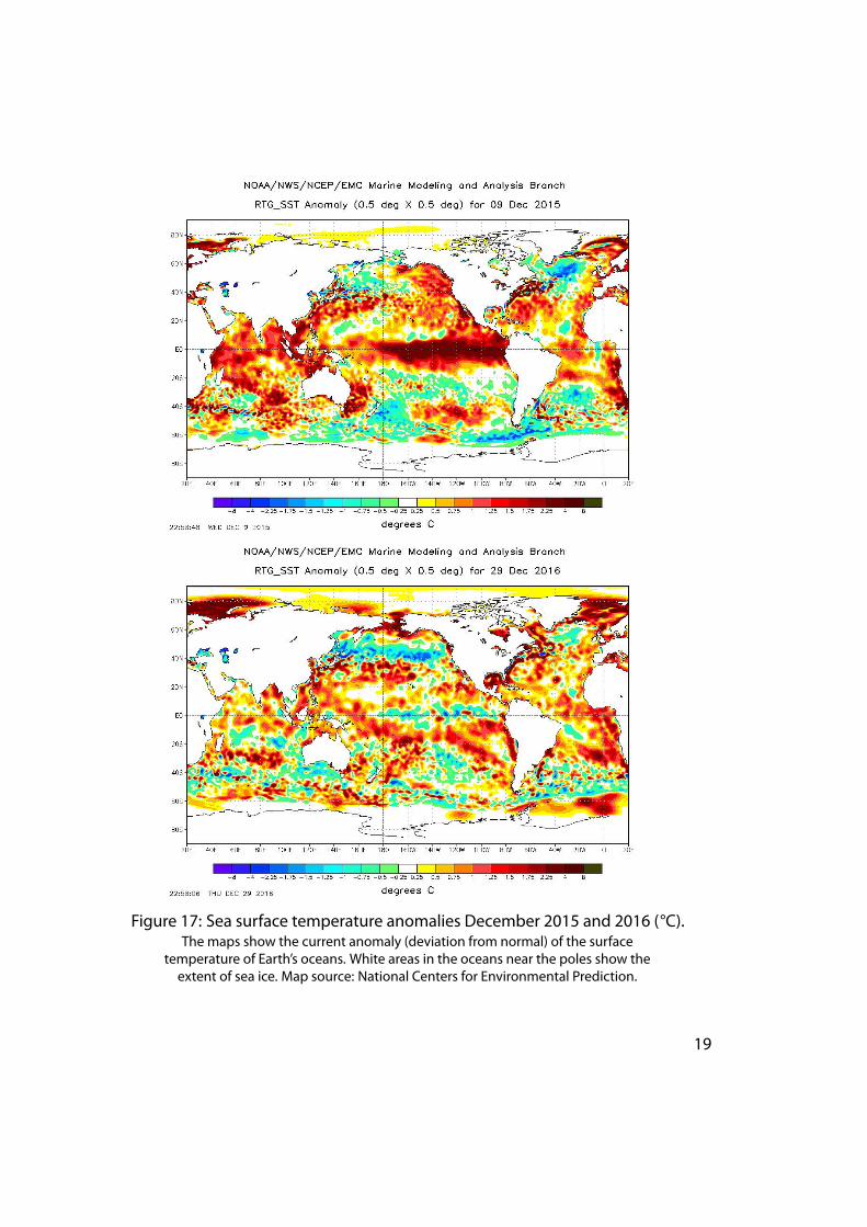
Figure 17: Sea surface temperature anomalies December 2015 and 2016 (°C).The maps show the current anomaly (deviation from normal) of the surface
temperature of Earth’s oceans. White areas in the oceans near the poles show theextent of sea ice. Map source: National Centers for Environmental Prediction.
19
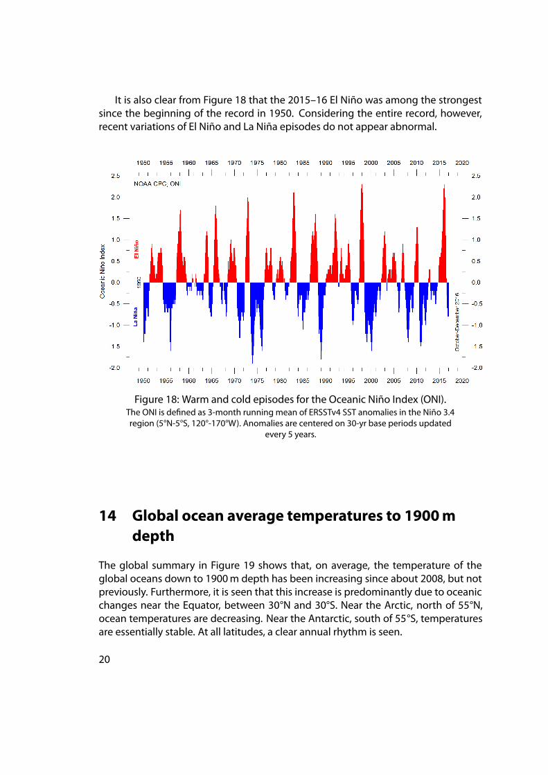
It is also clear from Figure 18 that the 2015–16 El Niño was among the strongestsince the beginning of the record in 1950. Considering the entire record, however,recent variations of El Niño and La Niña episodes do not appear abnormal.
Figure 18: Warm and cold episodes for the Oceanic Niño Index (ONI).The ONI is defined as 3-month running mean of ERSSTv4 SST anomalies in the Niño 3.4region (5°N-5°S, 120°-170°W). Anomalies are centered on 30-yr base periods updated
every 5 years.
14 Global ocean average temperatures to 1900mdepth
The global summary in Figure 19 shows that, on average, the temperature of theglobal oceans down to 1900m depth has been increasing since about 2008, but notpreviously. Furthermore, it is seen that this increase is predominantly due to oceanicchanges near the Equator, between 30°N and 30°S. Near the Arctic, north of 55°N,ocean temperatures are decreasing. Near the Antarctic, south of 55°S, temperaturesare essentially stable. At all latitudes, a clear annual rhythm is seen.
20
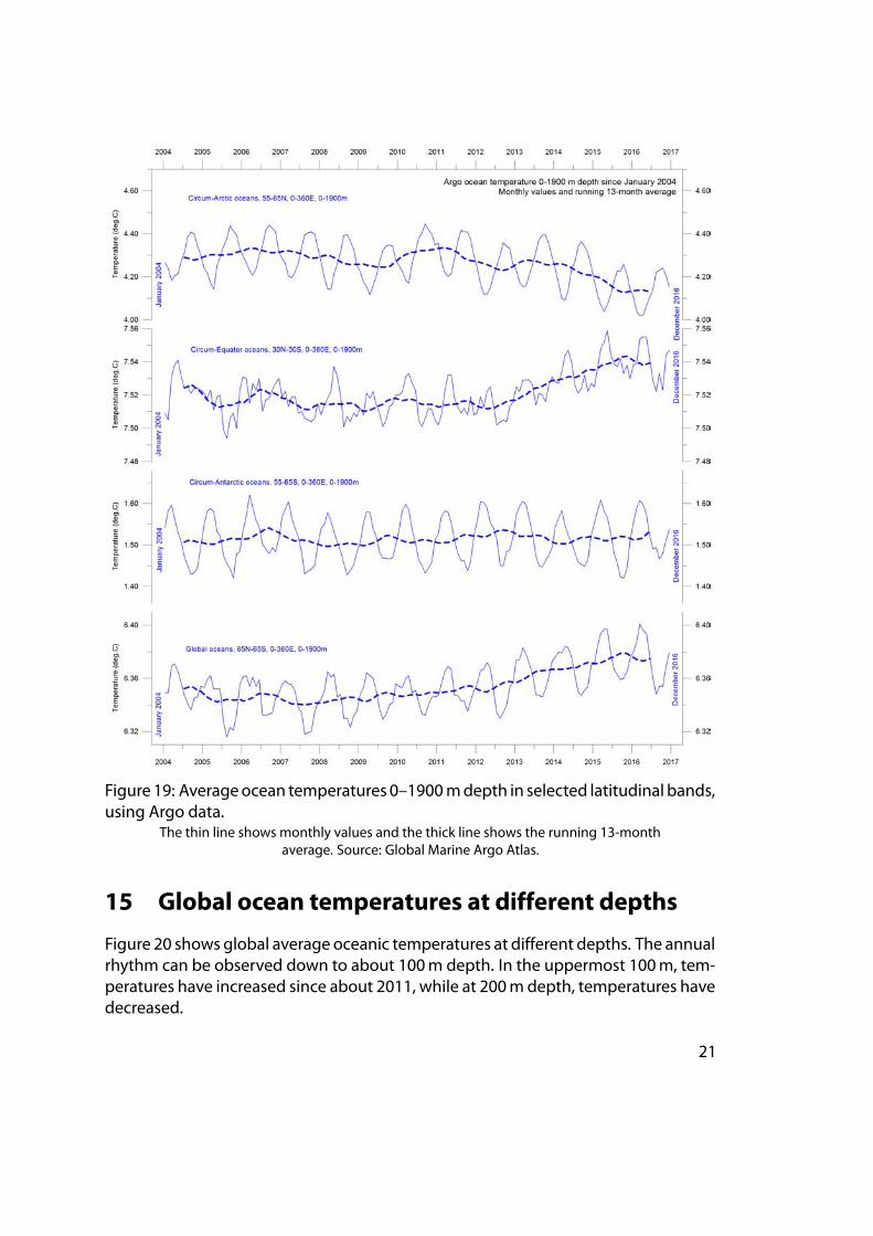
Figure 19: Averageocean temperatures 0–1900mdepth in selected latitudinal bands,using Argo data.
The thin line shows monthly values and the thick line shows the running 13-monthaverage. Source: Global Marine Argo Atlas.
15 Global ocean temperatures at different depths
Figure 20 shows global average oceanic temperatures at different depths. The annualrhythm can be observed down to about 100m depth. In the uppermost 100m, tem-peratures have increased since about 2011, while at 200mdepth, temperatures havedecreased.
21
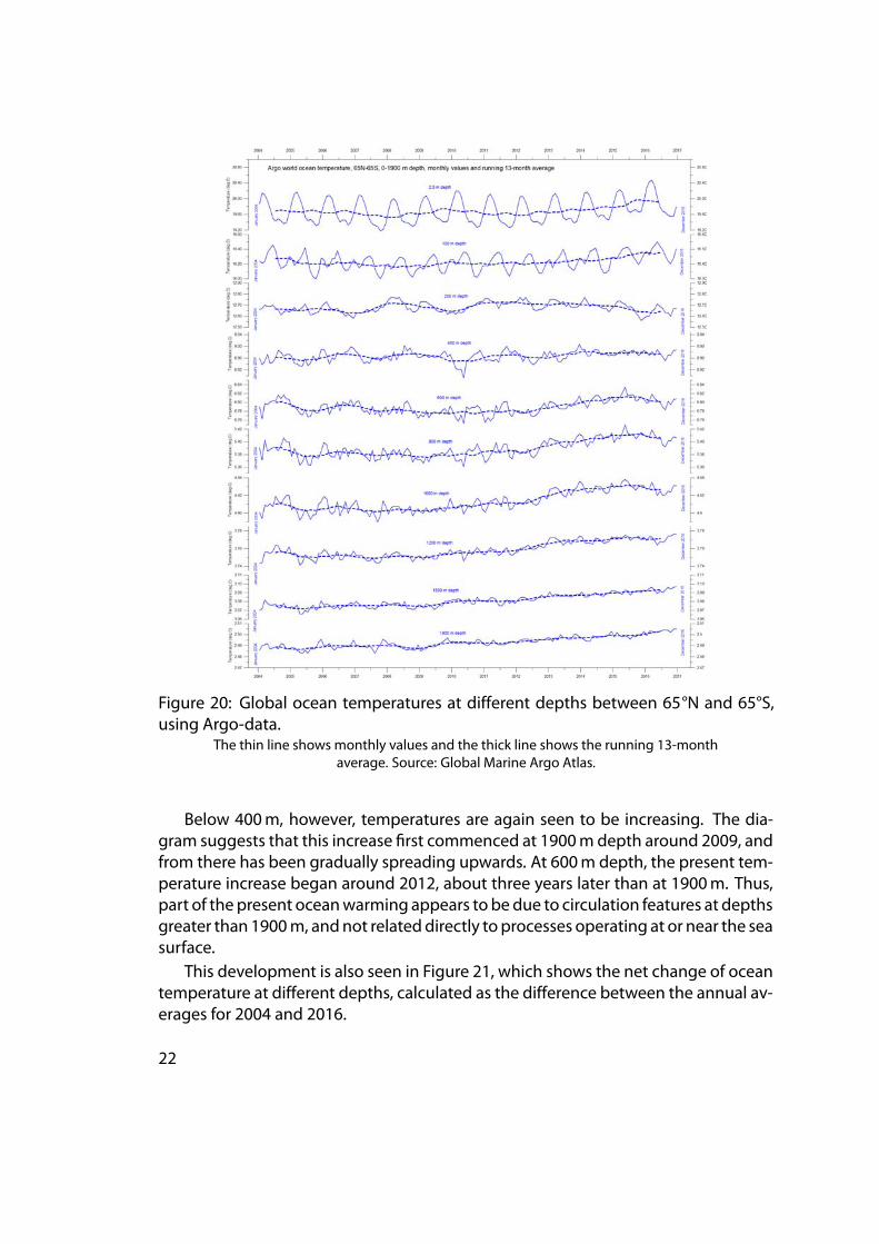
Figure 20: Global ocean temperatures at different depths between 65°N and 65°S,using Argo-data.
The thin line shows monthly values and the thick line shows the running 13-monthaverage. Source: Global Marine Argo Atlas.
Below 400m, however, temperatures are again seen to be increasing. The dia-gram suggests that this increase first commenced at 1900m depth around 2009, andfrom there has been gradually spreading upwards. At 600m depth, the present tem-perature increase began around 2012, about three years later than at 1900m. Thus,part of the present oceanwarming appears to bedue to circulation features at depthsgreater than 1900m, andnot relateddirectly to processes operating at or near the seasurface.
This development is also seen in Figure 21, which shows the net change of oceantemperature at different depths, calculated as the difference between the annual av-erages for 2004 and 2016.
22
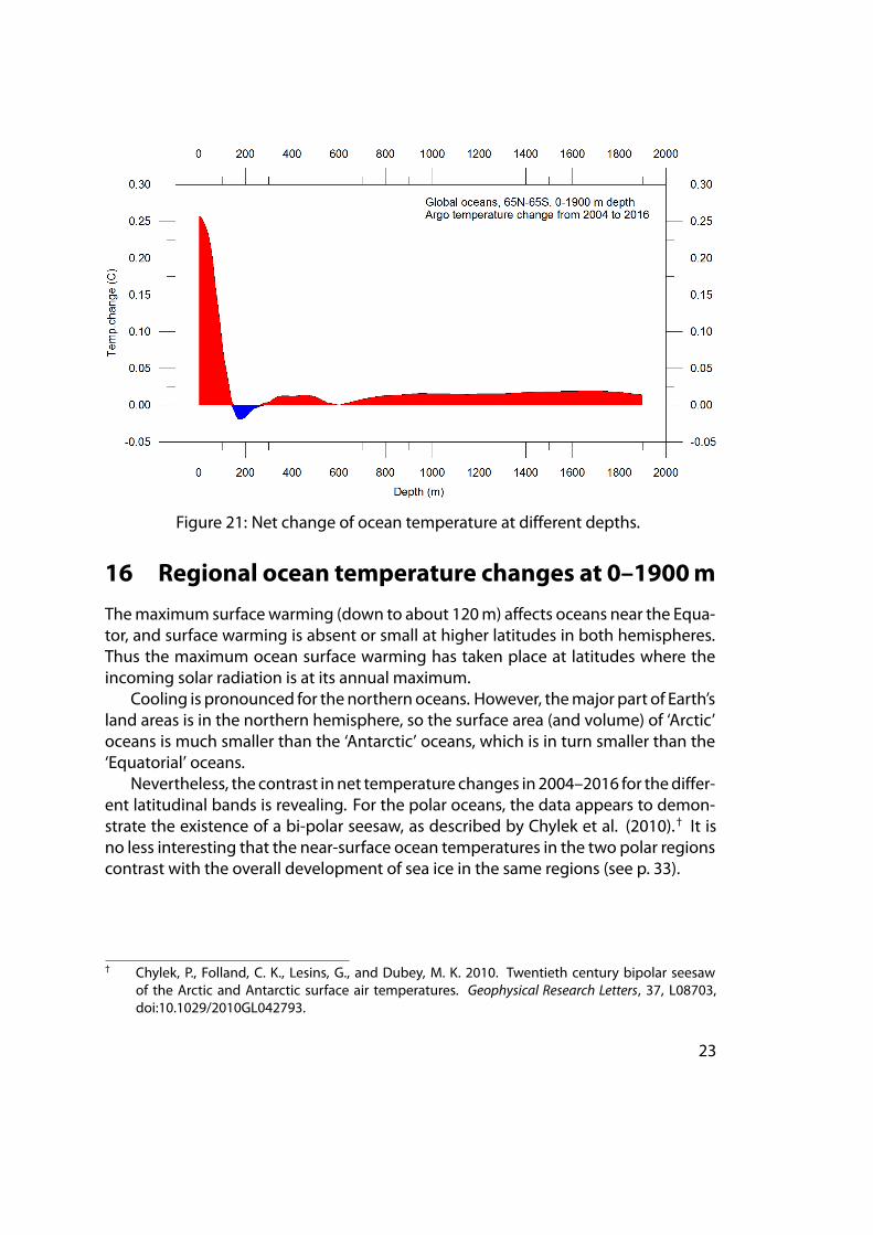
Figure 21: Net change of ocean temperature at different depths.
16 Regional ocean temperature changes at 0–1900m
Themaximum surfacewarming (down to about 120m) affects oceans near the Equa-tor, and surface warming is absent or small at higher latitudes in both hemispheres.Thus the maximum ocean surface warming has taken place at latitudes where theincoming solar radiation is at its annual maximum.
Cooling is pronounced for the northern oceans. However, themajor part of Earth’sland areas is in the northern hemisphere, so the surface area (and volume) of ‘Arctic’oceans is much smaller than the ‘Antarctic’ oceans, which is in turn smaller than the‘Equatorial’ oceans.
Nevertheless, the contrast in net temperature changes in 2004–2016 for thediffer-ent latitudinal bands is revealing. For the polar oceans, the data appears to demon-strate the existence of a bi-polar seesaw, as described by Chylek et al. (2010).† It isno less interesting that the near-surface ocean temperatures in the two polar regionscontrast with the overall development of sea ice in the same regions (see p. 33).
† Chylek, P., Folland, C. K., Lesins, G., and Dubey, M. K. 2010. Twentieth century bipolar seesawof the Arctic and Antarctic surface air temperatures. Geophysical Research Letters, 37, L08703,doi:10.1029/2010GL042793.
23
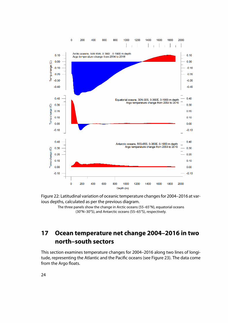
Figure 22: Latitudinal variation of oceanic temperature changes for 2004–2016 at var-ious depths, calculated as per the previous diagram.
The three panels show the change in Arctic oceans (55–65°N), equatorial oceans(30°N–30°S), and Antarctic oceans (55–65°S), respectively.
17 Ocean temperature net change 2004–2016 in twonorth–south sectors
This section examines temperature changes for 2004–2016 along two lines of longi-tude, representing the Atlantic and the Pacific oceans (see Figure 23). The data comefrom the Argo floats.
24
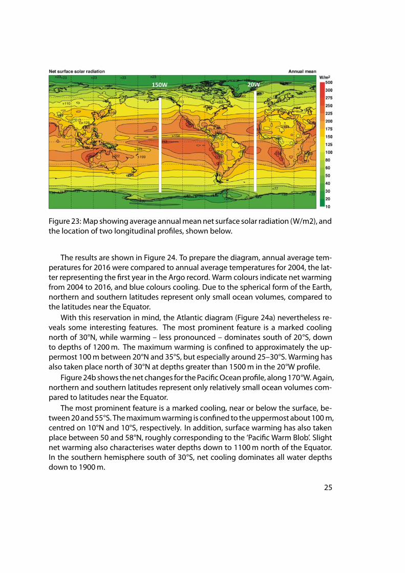
Figure 23: Map showingaverage annualmeannet surface solar radiation (W/m2), andthe location of two longitudinal profiles, shown below.
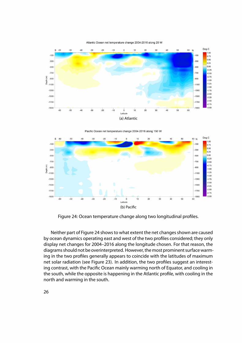
The results are shown in Figure 24. To prepare the diagram, annual average tem-peratures for 2016 were compared to annual average temperatures for 2004, the lat-ter representing the first year in the Argo record. Warm colours indicate net warmingfrom 2004 to 2016, and blue colours cooling. Due to the spherical form of the Earth,northern and southern latitudes represent only small ocean volumes, compared tothe latitudes near the Equator.
With this reservation in mind, the Atlantic diagram (Figure 24a) nevertheless re-veals some interesting features. The most prominent feature is a marked coolingnorth of 30°N, while warming – less pronounced – dominates south of 20°S, downto depths of 1200m. The maximum warming is confined to approximately the up-permost 100m between 20°N and 35°S, but especially around 25–30°S. Warming hasalso taken place north of 30°N at depths greater than 1500m in the 20°W profile.
Figure24b shows thenet changes for thePacificOceanprofile, along170°W.Again,northern and southern latitudes represent only relatively small ocean volumes com-pared to latitudes near the Equator.
The most prominent feature is a marked cooling, near or below the surface, be-tween20and55°S. Themaximumwarming is confined to theuppermost about100m,centred on 10°N and 10°S, respectively. In addition, surface warming has also takenplace between 50 and 58°N, roughly corresponding to the ‘Pacific Warm Blob’. Slightnet warming also characterises water depths down to 1100m north of the Equator.In the southern hemisphere south of 30°S, net cooling dominates all water depthsdown to 1900m.
25
(a) Atlantic
(b) Pacific
Figure 24: Ocean temperature change along two longitudinal profiles.
Neither part of Figure 24 shows towhat extent the net changes shown are causedby ocean dynamics operating east and west of the two profiles considered; they onlydisplay net changes for 2004–2016 along the longitude chosen. For that reason, thediagrams shouldnotbeoverinterpreted. However, themostprominent surfacewarm-ing in the two profiles generally appears to coincide with the latitudes of maximumnet solar radiation (see Figure 23). In addition, the two profiles suggest an interest-ing contrast, with the Pacific Ocean mainly warming north of Equator, and cooling inthe south, while the opposite is happening in the Atlantic profile, with cooling in thenorth and warming in the south.
26
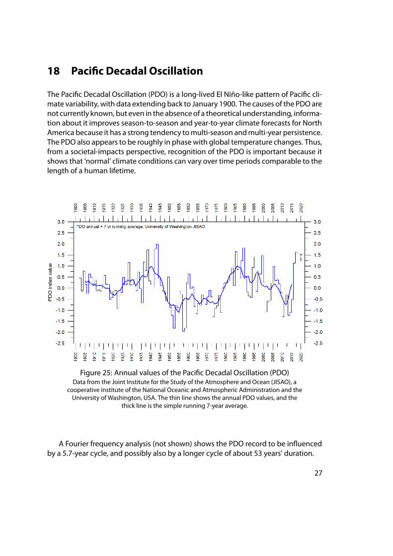
18 Pacific Decadal Oscillation
The Pacific Decadal Oscillation (PDO) is a long-lived El Niño-like pattern of Pacific cli-mate variability, with data extending back to January 1900. The causes of the PDOarenot currently known, but even in theabsenceof a theoretical understanding, informa-tion about it improves season-to-season and year-to-year climate forecasts for NorthAmerica because it has a strong tendency tomulti-season andmulti-year persistence.The PDO also appears to be roughly in phasewith global temperature changes. Thus,from a societal-impacts perspective, recognition of the PDO is important because itshows that ‘normal’ climate conditions can vary over time periods comparable to thelength of a human lifetime.
Figure 25: Annual values of the Pacific Decadal Oscillation (PDO)Data from the Joint Institute for the Study of the Atmosphere and Ocean (JISAO), a
cooperative institute of the National Oceanic and Atmospheric Administration and theUniversity of Washington, USA. The thin line shows the annual PDO values, and the
thick line is the simple running 7-year average.
A Fourier frequency analysis (not shown) shows the PDO record to be influencedby a 5.7-year cycle, and possibly also by a longer cycle of about 53 years’ duration.
27
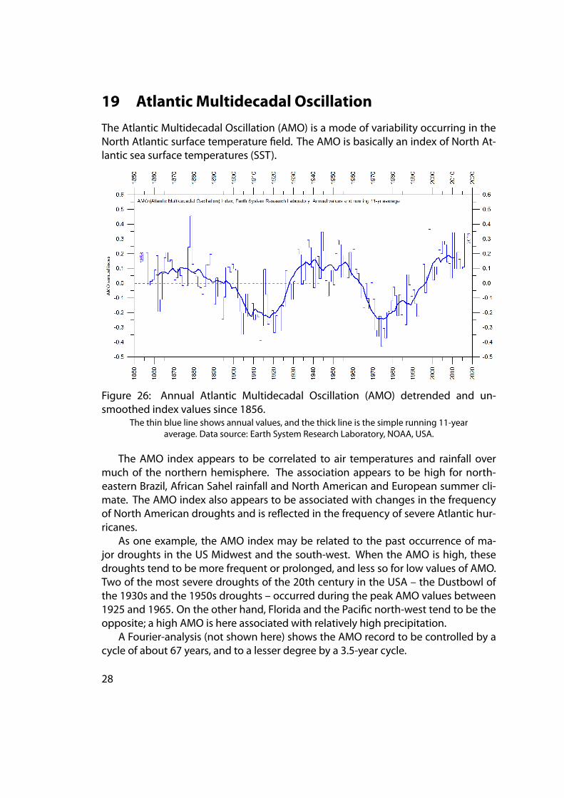
19 Atlantic Multidecadal Oscillation
The Atlantic Multidecadal Oscillation (AMO) is a mode of variability occurring in theNorth Atlantic surface temperature field. The AMO is basically an index of North At-lantic sea surface temperatures (SST).
Figure 26: Annual Atlantic Multidecadal Oscillation (AMO) detrended and un-smoothed index values since 1856.
The thin blue line shows annual values, and the thick line is the simple running 11-yearaverage. Data source: Earth System Research Laboratory, NOAA, USA.
The AMO index appears to be correlated to air temperatures and rainfall overmuch of the northern hemisphere. The association appears to be high for north-eastern Brazil, African Sahel rainfall and North American and European summer cli-mate. The AMO index also appears to be associated with changes in the frequencyof North American droughts and is reflected in the frequency of severe Atlantic hur-ricanes.
As one example, the AMO index may be related to the past occurrence of ma-jor droughts in the US Midwest and the south-west. When the AMO is high, thesedroughts tend to be more frequent or prolonged, and less so for low values of AMO.Two of the most severe droughts of the 20th century in the USA – the Dustbowl ofthe 1930s and the 1950s droughts – occurred during the peak AMO values between1925 and 1965. On the other hand, Florida and the Pacific north-west tend to be theopposite; a high AMO is here associated with relatively high precipitation.
A Fourier-analysis (not shown here) shows the AMO record to be controlled by acycle of about 67 years, and to a lesser degree by a 3.5-year cycle.
28
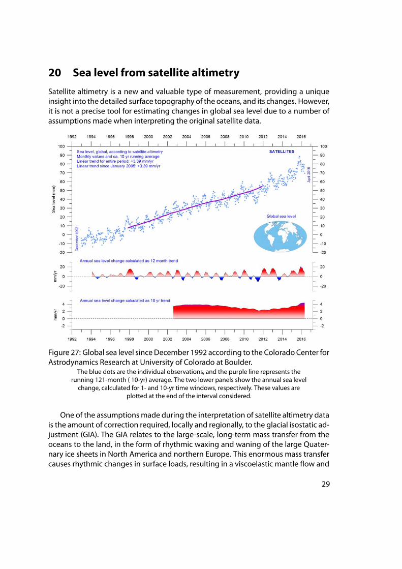
20 Sea level from satellite altimetry
Satellite altimetry is a new and valuable type of measurement, providing a uniqueinsight into the detailed surface topography of the oceans, and its changes. However,it is not a precise tool for estimating changes in global sea level due to a number ofassumptions made when interpreting the original satellite data.
Figure 27: Global sea level sinceDecember 1992 according to the Colorado Center forAstrodynamics Research at University of Colorado at Boulder.
The blue dots are the individual observations, and the purple line represents therunning 121-month ( 10-yr) average. The two lower panels show the annual sea level
change, calculated for 1- and 10-yr time windows, respectively. These values areplotted at the end of the interval considered.
One of the assumptionsmade during the interpretation of satellite altimetry datais the amount of correction required, locally and regionally, to the glacial isostatic ad-justment (GIA). The GIA relates to the large-scale, long-term mass transfer from theoceans to the land, in the form of rhythmic waxing and waning of the large Quater-nary ice sheets in North America and northern Europe. This enormous mass transfercauses rhythmic changes in surface loads, resulting in a viscoelastic mantle flow and
29
elastic effects in the upper crust. No single technique or observational network cangive enough information on all aspects and consequences of the GIA, so the assump-tions adopted for the interpretation of satellite altimetry data are difficult to verify.The GIA correction used in the interpretation of data from satellite altimetry dependson the choice ofmodels used: for themelting of the ice sheets since the last deglacia-tion and for the crust-mantle. As a consequence of this (and additional factors), inter-pretations of modern global sea level change based on satellite altimetry vary fromabout 1.7mm/yr to about 3.2mm/yr.
21 Sea level from tide gauges
Tide gauges are located at coastal sites, and record the net movement of the localocean surface in relation to the land. Local relative sea-level change is the importantfactor for purposes of coastal planning, so tide-gauge data are directly applicable forplanning for coastal installations.
In a more scientific context, the measured net movement of the local sea-level iscomposed of two local components:
• the vertical change of the ocean surface
• the vertical change of the land surface.
For example, a tidegaugemay recordanapparent sea-level increaseof 3mm/year.If geodeticmeasurements show the land tobe sinkingby2mm/year, the real sea levelrise is only 1mm/year (3 minus 2mm/year). In a global sea-level change context, thevalue of 1mm/year is relevant, but in a local coastal planning context the 3mm/yearvalue is more relevant.
To construct time seriesof sea-levelmeasurements at each tidegauge, themonthlyand annual means have to be reduced to a common datum. This reduction is per-formed by making use of the tide-gauge datum history provided by the supplyingauthority. The Revised Local Reference (RLR) datum at each station is defined to beapproximately 7000mmbelowmean sea level, with this arbitrary choicemademanyyears ago inorder to avoidnegative numbers in the resultingRLRmonthly andannualmean values.
Most tide gauges are located at sites exposed to tectonic uplift or sinking (thevertical change of the land surface). This widespread vertical instability has severalcauses, butof course affects the interpretationofdata fromthe individual tidegauges,although much effort is put into correcting for local tectonic movements.
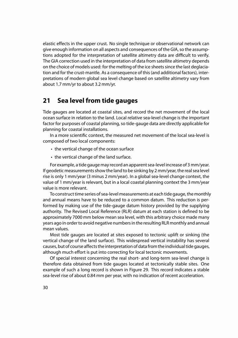
Of special interest concerning the real short- and long-term sea-level change istherefore data obtained from tide gauges located at tectonically stable sites. Oneexample of such a long record is shown in Figure 29. This record indicates a stablesea-level rise of about 0.84mm per year, with no indication of recent acceleration.
30
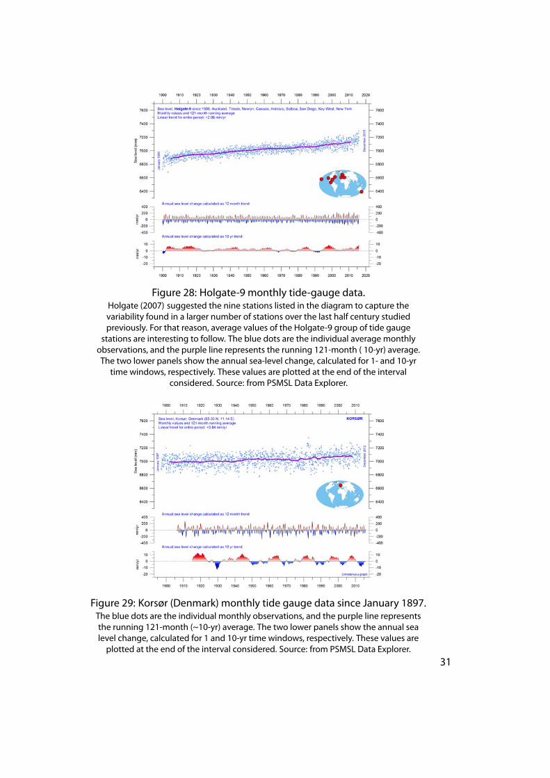
Figure 28: Holgate-9 monthly tide-gauge data.Holgate (2007) suggested the nine stations listed in the diagram to capture thevariability found in a larger number of stations over the last half century studiedpreviously. For that reason, average values of the Holgate-9 group of tide gauge
stations are interesting to follow. The blue dots are the individual average monthlyobservations, and the purple line represents the running 121-month ( 10-yr) average.The two lower panels show the annual sea-level change, calculated for 1- and 10-yr
time windows, respectively. These values are plotted at the end of the intervalconsidered. Source: from PSMSL Data Explorer.
Figure 29: Korsør (Denmark) monthly tide gauge data since January 1897.The blue dots are the individual monthly observations, and the purple line representsthe running 121-month (~10-yr) average. The two lower panels show the annual sealevel change, calculated for 1 and 10-yr time windows, respectively. These values areplotted at the end of the interval considered. Source: from PSMSL Data Explorer.
31
Data from tide gauges all over the world suggest an average global sea-level riseof only 1–1.5mm/yr, while the satellite-derived record (see above) suggests a riseof more than 3mm/yr. The noticeable difference between the two data sets has nobroadly accepted explanation.
22 Annual accumulated cyclone energy for theAtlantic Basin
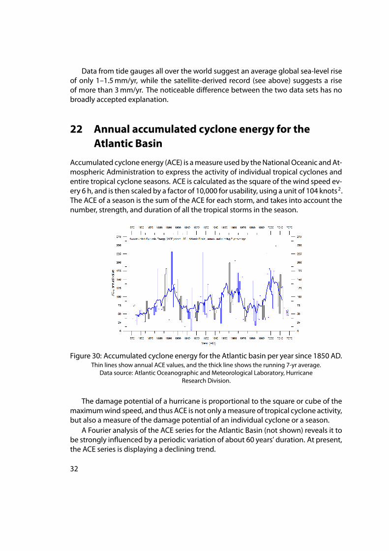
Accumulated cyclone energy (ACE) is ameasure usedby theNational Oceanic andAt-mospheric Administration to express the activity of individual tropical cyclones andentire tropical cyclone seasons. ACE is calculated as the square of the wind speed ev-ery 6 h, and is then scaled by a factor of 10,000 for usability, using a unit of 104 knots2.The ACE of a season is the sum of the ACE for each storm, and takes into account thenumber, strength, and duration of all the tropical storms in the season.
Figure 30: Accumulated cyclone energy for the Atlantic basin per year since 1850 AD.Thin lines show annual ACE values, and the thick line shows the running 7-yr average.
Data source: Atlantic Oceanographic and Meteorological Laboratory, HurricaneResearch Division.
The damage potential of a hurricane is proportional to the square or cube of themaximumwind speed, and thus ACE is not only ameasure of tropical cyclone activity,but also a measure of the damage potential of an individual cyclone or a season.
A Fourier analysis of the ACE series for the Atlantic Basin (not shown) reveals it tobe strongly influenced by a periodic variation of about 60 years’ duration. At present,the ACE series is displaying a declining trend.
32
23 Global, Arctic and Antarctic sea-ice extent
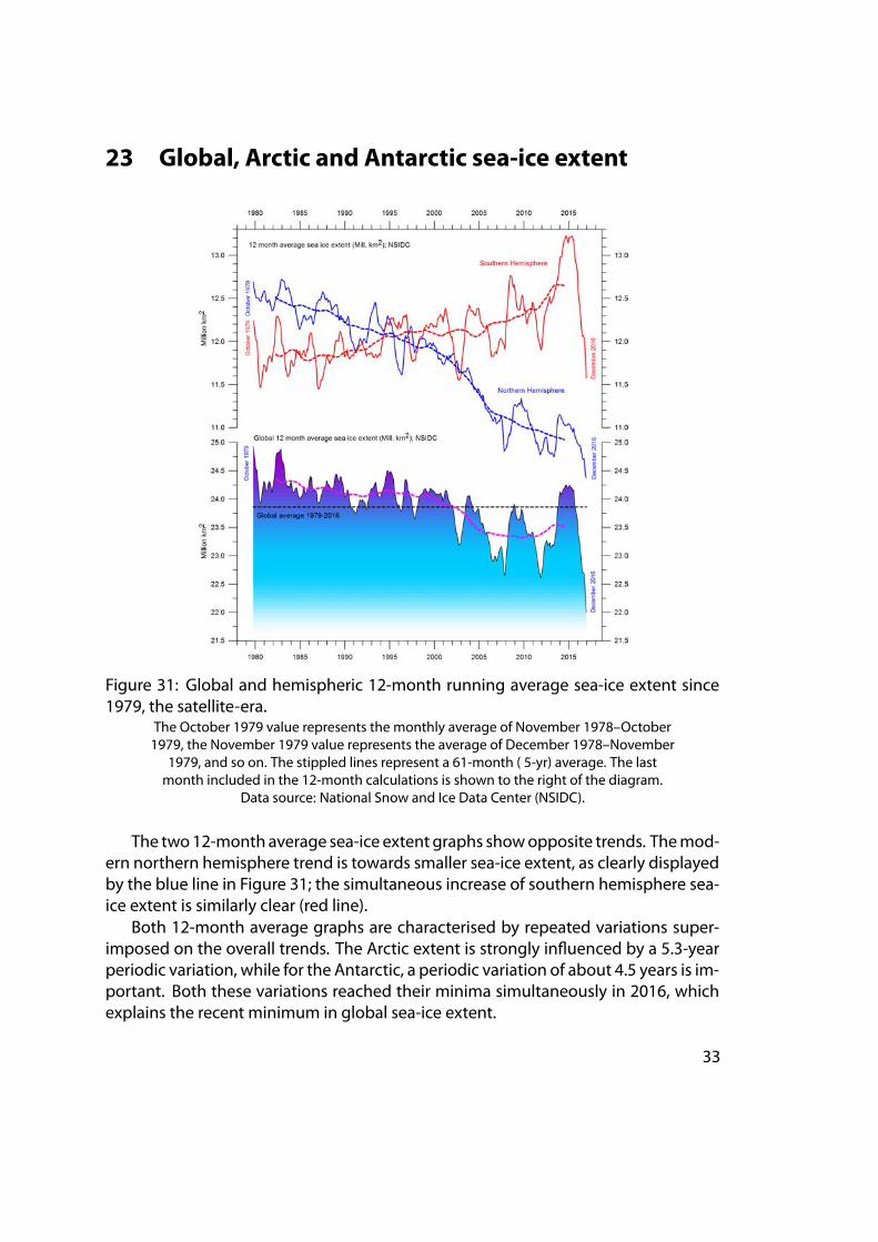
Figure 31: Global and hemispheric 12-month running average sea-ice extent since1979, the satellite-era.
The October 1979 value represents the monthly average of November 1978–October1979, the November 1979 value represents the average of December 1978–November
1979, and so on. The stippled lines represent a 61-month ( 5-yr) average. The lastmonth included in the 12-month calculations is shown to the right of the diagram.
Data source: National Snow and Ice Data Center (NSIDC).
The two12-month average sea-ice extent graphs showopposite trends. Themod-ern northern hemisphere trend is towards smaller sea-ice extent, as clearly displayedby the blue line in Figure 31; the simultaneous increase of southern hemisphere sea-ice extent is similarly clear (red line).
Both 12-month average graphs are characterised by repeated variations super-imposed on the overall trends. The Arctic extent is strongly influenced by a 5.3-yearperiodic variation, while for the Antarctic, a periodic variation of about 4.5 years is im-portant. Both these variations reached their minima simultaneously in 2016, whichexplains the recent minimum in global sea-ice extent.
33
Presumably, during the coming 1–2 years these natural variations will again in-duce an increase in sea-ice extent at both poles, with an increase in the 12-month av-erage global sea-ice extent as the likely result. However, in the coming years minimaandmaxima for these variations will not occur synchronously because of their differ-ent length, and global minima (or maxima) may be less pronounced than in 2016.
24 Northern hemisphere snow-cover extent
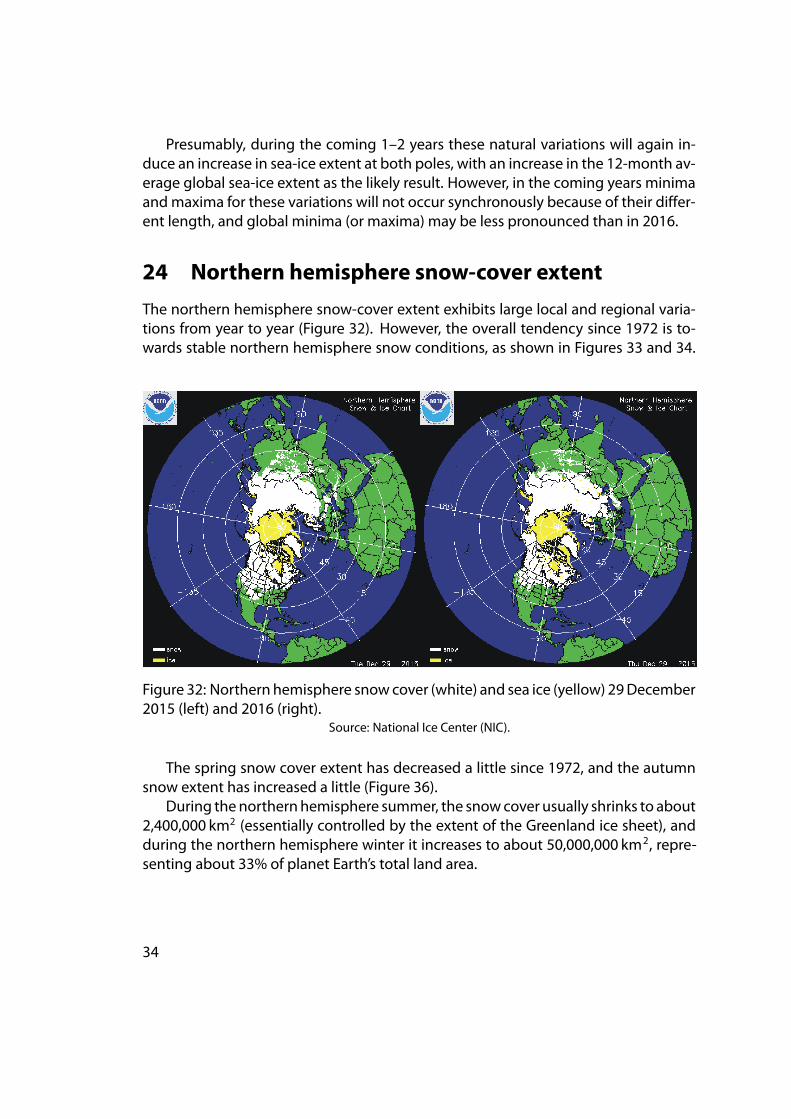
The northern hemisphere snow-cover extent exhibits large local and regional varia-tions from year to year (Figure 32). However, the overall tendency since 1972 is to-wards stable northern hemisphere snow conditions, as shown in Figures 33 and 34.
Figure 32: Northern hemisphere snowcover (white) and sea ice (yellow) 29December2015 (left) and 2016 (right).
Source: National Ice Center (NIC).
The spring snow cover extent has decreased a little since 1972, and the autumnsnow extent has increased a little (Figure 36).
During thenorthernhemisphere summer, the snowcover usually shrinks to about2,400,000 km2 (essentially controlled by the extent of the Greenland ice sheet), andduring the northern hemisphere winter it increases to about 50,000,000 km2, repre-senting about 33% of planet Earth’s total land area.
34
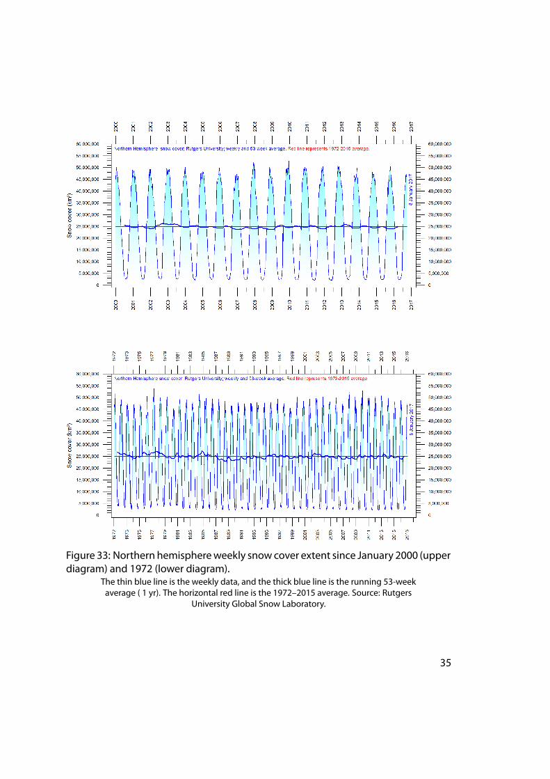
Figure 33: Northern hemisphereweekly snow cover extent since January 2000 (upperdiagram) and 1972 (lower diagram).
The thin blue line is the weekly data, and the thick blue line is the running 53-weekaverage ( 1 yr). The horizontal red line is the 1972–2015 average. Source: Rutgers
University Global Snow Laboratory.
35
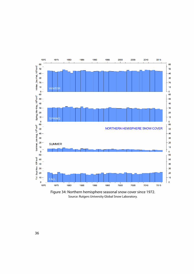
Figure 34: Northern hemisphere seasonal snow cover since 1972.Source: Rutgers University Global Snow Laboratory.
36
25 Links to data sources
AMO, Earth System Research Laboratory, NOAA, USA: https://www.esrl.noaa.gov/psd/data/timeseries/AMO/
Atlantic Oceanographic andMeteorological Laboratory, Hurricane ResearchDi-vision: http://www.aoml.noaa.gov/hrd/tcfaq/E11.html
Colorado Center for Astrodynamics Research: http://sealevel.colorado.edu/
EarthSystemResearchLaboratory (ESRL): https://www.esrl.noaa.gov/psd/map/clim/olr.shtml
GISS temperature data: https://data.giss.nasa.gov/gistemp/
Global Marine Argo Atlas: http://www.argo.ucsd.edu/Marine_Atlas.html
Goddard Institute for Space Studies (GISS): https://www.giss.nasa.gov/
HadCRUT temperature data: http://hadobs.metoffice.com/
National Ice Center (NIC). http://www.natice.noaa.gov/pub/ims/ims_gif/DATA/cursnow.gif
National Snowand IceDataCenter (NSIDC): http://nsidc.org/data/seaice_index/index.html
NCDC temperature data: https://www.ncdc.noaa.gov/monitoring-references/faq/
Ocean temperatures from Argo floats: http://www.argo.ucsd.edu/
Oceanic Niño Index (ONI): http://www.cpc.ncep.noaa.gov/products/analysis_monitoring/ensostuff/ensoyears.shtml
Outgoing longwave radiation (OLR): https://www.esrl.noaa.gov/psd/map/clim/olr.shtml
PDO, Joint Institute for the Study of the Atmosphere and Ocean (JISAO): http://research.jisao.washington.edu/pdo/PDO.latest
PSMSL Data Explorer: http://www.psmsl.org/data/obtaining/map.html
RutgersUniversityGlobal SnowLaboratory: http://climate.rutgers.edu/snowcover/index.php
RSS temperaturedata: http://www.remss.com/measurements/upper-air-temperature
Sea level fromsatellites: http://sealevel.colorado.edu/files/current/sl_global.txt
Sea level from tide gauges: http://www.psmsl.org/data/obtaining/map.html
UAHtemperaturedata: http://www.nsstc.uah.edu/data/msu/v6.0/tlt/uahncdc_lt_6.0.txt
GWPF REPORTS1 Montford The Climategate Inquiries2 Ridley The Shale Gas Shock3 Hughes The Myth of Green Jobs4 McKitrick What Is Wrong With the IPCC?5 Booker The BBC and Climate Change6 Montford Nullius in Verba: The Royal Society and Climate Change7 Goklany Global Warming Policies Might Be Bad for Your Health8 Hughes Why Is Wind Power So Expensive?9 Lilley What Is Wrong With Stern?10 Whitehouse The Global Warming Standstill11 Khandekar The Global Warming-Extreme Weather Link12 Lewis and Crok Oversensitive13 Lewis and Crok A Sensitive Matter14 Montford and Shade Climate Control: Brainwashing in Schools15 De Lange and Carter Sea-level Change: Living with Uncertainty16 Montford Unintended Consequences of Climate Change Policy17 Lewin Hubert Lamb and the Transformation of Climate Science18 Goklany Carbon Dioxide: The Good News19 Adams The Truth About China20 Laframboise Peer Review: Why Scepticism is Essential21 Constable Energy Intensive Users: Climate Policy Casualties22 Lilley £300 Billion: The Cost of the Climate Change Act23 Humlum The State of the Climate in 2016
TheGlobalWarming Policy Foundation is an all-party and non-party thinktank and a registered educational charity which, while openminded onthe contested science of global warming, is deeply concerned about thecosts and other implications ofmany of the policies currently being advo-cated.
Our main focus is to analyse global warming policies and their economicand other implications. Our aim is to provide themost robust and reliableeconomic analysis and advice. Above all we seek to inform the media,politicians and the public, in a newsworthy way, on the subject in generaland on themisinformation towhich they are all too frequently being sub-jected at the present time.
The key to the success of theGWPF is the trust and credibility thatwehaveearned in the eyes of a growing number of policy makers, journalists andthe interested public. The GWPF is funded overwhelmingly by voluntarydonations from a number of private individuals and charitable trusts. Inorder to make clear its complete independence, it does not accept giftsfrom either energy companies or anyone with a significant interest in anenergy company.
Viewsexpressed in thepublicationsof theGlobalWarmingPolicyFoun-dation are those of the authors, not those of the GWPF, its trustees, itsAcademic Advisory Council members or its directors.
Published by the Global Warming Policy Foundation
For further information about GWPF or a print copy of this report,please contact:
The Global Warming Policy Foundation55 Tufton Street, London, SW1P 3QLT 0207 3406038 M 07553 361717www.thegwpf.org
Registered in England, No 6962749Registered with the Charity Commission, No 1131448