Embed Size (px)
Citation preview
Veronika Burian
Dissertation submitted in partial fulfi lment of the requirements
for the Master of Arts in Typeface Design, September 2003
Department of Typography and Graphic Communication
The University of Reading
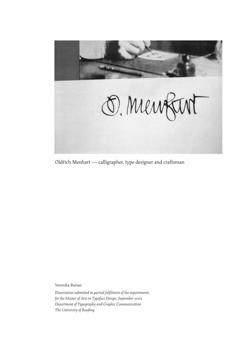
Oldřich Menhart — calligrapher, type designer and craftsman

Many thanks to the Department of Typography, František Storm,
Otokar Karlas, the staff of the Klingspor Museum and Robin Nicholas.
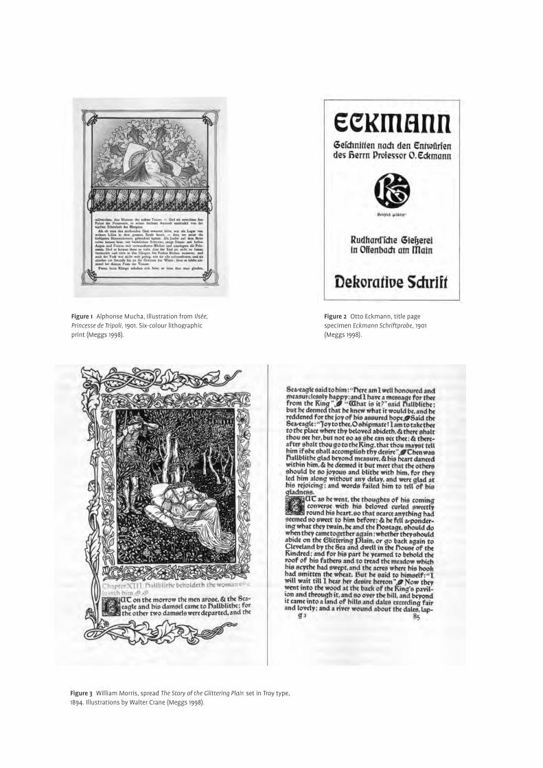
Figure 3 William Morris, spread The Story of the Glittering Plain set in Troy type, 1894. Illustrations by Walter Crane (Meggs 1998).
Figure 1 Alphonse Mucha, Illustration from Ilsée, Princesse de Tripoli, 1901. Six-colour lithographic print (Meggs 1998).
Figure 2 Otto Eckmann, title page specimen Eckmann Schriftprobe, 1901 (Meggs 1998).
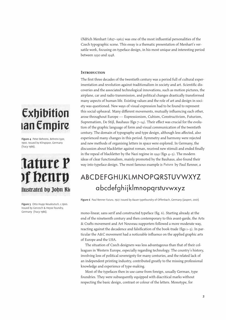
Oldřich Menhart (1897–1962) was one of the most infl uential personalities of the
Czech typographic scene. This essay is a thematic presentation of Menhart’s ver-
satile work, focusing on typeface design, in his most unique and interesting period
between 1930 and 1948.
Introduction
The fi rst three decades of the twentieth century was a period full of cultural exper-
imentation and revolution against traditionalism in society and art. Scientifi c dis-
coveries and the associated technological innovations, such as motion pictures, the
airplane, car and radio transmission, and political changes drastically transformed
many aspects of human life. Existing values and the role of art and design in soci-
ety was questioned. New ways of visual expression had to be found to represent
this social upheaval. Many diff erent movements, mutually infl uencing each other,
arose throughout Europe — Expressionism, Cubism, Constructivism, Futurism,
Suprematism, De Stijl, Bauhaus (fi gs 7–14). Their eff ect was crucial for the evolu-
tion of the graphic language of form and visual communication of the twentieth
century. The domain of typography and type design, although less aff ected, also
experienced many changes in this period. Symmetry and harmony were rejected
and new methods of organising letters in space were explored. In Germany, the
discussion about blackletter against roman, received new stimuli and ended fi nally
in the repeal of blackletter by the Nazi regime in 1941 (fi gs 4–5). The modern
ideas of clear functionalism, mainly promoted by the Bauhaus, also found their
way into typeface design. The most famous example is Futura by Paul Renner, a
mono-linear, sans serif and constructed typeface (fi g. 6). Starting already at the
end of the nineteenth century and then contemporary to this avant-garde, the Arts
& Crafts movement and Art Nouveau supporters followed a more moderate way,
reacting against the decadence and falsifi cation of the book-trade (fi gs 1–3). In par-
ticular the A&C movement had a noticeable infl uence on the applied graphic arts
of Europe and the USA.
The situation of Czech designers was less advantageous than that of their col-
leagues in Western Europe, especially regarding technology. The country’s history,
involving loss of political sovereignty for many centuries, and the related lack of
an independent printing industry, contributed greatly to the missing professional
knowledge and experience of type-making.
Most of the typefaces then in use came from foreign, usually German, type
foundries. They were subsequently equipped with diacritical marks without
respecting the basic design, contrast or colour of the letters. Monotype, for
Figure 6 Paul Renner Futura, 1927. Issued by Bauer typefoundry of Offenbach, Germany (Jaspert, 2001).
Figure 4 Peter Behrens, Behrens type, 1900. Issued by Klingspor, Germany (Tracy 1986).
Figure 5 Otto Hupp Neudeutsch, c.1900. Issued by Genzsch & Heyse foundry, Germany (Tracy 1986).
2
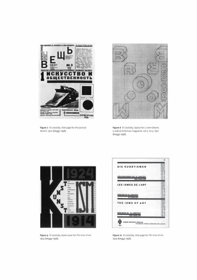
Figure 7 El Lissitzky, title page for the journal Veshch, 1922 (Meggs 1998).
Figure 9 El Lissitzky, book cover for The Isms of Art, 1924 (Meggs 1998).
Figure 10 El Lissitzky, title page for The Isms of Art, 1924 (Meggs 1998).
Figure 8 El Lissitzky, layout for a cover Broom, a radical American magazine, vol 5, no 3, 1922 (Meggs 1998).
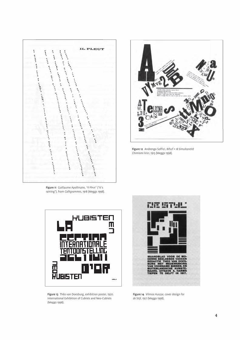
Figure 11 Guillaume Apollinaire, “Il Pleut” (“It’s raining”), from Calligrammes, 1918 (Meggs 1998).
Figure 13 Théo van Doesburg, exhibition poster, 1920. International Exhibition of Cubists and Neo-Cubists (Meggs 1998).
Figure 14 Vilmos Huszar, cover design for de Stijl, 1917 (Meggs 1998).
Figure 12 Andrengo Soffi ci, Bifszf + 18 Simultaneitè Chimismi lirici, 1915 (Meggs 1998).
4
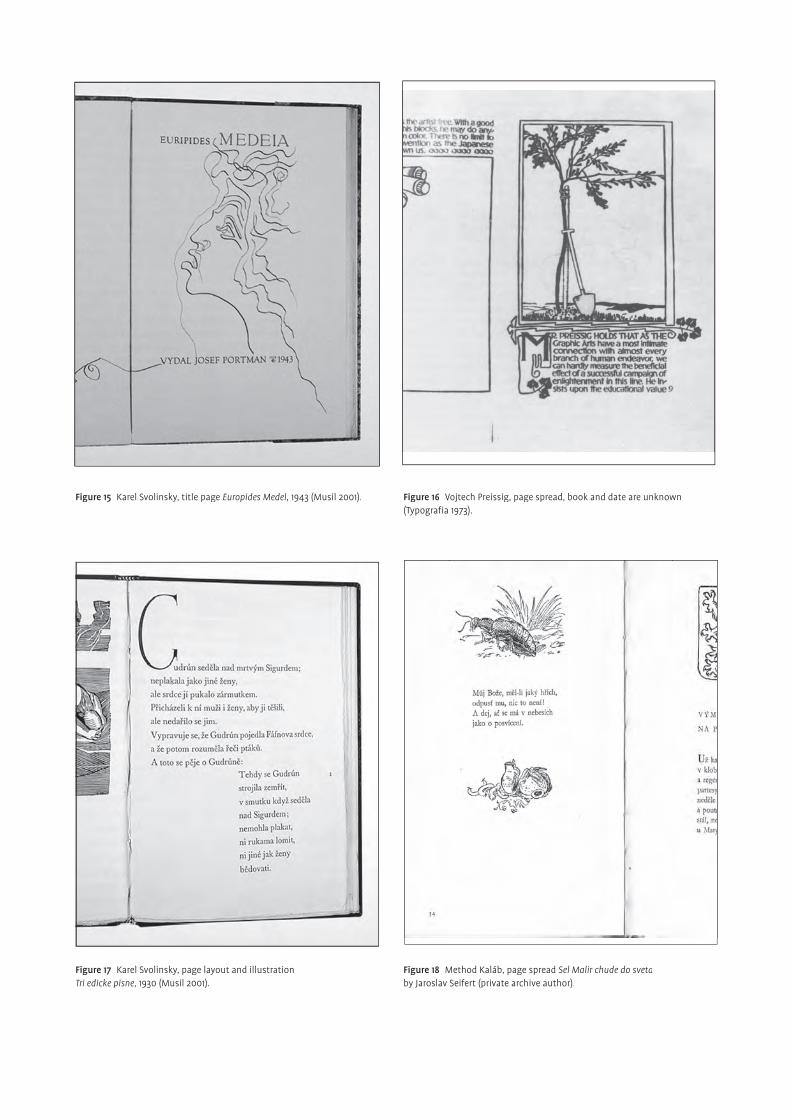
Figure 16 Vojtech Preissig, page spread, book and date are unknown(Typografi a 1973).
Figure 15 Karel Svolinsky, title page Europides Medel, 1943 (Musil 2001).
Figure 18 Method Kaláb, page spread Sel Malir chude do svetaby Jaroslav Seifert (private archive author).
Figure 17 Karel Svolinsky, page layout and illustration Tri edicke pisne, 1930 (Musil 2001).
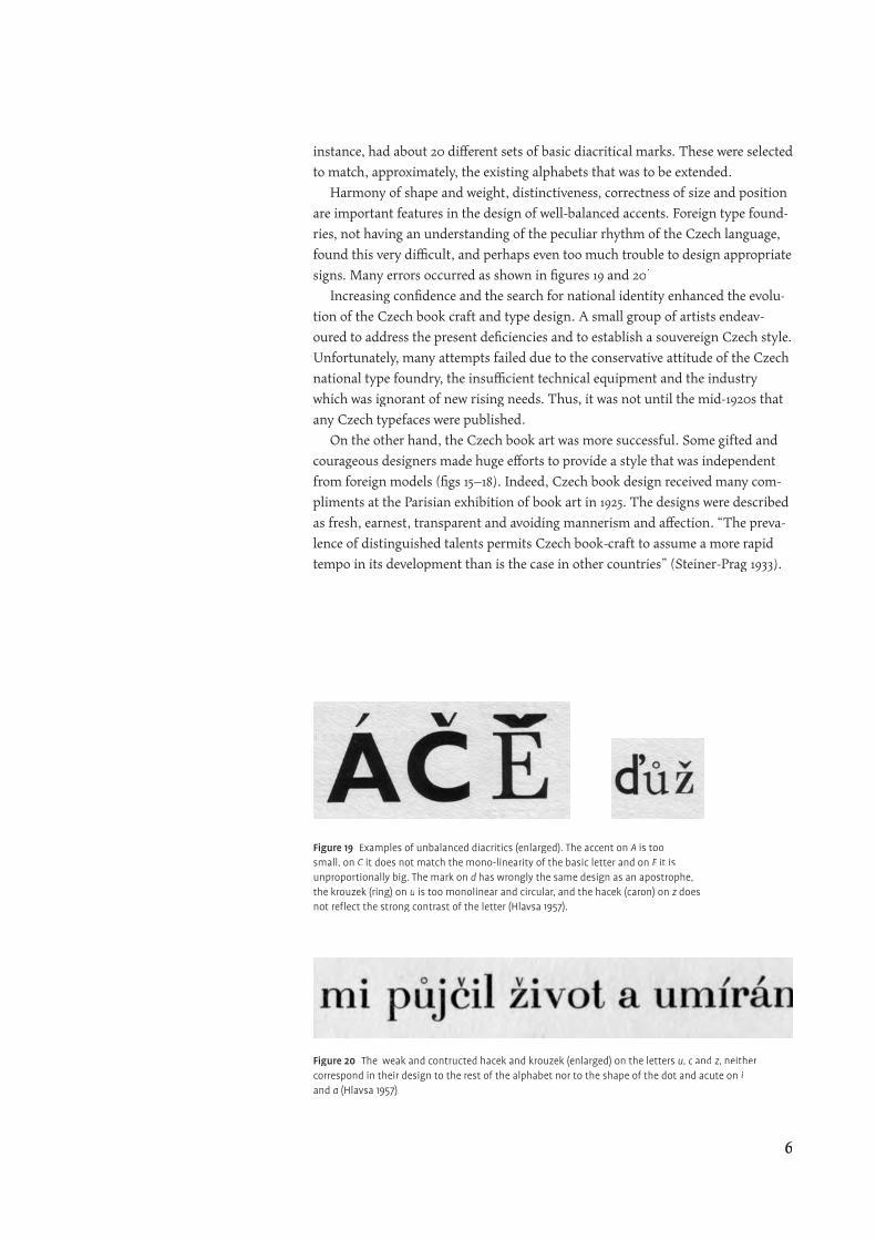
instance, had about 20 diff erent sets of basic diacritical marks. These were selected
to match, approximately, the existing alphabets that was to be extended.
Harmony of shape and weight, distinctiveness, correctness of size and position
are important features in the design of well-balanced accents. Foreign type found-
ries, not having an understanding of the peculiar rhythm of the Czech language,
found this very diffi cult, and perhaps even too much trouble to design appropriate
signs. Many errors occurred as shown in fi gures 19 and 20.
Increasing confi dence and the search for national identity enhanced the evolu-
tion of the Czech book craft and type design. A small group of artists endeav-
oured to address the present defi ciencies and to establish a souvereign Czech style.
Unfortunately, many attempts failed due to the conservative attitude of the Czech
national type foundry, the insuffi cient technical equipment and the industry
which was ignorant of new rising needs. Thus, it was not until the mid-1920s that
any Czech typefaces were published.
On the other hand, the Czech book art was more successful. Some gifted and
courageous designers made huge eff orts to provide a style that was independent
from foreign models (fi gs 15–18). Indeed, Czech book design received many com-
pliments at the Parisian exhibition of book art in 1925. The designs were described
as fresh, earnest, transparent and avoiding mannerism and aff ection. “The preva-
lence of distinguished talents permits Czech book-craft to assume a more rapid
tempo in its development than is the case in other countries” (Steiner-Prag 1933).
Figure 20 The weak and contructed hacek and krouzek (enlarged) on the letters u, c and z, neither correspond in their design to the rest of the alphabet nor to the shape of the dot and acute on i and a (Hlavsa 1957).
Figure 19 Examples of unbalanced diacritics (enlarged). The accent on A is too small, on C it does not match the mono-linearity of the basic letter and on E it is unproportionally big. The mark on d has wrongly the same design as an apostrophe, the krouzek (ring) on u is too monolinear and circular, and the hacek (caron) on z does not refl ect the strong contrast of the letter (Hlavsa 1957).
6
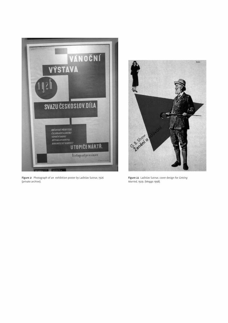
Figure 22 Ladislav Sutnar, cover design for Getting Married, 1929. (Meggs 1998).
Figure 21 Photograph of an exhibition poster by Ladislav Sutnar, 1926 (private archive).
main fi gures — Introduction
¶At the turn of the century, in the realm of an awakening national pursuit of cul-
tural and political independence, greater interest in typography, illustration, type-
face design, poster and book design arose. Private progressive publishers, new art
magazines, schools and museums all encouraged young Czech artists to focus on
applied graphic arts. This opportunity was welcomed as a new way of expressing
ideas and concepts. They were enthusiastic about the artistic developments and
achievements abroad and soon made contributions of their own. Major sources
of infl uence were the Arts & Crafts movement, Art Nouveau, Symbolism and
Expressionism. VH Brunner and Vojtěch Preissig were two important representa-
tives of that time, particularly in book design and lettering.
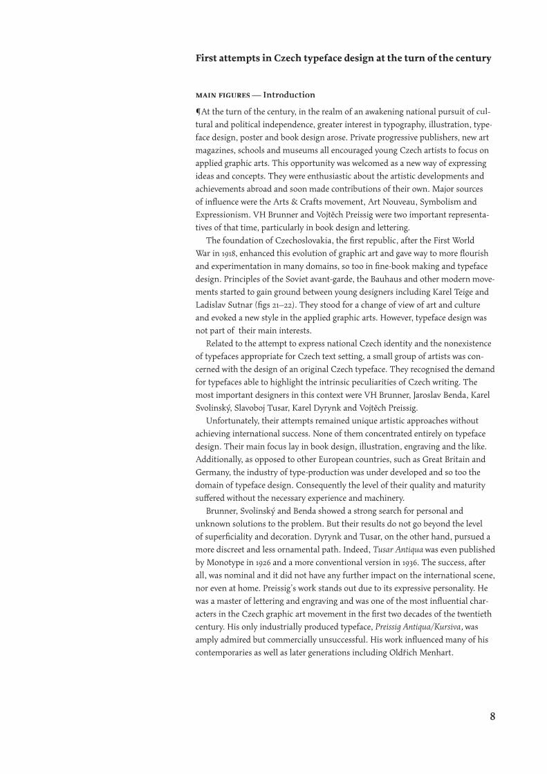
The foundation of Czechoslovakia, the fi rst republic, after the First World
War in 1918, enhanced this evolution of graphic art and gave way to more fl ourish
and experimentation in many domains, so too in fi ne-book making and typeface
design. Principles of the Soviet avant-garde, the Bauhaus and other modern move-
ments started to gain ground between young designers including Karel Teige and
Ladislav Sutnar (fi gs 21–22). They stood for a change of view of art and culture
and evoked a new style in the applied graphic arts. However, typeface design was
not part of their main interests.
Related to the attempt to express national Czech identity and the nonexistence
of typefaces appropriate for Czech text setting, a small group of artists was con-
cerned with the design of an original Czech typeface. They recognised the demand
for typefaces able to highlight the intrinsic peculiarities of Czech writing. The
most important designers in this context were VH Brunner, Jaroslav Benda, Karel
Svolinský, Slavoboj Tusar, Karel Dyrynk and Vojtěch Preissig.
Unfortunately, their attempts remained unique artistic approaches without
achieving international success. None of them concentrated entirely on typeface
design. Their main focus lay in book design, illustration, engraving and the like.
Additionally, as opposed to other European countries, such as Great Britain and
Germany, the industry of type-production was under developed and so too the
domain of typeface design. Consequently the level of their quality and maturity
suff ered without the necessary experience and machinery.
Brunner, Svolinský and Benda showed a strong search for personal and
unknown solutions to the problem. But their results do not go beyond the level
of superfi ciality and decoration. Dyrynk and Tusar, on the other hand, pursued a
more discreet and less ornamental path. Indeed, Tusar Antiqua was even published
by Monotype in 1926 and a more conventional version in 1936. The success, after
all, was nominal and it did not have any further impact on the international scene,
nor even at home. Preissig’s work stands out due to its expressive personality. He
was a master of lettering and engraving and was one of the most infl uential char-
acters in the Czech graphic art movement in the fi rst two decades of the twentieth
century. His only industrially produced typeface, Preissig Antiqua/Kursiva, was
amply admired but commercially unsuccessful. His work infl uenced many of his
contemporaries as well as later generations including Oldřich Menhart.
First attempts in Czech typeface design at the turn of the century
8
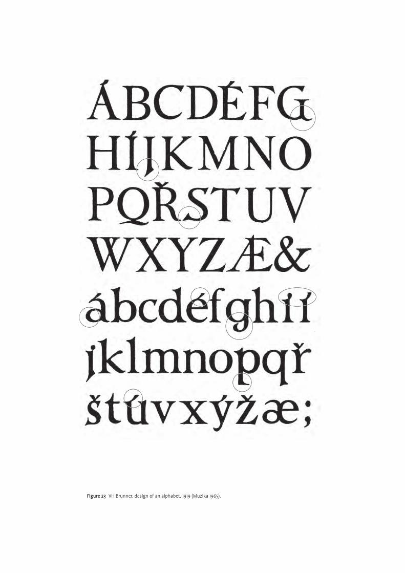
Figure 23 VH Brunner, design of an alphabet, 1919 (Muzika 1965).
Examples of their work
¶VH Brunner (1886–1928) was mainly an illustrator and book designer. He created
about 600 books in total. Due to various circumstances, his eight typefaces (fi ve
roman and three italic) have never been published. Similar to other designers of
his time, Brunner was infl uenced by Edward Johnston’s
roman and three italic) have never been published. Similar to other designers of
roman and three italic) have never been published. Similar to other designers of
school of calligraphy. It
was his guidance and source of inspiration. Brunner’s own design shows a good
deal of individuality and quirkiness. It dates from around 1919 and consist of capi-
tals and the lowercase (fi gs 24–25). He tried to solve the problematic eff ect caused
by diacritical marks, peculiar to Czech text setting, in a rather unusual way. They
merge into the body of the letter so forming a unity. Notice in fi gure 23 the small
size in relation to the body letter. The diff erentiation between dot and acute above
the letter i becomes diffi cult, particularly in small text sizes. The accents appear
too decorative and unfamiliar, making recognition, and thus easy reading, harder.
Additionally, quirky lettershapes, especially G J S a g j p s, hinder the typeface in
being useful and pleasant to read in continuous text.
Karel Svolinský approached the problem of phonetic sounds in a similar way to
Brunner. His main fi elds of activity were wood-engraving, typography and cal-
ligraphy. He created Svolinský Antiqua, in 1925. It was used in the book, Máy by
KH Macha, and was presented at the exhibition of book art in Paris the same year
(fi gs 24,26). The Průmyslová Tiskárna, one of the two printing houses in Prague,
cast one size, 24 pt, and intended it for one purpose only. This is refl ected by the
exclusion of the letters w q and x (only in the lowercase) as these are not used in
the Czech language.
Svolinský wanted his typeface to be new and autonomous without traces of
historical and even contemporary models and conventions. This aim, however,
was hard to achieve and the Svolinský Antiqua is still reminiscent of his historical
predecessors. One can be tempted to recognise similarities with the Bodoni style.
It is the strong contrast between thick and thin strokes and the vertical stress that
suggests this correspondence (fi g.29). Looking further, Svolinský Antiqua reveals
idiosyncrasies, such as one-directional serifs, irregular distribution of weight and
no terminals, all of which are alien to Bodoni. Inconsistencies in the design are
also noticeable, for instance, the double-sided serifs on the letters f i I P T and the
Figure 25 Text sample, typeface by VH Brunner, 1919 (Vichnar 1972).
Figure 24 Title page of the book Máy by KH Macha, set in Svolinský Antiqua, 1925. (Musil 2001). Dimensions are c. 40x60cm.
1. Edward Johnston was the main fi gure in the revival of calligraphy and the broad edge pen. His book Writing & Illuminating & Lettering was the source of inspiration for a whole generation of letter-artists at the beginning of the twenteeth century. He also designed the world famous typeface for the London Underground.
10
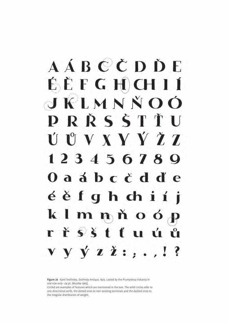
Figure 26 Karel Svolinsky, Svolinsky Antiqua, 1925, casted by the Prumyslova tiskarna in one size only—24 pt. (Muzika 1965).Circled are examples of features which are mentioned in the text. The solid circles refer to one-directional serifs, the dotted ones to non-exisitng terminals and the dashed ones to the irregular distribution of weight.
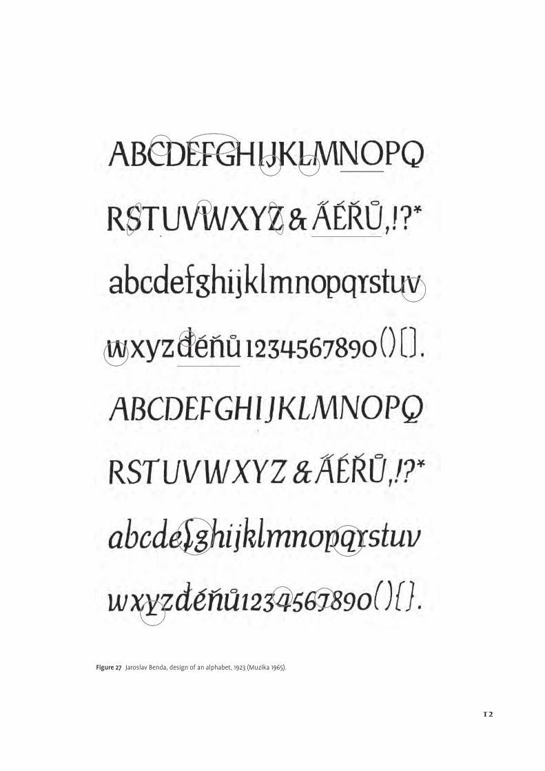
Figure 27 Jaroslav Benda, design of an alphabet, 1923 (Muzika 1965).
12
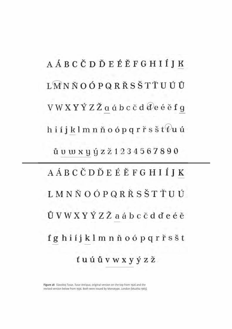
Figure 28 Slavoboj Tusar, Tusar Antiqua, original version on the top from 1926 and the revised version below from 1936. Both were issued by Monotype, London (Muzika 1965).
varying size and shape of the diacritics. Indeed, although it was one of the tasks to
face, the marks do not seem to be handled with appropriate care and thought.
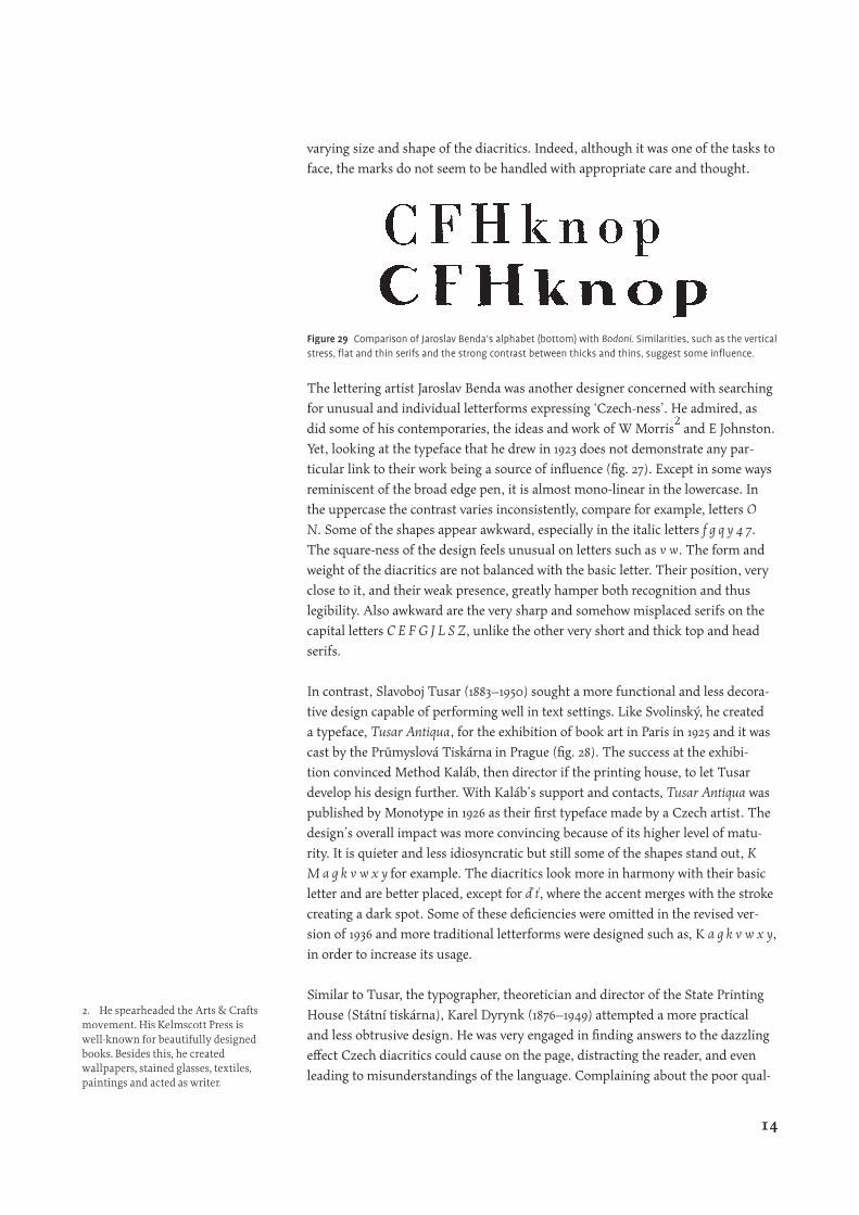
The lettering artist Jaroslav Benda was another designer concerned with searching
for unusual and individual letterforms expressing ‘Czech-ness’. He admired, as
did some of his contemporaries, the ideas and work of W Morris
for unusual and individual letterforms expressing ‘Czech-ness’. He admired, as
for unusual and individual letterforms expressing ‘Czech-ness’. He admired, as
and E Johnston.
Yet, looking at the typeface that he drew in 1923 does not demonstrate any par-
ticular link to their work being a source of infl uence (fi g. 27). Except in some ways
reminiscent of the broad edge pen, it is almost mono-linear in the lowercase. In
the uppercase the contrast varies inconsistently, compare for example, letters O
N. Some of the shapes appear awkward, especially in the italic letters f g q y 4 7.
The square-ness of the design feels unusual on letters such as v w. The form and
weight of the diacritics are not balanced with the basic letter. Their position, very
close to it, and their weak presence, greatly hamper both recognition and thus
legibility. Also awkward are the very sharp and somehow misplaced serifs on the
capital letters C E F G J L S Z, unlike the other very short and thick top and head
serifs.
In contrast, Slavoboj Tusar (1883–1950) sought a more functional and less decora-
tive design capable of performing well in text settings. Like Svolinský, he created
a typeface, Tusar Antiqua, for the exhibition of book art in Paris in 1925 and it was
cast by the Průmyslová Tiskárna in Prague (fi g. 28). The success at the exhibi-
tion convinced Method Kaláb, then director if the printing house, to let Tusar
develop his design further. With Kaláb’s support and contacts, Tusar Antiqua was
published by Monotype in 1926 as their fi rst typeface made by a Czech artist. The
design’s overall impact was more convincing because of its higher level of matu-
rity. It is quieter and less idiosyncratic but still some of the shapes stand out, K
M a g k v w x y for example. The diacritics look more in harmony with their basic
letter and are better placed, except for ď ť, where the accent merges with the stroke
creating a dark spot. Some of these defi ciencies were omitted in the revised ver-
sion of 1936 and more traditional letterforms were designed such as, K a g k v w x y,
in order to increase its usage.
Similar to Tusar, the typographer, theoretician and director of the State Printing
House (Státní tiskárna), Karel Dyrynk (1876–1949) attempted a more practical
and less obtrusive design. He was very engaged in fi nding answers to the dazzling
eff ect Czech diacritics could cause on the page, distracting the reader, and even
leading to misunderstandings of the language. Complaining about the poor qual-
Figure 29 Comparison of Jaroslav Benda’s alphabet (bottom) with Bodoni. Similarities, such as the vertical stress, fl at and thin serifs and the strong contrast between thicks and thins, suggest some infl uence.
2. He spearheaded the Arts & Crafts movement. His Kelmscott Press is well-known for beautifully designed books. Besides this, he created wallpapers, stained glasses, textiles, paintings and acted as writer.
14
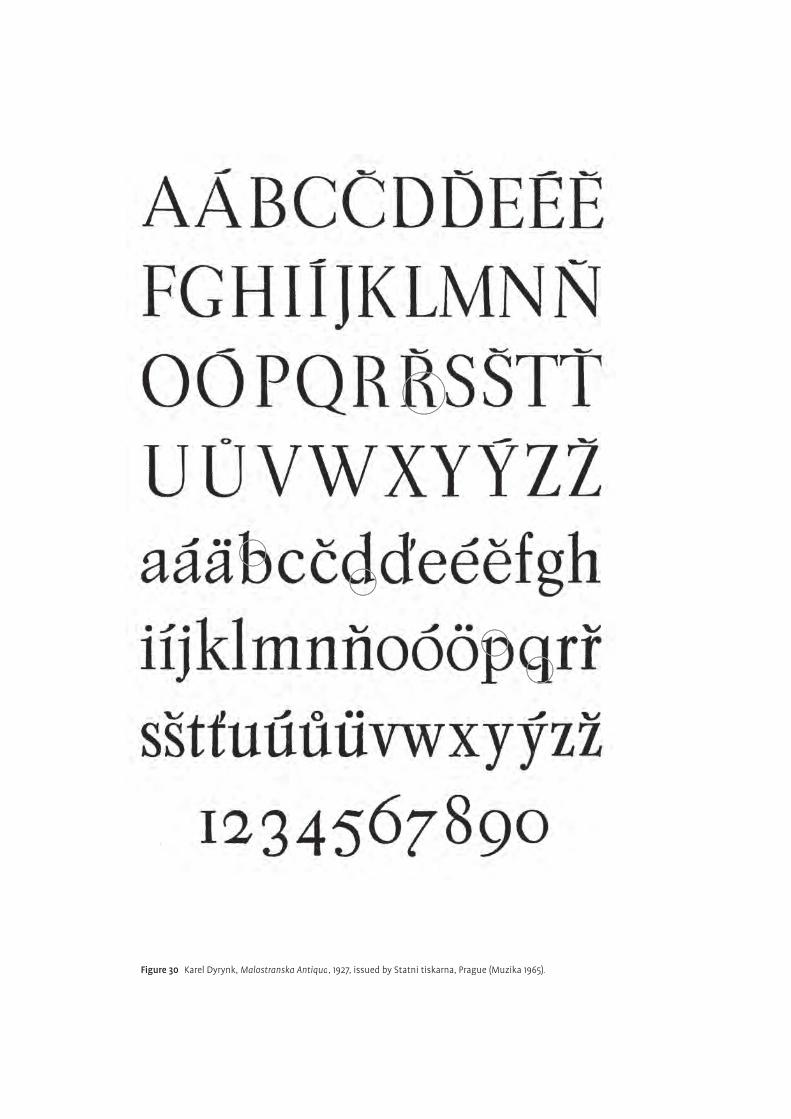
Figure 30 Karel Dyrynk, Malostranska Antiqua, 1927, issued by Statni tiskarna, Prague (Muzika 1965).
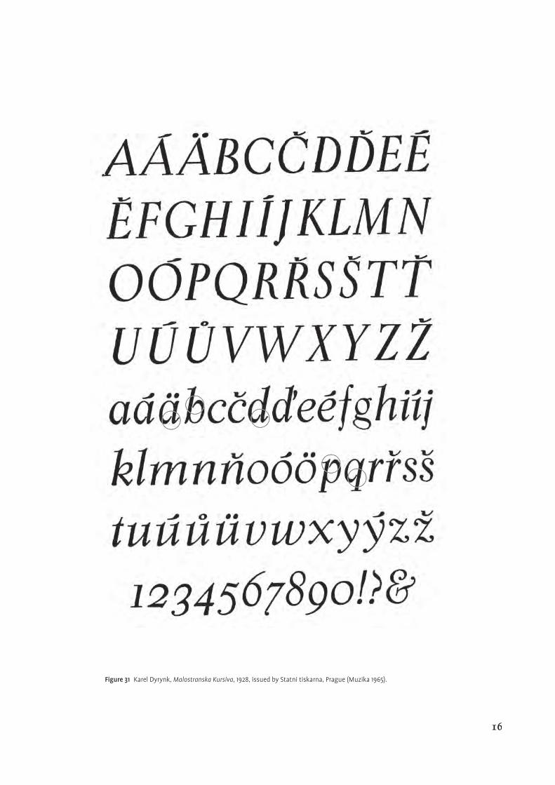
Figure 31 Karel Dyrynk, Malostranska Kursiva, 1928, issued by Statni tiskarna, Prague (Muzika 1965).
16
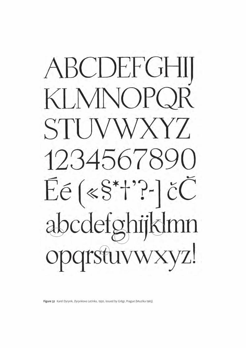
Figure 32 Karel Dyrynk, Dyrynkova Latinka, 1930, issued by Grégr, Prague (Muzika 1965).
ity of the then current typefaces in Czechoslovakia, he pointed out that, unfor-
tunately, the reader became insensitive to the correct proportions and shapes of
diacritical marks. Typefaces which did not repeat the common errors would even
be regarded negatively as mere modern novelty (Dyrynk 1925).
In his own creations, Dyrynk tried to counteract this and paid a lot of attention
to the balance of the design. Malostranská Antiqua/Kursiva, made in 1927–28, is
based on historical models, such as the Aldine-type of the 16th century
(fi gs 30–31). It is rather condensed, with low contrast, and bears some peculiari-
ties, such as open counters on the b d p q and the arched leg of the R. Here Dyrynk
achieved better consistency between the basic letter and the accent. They are
distinct enough and fi t in proportion and design. The characters have in general a
pleasant stroke width, and the typeface appears both vivid and dynamic.
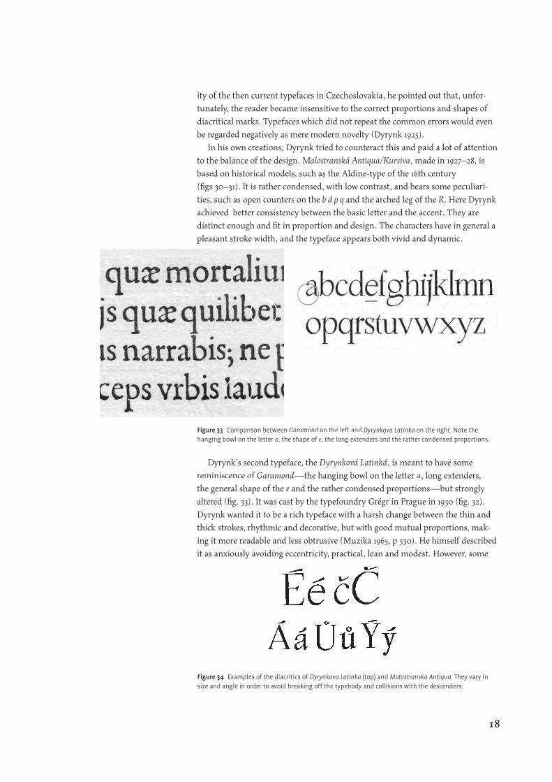
Dyrynk’s second typeface, the Dyrynková Latinká, is meant to have some
reminiscence of Garamond—the hanging bowl on the letter a, long extenders,
the general shape of the e and the rather condensed proportions—but strongly
altered (fi g. 33). It was cast by the typefoundry Grégr in Prague in 1930 (fi g. 32).
Dyrynk wanted it to be a rich typeface with a harsh change between the thin and
thick strokes, rhythmic and decorative, but with good mutual proportions, mak-
ing it more readable and less obtrusive (Muzika 1965, p 530). He himself described
it as anxiously avoiding eccentricity, practical, lean and modest. However, some
Figure 33 Comparison between Garamond on the left and Dyrynkova Latinka on the right. Note the hanging bowl on the letter a, the shape of e, the long extenders and the rather condensed proportions.
Figure 34 Examples of the diacritics of Dyrynkova Latinka (top) and Malostranska Antiqua. They vary in size and angle in order to avoid breaking off the typebody and collisions with the descenders.
18
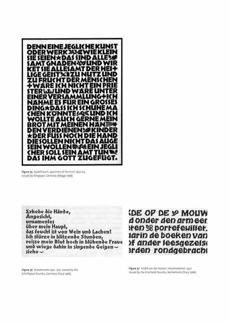
Figure 36 Mendelssohn type, 1921, issued by the Schriftguss foundry, Germany (Tracy 1986).
Figure 37 André van der Vossen, Houtsneeletter, 1927, issued by the Enschedé foundry, Netherlands (Tracy 1986).
Figure 35 Rudolf Koch, specimen of Neuland, 1922–23, issued by Klingspor, Germany (Meggs 1998).
features such as, the tail on the letter k, the foot serifs on a b, the bottom storey
of the g and the top stroke of t, indicate a less calm and more pretentious eff ect.
Something worth mentioning, regarding diacritics, is the variation in size and
angle from lowercase to capitals (fi g. 34). The shallow angle on the capitals helps
to avoid breaking off from the typebody and collisions with the descenders. As
with Tusar Antiqua, Dyrynk’s typefaces leave the ornamental approach of other
designs behind them.
Another remarkable personality is Vojtěch Preissig (1873–1944). He devoted all
his talent and skill to the revival of Czech book arts, performing in many areas
including illustration, lettering and book making. Preissig’s general artistic style
was to be deeply involved in experimentation with various techniques, giving pref-
erence to lino and wood cut. Indeed, most of his typefaces were made directly in
the material without initial drawings. The character of his designs demonstrates,
quite frankly, the infl uence of Expressionist publications, which used woodcuts
intensively (fi g. 38). The ‘primitivity’ and roughness of the design is refl ected in
the work of other contemporary artists as well (fi gs 36–37). Rudolf Koch’s Neuland
is one such example (fi g. 35).
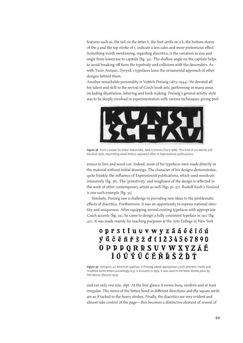
Similarly, Preissig saw a challenge in providing new ideas to the problematic
eff ects of diacritics. Furthermore, it was an opportunity to express national iden-
tity and uniqueness. After equipping several existing typefaces with appropriate
Czech accents (fi g. 39), he came to design a fully consistent typeface in 1912 (fi g.
40). It was made mainly for teaching purposes at the Arts College in New York
and cut only one size, 18pt. At the fi rst glance it seems busy, random and at least
irregular. The stems of the letters bend in diff erent directions and the square serifs
are as if tacked to the heavy strokes. Finally, the diacritics are very evident and
almost take control of the page—this becomes a distinctive element of several of
Figure 38 From a poster by Oskar Kokoschka, 1908 in Vienna (Tracy 1986). This kind of accidental and blockish style, resembling wood letters, appeared often in Expressionist publications.
Figure 39 Arlington, an American typeface. V Preissig added appropriate Czech phonetic marks and modifi ed some letters accordingly (e g, U krouzek) in 1909. It was used in the book Slezske písne by Petr Bezruc (Dyrynk 1925).
20
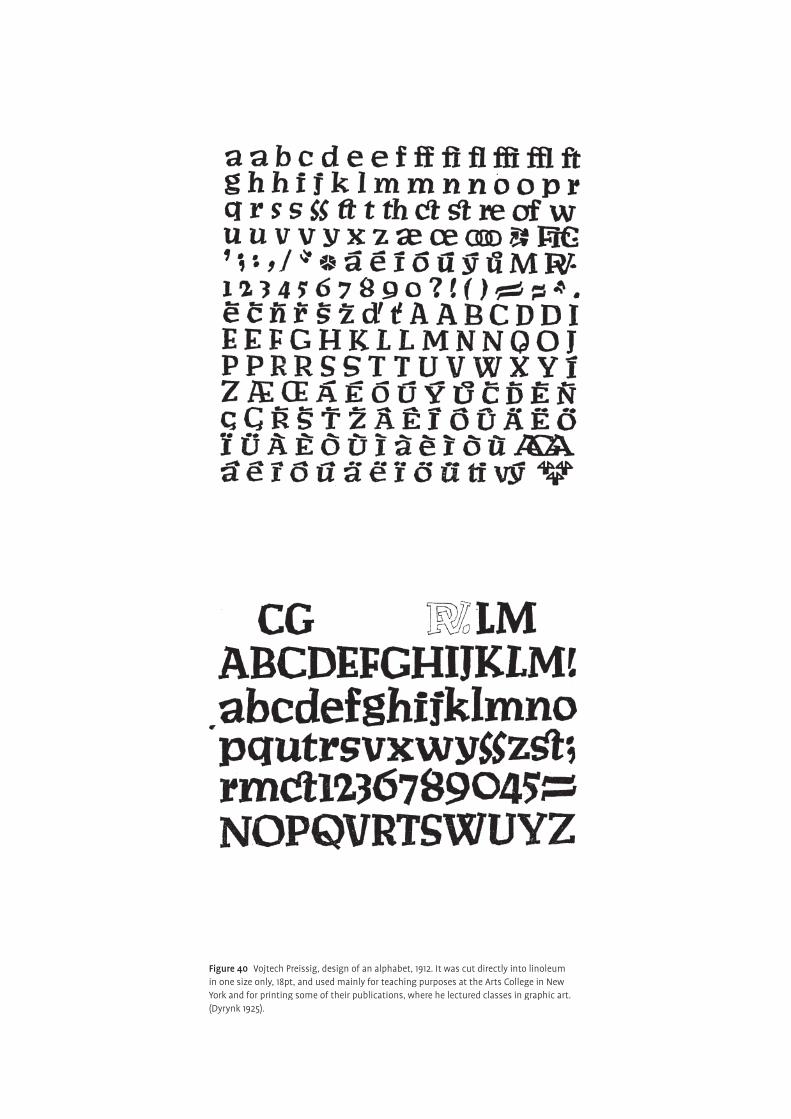
Figure 40 Vojtech Preissig, design of an alphabet, 1912. It was cut directly into linoleum in one size only, 18pt, and used mainly for teaching purposes at the Arts College in New York and for printing some of their publications, where he lectured classes in graphic art. (Dyrynk 1925).
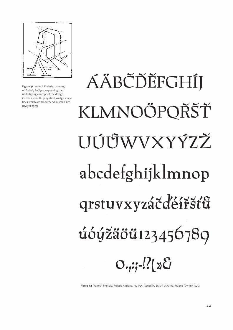
Figure 41 Vojtech Preissig, drawing of Preissig Antiqua, explaining the underlaying concept of the design. Curves are built up by short wedge shape lines which are smoothend in small size (Dyrynk 1925).
Figure 42 Vojtech Preissig, Preissig Antiqua, 1923–25, issued by Statní tiskárna, Prague (Dyrynk 1925).
22
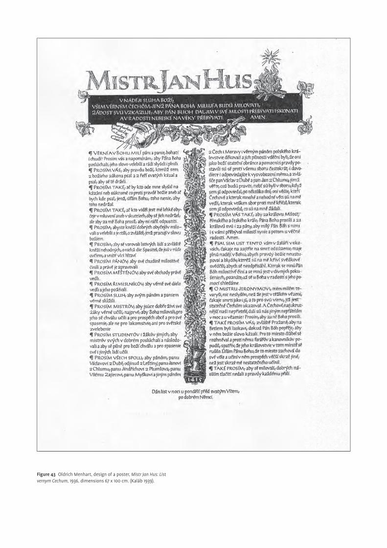
Figure 43 Oldrich Menhart, design of a poster, Mistr Jan Hus: List vernym Cechum, 1936, dimensions 67 x 100 cm. (Kaláb 1939).
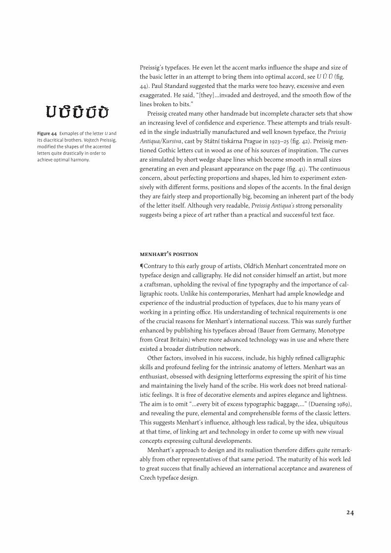
Preissig’s typefaces. He even let the accent marks infl uence the shape and size of
the basic letter in an attempt to bring them into optimal accord, see U Û Ů (fi g.
44). Paul Standard suggested that the marks were too heavy, excessive and even
exaggerated. He said, “[they]…invaded and destroyed, and the smooth fl ow of the
lines broken to bits.”
Preissig created many other handmade but incomplete character sets that show
an increasing level of confi dence and experience. These attempts and trials result-
ed in the single industrially manufactured and well known typeface, the Preissig
Antiqua/Kursiva, cast by Státní tiskárna Prague in 1923–25 (fi g. 42). Preissig men-
tioned Gothic letters cut in wood as one of his sources of inspiration. The curves
are simulated by short wedge shape lines which become smooth in small sizes
generating an even and pleasant appearance on the page (fi g. 41). The continuous
concern, about perfecting proportions and shapes, led him to experiment exten-
sively with diff erent forms, positions and slopes of the accents. In the fi nal design
they are fairly steep and proportionally big, becoming an inherent part of the body
of the letter itself. Although very readable, Preissig Antiqua’s strong personality
suggests being a piece of art rather than a practical and successful text face.
menhart’s position
¶Contrary to this early group of artists, Oldřich Menhart concentrated more on
typeface design and calligraphy. He did not consider himself an artist, but more
a craftsman, upholding the revival of fi ne typography and the importance of cal-
ligraphic roots. Unlike his contemporaries, Menhart had ample knowledge and
experience of the industrial production of typefaces, due to his many years of
working in a printing offi ce. His understanding of technical requirements is one
of the crucial reasons for Menhart’s international success. This was surely further
enhanced by publishing his typefaces abroad (Bauer from Germany, Monotype
from Great Britain) where more advanced technology was in use and where there
existed a broader distribution network.
Other factors, involved in his success, include, his highly refi ned calligraphic
skills and profound feeling for the intrinsic anatomy of letters. Menhart was an
enthusiast, obsessed with designing letterforms expressing the spirit of his time
and maintaining the lively hand of the scribe. His work does not breed national-
istic feelings. It is free of decorative elements and aspires elegance and lightness.
The aim is to omit “…every bit of excess typographic baggage,…” (Duensing 1989),
and revealing the pure, elemental and comprehensible forms of the classic letters.
This suggests Menhart’s infl uence, although less radical, by the idea, ubiquitous
at that time, of linking art and technology in order to come up with new visual
concepts expressing cultural developments.
Menhart’s approach to design and its realisation therefore diff ers quite remark-
ably from other representatives of that same period. The maturity of his work led
to great success that fi nally achieved an international acceptance and awareness of
Czech typeface design.
Figure 44 Exmaples of the letter U and its diacritical brothers. Vojtech Preissig, modifi ed the shapes of the accented letters quite drastically in order to achieve optimal harmony.
24
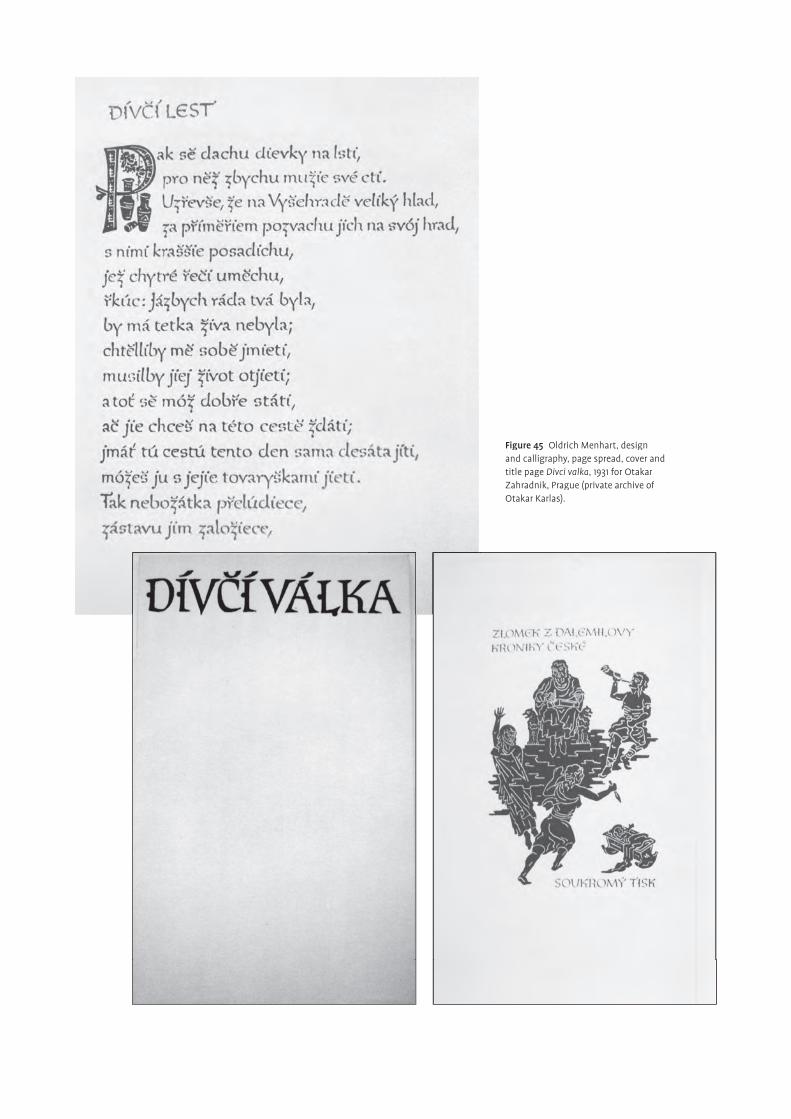
Figure 45 Oldrich Menhart, design and calligraphy, page spread, cover and title page Divci valka, 1931 for Otakar Zahradnik, Prague (private archive of Otakar Karlas).
Period of preparation
formative infl uences
¶In his early years Oldřich Menhart experienced formative infl uences from three
main directions. One of them was his father. He was a goldsmith who taught
his four sons engraving, drawing and carving. In his father’s workshop Menhart
acquired skilled hands and a profound feeling for shapes. He developed a sense
for detail up to a level of perfectionism. Increasing experience made his working
hand secure and assured. Additionally, he became familiar with the peculiar char-
acteristics of the material and the tool. The skill of being aware of the relationship
between tool and form, that is to know how technology would eff ect the fi nal
shape, became Menhart’s fundament for his later mastery.
Another important source was working fi rst as an apprentice, then as an
ordinary worker and fi nally as foreman in the printing house Politka in Prague.
Here he gained many years of professional experience in contact with the process
of printing and the industrial production of typefaces. This was crucial for his
extraordinary understanding of technical conditions when it comes to design
typefaces.
Finally, the third infl uence came from his teacher Karel Mrázek at the school of
typography. Here Menhart encountered for the fi rst time the art of calligraphy and
book design. Mrázek recognised his talent and encouraged him to occupy himself
with these subjects.
Furthermore, visits to the Plantin-Moretus Museum in Antwerp, to the
Imprimerie Nationale in Paris and the private Klingspor collection in Kronberg,
fi nanced by the Czech Institute of Economy, had deep impacts on Menhart’s later
professional evolution. He got in touch with original punches, matrices and prints.
During this time he also studied the work and life of several important masters of
writing, such as Plantin, for example.
interest in calligraphy
¶Menhart became increasingly involved with the study of calligraphy and old
writings. He realized the potential of expressing visually, beauty, sentiments
and intellect by the means of calligraphy. He had a strong creative drive and
wanted to understand, to absorb the inherent nature of letters. Unfortunately, the
opportunities, available to him, were quite limited. Churches, public buildings,
cementeries, libraries and the like, were some of the places where he could study
letterforms. Free from traditional heritage and knowledge, he was able to observe
the inscriptions with innocent eyes and to see the spirit of the letters behind the
external form. He refi ned his sense for detail and tried to comprehend the system
of relationships between single pieces of writing. This made for a gradual matur-
ing of his intuition for the viability of lettershapes and their emotional eff ect on
the message to the reader. Also interesting for him, was the power of letters as
testimonies of time and culture. This experience led Menhart to search for the
natural style of his time, the hidden rhythm of life and the hand of the scribe.
Beautiful but superfi cial and decorative calligraphy was alien to him. The chal-
lenge was to develop his own ideas and to fi nd new ways of conceiving of artistic
handwriting as a graphic representation of his individuality. The art of writing, in
26
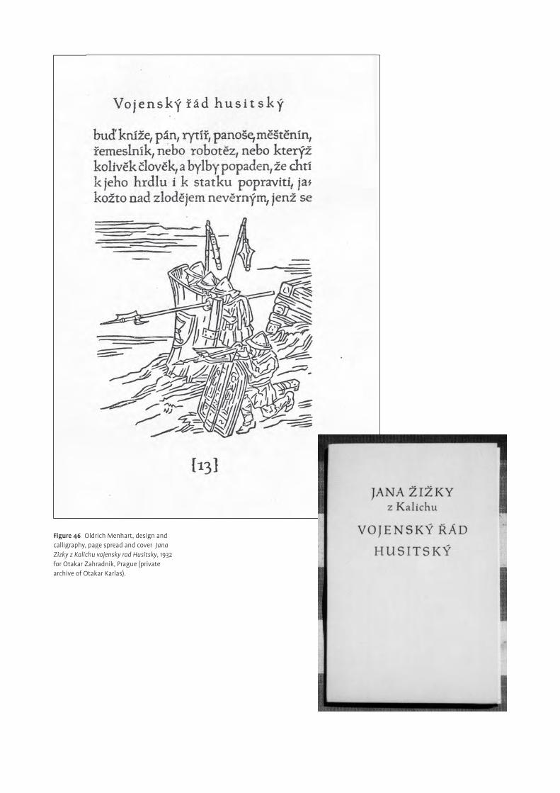
Figure 46 Oldrich Menhart, design and calligraphy, page spread and cover Jana Zizky z Kalichu vojensky rad Husitsky, 1932 for Otakar Zahradnik, Prague (private archive of Otakar Karlas).
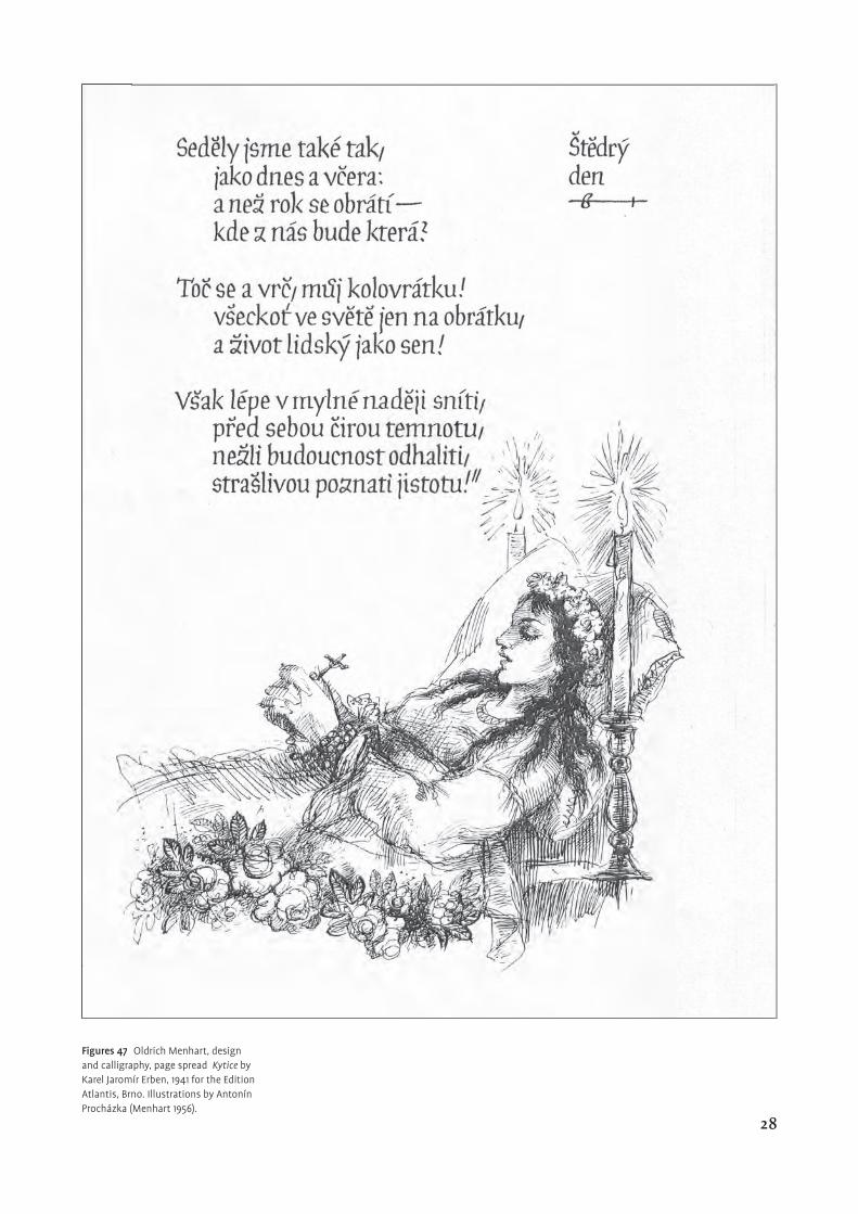
Figures 47 Oldrich Menhart, design and calligraphy, page spread Kytice by Karel Jaromír Erben, 1941 for the Edition Atlantis, Brno. Illustrations by Antonín Procházka (Menhart 1956).
28
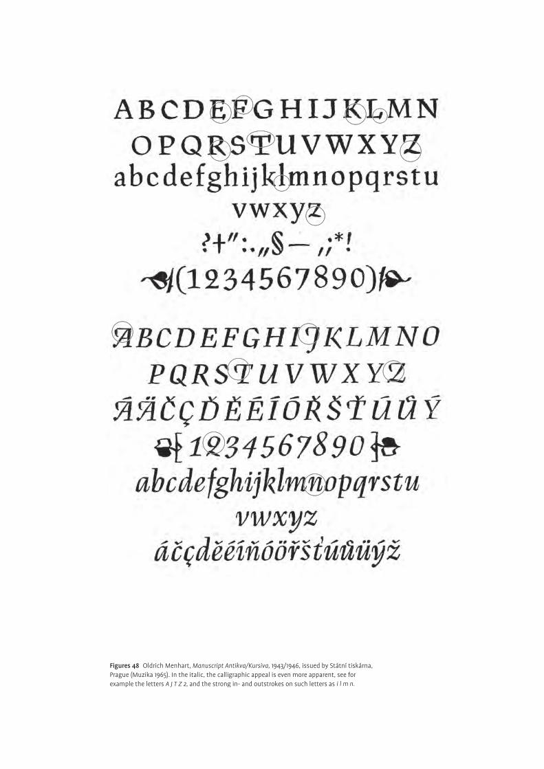
Figures 48 Oldrich Menhart, Manuscript Antikva/Kursiva, 1943/1946, issued by Státní tiskárna, Prague (Muzika 1965). In the italic, the calligraphic appeal is even more apparent, see for example the letters A J T Z 2, and the strong in- and outstrokes on such letters as i l m n.
fact, became an existential element of his life. Similar to other designers at that
time, he was engaged fi nding the national Czech style, although he was aware that
any given personal style could be only one of many possible interpretations of the
national style. Unrepelled, this task remained an endeavour until the very end of
his days.
His lifelong concern about teaching and discussing the ‘black art’, started with
the educational publication, together with his mentor Karel Mrázek, of his fi rst
book in 1921, První českou školu ornamentálního písma. It describes the rules of cal-
ligraphy he had discovered during his early years of studying letterforms. The use
of various design elements is shown together with their visual relationship to the
message of the text. Besides that, he began to create plenty of fi ne books, seeking
to unify the written word with the illustration. Figures 45–46 show two handwrit-
ten books, Dívcí válka 1931 and Jana Žižky z Kalichu vojenský řad Husitský 1932. Other
examples of his vast range of lettering, exlibris and books include Mistr Jan Hus:
List věrným Čechům a poster 1936 (fi g. 43) and Kytice by Karel Jaromír Erben 1941
(fi g. 49). Both pieces of work can be regarded as precursors to the highly individual
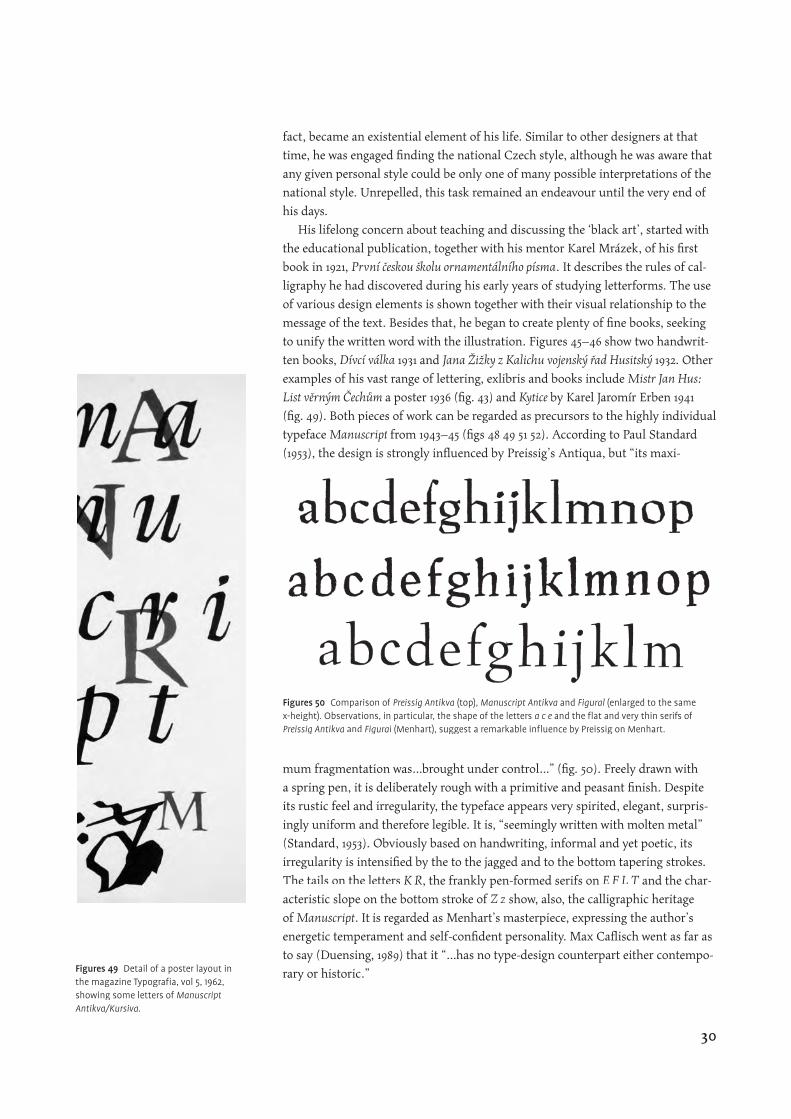
typeface Manuscript from 1943–45 (fi gs 48 49 51 52). According to Paul Standard
(1953), the design is strongly infl uenced by Preissig’s Antiqua, but “its maxi-
mum fragmentation was…brought under control…” (fi g. 50). Freely drawn with
a spring pen, it is deliberately rough with a primitive and peasant fi nish. Despite
its rustic feel and irregularity, the typeface appears very spirited, elegant, surpris-
ingly uniform and therefore legible. It is, “seemingly written with molten metal”
(Standard, 1953). Obviously based on handwriting, informal and yet poetic, its
irregularity is intensifi ed by the to the jagged and to the bottom tapering strokes.
The tails on the letters K R, the frankly pen-formed serifs on E F L T and the char-E F L T and the char-E F L T
acteristic slope on the bottom stroke of Z z show, also, the calligraphic heritage
of Manuscript. It is regarded as Menhart’s masterpiece, expressing the author’s
energetic temperament and self-confi dent personality. Max Cafl isch went as far as
to say (Duensing, 1989) that it “…has no type-design counterpart either contempo-
rary or historic.” Figures 49 Detail of a poster layout in the magazine Typografi a, vol 5, 1962, showing some letters of Manuscript Antikva/Kursiva.
Figures 50 Comparison of Preissig Antikva (top), Manuscript Antikva and Figural (enlarged to the same x-height). Observations, in particular, the shape of the letters a c e and the fl at and very thin serifs of Preissig Antikva and Figural (Menhart), suggest a remarkable infl uence by Preissig on Menhart.
30
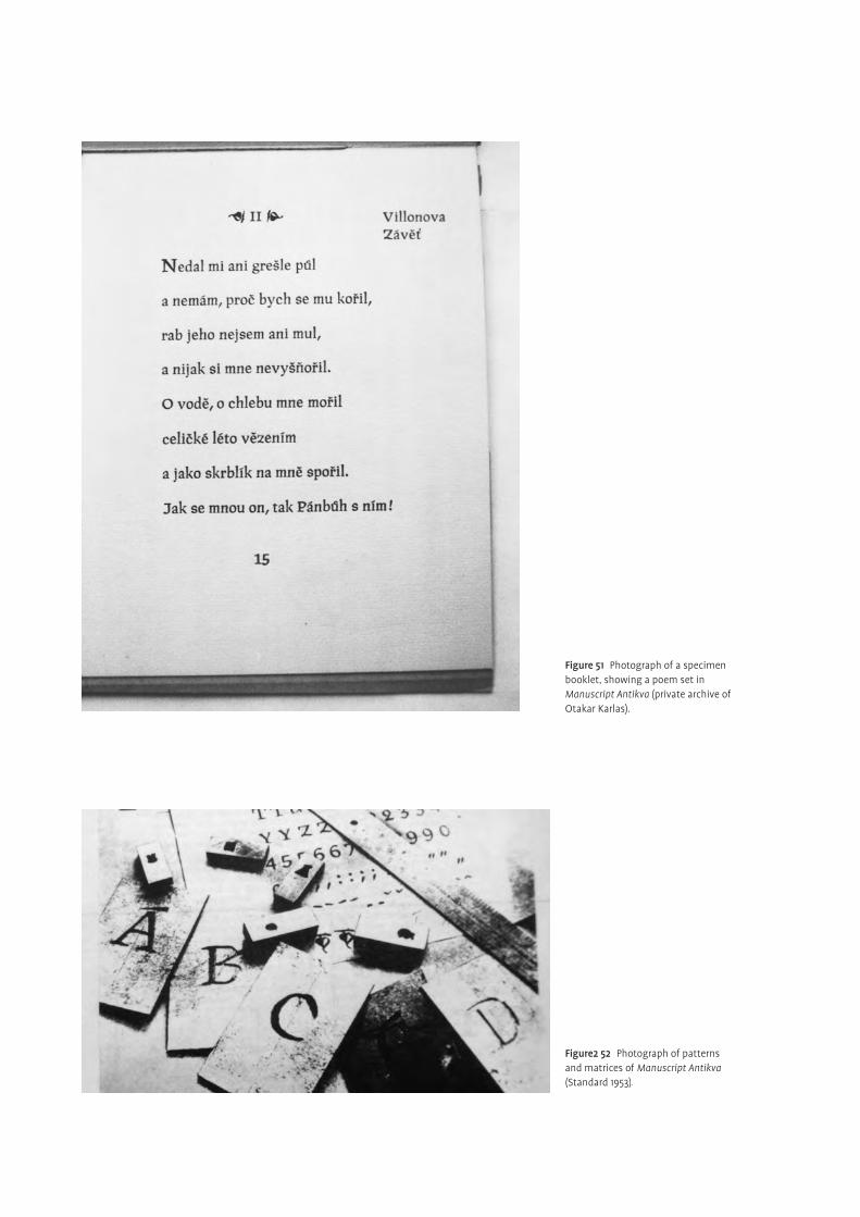
Figure 51 Photograph of a specimen booklet, showing a poem set in Manuscript Antikva (private archive of Otakar Karlas).
Figure2 52 Photograph of patterns and matrices of Manuscript Antikva (Standard 1953).
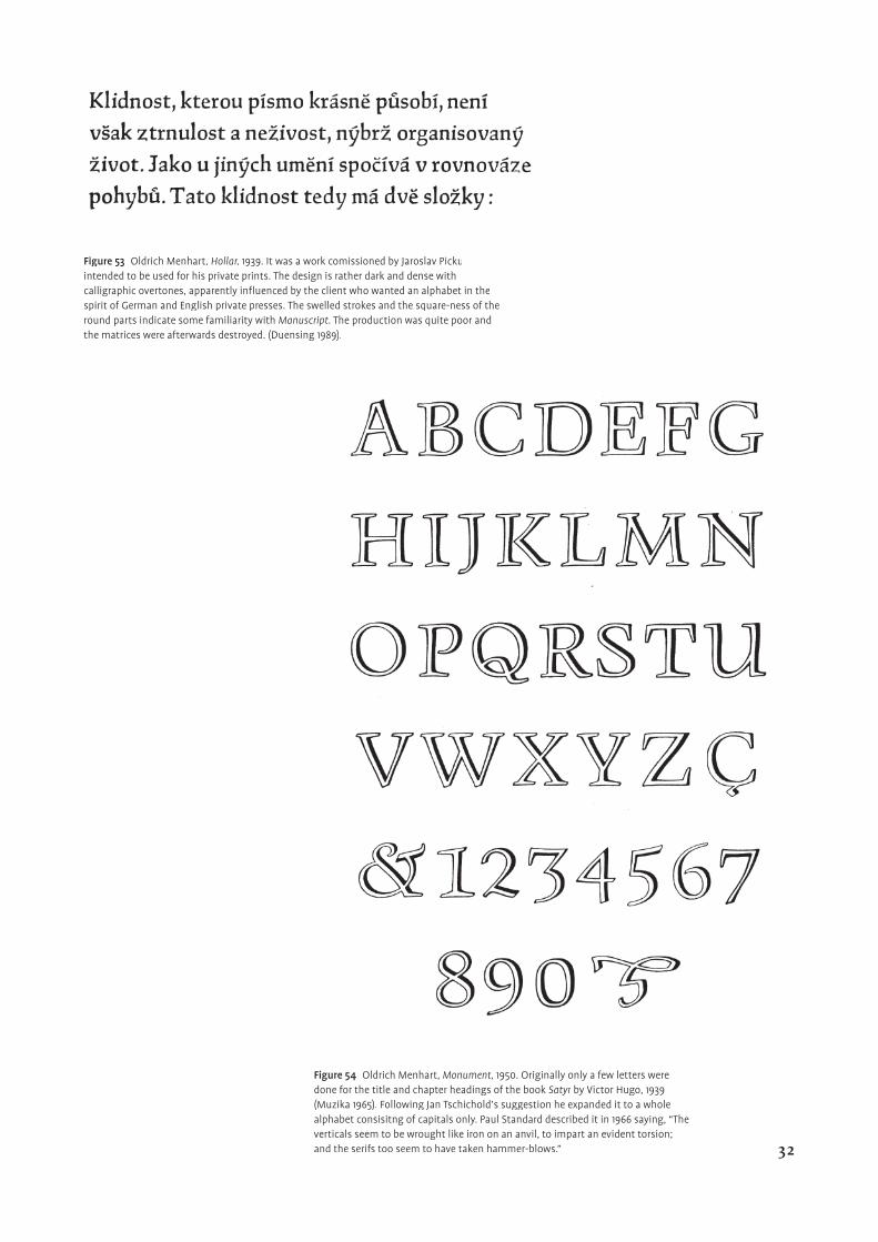
Figure 53 Oldrich Menhart, Hollar, 1939. It was a work comissioned by Jaroslav Pickuintended to be used for his private prints. The design is rather dark and dense with calligraphic overtones, apparently infl uenced by the client who wanted an alphabet in the spirit of German and English private presses. The swelled strokes and the square-ness of the round parts indicate some familiarity with Manuscript. The production was quite poor and the matrices were afterwards destroyed. (Duensing 1989).
Figure 54 Oldrich Menhart, Monument, 1950. Originally only a few letters were done for the title and chapter headings of the book Satyr by Victor Hugo, 1939 Satyr by Victor Hugo, 1939 Satyr(Muzika 1965). Following Jan Tschichold’s suggestion he expanded it to a whole alphabet consisitng of capitals only. Paul Standard described it in 1966 saying, “The verticals seem to be wrought like iron on an anvil, to impart an evident torsion; and the serifs too seem to have taken hammer-blows.” 32
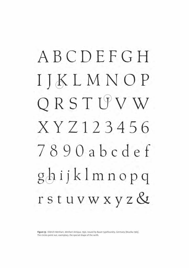
Figure 55 Oldrich Menhart, Menhart Antiqua, 1930, issued by Bauer typefoundry, Germany (Muzika 1965).The circles point out, exemplary, the special shape of the serifs.
Period of creation
role of technology — Designer and technology
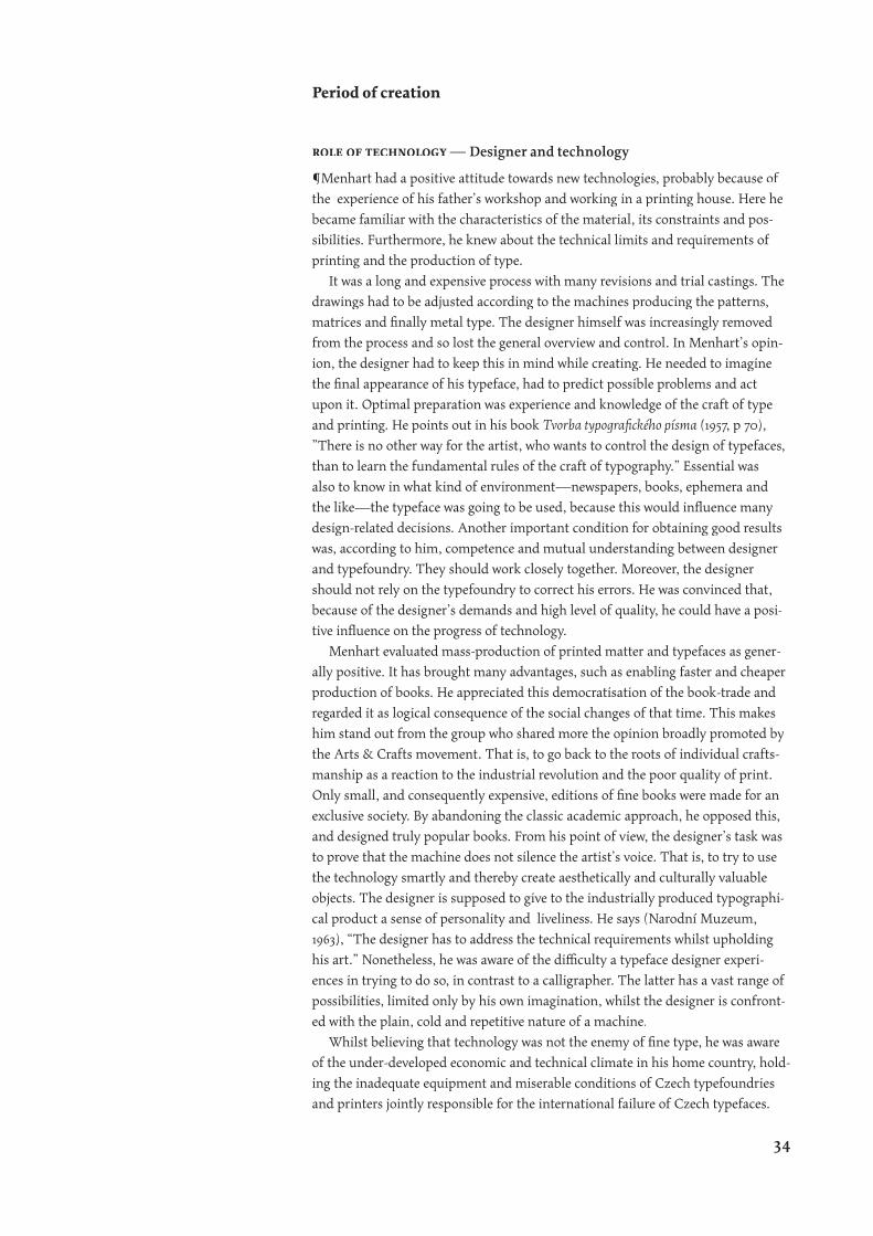
¶Menhart had a positive attitude towards new technologies, probably because of
the experience of his father’s workshop and working in a printing house. Here he
became familiar with the characteristics of the material, its constraints and pos-
sibilities. Furthermore, he knew about the technical limits and requirements of
printing and the production of type.
It was a long and expensive process with many revisions and trial castings. The
drawings had to be adjusted according to the machines producing the patterns,
matrices and fi nally metal type. The designer himself was increasingly removed
from the process and so lost the general overview and control. In Menhart’s opin-
ion, the designer had to keep this in mind while creating. He needed to imagine
the fi nal appearance of his typeface, had to predict possible problems and act
upon it. Optimal preparation was experience and knowledge of the craft of type
and printing. He points out in his book Tvorba typografi ckého písma (1957, p 70),
”There is no other way for the artist, who wants to control the design of typefaces,
than to learn the fundamental rules of the craft of typography.” Essential was
also to know in what kind of environment—newspapers, books, ephemera and
the like—the typeface was going to be used, because this would infl uence many
design-related decisions. Another important condition for obtaining good results
was, according to him, competence and mutual understanding between designer
and typefoundry. They should work closely together. Moreover, the designer
should not rely on the typefoundry to correct his errors. He was convinced that,
because of the designer’s demands and high level of quality, he could have a posi-
tive infl uence on the progress of technology.
Menhart evaluated mass-production of printed matter and typefaces as gener-
ally positive. It has brought many advantages, such as enabling faster and cheaper
production of books. He appreciated this democratisation of the book-trade and
regarded it as logical consequence of the social changes of that time. This makes
him stand out from the group who shared more the opinion broadly promoted by
the Arts & Crafts movement. That is, to go back to the roots of individual crafts-
manship as a reaction to the industrial revolution and the poor quality of print.
Only small, and consequently expensive, editions of fi ne books were made for an
exclusive society. By abandoning the classic academic approach, he opposed this,
and designed truly popular books. From his point of view, the designer’s task was
to prove that the machine does not silence the artist’s voice. That is, to try to use
the technology smartly and thereby create aesthetically and culturally valuable
objects. The designer is supposed to give to the industrially produced typographi-
cal product a sense of personality and liveliness. He says (Narodní Muzeum,
1963), “The designer has to address the technical requirements whilst upholding
his art.” Nonetheless, he was aware of the diffi culty a typeface designer experi-
ences in trying to do so, in contrast to a calligrapher. The latter has a vast range of
possibilities, limited only by his own imagination, whilst the designer is confront-
ed with the plain, cold and repetitive nature of a machine.
Whilst believing that technology was not the enemy of fi ne type, he was aware
of the under-developed economic and technical climate in his home country, hold-
ing the inadequate equipment and miserable conditions of Czech typefoundries
and printers jointly responsible for the international failure of Czech typefaces.
34
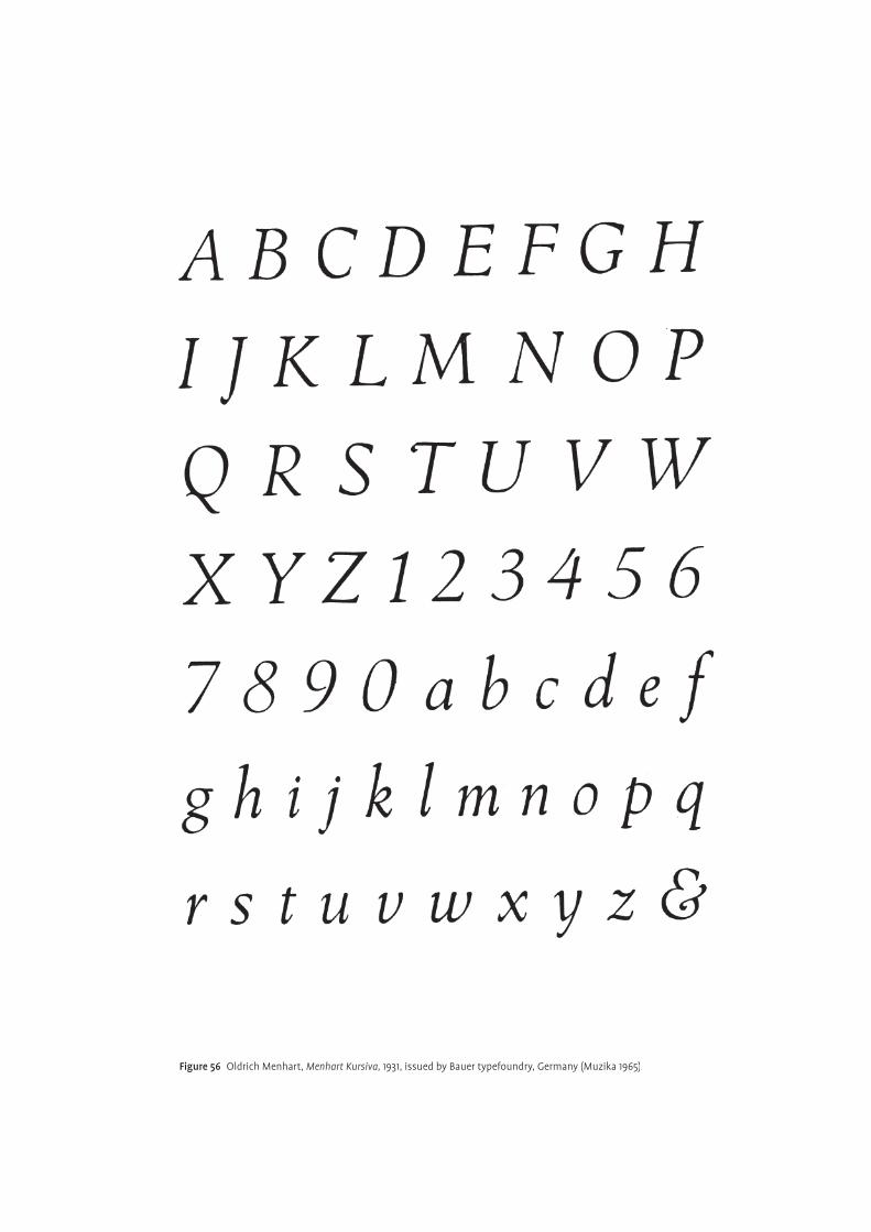
Figure 56 Oldrich Menhart, Menhart Kursiva, 1931, issued by Bauer typefoundry, Germany (Muzika 1965).
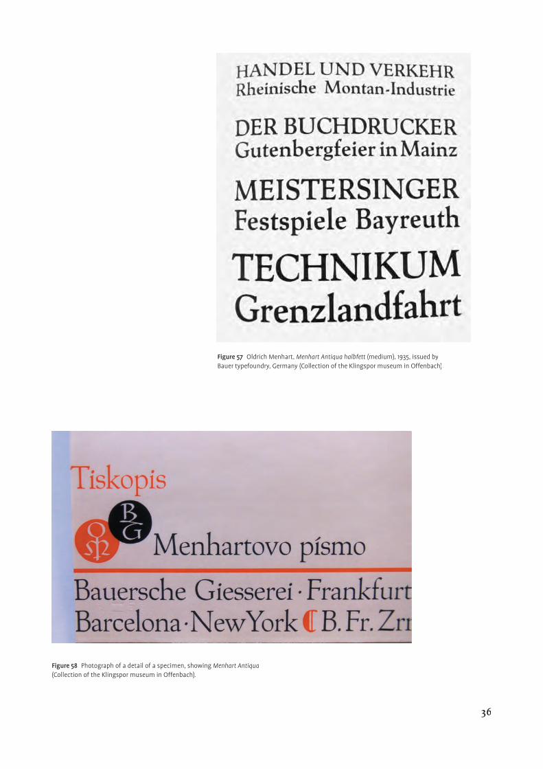
Figure 57 Oldrich Menhart, Menhart Antiqua halbfett (medium), 1935, issued by Bauer typefoundry, Germany (Collection of the Klingspor museum in Offenbach).
Figure 58 Photograph of a detail of a specimen, showing Menhart Antiqua(Collection of the Klingspor museum in Offenbach).
36
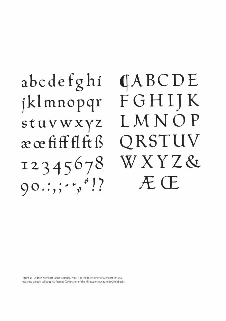
Figure 59 Oldrich Menhart Codex Antiqua, 1930. It is the forerunner of Menhart Antiqua, revealing greatly calligraphic featues (Collection of the Klingspor museum in Offenbach).
He was fortunate to have had the possibility to publish his fi rst typefaces abroad.
The dealer for the Bauer typefoundry, O Zahradnik, whom Menhart encountered
on his trip to Off enbach, encouraged him to submit a proposal to the foundry.
He followed this advice and sent a map with drawings and sample text layouts.
The name was Codex Antiqua and Kursiv, a hint to two important medieval manu-
scripts, the Reimser and Wyssehrader Codex (fi g. 59–61). It was strongly calli-
graphic and dynamic, but not yet accomplished. After several revisions it resulted
in the typeface Menhart Antiqua / Kursiva, cast in 1931 by Bauer in Germany (fi gs
55–58). It is a nicely balanced and calm design, with generous proportions and
calligraphic reminiscence. The dynamic spirit is enhanced by the asymmetrical
shape of the serifs. They are blunt, rectangular on the right side but wedge shaped
and elongated on the other. The strokes are modulated, refl ecting the broad edge
pen and the round letters tend towards a square shape. In doing so they form a
solid base for the diacritics above them (see also the section Czech peculiarities).
These are some hints of his leitmotifs (Duensing, 1989), that became fundamental
features of his later designs.
The typeface is neither radical nor particularly inventive. It respects tradi-
tional heritage and conventions. Nevertheless, it is elegant, vigorous, personal
and legible. People, including E R Weiss, Stanley Morrison and Jan Tschichold
were among those that stated their admiration. The most remarkable comment,
though, refl ecting Menhart’s perfectionism and skillfulness, came from Georg
Hartmann, senior chief of the Bauer typefoundry. He said, “Tell me, how did
you do it? In all my thirty years of typefounding I have never before had a design
from an artist’s hand which in the very fi rst trial cutting and casting was ready
and usable without any correction!” (Standard, 1953). All of these characteristics
contributed to make Menhart Antiqua the fi rst Czech typeface, to have any truly
international success. It was mature in design and off ered a reasonable solution
(see also section ‘Czech peculiarities’) to the diffi culties peculiar to Czech text set-
ting. It also represented the level of Czech culture and art in a self-confi dent and
sovereign way. O F Babler mentioned in 1950, “…[the alphabet] is fashioned in
conformity with tradition; and…found an inner discipline.”
“Bodies without soul”
Menhart expressed this opinion with reference to the constructed sans serif type-
faces, which enjoyed popularity and simultaneously provoked rejection, especially
in the 1920s (fi g. 62). As discussed earlier, he believed in social and technical
progress that required new solutions in the fi eld of visual communication. The
direction he took, however, was less controversial. It was very much related to his
calligraphic background and love of written letterforms (see also section ‘Marriage
of calligraphy and typeface design’). To him, free handwriting was the best source
of inspiration and innovation in the search for new, interesting forms. One of his
slogans was that, “letters could not be designed until they had been written.” He
refused to use any technical tools (ruler, compass, ruling pen), stating that type-
faces created in this manner, could be executed by anybody. This refl ects frankly
his conviction that the quality of design is based on the artist’s sensitivity, skill
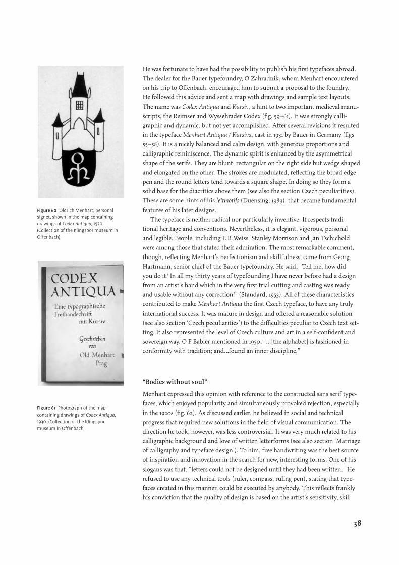
Figure 60 Oldrich Menhart, personal signet, shown in the map containing drawings of Codex Antiqua, 1930. (Collection of the Klingspor museum in Offenbach).
Figure 61 Photograph of the map containing drawings of Codex Antiqua, 1930. (Collection of the Klingspor museum in Offenbach).
38
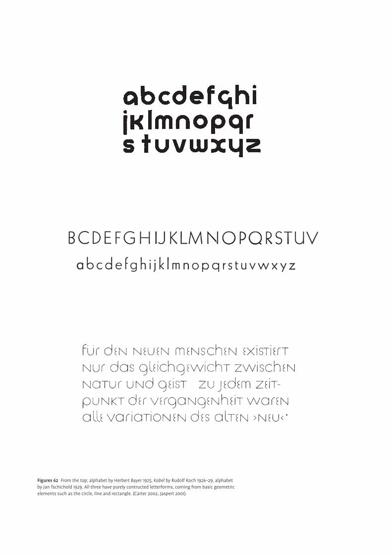
Figures 62 From the top; alphabet by Herbert Bayer 1925, Kabel by Rudolf Koch 1926–29, alphabet by Jan Tschichold 1929. All three have purely contructed letterforms, coming from basic geometric elements such as the circle, line and rectangle. (Carter 2002, Jaspert 2001).
and personality. In an article published in the magazine ‘Český Bibliofi l’ in 1932,
Menhart explained, that the beauty of a typeface and its aesthetic value do not
depend on a pile of geometrical tools. He continued mentioning that letters that
are purely mathematically constructed, so to speak, unpleasantly accurate and
consistent, are only results of mechanical production, without personal charm,
thoughtless, and a boring and deadly born thing (Halá, 1962). He believed that
dull repetition of shapes and their lack of subtle optical adjustments hamper leg-
ibility and tire the reader.
As proclaimed by some designers, the idea of a universal typeface, that was
supposedly appropriate for every application, reduced in Menhart’s view, the
energy and power of a typeface. He sought for typographical diversity and thus
expression of the diversity of life. Industrial production must not destroy human
versatility. A typeface should maintain the dynamic vibration of the human hand
with all its irregularities and imprecision. This is the spring of charm and vigour.
Superfi cial attributes decorating the letters unnecessarily were not what he
envisioned. On the contrary, he wanted to free the classic letters, to retain their
original and eternal, comprehensible spirit, to achieve maximum simplicity with-
out disturbing the easy fl ow of readability. Indeed, in his second typeface Menhart
Roman /Italic, he experimented with how far he could remove the design from the
traditional conventions normally associated with text faces (fi gs 63–67). It was
supposed to represent modern typeface design deliberated from historical archa-
ism and focused more on functionality.
Thanks to Method Kaláb, it was published by Monotype, Great Britain, in 1936.
Max Cafl isch (Christians, 1968) suggested an infl uence from Constructivism and
other similar theories some concepts of which having reached typography and
typeface design by that time. Menhart Roman shows, typically for Menhart, hints
of calligraphy and other common elements. The thick parts of the letters were
thinned down (usually it is the other way round) to an almost mono-linear stroke
width. The starting point was a simple handwritten alphabet. Gradually and very
carefully serifs and terminals were added only where optical balance, texture and
legibility required it. This led to the use of semi-serifs—only one sided and com-
pletely missing on the fi rst legs of the letters h k m n—as a solution which was
unusual for that time (fi g. 65). Again, as in Menhart Antiqua he paid a lot of atten-
tion to bringing the diacritics into accord with the basic letter, much to his suc-
cess. They are unobtrusive, harmonious but still distinctive. In general, the type-
face appears light, unsophisticated and aloof, functioning very well in continuous
text.
On the other hand, Menhart Italic which incidentally was developed simulta-
neously, is by its angular ductus much more calligraphic in style (fi g. 66). The
colour, proportion and some design details were adapted to the roman. The serifs,
for instance, were kept very similar in shape, instead of the more usual outstroke
form. The italic, though, is not a sloped roman — the one-storey a and g, the
altered letters v w x z and in general deeper crotches and stronger modulation—
and despite being less pronounced, it maintains its function of emphasis (fi g. 67).
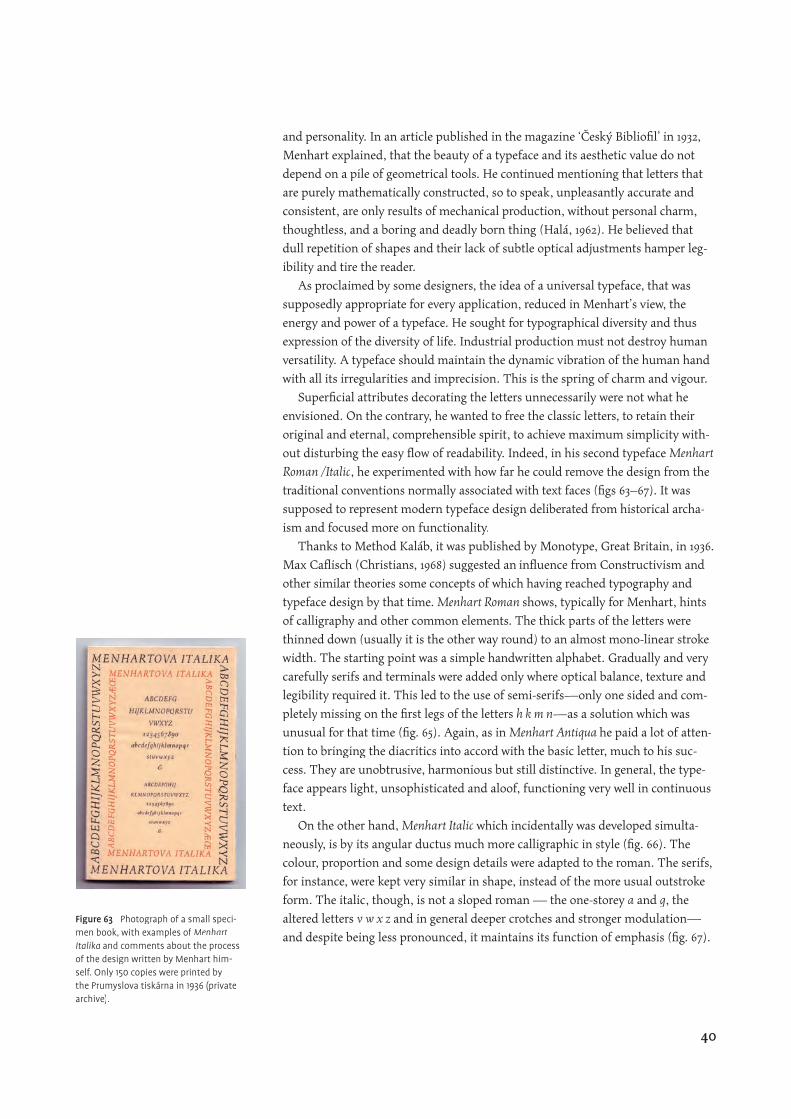
Figure 63 Photograph of a small speci-men book, with examples of Menhart Italika and comments about the process of the design written by Menhart him-self. Only 150 copies were printed by the Prumyslova tiskárna in 1936 (private archive).
40
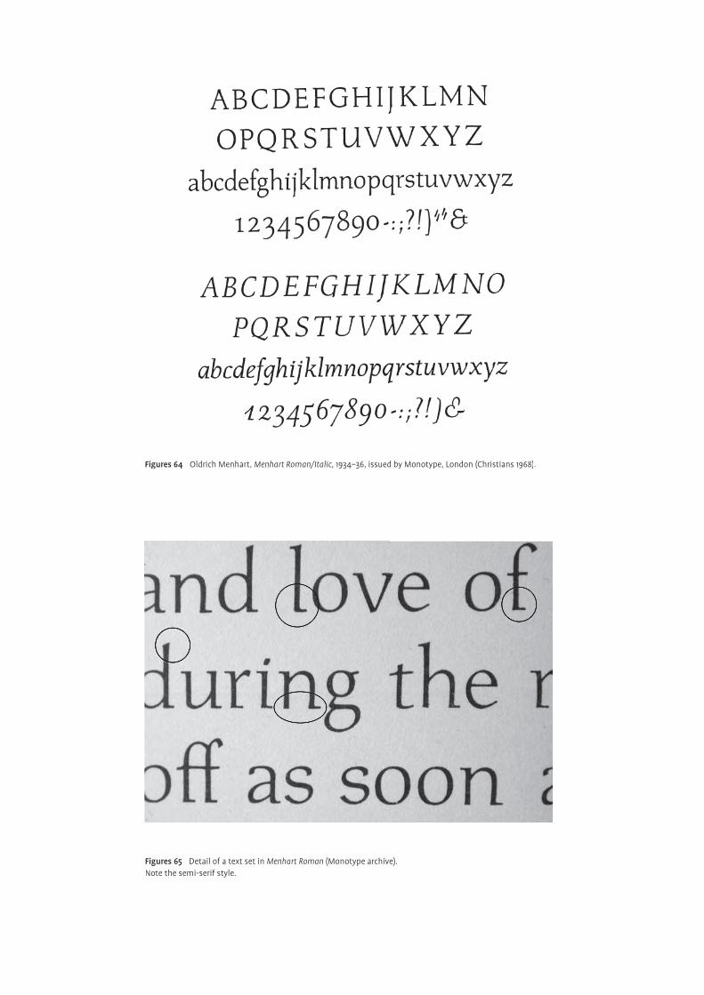
Figures 64 Oldrich Menhart, Menhart Roman/Italic, 1934–36, issued by Monotype, London (Christians 1968).
Figures 65 Detail of a text set in Menhart Roman (Monotype archive).Note the semi-serif style.
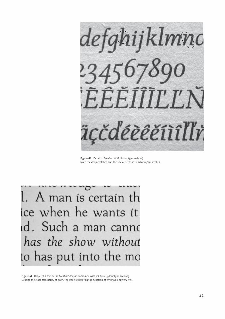
Figure 66 Detail of Menhart Italic (Monotype archive)Menhart Italic (Monotype archive)Menhart Italic . Note the deep crotches and the use of serifs instead of in/outstrokes.
Figure 67 Detail of a text set in Menhart Roman combined with its italic. (Monotype archive). Despite the close familiarity of both, the italic still fulfi lls the function of emphasising very well.
42
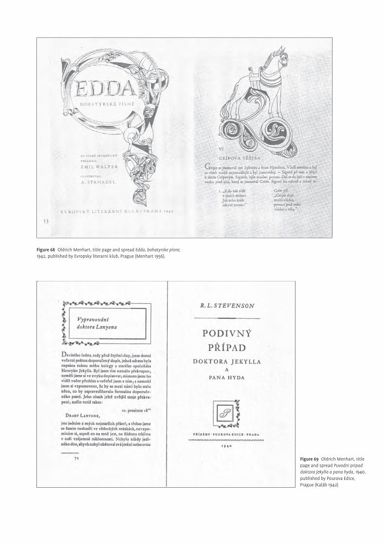
Figure 68 Oldrich Menhart, title page and spread Edda, bohatyrske pisne,1942, published by Evropsky literarni klub, Prague (Menhart 1956).
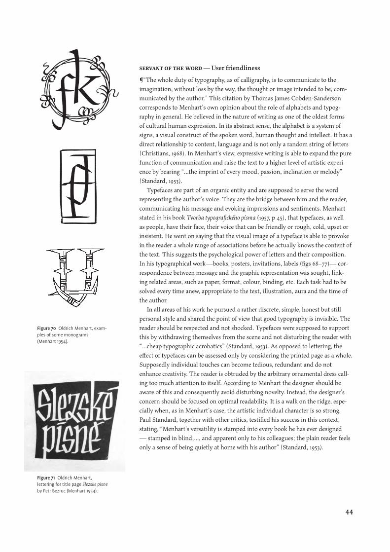
Figure 69 Oldrich Menhart, title page and spread Puvodni pripad doktora jekylla a pana hyda, 1940, published by Pourova Edice, Prague (Kaláb 1942).
servant of the word — User friendliness
¶“The whole duty of typography, as of calligraphy, is to communicate to the
imagination, without loss by the way, the thought or image intended to be, com-
municated by the author.” This citation by Thomas James Cobden-Sanderson
corresponds to Menhart’s own opinion about the role of alphabets and typog-
raphy in general. He believed in the nature of writing as one of the oldest forms
of cultural human expression. In its abstract sense, the alphabet is a system of
signs, a visual construct of the spoken word, human thought and intellect. It has a
direct relationship to content, language and is not only a random string of letters
(Christians, 1968). In Menhart’s view, expressive writing is able to expand the pure
function of communication and raise the text to a higher level of artistic experi-
ence by bearing “…the imprint of every mood, passion, inclination or melody”
(Standard, 1953).
Typefaces are part of an organic entity and are supposed to serve the word
representing the author’s voice. They are the bridge between him and the reader,
communicating his message and evoking impressions and sentiments. Menhart
stated in his book Tvorba typografi ckého písma (1957, p 45), that typefaces, as well
as people, have their face, their voice that can be friendly or rough, cold, upset or
insistent. He went on saying that the visual image of a typeface is able to provoke
in the reader a whole range of associations before he actually knows the content of
the text. This suggests the psychological power of letters and their composition.
In his typographical work—books, posters, invitations, labels (fi gs 68–77)— cor-
respondence between message and the graphic representation was sought, link-
ing related areas, such as paper, format, colour, binding, etc. Each task had to be
solved every time anew, appropriate to the text, illustration, aura and the time of
the author.
In all areas of his work he pursued a rather discrete, simple, honest but still
personal style and shared the point of view that good typography is invisible. The
reader should be respected and not shocked. Typefaces were supposed to support
this by withdrawing themselves from the scene and not disturbing the reader with
“…cheap typographic acrobatics” (Standard, 1953). As opposed to lettering, the
eff ect of typefaces can be assessed only by considering the printed page as a whole.
Supposedly individual touches can become tedious, redundant and do not
enhance creativity. The reader is obtruded by the arbitrary ornamental dress call-
ing too much attention to itself. According to Menhart the designer should be
aware of this and consequently avoid disturbing novelty. Instead, the designer’s
concern should be focused on optimal readability. It is a walk on the ridge, espe-
cially when, as in Menhart’s case, the artistic individual character is so strong.
Paul Standard, together with other critics, testifi ed his success in this context,
stating, “Menhart’s versatility is stamped into every book he has ever designed
— stamped in blind,…, and apparent only to his colleagues; the plain reader feels
only a sense of being quietly at home with his author” (Standard, 1953).
Figure 70 Oldrich Menhart, exam-ples of some monograms (Menhart 1954).
Figure 71 Oldrich Menhart, lettering for title page Slezske pisne by Petr Bezruc (Menhart 1954).
44
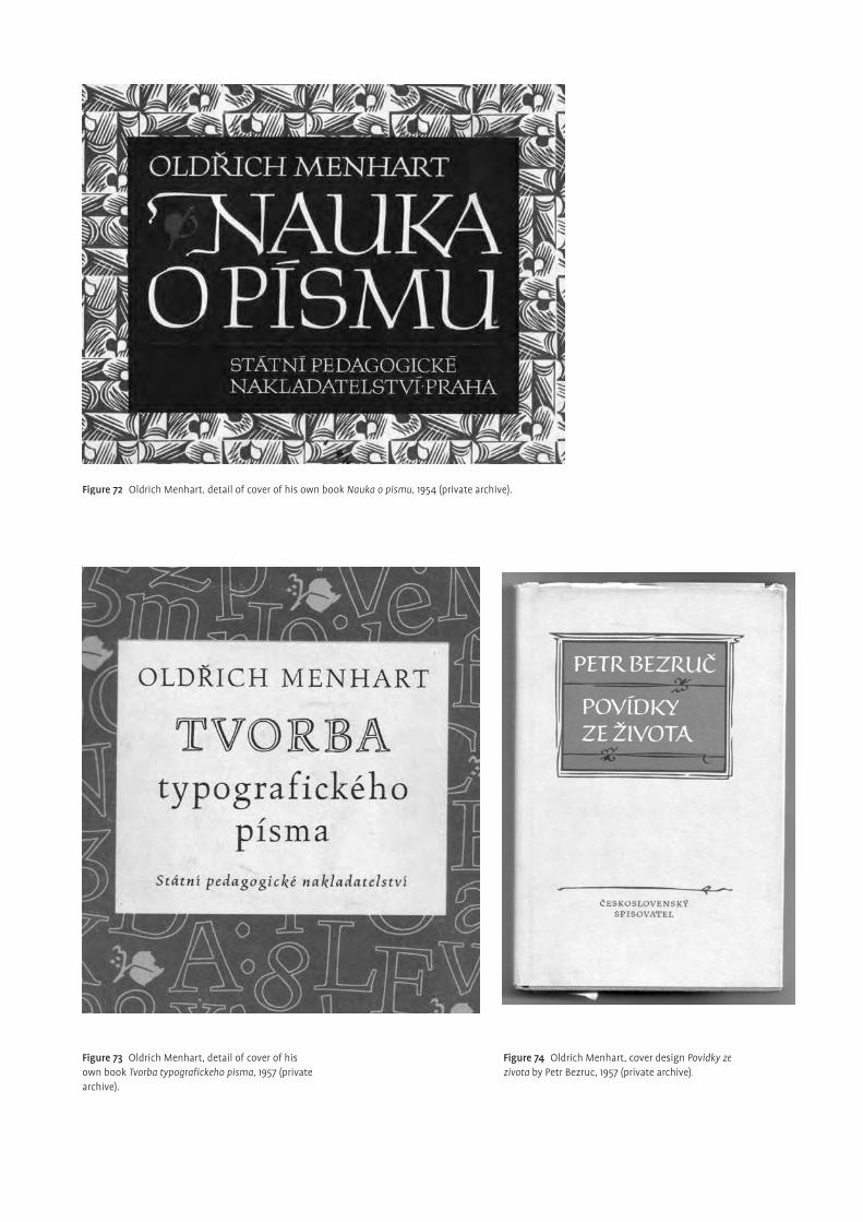
Figure 72 Oldrich Menhart, detail of cover of his own book Nauka o pismu, 1954 (private archive).
Figure 73 Oldrich Menhart, detail of cover of his own book Tvorba typografi ckeho pisma, 1957 (private archive).
Figure 74 Oldrich Menhart, cover design Povidky ze zivota by Petr Bezruc, 1957 (private archive).
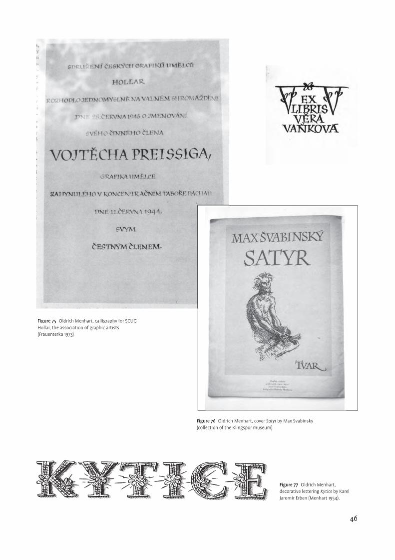
Figure 77 Oldrich Menhart, decorative lettering Kytice by Karel Jaromir Erben (Menhart 1954).
Figure 75 Oldrich Menhart, calligraphy for SCUG Hollar, the association of graphic artists (Frauenterka 1973).
Figure 76 Oldrich Menhart, cover Satyr by Max Svabinsky (collection of the Klingspor museum).
46
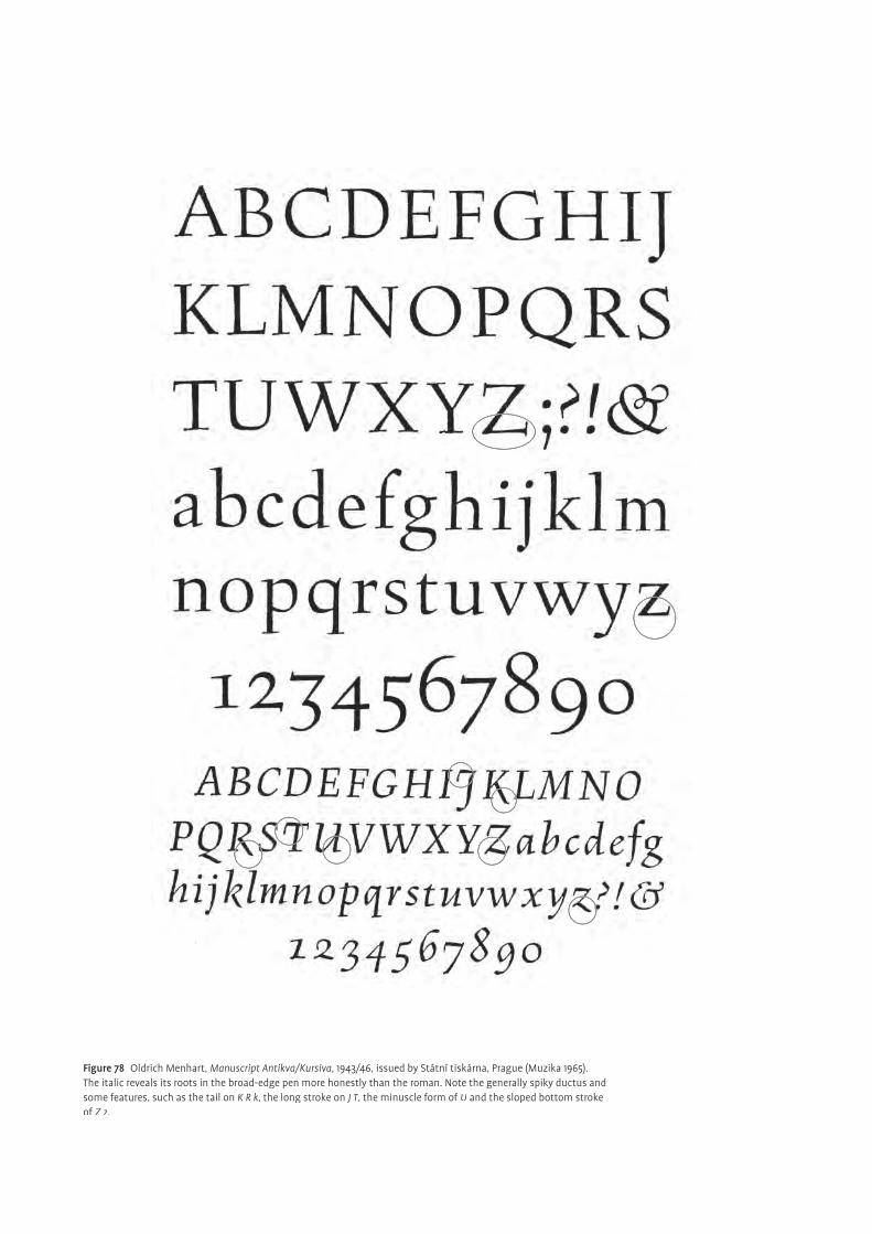
Figure 78 Oldrich Menhart, Manuscript Antikva/Kursiva, 1943/46, issued by Státní tiskárna, Prague (Muzika 1965).The italic reveals its roots in the broad-edge pen more honestly than the roman. Note the generally spiky ductus and some features, such as the tail on K R k, the long stroke on J T, the minuscle form of U and the sloped bottom stroke of Z z.
Expressing contemporary culture
¶Studying typefaces, printings and the books of old masters of typography
evoked, in Menhart, an admiration for their work. He was aware of their impor-
tance and contribution to the development of classic letterforms. In his eyes,
studying their work was crucial for every designer. On the other hand, he was
convinced that the artist should fi nd his own contemporary style. He should not
follow and copy historical models. Instead he is supposed to take an active part
in shaping the visual appearance of contemporary culture and society and in
doing so become historical himself. The tradition of the past should be logically
continued by creating honest, authentic methods and styles from the spirit of the
time. It serves the reform and evolution of society. The revival of old typefaces, as
practitioned by Monotype in the 1920s, could no longer serve as the stimulus of
new ideas
practitioned by Monotype in the 1920s, could no longer serve as the stimulus of
practitioned by Monotype in the 1920s, could no longer serve as the stimulus of
. It fulfi lled its task of cleaning the typefoundries and printers from the
type ballast of the excessive nineteenth century, but now it was time to move on.
This did not mean, however, that typographic tradition, conventions and history
should be neglected.
In this context it is interesting to see the typeface Figural from 1940, published
in 1949 by Státní tiskárna in Prague (fi g. 78). Here his ideas of how a contem-
porary book face should be, are realized. Remotely based on Jenson’s roman
of 1470, it shows again traces of calligraphic heritage, but only in a very subtle
way. As opposed to the previous designs, the serifs are fl at and very fi ne and the
‘Menhartesque’ sloped stroke of the z Z is reduced to a serif drawn over the base-
line. The character of freehand drawn letters, brings elasticity, dynamism and
fl uidity to the shapes. The proportions are rather classic and generous. Figural
appears in general angular, disciplined and vigorous, emphasising horizontality.
This enhances the fl ow of reading and forms a good base for the accents. It is com-
monly regarded as Menhart’s greatest and most mature book face. Paul Standard
(1966) said, “Both [roman and italic] are plainly derived from his handwriting,
handwriting so direct and muscular as to suggest the learned script of a structural
steelworker with a PhD.” Further Max Cafl isch pointed out in the book Oldřich
Menhart 1897–1962 (Christians, 1968, p 30), “…the Figural is a product of our time.”
Although being designed about eight years later, the accompanying italic matches
happily with the roman. It shows, as opposed to the roman, more frankly its calli-
graphic roots, for instance on the letter J K T R U Z. The thin straight serifs, on the
other hand, build an interesting contrast to the handwriting reminiscence. Figural
kursiva reveals in its spiky and angular quality, a secure, controlled and powerful
hand.
Another example of this approach, of allying tradition with progression, can
be seen in Česka Unciala 1940, published in 1948 by Státní tiskárna, Prague (fi g.
79). Larger sizes were cut by Grafotechna, Prague, in 1953. Work on the uncial
1940, published in 1948 by Státní tiskárna, Prague (fi g.
1940, published in 1948 by Státní tiskárna, Prague (fi g.
began as early as 1922 with experiments involving many variations and regional
interpretations of the letterforms. According to him, features of the uncial such
as its age, its transitional character (lowercase not yet existent as independent sys-
tem), its solemnity, richness and simplicity were some reasons for his continuous
interest in creating an uncial himself. His aim was to design a distinctive, readable
and modern uncial that would compensate for the lack of capitals and would be
of equal quality and importance to its predecessors. He was aware, though, of the
4. The uncial forms are predeces-sors of the Carolingian minuscle, about eight-century, from which our present lowercase letters devel-oped. It was the most elastic time in typology. Scribes experimented intensively in the attempt to fi nd optimal forms enhancing legibility and fast writing. The vastly spread Roman Capital letters were too diffi -cult and stiff for continuous reading. Hence, the scribes started to adapt the shapes to the logic of writing.
3. Stanley Morrison launched at Monotype a revival campaign. The aim was to improve the situ-ation of typography and typeface design. The idea behind is that all great typefaces have been already done several centuries ago. Thus, the task of today was to choose the good ones and adapt them to the technical requirements of new tech-nologies, in this case the Monotype maschines. An example is Bembo, a typeface released in 1929 that was based on the design of Francesco Griffo, Venice 1499.
48
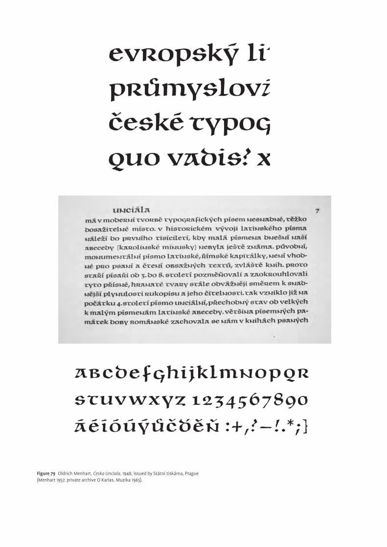
Figure 79 Oldrich Menhart, Ceska Unciala, 1948, issued by Státní tiskárna, Prague (Menhart 1957, private archive O Karlas, Muzika 1965).
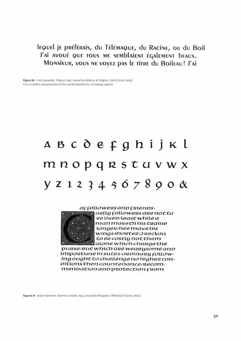
Figure 80 A M Cassandre, Peignot, 1937, issued by Deberny & Peignot, Paris (Carter 2002).It is a modern interpretation of the uncial letterforms, including capitals.
Figures 81 Victor Hammer, Hammer Unziale, 1923, issued by Klingspor, Offenbach (Carter 2002).
50
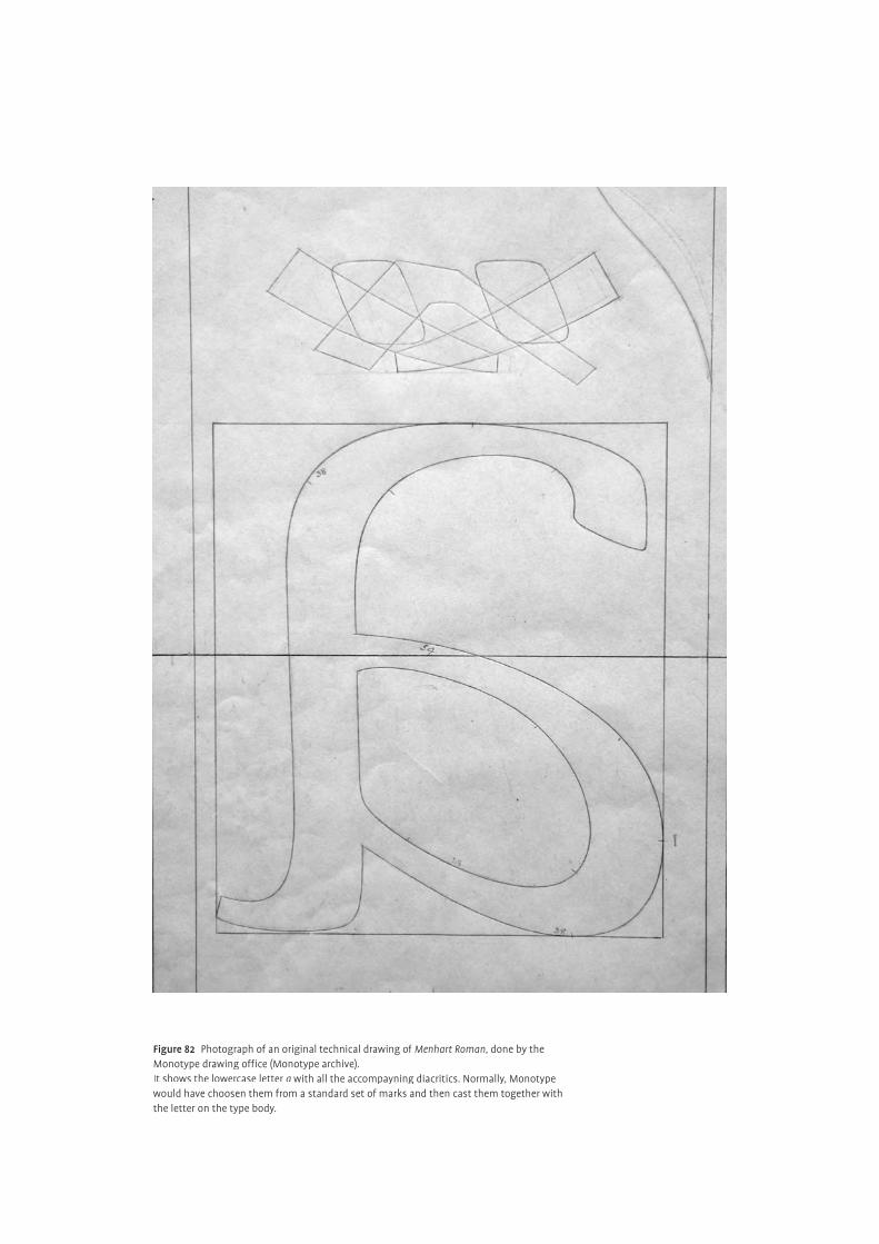
Figure 82 Photograph of an original technical drawing of Menhart Roman, done by the Monotype drawing offi ce (Monotype archive).It shows the lowercase letter a with all the accompayning diacritics. Normally, Monotype would have choosen them from a standard set of marks and then cast them together with the letter on the type body.
limited applicability to only “…most uncomplicated kinds of text”, due to “…no
display device other than colour” (Duensing, 1989).
Česká Unciala can be placed in the same category with Hammer Unziale, 1921
Victor Hammer (fi g. 83), Peignot, 1937 A M Cassandre (fi g. 82), Libra, 1938 S H
DeRoss and Friar, 1937 F W Goudy.
national and international — Czech peculiarities
¶How are Czech typography and typeface design defi ned? According to Karel
Dyrynk, an original Czech face is a typeface created by a Czech artist, with an
inherent understanding of the Czech language, and also produced and cast in
Bohemia [Czech Republic] (Dyrynk, 1925). Menhart, on the other hand, believed
that “…a Czech style of type comes above all from the spirit in which it was
designed, which gives it its ‘signature’, and not so much from decorative composi-
tion, and even less from the geographic location of its creation” (Duensing, 1989).
Albert Kapr suggested in 1962, that, to the uninvolved observer, it seems that
Menhart had found a specifi cally national Czech form of the ‘Antikva’ this being
the overriding reason for the positive response that it received.
A Czech typeface should, in Menhart’s view, address, in particular, the syntac-
tic and diacritic peculiarities of the Czech language. In doing so, the richness of
Czech culture is then properly demonstrated and national ambience and character
are refl ected. However, he knew that no letterform expressed ‘Czech-ness’ intrinsi-
cally and that every attempt in this direction could lead only to a very superfi cially
decorative and unattractive result. He sought for solutions that would make the
printed Czech text more balanced and comprehensive than if printed in other lan-
guages. According to him, the designer should take language biased peculiarities,
such as the construction of words, reoccurrence of special characters and use of
diacritical marks, into account while creating. But he should not intend to invent
new letterforms. The skeletal structure of the present classical letters is the result
of a long evolution that should be respected. Disregarding the reader’s habits ends
up being counterproductive.
In addition to the regular latin alphabet, the Czech language makes use of 15
accented letters. They were introduced by the reformer Jan Hus, in 1406, as sub-
stitution of particular letter pairs representing peculiar sounds that had no cor-
respondence in the latin script. Since then, unfortunately, very little attention has
been given to their design and the organic relationship to the letter itself. Usually,
diacritics were added to existing typefaces as an afterthought, disregarding style,
position and size, and bringing a busy and even confusing eff ect to the printed
text. In 1957, Menhart pointed out, that by now the Czech reader had to tolerate
typefaces, beautiful and excellent in other languages, but, destroyed in Czech text
setting by inferior and poorly designed diacritics. According to him, readability
and aesthetic appearance of the typeface suff er markedly if the diacritics are not
brought into accord with the rest of the alphabet. Similar to punctuation marks,
they are a subdued but very important part of the script, helping the reader (fi gs
83 86 87). Their function is to enhance the ease and fl ow of reading and to gently
52
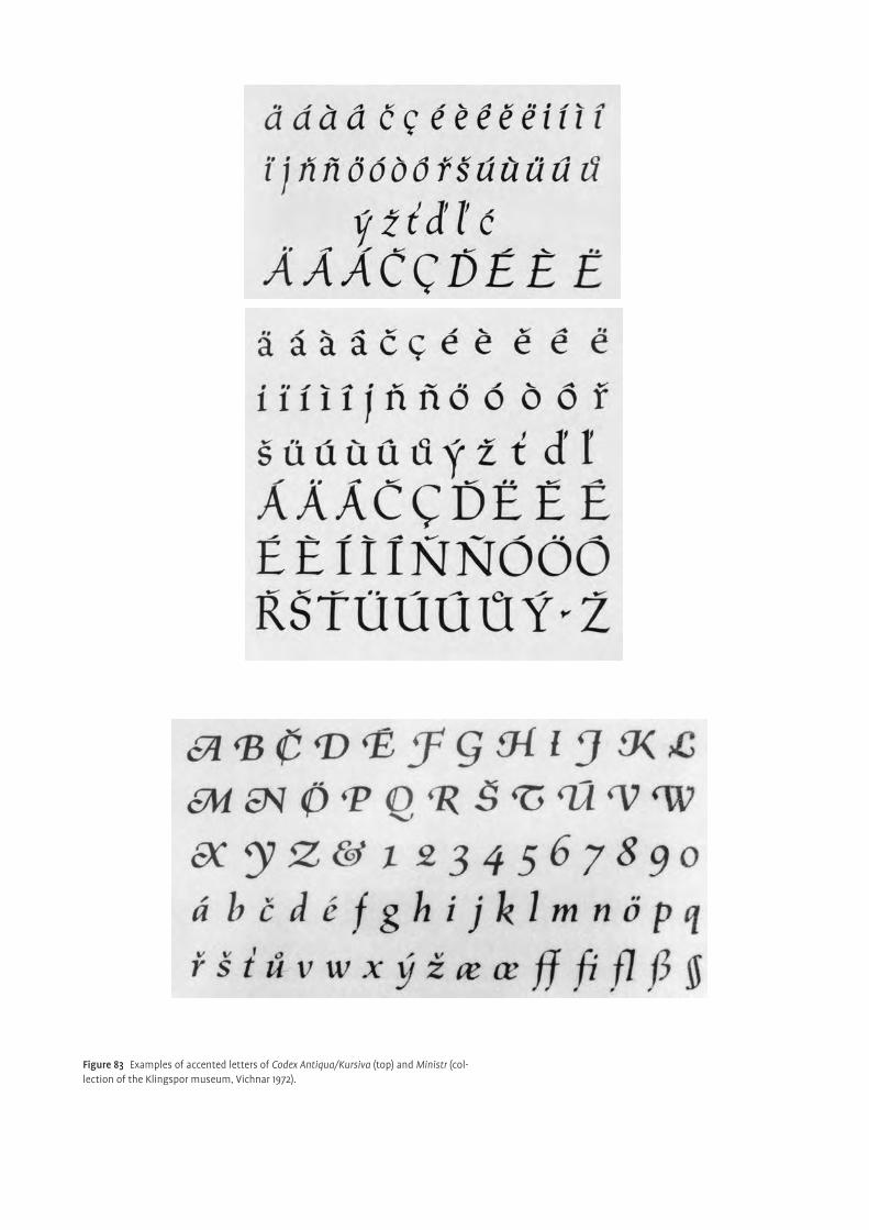
Figure 83 Examples of accented letters of Codex Antiqua/Kursiva (top) and Ministr (col-lection of the Klingspor museum, Vichnar 1972).
indicate changes in pronunciation and the phonetic value of letters. Arbitrary
changes to their appearance and position might lead to misunderstanding.
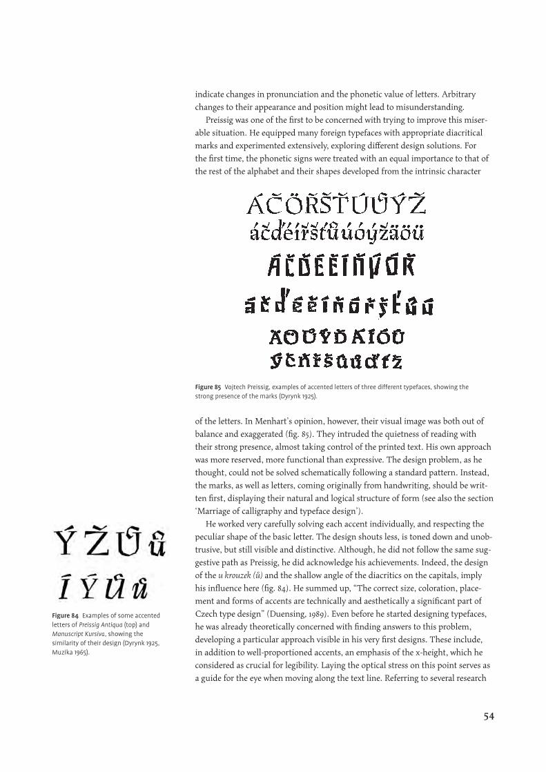
Preissig was one of the fi rst to be concerned with trying to improve this miser-
able situation. He equipped many foreign typefaces with appropriate diacritical
marks and experimented extensively, exploring diff erent design solutions. For
the fi rst time, the phonetic signs were treated with an equal importance to that of
the rest of the alphabet and their shapes developed from the intrinsic character
of the letters. In Menhart’s opinion, however, their visual image was both out of
balance and exaggerated (fi g. 85). They intruded the quietness of reading with
their strong presence, almost taking control of the printed text. His own approach
was more reserved, more functional than expressive. The design problem, as he
thought, could not be solved schematically following a standard pattern. Instead,
the marks, as well as letters, coming originally from handwriting, should be writ-
ten fi rst, displaying their natural and logical structure of form (see also the section
‘Marriage of calligraphy and typeface design’).
He worked very carefully solving each accent individually, and respecting the
peculiar shape of the basic letter. The design shouts less, is toned down and unob-
trusive, but still visible and distinctive. Although, he did not follow the same sug-
gestive path as Preissig, he did acknowledge his achievements. Indeed, the design
of the u krouzek (ů) and the shallow angle of the diacritics on the capitals, imply
his infl uence here (fi g. 84). He summed up, “The correct size, coloration, place-
ment and forms of accents are technically and aesthetically a signifi cant part of
Czech type design” (Duensing, 1989). Even before he started designing typefaces,
he was already theoretically concerned with fi nding answers to this problem,
developing a particular approach visible in his very fi rst designs. These include,
in addition to well-proportioned accents, an emphasis of the x-height, which he
considered as crucial for legibility. Laying the optical stress on this point serves as
a guide for the eye when moving along the text line. Referring to several research
Figure 85 Vojtech Preissig, examples of accented letters of three different typefaces, showing the strong presence of the marks (Dyrynk 1925).
Figure 84 Examples of some accented letters of Preissig Antiqua (top) and Manuscript Kursiva, showing the similarity of their design (Dyrynk 1925, Muzika 1965).
54
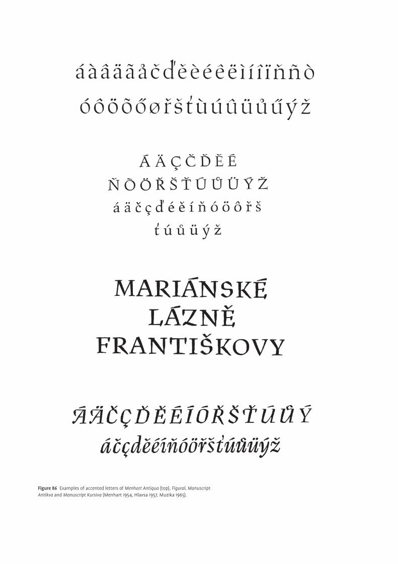
Figure 86 Examples of accented letters of Menhart Antiqua (top), Figural, Manuscript Antikva and Manuscript Kursiva (Menhart 1954, Hlavsa 1957, Muzika 1965).
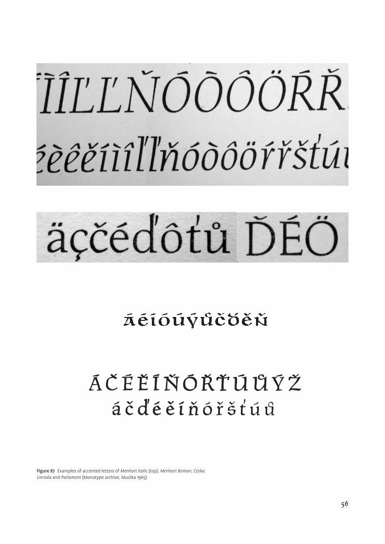
Figure 87 Examples of accented letters of Menhart Italic (top), Menhart Italic (top), Menhart Italic Menhart Roman, Ceska Unciala and Parlament (Monotype archive, Muzika 1965).
56
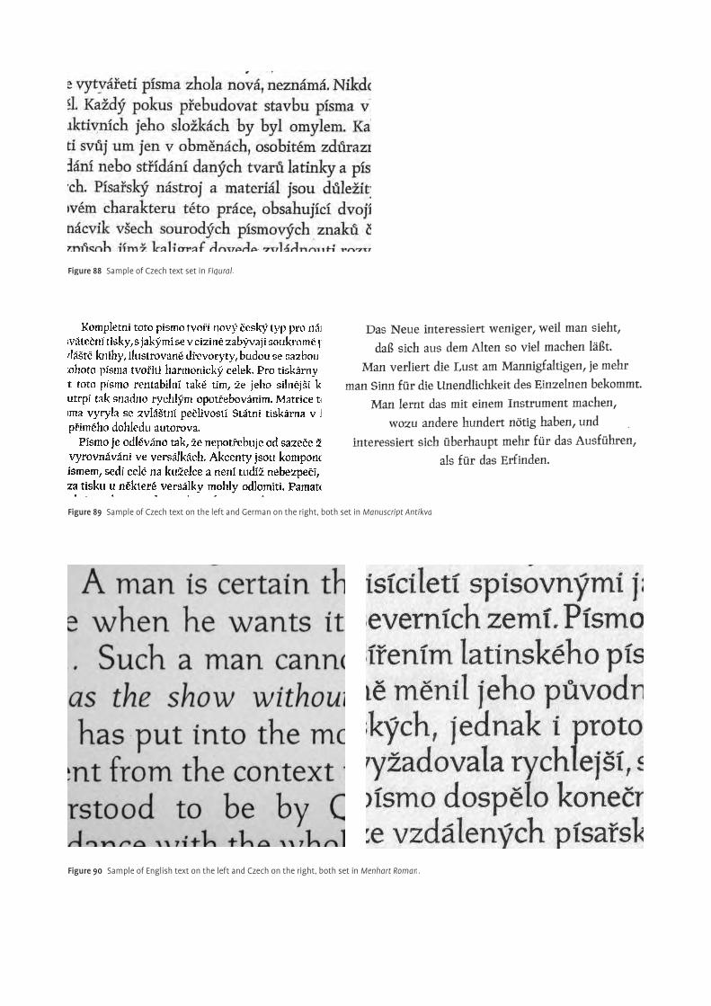
Figure 88 Sample of Czech text set in Figural.
Figure 89 Sample of Czech text on the left and German on the right, both set in Manuscript Antikva.
Figure 90 Sample of English text on the left and Czech on the right, both set in Menhart Roman.
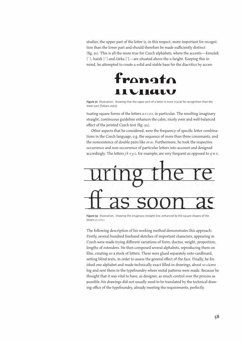
studies, the upper part of the letter is, in this respect, more important for recogni-
tion than the lower part and should therefore be made suffi ciently distinct
(fi g. 91). This is all the more true for Czech alphabets, where the accents—kroužek
[�], haček [˘] and čárka [´]—are situated above the x-height. Keeping this in
mind, he attempted to create a solid and stable base for the diacritics by accen-
tuating square forms of the letters a e c o s, in particular. The resulting imaginary
straight, continuous guideline enhances the calm, nicely even and well-balanced
eff ect of the printed Czech text (fi g. 92).
Other aspects that he considered, were the frequency of specifi c letter combina-
tions in the Czech language, e.g. the sequence of more than three consonants, and
the nonexistence of double pairs like oo ee. Furthermore, he took the respective
occurrence and non-occurrence of particular letters into account and designed
accordingly. The letters j k v y z, for example, are very frequent as opposed to q w x.
The following description of his working method demonstrates this approach:
Firstly, several hundred freehand sketches of important characters, appearing in
Czech were made trying diff erent variations of form, ductus, weight, proportion,
lengths of extenders. He then composed several alphabets, reproducing them on
fi lm, creating so a stock of letters. These were glued separately onto cardboard,
setting blind texts, in order to assess the general eff ect of the face. Finally, he fi n-
ished one alphabet and made technically exact fi lled-in drawings, about 10 cicero
big and sent them to the typefoundry where metal patterns were made. Because he
thought that it was vital to have, as designer, as much control over the process as
possible, his drawings did not usually need to be translated by the technical draw-
ing offi ce of the typefoundry, already meeting the requirements, perfectly.
Figure 91 Illustration, showing that the upper pert of a letter is more crucial for recognition than the lower part (Tubaro 2002).
Figure 92 Illustration, showing the imaginary straight line, enhanced by the square shapes of the letters a c e o s.
58
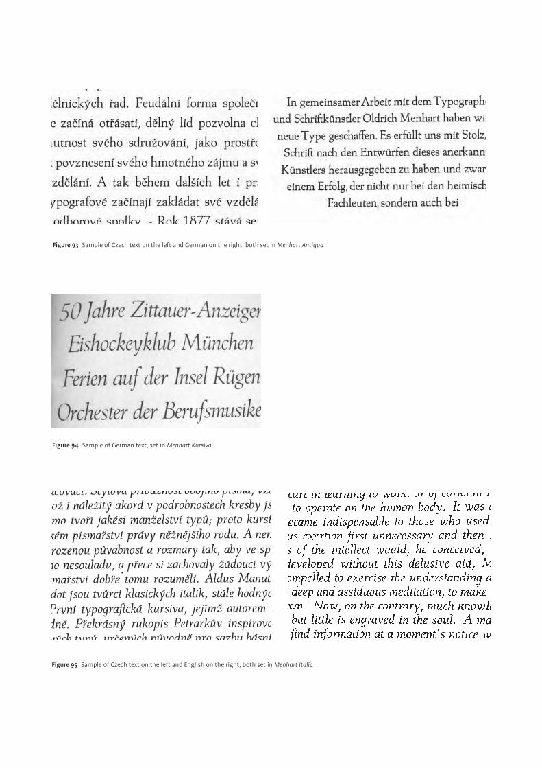
Figure 93 Sample of Czech text on the left and German on the right, both set in Menhart Antiqua.
Figure 94 Sample of German text, set in Menhart Kursiva.
Figure 95 Sample of Czech text on the left and English on the right, both set in Menhart Italic.
Internationality
Menhart looked upon the latin script as a collective cultural heritage of the occi-
dental civilisation, deserving respect. Hence, in his view, the task of designing an
original Czech typeface could neither be solved by inventing new letterforms nor
by dressing them in a national decor. They should rather be elaborated and modi-
fi ed in such a way that the printed text would be graceful, natural and legible, both
in Czech and in any other language using the latin writing system
(fi gs 88–90 93–95).
The Czech alphabet should also be a world alphabet, unifying global culture
and not disturbing with patriotic caprice and regional distinction. By its contri-
bution, it is supposed to enlarge the general repertoire of contemporary, well-
performing book faces and to aim for broad usability. One should attempt to
maintain the tradition of the latin script and make the typeface functional, usable
and harmonious in other languages whilst properly evaluating the importance of
Czech nationality, although less frequently, other languages do also make use of
accents. Otto F Babler (1950) confi rmed Menhart’s success in creating an interna-
tional Czech typeface, saying, “His [Menhart] printing-types, though they bear
no striking signs of Czech folk-lore or of Czech decorative elements, are somehow
typically Czech, and such a slightly Slavonic note is one of their charms.”
Another attitude that made him stand out from his artistic fellows and dem-
onstrated his global mind, was his vivid interest in contemporary technical and
cultural developments, changing fashions and tastes, both at home and abroad.
He had professional and personal contacts with many foreign designers, includ-
ing Paul Standard, Hermann Zapf, Jan Tschichold and others, with whom he
exchanged information, critic and ideas. This suggests a non negligible infl uence
on Menhart who wanted to keep up with the latest developments and to meet
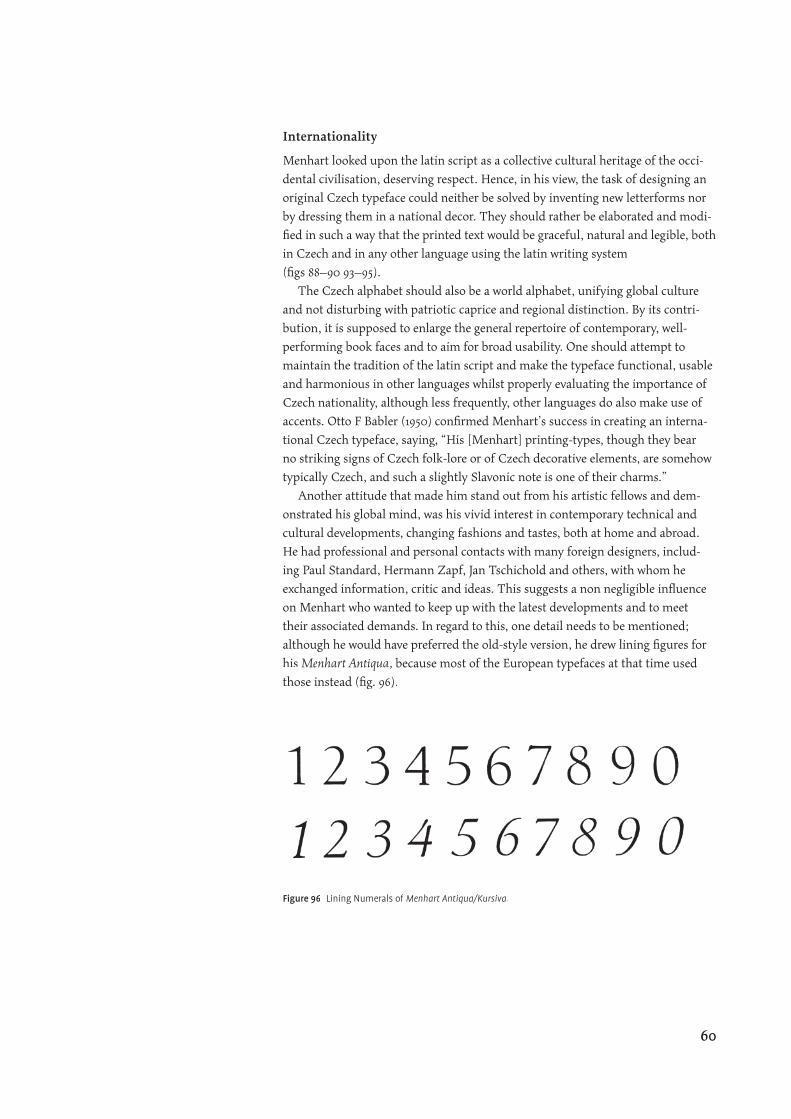
their associated demands. In regard to this, one detail needs to be mentioned;
although he would have preferred the old-style version, he drew lining fi gures for
his Menhart Antiqua, because most of the European typefaces at that time used
those instead (fi g. 96).
Figure 96 Lining Numerals of Menhart Antiqua/Kursiva.
60

preparation
¶“Calligraphy is the cradle of type design.” This slogan refl ects Menhart’s convic-¶“Calligraphy is the cradle of type design.” This slogan refl ects Menhart’s convic-¶“Calligraphy is the cradle of type design.” This slogan refl ects Menhart’s con
tion that calligraphy was the only truly natural source of inspiration for typeface
design. It is the pool from which new ideas emerge. He came to realise this, and
the principle that classic letterforms derive from writing, while studying old
manuscripts and doing calligraphy himself. He was searching for the fundamental
laws of letterforms by experimenting with diff erent pens, holding them in vari-
ous positions and angles. In doing so, writing became his second nature. He also
recognized that the slight imperfections and irregularities, intrinsic to the hand,
should also be maintained. They lend the typeface vitality and temperament,
and consequently, his starting point was always writing, which he had mastered
in a very impressive and sophisticated way. Writing, not in the sense of a sudden,
ephemeral act, but more in the form of laborious and intense practice, over a long
period of time. In a lecture he gave in 1958, he said, “No ‘Master’ ever just fell out
of the skies. That is, no letter-artist was born…but rather he arises through the
accumulation of experience and through study and practical work” (Duensing,
1989). Some of his further statements go on to explain that the creation of typo-
graphic letterforms requires patience, discipline, perseverance and a respect for
tradition. Only by adhering to this philosophy could one then hope to achieve a
signifi cant and successful design solution.
In doing so, the scribe realises the inherent quality and structure of every single
letter and the hand learns exactly all the needed strokes from the logic of the pen
itself. A powerful and balanced relationship between the hand of the scribe and
his tool is thus created. Once the scribe has absorbed this to its very last depth, he
goes beyond the phase of thought, to pure expression, giving his hand a special
power. Menhart concluded that new letterforms will develop from calligraphy
as they had already done so in the past: “The classical letters of the fi rst three
centuries of printing,…, are always beautiful and useful, and enjoy great favor
even today, as they were created in accordance with calligraphy in the manuscript
tradition” (Standard, 1953). Besides that, he was sure that, “…diff erentness,…,is
achieved neither by taking thought nor by obeying a command, but rather by
trusting the pen and the imagination (Standard, 1953). Designing alphabets could
then materialize naturally out of this understanding in the freedom that has been
gradually achieved. In fact, he was convinced that awkward lettershapes came
from misuse and a misunderstanding of the pen, since the pen itself cannot do
wrong. It is the inexperienced and unskilled hand that is misleading. One further
factor in this context, as he put it, is the sensitivity and ability of the scribe to per-
ceive and feel, “…the mysterious fl uency of those [letter] forms” where “the pulse
of life beats” (Standard, 1953). The manifestation of life through writing and fi nal-
ly type was one of his long-term aspirations. Otto F Babler (1950, p 23) confi rmed:
“Your [Menhart] bold and forthright hand…this includes your decoration, which
seems to me a written, a calligraphic and not a drawn decoration…The result is a
unique harmony—as of everything growing directly out of a searching, active and
inspired pen. And what makes this pen so powerful is its native avoidance of mere
complexity in favor of the barest and clearest simplicity.”
For many hundreds of years, European manuscripts were written with either
the broad edge reed, quill or metal pen. Each having its own nature and logic.
Marriage of calligraphy and typeface design
62
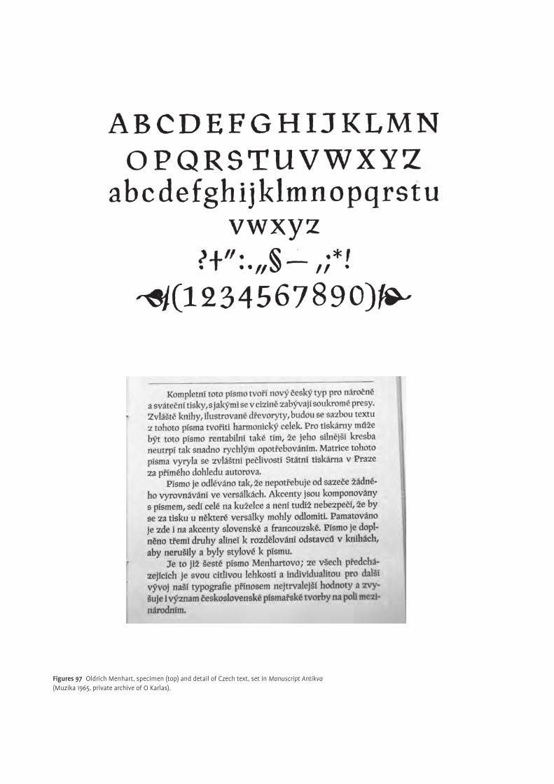
Figures 97 Oldrich Menhart, specimen (top) and detail of Czech text, set in Manuscript Antikva (Muzika 1965, private archive of O Karlas).
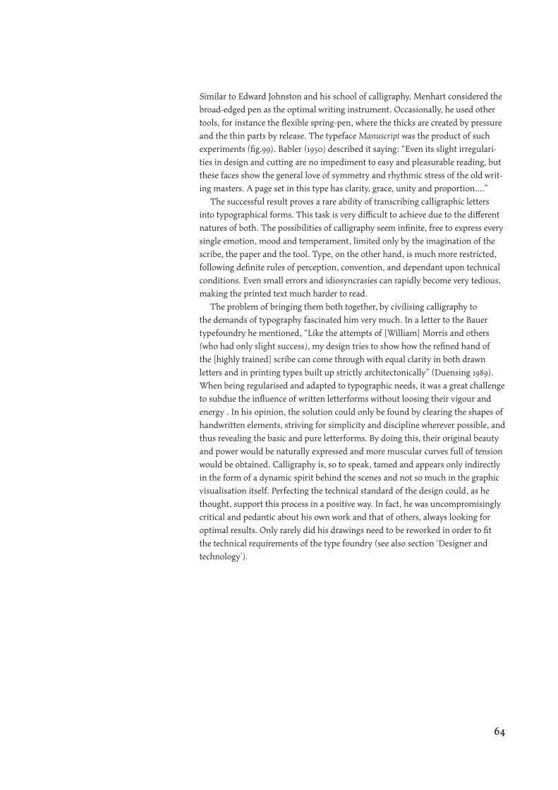
Similar to Edward Johnston and his school of calligraphy, Menhart considered the
broad-edged pen as the optimal writing instrument. Occasionally, he used other
tools, for instance the fl exible spring-pen, where the thicks are created by pressure
and the thin parts by release. The typeface Manuscript was the product of such
experiments (fi g.99). Babler (1950) described it saying: “Even its slight irregulari-
ties in design and cutting are no impediment to easy and pleasurable reading, but
these faces show the general love of symmetry and rhythmic stress of the old writ-
ing masters. A page set in this type has clarity, grace, unity and proportion….”
The successful result proves a rare ability of transcribing calligraphic letters
into typographical forms. This task is very diffi cult to achieve due to the diff erent
natures of both. The possibilities of calligraphy seem infi nite, free to express every
single emotion, mood and temperament, limited only by the imagination of the
scribe, the paper and the tool. Type, on the other hand, is much more restricted,
following defi nite rules of perception, convention, and dependant upon technical
conditions. Even small errors and idiosyncrasies can rapidly become very tedious,
making the printed text much harder to read.
The problem of bringing them both together, by civilising calligraphy to
the demands of typography fascinated him very much. In a letter to the Bauer
typefoundry he mentioned, “Like the attempts of [William] Morris and others
(who had only slight success), my design tries to show how the refi ned hand of
the [highly trained] scribe can come through with equal clarity in both drawn
letters and in printing types built up strictly architectonically” (Duensing 1989).
When being regularised and adapted to typographic needs, it was a great challenge
to subdue the infl uence of written letterforms without loosing their vigour and
energy . In his opinion, the solution could only be found by clearing the shapes of
handwritten elements, striving for simplicity and discipline wherever possible, and
thus revealing the basic and pure letterforms. By doing this, their original beauty
and power would be naturally expressed and more muscular curves full of tension
would be obtained. Calligraphy is, so to speak, tamed and appears only indirectly
in the form of a dynamic spirit behind the scenes and not so much in the graphic
visualisation itself. Perfecting the technical standard of the design could, as he
thought, support this process in a positive way. In fact, he was uncompromisingly
critical and pedantic about his own work and that of others, always looking for
optimal results. Only rarely did his drawings need to be reworked in order to fi t
the technical requirements of the type foundry (see also section ‘Designer and
technology’).
64
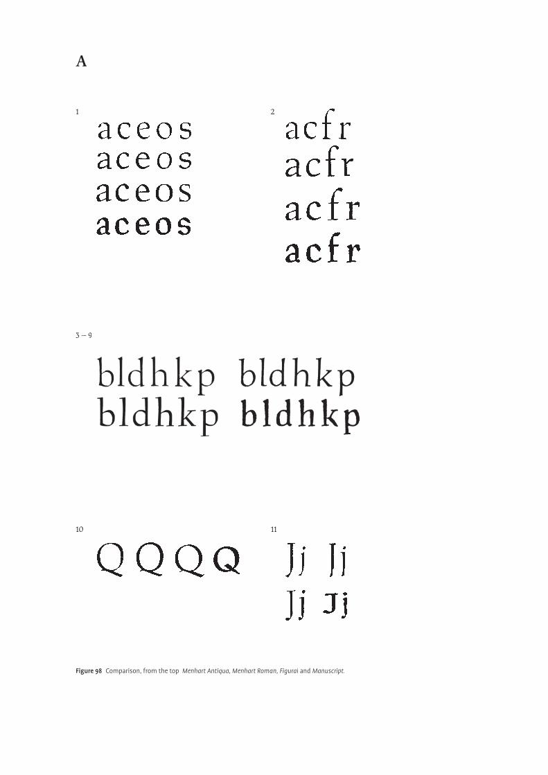
�
A
Figure 98 Comparison, from the top Menhart Antiqua, Menhart Roman, Figural and Manuscript.
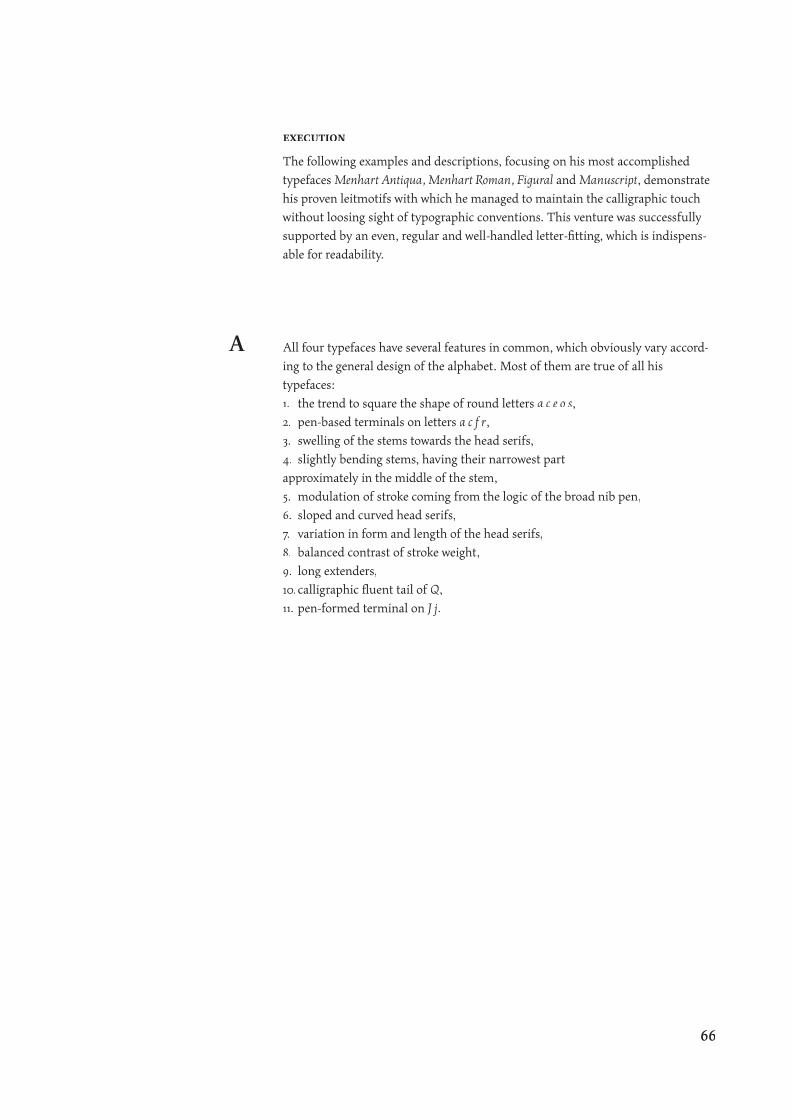
execution
The following examples and descriptions, focusing on his most accomplished
typefaces Menhart Antiqua, Menhart Roman, Figural and Manuscript, demonstrate
his proven leitmotifs with which he managed to maintain the calligraphic touch
without loosing sight of typographic conventions. This venture was successfully
supported by an even, regular and well-handled letter-fi tting, which is indispens-
able for readability.
All four typefaces have several features in common, which obviously vary accord-
ing to the general design of the alphabet. Most of them are true of all his
typefaces:
1. the trend to square the shape of round letters a c e o s,
2. pen-based terminals on letters a c f r,
3. swelling of the stems towards the head serifs,
4. slightly bending stems, having their narrowest part
approximately in the middle of the stem,
5. modulation of stroke coming from the logic of the broad nib pen,
6. sloped and curved head serifs,
7. variation in form and length of the head serifs,
8. balanced contrast of stroke weight,
9. long extenders,
10.calligraphic fl uent tail of Q,
11. pen-formed terminal on J j.
A
66
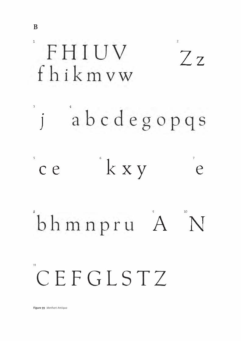
�
B
Figure 99 Menhart Antiqua
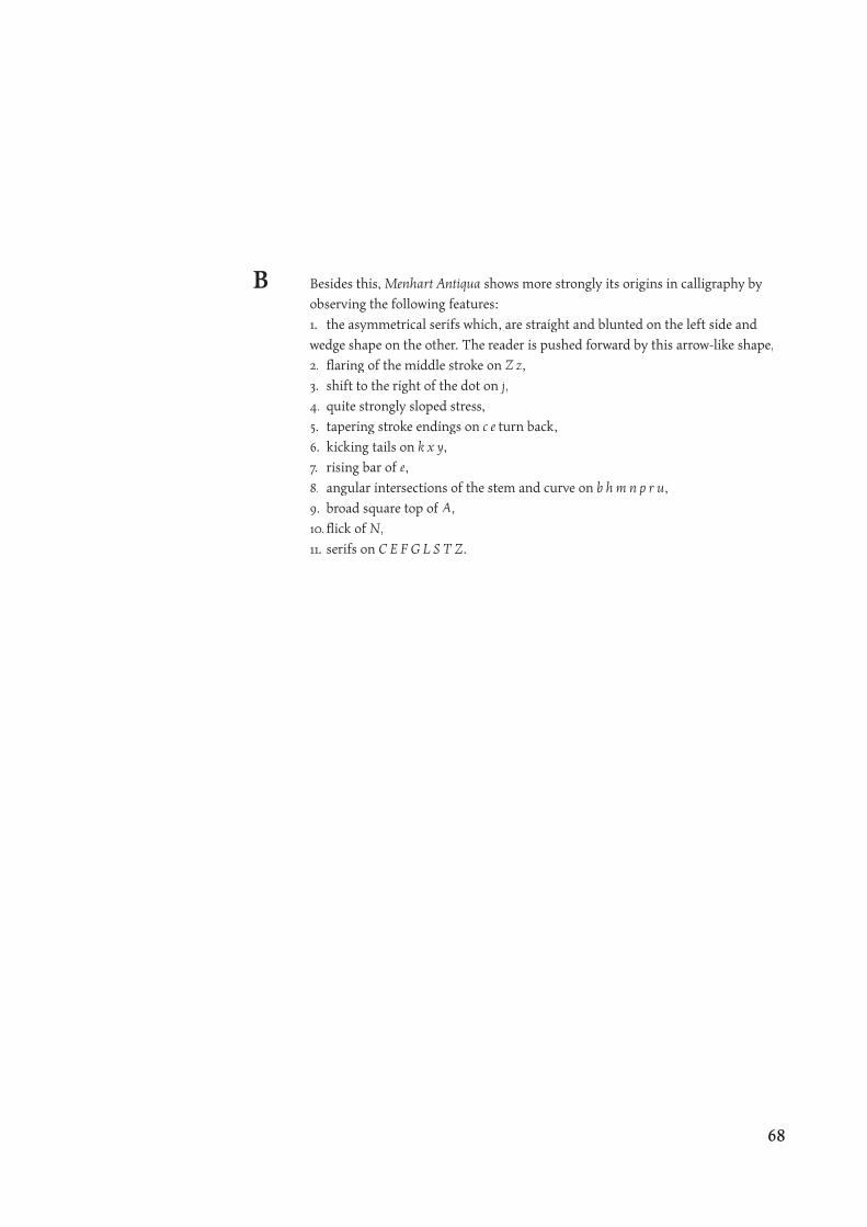
Besides this, Menhart Antiqua shows more strongly its origins in calligraphy by
observing the following features:
1. the asymmetrical serifs which, are straight and blunted on the left side and
wedge shape on the other. The reader is pushed forward by this arrow-like shape,
2. fl aring of the middle stroke on Z z,
3. shift to the right of the dot on j,
4. quite strongly sloped stress,
5. tapering stroke endings on c e turn back,
6. kicking tails on k x y,
7. rising bar of e,
8. angular intersections of the stem and curve on b h m n p r u,
9. broad square top of A,
10.fl ick of N,
11. serifs on C E F G L S T Z.
B
68
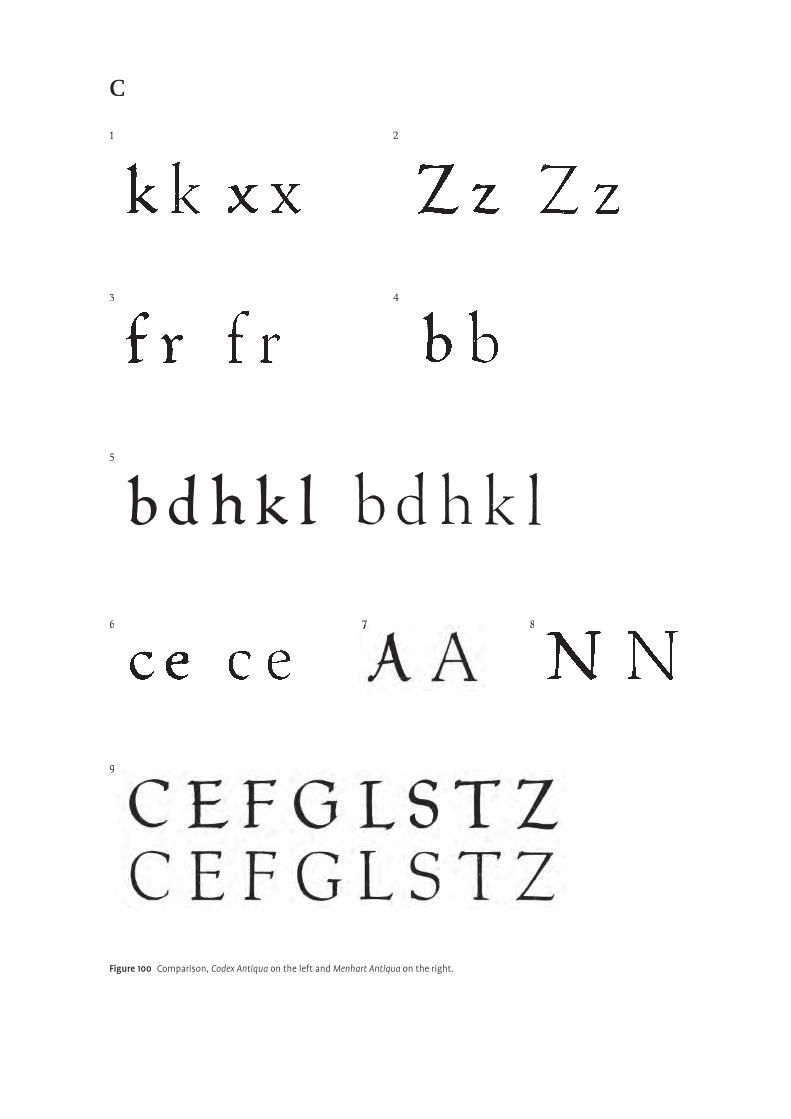
�
C
Figure 100 Comparison, Codex Antiqua on the left and Menhart Antiqua on the right.
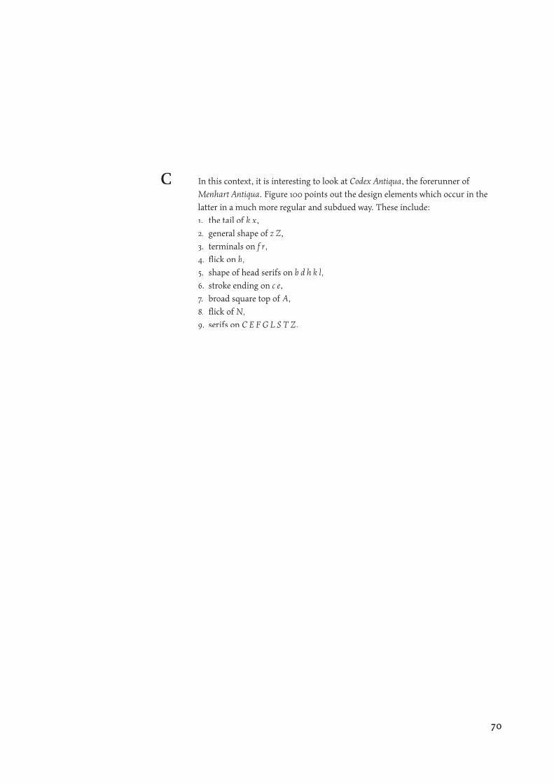
In this context, it is interesting to look at Codex Antiqua, the forerunner of
Menhart Antiqua. Figure 100 points out the design elements which occur in the
latter in a much more regular and subdued way. These include:
1. the tail of k x,
2. general shape of z Z,
3. terminals on f r,
4. fl ick on b,
5. shape of head serifs on b d h k l,
6. stroke ending on c e,
7. broad square top of A,
8. fl ick of N,
9. serifs on C E F G L S T Z.
C
70
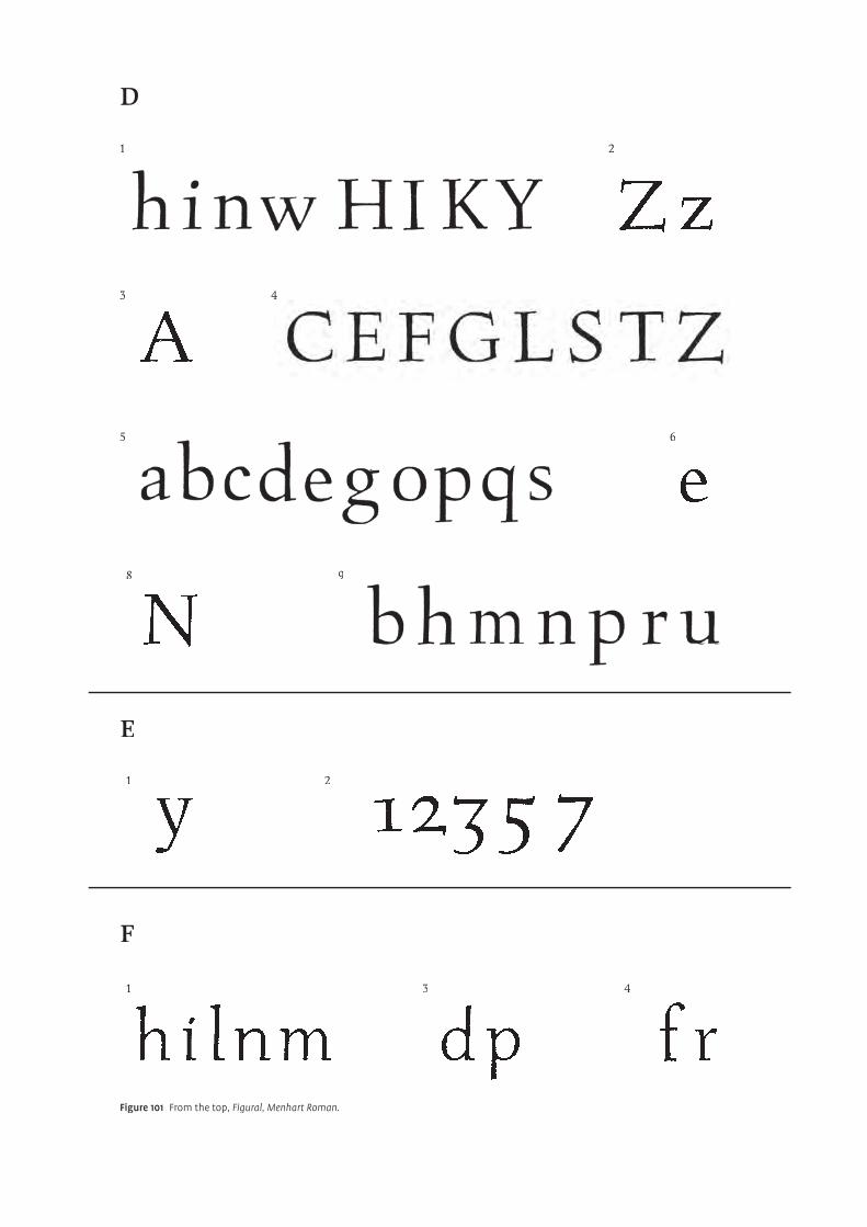
�
D
E
F
Figure 101 From the top, Figural, Menhart Roman.
In Figural Roman the calligraphic hints are even more removed, yet pleasantly evi-
dent, as the following features suggest:
1. the fl at, relatively thin and long, head and foot serifs,
2. straight bottom stroke on Z z and swapped stress (middle stroke is thick),
3. top of A is more pointy,
4. serifs on C E F G L S T Z are regularized,
5. rather vertical stress,
6. straight bar on e,
7. darker, heavier strokes,
8. fl ater, smoother curves on b h m n p r u,
9. straight middle stroke on N.
In addition to the common attributes already mentioned, Figural remains loyal to
its roots of writing as can be seen in:
1. the bottom terminal on y,
2. small fl icks on the numerals 1 2 3 5 7.
Menhart Roman is quite an unusual case, since the lower case appears in some way
as a formalized upright italic by:
1. having, in general, only partially existing serifs which are likely
to be outstrokes,
2. slightly condensed proportions,
3. missing head serif on d and foot serif on p,
4. hybrid letters f and r.
D
E
F
72
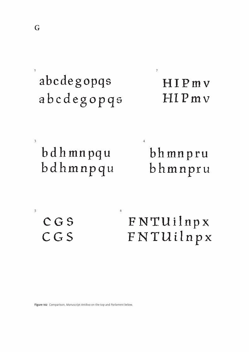
�
G
Figure 102 Comparison, Manuscript Antikva on the top and Parlament below.
On the other hand, Manuscript Antikva, is clearly based on handwriting, but it
is done in a very controlled and assured way. Comparing it with the typeface
Parlament, which is deliberately very calligraphic in design, reveals some inter-
esting details. The following diff erences seem to be responsible for the fact that
Manuscript Antikva performs disciplined and consistent, despite its calligraphic
and rustical touch:
1. the rather vertical and consistent stress,
2. serifs are blunt and rectangular,
3. rather condensed proportions,
4. smoother curves and higher intersections,
5. less pen-formed, abstract terminals on C G S,
6. strokes are straighter.
G
74
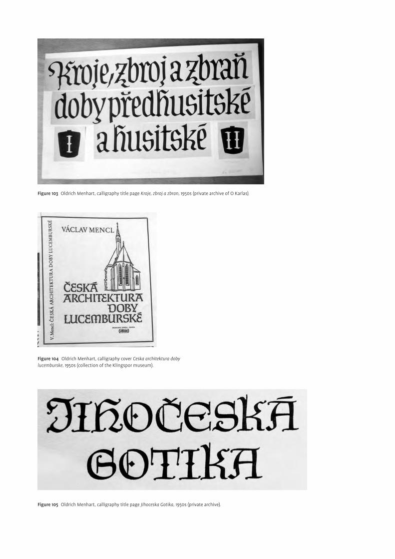
Figure 103 Oldrich Menhart, calligraphy title page Kroje, zbroj a zbran, 1950s (private archive of O Karlas).
Figure 104 Oldrich Menhart, calligraphy cover Ceska architektura doby lucemburske, 1950s (collection of the Klingspor museum).
Figure 105 Oldrich Menhart, calligraphy title page Jihoceska Gotika, 1950s (private archive).
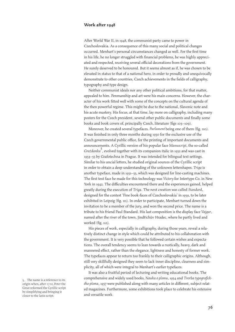
Work after 1948
After World War II, in 1948, the communist party came to power in
Czechoslovakia. As a consequence of this many social and political changes
occurred. Menhart’s personal circumstances changed as well. For the fi rst time
in his life, he no longer struggled with fi nancial problems, he was highly appreci-
ated and respected, receiving several offi cial decorations from the government.
He surely deserved to be honoured. But it seems almost as if, he was chosen to be
elevated in status to that of a national hero, in order to proudly and unequivocally
demonstrate to other countries, Czech achievements in the fi elds of calligraphy,
typography and type design.
Neither communist ideals nor any other political ambitions, for that matter,
appealed to him. Penmanship and art were his main concerns. However, the char-
acter of his work fi tted well with some of the concepts on the cultural agenda of
the then powerful regime. This might be due to the national, Slavonic note and
his acute mastery. His focus, at that time, lay more on calligraphy, including many
posters for the Czech president, several other public documents and fi nally some
books and book covers of, principally Czech, literature (fi gs 103–109).
Moreover, he created several typefaces. Parlament being one of them (fi g. 110).
It was fi nished in only three months during 1950 for the exclusive use of the
Czech governmental public offi ce, for the printing of important documents and
announcements. A Cyrillic version of his popular face Manuscript, the so-called
Graždanka�
announcements. A Cyrillic version of his popular face
�
announcements. A Cyrillic version of his popular face
, evolved together with its companion italic in 1952 and was cast in
1953–55 by Grafotechna in Prague. It was intended for bilingual text settings.
Similar to his uncial letters, he studied original sources of the Cyrillic script
in order to obtain a deep understanding of the unknown lettershapes. Triga is
another typeface, made in 1951–55, which was designed for line-casting machines.
The fi rst text face he made for this technology was Victory for Intertype Co. in New
York in 1942. The diffi culties encountered there and the experiences gained, helped
greatly during the execution of Triga. The next creation was called Standard,
designed for the contest ‘Fine book-faces of Czechoslovakia’ in 1959, to be later
exhibited in Leipzig (fi g. 111). In order to participate, Menhart turned down the
invitation to be a member of the jury, and won the second price. The name is a
tribute to his friend Paul Standard. His last composition is the display face Vajgar,
named after the river of the town, Jindřichův Hradec, where he partly lived and
worked (fi g. 112).
His pieces of work, especially in calligraphy, during those years, reveal a rela-
tively distinct change in style which could be attributed to his collaboration with
the government. It is very possible that he followed certain wishes and expecta-
tions. The overall tendency seems to lean towards a rustically, heavy, dark and
mannered eff ect, rather than the elegance, lightness and honesty of former work.
The typefaces appear to return too frankly to their calligraphic origins. Although,
still very skillfully designed they seem to lack inner discipline, clearness and sim-
plicity, all of which were integral to Menhart’s earlier typefaces.
It was also a fruitful period of lecturing and writing educational books. The
comprehensive and widely used books, Nauka o písmu, 1954 and Tvorba typografi ck-
ého písma, 1957 were published along with many articles in diff erent, subject relat-
ed magazines. Furthermore, some exhibitions took place to celebrate his extensive
and versatile work.
5. The name is a reference to its origin when, after 1710, Peter the Great reformed the Cyrillic script by simplifying and bringing it closer to the latin script.
76
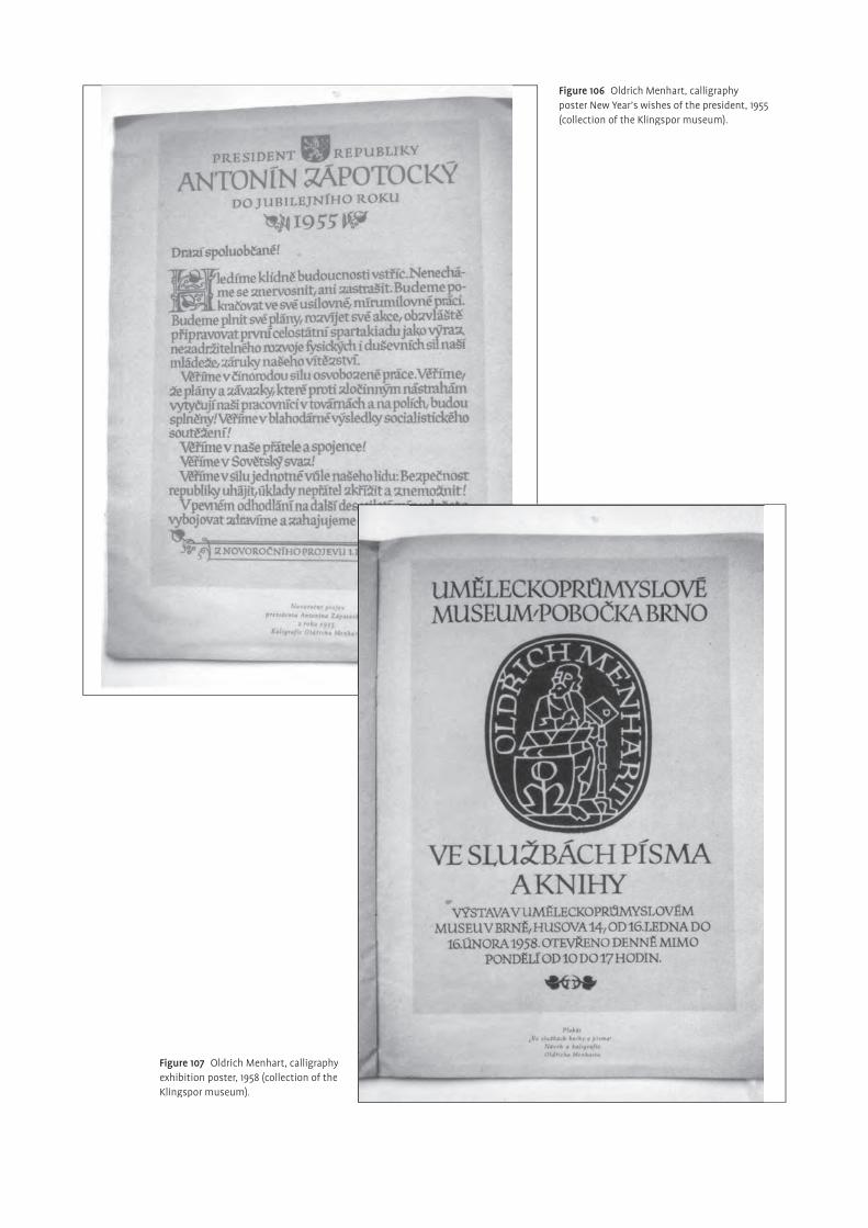
Figure 106 Oldrich Menhart, calligraphy poster New Year’s wishes of the president, 1955 (collection of the Klingspor museum).
Figure 107 Oldrich Menhart, calligraphy exhibition poster, 1958 (collection of the Klingspor museum).
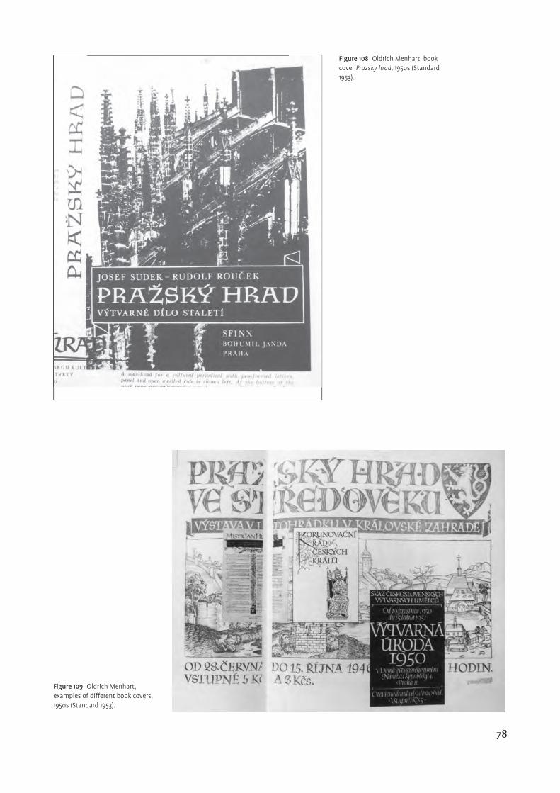
Figure 108 Oldrich Menhart, book cover Prazsky hrad, 195os (Standard 1953).
Figure 109 Oldrich Menhart, examples of different book covers, 195os (Standard 1953).
78
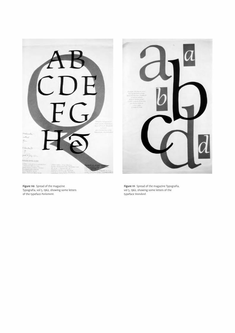
Figure 111 Spread of the magazine Typografi a, vol 5, 1962, showing some letters of the typeface Standard.
Figure 110 Spread of the magazine Typografi a, vol 5, 1962, showing some letters of the typeface Parlament.
Conclusion
¶Oldřich Menhart was surely a greatly skilled calligrapher and type designer
of the same high standard as other accomplished contemporaries outside
Czechoslovakia. After several attempts by other artists, trying to establish a
national Czech style, he was the first to manage to draw international attention
to Czech achievements in this area. Solving the problems peculiar to Czech text
setting, due to the extensive use of phonetic signs, was strongly related to this
success. Together with a few other designers, such as Karel Dyrynk, he attained
well-balanced and appropriate results. Stepping into the traces of Vojtěch Preissig,
but much more temperate and cautious, he treated the diacritics as an important
and integral part of the whole alphabet, critical for legibility and therefore under-
standing. He was very much concerned with correcting the deficiencies of existing
diacritics and hence to share the richness of Czech culture with the world by creat-
ing designs that present the printed text, both appropriately and pleasantly. This
was a logical way for him to make the Czech scene stand out from the crowd and
express Czech nationality. Nevertheless, from my angle, it is an exaggeration to say
that he coined the Czech style, since the vast variety of possibilities within a whole
nation cannot be represented by only one person and their individual ideals. But
he certainly established his own visual and intellectual Menhart-style, acknowl-
edging honestly and sensitively the human being behind his creation, as many
examples of his work clearly demonstrate.
His focus, after all, was not restricted to the Czech language only. Believing
that all languages unified by the latin script, deserve proper respect, put him
into a global light in a time in which nationalistic sentiments were widely spread
throughout Europe. This implies that Menhart was a modern designer who was
actively looking over his own borders, seeking to meet the then current needs
whilst simultaneously attempting to uphold his own Czech culture.
The long list of practical and historical publications mainly functioning as educa-
tional guidelines confirms moreover, this quite unusual character who although
open to criticism, was always striving for perfection. In my personal view, he suc-
ceeded by designing typefaces which communicated the message of the author
with a high degree of beauty, energy, and above all harmony.
The continuous search for new solutions in keeping with the spirit of the time,
was another aspiration in which he was fully engaged. The alphabet is, as he
believed, an evolving organism whose graphic expression has to be redeveloped in
each era anew, allowing for a logical continuity of tradition. Yet, his ideas were not
as radical as those of some other artists during the 1920s and 30s. His results being
rathermore classic and elegant than provocative, this, I believe, contributed greatly
to the admiration they received. Supposedly, it was this awareness of conventions
and historical knowledge, about the type-making and printing of the old masters,
that led Menhart in this direction. Despite these influences, he attempted a very
personal and sovereign interpretation, in my opinion, much to his success. Also
related to this, was his belief, that calligraphy is the only true source of inspiration
and innovation in the search for new visual expressions of classic letterforms. His
typefaces are deep reflections of this. However, they are also perfectly elaborated
typographical forms performing assuredly and with discipline in printed text,
passing all technical demands with consumate ease. His perfectionism regarding
the elaboration of details, was exceptional within the group of Czech artists at
80
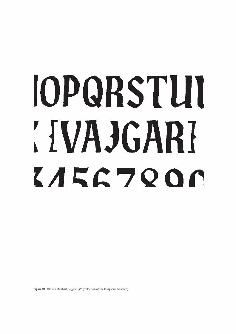
Figure 112 Oldrich Menhart, Vajgar, 1961 (collection of the Klingspor museum).
that time. He misliked average solutions and was very critical about his own work.
Thus, in him, for the first time, a Czech designer had achieved this high level of
maturity in typeface design both technically and aesthetically. From my point of
view, it is fascinating to recognise the virtuosity and self-confidence with which he
allied both disparate facets, in beautifully spirited typefaces. Although, I do not
share the absoluteness of his conviction, because I think that his approach is only
one of many other ways of designing an alphabet, I must admit the vigour and
power inherent in his typefaces attributed to the logic of writing.
82
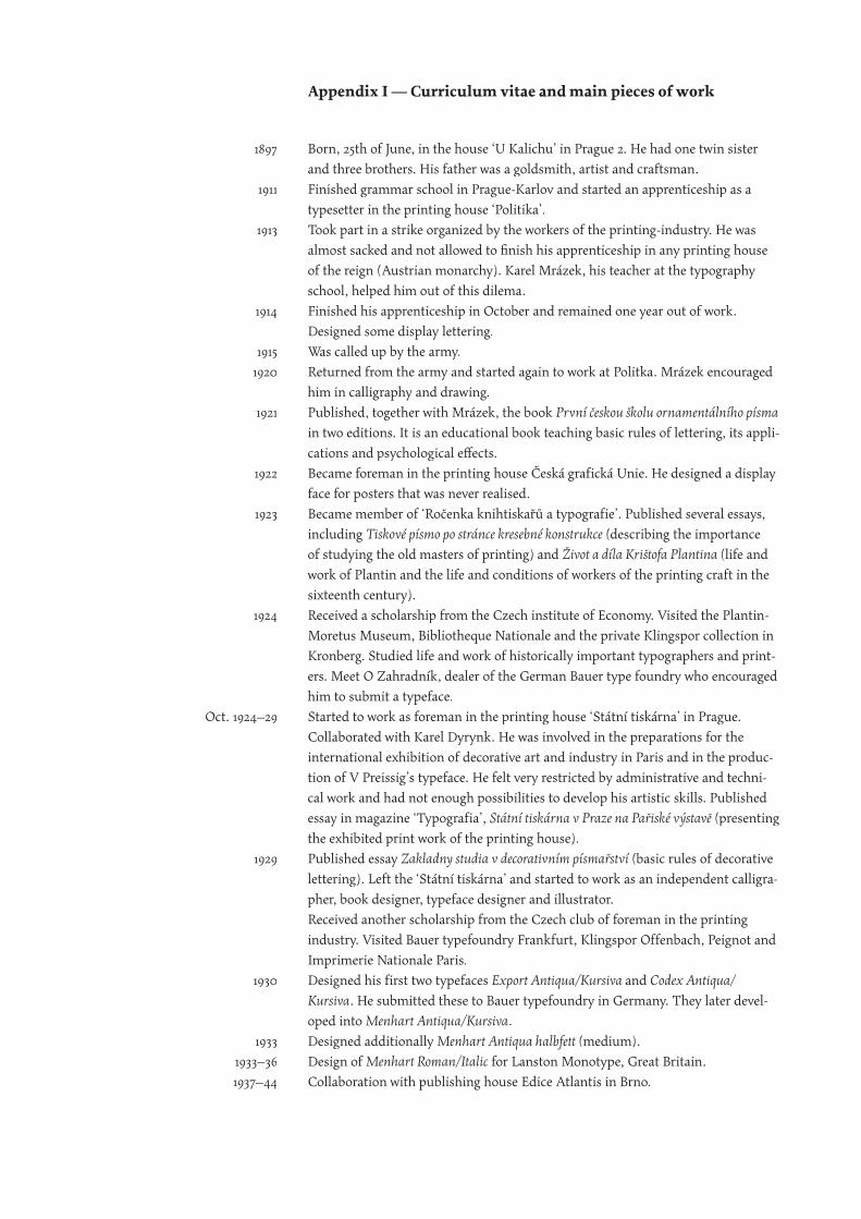
Born, 25th of June, in the house ‘U Kalichu’ in Prague 2. He had one twin sister
and three brothers. His father was a goldsmith, artist and craftsman.
Finished grammar school in Prague-Karlov and started an apprenticeship as a
typesetter in the printing house ‘Politika’.
Took part in a strike organized by the workers of the printing-industry. He was
almost sacked and not allowed to fi nish his apprenticeship in any printing house
of the reign (Austrian monarchy). Karel Mrázek, his teacher at the typography
school, helped him out of this dilema.
Finished his apprenticeship in October and remained one year out of work.
Designed some display lettering.
Was called up by the army.
Returned from the army and started again to work at Politka. Mrázek encouraged
him in calligraphy and drawing.
Published, together with Mrázek, the book První českou školu ornamentálního písma
in two editions. It is an educational book teaching basic rules of lettering, its appli-
cations and psychological eff ects.
Became foreman in the printing house Česká grafická Unie. He designed a display
face for posters that was never realised.
Became member of ‘Ročenka knihtiskařů a typografie’. Published several essays,
including Tiskové písmo po stránce kresebné konstrukce (describing the importance
of studying the old masters of printing) and Život a díla Krištofa Plantina (life and
work of Plantin and the life and conditions of workers of the printing craft in the
sixteenth century).
Received a scholarship from the Czech institute of Economy. Visited the Plantin-
Moretus Museum, Bibliotheque Nationale and the private Klingspor collection in
Kronberg. Studied life and work of historically important typographers and print-
ers. Meet O Zahradník, dealer of the German Bauer type foundry who encouraged
him to submit a typeface.
Started to work as foreman in the printing house ‘Státní tiskárna’ in Prague.
Collaborated with Karel Dyrynk. He was involved in the preparations for the
international exhibition of decorative art and industry in Paris and in the produc-
tion of V Preissig’s typeface. He felt very restricted by administrative and techni-
cal work and had not enough possibilities to develop his artistic skills. Published
essay in magazine ‘Typografia’, Státní tiskárna v Praze na Pařiské výstavě (presenting
the exhibited print work of the printing house).
Published essay Zakladny studia v decorativním písmařství (basic rules of decorative
lettering). Left the ‘Státní tiskárna’ and started to work as an independent calligra-
pher, book designer, typeface designer and illustrator.
Received another scholarship from the Czech club of foreman in the printing
industry. Visited Bauer typefoundry Frankfurt, Klingspor Offenbach, Peignot and
Imprimerie Nationale Paris.
Designed his first two typefaces Export Antiqua/Kursiva and Codex Antiqua/
Kursiva. He submitted these to Bauer typefoundry in Germany. They later devel-
oped into Menhart Antiqua/Kursiva.
Designed additionally Menhart Antiqua halbfett (medium).
Design of Menhart Roman/Italic for Lanston Monotype, Great Britain.
Collaboration with publishing house Edice Atlantis in Brno.
1897
1911
1913
1914
1915
1920
1921
1922
1923
1924
Oct. 1924–29
1929
1930
1933
1933–36
1937–44
Appendix I — Curriculum vitae and main pieces of work
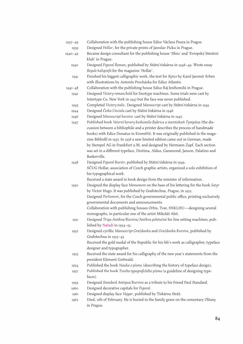
Collaboration with the publishing house Edice Václava Poura in Prague.
Designed Hollar, for the private prints of Jaroslav Picku in Prague.
Became design consultant for the publishing house ‘Sfi nx’ and ‘Evropský literární
klub’ in Prague.
Designed Figural Roman, published by Státní tiskárna in 1948–49. Wrote essay
Regule kaligrafů for the magazine ‘Hollar’.
Finished his biggest calligraphic work, the text for Kytice by Karel Jaromír Erben
with illustrations by Antonín Procházka for Edice Atlantis.
Collaboration with the publishing house Edice Ráj knihomilů in Prague.
Designed Victory roman/bold for linotype machines. Some trials were cast by
Intertype Co. New York in 1947 but the face was never published.
Completed Victory italic. Designed Manuscript cast by Státní tiskárna in 1945.
Designed Česka Unciala cast by Státní tiskárna in 1948.
Designed Manuscript kursiva cast by Státní tiskárna in 1947.
Published book Večerní hovory knihomila Rubrica a starotiskaře Tympána (the dis-
cussion between a bibliophile and a printer describes the process of handmade
books) with Edice Donatus in Kroměřiž. It was originally published in the maga-
zine Bibliofi l in 1937. In 1958 a new limited edition came out in German, made
by Stempel AG in Frankfurt a.M. and designed by Hermann Zapf. Each section
was set in a diff erent typeface, Diotima, Aldus, Garamond, Janson, Palatino and
Baskerville.
Designed Figural Kursiv, published by Státní tiskárna in 1949.
SČUG Hollar, association of Czech graphic artists, organized a solo exhibition of
his typographical work.
Received a state award in book design from the minister of information.
Designed the display face Monument on the base of his lettering for the book Satyr
by Victor Hugo. It was published by Grafotechna, Prague, in 1952.
Designed Parlament, for the Czech governmental public offi ce, printing exclusively
governmental documents and announcements.
Collaboration with publishing houses Orbis, Tvar, SNKLHU—designing several
monographs, in particular one of the artist Mikoláš Aleš.
Designed Triga Antikva/Kursiva/Antikva polotučná for line setting machines, pub-
lished by Nařadí in 1954–55. Nařadí in 1954–55. Nařadí
Designed cyrillic Manuscript Graždanka and Graždanka Kursiva, published by
Grafotechna in 1953–45.
Received the gold medal of the Republic for his life’s work as calligrapher, typeface
designer and typographer.
Received the state award for his calligraphy of the new year’s statements from the
president Klement Gottwald.
Published the book Nauka o písmu (describing the history of typeface design).
Published the book Tvorba typografi ckého písma (a guideline of designing type-
faces).
Designed Standard Antiqua/Kursiva as a tribute to his friend Paul Standard.
Designed decorative capitals for Figural.
Designed display face Vajgar, published by Tiskárna Stráž.
Died, 11th of February. He is buried in the family grave on the cementary Olšany
in Prague.
1937–49
1939
1940–49
1940
1941
1941–48
1942
1943
1944
1946
1947
1948
1950
1951
1952
1953
1954
1957
1959
1960
1961
1962
84

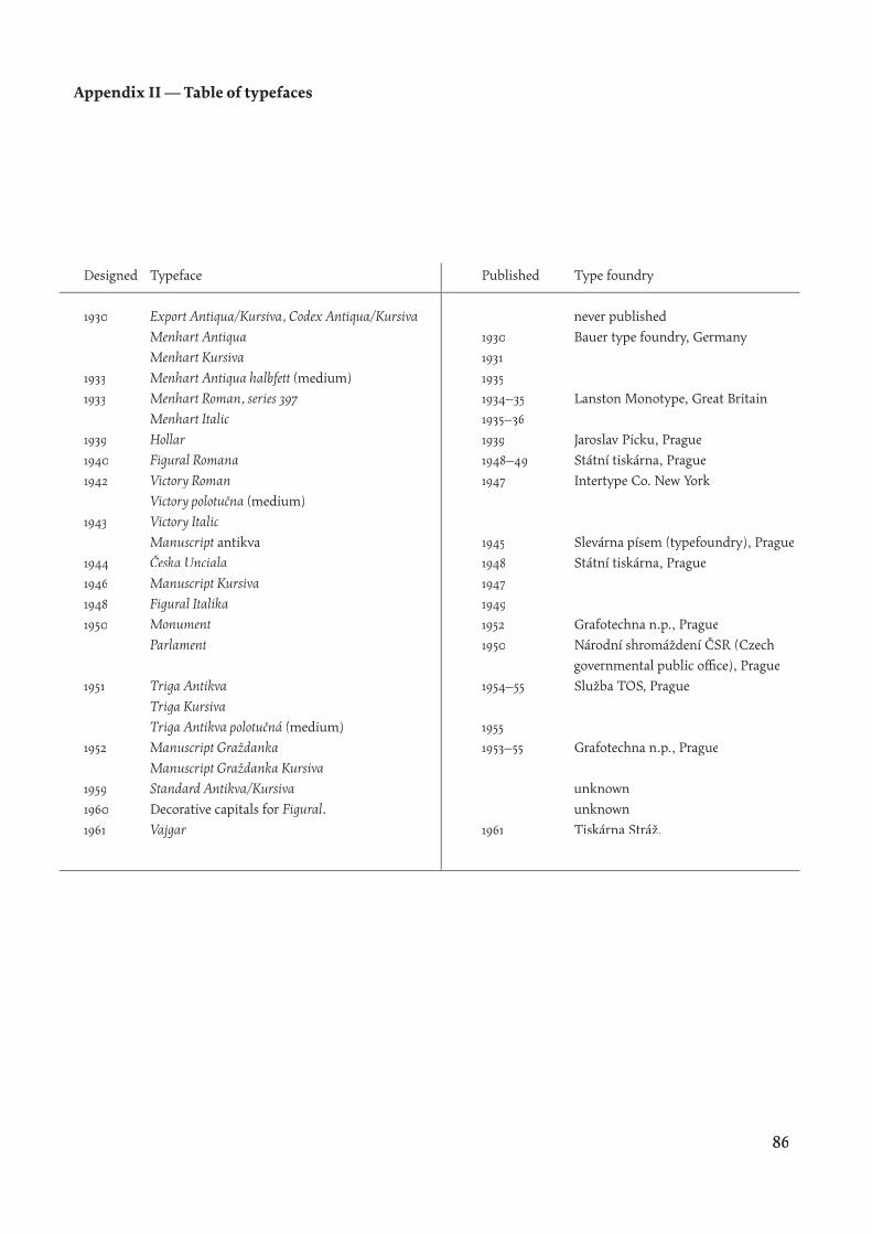
Typeface
Export Antiqua/Kursiva, Codex Antiqua/Kursiva
Menhart Antiqua
Menhart Kursiva
Menhart Antiqua halbfett (medium)
Menhart Roman, series 397
Menhart Italic
Hollar
Figural Romana
Victory Roman
Victory polotučna (medium)
Victory Italic
Manuscript antikva
Česka Unciala
Manuscript Kursiva
Figural Italika
Monument
Parlament
Triga Antikva
Triga Kursiva
Triga Antikva polotučná (medium)
Manuscript Graždanka
Manuscript Graždanka Kursiva
Standard Antikva/Kursiva
Decorative capitals for Figural.
Vajgar
Designed
1930
1933
1933
1939
1940
1942
1943
1944
1946
1948
1950
1951
1952
1959
1960
1961
Published
1930
1931
1935
1934–35
1935–36
1939
1948–49
1947
1945
1948
1947
1949
1952
1950
1954–55
1955
1953–55
1961
Type foundry
never published
Bauer type foundry, Germany
Lanston Monotype, Great Britain
Jaroslav Picku, Prague
Státní tiskárna, Prague
Intertype Co. New York
Slevárna písem (typefoundry), Prague
Státní tiskárna, Prague
Grafotechna n.p., Prague
Národní shromáždení ČSR (Czech
governmental public offi ce), Prague
Služba TOS, Prague
Grafotechna n.p., Prague
unknown
unknown
Tiskárna Stráž.
Appendix II — Table of typefaces
86

Babler, Otto F, 1950.
‘Oldřich Menhart, Czech printer, typedesigner and penman’
De Gulden Passer, vol 28, pp 1–31, Antwerpen.
Bohatec, Miloslav, 1962.
‘Un labeur courageux’ Gutenberg Jahrbuch, pp 76–81.
Christians, Hans (ed.), 1968.
Menhart Oldrich 1897 bis 1962 seine typographischen Schriften. Hamburg.
Duensing, Hayden Paul, 1987.
‘Oldřich Menhart’. Fine Print, vol 13, no 1, pp 34–39.
Dyrynk, Karel, 1925.
České původní tipografi cké písmo, Vojtech Preissig. Prague: Spolek Tipografi a.
Hála, Rudolf, 1962.
‘Život a dílo Oldřicha Menharta’ special edition, Typografia, no 5.
Johnston, Edward, 1906.
Writing & Illuminating & Lettering. London: John Hogg.
Meggs, Philip B, 1998.
A history of Graphic Design. 3rd edition, New York: John Wiley & Sons, Inc.
Menhart, Oldřich, 1957
—. Tvorba typografi ckého písma. Prague: Státní pedagigické nakladatelství.
Murat, René, 1967.
Method Kaláb, mistr typograf 1885–1963. Prague: Nakladatelství Blok.
Musil, Roman and E Burget (ed.), 2001.
Karel Svolinsky. Prague.
Muzika, František, 1965.
Die schöne Schrift in der Entwicklung des lateinischen Alphabets. Hanau am Main:
Verlag Werner Dausien.
[Národní Muzeum], 1963.
‘Výstava písmo a kniha v díle Oldřicha Menahrta’ exhibition catalogue, Prague.
Parry, Linda (ed.), 1996.
William Morris, 1834–1896. London: Philip Wilson publishers.
Standard, Paul, 1953.
‘The Menhart Story’ American Printer, vol 134, no 10–12.
Steiner-Prag, Hugo, 1933.
‘European books and designers’ The Dolphin, no 1, pp 209–249.
Tracy, Walter, 1986.
Letters of Credit, a view on type design. London: Gordon Fraser.
Tubaro, Ivana, 2002.
Lettering, studi e ricerche. Milano: Editore Ulrico Hoepli.
Vichnar, Jinřich and Rambousek, Antonín, 1972:
Původní československe typografická písma. Prague: Ministerstvo kultury.
Works cited
88

[Anon], April 2003
‘Morris, William’ <http://www.morrissociety.org/bio.html>
Bezruč, Petr, 1957.
Povídky ze života. Prague: Československy Spisovatel.
Bohatec, Miloslav, 1964.
Umělecký profi l Oldřicha Menahrta. Klub přátel výtvarného umění, Prague.
Bringhurst, Robert, 2001.
The Elements of Typographic Style. Vancouver: Hartely & Marks.
Carter, Sebastian, 2002.
Twentieth century type designers. London: Lund Humphries.
[Comenius Museum], 1995
Vojtěch Preissig 1873–1944. exhibition catalogue, Naarden: Gallery Groll and
National Gallery Prague.
Dluhosch, Eric et al (ed.), 1999
Karel Teige/1900–1951, L’enfant terrible of the Czech modernist avant-garde.
London: The MIT Press.
Dyrynk, Karel, 1993.
Typograf o knihách, 3rd edition Prague: Kentaur, Poligrafi a.
Erben, Karel Jaromír, 1940.
Kytice. Brno: Edice Atlantis.
[Exhibition], 20th June 03 until 26th Oct. 2003.
Ladislav Sutnar, praha, new york, design in action. Prague:
Uměleckoprůmyslové museum.
Haupt. Georg. 1936.
Rudolf Koch der Schreiber. Weimar: Gesellschaft der Bibliophilen.
Hlavsa, Oldřich, 1957.
Typografi cká Písma Latinková. Pragua: Nakladatelství technické literatury.
Hurm, Otto, 1955.
Johnston, Larisch, Koch, Drei Erneuerer der Schreibkunst. Vienna:
Kleiner Druck der Gutenberg-Gesellschaft Nr. 60.
Heiderhoff , Horst, 1971.
Antiqua oder Fraktur? Zur Problemgeschichte eines Streites. Frankfurt am Main:
Polygraph Verlag GmbH.
[Hessisches Gewerbemuseum], 1927.
Schrift und Handwerk. Off enbach am Main: Hausdruckerei vn Gebr. Klingspor.
Kaláb, Method, 1924.
‘Czechoslovak printing’ Fleuron, no 3, pp 75–88.
Kiefer James, September 2003.
‘Jan Hus, Priest and Martyr (6 Jul 1415)’ <http://www.hillsdale.edu/Dept/Phil&Rel/
Biography/07/06a.html>
Mamatey, Victor S (ed.), 1973.
A history of the Czechoslovak Republic, 1918–1948. Princeton University Press.
Menhart, Oldřich, 1937.
Menhartova Italika. limited edition, Prague: Průmyslova tiskárna.
—. ‘Snahy o český výraz v písmě’ Typografi a, vol 45, pp 176–180, 1938.
—. Nauka o písmu. Prague: Státní pedagigické nakladatelství, 1954.
—. Výbor z díla písmaře a úpravce knihy. Prague: Státní nakladatelství krásné litertury,
—. Česká unciála v soudobém typografi ckém písmarstvi. Prague, 1950.
—. Abendgespräche des Bücherfreundes Rubricus und des Buchdruckers Tympanus.
special edition, Frankfurt am Main: Hausdruckerei D Stempel AG, 1958
hudby a umění, 1956.
Works consulted
90

Müller, Fridolin (ed.) 1966.
Piet Zwart. Teufen: Verlag Arthur Niggli AG.
Renzio del, Toni, 1948.
‘Karel Svolinský’ Signature, no 5, pp 29–41.
Rous, Jan, 1987.
‘The Typography and Design of Czech Books between the Wars’ Fine Print,
vol 13, no 1, pp 19–21.
Seifert, Jaroslav, 1956.
Šel malíř chudě do světa. Prague: Česckoslovenský Spisovatel.
Siermann, Koosje, 1994.
‘Karel Teige and the Czech avantgarde’ Eye, no 12, pp 56–63.
Vlček, Tomáš, 1968.
Vojtěch Preissig 1873–1944. exhibition catalogue, Prague: Galerie václava špály.
—. ‘The Beginnings of Modern Czech Book Art: A Comment on the Work of
Vojtěch Preissig, František Kupka, František Bílek, Jan Preisler, Josef Váchal’ Fine Print,
vol 13, no 1, pp. 16–19, 1987.
Zapf, Hermann, 1970.
About Alphabets some marginal notes on type design. Cambridge/Mass: The M.I.T. Press
92

Due to various reasons, a big part of the illustrations was done under restrictive condi-
tions. These include insuffi cient lightning when taking pictures, scanning from photocop-
ies, lack of proper photographic equipment (macro lenses) and the like.
Private archives:
– Otokar Karlas, Prague.
– František Storm, Prague.
– Monotype Corp. Redhill.
– Author, Reading.
– Collection of the Klingspor Museum, Off enbach.
Bibliography:
Carter, Sebastian, 2002.
Twentieth century type designers. London: Lund Humphries.
Dyrynk, Karel, 1925. České původní tipografi cké písmo, Vojtech Preissig.
Prague: Spolek Tipografi a.
Frauenterka, Miroslav, 1973.
‘1873 Vojtěch Preissig 1973’ Typografi a, vol 76, no 8, pp 297–306.
Hayden Duensing, Paul, 1987.
‘Oldřich Menhart’. Fine Print, vol 13, no 1, pp 34–39.
Hlavsa, Oldřich, 1957.
Typografi cká Písma Latinková. Pragua: Nakladatelství technické literatury.
Jaspert, Pincus W, 2001.
Encyclopaedia of typefaces. London: Cassell Paperbacks.
Meggs, Philip B, 1998.
A history of Graphic Design. 3rd edition, New York: John Wiley & Sons, Inc.
Tracy, Walter, 1986.
Letters of Credit, a view on type design. London: Gordon Fraser.
Menhart, Oldřich, 1954.
Nauka o písmu. Prague: Státní pedagigické nakladatelství, 1954.
Musil, Roman and E Burget (ed.), 2001.
Karel Svolinsky. Prague.
Muzika, František, 1965.
Die schöne Schrift in der Entwicklung des lateinischen Alphabets. Hanau am Main:
Verlag Werner Dausien.
Standard, Paul, 1953.
‘The Menhart Story’ American Printer, vol 134, no 10–12.
Tubaro, Ivana, 2002.
Lettering, studi e ricerche. Milano: Editore Ulrico Hoepli.
Vichnar, Jinřich and Rambousek, Antonín, 1972:
Původní československe typografická písma. Prague: Ministerstvo kultury.
Illustrations
94


![Czech amphibians and reptiles [Režim kompatibility]kzr.agrobiologie.cz/natural/english/data/reptilesCR.pdf · 4.1.2010 1 Amphibians and Reptiles of the Czech Republic Zoology Oldřich](https://img.pdfslide.us/doc/110x75/5a78c26f7f8b9a21538cf2c2/czech-amphibians-and-reptiles-rezim-kompatibilitykzr-1-amphibians-and-reptiles.jpg)


![ON THE COMPUTER GENERATION OF RANDOM ...luc.devroye.org/devroye_1982_computer_generation_random...Remarks On the computer generation of random convex hulls 3 1. [Validity]. When R,](https://img.pdfslide.us/doc/110x75/5fea5e498ade6850471db5bf/on-the-computer-generation-of-random-luc-remarks-on-the-computer-generation.jpg)