Embed Size (px)
Citation preview

Oils and Pigments
By Jan Esmann
http://janesmann.com
http://www.facebook.com/jan.esmann
Copyright © 2011-2012 Jan Esmann, All rights reserved.
Version 2012, 1.2
Released on Facebook/the web for the benefit of our artistic community.
Jan Esmann has been a professional full time artist since 1990.
He has a B.Sc in Art Restoration from the Royal Academy of Art, Copenhagen, and and MA
in History of Modern Culture from Copenahgen University. He trained with the late Danish
artist Niels Hermann Wamberg 1980-83.
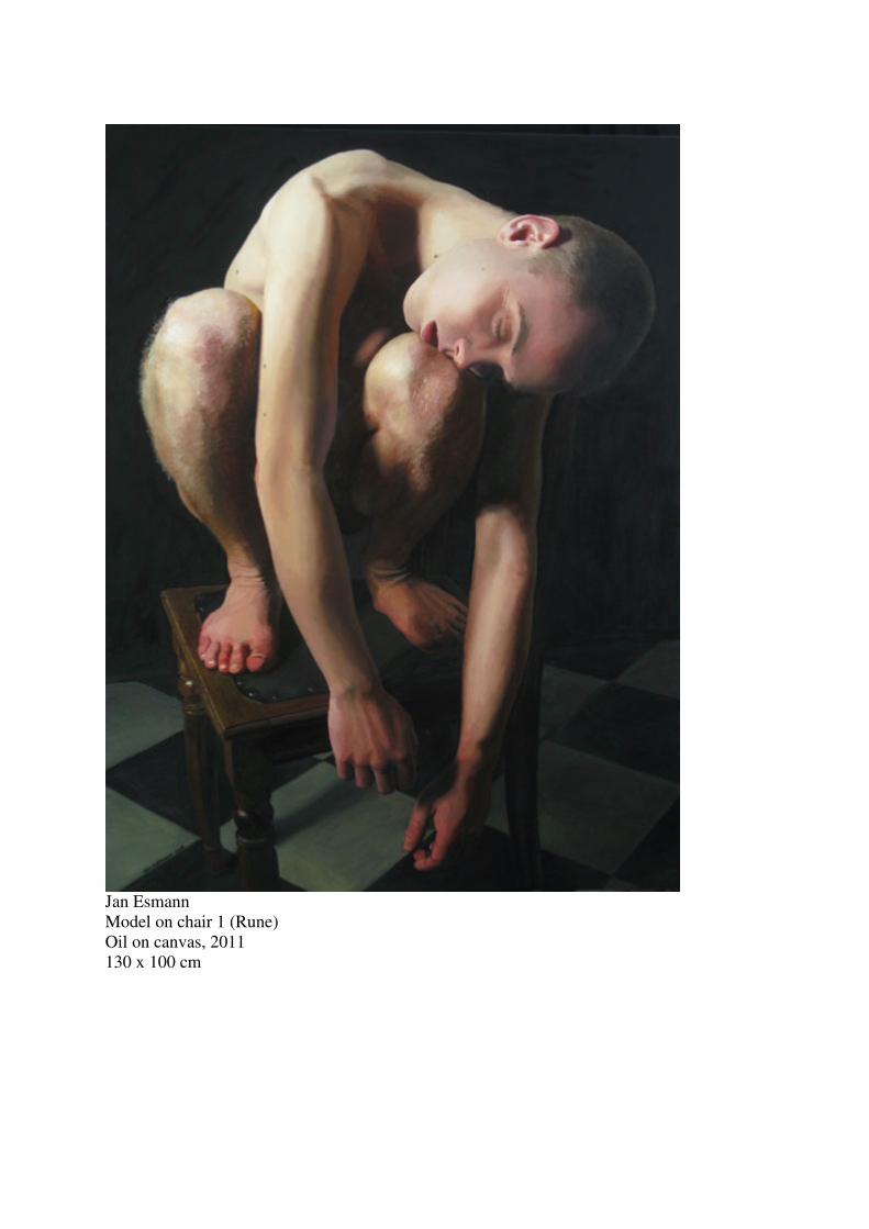
Jan Esmann
Model on chair 1 (Rune)
Oil on canvas, 2011
130 x 100 cm

Sad facts about commercial tube colours
1. You can not trust the name on the tube Colour manufacturers tend to sell pigments under fancy names or even sell fancy mixtures
under irrelevant, but regular, names. Thus for example, you will find that a tube labeled
manganese violet or ultramarine violet really contains a mixture of dioxazineviolet and
lithopone. This, unfortunately, goes for even good and respectable companies. So until you
are skilled enough to recognize any pigment instantly, you should only trust a colour
manufacturer that states what’s in the tube by pigment number – either on the tubes label or
in their catalogue. Always demand to see the catalogue, if nothing is stated on the tube. If you
don’t get any wiser from that, then go for some other brand at once. Anyway: get skilled
enough to recognize any pigment and its mixures more or less instantly. Now, the situation is
not as simple as this, because sometimes it is okay to replace an original pigment with an
emulation. Sadly most colour companies make ridiculous alternatives, like selling dioxazine
as ultramarine violet, or manganese violet as cobolt violet. Not to mention all the mixtures
sold as naples yellow that bear no resemblance with the real pigment at all (real naples yellow
is toxic and not generally available).
In the pigment list you will find recipes for the best emulations of expensive or
unavailable pigments. You can safely replace expensive colours with these mixtures and no
eye will ever be able to see any difference.
2. You can not trust the stiffness of the tube colour Today we have a number of plasticizers that can be added to the paint in order to make it
stiff. This means that a tube of a pigment like cobolt blue, which requires about 125% oil (a
lot), can actually contain 250% oil (relative to the amount of pigment, so that’s more than
twice the amount of pigment). Such a colour with excess of oil will naturally yellow with
time and be more liable to crack. You will find in books about the impressionist painters, that
they would place the colours from the tube on blotting paper in order to remove the excess
oil. You can’t use that method today if the colour has been made stiff with modern
plasticizers, because in this case, there is, technically speaking, no excess oil.
The most common plasticizers today are aluminium stearate and aluminium
hydroxide. If used wisely both are blessings, because some colours are pratically impossible
to grind without such additions (like ultramarine), but both – especially aluminium stearate -
can be abused to cut expensive colours into virtual uselessness for any artist who makes
immortal works. If on the other hand you only want to make decorative works that are meant
to last less than a lifetime, then no reason to bother. In older works on technique, such as Max
Doerners Malmaterial, you will find a 2% addition of wax mentioned as a plasticizer. Know
that aluminium hydroxide and aluminium stearate are infinitely better in all respects.
Aluminiumstearate is a modern synthetic wax-like substance. Aluminiumhydroxide is an
inert (colourless) pigment that makes the colour more buttery but does not make the oil itself
thick like wax or aluminiumstearate melted into the oil does. Remember wax is a soft
substance and that introducing it into your paint introduces a non-hardening substance, that
will soften the paint layer or destabilize the paint film, or even melt in hot climate or when
your immortal work of art needs treatment by restorers, who regularly subject paintings to
heat up to 60° C. Aluminium stearate is difficult to use. You can’t just add it to the colours,
but have to either a) coat the pigment particles with it under heat, which is impossible to do at
home, or b) heat your linseed oil high enough melt aluminium stearate into the hot oil. Then,
when the oil cools to normal temperature, it should be slightly jelly-like or slimy. Grinding

colours in this slimy oil will of course produce more stable tubecolours, but they will also
have a larger oil content. Rheologically, there is no advantage to this while painting. Perhaps
on the contrary.
One way to judge if a tube contains a regular amount of pigment is to have some idea
about the weight of the pigment. Know that organic pigments are generally lightweight and
nonorganic pigments are generally heavyweight (ultramarine and lamp black being
exceptions). So if your tube of cobolt blue or ceruleum blue does not feel distinctly heavy in
your hand, compared to for example quinacridone, reject it promptly. This is difficult with
the small 38 ml tubes, but easier with large tubes.
These pigment classes are heavy: cobolt, cadmium, zinc, iron (mars), manganese –
and of course the obsolete lead colours. Earth pigments are medium weight and thus difficult
to judge, but since earth costs about the same as oil, there is no need to worry too much about
earth colours. Even more so that the earth colours have much the same hue as darkened oil,
especially burnt sienna. Anyone who has compared the weight of a homemade zinc white
with a commercial zinc white will be shocked by the weight and pigment density of the real
thing. This is also because a zinc white must be ground several times, each time adding more
pigment. Commercial manufacturers do not have the patience to do that, so they grind it once
or twice and add a plasticizer.
Artist! Grind your own zinc white! Grind zinc white in alkyd or poppy or walnut oil,
all with siccative. Don’t grind your lead, cadmium or cobolt colours, because they are
poisonous. If you insist on doing so, wear a mask over your mouth and nose.
3. You can not trust that the oil used is the best oil for the pigment Most colours should be ground in linseed oil. However the whites and blues could be ground
in either alkyd, stand, walnut or poppy oil, because these oils yellow less or, rather, at least
more slowly. These oils dry slowly, so they need an addition of siccative to accelerate the
drying rate. Some respected companies market a zinc white ground in safflower oil, which is
nice considering that it yellows more slowly, but because they do not add siccative, the
colour needs about a month to dry, hence it is useless. Also safflower oil is not recommended
since it has a tendency to turn soft and sticky with age. In fact I would say: shun safflower oil
like the plague.
The elements of paint
Siccative It is a myth that siccatives (drying agents) should be avoided. The siccatives cobolt
naphtenate or cobolt linoleate are okay to use. Old siccatives based on lead or manganese are
bad because they keep on working on the paint in undiminished strength, even after the paint
has dried. You only want the siccative to work on the paint while the paint is wet. Otherwise
it will cause all the bad effects of ageing to come too soon (yellowing, cracking, etc.). Cobolt
siccatives tend to work while the paint is wet and will diminish in effect as the oil dries.
Intuitively you will try to avoid cobolt siccatives because of the dark violet hue. Lead and
manganese siccatives are brown. Cobolt naphtenate siccatives can be recognized by their
smell of naphthalene, their thin liquid diluents and their more neutral violet-brown colour.
Cobolt-oleate siccatives can be recognized by their thick oil-like fluidity and their strong
blue-violet hue. Oleates are the best from the point of view of rheology: they only slightly
alter the consistency of the paint they are added to and may even tend to make it more short
and buttery. But if you want to mix oil and siccative and store it, fx as a medium, then cobolt
oleate is a bad choice because somehow it congeals into odd lumps. I have not experienced

problems when coboltoleate is ground into colours along with the pigment and oil. Probably
because the mixture with dispersed pigment and the fine mixing in the rollers keep the oleate
dispersed and suspended enough. There is a third cobolt siccative, cobolt carboxylate, which
can be distinguised from the two other cobalt siccatives by not being violet but blackish
brown. Its use and behavior is similar to coboltnaptenate because it is diluted in mineral
spirits or similar solvent. It does not have an odor like coboltnaphtenate. Don’t be concerned
about the violet hue because it will fade away within a week or so, even from blanc fix.
Siccatives are sold diluted and the concentration is usually adjusted so that normal
linseed oil paint will dry within a day if you add about 2-5% of the amount of paint (2%
cobolt naphtenate, 5% cobolt oleate). However you can’t trust the label on the bottle in this
respect. I wasted my money on a flask of cobolt carboxylate siccative from Rubens that
claimed 1% was enough, however a zincwhite required 10% to dry as rapidly as with 2% of a
coboltnaphtenate from Roberson, which claimed 2% was appropriate. Don’t trust a cobolt
siccative that is not dark and non-transparent – you will need too much of it in your paint so
that its diluents will become a nuisance by thinning your paint to a useless amount. Some
colours require much more depending on the pigment and oil. In average linseed oil colours,
add a few drops for an amount of paint equal to a lump of sugar (about a cubic centimetre).
Slow drying pigments, like zincwite or ultramarine, ground in walnut oil will need four times
as much, that is about 10-20%. If you add aluminium hydrate to the paint, it will need more
siccative because aluminium hydroxide retards drying.
When you use siccative, be aware that the paint is apt to skin dry, that is, develop a
deceptive fully dried surface film while still wet underneath. If overpainted such will be
liable to crack. If this is the case with a work you destine for immortality, either wait till it’s
dry throughout or scrape off the dry film and wait for the exposed wet paint to dry. If really
too much siccative is used, the paint film will remain sticky. Adequate siccative will
accelerate the drying of the surface to make it barely tacky while the body paint below also
dries and it will not form a fully dried surface film before the body paint has set, if not dried
hard (this depends on the oil used, though). Such a break point is difficult to match and
depends on the kind of oil used, so you can’t trust a given pigment always requires the same
amount of siccative, because one tube colour manufacturer may grind it in safflower oil,
while another grinds it in linseed oil. Just be alert for wet paint under a dry surface and wait
with overpainting till it’s dried through.
Oil content In the list of pigments are given approximate amounts of oil needed to grind 100 parts of
pigment (by volume). These amounts change if the oil changes. The thicker the oil, the more
oil you need. So poppy oil makes leaner colours than linseed oil. Stand oil gives very fat and
fluid colours. The amounts given are for linseed oil. Also the amount of oil needed changes
with the amount of water imbedded in the pigment. Pigments like ochre are hygroscopic
because they often contain some clay. This water is no problem, but it explains why measures
are only approximate. You can get rid of the moisture by heating the pigment and this will
change the oil absorption. However, it will also change the hue of the pigment if you heat too
much.
Oils The following oils can be used to grind colours, though they are not equally good: Alkyd (oil
modified, not urethane used for varnish, it yellows), stand oil, linseed oil, walnut oil,
safflower oil, poppy oil, sunflower oil, hempseed oil, candlenut oil (lumbang oil), tallowseed
oil (stilinga oil). The most usual are linseed, walnut, poppy and safflower. In Russia they

traditionally grind in sunflower oil. However, I do not approve of sunflower or safflower oil
because they remains very tacky for a very long time after drying causing dust and dirt to
stick to your masterpieces. Safflower oil becomes sticky again after some months or a year
after it has dried to satisfaction. During the 16th
and 17th
century walnut was often used
alongside linseed. You can either buy the mentioned oils from a professional craftsman’s
shop or buy them, at least safflower and walnut, at your local supermarket as cooking oils.
The problem buying them as cooking oils is that cooking oils may have added antioxidants in
order to ensure the oils do not jelly in the bottle. Antioxidants retard or counteract the drying
and cause your painting to remain sticky for years. So if you purchase your oil as cooking oils
check if it’s free from antioxidants. If it does not say so on the label, then purchase your oil in
a biologically grown brand you trust shuns additives. You should always use cold pressed
and purified oil in order to avoid contamination with yellowing and non-drying pollutants
(organic residues).You can buy linseed oil raw and as varnish in many shops, but you should
not be tempted to use these very yellow oils unless driven by immediate need since it is
neither cold pressed not purified. No matter what oil you purchase and from what brand, you
should always initially check the drying of the oil by placing a small pool, about a few square
centimetres and half a millimetre or so deep, on a piece of cellophane. Observe how long it
takes for it to dry compared to linseed oil. Make experiments with adding siccative in small
amounts to a duplicate set of test samples. Do not be lazy and avoid doing this! Only this way
can you get to know the drying rate and drying phases of various oils and various brands.
This will reveal if the oil contains antioxidants and it will teach you things about the drying
and yellowing of oils you can not learn in any other way. For example, here you will directly
see the difference in how various oils wrinkle (this is proportionate to how it will make paint
films crack).
For those of you who are too busy making masterpieces to do these tests, I can help
you by saying, that you will find that all oils in thick layers without pigment will form heavy
wrinkles upon drying, less so stand oil and alkyd. In other words: all oils, least so stand oil
and alkyd, may cause your work to develop cracks of some kind over a century or more – and
I assume you intend to make immortal works, if not, then there is no reason to read all this
anyway! So when ever you can replace some of the colours oilcontent or your mediums oil
content with stand oil or good alkyd, then do so! Now that we are praising alkyd and
standoil, you will also find, when you study your samples after 20 years, that good alkyd and
standoil practically have not yellowed, while linseed oil has turned as dark as burnt siena.
Walnut oil turned orange like red ochre or mars orange and poppy turned yellow like yellow
ochre or mars yellow. Safflower and sunflower should yellow even less. Stand oil and thick
alkyds hardly change. In fact some thick alkyds may be, for all practical purposes, considered
non-yellowing, like the siccatived AH-oil sold by Kremer. Kremer also sells a siccatived oil
called Aussenlack, which defies logic and yellows very little (Kremer does not divulge its
exact nature). These two oils also do not wrinkle. As a consequence, I have begun using AH
as a medium. Here is a list of how much oils yellow in relation to each other:
Alkyd (thick oilmodified, yellowing varies)
Stand
Sunflower (try to avoid because of its bad drying)
Safflower (try to avoid because of its bad drying)
Poppy
Walnut
Linseed
Boiled linseed oil

The next thing you will observe from your tests is that all oils except sunflower and safflower
set when dry, that is, they are dry to the touch, whereas sunflower and safflower oil remains
sticky for a long time after drying – and with the term dry I mean after the period when the
oil has first expanded, then contracted to form the characteristic solid wrinkles (which stand
oil and good alkyd do not form, wherefore we love them). This residual stickiness, what so
ever causes it, you certainly don’t want, because it will cause your painting to catch any dust
that might settle on it, and even worse, your glazes will show a cobweb of cracks with a few
years.
In short: shun sunflower oil and safflower oil. Stick to alkyd and standoil when you
need thick oils. Grind in linseed as much as possible. All three dry slowly, so add cobalt
siccative. You can make very durable colours by adding 20% standoil (or non-diluted thick
alkyd, if you can find it anymore, it seems to be no longer available, once there were such
oils called GG and MM, but they are gone) when grinding the colours. If that is too thick,
grind in a mixure of walnut oil with 20% stand oil and 5% siccative. The reason for adding
stand oil is that thin oils tend to make more brittle films in time, and it is my belief, that
adding a bit of stand oil can counteract this. Paint ground in stand oil makes the most durable
and tough of all paintfilms but it is only to be used for very special applications since it is
extremely thick and impossible to brush. Alternatively add stand oil, or thick alkyd, in your
painting medium.
One way you can identify which oil has been used in a commercial tube is smell and
also the colour of any free oil that may have settled at the top. You can do this test in the shop
before buying. The colour can be seen in tubes of titanium white or zinkwhite, or if the tube
has a white cap. Sunflower and safflower oil often have a slight pinkish colour. Sunflower oil
more so. Sunflower oil is quite odorless, while safflower oil has a nutty odor. Other oils are
colourless. Linseed oil has a somewhat stingy smell, while poppy oil is odorless. With these
parameters you can identify the four most common oils. The smell of linseed oil is very
characteristic. This is valuable to know if you want to make sure your zincwhite is ground in
a relatively nonyellowing oil and you want to have a hunch about how much siccative may be
required. But the again, you never know if siccative has been added. So…
Always test the drying rate of an untested tube of a new colour by placing a blot of it
on a nonabsorbant surface – like the top of the tube itself. Making the test here will also help
you know what really comes out of the tube, because printed labels are usually far out.
Oils can be preprocessed in order to make them more viscous or make them dry
faster. Normaly this is a matter of oxidizing or boiling with or without added driers. If you
boil an oil without access to oxygen, you get modern stand oil which is superior in every
respect except that it dries slowly. Boil an oil with access to oxygen (boiled oil), and you get
an oil that dries rapidly, yet yellows faster.
The following common oils can not be used: olive oil, castor oil, corn oil, because
they are nondrying. The industry uses other oils that the artist can not use: tung oil, perilla oil,
cottonseed oil, fish oil. Don’t grind your colours in any of these colours, even though the
paintindustry uses them, because they need expert preprocessing in order to dry properly and
because they will darken. Boiled castor oil is available and it dries very slowly and yellows
slowly, though in the end just as much as walnut oil. Also don’t use any kind of commercial
varnish because they most likely yellow or become brittle. Some use pure castor oil as a
plasticizer because it never dries and is nonyellowing, but this practice is dubious since any
added nondrying oil will wander through the paintlayers and cause unpredictable results. You
can make a vaselinelike drying oil by boiling linseed oil with castor oil, but its use is not
recommended because it will only hold a small amount of pigment due to its high viscosity
and will therefore yield a colour that yellows badly. If you have an electric roller mill for
grinding colours, you might use these vaselinelike oils as additives or other special purposes,

but they are impossible to handgrind to anything of practical use. However, they are not
recommended because they enhance yellowing.
Stick to Thick alkyd, stand oil and linseed oil. Of the thin oils, use walnut oil.
Grinding colours Actually you don’t need to “grind” your colours today, since virtually all pigments are
manufactured to very minute particle sizes. You merely need to disperse the pigment in the
oil. However, we still call it to grind colours. Proper dispersion does require some mechanical
squeezing of the oil/pigment between tight surfaces in motion, which can only be properly
done with either a muller or with electric rollers. Merely mixing with a spatula will rarely
lead to a satisfactory result: the colour will quickly appear okay, but will separate or harden
later upon storage with due cracking.
Plasticizers, such as aluminium hydrate or clay, make the final paint more short,
butter-like. If you prefer this from the raw paint is largely a matter of personal preference.
Different pigments produce very different paints and they can be somewhat homogenized
with aluminium hydroxide. A short/buttery paint will retain the brushmarks, whereas more
fluid paint tends to soften out. Adding aluminium hydrate prolongs drying.
No matter what your preference is, the proper way to grind colours is as follows:
1. Mix the pigment and oil with a large spatula on a large, thick glass plate.
2. Grind the mixture thoroughly as you can with the means you have. Be it either with a
spatula, a muller or with electric rollers (preferable because it is much, much faster). Do not
add plasticizers yet. You can add siccative to the oil in step 1 if you have experience with the
oil/pigment combination you are grinding. Otherwise follow the advice to do drying tests.
3. Cover the mixture with cellophane so it won’t dry, but place a brushstroke of the paint on
some nonabsorbent surface with access to air. Leave it a day.
4. Next day (or two, depending on the desired drying time) see if your brushstroke is dry. If
not you know you have to add siccative to the paint. Also check if the large lump of paint has
become either more fluid or more stiff.
5. If the lump of pigment has changed to an undesirable consistency, either add more oil or
add more pigment. Instead of pigment you might want to add aluminium hydrate or
bentonite. If you choose to add pigment, you might have to go on ad infinitum, whereas
adding aluminium hydrate or bentonite once and for all settles the matter of consistency.
However you want to proceed, you must once more cover the paint with cellophane and leave
it a day. Remember to take notes on each pigment!
6. Once the lump of paint has the right consistency even after a day or two, it is time to
consider the amount of siccative. Check the brushstroke exposed to air and see if it is
sufficiently dried after the time you allow. Most people want their paint to dry from one day
to the next. If it is not dry, add about 2% siccative to the lump, make a fresh brushstroke on a
nonabsorbent surface and cover the lump with cellophane. Leave it a day.
7. Check if the stroke of paint is adequately dry. Adequate is a matter of taste, but be
especially careful not to be fooled by a skin dry paint. Thin paint might be dried through, but

thicker layers may only be dried on the surface while wet underneath. This is a very tricky
situation. Should one add more siccative or not? This is again a matter of taste. On the one
hand you can add more siccative to make it dry through faster, on the other hand you might
decide you have added to much already, since the paint has surface dried and not dried
through while the only thing lacking was your patience. Slow drying oils tend to skin dry no
matter what, that is: poppy oil, safflower oil, sunflower oil and to some degree walnut oil.
Polymerized oils tend to dry through, even though they may actually be slow driers, that is:
stand oil and alkyd oils. Linseed oils normally dries through unless one has added too much
siccative or unless the case is that exceptional one where the pigment is a retarder (like zink
white) and one has added sufficiant siccative.
8. The general rule is: first grind the pigment and the oil. Then wait a day and decide if you
need plasticizers and/or siccatives. Also: make notes! Grinding colours is an individual
matter and while one grinds colours to a very stiff paste another might like them more fluid,
so no set formulas can be given about hand making of colours – except that, if made with
diligence, they surpass any commercial colour, because you get exactly what you want.
9. Some colours tend to be very poor in commercial tubes, so they ought to be made by
oneself, especially: zink white, ultramarine violet, ultramarine blue (they should all be ground
in alkyd, walnut or poppy oil, perhaps with an addition of 10-20% stand oil for strength). In
addition one might want to grind a small number of titanium whites with distinctly different
consistency so as to be able to control the texture of the brushstroke. I will return to this
elsewhere.
It is noteworthy that when you grind your own colours they will dry up matt. Commercial
tube colours usually dry up glossy or semi-glossy. So commercial colours contain too much
oil. What is interesting about this observation that home ground colours dry up matt is that
you can use ample painting media – far more than with commercial tube colours – before
there is danger of an alarming excess of oil. This sheds some interesting light on old master’s
technique, because we know that the paintings of Rubens dried up glossy, yet he of course
ground his own colours so they should have dried up matt. In other words he used much
medium and a medium of a glossy oil-rich kind.
The secret of pastose brush strokes What I reveal here is a very, very, very big secret and it has probably been undiscovered
since Rermbrandt. The biggest secret is that of creating a paint that will be easily brushable
while retainting the brushstrokes even in impasto layers, as if making the stroke was nothing
special. Rembrandt used it mainly in his whites and he is the father of the magical
brushstroke. A fluid oil, that will retain the brushstrokes and look like Rembrandts strokes,
can be made only by grinding the colours fresh before use. The secret is to first grind the
colour in a mixture of thick oil and thin oil (stand oil and linseed oil will do; Rembrandt
probably used a mixture of heavily oxidized linseed oil and fresh linseed oil, which would
also ensure his impastos would dry through quickly), then when you are ready to use it, add a
drop of egg (yoke or white, results differ and it is a matter of taste) and pure magic will
happen!

Pigments
Historic use of pigments When you look at old paintings and wonder what pigments they used, it is good to have some
knowledge of the most important pigments and when they were in use.
Up to about 1800 a special green was used: copperresinate. According to some recipies it was
made by boiling verdigris into a balsam like venetian turpentine. Other recipies mention
grinding verdigris in balsam and allowing it to dry, then scraping the dry mixture off and
grinding that in oil. It is highly transparent and only used as a glaze. It got replaced by
mixtures with prussian blue etc.
In the following pigments are ordered according to in how many paintings they were found
out of a specific corpus (1). This survey did not include copperresinate.
Up to 1500 Black: Charcoal, ivory black.
Blue: Azurite, natural ultramarine, indigo (rarely).
Green: Verdigris, azurite + lead-tin yellow, green earth, malachite, azurite + yellow
ochre.
Red: Vermillion, organic reds, red ochre, minium (rarely).
White: Lead white.
Yellow: Ochre, lead-tin yellow. Auripigment (rarely).
1500 - 1600 Black: Charcoal, ivory black.
Blue: Azurite, natural ultramarine, smalt (rarely), indigo (rarely).
Green: Verdigris, azurite + lead-tin yellow, green earth, malachite (rarely), azurite +
yellow ochre.
Red: Vermillion, organic reds, red ochre, minium (rarely).
White: Lead white.
Yellow: Lead-tin yellow, ochre. Auripigment (rarely).
1600 - 1700 Black: Charcoal, ivory black.
Blue: Natural ultramarine, azurite (use fades out from1650-1700), smalt (rarely),
indigo (rarely).
Green: Verdigris (use fades out during the century), azurite + yellow ochre , azurite and
lead-tin yellow (use fades out during the century), green earth (comes in vogue
around 1675 and is the most used green at 1700).
Red: Vermillion, organic reds, red ochre, minium (rarely).
White: Lead white.
Yellow: Lead-tin yellow, ochre. Auripigment (rarely).
Brown: Earth browns.
1 Kühn, H.: Terminal Dates for Paintings Derived from Pigment Analysis, Museum of Fine Arts, Boston
Massachusets, 1973. Pp 199-205.
1700 - 1800 Black: Charcoal, ivory black.
Blue: Prussian blue (from 1725, quickly becomes dominant blue). Use of ultramarine
fades out. Smalt (rarely), indigo (rarely).
Green: Green earth, prussian blue + naplesyellow, prussian blue + ochre, malachite
(rarely).
Red: Vermillion, organic reds, red ochre, minium (rarely).
White: Lead white.
Yellow: Ochre, naples yellow, (use of lead-tin yellow fades out).
Brown: Bistre. Earth browns.
1800 - 1900 Black: Ivory black, charcoal.
Blue: Prussian blue, cobolt blue (from 1825 equal in use to prussian blue), artificial
ultramarine, natural ultramarine (very rarely).
Green: Prussian blue + chrome yellow (from about 1850), prussian blue + naples yellow,
prussian blue + ochre, chromium oxide, viridian (from about 1850), emerald
green (from about 1850), green earth fades out.
Red: Vermillion, organic reds, red ochre, minium (rarely).
White: Lead white, zinkwhite, barium sulphate.
Yellow: Ochre, naples yellow, chrome yellow, cadmium yellow.
Brown: Bistre, asphaltum. Earth browns.
The impressionist palette The impressionists favoured a palette that came as close to spectral hues as possible. They
quickly incorporated the new pigments, so their use of colour warrants special attention. An
impressionist palette could typically consist of: Zink white, lead white. Chrome yellow deep
and light, (strontium yellow), true naples yellow, cadmium yellow deep, yellow ochre.
Chrome orange. Vermillion, red ochre, natural madder. Emerald green, viridian, prussian
blue + chrome yellow. Cobolt blue, artificial ultramarine blue, cerulean blue. Ivory black.
List of pigments In the following list pigments are classified as good, acceptable and bad. This partly follows
ASTM standards I, II and III. The reason for not quite following it is that ASTM concerns the
pigment alone and we are specifically interested in oil ground pigments. ASTM I is
permanent and lightfast in all techniques and even in fine tints. ASTM II is acceptable, but
faint tints may fade. ASTM III is the permanence of Alizarin, which actually is not
adequately lightfast to be used in works destined for immortality. Even though a pigment in
itself may be ASTM I, it may be classified as acceptable, not good, if it tends to darken in oil,
like Prussian blue does, or if it contains so much oil it is prone to wrinkle upon drying and
make overpaints crack, like carbon black.
Blue
Good PB 15 Phthalocyanine (copper). Phtalo blue. Cyan. Heliogen blue. Monestial blue.
Monestral blue. Thalo blue. Requires 30-50% oil. semi-slow drier. High tinting
strength. Transparent.

In commercial tubes it is often cut with considerable amounts of transparent
fillers, which will make the colour turn greenish on age because of the yellowing
of the excess oil, so avoid too cheap products, like student colours. It’s tempting
to buy cheap products because the cut colour is more manageable than the
incredibly intense full strength product. This colour is so intense, it is practically
never used pure. It is lighter than paris blue but resembles it if mixed with black
and ultramarine (PB 27). Most other blues can be mixed with phtalocyanine blue
as a base, but pure phtalocyanine can not be emulated by other colours. Hence it
can be considered a primary colour even though it is rarely of any use if laid out
pure on the palette because of its intense colour. In use since about 1935.
PB 15:4 Phthalocyanine – cyan. See PB 15.
PB 15:6 Phthalocyanine – blueish. See PB 15.
PB 16 Phthalocyanine (metal free) – greenish. See PB 15.
PB 22 Indanthrone. See PB 60.
PB 28 Coboltblue. Oxides of cobolt and aluminium. Expensive. 120-150% oil. Weak
tinting strength. Semi-transparent. Fast dryer.
There are several varieties of cobolt blue, so don’t expect to get the same blue
from different brands.
It can be replaced by a cheap mixture of ultramarine, phtaloblue and titanium
white. This mixture also emulates the relative transparency of coboltblue and can
be manipulated to any of the many shades coboltblue comes in. In addition it
contains less oil (30-50%) and can be safely used for underpainting.
Since cobolt blue requires so much oil it is wise to dispense with it, because it
will turn greenish upon ageing and if used pure in underpaints, may cause
overpaints with leaner colours, like ultramarine, to crack. For underpainting it
ought to only be used 1:1 with white or other lean colours.
You might lament so many of Manets or Krøyers masterpieces are made with
cobolt blue in the shadows. It would be if they had used ample oily painting
medias, but as far as I know they did not and even – before introducing this
colour to the battlefield of the palette - placed the cobolt blue straight from the
tube on a piece of blotting paper to ensure all excess oil got drained out. Now,
you might comment, that the cobolt blue you have is so stiff already and does not
have excess oil like the tubecolours did at the end of the 19th
century. Well, not
so! Today we have a plasticizer, they did not have then: aluminiumstearate. This
devil in disguise can be used to make any colour appear stiff and apparently
without any excess oil, even though in reality it contains as much as twice the
needed amount of oil. So be warned: if you turn niggardly and purchase a cheap
cobolt blue in good faith because of its stiffness in the tube, then know that it
probably (due to its cheapness) contains not 150% oil, but 300% oil with large
amounts of aluminiumstearate to disguise it. So, paradoxical as it may sound: you
must never deviate from the maxim that expensive colours must be purchased in
the most expensive and trustworthy brand, while cheap pigments, like
earthcolours, may often be purchased as the cheapest studentcolours. This last
fact is because oil and aluminium stearate are more expensive than earth, so even
studentcolours of ochre are likely to contain only ochre.

PB 29 Ultramarine. Cheap. Most difficult to handgrind and requires plasticizers like 2%
wax, 2% aluminiumstearate or aluminium hydroxide (varying amounts depending
on the stiffness you want). Requires 30-50% oil. High tinting strength. Semi-slow
dryer.
When grinding your own ultramarine, a nice trick is to add 20-50% poppy oil
to the linseed oil in order to counteract the threadyness of a pure linseed oil
ultramarine. You will in any case need some siccative too. The problem is that the
paint will either harden in the tube or become very fluid within a days time. To
counteract this, leave the grinded paint on the slab overnight and then grind it
again. It is difficult to reach the exact break point when handgrinding with a
muller. Electric three-cylinder rollermills are much better, but expensive. In any
case you have to grind, wait a day, grind again, etc. for a couple of days.
Ultramarine is one of our most useful colours and in combination with
phtaloblue it can emulate most other blues.
In oil, ultramarine can (rarely) develop what is known as ultramarine disease:
a chalky grey hue. Its cause is not quite understood, though older books claim to
explain it. If you believe your works are destined for immortality and you fear
any disease that may strike your child, stick to cobolt blue, phtalocyanine and
ceruleum.
You can emulate ultramarine with a mixture of phtaloblue and dioxazine
violet. This mixture will be deeper than ultramarine, and not have its chalkiness,
and probably serve you better in the shadows since you can manipulate it to be
more or less violet. If you desire the faint chalkiness of light ultramarine add a
small amount of zink white to the mixture.
Throughout history ultramarine has been used as an addition to shadows, even
in the 15th
century (2) (then, of course, one used the expensive semi gemstone,
lapis lazuli). You will probably also want to use ultramarine to deepen your
shadows, and for that you might want to premix it with black. In the middle ages,
they sometimes underpainted ultramarine with black for the same reason. This
will remove the somewhat chalky appearance pure ultramarine can have in
tempera, especially when set against other darks like umber and black, and which
the light variety of ultramarine may also display. If you grind your own
ultramarine, you will have less of the chalkiness, since ultramarine is very
sensitive to the fillers and plasticizers colour manufacturers put in this difficult
colour to force it to some unecessary standard plasticity. I say unnecesary because
once you grind all your colours yourself, you will realize that the different
plasticity of ultramarine compared to ceruleum blue or umber, for example, will
force you to use different brushstrokes and manners of handling, which again will
present itself as great variety in your brushwork..
PB 33 Manganese blue. Barium manganate. No longer manufactured but still available
as a tube colour. Toxic. 30% oil. Transparent. fast dryer.
It is no tragedy that this beautiful colour is no longer manufactured, because it
can be very exactly emulated by phtalocyanine blue and large amounts of blanc
fix (PW 21). The mixture will truthfully copy the real things transparency and
will not be more prone to yellowing, since the mixtures oil content is lower.
Alternatively you can emulate manganese blue with a mixture of phtalocyanine
2 Technical Bulletin of the National gallery, London, vol 18, 1997, pp 6ff.

blue and cerulean blue, though it will be a bit darker and will have a higher oil
content, about 60%, so it will probably be more likely to yellow. This latter
mixture will also be more expensive.
PB 35 Ceruleum, Bleu Celeste. Oxides of cobolt and tin. Very expensive. Weak tinting
strength. Medium dryer. 120-140% oil. Because of the high oil content it should
only be ground in low-yellowing oils like alkyd, poppy or walnut. This is a
strikingly beautiful blue, hard to emulate. It can be replaced by a mixture of
ultramarine, phtaloblue and some zink white (titanium white will make it more
opaque than the original product). This mixture also emulates the relative
transparency of ceruleum and can be manipulated to any of the many shades
ceruleum comes in. Since ceruleum blue requires so much oil it is wise to
dispense with it or only use it in overpaintings. The suggested mixture will only
contain about 40% oil and is much cheaper, so it is a wiser choice. Mix it and fill
a tube with it. If you really need the nice skylike hue and texture of ceruleum,
then so be it, but grind it yourself in a low-yellowing oil. Remember that for any
blue to contribute to the immortality of your work, it should have a low
oilcontent, because otherwise it may turn greenish upon ageing. Certainly don’t
use it with oil rich painting mediums like gelmediums. If you grind it yourself,
know that some sources claim it will harden after a few days, so first grind it, then
leave it covered to see what happens and add more oil accordingly. Doerner for
this reason recommends 2% wax in the oil. Personally I have only experienced a
separation in the tube so the oil would flow out when you remove the cap from
the tube. Large amounts of aluminiumhydroxide might counteract this, but 2%
aluminiumstearate would probably be wiser. The best, of course, is not to care
about the excess oil and simply allow it to flow out on an old newsparer without
further ado. If the colour itself is too soft, leave it on the newspaper awhile to
remove some of the oil.
PB 36 Cobolt turquise. Ceruleum (Chrome). Oxides of cobolt and chromium and
aluminium. Expensive. See PB 28 and PB 35. It can be emulated with phtaloblue,
ptalogreen and zinkwhite.
PB 60 Indanthrone, Anthraquinone, Paliogen. Good tinting strength. Transparent. Its hue
is indigo, somewhat like prussian blue but not so intense.
PB 74 Ceruleum. Dark oxides of cobolt zinc silicate. See notes for PB 35, PB 28.
Acceptable PB 17:1 Phtalocyanine blue lake.
PB 27 Prussian Blue, Berlin Blue, Paris Blue, Milori Blue. Ferri ammonium
ferrocyanine. High tinting strength. Transparent. Fast dryer.
It may be emulated by a mixture of phtaloblue, ultramarine and black or
phtaloblue, dioxazine and black. Since it requires up to 120% oil, it is prudent to
replace it with this mixture when used pure or for underpainting. If not for any
other reason, replace it because its permanence is dubious, though authorities
seem to differ in this respect. Its tendency to become dull may be because of its
high oil content.

Bad PB 1 Victoria pure blue.
PB 24 Fugitive peacock blue.
PB 66 Indigo blue.
Miscellaneous blues Academy Blue: Ultramarine + viridian.
Cyan: Coboltblue + prussian blue.
Pure blue: Coboltblue + manganese blue.
Traditional blues PB 29 Natural ultramarine. Lapis lazuli. Extremely expensive.
PB 30 Azurite. Blue malachite. Basic copper carbonate. A natural mineral. The most
common blue in european painting up to about 1650. From about 1650 the
expensive azurite becomes replaced with smalt and indigo.
PB 31 Egyptian blue. Copper silicate derived from quartz. It is a highly transparent
colour prone to turn green due to the yellowing of the oil.
PB 32 Smalt. Saxon blue. Royal blue. Ground blue glass.
--- Indigo. Fugitive.
Black
Good PBk 8 Charcoal. Vine black. Blue black. Semi transparent. Cold and slightly grayish.
Very slow drier. 50-120% oil.
PBk 9 Ivory black. Burnt animal bone. 50% oil. Inexpensive. Slow drier. If used as an
underpaint it will cause overpainted layers to crack badly. Do not use as an
underpaint unless mixed 1:1 with pigments or fillers of low oilcontent - or mix
1:1 with manganese black or mars black. Can be used as a glaze, though the
pigment is strictly speaking not transparent.
PBk 10 Graphite gray.
PBk 11 Mars black. Ferro-ferric oxide. Cheap. Very opaque black. Good for
underpainting. 40-50% oil. Medium drier. Good tinting strength. If one requires
black in either the ground or underpainting, then manganese or mars black are the
best choices.
PBk 14 Manganese black. This pigment number also refers to manganese brown.
Manganese oxide. Manganese black is actually not absolutely black, but a very
dark grey no darker than a dark umber. It has a brownish tone in glazes. Requires
30% oil and dries fast. If one requires black in either the ground or underpainting,
then manganese or mars black are the best choices. It is not readily available in
tubes so one will have to grind it oneself. Toxic. Patented 1871.
PBk 19 Gray hydrated aluminium silicate.

PBk 26 Spinel black. Manganese ferrite. Truely transparent black. Expensive. Good
tinting strength. You can with some skill mix your own transparent blacks from
the dark, transparent organic pigments, so this pigment is really not needed unless
you require an absolutely black glaze – but then again: why use an absolutely
black glaze? In use since about 2000.
Acceptable PBk 6 Lamp black, blue black, carbon black. Requires a huge amount of oil – from 100-
800% depending on the particle size - so though it is a permanent colour, its use
in oil is unwise. It practically never dries and tends to wrinkle. If used as an
underpaint, layers above it will crack badly. It is best to mix it 1:1 or 1:3 with
manganese black or mars black, but then again, why not simply stick with
marsblack? There is really no need for lamp black unless you want deep black
glazes since it is the blackest of all the blacks. In use since about 1885.
PBk 7 Carbon black. See PBk 6.
PBk 19 Slate grey, Davy’s grey. Powdered slate. Medium to dark gray colour.
Bad PBk 1 Aniline black.
Miscellaneous blacks. Payne’s grey: Ultramarine + lamp black + slate + iron oxide red.
Davys grey: Powdered slate.
Here are some of my own favourite mixtures:
Opaque grey: Chromium oxide + caput mortuum/mars violet. This grey is for when you
either need to cover an underpaint with a grey or when you need a grey in your
opaque lights and really need to preserve opacity.
Transparent grey: 8 parts azomethine yellow, 4 quinacridone, 1 phtalocyanine. Proportions
vary depending on the brand used and upon what hue you need. This grey you
should adore and dream about at night. It will serve your shadows like nothing
else.
Neutral grey: 3 ultramarine + 1 umber (burnt or raw). This is my standard grey. It is cheap,
semitransparent and also dark, yet bright, enough to serve as a black in most
cases.
Brown
PBr 6 Mars brown. Very opaque dull brown. 50-60% oil.
Mars brown resembles manganese brown but is warmer in mixtures with
white. It can be emulated by a mixture of light red and black. If you use any of
the other red earths it will not match. It can also be somewhat emulated by burnt
siena and phtalo blue if you want the hue but desire it in a transparent version.

Reynolds recommended a mixture of indian red and black for the underpainting,
but here mars brown might do equally well (or vice versa) if you want to emulate
this old English master’s technique.
You could substitute mars brown with burnt iron oxide black if you possess
the iron oxide black pigment and desire to do the roasting yourself. Roasting
pigments can be done by placing the pigment in a thin layer on a metal plate, like
a cleaned lid from an empty can of paint, and then heating it above a flame or on
a stove. You can get very beautiful roasted ochres this way, but strong heating
can not be done on an electric stove because you need the greater heat of a direct
flame. Remember to stir the powder so you don’t just roast the bottom layer and
leave the top unchanged. On the other hand such mixtures can be truly beautiful,
though hard to reproduce next time you do the roasting.
PBr 23 Gubbio red. Semi transparent earthlike brown. Expensive.
PBr 24 Chrome titanate. The colour can be emulated by a mixture of dark cadmium
yellow (or cadmium orange and cadmium yellow light), raw umber and white.
The mixture will not be as warm in mixtures with white as the original, but this
can be leveled with less umber. Since making this emulation is rather complex –
involving four colours – you might want to use the real thing. Adding chrome
titanate to raw siena will make it look like yellow ochre, though more beautiful.
So if you want chrome titanate and raw siena on the battlefield of your palette,
you don’t need to crowd it with yellow ochre too.
PBr 25 Benzimidazolone
Other browns
PY 42 Mars yellow. See below.
PY 43 Ochre. See below.
PBk 14 Manganese brown. 30% oil. Opaque. Good drier. It resembles mars brown but is
slightly colder when mixed with white. It has somewhat the mass colour of a pale
burnt siena, though not siena’s glow when glazed. It’s difficult to glaze with
manganese brown. It is also cold when mixed with white, where burnt siena is
warm. Use this intense pigment when you need brown in your underpainting or
cold brown greys. You will have to grind it yourself since it is not readily
available in tubes. See manganese black. Harmful, so don’t breathe dust.
PG 23 Burnt green earth. 80% oil. Resembles a mixture of burnt umber and burnt siena.
Can with advantage replace burnt siena in many cases, because it contains less oil
and darkens less.
Acceptable PBr 7 Burnt and raw umber and burnt and raw siena. Good driers. Semi-transparent.
The umbers and the sienas darken with age (even within a relatively short
time, that is 10-20 years) because of their large oil content. It is therefore
advisable to grind ones own using good alkyd (most alkyd is thicker than linseed
oil), poppy or walnut oil. Some umbers need an addition of a plasticizer in order
not to settle or jelly in the tube, but I have observed that one brand of raw umber

did not change, while an other brand stiffened in a few weeks and had to receive
additional oil. Probably this difference stems not from the umbers, but from the
prescense of clay or chalk. Traditionally one recommends 2% wax or
aluminiumstearate melted into the oil. Kurt Wehlte recommends substituting
umbers with mixtures based on burnt siena in order to reduce the oil content (and
avoid subsequent darkening), but this seems ill advised since burnt siena requires
even more oil than the umbers. Replace them with mixtures based on manganese
brown or mars brown. Burnt siena can often be replaced with burnt green earth.
Sienas Burnt siena requires up to 200% oil which means it will darken with age as the
oil turns brown. Raw siena requires up to 120%, so it will also darken somewhat.
Do not use pure siena for underpainting since it will cause overpaints to crack. If
you need pure burnt siena as a heavy glaze or as an underpaint, you can emulate
the colour with a mixture of azomethine yellow (PY 153), quinacridone and
black, though this is more expensive. For underpainting you can replace it with
mars brown or manganese brown, for glazes add azomethine yellow to the
mars/manganese brown.
If you run out of raw siena and have an immediate need, you can make an
ochre (or mars yellow) look like raw siena by adding burnt siena (or mars brown)
and adjusting with a bit of green or blue. Since raw siena darkens a lot, it is wiser
to use this substitute which will have half the oil content. If you grind your own
colours, mix a raw siena substitute from mars colours and chromium oxide green.
Umbers You strictly speaking don’t need both raw and burnt umber of the type
commonly available on tube by various manufacturers. Common (warm) raw
umber can be made to look like burnt umber by adding either benzimidazolone
red (PR 175) or nickel azomethine red (PO 65) or alizarin. You can make burnt
umber look like raw umber by adding a bit of chromium oxide green (phtalo
green will not do) and adjusting with ochre.
What you want is a major difference between your raw and burnt umber. I
have come to the conclusion that the ideal combination of umbers is to choose a
green raw umber and a violet burnt umber. The burnt umber should become cold
when mixed with white but remain warm when used pure as a glaze. Raw umber
should become grey when mixed with white, and when used pure as a glaze it
should have a cool brown-grey effect so beautiful in shadows. This difference
between burnt and raw is unfortunately seldom encountered in ready made tubes.
So, artist, grind your own umbers! Make a violet burnt umber and a greenish raw
umber and you will be well on your way to becoming a colourist and clair-
obscure master all at once.
The umbers are often recommended for underpainting, but are actually not a
technically good choice if used pure and solid because they contain about 100%
oil – or more. One can overcome this by mixing the umbers 1:1 with zink white
or blanc fix (PW 21), which may reduce the general oilcontent to about 60%.
Using blanc fix will hardly change the colour of umber but will make it more
transparent, which can be desirable in the underpainting, though this has other
drawbacks. Adding too much black fix is problematic because the pigment is
transparent in oil and though it reduces the average oil/pigment ratio, it raises the

amount of oil that the actual pigment (the umber) has to hide, thus enforcing
yellowing. This might not be a problem when underpainting, but certainly when
overpainting. So what to do?
Perhaps the best is to grind umbers (and sienas) in walnutoil and add 20%
stand oil – this oil mixture needs 10% coboltlinoleate siccative, even with
umbers. This mixture, I believe, will counteract the deficiencies of the various
oils (stand oil counteracts the tendency to become brittle with age, that the other
oils show), and this mixture certainly will yellow less, or at least much slower,
than linseed oil. Probably it is the best mixture to grind all colours with. More
research on the subject is required. Please consult the sections on grinding colours
and on oils for more technical details.
Bad NBr 8 Van Dyke brown. Genuine Van Dyke brown is rarely sold in tubes today – and
thank God for that since the colour is not lightfast. They usually contain a mixture
based on umber. Some insist on using the true pigment for underpainting –
following the so called 19th
century ”brown sauce” of traditional academy
painting used for laying in shadows. This is a bad idea because Van Dyke brown
contains 250% oil and will cause the overpaint to crack. If used for glazes, the
painting will darken much upon age. Avoid it. The ”brown sauce” of the
”academicians” of the 19th
century was a red-brown colour easily mixed by
several colours (try burnt umber and earth red for one).
PBr 8 Manganese brown. Reputed to fade rapidly. See PBk14 (manganese black).
Traditional outdated NBr 9 Sepia. Not usefull in oil. It was used for brown semitransparent inks. Under this
name is sold a number of browns mixed from umber and other earth colours. The
original colour fades in all mediums.
--- Asphaltum. Bitumen. Asphalt must be disolved in turpentine and oil. It is in itself
a nondrying oil and will cause the paint layer itself, as well as overpaintings, to
crack and darken. It began to be used as an underpaint in the middle of the 18th
century and was highly valued in 19th
century English painting because of its
warm tone in glazes as well as deep black when thick. Don’t use it. If you need a
warm black to deepen warm shadows with a glaze, use instead a mixture of ivory
black, azomethine yellow and dioxazine violet. This mixture needs siccative.
--- Bister. Yellowish greybrown soot with some woodtar. Today various permanent
brown mixtures based on umber is sold under this name.
Green
Good PG 7 Phthalocyanine green. Monastrial green, phtalo green. Very high tinting strength.
Very transparent. 30-45% oil. Medium to slow dryer. Can be used to emulate the
more expensive viridian (PG 18). Available since about 1940.

PG 10 Nickel-azo, Green Gold. Quindo green gold. 35-40% oil. (see PY 150). Very
slow drier. Extremely transparent and strong colour. Irritates nickel allergy.
Medium to slow drier.
PG 17 Chromium oxide. 30% oil. Very opaque. Good tinting strength. A peculiar dull
green, that is neither yellowish nor blueish. Inexpensive. Medium dryer. This is
one of the most opaque colours we have and as such it can not be emulated. The
hue of chromium oxide green can be emulated with a mixture of phtalogreen, raw
umber and titanium white. It is more transparent than the real thing. You can also
emulate chromium oxide green with phtalogreen, mars yellow, mars black (or
manganese black) and titanium white. The choice of pigments in this mixture
reflects an urge to use the most opaque substitutes. You could use raw siena,
ivory black and zink white instead if you want a semitransparent version. Because
these emulations are more transparent than the real thing, you can make some
nice scumbles on flesh with them. Discovered 1797. In use since about 1865.
PG 18 Viridian. Guignets green. Vert Emeraude (not emerald green). Hydrated
chromium oxide. 50-100% oil. Good tinting strength. Very transparent.
The pure hue of viridian can be emulated by a mixture of phtalo green and
zink oxide, however, if you mix this with white, it will be far too saturated with
the typical phtalocyanine green hue. In comparison a mixture of viridian and
white will seem greyish. A mixture of phtalogreen, blanc fix (or zinkwhite) and
black will yield a similar hue as viridian when mixed with white, but will appear
darker in the pure. It is, however, an altogether fine substitute, because you will
rarely use viridian pure anyway. Similarly it’s even less likely that you will ever
use pure phtalocyanine, so it is not unwise to replace, on the palette, both
phtalocyanine and virdian with this latter mixture – which also contains less oil.
Anyway, viridian is inexpensive and you could probably squeeze in a place for it
on the palette, since many of the mixtures useing phtalocyanine can also be made
with viridian. In mixtures vidian and phtalocyanine behave similarly although
you need more viridian and it can’t make the same darks as phtalogreen since it is
inherently paler.
But remember this important fact: any colourist knows that green pigments are
often redundant, since you will fare much better by mixing the greens you need
from the blues and yellows already used in the picture. Available since about
1860.
When grinding it will become fluid after a day or so. You can then add the
same amount of pigment. Doerner recommends 2% wax in the oil.
PG 19 Cobolt green, Rinmans green. Oxides of cobolt and zinc. 70% oil. Expensive.
Weak tinting strength. Semi opaque.
Cobolt green can be emulated with a mixture of phtalogreen, siena and zink
white. Depending on the particular shade of cobolt green you want, you can use
either raw or burnt siena. You can also emulate it with ultramarine, viridian and
black.
Because of cobolt greens high oil content and high price, you will probably
want to use a substitute and will, in case you fancy it, benefit from having it
premixed in a tube. Remember, though, that it is often better to do without greens
altogether, since it’s better to mix greens from the blues and yellows used in the
picture if greens are needed. Flesh can appear to have green tints which might

require a premixed green; here cobolt green substitutes in the tube come in handy
and there is no need for the real stuff. For foliage try to manage with greens
mixed from blues and yellows. If you have a man made green object in your
picture, like a painted cupboard, please try to manage by not trying to reproduce
its true colour, but instead approximate it with a mixture of the blue-greens and
yellows you already have on your palette. Avilable since about 1835.
When grinding, know that it may harden in the tube, so leave it a few days and
then add more oil. Doerner recommends 2% wax in the oil.
PG 23 Green earth. Natural earth. 80-100% oil. Low tinctorial power. Normal dryer.
Cheap. There are several types of green earth. Bohemian and Tirolean are warm
and transparent, Veronese is cold and a bit more opaque. The coldes varieties can
be icy green. They were much used in medeival Italian anconas as an underpaint
for flesh. Doerner notes that Böcklin and Marées used it that way too as well as
for the shadow and middle tones of flesh. Because of its large oil content and
transparent nature it will darken. It can be replaced with a mixture of ochre,
chromiumoxide green, black and white. This mixture is less prone to darkening
since it has less oil and is more opaque, but it will not be so good for glazes. If
you heat green earth you get a brown semitransparent colour, burnt green earth,
which is quite nice and somewhat resembles burnt siena, though it is not as fiery.
PG 24 Ultramarine green. Polysulphide of sodium alumino silicate 77013.
PG 26 Cobolt green. Oxides of cobolt and chrome. Medium tinting strength. Fast dryer.
70% oil. See PG 19. Expensive. Can be emulated with Phtalogreen, siena (raw or
burnt depending on the shade you want) and zinc oxide.
PG 36 Phthalocyanine green. Monastralgreen, thalogreen. (se PG 7).
PG 50 Cobolt green dark. Oxides of nickel, cobolt and titanium. Medium tinting
strength. Fast dryer. 70% oil. See PG 29.
Bad PG 1 Brilliant green
PG 2 Permanent green.
PG 7 …
PG 8 Hookers green. Nitroso. Traditionally Hookers green was an impermanent
mixture of prussian blue and gamboge. Replace it with prussian blue (or
phtaloblue) and azomethine yellow (PY 153). You may somewhat emulate it with
a mixture of raw umber and phtalogreen.
PG 12 Green.
Miscellaneous greens Cadmium green. Mixture of cadmium yellow and phtalogreen. It used to be cadmium yellow
and either ultramarine or viridian. Slow drier.

Emerald green, vert emeraude, schweinfurt green. Traditionally this was copper aceto-
arsenite, which is toxic and impermanent. Under this name is now sold a variety
of intense, light, cold greens. You can mix your own emerald green from
phtalogreen, azomethine yellow (PY 153) and titanium white.
Chrome green, vert anglais. In the 19th
century this was chrome yellow + prussian blue, not
chromium oxide as today. Chrome yellow is impermanent. Some odd mixtures
exist today, but most of them are too saturated and pure hued because they are
based on the cheap phtalocyanine green and hansa yellow. You can easily
emulate the beautiful earthly hue of the original chrome greens. Chrome green
light can be emulated with cadmium yellow light (not lemon) and chromium
oxide green (not viridian nor phtalogreen). Crome green dark can only be
emulated by prussian blue and cadmium yellow light (or dark, depending on the
hue).
Zink green, Zink yellow + prussian blue. Obsolete.
Verdigris, Copperacetate. Toxic. Obsolete.
Malachite. A natural green. Never much used. Long obsolete.
Orange
Good
PO 20 Cadmium orange = 99,9% Cadmium sulpho-selenide. Available since about
1840. 40-60% oil.
PO 20:1 Cadmium-barium lithopone orange.
PO 23 Cadmium vermillion orange, .
PO 23:1 Cadmium-barium vermillion orange, .
PO 36 Benzimidazalone orange HL.
PO 43 Perinone, anthraquinone.
PO 48 Quinacridone gold. Yellow orange, similar to burnt siena, but with higher tinting
strength. Semi-slow drier.
PO 49 Quinacridone deep gold, quinacridone red gold. Red-orange, similar to burnt
siena, but with higher tinting power. Semi-slow drier. Transparent.
PO 59 Paliotol orange. Bright red-orange. Medium drier. Semi transparent.
PO 60 Benzimidazalone orange HGL. Hostaperm orange. Warm orange. Slow drier.
Transparent.
PO 61 Isoindoline orange. Warm dark orange. Slow drier. Transparent.

PO 62 Benzimidazalone orange HSG.
PO 65 Methin nickel complex.
PO 67 Pyrazolochinazolon.
PO 69 Isoindolin.
PO 71 Irgazine orange. Diketopyrrolopyrrole 561200.
PO 73 Irgazine orange. Diketopyrrolopyrrole 561170. Slow drier. Hue resembles
vermillion or cadmium red light. Semi opaque.
Acceptable PO 5 Permanent orange RN 2G. Dinitraniline orange.
Bad PO 1 Hansa orange.
PO 12 Chrome orange.
PO 13 Permanent orange G. Pyrazolone orange.
PO 34 Diarlylide orange.
PO 105 Red lead, minium. Toxic. Turns brown. Replaced by cadmiums or irgazine
orange (PO 73).
Miscellaneous oranges Academy Orange: English red + cadmium yellow.
Titanium orange. See PBr 24.
Red
Good
PR 20 Quinacridone brown. Can be somewhat emulated with a mixture of azomethine,
quinacridone red and dioxazine violet. In my opinion the mixture is preferable
since it has better tinting strength.
PR 88 Thioindigoid red violet. A very intense violet that it is difficult to match.
PR 101 Synthetic iron oxide in many shades. In order from warm to cold they are: light
red, english red, indian red, venetian red, mars red, mars violet (synthetic caput
mortum). 30-70% oil. Cheap. When grinding colours like english red, know that
they tend to become fluid after a week or two, then you have to add more pigment
or aluminium hydrate.
Mars violet can be emulated by a mixture of dark cadmium red and raw umber
(perhaps with a bit of black, depending on the umber), though it won’t be quite as
cold when mixed with white. The mixture is of course more expensive than mars
violet.
Light red is identical to pozzuoli red.
PR 102 Burnt ochre, Light red, Antwerp red, Bolus. Calcined natural ochre. See PR 101.
PR 108 Cadmium red light/medium/deep/purple, 99,9% cadmium seleno sulphide.
Expensive, Toxic. Slow drier. Opaque. 40% oil. Available since about 1915.
Purple cadmiums can be somewhat emulated with a mixture of indian red and
quinacridone.
PR 108:1 Cadmium-barium red. Expensive, Toxic. Slow drier. Opaque.
PR 113 Cadmium-vermillion red. Expensive, Toxic. Slow drier. Opaque.
PR 113:1 Cadmium-vermillion red. Lithopone red. Expensive, Toxic. Slow drier. Opaque.
PR 119 Naphtol FG. This is the only naphtol, that is lightfast even in pale tints.
PR 122 Quinacridone magenta Y. Slow drier. Very transparent. High tinting strength.
PR 123 Perylene vermillion. Medium drier. Transparent.
PR 144 …
PR 149 Perylene red BL. Anthraquinone red. Medium drier. Transparent. High tinting
strength.
PR 166 Cromophtal scarlet R (CGY).
PR 175 Benzimidazolone hft & maroon.
PR 176 Benzimidazolone.
PR 178 Perylene red.
PR 179 Perylene maroon. Paliogen maroon. Indanthrene red. Transparent. Slow drier.
Good tinting strength. Somewhat similar to Madder deep. Norma Madder Deep
342.
PR 181 Thioindigoid magenta.
PR 190 Perylene scarlet.
PR 192 Quinacridone scarlet. Slow drier. Very transparent.
PR 194 Perinone red, perylene red deep. Slow drier. Transparent.
PR 202 …

PR 207 Quinacridone scarlet. Slow drier. Very transparent.
PR 209 Quinacridone scarlet. Slow drier. Very transparent.
PR 214 Condensed azo.
PR 216 Pyranthrone red.
PR 254 Diketopyrrolopyrrole 56110. Similar to cadmium red but transparent.
PR 255 Diketopyrrolopyrrole 561050. Similar to cadmium red but transparent.
PR 260 Isoindolin.
PR 264 Diketopyrrolopyrrole 561300. Somewhat similar to alizarin crimson. Rembrandt
Permanent Madder Deep, 342. Norma Madder Ruby 320.
Acceptable
PR 5 Naphtol red ITR. Slow drier. Transparent. Pale tints may fade.
PR 7 Naphtol red F4HR, naphtol red AS-TR. Slow drier. Transparent. Pale tints may
fade.
PR 9 Naphtol red AS-OL, permanent red FRLL. Slow drier. Transparent. Pale tints
may fade.
PR 14 Naphtol AS-OL, permanent bordeaux FGR.
PR 106 Vermillion. Cinnabar. Toxic. Opaque. Good tinting strength.Very slow drier.
25% oil.
PR 168 Anthraquinone red, anthanthrone red, Rowney red. Dibromanthanthrone,
brominated anthraquinone. Transparent. Semi slow drier. High tinting strength.
Similar hue as vermillion, but with a very synthetic intensity.
PR 187 Naphtol red HF4B.
PR 188 Naphthol AS & HF3S.
Bad
NR 9 Natural madder lake, garance.
PR 3 Studio red. Hansa red. Slow drier. Transparent. Pale tints may fade.
PR 4 Monoazo (Naphthol) 12085.

PR 8 …
PR 12 Naphtol AS-D.
PR 17 Naphtol AS-D.
PR 23 Naphtol AS-BS.
PR 31 Naphtol AS-BS.
PR 48:1/2/3 Permanent red.
PR 49:1 Lithol red.
PR 52:2 Lithol red.
PR 53:1 Red lake C.
PR 57 Lithol rubine.
PR 57:1 Lithol brilliant carmine 6BN .
PR 60 Scarlet lake.
PR 60:1 Pigment scarlet 3B
PR 81 Rhodamine.
PR 83 Alizarin Crimson, rose madder alizarin. Slow drier. Transparent. 60-75 oil.
Alizarin can be closely emulated by a mixture of dark quinacridone and
azomethine yellow (PY 153). Quinacridone and umber can sometimes do.
According to Pip Seymour (3) it may be emulated by quinacridone (PV 19),
perylene red (PR 149) and ultramarine blue. I disagree. However, an almost
perfect emulation can be made with dark quinacridone magenta, azomethine
orange and burnt umber (first mix equal parts of quindo and azomethine, then mix
12 parts of the mixture with one part of good dark burnt umber). This mixture
needs siccative. Alizarin can be somewhat replaced by paliogen maroon (PR
179); it is perfectly replaced by PR 177.
PR 87 Eosine lake.
PR 90 Phioxine red.
PR 105 Red lead.
PR 104 Chrome red/orange. Molybdated red. Toxic. Turns dark in oil. 40% oil.
PR 112 Permanent red FGR = Naphtol red AS-D.
3 Seymour, Pip: The Artists Handbook, Arcturus Publishing 2003, p. 82.

PR 114 .
PR 146 Naphtol red, naphtol carmine fbb, permanent pink fbb.
PR 149 Perylene red BL.
PR 170 Naphtol crimson, naphtol red F5RK, permanent red F5RK. Slow drier.
Transparent. Pale tints may fade.
PR 171 Naphtol AS.
PR 173 Rhodamine.
PR 177 Anthraquinone. Replacement for Alizarin. Impermanent. I had a medium glaze of
this placed in the window for a year, and it had completely faded to invisibility. I
also had a pale mixture with titanium white and it had faded quite markedly.
Unfortunately PR 177 is a gorgeous colour and many manufacturers use it in
mixtures. Even worse, many manufacturers list it, or its mixtures, as permanent.
PR 259 …
Miscellaneous reds Scarlet red. A mixture of alizarin crimson and vermillion much used in portraits in the 18
th
and 19th
century. Resembles cadmium dark.
Untested reds
PR 13 Toluidine Red.
PR 242 Sandorin scarlet.
PR 251 Pyrazoloquinazolone 12925.
Violet
Good PV 14 Cobolt violet dark, cobolt phosphate. Very expensive. Weak tinting strength.
100% oil. Semi transparent.
Cobolt violet can be emulated by a mixture of manganese violet and zink
white. Alternatively use ultramarine violet, quinacridone and zink white if you
want greater control of its hue. Since the substitutes will only have about 20-30%
oil, it is wise to use them instead of cobolt violet. If you really want cobolt violets
hue, reserve it for overpainting and glazes. Available since about 1860.
PV 15 Ultramarine violet/red. Synthetic ultramarine V1S. 30-50% oil. Medium tinting
strength. Transparent. Slow to medium drier. It is highly recommended to grind
this colour in a low yellowing oil like alkyd, poppy or walnut because in linseed
oil it tends to turn muddy as the oil turns brown. If ground in a slow drying oil, it

requires three to four times as much siccative as normal colours do -- 10-20%
siccative depending on the concentration of your siccative. Ultramarine violet can
be emulated with a mixture of ultramarine blue, dioxazine violet and some blanc
fix or zink white.
PV 16 Manganese violet, manganese ammonium pyrophosphate. Semi transparent. 20-
30% oil. Fast dryer. Available since about 1870. Manganese violet can be
emulated by ultramarine violet and some quinacridone. When grinding this colour
know that it will become fluid after a few days.
PV 19 Quinacridone violet. Slow drier. Very transparent.
PV 23 Dioxazine. Carbazole violet reddish. Permanent violet RL, RS. (BS, bluish shade,
is not as permanent, but acceptable). High tinting strength. Slow to medium drier.
PV 23:1 Dioxazine.
PV 31 Isoviolanthrone.
PV 46 Graphtol violet CI-4RL.
PV 47 Cobolt violet light. Cobolt ammonium phosphate. Toxic. See PV 14.
PV 49 Cobolt violet brilliant. Cobolt ammonium phosphate. See PV 14.
Acceptable PV 14 Cobolt violet light. Cobolt Phosphate.
Bad PV 1 Rhodamine B (Triarylcarbonium) 45170:2.
PV 3 Triphenylmethane (Triarylcarbonium) 42535:2. Rhodamine lake.
PV 4 Magenta.
PV 5:1 Alizarin maroon.
PV 39 Crystal violet lake.
Untested violets
White
Good PW 6 Titanium dioxide (rutile). Our most opaque white. Slow dryer. Inexpensive. 15-
20% oil. In use since about 1920.

Acceptable PW 1 Lead white, Ceruse, Cremnitz white, Flake white. Lead carbonate. Toxic. Fast
dryer. 20% oil. Very toxic. Do not grind yourself. If you desire its
semitransparency, replace it with a mixture of titanium white and zink white (1:2)
or titanium white and black fix (1:3). Turns more transparent with age.
PW 4 Zinc white. Should be ground in alkyd, poppy or walnut to prevent (or delay)
yellowing. Slow drier. It requires siccative – especially in these oils. Semi
opaque. 15-25% oil. Available since about 1835 as watercolour, but not much
used as oil colour before 20th
century. If ground in slow drying oil, like poppy oil,
it requires about 10-20% siccative depending on the concentration of the
siccative. Zinc white is one of the most difficult pigments to make good colours
of, because even though ground to a stiff paste, the next day it will be thin again –
and this seems to be going on day after day – and again after a few weeks. For
this reason manufacturers add much plasticizer like aluminiumstearate to put an
end to this. If you grind your own zinc white, grind it again and again over three
days, then use more zinc white, or perhaps aluminiumhydroxide, to make it stiff,
wait a day and finally add some more zinc white or aluminiumhydroxide and put
it in tubes. It will still become more fluid later, but not so much. And it will be a
dense pigment, which still has the semitransparent nature of zinc white. It is much
advised to grind zinc white in good alkyd because alkyds are more flexible and
zinc white in oil produces a brittle film. It is not advisable simply to mix your
pigment with oil, because the resultant film will be weak and tend to crack in a
few days. Doerner recommends grinding zinc white with a mixture of oil and
resin in order to make it dry faster, but that would be bad. I disagree because this
will only make the film even more brittle and will not impart any good qualities
such as less yellowing. It is generally advised not to use zinc white in the
underpainting because of its slow drying. I believe there is no problem if you add
cobolt siccative in sufficient amounts and keep your underpaint relatively thin.
Zinc white becomes more transparent with age, just like lead white does, due to
saponification. For this reason it is often mixed 1:1 with titanium white, which is
a good practice also because the film will be stronger and titanium tends to be too
opaque anyhow. Zinc whites transparency can be emulated with a mixture of
titanium white and blanc fix (1:10) or titanium white and aluminiumhydroxide
1:5. The latter yellows less. Zinc white has fallen in disrepute lately amongst
restorers, because its film always cracks and for various other serious reasons I do
not readily remember.
PW 5 Lithopone. Coprecipitate of zinc sulphide and barium sulphate. Semi-transparent
white. Very slow drier. 10-20% oil.
PW 7 Zinc sulphide.
Bad PW 2 Lead sulphate.
PW 17 Bismuth white.

Miscelaneous whites. PW 15 Mica, iridiscent, pearl lustre pigment.
PW 18 Chalk.
PW 20 Mica, iridiscent, pearl lustre pigment.
PW 22 Baryte.
PW 26 Mica, iridiscent, pearl lustre pigment.
PW 27 Silica.
--- Mixed white. A usefull mixture of equal parts of titanium and zink white. In older
books it’s flake white and zink white.
Fillers, extenders and plasticizers
PW 21 Blanc fixe. Barium sulfate. Less transparent than aluminium hydroxide. Can be
used to manipulate transparency and oil content. 10-20 % oil. Should be ground
in alkyd, poppy or walnut oil.
PW 24 Aluminium hydroxide, aluminium hydrate. Transparent filler used to control
consistency of oilpaint. 5-10% is acceptable and improves the stability of the
ground paint while stored in tubes or jars. More than 15% tends to increase
yellowing because it is a transparent pigment. More transparent than PW 21 and
also has a stronger effect on the consistency and rheology (brushing quality) of
the paint. Very slow drier. Adding it to paint prolongs drying time.
Clay As dry powder. Clay of various types can be used as an additive to control the
rheology (brushstroke and flow) of oilpaint. Most clay contains iron, hence its
typical colour which can be a nuisance even though it is permanent. Kaolin, or
China clay, is the most colourless (white) of the clays. Bentonite is a wonderful
plasticizer, but it has the usual claycolour and will tone your colours cream. Some
recipes recommend using clay in large quantities in the ground, but this is a bad
practice since clay is hygroscopic and can hold the water for a long time with the
effect, that subsequent layers of oilpaint may eventually peel off. The use of
kaolin in the ground of van Dycks ”Great Peace” was as early as 1676 thought to
be responsible for the paint peeling off.
Chalk 20% oil.
Gypsum 10-20% oil.
Talcum 20 % oil.
Yellow
Good

PY 31 Barium Yellow Lemon. Barium chromate. Toxic. Medium dryer. 15-20% oil.
Even more milky than nickel titanate (PY 53).
PY 32 Strontium Yellow. Strontium chromate. Toxic.
PY 35 Cadmium lemon, cadmium-zink yellow, 99.9% cadmium zinc sulphide. All
cadmiums require 40-60% oil. All cadmiums are slow driers, semi opaque and
generally of good tinting strength. Expensive. Invented 1818. Available since
about 1840.
PY 35:1 Cadmium-barium yellow light, lemon yellow, barium yellow.
PY 37 Cadmium yellow (medium & dark). 99,9% cadmium sulphide. See PY 35.
PY 37:1 Cadmium-barium yellow (medium & dark). See PY 35.
PY 41 Naples yellow. Antimony yellow. Lead antimonate.Toxic. 20-40% oil. No longer
available unless purchased from chemists. Under this name is sold a variety of
mixtures based on titanium white and/or zink white with any other pigments the
manufacturer fancies. True naples yellow light can be emulated by a mixture of
one part cadmium yellow and two parts titanium white. This will also emulate its
low transparency. If you want a warm, creamcoloured, milky yellow you could
mix nickel-titanium yellow (PY53) with a little yellow ochre. In use since the 17th
century. If you get hold of the real pigment and want to grind it yourself, then
know that it tends to harden after a week and will then need more oil. Also it
tends to harden in the tube in a years time or so, even if you add 2% wax (as
Doerner recommends).
PY 42 Mars yellow & orange. Synthetic iron oxide. 65-70% oil. See PY 43. More
opaque than natural earths. There are specially manufactured highly transparent
ironoxides available, but they are comparably quite expensive. Grinding mars
yellow is tiresome. You can run it through the mill several times. You can add up
to 100% aliminiumhydrate (which is far too much for any pigment) and still run it
through the mill and see it become extremely fluid upon grinding, though stiff to
begin with. What to do? Replace your plasticizer with bentonite. Bentonite is a
clay with aproximately the same colour as ocher and it will for some reason serve
you better than aliminiumhydroxide or aluminiumstearate. Personally I mix a stiff
paste of oil and ochre (mars yellow) and run it through the mill, then run ochre
(mars yellow) and oil through the mill an extra time, adding more ochre (mars
yellow) and bentonite (1:1) each time. On the third run I add enough pure
bentonite to make the paste very stiff, then run the stiff paste through the mill and
do with the result.
PY 43 Natural ochre, chamois, yellow/brown ochre. 50-60% oil. Semi-opaque. Semi-
slow drier. About grinding see PY 42. If you run out of yellow ochre and have an
immediate need, you can mix it from raw siena and cadmium yellow or chrome
titanate (PBr 24), this is a waste of money. Likewise, you can make an ochre look
like raw siena by adding burnt siena and adjusting with a bit of green or blue.
Regarding grinding, see PY 42. Use ochres instead of raw siena when ever
possible.

PY 46 Lead-TinYellow. Lead stannate. Toxic. Fast drier. 30% oil. Low tinting power.
This is probably the Giallorino of the Italian rennaisance. It was the most
common yellow up until the 17th
century then from about 1650-1750 it became
replaced by naples yellow and ultimately forgotten, only to be rediscovered by
restorers at the middle of the 20th
century. It is not needed anymore because we
have the safer nikkel titanate yellow (PY 53), which, if you add equal amounts of
titanium white, very much resembles the cold pale variety of lead-tin yellow (type
I). The warm darker variety (type II) can be emulated by nikkel titanate yellow,
ochre and white. The dark variety is what Rembrandt used to imitate gold. The
pale yellow light in his pictures stems from pale lead-tin yellow. PY 46,
strangely, also refers to massicot (litharge, lead mono oxide), which undoubtedly
is what some Italian rennaisance writers call giallorino.
PY 53 Nickel titanate. Nickel/antimony/titanium oxides. 15-20% oil. Not considered
toxic, but irritates nickel allergy. Slow drier. Very opaque. Available since about
1960. This is a milky pure yellow. It is difficult to emulate, but you can approach
it with titanium white, light cadmium yellow and a small amount of phtalogreen.
PY 65 Arylide yellow, hansa yellow RN, permanent yellow RN. 50% oil. All hansa
yellows are semi transparent and very slow driers. They come in a variety of
shades. Available since about 1915.
PY 73 Arylide yellow, hansa yellow GX, monoazo yellow, permanent Yellow GX. 50%
oil.
PY 74 Arylide yellow, hansa yellow 5GX, monoazo yellow, permanent Yellow 5GX.
50% oil.
PY 83 Diarylide yellow, permanent yellow HR70.
PY 97 Arylide FGL. 50% oil.
PY 98 Arylide yellow, hansa yellow. 50% oil.
PY 108 Anthrapyrimidine yellow, pyramid yellow. Medium drier. Good tinting strength.
PY 109 Isoindolinone G. Tetrachloroisoindolinone.
PY 110 Isoindolinone R, irgazine yellow. Tetrachloroisoindolinone. Slow drier. High
tinting strength. Opaque.
PY 112 Flavanthrone. An orange-yellow.
PY 119 Spinel brown. Zinc iron oxide. Opaque. fast dryer.
PY 120 Benzimidazolone yellow.
PY 128 … Transparent bright yellow.

PY 129 Azomethine. Methine copper complex.
PY 138 Quinophtalone.
PY 139 Isoindolinone, paliotol yellow. Tetrachloroisoindolinone. Slow drier. Semi
transparent. Similar hue to cadmium yellow deep.
PY 150 Nickel-azo yellow 4G (se PG 10).
PY 151 Benzimidazolone yellow H4G.
PY 153 Dioxine nickel complex. 40% oil.
PY 154 Benzimidazolone yellow H3G. 60-70% oil.
PY 156 Benzimidazolone yellow HLR. 60-70% oil.
PY 157 Priderite yellow. Nickel barium titanium primrose. Slow drier. Opaque with
medium tinting strength.
PY 175 Benzimidazolone yellow H6G. 60-70% oil.
PY 184 Bristol yellow, sicopal yellow. Bismuth vanadate. Opaque. Good tinting strength.
Full range from light yellow to reddish hues. Available since the 1980’s.
PY 216 Orange brown hue.
Acceptable PY 3 Arylide yellow, hansa yellow 10G, monoazo, permanent yellow 10G. 50% oil.
Bad PY 1 Arylide yellow, hansa yellow G, monoazo yellow, permanent yellow G. 50% oil.
PY 12 Diarylide yellow AAA. Benzidine Yellow G.
PY 13 Diarylide yellow AAMX. Permanent Yellow GR.
PY 14 Diarylide yellow OT. Permanent Yellow G.
PY 17 Diarylide yellow AO. Permanent Yellow GG.
PY 20 Benzidine yellow B.
PY 34 Chrome yellow 5GH. Lead chromate. Turns dark and greenish. 30-60%
oil.Lemon to orange shades. Opaque. Fast drying. Invented 1797, in use since
about 1940.
PY 36 Zink chrome yellow. Toxic. No longer in use. 40% oil.

PY 40 Aureolin, cobolt yellow. Cobolt potassium nitrite. Expensive. Slow drier. 30-40%
oil. Semi transparent. Available since about 1850. You don’t need this colour,
because you can exactly duplicate its hue and transparency with a mixture of
azomethine yellow (PY 153), a small amount of chromium oxide green (not
viridian or phtalogreen) and some zink white. If you don’t have chromium oxide
green, you can approximate aureolin by substituting chromium oxide green with
ultramarine blue or ultramarine violet, though it won’t be an exact match.
PY 55 Diarlylide yellow PT.
PY 100 Tartrazine yellow.
PY 182 …
Untested yellows
PY 73 Arylide yellow, Hansa Yellow.
PY 75 Permanent Yellow RX.
PY 81 Benzidine Yellow 10G & 10GX.
Traditional yellows PY 39 Orpiment. Expensive and highly toxic.
PY 46 Massicot, litharge. Lead oxide. Toxic.
NY 24 Gamboge. Toxic. Replaced by aureolin (PY 40) or PY 10.
--- Indian yellow. Illegal since 1920’s. Made from the urine of cows on a painful diet
of mango leaves. Can be replaced by nickel azo green-gold (PG 10). Some
replace it with aureolin (PY 40).
--- Stil de grain, yellow lake. Dark brown-yellow glaze. Fugitive.

Jan Esmann
Open face (Johanne)
Oil on canvas, 2011
130 x 100 cm
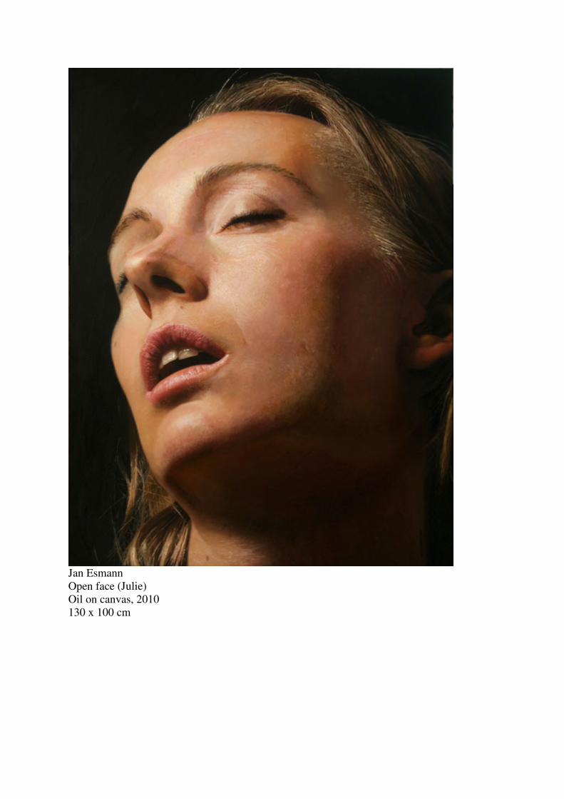
Jan Esmann
Open face (Julie)
Oil on canvas, 2010
130 x 100 cm

Jan Esmann
Open face (Kirstine, I)
Oil on canvas, 2010
130 x 100 cm