Embed Size (px)
Citation preview
Offline Method for GraphicalVisualization of Sensor Data
Tim StrasserZurich, Switzerland
Student ID: 12-742-573
Supervisor: Corinna Schmitt, Lisa KristianaDate of Submission: March 14, 2016
University of ZurichDepartment of Informatics (IFI)Binzmühlestrasse 14, CH-8050 Zürich, Switzerland ifi
AS
SIG
NM
EN
T–
Com
mun
icat
ion
Sys
tem
sG
roup
,Pro
f.D
r.B
urkh
ard
Stil
ler

AssignmentCommunication Systems Group (CSG)Department of Informatics (IFI)University of ZurichBinzmühlestrasse 14, CH-8050 Zürich, SwitzerlandURL: http://www.csg.uzh.ch/
Abstract
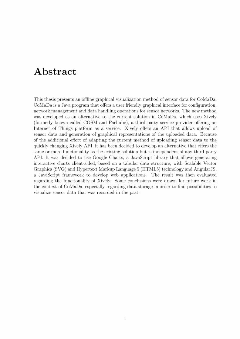
This thesis presents an offline graphical visualization method of sensor data for CoMaDa.CoMaDa is a Java program that offers a user friendly graphical interface for configuration,network management and data handling operations for sensor networks. The new methodwas developed as an alternative to the current solution in CoMaDa, which uses Xively(formerly known called COSM and Pachube), a third party service provider offering anInternet of Things platform as a service. Xively offers an API that allows upload ofsensor data and generation of graphical representations of the uploaded data. Becauseof the additional effort of adapting the current method of uploading sensor data to thequickly changing Xively API, it has been decided to develop an alternative that offers thesame or more functionality as the existing solution but is independent of any third partyAPI. It was decided to use Google Charts, a JavaScript library that allows generatinginteractive charts client-sided, based on a tabular data structure, with Scalable VectorGraphics (SVG) and Hypertext Markup Language 5 (HTML5) technology and AngularJS,a JavaScript framework to develop web applications. The result was then evaluatedregarding the functionality of Xively. Some conclusions were drawn for future work inthe context of CoMaDa, especially regarding data storage in order to find possibilities tovisualize sensor data that was recorded in the past.
i

ii
Zusammenfassung
Diese Arbeit prasentiert eine offline Methode zur graphischen Visualisierung von Sens-ordaten in CoMaDa. CoMaDa ist ein Java-Programm, welches eine benutzerfreundlichegraphische Schnittstelle zur Konfiguration, Netzwerkmanagement und Datenoperationenfur Sensornetzwerke anbietet. Die neue Methode wurde als Alternative entwickelt zur mo-mentan benutzten Losung in CoMaDa, welche Xively (fruher auch COSM und Pachubegenannt) benutzt, ein Drittanbieter, der einen Service fur Internet of Things zur Verfu-gung stellt. Xively bietet eine API an, die es erlaubt Sensordaten nach Xively zu ladenund graphische Darstellungen von Sensordaten zu generieren. Auf Grund des zusatzlichenAufwandes, der notig ist, um den momentanen Code fur den Datenupload an Xively andie sich schnell andernde Xively-API anzupassen, wurde entschieden eine Alternative zuentwickeln, die gleich viel oder sogar mehr Funktionalitat bieten soll als die existierendeLosung aber unabhangig von einer API eines Drittanbieters ist. Es wurde entschieden Goo-gle Charts zu benutzen, eine JavaScript-Bibliothek, welche es erlaubt, auf einer tabularenDatenstruktur basierende interaktive Graphen mit SVG und HTML5 Technologie auf derClientseite zu generieren. Benutzt wurde auch AngularJS, ein JavaScript-Framework furdie Entwicklung von Webapplikationen. Zum Abschluss wurde die neu entwickelte Me-thode verglichen mit der existierenden Losung hinsichtlich der Funktionalitat von Xively.Diverse Schlusse fur zukunftige Arbeiten an CoMaDa wurden gezogen, vor allem betref-fend eines Datenspeichers um Moglichkeiten zu finden, alte Daten visualisieren zu konnen.
iii

iv
Acknowledgments
First, I would like to sincerily thank my supervisor Dr. Corinna Schmitt for her support,guidance and her valuable and motivating inputs and comments during the last threemonths. I would also like to thank Prof. Dr. Burkhard Stiller for the possibility tocomplete this assignment at the Communications Systems Group at the Department ofInformatics of the University Of Zurich.
v

vi
Contents
Abstract i
Acknowledgments v
1 Introduction 1
1.1 Motivation . . . . . . . . . . . . . . . . . . . . . . . . . . . . . . . . . . . . 1
1.2 Description of Work . . . . . . . . . . . . . . . . . . . . . . . . . . . . . . 1
1.3 Report Outline . . . . . . . . . . . . . . . . . . . . . . . . . . . . . . . . . 2
2 Related Work 3
2.1 CoMaDa . . . . . . . . . . . . . . . . . . . . . . . . . . . . . . . . . . . . . 3
2.1.1 Xively Widget . . . . . . . . . . . . . . . . . . . . . . . . . . . . . . 7
2.1.2 AngularJS . . . . . . . . . . . . . . . . . . . . . . . . . . . . . . . . 12
2.2 Visualization Libraries . . . . . . . . . . . . . . . . . . . . . . . . . . . . . 13
2.2.1 JFreeGraph . . . . . . . . . . . . . . . . . . . . . . . . . . . . . . . 14
2.2.2 Matplotlib . . . . . . . . . . . . . . . . . . . . . . . . . . . . . . . . 14
2.2.3 JpGraph . . . . . . . . . . . . . . . . . . . . . . . . . . . . . . . . . 15
2.2.4 Google Charts . . . . . . . . . . . . . . . . . . . . . . . . . . . . . . 15
3 Design Decisions 19
3.1 Frontend Design . . . . . . . . . . . . . . . . . . . . . . . . . . . . . . . . . 19
3.2 Backend Design . . . . . . . . . . . . . . . . . . . . . . . . . . . . . . . . . 21
vii
viii CONTENTS
4 Implementation and Architecture 23
4.1 Frontend . . . . . . . . . . . . . . . . . . . . . . . . . . . . . . . . . . . . . 23
4.2 Backend . . . . . . . . . . . . . . . . . . . . . . . . . . . . . . . . . . . . . 29
5 Evaluation 31
6 Summary and Conclusions 35
Bibliography 37
Abbreviations 39
List of Figures 39
List of Tables 41
A Installation Guidelines 45
A.1 Adding a new sensor type . . . . . . . . . . . . . . . . . . . . . . . . . . . 45
A.2 Changing update intervals . . . . . . . . . . . . . . . . . . . . . . . . . . . 46
A.3 Changing the Google Charts version . . . . . . . . . . . . . . . . . . . . . 47
B Contents of the CD 49
Chapter 1
Introduction
1.1 Motivation
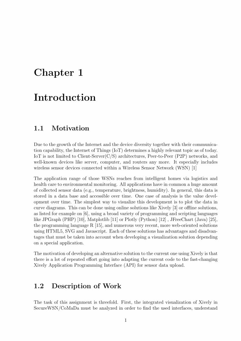
Due to the growth of the Internet and the device diversity together with their communica-tion capability, the Internet of Things (IoT) determines a highly relevant topic as of today.IoT is not limited to Client-Server(C/S) architectures, Peer-to-Peer (P2P) networks, andwell-known devices like server, computer, and routers any more. It especially includeswireless sensor devices connected within a Wireless Sensor Network (WSN) [1]
The application range of those WSNs reaches from intelligent homes via logistics andhealth care to environmental monitoring. All applications have in common a huge amountof collected sensor data (e.g., temperature, brightness, humidity). In general, this data isstored in a data base and accessible over time. One case of analysis is the value devel-opment over time. The simplest way to visualize this development is to plot the data incurve diagrams. This can be done using online solutions like Xively [3] or offline solutions,as listed for example on [6], using a broad variety of programming and scripting languageslike JPGraph (PHP) [10], Matplotlib [11] or Plotly (Python) [12] , JFreeChart (Java) [25],the programming language R [15], and numerous very recent, more web-oriented solutionsusing HTML5, SVG and Javascript. Each of these solutions has advantages and disadvan-tages that must be taken into account when developing a visualization solution dependingon a special application.
The motivation of developing an alternative solution to the current one using Xively is thatthere is a lot of repeated effort going into adapting the current code to the fast-changingXively Application Programming Interface (API) for sensor data upload.
1.2 Description of Work
The task of this assignment is threefold. First, the integrated visualization of Xively inSecureWSN/CoMaDa must be analyzed in order to find the used interfaces, understand
1
2 CHAPTER 1. INTRODUCTION
the data upload to Xively [8]. Second, existing offline solutions must be analyzed con-cerning their functionality compared to the current visualization method using the XivelyAPI. Thirdly, one offline solution should be selected, implemented according to the exist-ing functionality of Xively, possibly offering even extended functionality, and integratedinto the existing environment of SecureWSN [17], especially in CoMaDa, re-using existingdata formats (like JavaScript Object Notation [2]) and interfaces.
The developed offline solution will be tested with WSNs and different settings (networksize, sample rate, duration). The received visualization is compared with the alreadyimplemented solution that uses Xively. Important is that for each sensor type (e.g. tem-perature, brightness, humidity), one curve diagram is available and that the user canspecify the viewing period (e.g. last 10 minutes, time period from 5 a.m to 3 p.m.). Thelatter becomes important if the WSN has been running for a long period and the user isinterested in viewing short periods.
The result of this assignment is an offline visualization possibility for sensor data withthe same functionality as Xively offers. The overall goal is to make the user independentof any online tool for data analysis that involves sending data in a defined format to athird-party API.
1.3 Report Outline
This report is structured as follows: First, the related work is presented in Chapter 2.The chapter also presents challenges and problems that come with the related work andthe restrictions they brought to this assignment. Chapter 3 explains how the alterna-tive solution is designed and what technologies were used, including justifications of thedesign choices. Chapter 4.2 explains the implementation of the solution and technicalaspects of the assignment more detailed and explains the structure and architecture ofthe WSNDataFramework (The Java project that builds CoMaDa), and the integrationand placement of the offline method visualization method within the existing architec-ture. It also explains the communication between the parts of the solution in more detail.Chapter 5 reports on several evaluation methods to which the work of this assignmentwas subjected to and explains the found results. Finally, Chapter 6 summarizes the workand draws some conclusions about future work, like the integration into the mobile accesssolution WebMaDa.
Chapter 2
Related Work
This chapter highlights the related work, which this assignment will be built on, as wellas related work concerning data visualization. The goal is to build the context for thisassignment, introduce important definitions, and form a common ground.
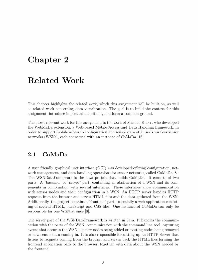
The latest relevant work for this assignment is the work of Michael Keller, who developedthe WebMaDa extension, a Web-based Mobile Access and Data Handling framework, inorder to support mobile access to configuration and sensor data of a user’s wireless sensornetworks (WSNs), each connected with an instance of CoMaDa [16].
2.1 CoMaDa
A user friendly graphical user interface (GUI) was developed offering configuration, net-work management, and data handling operations for sensor networks, called CoMaDa [8].The WSNDataFramework is the Java project that builds CoMaDa. It consists of twoparts: A ”backend” or ”server” part, containing an abstraction of a WSN and its com-ponents in combination with several interfaces. These interfaces allow communicationwith sensor nodes and their configuration in a WSN. An HTTP server handles HTTPrequests from the browser and serves HTML files and the data gathered from the WSN.Additionally, the project contains a ”frontend” part, essentially a web application consist-ing of several HTML, JavaScript and CSS files. One instance of CoMaDa can only beresponsible for one WSN at once [8].
The server part of the WSNDataFramework is written in Java. It handles the communi-cation with the parts of the WSN, communication with the command line tool, capturingevents that occur in the WSN like new nodes being added or existing nodes being removedor new sensor data coming in. It is also responsible for setting up an HTTP Server thatlistens to requests coming from the browser and serves back the HTML files forming thefrontend application back to the browser, together with data about the WSN needed bythe frontend.
3
4 CHAPTER 2. RELATED WORK
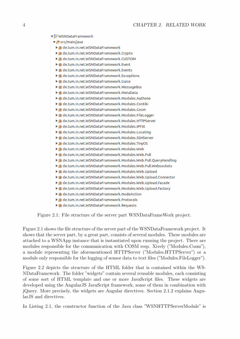
Figure 2.1: File structure of the server part WSNDataFrameWork project.
Figure 2.1 shows the file structure of the server part of the WSNDataFramework project. Itshows that the server part, by a great part, consists of several modules. These modules areattached to a WSNApp instance that is instantiated upon running the project. There aremodules responsible for the communication with COSM resp. Xively (”Modules.Cosm”),a module representing the aforementioned HTTPServer (”Modules.HTTPServer”) or amodule only responsible for the logging of sensor data to text files (”Modules.FileLogger”).
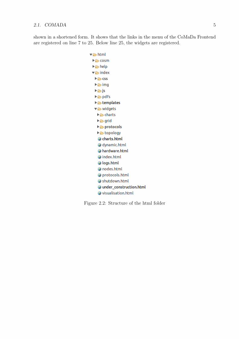
Figure 2.2 depicts the structure of the HTML folder that is contained within the WS-NDataFramework. The folder ”widgets” contain several reusable modules, each consistingof some sort of HTML template and one or more JavaScript files. These widgets aredeveloped using the AngularJS JavaScript framework, some of them in combination withjQuery. More precisely, the widgets are Angular directives. Section 2.1.2 explains Angu-larJS and directives.
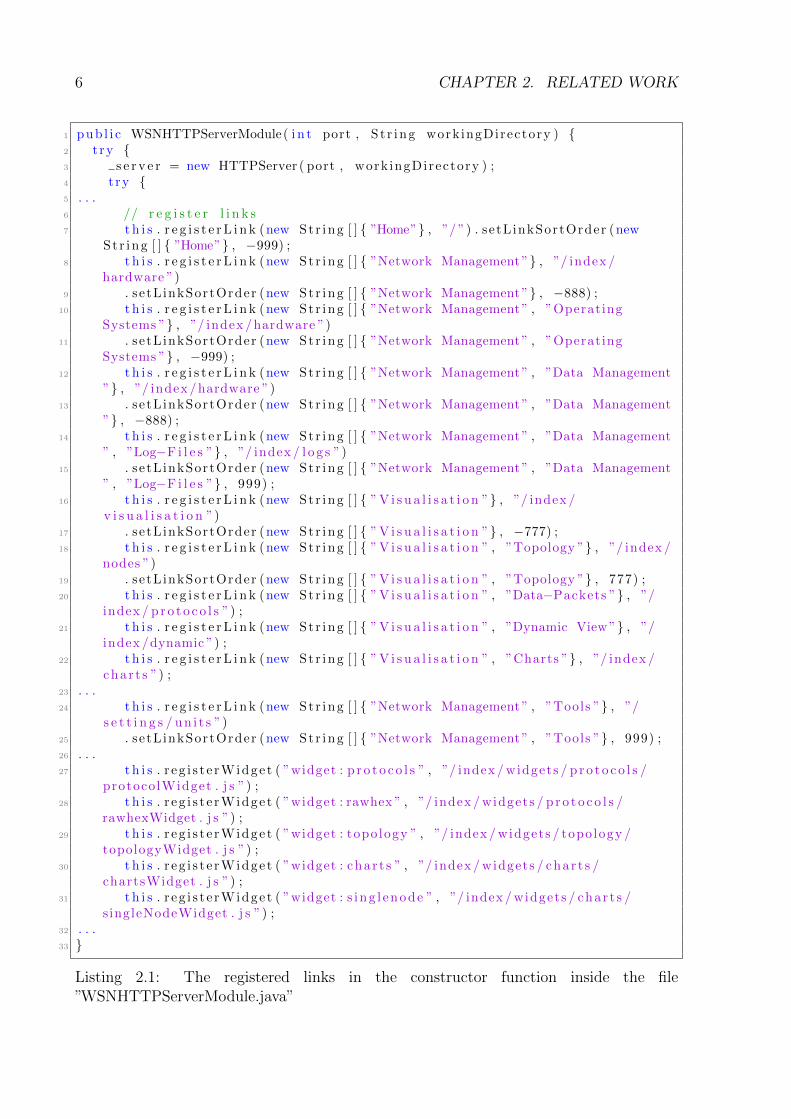
In Listing 2.1, the constructor function of the Java class ”WSNHTTPServerModule” is
2.1. COMADA 5
shown in a shortened form. It shows that the links in the menu of the CoMaDa Frontendare registered on line 7 to 25. Below line 25, the widgets are registered.
Figure 2.2: Structure of the html folder
6 CHAPTER 2. RELATED WORK
1 pub l i c WSNHTTPServerModule( i n t port , S t r ing work ingDirectory ) {2 t ry {3 s e r v e r = new HTTPServer ( port , work ingDirectory ) ;4 t ry {5 . . .6 // r e g i s t e r l i n k s7 t h i s . r e g i s t e rL i n k (new St r ing [ ] { ”Home”} , ”/ ”) . setLinkSortOrder (new
St r ing [ ] { ”Home”} , −999) ;8 t h i s . r e g i s t e rL i n k (new St r ing [ ] { ”Network Management”} , ”/ index /
hardware ”)9 . se tL inkSortOrder (new St r ing [ ] { ”Network Management”} , −888) ;
10 t h i s . r e g i s t e rL i n k (new St r ing [ ] { ”Network Management” , ”OperatingSystems ”} , ”/ index /hardware ”)
11 . se tL inkSortOrder (new St r ing [ ] { ”Network Management” , ”OperatingSystems ”} , −999) ;
12 t h i s . r e g i s t e rL i n k (new St r ing [ ] { ”Network Management” , ”Data Management”} , ”/ index /hardware ”)
13 . se tL inkSortOrder (new St r ing [ ] { ”Network Management” , ”Data Management”} , −888) ;
14 t h i s . r e g i s t e rL i n k (new St r ing [ ] { ”Network Management” , ”Data Management” , ”Log−F i l e s ”} , ”/ index / l o g s ”)
15 . se tL inkSortOrder (new St r ing [ ] { ”Network Management” , ”Data Management” , ”Log−F i l e s ”} , 999) ;
16 t h i s . r e g i s t e rL i n k (new St r ing [ ] { ”V i s u a l i s a t i o n ”} , ”/ index /v i s u a l i s a t i o n ”)
17 . se tL inkSortOrder (new St r ing [ ] { ”V i s u a l i s a t i o n ”} , −777) ;18 t h i s . r e g i s t e rL i n k (new St r ing [ ] { ”V i s u a l i s a t i o n ” , ”Topology ”} , ”/ index /
nodes ”)19 . se tL inkSortOrder (new St r ing [ ] { ”V i s u a l i s a t i o n ” , ”Topology ”} , 777) ;20 t h i s . r e g i s t e rL i n k (new St r ing [ ] { ”V i s u a l i s a t i o n ” , ”Data−Packets ”} , ”/
index / p r o t o c o l s ”) ;21 t h i s . r e g i s t e rL i n k (new St r ing [ ] { ”V i s u a l i s a t i o n ” , ”Dynamic View”} , ”/
index /dynamic ”) ;22 t h i s . r e g i s t e rL i n k (new St r ing [ ] { ”V i s u a l i s a t i o n ” , ”Charts ”} , ”/ index /
char t s ”) ;23 . . .24 t h i s . r e g i s t e rL i n k (new St r ing [ ] { ”Network Management” , ”Tools ”} , ”/
s e t t i n g s / un i t s ”)25 . se tL inkSortOrder (new St r ing [ ] { ”Network Management” , ”Tools ”} , 999) ;26 . . .27 t h i s . r eg i s t e rWidge t ( ”widget : p r o t o c o l s ” , ”/ index /widgets / p r o t o c o l s /
protocolWidget . j s ”) ;28 t h i s . r eg i s t e rWidge t ( ”widget : rawhex ” , ”/ index /widgets / p r o t o c o l s /
rawhexWidget . j s ”) ;29 t h i s . r eg i s t e rWidge t ( ”widget : topo logy ” , ”/ index /widgets / topology /
topologyWidget . j s ”) ;30 t h i s . r eg i s t e rWidge t ( ”widget : char t s ” , ”/ index /widgets / char t s /
chartsWidget . j s ”) ;31 t h i s . r eg i s t e rWidge t ( ”widget : s i ng l enode ” , ”/ index /widgets / char t s /
singleNodeWidget . j s ”) ;32 . . .33 }
Listing 2.1: The registered links in the constructor function inside the file”WSNHTTPServerModule.java”
2.1. COMADA 7
2.1.1 Xively Widget
One of the widgets that CoMaDa contains uses Xively to display a graphic visualizationof the sensor data of the WSNs nodes. Xively was founded by LogMeIn Inc. [3]. Itoffers a platform as a service (PaaS) for the IoT, that allows to ”Connect”, transmit andstore data, ”Manage”, set user identities and manage authentication and ”Engage” [4]. Italso allows developers to send sensor data in a predefined format, as a JavaScript ObjectNotation (JSON) object, to a REST API endpoint [5]. CoMaDa in its current versioncontains a module designed to send sensor data in the format defined by Xively to thisAPI endpoint. It then uses Xively to generate pictures of data series and displays them.A more detailed explanation is presented in the next section. ”COSM” and ”Xively” areused interchangeably throughout this chapter and the rest of this report.
The Xively widget, as all other widgets integrated into CoMaDa, is implemented usingthe AngularJS framework, which is explained more in detail in Section 2.1.2.
Note that in Listing 2.1, the Xively widget is missing. This is because the Xively widgetgets registered in the class ”WSNCosmModule”, as can be seen in Listing 2.2, after theHTTP controller of the Cosm module is registered in the server module.
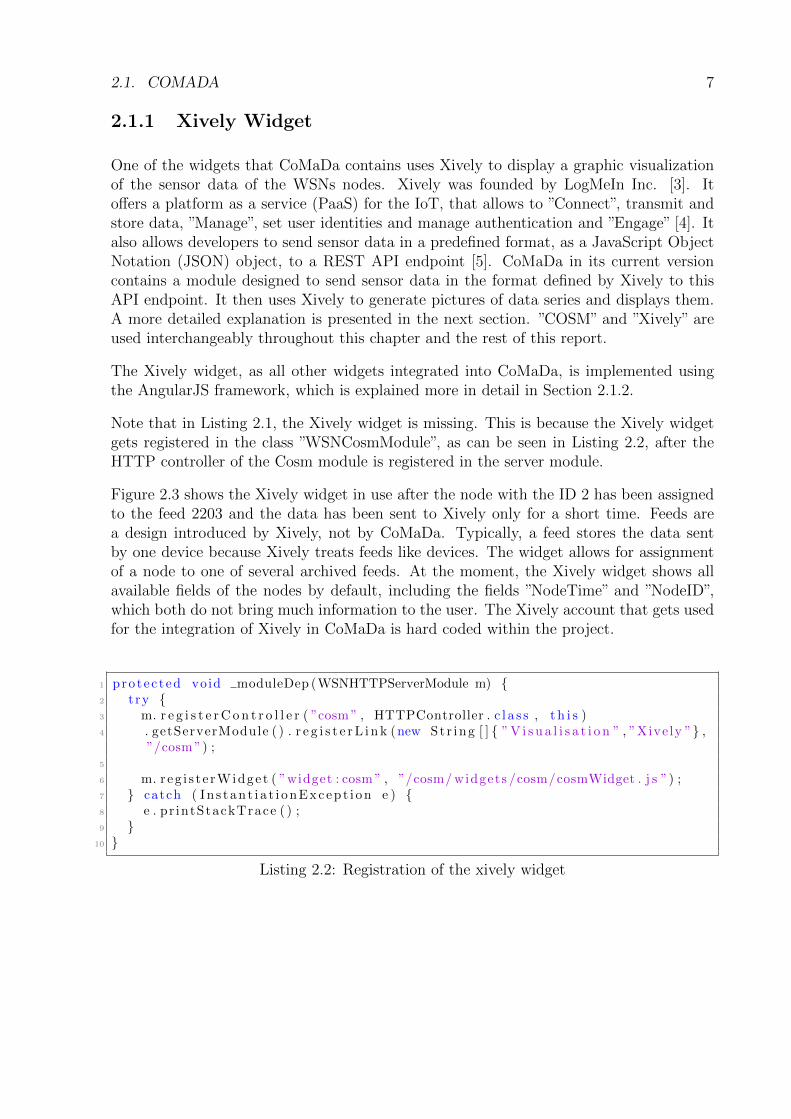
Figure 2.3 shows the Xively widget in use after the node with the ID 2 has been assignedto the feed 2203 and the data has been sent to Xively only for a short time. Feeds area design introduced by Xively, not by CoMaDa. Typically, a feed stores the data sentby one device because Xively treats feeds like devices. The widget allows for assignmentof a node to one of several archived feeds. At the moment, the Xively widget shows allavailable fields of the nodes by default, including the fields ”NodeTime” and ”NodeID”,which both do not bring much information to the user. The Xively account that gets usedfor the integration of Xively in CoMaDa is hard coded within the project.
1 protec ted void moduleDep (WSNHTTPServerModule m) {2 t ry {3 m. r e g i s t e rC o n t r o l l e r ( ”cosm” , HTTPController . c l a s s , t h i s )4 . getServerModule ( ) . r e g i s t e rL i n k (new St r ing [ ] { ”V i s u a l i s a t i o n ” , ”Xive ly ”} ,
”/cosm”) ;5
6 m. reg i s t e rWidge t ( ”widget : cosm” , ”/cosm/widgets /cosm/cosmWidget . j s ”) ;7 } catch ( In s t an t i a t i onExcep t i on e ) {8 e . pr intStackTrace ( ) ;9 }
10 }
Listing 2.2: Registration of the xively widget
8 CHAPTER 2. RELATED WORK
Figure 2.3: The Xively widget in the browser
2.1. COMADA 9
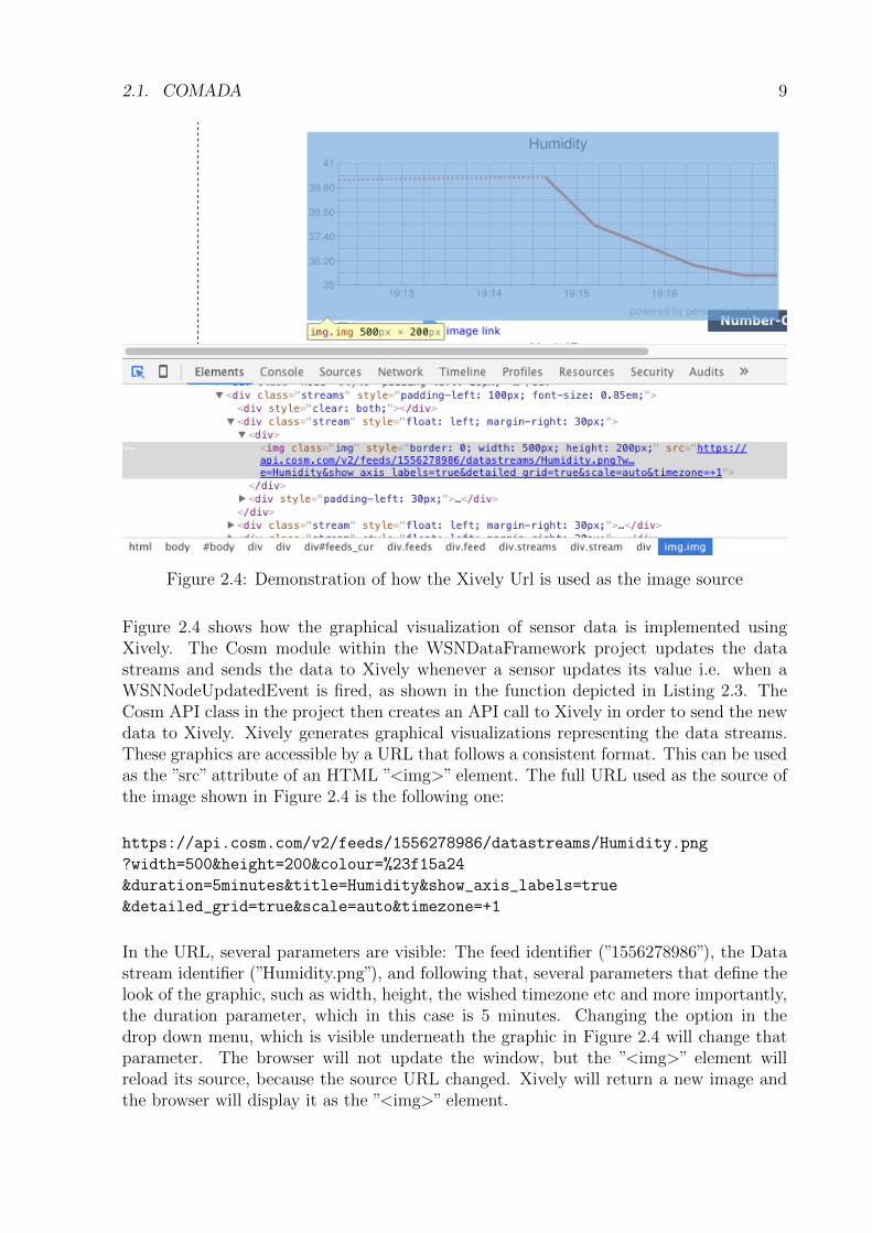
Figure 2.4: Demonstration of how the Xively Url is used as the image source
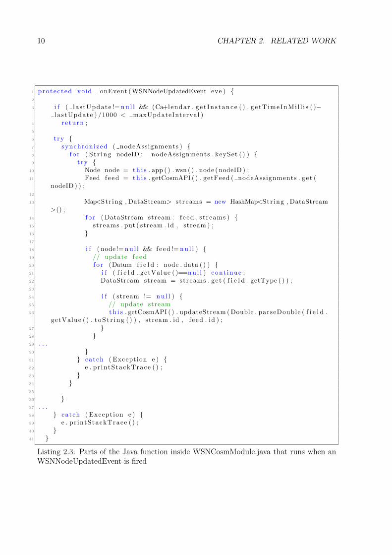
Figure 2.4 shows how the graphical visualization of sensor data is implemented usingXively. The Cosm module within the WSNDataFramework project updates the datastreams and sends the data to Xively whenever a sensor updates its value i.e. when aWSNNodeUpdatedEvent is fired, as shown in the function depicted in Listing 2.3. TheCosm API class in the project then creates an API call to Xively in order to send the newdata to Xively. Xively generates graphical visualizations representing the data streams.These graphics are accessible by a URL that follows a consistent format. This can be usedas the ”src” attribute of an HTML ”<img>” element. The full URL used as the source ofthe image shown in Figure 2.4 is the following one:
https://api.cosm.com/v2/feeds/1556278986/datastreams/Humidity.png
?width=500&height=200&colour=%23f15a24
&duration=5minutes&title=Humidity&show_axis_labels=true
&detailed_grid=true&scale=auto&timezone=+1
In the URL, several parameters are visible: The feed identifier (”1556278986”), the Datastream identifier (”Humidity.png”), and following that, several parameters that define thelook of the graphic, such as width, height, the wished timezone etc and more importantly,the duration parameter, which in this case is 5 minutes. Changing the option in thedrop down menu, which is visible underneath the graphic in Figure 2.4 will change thatparameter. The browser will not update the window, but the ”<img>” element willreload its source, because the source URL changed. Xively will return a new image andthe browser will display it as the ”<img>” element.
10 CHAPTER 2. RELATED WORK
1 protec ted void onEvent (WSNNodeUpdatedEvent eve ) {2
3 i f ( la s tUpdate != nu l l && (Ca+lendar . g e t In s tance ( ) . ge tT imeInMi l l i s ( )−l a s tUpdate ) /1000 < maxUpdateInterval )
4 re turn ;5
6 t ry {7 synchronized ( nodeAssignments ) {8 f o r ( S t r ing nodeID : nodeAssignments . keySet ( ) ) {9 t ry {
10 Node node = th i s . app ( ) . wsn ( ) . node ( nodeID ) ;11 Feed f eed = th i s . getCosmAPI ( ) . getFeed ( nodeAssignments . get (
nodeID ) ) ;12
13 Map<Str ing , DataStream> streams = new HashMap<Str ing , DataStream>() ;
14 f o r (DataStream stream : f e ed . streams ) {15 streams . put ( stream . id , stream ) ;16 }17
18 i f ( node != nu l l && feed != nu l l ) {19 // update f e ed20 f o r (Datum f i e l d : node . data ( ) ) {21 i f ( f i e l d . getValue ( )==nu l l ) cont inue ;22 DataStream stream = streams . get ( f i e l d . getType ( ) ) ;23
24 i f ( stream != nu l l ) {25 // update stream26 t h i s . getCosmAPI ( ) . updateStream (Double . parseDouble ( f i e l d .
getValue ( ) . t oS t r i ng ( ) ) , stream . id , f e ed . id ) ;27 }28 }29 . . .30 }31 } catch ( Exception e ) {32 e . pr intStackTrace ( ) ;33 }34 }35
36 }37 . . .38 } catch ( Exception e ) {39 e . pr intStackTrace ( ) ;40 }41 }
Listing 2.3: Parts of the Java function inside WSNCosmModule.java that runs when anWSNNodeUpdatedEvent is fired
2.1. COMADA 11
To conclude this section: The Cosm module in the project regularly sends data to Xively.Xivey can generate graphical visualizations of the data stream it stores. These graphicsare accessible under a URL which follows a well defined format, allowing developers tochange the parameters easily.
The current Xively widget allows assignment of a node to an existing, archived feed or thecreation of a new node. It also allows changing the time frame of the graph and deletingdata streams from the feed i.e. removing the graph from the feed and the user Interface.It is also possible to watch data from several nodes at the same time.
CoMaDa in its current state depends on Xively, a third party service provider [8]. Anadvantage of this is that at the moment, no database is needed to store the collected sensordata of a managed WSN. This means outsourcing the database maintenance and costs,not having to deal with storage capacity problems and authentication and authorizationmanagement.
But this architecture also brings disadvantages. A change to the Xively API means thatadaptive work is needed, because the JSON format in which the sensor data has to besent to Xively is possibly different from before. Also, because data has to be sent toa third party, there is a network overhead. As already mentioned in Section 1.1 in theintroduction of this assignment, the repeated effort going into adapting the current code tothe fast-changing upload interface of Xively was the main motivation for this assignment.”Offline” in this case means that no data has to be sent to an API respectively a thirdparty service provider.
Another disadvantage is a lack of privacy. A lot of conclusions can be drawn only fromsensor data, even with little context. For example: Sensor data measuring light from asensor node that is known to be placed in an office room, measured over several days orweeks can be used to draw conclusions about the times when the room is used. If there islight in the room, it is very likely that a person is working in this office. Looking at thesetime patterns, this data could potentially be used to plan housebreaking. This exampleis a bit exaggerated, but at least some concern about privacy is still inevitable if data issent to a third party, which is then storing said data. Another privacy problem is thatcurrently, authorization data has to be exchanged with Xively. Username and passwordare hard coded within the project.
Additionally, because the image is only reloaded if the source URL of the ”<img>” tagchanges, the visualization is not in real-time. The user either has to change a parameter,changing the duration i.e. the interval of the data or he has to refresh the page so thebrowser reloads everything, including the graphics.
12 CHAPTER 2. RELATED WORK
2.1.2 AngularJS
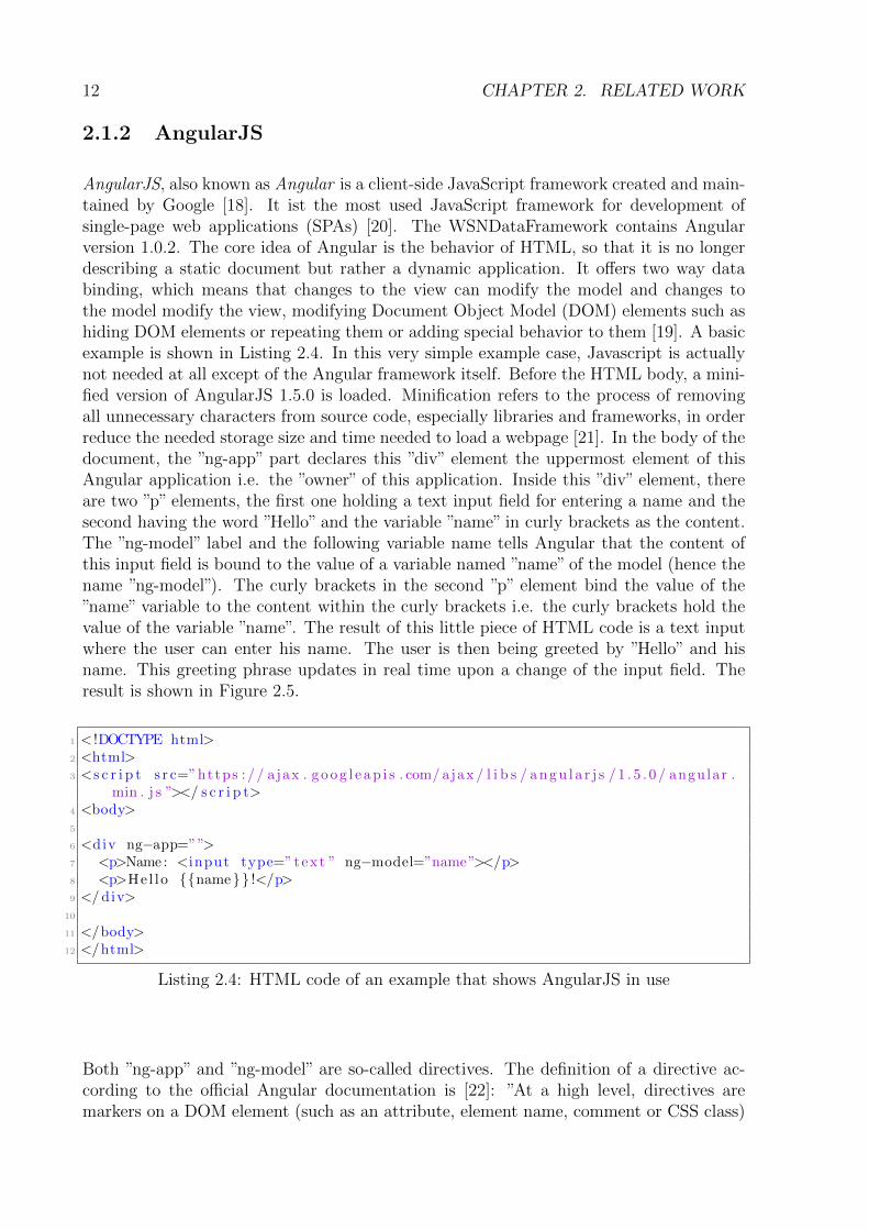
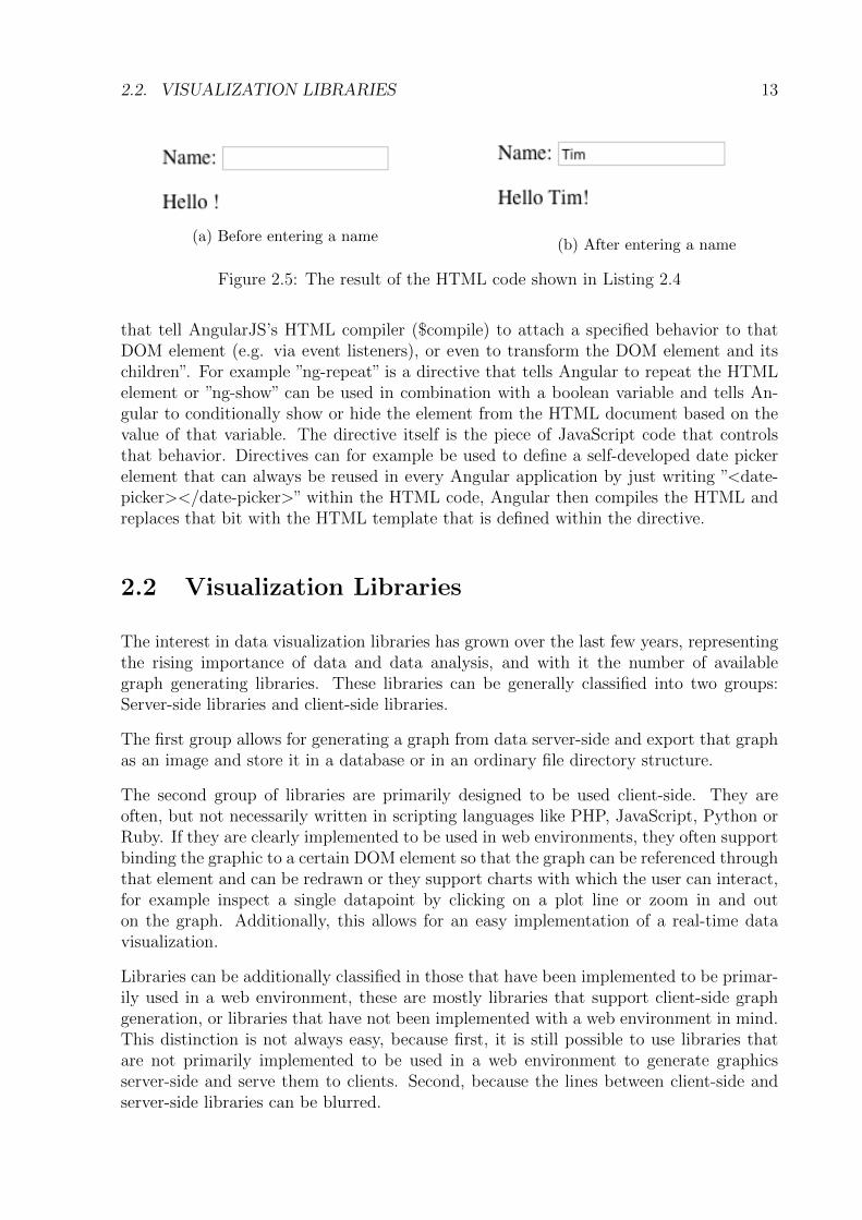
AngularJS, also known as Angular is a client-side JavaScript framework created and main-tained by Google [18]. It ist the most used JavaScript framework for development ofsingle-page web applications (SPAs) [20]. The WSNDataFramework contains Angularversion 1.0.2. The core idea of Angular is the behavior of HTML, so that it is no longerdescribing a static document but rather a dynamic application. It offers two way databinding, which means that changes to the view can modify the model and changes tothe model modify the view, modifying Document Object Model (DOM) elements such ashiding DOM elements or repeating them or adding special behavior to them [19]. A basicexample is shown in Listing 2.4. In this very simple example case, Javascript is actuallynot needed at all except of the Angular framework itself. Before the HTML body, a mini-fied version of AngularJS 1.5.0 is loaded. Minification refers to the process of removingall unnecessary characters from source code, especially libraries and frameworks, in orderreduce the needed storage size and time needed to load a webpage [21]. In the body of thedocument, the ”ng-app” part declares this ”div” element the uppermost element of thisAngular application i.e. the ”owner” of this application. Inside this ”div” element, thereare two ”p” elements, the first one holding a text input field for entering a name and thesecond having the word ”Hello” and the variable ”name” in curly brackets as the content.The ”ng-model” label and the following variable name tells Angular that the content ofthis input field is bound to the value of a variable named ”name” of the model (hence thename ”ng-model”). The curly brackets in the second ”p” element bind the value of the”name” variable to the content within the curly brackets i.e. the curly brackets hold thevalue of the variable ”name”. The result of this little piece of HTML code is a text inputwhere the user can enter his name. The user is then being greeted by ”Hello” and hisname. This greeting phrase updates in real time upon a change of the input field. Theresult is shown in Figure 2.5.
1 < !DOCTYPE html>2 <html>3 <s c r i p t s r c=”https : // ajax . g oog l e ap i s . com/ ajax / l i b s / angu l a r j s / 1 . 5 . 0 / angular .
min . j s ”></ s c r i p t>4 <body>5
6 <div ng−app=””>7 <p>Name : <input type=”text ” ng−model=”name”></p>8 <p>Hel lo {{name}} !</p>9 </ div>
10
11 </body>12 </html>
Listing 2.4: HTML code of an example that shows AngularJS in use
Both ”ng-app” and ”ng-model” are so-called directives. The definition of a directive ac-cording to the official Angular documentation is [22]: ”At a high level, directives aremarkers on a DOM element (such as an attribute, element name, comment or CSS class)
2.2. VISUALIZATION LIBRARIES 13
(a) Before entering a name(b) After entering a name
Figure 2.5: The result of the HTML code shown in Listing 2.4
that tell AngularJS’s HTML compiler ($compile) to attach a specified behavior to thatDOM element (e.g. via event listeners), or even to transform the DOM element and itschildren”. For example ”ng-repeat” is a directive that tells Angular to repeat the HTMLelement or ”ng-show” can be used in combination with a boolean variable and tells An-gular to conditionally show or hide the element from the HTML document based on thevalue of that variable. The directive itself is the piece of JavaScript code that controlsthat behavior. Directives can for example be used to define a self-developed date pickerelement that can always be reused in every Angular application by just writing ”<date-picker></date-picker>” within the HTML code, Angular then compiles the HTML andreplaces that bit with the HTML template that is defined within the directive.
2.2 Visualization Libraries
The interest in data visualization libraries has grown over the last few years, representingthe rising importance of data and data analysis, and with it the number of availablegraph generating libraries. These libraries can be generally classified into two groups:Server-side libraries and client-side libraries.
The first group allows for generating a graph from data server-side and export that graphas an image and store it in a database or in an ordinary file directory structure.
The second group of libraries are primarily designed to be used client-side. They areoften, but not necessarily written in scripting languages like PHP, JavaScript, Python orRuby. If they are clearly implemented to be used in web environments, they often supportbinding the graphic to a certain DOM element so that the graph can be referenced throughthat element and can be redrawn or they support charts with which the user can interact,for example inspect a single datapoint by clicking on a plot line or zoom in and outon the graph. Additionally, this allows for an easy implementation of a real-time datavisualization.
Libraries can be additionally classified in those that have been implemented to be primar-ily used in a web environment, these are mostly libraries that support client-side graphgeneration, or libraries that have not been implemented with a web environment in mind.This distinction is not always easy, because first, it is still possible to use libraries thatare not primarily implemented to be used in a web environment to generate graphicsserver-side and serve them to clients. Second, because the lines between client-side andserver-side libraries can be blurred.
14 CHAPTER 2. RELATED WORK
For example, it is entirely possible to generate graphs server-sided, using a library designedfor client side. Normally, the server would then send the image as data to the client uponan HTTP request and the client’s browser will interpret the data as an image and integrateit within the HTML document. But instead, it is possible to use the server to generateor draw graphs and include them in the HTML document. Instead of serving encodedimage data and HTML documents separately to the client, which then constructs the siteusing the HTML document and the image data, the server returns the HTML page withthe image already included. This is called ”pre-rendering”. With JavaScript being used asa backend language more frequently, this practice might spread. [23] shows an exampleof this quite unconventional method using D3.js, a very powerful visualization library forJavaScript [24] that is primarily designed to be used in web applications and is mostlyused client-sided.
The following part of the section will present the libraries and some of their features thatwhere taken into consideration for use during the design of the solution presented in thisassignment.
Chapter 3 will present the advantages and disadvantages of each of these libraries andpresent the reasons for the final design choice.
2.2.1 JFreeGraph
One example that would rather fall in the first group and has been up for discussion wasJFreeChart [25]. JFreeChart is a free Java chart library, offering:
• A well documented open-source API
• A wide range of chart types
• Support for both server-side and client-side applications
• Support for Swing and JavaFX as output types, but also PNG, JPEG, SVG andPDF
JFreeChart was especially considered, because the WSNDataFramework project is writtenin Java.
2.2.2 Matplotlib
Another example of a library rather belonging to the first group would be Matplotlib [11].Matplotlib is a python graph library that can be used in stand-alone python scripts, in aMATLAB shell or on a web application server, even though it was not really developedwith the web in mind. It is also suitable for mathematical visualizations and thought asa way to make complex visualizations more easy to produce.
2.2. VISUALIZATION LIBRARIES 15
2.2.3 JpGraph
JpGraph is an Object-Oriented Graph creating library [10]. The website lists the followingfeatures:
• Web-friendly with an average image size of around 2 kByte for a 300*200 pixel image
• Advanced interpolation to get smooth curves from few data points
• Several plot-types, both 2D and 3D
• Extensive documentation
• Supports internal caching of generated graphs
The library allows to use a PHP script as the source of an HTML ”img” tag by sending aheader to the client that tells the browser to interpret the received data (from the PHPscript) as a PNG image.
2.2.4 Google Charts
Google Charts is the alternative to the Image Charts API and the Infographics API, whichboth were deprecated in 2012 [14]. These two deprecated APIs made it possible to includea graphical visualizations in an HTML document by setting the ”src” attribute of a ”img”HTML element to a URL, forming a request with several parameters that defined thedata and the appearance of the graph. The API then returned the data for a PNG image.This method is equivalent to the one used by Xively, described in Section 2.1.1. Note thatthe graphics were static PNG images, not interactive charts. Google also offered librariesfor several programming languages to generate the graphics without having to make APIcalls.
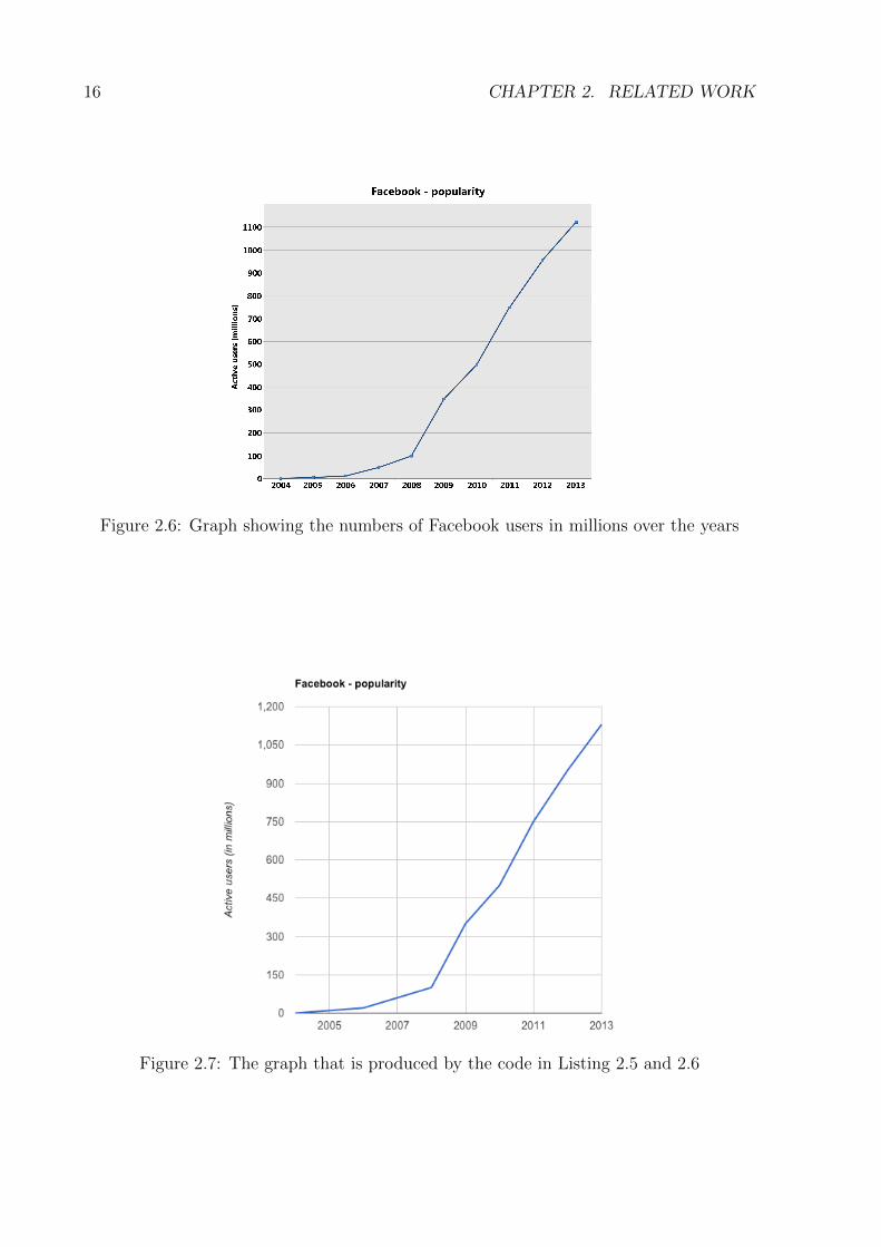
The new Google Charts JavaScript library allows for chart generation based on tabular,structured data and is built primarily for the web. It creates graphs using HTML5 andSVG or Vector Markup Language (VML) to support old versions of Internet Explorer.Figure 2.6 shows a graph for the example of Facebook users overtime.
The following example shows the reconstruction of this graph using Google Charts andestimated data values.
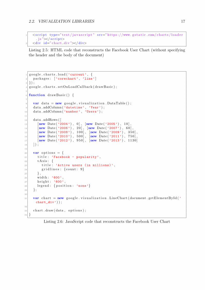
Listing 2.6 presents the JavaScript code that generates the chart. It can be seen that thelibrary is loaded and all other functions are dependent on a callback from the packageloader. Then, a data table that holds the data is instantiated and filled with columns androws. The first value of each row contains the year and the second column the numberof users in that year. After that, the options are defined, including the title, number ofgridlines and size of the chart. The chart is then bound to the HTML ”div” element withthe id ”chart div” and is finally drawn with ”chart.draw(data, options)”.
Listing 2.5 shows the corresponding HTML document. The final result, displayed in thebrowser, is shown in Figure 2.7.
16 CHAPTER 2. RELATED WORK
Figure 2.6: Graph showing the numbers of Facebook users in millions over the years
Figure 2.7: The graph that is produced by the code in Listing 2.5 and 2.6
2.2. VISUALIZATION LIBRARIES 17
1 <s c r i p t type=”text / j a v a s c r i p t ” s r c=”https : //www. g s t a t i c . com/ char t s / l oade r. j s ”></ s c r i p t>
2 <div id=”cha r t d iv ”></ div>
Listing 2.5: HTML code that reconstructs the Facebook User Chart (without specifyingthe header and the body of the document)
1 goog l e . cha r t s . load (’current’ , {2 packages : [ ’corechart’ , ’line’ ]3 }) ;4 goog l e . cha r t s . setOnLoadCallback ( drawBasic ) ;5
6 function drawBasic ( ) {7
8 var data = new goog l e . v i s u a l i z a t i o n . DataTable ( ) ;9 data . addColumn(’datetime’ , ’Year’ ) ;
10 data . addColumn(’number’ , ’Users’ ) ;11
12 data . addRows ( [13 [new Date (’2004’ ) , 0 ] , [new Date (’2005’ ) , 1 0 ] ,14 [new Date (’2006’ ) , 2 0 ] , [new Date (’2007’ ) , 6 0 ] ,15 [new Date (’2008’ ) , 100 ] , [new Date (’2009’ ) , 350 ] ,16 [new Date (’2010’ ) , 500 ] , [new Date (’2011’ ) , 750 ] ,17 [new Date (’2012’ ) , 950 ] , [new Date (’2013’ ) , 1130 ]18 ] ) ;19
20 var opt ions = {21 t i t l e : ’Facebook - popularity’ ,22 vAxis : {23 t i t l e : ’Active users (in millions)’ ,24 g r i d l i n e s : { count : 9}25 } ,26 width : ’600’ ,27 he ight : ’600’ ,28 l egend : { po s i t i o n : ’none’}29 } ;30
31 var chart = new goog l e . v i s u a l i z a t i o n . LineChart ( document . getElementById (’chart_div’ ) ) ;
32
33 chart . draw ( data , opt ions ) ;34 }
Listing 2.6: JavaScript code that reconstructs the Facebook User Chart

18 CHAPTER 2. RELATED WORK
Chapter 3
Design Decisions
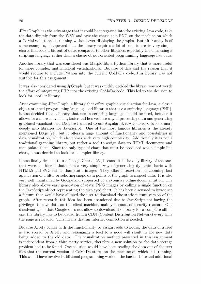
This chapter will explain the design decisions made before the start of the implementationof the offline visualization solution. The order in which the design is discussed representsthe chronological order of the decisions made during design preparation. The chapterwill focus on the design choices made in the frontend, which presents the larger part ofthe work done in the context of this assignment. This section will also present the datavisualization frameworks that have been taken into consideration for usage and explainthe choice that has been made. Second, the design choices made in the backend serverpart of CoMaDa are explained.
3.1 Frontend Design
A first decision was made while examining the architecture and design of the CoMaDacode, the WSNDataFramework Java project and especially its frontend. All of the widgetsare developed using AngularJS, which is explained in Section 2.1.2. Additionally, it wasclear that the functionality of the current Xively widget called for a JavaScript frameworkthat allows to develop reusable components or elements using templates. It should alsoallow adding and removing these elements to and from the UI. Since Angular offers all thisfunctionality, it was decided that it would be very convenient to to use the framework forthe frontend work and to develop the solution as another widget resp. Angular directivewithin the project. This decision was also made with the wish to change as few things aspossible to the structure and concept of the WSNDataFramework project.
At that point, it was only decided to use AngularJS to develop one or more directivesas widgets that manage adding/removing of nodes to the UI and adding/removing of thegraphic visualizations. How to generate the graphics to visualize the sensor data was stillup for discussion. The visualization libraries listed in Section 2.2 were considered duringthe planning phase of this assignment. The following part of the section will discuss theadvantages and disadvantages of each of those libraries and will explain how the finaldecision was met.
19
20 CHAPTER 3. DESIGN DECISIONS
JFreeGraph has the advantage that it could be integrated into the existing Java code, takethe data directly from the WSN and save the charts as a PNG on the machine on whicha CoMaDa instance is running without ever displaying the graphs. But after analysis ofsome examples, it appeared that the library requires a lot of code to create very simplecharts that look a bit out of date, compared to other libraries, especially the ones using ascripting language rather than a classic object oriented programming language like Java.
Another library that was considered was Matplotlib, a Python library that is more usefulfor more complex mathematical visualizations. Because of this and the reason that itwould require to include Python into the current CoMaDa code, this library was notsuitable for this assignment.
It was also considered using JpGraph, but it was quickly decided the library was not worththe effort of integrating PHP into the existing CoMaDa code. This led to the decision tolook for another library.
After examining JFreeGraph, a library that offers graphic visualization for Java, a classicobject oriented programming language and libraries that use a scripting language (PHP),it was decided that a library that uses a scripting language should be used, because itallows for a more convenient, faster and less verbose way of processing data and generatinggraphical visualizations. Because I wanted to use AngularJS, it was decided to look moredeeply into libraries for JavaScript. One of the most famous libraries is the alreadymentioned D3.js [24], but it offers a huge amount of functionality and possibilities indata visualization, which also comes with very high complexity. Additionally it is not atraditional graphing library, but rather a tool to assign data to HTML documents andmanipulate them. Since the only type of chart that must be produced was a simple linechart, it was decided to look for a simpler library.
It was finally decided to use Google Charts [26], because it is the only library of the onesthat were considered that offers a very simple way of generating dynamic charts withHTML5 and SVG rather than static images. They allow interaction like zooming, fastapplication of a filter or selecting single data points of the graph to inspect data. It is alsovery well maintained by Google and supported by a extensive online documentation. Thelibrary also allows easy generation of static PNG images by calling a single function onthe JavaScript object representing the displayed chart. It has been discussed to introducea feature that would have allowed the user to download the static picture version of thegraph. After research, this idea has been abandoned due to JavaScript not having theprivileges to save data on the client machine, mainly because of security reasons. Onedisadvantage is that Google does not allow to download the library for a complete offlineuse, the library has to be loaded from a CDN (Content Distribution Network) every timethe page is reloaded. This means that an internet connection is needed.
Because Xively comes with the functionality to assign feeds to nodes, the data of a feedis also stored by Xively and reassigning a feed to a node will result in the new databeing added to the old data. The visualization method presented in this assignmentis independent from a third party service, therefore a new solution to the data storageproblem had to be found. One solution would have been reading the data out of the textfiles that the current version of CoMaDa stores on the machine on which it is running.This would have involved additional programming work on the backend site and additional
3.2. BACKEND DESIGN 21
communication between the client and the server. Since it is planned to store the sensordata on a database, it was decided to not introduce that feature, because it would be inuse for very short time. In the end, it was decided to use the HTML5 session storagefeature. It allows to store data in text form (as String objects) on storage dedicated tothe browser by the client.
It was also decided to hide the ”NodeID” and ”Time” fields by default, since both do notadd much information to the user, because the node ID would not change and the timevalue will produce a linear line chart, but it would increase the network traffic betweenthe browser and the HTTP server.
3.2 Backend Design
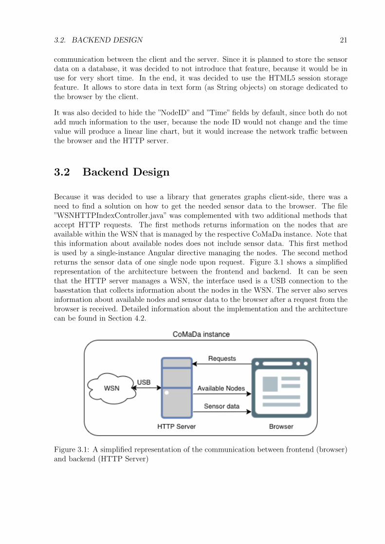
Because it was decided to use a library that generates graphs client-side, there was aneed to find a solution on how to get the needed sensor data to the browser. The file”WSNHTTPIndexController.java” was complemented with two additional methods thataccept HTTP requests. The first methods returns information on the nodes that areavailable within the WSN that is managed by the respective CoMaDa instance. Note thatthis information about available nodes does not include sensor data. This first methodis used by a single-instance Angular directive managing the nodes. The second methodreturns the sensor data of one single node upon request. Figure 3.1 shows a simplifiedrepresentation of the architecture between the frontend and backend. It can be seenthat the HTTP server manages a WSN, the interface used is a USB connection to thebasestation that collects information about the nodes in the WSN. The server also servesinformation about available nodes and sensor data to the browser after a request from thebrowser is received. Detailed information about the implementation and the architecturecan be found in Section 4.2.
Figure 3.1: A simplified representation of the communication between frontend (browser)and backend (HTTP Server)

22 CHAPTER 3. DESIGN DECISIONS
Chapter 4
Implementation and Architecture
This chapter gives a detailed insight on the implementation and the architecture of thisassignment.
4.1 Frontend
As described in Chapter 3, it was decided to use AngularJS to develop an additionalwidget for the front end part of the work done in this assignment. More precisely, itwas decided to develop two Angular directives: First, one that manages the adding andremoving of nodes. This angular directive also collects data from the instances of thesecond directive. Second, a directive that is created for every node that is added. Listing4.1 shows a shortened version of the HTML code of the first Angular directive/widget,the file is called ”chartsWidget.html”.
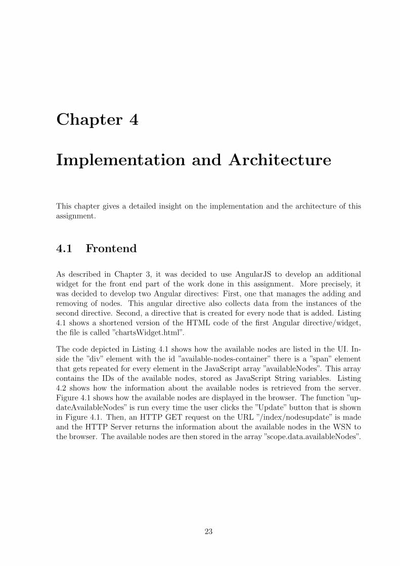
The code depicted in Listing 4.1 shows how the available nodes are listed in the UI. In-side the ”div” element with the id ”available-nodes-container” there is a ”span” elementthat gets repeated for every element in the JavaScript array ”availableNodes”. This arraycontains the IDs of the available nodes, stored as JavaScript String variables. Listing4.2 shows how the information about the available nodes is retrieved from the server.Figure 4.1 shows how the available nodes are displayed in the browser. The function ”up-dateAvailableNodes” is run every time the user clicks the ”Update” button that is shownin Figure 4.1. Then, an HTTP GET request on the URL ”/index/nodesupdate” is madeand the HTTP Server returns the information about the available nodes in the WSN tothe browser. The available nodes are then stored in the array ”scope.data.availableNodes”.
23
24 CHAPTER 4. IMPLEMENTATION AND ARCHITECTURE
1 <div>2 . . .3 <div id=”ava i l ab l e−nodes−conta ine r ”>4 <span>5 Ava i l ab l e Nodes ( l a s t updated at {{data . lastUpdatedAvai lableNodes |
date : ”HH:mm: s s ”}}) :6 <input type=”button ” value=”Update ” ng−c l i c k=”updateAvai lableNodes
( ) ”></ input>7 </span>8 </ div>9 <div id=”ava i l ab l e−nodes−conta ine r ”>
10 <span c l a s s=” l a b e l ” ng−repeat=”node in data . ava i l ab l eNodes ”>11 <span>{{node}}</span>12 <span c l a s s=”add−dashboard−btn ” ng−c l i c k=”addNode ( node ) ”> + </span>13 </span>14 </ div>15 <div id=”layered−charts−conta ine r ” ng−show=”data . r eg i s t e r edNodes . l ength
>= 2”>16 . . .17 </ div>18 <div id=”disp layed−nodes−conta ine r ”>19 <div node ng−repeat=”id in data . r eg i s t e r edNodes ”></ div>20 </ div>21 </ div>
Listing 4.1: A part of the chartsWidget.html
1 scope . updateAvai lableNodes = function ( ) {2 $http . get (’/index/nodesupdate’ ) . then ( function ( data ) {3 i f ( data != null ) {4 scope . data . ava i l ab l eNodes = [ ] ;5 f o r (var key in data . data ) {6 i f ( data . data . hasOwnProperty ( key ) ) {7 var entry = data . data [ key ] ;8 i f ( entry . nodeID != null && scope . data . r eg i s t e r edNodes . indexOf (
entry . nodeID ) < 0) {9 scope . data . ava i l ab l eNodes . push ( entry . nodeID ) ;
10 }11 }12 }13 scope . data . lastUpdatedAvai lableNodes = new Date ( ) ;14 }15 }) ;16 }
Listing 4.2: ”updateAvailableNodes” inside the Angular directive ”chartsWidget.js”.
In Listing 4.1, the ”div” element with the ID ”displayed-nodes-container” is shown on line18. Inside this element, there is a ”div” element with an attribute ”node” that is repeatedfor every element in the array named ”registeredNodes”, which contains the node IDs of thenodes that the user added to the UI. Every instance of that element is attached to the code
4.1. FRONTEND 25
Figure 4.1: How the available nodes are listed in the widget
of the second Angular directive, ”singleNodeWidget.js”. The element is compiled into theHTML code that is contained in the template associated with the Angular directive. Thenode ID of the node that an instance of the second directive manages is retrieved withinthe directive by accessing the data scope of the HTML element that is repeated for everyID in ”registeredNodes”. The node ID is then used to complete the URL that is neededto request sensor data of a node from the server. Parts of the function ”updateNode” thatretrieves the sensor data is shown in Figure 4.3. On line 4, it can be seen that if the datatable has no columns yet, it has to be initialized. For that, the function iterates over theavailable fields of the node, creating a new column for each field. The first column in thedata table represents the timestamp value. On line 17, this value is added to the newlycreated row. Then, starting at line 20, the function iterates over the available fields again,adding the data values to the new row. On line 27, the new row is added to the data table.Additionally, on line 30, the data table is written to the session storage if it is available.It can be seen that after line 30, the function iterates over all the displayed fields andredraws the corresponding chart if the chart is not displayed filtered at the moment. Atthe end of Listing 4.3, it can be seen that the function is run in a defined interval.
At the end of Listing 4.3 it is shown how the function is run in an interval, defined inbinary seconds by the variable ”updateInterval”.
Figure 4.2 shows a chart visualizing the data of the humidity sensor inside of a ”singleN-odeWidget” directive in action. It also shows the filter functionality, which allows the userto either use the range filter and change its thumbs to change the displayed time windowor to set the date and time using the two input fields below the range filter. The dateinput is currently only supported by the Google Chrome browser. In other browsers, thedate input will appear like a normal text input. If the user enters a lower date that islower than the time on which the first data point was received or a higher date that ishigher than the timestamp of the most recent datapoint, the widget will display an errormessage. To solve the problem of the filter returning to its old state (with the thumbs atthe lowermost and uppermost end), it was implemented that the chart is only redrawn ifthe time filter is not set to display the full available time range.
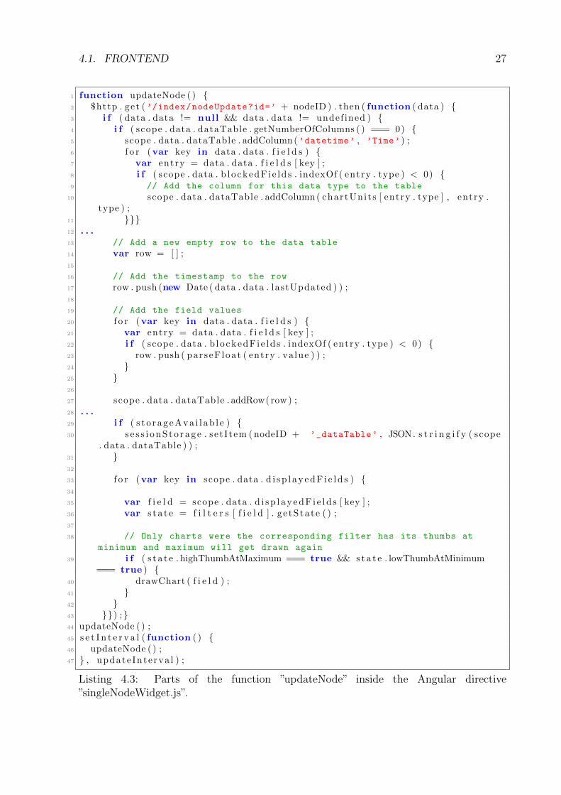
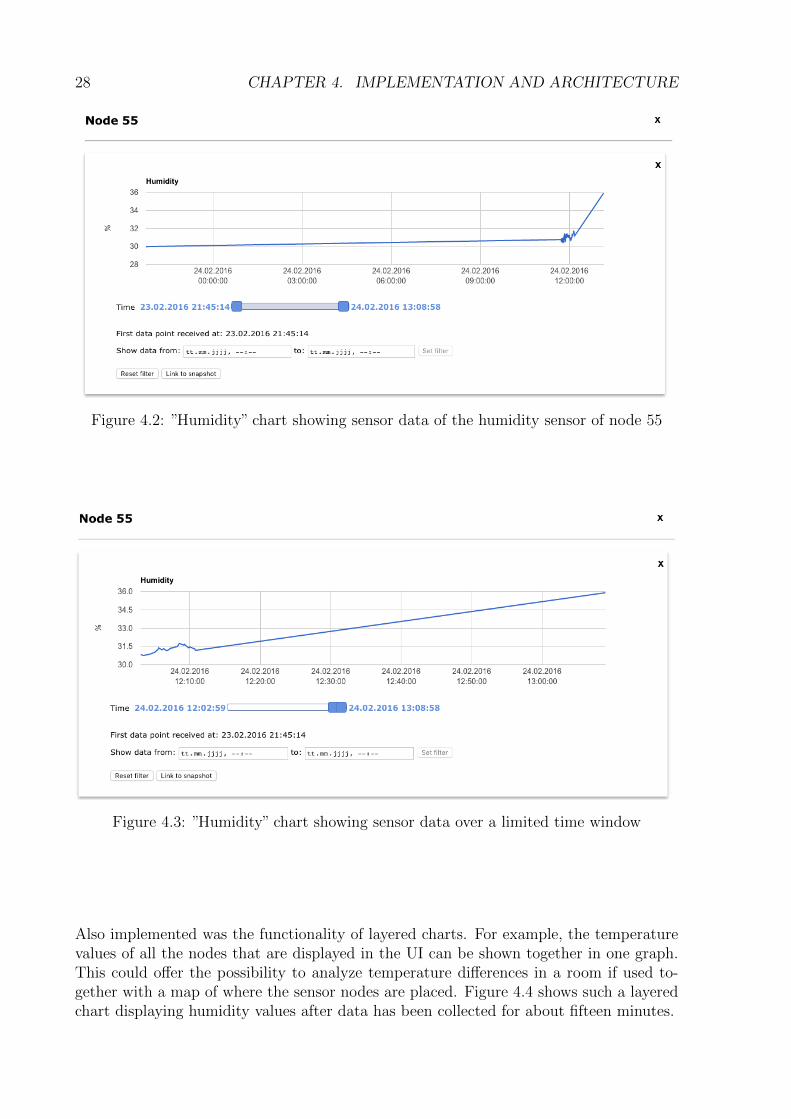
Note that the graph shows a straight line, showing that the last time CoMaDa receiveddata was at February 23rd at 9:45:14 p.m. (which in this case is also the first datapoint) and then received a data point again at February 24th at around 12:00 p.m. Thisalso demonstrates the functionality of HTML5 session storage saving the data, becausealthough the browser tab has not been closed, the connection to the base station has beeninterrupted during the night. Figure 4.3 shows the same graph but with the displayedtime window set to a bit more than a hour into the past, starting from the most recent
26 CHAPTER 4. IMPLEMENTATION AND ARCHITECTURE
last data point received. If the user is viewing a filtered visualization, the graph will notupdate after new data has been received by the widget. The user also has the possibilityto reset the filter. The chart will then be updated again. The ”Link to snapshot” buttonwill open a new tab in the browser with the graph as a static PNG image. The user canthen download the image by right clicking the image and saving it in their desired locationon their machine.
4.1. FRONTEND 27
1 function updateNode ( ) {2 $http . get (’/index/nodeUpdate?id=’ + nodeID ) . then ( function ( data ) {3 i f ( data . data != null && data . data != undef ined ) {4 i f ( scope . data . dataTable . getNumberOfColumns ( ) === 0) {5 scope . data . dataTable . addColumn(’datetime’ , ’Time’ ) ;6 f o r (var key in data . data . f i e l d s ) {7 var entry = data . data . f i e l d s [ key ] ;8 i f ( scope . data . b l o ckedF i e ld s . indexOf ( entry . type ) < 0) {9 // Add the column for this data type to the table
10 scope . data . dataTable . addColumn( chartUni t s [ entry . type ] , entry .type ) ;
11 }}}12 . . .13 // Add a new empty row to the data table
14 var row = [ ] ;15
16 // Add the timestamp to the row
17 row . push (new Date ( data . data . lastUpdated ) ) ;18
19 // Add the field values
20 f o r (var key in data . data . f i e l d s ) {21 var entry = data . data . f i e l d s [ key ] ;22 i f ( scope . data . b l o ckedF i e ld s . indexOf ( entry . type ) < 0) {23 row . push ( par seF loat ( entry . va lue ) ) ;24 }25 }26
27 scope . data . dataTable . addRow( row ) ;28 . . .29 i f ( s t o r ag eAva i l ab l e ) {30 s e s s i onS to r ag e . set I tem ( nodeID + ’_dataTable’ , JSON. s t r i n g i f y ( scope
. data . dataTable ) ) ;31 }32
33 f o r (var key in scope . data . d i s p l a y edF i e l d s ) {34
35 var f i e l d = scope . data . d i s p l ay edF i e l d s [ key ] ;36 var s t a t e = f i l t e r s [ f i e l d ] . g e tS ta t e ( ) ;37
38 // Only charts were the corresponding filter has its thumbs at
minimum and maximum will get drawn again
39 i f ( s t a t e . highThumbAtMaximum === true && s ta t e . lowThumbAtMinimum=== true ) {
40 drawChart ( f i e l d ) ;41 }42 }43 }}) ;}44 updateNode ( ) ;45 s e t I n t e r v a l ( function ( ) {46 updateNode ( ) ;47 } , update Inte rva l ) ;
Listing 4.3: Parts of the function ”updateNode” inside the Angular directive”singleNodeWidget.js”.
28 CHAPTER 4. IMPLEMENTATION AND ARCHITECTURE
Figure 4.2: ”Humidity” chart showing sensor data of the humidity sensor of node 55
Figure 4.3: ”Humidity” chart showing sensor data over a limited time window
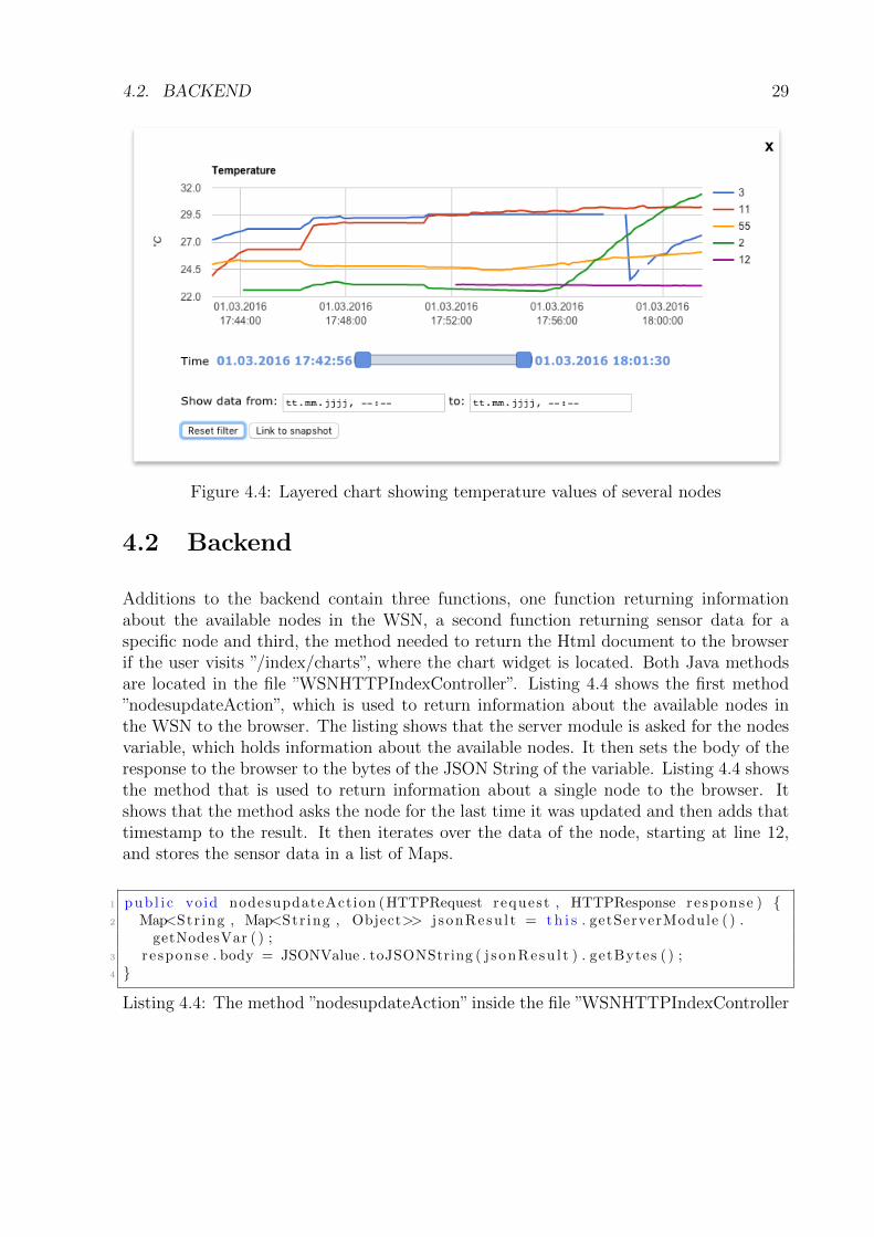
Also implemented was the functionality of layered charts. For example, the temperaturevalues of all the nodes that are displayed in the UI can be shown together in one graph.This could offer the possibility to analyze temperature differences in a room if used to-gether with a map of where the sensor nodes are placed. Figure 4.4 shows such a layeredchart displaying humidity values after data has been collected for about fifteen minutes.
4.2. BACKEND 29
Figure 4.4: Layered chart showing temperature values of several nodes
4.2 Backend
Additions to the backend contain three functions, one function returning informationabout the available nodes in the WSN, a second function returning sensor data for aspecific node and third, the method needed to return the Html document to the browserif the user visits ”/index/charts”, where the chart widget is located. Both Java methodsare located in the file ”WSNHTTPIndexController”. Listing 4.4 shows the first method”nodesupdateAction”, which is used to return information about the available nodes inthe WSN to the browser. The listing shows that the server module is asked for the nodesvariable, which holds information about the available nodes. It then sets the body of theresponse to the browser to the bytes of the JSON String of the variable. Listing 4.4 showsthe method that is used to return information about a single node to the browser. Itshows that the method asks the node for the last time it was updated and then adds thattimestamp to the result. It then iterates over the data of the node, starting at line 12,and stores the sensor data in a list of Maps.
1 pub l i c void nodesupdateAction (HTTPRequest request , HTTPResponse re sponse ) {2 Map<Str ing , Map<Str ing , Object>> j s onResu l t = th i s . getServerModule ( ) .
getNodesVar ( ) ;3 re sponse . body = JSONValue . toJSONString ( j sonResu l t ) . getBytes ( ) ;4 }
Listing 4.4: The method ”nodesupdateAction” inside the file ”WSNHTTPIndexController
30 CHAPTER 4. IMPLEMENTATION AND ARCHITECTURE
1 pub l i c void nodeupdateAction (HTTPRequest request , HTTPResponse response ) {2 St r ing nodeId = reques t . arguments . get ( ” id ”) . t oS t r i ng ( ) ;3 Node node = th i s . getServerModule ( ) . app ( ) . wsn ( ) . node ( nodeId ) ;4 Map < Str ing , Object > j s onResu l t = new HashMap < Str ing , Object > ( ) ;5
6 j s onResu l t . put ( ”nodeID ” , node . getNodeID ( ) ) ;7 // Send the l a s t updated Date as a timestamp ( m i l l i s e c ond s s i n c e January
1 , 1970)8 j s onResu l t . put ( ”lastUpdated ” , new Long ( node . getUpdatedAt ( ) . getTime ( ) ) ) ;9
10 // add f i e l d s11 L i s t < Map < Str ing , S t r ing >> f i e l d s E n t r i e s = new ArrayList < Map <
Str ing , S t r ing >> ( ) ;12 f o r (Datum f i e l d : node . data ( ) ) {13 Map < Str ing , S t r ing > f i e l dEn t r y = new HashMap < Str ing , S t r ing > ( ) ;14
15 f i e l dEn t r y . put ( ” f i e l d ID ” , f i e l d . getID ( ) . t oS t r i ng ( ) ) ;16 f i e l dEn t r y . put ( ”type ” , f i e l d . getType ( ) ) ;17 f i e l dEn t r y . put ( ”value ” , f i e l d . getValue ( ) != nu l l ? f i e l d . getValue ( ) .
t oS t r i ng ( ) : nu l l ) ;18 f i e l dEn t r y . put ( ”un i t ” , f i e l d . getUnit ( ) ) ;19 f i e l dEn t r y . put ( ”name” , f i e l d . getName ( ) ) ;20
21 f i e l d s E n t r i e s . add ( f i e l dEn t r y ) ;22 }23 j s onResu l t . put ( ” f i e l d s ” , f i e l d s E n t r i e s ) ;24
25
26 // add add i t i o na l i n f o27 i f ( node . getMetadata ( ) . s i z e ( ) > 0) {28 j s onResu l t . put ( ” i n f o ” , node . getMetadata ( ) ) ;29 }30 re sponse . body = JSONValue . toJSONString ( j sonResu l t ) . getBytes ( ) ;31 }
Listing 4.5: The method ”nodeupdateAction” inside the file ”WSNHTTPIndexController
Chapter 5
Evaluation
This chapter will discuss the functionality of the solution in context of this assignment,compare, and evaluate it to the existing solution for sensor data visualization, that usesXively.
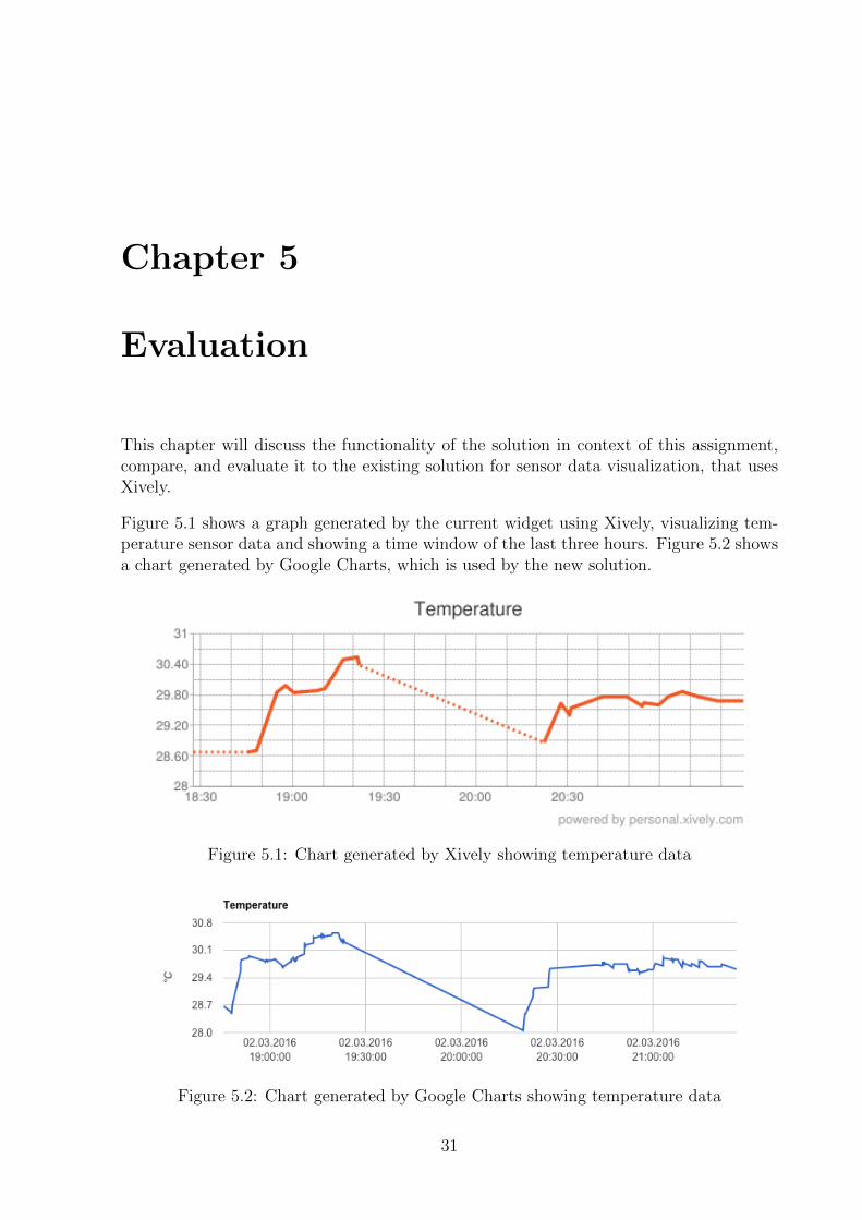
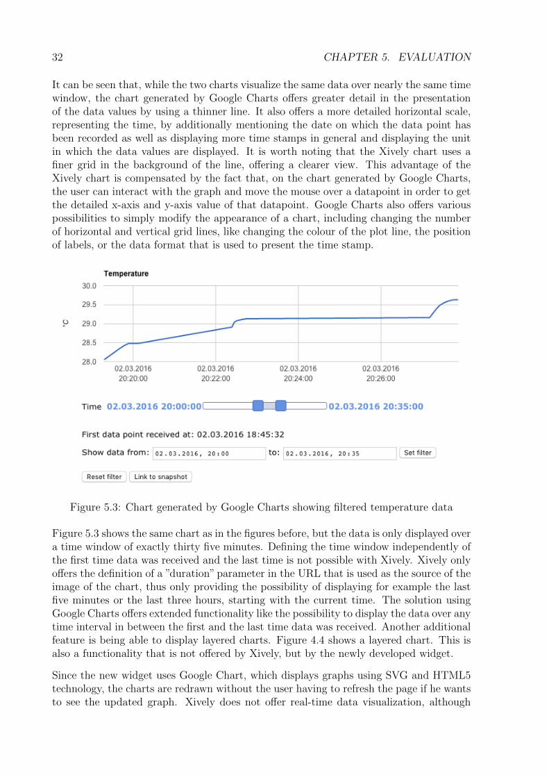
Figure 5.1 shows a graph generated by the current widget using Xively, visualizing tem-perature sensor data and showing a time window of the last three hours. Figure 5.2 showsa chart generated by Google Charts, which is used by the new solution.
Figure 5.1: Chart generated by Xively showing temperature data
Figure 5.2: Chart generated by Google Charts showing temperature data
31
32 CHAPTER 5. EVALUATION
It can be seen that, while the two charts visualize the same data over nearly the same timewindow, the chart generated by Google Charts offers greater detail in the presentationof the data values by using a thinner line. It also offers a more detailed horizontal scale,representing the time, by additionally mentioning the date on which the data point hasbeen recorded as well as displaying more time stamps in general and displaying the unitin which the data values are displayed. It is worth noting that the Xively chart uses afiner grid in the background of the line, offering a clearer view. This advantage of theXively chart is compensated by the fact that, on the chart generated by Google Charts,the user can interact with the graph and move the mouse over a datapoint in order to getthe detailed x-axis and y-axis value of that datapoint. Google Charts also offers variouspossibilities to simply modify the appearance of a chart, including changing the numberof horizontal and vertical grid lines, like changing the colour of the plot line, the positionof labels, or the data format that is used to present the time stamp.
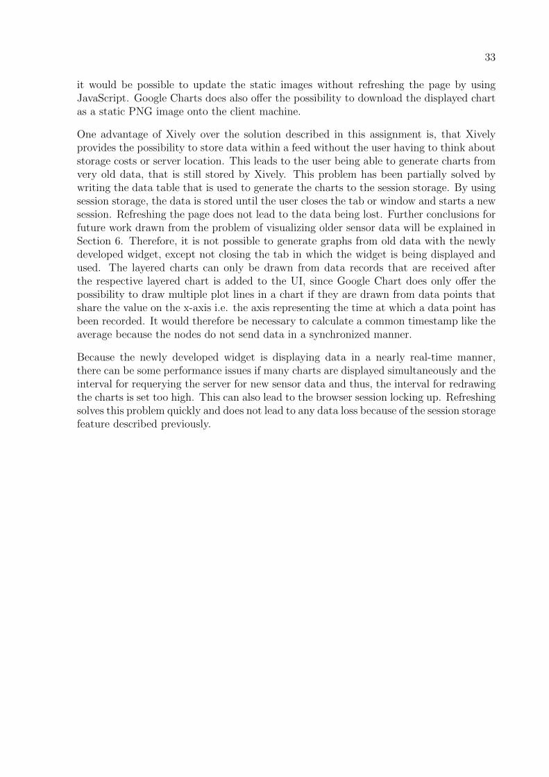
Figure 5.3: Chart generated by Google Charts showing filtered temperature data
Figure 5.3 shows the same chart as in the figures before, but the data is only displayed overa time window of exactly thirty five minutes. Defining the time window independently ofthe first time data was received and the last time is not possible with Xively. Xively onlyoffers the definition of a ”duration” parameter in the URL that is used as the source of theimage of the chart, thus only providing the possibility of displaying for example the lastfive minutes or the last three hours, starting with the current time. The solution usingGoogle Charts offers extended functionality like the possibility to display the data over anytime interval in between the first and the last time data was received. Another additionalfeature is being able to display layered charts. Figure 4.4 shows a layered chart. This isalso a functionality that is not offered by Xively, but by the newly developed widget.
Since the new widget uses Google Chart, which displays graphs using SVG and HTML5technology, the charts are redrawn without the user having to refresh the page if he wantsto see the updated graph. Xively does not offer real-time data visualization, although
33
it would be possible to update the static images without refreshing the page by usingJavaScript. Google Charts does also offer the possibility to download the displayed chartas a static PNG image onto the client machine.
One advantage of Xively over the solution described in this assignment is, that Xivelyprovides the possibility to store data within a feed without the user having to think aboutstorage costs or server location. This leads to the user being able to generate charts fromvery old data, that is still stored by Xively. This problem has been partially solved bywriting the data table that is used to generate the charts to the session storage. By usingsession storage, the data is stored until the user closes the tab or window and starts a newsession. Refreshing the page does not lead to the data being lost. Further conclusions forfuture work drawn from the problem of visualizing older sensor data will be explained inSection 6. Therefore, it is not possible to generate graphs from old data with the newlydeveloped widget, except not closing the tab in which the widget is being displayed andused. The layered charts can only be drawn from data records that are received afterthe respective layered chart is added to the UI, since Google Chart does only offer thepossibility to draw multiple plot lines in a chart if they are drawn from data points thatshare the value on the x-axis i.e. the axis representing the time at which a data point hasbeen recorded. It would therefore be necessary to calculate a common timestamp like theaverage because the nodes do not send data in a synchronized manner.
Because the newly developed widget is displaying data in a nearly real-time manner,there can be some performance issues if many charts are displayed simultaneously and theinterval for requerying the server for new sensor data and thus, the interval for redrawingthe charts is set too high. This can also lead to the browser session locking up. Refreshingsolves this problem quickly and does not lead to any data loss because of the session storagefeature described previously.

34 CHAPTER 5. EVALUATION
Chapter 6
Summary and Conclusions
Using Google Charts and AngularJS, a new method for the visualization of sensor datawas developed. The new widget receives the sensor data by sending requests to theHTTP server contained in the CoMaDa project and generates interactive charts usingSVG and HTML5 technology. The newly developed method offers more functionalitythan the existing solution, which uses the third-party service provider Xively. The mostsignificant difference is that Google Charts offers interactive charts, in contrast to thestatic PNG images provided by Xively. It also offers features like displaying the dataover a defined time interval, exploring single data points in order to see the detaileddata and downloading a static image version of the graph. Additionally, it offers layeredcharts, where the plot lines of several nodes are displayed in one single graph, providinga useful overview. The new widget is independent of any third-party API. While Googleis introducing a new version of the Google Charts library, called Material Charts [28],which will be not be compatible with older versions of Internet Explorer, there are so-called ”frozen releases” of Google Charts, which will be available forever [29]. An updateto a more recent version of Google Charts will therefore be entirely optional and can becarefully evaluated by weighing the benefits against the effort of potential rewriting ofcode.
Because the solution presented in this assignment is independent of Xively, the possibilityto access data that was recorded a long time ago and then stored by Xively is not availableanymore.This problem was only partly solved by using the HTML5 session storage, whichallows keeping sensor data for the duration of a browser session. Although all of therecorded sensor data is stored in several text files by CoMaDa on the client machine, onelog file storing the data from all the nodes in the network and one file per node, there isat the moment no solution that stores the data in a structural or relational manner andthus, there is no possibility to access older data and visualize it. This could be solvedby implementing a database solution, which runs on the same machine like CoMaDa andprovides the functionality to store received sensor data. A database that only runs onthe machine on which CoMaDa is running has also no need for any user authenticationand authorization mechanisms. This is because the only network requests sent to themachine are coming from WebMaDa, which already implements security mechanisms thatensure that only users that are authorized to view data of a WSN can send requests fromWebMaDa to the CoMaDa system managing that particular WSN. Additionally, a full
35

36 CHAPTER 6. SUMMARY AND CONCLUSIONS
integration of Google Charts solution into the WebMaDa environment is required to becompletely independent of Xively.
Bibliography
[1] H.Karl and A. Willig, Protocols and Architectures for Wireless Sensor Networks,John Wiley and Sons, Vol. 1, ISBN 0470519231, West Sussex, Great Britain, 2007
[2] T.Bray, The JavaScript Object Notation (JSON) Data Interchange Format, RFC7159, Internet Engineering Task Force (IETF), Fermon, California, U.S.A., May 2014
[3] Xively, http://xively.com, last visit Feb 7, 2016
[4] What is Xively? https://xively.com/whats_xively/, last visit Feb 11, 2016
[5] Xively API Documentation https://personal.xively.com/dev/docs/api/, lastvisit Feb 11, 2016
[6] A Carefully Selected List of Recommended Tools For Data Visualization, http://
selection.datavisualization.ch, last visit Feb 7, 2016
[7] SecureWSN, http://www.csg.uzh.ch/research/SecureWSN.html, last visit Feb 7,2016
[8] A. Freitag, C. Schmitt, G. Carle: CoMaDa: An Adaptive Framework with GraphicalSupport for Configuration; 9th International Conference on Network and ServiceManagement, CNSM, Zurich, Switzerland, October 2013, ISBN: 978-3-901882-53-1,pp 211-218
[9] 4 Best Chart Generation Options with PHP Components, http://www.sitepoint.com/4-best-chart-generation-options-php-components/, last visited Feb 19,2016
[10] JpGraph, http://jpgraph.net, last visit Feb 7, 2016
[11] MatplotLib, http://matplotlib.org, last visit Feb 7, 2016
[12] Plotly, https://plot.ly, last visit Feb 7, 2016
[13] JFreeChart, http://www.jfree.org/jfreechart, last visit Feb 7, 2016
[14] Changes to deprecation policies and API spring cleaning, GoogleDevelopers Blog, http://googledevelopers.blogspot.ch/2012/04/
changes-to-deprecation-policies-and-api.html, last visited Feb 19, 2016
37
38 BIBLIOGRAPHY
[15] The R Project for Statistical Computing, https://www.r-project.org, last visitFeb 7, 2016
[16] M. Keller, Design and Implementation of a Mobile App to Access and ManageWireless Sensor Networks, Master’s thesis, Department of Informatics, Universityof Zurich, Zurich, Switzerland, Nov 2014
[17] C. Anliker, Secure Pull Request Development for TinyIPFIX in Wireless SensorNetworks, Master’s thesis, Department of Informatics, University of Zurich, Zurich,Switzerland, Nov 2015
[18] AngularJS Homepage, https://angularjs.org/, last visited March 9, 2016
[19] What is Angular, https://docs.angularjs.org/guide/introduction , last visitedFeb 14, 2016
[20] JavaScript Frameworks: The Best 10 for Modern Web Apps, http://noeticforce.com/best-Javascript-frameworks-for-single-page-modern-web-applications,last visited Feb 28, 2016
[21] Minify Resources (HTML, CSS, and JavaScript), https://developers.google.
com/speed/docs/insights/MinifyResources, last visited Feb 28, 2016
[22] Creating Custom Directives, https://docs.angularjs.org/guide/directive, lastvisited Feb 15, 2016
[23] Pre-render d3.js charts at server side part1: proof-of-concept, http://mango-is.
com/blog/engineering/pre-render-d3-js-charts-at-server-side.html, lastvisited Feb 15, 2016
[24] D3.js, https://d3js.org/, last visited Feb 15, 2016
[25] JFreeChart, http://www.jfree.org/jfreechart/, last visited Feb 16, 2016
[26] Google Charts, https://developers.google.com/chart/, last visited Feb 17, 2016
[27] Google Visualization API Reference, https://developers.google.com/chart/
interactive/docs/reference#methods, last visited March 10, 2016
[28] Creating Material Line Charts, https://developers.google.com/chart/
interactive/docs/gallery/linechart#creating-material-line-charts,last visited March 7, 2016
[29] Google Charts Release Notes, https://developers.google.com/chart/
interactive/docs/release_notes, last visited March 7, 2016
Abbreviations
WSN Wireless Sensor NetworkCoMaDa Configuration, Management and Data Handling FrameworkWebMaDa Web-based Mobile Access and Data Handling FrameworkURL Uniform Resource LocatorUI User InterfaceGUI Graphical User InterfaceHTML Hypertext Markup LanguageSVG Scalable Vector GraphicsVML Vector Markup LanguageJSON JavaScript Object NotationAPI Application Programming InterfaceHTTP Hypertext Transfer Protocol
39

40 ABBREVIATONS
List of Figures
2.1 File structure of the server part WSNDataFrameWork project. . . . . . . . 4
2.2 Structure of the html folder . . . . . . . . . . . . . . . . . . . . . . . . . . 5
2.3 The Xively widget in the browser . . . . . . . . . . . . . . . . . . . . . . . 8
2.4 Demonstration of how the Xively Url is used as the image source . . . . . . 9
2.5 The result of the HTML code shown in Listing 2.4 . . . . . . . . . . . . . . 13
2.6 Graph showing the numbers of Facebook users in millions over the years . 16
2.7 The graph that is produced by the code in Listing 2.5 and 2.6 . . . . . . . 16
3.1 A simplified representation of the communication between frontend (browser)and backend (HTTP Server) . . . . . . . . . . . . . . . . . . . . . . . . . . 21
4.1 How the available nodes are listed in the widget . . . . . . . . . . . . . . . 25
4.2 ”Humidity” chart showing sensor data of the humidity sensor of node 55 . . 28
4.3 ”Humidity” chart showing sensor data over a limited time window . . . . . 28
4.4 Layered chart showing temperature values of several nodes . . . . . . . . . 29
5.1 Chart generated by Xively showing temperature data . . . . . . . . . . . . 31
5.2 Chart generated by Google Charts showing temperature data . . . . . . . . 31
5.3 Chart generated by Google Charts showing filtered temperature data . . . 32
41

42 LIST OF FIGURES

List of Tables
43

44 LIST OF TABLES
Appendix A
Installation Guidelines
This chapter explains what steps to take to add a new sensor type, change update intervalsor change the version of Google Charts that is loaded. File paths are to be read in contextof the ”code” folder found in the CD that is appended to this report.
A.1 Adding a new sensor type
Adding a new type of sensor node different from the Telos-B nodes, which were usedthroughout the development of this assignment, does not need any changes to the code ifthe new type does not support new types of sensor fields.
To add a new sensor field, the following changes have to be done:
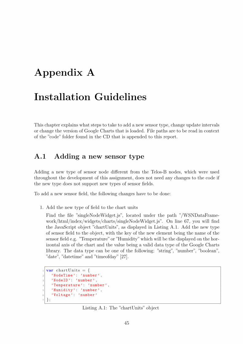
1. Add the new type of field to the chart units
Find the file ”singleNodeWidget.js”, located under the path ”/WSNDataFrame-work/html/index/widgets/charts/singleNodeWidget.js”. On line 67, you will findthe JavaScript object ”chartUnits”, as displayed in Listing A.1. Add the new typeof sensor field to the object, with the key of the new element being the name of thesensor field e.g. ”Temperature”or ”Humidity”which will be the displayed on the hor-izontal axis of the chart and the value being a valid data type of the Google Chartslibrary. The data type can be one of the following: ”string”, ”number”, ”boolean”,”date”, ”datetime” and ”timeofday” [27].
1 var chartUni t s = {2 ’NodeTime’ : ’number’ ,3 ’NodeID’ : ’number’ ,4 ’Temperature’ : ’number’ ,5 ’Humidity’ : ’number’ ,6 ’Voltage’ : ’number’
7 } ;
Listing A.1: The ”chartUnits” object
45
46 APPENDIX A. INSTALLATION GUIDELINES
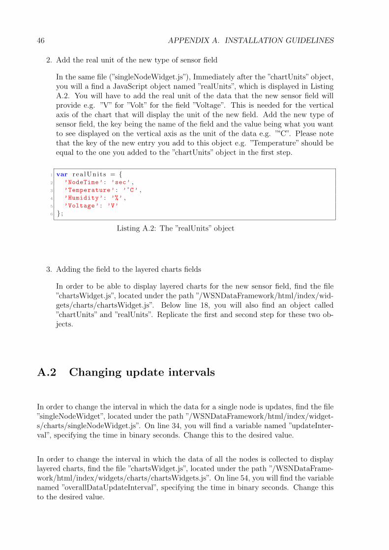
2. Add the real unit of the new type of sensor field
In the same file (”singleNodeWidget.js”), Immediately after the ”chartUnits” object,you will a find a JavaScript object named ”realUnits”, which is displayed in ListingA.2. You will have to add the real unit of the data that the new sensor field willprovide e.g. ”V” for ”Volt” for the field ”Voltage”. This is needed for the verticalaxis of the chart that will display the unit of the new field. Add the new type ofsensor field, the key being the name of the field and the value being what you wantto see displayed on the vertical axis as the unit of the data e.g. ”°C”. Please notethat the key of the new entry you add to this object e.g. ”Temperature” should beequal to the one you added to the ”chartUnits” object in the first step.
1 var r e a lUn i t s = {2 ’NodeTime’ : ’sec’ ,3 ’Temperature’ : ’ °C ’ ,4 ’Humidity’ : ’%’ ,5 ’Voltage’ : ’V’
6 } ;
Listing A.2: The ”realUnits” object
3. Adding the field to the layered charts fields
In order to be able to display layered charts for the new sensor field, find the file”chartsWidget.js”, located under the path ”/WSNDataFramework/html/index/wid-gets/charts/chartsWidget.js”. Below line 18, you will also find an object called”chartUnits” and ”realUnits”. Replicate the first and second step for these two ob-jects.
A.2 Changing update intervals
In order to change the interval in which the data for a single node is updates, find the file”singleNodeWidget”, located under the path ”/WSNDataFramework/html/index/widget-s/charts/singleNodeWidget.js”. On line 34, you will find a variable named ”updateInter-val”, specifying the time in binary seconds. Change this to the desired value.
In order to change the interval in which the data of all the nodes is collected to displaylayered charts, find the file ”chartsWidget.js”, located under the path ”/WSNDataFrame-work/html/index/widgets/charts/chartsWidgets.js”. On line 54, you will find the variablenamed ”overallDataUpdateInterval”, specifying the time in binary seconds. Change thisto the desired value.
A.3. CHANGING THE GOOGLE CHARTS VERSION 47
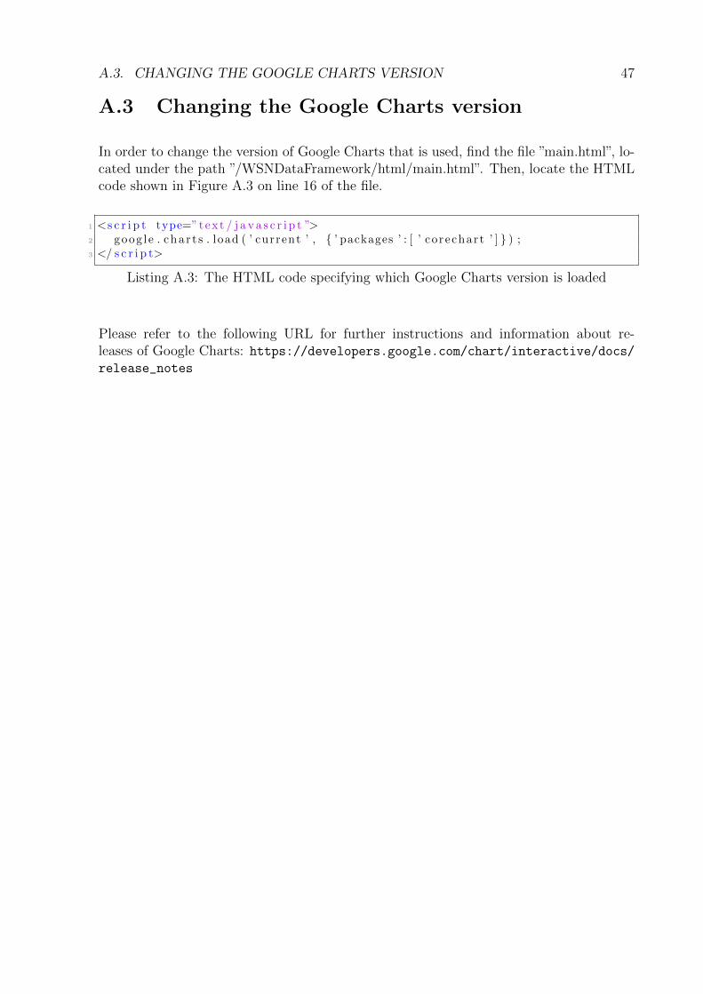
A.3 Changing the Google Charts version
In order to change the version of Google Charts that is used, find the file ”main.html”, lo-cated under the path ”/WSNDataFramework/html/main.html”. Then, locate the HTMLcode shown in Figure A.3 on line 16 of the file.
1 <s c r i p t type=”text / j a v a s c r i p t ”>2 goog l e . cha r t s . load ( ’ current ’ , { ’ packages ’ : [ ’ corechart ’ ] } ) ;3 </ s c r i p t>
Listing A.3: The HTML code specifying which Google Charts version is loaded
Please refer to the following URL for further instructions and information about re-leases of Google Charts: https://developers.google.com/chart/interactive/docs/release_notes

48 APPENDIX A. INSTALLATION GUIDELINES
Appendix B
Contents of the CD
• thesis.pdf - An electronic version of this paper in PDF format
• Zusfsg.txt - The abstract of this assignment in German
• Abstract.txt - The abstract of this assignment in English
• code - The folder containing the code that was written during this assignment
Subfolders:
– WSNDataFramework - The folder representing the CoMaDa Java project
49