Embed Size (px)
Citation preview
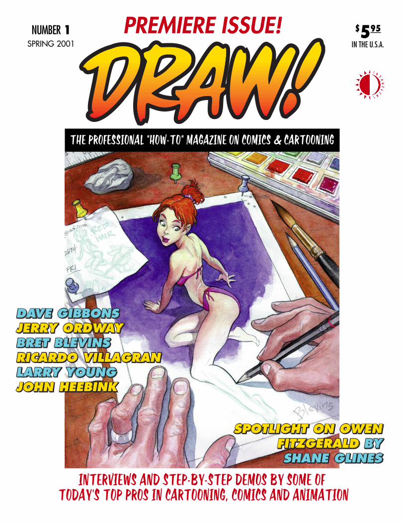
PREMIERE ISSUE!
THE PROFESSIONAL “HOW-TO” MAGAZINE ON COMICS & CARTOONING
NUMBER 1SPRING 2001
$595
IN THE U.S.A.
INTERVIEWS AND STEP-BY-STEP DEMOS BY SOME OFTODAY’S TOP PROS IN CARTOONING, COMICS AND ANIMATION
SPRING 2001 • VOL. 1, NO. 1
DRAW! Spring 2001, Vol. 1, No. 1 was produced by Action Planet Inc. and published by TwoMorrows Publishing. Michael Manley, Editor, John Morrow, Publisher.Editorial Address is PO Box 2129, Upper Darby, PA 19082. Subscription Address: TwoMorrows Publishing, 1812 Park Dr., Raleigh, NC 27605. DRAW! and its logo are trade-marks of Action Planet Inc. All contributions herein are copyright 2001 by their respective contributors. Action Planet Inc. and TwoMorrows Publishing accept no responsibilityfor unsolicited submissions. All artwork herein is copyright the year of production, its creator (if work-for-hire, the entity which contracted said artwork); the characters featuredin said artwork are trademarks or registered trademarks of their respective owners; and said artwork or other trademarked material is printed in these pages with the consentof the copyright holder and/or for journalistic, educational and historical purposes with no infringement intended or implied. Batman, Superman, Shazam, Atari Force, Liz, Here’sHowie, The Adventures of Bob Hope are TM and © 2001 DC COMICS • John Carter Vs. Tarzan © 2001 Dark Horse Comics • Tarzan, Deja Thoris, John Carter are registeredtrademarks of the Edgar Rice Burroughs estate • The Avengers, Avengers: Dominion Factor, The Fantastic Four, Mr. Fantastic, the Thing, the Human Torch, the Black Knight,Wonderman, The Scarlet Witch, Hela, Invisible Woman, The Wrecking Crew, The Vision, Hellcat, Iron Man, Loki, The Sorceress, Captain America, Thor, Boom Boom are TMand © 2001 Marvel Characters, Inc. • Deadbeats is TM and © 2001 Claypool Comics, Boffin Books and Richard Howell • Prince Valiant TM and © 2001 King Features Syndicate• Swing Town is TM and © 2001 WildBrain • The Bod is TM and © 2001 Larry Young and John Heebink • Conan the Barbarian is a registered trademark of the Robert E.Howard estate • Starlet O’Hara, Moronica © ACG Comics. This entire issue is © 2001 Action Planet Inc. and TwoMorrows Publishing and may not be reprinted or retransmit-ted without written permission of the copyright holders. FIRST PRINTING 2001. Printed in Canada.
ADVERTISE IN DRAW! For rates, call John Morrow at (919) 833-8092 or E-mail: [email protected]
Editor & Designer • Michael Manley Publisher • John Morrow
THE PROFESSIONAL”HOW-TO” MAGAZINE ONCOMICS & CARTOONING
Logo Design • John Costanza Front & Back Cover Illustrations • Bret Blevins
FEATURESCOMPUTERS – TIPS AND TRICKS LAYOUT AND DRAWING USING THE COMPUTER, BY DAVE GIBBONS . . . . . . . . . . .3
PENCILING – FIGURE DRAWING HOW TO DRAW LOVELY WOMEN PART 1, BY BRET BLEVINS . . . . . . . . . . . . . . . .13
INKING – TECHNIQUES AN INTERVIEW AND INKING DEMONSTRATION, WITH RICARDO VILLAGRAN . . . . . . . . . . . . . . . .31
COLOR SECTION PAINTING FROM LIFE, BY BRET BLEVINS . . . . . . . . . . . . . . . . . . . . . . . . . . . . . . . . . . . . . . . . . . . . . . . . . . .45
MULTIMEDIA THE INS AND OUTS OF PRODUCING A WEB CARTOON, BY CHANNEL 13 . . . . . . . . . . . . . . . . . . . . . . . . . . . . . . . .53
FROM SCRIPT TO PRINT AN INTERVIEW WITH JERRY ORDWAY ON HIS WORKING METHODS . . . . . . . . . . . . . . . . . . . . .65
SELF-PUBLISHING/SMALL PRESS THE BOD • INTERVIEWS WITH CREATORS YOUNG AND HEEBINK . . . . . . . . . . .84
CLASSIC CARTOONIST SHOWCASE AN APPRECIATION OF OWEN FITZGERALD, BY SHANE GLINES . . . . . . . . . . .96
BONUS FULL-COLOR SECTION!Featuring life drawings by Bret Blevins, page 45
Proofreaders • John Morrow & Eric Nolen-Weathington
Well, the premiere issue of DRAW! is finally here. It’s maybe alittle later and a little bigger than we first thought, but then no oneis ever really sure what their baby will look like before it’s borninto the world.
And the TwoMorrows publishing family is a great one to beborn into. DRAW! is the little brother looking up to our older sib-lings The Jack Kirby Collector, Comic Book Artist, Comicology,and Alter Ego. We have a lot of growing to do to catch up.
There are many people I’d like to thank for helping me bringDRAW! to life, and more importantly to you the reader, eternalstudent, fellow professional, or aspiring one. The first person Ihave to thank is John Morrow, whose enthusiasm for the idea fromour first phone call about the magazine that became DRAW!, aswell as his professionalism, patience and gentlemanly manner hasmade achieving this goal possible.
I’d also like to thank all the incredibly talented and generousartists, whose contributions to DRAW! made our first issue possi-ble, and whose considerable time, energy, knowledge, and love ofthis medium is amply displayed within its pages. Big thanks go outto John Costanza for our logo, Dave Gibbons, Jerry Ordway,Ricardo Villagran, Larry Young, John Heebink, Richard Howell,Kieron Dwyer, Rick Remender, John Estes, Shane Glines, the secretcabal (you guys know who you are), and especially my best pal fornearly 20 years, Bret Blevins. Bret not only drew both the front andback covers of this first issue, but has been supportive, creative,and enthusiastic about my idea to create a professional “how -to”manual over the last several years, as I talked about and nurturedthe idea for what eventually became DRAW!— to which his longdistance phone bills will no doubt attest.
The idea, the impetus for this magazine was begun some 25+years ago, when I was an aspiring cartoonist, comic book artist,illustrator, seeking anything, any scrap of knowledge to lift the veilon the “secrets of drawing.” I combed the used book stores, fanmagazines, and art/animation magazines to get any and all infor-mation I could on how to draw better; the kind of brief hands-onknowledge I’d get if I waited in the long lines at a convention tohave the pro across the table give me a critique. I’d try and absorbevery little bit of knowledge like a flower in the desert does water.Grateful, even when I was told “You’re not ready yet,” I’d rushhome and write down what I’d been told; even going so far as writ-ing the notes down on tape and sticking them up around my draw-ing board. Then came How to Draw Comics the Marvel Way, givento me by my Grandma one Christmas. But I was frustrated at itslack of depth, though I loved all of the great Buscema drawings. Iwas frustrated because I knew there were more than three steps todrawing a figure or a page. The whole time I kept thinking, “If onlythere was a book that showed you how to do it.”
There have been courses in the past like the “Famous ArtistsCourse” which was advertised on the back of comics for years, butI had never seen a set, and if you find those volumes now via usedbook sellers or E-bay, you’ll pay collector’s prices. So as I broke
into the business, learned and improved as an artist, ever the student,I kept thinking that there still needed to be a Trade or “how-to”magazine for comics. Each artist I met had some skill or knowledgeI didn’t. It would be great if all this knowledge could be put intoone place: A magazine or book. After all, there are zillions of themon everything from raising pot-bellied pigs to building your ownearth home. Why not one for comics and cartooning?
In several conversations last year, this idea for a “how-to”book or magazine was brought up again, and as they say, “the timewas right.” A friend put me in touch with John Morrow, who reallyliked the idea straight-off, and so the idea which became DRAW!finally had a home and a format.
My goals for DRAW! are simple: To show you, the reader, inclear step-by-step fashion, the various skills and techniquesemployed by the artists in as in-depth a manner as possible—shar-ing the collective knowledge each artist from the vast fields ofcomics and animation has stored away in their repertoire. Eachissue will be crammed with as many “how-to” demonstrations fromartists across the broad and related fields of comics, cartooning,and animation as I can fit in between its covers. It’s also a celebra-tion of the craft and craftsmen and craftswomen of those uniqueAmerican art forms: Comics and Animation!
Please drop me a letter or note and let me know what youthink of DRAW!, and what you’d like to see covered in upcomingissues, and in our letter column in issue #2, which will be out inJuly.
Mike Manley, editor
You can reach me via E-mail: [email protected] my web site: www.actionplanet.comor snail mail at: PO Box 2129, Upper Darby, PA 19082
FROM THE EDITOR
OFF THE BOARD
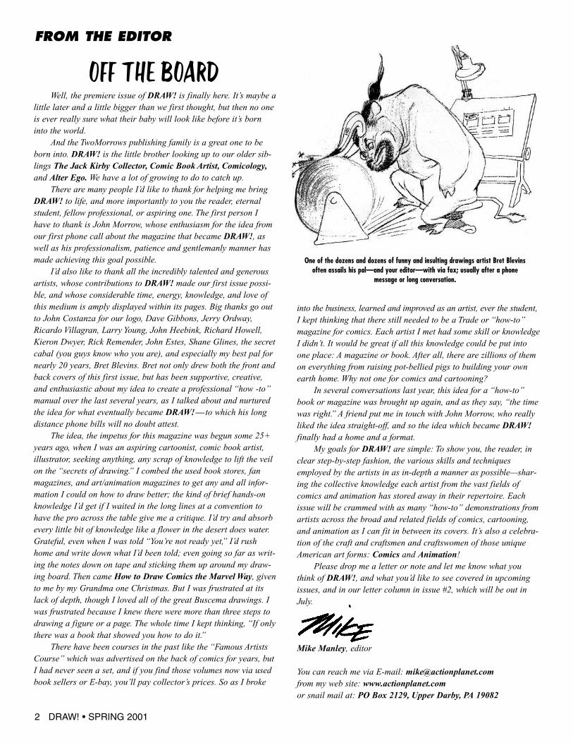
One of the dozens and dozens of funny and insulting drawings artist Bret Blevinsoften assails his pal—and your editor—with via fax; usually after a phone
message or long conversation.
2 DRAW! • SPRING 2001
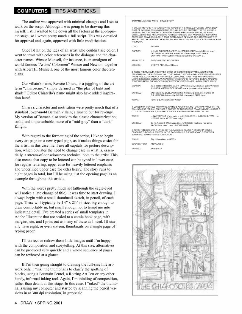
One of the freshest approaches to Batman in recent yearswas the Batman: Black &White series, later collected in a
single volume, edited by Mark Chiarello and published by DCComics. When DC revived the concept as an occasional back-up feature in the Batman: Gotham Knights monthly, I leapt atMark’s invitation to contribute a story.
Rather than something grim and moody, I had the notion ofdoing a light-hearted piece that hopefully embodied a little ofthe feel that Dick Sprang, Alex Toth and Bruce Timm hadbrought to the character in some of my favorite Batman stories.A number of techniques, from the high contrast to the delicatelyetched, had already been used in the Black &White stories; I
thought that a clean, graphic look using a limited number of flattones would look novel in context and would be perfect for thefeel of the story. I also decided to dispense with panel rules,giving the art an open flavor, reminiscent of the old Dellcomics.
It immediately struck me that such a style of artwork couldbe produced very effectively using my computer. It’s aMacintosh PowerPC 8500, a little outdated now, but with afaster G3 processor installed and 208mb of RAM. I used aWacom pressure-sensitive graphics tablet and Adobe Photoshop5 and Illustrator 8 software to do the digital work. But, to beginat the beginning, first I needed a story...
As I mused over the idea of a black-&-white story, I suddenly came up with anappropriate “black-&-white” connectionthat gave me the foundation for the wholepiece. (It’s the final panel of the printedstory, so you’ll have to seek out Batman:Gotham Knights #12 if you’re curious!)
Pretty soon, I came up with a wholelot more familiar objects that were typical-ly black-&-white. From there, I had tocome up with a reason for a bad guy to beinterested in stealing black-&-whiteobjects; once I’d established that, I more-or-less had my eight-page story.
Once it all made sense to me, I wrotean outline and e-mailed it off to editorChiarello. The outline ran about threepages in length and pretty much toldeverything in the story. I’d write propor-tionately much less for a longer story, butthis eight-pager was a very tightly packedpiece of storytelling.
I wrote the text using MicrosoftWord, which I’ve set up to use macros tochange with a keystroke from the format-ting used for, say, picture description tothat used for character dialogue. Recently,I’ve been using Final Draft, primarily ascreenwriting application, but more intu-itive than Word for comics writing, too.
LAYOUT AND DRAWING USING THE COMPUTERA CASE HISTORY by Dave Gibbons
COMPUTERS TIPS AND TRICKS
DRAW! • SPRING 2001 3
The outline was approved with minimal changes and I set towork on the script. Although I was going to be drawing thismyself, I still wanted to tie down all the factors at the appropri-ate stage, so I wrote pretty much a full script. This was e-mailedfor approval and, again, approved with little modification.
Once I’d hit on the idea of an artist who couldn’t see color, Iwent to town with color references in the dialogue and the char-acter names. Winsor Munsell, for instance, is an amalgam ofworld-famous “Artists’ Colormen” Winsor and Newton, togetherwith Albert H. Munsell, one of the most famous color theoreti-cians.
Our villain’s name, Roscoe Chiara, is a juggling of the artterm “chiaroscuro,” simply defined as “the play of light andshade.” Editor Chiarello’s name might also have added inspira-tion here!
Chiara’s character and motivation were pretty much that of astandard Joker-mold Batman villain; a lunatic out for revenge.My version of Batman also stuck to the classic characterization;stolid and imperturbable, more of a “mid-gray” than a “dark”Knight.
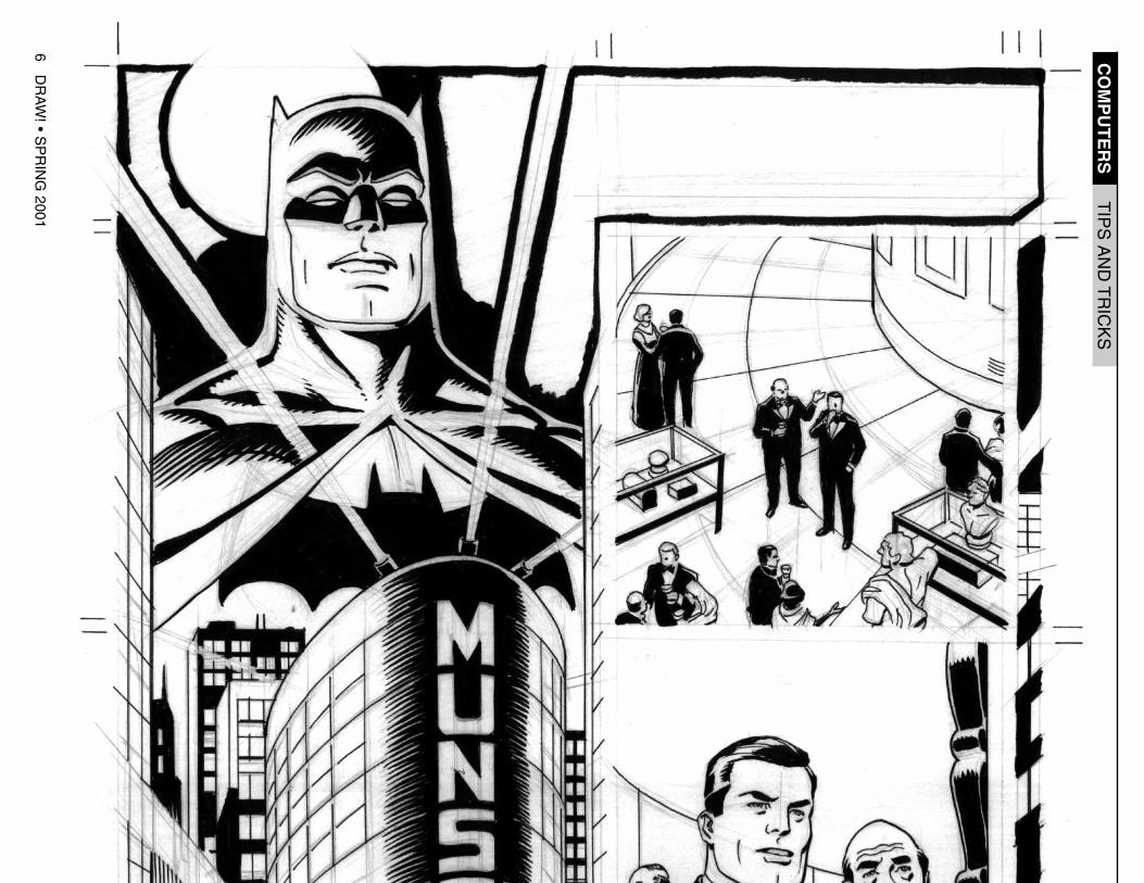
With regard to the formatting of the script, I like to beginevery art page on a new typed page, as it makes things easier forthe artist, in this case me. I use all capitals for picture descrip-tion, which obviates the need to change case in what is, essen-tially, a stream-of-consciousness technical note to the artist. Thisalso means that copy to be lettered can be typed in lower casefor regular lettering, upper case for heavily lettered emphasisand underlined upper case for extra heavy. The story runs toeight pages in total, but I’ll be using just the opening page as anexample throughout this article.
With the words pretty much set (although the eagle-eyedwill notice a late change of title), it was time to start drawing. Ialways begin with a small thumbnail sketch, in pencil, of eachpage. These will typically be 11⁄2" x 21⁄2" in size, big enough todraw comfortably in, but small enough not to tempt me intoindicating detail. I’ve created a series of small templates inAdobe Illustrator that are scaled to a comic book page, withmargins, etc. and I print out as many of these as I need. I’d usu-ally have eight, or even sixteen, thumbnails on a single page oftyping paper.
I’ll correct or redraw these little images until I’m happywith the composition and storytelling. At this size, alternativescan be produced very quickly and a whole sequence of pagescan be reviewed at a glance.
If I’m then going straight to drawing the full-size line art-work only, I “ink” the thumbnails to clarify the spotting ofblacks, using a Fountain Pentel, a Rotring Art Pen or any otherhandy, informal inking tool. Again, I’m thinking of composition,rather than detail, at this stage. In this case, I “inked” the thumb-nails using my computer and started by scanning the pencil ver-sions in at 300 dpi resolution, in grayscale.
COMPUTERS TIPS AND TRICKS
4 DRAW! • SPRING 2001
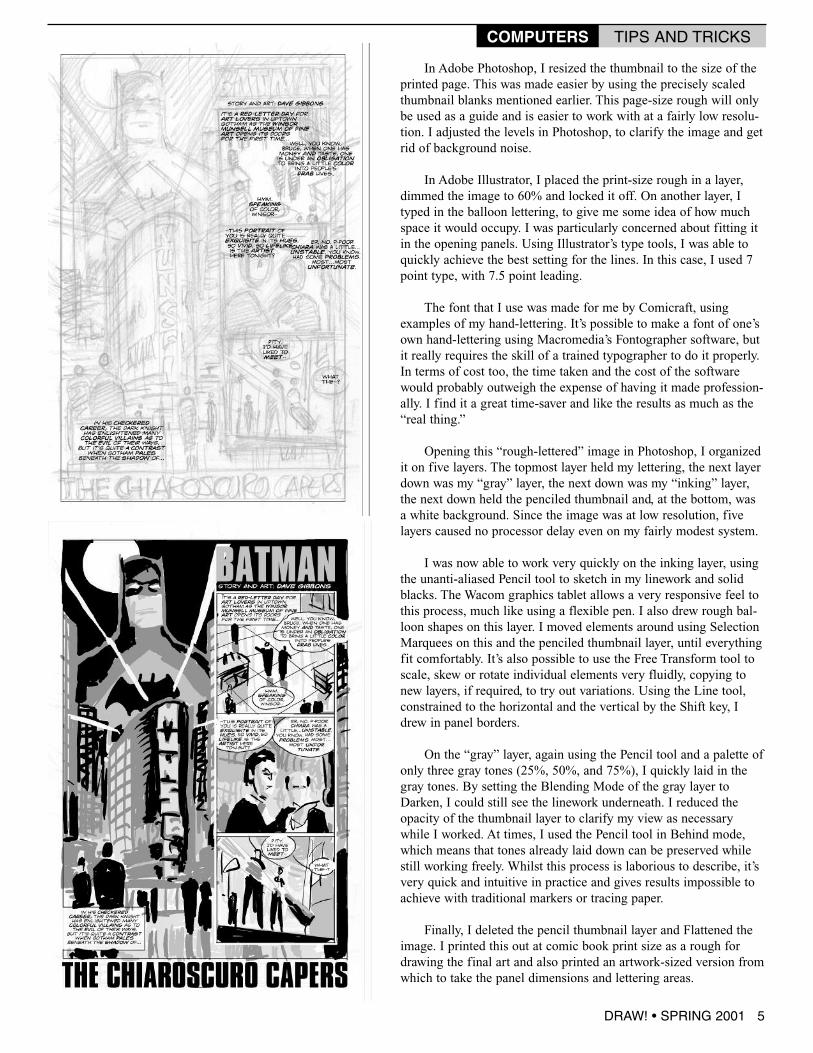
In Adobe Photoshop, I resized the thumbnail to the size of theprinted page. This was made easier by using the precisely scaledthumbnail blanks mentioned earlier. This page-size rough will onlybe used as a guide and is easier to work with at a fairly low resolu-tion. I adjusted the levels in Photoshop, to clarify the image and getrid of background noise.
In Adobe Illustrator, I placed the print-size rough in a layer,dimmed the image to 60% and locked it off. On another layer, Ityped in the balloon lettering, to give me some idea of how muchspace it would occupy. I was particularly concerned about fitting itin the opening panels. Using Illustrator’s type tools, I was able toquickly achieve the best setting for the lines. In this case, I used 7point type, with 7.5 point leading.
The font that I use was made for me by Comicraft, usingexamples of my hand-lettering. It’s possible to make a font of one’sown hand-lettering using Macromedia’s Fontographer software, butit really requires the skill of a trained typographer to do it properly.In terms of cost too, the time taken and the cost of the softwarewould probably outweigh the expense of having it made profession-ally. I find it a great time-saver and like the results as much as the“real thing.”
Opening this “rough-lettered” image in Photoshop, I organizedit on five layers. The topmost layer held my lettering, the next layerdown was my “gray” layer, the next down was my “inking” layer,the next down held the penciled thumbnail and, at the bottom, wasa white background. Since the image was at low resolution, fivelayers caused no processor delay even on my fairly modest system.
I was now able to work very quickly on the inking layer, usingthe unanti-aliased Pencil tool to sketch in my linework and solidblacks. The Wacom graphics tablet allows a very responsive feel tothis process, much like using a flexible pen. I also drew rough bal-loon shapes on this layer. I moved elements around using SelectionMarquees on this and the penciled thumbnail layer, until everythingfit comfortably. It’s also possible to use the Free Transform tool toscale, skew or rotate individual elements very fluidly, copying tonew layers, if required, to try out variations. Using the Line tool,constrained to the horizontal and the vertical by the Shift key, Idrew in panel borders.
On the “gray” layer, again using the Pencil tool and a palette ofonly three gray tones (25%, 50%, and 75%), I quickly laid in thegray tones. By setting the Blending Mode of the gray layer toDarken, I could still see the linework underneath. I reduced theopacity of the thumbnail layer to clarify my view as necessarywhile I worked. At times, I used the Pencil tool in Behind mode,which means that tones already laid down can be preserved whilestill working freely. Whilst this process is laborious to describe, it’svery quick and intuitive in practice and gives results impossible toachieve with traditional markers or tracing paper.
Finally, I deleted the pencil thumbnail layer and Flattened theimage. I printed this out at comic book print size as a rough fordrawing the final art and also printed an artwork-sized version fromwhich to take the panel dimensions and lettering areas.
DRAW! • SPRING 2001 5
COMPUTERS TIPS AND TRICKS
6DRAW!•SPRING2001
COMPUTERS
TIPSANDTRICKS
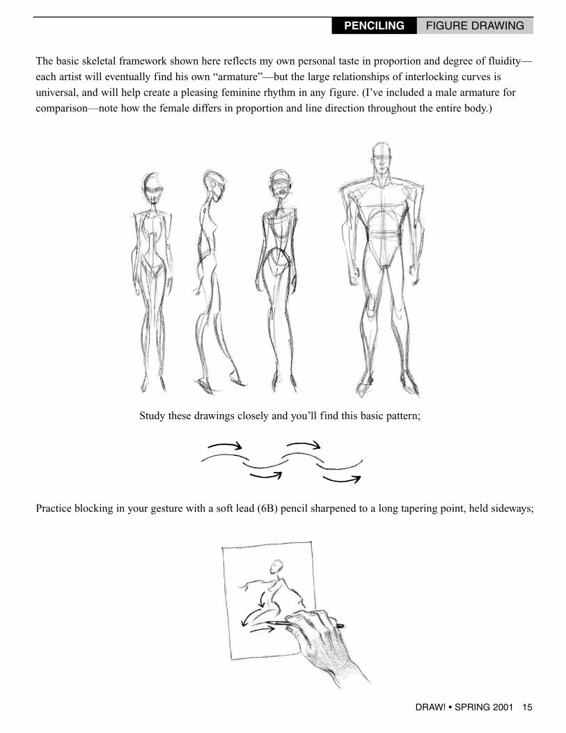
The basic skeletal framework shown here reflects my own personal taste in proportion and degree of fluidity—
each artist will eventually find his own “armature”—but the large relationships of interlocking curves is
universal, and will help create a pleasing feminine rhythm in any figure. (I’ve included a male armature for
comparison—note how the female differs in proportion and line direction throughout the entire body.)
Study these drawings closely and you’ll find this basic pattern;
Practice blocking in your gesture with a soft lead (6B) pencil sharpened to a long tapering point, held sideways;
DRAW! • SPRING 2001 15
PENCILING FIGURE DRAWING
16 DRAW! • SPRING 2001
PENCILING FIGURE DRAWING
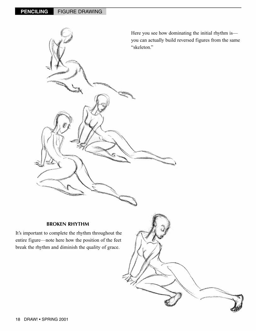
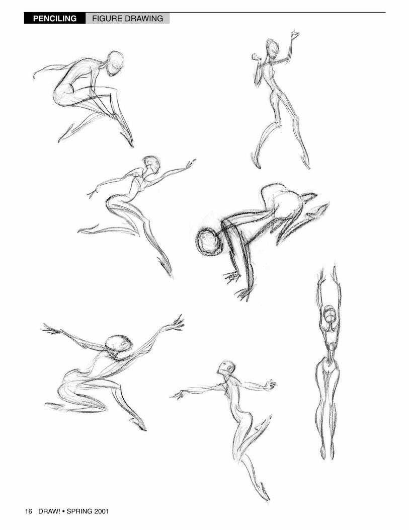
Here you see how dominating the initial rhythm is—
you can actually build reversed figures from the same
“skeleton.”
It’s important to complete the rhythm throughout the
entire figure—note here how the position of the feet
break the rhythm and diminish the quality of grace.
BROKEN RHYTHM
18 DRAW! • SPRING 2001
PENCILING FIGURE DRAWING
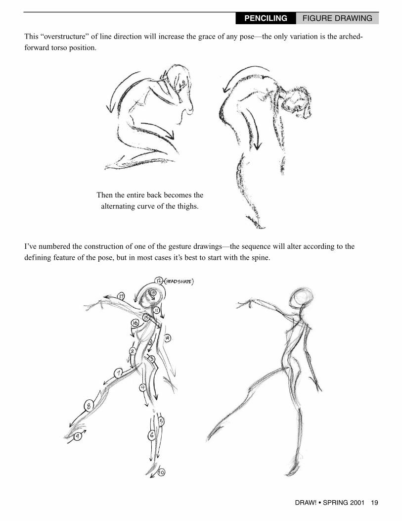
This “overstructure” of line direction will increase the grace of any pose—the only variation is the arched-
forward torso position.
Then the entire back becomes the
alternating curve of the thighs.
I’ve numbered the construction of one of the gesture drawings—the sequence will alter according to the
defining feature of the pose, but in most cases it’s best to start with the spine.
DRAW! • SPRING 2001 19
PENCILING FIGURE DRAWING
28 DRAW! • SPRING 2001
PENCILING FIGURE DRAWING
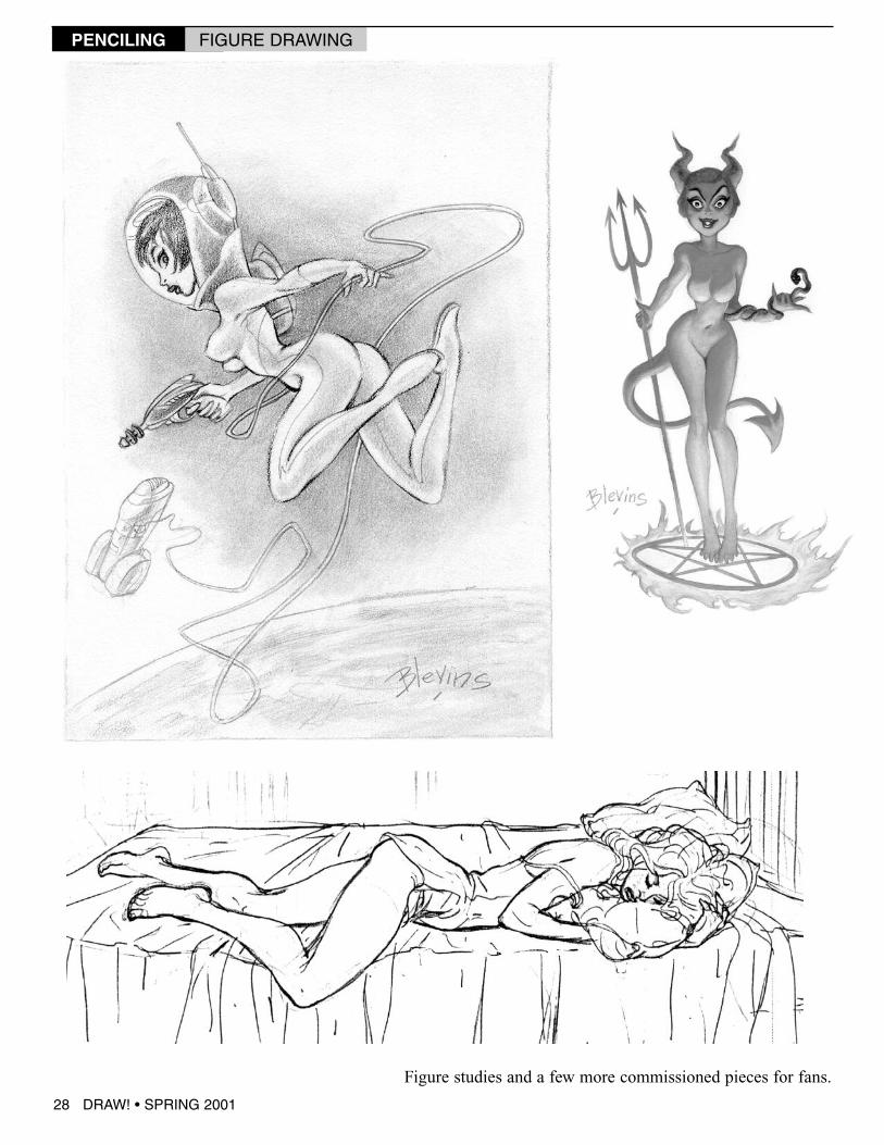
Figure studies and a few more commissioned pieces for fans.
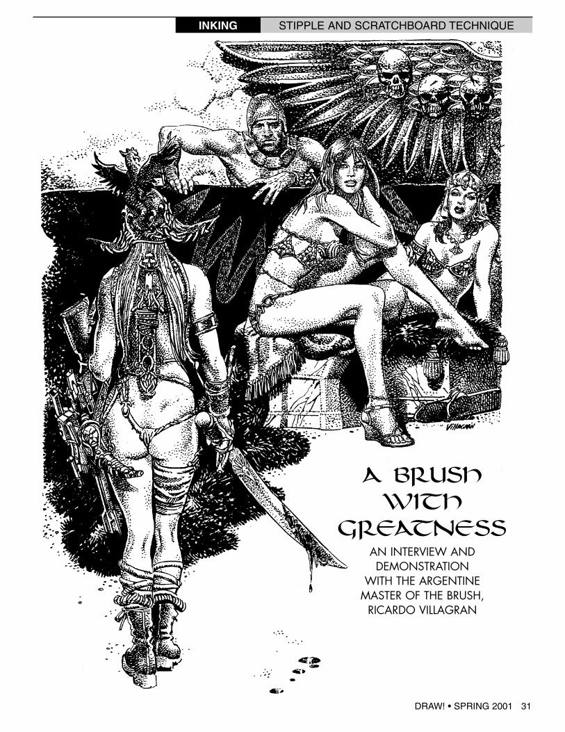
A BRUSHWITH
GREATNESSAN INTERVIEW ANDDEMONSTRATION
WITH THE ARGENTINEMASTER OF THE BRUSH,
RICARDO VILLAGRAN
INKING STIPPLE AND SCRATCHBOARD TECHNIQUE
DRAW! • SPRING 2001 31
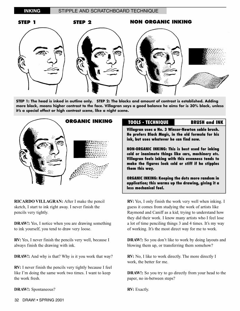
RICARDOVILLAGRAN: After I make the pencilsketch, I start to ink right away. I never finish thepencils very tightly.
DRAW!:Yes, I notice when you are drawing somethingto ink yourself, you tend to draw very loose.
RV:Yes, I never finish the pencils very well, because Ialways finish the drawing with ink.
DRAW!: And why is that? Why is it you work that way?
RV: I never finish the pencils very tightly because I feellike I’m doing the same work two times. I want to keepthe work fresh.
DRAW!: Spontaneous?
RV:Yes, I only finish the work very well when inking. Iguess it comes from studying the work of artists likeRaymond and Caniff as a kid; trying to understand howthey did their work. I know many artists who I feel losea lot of time penciling things 3 and 4 times. It’s my wayof working. It’s the most direct way for me to work.
DRAW!: So you don’t like to work by doing layouts andblowing them up, or transferring them somehow?
RV: No, I like to work directly. The more directly Iwork, the better for me.
DRAW!: So you try to go directly from your head to thepaper, no in-between steps?
RV: Exactly.
TOOLS - TECHNIQUE BRUSH and INK
STEP 1 STEP 2 NON ORGANIC INKING
ORGANIC INKING
STEP 1: The head is inked in outline only. STEP 2: The blacks and amount of contrast is established. Addingmore black, means higher contrast to the face. Villagran says a good balance he aims for is 30% black, unlessit’s a special effect or high contrast scene, like a night scene.
Villagran uses a No. 3 Winsor-Newton sable brush.He prefers Black Magic, in the old formula for hisink, but uses whatever he can find now.
NON-ORGANIC INKING: This is best used for inkingcold or inanimate things like cars, machinery etc.Villagran feels inking with this evenness tends tomake the figures look cold or stiff if he stipplesthem this way.
ORGANIC INKING: Keeping the dots more random inapplication; this warms up the drawing, giving it aless mechanical feel.
INKING STIPPLE AND SCRATCHBOARD TECHNIQUE
32 DRAW! • SPRING 2001
DRAW!: So let’s say there is something in the drawing,an area that is going to require extra finish, extra care ordetail; do you ever pencil that tighter? Or do you keepthat loose as well?
RV: No, no, in general I still pencil the same. But some-times if there is a gun or something like that, tanks orother specific reference, I will do a little more detail.Then I finish the drawing a little more. But in the case ofthe human body, I never finish the pencils very tightly. Iwill erase the pencils if something is wrong.
DRAW!:Now if you are inking someone else, say someonelike Richard Howell on Deadbeats, or Garcia Lopéz, howdoes that effect the way you approach inking because thedrawing is much more finished?
RV: Okay, in this case what I am trying to do, in a way, is
to introduce my style. And my style is something verydetailed. Sometimes I follow exactly what I see, but some-times I change things. It depends on the artist and the job.
DRAW!: So when you are inking a job for Marvel, DC,Claypool or whomever, you are saying what you try to dois introduce the way you work on top of the artist, thepenciler? Make a marriage of the two styles?
RV: Exactly. What I try to do is something in-between thestyle of the penciler. I try to finish in my style because Ioften create the shadows and the lighting, because inmany cases the penciler doesn’t exactly indicate where thelight is coming from. I don’t always get their point ofview. Sometimes I must create some shadows, some lightingeffects. Often this is up to me. But sometimes the pencilsare very well finished, so I try and follow what the pencilerdid. In this situation I try and find a balance between the
STEP 1 STEP 2
“Contention Line”
“Contention Line”
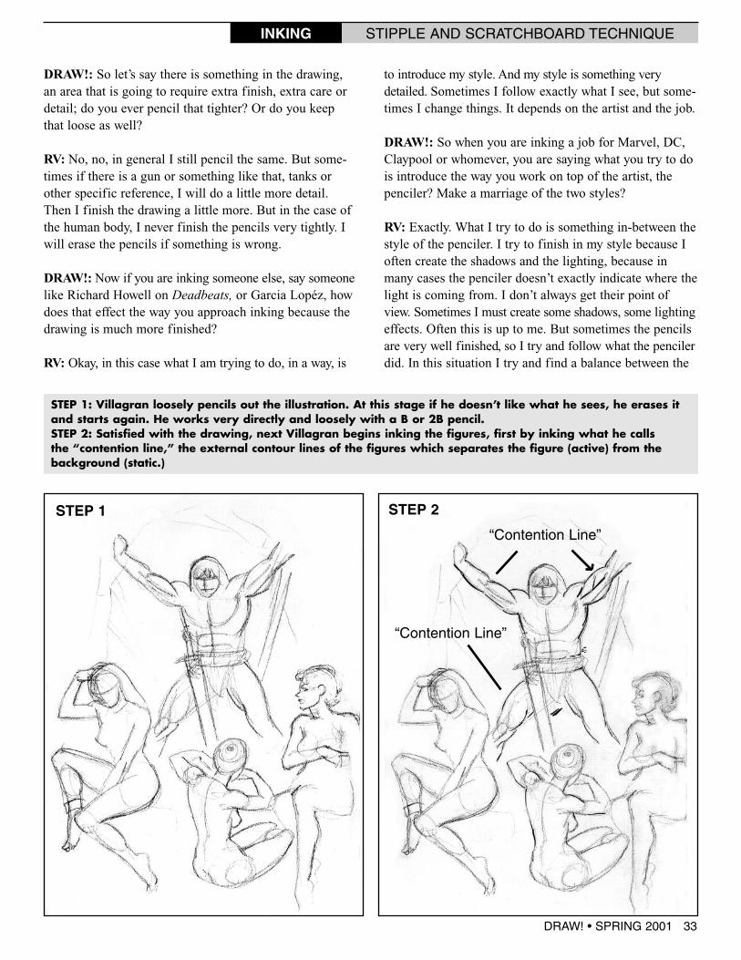
STEP 1: Villagran loosely pencils out the illustration. At this stage if he doesn’t like what he sees, he erases itand starts again. He works very directly and loosely with a B or 2B pencil.STEP 2: Satisfied with the drawing, next Villagran begins inking the figures, first by inking what he callsthe “contention line,” the external contour lines of the figures which separates the figure (active) from thebackground (static.)
DRAW! • SPRING 2001 33
INKING STIPPLE AND SCRATCHBOARD TECHNIQUE
penciler’s style and my style.
DRAW!: I see. So on someone like Garcia Lopéz, whosepencils are very well drawn, very well finished, you tryand just follow along?
RV:Yes, especially in his case, I ink almost without think-ing, because he has such a good base of drawing. He alsogave me a lot of liberty, but because I know GarciaLopéz, I can guess what he wants, and he leaves some-thing for me to do in the inks, according to my tastes.
DRAW!: Okay, so because he knows you, and how youwork, he might leave certain things like textures up to yousince he knows the way you work. And his drawing is so
solid, so flawless it must be easy to dress it up when youink it.
RV: Exactly. He can relax a little on the pencils.
DRAW!: Okay, in his case I can see how that wouldwork. But I have seen you do work, say for DC, where allyou got was layouts, very similar to what you have pen-ciled here for yourself to ink. So then it’s up to you to goin and add the shadows, textures, etc.
RV: Yes, that’s my decision. Sometimes the penciler willindicate a shadow or lighting that isn’t good or consistent,and in that case I will not follow that. But I will try andthink like the guy who is making the pencils. But some-times I can’t; the light is coming from the left at the top
STEP 3
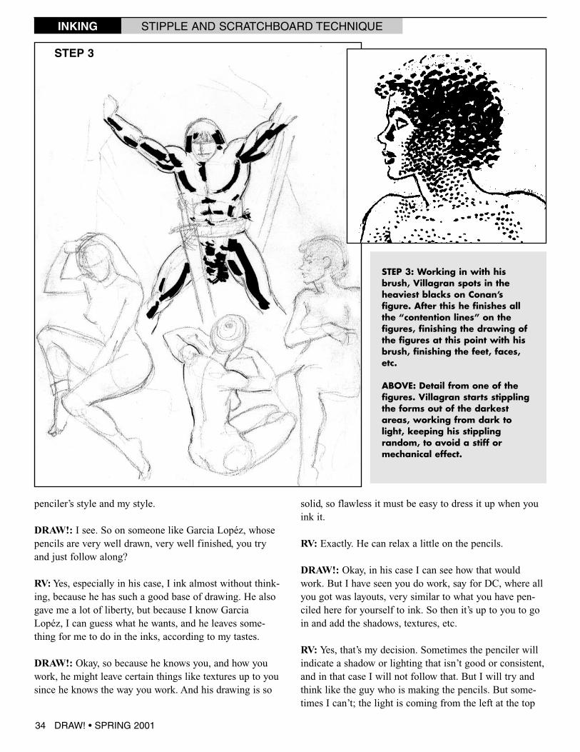
STEP 3: Working in with hisbrush, Villagran spots in theheaviest blacks on Conan’sfigure. After this he finishes allthe “contention lines” on thefigures, finishing the drawing ofthe figures at this point with hisbrush, finishing the feet, faces,etc.
ABOVE: Detail from one of thefigures. Villagran starts stipplingthe forms out of the darkestareas, working from dark tolight, keeping his stipplingrandom, to avoid a stiff ormechanical effect.
34 DRAW! • SPRING 2001
INKING STIPPLE AND SCRATCHBOARD TECHNIQUE
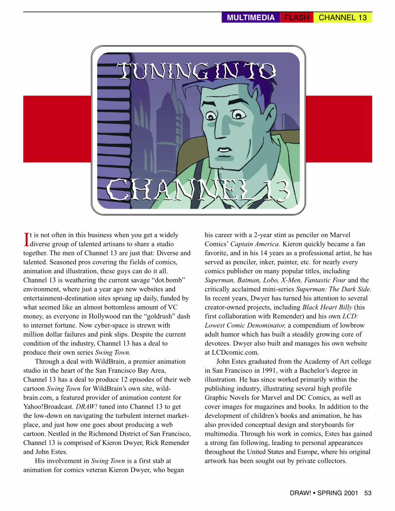
It is not often in this business when you get a widelydiverse group of talented artisans to share a studiotogether. The men of Channel 13 are just that: Diverse andtalented. Seasoned pros covering the fields of comics,animation and illustration, these guys can do it all.Channel 13 is weathering the current savage “dot.bomb”environment, where just a year ago new websites andentertainment-destination sites sprung up daily, funded bywhat seemed like an almost bottomless amount of VCmoney, as everyone in Hollywood ran the “goldrush” dashto internet fortune. Now cyber-space is strewn withmillion dollar failures and pink slips. Despite the currentcondition of the industry, Channel 13 has a deal toproduce their own series Swing Town.
Through a deal with WildBrain, a premier animationstudio in the heart of the San Francisco Bay Area,Channel 13 has a deal to produce 12 episodes of their webcartoon Swing Town for WildBrain’s own site, wild-brain.com, a featured provider of animation content forYahoo!Broadcast. DRAW! tuned into Channel 13 to getthe low-down on navigating the turbulent internet market-place, and just how one goes about producing a webcartoon. Nestled in the Richmond District of San Francisco,Channel 13 is comprised of Kieron Dwyer, Rick Remenderand John Estes.
His involvement in Swing Town is a first stab atanimation for comics veteran Kieron Dwyer, who began
his career with a 2-year stint as penciler on MarvelComics’ Captain America. Kieron quickly became a fanfavorite, and in his 14 years as a professional artist, he hasserved as penciler, inker, painter, etc. for nearly everycomics publisher on many popular titles, includingSuperman, Batman, Lobo, X-Men, Fantastic Four and thecritically acclaimed mini-series Superman: The Dark Side.In recent years, Dwyer has turned his attention to severalcreator-owned projects, including Black Heart Billy (hisfirst collaboration with Remender) and his own LCD:Lowest Comic Denominator, a compendium of lowbrowadult humor which has built a steadily growing core ofdevotees. Dwyer also built and manages his own websiteat LCDcomic.com.
John Estes graduated from the Academy of Art collegein San Francisco in 1991, with a Bachelor’s degree inillustration. He has since worked primarily within thepublishing industry, illustrating several high profileGraphic Novels for Marvel and DC Comics, as well ascover images for magazines and books. In addition to thedevelopment of children’s books and animation, he hasalso provided conceptual design and storyboards formultimedia. Through his work in comics, Estes has gaineda strong fan following, leading to personal appearancesthroughout the United States and Europe, where his originalartwork has been sought out by private collectors.
CHANNEL 13
TUNING IN TO
CHANNEL 13
TUNING IN TO
MULTIMEDIA CHANNEL 13FLASH
DRAW! • SPRING 2001 53
Rick Remender, the animator of the group, has pro-duced his own comic books Captain Dingleberry andBlack Heart Billy with friends Harper Jaten and KieronDwyer as well as having served as an animator on TheIron Giant. He began his career in 1995 when he joinedDon Bluth’s team of animators on the feature Anastasia.
He stayed at Fox Animation for 3 years also workingon Bartok and Titan A.E. Over the next few years heserved as animator on other features such as Rocky andBullwinkle as well as doing commercial animation for theJolly Green Giant and Willy Wonka. It was during thistime he began teaching Animation and Storyboarding atthe Academy of Art college in San Francisco. He has alsodone album covers and graphic design for some of thelargest punk labels in the world including Fat WreckChords.
In addition to the three partners, Channel 13 has bene-fited from the work of many talented folks. Eric Pierce isthe 3-D guru, having built many of the environments andcars for Swing Town in 3D Studio Max and exporting
them into Flash through a Vecta3D plug-in. He’s also beena consistent help in figuring out problems in Flash andoptimizing the episodes to reduce file size without sacrific-ing the look of the show. Elise Remender has done anexcellent job with coloring, taking John’s lead on colorpalettes, and giving the show its signature look. Fellowcomics pros Brandon McKinney and Jeff Johnson havelent their considerable talents to storyboards on severalepisodes, and led by Sean Worsham, a small team ofvolunteers from the SF-based Academy of Art college hasdone a bang-up job on animation clean-ups, in-betweens,et al. John’s cousin Evan Brock is their sound designer. Ingeneral, Channel 13 is a real home-grown, family-and-friends kind of company.
DRAW!: I’ve known Kieron for a few years but can yougive us a little backstory on the forming of Channel 13,and why you decided to group together; how long you’vebeen together, and what direction and place you seeChannel 13 occupying?
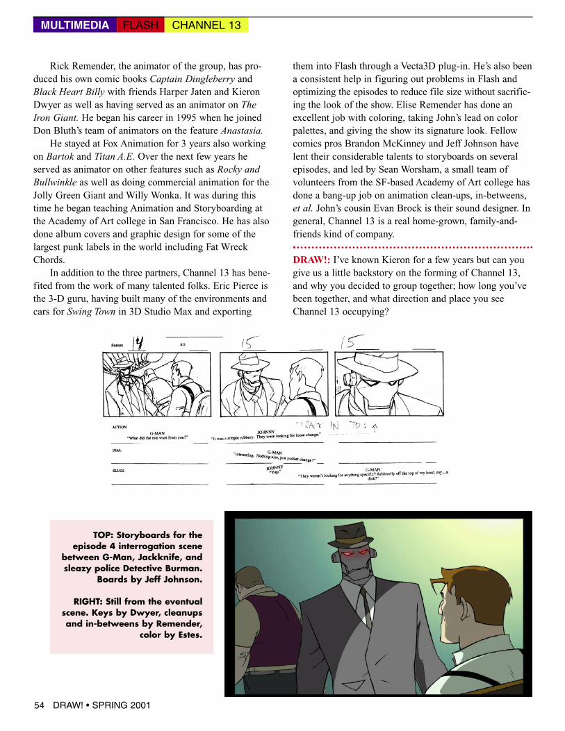
TOP: Storyboards for theepisode 4 interrogation scene
between G-Man, Jackknife, andsleazy police Detective Burman.
Boards by Jeff Johnson.
RIGHT: Still from the eventualscene. Keys by Dwyer, cleanupsand in-betweens by Remender,
color by Estes.
54 DRAW! • SPRING 2001
MULTIMEDIA CHANNEL 13FLASH
Channel 13: It started back in the Spring of 1999. We’dall been killing ourselves on projects in the slumpingcomic book industry. John had been doing covers andprints, and Kieron and Rick were doing their individualbooks, LCD and Captain Dingleberry, as well as BlackHeart Billy, a collaboration between the two. We were allbasically freelancers, paying the bills but not exactlyswimming in the cash fountain. Rick was living inPhoenix at the time and had come to San Francisco tohouse-sit for Kieron, and in the process, he lined up a gigworking at local animation house WildBrain. John Estescalled one day and started shooting the bull with Rickabout putting together a web cartoon company. John andKieron had already been tossing the idea around, and withtheir comic connections and Rick’s animation connections,we figured we could pull it off.
Freelancing is a tough road with little security. We allknew that comic books were taking a huge dive and thatweb animation was an expanding field. Even with therecent failure of some big web animation companies westill believe that content will drive things and we think wecan navigate this course successfully, especially if we lineup some commercial work to supplement the web work. Infact, we consider ourselves more of an all-purpose graphicarts/illustration/animation company than simply a web ani-mation company. Web animation just happened to be whatwe got funding to do first.
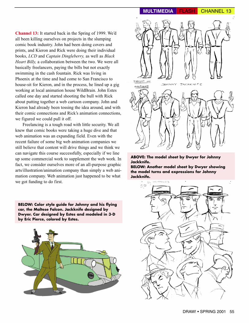
ABOVE: The model sheet by Dwyer for JohnnyJackknife.BELOW: Another model sheet by Dwyer showingthe model turns and expressions for JohnnyJackknife.
BELOW: Color style guide for Johnny and his flyingcar, the Maltese Falcon. Jackknife designed byDwyer. Car designed by Estes and modeled in 3-Dby Eric Pierce, colored by Estes.
DRAW! • SPRING 2001 55
MULTIMEDIA CHANNEL 13FLASH
Long one of the comicsfield’s few triple
threats, Jerry Ordway cando it all: Penciler, inker andwriter. From his hallmarkwork on Superman toShazam, to his creator-owned projects Wildstarand The Messenger,Ordway’s outstandingdraftsmanship, crisp inkingand clear solid storytellinghas set a benchmark ofexcellence.
Former Power of Shazam!inker and DRAW! editorMike Manley catches upwith Da’ Ordster freshfrom his gig on theAvengers and just as he’sabout to start work on hisnext book for MarvelComics, USAgent, and getsJerry to reveal some of hisworking methodologies andtechniques.
DRAW!: Since you often do both writing and drawing,how does it affect your process working from your ownplot versus working with another writer’s?
JO:Well, I always start with a pretty tight plot, even ifI’m the writer. You might think I’d get to skip that step,and jump right into thumbnail breakdowns, but if Marvel
or DC are paying you to write, they want to see a plotregardless. If I am working my own story, I will better knowthe amount of space I need for copy, first and foremost.Some writers I work with are more wordy than others,and if you don’t want to see important bits of story infor-mation covered up by dialogue, then you have to leavelots of room for copy.
an interview with jerry ordway
FROM SCRIPT TO PRINT JERRY ORDWAY
DRAW! • SPRING 2001 65
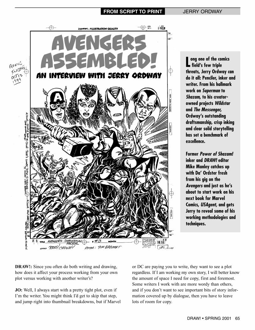
AVENGERSASSEMBLED!
In many ways I find it easier to design “fun” pageswhen working from someone else’s plot than my own. Ican be more objective about what fits in, and what toleave out. On the recent Maximum Security miniseries Idrew for Marvel Comics, I found Kurt Busiek’s plots tobe simple and to the point—very easy to translate into art.This is not the case with many other writers, who packeach plot-page with so much material that you’d need 12panels to fit it all in. Comics are first and foremost a visualmedium, and I think too many panels page after pagebecomes tedious.
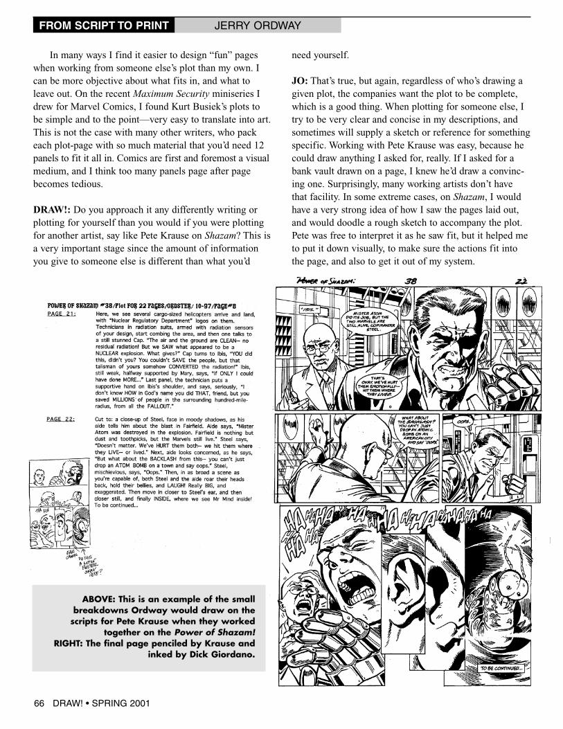
DRAW!: Do you approach it any differently writing orplotting for yourself than you would if you were plottingfor another artist, say like Pete Krause on Shazam? This isa very important stage since the amount of informationyou give to someone else is different than what you’d
need yourself.
JO: That’s true, but again, regardless of who’s drawing agiven plot, the companies want the plot to be complete,which is a good thing. When plotting for someone else, Itry to be very clear and concise in my descriptions, andsometimes will supply a sketch or reference for somethingspecific. Working with Pete Krause was easy, because hecould draw anything I asked for, really. If I asked for abank vault drawn on a page, I knew he’d draw a convinc-ing one. Surprisingly, many working artists don’t havethat facility. In some extreme cases, on Shazam, I wouldhave a very strong idea of how I saw the pages laid out,and would doodle a rough sketch to accompany the plot.Pete was free to interpret it as he saw fit, but it helped meto put it down visually, to make sure the actions fit intothe page, and also to get it out of my system.
ABOVE: This is an example of the smallbreakdowns Ordway would draw on thescripts for Pete Krause when they worked
together on the Power of Shazam!RIGHT: The final page penciled by Krause and
inked by Dick Giordano.
66 DRAW! • SPRING 2001
FROM SCRIPT TO PRINT JERRY ORDWAY
DRAW!: How do you go about layingout a book? Do you make full-sizeroughs print-size using an Artograph toproject it up, or do you just leap inright on the final board? Are your lay-outs in pencil or inked? Very tight orloose, leaving some decisions to bemade later in the final penciling stage?I’ve seen some guys do work so tightin this stage they could print from it. Ithink that this is the most importantpart of the job since all the storytelling,all the staging, shot flow and visualdynamics and composition is estab-lished here. How do you try and keepthe spontaneity in your work if you aretracing off layouts, as often a traceddrawing will lose the juice, the energyof the sketch? Do you have any sort ofgeneral rules of storytelling and com-position? Emotional or technical? Forinstance, like action shots must be amedium shot, exposition must be amedium close-up? Arrangement orvariety of shots to keep the page excit-
ing, likethe wayGilKanedid withdown-shots,next toup-shots?Do youbreak itdown to
simple shapes, or are you more concerned withhaving a good drawing over some tricky layoutdynamic?
JO: With most jobs, I start by doodling out the job, page by page, very roughly and verytiny, in the left or right margin of the plot. I try to figure out the number of panels, and howto stage the action as needed. This step is really less about the visuals than the mechanics ofgetting the correct information on the page. My priority is to tell the story, and I want toinsure that I will tell it clearly.
The next step varies. For a long while, I would draw a tight marker layout, 6"x4" and
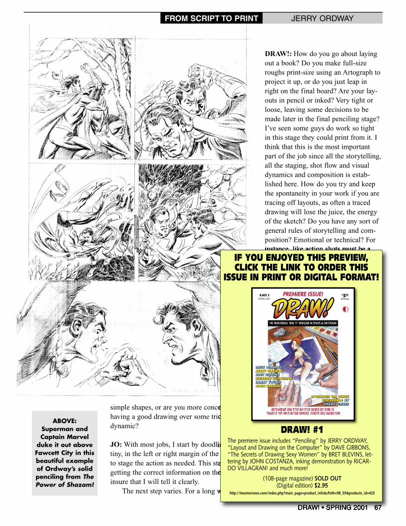
ABOVE:Superman andCaptain Marvelduke it out aboveFawcett City in thisbeautiful exampleof Ordway’s solidpenciling from ThePower of Shazam!
DRAW! • SPRING 2001 67
FROM SCRIPT TO PRINT JERRY ORDWAY
DRAW! #1The premiere issue includes “Penciling” by JERRY ORDWAY,“Layout and Drawing on the Computer” by DAVE GIBBONS,“The Secrets of Drawing Sexy Women” by BRET BLEVINS, let-tering by JOHN COSTANZA, inking demonstration by RICAR-DO VILLAGRAN! and much more!
(108-page magazine) SOLD OUT(Digital edition) $2.95
http://twomorrows.com/index.php?main_page=product_info&cPath=98_59&products_id=425
IF YOU ENJOYED THIS PREVIEW,CLICK THE LINK TO ORDER THIS
ISSUE IN PRINT OR DIGITAL FORMAT!