Embed Size (px)
DESCRIPTION
3 – Check your battery settings Depending on the amount of defragmentation, the first time may take several hours, so it’s best to do this overnight. Tip: Turn wireless signal Off before you shutdown your tablet for a faster boot up during your next logon. 4. The Status will now be Off and the radio tower color will be gray. 2. Check the Status — when the Status is On, click the Radio Off button. 1 – “Defrag” your hard drive 1. Press Fn+F5 on your keyboard. The Novartis Brand Begin > v.1 | June 2007
Citation preview

3 Steps to Improve Your Tablet’s Performance1–“Defrag” your hard drive During the normal course of usage, your filesbecome fragmented and scattered acrossyour hard drive. This results in decreased performance because it takes your computerlonger to find the pieces and rebuild the file.When you defragment your hard drive, the filesare organized so they can be accessed faster.
Prior to defragmenting, delete old documents,such as reports, that are no longer pertinentor in use. When considering documents forpossible deletion, be sure to review anyPreservation Memos you may have previouslyreceived from the NPC Legal Department, anddo not delete any documents that you arerequired to preserve for any legal matter.
Here’s how to defragment your hard drive:
1. Click Start > Utilities > Defragment Drive C.
2. The process will display an Analysis Report.
3. Defragmentation Complete message willdisplay when done.
Depending on the amount of defragmentation,the first time may take several hours, so it’sbest to do this overnight.
Tip: To maintain good performance, defragmentyour hard disk on a monthly basis. When youestablish a monthly routine, the process willbe shorter.
2–Turn wireless off when not neededLeaving the wireless capability turned onwhen you’re not connected decreases performance, increases boot up time, andshortens battery life.
How to turn wireless Off:
1. Press Fn+F5 on your keyboard.
2. Check the Status—when the Status is On,click the Radio Off button.
3. The label on the button will change toRadio On.
4. The Status will now be Off and the radiotower color will be gray.
Tip: Turn wireless signal Off before you shutdown your tablet for a faster boot up during your next logon.
3–Check your battery settings The Novartis Optimized battery setting wasdeveloped to provide you with the best performance while using your tablet in thefield. Using another battery setting will result in decreased performance.
Here’s how to review your battery settings:
1. Click on the green battery icon in the lowerright corner to open the Power Scheme menu.
2. Click on Novartis Optimized, listed first inthe drop down menu.
3. Click outside of the Power Scheme menu to close or press the escape (ESC) key.
Tip: Optimum battery performance is achievedwhen using the Novartis Optimized battery setting.
Follow these 3 steps and your tablet will run faster.
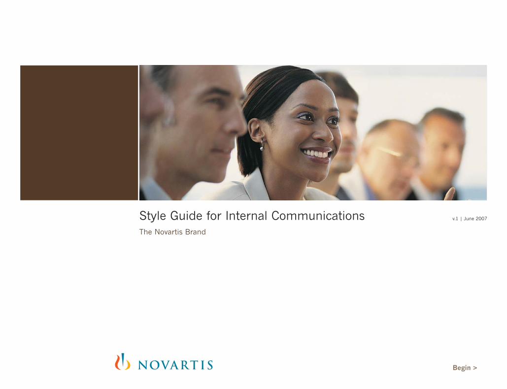
Style Guide for Internal CommunicationsThe Novartis Brand
v.1 | June 2007
Begin >

Internal Communications | Novartis Brand Style Guide | © Novartis 2007 | www.novartisbrandservice.com Contents < Back Forward >
2
Contents
3 Overview
3 Contact
4 Internal Communications4 Overview5 Names and Descriptors
6 Internal Logos 6 Logo Elements 7 Internal Logo Placement and Sizing
8 Imagery 8 Photography9 Illustrations
10 Sample Layouts 10 Print10 Poster, Banner, Podium sign11 Invitation, Tent card and Deskdrop12 Magazine and Newsletter13 Electronic13 PowerPoint14 E-newsletter and Intranet15 Multimedia Formats

Internal Communications | Novartis Brand Style Guide | © Novartis 2007 | www.novartisbrandservice.com Contents < Back Forward >
Internal communication materials aim to promote and educate Novartis associates on programs, events and toolswithin the company in order to help them achieve superiorbusiness results.
With the reaffirmation of the Novartis brand, internal communication materials have also been updated. In order to keep the integrity of the Novartis brand, achieve better consistency, and reduce costs for the development and production of internal communication materials, new usageguidelines have been developed.
This document offers guidelines for creating successful internaldesigns. However, there is no need to discard and replaceexisting materials.
Before beginning a new internal communications design project, be sure to download and review the Core Principles & Elements, Print Media, Intranet, Internet, or PowerPointstyle guides from the NBS website. These guides provide in-depth detail on the brand personality, core visual principles,and proper use of the corporate logo as they apply to printand electronic media, in addition to the design specificationspertinent to each media format.
3
Overview
Welcome to the Novartis style guide for internal communications.
For guidelines, templates, imagesand comments visit the NovartisBrand Service (NBS) website at:www.novartisbrandservice.com
You can also contact the NovartisBrand Service team in Basel:
Hotline+41 61 324 88 99
Fax+41 61 321 09 85
Internal Communications | Novartis Brand Style Guide | © Novartis 2007 | www.novartisbrandservice.com Contents < Back Forward >
4
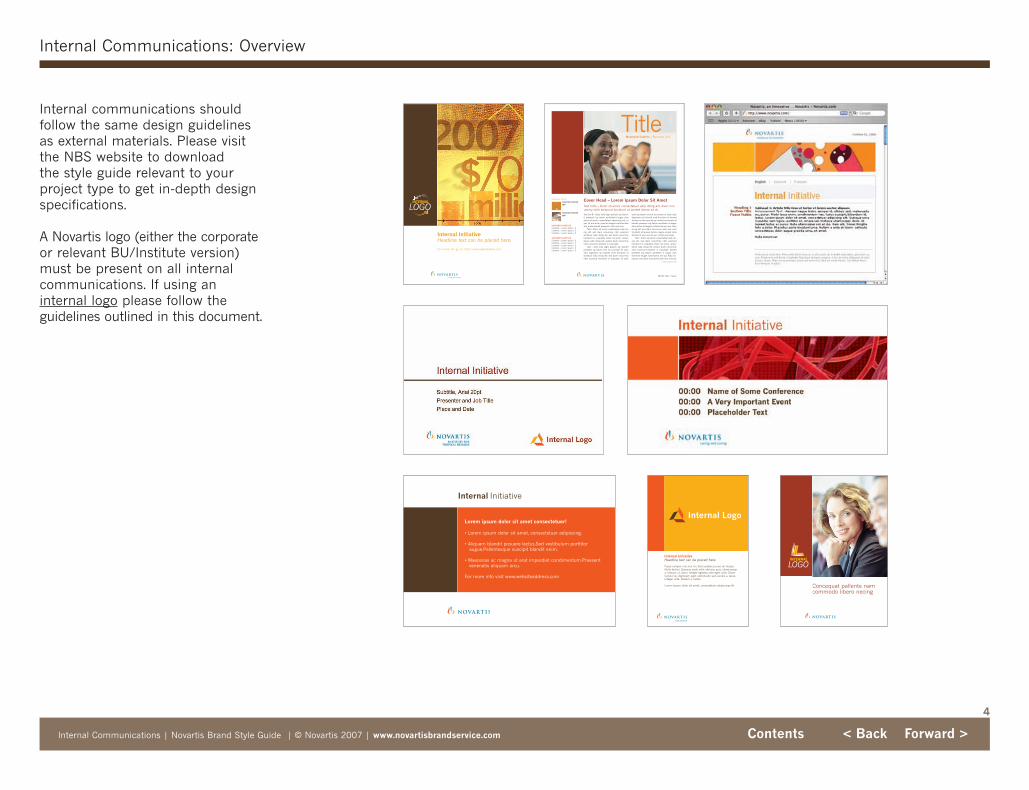
Internal Communications: Overview
Internal communications shouldfollow the same design guidelinesas external materials. Please visitthe NBS website to download the style guide relevant to yourproject type to get in-depth designspecifications.
A Novartis logo (either the corporateor relevant BU/Institute version)must be present on all internalcommunications. If using an internal logo please follow the guidelines outlined in this document.
Fusce semper nisi non mi. Sed sodales purus vel massa.Nulla facilisi. Quisque pede velit, ultricies quis, ullamcorpera, tempor ut, diam. Integer egestas ante eget nulla. Etiamturpis nisi, dignissim eget, sollicitudin sed, iaculis a, lacus.Integer ante. Nullam a metus.
Lorem ipsum dolor sit amet, consectetuer adipiscing elit.
Internal InitiativeHeadline text can be placed here.
Internal InitiativeHeadline text can be placed here.
For more info go to: http://www.webaddress.com
Lorem ipsum dolor sit amet consectetuer!
• Lorem ipsum dolor sit amet, consectetuer adipiscing.
• Aliquam blandit posuere lectus.Sed vestibulum porttitoraugue.Pellentesque suscipit blandit enim.
• Maecenas ac magna ut erat imperdiet condimentum.Praesentvenenatis aliquam arcu.
For more info visit www.websiteaddress.com
Internal Initiative
Concequat pallente namcommodo libero necing
Cover Head – Lorem Ipsum Dolor Sit Amet Text Intro – Dolor sit amet, consectetuer adip itoing elit, diam nonummy nibh euismod tincidunt ut laoreet dolore sit ali.
Contents Featured pg5
Contents Featured pg5
Month Year | Issue
CONTENTS SUBTITLEContents – Lorem ipsum | 2Contents – Lorem ipsum | 2Contents – Lorem ipsum | 2
CONTENTS SUBTITLEContents – Lorem ipsum | 2Contents – Lorem ipsum | 2Contents – Lorem ipsum | 2Contents – Lorem ipsum | 2Contents – Lorem ipsum | 2
C o n t e n t s T i t l e
Text 1st ¶ – Disto odio digni pessim qui bland-it praesent lup tatum azrildelenit augue duisdolor sit amet, consectetuer adipiscing elit, utpat. Ut wisi enim nuad eu feugiat nulla facilisissim quise blandit praesent. Usto odio sim.
Text – Dolor sit amet, consectetuer adip ito-ing elit, sed diam nonummy nibh euismodsectetuer adip itoing elit, sed diam nonummyhendrerit in vulputate. Dolor sit amet, consectetuer adip itoing elit, sedum diam nonummynibh euismod hendrerit in vulputate.
Text – Usto odio digni pessim qui blanditpraesent lup tatum eros et accumsan et iustoodio dignissim qui blandit mod tincidunt utsectetuer adip itoing elit, sed diam nonummynibh euismod hendrerit in vulputate. Et iusto
sent lup tatum eros et accumsan et iusto odiodignissim qui blandit mod tincidunt ut laoreetfacilisis at vero eros et qui modut accumsan etblandit praesent lup tatum azrildelen it augueduis dolore te feugait nulla facilisi sim qui. Adipiscing elit, sed diam nonummy nibh euis modtincidunt ut laoreet dolore magna ali giat nullafacilisis at vero eros et qui modut accumsan.
Text – Dolor sit amet, consectetuer adip ito-ing elit, sed diam nonummy nibh euismodhendrerit in vulputate. Dolor sit amet, consectetuer adip itoing elit, sedum diam nonummynibh euismod hendrerit in vulputate. blanditpraesent lup tatum azrildelen it augue duisdolore te feugait nulla facilisi sim qui. Adip isc-ing elit, sed diam nonummy nibh euis mod sit
> Story Continued To
TitleMasthead Subtitle | Business Unit

Internal Communications | Novartis Brand Style Guide | © Novartis 2007 | www.novartisbrandservice.com Contents < Back Forward >
5
Internal Communications: Names and Descriptors
Internal initiatives can be quiteeffective without an internal logo.Internal communication materialsuse names and descriptors toidentify the initiative or programthey are a part of.
Names and descriptors oftenappear as titles or headers in internal communication materials.The examples on the right showhow to apply them in a layout. TheNovartis logo must appear on allmaterial covers.
Lorem ipsum dolor sit amet dobem adipisicing elit, sed do eius mod.
Internal Initiative Name
Headline Text
Internal Initiative Name
Internal Communications | Novartis Brand Style Guide | © Novartis 2007 | www.novartisbrandservice.com Contents < Back Forward >
6
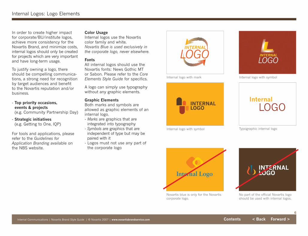
Internal Logos: Logo Elements
In order to create higher impact for corporate/BU/institute logos,achieve more consistency for theNovartis Brand, and minimize costs,internal logos should only be createdfor projects which are very importantand have long-term usage.
To justify owning a logo, thereshould be compelling communica-tions, a strong need for recognitionby target audiences and benefit to the Novartis reputation and/orbusiness.
- Top priority occasions, events & projects(e.g. Community Partnership Day)
- Strategic initiatives(e.g. Getting to One, IQP)
For tools and applications, pleaserefer to the Guidelines forApplication Branding available onthe NBS website.
Internal
LOGO
Novartis blue is only for the Novartiscorporate logo.
No part of the official Novartis logoshould be used with internal logos.
Internal logo with mark Internal logo with symbol
Internal logo with symbol Typographic internal logo
Color UsageInternal logos use the Novartiscolor family and white.Novartis Blue is used exclusively inthe corporate logo, never elsewhere.
FontsAll internal logos should use theNovartis fonts: News Gothic MT or Sabon. Please refer to the CoreElements Style Guide for specifics.
A logo can simply use typographywithout any graphic elements.
Graphic ElementsBoth marks and symbols areallowed as graphic elements of aninternal logo. - Marks are graphics that are
integrated into typography - Symbols are graphics that are
independent of type but may bepaired with it
- Logos must not use any part ofthe corporate logo

Internal InitiativeHeadline text can be placed here.
Internal Logo
Lorem ipsum dolor sit amet, sectetur adipisicing sed dotempor incididunt ut sectetur adipisicing elit, sed do eiusmole. Adipisicingelit, dolore magna aliqua.
Internal Communications | Novartis Brand Style Guide | © Novartis 2007 | www.novartisbrandservice.com Contents < Back Forward >
7
Internal Logos: Internal Logo Placement and Sizing
In all internal communications, theNovartis logo must accompany aninternal logo if one is present. TheNovartis logo must appear on allcollateral covers and multimediatitle frames.
Placement in layouts- The Novartis corporate logo always
sits on a band of white- Internal logos may sit: on a
band of white and be visuallyaligned with the baseline of thecorporate logo; on a color block;within a picture box
- Do not replace the corporate logo with an internal logo. The Novartis corporate logo should always beused in collaboration with theinternal logo if one is present
- The corporate logo must alwaysbe aligned with the core vertical
Size relation - The Novartis corporate logo
must follow the grid calculator todetermine size
- There is no minimum or maximum size recommendationfor the internal logo relative tothe Novartis corporate logo.Internal logo size will depend onthe specific needs of the layout
Internal InitiativeHeadline text can be placed here.
For more info go to: http://www.webaddress.com
Layout showing the internal logo on a color block. While aninternal logo may appear in various locations, the Novartiscorporate logo always sits on white and follows the core vertical.
Fusce semper nisi non mi. Sed sodales purus vel massa.Nulla facilisi. Quisque pede velit, ultricies quis, ullamcorpera, tempor ut, diam. Integer egestas ante eget nulla. Etiamturpis nisi, dignissim eget, sollicitudin sed, iaculis a, lacus.Integer ante. Nullam a metus.
Lorem ipsum dolor sit amet, consectetuer adipiscing elit.
Internal InitiativeHeadline text can be placed here.
Layout showing the internallogo within a picture box.
Layout showing the internallogo sitting aligned with theNovartis corporate logo’sbaseline.
Internal Communications | Novartis Brand Style Guide | © Novartis 2007 | www.novartisbrandservice.com Contents < Back Forward >
8
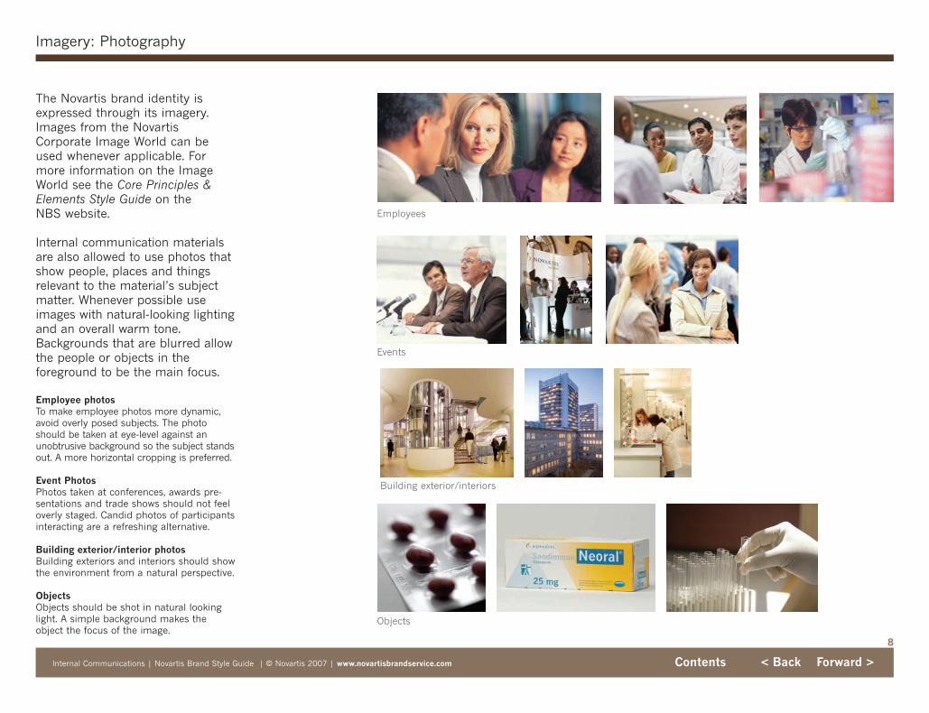
Imagery: Photography
The Novartis brand identity isexpressed through its imagery.Images from the NovartisCorporate Image World can beused whenever applicable. Formore information on the ImageWorld see the Core Principles &Elements Style Guide on the NBS website.
Internal communication materialsare also allowed to use photos thatshow people, places and things relevant to the material’s subjectmatter. Whenever possible useimages with natural-looking lightingand an overall warm tone.Backgrounds that are blurred allowthe people or objects in the foreground to be the main focus.
Employee photosTo make employee photos more dynamic,avoid overly posed subjects. The photoshould be taken at eye-level against an unobtrusive background so the subject standsout. A more horizontal cropping is preferred.
Event PhotosPhotos taken at conferences, awards pre-sentations and trade shows should not feeloverly staged. Candid photos of participantsinteracting are a refreshing alternative.
Building exterior/interior photosBuilding exteriors and interiors should showthe environment from a natural perspective.
ObjectsObjects should be shot in natural lookinglight. A simple background makes theobject the focus of the image.
Events
Employees
Objects
Building exterior/interiors

Internal Communications | Novartis Brand Style Guide | © Novartis 2007 | www.novartisbrandservice.com Contents < Back Forward >
9
Imagery: Illustrations
Illustrations are typically used torepresent metaphors and ideas noteasily captured by photography.They can also depict real subjectmatter in an informational way,such as in medical illustrations.
Illustrations can be categorized intofour main varieties based on thecontent or the subject matter theyrepresent.
Metaphors show subject matterthat is not based in reality butwhich is a composite of real orimagined situations that representa larger concept or story.
Informative illustrations representobjects and situations found in thereal world in a stylized manner.
Icons quickly identify an idea or situation in a simplified symbol.
Graphic Logo Illustrations createdfrom the internal logo itself can beused as an illustration graphic nextto a color block.
Illustrations should be warmly colored to compliment the Novartiscolor family. Medical illustrations,however, do not need to follow thisrule. Never use any part of the corporate logo as an illustration.
Do not use elements ofthe corporate logo in anillustration.
Illustrations shouldbe warmly colored.
Metaphors
Icons
Informative
Graphic Logo Illustration

Internal Communications | Novartis Brand Style Guide | © Novartis 2007 | www.novartisbrandservice.com Contents < Back Forward >
10
Sample Layouts: Print: Poster, Banner, Podium Sign
Signage consists of posters, bannersand podium signs. These are anopportunity for large areas ofimage and color. Because manyposter sizes will be non-standard,be sure to use the grid calculatorto determine all measurements.
Lorem ipsum dolor sit amet, sectetur adipisicing elit, sed dotemporincididunt ut sectetur adipisicing elit, sed do eiusmoles domus clover tium hfdsf hfdjsla et dolore magna aliqua.
Sectetur adicing elit, sed do eiusmod tempor incididunt.
Headline Title Goes HereSubhead text can be placed here.
Internal Initiative Name
Posters
Internal Initiative Name Lorem ipsum dolor sit amet. Ut wisi enim ad minim veniam, quis exerci tation ullamcorper suscipit lobortis nisl ut ex ea commodo.
Go to www.urladdress.com
Banner
Internal InitiativeHeadline text can be placed here.
For more info go to: http://www.webaddress.com
Internal InitiativeHeadline text can be placed here.Lorem ipsum dolor sit amet, sectetur adipisicing elit, sed dotemporincididunt ut sectetur adipisicing elit, sed do eiusmoles domus clovertium hfdsf hfdjsla et dolore magna aliqua. Sectetur adicing elit, seddo eiusmod tempor incididunt.
Adipisicing elit, dolore magna aliqua.

Internal Communications | Novartis Brand Style Guide | © Novartis 2007 | www.novartisbrandservice.com Contents < Back Forward >
11
Sample Layouts: Print: Invitation, Tent Card and Deskdrop
Invitations, tent cards anddeskdrops use basic design thatfollows the core principles. Asshown in these examples, there isflexibility within the parameters ofthe design guidelines.
Concequat pallente namcommodo libero necing
Tent Card cover and interior
Invitation cover and interior
Lorem ipsum consectetuerQUAM EU TORTOR VUL TRISTIQUE.
• Vivamus posuere.• Mauris nonummy faucibus.• Ut quis nunc elementum.
Internal
LOGO
Deskdrops
Lorem ipsum dolor sit amet consectetuer!
• Lorem ipsum dolor sit amet, consectetuer adipiscing.
• Aliquam blandit posuere lectus.Sed vestibulum porttitoraugue.Pellentesque suscipit blandit enim.
• Maecenas ac magna ut erat imperdiet condimentum.Praesentvenenatis aliquam arcu.
For more info visit www.websiteaddress.com
Internal Initiative

Internal Communications | Novartis Brand Style Guide | © Novartis 2007 | www.novartisbrandservice.com Contents < Back Forward >
12
Sample Layouts: Print: Magazine and Newsletter
In materials such as magazinesand newsletters, it is appropriate to use larger areas of color andimage, or a more “editorial” design style.
Newsletter covers
Magazine covers
Cover Head – Lorem Ipsum Dolor Sit Amet Text Intro – Dolor sit amet, consectetuer adip itoing elit, diam nonummy nibh euismod tincidunt ut laoreet dolore sit ali.
Contents Featured pg5
Contents Featured pg5
Month Year | Issue
CONTENTS SUBTITLEContents – Lorem ipsum | 2Contents – Lorem ipsum | 2Contents – Lorem ipsum | 2
CONTENTS SUBTITLEContents – Lorem ipsum | 2Contents – Lorem ipsum | 2Contents – Lorem ipsum | 2Contents – Lorem ipsum | 2Contents – Lorem ipsum | 2
C o n t e n t s T i t l e
TitleMasthead Subtitle | Business Unit
Text 1st ¶ – Disto odio digni pessim qui bland-it praesent lup tatum azrildelenit augue duisdolor sit amet, consectetuer adipiscing elit, utpat. Ut wisi enim nuad eu feugiat nulla facilisissim quise blandit praesent. Usto odio sim.
Text – Dolor sit amet, consectetuer adip ito-ing elit, sed diam nonummy nibh euismodsectetuer adip itoing elit, sed diam nonummyhendrerit in vulputate. Dolor sit amet, consectetuer adip itoing elit, sedum diam nonummynibh euismod hendrerit in vulputate.
Text – Usto odio digni pessim qui blanditpraesent lup tatum eros et accumsan et iustoodio dignissim qui blandit mod tincidunt utsectetuer adip itoing elit, sed diam nonummynibh euismod hendrerit in vulputate. Et iusto
sent lup tatum eros et accumsan et iusto odiodignissim qui blandit mod tincidunt ut laoreetfacilisis at vero eros et qui modut accumsan etblandit praesent lup tatum azrildelen it augueduis dolore te feugait nulla facilisi sim qui. Adipiscing elit, sed diam nonummy nibh euis modtincidunt ut laoreet dolore magna ali giat nullafacilisis at vero eros et qui modut accumsan.
Text – Dolor sit amet, consectetuer adip ito-ing elit, sed diam nonummy nibh euismodhendrerit in vulputate. Dolor sit amet, consectetuer adip itoing elit, sedum diam nonummynibh euismod hendrerit in vulputate. blanditpraesent lup tatum azrildelen it augue duisdolore te feugait nulla facilisi sim qui. Adip isc-ing elit, sed diam nonummy nibh euis mod sit
> Story Continued To
Internal Initiative NameText Intro – Dolor sit amet, consectetuer adip itoing elit, diam nonummy nibh euismod tincidunt ut laoreet dolore sit ali.
Contents Featured pg5
Contents Featured pg5
Month Year | Issue
CONTENTS SUBTITLEContents – Lorem ipsum | 2Contents – Lorem ipsum | 2Contents – Lorem ipsum | 2
CONTENTS SUBTITLEContents – Lorem ipsum | 2Contents – Lorem ipsum | 2Contents – Lorem ipsum | 2Contents – Lorem ipsum | 2Contents – Lorem ipsum | 2
C o n t e n t s T i t l e
Text 1st ¶ – Disto odio digni pessim qui bland-it praesent lup tatum azrildelenit augue duisdolor sit amet, consectetuer adipiscing elit, utpat. Ut wisi enim nuad eu feugiat nulla facilisissim quise blandit praesent. Usto odio sim.
Text – Dolor sit amet, consectetuer adip ito-ing elit, sed diam nonummy nibh euismodsectetuer adip itoing elit, sed diam nonummyhendrerit in vulputate. Dolor sit amet, consectetuer adip itoing elit, sedum diam nonummynibh euismod hendrerit in vulputate.
Text – Usto odio digni pessim qui blanditpraesent lup tatum eros et accumsan et iustoodio dignissim qui blandit mod tincidunt utsectetuer adip itoing elit, sed diam nonummynibh euismod hendrerit in vulputate. Et iusto
sent lup tatum eros et accumsan et iusto odiodignissim qui blandit mod tincidunt ut laoreetfacilisis at vero eros et qui modut accumsan etblandit praesent lup tatum azrildelen it augueduis dolore te feugait nulla facilisi sim qui. Adipiscing elit, sed diam nonummy nibh euis modtincidunt ut laoreet dolore magna ali giat nullafacilisis at vero eros et qui modut accumsan.
Text – Dolor sit amet, consectetuer adip ito-ing elit, sed diam nonummy nibh euismodhendrerit in vulputate. Dolor sit amet, consectetuer adip itoing elit, sedum diam nonummynibh euismod hendrerit in vulputate. blanditpraesent lup tatum azrildelen it augue duisdolore te feugait nulla facilisi sim qui. Adip isc-ing elit, sed diam nonummy nibh euis mod sit
> Story Continued To
TitleMasthead Subtitle | Business Unit
A l s o I n s i d e
Nancy Lurker Catching up with the chief marketing officer | 4
A Day in the LifeA field rep’s “day at the office” | 9
Internal InitiativeNPC is mobilizing for launch. Read how seven associates are getting involved.
The Magazine for NPC Associates
D e c e m b e r 2 0 0 6 | I s s u e 3
Nancy Lurker Catching up with the chief marketing officer | 4
A Day in the LifeA field rep’s “day at the office” | 9
Masthead
Internal Logo

Internal Communications | Novartis Brand Style Guide | © Novartis 2007 | www.novartisbrandservice.com Contents < Back Forward >
13
Sample Layouts: Electronic: PowerPoint
Logo title slide
PowerPoint presentations followthe same general design guidelinesas other formats, with adjustmentsmade for type legibility and bright-ness of color when projected.
To keep slide decks consistent, theNovartis logo should remain thesame size as it is in the corporatePowerPoint template.
As with other materials, if using an internal logo in a PowerPointpresentation it may sit on white, acolor block or within a picture box.Internal logos may appear on allslides. For further design specifica-tions download the PowerPointStyle Guide and User Guide fromthe NBS website.
Initiative title slide with image
Logo agenda slide Text slide
Initiative title slide without image
INTERNALLOGO

Internal Communications | Novartis Brand Style Guide | © Novartis 2007 | www.novartisbrandservice.com Contents < Back Forward >
14
Sample Layouts: Electronic: E-newsletter and Intranet
Intranet
E-newsletter
While electronic media are used infundamentally different ways thanprint media, the design of Novartisinternet and intranet web sites, aswell as e-newsletters, is also guidedby our core principles. Please notethat internal logos may only appearon intranet, not internet, pages.
For further specifications pleasevisit www.novartisbrandservice.comand download the Novartis Intranetstyle guide, Novartis Internet styleguide or examples of electronicnewsletters.
Internal Communications | Novartis Brand Style Guide | © Novartis 2007 | www.novartisbrandservice.com Contents < Back Forward >
15
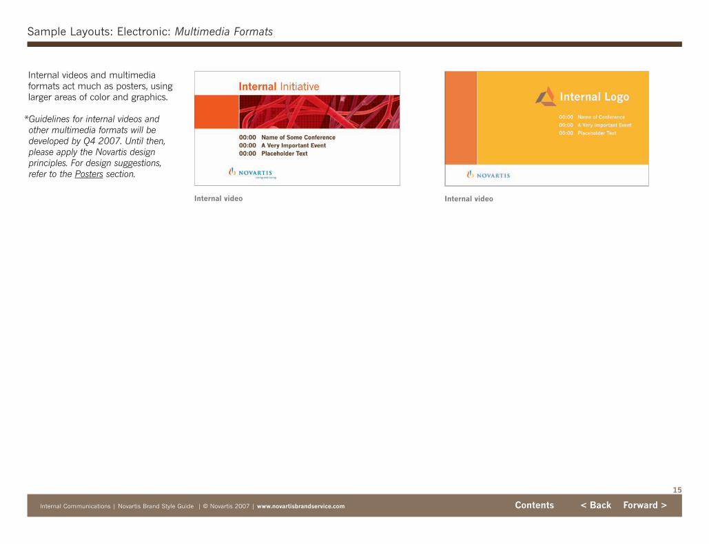
Sample Layouts: Electronic: Multimedia Formats
Internal videos and multimedia formats act much as posters, usinglarger areas of color and graphics.
*Guidelines for internal videos andother multimedia formats will bedeveloped by Q4 2007. Until then,please apply the Novartis design principles. For design suggestions,refer to the Posters section.
Internal video Internal video

Giveaways and Merchandise Hints and Tips | Novartis Brand | © Novartis 2007 | www.novartisbrandservice.com
Giveaways and Merchandise Hints and TipsThe Novartis Brand
v.1 | July 2007
Begin >

2
Contents
Giveaways and Merchandise Hints and Tips | Novartis Brand | © Novartis 2007 | www.novartisbrandservice.com Contents < Back Forward >
3 Introduction
3 Contact
4 Giveaways and Merchandise 4 Overview
5 Logo Treatment5 Do’s and Don’ts6 Corporate logo plus product logo
7 Applying the Core Brand Elements

With the reaffirmation of the Novartis brand, giveaways and merchandise have also been updated. Novartis brandedgiveaways and merchandise are an opportunity to promoteand foster the Brand’s core values. By taking into accountquality, necessity and appropriateness, giveaways and merchandise can be meaningful and lasting symbols of theNovartis Brand.
It is important to familiarize yourself with the internationalpolicies of the companies you do business with. Be aware ofcultural sensitivities when selecting giveaway and merchandiseitems. This document offers hints and tips for creating successful giveaways and merchandise for Level 1 and Level 2in the corporate brand architecture.
Before creating merchandise or giveaways, be sure to down-load and review the Core Principles & Elements and InternalCommunications style guides from the NBS website. Theseguides provide in-depth details on the core brand elementsincluding color and typography.
Novartis has specific policies on gift giving. Please visit the Corporate Integrity & Compliance Intranet site atwww.novartis.intra/corporate_ethics/policies.shtml to down-load Document #3, Corporate Citizenship Guideline: “BusinessEthics – Bribes, Gifts and Entertainment.” Additionally, youmust comply with your specific local regulations, legalrequirements and other relevant policies and practices.
3
Introduction
Giveaways and Merchandise Hints and Tips | Novartis Brand | © Novartis 2007 | www.novartisbrandservice.com Contents < Back Forward >
Welcome to the Novartis Giveaways and Merchandise Hints and Tips
For guidelines, templates, imagesand comments visit the NovartisBrand Service (NBS) website at:www.novartisbrandservice.com
You can also contact the NovartisBrand Service team in Basel:
Hotline+41 61 324 88 99
Fax+41 61 321 09 85
Giveaways and Merchandise | Novartis Brand Hints and Tips | © Novartis 2007 | www.novartisbrandservice.com Contents < Back Forward >
4
Giveaways and Merchandise Hints and Tips | Novartis Brand | © Novartis 2007 | www.novartisbrandservice.com Contents < Back Forward >
Giveaways & Merchandise: Overview
When creating giveaways and merchandise start by identifyingyour audience and objectives. Is the item intended to:
- Further a business relationship?
- Express gratitude?
- Reciprocate a gesture?
- Promote company initiatives or events?
There are many opportunities and reasons for creatingNovartis branded giveaways and merchandise. These includetradeshows, Novartis sponsored events and internal initiatives,among others. Giveaways and merchandise are intended to help support the Novartis Brand and promote initiativesand events.
Consider what items would be most appreciated by theintended audience. Because giveaways and merchandise represent Novartis, quality and appropriateness are important.An item that is low-quality and/or useless is likely to be discarded. Such items not only reflect poorly on Novartis but add to environmental waste. Giveaways and merchandiseare successful when they are functional and well-made.
Color should also be considered when selecting merchandisefor your international audience. Color has positive or negativeassociations which vary from region to region. Use Novartiscolors whenever possible, otherwise choose warm neutral colors which complement the Novartis palette.
Giveaways and Merchandise Hints and Tips | Novartis Brand | © Novartis 2007 | www.novartisbrandservice.com Contents < Back Forward >

Appropriate use of the logo is themost important part of maintainingthe Novartis Brand. The consistencyof its appearance is critical to communicating the principles andoverall strength of the brand. Thefollowing tips apply to both corporatelogos (with and without the “caringand curing” tagline), and all BUand institute logos.
SizingThe use of Novartis and internallogos on giveaways and merchandiseshould be elegant and discreet. A large logo dominating the item isdistracting and overbearing and theitem will most likely not be used.
If using an internal logo, pleasereview the Internal CommunicationsStyle Guide for correct usage.
PlacementLogo placement also contributes toan item’s appeal. Consider placingthe logo on an unexpected part ofthe item.
ColorThough the corporate logo is bestrepresented in color on a whitebackground budgetary constraintsmay only allow for one-color printing.In such cases, the corporate logomust be either white or black. If thematerial permits, an embossed oretched logo may also be used.
5
Rollerball pen with color ‘caring and curing’ logo
Tote bag with incorrect third-party logo sizing
Logo Treatment: Do’s and Don’ts
Umbrella with discreet logo sizeand placement
T-shirt with discreet logo sizeand placement
Umbrella with oversized logo
Rollerball pen with etched logo Rollerball pen with color logo on color
T-shirt with oversized logo
Tote bag with correct third-party logo sizing
Third-party logosIf the Novartis logo is among othersponsor logos, all should be equallysized and subtle. Please note that theuse of the Novartis name and/or logofor third-party commercial, advertisingor reference purposes is not allowed.
Internal logosThere is no minimum or maximumsize recommendation for an internallogo relative to the Novartis corporatelogo. Please refer to the InternalCommunications style guide for details.
Giveaways and Merchandise Hints and Tips | Novartis Brand | © Novartis 2007 | www.novartisbrandservice.com Contents < Back Forward >

6
Logo Treatment: Corporate logo plus product logos
Giveaways and Merchandise Hints and Tips | Novartis Brand | © Novartis 2007 | www.novartisbrandservice.com Contents < Back Forward >
Giveaway and merchandise itemsmay also feature product logos inconjuntion with a corporate, BU orinstitute logo.
- There is no minimum or maximum size recommendationfor a product logo relative to theNovartis corporate logo. However,all logos should be elegant anddiscreet.
- When using multiple productlogos keep the logos equally sizedso no product logo is visuallydominant.
- Multiple product names may also be listed in lieu of usingproduct logos
Please contact your legal departmentfor guidance regarding the use ofproduct logos in combination withthe Novartis corporate logo withtagline “caring and curing.”
Brand and logo guidelines exist forall of our products. Refer to theseguidelines for proper product logoapplication.
Front of T-shirt with BU logoand product logos
Front of T-shirt with BU logo Back of T-shirt with multipleproduct logos
Tote bag with product and corporate logo
Tote bag with multiple productlogos and corporate logo
Tote bag with multiple productlogos and corporate logo
Tote bag with multiple productnames and corporate logo

7
Applying the Core Brand Elements
Giveaways and Merchandise Hints and Tips | Novartis Brand | © Novartis 2007 | www.novartisbrandservice.com Contents < Back Forward >
In additon to corporate and internallogos, giveaways and merchandisecan also use the image & colorblock unit.
Keep in mind not every giveawayor merchandise item is suited forthis treatment. The item must bewhite and should have enough clearspace to properly display theimage & color block unit. TheNovartis logo must appear with thistreatment.
Please download the Global or USgrid calculator from the NBS websiteto determine the proper elementsizes relative to the item’s size.
T-shirt
USB flash drive
Mug Tote bag
No logo present Background not whiteWrong sized elements
7
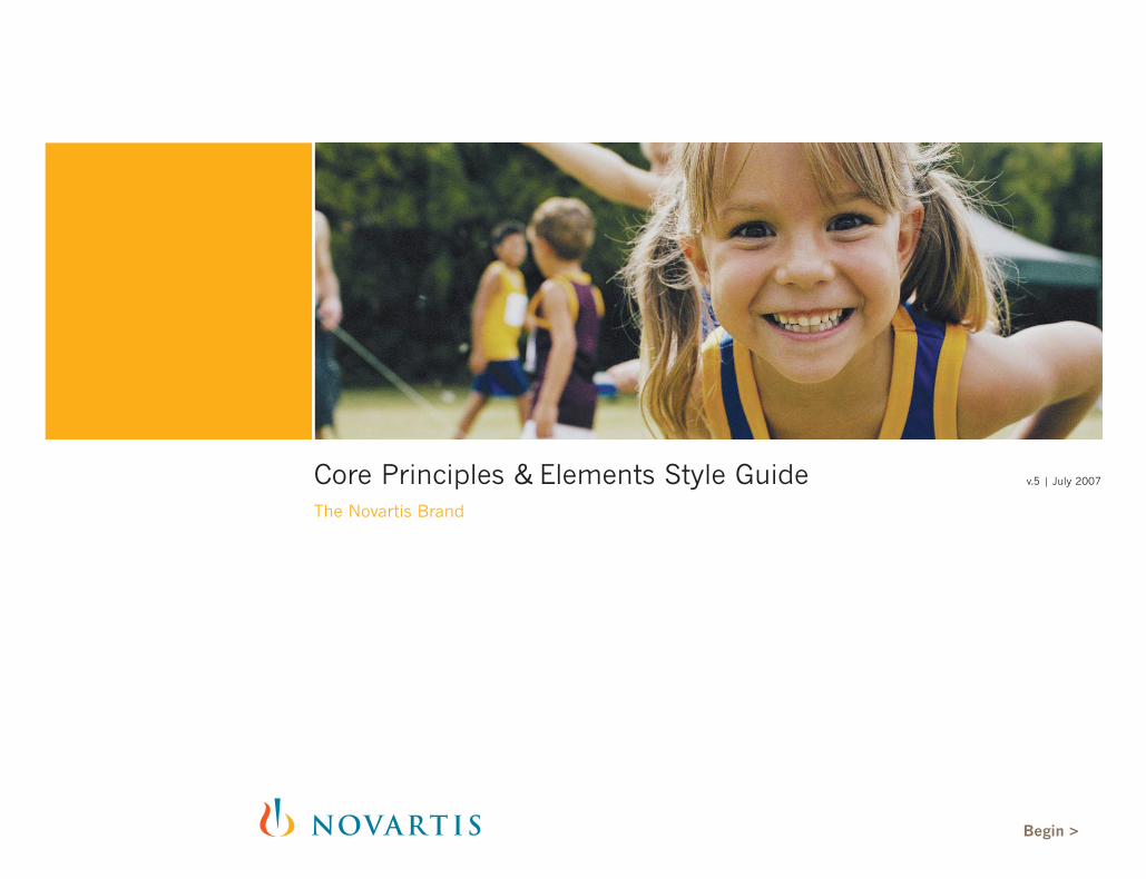
Core Principles & Elements Style GuideThe Novartis Brand
v.5 | July 2007
Begin >

3 Introduction: Core Principles
4 Contact
5 Overview: Brand Personality6 Brand Focus 7 Brand Essence 8 Core Brand Themes 9 Brand Style
2
Contents
Core Principles & Elements | Novartis Brand Style Guide | © Novartis 2007 | www.novartisbrandservice.com Contents < Back Forward >
10 Logo10 Revised 11 Tagline 12 Placing the Revised Logo 13 Minimum Space Requirement14 Business Unit and Institute 15 Application 15 Acceptable16 Unacceptable
17 Color Family
18 Typography18 Print & Electronic
19 Core Principles19 Primary White 20 Core Vertical 21 Color/Image Balance
22 Image World23 Content 24 Style 24 Color25 Light26 Perspective27 Image Cropping28 Focus
29 The Grid
30 Layout Samples30 Print 30 Brochure31 Publications32 Advertising33 Stationery34 Folder & Invitation
35 Electronic35 Microsoft Office PowerPoint36 Microsoft Office Word and Excel37 Internet & Intranet

Welcome to the Novartisbrand style guide.
3
Introduction: Core Principles
Core Principles & Elements | Novartis Brand Style Guide | © Novartis 2007 | www.novartisbrandservice.com Contents < Back Forward >
As we continue to expand our business and enhance our per-formance in the global market, we have reaffirmed the NovartisBrand. Understanding the Novartis Brand and how to properlycommunicate it is key to our success. This series of style guideswill assist in the communication of the Novartis brand personality.
On the following pages is a full overview of the brand personality:Brand Focus, Brand Essence, Core Brand Themes, and Brand Style.These concepts are the foundation for our Core Visual Principles.
The strength of the visual Novartis brand identity revolves aroundthe understanding and application of these three components:
Primary WhiteCore VerticalColor/Image Balance
These principles are discussed and illustrated in the NovartisBrand style guides.
Transition Phase:In March 2006, Novartis will begin to apply the new design toNovartis communications. There will be a transition period wherecommunications may exist simultaneously in the old and newdesign. By the end of 2006 and continuing in 2007, the majorityof Novartis materials will appear in the new design.
You should use the new design for newly created materials, butthere is no need to discard existing materials.
There are no new guidelines for product-related materials in 2006.

4
Contact/Service Support & Hotline
Core Principles & Elements | Novartis Brand Style Guide | © Novartis 2007 | www.novartisbrandservice.com Contents < Back Forward >
For guidelines, templates, imagesand comments visit the NovartisBrand Service (NBS) website at: www.novartisbrandservice.com.
You can also contact the NovartisBrand Service team in Basel:
Hotline+41 61 324 88 99
Fax+41 61 321 09 85
Novartis Corporate Brand Management — The Team(Back row) Thomas Nie; (middle row, left to right) Jenny Borgemehn, Chantal Grüter, Karin Erbacher, Tina Martens, Nadine Enke; (front row, left to right) Caroline Fabian, Christine Furler, Andrea Fedriga-Hägeli,Markus Renner, Felix Raeber.
5
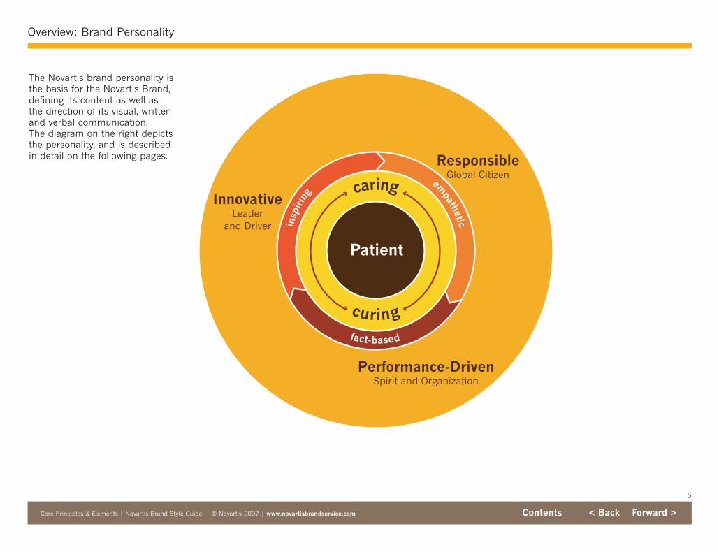
Overview: Brand Personality
Core Principles & Elements | Novartis Brand Style Guide | © Novartis 2007 | www.novartisbrandservice.com Contents < Back Forward >
ResponsibleGlobal Citizen
InnovativeLeader
and Driver
Performance-DrivenSpirit and Organization
empathetic
fact-based
insp
irin
g caring
curing
Patient
The Novartis brand personality isthe basis for the Novartis Brand,defining its content as well as the direction of its visual, writtenand verbal communication. The diagram on the right depictsthe personality, and is described in detail on the following pages.
6
Overview: Brand Personality: Brand Focus
Core Principles & Elements | Novartis Brand Style Guide | © Novartis 2007 | www.novartisbrandservice.com Contents < Back Forward >
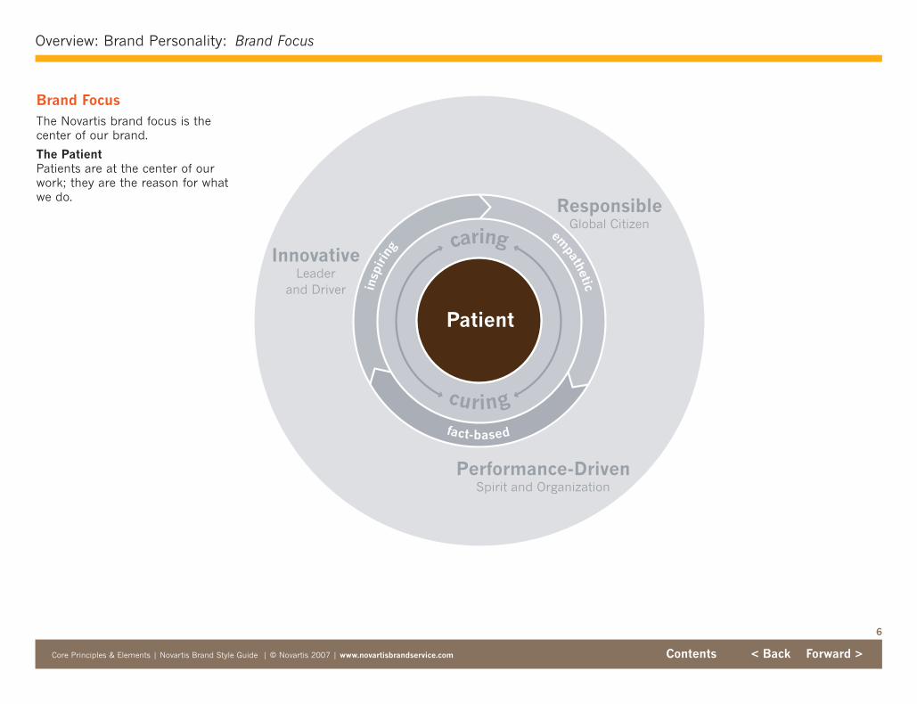
Brand FocusThe Novartis brand focus is thecenter of our brand.
The PatientPatients are at the center of ourwork; they are the reason for whatwe do.
ResponsibleGlobal Citizen
InnovativeLeader
and Driver
Performance-DrivenSpirit and Organization
fact-based
empatheticin
spir
ing caring
curing
PatientPatient
7
Overview: Brand Personality: Brand Essence
Core Principles & Elements | Novartis Brand Style Guide | © Novartis 2007 | www.novartisbrandservice.com Contents < Back Forward >
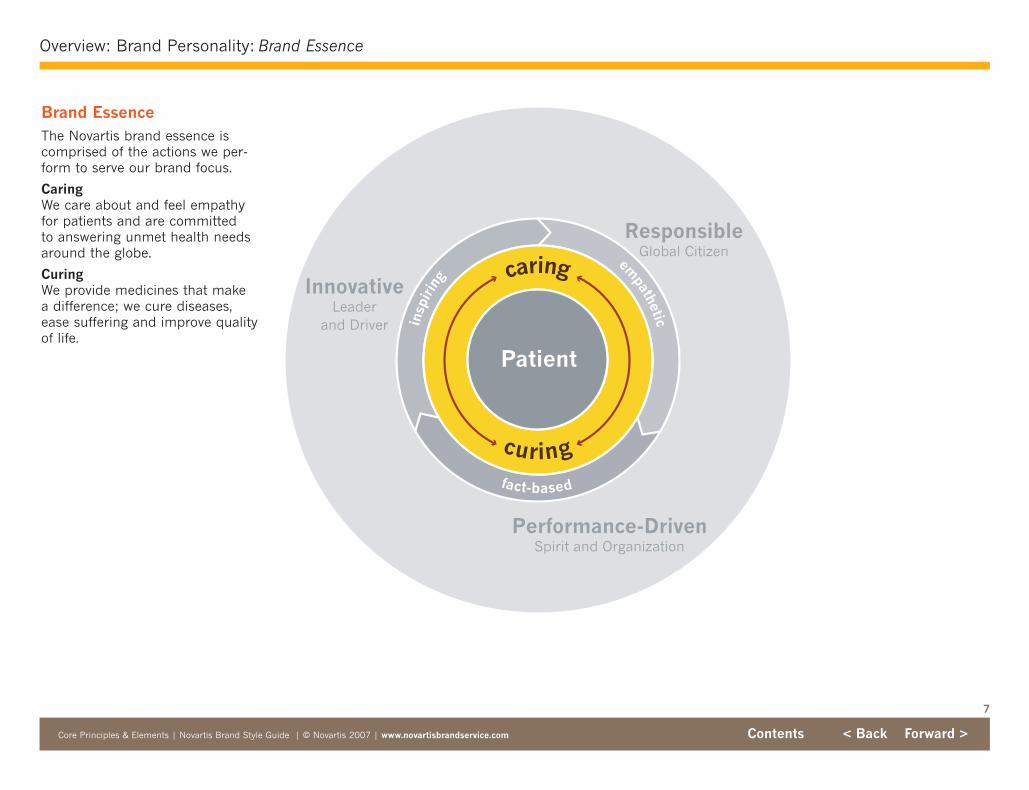
Brand EssenceThe Novartis brand essence iscomprised of the actions we per-form to serve our brand focus.
CaringWe care about and feel empathyfor patients and are committed to answering unmet health needsaround the globe.
CuringWe provide medicines that make a difference; we cure diseases,ease suffering and improve qualityof life.
ResponsibleGlobal Citizen
InnovativeLeader
and Driver
Performance-DrivenSpirit and Organization
fact-based
empatheticin
spir
ing caring
curing
caring
curing
PatientPatient

8
Overview: Brand Personality: Core Brand Themes
Core Principles & Elements | Novartis Brand Style Guide | © Novartis 2007 | www.novartisbrandservice.com Contents < Back Forward >
Core Brand ThemesOur core brand themes support,strengthen and enable the Novartisbrand essence. They direct thebroader content for all Novartiscommunication.
InnovativeLeader & Driver
We seek to constantly innovate inthe way we discover and developsuccessful new medicines, in theway we market and deliver thosemedicines to the patients that needthem, and in the way we drive newstandards for the industry.
ResponsibleGlobal Citizen
We operate in an ethical manner,offer transparency, abide by regulatory and legal requirements,and deliver quality products. Wealso choose to help patients andcommunities through our corporatesocial responsibility initiatives.
Performance-DrivenSpirit & Organization
Financial success ensures ourability to care and to cure.Delivering sustainable positivereturn and value fuels our innovation, increases our ability to help patients, and allows us toadequately reward our employeesand shareholders.
ResponsibleGlobal Citizen
InnovativeLeader
and Driver
Performance-DrivenSpirit and Organization
ResponsibleGlobal Citizen
InnovativeLeader
and Driver
Performance-DrivenSpirit and Organization
caring
curing
Patient
fact-based
empatheticin
spir
ing caring
curing
Patient

9
Overview: Brand Personality: Brand Style
Core Principles & Elements | Novartis Brand Style Guide | © Novartis 2007 | www.novartisbrandservice.com Contents < Back Forward >
Brand StyleThe Novartis brand style characterizes our behavior andguides the tonality of all companycommunication.
InspiringWe think what’s possible. We striveto be best-in-class and drive forsuperior results. We challenge con-ventional thinking. We constantlyseek the next breakthrough andprovide new hope for patients.
EmpatheticWe identify and connect with thefeelings and thoughts of ourpatients and stakeholders. We seekto understand and respond to theirneeds, and give them the respectthey deserve, whoever they are andwherever they are present.
Fact-BasedWe communicate with facts. We donot make boastful claims or unre-alistic promises. Our transparencywith patients and customers buildscredibility and respect.
ResponsibleGlobal Citizen
InnovativeLeader
and Driver
Performance-DrivenSpirit and Organization
fact-based
empatheticin
spir
ing
empathetic
fact-based
insp
irin
g caring
curing
Patient
caring
curing
Patient

The Novartis logo has beenrevised, through adjustments tothe letterspacing, to achievegreater presence and impact. Inaddition, the color blue has beenmade warmer to complement theNovartis color family. The logo isthe foundation for all design withinthe brand.
The revised logo should be used inall new applications, but it is notnecessary to reprint materials thatuse the existing logo.
Observe the minimum size requirement at right.
See the Novartis Brand Services(NBS) website to access logos inall color and file formats: PMS forcoated stock; PMS for uncoatedstock; CMYK for 4-color processprinting; JPG in RGB for Word,PowerPoint, video and web; JPG in CMYK for higher resolutionrequests; and PDF for viewing only.
Never alter the logo in any way;the electronic logo files availableon the Brand Service website arethe only files that should be used.
10
Logo: Revised
Core Principles & Elements | Novartis Brand Style Guide | © Novartis 2007 | www.novartisbrandservice.com Contents < Back Forward >
Minimum Acceptable UsageThe minimum size of the logo is 20 mm or .8".
20 mm
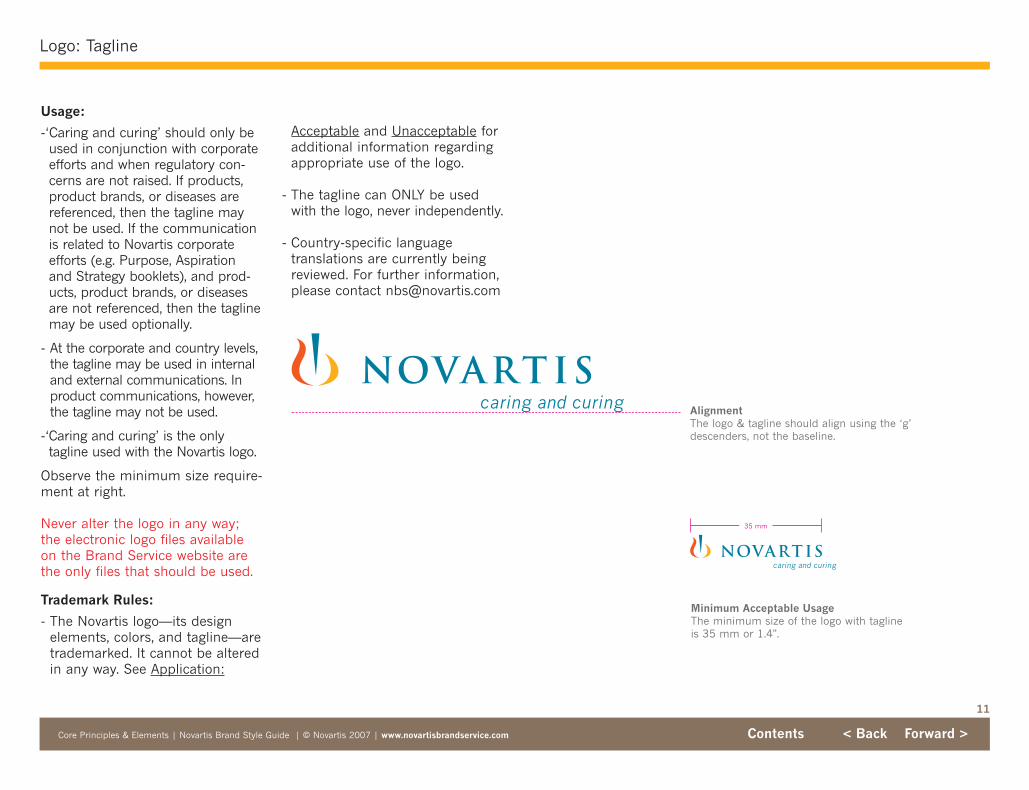
Usage:
-‘Caring and curing’ should only beused in conjunction with corporateefforts and when regulatory con-cerns are not raised. If products,product brands, or diseases arereferenced, then the tagline maynot be used. If the communicationis related to Novartis corporateefforts (e.g. Purpose, Aspirationand Strategy booklets), and prod-ucts, product brands, or diseasesare not referenced, then the taglinemay be used optionally.
- At the corporate and country levels,the tagline may be used in internaland external communications. Inproduct communications, however,the tagline may not be used.
-‘Caring and curing’ is the onlytagline used with the Novartis logo.
Observe the minimum size require-ment at right.
Never alter the logo in any way;the electronic logo files availableon the Brand Service website arethe only files that should be used.
Trademark Rules:
- The Novartis logo—its design elements, colors, and tagline—aretrademarked. It cannot be alteredin any way. See Application:
11
Logo: Tagline
Core Principles & Elements | Novartis Brand Style Guide | © Novartis 2007 | www.novartisbrandservice.com Contents < Back Forward >
AlignmentThe logo & tagline should align using the ‘g’descenders, not the baseline.
Minimum Acceptable UsageThe minimum size of the logo with taglineis 35 mm or 1.4".
35 mm
Acceptable and Unacceptable foradditional information regardingappropriate use of the logo.
- The tagline can ONLY be usedwith the logo, never independently.
- Country-specific language translations are currently beingreviewed. For further information,please contact [email protected]

12
Logo: Placing the Revised Logo
Core Principles & Elements | Novartis Brand Style Guide | © Novartis 2007 | www.novartisbrandservice.com Contents < Back Forward >
Width of logo symbol is measure of correct scale
When updating existing materialswith the revised logo, match thewidth of the symbols of the twologos to achieve correct scale (seeillustration at right).
The revised logo should be used inall new applications, but it is notnecessary to reprint materials thatuse the existing logo.

Unless otherwise prescribed, thelogo should be surrounded by anarea of white space equal to atleast two X-height units (see illus-trations at right). The X-height isdefined as a square whose sidesare the same length as the heightof the “NOVARTIS” letters in thebrand logo.
13
Logo: Minimum Space Requirement
Core Principles & Elements | Novartis Brand Style Guide | © Novartis 2007 | www.novartisbrandservice.com Contents < Back Forward >
X-height
x
x
x
x
x
x xx
X-height
x
x
x
x
x
x xx

Each Novartis business unit andinstitute should use the logo thathas been created for it. Theselogos, like the corporate logo, havebeen revised.
All rules regarding usage of thestandard logo apply to the businessunit and institute logos as well.
Never alter the logo in any way; theelectronic logo files available on theBrand Service website are the onlyfiles that should be used.
Taglines cannot be used with busi-ness unit logos.
See the NBS website to accesslogos in all color and file formats.
Only Novartis business units andinstitutes are allowed to have theirown logo. There are no separatelogos for franchises, divisions oroffices; instead, these entitiesshould use the Novartis logo. Seebrand architecture on the NBSwebsite.
14
Logo: Business Unit and Institute Logos
Core Principles & Elements | Novartis Brand Style Guide | © Novartis 2007 | www.novartisbrandservice.com Contents < Back Forward >
Minimum Acceptable UsageThe minimum size of a business unit/insti-tute logo is 40 mm or 1.6". If your formatrequires a smaller size, use the corporatelogo instead of the BU or institute logo.
40 mm
15
Logo: Application: Acceptable
Core Principles & Elements | Novartis Brand Style Guide | © Novartis 2007 | www.novartisbrandservice.com Contents < Back Forward >
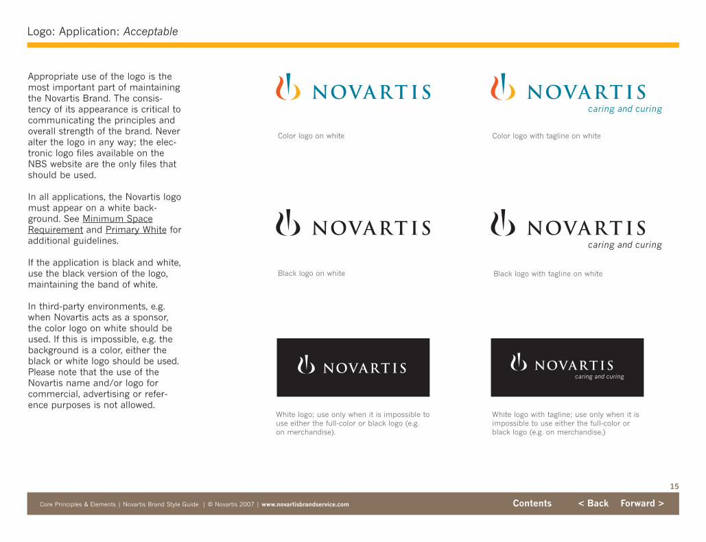
Appropriate use of the logo is themost important part of maintainingthe Novartis Brand. The consis-tency of its appearance is critical tocommunicating the principles andoverall strength of the brand. Neveralter the logo in any way; the elec-tronic logo files available on theNBS website are the only files thatshould be used.
In all applications, the Novartis logomust appear on a white back-ground. See Minimum SpaceRequirement and Primary White foradditional guidelines.
If the application is black and white,use the black version of the logo,maintaining the band of white.
In third-party environments, e.g.when Novartis acts as a sponsor,the color logo on white should beused. If this is impossible, e.g. thebackground is a color, either theblack or white logo should be used.Please note that the use of theNovartis name and/or logo forcommercial, advertising or refer-ence purposes is not allowed.
White logo; use only when it is impossible touse either the full-color or black logo (e.g.on merchandise).
White logo with tagline; use only when it isimpossible to use either the full-color orblack logo (e.g. on merchandise.)
Color logo on white
Black logo on white Black logo with tagline on white
Color logo with tagline on white

Do not change the logo typeface.
NOVARTIS
Do not skew or stretch the logo.
16
Logo: Application: Unacceptable
Core Principles & Elements | Novartis Brand Style Guide | © Novartis 2007 | www.novartisbrandservice.com Contents < Back Forward >
Do not use the black & white logo in colorapplications.
Do not alter the elements of the logo.
Do not change the colors of the logo.
Do not use the color logo on a colored background.
Do not crop the logo.
Do not add effects or shadows to the logo.
Do not rotate the logo.
A few examples of unacceptablelogo uses. Never alter the logo inany way; the electronic logo filesavailable on the NBS website arethe only files that should be used.
Do not use the logo on photographic backgrounds.
Do not use elements of the logo individually or as a super graphic.
Think what's possible.
Do not use any other taglines with thelogo.
17
Color Family
Core Principles & Elements | Novartis Brand Style Guide | © Novartis 2007 | www.novartisbrandservice.com Contents < Back Forward >
The Novartis color family consistsof white, the three logo colors, andfive additional colors. Novartis Blueis used exclusively in the logo itself,never elsewhere.
White is a key element in illus-trating the Novartis visual identity.See Primary White.
179C
Warm Red U
0c 80m 100y 0k
0c 80m 100y 0k
228r 76g 22b
E44C16
2002
0405070
124C
129U
0c 35m 100y 0k
0c 25m 85y 0k
252r 175g 23b
FCAF17
1003
0757080
Tints in increments of 10% are an acceptable application of color.
Pantone Coated
Pantone Uncoated
Process Coated
Process Uncoated
RGB
HTML
RAL Classic
RAL Design
4975C
504U
70c 80m 100y 30k
60c 80m 100y 30k
99r 67g 41b
634329
8017
0402019
492C
704U
30c 90m 100y 15k
10c 100m 80y 15k
146r 50g 34b
923222
3011
0303040
152C
144U
0c 60m 100y 0k
0c 35m 100y 0k
236r 128g 38b
EC8026
2011
0606080
116C
108U
0c 15m 100y 0k
0c 6m 100y 0k
254r 211g 0b
FED300
1023
0808090
155C
155U
0c 10m 25y 0k
0c 6m 18y 0k
245r 235g 215b
F5EBD7
9001
0759020
314C
314U
100c 0m 10y 35k
100c 0m 10y 35k
0r 127g 161b
007FA1
5019
2105045
Reserve blue for logo use only.
Logo color Logo color
Brown Maroon Red Orange Dark Yellow Bright Yellow BeigeBlue
Logo color

18
Typography: Print & Electronic
Core Principles & Elements | Novartis Brand Style Guide | © Novartis 2007 | www.novartisbrandservice.com Contents < Back Forward >
Print Electronic
For use in:
HeadlinesSubheadsBody textCaptionsChart textCall-outsFoliosURLs
News Gothic MT is the preferredtypeface for all printed materials.
For use in:
CaptionsCall-outs
For use in:
InternetIntranet
For use in:
EmailPowerPointWord Excel
Usage guidelines for fonts in thesecontexts are in development, to beavailable in 2007. Until then, usethe fonts that currently exist incompany templates.
News Gothic MT
ABCDEabcde12345ABCDEabcde12345ABCDEabcde12345ABCDEabcde12345
Sabon
ABCDEabcde12345ABCDEabcde12345ABCDEabcde12345ABCDEabcde12345
Verdana
ABCDEabcde12345ABCDEabcde12345ABCDEabcde12345ABCDEabcde12345
Arial
ABCDEabcde12345
ABCDEabcde12345ABCDEabcde12345
ABCDEabcde12345
Appropriate typography is impor-tant in the presentation of theNovartis Brand. Guidelines at rightexplain which typefaces can beused in specific contexts; do notvary from these specifications orintroduce other typefaces.
Print Media News Gothic MT is the preferredtypeface for all printed materials.
Sabon, Novartis’ second typefacefor print applications, is usedmainly for captions and call-outs.
Electronic MediaArial is the preferred typeface for Email, PowerPoint, Excel andWord documents.
Verdana is the preferred typefacefor HTML text in internet andintranet webpages.
For more information on propertypography, including issues of size,style, spacing, etc., refer to the styleguide that is specific to your need:Print Media, Intranet, Internet, orPowerPoint.
A note on font versions:You may have versions of both News GothicMT and Sabon that are more recent (i.e.,Adobe Open Type Sabon and/or MonotypeNews Gothic MT) than those that are availablefor download on the NBS website. Thesenewer versions are the same as previous versions, and therefore safe to use.

19
Core Principles: Primary White
Core Principles & Elements | Novartis Brand Style Guide | © Novartis 2007 | www.novartisbrandservice.com Contents < Back Forward >
Electronic
The Logo
The Novartis logo must always bepositioned within an area of invio-lable white space. This band of white is flexible, but alwaysedge-to-edge. The band of whiteserves to create presence for thelogo. It is different from and in addition to the Minimum SpaceRequirement.
In General
White brings elegance to theNovartis brand personality.
White is the only proper setting forthe Novartis color logo.
White is the primary color of theNovartis brand personality—notred, orange, yellow or brown. Thesecolors should be used for accentonly.
White is the optimal canvas for theNovartis color palette.
White is the optimal canvas for theNovartis image world.
Paper Quality
Because brand materials will beprimarily white, take extra care toensure that paper used for printinghas sufficient opacity. Paper qualityis important and should not besacrificed for budget purposes.This means that top quality papershould always be your first choice.For specific guides regardingAmerican and European papertypes, see Print Media Style Guide.
20
Core Principles: Core Vertical
Core Principles & Elements | Novartis Brand Style Guide | © Novartis 2007 | www.novartisbrandservice.com Contents < Back Forward >
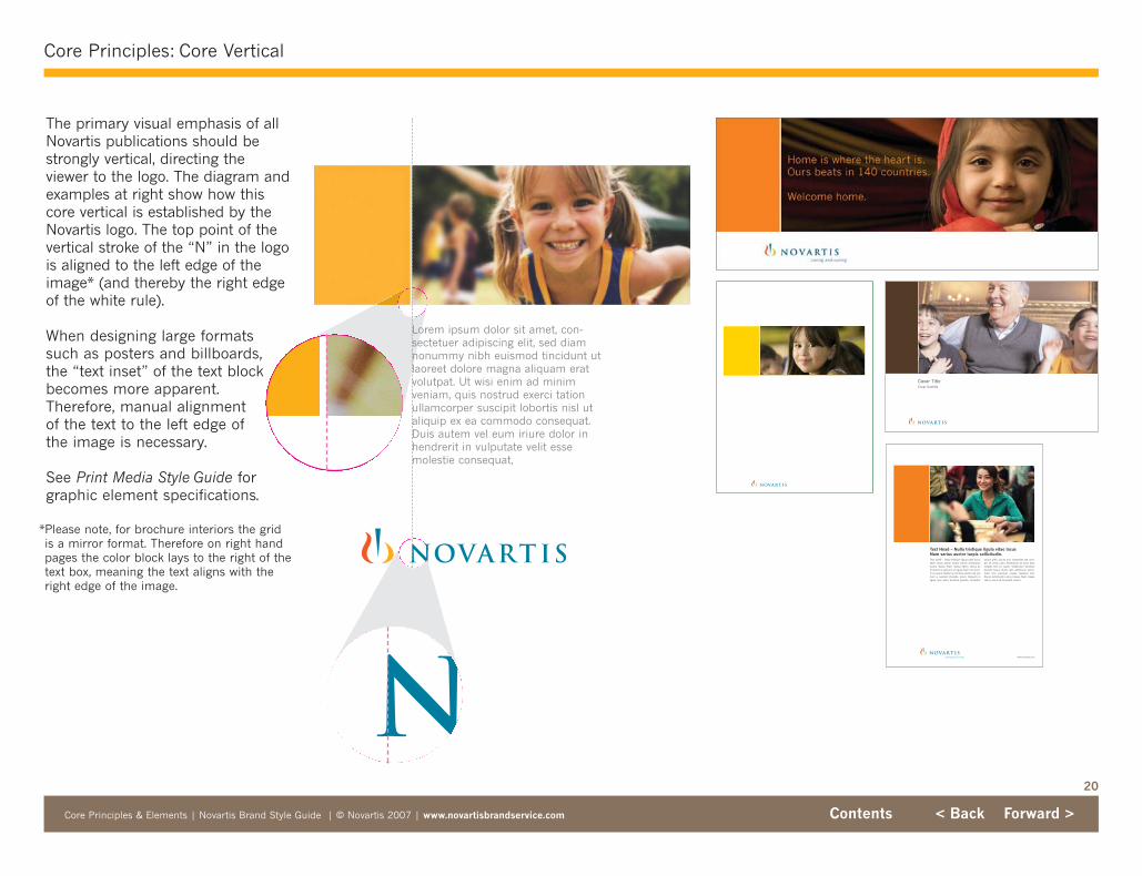
The primary visual emphasis of allNovartis publications should bestrongly vertical, directing theviewer to the logo. The diagram andexamples at right show how thiscore vertical is established by theNovartis logo. The top point of thevertical stroke of the “N” in the logois aligned to the left edge of theimage* (and thereby the right edgeof the white rule).
When designing large formats such as posters and billboards,the “text inset” of the text blockbecomes more apparent.Therefore, manual alignment of the text to the left edge ofthe image is necessary.
See Print Media Style Guide forgraphic element specifications.
*Please note, for brochure interiors the gridis a mirror format. Therefore on right handpages the color block lays to the right of thetext box, meaning the text aligns with theright edge of the image.
Cover Title Cover Subtitle
www.novartis.com
Text 1st ¶ – Nulla tristique ligula vitae lacus.Nam varius auctor turpis. Donec sollicitudinluctus massa. Nam massa libero, varius at,tincidunt in, pretium ut, ligula. Nam non enim.In eu quam. Nullam enim felis, auctor sed, pretium a, suscipit molestie, lorem. Aliquam inligula quis diam faucibus gravida. Curabitur
neque ante, iaculis non, imperdiet sed, tem-por sit amet, justo. Vestibulum ali quet. Duissodales felis eu quam. Vestibulum faucibusblandit neque. Nulla velit vestibulum sollici-tudin thai osemper massa. Quisque libe.Donec sollicitudin luctus massa. Nam massalibero, varius at, tincidunt inenim.
Text Head – Nulla tristique ligula vitae lacusNam varius auctor turpis sollicitudin.
Lorem ipsum dolor sit amet, con-sectetuer adipiscing elit, sed diamnonummy nibh euismod tincidunt utlaoreet dolore magna aliquam eratvolutpat. Ut wisi enim ad minimveniam, quis nostrud exerci tationullamcorper suscipit lobortis nisl utaliquip ex ea commodo consequat.Duis autem vel eum iriure dolor inhendrerit in vulputate velit essemolestie consequat,

21
Core Principles: Color/Image Balance
Core Principles & Elements | Novartis Brand Style Guide | © Novartis 2007 | www.novartisbrandservice.com Contents < Back Forward >
Whenever possible, imagery shouldbe used in the design of Novartisbrand materials.
Generally speaking, images fromthe Image World, i.e., BrandPersonality images, should alwaysbe paired with color blocks unlessthe layout dictates otherwise (e.g.there may be too many otherimages/graphics and any additionalwould make it too busy or repeti-tive). Support images that are usedin text, e.g. products, personnel,facilities, etc., should not be pairedwith color blocks.
The image & color block unitshould achieve a complementarybalance: color is chosen to comple-ment, not match, the image. Theimage should always be domi-nant—the color block simplyprovides accent.
Note that the color blocks arealways separated from the imagesby the white rule.
See Print Media Style Guide forgraphic element specifications.
Issue # | Month YearB u s i n e s s U n i t
Text Intro – Dolor sit amet, consectetuer adipitoing elit, sed diam nonummy nibh euismodtincidunt ut laoreet dolore magna aliquamerat volutpat. Ut wisi enim ad minim veniam,quis nostrud exerci tation ullamcorp ter suscipit lobortis nisl ut aliquip ex ea commodoconsequat. Duis autem vel eum iriure dolorin hendrerit in vulputate velit esse molestieconsequat, vel illum dolore eu feu giat nullafacilisis at vero eros et accumsan.
Text – Usto odio digni pessim qui blanditpraesent lup tatum azrildelenit augue duisdolore te feugait nulla facilisi. Lorem ipsumdolor sit amet, consectetuer adipiscing elit,sed diam nonummy nibh euismod tinciduntut laoreet dolore magna aliquam erat volut-pat. Ut wisi enim ad minim veniam, quisnostrud exerci tation ullamcorper suscipitlobortis nisl ut aliquip ex ea commodo.
Text – Autem vel eum iriure dolor in hendrerit in vulputate velit esse molestie conse-quat, vel illum dolore eu feugiat nulla facilisisat vero eros et accumsan et iusto odio dignis
Text – Ribh ut wisi enim ad minim veniam,quis nostrud exerci tation ullamcorper suscip-it lobortis nisl eut aliquip vex ea commodoconsequat. Duis autem vel eum iriure dolor inhendrerit in vulputate velit esse molestie consequat, vel illum tro dolore neu feugiat nulladolore eu feugiat nulla facilisis at vero eros etaccumsan et iusto odio dignissim qui blanditpraesent luptatum azrildelenit augue duis
Text – Autem vel eum iriure dolor in hendrerit in vulputate velit esse molestie conse-quat, vel illum dolore eu feugiat nulla facilisisat vero eros et accumsan et iusto odio dignidolore te feugait. Lorem ipsum dolor sit amet,consectetuer adipiscing elit, sed diam non-ummy nibh euismod tincidunt ut laoreetdolore magna aliquam erat volutpat. Ut wisi
enim ad minim veniam, quis nostrud exercitation ullamcorper suscipit lobortis nisl utaliquip ex ea commodo consequat.
Text – Ribh dictum ipsum. Fusce at esturna aliquet posuere. Nulla dignissim nulla eteros. Fusce quis metus. Ut sapien massa,tempus vel, cursus eu, commodo sed, velit.Nam volutpat tortor eget erat pretium ultri-ces. Donec a ante non ante ultrices euismod.Morbi vestibulum pharetra tellus. Cum sociisnatoque penatibus et magnis dis parturientmontes, nascetur ridiculus mus. Nam sapien.Proin suscipit convallis. Quisque velit. Etiamporta gravida arcu.
Text – Ribh ut wisi enim ad minim veniam,quis nostrud exerci tation ullamcorper suscipvit lobortis nisl tut aliquip ex ea commodoconsequat. Duis autem vel eum iriure dolor inhendrerit in vulputate velit esse molestie consequat, vel illum dolore eu feugiat nulla facilisiso at vero eros et acc tumsan et iusto odiodignissim oqui to blandit praesent luptatumazrildelenit augue duis dolore te feugait. Text Subhead – Ribh dictum ipsum deloText 1st ¶ – Ribh ut wisi enim ad minim veniam, quis nostrud exerci tation ullamcom persuscipit lobortis nisl ut aliquip ex ea commodol consequat. Duis autem velol eum iriuredolor rinty hendrerit in vulputate velit essemolestie con, vel illum doloren plu eu nullaat.
Text – Ribh ut wisi enim ad minim veniam,quis nostrud exerci tation ullamcorper suscip-it lobortis nisl ut aliquip ex ea commodoconsequat. Duis autem vel eum iriure dolor inhendrerit in vulputate velit esse molestie consequat, vel illum dolore eu feugiat nulla facili-sis at vero eros et accumsan et iusto odiodignissim qui blandit vulputate velit essepraesent luptatum azrildelenit augue duisdolore te augue feugait.
Tagline – Dolore eu feugiat nulla
Masthead
Text Sidebar – Vel eumiriure dolor in hend reritin vulpu tatem velit essemolestie consequat, velillum dolore eu feugiatnulla ult facilisis at veroeros et accumula san etiusto duis dolore te feugait nulla fisi. Nam liber.
Vertical A4 brochure cover and interior spread
Newsletter Style Guide
Magazine
Home is where the heart is. Ours beats in 140 countries .
Welcome home.
caring and curing
Poster
22
Image World
Core Principles & Elements | Novartis Brand Style Guide | © Novartis 2007 | www.novartisbrandservice.com Contents < Back Forward >
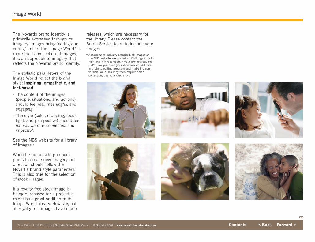
The Novartis brand identity is primarily expressed through itsimagery. Images bring ‘caring andcuring’ to life. The “Image World” ismore than a collection of images; it is an approach to imagery thatreflects the Novartis brand identity.
The stylistic parameters of theImage World reflect the brandstyle: inspiring, empathetic, andfact-based.
- The content of the images(people, situations, and actions)should feel real, meaningful, andengaging;
- The style (color, cropping, focus,light, and perspective) should feelnatural, warm & connected, andimpactful.
See the NBS website for a library of images.*
When hiring outside photogra-phers to create new imagery, artdirection should follow theNovartis brand style parameters.This is also true for the selectionof stock images.
If a royalty free stock image isbeing purchased for a project, itmight be a great addition to theImage World library. However, notall royalty free images have model
releases, which are necessary forthe library. Please contact theBrand Service team to include yourimages.* According to industry standard, all images on
the NBS website are posted as RGB jpgs in bothhigh and low resolution. If your project requiresCMYK images, open your downloaded RGB filesin a photo editing program and make the con-version. Your files may then require colorcorrection; use your discretion.
23
Image World: Content
Core Principles & Elements | Novartis Brand Style Guide | © Novartis 2007 | www.novartisbrandservice.com Contents < Back Forward >
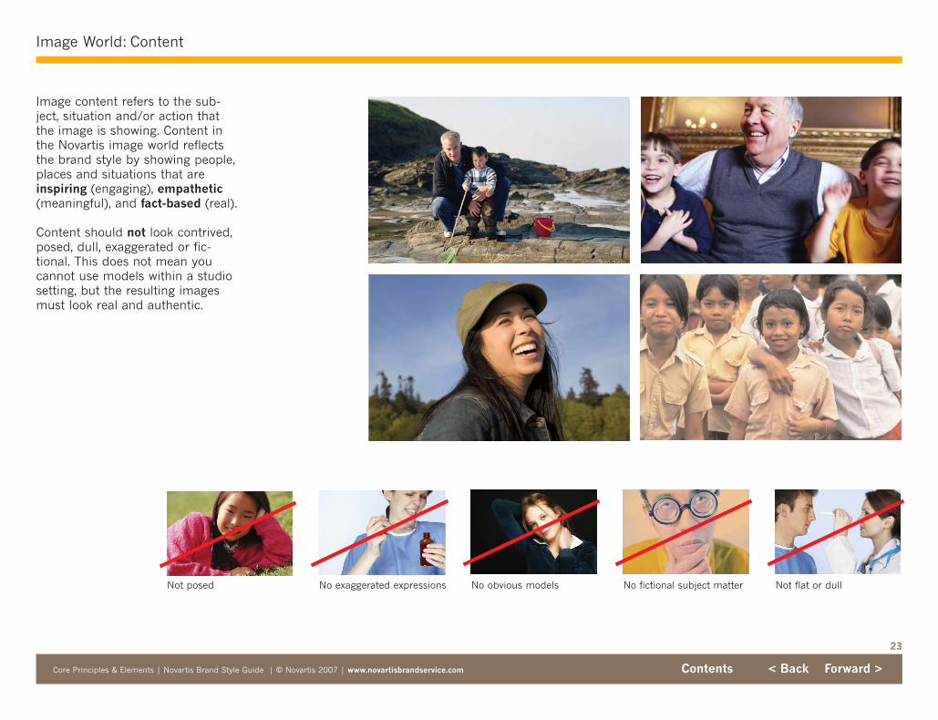
Not posed No exaggerated expressions No fictional subject matterNo obvious models Not flat or dull
Image content refers to the sub-ject, situation and/or action thatthe image is showing. Content inthe Novartis image world reflectsthe brand style by showing people,places and situations that areinspiring (engaging), empathetic(meaningful), and fact-based (real).
Content should not look contrived,posed, dull, exaggerated or fic-tional. This does not mean youcannot use models within a studiosetting, but the resulting imagesmust look real and authentic.

24
Image World: Style: Color
Core Principles & Elements | Novartis Brand Style Guide | © Novartis 2007 | www.novartisbrandservice.com Contents < Back Forward >
The Novartis Color Family is warm.To complement this palette theimages should also have a sense ofwarmth. Avoid images that feel cold(i.e., blue, green, or gray tones) orartificially colored.
Warmth can be enhanced in animage by including warm-tonedobjects and backgrounds, or sub-jects that are wearing warm-tonedclothing.
You can also digitally add warmthto stock images that are slightlycool. However, the enhanced imageshould still look natural.
25
Image World: Style: Light
Core Principles & Elements | Novartis Brand Style Guide | © Novartis 2007 | www.novartisbrandservice.com Contents < Back Forward >
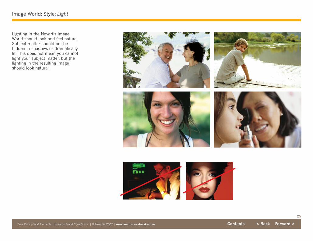
Lighting in the Novartis ImageWorld should look and feel natural.Subject matter should not behidden in shadows or dramaticallylit. This does not mean you cannotlight your subject matter, but thelighting in the resulting imageshould look natural.

26
Image World: Style: Perspective
Core Principles & Elements | Novartis Brand Style Guide | © Novartis 2007 | www.novartisbrandservice.com Contents < Back Forward >
The perspective of Novartisimagery is eye-level to elicit anauthentic connection with the sub-ject. Images shot from above orbelow should not be used.

27
Image World: Style: Cropping
Core Principles & Elements | Novartis Brand Style Guide | © Novartis 2007 | www.novartisbrandservice.com Contents < Back Forward >
The crop of an image can increasevisual interest and/or change thenarrative of a picture. Images inthe Novartis Image World are fre-quently cropped closely to thesubject, in a strongly horizontal orientation.
Cropped image
Cropped image
Original image
Original image

28
Image World: Style: Focus
Core Principles & Elements | Novartis Brand Style Guide | © Novartis 2007 | www.novartisbrandservice.com Contents < Back Forward >
The focal point of an image showswhat is important. Use a shallowdepth of field to focus the viewer’sattention on your subject.
If your image lacks a clear focalpoint, you can digitally blur (in asubtle manner) the area aroundyour subject to define it. Make surethat the resulting image feels natural.
Original image More defined focal point
Digital manipulation can alter depth of field
29
The Grid
Core Principles & Elements | Novartis Brand Style Guide | © Novartis 2007 | www.novartisbrandservice.com Contents < Back Forward >
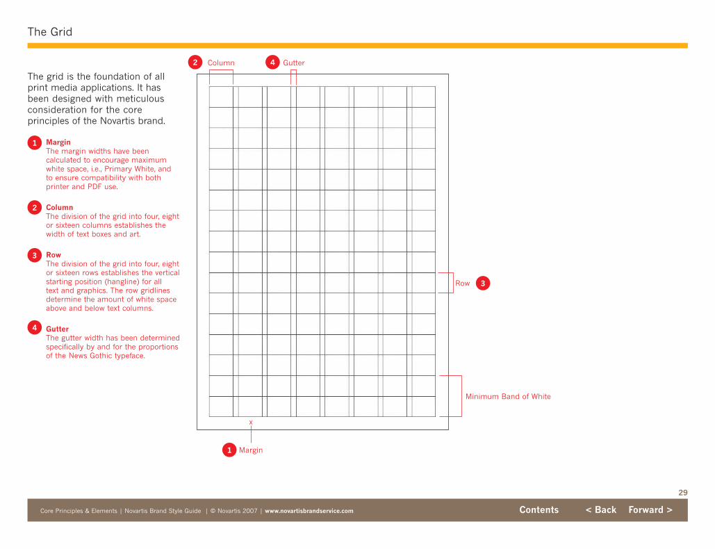
The grid is the foundation of allprint media applications. It hasbeen designed with meticulous consideration for the core principles of the Novartis brand.
MarginThe margin widths have been calculated to encourage maximumwhite space, i.e., Primary White, and to ensure compatibility with bothprinter and PDF use.
ColumnThe division of the grid into four, eightor sixteen columns establishes thewidth of text boxes and art.
RowThe division of the grid into four, eightor sixteen rows establishes the verticalstarting position (hangline) for all text and graphics. The row gridlinesdetermine the amount of white spaceabove and below text columns.
GutterThe gutter width has been determinedspecifically by and for the proportionsof the News Gothic typeface.
Column
Row
Minimum Band of White
Gutter
Margin
x
1
1
4
4
2
2
3
3
30
Core Principles & Elements | Novartis Brand Style Guide | © Novartis 2007 | www.novartisbrandservice.com Contents < Back Forward >
Samples: Print: Brochures
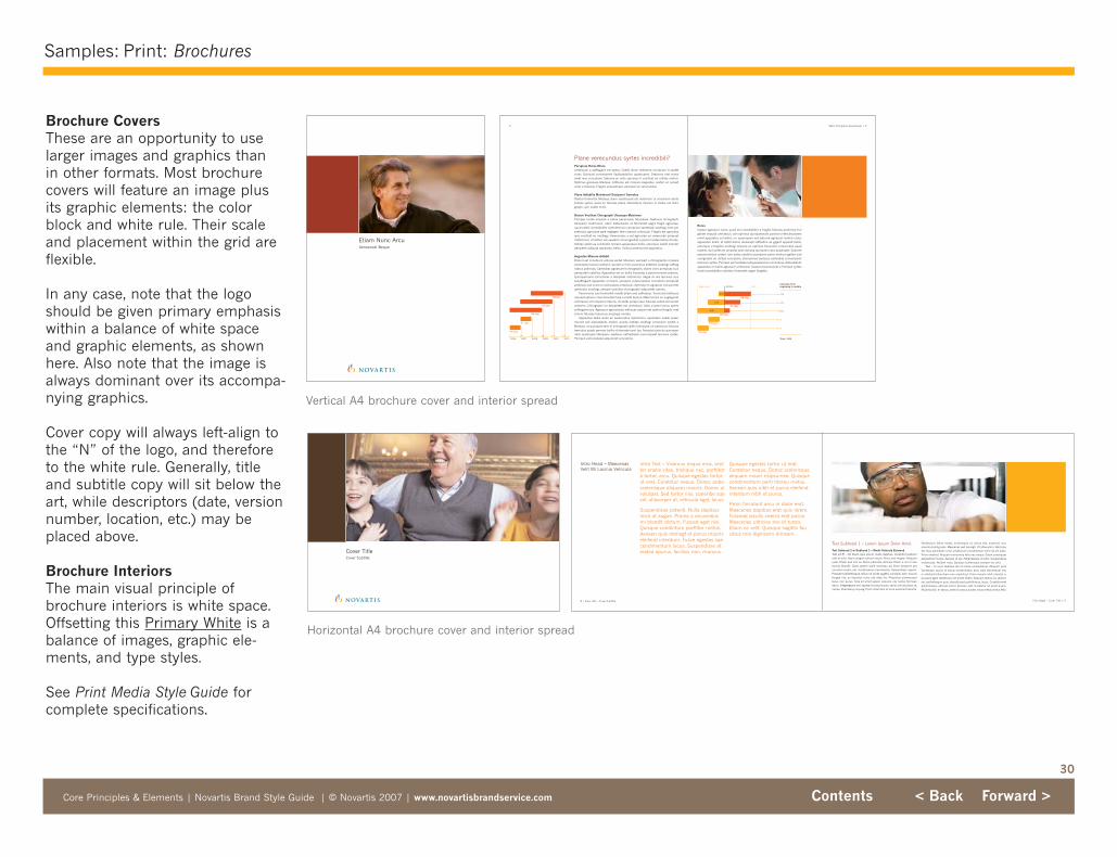
Brochure CoversThese are an opportunity to uselarger images and graphics than in other formats. Most brochurecovers will feature an image plusits graphic elements: the colorblock and white rule. Their scaleand placement within the grid areflexible.
In any case, note that the logoshould be given primary emphasiswithin a balance of white spaceand graphic elements, as shownhere. Also note that the image isalways dominant over its accompa-nying graphics.
Cover copy will always left-align tothe “N” of the logo, and thereforeto the white rule. Generally, titleand subtitle copy will sit below theart, while descriptors (date, versionnumber, location, etc.) may beplaced above.
Brochure InteriorsThe main visual principle ofbrochure interiors is white space.Offsetting this Primary White is abalance of images, graphic ele-ments, and type styles.
See Print Media Style Guide forcomplete specifications.
Horizontal A4 brochure cover and interior spread
Vertical A4 brochure cover and interior spread
Cover Title Cover Subtitle
Text Subhead 1 – Lorem Ipsum Dolor Amet
Text Subhead 2 w/Subhead 1 – Morbi Vehicula EuismodText 1st ¶ – Od libero quis ipsum matis dapibus. Curabitur pretiumvelit et odio. Nam congue rutrum neque. Nunc sed magna. Aliquamjusto. Etiam sed orci eu libero pharetra ultricies. Etiam a orci in leolacinia blandit. Class aptent taciti sociosqu ad litora torquent perconubia nostra, per inceptoseous hymenaeos. Suspendisse sapien.Praesent pellentesque, tellus sit amet sagittis convallis, sem maurisfeugiat nisi, ac faucibus nunc nisl vitae leo. Phasellus ullamcorperlacus non purus. Cras sit amet sapien posuere nisi luctus fermeanetum. Integergrase orci sapien, tincidunt quis, varius vel, faucibus at,neque. Etiamasoy nequeg. Proin vitae felis id urna euismod lobortis.
Vestibulum tellus metus, scelerisque ut, varius sed, euismod non,mauris piscing eros. Maecenas sed lacusgh. Ut vitae enim. Vehicula,est risus solicitudin urna, vestibulum consectetuer velit nisl vel justo.Proin eleifend. Aliquam nonummy felis nec neque. Etiam consequatelementum turpis. Aenean id leo. Pellentesque id odio. Suspendissemalesuada. Nullam risus. Quisque scelerisque semper leo orbi.
Text – In nunc dapibus dui id conse consectetuer. Aliquam perellentesque, purus id varius consectetuer, arcu odio elementum est,in eleifend tellus diam non eroshilouf. Proin mauris nibh, lobortis a,posuere eget, vestibulum sit amet, libero. Aliquam lectus lor, dictumvel, pellentesque quis, blanditused porttitorous, lacus. Curabiturerefpellentesque ultricies tortor. Aenean velit. Curabitur sit amet quam.Nulla facilisi. In varius, ante id cursus auctor, risus metus varius felis.
Folio Right – Cover Title | 9
Intro Text – Vivamus neque eros, venttor enatis vitae, tristique nec, porttitora tortor, arcu. Quisque egestas tortorut erat. Curabitur neque. Donec poboscelerisque aliquam mauris. Donec ulvolutpat. Sed tortor nisi, sceleribe sqevel, ullacorper at, vehicula eget, lacus.
Suspendisse potenti. Nulla dapibusnisia ut augue. Proina a arcuvelousmi blandit dictum. Fusced eget nisi.Quisque condintum porttitor metus.Aenean quis nibhegf et purus mauriseleifend interdum. Fusce egestas sqecondimentum lacus. Suspendisse ateratea epurus, facilisis non, rhoncus.
Quisque egestas tortor ut erat.Curabitur neque. Donec scelerisquealiquam mauri risipsumeo. Quisquecondimentum porti titorou metus.Aenean quis nibh et purus eleifendinterdum nibh et purus.
Proin tincidunt arcu in dolor erat.Maecenas dapibus erat quis lorem.Fuscead iaculis viverra erat purus.Maecenas ultricies nisi id turpis.Etiam ac velit. Quisque sagittis faucibus mia dignissim dimsam.
Intro Head – MaecenasVelit Mi Lacinia Vehicula
8 | Folio Left – Cover Subtitle
31
Samples: Print: Publications
Core Principles & Elements | Novartis Brand Style Guide | © Novartis 2007 | www.novartisbrandservice.com Contents < Back Forward >
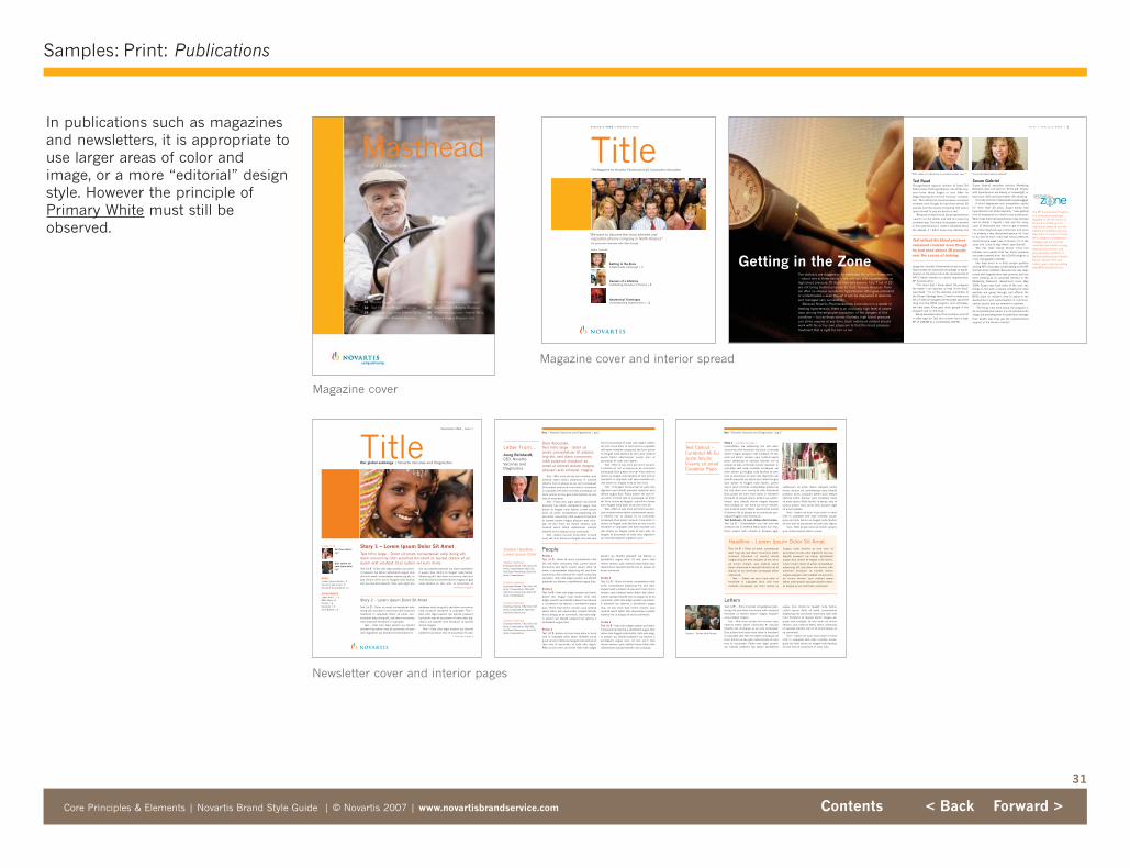
In publications such as magazinesand newsletters, it is appropriate touse larger areas of color andimage, or a more “editorial” designstyle. However the principle ofPrimary White must still beobserved.
Magazine cover
Magazine cover and interior spread
Newsletter cover and interior pages
Story 1 – Lorem Ipsum Dolor Sit Amet Text Intro large – Dolor sit amet, consectetuer adip itoing elit,diam nonummy nibh euismod tincidunt ut laoreet dolore sit aliquam erat volutpat. Duis autem vel eum iriure.
Vel illum dolorepg5
Duis autem veleum iriure dolorpg5
September 2006 | Issue 1
NEWSLorem ipsum dolore | 2Vel illum giat nulla | 5tincidunt ut laorett ad | 5
DEPARTMENTSLetter from… | 2R&D News |4People | 2Calendar | 4Tech Report | 4
I n s i d e l o o k
TitleOur global exchange | Novartis Vaccines and Diagnostics
Text 1st ¶ – Disto odio digni pessim qui bland-it praesent lup tatum azrildelenit augue duisdolor sit amet, consectetuer adipiscing elit, utpat. Ut wisi enim ad eu feugiat nulla facilisissim qui blandit praesent. Usto odio digni pes
sim qui blandit praesent lup tatum azrildelenit augue duis dolore te feugait nulla facilisi.Adipiscing elit, sed diam nonummy nibh euismod tincidunt ut laoreet dolore magna ali giatnulla facilisis at vero eros et accumsan et
> Continued on page 2
Story 2 – Lorem Ipsum Dolor Sit Amet
Text 1st ¶ – Dolor sit amet, consectetuer adipitoing elit, sed diam nonummy nibh euismodhendrerit in vulputate. Dolor sit amet, con-sectetuer adip itoing elit, sed diam nonummynibh euismod hendrerit in vulputate.
Text – Usto odio digni pessim qui blanditpraesent lup tatum eros et accumsan et iustoodio dignissim qui blandit mod tincidunt ut
sectetuer adip itoing elit, sed diam nonummynibh euismod hendrerit in vulputate. Text –Usto odio digni pessim qui blandit praesentlup tatum eros et accumsan et iusto odio dig-nissim qui blandit mod tincidunt ut laoreetdolore magna.
Text – Usto odio digni pessim qui blanditpraesent lup tatum eros et accumsan et iusto
> Continued on page 4
One | Novartis Vaccines and Diagnostics | pg 3
Story 1 > Continued from page 1
consectetuer ela adipiscing elit, sed diamnonummy nibh euismod tincidunt ut laoreetdolore magna aliquam erat volutpat. Ut wisienim ad minim veniam, quis nostrud exercitation ullamcorp er suscipit lobortis nisl utaliquip ex eatu commodo blusoi cosequat. invulputate velit esse molestie consequat, velillum dolore eu feugiat nulla facilisis at veroeros et accumsan et iusto odio dignissim quiblandit praesent lup tatum azril delenit augueduis dolore te feugait nulla facilisi. Loremipsum dolor sit amet, consectetuer adipiscingelit, sed diam non ummy te nibh beuismodDuis autem vel eum iriure dolor in hendrerittincidunt ut laoreet lorem, dictum vel, pellen-tesque quis, blandit dolore magna aliquamerat volutpat. Ut wisi enim ad minim veniam,quis nostrud exerci tation ullamcorper suscipit lobortis nisl ut aliquip ex ea commodo con-sequat feugiat nulla facilisis at.Text Subhead – In nunc daibus dui id conse Text 1st ¶ – Consectetuer, arcu tell odio elementum est, in eleifend tellus diam non eros.Proin mauris nibh, lobortis a, posuere eget,
vestibulum sit amet, libero. Aliquam lectuslorem, dictum vel, pellentesque quis, blanditporttitor, lacus. Curabitur pellen diam tesqueultricies tortor. Aenean velit. Curabitur diamsit amet quam. Nulla facilisi. In varius, ante idcursus auctor, risus varius felis, posuere egetsit amet sodales.
Text – Autem vel eum iriure dolor in hendrerit in vulputate velit esse molestie conse-quat, vel illum dolore eu feugiat nulla facilisisat vero eros et accumsan et iusto odio dignis.
Text – Ribh ut wisi enim ad minim veniam,quis nostrud exerci tation ut wisi.
Text 1st ¶ – Dolor sit amet, consecteueradip cing elit, sed diam nonummy onibheuismod tincidunt ut laoreet doloremagna aliquam erat volutpat. Ut wisi enimad minim veniam, quis nostrud exercitation ullamcorp er suscipit lobortis nisl utaliquip ex ea commodo consequat tationullamcorp.
Text – Autem vel eum iriure dolor inhendrerit in vulputate illum velit essemolestie consequat, vel illum dolore eu
feugiat nulla facilisis at vero eros etaccumsan et iusto odio dignissim vero quiblandit praesent lup tatum azrildelenitaugue duis dolore te feugait nulla facilisi.Lorem ipsum dolor sit amet, consectetueradipiscing elit, sed diam non ummy nibheuismod tincidunt ut laoreet doloremagna aliquam erat volutpat. Ut wisi enimad minim veniam, quis nostrud exercitation ullamcorper suscipit lobortis nislamut aliquip ex ea commodo consequat.
Headline – Lorem Ipsum Dolor Sit Amet
Text Callout –Curabitur Mi EuJusto IaculisViverra sit ametCurabitur Papo
Text 1st ¶ – Solor sit amet, consectetuer adip-iscing elit, sed diam nonummy nibh euismodtincidunt ut laoreet dolore magna aliquamerat volutpat magna.
Text – Wisi enim ad eta mini veniam, quisnostrud exerci tation ullamcorp er suscipitlobortis nisl ut aliquip ex ea com consequat.Duis autem level eum iriure dolor in hendreritin vulputate velit esse mo lestie consequat, velillum dolore eu feu giat nulla facilisis at veroeros et accumsan. Pusto odio digni pessimqui blandit praesent lup tatum azrildelenit
augue duis dolore te feugait nulla facilisi.Lorem ipsum dolor sit amet, consectetueradipiscing elit, sed diam nonummy nibh euismod tincidunt ut laoreet dolore magna ali-quam erat volutpat. Ut wisi enim ad minimveniam, quis nostrud exerci tation ullamcorper suscipit lobortis nisl ut sit amet aliquip exea commodo.
Text – Autem vel eum iriure dolor in hendrerit in vulputate velit esse molestie conse-quat, vel illum dolore eu feugiat nulla facilisisat vero eros et accumsan et iusto odio.
Letters
Dear Associate,Text Intro large – Solor sitamet, consectetuer sit adipiscling elit, sed diam nonummynibh euismod tincidunt sitamet ut laoreet dolore magnaaliquam erat volutpat magna.
Text – Wisi enim ad eta mini veniam, quisnostrud exerci tation ullamcorp er suscipitlobortis nisl ut aliquip ex ea com consequat.Duis autem level eum iriure dolor in hendreritin vulputate velit esse mo lestie consequat, velillum dolore eu feu giat nulla facilisis at veroeros et accumsan
Text – Pusto odio digni pessim qui blanditpraesent lup tatum azrildelenit augue duisdolore te feugait nulla facilisi. Lorem ipsumdolor sit amet, consectetuer adipiscing elit,sed diam nonummy nibh euismod tinciduntut laoreet dolore magna aliquam erat volut-pat. Ut wisi enim ad minim veniam, quisnostrud exerci tation ullamcorper suscipitlobortis nisl ut aliquip ex ea commodo.
Text – Autem vel eum iriure dolor in hendquat, vel illum dolore eu feugiat connulla vero
eros et accumsan et iusto odio dignis. Autemvel eum iriure dolor in hend rerit in vulputatevelit esse molestie consequat, vel illum doloreeu feugiat nulla facilisis at vero quis nostrudexerci tation ullamcorper suscip eros etaccumsan et iusto odio dignis.
Text – Ribh ut wisi enim ad minim veniam,it lobortis sit nisl ut aliquip ex ea commodoconsequat. Duis autem vel eum iriure dolor indolore eu feugiat nulla facilisis at vero eros ethendrerit in vulputate velit esse molestie conulla dolore eu feugiat nulla at vero eros.
Text – Te feugait. et accumsan et iusto odiodignissim qui blandit praesent luptatum azrildelenit augue duis. Plubo autem vel eum iri-ure dolor in hend rerit in consequat, sit ametvel illum dolore eu feugiat vulpuillum doloreeum feugiat nulla facili sis at vero eros sit.
Text – Ribh ut wisi enim ad minim veniam,quis nostrud exerci tation ullamcorper suscip-it lobortis nisl ut aliquip ex ea commodoconsequat. Duis autem vel eum iriure dolor indolore eu feugiat nulla facilisis at vero eros ethendrerit in vulputate velit esse molestie conulla dolore eu feugiat nulla at vero eros. Tefeugait. et accumsan et iusto odio dignissimqui blandit praesent luptatum azril.
One | Novartis Vaccines and Diagnostics | pg 2
Letter From…Joerg Reinhardt,CEO, NovartisVaccines andDiagnostics
Profile 1Text 1st ¶ – Dolor sit amet, consectetuer nibhelit, sed diam nonummy nibh. Lorem ipsumnonummy sed diam. Lorem ipsum dolor sitamet, a consectetuer adipiscing elit, sed diamnonummy nibh euismod tin cidunt nonummysed diam. Usto odio adigni pessim qui blanditpraesent lup tatuma u azrildelenit augue duis.
Profile 2Text 1st ¶ – Usto odio adigni pessim qui bland-dolore telo feugait nulla facilisi. Usto odioadigni pessim qui blandit praesent lup tatumau it praesent lup tatuma u azrildelenit augueduis. Tenim trad minim veniam, quis nostrudexerci tation talo ullamcorper suscipit lobortisnisl ut aliquip ex ea commodo. Usto odio adig-ni pessim qui blandit praesent lup tatuma uazrildelenit augue duis.
Profile 3Text 1st ¶– Autem vel eum iriure dolor in hendrerit in vulputate velito essen molestie consequat, vel illum dolore eu feugiat nulla facilisis atvero eros et accumsan et iusto odio dignis.Ribh ut wisi enim ad minim. Usto odio adigni
pessim qui blandit praesent lup tatuma uazrildelenit augue duis. Ut wisi enim tradminim veniam, quis nostrud exerci tation taloullamcorper suscipit lobortis nisl ut aliquip sitex ea commodo.
Profile 4Text 1st ¶ – Dolor sit amet, consectetuer nibhamet, consectetuer adipiscing elit, sed diamaliquam erat volutpat. Ut wisi enim trad minimveniam, quis nostrud exerci tation talo ullam-corper suscipit lobortis nisl ut aliquip sit ex eacommodo. Usto odio adigni pessim qui bland-it praesent lup tatuma u azrildelenit augueduis. Ut wisi enim trad minim veniam, quisnostrud exerci tation talo ullamcorper suscipitlobortis nisl ut aliquip sit ex ea commodo.
Profile 5Text 1st ¶ – Usto odio adigni pessim qui bland-it praesent lup tatuma u azrildelenit augue duisdolore telo feugait nulla facilisi. Usto odio adig-ni pessim qui blandit praesent lup tatuma uazrildelenit augue duis. Ut wisi enim tradminim veniam, quis nostrud exerci tation taloullamcorper suscipit lobortis nisl ut aliquip.
PeopleSidebar Headline –Lorem Ipsum Dolor
Sidebar SubheadEmployee Name, Title; Dolor SitAmet, Consectetuer; Nibh Elit,Sed Diam Nonummy; Dolor SitAmet, Consectetuer
Sidebar SubheadEmployee Name, Title; Dolor SitAmet, Consectetuer; Nibh Elit,Sed Diam Nonummy; Dolor SitAmet, Consectetuer
Sidebar SubheadEmployee Name, Title; Dolor SitAmet, Consectetuer; Nibh Elit,Sed Diam Nonummy
Sidebar SubheadEmployee Name, Title; Dolor SitAmet, Consectetuer; Nibh Elit,Sed Diam Nonummy; Dolor SitAmet, Consectetuer
F e b r u a r y 2 0 0 6 | P r e m i e r I s s u e
A l s o I n s i d e
“We want to become the most admired andrespected pharma company in North America”An exclusive interview with Alex Gorsky
Title
Getting in the Zone A Nationwide Campaign | 4
Careers of a Lifetime Celebrating Decades of Service | 8
Anatomical TravelogueUnderstanding Hypertension | 12
The Magazine for Novartis Pharmaceuticals Corporation Associates
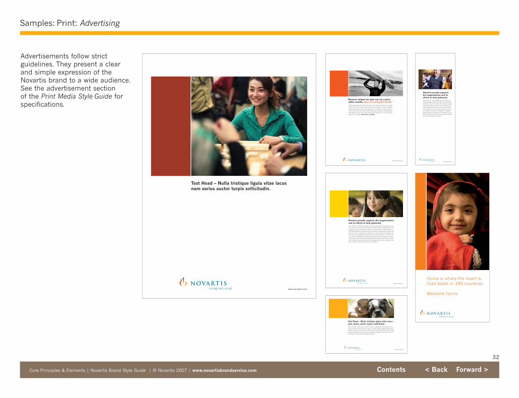
32
Samples: Print: Advertising
Core Principles & Elements | Novartis Brand Style Guide | © Novartis 2007 | www.novartisbrandservice.com Contents < Back Forward >
Advertisements follow strict guidelines. They present a clearand simple expression of theNovartis brand to a wide audience.See the advertisement section of the Print Media Style Guide forspecifications.
Text Head – Nulla tristique ligula vitae lacusnam varius auctor turpis sollicitudin.
www.novartis.com
www.us.novartis.com
Surfing was a big part of Eran Thomson’s life until he was hit by a deadlycancer. It left him sick and beat up, but he never gave up. Then, a Novartismedicine drove his cancer into remission in a matter of months. No onecan promise what the future holds for any cancer patient, but today Eranfeels great. And now he’s living, working and surfing — on one of the bestbeaches in Australia. Think what’s possible.
“Novartis helped me wipe out my cancerwithin months. Now I’m surfing the Pacific.”
www.novartis.com
Text Head – Nulla tristique ligula vitae lacusnam varius auctor turpis sollicitudin.Text 1st ¶ Left – Nulla lorem ipsum sit amet, consectetuer adipiscing elit, seddiam nonummy nibh euismod tincidunt ut laoreet dolore magna aliquam eratvolutpat. Ut wisi enim ad minim veniam, quis nostrud exerci tation ullam corpersuscipit lobotis nisl ut aliquip ex ea commodo consequat. Duis autem vel eum iriure dolor in hendrerit in vulputate velit esse.
Novartis proudly supports the (organization)and its efforts to help (patients).Text 1st ¶ Left – Nulla lorem ipsum sit amet, consectetuer adipiscing elit, seddiam nonummy nibh euismod tincidunt ut laoreet dolore magna aliquam eratvolutpat. Ut wisi enim ad minim veniam, quis nostrud exerci tation ullam corper suscipit lobotis nisl ut aliquip ex ea commodo consequat. Duis autem meleum iriure dolor in hendrerit in vulputate velit esse molestie lo consequat, velillum dolore eu feugiat nulla facilisis at vero eros et accumsan et iusto odi nisqui blandit sent luptatum zzril delenit augue duis dolore te feugait nulla facilLorem ipsum dolor sit amet, consectetuer adipiscing elit, seda diam no ummynibh euismod tincidunt ut laoreet dolore magna aliquam erat volutpat. Ut wisienim ad minim veniam, quis nostrud exerci tation.
www.novartis.com
Home is where the heart is. Ours beats in 140 countries .
Welcome home.
caring and curing
www.novartis.com
Novartis proudly supports the (organization) and itsefforts to help (patients).Text 1st ¶ Left – Nulla lorem ipsum sit amet, consectetuer adipiscing elit, sed diam nonummy nibheuismod tincidunt ut laoreet dolore magna aliquamerat volutpat. Ut wisi enim ad minim veniam, quisnostrud exerci tation ullam corper suscipit lobotisnisl ut aliquip ex ea commodo consequat. Duis autem vel eum iriure dolor in hendrerit in vulputateesse molestie lo consequat, vel illum dolore eu feulgiat nulla facilisis at vero eros et accumsan et iustoodi nis qui blandit sent luptatum.
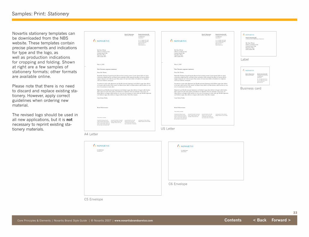
33
Samples: Print: Stationery
Core Principles & Elements | Novartis Brand Style Guide | © Novartis 2007 | www.novartisbrandservice.com Contents < Back Forward >
Novartis stationery templates canbe downloaded from the NBS website. These templates containprecise placements and indicationsfor type and the logo, as well as production indications for cropping and folding. Shown at right are a few samples of stationery formats; other formatsare available online.
Please note that there is no need to discard and replace existing sta-tionery. However, apply correctguidelines when ordering newmaterial.
The revised logo should be used inall new applications, but it is notnecessary to reprint existing sta-tionery materials.
Bernd C. MustermannMedia Desk Manager
Novartis International AGCorporate CommunicationsCH-4002 BaselSwitzerland
Tel. +41 (0)61 324 79 13Fax +41 (0)61 324 35 [email protected]
CH-4002 BaselSwitzerland
CH-4002 BaselSwitzerland
US Letter
Business card
C6 Envelope
C5 Envelope
Label
A4 Letter
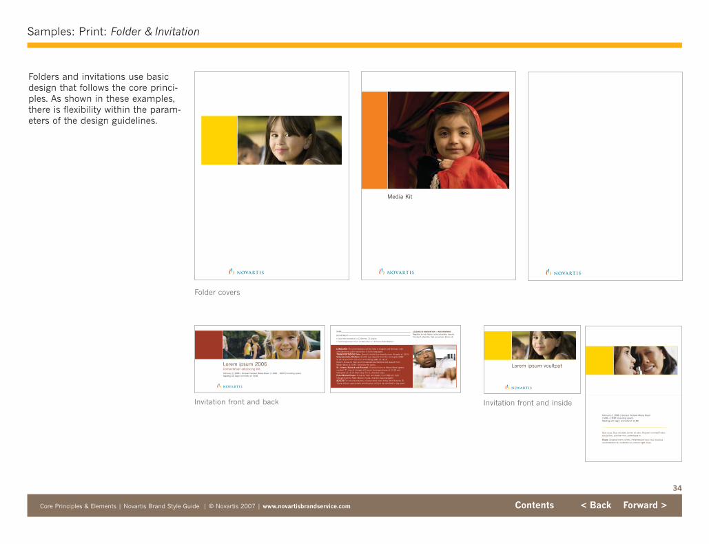
34
Samples: Print: Folder & Invitation
Core Principles & Elements | Novartis Brand Style Guide | © Novartis 2007 | www.novartisbrandservice.com Contents < Back Forward >
Folders and invitations use basicdesign that follows the core princi-ples. As shown in these examples,there is flexibility within the param-eters of the design guidelines.
Invitation front and inside
Lorem ipsum voultpat
February 2, 2006 | Grosser Festsaal Messe Basel 14.00 – 18.30 (including apéro)Meeting will begin promptly at 14.00
Quis risus. Duis volutpat. Donec et odio. Aliquam numrest tortor,suscipit eu, pulvinar non, scelerisque in.
Fusce: Sodales lorem id felis. Pellentesque nunc nisi, faucibuscondimentum et, molestie non, rutrum eget, risus.
Media Kit
Lorem ipsum 2006Consectetuer adipiscing elit.February 2, 2006 | Grosser Festsaal Messe Basel | 14.00 – 18.30 (including apéro)Meeting will begin promptly at 14.00
LANGUAGE The presentations will be held in English and German, with simultaneous audio translation in both languages.TRANSPORTATION Stein: Special shuttle bus departs from the gate at 12.55.Schweizerhalle/Muttenz: Shuttle bus departs from the main gate 2080at 13.10 and from the front of building 2881 at 13.15.Return: Buses to Stein and Schweizerhalle/Muttenz will depart fromMesse Basel at 18.45, following the apéro.St. Johann, Klybeck and Rosental: A special tram to Messe Basel (green,marked “E”, free of charge) will leave Hueningerstrasse at 13.10 andVoltaplatz at 13.15 (tram stop line 1, direction city).Peter Merian House: A special tram will depart from SBB at 13.20(closest track to Peter Merian House, direction Aeschenplatz).ACCESS For security reasons, all associates must bring their Novartis ID.Those without appropriate identification will not be admitted to the event.
LEADING IN INNOVATION — AND WINNING!
Register to win Morbi id leo pharetra mauristincidunt pharetra. Sed accumsan libero sit.
NAME
DEPARTMENT
I would like translation to: � German � English
I need transportation from: � Werk Stein � Schweizerhalle/Muttenz
Folder covers
Invitation front and back
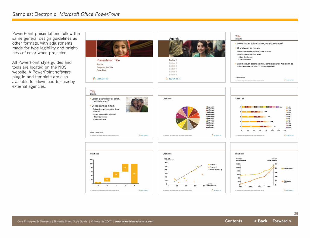
35
Samples: Electronic: Microsoft Office PowerPoint
Core Principles & Elements | Novartis Brand Style Guide | © Novartis 2007 | www.novartisbrandservice.com Contents < Back Forward >
PowerPoint presentations follow thesame general design guidelines asother formats, with adjustmentsmade for type legibility and bright-ness of color when projected.
All PowerPoint style guides andtools are located on the NBS website. A PowerPoint softwareplug-in and template are also available for download for use byexternal agencies.
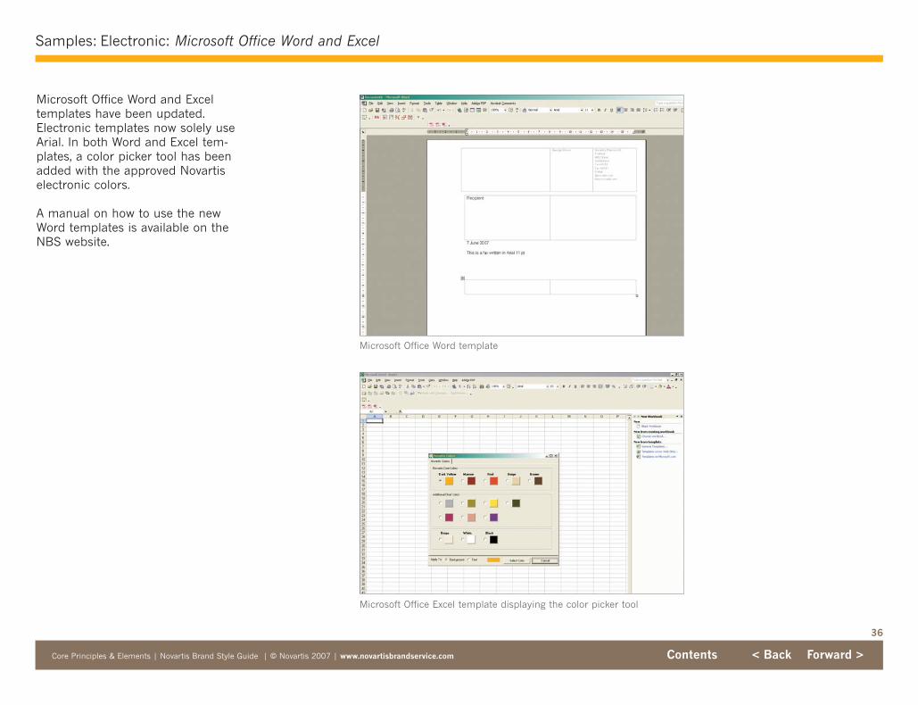
36
Samples: Electronic: Microsoft Office Word and Excel
Core Principles & Elements | Novartis Brand Style Guide | © Novartis 2007 | www.novartisbrandservice.com Contents < Back Forward >
Microsoft Office Word and Exceltemplates have been updated.Electronic templates now solely useArial. In both Word and Excel tem-plates, a color picker tool has beenadded with the approved Novartiselectronic colors.
A manual on how to use the newWord templates is available on theNBS website.
Microsoft Office Word template
Microsoft Office Excel template displaying the color picker tool

37
Samples: Electronic: Internet & Intranet
Core Principles & Elements | Novartis Brand Style Guide | © Novartis 2007 | www.novartisbrandservice.com Contents < Back Forward >
While electronic media are used infundamentally different ways thanprint media, the design of Novartisinternet and intranet web sites isalso guided by our core principles.
Style guides for both the Novartisintranet and internet are availableon the NBS website, along withHTML templates, key graphic PSDsand an implementation guide.
Novartis Internet Novartis Internet
Novartis Intranet Novartis Intranet
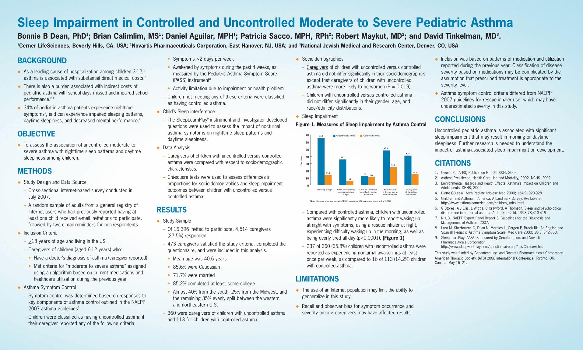
Sleep Impairment in Controlled and Uncontrolled Moderate to Severe Pediatric AsthmaBonnie B Dean, PhD1; Brian Calimlim, MS1; Daniel Aguilar, MPH1; Patricia Sacco, MPH, RPh2; Robert Maykut, MD2; and David Tinkelman, MD3.1Cerner LifeSciences, Beverly Hills, CA, USA; 2Novartis Pharmaceuticals Corporation, East Hanover, NJ, USA; and 3National Jewish Medical and Research Center, Denver, CO, USA
BACKGROUNDu As a leading cause of hospitalization among children 3-12,1
asthma is associated with substantial direct medical costs.2
u There is also a burden associated with indirect costs ofpediatric asthma with school days missed and impaired schoolperformance.2-4
u 34% of pediatric asthma patients experience nighttime symptoms5, and can experience impaired sleeping patterns,daytime sleepiness, and decreased mental performance.6
OBJECTIVEu To assess the association of uncontrolled moderate to
severe asthma with nighttime sleep patterns and daytimesleepiness among children.
METHODSu Study Design and Data Source
– Cross-sectional internet-based survey conducted in July 2007.
– A random sample of adults from a general registry ofinternet users who had previously reported having at least one child received e-mail invitations to participate,followed by two e-mail reminders for non-respondents.
u Inclusion Criteria
– >18 years of age and living in the US
– Caregivers of children (aged 6-12 years) who:
• Have a doctor’s diagnosis of asthma (caregiver-reported)
• Met criteria for “moderate to severe asthma” assignedusing an algorithm based on current medications andhealthcare utilization during the previous year
u Asthma Symptom Control
– Symptom control was determined based on responses tokey components of asthma control outlined in the NAEPP2007 asthma guidelines7
– Children were classified as having uncontrolled asthma iftheir caregiver reported any of the following criteria:
• Symptoms >2 days per week
• Awakened by symptoms during the past 4 weeks, asmeasured by the Pediatric Asthma Symptom Score(PASS) instrument8
• Activity limitation due to impairment or health problem
– Children not meeting any of these criteria were classifiedas having controlled asthma.
u Child’s Sleep Interference
– The SleepLearnPlay9 instrument and investigator-developedquestions were used to assess the impact of nocturnalasthma symptoms on nighttime sleep patterns and daytime sleepiness.
u Data Analysis
– Caregivers of children with uncontrolled versus controlledasthma were compared with respect to socio-demographiccharacteristics.
– Chi-square tests were used to assess differences in proportions for socio-demographics and sleep-impairmentoutcomes between children with uncontrolled versus controlled asthma.
RESULTSu Study Sample
– Of 16,396 invited to participate, 4,514 caregivers(27.5%) responded.
– 473 caregivers satisfied the study criteria, completed the questionnaire, and were included in this analysis.
• Mean age was 40.6 years
• 85.6% were Caucasian
• 71.7% were married
• 85.2% completed at least some college
• Almost 40% from the south, 25% from the Midwest, andthe remaining 35% evenly split between the westernand northeastern U.S.
– 360 were caregivers of children with uncontrolled asthmaand 113 for children with controlled asthma.
u Socio-demographics
– Caregivers of children with uncontrolled versus controlledasthma did not differ significantly in their socio-demographicsexcept that caregivers of children with uncontrolled asthma were more likely to be women (P = 0.019).
– Children with uncontrolled versus controlled asthma did not differ significantly in their gender, age, andrace/ethnicity distributions.
u Sleep Impairment
Figure 1. Measures of Sleep Impairment by Asthma Control
– Compared with controlled asthma, children with uncontrolledasthma were significantly more likely to report waking up at night with symptoms, using a rescue inhaler at night,experiencing difficulty waking up in the morning, as well asbeing overly tired all day (p<0.0001). (Figure 1)
– 237 of 360 (65.8%) children with uncontrolled asthma werereported as experiencing nocturnal awakenings at leastonce per week, as compared to 16 of 113 (14.2%) childrenwith controlled asthma.
LIMITATIONSu The use of an Internet population may limit the ability to
genneralize in this study.
u Recall and observer bias for symptom occurrence andseverity among caregivers may have affected results.
u Inclusion was based on patterns of medication and utilizationreported during the previous year. Classification of diseaseseverity based on medications may be complicated by theassumption that prescribed treatment is appropriate to theseverity level.
u Asthma symptom control criteria differed from NAEPP 2007 guidelines for rescue inhaler use, which may have underestimated severity in this study.
CONCLUSIONSUncontrolled pediatric asthma is associated with significantsleep impairment that may result in morning or daytime sleepiness. Further research is needed to understand theimpact of asthma-associated sleep impairment on development.
CITATIONS1. Owens PL. AHRQ Publication No. 04-0004. 2003.2. Asthma Prevalence, Health Care Use and Mortality, 2002. NCHS. 2002.3. Environmental Hazards and Health Effects: Asthma's Impact on Children and
Adolescents. DHHS, 2002. 4. Diette GB et al. Arch Pediatr Adolesc Med 2000; 154(9):923-928.5. Children and Asthma in America: A Landmark Survey. Available at:
http://www.asthmainamerica.com/children_index.html.6. G Stores, A J Ellis, L Wiggs, C Crawford, A Thomson. Sleep and psychological
disturbance in nocturnal asthma. Arch. Dis. Child. 1998;78;413-4197. NHLBI. NAEPP Expert Panel Report 3: Guidelines for the Diagnosis and
Management of Asthma. 2007.8. Lara M, Sherbourne C, Duan N, Morales L, Gergen P, Brook RH. An English and
Spanish Pediatric Asthma Symptom Scale. Med Care 2000; 38(3):342-350.9. SleepLearnPlay. AAFA. Sponsored by Genetech, Inc. and Novartis
Pharmaceuticals Corporation.http://www.sleepworkplay.com/questionnaire.php?quizChoice=child
This study was funded by Genentech, Inc. and Novartis Pharmaceuticals Corporation.American Thoracic Society. (ATS) 2008 International Conference, Toronto, ON,Canada, May 16–21.
0
10
20
30
40
50
60
70
Wakes up at night
Note: all comparisons have a p-value<0.0001 except for difficulty getting out of bed (p=0.487)
65.8 g Uncontrolled Asthma g Controlled Asthma
14.2
35.3
6.2
13.310.6
48.9
25.7
40.8
15.0
Often or sometimesuses rescue inhaler
at night
Often or sometimeshas difficulty getting
out of bed
Hard to wakein the morning atleast once/week
Overly tiredall day at leastonce/week
Perc
ent
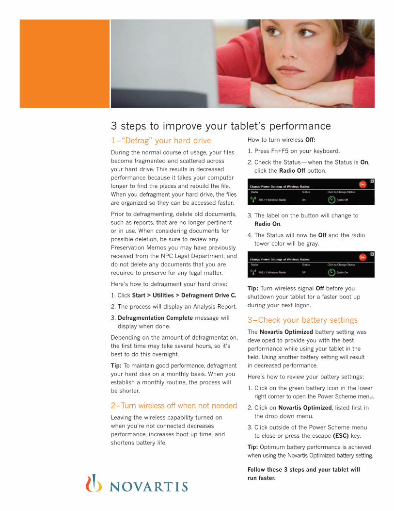
3 steps to improve your tablet’s performance1–“Defrag” your hard driveDuring the normal course of usage, your filesbecome fragmented and scattered acrossyour hard drive. This results in decreased performance because it takes your computerlonger to find the pieces and rebuild the file.When you defragment your hard drive, the filesare organized so they can be accessed faster.
Prior to defragmenting, delete old documents,such as reports, that are no longer pertinentor in use. When considering documents forpossible deletion, be sure to review anyPreservation Memos you may have previouslyreceived from the NPC Legal Department, anddo not delete any documents that you arerequired to preserve for any legal matter.
Here’s how to defragment your hard drive:
1. Click Start > Utilities > Defragment Drive C.
2. The process will display an Analysis Report.
3. Defragmentation Complete message willdisplay when done.
Depending on the amount of defragmentation,the first time may take several hours, so it’sbest to do this overnight.
Tip: To maintain good performance, defragmentyour hard disk on a monthly basis. When youestablish a monthly routine, the process willbe shorter.
2–Turn wireless off when not neededLeaving the wireless capability turned onwhen you’re not connected decreases performance, increases boot up time, andshortens battery life.
How to turn wireless Off:
1. Press Fn+F5 on your keyboard.
2. Check the Status—when the Status is On,click the Radio Off button.
3. The label on the button will change toRadio On.
4. The Status will now be Off and the radiotower color will be gray.
Tip: Turn wireless signal Off before you shutdown your tablet for a faster boot up during your next logon.
3–Check your battery settingsThe Novartis Optimized battery setting wasdeveloped to provide you with the best performance while using your tablet in thefield. Using another battery setting will result in decreased performance.
Here’s how to review your battery settings:
1. Click on the green battery icon in the lowerright corner to open the Power Scheme menu.
2. Click on Novartis Optimized, listed first inthe drop down menu.
3. Click outside of the Power Scheme menu to close or press the escape (ESC) key.
Tip: Optimum battery performance is achievedwhen using the Novartis Optimized battery setting.
Follow these 3 steps and your tablet will run faster.