Embed Size (px)
Citation preview
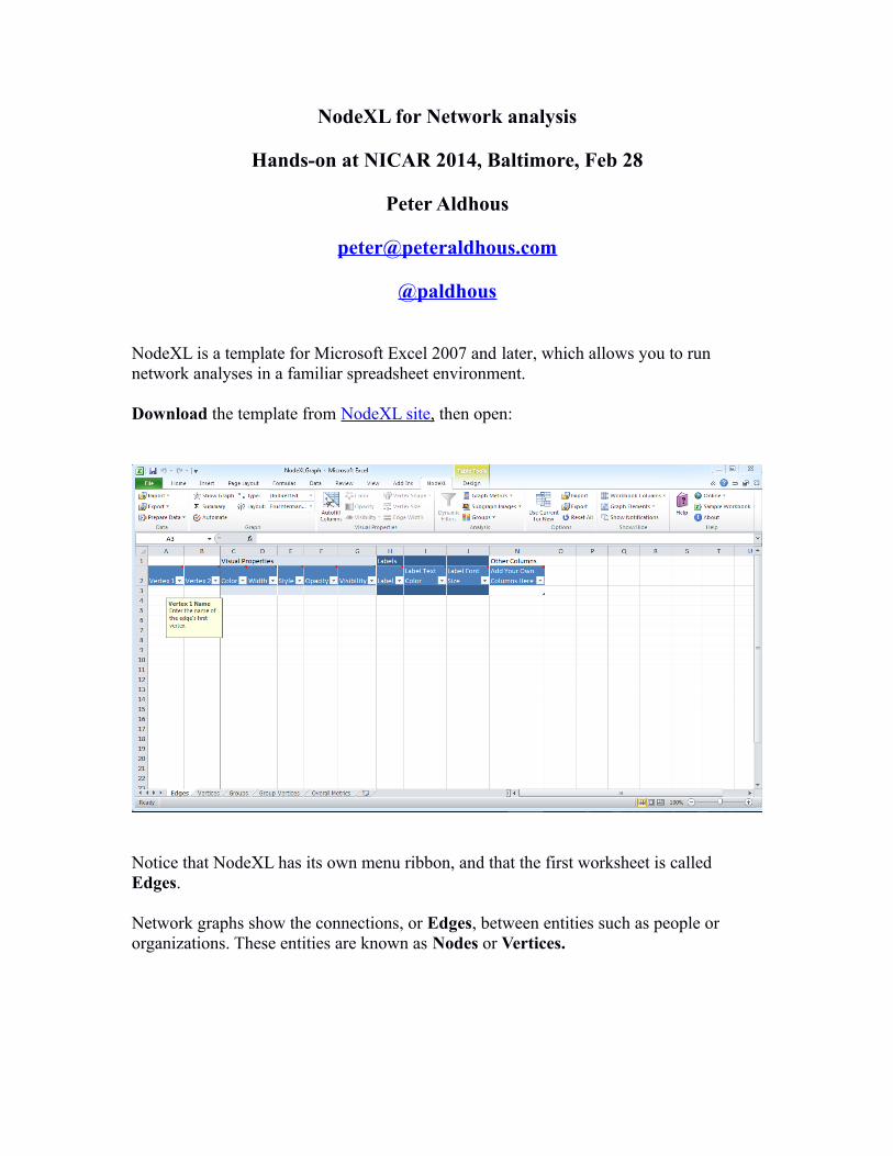
NodeXL for Network analysis
Hands-on at NICAR 2014, Baltimore, Feb 28
Peter Aldhous
@paldhous
NodeXL is a template for Microsoft Excel 2007 and later, which allows you to run network analyses in a familiar spreadsheet environment.
Download the template from NodeX L site , then open:
Notice that NodeXL has its own menu ribbon, and that the first worksheet is called Edges.
Network graphs show the connections, or Edges, between entities such as people or organizations. These entities are known as Nodes or Vertices.
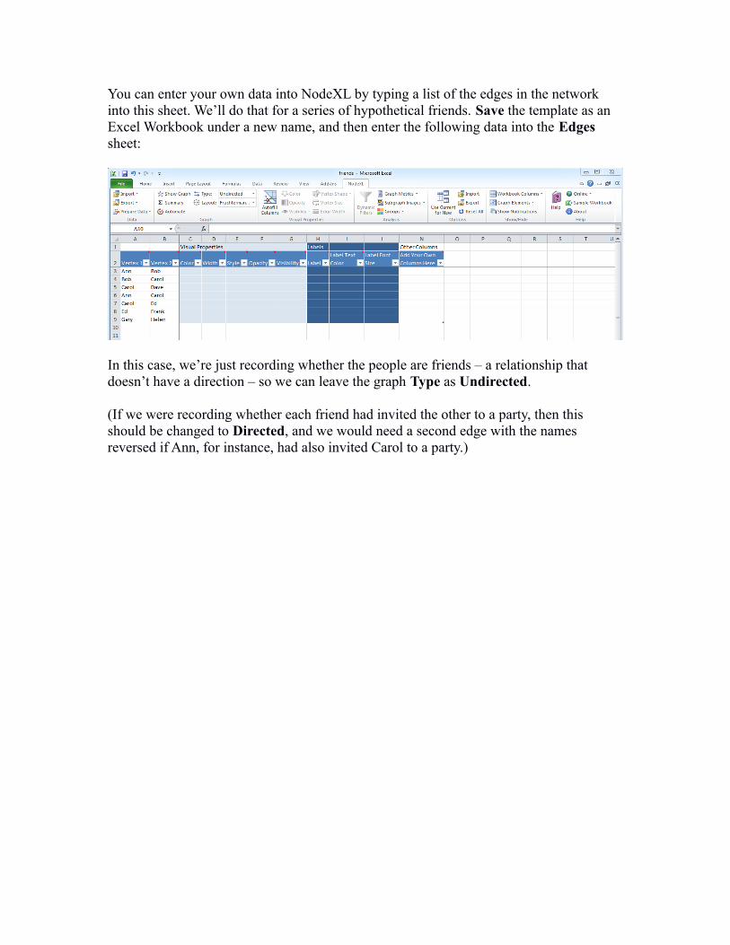
You can enter your own data into NodeXL by typing a list of the edges in the network into this sheet. We’ll do that for a series of hypothetical friends. Save the template as an Excel Workbook under a new name, and then enter the following data into the Edges sheet:
In this case, we’re just recording whether the people are friends – a relationship that doesn’t have a direction – so we can leave the graph Type as Undirected.
(If we were recording whether each friend had invited the other to a party, then this should be changed to Directed, and we would need a second edge with the names reversed if Ann, for instance, had also invited Carol to a party.)
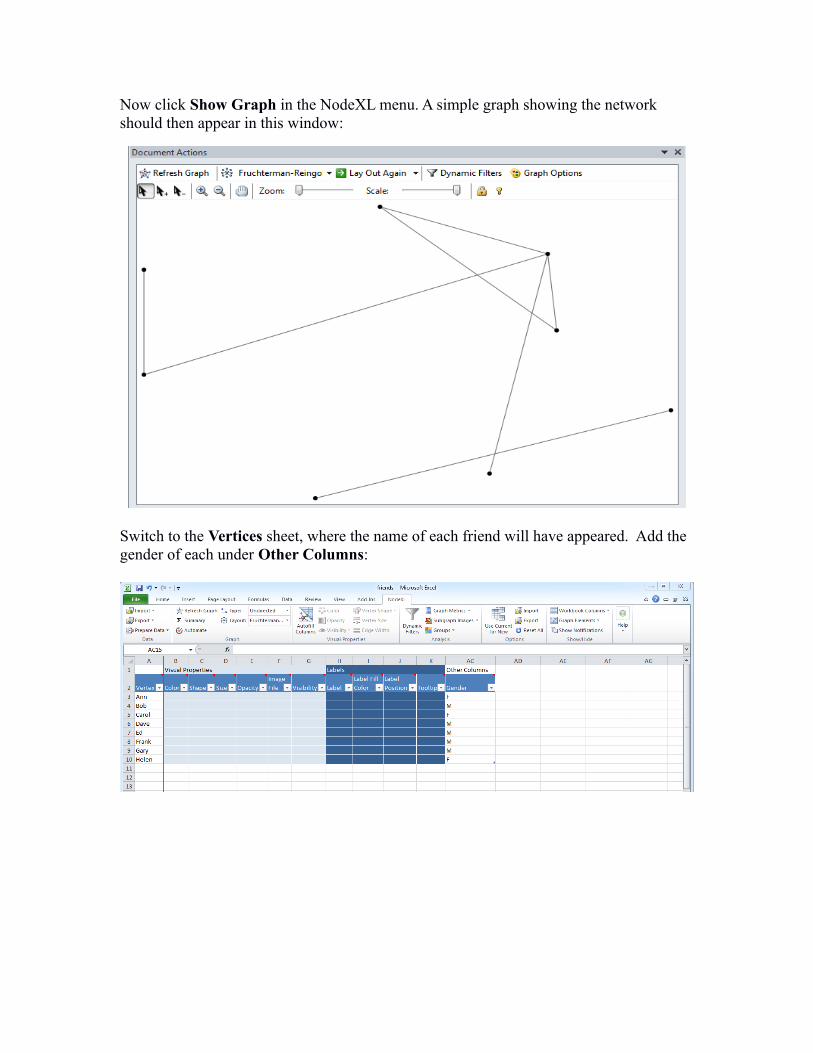
Now click Show Graph in the NodeXL menu. A simple graph showing the network should then appear in this window:
Switch to the Vertices sheet, where the name of each friend will have appeared. Add the gender of each under Other Columns:

Click Autofill Columns, select the Vertices tab, and tell NodeXL to label each friend with Vertex, or their name, and color them by their gender. For the latter, click on the Options arrow, tell NodeXL that the values in the column are Categories and click OK:
Click Autofill then Close. The Color column will now have populated with RGB color values, and the Label column will contain the friends’ names. The graph should have redrawn, but if necessary, click Refresh Graph:
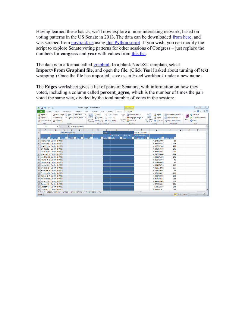
Having learned these basics, we’ll now explore a more interesting network, based on voting patterns in the US Senate in 2013. The data can be downloaded from here, and was scraped from govtrack.us using this Python script. If you wish, you can modify the script to explore Senate voting patterns for other sessions of Congress – just replace the numbers for congress and year with values from this list.
The data is in a format called graphml. In a blank NodeXL template, select Import>From Graphml file, and open the file. (Click Yes if asked about turning off text wrapping.) Once the file has imported, save as an Excel workbook under a new name.
The Edges worksheet gives a list of pairs of Senators, with information on how they voted, including a column called percent_agree, which is the number of times the pair voted the same way, divided by the total number of votes in the session:
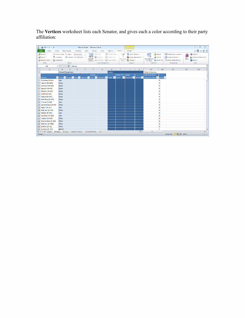
The Vertices worksheet lists each Senator, and gives each a color according to their party affiliation:

Click Show Graph to see the following, in which each of the Senators is connected to all of the others, because every pair voted the same way at least once:
NodeXL’s strength is the ease with which you can now filter and customize the network visualization.
The first task with complex networks like this one is often to filter them to reveal their core structure. This can be done in two ways. Clicking Dynamic Filters brings up a series of sliders that you can use to adjust the visibility of edges and nodes in the network graph. See how some of the edges disappear as you move the left slider for percent_agree toward the right.
But this does not make any changes to the network that is being analyzed. Dynamic filters will not, for instance, cause any change in the results obtained by calculating metrics describing the network.
Instead, we are going to filter the network using Autofill Columns, allowing us to run subsequent analyses on this filtered view of the data.

Click Autofill Columns and select the Edges tab. We will filter so Senators are connected only if they voted the same way at least two-thirds of the time. Select Edge Visibility = percent_agree, fill in Options as follows, and click OK:
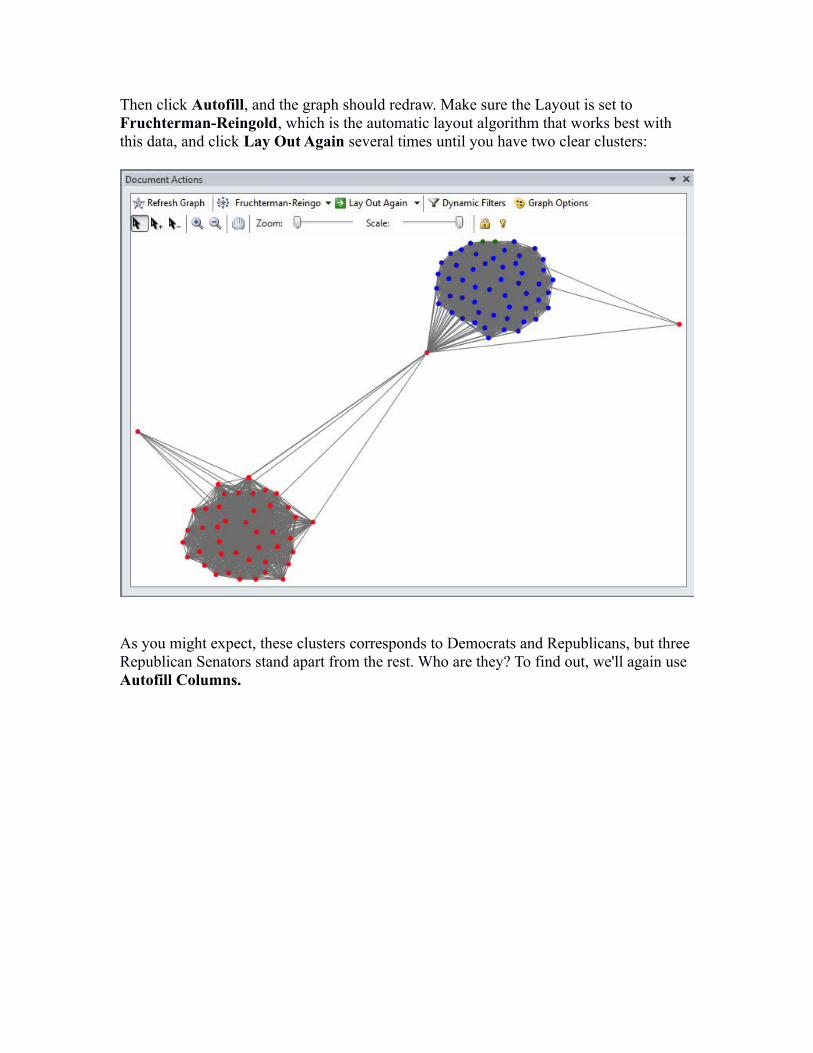
Then click Autofill, and the graph should redraw. Make sure the Layout is set to Fruchterman-Reingold, which is the automatic layout algorithm that works best with this data, and click Lay Out Again several times until you have two clear clusters:
As you might expect, these clusters corresponds to Democrats and Republicans, but three Republican Senators stand apart from the rest. Who are they? To find out, we'll again use Autofill Columns.
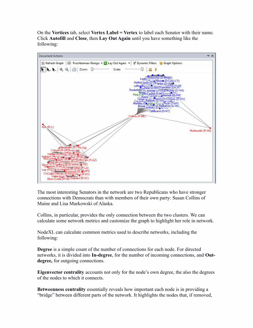
On the Vertices tab, select Vertex Label = Vertex to label each Senator with their name. Click Autofill and Close, then Lay Out Again until you have something like the following:
The most interesting Senators in the network are two Republicans who have stronger connections with Democrats than with members of their own party: Susan Collins of Maine and Lisa Murkowski of Alaska.
Collins, in particular, provides the only connection between the two clusters. We can calculate some network metrics and customize the graph to highlight her role in network.
NodeXL can calculate common metrics used to describe networks, including the following:
Degree is a simple count of the number of connections for each node. For directed networks, it is divided into In-degree, for the number of incoming connections, and Out-degree, for outgoing connections.
Eigenvector centrality accounts not only for the node’s own degree, the also the degrees of the nodes to which it connects.
Betweenness centrality essentially reveals how important each node is in providing a “bridge” between different parts of the network. It highlights the nodes that, if removed,
would cause a network to fall apart.
Closeness centrality is a measure of how close each node is, on average, to all of the other nodes in a network. It highlights the nodes that connect to the others through a lower number of edges – think Kevin Bacon Game.
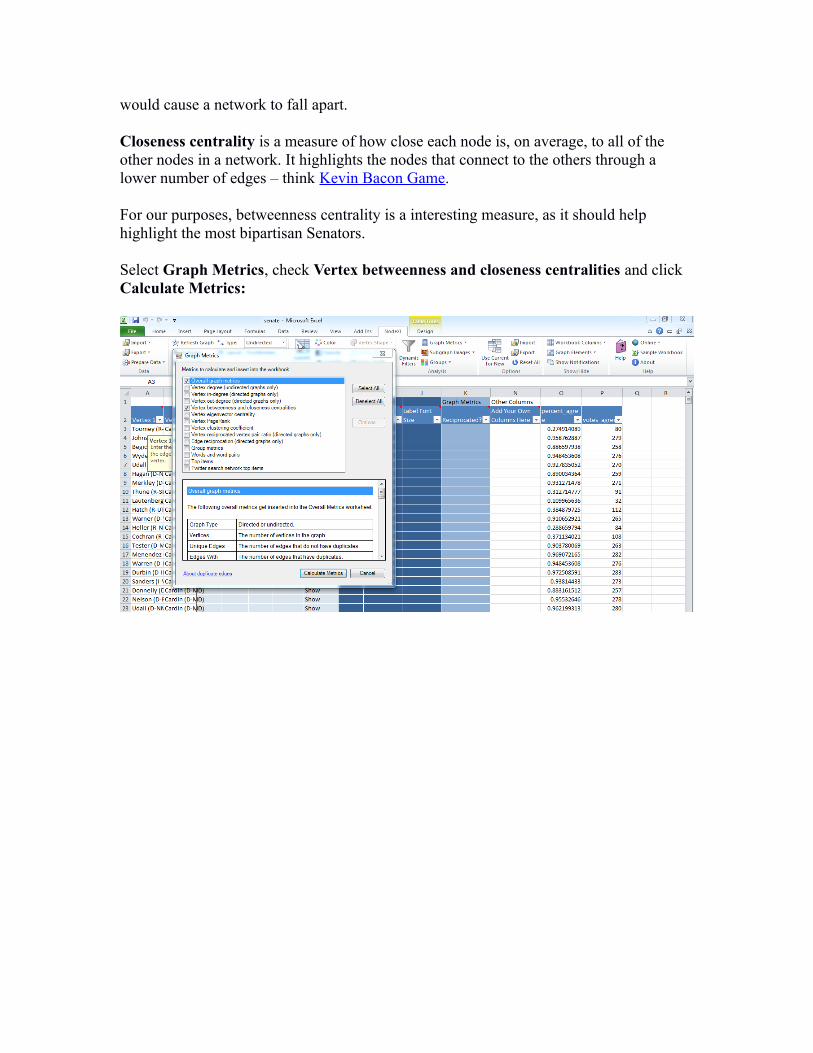
For our purposes, betweenness centrality is a interesting measure, as it should help highlight the most bipartisan Senators.
Select Graph Metrics, check Vertex betweenness and closeness centralities and click Calculate Metrics:

The relevant columns in the Vertices sheet will have been populated with data:
Now we can size the Senators according to their betweenness centrality. Click Autofill Columns, select the Vertices tab, and set Vertex Size = Betweenness Centrality. Using Options, set the maximum size to 20, and click OK:
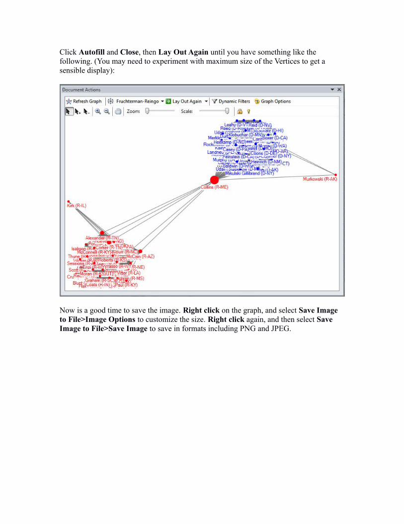
Click Autofill and Close, then Lay Out Again until you have something like the following. (You may need to experiment with maximum size of the Vertices to get a sensible display):
Now is a good time to save the image. Right click on the graph, and select Save Image to File>Image Options to customize the size. Right click again, and then select Save Image to File>Save Image to save in formats including PNG and JPEG.
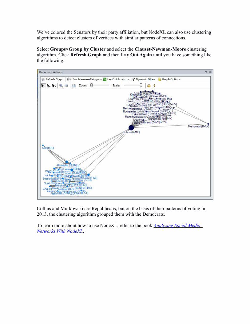
We’ve colored the Senators by their party affiliation, but NodeXL can also use clustering algorithms to detect clusters of vertices with similar patterns of connections.
Select Groups>Group by Cluster and select the Clauset-Newman-Moore clustering algorithm. Click Refresh Graph and then Lay Out Again until you have something like the following:
Collins and Murkowski are Republicans, but on the basis of their patterns of voting in 2013, the clustering algorithm grouped them with the Democrats.
To learn more about how to use NodeXL, refer to the book Analyzing Social Media Networks With NodeXL.