Embed Size (px)
Citation preview
Newspaper Design
Creating Pages
• Designers work with four elements: copy, art, headlines and white space- Copy: the actual text- Art: Photos, illustrations, maps, graphs, lines, etc; anything that is not text- Headlines: Any header for an article- White Space: Any space that is not covered by one of the three components mentioned above

Copy
• Type is the most basic component of any article
• Keep target audience in mind when choosing type
• Generally, set body type in 9,10,or 11 point type, use 8 point type for captions, and set headlines in bold
• Headlines should be in a type most appropriate for the style of document
Art
• Graphics must have a specific reason or purpose when used in a printed piece
• Graphics usually serve one of three purposes:
-Unify elements-Separate elements-Call attention to elements- A well-designed page is at least 1/3 art
White Space
• Publications need white space so that page does not become overwhelming to the reader
• Think of white space as breathing room for the page
• Do not overuse white space, but be sure every page has some
Dominance
• Every single page should have one dominant element that is at least 2 ½ times as large as any other element on the spread
• The dominant element serves as a port of entry for the reader; if there is no dominant element, the reader’s eye will bounce around or they will go on to the next page
• Dominant element is usually a large, well-composed photo that ties into the headline

Unity
• Use consistent external and internal margins
• Other graphics can create unity, even simple rules (lines)
Contrast
• Contrast: the use of opposites in size, shape and weight
• Different size and shapes of photos, as well as different typefaces, can create contrast
Creating Contrast with Headlines
• Headlines with primary and secondary components can create contrast
• The primary headline should be at least twice the size of the secondary
• Try to stay in the same type family

Rhythm and Balance
• Rhythm is the use of a repeated color, graphic, or typographic element to hold a design together
• Balance is designing your paper so that graphical elements are spread throughout the page and do not seem to all be on one side or the other
Organization of Pages
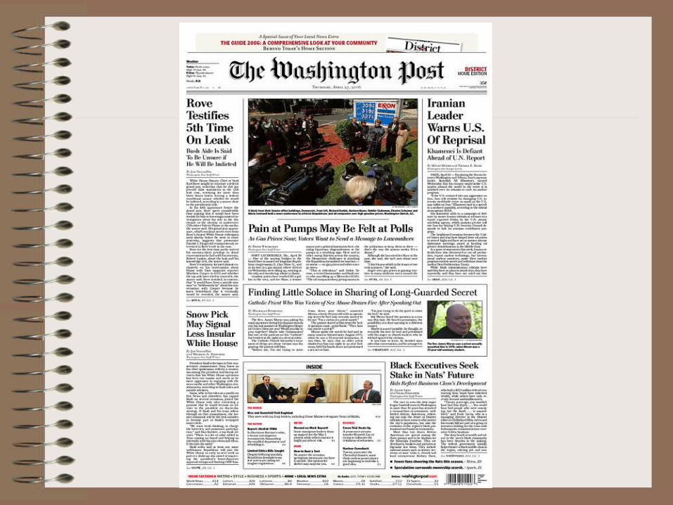
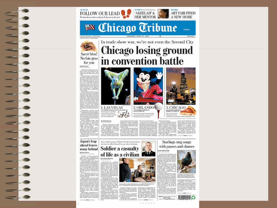
• Most important story goes at the top; should also have biggest headline and biggest picture
• Include dominant photo and dominant headline
• Don’t jump stories unless you have to; always use jump-lines if you do
• Juxtapose stories, headlines, and art
• Anchor bottom corners with photos or headlines
Page Design Basics
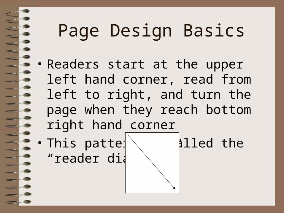
• Readers start at the upper left hand corner, read from left to right, and turn the page when they reach bottom right hand corner
• This pattern is called the “reader diagonal”
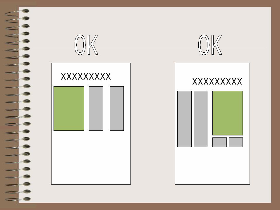
• Headline, copy, and photo and caption form a unit, called a story block.
• Need to group these elements so that the readers does not get lost
• A headline can be placed over pictures if it also covers the story
• Only if a photo is placed on the right of a story, the story may continue under the picture
XXXXXXXXX XXXXXXXXX
Other tips
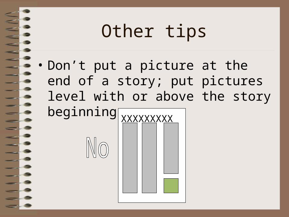
• Don’t put a picture at the end of a story; put pictures level with or above the story beginning
XXXXXXXXX
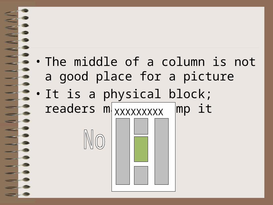
• The middle of a column is not a good place for a picture
• It is a physical block; readers may not jump it XXXXXXXXX
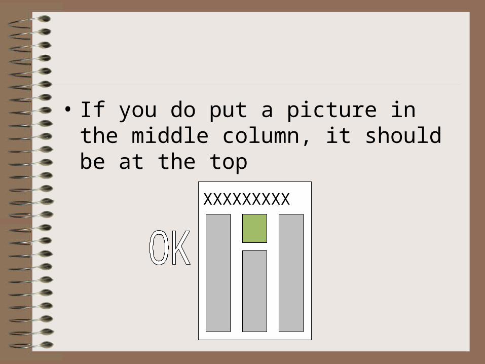
• If you do put a picture in the middle column, it should be at the top
XXXXXXXXX
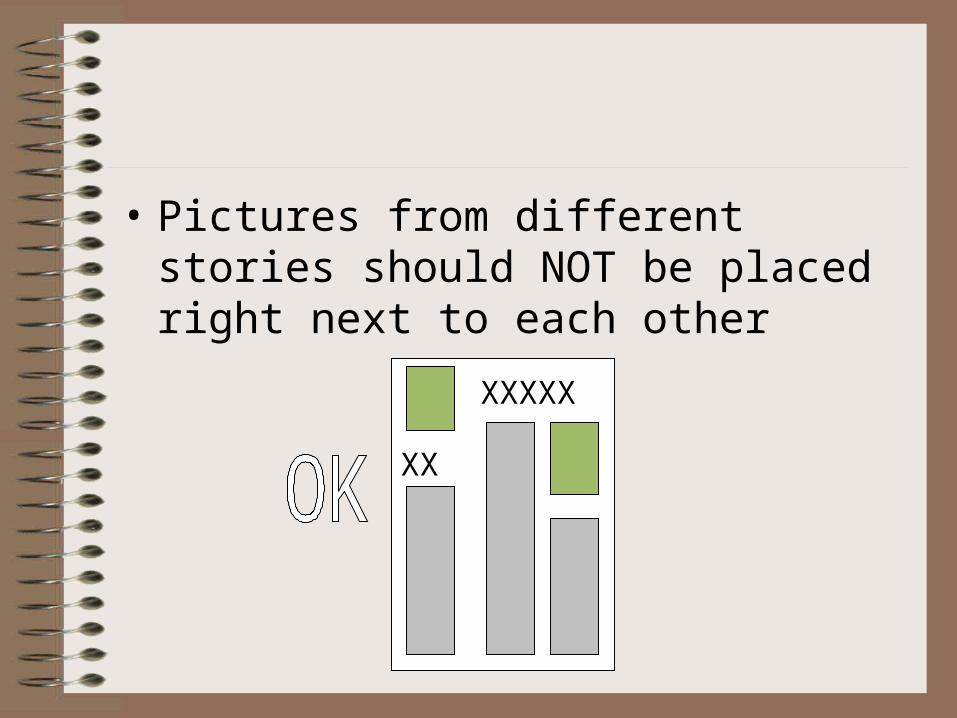
• Pictures from different stories should NOT be placed right next to each other
XXXXX
XX
Front Page Design
• Create a nameplate/flag that reflects the personality of the publication
• Nameplate should folio lines: name of the publication, date, school’s name, address, volume, and issue number
• It should be legible, distinctive and appropriate• Can “float” the flag and put skyboxes above it • Skyboxes are teasers; tell readers what stories are
inside• Could also give flag “ears”: elements at the side
of the nameplate • Masthead includes names of editors, etc.