Embed Size (px)
Citation preview
News &Notes Richard Hopkins
Let me start off by extending a sincere and hearty welcome to these new
members. They are the real life blood of the Society:
La Verne Barnes, Vancouver Joyce Caines, Yellowknife, NWT Myriam Chancy, Vancouver Melissa Gilbert, Vancouver Ryan Mah, Burnaby, BC John Pass & Theresa Kishkan, Madeira Park, BC John Steil, North Vancouver Inge von Hammerstein, Vancouver Daniel Wells, Windsor, Ontario Episcopal Divinity School Library, Cambridge, Mass. Andrea Belcham, Pointe Claire, QC Joseph Mercier, North Vancouver Augusta Dalziel, French Gulch, CA Sonya Thursby, Toronto Sheila & David Colwill, Victoria, BC Mark Young, Richmond, BC CGA Filiere Periodiques, Paris Jennifer MacMillan, Vancouver Robert DeMarais, Edmonton, AB Ernst Vegt, New Westminster, BC Gabrielle Fox, Victoria, BC Alan Stein, Parry Sound, ON Christopher Phelps, Edmonds, WA Claudia Cohen, Seattle, WA
T he members of the Society were greatly saddened to hear of the
death of long-time friend and member Marilyn Sacks. Those on the Publications Committee will particularly remember her as a "crackerjack" proof reader. Nothing slipped by Marilyn's eagle eye. And all of us in the Society remember her as a warm and helpful friend.
Many thanks to long standing member Henry Messerschmidt who
last Fall made a donation of a number of copies of Amphora and other Society publications to us. I hope you are comfortable in your new digs Henry - although, alas, I am assuming there will be less room for your cherished books. Hope not!
T his message from our intrepid Chair, Howard Greaves:
The Alcuin Society is hoping to hold occasional informal meetings throughout the year where members can meet one another informally to chat about their common interest in the book and the book arts. There may also be practitioners present whom members could meet in an informal setting. Members might wish to show, and maybe say a few words about, some examples of interesting books or books that feature the book arts that they own and feel others would find ofinterest. The occasion might be linked with a more formal talk.
If this opportunity to meet and chat with your fellow Alcuin members appeals to you, please let the Chair, Howard Greaves, know at [email protected] or at 604-733-1204. He would like to hear of your ideas to make these evenings as informally convivial and interesting as possible. Let him know if you would like to bring to the attention of other members some expertise that you may have.
T here will be a new Editor for Amphora beginning in June
2006. We are very fortunate to have Rollin Milroy as our new editor since he is himself a superb book artist. He is the proprietor of Heavenly Monkey Press in Vancouver. I will continue to produce the "News & Notes" column
34
and keep my eye open for articles on the book scene in British Columbia. I actually plan to produce an extended "News & Notes." Rollin will take what he likes for the printed version of Amphora and I will see that the rest of the material is mounted on our web site at www.amphorasociety.com or a new Alcuin "blog". Rollin and the Publications Committee are planning some changes to the journal which involve type-size, periodicity and number of pages published.
Are Men Who Read More Attractive? "Men who read stand a better chance
of attracting women according to a study. Women claim they are more likely to be seduced by a well-read man.
85% of women questioned in a British National Organization of Publishers survey for the publisher Penguin said they would be more attracted to a man who talked about literature. But women would be inclined to judge men by the type of books they read. On this rating, reading Harry Potter scored very badly."
A few editorial observations: ( 1) Do you suppose the survey was
conducted solely by men who read? (2)In a similar fashion are women
who read more attractive to men? (3)Men should carry at least two
books around with them at all times: one that has obvious sex appeal to women and a book that the fellow is actually reading!
A nyone who says you can't judge a J-\.book by its cover isn't trying hard enough. A British statistician has developed a complex computer model able to calculate a book's likelihood of being a bestseller based solely on its title.
35
In a study released a few months ago, Atai Winkler reports his new program is able to accurately forecast the strength of a book's sales nearly 70 per cent of the time - about 40 per cent better than random guesswork.
After analyzing eleven variables, from the number of words in the title to the etymology of the words used, three key 'differentiators' were found between bestsellers and non-bestsellers.
These were the title's use of pronouns, verbs, exclamations or gTeetings in the first word; the grammar pattern of the overall title; and whether the book was titled figuratively or literally - Gone With the Wind, for example, would theoretically outsell The Mysterious A.ff air at Styles. Each variable was weighed and applied to a mathematical model in order to create a single equation for predicting the probability of a bestseller. The resulting computer model is available for free at www.lulu.com/titlescorer.
Winkler's research, commissioned by independent publishing marketplace Lulu.com, analyzes the titles of every novel to have topped the hardcover fiction section of the New York Times Bestseller List during the last half-century, then compares the results with a control gTOup ofless successful novels by the same authors.
'We thought the findings were very interesting and, to some extent, groundbreaking,' says study co-ordinator Peter Freedman, a former Torontonian now living in the United Kingdom.
'This is something that's always talked about but never studied in a systematic and scientific way.'
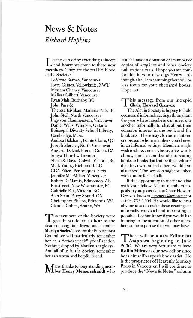
Other top-scorers included Agatha Christie's Sleeping Murder, Judith
I ('-
~ - -Great Roof Cat of Toulouse © 1992 McGregor Hone
Rossner's Looking for Mr. Goodbar, Scott Turow's Presumed Innocent, Stephen King's Everything's Eventual, Michael Crichton's Rising Sun, Nora Roberts' Three Fates, John le Carre's Smiley's People,James Patterson's Four Blind Mice, and Clive Cussler's Valhalla Rising. Other popular titles are Gone With the Wind, To Kill a Mockingbird, One Hundred Years of Solitude, and Ulysses.
But the model, which doesn't account for a book's content, has its limitations. Dan Brown's The Da Vinci Code, for example, was determined by the computer to have a mere 36 per cent chance of becoming a success!
This brief note from Leah Gordon, our astute Chair of the Alcuin Book
Design Competition Committee: "Publishing forms a minor branch of
the entertainment industry, and book design is increasingly a matter of fashion - that is, of attention-getting. In the visual
clamor of a bookstore, the important thing is to be different; a whisper becomes a shout, and the ugly becomes beautiful if it attracts attention." John Updike in his New Yorker review of By Its Cover: Modern American Book Cover Design.
"Good Night, and Good Luck," the movie about Edward R. Murrow's battle to expose the demagoguery of Joseph R. McCarthy, has received both critical and popular acclaim. But the movie has its fervent detractors - and they aren' t people nostalgic for the days ofbackyard fallout shelters. They are typographers and graphic designers. Their charge: typographical inaccuracy.
It appears that the CBS News sign, prominently displayed in the film's carefully reconstructed New York newsroom, uses the typeface Helvetica. But Helvetica was not designed until 1957, the year McCarthy died. The movie takes place in the early 1950s.
36
The Great Studio © 1958 McGregor Hone
"I thought it was a bitjarring," said Michael Bierut, a graphic designer at Pentagram Studio in New York. "After all, even in 1957, Helvetica was an exotic Swiss import."
He's not the only one. And "Good Night, and Good Luck" isn't the only malefactor. Hollywood features that spend millions on period production design are often rife with inaccurate typog,Taphy. And among a certain segment of the audience - a certain very narrow segment of the audience - that is an outrage.
Mark Simonson, a type designer in St. Paul, Minnesota maintains a web site ( www.ms-studio.com/typecasting .html) that exposes cinematic typognphical inaccuracies to the withering light of day. Take the 2000 film "Chocolat." Though the film takes place in the 1950s France, in a close-up shot of a public notice, a headline is set in ITC Benguiat, which he said made its debut in 1978 and was popular mainly in the 80s. "I almost laughed," Mr. Simonson writes.
37
Then there is "L.A. Confidential," set in 1950s Los Angeles. "It was tightly written, well acted, beautifully filmed," Mr. Simonson writes, "but pretty mediocre in its use of type."
Worse than any of these, to Mr. Bierut, is "Titanic." The dials on the pressure gauges, he said, are in Helvetica, though the ship when down in 1912. "To me, that's like taking out a Palm Pilot on the deck of the Titanic," he said.
Scott Stowell, the founder of Open, a New York graphic design studio, g,Tipes: "The thing that bugs me is that they create these elaborate period pieces for films. They put old cars on the street and get the hairstyles right, but typography, it seems like they don't know or care."
Mr. Stowell admits that he and other militant typography fans are not likely to affect Hollywood's revenue. "It's an obsession that's limited to a subset of a subset of a subset of society," he said. "There must be hairstylists who go crazy watching a certain movie because a certain hair
color or style hasn't been invented yet." On the other hand, the typography
buffs may be making some headway. Mr. Simonson, for one, was encouraged by the new remake of "King Kong.": "I thought they did a really good job with the type in it - making the signs and printed things really authentic."
Not that the film achieved perfection. "The guy supposed to be the movie star had all those movie posters in his cabin," Mr. Simonson said. "Those posters which weren't from real movies, looked very authentic, except for one that used a font from the 1990s. But that was the only thing I noticed." ( An article by Peter Edidin entitled "Good Film, Shame About the Helvetica," in the New York Times.)
I enjoyed this item sent to me by mem her Bruce Saunders. I had seen a vari
ation of this tongue-in-cheek joke before but must admit that seeing it again in a slightly new guise gave me a distinct series of chuckles:
TECHNOLOGICALADVANCEMENT: Announcing the new Built-in Orderly Organized Knowledge device called B.0.0.K. The "BOOK"is a revolutionary breakthrough in technology:
No wires; No electric circuits; No batteries; Nothing to be connected with or
switched on! It's so easy to use, even a child can
operate it.Just lift its cover! Compact and portable, it can be used anywhere - even sitting in an armchair by the fire - and yet it is powerful enough to hold as much information as a CD-ROM disk.
Here's how it works .... Each BOOK is constructed of
sequentially numbered sheets of paper (recyclable) called pages, each capable of holding thousands of bits ofinformation and data. These pages are locked together with a custom-fit device called a binder which maintains the sheets in their correct sequence. Opaque Paper Technology (OPT) allows manufacturers to use both sides of the sheet, doubling information density and cutting costs in half!
Experts are divided on the prospects for further increases in information density: for now, BOO KS with more information simply use more pages. This makes them thicker and harder to carry, and has drawn some criticism from the mobile computing crowd. Each sheet is scanned optically, registering information directly in the brain. A flick of the finger takes you to the next sheet. The BOOK may be taken up at any time and used by merely opening it. The BOOK never crashes and never needs re-booting. The "browse" feature allows the user to move instantly to any sheet, and move either forward or backward at any time. Many come with an "index" feature, which will pinpoint the exact location of any information for immediate retrieval.
An optional "BOOKmark" accessory allows the user to open the BOOK to the exact location left in a previous session -even if the BOOK has been closed! BOOKmarks fit universal design standards; thus a single BOOKmark can be used with BOOKs by various manufacturers. In addition, numerous BOOKmarks can be used in a single BOOK if the user wishes to store numerous views at once. The number is limited
38

only by the number of pages contained in the BOOK.
The medium is ideal for long term archival use. Several field trials have proven that the medium will still be readable in several centuries and because of the simple user interface, it will be compatible with future reading devices.
The operator can also make personal notations next to BOOK text entries with optional programming tools, the Portable Erasable Nib Cryptic Intercommunication Lead Stylus (PENCILS). Portable, durable and affordable, the BOOK is being hailed as the entertainment wave of the future. The BOO K's appeal seems so certain that thousands of content creators have committed to the platform. Look for a flood of titles soon in your own neighbourhood!
Beth © 1993 McGregor Hone
39
Book Review
Peter Milham
Classic Book Jackets: The Design Legacy of George Salter. Thomas S. Hansen. New York: Princeton Architectural Press, 2005. 200 p. $50.00.
Memory has turned the house of my father's sister in Westmount, Quebec, into a tower of stairs, landings and rooms full of books. It almost seems like something from the sketchbook of M.C. Escher, though in reality it was just three or four storeys hiding the largest - and most wide-ranging - private library I knew as a child. Rooms overflowed with titles reflecting the broad interests of my aunt and her husband, medical doctors with active intellects nourished both by the accepted classics as well as the titles that informed the chatter of their educated and cosmopolitan circle.
But by the time I discovered its secrets in the 1990s, the collection was telling its age. Browsing some sections was like stepping back in time, designs on the jackets and wrappers marking the editions as being from decades earlier.
That the designs should have spoken their era so loudly may be due in part to the work of George Salter, celebrated in Cwssic Book Jackets: The Design Legacy of George Salter. Boasting over 220 examples of Salter's work, Classic Book Jackets is a visual record of the quiet but significant influence Salter exerted over mid-20th century book design until his death at 70 in 1967. Few readers will recognize nothing of his work, even if they are unfamiliar with the man himself.
Salter designed the covers of modern literary classics such as the 1954 jacket for Thomas Mann, Death in Venice and Seven Other Stories (still in use when I studied the collection in the late 1980s)