Embed Size (px)
Citation preview
Georgia Southern UniversityDigital Commons@Georgia Southern
University Honors Program Theses
2017
Network Modeling of Infectious Disease:Transmission, Control and PreventionChristina M. Chandler
Follow this and additional works at: https://digitalcommons.georgiasouthern.edu/honors-theses
Part of the Discrete Mathematics and Combinatorics Commons, and the Theory and AlgorithmsCommons
This thesis (open access) is brought to you for free and open access by Digital Commons@Georgia Southern. It has been accepted for inclusion inUniversity Honors Program Theses by an authorized administrator of Digital Commons@Georgia Southern. For more information, please [email protected].
Recommended CitationChandler, Christina M., "Network Modeling of Infectious Disease: Transmission, Control and Prevention" (2017). University HonorsProgram Theses. 258.https://digitalcommons.georgiasouthern.edu/honors-theses/258
Network Modeling of Infectious Disease: Transmission,
Control and Prevention
An Honors Thesis submitted in partial fulfillment of the requirements for Honors in the
Department of Mathematical Sciences
By
Christina Chandler
Under the mentorship of Ionut Iacob and Hua Wang
ABSTRACT
Many factors come into play when it comes to the transmission of infectious diseases. In
disease control and prevention, it is inevitable to consider the general population and the
relationships between individuals as a whole, which calls for advanced mathematical
modeling approaches.
We will use the concept of network flow and the modified Ford-Fulkerson algorithm to
demonstrate the transmission of infectious diseases over a given period of time. Through
our model one can observe what possible measures should be taken or improved upon in
the case of an epidemic. We identify key nodes and edges in the resulted network, which
will help determine an improved plan of disease prevention. This solution has been
implemented through a Java code.
Thesis Mentor: ________________________
Dr. Hua Wang
Honors Director: _______________________
Dr. Steven Engel
April 2017 Department of Mathematical Sciences
University Honors Program Georgia Southern University

- 2 -
Acknowledgements
I would like to take this time to personally thank everyone who has helped me with my
Capstone Project.
College of Undergraduate Research
Dr. Hua Wang
Dr. Ionut Iacob
and
My friends and family

- 3 -
1. Introduction
Many factors come into play when it comes to the transmission of infectious diseases.
The actual way a disease is spread can be either through direct (person-to-person) or
indirect (airborne, animals, etc.) contact. Further, whether or not a person gets infected
depends on their hygiene habits and their exposure to an infected person. Therefore, in
disease control and prevention, it is inevitable to consider the general population and the
relationships between individuals as a whole. Mathematical modeling is necessary to
make sense of those relationships
Our goal is to use the concept of network flow and a modified Ford-Fulkerson algorithm
to demonstrate the transmission of infectious diseases over a given period of time. The
model uses five years of data on Hepatitis B retrieved from the CDC, but ultimately could
use data on any disease for future study. Through our model, one can observe what
possible measures should be taken or improved upon in the case of an epidemic. In order
to take a given time period into consideration, we construct our network in a recursive
manner so that the dynamic nature of evolution is reflected in one physical structure.
1.1. Basic Graph Theory
The graphs used in this project are not the ones seen in algebra and calculus classes, but
instead they are much more abstract. The easiest way to describe the definition of a graph
is “points connected by lines”. Therefore, it is possible to use graphs to model a wide
variety of things. Unless otherwise specified, the definitions discussed in this section are
from David Guichard’s book, An Introduction to Combinatorics and Graph Theory [1].
Study of graph theory dates back to the early 1700’s with the famous Seven Bridges of

- 4 -
Konigsberg problem. Euler, one of the most prolific mathematicians of all time, solved
this problem and opened up a totally new field of mathematics while doing so.
By definition, a graph G consists of a pair (𝑉, 𝐸) where 𝑉 is the set of vertices, and 𝐸 is
the set of edges. Vertices are points while edges are lines that connect two vertices. It is
common to write 𝑉(𝐺) to represent the vertices of a graph 𝐺 and 𝐸(𝐺) for the edges of
the same graph. Furthermore, the graph used in this project is a simple graph, meaning
that there are no loops or multiple edges. Loops
are edges that connect a vertex back to itself, and
multiple edges are edges that share the same
endpoints. The edges of a simple graph are
written as a set of two element sets. For example,
({𝑣1, 𝑣2, 𝑣3, 𝑣4, 𝑣5, 𝑣6, 𝑣7}, {{𝑣1, 𝑣2}, {𝑣2, 𝑣3}, {𝑣3, 𝑣4}, {𝑣3, 𝑣5}, {𝑣4, 𝑣5}, {𝑣5, 𝑣6}, {𝑣6, 𝑣7}})
creates the simple graph pictured above.
The edges of a graph can also have a direction. These graphs are called directed graphs,
or digraphs, and their edges are written as an ordered pair of vertices. The first value of
the ordered pair is the origin and the latter is the endpoint. We use a digraph for this
project. Another name for a directed edge in a digraph is arc, which is typically
represented as an arrow when constructing a graph. It is possible to have two directed
edges such as (𝑢, 𝑣) and (𝑣, 𝑢). This notion is separate from the concept of a multiple
edge as the two arcs are distinct. Directed graphs can be classified as simple or complex
depending on whether or not they have multiple edges or loops. Like graphs, digraphs are
simple if they contain neither. A practical example of a digraph is a map of airplane
routes. Vertices are airports and edges flight path from one airport to another.

- 5 -
1.2. Flow Network
A network is a directed graph with a designated source 𝑠 and sink (target) 𝑡. Each arc 𝑒 in
a network has a positive capacity - commonly denoted 𝑐(𝑒). The flow of a network is a
function 𝑓 from the arcs to ℝ such that ∀ 𝑒, 0 < 𝑓(𝑒) < 𝑐(𝑒) and the sum of the flows in
and out of a vertex are equal. This last characteristic applies to all vertices of a network
except for the sink and source. The value of a flow 𝑓 that is at least as large as any
possible flow of a particular network is called the maximum flow. Maximum flow marks
the overall efficiency of a network, making it a critical value. A cut in a network is a set
𝐶 of arcs such that every path from the sink to the source uses at least an arc in 𝐶. The
term “cut” naturally comes from the important fact that if the edges in 𝐶 are removed
from the network, there is no longer any path from 𝑠 to 𝑡. The capacity of a cut, 𝑐(𝐶), is
equal to the sum of the capacities, which can be positive or negative depending on the
orientation, of all the arcs in 𝐶. The cut with the smallest capacity is referred to as the
minimum cut, which plays a large role in this project [1].
The Ford-Fulkerson algorithm is a systematic way to find the maximum flow and
minimum cut of a network. The algorithm works as follows [2]:
Find a directed path from the source to the sink, such that the flow on each of the
forward edges can be improved and the flow on each of the backward edges is
non-zero. Such a path is called an “augmenting path”.
Improve the flow, from the source to the sink, along the augmenting path.
Repeat the above steps until no more augmenting path exists. Then the resulted
flow is maximum and a minimum cut is identified at the same time.

- 6 -
Note that, since in every step the value of the flow strictly increases by a positive integer
(if all original capacities are positive integers), the above process terminates in finitely
many steps. Also, note that the maximum flow of a network is equal to the capacity of the
minimum cut.
1.3. Motivation
Studying disease prevention and transmission is the key to healthier lives for everyone.
According to the CDC’s website [3]:
With better health, children are in school more days and are better able to
learn. Numerous studies have found that regular physical activity supports
better learning. Student fitness levels have been correlated with academic
achievement, including improved math, reading and writing scores.
With better health, adults are more productive and at work more days.
Preventing disease increases productivity—asthma, high blood pressure,
smoking and obesity each reduce annual productivity by between $200 and
$440 per person.
With better health, seniors keep their independence. Support for older adults
who choose to remain in their homes and communities and retain their
independence ("aging in place") helps promote and maintain positive mental
and emotional health.
Thus, it is clear that continuously learning and developing our knowledge of disease is
beneficial for everyone. Our motivation for pursuing this project comes from the
potential usefulness in this learning. There are so many different diseases in the world,

- 7 -
and just as quickly as some diseases are eradicated, more are being discovered. Also,
many strands of certain diseases keep evolving to become immune to our medicines and
vaccines originally designed to dispose of them. Because of these constant changes, it is
important to keep studying. This is where mathematical modeling comes into play. With
our model, we hope to provide a tool that can be modified as needed, depending on the
disease being studied.
1.4. Mathematical modeling
Flow network has been a popular model for numerous practical problems such as public
transportation (where nodes denote bus stops and arcs denote one way streets), financial
flow (where the flow between nodes represents the real current flow between different
entities), assignment problems (where the nodes and arcs represent the work assignment
and the ordering of individual assignments). In our study of the transmission of infectious
diseases, each node can represent a single person, a group of people, or a region. The
directed arc between nodes simply denotes the interaction between the corresponding
people or regions. The capacities assigned to these arcs essentially measures the scale of
interactions between those people/regions. We will use different copies of the same
structure to mimic the evolution of the disease and its transmission through time. The
maximum flow of such a network would imply the scale of the transmission.

- 8 -
2. Methods
2.1. Data Collection
Although the model could use information gathered from any type of illness/disease, we
illustrate our methodology through studying Hepatitis B. Hepatitis B is a liver disease
that is transmitted through bodily fluids from an infected person to an uninfected person.
The most common forms of transmission are from mother to child during birth, sexual
contact, and sharing needles, syringes, or other injection equipment. The CDC collects
data on all types of diseases, but they have a clear chart of surveillance data of Hepatitis
B covering five years from 2010-2014 [4]. This is our main source of data for the model.
For our calculations, we needed infection rates of Hepatitis B throughout regions of the
continental United States. To do this, we took the number of reported cases from each
state and gathered it into the table along with the state’s population for that year. Then,
we found the total population and total number of cases for each region and divided them
by each other to find the rate for each region. That is,
𝑟𝑒𝑔𝑖𝑜𝑛𝑎𝑙 𝑖𝑛𝑓𝑒𝑐𝑡𝑖𝑜𝑛 𝑟𝑎𝑡𝑒 =∑ 𝑛𝑢𝑚𝑏𝑒𝑟 𝑜𝑓 𝑐𝑎𝑠𝑒𝑠
∑ 𝑝𝑜𝑝𝑢𝑙𝑎𝑡𝑖𝑜𝑛𝑠
The data was then gathered into tables in Microsoft Excel. As an example, here is the
data gathered for the year 2010 [4][7]:

- 9 -
Hepatitis B by Region 2010
SOUTHEAST Population Number Rate
Alabama 4779736 68
Arkansas 2915918 66
Florida 18801310 297
Georgia 9687653 165
Kentucky 4339367 136
Mississippi 2967297 33
North Carolina 9535483 113
South Carolina 4625364 59
Tennessee 6346105 150
Virginia 8001024 97
West Virginia 1852994 88
TOTAL 73852251 1272 1.72236E-05
172
MIDEAST
Delaware 897934 0
Maryland 5773552 67
New Jersey 8791894 77
New York 19378102 139
Pennsylvania 12702379 72
TOTAL 47543861 355 7.46679E-06
75
NEW ENGLAND
Connecticut 3405565 22
Maine 1274923 13
Massachusetts 6349097 13
New Hampshire 1235786 5
Rhode Island 1048319 0
Vermont 608827 2
TOTAL 13922517 55 3.95044E-06
40
GREAT LAKES
Illinois 12419293 135
Indiana 6080485 75
Michigan 9938444 122
Ohio 11353140 95
Wisconsin 5363675 54
- 10 -
TOTAL 45155037 481 1.06522E-05
107
PLAINS
Iowa 3046355 15
Kansas 2853118 11
Minnesota 5303925 23
Missouri 5988927 67
Nebraska 1826341 12
North Dakota 672591 0
South Dakota 814180 2
TOTAL 20505437 130 6.33978E-06
63
SOUTHWEST
Arizona 6392017 26
New Mexico 2059179 5
Oklahoma 3751351 115
Texas 25145561 394
TOTAL 37348108 540 1.44586E-05
145
ROCKY
MOUNTAINS
Colorado 5029196 46
Idaho 1567582 6
Montana 989415 0
Utah 2763885 8
Wyoming 563626 3
TOTAL 10913704 63 5.77256E-06
58
FAR WEST
California 38041430 252
Nevada 2700551 41
Oregon 3831074 42
Washington 6724540 50
TOTAL 51297595 385 7.50523E-06
75
- 11 -
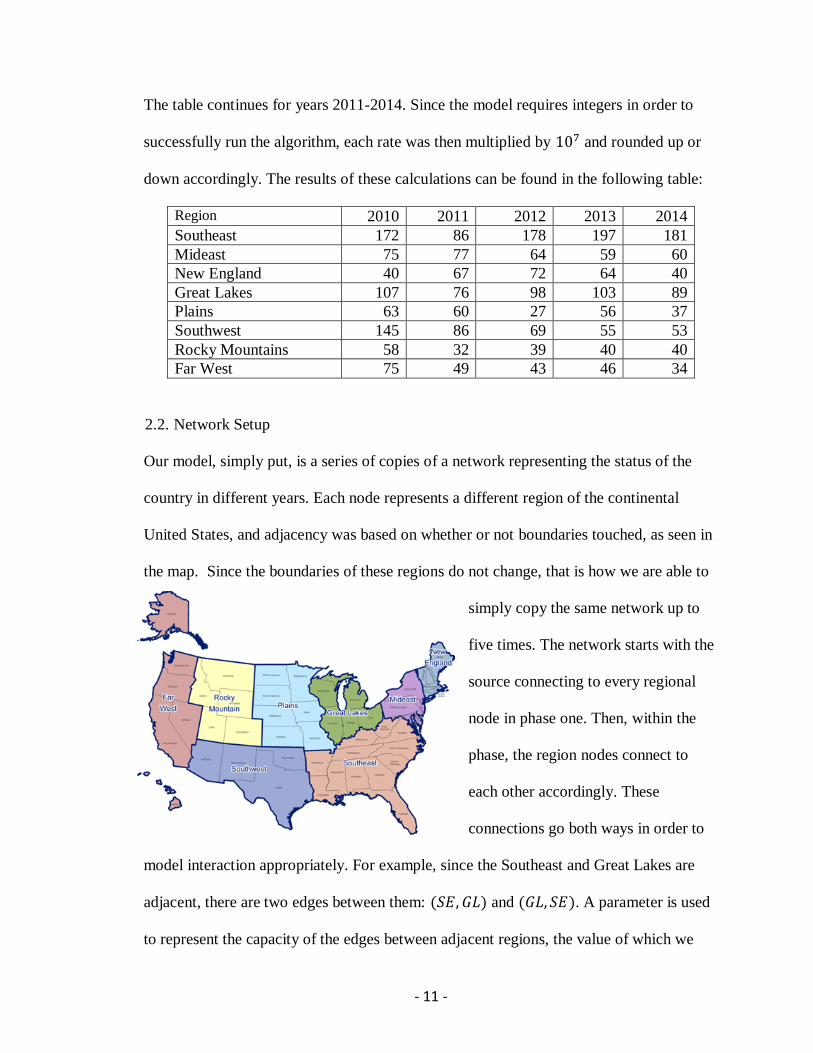
The table continues for years 2011-2014. Since the model requires integers in order to
successfully run the algorithm, each rate was then multiplied by 107 and rounded up or
down accordingly. The results of these calculations can be found in the following table:
Region 2010 2011 2012 2013 2014
Southeast 172 86 178 197 181
Mideast 75 77 64 59 60
New England 40 67 72 64 40
Great Lakes 107 76 98 103 89
Plains 63 60 27 56 37
Southwest 145 86 69 55 53
Rocky Mountains 58 32 39 40 40
Far West 75 49 43 46 34
2.2. Network Setup
Our model, simply put, is a series of copies of a network representing the status of the
country in different years. Each node represents a different region of the continental
United States, and adjacency was based on whether or not boundaries touched, as seen in
the map. Since the boundaries of these regions do not change, that is how we are able to
simply copy the same network up to
five times. The network starts with the
source connecting to every regional
node in phase one. Then, within the
phase, the region nodes connect to
each other accordingly. These
connections go both ways in order to
model interaction appropriately. For example, since the Southeast and Great Lakes are
adjacent, there are two edges between them: (𝑆𝐸, 𝐺𝐿) and (𝐺𝐿, 𝑆𝐸). A parameter is used
to represent the capacity of the edges between adjacent regions, the value of which we
- 12 -
may manipulate as needed for analysis. This variable ultimately represents the amount of
interaction between the regions. A lower value means less interaction and a higher value
means more interaction.
The next part of the network is the “evo” nodes. These are the eight nodes between
phases to account for change in infection rate between years. There is a unique evo node
for each region because this is also how a region is connected to its copy in future phases.
The model supports calculations on a model that represents up to five years of data. In
theory, the model could support more phases, but we are limited to the data that was
available. As stated previously, the data comes from rates of Hepatitis B from 2010
through 2014. These numbers are used for the capacities of edges that connect a vertex to
its evo node. Thus, the capacity of the edge leaving the evo node is different from the
capacity of the edge coming in. These changes in capacities make the amount of years (or
phases) included in the network critical to the results. At the end of the final phase, or
year, instead of connecting back to an evo node, each region then connects back to the
sink. This gives us the complete network on which to perform the algorithm.
2.3. Coding
The calculations for this project are done using a Java source file. We retrieved a code,
which we modified in several ways to fit our needs, that implements the Ford Fulkerson
algorithm over an adjacency matrix. An adjacency matrix is a square matrix and a
common way to represent graphs in coding. The rows and columns represent the vertices
of the graph where the first row and the first column represent the first vertex (in our case
the source), the second row and column representing the second vertex, and so on. The
- 13 -
values in a standard adjacency matrix are zeros and ones [5]. One means there is a vertex
from node A to node B while zero means no edge exists between those nodes. However,
in our code, the values that would be one in the adjacency matrix are the value of the
capacity of the edge between two nodes. We use a variable in these cases so that the
value can be easily modified when need be, which is one of the significant modifications
made.
In addition to the adjacency matrix, there is also a matrix for the evo nodes. The values in
this matrix are the rates from the data collected in the tables. This matrix is implemented
to mark the edges and their capacities between a region and its evo node. This matrix is
not square like the traditional adjacency matrix; it is a 5 × 8 matrix. It is just a way of
storing the values for the infection rates in a logical way where each row has a rate for
each region for that particular year and each subsequent year is listed below it. There is a
section of code that expands the original adjacency matrix in order to create the
additional phases. For each year that is added in to the model, the new matrix has to
include the proper amount of phases along with the evo nodes between the years. This is
where it retrieves the values from this matrix to mark the capacities of the edges between
regions and their evo nodes.
Another key addition to the code was printing out the minimum cut. Since the minimum
cut is a set of information key to gathering results, it was necessary to make sure it was
provided along with the maximum flow. This was easily accomplished with a couple
lines of code that retrieved the edges identified in the minimum cut and printed them out.

- 14 -
The Ford-Fulkerson algorithm
already finds the minimum cut along
with the maximum flow, so no
changes to the actual algorithm were
necessary.
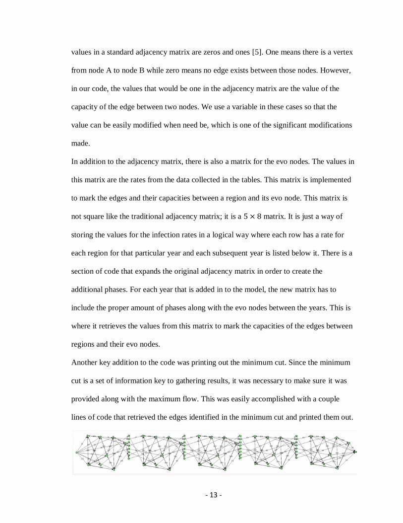
Several classes were also added in
order to make a GUI, graphical user interface, of the network. GUI’s are key for codes
like this because it allows the user to interact with the product of the code without having
to actually manipulate the code themselves [11]. These GUI classes worked together in
order to generate the image shown. As you can see, it provides a network including all
five years (also included is an image of the network at 1 year). The user is able to drag
the nodes around in order to better observe if needed. Being able to actually see the
network was key to understanding the effects of the changes made when gathering our
results.
Perhaps the most essential of these GUI classes is GraphData. This class creates one
environment to input data for the network where it can be accessed by both the GUI
classes and the class for the algorithm. This class also allows multiple networks to be
saved in the code. This is vital because the user can change/manipulate a copy of a
network while still saving the original and avoids many potential errors.
3. Results and Discussion
The results and observations for this project came from three major modifications to the
network: changing the variable, “isolating” regions, and introducing treatment. The first

- 15 -
modification is simple to understand. We would simply change the value of the variable
in the adjacency matrix and record the maximum flow and minimum cut. This was
performed on models for one, two, three, four, and five years. The second modification is
referred to as “quarantine”. Essentially, one region (vertex) was removed from the
network before running the algorithm. Finally, we further changed the network by
simulating treatment. This was done by changing the infection rate of a region to 0 in
each possible year while still allowing interaction with other regions. Of course, these are
ideal scenarios since it is unlikely that treatment would be provided to an entire region
and immediately heal all who were infected. In all these situations, the maximum flow
measures the extent of how much the disease has spread, so the smaller the flow, the
better. The minimum cut is the set of edges that are identified as the most important to
focus on for that particular scenario.
3.1. Effect of variable
The purpose of the parameter in the network is to simulate a certain amount of interaction
between the regions. The smaller the variable’s value, the less interaction and vise versa
with a higher value. We ran the algorithm with the parameter set to a certain value over a
model for each amount of possible years. Then, we would increase the value by 10 and
repeat the process. We started this calculation with the parameter set to 10 and increased
its value until there was no longer any change in the maximum flow or minimum cut. In
models for all possible number of years, there is a point where the variable’s value
stopped having an impact on the output of the algorithm.

- 16 -
In models for one year and two years, the variable actually doesn’t affect the maximum
flow. Regardless of the value, the maximum flow and minimum cut show no change.
This can be observed in the table:
1 Year
Value Max Flow Minimum Cut
10 735 (1,2);(1,4);(1,8);(1,7);(1,3);(1,6);(1,5);(1,9)
20 735 (1,2);(1,4);(1,8);(1,7);(1,3);(1,6);(1,5);(1,9)
30 735 (1,2);(1,4);(1,8);(1,7);(1,3);(1,6);(1,5);(1,9)
40 735 (1,2);(1,4);(1,8);(1,7);(1,3);(1,6);(1,5);(1,9)
50 735 (1,2);(1,4);(1,8);(1,7);(1,3);(1,6);(1,5);(1,9)
2 Years
Value Max Flow Minimum Cut
10 504 (13,21);(3,11);(14,22);(17,25);(15,23);(4,12);(16,24);(10,18)
20 504 (13,21);(3,11);(14,22);(17,25);(15,23);(4,12);(16,24);(10,18)
30 504 (13,21);(3,11);(14,22);(17,25);(15,23);(4,12);(16,24);(10,18)
40 504 (13,21);(3,11);(14,22);(17,25);(15,23);(4,12);(16,24);(10,18)
50 504 (13,21);(3,11);(14,22);(17,25);(15,23);(4,12);(16,24);(10,18)
What this table is telling us is that if someone were to look at the effects of a disease for
only a year or two, interaction between regions is not as important as what is going on
within each region.
In models for three, four, and five years, the results turn out to be the same. Unlike the
one and two year models, though, interaction plays a more important role. The variable
stops having an impact on the maximum flow and minimum cut when it reaches a value
of 28, which looking back at the table with the infection rates is one greater than the
smallest rate. This smallest rate also happens to occur in the third year of data, so it
explains why the same results occur for the four and five year models, as well. The
results are shown in the following table. One can easily observe how the maximum flow
increases by one as the parameter increases by one, while the minimum cut stays the
- 17 -
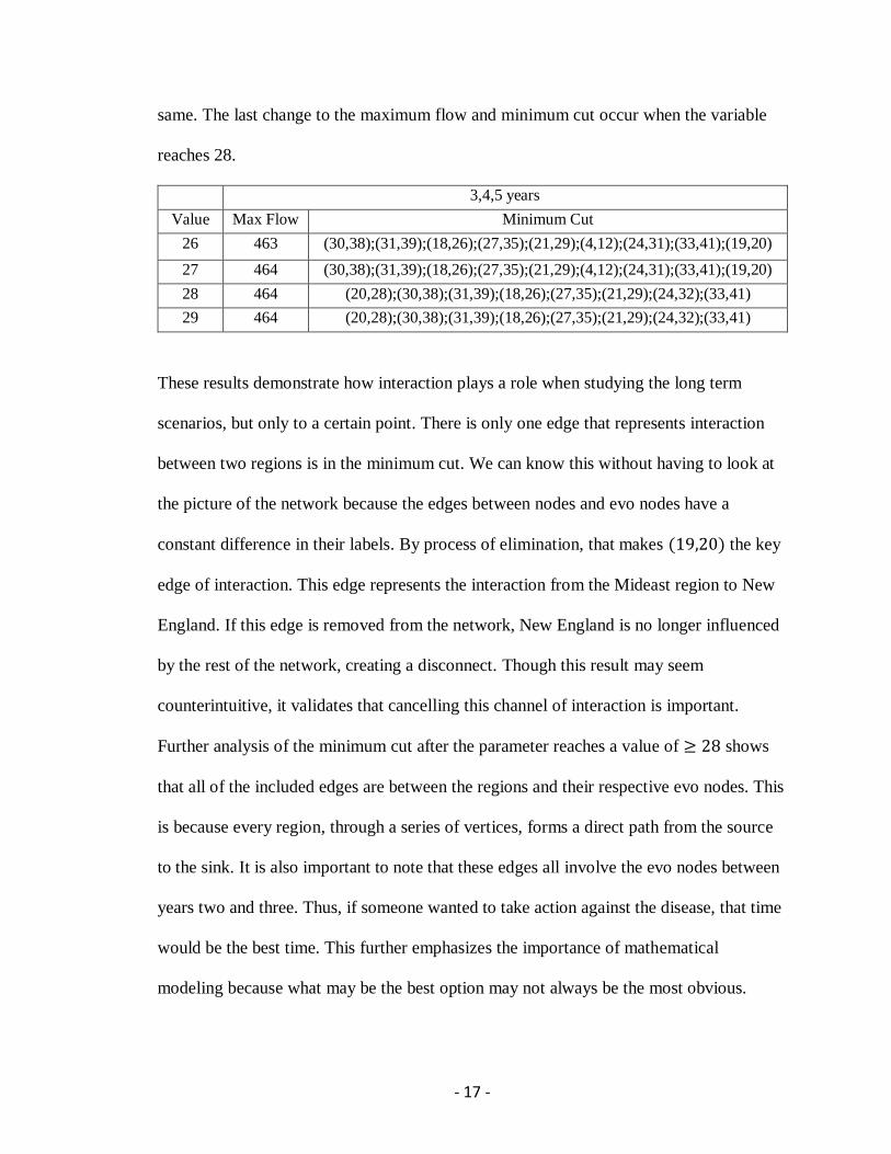
same. The last change to the maximum flow and minimum cut occur when the variable
reaches 28.
3,4,5 years
Value Max Flow Minimum Cut
26 463 (30,38);(31,39);(18,26);(27,35);(21,29);(4,12);(24,31);(33,41);(19,20)
27 464 (30,38);(31,39);(18,26);(27,35);(21,29);(4,12);(24,31);(33,41);(19,20)
28 464 (20,28);(30,38);(31,39);(18,26);(27,35);(21,29);(24,32);(33,41)
29 464 (20,28);(30,38);(31,39);(18,26);(27,35);(21,29);(24,32);(33,41)
These results demonstrate how interaction plays a role when studying the long term
scenarios, but only to a certain point. There is only one edge that represents interaction
between two regions is in the minimum cut. We can know this without having to look at
the picture of the network because the edges between nodes and evo nodes have a
constant difference in their labels. By process of elimination, that makes (19,20) the key
edge of interaction. This edge represents the interaction from the Mideast region to New
England. If this edge is removed from the network, New England is no longer influenced
by the rest of the network, creating a disconnect. Though this result may seem
counterintuitive, it validates that cancelling this channel of interaction is important.
Further analysis of the minimum cut after the parameter reaches a value of ≥ 28 shows
that all of the included edges are between the regions and their respective evo nodes. This
is because every region, through a series of vertices, forms a direct path from the source
to the sink. It is also important to note that these edges all involve the evo nodes between
years two and three. Thus, if someone wanted to take action against the disease, that time
would be the best time. This further emphasizes the importance of mathematical
modeling because what may be the best option may not always be the most obvious.
- 18 -
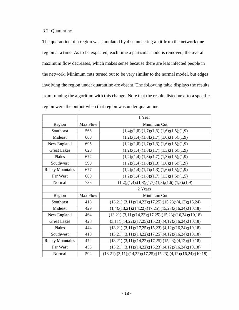
3.2. Quarantine
The quarantine of a region was simulated by disconnecting an it from the network one
region at a time. As to be expected, each time a particular node is removed, the overall
maximum flow decreases, which makes sense because there are less infected people in
the network. Minimum cuts turned out to be very similar to the normal model, but edges
involving the region under quarantine are absent. The following table displays the results
from running the algorithm with this change. Note that the results listed next to a specific
region were the output when that region was under quarantine.
1 Year
Region Max Flow Minimum Cut
Southeast 563 (1,4);(1,8);(1,7);(1,3);(1,6);(1,5);(1,9)
Mideast 660 (1,2);(1,4);(1,8);(1,7);(1,6);(1,5);(1,9)
New England 695 (1,2);(1,8);(1,7);(1,3);(1,6);(1,5);(1,9)
Great Lakes 628 (1,2);(1,4);(1,8);(1,7);(1,3);(1,6);(1,9)
Plains 672 (1,2);(1,4);(1,8);(1,7);(1,3);(1,5);(1,9)
Southwest 590 (1,2);(1,4);(1,8);(1,3);(1,6);(1,5);(1,9)
Rocky Mountains 677 (1,2);(1,4);(1,7);(1,3);(1,6);(1,5);(1,9)
Far West 660 (1,2);(1,4);(1,8);(1,7);(1,3);(1,6);(1,5)
Normal 735 (1,2);(1,4);(1,8);(1,7);(1,3);(1,6);(1,5);(1,9)
2 Years
Region Max Flow Minimum Cut
Southeast 418 (13,21);(3,11);(14,22);(17,25);(15,23);(4,12);(16,24)
Mideast 429 (1,4);(13,21);(14,22);(17,25);(15,23);(16,24);(10,18)
New England 464 (13,21);(3,11);(14,22);(17,25);(15,23);(16,24);(10,18)
Great Lakes 428 (3,11);(14,22);(17,25);(15,23);(4,12);(16,24);(10,18)
Plains 444 (13,21);(3,11);(17,25);(15,23);(4,12);(16,24);(10,18)
Southwest 418 (13,21);(3,11);(14,22);(17,25);(4,12);(16,24);(10,18)
Rocky Mountains 472 (13,21);(3,11);(14,22);(17,25);(15,23);(4,12);(10,18)
Far West 455 (13,21);(3,11);(14,22);(15,23);(4,12);(16,24);(10,18)
Normal 504 (13,21);(3,11);(14,22);(17,25);(15,23);(4,12);(16,24);(10,18)
- 19 -
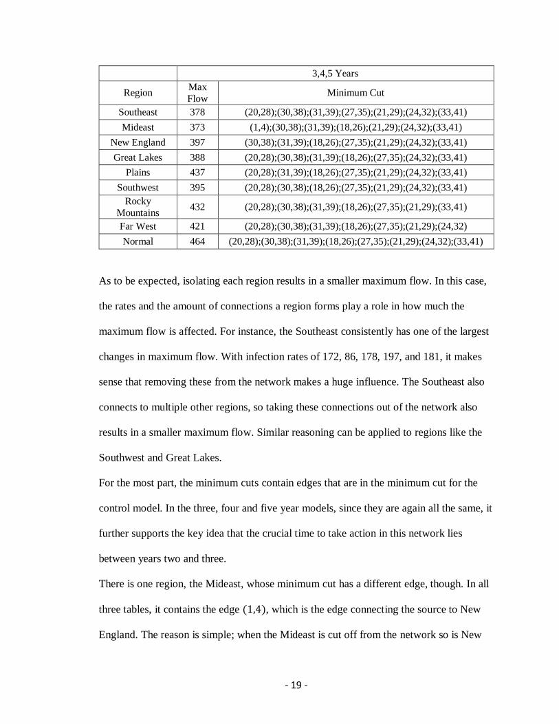
3,4,5 Years
Region Max
Flow Minimum Cut
Southeast 378 (20,28);(30,38);(31,39);(27,35);(21,29);(24,32);(33,41)
Mideast 373 (1,4);(30,38);(31,39);(18,26);(21,29);(24,32);(33,41)
New England 397 (30,38);(31,39);(18,26);(27,35);(21,29);(24,32);(33,41)
Great Lakes 388 (20,28);(30,38);(31,39);(18,26);(27,35);(24,32);(33,41)
Plains 437 (20,28);(31,39);(18,26);(27,35);(21,29);(24,32);(33,41)
Southwest 395 (20,28);(30,38);(18,26);(27,35);(21,29);(24,32);(33,41)
Rocky
Mountains 432 (20,28);(30,38);(31,39);(18,26);(27,35);(21,29);(33,41)
Far West 421 (20,28);(30,38);(31,39);(18,26);(27,35);(21,29);(24,32)
Normal 464 (20,28);(30,38);(31,39);(18,26);(27,35);(21,29);(24,32);(33,41)
As to be expected, isolating each region results in a smaller maximum flow. In this case,
the rates and the amount of connections a region forms play a role in how much the
maximum flow is affected. For instance, the Southeast consistently has one of the largest
changes in maximum flow. With infection rates of 172, 86, 178, 197, and 181, it makes
sense that removing these from the network makes a huge influence. The Southeast also
connects to multiple other regions, so taking these connections out of the network also
results in a smaller maximum flow. Similar reasoning can be applied to regions like the
Southwest and Great Lakes.
For the most part, the minimum cuts contain edges that are in the minimum cut for the
control model. In the three, four and five year models, since they are again all the same, it
further supports the key idea that the crucial time to take action in this network lies
between years two and three.
There is one region, the Mideast, whose minimum cut has a different edge, though. In all
three tables, it contains the edge (1,4), which is the edge connecting the source to New
England. The reason is simple; when the Mideast is cut off from the network so is New
- 20 -
England since its only connection to the rest of the network is through the Mideast. This
is also why the Mideast’s isolation results in a much smaller maximum flow since both
regions are cut off at the same time.
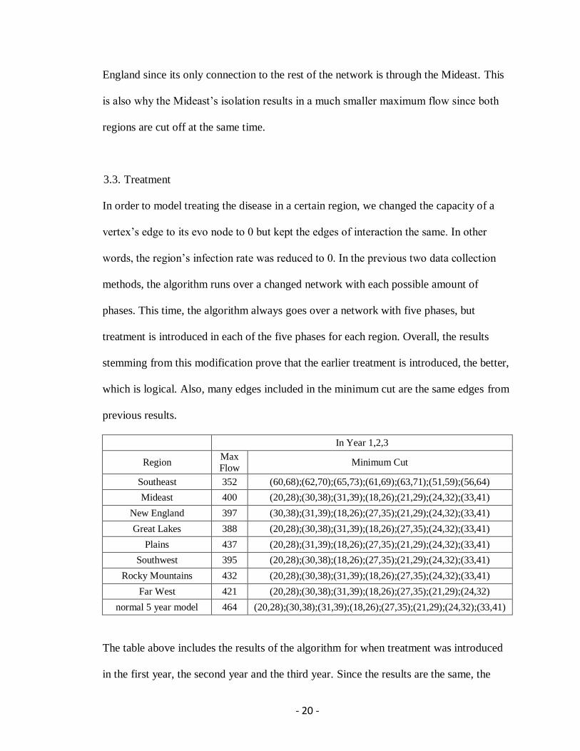
3.3. Treatment
In order to model treating the disease in a certain region, we changed the capacity of a
vertex’s edge to its evo node to 0 but kept the edges of interaction the same. In other
words, the region’s infection rate was reduced to 0. In the previous two data collection
methods, the algorithm runs over a changed network with each possible amount of
phases. This time, the algorithm always goes over a network with five phases, but
treatment is introduced in each of the five phases for each region. Overall, the results
stemming from this modification prove that the earlier treatment is introduced, the better,
which is logical. Also, many edges included in the minimum cut are the same edges from
previous results.
In Year 1,2,3
Region Max
Flow Minimum Cut
Southeast 352 (60,68);(62,70);(65,73);(61,69);(63,71);(51,59);(56,64)
Mideast 400 (20,28);(30,38);(31,39);(18,26);(21,29);(24,32);(33,41)
New England 397 (30,38);(31,39);(18,26);(27,35);(21,29);(24,32);(33,41)
Great Lakes 388 (20,28);(30,38);(31,39);(18,26);(27,35);(24,32);(33,41)
Plains 437 (20,28);(31,39);(18,26);(27,35);(21,29);(24,32);(33,41)
Southwest 395 (20,28);(30,38);(18,26);(27,35);(21,29);(24,32);(33,41)
Rocky Mountains 432 (20,28);(30,38);(31,39);(18,26);(27,35);(24,32);(33,41)
Far West 421 (20,28);(30,38);(31,39);(18,26);(27,35);(21,29);(24,32)
normal 5 year model 464 (20,28);(30,38);(31,39);(18,26);(27,35);(21,29);(24,32);(33,41)
The table above includes the results of the algorithm for when treatment was introduced
in the first year, the second year and the third year. Since the results are the same, the

- 21 -
maximum flow and minimum cut are even more important. Without any regions being
treated, the maximum flow is 464. If there is a large difference between that and the
maximum flow for when a certain region is treated, this is a key region to look at. With
that being said, it is easy to observe that the Southeast and Great Lakes regions create the
largest impact on the maximum flow. Therefore, it would be wise to select one of these
two regions to treat before any of the others. Though there are potentially many reasons
why these regions stand out, an easy one to discern comes from their infection rates. Both
of these regions, the Southeast especially, have consistently higher rates than the other
regions, so it is easy to conclude that their treatment would result in the biggest
differences in maximum flow.
As for the minimum cuts, the Southeast is the only region, such that after its treatment,
the minimum cut is completely different from the normal model. As discussed before the
edges in the minimum cut for the normal model involve edges between vertices and their
evo nodes between years two and three. In the minimum cut after treating the Southeast,
however, the edges are all between vertices and their evo nodes between years four and
five. As demonstrated previously, the Southeast is a pivotal region in the network. By
treating the Southeast most of the key edges identified by the normal minimum cut are
dealt with. Therefore, the minimum cut for when the Southeast is treated includes other
edges from later on. The other resulting minimum cuts just further support the idea that
the key time to take action is between years two and three.

- 22 -
In Year 4, 5
Region Max Flow Minimum Cut
Southeast 352 (60,68);(62,70);(65,73);(61,69);(63,71);(51,59);(56,64)
Mideast 464 (20,28);(30,38);(31,39);(18,26);(27,35);(21,29);(24,32);(33,41)
New England 464 (20,28);(30,38);(31,39);(18,26);(27,35);(21,29);(24,32);(33,41)
Great Lakes 444 (60,68);(62,70);(58,66);(65,73);(63,71);(51,59);(56,64)
Plains 464 (20,28);(30,38);(31,39);(18,26);(27,35);(21,29);(24,32);(33,41)
Southwest 464 (20,28);(30,38);(31,39);(18,26);(27,35);(21,29);(24,32);(33,41)
Rocky
Mountains 464 (20,28);(30,38);(31,39);(18,26);(27,35);(21,29);(24,32);(33,41)
Far West 464 (20,28);(30,38);(31,39);(18,26);(27,35);(21,29);(24,32);(33,41)
The table above displays the results of the algorithm when treatment is introduced to the
regions in the fourth or fifth year. This data further supports the claim that the earlier
treatment is introduced the better because most of the regions’ results saw no change
from the normal model. These regions are marked in blue in the table. This is also to be
expected because, as mentioned previously, the key time to take action as identified by
the minimum cuts is between years two and three, so most of the time, waiting until after
four or five years is too late.
Another important notion within this set of results is that again the Southeast and Great
Lakes regions are singled out. In this situation, they are the only ones where treatment in
the fourth or fifth year makes an impact on the maximum flow and minimum cut. This
influence is because of the minimum cuts, which are the same minimum cut from
introducing treatment to the Southeast in the first, second, or third years. Since the edges
all involve the evo nodes between the fourth and fifth years, it is consistent with what one
would naturally assume. In addition, the maximum flow when treating the Southeast is
the same as before. This shows that treating the Southeast will create a large impact on
the network regardless of when treatment is provided. On the other hand, the maximum

- 23 -
flow for the Great Lakes region increased significantly proving that it is better to treat
this region sooner rather than later, but later is better than never.
4. Conclusion
In this project we use a network flow model and the Ford-Fulkerson algorithm to analyze
the transmission of disease. With the algorithm implemented though a Java program, we
were able to easily study multiple copies of the model in order to incorporate time.
Focusing on data gathered by the CDC on Hepatitis B, we were able to identify the best
ways to fight the disease. First, interaction between regions is important, but analysis of
the parameter revealed that interaction only affects the model up until a certain point. We
also discovered that when looking at Hepatitis B, the Southeast is a key region. It
consistently had a large impact on the network when it was treated or isolated.
Furthermore, the model revealed that the most important time to take action against
Hepatitis B in this model is between two and three years after the beginning of the model,
not right away as one may assume. This ultimately shows how imperative mathematical
modeling is to this type of study because it reveals what the human eye may not be able
to see. Though our model only focuses on the transmission of Hepatitis B, our model can
be used to study any other disease in the future.

- 24 -
References
[1] D. Guichard, An Introduction to Combinatorics and Graph Theory,
https://www.whitman.edu/mathematics/cgt_online/cgt.pdf
[2] Class Nodes, University of British Colombia,
http://www.ugrad.cs.ubc.ca/~cs490/sec202/notes/flow/Flow%20Intro.pdf
[3] CDC, National Prevention Strategy: America's Plan for Better Health and Wellness,
https://www.cdc.gov/features/preventionstrategy/
[4] CDC, Surveillance for Viral Hepatitis – United States, 2014,
https://www.cdc.gov/hepatitis/statistics/2014surveillance/index.htm
[5] Weisstein, E., Adjacency Matrix,
http://mathworld.wolfram.com/AdjacencyMatrix.html
[6] Java Program to Implement Ford–Fulkerson Algorithm, Sanfoundry: Technology
Education Blog, http://www.sanfoundry.com/java-program-implement-ford-fulkerson-
algorithm/
[7] Fairfax, A., U.S. State Population Changes for 2010 to 2011,
http://censuschannel.net/cc/news/u-s-state-population-changes-for-2010-to-2011-1309
[8] 2012 State Population Census Estimates, Governing: The States and Localities,
http://www.governing.com/gov-data/state-census-population-migration-births-deaths-
estimates.html
[9] State Population Census Estimates: 2013 Births, Deaths, Migration Totals,
Governing: The States and Localities, http://www.governing.com/gov-
data/census/census-state-population-estimates-births-deaths-migration-totals-2013.html
[10] List of US States by Population: 2014, Wikipedia,
https://simple.wikipedia.org/wiki/List_of_U.S._states_by_population
[11] The Importance of User Interface Design, Art Vision,
https://artversion.com/blog/importance-of-user-interface-design/

- 25 -
Appendix A
FordFulkseron.java [6]
package edu.georgiasouthern.math.fordfulkerson;
import java.awt.Point;
import java.awt.event.WindowAdapter;
import java.awt.event.WindowEvent;
import java.util.HashSet;
import java.util.Iterator;
import java.util.LinkedList;
import java.util.Queue;
import java.util.Set;
import edu.georgiasouthern.math.jgraph.GraphFrame;
import edu.georgiasouthern.math.jgraph.GraphUtilities;
public class FordFulkerson {
private int[] parent;
private Queue<Integer> queue;
private int numberOfVertices;
private boolean[] visited;
private int[][] residualGraph;
public FordFulkerson(int numberOfVertices) {
this.numberOfVertices = numberOfVertices;
this.queue = new LinkedList<Integer>();
parent = new int[numberOfVertices + 3];
visited = new boolean[numberOfVertices + 3];
}
public boolean bfs(int source, int goal, int graph[][]) {
boolean pathFound = false;
int destination, element;
for(int vertex = 1; vertex <= numberOfVertices; vertex++) {
parent[vertex] = -1;
visited[vertex] = false;
}
queue.add(source);
parent[source] = -1;
visited[source] = true;
while (!queue.isEmpty()) {
element = queue.remove();
destination = 1;
while (destination <= numberOfVertices) {
if (graph[element][destination] > 0 && !visited[destination]){
parent[destination] = element;
queue.add(destination);
visited[destination] = true;
}
destination++;
}
}
if(visited[goal]) {
pathFound = true;
}
return pathFound;
}
public int fordFulkerson(int graph[][], int source, int destination) {
int u, v;
int maxFlow = 0;
int pathFlow;
- 26 -
residualGraph = new int[numberOfVertices + 1][numberOfVertices + 1];
for (int sourceVertex = 1; sourceVertex <= numberOfVertices;
sourceVertex++) {
for (int destinationVertex = 1; destinationVertex <=
numberOfVertices; destinationVertex++) {
residualGraph[sourceVertex][destinationVertex] =
graph[sourceVertex][destinationVertex];
}
}
while (bfs(source ,destination, residualGraph)) {
pathFlow = Integer.MAX_VALUE;
for (v = destination; v != source; v = parent[v]) {
u = parent[v];
pathFlow = Math.min(pathFlow, residualGraph[u][v]);
}
for (v = destination; v != source; v = parent[v]) {
u = parent[v];
residualGraph[u][v] -= pathFlow;
residualGraph[v][u] += pathFlow;
}
maxFlow += pathFlow;
}
Set<Point> minCut = new HashSet<Point>();
for(v = 0; v <= numberOfVertices; v++) {
for(u = 0; u <= numberOfVertices; u++) {
if (visited[v]==true && visited[u]==false && graph[v][u]>0) {
minCut.add(new Point(v, u));
}
}
}
//output the min cut
Iterator<Point> it = minCut.iterator();
while (it.hasNext()) {
Point p = it.next();
System.out.println("(v, u) = (" + ((int) p.getX()) + ", " + ((int)
p.getY()) + ")");
}
return maxFlow;
}
public int[][] getResidualGraph() {
return residualGraph;
}
public static void main(String...arg) {
int[][] graph;
int numberOfNodes;
int source;
int sink;
int maxFlow;
Graph graphData = GraphData.num2;
numberOfNodes = graphData.numOfNodes + (graphData.numOfStages - 1) * 2
* graphData.numOfNodes + 2;
source = graphData.source;
sink = numberOfNodes;//GraphData.num1.sink;
graph = GraphData.computeMatrix(graphData);//GraphData.num1.matrix;
int[][] newGraph = new int[graph.length * 2][graph.length * 2];
for(int i = 0; i < graph.length; i++) {
for (int j = 0; j < graph[i].length; j++) {
newGraph[i][j] = graph[i][j];
}
}
int w = graph.length;
for(int i = 0; i < graph.length; i++) {
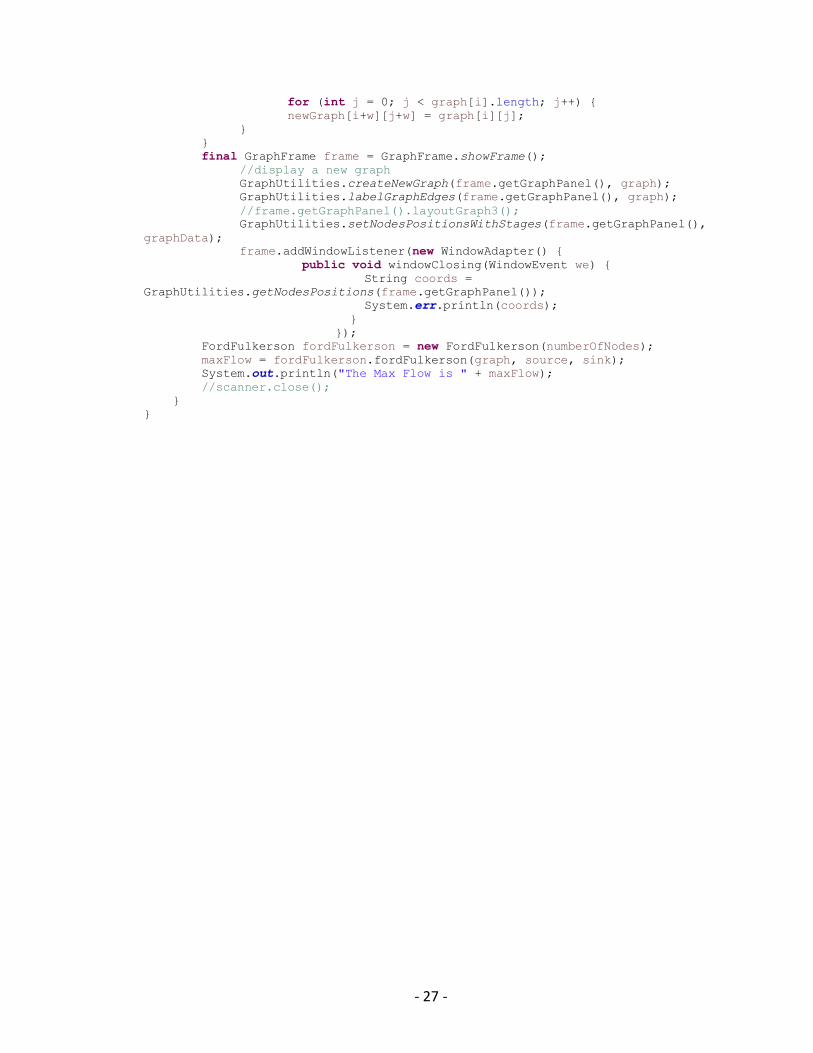
- 27 -
for (int j = 0; j < graph[i].length; j++) {
newGraph[i+w][j+w] = graph[i][j];
}
}
final GraphFrame frame = GraphFrame.showFrame();
//display a new graph
GraphUtilities.createNewGraph(frame.getGraphPanel(), graph);
GraphUtilities.labelGraphEdges(frame.getGraphPanel(), graph);
//frame.getGraphPanel().layoutGraph3();
GraphUtilities.setNodesPositionsWithStages(frame.getGraphPanel(),
graphData);
frame.addWindowListener(new WindowAdapter() {
public void windowClosing(WindowEvent we) {
String coords =
GraphUtilities.getNodesPositions(frame.getGraphPanel());
System.err.println(coords);
}
});
FordFulkerson fordFulkerson = new FordFulkerson(numberOfNodes);
maxFlow = fordFulkerson.fordFulkerson(graph, source, sink);
System.out.println("The Max Flow is " + maxFlow);
//scanner.close();
}
}