Embed Size (px)
Citation preview
8/7/2019 Negative Space in Logo Design
http://slidepdf.com/reader/full/negative-space-in-logo-design 1/28
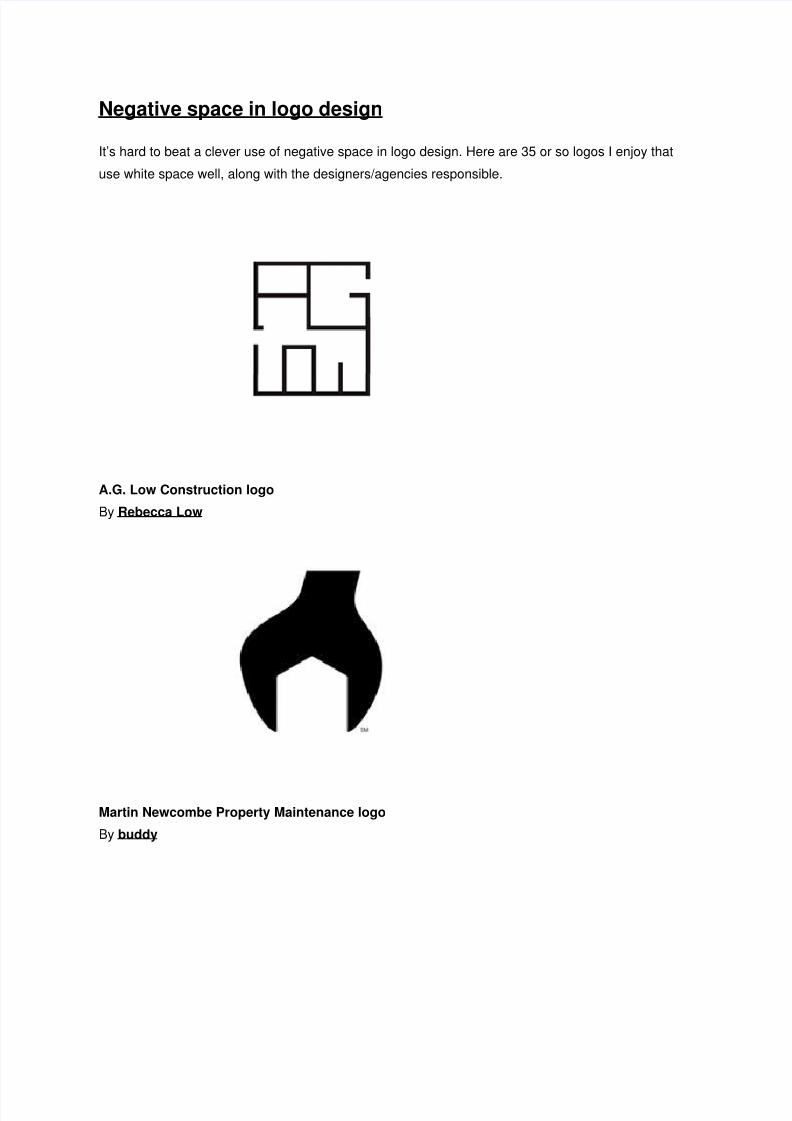
Negative space in logo design
It’s hard to beat a clever use of negative space in logo design. Here are 35 or so logos I enjoy that
use white space well, along with the designers/agencies responsible.
A.G. Low Construction logo
By Rebecca Low
Martin Newcombe Property Maintenance logo
By buddy
8/7/2019 Negative Space in Logo Design
http://slidepdf.com/reader/full/negative-space-in-logo-design 2/28
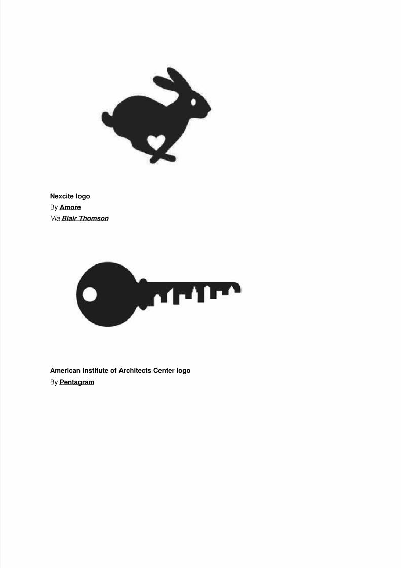
Nexcite logoBy Amore
Via Blair Thomson
American Institute of Architects Center logo
By Pentagram
8/7/2019 Negative Space in Logo Design
http://slidepdf.com/reader/full/negative-space-in-logo-design 3/28
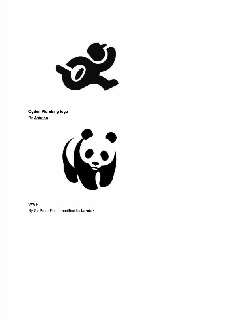
Ogden Plumbing logoBy Astuteo
WWF
By Sir Peter Scott, modified by Landor
8/7/2019 Negative Space in Logo Design
http://slidepdf.com/reader/full/negative-space-in-logo-design 4/28
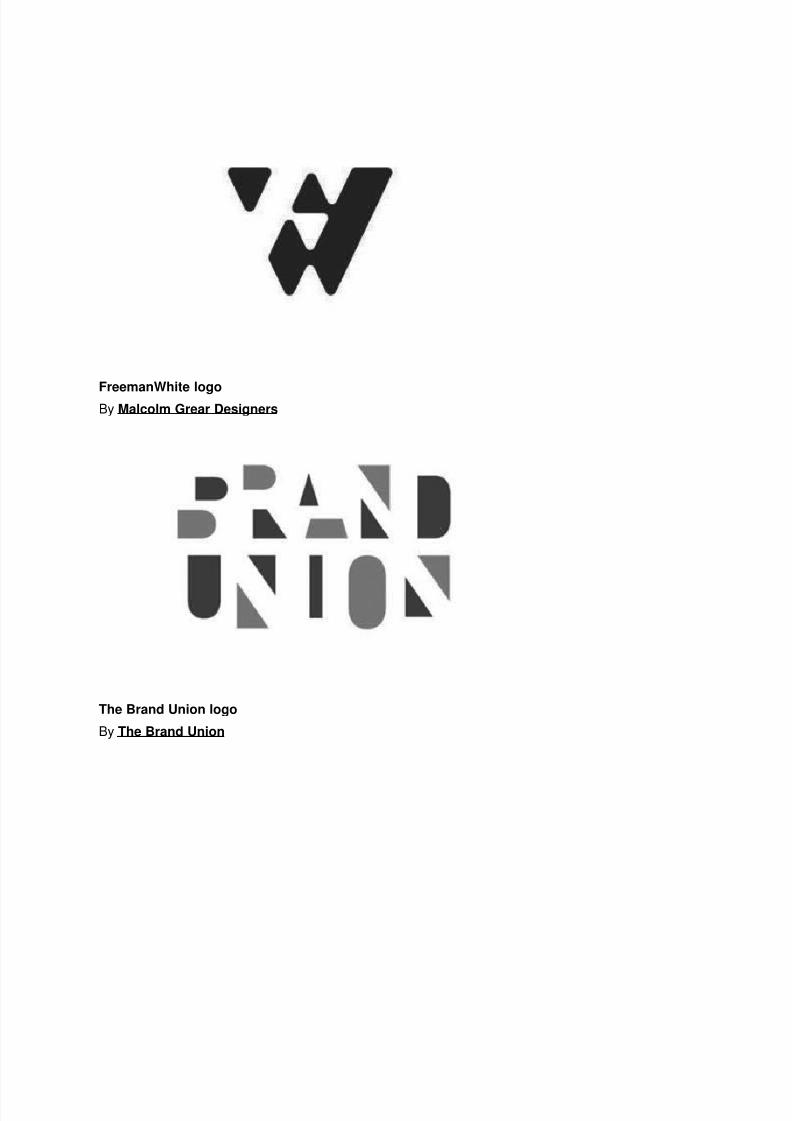
FreemanWhite logoBy Malcolm Grear Designers
The Brand Union logo
By The Brand Union
8/7/2019 Negative Space in Logo Design
http://slidepdf.com/reader/full/negative-space-in-logo-design 5/28
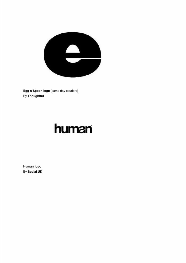
Egg n Spoon logo (same day couriers)By Thoughtful
Human logo
By Social UK
8/7/2019 Negative Space in Logo Design
http://slidepdf.com/reader/full/negative-space-in-logo-design 6/28
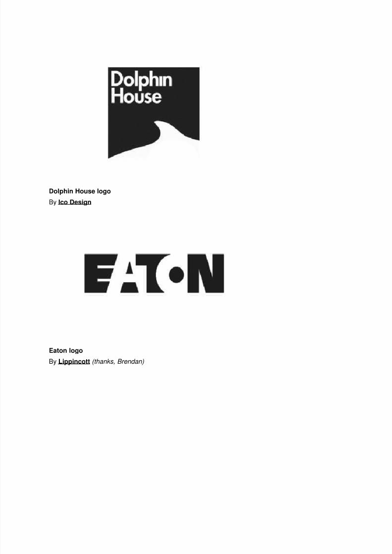
Dolphin House logoBy Ico Design
Eaton logo
By Lippincott (thanks, Brendan)
8/7/2019 Negative Space in Logo Design
http://slidepdf.com/reader/full/negative-space-in-logo-design 7/28
Elefont logoBy Logo Motive Designs
USA Network logo
By Peloton Design
8/7/2019 Negative Space in Logo Design
http://slidepdf.com/reader/full/negative-space-in-logo-design 8/28
CultureBus logoBy Pentagram
Carrefour logo
Original design examined by Miles Newlyn (thanks Rianna )
8/7/2019 Negative Space in Logo Design
http://slidepdf.com/reader/full/negative-space-in-logo-design 9/28
Henri Ehrhart monogram (shameless, aren’t I?)View the design process on David Airey dot com
Sinkit logo
By smashLAB
8/7/2019 Negative Space in Logo Design
http://slidepdf.com/reader/full/negative-space-in-logo-design 10/28
Guild of Food Writers logoBy 300million
ED logo
By Gianni Bortolotti
8/7/2019 Negative Space in Logo Design
http://slidepdf.com/reader/full/negative-space-in-logo-design 11/28
Blade logoBy Subversive Design
Premier Catering logo
By Madhouse
Via Logolog
8/7/2019 Negative Space in Logo Design
http://slidepdf.com/reader/full/negative-space-in-logo-design 12/28
The Waterways Trust logoBy Pentagram
FedEx logo
By Lindon Leader while at Landor
8/7/2019 Negative Space in Logo Design
http://slidepdf.com/reader/full/negative-space-in-logo-design 13/28
Knoll logoBy NB: Studio
Via Logolog
Ryan Biggs Associates logo
By id29
8/7/2019 Negative Space in Logo Design
http://slidepdf.com/reader/full/negative-space-in-logo-design 14/28
Hartford Whalers logoBy Cummings & Good (thanks, Jeff )
Conception logo
By The Chase

8/7/2019 Negative Space in Logo Design
http://slidepdf.com/reader/full/negative-space-in-logo-design 15/28
Yoga Australia logoBy Roy Smith Design
Hands On Network logo
By Duffy & Partners
8/7/2019 Negative Space in Logo Design
http://slidepdf.com/reader/full/negative-space-in-logo-design 16/28
MyFonts logoBy Underware
Vanderbilt University logo
By Malcolm Grear Designers
8/7/2019 Negative Space in Logo Design
http://slidepdf.com/reader/full/negative-space-in-logo-design 17/28
Recycle Taiwan logoBy do you know?
NBC logo
By Steff Geissbuhler while at Chermayeff & Geismar
8/7/2019 Negative Space in Logo Design
http://slidepdf.com/reader/full/negative-space-in-logo-design 18/28
New Bedford Whaling Museum logoBy Malcolm Grear Designers
Mouse logo
By Johnson Banks
—
Update: 06 September 2010
Here’s another nice idea just featured, for a company called Landfit.
Update: 05 March 2011
And another — Snooty Peacock.
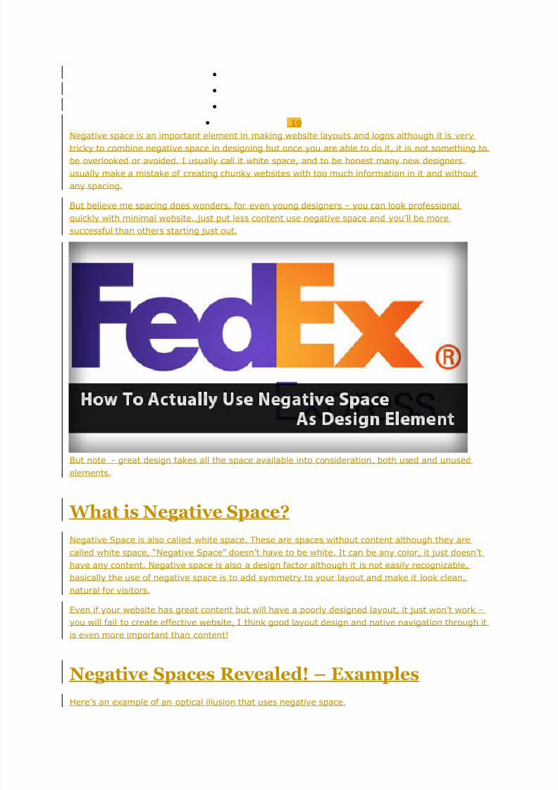
How To Actually Use Negative Space As
Design ElementP o s t e d i n : W e b D e s i g n • W r i t t e n b y : S t e p h e n G a l a n g • Decemb e r 3 r d , 2 0 1 0
•
8/7/2019 Negative Space in Logo Design
http://slidepdf.com/reader/full/negative-space-in-logo-design 19/28
•
•
•
• 10
Negative space is an important element in making website layouts and logos although it is verytricky to combine negative space in designing but once you are able to do it, it is not something to
be overlooked or avoided. I usually call it white space, and to be honest many new designers
usually make a mistake of creating chunky websites with too much information in it and without
any spacing.
But believe me spacing does wonders, for even young designers – you can look professional
quickly with minimal website..just put less content use negative space and you’ll be more
successful than others starting just out.
But note - great design takes all the space available into consideration, both used and unused
elements.
What is Negative Space?
Negative Space is also called white space. These are spaces without content although they are
called white space, “Negative Space” doesn’t have to be white. It can be any color, it just doesn’thave any content. Negative space is also a design factor although it is not easily recognizable,
basically the use of negative space is to add symmetry to your layout and make it look clean,
natural for visitors.
Even if your website has great content but will have a poorly designed layout, it just won’t work –
you will fail to create effective website, I think good layout design and native navigation through it
is even more important than content!
Negative Spaces Revealed! – Examples
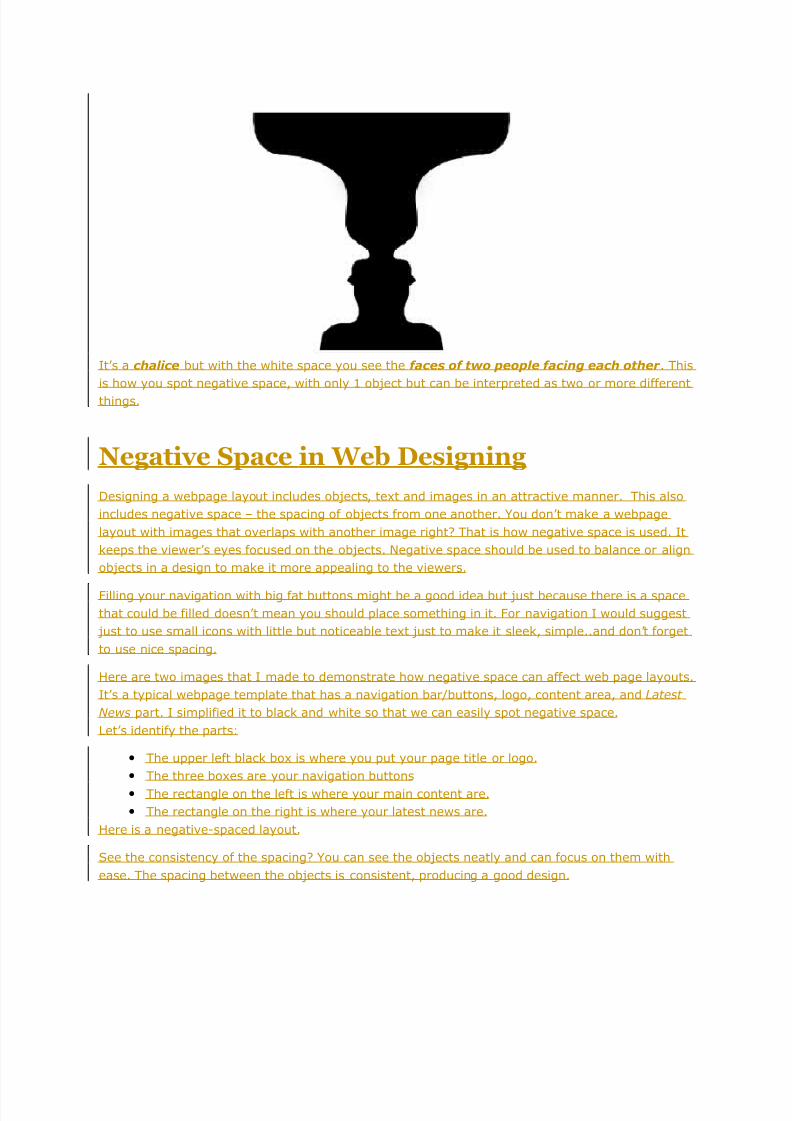
Here’s an example of an optical illusion that uses negative space.
8/7/2019 Negative Space in Logo Design
http://slidepdf.com/reader/full/negative-space-in-logo-design 20/28
It’s a chalice but with the white space you see the faces of two people facing each other . This
is how you spot negative space, with only 1 object but can be interpreted as two or more different
things.
Negative Space in Web Designing
Designing a webpage layout includes objects, text and images in an attractive manner. This also
includes negative space – the spacing of objects from one another. You don’t make a webpage
layout with images that overlaps with another image right? That is how negative space is used. It
keeps the viewer’s eyes focused on the objects. Negative space should be used to balance or align
objects in a design to make it more appealing to the viewers.
Filling your navigation with big fat buttons might be a good idea but just because there is a space
that could be filled doesn’t mean you should place something in it. For navigation I would suggest
just to use small icons with little but noticeable text just to make it sleek, simple..and don’t forget
to use nice spacing.
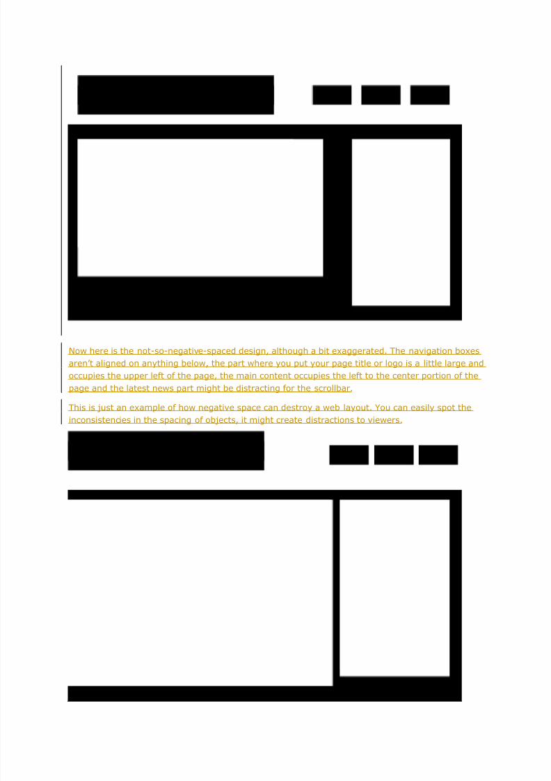
Here are two images that I made to demonstrate how negative space can affect web page layouts.
It’s a typical webpage template that has a navigation bar/buttons, logo, content area, and Latest
News part. I simplified it to black and white so that we can easily spot negative space.
Let’s identify the parts:
• The upper left black box is where you put your page title or logo.
• The three boxes are your navigation buttons
• The rectangle on the left is where your main content are.
• The rectangle on the right is where your latest news are.
Here is a negative-spaced layout.
See the consistency of the spacing? You can see the objects neatly and can focus on them with
ease. The spacing between the objects is consistent, producing a good design.
8/7/2019 Negative Space in Logo Design
http://slidepdf.com/reader/full/negative-space-in-logo-design 21/28
Now here is the not-so-negative-spaced design, although a bit exaggerated. The navigation boxes
aren’t aligned on anything below, the part where you put your page title or logo is a little large and
occupies the upper left of the page, the main content occupies the left to the center portion of the
page and the latest news part might be distracting for the scrollbar.
This is just an example of how negative space can destroy a web layout. You can easily spot theinconsistencies in the spacing of objects, it might create distractions to viewers.
8/7/2019 Negative Space in Logo Design
http://slidepdf.com/reader/full/negative-space-in-logo-design 22/28
Negative Space in images.
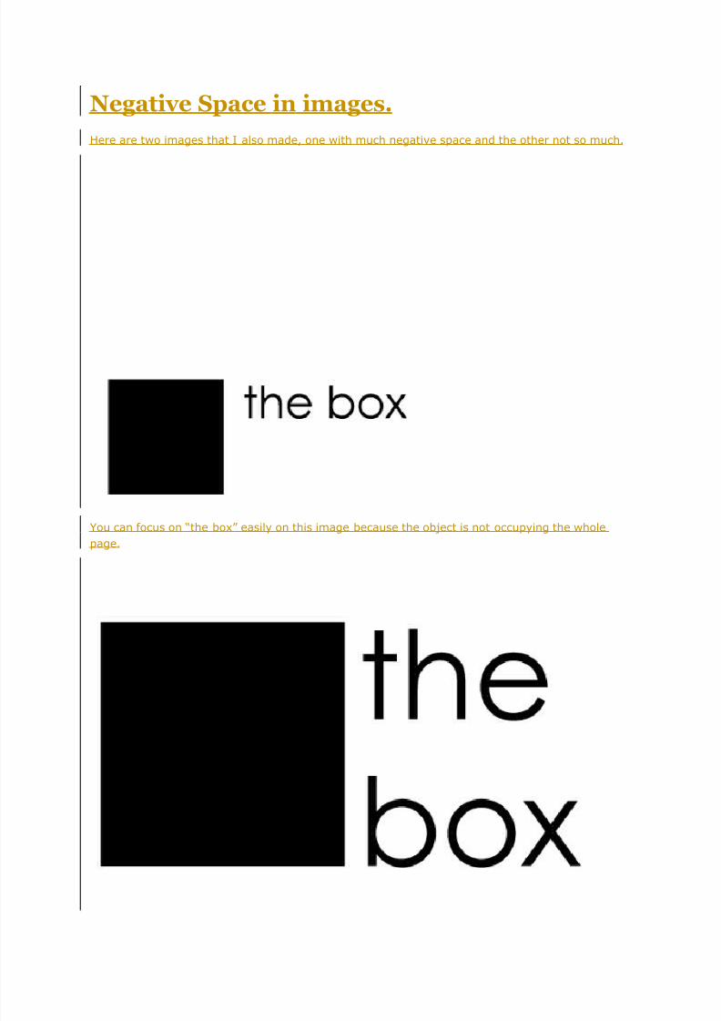
Here are two images that I also made, one with much negative space and the other not so much.
You can focus on “the box” easily on this image because the object is not occupying the whole
page.
8/7/2019 Negative Space in Logo Design
http://slidepdf.com/reader/full/negative-space-in-logo-design 23/28
You find it difficult to focus on “the box” since you can’t look at the square and the text at the
same time because the object is too large and it occupies the page completely.
That is how negative space works, it should help viewers focus on the objects that they should see
instead of making their eyes look all over the place. If that happens they might not see what they
are looking for in the website making them close their browser tab or go to another website.
Considering Negative space in Making logos
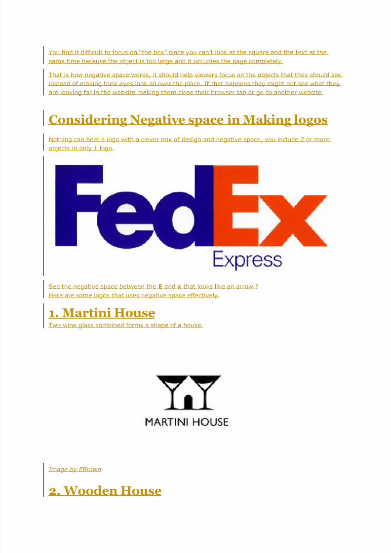
Nothing can beat a logo with a clever mix of design and negative space, you include 2 or more
objects in only 1 logo.
See the negative space between the E and x that looks like an arrow ?
Here are some logos that uses negative space effectively.
1. Martini HouseTwo wine glass combined forms a shape of a house.
Image by EBrown
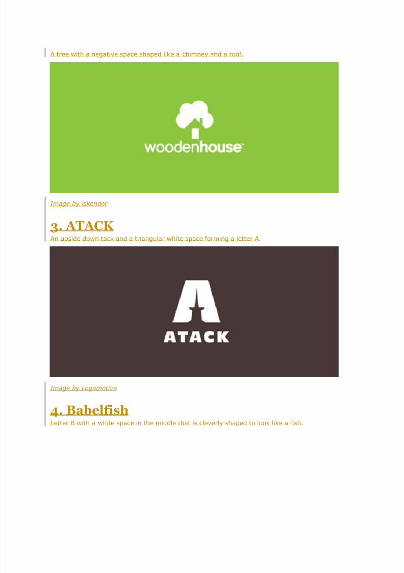
2. Wooden House
8/7/2019 Negative Space in Logo Design
http://slidepdf.com/reader/full/negative-space-in-logo-design 24/28
A tree with a negative space shaped like a chimney and a roof.
Image by iskender
3. ATACK An upside down tack and a triangular white space forming a letter A.
Image by Logomotive
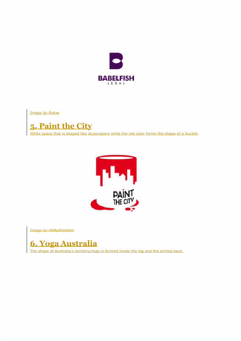
4. BabelfishLetter B with a white space in the middle that is cleverly shaped to look like a fish.
8/7/2019 Negative Space in Logo Design
http://slidepdf.com/reader/full/negative-space-in-logo-design 25/28
Image by Rokac
5. Paint the City White space that is shaped like skyscrapers while the red color forms the shape of a bucket.
Image by HitByReindeer
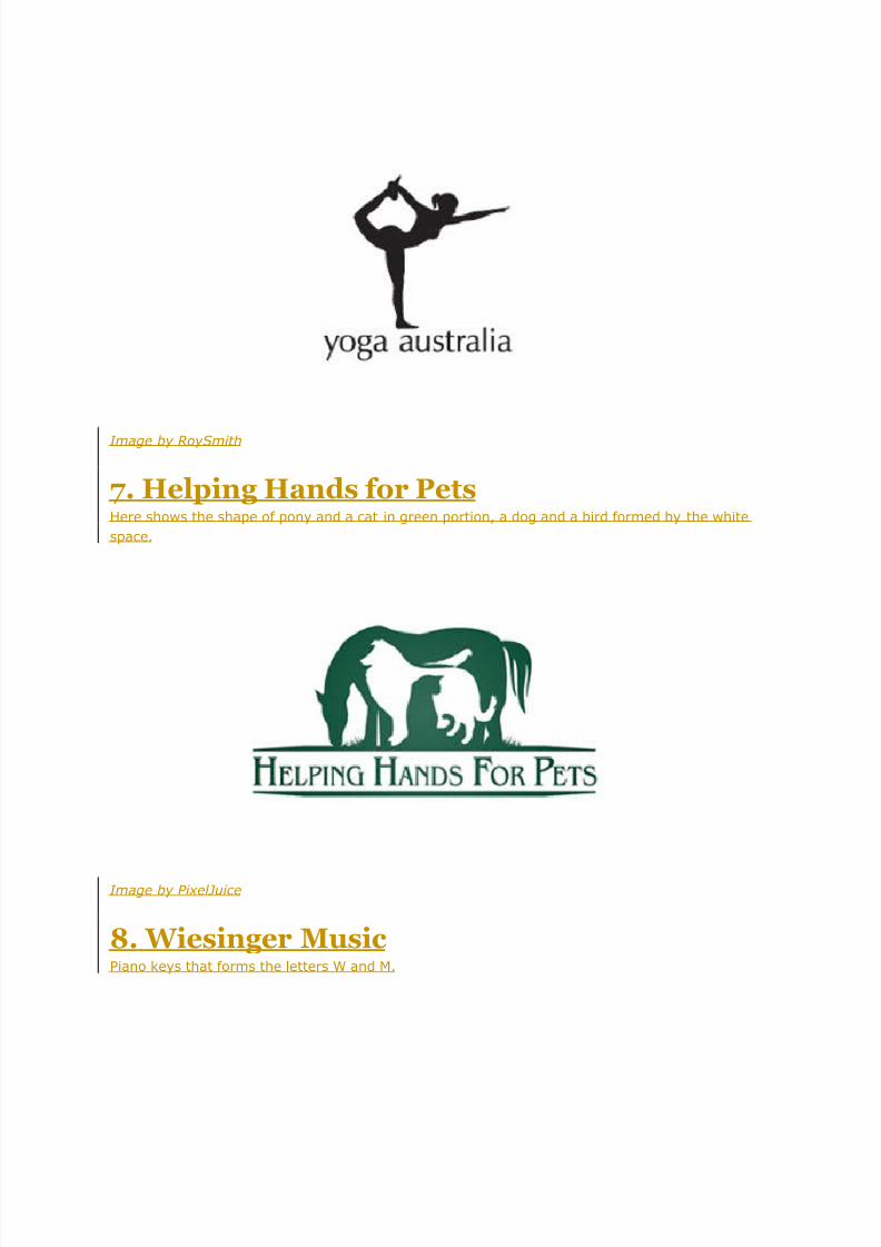
6. Yoga AustraliaThe shape of Australia’s territory/map is formed inside the leg and the arched back.
8/7/2019 Negative Space in Logo Design
http://slidepdf.com/reader/full/negative-space-in-logo-design 26/28
Image by RoySmith
7. Helping Hands for PetsHere shows the shape of pony and a cat in green portion, a dog and a bird formed by the white
space.
Image by PixelJuice
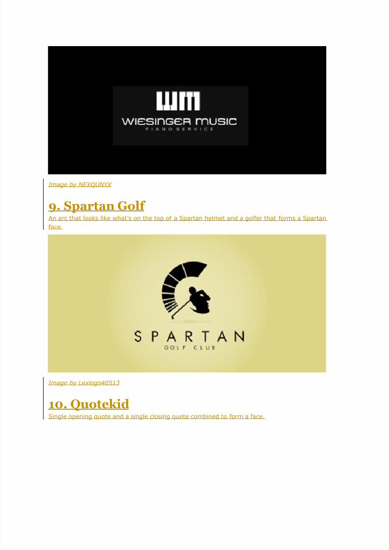
8. Wiesinger MusicPiano keys that forms the letters W and M.
8/7/2019 Negative Space in Logo Design
http://slidepdf.com/reader/full/negative-space-in-logo-design 27/28
Image by NEXQUNYX
9. Spartan Golf An arc that looks like what’s on the top of a Spartan helmet and a golfer that forms a Spartan
face.
Image by Lexlogo40513
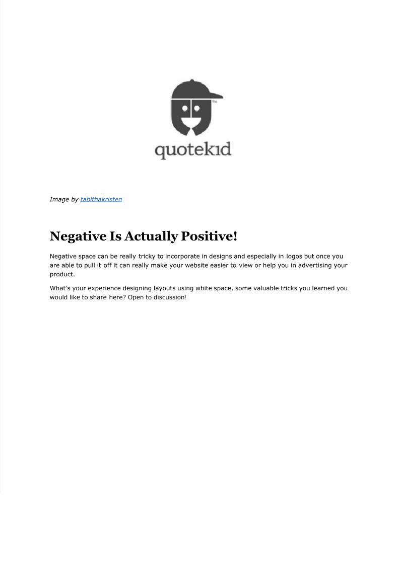
10. QuotekidSingle opening quote and a single closing quote combined to form a face.
8/7/2019 Negative Space in Logo Design
http://slidepdf.com/reader/full/negative-space-in-logo-design 28/28
Image by tabithakristen
Negative Is Actually Positive!
Negative space can be really tricky to incorporate in designs and especially in logos but once you
are able to pull it off it can really make your website easier to view or help you in advertising your
product.
What’s your experience designing layouts using white space, some valuable tricks you learned you
would like to share here? Open to discussion!