Embed Size (px)
Citation preview

The Q logo is A trademark logo which has been
included on every issue of the
magazine. The bold red and white
contrasting mast head stands out and
is easily recognizable. The
main image of adele is covering some of the logo, this shows how established Q magazine and its
logo is as people will be able to identify the magazine with out even seeing all
the masthead.
The use of the plug makes this issue
stand out from the rest of Q magazine as it it indicting this is the 300th issue.
This draw the audience to read this
magazine as the golden colour stands
out and contrasts front it white back
ground
Barcode is located at the bottom of the front cover, the barcode also presents the price, date and issue number of the magazine, by doing this allows the
audience to easily.
The use of sell lines on the front page have been closely linked in with key celebrates names in the music industry. By largening the font size of Liam and Keith provides the audience with key
information of what who is included in this issue of Q magazine . The wording of the sell lines “Liam Gallagher’s Last requests attracts the target audience to the magazine to want to know what Liam Gallagher’s last requests were and why he has last
requests.
The main image is a close up if Adele. The image is positioned in the central left side of the magazine
leaving room for sell liners around the left side of the
magazine. This image shows Adele’s confidence and the expression on her face and position of hands give a sense of a challenge
and reflect the singer personality of not caring what people think of how
she looks
The main cover line is big and bold so that the audience can see it from
a distance so it can distinguish itself form
other magazines.
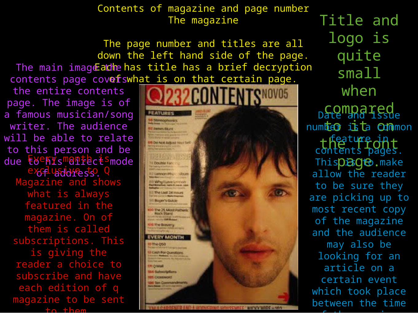
Contents of magazine and page numberThe magazine
The page number and titles are all down the left hand side of the page. Each has title has a brief decryption of what is on that certain
page.The main image the contents page covers the entire contents page. The
image is of a famous musician/song writer. The audience will be able to relate to this person and be due to his direct mode
of address.
Title and logo is
quite small when
compared to it on the front page.Date and issue
number is a common feature in contents
pages. This is to make allow the reader to be sure they are picking
up to most recent copy of the magazine and the audience may also be looking for an
article on a certain event which took
place between the time of the previous magazine and this
one.
Every month is exclusive to Q
Magazine and shows what is always featured in the
magazine. On of them is called subscriptions.
This is giving the reader a choice to
subscribe and have each edition of q
magazine to be sent to them.

On the first page of the double page spread is a photo of lady gaga. She is looking directly into
the camera (direct mode of address),
therefore establishing a relationship with the
readers. To keep focus on the singer the use of
a white background ensures focus remains
on her.
The lay out is very easy to read. the tell is split into 3 columns with paragraphs for different topic in a conventional magazine style for an easy read. The big, bold capital S and I helps to split up the text and is also a convention. This would primarily attract lady gaga fans as it gives a deup insight into her career.
The colour scheme is is constantly red, black and white just like from the contents page and the front cover.
There is no real title on the double page spread apart from the exception of the artists name on the top right side of the magazine. i believe the reason there was no large title was because it is who the article is focussed on by jut looking at how the page layout and the large image of the subject. The title is has more emphasis on the on the ‘GAGA’ than ‘lady’. This represent the editor felt that people could response her us from gaga.
On the right side of the double page spread their lies a article about Lady Gaga. There is a very large Red L which takes up the majority of the page, whilst it covers some of the text in a red shade. The letter L clearly links to the artist which the article is focusing on (Lady Gaga).